
Low-res version (3 mb) - Libre Graphics magazine
64
Transcript of Low-res version (3 mb) - Libre Graphics magazine
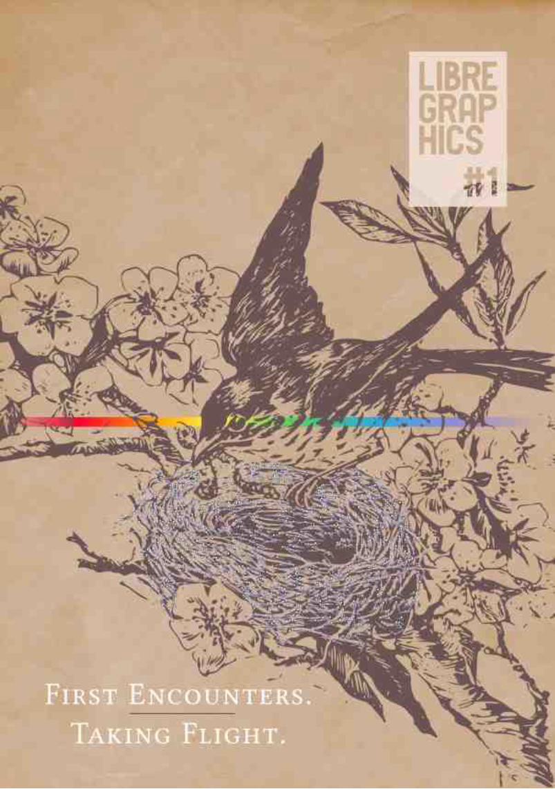

Silver Bird's Nest illustration created from a picture by Flickr userPerpetualPlum
http://www.flickr.com/photos/perpetualplum/3598355084/#/Rainbow gradient found on a post by user Erroneus on
InkscapeForum.com
http://www.inkscapeforum.com/viewtopic.php?f=5&t=5470
<!-- cover nest excerpt --><g inkscape:label="Layer 1" inkscape:groupmode="layer" id="layer1"> <g id="g38378"> <path inkscape:connector-curvature="0" id="path16611" d="m 225.82431,132.4672117.4409,2.28159" style="opacity:0.86138611;fill:none;stroke:#c2c2f5;stroke-width:1.29999995;stroke-linecap:butt;stroke-linejoin:miter;stroke-miterlimit:4;stroke-opacity:0.8627451;stroke-dasharray:none;marker-start:url(#EmptyTriangleOutS);marker-mid:none;marker-end:url(#EmptyDiamondS);display:inline" /> <path inkscape:connector-curvature="0" id="path20472" d="M219.05596,168.22787 206.77063,154.72065" style="opacity:0.86138611;fill:none;stroke:#c2c2f5;stroke-width:1.29999995;stroke-linecap:butt;stroke-linejoin:miter;stroke-miterlimit:4;stroke-opacity:0.8627451;stroke-dasharray:none;marker-start:url(#EmptyTriangleOutS);marker-mid:none;marker-end:url(#EmptyDiamondS);display:inline" /> <path inkscape:connector-curvature="0"id="path16607" d="m 200.15959,153.04307 6.61104,1.67758" style="opacity:0.86138611;fill:none;stroke:#c2c2f5;stroke-width:1.29999995;stroke-linecap:butt;stroke-linejoin:miter;stroke-miterlimit:4;stroke-opacity:0.8627451;stroke-dasharray:none;marker-start:url(#EmptyTriangleOutS);marker-mid:none;marker-end:url(#EmptyDiamondS);display:inline" /> <pathinkscape:connector-curvature="0" id="path20475" d="m 200.53421,145.30828 -4.18015,8.67534" style="opacity:0.86138611;fill:none;stroke:#c2c2f5;stroke-width:1.29999995;stroke-linecap:butt;stroke-linejoin:miter;stroke-miterlimit:4;stroke-opacity:0.8627451;stroke-dasharray:none;marker-start:url(#EmptyTriangleOutS);marker-mid:none;marker-end:url(#EmptyDiamondS);display:inline" /><path inkscape:connector-curvature="0" id="path16603" d="m 187.09434,155.9977 9.25972,-2.01408" style="opacity:0.86138611;fill:none;stroke:#c2c2f5;stroke-width:1.29999995;stroke-linecap:butt;stroke-linejoin:miter;stroke-miterlimit:4;stroke-opacity:0.8627451;stroke-dasharray:none;marker-start:url(#EmptyTriangleOutS);marker-mid:none;marker-end:url(#EmptyDiamondS);display:inline" /> <path inkscape:connector-curvature="0" id="path20478" d="m 179.79965,172.78437 10.93431,9.37073"style="opacity:0.86138611;fill:none;stroke:#c2c2f5;stroke-width:1.29999995;stroke-linecap:butt;stroke-linejoin:miter;stroke-miterlimit:4;stroke-opacity:0.8627451;stroke-dasharray:none;marker-start:url(#EmptyTriangleOutS);marker-mid:none;marker-end:url(#EmptyDiamondS);display:inline" /> <path inkscape:connector-curvature="0" id="path16599" d="m 185.55904,188.1525 5.17492,-5.9974" style="opacity:0.86138611;fill:none;stroke:#c2c2f5;stroke-width:1.29999995;stroke-linecap:butt;stroke-linejoin:miter;stroke-miterlimit:4;stroke-opacity:0.8627451;stroke-dasharray:none;marker-start:url(#EmptyTriangleOutS);marker-mid:none;marker-end:url(#EmptyDiamondS);display:inline" /> <path inkscape:connector-curvature="0" id="path20481" d="m 178.84708,190.69835 11.21845,-1.49125" style="opacity:0.86138611;fill:none;stroke:#c2c2f5;stroke-width:1.29999995;stroke-linecap:butt;stroke-linejoin:miter;stroke-miterlimit:4;stroke-opacity:0.8627451;stroke-dasharray:none;marker-start:url(#EmptyTriangleOutS);marker-mid:none;marker-end:url(#EmptyDiamondS);display:inline" /> <path inkscape:connector-curvature="0" id="path16595" d="m188.4914,197.19743 1.57413,-7.99033" style="opacity:0.86138611;fill:none;stroke:#c2c2f5;stroke-width:1.29999995;stroke-linecap:butt;stroke-linejoin:miter;stroke-miterlimit:4;stroke-opacity:0.8627451;stroke-dasharray:none;marker-start:url(#EmptyTriangleOutS);marker-mid:none;marker-end:url(#EmptyDiamondS);display:inline" /> <path inkscape:connector-curvature="0"id="path20484" d="M 177.24272,206.10799 188.6485,194.60558" style="opacity:0.86138611;fill:none;stroke:#c2c2f5;stroke-width:1.29999995;stroke-linecap:butt;stroke-linejoin:miter;stroke-miterlimit:4;stroke-opacity:0.8627451;stroke-dasharray:none;marker-start:url(#EmptyTriangleOutS);marker-mid:none;marker-end:url(#EmptyDiamondS);display:inline" /> <pathinkscape:connector-curvature="0" id="path16591" d="m 193.52753,194.47025 -4.87903,0.13533" style="opacity:0.86138611;fill:none;stroke:#c2c2f5;stroke-width:1.29999995;stroke-linecap:butt;stroke-linejoin:miter;stroke-miterlimit:4;stroke-opacity:0.8627451;stroke-dasharray:none;marker-start:url(#EmptyTriangleOutS);marker-mid:none;marker-end:url(#EmptyDiamondS);display:inline" /><path inkscape:connector-curvature="0" id="path20487" d="m 185.82537,210.62216 4.50234,-10.46706" style="opacity:0.86138611;fill:none;stroke:#c2c2f5;stroke-width:1.29999995;stroke-linecap:butt;stroke-linejoin:miter;stroke-miterlimit:4;stroke-opacity:0.8627451;stroke-dasharray:none;marker-start:url(#EmptyTriangleOutS);marker-mid:none;marker-end:url(#EmptyDiamondS);display:inline" /> <path inkscape:connector-curvature="0" id="path16587" d="M 203.96617,209.97213 190.32771,200.1551"style="opacity:0.86138611;fill:none;stroke:#c2c2f5;stroke-width:1.29999995;stroke-linecap:butt;stroke-linejoin:miter;stroke-miterlimit:4;stroke-opacity:0.8627451;stroke-dasharray:none;marker-start:url(#EmptyTriangleOutS);marker-mid:none;marker-end:url(#EmptyDiamondS);display:inline" /> <path inkscape:connector-curvature="0" id="path20490" d="m 189.94005,222.1377515.43965,7.54394" style="opacity:0.86138611;fill:none;stroke:#c2c2f5;stroke-width:1.29999995;stroke-linecap:butt;stroke-linejoin:miter;stroke-miterlimit:4;stroke-opacity:0.8627451;stroke-dasharray:none;marker-start:url(#EmptyTriangleOutS);marker-mid:none;marker-end:url(#EmptyDiamondS);display:inline" /> <path inkscape:connector-curvature="0" id="path16583" d="m210.98227,239.21531 -5.60257,-9.53362" style="opacity:0.86138611;fill:none;stroke:#c2c2f5;stroke-width:1.29999995;stroke-linecap:butt;stroke-linejoin:miter;stroke-miterlimit:4;stroke-opacity:0.8627451;stroke-dasharray:none;marker-start:url(#EmptyTriangleOutS);marker-mid:none;marker-end:url(#EmptyDiamondS);display:inline" /> <path inkscape:connector-curvature="0"id="path20493" d="m 220.62756,234.14166 3.26974,-5.35131" style="opacity:0.86138611;fill:none;stroke:#c2c2f5;stroke-width:1.29999995;stroke-linecap:butt;stroke-linejoin:miter;stroke-miterlimit:4;stroke-opacity:0.8627451;stroke-dasharray:none;marker-start:url(#EmptyTriangleOutS);marker-mid:none;marker-end:url(#EmptyDiamondS);display:inline" /> <pathinkscape:connector-curvature="0" id="path16579" d="m 220.13361,238.53825 3.76369,-9.7479" style="opacity:0.86138611;fill:none;stroke:#c2c2f5;stroke-width:1.29999995;stroke-linecap:butt;stroke-linejoin:miter;stroke-miterlimit:4;stroke-opacity:0.8627451;stroke-dasharray:none;marker-start:url(#EmptyTriangleOutS);marker-mid:none;marker-end:url(#EmptyDiamondS);display:inline" /><path inkscape:connector-curvature="0" id="path20496" d="m 211.04891,253.12733 14.02267,4.51152" style="opacity:0.86138611;fill:none;stroke:#c2c2f5;stroke-width:1.29999995;stroke-linecap:butt;stroke-linejoin:miter;stroke-miterlimit:4;stroke-opacity:0.8627451;stroke-dasharray:none;marker-start:url(#EmptyTriangleOutS);marker-mid:none;marker-end:url(#EmptyDiamondS);display:inline" /> <path inkscape:connector-curvature="0" id="path16575" d="m 217.84395,258.81557 7.22763,-1.17672"style="opacity:0.86138611;fill:none;stroke:#c2c2f5;stroke-width:1.29999995;stroke-linecap:butt;stroke-linejoin:miter;stroke-miterlimit:4;stroke-opacity:0.8627451;stroke-dasharray:none;marker-start:url(#EmptyTriangleOutS);marker-mid:none;marker-end:url(#EmptyDiamondS);display:inline" /> <path inkscape:connector-curvature="0" id="path20499" d="M 235.52707,275.36791221.32259,264.14945" style="opacity:0.86138611;fill:none;stroke:#c2c2f5;stroke-width:1.29999995;stroke-linecap:butt;stroke-linejoin:miter;stroke-miterlimit:4;stroke-opacity:0.8627451;stroke-dasharray:none;marker-start:url(#EmptyTriangleOutS);marker-mid:none;marker-end:url(#EmptyDiamondS);display:inline" /> <path inkscape:connector-curvature="0" id="path16571" d="m213.72293,257.05891 7.59966,7.09054" style="opacity:0.86138611;fill:none;stroke:#c2c2f5;stroke-width:1.29999995;stroke-linecap:butt;stroke-linejoin:miter;stroke-miterlimit:4;stroke-opacity:0.8627451;stroke-dasharray:none;marker-start:url(#EmptyTriangleOutS);marker-mid:none;marker-end:url(#EmptyDiamondS);display:inline" /> <path inkscape:connector-curvature="0"id="path20502" d="m 208.0218,253.35236 5.57663,11.79035" style="opacity:0.86138611;fill:none;stroke:#c2c2f5;stroke-width:1.29999995;stroke-linecap:butt;stroke-linejoin:miter;stroke-miterlimit:4;stroke-opacity:0.8627451;stroke-dasharray:none;marker-start:url(#EmptyTriangleOutS);marker-mid:none;marker-end:url(#EmptyDiamondS);display:inline" /> <pathinkscape:connector-curvature="0" id="path16567" d="m 209.27331,260.58973 4.32512,4.55298" style="opacity:0.86138611;fill:none;stroke:#c2c2f5;stroke-width:1.29999995;stroke-linecap:butt;stroke-linejoin:miter;stroke-miterlimit:4;stroke-opacity:0.8627451;stroke-dasharray:none;marker-start:url(#EmptyTriangleOutS);marker-mid:none;marker-end:url(#EmptyDiamondS);display:inline" /><path inkscape:connector-curvature="0" id="path20505" d="m 199.60985,236.51039 3.44245,19.358" style="opacity:0.86138611;fill:none;stroke:#c2c2f5;stroke-width:1.29999995;stroke-linecap:butt;stroke-linejoin:miter;stroke-miterlimit:4;stroke-opacity:0.8627451;stroke-dasharray:none;marker-start:url(#EmptyTriangleOutS);marker-mid:none;marker-end:url(#EmptyDiamondS);display:inline" /> <path inkscape:connector-curvature="0" id="path16563" d="M 203.92834,267.76898 203.0523,255.86839"style="opacity:0.86138611;fill:none;stroke:#c2c2f5;stroke-width:1.29999995;stroke-linecap:butt;stroke-linejoin:miter;stroke-miterlimit:4;stroke-opacity:0.8627451;stroke-dasharray:none;marker-start:url(#EmptyTriangleOutS);marker-mid:none;marker-end:url(#EmptyDiamondS);display:inline" /> <path inkscape:connector-curvature="0" id="path20508" d="m 232.37264,281.58421 0.0181,-10.11156" style="opacity:0.86138611;fill:none;stroke:#c2c2f5;stroke-width:1.29999995;stroke-linecap:butt;stroke-linejoin:miter;stroke-miterlimit:4;stroke-opacity:0.8627451;stroke-dasharray:none;marker-start:url(#EmptyTriangleOutS);marker-mid:none;marker-end:url(#EmptyDiamondS);display:inline" /> <path inkscape:connector-curvature="0" id="path16559" d="m238.70086,275.93809 -6.31014,-4.46544" style="opacity:0.86138611;fill:none;stroke:#c2c2f5;stroke-width:1.29999995;stroke-linecap:butt;stroke-linejoin:miter;stroke-miterlimit:4;stroke-opacity:0.8627451;stroke-dasharray:none;marker-start:url(#EmptyTriangleOutS);marker-mid:none;marker-end:url(#EmptyDiamondS);display:inline" /> <path inkscape:connector-curvature="0"id="path20511" d="M 255.65977,285.20723 242.85724,271.62589" style="opacity:0.86138611;fill:none;stroke:#c2c2f5;stroke-width:1.29999995;stroke-linecap:butt;stroke-linejoin:miter;stroke-miterlimit:4;stroke-opacity:0.8627451;stroke-dasharray:none;marker-start:url(#EmptyTriangleOutS);marker-mid:none;marker-end:url(#EmptyDiamondS);display:inline" /> <pathinkscape:connector-curvature="0" id="path16555" d="m 237.26082,264.76584 5.59642,6.86005" style="opacity:0.86138611;fill:none;stroke:#c2c2f5;stroke-width:1.29999995;stroke-linecap:butt;stroke-linejoin:miter;stroke-miterlimit:4;stroke-opacity:0.8627451;stroke-dasharray:none;marker-start:url(#EmptyTriangleOutS);marker-mid:none;marker-end:url(#EmptyDiamondS);display:inline" /><path inkscape:connector-curvature="0" id="path20514" d="m 217.80045,251.12069 4.8807,-5.01021" style="opacity:0.86138611;fill:none;stroke:#c2c2f5;stroke-width:1.29999995;stroke-linecap:butt;stroke-linejoin:miter;stroke-miterlimit:4;stroke-opacity:0.8627451;stroke-dasharray:none;marker-start:url(#EmptyTriangleOutS);marker-mid:none;marker-end:url(#EmptyDiamondS);display:inline" /> <path inkscape:connector-curvature="0" id="path16551" d="m 229.06569,251.69164 -6.38454,-5.58116"style="opacity:0.86138611;fill:none;stroke:#c2c2f5;stroke-width:1.29999995;stroke-linecap:butt;stroke-linejoin:miter;stroke-miterlimit:4;stroke-opacity:0.8627451;stroke-dasharray:none;marker-start:url(#EmptyTriangleOutS);marker-mid:none;marker-end:url(#EmptyDiamondS);display:inline" /> <path inkscape:connector-curvature="0" id="path20517" d="m 244.23402,265.17763 1.87905,-1.65287" style="opacity:0.86138611;fill:none;stroke:#c2c2f5;stroke-width:1.29999995;stroke-linecap:butt;stroke-linejoin:miter;stroke-miterlimit:4;stroke-opacity:0.8627451;stroke-dasharray:none;marker-start:url(#EmptyTriangleOutS);marker-mid:none;marker-end:url(#EmptyDiamondS);display:inline" /> <path inkscape:connector-curvature="0" id="path16547" d="m241.72371,256.46134 4.38936,7.06342" style="opacity:0.86138611;fill:none;stroke:#c2c2f5;stroke-width:1.29999995;stroke-linecap:butt;stroke-linejoin:miter;stroke-miterlimit:4;stroke-opacity:0.8627451;stroke-dasharray:none;marker-start:url(#EmptyTriangleOutS);marker-mid:none;marker-end:url(#EmptyDiamondS);display:inline" /> <path inkscape:connector-curvature="0"id="path20520" d="m 249.24923,257.98813 -10.87798,-3.25914" style="opacity:0.86138611;fill:none;stroke:#c2c2f5;stroke-width:1.29999995;stroke-linecap:butt;stroke-linejoin:miter;stroke-miterlimit:4;stroke-opacity:0.8627451;stroke-dasharray:none;marker-start:url(#EmptyTriangleOutS);marker-mid:none;marker-end:url(#EmptyDiamondS);display:inline" /> <pathinkscape:connector-curvature="0" id="path16543" d="m 228.131,254.39223 10.24025,0.33676" style="opacity:0.86138611;fill:none;stroke:#c2c2f5;stroke-width:1.29999995;stroke-linecap:butt;stroke-linejoin:miter;stroke-miterlimit:4;stroke-opacity:0.8627451;stroke-dasharray:none;marker-start:url(#EmptyTriangleOutS);marker-mid:none;marker-end:url(#EmptyDiamondS);display:inline" /> [...]</g></g>

LIBRE GRAPHICS MAGAZINE 1.13
Index
Masthead
Editor's Letter
Production Colophon
Notebook
New Releases
Freed Fonts, Strong Web Dave Crossland
This is the first day ofmy life Eric Schrijver
F/LOSS in the classroom Ludivine Loiseau
The unicorn tutorial ginger coons
Pierre Marchand talks Fontmatrix, responsiveness and userengagement
Showcase
Laura C. Hewitt
Pete Meadows
John LeMasney
Applying F/LOSS as a final user andnot dying in the attempt Lila Pagola
Visual literacy: knowing through images Eric Schrijver
Interview with Ben Laenen of DejaVu
Resource List
Glossary and resources
4
6
7
8
11
12
14
16
18
20
25
26
32
36
41
47
54
59
62
LIBRE GRAPHICS MAGAZINE 1.14
Masthead
Editorial TeamAna Carvalho [email protected]
ginger coons [email protected]
Ricardo Lafuente [email protected]
PublisherStudio XX http://www.studioxx.org
Community BoardDave Crossland
Louis Desjardins
Aymeric Mansoux
Alexandre Prokoudine
Femke Snelting
ContributorsMargaret Burnett, Dave Crossland, Laura C. Hewitt, John
LeMasney, Ludivine Loiseau (and her class), Pete Meadows,
Li la Pagola, Eric Schri jver.
Printed in Montréal by Mardigrafe on recycled paper.
Licensed under a Creative Commons Attribution-Share Al ike
l icense (CC-BY-SA). Al l content should be attributed to its
individual author. Al l content without a stated author can be
credited to Libre Graphics Magazine.
Write us [email protected]
http://libregraphicsmag.com
A Reader's Guide to Libre Graphics MagazineIn this magazine, you may find concepts, words, ideas andthings that are new to you. Good. That means your horizons areexpanding. The problem with that, of course, is that sometimes,things with steep learning curves are less fun than thosewithout.
That's why we're trying to flatten the learning curve. If, whilereading Libre Graphics Magazine, you encounter an unfamiliarword, project name, whatever it may be, chances are goodthere's an explanation.
At the back of this magazine, you'll find a glossary and resourcelist. The glossary aims to define words that are unique to the worldofLibre Graphics. The resource list provides valuable informationabout tools, licenses, whatever items we may be mentioning.
Practically, this means that if, for example, you're reading anarticle about DejaVu (see pages 51 to 53), you can always flip tothe back of the magazine, look up DejaVu in the resource listand become quickly informed about it. This provides someinstant gratification, giving you the resources you need tounderstand, in a moment, just what we're talking about.
We hope you like our system.
MASTHEAD
Images under a CC Attribution Share-Alike licensePhoto of ginger coons by herself.Photo of Dave Crossland by Mary Crossland.Photo of Eric Schri jver by himself.Photos of VTF type specimens in "Notebook" section by ginger coons.Type specimen in "F/LOSS in the classroom" by Ludivine Loiseau.I l lustrations in "The unicorn tutorial" by ginger coons.Images in "Applying F/LOSS as a final user and not dying in the attempt" by Li la Pagola.Photo of Ben Laenen by Dave Crossland.Al l images in the "Showcase" section can be attributed to the creators mentioned therein.Al l are l icensed CC BY-SA.Fontmatrix screenshot from Resources section by Wikipedia user Gürkan Sengün.http://en.wikipedia.org/wiki/Fi le:Screenshot_Fontmatrix.pngInkscape screenshot from Resources section by Ana Carvalho.
Images under other licensesPhotos and images of OSP DLF/Nancy in "Notebook" section by Open Source Publ ishing.Free Art License.DejaVu specimen page adapted from a specimen by Benjamin D. Esham. Publ ic Domain.http://dejavu-fonts.org/wiki/Fi le:DejaVu_specimen.pngBlender screenshot from Resources section by Wikipedia user DingTo. GNU GeneralPubl ic License. http://en.wikipedia.org/wiki/Fi le:Blender3D_2.4.5-screen.jpgFontForge screenshot from Resources section by George Wil l iams from the tutorial'FontForge, An Outl ine Font Editor'. http://fontforge.sourceforge.net/overview.htmlAssumed to be covered by a version of the Modified BSD license. Anyone in doubt shoulddirect themselves to: http://fontforge.sourceforge.net/l icense.htmlGIMP screenshot from Resources section by Wikipedia user IngerAlHaosului . GNUGeneral Publ ic License. http://en.wikipedia.org/wiki/Fi le:Gimpscreen.pngScribus screenshot from Resources section by Wikipedia user Kocio. GNU General Publ icLicense. http://en.wikipedia.org/wiki/Fi le:Scribus-1 .3-Linux.png
GeneralAdvertisements, with the exception of those representing //Libre Graphics Magazine//, arenot necessari ly covered by the blanket CC BY-SA license. I t is best to check with theprojects they represent before reusing them.


LIBRE GRAPHICS MAGAZINE 1.16
First times are seen as momentous events in our lives. The firsttime away from home, first job, first kiss, all are seen as seminalevents, meant to be packed up and remembered, fondly or not.The first, narratively, carries a heavier weight in our memoriesthan so many subsequent events. After the first time, you startgetting used to it, you become proficient, the magic andmystery start to wear off.
This issue, we're talking about firsts. We're talking about firstexperiences, first efforts, first anythings, about the liberation ofletting go and trying something new, and the terror thatsometimes comes with it. Firsts are about taking flight, aboutleaving behind the things you know and embracing somethingelse.
That's where our second theme, Taking Flight, comes in. Takingflight, leaving behind, in a physical and a metaphorical sense,carries with it that sense of liberation and trepidation, thatchange of perspective. Lifting off of our metaphorical groundand looking down from above packs the power to change ourperspective, to let us a little bit out of ourselves. In the sameway that seeing your own city from above can completelychange your conception of it, seeing your own possibility andcreative process from above has the power to make you stopand think again about the elements of process, style orworkflow that you take for granted.
Taken together, the ideas of First Encounters and Taking Flightare all about discovering the new, the momentous, the big andthe unexpected that you never even thought you possessed.These things, in your own head, in your own possibility,unlocked if only you give them a chance and break from thenorm.
That's why, this month, we're talking about firsts and flights,about the magic, the mystery, the revelation of doing somethingnew and discovering what you never even suspected youpossessed. We've got articles about first experiences in design,with tools and even more theoretical firsts, too.
We hope that you, picking up Libre Graphics Magazine for thefirst time, see it that way, too. We hope you'll join us on ajourney which promises to be an interesting, hopefully long,and maybe just a little bumpy.
All of this, we think, may just encourage you to think aboutcollecting a few more of those all-important firsts for yourself.
ginger coons is a member of the Libre Graphics Magazine editorial team.
If, at first...ginger coons
EDITOR'S LETTER

LIBRE GRAPHICS MAGAZINE 1.17
SoftwareIn the process of bringing this first issue into being, our workwas made easier by the excellent F/LOSS design tools available.
Scribus 1.3.8 was used to typeset and arrange all the magazinecontent into a final layout for print.
Inkscape 0.48 was the tool of choice to create the magazinecover, as well as the "Have your say", calendar and UpStage ads.
GIMP 2.7.2 helped us to retouch and edit columnist photos andmost of the bitmap illustrations, as well as converting some PDFfiles into bitmap for inclusion in the layout.
Pdftk 1.41, a tool for merging several PDFs into one (amongmany, many other uses), helped us streamline our workflowand produce the layout using smaller Scribus files instead of abig, heavy one.
Git 1.7.0.4 was the version control system that we used to sharework between ourselves, as well as providing it for anyoneinterested in taking a peek into the process. Gitorious was ourservice of choice when it came to publishing the magazinerepository. We also used gitg and git-cola to provide agraphical interface for the Git repository.
A spreadsheet for sorting through submissions was created inOpenOffice.org Calc.
Finally, all plain-text editing was done inside Gedit and vim.
FontsLinux Libertine body textLinux Biolinum footnotes and captionsPropCourier Sans titles
Linux Libertine and Linux Biolinum are two beautiful andwell-crafted typefaces by the Libertine Open Fonts Project.
PropCourier Sans is the official custom typeface for LibreGraphics Magazine. It is a friendly fork of Open SourcePublishing's NotCourier Sans, a monospaced typeface whichsports the statement "We are not here to be polite." PropCourierSans is the proportional version of NotCourier; it is an ongoingeffort that will be worked on and updated on each issue of LibreGraphics Magazine, following the "Release early, release often"principle. You'll find some inaccuracies and inconsistencies inthe current version, but we'd rather just use what we can havenow instead of going for a finished and polished typeface --whatever "finished and polished" might mean. We decided thatwe would prefer being honest than being right, hencePropCourier's tagline: "We are not here to be correct."
FindsIf you flip over to page 18, you'll find a text illustration based ona photo of Pierre Marchand. This effect was achieved with aPython script written by Alexandre Truppel who is 14 yearsold, and is attending tenth grade of school in Portugal.
Alex popped up in Hacklaviva (a hackerspace in Porto,Portugal) during a Python meet-up. It didn't take long foreveryone to be amazed by his coding-fu, complete with his ownfull-fledged GUIs. When we asked Alex if we could use hisprograms to create illustrations for the magazine, we got apositive response, along with some heartening remarks: "I neverthought my programs could be used for anything else besidesrandom fun. I did the program as a challenge to learn morePython and to work with images. Then I used it to make somegifts for my family."
Ana Carvalho and Ricardo Lafuente make up Manufactura Independente, a design
research studio based in Porto, Portugal . Their design practice orbits around the principles
of free software and free culture.
http://manufacturaindependente.org
Production ColophonAna Carvalho & Ricardo Lafuente
PRODUCTION COLOPHON
LIBRE GRAPHICS MAGAZINE 1.18
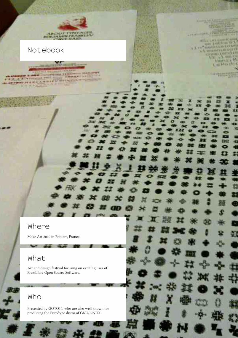
WhereMake Art 2010 in Poitiers, France.
Notebook
WhatArt and design festival focusing on exciting uses ofFree/Libre Open Source Software.
WhoPresented by GOTO10, who are also well known forproducing the Puredyne distro of GNU/LINUX.

LIBRE GRAPHICS MAGAZINE 1.19
PrettiestType specimens from VTF foundry. They're funny,they're well designed and there's a truly exhaustiveselection of dingbats and stars. Without a doubt, the mostexciting bits of paper I've seen in a while.
Most CollaborativeNancy, the dingbats font from Open Source Publishing.Visitors to the exhibition space were invited to createtheir own interpretation of hundreds of characters, fromsquares to arrows to numbers in circles. Resulted in animpressive array of different styles and levels ofinterpretation.
Least ExpectedOne visitor who, upon seeing the gender breakdown ofartists in the room, promptly asked why there were sofew women. And then wanted to talk about it. For anhour. Good debate all 'round.
Most ImmersiveElectroacoustic concerts held in the planetarium.Relaxing end to a long day, with some truly neat visuals.

LIBRE GRAPHICS MAGAZINE 1.111
New Releases
Hugin, our favourite panorma stitchingprogram, has a pack of new features,including masking and a mosaic mode.
An SVG based presentation program,allowing users to create on a movablecanvas. Say goodbye to slides.
A major new release of Blender. Roadtested on production of Sintel.
An overview of Inkscape 0.48, gearedspecifically towards the needs ofwebdesigners.
Another year, another BlenderFoundation project. Sintel is a short filmshowing Blender at its best and mostbeautiful.
Makes version control painless. Allowsfor folder based workflow, but with theadded power of full-on version control.
Sozihttp://sozi.baierouge.fr/wiki/doku.php
Sintelhttp://www.sintel.org
Blender 2.55bhttp://www.blender.org
SparkleShare 0.2b1http://sparkleshare.org
Hugin 2010.2.0http://hugin.sourceforge.net
Inkscape 0.48Essentials for WebDesigners (book)https://www.packtpub.com/inkscape-0-48-essentials-for-web-designers/book
NEW RELEASES

LIBRE GRAPHICS MAGAZINE 1.112
Fonts are essential to the design of every web page, and trueweb fonts are about to bring the typographic sophistication ofprint to the web in force.
It’s taken a while. In 1998, Internet Explorer 4 implemented thefeature with a DRM font format, Embedded OpenType (EOT),because it was part of CSS2. Despite that fact, it was ignored foryears by other browsers until CSS co-founder Håkon Wium Liechampioned it 10 years later. Slowly all the other big browsersbegan to support regular TrueType fonts, and resisted pressureto implement a standardised DRM format. Today SVG Fonts areused in iPhones, Internet Explorer 9 supports TrueType fonts,and Libre tools do EOT conversions. Web fonts workeverywhere.
In May, Google launched the first font service providing onlyLibre fonts. The blog for the service(http://googlewebfonts.blogspot.com) recently revealed somedetails about its growth – nearly 500,000 domains showing webfonts to 17 million people a day.
In 2011, CSS3 will take web fonts beyond the simple font linkingfeature of 1998. Designers will finally be able to use the fullpower of OpenType fonts directly in webpages. This can betested today with Firefox 4 beta releases.
The web is about to become as typographically powerful as thelatest proprietary desktop publishing applications. This meansthat web designers should now take time to learn about howtypefaces vary and what those variations mean for readers –there will be a lot of libre fonts to choose from, and we shouldchoose fonts wisely.
Three kinds of font classification schemes are useful to guidedesigners in their choices.
1. Simple Categories. These are are deceptively simple. Thedeception is their “Other" categories. CSS itself has a verysimple scheme (Serif, Sans-Serif, Fantasy, Mono) and this is
useful because everyone can remember its groups. Contrast thatwith the ‘IBM Family’ scheme which uses a long list ofhistorical genres and many “Miscellaneous" caverns.
2. Parametric systems. Common forms of the elements of theLatin alphabet are described and related. The result allows usersto drill down into a font collection interactively: “Letters thatwide, serifs this thick, an axis of contrast at that angle."PANOSE’s second version was a sophisticated example that hassadly disappeared thanks to an acquisition by and merger withHewlett Packard.
3. Tagging. Just as we tag photographs in centralisedproprietary photo storage services, font can be tagged. I imaginethat eventually a de-centralised federated font classificationnetwork service will be made, perhaps building on the Libre-licensed Typedia.org project. While the first two have theirplace in learning how fonts are different, tagging is for me themost useful classification technique when deciding on a font.
The words people tag with are often not the words used byother schemes. Instead, people relate to fonts with what Ovinkdescribed in 1938 as atmosphere values: "Those properties bywhich [a font] excites feelings within the reader."
The web is about to become astypographically powerful asthe latest proprietarydesktop publishingapplications.
Freed Fonts, Strong WebDave Crossland
TYPE DESIGN

LIBRE GRAPHICS MAGAZINE 1.113
Curiously, Ovink found in his research that general readerscan't tell the difference in atmosphere values of two typefaceswhich are very similar. I might suggest that this meansdesigning new type is, for practical purposes, entirely pointless.
Most importantly, he concluded that picking the "wrong" font isa "missed... opportunity to intensify the force of impression ofthe text in a considerable degree."
To web designers choosing web fonts, watch out.
Dave Crossland bel ieves anyone can learn to design great fonts. He is a type designer
fascinated by the potential of software freedom for graphic design, and runs workshops on
type design around the world.
http://understandingfonts.com
Today, web fonts are most useful at largesizes where the rendering problems associatedwith hinting do not occur, where images oftext are common. Since the beginning of theweb, a lot of large-size text on webpages hasnot been typeset in overly-familiar systemfonts. Instead, headlines are frozen into staticimages. This can be only just accessible atbest. Today, the accessibility of the webimpacts everyone because it defines ourability to machine-translate the webs of otherlanguage cultures.
TYPE DESIGN

LIBRE GRAPHICS MAGAZINE 1.114
The Dutch computer scientist Edgar Dijkstra believed in firsttimes. He thought it a contemporary charade to give programsversion numbers. Since it's possible for a program to be correct,better to get them right the first time around. I don’t agree withEdgar Dijkstra. I believe I will achieve my first proper columnafter five or six tries.
There is a second first time, when you finally manage to riseabove the preconceptions and ideas you started your projectwith. Then your project can start to work for you.
The rumour that Bill Joy wrote the vi editor in one night ispersistent, even though he denies it himself. Anything awesomehas a gestation period. But we just happen to love believing inspontaneous creation.
As to Libre Graphics, it is at the nexus ofmany excitingdevelopments. Libre Graphics lies at the intersection of art andtechnology, science and the humanities. And I am quite sure wewill see a number ofwonderful projects take flight.
Applying F/LOSS principles to art and design might help usimprove visual literacy, just as F/LOSS improves computerliteracy. Applying F/LOSS principles to art and design mighthelp us better understand the knowledge present in the creativeprocess.
Not just that, I think it might help us understand what it meansto share. Getting artists to share will be difficult, initially.Scientists have built an economy where giving things away willincrease their reputation, as well as the chances of getting andkeeping jobs. Artists, on the other hand, traditionally try to earnmoney by selling their work.
Even if the production methods of art have changed radically,the art market is still built on scarcity. Galleries will produce alimited number of copies of a video or photograph even if thismedium potentially allows for unlimited copying andredistribution.
With all the talk of sharing that comes from the world of
F/LOSS, I have never heard much about just how freaking scaryit can be to share. Sharing means giving up control. Letting goof control can be very, very difficult.
Of course, it is potentially beautiful, too. Recognizing that myunderstanding is limited, allowing someone else to findsomething in my work that I had never seen before can bebeautiful and fulfilling. Yet, having someone reinterpret myartwork is not the same as someone coming up with a clevernew use for a sorting algorithm. My art deals with people andemotions. That is why there is the possibility for such areinterpretation to hurt me.
(There’s always the option to keep something for myself.Assuming current copyright law, good health and somecooperation from my progeny, it will subsequently take about130 years before it lapses into the public domain.)
Anyway.
Whenever something wonderful takes off, it feels like abeginning. But I don’t want to take the idea of beginning tooliterally. It’s more like the experience opens up new possibilities.
Anything awesome has agestation period. But we
just happen to lovebelieving in spontaneous
creation.
This is the first dayof my lifeEric Schrijver
SCHRIJVER
LIBRE GRAPHICS MAGAZINE 1.115
At the same time, it seems to make up for the hardshipexperienced up to this point.
Madonna also treats the first time as a metaphor. She referencesthe prototypical first time in "Like a Virgin." Yet it’s not aboutthe first time, it’s about when it’s like the first time. Opensource developers work like Madonna. Projects are wellunderway before they reach 1.00. This is not the first release,this is the first release that works like the developer wanted it toinitially. What the first attempt should have been like butnecessarily couldn’t.
In fact, many projects never even reach 1.00. Most things neverhappen. When David Bowie shook the scene with his ZiggyStardust character, he'd already had a trial run with a bandcalled Arnold Corns, for which he styled a fashion designer tobe the lead singer.
Release early release often is a Torvalds maxim. In F/LOSS, nextto the projects that take flight, we get to see all the otherprojects as well, the entire primordial soup. We don’t just getZiggy Stardust, we get Arnold Corns too.
It’s a mess, frankly. This might not work for the Dijkstras of thisworld. F/LOSS encourages a mindset of bringing togetherdisparate sources to make something new. This is why artistscould potentially feel at home. There’s never a clean slate whenyou make a work of art or design. We are informed by ourpersonal history, we are informed by all the other works weknow. Bowie, on Ziggy, said “it just seemed perfectly naturalfor me at the time to put together all these odds and ends of artand culture that I really adore.” Never mind that everythingalways comes from somewhere, when it starts to work together,it feels like something new. It feels like you’ve just begun.
I have never heard much aboutjust how freaking scary it can
be to share. Sharing meansgiving up control.
Eric Schri jver (Amsterdam, 1 984) is a visual artist who makes instal lations and
performances. Eric teaches Design for new media at the Royal Academy of Art in The
Hague. He is inspired by open source and programming culture.
http://ericschri jver.nl
SCHRIJVER

LIBRE GRAPHICS MAGAZINE 1.116
Session 1 - September 24according to Jérémy and JiacintoThe goal of this session was to explain the principles behindF/LOSS software (GIMP and others). These programs areconceived by programmers who have decided to develop, onLinux (to start). Freeware: These softwares are free to use andlet the possibility open, for users capable of programming, tomodify the code of the software and, by connection, itsfunctions. Knowing that the license for a similar Adobeprogram might be 700€ and that it takes more than one programto make a work flow, freeware is something of obvious interest.
! freeware ≠ open source → libre and open source do not meanmonetarily free
The goal of our first project is to create an alphabet made up ofphotos. Choose a theme, take photos of objects which fit thetheme. Each object has to start with a specific letter of thealphabet.
The photos are then modified using GIMP, followed by Inkscapeto turn a bitmap-based image ( JPG, tiff, PSD in GIMP ) into avector-based image (the drawing is written by the computer inthe form of coordinates and points, making it infinitely scalable,allowing scale changes without quality loss). Once in a vectorformat ( .ai in Adobe Illustrator ) the image can now be used asa font after some manipulation with FontForge.
Onto the job, kids!
SESSION 2 - OCTOBER 1according to Edwin and FloreIn this session, we familiarized ourselves with pixels in order tobetter understand that digital image matrix (acquiring, creating,processing or storing in binary form). We also learned about theexistence of a multitude of image formats like .tiff (for highquality, lossless images) or .jpg (images compressed with an
F/LOSS in the classroomLudivine Loiseau
The École de Recherche Graphique in Brussels has a history of introducing F/LOSS tools to itsstudents. But in the autumn, 2010 semester, it went all out. Ludi OSP taught the first instanceof a class solely devoted to F/LOSS-based design tools and tactics. Collected below are reactionsand recollections from the class, translated into English.
algorithm which simplifies pixels of similar colours). We alsodeepened our use of GIMP, working directly on our laptops. Notonly that, but we had an introduction to vectorising imageswhich allowed us to visualize the next step in our alphabet-building process.
SESSION 3 - OCTOBER 15according to Viola and GwenaelSome notions on ASCII art: images are replaced by text → 128characters monospace, which means that all letters have thesame pitch. If the image is crowded, all it takes is to change thetypeface.
Vectorisation with Inkscape: vector-based formats are made upofmathematical coordinates, not pixels. It's possible to haveaccess to the source code of vectors in an image and also tochange, at will, the source code.
SESSION 4 - OCTOBER 22according to AdrienWe took a look at the command line - which provides a spacefor executing actions by typing text in a window provided forthat purpose. This allows us to carry out actions in batches, likereducing the size ofmultiple images by inputting a single line,modifying a whole text, executing actions in multiple programsat once... Once we have that figured out, it could prove to bevery useful and advantageous.
Next, we had an intro to FontForge, a program for creatingfonts. We learned how to import images to make a font, modifythem...
http://www.erg.be/erg
http://www.ludi .be/erg/doku.php?id=notes_de_cours
DISPATCHES

LIBRE GRAPHICS MAGAZINE 1.117DISPATCHES

LIBRE GRAPHICS MAGAZINE 1.118
The unicorn tutorialginger coons
On vectors, nodes and the power of simpleexamples
I remember my first introduction to nodes and vector-basedillustration. When I was about seven years old, my father, whowas a high school tech teacher at the time, sat me down in frontof Corel Draw 3. Up until that day, I had seen the program as arepository of clip art, not knowing what I could actually do withit. He loaded a clip art horse. Everything changed when heshowed me the node selection tool. The previously clean linedrawing suddenly had a mass of dots all along its outline. Heexplained that these were nodes, the points defining the shapeof the horse.
And then the magical bit: he had me select the node at the apexof the horse's ear. When I clicked and dragged that node, thehorse changed. The ear elongated, following my mouse. Heinstructed me to move the node a little distance and then dropit. The horse was no longer a horse. Elongating that ear hadturned it into a unicorn.
Since then, I've learned more about how nodes really work andwhat can be done with them. But that lesson still sticks in myhead. It was an incredibly powerful introduction. It started a (sofar) life-long love of vectors. A love of all their extensibility,elegance and possibility.
So I present to you a horse. More accurately, it's just an outlineof a horse, no shading, nothing fancy. It's a horse with twopointy ears, one ofwhich has a little node at the apex. You canfind the SVG file on our website. If you want, you candownload it, open it up with Inkscape or whatever vectormanipulation program you use, and turn it into a unicorn. Tome, it's the most powerful, understandable first introduction tonodes and their possibilities.
FIRST TIME

LIBRE GRAPHICS MAGAZINE 1.119FIRST TIME


LIBRE GRAPHICS MAGAZINE 1.121
Pierre Marchand is the creator of Fontmatrix,the leading F/LOSS font managementprogram.Dave Crossland: You were working as a graphic designer [whenyou started working on Fontmatrix].Pierre Marchand: I pretended to be a graphic designer. But Iwasn't really a graphic designer. I started because I had thislittle, little, little agency and no clients. So I started to play a bitwith programming. There was this program to compose text byhand. And there was, in this program, a font chooser. You couldchoose a font file and it was not enough for me. So I waslooking for a font manager, didn't find one. Because I wasworking a lot with FreeType it was quite trivial for me to justhave something to display fonts. All in all, it was really for myown needs.
What happened next? I posted on the Scribus mailing list. Iwrote a little font viewer manager. And what happened next?Still no clients. Still time to program. At this point, nobody butregular Scribus users were following the list and you start to dosomething and Wow! people are interested in the project andcome with some user feedback. And there's a lot of raising yourself esteem. It works well for that. And so I did continue,because in my regular work, it was completely the reverse. Noclients at all and no client, no client. So I had just enoughmoney to live and with coding, you need nothing more than acomputer. Coming from being nobody to being someone. So itwas very interesting for me... And when you're doingsomething interesting, people come to you, they listen to youand you can discuss things you have no occasion to do face toface. So it was the first push to work on Fontmatrix. My ownneeds and after that, the good reception by people.
There were people contributing in terms of ideas...A lot. From being very reactive. If someone tells you that hewould like something like a new feature and one hour later,there's the feature in the Subversion repository, they're happy.And they come back again and again and say "I would like that
Pierre Marchand talksFontmatrix, responsivenessand user engagementDave Crossland interviews Pierre Marchand
THE INTERVIEW

LIBRE GRAPHICS MAGAZINE 1.122
and that.. ." It's very useful for the developer because you can'thave all the ideas. You're just alone and you have your ownideas, but that's just a subset of what's possible. So it's reallyinteresting to have a lot of user input. And because you are veryreactive and you're ready to just stop doing your stuff and workon what people want, they are happy and they come back again.So it's a.. .
Cycle.You were working on it, kind of in your spare time, while youwere doing freelance graphic design work.It was not exactly my spare time. It was my main time.
Because you were filling out the extra hours in the day thatweren't being filled by clients. And you were building the toolsthat you needed for yourself as a designer.It wasn't even exactly that. When I finished school, after that, Ispent ten years working on my art work, etc. And I stoppedbecause of things, life. But I was very frustrated about stopping.And when I started working on Free Software, writing FreeSoftware, for me, it was a means to come back. To come back tosomething creative. The more I work on Free Software, themore I write code, the more I think that there is really creativework there.
In programming?Yeah. Not like code as art. I don't like that. It's not exactly that.But the practice ofwriting code can give you something like thepractice of doing art work. But the result is not the same. Youhave to go a bit further to make it a real art work. And it's whatI can do with OSP nowadays. And Constant. I take myhandcraft of writing code and I turn it into something artistic.But it's another work.
You need to start somewhere. When you start by writing FreeSoftware, you are writing the place to do this work. FreeSoftware gives you access to the machine, the culture, thecoding. You can't do real art work with computers withoutgoing Free Software. Because if you try to do that by usingMicrosoft APIs to write, you're still a user. You don't own themachine. The machines own you. It's the same for Fontmatrix.Even if now, I'm more productive at working on Fontmatrix,really focused on user integration and interactions, still, the wayI do it is looking for new ideas and finding something like acompromise between my way of coding, which is a bit weird
[I]f you... us[e]Microsoft APIs towrite, you're stilla user. You don'town the machine.The machines ownyou.
THE INTERVIEW

LIBRE GRAPHICS MAGAZINE 1.123
sometimes, and the way the users can be part of the project. Toform a community. Because I need this community to continueto work...
To motivate you.Yeah. And to make it meaningful. I mean, if there's nobody touse your software, there's no point in publishing it.
How do you think the Free Software community, the FreeSoftware programming community, can engage people whowork professionally on those kinds of jobs? There are userinterface designers, interaction designers, who do that kind ofwork professionally.Hmm. The huge work was really to change my mind. About thesoftware I was writing. To try to think as a user. In the state itwas, I heard users complaining "I can't do this, I can't do thatwith the software." And I was just answering, each time, "Yes,you can do that. You have to go to this menu and this sub-menuand click there and it's possible. It's possible this way or thisway." To make it usable by these people, you have to justchange that into when you hear something like that, to think"Okay, so the menu is not in the right place. They can't find it.So I will change my software to make it accessible for users." SoI started like that.
Because it's a Qt application, it's cross-platform, right? So it'sgoing to be useful for users on Windows and Mac OS.Useful not as a font manager. They have font managers. But itwill be useful to make them Free.
What do you mean?I mean that they have enough font managers on Mac OS X andWindows platforms. They don't need FontMatrix as badly as onLinux, where there's nothing at all.
But the value of FontMatrix as a font manager comes from itsFree Software touch. I mean that if you want to run FreeSoftware on your platform, whatever it is, you need FreeSoftware. So if you're on Mac and you have a feeling it will begreat because you've tried Inkscape and it was cool and you'vetried FontForge and it was cool and you want to continue to useFree Software, maybe you need a font manager. So you'reseeking a Free font manager and there's nothing. But hopefully,
there will be FontMatrix in a state of development ready fordaily use.
But as a font manager, what it will bring for these users is reallythe freedom and the community, the direct access to developers.But as a font manager itself, it won't be more than Suitcase orsomething. In the first case. After that, as people can come withnew ideas, we can imagine that it will bring something reallynew, because it's really fitted to their needs. But in the firstplace, it'll just be a font manager, as a font manager for all thoseusers. And if they're used to using font managers like LinotypeFont Explorer, etc., they won't be amazed by it. It will be justanother font manager. And the real value will come from thefreedom of the software.
THE INTERVIEW


By virtue of being called a showcase, we assume that youalready know quite a bit about this section. Many design andart publications prominently feature work in their excitinglyglossy pages.The difference, of course, between our showcase and thoseothers is that we do care about the process and tool chainbehind the works we show. For that reason, every workfeatured in this section has been created using F/LOSSgraphics programs. Sometimes, those F/LOSS tools are amongother techniques. Sometimes, they are the only tool in use.Our goal, in the showcase, is to show you just how stunningF/LOSS graphics can be. We hope you'll agree that the workson these pages are exciting, well crafted and very much worthpulling out and sticking to your walls.

LIBRE GRAPHICS MAGAZINE 1.126
CAMOUFLAGE ANDMIMICRY ILLUMINATED DRAWING
Statement
When I was a little kid and heard adults mention "illuminatedmanuscripts", I visualized an enormous dark archive,reminiscent of cathedrals and the basement vaults of libraries,full of rich images that were softly glowing. I was disappointedto discover that it just meant books with weird little pictures inthe margins, however intriguing those books might be. Still,decades later, when someone mentions illuminated manuscripts,the first image that comes to mind is my childhood vision and Ihave to consciously remember that it's illustrated texts, alwayswith a sense of disappointment.
Flight and Pursuit is the adult creation ofmy childhood vision. Ihave combined work from my adult artistic practice andinterests with the fairy tales, myths and dreams of childhood tocreate the imagery. It is an adult narrative ofmy flight from andpursuit of technology; my love/hate relationship withcomputers, motorcycles, microwaves, compound bows, myhearing aids, clocks...the entire paraphenalia of technologicalapparatus. Combined with pre-Internet childhood imagery, itbecomes an expression ofmy flight through, and pursuit of,time and memory.
42 x 1 8". Watercolor,
aquarel le penci l and pastel
on paper stretched over
what more or less amounts
to a fancy l ightbox. From a
series of i l luminated
drawings I cal l Fl ight and
Pursuit.
Laura C. Hewitt
SHOWCASE


LIBRE GRAPHICS MAGAZINE 1.130
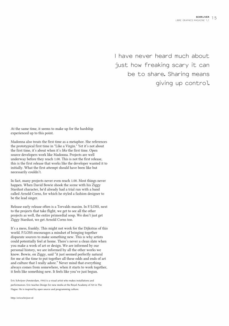
WARFLY 1
There is an Asian story that butterflies carry the souls of thedead to heaven. Early Native Americans believed that part ofthe human soul was captured in photographs. Combining thesetwo ideas, I used media war images to create butterflies afterhaving a dream in which human created patterns became sopervasive that butterflies started mimicking them. Could warimages be turned into something beautiful? Dangerous thought.This is one ofmany butterflies I have designed using computergraphics then hand painting and drawing on the computerprint. The butterfly's pattern is a digitally enhanced war image.
1 2 x 1 4". Watercolor and
computer print of war
image.


LIBRE GRAPHICS MAGAZINE 1.133
Pete Meadows is a Montreal-basedillustrator and musician. His illustrationprocess heavily features GIMP, which heuses to create the angular, but organicline quality and transparancy that yousee on these pages.
Pete Meadows
Bearbot 1
Bearbot 2
Bishops 1
Mini buddy meets Gargantuar 1
Kitty Bot 2
SHOWCASE


LIBRE GRAPHICS MAGAZINE 1.136
John LeMasney is a designer, artist, writer, poet, technologist,open web advocate and open source evangelist.
John started his project 365Sketches in January 2010. His goalwas to produce one sketch per day using only Inkscape. Hewould then publish it in his blog http://365sketches.org, set upin Wordpress, under a CC-BY-SA license. The underlyingpurpose of John's daily exercise was to improve his skills usingInkscape but, as he told us, the result was deeper than that. Inhis own words:
I've created a daily reminderfor myself and others of thepower of open source. I'vegathered a community ofabout 200 people who watchthe project, about 20 realfans, and I've gotten a lotof design and consulting work.I've also made quite a fewfriends. I feel like I'm doing mypart to help develop,advocate and advertiseInkscape.
John LeMasney
John's plans are to go on with the project, drawing upondifferent tools: in 2011, GIMP would be the tool of choice,whereas Blender might be slated for 2012. In the followingpages, you can see a small sample of John's work. To lookthrough the whole project, do visit his blog.
SHOWCASE

LIBRE GRAPHICS MAGAZINE 1.138
LIBRE GRAPHICS MAGAZINE 1.139


LIBRE GRAPHICS MAGAZINE 1.141
The artistic community of Córdoba first noticed F/LOSS in August 2003. There was anintroductory talk about the philosophy of free software, given by Grulic, the localF/LOSS group. The talk was part of an art and technology event, the main topic ofwhich was local initiatives merging technology and artistic practices.
That talk was a breath of fresh air for our little world which was exploring how net.artinitiatives were going mainstream. For most people, the information in the talkremained just some ideas, with no effect on daily software tool use.
In 2004 many of us began some touristic trips to GNU/Linux. We discovered therewere barriers of knowledge and practice preventing us from adopting it permanently.In March 2005, after an inspirational workshop given by Constant and Studio XX inBuenos Aires, the idea of creating a special project to help artists test and migrate tofree software emerged.
The first step was a dedicated install party in May 2005. On that occasion, we providedand helped to install Mandrake GNU/Linux with some customised software packagesspecially selected by us and added to the distribution by Grulic. We also hosted someshort demos by artists with software such as Blender, Audacity, and GIMP in order topresent the general characteristics, possibilities, limitations and defining traits of theseprograms.
Knowing the importance of further support in the first experience, this step wascontinued and documented in a shared wiki, a mailing list and later, a blog. From theoriginal 20 participants, less than half continued the regular use of free software. Somehad serious problems with specific hardware support, such as video capture cards andprofessional sound cards. Others never got used to new interfaces, with the loss ofexpertise that comes with them. The commitment shown by Grulic, which created akind of direct line to us, in order to solve problems and discuss doubts, wasremarkable.
The Nómade project's other line ofwork was producing complete graphic designpieces with free software. Most of them were completed thanks to the good faith of theVía Libre foundation, an NGO devoted to spreading free software philosophy, as wellas other local F/LOSS and free culture organisations in Argentina. So far, we'vedesigned several books, posters, booklets and other pieces.
Applying F/LOSS as a final userand not dying in the attemptLila Pagola
ABOUT THIS TEXT
This text is an adaptation of atalk presented at LGM 2010 inBrussels, Belgium. It shares theexperience of some pieces ofdesign (books, booklets, andbrochures) completely madewith F/LOSS by a team workingin Córdoba, Argentina from2005 to present (with manychanges), called Nómadeproject.The project emerged in amoment of growing interest inthe Free Software philosophyamong digital artists. Its mainpurposes are being an “interfacebetween artists and [F]ree[S]oftware” and building actualways to close the gap betweentheory and practice whileproviding support to “newbies”from the creative field. In otherwords, a proposal for evolvingfrom affinity and theoreticaldiscussions, to becoming users.The project developed this basicidea through two lines of action:the first one was creating aplatform for helping a specialgroup of guest digital artistsfrom different fields (musicians,animators, graphic designers,web designers, etc.) toencounter, test and migrate toF/LOSS alternatives while doingtheir routine tasks. The secondwas producing graphic designcompletely with free software.
FEATURE
LIBRE GRAPHICS MAGAZINE 1.142
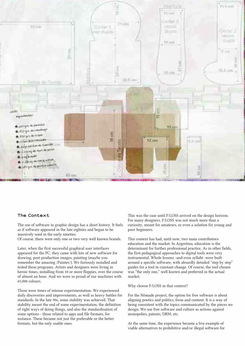
The Context
The use of software in graphic design has a short history. It feelsas if software appeared in the late eighties and began to bemassively used in the early nineties.Of course, there were only one or two very well known brands.
Later, when the first successful graphical user interfacesappeared for the PC, they came with lots of new software fordrawing, post-production images, painting (maybe youremember the amazing /Painter/). We furiously installed andtested these programs. Artists and designers were living inheroic times, installing from 10 or more floppies, over the courseof almost an hour. And we were so proud of our machines with65,000 colours.
Those were times of intense experimentation. We experienceddaily discoveries and improvements, as well as heavy battles forstandards. In the late 90s, some stability was achieved. Thatstability meant the end of some experimentation, the definitionof right ways of doing things, and also the standardisation ofsome options - those related to apps and file formats, forinstance. These became not just the preferable or the betterformats, but the only usable ones.
This was the case until F/LOSS arrived on the design horizon.For many designers, F/LOSS was not much more than acuriosity, meant for amateurs, or even a solution for young andpoor beginners.
This context has had, until now, two main contributors:education and the market. In Argentina, education is thedeterminant for further professional practice. As in other fields,the first pedagogical approaches to digital tools were veryinstrumental. Whole lessons -and even syllabi- were builtaround a specific software, with absurdly detailed “step by step”guides for a tool in constant change. Of course, the tool chosenwas “the only one,” well known and preferred in the actualmarket.
Why choose F/LOSS in that context?
For the Nómade project, the option for free software is aboutaligning poetics and politics, form and content. It is a way ofbeing consistent with the topics communicated by the pieces wedesign. We use free software and culture as actions againstmonopolies, patents, DRM, etc.
At the same time, the experience became a live example ofviable alternatives to prohibitive and/or illegal software for

LIBRE GRAPHICS MAGAZINE 1.143
graphic design. We began the discussion around which softwarewe use in professional practice and which software we teach indesign schools.
Choosing F/LOSS was also a way to escape the pressure ofproductivity and market determining times, regimes and “right”ways of doing. It represents a possibility of reinstallingexperimentation as procedure and criticism on the politicsbehind tools. Of course, the F/LOSS model promotes the debateabout circulation of culture and authorship.
One Work-flow
By the end of 2006, when we began the first big project -thebook Artificial monopolies on intangible goods. We made a bet.None of us actually knew ifwe would be able to finish the bookusing only F/LOSS, or how acceptable the results would be.
There were some critical known aspects to explore, such as4-colour output and colour management and others to test, likethe actual compatibility of the generated output files in acommon production process. With the first book, we gainedexperience about how to manage a better work-flow forpreventing mistakes and countless reviews.
The first problem appeared around fonts and their installation.Because we were newbies in Ubuntu, but used to installing anduninstalling fonts visually, it was tough to venture into thecommand line.
In my personal case, as a former QuarkXpress user, I began towork with Scribus. After using it for some hours, the work-flows became clear in their rough aspects. Maybe the mostcritical was the problem of footnotes. Having started fromoriginal texts in OpenOffice, with styles and notes at the bottomof the page, we quickly discovered incompatibilities betweenthe two programs. Styles were imported by Scribus in a verymessy way and when we saved the original .odt files as plaintext, we lost parts of sentences. In order to solve this, theoriginal texts were formatted again, setting notes at the end ofthe text, as a way to easily separate them from the main text.After that, footnotes were designed manually.
The next challenge was dealing with the Random AccessMemory (RAM) that Scribus consumes with files bigger than 30pages. The book had 130 pages. Our plan was to include allcontent in only one file for ease in using functions such as thedynamic table of contents, the same master pages, etc. But wequickly discovered, after passing 40 or 50 pages, that the texteditor began to work very slowly. So, we decided to divide thebook into five sections and put it all together, for the webversion of the book, with pdftk.
For the third book, the editors decided to use a wiki(https://wiki.vialibre.org.ar/moinmoin/vialibre/Publicaciones/VotoElectronico) instead of originals in .odt. It was a bettersolution with regard to text styles and footnote management,but it generated a new problem: while on a wiki, changes weremade directly there during a much longer period.
Printing process issues
We considered it a great advantage to have a friend in charge ofthe printing process, as we were interested in experimentingwith new ways of doing this work. His patience and help wereinvaluable: he was a kind of bridge with people in pre-press anda backup for problems that, of course, occurred.
The first book was also an ambitious design. Pages were printedin two colours, and the originals for each colour were madedirectly by the printer from the Scribus file, opened in aMicrosoft Windows system (although the book was designedunder Ubuntu). Then we discovered the first problem: somefonts were interpreted by MS Windows with a slight differencein metrics, and some parts of the design were misplaced. So, wehad to check and manually correct every page again.
The cover was done with Inkscape, GIMP and converted toCMYK mode with Krita. The first challenge here was to create afile with vectorial quality for drawings and typos and withoutcolour differences between the raster images. Here, we facedsome problems around the PDF output made from Inkscape,including a raster image with an alpha channel. We had tochange the strategy, integrating all the vectorial background,except illustrations with raster images, eliminating thetransparency.
The next question to solve was to find out which output wouldbe best accepted by the pre-press company. We exported EPS,PDF and even an Adobe Illustrator files in order to deal withany incompatibility. The first time, the EPS was the “winner”because the people in pre-press preferred to open our originaland manually set the resolution of vectors.
FEATURE

LIBRE GRAPHICS MAGAZINE 1.144 FEATURE

LIBRE GRAPHICS MAGAZINE 1.145
From this first experience, we have repeated the process with afew variations. The second book was designed in Córdoba, butprinted in Costa Rica by someone who didn't even know whatsoftware we were using. We decided not to tell the printerbecause of distance, and because we didn't talk directly to him,but only to our client.
From doing to teaching
This practical experience, using free software for design undernormal conditions of production, has been a useful point forintroducing the same software in design and photographyclassrooms. Actual designs done are a kind of backup forovercoming the first reaction of students and colleaguesconfronting the possibility of using free software in the actualfield of visual communication.
However,there are some barriers that are important to considerwhen discussing the option of free software in learning design.In Argentina, pirated software is very easy and cheap to get andinstall, even - or especially - in public institutions. Faced withthis reality, it is difficult to focus the discussion only on ethicsor ideological positions. These theoretical debates tend to haveno effect on the actual practices of students, teachers orprofessionals.
In the case of the photography school at which I work, freesoftware was installed in 2005 in a very forced way, due tolicensing problems. When this happened, the minimaldiscussion teachers were able to have around the tools we use(and teach) led us to this unacceptable analogy: using just onebrand and version of software in digital photography classes islike teaching about exposure techniques with just one brandand model of camera. For the camera, this would be consideredclearly unacceptable and non-ethical for both teachers andstudents. However, using just one brand and version of softwareis a common practice and even one preferred by many.
So, ideological positions plus proofs of efficiency are needed foropening the debate, but are not enough. Tools are not neutral,and probably will be always a field of political negotiation interms of distribution, possibilities of improvement andcustomisation.
On the one hand, we need to go back to the attitude of the earlytimes of intense experimentation, when designers explored,tested and rated software without any external pressures (suchas using certain software because it is a synonym for“professional”).
And, on the other hand, scholar communities should deeplyanalyse their practices on software teaching and learning. Bothteachers and students should promote critical approaches andcapabilities to adaptation and flexibility in who learns, insteadof creating captive users with no social awareness.
How can final users collaborate with developers?
Perhaps the most critical point is how to build bridges betweenusers (students and designers) and developers so we canbalance and improve the tools for everyone. Most people don'tknow that communities around applications exist, and that it'spossible to participate. This is the very first task necessaryamong teachers and students.
But I believe designers and students should be involved in amore direct way. They should be stimulated to test, compare,discuss, and modify developments, and probably the best personto do that is the teacher. In many cases, it's just a matter of timeand dissemination of information: as in other great initiatives offree culture, often the point is not disagreement or lack ofinterest, it's just ignorance on why and how to do it. Concreteenvironments and ways of participation where the added skillsof everyone can make the difference.
http://www.nomade.org.ar/si tio
FEATURE


LIBRE GRAPHICS MAGAZINE 1.147
Visual literacy:knowing through imagesEric Schrijver
The experience of our own time is mediated through images, but we tend to representthe past in a verbal-discursive way1. That means the model of the history book, withits emphasis on words and stories. In its attempts at establishing a reliable reputation,a resource like Wikipedia exhibits an extremely conservative take on representingknowledge2: an image that goes along with an article is never more than anillustration in the literal sense of the word.
This why all the images we know of child labour show unhappy children: thesepictures have been selected to fit to our story of the condemnation and subsequentabolition of child labour.
But when browsing through contemporary image archives, you will find most imagesshow smiling children. This makes perfect sense: a photographer's visit is a special andexciting occasion.
It's the shock we get when confronted with these images that suddenly makes itpossible for us to relate to our past. By freeing the image from its iconic role, we canstop seeing what's depicted as nothing but logical steps in a larger story. We canidentify, both with the children who are depicted and with the photographer takingthe picture.
1 . Wikipedia, the deeply
conservative and
traditional encyclopedia,
Al l The Modern Things, 2008
http://brianna.modernthings.
org/article/1 47/wikipedia-
the-deeply-conservative-and-
traditional-encyclopedia
2. Interactieve presentatie
handschriften
Museum Meermanno-
Westreenianum, 2003
http://col lecties.meermanno.
nl/handschriften/.
VISUAL FEATURE

LIBRE GRAPHICS MAGAZINE 1.148
In the pictures taken for the American National Child Labor Comittee, most depictedchildren look happy.
VISUAL FEATURE
LIBRE GRAPHICS MAGAZINE 1.149
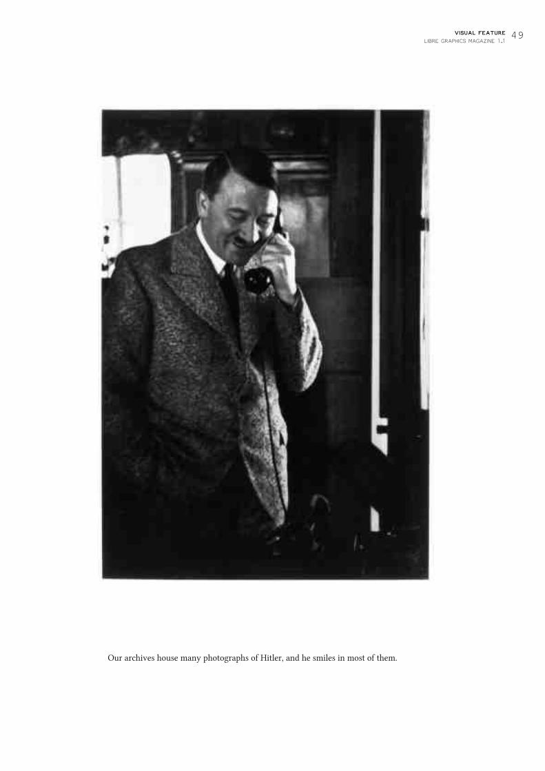
Our archives house many photographs of Hitler, and he smiles in most of them.
VISUAL FEATURE

LIBRE GRAPHICS MAGAZINE 1.150 VISUAL FEATURE

LIBRE GRAPHICS MAGAZINE 1.151VISUAL FEATURE

LIBRE GRAPHICS MAGAZINE 1.152
When you see his picture on the back of a book, Mark Twain is a long dead writer.When you see the whole series, you see he was a super star.3
3. Inspired by spreads
from Fantastic Man
http://www.fantasticman
magazine.com
VISUAL FEATURE

LIBRE GRAPHICS MAGAZINE 1.153
Grotesk typefaces likeHelvetica did notstart out with the‘neutrality’ impartedon them by the Swissdesign school—theywere whimsicaldisplay fonts.
Forms we employfor ironic effect didnot start out thatway.
All these areexamples of how‘reading’ theimages from thepast can show ushow our ownperception andnorms havechanged sincethen, allowing usto betterunderstand bothpast and present.
VISUAL FEATURE

LIBRE GRAPHICS MAGAZINE 1.155
Ben Laenen is a maintainer and developer ofDejaVu, the widely used but not oftenmentioned interface font.
Ben Laenen: My first action on DejaVu was drawing Greekglyphs which was actually a huge project in retrospect. I wasnaive at the time. I thought "oh, let's draw a lot of glyphsquickly and it'll work out." But actually, [the DejaVucommunity] weren't that harsh on me so the first glyphsimmediately got in.
ginger coons: For all of this, you use FontForge, right?Yes.
Your first experience with FontForge: how was it?I know what you want me to say: It's ugly! That's basically thefirst thing everyone thinks when they open FontForge. It's notreally appealing to many people. Afterwards, we learned fromGeorge Williams [developer of FontForge] that he doesn't reallycare about the looks of FontForge. I think the bad looks are[meant] to scare away people who aren't really serious about it.So you have to be serious about it or you won't go on with it.
Had you been using DejaVu beforehand?I can't remember about that, actually, if I used it. I think I wasusing Bitstream Vera at the time. And I wanted to have Greekglyphs in that style, but there weren't any. So I was Googlingaround, and then came upon DejaVu. I mean, at the time, thedefault font for most Linux distributions was Bitstream Vera,because DejaVu wasn't big yet. So, Googling around, I foundDejaVu, that they were a project making new glyphs forBitstream Vera, so I entered into it and...
So wait. Why did you want to do Greek in the first place? Whatdid you need the Greek for?I've always loved Greek. I did Greek at school, old Greek, but Iwanted to learn a little bit of new Greek. I just find it a nicealphabet. And I was trying to learn it a bit by moving theinterface ofmy computer. Instead of English, which I'm used to,I wanted to have it all in Greek one day. Just try it out, see if itcould work.
Interview with Ben Laenen of DejaVuginger coons interviews Ben Laenen
Have you managed that yet?I actually managed to do that for a few months, then I said"Let's go back to English again."
Were you using Deja Vu for your system font when you didthat?Not at the start. I had to first draw the glyphs, of course. Butafter a few months, then I switched my interface to Greek.
Your interface was in Greek...Using my own font. Actually, drawing a font was somethingthat goes many years before that. But nothing came from it,really.
What was that?I was just thinking about it today. Actually, a font should bequite easy. You just draw one glyph and then you can use it inthe entire text, the same glyph. That's my first idea ofmaking afont. But I wasn't really serious the first years.
So how long ago was that?I think ten years.
Ten years before you started on Deja Vu?Yeah.
So you've been thinking about it for a long time.Yeah. It used to be at a time when you had bitmap fonts.That was pretty easy, you just click some pixels and then youhave a font, pretty easy.
Did you ever do one of those, or no?Not really. If you really go back in time, I was using QBasic.I think that's more than ten years. I actually made a program
FEATURE

LIBRE GRAPHICS MAGAZINE 1.156
That's one of our weirdest contributors. Besarion Gugushvili.
If the previous system font in most distros was Bitstream Vera,or Bitstream Vera Sans...Bitstream Vera Sans was the font used in the interface.
So, if it didn't have all these international glyphs, have you guysmade localisation an easier thing?This is why people from distributions were pushing to getDejaVu instead of Bitstream Vera. Because if you couldn't evenuse Bitstream Vera in most eastern European countries, thenyou have a big problem if you want to see Linux taking off overthere. And there weren't really a lot of alternatives. We werethe first real font that could be used on screen as an interfacefont which had those glyphs. So there wasn't really muchchoice.
Have any competitors to DejaVu sprung up?Not really. There were a lot of Vera derivatives which weretrying to do the same. Štěpán Roh was actually quite cleverbecause he basically ported all those glyphs from the other fontsand tried to get them in DejaVu. So we ended up with the mostcomplete set of glyphs. And we became a little communityaround the font, which also helped. The other derivatives weremissing the community. It was basically one person doing thework.
Have your work habits, your toolchain, your workflow, yourprocess, changed at all in the last five years of working on DejaVu?We're still using FontForge and the build scripts have changed alittle, but that's not really important. I mean, it just made it alittle bit easier for us. Instead of using a Python script you couldjust use a makefile. Doesn't really make it a lot easier. It's a littlebit easier for maintenance.
So you're basically doing the same thing that you did, work-wise, five years ago, when you started?Making the font itself.. . Basically, you become better at it, ofcourse. But the tools are the same.
From your first faux-vector type in Basic up until now, you'vecome a very long way.Yeah. I didn't know anything about fonts at the time. I didn'tlook into trying to guess what font formats there were at thetime. I just said "Hey, I want letters" and decided to makesomething. I had a lot of time to program all day. But thatdoesn't work if you have to do it properly. No one will use thatfont.
which drew its own glyphs and I had to, in QBasic, really makearrays of all the letters to put on the screen.
That's dedication.I even had sort of vectorised fonts by drawing the lines, but justby coordinates.
Like choppy vectors.Basically, just glyphs were drawn as polygons, not filled in butjust straight lines. And that made a letter.
Fifteen years ago, or more, that's not bad.Yeah, and a very old computer. It wasn't very fast, either.
Early 90s, right?I think yeah. But I mean that's nostalgia. I think it's a recurringtheme, actually. If you really go back to it. And now... WhenDeja Vu came in, the real fonts business really started for me.
What's the uptake been on Deja Vu since five years ago, whenyou started on it?Well, the first years were pretty intense because lots of glyphswere added at the time. We became default font in a lot ofdistributions [of GNU/Linux] . So the first years were prettybusy. Had a lot of contact with the maintainers fromdistributions, who really pushed it. So that made DejaVu thedefault font. The last few years, it's slowed down a bit. We arestabilising.
How long had Deja Vu been going before you started on it?I think a year or so. It started with Štěpán Roh... He's from [theCzech Republic] so he needed a few more glyphs that weren't inBitstream Vera. So he started with that. It was pretty slowbefore [Denis Jacquerye and I] entered the project but I camewith Greek, Denis came with a lot of glyphs needed for Africanlanguages which included the International Phonetic Alphabet,for example. [The International Phonetic Alphabet is] not reallyall needed, but it came with it, almost. Afterwards, Cyrillic,I think Cyrillic came into it. Later, Arabic and Armenian...We have Georgian, which was made by a former PrimeMinister of Georgia.
What?! Really?Who lives in exile in Finland.
And he made the Georgian set for DejaVu?Yeah.
That's incredible.
FEATURE

LIBRE GRAPHICS MAGAZINE 1.157The DejaVu font family
http://dejavu-fonts.org

LIBRE GRAPHICS MAGAZINE 1.158
I just said 'Hey, Iwant letters' and
decided to makesomething.
So are there any secrets hiding in Deja Vu?No. Unfortunately not. There's one nice glyph which tells youthe point size of the rendering. Say it's displaying the numbereight and you make the font bigger, it'll display ten or fifteen.Hinting magic. It helps a lot in debugging. Everyone definestheir own point size. But their point size isn't the same as ourpoint size. So just pick that glyph and it tells us what number itis. Then we know what we have to debug.
Most people don't notice the fonts. The font is good if no onenotices it. When I drew the Arabic glyphs, for example,suddenly everyone noticed. So we knew it wasn't really thatgood.
If someone wants to contribute or make an improvement, whatdo they do?They'd usually ask about it on the mailing list. But most peopleenter the project by just making a few glyphs beforehand andthen just showing it in one go to us on the mailing list. A fewweeks ago, someone came with ancient Italic glyphs. Italic, used2000 years ago in Italy.
So have you incorporated Ancient Italic?Not yet. He first made his alphabet and then put a patch on themailing list, so we have to review that patch. Then we say "Oh,this can be improved" and he'll just work on it again.
FEATURE

LIBRE GRAPHICS MAGAZINE 1.159
Resource List
BLENDERA powerful F/LOSS 3D animationapplication for GNU/Linux, Mac OS Xand Microsoft Windows.
FONTFORGEA F/LOSS font editor for GNU/Linux,Mac OS X and Microsoft Windows.
RESOURCE LIST

LIBRE GRAPHICS MAGAZINE 1.160
FONTMATRIX
A F/LOSS font management andselection tool for GNU/Linux, Mac OS Xand Microsoft Windows.
GIMP
A raster based image editor forGNU/Linux, Mac OS X and MicrosoftWindows..
RESOURCE LIST

LIBRE GRAPHICS MAGAZINE 1.161
INKSCAPE
A vector graphics editor for GNU/Linux,Mac OS X and Microsoft Windows.
SCRIBUS
A desktop publishing software forGNU/Linux, Mac OS X and MicrosoftWindows.
RESOURCE LIST

LIBRE GRAPHICS MAGAZINE 1.162
Audacity:A F/LOSS sound editing application forGNU/Linux, Mac OS X and MicrosoftWindows.
Bitstream Vera:A typeface released under a permissivelicense, allowing modification.
Blender:A powerful F/LOSS 3D animationapplication for GNU/Linux, Mac OS Xand Microsoft Windows.
Command line:A text only user interface, allowing usersto input commands without theintervention of cursors and graphicaluser interfaces.
Constant:An arts organization based in Brussels,Belgium. The parent organization ofOpen Source Publishing.
Distro/Distribution:A specific configuration or "flavour" onGNU/Linux, often designed with aparticular purpose in mind.
DRM (Digital RightsManagement):Technologies (of whatever sort) whichprevent users from making certain usesof the larger technologies to which theDRM is applied.
FontForge:A F/LOSS font editor for GNU/Linux,Mac OS X and Microsoft Windows.
Glossary and resources 1.1
Fontmatrix:A F/LOSS font management andselection tool for GNU/Linux, Mac OS Xand Microsoft Windows.
Free:As in freedom, or often, that which is oris of Free Software.
Free Software:A term describing software which ismade available under licenses permittingusers to not only run it, but to examineits code, redistribute it and modify it.
GIMP:A raster based image editor forGNU/Linux, Mac OS X and MicrosoftWindows.
Inkscape:A vector graphics editor for GNU/Linux,Mac OS X and Microsoft Windows.
Mailing list:An email based forum through whichsubscribers may receive announcements,view or participate in discussion.
Mandrake:A distribution of GNU/Linux. Nowknown as Mandriva.
OSP (Open SourcePublishing):A graphic design collective which isdedicated to producing high quality workusing F/LOSS tools.
PANOSE:A typeface classification system firstdeveloped in the 1980s.
Qt:Pronounced "cute." A F/LOSSdevelopment framework which functionsacross platforms and provides a commonset of visual elements.
Repository:A stored collection of software packages,from which those packages may bedowloaded and installed.
Subversion:A F/LOSS version control system forGNU/Linux, Mac OS X and MicrosoftWindows.
Torvalds:Linus Torvalds, the originator of Linux.
Ubuntu:A particularly popular distribution ofGNU/Linux, produced by Canonical Ltd.
Version control:A means ofmanaging changes (andallowing reversion) to a commonly heldbody ofwork, most often a softwareproject.
vi:A F/LOSS text editor developed in the1970s and still in use. Available forGNU/Linux, Mac OS X and MicrosoftWindows.
GLOSSARY AND RESOURCES

Libre Graphics Magazine 1.1
November 2010
ISSN: 1925-1416


