Look the Other Way - TigerPrints
44
Clemson University TigerPrints All eses eses 5-2016 Look the Other Way Karl Richard Alexander Jahnke Clemson University, [email protected] Follow this and additional works at: hps://tigerprints.clemson.edu/all_theses is esis is brought to you for free and open access by the eses at TigerPrints. It has been accepted for inclusion in All eses by an authorized administrator of TigerPrints. For more information, please contact [email protected]. Recommended Citation Jahnke, Karl Richard Alexander, "Look the Other Way" (2016). All eses. 2331. hps://tigerprints.clemson.edu/all_theses/2331
Transcript of Look the Other Way - TigerPrints

Clemson UniversityTigerPrints
All Theses Theses
5-2016
Look the Other WayKarl Richard Alexander JahnkeClemson University, [email protected]
Follow this and additional works at: https://tigerprints.clemson.edu/all_theses
This Thesis is brought to you for free and open access by the Theses at TigerPrints. It has been accepted for inclusion in All Theses by an authorizedadministrator of TigerPrints. For more information, please contact [email protected].
Recommended CitationJahnke, Karl Richard Alexander, "Look the Other Way" (2016). All Theses. 2331.https://tigerprints.clemson.edu/all_theses/2331

LOOK THE OTHER WAY
A Thesis Presented to
the Graduate School of Clemson University
In Partial Fulfillment of the Requirements for the Degree
Master of Fine Arts Digital Production Arts
by Karl Richard Alexander Jahnke
May 2016
Accepted by: Professor David Donar, Committee Chair
Dr. Donald House Dr. Brian Malloy

ii
Abstract
Look the Other Way is a 2d animated short film based on the concept of a bird
character evading a rising water level. The work is inspired by the artists Don
Hertzfeldt, Bruno Bozzetto, and Matt Groening. The concept and production of
the film spanned approximately four months.

iii
Artist Statement
Look the Other Way is about evading a changing ecological landscape.
The story follows a bird content with its life until it is forced to abandon its
home due to rising water levels and journeys from sanctuary to
sanctuary. The water is an encroaching inconvenience that will not stop
and the bird must face the inevitable. Look the Other Way is not only a
story about a bird’s journey, it is a personal work satirizing the human
collectives’ evasion and inaction relating to our own changing ecological
landscape. I feel it is important to acknowledge the inevitable. If we as a
species cannot acknowledge a problem, and see a future past our own
generation, then we will never begin to envision a sustainable solution
that will last longer than ourselves.
Look the Other Way was inspired by the works of Don Hertzfeldt and his
themes of dark absurdity animated with minimalistic characters in a
desolate white background. Bruno Bozzetto, with his simplistic bumbling
Signor Rossi character animated closely to a UPA style, additionally
influenced the narrative structure of the film. Matt Groening’s Binky
character design is directly related to my own bird character.

iv
I see birds as simple and funny creatures with their graceful flight and
bumbling hops as they peck the ground looking for food. Seen as stupid,
e.g. birdbrained, birds have the ability to escape almost any situation.
Water sustains all of life, but it is also a great destroyer, it can erode
away any material given time. I use both these dichotomies to create a
dark and whimsical narrative in the film.

v
Acknowledgements
With the utmost sincerity, I want to express my gratitude to my wife,
Krista, for her love and support in all of my endeavors and to my son,
Korbin, for his laughter who motivates me to keep creating.
I would also like to thank Dr. Donald House for the opportunities he has
presented to me throughout my academic career at Clemson University. I
would also like to acknowledge Dr. Brian Malloy for his cheerful and
positive nature.
Finally, I would like to recognize Professor David Donar for being a
beacon of creativity and his support in the creation of the film Look the
Other Way.

vi
Table of Contents
Abstract ................................................................................................................. ii
Artist Statement ................................................................................................... iii
Acknowledgements ............................................................................................... v
List of Figures ..................................................................................................... vii
Background ........................................................................................................... 1
Influences ............................................................................................................. 4
Methodology ....................................................................................................... 19
Conclusion ......................................................................................................... .32
References ......................................................................................................... 34
Title Page................................................................................................................i
vii
List of Figures
Figure 2.1 Art of Skiing [1] .................................................................................... 5
Figure 2.2 Wisdom Teeth by Don Hertfeldt [7] ...................................................... 7
Figure 2.3 Signor Rossi at Sea [4] ........................................................................ 8
Figure 2.4 The Los Angeles Way of Death [2] .................................................... 10
Figure 2.5 Stills from Bolero, Allegro Non Troppo [8] .......................................... 11
Figure 2.6 School Is Hell, Lesson 11 by Matt Groening [9] ................................. 14
Figure 2.7 The Meaning of Life by Don Hertzfeldt [10] ........................................ 15
Figure 2.8 Bolero, Allegro Non Troppo by Bruno Bozzetto [8] ............................ 16
Figure 2.9 The Tree of Life by Matt Groening [11] .............................................. 17
Figure 3.1 original bird character sketches ......................................................... 20
Figure 3.2 Thumbnailed storyboard .................................................................... 21
Figure 3.3 Color study of animatic frame, shot 1 ................................................ 22
Figure 3.4 Color study of animatic frame, shot 3 ................................................ 22
Figure 3.5 Tree with overlay texture .................................................................... 23
Figure 3.6 Tree with painted stripe texture .......................................................... 24
Figure 3.7 Final tree with two color gradient ....................................................... 24
Figure 3.8 Green circles used to maintain volume of bird character ................... 26
Figure 3.9 Shot 1: The bird content in his hole ................................................... 28
Figure 3.10 Shot 2: The bird is surprised by encroaching water ......................... 28
Figure 3.11 Shot 3: The bird finds a new home .................................................. 28
Figure 3.12 Shot 4: The bird enters a berry induced psychedelic trip ................. 29

viii
Figure 3.13 Shot 5: The bird sees water invading his second home ................... 29
Figure 3.14 Shot 6: The bird stuck in a tree ........................................................ 29
Figure 3.15 Shot 7: The bird lands in river .......................................................... 30
Figure 3.16 Shot 8: The bird is saved by rising water level ................................. 30
Figure 3.17 Shot 9: An epic fly over of the world ................................................ 30
Figure 3.18 Shot 10: The bird sees a potentially new sanctuary ......................... 31
Figure 3.19 Shot 11: The bird attempting to grab a frozen fish ........................... 31
Figure 3.20 Shot 12: The final setting of the sun ................................................ 31

1
Background
My first experience creating digital artwork was at the age of 8, in 1986,
when I animated on a Tandy TRS-80 computer using Basic and draw
commands. The ability to use math and logic to create moving images on
a screen felt amazing. Rewriting code and copying and pasting written
elements to create new animation was my first introduction to editing and
understanding timing. Since that time I have used post-it, paper and VHS
cassette, Hypercard, 16mm film, LunchBox, Flash, Maya, and 3DS
Max, just to name a few, to visually express myself in the medium of
animation. Mark making, traditional drawing, and making films gives me
the freedom to express my ideas in ways that others can freely interpret.
Rarely do I create work that I want to be understood in a singular way. I
want my work to be thought over and digested and give a viewer insight
into a subject from a different perspective.
As a child I was always interested in the movement of things, not from a
mechanical or engineering aspect, but by the paths objects and animals
took through time. Birds have been a constant inspiration, as they move
through the air in erratic or graceful lines. On the ground, bird’s
movements make me giggle with their clumsy hoping or unpredictable
walking. I have studied this strange dichotomy of erratic and graceful and

2
it has left me with an awkward sense of humor focusing on the whimsical
and macabre.
In many ways my work is reactionary to my personal experiences. The
production and completion of a project is proportional to my
attitude/mood/success/failure of the previous project. Look the Other Way
is largely a reaction to the collaborative work Rats, a DPA 8600 course,
requiring to be a 3d animation, rendered in a photorealistic manner, and a
binary social interaction, left me with exhaustion. The challenges of
compromising on narratives, visual styles, timing and pacing, diminishes
the sense of authorship of the work. Relying on others to complete work
related to a project in a given deadline is a hurdle when the abilities of
individuals can vary drastically. Diverse personalities can also reduce the
sense of ownership in a work. To escape that exhaustion, I chose to do a
character animation about a simple bird evading the inevitable. A bird on
the surface is easily understood to be stupid, e.g. birdbrained, but for me,
I find humor in bird that has the ability to fly but is trapped no matter
where it flies to. This character is a personal satirical allegory of the
human collective, and how it is reacting, by not taking action to the
changing environment.
The objective of the animation is to use my personal style of humor to
poke fun at a very serious issue, ignoring climate change. It is not to

3
discuss the causes or the science, surrounding climate change. The
creation of animation is a difficult and time heavy endeavor. Look the
Other Way is the longest running 2d animation I have created. The ability
to complete an animation with a personal voice, and a sense of personal
authorship and with meaningful content in itself is significant.
The significance of this work is not its global statement, but in the
construction of the work by me. It my first work given personal predefined
stylistic rules. The work is a testament to a discipline, in an already craft
heavy medium, animation. Given the opportunity to author a personal
work is a challenge and is an important step as a growing artist.

4
Influences
The project, Look the Other Way, is artistically inspired by the works of
Matt Groening, and influenced narratively and cinematically by Don
Hertzfeldt and Bruno Bozzetto. Don Hertzfeldt’s minimalist style and dark
humor inspires a nihilistic humor in my own narrative. Bozzetto’s, Allegro
Non Troppo, is the reason I animate. It is Bozzetto’s work that introduced
me to animation aside from commercial animation aimed at children’s
entertainment. His autobiographical character Signor Rossi charmingly
introduced me to topical adult themes, with a unique character.
Bozzetto’s work is derivative of many other styles and narratives, his
Signor Rossi shorts are animated in a style similar to David Hilberman’s
United Productions of America (UPA), and Allegro Non Troppo is a
reactionary piece satirizing Disney’s Fantasia [5]. Many of the Rossi
cartoons mimic Disney’s Goofy cartoons that are narrator driven: Goofy
Goes to the Beach, Goofy Goes on Vacation, and Art of Skiing (figure
2.1). These types of stories are similar to character vs environment that I
am mimicking in the work Look the Other Way, although on a much
smaller scale. Groening’s character design and satirical social
commentary in his panel comic work also influenced the project. I was
exposed to Groening's work early in my life, living close to Los Angeles,
where Matt Groening resides. I would visit the local comic shop and meet
many of the comic book artists as they travel up and down the California

5
coast doing signings. I met Matt Groening at such a signing in 1986 and
was inspired by his characters right away. I spent a great deal of time
emulating his character designs when I would sketch. This emulating by
shear habit inspires my own character designs today.
Figure 2.1 Art of Skiing [1]
Much of Hertzfeldt’s work focuses on the mundane, through repetition,
the theme is exaggerated to absurdity and sometimes with lethal
consequences. In the work, Look the Other Way, I attempt to emulate this
focus on pure shapes and let the audience focus on the consequences of
the bird’s actions. Bozzetto and Groening’s interests are in social
commentary, with Bozzetto focusing on urban expansion, and Groening

6
focuses on the use of authority. Hertzfeldt and Bozzetto’s works both
have messages that go beyond the narrative presented. Hertzfeldt’s
work, World of Tomorrow, is a story about a six year old girl meeting her
older self who is searching for a memory. The narrative is not simple, and
many questions are left unanswered by the end of the film. Bozzetto’s
Allegro Non Troppo is a collection of shorts that all pose questions about
happiness but with the end of each short I am left wondering if the
characters are truly happy with their situation.
Bozzetto’s work communicates a common message that society will
attempt to change who you are. In Allegro Non Troppo the artist
character is pressured to create differing styles of works by various social
groups in the theatre where the animation is being presented. His Signor
Rossi character faces social obstacles dealing with crowds, traffic, and
typical urban congestion. A common motif of Hertzfeldt’s films are
innocent actions can have grave consequences. In the work Wisdom
Teeth the action of the short unravels when a friend casually asks to
remove a stitch from from a character’s mouth. The common theme of
Groening’s work is simply, grown ups are corrupt and stupid [6].

7
Figure 2.2 Wisdom Teeth by Don Hertfeldt [7]
The messages that dominate all of these artists work, and is a large
driving force for my project, is social commentary. In the Signor Rossi
works of Bozzetto, the environment is the medium in which he uses irony
and exaggeration to satirize Italian ‘la dolce vita’ culture. Hertzfeldt’s
work, Rejected, uses exaggeration and dark humor to satirize an artist's
descent into madness in the process of creating commercial work. In the
comic Life Is Hell, Groening uses ridicule to satirize the not so brilliant
decisions of adults.

8
Figure 2.3 Signor Rossi at Sea [4]
With the exception of Hertzfeldt, the works of Bozzetto and Groening are
an insight to the social and political history of the time of their creation
thus making their work timely. Hertzfeldt’s works, I personally feel, are
timeless, with his subject matter being larger in scope. As example, The
Meaning Of Life, is an animation about our place in the universe. This
timelessness is something that I would like to achieve in my own work in
the future. Groening’s work, I personally feel, will be tied to the late
1980’s and whole of the 1990’s simply because of his commercial
success with the animated sitcom the Simpsons and Futurama.
Bozzetto’s Signor Rossi animations are timely simply because of his
satirical exposition on Italian ‘la dolce vita’ culture.

9
Hertzfeldt’s absurdist and surrealist work can be linked to the work of
David Lynch and Stanley Kubrick. Hertzfeldt admittedly is a “filmmaker
who happens to animate”, [3] and is influenced by live action films. The
works of David OReilly can also be linked to those of his mentor,
Hertzfeldt, and the influences of OReilly can be seen in the film World of
Tomorrow. Bozzetto’s work during the 1960’s and 1970’s are similar to
the UPA, Mr. Magoo and Gerald McBoing Boing, although the
background elements are much more detailed than the typical UPA
animation. Bozzetto’s, Allegro Non Troppo is a reactionary work to
Disney’s Fantasia [5]. Personally I feel I am an animator who makes
films. My interests are in the use of narrative social commentary,
character movement, and timing through editing. Like my influences, my
inspiration is from artists within my generational time period.

10
Figure 2.4 The Los Angeles Way of Death [2]
Groening’s work relates to contemporary science and geography in many
of his panel comic works. In figure 2.4, geography, social commentary,
environmentalism, and personal reflection are all present in this singular
work. Hertzfeldt’s latest work, World of Tomorrow, considers a world
slowly giving way to erosion from continued digital transfer and copying of
information. Bozzetto, with his short work Bolero, composed by Ravel, in

11
the feature animation Allegro Non Troppo, a twisted dark vision of
evolution is considered as a metamorphosis of creatures experience war,
religion, and changing landscape (figure 2.5).
Figure 2.5 Stills from Bolero, Allegro Non Troppo [8]
Hertzfeldt’s work, with its absurdity and his well timed repetition makes
the humor rhythmic. Hertzfeld himself has stated [3] he will spend months
working on the timing of his character’s actions. I find the repetition of the
actions hilarious. Bozzetto, although his work is not as absurd as
Hertzfeldt’s, it does lean to an exaggerated narrative. I find exaggeration
incredibly humorous. I find social commentary, be it political or

12
demographic criticism, amusing. I feel this way because I am numb to a
lot of comedy. It takes a great deal of over the top exaggerated physical
or emotionally charged painful moments to genuinely make me laugh out
loud. Hertzfeldt’s absurdist work fills this need for exaggeration. Bozzetto
puts a mirror to the human condition and the satirical statements fill me
with joy. Groening’s panel comics deliver short bursts of witty and pithy
humor. Unfortunately, I feel his produced commercial animation are too
long and drawn out. Groening has stated that “Fox would rather mess
with the show and have them fail, than allow creators independence and
let them succeed”[13], and this could be a reason why I enjoy his comic
panel work over his produced work.
As an animator timing is a large factor in the success of a work, panel
comics on the other hand are free of the limitations of timing. Panel
comics, like Groening’s, use the viewer’s imagination to dictate timing,
motion, and sound. The reader of a panel comic has much greater control
over the pacing of the reading and viewing experience. With animated
films, the pacing must be dictated by the animator, I feel that Hertzfeldt
does this extremely well. Animation is strictly a linear time based medium,
where panel comics are able to be read forward, and backward if the
viewer chooses. When reading Groening’s work, I frequently go back to
previous panels because I may have missed a previously foreshadowed
13
joke. Hertzfeldt uses repetition to slow down the delivery of jokes, while
panel comics are somewhat limited by how much can be repeated,
although there are exceptions when repetition itself is the joke.
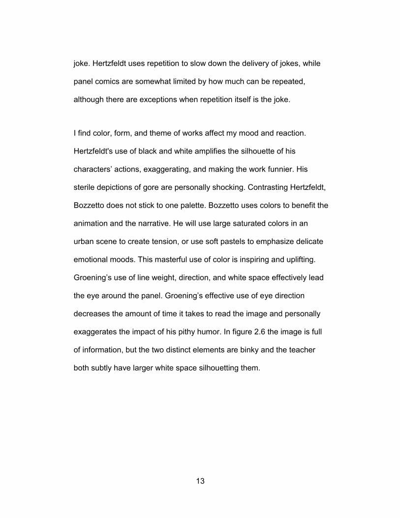
I find color, form, and theme of works affect my mood and reaction.
Hertzfeldt's use of black and white amplifies the silhouette of his
characters’ actions, exaggerating, and making the work funnier. His
sterile depictions of gore are personally shocking. Contrasting Hertzfeldt,
Bozzetto does not stick to one palette. Bozzetto uses colors to benefit the
animation and the narrative. He will use large saturated colors in an
urban scene to create tension, or use soft pastels to emphasize delicate
emotional moods. This masterful use of color is inspiring and uplifting.
Groening’s use of line weight, direction, and white space effectively lead
the eye around the panel. Groening’s effective use of eye direction
decreases the amount of time it takes to read the image and personally
exaggerates the impact of his pithy humor. In figure 2.6 the image is full
of information, but the two distinct elements are binky and the teacher
both subtly have larger white space silhouetting them.

14
Figure 2.6 School Is Hell, Lesson 11 by Matt Groening [9]
The atmosphere of Hertzfeldt’s work is spartan, with little to no
background, this can be seen in figure 2.8, from the film The Meaning of
Life. This lack of background creates a world of personal unease.
Bozzetto’s atmospheres are varied. In the short Bolero, from the feature
animation Allegro Non Troppo, the atmosphere is dark, violent, and
nebulous, seen in figure 2.8, this atmosphere is beneficial to the piece
because it is a birth and evolution of life piece. When Groening bothers to

15
place his characters into an environment the work suffers from
kenophobia. Words fill the space either labeling objects or people or
words from the characters dialogue. In all three of figures 2.7, 2.8, and
2.9, it can be seen how each artist approaches a similar narrative and the
atmosphere they each create.
Figure 2.7 The Meaning of Life by Don Hertzfeldt [10]

16
Figure 2.8 Bolero, Allegro Non Troppo by Bruno Bozzetto [8]

17
Figure 2.9 The Tree of Life by Matt Groening [11]
All of these artists use minimalistic line as a common trait between them,
as well as social commentary narratives. All of these are similar traits in
my own work when I choose to work in the medium of animation or mark-
making. All of these artists deal with the human condition and the
struggles humans face, be they small or large.
Bozzetto’s work is by far the most varied and mature (artistically). He
works in a variety of styles and his narratives can be character driven,
environmentally driven, or surreal. Despite Hertzfeldt having not been
trained to draw traditionally [12], much of the success of his animation is

18
because of the timing/editing and narrative pacing and how it all fits
cohesively. He has spoken at length about how long he will spend
meticulously timing a shot for maximum impact, like a good comedian
rehearsing the timing [3]. I also believe he has a natural talent for noticing
micro-movements in his characters unlike Bozzetto’s exaggerated
character movement. Groening differs from Bozzetto and Hertzfeldt in
that the work that has most inspired me, is his flat and non-animated
comic work. Unlike Bozzetto and Hertzfeldt, as a young child I emulated
or in some cases copied Groening’s characters. This emulation has
created traits in my own character design work like circular eyes,
cylindrical noses, and triangular philtrum.
Look the Other Way, is an incorporation of the works by Matt Groening,
Don Hertzfeldt, and Bruno Bozzetto. I emulate Don Hertzfeldt’s minimalist
style and dark humor. My narrative is a topical adult theme that
Bozzetto’s work has inspired me to create. Additionally, Matt Groening’s
character designs are a driving force behind the design of my own bird
character.

19
Methodology
The process for creating Look the Other Way is not revolutionary in the
history of contemporary animation. I began with a simple idea, and
followed a tried and tested process of moving from storyboarding, to
animatic, to animation, to editing, to adding sound, to producing a master
digital film. This is not to insinuate that the process did not have its
hiccups along the way to its final output.
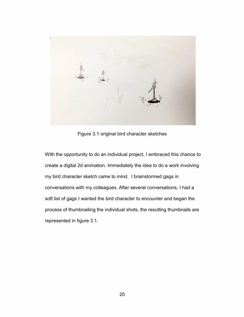
The idea of Look the Other Way came from a simple sketch that has
been lost to a hasty cleaning of a desk. Although the physical inspiration
was lost, the mental image remained. The sketch was of several bird
creatures living sustainably in their holes and a pool of water
encroaching, a tagline, “sustainability leaves nothing for a rainy day”. I
drew several of these bird creatures, in their holes, or in floating islands
for several days. Then, promptly let the idea go. Several weeks passed
and a new semester of school had started. It was this new semester that
presented my with the opportunity to finally work on a project I would call
truly my own.
20
Figure 3.1 original bird character sketches
With the opportunity to do an individual project, I embraced this chance to
create a digital 2d animation. Immediately the idea to do a work involving
my bird character sketch came to mind. I brainstormed gags in
conversations with my colleagues. After several conversations, I had a
soft list of gags I wanted the bird character to encounter and began the
process of thumbnailing the individual shots, the resulting thumbnails are
represented in figure 3.1.

21
Figure 3.2 Thumbnailed storyboard
With thumbnail images I immediately timed out a rough animatic. I knew
while creating the thumbnails there were problems with the story, but with
an animatic I could see exactly why shots did not fit well together through
visual hook ups from shot to shot, and line of action. Working digitally in
Adobe Photoshop the thumbnails made creating an animatic a fairly
simple process compared to the traditional approach of having to scan in
a traditional medium.
Before I revised the animatic I began to experiment with stylistic choices
for the final look of the film. I created a short list of restraints that would
dedicate and limit my freedom and keep the look of the film grounded.
The list is:
1. Line weight could not change in an element.

22
2. Only flat color or 2 color gradients could be used.
3. No frame blending or blurring of elements.
With these rules, the look of the film would represent a blending of my
artistic influences. Following the rules I experimented with color with two
of the animatic frames represented in figure 3.3 and figure 3.4
Figure 3.3 Color study of animatic frame, shot 1
Figure 3.4 Color study of animatic frame, shot 3

23
The greatest challenge in following these stylistic rules was the tree in
shot six. The tree lacking some texture element considering the size of
the tree in the shot left me uncomfortable. Adding a texture to the tree
would break the stylistic rules because it would create a complex
gradient, ruining the naive aesthetic. The figure 3.5 and 3.6 are examples
of an attempt to play with texture to see if I could create a tree that fit
stylistically. Figure 3.7 is a final frame of the film with the simple two color
gradient used to fill in the space of the tree.
Figure 3.5 Tree with overlay texture

24
Figure 3.6 Tree with painted stripe texture
Figure 3.7 Final tree with two color gradient
Content with the stylistic rules I had set forth I returned to revising the
animatic. I created additional thumbnails to focus on poses and revised
the timing between actions to create a more pleasing sense of motion. In
total I completed three timed out animatics that I ultimately felt conveyed
the essence of the story well.

25
From the beginning of the project, I knew I would work with a former
colleague of mine, Jeff Tackett, for the sound. I sent Jeff a copy of the
animatic to gauge his reaction, and he agreed to work with me on the
sound. Understanding the political nature of my animation and knowing
Jeff’s taste for early 1970’s music, I asked Jeff to use Harry Nilsson's, Me
and My Arrow from the feature animation The Point as a basis for the
music. I did not want to pressure Jeff to rush the music, so I left it in his
hands while I continued to the next milestone of the project, animation.
I began rough animation, using Adobe Flash CS5, with the straight-ahead
method, drawing one frame and then tracing that frame with only my
imagined goal in mind, as opposed to the pose-to-pose method which is
drawing the in between frames of two extreme drawings. I used this
method from shot one and working through the entire film in order.
Working straight-ahead, I feel, brings my animations more spontaneity
and life. I find working straight from the animatics and copying poses
slows the output of work, and also inhibits any whimsical animation
discoveries that may occur. The rough animation was created on two’s,
effectively twelve frames per second. As I completed shots I would
showcase them to my peers for critique. I would write this criticism down
and continue animating through to the end. Once I completed the rough
animation, I began to revise the timing or completely redraw the sections

26
based on the criticism. It took approximately one and half months to
complete the rough animation.
With rough animation done, the timing of the gags and movements of the
objects and characters is solid. At this point in the production of Look the
Other Way any sense of fun creating the work is over. Moving to final
animation and coloring is a labor intensive task of copying myself.
Creating animation straight-ahead while bringing whimsy and
spontaneity, also allows for objects or characters to be drawn smaller or
larger over time. To keep the proportions of the bird character correct I
used three circular shapes that I would place similar to where they
belonged on the rough animation, two circles for the eyes, and one for
body. I would trace these circles then move to the next frame of the
animation.
Figure 3.8 Green circles used to maintain volume of bird character

27
Completing the colored version of the animation took approximately one
month. Again the animation was shown to colleagues and professors for
final criticism. This criticism was digested and I began working to resolve
the issues that I felt needed to be dealt with to make the piece stronger
narratively. For the most part the changes were small and working
digitally, many of the tweaks or adjustments would only take a few
minutes. Some changes required additional drawing, and took more time.
With the final visual elements completed, I turned my attention to working
with Jeff on the sound. With my direction to use Me and My Arrow as
inspiration he had completed a three part melody for the entirety of the
film. With melody in place we had a base to build Foley on. For much of
the Foley I envisioned melodic motivated sound. This type of Foley can
be heard when the cymbals crash as the sun sets, or a down pitched
tuba as the bird arcs through the air. Finding a mix between Foley and
background music was a slight challenge but finally completed, the sound
and visuals could be combined into one master video file.
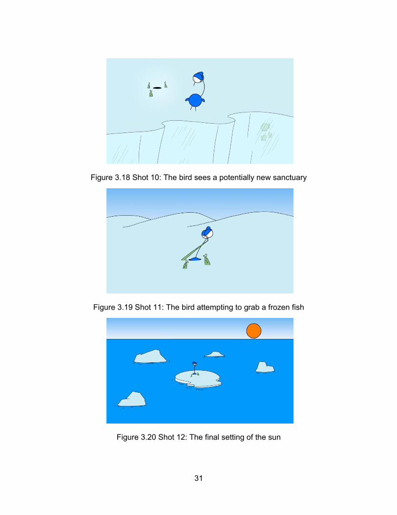
The following figures represent frames from the twelve shots from the
film.

28
Figure 3.9 Shot 1: The bird content in his hole
Figure 3.10 Shot 2: The bird is surprised by encroaching water
Figure 3.11 Shot 3: The bird finds a new home

29
Figure 3.12 Shot 4: The bird enters a berry induced psychedelic trip
Figure 3.13 Shot 5: The bird sees water invading his second home
Figure 3.14 Shot 6: The bird stuck in a tree

30
Figure 3.15 Shot 7: The bird lands in river
Figure 3.16 Shot 8: The bird is saved by rising water level
Figure 3.17 Shot 9: An epic fly over of the world
31
Figure 3.18 Shot 10: The bird sees a potentially new sanctuary
Figure 3.19 Shot 11: The bird attempting to grab a frozen fish
Figure 3.20 Shot 12: The final setting of the sun

32
Conclusion
I view the work Look the Other Way as a personal success. I set out to
complete a short 2d animation with a very stylistic look and I believe I
have accomplished my personal goal. I feel the film succeeds in using
sardonic humor to raise awareness of climate change. Although the work
has undergone heavy critique from colleagues and professors, I feel the
work is wholly my own vision, and it is told in my visual voice. Completing
the animation itself has given me the confidence and motivation to
continue working in 2d animation.
The strength of the work lies in its pure shape style and the naiveté
makes the work approachable. By setting out strict stylistic rules, and
sticking to them, it gave me a clear focus through the production of the
work. I hope that I have created a work that has a few laugh-out-loud
moments. Anytime a joke gets a laugh, I must view that as a success.
As I view Look the Other Way a personal success, it does not mean there
were not challenges to overcome. The waterfall scene of shot six did not
immediately read visually as a dangerous predicament for the bird.
Adjusting the horizon line from the original location at the middle on the
screen to the bottom of the screen solved this problem. With the horizon
line lower the waterfall reads as higher and the viewers’ position lower.

33
The solution to this problem did not occur until the very last revision of the
film. The attention I spend on horizon line during the preproduction
process will increase because of this single issue. During the middle of
production when I was combining shots I encountered the issue of the
backgrounds being combined with the animation frames before editing.
This was a technical oversight how production frames moved into the
postproduction process. I changed how I exported animation frames and
the workflow of the compositing to final frames. For any future projects I
will take care of how frames move from production to postproduction.
For the next stage of Look the Other Way, I will take the principles of
animation I have learned and apply them to the creation of an interactive
game. I plan on using the narrative of water destroying a bird’s habitat
and applying it to the principle game and level design. I would like to
evolve non-interactive viewing animation to the interactive medium.
Interactive media and game design have always been a passion, and I
would like to explore the medium of game, and the medium of animation,
and tie them together with strong narrative. I would also like to explore
the casual gaming audience and the relationship with social commentary.

34
References
[1] “The Art of Skiing”. Prod. Walt Disney Productions. 14 Nov, 1941.
Film.
[2] Groening, Matt. The Los Angeles Way of Death. 1982. Big Book of
Hell. New York:Random House. 1990. Pg 21. Print.
[3] UCSB Script to Screen: Don Hertzfeldt. Prod. Carsey-Wolf Center.
Vimeo. 30 May, 2012. Web.
[4] Signor Rossi Al Mare. Dir. Bruno Bozzetto. Studio Bozzetto, 1964.
Film.
[5] Hicks, Chris. Film Review: Allegro Non Troppo. Deseret News, 8
March, 1991. Web.
[6] Bart Simpson. People. 31 December, 1990: 72. Magazine.
[7] Wisdom Teeth. Dir. Don Hertzfeldt. Bitter Films, January, 2010. Film.
[8] Allegro Non Troppo. Dir. Bruno Bozzetto. Studio Bozzetto, 27 July,
1977. Film.
[9] Groening, Matt. School is Hell: Lesson 11. 1983. Big Book of Hell.
New York:Random House. 1990. Pg 41. Print.
[10] The Meaning of Life. Dir. Don Hertzfeldt. Bitter Films, 21 January,
2005. Film.
[11] Groening, Matt. The Tree of Life. 1985. Big Book of Hell. New
York:Random House. 1990. Pg 71. Print.

35
[12] UCSB Film and Media Studies. Don Hertzfeldt. UCSB Film and
Media Studies. 19 September, 2014. Web.
[13] Doherty, Brian. Matt Groening. Mother Jones. March/April, 1999.
Web.