FINANCIAL STATUS OF CONNECTICUT’S SHORT TERM ACUTE CARE HOSPITALS

Long-Term Care Hospitals: A Case Study in
Waste*
Liran Einav† Amy Finkelstein‡ Neale Mahoney§
April 26, 2021
Abstract
There is substantial waste in U.S. healthcare, but little consensus on how to iden-
tify or combat it. We identify one specific source of waste: long-term care hospitals
(LTCHs). These post-acute care facilities began as a regulatory carve-out for a few
dozen specialty hospitals, but have expanded into an industry with over 400 hospi-
tals and $5.4 billion in annual Medicare spending in 2014. We use the entry of LTCHs
into local hospital markets and an event study design to estimate their impact. We
find that most LTCH patients would have counterfactually received care at Skilled
Nursing Facilities – post-acute care facilities that provide medically similar care to
LTCHs but are paid significantly less – and that substitution to LTCHs leaves patients
unaffected or worse off on all dimensions we can objectively measure. Our results
imply that Medicare could save about $4.6 billion per year – with no harm to patients
– by reimbursing LTCHs the same way it reimburses Skilled Nursing Facilities.
*We thank Jeremy Kahn, Mark Miller, Hannah Wunsch, and many seminar participants for helpful com-ments. We are grateful to Abby Ostriker, Anna Russo, and Connie Xu for excellent research assistance.Einav and Finkelstein gratefully acknowledge support from the NIA (R01 AG032449). Mahoney acknowl-edges support from the Becker Friedman Institute at the University of Chicago and the National ScienceFoundation (SES-1730466).
†Stanford University and NBER. Email: [email protected]‡MIT and NBER. Email: [email protected]§Stanford University and NBER. Email: [email protected]

1 Introduction
Healthcare spending is one of the largest fiscal challenges facing the U.S. federal gov-
ernment. In 2014, the U.S. federal government spent $1.1 trillion on public healthcare
programs (BEA, 2016) and the CBO projects that spending will grow to $2 trillion by 2026
(CBO, 2016).
An idée fixe in health policy is that there is significant “waste” in the U.S. healthcare
system, with the widely repeated claim that 30% of U.S. healthcare spending is wasteful
(e.g., Orszag, 2009; McGinnis et al., 2013).1 One prominent, stylized fact in support of this
view is that the U.S. spends a much higher fraction of GDP on healthcare relative to other
OECD countries but obtains only middling health outcomes (e.g., OECD, 2017; Anderson
et al., 2005; Papanicolas, Woskie and Jha, 2018). Another is the Dartmouth Atlas evidence
of large, unexplained differences within the U.S. in Medicare spending per capita, with
no positive correlation between higher spending areas and better health outcomes (e.g.,
CBO, 2008; Skinner, 2011). While there is no universal definition, commentators typically
use the term waste to refer to healthcare spending that does not improve patient health.
Waste thus includes both transfers (e.g., excess payments to drug manufacturers) and
deadweight loss (e.g., from use of an expensive technology that does not improve health).
The near-consensus on the existence of waste is, unfortunately, not matched by any
agreement on how to reduce that waste. For example, Doyle, Graves and Gruber (2015)
write: “There is widespread agreement that the United States wastes up to one-third of
health care spending, yet pinpointing the source of the waste has proven difficult.” In a
similar spirit, Cutler (2010) notes: “Analysts from the left and right sides of the political
spectrum agree that health care costs could be greatly reduced. There is, however, less
agreement about the best strategy for reducing them.”
Cutting healthcare spending is easy – closing down hospitals would do the trick. Cut-
1McGinnis et al. (2013) in turn was picked up by many major media outlets. See https://khn.org/morning-breakout/iom-report/ for a summary.
1

ting healthcare spending without harming patient health or well-being, however, has
proved a much more elusive goal. In this paper we provide a case study where, our
evidence suggests, a substantial amount of healthcare spending – almost $5 billion per
year in Medicare spending – could be saved without harming patient outcomes. While
this is “only” about 1% of annual Medicare spending, a series of policies that save 1% of
Medicare spending can add up to a sizable amount, as Cooper and Scott Morton (2021)
emphasize.
Our case study is of a specific healthcare institution: long-term care hospitals (LTCHs).2
LTCHs are one of several types of healthcare institutions that provide post-acute care
(PAC) – formal care provided to help patients recover from a surgery or other acute care
event.
PAC is an under-studied sector, with large stakes for both federal spending and for
patient health. Federal spending on PAC through the Medicare program is substantial,
about $59 billion in 2014. A recent Institute of Medicine report found that, despite ac-
counting for only 16% of Medicare spending, PAC contributed to a striking 73% of the un-
explained geographic variation in Medicare spending (IOM, 2013), suggesting that there
may be inefficiency in the sector.
Traditionally, PAC was provided at skilled nursing facilities (SNFs) or at home by
home health agencies (HHAs). LTCHs were administratively created in the early 1980s
to protect 40 chronic disease hospitals from the new Prospective Payment System intro-
duced for acute care hospitals. What began as a regulatory carve-out for a few dozen
specialty hospitals subsequently expanded into an industry with over 400 LTCHs and
$5.4 billion in annual Medicare spending in 2014 (MedPAC, 2016).
The institutional history of LTCHs – which we discuss in detail below – suggests that
they may be primarily cost-increasing institutions. LTCHs are administrative – not med-
2The acronym LTCH is typically pronounced“el-tack", presumably reflecting the fact that LTCHs aresometimes referred to as long-term acute care hospitals (LTACs), which is phonetically pronounced in thismanner.
2

ical – constructs. They are unique to the U.S. health care system, and, to the best of our
knowledge, do not exist in any other country. LTCHs are reimbursed at substantially
higher rates than other PAC facilities and are run primarily by large for-profit chains.
They have also been the subject of several decades worth of a regulatory game of whack-
a-mole; in a series of reforms, the Centers for Medicare and Medicaid Services (CMS) has
made multiple attempts to eliminate the loopholes that LTCHs offer for excess reimburse-
ment, and to limit the growth of the sector as a whole.
We analyze the impact of a patient being discharged to an LTCH (hereafter, “LTCH
discharge”) on various outcomes. Our empirical strategy is to instrument for LTCH dis-
charge with an event study design based on the first entry of an LTCH into a local hospital
market. We define hospitals markets based on Hospital Service Areas (HSAs), of which
there are about 3,400 in the U.S. We analyze 17 years of data, from 1998-2014. During this
period, 186 hospital markets experienced their first LTCH entry. Another 152 markets
already had an LTCH at the start of our sample period, and over 3,000 markets still had
no LTCH at the end of our sample period. Markets with LTCHs are disproportionately
large, accounting for 34% of the Medicare enrollees by the end of our sample period.
We estimate that about four-fifths of discharges to LTCHs represent substitution from
SNFs, while the others substitute mostly from discharges home. SNFs are reimbursed by
Medicare at substantially lower rates than LTCHs; on a per day basis, LTCHs in 2014 were
reimbursed about $1,400, compared to about $450 for SNFs (authors’ calculation based on
Medicare data described below). We estimate that a discharge to an LTCH increases net
Medicare spending by about $30,000.
Patients, however, do not measurably benefit from this increased spending. We esti-
mate that patients discharged to an LTCH owe more money out of pocket, and find no
evidence that they spend less time in institutional care. Strikingly, despite an almost 30
percent 90-day mortality rate, we also find no evidence that discharge to an LTCH im-
proves mortality.
3

We do find that the discharging acute care hospitals gain from sending a patient to an
LTCH. Specifically, we estimate that discharge to an LTCH reduces the patient’s length
of stay in the originating acute care hospital, on average, by over 8 days. This generates
savings for the originating hospital because they are typically paid a fixed amount per
patient, regardless of the patient’s length of stay; they therefore gain financially from
being able to reduce the patient’s length of stay. However, discharges to an LTCH increase
overall costs for Medicare. Taken together, our findings indicate that Medicare could save
roughly $4.6 billion per year with no harm to patients by not allowing for discharge to
LTCHs.
Our strategy allows us to look not only at aggregate effects of LTCHs but also at
whether there is a subset of patients or LTCHs for whom the benefits of LTCH discharge
are higher and/or the costs of LTCH discharge are lower. We explore potential hetero-
geneity across a number of natural patient and LTCH characteristics, and find little ev-
idence of heterogeneous effects. Perhaps most interestingly, we examine heterogeneity
across LTCH patients affected by a recent policy change that occurred shortly after the
last year of our sample. To try to reduce expenditures and limit LTCH care to only the
most clinically complex patients, in 2016 CMS announced a “dual payment structure”
under which LTCHs are only reimbursed as LTCHs if the patients meet certain clinical
criteria (MedPAC, 2017a). We find no evidence of lower spending impacts or of mortal-
ity benefits for these more complex patients who would continue to qualify for LTCH
reimbursement under these new rules.
In interpreting our results, it is important to note that despite high short-term mor-
tality rates in the affected population, the confidence intervals on our mortality results
do not allow us to conclusively reject economically meaningful improvements in health;
this is a common feature of nearly all research that considers mortality as an outcome. In
addition, we are not able to measure non-mortality dimensions of health (such as pain,
functional limitations, and other quality-of-life metrics) or non-health dimensions of util-
4

ity (such as the quality of the room and board provided). Again, this is a common feature
of nearly all health economics research on patient outcomes.
Another way to interpret our findings, therefore, is to note that if the excess spending
on LTCHs provides unmeasured health benefits or non-health “amenity benefits”, they
would need to be valued (by the social planner) at about $1,000 per day in the LTCH to
“justify” the incremental Medicare spending. While it is difficult – if not impossible –
to definitively reject the presence of such unmeasured health and amenity benefits, we
argue that the institutional history of the LTCH sector as a regulatory carve-out – rather
than an institution created to serve a medical need – suggests that the “burden of proof”
should be to show that LTCHs provide medical or non-medical benefits that justify their
costs. Consistent with CMS’ various attempts to limit the growth of LTCHs, we cannot
reject the null that the medical care LTCHs provide is not better than the alternative.
Our paper relates to several distinct literatures. Most narrowly, it complements recent
work suggesting that the PAC sector is a fruitful part of the healthcare system in which
to look for inefficiencies in Medicare spending (IOM, 2013; Doyle, Graves and Gruber,
2017); relatedly, Curto et al. (2019) note that hospital patients enrolled in Medicare Ad-
vantage are much less likely to be discharged to PAC, and particularly institutional - i.e.
facility-based - PAC (such as SNFs or LTCHs). Our results are consistent with this exist-
ing impression and point to a particular PAC institution – the LTCH – whose elimination
could save money without any apparent harm to patients.
Our paper also contributes to a small but growing literature on the impact of providers
on the healthcare sector. Much of this literature has focused on the effect of financial in-
centives on provider behavior (e.g., Cutler, 1995; Clemens and Gottlieb, 2014; Ho and
Pakes, 2014; Eliason et al., 2018; Einav, Finkelstein and Mahoney, 2018), or more broadly
on the role of the physician in affecting healthcare decisions (e.g., Barnett, Olenski and
Jena, 2017; Molitor, 2018). Our study is unusual in that it studies the impact of a specific
institution (or organizational form) on the efficiency of the healthcare sector. Most closely
5

related to our analysis is Kahn et al. (2013) who look cross-sectionally at how outcomes
for chronically ill, acute care hospital patients differ in markets with differential LTCH
penetration. Like us, they conclude that increased probability of LTCH transfer is associ-
ated with lower use of SNFs, higher overall Medicare payments, and no improvement in
survival; however our empirical analysis below suggests that there are likely confounds
to such cross-sectional analysis (see Table 1).
Finally, and most broadly, our identification of a specific healthcare institution that
appears to be wasteful, is an illustration, in the context of healthcare, of the role Duflo
(2017) advocates for economists in general: “the economist as plumber . . . she installs the
machine in the real world, carefully watches what happens, and then tinkers as needed.”
In contrast to this “plumbing” approach, past efforts at reducing waste in U.S. health-
care have typically emphasized broad-based reforms to delivery models, often motivated
by economic theory – price regulation and certificate of need laws in the 1970s (Joskow,
1981), Prospective Payment and managed care systems in the 1980s and 1990s (New-
house, 1996), and most recently, the move to Alternative Payment Models such as Ac-
countable Care Organizations and bundled payments (Berwick, 2011). These efforts have
consistently failed to fulfill the high expectations set for them, and have often produced
unintended, negative consequences.
Our analysis of the case of LTCHs provides an illustration of how the health economist
might fruitfully transform into the health plumber. In this, our paper joins a small but
growing number of “case studies” of specific waste in healthcare – from out-of-network
billing (Cooper, Scott Morton and Shekita, 2020) to financial barriers to living kidney do-
nation (Macis, 2021), to lack of real-time adjudication of health insurance claims (Orszag
and Rekhi, 2021). This body of work, together with other projects compiled in Cooper
and Scott Morton (2021), suggests that successfully reducing waste in the healthcare sec-
tor may involve more forensic investigation than health economists and health policy
experts typically engage in.
6

The rest of our paper is organized as follows. Section 2 provides background on Post-
Acute Care and LTCHs. Section 3 describes our data and presents summary statistics.
Section 4 describes our empirical strategy and Section 5 reports the results. Section 6
concludes.
2 Setting
2.1 Post-Acute Care
LTCHs are part of the post-acute care (PAC) sector, which provides patients with rehabil-
itation and palliative services following an acute care hospital (hereafter, ACH or “hospi-
tal”) stay. PAC includes both facility-based care – skilled nursing homes (SNF), inpatient
rehabilitation facilities (IRFs), and long-term care hospitals (LTCHs) – and home-based
care, provided by home health agencies (HHAs). About two-fifths of Medicare hospital
patients are discharged to PAC, of which about 60% are sent to PAC facilities (70% of PAC
spending) and about 40% are sent to home health care (30% of PAC spending) (MedPAC,
2015b). Because IRFs are institutionally similar to SNFs, but are much smaller in number,
we lump them together with SNFs in our discussion and empirical analysis that follow.3
Spending on PAC is substantial. In 2014, Medicare spent $59 billion on PAC. This
is approximately 16% of the $376 billion in total Traditional Medicare (hereafter, “Medi-
care”) spending and about 20% more than the much-studied Medicare Part D program
spending.4 PAC patients are high-risk, with 15% of Medicare deaths involving a PAC stay
in the prior 30 days (Einav, Finkelstein and Mahoney, 2018). Medicare spending on PAC
is growing at two percentage points faster per year than overall Medicare spending, and
more than doubled between 2001 and 2013 (Boards of Trustees for Medicare, 2002, 2014).
3In 2014, there were approximately 205,000 IRF stays ($3.3 billion in Medicare payments) and 2.5 millionSNF stays ($32.4 billion in Medicare payments). These and subsequent numbers in this section without anexplicit citation are based on the Medicare data described in the next section.
4In particular, we estimate Part D spending for Medicare beneficiaries as the product of $78.1 billion intotal Part D spending (Boards of Trustees for Medicare, 2015) and the 62% of Part D beneficiaries enrolledin stand-alone PDP plans (MedPAC, 2015b), which yields $48.4 billion in Part D spending.
7

This spending growth has not been associated with any measurable improvements in
patient health or quality of care (MedPAC, 2015a).
Within the PAC landscape, LTCHs generally provide the most intensive care, SNFs
provide intermediate levels of care, and HHAs provide the least intensive care. Patient
health follows a similar ordering, with 90-day post-discharge mortality declining from
28% for patients discharged to LTCHs, to 17% for SNF and IRF patients, and to 13%
for patients discharged to home health care in 2014. Patients discharged to LTCHs look
correspondingly less healthy on many dimensions. For example, compared to those dis-
charged to SNFs, they are six times more likely to have been on a ventilator at the acute
care hospitals, about three times more likely to be suffering from respiratory failure when
admitted to the acute care hospitals, and about three times more likely to be suffering
from septicemia (bloodstream infection).
Medicare reimbursement differs greatly across PAC providers. Loosely speaking,
LTCHs are paid a fixed amount per admission, SNFs are reimbursed on a per diem basis,
and HHAs are reimbursed per 60-day episode of care. In 2014, the average LTCH stay
was 26 days and cost Medicare $36,000; by contrast, an average SNF stay was 25 days and
cost $12,000. On a per day basis, therefore, LTCHs are the most expensive form of PAC
($1,436 per day), followed by SNFs ($466 per day), and then HHAs ($73 per day). Patient
cost sharing also differs across PAC providers. Cost sharing for LTCH stays is tied to
the beneficiary’s inpatient cost sharing; SNF stays are covered by a separate cost-sharing
schedule, with daily copays that kick in after 20 days; and cost sharing is generally not
required for HHA services.
Despite these very different reimbursement regimes, physicians lack precise medical
guidelines or strict requirements from Medicare on which provider is most appropriate
for a given patient. As a result, discharge decisions can reflect non-clinical factors, such
as geographic availability, patient or physician preferences, and familiarity between the
PAC provider and the referring hospital (Buntin, 2007; Ottenbacher and Graham, 2007).
8

This results in substantial overlap in the types of cases treated by different PAC providers,
and in significant variation in PAC utilization.
2.2 Whack-a-Mole: A Brief Regulatory History of LTCHs
Our analysis focuses on the impact of discharge to an LTCH. Unlike other medical facil-
ities, LTCHs are a purely regulatory phenomenon and are unique to the U.S. health care
system. In order to be classified as an LTCH, a hospital must have an average length of
stay of 25 days or more. Because there are no specific medical requirements, LTCHs pro-
vide a diverse range of services, including those to address respiratory issues, septicemia,
skin ulcers, and renal failure (MedPAC, 2018). We focus the rest of this discussion on the
use of LTCHs by Medicare patients who, in 2014, accounted for just over 60 percent of all
LTCH stays.
Among Medicare patients, LTCHs account for about 4% of discharges to facility-based
PAC and about 12% of facility-based PAC spending (MedPAC, 2015b). As we discuss in
more detail below, LTCHs exist in some hospital markets but not in others; in 2014, in
markets where they exist, LTCHs accounted for 11% of discharges to facility-based PAC
and 31% of facility-based PAC spending. About half of LTCHs are known as “hospitals
within hospitals” meaning that they are physically located within the building or campus
of a (typically larger) acute care hospital (Office of Inspector General, 2013).
The history of LTCHs reads like a whack-a-mole history of health care reform. In
1982, the Tax Equity and Fiscal Responsibility Act (TEFRA) established a prospective
payment system (PPS) for acute care hospitals. Rather than being reimbursed on a fee-
for-service (“cost-plus”) basis, hospitals would be paid a predetermined, fixed amount
that depended on the patient’s diagnosis related group (DRG). At the time, there were
about 40 hospitals – primarily former tuberculosis and chronic disease facilities – that
specialized in clinically complex patients who required long hospital stays; regulators
were concerned that the fixed payments under PPS would be insufficient to cover costs
9

at these hospitals. To keep these hospitals afloat, CMS excluded hospitals with average
length of stay of at least 25 days from PPS and continued to pay them based on their
average per-diem cost (Liu et al., 2001). These 40 hospitals were the original LTCHs.
Figure 1 plots the number of LTCHs over time. Since 1982, there has been a rapid
growth in the LTCH sector, with the number of facilities rising from 40 to over 400. Be-
cause new entrants did not have prior cost data, payments for new entrants were deter-
mined by costs in their initial years of operation. This encouraged new entrants to be
inefficient when they first opened and to earn profits by increasing their efficiency over
time.5
The majority (72% in 2014) of LTCHs are for-profit (21% are non-profit and 7% are
government-run).6 According to recent financial statements of the two largest LTCH op-
erators, Kindred Health Systems and Select Medical, LTCHs generate profits margins be-
tween 16% and 29%.7
Since their creation in 1982, a series of policies have been enacted to try to curb rising
LTCH expenditures. The 1997 Balanced Budget Act (BBA) and 1999 Balanced Budget
Refinement Act (BBRA) established a prospective payment system for LTCHs. From 2002
to 2007, LTCHs were transitioned to a payment system in which, similar to the PPS for
acute care hospitals, they were paid a fixed amount per patient-DRG. However, much
like LTCHs were originally created as a necessary “carve out” to PPS, the LTCH PPS
in turn featured what was seen as a necessary carve out: in designing the LTCH PPS,
there was concern that LTCHs might discharge patients after a small number of days
but still receive the large, lump-sum payments that were intended for longer stays. To
5Liu et al. (2001) describes the early history and institutional features of LTCHs in greater detail.6Calculated from the American Hospital Association data described in the next section.7Profits are defined as EBITA (earnings before interest, taxes, and amortization). Kindred’s profits have
hovered between 22% and 29% of revenue based on 2009 to 2015 company reports. Prior to 2009, Kindreddid not separate out their reporting of LTCH profits from the much larger SNF category. Select’s profitshave ranged between 16% to 22% of revenue based on company reports from 2004 to 2015. Kindred’s an-nual reports are available at http://www.annualreports.com/Company/kindred-healthcare-inc and Select’s are available at https://www.selectmedical.com/investor-relations/for-investors/
10

address this potential perverse incentive to cycle patients briefly into an LTCH, stays
in an LTCH below a certain number of days (the “threshold day") were continued to
be paid on the pre-PPS per-diem reimbursement schedule. This created a substantial
(approximately $13,000) jump in Medicare payments at the threshold day, and LTCHs
responded by discharging large numbers of patients right after reaching the threshold
(Kim et al., 2015; Weaver, Mathews and McGinty, 2015; MedPAC, 2016; Eliason et al., 2018;
Einav, Finkelstein and Mahoney, 2018). In Einav, Finkelstein and Mahoney (2018) we
explored alternative payment schedules that remove this jump in payments and generate
significant savings for Medicare.
In more recent years, CMS has taken at least four distinct measures to try to reduce
LTCH spending. In 2007, and again in 2014, CMS established a 3-year moratorium on the
certification of new LTCHs or increases in LTCH beds (CMS, 2008, 2014). In 2005, CMS
established a policy known as the “25-percent rule” that penalizes LTCHs for admitting
more than 25% of patients in an LTCH from a single hospital, although Congress has
delayed the full implementation of the law (42 CFR § 412.534, 2014). In 2011, in order
to address incentives for hospitals-within-hospitals to “ping pong” patients between the
ACH and the LTCH, a regulation known as the “5 percent rule” went into effect, which
established that if more than 5% of patients discharged from an LTCH to a given hospital
are later re-admitted to the LTCH, the LTCH will be compensated as if the patient had a
single LTCH stay (42 CFR § 412.532, 2011).
In 2016, CMS phased in a dual payment structure for LTCHs to try to reduce expen-
ditures and incentivize LTCHs to better target the clinically complex patients they were
initially designed to serve. Under this new payment structure, LTCHs are reimbursed
under the LTCH PPS only if the patient had an immediately preceding ACH stay with
either (i) 3 or more days in an intensive care unit (ICU) or coronary care unit (CCU), or (ii)
mechanical ventilation for at least 96 hours at the ACH. All other LTCH cases are reim-
bursed at the lower of the inpatient PPS comparable per diem rate and the total estimated
11

cost incurred by the LTCH to treat the patient (MedPAC, 2017b). Irace (In Progress) stud-
ies this reform. Most recently, beginning in 2018, a payment reform went into effect that
eliminated the jump in payments at the threshold (80 FR 37990 , 2017). While it is too
soon to be sure, if history is to guide us, the most recent round of reforms will generate
new, unintended opportunities for LTCHs to earn profits, and the game of whack-a-mole
will continue.
We have dwelled at some length on the institutional and regulatory history of LTCHs
because, we believe, it is important for setting our priors and the appropriate null hypoth-
esis: namely, that LTCHs are cost-increasing institutions with no clear benefits to patients.
While suggestive, this qualitative history is of course by no means definitive. As noted,
existing empirical evidence is limited to cross-sectional comparisons of patient outcomes
in markets with differential LTCH penetration. We turn now to our data and empirical
strategy that will allow us to estimate the impact of LTCHs on average, as well as on
particular subsets of patients.
3 Data and Summary Statistics
3.1 Data and Variable Definitions
Our primary data source is the 100% Medicare Provider and Analysis Review (MedPAR)
data from 1998-2014. These data contain claim-level information on all (fee-for-service)
Medicare patient stays at acute care hospitals, LTCHs, SNFs and IRFs. For each stay, the
data contain admission and discharge dates, and information on procedures, diagnoses
(DRGs), and Medicare payments.
We merge the MedPAR data with three supplementary datasets. The Medicare An-
nual Beneficiary Summary File provides us with basic patient demographic information,
including age, sex, race, and ZIP code of residence, as well as date of death (if any)
through 2014. The beneficiary summary file also includes eligibility and enrollment in-
formation, which we use to determine whether a patient is dually eligible for Medicare
12

and Medicaid or enrolled in Medicare Advantage. We exclude approximately 12% of the
beneficiary-years that have at least one month of enrollment in Medicare Advantage (MA)
because claim-level information is not available for MA enrollees. The Provider of Service
(POS) dataset contains annual characteristics for all Medicare-approved providers, which
allows us to identify each provider’s ZIP code as early as 1984. Finally, we use the Amer-
ican Hospital Association’s (AHA) annual survey from 1998-2014 to classify providers as
for-profit, non-profit, or government-run, and to obtain provider latitude and longitude,
which allow us to calculate distances between facilities.
Our baseline analysis focuses on the entry of the first LTCH into a Hospital Service
Area (HSA). HSAs are a standard geographic measure of a health care market. HSAs were
originally defined by the National Center for Health Statistics as a collection of contiguous
ZIP codes whose residents receive the majority of their hospitalizations from hospitals in
the area. Since the geographic unit’s creation in the early 1990s, HSA boundaries have re-
mained constant regardless of changes to the hospital systems in those regions. There are
3,436 HSAs in the United States, which is similar to the number of counties and roughly
ten times the number of Hospital Referral Regions (HRRs), another common geographic
unit of analysis.8
We use the claim-level MedPAR data to identify whether an LTCH is present in an
HSA in each quarter of each year. We define entry as the earliest quarter with a patient
admission to an LTCH in that HSA. Appendix A provides more detail on this measure of
entry, showing that LTCHs quickly reach steady-state volume after entry; it also shows
that our claims-based definition of entry is highly correlated with a measure of entry
based on the year of an LTCH‘s first appearance in the POS file.
In our baseline analysis, our unit of observation is a patient “spell” which we define
(following Einav, Finkelstein and Mahoney, 2018) as starting on the date of a patient’s
8See www.dartmouthatlas.org/downloads/geography/ziphsahrr98.xls and http://www.dartmouthatlas.org/downloads/methods/geogappdx.pdf for more details on defining HSAs andHRRs.
13

admission to an acute care hospital (ACH) and consisting of the set of almost-continuous
days with a Medicare payment to an acute care hospital, LTCH, SNF, or IRF . We start the
spell with an ACH stay because the vast majority (84%) of LTCH patients are admitted
to an LTCH following their discharge from an ACH.9 We end the spell if there are two
consecutive days without any Medicare payments to any of these institutions. Note that
by this definition, a patient may be readmitted to an ACH following a stay at a different
facility without initiating a new spell. We show in Appendix B that our core results are
robust to defining the analysis window as a set amount of time following admission to
the ACH.
We analyze a variety of outcomes over the course of a spell. All monetary outcomes
are converted to 2014 dollars using the CPI-U. The first set of outcomes is the discharge
destination from the ACH. The (mutually exclusive and exhaustive) discharge destina-
tions are to death, to another ACH, to an LTCH, to a SNF, or to home/other (where other
includes home health care and hospice); Appendix A provides more detail on how we
code discharge destinations. We analyze total Medicare payments to and days at various
post-discharge facility destinations throughout the spell, as well as total Medicare pay-
ments for the spell.10 We also analyze total out-of-pocket payments owed for the spell,
using the term out-of-pocket payments to refer to payments not covered by Medicare;
these payments may be covered by the patient’s supplemental insurance plan. Finally,
we define indicators for whether the patient has died in the 90-days since the initiating
admission to the acute care hospital, and whether the patient has ever been at home in
the 90-days since the initiating admission to the acute care hospital. Again, Appendix A
provides details.
A potential limitation of our analysis is that the MedPAR data do not include pay-
9Most others are admitted directly from the community via a physician referral, although a small num-ber are admitted from other facility-based PAC.
10Our baseline measure includes all Medicare reimbursements except for outlier payments. In AppendixB, we show that including outlier payments makes the point estimates stronger but, because outlier pay-ments are noisy, reduces the precision of our results.
14

ments to home health or hospice. We have separate data on such payments from 2002-
2014. We show in Appendix B that these destinations account for a relatively low share of
spell spending (about 10% combined) and incorporating them into the analysis does not
meaningfully impact our findings.
3.2 LTCH Entry
Figure 2 shows the distribution of LTCHs across HSAs in the first year that data are avail-
able (1984), the first year of our study period (1998), and the last year of our study period
(2014). Prior to 1998, 152 HSAs had an LTCH. Over our study period, (1998-2014) an ad-
ditional 186 HSAs experienced their first entry. The figure also shows that LTCHs tend to
be geographically concentrated.
Figure 3 reports the timing of LTCH entry into new HSAs over our study period. First
entries occur fairly consistently over the first 12 years of our sample period but drop off
in the last few years, presumably due to the moratorium on new facilities.11
Table 1 explores characteristics of the hospital markets with LTCHs, separately exam-
ining markets that had an LTCH before 1998, experienced their first LTCH entry between
1998 and 2014, and never had an entry. The final column shows the bivariate correlation
between an indicator for whether the HSA ever had an LTCH and these characteristics.
Table 1 indicates that LTCHs are more likely to locate in urban and more populated
markets, presumably because these markets have enough demand to recover their fixed
costs. In 2014, although only about 10% of hospital markets had an LTCH, these markets
covered 34% of Medicare beneficiaries. LTCHs tend to be located in markets with a higher
rate of ACH beds per capita, a larger share of for-profit ACHs, and a higher rate of ACH
patients discharged to SNF or any PAC (which includes home health care). LTCHs are
more likely to enter states that had one of the original LTCHs (defined by presence of
an LTCH in 1984) and less likely to enter states with Certificate of Need (CON) laws,
11As Figure 3 illustrates, CMS made some exceptions to its moratorium; these are described in moredetail in CMS (2008, 2014).
15

which regulate entry. The correlation between entry and these characteristics motivate
our event study research design as a complement to prior work that has examined the
cross-sectional correlation between outcomes and market-level LTCH penetration (Kahn
et al., 2013).
3.3 Predicted Probability of LTCH Discharge
While the LTCH setting is high stakes both in terms of Medicare spending and patient
health in a given year, many patients are simply not “at risk” of an LTCH discharge and
mainly add noise to the estimates. For instance, in 2014, only about 1% of all hospital pa-
tients were discharged to an LTCH. Even in HSAs with LTCHs, only about 2% of hospital
patients were discharged to an LTCH. In order to improve our statistical power, we gen-
erate a stay-level measure of the predicted probability of LTCH discharge, and we allow
our first-stage estimate of the impact of LTCH market entry on LTCH discharge to vary
with this ex ante stay-level probability of LTCH discharge. Intuitively, the heterogeneous
first stage places more “weight” on patients with a higher ex ante probability of LTCH
discharge. We describe our IV approach in more detail in Section 4 below.
Identifying a hospital stay’s probability of LTCH discharge (hereafter, p̂) from the
high dimensional set of covariates available in the claims data is a prediction problem
well suited to machine-learning methods. We use a regression tree as our prediction al-
gorithm because its emphasis on interactions closely parallels the clinical complexity of
LTCH patients, who often have multiple chronic illnesses or comorbidities (Liu et al.,
2001; MedPAC, 2016).
We include as predictors demographics and pre-determined health conditions that are
plausibly exogenous to the discharge decision. The demographics are the calendar year
of the patient admission, patient’s age, sex, race, and an indicator for dual enrollment in
Medicaid. The health predictors are the ICD-9 diagnoses recorded during the patient’s
initiating hospital admission. Specifically, we cluster the diagnoses associated with the
16
initiating stay (each stay can have up to 9 distinct diagnoses) into 285 mutually exclusive
Clinical Classification Software (CCS) codes (HCUP, 2017). CCS codes have been shown
in other settings to be good predictors of health status in Medicare data (Ash et al., 2003;
Radley et al., 2008).12
As our event study results will confirm, geographic proximity plays a central role in
the probability of LTCH discharge. To determine the likelihood of LTCH discharge with-
out geographic constraints, we predict probabilities conditional on having an LTCH in
close proximity. To do so, we create a training set consisting of all ACH stays within 5 kilo-
meters of the nearest LTCH, with distance measured as spherical distance based on the
provider’s latitude and longitude coordinates reported in the AHA provider survey. We
train the regression tree on a 10% sample of these stays using five-fold cross-validation.
We then use the estimated prediction model to generate p̂’s for all initiating hospital stays
(including those further than 5 kilometers away from an LTCH). Thus p̂ measures the pre-
dicted probability of LTCH discharge if an LTCH were within 5 kilometers of the patient’s
hospital.
Appendix C provides more detail on both the construction of the prediction algorithm
and its output. Because the predictions are generated under the (counterfactual) assump-
tion that all hospital patients are within 5 kilometers of an LTCH, the mean probability of
discharge to an LTCH is 2%, rather than 1% as in the general population. The distribution
of p̂ is highly right-skewed. This reflects the fact that LTCHs are designed to serve a spe-
cific type of clinically complex patients; the vast majority of hospital patients have a very
low probability of LTCH discharge, even conditional on having an LTCH in the patient’s
HSA.
To reduce noise, we construct a “baseline” sample that focuses on all patients with a
non-trivial probability of LTCH discharge. Specifically, we drop the 73 million hospital
12We exclude procedures in the initial hospital stay from our set of predictors as the propensity to performcertain procedures could be affected by the presence of an LTCH. And, indeed, we provide suggestiveevidence of this in Appendix C.
17

stays (45%) with a p̂ ≤ 0.004, which is the “leaf” with the lowest value in the regression
tree. This restriction excludes only 8% of LTCH discharges. For some of our analyses, we
also focus on a “high p̂” sample, where we restrict to stays with p̂ > 0.15. This sample
keeps 16% of LTCH discharges.
Table 2 presents summary statistics for the full sample stays, the baseline sample, and
the high p̂ sub-sample of the baseline sample. Specifically, we report means of patient
demographics and our model’s “most important” selected health status features, where
variable importance is measured by ranking the variables by the additional R2 provided
at each leaf of the tree. We find that patients with a high probability of LTCH discharge
are nearly 10 times as likely to have experienced some sort of respiratory failure and over
10 times as likely to be diagnosed with septicemia (blood poisoning) than the overall
acute care population. This is consistent with previous work that finds a high prevalence
of patients with sepsis or respiratory failure in LTCHs (MedPAC, 2016; Chen, Vanness
and Golestanian, 2011; Koenig et al., 2015). To further assess our model and square our
predictions with the existing literature on LTCH patients, the bottom panel of Table 2
reports rates of ICU stays and mechanical ventilation in the initial ACH stay, two common
features of LTCH patients that have consistently been reported in the literature (Kahn and
Iwashyna, 2010; Koenig et al., 2015) but that we excluded from our prediction algorithm
due to concerns about potential endogeneity. Encouragingly, we find that over 50% of
high p̂ stays spent time in an ICU and over 45% were on a mechanical ventilator.
3.4 Summary Statistics
Table 3 presents means and standard deviations for our primary outcomes for our three
event study samples. Column 1 reports results for all acute care admissions. Column 2
shows the baseline sample, which excludes all observations with a p̂ ≤ 0.004, and also
restricts attention to the 186 first-entry HSAs and drops quarters following subsequent
LTCH entries or exits; this mimics the sample restrictions we use in the baseline event
18

study analyses below. As a result, the event study samples are roughly one seventh the
size of the “baseline” sample sizes reported in Table 2, which included the universe of
hospitals stays with a p̂ ≤ 0.004. Finally, column 3 shows the high p̂ sub-sample of the
baseline sample.
A comparison of outcomes in column 2 and column 3 provides a characterization of
how patients likely to be discharged from an LTCH differ from other patients. Patients in
the high p̂ sample require far more intensive, lengthy, and expensive care. High p̂ patients
have a 13% probability of being discharged to an LTCH (vs. 1.8% in the baseline sample),
an average spell length of 36 days (compared to 18 in the baseline sample), and average
spell Medicare expenditure of over $42,000 (vs. roughly $17,500 in the baseline sample).13
90-day mortality rates are high in the baseline sample (20%) and even higher in the high
p̂ sub-sample (over 40%).
4 Empirical Strategy
We estimate the effect of LTCH discharge on patient outcomes using variation in LTCH
discharges caused by the entry of the first LTCH into a hospital market. Our approach
allows outcomes to differ across markets (as suggested by Table 1) but assumes that, in
the absence of entry, trends in outcomes would be similar across markets. We examine
this assumption by examining trends in outcomes prior to entry.
In our baseline specification, we focus on the entry of the first LTCH in an HSA be-
cause this is where we expect to see the sharpest effects. Specifically, we restrict our
sample to the 186 HSAs with a first entry during our 1998-2014 sample period. We ex-
clude the 152 HSAs that, based on the POS annual 1984-1998 files, had an LTCH prior to
1998, and we exclude the over 3,000 HSAs which had no LTCH entry as of 2014. The mar-
kets we study are disproportionately large, accounting for 14% of the Medicare patients
and 24% of LTCH discharges at the end of our sample period. Within the 186 HSAs we
13Because p̂ is the probability of LTCH discharge conditional on having one nearby, the true probabilityof LTCH discharge is lower than the average p̂.
19

study, we truncate the data just before the quarter of second LTCH entry or LTCH exit so
that the post-entry results are not contaminated by further shocks to LTCH discharges.
Among our 186 HSAs, 24 experience a second entry and 23 an exit. Since the restricted
sample is unbalanced, the combination of heterogeneous treatment effects and changes
in sample composition might generate spurious time trends in our estimates. We conduct
robustness analysis where we restrict the sample to a balanced panel and show that these
types of effects are not driving our results.
In order to qualify as an LTCH, a facility must first document that it meets the min-
imum average length of stay requirement of 25 days for a six-month period (42 CFR §
412.23, 2011).14 Most LTCHs therefore begin as an ACH and are subsequently reclassi-
fied as an LTCH. These facilities are neither an LTCH nor an ACH; they are operationally
an LTCH but are not reimbursed as such. To address this, we classify a facility that ini-
tially opens as an ACH for a brief period before being deemed an LTCH as an “LTCH-in-
training.” Appendix A describes in more detail how we identify them. Our methodology
is conservative; as we discuss below, there are likely some LTCHs-in-training that we do
not categorize as such.
We define time relative to the quarter of LTCH entry as relative time (r). We consider
three distinct periods in relative time: a pre-period (r < −5, denoted Ppre), a post-period
(r > 0, denoted Ppost), and a transition period (r ∈ [−5, 0]), in which an LTCH-in-training
may have entered prior to the “true” LTCH entry at r = 0. We draw these distinctions
based on patterns in the raw data. In Appendix B, we show the results are robust to
alternative plausible time windows for this transition period. The patterns in the raw
data also motivate us to allow for separate trends in the outcomes pre and post entry,
and to drop from our event study estimates all observations that are associated with the
transition period.
The unit of observation is a spell, indexed by i. Each spell i is associated with an HSA
14In order to retain its LTCH reimbursement rate, a hospital must continue to report a 25-day averagelength of stay in each cost reporting period.
20

ji, a calendar time (in quarters) ti, and a relative time ri = ti − tentryj , where tentry
j is the
time (in calendar quarters) of LTCH entry into HSA ji. Our reduced form specification for
outcome yi takes the form:
yi = α · 1(ri ∈ Ppost) + 1(ri ∈ Ppre) f (ri) + 1(ri ∈ Ppost)g(ri) + γji + τti + εi, (1)
where γj are HSA fixed effects, τt are calendar quarter fixed effects, and f (r) and g(r)
are linear functions in r, normalized such that f (0) = g(0) = 0.15 Our parameter of
interest α captures the average impact of LTCH entry on patient outcomes. We calculate
heteroskedasticity-robust standard errors clustered at the HSA level.
Our identifying assumption is that in the absence of LTCH entry, any trends in the
outcome across markets would have been similar. While we cannot test this assumption
directly, we present graphical evidence of the time pattern of outcomes prior to LTCH
entry that is consistent with the identifying assumption
The parameter α in equation (1) measures the impact of LTCH entry into the market
on the outcome. To study the impact of a patient’s discharge to an LTCH on outcomes,
we estimate instrumental variable (IV) specifications where we use LTCH entry as an
instrument for LTCH discharge. Specifically, we estimate the equations:
LTCHi = αL · 1(ri ∈ Ppost)+1(ri ∈ Ppre) f L(ri) + 1(ri ∈ Ppost)gL(ri) + γLji + τL
ti+ εL
i (2)
yi = βy · LTCHi+1(ri ∈ Ppre) f y(ri) + 1(ri ∈ Ppost)gy(ri) + γyji+ τ
yti+ ε
yi , (3)
where LTCHi is an indicator for discharge to an LTCH, and the first line shows the “first
15Outside of the four-year window around entry, we model f (r) and g(r) as constant in relative time.Specifically, we define
f (r) ={
a if r < 16−br if r ≥ −16 and g(r) =
{cr if r ≤ 16d if r > 16 .
We define these functions in this way because it allows us to focus on LTCH entry inside a four-year windowwhile still preserving observations outside the window to pin down HSA and calendar-time fixed effects.
21

stage” equation that relates LTCH entry in a market to discharge to an LTCH. The second
line shows the “second stage” equation that relates LTCH discharge to patient outcome yi.
Both equations include the same controls as the reduced form specification (equation (1)),
with the parameters allowed to vary across equations. The parameter of interest βy can
be interpreted as the impact of being discharged to an LTCH on outcome yi. We calculate
heteroskedasticity-robust standard errors clustered at the HSA level.
In the LTCH setting, an additional challenge is that, as discussed in Section 3, the
probability of discharge to an LTCH is highly heterogeneous, and near zero for many pa-
tients (even if an LTCH exists nearby). To improve statistical power, we therefore estimate
specifications where we allow the first-stage coefficient (αL) to vary with p̂, the predicted
probability of LTCH discharge. Technically, p̂ can be interpreted as a compliance propen-
sity score in the spirit of Follmann (2000), which we use to determine heterogeneity in
first-stage effects.
To allow for a heterogeneous first stage within our event study framework, we divide
our baseline sample into five groups indexed by k = {1, 2, 3, 4, 5}. Groups 1 to 3 are
quartiles 1 to 3 of the p̂ distribution, and groups 4 and 5 are based on splitting the top
quartile into two groups (p̂ < 0.15 and p̂ > 0.15). Appendix Table A1 summarizes these
five p̂ groups. To account for heterogeneity, we denote by ki the group associated with
each spell i, and we estimate a modified version of our IV specification:
LTCHi = αLki· 1(ri ∈ Ppost)+1(ri ∈ Ppre) f L
ki(ri) + 1(ri ∈ Ppost)gL
ki(ri) + γL
ki,ji + τLki,ti
+ εLi
(4)
yi = βy · LTCHi+1(ri ∈ Ppre) f yki(ri) + 1(ri ∈ Ppost)gy
ki(ri) + γ
yki,ji
+ τyki,ti
+ εyi ,
(5)
which is identical to equations (2) and (3), except that the first-stage coefficient and all of
the controls are allowed to vary flexibly by k.
We continue to assume that the coefficient of interest βy is homogenous across groups,
22

and calculate heteroskedasticity-robust standard errors clustered at the HSA-p̂ group
level. In the results that follow, we show that, consistent with our homogeneity assump-
tion, our IV point estimates for βy are very similar, but less precisely estimated, if we
restrict the sample to patients with the highest ex ante probability of LTCH discharge
(p̂ > 0.15). In Appendix B, we also show results separately for the other p̂ groups, and
find that the results are consistent with our homogeneity assumption; we also show that
imposing a first-stage specification with a homogenous first-stage coefficient (αL) results,
as expected, in substantially less precise IV estimates.
5 Results
5.1 Reduced Form Graphical Results for High p̂ Sample
Figures 4 to 8 present graphical evidence of the reduced form effects of LTCH entry into
the market. In each plot, the horizontal axis shows the relative event time r in quarters
and the vertical axis shows the outcome variable. The dots show quarterly averages of
the outcome, net of HSA and calendar quarter fixed effects from estimating equation (1).
The solid lines show linear trends, f (r) and g(r), which, as shown in equation (1), are
separately estimated on the pre- and post-entry periods. For visual effect, the dashed line
extends the pre-period trend into the transition period. The reduced form effect of LTCH
entry on a given outcome, α, captures the gap between the linear trends at r = 0.
We start by examining the effect of LTCH entry into a market on p̂, our predicted
probability of LTCH discharge. Recall that p̂ is constructed using demographics and pre-
determined health conditions of patients with ACH stays. If there was an effect of LTCH
entry on p̂, it would indicate that hospitals are responding endogenously to LTCH entry,
for example by changing what patients they admit, which would raise concerns for the
interpretation of our empirical results. Reassuringly, Figure 4 shows no evidence of an
effect of LTCH entry on p̂ in the baseline sample. The estimated reduced form effect of
LTCH entry on p̂ (α in equation 1) is 0.00050 (standard error = 0.00027), relative to a base
23

of 0.033 pre-entry.
In Figures 5 to 8 we show the reduced form effects of LTCH entry into a market,
limited to the high p̂ sub-sample of our baseline sample. The first column of Table 4
summarizes the point estimate (and standard error) of the impact of LTCH entry into a
market on the outcome (α in equation 1). Figure 5 shows the impact of LTCH entry into
a market on the fraction of patients discharged to an LTCH. This will be the first stage
in our IV specification. The figure shows that LTCH entry has a sharp impact, raising
the probability of discharge to LTCH by 9.2 percentage points (standard error of 0.9),
a tripling of the pre-entry probability. The figure also shows evidences of a slight linear
trend in LTCH discharges both pre- and post-LTCH entry, which is consistent with LTCHs
choosing to enter more rapidly growing markets.
Figure 5 also provides support for our functional form assumptions. The sharp jump
at r = 0 supports our decision to model LTCH entry with a discontinuous jump in the
outcome rather than a gradual increase over time. The linear trend fits the data extremely
well in the pre-period (r < −5), supporting our identifying assumption that, conditional
on controls, the timing of entry is uncorrelated with deviations in the outcome from a
linear trend. The linear trends fit well, but with somewhat less precision, in the post
period (r > 0), perhaps reflecting heterogeneous treatment responses. The decline in
discharges to LTCH during the transition period (r ∈ [−5, 0]) is consistent with the entry
of LTCHs-in-training, which admit patients that would otherwise have gone to an LTCH
in the quarters leading up to entry. We see this more directly in Figure 6 discussed below.
Figure 6 shows the effect of LTCH entry into a market on discharges to a set of mutu-
ally exclusive and exhaustive non-LTCH discharge destinations. Panel (A) indicates that
LTCH entry causes a substantial decline in the fraction of patients discharged to a SNF,
suggesting that substitution away from SNFs is the primary margin of adjustment. Panel
(B) shows a smaller, but non-negligible, decline in discharges to home/other, suggesting
more modest substitution on this margin. Panel (C) shows a sharp increase in discharges
24

to LTCHs-in-training during the transition period only, which is what we would expect
given the institutional requirements to qualify as an LTCH. Panel (D) also shows some
evidence of an increase in discharges to ACHs during the transition period only, which
may reflect discharges to LTCHs-in-training that we did not classify using our algorithm.
Panel (E) shows no evidence of a change in the probability of discharge to death (i.e.
in-hospital death) following the entry of an LTCH.
Figure 7 shows the effect of LTCH entry into a market on total spell days and total
Medicare spending during the spell. Recall that the main effect of LTCH entry was sub-
stitution from SNFs to LTCHs. Panel (A) shows little effect on total spell days, suggesting
that the marginal patients have similar lengths of stay at SNFs and LTCHs. Panel (B),
on the other hand, shows that LTCH entry into a market leads to a fairly large increase
in total Medicare spending, which is consistent with LTCHs receiving larger daily reim-
bursements than SNFs.16
Finally, Figure 8 shows the impact LTCH entry into a market on three measures of
patient well being: total out-of-pocket spell spending, the probability the patient is ever
back home within 90 days after the initial hospital admission, and 90-day mortality (also
measured from the date of the initial hospital admission). The graphical results suggest
a clear increase in out-of-pocket spending. There is some suggestive evidence of a slight
decrease in the probability of being at home at any point within 90 days. Despite the
high 90-day mortality rate (44% in the high p̂ sample), the 90-day mortality plot shows
no evidence of any obvious pattern, and is quite noisy.17
16Appendix Figure A5 provides a more detailed perspective, showing the effect of LTCH entry on daysand spending separately by type of facility (LTCH, SNF, initiating ACH).
17Appendix Figures A1 to A4 show versions of these plots for the whole baseline sample. While thepatterns are qualitatively similar to those for the high p̂ sub-sample, we note that these plots do not directlycorrespond to the reduced form of the IV estimates for the whole sample discussed below. Specifically, ourIV specification allows for a heterogeneous first stage across p̂ groups, while Appendix Figure A1 shows apooled effect of LTCH entry across p̂ groups.
25

5.2 IV Estimates
Columns 2 and 3 of Table 4 show the IV estimates of the effect of discharge to an LTCH.
Column 2 shows point estimates and standard errors in the high p̂ sample, and column 3
shows the average impact of discharge to LTCH on patient outcomes for the whole base-
line sample, allowing for a heterogeneous first stage to improve power. In the baseline
sample, the share of patients discharged to LTCH increases from 0.5% in r = −6 (just
before the transition period) to 2.4% in r = 2 (just after the transition period). This im-
plies that about 20% (0.5 out of 2.4) of the patients who are discharged to LTCHs after the
LTCH entry would have been discharged to LTCHs even prior to the entry. Our effects
are thus identified off the remaining 80% of the patients in the baseline sample who are
marginal to LTCH entry. Consistent with our assumption that the impact of discharge to
LTCH on patient outcomes is constant across patients with different p̂’s, the IV estimates
in the high p̂ sub-sample and the baseline sample are usually quantitatively very similar,
and are never statistically distinguishable. We therefore focus our discussion below on
the IV results for the full baseline sample (column 3).18
The top panel of Table 4 show IV estimates of the effect of LTCH discharge on non-
LTCH discharge locations. The results indicate that about four-fifths of patients dis-
charged to an LTCH would have otherwise been discharged to a SNF; the remaining one-
fifth would have otherwise been discharged to home without home care or other (which
includes home with home health care, hospice, and other facility care). More specifically,
we estimate that each patient discharged to an LTCH reduced the probability of discharge
to a SNF by 0.791 (standard error of 0.075) and to home/other by 0.236 (standard error of
0.073).
A limitation to our baseline data is that we cannot see any finer granularity on the
18For completeness, Appendix Table A2 presents first stage and IV estimates for the five p̂ groups. Con-sistent with the interpretation of p̂ as an estimated compliance propensity score, the first stage increasesmonotonically with p̂ group. Although the results are, as expected, less precise in the lower p̂ bins, thebroad similarity in estimates across groups is consistent with our assumption that the impact of dischargeto an LTCH on patient outcomes is the same across patients in different groups.
26

discharge destination of “home/other.” However, for a subset of our study period (2002-
2014), additional data allow us to further decompose this discharge destination; Ap-
pendix B shows the results. We find that about half of the impact on the discharge des-
tination “home/other’ reflects a decline in discharges home without home health care,
and the rest stems from a decline in discharges to a residual ”other” category; there is no
evidence of any decline in discharges to home with home health care or in discharges to
hospice.
The next two panels of Table 4 show results for spell days and spell spending. Fo-
cusing again on the IV estimates for the baseline sample in column 3, our results indicate
that discharge to an LTCH increases total spell days by a statistically insignificant 6.6 days
(standard error of 5.1); days in both SNF and the initiating ACH decrease, while days in
LTCH increase. The 8.6 day average decline in length of stay at the initiating ACH is con-
sistent with the claim that LTCHs in some cases provide care to patients that they could
not receive at other forms of institutional PAC (NALTH, 2018); when the patient is not
discharged to an LTCH she spends, on average, considerably longer in the ACH. Given
that ACHs are paid a lump sum per patient that is (largely) independent of length of stay,
the decline in length of ACH stay associated with LTCH discharge suggests that not only
LTCHs, but also ACHs, may benefit financially from discharge to LTCH. We return to this
point in the conclusion.
Discharge to an LTCH increases total spell spending by $29,583 (standard error of
$4,810). This represents about 169% increase in total spell spending relative to the average
spell spending of $17,519 (see Table 3). The increase in spending reflects a $34,569 increase
in LTCH spending, that is only slightly offset by a decline in SNF spending. 19
The final panel of Table 4 shows results for three measures of patient welfare. There
19We omit from the table two other possible sources of institutional days and spending: days and spend-ing at an LTCH-in-training and data at another ACH. The effects are substantively small and statisticallyinsignificant: LTCH-in-training utilization increases by 0.16 days (standard error of 0.09) and $113 in spend-ing (standard error of 50), and ACH utilization increases by 0.71 days (standard error of 1.29) and $629(standard error of $1,930).
27

is no evidence of discharge to LTCH improving patient welfare on any of these measures.
Discharge to LTCH is associated with increased amounts owed out of pocket of $2,420
(standard error $640).20 There is no evidence that LTCHs increase the probability of being
at home at any point in the 90 days post admission to the initial acute hospital admission;
indeed the point estimates suggests a statistically insignificant decline (consistent with
the statistically insignificant increase in institutional days and in mortality). The final
measure of patient welfare we look at is 90-day mortality; this is quite high in our baseline
sample (20%; see Table 3). However, we find no evidence that discharge to LTCH reduces
mortality. Indeed, the point estimate suggests that discharge to LTCH is associated with
a statistically insignificant increase in 90-day mortality of 10.1 percentage points; the 95%
confidence interval allows us to rule out mortality declines greater than 2.6 percentage
points.
Appendix Table A3 explores these mortality results in more detail, examining results
over different horizons from 30 days to a year; at all these horizons we are unable to reject
the null hypothesis of no impact of discharge to LTCH on mortality. We are unable to
measure other potential non-mortality health benefits or non-health utility benefits from
an LTCH stay. Our estimates in Table 4, however, indicate that any such unmeasured
benefits would need to be valued at over $32,003 per LTCH stay (increased Medicare
spending of $29,583 plus increased out-of-pocket spending of $2,420 ) in order to cover
the incremental healthcare spending associated with LTCH discharge. With an increase
in length of stay of 28.9 days on average, this would require LTCHs to provide an incre-
mental $1,107 in daily value.
20LTCH stays are covered under inpatient cost-sharing. In practice, 95% of LTCH stays involve no de-ductible. However, patients are exposed to per-day coinsurance that applies starting on day 61 of the benefitperiod. In 2014, LTCH stays resulted in an average $2,250 in coinsurance owed out-of-pocket. By contrast,the first 20 days in a SNF have no patient cost-sharing.
28

5.3 Heterogeneous impacts and robustness
We examine potential heterogeneity in the impact of LTCHs on a number of dimensions.
Table 5 summarizes these results; Appendix Tables A4 and A5 provide additional de-
tails on the heterogeneity results while Appendix Figures A6 and A7 show the first-stage
figures for the high p̂ samples for each cut of the data.
Panels A and B of Table 5 explore whether the impact of LTCHs differs for patients
who – under the 2016 payment reform described in Section 2 – will still be reimbursed
under LTCH reimbursement rules. As discussed, this requires that the patient’s immedi-
ately preceding ACH stay have either 3 or more days in an intensive care unit (ICU) or
coronary care unit (CCU), as analyzed in Panel A, or mechanical ventilation for at least
96 hours at the ACH, as proxied in Panel B by an indicator for whether or not the patient
was ventilated at the initiating ACH. We estimate that about 30 percent of LTCH patients
in our sample would meet one or both of these conditions. Consistent with the idea
that these reforms were designed to exclude patients for whom other forms of PAC are
a reasonable substitute, patients whose reimbursement at LTCH rates was subsequently
excluded under the 2016 reform show more substitution away from SNF in response to
LTCH discharge. However, there is no evidence that those patients who would still qual-
ify for LTCH reimbursement under the new policy experience lower spending effects
or greater patient welfare from LTCH discharge; indeed, if anything the point estimates
are suggestive of the opposite, although we are unable to reject the null hypothesis that
effects are the same across groups. Appendix Table A4 considers a more stringent regu-
lation, originally proposed by CMS but weakened when enacted into law by Congress:
that patients must stay more than 8 days (rather than 3) in an ICU or CCU in order to be
reimbursed using the LTCH rates (MedPAC, 2014). The results for this split of the data
are again quite similar.
Panels C and D explore whether the impact of LTCHs differ across markets and
providers. Our analysis thus far of LTCH entries has not captured the effects for infra-
29

marginal patients who would have traveled outside of their HSA to receive care in an
LTCH if there had not been an LTCH entry in their HSA. To shed some light on the effects
for these type of patients, Panel C of Table 5 compares impacts of LTCHs across markets
that had a higher or lower pre-entry LTCH discharge share. Specifically, we compare
results for those markets below and above the median share of patients discharged to
LTCHs in relative quarter r = −6; where the average share was 0.27% and 0.89% respec-
tively. The results seem mostly similar between the two groups, with some evidence that
LTCHs that enter higher pre-entry LTCH discharge markets may have worse impacts on
patients (who are less likely to go home and more likely to die within 90 days). In Panel
D, we compare results across for-profit and non-profit LTCHs and see no evidence of
differential impacts.
We also explored the robustness of our findings to a number of alternative specifi-
cations. Appendix B presents the results, which are reassuring. Our baseline analysis
allowed for a transition period from relative year -5 to 0, in which an LTCH-in-training
may have entered prior to the “true” LTCH entry at r = 0. We explore alternative tran-
sition periods, both shorter (-2 to 0) and longer (-5 to 5). Our baseline analysis is limited
to the 186 markets where LTCHs entered for the first time during our study period (1998
to 2014). We show the results are robust to including the 152 markets with pre-existing
LTCHs as controls, to using an alternative geographic definition of healthcare markets
(specifically, county rather than HSA), and to including entries of additional LTCHs af-
ter the first in the market. We also show the results are robust to a balanced panel, to
excluding Medicaid dual eligibles from the analysis, to defining a spell as one-year post
admission to the ACH, and to including additional data on home health and hospice
payments.
30

5.4 Implications
We briefly explored the implications of our estimates for aggregate Medicare spending
and for the much-studied geographic variation in Medicare spending. In 2014, Medicare
spending on LTCHs was $5.4 billion (MedPAC, 2016). Our estimates in Table 4 indicate
that about 85% of LTCH spending (i.e. $29,583/$34,569) represents incremental spending.
This suggests that the elimination of LTCHs would reduce Medicare spending by about
$4.6 billion per year, with no measurable adverse impact on patient welfare.
Relatedly, we can use our estimates to ask what share of the large, and much-discussed,
geographic variation in Medicare spending would be eliminated if Medicare patients
were no longer sent to LTCHs. The finding of substantial differences across areas in Medi-
care spending per enrollee – without correspondingly better health outcomes – has been
widely-touted as suggestive of waste and inefficiency in the U.S. healthcare system (e.g.,
CBO, 2008; Gawande, 2009; Skinner, 2011). As noted earlier, an influential report by the
Institute of Medicine estimated that almost three-quarters of the unexplained geographic
variation in Medicare spending could be explained by spending on PAC (IOM, 2013). This
analysis, however, assumed that there would be no behavioral response to the removal of
PAC. We can use our estimates of the behavioral response to LTCHs – i.e., how much of
LTCH spending is incremental as opposed to substitution from SNFs – to ask how much
geographic variation in spending would be reduced if LTCHs were removed. We closely
replicate the IOM (2013) finding – specifically we find that eliminating PAC would reduce
residual variance by 69% (compared to their 73% reported estimate). We find that elim-
inating LTCHs – which are only 1% of Medicare spending – would remove 13% of the
residual variance, in the absence of a behavioral response, and about 10% given the sub-
stitution to SNFs. Consistent with the Dartmouth Atlas interpretation of the geographic
variation as evidence of waste and inefficiency, our estimates suggest that this reduction
in geographic variation would come without any adverse effects on patient well-being.
31

6 Conclusion
LTCHs were originally intended as a small administrative carve-out to the new inpatient
prospective payment system designed in 1982. Inadvertently, however, their designation
created a regulatory loophole for post-acute care facilities to receive substantially higher
reimbursements. Over the ensuing decades, CMS has endeavored, through a series of
legislative and regulatory reforms, to try to close this loophole. Its continued attempts
suggest that is has not yet been successful, and raise real questions about whether incre-
mental reforms will ever achieve their goals.
Our empirical estimates suggest that by simply eliminating the administratively-created
concept of LTCHs as an institution with its own reimbursement schedule – and reimburs-
ing them instead like SNFs – Medicare could save $4.6 billion per year with no harm to
patients. Moreover, despite accounting for only about 1% of Medicare spending, we esti-
mate that eliminating LTCHs would reduce 10% of the unexplained geographic variation
in Medicare spending. As is the case with any counterfactual, one must always be care-
ful to not go too far out of sample. From this perspective, a strength of our analysis is
that it provides the rare opportunity to study a non-marginal change: the entry of a new
healthcare institution into a healthcare market.
Nonetheless, there are (at least) two potential caveats to keep in mind in generalizing
from our estimates to the impact of changing LTCH reimbursement to that of SNFs. First,
we study the impact of LTCHs at the time of their creation. It is of course possible that the
longer-run impacts of LTCHs on either spending or patient well-being are different (with
unknown sign) from what we estimate here, although the graphical analysis we present
in Figures 5 through 8 do not suggest any obvious differences in the first four years of the
LTCH’s existence.
Second, our estimates of the impact of LTCHs are not based on all LTCH patients.
Our baseline sample excludes the approximately 15% of LTCH patients who are not ad-
32

mitted from an ACH and the approximately 8% of LTCH admissions from an ACH that
involve patients whose ex-ante probability of discharge to an LTCH is less than 0.4%. Our
estimates also do not speak to the effects for the 20% of patients who would have coun-
terfactually been discharged to LTCHs in the absence of LTCH entry into their HSA. In
this respect, we find it reassuring that we were unable to detect any evidence of heteroge-
neous impacts of LTCHs across patients, markets or outcomes; in particular, we find no
evidence of differential effects across markets with different shares of patients who would
have counterfactually been discharged to LTCHs in the absence of LTCH entry into their
HSA, for-profit and non-profit LTCHs, and patients whose LTCH stays are or are not
eligible for LTCH reimbursement rates under the 2016 dual payment reform (MedPAC,
2017b).
We finish with a note of caution: There is little reason to expect our proposed change
to the reimbursement of LTCHs will be politically easy. The $4.6 billion of incremental
spending generated by LTCHs every year may look like “waste” to the health economist,
but to the (largely for-profit) LTCH industry it might more accurately be referred to as
“rents.” In addition, the much larger number of acute care hospitals likely also benefit
from the presence of LTCHs since, we found, discharges to LTCHs reduce length of stay at
the initiating hospital, which bears the incremental costs of additional days. This suggests
a large financial incentive on the part of LTCHs as well as acute care hospitals to preclude
major regulatory changes, and may help explain their continued survival.
33

References
42 CFR § 412.23. 2011. “Excluded hospitals: Classifications.” Code of Federal Regulations.
42 CFR § 412.532. 2011. “Special payment provisions for patients who are transferred to
onsite providers and readmitted to a long-term care hospital.” Code of Federal Regula-
tions.
42 CFR § 412.534. 2014. “Special payment provisions for long-term care hospitals-within-
hospitals and satellites of long-term care hospitals, effective for discharges occurring
in cost reporting periods beginning on or before September 30, 2016.” Code of Federal
Regulations.
80 FR 37990 . 2017. “A Rule by the Centers for Medicare & Medicaid Services.” Federal
Regester.
AHPA. 2003-2011. “National Directory of Health Planning, Policy and Regulatory Agen-
cies.” American Health Planning Association.
Anderson, Gerard F, Peter S Hussey, Bianca K Frogner, and Hugh R Waters. 2005.
“Health spending in the United States and the rest of the industrialized world.” Health
Affairs, 24(4): 903–914.
Ash, Arlene S, Michael A Posner, Jeanne Speckman, Shakira Franco, Andrew C Yacht,
and Lindsey Bramwell. 2003. “Using claims data to examine mortality trends following
hospitalization for heart attack in Medicare.” Health Services Research, 38(5): 1253–1262.
Barnett, Michael L, Andrew R Olenski, and Anupam B Jena. 2017. “Opioid-prescribing
patterns of emergency physicians and risk of long-term use.” New England Journal of
Medicine, 376(7): 663–673.
BEA. 2016. “Download NIPA Tables: Government Current Receipts and Expenditures
(Section 3).”
34

Berwick, Donald M. 2011. “Launching accountable care organizations—the proposed
rule for the Medicare Shared Savings Program.” New England Journal of Medicine,
364(16): e32.
Boards of Trustees for Medicare. 2002. “The 2002 Annual Report of the Boards of Trustees
of the Federal Hospital Insurance Trust Fund and the Federal Supplementary Medical
Insurance Trust Fund.”
Boards of Trustees for Medicare. 2014. “The 2014 Annual Report of the Boards of Trustees
of the Federal Hospital Insurance Trust Fund and the Federal Supplementary Medical
Insurance Trust Fund.”
Boards of Trustees for Medicare. 2015. “The 2015 Annual Report of the Boards of Trustees
of the Federal Hospital Insurance Trust Fund and the Federal Supplementary Medical
Insurance Trust Fund.”
Buntin, Melinda Beeuwkes. 2007. “Access to postacute rehabilitation.” Archives of physi-
cal medicine and rehabilitation, 88(11): 1488–1493.
CBO. 2008. “Geographic Variation in Health Care Spending.” Congressional Budget Of-
fice.
CBO. 2016. “Updated Budget Projections: 2016 to 2026.” Congressional Budget Office.
Chen, Han-Yang, David J Vanness, and Ellie Golestanian. 2011. “A simplified score
for transfer of patients requiring mechanical ventilation to a long-term care hospital.”
American Journal of Critical Care, 20(6): e122–e130.
Clemens, Jeffrey, and Joshua D Gottlieb. 2014. “Do physicians’ financial incentives affect
medical treatment and patient health?” American Economic Review, 104(4): 1320–49.
CMS. 2008. “Moratorium on Classification of Long-Term Care Hospitals (LTCH) or Satel-
lites/Increase in Certified LTCH Beds.” Centers for Medicare & Medicaid Services.
35

CMS. 2014. “Long-term Care Hospital (LTCH) Moratorium – Preliminary Instructions.”
Centers for Medicare & Medicaid Services.
Cooper, Zack, and Fiona Scott Morton. 2021. “Health Care Reform: One (Percent) Step
At A Time.” Health Affairs Blog.
Cooper, Zack, Fiona Scott Morton, and Nathan Shekita. 2020. “Surprise! Out-of-
network billing for emergency care in the United States.” Journal of Political Economy,
128(9): 3626–3677.
Curto, Vilsa, Liran Einav, Amy Finkelstein, Jonathan D Levin, and Jay Bhattacharya.
2019. “Healthcare spending and utilization in public and private Medicare.” American
Economic Journal: Applied Economics, 11(2): 302–32.
Cutler, David. 2010. “How Health Care Reform Must Bend The Cost Curve.” Health Af-
fairs, 29(6): 1131–1135.
Cutler, David M. 1995. “The Incidence of Adverse Medical Outcomes Under Prospective
Payment.” Econometrica, 63(1): 29–50.
Doyle, Joseph J, John A Graves, and Jonathan Gruber. 2017. “Uncovering waste in
US healthcare: Evidence from ambulance referral patterns.” Journal of health economics,
54: 25–39.
Doyle, Joseph, John Graves, and Jonathan Gruber. 2015. “In hospital care saves money
– and lives.” Boston Globe.
Duflo, Esther. 2017. “Richard T. Ely Lecture: The Economist as Plumber.” American Eco-
nomic Review, 107(5): 1–26.
Einav, Liran, Amy Finkelstein, and Neale Mahoney. 2018. “Provider incentives and
healthcare costs: Evidence from long-term care hospitals.” Econometrica, 86(6): 2161–
2219.
36

Eliason, Paul J, Paul LE Grieco, Ryan C McDevitt, and James W Roberts. 2018. “Strategic
Patient Discharge: The Case of Long-Term Care Hospitals.” American Economic Review,
108(11): 3232–65.
Follmann, Dean A. 2000. “On the effect of treatment among would-be treatment compli-
ers: An analysis of the multiple risk factor intervention trial.” Journal of the American
Statistical Association, 95(452): 1101–1109.
Gawande, Atul. 2009. “The Cost Conundrum: What a Texas Town Can Teach Us about
Health Care.” New Yorker.
HCUP. 2017. “Clinical Classifications Software (CCS) for ICD-9-CM.” Healthcare Cost
and Utilization Project.
Ho, Kate, and Ariel Pakes. 2014. “Hospital choices, hospital prices, and financial incen-
tives to physicians.” American Economic Review, 104(12): 3841–84.
IOM. 2013. Variation in health care spending: target decision making, not geography. National
Academies Press.
Irace, Mariano. In Progress. “The Impact of Payment Reform on the Behavior of Long-
Term Care Hospitals.”
Joskow, Paul L. 1981. Controlling hospital costs: The role of government regulation.
Kahn, Jeremy M, and Theodore J Iwashyna. 2010. “Accuracy of the discharge destination
field in administrative data for identifying transfer to a long-term acute care hospital.”
BMC research notes, 3(1): 205.
Kahn, Jeremy M, Rachel M Werner, Guy David, Thomas R Ten Have, Nicole M Ben-
son, and David A Asch. 2013. “Effectiveness of long-term acute care hospitalization in
elderly patients with chronic critical illness.” Medical care, 51(1): 4.
37

Kim, Yan S, Eric C Kleerup, Patricia A Ganz, Ninez A Ponce, Karl A Lorenz, and Jack
Needleman. 2015. “Medicare payment policy creates incentives for long-term care hos-
pitals to time discharges for maximum reimbursement.” Health Affairs, 34(6): 907–915.
Koenig, Lane, Berna Demiralp, Josh Saavoss, and Qian Zhang. 2015. “The Role of Long-
term Acute Care Hospitals in Treating the Critically Ill and Medically Complex: An
Analysis of Nonventilator Patients.” Medical care, 53(7): 582.
Liu, Korbin, Cristina Baseggio, Douglas Wissoker, Stephanie Maxwell, Jennifer Ha-
ley, and Sharon Long. 2001. “Long-term care hospitals under Medicare: facility-level
characteristics.” Health care financing review, 23(2): 1.
Macis, Mario. 2021. “Removing All Financial Disincentives to Living Kidney Donation.”
1% Steps for Health Care Reform https://onepercentsteps.com/policy-
briefs/removing-all-financial-disincentives-to-living-kidney-
donation/.
McGinnis, J Michael, Leigh Stuckhardt, Robert Saunders, Mark Smith, et al. 2013.
Best care at lower cost: the path to continuously learning health care in America. National
Academies Press.
MedPAC. 2014. “Chapter 11: Long-term Care Hospital Services.” Medicare Payment Ad-
visory Commission.
MedPAC. 2015a. “A Data Book: Health Care Spending and the Medicare Program.” Medi-
care Payment Advisory Commission.
MedPAC. 2015b. “Report to the Congress.” Medicare Payment Advisory Commission.
MedPAC. 2016. “Chapter 10: Long-term Care Hospital Services.” Medicare Payment Ad-
visory Commission.
38

MedPAC. 2017a. “Long-Term Care Hospitals Payment System.” Medicare Payment Ad-
visory Commission.
MedPAC. 2017b. “Report to the Congress: Medicare Payment Policy, Chapter 11: Long-
term care hospital services.” Medicare Payment Advisory Commission.
MedPAC. 2018. “Report to the Congress: Medicare Payment Policy, Chapter 11: Long-
term care hospital services.” Medicare Payment Advisory Commission.
Molitor, David. 2018. “The evolution of physician practice styles: evidence from cardiol-
ogist migration.” American Economic Journal: Economic Policy, 10(1): 326–56.
NALTH. 2018. “A Response to the National Bureau of Economics Research Working Pa-
per, “Long-Term Care Hospitals: A Case Study in Waste” A Response to National Bu-
reau of Economics Research Working Paper, “Long-Term Care Hospitals: A Case Study
in Waste”.” National Association of Long Term Hospitals.
Newhouse, Joseph P. 1996. “Reimbursing health plans and health providers: efficiency
in production versus selection.” Journal of economic literature, 34(3): 1236–1263.
OECD. 2017. “Health at a Glance 2017: OECD Indicators.” OECD.
Office of Inspector General. 2013. “Early Alert Memorandum Report: Co-Located Long-
Term Care Hospitals Remain Unidentified, Resulting in Potential Overpayments.” De-
partment of Health and Human Services.
Orszag, Peter, and Rahul Rekhi. 2021. “Real-Time Adjudication for Health Insur-
ance Claims.” 1% Steps for Health Care Reform https://onepercentsteps.
com/policy-briefs/real-time-adjudication-for-health-insurance-
claims/.
Orszag, Peter R. 2009. “Heath Costs are the Real Deficit Threat.” The Wall Street Journal.
39

Ottenbacher, Kenneth J, and James E Graham. 2007. “The state-of-the-science: access
to postacute care rehabilitation services. A review.” Archives of Physical Medicine and
Rehabilitation, 88(11): 1513–1521.
Papanicolas, Irene, Liana R Woskie, and Ashish K Jha. 2018. “Health care spending
in the United States and other high-income countries.” Journal of the American Medical
Association, 319(10): 1024–1039.
Radley, David C, Daniel J Gottlieb, Elliot S Fisher, and Anna NA Tosteson. 2008. “Co-
morbidity risk-adjustment strategies are comparable among persons with hip fracture.”
Journal of clinical epidemiology, 61(6): 580–587.
Skinner, Jonathan. 2011. “Causes and consequences of regional variations in health care.”
In Handbook of health economics. Vol. 2, 45–93. Elsevier.
Weaver, Christopher, AW Mathews, and Tom McGinty. 2015. “Hospital discharges rise
at lucrative times.” Wall Street Journal.
40

Figure 1: LTCH Facilities over Time
0
100
200
300
400
500
1984 1989 1994 1999 2004 2009 2014
Nu
mb
er o
f LT
CH
s
Year
Observation period (1998-2014)
Note: Data are from the Provider of Service File from 1984-1998, and from the Medicare Provider andAnalysis Review (MedPAR) data from 1998 forward. Figure only includes pre-1998 LTCHs if they alsoappear in the MedPAR data. Both data sets are described in Section 3.1.
41

Figure 2: LTCH Concentration over Time
(A) 1984
(B) 1998
(C) 2014
Note: Maps illustrate the number of LTCHs present in each HSA in 1984, 1998, and 2014, according tothe 1984-2016 POS File and the 1998-2014 MedPAR data. White space indicates HSAs with no LTCHs.
42

Figure 3: LTCH Entry Quarters
0
3
6
9
12
1998Q1 2000Q1 2002Q1 2004Q1 2006Q1 2008Q1 2010Q1 2012Q1 2014Q1
Nu
mb
er o
f n
ew L
TCH
s in
qu
arte
r
Quarter of entry
Additional entry (not first) into HSA
First entry into HSA
Note: Histogram of LTCH entry to an HSA. First entries are defined as the first entry observed in ourdata (1998-2014). HSAs that had an LTCH at the start of our data period in 1998 are excluded.
43

Figure 4: Predicted Probability of LTCH Discharge
.03
.031
.032
.033
.034
Ave
rage
P-h
at
-16 -8 0 8 16Quarters Relative to Entry
Note: Figure reports estimates of equation (1), the reduced form impact of LTCH entry, estimated onthe baseline event study sample. The figure displays our estimated function of relative quarter, r, anda scatter plot of the average residualized values of p̂. Quarters −6 < r < 1 are greyed out because wedrop all observations in these quarters. The y-axis reports the average p̂ and is scaled so that the mean atr = −1 is equal to the mean at r = −1 among HSAs.
44

Figure 5: Discharge to LTCH
0.0
5.1
.15
.2F
rac
Dis
char
ged
to L
TC
H
-16 -8 0 8 16Quarters Relative to Entry
Note: Figure reports estimates of equation (1), the reduced form impact of LTCH entry, estimated onthe high p̂ sub-sample of the baseline event study sample. The figure displays our estimated functionof relative quarter, r, and a scatter plot of the average residualized values of the discharged to LTCHindicator. Quarters −6 < r < 1 are greyed out because we drop all observations in these quarters. They-axis reports the share discharged to LTCH and is scaled so that the mean at r = −1 is equal to the meanat r = −1 among HSAs.
45

Figure 6: Alternative Discharge Destinations
(A) Skilled Nursing Facility
.22
.24
.26
.28
.3.3
2F
rac
Dis
char
ged
to S
NF
-16 -8 0 8 16Quarters Relative to Entry
(B) Home/Other
.28
.3.3
2.3
4F
rac
Dis
char
ged
to H
ome/
Oth
er
-16 -8 0 8 16Quarters Relative to Entry
(C) LTCH-in-Training
-.02
0.0
2.0
4F
rac
Dis
char
ged
to L
TC
H-in
-Tra
inin
g
-16 -8 0 8 16Quarters Relative to Entry
(D) Acute Care Hospital
.04
.05
.06
.07
.08
.09
Fra
c D
isch
arge
d to
AC
H
-16 -8 0 8 16Quarters Relative to Entry
(E) Death
.24
.25
.26
.27
.28
.29
Fra
c D
isch
arge
d to
Dea
th
-16 -8 0 8 16Quarters Relative to Entry
Note: Figure reports estimates of equation (1), the reduced form impact of LTCH entry, estimated onthe high p̂ sub-sample of the baseline event study sample. The figure displays our estimated functionof relative quarter, r, and a scatter plot of the average residualized values of each of the dischargedestination indicators. Quarters −6 < r < 1 are greyed out because we drop all observations in thesequarters. The y-axis reports the share discharged to the location indicated and is scaled so that themean at r = −1 is equal to the outcome mean at r = −1 among HSAs.
46

Figure 7: Total Spell Utilization
(A) Total Spell Days
3536
3738
Tot
al S
pell
Day
s (I
ncl.
Init.
AC
H)
-16 -8 0 8 16Quarters Relative to Entry
(B) Total Spell Spending
3800
040
000
4200
044
000
4600
0T
otal
Spe
ll D
olla
rs (
Incl
. Ini
t. A
CH
)
-16 -8 0 8 16Quarters Relative to Entry
Note: Figure reports estimates of equation (1), the reduced form impact of LTCH entry, estimated onthe high p̂ sub-sample of the baseline event study sample. The figure displays our estimated functionof relative quarter, r, and a scatter plot of the average residualized values of spell days and spellspending. Quarters −6 < r < 1 are greyed out because we drop all observations in these quarters.The y-axis reports the utilization measure indicated and is scaled so that the mean at r = −1 is equalto the outcome mean at r = −1 among HSAs.
47

Figure 8: Patient Welfare Outcomes
(A) Total Spell Out of Pocket Spending28
0030
0032
0034
0036
00T
otal
OO
P S
pend
ing
-16 -8 0 8 16Quarters Relative to Entry
(B) Home in 90 Days
.37
.38
.39
.4.4
1.4
2F
rac
Hom
e in
90
Day
s
-16 -8 0 8 16Quarters Relative to Entry
(C) 90-Day Mortality
.44
.45
.46
.47
.48
.49
90 D
ay M
orta
lity
-16 -8 0 8 16Quarters Relative to Entry
Note: Figure reports estimates of equation (1), the reduced form impact of LTCH entry, estimated onthe high p̂ sub-sample of the baseline event study sample. The figure displays our estimated functionof relative quarter, r, and a scatter plot of the average residualized values of each of the patient welfareoutcomes. Quarters −6 < r < 1 are greyed out because we drop all observations in these quarters.The y-axis reports the utilization measure indicated and is scaled so that the mean at r = −1 is equalto the outcome mean at r = −1 among HSAs.
48

Table 1: Correlates of LTCH Location
HSAs w/ pre-1998 LTCH
HSAs w/ 1998-2014 entry
HSAs w/ no LTCH by 2014 Correlationa
(1) (2) (3) (4)
Number of HSAs 152 186
HSA demographics:Population (1000s) 540.7 233.5 59.1 0.47% Urban 0.84 0.76 0.50 0.28% Black 0.16 0.15 0.07 0.18Median age 39.6 40.9 43.2 -0.16Median income ($, 1000s) 56.0 49.9 49.9 0.05% < Federal Poverty Line 0.16 0.17 0.16 0.02% Uninsured 0.14 0.15 0.14 0.03% Dual Eligible 0.20 0.19 0.18 0.04
HSA hospital system:Acute Care Hospital beds per 1,000 people 4.2 4.5 3.6 0.05% For profit 0.25 0.25 0.13 0.11% Skilled Nursing Facility discharges 0.20 0.19 0.12 0.21% Post Acute Care discharges 0.41 0.39 0.21 0.27Medicare spend per beneficiary ($US) (000s) 10.17 9.92 9.59 0.09
HSA region:% HSAs with LTCH in census divisionb 0.12 0.13 0.10 0.13% HSAs with LTCH in state in 1984c 0.50 0.34 0.39 0.02% in states with CON lawd 0.40 0.41 0.49 -0.05
3,098
Note: “Pre-1998 Entry” is the set of HSAs that ever had an LTCH from 1984-1997. “1998-2014 Entry” refersto HSAs where a first LTCH entered from 1998 to 2014. “Never Enter” is the set of HSAs that never hadany LTCHs from 1984-2014. Population, share urban, and share black are determined from the 2010 census.Median age, income, the share below the poverty line, and the share uninsured are from the 2010-2014 ACS.ACH beds per capita, share for-profit, share discharged to SNF/IRF, share discharged to any PAC (includ-ing LTCH, SNF, IRF, HHA or hospice), and Medicare spending were calculated for 2014, the final year ofobservation in our event study.a The bivariate correlation column lists the bivariate correlation between the outcome variable and an indi-cator for whether an HSA ever had an LTCH from 1984-2014 (i.e. the union of the HSAs in column 1 andcolumn 2).bCensus Division’s share of HSAs with an LTCH calculates the share of HSAs in the same Census divisionas that reference HSA that have an LTCH in 2014 (leaving out the reference HSA).cShare with an LTCH in state in 1984 calculate the share of HSAs in each group (pre-1998 entry, 1998-2014entry, and never entry) that had an LTCH in the state in 1984.dShare in a state that ever had a Certificate of Need (CON) law: This is the share of HSAs in each group thatis in a state that had a CON law at any point from 2002-2010. State CON laws for 2002-2010 are reported inAHPA (2003-2011).
49

Table 2: Summary Statistics: Predictors of LTCH Discharge
All ACH admissions Baseline sample High p-hat sample(1) (2) (3)
P-hat 0.020 0.033 0.189Number of obs. (1000s) 163,649 90,384 2,338
DemographicsAge 73.9 75.6 71.1Female 0.57 0.57 0.49White 0.83 0.83 0.77Black 0.12 0.12 0.17Hispanic 0.02 0.02 0.02Asian 0.01 0.01 0.01Dual-Eligible for Medicaid 0.26 0.28 0.34
Selected Features Respiratory failure; insufficiency; arrest 0.07 0.14 0.71Septicemia 0.06 0.11 0.59Chronic skin ulcer 0.04 0.08 0.31Nutritional deficiencies 0.05 0.09 0.44Infective arthritis and osteomyelitis 0.01 0.02 0.15Complications of surgical procedures or medical care 0.06 0.10 0.27Shock 0.01 0.02 0.17Pneumonia 0.11 0.20 0.44Acute cerebrovascular disease 0.03 0.06 0.10Aspiration pneumonitis; food/vomitus 0.02 0.04 0.15Other aftercare 0.06 0.05 0.01Skin and subcutaneous tissue infections 0.04 0.07 0.09Bacterial Infection 0.05 0.10 0.08Intracranial injury 0.01 0.01 0.02Gangrene 0.01 0.02 0.05Paralysis 0.02 0.03 0.07Pleurisy; pneumothorax; pulmonary collapse 0.05 0.06 0.18
Excluded FeaturesICU 0.14 0.17 0.53Mechanical ventilation 0.04 0.08 0.45Over 3 days in ICU/CCU 0.20 0.26 0.64Over 8 days in ICU/CCU 0.10 0.14 0.45
Note: Each observation is a unique acute care hospital (ACH) stay. The baseline sample excludes all obser-vations with p̂ ≤ 0.004. High p̂ stays refer to ACH stays with a predicted probability of LTCH discharge(p̂) greater than 0.15. The CCS (Clinical Classification Software) health predictors are those that are amongthe 18 most important selected features used as predictors in the LTCH discharge model, where variableimportance is measured by ranking the additional R2 each of the variables adds, summed across all theleaves of the tree. Note that 17 CCS categories are chosen; the 20th important variable is age. ICU standsfor intensive care unit and CCU stands for critical care unit. ICU is determined using the MedPAR ICUindicator code, and mechanical ventilation is defined using the CCS procedure code for respiratory intuba-tion and mechanical ventilation. Age is enters the regression tree continuously. Race categories not listedinclude “other,” “unknown,” and “Native American.”
50

Table 3: Summary Statistics: Outcomes
Discharge destinationLTCH 0.010 (0.101) 0.018 (0.133) 0.126 (0.332)Skilled Nursing Facility 0.166 (0.372) 0.220 (0.414) 0.252 (0.434)Home/Other 0.736 (0.441) 0.646 (0.478) 0.334 (0.472)LTCH-in-training 0.000 (0.011) 0.000 (0.014) 0.001 (0.036)(Other) Acute Care Hospital 0.052 (0.221) 0.056 (0.230) 0.063 (0.243)Death 0.036 (0.186) 0.059 (0.236) 0.224 (0.417)
Spell daysLTCH 0.4 (4.0) 0.7 (5.1) 4.3 (13.1)Skilled Nursing Facility 7.0 (19.1) 9.0 (21.5) 12.4 (25.9)Initiating ACH 5.4 (5.6) 6.9 (6.7) 16.2 (14.0)Total 14.1 (23.3) 18.0 (26.5) 35.8 (38.3)
Spell spending ($)LTCH 530 (5,254) 843 (6,657) 5,869 (18,115)Skilled Nursing Facility 2,692 (7,222) 3,404 (8,078) 4,782 (10,189)Initiating Acute Care Hospital 10,079 (10,466) 11,201 (12,342) 27,583 (30,116)Total 14,992 (17,665) 17,519 (20,713) 42,202 (44,769)
Patient outcomesOut-of-pocket spending ($) 1,507 (2,602) 1,716 (3,111) 3,334 (6,431)Home within 90 days 0.82 (0.39) 0.73 (0.44) 0.42 (0.49)Died within 90 days 0.14 (0.34) 0.20 (0.40) 0.44 (0.50)
Mean p-hat 0.020 (0.032) 0.034 (0.039) 0.189 (0.034)Number of Obs. (1000s) 24,251 13,093 373
All ACH admissions(1)
Baseline sample High p-hat sample(2) (3)
Note: Each observation is a unique acute care hospital (ACH) stay. All ACH admissions (Column 1) in-cludes all HSAs that experience a first entry from 1998-2014, dropping observations at and after the quar-ter of subsequent entry or LTCH exit. Baseline sample (column 2) further excludes all observations withp̂ ≤ 0.004. High p̂ sample (Column 3) refers to ACH stays in the baseline sample with p̂ > 0.15.
51

Table 4: Event Study Estimates
Discharge destinationLTCH 0.092 (0.009)Skilled Nursing Facility -0.062 (0.010) -0.674 (0.103) -0.791 (0.075)Home/Other -0.022 (0.010) -0.244 (0.105) -0.236 (0.073)LTCH-in-training 0.001 (0.001) 0.007 (0.006) 0.007 (0.003)(Other) Acute Care Hospital -0.003 (0.006) -0.035 (0.064) 0.044 (0.040)Death -0.005 (0.009) -0.054 (0.101) -0.024 (0.051)
Spell daysLTCH 2.8 (0.4) 30.0 (1.9) 28.9 (1.0)Skilled Nursing Facility -1.5 (0.5) -16.2 (6.3) -14.3 (3.9)Initiating Acute Care Hospital -1.4 (0.4) -15.5 (4.8) -8.6 (2.1)Total 0.1 (0.9) 1.5 (9.4) 6.6 (5.1)
Spell spending ($)LTCH 3,138 (592) 34,210 (4,079) 34,569 (1,708)Skilled Nursing Facility -513 (246) -5,593 (2,714) -3,024 (1,572)Initiating Acute Care Hospital -1,124 (844) -12,256 (9,340) -2,016 (3,800)Total 1,894 (1,088) 20,649 (11,065) 29,583 (4,810)
Patient outcomesOut-of-pocket spending ($) 360 (133) 3,928 (1,381) 2,420 (640)Home within 90 days -0.004 (0.010) -0.039 (0.110) -0.172 (0.088)Died within 90 days 0.014 (0.010) 0.150 (0.109) 0.101 (0.065)
Number of Obs. (1000s)
High p-hat sample High p-hat sample Baseline sample
(1) (2) (3) Reduced form I.V. I.V.
343 343 11,824
Note: Column 1 reports estimates and standard errors of α in equation (1) and column 2 reports the IVestimate and standard errors of βy from equations (2) and (3), both estimated on the high p̂ sub-sample ofthe baseline event study sample. Column 3 reports IV estimates and standard errors of βy from equations(4) and (5), estimated on the baseline event study sample. Standard errors are clustered at the HSA level(186 clusters) for the high p̂ sample (columns 1 and 2), and at the HSA-bin level (930 clusters) for the baselinespecification (column 3).
52

Table 5: Event Study Estimates: Heterogeneity
Panel A: Days in ICU / CCU
Over 3 days 0.105 (0.011) -0.689 (0.069) 31,935 (6,472) 0.176 (0.070)Under 3 days 0.067 (0.008) -1.015 (0.137) 25,818 (5,345) -0.015 (0.120)
Panel B: Mechanical ventilator
On a ventilator 0.094 (0.012) -0.673 (0.074) 40,788 (2,593) 0.221 (0.097)Not on a ventilator 0.091 (0.009) -0.851 (0.098) 31,624 (1,531) -0.003 (0.077)
Panel C: Pre-entry LTCH discharge rate
Above median 0.072 (0.015) -0.765 (0.121) 30,983 (3,167) 0.276 (0.111)Below median 0.113 (0.011) -0.713 (0.085) 36,363 (1,582) 0.014 (0.077)
Panel D: For-profit status
For-profit LTCH 0.091 (0.011) -0.745 (0.101) 34,447 (2,118) 0.192 (0.080)Not-for-profit LTCH 0.095 (0.015) -0.824 (0.113) 35,546 (3,383) -0.062 (0.109)
7,5994,225
8,527
92410,900
5,5514,590
Baseline sampleI.V.
Number of Obs. (000s)(5)
3,297
High p-hat sample
Discharge to LTCH First stage
Discharge to SNF Total spell spending ($) Died within 90 days(1) (2) (3) (4)
Note: Column 1 reports first-stage estimates and standard errors of α in equation (1) in the high p̂ sample. Columns 2-4 reportsthe IV estimate and standard errors of βy from equations (4) and (5), estimated on the baseline event study sample. Standarderrors are clustered at the HSA level (186 clusters) for the high p̂ sample (columns 1), and at the HSA-bin level (930 clusters) forthe baseline specification (column 3). ICU stands for intensive care unit and CCU stands for critical care unit. In Panel C, thepre-entry discharge rate is based on the rate in period r = −6. For this panel, we exclude 30 of the 186 HSAs where we do notobserve outcomes in period r = −6.
53

Long-Term Care Hospitals: A Case Study inWaste
Online Appendix
Liran Einav Amy Finkelstein Neale Mahoney
A Data Appendix
A.1 Defining LTCH Entry
We define LTCH entry using both the Medicare claims in the MedPAR dataset and the
Provider of Service (POS) File. We determine the precise timing of entry with the MedPAR
data, defining the quarter of entry as the first quarter in which we observe a stay at a
given LTCH facility. Appendix Figure A8 confirms that the first stay is a good indicator
of facility entrance. There is a large jump in admissions to the entering LTCH in the week
of the first stay as the LTCH fills its beds, followed by a more gradual scale up from three
to four admissions per week over the course of the LTCH’s first six months.
The Medicare claims data do not include facility geography. We rely on the annual
POS file, which records characteristics of Medicare-approved facilities, to match each
LTCH to a given geography (an HSA in our baseline specification). Because we are using
two different data sources, Appendix Figure A9 cross-validates the timing of LTCH entry
between our two sources. In both data sets, we define entry as the first time the facility
“appears” in the data (the first stay in the MedPAR data and the first entry in the POS
file). The size of the dots in Appendix Figure A9 correspond to the number of LTCHs that
are defined as entering in a given (yearMedPAR, yearPOS) pair. The majority of entrances lie
on the 45-degree line, indicating that our two data sets generally agree. Nearly all entries
that do not align have a lagged date of entry in the POS file, potentially indicating some
administrative lag between when an LTCH is established and when it makes its way into
54

the POS File. In these cases, we backfill the geography of the facility from the first in-
stance it appears in the POS data to the quarter we identify the first stay associated with
a given LTCH facility.
A.2 Variable Definitions
Discharge Destinations We define a patient as being discharged to a given facility if
they are admitted to that facility within one day of discharge from the initiating ACH
stay. Although each stay-level record in the MedPAR data contains an indicator for the
discharge destination of each patient (e.g., ACH, SNF, home, death), we construct our
own definition of discharge destination within a healthcare spell. We do so primarily
because the “discharge to LTCH” code was first introduced in 2002; prior to 2002, dis-
charges to LTCHs were grouped into an “other” category. In addition, the destination
codes are often unreliable; in many instances following ACH discharge, a patient is im-
mediately admitted at a facility type inconsistent with the recorded discharge destination
(Kahn and Iwashyna, 2010). We code the discharge destination for a patient that died at
the ACH as “discharged to death.” We code the discharge destination for a patient that is
still alive following ACH discharge but not making any Medicare payments to an ACH,
LTCH, SNF, or IRF as discharged to home without care or to some other care, such as a
hospice or home health care.
Spell Definition, Days, and Spending As in Einav, Finkelstein and Mahoney (2018), we
define spells as the set of almost-continuous days with a Medicare payment to an acute
care hospital, LTCH, SNF, or IRF following an acute care hospital stay. The spell starts
on the first day of the ACH stay and ends if there are two consecutive days without any
Medicare payments to any of these institutions. Spell days count the number of days in
each facility over the course of the spell, including the initiating acute care stay. Spell
spending sums Medicare reimbursements, excluding outlier payments, at each facility
over the spell, including the initiating acute care stay. Out-of-pocket spending sums the
55

beneficiary coinsurance, inpatient deductible, and blood deductible at each facility over
the spell, including the initiating ACH stay.
Patient Outcomes We have three main patient outcome measures. The first is whether
the patient is home within 90 days of admission to the initiating acute care hospital stay.
If the discharge destination code in the final facility within a spell of continuous days is to
home (with either self-care or in the care of a home health association) within 90 days of
the date of admission at the initiating acute care stay, the patient is coded as going home
within 90 days. The second is an indicator for whether the beneficiary dies within 90 days
of the date of admission of the index ACH stay. The third is the amount of out-of-pocket
spending owed for the spell – i.e., payments not covered by Medicare; these payments
may be covered by the patient’s supplemental insurance plan.
LTCHs-in-Training Before a facility can be classified as an LTCH, it must demonstrate
a 25-day average length of stay for six months (42 CFR § 412.23, 2011). Because of this
regulatory requirement, an LTCH must begin its life as another facility (which we call an
“LTCH-in-training"), most commonly acute care hospitals. When an LTCH-in-training is
reclassified as an LTCH, it remains the same facility in all operational senses (the same
building, the same services, etc.), but its reimbursement schedule changes. As we will
show, the vast majority of LTCHs-in-training exist for only the six months required to
fulfill the regulatory requirement. Because these facilities are neither true ACHs (since
they are operationally an LTCH) nor true LTCHs (since they are not reimbursed as such),
we classify them as a separate entity.
The facility’s provider identification number changes upon reclassification, leaving
no clear link between an LTCH and its associated LTCH-in-training in the data. To ad-
dress this challenge, we rely on addresses and facility names in the POS data. The quality
of the POS addresses is variable; addresses and facility names will often change slightly
year over year. Moreover, it is common for multiple facilities to be located at the same ad-
56

dress; about half of LTCHs are co-located with an ACH in “Hospitals within Hospitals,”
rendering a simple match on addresses insufficient. To address these data challenges, we
searched for LTCHs-in-training by hand using addresses and facility names in the POS
data.
We first analyze the address and facility name data by hand, defining a potential
LTCH-in-training as any facility that meets the following two criteria: (1) exists at the
same address as an entering LTCH in the year of entry or prior to entry, and (2) vanishes
from the data in the year following entry. Using this method, we were able to identify 192
total potential LTCHs-in-training. Encouragingly, these 192 potential LTCHs-in-training
have an average length of stay of just over 25 days in the six months prior to entry, as
required by CMS regulation. Among the potential LTCHs-in-training we identified by
hand, we found that the 158 (82%) are ACHs (the remainder are IRFs). For simplicity, we
only consider ACHs that precede LTCHs as LTCHs-in-training. Of these 158 LTCHs-in-
training, all facilities had at least one quarter with an average length of stay longer than 20
days, and 90% had at least one quarter with an average length of stay longer than 25 days.
We are able to identify the LTCHs-in-training associated with 112 of the 186 first entries
we study in our main specification. Appendix Figure A10 presents a histogram of the
number of quarters a facility exists for the 158 LTCHs-in-training we were able to iden-
tify. Over 90% of the LTCHs-in-training we identified exist for one year or less, implying
that the vast majority of LTCHs-in-training are simply a regulatory object that allow a
true LTCH to enter a market. Some LTCHs-in-training have longer facility lives, which
indicates that a few facilities may have reclassified as LTCHs as their average length of
stay increased organically over time.
Our method of identifying LTCHs-in-training is imperfect; we fail to identify the
LTCH-in-training associated with 74 of the LTCH entries we study in our baseline anal-
ysis. Because the majority of LTCHs-in-training existed as ACHs, this means that there
may be up to 74 facilities in our data that we are mischaracterizing as ACHs, when they
57

would be more accurately described as LTCHs-in-training. In our event study analysis,
Figure 6 Panel (D) shows some evidence of an increase in discharges to ACHs during
the transition period; this may reflect discharges to LTCHs-in-training that we did not
classify using our algorithm. To assess this, Appendix Figure A11 presents discharges
to ACH restricted to the 112 HSAs in which we were able to identify a credible LTCH-
in-training associated with the entering LTCH. This restriction eliminates the increase in
discharges to an ACH during the transition period, indicating that the slight increase in
Figure 6 Panel (D) may be due to unclassified LTCHs-in-training.
Patient Classifications In Appendix Table 5 we analyze the impact of LTCHs across pa-
tients based on the number of days they spent in an ICU or CCU during the initial ACH
stay, and whether or not they were ventilated during the initial ACH stay. We identify
ventilator use in the MedPAR data using the ICD-9 codes associated with the initial ACH
stays. A patient is coded as “ventilated” if the stay has an ICD-9 code included in the
“Respiratory intubation and mechanical ventilation” category of the Clinical Classifica-
tion Software (CCS) procedure codes. Note that there is no way in the data to tell how
long a patient was on a mechanical ventilator, so the “ventilated” classification is a rough
approximation of the category that will be included in LTCH reimbursement under the
new rules (ventilated for over 96 hours), and will include many patients who in fact do
not qualify for the LTCH rate.
The number of days in an ICU (intensive care unit) and CCU (coronary care unit) for
each stay are reported in the MedPAR data. A spell is included in the “Over 3 (8) days in
an ICU/CCU” if the patient spent over 3 (8) days in an ICU or over 3 (8) days in a CCU
during the initial ACH stay.
58

B Additional Results and Robustness
Alternative transition periods: Our baseline specification drops the r ∈ [−5, 0] transi-
tion period. Appendix Figure A14 shows first-stage plots of the effect of LTCH entry on
LTCH stays for alternative transition periods. Specifically, we show results for a narrow
transition period which drops quarters r ∈ [−2, 0] and a wide transition period which
drops quarters r = [−5, 5]. Appendix Table A8 reports our baseline IV estimates for these
narrow and wide periods. Both the plots and tables confirm that our results are robust to
alternative transition periods.
Alternative specifications: In Appendix Figure A15 and Appendix Table A9, we show
first-stage plots and IV estimates that probe the sensitivity of our results to a number of
different alternative specifications. Panel A and column 1 show our baseline specification
for reference. In Panel B and column 2, we show our results are robust to including all
HSAs that already had at least one LTCH as of 1998 as controls. In Panel C and column 3,
we restrict the sample to a balanced panel of HSAs where we can observe outcomes +/-
3 years around entry. Restricting to a balanced panel allows us to assess whether changes
in sample composition (in combination with heterogeneous treatment effects) generate
time-trends in our results. A comparison of the balanced panel plot with the baseline
specification plot indicates little reason to be concerned about this issue.
In Panel D and column 4, we show our results are robust to including subsequent
entries, rather than just the first entry into an HSA, in our event study sample. We con-
struct the data so that HSAs with two entries “appear" twice, with the event-time variable
r defined in relation to the entry of interest. We additionally control for the non-focal en-
try in this specification. In Panel E and column 5, we show that our results are robust to
dropping individuals who are dually eligible for Medicaid. Since dual eligibles have their
out-of-pocket costs covered by Medicaid, it is interesting that there is a similar increase in
the out of pocket costs when these patients are excluded.
59

The final panel and column shows that our results are robust to defining health care
markets at an alternative geographic level. Specifically, in Panel F and column 6, we show
results where we redefine our event study to analyze the first entry of an LTCH into a
county, and replace the HSA fixed effects with fixed effects at the county level. There are
148 first entries at the county level in comparison to 196 first entries in our baseline HSA
level analysis.
Heterogeneous first stage and homogenous second stage: Our baseline specification al-
lowed the first stage of LTCH entry on LTCH discharge to be heterogeneous based on the
five p̂ groups, but imposed a homogeneous second stage of LTCH discharge on outcomes.
Appendix Table A2 shows IV estimates separately for each of the five p̂ groups. The IV
estimates are similar across the p̂ groups, consistent with our homogeneity assumption.
Appendix Table A10 shows IV estimates where we impose a homogenous first stage (and
maintain the homogenous second stage from our baseline specification). As expected,
imposing a homogeneous first-stage results in substantially less precise IV estimates.
Alternative spell definitions: In our baseline sample, we defined a spell as starting on
the first day of the ACH stay and ending if there are two consecutive days without Medi-
care payments to any institution. As a robustness check, we explore an alternative spell
definition, where we define a spell as the 365 days post admission to the ACH stay. Ap-
pendix Table A11 shows summary statistics with our baseline and this alternative spell
definition. With the 365-day spell definition, average LTCH and SNF days and spending
are roughly twice as large as under our baseline definition. Appendix Table A12 shows
IV estimates on spell days and spending in both samples. The estimates with the 365-day
spell sample are twice as large as those in the baseline sample, which is consistent with
the twice-as-large averages for this sample.
60

Decomposing discharges to “home/other": A limitation to our baseline data is that we
cannot see any finer granularity on the discharge destination of “home/other.” How-
ever, for a subset of our study period (2002-2014), we have separate data on claims for
home health and hospice. Using these data, we define two new destinations within the
discharge to “home/other" category based upon our methodology defined in Appendix
A: a patient is defined as discharged to home health or hospice if the patient has a claim
for home health or hospice beginning within one day of discharge from the initiating
ACH stay. To further decompose the remaining unclassified patients, we also use the dis-
charge destination codes on each ACH claim to categorize patients as discharged "home
with no care." All remaining unclassified patients are categorized as discharged to "other."
Column 3 of Appendix Table A12 shows the results. When restricting to stays from 2002-
2014, each LTCH discharge reduces discharges to home/other by 32.7 percentage points.
We can decompose this decrease into discharges home with no care (which decreases by
11.4 percentage points), home with home health care (which increases by 1.5 percentage
points), hospice (decreases by 7.0 percentage points) and other (which decreases by 15.8
percentage points).
Including payments to home health and hospice: A potential limitation of our baseline
analysis is that the MedPAR data do not include payments to home health or hospice. We
have separate data on such payments from 2002-2014. Appendix Table A11 shows these
destinations account for a relatively low share of spell spending (about 10% combined).
Column 3 of Appendix Table A12 shows that incorporating home health spending into
the analysis does not meaningfully impact our findings.
Including outlier payments: As discussed in Appendix Section A, our baseline mea-
sure of Medicare spending does not include outlier payments. In Appendix Table A13
and Appendix Figure A16 we show, in addition to the baseline effects for reference, effects
on outlier payments and combined baseline and outlier payments. The point estimates
61

indicate that including outlier payments strengthen our finding that LTCHs leads to ex-
cess spending. However, because the effects on outlier spending are very noisy (outlier
payments are naturally rare) including them substantially decreases the precision of our
results.
C Constructing LTCH Discharge Probabilities (p̂s)
We use a regression tree to generate predicted probabilities of LTCH discharge (p̂) condi-
tional on having an LTCH nearby. Each observation in the training and prediction data
is an ACH stay from 1998-2014 with an indicator for whether a patient was discharged
to an LTCH as the dependent variable. We include as predictors the calendar year of
the patient’s admission, the patient’s age, sex, race, and an indicator for dual enrollment
in Medicaid. We also use the ICD-9 diagnoses from the patient’s initiating hospital ad-
mission as health status indicators. Each ACH stay can have up to 9 distinct diagnoses,
and we cluster each diagnosis into 285 mutually exclusive Clinical Classification Software
(CCS) codes (HCUP, 2017).
We construct a training set consisting of ACH stays that are “close” to an LTCH. We
define close as all ACHs with an LTCH less than five kilometers away, where distance is
measured using the latitude-longitude coordinates for each facility reported in the AHA
Annual Survey. From 1998-2014, there were 32,724,774 “close” ACH stays. Our final
training set for the model uses a 10% random sample of these close stays, resulting in
a training set of 3,272,477 ACH stays. We use 5-fold cross validation to choose a com-
plexity parameter to maximize out of sample R2. The complexity parameter determines
how much to “prune” the regression tree; specifically, the complexity parameter is the
minimum R2 each additional leaf of the tree must add to be included in the decision tree.
Appendix Figure A12 plots the cross-validated (out of sample) R2 for different values of
the complexity parameter. As the magnitude of the complexity parameters decreases,
the size of the tree increases (as more new leaves cross the minimum R2 threshold). Ap-
62

pendix Figure A12 shows a maximum R2 is achieved at 3× 10⁻⁵. We build the optimally
pruned tree (complexity parameter = 3× 10⁻⁵). As anticipated with a small complexity
parameter, this creates a very large tree. For ease of visualization, we present a list of se-
lected features in Appendix Table A6 instead of the very complex decision tree. The final
predictive model results in an AUC value of 0.82.
Appendix Table A7 presents the distribution of p̂ (predicted from our optimally pruned
tree) among all ACH stays and among ACH stays with a high p̂ (p̂ > 0.15), and among all
“close” ACH stays, the set of ACH stays with an LTCH within five kilometers. Note that
the mean p̂ among all stays is higher than the share discharged to LTCHs. This is because
p̂ is the probability of LTCH discharge conditional on having an LTCH nearby; among all
close ACH stays, the mean p̂ and the share discharged to an LTCH are equivalent.
As discussed in the main text, we carefully chose predictors that are plausibly ex-
ogenous to the LTCH discharge decision. We excluded any procedures from the set of
predictors because certain procedures may become more or less common when there is
an LTCH available in the HSA. Panels A and B of Appendix Figure A13 present the proba-
bility of receiving a tracheostomy (a procedure to insert a breathing tube into a windpipe
for a patient on a mechanical ventilator) and the probability of being on a mechanical
ventilator upon LTCH entry estimated among all high p̂ stays. Neither tracheostomy
nor mechanical ventilation appear to increase upon LTCH entry, but we cannot rule out
non-negligible effects.
63

Figure A1: Discharge to LTCH
-.01
0.0
1.0
2.0
3.0
4F
rac
Dis
char
ged
to L
TC
H
-16 -8 0 8 16Quarters Relative to Entry
Note: Figure reports estimates of equation (1), estimated on baseline event study sample. The figure dis-plays our estimated function of relative quarter, r, and a scatter plot of the average residualized values ofthe discharged to LTCH indicator. Quarters −6 < r < 1 are greyed out because we drop all observationsin these quarters. The y-axis reports the share discharged to LTCH and is scaled so that the mean atr = −1 is equal to the mean at r = −1 among HSAs.
64

Figure A2: Alternative Discharge Destinations
(A) Skilled Nursing Facility.1
9.2
.21
.22
.23
.24
Fra
c D
isch
arge
d to
SN
F
-16 -8 0 8 16Quarters Relative to Entry
(B) Home/Other
.62
.63
.64
.65
.66
.67
Fra
c D
isch
arge
d to
Hom
e/O
ther
-16 -8 0 8 16Quarters Relative to Entry
(C) LTCH-in-Training
-.02
0.0
2F
rac
Dis
char
ged
to L
TC
H-in
-Tra
inin
g
-16 -8 0 8 16Quarters Relative to Entry
(D) Acute Care Hospital
.03
.04
.05
.06
.07
.08
Fra
c D
isch
arge
d to
AC
H
-16 -8 0 8 16Quarters Relative to Entry
(E) Death
.04
.05
.06
.07
.08
.09
Fra
c D
isch
arge
d to
Dea
th
-16 -8 0 8 16Quarters Relative to Entry
Note: Figure reports estimates of equation (1), the reduced form impact of LTCH entry, estimatedon the baseline event study sample. The figure displays our estimated function of relative quarter, r,and a scatter plot of the average residualized values of each of the discharge destination indicators.Quarters −6 < r < 1 are greyed out because we drop all observations in these quarters. The y-axisreports the share discharged to the location indicated and is scaled so that the mean at r = −1 is equalto the outcome mean at r = −1 among HSAs.
65

Figure A3: Total Spell Utilization
(A) Total Spell Days17
.617
.818
18.2
18.4
Tot
al S
pell
Day
s (I
ncl.
Init.
AC
H)
-16 -8 0 8 16Quarters Relative to Entry
(B) Total Spell Spending
1650
017
000
1750
0T
otal
Spe
ll D
olla
rs (
Incl
. Ini
t. A
CH
)
-16 -8 0 8 16Quarters Relative to Entry
Note: Figure reports estimates of equation (1), the reduced form impact of LTCH entry, estimated onthe baseline event study sample. The figure displays our estimated function of relative quarter, r, anda scatter plot of the average residualized values of spell days and spell spending. Quarters−6 < r < 1are greyed out because we drop all observations in these quarters. The y-axis reports the utilizationmeasure indicated and is scaled so that the mean at r = −1 is equal to the outcome mean at r = −1among HSAs.
66

Figure A4: Patient Welfare Outcomes
(A) Total Spell Out of Pocket Spending16
0016
2016
4016
6016
8017
00T
otal
OO
P S
pend
ing
-16 -8 0 8 16Quarters Relative to Entry
(B) Home in 90 Days
.7.7
1.7
2.7
3.7
4.7
5F
rac
Hom
e in
90
Day
s
-16 -8 0 8 16Quarters Relative to Entry
(C) 90-Day Mortality
.18
.19
.2.2
1.2
2.2
390
Day
Mor
talit
y
-16 -8 0 8 16Quarters Relative to Entry
Note: Figure reports estimates of equation (1), the reduced form impact of LTCH entry, estimated onthe baseline event study sample. The figure displays our estimated function of relative quarter, r, anda scatter plot of the average residualized values of each of the patient welfare outcomes. Quarters−6 < r < 1 are greyed out because we drop all observations in these quarters. The y-axis reports theutilization measure indicated and is scaled so that the mean at r = −1 is equal to the outcome meanat r = −1 among HSAs.
67

Figure A5: Spell Utilization by Destination
(A) LTCH Spell Days1
23
45
6R
est o
f Spe
ll D
ays
in L
TC
H
-16 -8 0 8 16Quarters Relative to Entry
(B) LTCH Spell Spending
020
0040
0060
0080
00R
est o
f Spe
ll D
olla
rs a
t LT
CH
-16 -8 0 8 16Quarters Relative to Entry
(C) Skilled Nursing Facility Spell Days
1011
1213
Res
t of S
pell
Day
s in
SN
F
-16 -8 0 8 16Quarters Relative to Entry
(D) Skilled Nursing Facility Spell Spending
4000
4200
4400
4600
4800
Res
t of S
pell
Dol
lars
at S
NF
-16 -8 0 8 16Quarters Relative to Entry
(E) Initiating Acute Care Hospital Days
17.5
1818
.519
19.5
Orig
inat
ing
AC
H L
OS
-16 -8 0 8 16Quarters Relative to Entry
(F) Initiating Acute Care Hospital Spending
2800
028
500
2900
029
500
3000
0O
rigin
atin
g A
CH
Pay
men
t
-16 -8 0 8 16Quarters Relative to Entry
Note: Figure reports estimates of equation (1), the reduced form impact of LTCH entry, estimated onthe high p̂ sub-sample of the baseline event study sample. The figure displays our estimated functionof relative quarter, r, and a scatter plot of the average residualized values of the spell utilization bydestination. Quarters −6 < r < 1 are greyed out because we drop all observations in these quarters.The y-axis reports the spell utilization indicated and is scaled so that the mean at r = −1 is equal tothe outcome mean at r = −1 among HSAs.
68

Figure A6: First Stage: Heterogeneity by ICU /CCU and Mechanical Ven-tilator
(A) 3 or More Days in ICU/CCU.0
5.1
.15
.2.2
5F
rac
Dis
char
ged
to L
TC
H
-16 -8 0 8 16Quarters Relative to Entry
(B) Under 3 Days in ICU/CCU
0.0
5.1
.15
.2.2
5F
rac
Dis
char
ged
to L
TC
H
-16 -8 0 8 16Quarters Relative to Entry
(C) 8 or More Days in ICU/CCU
.05
.1.1
5.2
.25
Fra
c D
isch
arge
d to
LT
CH
-16 -8 0 8 16Quarters Relative to Entry
(D) Under 8 Days in ICU/CCU
0.0
5.1
.15
.2.2
5F
rac
Dis
char
ged
to L
TC
H
-16 -8 0 8 16Quarters Relative to Entry
(E) Patient on Ventilator
.05
.1.1
5.2
.25
Fra
c D
isch
arge
d to
LT
CH
-16 -8 0 8 16Quarters Relative to Entry
(F) Patient not on Ventilator
0.0
5.1
.15
.2.2
5F
rac
Dis
char
ged
to L
TC
H
-16 -8 0 8 16Quarters Relative to Entry
Note: Figure reports estimates of equation (1), estimated on the high p̂ sub-sample of various robust-ness event study samples. Figure displays our estimated function of relative quarter, r, and a scatterplot of the average residualized values of the discharge to LTCH indicator. Quarters −6 < r < 1are greyed out because we drop all observations in these quarters. Panels A and B show plots sep-arately by whether the patient spent 3 or more days in an intensive care unit (ICU) or coronary careunit (CCU) prior to LTCH discharge. Panels C and D show plots separately by whether the patientspent 8 or more days in a ICU / CCU. Panels E and F split the analysis by whether was placed on amechanical ventilator at the initiating ACH. The y-axis reports the share discharged to LTCH and isscaled so that the mean at r = −1 is equal to the outcome mean at r = −1 among the geographies inthe sample.
69

Figure A7: First Stage: Heterogeneity by Pre-Entry Discharge and For-Profit Status
(A) Below Median Pre-Entry DischargeRate
0.0
5.1
.15
.2.2
5F
rac
Dis
char
ged
to L
TC
H
-16 -8 0 8 16Quarters Relative to Entry
(B) Above Median Pre-Entry DischargeRate
0.0
5.1
.15
.2.2
5F
rac
Dis
char
ged
to L
TC
H
-16 -8 0 8 16Quarters Relative to Entry
(C) Bottom Quartile Pre-Entry Dis-charge Rate
0.0
5.1
.15
.2.2
5F
rac
Dis
char
ged
to L
TC
H
-16 -8 0 8 16Quarters Relative to Entry
(D) Top Quartile Pre-Entry DischargeRate
.1.1
5.2
.25
Fra
c D
isch
arge
d to
LT
CH
-16 -8 0 8 16Quarters Relative to Entry
(E) For Profit
0.0
5.1
.15
.2.2
5F
rac
Dis
char
ged
to L
TC
H
-16 -8 0 8 16Quarters Relative to Entry
(F) Not For Profit
0.0
5.1
.15
.2.2
5F
rac
Dis
char
ged
to L
TC
H
-16 -8 0 8 16Quarters Relative to Entry
Note: Figure reports estimates of equation (1), estimated on the high p̂ sub-sample of various robust-ness event study samples. Figure displays our estimated function of relative quarter, r, and a scatterplot of the average residualized values of the discharge to LTCH indicator. Quarters −6 < r < 1are greyed out because we drop all observations in these quarters. Panels A and B split the sampleby whether the HSA had below or above the median LTCH discharge share. Panels C and D showresults for the bottom and top quartiles of LTCH discharge share. Panels E and F split the analysis bywhether the LTCH is a for-profit or non-for-profit organization. In Panels A-D, the pre-entry dischargerate is based on the rate in period r = −6. For these panels, we exclude 30 of the 186 HSAs where wedo not observe outcomes in period r = −6. The y-axis reports the share discharged to LTCH and isscaled so that the mean at r = −1 is equal to the outcome mean at r = −1 among the geographies inthe sample.
70

Figure A8: Average Weekly Admissions Following LTCH Entry
24
68
Avg
Num
ber
of A
dmis
sion
s
0 5 10 15 20 25Weeks post entry
Note: Figure shows the average number of LTCH admissions per week relative to LTCH entry for allLTCH entries from 1998-2014. Admission frequencies were calculated by taking the average number ofadmissions across all active LTCHs for a given week relative to LTCH entry.
71

Figure A9: Dates of LTCH Entry Into HSA, As Coded in Different DataSets
1995
2000
2005
2010
2015
PO
S d
ata
1995 2000 2005 2010 2015MedPAR data
Note: Figure plots entry years using the Provider of Service (POS) file against entry years using MedPARdata from 1998-2014. The size of each point on the scatter plot is determined by the number of observa-tions for each unique (MedPAR data entry year, POS data entry year) point in order to view the densityof matched observations. A 45 degree line is included for reference.
72

Figure A10: LTCHs-in-Training: Facility Life
0.2
.4.6
.8F
ract
ion
0 8 16 24 32 40 48Quarters of Facility Life
Note: Figure plots a histogram of the number of quarters the LTCHs-in-Training admit patients. Quartersof Facility Life denotes the number of quarters from the first observed admission date to the last observedadmission date.
73

Figure A11: Discharged to Acute Care Hospital
.05
.06
.07
.08
.09
.1F
rac
Dis
char
ged
to A
CH
-16 -8 0 8 16Quarters Relative to Entry
Note: Figure reports estimates of equation (1), estimated on the high p̂ sub-sample of the baseline eventstudy sample restricted to the 112 HSAs where we believe we were able to identify an associated LTCH-in-training. Figure displays our estimated function of relative quarter, r, and a scatter plot of the averageresidualized values of Discharge to ACH . Quarters −6 < r < 1 are greyed out because we drop allobservations in these quarters. The y-axis reports the share discharged to an ACH and is scaled so thatthe mean at r = −1 is equal to the mean at r = −1 among the 112 HSAs.
74

Figure A12: Complexity Parameter vs. R-squared
Complexity Parameter
Rsq
uare
d (C
ross
−V
alid
atio
n)
0.025
0.030
0.035
0.040
0.045
0.050
0.055
0.000 0.001 0.002 0.003 0.004 0.005
●
●
●●●
●●●●●
●
●
●
●
● ●
●
● ●
● ●
● ●
Note: This figure shows a plot of the variation explained (R2) versus the complexity parameter.
75

Figure A13: Responsiveness of Procedures to LTCH Entry
(A) Tracheostomy
.1.1
1.1
2.1
3.1
4.1
5F
rac
with
Tra
cheo
stom
y
-16 -8 0 8 16Quarters Relative to Entry
(B) Mechanical Ventilation
.43
.44
.45
.46
.47
.48
Fra
c w
ith M
echa
nica
l Ven
tilat
or
-16 -8 0 8 16Quarters Relative to Entry
Note: Figure reports estimates of equation (1), estimated on the high p̂ sub-sample of the baselineevent study sample. Figure displays our estimated function of relative quarter, r, and a scatter plot ofthe average residualized values of tracheostomy, and mechanical ventilation. Quarters −6 < r < 1are greyed out because we drop all observations in these quarters. The y-axis reports the frequencyof the procedure indicated and is scaled so that the mean at r = −1 is equal to the outcome mean atr = −1 among HSAs.
76

Figure A14: Alternative Transition Periods: First Stage
(A) Narrow Transition Period
0.0
5.1
.15
.2F
rac
Dis
char
ged
to L
TC
H
-16 -8 0 8 16Quarters Relative to Entry
(B) Wide Transition Period
0.0
5.1
.15
.2F
rac
Dis
char
ged
to L
TC
H
-16 -8 0 8 16Quarters Relative to Entry
Note: Figure reports estimates of equation (1), estimated on the high p̂ sub-sample of the baselineevent study sample. Figure displays our estimated function of relative quarter, r, and a scatter plot ofthe average residualized values of the discharge to LTCH indicator. The greyed out quarters are thealternative dropped transition periods, with the narrow transition period defined as r ∈ [−2, 0] andthe wide transition period defined as r = [−5, 5]. The y-axis reports the share discharged to LTCHand is scaled so that the mean at r = −1 is equal to the mean at r = −1 among HSAs.
77

Figure A15: First Stage: Robustness
(A) Baseline
0.0
5.1
.15
.2.2
5F
rac
Dis
char
ged
to L
TC
H
-16 -8 0 8 16Quarters Relative to Entry
(B) Include HSAs with Prior LTCHs
0.0
5.1
.15
.2.2
5F
rac
Dis
char
ged
to L
TC
H
-16 -8 0 8 16Quarters Relative to Entry
(C) 3 Year Balanced Panel
0.0
5.1
.15
.2.2
5F
rac
Dis
char
ged
to L
TC
H
-16 -8 0 8 16Quarters Relative to Entry
(D) Include Subsequent Entries
0.0
5.1
.15
.2.2
5F
rac
Dis
char
ged
to L
TC
H
-16 -8 0 8 16Quarters Relative to Entry
(E) Exclude Dual Eligibles
0.0
5.1
.15
.2.2
5F
rac
Dis
char
ged
to L
TC
H
-16 -8 0 8 16Quarters Relative to Entry
(F) County
0.0
5.1
.15
.2.2
5F
rac
Dis
char
ged
to L
TC
H
-16 -8 0 8 16Quarters Relative to Entry
Note: Figure reports estimates of equation (1), estimated on the high p̂ sub-sample of various robust-ness event study samples. Figure displays our estimated function of relative quarter, r, and a scatterplot of the average residualized values of the discharge to LTCH indicator. Quarters −6 < r < 1 aregreyed out because we drop all observations in these quarters. In panel (A) we present the result fromour baseline event study sample. In panel (B) we include all HSAs that already had at least one LTCHas of 1998 as controls. In panel (C) we restrict to all observations with a balanced 3-year panel aroundentry (i.e. first entries that occurred between 2001 and 2011 and was not followed by an entry or exitwithin three years). In panel (D) we do not drop subsequent entries or exits, and in panel (E) werestrict to all beneficiary-years in which beneficiaries are not dually eligible for Medicaid. In panel (F)we use county as the geographic unit. The y-axis reports the share discharged to LTCH and is scaledso that the mean at r = −1 is equal to the outcome mean at r = −1 among the geographies in eachrobustness sample.
78

Figure A16: Outlier Payments
(A) Baseline Spending38
000
4000
042
000
4400
046
000
Tot
al S
pell
Dol
lars
(In
cl. I
nit.
AC
H)
-16 -8 0 8 16Quarters Relative to Entry
(B) Outlier Spending
7000
9000
1100
013
000
1500
0T
otal
spe
ll ou
tlier
spe
ndin
g
-16 -8 0 8 16Quarters Relative to Entry
(C) Baseline + Outlier Spending
4800
050
000
5200
054
000
5600
0T
otal
spe
ll sp
endi
ng (
incl
. out
lier)
-16 -8 0 8 16Quarters Relative to Entry
Note: Figure reports estimates of equation (1), estimated on the high p̂ sub-sample of the baselineevent study sample. The figure displays our estimated function of relative quarter, r, and a scatterplot of the average residualized values of the spell utilization by destination. Quarters−6 < r < 1 aregreyed out because we drop all observations in these quarters. Panel (A) shows effects on the baselinespending measures, which is the sum of Medicare reimbursements excluding outlier payments, panel(B) shows effects on outlier payments, and panel (C) shows effects on combined baseline and outlierpayments. The y-axis reports the spell utilization indicated and is scaled so that the mean at r = −1is equal to the outcome mean at r = −1 among HSAs.
79
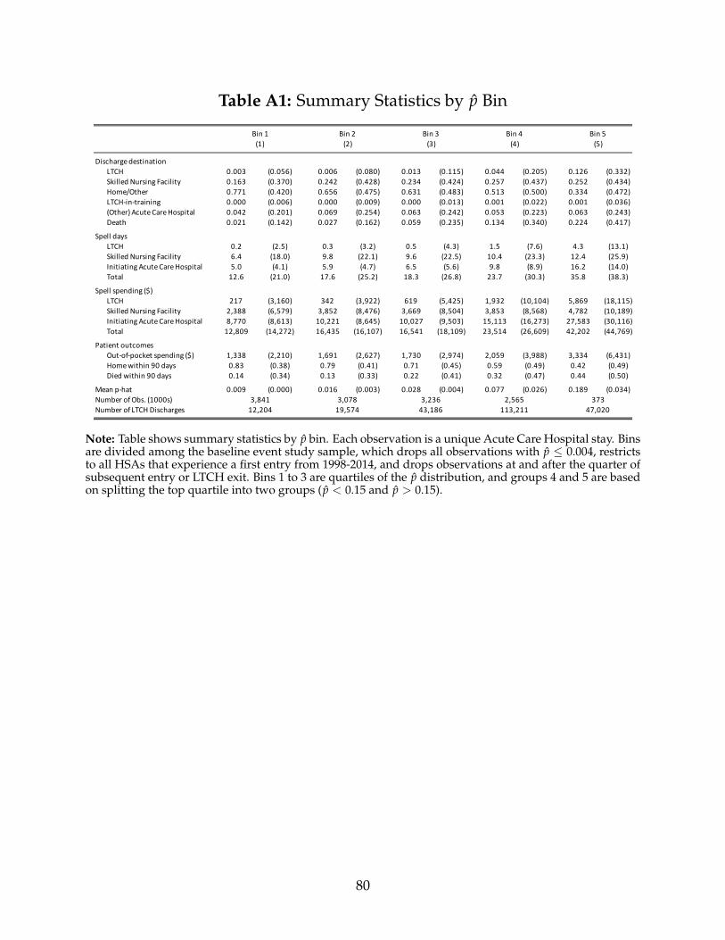
Table A1: Summary Statistics by p̂ Bin
Discharge destinationLTCH 0.003 (0.056) 0.006 (0.080) 0.013 (0.115) 0.044 (0.205) 0.126 (0.332)Skilled Nursing Facility 0.163 (0.370) 0.242 (0.428) 0.234 (0.424) 0.257 (0.437) 0.252 (0.434)Home/Other 0.771 (0.420) 0.656 (0.475) 0.631 (0.483) 0.513 (0.500) 0.334 (0.472)LTCH-in-training 0.000 (0.006) 0.000 (0.009) 0.000 (0.013) 0.001 (0.022) 0.001 (0.036)(Other) Acute Care Hospital 0.042 (0.201) 0.069 (0.254) 0.063 (0.242) 0.053 (0.223) 0.063 (0.243)Death 0.021 (0.142) 0.027 (0.162) 0.059 (0.235) 0.134 (0.340) 0.224 (0.417)
Spell daysLTCH 0.2 (2.5) 0.3 (3.2) 0.5 (4.3) 1.5 (7.6) 4.3 (13.1)Skilled Nursing Facility 6.4 (18.0) 9.8 (22.1) 9.6 (22.5) 10.4 (23.3) 12.4 (25.9)Initiating Acute Care Hospital 5.0 (4.1) 5.9 (4.7) 6.5 (5.6) 9.8 (8.9) 16.2 (14.0)Total 12.6 (21.0) 17.6 (25.2) 18.3 (26.8) 23.7 (30.3) 35.8 (38.3)
Spell spending ($)LTCH 217 (3,160) 342 (3,922) 619 (5,425) 1,932 (10,104) 5,869 (18,115)Skilled Nursing Facility 2,388 (6,579) 3,852 (8,476) 3,669 (8,504) 3,853 (8,568) 4,782 (10,189)Initiating Acute Care Hospital 8,770 (8,613) 10,221 (8,645) 10,027 (9,503) 15,113 (16,273) 27,583 (30,116)Total 12,809 (14,272) 16,435 (16,107) 16,541 (18,109) 23,514 (26,609) 42,202 (44,769)
Patient outcomesOut-of-pocket spending ($) 1,338 (2,210) 1,691 (2,627) 1,730 (2,974) 2,059 (3,988) 3,334 (6,431)Home within 90 days 0.83 (0.38) 0.79 (0.41) 0.71 (0.45) 0.59 (0.49) 0.42 (0.49)Died within 90 days 0.14 (0.34) 0.13 (0.33) 0.22 (0.41) 0.32 (0.47) 0.44 (0.50)
Mean p-hat 0.009 (0.000) 0.016 (0.003) 0.028 (0.004) 0.077 (0.026) 0.189 (0.034)Number of Obs. (1000s)Number of LTCH Discharges
Bin 4(4)
Bin 5(5)
Bin 1(1)
Bin 2(2)
Bin 3(3)
3,841 3,078 3,236 2,565 37312,204 19,574 43,186 113,211 47,020
Note: Table shows summary statistics by p̂ bin. Each observation is a unique Acute Care Hospital stay. Binsare divided among the baseline event study sample, which drops all observations with p̂ ≤ 0.004, restrictsto all HSAs that experience a first entry from 1998-2014, and drops observations at and after the quarter ofsubsequent entry or LTCH exit. Bins 1 to 3 are quartiles of the p̂ distribution, and groups 4 and 5 are basedon splitting the top quartile into two groups (p̂ < 0.15 and p̂ > 0.15).
80

Table A2: First Stage and IV by p̂ Bin
Discharge destinationLTCH 0.005 (0.001) 0.009 (0.001) 0.017 (0.002) 0.044 (0.004) 0.092 (0.009)Skilled Nursing Facility -1.343 (0.613) -1.677 (0.499) -0.997 (0.244) -0.748 (0.108) -0.674 (0.103)Home/Other 0.262 (0.689) 0.432 (0.475) -0.204 (0.259) -0.288 (0.103) -0.244 (0.105)LTCH-in-training 0.008 (0.005) 0.001 (0.003) 0.003 (0.002) 0.008 (0.004) 0.007 (0.006)(Other) Acute Care Hospital 0.217 (0.355) 0.456 (0.314) 0.180 (0.130) 0.030 (0.053) -0.035 (0.064)Death -0.144 (0.171) -0.211 (0.119) 0.018 (0.104) -0.002 (0.072) -0.054 (0.101)
Spell daysLTCH 28.4 (3.1) 25.0 (2.1) 28.1 (1.6) 28.7 (1.4) 30.0 (1.9)Skilled Nursing Facility -23.9 (27.6) -3.7 (21.1) -19.9 (11.6) -12.6 (5.5) -16.2 (6.3)Initiating Acute Care Hospital -5.8 (7.7) -7.7 (4.8) -4.8 (4.0) -5.7 (2.6) -15.5 (4.8)Total -5.7 (34.6) 17.3 (24.0) 4.0 (13.9) 9.6 (7.0) 1.5 (9.4)
Spell spending ($)LTCH 34,141 (4,160) 28,373 (2,592) 33,445 (2,164) 35,367 (2,170) 34,210 (4,079)Skilled Nursing Facility 2,855 (11,166) 9,179 (9,640) -2,374 (4,368) -2,621 (2,230) -5,593 (2,714)Initiating Acute Care Hospital -8,730 (19,212) -6,010 (12,670) -6,139 (5,476) 4,738 (4,504) -12,256 (9,340)Total 25,426 (24,402) 35,264 (16,728) 26,120 (8,062) 34,874 (6,147) 20,649 (11,065)
Patient outcomes Out-of-pocket spending ($) 499 (3,221) 1,786 (2,229) 576 (1,321) 2,071 (828) 3,928 (1,381)Home within 90 days 0.19 (0.65) 0.24 (0.52) -0.21 (0.29) -0.27 (0.13) -0.04 (0.11)Died within 90 days -0.62 (0.45) -0.33 (0.30) 0.02 (0.17) 0.13 (0.10) 0.15 (0.11)
Number of Obs. (1000s) 3,449 2,765 2,931 2,336 343
Bin 4(4)
Bin 5(5)
Bin 1(1)
Bin 2(2)
Bin 3(3)
Note: Table displays first stage (top row) and IV estimates (all other rows) for each p̂ bin. Standard errorsare clustered at the HSA level (186 clusters). Bins 1 to 3 are quartiles of the p̂ distribution, and bins 4 and 5are based on splitting the top quartile into two groups (p̂ < 0.15 and p̂ > 0.15).
81

Table A3: Mortality Horizons
Estimate S.E. Mean Proportional
Change
Died within30 days 0.056 (0.058) 0.12 0.4760 days 0.065 (0.065) 0.17 0.3990 days 0.101 (0.065) 0.20 0.51180 days 0.091 (0.067) 0.26 0.35365 days 0.003 (0.072) 0.35 0.01
Number of Obs. (000s)
Baseline Sample
11,824
Note: Table displays IV estimates from equations (4) and (5), estimated on the baselinesample, along with the mean and the implied proportional change in the mortality rate.Mortality is measured from the day of admission to the initiating Acute Care Hospital.Standard errors are clustered at the HSA-bin level.
82

Table A4: Heterogeneity by ICU/CCU and Mechanical Ventilator
Discharge destinationSkilled Nursing Facility -0.689 (0.069) -1.015 (0.137) -0.700 (0.069) -0.901 (0.115) -0.673 (0.074) -0.851 (0.098)Home/Other -0.302 (0.067) -0.134 (0.141) -0.218 (0.066) -0.257 (0.113) -0.314 (0.082) -0.162 (0.094)LTCH-in-training 0.006 (0.004) 0.008 (0.002) 0.006 (0.004) 0.008 (0.002) 0.007 (0.004) 0.007 (0.003)(Other) Acute Care Hospital -0.009 (0.043) 0.155 (0.064) -0.030 (0.043) 0.132 (0.057) -0.080 (0.049) 0.097 (0.048)Death -0.007 (0.060) -0.015 (0.079) -0.059 (0.057) 0.018 (0.072) 0.060 (0.094) -0.092 (0.054)
Spell daysLTCH 28.6 (1.1) 28.8 (1.3) 30.0 (1.2) 27.2 (1.1) 31.5 (1.5) 27.5 (1.0)Skilled Nursing Facility -12.8 (3.5) -19.2 (7.2) -15.8 (3.8) -14.5 (5.9) -19.4 (4.4) -11.1 (4.9)Initiating Acute Care Hospital -8.0 (2.4) -4.8 (2.7) -8.8 (2.6) -3.9 (2.2) -9.9 (2.8) -7.7 (2.2)Total 9.1 (4.9) 4.0 (8.8) 6.4 (5.2) 8.8 (7.4) 3.0 (6.9) 9.4 (6.1)
Spell spending ($)LTCH 34,798 (1,955) 32,886 (1,754) 36,450 (2,155) 31,674 (1,593) 40,788 (2,593) 31,624 (1,531)Skilled Nursing Facility -4,090 (1,470) -2,019 (2,718) -5,285 (1,507) -1,419 (2,338) -6,820 (1,763) -988 (1,914)Initiating Acute Care Hospital -235 (5,580) -2,745 (2,923) -570 (6,255) 229 (2,664) -4,563 (7,131) -556 (3,560)Total 31,935 (6,472) 25,818 (5,345) 31,108 (7,189) 29,780 (4,572) 29,033 (8,852) 30,695 (5,047)
Patient outcomes Out-of-pocket spending ($) 3,166 (706) 639 (960) 3,361 (795) 1,151 (802) 3,172 (977) 2,124 (738)Home within 90 days -0.157 (0.074) -0.176 (0.157) -0.108 (0.075) -0.218 (0.131) -0.125 (0.095) -0.159 (0.106)Died within 90 days 0.176 (0.070) -0.015 (0.120) 0.165 (0.070) 0.041 (0.101) 0.221 (0.097) -0.003 (0.077)
Number of Obs. (000s)
Patient Not on Mechanical Ventilator
3 or More Days in ICU/CCU
Fewer Than 3 Days in ICU/CCU
8 or More Days in ICU/CCU
Fewer than 8 Days in ICU/CCU
Patient on Mechanical Ventilator
10,900
(1) (2) (3) (4) (5) (6)
3,297 8,527 1,825 10,000 924
Note: Table displays IV estimates for different splits of the data. Columns 1 and 2 show plots separately by whether the patient spent 3 ormore days in an intensive care unit (ICU) or coronary care unit (CCU) prior to LTCH discharge. Columns 3 and 4 show plots separatelyby whether the patient spent 8 or more days in a ICU / CCU. Columns 5 and 6 split the analysis by whether was placed on a mechanicalventilator at the initiating ACH. Standard errors are clustered at the HSA-bin level.
83

Table A5: Heterogeneity by Pre-Entry Discharge and For-Profit Status
Discharge destinationSkill Nursing Facility -0.713 (0.085) -0.765 (0.121) -0.745 (0.101) -0.824 (0.113)Home/Other -0.272 (0.088) -0.292 (0.115) -0.409 (0.100) 0.040 (0.107)LTCH-in-training 0.003 (0.003) 0.014 (0.006) 0.004 (0.003) 0.010 (0.005)(Other) Acute Care Hospital 0.048 (0.041) -0.036 (0.070) 0.105 (0.054) -0.097 (0.059)Death -0.067 (0.061) 0.080 (0.080) 0.045 (0.067) -0.129 (0.074)
Spell daysLTCH 29.9 (0.9) 27.4 (1.8) 29.1 (1.3) 28.5 (1.6)Skilled Nursing Facility -16.7 (5.1) -9.7 (5.6) -10.4 (5.0) -19.8 (6.4)Initiating Acute Care Hospital -11.4 (2.5) -4.6 (3.1) -10.2 (2.9) -7.2 (2.6)Total 2.3 (6.7) 11.6 (7.1) 11.6 (6.6) -3.1 (7.8)
Spell spending ($)LTCH 36,363 (1,582) 30,983 (3,167) 34,447 (2,118) 35,546 (3,383)Skilled Nursing Facility -3,007 (1,716) -2,846 (2,917) 60 (2,063) -6,841 (2,651)Initiating Acute Care Hospital -1,925 (4,806) -1,053 (5,553) -6,250 (5,134) 6,501 (5,989)Total 31,769 (5,791) 24,867 (7,797) 33,970 (6,287) 25,185 (7,997)
Patient outcomes Out-of-pocket spending ($) 2,347 (824) 2,260 (977) 3,459 (796) 400 (1,161)Home within 90 days 0.103 (0.090) -0.563 (0.164) -0.223 (0.111) -0.060 (0.148)Died within 90 days 0.014 (0.077) 0.276 (0.111) 0.192 (0.080) -0.062 (0.109)
Number of Obs. (1000s)
Not for ProfitBelow Median LTCH
DischargesAbove Median LTCH
DischargesFor Profit
4,225
(1) (2) (3) (4)
5,551 4,590 7,599
Note: Table displays IV estimates for different splits of the data. Columns 1 and 2 split thesample by whether the HSA had below or above the median LTCH discharge share. Columns3 and 4 split the analysis by whether the LTCH is a for-profit or non-for-profit organization. Incolumns 1 and 2, the pre-entry discharge rate is based on the rate in period r = −6. For thesecolumns, we exclude 30 of the 186 HSAs where we do not observe outcomes in period r = −6.Standard errors are clustered at the HSA-bin level level.
84

Table A6: Selected Features
Other
Respiratory failure; insufficiency; arrest Mycoses AgeSepticemia Intestinal obstruction without hernia
Other aftercare Complication of device; implant or graftNutritional deficiencies Upper respiratory disease
Complications of surgical procedures of medical care Acute and unspecified renal failurePleurisy; pneumothroax; pulmonary collapse Other fractures
Secondary malignancies Urinary tract infectionsAcute cerebrovascular disease Essential hypertension
Pneumonia Congestive heart failure; nonhypertensiveIntracranial injury Disorders of lipid metabolism
Chronic ulcer of skin Bacterial infectionAspiration pneumonitis; food/vomitus Peri; endo-; and myocarditis; cardiomyopathy
Infective arthritis and osteomyelitis Skin and subcutaneous tissue infectionsParalysis Gangrene
Neck of femur (hip) fracture Peritonitis and intestinal abscessSpinal cord injury Chronic obstructive pulmonary disease and bronchiectasis
Clinical Classification Software (CCS) Categories
Note: Table lists potential predictors for the LTCH discharge regression tree model which were actuallyselected.
85

Table A7: Distribution of p̂
All ACH admissions High p-hat sample All close ACH admissions(1) (2) (3)
Mean 0.020 0.189 0.022S.D. 0.031 0.034 0.035Median 0.009 0.179 0.009Percentile
10th 0.004 0.159 0.00425th 0.004 0.164 0.00475th 0.024 0.206 0.02590th 0.053 0.218 0.06295th 0.085 0.272 0.09299th 0.173 0.291 0.181
Discharged to LTCH 0.009 0.110 0.022
Number of Obs. (1000s) 163,649 2,338 32,708
Note: Table presents the distribution of p̂ for all Acute Care Hospital (ACH) admissions, ACH admissionswith a high predicted probability of LTCH discharge (p̂>0.15), and all ACH admissions with an LTCHwithin 5 kilometers.
86

Table A8: Alternative Transition Periods
Discharge destinationSkill Nursing Facility -0.791 (0.075) -0.676 (0.049) -0.716 (0.070)Home/Other -0.236 (0.073) -0.245 (0.052) -0.318 (0.073)LTCH-in-training 0.007 (0.003) -0.006 (0.003) 0.001 (0.002)(Other) Acute Care Hospital 0.044 (0.040) -0.016 (0.027) 0.067 (0.038)Death -0.024 (0.051) -0.057 (0.034) -0.034 (0.053)
Spell daysLTCH 28.9 (1.0) 29.2 (0.8) 29.0 (1.1)Skill Nursing Facility -14.3 (3.9) -10.5 (2.4) -13.2 (3.6)Initiating Acute Care Hospital -8.6 (2.1) -7.7 (1.4) -9.2 (2.2)Total 6.6 (5.1) 10.2 (3.3) 7.2 (4.9)
Spell spending ($)LTCH 34,569 (1,708) 35,585 (1,307) 35,100 (1,691)Skill Nursing Facility -3,024 (1,572) -2,709 (1,121) -2,852 (1,578)Initiating Acute Care Hospital -2,016 (3,800) -914 (2,319) -2,653 (3,928)Total 29,583 (4,810) 31,295 (3,240) 29,880 (4,657)
Patient outcomes Out-of-pocket spending ($) 2,420 (640) 3,074 (469) 2,486 (677)Home within 90 days -0.17 (0.09) -0.08 (0.06) -0.05 (0.09)Died within 90 days 0.10 (0.07) 0.02 (0.04) 0.08 (0.07)
Number of Obs. (1000s)
Baseline Narrow transition period (1) (2)
Wide transition period (3)
11,824 12,438 10,737
Note: Table displays IV estimates from equations 4 and 5, estimated for the baseline sample, droppingalternative transition period observations. The narrow transition period is defined as r ∈ [−2, 0] and thewide transition period is defined as r = −5, 5]. Standard errors are clustered at the HSA-bin level (930clusters).
87

Table A9: Robustness
Discharge destinationSkill Nursing Facility -0.791 (0.075) -0.795 (0.075) -0.765 (0.081) -0.760 (0.074) -0.837 (0.082) -0.770 (0.090)Home/Other -0.236 (0.073) -0.225 (0.073) -0.182 (0.079) -0.225 (0.075) -0.201 (0.086) -0.170 (0.085)LTCH-in-training 0.007 (0.003) 0.008 (0.003) 0.006 (0.002) -0.009 (0.008) 0.007 (0.003) 0.007 (0.003)(Other) Acute Care Hospital 0.044 (0.040) 0.054 (0.041) -0.011 (0.041) 0.002 (0.034) 0.062 (0.052) -0.020 (0.042)Death -0.024 (0.051) -0.042 (0.052) -0.048 (0.052) -0.009 (0.048) -0.031 (0.061) -0.047 (0.058)
Spell daysLTCH 28.9 (1.0) 28.2 (1.1) 27.9 (1.0) 28.3 (1.0) 28.6 (1.1) 26.6 (1.2)Skill Nursing Facility -14.3 (3.9) -14.3 (3.9) -10.0 (4.1) -14.0 (3.6) -16.0 (4.2) -12.6 (4.4)Initiating Acute Care Hospital -8.6 (2.1) -8.7 (2.1) -7.2 (2.0) -8.0 (1.8) -10.1 (2.3) -13.1 (2.5)Total 6.6 (5.1) 5.6 (5.1) 10.9 (5.3) 5.6 (4.9) 4.0 (5.7) 2.2 (5.7)
Spell spending ($)LTCH 34,569 (1,708) 33,645 (1,903) 34,646 (1,866) 33,903 (1,892) 33,440 (1,811) 34,420 (1,828)Skill Nursing Facility -3,024 (1,572) -3,391 (1,610) -2,201 (1,423) -2,965 (1,432) -2,760 (1,710) -1,182 (1,762)Initiating Acute Care Hospital -2,016 (3,800) -1,806 (3,783) 1,829 (3,699) -4,343 (3,331) -2,355 (4,530) -7,557 (4,308)Total 29,583 (4,810) 28,740 (5,001) 34,143 (4,973) 24,960 (4,582) 29,606 (5,925) 26,656 (5,493)
Patient outcomes Out-of-pocket spending ($) 2,420 (640) 2,245 (656) 2,559 (647) 2,008 (610) 2,167 (718) 2,122 (749)Home within 90 days -0.172 (0.088) -0.169 (0.091) 0.014 (0.080) -0.217 (0.084) -0.058 (0.100) 0.089 (0.090)Died within 90 days 0.101 (0.065) 0.084 (0.065) 0.032 (0.065) 0.128 (0.063) 0.118 (0.076) 0.042 (0.076)
Number of Obs. (1000s) 12,30711,824 38,027 7,993 15,346 8,719
County
(6)
Include subsequent entries
(4)
Exclude dual eligibles
(5)
BaselineInclude HSAs with
prior LTCHs3 year balanced panel
(1) (2) (3)
Note: Table displays IV estimates from equations 4 and 5, estimated on the baseline sample. Standard errors are clustered at the geography-bin level. Column 1 presents our baseline results. In column 2 we include all HSAs that already had at least one LTCH as of 1998 as controls.In column 3 we restrict to all observations with a balanced 3-year panel around entry (restricting to entries that occurred between 2001 and2011). In column 4 we do not drop subsequent entries, and in column 5 we restrict to non-dually eligible beneficiary years. In column 6 weuse counties as the geographic unit; 148 counties experienced a first LTCH entry.
88

Table A10: Pooled versus Interacted First Stage
Discharge destinationSkill Nursing Facility -0.791 (0.075) -0.926 (0.165)Home/Other -0.236 (0.073) -0.209 (0.170)LTCH-in-training 0.007 (0.003) 0.006 (0.003)(Other) Acute Care Hospital 0.044 (0.040) 0.130 (0.095)Death -0.024 (0.051) -0.001 (0.061)
Spell daysLTCH 28.9 (1.0) 28.1 (1.2)Skill Nursing Facility -14.3 (3.9) -13.5 (7.3)Initiating Acute Care Hospital -8.6 (2.1) -4.5 (2.9)Total 6.6 (5.1) 10.5 (9.1)
Spell spending ($)LTCH 34,569 (1,708) 33,607 (1,966)Skill Nursing Facility -3,024 (1,572) -603 (3,462)Initiating Acute Care Hospital -2,016 (3,800) 1,196 (5,674)Total 29,583 (4,810) 34,356 (7,821)
Patient outcomes Out-of-pocket spending ($) 2,420 (640) 1,981 (925)Home within 90 days -0.17 (0.09) -0.21 (0.21)Died within 90 days 0.10 (0.07) 0.04 (0.10)
Number of Obs. (1000s)
Baseline Non-interacted first stage(1) (2)
11,824 11,824
Note: Table displays IV estimates from 4 and 5 (interacted first stage) and equations 2 and 3 (non-interactedfirst stage) estimated on the baseline sample. Standard errors are clustered at the HSA level for the non-interacted specification (186 clusters) and at the HSA-bin level for the interacted first stage specification(930 clusters).
89

Table A11: Summary Statistics: Alternative Spell Definition
Spell daysLTCH 0.7 (5.1) 1.2 (7.2) 1.4 (7.8)Skill Nursing Facility 9.0 (21.5) 14.5 (29.2) 15.3 (30.2)Initiating Acute Care Hospital 6.9 (6.7) 6.9 (6.7) 6.7 (6.4)Total 18.0 (26.5) 32.2 (39.1) 33.0 (40.3)
Home health care 41.5 (79.8)Hospice 7.1 (34.1)Total (incl. home health and hospice) 81.6 (99.8)
Spell spendingLTCH 916 (7,294) 1,650 (10,165) 1,997 (11,142)Skill Nursing Facility 4,169 (10,112) 6,655 (13,589) 7,167 (14,266)Initiating Acute Care Hospital 11,997 (12,415) 11,997 (12,415) 12,181 (12,461)Total 19,233 (22,538) 35,569 (36,555) 37,236 (38,279)
Home health care 2,697 (5,058)Hospice 1,303 (5,677)Total (incl. home health and hospice) 41,235 (39,814)
Number of Obs. (1000s)
(1) (2) (3)
13,098 12,704 9,561
Continuous spells 365-day spells 365-day spells1998-2014 2002-2014
Note: Each observation is a unique Acute Care Hospital stay. Includes all HSAs that experience a firstentry from 1998-2014, dropping observations at and after the quarter of subsequent entry or LTCH exitand excluding all observations with the minimum p̂ value (the Baseline Sample). Column 1 summarizesoutcomes using the continuous spell definitions for utilization used in our baseline utilization analysis;column 1 is the same as the baseline column in Table 3 of the main exhibits. All subsequent columnsrepresent a single deviation from the baseline, as indicated. Column 2 summarizes utilization using a 365-days post admission spell, summing all days and spending at an ACH, LTCHs, SNFs, IRFs, or LTCHs-in-Training with admission dates within 365 days of the admission date at the index acute care stay. Column3 restricts to 2002-2014 (the years when we have hospice and home health claims data). For these years, weincorporate utilization at home health and hospice into the 365-day post admission spell definition.
90

Table A12: Event Study Estimates: Alternative Spell Definition
Discharged to Home/Other -0.327 (0.100)Home health care 0.015 (0.063)Hospice -0.070 (0.039)Home (no care) -0.114 (0.071)Other -0.158 (0.059)
Spell daysLTCH 28.9 (1.0) 47.7 (1.2) 49.5 (1.6)Skill Nursing Facility -14.3 (3.9) -26.8 (4.9) -21.7 (6.0)Initiating Acute Care Hospital -8.6 (2.1) -8.6 (2.1) -5.8 (2.6)Total 6.6 (5.1) 2.7 (6.6) 7.8 (7.9)
Home health care 19.6 (18.0)Hospice -1.2 (5.5)Total (incl. home health and hospice) 26.2 (21.2)
Spell spendingLTCH 34,569 (1,708) 56,499 (1,868) 60,876 (2,106)Skill Nursing Facility -3,024 (1,572) -7,128 (2,102) -8,085 (2,310)Initiating Acute Care Hospital -2,016 (3,800) -2,016 (3,800) 9,841 (4,470)Total 29,583 (4,810) 40,507 (7,022) 55,873 (8,065)
Home health care 916 (1,191)Hospice -313 (917)Total (incl.home health and hospice) 56,477 (8,305)
Number of Obs. (000s)
1998-2014
(1) (2) (3)
2002-2014Continuous spells 365-day spells 365-day spells
11,824 11,431 5,997
Note: Table displays IV estimates from equations 4 and 5, estimated on the baseline sample. Standarderrors are clustered at the HSA-bin level.
91

Table A13: Event Study Estimates: Outlier Payments
Spell spending ($)LTCH 34,569 (1,708) 5,155 (791) 39,724 (1,922)Skill Nursing Facility -3,024 (1,572) 178 (57) -2,846 (1,575)Initiating Acute Care Hospital -2,016 (3,800) 4,429 (8,184) 2,413 (9,836)Total 29,583 (4,810) 10,884 (8,489) 40,466 (10,245)
Baseline Outlier Baseline + Outlier(1) (2) (3)
Note: Table displays IV estimates from equations 4 and 5, estimated on the baseline sample. Column 1shows effects on the baseline spending measures, which is the sum of Medicare reimbursements excludingoutlier payments. Column 2 shows effects on outlier payments. Column 3 shows effects on combinedbaseline and outlier payments. Standard errors are clustered at the HSA-bin level.
92