LIGHT AND COLOUR IN THE BUILT ENVIRONMENTler.letras.up.pt/uploads/ficheiros/14898.pdf · expressed...
18
Pernão, J. (2016), Light and colour in the built environment. In: Homem, P.M. (ed.) Lights On… Cultural Heritage and Museums!. Porto: LabCR | FLUP, pp.62-79 62 1 CIAUD - Faculdade de Arquitetura da Universidade de Lisboa | APCor - Associação Portuguesa da Cor, [email protected] LIGHT AND COLOUR IN THE BUILT ENVIRONMENT João Pernão 1 ABSTRACT In the Book of Genesis there is a dramatic change in the world when God says: Fiat Lux (Let there be light)! Chaos was ended. In our everyday life when we hear a noise while asleep at night, we are afraid because there is no light, and if there is no light we don’t see anything, i.e., we do not know. When we turn on the light, everything around us gets organized: light ends the chaos of darkness. In fact, we rely more than 80% on our sight sense to bring us what is happening around us. Light is the genesis of visual perception, and colour is its vehicle. We understand the world around us by the organization of colour stimuli received by our eyes, transmitted to our brain and interpreted there. We can say that colour is the form of space because it is through colour that we perceive the limits and the forms of our environment. Therefore, colour should be studied, together with light, its origin, as the main actor in space perception, and therefore in architecture. With these assumptions in mind, we have to distinguish between Inherent Colour and Perceived Colour. The first is the colour of the surfaces, which could be read by a colorimeter, without the interference of the human perception or the outside lighting conditions. The second is the colour perceived by the human being, always different according to three variables: light, the observer and the surface. If any of these variables change, the perception will be different: if the light changes its position, or its characteristics, if the observer moves to another place or looks in a different direction, if the surface is placed under or above the observer, or with a different angle, etc. Our work as Colour Consultant proves that the knowledge of this continuous variation in colour perception is a tool that we can use to design better spaces for human life and comfort. KEYWORDS Light; Colour; Perception; Built Environment; Architecture
Transcript of LIGHT AND COLOUR IN THE BUILT ENVIRONMENTler.letras.up.pt/uploads/ficheiros/14898.pdf · expressed...

Pernão, J. (2016), Light and colour in the built environment. In: Homem, P.M. (ed.) Lights On…
Cultural Heritage and Museums!. Porto: LabCR | FLUP, pp.62-79
62
1 CIAUD - Faculdade de Arquitetura da Universidade de Lisboa | APCor - Associação Portuguesa da Cor, [email protected]
LIGHT AND COLOUR IN THE BUILT
ENVIRONMENT
João Pernão1
ABSTRACT In the Book of Genesis there is a dramatic change in the world when God says: Fiat Lux (Let there be light)! Chaos was ended. In our everyday life when we hear a noise while asleep at night, we are afraid because there is no light, and if there is no light we don’t see anything, i.e., we do not know. When we turn on the light, everything around us gets organized: light ends the chaos of darkness. In fact, we rely more than 80% on our sight sense to bring us what is happening around us.
Light is the genesis of visual perception, and colour is its vehicle. We understand the world around us by the organization of colour stimuli received by our eyes, transmitted to our brain and interpreted there. We can say that colour is the form of space because it is through colour that we perceive the limits and the forms of our environment. Therefore, colour should be studied, together with light, its origin, as the main actor in space perception, and therefore in architecture.
With these assumptions in mind, we have to distinguish between Inherent Colour and Perceived Colour. The first is the colour of the surfaces, which could be read by a colorimeter, without the interference of the human perception or the outside lighting conditions. The second is the colour perceived by the human being, always different according to three variables: light, the observer and the surface. If any of these variables change, the perception will be different: if the light changes its position, or its characteristics, if the observer moves to another place or looks in a different direction, if the surface is placed under or above the observer, or with a different angle, etc. Our work as Colour Consultant proves that the knowledge of this continuous variation in colour perception is a tool that we can use to design better spaces for human life and comfort.
KEYWORDS Light; Colour; Perception; Built Environment; Architecture

Pernão, J. (2016), Light and colour in the built environment. In: Homem, P.M. (ed.) Lights On…
Cultural Heritage and Museums!. Porto: LabCR | FLUP, pp.62-79
63
1. The importance of a holistic approach to colour and light: the
ancient discipline of Optics
Colour is nowadays seen as something that makes part of our daily
choices concerning objects, clothes, cars, etc., and we tend to see it as
something very personal. Light, on the other hand, is something that
we only think about when we do not have it, when it is too dark for us
to perform the tasks we need. And usually we do not correlate them
as something that in fact constitutes the main origin of what we could
call “our reality”. If we consider that sight is the main vehicle for
conveying sensations from our environment (more than 80%) to one’s
self, that light is the cause to all visibility, and that colour is the
unavoidable interaction between light and matter, we begin to
understand their importance, and their fundamental relationship.
This holistic approach, and its importance, was recognized throughout
History from the classic world to the XIX century where it becomes
divided in various specific fields of knowledge corresponding to the
scientific specialisation that exist until today. In ancient Greece, the
discipline of Optics had a vast epistemological scope and was seen as
the most fundamental way to study and understand Nature, the key
that could unlock and reveal its most hidden secrets (Lindberg, 1976,
p.ix). Euclid’s and Ptolemy’s Optics were among the first pillars for
discussion of the subject, but we find discussions on it from the
Atomists, Plato, Aristotle, Galen, the Arabs Al Kindi and Al Hazen, to
the “modern” Optics of Kepler and Newton, just to cite some. The
discussion of processes of visual perception was crucial to the progress
of knowledge. This discipline of Optics could encompass subjects such
as anatomy and physiology of the eye, the mathematical principles of
perspective, psychology linked to visual perception and the nature of
light and the laws of its propagation. It has always been a domain of

Pernão, J. (2016), Light and colour in the built environment. In: Homem, P.M. (ed.) Lights On…
Cultural Heritage and Museums!. Porto: LabCR | FLUP, pp.62-79
64
reflection for thinkers and philosophers and currently one can easily
recognize the characteristics and controversies of the main currents of
thought throughout the various eras. Optics was a holistic field of
knowledge for the explanation of the universe and its relationship with
the human being.
We should think again of light and colour within this interdisciplinary
frame because it is the only way to understand their importance for
the perception of our environment and therefore, for architecture and
the built environment.
2. Light and colour perception in Architecture
In order to have visual information through our sight sense we must
have light; hence, light is considered the first condition for visual
perception. Additionally, whenever there is light there is colour. Being
the result of light’s interaction with matter, colour is responsible for
space perception, so we can state that colour is the form of space.
In De Coloribus, Aristotle notices this fact when considering that
visibility is only possible with light, just as bodies’ visibility is only
possible through colour (Aristóteles, 2001).
The importance of colour in space perception is well expressed by
Goethe in his Theory of Colours. He claims that nature seeks to
manifest itself to the sense of sight through colours (Goethe, 1988).
But more than concurring Aristotle’s previous perspective, he
innovates when saying that colours are directly related to emotions:
Since colour occupies so important a place in the series of elementary
phenomena, (… ) we shall not be surprised to find that its effects are at
all times decided and significant, and that they are immediately
associated with the emotions of the mind (Goethe, 1988, p.304).

Pernão, J. (2016), Light and colour in the built environment. In: Homem, P.M. (ed.) Lights On…
Cultural Heritage and Museums!. Porto: LabCR | FLUP, pp.62-79
65
The unavoidable relationship between light and colour is also well
expressed by Johannes Itten in his book Art of Color, where he
considers colour as the daughter of light (Itten, 1997). He also
poetically relates these elements saying that Light, that first
phenomenon of the world, reveals to us the spirit and living soul of the
world through colors (Itten, 1997, p.13).
Colour is an emotional link between the human being and what lies
around him. Cézanne used to say that Colour is the place where our
brain and the universe meet (Merleau-Ponty, 1993). To better
understand these concepts, we must empty our mind of any
preconceived ideas and establish a new understanding for the role of
light and colour in architecture.
Light is a metaphor for knowledge. To see is to know. Accordingly,
when we design spaces we must take into account that it is through
light that we reveal (or conceal) the architectural spaces, their forms,
their proportions, their textures and colours. Light shapes our
perception, as stated in Le Corbusier’s (Le Corbusier, 1977) definition
of Architecture: the learned, correct and magnificent play of volumes
in light (Le Corbusier, 1977, p.16). And as architectural spaces are
revealed through light, we must not simply imagine their outcome
during the day, but also during the night under artificial light.
Architects should not rely on Electric Engineers for the aesthetical
outcome of architectural spaces at night.
Since the spaces are revealed by light, the role of colour is inherent to
their formalization: if spaces are defined by their visible limits, these
limits have a certain materiality that is brought to us by their colours.
It should be made clear that when we talk about colour we are dealing
with everything we see in our environment, including raw materials
like wood, stone, metal, etc. Jan de Heer (2009) in his The Architectonic

Pernão, J. (2016), Light and colour in the built environment. In: Homem, P.M. (ed.) Lights On…
Cultural Heritage and Museums!. Porto: LabCR | FLUP, pp.62-79
66
Colour states that Polychromy (…) involves the treatment of the
surfaces that are exposed to everyday use. In present-day architecture,
this often relates to the choice and ordering of the materials (De Heer,
2009, p.6).
Colour is intertwined with light. The presence of a colour in space
depends on its illumination: a strong colour could have a subtle
presence if it is dimly illuminated and a subtle colour could have a
strong presence if it is brightly illuminated. Furthermore, there are
colours that need more light to accomplish their identity, like some
reds, and colours that live well in the shadow, like some Blues (Le
Corbusier, 2006). On the other hand, our colour perception also varies
with the circumstances of observation (distance, space location, etc.)
and with the characteristics of the object’s surface (texture, gloss level,
etc.).
In order to understand light and colour’s relationship with space we
have to admit that they play a continuous game of variations. Colour
perception is the result of three variables: Light, Object and Observer.
If any of these variables change, the colour perception will be
different. But the colour measured over the surface, for instance with
a colorimeter, will be the same because it has no interference with the
human perception or the outside lighting conditions. For this reason,
we have to define two kinds of colours: Inherent Colour and Perceived
Colour. For each inherent colour, i.e. the colour measured over a
surface; there will be thousands of perceived colours, depending on
the variation of the light, the object and the observer’s point of view.
Josef Albers (1975), a prominent artist and a Bauhaus teacher, based
his work upon the variations of colour perception, stating: In visual
perception, a color is almost never seen as it really is - as it physically
is. This fact makes color the most relative medium in art (Albers, 1975,

Pernão, J. (2016), Light and colour in the built environment. In: Homem, P.M. (ed.) Lights On…
Cultural Heritage and Museums!. Porto: LabCR | FLUP, pp.62-79
67
p.1). We can follow this notion back to the work of Aristotle
(Aristóteles, 2001), probably the first to isolate the colour
phenomenon, when he says:
We do not see any of the colours pure as they really are, but all are
mixed with others; or if not mixed with any other colour they are mixed
with rays of light and with shadows, and so they appear different and
not as they are (Aristóteles, 2001, p.17).
In Architecture, perceived colours are the ones that interest us, which
we can model with light, transforming the space perception. But when
it comes to formalizing a Colour Study and transmitting our ideas to be
applied at the worksite, we have to use colour codes, that is to say,
inherent colours.
3. Design using light and colour variation
Variation is the key for perception: if one’s perceptive visual field lacks
variation, one cannot distinguish forms or volumes (like in a foggy day).
Colour and light variation allows us to form coherent associations,
detach figures from the background, and in this manner, form a mental
space where we can act and move safely.
Colour variation was Leonardo da Vinci’s first concern when teaching
painting techniques. In his Trattato della Pittura he refers that the first
object of a painter is to make a simple flat surface appear like a relievo,
and some of its parts detached from the ground (Da Vinci, 2002). This
idea is interdisciplinary: anthropologist Gregory Bateson (1987)
stipulates that perception is based on difference: change is the food of
perception. Psychologist James Gibson also defines the variation, or
change, as the main factor for visual perception (Gibson, 1986).

Pernão, J. (2016), Light and colour in the built environment. In: Homem, P.M. (ed.) Lights On…
Cultural Heritage and Museums!. Porto: LabCR | FLUP, pp.62-79
68
We can distinguish two kinds of variation: synchronic and diachronic.
When you perceive a red square over a black painted background, you
are experiencing synchronic variation. The borders of the red figure
detach themselves from the black background, and through that
colour variation you perceive a figure you have learned to call
“square”. When you walk through a space, forms and shapes keep on
changing and, even when you stop and look around, your perception
varies. That is diachronic variation. Another example of this concept
could be the changes of colour and light in a room, which are dictated
by the movement of the Sun during the day. If we consider that even
in the first example of synchrony you detach the square figure from its
background by moving your eyes following the difference between red
and black, we can say that variation is allays related with movement,
and therefore with time.
The human being is naturally related to variation. Our body, and its
functions, is regulated by the twenty-four-hour cosmic circadian cycle,
alternating light and dark, activity and rest. From our prenatal period,
we learn to associate various stimuli with variation: bright hues,
intense light, noise (active period) and dark hues, low lighting, silence
(period of rest). Variation is a natural element; constancy is not.
Until the end of the XIX century, light variation (and consequently
colour variation) was a natural presence for twenty-four hours. Even
at night, the illumination resulting from burning materials (like candles
or petrol lamps) always produced movement. In our days, artificial
light produces a static environment at night, always with the same
intensity and direction provoking an immobility that is not natural to
us. Jean-Paul Sartre names this fact the look of Medusa over things,
paralyzing them. The colours caused by artificial lighting will not
change over time and the objects will remain motionless in their

Pernão, J. (2016), Light and colour in the built environment. In: Homem, P.M. (ed.) Lights On…
Cultural Heritage and Museums!. Porto: LabCR | FLUP, pp.62-79
69
appearance, as well as their shadows. This unnatural immobility of
light and colour perception could cause psycho-physiological
disturbances like fatigue, stress, etc. Light and colour variations are
indeed a natural and meaningful attribute for space perception and for
human comfort.
Knowing all this, how can we use light/colour variation to design better
environments?
a) Accentuate different functions within a space
In a classroom, the colour of the wall behind the teacher should be
darker than the others, in order to focus students’ attention and
promote comfort for their eyes. A bright colour in the teacher’s
background would cause pupil muscle’s fatigue in trying to adapt to
different luminous fields: the teacher’s face and the bright
background. In FIG. 1 we can see that, before the colour study, the
walls and ceiling were all painted white. The colour study applies a
greyish Blue at the teacher’s wall and in the ceiling promoting a focus
of attention and reducing the excess of glare coming from the large
window.
Other example of the use of colour variation to accentuate space
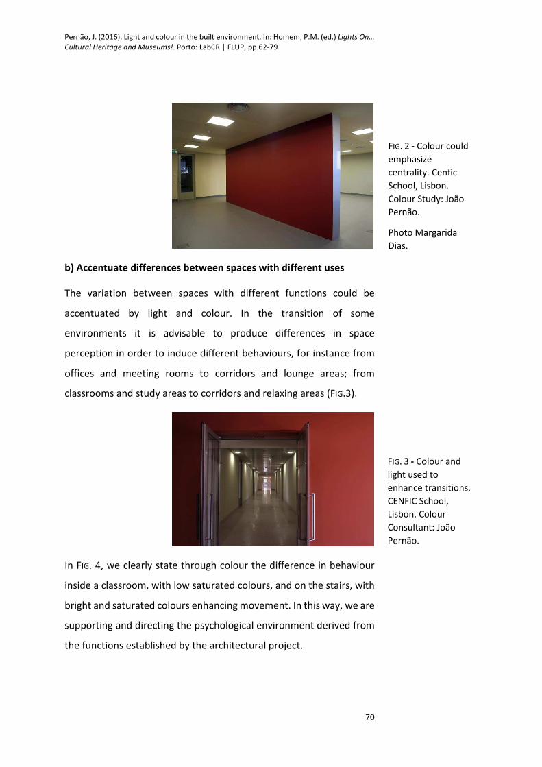
functions is seen on FIG. 2. A wall dividing two different areas in a
classroom could be painted in a strong colour to emphasize its
centrality. In this case this wall is covered with a soft material that
absorbs sound and allows for papers and drawings to be fixed on it.
FIG. 1 - Before and
after: colour could
be used to focus
attention in a
classroom. SAMP
School. Colour
Study: João Pernão.
Pernão, J. (2016), Light and colour in the built environment. In: Homem, P.M. (ed.) Lights On…
Cultural Heritage and Museums!. Porto: LabCR | FLUP, pp.62-79
70
b) Accentuate differences between spaces with different uses
The variation between spaces with different functions could be
accentuated by light and colour. In the transition of some
environments it is advisable to produce differences in space
perception in order to induce different behaviours, for instance from
offices and meeting rooms to corridors and lounge areas; from
classrooms and study areas to corridors and relaxing areas (FIG.3).
In FIG. 4, we clearly state through colour the difference in behaviour
inside a classroom, with low saturated colours, and on the stairs, with
bright and saturated colours enhancing movement. In this way, we are
supporting and directing the psychological environment derived from
the functions established by the architectural project.
FIG. 2 - Colour could
emphasize
centrality. Cenfic
School, Lisbon.
Colour Study: João
Pernão.
Photo Margarida
Dias.
FIG. 3 - Colour and
light used to
enhance transitions.
CENFIC School,
Lisbon. Colour
Consultant: João
Pernão.

Pernão, J. (2016), Light and colour in the built environment. In: Homem, P.M. (ed.) Lights On…
Cultural Heritage and Museums!. Porto: LabCR | FLUP, pp.62-79
71
c) Define transitions between exterior and interior
The moments of transition between spaces are one of the most
important issues in Architecture. Transition between exterior and
interior spaces is perhaps the most dramatic one because it involves
many levels of perception and many senses: it’s a transition of scale,
temperature, sound, smell, and, of course, light and colour. In FIG. 5
the complementary effect of colours (red/green) is used to establish a
contrast between the green colour of nature and the interior walls.
In a social housing rehabilitation, we use different entrance colours to
promote identity and distinction between buildings (FIG. 6).
This variation in buildings otherwise all alike, gives inhabitants the
sense of recognition of each ones’ house as unique.
FIG. 4 - Colour used to
establish variation in
behaviour. CENFIC
School, Lisbon. Colour
Consultant: João Pernão
Photos: Margarida Dias.
FIG. 5 - Using Colour to
accentuate
exterior/interior
transition. CENFIC School,
Lisbon. Colour Consultant:
João Pernão.
Photo Margarida Dias.
FIG. 6 - Entrance
differentiation through
colours. Bairro das
Descobertas, Moita.
Colour Consultants: José
Aguiar and João Pernão.

Pernão, J. (2016), Light and colour in the built environment. In: Homem, P.M. (ed.) Lights On…
Cultural Heritage and Museums!. Porto: LabCR | FLUP, pp.62-79
72
d) Using colour difference to promote way-finding
Colour is an important tool in recognizing the visual references of our
environment; it is through that recognition that we establish a series
of key-points or anchors that define our position in space. The legibility
of our built environment is determinant for a good relationship
between the space users and the architecture (Lynch, 1982).
In a colour study for the interior of a hospital facility, we create a
correspondence between the access units (stairs and elevators) and a
colour (red). The same colour was used to detach the reception spaces
on each infirmary. This facilitates orientation of the visitants that used
to be lost in the maze of similar galleries and corridors. In FIG. 7 red
was used for the infirmary’s reception desk, on the right, and to sign
the stairs at the end of the corridor. Green and yellow were also used
for orientation: the infirmary rooms are on the green side; the yellow
side is for medical exams and staff offices.
e) Using natural light variation to enrich the architectural experience
We have studied two ways for applying this concept: texture / gloss
difference, and colour reflection.
The interplay between light and matter is a key issue in designing good
architecture. Peter Zumthor (2006) argues that the materials in
architecture should be chosen by the way they reflect light. Stone,
wood and other raw materials’ finishing, as well as the gloss level of
paint, are fundamental decisions for space perception. Glossy finishes
FIG. 7 - Before and after:
using colour to promote
way-finding. Hospital de
Santo André, Leiria.
Colour Study: João Pernão,
Luís Bissau, Carla Lobo.

Pernão, J. (2016), Light and colour in the built environment. In: Homem, P.M. (ed.) Lights On…
Cultural Heritage and Museums!. Porto: LabCR | FLUP, pp.62-79
73
have the ability to convey and reflect light and colour variations from
the environment in a much stronger manner than matte ones. But it is
the difference between them that produces balanced and
aesthetically pleasing spaces. In FIG. 8 we can see a simulation of the
difference between a choice of matte paint on the walls, on the left,
and glossy on the right. The choice of the glossy surface produces a
virtual expansion of the space’s dimensions through the reflection on
the walls.
In Portuguese architecture, we commonly use glossy glazed tiles
(azulejos), as a wainscot in the lower part of the walls, for aesthetic
and protective reasons. This glossy part of the wall plays a perceptual
game of ephemeral reflections, always transforming space perception
as you walk through a room, or as the sun strikes it at different hours
of the day. With this in mind, in a colour study for a secondary school
we define a unique colour for the wall, but we choose a paint with a
gloss finishing for the lower part a matte paint and for the upper part
(FIG. 9).
When light strikes a coloured surface, the result is a reflection of
coloured light. That coloured light could tinge the space nearby. We
FIG. 8 - Matte or gloss
finish could dramatically
change the space
perception. Francisco
Arruda School, Lisbon.
Colour Consultants: João
Pernão and Maria
Capelo. Photo Laura
Castro .Caldas/Paulo
Cintra.

Pernão, J. (2016), Light and colour in the built environment. In: Homem, P.M. (ed.) Lights On…
Cultural Heritage and Museums!. Porto: LabCR | FLUP, pp.62-79
74
can notice this phenomenon in our everyday life as the sun reflects the
blue of a swimming pool, or the green of the grass into a room. This
ephemeral variation of the reflected colours could be used as a tool
for architectural design, relating space perception with time (Pernão,
2014).
In Braancamp Freire School we tested this concept using yellow to
paint the skylights in the atrium, giving that space a continuous
variation of warm tones during the day. To balance this accentuation,
we paint the auditorium blue, colour which reflects on the white
painted walls nearby (FIG. 10).
FIG. 9 - Gloss and matte
surfaces could bring
aesthetical quality to
architectural space.
Palácio Fronteira, Lisboa
/ Francisco Arruda
School, Lisbon. Colour
Consultants: João
Pernão and Maria
Capelo.
FIG. 10 - Colour and light
variation produced by
reflected colours
transforms space
perception during the
day.
Braancamp Freire
School, Lisbon. Colour
Consultant: João
Pernão.

Pernão, J. (2016), Light and colour in the built environment. In: Homem, P.M. (ed.) Lights On…
Cultural Heritage and Museums!. Porto: LabCR | FLUP, pp.62-79
75
In classroom spaces, painted white, light is reflected in the coloured
concrete exterior surfaces near the windows. The difference between
inherent colour and perceptual colour varies during the day,
transforming the classroom space in a rich architectural experience
(FIG. 11).
4. Two much or too little colour and light
Being so important for the perception of the built environment, light
and colour are often wrongly used, most of the times due to lack of
knowledge, some of the times due to a blind repetition of an
aesthetical stereotype.
One of the most common mistakes is related to the use of pure white
in architecture as a dominant colour. White has the highest luminous
reflectance factor of all colours, and for that reason should be used
with caution, once it can easily produce glare that, when accompanied
by high levels of natural or artificial light, could be harmful to our
health, causing physical, mental and emotional discomfort (Mahnke,
1996). For this reason, white should not be used as the main colour in
an environment where people stay for a long period of time, for
instance classrooms, offices, etc. The continuous action of the eye
muscles, opening and closing the pupil, trying to focus less illuminated
subjects, will result in eye fatigue. It is not a question of aesthetics, it
has a physiological one, and that should not be questionable.
FIG. 11 - Reflected
colours in the
classroom. Braancamp
Freire School, Lisbon.
Colour Consultant: João
Pernão.

Pernão, J. (2016), Light and colour in the built environment. In: Homem, P.M. (ed.) Lights On…
Cultural Heritage and Museums!. Porto: LabCR | FLUP, pp.62-79
76
Another factor is that the white paint nowadays used as default is the
strongest and most reflective white ever available in our entire history.
This white was only possible with the manufacturing of Rutile
(titanium dioxide) as a pigment and it is used because of its chemical
stability and excellent hiding power (twice the opacity of pure lead
white). But it is very uncomfortable, and looks false (plastic) in
architectural surfaces. It has to be subdued with a small percentage of
blackness and colour (yellow + red) for correct use as dominant colour.
Architects, in general, have a serious flaw in their education: schools
of architecture are increasingly more technical and less artistic, which
leads to the total absence of harmony and aesthetic issues in their
curricula, such as the use of colour. The colour white appears as a
default, a non-choice, something that is neutral. But it is not.
There is another reason for not using achromatic white, related to its
psychological meaning: a sterile and cold environment, only related in
nature with snow or ice surfaces. The most stressing environments,
unfortunately used for sensory deprivation in some extreme police
and military cells, like in Guantanamo, are painted white in all surfaces
and use high levels of illumination. These environments are
inconceivably similar to others connoted with a “clean” and minimalist
architectural aesthetic (Pernão, 2010). But for these ones, people
generally pay high amounts in order to live in them!
David Batchelor (2007) names this refusal to use color - Chromofobia -
stating that the issue is not white but the generalization of white
(whiteness) because it makes it abstract.
This Chromofobic characteristic was well patent in a recent congress
about colour and architecture when we were asked the reason why
contemporary architects always dress in black and paint their buildings
white.

Pernão, J. (2016), Light and colour in the built environment. In: Homem, P.M. (ed.) Lights On…
Cultural Heritage and Museums!. Porto: LabCR | FLUP, pp.62-79
77
There are international recommendations for the correct percentage
of luminous reflectance factor in classrooms and other public spaces
designed for long periods of people’s permanence. Those numbers
aim at 25% of blackness (NCS system) while the common white has 5%
of blackness. The negative effect of excessive light reflection in
architectural surfaces could be amplified by the use of gloss or semi-
gloss finishes, as well as the incorrect layout of light sources.
Adopting these recommendations and thus removing the glare of walls
can correct many situations of lack of concentration and eyestrain
complaints in work environments.
Conclusions
With a phenomenological approach to space perception, we state the
importance of light and colour to the quality of the built environment.
We should always study these two elements together because they
are inseparable, being the cause and effect of our image of reality.
Architects should be more aware of this importance in order to apply
light and colour considerations right from the first stages of the
architectural design process.
Colour should not only be seen as the paint covered surfaces but also
as all the materials that assemble the visual field in the built
environment.
Colour perception is based on variation, framed in time and always
derives from three elements: Light, object, and observer. Variation,
the main factor for perception, should be used conscientiously in
architectural design as a tool to enhance the quality of architecture
and its relationship with the human being.

Pernão, J. (2016), Light and colour in the built environment. In: Homem, P.M. (ed.) Lights On…
Cultural Heritage and Museums!. Porto: LabCR | FLUP, pp.62-79
78
References
Albers, J. (1975), Interaction of Color. New Haven and London: Yale
University Press.
Aristóteles (2001), Da Alma (De Anima). Lisboa: Edições 70.
Batchelor D. (2007), Chromophobia. London: Reaktion Books.
Bateson, G. (1987), Natureza e Espírito: Uma Unidade Necessária.
Lisboa: Publicações Dom Quixote.
Da Vinci, L. (2002), A Treatise on Painting. New York: Prometheus
Books.
De Heer, J. (2009), The Architectonic Colour. Polychromy in the Purist
Architecture of Le Corbusier. Roterdam: 010 Publishers
Gibson, J.J. (1986), The Ecological Approach to Visual Perception.
London: Lawrence Erlbaum Associates, Publishers.
Goethe, J.W. (1988), Theory of Colours. London: Frank Cass & Co.
Itten, J. (1997), Design and Form: The Basic Course at the Bauhaus.
London: Thames and Hudson.
Le Corbusier (1977), Vers Une Architecture. Paris: Éditions Arthaud.
Le Corbusier (2006), Polychromie Architecturale: Les Claviers de
Couleurs de 1931 et de 1959. Arthur Ruegg (Ed.). Basel: Birkhauser.
Lynch, K. (1982), A Imagem da Cidade. Lisboa: Edições 70.
Mahnke, F. (1996), Color, Environment and Human Response. New
York: John Wiley and Sons.
Merleau-Ponty, M. (1993), Eye and Mind. Chicago: Northwestern
University Press.
Pernão, J. (2010), The Otherness of White: Elements for a Better
Understanding and Use of the Colour White in Architecture. Colour

Pernão, J. (2016), Light and colour in the built environment. In: Homem, P.M. (ed.) Lights On…
Cultural Heritage and Museums!. Porto: LabCR | FLUP, pp.62-79
79
and Light in Architecture_First International Conference
2010_Proceedings. pp.154-159. Accessible at:
http://rice.iuav.it/195/1/07_pernao.pdf
Pernão, J. (2014), Reflected Colours as a Tool for Architectural Design.
Proceedings: X Conferenza del Colore, Università degli studi di Genova,
10-11 September.
Zumthor, P. (2006), Atmosferas. Barcelona: Gustavo Gili.