Life Science Competitiveness Indicators · 2017-04-05 · Life Science Competitiveness Indicators 2...
36
Life Science Competitiveness Indicators April 2017
Transcript of Life Science Competitiveness Indicators · 2017-04-05 · Life Science Competitiveness Indicators 2...

Life Science Competitiveness Indicators
April 2017

Life Science Competitiveness Indicators 2
Ministerial foreword
I am pleased to introduce the third Life Science Competitiveness Indicators. Since the Government launched the last Life Sciences Strategy in 2011 the UK has secured over £7.5bn of inward investment in the sector, leading to the creation of 18,000 new jobs, and today, the UK has one of the strongest and most productive health and life sciences industries in the world.
Now, following the Referendum on leaving the EU, the Government intends to work with all parts of the industry to identify new opportunities presented to maintain and strengthen this position.
This report includes a set of metrics against which UK performance relative to other countries may be compared. For example: in 2015 UK exports grew for the third year in a row, reaching $36.7bn for pharmaceuticals and increased 6% from the previous year.
Despite many positives for the sector, Government recognises that more can be done. In January 2017, we launched the Industrial Strategy Green Paper with a 12 week period of consultation. Through the development of the Life Sciences Industrial Strategy we have listened to the ideas of the sector to ensure the UK remains a top tier global hub and the home of clinical research and medical innovation. Our ambition remains for the UK to be the best place in the world to develop and launch innovative medicines, technologies and diagnostics, for the benefit of patients and boosting growth.
Lord Prior of Brampton Parliamentary Under Secretary of State for the Department for Business, Energy and Industrial Strategy
Life Science Competitiveness Indicators 3
Introduction
This Office for Life Sciences (OLS) report brings together a set of competitiveness indicators on the life science environment in the UK and how these compare internationally. This is the third report and it is published alongside the other annual OLS publication – Strength & Opportunity – which provides detailed analysis of the life science sector in the UK.
The 2016 publication seeks continuity with the 2015 publication and so minimal changes have been made to the individual indicators. However, as many of the indicators draws from existing datasets in the public domain, where the underlying data series has changed so the indicators in this publication have changed. Most noticeably, the charts from the 2015 publication which covered Life Science academic citations (charts 12A and 12B in 2015) have been withdrawn from the indicator series as the underlying data has not been refreshed since 2012. Consequently subsequent indicators within the comparative indicator series have been renumbered. In addition, the data series used for science graduates (chart 8) has changed to the percentage of graduates from tertiary education graduating from Natural Sciences, Mathematics and Statistics programmes, both sexes (%) in line with changes made by UNESCO who compile the series.
The web links to public sources along with caveats, as appropriate, are provided for each indicator. The specific data for these charts and tables can be found in the accompanying spreadsheet. In a few instances, it has been necessary for data to be sourced commercially or obtained directly from the organisation holding it. In these cases, the supplier is clearly credited against relevant charts. In cases where the data is from a proprietary source, we have not been able to reproduce the underlying data tables.
The choice of indicators was informed by engagement with life science sector stakeholders. We have selected comparator countries using their advice. However, in some cases this choice has been limited by data availability. We would like to thank all those who have contributed to these indicators, or supplied data for this publication.
Life Science Competitiveness Indicators 4
Table of contents
Overview: Performance of UK Life Science Sector and Contribution to UK Economy 5
Overview: Competitiveness of UK Life Science Environment 6
Indicators for UK industry 7
Chart 1A: Number of people employed in manufacture of basic pharmaceutical products and pharmaceutical preparations 8
Chart 1B: Number of people employed in manufacture of medical technology products 9
Chart 2: Gross Value Added for pharmaceutical manufacturing 10
Chart 3A: Exports of pharmaceutical products 11
Chart 3B: Exports of medical technology products 12
Chart 4A: Imports of pharmaceutical products 13
Chart 4B: Imports of medical technology products 14
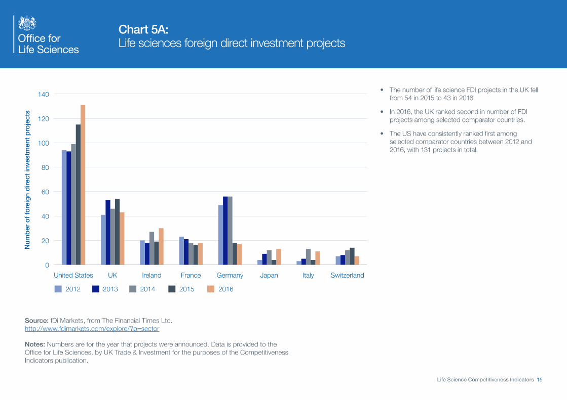
Chart 5A: Life sciences foreign direct investment projects 15
Chart 5B: Life sciences foreign direct investment – capital expenditure 16
Chart 6A: Share of global life science Initial Public Offerings (IPOs) – 2016 17
Chart 6B: Initial Public Offerings (IPOs) in life sciences – amount raised in 2016 (where known) 18
Chart 7A: Private equity investment – total investment 19
Chart 7B: Number of companies receiving private equity investment 20
Chart 8: Number of science graduates 21
Research and Development Indicators 22
Chart 9: Government spend on health research and development 23
Chart 10: 2015 non-industry spend on research and development 24
Chart 11: Pharmaceutical industry spend on research and development in the UK 25
Regulatory Indicator 26
Chart 12: Instances where MHRA is in lead role in EU regulatory procedure 27
Clinical Research Indicators 28
Chart 13: Share of patients recruited to global studies (all trial phases) 29
Chart 14: Time from core package received to first patient enrolled in country (all trial phases) 30
Demand-side Indicators 31
Chart 15: Dashboard of NICE Technology Appraisal publication 32
Uptake of New Medicines 33
Chart 16A: Uptake of new medicines – NICE approved 34
Chart 16B: Uptake of new medicines – non-NICE approved 35

Life Science Competitiveness Indicators 5
Overview: Performance of UK Life Science Sector and Contribution to UK Economy
Chart 1B: Number of people employed in manufacture of medical technology products
0
50,000
100,000
150,000
200,000
250,000
Num
ber
of
peo
ple
em
plo
yed
20152014201320122011
Ireland
Hungary
Czech Republic
NetherlandsSpain
TurkeyPoland
Switzerland
United KingdomFranceItaly
Germany
Source Data: Eurostat – Data Explorer, Annual detailed enterprise statistics for industry: http://ec.europa.eu/eurostat/data/database
Chart 3A: Exports of pharmaceutical products
Exp
ort
s in
bill
ions
of
US
Do
llars
($b
n)
20152014201320122011
0
10
20
30
40
50
60
70
80
90
IndiaItalyFrance
Ireland
NetherlandsUKBelgiumUSA
Korea
Switzerland
Germany
Source: UNCTAD STAT Data Center http://unctadstat.unctad.org/wds/ReportFolders/reportFolders.aspx
Chart 5A: Life sciences foreign direct investment projects
Num
ber
of
fore
ign
dire
ct in
vest
men
t p
roje
cts
20162015201420132012
SwitzerlandItalyJapanGermanyFranceIrelandUKUnited States
0
20
40
60
80
100
120
140
Source: fDi Markets, from The Financial Times Ltd.
Chart 6A: Share of global life science Initial Public Offerings (IPOs) – 2016
China inc China Hong Kong 33%USA inc Pink Sheets 23%Australia 10%Republic of Korea 8%Sweden 6%India 5%UK 4%Japan 3%Vietnam 2%Other 6%
Source: S&P Capital IQ http://www.spcapitaliq.com/

Life Science Competitiveness Indicators 6
Overview: Competitiveness of UK Life Science Environment
Chart 7A: Private equity investment – total investment
Tota
l pri
vate
eq
uity
inve
stm
ent
in b
illio
ns o
f E
uro
s (€
bn)
20152014201320122011
0
.03
0.6
0.9
1.2
1.5
1.8
2.1
2.4
IrelandItalySwitzerlandSpainUKFranceGermany
Source: Invest Europe http://www.investeurope.eu/research/activity-data/annual-activity-statistics/
Chart 7B: Number of companies receiving private equity investment
0
20
40
60
80
100
120
140
160
180
200
Num
ber
of c
ompa
nies
UK Switzerland Spain IrelandFrance
20152014201320122011
Germany Italy
Source: Invest Europe http://www.investeurope.eu/research/activity-data/annual-activity-statistics/
Chart 8: Percentage of graduates from tertiary education graduating from Natural Sciences, Mathematics and Statistics programmes, both sexes (%)
Per
cen
tag
e o
f g
rad
uat
es
20142013201220112010
0
2
4
6
8
10
12
14
Netherlands
BelgiumSweden
SpainUSA
Switzerland
FranceIrelandItaly
Germany
UK
Source: OECD Research & Development statistics http://stats.oecd.org/index.aspx?r=227797
Chart 9: Government spend on health research and development
Sp
end
in b
illio
ns o
f U
S d
olla
rs ($
bn)
20152014201320122011
0
1
2
3
4
25
30
35
BelgiumItalyJapanFranceGermanyUKUS Spain
Source: OECD Research & Development statistics http://stats.oecd.org/index.aspx?r=227797

Life Science Competitiveness Indicators 7
Indicators for UK industry

Chart 1A: Number of people employed in manufacture of basic pharmaceutical products and pharmaceutical preparations
Life Science Competitiveness Indicators 8
0
20,000
40,000
60,000
80,000
100,000
120,000
140,000
Netherlands
SwedenAustri
a
HungaryPoland
Belgium
DenmarkSpain
United Kingdom
SwitzerlandItaly
France
Germany
Num
ber
of
peo
ple
em
plo
yed
20152014201320122011
• U K pharmaceutical employment increased from approximately 37,000 to 39,000 between 2014 to 2015. To note, there is limited data for UK in specific years due to unavailability from Eurostat.
• G ermany has continued to have the highest level of employment amongst the selected comparator countries throughout 2010 to 2015.
• T he Strength & Opportunity (S&O) annual publication provides details of UK trends in life science sector employment. The S&O report includes supply chain companies, which are an important part of the sector and are excluded here.
Source: Eurostat – Data Explorer, Annual Detailed Enterprise Statistics for Industry http://appsso.eurostat.ec.europa.eu/nui/show.do?dataset=sbs_na_ind_r2&lang=en
Notes: Not all years are available for each country.
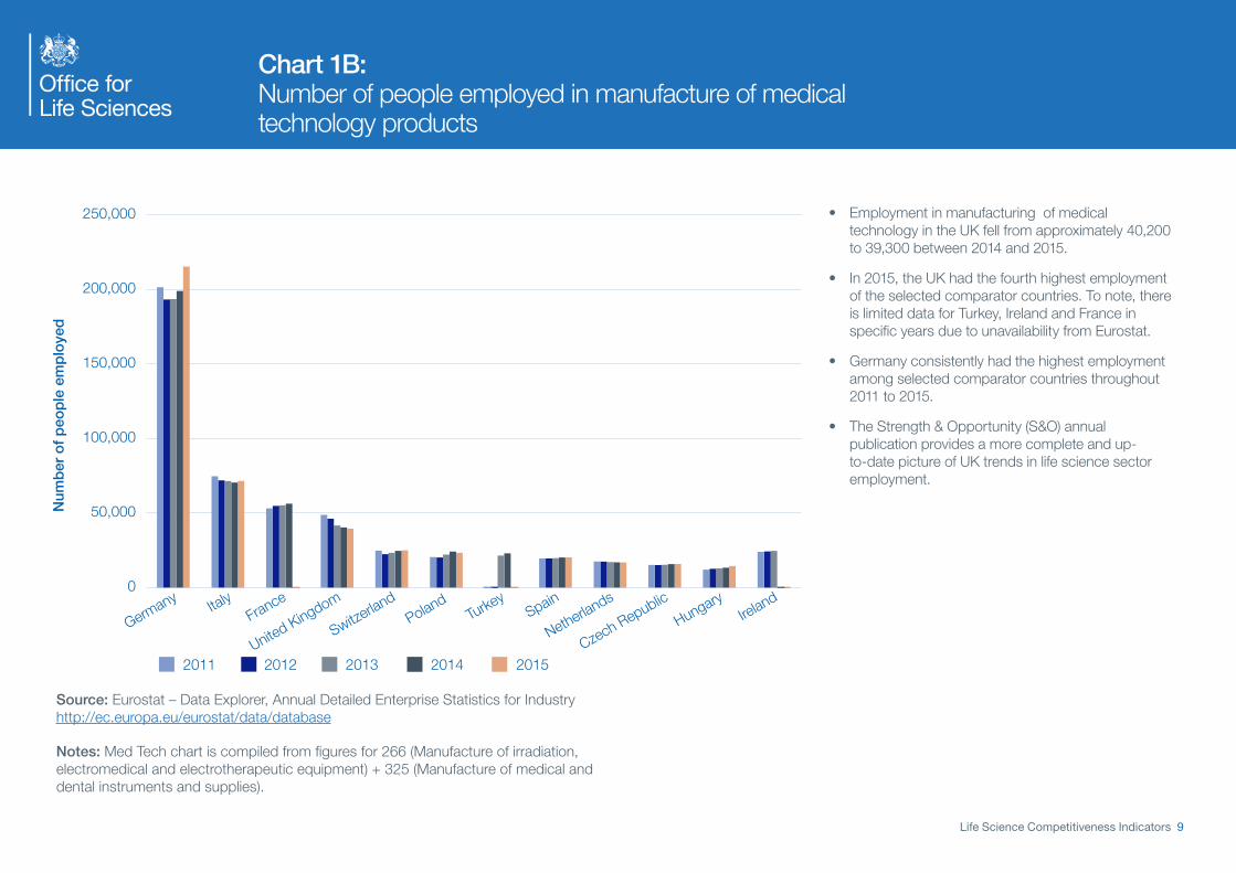
Chart 1B: Number of people employed in manufacture of medical technology products
Life Science Competitiveness Indicators 9
0
50,000
100,000
150,000
200,000
250,000
Num
ber
of
peo
ple
em
plo
yed
20152014201320122011
Ireland
Hungary
Czech Republic
NetherlandsSpain
TurkeyPoland
Switzerland
United KingdomFranceItaly
Germany
• Employment in manufacturing of medical technology in the UK fell from approximately 40,200 to 39,300 between 2014 and 2015.
• In 2015, the UK had the fourth highest employment of the selected comparator countries. To note, there is limited data for Turkey, Ireland and France in specific years due to unavailability from Eurostat.
• Germany consistently had the highest employment among selected comparator countries throughout 2011 to 2015.
• The Strength & Opportunity (S&O) annual publication provides a more complete and up-to-date picture of UK trends in life science sector employment.
Source: Eurostat – Data Explorer, Annual Detailed Enterprise Statistics for Industry http://ec.europa.eu/eurostat/data/database
Notes: Med Tech chart is compiled from figures for 266 (Manufacture of irradiation, electromedical and electrotherapeutic equipment) + 325 (Manufacture of medical and dental instruments and supplies).

Life Science Competitiveness Indicators 10
Chart 2: Gross Value Added for pharmaceutical manufacturing
Gro
ss V
alue
ad
ded
in b
illio
ns o
f E
uro
s (€
bn)
DenmarkSpainUnited KingdomItaly
Belgium Netherlands
IrelandFranceSwitzerlandGermany
20152014201320122011
0
5,000
10,000
15,000
20,000
25,000 • In the UK, the gross value added for pharmaceutical manufacturing was broadly flat between 2014 and 2015 at £9,320m
• In 2016, the UK had the sixth highest gross value added for pharmaceutical manufacturing compared to selected competitor countries.
• Germany and Switzerland continue to be two European countries with the largest pharmaceutical manufacturing sectors
• Most recent data for the UK only shows an increase in pharmaceutical GVA of 1.5% on the previous year (ONS).
Source: Comparator countries’ data from Eurostat National Accounts data http://ec.europa.eu/eurostat/web/national-accounts/data/database
Notes: Categories used are “541 Medicinal and pharmaceutical products” and “542 Medicaments including veterinary medicaments”. Data is in current prices.

Life Science Competitiveness Indicators 11
Chart 3A: Exports of pharmaceutical products
Exp
ort
s in
bill
ions
of
US
Do
llars
($b
n)
20152014201320122011
0
10
20
30
40
50
60
70
80
90
IndiaItalyFrance
Ireland
NetherlandsUKBelgiumUSA
Korea
Switzerland
Germany
• Between 2011 and 2015, exports of pharmaceutical products in the UK grew from $35.9 billion to $36.7 billion, a compound annual growth rate of approximately 0.6%.
• In 2015, the UK ranked 6th of comparative countries in value of pharmaceutical product exports.
• Exports from US, UK, Ireland and India all grew between 2014 and 2015.
• Up-to-date UK data, available from ONS, shows a 17% rise in pharmaceutical exports between 2014 and 2015 (ONS).
Source: UNCTAD STAT Data Center http://unctadstat.unctad.org/wds/ReportFolders/reportFolders.aspx
Notes: Categories used from UNCTAD are “541 Medicinal and pharmaceutical products” “542 Medicaments including veterinary medicament”. Data is in current prices.

Life Science Competitiveness Indicators 12
Chart 3B: Exports of medical technology products
0
5
10
15
20
25
30
35
Exp
ort
s in
bill
ions
of
US
Do
llars
($b
n)
20152014201320122011
Italy
SwitzerlandUK
FranceIreland
JapanBelgium
Mexico
NetherlandsChina
GermanyUSA
• Between 2011 and 2015, exports of medical technology products in the UK grew from $3.7 billion to $4.1 billion, although most recent years show a decline in exports compared to the previous year.
• In 2015, the UK ranked 10th out of the 12 comparative countries in value of medical technology product exports. The UK had a similar level of exports to France and Switzerland.
• The US had the highest value of exports in 2015 with an annual growth rate of approximately 2% between 2011 to 2015
Source: UNCTAD STAT Data Center http://unctadstat.unctad.org/wds/ReportFolders/reportFolders.aspx
Notes: Categories used from UNCTAD STAT are “774 Electro-diagnostic apparatus for medical science etc.” and “872 Instruments and appliances, n.e.s, for medical, etc.” Data is in current prices.

Life Science Competitiveness Indicators 13
Chart 4A: Imports of pharmaceutical products
Imp
ort
s in
bill
ions
of
US
Do
llars
($b
n)
20152014201320122011
0
10
20
30
40
50
60
70
80
90
100
CanadaSpain
China
Netherlands
SwitzerlandItaly
JapanFranceUK
Belgium
GermanyUSA
• Imports of pharmaceutical products rose in the UK from $26.8 billion in 2011 to $34.5 billion in 2015, a compound annual growth of approximately 6.5%.
o In 2015, the UK had the fourth highest value of imports of pharmaceutical products after the US, Germany and Belgium.
o The US saw a noticeable 17% growth between 2014 to 2015.
Source: UNCTAD STAT Data Center http://unctadstat.unctad.org/wds/ReportFolders/reportFolders.aspx?sCS_ChosenLang=en
Notes: Categories used are from UNCTAD “541 Medicinal and pharmaceutical products” “542 Medicaments including veterinary medicament”. Data is in current prices.

Life Science Competitiveness Indicators 14
Chart 4B: Imports of medical technology products
0
5
10
15
20
25
30
Imp
ort
s in
bill
ions
of
US
Do
llars
($b
n)
20152014201320122011
Ireland
Switzerland
SpainItalyUK France
BelgiumJapan
NetherlandsChina
GermanyUSA
• Imports of medical technology products in the UK fell slightly in 2015.
• In 2015, the UK had the eighth highest value of imports among selected comparator countries. The UK had a similar level of imports to France and Belgium.
• Imports of medical technology products have also grown steadily in the US between 2011 and 2015. The US consistently had the highest level among the selected competitor countries.
Source: UNCTAD STAT Data Center http://unctadstat.unctad.org/wds/ReportFolders/reportFolders.aspx?sCS_ChosenLang=en
Notes: Categories used from UNCTAD STAT are “774 Electro-diagnostic apparatus for medical science etc.” and “872 Instruments and appliances, n.e.s, for medical, etc.” Data is in current prices.
Life Science Competitiveness Indicators 15
Chart 5A: Life sciences foreign direct investment projects
Num
ber
of
fore
ign
dire
ct in
vest
men
t p
roje
cts
20162015201420132012
SwitzerlandItalyJapanGermanyFranceIrelandUKUnited States
0
20
40
60
80
100
120
140• The number of life science FDI projects in the UK fell
from 54 in 2015 to 43 in 2016.
• In 2016, the UK ranked second in number of FDI projects among selected comparator countries.
• The US have consistently ranked first among selected comparator countries between 2012 and 2016, with 131 projects in total.
Source: fDi Markets, from The Financial Times Ltd. http://www.fdimarkets.com/explore/?p=sector
Notes: Numbers are for the year that projects were announced. Data is provided to the Office for Life Sciences, by UK Trade & Investment for the purposes of the Competitiveness Indicators publication.

Life Science Competitiveness Indicators 16
Chart 5B: Life sciences foreign direct investment – capital expenditure
Sp
end
in p
oun
ds
(£m
)
20162015201420132012
0
500
1,000
1,500
2,000
2,500
3,000
3,500
JapanItalyUKFranceGermanySwitzerlandIrelandUnited States
• There has been an upward growth in life science foreign direct investment capital expenditure in the UK between 2011 and 2016, although investments can fluctuate markedly from year to year.
• In 2016, the UK ranked 6th in capital expenditure among selected comparator countries.
• The US life sciences foreign direct investment capital expenditure almost doubled from 2012 to 2016
Source: fDi Markets, from The Financial Times Ltd. http://www.fdimarkets.com/explore/?p=sector
Notes: Numbers are for the year that projects were announced. Data is provided to the Office for Life Sciences, by UK Trade & Investment for the purposes of the Competitiveness Indicators publication.
Life Science Competitiveness Indicators 17
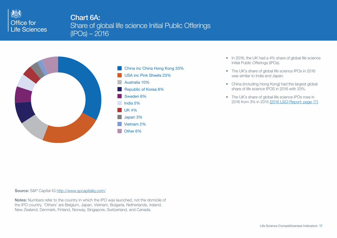
Chart 6A: Share of global life science Initial Public Offerings (IPOs) – 2016
China inc China Hong Kong 33%USA inc Pink Sheets 23%Australia 10%Republic of Korea 8%Sweden 6%India 5%UK 4%Japan 3%Vietnam 2%Other 6%
• In 2016, the UK had a 4% share of global life science Initial Public Offerings (IPOs).
• The UK’s share of global life science IPOs in 2016 was similar to India and Japan.
• China (including Hong Kong) had the largest global share of life science IPOS in 2016 with 33%.
• The UK’s share of global life science IPOs rose in 2016 from 3% in 2015 [2016 LSCI Report: page 17].
Source: S&P Capital IQ http://www.spcapitaliq.com/
Notes: Numbers refer to the country in which the IPO was launched, not the domicile of the IPO country. ‘Others’ are Belgium, Japan, Vietnam, Bulgaria, Netherlands, Ireland, New Zealand, Denmark, Finland, Norway, Singapore, Switzerland, and Canada.

Life Science Competitiveness Indicators 18
Chart 6B: Initial Public Offerings (IPOs) in life sciences – amount raised in 2016 (where known)
Am
oun
t ra
ised
in m
illio
ns o
f p
oun
ds
(£m
)
Indonesia
Australia
USA inc Pink SheetsUK
Republic of Korea
China inc Hong Kong0
20
40
60
80
Malaysia
Vietnam
West Afric
aIndia
JapanFrance
Canada
Bangladesh
SwedenPoland
500
1,000
1,500
2,000
2,500
3,000 • Approximately £1,557 million was raised in UK Initial Public Offerings (IPOs) in life sciences in 2016, compared to approximately £107.1 million raised in 2015.
• In 2016, the UK ranked third among selected comparator countries.
• China (including Hong Kong) raised the largest amount of IPOs in life sciences in 2016, with approximately £2,549 million raised.
Source: S&P Capital IQ http://www.spcapitaliq.com/
Notes: Numbers refer to the country in which the IPO was launched, not the domicile of the IPO country.
Life Science Competitiveness Indicators 19
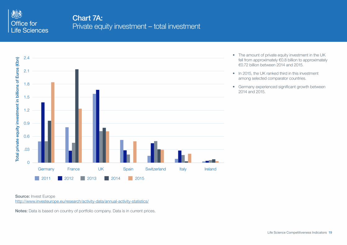
Chart 7A: Private equity investment – total investment
Tota
l pri
vate
eq
uity
inve
stm
ent
in b
illio
ns o
f E
uro
s (€
bn)
20152014201320122011
0
.03
0.6
0.9
1.2
1.5
1.8
2.1
2.4
IrelandItalySwitzerlandSpainUKFranceGermany
• The amount of private equity investment in the UK fell from approximately €0.8 billion to approximately €0.72 billion between 2014 and 2015.
• In 2015, the UK ranked third in this investment among selected comparator countries.
• Germany experienced significant growth between 2014 and 2015.
Source: Invest Europe http://www.investeurope.eu/research/activity-data/annual-activity-statistics/
Notes: Data is based on country of portfolio company. Data is in current prices.

Life Science Competitiveness Indicators 20
Chart 7B: Number of companies receiving private equity investment
0
20
40
60
80
100
120
140
160
180
200
Num
ber
of c
ompa
nies
UK Switzerland Spain IrelandFrance
20152014201320122011
Germany Italy
• The number of companies receiving private equity investment in the UK fell from 118 in 2011 to 71 in 2015.
• In 2015, the UK had the third highest number of companies receiving private equity investment among selected comparator countries.
• In 2015, Germany had the highest number of companies, despite seeing a decline from 194 in 2011 to 187 in 2015.
Source: Invest Europe http://www.investeurope.eu/research/activity-data/annual-activity-statistics/
Notes: Data is based on country of portfolio company. Data is in current prices.

Life Science Competitiveness Indicators 21
Chart 8: Percentage of graduates from tertiary education graduating from Natural Sciences, Mathematics and Statistics programmes, both sexes (%)
Per
cen
tag
e o
f g
rad
uat
es
20142013201220112010
0
2
4
6
8
10
12
14
Netherlands
BelgiumSweden
SpainUSA
Switzerland
FranceIrelandItaly
Germany
UK
• The latest figures from the UK continue to show the high proportion of students graduating in sciences and mathematical subjects. In 2014, this was 13% of all graduates.
• This is twice the reported proportion of science graduates in the US, although, the larger population pool in the US means it continues to have the largest overall volume of science graduates
• Germany also had a high proportion of science and mathematics graduates (105) in 2014. The UNECO data series only has one year of data for Germany.
Notes: The data time series, within the “education” theme, produced by UNESCO have changed. Previously, this Life Sciences Competitiveness Indicator set has reproduced the “Science graduates from tertiary education, both sexes (number)” series. As this is now longer available we have switched to including “Percentage of graduates from tertiary education graduating from Natural Sciences, Mathematics and Statistics programmes, both sexes (%)”. This has the advantage of standardising for population size, but gives limited insight on the size of the pool of appropriately qualified graduates.

Life Science Competitiveness Indicators 22
Research and Development Indicators

Life Science Competitiveness Indicators 23
Chart 9: Government spend on health research and development
Sp
end
in b
illio
ns o
f U
S d
olla
rs ($
bn)
20152014201320122011
0
1
2
3
4
25
30
35
BelgiumItalyJapanFranceGermanyUKUS Spain
• The most recent data for the UK in the OECD series is for 2014. The UK maintained its position as country with the second highest level of expenditure on health R&D behind the US.
• Expenditure in most countries has been flat of falling over the last 5 years. In the UK, expenditure was $3bn in 2014, approximately the same level as in 2013.
• Expenditure in the US remained at an order of magnitude of 10 larger than expenditure in comparator countries
Source: OECD Research & Development statistics http://stats.oecd.org/index.aspx?r=227797
Notes: OECD, has rebased the data used in their series on Government R&D spend from US dollars 2005 to US dollars 2010 at constant prices.

Life Science Competitiveness Indicators 24
Chart 10: 2015 non-industry spend on research and development
AMRC member charities – £1,443m
Medical Research Council – £772m
National Institute for Health Research – £1,034m
• In 2015:
– 44% of UK non-industry spend on R&D was by AMRC member charities
– 24% of UK non-industry spend on R&D was by the Medical Research Council
– 32% of UK non-industry spend on R&D was by the National Institute for Health Research.
• In 2014:
– 41% of UK non-industry spend on R&D was by AMRC member charities
– 27% of UK non-industry spend on R&D was by the Medical Research Council
– 32% of UK non-industry spend on R&D was by the National Institute for Health Research.
• Expenditure by AMRC member charities increased from £1,286m in 2014 to £1,443m in 2015.
Source: AMRC Annual Review 2014-15, spend by health departments in Scotland, Wales and Northern Ireland not illustrated http://www.amrc.org.uk/publications
Notes: The data here is reproduced from the Association of Medical Research Charities website.

Life Science Competitiveness Indicators 25
Chart 11: Pharmaceutical industry spend on research and development in the UK
Sp
end
in b
illio
ns o
f p
oun
ds
(£b
n)
0
1
2
3
4
5
2015201420132012201120102009200820072006200520042003
• Between 2003 and 2011, there was steady growth in pharmaceutical industry spend on R&D in the UK followed by a decline from a peak of £4.9bn in 2011 to £3.8bn in 2014.
• 2015, saw a recovery with expenditure of £4.2bn, representing growth of 8% over the previous year.
• Internationally comparable data on pharmaceutical industry spend on R&D is not available, so only UK data is presented here.
Source: ONS BERD survey 2015, table 2, current prices http://www.ons.gov.uk/ons/publications/re-reference-tables.html?edition=tcm%3A77-386019
Notes: Data is not available for medical technology industry spend.

Life Science Competitiveness Indicators 26
Regulatory Indicator

Life Science Competitiveness Indicators 27
Chart 12: Instances where MHRA is in lead role in EU regulatory procedure
2015 201620142013201220112010200920080
10%
20%
30%
40%
50%
60%
70%
UK Decentralised Procedures – Reference Member State
Scientific AdviceCo-ordinator
Centralised ProceduresRapporteur/Co-rapporteur
Pro
po
rtio
n o
f to
tal c
ases
• The MHRA is a leading regulator of choice for scientific advice and centralised procedures.
• In 2016, the MHRA was:
– Rapporteur/Co-rapporteur in 15.4% of Centralised Procedures;
– Scientific Advice Co-ordinator in 21% of cases; and
– Reference Member State in 45% of Decentralised Procedures involving the UK.
Source: Medicines and Healthcare Products Regulatory Agency
Notes: The chart illustrates the proportion of work the UK has undertaken in three key areas of European regulatory activity. As the work of the Medicines and Healthcare Products Regulatory Agency (MHRA) within the areas covered by these indicators is collaborative, no direct comparison with the other 27 Member States is made and the UK’s position in the leading role is shown as a percentage of all work undertaken.
Each new medicine product seeking approval in Europe through the Centralised Procedure has a Rapporteur and a co-Rapporteur appointed by the European Medicines Agency (EMA) to lead the assessment process. The Decentralised Procedure requires the applicant company to select a Reference Member State (RMS) to lead the assessment of the medicine during the procedure.

Life Science Competitiveness Indicators 28
Clinical Research Indicators

Life Science Competitiveness Indicators 29
Chart 13: Share of patients recruited to global studies (all trial phases)
Sha
re o
f p
atie
nts
recr
uite
d g
lob
ally
0%
5%
10%
15%
20%
25%
30%
35%
40%
45%
USAUKPolandGermanyFranceCzech Republic
20142013201220112010
• The share of patients recruited to global studies in the UK rose from 1.6% in 2010 to 2.7% in 2014.
• Over the last few years, the UK has been working to increase opportunities for patient participation in life sciences industry studies.
• This is now making significant impact, with recent data from the National Institute for Health Research (NIHR) showing that the number of participants recruited to commercial contract studies increased from 13,987 in 2010/11 to 34,339 in 2015/16, with the support of the NIHR Clinical Research Network (NIHR).
• In addition, the UK has increased its share of European trials, with the UK being represented in 29% of total EU trials in 2016, based on data from the EudraCT database (MHRA and EudraCT).
Source: This material is reproduced under a licence from CMR International.
Notes: You may not copy or re-distribute this material in whole or part without the written consent of CMR International.
Life Science Competitiveness Indicators 30
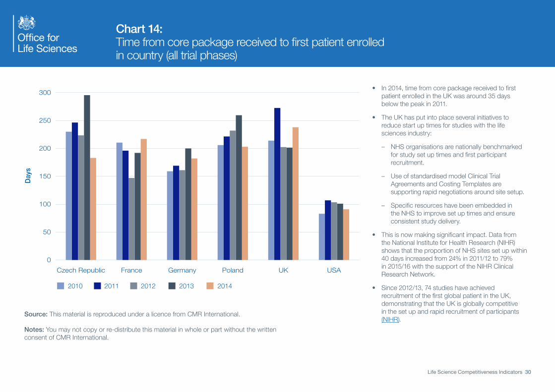
Chart 14: Time from core package received to first patient enrolled in country (all trial phases)
Day
s
0
50
100
150
200
250
300
USAUKPolandGermanyFranceCzech Republic
20142013201220112010
• In 2014, time from core package received to first patient enrolled in the UK was around 35 days below the peak in 2011.
• The UK has put into place several initiatives to reduce start up times for studies with the life sciences industry:
– NHS organisations are nationally benchmarked for study set up times and first participant recruitment.
– Use of standardised model Clinical Trial Agreements and Costing Templates are supporting rapid negotiations around site setup.
– Specific resources have been embedded in the NHS to improve set up times and ensure consistent study delivery.
• This is now making significant impact. Data from the National Institute for Health Research (NIHR) shows that the proportion of NHS sites set up within 40 days increased from 24% in 2011/12 to 79% in 2015/16 with the support of the NIHR Clinical Research Network.
• Since 2012/13, 74 studies have achieved recruitment of the first global patient in the UK, demonstrating that the UK is globally competitive in the set up and rapid recruitment of participants (NIHR).
Source: This material is reproduced under a licence from CMR International.
Notes: You may not copy or re-distribute this material in whole or part without the written consent of CMR International.

Life Science Competitiveness Indicators 31
Demand-side Indicators

Life Science Competitiveness Indicators 32
Chart 15: Dashboard of NICE Technology Appraisal publication
Notes:
MA: Marketing Authorisation
ACD: Appraisal Consultation Document
FAD: Final Appraisal Determination
Dials address forecast and actual timeframes for different stages of the NICE Technology Appraisal process.
Full details of the process, including descriptions of the separate stages can be found on the NICE website
http://www.nice.org.uk/About/What-we-do/Our-Programmes/NICE-guidance/NICE-technology-appraisal-guidance
Red and Green zones on dials relate to whether milestones have been attained within existing targets for NICE performance.

Life Science Competitiveness Indicators 33
Uptake of new medicines• The next two charts show the UK uptake per capita of new medicines compared to a group
of comparator countries.
• UK uptake per capita is compared to the average uptake per capita of a group of Europeanand non-European countries: Australia, Austria, Belgium, Canada, Finland, France, Germany,Ireland, Italy, Japan, Netherlands, Spain, Sweden, USA.
• Chart A shows the per capita uptake of 41 new medicines first marketed in the UK between2011 and 2015 and recommended (or optimised) by NICE for routine funding in the NHS.
• Chart B shows the per capita uptake of 38 medicines first marketed in the UK between 2011and 2015 and not referred to NICE. Medicines appraised but not recommended by NICE arenot included in the analysis.
• The analysis adjusts for population size, but it does not adjust for other important factorswhich might drive the level of use, such as the number of patients with relevant clinicalconditions for each treatments and standard clinical practice at the country level.
• The analysis does not take into account different levels of expenditure on medicines in eachcountry, which is likely to affect uptake.
• Therefore any comparisons and conclusions on the evolution of the uptake of new medicinesmust be performed with extreme caution.

Life Science Competitiveness Indicators 34
Chart 16A: Uptake of new medicines – NICE approved
0%
100%
200%
300%
400%
UK
up
take
per
hea
d/c
om
par
ato
r co
untr
ies
upta
ke p
er h
ead
MAT 1 MAT 2 MAT 3 MAT 4 MAT 5
74.2%120.9%79.1%62.1%18.2%
Source: Office of Health Economics analysis based on IMS data.
• Chart 16A shows the relative uptake per capita in the UK compared to a selection of other European and non-European countries for a selection of medicines first marketed between 2011 and 2015 and recommended by NICE for routine funding in the NHS.
• Vertical lines refer to the percentages shown on the y-axis and indicate the relative uptake per capita (UK versus other countries) of the individual medicines over a Moving Annual Total (MAT) period of 12 months. The first date of marketing in a country will fall within the first MAT period. The relative uptake figures compare the sales per capita for the UK to the other countries included in the analysis.
• The percentages displayed on the graph represent the median relative uptake per capita in the UK compared with the other countries for all products included in the analysis.
• A value of 100% means UK per capita consumption is identical to the average uptake per capita for the comparison countries during the MAT time window (a percentage higher than 100% indicates that the relative uptake per capita was higher in the UK and a percentage lower than 100% indicates that the uptake was lower in the UK). For example in the 3rd year of launch the median usage of medicines per capita in the UK represented 77.5% of the usage in the comparator countries.
• Medicines launched in 2015 will appear in ‘MAT1’ group, those marketed (corresponding to the first sale made) in 2014 will appear in ‘MAT1’ and ‘MAT2’, etc. The newest medicines will therefore not yet appear in ‘MAT5’.
• The results are specific to the medicines included in the analysis and caution should be exercised when comparing to previous analyses because of the different mix of medicines.

Life Science Competitiveness Indicators 35
Chart 16B: Uptake of new medicines – non-NICE reviewed
0%
100%
200%
300%
400%
UK
up
take
per
hea
d/c
om
par
ato
r co
untr
ies
upta
ke p
er h
ead
MAT 1 MAT 2 MAT 3 MAT 4 MAT 5
114.6%71.3%67.3%54.2%12.1%
Source: Office of Health Economics analysis based on IMS data.
• Chart 16B shows the relative uptake per capita in the UK compared to a selection of other European and non-European countries for a selection of medicines first marketed between 2011 and 2015 but not referred to NICE. Medicines rejected by NICE are not included in the analysis.
• Vertical lines refer to the percentages shown on the y-axis and indicate the relative uptake per capita (UK versus other countries) of the individual medicines over a Moving Annual Total (MAT) period of 12 months. The first date of marketing in a country will fall within the first MAT period. The relative uptake figures compare the sales per capita for the UK to the other countries included in the analysis.
• The percentages displayed on the graph represent the median relative uptake per capita in the UK compared with the other countries for all products included in the analysis.
• A value of 100% means UK per capita consumption is identical to the average uptake per capita for the comparison countries during the MAT time window relevant to the comparison (a percentage higher than 100% indicates that the relative uptake per capita was higher in the UK and a percentage lower than 100% indicates that the uptake was lower in the UK). For example in the 3rd year of launch the median usage of medicines per capita in the UK represented 67.3% of the usage in the comparator countries.
• Medicines launched in 2015 will appear in ‘MAT1’ group, those marketed (corresponding to the first sale made) in 2014 will appear in ‘MAT1’ and ‘MAT2’, etc. The newest medicines will therefore not yet appear in ‘MAT5’
• The results are specific to the medicines included in the analysis and caution should be exercised when comparing to previous analyses because of the different mix of medicines.