Leonardo's Colour and Chiaroscuro - WordPress.com · LEONARDO'S COLOUR AND CHIAROSCURO By John...
36
Leonardo's Colour and Chiaroscuro Author(s): John Shearman Source: Zeitschrift für Kunstgeschichte, 25. Bd., H. 1 (1962), pp. 13-47 Published by: Deutscher Kunstverlag GmbH Munchen Berlin Stable URL: http://www.jstor.org/stable/1481484 . Accessed: 27/02/2014 13:46 Your use of the JSTOR archive indicates your acceptance of the Terms & Conditions of Use, available at . http://www.jstor.org/page/info/about/policies/terms.jsp . JSTOR is a not-for-profit service that helps scholars, researchers, and students discover, use, and build upon a wide range of content in a trusted digital archive. We use information technology and tools to increase productivity and facilitate new forms of scholarship. For more information about JSTOR, please contact [email protected]. . Deutscher Kunstverlag GmbH Munchen Berlin is collaborating with JSTOR to digitize, preserve and extend access to Zeitschrift für Kunstgeschichte. http://www.jstor.org This content downloaded from 128.111.215.12 on Thu, 27 Feb 2014 13:46:34 PM All use subject to JSTOR Terms and Conditions
Transcript of Leonardo's Colour and Chiaroscuro - WordPress.com · LEONARDO'S COLOUR AND CHIAROSCURO By John...
Leonardo's Colour and ChiaroscuroAuthor(s): John ShearmanSource: Zeitschrift für Kunstgeschichte, 25. Bd., H. 1 (1962), pp. 13-47Published by: Deutscher Kunstverlag GmbH Munchen BerlinStable URL: http://www.jstor.org/stable/1481484 .
Accessed: 27/02/2014 13:46
Your use of the JSTOR archive indicates your acceptance of the Terms & Conditions of Use, available at .http://www.jstor.org/page/info/about/policies/terms.jsp
.JSTOR is a not-for-profit service that helps scholars, researchers, and students discover, use, and build upon a wide range ofcontent in a trusted digital archive. We use information technology and tools to increase productivity and facilitate new formsof scholarship. For more information about JSTOR, please contact [email protected].
.
Deutscher Kunstverlag GmbH Munchen Berlin is collaborating with JSTOR to digitize, preserve and extendaccess to Zeitschrift für Kunstgeschichte.
http://www.jstor.org
This content downloaded from 128.111.215.12 on Thu, 27 Feb 2014 13:46:34 PMAll use subject to JSTOR Terms and Conditions
LEONARDO'S COLOUR AND CHIAROSCURO
By John Shearman
It is unfortunately the case that the analysis and interpretation of colour in paintings lags far behind other aspects of formal historical criticism. The subject seems to be in some degree of dis- repute, or at the best open to suspicion, and not without reason. It is rare that observations in this field descend from the general to the particular 1, or from frank subjectivity (even quasi-mysticism) to the admittedly more tedious but ultimately more rewarding objectivity that is, for example, nor-
mally regarded as indispensable in modern studies of perspective. The following study was under- taken in the belief that colour (and its dependents, light and chiaroscuro) can just as well be sub-
mitted to argument and historical criticism 2
The analogy between perspective and colour is not casual. One initial clarification is demanded:
light, in painting, is absent, or present, or deployed and characterized in this or that way, always as a result of handling colour, the primary visual constituent of the work, in a certain fashion. This is too often forgotten, and light is discussed as if it were a self-sufficient element which arrived via the artist's brush. Similarly, linear space, in its absence or presence, is the product of the treatment of the
perspective of objects. It is not an accident that those artists in the Renaissance who made most discoveries about space also explored and defined the possibilities of pictorial light; the interest in, and understanding of, each problem requires the same state of mind. This is as clear in the art of Giotto as in the words of Alberti; Leonardo is another conspicuous case.
Another clarification must be made. How often has it been said that Leonardo was not interested in colour, but in chiaroscuro or tone? This is a statement that is based on a modern analytical distinct- ion, and no Renaissance text on colour can be understood before the anachronism is removed. For
example, in 1-504 Ugo da Carpi's "chiaroscuro woodcuts" are called stampe di legno a 3 colori . There is in Leonardo's paintings and theoretical writings4, as in those of his contemporaries, no
opposition between colour on the one hand and light and shade on the other; it is inexact to separate colour - in the customary sense of the chromatic element of colore - from chiaroscuro, and to say that he found the former of secondary importance compared with the latter. Leonardo developed both, in new directions and for new purposes. To him they were not separate departments of his art, but were in most respects inseparable; at times they are complementary, at other times their interact- ion is so complex that they may be regarded, in all but the scientific context, as one medium. It is
highly significant that when he talks of colour and chiaroscuro in pictorial, and not scientific, theory, the treatment of light and shade is designated colore, as in Alberti. Dividesi la pittura in due parti principali; delle quali la prima e figura, cioe la linea, che destingue la figura delli corpi e lor parti- cule; la seconda e il colore contenuto da essi termini; when this division is repeated in all essentials in a second text, la seconda e detta ombra 5.
The development of the handling of colour in Tuscan painting achieves its greatest acceleration between the earliest works of Leonardo and the death of Andrea del Sarto. Its pace may be compa- red fruitfully to those of plasticity and disegno between, say, Filippino and Salviati. It was Leonardo who gave the first impetus in each case, and in colour his contribution is measurably the greatest. It is not my purpose to describe this contribution in all its many aspects, but rather to demonstrate one relatively simple point and to explore its consequences. From the methodological point of view I have taken the obvious opportunity, in the second section, to check observations and interpretations
'3
This content downloaded from 128.111.215.12 on Thu, 27 Feb 2014 13:46:34 PMAll use subject to JSTOR Terms and Conditions
against Leonardo's many notes on the subject; this expresses the assumption that techniques of ana-
lysis and terms of reference are most relevant when they can be found in the literary material which is closest to the work of art6.
The tonal scale of pigments and the tonal unity of colour.
One of the properties of the Absolute Colour of mediaeval painting which most vigorously resisted the realistic tendencies of early Renaissance art was the modelling of forms exclusively in colour. With significant exceptions, most quattrocento painting achieves the relief of form in this way. Generally, a form of a certain colour is defined by variations in the intensity or saturation of this
colour; variations in intensity yield automatically a range of tonal differences and these express lighting and relief.
Each pigment, however, in its pure and fully saturated state, has its own specific tonal value; blues are inherently darker than yellows. If, hypothetically, we take the most familiar pigments on the Renaissance palette, fully saturated, it is possible to produce a tonal, as well as a chromatic, scale: from yellow, the lightest, down through cinnobar (or vermilion), apple-green, turquoise, rose-red, to the darkest, lapis lazuli. If an artist works within the convention of colour-modelling these tonal
properties of pigments are imposed upon him and lead to certain results. The awareness of these properties in the Trecento and Quattrocento is demonstrated by the way in
which many artists exploit them. An alternative to simple saturation-modelling is the phenomenon of
colour-change; this is the variation of the local-colour of a form between its highlight and shadow - a device much favoured for its decorative contribution by many of the Tuscan gothic artists such as Agnolo Gaddi or Lorenzo Monaco, and obviously sympathetic to an age which assessed the beauty of colour quantitatively, both in the sense of variety and of brilliance. Frequently colour-changes are no more than decorative, and there is no other logic in the selection of these pairs, but the tonal difference inherently present in the coupling of, say, yellow and blue, may be made to model form.
Masolino, in the frescoes at Castiglione Olona, is typical of several Quattrocento artists who consist-
ently select their colour-couples in this way, so that the tonal contrast of pigments alone provides an alternative to variations of saturation 7
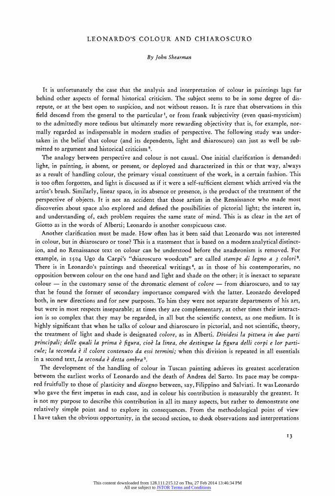
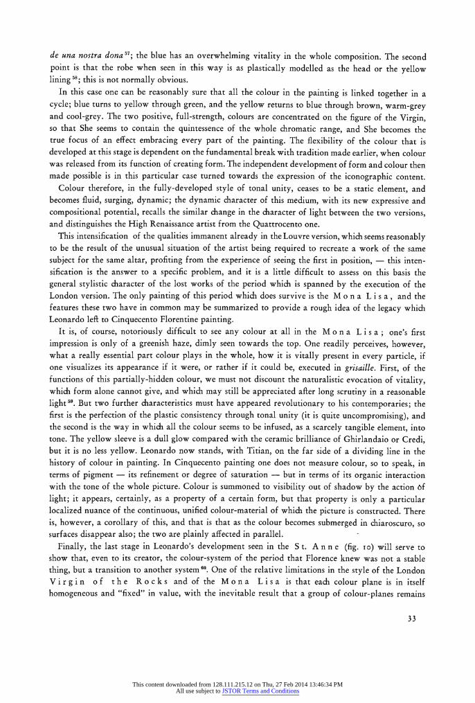
Another more important fact follows from the tonal scale of pigments. If an artist in this conven- tion paints St. Peter, by tradition clothed in a yellow robe over a blue vestment, with each drapery modelled by saturation-changes and the full intensity of the pigment used for the deepest shadows, then those two forms are bound to be plastically inconsistent. The potential range of tone offered by each pigment cannot be matched, and the modelling of the yellow drapery will be less powerful than that of the blue. The full meaning of this problem may be seen in Masaccio's S t. A n n e in the Uffizi (figure i); at this early stage of his career Masaccio worked without modification within the technical tradition of late gothic art. A case where the consequences are least obvious is the rela-
tionship between the rose-red and deep blue draperies of the Madonna, for these are pigments close to each other on the tonal scale; even so, if one compares the plasticity attained on the sleeve of the Madonna in red, with that on the knee below in blue, the inevitable disparity is apparent. More
striking, however, is the disparity in potential modelling between forms of colours at opposite ends of the scale, between, say, the relatively strong rose-red of S. Anne's robe and the much weaker cinnobar-red of the angel at the top, and most striking of all, if one takes the extremes of the scale, between the full saturated yellow of the highlights of the upper left-hand angel and his equally pure, but far deeper blue wing. This angel has a vestment that turns from this full value of yellow to a full cinnobar-red shadow, which is an example of the device of colour-change, used by Masaccio
'4
This content downloaded from 128.111.215.12 on Thu, 27 Feb 2014 13:46:34 PMAll use subject to JSTOR Terms and Conditions
i..?;:"t' "I '"
?E* rlk ~ I 1! t: r " 6...:.1
i;'t.f' ~??r
- ?
dl: rA;.'LF'?ii ?r" Z~i a.?4e ?:~?? * ~i? . * ?k ?.? . .i .* f ?, r i. *: 'f. .?`? : I .,? :'i -1
;? it.' ?: k. i:?.Y 1 4
it ~EI~ ~B~L:Y' ill
T:. ?n.: i:'-?? "'I?:: r :r ~ ?:'*
?,?
fq':' ' I ??'~r ?k;
??l~i~Si:~ : ? i.. j~3~ *5. ?r
e~yCI-
ii "i; ?, ~iC P
j?l~f~a: 'U13~ *
'b r-, * i
rr d2. 1r: -1 ~nnr. f r *s~ i. It
~ ?~R ,I?r -~ ?I ,?r?
,.I
r: I ; j 1,, % *' t ii t?; t, I ?; t? t:'l a -.?r:? ir? 'f ?e? :? 1?
- f 'La:
*? :k. *::? r
I ~s~Aa~F':: i '%
I. Masaccio, Madonna and Child and St Anne, Uffizi.
15
This content downloaded from 128.111.215.12 on Thu, 27 Feb 2014 13:46:34 PMAll use subject to JSTOR Terms and Conditions
to exploit just the differences of tone in the pigments themselves which poses the problem we are examining.
The S t. A n n e panel introduces a secondary aspect of the problem-modelling forms in paler and darker values of the same colour. Using the technique of colour-modelling, the only possibility is what we have here: the light blue veil of the Madonna is modelled from white to a relatively pale lapis for the full-shadow, whereas the dark blue robe has a highlight value of the same pigment already several tones darker than the shadow of the veil, and a full shadow immeasurably deeper again. The same difference exists between the deeper rose-red of S. Anne's veil and the pale red angel below to the right in the same pigment.
The stylistic result of this use of colour is complex, but its main points may be briefly summarized. Firstly, the colour imposes an accent on the linear qualities of the painting; the limits of every object are marked by a sharp transition to a new colour and to a new range of tone values: to a totally different level of plasticity. Consequently the line so created has a special emphasis, and a tendency to insulate each differently-coloured object as an autonomous field on the picture surface; to each individual colour-plane, therefore, this use of colour will introduce a flattening, surface- stressing tendency. In the case of a form like a draped figure, composed of elements of more than one colour, this polychromy will inevitably break up the volume of the whole into planes of varying plastic intensity. In the S t. An n e, for instance, the total plasticity of the figure of the Virgin - or of the whole figure group - is incoherent, and appreciably less impressive than the really powerful modelling of the forms individually, like the folds over the knees. Because of the tonal scale of
pigments, a polychrome object in colour-modelling amounts plastically to much less than the sum of its parts. In the Arena chapel every coloured figure is flatter, and less of a volumetric unit, than the monochrome figures below; to carry the argument a stage further, it is also less fully related to its
surrounding forms. A second result, equally relevant to the style as a whole, is that this use of colour entails the
completely finite realization of every part of every form; there is no possibility of varying the
sharpness of focus on surfaces right up to their contours, because it is an attitude to colour and form which excludes the notions of atmosphere or of volumes of shadow as universal elements in the
painting, whereby the surfaces might become partially or wholly lost to view. The third point concerns the attitude to li g h t which is implied by this handling of colour. By
no means, for example, can the colour-change from yellow to red, or green to red, have been thought of in the artist's mind as a rational or naturalistic result of the fall of a stream of light on a coloured
form; the same is true of the intensification of the local colour in the more common cases of simple colour-modelling. Neither can he have considered a unity in the reaction of separate coloured forms to a single light: each form makes its own reaction, and this is conditioned in the first place by the intrinsic qualities of the particular pigment in use. Masaccio, of course, even at this early date, was
exceptional in his time for the understanding of the action of light in painting. But in the S t. A n n e the impression of light that exists is, so to speak, the sum of a number of individually-lit parts, and the only real difference between this and the light of Cimabue, of Orcagna or even of Lorenzo
Monaco, is that on these individual parts there is imposed a unity of direction; all the highlights have been orientated to one side. This step had already been taken by Giotto and Duccio. But it is the lack of unity of response from colours, more than the inconsistencies in direction and cast shadow, that withholds the instantaneous impression of the presence of a true pictorial light, a single, unified element passing through space and conditioning the visibility and invisibility of objects.
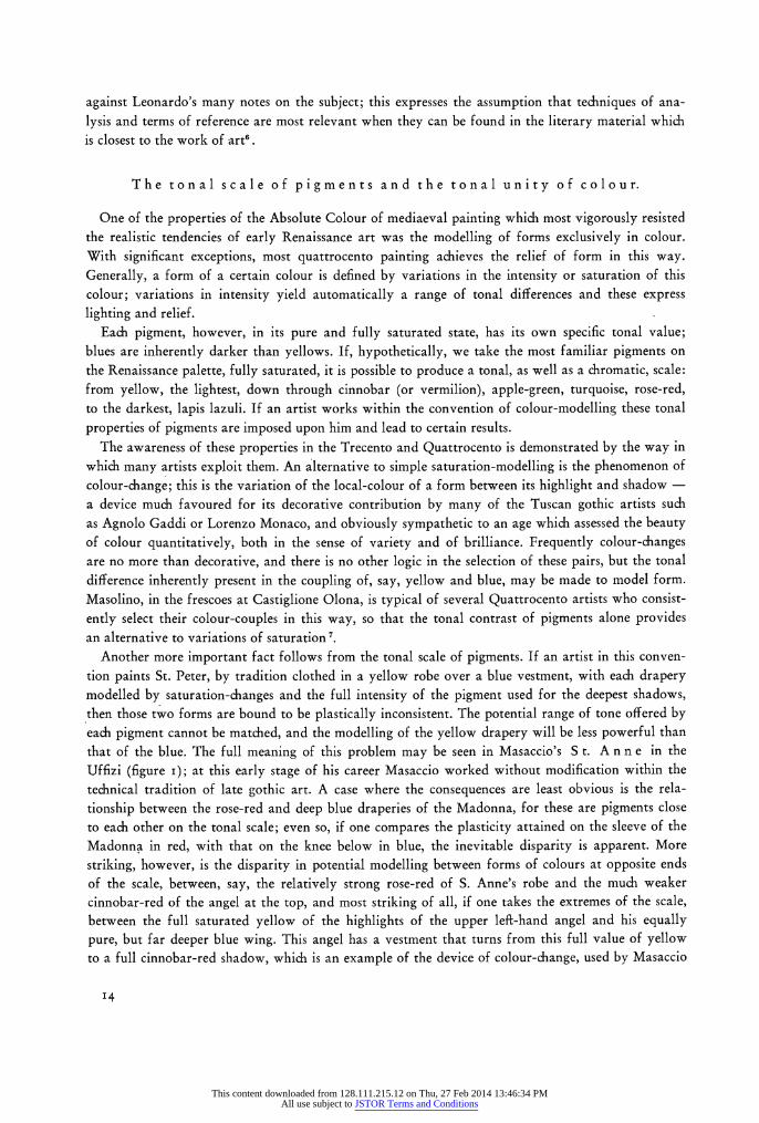
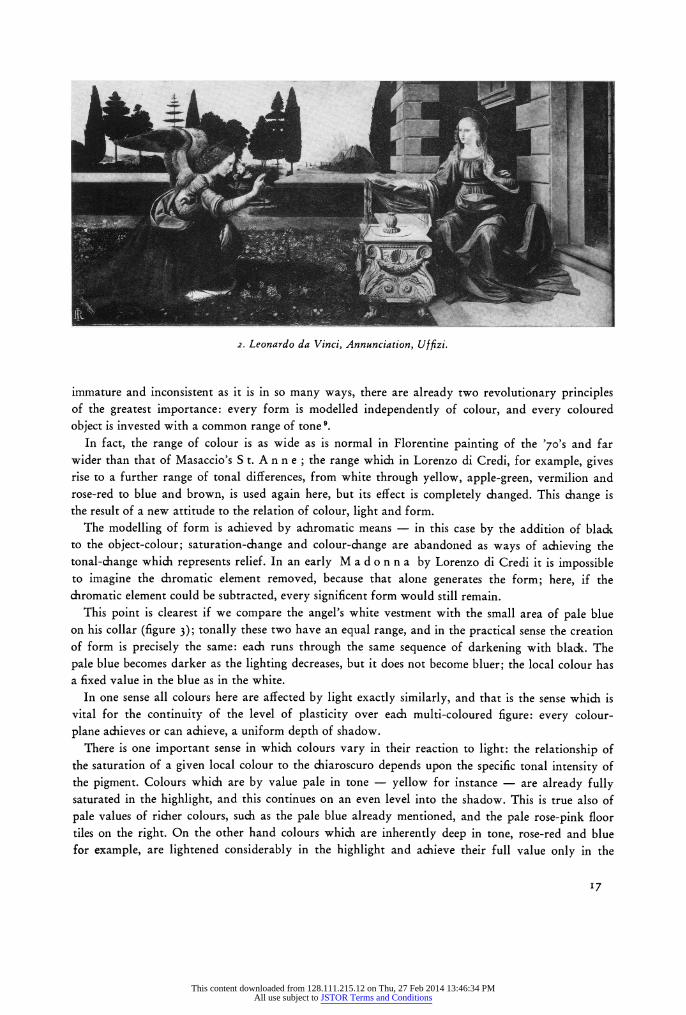
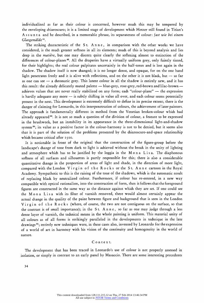
The A n n u n c ia t ion in the Uffizi (figure 2) forms the best starting-point for a discussion of Leonardo's position in the history of this problem 8; it is a very remarkable position. In this picture,
i6
This content downloaded from 128.111.215.12 on Thu, 27 Feb 2014 13:46:34 PMAll use subject to JSTOR Terms and Conditions
S? r ?~rr~i? ' ~B~"- : ;?r;E~1 IC ?, TcF
?.~L~'"1 '~? ?7 Ic
?.-t.~ 1 ??: ?~' ~_~_~~~ ,_~ii~??? ;* -1
;~?l.:Y
r
2. Leonardo da Vinci, Annunciation, Uffizi.
immature and inconsistent as it is in so many ways, there are already two revolutionary principles of the greatest importance: every form is modelled independently of colour, and every coloured object is invested with a common range of tone 9.
In fact, the range of colour is as wide as is normal in Florentine painting of the '70's and far wider than that of Masaccio's S t. A n n e ; the range which in Lorenzo di Credi, for example, gives rise to a further range of tonal differences, from white through yellow, apple-green, vermilion and rose-red to blue and brown, is used again here, but its effect is completely changed. This change is the result of a new attitude to the relation of colour, light and form.
The modelling of form is achieved by achromatic means - in this case by the addition of black to the object-colour; saturation-change and colour-change are abandoned as ways of achieving the tonal-change which represents relief. In an early M a d o n n a by Lorenzo di Credi it is impossible to imagine the chromatic element removed, because that alone generates the form; here, if the chromatic element could be subtracted, every significent form would still remain.
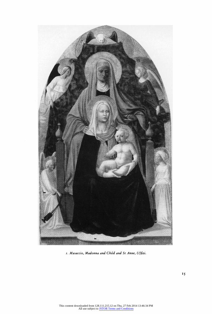
This point is clearest if we compare the angel's white vestment with the small area of pale blue on his collar (figure 3); tonally these two have an equal range, and in the practical sense the creation of form is precisely the same: each runs through the same sequence of darkening with black. The pale blue becomes darker as the lighting decreases, but it does not become bluer; the local colour has a fixed value in the blue as in the white.
In one sense all colours here are affected by light exactly similarly, and that is the sense which is vital for the continuity of the level of plasticity over each multi-coloured figure: every colour- plane achieves or can achieve, a uniform depth of shadow.
There is one important sense in which colours vary in their reaction to light: the relationship of the saturation of a given local colour to the chiaroscuro depends upon the specific tonal intensity of the pigment. Colours which are by value pale in tone - yellow for instance - are already fully saturated in the highlight, and this continues on an even level into the shadow. This is true also of pale values of richer colours, such as the pale blue already mentioned, and the pale rose-pink floor tiles on the right. On the other hand colours which are inherently deep in tone, rose-red and blue for example, are lightened considerably in the highlight and achieve their full value only in the
17
This content downloaded from 128.111.215.12 on Thu, 27 Feb 2014 13:46:34 PMAll use subject to JSTOR Terms and Conditions
half-tones and the full shadow. Colours of moderate depth of tone, vermilion and apple-green, are lightened a little for the highlight but are already at full intensity in the higher half-tones. The reasons for this apparent inconsistency are two-fold. In the first place a colour plane which is required to be rich in colour, such as the "dark" blue robe of the Madonna (in contrast to the "pale" blue of the angel's collar and ribbons) is already of a depth of tone near to that which will be reached by the blackness of the shadow; if therefore the colour were to remain constant in intensity for dark colours as for light, very little relief would result. It is clear that the new ideal of uniform
plasticity requires also that the level of tone of the highlights will be approximately equal. One may also look at this from a rather different view-point, and see that the achromatic modelling implies not only the superimposition on the local colour of a system of darkening with some neutral pigment, in this case black, but also of lightening, if necessary, with white.
The second reason follows from the first: a colour of weak intensity becomes quickly submerged in the chiaroscuro. Consider, for example, the two cases of the Virgin's deep blue robe and its yellow lining; if the yellow followed the same sequence of lightening in the highlights - that is, dilution with white (which would in fact make little tonal difference) the result would be, virtually, monochrome; the yellow would be entirely lost in the gathering obscurity of the shadow. The blue, on the other hand, and also the rose of the vestment, have a natural strength which will enable them to colour the form effectively even if they only reach full intensity in the deepest shadow: a power to retain chromatic effect into chiaroscuro which yellow - and apple-green - have not.
Leonardo's solution to this perpetual problem of the different intensities of the palette is not
entirely rational; yet, from the aesthetic point of view it is justified. When he varies the treatment of colour over the form - its reaction to light-changes - in relation to the specific qualities of the local-colour, this results in some cases in a parallelism of saturation-change to relief, represented by the monochrome element, but it is perfectly clear that these saturation-changes are conditioned by the chiaroscuro, and that they are neutral and inert in the complex processes of the generation of form.
This early, and as yet unsophisticated, reaction to the pigment-problem may be called by what it achieves: Tonal Unity. There are two major consequences to notice. The first, and historically the more important, is the control of the inherently disruptive effects of polychromy upon plasticity. A figure like the Madonna presents now a single, swelling, homogeneously-generated volume in contrast to the inevitably fragmented effects of colour-modelling seen in Masaccio's Madonna.
Secondly, and of particular significance for Leonardo himself, light, colour and form are now related in a way that approximates to, and describes, their scientific and naturalistic behaviour. The relation of colour to light has entirely changed'". In the relative absolutism of late Quattrocento painting light remained a function of colour; changes in the objective nature of the surface of the form -
variations of intensity of colour, or colour-changes - created relief, and this relief was the indication of the lighting on the form; the incidence of light on a given part of the form was the result of the
objective nature of the colour at that point. Now, colour is a function of light; it appears and
disappears according to the lighting conditions, and its specific qualities at a given point are governed by the fall of the light upon it, and not by the properties of the pigment. In other words light is perceived as an exterior force, outside the object and governing the relative visibility of the properties of the object; the colour of the form is now, in the Albertian sense, one of its permanent qualities, rather than temporary or accidental
ones. In the group of early works the concept of tonal unity is always present, though there is a perceptible development. The angel of the Uffizi B a p t i s m is in this respect already an exceptional case in Florentine painting of the '70's, yet it is tentative and incomplete. On the other hand the
i8
This content downloaded from 128.111.215.12 on Thu, 27 Feb 2014 13:46:34 PMAll use subject to JSTOR Terms and Conditions
? ii
,,
3. Leonardo da Vinci, Annunciation, Uffizi (detail).
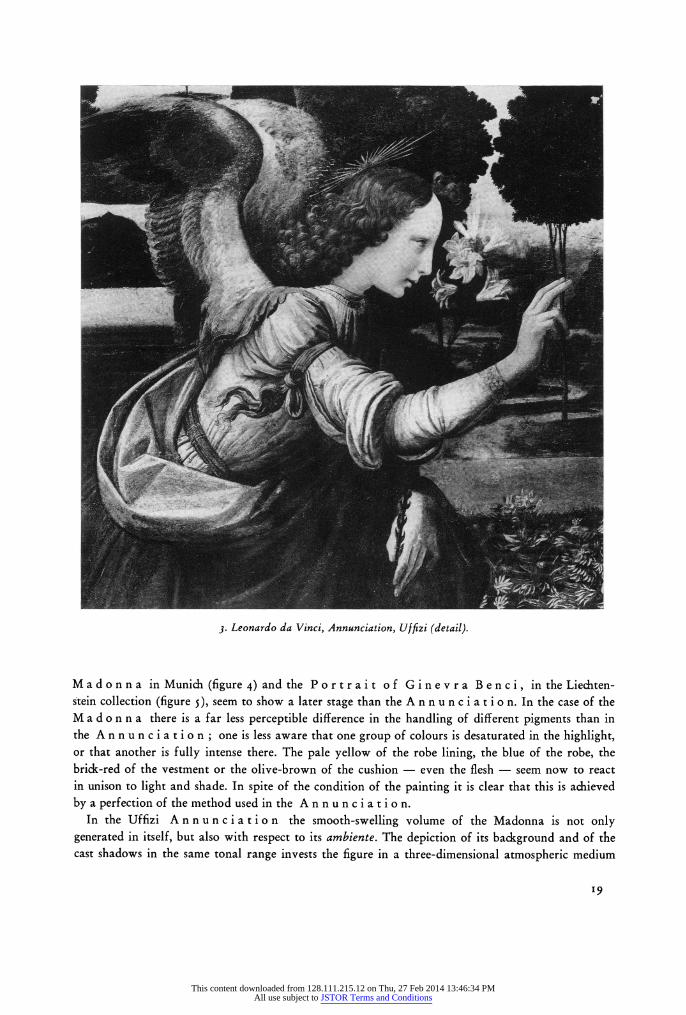
Madonna in Munich (figure 4) and the Portrait of Ginevra Benci, in the Liechten- stein collection (figure 5), seem to show a later stage than the A n n u n c i a t i o n. In the case of the M a d o n n a there is a far less perceptible difference in the handling of different pigments than in the A n n u n c i a t i o n ; one is less aware that one group of colours is desaturated in the highlight, or that another is fully intense there. The pale yellow of the robe lining, the blue of the robe, the brick-red of the vestment or the olive-brown of the cushion - even the flesh - seem now to react in unison to light and shade. In spite of the condition of the painting it is clear that this is achieved by a perfection of the method used in the An n u n c i a t i o n.
In the Uffizi An nunciation the smooth-swelling volume of the Madonna is not only generated in itself, but also with respect to its ambiente. The depiction of its background and of the cast shadows in the same tonal range invests the figure in a three-dimensional atmospheric medium
i9
This content downloaded from 128.111.215.12 on Thu, 27 Feb 2014 13:46:34 PMAll use subject to JSTOR Terms and Conditions
::.::?? ?P:':': ?: *:
r:???: * 'i: ;r *W" .r r ~sa~ ...;:..I ?::~:iii:? :J:
:??:I;? Il~??aiss~ii~?i~'~LIB:~??' :i i ,1,,1,.,...., ?"!""? "f' ~.?:::".l$:!;iRptE :$:li~ifBJ:;l:Pli#:8::.:' ?-~ i;? ig'; a:?'?' ';'~'
.* ?;?
..* P .? ?';i: ??:!* ~;. : : ?sr
Di. ..
"?
.r6Lffil~
M t
?, :.::;
??, ??,:..
??-crr, ~i~3%8s$E~1E~ i
P; .r ..
4. Leonardo da Vinci, Madonna, Munich.
which is another personal contribution of Leonardo's: a spatial chiaroscuro, which is a non-linear, tonal, system of coordinates. His achievement of tonal unity brings the possibility of a rich develop- ment of this new spatial system, but a series of problems stood in his way. From the proposition that the greatest range of tone in the modelling of a form, say a head, gives the greatest relief, it is a
logical step to the realization that this relief is only obtained under certain conditions: in a restricted, focussed, light in a dark environment. In any other situation reflected light begins to play in the
20
This content downloaded from 128.111.215.12 on Thu, 27 Feb 2014 13:46:34 PMAll use subject to JSTOR Terms and Conditions
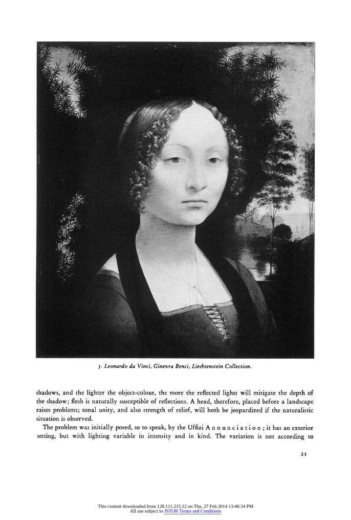
5. Leonardo da Vinci, Ginevra Benci, Liechtenstein Collection.
shadows, and the lighter the object-colour, the more the reflected lights will mitigate the depth of the shadow; flesh is naturally susceptible of reflections. A head, therefore, placed before a landscape raises problems; tonal unity, and also strength of relief, will both be jeopardized if the naturalistic situation is observed.
The problem was initially posed, so to speak, by the Uffizi A n n u n c i a t i o n ; it has an exterior setting, but with lighting variable in intensity and in kind. The variation is not according to
21
This content downloaded from 128.111.215.12 on Thu, 27 Feb 2014 13:46:34 PMAll use subject to JSTOR Terms and Conditions
naturalistic principles, but in the interests of the clarity of individual objects. Probably the expression of the subject matter made it difficult to invest the head of the angel with the same depth of shadow as his torso and the right arm; two different lighting conditions certainly exist. But the next problem lies in this: that whereas it is the head which is given the lighting appropriate to the exterior setting, and the torso is given that of an interior, it is precisely the torso that is in some sort of atmospheric unity with the dark background, while the head is sharply detached from it, and appears superim- posed.
The colour-problem in Leonardo's notes.
In the whole painted oeuvre of Leonardo the subsequent stages in this problem are naturalistic
adjustments of the aesthetic principle of tonal unity. It was a problem which lasted for his entire career and it would be strange if there were no discussion of it in his writings; in fact there is precise confirmation of the objects of tonal unity as they have been deduced from the paintings.
For example, the final considerations in the preceding section are not abstract: Leonardo examined
every one of them 12. As is perhaps to be expected, he is undecided as to which setting he prefers ", but no-one was ever clearer on the differences between the two extreme situations: Grand'errore e di
quelli pittori, Ii quali spesse volte retranno una cosa di rilevo a un lume particulare nelle loro case, e
poi mettono in opera tal ritratto a' un lume universale de l'aria in campagna, dove tale aria abbraccia et alumina tutte le parte delle vedute a un medesimo modo; e cosi costui fa l'ombre oscure, dove non
po essere ombra, e se pure ella ve e, ella e di tanta chiarezza, che'l e insensibile; e cosi fanno li riflessi, dove e impossibile quelli esser veduti 14
It is hardly necessary to demonstrate that Leonardo had a full understanding of light as an exterior force, and that form is revealed in the dynamic interplay of light and shade; he also
distinguished clearly between the local-colour and the accidental colour of objects, between the
permanent and temporary colouristic properties 5". Light and shade are temporary phenomena clothing the form: ogni corpo opaco sia circundato e superfitialmente vestito d'ombre.16
In effect the whole theory of tonal unity follows logically upon these premises. In painting, white and black are not real colours, but are the modifications of colours which indicate their lighting: nero ... bianco ... privatione e generativo... in pittura sono li principali, concio sia che la pittura sia composta d'ombre et di lumi, cioe di chiaro et scuro .17
This black/white structure is independent of the local colour on which it is superimposed; it is immaterial whether an object be blue or white if the lighting conditions are the same, for the highlight and the shadow will contain the same quantity of white or black ". This observation is followed by a practical recipe for achieving this consistent modelling of relief by the addition of measured quan- tities to the blue, a recipe which is the perfect counterpart of Cennini's colour-modelling recipes for relief by measured quantities of the object-colour. In another passage the common depth of shadow is clearly stated: All colours when placed in shadow seem to be equally dark". Nowhere, in the hundreds of passages on light, shade and colour, is there any contradiction of this fundamental
principle 20 The question of the appearance of the object-colour through this light-shade structure is also
discussed in the writings; no definitive solution is reached. Although some passages are contradictory in detail, the approach to the problem corresponds to the analysis of the inconsistencies noticed in the paintings ". The difficulty lies in the problem of varying saturation, and whether the greatest brightness, intensity, or simply bellezza, occurs in the highlights or in the half-tones; full shadow is naturally out of the question. Generally speaking he is content to accept the conclusions of the Albertian optical theory, that, since light reveals form and shade obscures it, the true colouristic
22
This content downloaded from 128.111.215.12 on Thu, 27 Feb 2014 13:46:34 PMAll use subject to JSTOR Terms and Conditions
properties will be most visible in the light 22. The conflict arises from the further observation, more practically linked to painting, that if the object-colour remained indeed unchanged in the highlight, light coloured objects would have a greater range of tone than dark, and greater relief23; in the abstract context of optical theory this is assumed to be the case 24. This difficulty is parallelled by the practical proposition that while shadows in a painting are achieved by the addition of black, highlights are equally to be achieved by white. There is never any statement of the exact nature of the compromise which would solve these conflicts - probably because no stabilized solution was ever achieved - but it seems that the understanding of the different requirements of pigments according to their position on the tonal scale, which was deduced from the examination of the paintings, was in fact in Leonardo's mind. Two passages from the Trattato can only be explained in this way: (i) ... diverse colore hanno le loro bellezze in diverse parte di se medesimo, e questo ci mostra il nero haver la bellezza nell' Ombre e il bianco nel lume e l'azzurro e'verde e taneto (brown) nell'ombre mezzane, e'l giallo e rosso (cinnobar?) ne'lumi, e l'oro ne reflessi et la laca (rose madder?) nelle ombre mezzani25. (2) Dove et in qual colore l'ombre perdano piu ii color naturale della cosa ombrata? II bianco, che non vede ne lume incidente, ne nisuna sorte di lume riflesso, e quello che prima perde nella sua ombra integralmente il suo proprio natural colore, se colore si potesse dire il bianco. - Ma il nero agumenta il suo colore nelle ombre e o10 perde nelle sue parte aluminate, e tanto
piu lo perde, quanto la parte aluminata e veduta da lume di maggiore potenzia. E il verde, e l'azuro agumenta il suo colore ne' l'ombre mezane; et il rosso e giallo acquista di colore nelle sue parte aluminate, e'l simile fa il bianco; e li colori misti partecipano della natura de colori, che compongano tal mistione, cioe, il nero misto col bianco fa berettino, il quale non A bello nell'ultime ombre, com'-'l nero semplice, et non e bello in su lumi, com'e il semplice bianco, ma la suprema sua bellezza sit infra lume et ombra 26. White, yellow and red (probably cinnobar or vermilion) are the colours light in themselves, which require little or no adjustment to make an effective tonal contrast to the shadow; on the other hand blue, lake, green (probably the deep copper-green which has now in most cases turned to brown) and brown are the colours which are dark in themselves, and which can therefore
appear at full intensity only in the increasing shadow.
The development of Tonal Unity in Leonardo's painting.
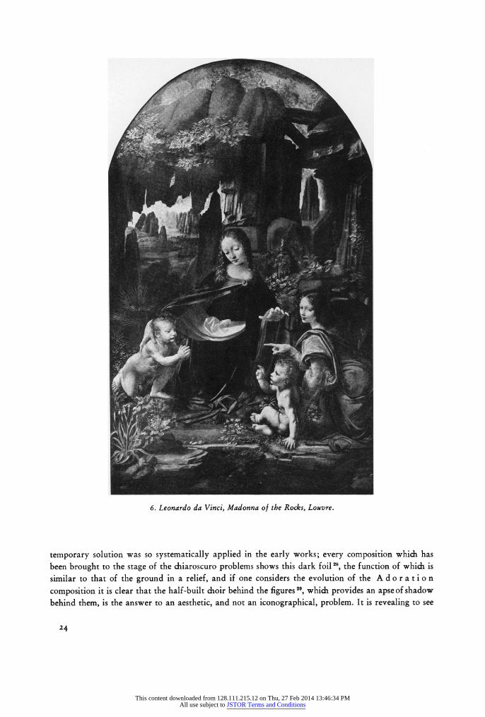
At the conclusion of the first section it was postulated that an unsolved aesthetic problem arose in the A n n u n c i a t i o n. A naturalistic respect for the exterior lighting conditions in the head of the angel led to a less coherent relation of form to setting than was achieved in a more ideal, or abstract, lighting situation assumed for the rest of the figure. The first stage in the solution of this problem was the exploitation of the second situation, and especially of the dark foil to the figure, with a greater or lesser implication of enclosed space. The aim of these earlier works, up to the first Milanese period, is towards a closer and closer approximation to the complete consistency of tone for the whole figure, flesh and polychrome drapery, and this means at once a greater intensity of lighting and a greater restriction of its direction; the dark foil is a necessary complement to the plastic consequences of this development, and the naturalistic aspect is for the moment ignored. In the more abstract sense there is no conflict in the use of essentially the same pattern of background for both the Munich M a do n n a and the Liechtenstein portrait 27, for the lighting of the foreground and of the background is unrelated in the naturalistic sense in each case, and the pictorial unity is achieved through the decorative function of the colour. The darkness surrounding the profile of the figure is essential for the atmospheric setting of the form, and in neither case is an enclosure implied which would justify naturalistically the character of the foreground light. It is indeed remarkable that this
23
This content downloaded from 128.111.215.12 on Thu, 27 Feb 2014 13:46:34 PMAll use subject to JSTOR Terms and Conditions
6. Leonardo da Vinci, Madonna of the Rocks, Louvre.
temporary solution was so systematically applied in the early works; every composition which has been brought to the stage of the chiaroscuro problems shows this dark foil 28, the function of which is similar to that of the ground in a relief, and if one considers the evolution of the A d o r a tio n
composition it is clear that the half-built choir behind the figures 29, which provides an apse of shadow behind them, is the answer to an aesthetic, and not an iconographical, problem. It is revealing to see
24
This content downloaded from 128.111.215.12 on Thu, 27 Feb 2014 13:46:34 PMAll use subject to JSTOR Terms and Conditions
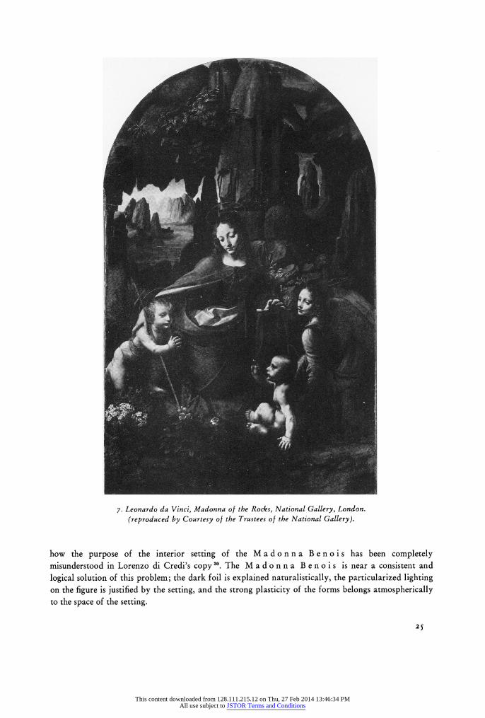
7. Leonardo da Vinci, Madonna of the Rocks, National Gallery, London. (reproduced by Courtesy of the Trustees of the National Gallery).
how the purpose of the interior setting of the Madon na Benois has been completely misunderstood in Lorenzo di Credi's copy 30. The M a d o n n a B e n o i s is near a consistent and
logical solution of this problem; the dark foil is explained naturalistically, the particularized lighting on the figure is justified by the setting, and the strong plasticity of the forms belongs atmospherically to the space of the setting.
25
This content downloaded from 128.111.215.12 on Thu, 27 Feb 2014 13:46:34 PMAll use subject to JSTOR Terms and Conditions
Vasari, speaking specifically of these early works, is aware of the limitations of this solution 31 P cosa mirabile che quello ingegno, che avendo desiderio di dar sommo rilievo alle cose che egli faceva, andava tanto con l'ombre scure a trovare i fondi de'piz' scuri che cercava neri che ombrassino e fussino pi' scuri degli altri neri, per fare che'l chiaro, mediante quegli, fussi piz' lucido; et infine riusciva questo modo tanto tinto, che non vi rimanendo chiaro, avevon piz' forma di cose fatte per contraffare una notte, che una finezza del lume del dl: ma tutto era per cercare di dare maggiore rilievo, di trovar il fine e la perfezione dell'arte.
The next development can best be shown by a comparison between the two versions of the M a - d o n n a o f t h e R o c k s. There is reason to believe that the Louvre version was made in response to the commission of 1483, and is therefore documented as being entirely by Leonardo's hand and finished some time before about 149432. The documents prove without any doubt at all that the National Gallery picture is the one that was destined for the same altar as the I483 commission but was in an unfinished state when Leonardo left Milan in 1499, and was brought to its present state by him during the second Milanese period. The difference in the conception of the two paintings therefore represents a stylistic advance of about fifteen years and bridges the gap between the Madonna Benois and the Madonna with the Yarn-Winder (first version), bet- ween the Adoration andthe Battle of Anghiari,or between the Ginevra Benci and Mona Lisa.33
Generally speaking, the lighting situation of the Louvre version (figure 6) is that of the S t. J e - r o m e 34 or of the A d o r a t io n; that is to say, that the figures are sharply lit, in an exterior setting, before a dark foil. It cannot be too strongly emphasized that this is n o t a painting of a group in a grotto; there is open sky above the group, conspiciously coloured a clear blue, and no indication of any enclosure; the "grotto" is not really a grotto at all, but the rocky equivalent of the ruined stable behind the figures in the Metropolitan Adoration studies 3. Its pictorial function is the same as the wall in the Uffizi Adoration or the rock behind S t. J e r o m e.
In the Louvre version the individual realization of every detailed form, so clearly seen in its drawing, is seen also in the lighting; the dualism of the situation in the A n n u n c i a t i o n is still unresolved. Only those flesh-forms close to the dark ground achieve a plasticity equal to that of the drapery, even though polychromy in itself no longer presents a tonal problem. In the forms above, more freely enveloped in illuminated space, naturalistic concessions with respect to the "exterior" situation are made - as in the G i n e v r a B e n c i portrait - so that on the one hand the inter- nal reflections on the flesh deprive heads and hands of plasticity, on the other the persistently clear silhouette of the shadowed side of the forms detaches them from atmospheric union with the setting35a.
In the London version (figure 7) the dualism is resolved, and this more intensely realized and intellectually meditated conception comes about partly through an apparent change in the actual situation portrayed. The open area of sky above is drastically reduced, and the impression of the enclosure of the figures in a dark space thereby created; it is possible now to read the situation as that of a grotto, since the continuity of the wall of rock is suggested above as well as at both sides. This means that the lighting of the figures may be brought into a rational harmony with their con- text. A restricted, particularized light enters the scene through such openings as are shown behind but actually from within the spectators' space to the left. The light is restricted not only in the sense of its sharpness of direction, so that the scattered reflections are eliminated, but also in its selective fall: it is a selective light seeking out the compositionally and iconographically significant forms and ignoring the rest. In its dynamic qualities of variability and selectivity, in contrast to the static, even, universal light of the Louvre version, it is the light of a new era. By its very restriction the plasticity of every form it touches is augmented, and at the same time the complementary chiaroscuro sets
26
This content downloaded from 128.111.215.12 on Thu, 27 Feb 2014 13:46:34 PMAll use subject to JSTOR Terms and Conditions
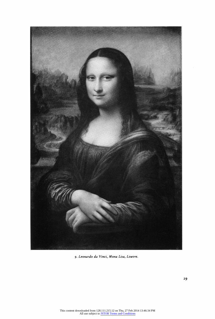
each form in volumetric relation one to another, and each to the grotto, more forcefully than ever before because now the possibility exists of losing a shadowed contour. The "grotto-light" is as objective as M o n a L i s a's smile; the naturalistic harmony of the situation is now complementary to the aesthetic harmony 3.
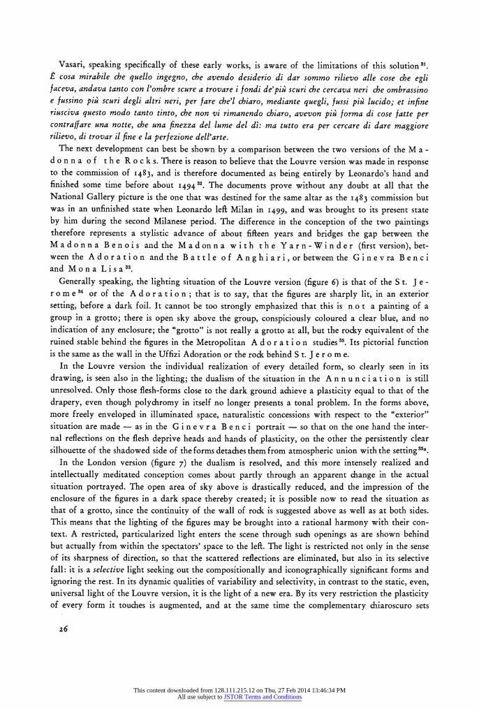
It is perhaps fair to look upon the London version therefore as the perfected solution of the early problem; what we need to stress here is the role of tonal unity, and what could thereby be archieved. To the independently-conceived psychological states of the figures in the first version there is applied a focus of emotional response and physical action which contributes a reflective unity of sentiment. In this dreamlike fusion the interweaving emotional cross-currents become superfluous: the figures do not look at each other, or at us. An integration, parallel in direction and equal in extent, has been applied to the formal constituent of the painting. This is the product as much of a developing treat-. ment of colour, and of its derivative light, as of design. The solution of the initial dualism was not found by abandoning the progress towards unity, but rather by the subordination, first, of naturalistic to aesthetic considerations and then by the invention of a situation in which they could coincide. This common solution to the aesthetic and naturalistic problem in the later years of the Milanese period forms the basis of the final solution whereby the figure could retain its plasticity against either a dark or a bright background, while still preserving its spatial, atmospheric relationship with it. Leonardo's habitual diagonal formal constructions, implying as they do that the setting requires to be in more than decorative harmony with the figures, make the pursuit of this final solution appear inevitable. The new orientation for this pursuit is set initially by the L a s t S u p p e r, which in a very different "naturalistic situation" represents a phase comparable to that of the London V i r - gin of the Rocks.
In the L a s t S u p p e r (figure 8) there could never have been a choice of the setting, yet it is remarkable that even in the very early stages of the conception, in the Venice sketch, the need is felt for the chiaroscuro as a support for the figures 37. As the painting stands at present it is of course impossible to grasp with any accuracy the original atmospheric effect, but it is clear enough that the figures of the apostles towards the wings are integrated by light with the space behind as in the London Madonna of the Roc k s. But there are some new features; the chiaroscuro, the three-dimensional dialogue of light and shade, is now so emphatically present as a pictorial reality that it becomes itself expressive directly of the subject matter; this is to be seen not only in the lite- rally dramatic shadow of Judas, but also in the whole crepuscolo mise-en-scene, recalling the text: And it was evening .... So, dependent always upon the tonal unity of the colour, an entirely new expressive medium is given to painting, beyond the means of the Quattrocento. The second feature is the setting of the figure of Christ against the bright background of the view through the doorway onto the open landscape (figure 8). This is perfectly satisfying only by virtue of the clarity of the lighting-situation; perhaps the point is clearer if we consider the M o n a L is a which is in this respect equivalent to the centre-portion of the L a s t S u p p e r in isolation (figure 9).
The M o n a L is a must always be visualized with the flanking columns more in evidence than they now are 38; this therefore, is a portrait in a loggia, with a landscape beginning at an indefinable distance behind it. The stratification of the space therefore justifies logically the unrelated lighting of the figure, restricted and without "scatter", and of the background, limpid and diffuse; this new "situation" should be contrasted with that of G i n e v r a B e n ci (figure 5). The figure now stands out by virtue of the strength of its own modelling; it clearly does not belong to the same space-and- light unit as the background either in the aesthetic or the naturalistic sense.
However, the next problem, of the setting of a figure-group in an open landscape, occupied his attention in the same years that were spent on the M o n a L i s a. This problem was the necessary
27
This content downloaded from 128.111.215.12 on Thu, 27 Feb 2014 13:46:34 PMAll use subject to JSTOR Terms and Conditions
cr.-. '" "' :?a;, ~? C~~
~artv: , ~;i~~LU' jri? i~ ~:? *'? iii' i ?~ 7:~? ?cl~ ZY,
-C~?.. ?'
*.. .. Lj
3L*? :"':S~?~?~Pa~B ~ ?:.~
?e ~i,. r *! ?1. 4". t r'.
?.~:
?li3E * ?
?;~ ~ .I? ?r I I ~'
- ,~-~~C-~E5~L- ~B-~2~T~~;i?..~ ~"' :.~S~S~i~i~?iL?
a g "-*Y~~IJ~? ~I?;:? Inn;~~
8. Leonardo da Vinci, The Last Supper, S. Maria delle Grazie, Milan (detail).
corollary of the logical treatment of the interior setting of M o n a L i s a and the L a s t S u p -
p e r; it was already set by the compromise of the late-Milanese cartoon in the Royal Academy, and this was followed by the ISoi S t. Ann e cartoon, the two versions of the M ado n n a o f the Yarn-Winder, the Leda and the Battle of Anghiari; we do not know precisely the stages in the evolution here, only the final result in the Louvre S t. An ne, but it is clear that one of the elements in the final solution, the greatly enriched penetration of light within the complex group - or, to put it another way, the use of a diffused light without sacrificing plasti- city - must have been considerably developed already in response to the special problems of the
battle-piece 3. The other element which is important is the increased role of colour - in the modern sense - in this unity; and here, before considering this in detail, it would be as well to examine the
changing functions of the purely chromatic element up to this point, for the S t. A n n e belongs to a phase of Leonardo's development of which Florentine painters were ignorant at least until Andrea del Sarto's journey to Paris in 1 518/19 40.
It seemed worth while to deal with Leonardo's achievement and development of tonal unity at
length, because of its great historical importance; of its two functions, the approximation to optical
28
This content downloaded from 128.111.215.12 on Thu, 27 Feb 2014 13:46:34 PMAll use subject to JSTOR Terms and Conditions
9. Leonardo da Vinci, Mona Lisa, Louvre.
29
This content downloaded from 128.111.215.12 on Thu, 27 Feb 2014 13:46:34 PMAll use subject to JSTOR Terms and Conditions
naturalism and the creation of consistent plasticity, it was the latter which was most appreciated in his own day, and which stands so directly in the Florentine monumental tradition; it is no exaggera- tion to say that this discovery is the essential and inevitable pre-requisite for the classic plasticity of the High-Renaissance, by which painting achieved the corporeal homogeneity and relievo which would rival sculpture. It is impossible to imagine the aims of the early Cinquecento expressed without it. The "sculptural presence" of painted form may well have been among Leonardo's most
compelling ambitions, obsessed as he was with the Paragone. The judgement of the Cinquecento is on these lines; Vasari's summary of his historical position
as a painter, at the end of the Vita, is this: Nell'arte della pittura aggiunse costui alla maniera del colorire ad olio una certa oscurita, donde hanno dato i moderni gran forza e rilievo alle loro figure 41 and (an independet judgement) a contemporary of Vasari's calls him: primo inventore delle figure grandi tolte dalle ombre delle lucerne 42
Colour, chiaroscuro, and composition.
These changes of Leonardo's brought with them two entirely new stylistic characteristics, whereby the actual appearance of the painting is changed; the first concerns the chromatic effect of the pic- ture, the second, the veil of positive, corporeal atmosphere in which the sharpness of the form is lost and found, whereby the tactility of its surface becomes variable.
The "suppression" of colour by chiaroscuro is not a negative attitude to colour; the open clarity, the purity, the brightness of Quattrocento colour are rejected - and progressively more so - and colour speaks only in a dialogue with chiaroscuro, the one infused into the other, but thereby it attains a new resonance and a new depth, and it is this more sophisticated richness which characterized Florentine painting for a generation.
There is a text which is often chosen to show that Leonardo was interested only in the chiaroscuro, and that colour itself meant little or nothing to him:
Qual e di piu importantia, o'che la figura abbondi in bellezza di colori, o'in dimostratione di gran rilevo?
Sola lapittura si rende (cosa maravigliosa?) alli contemplatori di quella per fare parere rilevato e spichato dalli muri quel, che nulla, e li colori sol fanno onore alli maestri, che li fanno, perche in loro non si causa altra maraviglia che bellezza, la quale bellezza non e virtu del pittore, ma di quello, che gli ha generati. E puo una cosa esser vestita di brutti colori e dar di se maraviglia alli suoi con-
templanti pel parere di rilevo 43 It cannot be too strongly emphasized that bellezza di colori does not mean "beauty of colour" in
the modern sense, but the harsh brilliance of pure pigment; what Leonardo has in mind is not the choice between a picture brilliantly and subtly coloured (for example, his own L a s t S u p p e r) and a grisaille44, but between a painting of, say, Ghirlandaio, and his own: the contrast is between the Quattrocento and the Cinquecento. This is the change of taste which is reflected in the writing of
Michiel, Benedetto Varchi, Vasari and Paolo Pino 45. Leonardo in fact seldom touches on the nebulous
subject of colour harmony, but when he does, it is clear that his ideas are those which were given more succinct expression by the greater critical apparatus of Vasari. Restaci una secunda regola, la quale non attende d fare li colori in se di piu suprema bellezza, ch'essi naturalmente sieno, ma che la compagnia loro dia gratia l'uno a l'altro . . .46
Leonardo's personality as a painter is partly conditioned by his "total" vision of a work, which results in the unified conception (in the mature drawings one sees the spontaneous growth of a
complex design) and in the necessity of bringing the execution of the whole to a finish simultaneously,
30
This content downloaded from 128.111.215.12 on Thu, 27 Feb 2014 13:46:34 PMAll use subject to JSTOR Terms and Conditions
an innovation which brought its own difficulties; the traditional fresco-technique, for example, was
inadequate for his purposes. This simultaneous execution of the whole work is seen in technical terms in the unfinished works and in the evidence we have of the way he actually painted the two wall-
paintings: the stories relating to the L a s t S u p p e r 47, Vasari's description of the adjustable scaffolding for the Battle-cartoon 48, and the documents describing the scaffolding for the Battle-piece itself 49, all show how necessary it was to be able to paint, so to speak, the whole work at once. Both for these technical reasons, and for the psychological impetus behind them, it was inevitable, one
might think, that Leonardo should have broken the bonds of Quattrocento, quasi-Absolute colour. The clearly defined, mutually insulated, colour-planes imposed limitations like those of buon fresco, which the continuously fomenting creativity of his brain could not accept.
We have already seen that in the early Uffizi A n n u n c ia t io n colour ceased to play the active role in the creation of form and line; it begins, on the contrary, to be brought into a dynamic relationship with light, parallel to that of form with light. The particular technical characteristics of the chiaroscuro in use up to the time of the London version of the Virgin of the Rocks altered the chromatic effect of the painting in two ways: the reduction of the brightness of colour
(a suppression of one kind of richness), and its replacement by a homogeneous resonance in a
distinctly lower key. In this sense there is already a new unity of colour compared with the Quattro- cento; this is a sfumato unity achieved by achromatic means.
In the earlier works the compositional function of colour is primarily decorative; that is to say that the colour links draw the picture-surface into a unity, in the manner sensitive to the reality of the picture surface which is common in the Quattrocento. In the A n n u n c i a t i o n only the colour-links across the third dimension are exact, whereas those across the plane give the greater stress to the figures; no colour-value is common to both figures, so that each receives accented
individuality. The colour-link across the depth is given, for example, by the repetition of the silvery blue of the distant mountains in the ribbons, the collar and wing-roots of the angel. This paler blue, which occurs all over the left-hand half of the painting, in the flowers below and in the sky above as well as in the distant landscape and the angel, is the same blue which occurs more intensely on the robe of the virgin; similarly the glowing ruby-red of the angel's robe is repeated more softly on the bed-cover on the right.
In the Liechtenstein Portrait and the Munich Madonna the decorative function of the colour answers the essentially different requirements of the format; the consciousness of the depth axis is correspondingly greater, and the necessity of integrating the surface-pattern by repetitions across the plane could be ignored. In the Ma don na, the olive-brown cushion in the bottom left corner repeats the colours of the middle-distance landscape, while the blue of the robe
(softer than in the An n un c i a tio n) repeats that of the distant mountains. In the Po r tr a i t, the orange-brown of the middle-distance trees is precisely the same as the highlight on the right shoulder of her gown, and the blue of the lacing on the front is equal to the strongest blue in the
landscape, in the distant trees and the church spires. The colour-composition of the Paris version of the V i r g i n o f t h e R o c k s is a development
from the Florentine works only in the sense of a greater subtlety and maturity, a new richness of orchestration; the principle is a very fine balance of the still sharply individualized polychromy of the draperies of Virgin and angel. The blue of her robe, for example, by far the most intense colour in the picture and of an extraordinary richness, is given progressively weaker echoes in the distant landscape-vista and the quadrant of sky above, then in the flowers just to the right of her head and in the pale irises beneath the Giovannino, and finally in the cool grey ledges of the foreground parapet of rocks and the feathers of the angel's wings. The warmest patches of rock, ruddy-brown,
31
This content downloaded from 128.111.215.12 on Thu, 27 Feb 2014 13:46:34 PMAll use subject to JSTOR Terms and Conditions
below Christ on the left and along the very top, seem like reflections from the glowing brilliance of the Angel's robe, and the complementary green of the lining thrown over his left shoulder is softly echoed in the landscape vista, diagonally opposite.
In spite of the disfiguring varnish, and what appears to me to be a considerable quantity of over-
paint, all of which adds an artificial degree of unity to the colour-planes, the "separateness" of colour at this stage - a feature which further accentuates the individuality of the forms to which they are fixed - is still apparent; what is also apparent is an intention to use colour as an "accent" on the
subject matter, but this has not yet found a new means of expression. The new concept of crescendo or focus emerges first in the La s t S u p p e r 50.
It is essential to see the L a s t S u p p e r in the correct natural lighting, that is in the late after- noon or early evening when the light comes strongly from above and from the left, and leaves almost a third of the composition in half-shadow on this side. Without this lighting the balance is disturbed.
Leonardo has compensated this shadow by a greater strength of colour on the left than on the right, and by stronger contrasts of colour51 and modelling within the shadow; in comparison, the colour
is much softer on the right, with many of the draperies approaching a silvery-grey. This increase of
plasticity and colour in the more weakly-lit part is a device which he seems to have learnt from
Masaccio 52; it has another function, apart from the balance in the general impression on the spectator, and this is that while the direction and the temporal significance of the actual light has been most
subtly re-deployed in the painting, it has been, so to speak, extended to the part of the wall that is
actually in shadow. When the painting is seen in the natural light, therefore, the balance in the chromatic effect from
one side to another is perfect, but there is no articulated pattern in its distribution as there is in
Ghirlandaio's L a s t S u p p e r: the colour-planes are not unified by repetition. In the present state of the painting53 it is clearly impossible to say whether there was ever a colour-chain coordinat-
ing the colours - perhaps there was; but it is even now possible to see how colours have lost their
particularity. No colour-value is exactly repeated anywhere else, yet there is an element of homogene-
ity, of spontaneous harmony, which runs like a ground-bass beneath the cantilena of the individual
colours, and is one feature which pulls the whole long composition together. The other is the sub-
ordination of the whole to a dominant centre; the figure of Christ, in the colour composition, is
isolated by the simplicity of the colour-shapes - a red diamond and a blue equilateral triangle - and also because these two colours, apparently endlessly echoed and re-echoed in the other figures, are the strongest in the whole painting 54. Moreover, if we are right in reconstructing the rich green of James' tunic as being about equal in intensity to the blue and rose of John's vestment and robe 55, there was originally a crescendo towards the centre, an organic movement in the colour which
continuously focuses, even now, the spectators' attention on the quiet figure of Christ56. This "colour-focus", distinct from the old method of a particularized accent, is the expressive
equivalent of that kernel of formal activity which Leonardo had introduced into the plastic pattern as early as the Benois Madonna and the Adoration, as a stress on the essence of the
subject matter; it may be seen even more plainly, without so many necessary qualifications for
condition, in the London version of the Vi r g i n o f th e R oc k s.
The change in colour between the two versions is very striking; in the first it is gay, lyrical, finite
and wide in range: in the second, brooding, austere, elusive and restricted, virtually, to two im-
pressive chords of deep blue and golden-peach on the Madonna. To see this second picture in a light
approximating to a church interior is to realize two things; the first is the futility of the discussions
as to whether St. John or the Christ Child is the subject of the painting. The augmented intensity of
the blue in these conditions leaves no doubt whatever that it is, in Leonardo's own words, uno quadro
32
This content downloaded from 128.111.215.12 on Thu, 27 Feb 2014 13:46:34 PMAll use subject to JSTOR Terms and Conditions
de una nostra dona 57; the blue has an overwhelming vitality in the whole composition. The second point is that the robe when seen in this way is as plastically modelled as the head or the yellow lining 58; this is not normally obvious.
In this case one can be reasonably sure that all the colour in the painting is linked together in a cycle; blue turns to yellow through green, and the yellow returns to blue through brown, warm-grey and cool-grey. The two positive, full-strength, colours are concentrated on the figure of the Virgin, so that She seems to contain the quintessence of the whole chromatic range, and She becomes the true focus of an effect embracing every part of the painting. The flexibility of the colour that is developed at this stage is dependent on the fundamental break with tradition made earlier, when colour was released from its function of creating form. The independent development of form and colour then made possible is in this particular case turned towards the expression of the iconographic content.
Colour therefore, in the fully-developed style of tonal unity, ceases to be a static element, and becomes fluid, surging, dynamic; the dynamic character of this medium, with its new expressive and compositional potential, recalls the similar change in the character of light between the two versions, and distinguishes the High Renaissance artist from the Quattrocento one.
This intensification of the qualities immanent already in the Louvre version, which seems reasonably to be the result of the unusual situation of the artist being required to recreate a work of the same
subject for the same altar, profiting from the experience of seeing the first in position, - this inten- sification is the answer to a specific problem, and it is a little difficult to assess on this basis the general stylistic character of the lost works of the period which is spanned by the execution of the London version. The only painting of this period which does survive is the M o n a L i s a, and the features these two have in common may be summarized to provide a rough idea of the legacy which Leonardo left to Cinquecento Florentine painting.
It is, of course, notoriously difficult to see any colour at all in the M o n a L is a; one's first impression is only of a greenish haze, dimly seen towards the top. One readily perceives, however, what a really essential part colour plays in the whole, how it is vitally present in every particle, if one visualizes its appearance if it were, or rather if it could be, executed in grisaille. First, of the functions of this partially-hidden colour, we must not discount the naturalistic evocation of vitality, which form alone cannot give, and which may still be appreciated after long scrutiny in a reasonable light 59. But two further characteristics must have appeared revolutionary to his contemporaries; the first is the perfection of the plastic consistency through tonal unity (it is quite uncompromising), and the second is the way in which all the colour seems to be infused, as a scarcely tangible element, into tone. The yellow sleeve is a dull glow compared with the ceramic brilliance of Ghirlandaio or Credi, but it is no less yellow. Leonardo now stands, with Titian, on the far side of a dividing line in the history of colour in painting. In Cinquecento painting one does not measure colour, so to speak, in terms of pigment - its refinement or degree of saturation - but in terms of its organic interaction with the tone of the whole picture. Colour is summoned to visibility out of shadow by the action of light; it appears, certainly, as a property of a certain form, but that property is only a particular localized nuance of the continuous, unified colour-material of which the picture is constructed. There is, however, a corollary of this, and that is that as the colour becomes submerged in chiaroscuro, so surfaces disappear also; the two are plainly affected in parallel.
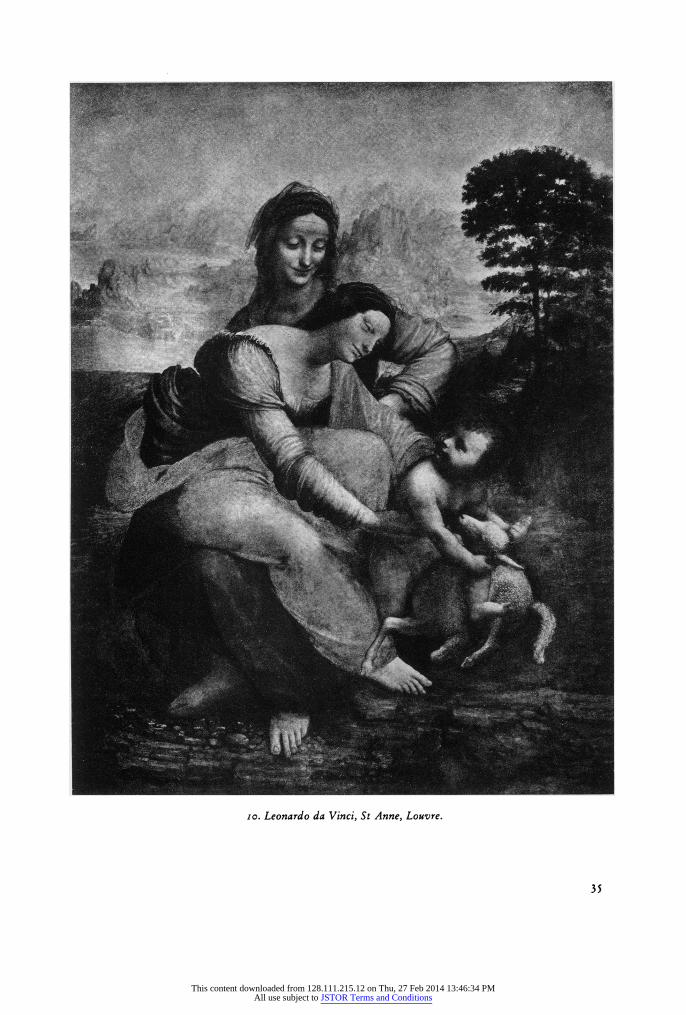
Finally, the last stage in Leonardo's development seen in the S t. An ne (fig. Io) will serve to show that, even to its creator, the colour-system of the period that Florence knew was not a stable thing, but a transition to another system 60. One of the relative limitations in the style of the London Virgin of the Rocks and of the Mona Lisa is that each colour plane is in itself homogeneous and "fixed" in value, with the inevitable result that a group of colour-planes remains
33
This content downloaded from 128.111.215.12 on Thu, 27 Feb 2014 13:46:34 PMAll use subject to JSTOR Terms and Conditions
individualized as far as their colour is concerned, however much this may be tempered by the enveloping chiaroscuro; it is a limited stage of development which Hetzer still found in Titian's A s s u n t a and he described, in a memorable phrase, its separateness of colour: fast wie bei einem Glasgemeilde 1.
The striking characteristic of the S t. An n e, in comparison with the other works we have considered, is the much greater softness in all its elements; much of this is beyond analysis and lies
deep in the matiere, but one may discern quite clearly the softening almost to extinction of the differences of colour-planes 62. All the draperies have a virtually uniform grey, only faintly tinted, for their highlights; the real colour palpitates uncertainly in the half-tones and is lost again in the shadow. The shadow itself is now changed; it is no longer dense, and opaque, for on the one hand
light penetrates freely and it is alive with reflections, and on the other it is not black, but - so far as one can see - a chromatic grey. This latent colour in all the shadow is entirely new, and it has this result: the already delicately muted palette - blue-grey, rose-grey, red-brown and lilac-brown -
achieves values that are never really stabilized on any form; each "colour-plane" - the expression is hardly adequate any more - is subtly shifting in value all over, and each colour seems potentially present in the next. This development is extremely difficult to define in its precise extent; there is the
danger of claiming for Leonardo, in this interpenetration of colours, the achievement of later painters. The approach is fundamentally different in method from the Venetian broken-colour which had
already appeared63. It is not so much a question of the division of colour, a feature to be expressed in the brushwork, but an instability in its appearance in the three-dimensional light-and-shadow
system64; its value as a positive factor in the colour-harmony is not to be denied, but it seems also that it is part of the solution of the problems presented by the chiaroscuro-and-space relationship which became critical after 50oo.
It is noticeable in front of the original that the construction of the figure-group before the
landscape's change of tone from dark to light is achieved without the break in the unity of lighting and atmosphere which has to be justified by the loggia in the M o n a L i s a. The diaphonous softness of all surfaces and silhouettes is partly responsible for this; there is also a considerable
quantitative change in the proportion of areas of light and shade, in the direction of more light, compared with the London Vir gin of the Roc ks or the S t. Anne cartoon in the Royal Academy. Sympathetic to this is the raising of the tone of the shadows, which is the automatic result of replacing black by neutralized colour. Furthermore, if colour has re-entered, in a new way compatible with optical rationalism, into the construction of form, then it follows that the foreground figures are constructed in the same way as the distance against which they are set. If one could see the Mo n a L is a with its filter of varnish removed, there would almost certainly appear the actual change in the quality of the paint between figure and background that is seen in the London
Virgin of the Roc ks (where, of course, the two are not contiguous on the surface, so that the contrast is of small importance); in the S t. An n e, so far as one may judge through a less dense layer of varnish, the technical means in the whole painting is uniform. This material unity of all colours as of all forms is strikingly paralleled in the developments in technique in the late
drawings 65; entirely new techniques were, in these cases also, invented by Leonardo for the expression of a world of art in harmony with his vision of the continuity and homogeneity in the world of nature.
Conte x t.
The development that has been traced in Leonardo's use of colour is not properly assessed in isolation, or simply in contrast to an early panel by Masaccio. There are some interesting precedents
34
This content downloaded from 128.111.215.12 on Thu, 27 Feb 2014 13:46:34 PMAll use subject to JSTOR Terms and Conditions
I'~~.~-~'~'IPE~L~""""as"a~B~?~LB~B~-a#l~ si~'? jl. ''' ? ~ ~l"i?? ?
~.t~~.jSL~. h'??;:~7t? i' ~: %;.7 S~L~! Pi.~ -? a.- ?1
E~lx ?il- *:? ;???.
:: ::7~,*i t,?::j~: 3~?7.:3.:~.?1 ;: ~ J. I;;i ~35~0~: ill? i ?: ?d:l? 'if;:L:
?? i: -.???~:e i*Jir~~??:
l-..??lr? ;J~?nl;, ??:~i~TP;::':Jin' s:~ ;j .~['[~:*li~:?:~'::L;i: .?s.?. ?i ?r
~?.r? ~-7~ "~ ?:?"' c??
?o? :t?... :???' ?:, '?'rc??:? ?.??:? "?.:.4-: :?? .?*.?
;:*~ti:l-i~.:m :~ iiIjkj dd
tt ?; ?~-~f~f~ i' ?*!~ .I? i~tl~f~'~i ?r 5 ?, t~d~~P. it~~ff:L
Y~:* :r: ?-?' ?!,7T: yr?' I': ;;
.~? :'~??~ ':""? ?, ''~':??i r. "'?'~i; ?~:?r~ *;I
~t ..: ::?: ?- ??:? ~~ !:~? r. ?i~
12f: i ~ 'IS
- rC~rp~lm~l-~~:?k~.P~ ̀ ~i~qpFP~j~i~El P -~P ' ??rl?
:i *k~.;. i
":. ?"!~r~E~ C a~Eil"~?;~~i"~ilC~Fx~~s-*~ ;~~lii ....- ,.... ?'"?;;: :?~ ~JrYLlk I IE .It. I1J~BL~'~Yr~b~"llE~Ia~B~l-- ;.:? ?? ~F~P'r:e: ?~ .:? ?~
L~:"- -51 t?. ?$~t~P:-;-~C~_:
'r'i ' ~U ~r?~I~L rll y
*:i:~CillE ~E .~
,?
~?. Ij;Z~~ ?~ ?:. :]
:.;:-?~ ?-~????'b?? I~ if~:'l :?:*j ,.*I
~Q--~Sp~rq *.i 'r ? " .C.:" :?9'~ '~.*?! ~?? :i .r? -~??.:
Y -?: ?.
iP
;s h?:
?: :?
io. Leonardo da Vinci, St Anne, Louvre.
35
This content downloaded from 128.111.215.12 on Thu, 27 Feb 2014 13:46:34 PMAll use subject to JSTOR Terms and Conditions
for his discoveries and a parallel (but not identical) development took place independently in Venice. In conclusion, therefore, a brief sketch of this situation, and also of the immediate reflexes in Floren- tine painting, is necessary. In doing this I am not attempting to sketch any sort of development in Florentine colour, but only to round out more fully the character of Leonardo's achievement which, like any other historical phenomenon, gains meaning from a consideration of its context.
It is unlikely that such a profound stylistic change should be unaccompanied by comment, or by a
sympathetic revolution in taste, and some documentation on both counts may make this enquiry seem less like an analytical exercise unrelated to historical events.
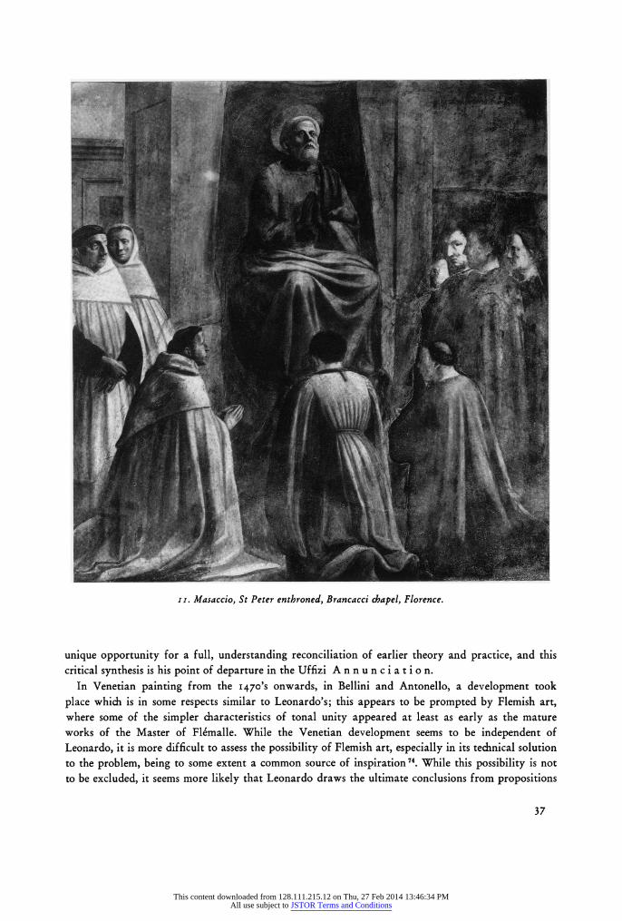
The S t. A nn e in the Uffizi represents only Masaccio's starting-point in his handling of colour. It is probable that his last work known to us is the Cathedra Petri (figure II) in the Brancacci chapel, and here the difference is remarkable; the impetus of Masaccio's development was so great that the contrasts exist even between this and his earlier frescoes in the same cycle. The point is simple: not only is there no substantial difference in the plastic intensity of blue and yellow draperies on the figure of St. Peter, but the same is true of flesh-forms and, most remarkably, of the white-habited kneeling figures before him; much of Leonardo's spatial correlation of volumes by tone is also prefigured here, and of course it is in these frescoes (for the same set of reasons) that appears the first instantaneously-felt pictorial light of the Renaissance. However, the extent of Masaccio's adumbration of Leonardo's early use of colour seems to be somewhat exaggerated by the condition of the frescoes; overpainted they certainly are (how much is not clear) and the superimposed dirt and smoke probably give a false impression of an atmospheric chiaroscuro, and obscure one important fact: in those small areas that are free from this distortion 66 it seems that colour-modelling is still
predominantly in use. Probably Masaccio modified this only by reinforcing the tonally-weaker pigments with some achromatic addition 67. It is important that in Masaccio's case no technical revo- lution accompanied this change, for this probably inhibited further development in the Quattrocento, and surely made it relatively easy for this demonstration to be quickly forgotten 68
It is possible that there were even some precendents in fresco for Masaccio. In Giotto's latter chapels in S. Croce there seems to be an appreciably greater control over the properties of pigments than was visible in the Arena chapel69. And, on reflection, it is striking how unified in tone is Cavallini's L a s t
J udgement in S. Cecilia 70 After Masaccio, it seems that only Filippo Lippi attempted to follow him, and that not for long;
but Lippi's early colour-style may be significant since it was first of all a translation of the C a t h e d r a P e t r i experiment into panel-painting (a step which, so far as I know, was not taken
by Masaccio, and which does in some ways pose the greater technical problem) and secondly because the earlier style of Lippi as a whole is an important part of Leonardo's background 71
It is possible that Masaccio's dramatic invention is more than the solution to a practical aesthetic
problem and was prompted by theoretical optical conclusions drawn by Brunelleschi. Certainly in
Alberti's della Pittura the logical counterpart of his perspective theory is a light-shadow system which takes for granted the situation created practically by Masaccio, and this system is entirely based on abstract, optical considerations. Alberti's theory of colore7" bears some relation to the exactly contemporary practice of Filippo Lippi, but I doubt if the relation is one of cause and effect; the perspective theory could fairly easily be converted to workshop practice, whereas the theory of colore (in spite of the protestations parliamo come pictore) is so totally unrelated to practical problems that it is not surprising that it found no interpreter until, possibly, Piero della Francesca, and Leonardo. It is no longer necessary to demonstrate that Leonardo had digested della Pittura7 , and much of what he says on this subject is a criticism of it; but in his person was presented the
36
This content downloaded from 128.111.215.12 on Thu, 27 Feb 2014 13:46:34 PMAll use subject to JSTOR Terms and Conditions
1I. Masaccio, St Peter enthroned, Brancacci chapel, Florence.
unique opportunity for a full, understanding reconciliation of earlier theory and practice, and this critical synthesis is his point of departure in the Uffizi A n n u n c i a t i o n.
In Venetian painting from the 1470's onwards, in Bellini and Antonello, a development took
place which is in some respects similar to Leonardo's; this appears to be prompted by Flemish art, where some of the simpler characteristics of tonal unity appeared at least as early as the mature works of the Master of Flemalle. While the Venetian development seems to be independent of Leonardo, it is more difficult to assess the possibility of Flemish art, especially in its technical solution to the problem, being to some extent a common source of inspiration 7. While this possibility is not to be excluded, it seems more likely that Leonardo draws the ultimate conclusions from propositions
37
This content downloaded from 128.111.215.12 on Thu, 27 Feb 2014 13:46:34 PMAll use subject to JSTOR Terms and Conditions
indigenous to Tuscan painting, and certainly his contribution crystallizes the aims and ideals of the local monumental tradition.
Many of the characteristics of Leonardo's colour reappear in the work of Perugino, and this is
historically important since Perugino's influence during Leonardo's long absence in Milan in the
1480's and '90o's provided to some extent a colouristic substitute for the latter which effects, for
example, the earliest works of Fra Bartolomeo and Albertinelli75. But Perugino's understanding of the potential of this new use of colour was limited; it went no further than the creation of plastically- coherent simple forms, and exploits none of the volumetric and spatial possibilities, nor the compo- sitional possibilities consequent upon the liberation of colour from the provision of form, and shows no awareness of the rational or naturalistic problems involved. Chronologically assessed, it is clear in any case that Perugino follows Leonardo's first demonstrations in the 1470's.
The first Florentine to explore and develop all the potentialities of Leonardo's colour-style (up to
15o8) was Fra Bartolomeo, whose intellectual penetration of that style was remarkable. Fra Bartolo-
meo's own development cannot be discussed here, but an altarpiece such as the Accademia
Marriage of St. Catherine (1512) can illustrate what is necessary. The tonal unity of colours is of course complete and is the basis for the homogeneous rilievo throughout the work, and
at the same time for the instantaneous impression of a powerful light. The presence of this light, and
of its complementary shadow, gives the coordinates of the spatial design with practically no
assistance from linear constructions. Darkness is the condition of space without light, and the light
penetrates selectively and draws out form into visible volume. Fra Bartolomeo at this stage makes
full use of the new capacity of the handling of colour to vary the realization, or the tactility, of
form, so that the sculpturally-plastic foreground figures contrast with those deep in the half-light of
the niche, as insubstantial as shadows. In the earlier quasi-Absolute colour-system a colour-com-
position automatically created a tone-composition, and the two were indivisible: the tonal com-
position was the product of colour and line (figure i). After the Leonardesque evolution tonal
compositions became the product of light, form, and space, so that colour, now independent, was
free to surge dynamically over the picture surface, as in the L a s t S u p p e r. In Fra Bartolomeo's
altarpiece again the colour-composition is independent of the tonal one, and plays principally the
complementary role of articulating, and therefore re-asserting, the surface.
The style of tonal unity in this direct Leonardesque form characterizes Florentine painting in its
most vital currents at the end of the first decade of the Cinquecento and for most of the second; it
characterizes, for example, not only the School of S. Marco (Fra Bartolomeo, Albertinelli, Sogliani and their followers) but also'the rapidly rising and ultimately triumphant rival, the School of the
Annunziata, circulating round the figure of Andrea del Sarto. The earliest works of Andrea, of
Pontormo, Rosso and Puligo fall within this definition 7. It was, on the other hand, these artists who
progressively formed the most critical reaction to it, and the point of departure for their increasing criticism was a work which was both influenced by, and a protest against, Leonardo's colour-style.
Michelangelo's D o n i T o n d o (figure 12) provided for Florentines an alternative approach to
the problem which was very different in character, chromatically more intense, and more directly based upon the Florentine tradition of colour-modelling.
Leonardo's new mode of vision embraced phenomena which were strictly pictorial: light, corporeal
space, and chiaroscuro, which brought a subjective flexibility of form, so that its limits and even its substance might be momentarily made less tangible or lost altogether. Michelangelo, by his whole
training, saw form in terms of solid matihre, and was not interested in phenomena outside the enve-
lope of surface. Chiaroscuro would have been anathema to him at this stage, and the workshop practice of his only master in painting, Ghirlandaio, was already on these lines (through indeed with
38
This content downloaded from 128.111.215.12 on Thu, 27 Feb 2014 13:46:34 PMAll use subject to JSTOR Terms and Conditions
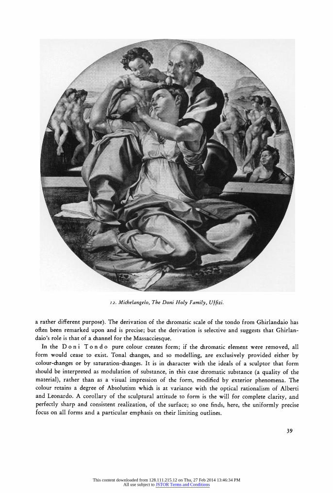
F-.--"17:': j .?I~~C~: *' *..
S.:
.~: ?
'?
..?~: ?
. . , ... .
1g " " X dbi : .:4
,,' ~ ~ .
? " .,
S
".. .i " ?
12. Michelangelo, The Doni Holy Family, Uffizi.
a rather different purpose). The derivation of the chromatic scale of the tondo from Ghirlandaio has often been remarked upon and is precise; but the derivation is selective and suggests that Ghirlan- daio's role is that of a channel for the Massacciesque.
In the D o n i T o n d o pure colour creates form; if the chromatic element were removed, all form would cease to exist. Tonal changes, and so modelling, are exclusively provided either by colour-changes or by saturation-changes. It is in character with the ideals of a sculptor that form should be interpreted as modulation of substance, in this case chromatic substance (a quality of the material), rather than as a visual impression of the form, modified by exterior phenomena. The colour retains a degree of Absolutism which is at variance with the optical rationalism of Alberti and Leonardo. A corollary of the sculptural attitude to form is the will for complete clarity, and perfectly sharp and consistent realization, of the surface; so one finds, here, the uniformly precise focus on all forms and a particular emphasis on their limiting outlines.
39
This content downloaded from 128.111.215.12 on Thu, 27 Feb 2014 13:46:34 PMAll use subject to JSTOR Terms and Conditions
The colour-changes in the D o n i T o n d o follow one Florentine tradition in exploiting the natural tonal differences of pigments. Joseph's robe, lying over his knees, is the most striking example: a fully-saturated yellow in the highlights turns smoothly to a pure and luminous coral-red which provides all but the very deepest points of shadow; here, only, the red is reinforced with a little rose-madder and brown. It is easy to find similar passages in Ghirlandaio and Filippino, but it is questionable whether they ever reach such vivid intensity. A second case, however, is in the
drapery behind the nudes in the left background: this turns from green to pure rose in the shadows 77. Both in the case of colour-change, and in the more frequent transition in one chromatic value from a white highlight to a densely-saturated shadow (Joseph's slate-blue vestment, the Virgin's lapis- lazuli robe and rose vestment, and also the flesh-tones), the forcefulness of the plasticity depends upon the strength of the colour; only the practical problems of grinding, purifying, and media set a limit to this plasticity, and this goes a long way towards explaining the really exceptional brilliance of the colour in this painting 78.
All this is clearly very different from Leonardo's practice; yet the two artists have one vital feature in common in their use of colour, which I believe is an influence of the older upon the youn- ger, however different their methods. This feature is the common and unified ("synchronized") range of tone of all colour planes. An indication of the importance Michelangelo attached to this is the reinforcement of the red shadow of Joseph's robe, which provides an extreme shadow of a depth commensurate with the blues and the rose-red, but which the yellow pigment would not reach. The function of this tonal unity of the colours of the figure-group is also the same as in Leonardo: to provide a uniform development of plasticity throughout.
The subsequent development of early Cinquocento colour in Florence oscillates between the
techniques of Leonardo and of Michelangelo. The situation is very confusing, particularly as Michel-
angelo's later colour seems to have moved significantly closer to Leonardo's v,. But in general, Andrea del Sarto, Rosso and Pontormo all seem to have reacted against the restraints that Leonardo placed upon the purely chromatic attributes of painting, and each of them, from about 15 20 onwards, varied at will the proportions of colour-modelling or of chiaroscuro in their works. However, no artist who was trained in the Tonal Unity of High Renaissance painting could afford to forget its formal and
expressive potential, and the many adjustments that follow Leonardo do not contradict, but on the
contrary develop further, his fundamental aesthetic principles. In 1522 a group of artists discussing the frescoes in the Carmine admired Masaccio's maniera si
moderna .. nel colorito so. It is probable that - at least in part - they were commenting upon the advanced tonal unity of his colour, as Vasari did when he remarked: dipinse le cose sue con buona unione e morbidezza, accompagnando con le incarnazioni delle teste e degl'ignudi i colori dei
panni ... come fa il vivo e naturale ... '. This remark is a compression of his advice in his della Pittura: Ne si debbono vestire gl'ignudi di colori tanto carichi di corpo, che dividano le carni
da'panni, quando detti panni attraversassino detti ignudi; ma i colori dei lumi di detti panni siano chiari simili alle carni, o gialletti, o rossigni ... (etc.), purche tragghino allo scuro, e che unitamente si accompagnino nel girare delle figure con le lor ombre: in quel medesimo modo, che noi veggiamo nel vivo ...82. Aretino, in his letter to Tintoretto of February 1545, on the A p o 1 1 o an d M a r - s y a s, had already appreciated the same point:... lo intende il vostro spirito intendente il dove si distendono i colori chiari e gli oscuri. Per la quale intelligenzia le figure ignude e vestite mostrano se medesime nei lor propri rilievi
83. Vasari on another occasion explains that ... colori. . carichi di corpo, siccome usavano di fare gid
alcuni pittori make the figures too obviously painted with pigments and prevent them being di rilievo e naturali84. More acutely still, he observes that sharp contrasts of pigments make a painting
40
This content downloaded from 128.111.215.12 on Thu, 27 Feb 2014 13:46:34 PMAll use subject to JSTOR Terms and Conditions
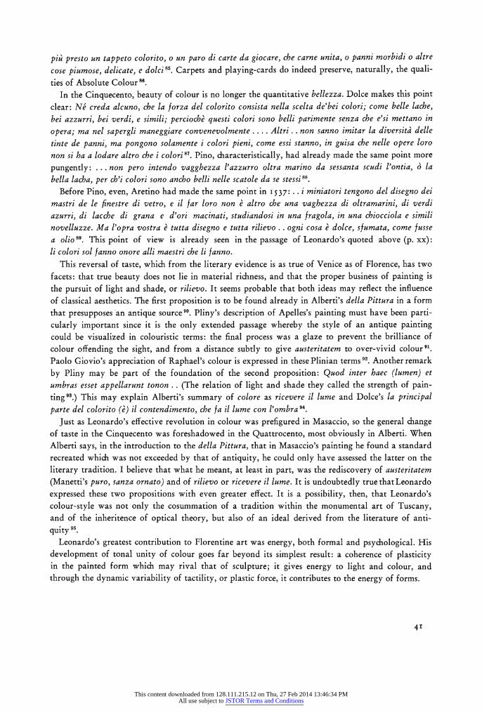
piz' presto un tappeto colorito, o un paro di carte da giocare, che carne unita, o panni morbidi o altre cose piumose, delicate, e dolci85. Carpets and playing-cards do indeed preserve, naturally, the quali- ties of Absolute Colour 86
In the Cinquecento, beauty of colour is no longer the quantitative bellezza. Dolce makes this point clear: Ne creda alcuno, che la forza del colorito consista nella scelta de'bei colori; come belle lache, bei azzurri, bei verdi, e simili; percioche questi colori sono belli parimente senza che e'si mettano in
opera; ma nel sapergli maneggiare convenevolmente .... Altri . . non sanno imitar la diversita delle tinte de panni, ma pongono solamente i colori pieni, come essi stanno, in guisa che nelle opere loro non si ha a lodare altro che i colori 87. Pino, characteristically, had already made the same point more
pungently: ... non pero intendo vagghezza l'azzurro oltra marino da sessanta scudi l'ontia, 6 la bella lacha, per ch'i colori sono ancho belli nelle scatole da se stessi 88.
Before Pino, even, Aretino had made the same point in 537: . . i miniatori tengono del disegno dei mastri de le finestre di vetro, e il far loro non e altro che una vaghezza di oltramarini, di verdi
azurri, di lacche di grana e d'ori macinati, studiandosi in una fragola, in una chiocciola e simili novelluzze. Ma l'opra vostra e tutta disegno e tutta rilievo . . ogni cosa e dolce, sfumata, come fusse a olio89. This point of view is already seen in the passage of Leonardo's quoted above (p. xx): li colori sol fanno onore alli maestri che li fanno.
This reversal of taste, which from the literary evidence is as true of Venice as of Florence, has two facets: that true beauty does not lie in material richness, and that the proper business of painting is the pursuit of light and shade, or rilievo. It seems probable that both ideas may reflect the influence of classical aesthetics. The first proposition is to be found already in Alberti's della Pittura in a form that presupposes an antique source 90. Pliny's description of Apelles's painting must have been parti- cularly important since it is the only extended passage whereby the style of an antique painting could be visualized in colouristic terms: the final process was a glaze to prevent the brilliance of colour offending the sight, and from a distance subtly to give austeritatem to over-vivid colour91. Paolo Giovio's appreciation of Raphael's colour is expressed in these Plinian terms 92. Another remark
by Pliny may be part of the foundation of the second proposition: Quod inter haec (lumen) et umbras esset appellarunt tonon.. (The relation of light and shade they called the strength of pain- ting93.) This may explain Alberti's summary of colore as ricevere il lume and Dolce's la principal parte del colorito (e) il contendimento, che fa il lume con l'ombra 94
Just as Leonardo's effective revolution in colour was prefigured in Masaccio, so the general change of taste in the Cinquecento was foreshadowed in the Quattrocento, most obviously in Alberti. When Alberti says, in the introduction to the della Pittura, that in Masaccio's painting he found a standard recreated which was not exceeded by that of antiquity, he could only have assessed the latter on the
literary tradition. I believe that what he meant, at least in part, was the rediscovery of austeritatem (Manetti's puro, sanza ornato) and of rilievo or ricevere il lume. It is undoubtedly true that Leonardo
expressed these two propositions with even greater effect. It is a possibility, then, that Leonardo's colour-style was not only the cosummation of a tradition within the monumental art of Tuscany, and of the inheritence of optical theory, but also of an ideal derived from the literature of anti-
quity 95 Leonardo's greatest contribution to Florentine art was energy, both formal and psychological. His
development of tonal unity of colour goes far beyond its simplest result: a coherence of plasticity in the painted form which may rival that of sculpture; it gives energy to light and colour, and through the dynamic variability of tactility, or plastic force, it contributes to the energy of forms.
4'
This content downloaded from 128.111.215.12 on Thu, 27 Feb 2014 13:46:34 PMAll use subject to JSTOR Terms and Conditions
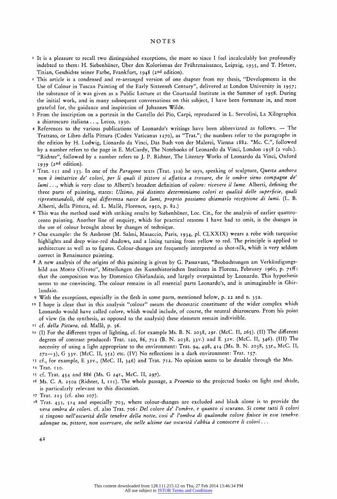
NOTES
1 It is a pleasure to recall two distinguished exceptions, the more so since I feel incalculably but profoundly indebted to them: H. Siebenhiiner, Ober den Kolorismus der Friihrenaissance, Leipzig, 1935, and T. Hetzer, Tizian, Geschichte seiner Farbe, Frankfurt, 1948 (2nd edition).
2 This article is a condensed and re-arranged version of one chapter from my thesis, "Developments in the Use of Colour in Tuscan Painting of the Early Sixteenth Century", delivered at London University in 1957; the substance of it was given as a Public Lecture at the Courtauld Institute in the Summer of 1958. During the initial work, and in many subsequent conversations on this subject, I have been fortunate in, and most
grateful for, the guidance and inspiration of Johannes Wilde. 3 From the inscription on a portrait in the Castello dei Pio, Carpi, reproduced in L. Servolini, La Xilographia
a chiaroscuro italiana ..., Lecco, 1930. 4 References to the various publications of Leonardo's writings have been abbreviated as follows. - The
Trattato, or Libro della Pittura (Codex Vaticanus 1270), as "Trat."; the numbers refer to the paragraphs in the edition by H. Ludwig, Lionardo da Vinci, Das Buch von der Malerei, Vienna 1882. "Mc. C.", followed
by a number refers to the page in E. McCurdy, The Notebooks of Leonardo da Vinci, London 1938 (2 vols.). "Richter", followed by a number refers to J. P. Richter, The Literary Works of Leonardo da Vinci, Oxford
1939 (2nd edition). 5 Trat. i i i and 133. In one of the Paragone texts (Trat. 3Pa) he says, speaking of sculpture, Questa anchora
non e imitatrice de' colori, per ii quali ii pittore si affatica a trovare, che le ombre sieno compagne de' lumi ..., which is very close to Alberti's broadest definition of colore: ricevere il lume. Alberti, defining the three parts of painting, states: Ultimo, piu distinto determiniamo colori et qualita' delle superficie, quali ripresentandoli, che ogni differenza nasce da lumi, proprio possiamo chiamarlo receptione di lumi. (L. B.
Alberti, della Pittura, ed. L. Mallk, Florence, I95o, p. 82.) 6 This was the method used with striking results by Siebenhiiner, Loc. Cit., for the analysis of earlier quattro-
cento painting. Another line of enquiry, which for practical reasons I have had to omit, is the changes in the use of colour brought about by changes of technique.
7 One example: the St Ambrose (M. Salmi, Masaccio, Paris, 1934, pl. CLXXIX) wears a robe with turquoise highlights and deep wine-red shadows, and a lining turning from yellow to red. The principle is applied to architecture as well as to figures. Colour-changes are frequently interpreted as shot-silk, which is very seldom correct in Renaissance painting.
8 A new analysis of the origins of this painting is given by G. Passavant, "Beobachtungen am Verkiindigungs- bild aus Monte Oliveto", Mitteilungen des Kunsthistorischen Institutes in Florenz, February 1960, p. 7iff: that the composition was by Domenico Ghirlandaio, and largely overpainted by Leonardo. This hypothesis seems to me convincing. The colour remains in all essential parts Leonardo's, and is unimaginable in Ghir- landaio.
9 With the exceptions, especially in the flesh in some parts, mentioned below, p. 22 and n. 3 5a. ro I hope is clear that in this analysis "colour" means the chromatic constituent of the wider complex which
Leonardo would have called colore, which would include, of course, the neutral chiaroscuro. From his point of view (in the synthesis, as opposed to the analysis) these elements remain indivisible.
11 cf. della Pittura, ed. Mallk, p. 56. 12 (I) For the different types of lighting, cf. for example Ms. B. N. 2038, 29r. (McC. II, 265). (II) The different
degrees of contrast produced: Trat. 120, 86, 712 (B. N. 2038, 33v.) and E 32v. (McC. II, 346). (III) The
necessity of using a light appropriate to the environment: Trat. 94, 498, 414 (Ms. B. N. 2038, 33r., McC. II, 272-3), G 33v. (McC. II, 352) etc. (IV) No reflections in a dark environment: Trat. 157.
13 cf., for example, E 32v., (McC. II, 346) and Trat. 712. No opinion seems to be datable through the Mss. 14 Trat. IIo. S5 cf. Trat. 454 and 886 (Ms. G 24r., McC. II, 297). i6 Ms. C. A. 25oa (Richter, I, iii). The whole passage, a Proemio to the projected books on light and shade,
is particularly relevant to this discussion. 17 Trat. 213 (cf. also 207). i8 Trat. 433, 514 and especially 703, where colour-changes are excluded and black alone is to provide the
vera ombra de colori. cf. also Trat. 706: Del colore de' l'ombre, e quanto si scurano. Si come tutti Ii colori si tingono nell'oscurita' delle tenebre della notte, cosi d' l'ombra di qualonche colore finisce in esse tenebre. adonque tu, pittore, non osservare, che nelle ultime tue oscuritd s'abbia a conoscere li colori..
42
This content downloaded from 128.111.215.12 on Thu, 27 Feb 2014 13:46:34 PMAll use subject to JSTOR Terms and Conditions
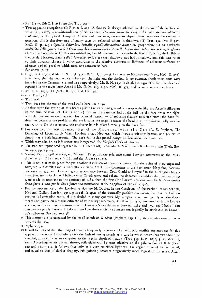
'9 Ms. E I7v. (McC. I, 258; see also Trat. 201). 20 Two apparent exceptions: (I) Richter I, 265 "A shadow is always affected by the colour of the surface on
which it is cast", is a mistranslation of W. 19 076a: L'ombra participa sempre del color del suo obbietto. Obbietto, in the optical theory of Alberti and Leonardo, means an object placed opposite the surface in question; this is therefore one of many texts on reflected colour in shadows. (II) Trat. 592 (Ms. E 30v., McC. 1I, p. 343): Qualita dellonbre. Infralle equali alleviatione diluce tal proportione sia da osschurita asschurita delle generate onbre Qual sara daosschurita asschurita delli cholori dove tali onbre sichongiunghano. (From the facsimile in C. Ravaisson-Mollien, Les Manuscrits de Leonardo de Vinci, C, E, K, de la Biblio- theque de l'Institut, Paris 1888.) Generate onbre are cast shadows, not body-shadows, and this text refers to their apparent change in value according to the relative darkness or lightness of adjacent surfaces, an abstract optical problem which need not concern us here.
21 See above, p. 17. 22 E. g., Trat. 207, and Ms. B. N. 2038, 33r. (McC. II, 273-4). In the same Ms., however (3Iv., McC. II, 272),
it is stated that the part which is between the light and the shadow is pi colorita. (Both these texts were included in the Trattato, 21o and 419 respectively.) Ms. B. N. 2038 is datable c. 1492. The first conclusion is repeated in the much later Arundel Ms. (B. M. 263, I69r., McC. II, 379) and in numerous other places.
23 Ms. B. N. 2038, 26a (McC. II, 258) and Trat. 492. 24 e. g. Trat. 713b. 25 Trat. 206. 26 Trat. 692; for the use of the word bello here, see n. 44. 27 At first sight the setting of this head against the dark background is deceptively like the Angel's silhouette
in the Annunciation (cf. Figs. 3 and 5). But in this case the light falls full on the face from the right, with the purpose - one imagines for personal reasons - of reducing shadow to a minimum; the dark foil does not delineate the profile of the head, as in the angel, because the head is at no point actually in con- tact with it. On the contrary, the enclosing hair is related tonally to the dark foil.
28 For example, the most advanced stages of the Madon na with the Cat (A. E. Popham, The Drawings of Leonardo da Vinci, London, 1947, Nos. 9A, which shows a window behind, and 9B, which simply has a dark background). The dark foil is designated campo by Leonardo: see Trat. 120.
29 Which may also be, as it is sometimes interpreted, the Virgin's Cloth of Honour. 30 The two are reproduced together in E. Hildebrandt, Leonardo da Vinci, der Kiinstler und sein Werk, Ber-
lin 1927, PP. 244-5. 31 Vasari, Vite.., 1568 edition, ed. Milanesi, IV p. 26; the reference comes between comments on the M a -
donna of Clement VII, and the Adoration.
32 This is not a suitable place for yet another discussion of these documents. For the point of view expressed here, see G. Castelfranco in Raccolta Vinciana XVIII, my comments in the Burlington Magazine, Novem- ber I96I, p. 475, and the ensuing correspondence between Cecil Gould and myself in the Burlington Maga- zine, January 1962. If, as I believe with Castelfranco and others, the documents establish that two paintings were made in response to the contract of 1483, then the first (the Louvre version) must be la dicta nostra dona facta a olio per lo dicto florentino mentioned in the Supplica of the early '90o's.
33 For the provenance of the London version see M. Davies, in the Catalogue of the Earlier Italian Schools, National Gallery London, i95i, p 211 ff. In spite of the unusually positive documentation that the London version is Leonardo's work, this is denied in many quarters. My acceptance is based partly on the docu- ments and partly on a visual estimate of its quality; moreover, it differs in style, compared with the Louvre version, in a way that is consistent with Leonardo's development between 1483 and I5O8 (as I hope I can demontrate partly here) and I do not see how these stylistic advances can logically be attributed to Leonar- do's followers. See also note 58.
34 This comparison is suggested by the small sketch at Windsor (Popham, Op. Cit., 16o) which seems to come between the two.
35 Popham I59. 35aIt will be noticed that the unity of tone is frequently broken in the flesh; two possible explanations for this
appear in the notes. Leonardo quotes the flesh of young people as a case in which heavy shadows should be avoided, apparently as an exception to the regular depth of shadow (Trat. 419, B. N. 20o38, 31 v., McC. II, 272). According to his optical theory, reflections will be most effective on the pale surface of flesh (Trat. 160 and 162-3) so it follows that only in a very restricted light will the degree of relief be unaffected, and equal to that of darker drapery. His painting becomes progressively more logical in this sense. Alter-
43
This content downloaded from 128.111.215.12 on Thu, 27 Feb 2014 13:46:34 PMAll use subject to JSTOR Terms and Conditions
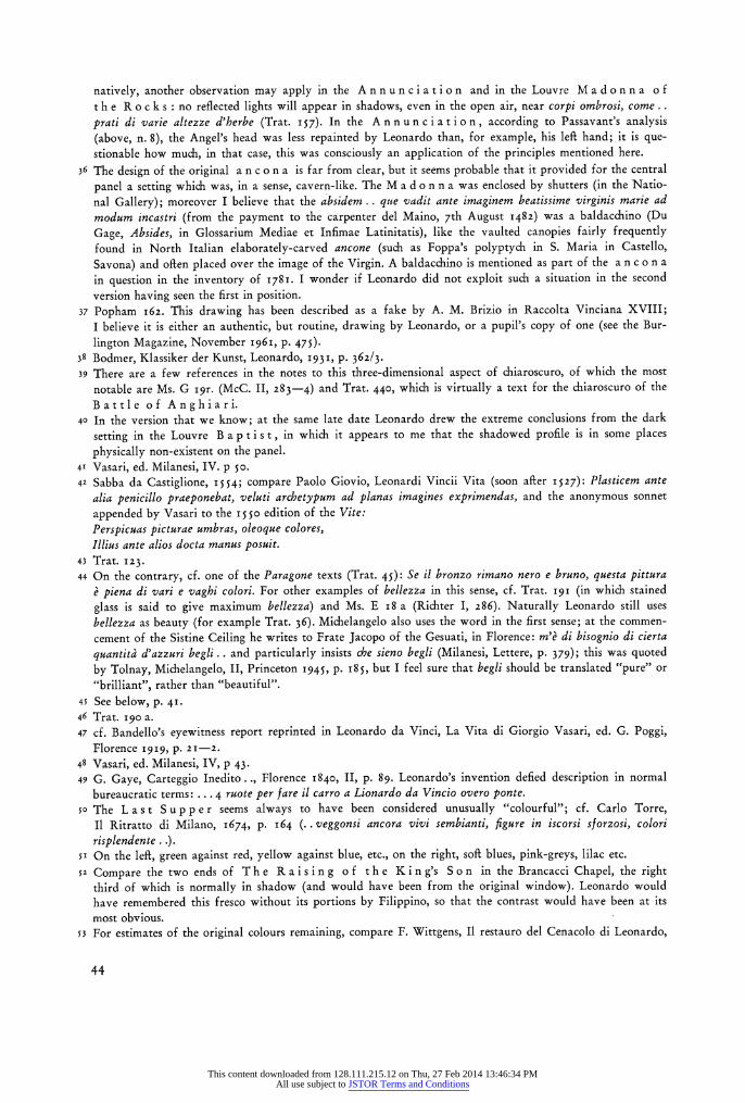
natively, another observation may apply in the An nunciation and in the Louvre Madon na of t h e R o c k s: no reflected lights will appear in shadows, even in the open air, near corpi ombrosi, come .. prati di varie altezze d'herbe (Trat. I57). In the A n n u n c i at io n, according to Passavant's analysis (above, n. 8), the Angel's head was less repainted by Leonardo than, for example, his left hand; it is que- stionable how much, in that case, this was consciously an application of the principles mentioned here.
36 The design of the original a n c o n a is far from clear, but it seems probable that it provided for the central
panel a setting which was, in a sense, cavern-like. The M a d o n n a was enclosed by shutters (in the Natio- nal Gallery); moreover I believe that the absidem .. que vadit ante imaginem beatissime virginis marie ad modum incastri (from the payment to the carpenter del Maino, 7th August 1482) was a baldacchino (Du Gage, Absides, in Glossarium Mediae et Infimae Latinitatis), like the vaulted canopies fairly frequently found in North Italian elaborately-carved ancone (such as Foppa's polyptych in S. Maria in Castello,
Savona) and often placed over the image of the Virgin. A baldacchino is mentioned as part of the a n c o n a
in question in the inventory of 1781. I wonder if Leonardo did not exploit such a situation in the second
version having seen the first in position. 37 Popham 162. This drawing has been described as a fake by A. M. Brizio in Raccolta Vinciana XVIII;
I believe it is either an authentic, but routine, drawing by Leonardo, or a pupil's copy of one (see the Bur-
lington Magazine, November I96I, p. 475). 38 Bodmer, Klassiker der Kunst, Leonardo, 1931, p. 362/3. 39 There are a few references in the notes to this three-dimensional aspect of chiaroscuro, of which the most
notable are Ms. G 19r. (McC. II, 283-4) and Trat. 440, which is virtually a text for the chiaroscuro of the
Battle of Anghiari. 40 In the version that we know; at the same late date Leonardo drew the extreme conclusions from the dark
setting in the Louvre B a p t i s t, in which it appears to me that the shadowed profile is in some places
physically non-existent on the panel. 41 Vasari, ed. Milanesi, IV. p 5o. 42 Sabba da Castiglione, 1554; compare Paolo Giovio, Leonardi Vincii Vita (soon after 1527): Plasticem ante
alia penicillo praeponebat, veluti archetypum ad planas imagines exprimendas, and the anonymous sonnet
appended by Vasari to the 1550o edition of the Vite:
Perspicuas picturae umbras, oleoque colores, Illius ante alios docta manus posuit.
43 Trat. 123. 44 On the contrary, cf. one of the Paragone texts (Trat. 45): Se il bronzo rimano nero e bruno, questa pittura
e piena di vari e vaghi colori. For other examples of bellezza in this sense, cf. Trat. 191 (in which stained
glass is said to give maximum bellezza) and Ms. E i8 a (Richter I, 286). Naturally Leonardo still uses bellezza as beauty (for example Trat. 36). Michelangelo also uses the word in the first sense; at the commen- cement of the Sistine Ceiling he writes to Frate Jacopo of the Gesuati, in Florence: m'e di bisognio di cierta
quantitd d'azzuri begli .. and particularly insists che sieno begli (Milanesi, Lettere, p. 379); this was quoted by Tolnay, Michelangelo, II, Princeton 1945, P. i85, but I feel sure that begli should be translated "pure" or
"brilliant", rather than "beautiful". 45 See below, p. 41. 46 Trat. 19o a. 47 cf. Bandello's eyewitness report reprinted in Leonardo da Vinci, La Vita di Giorgio Vasari, ed. G. Poggi,
Florence 1919, p. 2 1-2. 48 Vasari, ed. Milanesi, IV, p 43. 49 G. Gaye, Carteggio Inedito.., Florence 1840, II, p. 89. Leonardo's invention defied description in normal
bureaucratic terms: ... 4 ruote per fare il carro a Lionardo da Vincio overo ponte.
5o The Last S up p e r seems always to have been considered unusually "colourful"; cf. Carlo Torre, II Ritratto di Milano, 1674, p. 164 (.. veggonsi ancora vivi sembianti, figure in iscorsi sforzosi, colori
risplendente . .). sr On the leRft, green against red, yellow against blue, etc., on the right, soR blues, pink-greys, lilac etc. 52 Compare the two ends of The Raising of the King's Son in the Brancacci Chapel, the right
third of which is normally in shadow (and would have been from the original window). Leonardo would have remembered this fresco without its portions by Filippino, so that the contrast would have been at its most obvious.
53 For estimates of the original colours remaining, compare F. Wittgens, Il restauro del Cenacolo di Leonardo,
44
This content downloaded from 128.111.215.12 on Thu, 27 Feb 2014 13:46:34 PMAll use subject to JSTOR Terms and Conditions
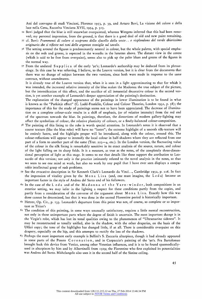
Atti del convegno di studi Vinciani, Florence 1953, p. 39, and Arturo Bovi, La visione del colore e della luce nella Cena, Raccolta Vinciana XVII, 1954, p. 315.
54 Bovi judged that the blue is still somewhat overpainted, whereas Wittgens inferred that this had been remo- ved; my personal impression, from the ground, is that there is a good deal of old and new paint remaining.
55 cf. Bovi: Frammenti di colore si scoprono dello sfacello della veste .. e risplendono del verde chiarissimo originario che si riflette nei toni delle argentee stoviglie sul tavolo.
56 The setting around the figures is predominantly neutral in colour, but the whole palette, with special empha- sis on the reds and greens, is repeated in the wreaths in the lunettes above. The distant view in the centre
(which is said to be free from overpaint), seems also to pick up the paler blues and greens of the figures in the normal way.
57 From the undated S u p p li c a of the early 'go's; Leonardo's authorship may be deduced from its phrase- ology. In this case he was referring, I believe, to the Louvre version, but it is clear from the documents that there was no change of subject between the two versions, since both were made in response to the same contract, without amendments. It is already true of the Louvre version that, when it is seen in a light approximating to that for which it was intended, the increased relative intensity of the blue makes the Madonna the true subject of the picture, but the intensification of this effect, and the sacrifice of all inessential decorative colour in the second ver- sion, is yet another example of Leonardo's deeper appreciation of the painting's destination. The explanation of the changed appearance of the paintings in lower illumination is to be found in what is known as the "Purkinje effect" (C. Ladd-Franklin, Colour and Colour Theories, London 1932, p. 58); the
importance of this for the study of paintings seems not to have been appreciated. The decrease of illumina- tion on a complete colour-scale results in a shift of emphasis, (or of relative intensity) from the red end of the spectrum towards the blue. In paintings, therefore, the distortions of modern gallery-lighting may affect the symbolism of colour, the relative plasticity of colours, or a finely-balanced colour-composition.
58 The painting of this lining to the robe is worth special attention. In Leonardo's notes it is observed that a coarse texture (like the blue robe) will have no "lustre"; the extreme highlight of a smooth silk-texture will be entirely lustre, and the highlight proper will be introduced, along with the colour, around this. The colour-reflections will appear to intensify the local colour in half-shadows where they are reflected from one
part of a form to another part of the same (Trat. 223-4, etc.). In the London version, the fluctuating value of the colour in the silk lining is remarkably sensitive in its exact analysis of the source, nature, and colour of the light falling on its sharp folds. It is a measure, as true as the notes, of the completely three-dimen- sional perception of light at this stage. It seems to me that details like these support the attribution to Leo- nardo of this version; not only is the practice intimately related to the novel analysis in the notes, so that we seem to see one mind at work, but also no work by any pupil that I have ever seen displays a compa- rable intellectual grasp of such problems.
59 See the evocative description in Sir Kenneth Clark's Leonardo da Vinci.., Cambridge 1952, p. i16. In fact the impression of vitality given by the M o n a L i s a (and, one must imagine, the L e d a) became an
important factor in the style of Andrea del Sarto and of his followers. 6o In the case of the L eda and of the Madonna of the Yarn-winder, both compositions in an
exterior setting, we may infer in the lighting a respect for these conditions partly from the copies, and
partly from a consideration of the converse of the argument about M o n a L i s a. Exactly how this was done cannot be determined, but that it was done in the second Florentine period is historically important.
6r Hetzer, Op. Cit., p. 133. Leonardo's departure from this point was not, of course, so complete or so impor- tant as Titian's
62 The condition of this painting, in some ways unusually satisfactory, requires a little mental reconstruction, not only in those unimportant parts where the degree of finish is uncertain. The most important change is in the Virgin's robe, which has lost its tonal qualities owing to the phenomenon of "Ultramarine sickness". It
may be reconstructed as tonally unified, also in the shadow, with the other draperies, on the basis of the Uffizi copy; the tone of the highlights has changed little, if at all. There is considerable overpaint on this drapery, especially on the hip, and this attempts to rectify the loss of the shadows.
63 Perhaps the most important early example is Bellini's S. Zaccaria altarpiece, though it had already appeared in some parts of the Pesaro C o r o n a t io n, and in Carpaccio's painting of the '90's. Fra Bartolomeo brought back this device from Venice, among other Venetian influences, and it is to be found spasmodically- used in altarpieces by him and by Albertinelli from I509; the Florentine who first exploited its potentialities was Andrea del Sarto. Michelangelo also uses it in the second half of the Sistine ceiling.
45
This content downloaded from 128.111.215.12 on Thu, 27 Feb 2014 13:46:34 PMAll use subject to JSTOR Terms and Conditions
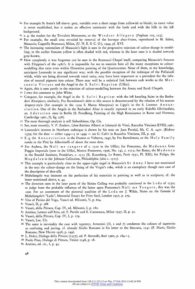
64 For example St Anne's left sleeve: grey, variable over a short range from yellowish to bluish; its exact value is never established, but it makes an effective continuity with the lamb and with the hills in the left
background. 65 e. g. the studies for the Trivulzio Monument, or the W i n d s o r A 11 e g o r y (Popham 102, 123). 66 For example, the small area revealed by removal of the baroque altar-frame, reproduced in M. Salmi,
Masaccio, Cappella Brancacci, Milan, (U. N. E. S. C. 0.), 1949, pl. XVI. 67 The increasing rationalism of Masaccio's light is seen in the progressive rejection of colour-change in model-
ling; in the earlier frescoes yellow is often shaded with red, whereas in the later ones it is shaded towards
grey-brown. 68 How completely it was forgotten can be seen in the Brancacci Chapel itself, comparing Masaccio's frescoes
with Filippino's of the 1480's. It is impossible for me to mention here all the many exceptions to colour-
modelling that exist even within Florentine painting of the Quattrocento. None of them, to my knowledge, anticipate Leonardo in any significant way, with the possible exception of the technique of the Pollaiuoli
which, while not being directed towards tonal unity, may have been important as a precedent for the infu- sion of neutral pigment into colour. There may well be a technical link between such works as the Me r - canz ia Virtu es and the Angel in the S. Sal vi Baptism (Uffizi).
69 Again, this is seen partly in the rejection of colour-modelling between the Arena and Bardi Chapels. 70 I owe this comment to John White. 71 Compare, for example, the Angel in the S. S a lvi B a p t is m with the left kneeling Saint in the Barba-
dori Altarpiece; similarly, Fra Bartolomeo's debt to this source is demonstrated by the relation of his mature
drapery-style (for example in the 1509 S. Marco Altarpiece) to Lippi's in the S. Lorenzo An nu n - c ia t io n. One of the Angels in the Barbadori Altar is exactly repeated in an early Ridolfo Ghirlandaio, an A d o r a t io n once in Berlin (S. Freedberg, Painting of the High Renaissance in Rome and Florence, Cambridge 1961, II, fig. 278).
72 The most thorough analysis is still Siebenhiiner, Op. Cit. 73 See, most recently, V. P. Zoubov, Leon-Battista Alberti et Leonard de Vinci, Raccolta Vinciana XVIII, 1961. 74 Leonardo's interest in Northern technique is shown by his note on Jean Perrial, Ms. C. A. 247r. (Richter
1379; for the date - either 1494-5 or 1499 - see G. Calvi in Raccolta Vinciana, III, p. 99). 75 E. g. the A n n un ci ati on in the Duomo at Volterra, 1947, by Fra Bartolomeo, or the Holy Fam i ly
tondo in the Pitti by Albertinelli of about the same date. 76 For Andrea, the Noli me tangere of c. I5io in the Uffizi; for Pontormo, the Madonna from
Poggio Imperiale (now in the Uffizi, Mostra Pontormo, 1956, No. 14), c. 1515; for Rosso, the M a d on n a in the Staedel Institute, Frankfurt, c. 1515 (K. Kusenberg, Le Rosso, Paris 1931, P1. XII); for Puligo, the M a g d a 1 e n in the Johnson Collection, Philadelphia (also c. 1515).
77 This example is particularly close to the upper-right angel in Masaccio's S t A n n e. I have not mentioned in the text the colour-change on the lining of the Virgin's robe, which is an exemplary though rare case of the description of shot-silk.
78 Michelangelo was insistent on the perfection of his materials in painting as well as in sculpture; cf. the letter mentioned above, n. 44.
79 The direction seen in the later parts of the Sistine Ceiling was probably continued in the L e d a of 1530o; to judge from the probable influence of the latter upon Pontormo's N o li m e T a n g e r e, this was the case. For an assessment of the pictorial qualities of the L e d a see J. Wilde, Notes on the Genesis of
Michelangelo's "Leda", Memorial Essays for Fritz Saxl, London 1957, p. 279- 8so Vita of Perino del Vaga, Vasari ed. Milanesi, V, p. 604. 8i Vasari, II, p. 288. 82 Vasari, della Pittura, Cap. IV, ed. Milanesi, I, p. 18o. 83 Aretino, Lettere sull'Arte, ed. F. Pertile and E. Camesasca, Milan 1957, II, p. 52. 84 Vasari, della Pittura, Cap. IV, I, p. 179. 8s Vasari, Loc. Cit. 86 The same is inevitably the case with tapestry; Armenini (II, 2 and 7) condemns the colours of tapestries
as confusing and jarring. cf. already Giulio Romano in his letter to the Steccata, 1541 (F. Hartt, Giulio Romano, New Haven 1958, p. 249).
87 L. Dolce, Dialogo della Pittura (x557),
ed. P. Barocchi, Bari 1960, p. 184-5. 88 Paolo Pino, Dialogo di Pittura, Venice 1548, p. 18. 89 Aretino, ed. cit., I, p. 45.
46
This content downloaded from 128.111.215.12 on Thu, 27 Feb 2014 13:46:34 PMAll use subject to JSTOR Terms and Conditions
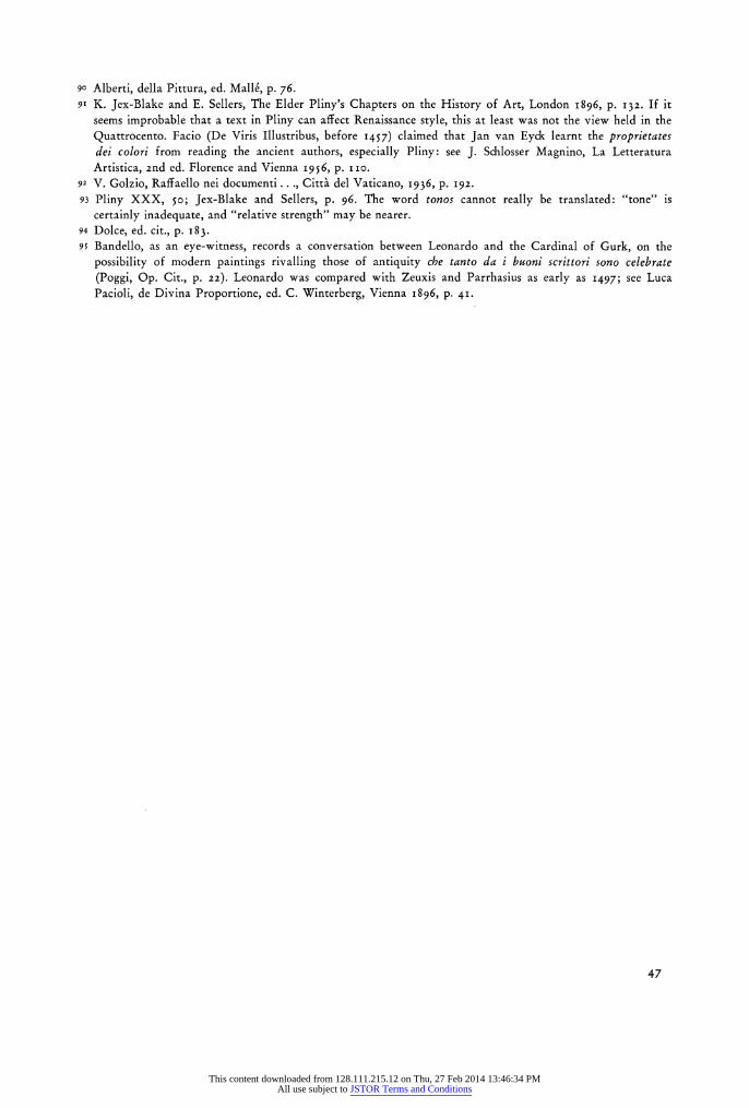
90 Alberti, della Pittura, ed. Mall6, p. 76. 9' K. Jex-Blake and E. Sellers, The Elder Pliny's Chapters on the History of Art, London I896, p. I32. If it
seems improbable that a text in Pliny can affect Renaissance style, this at least was not the view held in the Quattrocento. Facio (De Viris Illustribus, before 1457) claimed that Jan van Eyck learnt the proprietates dei colori from reading the ancient authors, especially Pliny: see J. Schlosser Magnino, La Letteratura Artistica, 2nd ed. Florence and Vienna 1956, p. i i o.
92 V. Golzio, Raffaello nei documenti ..., Citta del Vaticano, 1936, p. 192. 93 Pliny XXX, 5o; Jex-Blake and Sellers, p. 96. The word tonos cannot really be translated: "tone" is
certainly inadequate, and "relative strength" may be nearer. 94 Dolce, ed. cit., p. 183- 95 Bandello, as an eye-witness, records a conversation between Leonardo and the Cardinal of Gurk, on the
possibility of modern paintings rivalling those of antiquity che tanto da i buoni scrittori sono celebrate (Poggi, Op. Cit., p. 22). Leonardo was compared with Zeuxis and Parrhasius as early as 1497; see Luca Pacioli, de Divina Proportione, ed. C. Winterberg, Vienna 1896, p. 41.
47
This content downloaded from 128.111.215.12 on Thu, 27 Feb 2014 13:46:34 PMAll use subject to JSTOR Terms and Conditions