Lecture 2 Describing and Visualizing Data
33
Slide 1 ing, 2005 by Dr. Lianfen Qian Lecture 2 Describing and Visualizing Data 2-1 Overview 2-2 Frequency Distributions 2-3 Visualizing Data
-
Upload
linda-welch -
Category
Documents
-
view
34 -
download
2
description
2-1 Overview 2-2 Frequency Distributions 2-3 Visualizing Data. Lecture 2 Describing and Visualizing Data. Descriptive Statistics summarize or describe the important characteristics of a known set of data Inferential Statistics - PowerPoint PPT Presentation
Transcript of Lecture 2 Describing and Visualizing Data

Slide 1
Spring, 2005 by Dr. Lianfen Qian
Lecture 2Describing and Visualizing Data
2-1 Overview
2-2 Frequency Distributions
2-3 Visualizing Data

Slide 2
Spring, 2005 by Dr. Lianfen Qian
Descriptive Statistics
summarize or describe the important characteristics of a known set of data
Inferential Statistics
use sample data to make inferences (or generalizations) about a population
2.1 Overview

Slide 3
Spring, 2005 by Dr. Lianfen Qian
RelationshipRelationship
PopulationPopulation: Characteristics
SampleSampleX: Sample values
SamplingSampling•Method of drawing•Based on probability
Estimation & InferenceEstimation & Inference•Method of concluding•Based on statistics f(X)
Slide 4
Spring, 2005 by Dr. Lianfen Qian
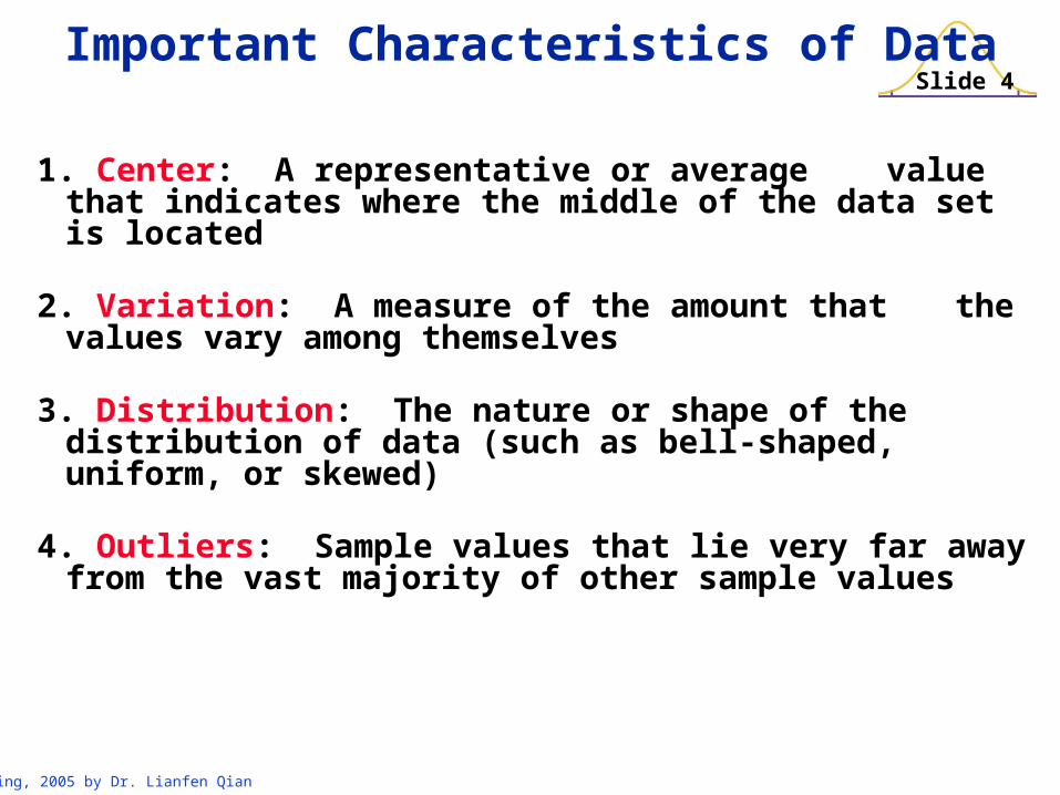
1. Center: A representative or average value that indicates where the middle of the data set is located
2. Variation: A measure of the amount that the values vary among themselves
3. Distribution: The nature or shape of the distribution of data (such as bell-shaped, uniform, or skewed)
4. Outliers: Sample values that lie very far away from the vast majority of other sample values
Important Characteristics of Data

Slide 5
Spring, 2005 by Dr. Lianfen Qian
Frequency Distribution
lists data values (either individually or by
groups of intervals), along with their
corresponding frequencies or counts
2.2 Frequency Distributions
Slide 6
Spring, 2005 by Dr. Lianfen Qian
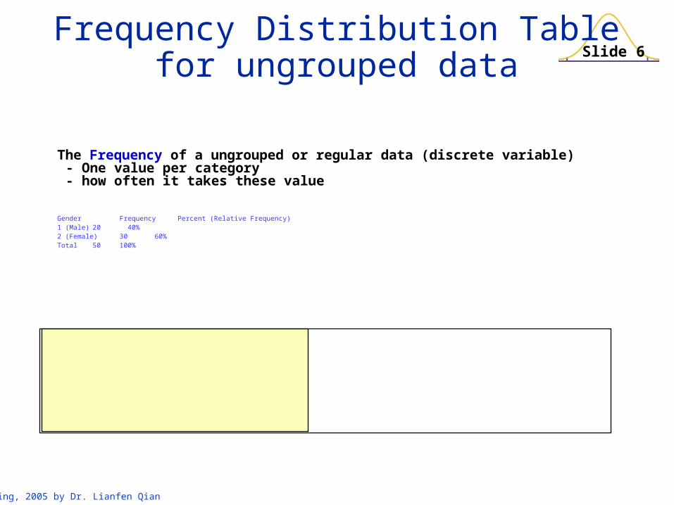
Frequency Distribution Tablefor ungrouped data
The Frequency of a ungrouped or regular data (discrete variable)- One value per category- how often it takes these value
Gender Frequency Percent (Relative Frequency)1 (Male) 20 40%2 (Female) 30 60%Total 50 100%

Slide 7
Spring, 2005 by Dr. Lianfen Qian
Example: Cotinine levels in smokers

Slide 8
Spring, 2005 by Dr. Lianfen Qian
Grouped Frequency Distribution Table

Slide 9
Spring, 2005 by Dr. Lianfen Qian
are the smallest numbers that can actually belong to different classes
Lower ClassLimits
Lower Class Limits

Slide 10
Spring, 2005 by Dr. Lianfen Qian
Upper Class Limits are the largest numbers that can actually belong to
different classes
Upper ClassLimits

Slide 11
Spring, 2005 by Dr. Lianfen Qian
number separating classes
Class Boundaries
- 0.5
99.5
199.5
299.5
399.5
499.5
Slide 12
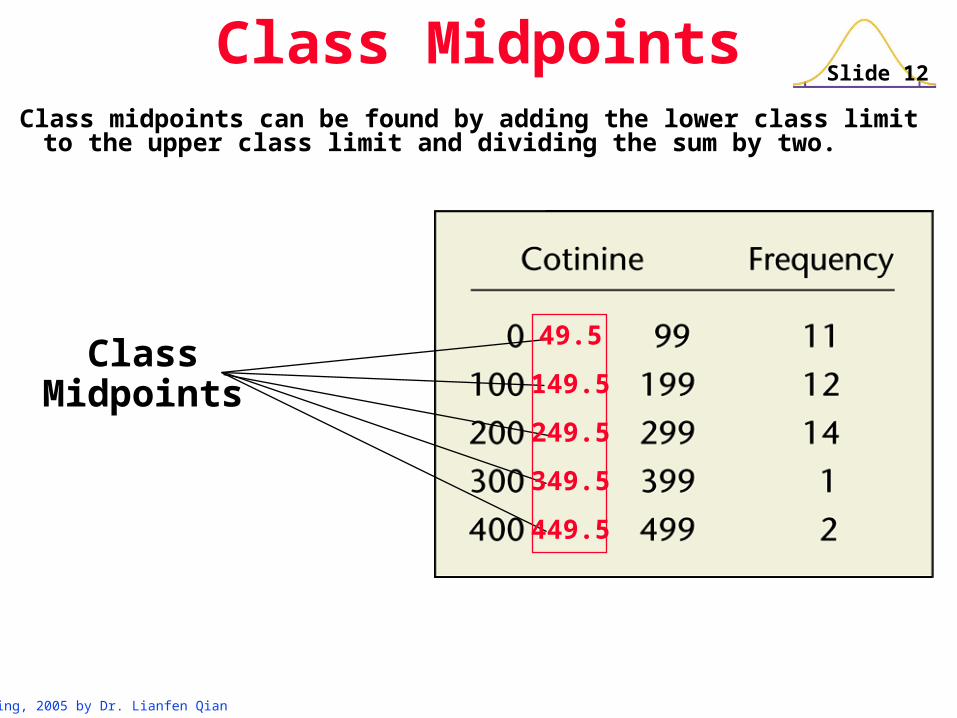
Spring, 2005 by Dr. Lianfen Qian
ClassMidpoints
Class midpoints can be found by adding the lower class limit to the upper class limit and dividing the sum by two.
Class Midpoints
49.5
149.5
249.5
349.5
449.5

Slide 13
Spring, 2005 by Dr. Lianfen Qian
Class Width is the difference between two consecutive lower class
limits or two consecutive lower class boundaries
Class Width
100
100
100
100
100

Slide 14
Spring, 2005 by Dr. Lianfen Qian
1. Large data sets can be summarized.
2. Can gain some insight into the nature of data.
3. Have a basis for constructing graphs.
Disadvantage: information lost
Reasons for Constructing Frequency Distributions
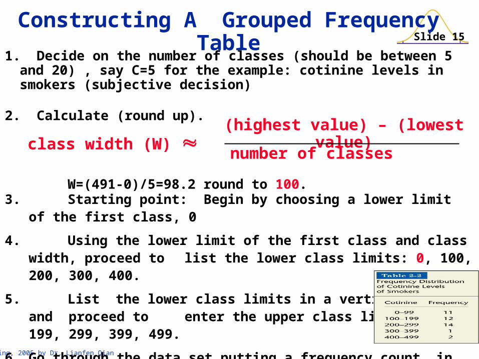
Slide 15
Spring, 2005 by Dr. Lianfen Qian
3. Starting point: Begin by choosing a lower limit of the first class, 0
4. Using the lower limit of the first class and class width, proceed to list the lower class limits: 0, 100, 200, 300, 400.
5. List the lower class limits in a vertical column and proceed to enter the upper class limits: 99, 199, 299, 399, 499.
6. Go through the data set putting a frequency count in
the appropriate class for each data value.
6. Add a caption for the frequency distribution table
Constructing A Grouped Frequency Table
1. Decide on the number of classes (should be between 5 and 20) , say C=5 for the example: cotinine levels in smokers (subjective decision)
2. Calculate (round up).
W=(491-0)/5=98.2 round to 100.
class width (W) (highest value) – (lowest value)
number of classes
Slide 16
Spring, 2005 by Dr. Lianfen Qian
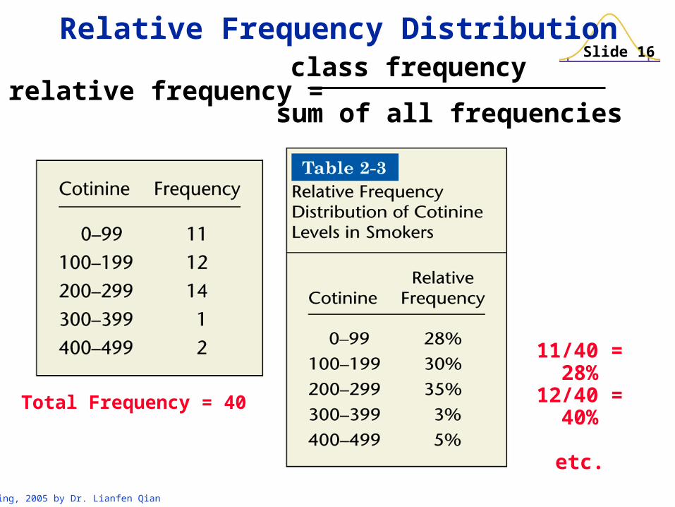
Relative Frequency Distribution
11/40 = 28%12/40 = 40%
etc.Total Frequency = 40
relative frequency =class frequency
sum of all frequencies

Slide 17
Spring, 2005 by Dr. Lianfen Qian
Cumulative Frequency Distribution
CumulativeFrequencies

Slide 18
Spring, 2005 by Dr. Lianfen Qian
Frequency Tables

Slide 19
Spring, 2005 by Dr. Lianfen Qian
In this Section we have discussed
Important characteristics of data
Frequency distributions
Procedures for constructing frequency distributions
Relative frequency distributions
Cumulative frequency distributions
Recap
Slide 20
Spring, 2005 by Dr. Lianfen Qian
2.3 Visualizing Data
Depict the nature of shape or shape of the data distribution
Slide 21
Spring, 2005 by Dr. Lianfen Qian
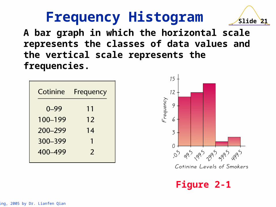
A bar graph in which the horizontal scale represents the classes of data values and the vertical scale represents the frequencies.
Figure 2-1
Frequency Histogram

Slide 22
Spring, 2005 by Dr. Lianfen Qian
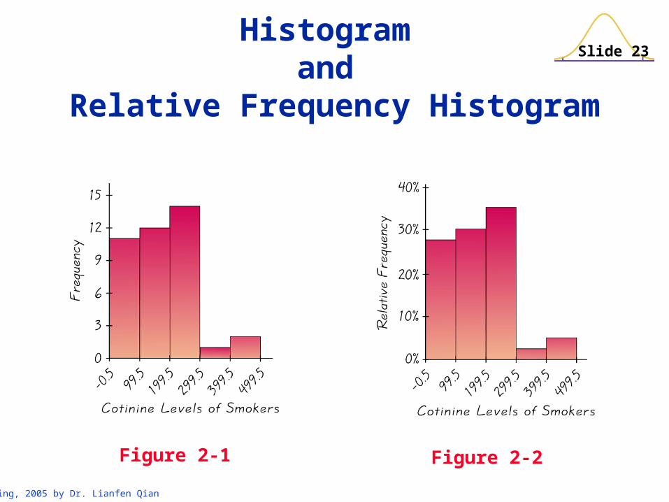
Has the same shape and horizontal scale as a histogram, but the vertical scale is marked with relative frequencies.
Figure 2-2
Relative Frequency Histogram
Slide 23
Spring, 2005 by Dr. Lianfen Qian
Histogram and
Relative Frequency Histogram
Figure 2-1 Figure 2-2

Slide 24
Spring, 2005 by Dr. Lianfen Qian
Uses line segments connected to points directly above class midpoint values
Figure 2-3
Frequency Polygon
Slide 25
Spring, 2005 by Dr. Lianfen Qian
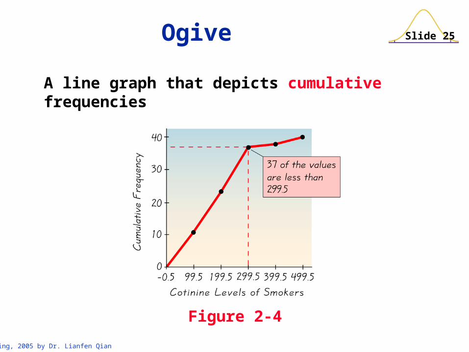
A line graph that depicts cumulative frequencies
Figure 2-4
Ogive

Slide 26
Spring, 2005 by Dr. Lianfen Qian
Consists of a graph in which each data value is plotted as a point along a scale of values
Figure 2-5
Dot Plot

Slide 27
Spring, 2005 by Dr. Lianfen Qian
Stem-and Leaf Plot
Represents data by separating each value into two parts: the stem (such as the leftmost digit) and the leaf (such as the rightmost digit)
Slide 28
Spring, 2005 by Dr. Lianfen Qian
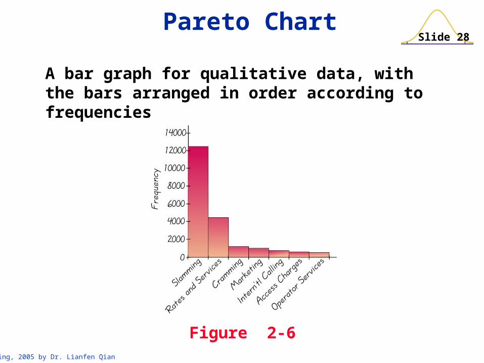
Pareto Chart
A bar graph for qualitative data, with the bars arranged in order according to frequencies
Figure 2-6
Slide 29
Spring, 2005 by Dr. Lianfen Qian
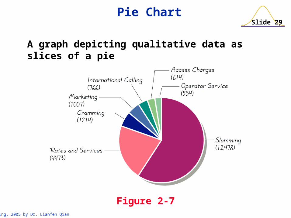
Pie Chart
A graph depicting qualitative data as slices of a pie
Figure 2-7
Slide 30
Spring, 2005 by Dr. Lianfen Qian
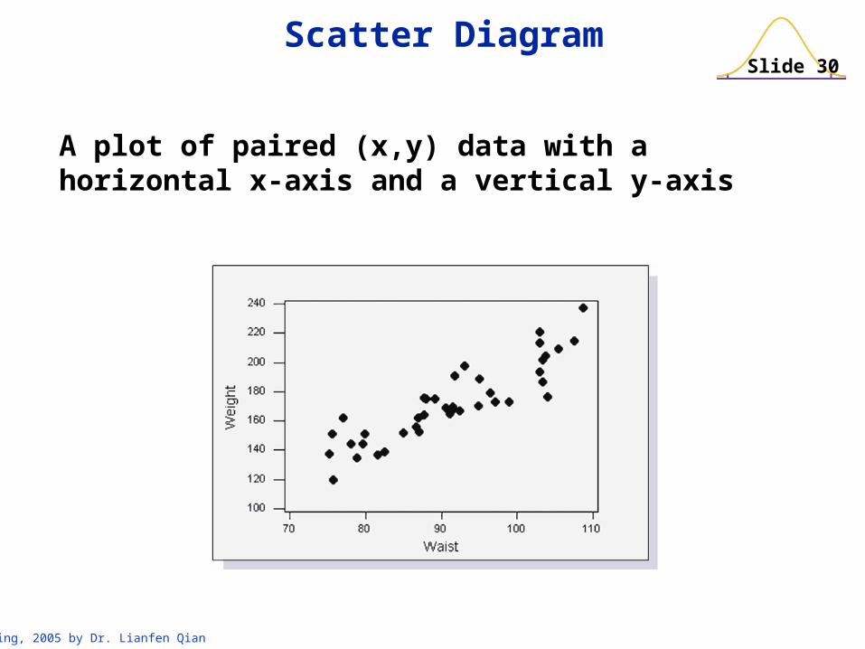
Scatter Diagram
A plot of paired (x,y) data with a horizontal x-axis and a vertical y-axis
Slide 31
Spring, 2005 by Dr. Lianfen Qian
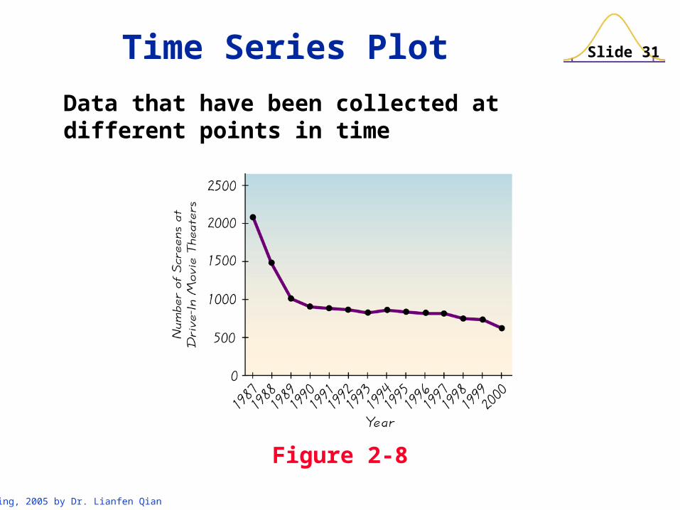
Data that have been collected at different points in time
Figure 2-8
Time Series Plot
Slide 32
Spring, 2005 by Dr. Lianfen Qian
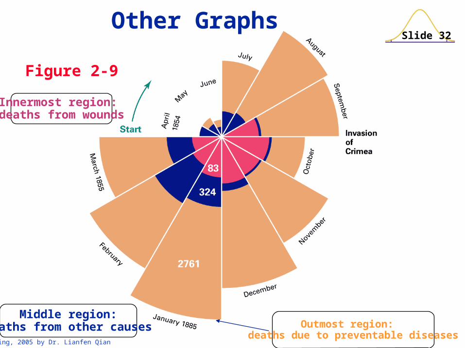
Figure 2-9
Outmost region: deaths due to preventable diseases
Innermost region: deaths from wounds
Middle region:Deaths from other causes
Other Graphs
Slide 33
Spring, 2005 by Dr. Lianfen Qian
In this Section we have discussed graphs that are pictures of distributions.
Keep in mind that the object of this section is not just to construct graphs, but to learn something about the data sets – that is, to understand the nature of their distributions.
Recap