Labor Market Performance, Poverty, and Income Inequality ... · LABOR MARKET PERFORMANCE, POVERTY,...
60
Demographic and Socioeconomic Change in Appalachia LABOR MARKET PERFORMANCE, POVERTY, AND INCOME INEQUALITY IN APPALACHIA by Dan A. Black Syracuse University Seth G. Sanders University of Maryland September 2004
Transcript of Labor Market Performance, Poverty, and Income Inequality ... · LABOR MARKET PERFORMANCE, POVERTY,...

Demographic and Socioeconomic Change in Appalachia
LABOR MARKET PERFORMANCE, POVERTY, AND INCOME INEQUALITY IN APPALACHIA
by
Dan A. Black Syracuse University
Seth G. Sanders
University of Maryland
September 2004
About This Series
“Demographic and Socioeconomic Change in Appalachia” is a series of reports that examine demographic, social, and economic levels and trends in the 13-state Appalachian region. Each report uses data from the decennial censuses of 1990 and 2000, plus supplemental information from other data sources. Current reports in the series include:
• “Appalachia at the Millennium: An Overview of Results from Census 2000,” by Kelvin M. Pollard (June 2003).
• “Housing and Commuting Patterns in Appalachia,” by Mark Mather (January 2004). • “The Aging of Appalachia,” by John G. Haaga (April 2004). • “Households and Families in Appalachia,” by Mark Mather (May 2004). • “Educational Attainment in Appalachia,” by John G. Haaga (May 2004). • “A ‘New Diversity’: Race and Ethnicity in the Appalachian Region,”
by Kelvin M. Pollard (September 2004). • “Labor Market Performance, Poverty, and Income Inequality in Appalachia,” by Dan A.
Black and Seth G. Sanders (September 2004). • “Population Growth and Distribution in Appalachia: New Realities,”
by Kelvin M. Pollard (forthcoming). • “Appalachian Population redistribution and Migration in the 1990’s,”
by Daniel T. Lichter, Jillian Wooten, Michael Cardella, Mary L. Marshall (forthcoming).
Additional reports will cover: Migration and Immigration; Population Change and Distribution; and Geographic Concentration of Poverty. You can view and download the reports by visiting either www.prb.org or www.arc.gov. For more information about the series, please contact either Kelvin Pollard of the Population Reference Bureau (202-939-5424, [email protected]) or Gregory Bischak of the Appalachian Regional Commission (202-884-7790, [email protected]). The authors wish to thank the Appalachian Regional Commission for providing the funding for this series. Population Reference Bureau 1875 Connecticut Avenue, NW, Suite 520 Washington, DC 20009-3728 The Population Reference Bureau is the leader in providing timely and objective information on U.S. and international population trends and their implications. Appalachian Regional Commission 1666 Connecticut Avenue, NW, Suite 700 Washington, DC 20009-1068 The Appalachian Regional Commission’s mission is to be an advocate for and partner with the people of Appalachia to create opportunities for self-sustaining economic development and improved quality of life.

INTRODUCTION
When President Lyndon Johnson attempted to galvanize public support for his War on Poverty, he traveled on April 24, 1964 to the little town of Inez, located in Martin County, Kentucky. Through that visit, Americans saw poverty that shocked them. Indeed, the 1970 Census found the per capita personal income of Martin County was only 34.5 percent that of the United States as a whole. By the next census, however, Martin County’s per capita income, riding the OPEC-induced coal boom, was 80.5 percent of the national average. But as the price of oil dropped, western states increased their coal production, and technological advances in the coal industry decreased mining employment. Martin County’s economy declined until, by the 2000 Census, its per capita income was only 54.7 percent of the national average. While Martin County, with its severe poverty, may fit the American stereotype of Appalachia, the region is considerably more complex. Appalachia comprises 13 different states and stretches from central New York to central Mississippi. It includes large cities such as Pittsburgh and small villages such as Inez. In this article, we explore the performance of the Appalachian economies during the 1990s and then examine how these economies fared over a longer horizon, from 1970 to 2000.
Aims The aims of this article are two-fold. First, it examines the performance of the Appalachian economy and how residents of Appalachia have fared between 1990 and 2000. The article will describe Appalachia as a whole as well as its important subregions, which are defined geographically—southern Appalachia, central Appalachia, and northern Appalachia. The economic classifications of these subregions are then defined either by their economic structure or their level of economic distress. Of course, the industrial structure or level of economic distress of counties can change over time, so when analyzing this type of classification we need to ask certain questions, such as: “How did counties that were distressed in 1990 fare over the next 10 years?” We have to define a base year to construct the level of distress of an area or its industrial composition and then follow this area over time. For the first part of our analysis we define 1990 as the base year and measure changes between 1990 and 2000. What defines the level of economic distress or the industrial composition is discussed in great detail below. Our second aim is to put the current economic conditions in historical context by comparing Appalachia to areas that are historically similar in terms of economic distress and economic structure. Through this analysis, we hope to answer the question: “How has Appalachia fared over the last 30 years relative to areas that historically faced similar conditions?” We also hope to begin to understand why disparities between Appalachia and historically similar areas have occurred. Background
During the 1980s, Appalachian families experienced rising rates of poverty and growing income inequality. These trends reflected trends that held in the United States as well. For

2
instance, for the United States as a whole, the poverty rate increased from 13.0 percent in 1980 to 13.2 percent in 1990, while in Appalachia the poverty rate increased from 14.1 percent in 1980 to 15.4 percent in 1990. For the United States as a whole, there is mounting evidence that, beginning in the mid-1990s, after nearly 20 years of rising income inequality and poverty, a slow but steady decline in both statistics occurred. For instance, by 2000 the poverty rate fell to 12.4 percent for the United States as a whole and to 13.7 percent for Appalachia. Figure 1 shows national trends both in the number in poverty and in the poverty rate. Figure 1 Number of Poor and Poverty Rate: 1959 to 2002
0
5
10
15
20
25
30
35
40
45
1959
1965
1970
1975
1980
1985
1990
1995
2002
Num
ber i
n m
illion
s, ra
tes i
n pe
rcen
t
Recession
Number in poverty
Poverty rate
Source: U.S. Census Bureau, Current Population Reports P60-222, “Poverty in the United States: 2002.”
The reasons for the rise and fall in poverty and income inequality are far from clear. Prominent economists have investigated the role of globalization, increased international trade, de-industrialization, and technical change, but there has been no definitive resolution to the question. One prevailing theory is that growth in the economy takes some time to help those individuals who are the least skilled, and the unprecedented prosperity of the United States over the last 20 years took many years to raise the level of prosperity of the least skilled.

3
There are only a handful of papers investigating trends in income inequality and poverty on a regional level from 1970 to 1990, even though there are tremendous differences across regions in their percentages of residents in poverty, their levels of income inequality, and their degrees of sustained economic prosperity.1 There is virtually no work on these issues on a regional basis over the 1990s.
OUTCOMES OF INTEREST AND DATA SOURCES
There are two sources of data that help us describe the economic outcomes of local economies and the economic performance of individuals in those economies. The first source is data from the Decennial Census. Every 10 years, the United States Census Bureau engages in a complete enumeration of the United States population. In conducting this enumeration, the Census Bureau collects a great deal of information on the characteristics of the population and the housing stock. There is a small set of questions asked of every household in the United States called the short form: it includes questions about sex, age, race, Hispanic ethnicity, whether the home is owned or rented, and whether the home is vacant. The long form contains a much more detailed set of questions for a sample of the population, approximately 1 in 6 households. Long-form data includes marital status, place of birth, citizenship, year of entry into United States for immigrants, school enrollment and attainment, migration over the past five years, language ability, veterans status, disability, grandparents as caregivers, place of work, labor force status, occupation and industry, work status, and income. This information allows many measures of the economic well-being of families, including unemployment of adults in the household and the poverty status of households. For the 2000 Census, as it has done for many years, the Census Bureau provides public release tabulations from this data at levels of small geographic aggregation, including the county level. The following are outcomes of interest from the Decennial Censuses that measure the health of the local economy and the well-being of families:
• Poverty rates for families, households, individuals, and children; • The level of median income for married couples, single-parent families, and unmarried
households; • The labor force participation and unemployment rates for men and women at various
ages and levels of educational attainment, as well as for blacks, whites, and Hispanic individuals; and
• The jobs mix in the economy as measured by changes in the distributions of industries and occupations.
The second source of data is from the Bureau of Economic Analysis (BEA), Regional
Economic Information System (REIS). BEA prepares the only detailed, broadly inclusive economic time series for local areas (counties, metropolitan areas, and BEA economic areas) that is available annually. Estimates of total and per capita personal income, beginning with 1969, are available for each of the 3,110 counties and county equivalents and 335 metropolitan areas of the United States. BEA also provides detailed annual estimates of earnings and employment by industry, transfer payments by major program, farm gross income, and expenses by major category. This data represents tabulations from reports from the ES202 database, an
4
administrative database created for collection of unemployment insurance taxes by each state. (The Unemployment Insurance system covers about 95 percent of all employment, and the BEA supplements this data with estimates of earnings and employment for non-covered jobs.) We are interested in the following outcomes from the REIS data:
• The level of reliance on transfer programs such as the Temporary Assistance for Needy
Families Program (TANF), food stamps, unemployment insurance, social security, and supplemental security insurance; and
• Annual data on income, earnings, and employment.
Both the United States Census data and the BEA data have some data missing for some counties but for different reasons. The Census has missing data when respondents refuse to answer a question or when a question is answered in a way that is inconsistent with other answers. The Census Bureau has a long tradition of imputing the missing data. After imputing this data, the Census Bureau then releases tabulations from the Census survey. Because these tabulations are only available including imputed data, our estimates include Census Bureau imputations.
The REIS system is derived from administrative data, so no information is missing.
Under some circumstances, however, the BEA does not release some of its data elements and instead suppresses the data field for some counties in some years to protect the confidentiality of firms or individuals in the database. There is a large debate in the statistics field regarding how to analyze data with such missing data elements. If the data were missing at random, then dropping counties from the analysis would leave estimates unbiased. However, it is smaller counties and counties in which rare events occur whose data are more often suppressed. Our solution is essentially to classify counties into groups and then impute the mean value within the group for counties with suppressed data. This is the same as assuming the data is missing at random within the group.2
ANALYSIS OF CONTEMPORARY APPALACHIA
Sub-regions and Economic Classifications of Analysis
In our analysis, we divide Appalachia into three different classification schemes. First, we use the Appalachian Regional Commission’s (ARC) geographically based subregions: northern, central, and southern Appalachia. Second, we use the ARC grouping of counties by success of the local economy: distressed, transitional, attainment, and competitive. Third, we group counties by the primary economic activity in the county: metropolitan areas, farming areas, mining areas, manufacturing areas, government-dependent areas, and nonspecialized areas. In the next two subsections, we provide a detailed description of these economic characterizations.
Unlike ARC geographic sub-regions, both a county’s level of economic distress and its
primary economic activity change over time. For our analysis of contemporary Appalachia, therefore, it is necessary to define an area at a specific point in time. One issue raised by this approach is that some of the outcomes that we investigate—for example, the poverty rate—are

5
themselves part of the definition of the level of economic distress. Therefore, it would make little sense to talk about the high rates of poverty in “distressed” areas, as a “distressed” area is defined as having a high rate of poverty (among other characteristics). For the analysis of contemporary statistics, we make our base year 1990 and measure changes between 1990 and 2000.
Levels of Economic Distress
A note about exactly how we classify counties into levels of economic distress in 1990 is in order. The ARC has a rich tradition of classifying each county in Appalachia into one of four levels of economic development—distressed, transitional, competitive, and attainment. In fact, the ARC has an official 1990 ARC designation of the level of economic development for each county. We do not use this official designation, but instead construct our own classifications, and the reasons for this shift are important to understand. The purpose of the ARC classification system is as a management tool, not as a research tool. Because of this, the ARC does not need to go to great lengths to make the classification of counties consistent over time; in fact, the classification of counties by ARC has a lengthy history of change. First, in 1988, the commission opted to freeze the number of distressed counties between 1988 and 1992 because the decennial census data would not be available for at least three years (there were 90 distressed counties in FY1990). In late 1992, the 1990 Census became available, and the commission added 27 counties to the distressed list, increasing the number of distressed counties from 90 to 117 for FY1993. Between 1994 and 1996, the commission recognized the need to reexamine its distressed county program and opted to freeze the number once again at 115. Beginning in FY1997, the data drove the economic designations, and the commission rationalized the system for adding or deleting distressed counties.
A related but separate issue to the economic classification of Appalachian counties is the actual number of counties mandated by Congress as part of the Appalachian Region. In 1965, after the inclusion of the New York Appalachian region, the ARC included 373 counties in 12 states (excluding Mississippi). In 1967, 20 counties from Mississippi were added, along with two from Alabama (Lamar and Pickens), one from New York (Schoharie), and one from Tennessee (Cannon) for a total of 397 counties. In 1990, Columbiana County, Ohio, was added; and in 1991, Calhoun County, Miss., was added, bringing the total to 399 counties. In FY1999, eight more counties were added: Hale and Macon in Alabama; Elbert and Hart in Georgia; Yalobusha in Mississippi; and Montgomery, Radford, and Rockbridge in Virginia, for a grand total of 406 counties. The seven counties were added under Section 1222 of the TEA21 bill entitled the “Transportation Equity Act for the 21st Century,” as reported in the Conference Report on HR 2400, Congressional Record, May 22, 1998. On March 12, 2002, President Bush’s signature of ARC’s five-year reauthorization added four more counties in FY2003, including Hart and Edmonson, Ky., and Panola and Montgomery, Miss., bringing the grand total of Appalachian counties to 410 in FY2002.
There is one final nuance about ARC’s economic designation process: the formal four-level designation of economic status for counties was only finalized in FY1997. The 1997 ARC classification system allows the ARC to target counties in need of special economic assistance.

6
Four economic levels were created based on the comparison of three county economic indicators (three-year average unemployment, per capita market income, and poverty) to their respective national averages. Data for the average unemployment rate is taken from the Bureau of Labor Statistics; data for per capita income is obtained from the Bureau of Economic Analysis, the Regional Economic Information System (REIS); and data for the poverty rate is obtained from the 1990 Census. Table 1 describes the 1997 ARC county economic levels.
Table 1 County Economic Indicators
County Economic Levels
Three-Year Average Unemployment Rate
Per Capita Market Income
Poverty Rate
Distressed 150% or more of United States average
67% or less of United States
average
150% or more of United States average
Transitional All counties not in other classes. Individual indicators vary.
Competitive 100% or less of United States average
80% or more of United States
average
100% or less of United States average
Attainment 100% or less of United States average
100% or more of United States
average
100% or less of United States average
Source: Authors’ calculations from data obtained from Appalachian Regional Commission (accessed at www.arc.gov/search/method/cty_econ.jsp).
We have two challenges that do not let us use the 1990 ARC official classification of counties. First, there are several counties that were part of Appalachia in the year 2000 that were not part of Appalachia in 1990. These counties do not appear in the 1990 ARC official list of levels of economic distress. Second, as we detail above, the 1990 classification schema and the schema post-1997 vary considerably. Therefore, a county that is labeled “distressed” under one schema may or may not be labeled distressed under the second schema, even when the different schema applied to the same 1990 levels of per capita income, poverty, and unemployment would yield different classifications. We attempt to mimic the 1997 scheme for earlier years of data, a shift that requires some modifications.
This issue of how to make levels of economic distress historically comparable was first
addressed by Wood and Bischak,3 and we follow their methodology closely. One challenge in following this paradigm, however, is that unemployment rates are available for all counties in each census year but are not necessarily available in the year before and after the census year. This data gap makes implementing the three-year average unemployment rate difficult. For this

7
reason, Wood and Bischak substitute the census unemployment rate in constructing historically comparable ARC economic levels outside Appalachia. These rates are conceptually different in two ways. First, the census unemployment statistic reflects a one-year rate rather than a three-year rate. Second, the census measure may differ simply because the data source differs. Empirically, the switch from a three-year rate to a one-year rate makes little difference. In addition, most of the existing difference comes from differences between Census and BLS unemployment statistics, rather than the switch from a three-year average rate to a one-year rate.
Table 2 1990 ARC Classification
Percentage of People [Number of People]
Percentage of Counties [Number of Counties]
Appalachia United States Appalachia United States
Distressed 12.8
[2,700,451] 4.7
[11,752,398] 28.3 [116]
14.3 [440]
Transitional 67.8
[14,264,674] 55.0
[136,327,365] 62.4 [256]
65.7 [2020]
Competitive 13.8
[2,902,256] 9.9
[24,524,356] 7.3 [30]
11.9 [367]
Attainment 5.5
[1,162,276] 30.3
[75,119,311] 2.0 [8]
8.0 [246]
Total 100.00
[21,029,657] 100
[247,723,430] 100.0 [410]
100.0 [3073]
Source: Authors’ calculations.
Table 2 displays the fraction and number of counties as well as the fraction and number of people that live in counties that were classified in each of the four ARC categories in 1990. While in the United States, only 14.3 percent of counties are classified as economically distressed, fully 28.3 percent of Appalachian counties are so classified. And while 30.3 percent of people in the United States live in a county that has reached “attainment,” only 5.5 percent of Appalachian residents live in a county that has done so. Figure 2 (page 12) is a map of the United States by ARC categories defined as of 1990. Figure 3 (page 12) is a similar map for Appalachia. It is clear that, in 1990, Appalachia was much more economically distressed than the United States as a whole, and that the central area of Appalachia, including West Virginia and Eastern Kentucky, had particularly high levels of economic distress. Looking back at Figure 2, one sees that several areas of the United States stand out as having a level of economic distress in 1990 similar to Appalachia—the Mississippi Delta Region, the Rio Grande Region, and the Ozark Mountain Region. We return to these similarities below.

8
Figure 2
Source: Authors’ analysis.
Figure 3 Source: Authors’ analysis.

9
Primary Economic Activities
We construct U.S. Department of Agriculture Economic Research Service (ERS) categories based on data from 1989. The ERS classifies counties first into metropolitan and nonmetropolitan areas and further subdivides nonmetropolitan areas by their primary economic activity. Metropolitan areas contain: (1) core counties with one or more central cities of at least 50,000 residents or with a Census Bureau-defined urbanized area (and a total metro area population of 100,000 or more); and (2) fringe counties that are economically tied to the core counties. Nonmetropolitan counties are outside the boundaries of metro areas and have no cities with as many as 50,000 residents. Within nonmetropolitan counties, ERS defines the following county types (by fraction of county earnings in that source): farming dependent (20 percent or more); mining dependent (15 percent or more); manufacturing dependent (30 percent or more); government dependent (25 percent or more); and nonspecialized (NEC). These classifications are based on data from the REIS, and ERS provides the classifications for every county in the United States. The 1989 ERS classification is used here.
Table 3 1989 ERS Classification
Percentage of People [Number of People]
Percentage of Counties [Number of Counties]
Appalachia United States Appalachia United States
Farming 0.4
[89,389] 2.0
[4,951,522] 1.7 [7]
18.5 [568]
Mining 6.1
[1,274,162] 1.2
[2,844,894] 10.0 [41]
4.8 [146]
Manufacturing 20.8
[4,367,085] 6.4
[15,804,932] 31.5 [129]
16.5 [506]
Government 2.0
[411,228] 2.6
[6,334,185] 6.1 [25]
7.7 [235]
Services 6.1
[1,285,857] 3.8
[9,350,576] 8.1 [33]
10.4 [320]
Nonspecialized 7.1
[1,494,908] 4.5
[11,045,131] 16.1 [66]
15.7 [482]
Metro 57.6
[12,107,028] 79.6
[196,308,563] 26.6 [109]
26.4 [809]
Total 100.00
[21,029,657] [246,639,803] 100.0 [410]
100.0 [3066]*
* ERS classified 3066 counties in the 48 contiguous states in 1989. Source: Authors’ calculations.
Figures 4 through 6 below are maps of the United States based on 1989 ERS categories.
Figures 7 through 9 contain similar maps for Appalachia. It is clear that in 1989, Appalachia was much more dependent on manufacturing and mining and much less dependent on farming than the United States as a whole. Table 3 displays the fraction of counties and the fraction of people that were in each ERS category in 1990. While 80 percent of U.S. residents lived in metropolitan areas, only 57 percent of Appalachian residents did so. Among non-metro areas, 27 percent of Appalachian residents lived in counties where mining or manufacturing was the primary economic activity; in the United States as a whole, 7 percent of residents lived in such counties.

10
Figure 4
Figure 5
Source: Authors’ analysis of data from U.S. Bureau of Economic Analysis, Rural Economic Information System, and from U.S. Department of Agriculture, Economic Research Service.

11
Figure 6
Source: Authors’ analysis of data from U.S. Bureau of Economic Analysis, Rural Economic Information System, and from U.S. Department of Agriculture, Economic Research Service.

12
Figure 7
Figure 8
Source: Authors’ analysis of data from U.S. Bureau of Economic Analysis, Rural Economic Information System, and from U.S. Department of Agriculture, Economic Research Service.

13
Figure 9
Source: Authors’ analysis of data from U.S. Bureau of Economic Analysis, Rural Economic Information System, and from U.S. Department of Agriculture, Economic Research Service. Weighted and Unweighted Statistics
When we produce statistics, we produce them for Appalachia and comparison counties,
both unweighted and population weighted. The unweighted statistics are calculated by first calculating a statistic for each county (say, the poverty rate) and then calculating the simple average across all relevant counties (e.g., all counties in Appalachia, all counties in an ERS category in Appalachia, etc.). This calculation answers the question, “What is the average outcome for the typical county in the category?” For example, what is the average poverty rate for counties in Appalachia?
Population weighted statistics, on the other hand, are the weighted average of relevant
statistics where weights are proportional to the population size of each county. This calculation answers the question, “What is the average outcome for a typical person in a category?” For example, what is the average rate of poverty for people in Appalachia? Counties with large populations will heavily influence the latter statistic. For example, for statistics on Appalachia as a whole, the outcomes of just five counties—Allegheny County, Pa. (Pittsburgh); Jefferson County, Ala. (Birmingham); Gwinnett County, Ga. (Lawrenceville Area); Knox County, Tenn. (Knoxville); and Greenville County, S.C. (Greenville)—contain approximately 15 percent of the population of all 410 counties in Appalachia in 1990. We present the unweighted statistics in the text and tables of weighted statistics in Appendix A.

14
Results
Changes in Poverty Rates Table 4 (page 20) presents the fraction of households, children, families, and individuals in poverty for Appalachia as a whole, Appalachia by subregion, and the United States as a whole. A family consists of two or more individuals (one of whom is the householder) related by birth, marriage, or adoption and residing in the same housing unit. A household consists of all individuals who occupy a housing unit regardless of relationship. The Census Bureau considers individuals under age 18 as children.
For each of these groups, Appalachia has traditionally had a higher poverty rate than the United States as a whole. For example, in 1990, the average county-level poverty rate for households in Appalachia was 20 percent, while the average rate for the United States was 17 percent. (A three percentage-point difference in the average poverty rate of households implies that the rate of household poverty was 15 percent higher in Appalachia). These county-level rates refer to unweighted statistics and represent what the county household poverty rate was on average in Appalachia and in the United States. A second statistic, the fraction of households below the poverty line, is calculated by weighting the county-level household poverty rate by the number of households in each county. These statistics are reported in Table A4 in the Appendix. They show that 16.1 percent of households in Appalachia were in poverty in 1990; in the United States as a whole, 12.7 percent of households were in poverty (implying that on average, the fraction of households in Appalachia in poverty was 21 percent higher than the United States as a whole). Appalachia was poorer than the United States as a whole, based either on statistics that reflect the average rate in counties or on statistics that reflect the average rate of poverty of all households. In general, the weighted and unweighted results tell the same story. For the remainder of this section, we discuss only the unweighted statistics.
Looking across poverty measured for four groups (households, children, families, and
people), we see that between 1990 and 2000, the poverty rate in Appalachia decreased substantially (between 11 percent and 18 percent). While this was a large reduction in poverty, the reduction mimicked the national trend (a reduction of between 14 percent and 18 percent). As a result, in 2000, the gap in the poverty rate between the United States and Appalachia as a whole was nearly identical to what it had been in 1990.
Within Appalachia there has traditionally been variation in the poverty rate. For example,
in 1990, counties in central Appalachia had on average a poverty rate of 29 percent among households. In northern Appalachia, this rate was 17 percent, and in southern Appalachia, it was 19 percent. While the central region had the largest absolute reductions in poverty, the percentage change in the poverty rate across subregions was similar. When we classify Appalachia by its level of economic distress, however, a clear pattern emerges. Poverty rates have declined much more among counties that were more distressed in 1990 than for those that were closer to the U.S. average in their level of development. For example, the rate of poverty among children declined by 14 percent and 11 percent in distressed and transitional counties, respectively, while it actually increased slightly in attainment counties. This “regression towards the mean” implies that the level of economic development is growing more equal across counties in Appalachia.

15
Table 4 Poverty Statistics for Appalachia Region and the United States
Year
Fraction of Households in
Poverty
Fraction of Children (0-17) in
Poverty
Fraction of Families in
Poverty
Fraction of Population in
Poverty Appalachia 1990 0.201 0.239 0.154 0.191 2000 0.170 0.212 0.127 0.164 % ∆ -15% -11% -18% -14% United States 1990 0.171 0.214 0.131 0.167 2000 0.142 0.184 0.107 0.142 % ∆ -17% -14% -18% -15% Appalachia Northern 1990 0.167 0.216 0.129 0.165 2000 0.146 0.192 0.107 0.145 % ∆ -13% -11% -17% -12% Central 1990 0.286 0.342 0.241 0.279 2000 0.242 0.303 0.193 0.234 % ∆ -15% -11% -20% -16% Southern 1990 0.186 0.207 0.132 0.169 2000 0.155 0.184 0.110 0.145 % ∆ -17% -11% -17% -14% Appalachia Distressed 2000 0.245 0.315 0.197 0.241 % ∆ -16% -14% -21% -17% Transitional 2000 0.147 0.178 0.104 0.139 % ∆ -15% -10% -15% -13% Competitive 2000 0.103 0.128 0.071 0.099 % ∆ -10% -4% -9% -5% Attainment 2000 0.080 0.099 0.058 0.080 % ∆ -9% 4% -2% 0% Appalachia Farming 2000 0.199 0.234 0.150 0.188 % ∆ -23% -16% -25% -21% Mining 2000 0.241 0.313 0.198 0.239 % ∆ -10% -7% -15% -11% Manufacturing 2000 0.161 0.196 0.117 0.153 % ∆ -17% -11% -16% -14% Government 2000 0.246 0.305 0.187 0.242 % ∆ -18% -13% -22% -18% Services 2000 0.172 0.225 0.128 0.169 % ∆ -14% -11% -19% -14% Metro 2000 0.126 0.159 0.090 0.121 % ∆ -14% -10% -14% -11% Nonspecialized 2000 0.183 0.224 0.137 0.175 % ∆ -18% -15% -20% -17%
Source: Authors’ calculations.

16
Finally, we address the changing rate of poverty for counties with various primary
economic activities. Traditionally, counties engaged in farming (seven counties), mining (41 counties), and government (25 counties) have had the highest poverty rates in Appalachia. In 1990, the poverty rate in farming counties was 26 percent, in mining counties 25 percent, and in government counties 29 percent. Table 4 shows that the reduction in poverty varied a great deal by primary economic activity. Farming counties had an impressive 23 percent reduction in the fraction of households in poverty; mining counties had only a 10 percent reduction in this rate. This reflects the continual national trend of reduced mining employment with increased capital intensity of that industry. The reduction in poverty among farming communities stems from a broadening economic base in these counties. One indication of this is that, while 44 counties had farming as a primary economic activity in 1970, by 1990 only seven counties remained with farming as their primary economic activity (17 had moved to nonspecialized economies, 11 to manufacturing economies, nine to government-based economies, and two to mining-based economies). The seven counties where farming was the primary economic activity in 1990 are: Cherokee County, Ala.; Banks County, Ga.; Casey County, Ky.; Green County, Ky.; Adams County, Ohio; Hancock County, Tenn.; and Highland County, Va. Changes in Earnings Table 5 presents the median and mean family earnings for family and non-family households in Appalachia. Many of the trends seen in the poverty statistics in Table 4 are mimicked for average family earnings. In general, there was a 13 percent increase in the county level of average household family income in Appalachia and a 26 percent increase in the county level of average household non-family income in Appalachia. These increases in average earnings are similar to the United States as a whole. The rise in mean family earnings was larger than the rise in the average of median family income, reflecting that the rise in income at the top of the earnings distribution was larger than at lower levels of income. But again, this disparity appears to reflect a national trend. The central and southern regions of Appalachia appear to have had family and non-family income grow faster than the northern area. Again, distressed areas of Appalachia appear to have had household income rising faster than more developed areas. For example, median household income increased 11 percent in distressed areas, 6 percent in transitional areas, 3 percent in competitive areas, and 6 percent in attainment areas. There also appear to be differences across counties with differing primary economic activities. Farming and government counties had the largest increases in household income, while mining and manufacturing areas had the slowest increases.

17
Table 5 Median Income for Appalachia Region and the United States
Year
Median Household
Income
Median Family Income
Median Non Family
Household Income
Average Family
Household Income
Average Non Family
Household Income
Appalachia 1990 30,437 35,930 14,811 42,480 19,865 2000 32,464 39,055 16,856 48,210 25,054 % ∆ 7% 9% 14% 13% 26% United States 1990 34,046 39,670 18,401 46,844 23,303 2000 36,503 43,496 20,111 53,205 28,330 % ∆ 7% 10% 9% 14% 22% Appalachia Northern 1990 32,204 38,096 16,584 44,563 21,601 2000 33,699 40,729 18,102 49,369 26,117 % ∆ 5% 7% 9% 11% 21% Central 1990 23,765 28,328 11,079 35,202 16,003 2000 25,623 31,234 12,706 40,540 20,834 % ∆ 8% 10% 15% 15% 30% Southern 1990 32,271 37,895 15,188 44,342 20,345 2000 34,822 41,536 17,875 51,006 26,251 % ∆ 8% 10% 18% 15% 29% Appalachia Distressed 2000 25,525 31,116 12,741 40,046 20,904 % ∆ 11% 12% 16% 16% 29% Transitional 2000 33,888 40,829 17,550 49,810 25,708 % ∆ 6% 8% 14% 13% 26% Competitive 2000 41,879 49,148 23,300 59,643 31,394 % ∆ 3% 6% 8% 12% 19% Attainment 2000 52,213 59,671 30,055 72,513 40,560 % ∆ 6% 8% 8% 13% 19% Appalachia Farming 2000 28,931 35,054 14,166 44,144 21,492 % ∆ 12% 12% 32% 20% 23% Mining 2000 25,602 31,247 13,306 40,112 20,641 % ∆ 4% 5% 8% 9% 19% Manufacturing 2000 32,290 38,655 16,416 47,541 24,544 % ∆ 7% 9% 17% 14% 30% Government 2000 26,011 32,608 13,331 41,309 21,406 % ∆ 14% 17% 19% 20% 25% Services 2000 31,578 38,156 16,492 48,459 26,032 % ∆ 7% 8% 11% 14% 28% Metro 2000 38,260 45,770 20,460 55,321 28,828 % ∆ 4% 7% 8% 12% 22% Nonspecialized 2000 30,704 36,845 15,733 45,724 23,832 % ∆ 11% 12% 22% 16% 31%

18
Source: Authors’ calculations. Changes in Labor Force Status
Table 6 presents two measures of labor force status: the labor force participation rate and the unemployment rate for individuals ages 16 to 64. The labor force participation rate is the proportion of the available “working age” population that is willing and able to work and is either employed or actively seeking employment during the week the census was taken. The unemployment rate is the fraction of individuals in the labor force who are without a job and currently searching for work. Table 6 presents the labor force participation rate for all persons, as well as separately for men and women; it also presents the unemployment rate for all men as well as for men by racial group.
Several patterns emerge. While there has been virtually no change in the average county-level labor force participation rate, this lack of rate change masks an important compositional change. The average county-level labor force participation rate for men has been declining for many years, while the labor force participation rate of women has been increasing for many years. This substitution in labor force participation between men and women is particularly noticeable in distressed counties and mining counties. Between 1990 and 2000, the average county-level labor force participation rate of men in the United States declined by 4 percent on average, while it rose 6 percent for women. Historically, Appalachia has had lower rates of labor force participation for both men and women. Over the 1990s, the average county-level labor force participation rate for men declined 6 percent, while the average county-level labor force participation rate for women increased by 4 percent. As a result, in 2000, both men and women in Appalachia participated in the labor force at a lower rate than in the United States as a whole.
The unemployment rate of men in Appalachia appears to have decreased more between 1990 and 2000 than for the United States as a whole. This disparity, however, obscures an important fact about unemployment rates: the local unemployment rate is sensitive to the racial and ethnic composition of its population because rates of unemployment vary enormously across groups. When we break unemployment rates out by racial and ethnic group, we see that the white unemployment rate declined much faster in Appalachia than for the United States as a whole. The black unemployment rate declined by only 1 percent in Appalachia, while it declined 6 percent in the United States as a whole; and while Hispanics in the United States experienced an impressive 12 percent decline in their unemployment rate, in Appalachia the Hispanic unemployment rate actually increased by 6 percent. The unemployment rate of distressed Appalachian counties declined dramatically—driven mostly by the large decline for white men—but blacks in distressed Appalachian counties showed a less dramatic improvement. Hispanic unemployment experienced a 23 percent increase in distressed Appalachian counties.
By several measures, the southern region of Appalachia showed less improvement in the labor markets than the central or northern areas. For example, while unemployment decreased 20 percent in the northern region and 28 percent in the central region, it declined only 14 percent in the southern region. Of course, the level of unemployment was lower in 1990 in the south and it remained lower in 2000 than in either the central or northern regions.

19
Table 6 Employment Rates for Appalachia Region and the United States
Year
Labor Force Participation: All Persons
Men’s Labor Force
Participation
Women’s Labor Force Participation
Unemploy-ment Rate:
Male
Unemploy-ment Rate: White Male
Unemploy-ment Rate: Black Male
Unemploy-ment Rate: Hispanic
Appalachia 1990 0.574 0.674 0.483 0.080 0.076 0.153 0.085 2000 0.570 0.642 0.503 0.064 0.059 0.151 0.090 % ∆ -1% -5% 4% -20% -22% -1% 6% United States 1990 0.604 0.697 0.518 0.066 0.057 0.141 0.091 2000 0.606 0.669 0.547 0.057 0.049 0.132 0.080 % ∆ 0% -4% 6% -14% -14% -6% -12% Appalachia Northern 1990 0.562 0.670 0.464 0.091 0.089 0.195 0.134 2000 0.574 0.646 0.507 0.072 0.070 0.183 0.112 % ∆ 2% -4% 9% -20% -21% -6% -16% Central 1990 0.515 0.621 0.417 0.113 0.112 0.172 0.055 2000 0.509 0.575 0.448 0.081 0.080 0.175 0.118 % ∆ -1% -7% 7% -28% -29% 2% 114% Southern 1990 0.612 0.703 0.530 0.056 0.049 0.113 0.058 2000 0.597 0.673 0.527 0.048 0.040 0.117 0.059 % ∆ -2% -4% -1% -14% -18% 4% 2% Appalachia Distressed 2000 0.500 0.566 0.439 0.090 0.083 0.201 0.134 % ∆ 0% -7% 10% -29% -30% -9% 23% Transitional 2000 0.591 0.665 0.522 0.055 0.051 0.135 0.075 % ∆ -1% -4% 3% -16% -18% -1% -7% Competitive 2000 0.639 0.714 0.569 0.042 0.038 0.142 0.065 % ∆ -2% -4% 1% -7% -11% 54% 18% Attainment 2000 0.671 0.752 0.594 0.040 0.032 0.099 0.054 % ∆ -2% -4% -1% -2% -14% 27% 20% Appalachia Farming 2000 0.563 0.651 0.479 0.047 0.045 0.227 0.116 % ∆ -1% -3% 0% -34% -35% 233% 315% Mining 2000 0.478 0.546 0.415 0.101 0.098 0.217 0.128 % ∆ 1% -9% 16% -24% -24% -10% -9% Manufacturing 2000 0.583 0.657 0.515 0.054 0.049 0.120 0.075 % ∆ -2% -5% 1% -20% -23% -13% -13% Government 2000 0.514 0.576 0.457 0.092 0.082 0.281 0.099 % ∆ 2% -2% 7% -26% -29% 47% 150% Services 2000 0.551 0.619 0.489 0.075 0.069 0.250 0.131 % ∆ 0% -4% 6% -18% -20% 79% -16% Metro 2000 0.613 0.688 0.543 0.053 0.049 0.121 0.069 % ∆ 0% -4% 4% -16% -19% -17% -8% Nonspecialized 2000 0.564 0.635 0.497 0.062 0.058 0.132 0.105 % ∆ -1% -5% 4% -23% -24% -10% 133%
Source: Authors’ calculations.

20
Changes in Federal Assistant Program Expenditures Traditionally, Appalachia has had higher than average payments from four federal assistance programs: Food Stamps; Social Security Disability Insurance (SSDI); Temporary Assistance for Needy Families (TANF); and Supplemental Security Income (SSI). The Food Stamp Program enables low-income families to buy food with coupons or through Electronic Benefits Transfer (EBT) cards. SSDI benefits are paid to disabled individuals who have worked five out of the last 10 years. SSI benefits are paid to individuals who are poor and disabled, regardless of whether or not the individual has worked in the past. TANF (formerly Aid to Families with Dependent Children, or AFDC) provides income supplements to poor families with children, but the program has work requirements that vary by state.
Table 7 presents the per capita use of these programs in Appalachia and the United States. Clearly, for the Food Stamp Program as well as for SSI, per capita payments per county in Appalachia were higher than in the United States as a whole in 1990. This reflects both higher rates of poverty and disability in Appalachia. Per capita, TANF payments were about the same in Appalachia as in the United States as a whole. TANF benefits, however, vary by state, and the average payment per family was much higher in states outside of Appalachia. For example, in 1998, the average payment per family in the United States was $529. The average benefit in Kentucky and Tennessee (the two lowest benefit states) was $283, and the highest benefit state in Appalachia—Pennsylvania—paid average benefits per family just above the national mean of $537.4
Real payments per capita for TANF and the Food Stamp Program declined throughout the United States over the 1990s, and Appalachia mimicked the national trend. But while SSI per capita nationally increased by 22 percent on average in a county, in Appalachia SSI per capita increased 31 percent. This increase appears driven by large increases in SSI per capita in the northern and central regions of Appalachia, with strong declines in the southern region. Distressed areas and mining-dependent areas (many located in the central region) appeared to have had particularly large increases in SSI. SSI is thought of as the program of last resort for the disabled. It is a means-tested program. Because SSDI benefits are larger than SSI benefits, only poor individuals with irregular work histories enroll when disabled. For this reason, the rise in SSI benefits in distressed central mining regions is a bad omen indicating low availability of jobs and high rates of disability. Appalachia also had a much larger growth in use of Disability Insurance than the United States as a whole, with an increase of 20 percent versus the United States’ increase of only 12 percent. The regional increase is concentrated in the farming and mining counties, which increased 27 percent and 28 percent, respectively. However, the growth in Disability Insurance payments in Appalachia was larger than the national average for each economic category.

21
Table 7 Social Program Expenditures per Capita for Appalachia Region and the United States
Year Food Stamps Disability
Insurance TANF Supplemental
Security Income (SSI)
Appalachia 1990 $120.26 $1429.40 $63.37 $131.31 2000 $77.34 $1721.22 $33.72 $172.61 % ∆ -36% 20% -47% 31% United States 1990 $92.00 $1457.63 $66.44 $87.63 2000 $59.06 $1636.11 $37.81 $106.87 % ∆ -36% 12% -43% 22% Appalachia Northern 1990 $112.25 $1564.43 $87.60 $89.82 2000 $66.19 $1811.62 $40.58 $135.86 % ∆ -41% 16% -54% 51% Central 1990 $199.26 $1333.89 $90.27 $227.69 2000 $139.25 $1715.64 $60.96 $325.97 % ∆ -30% 29% -32% 43% Southern 1990 $88.29 $1367.19 $30.25 $117.85 2000 $56.21 $1651.20 $14.54 $127.64 % ∆ -36% 21% -52% 8% Appalachia Distressed 2000 $138.01 $1721.75 $62.97 $311.735 % ∆ -37% 25% -41% 44% Transitional 2000 $56.56 $1740.14 $22.91 $124.604 % ∆ -34% 19% -53% 20% Competitive 2000 $34.10 $1661.93 $17.23 $76.66 % ∆ -27% 19% -51% 18% Attainment 2000 $24.45 $1330.27 $11.89 $51.304 % ∆ -32% 23% -43% 18% Appalachia Farming 2000 $75.63 $1545.97 $31.10 $214.46 % ∆ -39% 27% -56% 9% Mining 2000 $149.30 $1918.23 $79.53 $314.75 % ∆ -30% 28% -33% 72% Manufacturing 2000 $61.45 $1721.55 $22.31 $144.93 % ∆ -39% 19% -53% 16% Government 2000 $127.67 $1563.14 $55.15 $282.47 % ∆ -39% 23% -40% 36% Services 2000 $83.77 $1886.68 $40.09 $184.22 % ∆ -32% 17% -45% 38% Metro 2000 $52.96 $1673.04 $25.00 $108.85 % ∆ -34% 19% -52% 31% Nonspecialized 2000 $81.84 $1672.57 $30.79 $191.86 % ∆ -37% 20% -49% 24%

22
Changes in Family Income Inequality
Income inequality is often an issue of social concern. Income inequality can be thought of
as a measure of how much more people of one social status earn relative to another. There are many ways of measuring income inequality, including well-known indices such as the Gini coefficient or the Theil index. However, these indexes are difficult to interpret when one wants answers to questions such as: “How much more do rich people earn relative to poor people?”
An alternative to these indices is to classify families into groups and measure their
relative earnings directly. We define four groups of families as follows:
• Families in the 10th percentile of the family income distribution are labeled “poor”; in 1990, poor families had family income of $14,988.
• Families in the 25th percentile are labeled “lower middle class”; in 1990, lower middle class families had family incomes of $24,511.
• Families in the 75th percentile are labeled “upper middle class”; in 1990, upper middle class families had family incomes of $73,129.
• Families in the 90th percentile are labeled “rich”; rich families had family incomes of $119,597 (all incomes reported in 2000 dollars). In principle, the earnings ratio between the rich and the poor or between the upper middle
class and the lower middle class is easy to calculate. If we knew the level of family earnings for every family in the United States, we could simply calculate the level of earnings at each percentile and then calculate the relative earnings between groups of differing social status. However, for reasons of confidentiality, the Census Bureau has never released micro data with geographic information on the place of residence of families that was recorded as finely as the county (the state of residence is typically what is recorded). In order to give users an idea of the characteristics of counties, including the distribution of family income, the Census Bureau instead releases tabulations from each census, recording the number of families in a county whose income falls into a limited set of groups (typically, 10 groups). In general, there are many interesting groups on which inequality might be calculated—including adult men, families, households, etc.—and the distribution of earnings for all of these groups is available in some years. However, the only distribution that is available in all years between 1970 and 2000 is family income. It is for this reason that we focus on family income.
The fact that income data is recorded in groups rather than on individual families poses
special issues for estimating income inequality that are addressed in Appendix D. To our knowledge, using family income is the most feasible way of estimating income inequality from grouped data. However, we stress that these numbers are estimates and will not necessarily match published statistics for the entire United States. While it is feasible to calculate such

23
statistics directly from micro data, the process of doing so would take special approval from the Census Bureau to access their internal files. In fact, these files have only become available recently on modern computing equipment. Table 8 calculates two measures of family income inequality—the ratio of the earnings of rich families relative to poor families (90th to 10th percentile) and the ratio of upper middle class families to lower middle class families (75th to 25th percentile). These statistics are population weighted to represent the area that is classified in the table’s first column. What is clear is that the gap between the rich and the poor grew in the United States as a whole but grew much less in Appalachia between 1990 and 2000. By the year 2000, the rich in the United States earned 8.13 times what the poor earned, while in Appalachia this ratio was 7.71. There was less growth in inequality in both the United States and Appalachia between the lower middle class and the upper middle class. When we break Appalachia up into its three sub-regions, an interesting pattern emerges. In the central region, family income inequality actually decreased, suggesting that the higher growth rate in the central Appalachia economy—as this region converges towards the mean of the rest of Appalachia—was also accompanied by reduced family income inequality. The southern region of Appalachia saw a rise in family income inequality. The theory that a convergence in average incomes between the rich and poor of an area also reduces family income inequality in that area is supported by the relative change in income inequality in the areas of differing levels of economic distress. Families in distressed counties in Appalachia had a substantial reduction in income inequality, whether measured either as the ratio of earnings of the rich to the poor or measured as the ratio of upper middle class earnings to lower middle class earnings. Notice that for both measures, as the level of economic development increases, the growth in income inequality between 1990 and 2000 also increases. In general, Appalachian areas that were in mining had the largest levels of income inequality in 2000, but they also displayed the largest convergence in income between the rich and the poor and between the upper middle class and the lower middle class. Families in metropolitan areas experienced growing family income inequality, while those in most other areas experienced reductions in income inequality.

24
Table 8 Inequality Statistics for Appalachia Region and the United States Family Income (Population Weighted Results)
Year 90th/10th Percentile Ratio 75th/25th Percentile Ratio
Appalachia 1990 7.67 2.92 2000 7.71 2.93 ∆ 0.05 0.01 United States 1990 7.98 2.98 2000 8.13 3.01 ∆ 0.15 0.03 Appalachia Northern 1990 7.28 2.84 2000 7.27 2.84 ∆ -0.02 0.00 Central 1990 8.52 3.09 2000 8.00 2.99 ∆ -0.51 -0.10 Southern 1990 7.62 2.91 2000 7.86 2.96 ∆ 0.24 0.05 Appalachia Distressed 2000 7.90 2.97 ∆ -0.47 -0.09 Transitional 2000 7.38 2.86 ∆ 0.06 0.01 Competitive 2000 7.58 2.90 ∆ 0.55 0.11 Attainment 2000 7.66 2.92 ∆ 0.59 0.12 Appalachia Farming 2000 6.64 2.71 ∆ -0.19 -0.04 Mining 2000 8.03 2.99 ∆ -0.68 -0.13 Manufacturing 2000 7.26 2.84 ∆ 0.12 0.02 Government 2000 8.21 3.03 ∆ -0.07 -0.01 Services 2000 7.87 2.96 ∆ -0.23 -0.05 Metro 2000 7.76 2.94 ∆ 0.23 0.05 Nonspecialized 2000 7.37 2.86 ∆ -0.01 0.00 Source: Authors’ calculations.

25
ANALYSIS OF LONG-TERM TRENDS FOR APPALACHIA
Issues in Historical Analysis
The aim of this section is to describe the economic status of Appalachia in historical perspective. Using data from the 1970 Decennial Census and the REIS data from the 1970s, we ask: “How did the Appalachian economy look in 1970 (in terms of levels of poverty, per capita income, and levels of transfer payments), and which other areas of the United States historically looked similar?”
Two particular comparisons of interest will be a historical classification of ERS primary
economic activity categories and a historical classification of ARC economic levels. These comparisons will require establishing the job mix of these regions in 1970 and classifying the counties inside and outside of Appalachia into historic ERS categories. We similarly classified all counties in the United States into historical ARC economic levels for 1970. The “Analysis of Contemporary Appalachia” section of this article describes the construction of the ARC economic level and the ERS primary economic activity for counties for 1990 and 2000. To construct historic parallels to our contemporaneous measures, we use the same definitions as discussed above; but the inputs to these measures are drawn from data surrounding relevant years (1970, 1980, 1990, and 2000). Appendix B provides a detailed discussion of the construction of these measures.
When we discuss changes in Appalachia between 1970 and 2000, we will use other
historically disadvantaged areas as points of comparison. The historic ARC economic level and ERS historic primary economic activity of each county will allow us to construct one measure of historically disadvantaged. This measure is a statistically constructed match to Appalachia where the outcome for each county in the United States contributes to a weighted average. The importance of each county in this weighted average depends on how important counties of the same ARC and ERS category are within Appalachia.
While a full description of how we construct a statistical match to Appalachia is relegated
to Appendix A, we give a brief example here. The basic idea is to classify all counties in Appalachia into cells that describe their level of economic distress and their primary economic activity in 1970. Table A1 (in the Appendix) shows that counties in Appalachia can be classified into one of 19 cells. In 1970, there were distressed and transitional counties in each of the seven ERS primary economic activities. But because so few counties in Appalachia were either competitive or attainment, there were only four ERS activities in competitive counties, and the only attainment counties were metropolitan. In 1970, the most prevalent type of county (25.4 percent) was a transitional county with manufacturing as its primary economic activity. We then calculate the average level of our indicator of interest within these cells for counties outside of Appalachia. Table A1, as an example, calculates the average per capita TANF payment for counties outside of Appalachia within the 19 ARC-ERS county types found in Appalachia.

26
To determine what the average per capita TANF payment would have been outside of Appalachia in 1970 if counties outside of Appalachia had the same distribution of ARC-ERS types as within Appalachia, we weight the average per capita TANF payment outside of Appalachia for each cell by the distribution of cell types within Appalachia. That is, distressed farming counties outside of Appalachia had per capita TANF payments of $106.09 in 1970; we weight this by 0.076 (the fraction of counties in Appalachia that were distressed farming). Distressed mining counties outside of Appalachia had per capita TANF payments of $124.28 in 1970; we weight this by 0.059 (the fraction of counties in Appalachia that were distressed mining) and so forth. The result is that, while counties outside of Appalachia had per capita TANF payments in 1970 of $65.80, the remainder of the United States (when weighted by the ARC-ERS composition of Appalachia) would have had per capita TANF payments in 1970 of $72.10 had the remainder of the U.S. followed the ARC-ERS distribution of county types within Appalachia. The careful reader of Table A1 will notice that part of the reason that TANF payments outside of Appalachia were actually higher than within Appalachia is that several more wealthy county types that have lower TANF payments ($40.04 on average) do not exist in Appalachia (e.g., Attainment farming counties).
Another measure is more ad hoc. We compare Appalachia to areas of the United States
that are historically impoverished. Figures 10 and 11 (page 36) present the fraction of each county (in both the United States and in Appalachia) below the poverty line in 1970. It is clear that Appalachia has high rates of poverty; but other areas, including the Mississippi Delta Region, Indian Reservation Areas of traditional Indian states, the Rio Grande Region, the Ozark Mountain Region, and the East Carolina Region, also had very high rates. As points of comparison to Appalachia, we use three areas—the Mississippi Delta Region, the Ozark Mountain Region, and the Rio Grande Valley Region. We pick these areas because they had similar poverty rates in 1970 to Appalachia and because there is a standardized definition of which counties constitute each area (see Appendix C for a list of the counties included in these three regions).
Using these comparisons, we describe in detail the 1970 and 2000 levels of poverty, median income, labor force participation, unemployment, level of reliance on transfer programs, and measures of income inequality in Appalachia and in our four comparison areas. We also describe the evolution of the job mix between 1970 and 1990 and the trend from 1990 to 2000 in each of these areas. When appropriate, we present our analysis separately by gender, family structure, age group, race, and ethnicity. The overall goal is twofold: to establish whether the pattern of poverty rates and income inequality measures found for the United States holds for Appalachia as well, and to determine the role of the type of local economy on these measures.

27
Figure 10
Source: U.S. Census Bureau, 1970 census. Figure 11
Source: U.S. Census Bureau, 1970 census.

28
Table 9 Distribution of Primary Economic Activity for Appalachia Region and the Remainder of the U.S. (Unweighted Results)
Appalachia (N=410)
1970 1989 1999 Change 1970 to
1989 Change 1989 to
1999 Types N % N % N % N % N % Farming 37 9.02 1 0.24 1 0.24 -36 -97% 0 0% Mining 33 8.05 43 10.49 21 5.12 10 30% -22 -51% Manufacturing 158 38.54 137 33.41 97 23.66 -21 -13% -40 -29% Government 23 5.61 31 7.56 45 10.98 8 35% 14 45% Services 12 2.93 26 6.34 34 8.29 14 116% 8 31% Nonspecialized 68 16.59 63 15.37 72 17.56 -5 -7% 9 14% Metro 79 19.27 109 26.59 140 34.15 30 38% 31 28% Remainder of U.S. (N=2654)
1970 1989 1999 Change 1970 to
1989 Change 1989 to
1999 Types N % N % N % N % N % Farming 825 31.09 388 14.62 239 9.01 -437 -53% -149 -38% Mining 84 3.17 113 4.26 80 3.01 29 34% -33 -29% Manufacturing 389 14.66 410 15.45 326 12.28 20 5% -84 -21% Government 192 7.23 330 12.43 362 13.64 138 72% 32 10% Services 165 6.22 304 11.45 305 11.49 139 84% 1 0% Nonspecialized 452 17.03 410 15.45 426 16.05 -42 -9% 16 4% Metro 547 20.61 699 26.34 916 34.51 153 28% 217 31% Source: Authors’ calculations. Results Changes in Primary Economic Activity
Table 9 presents the evolution of the Appalachian economy since 1970. Specifically, Table 9 presents the fraction of counties in each of the six ERS primary classifications for 1970, 1989, and 1999 (see Appendix B for a description of constructing historically comparable classifications). Between 1970 and 1989, Appalachia became substantially less farming- and manufacturing-dependent and substantially more service-dependent, with an increase in the

29
number of metropolitan counties. This pattern was also seen outside of Appalachia. There are some differences in the timing of the changes in county primary activity, however. Farming-dependent counties all but disappeared in Appalachia between 1970 and 1989, while they have been declining more steadily in the United States as a whole. Manufacturing seemed to decline more in Appalachia than the rest of the country between 1970 and 1989, but the long-term trend over the last 30 years has been downward everywhere. Finally, the national trend of a growth in the service sector is somewhat more pronounced in Appalachia than elsewhere in the United States; but even in 1999, the fraction of counties that were service-dependent remained lower in Appalachia than in the United States as a whole. In general, the U.S. economy has diversified; and Appalachia, starting with an economy more concentrated in mining and manufacturing in 1970 than elsewhere, has diversified somewhat more rapidly. Today, except for an almost total absence in farming and a somewhat heavier reliance on manufacturing, the Appalachian economy is becoming remarkably similar in primary economic activities to rest of the United States. Changes in Poverty and Income
Table 10 presents the fraction of the population in poverty as well as average family income and average non-family income for Appalachia and the four comparison areas for the years 1970, 1980, 1990, and 2000. By any measure, the typical county in Appalachia has become substantially richer since 1970. Between 1970 and 2000, the average county poverty rate declined by 35 percent, while average family income in a county increased by 37 percent. The average income for non-family households increased by 131 percent. Most of the reduction in poverty occurred between 1970 and 1980. Poverty actually increased between 1980 and 1990, with a decline once again between 1990 and 2000. Average income, however, has shown a steady rise for both family and non-family households.
Turning our attention to the four comparison areas, we see that the changes experienced
by Appalachia over the last 30 years reflect a more general trend in historically disadvantaged areas. In 1970, areas that were statistically similar to Appalachia in primary economic activity and level of economic distress had somewhat lower poverty rates and somewhat higher levels of household incomes than their Appalachian counterparts. The trend in these areas over the last 30 years, however, is remarkably similar to that in Appalachia. Likewise, while counties in the Mississippi Delta, Ozark Mountains, and Rio Grande Valley had on average higher rates of poverty and lower average family income than counties in Appalachia, all three comparison areas experienced a decline in the rate of poverty and increases in average family income similar to that in Appalachia. If anything stands out in Table 10, it is that the growth in non-family income among non-family households has happened more slowly in the Rio Grande Valley relative to other historically disadvantaged areas. This may reflect the larger increase in illegal aliens in this region over the last 30 years.
The results in Table 10 (and Table 4 above), however, show a clear pattern. Historically
poor regions of the United States are getting wealthier, and Appalachian economies’ performances do not appear to be substantially better or substantially worse than the performances of other similar economies. Many areas that were historically very poor showed a marked improvement in the economic welfare of their populations, which is consistent with the

30
notion that poorer economies converge to the performance of more successful economies. This convergence undoubtedly occurs because technology diffuses through the economy over time, but it also occurs because areas that have low growth rates are apt to lose significant portions of their populations.
Table 10 Labor Market Statistics for Appalachia and Four Comparison Areas: 1970 – 2000 Fraction of Population in Poverty
Year Appalachia Statistical
Comparison Mississippi
Delta Ozark
Mountain Rio Grande
1970 0.250 0.235 0.345 0.332 0.449 1980 0.179 0.173 0.241 0.243 0.315 1990 0.191 0.189 0.262 0.246 0.381 2000 0.164 0.154 0.211 0.214 0.305
% ∆ 1970-2000 -34% -34% -39% -36% -32% Average Family Income (2000 $’s)
1970 $35,203 $38,724 $32,303 $28,884 $29,596 1980 $41,854 $44,663 $40,322 $32,867 $38,122 1990 $42,480 $44,490 $38,978 $33,242 $34,734 2000 $48,210 $51,088 $45,398 $38,337 $38,663
% ∆ 1970-2000 37% 32% 41% 33% 31% Average Non-Family Income (2000 $’s)
1970 $10,866 $12,877 $10,042 $9,792 $11,668 1980 $15,740 $17,476 $14,862 $12,264 $16,388 1990 $19,865 $21,898 $17,856 $15,976 $19,727 2000 $25,054 $27,100 $23,125 $20,657 $22,376
% ∆ 1970-2000 131% 110% 130% 111% 92%
Source: Authors’ calculations.
Changes in Labor Force Status
Table 11 shows the labor force participation rate for prime-aged men and women between 1970 and 2000. Clearly there has been a decline in the labor force participation rate of men and an increase in the rate for women over the last 30 years. There is much controversy over the decline in the labor force participation rate of prime-aged men (men between the ages of 25

31
and 55). Bound and Waidmann argue that increasing health has paradoxically allowed some men to live but not be healthy enough to work, while historically these men would have died.5 Parsons points to the increasing generosity of the Disability Insurance program as a substitute source of support.6 In any case, the decline in work of prime-aged men appears to be a national trend, one from which Appalachia is not exempt. In fact, the decline in the labor force participation rate of prime-aged men appears somewhat smaller in Appalachia than in our
Table 11 Labor Force Participation for Appalachia and Four Comparison Areas: 1970 – 2000
Year Appalachia Statistical
Comparison Mississippi
Delta Ozark
Mountain Rio Grande Labor Force Participation of Men
1970 0.687 0.703 0.650 0.622 0.672 1980 0.689 0.702 0.652 0.625 0.688 1990 0.674 0.689 0.641 0.638 0.663 2000 0.642 0.661 0.610 0.623 0.604
% ∆ 1970-2000 -7% -6% -6% 0.2% -10% Labor Force Participation of Women
1970 0.347 0.372 0.336 0.302 0.314 1980 0.420 0.449 0.403 0.393 0.379 1990 0.483 0.511 0.468 0.459 0.427 2000 0.503 0.542 0.497 0.477 0.449
% ∆ 1970-2000 45% 46% 48% 58% 43%
Source: Authors’ calculations.
statistically constructed comparison counties. The 7 percent decline in the labor force participation rate of men in Appalachian counties, however, appears very similar to counties in the Mississippi Delta and Rio Grande Valley.
The opposite story is true for the labor force participation rate of prime-aged women. Over the last 30 years, women have entered the labor force in unprecedented numbers. Again, Appalachia is no exception, with the typical county seeing a 45 percent increase in the labor force participation rate of women. Changes in Unemployment
Table 12 presents the unemployment rate for men. (The United States Census Bureau provides unemployment data by race and ethnicity in the summary files starting only in 1980, so we cannot include these statistics in our long-term analysis.) Overall, after achieving relatively

32
low levels in 1970, unemployment rates rose sharply during the recession of 1980. Again, the rate in counties in Appalachia was similar to other historically disadvantaged areas with the exception of the Rio Grande Valley, where unemployment has grown sharply.
Table 12 Unemployment Rates for Appalachia and Four Comparison Areas: 1970 – 2000
Year Appalachia Statistical
Comparison Mississippi
Delta Ozark
Mountain Rio Grande Unemployment Rate of Men
1970 0.048 0.044 0.054 0.048 0.050 1980 0.088 0.076 0.085 0.082 0.067 1990 0.080 0.075 0.089 0.075 0.116 2000 0.064 0.063 0.073 0.060 0.115
% ∆ 1970-2000 33% 43% 35% 25% 130% % ∆ 1980-2000 -27% -17% -14% -27% 72%
Source: Authors’ calculations.
Table 13 presents transfer payments—Food Stamps, Disability Insurance payments, TANF, and SSI payments. While most programs were available nationally in 1970, the federal Food Stamp Program was not available in all areas. For example, no county in the Ozark Mountains had implemented the program in 1970. Because of this, the Mississippi Delta counties probably serve as the best point of comparison for this program. Both Appalachia and the Delta region had growth in per capita receipt of Food Stamp dollars. Appalachia has had both a lower level and slower growth in this program since 1970.
As in the United States as a whole, Appalachia has experienced an enormous increase in per capita Disability Insurance payments. The rate of increase is substantially higher than in other comparison regions (but most similar to the Mississippi Delta counties). This increase in Disability Insurance payments likely stems from two factors: higher rates of disability because of the Appalachian job mix, and a population in Appalachia that is older relative to other areas. This can also be seen in the relative growth of SSI. This program also supplements the income of disabled individuals; however, unlike Disability Insurance, this program is means-tested. While the growth in this program was modest or even decreasing in comparison areas, Appalachia experienced a 78 percent increase in SSI payments per capita. This is a much sharper growth than in other areas, but in some respects it represents a catching up to the levels received in our

33
comparison areas. Prior to 1974, however, SSI was a collection of state programs rather than a single national program. A good portion of the increase, therefore, may be the result of moving to a single national payment schedule. Black, Daniel, and Sanders, however, document that enrollment in the program is quite sensitive to economic conditions.7
Finally, TANF payments fell substantially in Appalachia, as in other areas of the United
States. Unlike the other programs discussed here, TANF payments are set at the state rather than the federal level. Therefore, changes in TANF payments in Appalachia relative to other areas are a function of both the relative use of the program and the relative generosity of the program.
Table 13 Transfer Payments for Appalachia and Four Comparison Areas: 1970 – 2000, Dollars per Capita (2000 dollars)
Year Appalachia Statistical
Comparison Mississippi
Delta Ozark Mountain Rio Grande
Food Stamps
1970 $70.76 $39.75 $91.61 $0.00 $6.70 2000 $77.34 $67.87 $107.42 $104.61 $171.00 % ∆ 9% 71% 17% . 2451%
Disability Insurance
1970 $717.10 $721.45 $702.83 $915.00 $530.31 2000 $1721.22 $1583.01 $1604.55 $1828.69 $1061.68 % ∆ 140% 119% 128% 100% 100%
Temporary Aid to Needy Families
1970 $68.79 $72.44 $69.94 $64.39 $87.16 2000 $33.72 $41.93 $31.87 $41.80 $84.18 % ∆ -51% -42% -54% -35% -3.4%
Supplemental Security Income
1970 $96.77 $113.03 $182.86 $294.77 $173.33 2000 $172.61 $115.31 $189.97 $165.34 $158.89 % ∆ 78% 2% 4% -44% -8%
Source: Authors’ calculations.

34
Changes in Income Inequality
Table 14 presents the same measures of family income inequality for 1970 through 2000 that were discussed above for 1990 and 2000. First, looking at the relative income of rich versus poor families (the 90th and 10th percentiles, respectively), what is clear is that Appalachia experienced an extremely large decline in income inequality between 1970 and 1980. Thereafter, there were slow rises in family income inequality. This pattern is somewhat different than other poor areas of the United States. While the Mississippi Delta, Ozark Mountain Region, and Rio Grande Region also experienced a rapid reduction in inequality between 1970 and 1980, these areas’ trend downward in income inequality continued through 2000. However, all three regions displayed a substantially larger level of income inequality in 1970 than did Appalachia. Table 14 90th to 10th Percentile and 75th to 25th Percentile of Family Income for Appalachia and Four Comparison Areas: 1970 – 2000 (Population Weighted Results)
Year Appalachia Statistical
Comparison Mississippi
Delta Ozark
Mountain Rio Grande
90th/10th Percentile Ratio
1970 8.19 8.25 10.34 9.30 9.65 1980 7.57 7.92 9.39 7.60 9.13 1990 7.67 8.00 9.04 6.97 8.93 2000 7.71 7.95 8.60 6.86 8.22
% ∆ 1970-2000 -0.47 -0.30 -1.75 -2.44 -1.43
75th/25th Percentile Ratio
1970 3.02 3.04 3.42 3.23 3.30 1980 2.90 2.97 3.25 2.91 3.20 1990 2.92 2.99 3.19 2.78 3.16 2000 2.93 2.98 3.10 2.76 3.03
% ∆ 1970-2000 -0.09 -0.06 -0.32 -0.48 -0.27
Source: Authors’ calculations.
The statistical comparison area also displayed a large decline in family income inequality between 1970 and 1980, although not as steep a decline as found in Appalachia. However, after 1980, income inequality did not grow in the statistical comparison area. Part of the reason for the greater drop in income inequality between 1970 and 1980 in Appalachia relative to the statistical comparison area is that the coal boom likely provided many higher-paying jobs for low-skilled workers in Appalachia, substantially increasing the earnings of low-skilled workers. As the boom

35
of the 1970s turned into the bust of the 1980s, it is reasonable that family income inequality would expand in Appalachia relative to other historically poor areas. The patterns of inequality between rich and poor families are mimicked in the patterns of inequality between upper and lower middle-class families. This argument parallels arguments made by Galbraith.8
CONCLUSION
We began this report by looking briefly at the economic history of Martin County, Kentucky. While Martin County was and is much poorer than the typical Appalachian county, it is perhaps a good metaphor for the Appalachian economics experience over the last 30 years. The Martin County economy has grown much faster than the national average over the last 30 years, and its residents are considerably wealthier in 2000 than they were in 1970. Similarly, the Appalachian economy has grown much faster than the national average, the residents of Appalachia are wealthier, and their poverty rate is lower in 2000 than in 1970. In addition, income inequality seems to have expanded much more slowly in Appalachia than the United States as a whole between 1990 and 2000. In fact, in the most distressed areas between 1990 and 2000, it appears that there has been a reduction in income inequality.
Of course, the problems of the Appalachian economy differ greatly across the regions. The coal-producing areas have been hard-hit by the decline of the coal industry. Similarly, the steel-producing regions have experienced the rapid decline of the United States industry with increased international competition, a problem that has beset much of the manufacturing sector in this country. Adjustments to these types of shocks require several years and often painful reallocation of resources. Coupled with their initial disadvantages, the performance of the Appalachian economies during the last 30 years is even more remarkable. This much is quite encouraging.
Yet many problems remain. Median family income in Appalachia remains substantially below the United States average. Poverty rates are higher and labor force participation lower in Appalachia than in the United States as a whole, and these differences are particularly stark when considering the region’s distressed counties. While these areas have progressed greatly in the last 30 years, their residents remain much poorer than the typical resident of the United States.

36
Appendix A: Matching and Weighting
In this appendix, we outline the nonparametric matching model we use in the text to compare counties in Appalachia with similar economic areas. When matching on continuous random variables, nonparametric matching requires some type of kernel estimation or other method of taking a local average; see Pagan and Ullah for details.9 When the data are discrete, however, the process is much less complicated. Suppose one wishes to match on a discrete x , which takes on n different values. We may specify our regression model as:
1 1 1( )y g x ε= + , (A1) when a county is in Appalachia, and
0 0 0( )y g x ε= + , (A2) when a county is not in Appalachia. The functions 0 ( )g x and 1( )g x are unknown regression (or conditional mean) functions that are dependent on x , which we wish to estimate. As in standard regression analysis, the variables 1 0( , )ε ε are mean zero error terms that are assumed to be independent of 0 ( )g x and 1( )g x , respectively. Thus, 1 1( | ) ( )E y x g x= and 0 0( | ) ( )E y x g x= .
While we do not know the form of the regression functions 0 ( )g x and 1( )g x , we may estimate them using the means of 0y and 1y conditional on x as:
1 1
0 0
( | ) ( )( | ) ( )
E y x g xE y x g x
==
, (A3)
so we may directly estimate the value. We may calculate the value of the unconditional mean for Appalachia as:
1 1 1|1 1
( | ) ( | ) ( | )i
n n
i i i x xi i
y F x A E y x F x A y == =
= =∑ ∑ , (A4)
where ( | )iF x A is the fraction of Appalachian counties with ix x= and 1| ix xy = is the mean of 1y conditional on ix x= . Similarly, we may calculate the mean of the rest of the United States as:
0 0 0|1 1
( | ) ( | ) ( | )i
n n
i i i x xi i
y F x N E y x F x A y == =
= =∑ ∑ ,
where ( | )iF x N is the fraction of the non-Appalachian counties in the United States with ix x= . The mean 0y may differ from 1y either because of differences in the conditional mean functions,
0 1( ) ( )g x g x≠ , or because the distributions of 1x and 2x differ so that ( | ) ( | )i iF x N F x A≠ .

37
Table A1 Calculation of Statistical Comparison for Non-Appalachia in 1970
Example of Calculating Average TANF Benefits (1) (2) Category Fraction of Counties in Average TANF in 1970
Appalachia in Each Cell in
1970 (Ave. in Cell of Counties
outside Appalachia)
1 Distressed Farming 0.076 $106.09 2 Distressed Mining 0.059 $124.28 3 Distressed Manufacturing 0.105 $65.60 4 Distressed Government 0.027 $110.94 5 Distressed Service 0.007 $76.85 6 Distressed Nonspecialized 0.102 $82.13 7 Distressed Metro 0.015 $76.70 8 Transitional Farming 0.015 $54.71 9 Transitional Mining 0.022 $58.87
10 Transitional Manufacturing 0.254 $55.42 11 Transitional Government 0.029 $57.50 12 Transitional Service 0.020 $57.86 13 Transitional Nonspecialized 0.061 $58.14 14 Transitional Metro 0.142 $82.46 15 Competitive Manufacturing 0.027 $27.21 16 Competitive Service 0.002 $49.57 17 Competitive Nonspecialized 0.002 $35.13 18 Competitive Metro 0.034 $43.42 19 Attainment Metro 0.002 $68.88 20 No Support 0.000 $40.04
Weighted Average $72.14*
Unweighted Average (including no-support counties) $65.80 * This differs from $72.44 in Table 13 because of rounding of the fraction in each cell.
Thus, we estimate:
0 0 0 0|1 1
( | ) ( | ) ( | ) ( | )i
n n
i i x xi i
E y A F x A E y x F x A y == =
≡ =∑ ∑ ,
which adjusts the United States means for differences in the distribution of covariates. Consider the following example. In column (2) of Table A1, we report the mean of TANF per capita payments in 2000 by ARC economic level (distressed, transitional, competitive, and attainment) and primary economic activity (farming, mining, manufacturing, government, service, nonspecialized, and metropolitan) for the United States as a whole. In column (1) of Table A1, we report fraction of counties in Appalachia in each category. To calculate the weighted average, we simply multiply column (1) by column (2) and sum the results.

38
An important distinction, however, is which unit of observation one wishes to use. In the text, we treat each county as a unit of observation. These estimates answer the question: “How did the average county in Appalachia fare relative to the average county in the United States?” Because the counties differ in population, however, these estimates will not answer the question: “How did the typical resident of Appalachia fare relative to the typical person in the United States?” To answer that question, we reproduce Tables 4 through 8 and Tables 10 through 13 in the text as Tables A2 through A9 (pages 52-58) using population weights.
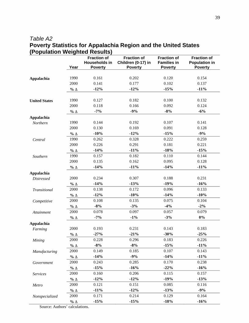
39
Table A2 Poverty Statistics for Appalachia Region and the United States (Population Weighted Results)
Year
Fraction of Households in
Poverty
Fraction of Children (0-17) in
Poverty
Fraction of Families in
Poverty
Fraction of Population in
Poverty Appalachia 1990 0.161 0.202 0.120 0.154 2000 0.141 0.177 0.102 0.137 % ∆ -12% -12% -15% -11% United States 1990 0.127 0.182 0.100 0.132 2000 0.118 0.166 0.092 0.124 % ∆ -7% -9% -8% -6% Appalachia Northern 1990 0.144 0.192 0.107 0.141 2000 0.130 0.169 0.091 0.128 % ∆ -10% -12% -15% -9% Central 1990 0.262 0.328 0.222 0.259 2000 0.226 0.291 0.181 0.221 % ∆ -14% -11% -18% -15% Southern 1990 0.157 0.182 0.110 0.144 2000 0.135 0.162 0.095 0.128 % ∆ -14% -11% -14% -11% Appalachia Distressed 2000 0.234 0.307 0.188 0.231 % ∆ -14% -13% -19% -16% Transitional 2000 0.138 0.172 0.096 0.133 % ∆ -12% -10% -14% -10% Competitive 2000 0.108 0.135 0.075 0.104 % ∆ -8% -3% -4% -2% Attainment 2000 0.078 0.097 0.057 0.079 % ∆ -7% -1% -3% 0% Appalachia Farming 2000 0.193 0.231 0.143 0.183 % ∆ -27% -21% -30% -25% Mining 2000 0.228 0.296 0.183 0.226 % ∆ -8% -8% -15% -11% Manufacturing 2000 0.149 0.185 0.107 0.143 % ∆ -14% -9% -14% -11% Government 2000 0.243 0.285 0.170 0.238 % ∆ -15% -16% -22% -16% Services 2000 0.160 0.206 0.115 0.157 % ∆ -12% -12% -19% -13% Metro 2000 0.121 0.151 0.085 0.116 % ∆ -11% -12% -13% -9% Nonspecialized 2000 0.171 0.214 0.129 0.164 % ∆ -15% -15% -18% -16% Source: Authors’ calculations.

40
Table A3 Median Income for Appalachia Region and the United States (Population Weighted Results)
Year
Median Household
Income
Median Family Income
Median Non Family
Household Income
Average Family
Household Income
Average Non Family
Household Income
Appalachia 1990 35,592 41,570 18,843 48,755 23,626 2000 36,603 44,580 19,909 55,189 28,365 % ∆ 3% 7% 6% 13% 20% United States 1990 45,133 51,143 27,819 60,785 33,418 2000 44,793 52,874 27,187 67,803 37,324 % ∆ -1% 3% -2% 12% 12% Appalachia Northern 1990 35,886 42,304 19,378 49,564 24,104 2000 36,021 44,834 19,550 55,099 28,031 % ∆ 0.4% 6% 1% 11% 16% Central 1990 25,574 30,284 12,606 37,429 17,479 2000 26,997 33,118 13,618 42,536 21,667 % ∆ 6% 9% 8% 14% 24% Southern 1990 37,486 43,376 19,396 50,502 24,240 2000 39,166 46,590 21,565 57,790 30,073 % ∆ 4% 7% 11% 14% 24% Appalachia Distressed 2000 26,267 32,472 13,250 41,751 21,244 % ∆ 8% 11% 10% 15% 24% Transitional 2000 35,590 44,095 18,928 54,555 27,398 % ∆ 1% 7% 3% 13% 18% Competitive 2000 41,774 49,556 23,655 61,170 32,013 % ∆ 2% 5% 8% 12% 20% Attainment 2000 53,756 60,699 32,890 73,627 42,564 % ∆ 2% 4% 6% 9% 18% Appalachia Farming 2000 29,672 35,158 14,507 44,306 21,616 % ∆ 16% 13% 37% 19% 29% Mining 2000 26,598 33,901 13,727 43,319 21,228 % ∆ 2% 8% 0.1% 13% 15% Manufacturing 2000 33,901 40,515 17,592 49,900 25,683 % ∆ 6% 7% 13% 13% 25% Government 2000 27,415 36,747 14,101 46,436 22,174 % ∆ 14% 22% 12% 24% 19% Services 2000 33,359 41,054 17,477 51,272 26,697 % ∆ 6% 10% 3% 15% 20% Metro 2000 39,781 48,247 22,292 59,744 31,023 % ∆ 1% 5% 5% 12% 20% Nonspecialized 2000 31,605 37,921 16,245 46,751 24,216 % ∆ 9% 10% 15% 15% 26% Source: Authors’ calculations.

41
Table A4 Employment Rates for Appalachia Region and the United States (Population Weighted Results)
Year
Labor Force Participation: All Persons
Men’s Labor Force
Participation
Women’s Labor Force Participation
Unemploy-ment Rate:
Male
Unemploy- ment Rate: White Male
Unemploy-ment Rate: Black Male
Unemploy- ment Rate: Hispanic
Appalachia 1990 0.596 0.695 0.507 0.069 0.065 0.129 0.079
2000 0.600 0.673 0.532 0.057 0.052 0.118 0.061 % ∆ 1% -3% 5% -17% -20% -9% -23%
United States 1990 0.644 0.728 0.566 0.064 0.053 0.137 0.098 2000 0.634 0.669 0.5747 0.057 0.046 0.123 0.083 % ∆ -1% -8% 2% -11% -13% -10% -15% Appalachia Northern 1990 0.578 0.680 0.486 0.079 0.076 0.195 0.120 2000 0.591 0.703 0.526 0.066 0.062 0.159 0.100 % ∆ 2% 3% 8% -16% -18% -18% -17% Central 1990 0.515 0.626 0.415 0.107 0.105 0.184 0.061 2000 0.514 0.580 0.452 0.077 0.076 0.152 0.073 % ∆ 0% -7% 9% -28% -28% -17% 20% Southern 1990 0.634 0.725 0.552 0.052 0.045 0.111 0.053 2000 0.626 0.703 0.525 0.046 0.038 0.107 0.053 % ∆ -1% -3% -5% -12% -16% -4% 0% Appalachia Distressed 2000 0.504 0.570 0.443 0.091 0.087 0.156 0.081 % ∆ 1% -6% 11% -27% -29% -8% 6% Transitional 2000 0.599 0.672 0.532 0.057 0.052 0.123 0.069 % ∆ 1% -3% 5% -16% -18% -11% -3% Competitive 2000 0.642 0.719 0.571 0.044 0.038 0.101 0.060 % ∆ -1% -3% 2% -7% -11% 4% 2% Attainment 2000 0.693 0.772 0.618 0.038 0.028 0.094 0.048 % ∆ -3% -3% -2% -2% -14% 6% 1% Appalachia Farming 2000 0.569 0.651 0.491 0.048 0.047 0.113 0.076 % ∆ 1% -2% 4% -41% -41% -9% 1% Mining 2000 0.490 0.556 0.428 0.093 0.091 0.180 0.090 % ∆ 1% -9% 15% -23% -23% -22% -8% Manufacturing 2000 0.596 0.670 0.526 0.052 0.049 0.107 0.058 % ∆ -1% -4% 1% -18% -20% -3% -8% Government 2000 0.547 0.602 0.495 0.096 0.089 0.167 0.065 % ∆ 4% 0% 8% -8% -12% 28% 105% Services 2000 0.568 0.636 0.505 0.075 0.071 0.174 0.098 % ∆ 2% -3% 8% -14% -18% 9% -17% Metro 2000 0.622 0.697 0.553 0.052 0.047 0.114 0.058 % ∆ 1% -2% 5% -16% -19% -12% -29%
Nonspecialized 2000 0.569 0.639 0.502 0.062 0.059 0.135 0.085 % ∆ 0% -4% 6% -23% -24% -13% 23%
Source: Authors’ calculations.

42
Table A5 Social Program Expenditures per Capita for Appalachia Region and the United States (Population Weighted Results)
Year Food Stamps Disability
Insurance TANF Supplemental
Security Income (SSI)
Appalachia 1990 $95.47 $1504.90 $62.87 $97.80 2000 $60.38 $1712.08 $30.44 $131.50 % ∆ -37% 14% -52% 34% United States 1990 $79.09 $1312.20 $102.98 $89.70 2000 $52.61 $1425.36 $64.58 $112.47 % ∆ -33% 9% -37% 25% Appalachia Northern 1990 $94.79 $1671.27 $89.70 $79.11 2000 $56.42 $1865.86 $41.46 $122.50 % ∆ -40% 12% -54% 55% Central 1990 $185.00 $1431.96 $88.60 $197.91 2000 $130.88 $1797.83 $57.41 $296.94 % ∆ -29% 26% -35% 50% Southern 1990 $75.96 $1338.51 $27.50 $95.71 2000 $49.87 $1549.24 $14.52 $106.56 % ∆ -34% 16% -47% 11% Appalachia Distressed 2000 $132.95 $1767.64 $65.59 $297.61 % ∆ -37% 21% -43% 53% Transitional 2000 $55.76 $1781.64 $28.17 $120.46 % ∆ -36% 13% -53% 34% Competitive 2000 $38.28 $1634.44 $20.36 $83.23 % ∆ -28% 14% -51% 23% Attainment 2000 $24.46 $1129.55 $12.21 $49.63 % ∆ -37% 17% -42% 12% Appalachia Farming 2000 $75.71 $1525.05 $85.35 $219.28 % ∆ -45% 25% -66% 5.4% Mining 2000 $133.82 $1933.12 $107.59 $282.27 % ∆ -29% 23% -38% 74% Manufacturing 2000 $54.58 $1708.45 $49.63 $129.52 % ∆ -37% 15% -55% 20% Government 2000 $104.21 $1395.35 $82.99 $222.40 % ∆ -43% 19% -44% 31% Services 2000 $74.95 $1855.25 $77.44 $164.44 % ∆ -34% 14% -46% 44% Metro 2000 $50.30 $1691.03 $60.05 $104.95 % ∆ -37% 12% -53% 35% Nonspecialized 2000 $76.92 $1698.76 $32.61 $177.10 % ∆ -38% 17% -51% 30% Source: Authors’ calculations.

43
Table A6 Labor Market Statistics for Appalachia and Four Comparison Areas: 1970 – 2000 (Population Weighted Results)
Year Appalachia Statistical
Comparison Mississippi
Delta Ozark
Mountain Rio Grande Fraction of Population in Poverty
1970 0.178 0.232 0.290 0.314 0.362 1980 0.141 0.172 0.213 0.233 0.290 1990 0.154 0.186 0.233 0.247 0.355 2000 0.137 0.150 0.192 0.206 0.308
% ∆ 1970-2000 -23% -35% -34% -34% -15% Average Family Income (2000 $’s)
1970 $41,739 $38,487 $38,053 $30,667 $36,418 1980 $47,126 $44,273 $45,519 $33,612 $41,124 1990 $48,755 $44,156 $45,098 $33,785 $38,681 2000 $55,189 $50,718 $52,239 $39,012 $42,516
% ∆ 1970-2000 32% 32% 37% 27% 17% Average Non-Family Income (2000 $’s)
1970 $13,318 $12,990 $12,393 $10,104 $13,879 1980 $17,651 $17,547 $17,689 $12,161 $17,999 1990 $23,626 $21,886 $22,471 $16,163 $24,946 2000 $28,365 $26,906 $26,809 $21,000 $27,552
% ∆ 1970-2000 113% 107% 116% 108% 99%
Source: Authors’ calculations.

44
Table A7 Labor Force Participation for Appalachia and Four Comparison Areas: 1970 – 2000 (Population Weighted Results)
Year Appalachia Statistical
Comparison Mississippi
Delta Ozark
Mountain Rio Grande Labor Force Participation of Men
1970 0.718 0.706 0.680 0.627 0.649 1980 0.711 0.705 0.686 0.636 0.683 1990 0.695 0.692 0.671 0.649 0.667 2000 0.673 0.664 0.647 0.632 0.620
% ∆ 1970-2000 -13% -18% -12% -14% -11% Labor Force Participation of Women
1970 0.365 0.370 0.369 0.310 0.350 1980 0.439 0.444 0.446 0.397 0.434 1990 0.507 0.509 0.511 0.465 0.467 2000 0.532 0.541 0.535 0.488 0.452
% ∆ 1970-2000 35% 23% 32% 36% 53%
Source: Authors’ calculations. Table A8 Unemployment Rates for Appalachia and Four Comparison Areas: 1970 – 2000 (Population Weighted Results)
Year Appalachia Statistical
Comparison Mississippi
Delta Ozark
Mountain Rio Grande Unemployment Rate of Men
1970 0.040 0.044 0.048 0.051 0.053 1980 0.079 0.075 0.070 0.081 0.080 1990 0.069 0.074 0.082 0.073 0.124 2000 0.057 0.061 0.069 0.060 0.107
% ∆ 1970-2000 43% 39% 44% 18% 102% % ∆ 1980-2000 -28% -19% -1% -26% 34%
Source: Authors’ calculations.
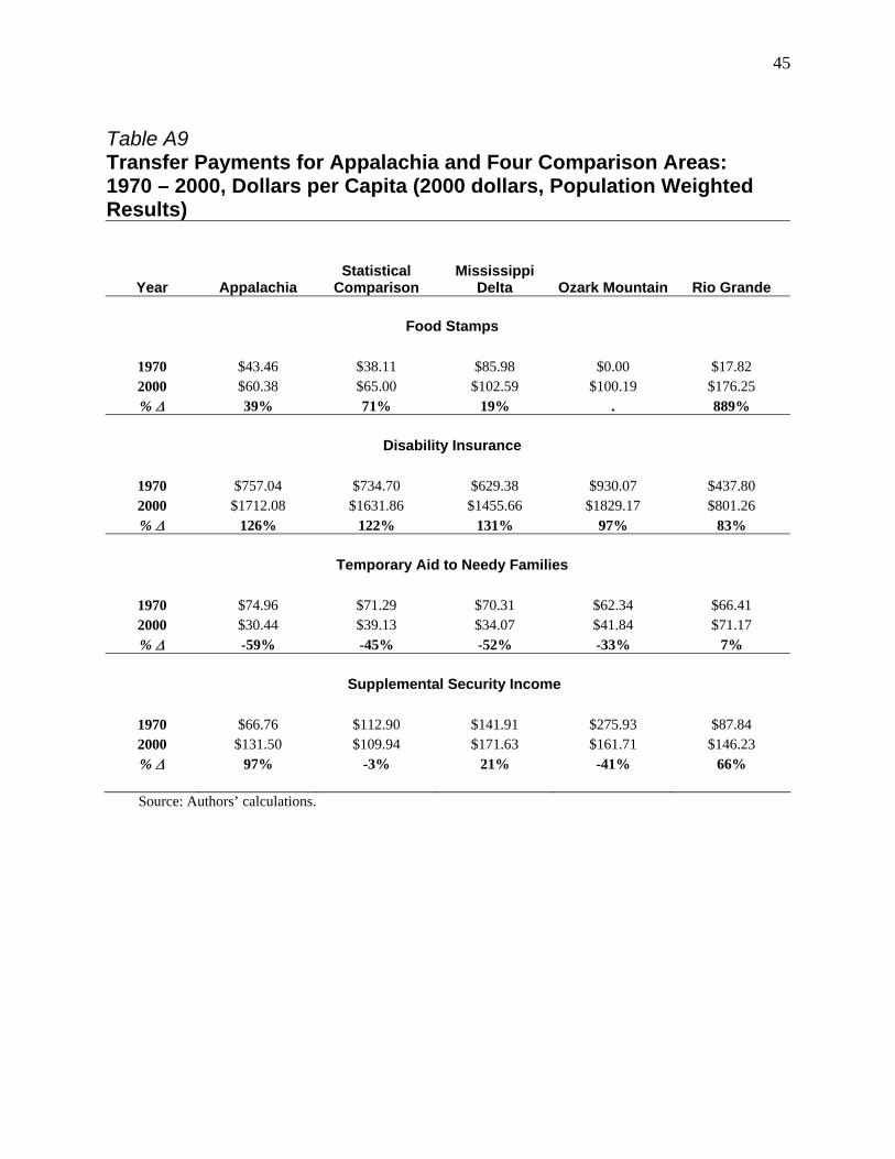
45
Table A9 Transfer Payments for Appalachia and Four Comparison Areas: 1970 – 2000, Dollars per Capita (2000 dollars, Population Weighted Results)
Year Appalachia Statistical
Comparison Mississippi
Delta Ozark Mountain Rio Grande Food Stamps
1970 $43.46 $38.11 $85.98 $0.00 $17.82 2000 $60.38 $65.00 $102.59 $100.19 $176.25 % ∆ 39% 71% 19% . 889%
Disability Insurance
1970 $757.04 $734.70 $629.38 $930.07 $437.80 2000 $1712.08 $1631.86 $1455.66 $1829.17 $801.26 % ∆ 126% 122% 131% 97% 83%
Temporary Aid to Needy Families
1970 $74.96 $71.29 $70.31 $62.34 $66.41 2000 $30.44 $39.13 $34.07 $41.84 $71.17 % ∆ -59% -45% -52% -33% 7%
Supplemental Security Income
1970 $66.76 $112.90 $141.91 $275.93 $87.84 2000 $131.50 $109.94 $171.63 $161.71 $146.23 % ∆ 97% -3% 21% -41% 66%
Source: Authors’ calculations.

46
Appendix B: Historical Classifications
The sections “Analysis of Contemporary Appalachia” and “Analysis of Long-term Trends for Appalachia” present statistics for Appalachia by ERS primary economic activity. Starting in 1979, ERS constructed and released to the research community a typology that classified counties into primary economic activity. Currently, ERS has released a typology for 1979 and 1989 and is engaged in constructing a typology for 1999. The typology uses data from the decennial census to define whether a county is a metro or non-metro county and data from the Bureau of Economic Analysis (the Local Area Income Series) to define primary economic activity in non-metro areas. Several changes make the 1979 and 1989 typology non-comparable, and no typology since 1989 has been released. ARC has its classification of county level of economic distress since at least 1988. Again, several changes make the ARC designations non-comparable across time. In addition, to our knowledge, classification now exists for Appalachia prior to 1988; counties outside of Appalachia have never been classified into ARC classifications.
The “Analysis of Contemporary Appalachia” section of this paper uses the typology developed by ERS for 1989. It uses a constructed ARC typology for 1990 that follows the classification ARC has had in place since 1997, but uses different Census unemployment numbers rather than the BLS series. The “Analysis of Long-term Trends for Appalachia” section is concerned with the historical evolution of Appalachia relative to other areas in the United States. Because of this need for historical context, we construct a new set of ERS codes (following the 1989 typology) and ARC codes (following a new typology) that is closer to consistent across time. This appendix documents the differences in our classifications and ERS’s classification for 1989 and the ARC’s classification for 2002. For the ERS codes, this appendix
documents the choices we made in constructing our measure of primary economic activity, including:
• Our choice of a time-consistent classification schema; • Our choice of a time-consistent version of the BEA data; and • Our choice of definitions for metro areas.
For the ARC codes, this appendix documents our choices, including:
• Our choice of a time-consistent definition of Appalachia; • Our choice of a time-consistent definition of “Distressed,” “Transitional,” “Competitive,”
and “Attainment”; • Our choice of a time-consistent version of the BEA data; and • Our choice of Census, rather than BLS, local unemployment statistics.
Below is a description of our choices. Table B1 is a succinct description of the
construction of ARC and ERC categories for historical comparability.
Time-consistent Classification Schema for ERS Primary Economic Areas
The ERS revised the coding schema for 1989, making several improvements to previous work. Perhaps most important was the establishment of mutually exclusive economic types, which makes the typology more useful for statistical analysis. Five types were retained from the 1979 typology, but a sixth type on service-dependent counties was added to account for the

47
growth of service jobs in the national economy. A second improvement was the use of multi-year measures to define economic types.
Since we viewed the ERS work in 1989 as a major improvement on earlier work, we
adopted the 1989 codification for all years. Specifically, economic types were defined as follows:
• Farming-dependent – Farming contributed 20 percent or more of total labor and proprietor income over three years;
• Mining-dependent – Mining contributed 15 percent or more of total labor and
proprietor income over three years;
• Manufacturing-dependent – Manufacturing contributed 30 percent or more of total labor and proprietor income over three years;
• Government-dependent – Government activities (federal, state, and local)
contributed 25 percent or more of total labor and proprietor income over three years;
• Service-dependent – Service activities (private and personal service, agricultural
services, wholesale and retail trade, finance and insurance, transportation and public utilities) contributed 50 percent or more of total labor and proprietor income over three years; and
• Nonspecialized – Not classified as a specialized economy over three years.
For our 1970 classification, we used 1969 through 1971 BEA data (1968 is not available);
for our 1989 classification, we used 1987 through 1989 data (as did ERS); and for 1999, we used 1997 through 1999 data. We also followed the ERS choices of how to classify counties that met more than one of the criteria above. Counties that qualify as farming, mining, or manufacturing and that also qualify as government or service were classified as farming, mining, or manufacturing. Other overlaps (farming-mining, government-service, etc.) were assigned to the type with the largest percentage point difference above the cutoff point divided by the standard deviation.
Time-consistent Version of the BEA Data
There are at least two reasons that our classification for 1989 will differ from ERS’s, even though the same codification schema was used in both. First, BEA furnished ERS with unsuppressed data for all but five of 50 states. Since this data is not publicly available, we had to construct our classifications based on data with more suppression. Typically, data is suppressed when the level of economic activity belongs to a handful of firms (which typically means that the level of activity is small). But it is possible that a county with one large plant would be suppressed even though that plant was responsible for a large fraction of economic activity. In general, the effect of this suppression is to make more counties appear as nonspecialized in our classification. A more important issue is that BEA county income estimates used to create the 1989 ERS county codes differ substantially from estimates reported in later revisions. The differences stem from a
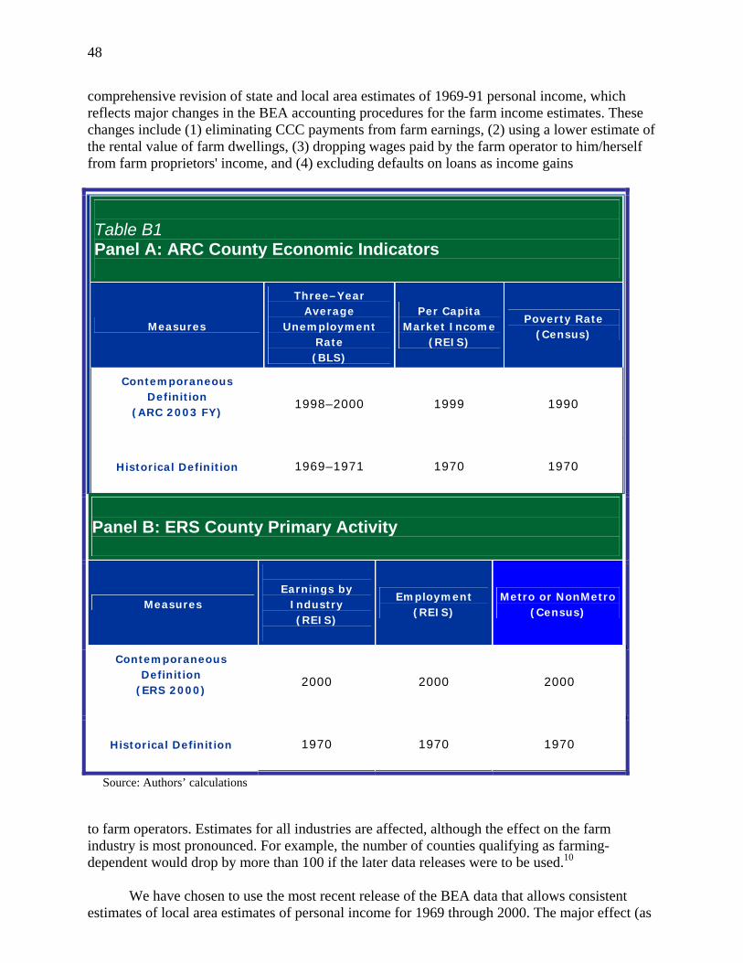
48
comprehensive revision of state and local area estimates of 1969-91 personal income, which reflects major changes in the BEA accounting procedures for the farm income estimates. These changes include (1) eliminating CCC payments from farm earnings, (2) using a lower estimate of the rental value of farm dwellings, (3) dropping wages paid by the farm operator to him/herself from farm proprietors' income, and (4) excluding defaults on loans as income gains
Table B1 Panel A: ARC County Economic Indicators
Measures
Three–Year Average
Unemployment Rate (BLS)
Per Capita Market Income
(REIS)
Poverty Rate (Census)
Contemporaneous Definition
(ARC 2003 FY)
1998–2000 1999 1990
Historical Definition
1969–1971 1970 1970
Panel B: ERS County Primary Activity
Measures
Earnings by
Industry (REIS)
Employment (REIS)
Metro or NonMetro (Census)
Contemporaneous Definition
(ERS 2000)
2000 2000 2000
Historical Definition
1970 1970 1970
Source: Authors’ calculations
to farm operators. Estimates for all industries are affected, although the effect on the farm industry is most pronounced. For example, the number of counties qualifying as farming-dependent would drop by more than 100 if the later data releases were to be used.10
We have chosen to use the most recent release of the BEA data that allows consistent
estimates of local area estimates of personal income for 1969 through 2000. The major effect (as

49
suggested by ERS) is that the number of farming-dependent counties is lower in our classification and becomes redistributed to other categories (especially nonspecialized counties). Definitions for Metro Areas
The definition of metro areas is derived from data collected by the decennial censuses.
About three years after each census, the Office of Management and Budget (OMB) releases a list of metropolitan (metro) and nonmetropolitan (nonmetro) areas. While the definitions have changed over time, these definitions were largely consistent for the 1970, 1980, and 1990 censuses.
In 2003, OMB released metro and nonmetro areas from the 2000 Census. The ERS
website at www.ers.usda.gov/Briefing/Rurality/Newdefinitions/ succinctly describes these changes as follows:
Metro areas were previously defined to include central counties with one or more cities of at least 50,000 residents or with an urbanized area of 50,000 or more and total area population of at least 100,000. Outlying counties were included if they were both economically tied to the central counties, as measured by daily commuting, and they displayed a level of “metropolitan character” based on population density, urbanization, and population growth. A county with high “metropolitan character” would be included with as little as 15 percent of its workers commuting. A county low in such attributes would be regarded as nonmetro no matter how high the commuting linkage was to the central county or counties.
Under the new “core-based statistical area” system, metro areas are defined for all urbanized areas regardless of total area population. In addition, inclusion as an outlying county is based on a single commuting threshold of 25 percent with no “metropolitan character” requirement. Streamlining the criteria in this manner decreases the population covered by metro areas by approximately 2 million residents, but actual expansion of metro territory during the last decade added 8 million persons. The net effect reduces the 2000 nonmetro population from 55 to 49 million persons.
The addition of 49 new metro areas mostly results from actual growth during the decade of nonmetro cities past the 50,000 urbanized area threshold. The addition of formerly nonmetro counties to the fringe of existing metro areas (298 counties) comes partly from relentless suburbanization and partly from rule changes, specifically the removal of the "metropolitan character" requirement. The reclassification of 45 metro counties to nonmetro status is almost entirely a result of rule changes, particularly the increase in the commuting level required for inclusion as an outlying metro county. All but 4 [sic] of these new nonmetro counties became part of a micropolitan area.
Because there is no existing list of metro areas that uses the 1993 definitions on the 2000 Census data, our options are to use the 2003 definitions as released by OMB or to use the 1993 definitions of metro areas. While the change between 1993 and 2003
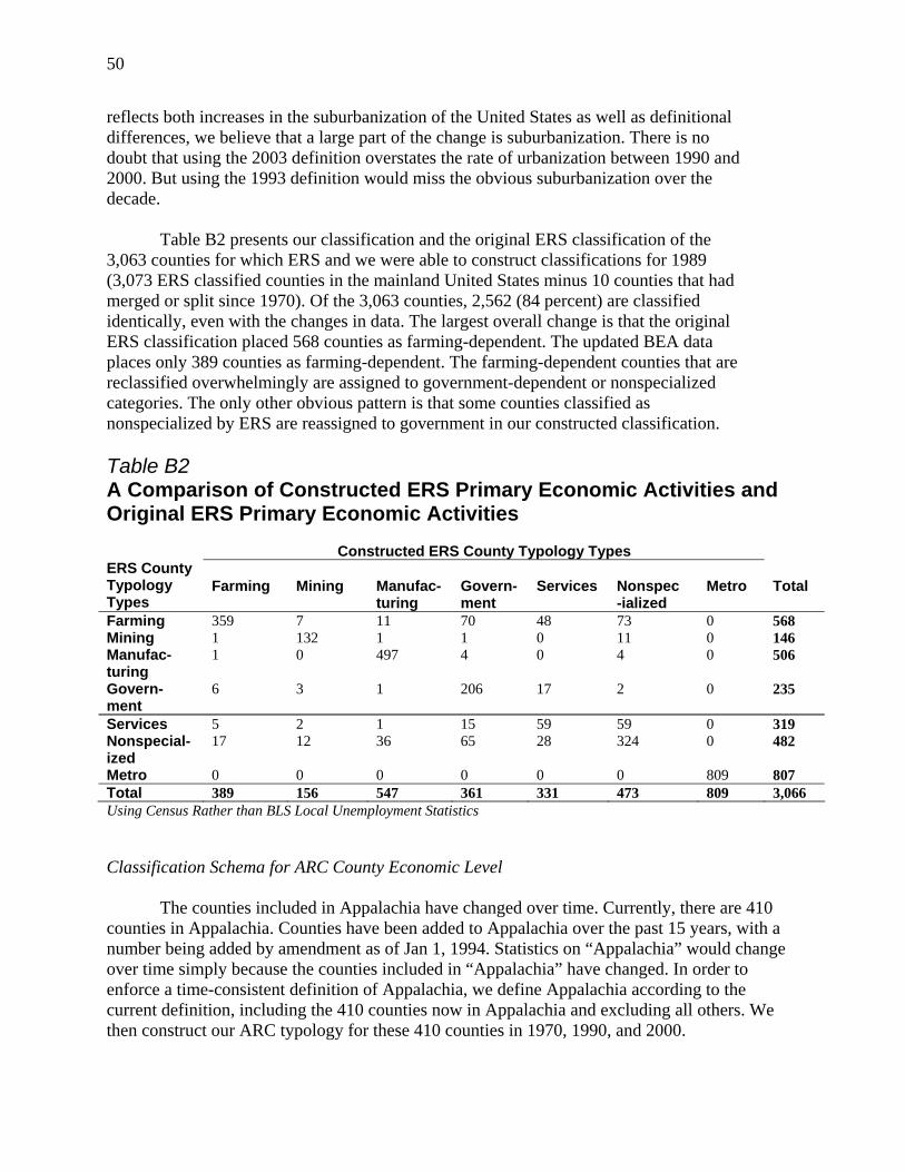
50
reflects both increases in the suburbanization of the United States as well as definitional differences, we believe that a large part of the change is suburbanization. There is no doubt that using the 2003 definition overstates the rate of urbanization between 1990 and 2000. But using the 1993 definition would miss the obvious suburbanization over the decade.
Table B2 presents our classification and the original ERS classification of the 3,063 counties for which ERS and we were able to construct classifications for 1989 (3,073 ERS classified counties in the mainland United States minus 10 counties that had merged or split since 1970). Of the 3,063 counties, 2,562 (84 percent) are classified identically, even with the changes in data. The largest overall change is that the original ERS classification placed 568 counties as farming-dependent. The updated BEA data places only 389 counties as farming-dependent. The farming-dependent counties that are reclassified overwhelmingly are assigned to government-dependent or nonspecialized categories. The only other obvious pattern is that some counties classified as nonspecialized by ERS are reassigned to government in our constructed classification.
Table B2 A Comparison of Constructed ERS Primary Economic Activities and Original ERS Primary Economic Activities
Using Census Rather than BLS Local Unemployment Statistics Classification Schema for ARC County Economic Level
The counties included in Appalachia have changed over time. Currently, there are 410 counties in Appalachia. Counties have been added to Appalachia over the past 15 years, with a number being added by amendment as of Jan 1, 1994. Statistics on “Appalachia” would change over time simply because the counties included in “Appalachia” have changed. In order to enforce a time-consistent definition of Appalachia, we define Appalachia according to the current definition, including the 410 counties now in Appalachia and excluding all others. We then construct our ARC typology for these 410 counties in 1970, 1990, and 2000.
Constructed ERS County Typology Types ERS County Typology Types
Farming
Mining
Manufac-turing
Govern-ment
Services
Nonspec -ialized
Metro
Total
Farming 359 7 11 70 48 73 0 568 Mining 1 132 1 1 0 11 0 146 Manufac-turing
1 0 497 4 0 4 0 506
Govern-ment
6 3 1 206 17 2 0 235
Services 5 2 1 15 59 59 0 319 Nonspecial-ized
17 12 36 65 28 324 0 482
Metro 0 0 0 0 0 0 809 807 Total 389 156 547 361 331 473 809 3,066

51
A Time-consistent Definition of “Distressed,” “Transitional,” “Competitive,” and “Attainment”
While ARC has produced a list of counties by economic levels since 1988, the definition of what qualified a county for each category has evolved over time. Table 1 (page 10) describes the current definitions. However, prior to 1997, an “Attainment” county was defined as having 75 percent of the U.S. three-year average unemployment rate, 80 percent of the U.S. PCMI, and 75 percent of the nation’s poverty rate. In order to make our definitions historically comparable, we use the current definitions and apply these to data for 1990 and 1970.
Perhaps the biggest difference between our ARC classification and the original one is the
use of Census local unemployment statistics rather than those of BLS. The first reason we do this is that BLS local unemployment statistics are not available prior to 1990. Since the unemployment rate is a vital component to the ARC classification scheme and since the BLS data is not available around 1970, we have little option but to use a series on local unemployment that is available for this time period. There is, however, an additional reason to prefer census-based estimates of local unemployment. In general, the BLS uses the Current Population Surveys to estimate unemployment rates for the United States. The CPS is a national probability sample and can be used to directly estimate unemployment in the United States and for some states. But for other states and almost all substate regions, the BLS must rely on the “Handbook” method to construct these local series. This method is an effort to estimate unemployment for an area using available information without the expense of expanding a labor force survey like the CPS. The primary data source for this method is establishment employment data from the Quarterly Report of Covered Employment and Wages (ES-202 Report). In this data, employment is recorded by place of work, and BLS has developed extensive adjustments to convert this to place of residence estimates. In addition to these adjustments, the ES-202 data does not contain employment in uncovered sectors. While this method is error-prone for small areas, there is little choice for unemployment statistics on an annual or monthly basis.
By contrast, the decennial census is a household-based survey that is collected on every household in the United States. Because of this comprehensiveness, using the census to estimate unemployment by place of residence for small areas is a straightforward exercise of tabulating individual respondents’ employment status on the census by their county of residence. Large samples and nearly complete coverage are likely to make the decennial census data more accurate for small areas than the BLS unemployment rate series. In general, the downside of census estimates is that they are limited to the time period when the census is collected—March at the turn of each decade. However, for the purpose of classifying counties in 1970, 1990, and 2000, this data serves us well. Time-consistent Version of the BEA Data
Finally, the BEA data is updated each year. We use the 2002 REIS data for all years. Discussion of Various Definitions Our classification differs from ARC’s in three important ways. Take the 2002 ARC classification as an example. First, our unemployment statistics reflect unemployment as of the year 2000, rather than unemployment between the years 1997 and 1999. Second, our unemployment statistics reflect a one-month unemployment rate, rather than a three-year average rate. The three-year average has been used to reflect more “structural” unemployment. How much difference this makes is an empirical issue. Finally, we use the REIS data available as of

52
2002, which could be slightly different from the time period used when ARC constructed the series. Table B3 shows the effect of each decision. Panel A simply demonstrates that we were able to exactly replicate ARC’s classification using their data. This was done to ensure the integrity of the programming and to make sure classifications were implemented correctly. Panel B replicates Panel A with one change—the local area unemployment rate for 2000 was used to construct the categories rather than the three-year average. What is clear is that both the movement to a one-year rather than three-year average and the movement in time periods affect the classification very little. Of the 122 distressed counties, 116 remain distressed in the new classification, with six now classified as transitional. Of the 260 counties classified as transitional, 251 remain classified as transitional, with six counties now classified as distressed and three counties classified as competitive.
Panel C replicates Panel B but again with one substantive change—the census measure of unemployment as of March 2000 was used rather than the BLS unemployment series for 2000. This has more of an effect on the classification. Of the 122 counties classified by the ARC-2002 list as distressed, 64 are now classified as distressed, but 58 are classified as transitional. In general, local unemployment rates appear higher in the census than in the BLS data (5.7 percent vs. 4.6 percent), while the standard deviation of the unemployment statistics are smaller in the census than the BLS (2.1 vs. 2.3). The difference between the two classification schemes is almost certainly caused by the lower variability of the census unemployment statistics relative to the BLS local unemployment statistics. A final note is that in 1970 and 1990, the Census Public Use tapes that we had available round the fraction of the population in poverty to the closest percentage point. Panel C also uses the current version of the REIS Public Use Data, rather than ARC’s version (used in Panel B). This change has very little effect on the classification.
In the “Analysis of Contemporary Appalachia” section of the paper, we present statistics
by ARC subgroup for 1990. This classification is based on our new definition that uses the 1990 Census unemployment statistics rather than the 1987 through 1989 BLS average. While it is possible by using the BLS data to create a series for 1990 that is more comparable to ARC’s 2002 classification, this series would introduce yet another classification and add to the confusion surrounding which classification to use.

53
Table B3 A Comparison of Constructed ARC Primary Economic Activities and Original ARC Primary Economic Activities
Panel A: Replication using ARC Data
Constructed (BLS) ARC Economic Status arc_2002 Distressed Transition Competitive Attainment Total Distressed 122 0 0 0 122 Transition 0 258 0 0 258 Competitive 0 0 18 0 18 Attainment 0 0 0 12 12 Total 122 258 18 12 410
Panel B: Replication Substituting BLS 2000 Unemployment Statistics for the BLS 1997-1999 Three-year Average Unemployment Statistics
Constructed (2000) ARC Economic Status arc_2002 Distressed Transition Competitive Attainment Total Distressed 116 6 0 0 122 Transition 6 251 1 0 258 Competitive 0 3 15 0 18 Attainment 0 0 0 12 12 Total 122 260 16 12 410
Panel C: Replication Substituting Census March 2000 Unemployment Statistics for the BLS 1997-1999 Three-year Average Unemployment Statistics and substituting the Public Use REIS Per Capita Market Income for ARC’s Series
Constructed (Census REIS Public Data)
ARC Economic Status
arc_2002 Distressed Transition Competitive Attainment Total Distressed 64 58 0 0 122 Transition 2 242 14 0 258 Competitive 0 2 14 0 18 Attainment 0 2 1 9 12 Total 66 306 29 9 410

54
Appendix C: Listing of Counties by Region
Ozark Mountain Counties Rio Grand Valley Counties
FIPS County State FIPS County State 29067 Douglas MO 48043 Brewster TX 29091 Howell MO 48061 Cameron TX 29149 Oregon MO 48127 Dimmit TX 29153 Ozark MO 48131 Duval TX 29203 Shannon MO 48141 El Paso TX 29215 Texas MO 48215 Hidalgo TX 29229 Wright MO 48229 Hudspeth TX
48243 Jeff Davis TX 48247 Jim Hogg TX 48275 Knox TX 48283 LaSalle TX 48377 Presidio TX 48427 Starr TX 48479 Webb TX 48489 Willacy TX 48505 Zapata TX
Mississippi Delta Counties
FIPS County State FIPS County State1005 Barbour AL 22001 Acadia LA 1011 Bullock AL 22003 Allen LA 1013 Butler AL 22005 Ascension LA 1023 Choctaw AL 22007 Assumption LA 1025 Clarke AL 22009 Avoyelles LA 1035 Conecuh AL 22021 Caldwell LA 1047 Dallas AL 22025 Catahoula LA 1053 Escambia AL 22029 Concordia LA 1063 Greene AL 22033 East Baton Rouge LA 1065 Hale AL 22035 East Carroll LA 1085 Lowndes AL 22037 East Feliciana LA 1087 Macon AL 22039 Evangeline LA 1091 Marengo AL 22041 Franklin LA 1099 Monroe AL 22043 Grant LA 1105 Perry AL 22045 Iberia LA 1107 Pickens AL 22047 Iberville LA 1113 Russell AL 22049 Jackson LA 1119 Sumter AL 22051 Jefferson LA 1129 Washington AL 22057 Lafourche LA 1131 Wilcox AL 22059 LaSalle LA

55
Mississippi Delta Counties (cont’d)
5003 Ashley AR 22063 Livingston LA 5005 Baxter AR 22065 Madison LA 5011 Bradley AR 22067 Morehouse LA 5013 Calhoun AR 22069 Natchitoches LA 5017 Chicot AR 22071 Orleans LA 5021 Clay AR 22073 Ouachita LA 5025 Cleveland AR 22075 Plaquemines LA 5031 Craighead AR 22077 Pointe Coupee LA 5035 Crittenden AR 22079 Rapides LA 5037 Cross AR 22083 Richland LA 5039 Dallas AR 22087 St. Bernard LA 5041 Desha AR 22089 St. Charles LA 5043 Drew AR 22091 St. Helena LA 5049 Fulton AR 22093 St. James LA 5053 Grant AR 22095 St. John the Baptist LA 5055 Greene AR 22097 St. Landry LA 5063 Independence AR 22099 St. Martin LA 5065 Izard AR 22105 Tangipahoa LA 5067 Jackson AR 22107 Tensas LA 5069 Jefferson AR 22111 Union LA 5075 Lawrence AR 22117 Washington LA 5077 Lee AR 22121 West Baton Rouge LA 5079 Lincoln AR 22123 West Carroll LA 5085 Lonoke AR 22125 West Feliciana LA 5089 Marion AR 22127 Winn LA 5093 Mississippi AR 28001 Adams MS 5095 Monroe AR 28005 Amite MS 5103 Ouachita AR 28007 Attala MS 5107 Phillips AR 28009 Benton MS 5111 Poinsett AR 28011 Bolivar MS 5117 Prairie AR 28015 Carroll MS 5119 Pulaski AR 28021 Claiborne MS 5121 Randolph AR 28027 Coahoma MS 5123 St. Francis AR 28029 Copiah MS 5129 Searcy AR 28031 Covington MS 5135 Sharp AR 28033 DeSoto MS 5137 Stone AR 28037 Franklin MS 5139 Union AR 28043 Grenada MS 5141 Van Buren AR 28049 Hinds MS 5145 White AR 28051 Holmes MS 5147 Woodruff AR 28053 Humphreys MS
17003 Alexander IL 28055 Issaquena MS 17055 Franklin IL 28063 Jefferson MS 17059 Gallatin IL 28065 Jefferson Davis MS 17065 Hamilton IL 28071 Lafayette MS 17069 Hardin IL 28077 Lawrence MS 17077 Jackson IL 28083 Leflore MS 17087 Johnson IL 28085 Lincoln MS 17127 Massac IL 28089 Madison MS

56
Mississippi Delta Counties (cont’d) 17145 Perry IL 28091 Marion MS 17151 Pope IL 28093 Marshall MS 17153 Pulaski IL 28097 Montgomery MS 17157 Randolph IL 28107 Panola MS 17165 Saline IL 28113 Pike MS 17181 Union IL 28119 Quitman MS 17193 White IL 28121 Rankin MS 17199 Williamson IL 28125 Sharkey MS 21007 Ballard KY 28127 Simpson MS 21033 Caldwell KY 28133 Sunflower MS 21035 Calloway KY 28135 Tallahatchie MS 21039 Carlisle KY 28137 Tate MS 21047 Christian KY 28139 Tippah MS 21055 Crittenden KY 28143 Tunica MS 21075 Fulton KY 28145 Union MS 21083 Graves KY 28147 Walthall MS 21101 Henderson KY 28149 Warren MS 21105 Hickman KY 28151 Washington MS 21107 Hopkins KY 28157 Wilkinson MS 21139 Livingston KY 28161 Yalobusha MS 21143 Lyon KY 28163 Yazoo MS 21145 McCracken KY 29017 Bollinger MO 21149 McLean KY 29023 Butler MO 21157 Marshall KY 29031 Cape Girardeau MO 21177 Muhlenberg KY 29035 Carter MO 21219 Todd KY 29055 Crawford MO 21221 Trigg KY 29065 Dent MO 21225 Union KY 29067 Douglas MO 21233 Webster KY 29069 Dunklin MO 47005 Benton TN 29091 Howell MO 47017 Carroll TN 29093 Iron MO 47023 Chester TN 29123 Madison MO 47033 Crockett TN 29133 Mississippi MO 47039 Decatur TN 29143 New Madrid MO 47045 Dyer TN 29149 Oregon MO 47047 Fayette TN 29153 Ozark MO 47053 Gibson TN 29155 Pemiscot MO 47069 Hardeman TN 29157 Perry MO 47071 Hardin TN 29161 Phelps MO 47075 Haywood TN 29179 Reynolds MO 47077 Henderson TN 29181 Ripley MO 47079 Henry TN 29186 Ste. Genevieve MO 47095 Lake TN 29187 St. Francois MO 47097 Lauderdale TN 29201 Scott MO 47109 McNairy TN 29203 Shannon MO 47113 Madison TN 29207 Stoddard MO 47131 Obion TN 29215 Texas MO 47157 Shelby TN 29221 Washington MO 47167 Tipton TN 29223 Wayne MO 47183 Weakley TN 29229 Wright MO

57
Appendix D: Calculating the 90-10 Family Earnings Statistics from Grouped Data Unfortunately, we do not have microeconomic data for income. Instead, we have only categorical data. Thus, we know the number of families in each county with income between, say, $10,000 and $12,500. More formally, there are 1n + values, denoted 0 1 2{ , , , ..., }nc c c c , that define n categories of income. To be able to estimate the distribution of income, we assume that income, y , is log-normally distributed. To see why this assumption allows us to estimate the model as if we had microeconomic data, suppose that we did in fact have microeconomic data on the categories. We may then construct a likelihood function for income distribution, or
( ), , 11
( , ) (ln( ), , ) (ln( ), , )j j
N
j k j kj
L F c F cm s m s m s-=
= -Õ , (D1)
where ( )F × is the cumulative normal distribution function, N is the number of families, 1( , )j jk kc c -
are the two values that define the income category for the jth observation, and ( , )m s are parameters to be estimated. Taking the logarithm of the likelihood function we obtain
( ), , 11
( , ) ln (ln( ), , ) (ln( ), , )j j
N
j k j kj
F c F cm s m s m s-=
= -ål (D2)
This in turn can be simplified to ( )1
1
( , ) ln (ln( ), , ) (ln( ), , )n
i i ii
n F c F cm s m s m s-=
= -ål , (D3)
where in is the number of people in the ith income category and 1( , )i ic c - are the cutoffs that define the ith income category. Once estimates of ( , )m s are obtained, it is quite easy to calculate any quantiles of the distribution because ( , )m s are sufficient statistics for the log normal distribution. Moreover, because we use no covariates in our analysis, there is no loss of information from having only counts of the number of families in each category, rather than having each of the categories for each of the N families.

58
References 1 See the following for a review of regional booms and slumps through the 1980s: Oliver J. Blanchard and Lawrence F. Katz, “Regional Evolutions,” Brookings Papers in Economic Activity 1 (1992): 1-75. For a specific look at a region of Appalachia, see the following: Dan A. Black, Terra McKinnish, and Seth G. Sanders, “The Economic Impact of the Coal Boom and Bust,” Economic Journal, forthcoming. 2 Roderick J.A. Little and Donald B. Rubin, Statistical Analysis with Missing Data (New York: John Wiley & Sons, Inc., 1987). 3 Lawrence E. Wood and Gregory A. Bischak, “Progress and Challenges in Reducing Economic Distress in Appalachia: An Analysis of National and Regional Trends Since 1960,” ARC Research Paper (Washington, D.C.: Appalachian Regional Commission, January 2000). 4 Social Security Administration, Social Security Bulletin, Annual Statistical Supplement (Washington, D.C.: Government Printing Office, 2000): Table 9.G.2. 5 John Bound and Timothy Waidmann, “Disability Transfers, Self-Reported Health, and the Labor Force Attachment of Older Men: Evidence from the Historical Record,” Quarterly Journal of Economics 107, no. 4 (1992): 1393-1419. 6 Donald O. Parsons, “The Decline of Male Labor Force Participation,” Journal of Political Economy 88, no. 1 (1980): 117-134; and Donald O. Parsons, “Disability Insurance and Male Labor Force Participation,” Journal of Political Economy 92, no. 3 (1984): 542-49. 7 Dan A. Black, Kermit Daniel, and Seth G. Sanders, “The Impact of Economic Conditions on Participation in Disability Programs: Evidence from the Coal Boom and Bust,” The American Economic Review 92, no. 1 (March 2002): 27-50. 8 James K. Galbraith, Created Unequal: The Crisis in American Pay (Chicago: University of Chicago Press, 2000). 9 Adrian Pagan and Aman Ullah, Nonparametric Econometrics (Cambridge, UK: Cambridge University Press, 1999). 10 Bureau of Economic Analysis, User Notes from the January 1995 release of the 1989 County Typology Codes. For Further Reading Bagi, Faqir S., Richard J. Reeder, and Samuel D. Calhoun. “Federal Funding’s Unique Role in Appalachia.” Rural
Development Perspectives 14, no. 1 (1999): 14-21. Black, Dan A., Terra McKinnish, and Seth G. Sanders. “Does the Availability of High Wage Jobs for Low Skilled
Men Affect Welfare Expenditures? Evidence from Shocks to the Coal and Steel Industries.” Journal of Public Economics 85, no. 2 (2003): 185-206.
McLaughlin, Diane K., Daniel T. Lichter, and Stephen A. Matthews (with the assistance of Glynis Daniels and
James Cameron). “Demographic Diversity and Economic Change in Appalachia.” ARC Research Paper (Washington, D.C.: Appalachian Regional Commission, July 1999).