
Lab 4: Cartography and Classification 1.0 Overview€¦ · Geography 387 – Fall 2011 Lab 4...
23
Geography 387 – Fall 2011 Lab 4 Cartography and Classification 1 Lab 4: Cartography and Classification 1.0 Overview This lab will introduce you to two main concepts: 1) how to join an attribute table to the attribute table of an existing feature class, and 2) how to make choropleth maps using a variety of classification methods. We will continue with our counties feature class from Lab 3. We will then download year 2000 water use data from the National Atlas site and make a variety of maps for the conterminous United States. The overall steps of this lab are: Import existing GIS data into a new file geodatabase Compare fields in the original shapefile to fields in the geodatabase feature class Download water use statistics from National Atlas Read the metadata for the water use statistics Relate water use statistics to the county feature class Symbolize the counties with total water use Create a map of total daily water use with different classification schemes Create a map of annual ground water use per hectare Create a map showing a large aquifer along with annual ground water use per hectare
Transcript of Lab 4: Cartography and Classification 1.0 Overview€¦ · Geography 387 – Fall 2011 Lab 4...

Geography 387 – Fall 2011 Lab 4 Cartography and Classification
1
Lab 4: Cartography and Classification
1.0 Overview This lab will introduce you to two main concepts: 1) how to join an attribute table to the attribute table of an existing feature class, and 2) how to make choropleth maps using a variety of classification methods. We will continue with our counties feature class from Lab 3. We will then download year 2000 water use data from the National Atlas site and make a variety of maps for the conterminous United States. The overall steps of this lab are:
Import existing GIS data into a new file geodatabase
Compare fields in the original shapefile to fields in the geodatabase feature class
Download water use statistics from National Atlas
Read the metadata for the water use statistics
Relate water use statistics to the county feature class
Symbolize the counties with total water use
Create a map of total daily water use with different classification schemes
Create a map of annual ground water use per hectare
Create a map showing a large aquifer along with annual ground water use per hectare

Geography 387 – Fall 2011 Lab 4 Cartography and Classification
2
2.0 Import existing GIS data into a new file geodatabase
Make a Lab 4 working folder in your workspace (on your USB drive or local drive). Open ArcMap and establish a folder connection to your workspace that contains your Lab 3 and Lab 4 working folders. In this exercise, we are going to create a new File Geodatabase and import a feature class of counties from the 48 conterminous states (and Washington, D.C.) from your Lab 3 geodatabase. In the Catalog window in ArcMap, right-click on your Lab 4 working folder and select “New” and then select “File Geodatabase”. Rename your new geodatabase Lab4_US_water_use.gdb
Now we are going to import a feature class from your Lab 3 geodatabase into your Lab 4 geodatabase. Right-click on the Lab 4 geodatabase in the Catalog window and select Import, and then Feature Class (single). Note: if you wanted to import multiple shapefiles all at once, you could select Feature Class (multiple).

Geography 387 – Fall 2011 Lab 4 Cartography and Classification
3
The Feature Class to Feature Class window opens. In the Input Features window, browse to and select your feature class of counties of the 48 conterminous states in the Albers projection from your Lab 3 geodatabase. Do not use the dissolved feature class. For Output Location, chose your Lab 4 geodatabase, and for Output Feature Class name, use county_48_albers.
Click the Show Help button to open the help if it is not already open. Click anywhere in the "Field Map (optional)" section of the "Feature Class to Feature Class" window to display the help information for field import. Use the help to answer the following question:
Question 1: (2)
a. How could we change the field names that will be displayed in the output feature class? Hint: To answer this thoroughly, right-click on the various attribute names (e.g. State) and select "Properties...”. FYI: you can remove a field from the final imported
feature class by selecting the field and then clicking the button. b. What does the "Expression (optional)" parameter do?
We are going to import all of the fields with the same names as found in the input feature class. Click OK. If everything works properly, you should see your feature class appear in your Lab 4 geodatabase, and the feature class is added to ArcMap. Save the map document to your Lab 4 folder as Lab4.mxd.
Geography 387 – Fall 2011 Lab 4 Cartography and Classification
4
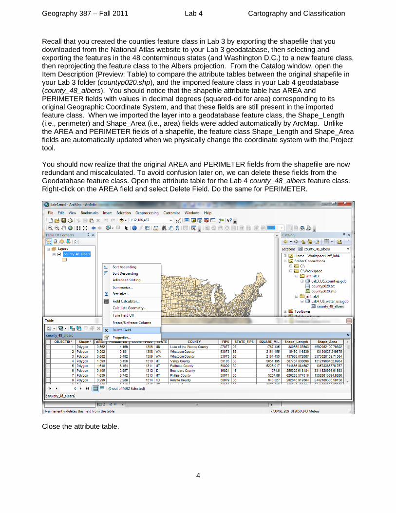
Recall that you created the counties feature class in Lab 3 by exporting the shapefile that you downloaded from the National Atlas website to your Lab 3 geodatabase, then selecting and exporting the features in the 48 conterminous states (and Washington D.C.) to a new feature class, then reprojecting the feature class to the Albers projection. From the Catalog window, open the Item Description (Preview: Table) to compare the attribute tables between the original shapefile in your Lab 3 folder (countyp020.shp), and the imported feature class in your Lab 4 geodatabase (county_48_albers). You should notice that the shapefile attribute table has AREA and PERIMETER fields with values in decimal degrees (squared-dd for area) corresponding to its original Geographic Coordinate System, and that these fields are still present in the imported feature class. When we imported the layer into a geodatabase feature class, the Shape_Length (i.e., perimeter) and Shape_Area (i.e., area) fields were added automatically by ArcMap. Unlike the AREA and PERIMETER fields of a shapefile, the feature class Shape_Length and Shape_Area fields are automatically updated when we physically change the coordinate system with the Project tool. You should now realize that the original AREA and PERIMETER fields from the shapefile are now redundant and miscalculated. To avoid confusion later on, we can delete these fields from the Geodatabase feature class. Open the attribute table for the Lab 4 county_48_albers feature class. Right-click on the AREA field and select Delete Field. Do the same for PERIMETER.
Close the attribute table.
Geography 387 – Fall 2011 Lab 4 Cartography and Classification
5
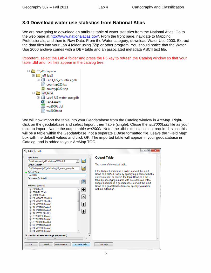
3.0 Download water use statistics from National Atlas We are now going to download an attribute table of water statistics from the National Atlas. Go to the web page at http://www.nationalatlas.gov/. From the front page, navigate to Mapping Professionals, and then to Raw Data. From the Water category, download Water Use 2000. Extract the data files into your Lab 4 folder using 7Zip or other program. You should notice that the Water Use 2000 archive comes with a DBF table and an associated metadata ASCII text file. Important, select the Lab 4 folder and press the F5 key to refresh the Catalog window so that your table .dbf and .txt files appear in the catalog tree.
We will now import the table into your Geodatabase from the Catalog window in ArcMap. Right-click on the geodatabase and select Import, then Table (single). Chose the wu2000t.dbf file as your table to import. Name the output table wu2000t. Note: the .dbf extension is not required, since this will be a table within the Geodatabase, not a separate DBase formatted file. Leave the "Field Map" box with the default values and click OK. The imported table will appear in your geodatabase in Catalog, and is added to your ArcMap TOC.

Geography 387 – Fall 2011 Lab 4 Cartography and Classification
6
Open the Item Description for the geodatabase table from the Catalog window. Also double-click on the Water Use 2000 metadata file (w2000t.txt) in the Catalog window; it will open up as an ASCII text file in Notepad. Look at the Item Description and table's attribute descriptions in the metadata text file to answer the following questions.
Look in the metadata text file under “Supplemental_Information:“ and use your internet browser to navigate to the link to the complete USGS report for these data. Answer the following questions by reading the report's abstract online.
Question 3: (3)
a. Which sector (e.g., public supply, irrigation, industrial) accounted for the greatest freshwater water use in the United States for 2000? b. Which states account for one-fourth of all water withdrawals for 2000?
Question 2: (5)
a. Is there a detailed description of the meaning of each table attribute (field) in the
Catalog Item Description?
b. Is there a detailed description of the meaning of each table attribute (field) in the
original text file metadata?
c. What is the attribute (field) containing the estimated total ground water withdrawal
of fresh water and saline water for all categories, in millions of gallons per day?
d. What is the attribute (field) containing the estimated total surface water withdrawal
of fresh water and saline water for all categories, in millions of gallons per day?
e. What is the attribute (field) containing the estimated total withdrawal of fresh water
and saline water for all categories, in millions of gallons per day? (Note: this is both
ground and surface water, combined).

Geography 387 – Fall 2011 Lab 4 Cartography and Classification
7
4.0 Relate water use statistics to the county feature class We are now going to relate the water use attribute data to the county geographic data in ArcMap. The counties and water-use tables can be joined together based on a common attribute, or "key". Review the attributes lecture or Ch 8 for more information on relating tables. The key is a 5-digit State and county Federal Information Processing Standard code, called "FIPS". You should have an open ArcMap document with the counties feature class and the water-use table from your geodatabase in the Table Of Contents (TOC).
Right-click on the counties feature class in the TOC and select Joins and Relates.

Geography 387 – Fall 2011 Lab 4 Cartography and Classification
8
Select the FIPS field for the feature class attribute key (pop-up parameter 1). Select your geodatabase water use table for the table to join (pop-up parameter 2). Select the FIPS field for the table's attribute key (pop-up parameter 3). Click OK. (You may have to actually reset the parameter 3 field to FIPS even though it is preselected by ArcGIS, in order for the OK button to be selected). Select “No” in the Create Index dialog box. See the screenshot below.

Geography 387 – Fall 2011 Lab 4 Cartography and Classification
9
Question 4: (3)
a. In which table (counties or water use) is FIPS considered the primary key? b. In which table (counties or water use) is FIPS considered the foreign key?
Examine the table for the counties feature class. In the Table Options, uncheck “Show Field Aliases”. You should now see the original county fields preceded with the name of the feature class, followed by the field name (e.g., county_48_albers.COUNTY). The water use table's fields are joined to the right of the table with names preceded with the table's name (e.g., wu2000t.TO_WSWTO). You may need to widen the columns in the attribute table to view the full field names. When you are done viewing the field names, close the attribute table.

Geography 387 – Fall 2011 Lab 4 Cartography and Classification
10
5.0 Symbolize the counties with total water use
Now that the water use attribute table is joined to the counties feature class, we can make a
choropleth map of total daily water use by county using graduated colors (see Cartographic Design
and Map Types lecture). Right-click on the county feature class (or double left-click) to open the
layer properties. Then go to the Symbology tab. Select Quantities, Graduated colors. In Fields,
Value, select the field name that represents estimated total withdrawal of fresh water and saline
water for all categories, in millions of gallons per day (see Question 2e above). Notice that the field
has continuous values (real numbers). Also, notice that field names do not have the table prefix
(they just show the field name – or, alias). In Table view we toggled the “Show Field Aliases”
option off, which allowed us to see the table name (either county feature class table, or imported
water table) as a prefix to the field name.
Question 5: (2)
Is the COUNTY field (county names) from either table available for symbolization
with graduated colors? If not, why?
Chose the light-blue to dark-blue color ramp. We will leave the classification scheme as 5 classes
with Natural Breaks. Right-click on any one of the symbol color patches or labels and select

Geography 387 – Fall 2011 Lab 4 Cartography and Classification
11
"Properties for all symbols...". Click on the Outline color box and select "No Color". Click OK. Right-
click again and select "Format Labels...". Select Number in the Category window and set the
number of decimal places to zero in the Rounding window. Click OK.
Click OK again to leave the Symbology window. In the Data Frame, left-click once on the counties
feature class name to rename how the layer's name appears in your ArcMap document (or, edit the
name in the Layer Properties, General tab). Change the name to "Total Water Use (Million
gal./day)". Note: renaming the feature class in ArcMap’s TOC does not physically rename the
feature class in the geodatabase; the ArcMap TOC name change is only for display purposes in
ArcMap (for example, the name change will show up in the layout's legend). In the screen shot
below, the field name has been covered. I don't want to give away the answer to the field name!

Geography 387 – Fall 2011 Lab 4 Cartography and Classification
12
6.0 Create a map with different classification schemes
Save your map document as “Lab4_Map1”. Use your skills from Lab 2 to create a series of four
maps in one layout. This time you will not change the projection for the map data frames. All the
maps will be in the Albers projection (why does the map display Albers?). Start by using the ruler
and guides to set up four map quadrants, like you did in Lab 2. Rename your data frame from
"Layers" to "Natural Breaks". Resize the data frame and snap it into position in the upper-left
quadrant.
Click on the Natural Breaks data frame and insert a legend with default size parameters. Do not
include the title "Legend" in legend. Resize and position the legend in the bottom-left of the data
frame, but not snapped to the left edge (see screen shot below). Note: You can turn snapping to
guides off and on in ArcMap Options (from the Customize menu), Layout tab, by unchecking or
checking the box next to “Guides” in the “Snap elements to:” drop-down box.
Select the legend and right-click to get the Legend Properties window. Select "Total Water Use
(Millions gal./day)" in the Legend Items window, then click the Style button. This opens yet another
window with more legend properties (Legend Item Selector). Select the legend type called
"Horizontal Single Symbol Layer Name and Label". See the screen shot below to help you pick the
right style. Click OK, and OK again to apply your legend style. This step removed the "heading"
from legend (the heading had the classified field's name, e.g., TO_....), leaving just the Layer Name
(“Total Water Use…”).

Geography 387 – Fall 2011 Lab 4 Cartography and Classification
13
Insert a title in the upper-center of the data frame, and call it "Natural Breaks". Make the font size
20 by selecting the text, then selecting 20 in the pop-up menu next to the font "Arial" in the Draw
toolbar. Note: if this toolbar is not visible in ArcMap, you can enable it in the Customize menu by
selecting Toolbars, then click on “Draw” in the drop-down list. The Draw toolbar will appear at the
bottom of the map document.
Hold down the shift key and then click the Natural Breaks data frame, the title and the legend.
Right-click then select Copy, then select Paste. Move the copied data frame (and associated title
and legend) into position in the upper-right quadrant. (Turn snapping to Guides back on if you
turned it off before). Repeat these steps to insert a copy of the Natural Breaks data frame in the
remaining two quadrants.
Complete the following steps:
1. Rename the upper-right data frame "Equal Interval Breaks". Rename the title in the layout
with the same name.
2. Rename the bottom-left data frame "Quantile Breaks". Rename the title in the layout with
the same name.
Geography 387 – Fall 2011 Lab 4 Cartography and Classification
14
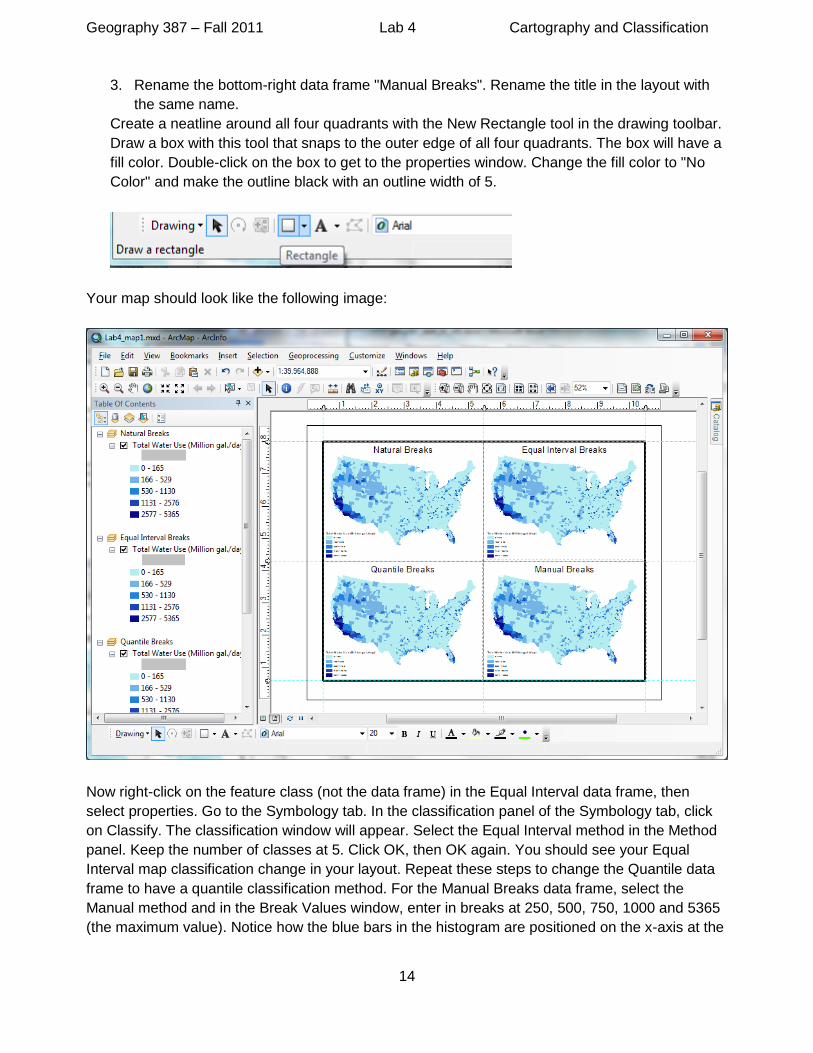
3. Rename the bottom-right data frame "Manual Breaks". Rename the title in the layout with
the same name.
Create a neatline around all four quadrants with the New Rectangle tool in the drawing toolbar.
Draw a box with this tool that snaps to the outer edge of all four quadrants. The box will have a
fill color. Double-click on the box to get to the properties window. Change the fill color to "No
Color" and make the outline black with an outline width of 5.
Your map should look like the following image:
Now right-click on the feature class (not the data frame) in the Equal Interval data frame, then
select properties. Go to the Symbology tab. In the classification panel of the Symbology tab, click
on Classify. The classification window will appear. Select the Equal Interval method in the Method
panel. Keep the number of classes at 5. Click OK, then OK again. You should see your Equal
Interval map classification change in your layout. Repeat these steps to change the Quantile data
frame to have a quantile classification method. For the Manual Breaks data frame, select the
Manual method and in the Break Values window, enter in breaks at 250, 500, 750, 1000 and 5365
(the maximum value). Notice how the blue bars in the histogram are positioned on the x-axis at the

Geography 387 – Fall 2011 Lab 4 Cartography and Classification
15
corresponding break values. You can manually slide these bars to your desired break values as
well. Experiment with both ways of setting manual breaks.
Click OK, then OK again. Be sure to save your map document.

Geography 387 – Fall 2011 Lab 4 Cartography and Classification
16
Map 1 (7)
Make a map of total daily water use for the counties in the 48 conterminous states +
Washington DC. The map should have four panels, each with a different
classification method: Natural Breaks, Equal Interval, Quantile, and Manual. Export
the map to a PDF file with 150 dpi.
7.0 Create a map of annual ground water use per hectare One problem with our maps is that there is a positive relationship between the size of the county and the water usage. We do not know if greater gallons/day for a county is just because the county is bigger or if there really is more water use at every location in the area. One method to minimize the effect of polygon size is to normalize the data by polygon area. That is, we can divide the total daily water use by the area of the polygon, creating a density of water usage by area. The units in our classification would then be Million gallons per day per unit area (e.g., Million gal/day/m2 for a Albers projection). In this part of the lab, we will create a map of groundwater use per hectare for the whole of year 2000. One helpful way to learn about map design is to start with the built-in ESRI map templates. We will start out by opening a template for the conterminous United States. Create a new map document, click on USA under Templates - Traditional Layouts, then select the ConterminousUSA map document template. Set the default geodatabase to your Lab 4 geodatabase. Click OK.

Geography 387 – Fall 2011 Lab 4 Cartography and Classification
17
The template data is grouped in a Basemap Layer. Right-click on “Basemap” in the TOC and
select “Ungroup”. Add your counties feature class and water use table from your geodatabase.
Move the county feature class down in draw order in the TOC, below the State Boundaries layer.
You will have to move from the Source tab to the Display tab to move the layer order. (When you
add a table, ArcMap automatically switches to the Source tab, which shows both spatial and non-
spatial data that are loaded with the data file paths). Turn off the States layer. Do not worry about
fixing the legend, title, etc. until after we symbolize our county data with annual ground water use.
Save your map document (e.g. “Lab4_map2”).
One problem that we will run into with the counties layer is that some counties have multiple
polygons, each with a different area. Let's investigate this a bit. Open the attribute table for the
county feature class and make a Select By Attribute query for 'Miami-Dade County’. (Be sure your
selection layer is your county feature class). You can zoom into the selected set by going to
Selection in the top menu, then "Zoom To Selected Features". It may also help to make the lines
less thick. You can do this by going to the county feature class properties, Display tab and
unchecking "Scale symbols when a reference scale is set". You can get to the extent of the entire
counties layer again by right-clicking the county feature class and selecting "Zoom To Layer".

Geography 387 – Fall 2011 Lab 4 Cartography and Classification
18
Question 6: (3)
a. How many polygons are there in the entire county feature class?
b. How many polygons make up Miami-Dade County? Why does this county need
separate polygons?
These multiple polygons per county will affect our normalization of ground water by area. This is
because the ground water data is for the whole county, while our area for the county can be
divided among many polygons. We need the total area for the entire county. We can remedy this
problem by grouping all polygons from the same county into one "multi-polygon". The county's
polygons will remain separated, but all will share one row in the attribute table, including a total
area. We will do this with the Dissolve tool in ArcToolbox.
Start by clearing your selected features. You do this by going to Selection in the top menu bar,
then "Clear Selected Features". Open the Dissolve tool (Remember this tool from Lab 4? Last time
we dissolved by state name). Select the FIPS field for the dissolve. Each county in the US has a
unique FIPS number, so this is similar to dissolving by County name. But, you may recall from Lab
1 that some county names are used in more than one state, and we would not want to dissolve
those counties together. Since the FIPS code is unique for each county, this is the correct choice.
Also, we will need the FIPS number for a join later on, so use FIPS for the dissolve field. Save your
output in your Lab 4 geodatabase and give it a logical name (e.g., county_48_albers_dissolveFIP).
Be sure that the box is checked next to “Create multipart features” (we want multiple-part polygons)
and click “OK” to run the Dissolve tool. This time the Dissolve process takes a bit longer than with
states. This is because our output is not as aggregated as states... there's a lot of county geometry
to analyze, dissolve and export.

Geography 387 – Fall 2011 Lab 4 Cartography and Classification
19
Move your new dissolved feature class below the State Boundaries layer and remove your original
counties feature class. Here is a hint for the next question: the Miami-Dade County FIPS number is
'12086', and FIPS is a string data type! Be sure to clear your selected features after answering the
question.
Question 7: (3)
In your new dissolved feature class:
a. How many polygons are there in the entire dissolved feature class?
b. How many polygons make up Miami-Dade county? What is the county's total
area?

Geography 387 – Fall 2011 Lab 4 Cartography and Classification
20
Use your new skills from Section 4.0 to join the water-use table to the dissolved feature class.
Open the dissolved feature class attribute table and add a new double type field called
"Ground_Water". Calculate the total annual ground water use by multiplying the field you identified
in Question 2c by the total number of days in the year (there are 366 days, because year 2000 was
a leap year!). If you get an error about a row with a bad Object ID=223, just click Yes. This error
was caused by a county in Colorado that did not have a matching FIP number in the water use
table... missing data, argh! Since we multiplied Million gallons/day by number of days for one year,
our units are now total million gallons for year 2000. Right-click on the Ground_Water column and
select Sort Descending. You should have ground water values that look like the following:
Notice that we have an area column with units in square meters
(county_48_albers_dissolveFIP.Shape_Area). We need hectares calculated once again! Add a
double field type to the table and call it Hectares. Calculate hectares either using the Shape_Area
in Field Calculator or use Calculate Geometry with the hectares option for units. Hopefully you can
do this step without going back to the previous labs. For your reference, the above table has
values for calculated hectares matching the sorted ground water values.
We are now ready to make a new choropleth map with the total ground water use for year 2000,
normalized by area in hectares. First of all, we are done with the joined table and those extra
prefixes in the field names can be a bit annoying. Let's remove the joined table. Right-click on the
dissolved feature class, select Joins and Relates, then Remove Join(s), and then Remove All
Joins. We have now removed the joined water use table. Verify this for yourself in the dissolved
Geography 387 – Fall 2011 Lab 4 Cartography and Classification
21
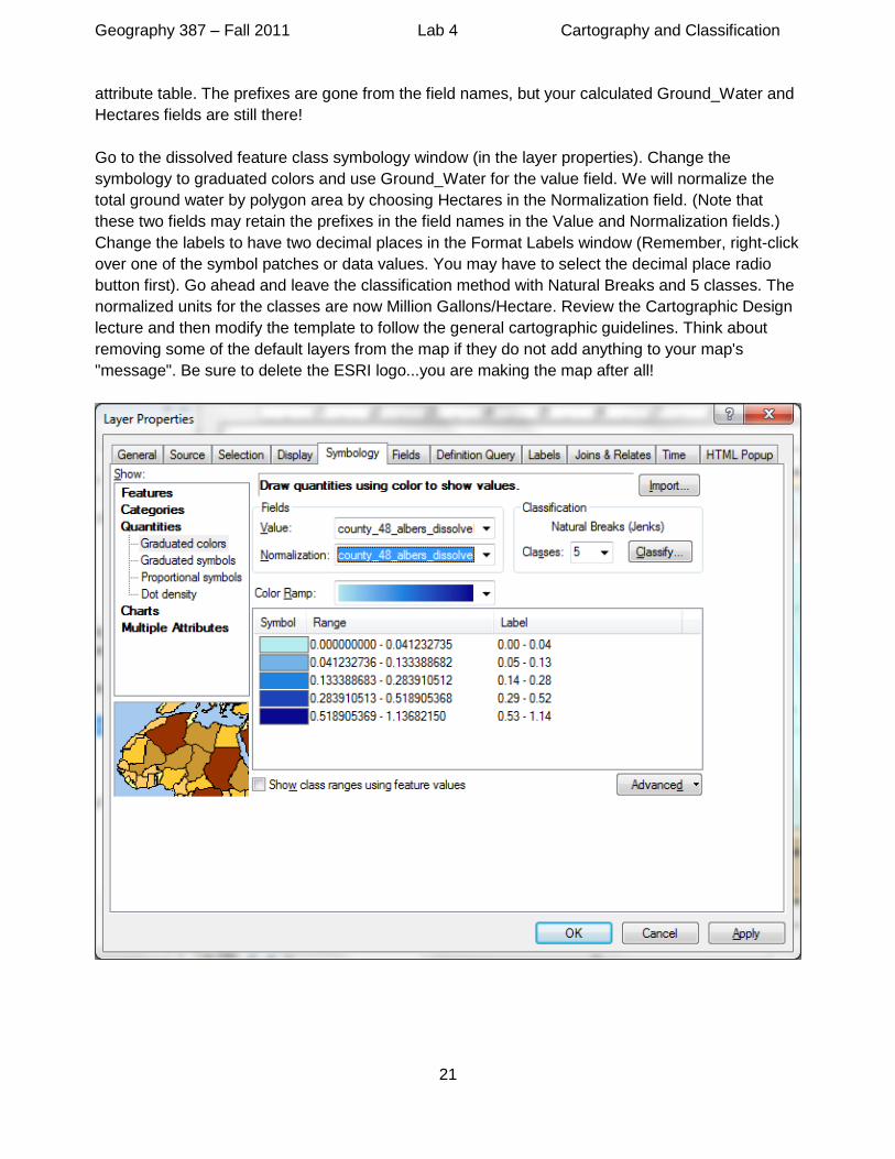
attribute table. The prefixes are gone from the field names, but your calculated Ground_Water and
Hectares fields are still there!
Go to the dissolved feature class symbology window (in the layer properties). Change the
symbology to graduated colors and use Ground_Water for the value field. We will normalize the
total ground water by polygon area by choosing Hectares in the Normalization field. (Note that
these two fields may retain the prefixes in the field names in the Value and Normalization fields.)
Change the labels to have two decimal places in the Format Labels window (Remember, right-click
over one of the symbol patches or data values. You may have to select the decimal place radio
button first). Go ahead and leave the classification method with Natural Breaks and 5 classes. The
normalized units for the classes are now Million Gallons/Hectare. Review the Cartographic Design
lecture and then modify the template to follow the general cartographic guidelines. Think about
removing some of the default layers from the map if they do not add anything to your map's
"message". Be sure to delete the ESRI logo...you are making the map after all!

Geography 387 – Fall 2011 Lab 4 Cartography and Classification
22
You may want to stretch your legend out horizontally. You can have your dissolved feature class fill
a second column in the legend by selecting it in the Legend Properties window, then checking the
"Place in new column" option. See the screen shot below. After working with the legend, edit the
title of the map, and rearrange the other elements in the layout so that everything fits.
Map 2 (7)
Using the map template, make a map of the year 2000 ground water use for the
counties in the 48 conterminous states. Use natural breaks based on the ground
water normalized by hectares. Chose a color scheme that clearly shows the
difference among the different classes. Be sure to include a meaningful title, legend,
scale bar, your name, etc. Export the map to a PDF file with 150 dpi.
Geography 387 – Fall 2011 Lab 4 Cartography and Classification
23
Question 8: (2)
You should see an interesting pattern of total ground water use in the Great Plains
area region. Where is all that ground water coming from and which states are
affected? (BIG hint: type in "high plains aquifer" in Google).
Map 3 (3)
Download the aquifer shapefile from the National Atlas, Water raw data download
area. Select the "High Plains Aquifer" and export the polygon to a new feature class
in your geodatabase. Add the new aquifer feature class to your Map 2, and rename
the layer to an appropriate name (in TOC) so it makes sense to the average person
when reading the Legend. Export Map 3 to a PDF file with 150 dpi. Be sure to
actually look at your map and interpret what you see… an interesting spatial
correlation with water usage...
8.0 Conclusions
You have now learned how to join an attribute table of water-use statistics to a geographic data layer based on a common attribute. You will find that the ability of the GIS to function as a relational database management system (RDBMS) is a powerful way to connect non-spatial data to spatial features for visualization and analysis. Imagine working with just the water-use data in a database or spreadsheet. You could make a graph or summary table, but you wouldn't see spatial patterns. With the GIS we were able to see how water use is distributed across the United States. We could then see that certain areas had more water use than others in a non-random way. It was apparent that one large area in the Great Plains had water-use linked to an underground feature, not a major above-ground river.
9.0 To turn in
● Your answers to the 8 questions in a Word document (23)
● Map 1 (pdf format) (7) ● Map 2 (pdf format) (7) ● Map 3 (pdf format) (3)
Submit electronic files via email to your instructor, with the subject "G387, Lab 4, [your last name]".
Remember to put your last name before each file name (e.g., clark_lab4.docx,
clark_lab4_map1.pdf, etc.). We will deduct 0.5 points for each file not properly named.
Credits: The original version of this lab module was developed for instruction at Sonoma State
University by Matthew Clark and expanded for ArcGIS 10 by Elizabeth Lotz.


![Data Mining - [2] Classification - 07 - Feature Selection](https://static.fdocuments.net/doc/165x107/61a90a7cc6cb190dbd05c382/data-mining-2-classification-07-feature-selection.jpg)