Julie Baughman Portfolio
11
Julie Baughman
-
Upload
julie-baughman -
Category
Education
-
view
83 -
download
0
Transcript of Julie Baughman Portfolio

Julie Baughman

Baughman Page 2 Baughman Page 3
Julie Baughman16945 W. Elk TrailMarana, AZ 85653520 682 [email protected]://juliebaughmanblog.wordpress.com/
4 Infographic
6 Web Page Mockup
8 Brochure
10 Photodesign
12 Business Identity
14 HTML/CSS Coding
16 Magazine Cover
18 Photomontage
20 Prezi Presentation

Baughman Page 4 Baughman Page 5
DATE:November 2, 2016
course:Visual Media 130 Section 15
Instructor:Jason Stucki
program(s)/tools:Adobe Photoshop and Adobe Illustrator
OBJECTIVES:Create an infographic on a topic that is to be shared on a company’s blog and Pinterest Board using Adobe Illustrator.
process:Before I began this project, I searched for good examples of infographics on Pinterest and Google. I then began to brainstorm topics and I decided that my topic would be Arizona.
I started researching facts about Arizona. I found this website that had one hundred facts about this state. I thought this would be a good resource to use for my infographic.
I sketched different layout designs and different icons for the infographic. I sketched a heart, a mule’s head, a thermometer and other icons.
After sketching ideas, I began to create the infographic in Adobe Illustrator. I searched the internet for different backgrounds. I decided to create a textured background in Adobe Photoshop.
After creating the background, I started creating the different icons for each state fact using Illustrator. I traced a US map to trace the six largest states for the infographic.
Once the background and icons were finished, I started to lay them out in Illustrator. Once the layout was complete, I worked on alignment of text and images. I was able to complete the infographic on Arizona.

Baughman Page 6 Baughman Page 7
DATE:November 16, 2016
course:Visual Media 130 Section 15
Instructor:Jason Stucki
program(s)/tools:Adobe Photoshop and Adobe Illustrator
OBJECTIVES:Create a company website mockup using Adobe Photoshop.
process:I decided to create a website mockup of Lucy’s Lemonade which I used for my previous projects. I searched website design layouts to get inspiration. Then I sketched three different layouts for the mockup. After I sketched, I created a shape map using a 12-column grid.
Once I created the shape map, I started to add text and pictures to the shape map. I resized and adjusted the logo for Lucy’s Lemonade in Adobe Illustrator and placed it in the header section of the mockup. I created the navigation bar and the company’s motto in the header.
I searched for pictures online and I found a large picture of lemons on a tree. I thought that would be a great banner for the website. I changed my layout to fit a banner in the design. I found three pictures for the main sections of the website which are Lemonade, Lemon Pastries, and Orchard Tours.
After I found the main pictures, I searched for a subtle background. I was able to find a background that had light gray circles. I thought that the circles would go with the shape of the lemon.
I worked on the alignment of the three sections with the banner. I also added copyright information and social media icons to the footer section. I was able to complete the website mockup for Lucy’s Lemonade.

Baughman Page 8 Baughman Page 9
DATE:November 30, 2016
course:Visual Media 130 Section 15
Instructor:Jason Stucki
program(s)/tools:Adobe InDesign, Adobe Photoshop and Adobe Illustrator
OBJECTIVES:Create a brochure for a company.
process:I started out brainstroming ideas on brochure topics. A family friend suggested that I create a brochure about a pig store since she loves pigs. I decided that I would make a brochure for Oink’s Pig Palace.
I started sketching different kinds of brochures. I decided to do a traditional tri-fold brochure with a cut-out on the front cover. I researched the measurements for the fold lines of the brochure.
I started gathering photos of pigs and pig related items. I used Adobe Illustrator to create a logo for Oink’s Pig Palace. I used different shapes to create a pig’s face for the logo. I used a sans-serif type for the name of the company. I sampled the color of a actual pig to get a realistic pig color for my logo and my color scheme.
I wrote body copy for the brochure. I had three main sections- History, Piggy Facts and Piggy Products.
I started to create the brochure in Adobe InDesign. I set up my margins and fold lines. I also determined the location of the cut-out. I started placing text and graphics in the document.
In Illustrator, I created a pig body graphic for my Piggy Facts section. I used Adobe Photoshop to crop and adjust color of the pictures to match more of the color scheme. After completion, I was able to print the brochure at a copy store.

Baughman Page 10 Baughman Page 11
DATE:October 12, 2016
course:Visual Media 130 Section 15
Instructor:Jason Stucki
program(s)/tools:Adobe Photoshop
OBJECTIVES:Create a photodesign thats a color scheme that has a image and design elements.
process:When I first started working on this project, I wanted to do something with nature.I went driving around and took different pictures of nature. I went to a new outlet mall that had many plants and flowers on their grounds. I was able to capture a butterfly that landed on a flower. I used the butterfly picture as the main picture of my photodesign. I edited the picture in Adobe Photoshop.
I searched for a quote to connect with the butterfly and flowers picture. I found a quote by Lady Bird Johnson about flowers and hope.
I placed the butterfly picture and the quote in a new document. I decided to use different sizes of horizontal yellow lines for my design element. I used a white box with low opacity to house my quote in. I was able to work on the alignment of the quote, horizontal lines and the white box. I completed the photodesign project.

Baughman Page 12 Baughman Page 13
DATE:October 26, 2016
course:Visual Media 130 Section 15
Instructor:Jason Stucki
program(s)/tools:Adobe InDesign and Adobe Illustrator
OBJECTIVES:Design a company logo to be used for a letterhead and business card.
process:I searched online for examples of different company’s logos. I brainstormed different ideas for companies. I decided on a company that makes lemonade. I came up with Lucy’s Lemonade.
I digitally sketched some ideas for a logo. I came up with three different logos. I asked friends, family and classmates for feedback. I decided to use the logo that people liked most.
I started to design the letterhead in Adobe InDesign. I placed the logo on the left corner with the contact information on the right corner. I used a left alignment for the text to draw the viewer to the logo. I used a lemon as a watermark. I used a line of lemons on the left margin.
I designed the business card. I used the same elements as the letterhead to create the front of the business card. I decided to put the lemon and the green circle from the logo on the back of the business card. I completed the letterhead and business card designs.
Baughman Page 14 Baughman Page 15
DATE:November 9, 2016
course:Visual Media 130 Section 15
Instructor:Jason Stucki
program(s)/tools:Notepad ++ and Adobe Illustrator
OBJECTIVES:Create a custom web page using HTML and CSS to highlight your business identity logo.
process:I started this project by resizing my logo from the business identity project in Adobe Illustrator.
I researched examples of this project from past students. I thought of ways on how to design my layout of the web page. I opened up an HTML document in Notepad ++.
I started creating content for the web page in my HTML file. I typed up differentsections of how I designed my business logo. Some of the sections were inspiration, Adobe Illustrator skills, audience and design skills.
After I created the content, I began to stylize the content by using a CSS file. I opened a CSS file and linked it to the HTML file. Using CSS, I added a light green background. I also added color to the headings and I created a button.
After I created the HTML and CSS file, I was able to validate and fix errors.
Baughman Page 16 Baughman Page 17
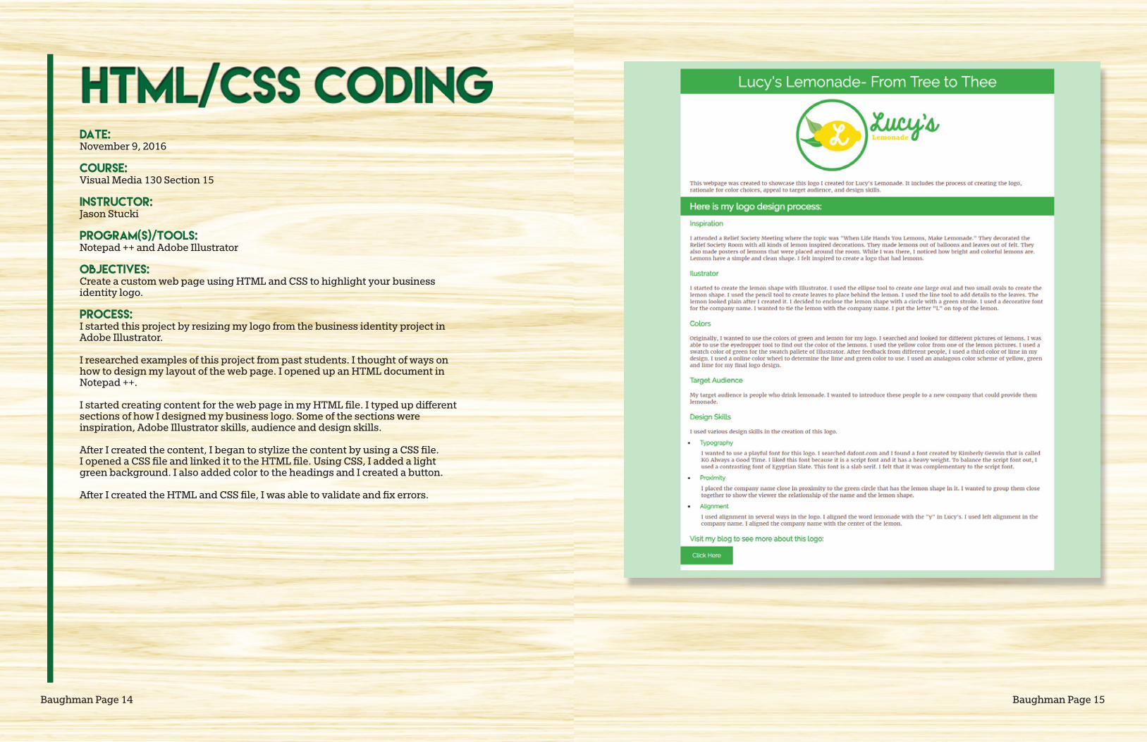
DATE:September 28, 2016
course:Visual Media 130 Section 15
Instructor:Jason Stucki
program(s)/tools:Adobe InDesign and Adobe Photoshop
OBJECTIVES:Create a magazine cover that features a picture and articles about myself.
process:I started by looking at different examples of magazines covers online. I began to formulate a plan for my magazine cover. I came up with names of articles of thingsthat described my life and interest. I wanted to have an article about family history, motherhood and vacations.
I sketched four design layouts. Based on my sketches, I was able to create a shape map of my design layout.
My family went near the Saguaro National Park to take pictures of myself and myfamily. I was able to use one of the pictures for the main magazine cover picture. I cropped and adjusted colors in Adobe Photoshop.
I started to place pictures and articles headlines in the Adobe InDesign document. I was able to make a circle graphic for one of the articles in Adobe Photoshop. I completed the magazine cover.
azfamilyArizona’s Best Resource for Family Fun and Adventures
Ancestors10
Vacations on a Budget
Exclusive
Easy Tips toFind Your
Bearizona
Sept 2016 Edition 22
Family Tour of
Baughman Page 18 Baughman Page 19
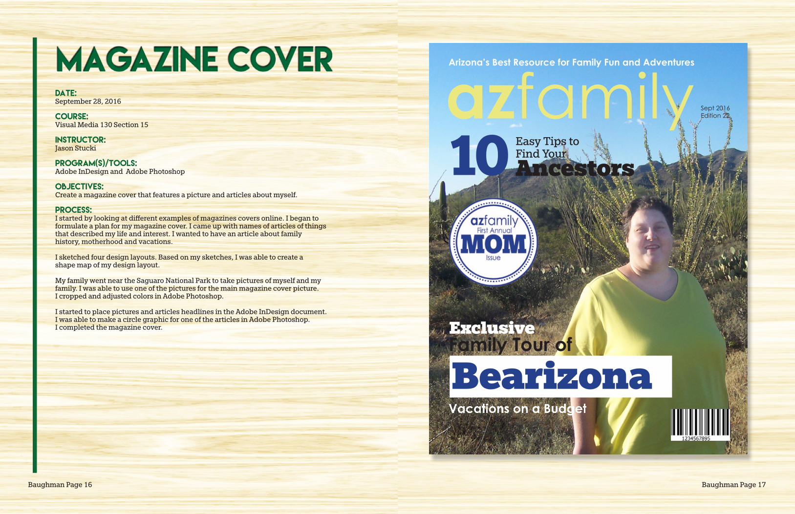
DATE:October 19, 2016
course:Visual Media 130 Section 15
Instructor:Jason Stucki
program(s)/tools:Adobe Photoshop
OBJECTIVES:Design a spiritual poster montage using images and text.
process:I researched past examples of photomontages. I wanted a family history theme for my montage. I decided to use a picture of my great-grandmother, Lulu Brady and the Salt Lake City Temple.
I placed the temple picture in a new image in Adobe Photoshop. Once it was placed in, I used a blur filter on the temple image. I created a layer mask to make the temple not blurry.
Then I placed Lulu Brady’s picture in the design. I put her image on top of the temple. I created a layer mask to blend the two pictures together.
I placed a paper image on top of the temple and the picture of Lulu Brady. I changed the opacity of the paper. I created a layer mask to uncover the temple image.
I found a quote by Russell M. Nelson about family history. I added it to the photomontage. Then I was able to complete the photomontage.
Baughman Page 20 Baughman Page 21
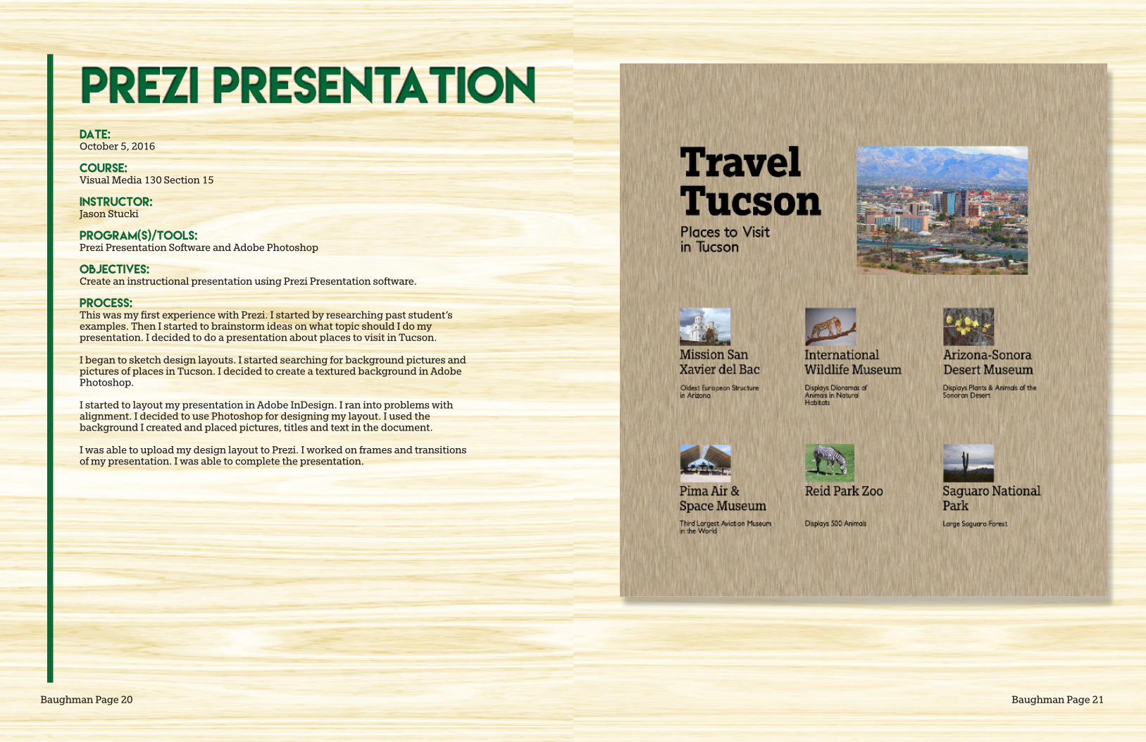
DATE:October 5, 2016
course:Visual Media 130 Section 15
Instructor:Jason Stucki
program(s)/tools:Prezi Presentation Software and Adobe Photoshop
OBJECTIVES:Create an instructional presentation using Prezi Presentation software.
process:This was my first experience with Prezi. I started by researching past student’s examples. Then I started to brainstorm ideas on what topic should I do my presentation. I decided to do a presentation about places to visit in Tucson.
I began to sketch design layouts. I started searching for background pictures and pictures of places in Tucson. I decided to create a textured background in Adobe Photoshop.
I started to layout my presentation in Adobe InDesign. I ran into problems with alignment. I decided to use Photoshop for designing my layout. I used the background I created and placed pictures, titles and text in the document.
I was able to upload my design layout to Prezi. I worked on frames and transitionsof my presentation. I was able to complete the presentation.