JMP® versus JMP® Clinical for Interactive Visualization · PDF fileJMP® versus...
11
1 PharmaSUG 2013 - Paper DG06 JMP® versus JMP® Clinical for Interactive Visualization of Clinical Trials Data Doug Robinson, SAS Institute, Cary, NC Jordan Hiller, SAS Institute, Cary, NC ABSTRACT JMP software has a large set of visualization and analysis tools that can be used to analyze many different kinds of data; JMP Clinical is designed specifically for point-and-click analysis of SDTM and/or ADaM formatted data. Both applications are widely used for cleansing, monitoring, and reviewing clinical trials data. Although JMP and JMP Clinical differ in terms of the input data format that is required and the output that is produced, they share the JMP philosophy of enabling users to produce interactive and dynamic data visualizations that enhance understanding of the data. This paper will show examples of analysis of clinical trials data in both JMP and JMP Clinical, and compare the benefits of each. INTRODUCTION Data visualization can greatly enhance the speed and accuracy of clinical trial safety review (Amit et al., 2008; Mann, 2011). Most SAS® users are familiar with the many graphing capabilities available in SAS/GRAPH, but may not be familiar with two SAS products that are particularly well-suited for visual safety review: JMP and JMP Clinical. JMP software, first released in 1989, is a robust and mature platform for interactive visualization and data analysis. JMP Clinical, introduced in 2011, is built on top of both JMP and SAS, and is designed specifically for analysis of SDTM and/or ADaM formatted data. Here we show examples of adverse events analysis in both of these systems and compare their capabilities. ADVERSE EVENTS ANALYSIS IN JMP CLINICAL JMP Clinical requires data in SDTM and/or ADaM format for analysis. Here we show an example using the example Nicardipine dataset that is included with JMP Clinical. To examine the distribution of adverse events in JMP Clinical, select Events > AE Distribution from the Clinical Starter menu. The launch dialog for this analysis is shown in Display 1. Although there are several options for modifying the analysis (such as restricting the sample to selected patients or examining only serious adverse events), here we accept the defaults and click the Run button in the lower left. Display 1. JMP Clinical Launch Dialog for AE Distribution Analysis
Transcript of JMP® versus JMP® Clinical for Interactive Visualization · PDF fileJMP® versus...
1
PharmaSUG 2013 - Paper DG06
JMP® versus JMP® Clinical for Interactive Visualization of Clinical Trials Data
Doug Robinson, SAS Institute, Cary, NC Jordan Hiller, SAS Institute, Cary, NC
ABSTRACT
JMP software has a large set of visualization and analysis tools that can be used to analyze many different kinds of data; JMP Clinical is designed specifically for point-and-click analysis of SDTM and/or ADaM formatted data. Both applications are widely used for cleansing, monitoring, and reviewing clinical trials data. Although JMP and JMP Clinical differ in terms of the input data format that is required and the output that is produced, they share the JMP philosophy of enabling users to produce interactive and dynamic data visualizations that enhance understanding of the data. This paper will show examples of analysis of clinical trials data in both JMP and JMP Clinical, and compare the benefits of each.
INTRODUCTION
Data visualization can greatly enhance the speed and accuracy of clinical trial safety review (Amit et al., 2008; Mann,
2011). Most SAS® users are familiar with the many graphing capabilities available in SAS/GRAPH, but may not be
familiar with two SAS products that are particularly well-suited for visual safety review: JMP and JMP Clinical. JMP software, first released in 1989, is a robust and mature platform for interactive visualization and data analysis. JMP Clinical, introduced in 2011, is built on top of both JMP and SAS, and is designed specifically for analysis of SDTM and/or ADaM formatted data. Here we show examples of adverse events analysis in both of these systems and compare their capabilities.
ADVERSE EVENTS ANALYSIS IN JMP CLINICAL
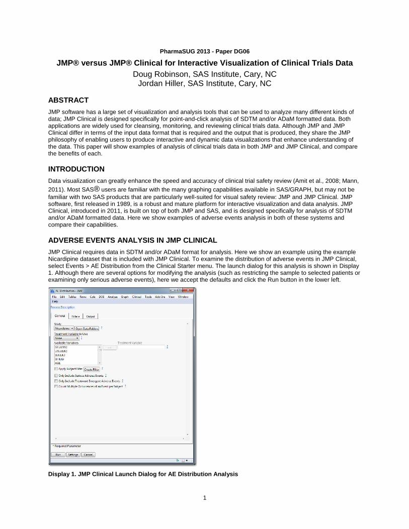
JMP Clinical requires data in SDTM and/or ADaM format for analysis. Here we show an example using the example Nicardipine dataset that is included with JMP Clinical. To examine the distribution of adverse events in JMP Clinical, select Events > AE Distribution from the Clinical Starter menu. The launch dialog for this analysis is shown in Display 1. Although there are several options for modifying the analysis (such as restricting the sample to selected patients or examining only serious adverse events), here we accept the defaults and click the Run button in the lower left.
Display 1. JMP Clinical Launch Dialog for AE Distribution Analysis
JMP versus JMP Clinical for Interactive Visualization of Clinical Trials Data, continued
2
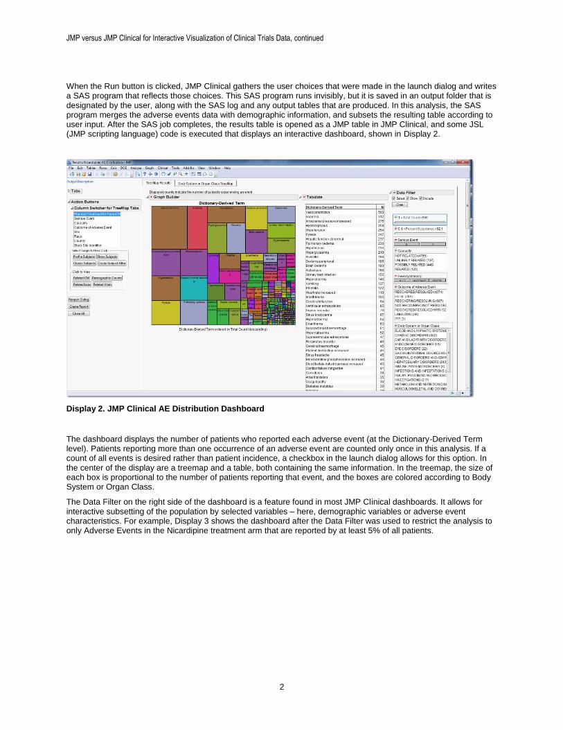
When the Run button is clicked, JMP Clinical gathers the user choices that were made in the launch dialog and writes a SAS program that reflects those choices. This SAS program runs invisibly, but it is saved in an output folder that is designated by the user, along with the SAS log and any output tables that are produced. In this analysis, the SAS program merges the adverse events data with demographic information, and subsets the resulting table according to user input. After the SAS job completes, the results table is opened as a JMP table in JMP Clinical, and some JSL (JMP scripting language) code is executed that displays an interactive dashboard, shown in Display 2.
Display 2. JMP Clinical AE Distribution Dashboard
The dashboard displays the number of patients who reported each adverse event (at the Dictionary-Derived Term level). Patients reporting more than one occurrence of an adverse event are counted only once in this analysis. If a count of all events is desired rather than patient incidence, a checkbox in the launch dialog allows for this option. In the center of the display are a treemap and a table, both containing the same information. In the treemap, the size of each box is proportional to the number of patients reporting that event, and the boxes are colored according to Body System or Organ Class.
The Data Filter on the right side of the dashboard is a feature found in most JMP Clinical dashboards. It allows for interactive subsetting of the population by selected variables – here, demographic variables or adverse event characteristics. For example, Display 3 shows the dashboard after the Data Filter was used to restrict the analysis to only Adverse Events in the Nicardipine treatment arm that are reported by at least 5% of all patients.
JMP versus JMP Clinical for Interactive Visualization of Clinical Trials Data, continued
3
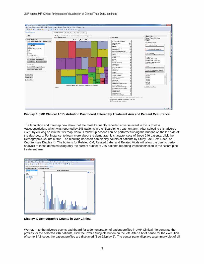
Display 3. JMP Clinical AE Distribution Dashboard Filtered by Treatment Arm and Percent Occurrence
The tabulation and treemap now show that the most frequently reported adverse event in this subset is Vasoconstriction, which was reported by 246 patients in the Nicardipine treatment arm. After selecting this adverse event by clicking on it in the treemap, various follow-up actions can be performed using the buttons on the left side of the dashboard. For instance, to learn more about the demographic characteristics of these 246 patients, click the Demographic Counts button. The resulting bar chart can display counts of patients by Study Site, Sex, Race, or Country (see Display 4). The buttons for Related CM, Related Labs, and Related Vitals will allow the user to perform analysis of those domains using only the current subset of 246 patients reporting Vasoconstriction in the Nicardipine treatment arm.
Display 4. Demographic Counts in JMP Clinical
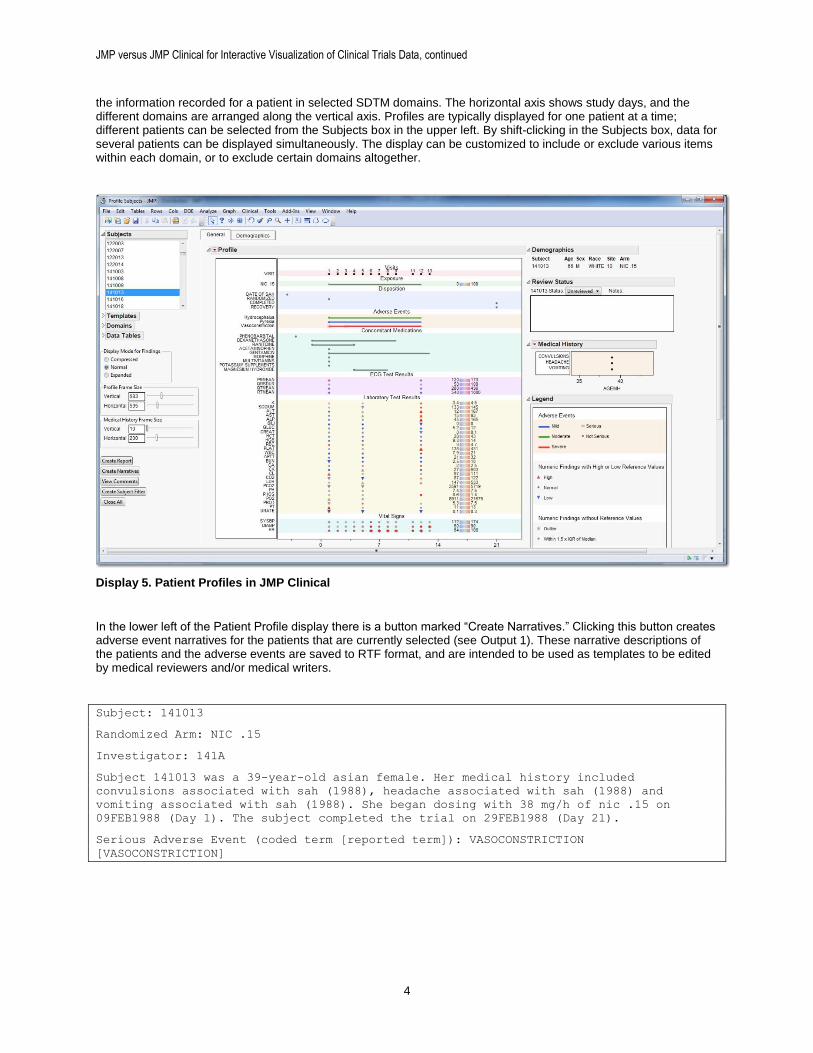
We return to the adverse events dashboard for a demonstration of patient profiles in JMP Clinical. To generate the profiles for the selected 246 patients, click the Profile Subjects button on the left. After a brief pause for the execution of some SAS code, the patient profiles are displayed (See Display 5). The center panel displays a summary plot of all
JMP versus JMP Clinical for Interactive Visualization of Clinical Trials Data, continued
4
the information recorded for a patient in selected SDTM domains. The horizontal axis shows study days, and the different domains are arranged along the vertical axis. Profiles are typically displayed for one patient at a time; different patients can be selected from the Subjects box in the upper left. By shift-clicking in the Subjects box, data for several patients can be displayed simultaneously. The display can be customized to include or exclude various items within each domain, or to exclude certain domains altogether.
Display 5. Patient Profiles in JMP Clinical
In the lower left of the Patient Profile display there is a button marked “Create Narratives.” Clicking this button creates adverse event narratives for the patients that are currently selected (see Output 1). These narrative descriptions of the patients and the adverse events are saved to RTF format, and are intended to be used as templates to be edited by medical reviewers and/or medical writers.
Subject: 141013
Randomized Arm: NIC .15
Investigator: 141A
Subject 141013 was a 39-year-old asian female. Her medical history included
convulsions associated with sah (1988), headache associated with sah (1988) and
vomiting associated with sah (1988). She began dosing with 38 mg/h of nic .15 on
09FEB1988 (Day 1). The subject completed the trial on 29FEB1988 (Day 21).
Serious Adverse Event (coded term [reported term]): VASOCONSTRICTION
[VASOCONSTRICTION]
JMP versus JMP Clinical for Interactive Visualization of Clinical Trials Data, continued
5
On 11FEB1988 (Day 3) the subject experienced a vasoconstriction (severe) which was
considered a serious adverse event (SAE). Though the event was considered serious, no
reasons were provided on the case report form. At the time of the event, the subject
was taking 38 mg/h of nic .15 and had been at this dose for 3 days. The SAE occurred 2
days after the first dose of any study medication. Trial medication had an action of
unknown as a result of the event. It is not known from the case report form if
therapeutic measures were administered to treat the event.
Adverse events that occurred within a 3-day window of the onset of the SAE included
hydrocephalus (moderate), pyrexia (mild) and vasoconstriction (severe). Concomitant
medications taken at the onset of the SAE included phenobarbital, dexamethasone,
ranitidine, acetaminophen, gentamicin, morphine, multivitamins and potassium
supplements.
The investigator considered the AE to be not related to study medication. The final
outcome of the event was reported as recovered/resolved on 20FEB1988 (Day 12).
Output 1. Adverse Event Narrative in JMP Clinical
ADVERSE EVENTS ANALYSIS IN JMP
Now we present a simple example of an analysis of adverse events in standard JMP. We also show how to capture the steps that were taken in the interactive analysis, and automate them using JSL scripting. There is more data manipulation here than in JMP Clinical, and there is some JSL code to manage, but it is not too difficult. Here are the steps:
1. Open the adverse events and demographics data sets, and merge them.
2. Create the graph(s) to be displayed.
3. Capture the JSL scripts that were created during step 1 and step 2, and edit them to create a script that performs the entire analysis.
This example uses the same Nicardipine data set that was used for the JMP Clinical analysis. Note that although this dataset uses the SDTM and ADaM models, this format is not required for analysis using JMP. We use this data for consistency, not because of format requirements. JMP is very tolerant of data in different formats.
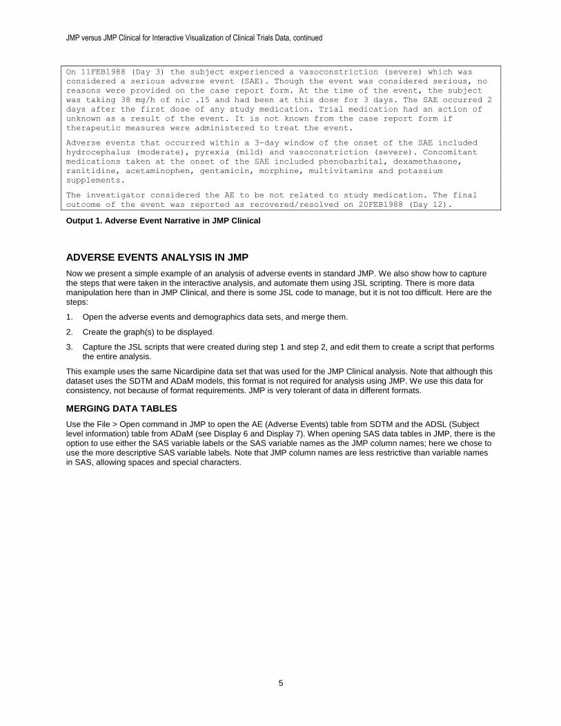
MERGING DATA TABLES
Use the File > Open command in JMP to open the AE (Adverse Events) table from SDTM and the ADSL (Subject level information) table from ADaM (see Display 6 and Display 7). When opening SAS data tables in JMP, there is the option to use either the SAS variable labels or the SAS variable names as the JMP column names; here we chose to use the more descriptive SAS variable labels. Note that JMP column names are less restrictive than variable names in SAS, allowing spaces and special characters.
JMP versus JMP Clinical for Interactive Visualization of Clinical Trials Data, continued
6
Display 6. AE Table in JMP
Display 7. ADSL table in JMP
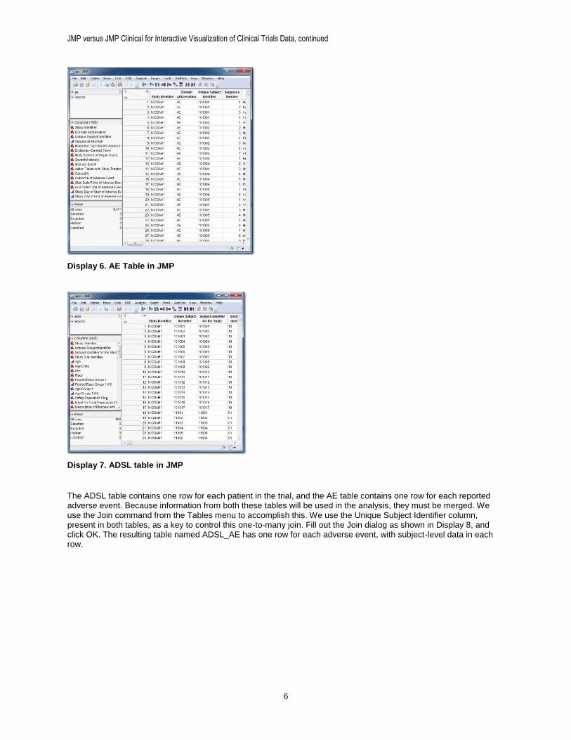
The ADSL table contains one row for each patient in the trial, and the AE table contains one row for each reported adverse event. Because information from both these tables will be used in the analysis, they must be merged. We use the Join command from the Tables menu to accomplish this. We use the Unique Subject Identifier column, present in both tables, as a key to control this one-to-many join. Fill out the Join dialog as shown in Display 8, and click OK. The resulting table named ADSL_AE has one row for each adverse event, with subject-level data in each row.
JMP versus JMP Clinical for Interactive Visualization of Clinical Trials Data, continued
7
Display 8. Join Dialog in JMP
PRODUCING THE GRAPH
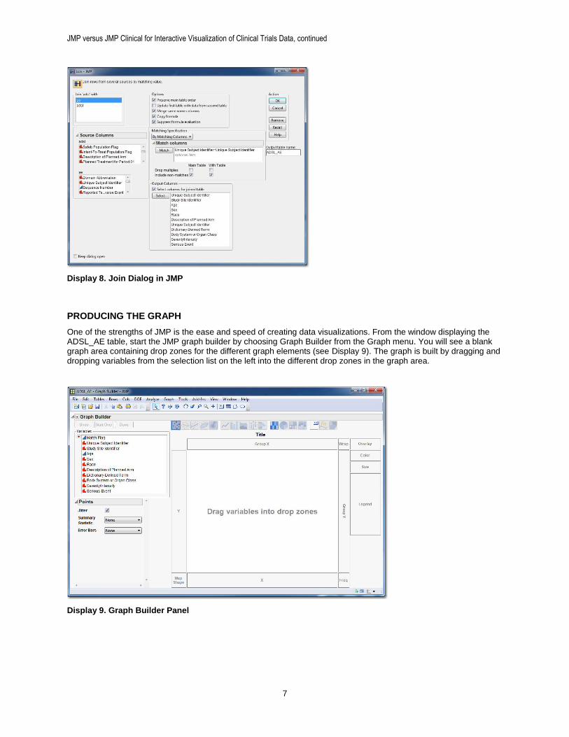
One of the strengths of JMP is the ease and speed of creating data visualizations. From the window displaying the ADSL_AE table, start the JMP graph builder by choosing Graph Builder from the Graph menu. You will see a blank graph area containing drop zones for the different graph elements (see Display 9). The graph is built by dragging and dropping variables from the selection list on the left into the different drop zones in the graph area.
Display 9. Graph Builder Panel
JMP versus JMP Clinical for Interactive Visualization of Clinical Trials Data, continued
8
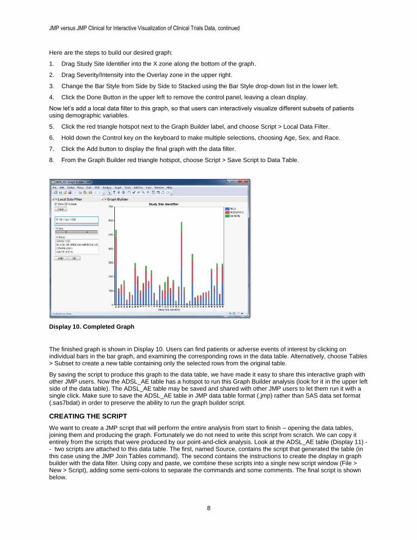
Here are the steps to build our desired graph:
1. Drag Study Site Identifier into the X zone along the bottom of the graph.
2. Drag Severity/Intensity into the Overlay zone in the upper right.
3. Change the Bar Style from Side by Side to Stacked using the Bar Style drop-down list in the lower left.
4. Click the Done Button in the upper left to remove the control panel, leaving a clean display.
Now let’s add a local data filter to this graph, so that users can interactively visualize different subsets of patients using demographic variables.
5. Click the red triangle hotspot next to the Graph Builder label, and choose Script > Local Data Filter.
6. Hold down the Control key on the keyboard to make multiple selections, choosing Age, Sex, and Race.
7. Click the Add button to display the final graph with the data filter.
8. From the Graph Builder red triangle hotspot, choose Script > Save Script to Data Table.
Display 10. Completed Graph
The finished graph is shown in Display 10. Users can find patients or adverse events of interest by clicking on individual bars in the bar graph, and examining the corresponding rows in the data table. Alternatively, choose Tables > Subset to create a new table containing only the selected rows from the original table.
By saving the script to produce this graph to the data table, we have made it easy to share this interactive graph with other JMP users. Now the ADSL_AE table has a hotspot to run this Graph Builder analysis (look for it in the upper left side of the data table). The ADSL_AE table may be saved and shared with other JMP users to let them run it with a single click. Make sure to save the ADSL_AE table in JMP data table format (.jmp) rather than SAS data set format (.sas7bdat) in order to preserve the ability to run the graph builder script.
CREATING THE SCRIPT
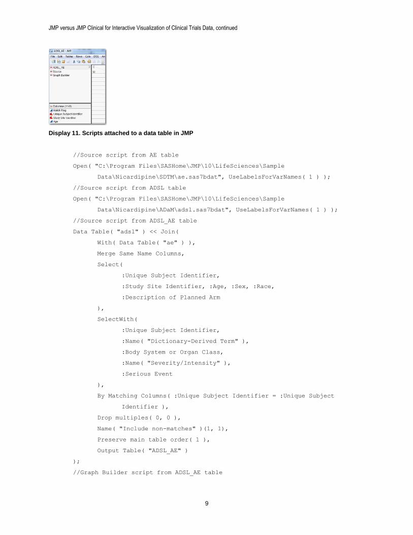
We want to create a JMP script that will perform the entire analysis from start to finish – opening the data tables, joining them and producing the graph. Fortunately we do not need to write this script from scratch. We can copy it entirely from the scripts that were produced by our point-and-click analysis. Look at the ADSL_AE table (Display 11) -- two scripts are attached to this data table. The first, named Source, contains the script that generated the table (in this case using the JMP Join Tables command). The second contains the instructions to create the display in graph builder with the data filter. Using copy and paste, we combine these scripts into a single new script window (File > New > Script), adding some semi-colons to separate the commands and some comments. The final script is shown below.
JMP versus JMP Clinical for Interactive Visualization of Clinical Trials Data, continued
9
Display 11. Scripts attached to a data table in JMP
//Source script from AE table
Open( "C:\Program Files\SASHome\JMP\10\LifeSciences\Sample
Data\Nicardipine\SDTM\ae.sas7bdat", UseLabelsForVarNames( 1 ) );
//Source script from ADSL table
Open( "C:\Program Files\SASHome\JMP\10\LifeSciences\Sample
Data\Nicardipine\ADaM\adsl.sas7bdat", UseLabelsForVarNames( 1 ) );
//Source script from ADSL_AE table
Data Table( "adsl" ) << Join(
With( Data Table( "ae" ) ),
Merge Same Name Columns,
Select(
:Unique Subject Identifier,
:Study Site Identifier, :Age, :Sex, :Race,
:Description of Planned Arm
),
SelectWith(
:Unique Subject Identifier,
:Name( "Dictionary-Derived Term" ),
:Body System or Organ Class,
:Name( "Severity/Intensity" ),
:Serious Event
),
By Matching Columns( :Unique Subject Identifier = :Unique Subject
Identifier ),
Drop multiples( 0, 0 ),
Name( "Include non-matches" )(1, 1),
Preserve main table order( 1 ),
Output Table( "ADSL_AE" )
);
//Graph Builder script from ADSL_AE table
JMP versus JMP Clinical for Interactive Visualization of Clinical Trials Data, continued
10
Graph Builder(
Size( 570, 517 ),
Show Control Panel( 0 ),
Variables(
X( :Study Site Identifier ),
Overlay( :Name( "Severity/Intensity" ) )
),
Elements(
Bar(
X,
Legend( 3 ),
Bar Style( "Stacked" ),
Summary Statistic( "Mean" )
)
),
Local Data Filter(
Location( {214, 91} ),
Add Filter(
columns( :Age, :Sex, :Race ),
Display( :Race, Size( 204, 72 ), List Display)
),
Mode( Select( 0 ), Show( 1 ), Include( 1 ) )
),
SendToReport(
Dispatch(
{}, "Study Site Identifier",
ScaleBox,
{Show Major Ticks( 0 ), Rotated Labels( "Automatic" )}
)
)
);
CONCLUSION
Both JMP and JMP Clinical can be used to produce interactive visualizations and analyses of clinical trials data.
Those who have already adopted SDTM and/or ADaM can benefit from the pre-built workflows and dashboards of JMP Clinical. Reports on Findings, Interventions and Events domains are produced automatically (as well as patient profiles and adverse events narratives). No programming or customization is required because standardized data is used for standardized reporting. JMP Clinical is especially well-suited for users who require graphing and reporting of safety data, but are not programmers or statisticians.
With a little more effort, JMP can be used to produce graphs and dashboards similar to those found in JMP Clinical. Because there is no data standard such as SDTM or ADaM, the analyses must be customized, and users must possess a greater understanding of the underlying data structure. Still, custom JMP scripts can be produced by programmers and/or statisticians, and consumed by other personnel.
JMP versus JMP Clinical for Interactive Visualization of Clinical Trials Data, continued
11
REFERENCES
Amit, O., Heiberger, R. M., & Lane, P. W. 2008. Graphical approaches to the analysis of safety data from clinical trials. Pharmaceutical Statistics, 7(1), 20-35.
Mann, G. 2011. “Driving Clinical Safety Reviews with Data Standards.” Proceedings of the SAS Global Forum 2011 Conference. Cary, NC: SAS Institute Inc. Available at http://support.sas.com/resources/papers/proceedings11/201-2011.pdf.
RECOMMENDED READING
SAS Institute Inc. 2012. JMP® 10 Scripting Guide. Cary, NC: SAS Institute Inc.
CONTACT INFORMATION
Your comments and questions are valued and encouraged. Contact the authors at:
Doug Robinson SAS Institute 919.531.9723 [email protected] Jordan Hiller SAS Institute 919.531.9809 [email protected]
SAS and all other SAS Institute Inc. product or service names are registered trademarks or trademarks of SAS Institute Inc. in the USA and other countries. ® indicates USA registration.
Other brand and product names are trademarks of their respective companies.