Distributed by Conrad Electronic SE • Klaus-Conrad-Str. 1 ...
Upload
jessica-conradCategory
view
237download
0description
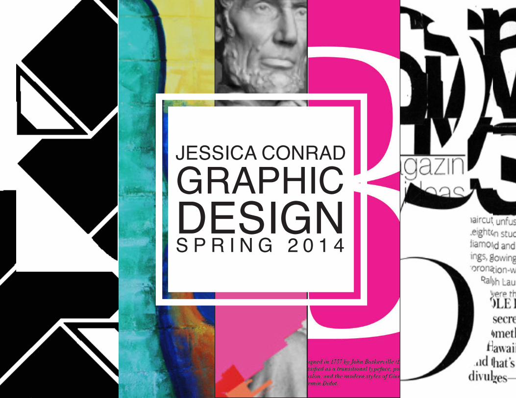
JESSICA CONRADGRAPHICDESIGNS P R I N G 2 0 1 4
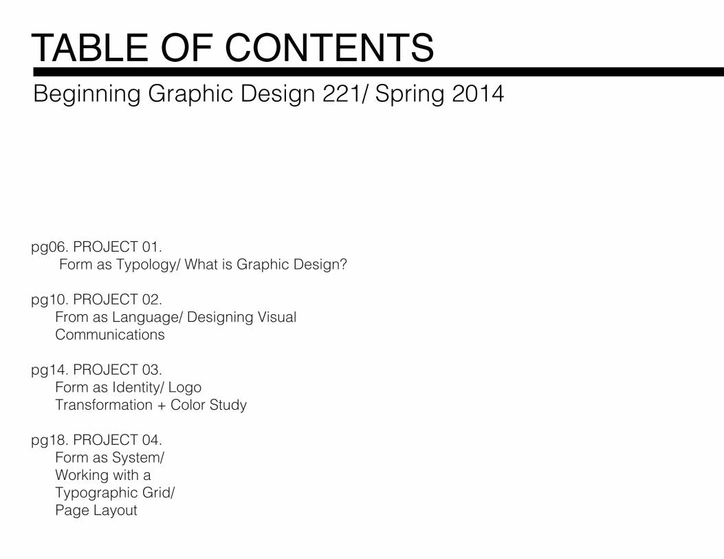
pg06. PROJECT 01. Form as Typology/ What is Graphic Design?
pg10. PROJECT 02. From as Language/ Designing Visual Communications
pg14. PROJECT 03. Form as Identity/ Logo Transformation + Color Study
pg18. PROJECT 04. Form as System/ Working with a Typographic Grid/ Page Layout
TABLE OF CONTENTSBeginning Graphic Design 221/ Spring 2014
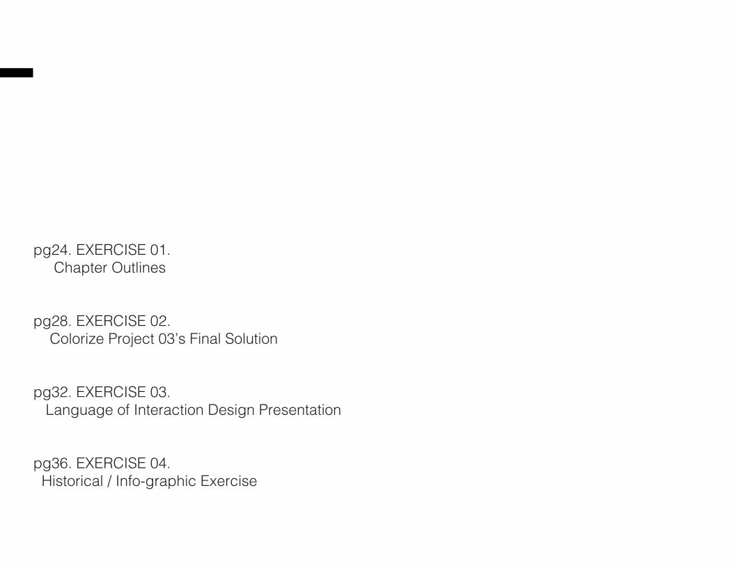
pg24. EXERCISE 01. Chapter Outlines
pg28. EXERCISE 02. Colorize Project 03’s Final Solution
pg32. EXERCISE 03. Language of Interaction Design Presentation
pg36. EXERCISE 04. Historical / Info-graphic Exercise
jessicahaleconrad.com
GRPH 221Professor Stacy AsherUniversity of Nebraska- Lincoln Department of Art + Art HistorySpring 2014
COURSE INFORMATION
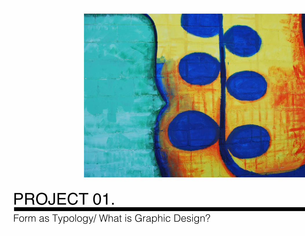
PROJECT 01. Form as Typology/ What is Graphic Design?
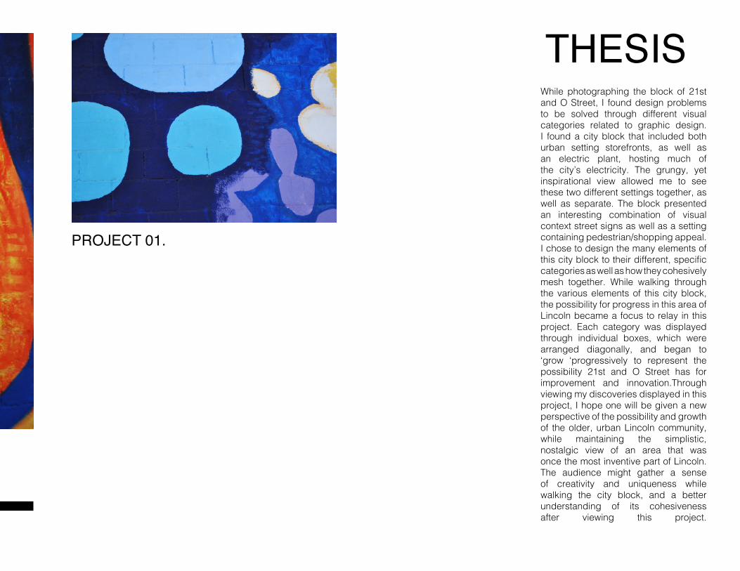
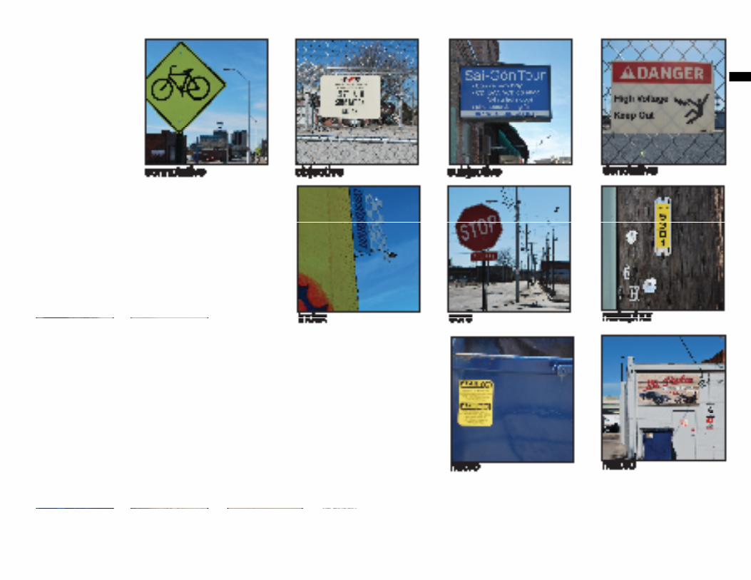
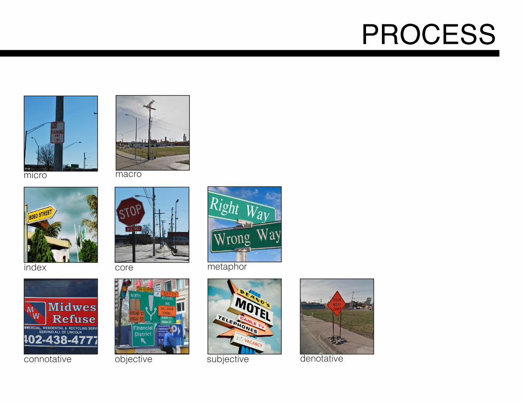
THESISWhile photographing the block of 21st and O Street, I found design problems to be solved through different visual categories related to graphic design. I found a city block that included both urban setting storefronts, as well as an electric plant, hosting much of the city’s electricity. The grungy, yet inspirational view allowed me to see these two different settings together, as well as separate. The block presented an interesting combination of visual context street signs as well as a setting containing pedestrian/shopping appeal. I chose to design the many elements of this city block to their different, specific categories as well as how they cohesively mesh together. While walking through the various elements of this city block, the possibility for progress in this area of Lincoln became a focus to relay in this project. Each category was displayed through individual boxes, which were arranged diagonally, and began to ‘grow ‘progressively to represent the possibility 21st and O Street has for improvement and innovation.Through viewing my discoveries displayed in this project, I hope one will be given a new perspective of the possibility and growth of the older, urban Lincoln community, while maintaining the simplistic, nostalgic view of an area that was once the most inventive part of Lincoln.The audience might gather a sense of creativity and uniqueness while walking the city block, and a better understanding of its cohesiveness after viewing this project.
PROJECT 01.
micro macro
metaphorindex
denotativeconnotative
core
subjectiveobjective
PROCESS
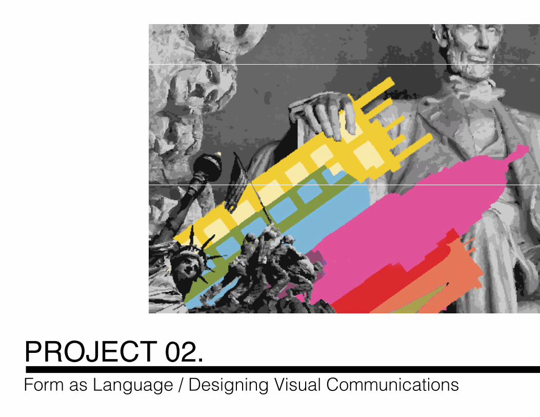
PROJECT 02.Form as Language / Designing Visual Communications
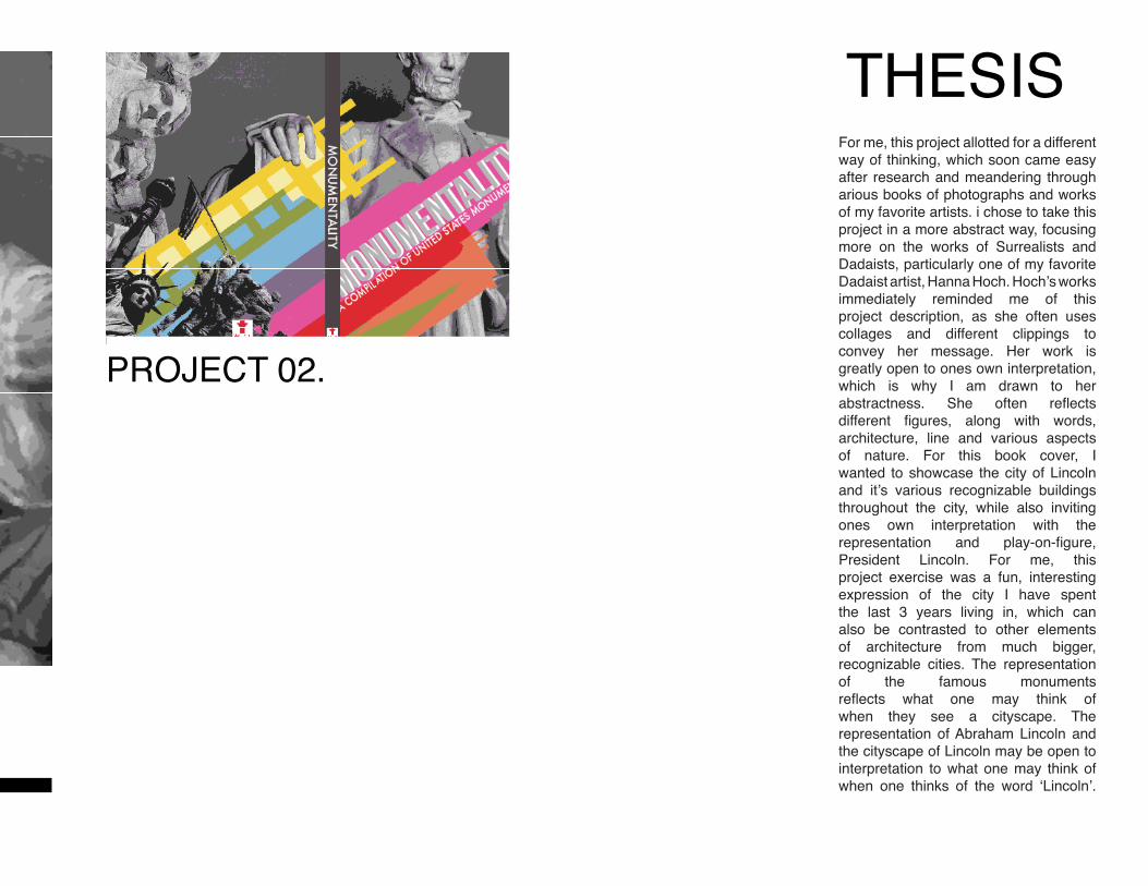
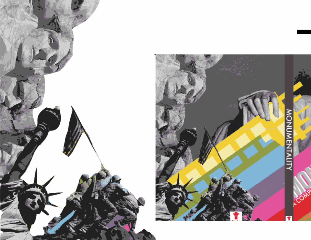
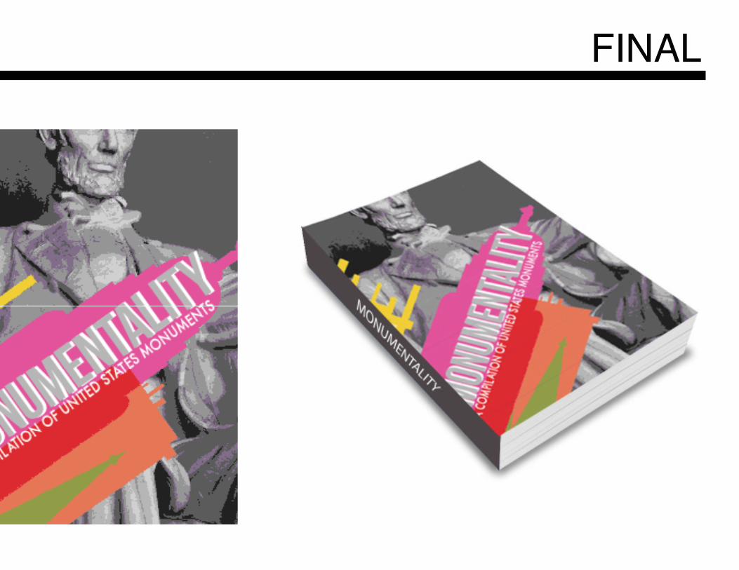
THESISFor me, this project allotted for a different way of thinking, which soon came easy after research and meandering through arious books of photographs and works of my favorite artists. i chose to take this project in a more abstract way, focusing more on the works of Surrealists and Dadaists, particularly one of my favorite Dadaist artist, Hanna Hoch. Hoch’s worksimmediately reminded me of this project description, as she often uses collages and different clippings to convey her message. Her work is greatly open to ones own interpretation, which is why I am drawn to her abstractness. She often reflects different figures, along with words, architecture, line and various aspects of nature. For this book cover, I wanted to showcase the city of Lincoln and it’s various recognizable buildings throughout the city, while also inviting ones own interpretation with the representation and play-on-figure, President Lincoln. For me, this project exercise was a fun, interesting expression of the city I have spent the last 3 years living in, which can also be contrasted to other elements of architecture from much bigger, recognizable cities. The representation of the famous monuments reflects what one may think of when they see a cityscape. Therepresentation of Abraham Lincoln and the cityscape of Lincoln may be open tointerpretation to what one may think of when one thinks of the word ‘Lincoln’.
PROJECT 02.
FINAL
PROJECT 03.Form as Identity / Logo transformation
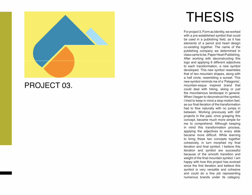
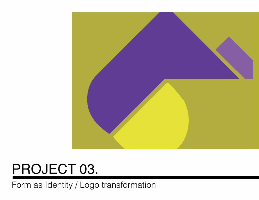
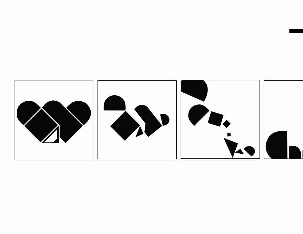
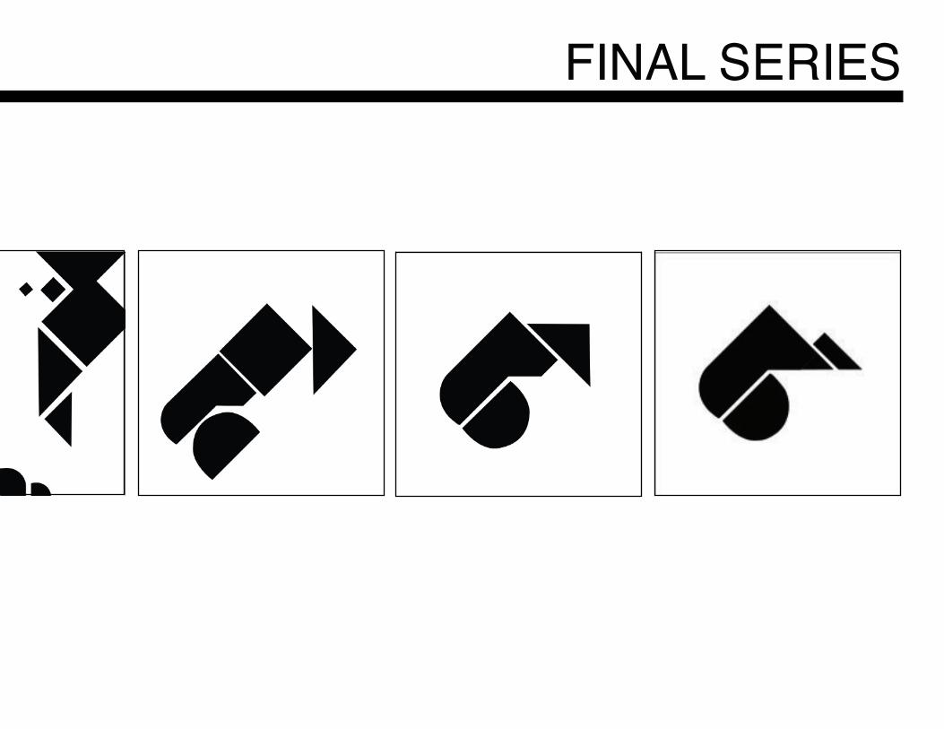
THESISFor project 3, Form as Identity, we worked with a pre-established symbol that could be used in a publishing field, as it has elements of a pencil and heart design co-existing together. The name of the publishing company we determined in class came to be, Paper Heart Publishing. After working with deconstructing this logo and applying 6 different adjectives to each transformation, a new symbol developed. This new symbol resembles that of two mountain shapes, along with a half circle, resembling a sunset. This new symbol reminds me of a ‘Patagonia’, mountain-esque inspired brand that could deal with hiking, skiing or just the mountainous landscape in general. When I began to deconstruct the symbol, I tried to keep in mind a stop-motion feel, as our final iteration of the transformation had to flow naturally with no jumps in between. Working previously with GIF projects in the past, once grasping this concept, became much more simple for me to comprehend. Although keeping in mind this transformation process, applying the adjectives to every slide became more difficult. While learning to bring these two concepts together cohesively, in turn morphed my final iteration and final symbol. I believe this iteration and symbol are successful because of the smooth transition and weight of the final mountain symbol. I am happy with how this project has evolved since the first iteration and believe this symbol is very versatile and cohesive and could do a fine job representing numerous brands under its category.
PROJECT 03.
FINAL SERIES
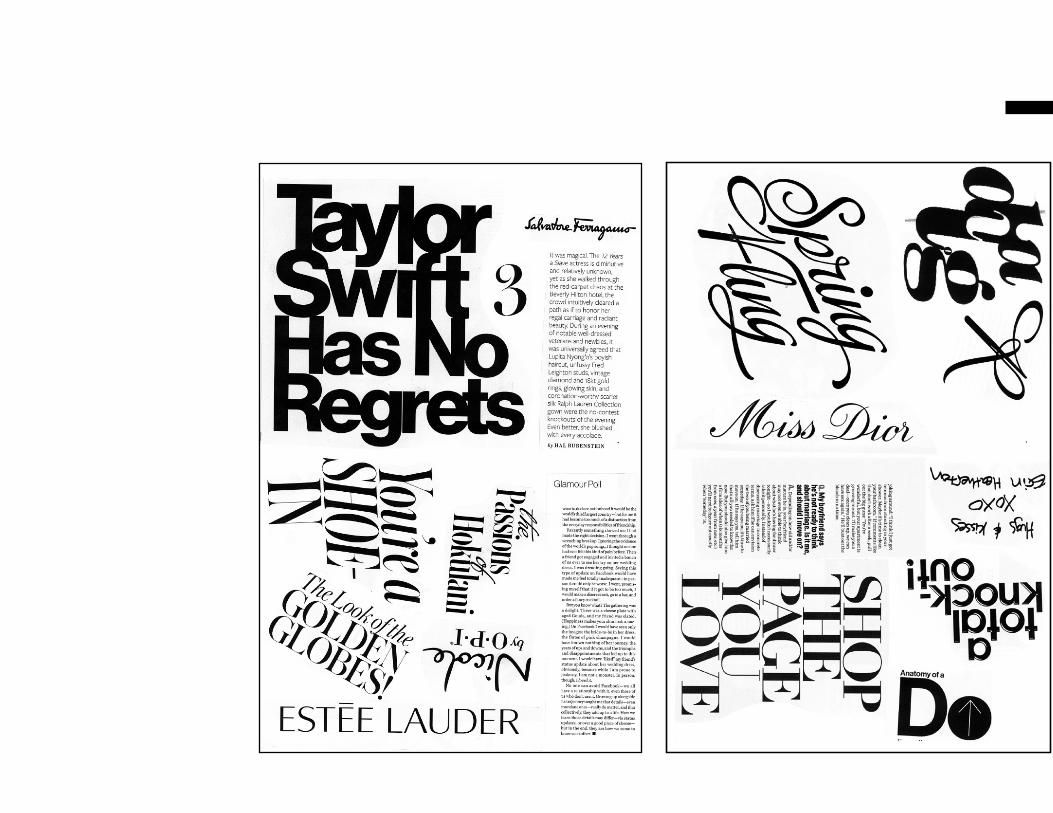
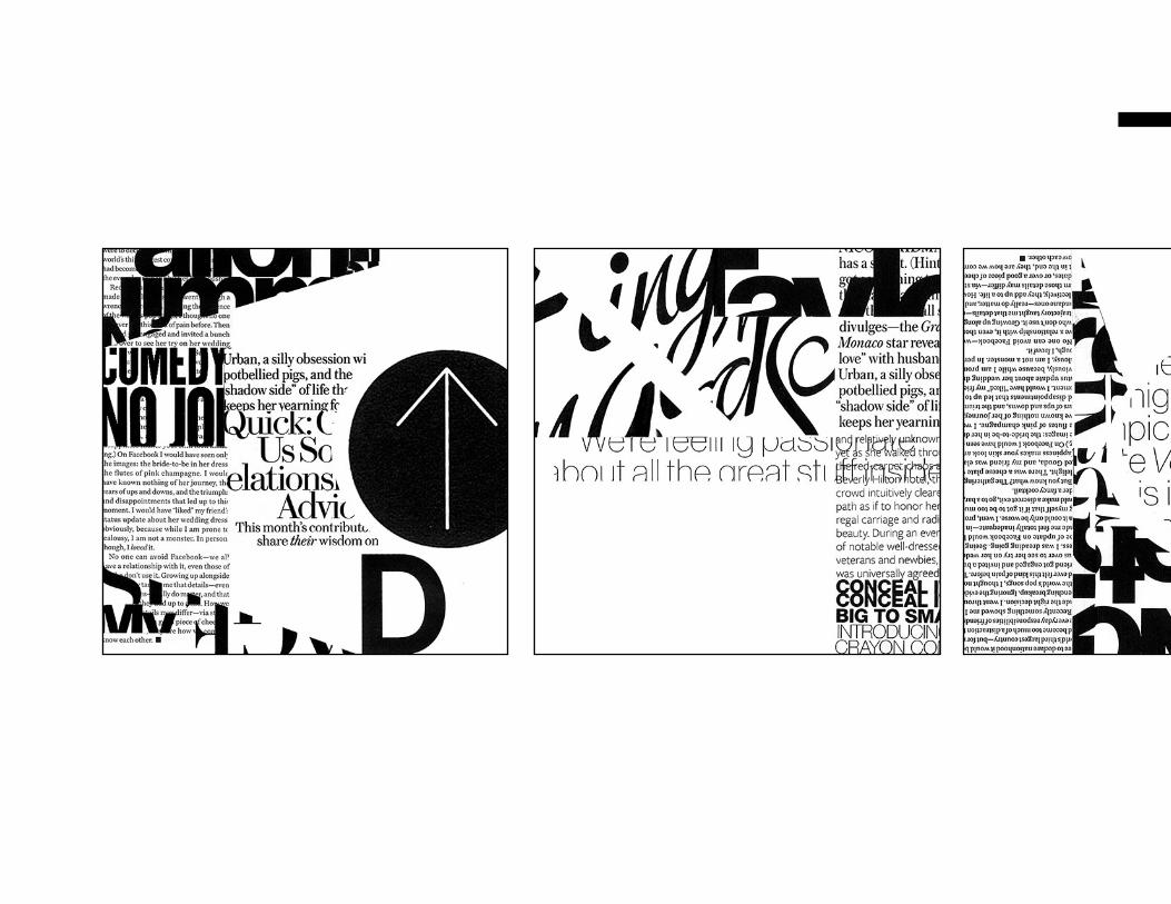
PROJECT 04.Form as System / Working with a Typographic Grid / Page Layout
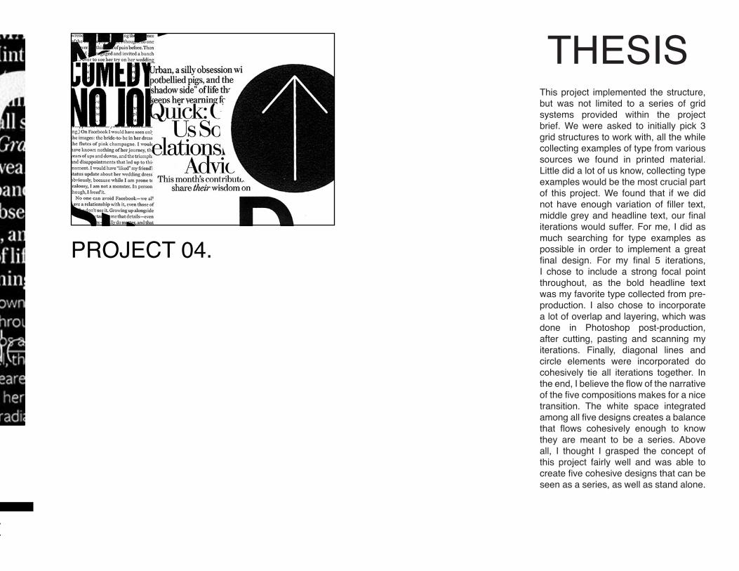
THESISThis project implemented the structure, but was not limited to a series of grid systems provided within the project brief. We were asked to initially pick 3 grid structures to work with, all the while collecting examples of type from various sources we found in printed material. Little did a lot of us know, collecting type examples would be the most crucial part of this project. We found that if we did not have enough variation of filler text, middle grey and headline text, our final iterations would suffer. For me, I did as much searching for type examples as possible in order to implement a great final design. For my final 5 iterations, I chose to include a strong focal point throughout, as the bold headline text was my favorite type collected from pre-production. I also chose to incorporate a lot of overlap and layering, which was done in Photoshop post-production, after cutting, pasting and scanning my iterations. Finally, diagonal lines and circle elements were incorporated do cohesively tie all iterations together. In the end, I believe the flow of the narrative of the five compositions makes for a nice transition. The white space integrated among all five designs creates a balance that flows cohesively enough to know they are meant to be a series. Above all, I thought I grasped the concept of this project fairly well and was able to create five cohesive designs that can be seen as a series, as well as stand alone.
Form as System / Working with a Typographic Grid / Page Layout
PROJECT 04.
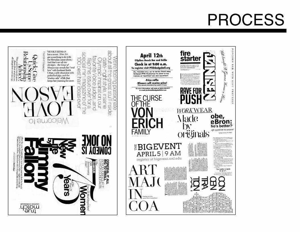
PROCESS
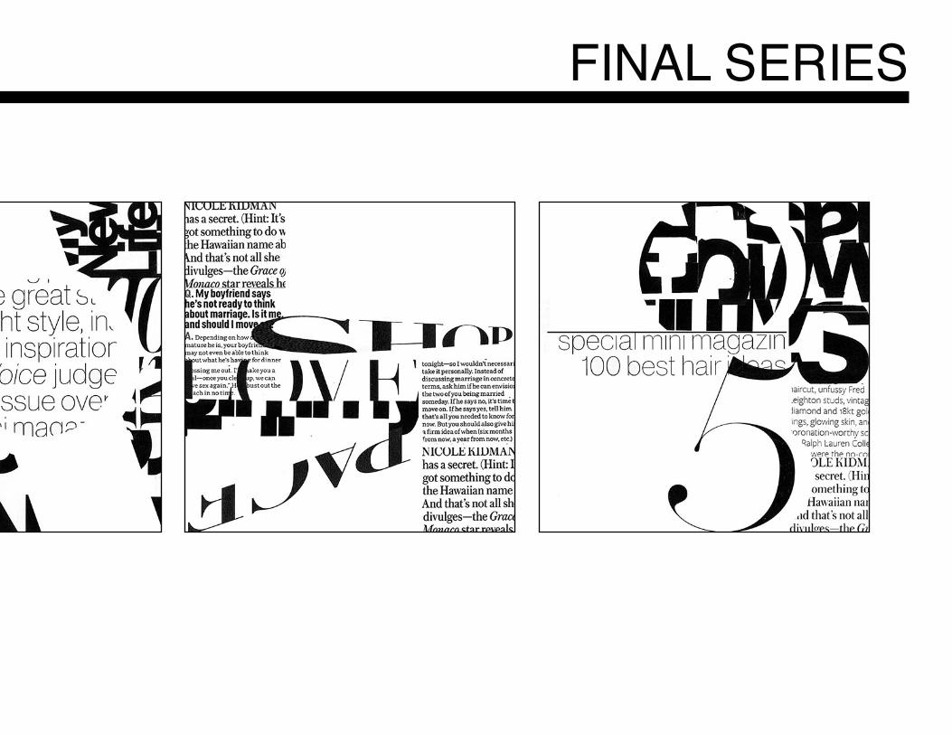
FINAL SERIES
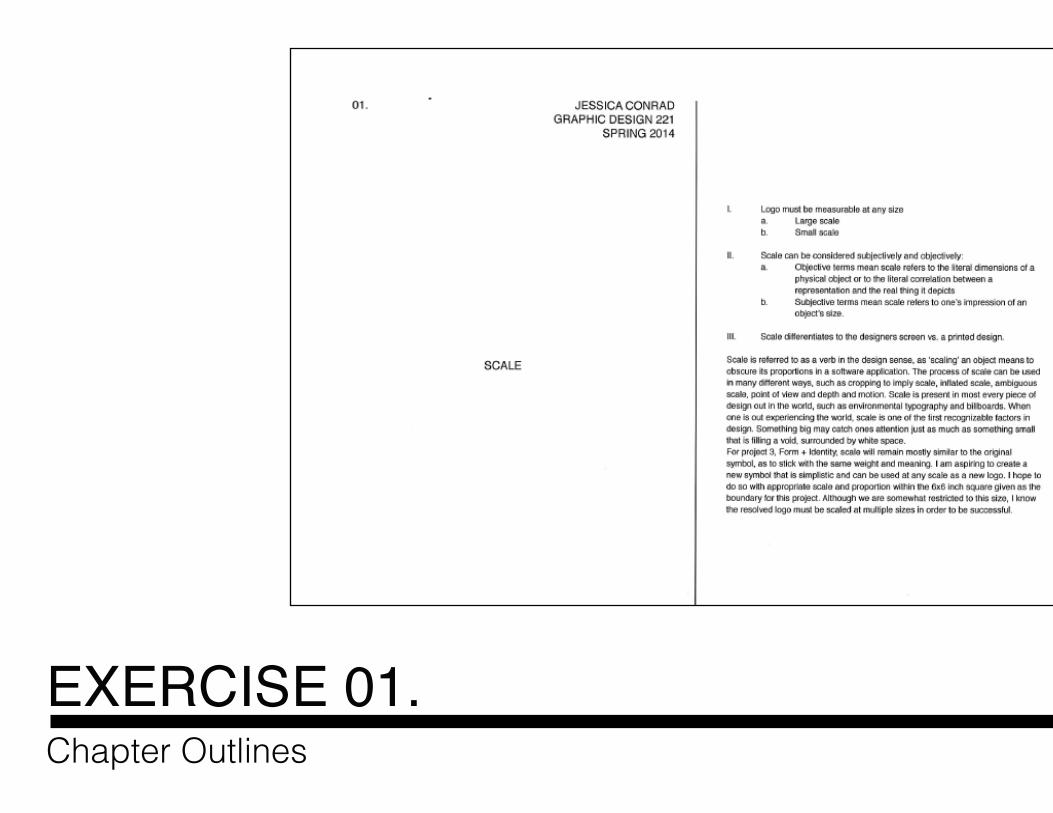
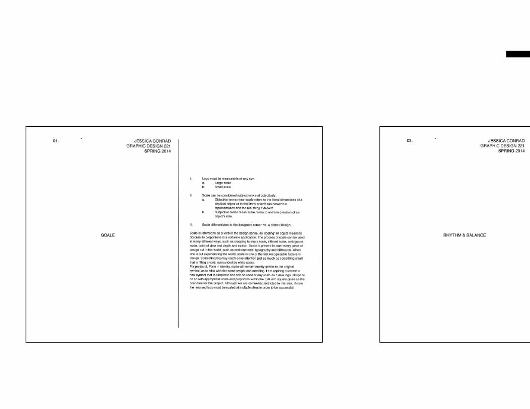
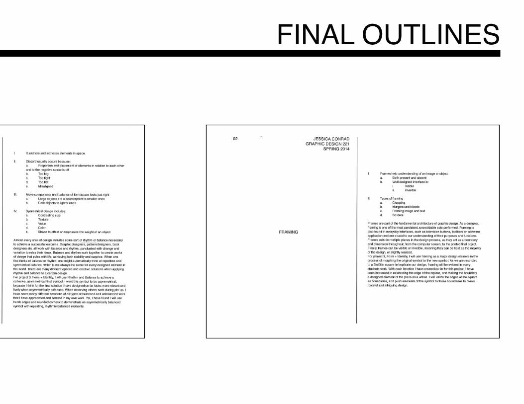
EXERCISE 01.Chapter Outlines
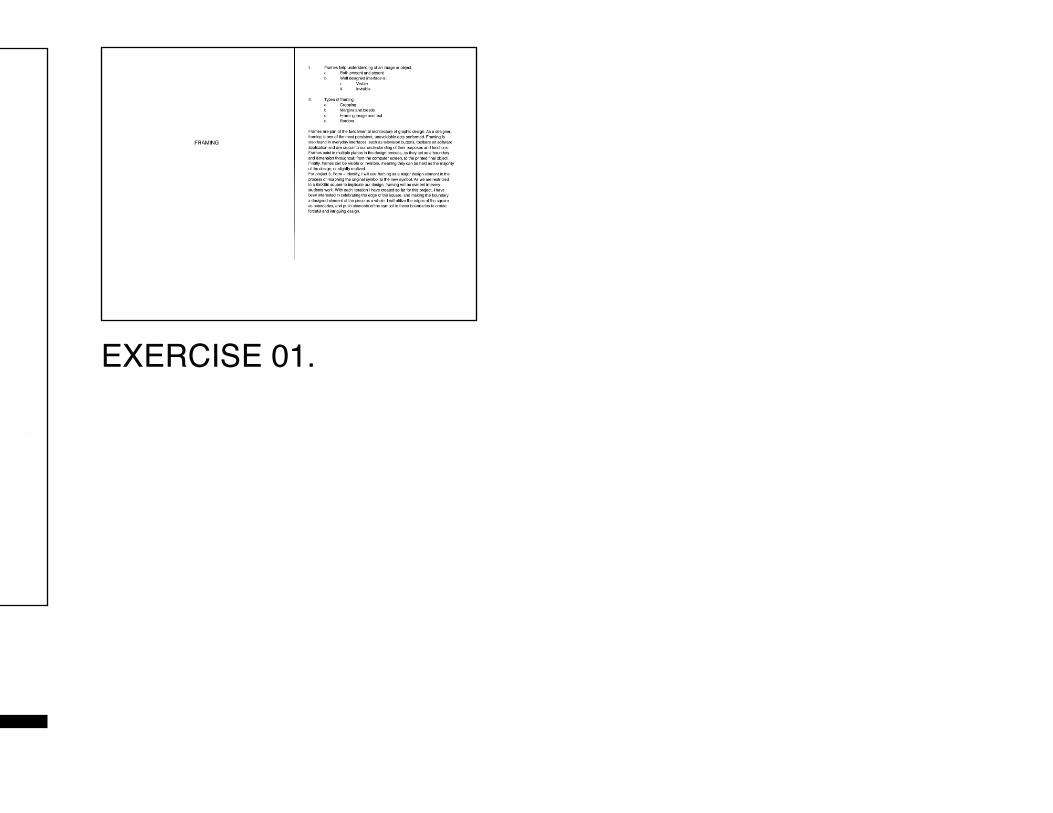
Chapter Outlines
EXERCISE 01.
FINAL OUTLINES
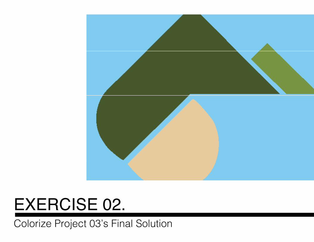
EXERCISE 02.Colorize Project 03’s Final Solution
Colorize Project 03’s Final Solution
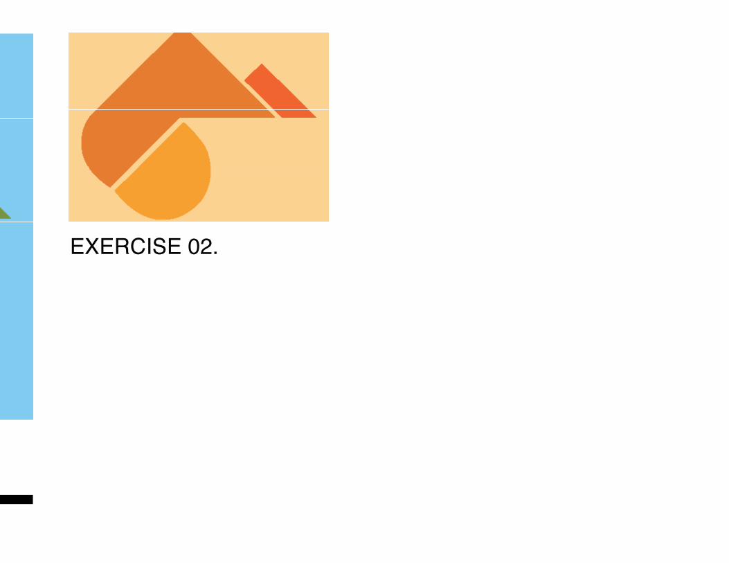
EXERCISE 02.
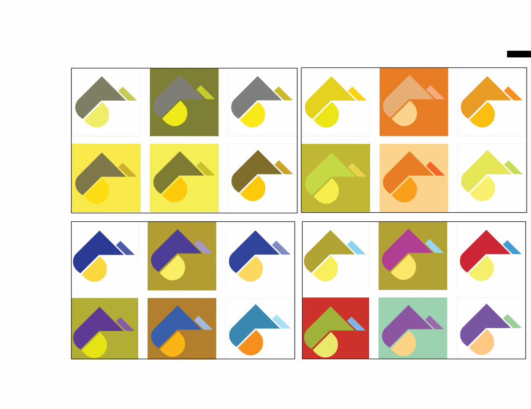
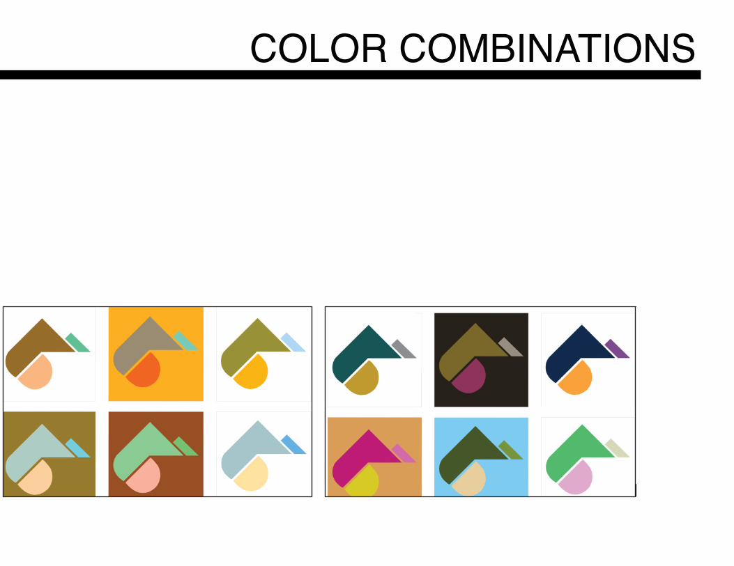
COLOR COMBINATIONS
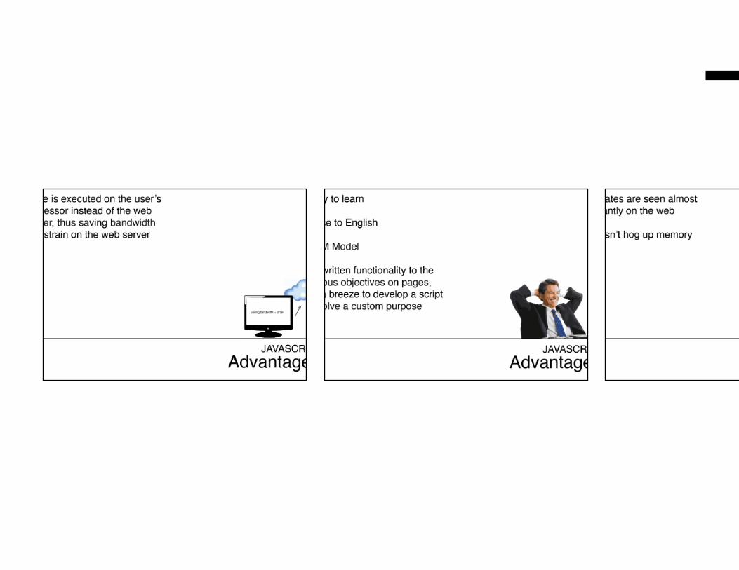
EXERCISE 03.Language of Interaction Design Presentation
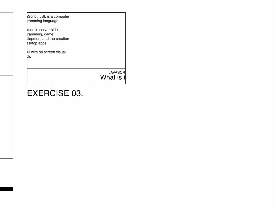
Language of Interaction Design Presentation
EXERCISE 03.
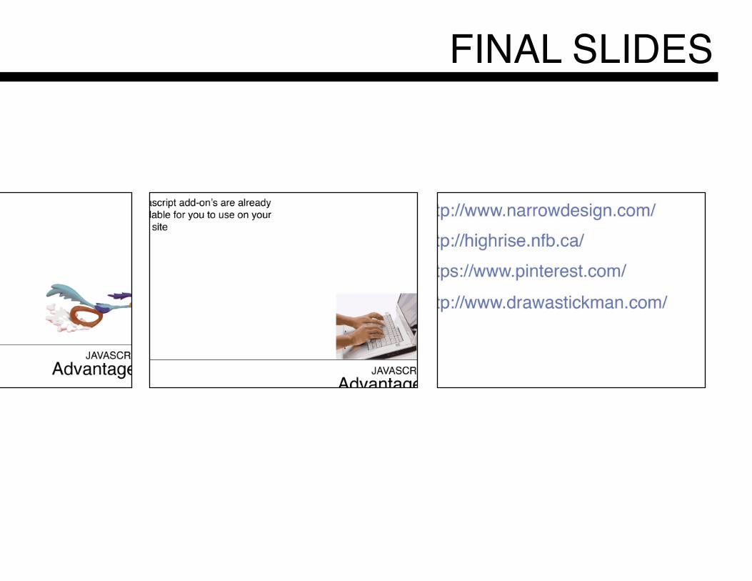
FINAL SLIDES
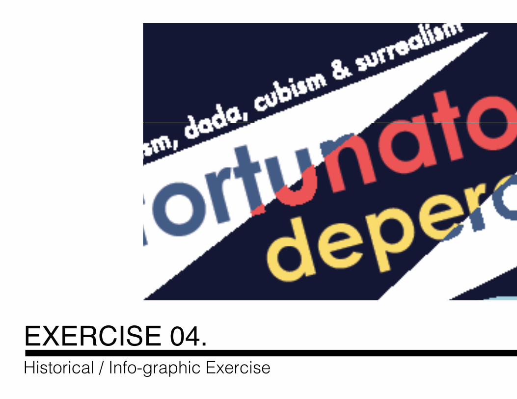
EXERCISE 04.Historical / Info-graphic Exercise
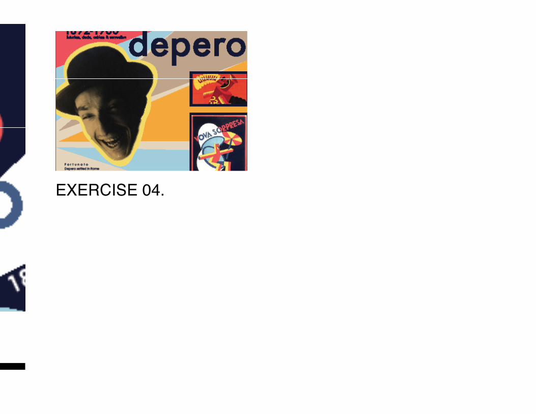
Historical / Info-graphic Exercise
EXERCISE 04.
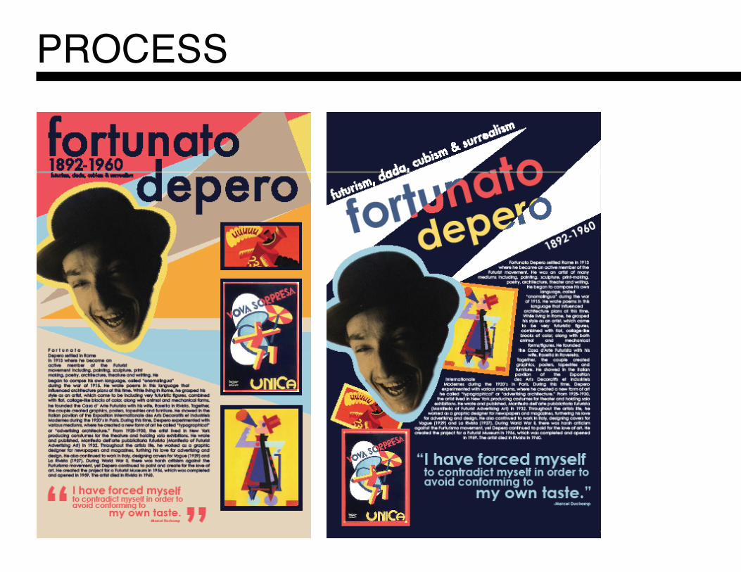
PROCESS
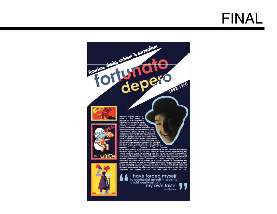
FINAL

DESIGNERS STATEMENTWhile designing the grid and layout for Project 05, I started with a very cluttered concept and slowly started narrowing down to simple design elements necessary to convey the message I had in mind. I diluted color from the layout system in order to emphasize the projects as a whole. This helped minimize content and made the viewers eyes rest easier. I chose Helvetica as the typeface implemented, because of it’s modern and timeless feel. I also wanted to keep consistent with previous projects typeface choice. As for the grid system chosen for this portfolio, I wanted an easily legible view of each project, kept consistent throughout. I chose to place an image of the project represented large on the left and a smaller view to the right, along with the thesis statement. This allowed the viewer to get a sense of the project from the first spread, rather than having to flip through more unnecessary pages. The second page of each project layout, I chose to provide either a process or a final, which was implemented through smaller boxes ranging from left to right of the spread altogether. Finally, I chose a Fibonacci sequence that doubles each size to implement within the type hierarchy. This gave headlines, subheads, body text and captions necessary weight to stand together or separate.