Jeremy Botts - fiammascura.com
22
Jeremy Botts 614 South Hale Street • Wheaton IL 60187 • www.behance.net/JeremyBotts | www.fiammascura.com | @jeremybotts Personal Work working appropriately and imaginatively in relation to nature and with the nature and history of things and images visual polyphony occurring in the textures of written and printed text, including historical exemplars | palimpsests collaborative exploration of traditional hand media, printmaking, and digital and time-based media (video and sound) site specific structures | sculptural and collaborative, educational projects | liturgical spaces and installations Exhibitions, Performances, Publications & Works 2021 DICTUM EST | a collaborative, limited edition, CMYK color separated silkscreen print, May Each student in my class contributed a color separated image; I arranged them into the composite design; and we printed it together. 2021 ART AT WHEATON POSTCARDS | hand collaged Risograph prints made for prospective art majors, March As a way to welcome incoming art majors I collaged makeready Risograph prints to create forty unique postcards.. 2021 OUTSTANDING IN HIS FIELD | a limited edition silkscreen printed portrait of my grandfather, March Color separated into CMYK and with halftone linescreens, I made this print as a demonstration for my silkscreen class. 2021 DEEP CALLS TO DEEP | a series of Lenten videos created for Lombard Mennonite Church, February I created layered piano and accordion soundtracks to the abstract video with fragments of Palestrina, Sofia Gubaidulina, and traditional spirituals. 2021 POCHOIR SELF PORTRAIT | a hand cut pochoir printed illustration, January I created this two color stencil print as a demonstration for my silkscreen class. The composition was influenced by a Lucien Freud self portrait.
Transcript of Jeremy Botts - fiammascura.com
Jeremy Botts614 South Hale Street • Wheaton il 60187 • www.behance.net/JeremyBotts | www.fiammascura.com | @jeremybotts
Personal Workworking appropriately and imaginatively in relation to nature and with the nature and history of things and imagesvisual polyphony occurring in the textures of written and printed text, including historical exemplars | palimpsestscollaborative exploration of traditional hand media, printmaking, and digital and time-based media (video and sound)site specific structures | sculptural and collaborative, educational projects | liturgical spaces and installations
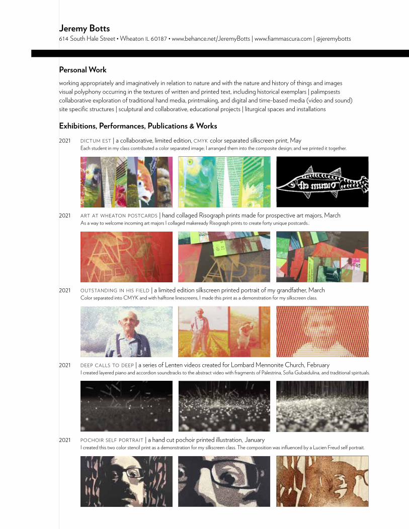
Exhibitions, Performances, Publications & Works2021 dictum est | a collaborative, limited edition, cmyk color separated silkscreen print, May Each student in my class contributed a color separated image; I arranged them into the composite design; and we printed it together.
2021 art at wheaton postcards | hand collaged Risograph prints made for prospective art majors, March As a way to welcome incoming art majors I collaged makeready Risograph prints to create forty unique postcards..
2021 outstanding in his field | a limited edition silkscreen printed portrait of my grandfather, March Color separated into CMYK and with halftone linescreens, I made this print as a demonstration for my silkscreen class.
2021 deep calls to deep | a series of Lenten videos created for Lombard Mennonite Church, February I created layered piano and accordion soundtracks to the abstract video with fragments of Palestrina, Sofia Gubaidulina, and traditional spirituals.
2021 pochoir self portrait | a hand cut pochoir printed illustration, January I created this two color stencil print as a demonstration for my silkscreen class. The composition was influenced by a Lucien Freud self portrait.
2021 the world’s largest country band | live, international online performance art piece, voice and pump organ, January I was invited and participated in a live, simultaneous performance of Hank Williams’ classic I’m So Lonesome I Could Cry.
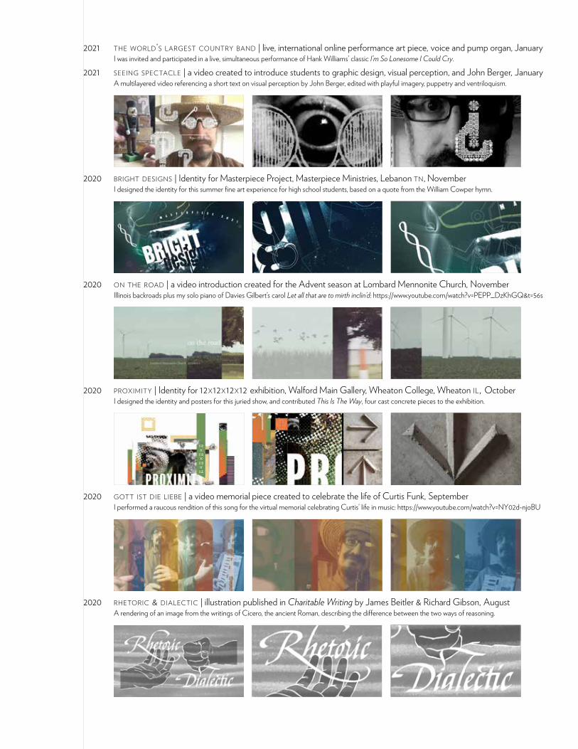
2021 seeing spectacle | a video created to introduce students to graphic design, visual perception, and John Berger, January A multilayered video referencing a short text on visual perception by John Berger, edited with playful imagery, puppetry and ventriloquism.
2020 bright designs | Identity for Masterpiece Project, Masterpiece Ministries, Lebanon tn, November I designed the identity for this summer fine art experience for high school students, based on a quote from the William Cowper hymn.
2020 on the road | a video introduction created for the Advent season at Lombard Mennonite Church, November Illinois backroads plus my solo piano of Davies Gilbert’s carol Let all that are to mirth inclin’d: https://www.youtube.com/watch?v=PEPP_DzKhGQ&t=56s
2020 proximity | Identity for 12x12x12x12 exhibition, Walford Main Gallery, Wheaton College, Wheaton il, October I designed the identity and posters for this juried show, and contributed This Is The Way, four cast concrete pieces to the exhibition.
2020 gott ist die liebe | a video memorial piece created to celebrate the life of Curtis Funk, September I performed a raucous rendition of this song for the virtual memorial celebrating Curtis’ life in music: https://www.youtube.com/watch?v=NY02d-njoBU
2020 rhetoric & dialectic | illustration published in Charitable Writing by James Beitler & Richard Gibson, August A rendering of an image from the writings of Cicero, the ancient Roman, describing the difference between the two ways of reasoning.
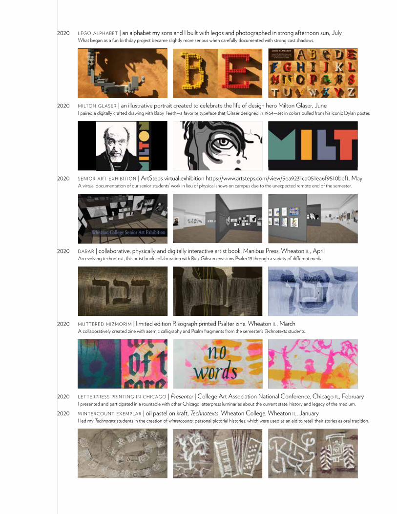
2020 lego alphabet | an alphabet my sons and I built with legos and photographed in strong afternoon sun, July What began as a fun birthday project became slightly more serious when carefully documented with strong cast shadows.
2020 milton glaser | an illustrative portrait created to celebrate the life of design hero Milton Glaser, June I paired a digitally crafted drawing with Baby Teeth—a favorite typeface that Glaser designed in 1964—set in colors pulled from his iconic Dylan poster.
2020 senior art exhibition | ArtSteps virtual exhibition https://www.artsteps.com/view/5ea9231ca051ea6f9510bef1, May A virtual documentation of our senior students’ work in lieu of physical shows on campus due to the unexpected remote end of the semester.
2020 dabar | collaborative, physically and digitally interactive artist book, Manibus Press, Wheaton il, April An evolving technotext, this artist book collaboration with Rick Gibson envisions Psalm 19 through a variety of different media.
2020 muttered mizmorim | limited edition Risograph printed Psalter zine, Wheaton il, March A collaboratively created zine with asemic calligraphy and Psalm fragments from the semester’s Technotexts students.
2020 letterpress printing in chicago | Presenter | College Art Association National Conference, Chicago il, February I presented and participated in a rountable with other Chicago letterpress luminaries about the current state, history and legacy of the medium.
2020 wintercount exemplar | oil pastel on kraft, Technotexts, Wheaton College, Wheaton il, January I led my Technotext students in the creation of wintercounts: personal pictorial histories, which were used as an aid to retell their stories as oral tradition.
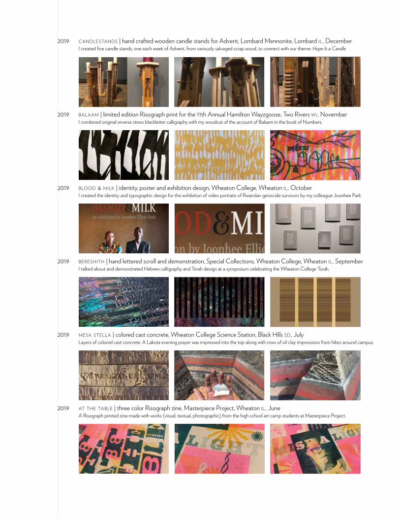
2019 candlestands | hand crafted wooden candle stands for Advent, Lombard Mennonite, Lombard il, December I created five candle stands, one each week of Advent, from variously salvaged scrap wood, to connect with our theme: Hope Is a Candle.
2019 balaam | limited edition Risograph print for the 11th Annual Hamilton Wayzgoose, Two Rivers wi, November I combined original reverse stress blackletter calligraphy with my woodcut of the account of Balaam in the book of Numbers.
2019 blood & milk | identity, poster and exhibition design, Wheaton College, Wheaton il, October I created the identity and typographic design for this exhibition of video portraits of Rwandan genocide survivors by my colleague Joonhee Park.
2019 bereshith | hand lettered scroll and demonstration, Special Collections, Wheaton College, Wheaton il, September I talked about and demonstrated Hebrew calligraphy and Torah design at a symposium celebrating the Wheaton College Torah.
2019 mesa stella | colored cast concrete, Wheaton College Science Station, Black Hills sd, July Layers of colored cast concrete. A Lakota evening prayer was impressed into the top along with rows of oil clay impressions from hikes around campus.
2019 at the table | three color Risograph zine, Masterpiece Project, Wheaton il, June A Risograph printed zine made with works (visual, textual, photographic) from the high school art camp students at Masterpiece Project.
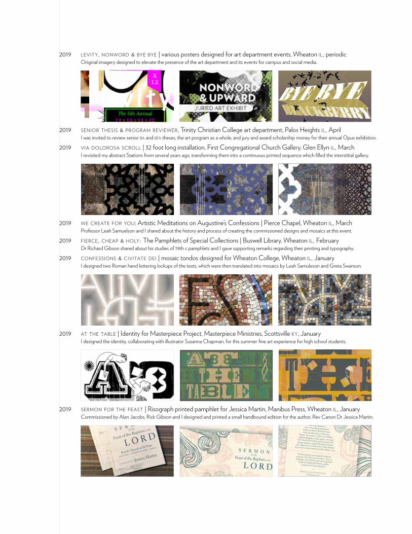
2019 levity, nonword & bye bye | various posters designed for art department events, Wheaton il, periodic Original imagery designed to elevate the presence of the art department and its events for campus and social media.
12x12x12x12
The 6th Annual 12 x 12 x 12 x 12 exhibition
l e v i t y call for entries
Participants are invited to create work that addresses the theme levity. Work can be in any media but must conform
to the square or cubic format of the show. More detailed information is available in the art department or from [email protected].
submissions dueSeptember 28th • 4:30pm • Walford Gallery
10:30–10:40 Arrive & enjoy Blackberry Market Cinnamon Buns
—————————————————————
10:40–10:42Welcome
—————————————————————
10:42–10:51Slideshow of Student Work
—————————————————————
10:51–10:55Sophomore Blessing
—————————————————————
10:55–10:59Senior Blessing—————————————————————
10:59–11:05Art Dept Blackberry Send-Off
—————————————————————
11:07Please tidy and move on
TUESDAY, APRIL 30 | ADAMS H
ALL #301
2019 senior thesis & program reviewer, Trinity Christian College art department, Palos Heights il, April I was invited to review senior ba and bfa theses, the art program as a whole, and jury and award scholarship money for their annual Opus exhibition.
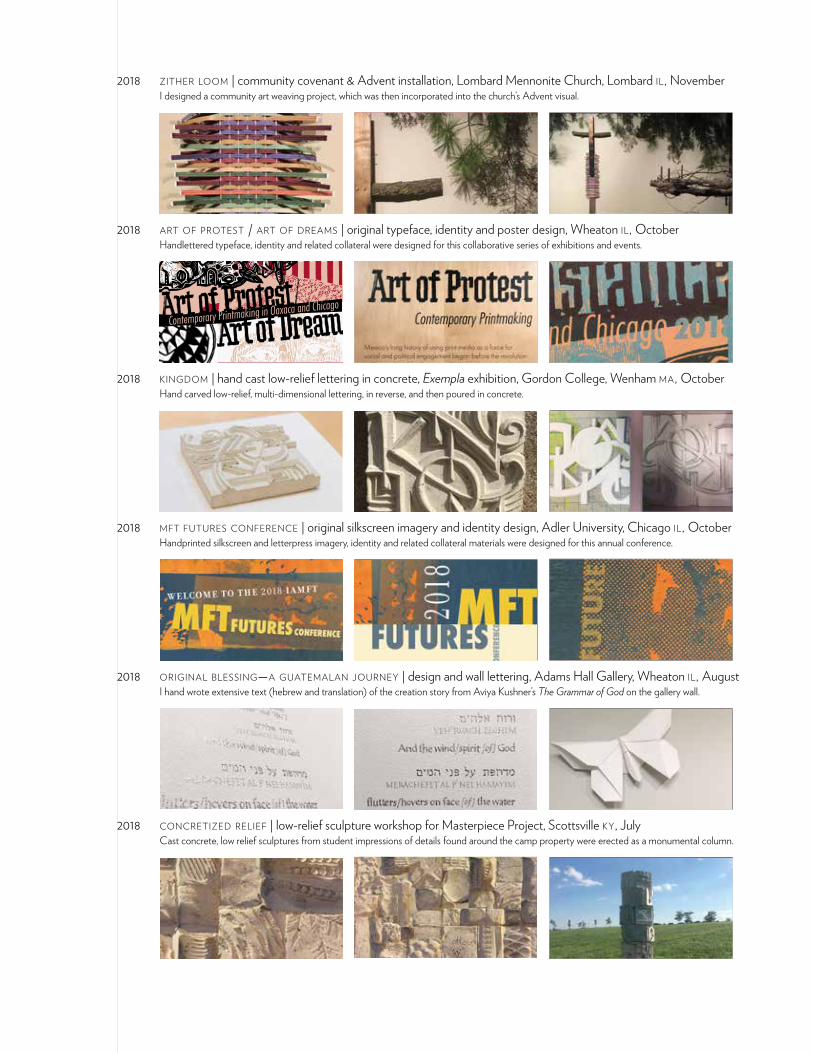
2019 via dolorosa scroll | 32 foot long installation, First Congregational Church Gallery, Glen Ellyn il, March I revisited my abstract Stations from several years ago, transforming them into a continuous printed sequence which filled the interstitial gallery.
2019 we create for you: Artistic Meditations on Augustine’s Confessions | Pierce Chapel, Wheaton il, March Professor Leah Samuelson and I shared about the history and process of creating the commissioned designs and mosaics at this event.
2019 fierce, cheap & holy: The Pamphlets of Special Collections | Buswell Library, Wheaton il, February Dr Richard Gibson shared about his studies of 19th c pamphlets and I gave supporting remarks regarding their printing and typography.
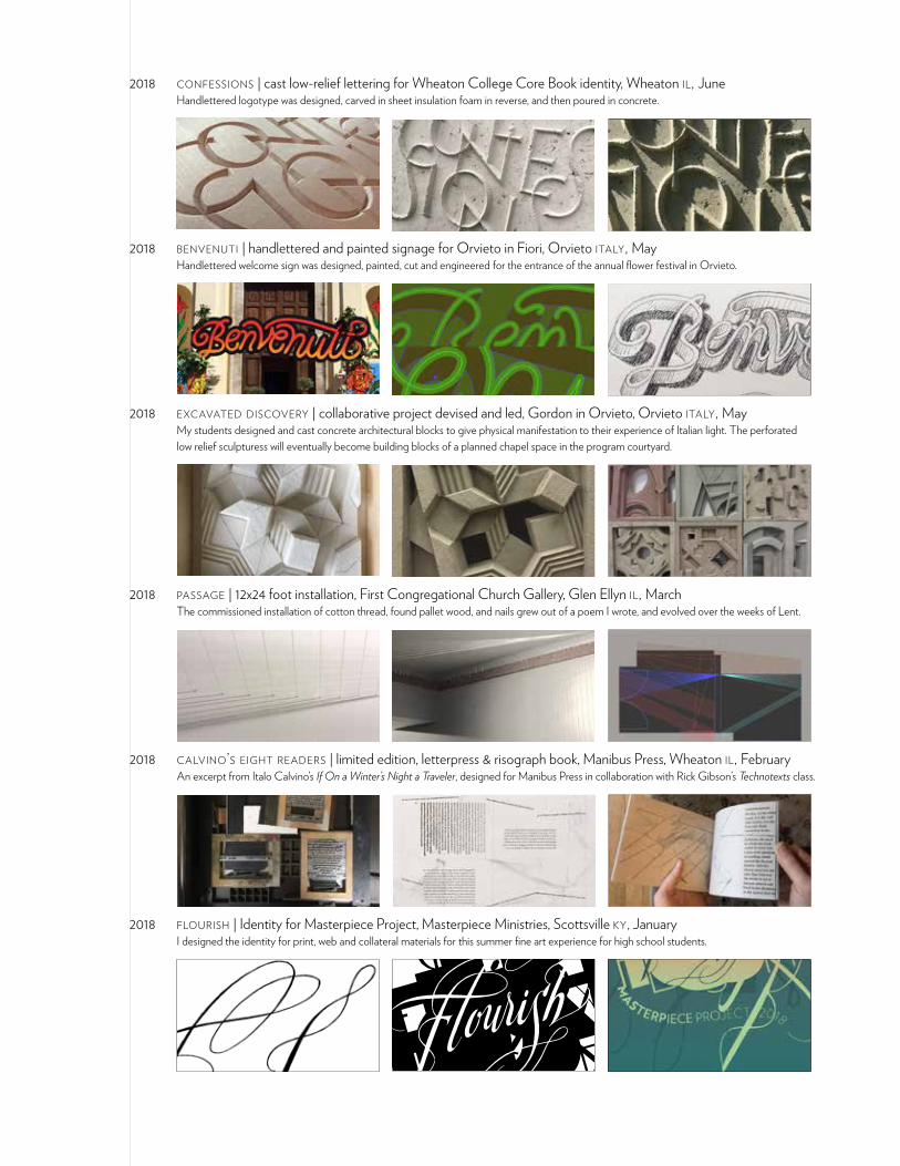
2019 confessions & civitate dei | mosaic tondos designed for Wheaton College, Wheaton il, January I designed two Roman hand lettering lockups of the texts, which were then translated into mosaics by Leah Samuleson and Greta Swanson.
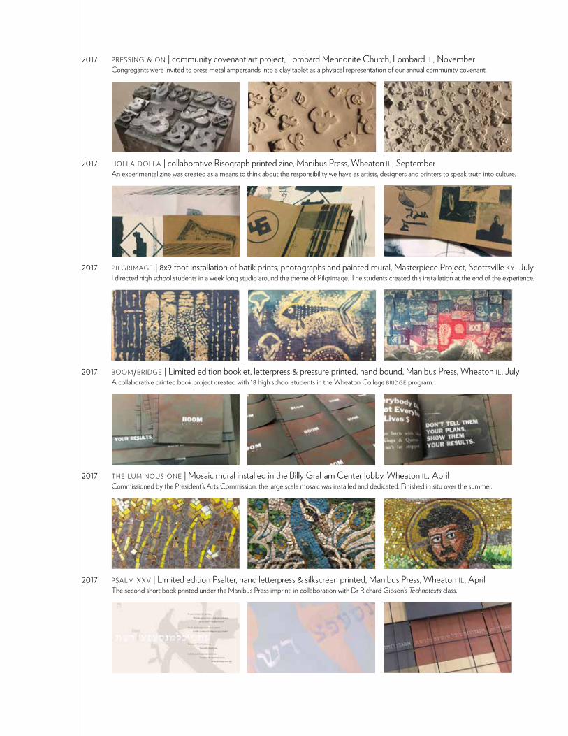
2019 at the table | Identity for Masterpiece Project, Masterpiece Ministries, Scottsville ky, January I designed the identity, collaborating with illustrator Susanna Chapman, for this summer fine art experience for high school students.
2019 sermon for the feast | Risograph printed pamphlet for Jessica Martin, Manibus Press, Wheaton il, January Commissioned by Alan Jacobs, Rick Gibson and I designed and printed a small handbound edition for the author, Rev Canon Dr Jessica Martin.
2018 zither loom | community covenant & Advent installation, Lombard Mennonite Church, Lombard il, November I designed a community art weaving project, which was then incorporated into the church’s Advent visual.
2018 art of protest / art of dreams | original typeface, identity and poster design, Wheaton il, October Handlettered typeface, identity and related collateral were designed for this collaborative series of exhibitions and events.
Art & ResistanceContemporary Printmaking in Oaxaca and Chicago
2018 kingdom | hand cast low-relief lettering in concrete, Exempla exhibition, Gordon College, Wenham ma, October Hand carved low-relief, multi-dimensional lettering, in reverse, and then poured in concrete.
2018 mft futures conference | original silkscreen imagery and identity design, Adler University, Chicago il, October Handprinted silkscreen and letterpress imagery, identity and related collateral materials were designed for this annual conference.
2018 original blessing—a guatemalan journey | design and wall lettering, Adams Hall Gallery, Wheaton il, August I hand wrote extensive text (hebrew and translation) of the creation story from Aviya Kushner’s The Grammar of God on the gallery wall.
2018 concretized relief | low-relief sculpture workshop for Masterpiece Project, Scottsville ky, July Cast concrete, low relief sculptures from student impressions of details found around the camp property were erected as a monumental column.
2018 confessions | cast low-relief lettering for Wheaton College Core Book identity, Wheaton il, June Handlettered logotype was designed, carved in sheet insulation foam in reverse, and then poured in concrete.
2018 benvenuti | handlettered and painted signage for Orvieto in Fiori, Orvieto italy, May Handlettered welcome sign was designed, painted, cut and engineered for the entrance of the annual flower festival in Orvieto.
2018 excavated discovery | collaborative project devised and led, Gordon in Orvieto, Orvieto italy, May My students designed and cast concrete architectural blocks to give physical manifestation to their experience of Italian light. The perforated low relief sculpturess will eventually become building blocks of a planned chapel space in the program courtyard.
2018 passage | 12x24 foot installation, First Congregational Church Gallery, Glen Ellyn il, March The commissioned installation of cotton thread, found pallet wood, and nails grew out of a poem I wrote, and evolved over the weeks of Lent.
2018 calvino’s eight readers | limited edition, letterpress & risograph book, Manibus Press, Wheaton il, February An excerpt from Italo Calvino’s If On a Winter’s Night a Traveler, designed for Manibus Press in collaboration with Rick Gibson’s Technotexts class.
2018 flourish | Identity for Masterpiece Project, Masterpiece Ministries, Scottsville ky, January I designed the identity for print, web and collateral materials for this summer fine art experience for high school students.
2017 pressing & on | community covenant art project, Lombard Mennonite Church, Lombard il, November Congregants were invited to press metal ampersands into a clay tablet as a physical representation of our annual community covenant.
2017 holla dolla | collaborative Risograph printed zine, Manibus Press, Wheaton il, September An experimental zine was created as a means to think about the responsibility we have as artists, designers and printers to speak truth into culture.
2017 pilgrimage | 8x9 foot installation of batik prints, photographs and painted mural, Masterpiece Project, Scottsville ky, July I directed high school students in a week long studio around the theme of Pilgrimage. The students created this installation at the end of the experience.
2017 boom/bridge | Limited edition booklet, letterpress & pressure printed, hand bound, Manibus Press, Wheaton il, July A collaborative printed book project created with 18 high school students in the Wheaton College bridge program.
2017 the luminous one | Mosaic mural installed in the Billy Graham Center lobby, Wheaton il, April Commissioned by the President’s Arts Commission, the large scale mosaic was installed and dedicated. Finished in situ over the summer.
2017 psalm xxv | Limited edition Psalter, hand letterpress & silkscreen printed, Manibus Press, Wheaton il, April The second short book printed under the Manibus Press imprint, in collaboration with Dr Richard Gibson’s Technotexts class.
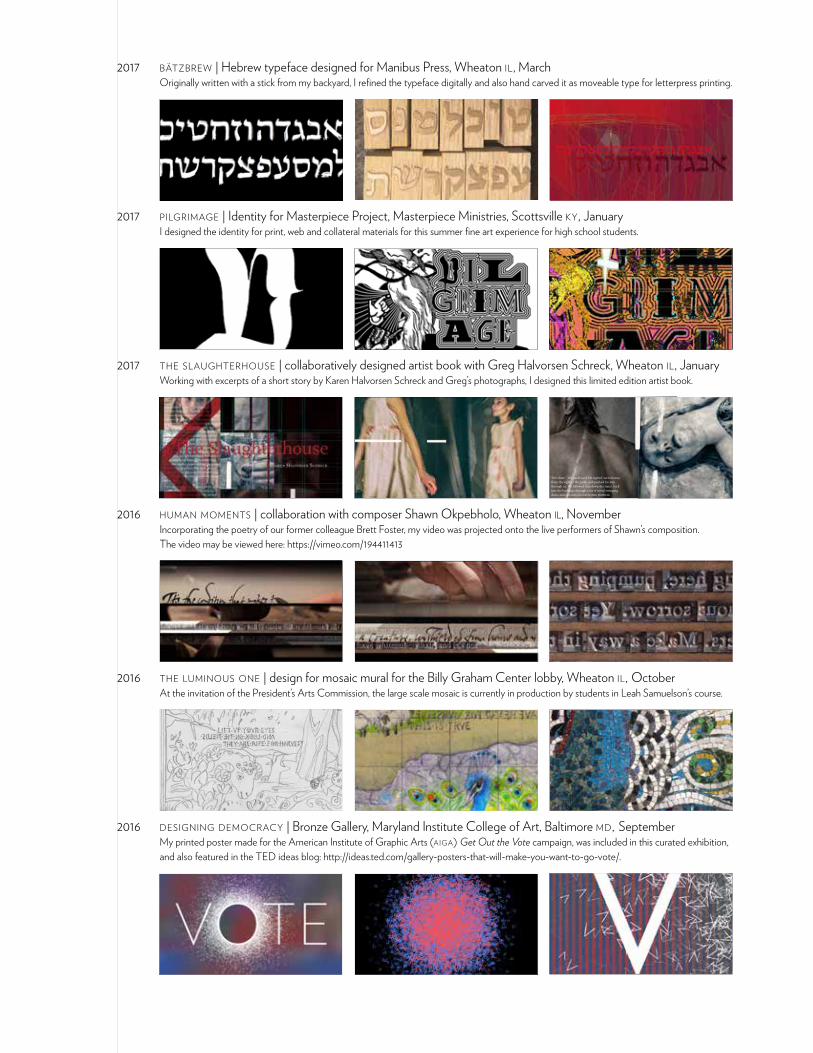
2017 bätzbrew | Hebrew typeface designed for Manibus Press, Wheaton il, March Originally written with a stick from my backyard, I refined the typeface digitally and also hand carved it as moveable type for letterpress printing.
2017 pilgrimage | Identity for Masterpiece Project, Masterpiece Ministries, Scottsville ky, January I designed the identity for print, web and collateral materials for this summer fine art experience for high school students.
2017 the slaughterhouse | collaboratively designed artist book with Greg Halvorsen Schreck, Wheaton il, January Working with excerpts of a short story by Karen Halvorsen Schreck and Greg’s photographs, I designed this limited edition artist book.
“The chute,” the guide said. He sighed, turned away from the sight of the yards, and pushed his way through us. We followed him down the stairs, back into the building, through a set of metal swinging doors and out onto an observation platform.
At first, I couldn’t breathe. The place seemed to boil with something other than air, something more like soup, thickened with rot. Animals bellowed, men shouted, metal clanged and rattled. Hulking, lumbering shapes solidified into carcasses swaying, hanging suspended from chains. These bore great incisions, from which rose pockets of steam. Inside, membranes shimmered over organs.
2016 human moments | collaboration with composer Shawn Okpebholo, Wheaton il, November Incorporating the poetry of our former colleague Brett Foster, my video was projected onto the live performers of Shawn’s composition. The video may be viewed here: https://vimeo.com/194411413
2016 the luminous one | design for mosaic mural for the Billy Graham Center lobby, Wheaton il, October At the invitation of the President’s Arts Commission, the large scale mosaic is currently in production by students in Leah Samuelson’s course.
2016 designing democracy | Bronze Gallery, Maryland Institute College of Art, Baltimore md, September My printed poster made for the American Institute of Graphic Arts (aiga) Get Out the Vote campaign, was included in this curated exhibition, and also featured in the TED ideas blog: http://ideas.ted.com/gallery-posters-that-will-make-you-want-to-go-vote/.
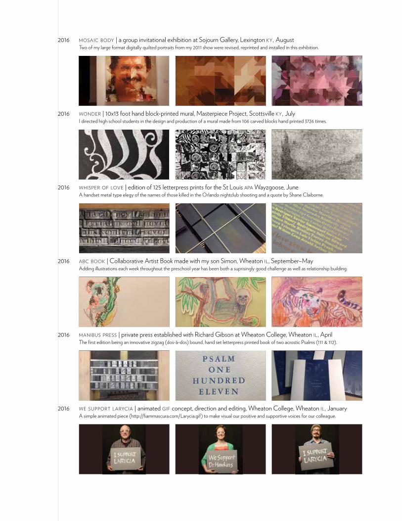
2016 mosaic body | a group invitational exhibition at Sojourn Gallery, Lexington ky, August Two of my large format digitally quilted portraits from my 2011 show were revised, reprinted and installed in this exhibition.
2016 wonder | 10x13 foot hand block-printed mural, Masterpiece Project, Scottsville ky, July I directed high school students in the design and production of a mural made from 106 carved blocks hand printed 3726 times.
2016 whisper of love | edition of 125 letterpress prints for the St Louis apa Wayzgoose, June A handset metal type elegy of the names of those killed in the Orlando nightclub shooting and a quote by Shane Claiborne.
2016 abc book | Collaborative Artist Book made with my son Simon, Wheaton il, September–May Adding illustrations each week throughout the preschool year has been both a suprisingly good challenge as well as relationship building.
2016 manibus press | private press established with Richard Gibson at Wheaton College, Wheaton il, April The first edition being an innovative zigzag (dos-à-dos) bound, hand set letterpress printed book of two acrostic Psalms (111 & 112).
2016 we support larycia | animated gif concept, direction and editing, Wheaton College, Wheaton il, January A simple animated piece (http://fiammascura.com/Larycia.gif) to make visual our positive and supportive voices for our colleague.
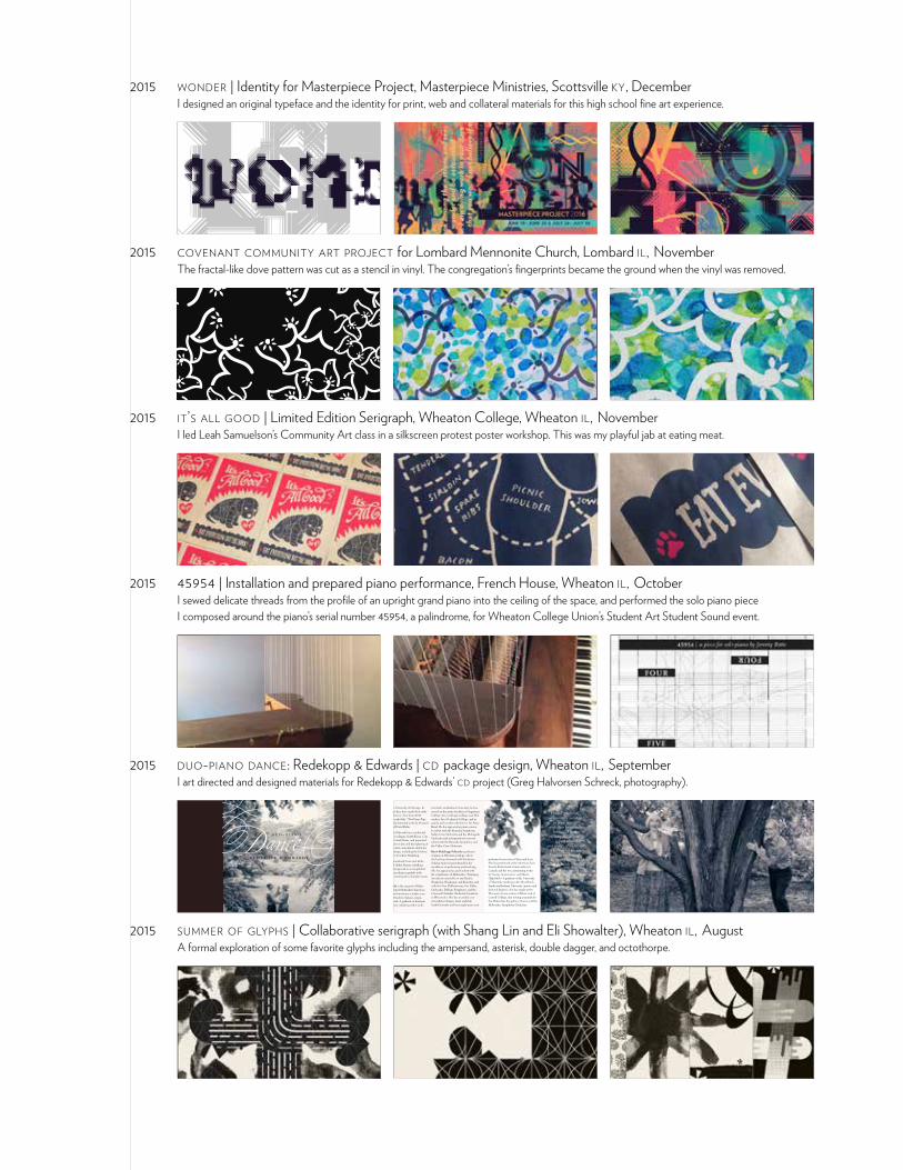
2015 wonder | Identity for Masterpiece Project, Masterpiece Ministries, Scottsville ky, December I designed an original typeface and the identity for print, web and collateral materials for this high school fine art experience.
2015 covenant community art project for Lombard Mennonite Church, Lombard il, November The fractal-like dove pattern was cut as a stencil in vinyl. The congregation’s fingerprints became the ground when the vinyl was removed.
2015 it’s all good | Limited Edition Serigraph, Wheaton College, Wheaton il, November I led Leah Samuelson’s Community Art class in a silkscreen protest poster workshop. This was my playful jab at eating meat.
2015 45954 | Installation and prepared piano performance, French House, Wheaton il, October I sewed delicate threads from the profile of an upright grand piano into the ceiling of the space, and performed the solo piano piece I composed around the piano’s serial number 45954, a palindrome, for Wheaton College Union’s Student Art Student Sound event.
2015 duo-piano dance: Redekopp & Edwards | cd package design, Wheaton il, September I art directed and designed materials for Redekopp & Edwards’ cd project (Greg Halvorsen Schreck, photography).
d u o - p i a n o
r e d e k o p p & e d w a r d s
including the University of Chicago. In recent seasons they have made their radio broadcast debut on “Live from wfmt Chicago,” recorded the “Two-Piano Tap-estry” cd, and premiered works by Howard Whitaker and David Bohn.
Redekopp and Edwards have conducted master classes in Japan, South Korea, Can-ada and the United States, and presented lecture/recitals on duo and duet playing at several mtna state conventions and at nu-merous workshops, including the Goshen College Piano Teachers Workshop.
The husband-and-wife team met while studying with Abbey Simon at Indiana University. Recognized as accomplished soloists, each performs regularly with orchestra, in recital and in chamber music concerts.
Mark Edwards is the organist of Baker Memorial United Methodist Church in St. Charles and maintains a studio as an independent teacher of piano, organ, and harpsichord. A graduate of Eastman School of Music (studying with Cecile
performed concerts in China and Laos. She has performed at the American Liszt Society Festival and at universities in Canada and the usa, premiering works by George Arasimowicz and Shawn Okpebholo. A graduate of the University of Manitoba (studying with Alma Brock-Smith)and Indiana University (master and doctoral degrees), she has taught at the Wisconsin Conservatory of Music and at Carroll College, also serving as pianist for the Milwaukee Symphony Chorus and the Milwaukee Symphony Orchestra.
Genhart) and Indiana University, he has served on the piano faculties of Augustana College (sd), Carthage College, and Mil-waukee Area Technical College, and as pianist and vocalist with the u.s. Air Force Band. He has appeared as piano concer-to soloist with the Kenosha Symphony, Valley Civic Orchestra and the Metropolis Orchestra and as harpsichord concerto soloist with the Kenosha Symphony and the Valley Civic Orchestra.
Karin Redekopp Edwards is professor of piano at Wheaton College, where she has been honored with the Senior Scholar Achievement Award for her excellence in performing and teaching. She has appeared as guest soloist with the symphonies of Milwaukee, Winnipeg (broadcast nationally on cbc Radio), Waukesha, Waukegan, and Kenosha, and with the New Philharmonic, Fox Valley Orchestra, DuPage Symphony, and the Concord Chamber Orchestra (broadcast in Wisconsin). She has recorded a cd of works by Chopin, Liszt, and Eck-hardt-Gramatté and has taught piano and
“... I found [their CD] so musically satisfying in every respect with their beautifully controlled tone, exciting dynamics, superb ensemble and clarity of technically challenging passages.... I was so enchanted by their playing as they were so evenly matched.” VB, concert pianist and teacher, former student of Rosina Lhevinne
“A spiritually invigorating experience.” BS, pianist
2015 summer of glyphs | Collaborative serigraph (with Shang Lin and Eli Showalter), Wheaton il, August A formal exploration of some favorite glyphs including the ampersand, asterisk, double dagger, and octothorpe.
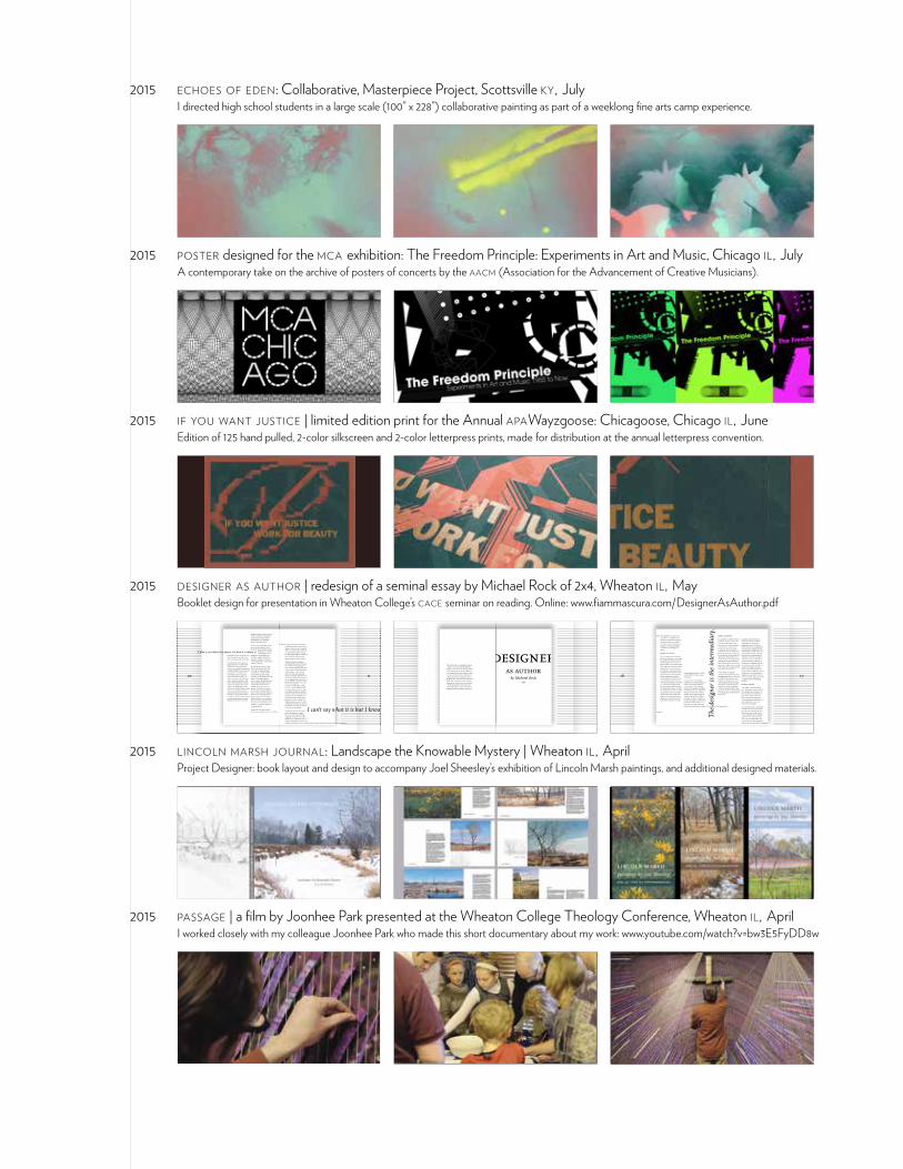
2015 echoes of eden: Collaborative, Masterpiece Project, Scottsville ky, July I directed high school students in a large scale (100” x 228”) collaborative painting as part of a weeklong fine arts camp experience.
2015 poster designed for the mca exhibition: The Freedom Principle: Experiments in Art and Music, Chicago il, July A contemporary take on the archive of posters of concerts by the aacm (Association for the Advancement of Creative Musicians).
2015 if you want justice | limited edition print for the Annual apaWayzgoose: Chicagoose, Chicago il, June Edition of 125 hand pulled, 2-color silkscreen and 2-color letterpress prints, made for distribution at the annual letterpress convention.
2015 designer as author | redesign of a seminal essay by Michael Rock of 2x4, Wheaton il, May Booklet design for presentation in Wheaton College’s cace seminar on reading. Online: www.fiammascura.com/DesignerAsAuthor.pdf
1
designer as author
by Michael Rock1996
20
This short book was designed by Jeremy Botts as an exercise during Wheaton
College’s cace seminar on reading in May 2015. The text was set in the typeface ff
Scala, designed by Martin Majoor in 1989, and named after the Teatro alla Scala in Milan. At present, no permission was
sought for this re-presentation of Michael Rock’s text, as the exercise was initially a personal one. Fifteen copies were printed
for the participants in the seminar on cheap copy paper in Adams Hall, the art
building at Wheaton College, Wheaton il.
2
designer as author
by Michael Rock1996
Published in Multiple Signatures: On Designers, Authors, Readers and Users (Spring 2013)
designer as author
by Michael Rock1996
What does it mean to call a graphic designer an author?
19
designer = designer.
Thi
s ar
ticl
e is
an
adap
tati
on o
f Gra
phic
Aut
hors
hip
(19
96
) fo
r pu
blic
atio
n in
Mul
tipl
e Si
gnat
ures
: On
Des
igne
rs, A
utho
rs, R
eade
rs a
nd U
sers
(S
prin
g 20
13)
3
The meaning of the word itself has shifted significantly over time.
Authorship, in one form or an-other, has been a popular term in graphic design circles, especially those at the edge of the profes-sion, the design academies and the murky territories that exist between design and art. The word authorship has a ring of impor-tance: it connotes seductive ideas of origination and agency. But the question of how designers become authors is a difficult one, and ex-actly who the designer/authors are and what authored design looks like depends entirely on how you define the term and the criteria you choose to grant entrance into the pantheon.
Authorship may suggest new ap-proaches to understanding design process in a profession tradition-ally associated more with the com-munication than the origination of messages. But theories of author-ship may also serve as legitimizing strategies, and authorial aspira-tions may actually end up reinforc-ing certain conservative notions of design production and subjectivity — ideas that run counter to recent critical attempts to overthrow the perception of design based on indi-vidual brilliance. The implications deserve careful evaluation. What does it really mean to call for a graphic designer to be an author?
What is an author?
That question has been an area of intense scrutiny over the last forty years. The meaning of the word itself has shifted significantly over time. The earliest definitions are not associated with writing; in fact the most inclusive is a "person who originates or gives clearly index authoritarian — even patriarchal — connotations: "father of all life," "any inventor, constructor or founder," "one who begets," and a "director, commander, or ruler."
All literary theory, from Aristotle on, has in some form or another been theory of authorship. Since this is not a history of the author but a consideration of the author as metaphor, I'll start with recent history. Wimsatt and Beardsley's, seminal text, "The Intentional Fal-lacy" (1946), drove an early wedge between the author and the text, dispelling the notion that a reader could ever really know an author through his writing. The so-called death of the author, proposed most succinctly by Roland Barthes in 1968 in an essay of that title, is closely linked to the birth of critical theory, especially theory based in reader response and interpretation rather than intentionality. Michel Foucault used the rhetorical ques-tion "What is an author?" as the title of his influential essay of 1969 which, in response to Barthes, outlines the
The meaning of the word itself has shifted significantly over time.
What does it mean to call a graphic designer an author?
18
like those for Nike or Coca-Cola are exam-ples of this approach. Curatorial projects such as Sean Perkins' catalogue, Experience, which cre-ates an exhibition of other design projects, is another example.
One of the clearest examples is Irma Boom's project for SHV Cor-poration. Working in conjunction with an archivist for more than five years, Boom created narrative from a mass of data, a case of the design-er creating meaning almost exclu-sively via the devices of design: the narrative is not a product of words but almost exclusively of the se-quence of pages and the cropping of images. The scale of the book allows for thematic development, contradiction, and coincidence.
The value of these models is that they accept the multivalent activity of design without resorting to totalizing description. The problem with the authorship paradigm
alone is that it encourages both ahistorical and acultural readings of design. It grants too much agency, too much control to the lone artist/genius, and discourag-es interpretation by validating a "right" reading of a work.
On the other hand, work is made by someone. And the difference between the way different writers or designers approach situations and make sense of the world is at the heart of a certain criticism. The challenge is to accept the multi-plicity of methods that comprise design language. Authorship is only one device to compel design-ers to rethink process and expand their methods.
If we really need to coin a phrase to describe an activity encompass-ing imaging, editing, narration, chronicling, performing, translat-ing, organizing and directing, I’ll conclude with a suggestion:
designer = designer.
4
The meaning of the word itself has shifted significantly over time.
The very anonymity of the text served as a certain kind of authentication.
basic taxonomy and functions of the author and the problems associated with conventional ideas of authorship and origination.
Foucauldian theory holds that the connection between author and text has transformed and that there exist a number of author-func-tions that shape the way readers approach a text. These stubbornly persistent functions are historically determined and culturally specific categories.
Foucault posits that the earliest sacred texts were authorless, their origins lost in ancient history (the Vedas, the Gospels, etc.). The very anonymity of the text served as a certain kind of authentication. The author's name was symbolic, rarely attributable to an individual. (The Gospel of Luke, for instance, is a diversity of texts gathered under the rubric of Luke, someone who may indeed have lived and written parts, but not the totality, of what we now think of as the complete work.)
Scientific texts, at least through the Renaissance, demanded an author's name as validation. Far from objective truth, science was based in subjective invention and the authority of the scientist. This changed with the rise of the scien-tific method. Scientific discoveries and mathematical proofs were no longer in need of authors because they were perceived as discovered truths rather than authored ideas. The scien-
The meaning of the word itself has shifted significantly over time.
The very anonymity of the text served as a certain kind of authentication.
17translation of the Odyssey will be radically different from a 1950s translation.
In certain works, the designer remolds the raw material of given content, rendering it legible to a new audience. Like the poetic translator, the designer transforms not only the literal meaning of the elements but the spirit, too. For example, Bruce Mau's design of a book version of Chris Marker's 1962 film, "La Jetée," attempts to translate the original material from one form to another. Mau is cer-tainly not the author of the work but the translator of form and spirit. The designer is the intermediary.
Designer as performer
The performer metaphor is based on theater and music. The actor is not the author of the script, the musician is not the composer of the score, but without actor or musician, the art cannot be realized. The actor is the physical expression of the work; every work has an infinite number of physical expressions. Every performance re-contextualizes the original work. (Imagine the range of interpreta-tions of Shakespeare's plays.) Each performer brings a certain reading to the work. No two actors play the same role in the same way
In this model, the designer transforms and expresses content through graphic devices. The score or script is enhanced and made whole by the performance. And so the designer likewise becomes the physical manifestation of the content, not author but perform-er, the one who gives life to, who speaks the content, contextualizing it and bringing it into the frame of the present.
Examples abound, from early Dada, Situationist, and Fluxus experiments to more recent typographic scores like Warren Lehrer's performance typography or experimental typography from Edward Fella or David Carson. The most notable example is perhaps Quentin Fiore's performance of McLuhan. It was Fiore's graphic treatment as much as McLuhan's words that made The Medium is the Massage a worldwide phenom-ena. (Other examples include any number of "graphic interpreta-tions," such as Allen Hori's rein-vention of Beatrice Warde's Crystal Goblet essay, or P. Scott Makela's improvisation on Tucker Viemeis-ter's lecture, both originally printed in Michael Bierut's Rethinking Design.)
Designer as director
This model is a function of big-ness. Meaning is manufactured by the arrangement of elements, so there must be many elements at play. Only in large-scale instal-lations, advertising campaigns, mass-distribution magazines and very large books do we see evi-dence of this paradigm.
In such large projects, the designer orchestrates masses of materials to shape meaning, working like a film director, overseeing a script, a series of performances, photog-raphers, artists, and production crews. The meaning of the work results from the entire production. Large-scale, mass-distribution campaigns
The
des
igne
r is
the
inte
rmed
iary
.
5
The very anonymity of the text served as a certain kind of authentication.
tist revealed extant phenomena, facts anyone faced with the same conditions would discover. The scientist and the mathematician could claim to have been first to discover a paradigm, and lend their name to the phenomenon, but could never claim authorship over it. (The as-tronomer who discovers a new star may name it but does not conjure
it.) Facts were universal and thus eternally preexisiting.
By the 18th century, Foucault sug-gests, the situation had reversed: literature was authored and science became the product of anonymous objectivity. When authors came to be punished for their writing — i.e. when a text could be transgressive — the link between author and text was firmly established.
The codification of ownership over a text is often dated to the adoption of the Statute of Anne (1709) by the British Parliament, generally considered the first real copyright act. The first line of the law is revealing: "Whereas Printers, Booksellers, and other Persons, have of late frequently taken the Liberty of Printing... Books, and other Writings, without the Consent of the Authors... to their very great Detriment, and too often to the Ruin of them and their
Families..." The statute secures the right to benefit financially from a work and for the author to preserve its textual integrity. That authorial right was deemed irrevocable. Text came to be seen as a form of pri-vate property. A romantic criticism arose that reinforced that relation-ship, searching for critical keys in the life and intention of the writer.
By laying a legal ground for own-ership, the Statute of Anne defines who is, and isn't, an author. It was a thoroughly modern problem. No one had owned the sacred texts. The very fact that the origins of sa-cred texts were lost in history, their
authors either composites or anon-ymous, gave them their authority. The gospels in their purest form were public domain. Any work to be done, and any arguments to have, were interpretive. The authors referred to in the Statute were living, breathing — and ap-parently highly litigious — beings. The law granted them authority over the meaning and use of their own words.
Ownership of the text, and the au-thority granted to authors at the ex-pense of the creative reader, fueled much of the 20th century's obses-sion with authorship. Post-struc-turalist reading of authorship tends to critique the prestige attributed to the figure of the author and to suggest or
The very anonymity of the text served as a certain kind of authentication.
16
Rather than glorify the act and sancti-fy the practice, I propose three alternative models for design that attempt to describe the activity as it exists and as it could evolve: designer as translator, designer as performer, and designer as director.
Designer as translator
This is based on the assumption that the act of design is, in essence, the clarification of material or the remodeling of content from one form to another. The ultimate goal is the expression of a given content rendered in a form that reaches a new audience. I am drawn to this metaphor by Ezra Pound's transla-tions of Chinese character poetry. Pound translated not only the meaning of the characters but the visual component of the poem as well. Thus the original is rendered as a raw material reshaped into the conventions of Western poetry. The translation becomes a second art. Translation is neither scientific nor ahistorical. Every translation reflects both the character of the original and the spirit of the con-temporary as well as the individ-uality of the translator: An 1850s
translation of the Odyssey will be radically different from a 1950s translation.
In certain works, the designer remolds the raw material of given content, rendering it legible to a new audience. Like the poetic translator, the designer transforms not only the literal meaning of the elements but the spirit, too. For example, Bruce Mau's design of a book version of Chris Marker's 1962 film, "La Jetée," attempts to translate the original material from one form to another. Mau is cer-tainly not the author of the work but the translator of form and spirit. The designer is the intermediary.
a limiting factor, containing and categorizing the work. The author as origin and ultimate owner of the text guards against the free will of the reader. The figure of the author reconfirms the traditional idea of the genius creator, and the esteem or status of the man frames the work and imbues it with some mythical value.
While some claims for authorship may be as simple as a renewed sense of responsibility, at times they seem to be ploys for property rights, attempts to finally exercise some kind of agency where tradi-tionally there has been none. The author = authority. The longing for graphic authorship may be the longing for a kind of legitimacy, or a kind of power that has so long eluded the obedient designer. But do we get anywhere by celebrating the designer as some central char-acter? Isn't that what fueled the last fifty years of design history? If we really want to move beyond the de-signer-as-hero model of history, we may have to imagine a time when we can ask, "What difference does it make who designed it?"
Perhaps, in the end, authorship is not a very convincing metaphor for the activity we understand as de-sign. There are a few examples of work that is clearly the product of design authors and not designer/authors, and these tend to be exceptions to the rule.
The
des
igne
r is
the
inte
rmed
iary
.
6
The very anonymity of the text served as a certain kind of authentication.
speculate about a time after his fall from grace.
Postmodernity turns on what Fredric Jameson identified as a "fragmented and schizophrenic decentering and dispersion" of the subject. Decentered text — a text that is skewed from the direct line of communication from sender to receiver, severed from the author-ity of its origin, a free — floating element in a field of possible significations — figures heavily in constructions of a design based in reading and readers. But Kather-ine McCoy's prescient image of
designers moving beyond problem solving and by "authoring addi-tional content and a self-conscious critique of the message, adopt-ing roles associated with art and literature," is often misconstrued. Rather than working to incorpo-rate theory into their methods of production, many selfproclaimed deconstructivist designers literally illustrated Barthes' image of a reader-based text — a "tissue of quotations drawn from innu-merable centers of culture" — by scattering fragments of quotations across the surface of their "au-thored" posters and book covers. (This technique went something like: "Theory is complicated, so my design is complicated.") The rather
dark implications of Barthes' theory, note Ellen Lupton and J. Abbott Miller, were refashioned into a "ro-mantic theory of self-expression."
After years in the somewhat thank-less position of the faceless facilita-tor, many designers were ready to speak out. Some designers may be eager to discard the internal affairs of formalism — to borrow Paul de Man's metaphor — and branch out to the foreign affairs of external politics and content. By the '70s, design began to discard some of the scientistic approach that held sway for several decades. (As early as the '20s, Trotsky was labeling formalist artists the "chemists of art.") That approach was evident in the design ideology that preached strict adherence to an eternal grid and a kind of rational approach to design. (Keep in mind that although this example is a staple of critiques of modernism, in actuality the objectivists represent-ed a small fragment of the design population at the time.)
Müller-Brockmann's evocation of the "aesthetic quality of mathe-matical thinking" is certainly the clearest and most cited example of this approach. Müller-Brockmann and a slew of fellow researchers like Kepes, Dondis and Arnheim worked to uncover preexisting order and form
The very anonymity of the text served as a certain kind of authentication.
15
a limiting factor, containing and categorizing the work. The author as origin and ultimate owner of the text guards against the free will of the reader. The figure of the author reconfirms the traditional idea of the genius creator, and the esteem or status of the man frames the work and imbues it with some mythical value.
While some claims for authorship may be as simple as a renewed sense of responsibility, at times they seem to be ploys for property rights, attempts to finally exercise some kind of agency where tradi-tionally there has been none. The author = authority. The longing for graphic authorship may be the longing for a kind of legitimacy, or a kind of power that has so long eluded the obedient designer. But do we get anywhere by celebrating the designer as some central char-acter? Isn't that what fueled the last fifty years of design history? If we really want to move beyond the de-signer-as-hero model of history, we may have to imagine a time when we can ask, "What difference does it make who designed it?"
Perhaps, in the end, authorship is not a very convincing metaphor for the activity we understand as de-sign. There are a few examples of work that is clearly the product of design authors and not designer/authors, and these tend to be exceptions to the rule.
desire is thwarted by oppositional theories of authorship. The cult of the author narrows interpreta-tion and places the author at the center of the work. Foucault noted that the figure of the author is not a particularly liberating one. By transferring the authority of the text back to the author, by focus-ing on voice, presence becomes
a limiting factor, containing and categorizing the work. The author as origin and ultimate owner of the text guards against the free will of the reader. The figure of the author reconfirms the traditional idea of the genius creator, and the esteem or status of the man frames the work and imbues it with some mythical value.
While some claims for authorship may be as simple as a renewed sense of responsibility, at times they seem to be ploys for property rights, attempts to finally exercise some kind of agency where tradi-tionally there has been none. The author = authority. The longing for graphic authorship may be the longing for a kind of legitimacy, or a kind of power that has so long eluded the obedient designer. But do we get anywhere by celebrating the designer as some central char-acter? Isn't that what fueled the last fifty years of design history? If we really want to move beyond the de-signer-as-hero model of history, we may have to imagine a time when we can ask, "What difference does it make who designed it?"
Perhaps, in the end, authorship is not a very convincing metaphor for the activity we understand as de-sign. There are a few examples of work that is clearly the product of design authors and not designer/authors, and these tend to be exceptions to the rule.
In the rejection of the role of the
facilitator and in the call for transcendence lies the implication
that authored design holds some higher,
purer purpose.
7
in principle they are irreducible. In other words, they establish a principle."
The reaction to that drive for an irreducible theory of design is well documented. On the surface at least, contemporary designers were moving from authorless, scientific text — in which inviolable visual principles were carefully revealed through extensive visual research — toward a more textual position in which the designer could claim some level of ownership over the
message. (This at the time literary theory was trying to move away from that very position.) But some of the basic, institutional features of design practice have a way of getting tangled up in zealous at-tempts at self-expression. The idea of a decentered message does not necessarily sit well in a profession-al relationship in which the client is paying a designer to convey specific information or emotions. In addition, most design is done in some kind of collaborative setting, either within a client relation-ship or in the context of a design studio that utilizes the talents of numerous creative people. Thus the origin of any particular idea is clouded. And the ever-present pres-sure of technology and electronic communication only further muddies the water.
Theory is complicated, so my design is complicated.
dark implications of Barthes' theory, note Ellen Lupton and J. Abbott Miller, were refashioned into a "ro-mantic theory of self-expression."
After years in the somewhat thank-less position of the faceless facilita-tor, many designers were ready to speak out. Some designers may be eager to discard the internal affairs of formalism — to borrow Paul de Man's metaphor — and branch out to the foreign affairs of external politics and content. By the '70s, design began to discard some of the scientistic approach that held sway for several decades. (As early as the '20s, Trotsky was labeling formalist artists the "chemists of art.") That approach was evident in the design ideology that preached strict adherence to an eternal grid and a kind of rational approach to design. (Keep in mind that although this example is a staple of critiques of modernism, in actuality the objectivists represent-ed a small fragment of the design population at the time.)
Müller-Brockmann's evocation of the "aesthetic quality of mathe-matical thinking" is certainly the clearest and most cited example of this approach. Müller-Brockmann and a slew of fellow researchers like Kepes, Dondis and Arnheim worked to uncover preexisting order and form
in the manner a scientist reveals a natural "truth." But what is most peculiar and revealing in Müller-Brock-mann's writing is his reliance on tropes of submission: the designer submits to the will of the system, forgoes personality and withholds interpretation.
In his introduction to Compendi-um for Literates, which attempts a highly formal dissection of writing, Karl Gerstner claims about the organization of his book that "all the components are atomic, i.e.
in principle they are irreducible. In other words, they establish a principle."
The reaction to that drive for an irreducible theory of design is well documented. On the surface at least, contemporary designers were moving from authorless, scientific text — in which inviolable visual principles were carefully revealed through extensive visual research — toward a more textual position in which the designer could claim some level of ownership over the
message. (This at the time literary theory was trying to move away from that very position.) But some of the basic, institutional features of design practice have a way of getting tangled up in zealous at-tempts at self-expression. The idea of a decentered message does not necessarily sit well in a profession-al relationship in which the client is paying a designer to convey specific information or emotions. In addition, most design is done in some kind of collaborative setting, either within a client relation-ship or in the context of a design studio that utilizes the talents of numerous creative people. Thus the origin of any particular idea is clouded. And the ever-present pres-sure of technology and electronic communication only further muddies the water.
Theory is complicated, so my design is complicated.
14
In addition, the comic book and the graphic novel have generated a renewed interest both in artistic and critical circles. Spiegelman's Maus and Coe's X and Porkopolis suggest expanded possibilities.
Power ploys
If the ways a designer can be an author are myriad, complex and often confusing, the way designers have used the term and the value attributed to it are equally so. Any number of recent statements claim authorship as the panacea to the woes of the browbeaten designer. In an article in Emigre, author Anne Burdick proposed that "de-signers must consider themselves authors, not facilitators. This shift in perspective implies responsibili-ty, voice, action... With voice comes a more personal connection and opportunity to explore individual options." A recent call-for-entries for a design exhibition titled "De-signer as Author: Voices and Vi-sions" sought to identify "graphic designers who are engaged in work that transcends the traditional ser-vice-oriented commercial produc-tion, and who pursue projects that are personal, social or investigative in nature." In the rejection of the role of the facilitator and in the call for transcendence lies the impli-cation that authored design holds some higher, purer purpose. The amplification of the personal voice
compels designers to take posses-sion of their texts and legitimizes design as an equal of the more traditionally privileged forms of authorship.
But if, as a chorus of contempo-rary theorists have convinced us, the proclivity of the contemporary designer is toward open reading and free textual interpretation, that
tion is as much the content of the magazine as the articles. The three actions blur into one contiguous whole. VanderLans expresses his message through the selection of material (as an editor), the content of the writing (as a writer), and the form of the pages and typography (as a form-giver).
Ellen Lupton and her partner J. Abbott Miller are an interesting variation on this model. "The Bathroom, the Kitchen and the Aesthetics of Waste," an exhibition at MIT and a book, seems to ap-proach a kind of graphic author-ship. The message is explicated equally through graphic/visual devices as well as text panels and descriptions. The design of the ex-hibition and the book evoke design issues that are also the content: it is clearly self-reflexive.
Lupton and Miller's work is primarily critical. It forms and represents a reading of exterior social or historical phenomena and explicates that message for a specific audience. But there is a subset of work often overlooked by the design community, the illus-trated book, that is almost entirely concerned with the generation of creative narrative. Books for children have been one of the most success-
ful venues for the author/artist, and bookshops are packed with the fruits of their labors. Many illustra-tors have used the book in wholly inventive ways and produced serious work. Illustrator/authors include Sue Coe, Art Spiegelman, Charles Burns, David Macaulay, Chris Van Allsburg, Edward Gorey, Maurice Sendak, and many others.
In the rejection of the role of the
facilitator and in the call for transcendence lies the implication
that authored design holds some higher,
purer purpose.
8
Theory is complicated, so my design is complicated.
Is there an auteur in the house?
It is not surprising to find that Bar-thes' essay, "Death of the Author," was written in Paris in 1968, the year students joined workers on the barricades in the general strikes and the year the Western world flirted with social revolution. To call for the overthrow of authority — in the form of the author — in favor of the reader — read: the masses — had real resonance in 1968. But to lose power you must have already worn the mantle, and
so designers had a bit of a dilemma overthrowing a power they may never have possessed.
On the other hand, the figure of the author implies a total control over creative activity and seemed an essential ingredient of high art. If the relative level of genius was the ultimate measure of artistic achievement, activities that lacked a clear central authority figure were necessarily devalued. The develop-ment of film theory in the 1950s serves as an interesting example.
Almost ten years before Barthes made his famous proclamation, film critic and budding director François Truffaut proposed "La politique des auteurs," a polemical strategy to reconfigure a critical theory of the cinema.
Theory is complicated, so my design is complicated.
13
tion is as much the content of the magazine as the articles. The three actions blur into one contiguous whole. VanderLans expresses his message through the selection of material (as an editor), the content of the writing (as a writer), and the form of the pages and typography (as a form-giver).
Ellen Lupton and her partner J. Abbott Miller are an interesting variation on this model. "The Bathroom, the Kitchen and the Aesthetics of Waste," an exhibition at MIT and a book, seems to ap-proach a kind of graphic author-ship. The message is explicated equally through graphic/visual devices as well as text panels and descriptions. The design of the ex-hibition and the book evoke design issues that are also the content: it is clearly self-reflexive.
Lupton and Miller's work is primarily critical. It forms and represents a reading of exterior social or historical phenomena and explicates that message for a specific audience. But there is a subset of work often overlooked by the design community, the illus-trated book, that is almost entirely concerned with the generation of creative narrative. Books for children have been one of the most success-
ful venues for the author/artist, and bookshops are packed with the fruits of their labors. Many illustra-tors have used the book in wholly inventive ways and produced serious work. Illustrator/authors include Sue Coe, Art Spiegelman, Charles Burns, David Macaulay, Chris Van Allsburg, Edward Gorey, Maurice Sendak, and many others.
I can’t say what it is but I know it when I see it.I can’t say what it is but I know it when I see it.
9
Ebert summed up the idea: "A film is not what it is about, it's how it is about it."
The interesting thing about the au-teur theory was that, unlike literary critics, film theorists, like design-ers, had to construct the notion of the author. It was a legitimizing strategy, a method to raise what was considered low entertainment to the plateau of fine art. By crown-ing the director the author of the film, critics could elevate certain subjects to the status of high art. That elevation, in turn, would grant the director new freedoms in future projects. (Tantrums could be thrown in the name of artistic vision. "I'm an artist, dammit, not a butcher!" Expensive wines could be figured into overhead to satisfy rarefied palates.)
The parallel to design practice is useful. Like the film director, the art director or designer is often assigned his or her material and often works collaboratively in a role directing the activity of a number of other creative people. In addition, the designer works on a number of diverse projects over the course of a career, many of which have widely varying levels of creative
Theory is complicated, so my design is complicated.
A film is not what it is about, it’s how it is about it.
Is there an auteur in the house?
It is not surprising to find that Bar-thes' essay, "Death of the Author," was written in Paris in 1968, the year students joined workers on the barricades in the general strikes and the year the Western world flirted with social revolution. To call for the overthrow of authority — in the form of the author — in favor of the reader — read: the masses — had real resonance in 1968. But to lose power you must have already worn the mantle, and
so designers had a bit of a dilemma overthrowing a power they may never have possessed.
On the other hand, the figure of the author implies a total control over creative activity and seemed an essential ingredient of high art. If the relative level of genius was the ultimate measure of artistic achievement, activities that lacked a clear central authority figure were necessarily devalued. The develop-ment of film theory in the 1950s serves as an interesting example.
Almost ten years before Barthes made his famous proclamation, film critic and budding director François Truffaut proposed "La politique des auteurs," a polemical strategy to reconfigure a critical theory of the cinema.
The problem facing the auteur theorists was how to create a theory that imagined the film, necessarily a work of broad collaboration, as a work of a single artist and thus a singular work of art. The solution was to develop a set of criteria that allowed a critic to decree certain directors auteurs. In order to establish the film as a work of art,
auteur theory required that the director — heretofore merely a third of the creative troika of director, writer and cinematog-
rapher — had the ultimate control of the entire project.
Auteur theory — especially as es-poused by American critic Andrew Sarris — held that directors must meet three essential criteria in order to pass into the sacred hall of the auteur. Sarris proposed that the director must demonstrate technical expertise, have a stylistic signature that is demonstrated over the course of several films and, most important, through choice of projects and cinematic treatment, demonstrate a consistent vision and evoke a palpable interior meaning through his work. Since the film director often had little control over the choice of the mate-rial — especially in the Hollywood studio system that assigned direc-tors to projects — the signature way he treated a varying range of scripts and subjects was especially important in establishing a direc-tor's auteur credentials. As Roger
Ebert summed up the idea: "A film is not what it is about, it's how it is about it."
The interesting thing about the au-teur theory was that, unlike literary critics, film theorists, like design-ers, had to construct the notion of the author. It was a legitimizing strategy, a method to raise what was considered low entertainment to the plateau of fine art. By crown-ing the director the author of the film, critics could elevate certain subjects to the status of high art. That elevation, in turn, would grant the director new freedoms in future projects. (Tantrums could be thrown in the name of artistic vision. "I'm an artist, dammit, not a butcher!" Expensive wines could be figured into overhead to satisfy rarefied palates.)
The parallel to design practice is useful. Like the film director, the art director or designer is often assigned his or her material and often works collaboratively in a role directing the activity of a number of other creative people. In addition, the designer works on a number of diverse projects over the course of a career, many of which have widely varying levels of creative
Theory is complicated, so my design is complicated.
A film is not what it is about, it’s how it is about it.
12
The general authorship rhetoric seems to include any work by a designer that is self-motivated, from artist books to political activism. But artist books easily fall within the realm and descriptive power of art criticism. Activist work may be neatly explicated using allusions to propaganda, graphic design, public relations and advertising.
Perhaps the graphic author is actually one who writes and publishes material about design. This category would include Josef Müller-Brockmann and Rudy VanderLans, Paul Rand and Eric Spiekermann, William Morris and Neville Brody, Robin Kinross and Ellen Lupton — rather strange bed-fellows. The entrepreneurial arm of authorship affords the possibility of personal voice and wide distribu-tion. The challenge is that most in this category split the activities into three recognizable and discrete ac-tions: editing, writing and design-ing. Design remains the vehicle for their written thought even when they are acting as their own clients. (Kinross, for example, works as a historian and then changes hats and becomes a typographer.) Rudy VanderLans is perhaps the purest of the entrepreneurial authors. Emigre is a project in which the content is the form — i.e. the formal explora-
I can’t say what it is but I know it when I see it.I can’t say what it is but I know it when I see it.
10
A film is not what it is about, it’s how it is about it.potential; any inner meaning must come through the aesthetic treat-ment as much as from the content.
If we apply the auteur criteria to graphic designers we find a body of work that may be elevated to auteur status. Technical proficiency could be fulfilled by any number of practitioners, but couple techni-cal proficiency with a signature style and the field narrows. The list of names that meet those two criteria would be familiar, as that work is often published, awarded and praised. (And, of course, that selective republishing of certain work to the exclusion of other work constructs a unified and stylisti-cally consistent oeuvre.) But great technique and style alone do not an auteur make. If we add the third requirement of interior meaning, how does that list fare? Are there
graphic designers who, by special treatment and choice of projects, approach the realm of deeper meaning the way a Bergman, Hitchcock or Welles does?
In these cases the graphic auteur must both seek projects that fit his or her vision and then tackle a
project from a specific, recognizable critical
perspective. For example, Jan van Toorn might be expected to approach a brief for a corporate annual report from a critical socio-economic position.
But how do you compare a film poster with the film itself? The very scale of a cinematic proj-ect allows for a sweep of vision not possible in graphic design. Therefore, as the design of a single project lacks weight, graphic auteurs, almost by definition, have long, established bodies of work in which discernable patterns emerge. The auteur uses very specific client vehicles to attain a consistency of meaning. (Renoir observed that a director spends his whole career making variations on the same film.) Think of the almost fetishistic way a photogra-pher like Helmut Newton returns to a particular vision of class and sexuality — no matter what he is assigned to shoot.
Conversely, many great stylists don't seem to make the cut, as it is difficult
A film is not what it is about, it’s how it is about it.
11
to discern a larger message in their work — a message that transcends stylistic elegance. (You have to ask yourself, "What's the work about?") Perhaps it's an absence or presence of an overriding philosophy or individual spirit that diminishes some de-signed works and elevates others.
We may have been applying a modified graphic auteur theory for years without really paying atten-tion. What has design history been, if not a series of critical elevations and demotions as our attitudes about style and inner meaning evolve? In trying to describe interi-or meaning, Sarris finally resorts to the "intangible difference between one personality and another." That retreat to intangibility — "I can't say what it is but I know it when I see it" — is the Achilles heel of the auteur theory, which has long since fallen into disfavor in film — criticism circles. It never dealt ad-equately with the collaborative na-ture of the cinema and the messy problems of movie-making. But while the theory is passé, its effect is still with us: to this day, when we think of film structure, the director is squarely in the middle.
The application of auteur theory may be too limited an engine for our current image of design authorship but there are a variety of other ways to frame the issue, a number of paradigms on which we could base our practice: the artist book, concrete poetry, political activism, publishing, illustration.
I can’t say what it is but I know it when I see it
designer as author
by Michael Rock1996
This short book was designed by Jeremy Botts as an exercise during Wheaton
College’s cace seminar on reading in May 2015. The text was set in the typeface ff
Scala, designed by Martin Majoor in 1989, and named after the Teatro alla Scala in Milan. At present, no permission was
sought for this re-presentation of Michael Rock’s text, as the exercise was initially a personal one. Fifteen copies were printed
for the participants in the seminar on cheap copy paper in Adams Hall, the art
building at Wheaton College, Wheaton il.
16 17
Rather than glorify the act and sancti-fy the practice, I propose three alternative models for design that attempt to describe the activity as it exists and as it could evolve: designer as translator, designer as performer, and designer as director.
Designer as translator
This is based on the assumption that the act of design is, in essence, the clarification of material or the remodeling of content from one form to another. The ultimate goal is the expression of a given content rendered in a form that reaches a new audience. I am drawn to this metaphor by Ezra Pound's transla-tions of Chinese character poetry. Pound translated not only the meaning of the characters but the visual component of the poem as well. Thus the original is rendered as a raw material reshaped into the conventions of Western poetry. The translation becomes a second art. Translation is neither scientific nor ahistorical. Every translation reflects both the character of the original and the spirit of the con-temporary as well as the individ-uality of the translator: An 1850s
translation of the Odyssey will be radically different from a 1950s translation.
In certain works, the designer remolds the raw material of given content, rendering it legible to a new audience. Like the poetic translator, the designer transforms not only the literal meaning of the elements but the spirit, too. For example, Bruce Mau's design of a book version of Chris Marker's 1962 film, "La Jetée," attempts to translate the original material from one form to another. Mau is cer-tainly not the author of the work but the translator of form and spirit. The designer is the intermediary.
a limiting factor, containing and categorizing the work. The author as origin and ultimate owner of the text guards against the free will of the reader. The figure of the author reconfirms the traditional idea of the genius creator, and the esteem or status of the man frames the work and imbues it with some mythical value.
While some claims for authorship may be as simple as a renewed sense of responsibility, at times they seem to be ploys for property rights, attempts to finally exercise some kind of agency where tradi-tionally there has been none. The author = authority. The longing for graphic authorship may be the longing for a kind of legitimacy, or a kind of power that has so long eluded the obedient designer. But do we get anywhere by celebrating the designer as some central char-acter? Isn't that what fueled the last fifty years of design history? If we really want to move beyond the de-signer-as-hero model of history, we may have to imagine a time when we can ask, "What difference does it make who designed it?"
Perhaps, in the end, authorship is not a very convincing metaphor for the activity we understand as de-sign. There are a few examples of work that is clearly the product of design authors and not designer/authors, and these tend to be exceptions to the rule.
The
des
igne
r is
the
inte
rmed
iary
.
translation of the Odyssey will be radically different from a 1950s translation.
In certain works, the designer remolds the raw material of given content, rendering it legible to a new audience. Like the poetic translator, the designer transforms not only the literal meaning of the elements but the spirit, too. For example, Bruce Mau's design of a book version of Chris Marker's 1962 film, "La Jetée," attempts to translate the original material from one form to another. Mau is cer-tainly not the author of the work but the translator of form and spirit. The designer is the intermediary.
Designer as performer
The performer metaphor is based on theater and music. The actor is not the author of the script, the musician is not the composer of the score, but without actor or musician, the art cannot be realized. The actor is the physical expression of the work; every work has an infinite number of physical expressions. Every performance re-contextualizes the original work. (Imagine the range of interpreta-tions of Shakespeare's plays.) Each performer brings a certain reading to the work. No two actors play the same role in the same way
In this model, the designer transforms and expresses content through graphic devices. The score or script is enhanced and made whole by the performance. And so the designer likewise becomes the physical manifestation of the content, not author but perform-er, the one who gives life to, who speaks the content, contextualizing it and bringing it into the frame of the present.
Examples abound, from early Dada, Situationist, and Fluxus experiments to more recent typographic scores like Warren Lehrer's performance typography or experimental typography from Edward Fella or David Carson. The most notable example is perhaps Quentin Fiore's performance of McLuhan. It was Fiore's graphic treatment as much as McLuhan's words that made The Medium is the Massage a worldwide phenom-ena. (Other examples include any number of "graphic interpreta-tions," such as Allen Hori's rein-vention of Beatrice Warde's Crystal Goblet essay, or P. Scott Makela's improvisation on Tucker Viemeis-ter's lecture, both originally printed in Michael Bierut's Rethinking Design.)
Designer as director
This model is a function of big-ness. Meaning is manufactured by the arrangement of elements, so there must be many elements at play. Only in large-scale instal-lations, advertising campaigns, mass-distribution magazines and very large books do we see evi-dence of this paradigm.
In such large projects, the designer orchestrates masses of materials to shape meaning, working like a film director, overseeing a script, a series of performances, photog-raphers, artists, and production crews. The meaning of the work results from the entire production. Large-scale, mass-distribution campaigns
The
des
igne
r is
the
inte
rmed
iary
.
2015 lincoln marsh journal: Landscape the Knowable Mystery | Wheaton il, April Project Designer: book layout and design to accompany Joel Sheesley’s exhibition of Lincoln Marsh paintings, and additional designed materials.
2015 passage | a film by Joonhee Park presented at the Wheaton College Theology Conference, Wheaton il, April I worked closely with my colleague Joonhee Park who made this short documentary about my work: www.youtube.com/watch?v=bw3E5FyDD8w
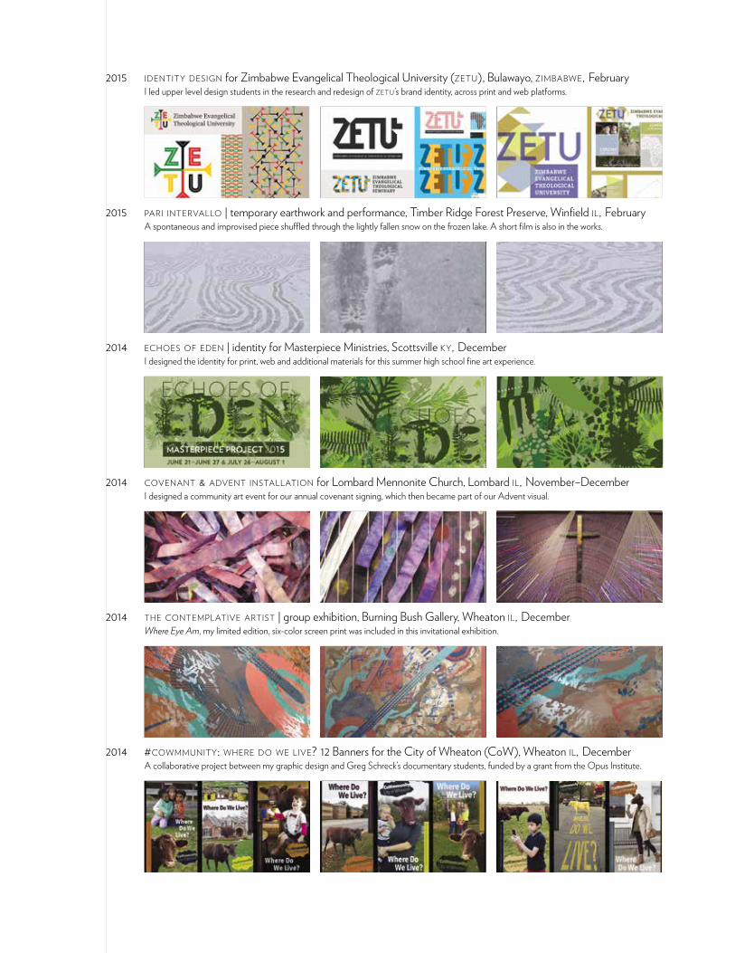
2015 identity design for Zimbabwe Evangelical Theological University (zetu), Bulawayo, zimbabwe, February I led upper level design students in the research and redesign of zetu ’s brand identity, across print and web platforms.
2015 pari intervallo | temporary earthwork and performance, Timber Ridge Forest Preserve, Winfield il, February A spontaneous and improvised piece shuffled through the lightly fallen snow on the frozen lake. A short film is also in the works.
2014 echoes of eden | identity for Masterpiece Ministries, Scottsville ky, December I designed the identity for print, web and additional materials for this summer high school fine art experience.
2014 covenant & advent installation for Lombard Mennonite Church, Lombard il, November–December I designed a community art event for our annual covenant signing, which then became part of our Advent visual.
2014 the contemplative artist | group exhibition, Burning Bush Gallery, Wheaton il, December Where Eye Am, my limited edition, six-color screen print was included in this invitational exhibition.
2014 #cowmmunity: where do we live? 12 Banners for the City of Wheaton (CoW), Wheaton il, December A collaborative project between my graphic design and Greg Schreck’s documentary students, funded by a grant from the Opus Institute.
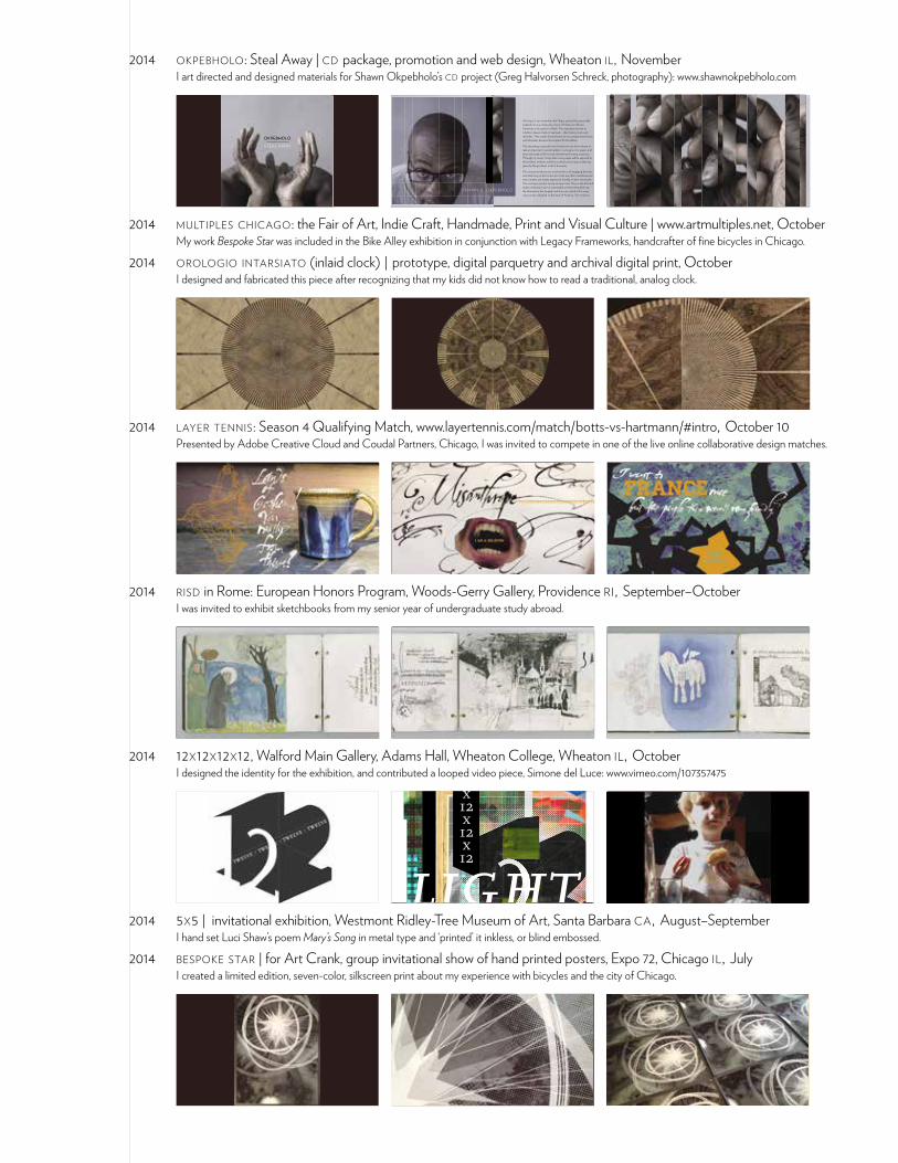
2014 okpebholo: Steal Away | cd package, promotion and web design, Wheaton il, November I art directed and designed materials for Shawn Okpebholo’s cd project (Greg Halvorsen Schreck, photography): www.shawnokpebholo.com
OKPEBHOLO
STEAL AWAY
OKPEBHOLO
STEAL AWAY
As long as I can remember, the Negro spiritual has personally inspired me as a composer, a lover of history, an African-American, and a person of faith. This inspiration led me to a further, deeper study of spirituals – their history, texts, and melodies. That study informed areas of my compositional voice, and ultimately became the impetus for this album.
This recording is special to me. It was born out of my desire to take an important musical tradition, re-imagine it on paper, and have it brought to life by truly talented performing musicians. Through my music, I hope that more people will be exposed to this timeless art form, and be touched by this treasure that was given by Negro slaves to all of humanity.
My compositional process involved hours of engaging the texts and reflecting on the honest lyrics that are often multidimensional and complex, yet simply expressed, humbly, in slave vernacular. The messages are discerning and personal. They evoke the hard truths of slavery in such a meaningful and even beautiful way: the inhumanity, the tragedy, and the scars, which still in many ways remain unhealed on the back of America. Yet somehow,
SHAWN E. OKPEBHOLO
2014 multiples chicago: the Fair of Art, Indie Craft, Handmade, Print and Visual Culture | www.artmultiples.net, October My work Bespoke Star was included in the Bike Alley exhibition in conjunction with Legacy Frameworks, handcrafter of fine bicycles in Chicago.
2014 orologio intarsiato (inlaid clock) | prototype, digital parquetry and archival digital print, October I designed and fabricated this piece after recognizing that my kids did not know how to read a traditional, analog clock.
2014 layer tennis: Season 4 Qualifying Match, www.layertennis.com/match/botts-vs-hartmann/#intro, October 10 Presented by Adobe Creative Cloud and Coudal Partners, Chicago, I was invited to compete in one of the live online collaborative design matches.
2014 risd in Rome: European Honors Program, Woods-Gerry Gallery, Providence ri, September–October I was invited to exhibit sketchbooks from my senior year of undergraduate study abroad.
2014 12x12x12x12, Walford Main Gallery, Adams Hall, Wheaton College, Wheaton il, October I designed the identity for the exhibition, and contributed a looped video piece, Simone del Luce: www.vimeo.com/107357475
12x12x12x12
light
The opening of the frame is 10.5 inches square, but you may be creative in how you
engage the frame (ie. It might become a pedestal for your three-dimensional work).
Work should not exceed 12 inches in any dimension. There will be a workshop in the fall
for students to build the 12x12 frame for their work.
Questions? Contact [email protected]
For this 2nd annual exhibition, participants are invited to create work that addresses the theme: darkness to light, sorrow to hope. Work can be 2d, 3d, or time based (should last 12 seconds), and must conform to the square or cubic format of the show.
Art Major participation is mandatory, and all work must be submitted by September 29th at 3:00pm.
2014 5x5 | invitational exhibition, Westmont Ridley-Tree Museum of Art, Santa Barbara ca, August–September I hand set Luci Shaw’s poem Mary’s Song in metal type and ‘printed’ it inkless, or blind embossed.
2014 bespoke star | for Art Crank, group invitational show of hand printed posters, Expo 72, Chicago il, July I created a limited edition, seven-color, silkscreen print about my experience with bicycles and the city of Chicago.
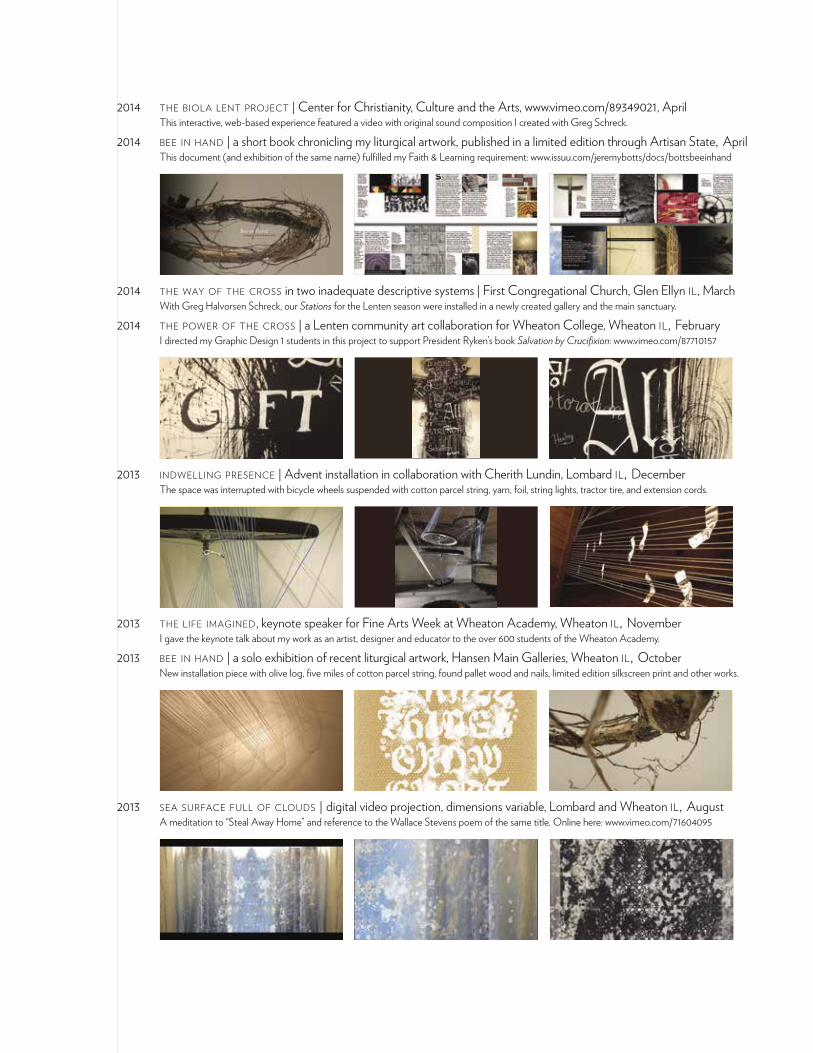
2014 the biola lent project | Center for Christianity, Culture and the Arts, www.vimeo.com/89349021, April This interactive, web-based experience featured a video with original sound composition I created with Greg Schreck.
2014 bee in hand | a short book chronicling my liturgical artwork, published in a limited edition through Artisan State, April This document (and exhibition of the same name) fulfilled my Faith & Learning requirement: www.issuu.com/jeremybotts/docs/bottsbeeinhand
2014 the way of the cross in two inadequate descriptive systems | First Congregational Church, Glen Ellyn il , March With Greg Halvorsen Schreck, our Stations for the Lenten season were installed in a newly created gallery and the main sanctuary.
2014 the power of the cross | a Lenten community art collaboration for Wheaton College, Wheaton il, February I directed my Graphic Design 1 students in this project to support President Ryken’s book Salvation by Crucifixion: www.vimeo.com/87710157
2013 indwelling presence | Advent installation in collaboration with Cherith Lundin, Lombard il, December The space was interrupted with bicycle wheels suspended with cotton parcel string, yarn, foil, string lights, tractor tire, and extension cords.
2013 the life imagined, keynote speaker for Fine Arts Week at Wheaton Academy, Wheaton il, November I gave the keynote talk about my work as an artist, designer and educator to the over 600 students of the Wheaton Academy.
2013 bee in hand | a solo exhibition of recent liturgical artwork, Hansen Main Galleries, Wheaton il, October New installation piece with olive log, five miles of cotton parcel string, found pallet wood and nails, limited edition silkscreen print and other works.
2013 sea surface full of clouds | digital video projection, dimensions variable, Lombard and Wheaton il, August A meditation to “Steal Away Home” and reference to the Wallace Stevens poem of the same title. Online here: www.vimeo.com/71604095
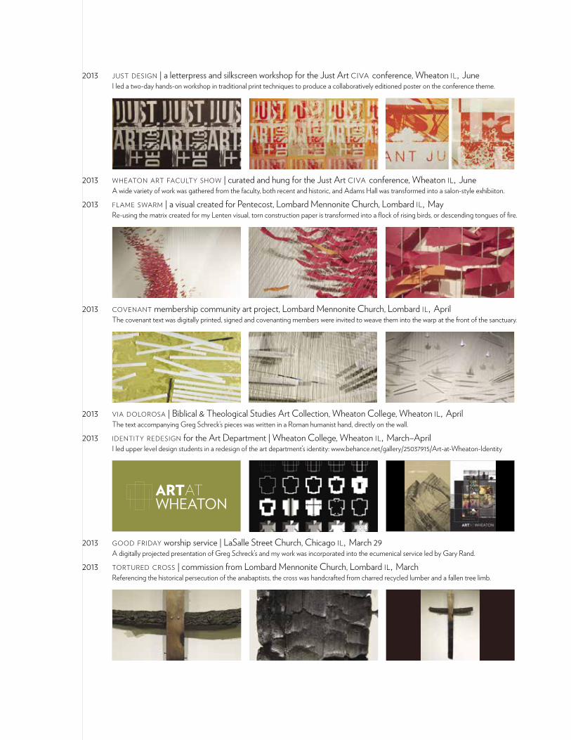
2013 just design | a letterpress and silkscreen workshop for the Just Art civa conference, Wheaton il, June I led a two-day hands-on workshop in traditional print techniques to produce a collaboratively editioned poster on the conference theme.
2013 wheaton art faculty show | curated and hung for the Just Art civa conference, Wheaton il, June A wide variety of work was gathered from the faculty, both recent and historic, and Adams Hall was transformed into a salon-style exhibiiton.
2013 flame swarm | a visual created for Pentecost, Lombard Mennonite Church, Lombard il, May Re-using the matrix created for my Lenten visual, torn construction paper is transformed into a flock of rising birds, or descending tongues of fire.
2013 covenant membership community art project, Lombard Mennonite Church, Lombard il, April The covenant text was digitally printed, signed and covenanting members were invited to weave them into the warp at the front of the sanctuary.
2013 via dolorosa | Biblical & Theological Studies Art Collection, Wheaton College, Wheaton il, April The text accompanying Greg Schreck’s pieces was written in a Roman humanist hand, directly on the wall.
2013 identity redesign for the Art Department | Wheaton College, Wheaton il, March–April I led upper level design students in a redesign of the art department’s identity: www.behance.net/gallery/25037915/Art-at-Wheaton-Identity
2013 good friday worship service | LaSalle Street Church, Chicago il, March 29 A digitally projected presentation of Greg Schreck’s and my work was incorporated into the ecumenical service led by Gary Rand.
2013 tortured cross | commission from Lombard Mennonite Church, Lombard il, March Referencing the historical persecution of the anabaptists, the cross was handcrafted from charred recycled lumber and a fallen tree limb.
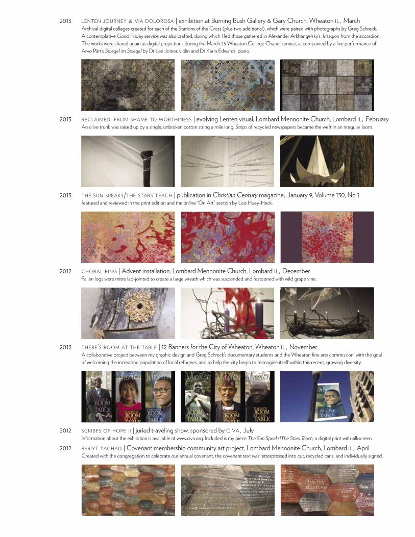
2013 lenten journey & via dolorosa | exhibition at Burning Bush Gallery & Gary Church, Wheaton il, March Archival digital collages created for each of the Stations of the Cross (plus two additional), which were paired with photographs by Greg Schreck. A contemplative Good Friday service was also crafted, during which I led those gathered in Alexander Arkhangelsky’s Trisagion from the accordion. The works were shared again as digital projections during the March 25 Wheaton College Chapel service, accompanied by a live performance of Arvo Pärt’s Spiegel im Spiegel by Dr Lee Joiner, violin and Dr Karin Edwards, piano.
2013 reclaimed: from shame to worthiness | evolving Lenten visual, Lombard Mennonite Church, Lombard il, February An olive trunk was raised up by a single, unbroken cotton string a mile long. Strips of recycled newspapers became the weft in an irregular loom.
2013 the sun speaks/the stars teach | publication in Christian Century magazine, January 9, Volume 130, No 1 featured and reviewed in the print edition and the online “On Art” section by Lois Huey-Heck.
2012 choral ring | Advent installation, Lombard Mennonite Church, Lombard il, December Fallen logs were mitre lap-jointed to create a large wreath which was suspended and festooned with wild grape vine.
2012 there’s room at the table | 12 Banners for the City of Wheaton, Wheaton il, November A collaborative project between my graphic design and Greg Schreck’s documentary students and the Wheaton fine arts commission, with the goal of welcoming the increasing population of local refugees, and to help the city begin to reimagine itself within this recent, growing diversity.
2012 scribes of hope ii | juried traveling show, sponsored by civa, July Information about the exhibition is available at www.civa.org. Included is my piece The Sun Speaks|The Stars Teach, a digital print with silkscreen.
2012 beriyt yachad | Covenant membership community art project, Lombard Mennonite Church, Lombard il, April Created with the congregation to celebrate our annual covenant, the covenant text was letterpressed into cut, recycled cans, and individually signed.
2012 the way of the cross | Good Friday Event, Gary United Methodist Church, Wheaton il, April Original artworks created for digital projection, and piano performance of Arvo Pärt’s Spiegel im Spiegel with Howard Whitaker, clarinet.
Via DolorosaThe Way of the Cross
good friday, 6 april 2012
“Truly I tell you, just as you did it to one of the least of these brothers and sisters
of mine, you did it to me.”
2012 approaching contemporary portraiture | civa seen Journal: Face to Face, Volume cxii :1 A conversation with Greg Schreck and David Hooker about my vector-based photo quilts, edited for the biannual publication.
2012 via dolorosa | tiled digital print, 56” x 72”, Adams Hall, Wheaton College, Wheaton il , March A recreation of an image of Marion Perkins’ Man of Sorrows (1951) by means of digital mosaic; a collaboration with 380 art survey students.
2011 ets-ezer: wooden quilt | Advent community art project, Lombard Mennonite Church, Lombard il, December Created with the congregation during Advent; an evolving installation culminating in a wooden “quilt” based on the traditional log cabin pattern.
2011 when artists believe | group show, Perspectives Gallery, Aurora il, October An exhibition of the Alhambran Butterfly series; digital and painted collaborations with Cora Jane Botts.
2011 rotolo: o tutti assetati venite all’acqua | 6’ x 18’ scroll, Orvieto italy, June A collaborative piece created as theatrical backdrop for Karin Coonrod’s medieval mystery play Stranieri ed altri Angeli.
2011 earthworks: Collaboration as Foundational Practice, paper given at fate conference, St Louis mo, March Included on the panel Teaching Site-Specific Practices, the presentation documented a collaborative project Greg Schreck and I devised.
2011 quilt | solo show at Hansen Main Gallery, Wheaton College, Wheaton il , February An exploration of the technical means by which images are created today, incorporating family history and traditional quilt patterns.
2010 advent installation | 8 x 21’ painting altered weekly, Lombard Mennonite Church, Lombard il , November–December An abstract, centering painting of concentric rings, inspired by the visual idea of time lapse, with select glow in the dark paint.
2010 invited faculty | Odyssey 2010: 29th International Conference for Lettering Artists, Stonehill College, Easton ma Courses: Contemporary Ornament: Weaving Complexity from Elementary & Contemporary Cuneiform: Creating Modular Letterforms.
Jeremy Botts • 153 E Pomfret Street • Carlisle PA 17013 • phone 717.756.0621 • website www.fiammascura.com
above: modular rotunda built from three simple modules (below in red)
Contemporary Cuneiform: Creating Letterforms from ModulesSince the invention of alphabetic and written language systems, there has been a dichotomy between the drawn (or constructed) form, and the written (and potentially calligraphic) form. Cuneiform was one of the earliest systems constructed with wedge-shaped modules. Today, many type designers employ similar constraints to standardize parts of letters both for ease in the digital environment, and for the uniformity and internal harmony it brings to the whole. Students will create a personal alphabetic system from a small set of modules, exploring the possibilties of hard-edged geometries as well as the hand-made mark, and apply their system to a series of explorations and more final pieces. If technology allows, we may explore some possibilities the computer affords.
Biography Jeremy Botts works with his hands around the ideas of landscape, journey, and language. He received a BFA from Rhode Island School of Design, spending his senior year in Italy drawing and writing letters, and a decade later an MFA from Maryland Institute College of Art (MICA), where he continues to teach typography and graphic design. He lives with his wife and baby girl in Pennsylvania and maintains a freelance design studio (www.fiammascura.com). Recently, he worked with Ellen Lupton on the textbook Graphic Design: The New Basics, and Indie Publishing, both published by Princeton Architectural Press.
logotype by Alex Klug
2008 indie publishing | wrote and designed the Poetry Chapbook chapter, Princeton Architectural Press A practical guide for creating and distributing independent printed books, with special focus on design, edited by Ellen Lupton.
by Jeremy Botts
Chapbooks have been around almost as long as the printing press. They originated as cheaply bound, roughly printed pamphlets that were carried around from village to village by “chapmen,” a kind of pedlar. Consisting of a dozen or so pages, these early chapbooks were informal, underground publications filled with bawdy stories and simple poems. Chapbooks still exist today, and although they have acquired a more dignified and polished aura, they remain an independent publishing phenomenon. A modern chapbook is a bound edition of poetry, generally containing forty or fewer poems, printed in a small edition for limited distribution by the publisher. Numerous literary magazines and poetry organizations sponsor chapbook competitions that result in the publication of a poet’s work. You can also make and distribute your own chapbook.
POETRYCHAPBOOK
TypographyTo make your poetry look good on the page you will want to avoid certain typographic crimes. Line breaks are quite often important to the reading of the poem, so you will want to make sure that you choose a typeface and size that will accomodate your longest line,
and longest poem. Typefaces have distinct qualities which might influence your choice as well, but choosing an “old style” or “bookface” might be best to allow the content of your poems to speak most clearly. Placing your poems on the page can give them a specific feel as well. I chose to
optically center each poem on the page. This diagram shows the accumulated weight of the poems over the course of the entire book.
Chapbooks are produced in many ways. They can be exquisitely crafted objects, printed via letterpress on fine paper, or they can be reproduced on a photocopier and bound together with a staples. In the nineteenth century, the fine press movement revived the idea of the chapbook as a way to publish small, collectible editions in a pamphlet format. Today, poetry societies and literary magazines issue chapbooks produced via offset printing as well as letterpress. I made the two chapbooks showcased in this chapter by hand, using a combination of desktop printing and traditional bookmaking techniques. You can learn more about these and other binding methods at the back of this book, in the section on production. Each chapbook was published in an edition of no more than XXX. I distributed the books among my friends and left copies in local cafes and coffee houses for people to read and enjoy. Some poets include illustrations in their chapbooks, featuring their own work or that of another artist. Chapbooks are often collaborations among a poet, artist, and master printer or designer. Your poetic voice is unique... so why not make your chapbook reflect that uniqueness! If you are producing the book yourself, consider trimming your book to an unexpected size or proportion to make it stand out from the majority of other chapbooks on the coffee table. It will take a bit more time and consideration, but in the end will be worth it.
2008 charlie bonner at 90 | book designed on the occasion of my grandfather’s 90th birthday, November To view the book in its entirety click here: www.issuu.com/jeremybotts/docs/charliebonnerninety
Charlie Bonner••
2008 graphic design: the new basics | work included in textbook by Ellen Lupton, Princeton Architectural Press The first significant text revisiting the foundational principles of design as set forth by the Bauhaus, and addressing contemporary concepts.
2007 promotional video for International Calligraphy Conference | wrote, directed, filmed and edited, Chicago il Commissioned by the Chicago Calligraphy Collective, the video can be viewed here: www.fiammascura.com/movings/mingle.html
2007 faculty show & mfa show | Maryland Institute College of Art, Baltimore md Work from my thesis, Reframing the Family can be viewed here: www.digital.mica.edu/courses/mfagd/thesis_2007/thesis_07.html
2006 giftcard designs for the Feeding Desire exhibition | Cooper-Hewitt, National Design Museum, New York ny Commissioned by the Smithsonian, these letterpress printed cards depict historical recipes rendered in hand and digital means.
2006 contemporary ornament | pattern designs published in Print Magazine I created illustrations to accompany an article about the resurgence of ornament in visual culture and design.
2005 civaxxv: faith+vision | work included in retrospective edited by Cameron J. Anderson, Square Halo Books One of my pieces: Esther, to be read at Purim, was featured in this 25th anniversary publication.
2005 sanctuary cross | commission of 17-foot tall oak, copper and steel cross, Mechanicsburg pa The cross was made from locally salvaged barn beams, and installed in the new sanctuary of West Shore Evangelical Free Church.
2004 faculty show | group show, Messiah College, Grantham pa Featured a series of charcoal drawings on inkjet prints, and Glory, a rendering of digital pixels in subtly stained and gold gilded pine blocks.
2004 icon show | group show organized by Icon Artists Guild, Enola pa I helped organize, jury and hang the show, and gave one of the presentations at the opening: From Rembrandt van Rijn to Philip Guston.
2002 thisplacement and septembered sabbaths | chapbooks of personal artwork and poetry Created while living on the family farm, the books were self published in editions of 150 each, with hand-painted covers and hand-sewn bindings.
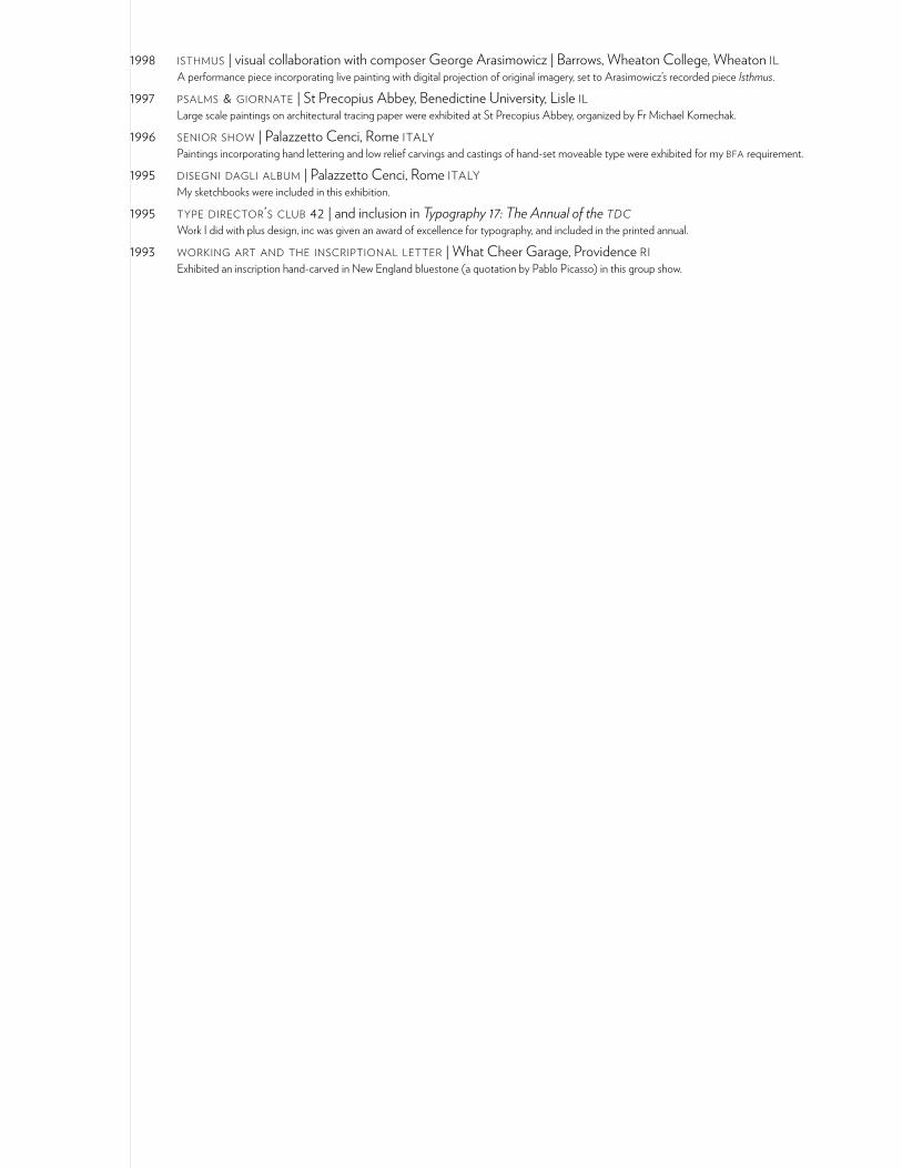
1998 isthmus | visual collaboration with composer George Arasimowicz | Barrows, Wheaton College, Wheaton il A performance piece incorporating live painting with digital projection of original imagery, set to Arasimowicz’s recorded piece Isthmus.
1997 psalms & giornate | St Precopius Abbey, Benedictine University, Lisle il Large scale paintings on architectural tracing paper were exhibited at St Precopius Abbey, organized by Fr Michael Komechak.
1996 senior show | Palazzetto Cenci, Rome italy Paintings incorporating hand lettering and low relief carvings and castings of hand-set moveable type were exhibited for my bfa requirement.
1995 disegni dagli album | Palazzetto Cenci, Rome italy My sketchbooks were included in this exhibition.
1995 type director’s club 42 | and inclusion in Typography 17: The Annual of the tdc Work I did with plus design, inc was given an award of excellence for typography, and included in the printed annual.
1993 working art and the inscriptional letter | What Cheer Garage, Providence ri Exhibited an inscription hand-carved in New England bluestone (a quotation by Pablo Picasso) in this group show.
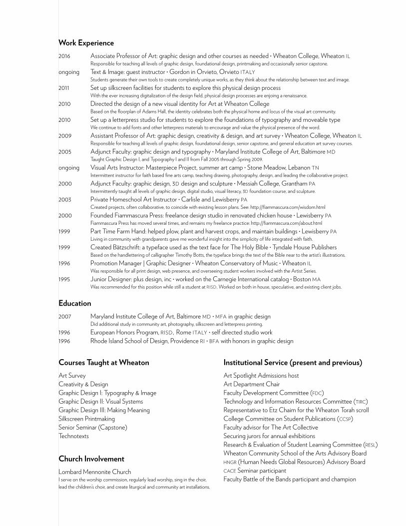
Work Experience2016 Associate Professor of Art: graphic design and other courses as needed • Wheaton College, Wheaton il Responsible for teaching all levels of graphic design, foundational design, printmaking and occasionally senior capstone.ongoing Text & Image: guest instructor • Gordon in Orvieto, Orvieto italy Students generate their own tools to create completely unique works, as they think about the relationship between text and image.2011 Set up silkscreen facilities for students to explore this physical design process With the ever increasing digitalization of the design field, physical design processes are enjoing a renaissance. 2010 Directed the design of a new visual identity for Art at Wheaton College Based on the floorplan of Adams Hall, the identity celebrates both the physical home and locus of the visual art community.2010 Set up a letterpress studio for students to explore the foundations of typography and moveable type We continue to add fonts and other letterpress materials to encourage and value the physical presence of the word.2009 Assistant Professor of Art: graphic design, creativity & design, and art survey • Wheaton College, Wheaton il Responsible for teaching all levels of graphic design, foundational design, senior capstone, and general education art survey courses.2005 Adjunct Faculty: graphic design and typography • Maryland Institute College of Art, Baltimore md Taught Graphic Design I, and Typography I and II from Fall 2005 through Spring 2009.ongoing Visual Arts Instructor: Masterpiece Project, summer art camp • Stone Meadow, Lebanon tn Intermittent instructor for faith based fine arts camp, teaching drawing, photography, design, and leading the collaborative project.2000 Adjunct Faculty: graphic design, 3d design and sculpture • Messiah College, Grantham pa Intermittently taught all levels of graphic design, digital studio, visual literacy, 3d foundation course, and sculpture.2003 Private Homeschool Art Instructor • Carlisle and Lewisberry pa Created projects, often collaborative, to coincide with existing lesson plans. See: http://fiammascura.com/wisdom.html2000 Founded Fiammascura Press: freelance design studio in renovated chicken house • Lewisberry pa Fiammascura Press has moved several times, and remains my freelance practice: http://fiammascura.com/about.html1999 Part Time Farm Hand: helped plow, plant and harvest crops, and maintain buildings • Lewisberry pa Living in community with grandparents gave me wonderful insight into the simplicity of life integrated with faith.1999 Created Bätzschrift: a typeface used as the text face for The Holy Bible • Tyndale House Publishers Based on the handlettering of calligrapher Timothy Botts, the typeface brings the text of the Bible near to the artist’s illustrations.1996 Promotion Manager | Graphic Designer • Wheaton Conservatory of Music • Wheaton il Was responsible for all print design, web presence, and overseeing student workers involved with the Artist Series.1995 Junior Designer: plus design, inc • worked on the Carnegie International catalog • Boston ma Was recommended for this position while still a student at risd . Worked on both in house, speculative, and existing client jobs.
Education2007 Maryland Institute College of Art, Baltimore md • mfa in graphic design Did additional study in community art, photography, silkscreen and letterpress printing.1996 European Honors Program, risd, Rome italy • self directed studio work1996 Rhode Island School of Design, Providence ri • bfa with honors in graphic design
Institutional Service (present and previous)Art Spotlight Admissions hostArt Department ChairFaculty Development Committee (fdc)Technology and Information Resources Committee (tirc)Representative to Etz Chaim for the Wheaton Torah scrollCollege Committee on Student Publications (ccsp)Faculty advisor for The Art CollectiveSecuring jurors for annual exhibitionsResearch & Evaluation of Student Learning Committee (resl)Wheaton Community School of the Arts Advisory Boardhngr (Human Needs Global Resources) Advisory Boardcace Seminar participantFaculty Battle of the Bands participant and champion
Courses Taught at WheatonArt SurveyCreativity & DesignGraphic Design I: Typography & ImageGraphic Design II: Visual SystemsGraphic Design III: Making MeaningSilkscreen PrintmakingSenior Seminar (Capstone)Technotexts
Church InvolvementLombard Mennonite ChurchI serve on the worship commission, regularly lead worship, sing in the choir, lead the children’s choir, and create liturgical and community art installations.