
J query wigets
34
jQuery Widgets
-
Upload
misbah-saleem -
Category
Internet
-
view
16 -
download
1
Transcript of J query wigets
jQuery Widgets
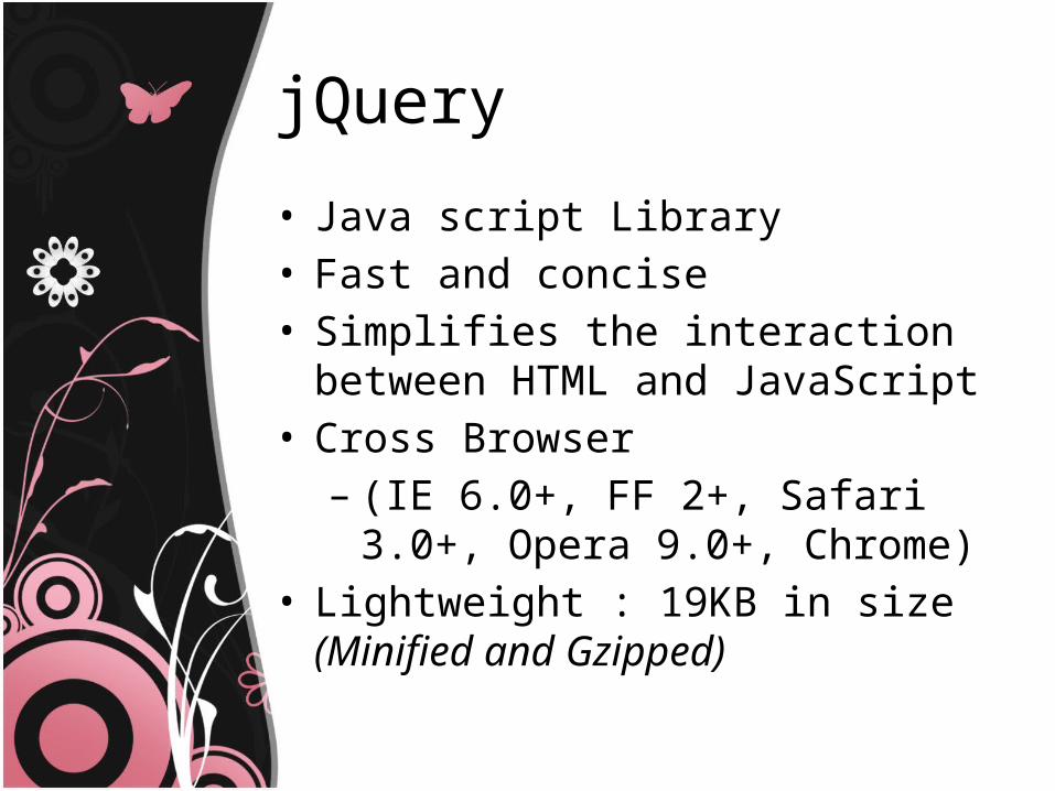
jQuery
• Java script Library• Fast and concise• Simplifies the interaction between HTML
and JavaScript• Cross Browser – (IE 6.0+, FF 2+, Safari 3.0+, Opera 9.0+,
Chrome)• Lightweight : 19KB in size (Minified and
Gzipped)
JQuery widgets
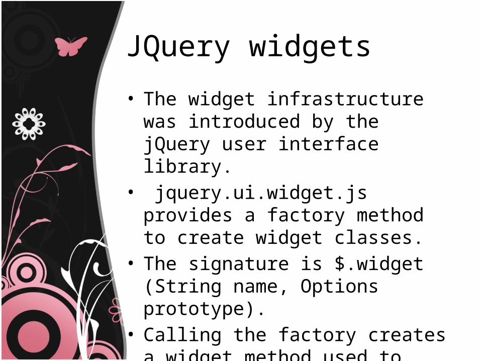
• The widget infrastructure was introduced by the jQuery user interface library.
• jquery.ui.widget.js provides a factory method to create widget classes.
• The signature is $.widget (String name, Options prototype).
• Calling the factory creates a widget method used to create and interact with an instance of that widget class.
Widgets default méthods
• The following default methods are available for each instance, in addition to those provided by the prototype argument:
Widgets default méthode
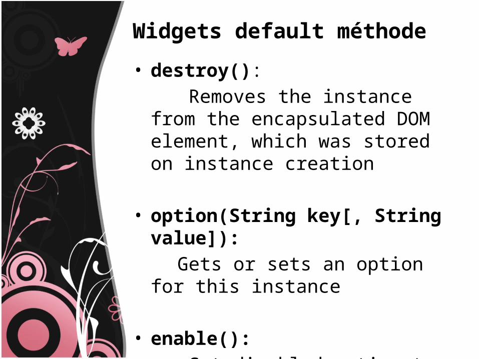
• destroy(): Removes the instance from the
encapsulated DOM element, which was stored on instance creation
• option(String key[, String value]): Gets or sets an option for this instance
• enable(): Set disabled option to false, it's up to
the instance to respect the option
Cont…
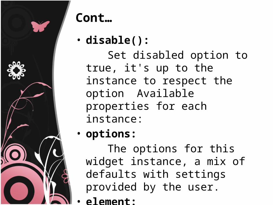
• disable(): Set disabled option to true, it's up to
the instance to respect the option Available properties for each instance:
• options: The options for this widget instance, a
mix of defaults with settings provided by the user.
• element: A jQuery object always containing a
single DOMElement, which can be accessed with this.element[0].
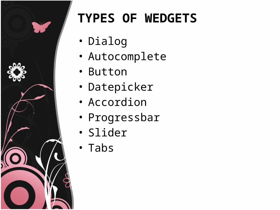
TYPES OF WEDGETS
• Dialog• Autocomplete • Button • Datepicker• Accordion• Progressbar• Slider• Tabs
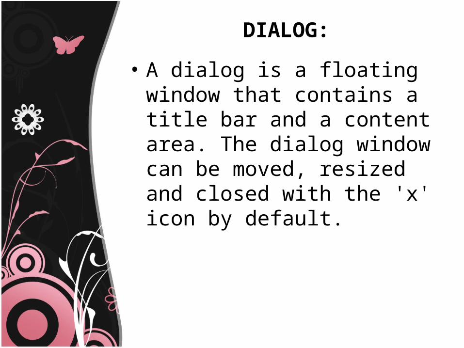
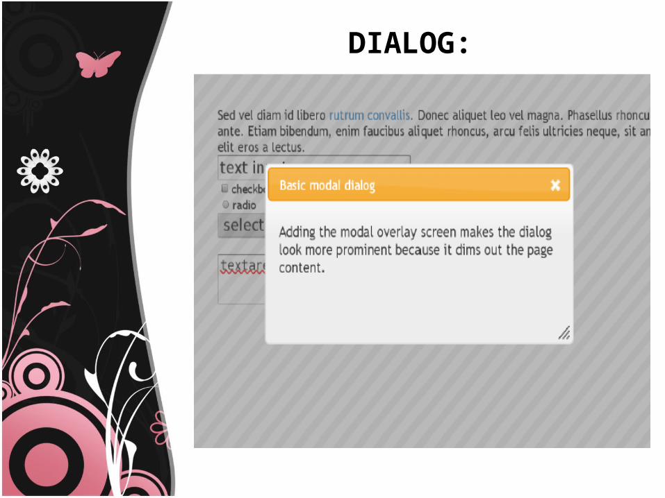
DIALOG:
• A dialog is a floating window that contains a title bar and a content area. The dialog window can be moved, resized and closed with the 'x' icon by default.
DIALOG:
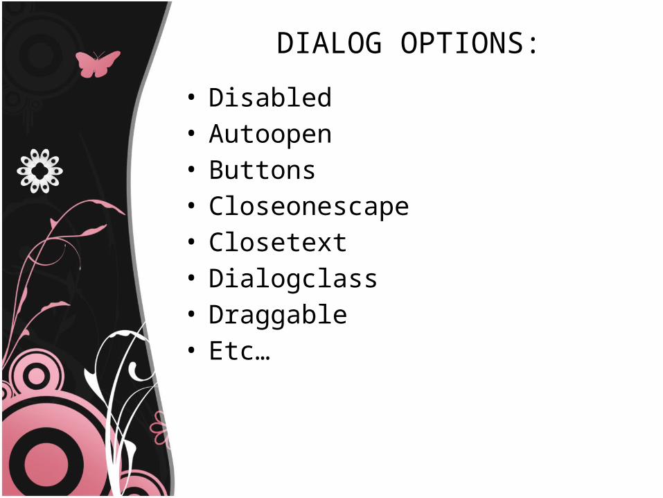
DIALOG OPTIONS:
• Disabled• Autoopen• Buttons• Closeonescape• Closetext• Dialogclass• Draggable• Etc…
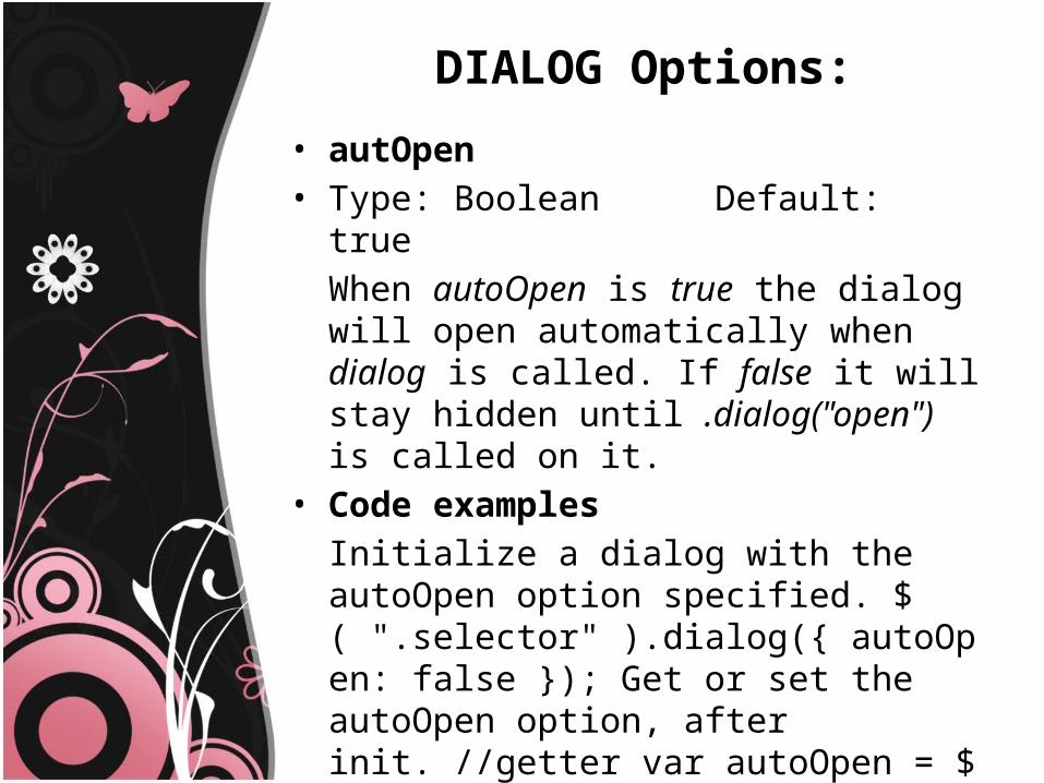
DIALOG Options:
• autOpen• Type: Boolean Default: true
When autoOpen is true the dialog will open automatically when dialog is called. If false it will stay hidden until .dialog("open") is called on it.
• Code examplesInitialize a dialog with the autoOpen option specified. $( ".selector" ).dialog({ autoOpen: false }); Get or set the autoOpen option, after init. //getter var autoOpen = $( ".selector" ).dialog( "option", "autoOpen" ); //setter $( ".selector" ).dialog( "option", "autoOpen", false );
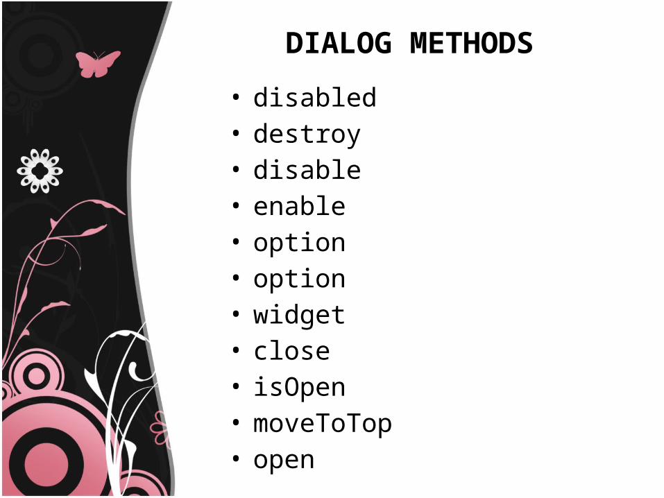
DIALOG METHODS
• disabled• destroy• disable• enable• option• option• widget• close• isOpen• moveToTop• open
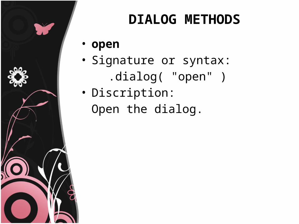
DIALOG METHODS
• open• Signature or syntax: .dialog( "open" ) • Discription:
Open the dialog.
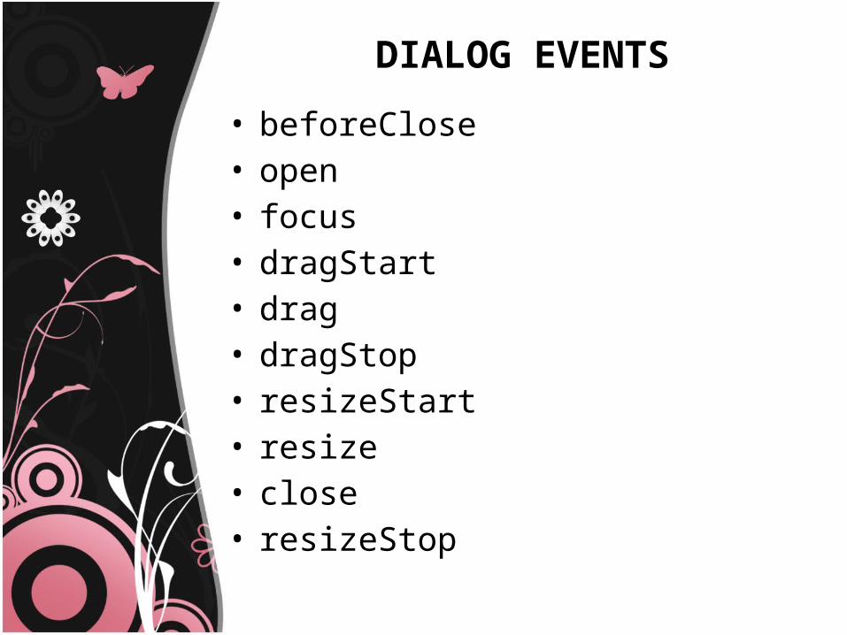
DIALOG EVENTS
• beforeClose• open• focus• dragStart• drag• dragStop• resizeStart• resize• close• resizeStop
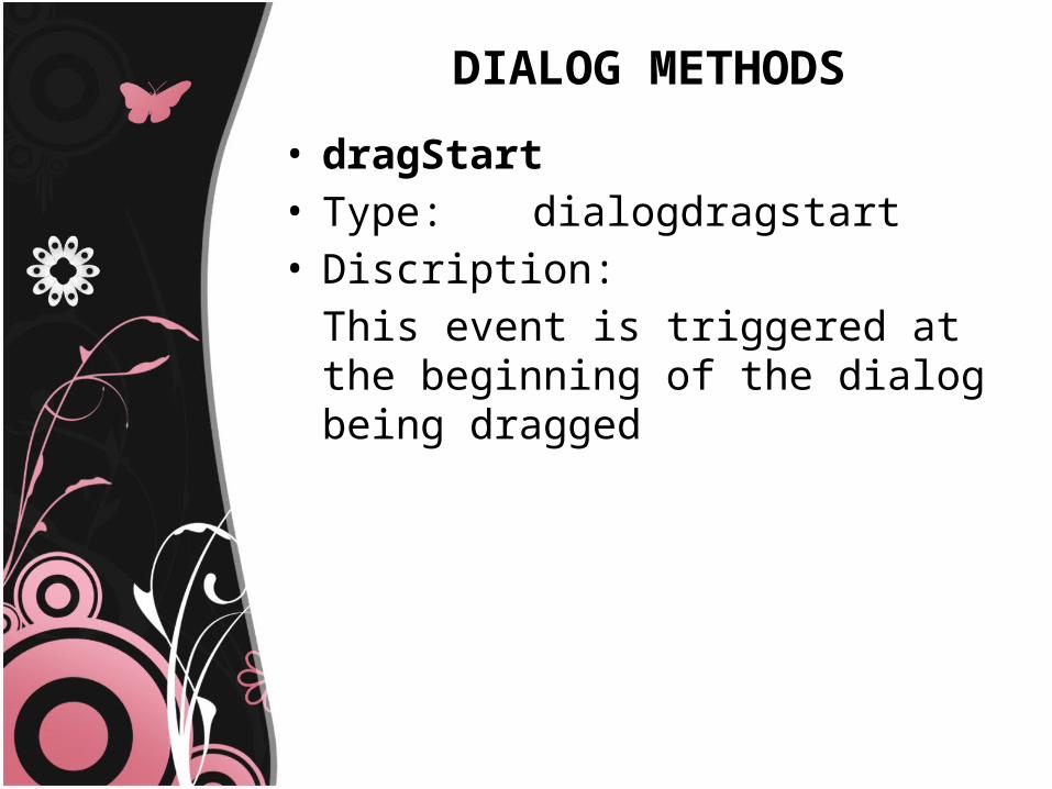
DIALOG METHODS
• dragStart• Type: dialogdragstart • Discription:
This event is triggered at the beginning of the dialog being dragged
PROGRESSBAR
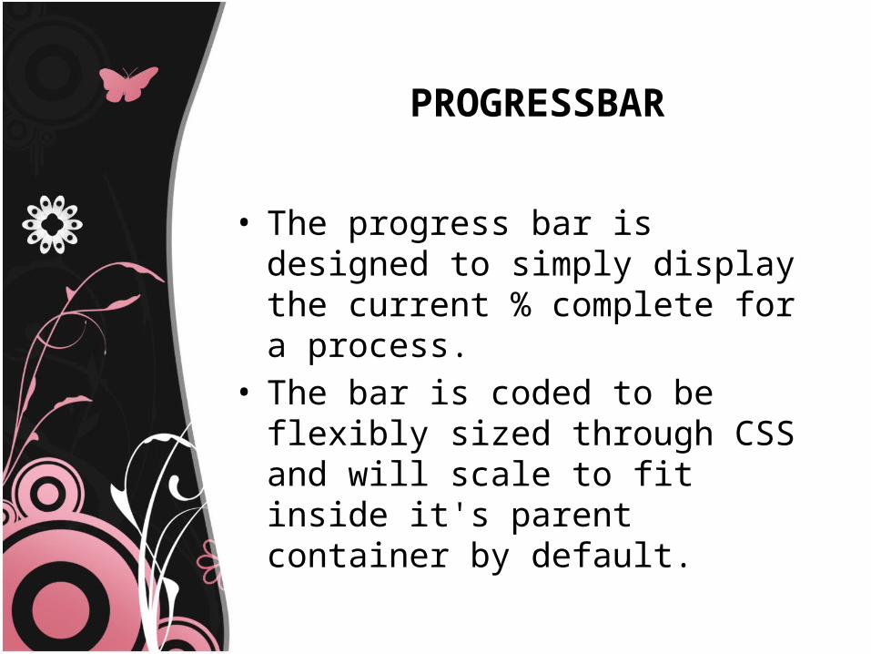
• The progress bar is designed to simply display the current % complete for a process.
• The bar is coded to be flexibly sized through CSS and will scale to fit inside it's parent container by default.

PROGRESSBAR
PROGRESSBAR OPTIONS
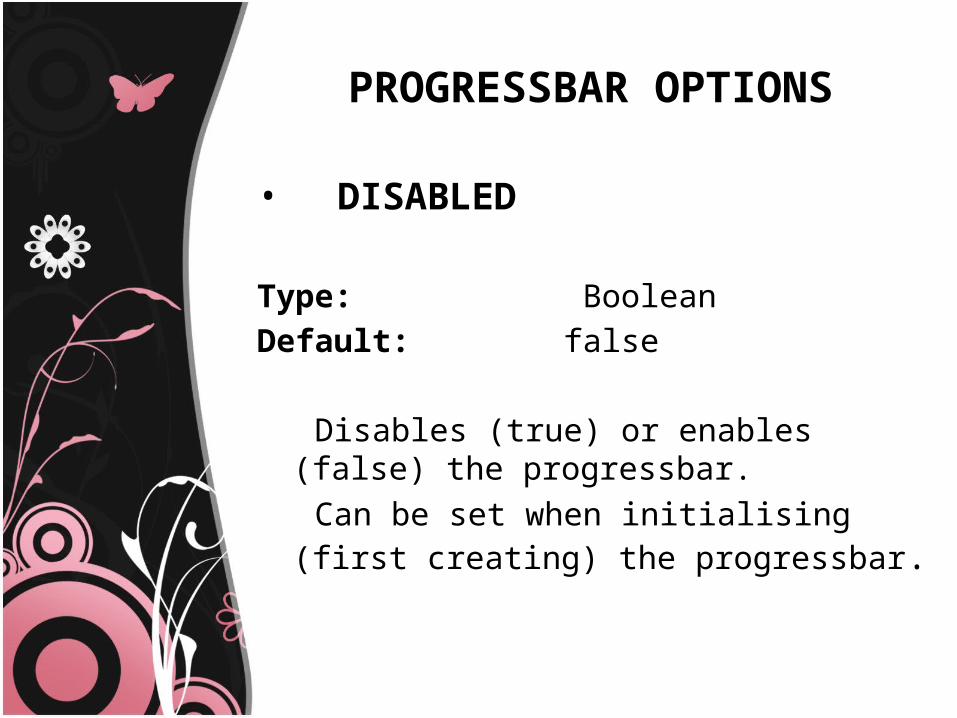
• DISABLED
Type: BooleanDefault: false
Disables (true) or enables (false) the progressbar. Can be set when initialising (first creating) the
progressbar.
PROGRESSBAR OPTIONS
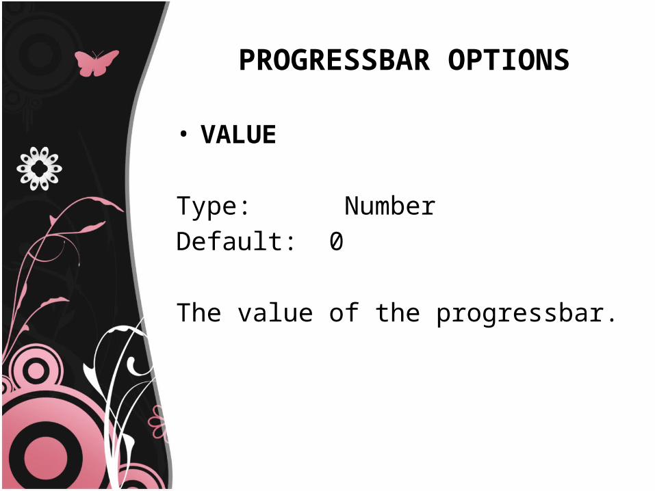
• VALUE
Type: NumberDefault: 0
The value of the progressbar.
PROGRESSBAR OPTIONS
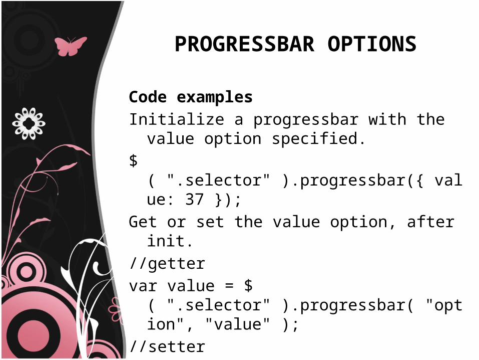
Code examplesInitialize a progressbar with the value option
specified. $( ".selector" ).progressbar({ value: 37 });Get or set the value option, after init. //gettervar value = $( ".selector" ).progressbar( "option",
"value" );//setter$( ".selector" ).progressbar( "option", "value", 37 );
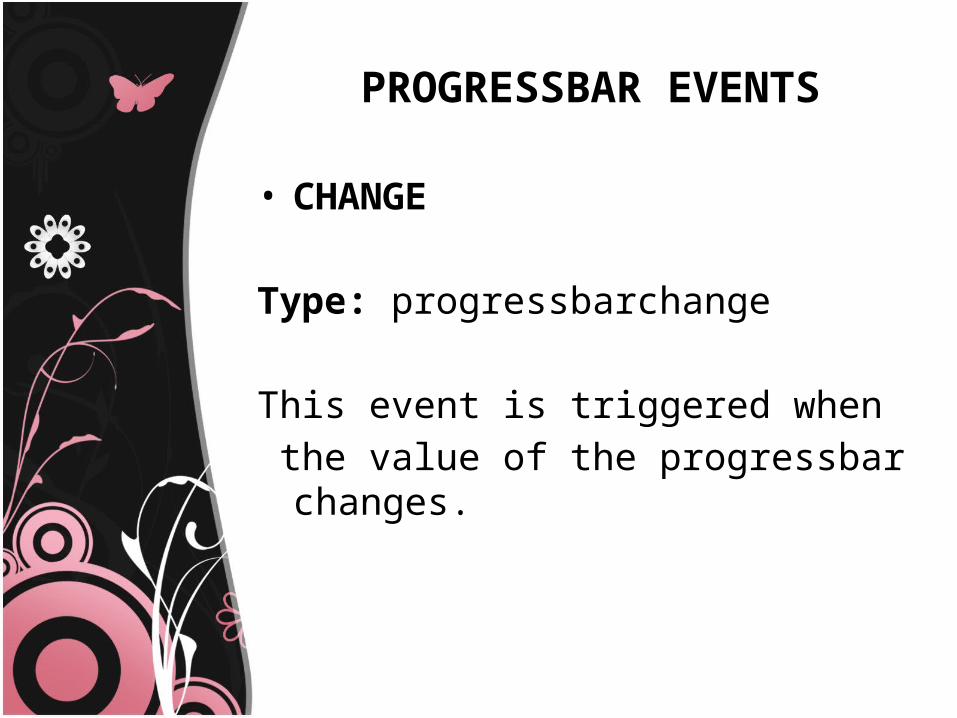
PROGRESSBAR EVENTS
• CHANGE
Type: progressbarchange
This event is triggered when the value of the progressbar changes.
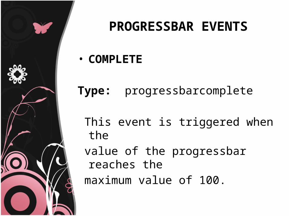
PROGRESSBAR EVENTS
• COMPLETE
Type: progressbarcomplete
This event is triggered when the value of the progressbar reaches the maximum value of 100.
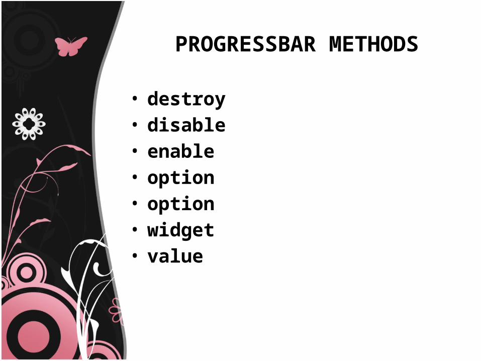
PROGRESSBAR METHODS
• destroy• disable• enable• option• option• widget• value
PROGRESSBAR METHODS
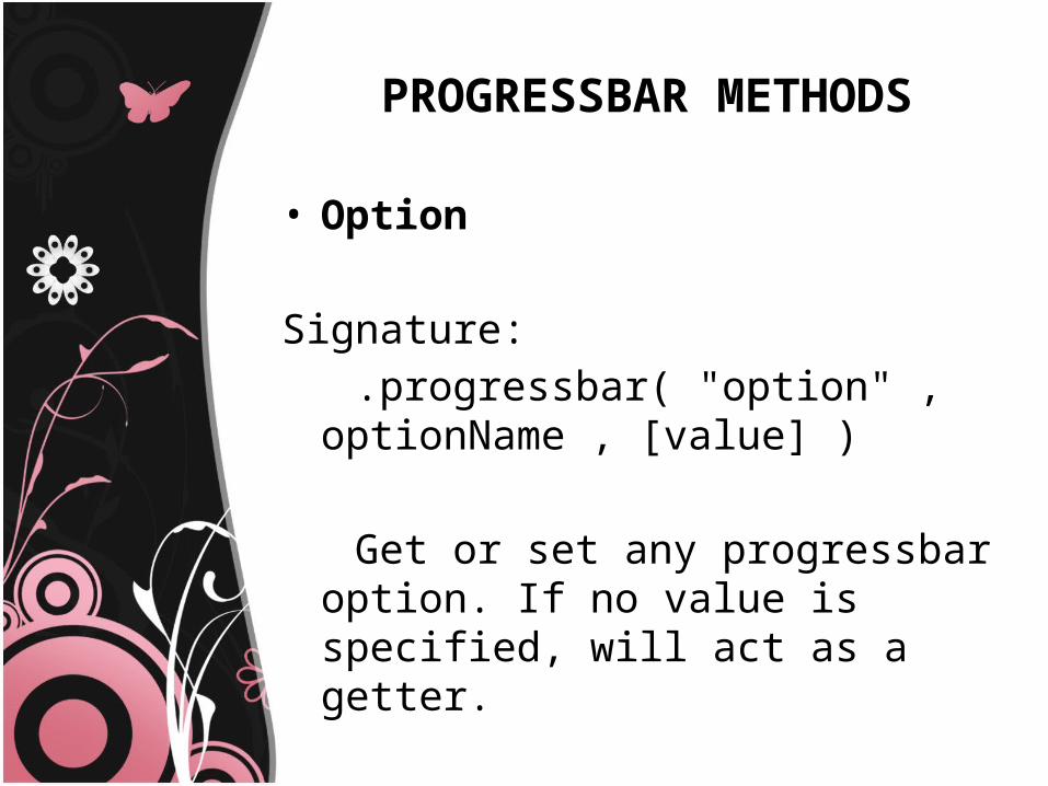
• Option
Signature: .progressbar( "option" , optionName ,
[value] ) Get or set any progressbar option. If no
value is specified, will act as a getter.
PROGRESSBAR METHODS
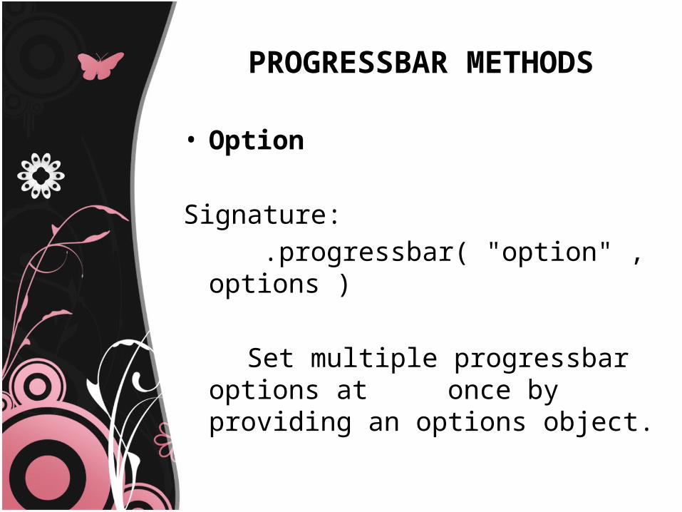
• Option
Signature: .progressbar( "option" , options ) Set multiple progressbar options at
once by providing an options object.
PROGRESSBAR METHODS
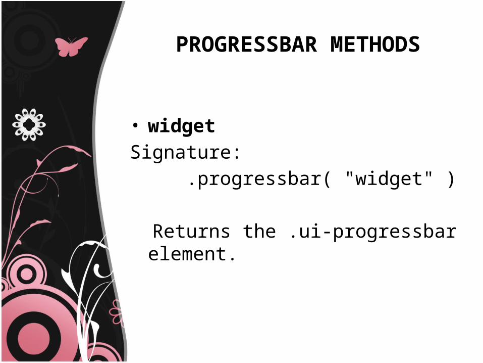
• widgetSignature: .progressbar( "widget" )
Returns the .ui-progressbar element.
UI Tabs
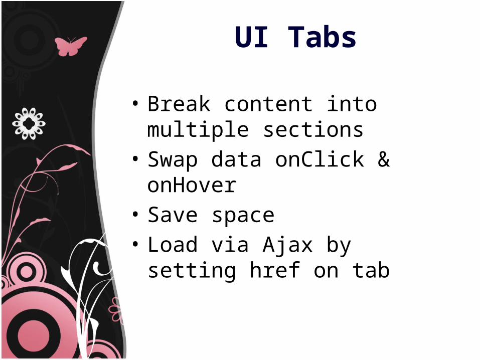
• Break content into multiple sections
• Swap data onClick & onHover• Save space• Load via Ajax by setting href on tab
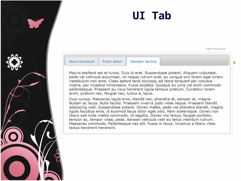
UI Tab
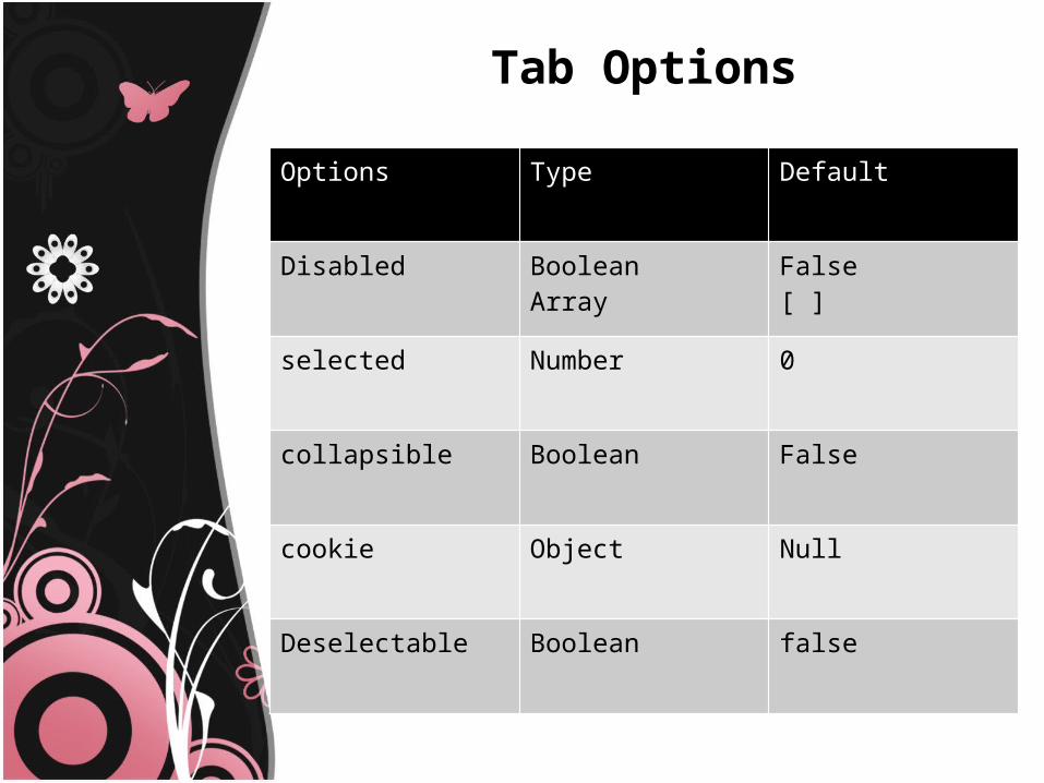
Tab Options
Options Type Default
Disabled BooleanArray
False[ ]
selected Number 0
collapsible Boolean False
cookie Object Null
Deselectable Boolean false
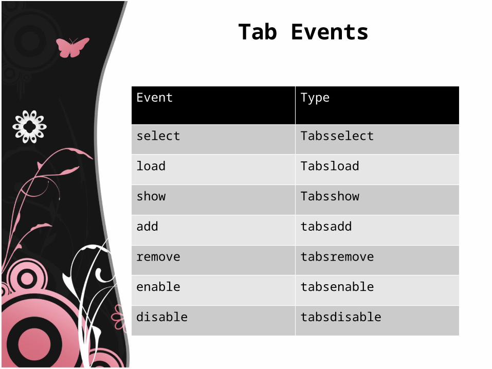
Tab Events
Event Type
select Tabsselect
load Tabsload
show Tabsshow
add tabsadd
remove tabsremove
enable tabsenable
disable tabsdisable
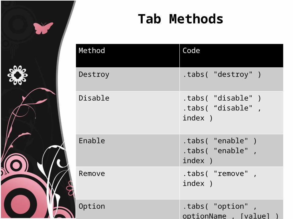
Tab Methods
Method Code
Destroy .tabs( "destroy" )
Disable .tabs( "disable" ).tabs( “disable" , index )
Enable .tabs( "enable" ).tabs( "enable" , index )
Remove .tabs( "remove" , index )
Option .tabs( "option" , optionName , [value] ).tabs( "option" , options )
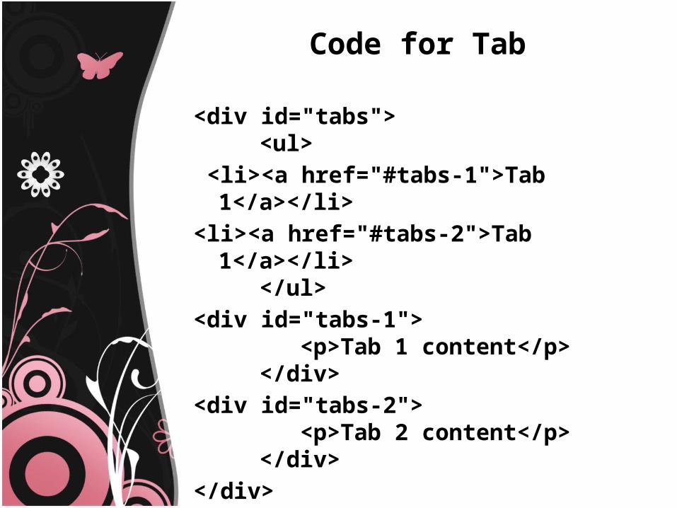
Code for Tab
<div id="tabs"> <ul>
<li><a href="#tabs-1">Tab 1</a></li><li><a href="#tabs-2">Tab 1</a></li>
</ul><div id="tabs-1">
<p>Tab 1 content</p> </div>
<div id="tabs-2"> <p>Tab 2 content</p> </div>
</div>
Conclusion
The jQuery UI plugin uses the jQuery UI CSS Framework to style its look and feel, including colors and background textures.

THANK YOU