It Blazes Brightly Before Us
48
Frances Mahoney Graphic Design, 2015 Branding the Mahoney Family
-
Upload
frances-mahoney -
Category
Documents
-
view
217 -
download
0
description
For many people, the questions “Where do I come from?” and “What is my heritage?” are ones that often go unanswered, undiscovered, or simply aren’t considered important enough to undertake. Many of us could have famous, revolutionary, or even royal ancestry and may never even realize this. When approaching thesis, a fascination with the idea of lineage arose both for its personal connection and the pure desire to learn about my roots. Married with corporate identity design, using the Mahoney genealogy as a model, this project takes elements, locations, and names from my family’s Gaelic origins and incorporates them into an identity system for a prospective “company.” These historic components are brought into modernity in a way that reflects my proclivity for branding, as well as breathes new life into parts of my ancestry that could just as easily be lost to time.
Transcript of It Blazes Brightly Before Us

1Frances Mahoney Graphic Design, 2015
Branding the Mahoney Family

2
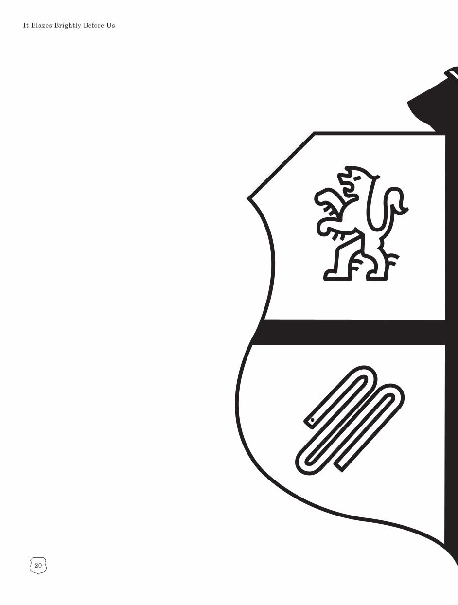
It Blazes Brightly Before Us

3
This book was designed and arranged by Frances Mahoney in Spring 2015.
Two editions of this book were printed atMaine College of Art, this being edition one.
This edition was coptic bound with vegetabletanned leather provided by Belle Hilmer ofMaine Leather Company.
The body text is set at 8 and 10 pt. in Century, designed by Linn Boyd Benton in 1894.
The header text is set in Mathghamhain,designed by Frances Mahoney in 2015.

4
It Blazes Brightly Before Us
06 Introduction 07 The Mahoney Family
10 22Crafting the Crest Mathghamhain

5
Moving Forward
32 The Branches 40 Implementing the Identity
46
Contents

6
It Blazes Brightly Before Us
Often when you ask someone what their heritage is, a common answer to receive is, “I’m a mutt” or, “I’m a lot of different things.” Some-
times, people aren’t even aware of their lineage in the slightest. For many people in our culture, maintaining and passing down knowledge of our ancestry is more of a hobby or passing fancy rather than a deeply rooted tradition amongst families. I too have been guilty of this, both of not knowing enough about where I came from and of not expressing enough interest in learning. I have always been aware of my Irish background, given my last name, but never did I give much thought to explor-ing just how far the roots of my bloodline ran, or the place the Mahoney family has had in history. It wasn’t until my father showed me a small wooden plaque bear-ing my family crest, having had it passed down from his father, my interest in the Mahoney family ignited like a flame.
I have dedicated the past four months to continuing to learn more and delve into the history of my namesake, and marrying the elements of my lineage to my profes-sional practice; Graphic Design. Allowing myself a semester to dedicate my time to learning more about where I came from has been one of the most rewarding ex-periences I’ve taken on. Not only because I can correct my grandmother on fami-ly trivia, but exploring one’s place in the world gives you a sense of belonging, ca-maraderie, and pride unlike anything else.

7
For a good long while before the-sis even began, I was certain of what I wanted my final project to center around; my Gaelic her-itage. My interest in my lineage
was truly sparked when my father handed down to me a small wooden plaque bearing the O’Mahony crest. It was then that he explained to me a bit of our Irish heritage, descending from my grandfather’s blood line, and how our name was a modern version of the Irish surname ‘O’Mahony’. This was something I carried with me now into my adulthood, and when brainstorming about my thesis proj-ect, choosing to make my lineage the central theme only felt natural. As a designer, the decision to pursue corporate branding was in-spired not only by my love of crafting identi-ty design, but to pay homage to my late uncle Bill Mahoney; an entrepreneur and incredible human being. In order to do justice to my her-itage, family, and the art of branding, I have looked to designers and studios of the past and studied how they approached giving an identity to the great businesses of the world. Forging an identity isn’t just about a logo; it’s encompassing the mission of an entire corpo-ration through a series of multiple touchpoints that affect the perception of the brand itself.
In order to make my thesis project a true exploration of my family’s heritage, I have aimed to learn as much about the Ma-honey family. It all began with an Irish-man of the early 11th century who went by the name of Mathghamhain (whose name means bear). Mathghamhain was the son of Cian Mac Mael Muda, chief of the Cineal Aodha clan, and his wife Sadh-bh, daughter of the High King Brian Boru. Through Brian Boru, Mathghamhain was a member of the Eoghanacht Raithline, a dynastic line claiming descent from Eo-ghan Mor, a 2nd-century King of Mun-ster. Following Mathghamhain death in battle, his descendants later went on to become sovereigns over territory in West York. Today, his descendants use the surname McMahon, Mahoney, O’Mahoney, or O’Mahony. During the clan wars of the Middle Ages, the O’Mahonys were di-vided into eight separate septs and at one time, owned eight castles. These cas-tles included; Castle Mahon, Castle Lac, Dunmanus, Laem Con, Rosbrin, Ardin Tenant, Ballydevlin, Dunbeacon, and Tem-plemartin. Of these castles, remnants of Dunmanus, Rosbrin, Ardin Tenant, Bal-lydevlin, and Dunbeacon still remain today.
The Mahoney Family

8
It Blazes Brightly Before Us
To this day, descendants of Mathghamhain continue to thrive in southern Ireland in the Province of Munster and the surrounding towns, as well as scattered all across the world. To learn that my ancestors were royalty of Ire-land, and that throughout my family history there have been a number of notable princes and sovereigns is quite elating and exciting. Not only that, but the fact that my family is still thriving and present in the world makes me incredibly happy. What makes the history of my lineage so interesting is the fact that during the Middle Ages, my family split up into a number of different factions, resulting in a number of different branches of the original Mathghamhain bloodline and each new sect having their own surname. Despite this fact, we are all still interconnected through our one common descendant, and there is certainly much history to be proud of found in each it-eration of my bloodline. This comradery, this sense of belonging to a rich heritage.

9
Mizen Head Peninsula, County Cork, Ireland
The Mahoney Family

10
It Blazes Brightly Before Us
My first introduction to the O’Mahony family crest came in the form of my fa-ther showing me a small, wooden plaque that his fa-
ther had given to him. He explained to me that O’Mahony was our traditional family name, and that this was the crest that represented us. Though I didn’t give it much thought at first, the image stayed with me for years in the back of my mind. A few years later as we were cleaning out our home to get ready to move, again my dad showed me something correlat-ing with our family history; a small sheet of paper encased in plastic that bore the same crest, our family motto, and a brief description of where we came from and where the blood-line began. This is really what sparked my interest in my lineage, and was something I carried with me into my junior year as I be-gan to mull over how to approach my thesis project. I knew this project couldn’t just be some run-of-the-mill branding assignment. I wanted it to mean something, to have some personal connection to me and what I cared about personally. The crest and the informa-tion card came to mind, and the decision to work with my family history was incepted. I find myself to be a designer who is primari-ly interested in the crafting of identities,
i.e logos, color schemes, typefaces, etc. that help to give a ‘face’ if you will to a company, foundation, restaurant, and so on. So when be-ginning to formulate how to work within this framework, I knew the crest would be central in the final product. From there, it was de-cided that I would use the crest as a model for the beginnings of this identity. Using this mark as a starting point, I became inspired to take on corporate branding in light of my father’s and uncle’s backgrounds in busi-ness, and how I myself am interested in pos-sibly pursuing a Masters in business further down the road. But before I could take on any of the print collateral and other makings of a corporate brand, I had to first perfect this mark. I wanted it to reflect its traditional aesthetic while also being set in modernity. This would mean I would have to go cleaner, simpler, and minimal. This was the most dif-ficult part of reimagining this crest; how do you take such an ornate, historic design and simplify it down to its most basic elements?

11
The original wooden plaque of the O’Mahony crest, currently in possession of my father.
Crafting the Crest

12
It Blazes Brightly Before Us
Original “But, seriously” teaser poster created at the start of the project.

13
Frances Mahoney, Graphic Design ‘15
First and foremost, I had to think of how the crest, devoid of any other icons or trimmings, would look. I knew of course that I wanted to maintain the original shape of the crest on the wooden plaque, but in order to achieve that sense of modernity, I had a few different ideas to work with. The crest used in the original “But, seriously” teaser poster I created at the start of the project was a direct tracing of the wooden plaque, and was used at the model for all future iterations of the working mark.I experimented with different weights, how the lines sat within the exterior shape, and whether of not the edges should be round-ed. A unanimous decision was made to not use any rounded edges, as it gave the crest an almost bloated feeling. Plus, the sharper edges would later come to act as a contrast-ing balance to the rounded edges of the icons that would later be placed inside. The interior lines touching the crest was also the final de-cision, as it simply felt more whole this way.
Crafting the Crest

14
It Blazes Brightly Before Us
Rough sketch concepts for the lion icon.

15
Crafting the Crest

16
It Blazes Brightly Before Us
Once the initial shape of the crest was fleshed out, it was time to move onto the icons them-selves. Like the teaser, I began with icons that directly reflected the traditional-looking lions and snakes. The lion emulated the one from the plaque exactly, with a few modifications to clarify some of the detail that was lacking otherwise. This went through two more drafts, slowly elimnating more of the detail and sim-plifying things down while still maintaining the traditional feel. This created a lot of sharp edges and extra details that as I began to pair the first iterations with the crest, I realized that sticking with this style starkly contrasted the idea of modernity that I was trying to go for
When it came to the snake, it was easier to come up with a more minimalistic look than the lion, as there were obviously less parts to work with. After trying out a few different options, I just wasn’t happy with any of the results I was getting with the snake. I looked to other resources, such as Kenneth J. Hie-bert’s “Graphic Design Sources” and quickly transitioned into a more geometric, simple design for the snake that focused more on working with the icon as a shape rather than sticking strictly to the source material. The snake was resolved rather quickly, but this still left the lion, which still wasn’t working quite within the modern context I wanted.

17
Page from Kenneth J. Hiebert’s ‘Graphic Design Sources’
Crafting the Crest

18
It Blazes Brightly Before Us

19
When I began placing the icons within the crest shape, the initial steps towards the final product were being taken. At first, I didn’t work with the knight’s arm and worked only with the crest, as I both wasn’t sure how the arm would look and didn’t think it would work visually. The first version’s icons felt too clunky and large, even though they closely resembled the source material. I also played with the idea of the icons consisting of separate parts, with the lines not touching. This also came out a bit too overwhelming and that was scraped as well. Once the forms were simplified, they worked a little better, and I finally began working with the idea of the knight’s arm. Again, like the lion and the snake, I wanted to remain true to the original plaque. However, the crown below the arm was also omitted as it added too much de-tail to what was supposed to be a simple mark. While the snake felt finalized, the lion still felt like it didn’t fit in with the modern look of the arm and the snake, so I took the mark into a new direction in order to create consistency.
Like the snake, I thought about the lion more as a number of different shapes rather than just a lion. I did a little research on different lion logos that exist in the world today, such as the Peugeot and MGM logos, and noticed how they thought of the lion more as a silhouette or shape. I began to rethink the current icon and removed much of the excess detail in favor of focusing more on how it was posed and how its limbs and body were contorted. Ultimately, I retained the shape of the head, tail and torso, while giving the limbs a more rounded, simpli-fied look that fell more in line with the geom-etry of the snake’s appearance. The two marks finally felt more in line with one another and the overall aesthetic I was aiming to achieve. With a few more tweaks of the knight’s arm, siz-ing, and other futzing, the logo came to a place I was ultimately satisfied with. The Mahoney family crest had been brought into modernity.
Crafting the Crest
20
It Blazes Brightly Before Us

21
Crafting the Crest

22
It Blazes Brightly Before Us
The family crest may have been the starting point for this en-tire ordeal, but once I decided this project would be dedicated to learning as much about my
heritage as possible, I knew that this would have to become much more than rethinking a mark. I knew right away that I wanted to cre-ate a typeface for this project, one that was custom designed specially for this project. Gaelic letterforms beame more publicly famil-iar with the creation of J.R.R Tolkien’s Lord of the Rings, as he based most if not all the type-faces he created on Gaelic letterforms. More notably, the Elvish language he created was directly inspired by the Gaelic alphabet. When the decision was made to design type that em-ulated modern Gaelic, I knew it was important to have the letters look as little as Tolkien’s as possible. The most important factor of creating a font around Gaelic would be avoiding this Hobbit-y look that so many have become famil-iar with. At the same time, like with the logo, I wanted to move away from the more tradition-al look and give these forms a cleaner, slicker look while still retaining their origins. I be-gan to research multiple sources for examples how both ancient and modern Gaelic looked and how it was used in the current context.
Gaelic type is a family of insular typefaces that was devised for the printing of Irish, be-ginning in the 16th century. The first Gaelic typeface was designed in 1571 for a catechism commissioned by Elizabeth I to help convert the Irish Roman Catholic population to An-glicanism. Traditionally, all Gaelic typefaces must include the vowels with acute accents and the consonants with dots above. Some typefaces even have ligatures that were used in early gaelic typography and derive from the traditional manuscripts. However, as my goal was to create a completely Latin alphabet that would be used as a header text in the English language, these accents, dots, and ligatures were to be omitted in order to read solely as Latin text. This came up in class discussion, as some people seemed confused as to whether or not I would actually be writing in Gaelic for this project. While these more tradition-al elements were ultimately going to have to be left out, I aimed to retain as much of the original letterforms as possible while still having a uniqueness that set it apart from any other Gaelic typeface in the world today.

23
Gaelic alphabet
Mathghamhain

24
It Blazes Brightly Before Us
The first iteration of my typeface was test-ed when I designed the tease poster for this project. Having looked at a number of samples and examples, I quickly rendered the phrase ‘Lasair Romhainn Abu’ or ‘It Blazes Brightly Before Us’ ,the family motto, into what would become my first try at Gaelic. These letter-forms were quickly conceived, but in this quick exercise I aimed to reflect modern Gaelic let-ters while giving them a more modern twist with the contrast between the thick and thin geometric lines. This was carried over into de-signing the full uppercase alphabet. In order to avoid the Hobbit-y look mentioned earlier, I tried to keep the letters as blocky and shapely as possible, compared to the more calligraph-ic look of other typefaces at in the world to-day. The difference in weights was very ex-treme and almost industrial in appearance. Though it was well-received, when I brought my first draft to Mark Jamra for his seal of approval, I quickly came to face all the flaws I knew were hidden within this first draft, but didn’t quite know how to articulate. With Mark’s help, specific areas were addressed that needed improvement, such as how in most typefaces, the weights of letters worked in a sort of black-white-black pattern and there needed to be more consistency in order to im-prove readability. Sizing was also an area that needed improvement, as some letters were wider, taller, or smaller/larger than others.
While this is easy enough, turning my chick-en scratch into an alphabet, crafting an en-tirely new typeface altogether was an entire-ly new frontier that was require a great deal more research than I realized. Not only of other Gaelic fonts, but of letterforms in gen-eral and how I could improve overall legibili-ty. What would make this all the more chal-lenging wasn’t just my lack of knowledge, but my lack of experience and time to accomplish the task. What lifted some of the stress off my shoulders was the fact that this wouldn’t actually be a typeface one could just type up on the computer, eliminating the need to cre-ate an entire lowercase set and glyphs. The Gaelic alphabet typically has no lowercase, but rather, uses the dots as signifiers of upper and lowercase. In this instance, only upper-case would be necessary for the header text.

25
Mathghamhain v.1
Mathghamhain

26
It Blazes Brightly Before Us

27
Mathghamhain
Mathghamhain v1 with Mark Jamra’s notes.

28
It Blazes Brightly Before Us
In the first iteration of my typeface, as shwon above, I experimented with varying weights for each letterform. My intention was to give them a sense of geometry and a rigidity that wasn’t found in common Gaelic type. The end result was almost robotic in a way, but unfor-tunately, the number of varying weights be-tween each letter caused for a lack in read-ability. Not only that, but I realized after the fact that there was not that much consistency amongst the letters; each one seemed like its own stand alone form. Some letters were also not yet properly developed into their final form and needed tweaking. Of course, the typeface was still only in its first draft and was still due for a number of changes. In order to facil-itate those changes, I approached Mark Jamra on how to approach taking the next step. As a master with typography, it only seemed fit-ting tha I sought out his guidance. When I met with him, right away he was able to point out the very specific areas in need of development. First off, the weights for each letter needed to be consistent with one another. Most typefaces read in a sort of black-white-black-white for-mat, so that you eye has places to rest while reading. There also needed to be more consis-tency in the size and spacing of each letter,
so that the words would read more like a tra-ditional typeface and not just a decorative one. Mark referred me to the work of Michael Everson, a type designer who had designed a number of different Gaelic font families, from traditional to more modernistic like my own. I looked specifically to his Teamhair typeface, a light, clean Gaelic type. I was inspired by how simple and elegant the forms were, un-hindered by any weights in the letterforms and they read very clearly. It was then that I realized I needed to move away from the idea of weights and instead vie for opting them out all together. I made this decision not only for reasons of legibility, but because I’ve always been a fan of sans serif typefaces such as Jo-sefin Sans and Futura. The choice to head in this direction felt natural, and it was relief to cast aside the worry of adding weights to ev-ery letter so that they remained both consis-tent and aesthetically appealing. I could focus more on the letterforms I wanted to make and how they would be put into use on the print collateral and other formats. Once this stress was alleviated, I could move forward into the second version of the typeface for revisions and to begin applying it to the different for-mats I had chosen to see how it would read.

29
Teamhair by Michael Everson
Mathghamhain

30
It Blazes Brightly Before Us
Mathghamhain v.2

31
The second, and final, version of the typeface was the epitome of what I wanted out of this type exploration. With the burden of consider-ing weights cast aside, this allowed me to think more about each letter as a geometric shape and it was a lot of fun to work in that frame of mind. The process of redesigning the first iteration felt more much natural, and yielded results that were far closer to my vision. The initial problems had been erased, such as the varying widths and heights, as well as how the letters would read when stacked into words. Mark Jamra’s notes on my original draft were helpful, as they outlined the problem areas and he suggested a more Tolkien-esque look, but ultimately I stuck to my inspiration from Evermore. Small quirks that have cropped up in past typefaces I designed reared their heads too, such as the line work not touching in cer-tain areas, like with the Q. The Q was very positively recieved, and I made sure to reflect that same element with other letterforms as well, such as the R, D, B, P, and W. The name of the font family was also finally settled upon: Mathghamhain, after the original descendant of the O’Mahony bloodline. I am very pleased with where this exploration came to in the end.
Mathghamhain

32
It Blazes Brightly Before Us
This part of the project was quite the surprise for me. Going into this, I had never even consid-ered the idea of ‘branches’ for a company, or how that would even
look. But while doing research for the proj-ect, I came across information about castles that were built by and belonged in my family centuries ago. As the O’Mahonys were a fam-ily of high breeding and royalty at the time, they sought to conquer as much land within County Cork as possible. These castles were their testament to the dominion they had over the southern Irish lands. While there were at least ten, possibly more, castles that be-longed to my ancestors, only four remaining standing today, albeit in ruins. These castles are Ardintenant, Dunbeacon, Dunmanus, and Rosbrin. When I learned of these castles, I knew I had to incorporate them somehow into this project. Given this is corpoarate identity branding, and how a company can have many locations nationally and internationally, it made sense to use these castles and their lo-cations as the ‘branches’ of my company. In a way, that is what these are essentially. While the family most likely had one central home base, in a manner of speaking, these castles were extensions of the O’Mahonys sovereign.
What makes this idea of branches so inter-esting is the fact that each location does have a sizable amount of history behind them, whether that history existed within the castle itself or the land that it sat upon. Dunbeacon and Dunmanus, for example, are settled on the Mizen Head peninsula overlooking Dun-manus Bay, which is considered the south-ernmost point in Ireland. To learn that there were still testaments to my family’s name still standing in Ireland today, as if my family still had significant presence in the country, was an exciting thing to think about in the con-text of my lineage. Even though I myself am an American citizen, born here in Maine, I know that in a smal way I still have a link to my homeland through these castle ruins. What’s important for me to remember is that even though I wasn’t born in County Cork, my ancestors come from there decades ago to seek new opportunities but still had ties to their place of origin. Not to mention there are prob-ably lots and lots of bloodline descendants of the O’Mahony name living there currently, and while I don’t know any one of them per-sonally, I’m sure that somewhere along the lines, we share a piece of history together.

33
County Cork’s place in Ireland.
The Branches

34
It Blazes Brightly Before Us
Ardintenant Castle, White Castle Cottage,Co. Cork, Ireland
Dunbeacon Castle, Dunmanus,Co. Cork, Ireland

35
Dunmanus Castle, Dunmanus BayCo. Cork, Ireland
Rosbrin Castle, SchullCo. Cork, Ireland
The Branches

36
It Blazes Brightly Before Us
To make these branches a reality, it would be imperative to create icons that resembled the original castles as much as possible. This be-came a hunt for the perfect photos of what re-mained of these monuments. But finding the right images was no easy task at all. There couldn’t be too much dimension, or the icon would be too difficult to render. It couldn’t be from overhead or down below because this would be too confusing and no one would read it as a facade. So I had to find images of the castles straight on, no angles, and that encapsulated the castle ruins perfectly as possible. These icons also had to harken back to the main mark

37
in all of its simplicity and minimalism. Again, this was taking a rather realistic and complex image and narrowing it down to its most basic elements, but it still was no easy task. After a number of different tries, playing around, and editing what I had, I came to the final prod-ucts; icons that were direct resemblances of the castles they were meant to represent.What was especially nice about them was how organ-icallty they tied into the rest of the identity. They felt like they were a part of the original idea all along, like I wanted these branches to be created from the beginning. Though, in a way that’s true, given the history behind them.
The Branches

38
It Blazes Brightly Before Us
With the icons themselves completed, it be-came a matter of how else to tie them into the rest of the identity system. Most importantly, I had to correlate these icons with the main crest in some way. The most obvious and im-mediate solution became clear rather quickly; implement these marks within crests of their own. This way, the icons themselves felt a lit-tle more grounded, and tied back to the orig-inal mark in a solid, recognizable way. An af-ter thought of this process was adding color. If the main mark had alternative color schemes, aside from black and white, then these had to have color too. Again, the answer was self-ev-ident from the get go. And I was lucky in that my color scheme was already comprised of four different colors; four different icons, a color for each. This really helped push along the entire identity system, as it added variety while tie-ing everything together nicely and smartly. When it came to the print collateral, it was nice to have everything be designated by color. Ardintenant has a red envelope, with red mo-tifs in the letterhead and business card. This went for the rest of the branches as well, each with their specific mark and color. This was all thanks to coming across information about these castles, and feeling the immediate need to include them in this branding exercise.

39
The Branches

40
It Blazes Brightly Before Us
The first two months of the spring semester were spent building up the meat of the project; the marks around which the rest of the process would be decided. It
was most important to have all the icons and letterforms ready for use before I could move onto anything like print collateral or web. The problem here was the fact that I was so picky about the small details, and moving into the second half of the semester, I was still not com-pletely satisfied with everything and continued to tweak the marks and the typefaces. Once I was in a place where I felt comfortable enough to move on, the rest of the process came nat-urally as the rest of the project had. Through my internship at Murphy Empire, and through other exercises, I was very familiar with work-ing in identity systems and moving forward into implenting the identity became a matter of picking and choosing what the most im-portant items to brand would be. I knew that letterheads and business cards were obvious, but if you’ve ever seen other identity systems, there’s so much more you can do; apparel, pins, pencils, etc. However, this is a matter of qual-ity over quantity, and it couldn’t just be spit-ting out anything I could give physical form to. After all, my exhibition space is only so big.
Ultimately, it came down to letterheads, busi-ness cards, envelopes, and a website. No need for any fancy extra little trimmings, even though its easy to entice an audience when you have all sorts of little objects to touch and look at. If this was corporate branding, sticking to the basics felt like the most appro-priate idea. The marks themselves and how they were implemented into these identity systems would speak for themselves. Every branch has its own color-coded set of print col-lateral, and each has their own section on the website dedicated to it. The color and marks would help disguinish each branch from one another, and if you were a potential client, you would know exactly which branch you were receiving mail from based simply on the col-or of the logo on your envelope. This is what is so fun about branding; finding clever little ways to create simple, recognizable systems.

41
Implementing the Identity

42
It Blazes Brightly Before Us

43
Implementing the Identity

44
It Blazes Brightly Before Us

45
Implementing the Identity

46
It Blazes Brightly Before Us
iMac desktop mockup.

47
Moving Forward
You don’t need to be working on a thesis project or have to have any particular reason to take a few minutes of your day and explore a little bit of your her-
itage. I am lucky in that thesis has acted as a platform for me to educate myself on my fami-ly while undergoing an exercise in identity de-sign. As a designer, I am aware that I will not always be afforded the chance to always get to do projects I am one-hundred percent invest-ed in, and feel personally connected to. This final senior project has been both an experi-ence of experimentation, learning, and cre-ative freedom. An experience I will likely not get to have again for some time in the work-ing world. The fact that this time has been so singularly dedicated to a subject matter I am so deeply affiliated with has made this project one of the most significant undertak-ings of my creative career, and largely, of my life. What I’ve learned here I will carry with me further into adulthood, and hopefully one day, will be a wealth of knowledge that I may pass on to the next generation of Mahoneys.
As for the next step, where do I plan on going with this project after graduation? I consider this to be the largest, most important project I’ve ever taken on so far, not only because this is my thesis project, but because of its signif-icance to me. Many people have asked if the Mathghamhain typeface will become a full font family, or if I will continue to use the O’Maho-ny logo in other ways. I’m happy to say that I most likely will complete Mathghamhain, with lowercase letters, numbers, and glyphs. Hopefully, I can get my hands on the tools I need to publish the font upon completion. As for the logo, while I have no further plans for it, I will always have the custom magnesium die that was made for me, and will always be at any of my family member’s disposal. My fa-ther has even expressed interest in using the die to emboss some leather of his own. Either way, I will carry this project with me into the future, and it will always remain of part of my portfolio, to not only show where I’ve been as a designer, but to show how far I’ve come.

48
It Blazes Brightly Before Us