
iPhone ui guidelines
54
iPhone Human Interface Guidelines iPhone > User Experience 2008-02-05
description
very useful for anyone involved with content/app development for iPhone
Transcript of iPhone ui guidelines

iPhone Human Interface GuidelinesiPhone > User Experience
2008-02-05

Apple Inc.© 2008 Apple Inc.All rights reserved.
No part of this publication may bereproduced, stored in a retrieval system, ortransmitted, in any form or by any means,mechanical, electronic, photocopying,recording, or otherwise, without priorwritten permission of Apple Inc., with thefollowing exceptions: Any person is herebyauthorized to store documentation on asingle computer for personal use only andto print copies of documentation forpersonal use provided that thedocumentation contains Apple’s copyrightnotice.
The Apple logo is a trademark of Apple Inc.
Use of the “keyboard” Apple logo(Option-Shift-K) for commercial purposeswithout the prior written consent of Applemay constitute trademark infringement andunfair competition in violation of federaland state laws.
No licenses, express or implied, are grantedwith respect to any of the technologydescribed in this document. Apple retainsall intellectual property rights associatedwith the technology described in thisdocument. This document is intended toassist application developers to developapplications only for Apple-labeledcomputers.
Every effort has been made to ensure thatthe information in this document isaccurate. Apple is not responsible fortypographical errors.
Apple Inc.1 Infinite LoopCupertino, CA 95014408-996-1010
Apple, the Apple logo, Aqua, iPod, Mac,and Mac OS are trademarks of Apple Inc.,registered in the United States and othercountries.
iPhone and Safari are trademarks of AppleInc.
Helvetica is a registered trademark ofHeidelberger Druckmaschinen AG,available from Linotype Library GmbH.
Java and all Java-based trademarks aretrademarks or registered trademarks of Sun
Microsystems, Inc. in the U.S. and othercountries.
Simultaneously published in the UnitedStates and Canada.
Even though Apple has reviewed this document,APPLE MAKES NO WARRANTY ORREPRESENTATION, EITHER EXPRESS ORIMPLIED, WITH RESPECT TO THISDOCUMENT, ITS QUALITY, ACCURACY,MERCHANTABILITY, OR FITNESS FOR APARTICULAR PURPOSE. AS A RESULT, THISDOCUMENT IS PROVIDED “AS IS,” ANDYOU, THE READER, ARE ASSUMING THEENTIRE RISK AS TO ITS QUALITY ANDACCURACY.
IN NO EVENT WILL APPLE BE LIABLE FORDIRECT, INDIRECT, SPECIAL, INCIDENTAL,OR CONSEQUENTIAL DAMAGESRESULTING FROM ANY DEFECT ORINACCURACY IN THIS DOCUMENT, even ifadvised of the possibility of such damages.
THE WARRANTY AND REMEDIES SETFORTH ABOVE ARE EXCLUSIVE AND INLIEU OF ALL OTHERS, ORAL OR WRITTEN,EXPRESS OR IMPLIED. No Apple dealer, agent,or employee is authorized to make anymodification, extension, or addition to thiswarranty.
Some states do not allow the exclusion orlimitation of implied warranties or liability forincidental or consequential damages, so theabove limitation or exclusion may not apply toyou. This warranty gives you specific legalrights, and you may also have other rights whichvary from state to state.

Contents
Introduction Introduction 7
Organization of This Document 7See Also 8
Chapter 1 iPhone and the User’s Environment 9
It’s a Browser-Based World 9iPhone and Its Place in the User’s World 10iPhone as Web Platform 10
Network Connectivity 11Safari on iPhone 11The iPhone Viewport 12
The iPhone User Interaction Model 13
Chapter 2 Content on iPhone: Is It a Webpage or an Application? 15
Types of iPhone Content 15Decide How to Position Your Content 16Design for Your Users 18
Chapter 3 Principles and Guidelines for Creating Great iPhone Content 21
Simplicity and Ease of Use 21Make It Obvious 22Avoid Clutter 23Minimize Required Input 23Express Information Succinctly 24Provide Fingertip-Sized Targets 24Avoid Unnecessary Interactivity 25
Focus 25Communication 27Consistency 28Responsiveness 29Interoperability 30Adaptability 31
32008-02-05 | © 2008 Apple Inc. All Rights Reserved.

Chapter 4 Metrics, Layout Guidelines, and Tips 33
Create an Icon for Your Web Application or Webpage 33Use Custom CSS 34Lay Out Content for Safari on iPhone 35Consider the List Approach 38
Edge-to-Edge List Metrics 40Rounded-Rectangle List Metrics 41
Accommodate the Built-in Form Interface 42Keyboards 43The Pop-up Menu 45
Create Custom Form Controls 45Be Aware of Default Control Styles 46Provide a Custom Navigation Solution 48Pay Attention to Text 49
Glossary 51
Document Revision History 53
42008-02-05 | © 2008 Apple Inc. All Rights Reserved.
C O N T E N T S

Figures and Tables
Chapter 1 iPhone and the User’s Environment 9
Figure 1-1 Differences between Safari on iPhone and Safari on the desktop 12Table 1-1 Gestures users make to interact with iPhone 14
Chapter 2 Content on iPhone: Is It a Webpage or an Application? 15
Figure 2-1 Safari on iPhone displays the missing plug-in icon when third-party plug-insare present 16
Figure 2-2 The built-in Weather application focuses on a single task 17
Chapter 3 Principles and Guidelines for Creating Great iPhone Content 21
Figure 3-1 The most important information should be the most prominent 22Figure 3-2 The built-in Stopwatch function makes its usage obvious 23Figure 3-3 The built-in Calculator application displays fingertip-sized controls 25Figure 3-4 The built-in Calendar application is focused on days and events 26Figure 3-5 An alert in Safari on iPhone 28Figure 3-6 The controls and list of the built-in World Clock function make it consistent
with other built-in applications 29
Chapter 4 Metrics, Layout Guidelines, and Tips 33
Figure 4-1 A simple icon before it is displayed as a Web Clip 34Figure 4-2 A simple icon displayed as a Web Clip on the Home screen 34Figure 4-3 The additional trailers controls on the Apple movie trailers webpage when
viewed in Safari on the desktop 34Figure 4-4 The previous trailers control on the Apple movie trailers webpage when
viewed in Safari on iPhone 35Figure 4-5 Portrait orientation layout metrics in pixels 36Figure 4-6 Landscape orientation layout metrics in pixels 36Figure 4-7 Setting the width property of a narrow webpage 37Figure 4-8 Setting the width property to display an application correctly 38Figure 4-9 An iPhone application that displays a list of names using the edge-to-edge
layout 39Figure 4-10 Edge-to-edge list design layout 41Figure 4-11 Rounded-rectangle list design layout 42Figure 4-12 Screen metrics when a keyboard is displayed in portrait orientation 44
52008-02-05 | © 2008 Apple Inc. All Rights Reserved.
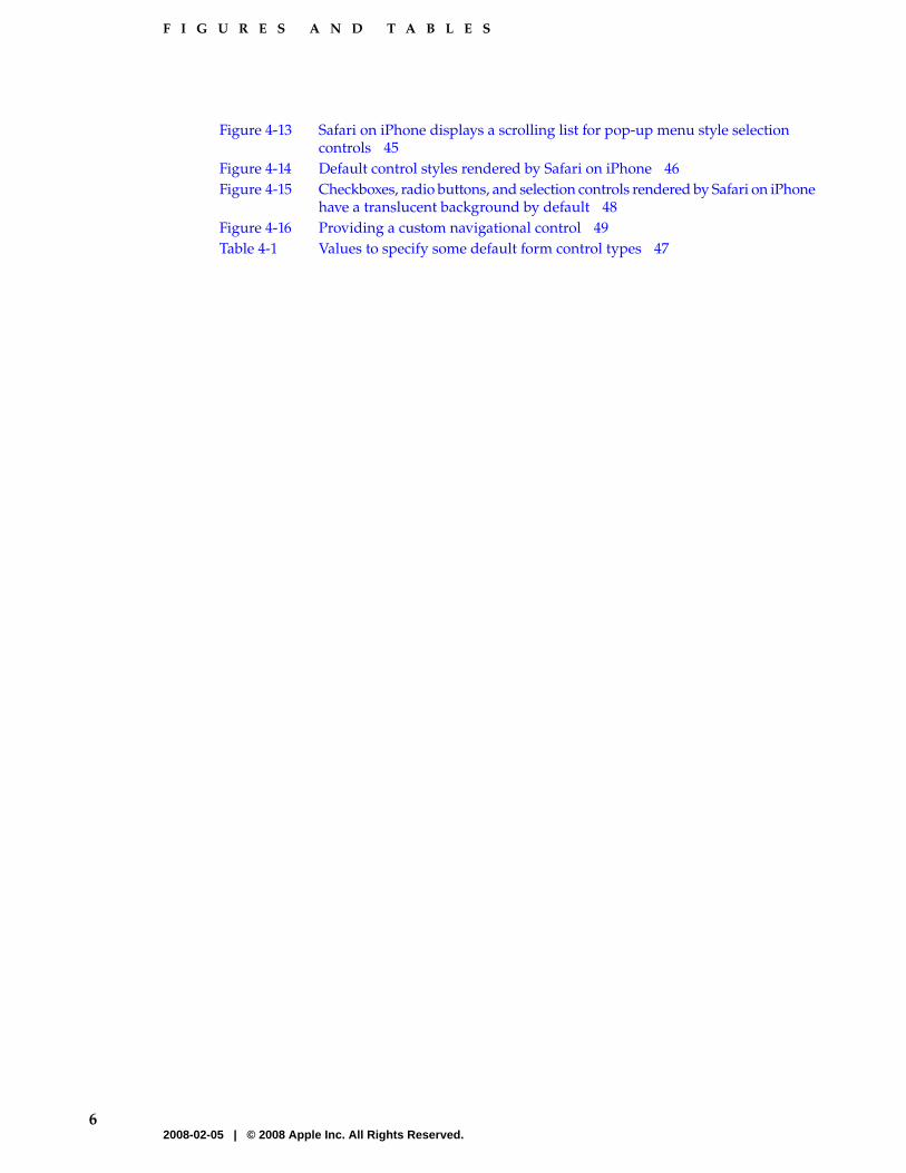
Figure 4-13 Safari on iPhone displays a scrolling list for pop-up menu style selectioncontrols 45
Figure 4-14 Default control styles rendered by Safari on iPhone 46Figure 4-15 Checkboxes, radio buttons, and selection controls rendered by Safari on iPhone
have a translucent background by default 48Figure 4-16 Providing a custom navigational control 49Table 4-1 Values to specify some default form control types 47
62008-02-05 | © 2008 Apple Inc. All Rights Reserved.
F I G U R E S A N D T A B L E S

Apple’s iPhone presents a revolutionary user interface and interaction model. Users can view webpages,use web applications, and use built-in iPhone features, such as the email application, the iPod, andthe digital camera, wherever they go. Safari on iPhone, a unique implementation of Safari, is theapplication users use to browse the web on both iPhone and iPod touch.
Note: Safari on iPhone behaves the same on iPhone and iPod touch except when users tap links toiPhone-only applications. See Using iPhone Application Links in Safari Web Content Guide for iPhonefor more information about links that behave differently on iPod touch.
This document introduces you to the iPhone environment and how it shapes the user experience ofiPhone content. Then, it explains how to design a superlative user interface for your web content soit displays and works well on iPhone. It does this by first examining different types of iPhone contentand exploring how you can decide which type to create. It then discusses how to apply user interfacedesign principles to iPhone content, and finally provides numerous metrics and guidelines to helpyou handle specific design issues. For the implementation details and guidance you need to writethe code for your iPhone product, see the “See Also” section below.
Note: Currently, developers create web applications for iPhone, not native applications. Therefore,this document focuses solely on the presentation of web applications and other web content on iPhone.
Whether you’re an experienced web content developer or an application developer unfamiliar withweb content creation, you should read this document to find out what users expect of iPhone contentand how to design content that exceeds those expectations.
If you have user interface development experience, you might be tempted to skip the sections onhuman interface design principles and desirable application characteristics. Although your priorknowledge of these topics is extremely useful, you’re encouraged to read these sections to learn howto apply your experience to the design of iPhone content.
Organization of This Document
iPhone Human Interface Guidelines contains the following chapters:
Organization of This Document 72008-02-05 | © 2008 Apple Inc. All Rights Reserved.
I N T R O D U C T I O N
Introduction

■ “iPhone and the User’s Environment” (page 9) introduces iPhone and describes how the user’senvironment influences the design and usage of iPhone content. This chapter also describesfeatures of the iPhone user interface that have a bearing on the design of iPhone content.
■ “Content on iPhone: Is It a Webpage or an Application?” (page 15) defines the different types ofiPhone content you can develop and how that influences what you decide to do with your existingcontent. It also discusses how to define your user audience so you can customize your userexperience and user interface design.
■ “Principles and Guidelines for Creating Great iPhone Content” (page 21) covers the principlesof human interface design as they apply to iPhone content and provides guidelines to help yourealize these principles in your design.
■ “Metrics, Layout Guidelines, and Tips” (page 33) presents layout and user interface metrics andtips you should use as you develop an iPhone application or webpage.
At the end of the document is a glossary that defines iPhone and web-application development terms;see “Glossary” (page 51).
See Also
To learn how to implement your design in code, begin by reading:
■ Getting Started with iPhone
■ Safari Web Content Guide for iPhone
In addition, Apple provides several other detailed conceptual and reference documents that describehow to use web technologies to develop your iPhone content. The two documents listed above containreferences to these documents.
8 See Also2008-02-05 | © 2008 Apple Inc. All Rights Reserved.
I N T R O D U C T I O N
Introduction

Apple’s iPhone introduces a revolutionary platform for your web content. With an innovative userinteraction model and exceptional interoperability, iPhone offers significant new opportunities anda few unique challenges to web content developers.
The goal of this chapter is to orient you to the iPhone platform and properly set your web-developmentexpectations. To do this, this chapter describes how the environment in which users use iPhone,combined with iPhone features and infrastructure, influences your design decisions.
It’s a Browser-Based World
Obviously, users use and perceive iPhone very differently than they do a desktop or even a laptopcomputer. This may seem like an unnecessary statement, but it is an observation that is crucial tokeep in mind as you create content for iPhone, especially if you’re an experienced application developer.This is because you may have to work to shift your perspective away from a computer-centric worldview, even if your expertise lies in web content creation. It’s essential to keep in mind, for example,that instead of the layered windows, desktop, mouse, and file system with which you’re familiar,iPhone has a small, fixed screen size, a browser interface supplied by Safari on iPhone, a touch-basedinput system, and no accessible file system.
Regardless of these differences in platform, however, your main goal as a web content developer isthe same: to capture users’ imagination and earn their loyalty with a solution that is functional,focused, and enjoyable to use.
iPhone users are accepting of, and even anticipating, an experience different from the one they areaccustomed to on a desktop computer, a laptop, or even a mobile phone. Although this affords youa certain latitude for experimentation, be aware that iPhone users are likely to be even less tolerantof sluggish performance and a complicated user interface than they are when it comes to softwarerunning in a computer. In addition, users quickly become accustomed to the elegant, functional, andstreamlined user interface of the built-in applications and features, which sets a standard by whichthey’re apt to judge other content.
There are, of course, similarities between the computer and iPhone environments, too. The mostnotable similarity, from the perspective of user experience and the user interface, is that most of thecharacteristics that define great computer applications also define great iPhone webpages andapplications, whether built-in or external. Qualities such as responsiveness, simplicity, ease of use,
It’s a Browser-Based World 92008-02-05 | © 2008 Apple Inc. All Rights Reserved.
C H A P T E R 1
iPhone and the User’s Environment

and consistency are at least as important in iPhone content as they are in computer applications. Tolearn more about these qualities and how to build them into your web content, see “Principles andGuidelines for Creating Great iPhone Content” (page 21).
Other similarities are evident at the content implementation level. Accepted best practices for websitedesign and implementation are wholly applicable to iPhone content design and implementation (foran overview of these guidelines, see “Creating Compatible Web Content” in Safari Web Content Guidefor iPhone). If you’re in the habit of following web design best practices when you target desktopbrowsers, you’re well on your way to creating content that displays well on iPhone. Following theuser experience and user interface guidelines in the rest of this document will help you build on thatexpertise so you can create best-in-class iPhone content.
Ultimately, iPhone users may determine additional qualities that characterize the most successfuliPhone products. As iPhone content evolves and you discover new ways to provide functionality tousers, new best practices will emerge.
iPhone and Its Place in the User’s World
Almost by definition, users use iPhone while they are mobile. Whether they’re in a car or a train,sitting in a cafe or on a park bench, taking a walk, shopping, or waiting for an appointment, usersuse iPhone in environments that are likely to be filled with distractions. This does not mean that youriPhone solution can’t or shouldn’t perform important tasks that require users to concentrate. But itdoes mean that you must be prepared for the probability that users will not be giving their undividedattention to your content, at least not for long.
Above all, therefore, your iPhone content must be quick and extremely easy to use. You need to grabthe user’s attention immediately and help them access the most valuable parts of your content quickly.
Users not only use iPhone differently, they also feel differently about it. For example, users have amuch more personal relationship with iPhone than they have with their computer and this influenceswhich user experience characteristics are most important. One aspect of this bond is the fact thatiPhone is a small device that can accompany users wherever they go. This view encourages thedevelopment of a broad range of products that provide quick, easy access to things users need andwant no matter where they are, such as shopping lists, movie reviews, maps and directions, email,and games.
The user interaction model also informs content design. Because there is no external physical devicethat comes between the user and iPhone, the user interface of iPhone content must be especiallystreamlined and inviting.
iPhone as Web Platform
Although iPhone combines camera, phone, iPod, and email functionality, as far as your web contentis concerned iPhone is a mobile web platform on which users view your webpage or use your webapplication. How users access web content, using iPhone network connectivity, browser capabilities,and the view screen, has a significant impact on both the behavior of your web content and users’perception of it.
10 iPhone and Its Place in the User’s World2008-02-05 | © 2008 Apple Inc. All Rights Reserved.
C H A P T E R 1
iPhone and the User’s Environment

The following sections briefly describe these parts of the iPhone web infrastructure, emphasizinghow each part influences the design of your web content. For details on how to implement yourwebpage or web application to work well with this infrastructure, see Safari Web Content Guide foriPhone.
Network Connectivity
iPhone connects to either an available Wi-Fi network, which can be very fast, or the EDGE network,which is slower. As users move about, iPhone automatically switches to the service currently availableto provide the fastest possible connection speed.
As you design your web content, you should keep the adaptable connectivity of iPhone in mind. Youcan’t predict what connection speeds users have at a given moment or know when iPhone switchesfrom one network to another, so your content should be designed to work well at any connectionspeed. And when you optimize your content to be responsive at the slowest connection speed, usersenjoy even better performance at higher connection speeds. See Creating Compatible Web Contentin Safari Web Content Guide for iPhone for some specific optimization techniques you can use to enhancethe performance and responsiveness of your iPhone content.
Safari on iPhone
Safari on iPhone provides the interface for all web content on iPhone. Although Safari on iPhone issimilar in many ways to Safari on the computer desktop, it is not the same. You need to work withinthe feature set Safari on iPhone makes available and provide workarounds if you typically use Safarifeatures available on the desktop that are unavailable on iPhone. For information on all the differencesbetween Safari on iPhone and Safari on the desktop and how to accommodate them, see CreatingCompatible Web Content in Safari Web Content Guide for iPhone.
Most Safari on iPhone features influence the implementation of your web content, but some have animpact on the design of your user interface. The following list describes those features you shouldkeep in mind as you design the user experience and user interface of your web content.
■ Safari on iPhone supports cookies.
This means that you can use cookies to save the user’s context, preferences, and previously entereddata, which can streamline the user’s interaction with your content by minimizing the amountof information users must supply.
■ Safari on iPhone does not support Flash or Java (including Java applets) in iPhone content.
In particular, be sure you avoid recommending that users download the latest Flash to theiriPhone because neither Flash nor file downloads are supported by Safari on iPhone. Because ofthis constraint, the user interface of your web content should not rely on Flash animation tocommunicate with users.
■ Safari on iPhone interprets most of the user’s finger movements as targeting the way iPhonedisplays your content, not the content itself.
The main exception to this is the tap, which is analogous to a single mouse click, and which cancause Safari on iPhone to send the onclick event to your webpage. As you design your userinterface, keep in mind that the users should be able to use a tap to access and drive all functionality
iPhone as Web Platform 112008-02-05 | © 2008 Apple Inc. All Rights Reserved.
C H A P T E R 1
iPhone and the User’s Environment

in your content (“The iPhone User Interaction Model” (page 13) describes the touch-based interfaceof iPhone). For more information on the events Safari on iPhone generates, see Handling Eventsin Safari Web Content Guide for iPhone.
Currently, Safari on iPhone does not support third party plug-ins. For a complete list of webtechnologies that Safari on iPhone does not support, see Creating Compatible Web Content in SafariWeb Content Guide for iPhone.
The iPhone Viewport
For Safari on iPhone, the viewport is a rectangular area that determines how content is laid out andwhere text wraps on a webpage. On the desktop, the viewport is defined by the size of the browserwindow. Users resize the viewport on the desktop by resizing the window and they scroll to see moreof the webpage, if necessary. But Safari on iPhone does not have resizable windows, so there are noscroll bars or resize controls. Figure 1-1 shows how the viewport differs between Safari on iPhoneand Safari on the desktop.
Figure 1-1 Differences between Safari on iPhone and Safari on the desktop
Safari on iPhone Safari on the desktop
As you design the user experience and user interface of your webpage, it’s important to rememberthat iPhone users can change the scale of the viewport by zooming in and out, but not the size. Theonly exception to this is that when users change iPhone from portrait to landscape orientation, theviewport size changes. Under certain circumstances, Safari on iPhone may adjust the viewport widthand change the webpage layout. Note that you can set the viewport size and other properties to
12 iPhone as Web Platform2008-02-05 | © 2008 Apple Inc. All Rights Reserved.
C H A P T E R 1
iPhone and the User’s Environment

improve the presentation of your webpage the first time it is rendered on iPhone. “Lay Out Contentfor Safari on iPhone” (page 35) provides an introduction to configuring the viewport; Configuringthe Viewport in Safari Web Content Guide for iPhone provides implementation details.
When iPhone users pan or scroll to see more of a webpage, a gray bar appears at the right side orbottom of the iPhone screen to give a visual indication of how much more of the webpage there is tosee. Although this is similar to the way the size of a scroller on the desktop indicates how much ofthe content is hidden, the gray bars Safari on iPhone displays are indicators only; they cannot bedragged.
For webpages, there’s nothing wrong with expecting users to zoom in to read text, but there are thingsyou can do to make the zoom effective, such as presenting your text in relatively narrow columns ofsmall, easily digestible blocks. This allows users to avoid panning back and forth to read long linesof text. For example, most online newspaper websites are designed to mimic the easy-to-read columnlayout used on paper, and this translates very well to iPhone.
For a webpage that is intended to behave as an iPhone application, however, you should avoidrequiring users to zoom in at all, because it impedes access to your content and weakens the perceptionof the webpage as a standalone application. To learn about how webpages on iPhone and iPhoneapplications are defined, see “Content on iPhone: Is It a Webpage or an Application?” (page 15).
The iPhone User Interaction Model
Users use their fingers to operate the iPhone user interface, tapping, flicking, and pinching to select,navigate, and read web content and use built-in applications. There are real advantages to usingfingers to operate a device: They are always available, they are capable of many different movements,and they give users a sense of immediacy and connection to the device that’s impossible to achievewith an external input device, such as a mouse.
However, fingers have one major disadvantage: They are much bigger than a mouse pointer, regardlessof their size, their shape, or the dexterity of their owner. In the context of a display screen, fingers cannever be as precise as a mouse pointer. Additionally, there are some actions users can take with thecombination of a mouse and keyboard that are difficult to replicate using fingers alone, such as textselection, drag-and-drop operations, and cut, copy, and paste actions.
Fortunately, you can meet the challenges of a finger-based input system by good user interface design.For the most part, this means making sure your layout accommodates the average size of a fingertipand finding alternatives to drag-and-drop and cut, copy, and paste. For specific guidelines on howto lay out your user interface to make it easy to use, see “Metrics, Layout Guidelines, and Tips” (page33).
iPhone users perform specific movements, called gestures, to get particular results. Table 1-1 lists thegestures users can perform. It’s vital to realize, however, that you do not receive an event for mostof these gestures. Instead, the majority of these gestures are interpreted by Safari on iPhone andapplied to the way iPhone displays content, instead of being passed directly to your content. For moreinformation on how to handle events created on iPhone, see Handling Events in Safari Web ContentGuide for iPhone.
The iPhone User Interaction Model 132008-02-05 | © 2008 Apple Inc. All Rights Reserved.
C H A P T E R 1
iPhone and the User’s Environment

Table 1-1 Gestures users make to interact with iPhone
ActionGesture
To press or select a control or link (analogous to a single mouse click).
You receive the onclick event for this gesture.
Tap
To zoom in and center a block of content or an image.
To zoom out (if already zoomed in).
Double tap
To scroll or pan quickly.Flick
To move the viewport or pan.Drag
To zoom in.Pinch open
To zoom out.Pinch close
To display an information bubble, magnify content under the finger, or performspecific actions in built-in iPhone applications and features.
Touch and hold
To scroll up or down within a text area, an inline frame, or an element withoverflow capability, depending on the direction of the movement.
You can receive a mousewheel event for this gesture.
Two-finger scroll
14 The iPhone User Interaction Model2008-02-05 | © 2008 Apple Inc. All Rights Reserved.
C H A P T E R 1
iPhone and the User’s Environment

As you prepare your web content to display successfully on iPhone, you face a decision. Should youmodify your webpage (if necessary) so that it looks great on iPhone or create an iPhone application?Before you make this decision, you need to understand what distinguishes a webpage and an iPhoneapplication. This chapter defines three types of third-party content that users can access on iPhoneand outlines some of the steps you take to develop them.
You should read this chapter if you’re considering how to display your web content on iPhone. Afteryou decide what type of iPhone content you want to deliver, be sure to read “Design for YourUsers” (page 18) to gain insight into this first important step in the user experience and user interfacedesign process.
Types of iPhone Content
When is a webpage an iPhone application? It may be that the best answer is “when the user thinks itis.“ But when it comes to design and development and the choice of appropriate metrics, guidelines,and techniques, that answer isn’t very helpful. In a document that provides material help to developers,such as this one, definitions are required for clarity and disambiguation, even if they might seem abit arbitrary.
As described in “Safari on iPhone” (page 11), Safari on iPhone provides the interface for all webcontent on iPhone. Not surprisingly, therefore, the way a webpage works in Safari on iPhonedetermines how the page is defined.
This document distinguishes three types of webpage. The first type is a W3C (World Wide WebConsortium)–compliant webpage in which all elements display and operate as designed, with theexception of any elements that rely on unsupported technologies, in particular, plug-ins, Flash, orJava. This type of webpage is referred to in this document as compatible with Safari on iPhone.Webpages that are compatible with Safari on iPhone display successfully on iPhone, even if somecontent is missing or the missing plug-in icon is displayed (Figure 2-1 shows this icon). However, theuser interface of a webpage that is compatible with Safari on iPhone does not necessarily take intoaccount the iPhone user interaction model (described in “The iPhone User Interaction Model” (page13)) and may require users to pan and zoom extensively.
Types of iPhone Content 152008-02-05 | © 2008 Apple Inc. All Rights Reserved.
C H A P T E R 2
Content on iPhone: Is It a Webpage or anApplication?

Figure 2-1 Safari on iPhone displays the missing plug-in icon when third-party plug-ins are present
The second type of webpage is a W3C compliant–webpage that displays and operates as designed,correctly scales content for the iPhone screen, and has no elements that rely on unsupportedtechnologies, in particular, plug-ins, Flash, or Java. Often, this type of webpage is designed to detectwhen it is being viewed on iPhone and adjusts the content it provides accordingly. This documentrefers to this type of webpage as optimized for Safari on iPhone. Webpages that are optimized forSafari on iPhone may integrate with built-in iPhone features and services, such as email and phone,where appropriate.
In addition to meeting the requirements for a webpage that is optimized for Safari on iPhone, thethird type of webpage provides discrete functionality to users and is often implemented using modernweb technologies, such as AJAX. This type of webpage is referred to in this document as an iPhoneapplication. An iPhone application emulates built-in iPhone applications by providing a focusedsolution to users, integrating with iPhone features and services where appropriate, and minimizingthe user’s awareness of the browser experience.
Even though, at the implementation level, all three types of iPhone content are webpages, it’s helpfulto be able to discuss an iPhone application as something different from a webpage that is compatiblewith, or optimized for, Safari on iPhone. This is because users have expectations of an applicationthat are different from those they have of a webpage, which means that some user experience anduser interface design guidelines are better suited to an application than they are to a webpage.
Decide How to Position Your Content
If you followed standard website design and implementation best practices when you developedyour web content, it’s likely that your content is at least compatible with Safari on iPhone. Now, youneed to decide if you want to optimize your webpages for Safari on iPhone or use your content tocreate an iPhone application. To help you make this decision, this section elaborates on the mainattributes of an iPhone application, as defined in “Types of iPhone Content” (page 15).
Most importantly, an iPhone application provides a focused solution to a well-defined problem: Usersprefer an application that performs one task perfectly to an application that tries to perform manytasks but excels at none of them. This is especially true for iPhone applications, because users expectto accomplish things quickly on iPhone and they don’t want to waste time either figuring out whatan application does or wading through unnecessary functionality. For example, the built-in Weatherapplication (shown in Figure 2-2) displays a focused, easy-to-understand answer to the question“What's the weather forecast for my chosen location?“.
16 Decide How to Position Your Content2008-02-05 | © 2008 Apple Inc. All Rights Reserved.
C H A P T E R 2
Content on iPhone: Is It a Webpage or an Application?

Figure 2-2 The built-in Weather application focuses on a single task
If you can easily identify the primary task your webpage performs, you should consider developingan iPhone application that offers that functionality to users. For example, if the primary purpose ofyour webpage is to aggregate information on a single topic, you could design an iPhone applicationthat presents that information in a way that looks at home on iPhone.
If, however, your website includes a combination of different functions and types of information, youhave two options: You can optimize it for iPhone or you can create an iPhone application using onlyone feature of your content. For example, a website that displays an up-to-date list of bestsellingnovels, provides news about authors and book reviews, hosts book discussions, and allows users toorder books has a unifying theme but no single purpose. However, an iPhone application that allowsusers to order a book from a list of current bestsellers would be a focused and useful application.Another possibility using this example is an iPhone application that allows users to keep track of apersonal reading list, adding new books and checking off others when they’re finished.
If you’ve decided to design an iPhone application, it’s worth revisiting the main attributes of iPhoneapplications. Specifically, an iPhone application emulates the look and feel of built-in iPhoneapplications in three ways:
■ An iPhone application minimizes the user’s awareness of the browser experience.
Although an iPhone application is, by definition, a web application that users open in Safari oniPhone, it suppresses the browser’s presence in its user interface. As a result, users perceive theapplication as a standalone solution. One way to achieve this effect is to set viewport propertiesso that the iPhone application displays correctly in Safari on iPhone and requires no zooming orpanning. Another way is to provide custom navigation controls embedded in the webpage sousers don’t have to use the Safari on iPhone navigation controls.
■ An iPhone application reproduces the control style, layout, and behavior of the built-in iPhoneapplications.
Decide How to Position Your Content 172008-02-05 | © 2008 Apple Inc. All Rights Reserved.
C H A P T E R 2
Content on iPhone: Is It a Webpage or an Application?

Users are accustomed to the user experience offered by built-in iPhone applications, which meansthat they recognize the function of specific controls and expect a clean, easy-to-use layout.Additionally, users expect scrolling to be minimized and constrained to the vertical direction,color usage to be subtle, and branding to be discreet.
■ An iPhone application integrates with built-in iPhone features and services.
Users expect to be able to access built-in iPhone functionality, such as the phone and Googlemaps, while they are using an iPhone application.
Design for Your Users
Before you begin to work on your iPhone application, be sure you know precisely who your usersare. Although you may have defined the functionality you want to provide, if you don’t know whoyour users are and how they’re likely to use your product, it’s very difficult to deliver that functionalityappropriately. Understanding your users is an important requirement for designing a successfulwebsite, but it is even more important for designing a successful iPhone application. This is because,to be useful, an iPhone application must deliver a focused solution to a well-defined problem.
As you begin to design your product, therefore, spend some time defining your user audience: Arethey experienced or novice, serious or casual, looking for help with a specific task or looking forentertainment? Knowing these things about your users helps you customize the user experience anduser interface to their particular needs and wants.
When you design a webpage or application for iPhone users, you already know a lot about them. Forexample:
■ They are probably mobile right now.
■ They want quick and easy access to your content.
■ They need to be able to jump in and out of your webpage or application when a phone call comesin, an email message arrives, or they decide to listen to a song.
■ They expect to be able to initiate a phone call, open their email, and view a Google map whilethey’re in your content.
If you’re designing a webpage (as opposed to an iPhone application), this may be all you need toknow about your audience. In addition to ensuring that your webpage is at least compatible withSafari on iPhone, you should concentrate on building in as many of the characteristics of great iPhonecontent as possible (see “Principles and Guidelines for Creating Great iPhone Content” (page 21) foradvice on how to do this).
If you’re designing an iPhone application, it’s appropriate to go further in defining your audienceand ask yourself what traits might set your users apart from all other iPhone users. Are they businesspeople, teenagers, or retirees? Will they use your application at the end of every day, every time theycheck their email, or whenever they have a few extra moments? The more accurately you define youraudience, the more accurate are your decisions about the look, feel, and functionality of your userinterface.
18 Design for Your Users2008-02-05 | © 2008 Apple Inc. All Rights Reserved.
C H A P T E R 2
Content on iPhone: Is It a Webpage or an Application?

For example, if your application helps business people keep track of their billing time, your userinterface should focus on making it easy to enter times and rates, without asking for a lot of detailsthat aren’t central to the task. In addition, you might choose a subtle color palette that appearsprofessional and is pleasant to look at several times a day.
Or, if your iPhone application provides entertainment to a target audience of teenagers, you mightinstead want a user interface that is exciting, language that imparts a feeling of exclusivity, and acolor palette that evokes current fashions.
Finally, examine the set of features you intend to deliver. With the image of your user audience inmind, try to distill the list of features into a single statement, a product definition statement, thatdescribes the most important functionality of your product and how it benefits your users. For example,the built-in Calendar application (shown in Figure 3-4 (page 26)) is an easy-to-use tool that allowsusers to see dates and associate events with specific days. The product definition statement for thisapplication could be “A date and event tracking tool for all users.“
As you design your content, use your product definition statement to help you decide which featuresare critical (and should be prominent) and which are secondary. It’s especially important to eliminatethose features that don’t support the product definition statement, because iPhone applications haveno room to spare for functionality that isn’t focused on the main task.
Imagine, for example, that you’re thinking of developing an iPhone application that people can usewhen they shop for groceries. In the planning stage, you might consider including a wide range ofactivities users might like to perform, such as:
Getting nutritional information about specific foodsFinding coupons and special offersCreating and using shopping listsLocating storesLooking up recipesComparing pricesKeeping a running total of prices
However, you believe that your users are most concerned with remembering everything they needto buy, they would like to save money if possible, and they’re probably in a hurry to get home withtheir purchases. Using this audience definition, you craft a product definition statement for yourapplication, such as “A shopping list creation and coupon-finding tool for people in a hurry.“ Filteringyour list of potential features through this product definition statement, you decide to focus primarilyon making shopping lists easy to create, store, and use. You also offer users the ability to find couponsfor the items on their list. Even though the other features are useful (and might become primaryfeatures of other applications), they don’t fit the product definition statement for this application.
Design for Your Users 192008-02-05 | © 2008 Apple Inc. All Rights Reserved.
C H A P T E R 2
Content on iPhone: Is It a Webpage or an Application?

20 Design for Your Users2008-02-05 | © 2008 Apple Inc. All Rights Reserved.
C H A P T E R 2
Content on iPhone: Is It a Webpage or an Application?

Great iPhone content embodies many of the characteristics of great computer applications and isinformed by many of the same design principles. One such principle, understanding your users, is acornerstone of user experience and user interface design, whether you are designing a webpage, aniPhone application, or a computer application. (Read “Design for Your Users” (page 18) for moreinformation on how to define your user audience and create a product definition statement.) Thischapter describes the essential principles of human interface design behind great iPhone content andprovides guidelines that help you incorporate these characteristics in your webpage or iPhoneapplication.
At a high level, the advice and guidelines in this chapter are applicable to both webpages and iPhoneapplications. After all, characteristics such as simplicity, focus, and clear communication are essentialingredients of a great user experience, whether that experience involves reading a webpage or usingan application. The differences lie primarily in the interpretation and implementation of the guidelines.
For example, one of the ways to achieve simplicity is to avoid the clutter of too many visual elementsthat compete for the user’s attention. In a webpage, you might do this by reducing the number of ads,images, and links. In an iPhone application, you might do this by reducing the number of controls,shortening the displayed text, avoiding purely decorative elements, and ensuring adequate spacingbetween controls.
Simplicity and Ease of Use
Simplicity and ease of use are fundamental principles for creating all types of software, but in iPhonecontent they are critical. As described in “iPhone and Its Place in the User’s World” (page 10), iPhoneusers are probably doing other things while they simultaneously view or use your content on iPhone.If users can’t quickly figure out how to use your content, they’re likely to move on to something elseand not come back.
As you design the flow of your content and its user interface, follow these guidelines to build insimplicity and ease of use:
■ Make it obvious how to use your content.
■ Avoid clutter, unused blank space, and busy backgrounds.
■ Minimize required user input.
■ Express essential information succinctly.
Simplicity and Ease of Use 212008-02-05 | © 2008 Apple Inc. All Rights Reserved.
C H A P T E R 3
Principles and Guidelines for CreatingGreat iPhone Content

■ Provide a fingertip-sized target area for all links and controls.
■ Avoid unnecessary interactivity.
The following sections explain each guideline for simplicity and ease of use in more detail.
Make It Obvious
You can’t assume that users have the time (or can spare the attention) to figure out how your contentworks. Therefore, you should strive to make your web content instantly understandable to users.
In a webpage, you should display the most important information and functionality prominently.Remember that users view your webpage in a small screen, probably with some of their attentionelsewhere. As a result, panning, scrolling, or paging past irrelevant elements to find valuableinformation can be irritating.
For example, Apple’s main website, shown in Figure 3-1, prominently displays featured products;users can get more information about them with a tap.
Figure 3-1 The most important information should be the most prominent
In an iPhone application, the main function should be immediately apparent. You can do this byminimizing the number of controls from which users have to choose and labeling them clearly sousers understand exactly what they do. For example, in the built-in Stopwatch function (part of theClock application), shown in Figure 3-2, users can see at a glance which button stops and starts thestopwatch and which button records lap times.
22 Simplicity and Ease of Use2008-02-05 | © 2008 Apple Inc. All Rights Reserved.
C H A P T E R 3
Principles and Guidelines for Creating Great iPhone Content

Figure 3-2 The built-in Stopwatch function makes its usage obvious
Avoid Clutter
A webpage that is cluttered with many different sizes and styles of elements, different sizes and colorsof text, and gratuitous images presents an unpleasant user experience. Viewed in the small iPhonescreen, the negative effects of clutter are magnified, making webpages that might be acceptable onthe desktop difficult to use on iPhone.
In both webpages and iPhone applications, it’s important to avoid overloading users with a profusionof images and elements. Space is at a premium in the iPhone screen, so you should display only thoseelements that provide essential information or functionality in the current context. For the most part,avoid displaying elements and images that are purely decorative.
It’s also important to avoid leaving too much blank space around your content. If blank space separatesimportant content, users must pan or scroll past it to reach that content. If a lot of blank space isconcentrated around the edges of your webpage, it makes your webpage look poorly laid out. Whetheryou’re designing a webpage or an iPhone application, you should use only enough blank space tomake controls easy to tap accurately and to make images and text look uncrowded.
Minimize Required Input
Inputting information takes time and attention, whether users tap your controls or use the iPhonekeyboard. If your application requires a lot of user input, either all at once or before users can beginusing your content, it slows users down and can discourage them from persevering with your site.
Simplicity and Ease of Use 232008-02-05 | © 2008 Apple Inc. All Rights Reserved.
C H A P T E R 3
Principles and Guidelines for Creating Great iPhone Content

Of course, you often need some information from users to tailor the content or task to their needs,but you should balance this with what you offer users in return. In other words, strive to provide asmuch information or functionality as possible for each piece of information users provide. That way,users feel they are making progress and are not being delayed as they attempt to reach the importantparts of your content.
For example, a website that helps users purchase concert tickets might first ask users for input—suchas artist name, concert dates, and locations—before displaying a list of concerts that meet these criteria.Finally, the website would give users a way to purchase the tickets they’ve selected. In an iPhoneapplication that performs the same function, however, it’s better to avoid requiring users to supplya lot of information before they can get to the main purpose, which is to buy tickets. Therefore, thisiPhone application might first display a short list of the most popular concerts scheduled in the nextfew weeks. In this way, most users can make progress toward their goal before they have to supplythe information required to make a purchase.
Consider using cookies to store previously input information to avoid asking for it again. You canalso use cookies to remember where users were the last time they accessed your webpage or application.Cookies can help you tailor your content to users as soon as they arrive at your content.
When you ask for input from users, consider using lists (or pop-up menus) instead of text fieldswhenever possible. It’s usually easier for users to select an item from a list than to type words. Bydefault, Safari on iPhone displays pop-menus in an easy-to-use, aesthetically pleasing way. See Figure4-13 (page 45) for an example.
Express Information Succinctly
When your user interface text is short and direct, users can quickly and easily absorb it. Therefore,identify the most important information, express it concisely, and display it prominently so usersdon’t have to read too many words to find what they’re looking for or to figure out what to do next.
To help you do this, think like a newspaper editor and strive to convey information in a condensed,headline style. Give controls short labels (or use well-understood symbols) so users understand howto use them at a glance.
Provide Fingertip-Sized Targets
If your layout places links and controls too close together, users must spend extra time and attentionbeing careful where they tap and are more likely to tap the wrong element. A simple, easy-to-useuser interface spaces controls and other user-interaction elements so that users can tap accuratelywith a minimum of effort. “Metrics, Layout Guidelines, and Tips” (page 33) contains some specificmetrics you can use in your layout.
For example, the built-in Calculator application displays large, easy-to-tap controls that each have atarget area of about 44 x 44 pixels. Figure 3-3 shows the Calculator iPhone application.
24 Simplicity and Ease of Use2008-02-05 | © 2008 Apple Inc. All Rights Reserved.
C H A P T E R 3
Principles and Guidelines for Creating Great iPhone Content

Figure 3-3 The built-in Calculator application displays fingertip-sized controls
Avoid Unnecessary Interactivity
Interactivity, not including required user input, is often used to engage users’ interest and imagination.For example, some webpages present elaborate entry pages users must pass through before gettingto the main content. Although an entry page might be acceptable in a webpage viewed on the desktop,when viewed on iPhone it merely prevents users from reaching your content quickly. In your iPhonesolution, make sure you use interactivity to get users closer to their goal and avoid interactivity thatserves no functional purpose.
Another form of interactivity in a webpage is the use of elements and images that hide theirfunctionality until users interact with them by, for example, mousing over them. This design doesn’twork well on iPhone for two reasons. The first is that you do not receive an event equivalent to amouseover, so such elements and images do not reveal their functionality to iPhone users. The secondis that this type of interactivity adds an unnecessary layer of indirection between users and the contentthey want to view. Therefore, you should avoid interactivity that can be replaced by simple,straightforward elements.
If you’re designing an iPhone application, your content is, by definition, interactive. However, youshould examine your design and eliminate those interactive elements that don’t provide essentialfunctionality and consider replacing others with simple, clearly labeled controls.
Focus
A webpage or iPhone application that establishes and maintains focus on its prime functionality isrewarding and enjoyable to use. Especially critical for iPhone applications, focus strengthens theuser’s perception of your content as a standalone solution. As you design your content, therefore,
Focus 252008-02-05 | © 2008 Apple Inc. All Rights Reserved.
C H A P T E R 3
Principles and Guidelines for Creating Great iPhone Content

stay focused on your product definition statement and make sure every feature and user interfaceelement supports it. See “Design for Your Users” (page 18) for some advice on how to create a productdefinition statement.
In an iPhone application, a good way to achieve focus is to determine what’s most important in eachcontext. As you decide what to display on each page always ask yourself, is this critical informationor functionality users need right now? If not, decide if the information or functionality is critical in adifferent context or if it’s not that important after all. For example, an iPhone application that helpsusers keep track of car mileage loses focus on this functionality if it also displays the car’s maintenancehistory.
Following the guidelines for making your content simple and easy to use also helps make your contentfocused. In particular, avoiding clutter and unnecessary interactivity, and minimizing user inputmake it easier for users to arrive quickly at the most important parts of your content, which tightensthe focus on your solution (for specifics on these guidelines, see “Simplicity and Ease of Use” (page21)).
For example, the built-in Calendar application (shown in Figure 3-4) is focused on days and the eventsthat occur on them. Users can use the clearly labeled buttons to highlight the current day, select aviewing option, and add events. The most important information, days and the events associatedwith them, is the most prominent. User input is simplified by allowing users to choose from lists ofevent times, repetition intervals, and alert options, instead of requiring keyboard entry for all input.
Figure 3-4 The built-in Calendar application is focused on days and events
26 Focus2008-02-05 | © 2008 Apple Inc. All Rights Reserved.
C H A P T E R 3
Principles and Guidelines for Creating Great iPhone Content

Communication
Communication and feedback are as important in webpages and web applications are they are indesktop applications. Users need to know that their requests are being processed and when theiractions might result in data loss or other problems. On the other hand, it’s also important to avoidoverdoing it by, for example, alerting the user to conditions that aren’t really serious or asking forconfirmation too often.
Here are some guidelines to help you provide the right level of communication and feedback:
■ Use user-centric terminology.
Avoid technical jargon in the user interface. Use what you know about your users to determinewhether the words and phrases you plan to use are appropriate. For example, if your contenttargets soccer fans, it might be appropriate to use terms and abbreviations that are commonlyused in the sport. On the other hand, if your user audience includes fans of many different sports,it’s better to avoid relying on terms that are specific to only one sport.
■ In an iPhone application, provide embedded navigational functionality, when appropriate.
In iPhone applications that preserve their own context and contain multiple pages through whichusers can navigate, it’s a good idea to provide custom navigation controls. This minimizes thebrowser experience and helps users avoid inadvertently jumping to a different website. Forinformation on how to do this, see “Provide a Custom Navigation Solution” (page 48).
■ Provide feedback when necessary.
If you need to tell the user something important, such as asking for confirmation of input databefore the user taps a submit button, you can use the JavaScript alert element. (Safari on iPhonedisplays such a JavaScript alert as shown in Figure 3-5 (page 28).)
If your webpage or iPhone application is communicating with the server or downloading itsresources, it might be appropriate to let users know that progress is being made, so they don’tthink that your content has stopped responding. You can create and display a progress indicatorfor this purpose. If possible, display the progress indicator next to the element that is associatedwith the processing. You should avoid displaying a progress indicator in a JavaScript alert,however, unless the entire website or iPhone application is busy.
Communication 272008-02-05 | © 2008 Apple Inc. All Rights Reserved.
C H A P T E R 3
Principles and Guidelines for Creating Great iPhone Content

Figure 3-5 An alert in Safari on iPhone
Consistency
Consistency across user interfaces allows users to apply knowledge they’ve gained from otherwebpages and applications to new content. For webpages, there are many examples of good websitedesign with which to be consistent. But for web applications, iPhone presents a different platformand a different way of doing things. With what should you be consistent?
To the extent that you can, emulate the clean lines and layout of the built-in iPhone applications. Usea color palette that subtly unifies your content. And, where appropriate, design controls to look andbehave like the controls in the built-in iPhone applications. See “Metrics, Layout Guidelines, andTips” (page 33) for some specific guidelines to help you do these things.
For example, the World Clock function of the built-in Clock application (shown in Figure 3-6) usesthe same style of button and the same fonts and font attributes used in many other built-in applications.In addition, World Clock displays the user-selected locations in a scrollable list, which works like thelists in other built-in applications. Consistency of appearance and function helps users know what toexpect when they tap a button or see a list.
28 Consistency2008-02-05 | © 2008 Apple Inc. All Rights Reserved.
C H A P T E R 3
Principles and Guidelines for Creating Great iPhone Content

Figure 3-6 The controls and list of the built-in World Clock function make it consistent with other built-inapplications
Consistency within a user interface is at least as important as consistency with other user interfaces.Remember that iPhone users don’t want to spend time discovering and working around theidiosyncrasies of your user interface; they want to be able to use your content as soon as they viewit on iPhone. Therefore, you should reward their attention by ensuring that controls and featureswork as users have learned to expect.
If, for example, you use the same control to perform different actions, you make it impossible forusers to apply what they’ve learned from their earlier encounter with the control and predict theoutcome of their gesture. Because iPhone users may have little patience with an application thatdoesn’t behave consistently, an inconsistent user interface can alienate your audience.
Responsiveness
Responsiveness means that an iPhone application or webpage is perceived to respond quickly andaccurately to users' requests and gestures. Responsiveness in an iPhone application or webpage iseven more important than it is in an application or webpage on the desktop, because users areconstantly aware of the passage of time, both in terms of the flow of real-world events and in theusage of the battery.
As described in “Network Connectivity” (page 11), you can’t predict what network speed usersexperience at any given time, because iPhone automatically switches to the currently available network.As a general rule, therefore, you should design your solution so that it loads quickly and works wellat the slowest connection speed. In addition, be sure to provide adequate feedback on potentiallylengthy processes (as described in “Communication” (page 27)) so that users know your content isstill responding.
Responsiveness 292008-02-05 | © 2008 Apple Inc. All Rights Reserved.
C H A P T E R 3
Principles and Guidelines for Creating Great iPhone Content

If your webpage or iPhone application seems unresponsive, users may not give it a second chance.Here are some things you can do to increase perceived performance:
■ Optimize images.
Be mindful of the recommended limits on image sizes (for specifics on these limits, see CreatingCompatible Web Content in Safari Web Content Guide for iPhone) and supply reduced-size imageswhenever possible.
Consider using JavaScript to draw elements, such as controls and backgrounds, instead of addingexisting images to your resources.
■ Handle video and audio content correctly.
iPhone streams movies and audio using HTTP over EDGE and Wi-Fi networks. See CreatingVideo in Safari Web Content Guide for iPhone for details on how to ensure a great audio and videoexperience on iPhone.
■ Make sure JavaScript execution does not exceed 5 seconds for each top-level entry point.
Execution longer than 5 seconds raises an exception and makes your webpage seem unresponsive.
■ Be mindful of resource limits.
Make sure your webpage or application does not contain unneeded JavaScript, which consumesmemory resources without providing any benefit.
Interoperability
An iPhone webpage or application is interoperable when it works seamlessly with built-in iPhoneapplications and features. It’s natural to focus only on your own content, but it’s important to rememberthe other things users can do with their iPhones and the larger environment in which they’re operating.The better your content handles interruptions and, when appropriate, integrates with iPhone features,the more useful your webpage or application is.
The iPhone environment includes features such as phone, iPod, email, and web browser functionality.There are two main ways to take this environment into account as you design your webpage or iPhoneapplication:
■ Make sure your content can handle frequent interruptions.
Users are likely to quickly switch between webpages, applications (both built-in and external),and iPhone functions, so you should perform frequent server-side saves of user data and state.Because there is no concept of quitting an application on iPhone, you won’t get any notificationwhen users decide to switch from your webpage to another webpage or to a built-in application.
Remember that there is no local storage on iPhone that is available to your application. Therefore,you need to make sure you save important information when you can. And, if users are in themidst of providing information to your webpage (by filling in a form, for example), you shouldalert them to the possibility of data loss if they navigate away from your webpage before theyare finished. (See “Communication” (page 27) for more information on communicating withusers.)
■ Make it easy for users to use built-in iPhone features and applications.
30 Interoperability2008-02-05 | © 2008 Apple Inc. All Rights Reserved.
C H A P T E R 3
Principles and Guidelines for Creating Great iPhone Content

Where appropriate, you can include links that allow users to make a phone call, open Mail, lookat Google maps, or view YouTube videos. See Using iPhone Application Links in Safari WebContent Guide for iPhone for details on how to add these links to your content.
Adaptability
Users can view iPhone content in landscape or portrait orientation, and they can be connected throughWi-Fi or EDGE. Your webpage or application, however, probably won’t know when these thingschange. Fundamentally, this means two things:
■ Avoid making assumptions about the way users view your content or the speed of the connection.Design and optimize your webpage or application to work well at slower connection speeds andin both portrait and landscape orientations.
■ If possible, avoid absolute positioning in your layout. This is because text that appears inabsolute-positioned elements can overflow the screen after users zoom in.
Adaptability 312008-02-05 | © 2008 Apple Inc. All Rights Reserved.
C H A P T E R 3
Principles and Guidelines for Creating Great iPhone Content

32 Adaptability2008-02-05 | © 2008 Apple Inc. All Rights Reserved.
C H A P T E R 3
Principles and Guidelines for Creating Great iPhone Content

This chapter provides specific layout guidelines and metrics you can use to design the user interfaceof your web content so it looks great and works well on iPhone. Some guidelines and metrics aremore applicable to iPhone applications than to webpages, but you should read them all and followthe ones that make the most sense for your needs.
If you’re new to web content design, be sure to familiarize yourself with accepted best practices; foran overview, see Creating Compatible Web Content in Safari Web Content Guide for iPhone. Then, readthis chapter to find out how to adjust your content so it works well with the unique features of iPhone.
Create an Icon for Your Web Application or Webpage
In iPhone 1.1.3 and later, you can provide a custom icon that users can display on their Home screensusing the Web Clip feature. You can create an icon that represents your website as a whole or an iconthat represents a single webpage. Users tap the icon to reach your web content in one easy step.
Users can display as many custom icons on their Home screens as they want, so you should designan icon that is:
■ Attractive, so users want to keep it on their Home screens
■ Distinctive, so users can easily find it among all other icons
If your web content is distinguished by a familiar image or memorable color scheme, it makes senseto incorporate it in your icon. However, to ensure that your icon looks great on iPhone you shouldalso follow the guidelines in this section. (To learn how to add code to your web content to providea custom icon, see "Specifying a Webpage Icon for Web Clip" in Safari Web Content Guide for iPhone.)
When a user decides to display your icon on the Home screen, iPhone 1.1.3 and later automaticallyadds some visual effects so that it coordinates with the built-in icons. Specifically, iPhone 1.1.3 adds:
■ Rounded corners
■ Drop shadow
■ Reflective shine
For example, Figure 4-1 shows a simple icon as it might be provided by a webpage:
Create an Icon for Your Web Application or Webpage 332008-02-05 | © 2008 Apple Inc. All Rights Reserved.
C H A P T E R 4
Metrics, Layout Guidelines, and Tips

Figure 4-1 A simple icon before it is displayed as a Web Clip
Figure 4-2 shows the same icon as it is displayed on a Home screen by iPhone 1.1.3:
Figure 4-2 A simple icon displayed as a Web Clip on the Home screen
To ensure that your icon can take advantage of these visual enhancements, provide an image in PNGformat that:
■ Measures 57 x 57 pixels, with 90 degree corners (if the image measures other than this size, iPhone1.1.3 scales it)
■ Does not have any shine or gloss
As with other user interface elements on iPhone, icons that use bold shapes and lines and pleasingcolor combinations work best. It’s advisable to spend some time simplifying your icon design so itclearly conveys the essence of your web content. Also, it’s a good idea to investigate how your choiceof image and color might be interpreted by people from different cultures.
Use Custom CSS
To ensure that your content is readable and well laid out when it displays on iPhone, you can providea style sheet that adapts to iPhone. For example, you might want to do this if your text looks betterin Safari on iPhone when it is displayed at 200%. Or, you might change the display of a set of itemsfrom a horizontal orientation to a vertical one, to accommodate the smaller screen.
You can also use custom CSS to style controls or provide alternative controls. For example, the Applewebsite includes a page that displays movie trailers users can watch. When viewed in Safari on thedesktop, users can click the numbers or the previous and next controls (shown in Figure 4-3) to seeadditional trailers.
Figure 4-3 The additional trailers controls on the Apple movie trailers webpage when viewed in Safari onthe desktop
34 Use Custom CSS2008-02-05 | © 2008 Apple Inc. All Rights Reserved.
C H A P T E R 4
Metrics, Layout Guidelines, and Tips

When viewed on iPhone, however, the next, previous, and number controls are replaced by prominent,easy-to-use buttons with symbols that echo the style of built-in controls. Figure 4-4 shows one of thesecustom controls.
Figure 4-4 The previous trailers control on the Apple movie trailers webpage when viewed in Safari oniPhone
iPhone-specificcontrol
To provide a style sheet specifically for iPhone, use the CSS 3 media query. For more information onhow to do this, including code samples, see Customizing Style Sheets in Safari Web Content Guide foriPhone.
Lay Out Content for Safari on iPhone
As you design the user interface of your webpage or iPhone application, you need to know how muchdisplay space Safari on iPhone makes available to you. By default, Safari on iPhone displays a statusbar, a URL text field, and a button bar, all of which extend across the full width of the screen, in bothportrait and landscape orientation. The status bar can show battery charge, network status, and time.The URL text field displays a bookmark button and a refresh button, in addition to a text field inwhich users can type a URL. The button bar at the bottom of the screen displays buttons that act onthe current iPhone feature or built-in application.
Safari on iPhone displays your content between the lower edge of the URL text field and the top edgeof the button bar. Figure 4-5 shows the metrics of the Safari on iPhone controls and the visible areain which you can display your content when iPhone is in portrait orientation.
Lay Out Content for Safari on iPhone 352008-02-05 | © 2008 Apple Inc. All Rights Reserved.
C H A P T E R 4
Metrics, Layout Guidelines, and Tips

Figure 4-5 Portrait orientation layout metrics in pixels
480 pixels
320
Status bar: 20 pixels
URL text field: 60 pixels
Visible area for yourcontent: 320 x 356 pixels
Button bar: 44 pixels
When iPhone is in landscape orientation the metrics change, although the relative arrangement ofthe status bar, URL text field, and button bar is the same. Figure 4-6 shows the dimensions of thevisible area available for your content when iPhone is in landscape orientation.
Figure 4-6 Landscape orientation layout metrics in pixels
320 pixels
480
Status bar: 20 pixels
URL text field: 60 pixels
Visible area for yourcontent: 480 x 208 pixels
Button bar: 32 pixels
36 Lay Out Content for Safari on iPhone2008-02-05 | © 2008 Apple Inc. All Rights Reserved.
C H A P T E R 4
Metrics, Layout Guidelines, and Tips

Note: Although it is possible for your iPhone application to scroll the status bar and URL text fieldoff the top edge of the screen, it cannot change the position of the button bar.
As mentioned in “The iPhone Viewport” (page 12), the iPhone viewport determines how your contentis laid out on iPhone. When Safari on iPhone loads a webpage, it sets the viewport’s initial scaleproperty so that the full width of the webpage fits the width of the iPhone screen. It also sets theviewport’s width property to 980 pixels, which is the width of most webpages.
You might need to change the default values of these properties if the width of your webpage is muchdifferent from 980 pixels, especially if it is narrower. This is because if the width of your webpage isless than 980 pixels, your content scales too small, making it very difficult for users to see withoutzooming. If the width of your webpage is greater than 980 pixels, users must pan to see all the contenton the page. Figure 4-7 shows a narrow webpage before and after its width property is setappropriately.
Figure 4-7 Setting the width property of a narrow webpage
Default width Custom width
980 pixels 590 pixels
It’s especially important for iPhone applications to specify the correct values for viewport width andheight, because it means that the user interface fits the screen precisely, without requiring users tozoom or pan. This strengthens the user’s perception of the content as a standalone application andreduces the user’s awareness of Safari on iPhone. For example, Figure 4-8 shows how an applicationlooks when it incorrectly sets the width to 980 pixels (on the left) and how it looks when the width iscorrected to equal the width of the iPhone screen (on the right).
Lay Out Content for Safari on iPhone 372008-02-05 | © 2008 Apple Inc. All Rights Reserved.
C H A P T E R 4
Metrics, Layout Guidelines, and Tips

Figure 4-8 Setting the width property to display an application correctly
Default width Width set to device-width
980 pixels 320 pixels
If you’re developing an iPhone application using Safari on iPhone 1.1.1 and later, you should use thedevice-width and device-height constants to set the viewport width and height properties to thesize of the iPhone screen. This ensures that Safari on iPhone renders the application with a scale of1.0 and doesn’t change the layout of the user interface when users switch from portrait to landscapeorientation.
It is also recommended that you turn off user scaling in your iPhone application. This means thatSafari on iPhone does not zoom in your content when users double-tap or pinch open.
To supply values for viewport properties, use the viewport metatag. In addition to width and height,you can also use the metatag to specify values that control scaling. For more information about usingthe metatag to set viewport properties, including sample code, see Configuring the Viewport in SafariWeb Content Guide for iPhone.
Consider the List Approach
As you lay out your webpage or iPhone application, you often find that you need to display informationin a list-like format. Lists are a natural way to present information organized by date, popularity,name, location, or any other sorting scheme. Lists are based on the principles of simplicity and easeof use (described in “Simplicity and Ease of Use” (page 21)) and consistency (described in“Consistency” (page 28)) and they are an especially effective way for iPhone applications to displayinformation. This is because lists encourage a simple, uncluttered layout and, because they are similar
38 Consider the List Approach2008-02-05 | © 2008 Apple Inc. All Rights Reserved.
C H A P T E R 4
Metrics, Layout Guidelines, and Tips

to menus, users already understand how they work. This section describes two ways to lay out listsand provides the metrics you need to organize your content so that it looks good on iPhone and iseasy for users to read and use.
One style of list layout, the edge-to-edge list layout, displays all items in equally sized rows. It is wellsuited to iPhone applications that need to display a large number of items, such as locations, names,or objects, from which users can choose. When users choose an item from the list, an iPhone applicationmight respond by:
■ Displaying details about the item, such as contact information for the chosen person or theaterinformation associated with the chosen concert.
■ Performing an action associated with the item. For example, if the list displays items for sale, theselection of an item might result in the display of an order form.
■ Displaying another, more focused list of items that helps users drill down to the desired content.In this way, you can present a large amount of hierarchically organized information in a simple,efficient way. For example, an iPhone application that helps users decide which books to buymight first display a list of literary genres, followed by a list of authors in each genre, followedby a list of book titles for each author.
Figure 4-9 shows an example of an edge-to-edge layout used to display a list of names. Note that thelast names are displayed in bold font to make it clear that the list is alphabetized by last name (see“Edge-to-Edge List Metrics” (page 40) for details on the display of text in lists).
Figure 4-9 An iPhone application that displays a list of names using the edge-to-edge layout
The other style of list layout, the rounded rectangle list layout, displays information in separate,rounded-corner boxes that are visually distinct from the background. This type of layout is useful fordisplaying small groups of information related to a single topic. To display a person’s contact
Consider the List Approach 392008-02-05 | © 2008 Apple Inc. All Rights Reserved.
C H A P T E R 4
Metrics, Layout Guidelines, and Tips

information, for example, you might list home, work, mobile, and fax numbers in one box, emailaddresses in another box, and street addresses in a third box. The “After” illustration in Figure4-8 (page 38) shows one way this can look.
The rounded-rectangle design is well suited for use as the destination screen displayed at the end ofsome number of preceding edge-to-edge lists. For example, as described above, an iPhone applicationthat helps users find books can use edge-to-edge lists that allow users to make increasingly specificchoices, drilling down through genres, authors, and book titles. To display details about a specificbook, however, the application can use the rounded-rectangle layout to display groups of relatedinformation, such as the book’s publication information, links to reviews, and titles of similar books.
Edge-to-Edge List Metrics
To display a flat list of items, use the edge-to-edge design, which yields the most space for yourcontent. Each row, or cell, is 44 pixels high (including the line at the bottom of the cell) and 320 pixelswide.
Use Helvetica, 20-pixel size, in black for all text. By default, you should make your text bold foroptimum readability, but you can use regular font for content that's less important. You can also usebold to emphasize a portion of the text that’s used for sorting. For example, if you display a list offull names alphabetized by last name, you can use bold font for the last name and regular font forthe rest of the name. Text should be inset 10 pixels from the left edge and 14 pixels from the line atthe bottom edge of the cell.
The background fill color of the list is white, and the lines between items are R = 217, G = 217, B =217.
If you need to provide a control, design a rounded rectangular button that is 29 pixels high and hasa corner radius of 5 pixels but that has a target area that is 44 pixels high. Use Helvetica, 12-pixel size,for the label on the button. Place the button 10 pixels from the right edge of a cell and center it vertically.Figure 4-10 shows this style of layout (without a button).
40 Consider the List Approach2008-02-05 | © 2008 Apple Inc. All Rights Reserved.
C H A P T E R 4
Metrics, Layout Guidelines, and Tips

Figure 4-10 Edge-to-edge list design layout
320 pixels
370 pixelsScale = 1.0
Rounded-Rectangle List Metrics
To display items in groups, use the rounded-rectangle design. Each rounded rectangle has a cornerradius of 8 pixels, a width of 300 pixels, and white background fill. The edges of the rounded rectanglesand the horizontal lines between the cells inside them are R = 217, G = 217, B = 217.
Because there is slightly less space for content in this design, use Helvetica, 17-pixel size, in black forall text. As with the edge-to-edge design, you should use bold font by default, but you can use regularfont for secondary or de-emphasized text. Within a rounded rectangle, text should be inset 10 pixelsfrom the left edge and 14 pixels from the bottom edge of a cell.
A rounded rectangle should be inset 10 pixels from both right and left edges of the iPhone screen and17 pixels from the top of the button bar. Figure 4-11 shows the layout of this design.
Consider the List Approach 412008-02-05 | © 2008 Apple Inc. All Rights Reserved.
C H A P T E R 4
Metrics, Layout Guidelines, and Tips

Figure 4-11 Rounded-rectangle list design layout
320 pixels
370 pixelsScale = 1.0
The design shown in Figure 4-11 allows you to display text between the rounded rectangles that youcan use as labels for the groups of content. This text should be Helvetica, 17-pixel size, and shouldbe bold. Instead of black, however, the color of this text is R = 76, G = 86, B = 108. The size of the areabehind the rounded rectangles is 320 pixels wide and 356 pixels high and its background fill color isR = 197, G = 204, B = 211.
Accommodate the Built-in Form Interface
Under certain circumstances, Safari on iPhone provides to users some built-in conveniences, such asa keyboard, a navigation bar, and a form assistant. The fact that these user interface components arebuilt in means you don’t have to replicate them in your content, but it also means that you may needto take them into account when you design your layout. This is especially true for the layout of aniPhone application’s user interface.
An HTML form is a section of an HTML document that contains special elements that users interactwith, such as buttons, checkboxes, and text fields. Users typically enter text, select menu items, orcheck checkboxes and then submit the form to a web server for processing. The following sectionsdescribe how to work with the user interface objects that Safari on iPhone displays for some of thecontrols in HTML forms.
42 Accommodate the Built-in Form Interface2008-02-05 | © 2008 Apple Inc. All Rights Reserved.
C H A P T E R 4
Metrics, Layout Guidelines, and Tips

Keyboards
When users tap an input element in a webpage form, Safari on iPhone automatically displays theappropriate keyboard and the form assistant in place of the button bar. Depending on the input typeof the form control, Safari on iPhone displays either the alphabetic keyboard or the numeric keyboard.For all input types, Safari on iPhone displays the form assistant, which contains iPhone controls userstap to move among form controls and to dismiss the keyboard.
There are two ways you can handle the display of forms in your content. One way is to allow Safarion iPhone to automatically zoom in and center each form control in turn as the user taps it. The otherway is to specify a form layout that fits the available area of the screen when the keyboard and formassistant are displayed.
The first method is suitable for webpages that don’t look and behave like an iPhone application. Whenyou define a form in such a webpage, you can count on Safari on iPhone to automatically zoom inon and center an individual form control when the user taps it and simultaneously display a keyboardand the form assistant. When the user taps Next or Previous in the form assistant, Safari on iPhoneautomatically centers and displays the next or previous form control.
Note: If you choose to turn off user scaling, be aware that you also lose the automatic zoom on formcontrols. User scaling is one of the viewport properties you can set using the viewport metatag,introduced in “Lay Out Content for Safari on iPhone” (page 35).
The second method of handling forms in your content is suitable for an iPhone application. Asdescribed in“Lay Out Content for Safari on iPhone” (page 35), you’ve already set the viewport widthand height properties to ensure your content fits the screen precisely. In addition, you’ve turned offuser-scaling so your application looks right in both portrait and landscape orientation. Then, if yourapplication needs to display a form, you need to determine the screen size that’s available when thekeyboard and form assistant are visible, and lay out your content to fit.
When a keyboard and the form assistant are visible, Safari on iPhone displays your webpage in thearea below the URL text field and above the keyboard and form assistant, as shown in Figure 4-12.
Accommodate the Built-in Form Interface 432008-02-05 | © 2008 Apple Inc. All Rights Reserved.
C H A P T E R 4
Metrics, Layout Guidelines, and Tips

Figure 4-12 Screen metrics when a keyboard is displayed in portrait orientation
Status bar: 20 pixels
URL text field: 60 pixels
Remaining space: 140 pixels
Form assistant: 44 pixels
Keyboard: 216 pixels
When a keyboard and the form assistant are not displayed, there is an additional 216 pixels of verticalspace available (in portrait orientation) for the display of your webpage (as shown in Figure 4-5 (page36)).
In landscape orientation, two of the values differ: The keyboard height is 180 pixels, and the formassistant height is 32 pixels.
Whichever method of handling forms you use, the name of a form control can determine the type ofkeyboard Safari on iPhone displays. In general, Safari on iPhone displays the alphabetic keyboardwhen the input type of a form control is text. In addition:
■ When the name of a form control contains the string zip, regardless of the user-visible label,Safari on iPhone displays the numeric keyboard.
■ When the name of a form control contains any one of the strings phone, cellular, or mobile(again, regardless of the user-visible label) Safari on iPhone displays the dialing keyboard.
■ If the input type of a button control is search (or the name or title contains the string search)and the form has an action, Safari on iPhone displays the Search keyboard button.
Notice that the keyboard in Figure 4-12 (page 44) displays a return button in the lower-right corner.The label of this button can change, depending on the type of the input control. For example, a searchfield causes the lower-right button to be labeled Search.
For information on available configuration options for forms and the keyboard, see Designing Formsin Safari Web Content Guide for iPhone.
44 Accommodate the Built-in Form Interface2008-02-05 | © 2008 Apple Inc. All Rights Reserved.
C H A P T E R 4
Metrics, Layout Guidelines, and Tips

The Pop-up Menu
When users tap a pop-up menu style selection control in a webpage or iPhone application, Safari oniPhone displays a custom user interface control that differs from the corresponding control Safaridisplays on the desktop. In Safari on the desktop, a pop-up menu that contains a large number ofitems displays as it does in a Mac OS X application; that is, the menu opens to display all items,extending past the window boundaries, if necessary. Users can scroll through the list itself to see eachitem.
On the small iPhone screen, however, it’s too difficult for users to scroll through an open menu withoutalso scrolling the surrounding page. Therefore, Safari on iPhone automatically displays a unique styleof list when users tap a pop-up menu control. Figure 4-13 shows the list Safari on iPhone displayswhen a user taps the Apple.com Worldwide pop-up menu on the Apple website.
Figure 4-13 Safari on iPhone displays a scrolling list for pop-up menu style selection controls
Create Custom Form Controls
The Web Kit engine that Safari on iPhone uses allows you to style your own form controls. UsingCSS, you can create custom checkboxes, text fields, selection elements, and other form controlsspecifically for display on iPhone.
Although you can style form controls any way you want, you should focus on designing controlsthat are easy to use, attractive, and consistent both within your content and, as much as possible, withbuilt-in iPhone controls. (For more information on the principles of ease of use and consistency, see“Principles and Guidelines for Creating Great iPhone Content” (page 21).) In particular, keep in mindthe following:
■ Create controls that are at least 29 pixels high and provide a target area that’s 44 pixels high.
Create Custom Form Controls 452008-02-05 | © 2008 Apple Inc. All Rights Reserved.
C H A P T E R 4
Metrics, Layout Guidelines, and Tips

Users tap controls with their fingers, so controls that are too small are frustrating and difficult touse. Following this recommendation for control size ensures that users can successfully tap acontrol without mistakenly tapping a nearby control.
■ Design your controls to be consistent with each other.
Different instances of the same type of control should not be greatly dissimilar in size and styleunless you need to use the differences to communicate something to users. Users assume thereis a reason for user interface elements to look different, so it’s a good idea to work with thisassumption and not against it. See “Consistency” (page 28) for more information about theprinciple of consistency.
■ Style your controls to coordinate with the design of your user interface and enhance the messageyou present to users.
A pleasing user interface design encourages users to return to your webpage or application.Knowing as much as possible about your user audience helps you design the best controls foryour webpage’s user interface. See “Design for Your Users” (page 18) for more information aboutdefining your user audience.
Be Aware of Default Control Styles
As with Safari on the desktop, Safari on iPhone provides default styles for form controls in yourwebpage or iPhone application. Whereas Safari on the desktop supplies Aqua controls by default,Safari on iPhone supplies default control styles that are specific to iPhone. Before you design customform control styles, look at the default control styles you get automatically, shown in Figure 4-14:
Figure 4-14 Default control styles rendered by Safari on iPhone
Standard text field
Search field
Checkboxes
Radio buttons
File upload control(always disabled on iPhone)
Select element
Multiple select element
46 Be Aware of Default Control Styles2008-02-05 | © 2008 Apple Inc. All Rights Reserved.
C H A P T E R 4
Metrics, Layout Guidelines, and Tips

The first five form control types shown in Figure 4-14 are produced by specifying different values forthe type attribute of the input HTML tag (to learn more about the input tag, see Safari HTMLReference). Table 4-1 shows the value used for each type.
Table 4-1 Values to specify some default form control types
Value of type attributeControl description
text
Note that the standard text field is the defaulttype of the input tag, so you do not have tospecify text to get it.
Standard text field
searchSearch field
checkboxCheckbox
radioRadio button
fileFile upload control
Note that this control is always disabled on iPhone,because iPhone does not support file uploading.
Note: Safari on iPhone does not display the text “Placeholder String” in the search field control bydefault; it is added by specifying this text in the placeholder attribute.
The two selection controls shown in Figure 4-14 (page 46) are both created using the select HTMLtag. To display a list of items from which users can choose only one at a time, use the select tag andsupply a set of option elements that represent the items. By default, Safari on iPhone displays theclosed state of this control in a style that resembles a closed pop-up menu on the desktop.
To display a list of items from which users can choose more than one at a time, use the select tagwith the multiple attribute and supply a set of option elements that represent the items. By default,Safari on iPhone displays the closed state of this control in the same way it displays a closed singleselection control, except that it displays an ellipsis character (…) in place of the downward triangleto indicate additional selections.
When users tap either the single or multiple selection control, Safari on iPhone reveals the list of itemsin a custom scrolling list, as shown in Figure 4-13 (page 45). See “The Pop-up Menu” (page 45) formore information on how users interact with this type of control.
Although the checkbox, radio button, and selection controls shown in Figure 4-14 (page 46) appearto have a white background, by default the background of these controls is translucent. As a result,the controls blend better with the background of your webpage. Using CSS properties, however, youcan change this default translucency or set a specific background color. Figure 4-15 shows thetranslucency of the checkbox, radio button, and selection controls by placing them on a bluebackground.
Be Aware of Default Control Styles 472008-02-05 | © 2008 Apple Inc. All Rights Reserved.
C H A P T E R 4
Metrics, Layout Guidelines, and Tips

Figure 4-15 Checkboxes, radio buttons, and selection controls rendered by Safari on iPhone have atranslucent background by default
Provide a Custom Navigation Solution
Navigation is a necessity in both webpages and iPhone applications. The combination of the wayusers interact with iPhone and the size of the iPhone screen makes easy, accurate navigation essential.
In accordance with webpage design best practices and the principles of simplicity and focus (describedin “Simplicity and Ease of Use” (page 21) and “Focus” (page 25)), you should avoid requiring usersto move through too many pages to get to what they’re interested in. Tapping too many times oniPhone is as annoying as clicking too many times in a desktop browser. It is also irritating if yourwebpage requires users to pan to a different location on the page to reveal the control that takes themto the next page.
Safari on iPhone, like Safari on the desktop, provides a back button (it’s the left-pointing arrow onthe left end of the button bar, as shown in Figure 4-5 (page 36)). When users tap this back button,Safari on iPhone opens the previously visited URL. Under certain circumstances, this behavior maypresent a problem. For example, if your webpage or iPhone application preserves its own contextand displays different pages with a single URL, users may assume that tapping the Safari on iPhoneback button will return them to the previously viewed page, when in fact it returns them to thepreviously viewed website. This is an especially important problem for iPhone applications to solve,because an iPhone application strives to emphasize its similarities to built-in iPhone applications andto downplay the fact that it is a web application viewed in Safari on iPhone.
If you’re developing an iPhone application or if your webpage maintains its own context, you canaddress this issue by designing a custom control that helps users navigate your content, as describednext.
48 Provide a Custom Navigation Solution2008-02-05 | © 2008 Apple Inc. All Rights Reserved.
C H A P T E R 4
Metrics, Layout Guidelines, and Tips

Important: This is not a recommendation to design another back button; providing redundant controlsis a user interface design error.
To enable custom navigation, follow these steps:
■ On each page, including the first page, clearly and succinctly title each link to a subsequent page.If possible, use a one-word title.
■ Be sure the title of each subsequent page is identical to the title you used in the text that links toit.
■ Add a custom navigational control to the upper-left corner of every page except the first page,and label it with the title of the page the user visited previously.
When users move from one page to another, they can easily return to the previous page because yourcustom navigational control always displays the title of the previous page. Figure 4-16 shows howthis looks in a few pages of the built-in Settings application.
Figure 4-16 Providing a custom navigational control
Providing a custom navigational control encourages users to ignore the built-in button bar while theyare in your application, decreasing the possibility that they will mistakenly tap the Safari on iPhoneback button and strengthening the feeling that they are using a standalone application. The built-iniPhone applications use this method to good effect, which means that users are already accustomedto it.
Pay Attention to Text
For most webpages, the automatic zooming that Safari on iPhone performs in response to user gesturesis sufficient to allow users to read the content with ease. For in-depth information on how Safari oniPhone zooms and centers content, see Creating Compatible Web Content in Safari Web Content Guide
Pay Attention to Text 492008-02-05 | © 2008 Apple Inc. All Rights Reserved.
C H A P T E R 4
Metrics, Layout Guidelines, and Tips

for iPhone. In addition, following web-design best practices, such as avoiding fonts, font colors, andfont sizes that are difficult to read, and displaying text in a column format, is probably all you needto do to display clear, easily readable text in your webpage.
Note: Even though Safari on iPhone supports a wide range of built-in fonts, it’s best to use the mostreadable fonts, such as Helvetica, for most of the text you display. For example, you may have a gooddesign reason to display a word or two in Zapfino, but using it for all the text on your webpage canmake your content difficult to read.
If you’re developing an iPhone application, on the other hand, you might want to go a bit further toensure your text is easy to read and helps focus the user’s attention on your content. The followinglist presents guidelines that help you save space and make text more readable in your application:
■ Use a 17-pixel to 22-pixel font.
■ Use bold for emphasis, to delineate list items, or to show hierarchy or sort order (see Figure4-10 (page 41) and Figure 4-11 (page 42) for examples).
■ Make each label as succinct as possible, begin it with a capital letter, and do not follow it with acolon.
■ Left align text, especially in a list layout.
■ Consider avoiding the underlined style for displaying links, because it can make the text appearcrowded.
50 Pay Attention to Text2008-02-05 | © 2008 Apple Inc. All Rights Reserved.
C H A P T E R 4
Metrics, Layout Guidelines, and Tips

AJAX (Asynchronous JavaScript and XML) Across-platform web development technique usedto create interactive web applications. Typically,AJAX is understood to comprise the use of somecombination of HTML (Hypertext MarkupLanguage), CSS (Cascading Style Sheets), theDOM (Document Object Model), XML (ExtensibleMarkup Language), JavaScript, and theXMLHttpRequest object.
button bar A built-in iPhone user interfacecomponent. The button bar extends across thebottom of the screen in Safari on iPhone and somebuilt-in applications. It provides buttons that acton the currently displayed iPhone feature orapplication.
compatible with Safari on iPhone A webpagethat is W3C (World Wide WebConsortium)–compliant and in which all elementsdisplay and operate as designed, with theexception of any elements that rely onunsupported technologies, such as plug-ins, Flash,or Java.
CSS (Cascading Style Sheets) A style sheetlanguage used to define the visual presentationof a document written in a markup language, suchas HTML (Hypertext Markup Language).
DOM (Document Object Model) Aplatform-independent interface, typicallyimplemented in JavaScript, that provides astructured set of objects that correspond to adocument’s elements. Developers can takeadvantage of the DOM to dynamically access andchange the content, structure, and style of adocument written in a markup language, such asHTML (Hypertext Markup Language) or XML(Extensible Markup Language).
double tap A user gesture used to zoom in or outon web content. A double tap consists of two quicktaps. Safari on iPhone interprets a double tap astargeting iPhone itself, not the web content.Compare tap.
drag A user gesture used to scroll or pan. To drag,users place a finger on the iPhone screen andmove it in the desired direction without lifting itfrom the screen.
flick A user gesture used to scroll or pan quickly.To flick, users place a finger on the iPhone screenand quickly swipe it in the desired direction.
form assistant A Safari on iPhone user interfacecomponent displayed when users fill out webforms. The form assistant contains buttons thatusers tap to move among form controls and todismiss the keyboard.
HTML (Hypertext Markup Language) Thestandard scripting language used to create webcontent.
iPhone application A W3C (World Wide WebConsortium)–compliant webpage or webapplication that provides a focused solution tousers and contains no elements that rely onunsupported technologies, such as plug-ins, Flash,or Java. An iPhone application emulates the lookand behavior of the built-in iPhone applicationsand minimizes the user’s awareness of the browserexperience.
JavaScript A scripting language used in webcontent development, primarily to create functionsthat can be embedded in or included from HTML(Hypertext Markup Language) documents andthat interact with the DOM (Document ObjectModel).
512008-02-05 | © 2008 Apple Inc. All Rights Reserved.
Glossary

optimized for Safari on iPhone A W3C (WorldWide Web Consortium)–compliant webpage thatdisplays and operates as designed, correctly scalescontent for the iPhone screen, and contains noelements that rely on unsupported technologies,such as plug-ins, Flash, or Java.
pan To move content displayed on iPhone fromside to side (horizontally) with the drag gesture.Compare scroll.
pinch close A two-finger user gesture used tozoom out. To pinch close, users place the thumband a finger (or two fingers) a little distance aparton the iPhone screen and move them toward eachother without lifting them from the screen.Compare pinch open.
pinch open A two-finger user gesture used tozoom in. To pinch open, users place the thumband a finger (or two fingers) close together on theiPhone screen and move them apart without liftingthem from the screen. Compare pinch close.
Safari on iPhone A unique implementation ofSafari that is native to iPhone. Safari on iPhoneinterprets user gestures, scales web content to fitthe iPhone screen, and contains built-in featuresthat support PDF viewing, video playback, andlinking to iPhone features, such as phone, Mail,and Maps.
Safari on the desktop The version of Safari thatruns on the computer desktop.
scroll To move content displayed on iPhone upand down (vertically) with the drag gesture.Compare pan.
single tap See tap.
status bar A built-in iPhone user interfacecomponent. The status bar displays informationabout iPhone, such as battery charge, networkstatus, lock status, and time. The status bar isalways visible.
tap A user gesture used to select a control orelement, analogous to a single click in a desktopapplication. To tap, users make a quickup-and-down motion with a finger, lightly striking
the screen. Safari on iPhone interprets a tap astargeting the web content, not iPhone itself.Compare double tap.
touch and hold A user gesture used to displayan enhanced view or additional information, suchas the address of a link, or to perform specificactions in built-in iPhone applications andfeatures. To touch and hold, users touch theiPhone screen, leaving their finger motionless untilthe information is displayed or the action occurs.
two-finger scroll A user gesture used to scrollcontent in an element with overflow capability ora scrollable inline frame element. A two-fingerscroll is a drag performed with two fingersmoving together in the same direction.
viewport The rectangular area that determineshow content is laid out and where text wraps onthe webpage when viewed on iPhone.
visible area The area of the iPhone screen that isavailable for the display of web content.
W3C (World Wide Web Consortium) Aninternational consortium in which memberorganizations, staff, and the public participate todevelop web standards and protocols. Seewww.w3.org.
Web Kit (1) An open source source web browserengine. (2) A Mac OS X application frameworkthat provides classes to display web content, andthat simplifies webpage loading and the displayof content that contains various MIME types.
XML (Extensible Markup Language) A markuplanguage used to represent structured informationin a standard way.
522008-02-05 | © 2008 Apple Inc. All Rights Reserved.
G L O S S A R Y

This table describes the changes to iPhone Human Interface Guidelines.
NotesDate
Added information about image scaling for web clip images other thanthe recommended size.
2008-02-05
Added guidelines for creating a custom webpage icon to display on iPhone.2008-01-15
Corrected description of circumstances under which the form assistant isdisplayed.
2007-12-11
Fixed minor errors.2007-10-05
New document that provides guidelines for creating web content andapplications suited to the user experience of the iPhone environment.
2007-09-27
532008-02-05 | © 2008 Apple Inc. All Rights Reserved.
R E V I S I O N H I S T O R Y
Document Revision History

542008-02-05 | © 2008 Apple Inc. All Rights Reserved.
R E V I S I O N H I S T O R Y
Document Revision History