Investing Trading with the PE ratio - SHARENET
13
INVESTING & TRADING WITH THE JSE PRICE/EARNINGS (P/E) RATIO 2014 "At the end of the day, all stock price movements can be traced back to earnings."
Transcript of Investing Trading with the PE ratio - SHARENET

INVESTING & TRADING
WITH THE JSE PRICE/EARNINGS
(P/E) RATIO 2014
"At the end of the day, all stock price movements can be traced back to earnings."

2
Introduction This e-book shows how to use the daily JSE trailing Price/Earnings ratio to manage risk in your investing and/or trading decisions. The P/E ratio is a valuation ratio of a company's current share price compared to its per-share earnings, calculated as:
Market Value per Share Earnings per Share (EPS)
For example, if a company is currently trading at R43 a share and earnings over the last 12 months were R1.95 per share, the P/E ratio for the stock would be 22.05 (R43/R1.95). The JSE’s P/E ratio is merely the same calculation, but conducted on the sum of all its constituents (over 350 shares). It thus gives the aggregate P/E ratio of the whole South African stock market. However the JSE market capitalization is dominated by the top 40 large-cap shares (it is very “top heavy”) and so in reality these 40 shares’ earnings will likely dominate the overall JSE’s P/E ratio.
When a P/E ratio is low, the shares’ (or market in the JSE’s case) are considered to be cheap. When the P/E is high, it is considered expensive. Clearly buying the JSE (through a SATRIX-40 or other ETF) when it is cheap is less risky than buying the JSE when it is expensive. We present a number of tools using the JSE overall P/E (of the whole market) to gauge your market risk.
Method-1 : JSE Valuation to Mean P/E’s are considered “mean reverting” meaning they fluctuate around an average. If the P/E is far above average, “gravity” will eventually pull it back to the mean, which will require a correction in the JSE. With stock markets, P/E’s never trend toward the mean they fluctuate wildly about the mean – since stock market corrections (panic) and bull markets (greed) always tend to overshoot. The JSE TOP40 and its trailing P/E are shown below since 1996 to illustrate this:
We use a linear regression mean (black dotted line) to show the long term “average” of the P/E as opposed to a single straight line as clearly P/E’s have been trending upward over the decades. The red line is 2 standard deviations above the mean (way above average = expensive) and the green

3
line is 2 standard deviations below the mean (way below average = cheap territory.)
Mean reversion dictates that overly high P/E ratios (over-inflated prices) will eventually succumb to the laws of supply and demand and revert back to the mean. If you can find points in time where the P/E level is over-extended (above red line) or under-extended (below green line) this can give you some idea about how risky the market is. Over-extended P/E ratios are risky and warn of a correction whilst under-extended (low) P/E's actually are lowest risk entry points. Ironically market sentiment at these points is counter to the implied risk. Very low P/E's arise out of financial crises, recessions, sell-offs, panic and general bearish sentiment. The perceived risk is high but the actual entry risk is low!
You can see that whilst not every visit by the P/E into expensive territory resulted in a correction, and not every correction was preceded by expensive P/E’s, there are some pretty nasty corrections that had expensive P/E’s fingerprints all over them (red circles). More importantly, every visit of the P/E into “cheap” territory served up magnificent buying opportunities (green circles.)
The relationship of the TOP40 P/E ratio to its regression mean therefore provides an excellent guideline to inherent market risk. As a rule of thumb the JSE is not a very safe place when P/E’s are above the red (expensive) line and is presenting massive buying opportunity when it is below the green (cheap) line.
Sharenet Analytics subscribers can see the P/E regression chart updated on a daily basis as shown below in the CHARTSàMACROàP/E menu. The black solid line is the daily P/E ratio and the chart is shading red when the P/E rises above the “expensive” red regression and shading green when it falls below the “cheap” regression trend. We also show a blue line which is the J200 index divided by its P/E ratio to derive actual earnings per share for the TOP40’s underlying constituents. This allows you to track on a daily basis if any company earnings announcements increased or decreased index earnings.

4
The following 10 ALERTS can be programmed for the P/E chart in the PowerALERT menu:
In addition to the above alerts that track the movement of the JSE P/E ratio around the “expensive”, “median” and “cheap” regression trend lines, there are five “special circumstance” P/E alerts you can configure on this chart that are extremely useful and missed by most market participants:

5
In the below example you can see a sizeable correction in the J200 against a backdrop of rising per-share earnings (the blue line). This would have triggered a BULLISH EARNINGS COUNTER TREND alert. In addition, the J200 P/E dropped below the “CHEAP” regression line and green shading appeared on the chart to show a rare cheap buying opportunity. The rising earnings coupled with the unusually cheap valuation was your cue we were onto a winner here – the market rose 8.5% in the ensuing 3 months, 16% in the ensuing 6 months and 25% in the ensuing 9 months.
6
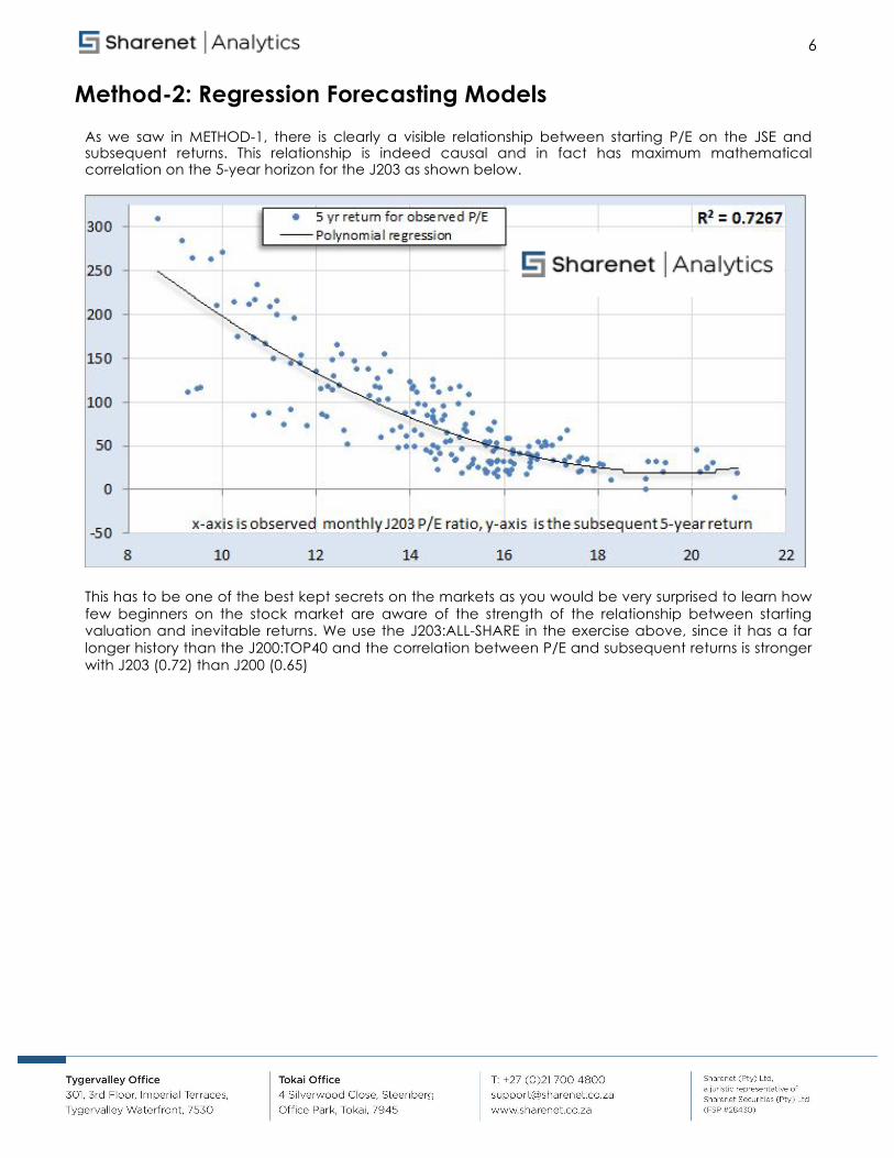
Method-2: Regression Forecasting Models As we saw in METHOD-1, there is clearly a visible relationship between starting P/E on the JSE and subsequent returns. This relationship is indeed causal and in fact has maximum mathematical correlation on the 5-year horizon for the J203 as shown below.
This has to be one of the best kept secrets on the markets as you would be very surprised to learn how few beginners on the stock market are aware of the strength of the relationship between starting valuation and inevitable returns. We use the J203:ALL-SHARE in the exercise above, since it has a far longer history than the J200:TOP40 and the correlation between P/E and subsequent returns is stronger with J203 (0.72) than J200 (0.65)

7
For many people, a regression chart such as the above one, even with a high correlation, does not impart the realities of the strong relationship between the variables being compared. We find a lot of people relate far better to the below chart, which merely uses the regression model above, monthly since 1994, to plot actual achieved 5-year JSE returns versus those forecast by the model 5 years before:
This chart is more intuitively appreciated by those less versed in statistical regression techniques and clearly shows how the regression model is an excellent "crystal ball" for forecasting 5 year ahead returns. The fact that you witness the green line some 5 years before the calculation of the black line at any date “hits you right between the eyes.”
Unless we are very long-term investors however, the five year horizon is of less interest to us.
We are more concerned about what is going to happen in the next 12 months. Using starting JSE P/E and regression to subsequent 12-month forward returns is not going to be helpful since this has a very low correlation as shown on the chart on the left.
Given that the JSE P/E on any given day is a poor predictor of one-year returns, we need to use the more accurate 5-year forecasting model to somehow predict returns 1 year ahead.

8
The solution is very simple - on any given day “T", we look back 4 years to see what the 5-year forecasting model has predicted for the next 5 years "A", and compare this to how much the JSE has already grown in the last 4 years "B". This will tell us what returns "C" we need to achieve in the year ahead to match the forecast made by the 5-year model. This trick yields remarkable accuracy (0.41 regressions) for what is essentially a very short forecast horizon, as shown to the left.
Again, for many people, a regression chart such as the one to the left, does not impart the realities of the strong relationship between the variables being compared.
We find a lot of people relate far better to the below chart, which merely uses the regression model to the left, monthly since 1994, to plot actual achieved 1-year JSE returns versus those forecast by the model 1 years before.
Correlation aside, it is remarkable in that the model accurately forecast the negative returns of the last 3 great bear markets - which is more important to us than month-to-month tracking error.
Whilst the model is not perfect (no model ever is) it clearly provides accurate warning of 12-month periods with negative returns. The reasoning is clear - if the JSE has run hard over the last 4 years and we have to have negative 1-year forward returns to achieve the original 5-year forecast then we are

9
bound to have the said correction. In February 2008, many financial market pundits were forecasting 5-8% returns for the JSE, but the model had recognized that the JSE and P/E's had run ahead of themselves in the prior 4 years and that a -42.8% return was likely for the next 12 months. Twelve months later, in February 2009, the market had fallen 39.8%. If you examine the chart you see that the JSE starts correcting about 3-6 months after the forecast goes deeply negative. Both the 5-year regression forecast and the 1-year forecast model (that uses the 5-year regression forecast) are shown as monthly charts for Sharenet Analytics subscribers in the MACRO sub-set as shown overleaf. Although the charts display monthly data, the last month to the right of the chart is updated daily with the latest data forming the current month
For the 5-year model below, “PE 5YR” we show the J203 (blue line) the 5 year ahead returns forecast (black line) and the actual achieved 5 year return from each data (green line). The chart is defaulted on a 10-year view but you can use the Zoom buttons or the slider at the bottom to change your view all the way back to 1994:
The chart above displays the expected 5 year return and annualizes this down to 4.08% per annum.

10
This per-annum figure is a 5-year aggregate though and does not really give a good indication of what to expect in the 12 months. For this we use the 1-year forecast model which is also updated daily (but displayed monthly) as shown below:

11
Method-3: Relative Valuation Rather than examine the JSE’s P/E ratio in isolation, this method compares it to competing returns from cash, after adjusting for inflation. The model compares the valuation of equities by measuring JSE ALSH Index’s’ Earnings Yield (inverse of P/E) less Inflation, to interest you can earn in cash (a competing asset class) through the ratio R=(EY-CPI)/CASH RATE.
Ratios above 0 imply equities are favorable over cash and other fixed interest assets and ratios below zero imply fixed interest assets are favorable over equities. The idea is that as P/E ratios fall (thus raising Earnings Yields), either through strong earnings growth or a correction, and inflation drops, then equities become favorable over cash. As interest rates and/or P/E ratios rise and inflation rises, then cash becomes favorable to equities.
The ratio is shown in red below since 1997 together with blue shaded areas where a timing model would have us in equities (when ratio is >0) or white areas when we are in cash earning prime less 4 (when ratio < 0):
The ratio also indicates the relative attractiveness of either asset class – when it is high equities should be overweight and when it is very low, cash should be overweight. The timing model has two powerful growth impacts – first it keeps you out the majority of the bear markets, and second, it leverages high interest rates when in cash.

12
Its performance over the last 15 years (12 trades) astonishes (just over 7 times the JSE buy and hold) and is shown below as at February 2012:
This model is less about predicting recessions and more about keeping you in the asset class showing most favorable long term likely returns. Prior to 1997 the model has worked less well, possibly due to artificial levels of earnings and/or interest rates due to sanctions and our closed economy in the pre-democracy era.
The long-term performance of the Cash/Equity model compared to other trading and investment models we maintain for clients and fund managers can be viewed over here: http://Sharenet Analytics.co.za/tradingtables.php

13
The timing model is updated daily for Sharenet Analytics clients in the MACRO charts group as shown below. The light grey line is the actual Cash/Equity ratio calculation for the day (R=(EY-CPI)/CASH RATE), the black line is the exponential moving average of R that is used to signal BUY and SELL alerts, the red vertical lines are SELL signals and the green vertical lines are BUY signals:
You can configure the following alerts for the CER chart: