
Introduction to Statistics Using LibreOffice.org Calc...
39
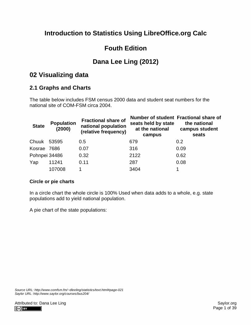
Source URL: http://www.comfsm.fm/~dleeling/statistics/text.html#page-021 Saylor URL: http://www.saylor.org/courses/bus204/ Attributed to: Dana Lee Ling Saylor.org Page 1 of 39 Introduction to Statistics Using LibreOffice.org Calc Fouth Edition Dana Lee Ling (2012) 02 Visualizing data 2.1 Graphs and Charts The table below includes FSM census 2000 data and student seat numbers for the national site of COM-FSM circa 2004. State Population (2000) Fractional share of national population (relative frequency) Number of student seats held by state at the national campus Fractional share of the national campus student seats Chuuk 53595 0.5 679 0.2 Kosrae 7686 0.07 316 0.09 Pohnpei 34486 0.32 2122 0.62 Yap 11241 0.11 287 0.08 107008 1 3404 1 Circle or pie charts In a circle chart the whole circle is 100% Used when data adds to a whole, e.g. state populations add to yield national population. A pie chart of the state populations:
Transcript of Introduction to Statistics Using LibreOffice.org Calc...
Source URL: http://www.comfsm.fm/~dleeling/statistics/text.html#page-021 Saylor URL: http://www.saylor.org/courses/bus204/ Attributed to: Dana Lee Ling Saylor.org Page 1 of 39
Introduction to Statistics Using LibreOffice.org Calc
Fouth Edition
Dana Lee Ling (2012)
02 Visualizing data
2.1 Graphs and Charts
The table below includes FSM census 2000 data and student seat numbers for the national site of COM-FSM circa 2004.
State Population (2000)
Fractional share of national population (relative frequency)
Number of student seats held by state
at the national campus
Fractional share of the national
campus student seats
Chuuk 53595 0.5 679 0.2 Kosrae 7686 0.07 316 0.09 Pohnpei 34486 0.32 2122 0.62 Yap 11241 0.11 287 0.08 107008 1 3404 1
Circle or pie charts
In a circle chart the whole circle is 100% Used when data adds to a whole, e.g. state populations add to yield national population.
A pie chart of the state populations:
Source URL: http://www.comfsm.fm/~dleeling/statistics/text.html#page-021 Saylor URL: http://www.saylor.org/courses/bus204/ Attributed to: Dana Lee Ling Saylor.org Page 2 of 39
The following table includes data from the 2010 FSM census as an update to the above data.
State Population (2010) Relative frequency Chuuk 48651 Kosrae 6616 Pohnpei 35981 Yap 11376 Sum: 102624
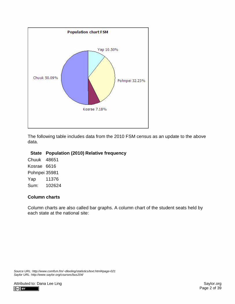
Column charts
Column charts are also called bar graphs. A column chart of the student seats held by each state at the national site:

Source URL: http://www.comfsm.fm/~dleeling/statistics/text.html#page-021 Saylor URL: http://www.saylor.org/courses/bus204/ Attributed to: Dana Lee Ling Saylor.org Page 3 of 39
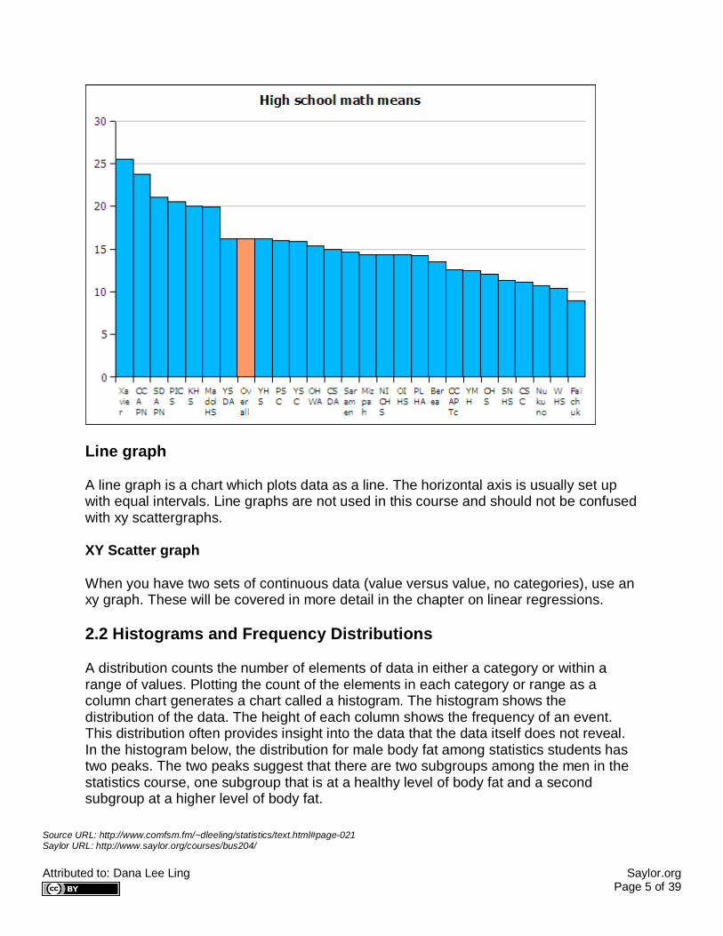
Pareto chart
If a column chart is sorted so that the columns are in descending order, then it is called a Pareto chart. Descending order means the largest value is on the left and the values decrease as one moves to the right. Pareto charts are useful ways to convey rank order as well as numerical data.

Source URL: http://www.comfsm.fm/~dleeling/statistics/text.html#page-021 Saylor URL: http://www.saylor.org/courses/bus204/ Attributed to: Dana Lee Ling Saylor.org Page 4 of 39
Source URL: http://www.comfsm.fm/~dleeling/statistics/text.html#page-021 Saylor URL: http://www.saylor.org/courses/bus204/ Attributed to: Dana Lee Ling Saylor.org Page 5 of 39
Line graph
A line graph is a chart which plots data as a line. The horizontal axis is usually set up with equal intervals. Line graphs are not used in this course and should not be confused with xy scattergraphs.
XY Scatter graph
When you have two sets of continuous data (value versus value, no categories), use an xy graph. These will be covered in more detail in the chapter on linear regressions.
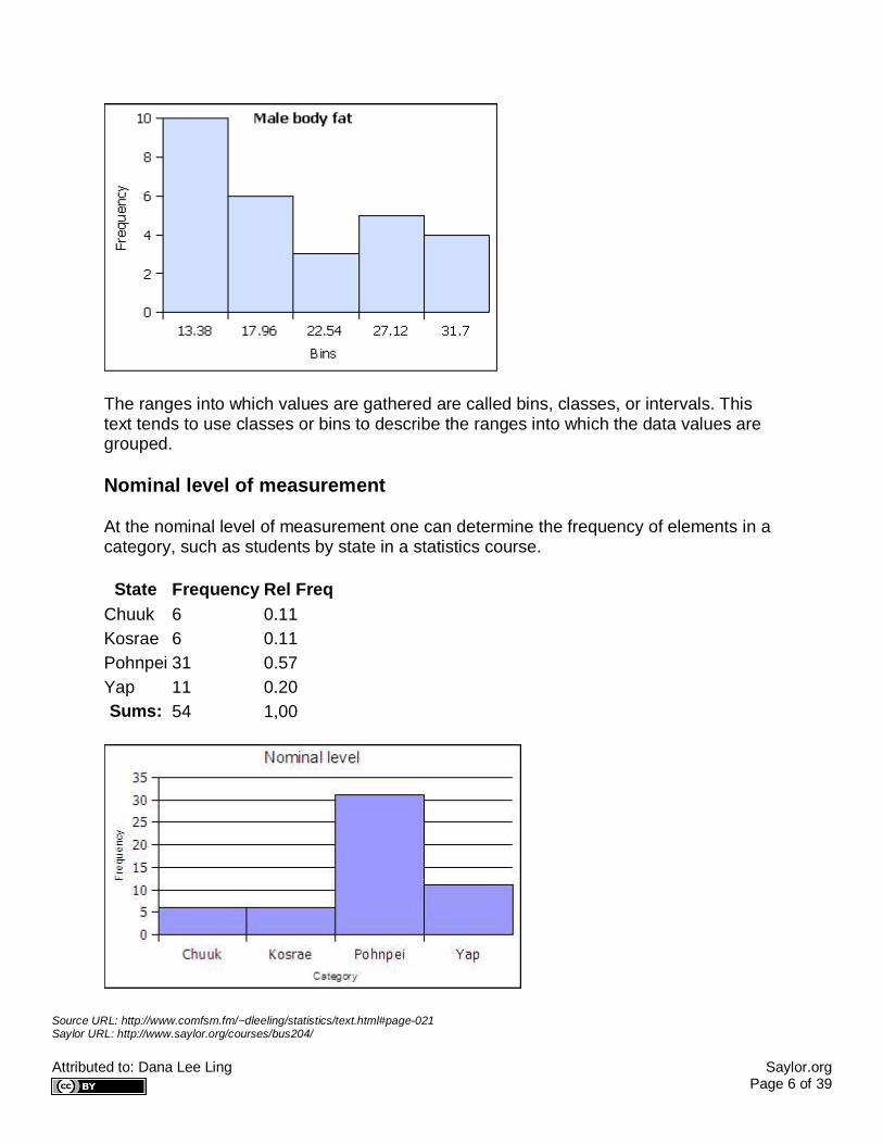
2.2 Histograms and Frequency Distributions
A distribution counts the number of elements of data in either a category or within a range of values. Plotting the count of the elements in each category or range as a column chart generates a chart called a histogram. The histogram shows the distribution of the data. The height of each column shows the frequency of an event. This distribution often provides insight into the data that the data itself does not reveal. In the histogram below, the distribution for male body fat among statistics students has two peaks. The two peaks suggest that there are two subgroups among the men in the statistics course, one subgroup that is at a healthy level of body fat and a second subgroup at a higher level of body fat.
Source URL: http://www.comfsm.fm/~dleeling/statistics/text.html#page-021 Saylor URL: http://www.saylor.org/courses/bus204/ Attributed to: Dana Lee Ling Saylor.org Page 6 of 39
The ranges into which values are gathered are called bins, classes, or intervals. This text tends to use classes or bins to describe the ranges into which the data values are grouped.
Nominal level of measurement
At the nominal level of measurement one can determine the frequency of elements in a category, such as students by state in a statistics course.
State Frequency Rel Freq Chuuk 6 0.11 Kosrae 6 0.11 Pohnpei 31 0.57 Yap 11 0.20 Sums: 54 1,00

Source URL: http://www.comfsm.fm/~dleeling/statistics/text.html#page-021 Saylor URL: http://www.saylor.org/courses/bus204/ Attributed to: Dana Lee Ling Saylor.org Page 7 of 39
Ordinal level of measurement
Data classes into classes comprised of each unique data value
At the ordinal level, a frequency distribution can be done using the rank order, counting the number of elements in each rank order to obtain a frequency. When the frequency data is calculated in this way, the distribution is not grouped into a smaller number of classes.
Age Frequency Rel Freq 17 1 0.02 18 5 0.1 19 14 0.27 20 12 0.24 21 9 0.18 22 1 0.02 23 3 0.06 24 3 0.06 25 1 0.02 26 1 0.02 27 1 0.02 sums 51 1
Data gathered into a number of classes fewer than the number of unique data values
The ranks can be collected together, classed, to reduce the number of rank order categories. in the example below the age data in gathered into two-year cohorts.

Source URL: http://www.comfsm.fm/~dleeling/statistics/text.html#page-021 Saylor URL: http://www.saylor.org/courses/bus204/ Attributed to: Dana Lee Ling Saylor.org Page 8 of 39
Age Frequency Rel Freq 19 20 0.39 21 21 0.41 23 4 0.08 25 4 0.08 27 2 0.04 Sums: 51 1
2.22 Ratio level of measurement
At the ratio level data is always gathered into ranges. At the ratio level, classed histograms are used. Ratio level data is not necessarily in a finite number of ranks as was ordinal data.
The ranges into which data is gathered are defined by a class lower limit and a class upper limit. The width is the class upper limit minus the class lower limit. The frequency function in spreadsheets uses class upper limits. In this text histograms are also generated using the class upper limits.
To calculate the class lower and upper limits the minimum and maximum value in a data set must be determined. Spreadsheets include functions to calculate the minimum value MIN and maximum value MAX in a data set.
=MIN(data)
=MAX(data)
In LibreOffice the MIN and MAX function can take a list of comma separated numbers or a range of cells in a spreadsheet. In statistics a range of cells is the most common
Source URL: http://www.comfsm.fm/~dleeling/statistics/text.html#page-021 Saylor URL: http://www.saylor.org/courses/bus204/ Attributed to: Dana Lee Ling Saylor.org Page 9 of 39
input for these functions. When a range of cells is the usual input, this text uses the word "data" to refer to the fact that the range of cells is usually your data! Ranges of cells use two cell addresses separated by a full colon. An example is shown below where the data is arranged in a vertical column from A2 to A42. Sort the original data from smallest to largest before you begin!
=MIN(A2:A42)
How to make a frequency table at the ratio level
1. Find the minimum value of the data set using the MIN function 2. Find the maximum value of the data set using the MAX function 3. Calculate the range by subtracting the MIN from the MAX:
range = maximum value - minimum value 4. Decide on the number of classes you are going to use (also called bins or
intervals) 5. Divide the range by the number of classes to calculate the class width (or bin
width or interval width) 6. Calculate the class upper limits 7. Put the class upper limits into a column of cells 8. Manually tally the data into the frequency column to determine the frequencies
for each class. The class upper limit is included in each tally. As a check, the sum of the frequencies must be equal to the sample size.
9. Create a column chart
Class Upper Limits (CUL) Frequency =min + class width + class width + class width + class width + class width = max
For the female height data:
58, 58, 59.5, 59.5, 60, 60, 60, 60, 60, 61, 61, 61.2, 61.5, 62, 62, 62, 62, 62, 62, 62, 62, 62, 62, 62, 62, 63, 63, 63, 63.5, 64, 64, 64, 64, 65, 65, 66, 66
Five classes would produce the following results: Min = 58 Max = 66 Range = 66 - 58 = 8 Width = 8/5 = 1.6
Source URL: http://www.comfsm.fm/~dleeling/statistics/text.html#page-021 Saylor URL: http://www.saylor.org/courses/bus204/ Attributed to: Dana Lee Ling Saylor.org Page 10 of 39
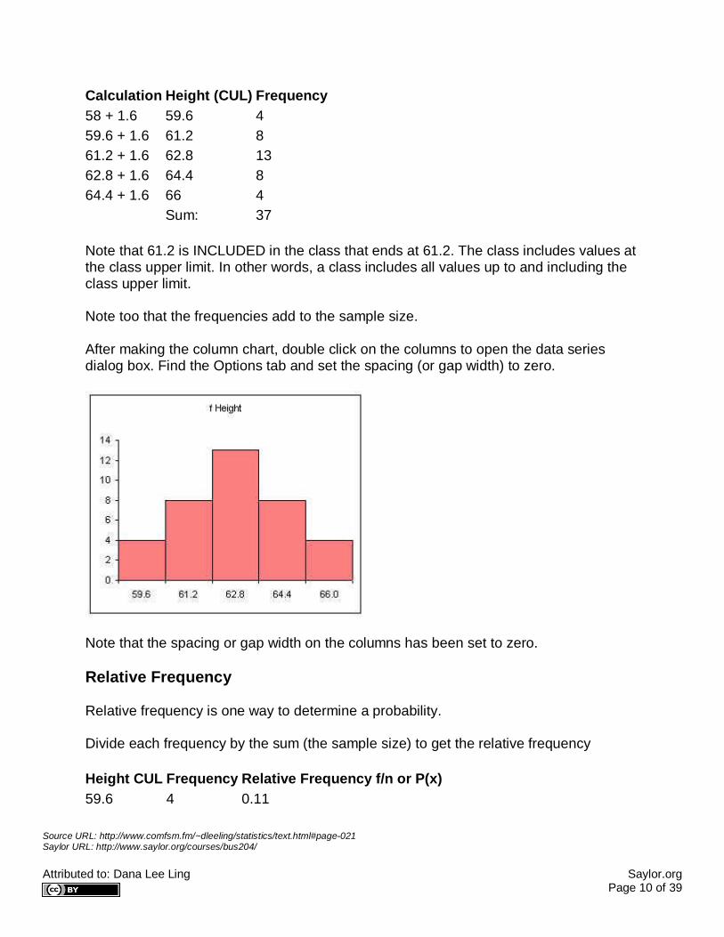
Calculation Height (CUL) Frequency 58 + 1.6 59.6 4 59.6 + 1.6 61.2 8 61.2 + 1.6 62.8 13 62.8 + 1.6 64.4 8 64.4 + 1.6 66 4 Sum: 37
Note that 61.2 is INCLUDED in the class that ends at 61.2. The class includes values at the class upper limit. In other words, a class includes all values up to and including the class upper limit.
Note too that the frequencies add to the sample size.
After making the column chart, double click on the columns to open the data series dialog box. Find the Options tab and set the spacing (or gap width) to zero.
Note that the spacing or gap width on the columns has been set to zero.
Relative Frequency
Relative frequency is one way to determine a probability.
Divide each frequency by the sum (the sample size) to get the relative frequency
Height CUL Frequency Relative Frequency f/n or P(x) 59.6 4 0.11
Source URL: http://www.comfsm.fm/~dleeling/statistics/text.html#page-021 Saylor URL: http://www.saylor.org/courses/bus204/ Attributed to: Dana Lee Ling Saylor.org Page 11 of 39
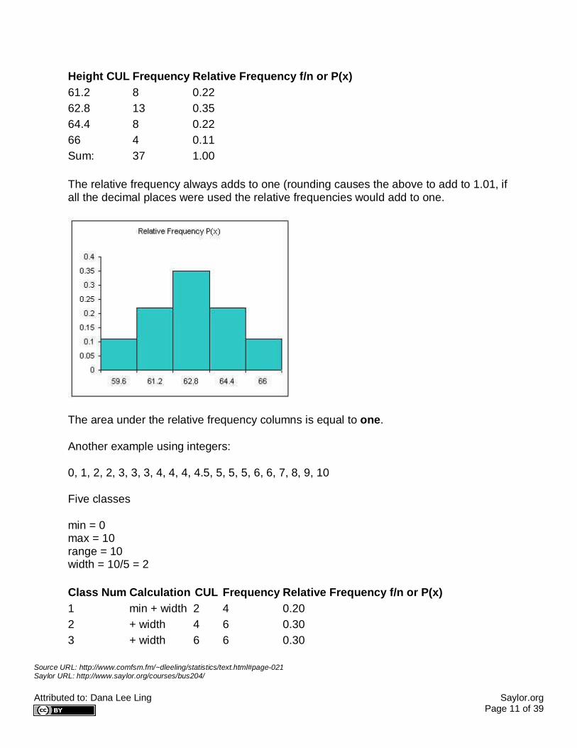
Height CUL Frequency Relative Frequency f/n or P(x) 61.2 8 0.22 62.8 13 0.35 64.4 8 0.22 66 4 0.11 Sum: 37 1.00
The relative frequency always adds to one (rounding causes the above to add to 1.01, if all the decimal places were used the relative frequencies would add to one.
The area under the relative frequency columns is equal to one.
Another example using integers:
0, 1, 2, 2, 3, 3, 3, 4, 4, 4, 4.5, 5, 5, 5, 6, 6, 7, 8, 9, 10
Five classes
min = 0 max = 10 range = 10 width = 10/5 = 2
Class Num Calculation CUL Frequency Relative Frequency f/n or P(x) 1 min + width 2 4 0.20 2 + width 4 6 0.30 3 + width 6 6 0.30
Source URL: http://www.comfsm.fm/~dleeling/statistics/text.html#page-021 Saylor URL: http://www.saylor.org/courses/bus204/ Attributed to: Dana Lee Ling Saylor.org Page 12 of 39
Class Num Calculation CUL Frequency Relative Frequency f/n or P(x) 4 + width 8 2 0.10 5 + width 10 2 0.10 Sum: 20 1.00
The above method produces equal width classes and to conforms the inclusion of the class upper limit by spreadsheet packages.
Checking frequency tables
The final class upper limit must be equal to the maximum value in the data set. The frequencies must sum to the sample size n. The relative frequencies must add to 1.00.
CUL Frequency Relative Frequency f/n min + width + width + width + width + width = MAX Sum: sample size n 1.00
Frequency function
For more advanced spreadsheet users, frequency data can be obtained using the frequency function FREQUENCY. This function is also very useful when working with large data sets. The frequency function is:
=FREQUENCY(DATA,CLASSES)
DATA refers to the range of cells containing the data, CLASSES refers to the range of cells containing the class upper limits.
The data set seen below are the height measurements for 49 female students in statistics courses during two consecutive terms.
The frequency function built into spreadsheets works very differently from all other functions. The frequency function called an "array" function because the function places values into an array of cells. For the function to do this, you must first select the cells into which the function will place the frequency values.

Source URL: http://www.comfsm.fm/~dleeling/statistics/text.html#page-021 Saylor URL: http://www.saylor.org/courses/bus204/ Attributed to: Dana Lee Ling Saylor.org Page 13 of 39
With the cells still highlighted, start typing the frequency function.
Source URL: http://www.comfsm.fm/~dleeling/statistics/text.html#page-021 Saylor URL: http://www.saylor.org/courses/bus204/ Attributed to: Dana Lee Ling Saylor.org Page 14 of 39
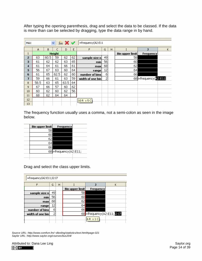
After typing the opening parenthesis, drag and select the data to be classed. If the data is more than can be selected by dragging, type the data range in by hand.
The frequency function usually uses a comma, not a semi-colon as seen in the image below.
Drag and select the class upper limits.
Source URL: http://www.comfsm.fm/~dleeling/statistics/text.html#page-021 Saylor URL: http://www.saylor.org/courses/bus204/ Attributed to: Dana Lee Ling Saylor.org Page 15 of 39
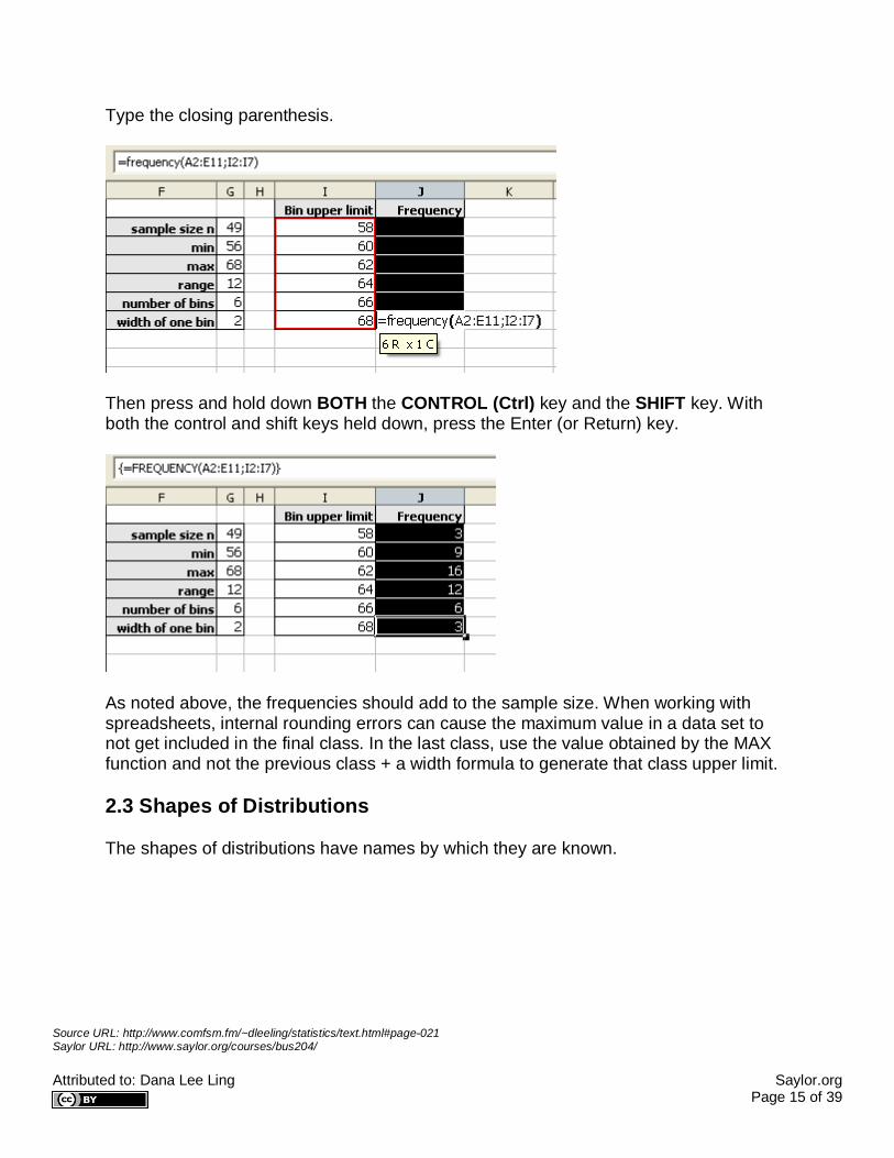
Type the closing parenthesis.
Then press and hold down BOTH the CONTROL (Ctrl) key and the SHIFT key. With both the control and shift keys held down, press the Enter (or Return) key.
As noted above, the frequencies should add to the sample size. When working with spreadsheets, internal rounding errors can cause the maximum value in a data set to not get included in the final class. In the last class, use the value obtained by the MAX function and not the previous class + a width formula to generate that class upper limit.
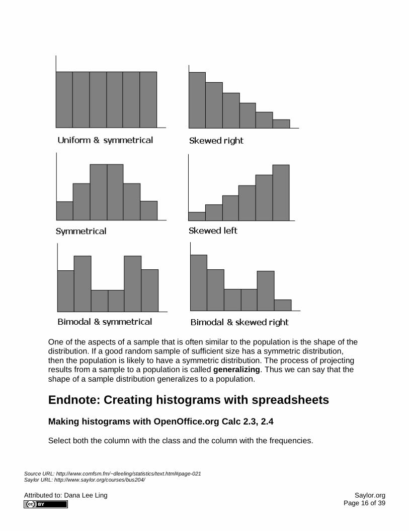
2.3 Shapes of Distributions
The shapes of distributions have names by which they are known.
Source URL: http://www.comfsm.fm/~dleeling/statistics/text.html#page-021 Saylor URL: http://www.saylor.org/courses/bus204/ Attributed to: Dana Lee Ling Saylor.org Page 16 of 39
One of the aspects of a sample that is often similar to the population is the shape of the distribution. If a good random sample of sufficient size has a symmetric distribution, then the population is likely to have a symmetric distribution. The process of projecting results from a sample to a population is called generalizing. Thus we can say that the shape of a sample distribution generalizes to a population.
Endnote: Creating histograms with spreadsheets Making histograms with OpenOffice.org Calc 2.3, 2.4
Select both the column with the class and the column with the frequencies.

Source URL: http://www.comfsm.fm/~dleeling/statistics/text.html#page-021 Saylor URL: http://www.saylor.org/courses/bus204/ Attributed to: Dana Lee Ling Saylor.org Page 17 of 39
Click on the chart wizard button and then drag the mouse to place and size the histogram.
At the first dialog box be sure to click on the "First column as label" check box as indicated by the arrow in the diagram below.

Source URL: http://www.comfsm.fm/~dleeling/statistics/text.html#page-021 Saylor URL: http://www.saylor.org/courses/bus204/ Attributed to: Dana Lee Ling Saylor.org Page 18 of 39
For the next two screens simply click on "Next"
On the next screen fill in the appropriate titles. The legend can be "unchecked" as seen below.

Source URL: http://www.comfsm.fm/~dleeling/statistics/text.html#page-021 Saylor URL: http://www.saylor.org/courses/bus204/ Attributed to: Dana Lee Ling Saylor.org Page 19 of 39
When done, click on Create.
Double click any column to open up the data series dialog box.
Source URL: http://www.comfsm.fm/~dleeling/statistics/text.html#page-021 Saylor URL: http://www.saylor.org/courses/bus204/ Attributed to: Dana Lee Ling Saylor.org Page 20 of 39
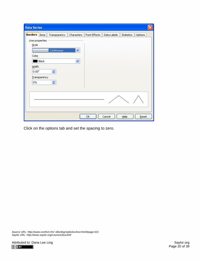
Click on the options tab and set the spacing to zero.
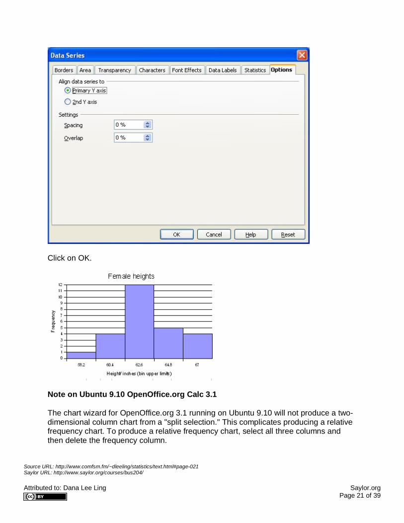
Source URL: http://www.comfsm.fm/~dleeling/statistics/text.html#page-021 Saylor URL: http://www.saylor.org/courses/bus204/ Attributed to: Dana Lee Ling Saylor.org Page 21 of 39
Click on OK.
Note on Ubuntu 9.10 OpenOffice.org Calc 3.1
The chart wizard for OpenOffice.org 3.1 running on Ubuntu 9.10 will not produce a two-dimensional column chart from a "split selection." This complicates producing a relative frequency chart. To produce a relative frequency chart, select all three columns and then delete the frequency column.

Source URL: http://www.comfsm.fm/~dleeling/statistics/text.html#page-021 Saylor URL: http://www.saylor.org/courses/bus204/ Attributed to: Dana Lee Ling Saylor.org Page 22 of 39
In step three, remove the frequency series to chart only the relative frequency.
Making histograms with Microsoft Excel 97/2000/XP
Select ONLY the column with the column with the frequencies. Click on the chart wizard.

Source URL: http://www.comfsm.fm/~dleeling/statistics/text.html#page-021 Saylor URL: http://www.saylor.org/courses/bus204/ Attributed to: Dana Lee Ling Saylor.org Page 23 of 39
Click on next.
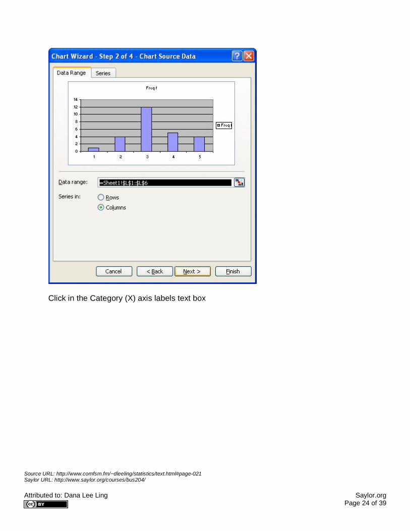
In step 2 of 4, click on the series tab
Source URL: http://www.comfsm.fm/~dleeling/statistics/text.html#page-021 Saylor URL: http://www.saylor.org/courses/bus204/ Attributed to: Dana Lee Ling Saylor.org Page 24 of 39
Click in the Category (X) axis labels text box
Source URL: http://www.comfsm.fm/~dleeling/statistics/text.html#page-021 Saylor URL: http://www.saylor.org/courses/bus204/ Attributed to: Dana Lee Ling Saylor.org Page 25 of 39
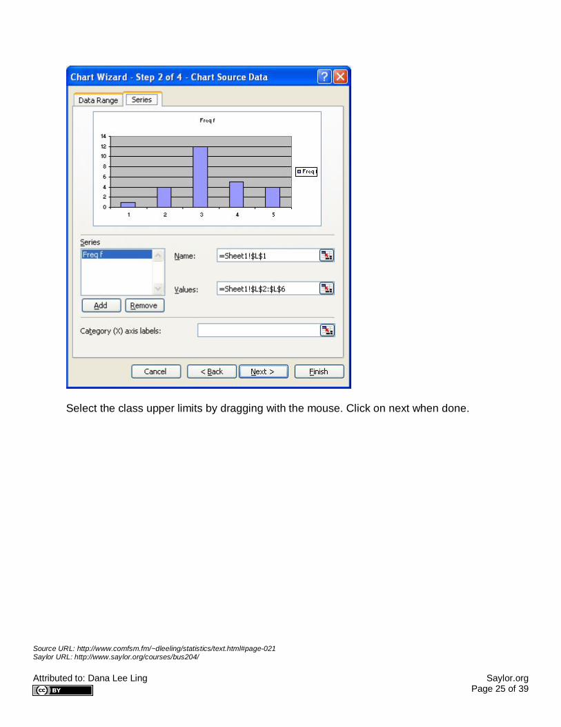
Select the class upper limits by dragging with the mouse. Click on next when done.

Source URL: http://www.comfsm.fm/~dleeling/statistics/text.html#page-021 Saylor URL: http://www.saylor.org/courses/bus204/ Attributed to: Dana Lee Ling Saylor.org Page 26 of 39
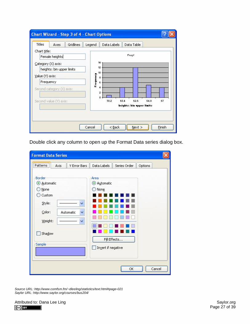
Fill in the appropriate titles and then click on finish.
Source URL: http://www.comfsm.fm/~dleeling/statistics/text.html#page-021 Saylor URL: http://www.saylor.org/courses/bus204/ Attributed to: Dana Lee Ling Saylor.org Page 27 of 39
Double click any column to open up the Format Data series dialog box.

Source URL: http://www.comfsm.fm/~dleeling/statistics/text.html#page-021 Saylor URL: http://www.saylor.org/courses/bus204/ Attributed to: Dana Lee Ling Saylor.org Page 28 of 39
Click on the options tab and set the gap width to zero.
Click on OK.
Making histograms with Microsoft Excel 2007
Source URL: http://www.comfsm.fm/~dleeling/statistics/text.html#page-021 Saylor URL: http://www.saylor.org/courses/bus204/ Attributed to: Dana Lee Ling Saylor.org Page 29 of 39
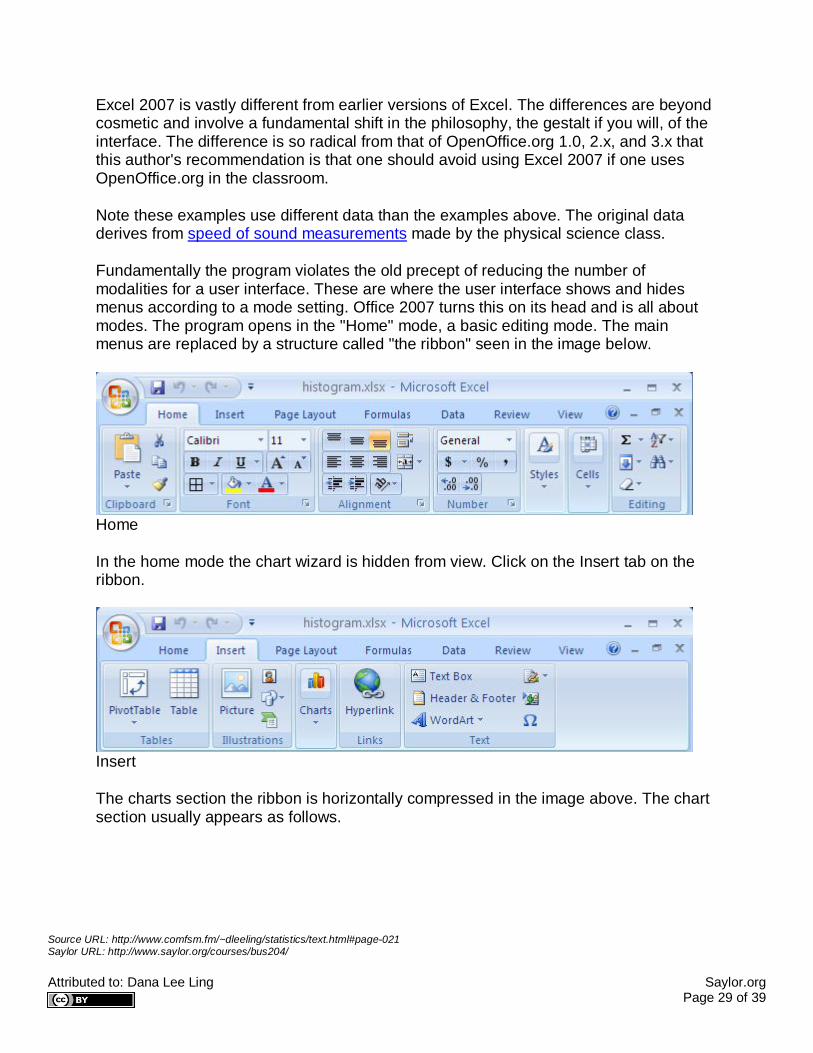
Excel 2007 is vastly different from earlier versions of Excel. The differences are beyond cosmetic and involve a fundamental shift in the philosophy, the gestalt if you will, of the interface. The difference is so radical from that of OpenOffice.org 1.0, 2.x, and 3.x that this author's recommendation is that one should avoid using Excel 2007 if one uses OpenOffice.org in the classroom.
Note these examples use different data than the examples above. The original data derives from speed of sound measurements made by the physical science class.
Fundamentally the program violates the old precept of reducing the number of modalities for a user interface. These are where the user interface shows and hides menus according to a mode setting. Office 2007 turns this on its head and is all about modes. The program opens in the "Home" mode, a basic editing mode. The main menus are replaced by a structure called "the ribbon" seen in the image below.
Home
In the home mode the chart wizard is hidden from view. Click on the Insert tab on the ribbon.
Insert
The charts section the ribbon is horizontally compressed in the image above. The chart section usually appears as follows.
Source URL: http://www.comfsm.fm/~dleeling/statistics/text.html#page-021 Saylor URL: http://www.saylor.org/courses/bus204/ Attributed to: Dana Lee Ling Saylor.org Page 30 of 39
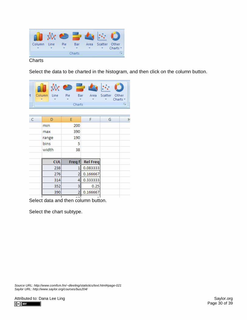
Charts
Select the data to be charted in the histogram, and then click on the column button.
Select data and then column button.
Select the chart subtype.

Source URL: http://www.comfsm.fm/~dleeling/statistics/text.html#page-021 Saylor URL: http://www.saylor.org/courses/bus204/ Attributed to: Dana Lee Ling Saylor.org Page 31 of 39
Chart subtype selection
The chart appears.
Right click on the chart to pop-up the chart context menu. Choose "Select Data"
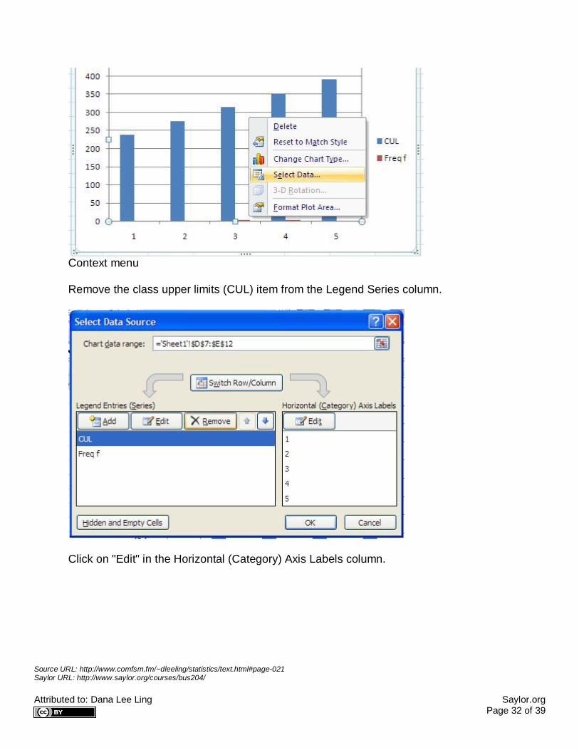
Source URL: http://www.comfsm.fm/~dleeling/statistics/text.html#page-021 Saylor URL: http://www.saylor.org/courses/bus204/ Attributed to: Dana Lee Ling Saylor.org Page 32 of 39
Context menu
Remove the class upper limits (CUL) item from the Legend Series column.
Click on "Edit" in the Horizontal (Category) Axis Labels column.
Source URL: http://www.comfsm.fm/~dleeling/statistics/text.html#page-021 Saylor URL: http://www.saylor.org/courses/bus204/ Attributed to: Dana Lee Ling Saylor.org Page 33 of 39
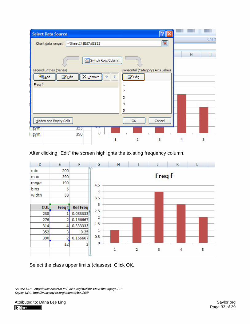
After clicking "Edit" the screen highlights the existing frequency column.
Select the class upper limits (classes). Click OK.
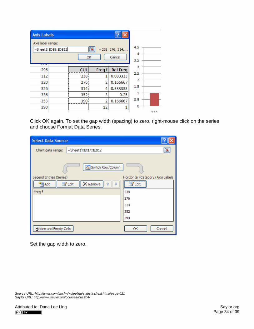
Source URL: http://www.comfsm.fm/~dleeling/statistics/text.html#page-021 Saylor URL: http://www.saylor.org/courses/bus204/ Attributed to: Dana Lee Ling Saylor.org Page 34 of 39
Click OK again. To set the gap width (spacing) to zero, right-mouse click on the series and choose Format Data Series.
Set the gap width to zero.

Source URL: http://www.comfsm.fm/~dleeling/statistics/text.html#page-021 Saylor URL: http://www.saylor.org/courses/bus204/ Attributed to: Dana Lee Ling Saylor.org Page 35 of 39
Gap width setting
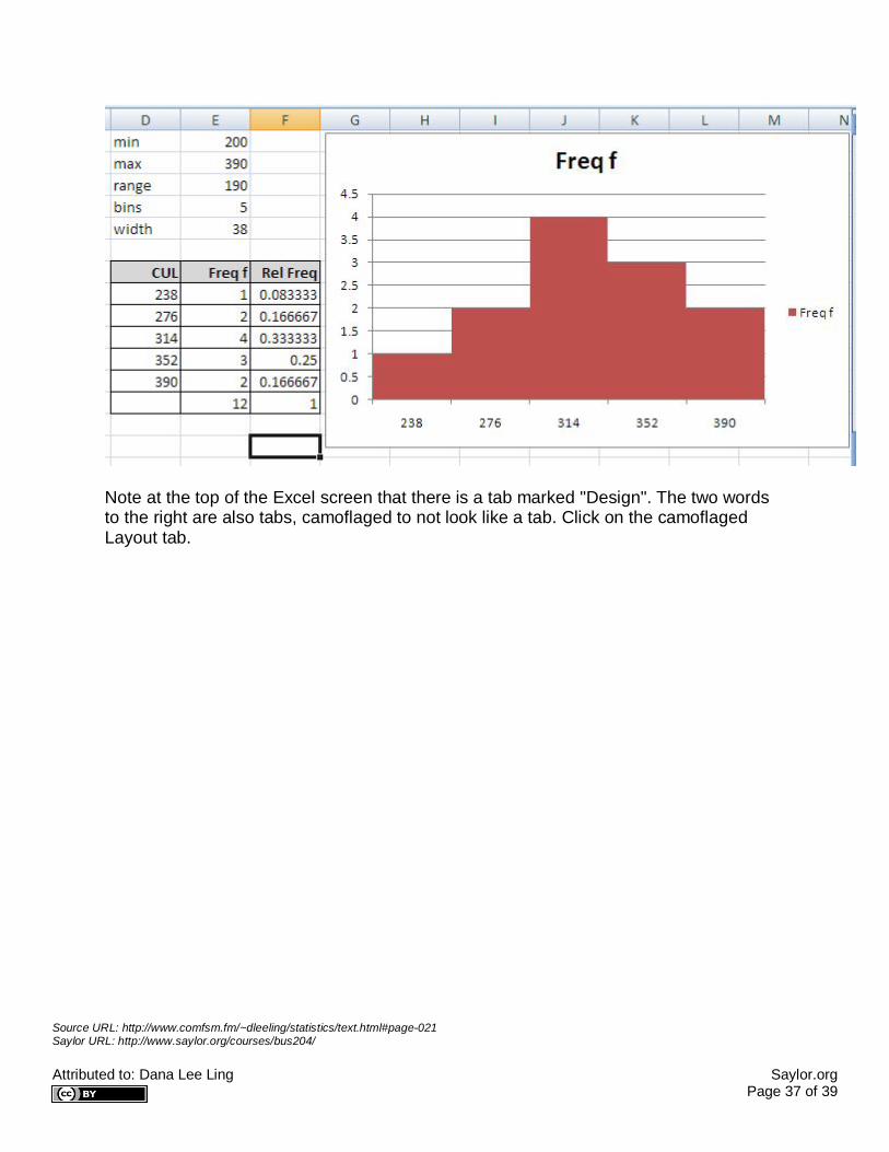
The result is a tad cartoonish - borderless columns - but that is a default style for Excel 2007.

Source URL: http://www.comfsm.fm/~dleeling/statistics/text.html#page-021 Saylor URL: http://www.saylor.org/courses/bus204/ Attributed to: Dana Lee Ling Saylor.org Page 36 of 39
Borderless columns
One can delete the legend, but x and y axis labels are usually necessary. Adding these is possibly the most non-obvious step for an OpenOffice.org or Excel 97/2000 user.
Source URL: http://www.comfsm.fm/~dleeling/statistics/text.html#page-021 Saylor URL: http://www.saylor.org/courses/bus204/ Attributed to: Dana Lee Ling Saylor.org Page 37 of 39
Note at the top of the Excel screen that there is a tab marked "Design". The two words to the right are also tabs, camoflaged to not look like a tab. Click on the camoflaged Layout tab.

Source URL: http://www.comfsm.fm/~dleeling/statistics/text.html#page-021 Saylor URL: http://www.saylor.org/courses/bus204/ Attributed to: Dana Lee Ling Saylor.org Page 38 of 39
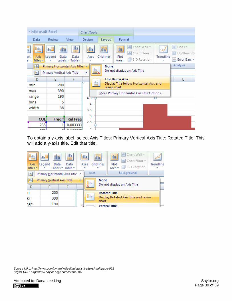
Now select Axis Titles: Primary Horizontal Axis Title: Title Below Axis sub-sub-menu. This adds an x-axis label which one can then edit.
Source URL: http://www.comfsm.fm/~dleeling/statistics/text.html#page-021 Saylor URL: http://www.saylor.org/courses/bus204/ Attributed to: Dana Lee Ling Saylor.org Page 39 of 39
To obtain a y-axis label, select Axis Titles: Primary Vertical Axis Title: Rotated Title. This will add a y-axis title. Edit that title.