NAME County WHAT’S IN YOUR BREAKFAST? Table Top Exercise Date.
date post
20-Dec-2015Category
view
216download
1
Introduction to statistics and data

Looking at numbers… Group exercise: What’s the math
problem in each of the four examples I’ve given you?

Experimental treatment
Standard treatment
Table 2. Outcome volume for the experimental and standard groups; mean (SD).
Location Week 0 Week 12 Change (Week 0 – Week 12)
experimental standard experimental standard experimental standard
Affected side 3135 (748)* 3333 (1368)* 2982 (715)* 3331 (1383)* –154 (168) –2 (306)
Contralateral side
2595 (672) 2654 (761) 2553 (606) 2631 (736) –42 (193) –23 (219)
* p< .05 greater than the contralateral side
EXAMPLE 1.
~3350~3285

EXAMPLE 2.
Objective: The study objective is to determine the efficacy of a new treatment cream as a therapeutic option for eczema.Methods: Prospective study under institutional review board approval of ten patients with eczema, who were all treated with the experimental cream. Three blinded independent investigators evaluated overall improvement, as well as changes in scaliness and redness, graded on a quartile (0-3) scale: 0=none, 1=mild (1-33%), 2=moderate (34-66%), 3=excellent (67-100%). Results: All patients showed overall improvement as measured by blinded investigators. Of patients showing overall improvement, 78% were graded as having either excellent or moderate improvement. Ninety-six percent of subjects demonstrated improvements in scaliness and redness. Limitations: Small sample size

EXAMPLE 3.
Table 1 -- Baseline characteristics by height and follow-up for incident cancer in the Million Women Study Height in cm* All women <155 155 160 165 170 ≥175 Mean measured height (SD) 152·8 (4·1) 156·5 (2·3) 160·4 (2·9) 164·9 (2·9) 169·0 (2·9) 173·8 (4·3) 160·9 (6·4) ‡ Characteristics at recruitment Number of women 233 516 196 773 388 515 288 893 143 289 46 138 1 297 124 Mean age, years (SD) 56·3 (4·9) 56·2 (4·9) 56·2 (4·9) 56·0 (4·8) 56·0 (4·8) 55·8 (4·8) 56·1 (4·9) Socioeconomic status, n (%) in lowest quintile 59 220 (26%) 42 862 (22%) 73 119 (19%) 48 190 (17%) 23 262 (16%) 7 664 (17%) 19·7 Current smokers, n (%) 50 775 (23%) 40 500 (22%) 72 763 (20%) 51 678 (19%) 26 147 (19%) 8 369 (19%) 20·5 Alcohol intake, n (%) ≥7 units per week 47 138 (20%) 43 324 (22%) 92 126 (24%) 73 597 (26%) 36 742 (26%) 11 734 (26%) 23·7 Body-mass index, n (%) BMI ≥30 54 550 (25%) 38 493 (20%) 65 622 (18%) 42 004 (15%) 18 370 (13%) 5 320 (12%) 18·0 Strenuous exercise, n (%) once a week or more 76 917 (35%) 69 607 (37%) 147 103 (39%) 116 614 (42%) 58 339 (42%) 18 699 (42%) 39·0 Age at menarche, n (%) ≥14 years 79 858 (35%) 69 718 (36%) 139 607 (37%) 108 550 (38%) 57 852 (41%) 20 176 (45%) 37·4 Parity, n (%) nulliparous 22 827 (10%) 19 149 (10%) 40 296 (10%) 33 267 (12%) 17 985 (13%) 6 900 (15%) 10·8 Number of full-term pregnancies, n (%) with three or more 82 436 (35%) 67 118 (34%) 127 826 (33%) 91 287 (32%) 44 074 (31%) 13 335 (29%) 32·9 Age at first birth, n (%) ≥25 years 67 250 (33%) 61 042 (35%) 129 031 (38%) 103 017 (41%) 52 677 (43%) 17 492 (46%) 38·2 Postmenopausal, n (%) 162 551 (81%) 136 544 (81%) 269 384 (81%) 197 618 (80%) 97 855 (80%) 30 900 (79%) 80·5 Ever use of oral contraceptives, n (%) 133 979 (58%) 114 105 (59%) 228 669 (60%) 173 520 (61%) 85 522 (60%) 27 571 (60%) 59·5 Current use of HRT, n (%) 75 151 (33%) 63 865 (33%) 128 891 (34%) 98 086 (34%) 48 516 (34%) 15 637 (34%) 33·6Follow-up for cancer incidence Woman-years, millions 2·1 1·8 3·5 2·6 1·3 0·4 11·7 Number of incident cancers 15 792 14 213 28 806 22 571 11 902 4 092 97 376* The categories of height are those reported at recruitment, and mean values are those measured in a randomly selected sample.‡ Standardised to the distribution of categories of self-reported height in our whole analysis population.

EXAMPLE 3.
Height groups
<155
155 160 165 170 ≥175
152·8 (4·1)
156·5 (2·3)
160·4 (2·9)
164·9 (2·9)
169·0 (2·9)
173·8 (4·3)
Mean (SD) of height in each group

Original data:
Data re-use:

Original data:
Data re-use:
sensitive=11; resistant=13
sensitive=13; resistant=11

Clinical Data Example 1. Kline et al. (2002)
The researchers analyzed data from 934 emergency room patients with suspected pulmonary embolism (PE). Only about 1 in 5 actually had PE. The researchers wanted to know what clinical factors predicted PE.
I will use four variables from their dataset today: Pulmonary embolism (yes/no) Age (years) Shock index = heart rate/systolic BP Shock index categories = take shock index and divide it
into 10 groups (lowest to highest shock index)

Descriptive Statistics

Types of Variables: Overview
Categorical Quantitative
continuousdiscreteordinalnominalbinary
2 categories +
more categories +
order matters +
numerical +
uninterrupted

Categorical Variables Also known as “qualitative.”
Categories.
treatment groups exposure groups disease status

Categorical Variables Dichotomous (binary) – two levels
Dead/alive Treatment/placebo Disease/no disease Exposed/Unexposed Heads/Tails Pulmonary Embolism (yes/no) Male/female

Categorical Variables
Nominal variables – Named categories Order doesn’t matter!
The blood type of a patient (O, A, B, AB) Marital status Occupation

Categorical Variables Ordinal variable – Ordered categories.
Order matters!
Staging in breast cancer as I, II, III, or IV Birth order—1st, 2nd, 3rd, etc. Letter grades (A, B, C, D, F) Ratings on a scale from 1-5 Ratings on: always; usually; many times; once in
a while; almost never; never Age in categories (10-20, 20-30, etc.) Shock index categories (Kline et al.)

Quantitative Variables Numerical variables; may be
arithmetically manipulated.
Counts Time Age Height

Quantitative Variables Discrete Numbers – a limited set of
distinct values, such as whole numbers.
Number of new AIDS cases in CA in a year (counts)
Years of school completed The number of children in the family (cannot have
a half a child!) The number of deaths in a defined time period
(cannot have a partial death!) Roll of a die

Quantitative Variables Continuous Variables - Can take on any
number within a defined range.
Time-to-event (survival time) Age Blood pressure Serum insulin Speed of a car Income Shock index (Kline et al.)

Review Question 1
Which of the following variables would be considered a continuous variable?
a. Favorite fruitb. Genderc. Decade of birthd. Age at first birthe. Parity

Answer
Which of the following variables would be considered a continuous variable?
a. Favorite fruitb. Genderc. Decade of birthd. Age at first birthe. Parity

Review Question 2Which of the following variables would be considered a nominal (categorical) variable?
a. Favorite fruitb. Genderc. Decade of birthd. Age at first birthe. Parity

AnswerWhich of the following variables would be considered a nominal (categorical) variable?
a. Favorite fruitb. Genderc. Decade of birthd. Age at first birthe. Parity

Looking at Data How are the data distributed?
Where is the center? What is the range? What’s the shape of the distribution (e.g.,
Gaussian, binomial, exponential, skewed)?
Are there “outliers”?
Are there data points that don’t make sense?

The first rule of statistics: USE COMMON SENSE!
90% of the information is contained in the graph.

Frequency Plots (univariate)
Categorical variables Bar Chart
Continuous variables Box Plot Histogram

Bar Chart Used for categorical variables to
show frequency or proportion in each category.
Translate the data from frequency tables into a pictorial representation…

Bar Chart: categorical variables
no
yes

Bar Chart for SI categories
Num
ber of Patients
Shock Index Category
0.0
16.7
33.3
50.0
66.7
83.3
100.0
116.7
133.3
150.0
166.7
183.3
200.0
1 2 3 4 5 6 7 8 9 10
Note how much easier it is to extract information from a bar chart than from a table!

Box plot and histograms To show the distribution (shape,
center, range, variation) of continuous variables.

Shape of a Distribution Describes how data are distributed Measures of shape
Symmetric or skewed
Mean = Median Mean < Median Median < Mean
Right-SkewedLeft-Skewed Symmetric

0.0
0.7
1.3
2.0
SI
Box Plot: Shock IndexS
ho
ck In
de
x U
nits
“whisker”
Q3 + 1.5IQR = .8+1.5(.25)=1.17575th percentile (0.8)
25th percentile (0.55)
maximum (1.7)
interquartile range(IQR) = .8-.55 = .25
minimum (or Q1-1.5IQR)
Outliers
median (.66)

Note the “right skew”
Bins of size 0.1 (automatically generated)
0.0
8.3
16.7
25.0
0.0 0.7 1.3 2.0
Histogram of SI
SI
Per
cent

0.0
2.0
4.0
6.0
0.0 0.7 1.3 2.0
Histogram
SI
Perc
ent
100 bins (too much detail)

0.0
66.7
133.3
200.0
0.0 0.7 1.3 2.0
Histogram
SI
Perc
ent
2 bins (too little detail)

0.0
0.7
1.3
2.0
SI
Box Plot: Shock IndexS
ho
ck In
de
x U
nits Also shows the
“right skew”

Distribution Shape and Box-and-Whisker Plot
Right-SkewedLeft-Skewed Symmetric
Q1 Q2 Q3 Q1 Q2 Q3 Q1 Q2 Q3

75th percentile
25th percentile
maximum
interquartile range
minimum
median
0.0
33.3
66.7
100.0
AGE
Box Plot: Age
Variables
Yea
rs
More symmetric

Histogram: Age
0.0
4.7
9.3
14.0
0.0 33.3 66.7 100.0
AGE (Years)
Pe
rce
nt
Not skewed, but not bell-shaped either…

Some histograms from your class (n=25)
Starting with politics…


Health Care Law

Feelings about math and writing…

Optimism…

Diet…

Habits…

Homework and optimism? (bivariate)

Review Question 3
Which of the following graphics should be used for categorical variables?
a. Histogramb. Box plotc. Bar Chartd. Stem-and-leaf plot

Review Question 3
Which of the following graphics should be used for categorical variables?
a. Histogramb. Box plotc. Bar Chartd. Stem-and-leaf plot

Review Question 4
What is the first thing you should do when you get new data?
a. Run a ttestb. Calculate a p-valuec. Plot your datad. Run multivariate regression

Review Question 4
What is the first thing you should do when you get new data?
a. Run a ttestb. Calculate a p-valuec. Plot your data!d. Run multivariate regression

Review Question 5
0.0
13.3
26.7
40.0
60.0 80.0 100.0 120.0
PULSE_OX
Pe
rce
nt
Approximately what percent of subjects had pulses between 80 and 90?
a. 200%
b. 100%
c. 90%
d. 50%
e. 10%

Review Question 5
0.0
13.3
26.7
40.0
60.0 80.0 100.0 120.0
PULSE_OX
Pe
rce
nt
Approximately what percent of subjects had pulses between 80 and 90?
a. 200%
b. 100%
c. 90%
d. 50%
e. 10%

Review Question 6
What is the maximum pulse that any subject had?
a. =100
b. <=100
c. >100
d. >=100
0.0
13.3
26.7
40.0
60.0 80.0 100.0 120.0
PULSE_OX
Pe
rce
nt

Review Question 6
What is the maximum pulse that any subject had?
a. =100
b. <=100
c. >100
d. >=100
0.0
13.3
26.7
40.0
60.0 80.0 100.0 120.0
PULSE_OX
Pe
rce
nt

Review Question 7
This distribution of the variable (pulse) would be described as?
a. Symmetricb. Right-skewedc. Left-skewed
0.0
13.3
26.7
40.0
60.0 80.0 100.0 120.0
Histogram
PULSE_OX
Pe
rce
nt

Review Question 7
This distribution of the variable (pulse) would be described as?
a. Symmetricb. Right-skewedc. Left-skewed
0.0
13.3
26.7
40.0
60.0 80.0 100.0 120.0
Histogram
PULSE_OX
Pe
rce
nt

Measures of central tendency Mean Median Mode

Central Tendency Mean – the average; the balancing
point
calculation: the sum of values divided by the sample size
n
XXX
n
XX n21
n
1ii
In math shorthand:

Mean: exampleSome data: Age of participants: 17 19 21 22 23 23 23 38
25.238
38232323222119171
n
X
X
n
ii

Mean of age in Kline’s data
Descriptive Statistics ReportPage/Date/Time1 3/30/2006 10:25:14 AMDatabaseC:\Program Files\NCSS97\Data\Dawson\kline.S0
Means Section of AGEGeometricHarmonic
Parameter Mean Median Mean Mean Sum ModeValue 50.19334 49 46.66865 43.00606 46730 49
556.9546
0.0
4.7
9.3
14.0
0.0 33.3 66.7 100.0
Pe
rce
nt

Mean of age in Kline’s data
The balancing point
0.0
4.7
9.3
14.0
0.0 33.3 66.7 100.0
Pe
rce
nt

Mean of Pulmonary Embolism? (Binary variable?)
0.0
33.3
66.7
100.0
0.0 0.3 0.7 1.0
Histogram
PE
Perc
ent
19.44% (181)
80.56%
(750)
1944.931
181
931
0*7501*1811
n
X
X
n
ii

Mean The mean is affected by extreme values
(outliers)
0 1 2 3 4 5 6 7 8 9 10
Mean = 3
0 1 2 3 4 5 6 7 8 9 10
Mean = 4
35
15
5
54321
4
5
20
5
104321

Central Tendency Median – the exact middle value
Calculation: If there are an odd number of
observations, find the middle value If there are an even number of
observations, find the middle two values and average them.

Median: exampleSome data: Age of participants: 17 19 21 22 23 23 23 38
Median = (22+23)/2 = 22.5

0.0
4.7
9.3
14.0
0.0 33.3 66.7 100.0AGE (Years)
Pe
rce
nt
Median of age in Kline’s data
Means Section of AGEGeometricHarmonic
Parameter Mean Median Mean Mean Sum ModeValue 50.19334 49 46.66865 43.00606 46730 49

0.0
4.7
9.3
14.0
0.0 33.3 66.7 100.0
Pe
rce
nt
Median of age in Kline’s data
50%
of mass
50%
of mass

Does PE have a median? Yes, if you line up the 0’s and 1’s,
the middle number is 0.

Median
The median is not affected by extreme values (outliers).
0 1 2 3 4 5 6 7 8 9 10
Median = 3
0 1 2 3 4 5 6 7 8 9 10
Median = 3

Central Tendency Mode – the value that occurs most
frequently

Mode: exampleSome data: Age of participants: 17 19 21 22 23 23 23 38
Mode = 23 (occurs 3 times)

Mode of age in Kline’s data
Means Section of AGEGeometricHarmonic
Parameter Mean Median Mean Mean SumModeValue 50.19334 49 46.66865 43.00606 46730 49

Mode of PE? 0 appears more than 1, so 0 is the
mode.

Mode Not affected by extreme values Used for either numerical or categorical
data There may may be no mode There may be several modes
0 1 2 3 4 5 6 7 8 9 10 11 12 13 14
Mode = 9
0 1 2 3 4 5 6
No Mode
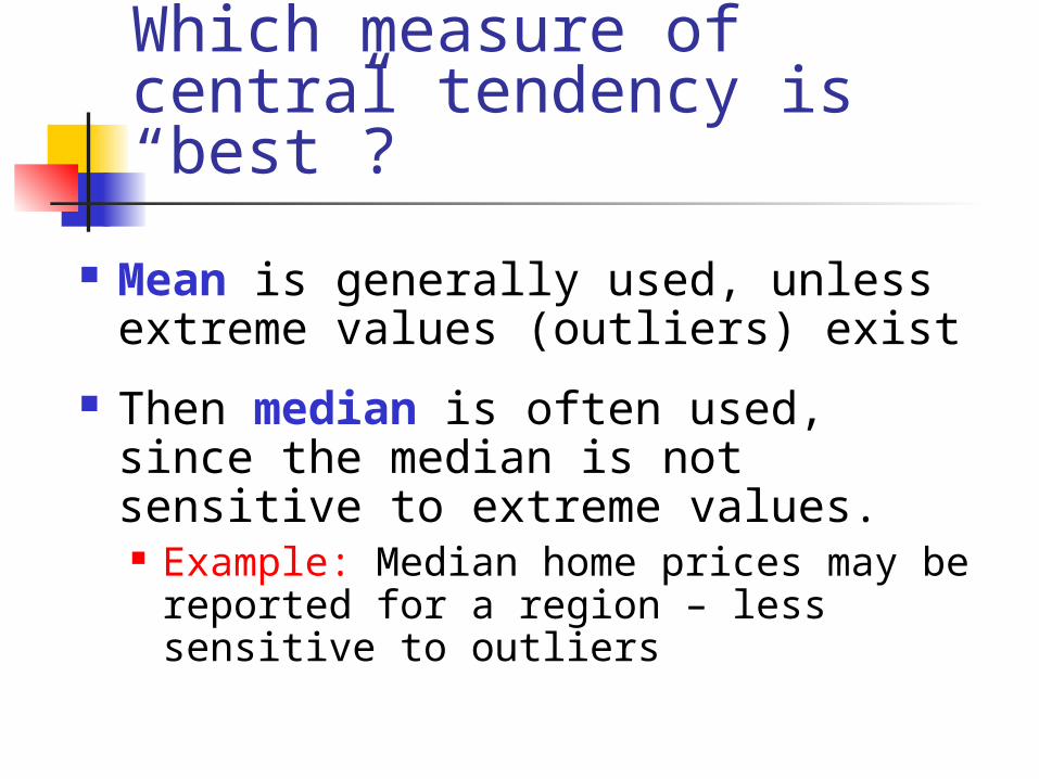
Mean is generally used, unless extreme values (outliers) exist
Then median is often used, since the median is not sensitive to extreme values. Example: Median home prices may be
reported for a region – less sensitive to outliers
Which measure of central tendency is “best”?

Measures of Variation/Dispersion Range Percentiles/quartiles Interquartile range Standard deviation/Variance

Range
Difference between the largest and the smallest observations.

0.0
4.7
9.3
14.0
0.0 33.3 66.7 100.0
Range of age: 94 years-15 years = 79 years
AGE (Years)
Pe
rce
nt

Range of PE? 1-0 = 1

Quartiles
25% 25% 25% 25%
The first quartile, Q1, is the value for which 25% of the observations are smaller and 75% are larger
Q2 is the same as the median (50% are smaller, 50% are larger)
Only 25% of the observations are greater than the third quartile
Q1 Q2 Q3

Interquartile Range
Interquartile range = 3rd quartile – 1st quartile = Q3 – Q1

Interquartile Range: age
Median(Q2) maximumminimum Q1 Q3
25% 25% 25% 25%
15 35 49 65 94
Interquartile range = 65 – 35 = 30

Average (roughly) of squared deviations of values from the mean
Sample Variance
1
)( 2
2
n
XxS
n
ii

Why squared deviations? Adding deviations will yield a sum of
0. Absolute values are tricky! Squares eliminate the negatives.
Result: Increasing contribution to the variance
as you go farther from the mean.

Standard Deviation
Most commonly used measure of variation
Shows variation about the mean Has the same units as the original
data
1
)( 2
n
XxS
n
ii

Calculation Example:Sample Standard Deviation
Age data (n=8) : 17 19 21 22 23 23 23 38
n = 8 Mean = X = 23.25
3.67
280
18
)25.23(38)25.23(19)25.32(17 222
S

0.0
4.7
9.3
14.0
0.0 33.3 66.7 100.0
AGE (Years)
Pe
rce
nt
Std. dev is a measure of the “average” scatter around the mean.
Estimation method: if the distribution is bell shaped, the range is around 6 SD, so here rough guess for SD is 79/6 = 13

Std. Deviation age
Variation Section of AGE
Standard
Parameter Variance Deviation
Value 333.1884 18.25345

0.0
62.5
125.0
187.5
250.0
0.0 0.5 1.0 1.5 2.0
Std Dev of Shock Index
SI
Co
un
t
Std. dev is a measure of the “average” scatter around the mean.
Estimation method: if the distribution is bell shaped, the range is around 6 SD, so here rough guess for SD is 1.4/6 =.23

Std. Deviation SI
Variation Section of SI
Standard Std Error Interquartile
Parameter Variance Deviation of Mean Range Range
Value 4.155749E-02 0.2038566 6.681129E-03 0.24604321.430856

Std. dev is a measure of the “average” scatter around the mean.
Std. Dev of binary variable, PE
3959.930
8.145
1319
)1944.(0*750)1944.(1*181 22
S
19.44%
80.56%

Std. Deviation PE
Variation Section of PE
Standard
Parameter Variance Deviation
Value 0.156786 0.3959621

Comparing Standard Deviations
Mean = 15.5 S = 3.338 11 12 13 14 15 16 17 18 19 20 21
11 12 13 14 15 16 17 18 19 20 21
Data B
Data A
Mean = 15.5 S = 0.926
11 12 13 14 15 16 17 18 19 20 21
Mean = 15.5 S = 4.570
Data C

Regardless of how the data are distributed, a certain percentage of values must fall within K standard deviations from the mean:
Bienaymé-Chebyshev Rule
withinAt least
(1 - 1/12) = 0% …….….. k=1 (μ ± 1σ)
(1 - 1/22) = 75% …........ k=2 (μ ± 2σ)
(1 - 1/32) = 89% ………....k=3 (μ ± 3σ)
Note use of (sigma) to represent “standard deviation.”
Note use of (mu) to represent “mean”.

Symbol Clarification S = Sample standard deviation
(example of a “sample statistic”) = Standard deviation of the
entire population (example of a “population parameter”) or from a theoretical probability distribution
X = Sample mean µ = Population or theoretical mean

**The beauty of the normal curve:
No matter what and are, the area between - and + is about 68%; the area between -2 and +2 is about 95%; and the area between -3 and +3 is about 99.7%. Almost all values fall within 3 standard deviations.

68-95-99.7 Rule
68% of the data
95% of the data
99.7% of the data

Summary of Symbols
S2= Sample variance S = Sample standard dev 2 = Population (true or theoretical)
variance = Population standard dev. X = Sample mean µ = Population mean IQR = interquartile range (middle 50%)

Review Question 8
All of the following are measures of data variation EXCEPT:
a. Varianceb. Interquartile rangec. Standard deviationd. Rangee. Mean

Review Question 8
All of the following are measures of data variation EXCEPT:
a. Varianceb. Interquartile rangec. Standard deviationd. Rangee. Mean

Review Question 9
All of the following are influenced by outliers EXCEPT:
a. Varianceb. Interquartile rangec. Standard deviationd. Rangee. Mean

Review Question 9
All of the following are influenced by outliers EXCEPT:
a. Varianceb. Interquartile rangec. Standard deviationd. Rangee. Mean

Review Question 10 If you have right-skewed data, which
of the following will be true?
a. Mean > medianb. Mean > = medianc. Median > = meand. Median > meane. Mean = median

Review Question 10 If you have right-skewed data, which
of the following will be true?
a. Mean > medianb. Mean > = medianc. Median > = meand. Median > meane. Mean = median

Review Question 11 How much of your data is guaranteed to
fall within 2 standard deviations of the mean?
a. None—there are no guarantees.b. 95%c. 99%d. 75%e. 89%

Review Question 11 How much of your data is guaranteed to
fall within 2 standard deviations of the mean?
a. None—there are no guarantees.b. 95%c. 99%d. 75%e. 89%

Examples of bad graphics

What’s wrong with this graph?
from: ER Tufte. The Visual Display of Quantitative Information. Graphics Press, Cheshire, Connecticut, 1983, p.69

From: Visual Revelations: Graphical Tales of Fate and Deception from Napoleon Bonaparte to Ross Perot Wainer, H. 1997, p.29.
Notice the X-axis

Correctly scaled X-axis…

Report of the Presidential Commission on the Space Shuttle Challenger Accident, 1986 (vol 1, p. 145)
The graph excludes the observations where no O-rings failed.

http://www.math.yorku.ca/SCS/Gallery/
Smooth curve at least shows the trend toward failure at high and low temperatures…

Even better: graph all the data (including non-failures) using a logistic regression model
Tappin, L. (1994). "Analyzing data relating to the Challenger disaster". Mathematics Teacher, 87, 423-426

from: ER Tufte. The Visual Display of Quantitative Information. Graphics Press, Cheshire, Connecticut, 1983, p.74
What’s wrong with this graph?


Diagraphics II, 1994
What’s the message here?

Diagraphics II, 1994

For more examples… http://www.math.yorku.ca/SCS/Gallery/

Class exercise What’s wrong with these graphs?

From: Johnson R. Just the Essentials of Statistics. Duxbury Press, 1995.

From: Johnson R. Just the Essentials of Statistics. Duxbury Press, 1995.
“Lying” with statistics More accurately, misleading with
statistics…

Example 1: projected statistics
Lifetime risk of melanoma: 1935: 1/15001960: 1/6001985: 1/1502000: 1/742006: 1/60
http://www.melanoma.org/mrf_facts.pdf

Example 1: projected statistics
How do you think these statistics are calculated?
How do we know what the lifetime risk of a person born in 2006 will be?

Example 1: projected statistics
Interestingly, a clever clinical researcher recently went back and calculated (using SEER data) the actual lifetime risk (or risk up to 70 years) of melanoma for a person born in 1935.
The answer?Closer to 1/150 (one order of magnitude off)
(Martin Weinstock of Brown University, AAD conference 2006)

Example 2: propagation of statistics
In many papers and reviews of eating disorders in women athletes, authors cite the statistic that 15 to 62% of female athletes have disordered eating.
I’ve found that this statistic is attributed to about 50 different sources in the literature and cited all over the place with or without citations...

For example… In a recent review (Hobart and Smucker, The
Female Athlete Triad, American Family Physician, 2000):
“Although the exact prevalence of the female athlete triad is unknown, studies have reported disordered eating behavior in 15 to 62 percent of female college athletes.”
No citations given.

And… Fact Sheet on eating disorders: “Among female athletes, the
prevalence of eating disorders is reported to be between 15% and 62%.”Citation given: Costin, Carolyn. (1999) The Eating Disorder Source Book: A comprehensive guide to the causes, treatment, and prevention of eating disorders. 2nd edition. Lowell House: Los Angeles.

And… From a Fact Sheet on disordered
eating from a college website: “Eating disorders are significantly higher
(15 to 62 percent) in the athletic population than the general population.”
No citation given.

And… “Studies report between 15% and 62%
of college women engage in problematic weight control behaviors (Berry & Howe, 2000).” (in The Sport Journal, 2004)
Citation: Berry, T.R. & Howe, B.L. (2000, Sept). Risk factors for disordered eating in female university athletes. Journal of Sport Behavior, 23(3), 207-219.

And… 1999 NY Times article “But informal surveys suggest that
15 percent to 62 percent of female athletes are affected by disordered behavior that ranges from a preoccupation with losing weight to anorexia or bulimia.”

And “It has been estimated that the prevalence of
disordered eating in female athletes ranges from 15% to 62%.” ( in Journal of General Internal Medicine 15 (8), 577-590.)Citations:Steen SN. The competitive athlete. In: Rickert VI, ed. Adolescent Nutrition: Assessment and Management. New York, NY: Chapman and Hall; 1996:223 47. Tofler IR, Stryer BK, Micheli LJ. Physical and emotional problems of elite female gymnasts. N Engl J Med. 1996;335:281 3.

Where did the statistics come from?
The 15%: Dummer GM, Rosen LW, Heusner WW, Roberts PJ, and Counsilman JE. Pathogenic weight-control behaviors of young competitive swimmers. Physician Sportsmed 1987; 15: 75-84.
The “to”: Rosen LW, McKeag DB, O’Hough D, Curley VC. Pathogenic weight-control behaviors in female athletes. Physician Sportsmed. 1986; 14: 79-86.
The 62%:Rosen LW, Hough DO. Pathogenic weight-control behaviors of female college gymnasts. Physician Sportsmed 1988; 16:140-146.

Where did the statistics come from?
Study design? Control group? Cross-sectional survey (all) No non-athlete control groups
Population/sample size? Convenience samples Rosen et al. 1986: 182 varsity athletes from two
midwestern universities (basketball, field hockey, golf, running, swimming, gymnastics, volleyball, etc.)
Dummer et al. 1987: 486 9-18 year old swimmers at a swim camp
Rosen et al. 1988: 42 college gymnasts from 5 teams at an athletic conference

Where did the statistics come from? Measurement?
Instrument: Michigan State University Weight Control Survey
Disordered eating = at least one pathogenic weight control behavior:
Self-induced vomiting fasting Laxatives Diet pills Diuretics In the 1986 survey, they required use 1/month; in the
1988 survey, they required use twice-weekly In the 1988 survey, they added fluid restriction

Where did the statistics come from? Findings?
Rosen et al. 1986: 32% used at least one “pathogenic weight-control behavior” (ranges: 8% of 13 basketball players to 73.7% of 19 gymnasts)
Dummer et al. 1987: 15.4% of swimmers used at least one of these behaviors
Rosen et al. 1988: 62% of gymnasts used at least one of these behaviors

Citation Tree…
Figure 4A from: Smith N P et al. J Exp Biol 2007;210:1576-1583.

Figure 4B from: Smith N P et al. J Exp Biol 2007;210:1576-1583.

Homework Problem Set 1 Reading: Chapters 1-6 Vickers. Read weekly journal article Fill out a “Journal Article Review Sheet” (on
class website). Who wants to lead journal article discussion
next week?

References
http://www.math.yorku.ca/SCS/Gallery/ Kline et al. Annals of Emergency Medicine 2002; 39: 144-152. Statistics for Managers Using Microsoft® Excel 4th Edition, 2004 Prentice-Hall Tappin, L. (1994). "Analyzing data relating to the Challenger disaster". Mathematics Teacher, 87, 423-
426 Tufte. The Visual Display of Quantitative Information. Graphics Press, Cheshire, Connecticut, 1983. Visual Revelations: Graphical Tales of Fate and Deception from Napoleon Bonaparte to Ross Perot
Wainer, H. 1997. Johnson R. Just the Essentials of Statistics. Duxbury Press, 1995.