Introduction: Design Standards EP 310-1-6a 01 Jun 06 · Introduction: Design Standards EP 310-1-6a...
13
Introduction: Design Standards EP 310-1-6a 01 Jun 06 4-1 The Corps sign system has been designed using a selected group of common graphic elements and visual standards. These graphic elements include: the Corps Signature for agency identification, color standards for each type of sign, three weights of the Haas Helvetica typeface for the lettering on sign faces, specifications for letter- and word-spacing, the visual relationship of sign legend to sign panel size, recom- mended viewing distances for each size of legend typography (page 2-6), and sign placement guidelines (page 2-8 to 2-9). These standards become the graphic building blocks around which the signs are designed. They have been adopted because they provide a functional base for the graphic format of each sign. These design standards also become one of the visual threads common to the design of each sign in the system. This section defines the common graphic elements and visual standards and describes how they are to be used. These standards incorporate the prin- ciples contained in the Corps Graphic Standards Manual (EP 310-1-6). Each standard, however, has been adapted for application to signage. Contact the National Sign Program Manager for advice and assistance concerning specialized or unique applica- tions of these Corps design standards as they are applied to signs.
Transcript of Introduction: Design Standards EP 310-1-6a 01 Jun 06 · Introduction: Design Standards EP 310-1-6a...

Introduction: Design Standards EP 310-1-6a01 Jun 06
4-1
The Corps sign system has beendesigned using a selected group ofcommon graphic elements and visualstandards. These graphic elementsinclude: the Corps Signature for agencyidentification, color standards for eachtype of sign, three weights of the HaasHelvetica typeface for the lettering onsign faces, specifications for letter- andword-spacing, the visual relationship ofsign legend to sign panel size, recom-mended viewing distances for each sizeof legend typography (page 2-6), and signplacement guidelines (page 2-8 to 2-9).
These standards become the graphicbuilding blocks around which the signsare designed. They have been adoptedbecause they provide a functional basefor the graphic format of each sign.These design standards also become oneof the visual threads common to thedesign of each sign in the system.
This section defines the common graphicelements and visual standards anddescribes how they are to be used.These standards incorporate the prin-ciples contained in the Corps GraphicStandards Manual (EP 310-1-6). Eachstandard, however, has been adapted forapplication to signage.
Contact the National Sign ProgramManager for advice and assistanceconcerning specialized or unique applica-tions of these Corps design standards asthey are applied to signs.

Signature
4-2
EP 310-1-6a01 Jun 06
The Corps Signature is the key graphicelement used to identify the Corps to thepublic. The Signature consists of theMark and the Corps name set inHelvetica Medium typeface. Bothelements are placed flush left.
In applications to signage, the Signatureis to be used only on signs where Corpsidentification is important and integral to
the message being communicated. Thisuse is limited to: Standard Identification,Approach Roadway Directional, Boundary(ownership), Construction Project Identifi-cation, and Corps Participation Creditsigns. Each of these examples is shownin its respective section of this manual.
The two basic forms of the Signature areshown below. The positive version (top) is
used on signs with a white or light tonebackground. The reverse version is usedon signs where the Signature is placedon a dark background.
Refer to the Graphic Standards Manual(EP 310-1-6) for a complete description ofthe Mark and Signature. Note theSignature registration symbol ®
The form of the Mark is derived from thetraditional Castle symbol used by the Corpssince its inception.
The Mark has been redesigned for greaterstrength and adaptability, both visually and forreproduction purposes. In its new form, theMark is a simplified contemporary rendering ofthe traditional symbol.
Do not place the Corps Mark or Signature onProject Roadway Directional, recreation area,informational, safety, or waterway guidesigns. Indiscriminate use of the Signatureonly dilutes the primary communicative intentof the sign on which it is placed.
No district, division or other field-operatingactivity names are to be added to the basicCorps Signature when used on signs (otherthan sign CID-01 on page 16-2)
is not tobe used on signs.

Signature Color Use Guidelines EP 310-1-6a01 Jun 06
4-3
The illustrations below show the variouscolor configurations possible when usingthe Corps Signature on signs. Note thatthere are fewer possible ways to renderthe Signature on a sign panel than arespecified for print applications (seeGraphic Standards Manual, pages 1-5).
a) The most prominent use of the Signaturewill be on identification signs. For StandardIdentification, post and panel signs, thereverse Signature is used; the Mark isCommunication Red, the Signature type iswhite.
b) For large-scale Standard Identificationsigns of individual fabricated letters, thepositive version is used; the Mark is Commu-nication Red and the Signature typography iswhite (see page 5-7).
c) The Corps Participation Credit sign uses anall white reverse Signature on a CorpsBrown background.
d) The header panels on Building OfficeDirectories use a reverse Signature in whiteon Dark Grey.
e) Construction Project Identification signsuse an all white reverse Signature on aCommunication Red background.
f) Boundary signs use the positive Signaturein black on a white background.

Color StandardsEP 310-1-6a01 Jun 06
4-4
Within the Corps sign system there arefive standard color palettes. Three havebeen developed by the Corps andinclude: 1) Recreation Area signs,2) Lock, Dam and Waterway signs, and3) Office Interior signs. Two color groupshave been adopted from existingstandards: 1) Traffic signs (MUTCD) and2) Workplace Safety signs (ANSI). Eachof these is illustrated on the followingpages with descriptions for their use.The two-character color code is inparentheses immediately after the color.Additional color application instructionsare included in each respective section.
Colors must conform to the standardspresented on the following pages whenpreparing signs.
For many of the colors shown on the nextfive pages, a corresponding FederalStandard Color number is listed. Thesenumbers refer to color samples con-tained in a fan deck titled FederalStandard 595B Colors. The fan deck ispublished by the General ServicesAdministration, order number 7690-01-162-2210.

Recreation Area Color Standards EP 310-1-6a01 Jun 06
4-5
Shown below are the colors for use onCorps identification, directional, andrecreation area signs.
Communication Red (CR): Corps Mark (Castle)on identification signs. The closest FederalStandard Color is 11350, but the match with the595B fan deck is not exact. The GraphicsStandards Manual (EP 310-1-6) specifiesCommunication Red shall match Pantone Red032.
Corps Brown (BR): Background for identifica-tion, directional, recreation, and symbol signs.The closest Federal Standard Color is 20095.
White (WH): Legend for identification,directional, and recreation signs. Backgroundfor boundary signs. The closest FederalStandard Color is 27925, but the match withthe 595B fan deck is not exact.
Black (BK): Legend and Signature forboundary signs. The closest FederalStandard Color is 17038.
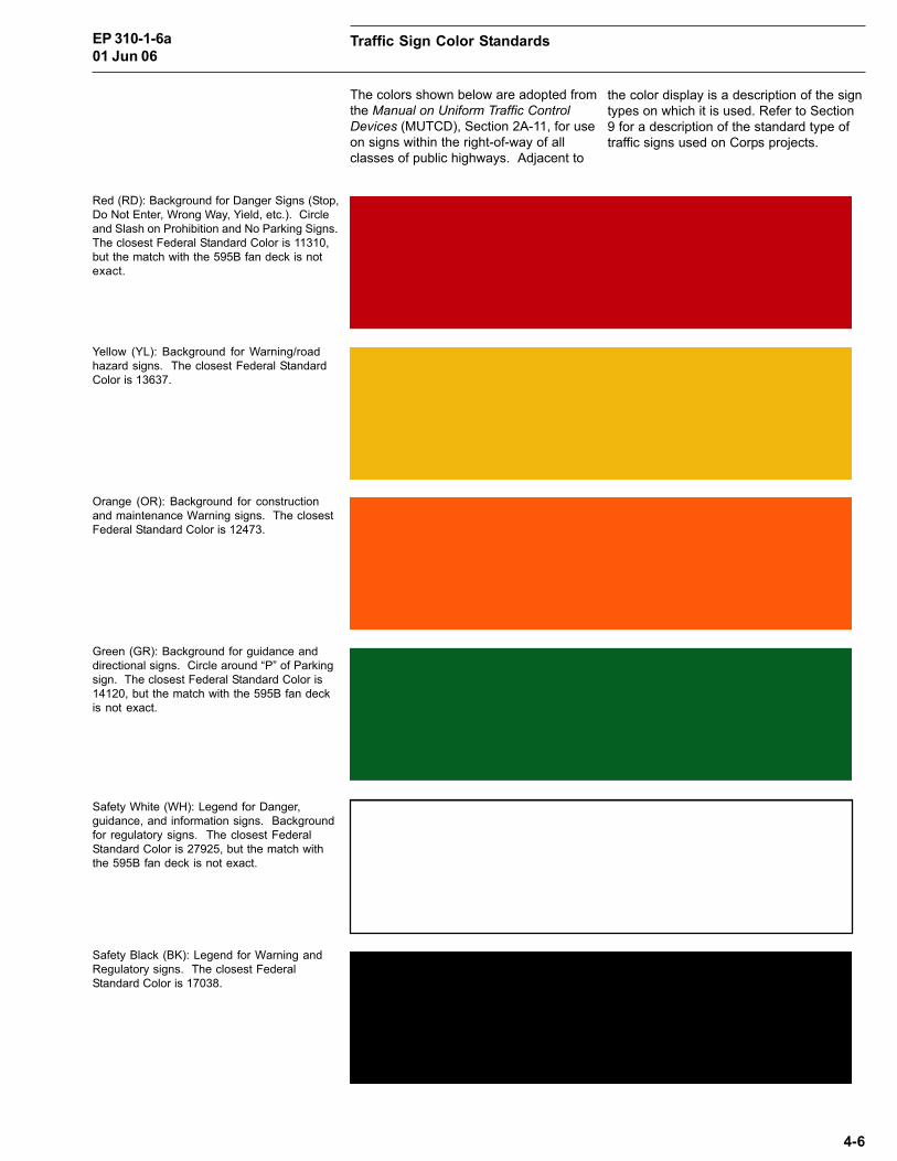
Traffic Sign Color StandardsEP 310-1-6a01 Jun 06
4-6
The colors shown below are adopted fromthe Manual on Uniform Traffic ControlDevices (MUTCD), Section 2A-11, for useon signs within the right-of-way of allclasses of public highways. Adjacent to
Red (RD): Background for Danger Signs (Stop,Do Not Enter, Wrong Way, Yield, etc.). Circleand Slash on Prohibition and No Parking Signs.The closest Federal Standard Color is 11310,but the match with the 595B fan deck is notexact.
Yellow (YL): Background for Warning/roadhazard signs. The closest Federal StandardColor is 13637.
Orange (OR): Background for constructionand maintenance Warning signs. The closestFederal Standard Color is 12473.
Green (GR): Background for guidance anddirectional signs. Circle around “P” of Parkingsign. The closest Federal Standard Color is14120, but the match with the 595B fan deckis not exact.
Safety White (WH): Legend for Danger,guidance, and information signs. Backgroundfor regulatory signs. The closest FederalStandard Color is 27925, but the match withthe 595B fan deck is not exact.
Safety Black (BK): Legend for Warning andRegulatory signs. The closest FederalStandard Color is 17038.
the color display is a description of the signtypes on which it is used. Refer to Section9 for a description of the standard type oftraffic signs used on Corps projects.

Workplace Safety Sign Color Standards EP 310-1-6a01 Jun 06
4-7
The colors shown below are used on allsafety signs as described in Section 11 ofthis manual.
Safety Red (SR): Federal Standard Color11310, but the match with the 595B fan deckis not exact. Danger; warning of an immediatehazard.
Safety Yellow (SY): Federal Standard Color13591, but the match with the 595B fan deckis not exact. Caution; warning of potentialhazard.
Safety Green (SG): Federal Standard Color14109, but the match with the 595B fan deckis not exact. Notice; for safety.
Safety Blue (SB): Federal Standard Color15092. Information; general.
Black (SK): Federal Standard Color 17038.Directional and all descriptive legends.
White (SW): Federal Standard Color 27875. Allsign backgrounds, except for Caution.

Lock, Dam and Waterway Safety and Infor-mation Sign Color Standards
EP 310-1-6a01 Jun 06
4-8
This color group has been developed forall waterway safety and information signsplaced around locks and dams, on jettiesand breakwaters, and to mark orientationpoints on lakes. Specifications andillustrations for their use are shown inSection 14 of this manual.
Red (RD): Background for Danger andRestricted signs; denoting an immediatehazard, and identification of restricted areas.
Color shall conform to the chromaticitycoordinates as specified by the Corps.The material to be used for the colorsbelow (other than black) is DiamondGrade sheeting. Color referencenumbers are available from the NationalSign Program Manager. Material
specifications are provided on page B-13c-d. Recommended material productnumbers are provided in Appendix B.
Lock, dam and waterway signs are usedin conjunction with the Aids to NavigationMarking System (U.S. Coast Guard).
Medium Blue (MB): Legend for Lockinformation/instruction signs; identifiesarrival point, locking procedures, andgeneral lock use information.
Alternate figure and field color (with white)for Lake Mile Markers and Lake SymbolGuide signs.
Lemon Yellow (LY): Background forWarning and Caution signs; warning ofpotential hazards.
White (WH): Background for Lock InformationInstruction signs.
Legend for Danger and Restricted signs.
Black (BK): Legend for Warning and Cautionsigns.

Office Interior Sign Color Standards EP 310-1-6a01 Jun 06
4-9
Office Interior signs for Corps buildingsuse the sign system described in Section18. Shown below are the standard colorsfor use in this system. Only one of thestandard accent colors (OD, OL, OG orWG) would be selected for a given office
Office Dark Grey (DG): Background and framecolor for identification and information plaquesand directories (color number 44).
Office Red (OD): Background and frame colorfor ceiling-mounted assemblies (color number24).
Office Blue (OL): Background and frame colorfor ceiling-mounted assemblies (color number13).
Office Green (OG): Background and framecolor for ceiling-mounted assemblies (colornumber 27).
Communication Red (CR): Background forsafety-related plaques (color number 032).Panel frame to be Office Dark Grey.
Office Warm Grey (WG): Background andframe color for ceiling-mounted assemblies(color number 03).
area. Color selected should be compatiblewith the existing office color scheme.
All sign legends are white (WH) and areidentified using color number (01).

Typography for Sign LegendsEP 310-1-6a01 Jun 06
4-10
Three different weights of the HaasHelvetica typeface have been adopted asthe standard letter-style to be used on allCorps signs. These include HelveticaBold, Helvetica Medium, and HelveticaRegular. These alphabets were selectedbecause they are highly legible, contem-porary in character, and readily availableto manufacturers preparing signs for theCorps.
Helvetica Bold: The wide stroke width of thisletter-style creates a distinctive looking signwith simplicity. The bold letter-forms areideally suited for signs with short legends.This typeface is used for the primary andsecondary legends in identification, recreationarea, industrial safety and parking signs.
Shown below is a full upper/lower casedisplay for each weight of the Helveticaletter-style. The comparative diagram onthe following page illustrates the desig-nated applications of each differentweight.
Do not substitute any other typestyle foruse on Corps signs.
Designed in 1957 by Edourd Hoffman andMax Miedinger, the Helvetica family oftype is registered and copyrighted by theHaas type foundry in Switzerland. Useonly versions of this typeface family thathave been prepared from Haas originalsand licensed for use by Haas on thetypesetting method used. Many unautho-
rized versions exist. Some differ onlyminutely from the authorized versions. Inothers, the letter-forms are distortedenough to cause a significant differencein the length of words and, consequently,in panel length. In addition, manyversions are not as legible, nor visuallypleasing as the correct one.
Helvetica Medium: This medium weight letter-style is used for all roadway and recreationarea directional sign legends. This type isideally suited for signs viewed from a movingvehicle. Its 5:1 letter height to stroke widthratio and large, open, lower case letters makeit a very legible typeface. The HelveticaMedium typestyle should not be used onsigns where the Helvetica Regular orHelvetica Bold typefaces are used.
Helvetica Regular: This is a thin stroke letter-style used for selected secondary legends onsigns with Helvetica Bold primary legends,such as interpretative signs, and boundarysigns. Helvetica Regular is also the typefaceused for all interior signs.

Typography Applications EP 310-1-6a01 Jun 06
4-11
The examples below illustrate how thethree different weights of the Helveticatypeface are used on the various typesof signs in the Corps sign program.Although each sign type has beendesigned for a specific purpose, theshared typographic system gives acohesive look to these many differenttypes of signs.
Helvetica Bold is used for all legends onStandard and Secondary Identification signs.
The basic sizes of these typefaces(capital letter height) have been predeter-mined for each type of sign depending onthe distance at which they will be viewed(see Viewing Distance Guide, page 2-6).
For optimum legibility, a spacing guide hasbeen developed for each type weight (seeAppendix D).
Helvetica Bold is used for all legends onrecreation signs and as the support legendsfor Prohibition Symbol and Area Regulationsigns.
Helvetica Bold is used for all legends onWorkplace Safety signs and for supportlegends on Parking/No Parking signs.
Helvetica Medium is used for all directionaland water-viewed signs.
Helvetica Regular is used with HelveticaBold on Construction Project Identificationsigns and Property Markers.

Letter-spacing of TypographyEP 310-1-6a01 Jun 06
4-12
Proper letter spacing is critical to thelegibility of a sign. Individual lettersspaced too closely will cause them to runtogether, making it difficult to read theword. If the space between letters is toogreat, it is difficult to distinguish words.For this reason, letter-spacing standardshave been established for all Corpssigns. A list of typesetting systems thatconform to Corps standards is in Appen-dix D.
In cases where typesetting systems thatmeet the Corps standards are notavailable, legends can be prepared usingthe manual letter-spacing guide de-scribed in Appendix D. This guide, whilevery time-consuming to use, is extremelyaccurate.
For reference purposes, a display ofcommonly used words is provided inAppendix D (pages D-18 through D-34)These words can be used to preparelegends or to verify the type and letterspacing provided by a fabricator. Notethat the letter-spacing standards foridentification, directional and recreationsigns use one standard, while safetysigns viewed from the water use a moreopen version to increase legibility.
For more information on letter spacing,consult your district Sign ProgramManager.

Arrows EP 310-1-6a01 Jun 06
The arrows shown below are for use onCorps signs. Each arrow has beendesigned to be legible and, at the sametime, compatible with its respectivetypeface.
Arrows may be placed in the directionsshown. Position straight-up and left-directed arrows to the left of the legend.
Place right-directed arrows to the right ofthe legend.
On signs with numerous destinations, asingle arrow may be used for a group ofdestinations with a common direction.Place the arrow alongside the top destina-tion in the group, either left or right of thelegend as specified above.
4-13
Helvetica Bold Arrow
Helvetica Medium Arrow
Panel illustrates arrow alignment for the fivedifferent directions in which arrows may beplaced on signs. Reading from left to right,the arrows show the priority of placement ona sign (see page 6-4).


![· Web view453.4.1 Rule 6A-2.00.10 [State Requirements for Educational Facilities (SREF) ]. A Florida Department of Education document which includes required design standards, standards](https://static.fdocuments.net/doc/165x107/5f03ffc67e708231d40bd134/web-view-45341-rule-6a-20010-state-requirements-for-educational-facilities.jpg)