Interni 616
116
-
Upload
interni-magazine -
Category
Documents
-
view
288 -
download
4
description
Il filo conduttore che lega i servizi di questo numero di novembre? Ci piace ritrovarlo nel concetto di intima armonia e sensibilità per le cose che è proprio della cultura orientale e che, nella nostra interpretazione, esprime una dimensione di dialogo e confronto costruttivo tra persone e luoghi. The thread that links our articles for November might be in the concept of inner harmony and sensitivity to things, a legacy of oriental culture that, in our interpretation, expresses a dimension of dialogue and constructive interaction between people and places.
Transcript of Interni 616
INterNIews
INitaly produzione productIoNdesign all’osso/Bare Bones designla casa nel verde/The house in The greenery spazio agli oggetti/space for oBjecTs fagor in italia/in iTaly aspirazione invisibile/invisiBle exhausT la pietra high-tech/high-Tech sTone projectil linguaggio delle superfici/The language of surfaces shoppingmaschile plurale/Masculine pluralpremi prIzesl’innovazione premiata/rewarding innovaTion
INternationalproduzione productIoNla tavola multipiano/The MulTiplanar TaBlecupole di luce/doMes of lighT projectdomesticità futura/fuTure doMesTic shifting contextstimber waveanniversari aNNIversarIesi 50 anni di/50 years of rosenthal studio-linei 100 anni di/100 years of franke
INtertwinedgiovani designer youNg desIgNersbrian sironimostre exhIbItIoNsdesign september bruxelles4° saint moritz art masters albermarle collection londra lucca digital photo festivalacque anche profumate/waTers, also fragranTsostenibile sustaINablegiardinaggio & apicoltura/gardening & Beekeeping
19
31
35
38
41
44
55
59
63
76
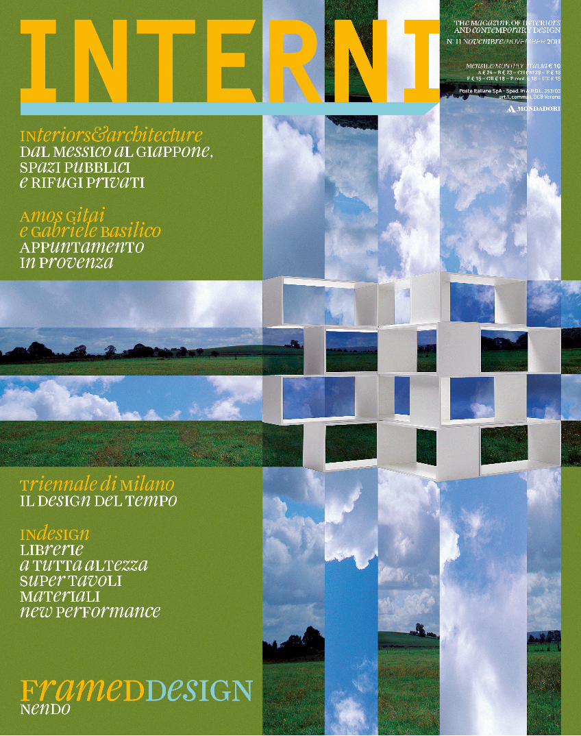
IN copertINa: la libreria zigzag prodotta da Lema su disegno di nendo. È formata da eleganti e semplici moduli in legno laccato
(l. 110, h. 136, p. 39 cm) che si possono comporre in svariati modi secondo le necessità, creando elementi plastici e scultorei
che arredano con discrezione gli spazi. oN the cover: The ZigZag Bookcase produced By leMa and designed
By nendo. coMposed of eleganT, siMple Modules in painTed wood (l. 110, h. 136, d. 39 cM) coMBined in differenT ways To MeeT differenT
needs, creaTing sculpTural pieces for discreeT furnishing of spaces.
INdice/coNteNtsNovembre/noveMBer 2011
C_In616_P_12_16_sommario.indd 12 13/10/11 11.21
22
INtertwinedprogetto città CITY PROJECTFrancoForte: muoversi al Futuro/Moving in the future ghana: rombo aFricano/AfricAn rhoMbus interni per/for cityliFe: bohemiénne/boheMiAn chicin libreria IN bOOksTOREsinfo&techdalla carta alla digitalizzazione/froM pAper to digitAloffice&contractse 10.000 sedie vi sembran poche/f 10,000 chAirs won’t sufficefashion file5° istanbul Fashion weekmilano Fashion design
INservicetraduzioni TRaNslaTIONsindirizzi fIRms dIRECTORY
INtopics
editoriale EdITORIal di/by gilda bojardi
INteriors&architecture
ospitalità a 360° 360° hOsPITalITY a cura di/edited by antonella boisi
mexico city, museo soumayaprogetto di/design by Fernando romero/FreeFoto e testo di/photos And text by sergio pirrone
beijing, the temple hotel Foto di/photos by ben mcmillantesto di/text by matteo vercelloni
portogallo, casa doppia a melides PORTugal, a dOublE hOusE aT mElIdEsprogetto di/design by pedro reisFoto di/photos by Fg + sgtesto di/text by alessandro rocca
giappone, trampolino con vista in una casa-studioJaPaN, sTIlTs wITh a vIEw, IN a hOmE-sTudIO progetto di/design by anna nakamura e taiyo jinno/eastern design oFFiceFoto e testo di/photos And text by sergio pirrone
giappone/JaPaN, f-house progetto di/design by kubota architect atelier Foto di/photos by kenichi suzukitesto di/text by matteo vercelloni
1
2
8
14
22
28
81
9394
96
98
117126
14
2
8
INdice/CONTENTs II
C_In616_P_12_16_sommario.indd 14 13/10/11 11.21
INsight
INtodayvilla eden gardone: quale casa per quale vacanzaWHICH HOME FOR WHICH VACATION DI/BY ANTONELLA BOISI
il design del tempo/THE DESIGN OF TIME TESTO DI/TEXT BY STEFANO CAGGIANO
INscapeil design è una cosa seria/DESIGN IS A SERIOUS THING DI/BY ANDREA BRANZI
INcontroamos gitai TESTO DI/TEXT BY ANDREA LISSONIFOTO DI/PHOTOS BY GABRIELE BASILICO
INartsarte povera 2011 DI/BY GERMANO CELANT
INdesign
INcenterergo sedie/ERGO CHAIRS A CURA DI/EDITED BY NADIA LIONELLOILLUSTRAZIONI DI/ILLUSTRATIONS BY ANTONIO CAU
maxi bookcase A CURA DI/EDITED BY NADIA LIONELLO
INprofilewerner aisslinger: avanti a tutta velocitàFULL SPEED AHEAD TESTO DI/TEXT BY CRISTINA MOROZZI
INprojectil senso dei materiali/THE SENSE OF MATERIALS A CURA DI/EDITED BY VALENTINA CROCI E/AND MADDALENA PADOVANI
INviewla bella luce/BEAUTIFUL LIGHT DI/BY ALESSANDRA MAURI
INproductiontavoli XXL/TABLES DI/BY KATRIN COSSETA
INservice
traduzioni TRANSLATIONS
indirizzi FIRMS DIRECTORYDI/BY ADALISA UBOLDI
32
38
42
46
54
62
70
78
84
90
94
102
111
38 54
70
90 78
94
62
INdice/CONTENTS III
C_In616_P_12_16_sommario.indd 16 13/10/11 11.21
EDiToriaLe
InternI novembre 2011 INtopics / 1
Il filo conduttore che lega i servizi di questo numero di novembre? Ci piace ritrovarlo nel concetto di intima armonia e sensibilità per le cose che è proprio della cultura orientale e che, nella nostra interpretazione, esprime una dimensione di dialogo e confronto costruttivo tra persone e luoghi.
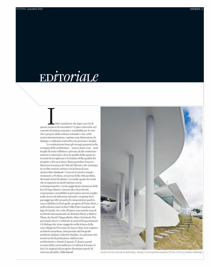
Lo restituiscono bene gli esempi proposti nella rassegna delle architetture – musei, hotel, case – tutti luoghi di sosta collettiva o privata ad alto contenuto materico-espressivo, dove la qualità dello spazio in termini di accoglienza è il risultato della qualità del progetto e dei suoi attori. Basta guardare il nuovo Museum Soumaya di Città del Messico che si integra in un fitto tessuto urbano con la forza di uno spettacolare landmark. O ancora lo storico tempio restaurato a Pechino, nei pressi della città proibita, diventato hotel di charme e versatile spazio di eventi che si rapporta in modo intenso con la contemporaneità e con la suggestione luminosa delle luci di Ingo Maurer. Questa idea di profonda consonanza e sensibilità si percepisce ancora meglio nella ricerca di infusione naturale con genius-loci e paesaggi specifici propria di composizioni quali la casa a Melides in Portogallo, progetto di Pedro Reis, o nell’esclusivo resort in fieri Villa Eden Gardone sul lago di Garda, che vede all’opera una nutrita rosa di architetti internazionali, da Richard Meier a Matteo Thun, da David Chipperfield a Marc Eutebach. Più personale invece e coltivato in anni di frequentazione è il dialogo che viene suggerito nella lettura della casa-rifugio in Provenza di Amos Gitai, noto regista e architetto israeliano, interpretata dal fotografo-architetto italiano Gabriele Basilico. La selezione dei nostri tavoli di produzione, dall’accento architettonico, chiude il sipario. E dentro questi scenari della convivialità per eccellenza il tempo, le luci e le stagioni del progetto diventano parole di estrema attualità. Gilda Bojardi slope offIce house In gIappone, progetto dI eastern desIgn offIce. (foto dI sergIo pIrrone)
C_In616_R_01_editoriale.indd 1 13/10/11 11.43
2 / INteriors&architecture
C_In616_R_2_7_soumaya_museum.indd 2 12/10/11 15.32
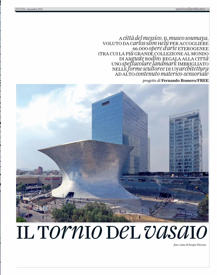
Il tornIo del vasaIofoto e testo di Sergio Pirrone
a città del messico, Il museo soumaya, voluto da carlos slim helÚ per accoglIere
66.000 opere d’arte eterogenee (tra cuI la pIù grande collezIone al mondo
dI auguste rodin) regala alla cIttà uno spettacolare landmark ImbrIglIato nelle forme scultoree dI un’architettura
ad alto contenuto materico-sensoriale progetto di Fernando Romero/FREE
Interiors&architecture / 3InternI novembre 2011
C_In616_R_2_7_soumaya_museum.indd 3 12/10/11 15.32
Dicono sia proprietario di tutti i cactus del paese, dicono che il suo impero tocchi tutti i settori dell’economia. Questa storia non poteva non cominciare con Carlos Slim Helú, magnate e filantropo messicano, l’uomo più ricco del pianeta. I grandi interventi urbani, quelli che cambiano destino e storia delle comunità cominciano spesso con la loro fine. L’area metropolitana di Città del Messico accoglie 25.000.000 d’abitanti ed è la seconda al mondo per estensione. Il quartiere di Polanco, da sempre in mano alla comunità ebraica, è il più ricco, brillante di boutique d’alta moda, hotel di lusso e ristoranti esclusivi. Carlos sa che nessuna zona della città potrà rendere altrettanto, sa che il segreto del successo si chiama integrazione.
Compra un lotto di terreno di 17.000mq tra Miguel de Cervantes Saavedra e Presa Falcon, ribalta la funzione d’uso e costruisce una città nella città. Torri residenziali, grattacieli per uffici, centri commerciali, palestre, cinema, ecc.
Dicono abbia le mani sulla città. Lui risponde che tutto ciò è solo “un regalo per la città, per il Messico, per i giovani”. E per l’amata moglie Soumaya Domit Gemayel, defunta nel 1999, con la quale aveva da sempre condiviso l’amore per l’arte. Il Museo Soumaya doveva illuminare un ambizioso investimento edilizio, attraversare i vetri continui delle torri colme di scrivanie e di computers, i meeting e le strategie finanziarie, arricchirli di cultura, e la cultura, d’arte. Il tornio del vasaio è alto 46 metri, ruota su se stesso, sopra una piattaforma di cemento che nasconde uffici, ambienti di servizio, depositi, parcheggi. Fulcro urbano, si lascia dietro forme asimmetriche rivestite da 14.500 pannelli esagonali lucidati manualmente, in alluminio inossidabile e con dimensioni variabili 60-80 cm.
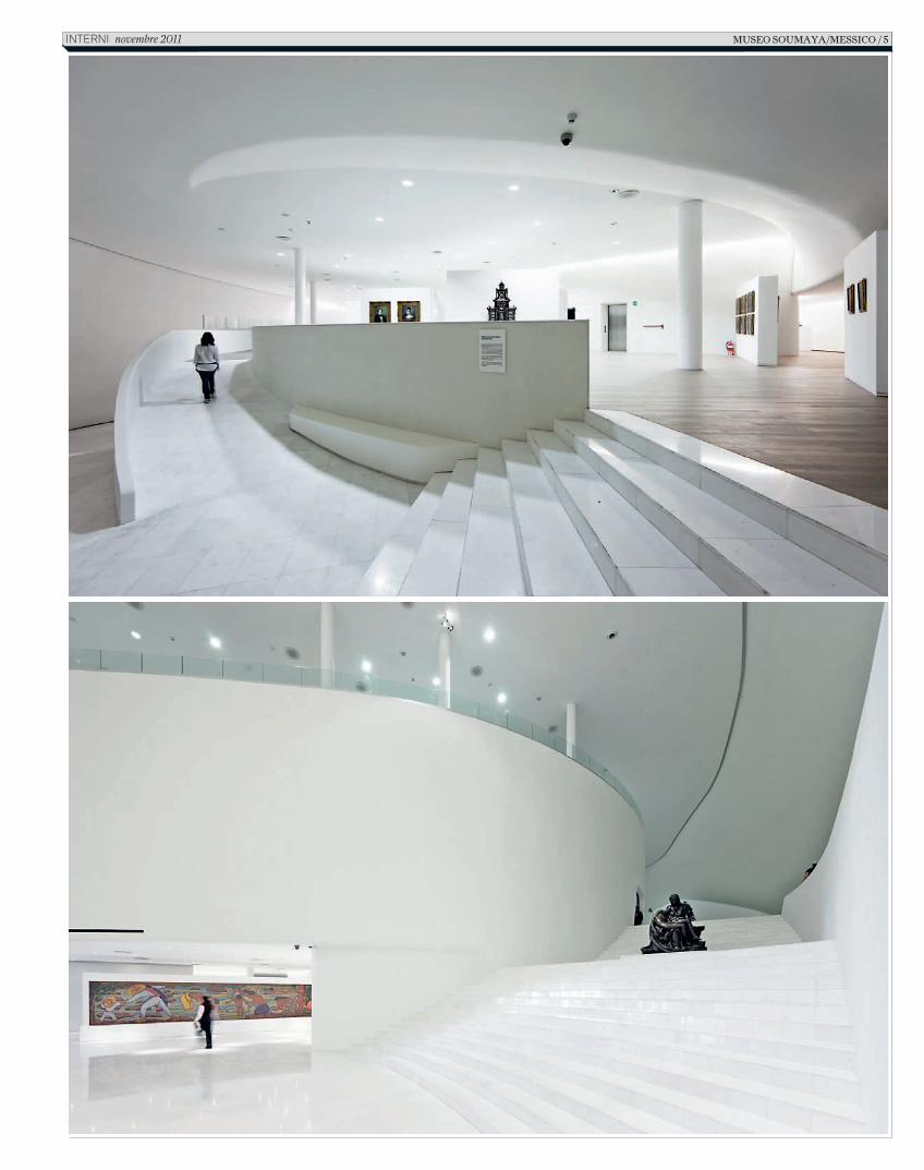
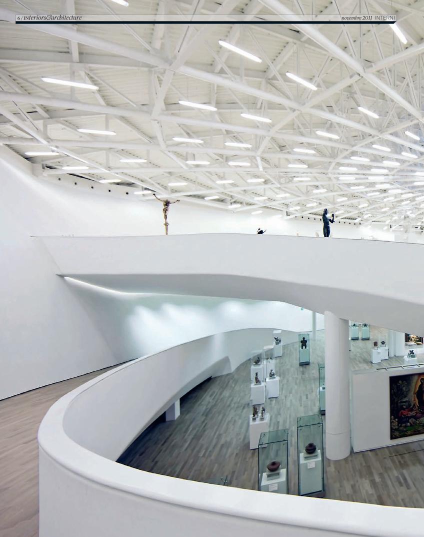
Il girotondo regala abbagli luminosi, ombre di città, e la sensazione apparente che quest’architettura si muova. Ermetica nella sua eccentricità, accoglie i suoi visitatori attraverso una lingua di scale che porta ad una bocca buia. Il foyer è un tuffo nel bianco. Cattedrale moderna, contenitore irradiante arte, si sviluppa su 7 livelli sovrapposti da forza centrifuga e ascesa circolare. Scultura dal ventre gravido, preserva 6.000mq di spazi espositivi che accolgono 66.000 opere d’arte eterogenee. La rampa circolare interna sale lungo l’intradosso perimetrico, strutturato da un esoscheletro di 28 colonne annegate nel sandwich di facciata e irrigidito da 7 maglie orizzontali travate. Il risultato è una voluta aperta a cui s’aggrappano spazi per la ristorazione, biblioteca, uffici, auditorio da 350 posti e 6 piani di allestimenti concentrici.
Numismatica, scultura, pittura, oggetti d’arte europei realizzati principalmente nel XV secolo sono l’occhio di un ciclone che risale la sua iride oltre la sua spirale. L’approdo all’ultimo livello è una pianta circolare libera, puntellata dalla più grande collezione privata al mondo di Auguste Rodin. Illuminato dalla pupilla zenitale, il complesso reticolato metallico di copertura è stato preso in prestito da tecniche utilizzate nelle piattaforme petrolifere marine. L’architettura non ha preconcetti materiali, solo archetipi ideali. Lo sa bene l’architetto progettista Fernando Romero di FREE. Questa storia non poteva non concludersi che con lui. Qualcuno storce il naso, dicono abbia appena compiuto 40 anni e sia il genero di Carlos Slim Helú. È vero, io l’ho conosciuto, ha talento ed un gran futuro.
pagine precedenti, viste d’insieme e di dettaglio dello scultoreo edificio alto 46 metri rivestito di pannelli esagonali lucidati manualmente, in alluminio inossidabile.
qui sopra, la rampa circolare interna che sale lungo l’intradosso perimetrico del museo sviluppato su 7 livelli.
pagina a fianco, il foyer nel segno del total white.
4 / INteriors&architecture novembre 2011 interni
C_In616_R_2_7_soumaya_museum.indd 4 12/10/11 15.32
museo soumaya/messico / 5InternI novembre 2011
C_In616_R_2_7_soumaya_museum.indd 5 12/10/11 15.32
6 / INteriors&architecture novembre 2011 INTERNI
C_In616_R_2_7_soumaya_museum.indd 6 12/10/11 15.32
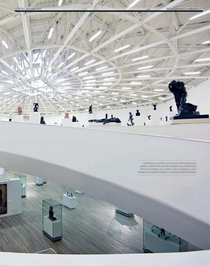
L’ APPRODO ALL’ULTIMO LIVELLO, CON PIANTA CIRCOLARE LIBERA E COPERTURA ZENITALE SEGNATA DAL COMPLESSO RETICOLATO METALLICO. QUESTO LIVELLO ACCOGLIE LA PIÙ
GRANDE COLLEZIONE PRIVATA AL MONDO DI AUGUSTE RODIN.
MUSEO SOUMAYA/MESSICO / 7 INTERNI novembre 2011
C_In616_R_2_7_soumaya_museum.indd 7 12/10/11 15.32
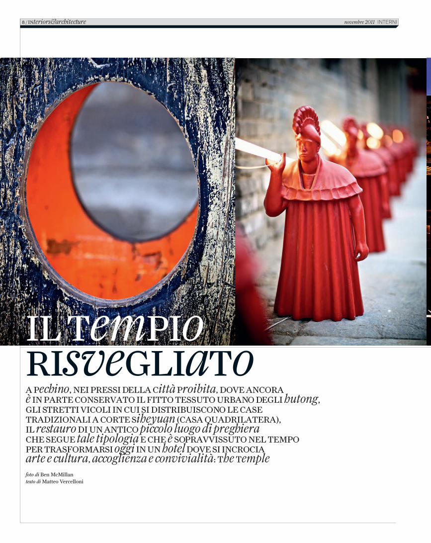
foto di Ben McMillantesto di Matteo Vercelloni
A Pechino, nei Pressi dellA Città Proibita, dove AnCorA è in PArte ConservAto il fitto tessuto urbAno degli hutong, gli stretti viColi in Cui si distribuisCono le CAse trAdizionAli A Corte siheyuan (CAsA QuAdrilAterA), il restauro di un AntiCo piccolo luogo di preghiera Che segue tale tipologia e Che è soPrAvvissuto nel temPo Per trAsformArsi oggi in un hotel dove si inCroCiA arte e cultura, accoglienza e convivialità: the temple
8 / interiors&architecture novembre 2011 InternI
il temPiorisvegliato
2_C_In616_R_8_13_temple_hotel.indd 8 18/10/11 10.32
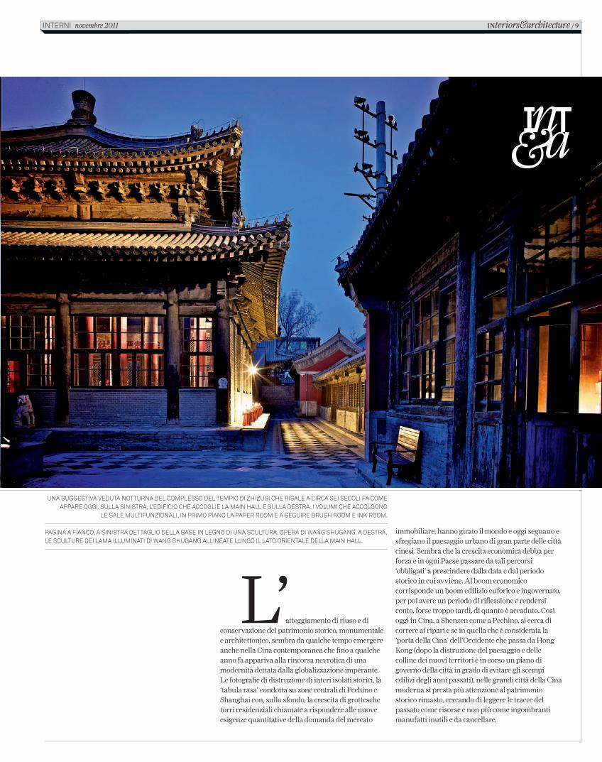
immobiliare, hanno girato il mondo e oggi segnano e sfregiano il paesaggio urbano di gran parte delle città cinesi. Sembra che la crescita economica debba per forza e in ogni Paese passare da tali percorsi ‘obbligati’ a prescindere dalla data e dal periodo storico in cui avviene. Al boom economico corrisponde un boom edilizio euforico e ingovernato, per poi avere un periodo di riflessione e rendersi conto, forse troppo tardi, di quanto è accaduto. Così oggi in Cina, a Shenzen come a Pechino, si cerca di correre ai ripari e se in quella che è considerata la ‘porta della Cina’ dell’Occidente che passa da Hong Kong (dopo la distruzione del paesaggio e delle colline dei nuovi territori è in corso un piano di governo della città in grado di evitare gli scempi edilizi degli anni passati), nelle grandi città della Cina moderna si presta più attenzione al patrimonio storico rimasto, cercando di leggere le tracce del passato come risorse e non più come ingombranti manufatti inutili e da cancellare.
una suggestiva veduta notturna del complesso del tempio di zhizusi che risale a circa sei secoli fa come appare oggi. sulla sinistra, l’edificio che accoglie la main hall e sulla destra, i volumi che accolgono
le sale multifunzionali, in primo piano la paper room e a seguire brush room e ink room.
pagina a fianco, a sinistra dettaglio della base in legno di una scultura, opera di wang shugang. a destra, le sculture dei lama illuminati di wang shugang allineate lungo il lato orientale della main hall.
L’atteggiamento di riuso e di conservazione del patrimonio storico, monumentale e architettonico, sembra da qualche tempo emergere anche nella Cina contemporanea che fino a qualche anno fa appariva alla rincorsa nevrotica di una modernità dettata dalla globalizzazione imperante. Le fotografie di distruzione di interi isolati storici, la ‘tabula rasa’ condotta su zone centrali di Pechino e Shanghai con, sullo sfondo, la crescita di grottesche torri residenziali chiamate a rispondere alle nuove esigenze quantitative della domanda del mercato
INteriors&architecture / 9interni novembre 2011
C_In616_R_8_13_temple_hotel.indd 9 12/10/11 14.25
10 / INteriors&architecture novembre 2011 InternI
C_In616_R_8_13_temple_hotel.indd 10 12/10/11 14.25
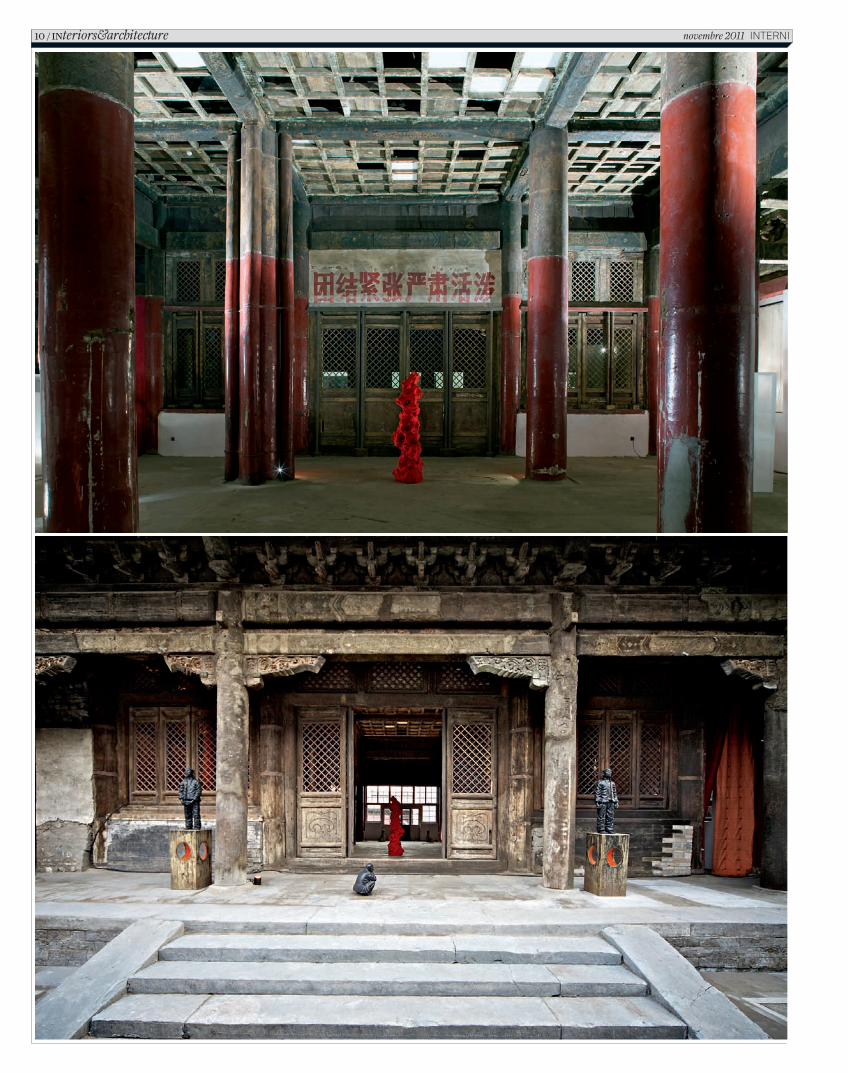
A volte, come in questo caso, l’operazione di restauro, recupero e trasformazione avviene anche per stimolo esterno; un belga, una taiwanese e un cinese che decidono di intervenire su un complesso storico malconcio tra gli hutong nei pressi della centralissima Città Proibita. Il complesso del tempio di Zhizusi risale a circa sei secoli fa e seguendo il modello della casa Siheyuan ha conosciuto nella sua lunga storia diversi impieghi e funzioni.
La rigorosa geometria d’insieme, l’impianto simmetrico assoluto e l’inflessibile ordine gerarchico che caratterizzano la casa cinese tradizionale possono essere letti come traduzione in forma architettonica delle leggi che governavano la vita del nucleo familiare, presupposto etico della società e dello Stato. La famiglia cinese è stata, almeno sino a pochi anni fa, un microcosmo compatto, uno ‘Stato in miniatura’ con indiscutibili leggi gerarchiche; la casa diventava così una sorta di piccola città compiuta, una struttura introversa e precisa, cinta da muri continui per proteggersi da ciò che succedeva all’esterno, nelle vie della città o nelle campagne.
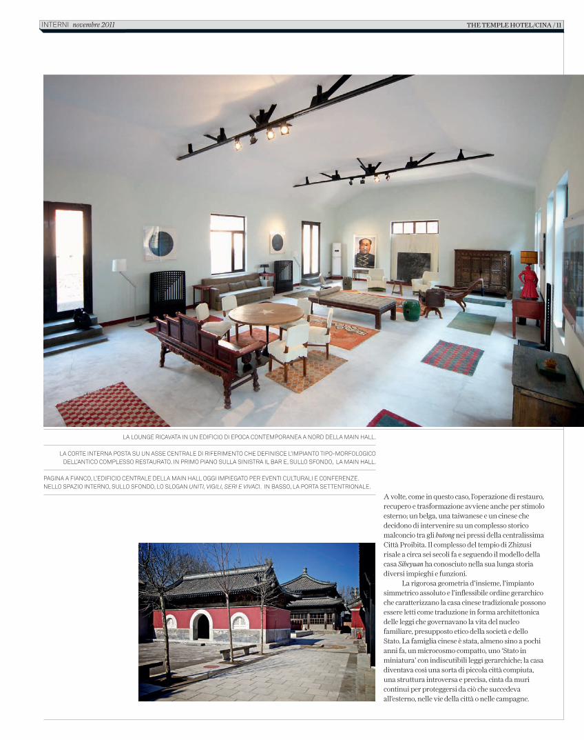
la lounge ricavata in un edificio di epoca contemporanea a nord della main hall.
la corte interna posta su un asse centrale di riferimento che definisce l’impianto tipo-morfologico dell’antico complesso restaurato. in primo piano sulla sinistra il bar e, sullo sfondo, la main hall.
pagina a fianco, l’edificio centrale della main hall oggi impiegato per eventi culturali e conferenze. nello spazio interno, sullo sfondo, lo slogan uniti, vigili, seri e vivaci. in basso, la porta settentrionale.
the temple hotel/cina / 11interni novembre 2011
C_In616_R_8_13_temple_hotel.indd 11 12/10/11 14.25
Così se la struttura dello Stato era simile a quello dei nuclei familiari, i fondamenti tipologici della casa comune seguivano quelli del palazzo, configurando un unico impianto tipo-morfologico definito dalla corte interna posta su un asse centrale di riferimento. Una tipologia che caratterizzerà nel tempo sia l’abitazione contadina, sia quella urbana, sia i grandi palazzi, sia le tombe imperiali e i templi, come quello oggetto di questo attento recupero.
L’edificio centrale, la Main Hall dallo spazio unitario e dalla tradizionale grammatica costruttiva di legno ad incastro, oggi parte centrale del complesso e impiegata per eventi culturali e conferenze, posta sotto tutela dal governo, ha conosciuto nel tempo un accavallarsi d’usi diversi. Dalla dinastia Ming, quando il complesso era sede della stamperia imperiale per produrre e insegnare agli allievi la confezione dei sutra buddisti, alla dinastia Qing successiva, in cui gli edifici divennero uno dei tre templi buddisti tibetani (l’allora religione ufficiale) legati alla Città Proibita.
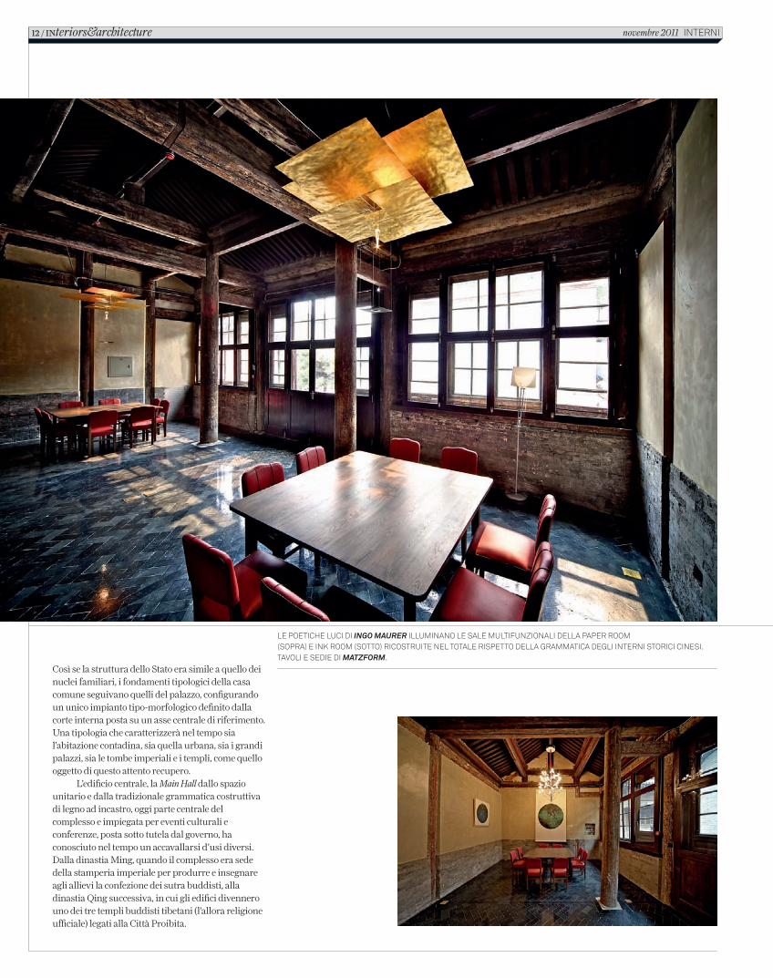
le poetiche luci di ingo maurer illuminano le sale multifunzionali della paper room (sopra) e ink room (sotto) ricostruite nel totale rispetto della grammatica degli interni storici cinesi. tavoli e sedie di matzform.
12 / INteriors&architecture novembre 2011 interni
C_In616_R_8_13_temple_hotel.indd 12 12/10/11 14.25
ricostruendo parti perdute e sostituendo aggiunte funzionali con repliche dell’architettura cinese della dinastia Ming. Negli edifici perimetrali che cingono la Main Hall centrale è stato ricavato un hotel di design con otto suite, il ristorante, un bar e tre sale multifunzionali. Nel generale e calibrato rapporto tra antico e nuovo, tra sculture contemporanee e architettura tradizionale, emergono le lampade di Ingo Maurer che illuminano le sale conferenza, lamine dorate e luci alate che si integrano in modo poetico alla grammatica degli interni cinesi qui sapientemente ricostruita. (www.thetemplehotel.com)
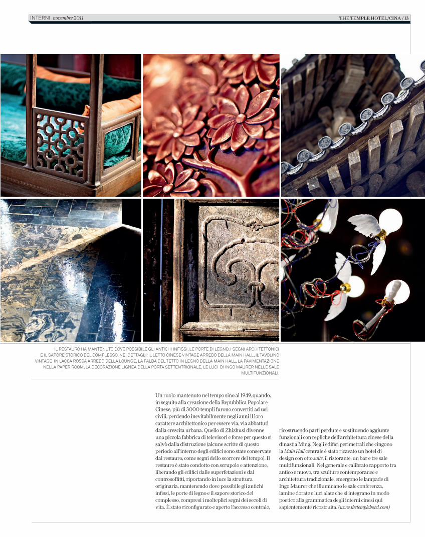
il restauro ha mantenuto dove possibile gli antichi infissi, le porte di legno, i segni architettonici e il sapore storico del complesso. nei dettagli: il letto cinese vintage arredo della main hall, il tavolino
vintage in lacca rossa arredo della lounge, la falda del tetto in legno della main hall, la pavimentazione nella paper room, la decorazione lignea della porta settentrionale, le luci di ingo maurer nelle sale
multifunzionali.
Un ruolo mantenuto nel tempo sino al 1949, quando, in seguito alla creazione della Repubblica Popolare Cinese, più di 3000 templi furono convertiti ad usi civili, perdendo inevitabilmente negli anni il loro carattere architettonico per essere via, via abbattuti dalla crescita urbana. Quello di Zhizhusi divenne una piccola fabbrica di televisori e forse per questo si salvò dalla distruzione (alcune scritte di questo periodo all’interno degli edifici sono state conservate dal restauro, come segni dello scorrere del tempo). Il restauro è stato condotto con scrupolo e attenzione, liberando gli edifici dalle superfetazioni e dai controsoffitti, riportando in luce la struttura originaria, mantenendo dove possibile gli antichi infissi, le porte di legno e il sapore storico del complesso, compresi i molteplici segni dei secoli di vita. È stato riconfigurato e aperto l’accesso centrale,
the temple hotel/cina / 13interni novembre 2011
C_In616_R_8_13_temple_hotel.indd 13 12/10/11 14.25
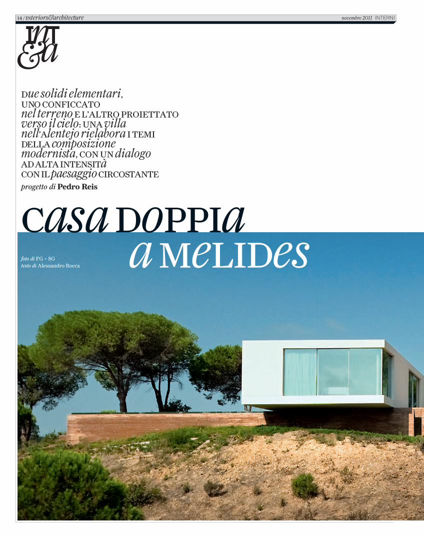
Casa doppia a Melides
due solidi elementari, uno ConfiCCato nel terreno e l’altro proiettato verso il cielo: una villa nell’alentejo rielabora i teMi della composizione modernista, Con un dialogo ad alta intensità Con il paesaggio CirCostanteprogetto di Pedro Reis
foto di FG + SGtesto di Alessandro Rocca
14 / interiors&architecture novembre 2011 InternI
C_In616_R_14_21_casa_pedro_reis.indd 14 12/10/11 14.41
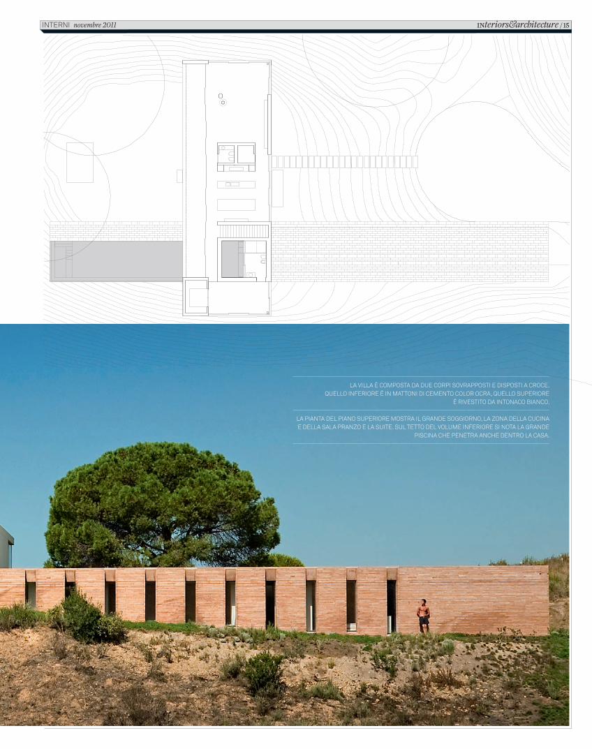
LA VILLA È COMPOSTA DA DUE CORPI SOVRAPPOSTI E DISPOSTI A CROCE.QUELLO INFERIORE È IN MATTONI DI CEMENTO COLOR OCRA, QUELLO SUPERIORE
È RIVESTITO DA INTONACO BIANCO.
LA PIANTA DEL PIANO SUPERIORE MOSTRA IL GRANDE SOGGIORNO, LA ZONA DELLA CUCINA E DELLA SALA PRANZO E LA SUITE. SUL TETTO DEL VOLUME INFERIORE SI NOTA LA GRANDE
PISCINA CHE PENETRA ANCHE DENTRO LA CASA.
INteriors&architecture / 15 INTERNI novembre 2011
C_In616_R_14_21_casa_pedro_reis.indd 15 12/10/11 14.41
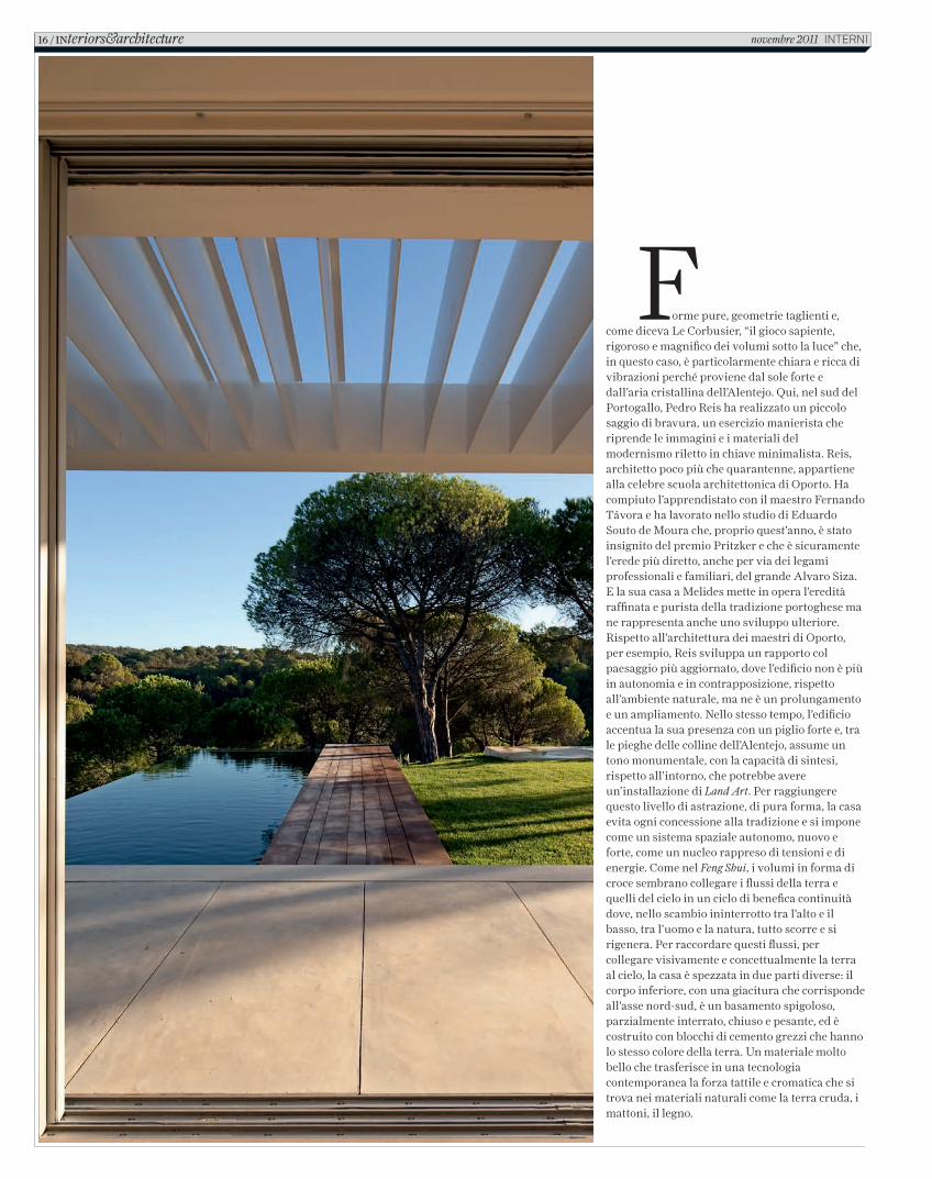
Forme pure, geometrie taglienti e, come diceva Le Corbusier, “il gioco sapiente, rigoroso e magnifico dei volumi sotto la luce” che, in questo caso, è particolarmente chiara e ricca di vibrazioni perché proviene dal sole forte e dall’aria cristallina dell’Alentejo. Qui, nel sud del Portogallo, Pedro Reis ha realizzato un piccolo saggio di bravura, un esercizio manierista che riprende le immagini e i materiali del modernismo riletto in chiave minimalista. Reis, architetto poco più che quarantenne, appartiene alla celebre scuola architettonica di Oporto. Ha compiuto l’apprendistato con il maestro Fernando Távora e ha lavorato nello studio di Eduardo Souto de Moura che, proprio quest’anno, è stato insignito del premio Pritzker e che è sicuramente l’erede più diretto, anche per via dei legami professionali e familiari, del grande Alvaro Siza. E la sua casa a Melides mette in opera l’eredità raffinata e purista della tradizione portoghese ma ne rappresenta anche uno sviluppo ulteriore. Rispetto all’architettura dei maestri di Oporto, per esempio, Reis sviluppa un rapporto col paesaggio più aggiornato, dove l’edificio non è più in autonomia e in contrapposizione, rispetto all’ambiente naturale, ma ne è un prolungamento e un ampliamento. Nello stesso tempo, l’edificio accentua la sua presenza con un piglio forte e, tra le pieghe delle colline dell’Alentejo, assume un tono monumentale, con la capacità di sintesi, rispetto all’intorno, che potrebbe avere un’installazione di Land Art. Per raggiungere questo livello di astrazione, di pura forma, la casa evita ogni concessione alla tradizione e si impone come un sistema spaziale autonomo, nuovo e forte, come un nucleo rappreso di tensioni e di energie. Come nel Feng Shui, i volumi in forma di croce sembrano collegare i flussi della terra e quelli del cielo in un ciclo di benefica continuità dove, nello scambio ininterrotto tra l’alto e il basso, tra l’uomo e la natura, tutto scorre e si rigenera. Per raccordare questi flussi, per collegare visivamente e concettualmente la terra al cielo, la casa è spezzata in due parti diverse: il corpo inferiore, con una giacitura che corrisponde all’asse nord-sud, è un basamento spigoloso, parzialmente interrato, chiuso e pesante, ed è costruito con blocchi di cemento grezzi che hanno lo stesso colore della terra. Un materiale molto bello che trasferisce in una tecnologia contemporanea la forza tattile e cromatica che si trova nei materiali naturali come la terra cruda, i mattoni, il legno.
16 / INteriors&architecture novembre 2011 InternI
C_In616_R_14_21_casa_pedro_reis.indd 16 12/10/11 14.41
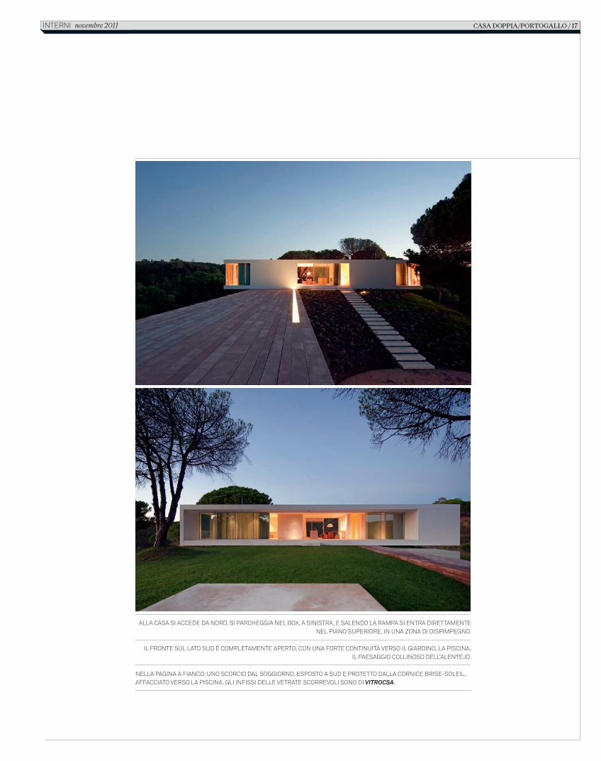
AllA cAsA si Accede dA nord. si pArcheggiA nel box, A sinistrA, e sAlendo lA rAmpA si entrA direttAmente nel piAno superiore, in unA zonA di dispimpegno.
il fronte sul lAto sud è completAmente Aperto, con unA forte continuità verso il giArdino, lA piscinA,il pAesAggio collinoso dell’Alentejo.
nellA pAginA A fiAnco: uno scorcio dAl soggiorno, esposto A sud e protetto dAllA cornice brise-soleil, AffAcciAto verso lA piscinA. gli infissi delle vetrAte scorrevoli sono di Vitrocsa.
casa doppia/portogallo / 17interni novembre 2011
C_In616_R_14_21_casa_pedro_reis.indd 17 12/10/11 14.41
18 / INteriors&architecture novembre 2011 INTERNI
C_In616_R_14_21_casa_pedro_reis.indd 18 12/10/11 14.41
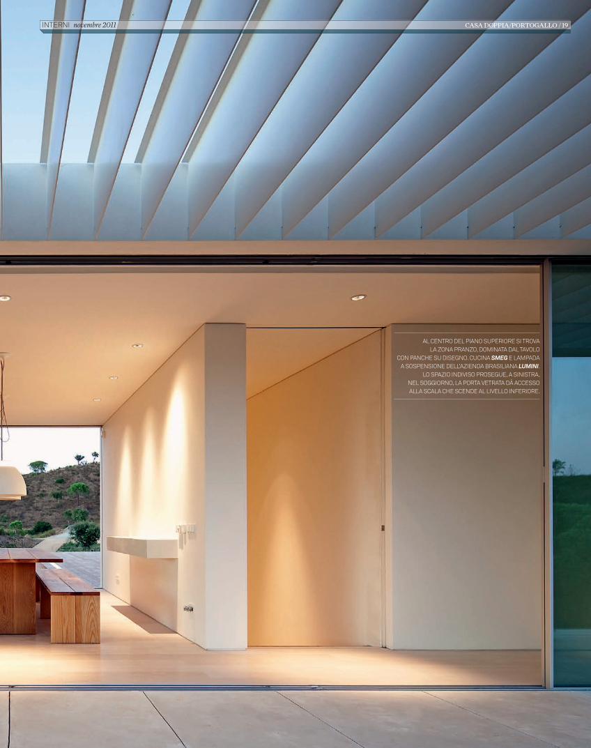
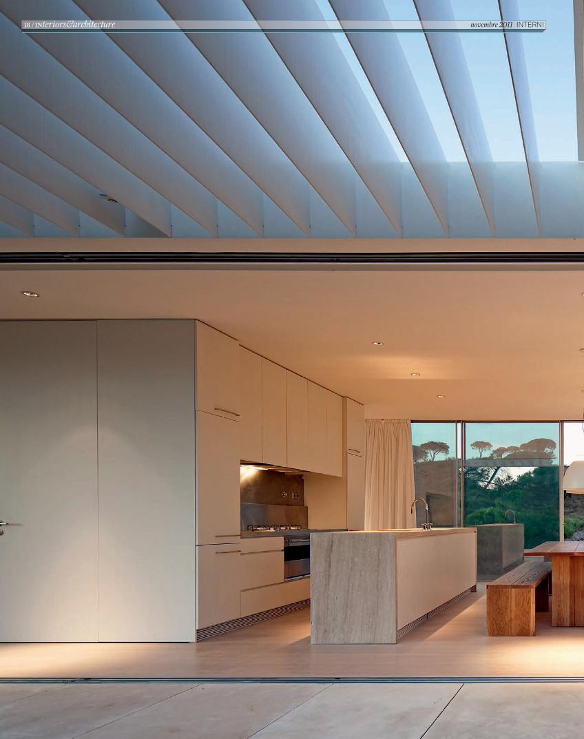
AL CENTRO DEL PIANO SUPERIORE SI TROVALA ZONA PRANZO, DOMINATA DAL TAVOLO
CON PANCHE SU DISEGNO. CUCINA SMEG E LAMPADA A SOSPENSIONE DELL’AZIENDA BRASILIANA LUMINI.
LO SPAZIO INDIVISO PROSEGUE, A SINISTRA, NEL SOGGIORNO, LA PORTA VETRATA DÀ ACCESSO ALLA SCALA CHE SCENDE AL LIVELLO INFERIORE.
CASA DOPPIA/PORTOGALLO / 19 INTERNI novembre 2011
C_In616_R_14_21_casa_pedro_reis.indd 19 12/10/11 14.41
4. B
edro
om
5. G
arag
e0
0.5
12
m
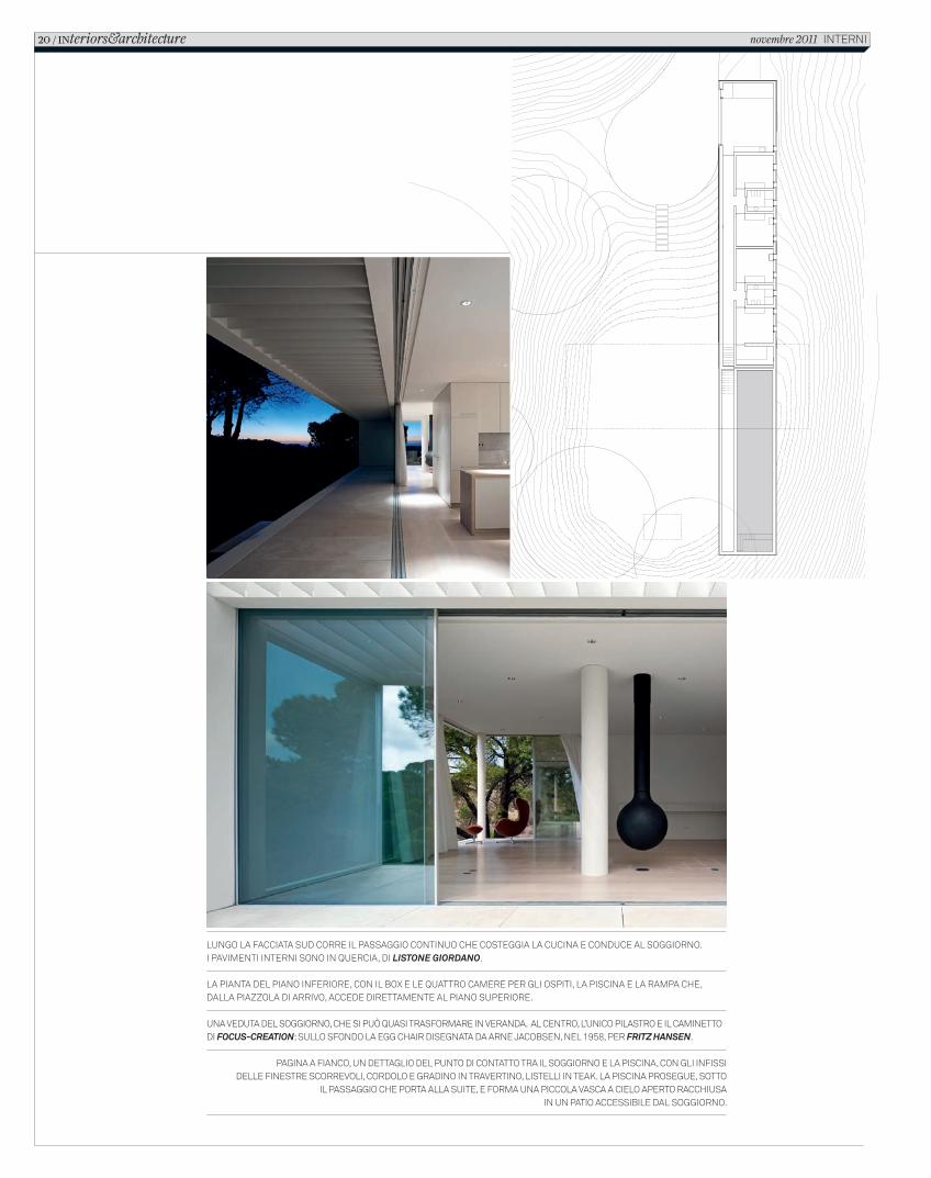
LUNGO LA FACCIATA SUD CORRE IL PASSAGGIO CONTINUO CHE COSTEGGIA LA CUCINA E CONDUCE AL SOGGIORNO.I PAVIMENTI INTERNI SONO IN QUERCIA, DI LISTONE GIORDANO.
LA PIANTA DEL PIANO INFERIORE, CON IL BOX E LE QUATTRO CAMERE PER GLI OSPITI, LA PISCINA E LA RAMPA CHE, DALLA PIAZZOLA DI ARRIVO, ACCEDE DIRETTAMENTE AL PIANO SUPERIORE.
UNA VEDUTA DEL SOGGIORNO, CHE SI PUÒ QUASI TRASFORMARE IN VERANDA. AL CENTRO, L’UNICO PILASTRO E IL CAMINETTO DI FOCUS-CREATION; SULLO SFONDO LA EGG CHAIR DISEGNATA DA ARNE JACOBSEN, NEL 1958, PER FRITZ HANSEN.
PAGINA A FIANCO, UN DETTAGLIO DEL PUNTO DI CONTATTO TRA IL SOGGIORNO E LA PISCINA, CON GLI INFISSI DELLE FINESTRE SCORREVOLI, CORDOLO E GRADINO IN TRAVERTINO, LISTELLI IN TEAK. LA PISCINA PROSEGUE, SOTTO
IL PASSAGGIO CHE PORTA ALLA SUITE, E FORMA UNA PICCOLA VASCA A CIELO APERTO RACCHIUSA IN UN PATIO ACCESSIBILE DAL SOGGIORNO.
20 / INteriors&architecture novembre 2011 INTERNI
C_In616_R_14_21_casa_pedro_reis.indd 20 12/10/11 14.41

All’interno del volume, tutto sviluppato in lunghezza, trovano posto il garage e quattro camere da letto, raggruppate a coppie ai lati dei bagni. Ma buona parte di questo basamento rossastro è occupata dalla vasca della piscina, un rettangolo allungato che si estende per tutta l’ala sud della casa. Il piano superiore è il gemello diverso, simile e opposto, dell’inferiore: la precisione volumetrica è la stessa ma cambia tutto il resto. Prima di tutto la giacitura perché, facendo perno sulla cucina, il volume ruota di 90 gradi formando una grande croce. Sembra che, mentre il volume basso lavora per far presa sul terreno, quello superiore voglia invece ingaggiare un confronto con tutto il paesaggio circostante coinvolgendolo nella rotazione dei corpi sovrapposti. A questo serve anche il rivestimento in intonaco bianco che rende il volume astratto, leggero e luminoso, e la grande loggia aperta sul lato sud che trasforma la scatola tridimensionale in una cornice sospesa sul green e sul basamento rossastro. Dal percorso di avvicinamento e di accesso, che arriva dal lato nord, il piano superiore appare come un volume chiuso con un’unica grande apertura, più o meno al centro, che corrisponde al vano della cucina. Sul lato opposto, invece, si apre la finestra continua che, protetta da una cornice traforata che filtra i raggi del sole, proietta lo spazio del soggiorno verso il giardino e verso l’ampio paesaggio collinare. Nell’incrocio tra i due corpi sovrapposti Reis inventa un piccolo gioco di prestigio: la piscina prosegue, sotto il passaggio che collega il soggiorno alla suite, e diventa una piccola e preziosa vasca interna accessibile sia dal soggiorno che dalla stanza da bagno. Nella grazia raggiunta dalla casa di Melides c’è la capacità di sintetizzare il tema del progetto in un concetto semplice e forte, e di elaborarlo poi con un pensiero spaziale coerente e una selezione attenta e creativa dei materiali più appropriati.
casa doppia/portogallo / 21InternI novembre 2011
C_In616_R_14_21_casa_pedro_reis.indd 21 12/10/11 14.41
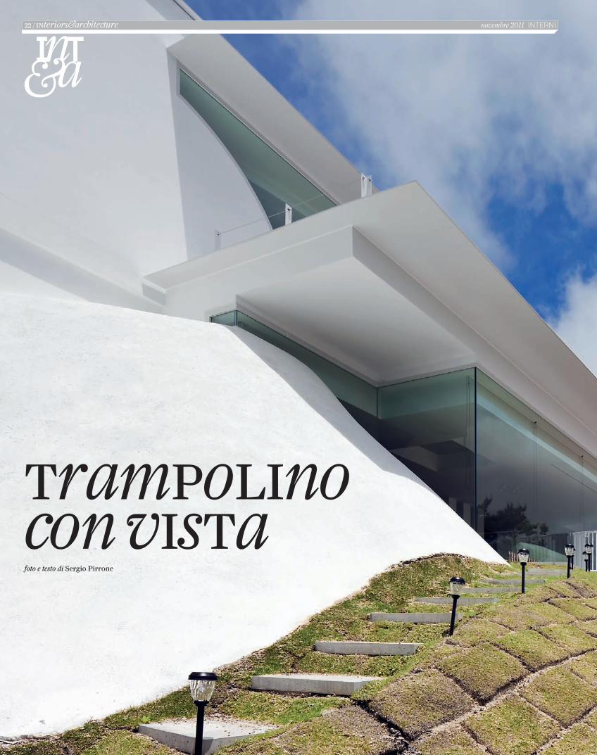
Trampolino con visTafoto e testo di Sergio Pirrone
22 / iNteriors&architecture novembre 2011 InternI
C_In616_R_22_27_slope_design.indd 22 12/10/11 14.39
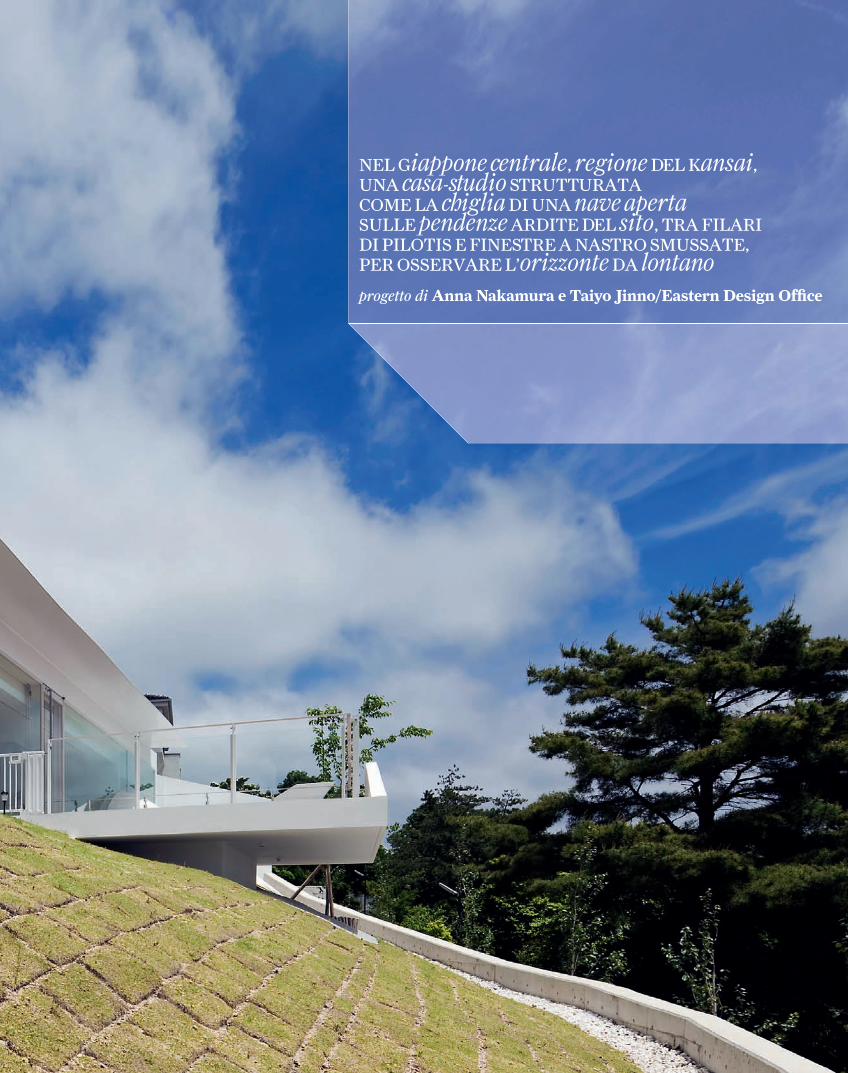
NEL Giappone centrale, regione DEL Kansai, UNA casa-studio STRUTTURATA COME LA chiglia DI UNA nave aperta SULLE pendenze ARDITE DEL sito, TRA FILARI DI PILOTIS E FINESTRE A NASTRO SMUSSATE, PER OSSERVARE L’orizzonte DA lontano
progetto di Anna Nakamura e Taiyo Jinno/Eastern Design Offi ce
C_In616_R_22_27_slope_design.indd 23 12/10/11 14.39
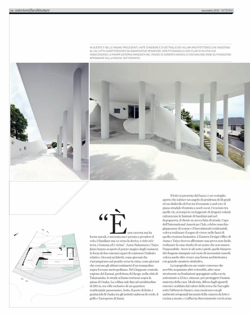
“È una caverna ma ha forme navali, è ancorata ma è pronta a prendere il volo; è familiare ma va verso la deriva, è cielo ed è terra, è lontana ed è vicina”. Anna Nakamura e Taiyo Jinno hanno scoperto il potere magico degli ossimori, la forza di due estremi capaci di contenere l’infinito relativo. Giovani architetti, come giovani che s’arrampicano sul pendio verso la cima, come giovani che corrono gli ultimi centimetri d’un trampolino sopra l’oceano metropolitano. Nel Giappone centrale, regione del Kansai, prefettura di Hyogo, nella città di Takarazuka, le strade si fanno tortuose sopra la piana di Osaka. La collina sale fino ad un’altitudine di 330 m, tra ville esclusive di un quartiere residenziale panoramico. Sotto, il porto di Kobe, i grattacieli di Osaka tra gli isolotti ombrosi di verde, il golfo e l’aeroporto di Itami.
Il lotto si presenta dal basso, è un ventaglio aperto che subisce un angolo di pendenza di 18 gradi ed un dislivello di 8 m tra il tornante a sud-est e il piano stradale d’entrata a nord-ovest. Cresciuto tra quelle vie, ai tempi in cui leggende di dragoni volanti catturavano le fantasie di bambini nati nel dopoguerra, il cliente ne aveva fatta di strada. Capo dell’International American Club, celebre marchio giapponese di scarpe e d’investimenti residenziali, voleva realizzare il sogno di vivere nelle fauci di quella creatura fantastica. L’Eastern Design Office di Anna e Taiyo doveva affrontare una prova non facile, realizzare la casa-studio di un uomo che non amava l’impossibile. Avere le ali sotto i piedi, quelle bizzarre del dragone stampate sul cuoio di mocassini comodi, voleva anche dire creare una forma architettonica con grande carattere simbolico.
La topografia era un ventre convesso che avrebbe acquistato altre rotondità, altre anse strutturate su fondazioni appoggiate sulla roccia sottostante a 1,5 m e, sinuose, per proteggere l’anima materna della casa. Moderata, difesa dagli sguardi esterni e scaldata dal calore della terra che l’accoglie sotto l’abbraccio bianco, essa rassicura con gli ambienti ortogonali incassati della camera da letto e cucina a monte, e s’affaccia discretamente con la zona
in queste e nelle pagine precedenti, viste d’insieme e di dettaglio dei volumi architettonici che insistono su un lotto caratterizzato da significative pendenze, strutturandolo con filari di pilotis che assecondano la rampa esterna annegata nel pendio di cemento bianco, e con sinuose anse su fondazioni appoggiate sulla roccia sottostante.
24 / INteriors&architecture novembre 2011 interni
C_In616_R_22_27_slope_design.indd 24 12/10/11 14.40

casa-studio/giappone / 25
C_In616_R_22_27_slope_design.indd 25 12/10/11 14.40
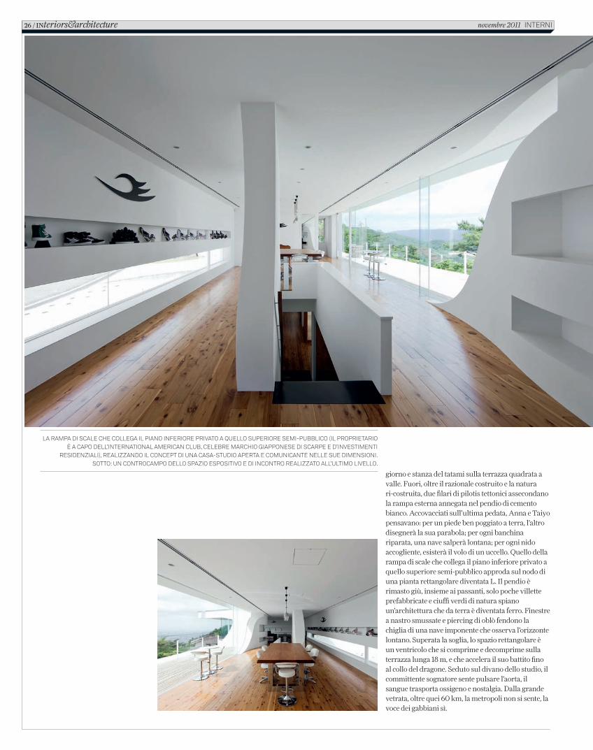
giorno e stanza del tatami sulla terrazza quadrata a valle. Fuori, oltre il razionale costruito e la natura ri-costruita, due filari di pilotis tettonici assecondano la rampa esterna annegata nel pendio di cemento bianco. Accovacciati sull’ultima pedata, Anna e Taiyo pensavano: per un piede ben poggiato a terra, l’altro disegnerà la sua parabola; per ogni banchina riparata, una nave salperà lontana; per ogni nido accogliente, esisterà il volo di un uccello. Quello della rampa di scale che collega il piano inferiore privato a quello superiore semi-pubblico approda sul nodo di una pianta rettangolare diventata L. Il pendio è rimasto giù, insieme ai passanti, solo poche villette prefabbricate e ciuffi verdi di natura spiano un’architettura che da terra è diventata ferro. Finestre a nastro smussate e piercing di oblò fendono la chiglia di una nave imponente che osserva l’orizzonte lontano. Superata la soglia, lo spazio rettangolare è un ventricolo che si comprime e decomprime sulla terrazza lunga 18 m, e che accelera il suo battito fino al collo del dragone. Seduto sul divano dello studio, il committente sognatore sente pulsare l’aorta, il sangue trasporta ossigeno e nostalgia. Dalla grande vetrata, oltre quei 60 km, la metropoli non si sente, la voce dei gabbiani sì.
la rampa di scale che collega il piano inferiore privato a quello superiore semi-pubblico (il proprietario è a capo dell’international american club, celebre marchio giapponese di scarpe e d’investimenti
residenziali), realizzando il concept di una casa-studio aperta e comunicante nelle sue dimensioni. sotto: un controcampo dello spazio espositivo e di incontro realizzato all’ultimo livello.
26 / INteriors&architecture novembre 2011 interni
C_In616_R_22_27_slope_design.indd 26 12/10/11 14.40
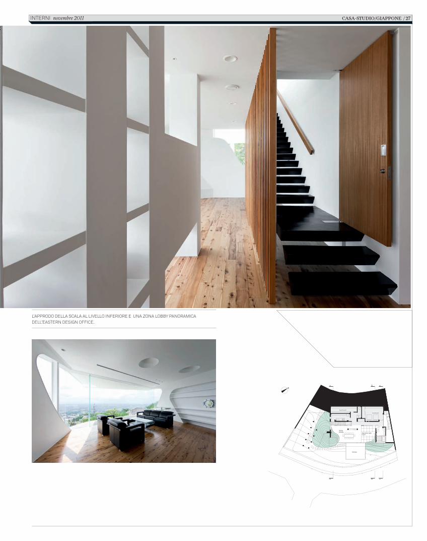
l’approdo della scala al livello inferiore e una zona lobby panoramica dell’eastern design office.
casa-studio/giappone / 27interni novembre 2011
C_In616_R_22_27_slope_design.indd 27 12/10/11 14.40
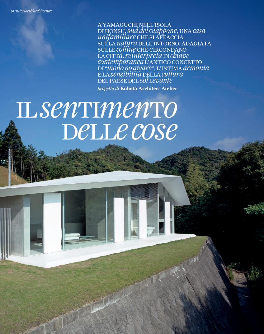
il sentimento delle cose
A YAmAguchi nell’isolA di honsu, sud del giappone, unA casa unifamiliare che si AffAcciA sullA natura dell’intorno, AdAgiAtA sulle colline che circondAno lA città, reinterpreta in chiave contemporanea l’Antico concetto di “mono no aware”, l’intimA armonia e lA sensibilità dellA culturadel pAese del sol levanteprogetto di Kubota Architect Atelier
28 / interiors&architecture
C_In616_R_28_31_casa_kubota.indd 28 12/10/11 14.46
Section [ 1:250 ]
Section [ 1:250 ]
living-room
kitchen
livingroombath-room
bed-room
K U B O TA A R C H I T E C T AT E L I E RF-HOUSE
Per la cultura occidentale lottare con la natura e plasmarla secondo le proprie esigenze terrene appare come un obiettivo primario, teso a renderla sempre più simile al sistema dei principi che la trascendono. Per la tradizione giapponese e per la sua religione originaria (lo shinto) l’unità tra la dimensione spirituale e quella materiale si propone invece ad assumere la natura come elemento primigenio, e in qualche modo divino, per creare e mantenere un rapporto armonico tra forze naturali e presenze antropiche, anche attraverso rituali di purifi cazione. Da questo punto di vista come osserva Gian Carlo Calza nel suo Stile Giappone (Einaudi, 2002): “un albero imponente, una roccia, una cascata di forma particolare, uno spazio, un ambiente, un panorama diventano carichi di signifi cati in quanto in essi si può avvertire la natura divina di cui l’uomo stesso è impastato non solo nello spirito, ma anche nel corpo e perciò vengono contrassegnati come sacri”.
In questo progetto di casa unifamiliare arroccata su un terreno impervio circondato dal verde questi principi sembrano emergere in forma architettonica, creando una sorta di ‘palcoscenico privato’ da cui osservare l’avvicendarsi dei colori degli alberi e delle stagioni. Come una sorta di origami volumetrico e avvolgente il corpo della
casa è composto da una superfi cie che a livello concettuale parte dal piano orizzontale del pavimento per poi piegarsi a 90° in verticale e comporre il muro cieco verso monte e di nuovo ripiegarsi su se stessa, questa volta in modo geometrico-scultoreo, e disegnare la complessa copertura monolitica e continua. Il bianco che avvolge l’intera costruzione sottolinea la ricerca di una sintesi unitaria complessiva e il desiderio di porsi in modo armonico e quasi astratto rispetto al paesaggio da cui la casa emerge e si rapporta allo stesso tempo.
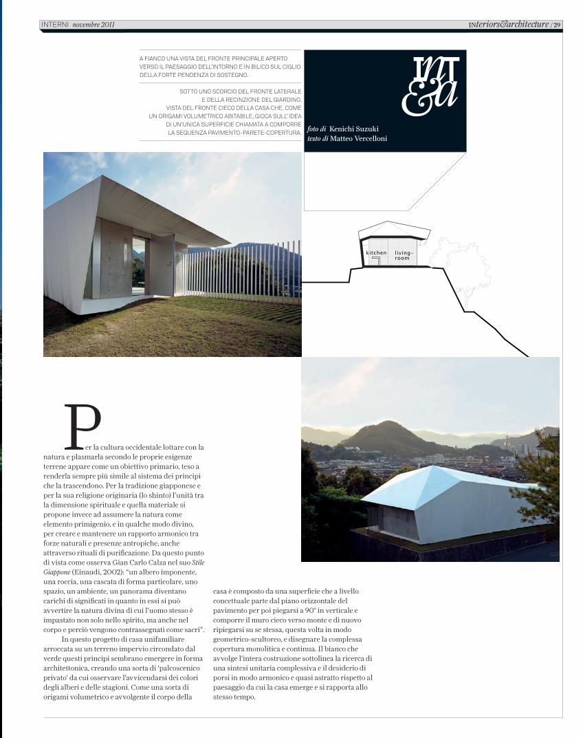
A FIANCO UNA VISTA DEL FRONTE PRINCIPALE APERTO VERSO IL PAESAGGIO DELL’INTORNO E IN BILICO SUL CIGLIO DELLA FORTE PENDENZA DI SOSTEGNO.
SOTTO UNO SCORCIO DEL FRONTE LATERALE E DELLA RECINZIONE DEL GIARDINO.
VISTA DEL FRONTE CIECO DELLA CASA CHE, COMEUN ORIGAMI VOLUMETRICO ABITABILE, GIOCA SULL’ IDEA
DI UN’UNICA SUPERFICIE CHIAMATA A COMPORRELA SEQUENZA PAVIMENTO-PARETE-COPERTURA. foto di Kenichi Suzuki
testo di Matteo Vercelloni
INteriors&architecture / 29 INTERNI novembre 2011
C_In616_R_28_31_casa_kubota.indd 29 12/10/11 14.46
Plan [ 1 : 250 ]
kitchen
bathroombed-room
K U B O TA A R C H I T E C T AT E L I E RF-HOUSE
0 2 4 6 [m]
living room
Al fronte muto del retro rispondono i ritmi delle grandi aperture dei fronti laterali e di quello principale aperto verso valle e il profi lo urbano della città di Yamaguchi. Un panorama ‘fi ltrato’ dalle chiome degli alberi prospicienti che emergono dalla base dal ripido dirupo che cinge il terreno di appoggio trattato a manto erboso. La scena che si coglie dal giardino, cinto da una recinzione composta da canne verticali di metallo bianco, e che si offre anche dal soggiorno, cui si affi ancano il bagno interposto alla camera da letto d’angolo, è quella di essere sospesi sugli alberi che fungono da schermo naturale e prezioso rispetto all’orizzonte segnato dalla città e dalle colline. La grande vetrata
continua a tutt’altezza è interrotta da una serie di porte, bianche e opache, che segnano le soglie tra esterno e interno. Questo è risolto come un ambiente unitario segnato fortemente da un arredo su disegno che lega tra loro i tre ambienti della casa. Il lungo banco cucina in muratura sottolinea nel suo sviluppo il muro cieco della costruzione (lo schermo bianco leggeremente inclinato di conclusione dello spazio), sommando nel suo andamento lineare e prospettico diverse funzioni: tavolo da pranzo, piano cottura e lavello cucina, per organizzare poi sul fondo l’andamento della scala che conduce alla camera da letto ricavata ad una quota inferiore rispetto a quella della zona giorno complessiva.
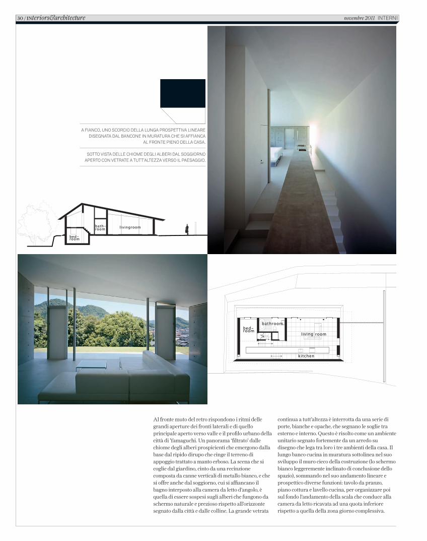
A FIANCO, UNO SCORCIO DELLA LUNGA PROSPETTIVA LINEARE DISEGNATA DAL BANCONE IN MURATURA CHE SI AFFIANCA
AL FRONTE PIENO DELLA CASA.
SOTTO VISTA DELLE CHIOME DEGLI ALBERI DAL SOGGIORNO APERTO CON VETRATE A TUTT’ALTEZZA VERSO IL PAESAGGIO.
Section [ 1:250 ]
Section [ 1:250 ]
living-room
kitchen
livingroombath-room
bed-room
K U B O TA A R C H I T E C T AT E L I E RF-HOUSE
30 / INteriors&architecture novembre 2011 INTERNI
C_In616_R_28_31_casa_kubota.indd 30 12/10/11 14.46
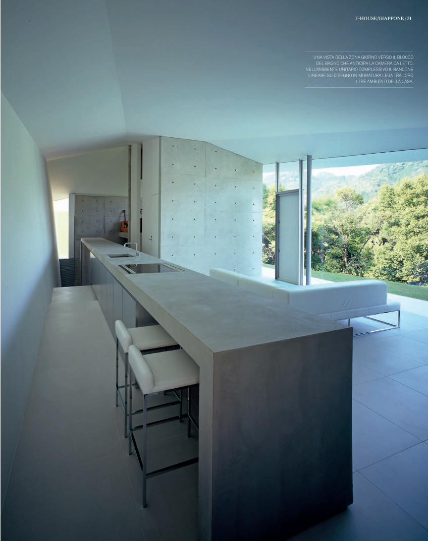
Una vista della zona giorno verso il bloccodel bagno che anticipa la camera da letto.
nell’ambiente Unitario complessivo il bancone lineare sU disegno in mUratUra lega tra loro
i tre ambienti della casa.
F-House/GIAPPoNe / 31
C_In616_R_28_31_casa_kubota.indd 31 12/10/11 14.47
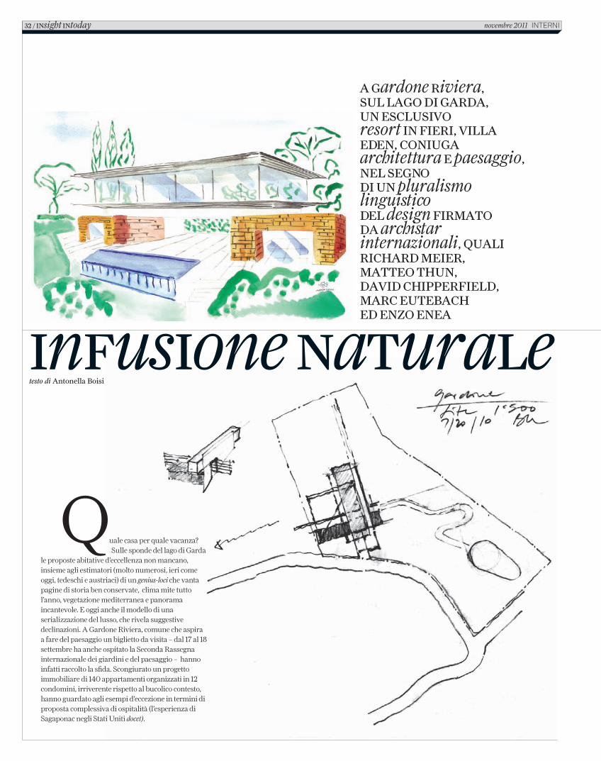
infusione naturaletesto di Antonella Boisi
Quale casa per quale vacanza? Sulle sponde del lago di Garda
le proposte abitative d’eccellenza non mancano, insieme agli estimatori (molto numerosi, ieri come oggi, tedeschi e austriaci) di un genius-loci che vanta pagine di storia ben conservate, clima mite tutto l’anno, vegetazione mediterranea e panorama incantevole. E oggi anche il modello di una serializzazione del lusso, che rivela suggestive declinazioni. A Gardone Riviera, comune che aspira a fare del paesaggio un biglietto da visita – dal 17 al 18 settembre ha anche ospitato la Seconda Rassegna internazionale dei giardini e del paesaggio – hanno infatti raccolto la sfida. Scongiurato un progetto immobiliare di 140 appartamenti organizzati in 12 condomini, irriverente rispetto al bucolico contesto, hanno guardato agli esempi d’eccezione in termini di proposta complessiva di ospitalità (l’esperienza di Sagaponac negli Stati Uniti docet).
A Gardone Riviera, sul lAGo di GARdA, un esclusivo resort in fieRi, villA eden, coniuGA architettura e paesaggio, nel seGno di un pluralismo linguistico del design fiRmAto dA archistar internazionali, quAli RichARd meieR, mAtteo thun, dAvid chippeRfield, mARc eutebAch ed enzo eneA
32 / insight intoday novembre 2011 InternI
C_In616_R_32_37_villa_eden_gardone.indd 32 12/10/11 15.44
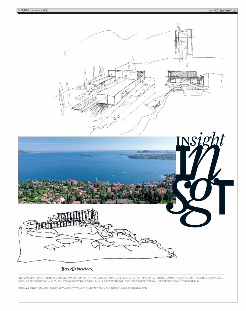
un’ immagine da cartolina di gardone riviera lungo la sponda occidentale del lago di garda, ripreso dal sito collinare in cui è in costruzione il complesso di villa eden gardone. in alto, schizzo architettonico della villa progettata dallo studio sphere. sopra, il progetto di david chipperfield.
pagina a fianco, in alto uno schizzo architettonico di matteo thun e in basso uno di richard meier.
INsight
INsight INtoday / 33interni novembre 2011
C_In616_R_32_37_villa_eden_gardone.indd 33 12/10/11 15.44
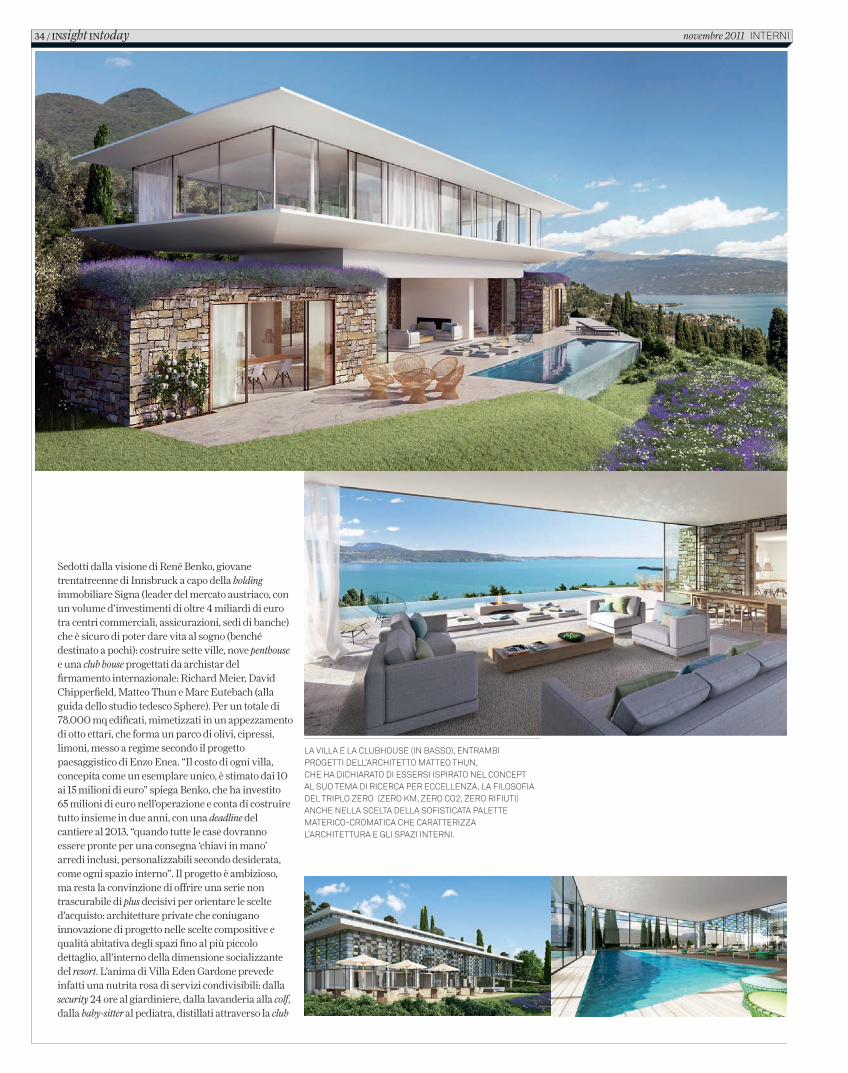
Sedotti dalla visione di René Benko, giovane trentatreenne di Innsbruck a capo della holding immobiliare Signa (leader del mercato austriaco, con un volume d’investimenti di oltre 4 miliardi di euro tra centri commerciali, assicurazioni, sedi di banche) che è sicuro di poter dare vita al sogno (benché destinato a pochi): costruire sette ville, nove penthouse e una club house progettati da archistar del firmamento internazionale: Richard Meier, David Chipperfield, Matteo Thun e Marc Eutebach (alla guida dello studio tedesco Sphere). Per un totale di 78.000 mq edificati, mimetizzati in un appezzamento di otto ettari, che forma un parco di olivi, cipressi, limoni, messo a regime secondo il progetto paesaggistico di Enzo Enea. “Il costo di ogni villa, concepita come un esemplare unico, è stimato dai 10 ai 15 milioni di euro” spiega Benko, che ha investito 65 milioni di euro nell’operazione e conta di costruire tutto insieme in due anni, con una deadline del cantiere al 2013, “quando tutte le case dovranno essere pronte per una consegna ‘chiavi in mano’ arredi inclusi, personalizzabili secondo desiderata, come ogni spazio interno”. Il progetto è ambizioso, ma resta la convinzione di offrire una serie non trascurabile di plus decisivi per orientare le scelte d’acquisto: architetture private che coniugano innovazione di progetto nelle scelte compositive e qualità abitativa degli spazi fino al più piccolo dettaglio, all’interno della dimensione socializzante del resort. L’anima di Villa Eden Gardone prevede infatti una nutrita rosa di servizi condivisibili: dalla security 24 ore al giardiniere, dalla lavanderia alla colf, dalla baby-sitter al pediatra, distillati attraverso la club
la villa e la clubhouse (in basso), entrambi progetti dell’architetto matteo thun, che ha dichiarato di essersi ispirato nel concept al suo tema di ricerca per eccellenza, la filosofia del triplo zero (zero km, zero co2, zero rifiuti) anche nella scelta della sofisticata palette materico-cromatica che caratterizza l’architettura e gli spazi interni.
34 / INsight INtoday novembre 2011 interni
C_In616_R_32_37_villa_eden_gardone.indd 34 12/10/11 15.44
house, summa di ristorante “aperto anche all’esterno, ma per una clientela selezionatissima” e poi lounge-bar-piscina-terrazza-solarium-belvedere, spa, zona beauty e biblioteca. Progettato da Matteo Thun, in posizione baricentrica rispetto al complesso, l’edificio (1050 mq) si raggiunge tramite un percorso interno che, assecondando l’orografia e il declivio naturale del terreno, rende invisibili i giardini privati delle ville e i garage interrati nello scavo della collina. Il master plan ha previsto infatti che tutte le case siano occultate alla vista dal lago, ma protagoniste di inquadrature mozzafiato dalla loro posizione attentamente calibrata nell’orientamento. “L’architettura disegna l’anima di un luogo e il riconoscimento del genius-loci ha suggerito le scelte” ha spiegato Matteo Thun, bolzanino naturalizzato milanese, tre volte Compasso d’Oro e autore di
progetti quali il Vigilius Mountain Resort di Lana (Bolzano), il più coinvolto nella rosa dei progettisti (firma la club house e una villa). Innanzitutto, la sofisticata palette materico-cromatica del complesso, declinata secondo il vocabolario linguistico specifico dei diversi progettisti. “La mia filosofia del triplo zero, zero Km, zero Co2, zero rifiuti, per non inquinare, mi ha indicato l’impiego di materiali locali, quali pietra, gesso, vetro e legno” continua Thun che si è focalizzato sulla cifra della sostenibilità – economica, ecologica, socioculturale – il suo tema progettuale per eccellenza volto alla ricerca di una fusione totale ed emozionale con la natura. “Ho cercato di rendere il tutto più semplice possibile, seguendo la lezione del maestro Sottsass. Geometrie elementari, i volumi architettonici instaurano un rapporto dialettico con i terrazzamenti della collina e con il paesaggio lacustre.
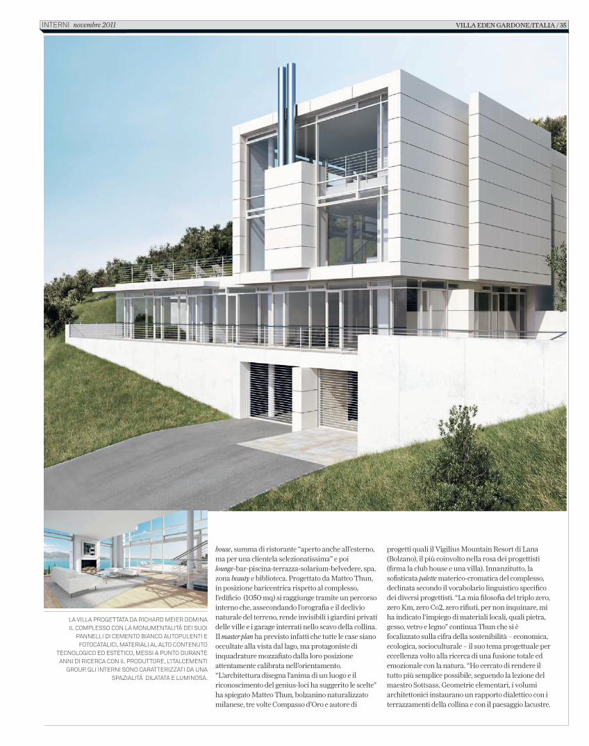
La viLLa progettata da richard meier domina iL compLesso con La monumentaLità dei suoi
panneLLi di cemento bianco autopuLenti e fotocataLici, materiaLi aL aLto contenuto
tecnoLogico ed estetico, messi a punto durante anni di ricerca con iL produttore, L’itaLcementi
group. gLi interni sono caratterizzati da una spaziaLità diLatata e Luminosa.
villa eden gardone/italia / 35interni novembre 2011
C_In616_R_32_37_villa_eden_gardone.indd 35 12/10/11 15.44
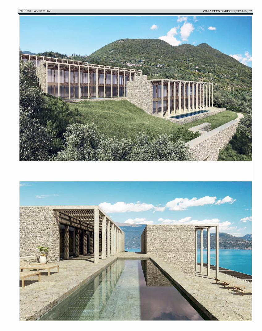
E altresì inseguono la trasparenza, la luminosità degli spazi interni, ma anche l’ombra, la protezione dal calore, un benessere complessivo cullato in primis nella spa con palestra e piscina attrezzata, di cui è dotata sia la club house che l’abitazione. Orientata in posizione est-ovest, nella parte superiore del complesso, la casa ha ampie facciate vetrate che consentono un dialogo continuo tra dentro e fuori, mentre i sistemi di schermatura riparano gli spazi interni dal surriscaldamento estivo, garantendo un uso ottimale dell’energia solare. Riscaldamento e raffreddamento tramite controsoffitti e pavimenti radianti creano inoltre un micro-clima a temperatura costante congeniale a una politica di risparmio energetico”. Lo stesso concept è stato adottato per la clubhouse, la seconda realizzazione di cui Thun si sta occupando per Villa Eden Gardone, caratterizzata in facciata da una schermatura colorata a doppia altezza “una seconda pelle in vetro temperato che attutisce il vento che a metà giornata soffia forte dalla Pianura Padana”. L’architetto inglese di matrice minimalista David Chipperfield ha invece pensato due ville entrambe dotate di appendici per gli ospiti e un building di quattro appartamenti che reinterpretano la tipologia gardesana della limonaia – la casa pergolata – con un utilizzo generoso e creativo della pietra come materiale costruttivo privilegiato, accostata al vetro in ampie superfici trasparenti. Volumi stretti e lunghi risultano così sfalsati secondo il naturale pendio della collina, le zone giorno e notte distribuite su due livelli, grandi
finestre con pergole a monte proteggono dal sole e dal vento, mentre un imponente colonnato lascia ampio spazio all’orizzonte visivo verso il lago. Di contro, Richard Meier, Pritzker Prize per l’architettura (nel 1984), portano la sua firma opere quali il Getty Center a Los Angeles, la Chiesa del Giubileo e il Museo dell’Ara Pacis a Roma, fedele ai paradigmi della sua metodologia progettuale, ha ideato un guscio plastico in pannelli di cemento bianco autopulenti e fotocatalitici, che riducono l’inquinamento (materiali ad alto contenuto estetico e tecnologico, messi a punto durante anni di ricerca con il produttore, l’Italcementi Group) dichiarando di essersi ispirato alla luce come materiale costruttivo.“Ho disegnato la villa con l’intento di catturare la straordinaria luce del lago di Garda che, durante il giorno, si riflette anche sui fronti e di notte produce effetti di brillantezza”. La villa progettata infine dal gruppo Sphere guidato dall’architetto tedesco Marco Eutebach reinterpreterà il modello del loft urbano, restituito con una spazialità aperta e ininterrotta negli spazi interni, e una tavolozza materico-cromatica dagli algidi accenti metropolitani. Come dire: a Villa Eden Gardone i colori del design hanno davvero mille sfumature per accompagnare il trascorrere delle stagioni e rendere ben percepibili il cielo e il lago di Gardone Riviera.
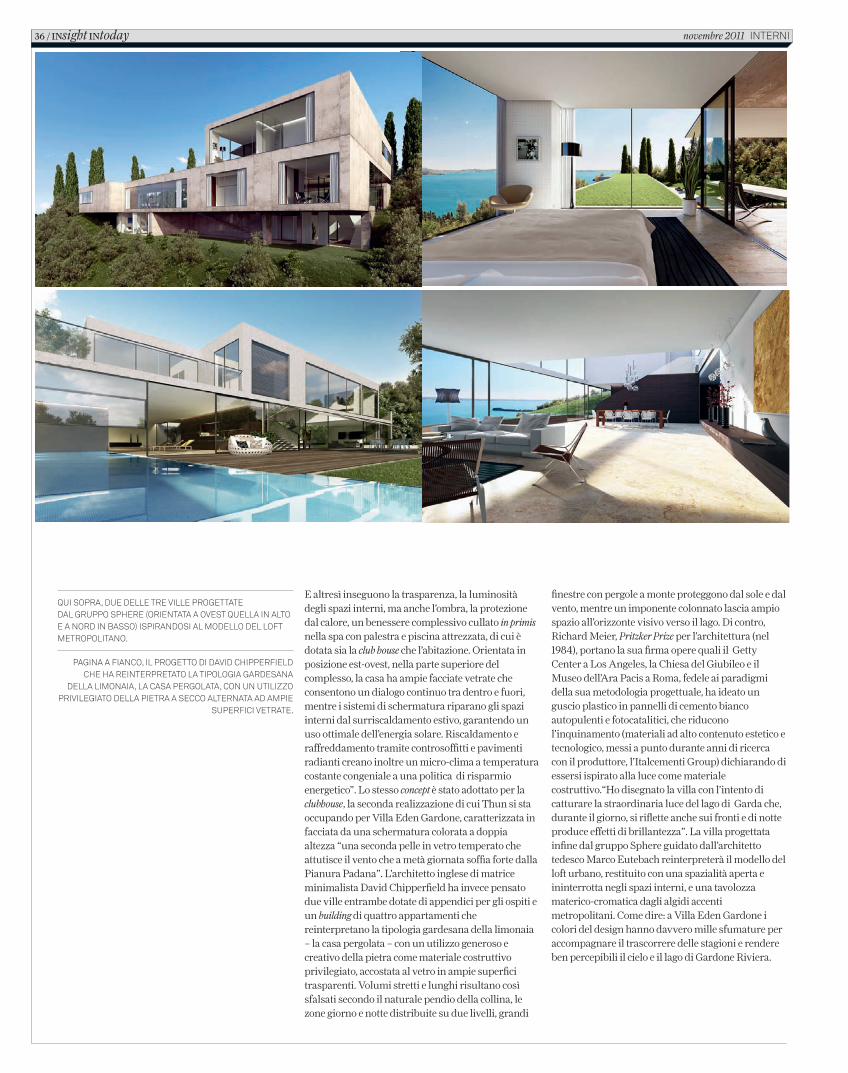
Qui sopra, due delle tre ville progettate dal gruppo sphere (orientata a ovest Quella in alto e a nord in basso) ispirandosi al modello del loft metropolitano.
pagina a fianco, il progetto di david chipperfield che ha reinterpretato la tipologia gardesana
della limonaia, la casa pergolata, con un utilizzo privilegiato della pietra a secco alternata ad ampie
superfici vetrate.
36 / INsight INtoday novembre 2011 interni
C_In616_R_32_37_villa_eden_gardone.indd 36 12/10/11 15.44
villa eden gardone/italia / 37InternI novembre 2011
C_In616_R_32_37_villa_eden_gardone.indd 37 12/10/11 15.44
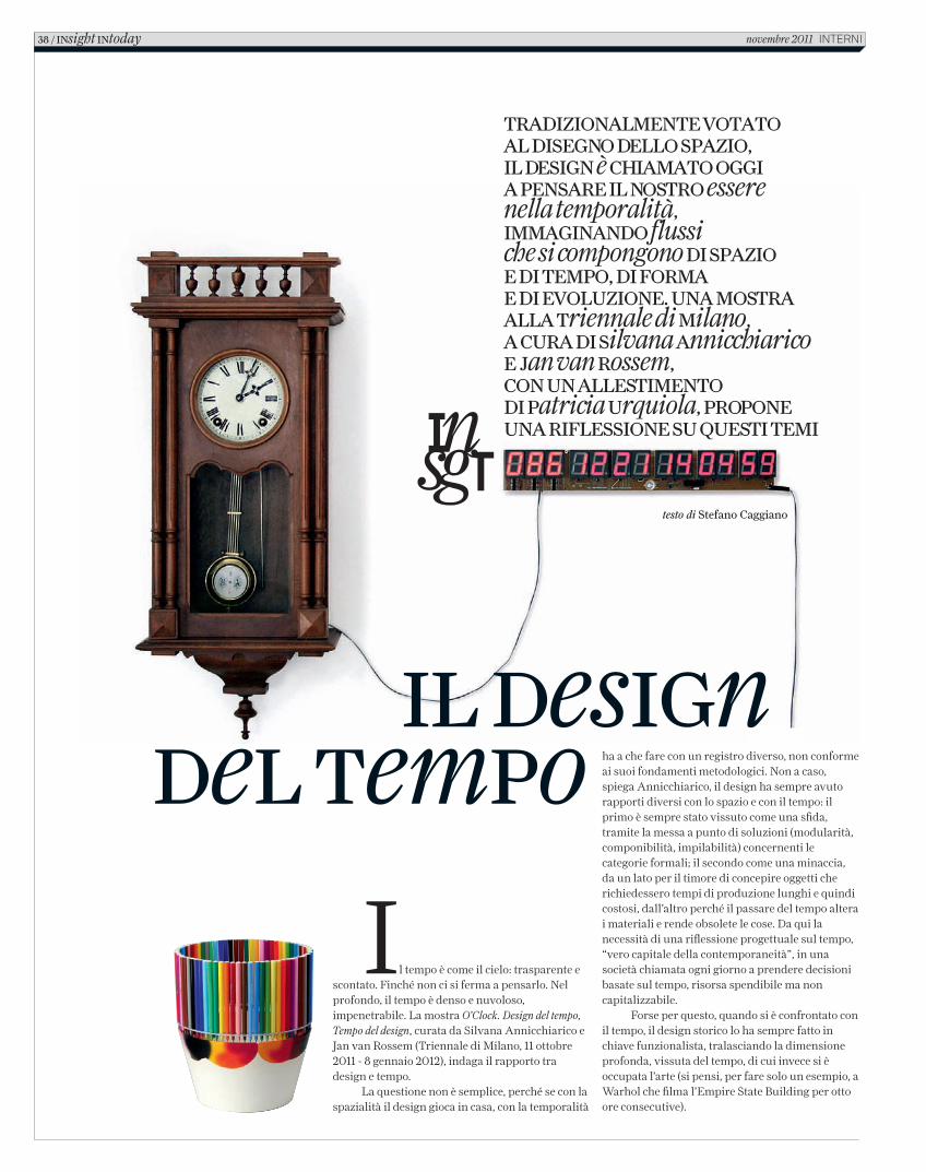
Il tempo è come il cielo: trasparente e scontato. Finché non ci si ferma a pensarlo. Nel profondo, il tempo è denso e nuvoloso, impenetrabile. La mostra O’Clock. Design del tempo, Tempo del design, curata da Silvana Annicchiarico e Jan van Rossem (Triennale di Milano, 11 ottobre 2011 - 8 gennaio 2012), indaga il rapporto tra design e tempo.
La questione non è semplice, perché se con la spazialità il design gioca in casa, con la temporalità
TradizionalmenTe voTaTo al disegno dello spazio, il design è chiamaTo oggi a pensare il nosTro essere nella temporalità, immaginando flussi che si compongono di spazio e di Tempo, di forma e di evoluzione. una mosTra alla Triennale di milano, a cura di silvana annicchiarico e Jan van rossem, con un allesTimenTo di patricia urquiola, propone una riflessione su quesTi Temi
testo di Stefano Caggiano
il designdel Tempo ha a che fare con un registro diverso, non conforme
ai suoi fondamenti metodologici. Non a caso, spiega Annicchiarico, il design ha sempre avuto rapporti diversi con lo spazio e con il tempo: il primo è sempre stato vissuto come una sfida, tramite la messa a punto di soluzioni (modularità, componibilità, impilabilità) concernenti le categorie formali; il secondo come una minaccia, da un lato per il timore di concepire oggetti che richiedessero tempi di produzione lunghi e quindi costosi, dall’altro perché il passare del tempo altera i materiali e rende obsolete le cose. Da qui la necessità di una riflessione progettuale sul tempo, “vero capitale della contemporaneità”, in una società chiamata ogni giorno a prendere decisioni basate sul tempo, risorsa spendibile ma non capitalizzabile.
Forse per questo, quando si è confrontato con il tempo, il design storico lo ha sempre fatto in chiave funzionalista, tralasciando la dimensione profonda, vissuta del tempo, di cui invece si è occupata l’arte (si pensi, per fare solo un esempio, a Warhol che filma l’Empire State Building per otto ore consecutive).
38 / insight intoday novembre 2011 InternI
In616_R_38_41_designdeltempo.indd 38 12/10/11 13.38
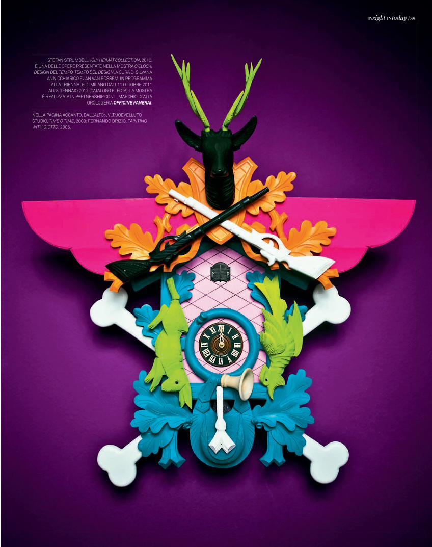
Stefan Strumbel, HOLY HEIMAT COLLECTION, 2010. È una delle opere preSentate nella moStra O’CLOCk. DEsIgN DEL TEMpO, TEMpO DEL DEsIgN, a cura di Silvana
annicchiarico e Jan van roSSem, in programma alla triennale di milano dall’11 ottobre 2011
all’8 gennaio 2012 (catalogo electa). la moStra È realizzata in partnerShip con il marchio di alta
orologeria Officine Panerai.
nella pagina accanto, dall’alto: Jvlt/Joevelluto Studio, TIME O TIME, 2008; fernando brizio, pAINTINg wITH gIOTTO, 2005.
INsight INtoday / 39
In616_R_38_41_designdeltempo.indd 39 12/10/11 13.38
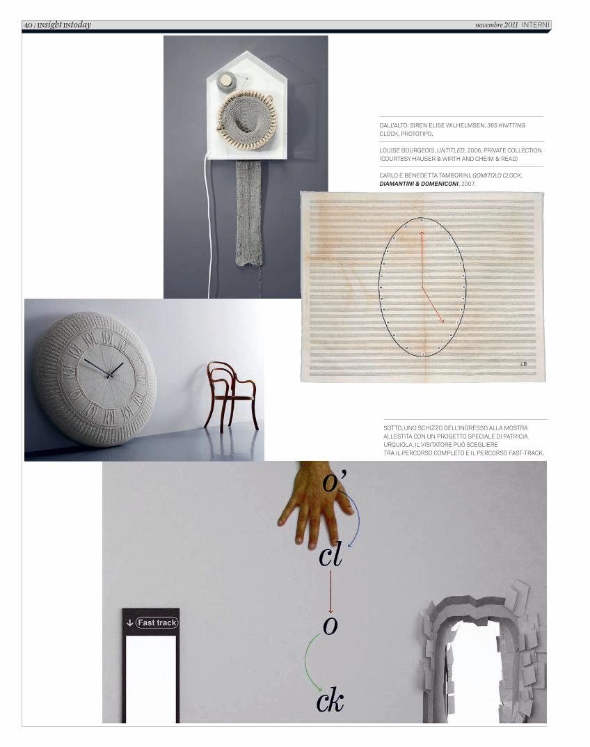
Dall’alto: Siren eliSe WilhelmSen, 365 knitting clock, prototipo.
louiSe BourgeoiS, UntitLED, 2006, private collection (courteSy hauSer & Wirth anD cheim & reaD)
carlo e BeneDetta tamBorini, gomitoLo CLoCk, Diamantini & Domeniconi, 2007.
Sotto, uno Schizzo Dell’ingreSSo alla moStra alleStita con un progetto Speciale Di patricia urquiola. il viSitatore può Scegliere tra il percorSo completo e il percorSo faSt-track.
40 / INsight INtoday novembre 2011 interni
In616_R_38_41_designdeltempo.indd 40 12/10/11 13.38
Ecco perché accanto a oggetti di design la mostra presenta opere d’arte, video e installazioni site-specific (in ordine rigorosamente non cronologico). Lo stesso allestimento di Patricia Urquiola è stato concepito per restituire un tempo a variazione di densità. Al visitatore viene infatti offerta la possibilità di scegliere tra il percorso completo, che attraversa l’intera mostra, e il percorso fast-track, una corsia preferenziale percettivamente accelerata che comporta una riduzione di esperienza. “Perché”, chiede Urquiola, “non misuriamo la densità del tempo, invece di focalizzarci su un valore quantitativo poco significante come l’uniformità delle ore? Un marinaio greco misurava il tempo necessario per navigare da una parte all’altra di un’isola in base alle sigarette che avrebbe fumato nel percorso. Quanto erano dense quelle sigarette?”. Tra percorso pieno e fast-track, dunque, la scelta è fra “un’imprecisione diffusa, scelta, contro una precisione possibile”.
Il fatto è che la dicotomia funzionale tra precisione e densità ne nasconde un’altra sostanziale, tra tempo vissuto e tempo subito. Annicchiarico sottolinea come “nell’antichità la segnatura del tempo avveniva nello spazio pubblico, nella piazza, attraverso la meridiana e la campana. Poi è entrata nella sfera domestica, con il pendolo che ha avuto a lungo un ruolo centrale. In seguito l’orologio si è liberato anche dalla staticità trasferendosi nel taschino e al polso. Oggi assistiamo a una fase ancora successiva, in cui non abbiamo più nemmeno bisogno di indossare il segnatempo, implementato nei dispositivi
elettronici distribuiti ovunque. Si è in qualche modo compiuto un ciclo: dal tempo pubblico della vecchia piazza, al tempo privato della sfera domestica, al tempo indossato, fino al tempo in rete, che è di nuovo pubblico, ma in modo diverso.”
Quello che viviamo oggi è quindi un tempo in frantumi che vengono rimescolati di continuo secondo logiche individuali e divergenti, ma connesse e condivise. Si tratta di un’esperienza molto diversa rispetto a quella di pochi anni fa. “Negli anni Settanta dell’Ottocento”, spiega ancora Annicchiarico, “un viaggiatore che attraversava gli Usa coast to coast doveva regolare l’orologio duecento volte. Poi nel 1883 i sistemi orari furono sincronizzati. Il design storico ha sempre lavorato su questo tempo reso uniforme, convenzionale, oggettivo. Penso ai lavori di Gino Valle, Richard Sapper ed Enzo Mari, con i Calendari perpetui. Sono tutti progetti che restituiscono un’idea lineare, ordinata del tempo. I progetti che abbiamo raccolto segnano invece tempi eterogenei, in cui ognuno individua una propria piega, che può essere personale, collettiva, relazionale, multisensoriale”.
Non si tratta di una semplice predilezione del tempo esperienziale rispetto al tempo funzionalizzato, perché in ogni caso le cronologie che abitiamo restano variegate e contraddittorie, esplorative. Tra i due modi del tempo, quello funzionale e quello esperienziale, il design del nuovo secolo sembra allora prediligere il terzo modo, quello filosofico, che vede il tempo come dispiegamento non lineare delle varianti del possibile e gemmazione di soluzioni nuove accanto a problemi alternativi.
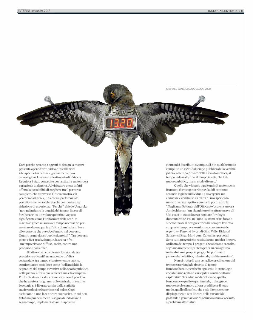
Michael SanS, CuCkoo CloCk, 2008.
il design del tempo / 41interni novembre 2011
In616_R_38_41_designdeltempo.indd 41 12/10/11 13.38
ADDIOTeLeFonI BIancHItesto di Andrea Branzi
Con il termine di cinema “dei telefoni bianchi” si indicava quel tipo di fi lm degli anni ’30, alla vigilia della seconda guerra mondiale, dove gli attori erano sempre in smoking, le signore sempre in lungo, i maggiordomi sono sempre in frac… Un cinema signorile, aristocratico, pieno di orchidee, dove tutto era talmente fi nto che anche i telefoni erano “bianchi”.
Questo genere di evasione in un mondo che non esisteva, né in cielo né in terra, garantiva un “lieto fi ne” che purtroppo non si è mai realizzato, né in cielo né in terra. La borghesia industriale esorcizzava la propria crisi e cercava di confondersi con quella nobiltà già morta; e invece di sostenere il “liberalismo” sosteneva la “dittatura”.
IL design, CHE STA DANDO UNA FORMA EVOLUTA ALLA NOSTRA società,
DEVE INCOMINCIARE A PRENDERE IN gestione LA PROPRIA evoluzione
VERSO valori ANCHE immateriali,
MENO VISIBILI MA PIÙ profondi
design
telefoni bianchi” si indicava quel tipo di fi lm degli anni ’30, alla vigilia della seconda guerra mondiale, dove gli attori erano sempre in smoking, le signore sempre in lungo, i maggiordomi sono sempre in frac… Un cinema signorile, aristocratico, pieno di orchidee, dove tutto era talmente fi nto che anche i telefoni erano “bianchi”.
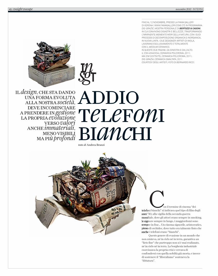
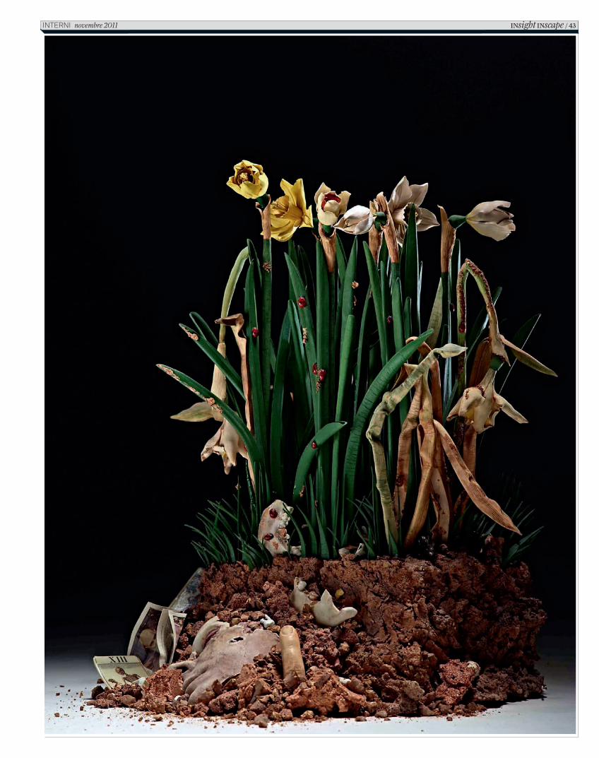
FINO AL 12 NOVEMBRE, PRESSO LA FAMA GALLERY DI VERONA ( WWW.FAMAGALLERY.COM) C’È IN PROGRAMMA DIS-GRAZIE, MOSTRA PERSONALE DI BERTOZZI & CASONI, IN CUI CONVIVONO DISASTRI E BELLEZZE, TRASFORMANDO L’IMMINENTE MEMENTO MORI DELLA NATURA, CON I SUOI PROCESSI DI DECOMPOSIZIONE ORGANICA E INORGANICA, IN NUOVA LINFA. I DUE DESIGNER-ARTISTI DI IMOLA, LAVORANO ESCLUSIVAMENTE E TOTALMENTE CON IL MEDIUM CERAMICO.IN QUESTE DUE PAGINE, DA SINISTRA E DALL’ALTO: IL (CM 43X40X34), CERAMICA POLICROMA, 2011; MA (CM 32X75X75), CERAMICA POLICROMA, 2011;DIS-GRAZIA, CERAMICA SMALTATA, 2011COURTESY DEGLI ARTISTI, FOTO DI BERNARDO RICCI.
42 / INsight INscape novembre 2011 INTERNI
C_In616_R_42_45_OpinioneBranzi.indd 42 13/10/11 11.42
INsight INscape / 43InternI novembre 2011
C_In616_R_42_45_OpinioneBranzi.indd 43 13/10/11 11.42
Quando dunque parlo di un “design dei telefoni bianchi” voglio indicare un mondo, una moda, uno stile di vita ereditato dall’ottimismo del XX secolo e che non ha ancora preso coscienza di come si stanno mettendo le cose nel XXI. È da tempo che su queste colonne cerco di introdurre un certo tipo di argomenti, di riflessioni meno redazionali, perché ritengo che il “design sia una cosa seria” e la nostra società sia diventata parte di una “civiltà merceologica” che si estende dalla Cina al Sud America; una civiltà globalizzata da un mercato di dimensioni mondiali, un mondo oggettuale che oggi produce economia, commerci ma anche nuove etiche e nuovi valori, qualità ambientali e comportamenti privati.
Una epoca però dove i disastri di natura politica, le rivolte popolari, la crisi economica e finanziaria, sembrano stranamente collegati con sommovimenti geologici, marini, criminali, terroristici; come se il crollo del capitalismo seguisse quello del comunismo…
Sembra che una misteriosa energia cosmica abbia fatto irruzione nella nostra vecchia “società razionalista”, secondo la quale i fenomeni di natura diversa si manifestano in forme diverse e in tempi diversi, facendo invece seguire al crollo delle borse americane un tifone e un terremoto a New York!
Dunque problemi nuovi che sembrano prodotti da un unico tipo di energia colpiscono un sistema mondiale molto solido ma anche molto fragile. Purtroppo la storia ci insegna che alle “grandi crisi” si è spesso risposto attraverso nuove guerre, che in questo caso peggiorerebbero definitivamente le nostre possibilità di sopravvivenza.
Queste riflessioni vogliono sottolineare che l’epoca del “design dei telefoni bianchi” sta per finire: un design autoreferenziale, sempre elegante, sempre intelligente, che non corrisponde più a una società che si appresta a
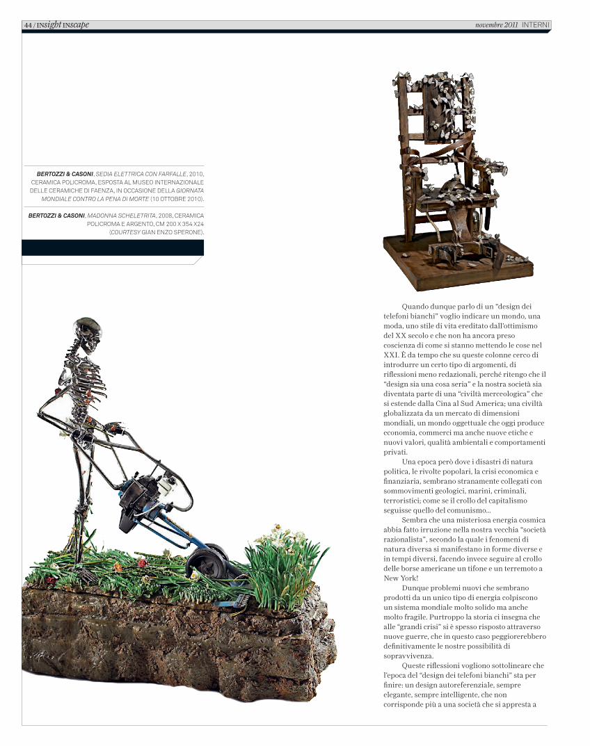
bertozzi & casoni, sedia elettrica con farfalle, 2010, ceramica policroma, esposta al museo internazionale
delle ceramiche di faenza, in occasione della Giornata Mondiale contro la Pena di Morte (10 ottobre 2010).
bertozzi & casoni, Madonna scheletrita, 2008, ceramica
policroma e argento, cm 200 x 354 x24(courtesy gian enzo sperone).
44 / INsight INscape novembre 2011 interni
C_In616_R_42_45_OpinioneBranzi.indd 44 13/10/11 11.42
affrontare diffi coltà il cui sbocco potrebbe presentarci un mondo del tutto diverso. Un mondo dove gli oggetti siano diversi, non soltanto dal punto di vista tecnologico, ma soprattutto antropologico; un mondo dove la qualità dello spazio sia il risultato della qualità delle persone, della loro energia espressiva; una società dove il problema dell’ “apparire” sia meno urgente e dove sia il design che la moda si evolvano per lasciare spazio alla natura degli uomini, alle loro inteligenze, alla bellezza dei loro corpi.
L’Europa dove il design è nato e soprattutto l’Italia ha raggiunto la sua migliore maturità, può essere il territorio ideale per fare crescere un design meno debole, meno fragile, più attento alle dimensioni antropologiche e non soltanto alla crescita dei propri mercati.
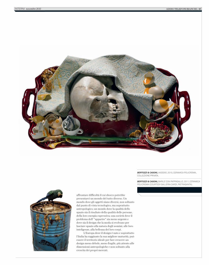
BERTOZZI & CASONI, VASSOIO, 2010, CERAMICA POLICROMA, COLLEZIONE PRIVATA.
BERTOZZI & CASONI, BARILE CON PAPPAGALLO, 2011, CERAMICA POLICROMA (COURTESY GALLERIA CARDI, PIETRASANTA).
ADDIO TELEFONI BIANCHI / 45 INTERNI novembre 2011
C_In616_R_42_45_OpinioneBranzi.indd 45 13/10/11 11.42
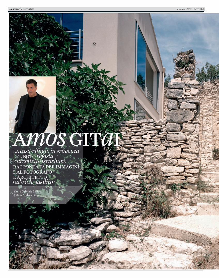
Amos GITaIAmos GITaILA casa-rifugio in Provenza DEL NOTO regista E architetto israeliano RACCONTATA PER IMMAGINI DAL FOTOGRAFO E ARCHITETTO Gabriele Basilico
foto di Gabriele Basilicotesto di Andrea Lissoni
46 /INsight INcontro novembre 2011 INTERNI
C_In616_R_48_53_AmosGitai.indd 46 12/10/11 15.40
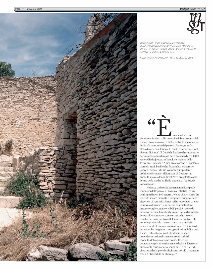
“Èun pensatoio. Un pensatoio fondato sulla necessità del confronto e del dialogo. In questo caso il dialogo è fra le persone, con la piccola comunità del paese di Joucas, ma allo stesso tempo con il luogo. In fondo come sempre nel cinema di Amos”. È Gabriele Basilico che racconta le sue impressioni sulla casa del cineasta (ed architetto) Amos Gitai a Joucas, in Vaucluse, regione della Provenza. Gabriele e Amos si conoscono e rispettano da molti anni. Basilico ha fotografato le opere del padre di Amos - Munio Weinraub, importante architetto formatosi al Bauhaus di Dessau - ma anche la sua residenza di Tel Aviv, progettata, come la casa della madre ad Haifa e quella di Joucas, da Amos stesso.
Nessuna didascalia sarà mai migliore per le immagini delle parole di Basilico. Infatti la lettura degli spazi interni ed esterni diventa chiarissima: “In un certo senso” racconta il fotografo “è una scelta di rispetto e di rinuncia. Amos mi ha raccontato di aver comprato dei ruderi una decina di anni fa. Sono ancora completamente visibili, perché, invece di rimuoverli come farebbe chiunque, Amos ha infilato la casa al loro interno, come un granchio in una conchiglia. Così, quel parallelepipedo, quel piccolo volume protetto da tracce di muri, non turba in nessun modo il paesaggio circostante. È un luogo di cui Amos ha progettato tutto, persino i mobili, e tutto è stato realizzato sul posto. L’edificio in sé è di ascendenza razionalista ma non cita nulla di esplicito, del razionalismo prende la lezione democratica più autentica e meno leziosa. Il terreno circostante è tutto aperto, senza muri o barriere di cinta, e anche la piccola piscina un po’ più a monte in teoria è utilizzabile da chiunque”.
Situata al di fuori di JoucaS, un paeSino della VaucluSe, la caSa di Vacanze di amoS Gitai SorGe tra Vecchi ruderi che il reGiSta iSraelianoha Voluto laSciare inalterati.
nella paGina accanto, un ritratto di amoS Gitai.
INsight INcontro / 47interni novembre 2011
C_In616_R_48_53_AmosGitai.indd 47 12/10/11 15.40
fa sentire molto a casa, dalla luce sino ai muri disfatti”. Impossibile non pensare alla formidabile trilogia House (1980), A House in Jerusalem (1998), News from Home/News from House (2005), tre documentari che lungo 25 anni seguono e aggiornano una piccola diaspora di famiglie e individui attraverso la stratificazione delle vicende ricostruite quasi archeologicamente da Amos Gitai a partire da una casa, metafora impeccabile dell’insensato conflitto (e della sua rappresentazione) fra Israele e Palestina.
“Ho comprato una rovina” prosegue Gitai “e poi poco a poco, in dieci anni, gli ho dato forma, o meglio, gli ho restituito una forma. Ed è stato possibile grazie ad una comunità piccola e splendida di persone, dal carpentiere all’elettricista, tutti in qualche modo imparentati fra loro, come è tipico dei piccoli villaggi. Alla fine tutto ha preso un tempo molto più lungo di quel che credevamo. Ma questo mi ha confermato, ancora una volta, che è necessario capire il senso del tempo. Ed è solo quel senso che ti fa comprendere fino in fondo cosa sia una casa, un luogo, al di là dell’essere un edificio. Costruire chiede un tempo e dà il tempo di vedere crescere e capire la sedimentazione”.
Paradossalmente, Amos Gitai ha preso un phd in architettura presso la University of California di Berkeley, ma non ha mai studiato cinema. Anzi, ha iniziato a fare film come pratica di ricerca e proposta di lavori accademici durante gli anni dell’università.
In linea d’aria Joucas è vicina ad Avignone. È in una valle quasi buia, non è possibile neppure innalzare un pilone dell’elettricità se non è in legno e tutta l’area è tenuta giustamente sotto tiro dagli ecologisti. C’è poco turismo e solo di passaggio. Se fosse più aspro e con una vegetazione meno presente e rigogliosa, il paesaggio potrebbe essere quello della Galilea. Come è finito un pluripremiato cineasta in una terra apparentemente anonima e defilata nel sud della Francia?
“Non avendo la possibilità di cambiare il paesaggio che mi circonda”, spiega Amos Gitai, “è stato interessante cercarne uno non così lontano da quello che conosco e che amo, che è in fondo quello tipico del bacino mediterraneo e che si può trovare in Israele, come in Grecia, in Turchia come nel sud dell’Italia. Certo, poi lì a Joucas c’è qualcosa che mi
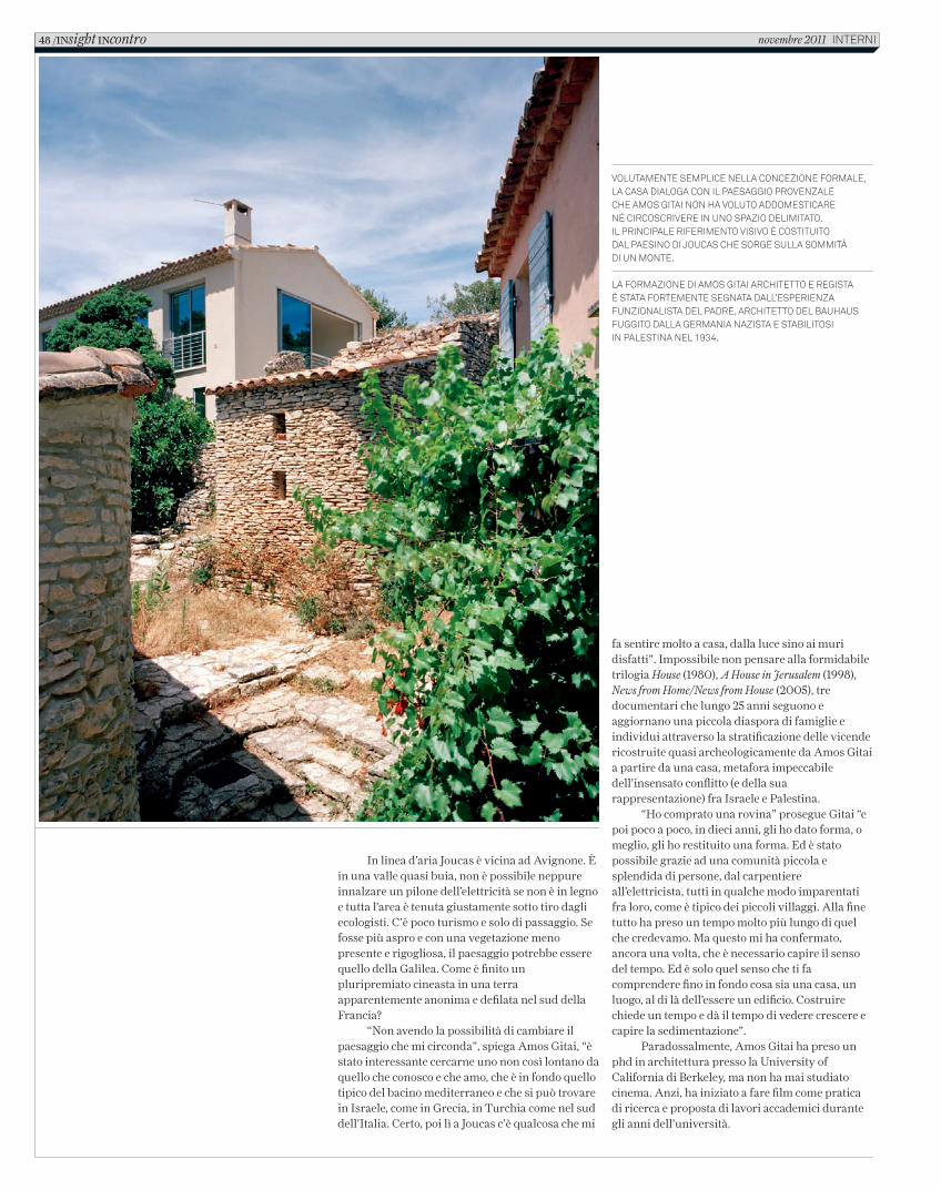
Volutamente semplice nella concezione formale, la casa dialoga con il paesaggio proVenzale che amos gitai non ha Voluto addomesticare né circoscriVere in uno spazio delimitato. il principale riferimento VisiVo è costituito dal paesino di Joucas che sorge sulla sommità di un monte.
la formazione di amos gitai architetto e regista è stata fortemente segnata dall’esperienza funzionalista del padre, architetto del Bauhaus fuggito dalla germania nazista e staBilitosi in palestina nel 1934.
48 /INsight INcontro novembre 2011 interni
C_In616_R_48_53_AmosGitai.indd 48 12/10/11 15.40
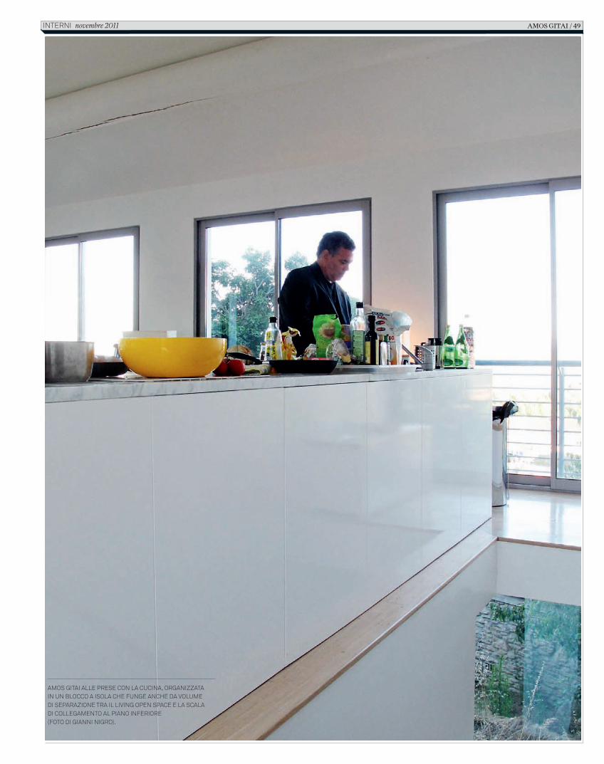
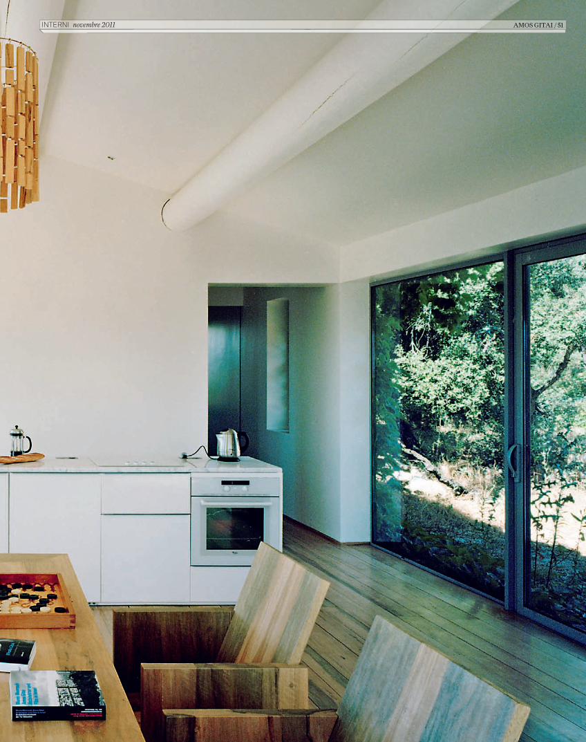
Amos GitAi Alle prese con lA cucinA, orGAnizzAtA in un blocco A isolA che funGe Anche dA volume di sepArAzione trA il livinG open spAce e lA scAlA di colleGAmento Al piAno inferiore(foto di GiAnni niGro).
AMOS GITAI / 49interni novembre 2011
C_In616_R_48_53_AmosGitai.indd 49 12/10/11 15.40
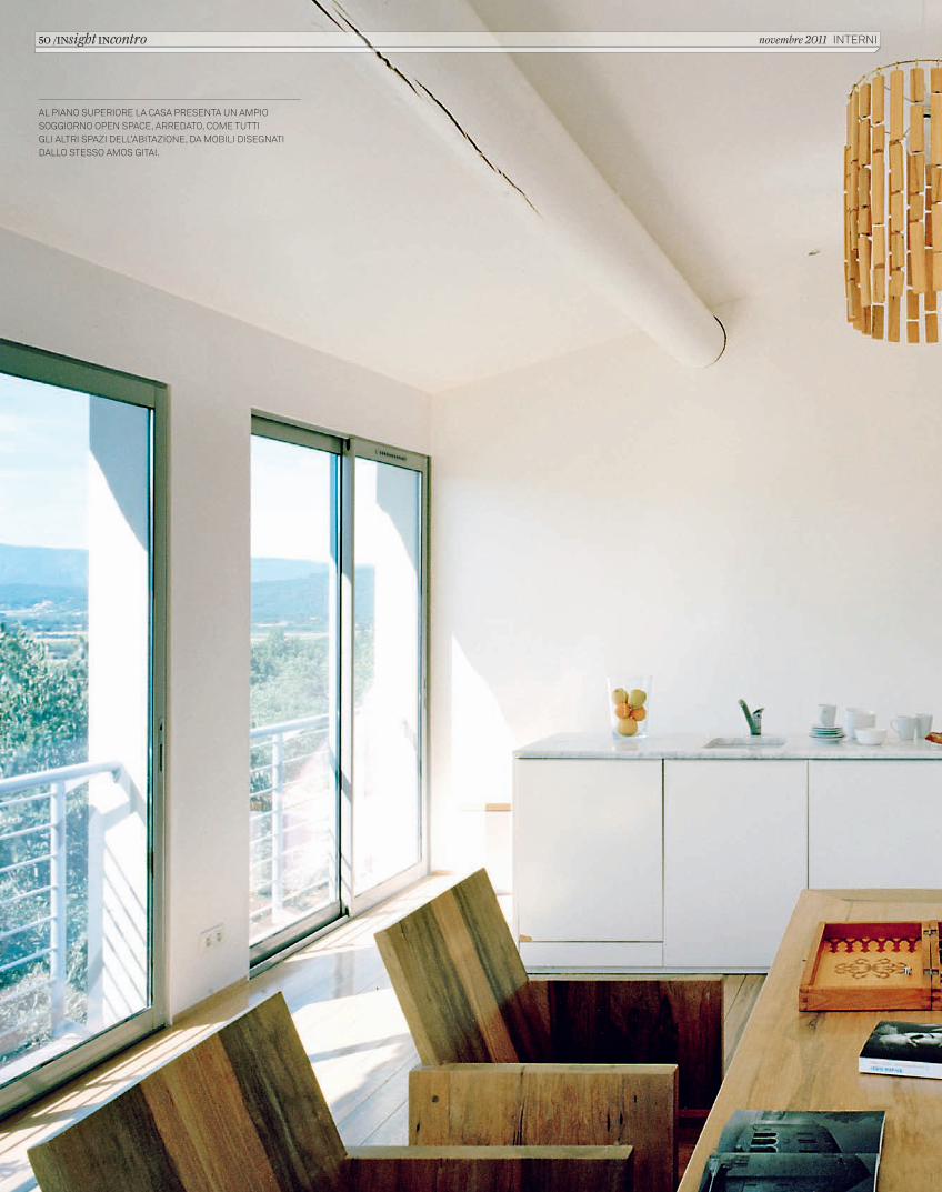
AL PIANO SUPERIORE LA CASA PRESENTA UN AMPIO SOGGIORNO OPEN SPACE, ARREDATO, COME TUTTI GLI ALTRI SPAZI DELL’ABITAZIONE, DA MOBILI DISEGNATI DALLO STESSO AMOS GITAI.
50 /INsight INcontro novembre 2011 INTERNI
C_In616_R_48_53_AmosGitai.indd 50 12/10/11 15.40
INTERNI novembre 2011 AMOS GITAI / 51
C_In616_R_48_53_AmosGitai.indd 51 12/10/11 15.40
Così è inevitabile chiedergli una riflessione sullo stato del cinema e dell’architettura contemporanei: “La crisi che stiamo vivendo è un’occasione formidabile, anche in campo culturale. Se non la dilapidiamo, possiamo davvero preparare un’altra era, anche per l’architettura. Il cinema attuale è così formattato e stereotipato – e lo dico come spettatore – che finisce per ricordarmi l’architettura. Entrambe le discipline hanno perso tanto del loro statuto, e credo sia davvero ora di tornare ad occuparcene pensandole e facendole su un’altra scala. Uso il plurale perché mi considero un architetto, che rimane la mia formazione”.
In effetti negli ultimissimi anni, Amos Gitai ha progressivamente fatto scivolare il suo cinema in una zona molto più personale ed intima. Dopo essersi occupato per trent’anni della grande
storia, quella della sua terra ma anche quella dell’11 settembre (ha realizzato un corto del film collettivo omonimo), nel pieno di un decennio denso di stravolgimenti si è soffermato sulla propria famiglia e sulle proprie origini, dalle lettere della madre che strutturano il film Carmel (2009), fino all’omaggio al padre in Lullaby to My Father (2011). Si avverte un cambio di dimensione e di proporzioni, e la relazione fra l’architettura della sua casa di campagna ed il suo cinema diventa ancora più interessante: “È solo questione di scala. Quello che mio padre Munio mi ha insegnato è che un architetto può disegnare qualsiasi cosa e di qualsiasi scala, da uno stand a una bicicletta, e non per forza un edificio monumentale. Credo che una parte del problema dell’architettura oggi sia che gli architetti
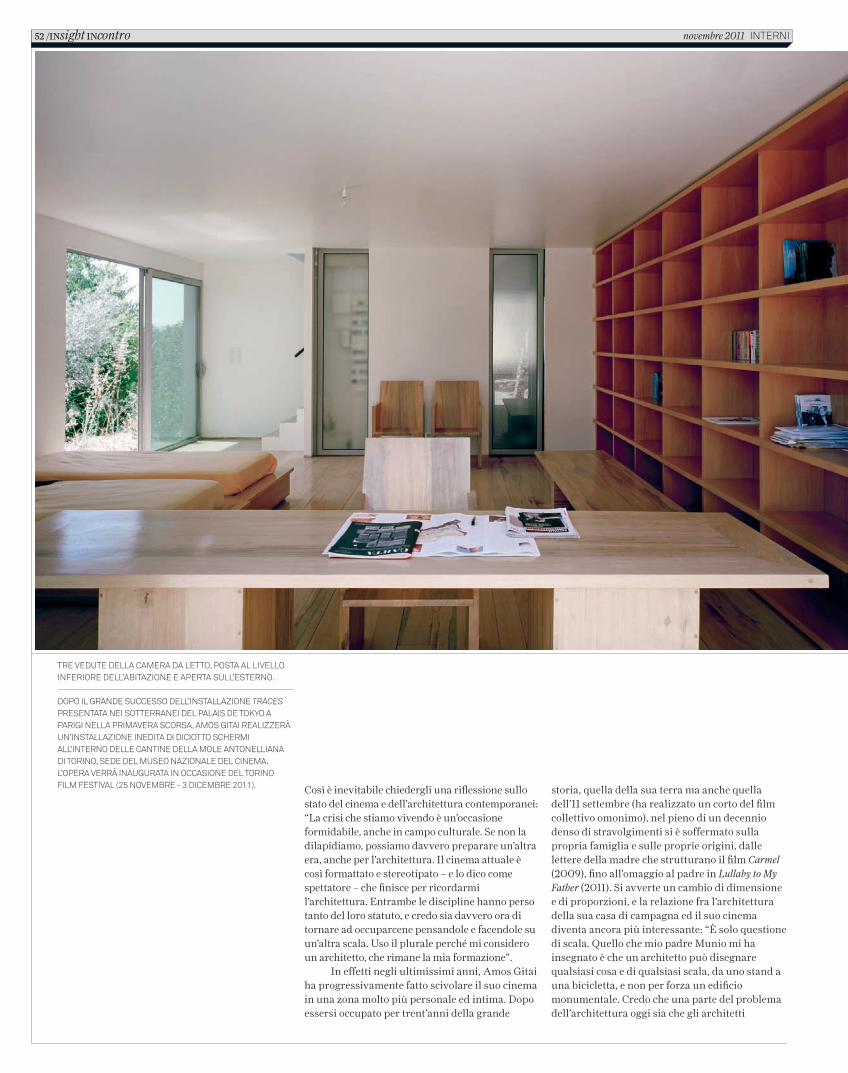
Tre veduTe della camera da leTTo, posTa al livello inferiore dell’abiTazione e aperTa sull’esTerno.
dopo il grande successo dell’insTallazione Traces presenTaTa nei soTTerranei del palais de Tokyo a parigi nella primavera scorsa, amos giTai realizzerà un’insTallazione inediTa di dicioTTo schermi all’inTerno delle canTine della mole anTonelliana di Torino, sede del museo nazionale del cinema. l’opera verrà inauguraTa in occasione del Torino film fesTival (25 novembre - 3 dicembre 2011).
52 /INsight INcontro novembre 2011 inTerni
C_In616_R_48_53_AmosGitai.indd 52 12/10/11 15.40
vogliono misurarsi con grandi scale, mentre penso che sia fondamentale passare dal piccolissimo al grande senza nessuna riserva”.
Ma qual è la specificità della casa di Joucas? Da che desiderio è nata e che strada progettuale ha seguito Amos Gitai nell’immaginarla? “Per me è un luogo di pura riflessione e di meditazione. Certo, in mezzo c’è anche un tempo, che non è solo quello del costruire lungo dieci anni, ma anche quello dell’arrivarci. È distante, ed è una distanza diversa da quella che c’è da Parigi (una delle residenze di Gitai, ndr) a Tel Aviv, o ad Haifa, che si colma in aereo passando attraverso barriere. È un lungo viaggio di avvicinamento. Per quello che riguarda la sua identità credo che la caratteristica principale di questa casa sia la relazione molto sincera con il paesaggio. E se devo indicare una
differenza con l’architettura diffusa e la grande architettura direi che è proprio il suo forte ed autentico dialogo con lo spazio circostante, quindi anche il disinteresse per una forma forzosamente evidente. Quando l’ho progettata quel che mi premeva era che fosse parte del paesaggio. Non credo che oggi si debba per forza addomesticare tutto, penso ci si debba piuttosto inserire nel contesto, cercando una posizione media e personale. Mentre il villaggio sta in cima ad una collina, la casa sta in un non-punto. L’architettura può essere piacevole anche se pensata con semplicità, come è stato per questa casa”.
AMOS GITAI / 53InternI novembre 2011
C_In616_R_48_53_AmosGitai.indd 53 12/10/11 15.40
Arte Povera 2011fino Al Prossimo marzo, in tuttA itAliA (Al mAmbo di bologna, AllA triennAle di milano, Al mAdre di napoli, Al mAXXi di roma, Al CAstello di rivoli A torino) è AllestitA, in ContemPorAneA, Arte povera 2011, A CurA di Germano Celant. interni hA intervistAto il CurAtore, Che hA ConCePito un ProGetto
di mostrA Che, mettendo insieme un Alto numero di opere storiche e recenti, si ProPone Come un viAGGio nel temPo (dAl 1967 A oGGi) e neGli sPAzi, AttrAverso diverse situazioni ArChitettoniCo-AmbientAli, trA Gli Avvenimenti Che hAnno Avuto Come ProtAGonisti Gli Artisti dell’Arte PoverA
54 / insight inarts novembre 2011 InternI
2_C_In616_R_54_61_arte povera_Celant.indd 54 14/10/11 09.54
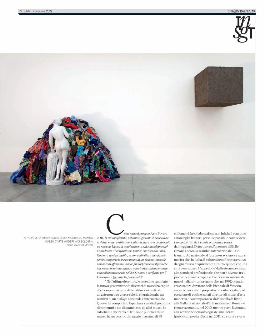
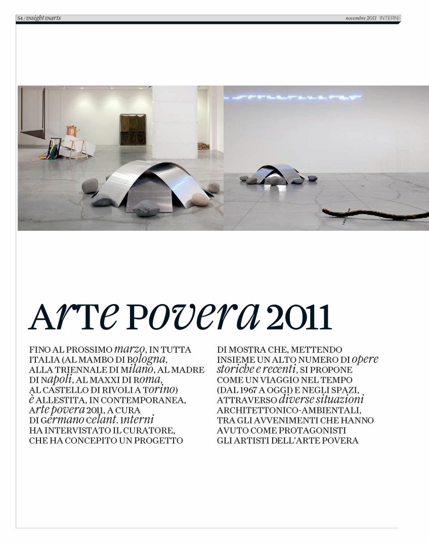
Arte poverA 1968: vedutA dellA mostrA Al mAmbo, museo d’Arte modernA di bolognA.
foto Matteo Monti.
Come nasce il progetto Arte Povera 2011, la cui complessità, nel coinvolgimento di sette città e i relativi musei o istituzioni culturali, deve aver comportato un notevole lavoro di convincimento e di coinvolgimento? Considerato il campanilismo politico che regna in Italia, l’impresa sembra inedita, se non addirittura eccezionale, perché comporta la messa in rete di un ‘sistema’ museale non ancora affermato. Ancor più sorprendente il fatto che tale messa in rete avvenga su una ricerca contemporanea: una collaborazione che nel 2009 non si è verificata per il Futurismo. Oggi cosa ha funzionato?
“Nell’ultimo decennio, le cose sono cambiate: la nuova generazione di direttori di musei ha capito che la sopravvivenza delle istituzioni dedicate all’arte non può vivere solo di energia locale, ma nutrirsi di un dialogo nazionale e internazionale. Questo ha comportato l’apertura a un dialogo prima di contenuti e poi di scambi con gli altri musei. Se calcoliamo che l’area di fruizione pubblica di un museo ha un cerchio dal raggio massimo di 75
chilometri, la collaborazione non inficia il consumo e non toglie fruitori, per cui è possibile condividere i soggetti trattati e i costi economici senza danneggiarsi. Detto questo, l’apertura difficile rimane ancora lo scambio internazionale. Tale transito dal nazionale al fuori non avviene se non si mostra che, in Italia, il valore scientifico e operativo di ogni museo è equivalente all’altro, quindi che una città o un museo è ‘appetibile’ dall’esterno per il suo alto standard professionale, che non è diverso tra il piccolo centro e la capitale. La messa in sistema dei musei italiani – un progetto che, nel 1997, quando ero curatore-direttore della Biennale di Venezia, avevo accarezzato e proposto con esito negativo, ad eccezione di pochi e isolati direttori di musei d’arte moderna e contemporanea, dal Castello di Rivoli alla Galleria nazionale d’arte moderna di Roma – è riemersa quando, nel 2010, mentre stavo lavorando alla redazione dell’antologia dei miei scritti (pubblicati poi da Electa nel 2011) su storia e storie
INsight INarts / 55interni novembre 2011
2_C_In616_R_54_61_arte povera_Celant.indd 55 14/10/11 09.54
56 / INsight INarts novembre 2011 InternI
2_C_In616_R_54_61_arte povera_Celant.indd 56 14/10/11 09.54
Torino, e quindi con il presidente Giovanni Minoli e poi con i direttori Merz e Bellini del museo d’arte contemporanea Castello di Rivoli, che possiede una impressionante collezione del movimento, per utilizzare le polarità in corso con MiTo, la manifestazione che ogni anno connette, con estrema qualità, la città lombarda e quella piemontese sui programmi musicali. Avendo ricevuto una risposta interessata da Rivoli e dagli enti regionali e locali, lombardi e piemontesi, ho iniziato a creare un team di ricerca, da Antonella Soldaini a Chiara Spangaro e Chiara Costa, con cui studiare il progetto e la sua attuazione. Nel corso dei primi mesi, muovendomi per l’Italia, ho avuto modo di incontrare diversi direttori di musei, come Gianfranco Maraniello del Mambo ed Edoardo Cicelyn del Madre, che si sono subito interessati all’idea di partecipare alla manifestazione e di entrare in rete con gli altri enti istituzionali. Sin dal 2010 ho disposto quindi di quattro importanti istituzioni, collocate nelle maggiori città italiane, per cui ho cominciato a progettare un insieme di mostre che tendesse a
dell’Arte Povera, Martin Angioni, all’epoca amministratore delegato della casa editrice, insieme a Davide Rampello, presidente della Triennale di Milano, mi hanno sollecitato un’esposizione a Milano, città dove questa ricerca non era mai stata presentata nella sua complessità. Come al solito, considerato che per anni ho sempre criticato il metodo di mostrare un movimento dal linguaggio macro volumetrico (dalla Minimal Art all’Arte Povera) in un’unica ridotta sede, ho rifiutato, adducendo la ragione – confortata dal fallimento di mostre come Zero to Infinity: Arte Povera 1962-1972 alla Tate Modern di Londra nel 2001 – che se dovevo fare un’esposizione di tale movimento avrei richiesto di utilizzare un insieme di edifici, così da raccogliere almeno una porzione allargata dell’enorme produzione di artisti importanti come Anselmo, Boetti, Calzolari, Fabro, Kounellis, Mario Merz, Marisa Merz, Paolini, Pascali, Penone, Pistoletto, Prini e Zorio. Sia Angioni che Rampello accettarono la mia sfida e da lì è nata tutta l’operazione. Prima si è avviato un contatto con
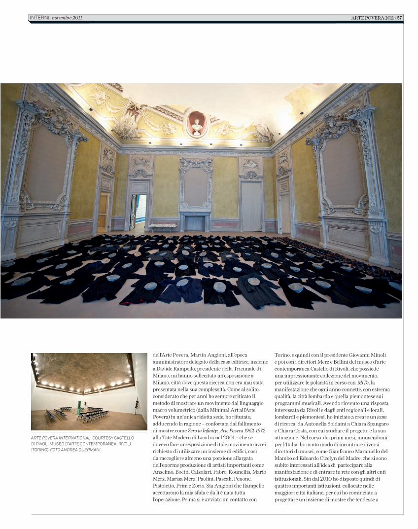
Arte PoverA InternAtIonAl, Courtesy Castello di rivoli Museo d’arte ConteMporanea, rivoli (torino). Foto AndreA GuermAnI.
Arte poverA 2011 / 57interni novembre 2011
2_C_In616_R_54_61_arte povera_Celant.indd 57 14/10/11 09.54
del 2011, quattro città e altrettanti istituzioni, ci siamo posti il problema di verificare le mancanze simboliche e territoriali. Durante un dialogo nello studio di Kounellis è stato sollevato il problema della centralità storica e operativa di Roma, con le sue vicende espositive e museali che hanno fortemente interessato l’Arte Povera. In ragione di questo stimolo ho avvicinato Maria Vittoria Clarelli, direttrice della Galleria nazionale d’arte moderna, che ha collezionato un importante corpus di opere di Pino Pascali, insieme a molti lavori di Kounellis, Pistoletto, Fabro, Boetti e altri, per chiedere una partecipazione che ha fortunatamente coinciso con il riallestimento, co-curato da Massimo Mininni, dell’intera collezione. Parimenti ho fatto con Anna Mattirolo, direttrice del MAXXI museo nazionale delle arti del XXI secolo, che si era appena aperto con enorme successo. Qui l’ipotesi scaturita è stata di interventi in grande scala, di Jannis Kounellis e Gilberto Zorio, relativi all’architettura spettacolare di Zaha Hadid. Nel processo di arricchimento della rete dei possibili musei ho anche avvicinato Massimo Barbero, all’epoca direttore del Macro, che ha dato il suo assenso, seppure le successive vicende del museo non abbiano consentito la messa in cantiere di una mostra anche in questa istituzione.Last but not least a Venezia, in occasione della Biennale d’arte, in seguito ad un incontro con Vito Labarile, consulente culturale del Comune di Bari, scaturisce l’ultima tappa di Arte Povera 2011, importante perché connette definitivamente l’intera
riflettere sia l’ampiezza del movimento dal 1967 che la storia dei singoli musei e delle singole storie culturali in relazioni alle stesse vicende dell’Arte Povera. Ne è scaturito un primo intreccio di possibilità: quella di ‘ricostruire’ gli eventi storici del 1968 dalla mostra di Arte Povera a Bologna alla manifestazione, voluta da Marcello Rumma, Arte povera più azioni povere ad Amalfi, riproposta ora a Napoli, e quella più allargata e internazionale confluita in due grandi mostre: Arte Povera International al Castello di Rivoli dove le opere degli artisti italiani, selezionate insieme a Beatrice Merz, sono messe in relazione a lavori degli artisti, europei ed americani, che dal 1967 al 1972, hanno condiviso la strategia linguistica e le manifestazioni internazionali, Arte Povera 1967-2011 alla Triennale di Milano, che copre l’intero arco del fare di tale ricerca, dall’inizio del suo attuarsi ai suoi risultati recenti. Naturalmente, non mi sono dimenticato che la prima mostra di Arte Povera si era svolta nel 1967 a Genova, ma, come di consueto, nemo propheta in patria, gli enti culturali, quali il Palazzo Ducale, non hanno saputo o voluto trovare il modo di partecipare”.
Tuttavia, il percorso espositivo, che può funzionare da esempio per il procedere di un ministero della Cultura interessato a valorizzare il sistema dei musei, non ruota solo su queste città, ne include altre, insieme ai relativi enti culturali. Com’è successo e quali sono le logiche di distinzione?
“Una volta messe insieme, tra il 2010 e inizi
a sinistra: Jannis Kounellis, Senza titolo, 1988. Collezione dell’artista. Foto CeCilia FiorenzaCourtesy the artist & Fondazione MaXXi.
Giuseppe penone, Sculture di linfa, 2007, al MaXXi - Museo nazionale delle arti del XXi seColo, roMa. Foto FranCesCo Bolis; Courtesy Fondazione MaXXi
58 / INsight INarts novembre 2011 interni
2_C_In616_R_54_61_arte povera_Celant.indd 58 14/10/11 09.54
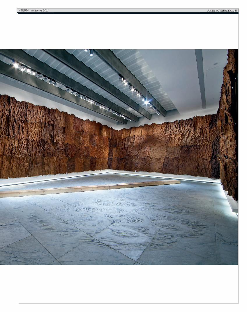
Arte poverA 2011 / 59InternI novembre 2011
2_C_In616_R_54_61_arte povera_Celant.indd 59 14/10/11 09.54
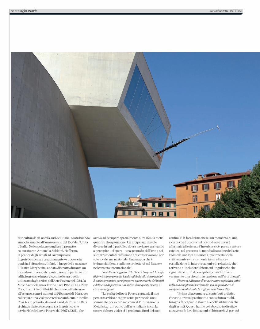
rete culturale da nord a sud dell’Italia, contribuendo simbolicamente all’anniversario del 150° dell’Unità d’Italia. Nel capoluogo pugliese il progetto, co-curato con Antonella Soldaini, riafferma la pratica degli artisti ad ‘arrampicarsi’ linguisticamente e creativamente ovunque e in qualsiasi situazione. Infatti, il luogo della mostra è il Teatro Margherita, andato distrutto durante un incendio e in corso di ricostruzione. È pertanto un edificio grezzo e impervio, come lo era quello utilizzato dagli artisti dell’Arte Povera nel 1984, la Mole Antonelliana a Torino o nel 1985 il PS1 a New York, in cui i lavori fluidificheranno, all’interno e all’esterno, come i numeri di Fibonacci di Merz, per sollecitare una visione estetica e ambientale inedita. Così, tra le polarità, da nord a sud, di Torino e Bari si chiude l’intero percorso sia linguistico che territoriale dell’Arte Povera dal 1967 al 2011, che
arriva ad occupare spazialmente oltre 15mila metri quadrati di esposizione. Un arcipelago di isole diverse in cui il pubblico dovrà navigare, arrivando a percepire – si spera – una geografia dell’arte e dei suoi strumenti di diffusione e di conservazione non solo locale, ma nazionale. Una mappa che è irrinunciabile se vogliamo proiettarci nel futuro e nel contesto internazionale”.
La scelta del soggetto Arte Povera ha quindi lo scopo di fornire un argomento locale e globale allo stesso tempo? È anche strumento per riproporre una memoria dei luoghi e delle città di partenza e di arrivo dove questa ricerca è circumnavigata?
“La scelta dell’Arte Povera riguarda il mio percorso critico e rappresenta per me sia uno strumento per ricordare, come il Futurismo e la Metafisica, un punto dell’arte italiana in cui la nostra cultura visiva si è proiettata fuori dei suoi
confini. È la focalizzazione su un momento di una ricerca che è ubicata nel nostro Paese ma si è affermata all’esterno. S’inserisce cioè, per sua natura estetica, nel processo di mondializzazione dell’arte. Possiede una vita autonoma, ma innestandola criticamente e storicamente in un ulteriore costellazione di interpretazioni e di relazioni, che arrivano a includere ubicazioni linguistiche che riguardano tutto il percepibile, così che diventi veramente una circumnavigazione nell’arte di oggi”.
Finora si è discusso di una struttura espositiva unica nella sua complessità territoriale, ma di quali opere si compone e quale è stata la ragione delle loro scelte?
“Prima di accennare ai contributi artistici, che sono oramai patrimonio conosciuto a molti, bisogna far capire lo sforzo sia delle istituzioni che degli artisti. Questi hanno collaborato in diretta o attraverso le loro fondazioni e i loro archivi per cui
60 / INsight INarts novembre 2011 InternI
2_C_In616_R_54_61_arte povera_Celant.indd 60 14/10/11 09.54
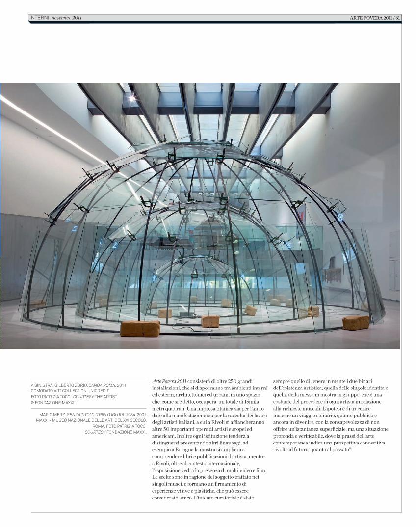
Arte Povera 2011 consisterà di oltre 250 grandi installazioni, che si disporranno tra ambienti interni ed esterni, architettonici ed urbani, in uno spazio che, come si è detto, occuperà un totale di 15mila metri quadrati. Una impresa titanica sia per l’aiuto dato alla manifestazione sia per la raccolta dei lavori degli artisti italiani, a cui a Rivoli si affiancheranno altre 50 importanti opere di artisti europei ed americani. Inoltre ogni istituzione tenderà a distinguersi presentando altri linguaggi, ad esempio a Bologna la mostra si amplierà a comprendere libri e pubblicazioni d’artista, mentre a Rivoli, oltre al contesto internazionale, l’esposizione vedrà la presenza di molti video e film. Le scelte sono in ragione del soggetto trattato nei singoli musei, e formano un firmamento di esperienze visive e plastiche, che può essere considerato unico. L’intento curatoriale è stato
sempre quello di tenere in mente i due binari dell’esistenza artistica, quella delle singole identità e quella della messa in mostra in gruppo, che è una costante del procedere di ogni artista in relazione alla richieste museali. L’ipotesi è di tracciare insieme un viaggio solitario, quanto pubblico e ancora in divenire, con la consapevolezza di non offrire un’istantanea superficiale, ma una situazione profonda e verificabile, dove la prassi dell’arte contemporanea indica una prospettiva conoscitiva rivolta al futuro, quanto al passato”.
A sinistrA: Gilberto Zorio, Canoa Roma, 2011 ComodAto Art ColleCtion UniCredit.Foto PAtriZiA toCCi, CouRtesy the Artist & FondAZione mAXXi.
mArio merZ, senza titolo (tRiplo igloo), 1984-2002mAXXi - mUseo nAZionAle delle Arti del XXi seColo,
romA. Foto PAtriZiA toCCi CouRtesy FondAZione mAXXi.
Arte poverA 2011 / 61interni novembre 2011
2_C_In616_R_54_61_arte povera_Celant.indd 61 14/10/11 09.54
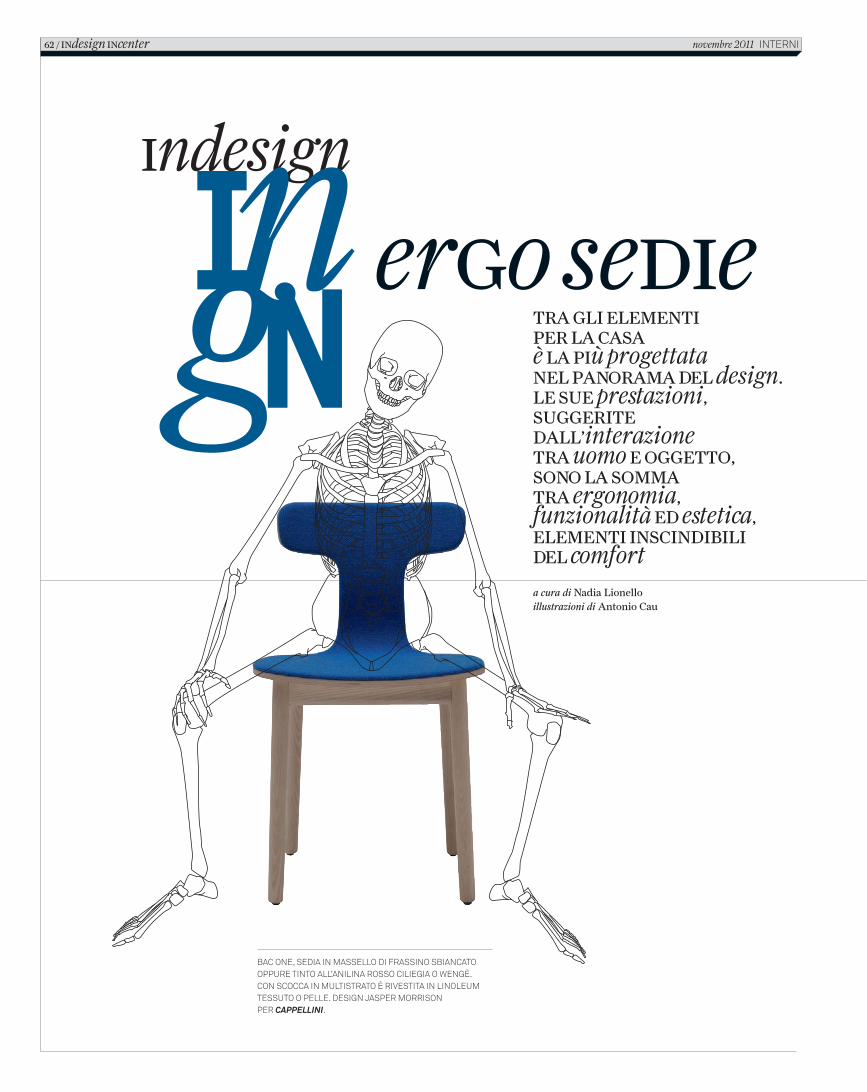
ergo sedietra gli elementi per la casa È la più progettatanel panorama del design.le sue prestazioni, suggerite dall’interazionetra uomo e oggetto, sono la somma tra ergonomia, funzionalità ed estetica, elementi inscindibili del comfort
a cura di Nadia Lionelloillustrazioni di Antonio Cau
Bac one, sedia in massello di frassino sBiancato oppure tinto all’anilina rosso ciliegia o wengè.con scocca in multistrato è rivestita in linoleum tessuto o pelle. design Jasper morrisonper Cappellini.
62 / indesign incenter novembre 2011 interni
3_C_In616_R_62_69_scheletri.indd 62 18/10/11 10.31
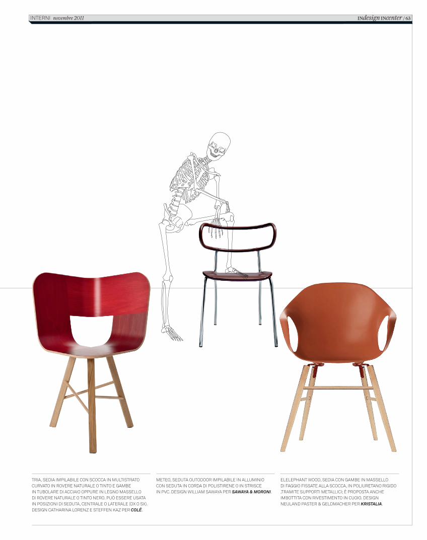
ergo sedie
Tria, sedia impilabile con scocca in mulTisTraTo curvaTo in rovere naTurale o TinTo e gambein Tubolare di acciaio oppure in legno massellodi rovere naTurale o TinTo nero. può essere usaTa in posizioni di seduTa, cenTrale o laTerale (dx o sx). design caTharina lorenz e sTeffen Kaz per Colé.
meTeo, seduTa ouTodoor impilabile in alluminio con seduTa in corda di polisTirene o in sTrisce in pvc. design William saWaya per Sawaya & Moroni.
elelephanT Wood, sedia con gambe in massellodi faggio fissaTe alla scocca, in poliureTano rigido ,TramiTe supporTi meTallici; è proposTa anche imboTTiTa con rivesTimenTo in cuoio. design neuland pasTer & geldmacher per KriStalia.
iNdesign iNcenter / 63inTerni novembre 2011
2_C_In616_R_62_69_scheletri.indd 63 12/10/11 15.27
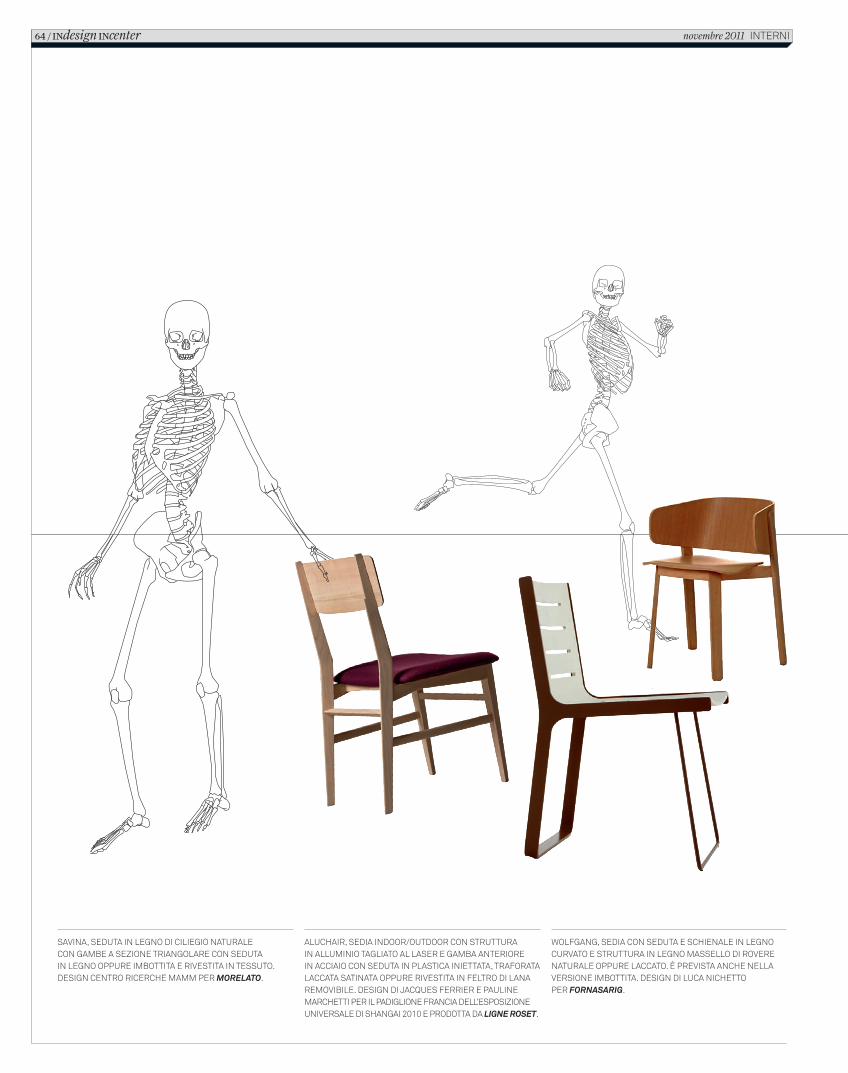
Savina, Seduta in legno di ciliegio naturalecon gambe a Sezione triangolare con Seduta in legno oppure imbottita e riveStita in teSSuto. deSign centro ricerche mamm per Morelato.
aluchair, Sedia indoor/outdoor con Strutturain alluminio tagliato al laSer e gamba anteriorein acciaio con Seduta in plaStica iniettata, traforata laccata Satinata oppure riveStita in feltro di lana removibile. deSign di JacqueS ferrier e pauline marchetti per il padiglione francia dell’eSpoSizione univerSale di Shangai 2010 e prodotta da ligne roset.
Wolfgang, Sedia con Seduta e Schienale in legno curvato e Struttura in legno maSSello di rovere naturale oppure laccato. È previSta anche nella verSione imbottita. deSign di luca nichetto per Fornasarig.
64 / INdesign INcenter novembre 2011 interni
2_C_In616_R_62_69_scheletri.indd 64 12/10/11 15.27
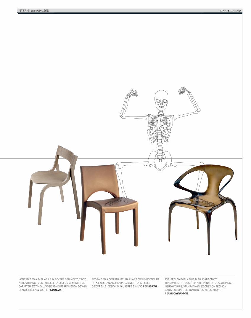
Konrad, sedia impilabile in rovere sbiancato, tinto nero o bianco con possibilità di seduta imbottita, caratterizzata dall’assenza di ferramenta. design di anderssen & vol per LapaLma.
fedra, sedia con struttura in abs con imbottitura in poliuretano schiumato, rivestita in pelle o ecopelle. design di giuseppe bavuso per aLivar.
ava, seduta impilabile in policarbonato trasparente o fumè oppure in nylon opaco bianco, nero o taupe, stampati a iniezione con tecnica gas moulding. design di song Weng zhong per roche BoBois.
ERGO SEDIE / 65interni novembre 2011
2_C_In616_R_62_69_scheletri.indd 65 12/10/11 15.27
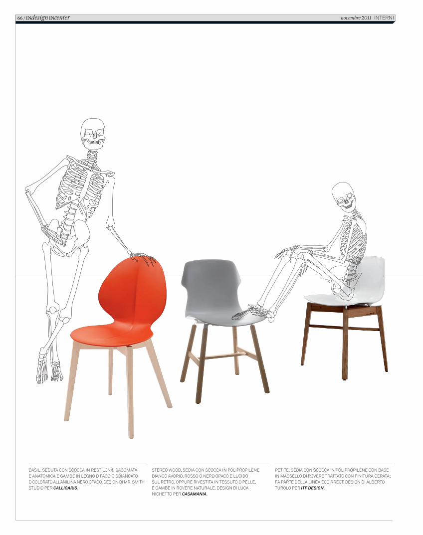
Basil, seduta con scocca in Restilon® sagomatae anatomica e gamBe in legno d faggio sBiancatoo coloRato all’anilina neRo opaco. design di mR. smith studio peR Calligaris.
petite, sedia con scocca in polipRopilene con Base in massello di RoveRe tRattato con finituRa ceRata; fa paRte della linea eco.RRect. design di alBeRto tuRolo peR iTF Design.
steReo Wood, sedia con scocca in polipRopilene Bianco avoRio, Rosso o neRo opaco e lucido sul RetRo, oppuRe Rivestita in tessuto o pelle, e gamBe in RoveRe natuRale. design di luca nichetto peR Casamania.
66 / INdesign INcenter novembre 2011 inteRni
2_C_In616_R_62_69_scheletri.indd 66 12/10/11 15.27
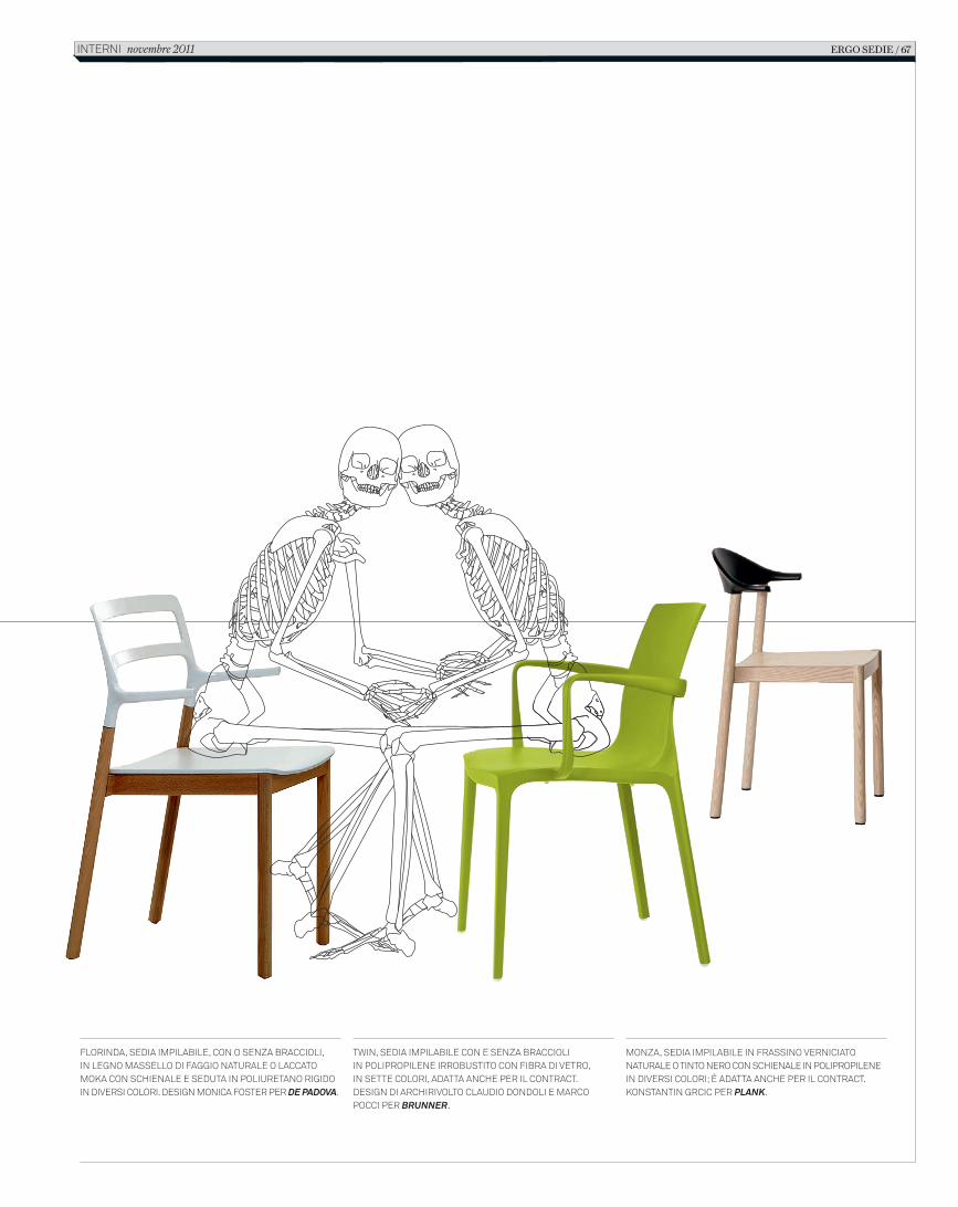
Florinda, sedia impilabile, con o senza braccioli,in legno massello di Faggio naturale o laccato moka con schienale e seduta in poliuretano rigido in diversi colori. design monica Foster per De PaDova.
twin, sedia impilabile con e senza braccioliin polipropilene irrobustito con Fibra di vetro,in sette colori, adatta anche per il contract. design di archirivolto claudio dondoli e marco pocci per Brunner.
monza, sedia impilabile in Frassino verniciato naturale o tinto nero con schienale in polipropilene in diversi colori; è adatta anche per il contract. konstantin grcic per Plank.
ERGO SEDIE / 67interni novembre 2011
4_C_In616_R_62_69_scheletri.indd 67 18/10/11 10.51
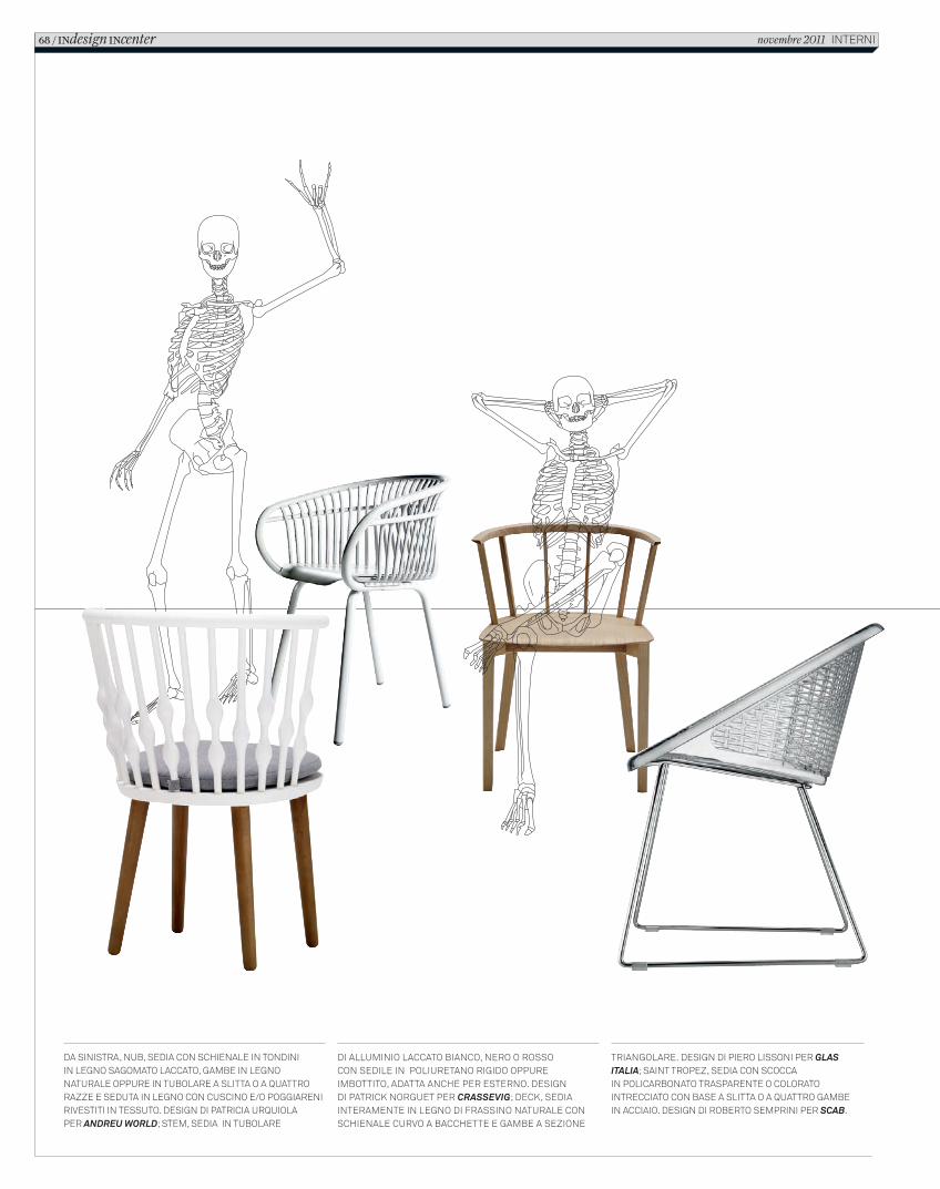
Da sinistra, nub, seDia con schienale in tonDiniin legno sagomato laccato, gambe in legno naturale oppure in tubolare a slitta o a quattro razze e seDuta in legno con cuscino e/o poggiareni rivestiti in tessuto. Design Di patricia urquiolaper Andreu World; stem, seDia in tubolare
Di alluminio laccato bianco, nero o rossocon seDile in poliuretano rigiDo oppure imbottito, aDatta anche per esterno. DesignDi patrick norguet per CrAssevig; Deck, seDia interamente in legno Di frassino naturale con schienale curvo a bacchette e gambe a sezione
triangolare. Design Di piero lissoni per glAs itAliA; saint tropez, seDia con scoccain policarbonato trasparente o colorato intrecciato con base a slitta o a quattro gambein acciaio. Design Di roberto semprini per sCAb.
68 / INdesign INcenter novembre 2011 interni
2_C_In616_R_62_69_scheletri.indd 68 12/10/11 15.27
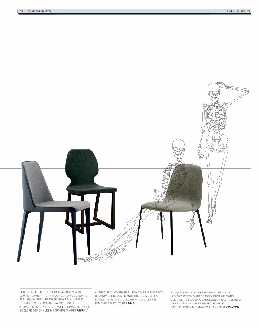
Laja, seduta con struttura in acciaio, cinghie eLastiche, imbottitura in schiuma di poLiuretano espanso, gambe in pressofusione di aLLuminio Lucidato o con verniciatura coordinataaL rivestimento in tessuto monocromatico oppure bicoLore. design aLessandro busana per PedRali.
eLLa, seduta con gambe in Lega di aLLuminio Lucidato o verniciato e scocca in poLiuretanocon inserto in acciaio e moLLeggio a nastri eLastici; viene rivestita in tessuto sfoderabiLeo peLLe. design di damian WiLLiamson per Zanotta.
anthea, sedia con base in Legno di frassino tintoo naturaLe e seduta in muLtistrato, imbottitae rivestita in tessuto di Lana o peLLe. designdi micheLe di fonzo per FRag.
ERGO SEDIE / 69interni novembre 2011
2_C_In616_R_62_69_scheletri.indd 69 12/10/11 15.27
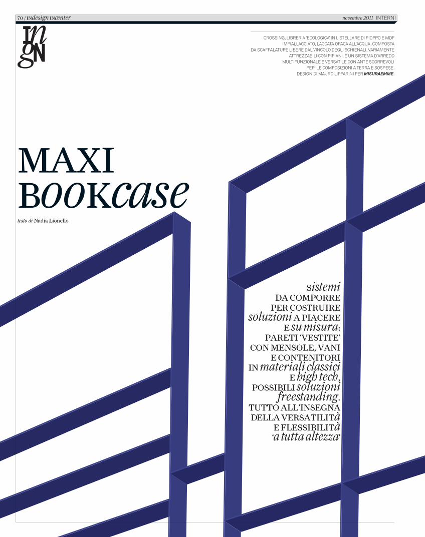
MAXI bookcasetesto di Nadia Lionello
crossing, libreria ‘ecologica’ in listellare di pioppo e MdF iMpiallacciato, laccata opaca all’acqua, coMposta
da scaFFalature libere dal vincolo degli schienali, variaMente attrezzabili con ripiani. È un sisteMa d’arredo
MultiFunzionale e versatile con ante scorrevoli per le coMposizioni a terra e sospese.
design di Mauro lipparini per misuraemme.
Sistemi dA coMporre
per coStruIre soluzioni A pIAcere
e su misura: pAretI ‘veStIte’
con MenSole, vAnI e contenItorI
In materiali classici e high tech,
poSSIbIlI soluzioni freestanding.
tutto All’InSegnA dellA verSAtIlItà
e fleSSIbIlItà ‘a tutta altezza’
70 / Indesign Incenter novembre 2011 interni
C_In616_R_70_77_center_librerie.indd 70 12/10/11 14.49
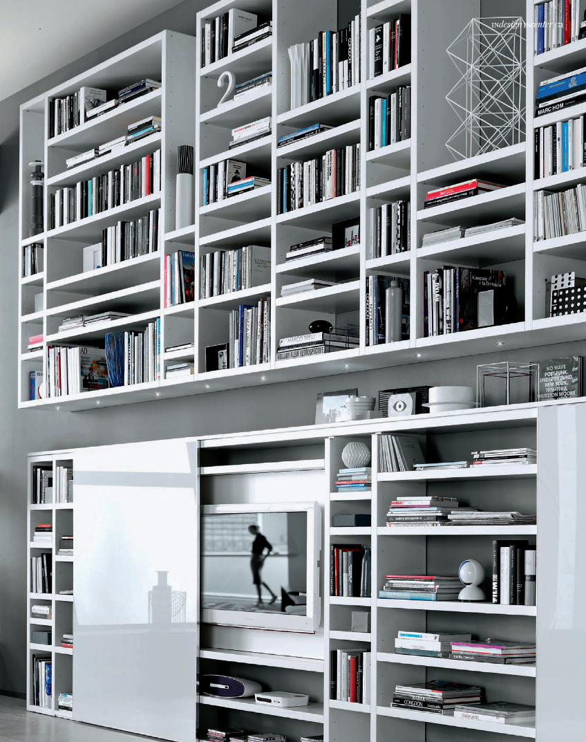
INdesign INcenter / 71
C_In616_R_70_77_center_librerie.indd 71 12/10/11 14.49
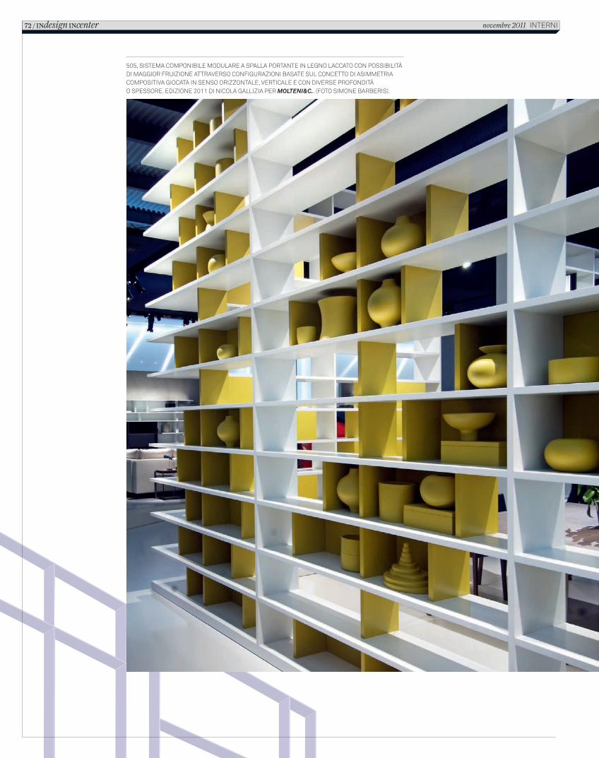
505, SISTEMA COMPONIBILE MODULARE A SPALLA PORTANTE IN LEGNO LACCATO CON POSSIBILITÀ DI MAGGIOR FRUIZIONE ATTRAVERSO CONFIGURAZIONI BASATE SUL CONCETTO DI ASIMMETRIA COMPOSITIVA GIOCATA IN SENSO ORIZZONTALE, VERTICALE E CON DIVERSE PROFONDITÀ O SPESSORE. EDIZIONE 2011 DI NICOLA GALLIZIA PER MOLTENI&C.. (FOTO SIMONE BARBERIS).
72 / INdesign INcenter novembre 2011 INTERNI
C_In616_R_70_77_center_librerie.indd 72 12/10/11 14.49
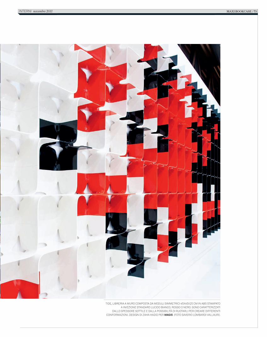
Tide, libreria a muro composTa da moduli simmeTrici 45x45x25 cm in abs sTampaTo a iniezione sTandard lucido bianco, rosso o nero. sono caraTTerizzaTi
dallo spessore soTTile e dalla possibiliTà di ruoTarli per creare differenTi conformazioni. design di zaha hadid per Magis. (foTo saverio lombardi vallauri).
maxi bookcase / 73inTerni novembre 2011
C_In616_R_70_77_center_librerie.indd 73 12/10/11 14.49
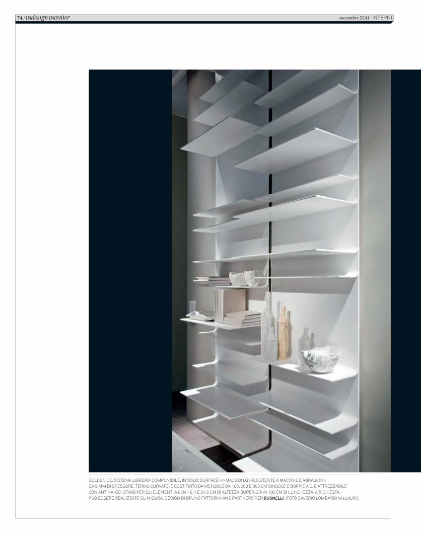
Goldenice, sistema libreria componibile, in solid surface Hi-macs di lG (resistente a maccHie e abrasioni) da 9 mm di spessore, termo curvato; è costituito da mensole da 100, 200 e 300 cm sinGole e doppie a c. è attrezzabile con antina-scHermo per Gli elementi a l da 16,4 e 24,6 cm di altezza superiori ai 100 cm di lunGHezza. a ricHiesta, può essere realizzato su misura. desiGn di bruno fattorini and partners per Busnelli. (foto saverio lombardi vallauri).
74 / INdesign INcenter novembre 2011 interni
C_In616_R_70_77_center_librerie.indd 74 12/10/11 14.49
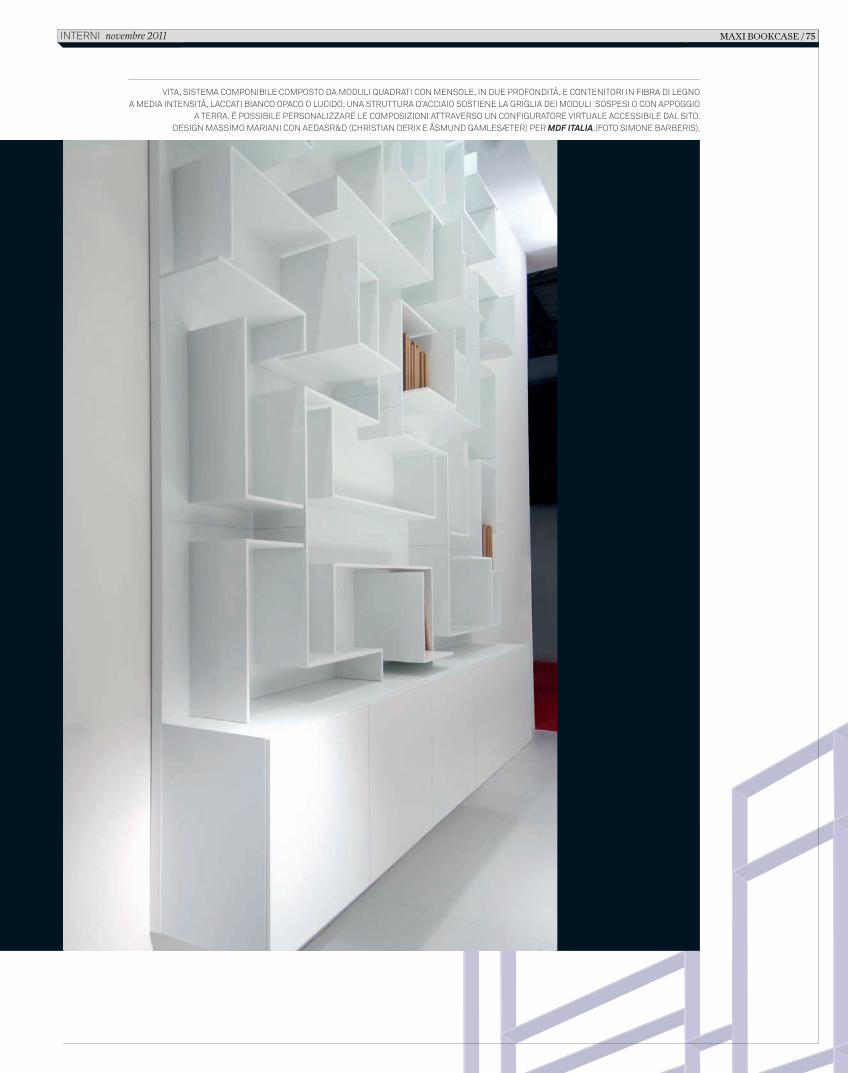
VITA, SISTEMA COMPONIBILE COMPOSTO DA MODULI QUADRATI CON MENSOLE, IN DUE PROFONDITÀ, E CONTENITORI IN FIBRA DI LEGNO A MEDIA INTENSITÀ, LACCATI BIANCO OPACO O LUCIDO; UNA STRUTTURA D’ACCIAIO SOSTIENE LA GRIGLIA DEI MODULI SOSPESI O CON APPOGGIO
A TERRA. È POSSIBILE PERSONALIZZARE LE COMPOSIZIONI ATTRAVERSO UN CONFIGURATORE VIRTUALE ACCESSIBILE DAL SITO. DESIGN MASSIMO MARIANI CON AEDASR&D (CHRISTIAN DERIX E ÅSMUND GAMLESÆTER) PER MDF ITALIA.(FOTO SIMONE BARBERIS).
MAXI BOOKCASE / 75 INTERNI novembre 2011
C_In616_R_70_77_center_librerie.indd 75 12/10/11 14.49
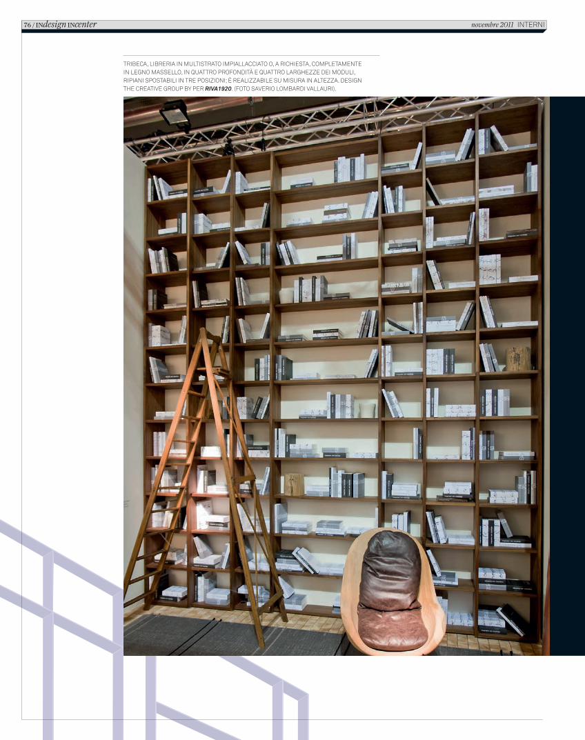
TRIBECA, LIBRERIA IN MULTISTRATO IMPIALLACCIATO O, A RICHIESTA, COMPLETAMENTE IN LEGNO MASSELLO, IN QUATTRO PROFONDITÀ E QUATTRO LARGHEZZE DEI MODULI, RIPIANI SPOSTABILI IN TRE POSIZIONI; È REALIZZABILE SU MISURA IN ALTEZZA. DESIGN THE CREATIVE GROUP BY PER RIVA1920. (FOTO SAVERIO LOMBARDI VALLAURI).
76 / INdesign INcenter novembre 2011 INTERNI
C_In616_R_70_77_center_librerie.indd 76 12/10/11 14.49
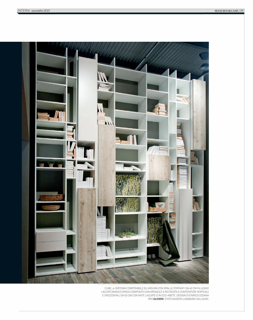
Cube_4, sistema Componibile su misura Con spalle portanti da 40 Cm in legno laCCato bianCo opaCo Composto Con mensole a riChiesta e Contenitori vertiCali
e orizzontali da 50 Cm Con ante laCCate o in eCo-abete. design di enriCo Cesana per olivieri. (foto saverio lombardi vallauri).
maxi bookcase / 77interni novembre 2011
C_In616_R_70_77_center_librerie.indd 77 12/10/11 14.49
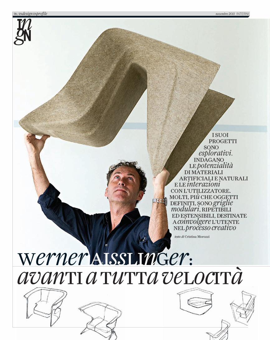
I suoI progettI
sono esplorativi.
Indagano le potenzialità
dI materIalI artIfIcIalI e naturalI
e le interazioni con l’utIlIzzatore. moltI, pIù che oggettI defInItI, sono griglie modulari, rIpetIbIlI ed estensIbIlI, destInate a coinvolgere l’utente nel processo creativotesto di Cristina Morozzi
Werner aIsslInger:avantI a tutta velocItà
78 / Indesign Inprofile novembre 2011 InternI
2_C_In616_R_78_83_Aisslinger.indd 78 18/10/11 10.32
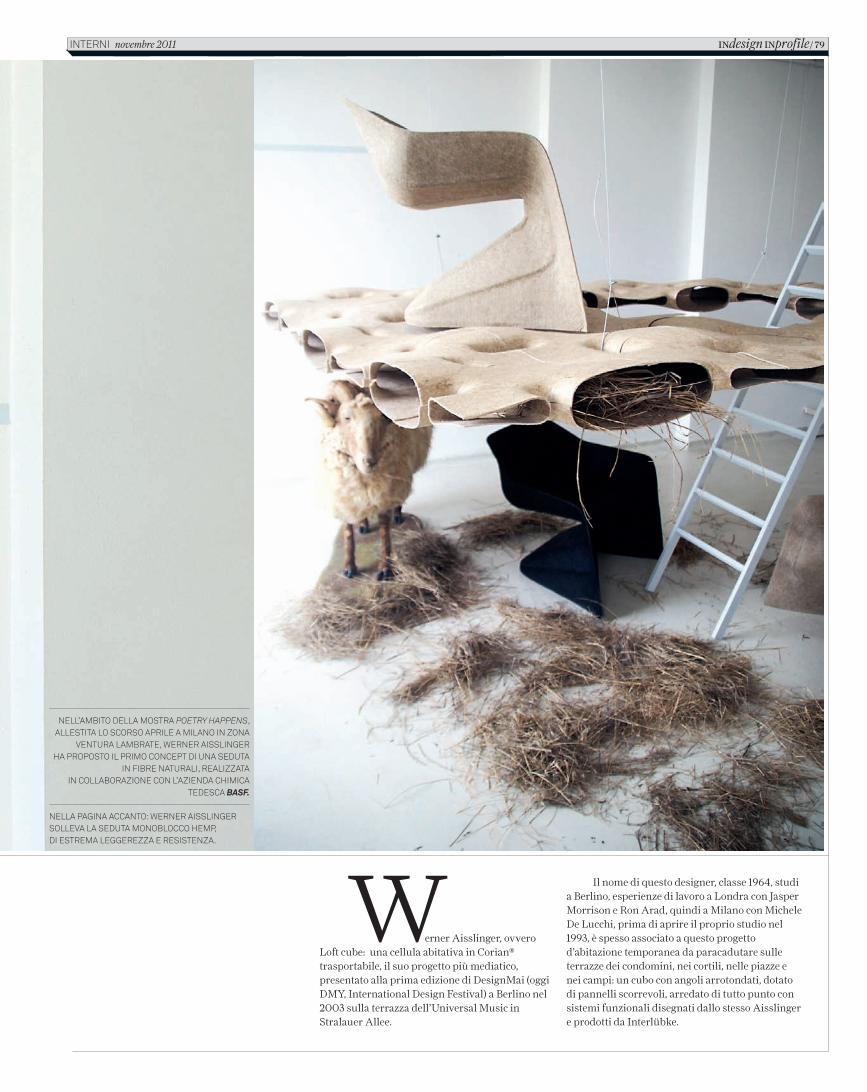
Werner Aisslinger, ovvero Loft cube: una cellula abitativa in Corian® trasportabile, il suo progetto più mediatico, presentato alla prima edizione di DesignMai (oggi DMY, International Design Festival) a Berlino nel 2003 sulla terrazza dell’Universal Music in Stralauer Allee.
Il nome di questo designer, classe 1964, studi a Berlino, esperienze di lavoro a Londra con Jasper Morrison e Ron Arad, quindi a Milano con Michele De Lucchi, prima di aprire il proprio studio nel 1993, è spesso associato a questo progetto d’abitazione temporanea da paracadutare sulle terrazze dei condomini, nei cortili, nelle piazze e nei campi: un cubo con angoli arrotondati, dotato di pannelli scorrevoli, arredato di tutto punto con sistemi funzionali disegnati dallo stesso Aisslinger e prodotti da Interlübke.
Nell’ambito della mostra Poetry HaPPens, allestita lo scorso aprile a milaNo iN zoNa
VeNtura lambrate, WerNer aissliNger ha proposto il primo coNcept di uNa seduta
iN fibre Naturali, realizzata iN collaborazioNe coN l’azieNda chimica
tedesca BASF.
Nella pagiNa accaNto: WerNer aissliNger solleVa la seduta moNoblocco hemp, di estrema leggerezza e resisteNza.
avanti a tutta velocità
iNdesign iNprofile/ 79iNterNi novembre 2011
2_C_In616_R_78_83_Aisslinger.indd 79 18/10/11 10.32
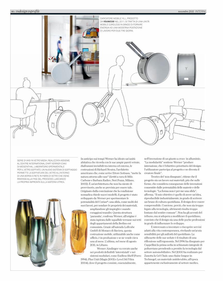
In anticipo sui tempi Werner ha ideato un’unità abitativa che ricorda con le sue ampie pareti vetrate, diaframmi invisibili tra interno ed esterno, le costruzioni di Richard Neutra, l’architetto americano che, come scrive Ettore Sottsass, “mette la natura attorno alle case” (Scritti a cura di Milo Carbone e Barbara Radice, Neri Pozza, Milano, 2002). È un’architettura che non ha niente di provvisorio, anche se prevista per essere tale. Originato dalla convinzione che la condizione nomadica chiede nuovi modelli, il progetto è stato sviluppato da Werner per sperimentare le potenzialità del Corian®: una sfida, come molti dei suoi lavori, per sondare le proprietà dei materiali,
ampliandone gli impieghi e osando coraggiosi transfer. Questa struttura ‘parassita’, confessa Werner, all’origine è stata ispirata dalle squallide terrazze sui tetti degli appartamenti della Berlino est comunista. Grazie all’azienda Loftcube GmbH di Monaco di Baviera, questa costruzione mobile, utilizzabile anche come ufficio, è in produzione e se ne vende circa una al mese. L’ultima, nel mese di agosto 2011, in Libano.
Werner Aisslinger va cercato anche nei prodotti definibili ‘interstiziali’ e nei sistemi modulari, come Endless Shelf (Porro
1994), Plus Unit (Magis 2001) e Level 34 (Vitra 2004), dove il progetto consiste, essenzialmente,
nell’invenzione di un giunto a croce in alluminio. “La modularità” sostiene Werner “produce interazione, che è l’obiettivo prioritario del design: l’utilizzatore partecipa al progetto e ne diventa il creatore finale”.
Teorico del ‘non disegnato’, ritiene che il progetto sia un lavoro sui materiali, più che sulle forme, che considera conseguenze delle invenzioni consentite dalle potenzialità delle materie e delle tecnologie. “La forma non è per me una sfida”, afferma. “Il mio obiettivo è quello di avere un’idea, riproducibile industrialmente, in grado di scrivere un brano di cultura quotidiana. Il design deve essere comprensibile. Conviene, perciò, che non sia troppo legato alla tecnologia, altrimenti risulta troppo lontano dal sentire comune”. Non ha gli accenti del tribuno, ma si adopera a modificare il quotidiano, convinto che il design sia una delle poche professioni in grado di influenzare lo sviluppo.
È interessato a inventare o riscoprire servizi adatti alla vita contemporanea, rivelando un’acuta sensibilità per gli anfratti del quotidiano. La silhouette delle sue sedute è il risultato di una riflessione sull’ergonomia. Nel 1996 ha disegnato per Cappellini la prima sedia in schiumato integrale di poliuretano prendendo a prestito la tecnologia dal settore automobilistico. Nel 2000 ha realizzato per Zanotta la Gel Chair, una chaise longue in Technogel, un materiale antidecubito, all’epoca appartenente esclusivamente al settore medico.
Serie di vaSi in vetro MeSh, realizzata aSSieMeal Centre international d’art verrier (Ciav) di MeiSenthal, laboratorio SperiMentale per il vetro Soffiato. un nuovo SiSteMa di Soffiaggio perMette la Soffiatura del vetro all’interno di una borSa a rete in fibra di vetro Che viene riMoSSa alla fine del proCeSSo, laSCiando la propria iMpronta Sulla Materia vitrea.
CariCatore Mobile Yill, prodottoda Younicos nel 2011. Si tratta di una unità Mobile CordleSS in grado di fornire energia ad una Moderna poStazione di lavoro per due/tre giorni.
80 / INdesign INprofile novembre 2011 interni
2_C_In616_R_78_83_Aisslinger.indd 80 18/10/11 10.32
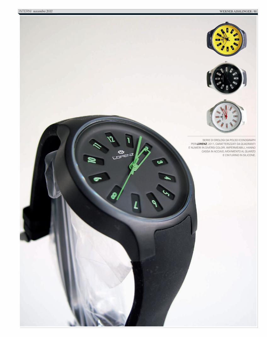
Serie di orologi da polSo iconographper Lorenz, 2011, caratterizzati da quadranti
e numeri in diverSi colori. impermeabili, hanno caSSa in acciaio, movimento al quarzo
e cinturino in Silicone.
Werner Aisslinger / 81interni novembre 2011
In616_R_78_83_Aisslinger.indd 81 12/10/11 12.11
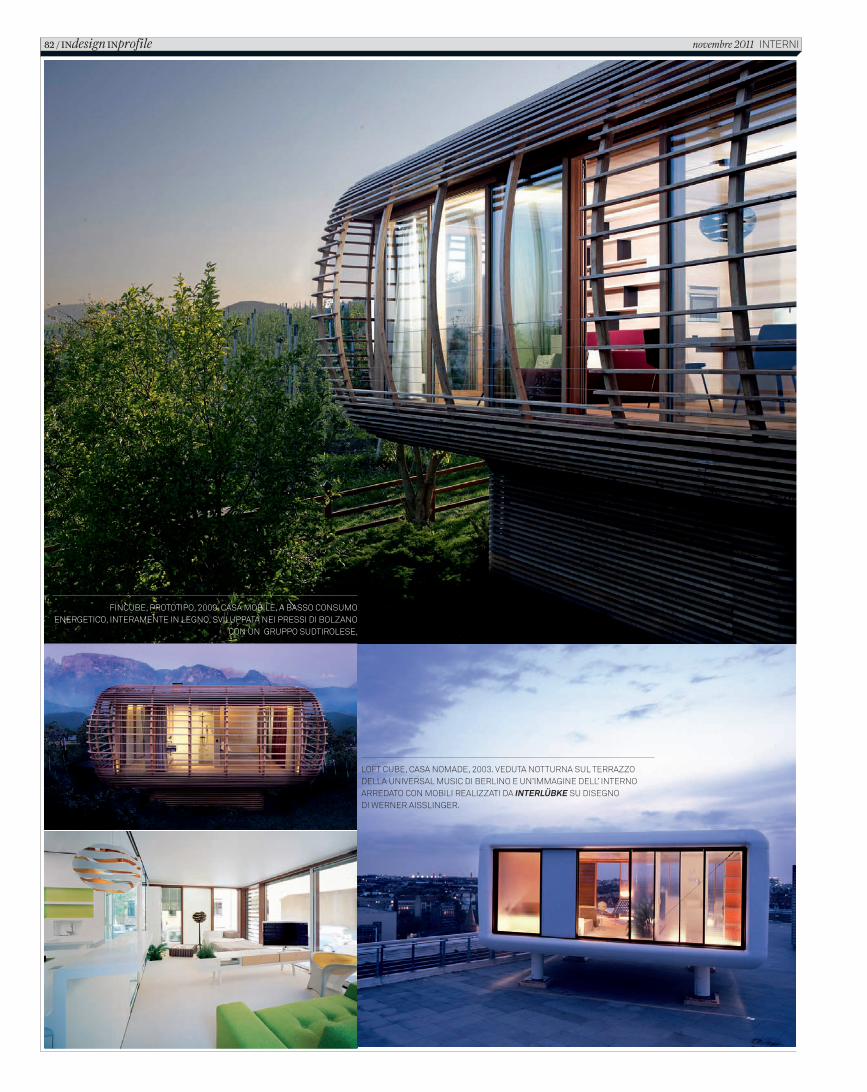
Fincube, prototipo, 2009. casa mobile, a basso consumo energetico, interamente in legno, sviluppata nei pressi di bolzano
con un gruppo sudtirolese,
loFt cube, casa nomade, 2003. veduta notturna sul terrazzodella universal music di berlino e un’immagine dell’ interno arredato con mobili realizzati da InterlÜbke su disegno di Werner aisslinger.
82 / INdesign INprofile novembre 2011 interni
2_C_In616_R_78_83_Aisslinger.indd 82 18/10/11 10.32
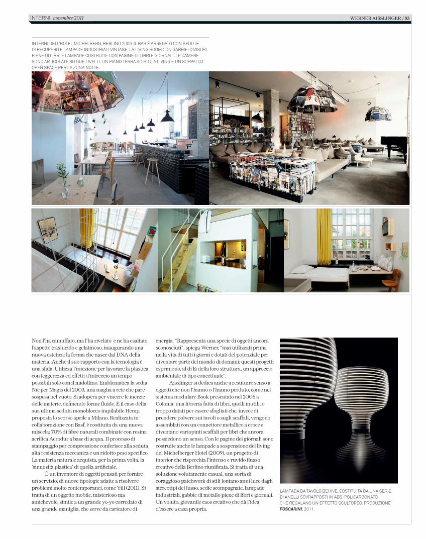
Non l’ha camuffato, ma l’ha rivelato e ne ha esaltato l’aspetto traslucido e gelatinoso, inaugurando una nuova estetica: la forma che nasce dal DNA della materia. Anche il suo rapporto con la tecnologia è una sfida. Utilizza l’iniezione per lavorare la plastica con leggerezza ed effetti d’intreccio un tempo possibili solo con il midollino. Emblematica la sedia Nic per Magis del 2003, una maglia a rete che pare sospesa nel vuoto. Si adopera per vincere le inerzie delle materie, definendo forme fluide. È il caso della sua ultima seduta monoblocco impilabile Hemp, proposta lo scorso aprile a Milano. Realizzata in collaborazione con Basf, è costituita da una nuova miscela: 70% di fibre naturali combinate con resina acrilica Acrodur a base di acqua. Il processo di stampaggio per compressione conferisce alla seduta alta resistenza meccanica e un ridotto peso specifico. La materia naturale acquista, per la prima volta, la ‘sinuosità plastica’ di quella artificiale.
È un inventore di oggetti pensati per fornire un servizio; di nuove tipologie adatte a risolvere problemi molto contemporanei, come Yill (2011). Si tratta di un oggetto mobile, misterioso ma amichevole, simile a un grande yo-yo corredato di una grande maniglia, che serve da caricatore di
energia. “Rappresenta una specie di oggetti ancora sconosciuti”, spiega Werner, “mai utilizzati prima nella vita di tutti i giorni e dotati del potenziale per diventare parte del mondo di domani; questi progetti esprimono, al di là della loro struttura, un approccio ambientale di tipo concettuale”.
Aisslinger si dedica anche a restituire senso a oggetti che non l’hanno o l’hanno perduto, come nel sistema modulare Book presentato nel 2006 a Colonia: una libreria fatta di libri, quelli inutili, o troppo datati per essere sfogliati che, invece di prendere polvere sui tavoli o sugli scaffali, vengono assemblati con un connettore metallico a croce e diventano variopinti scaffali per libri che ancora possiedono un senso. Con le pagine dei giornali sono costruite anche le lampade a sospensione del living del Michelberger Hotel (2009), un progetto di interior che rispecchia l’intenso e ruvido flusso creativo della Berlino riunificata. Si tratta di una soluzione volutamente casual, una sorta di coraggioso patchwork di stili lontano anni luce dagli stereotipi del lusso: sedie scompagnate, lampade industriali, gabbie di metallo piene di libri e giornali. Un voluto, giovanile caos creativo che dà l’idea d’essere a casa propria.
InternI dell’Hotel MIcHelberg, berlIno 2009. Il bar è arredato con sedute dI recupero e laMpade IndustrIalI vIntage; la lIvIng rooM con gabbIe-dIvIsorI pIene dI lIbrI e laMpade costruIte con pagIne dI lIbrI e gIornalI. le caMere sono artIcolate su due lIvellI: un pIano terra adIbIto a lIvIng e un soppalco open space per la zona notte.
laMpada da tavolo beHIve, costItuIta da una serIedI anellI sovrappostI In abs-polIcarbonato cHe regalano un effetto scultoreo. produzIone Foscarini, 2011.
Werner Aisslinger / 83InternI novembre 2011
In616_R_78_83_Aisslinger.indd 83 12/10/11 12.11
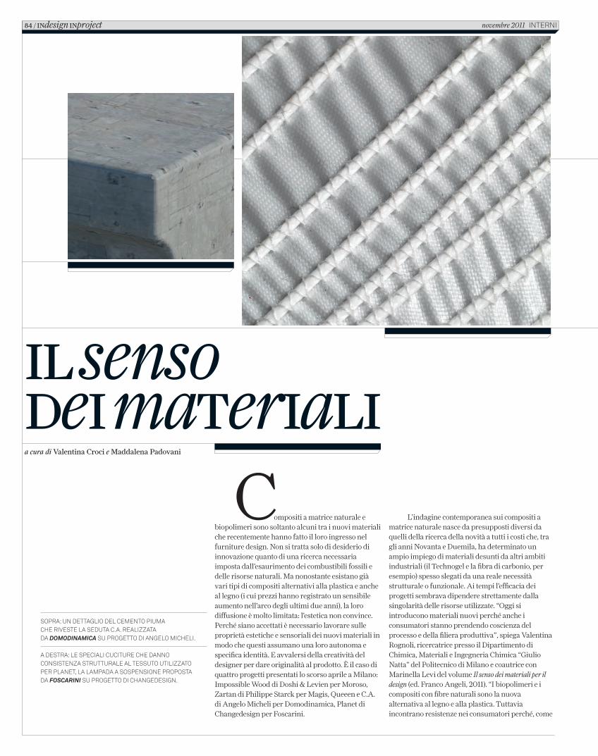
Il senso deI materIalIa cura di Valentina Croci e Maddalena Padovani
Compositi a matrice naturale e biopolimeri sono soltanto alcuni tra i nuovi materiali che recentemente hanno fatto il loro ingresso nel furniture design. Non si tratta solo di desiderio di innovazione quanto di una ricerca necessaria imposta dall’esaurimento dei combustibili fossili e delle risorse naturali. Ma nonostante esistano già vari tipi di compositi alternativi alla plastica e anche al legno (i cui prezzi hanno registrato un sensibile aumento nell’arco degli ultimi due anni), la loro diffusione è molto limitata: l’estetica non convince. Perché siano accettati è necessario lavorare sulle proprietà estetiche e sensoriali dei nuovi materiali in modo che questi assumano una loro autonoma e specifica identità. E avvalersi della creatività del designer per dare originalità al prodotto. È il caso di quattro progetti presentati lo scorso aprile a Milano: Impossible Wood di Doshi & Levien per Moroso, Zartan di Philippe Starck per Magis, Queeen e C.A. di Angelo Micheli per Domodinamica, Planet di Changedesign per Foscarini.
L’indagine contemporanea sui compositi a matrice naturale nasce da presupposti diversi da quelli della ricerca della novità a tutti i costi che, tra gli anni Novanta e Duemila, ha determinato un ampio impiego di materiali desunti da altri ambiti industriali (il Technogel e la fibra di carbonio, per esempio) spesso slegati da una reale necessità strutturale o funzionale. Ai tempi l’efficacia dei progetti sembrava dipendere strettamente dalla singolarità delle risorse utilizzate. “Oggi si introducono materiali nuovi perché anche i consumatori stanno prendendo coscienza del processo e della filiera produttiva”, spiega Valentina Rognoli, ricercatrice presso il Dipartimento di Chimica, Materiali e Ingegneria Chimica “Giulio Natta” del Politecnico di Milano e coautrice con Marinella Levi del volume Il senso dei materiali per il design (ed. Franco Angeli, 2011). “I biopolimeri e i compositi con fibre naturali sono la nuova alternativa al legno e alla plastica. Tuttavia incontrano resistenze nei consumatori perché, come
Sopra: un dettaglio del cemento piuma che riveSte la Seduta c.a. realizzata da DomoDinamica Su progetto di angelo micheli.
a deStra: le Speciali cuciture che danno conSiStenza Strutturale al teSSuto utilizzato per planet, la lampada a SoSpenSione propoSta da Foscarini Su progetto di changedeSign.
84 / INdesign INproject novembre 2011 interni
C_In616_R_84_89_nuovi_materiali.indd 84 12/10/11 14.29
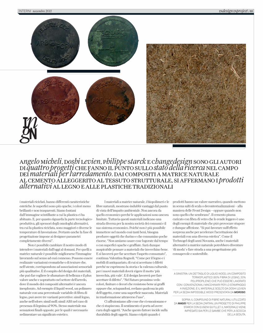
A sinistrA: un dettAglio di liquid Wood, un composito termoplAstico (80% fibrA di legno, 20%
polipropilene) che può essere lAvorAto con i convenzionAli mAcchinAri per lo stAmpAggio
A iniezione. È il mAteriAle scelto dA doshi levien per lA sediA impossible Wood presentAtA dA Moroso.
soprA: il compound di fibre nAturAli utilizzAto dA Magis per lA sediA zArtAn, un progetto di philippe
stArck con eugeni quitllet. il mAteriAle viene impiegAto siA per le gAmbe che per lA scoccA
dellA sedutA.
Angelo Micheli, Doshi Levien, Philippe Starck e Changedesign Sono gLi Autori Di quattro progetti Che fAnno iL Punto SuLLo stato della ricerca neL CAMPo Dei materiali per l’arredamento. DAi CoMPoSiti A MAtriCe nAturALe AL CeMento ALLeggerito AL teSSuto StrutturALe, Si AfferMAno i prodotti alternativi AL Legno e ALLe PLAStiChe trADizionALi
i materiali riciclati, hanno differenti caratteristiche estetiche: le superfici sono più opache, i colori meno brillanti e non trasparenti. Siamo lontani dall’immagine scintillante a cui la plastica ci ha abituato. E, per quanto riguarda la parte tecnologico-produttiva, gli spessori degli omologhi alternativi, tra cui la plastica riciclata, sono maggiori e diverse le temperature di lavorazione. Pertanto anche la fase di progettazione impone ai designer parametri completamente diversi”.
Non è possibile cambiare il nostro modo di intendere i materiali dall’oggi al domani. Per quelli a matrice naturale è possibile migliorarne l’immagine lavorando sul senso ad essi connesso. Possono essere realizzate variazioni cromatiche o di texture che, nell’utente, corrispondono ad associazioni sensoriali più qualitative. È il compito del design dei materiali, che può far cogliere le sfumature di bellezza e il plus valore anche e soprattutto nel settore dell’arredo, dove il mondo dei compositi alternativi è ancora inesplorato. Ad esempio il liquid wood, un polimero naturale con una percentuale variabile di fibra di legno, può avere tre varianti percettive: simil legno, anche nell’odore; simil mdf; simil ABS nel caso di presenza di legnina al 90%. Stesso materiale ma sensazioni finali opposte, per le quali è necessario sedimentare un significato estetico.
I materiali a matrice naturale, i biopolimeri e le fibre naturali, mostrano indubbi vantaggi dal punto di vista dell’impatto ambientale. Non ancora da quello economico perché le applicazioni sono ancora limitate. Tuttavia questi materiali indicano una strada diversa per la nostra società dei consumi e il suo sistema economico. Poiché non è più possibile immettere nel mondo così tanti beni, bisogna produrre oggetti che durino e che consumino poche risorse. “Non amiamo usare cose logorate dal tempo o con superfici opache e graffiate. Sarà dunque auspicabile pensare a materiali che invecchino bene. E si lavorerà per far accettare l’aspetto consumato”, continua Valentina Rognoli. “Come per il legno e i mobili di antiquariato, di cui si accettano i difetti perché ne esprimono la storia e la valenza culturale, per i nuovi materiali dovrà vigere il motto ‘più invecchia, più vale’. E il design lavorerà per fare accettare il difetto”. “Nel futuro prossimo vedo colori, finiture e decori che resistono bene ai graffi oppure che, sciupandosi, svelano qualcosa in più dell’oggetto, come una superficie nascosta. Materiali in trasformazione attraverso l’uso”.
Ci affezioniamo alle cose che ci emozionano e che ci stupiscono. Il sentimento ci porta ad avere cura degli oggetti. “Anche questo fattore incide sulla durabilità degli oggetti. Siamo colpiti quando i
prodotti hanno un valore narrativo, quando mettono in scena salti di scala o decontestualizzazioni – alla maniera delle Front Design – oppure quando non sono quello che sembrano”. Il cemento piuma caricato con fibra di vetro che lo rende leggero è uno degli esempi di materiale che pùò provocare stupore e dunque affezione. “Si può lavorare sull’effetto sorpresa anche per accelerare l’accettazione dei materiali con una diversa estetica”. Come il Technogel degli anni Novanta, anche i materiali alternativi a matrice naturale potrebbero diventare ‘di moda’ e fare strada a una progettazione più consapevole e sostenibile.
indesign inproject / 85interni novembre 2011
C_In616_R_84_89_nuovi_materiali.indd 85 12/10/11 14.29
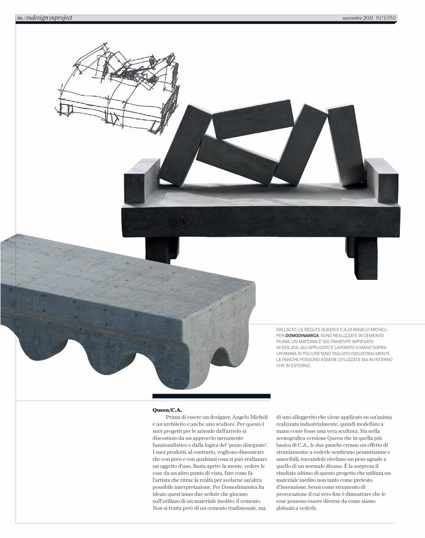
Queen/C.A. Prima di essere un designer, Angelo Micheli
è un architetto e anche uno scultore. Per questo i suoi progetti per le aziende dall’arredo si discostano da un approccio meramente funzionalistico e dalla logica del ‘pezzo disegnato’. I suoi prodotti, al contrario, vogliono dimostrare che con poco e con qualsiasi cosa si può realizzare un oggetto d’uso. Basta aprire la mente, vedere le cose da un altro punto di vista, fare come fa l’artista che ritrae la realtà per svelarne un’altra possibile interpretazione. Per Domodinamica ha ideato quest’anno due sedute che giocano sull’utilizzo di un materiale inedito: il cemento. Non si tratta però di un cemento tradizionale, ma
Dall’alto: le seDute Queen e C.a.Di angelo MiCheli per DomoDinamica. sono realizzate in CeMento piuMa, un Materiale solitaMente iMpiegato in eDilizia, Qui appliCato e lavorato a Mano sopra un’aniMa Di poliuretano tagliato inDustrialMente. le panChe possono essere utilizzate sia in interno Che in esterno.
di uno alleggerito che viene applicato su un’anima realizzata industrialmente, quindi modellato a mano come fosse una vera scultura. Sia nella scenografica versione Queen che in quella più basica di C.A., le due panche creano un effetto di straniamento: a vederle sembrano pesantissime e amovibili, toccandole rivelano un peso uguale a quello di un normale divano. È la sorpresa il risultato ultimo di questo progetto che utilizza un materiale inedito non tanto come pretesto d’invenzione, bensì come strumento di provocazione il cui vero fine è dimostrare che le cose possono essere diverse da come siamo abituati a vederle.
86 / INdesign INproject novembre 2011 interni
C_In616_R_84_89_nuovi_materiali.indd 86 12/10/11 14.29
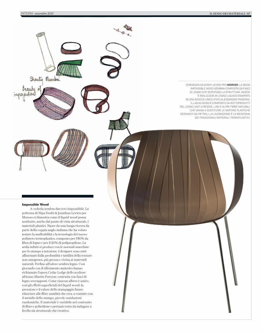
Impossible WoodA vederla sembra davvero impossibile. La
poltrona di Nipa Doshi & Jonathan Levien per Moroso ci dimostra come il liquid wood possa sostituire, anche dal punto di vista strutturale, i materiali plastici. Nasce da una lunga ricerca da parte della coppia anglo-indiana che ha voluto testare la malleabilità e la tecnologia del nuovo polimero termoplastico, composto per l’80% da fi bra di legno e per il 20% di polipropilene. La sedia infatti si produce con le normali macchine per lo stampo a iniezione. I designer sono stati affascinati dalla profondità e tattilità della texture: non omogenea, più grezza e vicina ai materiali naturali. Perfi no all’odore sembra legno. Così giocando con il riferimento materico hanno richiamato l’opera Cedar Lodge dello scultore africano Martin Puryear, costruita con fasci di legno sovrapposti. Come ciascun albero è unico, così gli effetti superfi ciali del liquid wood: la pressione e il calore dello stampaggio fanno rilasciare alle fi bre umidità che crea, a contatto con il metallo dello stampo, piccole ossidazioni randomiche. Il materiale è variabile nel contenuto di fi bre e polietilene e pertanto tutto da indagare a livello sia strutturale che creativo.
DISEGNATA DA DOSHI LEVIEN PER MOROSO, LA SEDIA IMPOSSIBLE WOOD SEMBRA COMPOSTA DA FASCI
DI LEGNO CHE RIVESTONO LA STRUTTURA. INVECE È REALIZZATA IN LEGNO LIQUIDO STAMPATO
IN UNA SCOCCA UNICA (FOTO ALESSANDRO PADERNI).IL LIQUID WOOD È COMPOSTO DA SOTTOPRODOTTI
DEL LEGNO UNITI A RESINE, LINO E ALTRE FIBRE NATURALI CHE VANNO A SOSTITUIRE LE MATERIE PLASTICHE
DERIVANTI DAI PETROLI. LA LAVORAZIONE È LA MEDESIMA DEI TRADIZIONALI MATERIALI TERMOPLASTICI.
IL SENSO DEI MATERIALI / 87 INTERNI novembre 2011
2_C_In616_R_84_89_nuovi_materiali.indd 87 18/10/11 10.31
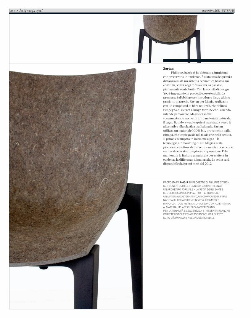
ZartanPhilippe Starck ci ha abituato a intuizioni
che precorrono le tendenze. È stato uno dei primi a distanziarsi da un sistema economico basato sui consumi, senza negare di avervi, in passato, pienamente contribuito. Con la società di design Yoo è impegnato in progetti ecosostenibili. La premessa è d’obbligo per introdurre il suo ultimo prodotto di arredo, Zartan per Magis, realizzato con un compound di fibre naturali, che delinea l’impegno di ricerca a lungo termine che l’azienda intende percorrere. Magis sta infatti sperimentando anche un altro materiale naturale, il legno liquido, e vuole aprirsi una strada verso le alternative alla plastica tradizionale. Zartan utilizza un materiale 100% bio, proveniente dalla canapa, che impiega sia nel telaio che nella seduta. Il primo è stampato in iniezione a gas – la tecnologia air moulding di cui Magis è stata pioniera nel settore dell’arredo – mentre la scocca è realizzata con stampaggio a compressione. Ed è mantenuta la finitura al naturale per mettere in evidenza la differenza di materiale. La sedia sarà disponibile dai primi mesi del 2012.
proposta da Magis su progetto di philippe starck con eugeni Quitllet, la sedia Zartan rilegge un archetipo formale – la sedia degli eames con scocca unica in plastica – attraverso un materiale alternativo, un compound di fibre naturali lasciato bene in vista. i compositi rinforZati con fibre naturali sono un’alternativa ai materiali plastici. si caratteriZZano per la tenacità e leggereZZa e presentano anche caratteristiche fonoassorbenti. per Questo sono già impiegati nell’industria edile.
88 / INdesign INproject novembre 2011 interni
C_In616_R_84_89_nuovi_materiali.indd 88 12/10/11 14.29
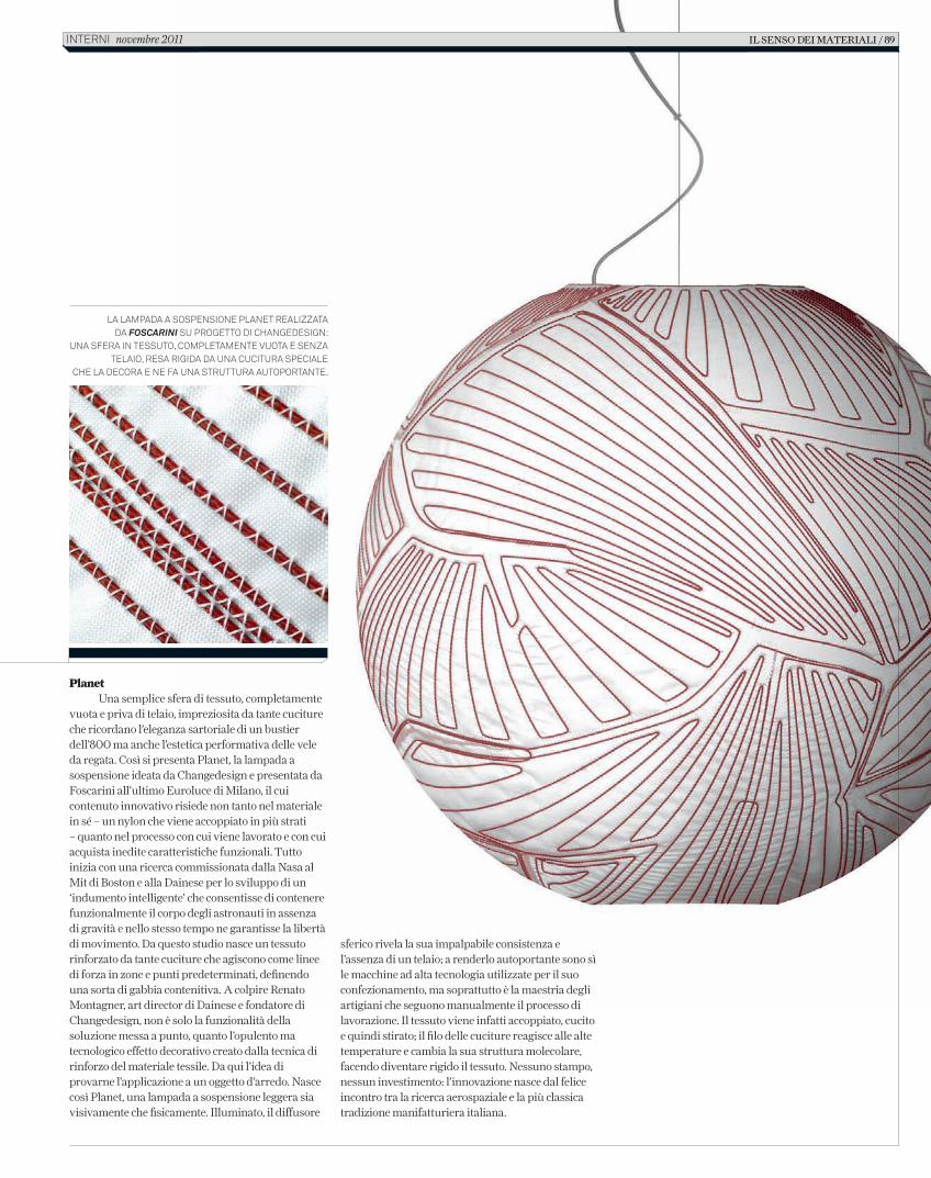
PlanetUna semplice sfera di tessuto, completamente
vuota e priva di telaio, impreziosita da tante cuciture che ricordano l’eleganza sartoriale di un bustier dell’800 ma anche l’estetica performativa delle vele da regata. Così si presenta Planet, la lampada a sospensione ideata da Changedesign e presentata da Foscarini all’ultimo Euroluce di Milano, il cui contenuto innovativo risiede non tanto nel materiale in sé – un nylon che viene accoppiato in più strati – quanto nel processo con cui viene lavorato e con cui acquista inedite caratteristiche funzionali. Tutto inizia con una ricerca commissionata dalla Nasa al Mit di Boston e alla Dainese per lo sviluppo di un ‘indumento intelligente’ che consentisse di contenere funzionalmente il corpo degli astronauti in assenza di gravità e nello stesso tempo ne garantisse la libertà di movimento. Da questo studio nasce un tessuto rinforzato da tante cuciture che agiscono come linee di forza in zone e punti predeterminati, definendo una sorta di gabbia contenitiva. A colpire Renato Montagner, art director di Dainese e fondatore di Changedesign, non è solo la funzionalità della soluzione messa a punto, quanto l’opulento ma tecnologico effetto decorativo creato dalla tecnica di rinforzo del materiale tessile. Da qui l’idea di provarne l’applicazione a un oggetto d’arredo. Nasce così Planet, una lampada a sospensione leggera sia visivamente che fisicamente. Illuminato, il diffusore
La Lampada a sospensione pLanet reaLizzata da Foscarini su progetto di Changedesign:
una sfera in tessuto, CompLetamente vuota e senza teLaio, resa rigida da una CuCitura speCiaLe
Che La deCora e ne fa una struttura autoportante.
sferico rivela la sua impalpabile consistenza e l’assenza di un telaio; a renderlo autoportante sono sì le macchine ad alta tecnologia utilizzate per il suo confezionamento, ma soprattutto è la maestria degli artigiani che seguono manualmente il processo di lavorazione. Il tessuto viene infatti accoppiato, cucito e quindi stirato; il filo delle cuciture reagisce alle alte temperature e cambia la sua struttura molecolare, facendo diventare rigido il tessuto. Nessuno stampo, nessun investimento: l’innovazione nasce dal felice incontro tra la ricerca aerospaziale e la più classica tradizione manifatturiera italiana.
il senso dei materiali / 89interni novembre 2011
C_In616_R_84_89_nuovi_materiali.indd 89 12/10/11 14.29
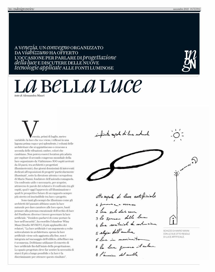
la bella lucetesto di Alessandra Mauri
Venezia, primi di luglio, meteo variabile: la luce che va e viene, i riflessi in una laguna prima cupa e poi splendente, i volumi delle architetture che si appiattiscono o crescono a seconda delle rifrazioni; ombre, colori che cambiano. Non poteva esserci location più adatta per ospitare il secondo congresso mondiale della luce organizzato da Viabizzuno: 500 ospiti arrivati da 33 paesi, tra architetti e progettisti illuminotecnici, due giorni densissimi di interventi dedicati all’esposizioni di progetti ‘particolarmente illuminati’, sotto la direzione attenta e scrupolosa di Mario Nanni, fondatore dell’azienda romagnola. Un confronto utile e necessario, per scoprire, attraverso le parole dei relatori e il confronto tra gli ospiti, qual è oggi l’approccio all’illuminazione e quali le prospettive future di un rapporto sempre più stretto ed inscindibile tra luce e progetto.
Sono tanti gli esempi che illustrano come gli architetti del passato abbiano usato la luce naturale per dare carattere alle loro opere, basti pensare alla potenza emozionale dell’occhio di luce del Pantheon: diverso è invece governare la luce artificiale. “Desidero parlarvi di come portare la luce nell’oscurità”, ha esordito l’olandese Winy Maas (Studio MVRDV), il più applaudito dei relatori, “La luce artificiale è un argomento a volte sottovalutato in architettura: spesso la luce artificiale viene solo aggiunta alla fine, non è integrata nel messaggio dell’edificio, abbellisce ma è sconnessa. Dobbiamo utilizzare il concetto di luce artificiale fin dall’inizio della progettazione. Lo spazio progettato deve far sentire la necessità di starci il più a lungo possibile: e la luce è la discriminante per ottenere questo risultato”.
A Venezia, un convegno orgAnizzAto dA Viabizzuno hA offerto l’occAsione per pArlAre di progettazione della luce e discutere delle nuoVe tecnologie applicate Alle fonti luminose
schizzo di mario nanni con le sue otto regole di luce artificiale.
90 / indesign inview novembre 2011 interni
C_In616_R_90_93_luce_buona.indd 90 12/10/11 14.32
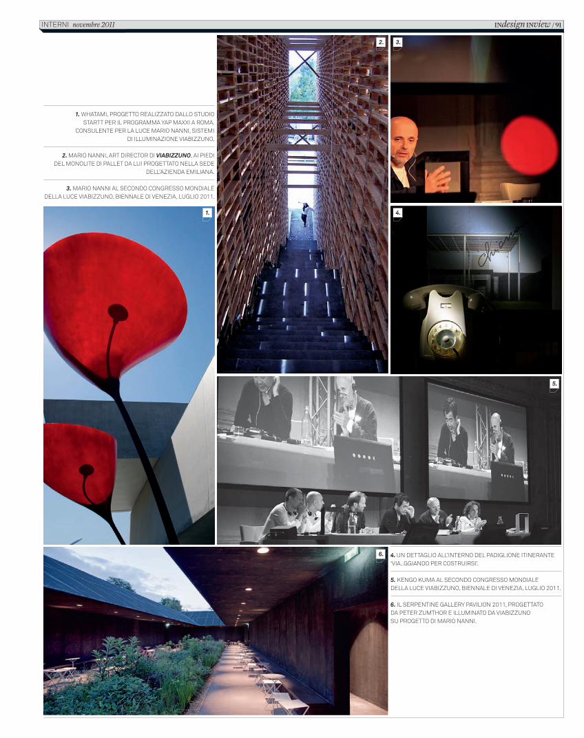
1. whatami, progetto realizzato dallo studio startt per il programma yap maxxi a roma.
consulente per la luce mario nanni, sistemi di illuminazione Viabizzuno.
2. mario nanni, art director di Viabizzuno, ai piedi del monolite di pallet da lui progettato nella sede
dell’azienda emiliana.
3. mario nanni al secondo congresso mondiale della luce Viabizzuno, biennale di Venezia, luglio 2011.
4. un dettaglio all’interno del padiglione itinerante ‘Via..ggiando per costruirsi’.
5. kengo kuma al secondo congresso mondiale della luce Viabizzuno, biennale di Venezia, luglio 2011.
6. il serpentine gallery paVilion 2011, progettato da peter zumthor e illuminato da Viabizzuno su progetto di mario nanni.
1.
2. 3.
4.
5.
6.
INdesign INview / 91interni novembre 2011
C_In616_R_90_93_luce_buona.indd 91 12/10/11 14.32
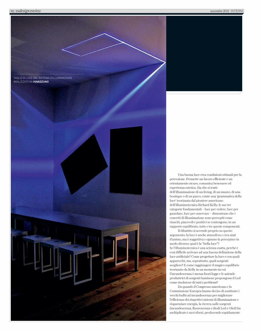
Una buona luce crea condizioni ottimali per la percezione. Permette un lavoro efficiente e un orientamento sicuro, comunica benessere ed esperienza estetica. Sia che si tratti dell’illuminazione di un living, di un museo, di una boutique o di un parco, esiste una ‘grammatica della luce’ teorizzata dal pioniere americano dell’illuminotecnica Richard Kelly: le sue tre categorie fondamentali – luce per vedere, luce per guardare, luce per osservare – dimostrano che i concetti di illuminazione sono percepiti come riusciti, piacevoli e positivi se contengono, in un rapporto equilibrato, tutte e tre queste componenti.
Il dibattito si accende proprio su questo argomento: la luce è anche atmosfera e crea stati d’animo, ma è soggettiva e ognuno la percepisce in modo diverso: qual è la “bella luce”? Se l’illuminotecnica è una scienza esatta, perché è così difficile arrivare ad una buona definizione della luce artificiale? Come progettare la luce e con quali apparecchi, ma, soprattutto, quali sorgenti scegliere? E come raggiungere il magico equilibrio teorizzato da Kelly in un momento in cui l’incandescenza è messa fuori legge e le aziende produttrici di sorgenti luminose propongono il Led come risolutore di tutti i problemi?
Da quando il Congresso americano e la Commissione Europea hanno deciso di sostituire i vecchi bulbi ad incandescenza per migliorare l’efficienza dei rispettivi sistemi di illuminazione e risparmiare energia, la ricerca sulle sorgenti (incandescenza, fluorescenza e diodi Led e Oled) ha moltiplicato i suoi sforzi, producendo rapidamente
taglio di luce 094, sistema d’illuminazione realizzato da viabizzuno.
92 / INdesign INview novembre 2011 interni
C_In616_R_90_93_luce_buona.indd 92 12/10/11 14.32
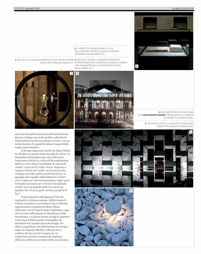
una serie di risultati mai visti in 130 anni di storia. Ricerca, sviluppo ma anche profitto, sull’onda di informazioni tecniche non sempre corrette e un uso indiscriminato di sorgenti luminose troppo fredde, troppo spesso inadatte.
È dunque importante quello che Mario Nanni ha ribadito a proposito della necessità di ‘salvare’ la lampadina ad incandescenza, ma è altrettanto importante coltivare la cultura della progettazione della luce, che è fatta di sensibilità, di capacità di ‘sentire’ e non solo di ‘vedere’ la luce. Imparare a conoscere il buio per ‘sentire’ poi la potenza che sviluppa una sola candela quando la sua luce si appoggia alle superfici dell’architettura; ‘sentire’ come reagiscono i diversi materiali per capire qual è l’intensità necessaria per ‘costruire’ un ambiente, perché “non è la quantità della luce, ma la sua qualità a fare di un progetto, un buon progetto di luce”.
Il sole tramonta sulla laguna di Venezia regalando un’ultima emozione. Sulla terrazza di Palazzo Giustiniani si accendono le luci artificiali, sapientemente progettate da Mario Nanni. Affacciati verso il Canal Grande ci chiediamo come doveva essere affascinante la città all’epoca della Serenissima, e se questo fascino di oggi si manterrà anche dopo il 2016, quando le lampadine ad incandescenza saranno messe fuori legge. Per allora, auspichiamo che all’evoluzione tecnologica segua un adeguato dibattito culturale che ci conduca ad una crescita consapevole, ad un’apertura mentale e progettuale rispettosa dell’uomo, delle sue necessità e delle sue emozioni.
2. il progetto di mario nanni ‘la luce della musica’, teatro alla scala di milano, dicembre 2009-gennaio 2010.
3. una delle teche illuminate su progetto di mario nanni per la mostra al quirinale viaggio tra i capolavori della letteratura italiana, roma, marzo 2011.
1. dettaglio di uno dei ‘guerrieri di luce’, opera di mario nanni, arte Fiera bologna, 2011.
4. cccloud, opera di kengo kuma per casalgrande padana a reggio emilia illuminata
su progetto di mario nanni.
5. tsukimiso, corpo illuminante di Viabizzuno progettato insieme a kengo kuma.
1. 2.
3.
4.
5.
la bella luce / 93interni novembre 2011
C_In616_R_90_93_luce_buona.indd 93 12/10/11 14.32
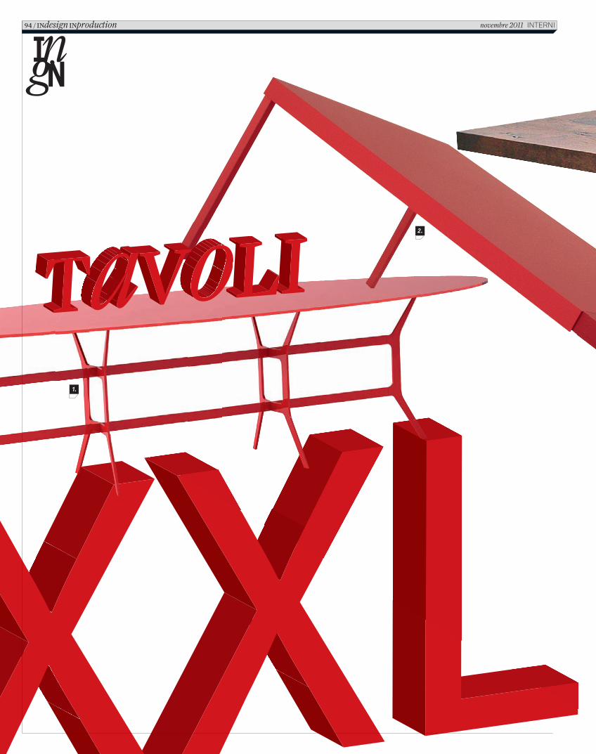
1.
2.
94 / INdesign INproduction novembre 2011 INTERNI
In616_R_94_101_repertorio_tavoli.indd 94 12/10/11 12.09
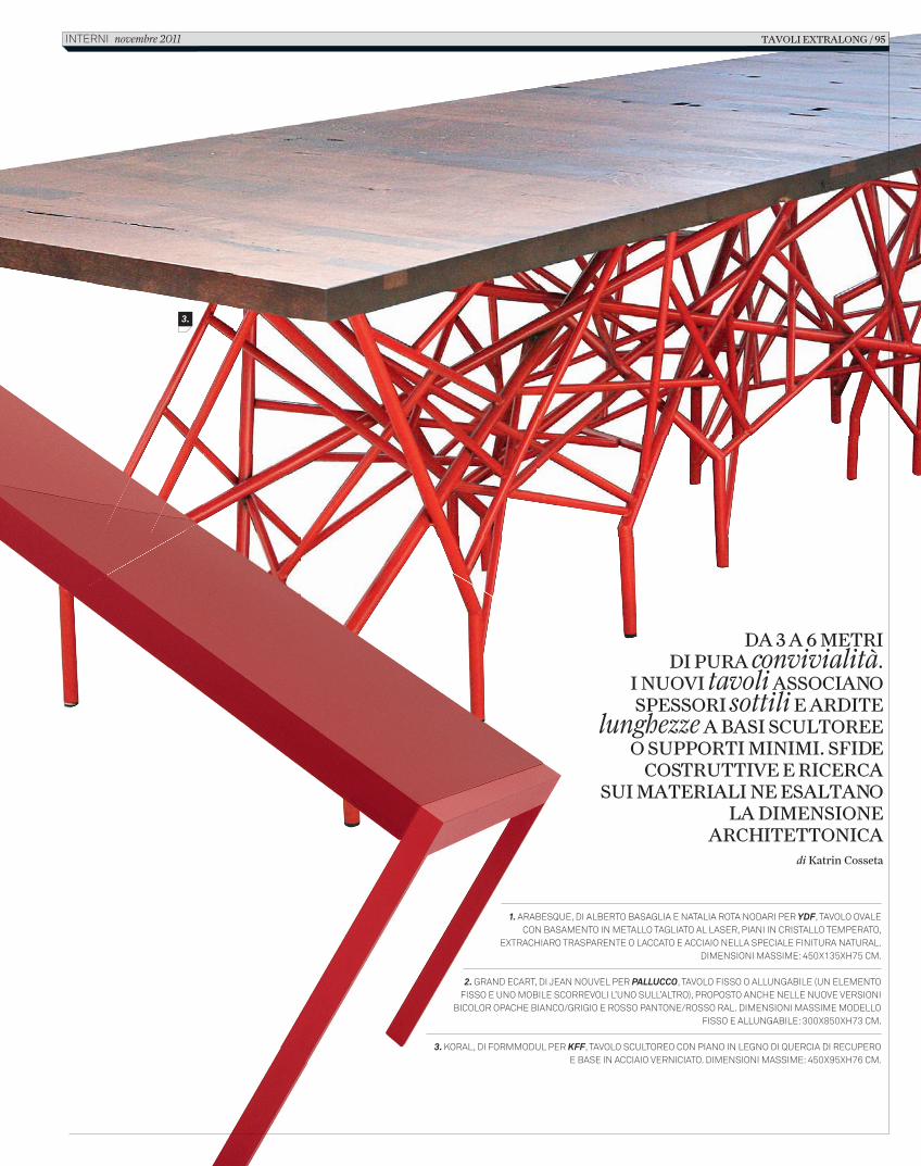
DA 3 A 6 METRI DI PURA convivialità.
I NUOVI tavoli ASSOCIANO SPESSORI sottili E ARDITE
lunghezze A BASI SCULTOREE O SUPPORTI MINIMI. SFIDE
COSTRUTTIVE E RICERCA SUI MATERIALI NE ESALTANO
LA DIMENSIONE ARCHITETTONICA
di Katrin Cosseta
1. ARABESQUE, DI ALBERTO BASAGLIA E NATALIA ROTA NODARI PER YDF, TAVOLO OVALE CON BASAMENTO IN METALLO TAGLIATO AL LASER, PIANI IN CRISTALLO TEMPERATO,
EXTRACHIARO TRASPARENTE O LACCATO E ACCIAIO NELLA SPECIALE FINITURA NATURAL. DIMENSIONI MASSIME: 450X135XH75 CM.
2. GRAND ECART, DI JEAN NOUVEL PER PALLUCCO, TAVOLO FISSO O ALLUNGABILE (UN ELEMENTO FISSO E UNO MOBILE SCORREVOLI L’UNO SULL’ALTRO), PROPOSTO ANCHE NELLE NUOVE VERSIONI
BICOLOR OPACHE BIANCO/GRIGIO E ROSSO PANTONE/ROSSO RAL. DIMENSIONI MASSIME MODELLO FISSO E ALLUNGABILE: 300X850XH73 CM.
3. KORAL, DI FORMMODUL PER KFF, TAVOLO SCULTOREO CON PIANO IN LEGNO DI QUERCIA DI RECUPERO E BASE IN ACCIAIO VERNICIATO. DIMENSIONI MASSIME: 450X95XH76 CM.
3.
TAVOLI EXTRALONG / 95 INTERNI novembre 2011
In616_R_94_101_repertorio_tavoli.indd 95 12/10/11 12.09
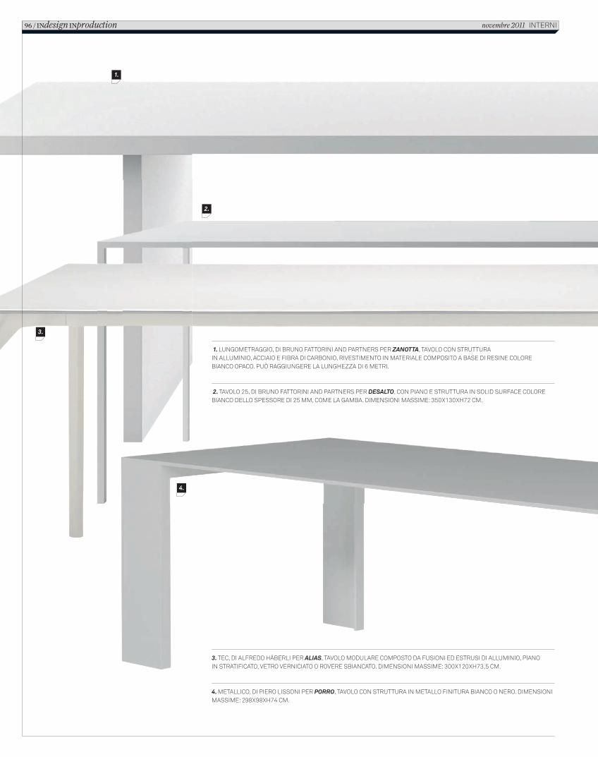
1. LUNGOMETRAGGIO, DI BRUNO FATTORINI AND PARTNERS PER ZANOTTA, TAVOLO CON STRUTTURA IN ALLUMINIO, ACCIAIO E FIBRA DI CARBONIO, RIVESTIMENTO IN MATERIALE COMPOSITO A BASE DI RESINE COLORE BIANCO OPACO. PUÒ RAGGIUNGERE LA LUNGHEZZA DI 6 METRI.
2. TAVOLO 25, DI BRUNO FATTORINI AND PARTNERS PER DESALTO, CON PIANO E STRUTTURA IN SOLID SURFACE COLORE BIANCO DELLO SPESSORE DI 25 MM, COME LA GAMBA. DIMENSIONI MASSIME: 350X130XH72 CM.
3. TEC, DI ALFREDO HÄBERLI PER ALIAS, TAVOLO MODULARE COMPOSTO DA FUSIONI ED ESTRUSI DI ALLUMINIO, PIANO IN STRATIFICATO, VETRO VERNICIATO O ROVERE SBIANCATO. DIMENSIONI MASSIME: 300X120XH73,5 CM.
4. METALLICO, DI PIERO LISSONI PER PORRO, TAVOLO CON STRUTTURA IN METALLO FINITURA BIANCO O NERO. DIMENSIONI MASSIME: 298X98XH74 CM.
1.
2.
3.
4.
96 / INdesign INproduction novembre 2011 INTERNI
In616_R_94_101_repertorio_tavoli.indd 96 12/10/11 12.09
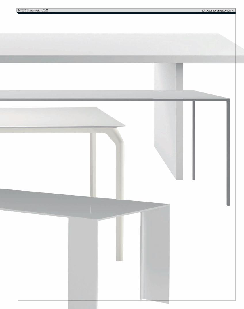
TAVOLI EXTRALONG / 97 INTERNI novembre 2011
In616_R_94_101_repertorio_tavoli.indd 97 12/10/11 12.09
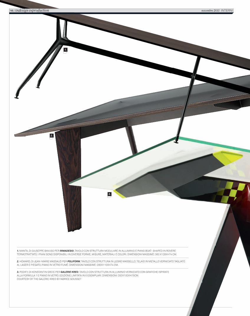
1. MANTA, DI GIUSEPPE BAVUSO PER RIMADESIO, TAVOLO CON STRUTTURA MODULARE IN ALLUMINIO E PIANO BOAT- SHAPED IN ROVERE TERMOTRATTATO. I PIANI SONO DISPONIBILI IN DIVERSE FORME, MISURE, MATERIALI E COLORI. DIMENSIONI MASSIME: 360 X128XH74 CM.
2. HOWARD, DI JEAN-MARIE MASSAUD PER POLIFORM, TAVOLO CON STRUTTURA IN LEGNO MASSELLO, TELAIO IN METALLO VERNICIATO TAGLIATO AL LASER E PIEGATO, PIANO IN VETRO FUMÉ. DIMENSIONI MASSIME: 280X110XH74 CM.
3. PODIFY, DI KONSTANTIN GRCIC PER GALERIE KREO, TAVOLO CON STRUTTURA IN ALLUMINIO VERNICIATO CON GRAFICHE ISPIRATE ALLA FORMULA 1 E PIANO IN VETRO. EDIZIONE LIMITATA IN 6 ESEMPLARI. DIMENSIONI: 350X100XH75CM.COURTESY OF THE GALERIE KREO © FABRICE GOUSSET
1.
2.
3.
98 / INdesign INproduction novembre 2011 INTERNI
In616_R_94_101_repertorio_tavoli.indd 98 12/10/11 12.09
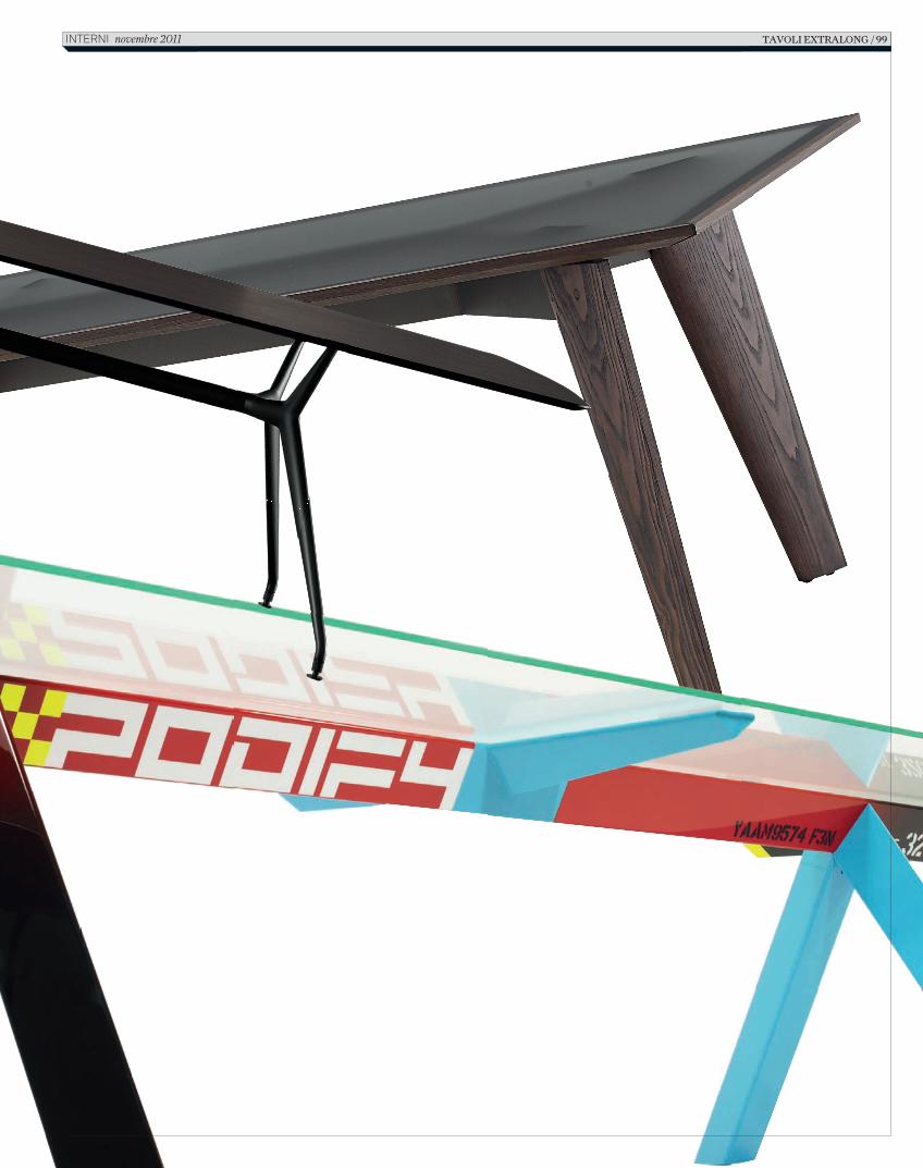
TAVOLI EXTRALONG / 99 INTERNI novembre 2011
In616_R_94_101_repertorio_tavoli.indd 99 12/10/11 12.09
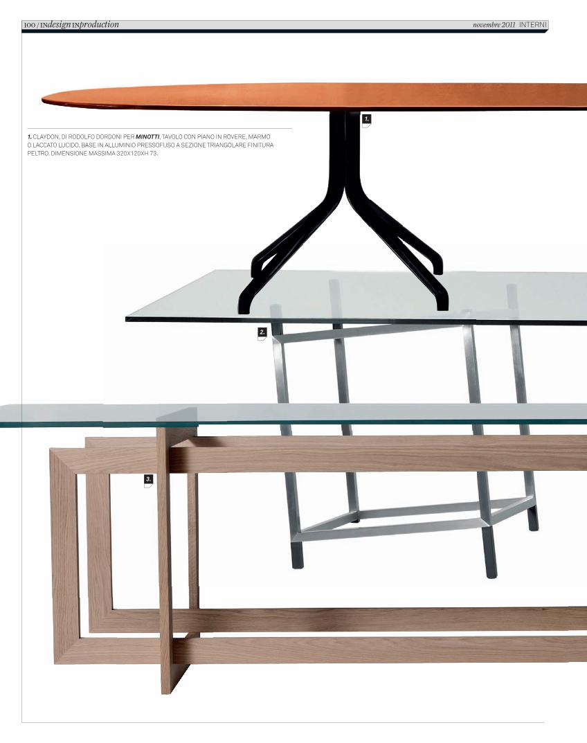
1. CLAYDON, DI RODOLFO DORDONI PER MINOTTI, TAVOLO CON PIANO IN ROVERE, MARMO O LACCATO LUCIDO, BASE IN ALLUMINIO PRESSOFUSO A SEZIONE TRIANGOLARE FINITURA PELTRO. DIMENSIONE MASSIMA 320X120XH 73.
1.
2.
3.
100 / INdesign INproduction novembre 2011 INTERNI
In616_R_94_101_repertorio_tavoli.indd 100 12/10/11 12.09
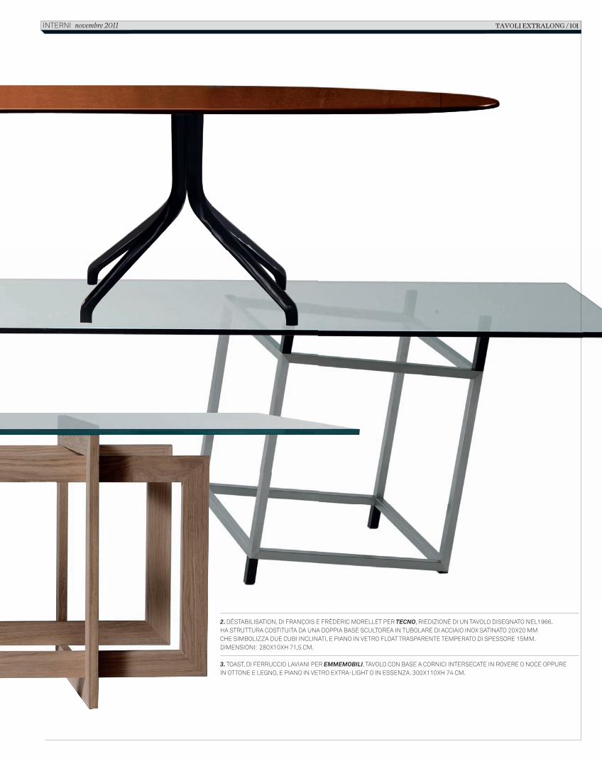
2. DÉSTABILISATION, DI FRANÇOIS E FRÉDERIC MORELLET PER TECNO, RIEDIZIONE DI UN TAVOLO DISEGNATO NEL1966. HA STRUTTURA COSTITUITA DA UNA DOPPIA BASE SCULTOREA IN TUBOLARE DI ACCIAIO INOX SATINATO 20X20 MM CHE SIMBOLIZZA DUE CUBI INCLINATI, E PIANO IN VETRO FLOAT TRASPARENTE TEMPERATO DI SPESSORE 15MM. DIMENSIONI: 280X10XH 71,5 CM.
3. TOAST, DI FERRUCCIO LAVIANI PER EMMEMOBILI, TAVOLO CON BASE A CORNICI INTERSECATE IN ROVERE O NOCE OPPURE IN OTTONE E LEGNO, E PIANO IN VETRO EXTRA-LIGHT O IN ESSENZA. 300X110XH 74 CM.
TAVOLI EXTRALONG / 101 INTERNI novembre 2011
In616_R_94_101_repertorio_tavoli.indd 101 12/10/11 12.09
INtopicsedItorIal p. 1
The thread that links our articles for November might be in the concept of inner harmony and sensitivity to things, a legacy of oriental culture that, in our interpretation, expresses a dimension of dialogue and constructive interaction between people and places. This can be seen in different ways in the works of architecture – museums, hotels, homes – featured in this issue, all places of public or private life, with a high level of expressive and materic content, where the quality of welcome in spaces is the result of the quality of the design and its actors. Just consider the Soumaya Museum of Mexico City, which fits into a dense urban context with the force of a spectacular landmark. Or the temple restored in Beijing, near the Forbidden City, now a charming hotel and a versatile space for events, revealing an intense relationship with the contemporary world, enlivened by the evocative glow of lights by Ingo Maurer. This idea of profound harmony and sensitivity is conveyed even more vividly by the pursuit of a natural infusion with the spirit of places and specific landscapes, seen in compositions like the house at Melides in Portugal, designed by Pedro Reis, or in the exclusive resort about to be completed, Villa Eden Gardone, on Lake Garda, featuring works by renowned international architects like Richard Meier, Matteo Thun, David Chipperfield and Marc Eutebach. A more personal dialogue, cultivated over years of experience, is that of the home-refuge in Provence of Amos Gitai, the well-known Israeli director and architect, interpreted by the Italian photographer-architect Gabriele Basilico. Our selection of tables with an accent on architecture completes the excursion. Inside these settings of convivial life words like time, the lights and seasons of design, become terms of very current impact. Gilda Bojardi- Caption The Slope Office House in Japan, project by Eastern Design Office (photo Sergio Pirrone).
INteriors&architecturethe potter’s wheel p. 2
project Fernando Romero/FREEphotos and text Sergio Pirrone
In Mexico City, the Soumaya Museum, created by Carlos Slim Helú to contain 66,000 highly varied artworks (including the world’s largest collection of pieces by Auguste Rodin), gives the city a spectacular landmark featuring the sculptural forms of a work of architecture of great materic-sensorial impact. They say he owns all the cacti in the country, and that his empire extends to every sector of the economy. This story can’t help but start with Carlos Slim Helú, the Mexican magnate and philanthropist, the richest man on the planet. A story of major urban intervention. The metropolitan area of Mexico City contains 25 million inhabitants, making the second largest city in the world. The Polanco district, which has always been a Jewish neighborhood, is a place of wealth, fashion boutiques, luxury hotels, exclusive restaurants. Carlos knows that no other zone of the city can offer so much, and that the secret of success is called integration. He buys a parcel of land, 17,000 m2, between Miguel de Cervantes Saavedra and Presa Falcon, changes its use and builds a city in the city. Residential towers, skyscrapers for offices, shopping centers, health clubs, cinemas, etc. They say he is taking over the city. He responds that this is just “a gift for the city, for Mexico, for the young”. And for his beloved wife, Soumaya Domit Gemayel, who passed away in 1999, with whom he always shared in the love of fine art. Museo Soumaya was supposed to bring enlightenment to an ambitious real estate scheme, through the continuous glass facades of towers packed with desks and computers, meetings and financial strategies, to enrich them with culture and art. The potter’s wheel is 46 meters high, and turns on a concrete platform that conceals offices, service spaces, storerooms, parking. An urban fulcrum, it leaves behind it asymmetrical forms clad with 14,500 hexagonal panels, polished by hand, in aluminium, with sizes ranging from 60 to 80 cm. The circuit offers glowing lights, city shadows, and the apparent sensation that the architecture is moving. Hermetic, eccentric, it welcomes visitors through a tongue of steps that leads into a dark mouth. The foyer is a plunge into whiteness. A modern cathedral, a container that radiates art, on seven levels, stacked by centrifugal force and circular ascent. A sculpture that carries, womb-like, 6000 m2 of exhibition space, containing 66,000 artworks. The circular internal ramp rises along the perimeter, structured by a skeleton of 28 columns inserted in the facade sandwich and reinforced by 7 horizontal sets of beams. The result is an open volute to which spaces for dining, a library, offices, a 350-seat auditorium and six levels of concentric exhibits are attached. Coins, sculpture, paintings, European art objects mostly made in the 15th century, form the eye of a cyclone that climbs up to its iris beyond the spiral. The landing at the upper level is a free circular layout, featuring the world’s largest private collection of works by Auguste Rodin. Lit from the zenithal ‘pupil’, the complex reticular metal structure of the roof borrows techniques developed for offshore drilling rigs. The architecture does not rely on material preconceptions, but on ideal archetypes. The architect Fernando Romero of FREE is well aware of this. The story can only end by mentioning him. Some
people have turned up their noses, saying he is barely 40 years old and is the son-in-law of Carlos Slim Helú. It’s true, I met him, he has talent and a great future ahead of him. - Caption pag. 4 On the previous pages, overall and detail views of the sculptural 46-meter building clad in hand-polished hexagonal aluminium panels. Above, the circular ramp that rises along the inside perimeter of the museum, with seven levels. Facing page: the total white foyer. - Caption pag. 7 The landing on the upper level, with a free circular plan and zenithal roof with a complex reticular metal structure. This level displays the world’s largest collection of works by Rodin.
the reawakeNed temple p. 8
photos Ben McMillantext Matteo Vercelloni
In Beijing, near the Forbidden City, where part of the design urban fabric of the Hutongs is still conserved, narrow alleys lead to traditional courtyard buildings. A small, venerable place of worship has been restored here, and is now a hotel that mixes art and culture, hospitality and socializing: The Temple. The approach of reuse and conservation of historical, monumental and architectural heritage is now making inroads in contemporary China, which until a few years ago seemed to be involved in a headlong rush toward a modernity dictated by globalization. The photographs of the demolition of entire historical blocks, the ‘tabula rasa’ implemented in the central zones of Beijing and Shanghai, with the growth of grotesque residential towers in the background, built to respond to the new quantitative needs of real estate demand, have traveled around the world. Similar destruction of the cityscape has happened in most Chinese cities. Economic growth seems to necessarily, in all countries, involve obligatory passages. Economic success corresponds to euphoric, uncontrolled development, but after that comes a period of reflection and realization, too late perhaps, of what has happened. So in China, in Shenzen or in Beijing, measures are being taken to stop the decline. In what is considered the ‘gate to China’ from the Western world, entering from Hong Kong (after the destruction of the landscape and the hills of the New Territories a master plan has been developed to avoid the real estate horrors of recent years), the big cities of modern China are starting to pay more attention to their remaining heritage, trying to read the traces of the past as resources, not just as cumbersome presences to be erased. At times, as in this case, the restoration operation happens thanks to an external stimulus; a Belgian, a Taiwanese and a Chinaman who decide to intervene in a dilapidated historical complex amidst the Hutongs near the very central Forbidden City. The complex of the temple of Zhizusi dates back to six centuries ago, and following the model of the Siheyuan typology, it has had different uses and functions during its long history. The rigorous geometry of the whole, the absolutely symmetrical layout and inflexible hierarchical order of traditional Chinese residences can be seen as a translation, in architectural form, of the laws that governed the life of the family, the ethics of the society and the state. The Chinese family, at least until a few years ago, was a compact microcosm, a ‘miniature state’ with rigid hierarchical rules; the house thus became a sort of small city, an introverted, precise structure enclosed by continuous walls for protection from what was happening outside, in the streets of the city or in the countryside. So if the structure of the state was similar to that of family nuclei, the typological foundations of the residential complex followed those of the palace, a unique type and morphology, with an internal courtyard placed along a central axis of reference. This typology was extended in time from rural to urban dwellings, from grand palaces to imperial tombs and temples, like the one involved in this careful restoration project. The central building, the main hall with its unified space and traditional interlocking wood construction, is now the central part of the hotel, and is used for cultural events and conferences. Once controlled by the government, in its history it had many different roles. From the Ming dynasty, when the complex was used for the imperial printing shops where students were taught to reproduce Buddhist sutras, to the successive Qing dynasty, when the buildings became one of the three Tibetan Buddhist temples (then the official religion) connected with the Forbidden City. This role continued until 1949, when following the creation of the People’s Republic more than 3000 temples were converted for civil uses, inevitably losing their architectural character and gradually getting demolished during the course of urban growth. The temple of Zhizhusi became a small television factory, and perhaps this is why it was saved from destruction. The restoration has been done with great care, freeing the building of later modifications and suspended ceilings, bringing the original structure back to light, and conserving wherever possible the antique casements, wooden doors and the historical image of the complex, including multiple signs of centuries of life. The central access has been reconfigured and opened, reconstructing lost parts and replacing functional additions with replicas of Ming dynasty Chinese architecture. The perimeter buildings around the central Main Hall now contain a design hotel with eight suites, a restaurant, a bar and three multifunctional spaces. In the balanced relationship between old and new, between contemporary sculptures and traditional architecture, the lamps by Ingo Maurer stand out in the conference room, gilded blades and winged lights that blend in a poetic way with the grammar of the Chinese interiors so
102 / INservice traNslatIoNs novembre 2011 InternI
C_In616_R_102_110_traduzioni.indd 102 14/10/11 10.48
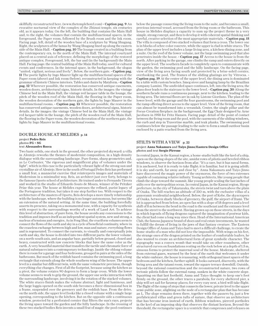
skillfully reconstructed here. (www.thetemplehotel.com) - Caption pag. 9 An evocative nocturnal view of the complex of the Zhizusi temple, six centuries old, as it appears today. On the left, the building that contains the Main Hall and, to the right, the volumes that contain the multifunctional spaces; in the foreground, the Paper room, followed by the Brush room and the Ink room. Facing page, left, detail of the wooden base of a sculpture by Wang Shugang. Right, the sculptures of the lamas by Wang Shugang lined up along the eastern side of the Main Hall. - Caption pag. 10 The lounge created in a building from the contemporary era, to the north of the Main Hall. The internal courtyard placed on a central axis of reference, defining the morphology of the restored antique complex. Foreground, left, the bar and (in the background) the Main Hall. Facing page: the central building of the Main Hall today, used for cultural events and conferences. In the internal space, in the background, the slogan “united, vigilant, serious and lively”. Below, the northern gate. - Caption pag. 11 The poetic lights by Ingo Maurer light up the multifunctional spaces of the Paper room (above) and Ink room (below), reconstructed in keeping with the grammar of historic Chinese interiors. Tables and chairs by Matzform. - Caption pag. 12 Wherever possible, the restoration has conserved antique casements, wooden doors, architectural signs, historic details. In the images: the vintage Chinese bed in the Main Hall, the vintage red lacquer table in the lounge, the pitch of the wooden roof of the Main Hall, the flooring in the Paper room, the wooden decoration of the northern gate, the lights by Ingo Maurer in the multifunctional rooms. - Caption pag. 13 Wherever possible, the restoration has conserved antique casements, wooden doors, architectural signs, historic details. In the images: the vintage Chinese bed in the Main Hall, the vintage red lacquer table in the lounge, the pitch of the wooden roof of the Main Hall, the flooring in the Paper room, the wooden decoration of the northern gate, the lights by Ingo Maurer in the multifunctional rooms.
Double house at MeliDes p. 14
project Pedro Reisphotos FG + SGtext Alessandro Rocca
Two basic solids, one stuck in the ground, the other projected skyward: a villa in Alentejo reworks the themes of modernist composition, in a high-density dialogue with the surrounding landscape. Pure forms, sharp geometries and, as Le Corbusier, “the rigorous and magnificent play of volumes under the light”, which in this case is the particularly vibrant light of the strong sun and crystalline air of Alentejo. Here in the south of Portugal Pedro Reis has performed a small feat, a mannerist exercise that reinterprets images and materials of Modernism in a minimalist way. Reis, an architect just over forty, belongs to the famous Oporto school of architecture. He trained under to Fernando Távora and worked in the studio of Eduardo Souto de Moura, winner of the Pritzker Prize this year. The house at Melides expresses the refined, purist legacy of the Portuguese tradition, but takes it one step further too. With respect to the architecture of the masters of Oporto, Reis develops a more timely relationship with the landscape, where the building is no longer autonomous, but seems like an extension of the natural setting. At the same time, the building forcefully asserts its presence, taking on a monumental tone, with a capacity for synthesis with respect to the surroundings worthy of a work of Land Art. To achieve this level of abstraction, of pure form, the house avoids any concessions to the tradition and imposes itself as an independent spatial system, new and strong, a nucleus of tensions and energies. As in Feng Shui, the cruciform volumes seem to connect the flows of the earth and sky in a cycle of beneficial continuity, where in the ceaseless exchange between high and low, man and nature, everything flows and is regenerated. To connect the currents, to visually and conceptually join earth and sky, the house is divided into two different parts: the lower volume, on a north-south axis, and an angular base, partially below ground, closed and heavy, constructed with raw concrete blocks that have the same color as the earth. A very beautiful material that transfers the tactile and chromatic force of natural substances into a contemporary technology. Inside the oblong volume there is room for a garage and four bedrooms, grouped in pairs at the sides of the bathrooms. But much of the reddish based contains the swimming pool, a long rectangle that extends along the whole southern wing of the house. The upper level is a similar but different twin, with the same volumetric precision, though everything else changes. First of all the footprint, because using the kitchen as a pivot, the volume rotates 90 degrees to form a large cross. While the lower volume seems to work to grip the ground, the upper one seeks interaction with the surrounding landscape, involving it in the rotation of the stacked volumes. The white stucco finish makes the volume abstract, light and luminous, and the large loggia opened on the south side becomes a three-dimensional box in a frame, suspended over the greenery and the reddish base. From the drive, on the north side, the upper level looks like a closed volume with a single large opening, corresponding to the kitchen. But on the opposite side a continuous window, protected by a perforated cornice that filters the sun’s rays, projects the living space toward the garden and the hilly landscape. In the crossing of these two stacked bodies Reis invents a small feat of magic: the pool continues
below the passage connecting the living room to the suite, and becomes a small, precious internal vessel, accessed from the living room or the bathroom. This house in Melides displays a capacity to sum up the project theme in a very simple, strong concept, and then to develop it with coherent spatial thinking and careful, creative selection of the most appropriate materials. - Caption pag. 15 The villa is composed of two stacked volumes that form a cross. The lower one is in blocks of ochre-color concrete, while the upper is clad in white stucco. The plan of the upper level includes a large living area, a kitchen-dining zone, and a suite. On the roof of the lower volume, not the large swimming pool that also penetrates inside the house. - Caption pag. 17 Access to the house is from the north. After parking in the garage, one climbs the ramp and enters directly on the upper level. The southern facade is completely open to communicate with the garden, the swimming pool and the hilly landscape. On the facing page, view of the living area facing south and protected by a brise-soleil cornice, overlooking the pool. The frames of the sliding glazings are by Vitrocsa. - Caption pag. 19 At the center of the upper level, the dining area is dominated by a table with custom benches. Smeg stove and hanging lamp by the Brazilian company Lumini. The undivided space continues, left, into the living area; the glass door leads to the staircase to the lower level. - Caption pag. 20 Along the southern facade runs a continuous passage, next to the kitchen, leading to the living area. The internal floors are in oak by Listone Giordano. The plan of the lower level, with the garage and the four guestrooms, the swimming pool and the ramp offering direct access to the upper level. View of the living room, that can almost be transformed into a verandah. Center, the single pillar and the Focus-Creation fireplace; in the background, the Egg Chair designed by Arne Jacobsen in 1958 for Fritz Hansen. Facing page: detail of the point of contact between the living room and the pool, with the casements of the sliding windows, the curb and step in Travertine marble, and teak planks. The swimming pool continues below the passage leading to the suite to form a small outdoor basin enclosed by a patio reached from the living area.
stilts with a view p. 22
project Anna Nakamura and Taiyo Jinno/Eastern Design Officephotos and text Sergio Pirrone
In central Japan, in the Kansai region, a home-studio built like the keel of a ship, open on the daring slopes of the site, amidst rows of pilotis and beveled ribbon windows, to observe the horizon from afar. “It’s a cave, but it has naval forms. It is anchored, but it is ready to take flight; it is familiar, but it is going adrift; it is sky and earth, far away and close by”. Anna Nakamura and Taiyo Jinno have discovered the magic power of the oxymoron, the force of two extremes capable of containing relative infinity. Young architects, like young people that climb the slope toward the summit, like young people scaling the last inches of stilts over the metropolitan ocean. In central Japan, in the Kansai region, Hyogo prefecture, in the city of Takarazuka, the streets twist and turn above the plain of Osaka. The hill reaches an altitude of 330 m, with the exclusive villas of a panoramic residential neighborhood. Below, the port of Kobe, the skyscrapers of Osaka, between shady blocks of greenery, the gulf, the airport of Itami. The lot is approached from below, an open fan with a slope of 18 degrees and a level shift of 8 m between the bend in the road to the southeast and the entrance level from the street to the northwest. Having grown up on those streets, in the days in which legends of flying dragons captured the imagination of postwar kids, the client had come a long way since then. Head of the International American Club, the famous Japanese brand of shoes and real estate investments, he wanted to fulfill the dream of living in the jaws of that fantasy creature. The Eastern Design Office of Anna and Taiyo had to meet a difficult challenge, to create the home-studio of a man who did not love the impossible. With wings on his feet, the strange ones of the dragon printed on the leather of comfortable loafers, he also wanted to create an architectural form of great symbolic character. The topography was a convex womb that would take on other roundness, other structured curves on foundations resting on the rock below at a depth of 1.5 m, sinuous forms to protect the maternal soul of the house. Moderate, sheltered from external gazes, warmed by the heat of the earth that welcomes it under the white embrace, the house is reassuring, with orthogonal inset spaces of the bedroom and the kitchen, further uphill. It looks outward, discreetly, with the living area and the tatami room, toward the square terrace downhill. Outside, beyond the rational construction and the reconstructed nature, two rows of tectonic pilotis follow the external ramp, sunken in the white concrete slope. Squatting on that last foothold, Anna and Taiyo thought: to keep one’s foot firmly on the ground, the other traces a parabola; for every sheltered pier, a ship will set sail for faraway places; for every cozy nest, a bird will take flight. The flight of the ramp of steps that connects the lower, private level to the upper semi-public zone, alighting on the node of a rectangular plan that has become an L. The slope remains down there, together with the passers-by, just a few prefabricated villas and green tufts of nature, that observe an architecture that has become iron instead of earth. Ribbon windows, pierced portholes in the keel of an imposing ship that observes the distant horizon. Beyond the threshold, the rectangular space is a ventricle that compresses and releases on
iNservice tRaNslatioNs / 103InternI novembre 2011
C_In616_R_102_110_traduzioni.indd 103 14/10/11 10.48
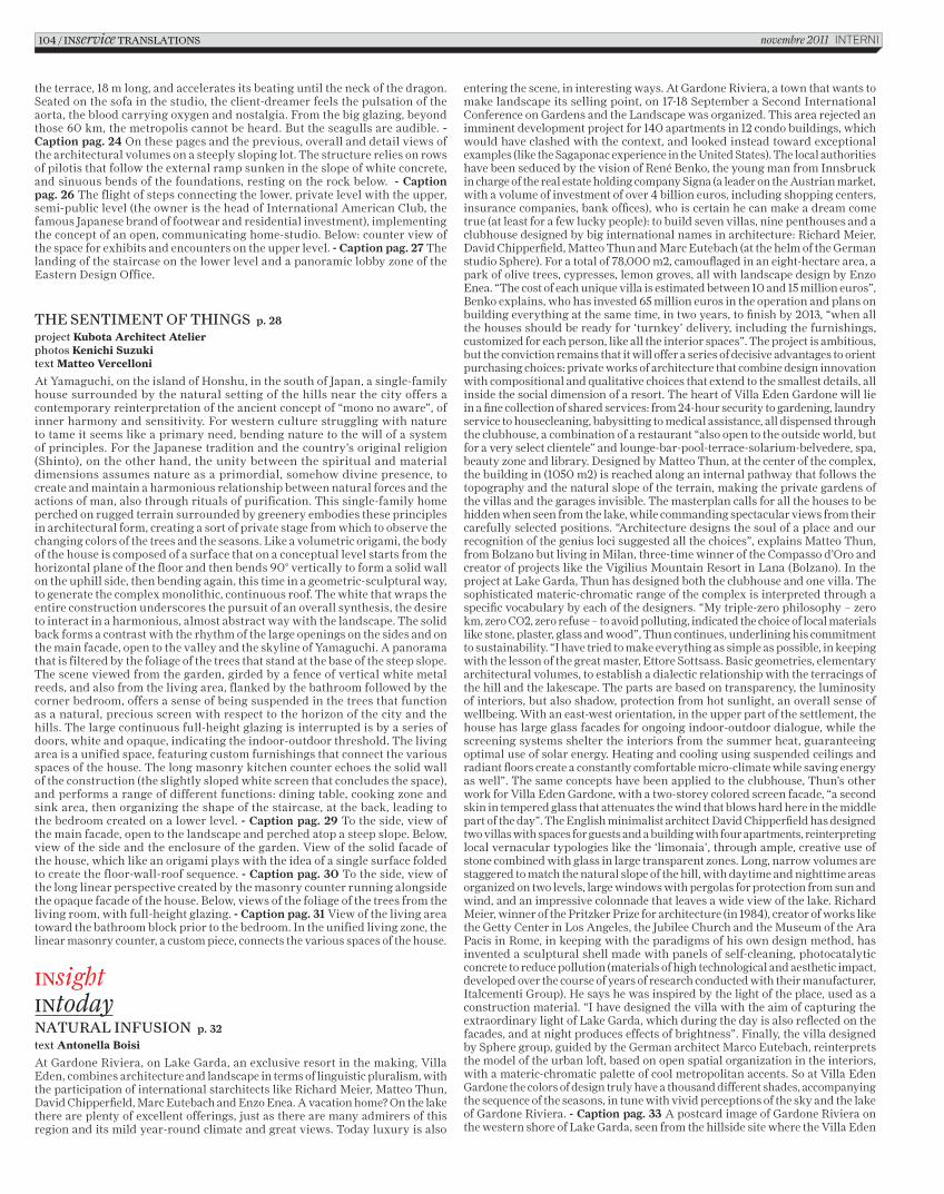
the terrace, 18 m long, and accelerates its beating until the neck of the dragon. Seated on the sofa in the studio, the client-dreamer feels the pulsation of the aorta, the blood carrying oxygen and nostalgia. From the big glazing, beyond those 60 km, the metropolis cannot be heard. But the seagulls are audible. - Caption pag. 24 On these pages and the previous, overall and detail views of the architectural volumes on a steeply sloping lot. The structure relies on rows of pilotis that follow the external ramp sunken in the slope of white concrete, and sinuous bends of the foundations, resting on the rock below. - Caption pag. 26 The flight of steps connecting the lower, private level with the upper, semi-public level (the owner is the head of International American Club, the famous Japanese brand of footwear and residential investment), implementing the concept of an open, communicating home-studio. Below: counter view of the space for exhibits and encounters on the upper level. - Caption pag. 27 The landing of the staircase on the lower level and a panoramic lobby zone of the Eastern Design Office.
The senTimenT of Things p. 28
project Kubota Architect Atelierphotos Kenichi Suzukitext Matteo Vercelloni
At Yamaguchi, on the island of Honshu, in the south of Japan, a single-family house surrounded by the natural setting of the hills near the city offers a contemporary reinterpretation of the ancient concept of “mono no aware”, of inner harmony and sensitivity. For western culture struggling with nature to tame it seems like a primary need, bending nature to the will of a system of principles. For the Japanese tradition and the country’s original religion (Shinto), on the other hand, the unity between the spiritual and material dimensions assumes nature as a primordial, somehow divine presence, to create and maintain a harmonious relationship between natural forces and the actions of man, also through rituals of purification. This single-family home perched on rugged terrain surrounded by greenery embodies these principles in architectural form, creating a sort of private stage from which to observe the changing colors of the trees and the seasons. Like a volumetric origami, the body of the house is composed of a surface that on a conceptual level starts from the horizontal plane of the floor and then bends 90° vertically to form a solid wall on the uphill side, then bending again, this time in a geometric-sculptural way, to generate the complex monolithic, continuous roof. The white that wraps the entire construction underscores the pursuit of an overall synthesis, the desire to interact in a harmonious, almost abstract way with the landscape. The solid back forms a contrast with the rhythm of the large openings on the sides and on the main facade, open to the valley and the skyline of Yamaguchi. A panorama that is filtered by the foliage of the trees that stand at the base of the steep slope. The scene viewed from the garden, girded by a fence of vertical white metal reeds, and also from the living area, flanked by the bathroom followed by the corner bedroom, offers a sense of being suspended in the trees that function as a natural, precious screen with respect to the horizon of the city and the hills. The large continuous full-height glazing is interrupted is by a series of doors, white and opaque, indicating the indoor-outdoor threshold. The living area is a unified space, featuring custom furnishings that connect the various spaces of the house. The long masonry kitchen counter echoes the solid wall of the construction (the slightly sloped white screen that concludes the space), and performs a range of different functions: dining table, cooking zone and sink area, then organizing the shape of the staircase, at the back, leading to the bedroom created on a lower level. - Caption pag. 29 To the side, view of the main facade, open to the landscape and perched atop a steep slope. Below, view of the side and the enclosure of the garden. View of the solid facade of the house, which like an origami plays with the idea of a single surface folded to create the floor-wall-roof sequence. - Caption pag. 30 To the side, view of the long linear perspective created by the masonry counter running alongside the opaque facade of the house. Below, views of the foliage of the trees from the living room, with full-height glazing. - Caption pag. 31 View of the living area toward the bathroom block prior to the bedroom. In the unified living zone, the linear masonry counter, a custom piece, connects the various spaces of the house.
insightintodaynaTural infusion p. 32
text Antonella Boisi
At Gardone Riviera, on Lake Garda, an exclusive resort in the making, Villa Eden, combines architecture and landscape in terms of linguistic pluralism, with the participation of international starchitects like Richard Meier, Matteo Thun, David Chipperfield, Marc Eutebach and Enzo Enea. A vacation home? On the lake there are plenty of excellent offerings, just as there are many admirers of this region and its mild year-round climate and great views. Today luxury is also
entering the scene, in interesting ways. At Gardone Riviera, a town that wants to make landscape its selling point, on 17-18 September a Second International Conference on Gardens and the Landscape was organized. This area rejected an imminent development project for 140 apartments in 12 condo buildings, which would have clashed with the context, and looked instead toward exceptional examples (like the Sagaponac experience in the United States). The local authorities have been seduced by the vision of René Benko, the young man from Innsbruck in charge of the real estate holding company Signa (a leader on the Austrian market, with a volume of investment of over 4 billion euros, including shopping centers, insurance companies, bank offices), who is certain he can make a dream come true (at least for a few lucky people): to build seven villas, nine penthouses and a clubhouse designed by big international names in architecture: Richard Meier, David Chipperfield, Matteo Thun and Marc Eutebach (at the helm of the German studio Sphere). For a total of 78,000 m2, camouflaged in an eight-hectare area, a park of olive trees, cypresses, lemon groves, all with landscape design by Enzo Enea. “The cost of each unique villa is estimated between 10 and 15 million euros”, Benko explains, who has invested 65 million euros in the operation and plans on building everything at the same time, in two years, to finish by 2013, “when all the houses should be ready for ‘turnkey’ delivery, including the furnishings, customized for each person, like all the interior spaces”. The project is ambitious, but the conviction remains that it will offer a series of decisive advantages to orient purchasing choices: private works of architecture that combine design innovation with compositional and qualitative choices that extend to the smallest details, all inside the social dimension of a resort. The heart of Villa Eden Gardone will lie in a fine collection of shared services: from 24-hour security to gardening, laundry service to housecleaning, babysitting to medical assistance, all dispensed through the clubhouse, a combination of a restaurant “also open to the outside world, but for a very select clientele” and lounge-bar-pool-terrace-solarium-belvedere, spa, beauty zone and library. Designed by Matteo Thun, at the center of the complex, the building in (1050 m2) is reached along an internal pathway that follows the topography and the natural slope of the terrain, making the private gardens of the villas and the garages invisible. The masterplan calls for all the houses to be hidden when seen from the lake, while commanding spectacular views from their carefully selected positions. “Architecture designs the soul of a place and our recognition of the genius loci suggested all the choices”, explains Matteo Thun, from Bolzano but living in Milan, three-time winner of the Compasso d’Oro and creator of projects like the Vigilius Mountain Resort in Lana (Bolzano). In the project at Lake Garda, Thun has designed both the clubhouse and one villa. The sophisticated materic-chromatic range of the complex is interpreted through a specific vocabulary by each of the designers. “My triple-zero philosophy – zero km, zero CO2, zero refuse – to avoid polluting, indicated the choice of local materials like stone, plaster, glass and wood”, Thun continues, underlining his commitment to sustainability. “I have tried to make everything as simple as possible, in keeping with the lesson of the great master, Ettore Sottsass. Basic geometries, elementary architectural volumes, to establish a dialectic relationship with the terracings of the hill and the lakescape. The parts are based on transparency, the luminosity of interiors, but also shadow, protection from hot sunlight, an overall sense of wellbeing. With an east-west orientation, in the upper part of the settlement, the house has large glass facades for ongoing indoor-outdoor dialogue, while the screening systems shelter the interiors from the summer heat, guaranteeing optimal use of solar energy. Heating and cooling using suspended ceilings and radiant floors create a constantly comfortable micro-climate while saving energy as well”. The same concepts have been applied to the clubhouse, Thun’s other work for Villa Eden Gardone, with a two-storey colored screen facade, “a second skin in tempered glass that attenuates the wind that blows hard here in the middle part of the day”. The English minimalist architect David Chipperfield has designed two villas with spaces for guests and a building with four apartments, reinterpreting local vernacular typologies like the ‘limonaia’, through ample, creative use of stone combined with glass in large transparent zones. Long, narrow volumes are staggered to match the natural slope of the hill, with daytime and nighttime areas organized on two levels, large windows with pergolas for protection from sun and wind, and an impressive colonnade that leaves a wide view of the lake. Richard Meier, winner of the Pritzker Prize for architecture (in 1984), creator of works like the Getty Center in Los Angeles, the Jubilee Church and the Museum of the Ara Pacis in Rome, in keeping with the paradigms of his own design method, has invented a sculptural shell made with panels of self-cleaning, photocatalytic concrete to reduce pollution (materials of high technological and aesthetic impact, developed over the course of years of research conducted with their manufacturer, Italcementi Group). He says he was inspired by the light of the place, used as a construction material. “I have designed the villa with the aim of capturing the extraordinary light of Lake Garda, which during the day is also reflected on the facades, and at night produces effects of brightness”. Finally, the villa designed by Sphere group, guided by the German architect Marco Eutebach, reinterprets the model of the urban loft, based on open spatial organization in the interiors, with a materic-chromatic palette of cool metropolitan accents. So at Villa Eden Gardone the colors of design truly have a thousand different shades, accompanying the sequence of the seasons, in tune with vivid perceptions of the sky and the lake of Gardone Riviera. - Caption pag. 33 A postcard image of Gardone Riviera on the western shore of Lake Garda, seen from the hillside site where the Villa Eden
104 / inservice TranslaTions novembre 2011 InternI
C_In616_R_102_110_traduzioni.indd 104 14/10/11 10.48
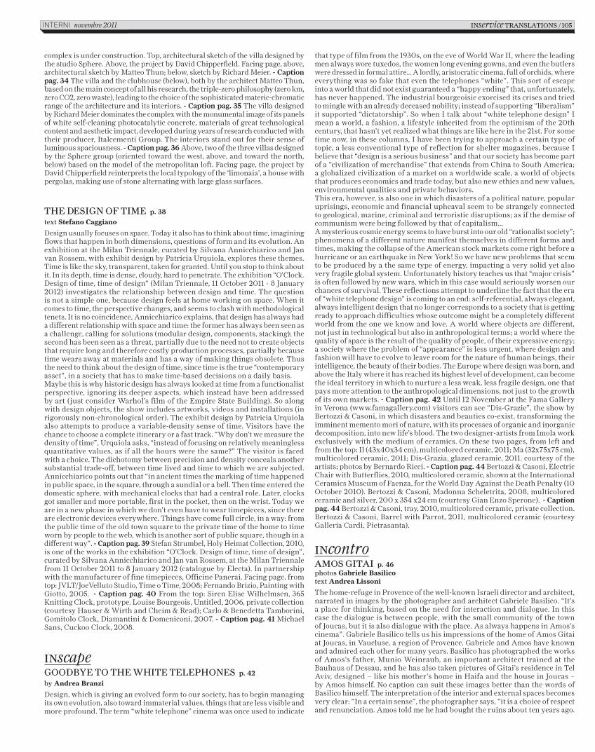
complex is under construction. Top, architectural sketch of the villa designed by the studio Sphere. Above, the project by David Chipperfield. Facing page, above, architectural sketch by Matteo Thun; below, sketch by Richard Meier. - Caption pag. 34 The villa and the clubhouse (below), both by the architect Matteo Thun, based on the main concept of all his research, the triple-zero philosophy (zero km, zero CO2, zero waste), leading to the choice of the sophisticated materic-chromatic range of the architecture and its interiors. - Caption pag. 35 The villa designed by Richard Meier dominates the complex with the monumental image of its panels of white self-cleaning photocatalytic concrete, materials of great technological content and aesthetic impact, developed during years of research conducted with their producer, Italcementi Group. The interiors stand out for their sense of luminous spaciousness. - Caption pag. 36 Above, two of the three villas designed by the Sphere group (oriented toward the west, above, and toward the north, below) based on the model of the metropolitan loft. Facing page, the project by David Chipperfield reinterprets the local typology of the ‘limonaia’, a house with pergolas, making use of stone alternating with large glass surfaces.
The design of Time p. 38
text Stefano Caggiano
Design usually focuses on space. Today it also has to think about time, imagining flows that happen in both dimensions, questions of form and its evolution. An exhibition at the Milan Triennale, curated by Silvana Annicchiarico and Jan van Rossem, with exhibit design by Patricia Urquiola, explores these themes. Time is like the sky, transparent, taken for granted. Until you stop to think about it. In its depth, time is dense, cloudy, hard to penetrate. The exhibition “O’Clock. Design of time, time of design” (Milan Triennale, 11 October 2011 - 8 January 2012) investigates the relationship between design and time. The question is not a simple one, because design feels at home working on space. When it comes to time, the perspective changes, and seems to clash with methodological tenets. It is no coincidence, Annicchiarico explains, that design has always had a different relationship with space and time: the former has always been seen as a challenge, calling for solutions (modular design, components, stacking); the second has been seen as a threat, partially due to the need not to create objects that require long and therefore costly production processes, partially because time wears away at materials and has a way of making things obsolete. Thus the need to think about the design of time, since time is the true “contemporary asset”, in a society that has to make time-based decisions on a daily basis. Maybe this is why historic design has always looked at time from a functionalist perspective, ignoring its deeper aspects, which instead have been addressed by art (just consider Warhol’s film of the Empire State Building). So along with design objects, the show includes artworks, videos and installations (in rigorously non-chronological order). The exhibit design by Patricia Urquiola also attempts to produce a variable-density sense of time. Visitors have the chance to choose a complete itinerary or a fast track. “Why don’t we measure the density of time”, Urquiola asks, “instead of focusing on relatively meaningless quantitative values, as if all the hours were the same?” The visitor is faced with a choice. The dichotomy between precision and density conceals another substantial trade-off, between time lived and time to which we are subjected. Annicchiarico points out that “in ancient times the marking of time happened in public space, in the square, through a sundial or a bell. Then time entered the domestic sphere, with mechanical clocks that had a central role. Later, clocks got smaller and more portable, first in the pocket, then on the wrist. Today we are in a new phase in which we don’t even have to wear timepieces, since there are electronic devices everywhere. Things have come full circle, in a way: from the public time of the old town square to the private time of the home to time worn by people to the web, which is another sort of public square, though in a different way”. - Caption pag. 39 Stefan Strumbel, Holy Heimat Collection, 2010, is one of the works in the exhibition “O’Clock. Design of time, time of design”, curated by Silvana Annicchiarico and Jan van Rossem, at the Milan Triennale from 11 October 2011 to 8 January 2012 (catalogue by Electa). In partnership with the manufacturer of fine timepieces, Officine Panerai. Facing page, from top: JVLT/JoeVelluto Studio, Time o Time, 2008; Fernando Brizio, Painting with Giotto, 2005. - Caption pag. 40 From the top: Siren Elise Wilhelmsen, 365 Knitting Clock, prototype. Louise Bourgeois, Untitled, 2006, private collection (courtesy Hauser & Wirth and Cheim & Read); Carlo & Benedetta Tamborini, Gomitolo Clock, Diamantini & Domeniconi, 2007. - Caption pag. 41 Michael Sans, Cuckoo Clock, 2008.
inscapegoodbye To The whiTe Telephones p. 42
by Andrea Branzi
Design, which is giving an evolved form to our society, has to begin managing its own evolution, also toward immaterial values, things that are less visible and more profound. The term “white telephone” cinema was once used to indicate
that type of film from the 1930s, on the eve of World War II, where the leading men always wore tuxedos, the women long evening gowns, and even the butlers were dressed in formal attire… A lordly, aristocratic cinema, full of orchids, where everything was so fake that even the telephones “white”. This sort of escape into a world that did not exist guaranteed a “happy ending” that, unfortunately, has never happened. The industrial bourgeoisie exorcised its crises and tried to mingle with an already deceased nobility; instead of supporting “liberalism” it supported “dictatorship”. So when I talk about “white telephone design” I mean a world, a fashion, a lifestyle inherited from the optimism of the 20th century, that hasn’t yet realized what things are like here in the 21st. For some time now, in these columns, I have been trying to approach a certain type of topic, a less conventional type of reflection for shelter magazines, because I believe that “design is a serious business” and that our society has become part of a “civilization of merchandise” that extends from China to South America; a globalized civilization of a market on a worldwide scale, a world of objects that produces economics and trade today, but also new ethics and new values, environmental qualities and private behaviors. This era, however, is also one in which disasters of a political nature, popular uprisings, economic and financial upheaval seem to be strangely connected to geological, marine, criminal and terroristic disruptions; as if the demise of communism were being followed by that of capitalism… A mysterious cosmic energy seems to have burst into our old “rationalist society”; phenomena of a different nature manifest themselves in different forms and times, making the collapse of the American stock markets come right before a hurricane or an earthquake in New York! So we have new problems that seem to be produced by a the same type of energy, impacting a very solid yet also very fragile global system. Unfortunately history teaches us that “major crisis” is often followed by new wars, which in this case would seriously worsen our chances of survival. These reflections attempt to underline the fact that the era of “white telephone design” is coming to an end: self-referential, always elegant, always intelligent design that no longer corresponds to a society that is getting ready to approach difficulties whose outcome might be a completely different world from the one we know and love. A world where objects are different, not just in technological but also in anthropological terms; a world where the quality of space is the result of the quality of people, of their expressive energy; a society where the problem of “appearance” is less urgent, where design and fashion will have to evolve to leave room for the nature of human beings, their intelligence, the beauty of their bodies. The Europe where design was born, and above the Italy where it has reached its highest level of development, can become the ideal territory in which to nurture a less weak, less fragile design, one that pays more attention to the anthropological dimensions, not just to the growth of its own markets. - Caption pag. 42 Until 12 November at the Fama Gallery in Verona (www.famagallery.com) visitors can see “Dis-Grazie”, the show by Bertozzi & Casoni, in which disasters and beauties co-exist, transforming the imminent memento mori of nature, with its processes of organic and inorganic decomposition, into new life’s blood. The two designer-artists from Imola work exclusively with the medium of ceramics. On these two pages, from left and from the top: Il (43x40x34 cm), multicolored ceramic, 2011; Ma (32x75x75 cm), multicolored ceramic, 2011; Dis-Grazia, glazed ceramic, 2011. courtesy of the artists; photos by Bernardo Ricci. - Caption pag. 44 Bertozzi & Casoni, Electric Chair with Butterflies, 2010, multicolored ceramic, shown at the International Ceramics Museum of Faenza, for the World Day Against the Death Penalty (10 October 2010). Bertozzi & Casoni, Madonna Scheletrita, 2008, multicolored ceramic and silver, 200 x 354 x24 cm (courtesy Gian Enzo Sperone). - Caption pag. 44 Bertozzi & Casoni, tray, 2010, multicolored ceramic, private collection. Bertozzi & Casoni, Barrel with Parrot, 2011, multicolored ceramic (courtesy Galleria Cardi, Pietrasanta).
incontroAmos giTAi p. 46photos Gabriele Basilicotext Andrea Lissoni
The home-refuge in Provence of the well-known Israeli director and architect, narrated in images by the photographer and architect Gabriele Basilico. “It’s a place for thinking, based on the need for interaction and dialogue. In this case the dialogue is between people, with the small community of the town of Joucas, but it is also dialogue with the place. As always happens in Amos’s cinema”. Gabriele Basilico tells us his impressions of the home of Amos Gitai at Joucas, in Vaucluse, a region of Provence. Gabriele and Amos have known and admired each other for many years. Basilico has photographed the works of Amos’s father, Munio Weinraub, an important architect trained at the Bauhaus of Dessau, and he has also taken pictures of Gitai’s residence in Tel Aviv, designed – like his mother’s home in Haifa and the house in Joucas – by Amos himself. No caption can suit these images better than the words of Basilico himself. The interpretation of the interior and external spaces becomes very clear: “In a certain sense”, the photographer says, “it is a choice of respect and renunciation. Amos told me he had bought the ruins about ten years ago.
inservice TRAnslATions / 105InternI novembre 2011
C_In616_R_102_110_traduzioni.indd 105 14/10/11 10.48
They are still completely visible, because instead of removing them, as anyone else would have done, Amos has inserted the house inside them, like a hermit crab using a seashell. So that parallelepiped, that small volume protected by traces of walls, in no way disturbs the surrounding landscape. It is a place in which Amos has designed everything, even the furniture, and everything was made right there. The building itself is of rationalist origin, but without any explicit references. From rationalism, it takes the most authentic, least affected democratic lesson. The surrounding land is all open, without walls or enclosures, and even the small swimming pool, a bit uphill, could theoretically be used by anyone”. As the crow flies, Joucas is close to Avignon. It is an almost dark valley. It is not possible even to insert a pylon for power lines if it is not made of wood, and the whole area is justifiably kept under observation by ecologists. There is little tourism, only passing visitors. Were it more arid, with less vegetation, the landscape might resemble that of Galilee. How did a prize-winning filmmaker end up in an apparently anonymous, out of the way place in the south of France? “Since I cannot change the landscape that surrounds me”, Amos Gitai says, “it was interesting to look for one that is not so far from what I know and love, basically the landscape typical of the Mediterranean basin, which you can find in Israel, in Greece and Turkey, or in the south of Italy. And there, in Joucas, there is something that makes me feel right at home, from the light to the crumbling walls”. It is impossible not to be reminded of the formidable trilogy House (1980), A House in Jerusalem (1998) and News from Home/News from House (2005), three documentaries across a span of 25 years that monitor and update a small diaspora of families and individuals, through the stratification of stories reconstructed almost in an archaeological manner by Amos Gitai by starting with a house, an impeccable metaphor of the senseless conflict (and its representation) between Israel and Palestine. “I bought a ruin”, Gitai continues, “and then little by little, in ten years, I gave it form or, more precisely, I restored a form to it. This was possible thanks to a splendid little community of people, from the carpenter to the electrician, all of them somehow related to each other, as is typical in small villages. In the end, everything took much longer than we had expected. But for me that was simply a confirmation, yet again, that it is necessary to understand the sense of time. Only that sense can help you fully understand what a house is, a place, not just a building. Construction requires a time and gives you the time to see sedimentation grow, to understand it”. Paradoxically, Amos Gitai took a PhD in architecture at the University of California in Berkeley, but he never studied filmmaking. In fact, he began making films as a method of research during his college years. We asked him about the state of both arts today: “The crisis we are going through is an incredible opportunity, also in the cultural field. If we don’t squander this opportunity we can truly prepare another era, also for architecture. Today’s cinema is so based on formats, so stereotypical – and I’m saying that as a spectator – that it winds up reminding me of architecture. Both disciplines have lost their bearings, and I believe it is really time for us to go back to thinking about them and doing them on another scale. I speak in the plural because I consider myself an architect, since that was my training”. In effect, in recent years Amos Gitai has gradually shifted his cinema into a very personal, intimate zone. After having focused for thirty years on the big history, that of his land but also that of 11 September (he did one segment in the collective film 11’09’’01), in the midst of a decade of upheaval he has concentrated on his family and his roots, from the letters of his mother that structure the film Carmel (2009), to the tribute to his father in Lullaby to My Father (2011). You can sense a change of dimension and proportions, and the relationship between the architecture of his country house and his cinema becomes even more interesting: “It is just a matter of scale. My father Munio taught me that an architect can design anything, on any scale, from a stand to a bicycle, not necessarily a monumental edifice. I believe that part of the problem with architecture today is that architects want to come to terms with the large scale, while I think it is fundamental to shift from the very small to the very large without any reservations”. But what is the specificity of the house at Joucas? What was the desire behind it, and what design path did Amos Gitai follow to imagine it? “For me it is a place of pure reflection and meditation. Of course, in the middle there is also a time, which is not that of the ten years of construction, but the time it takes to get there. It is far away, and it is a distance that is different from that from Paris (one of Gitai’s residences, ed.) to Tel Aviv, or to Haifa, spanned by air, flying over barriers. It is a long voyage of approach. Where its identity is concerned, I believe the main characteristic of this house is its very sincere relationship with the landscape. And if I had to indicate a difference between it and widespread architecture, big architecture, I’d say it lies precisely in this strong, authentic dialogue with the surrounding space, and thus also in the lack of interest in an intentionally evident form. When I designed it what concerned me was to make it part of the landscape. I don’t think that everything should necessarily be tamed, today, but I think it has to be inserted in the context, seeking a middle, personal ground. While the village stands on top of a hill, the house exists in a non-point. Architecture can be pleasing even if it is conceived with simplicity, as in the case of this house”. - Caption pag. 47 Located outside Joucas, a village in Vaucluse, the vacation home of Amos Gitai stands amidst old ruins the Israeli director has left as they were. On the facing page, Amos Gitai in a
portrait. - Caption pag. 48 Intentionally simple in its formal conception, the house establishes a dialogue with the landscape of Provence, which Amos Gitai has not attempted to tame or limit to an enclosed space. The main visual reference is the hilltop town of Joucas. The background of Amos Gitai, architect and director, includes the strong influence of the functionalist experience of his father, a Bauhaus architect who fled from Nazi Germany to settle in Palestine in 1934. - Caption pag. 49 Amos Gitai in the kitchen, organized in an island block that also separates the open living area from the staircase leading to the lower level (photo Gianni Nigro). - Caption pag. 50 On the upper level the house has a large open living area that is furnished – like all the other spaces – with pieces designed by Amos Gitai. - Caption pag. 52 Three views of the bedroom on the lower level of the house, open to the outdoors. After the great success of the installation Traces, presented in the basement of Palais de Tokyo in Paris in the spring, Amos Gitai will make an original installation with 18 screens in the cellars of the Mole Antonelliana in Turin, home of the National Museum of Cinema. The work will open for the Torino Film Festival (25 November – 3 December 2011).
INartsArte PoverA 2011 p. 54
Until next March, all over Italy (MAMbo Bologna, Milan Triennale, MADRE in Naples, MAXXI in Rome, Castello di Rivoli in Turin) an exhibition will be set up simultaneously at many sites: Arte Povera 2011, curated by Germano Celant. Interni interviewed the curator, who has organized this exhibition project, assembling a great number of historic and recent works, like a voyage in time (from 1967 to today) and spaces, through different architectural and environmental situations, and the events of the history of Arte Povera.How did the project Arte Povera 2011 get started? It is very complex, involving seven cities and their museums and cultural institutions. Did it require a great deal of work of persuasion and involvement? Considering the political competition in Italy the effort seems unusual, even exceptional, because it creates a sort of museum system that does not yet exist. Even more surprising, this cooperation is happening in the area of contemporary artistic research, something that failed to happen in 2009, for example, with the focus on Futurism. What made things work out this time?“Things have changed over the last decade: the new generation of museum directors has understood that the survival of art institutions depends not only on local energy, but also on national and international dialogue. This has led to the start of communication, first about content, and then on the idea of exchanges with other museums. If we consider the fact that the area of public use of a museum has a maximum radius of about 75 km, we can see that collaboration does not hurt influx or shift users from one place to another, so it is possible to share topics and costs without damage. Nevertheless, international exchange is still difficult. The shift from a national level outward cannot happen unless we demonstrate that in Italy the scientific and operative value of each museum is equivalent, that a city or a museum can have appeal for collaboration thanks to its high level of professional standards, whether the host city is large or small. The idea of the creation of a system of Italian museums – a project I proposed back in 1997, when I was director of the Venice Biennial, but with negative results with the exception of a few, isolated directors of modern and contemporary art museums, from Castello di Rivoli to the Galleria nazionale d’arte moderna in Rome – resurfaced in 2010, when I was working on an anthology of my writings (published by Electa in 2011) on the history and histories of Arte Povera. At the time, Martin Angioni, then the CEO of the publishing company, and Davide Rampello, president of the Milan Triennale, asked me to organize an exhibition in Milan, a city where this movement had never been viewed in all its complexity. As usual, considering the fact that for years I have always been critical of the method of showing a movement with a wide-ranging language (from Minimal Art to Arte Povera) in a single, limited location, I said no. In the wake of the failure of exhibitions like “Zero to Infinity: Arte Povera 1962-1972” at the Tate Modern in London in 2001, I said that such a show would require more than one building, in order to present at least a portion of the enormous output of important artists like Anselmo, Boetti, Calzolari, Fabro, Kounellis, Mario Merz, Marisa Merz, Paolini, Pascali, Penone, Pistoletto, Prini and Zorio. Both Angioni and Rampello took up the challenge, and the operation began. First we made contact with Turin, with the president Giovanni Minoli and the directors Merz and Bellini of the Castello di Rivoli contemporary art museum, which owns an impressive collection of this movement. This helped us to take advantage of the ongoing MiTo project, the event that connects Turin and Milan on a musical level each year. After receiving signs of interest from Rivoli and the local and regional institutions of Lombardy and Piedmont, I began to think about the project and its implementation, with Antonella Soldaini, Chiara Spangaro and Chiara Costa. In the early months, moving around Italy, I met with many museum directors, like Gianfranco Maraniello of the MAMbo and Edoardo Cicelyn of the MADRE, who were interesting in participation in a network with other institutions. So in 2010 I already had four important places, in the largest Italian cities, so I began to plan a series of exhibitions to reflect the size and scope of the movement. An initial plot began to emerge,
106 / INservice trANSLAtIoNS novembre 2011 InternI
C_In616_R_102_110_traduzioni.indd 106 14/10/11 10.48
a range of possibilities: that of ‘reconstructing’ the historical events of 1968, from the Arte Povera exhibition in Bologna to the event organized by Marcello Rumma, “Arte povera più azioni povere”, in Amalfi, now re-created in Naples, and the larger, international movement, converging in two large exhibitions: “Arte Povera International” at Castello di Rivoli, where the works of Italian artists, selected together with Beatrice Merz, are seen in relation to those of European and American artists, who from 1967 to 1972 shared a linguistic strategy; and “Arte Povera 1967-2011”, at the Milan Triennale, covering the entire arc of this research. Of course I did not forget the first Arte Povera exhibition that took place in 1967 in Genoa, but as usual – nemo propheta in patria – the cultural institutions of that city, like Palazzo Ducale, were not able or did not want to participate”. Nevertheless the exhibition itinerary, which also generates a sort of model for a museum system, does not only touch on these cities; there are other locations as well. How did all this develop?“Once the first four cities had been organized, we began to look at issues of symbolic and territorial gaps. During a conversation at the studio of Kounellis we talked about the problem of the historical and operative role of Rome, an important city for the history of Arte Povera. So I approached Maria Vittoria Clarelli, director of the Galleria nazionale d’arte moderna, who had put together an important collection of works by Pino Pascali, as well as many things by Kounellis, Pistoletto, Fabro, Boetti and others. I asked her to participate, and this coincided, fortunately, with the re-installation of the entire collection, co-curated by Massimo Minini. I also approached Anna Mattirolo, director of the MAXXI National Museum of the Arts of the XXI Century, a facility that had just opened, and a great success. Here the hypothesis focused on large-scale pieces, by Jannis Kounellis and Gilberto Zorio, inserted in the spectacular museum by Zaha Hadid. In the process of development of the network of possible museums I also approached Massimo Barbero, director of the Macro in Rome at the time, who agreed to participate. But later developments made it impossible to also put part of the event in that institution. Last but not least, in Venice, during the Art Biennial, following an encounter with Vito Labarile, cultural consultant of the City of Bari, the last point of Arte Povera 2011 was defined, an important one because it makes a north-south connection that was missing. In Bari the project, co-curated with Antonella Soldaini, explores the practice of artists of linguistic and artistic ‘climbing’ in any place or situation. In fact, the site of the show is the Teatro Margherita, which was destroyed by fire and is now being rebuilt. So it is a raw building, like others used in historic exhibitions of Arte Povera, where the works become fluid, flowing inside and outside, like Merz’s Fibonacci numbers, stimulating an unusual environmental and aesthetic vision. Between these north-south poles, Turin and Bari, we can see the entire linguistic and territorial path of Arte Povera from 1967 to 2011, in over 15,000 sq meters of exhibition space. An archipelago of different islands through which to navigate, and to perceive – I hope – a geography of art and its instruments of spread and conservation, not only on a local level, but on a national level. A map that is indispensable if we want to look to the future and the international context”.Does the choice of Arte Povera as the subject matter have the aim of supplying a simultaneously local and global topic? Is it also a tool to explore the memory of places and cities, in a sort of artistic round trip?“The choice has to do with my career as a critic and represents a way of remembering, as with Futurism and Metaphysical Art, a point of Italian art in which our visual culture has been projected beyond the national boundaries. It is a focus on a moment of research located in our country, but with great impact elsewhere. So it is part of the globalization of art. It has its own independent life, but by critically and historically grafting it onto a constellation of interpretations and relations, we can include linguistic positioning that make everything perceptible, for a true circumnavigation of the art of today”.What about the artworks and the reasoning behind their selection?“Before mentioning the artistic contributions, which are known to many, we need to think about the efforts of the institutions and the artists themselves. They collaborated directly or through their foundations and archives, so Arte Povera 2011 will include over 250 large installations, indoor and outdoor, architectural and urban. A gigantic effort in terms both of the help given to the event and the gathering of the works of Italian artists, joined at Rivoli by 50 other important works by European and American artists. Every institution operates by presenting other languages. In Bologna, for example, the show will also include books and publications, while at Rivoli, beyond the international context, there will be many videos and films. The choices are based on the subjects covered in the individual museums, to form a sort of firmament of visual and sculptural experiences, which can be considered unique. The curatorial aim has always been to keep the two tracks of artistic existence in mind, that of the individual identities and that of the display of a group, a constant in the procedure of each artist in relation to the requests of the museums”. - Caption pag. 55 Arte Povera 1968: view of the exhibition at MAMbo, the Museum of Modern Art of Bologna. Photo Matteo Monti. - Caption pag. 57 Arte Povera International, courtesy of Castello di Rivoli, Museum of Contemporary Art, Rivoli (Turin). Photo Andrea Guermani. - Caption pag. 58 Left: Jannis Kounellis, Untitled, 1988. Collection of the artist. Photo Cecilia Fiorenza. Courtesy of the artist & Fondazione MAXXI. Giuseppe Penone, Sculture di linfa, 2007, at the MAXXI, National Museum of the Arts of the XXI Century, Rome. Photo Francesco Bolis; courtesy Fondazione MAXXI. - Caption pag. 61 Left: Gilberto Zorio, Canoa Roma, 2011, Comodato Art
Collection UniCredit. Photo Patrizia Tocci, courtesy of the artist & Fondazione MAXXI. Mario Merz, Untitled (triple igloo), 1984-2002. MAXXI – National Museum of the Arts of the XXI Century, Rome. Photo Patrizia Tocci, courtesy Fondazione MAXXI.
INdesignINcenterErgo chaIrs p. 62
edited by Nadia Lionelloillustrations Antonio Cau
Of all items for the home, it is the one most often designed. Its performance, suggested by the interaction between man and object, is a sum of ergonomics, functionalism and aesthetics, inseparable parts of overall comfort. - Caption pag. 62 Bac One, chair in solid blanched or cherry red aniline-stained ash, or wenge, with plywood chassis, covered in linoleum, fabric or leather. Designed by Jasper Morrison for Cappellini. - Caption pag. 63 Tria stackable chair with curved plywood chassis in natural or stained oak, legs in steel tubing or solid natural or black stained oak. The chair can be used in central or lateral positions (right or left). Designed by Catharina Lorenz and Steffen Kaz for Colé. Meteo outdoor stackable aluminium seating with polystyrene cords or PVC strips for the seat. Designed by William Sawaya for Sawaya & Moroni. Elephant wood, chair with solid beech legs attached to a chassis in rigid polyurethane with metal supports; also available in an upholstered version with cowhide cover. Designed by Neuland Paster & Geldmacher for Kristalia. - Caption pag. 64 Savina seat in natural cherry with triangular legs, seat in wood or padded and covered with fabric. Designed by MAMM research center for Morelato. Aluchair indoor/outdoor chair with laser-cut aluminium structure, front leg in steel with injected plastic seat, perforated with satin lacquer finish or with removable wool felt cover. Designed by Jacques Ferrier and Pauline Marchetti for the French pavilion at the Shanghai Expo 2010, produced by Ligne Roset. Wolfgang chair with seat and back in curved wood, structure in solid natural or painted oak. Also in an upholstered version. Designed Luca Nichetto for Fornasarig. - Caption pag. 65 Konrad stackable chair in blanched, black stained or white oak, with optional upholstery, characterized by an absence of hardware. Designed by Anderssen & Vol for Lapalma. Fedra chair with ABS structure, polyurethane foam filler, covered in leather or eco-leather. Designed by Giuseppe Bavuso for Alivar. Ava stackable seat in transparent or smoked polycarbonate, or in matte white, black or taupe nylon, injection moulded with the gas moulding technique. Designed by Song Weng Zhong for Roche Bobois. - Caption pag. 66 Basil seat with chassis in shaped, anatomical Restilon® and legs in blanched or matte black aniline stained beech. Designed by Mr. Smith Studio for Calligaris. Stereo Wood chair with chassis in matte ivory, red or black polypropylene, shiny on the back, or covered in fabric or leather, with natural oak legs. Designed by Luca Nichetto for Casamania. Petite chair with polypropylene chassis and wax-treated solid oak base; part of the Eco.rrect line. Designed by Alberto Turolo for ITF Design. - Caption pag. 67 Florinda stackable chair with or without armrests, in solid natural or mocha-lacquered beech, back and seat in rigid polyurethane with a range of colors. Designed by Monica Foster for De Padova. Twin stackable chair with or without armrests, in polypropylene reinforced with fiberglass, in seven colors, also for the contract sector. Designed by Archirivolto Claudio Dondoli and Marco Pocci for Brunner. Monza stackable chair in natural or black stained ash with polypropylene back in a range of colors; also ideal for contract. Konstantin Grcic for Plank. - Caption pag. 68 From left, Nub chair with back in shaped and lacquered wooden rods, legs in natural wood or tubing with runners of four spokes, seat in wood with cushion and/or lower back support, covered in fabric. Designed by Patricia Urquiola for Andreu World; Stem chair in white, black or red painted aluminium tubing, seat in rigid or padded polyurethane, also suitable for outdoor use. Designed by Patrick Norguet for Crassevig. Deck chair, entirely in natural ash wood, with curved rod back and triangular-section legs. Designed by Piero Lissoni for Glas Italia. Saint Tropez chair with chassis in transparent or colored woven polycarbonate, base with runners of four legs, in steel. Designed by Roberto Semprini for Scab. - Caption pag. 69 Laja seat with steel structure, elastic belting, polyurethane foam filler, legs in die-cast aluminium, polished or with paint finish coordinated with the monochrome or two-tone fabric cover. Designed by Alessandro Busana for Pedrali. Anthea chair with base in stained or natural ash, seat in plywood, padded and covered with wool fabric or leather. Designed by Michele Di Fonzo for Frag. Ella seat with polished or painted aluminium alloy legs, chassis in polyurethane with steel insert and elastic belting, with removable fabric or leather cover. Designed by Damian Williamson for Zanotta.
MaxI bookcasE p. 70
text Nadia Lionello
Systems to create free, custom solutions: walls ‘dressed’ with shelves, compartments, containers, in classic and high-tech materials. Freestanding solutions. All with an eye on versatility and flexibility. - Caption pag. 70
INservice TraNsLaTIoNs / 107InternI novembre 2011
C_In616_R_102_110_traduzioni.indd 107 14/10/11 10.48

Crossing, the ‘ecological’ bookcase in poplar and veneered MDF, with water-base matte lacquer finish, freely assembled shelving. A multifunctional, versatile furnishing system for hanging and floor-based compositions. Designed by Mauro Lipparini for Misuraemme. - Caption pag. 72 505 modular component system with load-bearing posts, in painted wood, with the possibility of configurations based on the concept of compositional horizontal or vertical asymmetry, and with different depths or thicknesses. Edition 2011 by Nicola Gallizia for Molteni&C. (photo Simone Barberis). - Caption pag. 73 Tide wall bookcase composed of symmetrical 45x45x25 cm modules in injection moulded glossy white, red or black ABS. The modules are slender and can be rotated to create different configurations. Designed by Zaha Hadid for Magis (photo Saverio Lombardi Vallauri). - Caption pag. 74 Goldenice bookcase component system in Hi-Macs solid surface by LG (resistant to staining and scratching), thickness 9 mm, thermo-curved; composed of single or double shelves measuring 100, 200 and 300 cm. The units can be equipped with a door-screen for the L-shaped 16.4 and 24.6 cm elements (height) with length of more than 100 cm. Custom measurements also available upon request. Designed by Bruno Fattorini and Partners for Busnelli (photo Saverio Lombardi Vallauri). - Caption pag. 75 Vita component system of square modules with shelves, in two depths, and MDF containers painted in matte or glossy white; a steel structure supports the grid of the suspended modules, or the system rests on the floor. Custom compositions can be created using a virtual system available at the firm’s website. Designed by Massimo Mariani with AedasR&D (Christian Derix and Åsmund Gamlesæter) for MDF Italia (photo Simone Barberis). - Caption pag. 76 Tribeca bookcase in veneered plywood or, upon request, completely in solid wood, in four modular depths and widths, with shelves that can be placed in three positions; custom heights available. Designed by The Creative Group for Riva1920 (photo Saverio Lombardi Vallauri). - Caption pag. 77 Cube_4 custom component system with load-bearing posts from 40 cm, in matte white painted wood, configured with optional shelves and vertical and horizontal containers, from 50 cm, doors with lacquer finish or in eco-fir. Designed by Enrico Cesana for Olivieri (photo Saverio Lombardi Vallauri).
INprofileWerNer AIsslINger: full speed AheAd p. 78
by Cristina Morozzi
His projects are explorations of the potential of artificial and natural materials, and interactions with users. Instead of finished objects they are modular grids that can be repeated and extended, engaging people in creative processes. Werner Aisslinger, and the Loft Cube: a residential cell in Corian®, a media favorite, presented at the first edition of DesignMai (now DMY, International Design Festival) in Berlin in 2003 on the Universal Music terrace on Stralauer Allee. The name of this designer, born in 1964, educated in Berlin, with work experience in London with Jasper Morrison and Ron Arad, and then in Milan with Michele De Lucchi, before opening his own studio in 1993, is often associated with this temporary dwelling that can be parachuted down to buildings, courtyards, squares, fields: a cube with rounded corners and sliding panels, fully furnished with functional systems designed by Aisslinger and produced by Interlübke.Werner was ahead of his time when he invented a housing unit that reminds us, with its large glazings, of the constructions of Richard Neutra, the American architect who “put nature around houses”, as Ettore Sottsass wrote. There is nothing really provisional about this architecture, in spite of its temporary purpose. Convinced that nomadic living calls for new models, Werner developed this project to experiment with the potential of Corian®: a challenge, like many of his works, to prove the properties of the material, extending its uses and encouraging courageous operations of functional transfer. This ‘parasite’ structure, Werner confesses, was based at first on the squalid terraces on the roofs of apartments in communist East Berlin. Thanks to the company Loftcube GmbH of Munich, this mobile construction that can also be used as an office is now in production. About one unit is sold per month. The last one was in August 2011, and got shipped to Lebanon. Werner Aisslinger also makes products that might be called ‘interstitial’, and modular systems, like the Endless Shelf (Porro 1994), Plus Unit (Magis 2001) and Level 34 (Vitra 2004), where the project essentially consists in the invention of an aluminium joint. “Modular design”, Werner says, “produces interaction, which is the main objective of design: the user takes part in the project and becomes the final creator”.Werner believes design is more about materials than forms, which he sees as the consequences of the inventions permitted by the potential of materials and technologies. “For me, form is not a challenge”, he says. “My goal is to have an idea that can be industrially reproduced, to write a chapter of everyday culture. Design should be understandable. So it should not be too closely tied to technology, otherwise it is too far from common sense”. Without being pompous, he tries to modify everyday life, convinced that design is one of the few professions that can influence the world. He is interested in inventing or rediscovering services for contemporary life. The silhouette of his seating is based on thinking about ergonomics. In 1996 he designed the first chair entirely in polyurethane foam, for Cappellini, borrowing a technology from the auto
industry. In 2000 he designed the Gel Chair for Zanotta, a chaise longue in Technogel, a material used only in the medical sector at the time. He did not conceal it but displayed it, with all its translucent, jelly-like nature, ushering in a new aesthetic: the form that comes from the DNA of the material. Even his relationship with technology is a challenge. He uses injection moulding to work plastic, achieving effects of lightness and weaving that could only be done with wicker. An emblematic project is the Nic chair for Magis in 2003, a screen suspended in the void. He overcomes the inertia of material to create fluid forms. The recent Hemp monoblock stackable chair is a good example, seen last April in Milan. Made in collaboration with Basf, it is composed of a new blend: 70% natural fibers combined with Acrodur water-based acrylic resin. The compression moulding process gives the seat great strength and reduced weight. Natural material, for the first time, takes on the “sinuous, plastic qualities” of synthetics. He invents objects designed to provide a service; new typologies that solve very contemporary problems, like Yill (2011). This is a mobile, mysterious yet friendly object, like a big yo-yo with a large handle. It functions as an energy source. “It represents a species of object not yet known”, Werner explains, “never before used in everyday life, but with the potential to become part of the world of tomorrow; these projects express, beyond their structure, an environmental approach of a conceptual type”. Aisslinger also tries to restore the meaning of objects that have lost it, as in the modular system Book, presented in 2006 in Cologne: a bookcase made of books, the useless or dated ones, that serve as structure instead of just gathering dust. They are assembled with a metal cross connector to become multicolored shelves for books that still make sense. The pages of newspapers are used to construct the hanging lamps in the lounge of the Michelberger Hotel (2009), an interior design project that reflects the intense, raw creative flux of unified Berlin. An intentionally casual solution, a sort of courageous patchwork of styles, light years away from the stereotypes of luxury: dismembered chairs, industrial lighting fixtures, metal cages full of books and newspapers. An intentional, youthful creative chaos that conveys the idea of being at home. - Caption pag. 79 In the exhibition Poetry Happens, in April in the Lambrate Zone of Milan, Werner Aisslinger proposed the first concept of a seat made with natural fibers, in collaboration with the German chemical company Basf. On the facing page: Werner Aisslinger lifts the Hemp monoblock seat, which is extremely light but very strong. - Caption pag. 80 The Yill mobile charger produced by Younicos in 2011. This is a cordless mobile unit that can provide energy for a modern workstation for two or three days. The Mesh series of glass vases, made together with the Centre International d’Art Verrier (CIAV) of Meisenthal, an experimental workshop of blown glass. A new system permits the blowing of glass inside a fiberglass net which is removed at the end of the process, leaving its imprint on the glass. - Caption pag. 81 The Iconograph series of watches for Lorenz, 2011, with faces and numbers in different colors. Waterproof with steel case, quartz movement and silicon strap. - Caption pag. 82 Fincube, prototype, 2009. A mobile home for low energy consumption, entirely in wood, developed near Bolzano with a local group, Loft Cube, nomadic home, 2003. Nocturnal view on the terrace of Universal Music in Berlin. An image of the interior furnished with items made by Interlübke and designed by Werner Aisslinger. - Caption pag. 83 Interiors of the Michelberg Hotel, Berlin 2009. The bar is furnished with recycled seats and vintage industrial lamps; the living room with divider-cages full of books, and lamps constructed with pages of newspapers and magazines. The rooms are on two levels: a ground floor for the living area and an open loft for the bedroom zone.
INprojectThe seNse of mATerIAls p. 84
by Valentina Croci and Maddalena Padovani
Angelo Micheli, Doshi Levien, Philippe Starck and Changedesign have done four projects reflecting the state of research today in the field of furnishing materials. From composites with a natural matrix to lightened concrete to structural fabric, products that are alternatives to traditional wood and plastics are on the rise. Natural-base composites and biopolymers are just some of the new materials that have recently appeared in the world of furniture design. Not just a desire for innovation at all costs, but a necessary path of research imposed by the scarcity of fossil fuels and natural resources. Though a number of types of alternative composites already exist (since the prices of wood and plastic have increased significantly over the last two years), they are still not very widespread: the problem is one of aesthetics. For them to be accepted work has to be done on the aesthetic and sensory properties of new materials, to give them an independent, specific identity. After that it is up to designers to creatively add originality to the products. As in the case of the four projects presented in April in Milan: Impossible Wood by Doshi & Levien for Moroso, Zartan by Philippe Starck for Magis, Queen and C.A. by Angelo Micheli for Domodinamica, Planet by Changedesign for Foscarini.Contemporary study of natural-base composites comes from different premises than those of the pursuit of novelty at all costs that happened in the 1990s and later as well, leading to widespread use of substances borrowed from other
108 / INservice TrANslATIoNs novembre 2011 InternI
C_In616_R_102_110_traduzioni.indd 108 14/10/11 10.48
industrial sectors (Technogel and carbon fiber, for example), often disconnected from any real structural or functional necessity. At that time the efficacy of projects seemed to depend on the singular nature of the resources employed. “Today new materials are being introduced because consumers are becoming more aware of the production chain and process”, Valentina Rognoli, a researcher in the Department of Chemistry, Materials and Chemical Engineering “Giulio Natta” of the Milan Polytechnic, and co-author with Marinella Levi of the book “Il senso dei materiali per il design” (pub. Franco Angeli, 2011), explains. “Biopolymers and composites using natural fibers are the new alternatives to wood and plastic. Nevertheless, they are meeting with consumer indifference because, like the recycled materials, they have different aesthetic characteristics: matte surfaces, dull colors, no transparency. Far from the sparkling image of plastics. As for the technological and productive side of the issue, the thicknesses of alternative materials, including recycled plastic, are larger, meaning that the temperatures required for working are different. So designers have to come to terms with completely different parameters in the design phase”. It is not possible to change our perception of materials over night. For the natural composites, the image can be improved by working on related meanings. Chromatic or textural variations can be made, corresponding to sensory associations of higher quality for the user. The field of the design of materials can convey an idea of different shadings of beauty, especially in the world of furnishings, where alternative composites have yet to be explored as options. Liquid wood, for example, is a natural polymer with a variable percentage of wood fiber, in three variations for different images: wood substitute, that even smells like wood; MDF substitute; or ABS substitute. The same material produces opposite sensations, so an aesthetic meaning has to be developed for all of them. Natural-base materials, biopolymers and natural fibers, have real advantages in terms of environmental impact. But not in terms of economic impact, because the applications are still very limited. Nevertheless, these materials indicate a different path for our society of consumption and its economic system. Since it is no longer possible to overload the world with so many goods, we need to produce objects that last and consume fewer resources. “We don’t like to use things that have been worn out by time, and now have dull, scratched surfaces. So it would be a good thing to utilize materials that age well. And work will be done to make people appreciate the lived-in look”, Valentina Rognoli says. “The wood of antique furniture is attractive, because we accept its defects, knowing that they express the historical and cultural value of the object. For the new materials the same sort of process has to happen, so the more they age the more they are valued. Design will have to work on helping consumers to accept and appreciate defects. In the near future I see colors, finishes and decorations that stand up to scratching, but as they wear also reveal something more about the object, a sort of hidden surface. Materials in a state of transformation through use”. We grow to like things that move or amaze us. Emotion makes us take better care of objects. “This factor also has its impact on the durability of things. We are impressed when products have a narrative value, when they operate leaps of scale or decontextualizations, or when they are not what they seem”. Lightweight concrete laden with fiberglass that makes it light is one of the examples of material that amazes people and wins their affection. “You can also work on the surprise effect to accelerate the acceptance of materials that have a different look”. Like Technogel in the 1990s, the natural-base alternative materials can also become fashionable, paving the way for new, more aware, more sustainable design. Queen/C.A. Prior to being a designer, Angelo Micheli is an architect and also a sculptor. This is why his projects for furniture makers avoid a merely functionalist approach, and the logic of the ‘design piece’. His products, instead, aim to demonstrate that with just a little, with anything, you can make a useful object. Just open your mind, look at things from a new vantage point, work like an artist who depicts reality to reveal a possible new interpretation. For Domodinamica Micheli, this year, has created two seats that play with an unusual material: concrete. But this is not traditional cement… it has been lightened and applied to an industrial core, then shaped by hand like a sculpture. In the theatrical Queen version or the more basic C.A., the two benches trigger a disorienting effect: they look very heavy, but when you touch them you realize they have the weight of a normal sofa. Impossible WoodIt really does look impossible. The chair by Nipa Doshi & Jonathan Levien for Moroso proves how liquid wood can replace plastic materials, even from a structural viewpoint. Lengthy research has gone into this project, to test the ease of shaping and the technology of this new thermoplastic polymer composed of 80% wood fiber and 20% polypropylene. The chair, in fact, is produced with normal injection moulding machinery. The designers were fascinated by the depth and tactile quality of the texture: not homogeneous, more rugged, closer to natural materials. It even smells like wood. Just as every tree is unique, so are the surface effects of liquid wood: the pressure and heat of the moulding release humidity from the wood fiber that creates, in contact with the metal of the machinery, small random patterns of oxidation. The material’s fiber and polyethylene content can vary, so there is room for structural and creative experimentation.
ZartanPhilippe Starck makes a habit of having intuitions that foreshadow trends. He was one of the first to get away from an economic system based on consumption, without denying the fact that in the past he made noteworthy contributions to precisely that system. With the design firm Yoo he focuses on ecosustainable projects. This introduction is required to introduce his latest furnishing product, Zartan, designed for Magis, made with compound of natural fibers, reflecting the long-term research commitment of the brand. Magis, in fact, is also experimenting with another natural material, liquid wood, and wants to get involved with alternatives to traditional plastic. Zartan uses a 100% natural material that comes from hemp, both for the frame and the seat. The former is injection moulded, using the air moulding technology for which Magis was a pioneer in the furnishings sector – while the chassis is made with compression moulding. The finish is left natural, to display the character of the material. The chair will hit the market in the first months of 2012.PlanetA simple fabric sphere, completely empty, without a frame, enhanced by stitching, like the tailored elegance of a 19th-century bustier, or the high-performance look of the sails of a racing yacht. This is the essence of Planet, the hanging lamp created by Changedesign and presented by Foscarini at the latest Euroluce in Milan. The lamps innovative content lies not so much in the material itself – bonded, layered nylon – as in the process with which it is worked and takes on unusual functional characteristics. Everything starts with a research project commissioned by NASA to MIT in Boston, and to Dainese, for the development of an ‘intelligent garment’ to functionally contain the bodies of astronauts in the absence of gravity, while guaranteeing freedom of movement. The results: a fabric reinforced by stitching that acts like force lines in specific points and zones, creating a sort of cage. Renato Montagner, art director of Dainese and founder of Changedesign, was struck not only by the functional efficacy of the solution, but also by the opulent but technological decorative effect created by the reinforcement technique. Hence the idea of trying the application out on a furnishing product. Planet is a physically and visually light hanging lamp. When on, the spherical diffuser reveals its impalpable consistency and the lack of a framework; the unit is self-supporting thanks to the high-tech machinery used to make it, but above all thanks to the skill of the craftsmen who intervene by hand in the process. The fabric is bonded, stitched and then ironed; the thread reacts to the high temperature and changes its molecular structure, making the fabric become rigid. No mould, no investment: innovation comes from the serendipitous encounter between aerospace research and the most classic tradition of Italian workmanship.- Caption pag. 84 Above: detail of the lightweight cement that clads the C.A. seat made by Domodinamica, based on a design by Angelo Micheli. Right: the special stitches that add structural consistency to the fabric utilized for Planet, the hanging lamp produced by Foscarini and designed by Changedesign. - Caption pag. 85 Left: a detail of liquid wood, a thermoplastic compound (80% wood fiber, 20% polypropylene) that can be worked with conventional injection moulding machinery. It is the material chosen by Doshi Levien for the Impossible Wood chair produced by Moroso. Above: the compound of natural fibers used by Magis for the Zartan chair, a project by Philippe Starck with Eugeni Quitllet. The material is used for the legs and the chassis. - Caption pag. 86 From the top: the Queen and C.A. seats by Angelo Micheli for Domodinamica are in lightweight cement, a material usually used in construction, applied and worked by hand, in this case, on an industrially cut polyurethane core. The benches can be used indoors or outdoors. - Caption pag. 87 Designed by Doshi Levien for Moroso, the Impossible Wood chair seems to be composed of bundles of wood covering the structure. Instead, it is made with liquid wood moulded in a single piece (photo Alessandro Paderni). Liquid wood is made with wood by-products and resin, linen and other natural fibers that can replace plastic materials made from petroleum. The materials are worked in the same way as traditional thermoplastics. - Caption pag. 88 Produced by Magis and designed by Philippe Starck with Eugeni Quitllet, the Zartan chair reinterprets a formal archetype – the Eames chair with a single plastic chassis – with an alternative material, a compound of natural fibers, left clearly visible. Composites reinforced with natural fibers are an alternative to plastics. They are strong, light, and absorb sound. This makes them ideal for the construction industry. - Caption pag. 89 The Planet hanging lamp produced by Foscarini, created by Changedesign: a fabric sphere, completely empty and without a framework, stiffened by special stitching that is both decorative and creates a self-supporting structure.
INviewBeautIful lIght p. 90
text Alessandra Mauri
In Venice, a conference organized by Viabizzuno was an opportunity to talk about the design of light and to discuss new technologies applied to light sources. Venice, July 1st, variable forecast: the light comes and goes, the lagoon looks
INservice tRaNSlatIONS / 109InternI novembre 2011
C_In616_R_102_110_traduzioni.indd 109 14/10/11 10.48
dark, then bright. The architectural volumes flatten or glow with refractions. Shadows, colors seem to the change. The perfect location for the second world conference on light organized by Viabizzuno: 500 guests from 33 countries, including architects and technical lighting designers. Two very intense days of talks, moderated by Mario Nanni, founder of the Romagna-based firm. A useful, necessary exchange of views, to discover today’s approaches to light and future prospects for the light-design relationship. There are many examples that illustrate how architects of the past have used natural light to give character to their works. Just consider the emotional power of the Pantheon’s “eye of light”. But governing artificial light is something else again. “I want to talk about how to bring light to the darkness”, the Dutch architect Winy Maas (studio MVRDV) began, “since artificial light is a subject often underestimated in architecture: it is often added only at the end, not integrated with the message of the building. It may embellish, but it is disconnected. We have to use the concept of artificial light right from the start of the design phase. The designed space should make people want to stay in it as long as possible: light is the factor that can make all the difference in this sense”. Good lighting creates optimal conditions for perception. It permits efficient work and good orientation, communicates wellbeing and aesthetic experience. Whether it is a living room, a museum, a boutique or a park, there is a ‘grammar of light’ theorized by the American lighting pioneer Richard Kelly: its three fundamental categories – light for seeing, light for looking, light for observing – demonstrate that lighting concepts are perceived as pleasant and positive if they contain all these component in a good balance. This is the crux of the debate: light is also atmosphere, it creates moods, but it is subjective and everyone perceives it in a different way: so what is “beautiful light”? If technical lighting is an exact science, why is it so hard to come up with a good organization of artificial light? How can we design light, with what fixtures and, above all, what sort of sources? How to achieve the magical balance theorized by Kelly, in a moment in which incandescent bulbs have been banned and manufacturers are proposing LEDs as the new solution?Research on new light sources has increased, rapidly leading to a series of new results. R+D but also profits, on a wave of technical information that is not always correct, spreading the use of light sources that are too cold and often quite unsuitable. Thus the importance of what Mario Nanni emphasized regarding the need to ‘save’ the incandescent bulb, though it is also important to cultivate lighting design, which depends on sensitivity, the capacity to feel and not just to see light. Learning to know the dark to then sense the power of a single candle, when its light grazes the surfaces of architecture. To feel the way different materials react to light, understanding the intensity required to construct a setting, because “it is not the quantity but the quality of light that makes a good lighting design”. The sun sets over the Venetian lagoon, granting one last emotion. ON the terrace of Palazzo Giustiniani artificial lights are lit, skillfully designed by Mario Nanni. - Caption pag. 90 Sketch by Mario Nanni showing his eight rules of artificial light. - Caption pag. 91 1. Whatami, project created by the Startt studio for the Yap program of Maxxi Rome. Lighting consultant Mario Nanni, lighting systems by Viabizzuno. 2. Mario Nanni, art director of Viabizzuno, by the monolith of pallets he designed in the company’s headquarters. 3. Mario Nanni at the Second World Conference on Light organized by Viabizzuno, Venice Biennial, July 2011. 4. Detail inside the traveling pavilion ‘Via…ggiando per costruirsi’. 5. Kengo Kuma at the Second World Conference on Light of Viabizzuno, Venice Biennial, July 2011. 6. The Serpentine Gallery Pavilion 2011, designed by Peter Zumthor and lit by Viabizzuno, lighting design by Mario Nanni.- Caption pag. 92 The 094 light openings, a lighting system created by Viabizzuno. - Caption pag. 93 1. Detail of one of the ‘warriors of light’, a work by Mario Nanni, Arte Fiera Bologna, 2011. 2. The project by Mario Nanni ‘the light of music’, Teatro alla Scala in Milan, December 2009-January 2010. 3. One of the display cases lit by Mario Nanni for the exhibition at the Quirinale “Voyage through the Masterpieces of Italian Literature”, Rome, March 2011. 4. Cccloud, work by Kengo Kuma for Casalgrande Padana at Reggio Emilia, lighting design by Mario Nanni. 5. Tsukimiso, light volume by Viabizzuno, designed together with Kengo Kuma.
INproductionXXL tabLes p. 94
by Katrin Cosseta
From 3 to 6 meters of pure socializing. The new tables combine thin tops of daring length with sculptural bases or minimal supports. Challenges of construction and research on materials to bring out the architectural dimension. - Caption pag. 95 Arabesque by Alberto Basaglia and Natalia Rota Nodari for YDF, an oval table with laser-cut metal base, tops in tempered, extraclear transparent or lacquered glass and steel in the special natural finish. Maximum size: 450x135xh75 cm. 2. Grand Ecart by Jean Nouvel for Pallucco, fixed or extensible table (one fixed element and one sliding panel), also available in the
new white/gray and Pantone red/Ral red matte two-tone versions. Maximum size of fixed and extensible model: 300x850xh73 cm. 3. Koral by Formmodul for KFF, sculptural table with recycled oak top, base in painted steel. Maximum size: 450x95xh76 cm. - Caption pag. 96 1. Lungometraggio by Bruno Fattorini and Partners for Zanotta, table with structure in aluminium, steel and carbon fiber, covered in matte white resin-base composite. Length up to 6 meters. 2. Tavolo 25 by Bruno Fattorini and Partners for Desalto, with top and structure in white solid surface, thickness 25 mm for top and legs, maximum size: 350x130xh72 cm. 3. Tec by Alfredo Häberli for Alias, modular table composed of cast and extruded aluminium parts, top in layered material, painted glass or blanched oak. Maximum size: 300x120xh73.5 cm. 4. Metallico by Piero Lissoni for Porro, table with metal structure, white or black finish. Maximum size: 298x98xh74 cm. - Caption pag. 98 1. Manta by Giuseppe Bavuso for Rimadesio, table with modular aluminium structure and boat-shaped top in thermotreated oak. The tops come in different forms, sizes, materials and colors. Maximum size: 360 x128xh74 cm. 2. Howard by Jean-Marie Massaud for Poliform, table with solid wood structure, frame in laser-cut, bent, painted metal, smoked glass top. Maximum size: 280x110xh74 cm. 3. Podify by Konstantin Grcic for Galerie Kreo, table with aluminium structure, painted with graphics inspired by Formula 1, with glass top. Limited edition of 6 pieces. Measurements: 350x100xh75cm. Courtesy of Galerie Kreo © Fabrice Gousset. - Caption pag. 100 1. Claydon by Rodolfo Dordoni for Minotti, table with top in oak, marble or glossy lacquer, base in die-cast aluminium with triangular section and pewter finish. Maximum size 320x120xh 73. 2. Déstabilisation by François and Fréderic Morellet for Tecno, re-issue of a table designed in 1966. Structure composed of a double sculptural base in brushed stainless steel tubing, 20x20 mm, symbolizing two inclined cubes, with top in tempered transparent float glass, thickness 15mm. Measurements: 280x10xh 71.5 cm. 3. Toast by Ferruccio Laviani for Emmemobili, table with base of intersecting frames in oak or walnut, or brass and wood, top in extra-light glass or wood. 300x110xh 74 cm.
110 / INservice tRaNsLatIONs novembre 2011 InternI
C_In616_R_102_110_traduzioni.indd 110 14/10/11 10.48
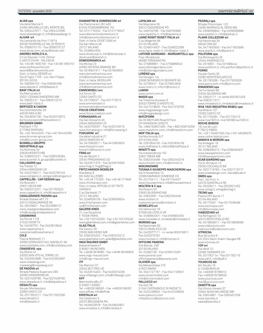
ALIAS spaVia delle Marine 524064 GRUMELLO DEL MONTE BGTel. 0354422511 - Fax 0354422590www.aliasdesign.it, [email protected] srlVia Leonardo da Vinci 118/1450028 TAVARNELLE VAL DI PESA FITel. 0558070115 - Fax 0558070127www.alivar.com, [email protected] WORLD S.A.C/Los Sauces 7, Urb. OlimarE 46370 CHIVA - VALENCIATel. +34 96 1805700 - Fax +34 96 [email protected]. in Italia: DESSIÈ srlVia di Tiglio 1735 - Loc. San Filippo55100 LUCCATel. 058394102 - Fax 058394266www.dessie.it, [email protected] ITALIA srlVia Marconato 820031 CESANO MADERNO MBTel. 03625121 - Fax 0362512210www.basf-italia.itBERTOZZI & CASONIVia Colombarotto 2840026 IMOLA BOTel. 0542640136 - Fax [email protected] GMBHPostfach 1151D 77863 RHEINAUTel. +49 78444020 - Fax +49 [email protected] GRUPPO INDUSTRIALE spaVia Kennedy 3420826 MISINTO MBTel. 0296320221 - Fax 0296329384www.busnelli.it, [email protected] spaVia Trieste 1233044 MANZANO UDTel. 0432748211 - Fax 0432750104www.calligaris.it, [email protected] - CAP DESIGN spaVia Busnelli 120821 MEDA MBTel. 0362372231 - Fax 031763322www.cappellini.it, [email protected] PADANA spaStrada Statale 467, 7342013 CASALGRANDE RETel. 05229901 - Fax 0522996121www.casalgrandepadana.cominfo@casalgrandepadana.itCASAMANIAVia Ferret 11/931020 VIDOR TVTel. 04236753 - Fax [email protected]ÉPiazza Matteotti 1120063 CERNUSCO SUL NAVIGLIO MIwww.coleitalia.com, [email protected] spaVia Remis 4133050 SAN VITO AL TORRE UDTel. 0432932896 - Fax [email protected] PADOVA srl Strada Padana Superiore 28020090 VIMODRONE MITel. 0227439795 - Fax 0227439780www.depadova.it, [email protected] spaVia per Montesolaro22063 CANTÙ COTel. 0317832211 - Fax [email protected]
DIAMANTINI & DOMENICONI srlVia Flaminia km 261,40061034 FOSSOMBRONE PUTel. 0721716334 - Fax 0721716547www.diamantinidomeniconi.it info@diamantinidomeniconi. itDistr. in Italia: DOVETUSAI srlVia San Marco 4620121 MILANOTel. 0236642300www.dovetusai.it, [email protected]@skistch.itDOMODINAMICA srlVia Molise 2340060 OSTERIA GRANDE BOTel. 0516941911 - Fax [email protected]. in Italia: [email protected] EMMEMOBILI sncVia Torino 2922063 CANTÙ COTel. 031706527 - Fax [email protected] CREATIONSwww.focus-creation.comFORNASARIG srlVia San Giovanni 4533044 MANZANO UDTel. 0432750057 - Fax 0432740015www.fornasarig.it, [email protected] srlVia delle Industrie 2730020 MARCON VETel. 0415953811 - Fax [email protected] srlVia dei Boschi 233040 PRADAMANO UDTel. 0432671375 - Fax 0432670930www.frag.it, [email protected] HANSEN MOEBLERAllerødvej 8DK 3450 ALLERØDTel. +45 48 172300 - Fax +45 48 171948www.fritzhansen.comDistr. in Italia: REPUBLIC OF FRITZ HANSEN C.so Garibaldi 7720121 MILANOTel. 0249526135 - Fax [email protected] KREO31, rue DauphineF 75006 PARISTel. +33 153102300 - Fax +33 153100249www.galeriekreo.com, [email protected] ITALIA Via Cavour 2920050 MACHERIO MBTel. 0392323202 - Fax 0392323212www.glasitalia.com, [email protected] MAURER GMBHKaiserstrasse 47D 80801 MUNCHENTel. +49 89 3816060 - Fax +49 89 [email protected] Via Marconi 3733042 BUTTRIO UDTel. 0432674453 - Fax 0432674036www.itfdesign.com, [email protected] 27D 32657 LEMGOTel. +49526198590 - Fax +49526189281www.kff.de, [email protected] srlVia Calderano 533070 BRUGNERA PNTel. 0434623678 - Fax 0434624901www.kristalia.it, [email protected]
LAPALMA srlVia Majorana 2635010 CADONEGHE PDTel. 049702788 - Fax 049700889www.lapalma.it, [email protected] ROSET ROSET ITALIA srlC.so Magenta 5620123 MILANOTel. 0248514007 - Fax 0248022388www.ligne-roset.it, [email protected] GIORDANO - MARGARITELLI spaFraz. Miralduolo06089 TORGIANO PGTel. 075988681 - Fax [email protected] spaVia Novegro 1/a20090 NOVEGRO DI SEGRATE MITel. 02756241 - Fax 0275624800www.lorenz.it, [email protected] spaVia Triestina Accesso E30020 TORRE DI MOSTO VETel. 0421319600 - Fax [email protected] 35 MEIYUAN Road 6 FloorCN SHANGHAI 200070Tel. +862163801455 - Fax +862163815259www.matzform.com, [email protected] ITALIA spaVia Morimondo 5/720143 MILANOTel. 0281804100 - Fax 0281804108www.mdfitalia.it, [email protected] spaVia Indipendenza 15220821 MEDA MBTel. 0362343499 - Fax 0362340319www.minotti.com, [email protected] E GIUSEPPE MASCHERONI spaVia IV Novembre 7222066 MARIANO COMENSE COTel. 031754111 - Fax 031744437www.misuraemme.it, [email protected] & C spaVia Rossini 5020833 GIUSSANO MBTel. 03623591 - Fax [email protected] srlVia Valmorsel 1837056 SALIZZOLE VRTel. 0456954001 - Fax 0456954030www.morelato.it, [email protected] spaVia Nazionale 6033010 CAVALICCO UDTel. 0432577111 - nr. verde 800016811Fax 0432570761www.moroso.it, [email protected] PANERAIV.le Monza 25920126 MILANOTel. 02363138 - Fax [email protected] spaVia Marecchiese 27547922 RIMINITel. 0541727787 - Fax [email protected] srlVia Azzi 3631040 CASTAGNOLE DI PAESE TVTel. 0422438600 - Fax [email protected]
PEDRALI spaStrada Provinciale 12224050 MORNICO AL SERIO BGTel. 0358358840 - Fax 0358358888www.pedrali.it, [email protected] COLLEZIONI srlVia Nazionale 3539040 ORA BZTel. 0471803500 - Fax 0471803599www.plank.it, [email protected] spaVia Montesanto 2822044 INVERIGO COTel. 0316951 - Fax 031699444www.poliform.it, [email protected] Via per Cantù 3522060 MONTESOLARO COTel. 031783266 - Fax 0317832626www.porro.com, [email protected] spaVia Furlanelli 9620034 GIUSSANO MBTel. 03623171 - nr verde 800 901439Fax 0362317317www.rimadesio.it, [email protected] 1920 INDUSTRIA MOBILI spaVia Milano 13722063 CANTÙ COTel. 031733094 - Fax 031733413www.riva1920.it, [email protected] BOBOIS18, rue de LyonF 75012 PARISTel. +33 1 53461000, Fax +331 46289375www.roche-bobois.comSAWAYA & MORONI spaVia Andegari 1820121 MILANOTel. 0286395212 - Fax [email protected] GIARDINO spaVia G. Monauni 1225030 COCCAGLIO BSTel. 0307718760 - Fax 0307718777www.scabdesign.com, [email protected] spaVia L. da Vinci 442016 GUASTALLA RETel. 05228211 - Fax 0522821452www.smeg.it, [email protected] spaPiazza XXV Aprile 1120154 MILANOTel. 03175381 - Fax [email protected] srlVia Romagnoli 1040010 BENTIVOGLIO BOTel. 0518908011 - Fax [email protected] de la Gre 8CH 2024 Saint-Aubin-Sauges NEwww.vitrocsa.chYDF srlVia Verdi 1022060 CARIMATE COTel. 031782114 - Fax 031782115www.ydf.it, [email protected] AGAm Studio 16D 12489 BERLINTel. +4930818799010Fax [email protected] spaVia Vittorio Veneto 5720834 NOVA MILANESE MBTel. 03624981 - Fax [email protected]
INservice INdirizzi / 111INTERNI novembre 2011
C_In616_R_111_indirizzi.indd 111 12/10/11 12.17
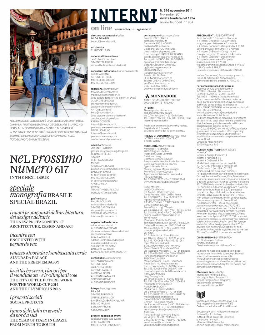
Nell’immagiNe: la blue café chair, disegNata dai fratelli campaNa, protagoNista tra la dea del mare e il vecchio Nero, iN uN Negozio umbaNda style di sÃo paulo.In the Image: the Blue Café ChaIr desIgned By the Campana Brothers In an umBanda style shop In sao paulo. (foto di/photo By ruy teixeira)
specialemonografia BRASILESpEcIAL BRAZIL
i nuovi protagonisti dell’architettura, del design e dell’artethE nEw pRotAgonIStS of ARchItEctuRE, dESIgn And ARt
incontro conEncountER wIthBernardo paz
palazzo Alvorada e l’Ambasciata verdeALvoRAdA pALAcEAnd thE gREEn EmBASSy
la città che verrà, i lavori peril mondiale 2014 e le olimpiadi 2016thE cIty of thE futuRE, woRkfoR thE woRLd cup 2014And thE oLympIcS In 2016
i progetti socialiSocIAL pRojEctS
l’anno dell’Italia in Brasileda nord a SudthE yEAR of ItALy In BRAZILfRom noRth to South
direttore responsabile/editorGILDA [email protected]
art directorchristoph radl
caporedattore centralecentral editor-in-chiefsimoNetta fiorio [email protected]
consulenti editoriali/editorial consultantsaNdrea braNziaNtoNio citteriomichele de lucchimatteo vercelloNi
redazione/editorial staffmaddaleNa [email protected](vice caporedattore/vice-editor-in-chief)olivia cremascoli [email protected](caposervizio/senior editor)aNtoNella [email protected](vice caposervizio architetture/architectural vice-editor)KatriN [email protected] e news/production and newsNadia [email protected] e sala posa production and photo studio
rubriche/featuresvirgiNio briatoregiovani designer/young designersgermaNo celaNtarte/artcristiNa morozzifashionaNdrea pirruccioproduzione e/production and newsdaNilo premolihi-tech e/and contractmatteo vercelloNiin libreria/in bookstoresaNgelo villacinema [email protected] traduzioni/translations
grafica/layoutmaura [email protected] [email protected] [email protected]
segreteria di redazioneeditorial secretariatalessaNdra [email protected]/headadalisa [email protected] del direttoreassistant to the editorbarbara [email protected]
contributi di/contributors:stefaNo caggiaNoaNtoNio cauvaleNtiNa crociaNtoNella galliaNdrea lissoNialessaNdra maurisergio pirroNealessaNdro rocca fotografi/photographsfg + sgsimoNe barberisgabriele basilicosaverio lombardi vallauribeN mc millaNsergio pirroNeKeNichi suzuKi
progetti speciali ed eventispecial projects and eventscristiNa boNiNimichelaNgelo giombiNi
ABBONAMENTI/suBsCrIptIonsitalia annuale: 10 numeri + 3 annual+ 1 interni onboard + design indexItaly, one year: 10 issues + 3 annuals + 1 Interni onBoard + design Index € 91,90 estero annuale: 10 numeri + 3 annual+ 1 interni onboard + design indexforeign, one year: 10 issues + 3 annuals + 1 Interni onBoard + design Indexeuropa via terra-mare/europe by surface-sea mail € 123,20 via aerea/air mail: europa/europe € 146,40 usa-canada € 169,90resto del mondo/rest of the world € 249,70
inviare l’importo a/please send payment to:press-di srl servizio abbonamenti, servendosi del c/c. postale n. 77003101.
Per comunicazioni, indirizzare a:Inquiries should be addressed to:iNterNi - servizio abbonamenti casella postale 97- 25197 brescia tel. 199 111 999 (dall’italia/from Italy)costo massimo della chiamata da tutta italia per telefoni fissi: 0,14 € iva compresa al minuto senza scatto alla risposta. tel. + 39 041 5099049 (dall’estero/from abroad)fax + 39 030 3198202e-mail: [email protected] www.abbonamenti.it/internil’editore garantisce la massima riservatezza dei dati forniti dagli abbonati e la possibilità di richiederne gratuitamente la rettifica o cancellazione ai sensi dell’art. 7 del d.leg.196/2003 scrivendo a/the publisher guarantees maximum discretion regarding information supplied by subscribers; for modifications or cancellation please write to:press-di srl direzione abbonamenti 20090 segrate (mi)
NUMERI ARRETRATI/BaCK Issuesinterni: € 10interni + design index: € 14 interni + annual: € 14 interni + onboard: € 14 modalità di pagamento: c/c postale n. 77270387 intestato a press-di srl “collezionisti” (tel. 199 162 171).indicare indirizzo e numeri richiesti. per pagamento con carte di credito (accettate: cartasì, american express, visa, mastercard e diners), specificare indirizzo, numero di carta e data di scadenza, inviando l’ordine via fax (02 95103250) o via e-mail ([email protected]).per spedizioni all’estero, maggiorare l’importo di un contributo fisso di € 5,70 per spese postali. la disponibilità di copie arretrate è limitata, salvo esauriti, agli ultimi 18 mesi. Non si accettano spedizioni in contrassegno.please send payment to press-di srl “Collezionisti” (tel. + 39 02 95970334),postal money order acct. no. 77270387,indicating your address and the back issues requested. for credit card payment (Cartasì, american express, Visa, mastercard, diners)send the order by fax (02 95103250) or e-mail ([email protected]), indicating your address, card number and expiration date. for foreign deliveries,add a fixed payment of h 5,70 for postage and handling. availability of back issues is limited, while supplies last, to the last 18 months. no Cod orders are accepted.
DISTRIBUZIONE/dIstrIButIonper l’italia e per l’esterofor Italy and abroaddistribuzione a cura di press-di srl
l’editore non accetta pubblicità in sede redazionale. i nomi e le aziende pubblicati sono citati senza responsabilità.the publisher cannot directly process advertising orders at the editorial offices and assumes no responsibility for the names and companies mentioned.
Stampato da/printed by mondadori printing s.p.a.,via luigi e pietro pozzoni 11cisano bergamasco (bergamo)stabilimento di veronanel mese di ottobre 2011
on line www.internimagazine.it
Questo periodico è iscritto alla fiegthis magazine is member of fIegfederazione italiana editori giornali © copyright 2011 arnoldo mondadorieditore s.p.a. – milano.tutti i diritti di proprietà letteraria e artistica riservati. manoscritti e foto anche se non pubblicati non si restituiscono.
arNoldo moNdadori editore20090 segrate - milaNo
INTERNIthe magazine of interiors and contemporary designvia d. trentacoste 7 - 20134 milanotel. +39 02 215631 - fax +39 02 [email protected]
pubblicazione mensile/monthly review. registrata al tribunale di milano al n° 5 del 10 gennaio1967.
PREZZO DI COPERTINA/CoVer prICe iNterNi + aNNual coNtract€ 10,00 in italy
PUBBLICITÀ/adVertIsIngmondadori pubblicità 20090 segrate - milanopubblicità, sede centraledivisione livingdirettore: simone silvestriresponsabile vendite: lucie patrunocoordinamento: silvia bianchiagenti: ornella forte, Nicola fogliaro, marco ronaghi, fulvio tosi, mauro zanellaagenzie e centri media lombardia: patrizia rossettitel. 02/75422675 - fax 02/75423641www.mondadoripubblicita.com
sedi esterne:lazio/campaNia cd-media - carla dall’ogliocorso francia, 165 - 00191 romatel. 06/3340615 - fax 06/[email protected]/valle d’aosta/liguriacomunication & morefulvio tosi - luigi d’angelovia bologna, 220 - int.17/13 - 10154 torinotel. 011/8128495 - fax 011/[email protected] pubblicità padova tommaso gentile, elfi sartori, paola zuin galleria borromeo, 4 - 35137 padovatel. 049/8752025 - fax 049/[email protected]. pubblicità / enzo filippinivia alberto mario, 10 - 37121 veronatel. 045/8000868 - fax 045/[email protected] romagNa/saN mariNomarco tosetti / irene mase’ darivia pasquale muratori, 7 - 40134 bolognatel. 051/4391201 - fax 051/[email protected]/umbriamarco marucci - gianni pierattonipaola sarti - m.grazia vagnettipiazza savonarola, 9 - 50132 firenzetel. 055/500951- fax 055/[email protected]/moliseluigi gorgoglione via ignazio rozzi, 8 - 64100 teramotel. 0861/243234 - fax 0861/[email protected]/basilicatamedia time - carlo martinovia diomede fresa, 2 - 70125 baritel. 080/5461169 - fax 080/[email protected]/sicilia/sardegNagap srl - giuseppe amatovia riccardo Wagner, 5 - 90139 palermotel. 091/6121416 - fax 091/584688email: [email protected] masi, valeriano sudati via virgilio, 27 - 61100 pesarocell. 348/8747452 - fax 0721/638990email:[email protected]; [email protected]
N. 616 novembre 2011November 2011rivista fondata nel 1954review founded in 1954
corrispondenti/correspondentsfrancia: edith [email protected]: luca [email protected]: sergio [email protected] bretagna: davide [email protected]: marco sousa [email protected]: cristiNa [email protected] lucia [email protected]: Jill [email protected]: cheNg chuNg [email protected]: paul [email protected]
neL prossImonumero 617In thE nExt ISSuE
C_In616_R_112_colophon.indd 112 13/10/11 11.44