Interacetion Aesthetics
18
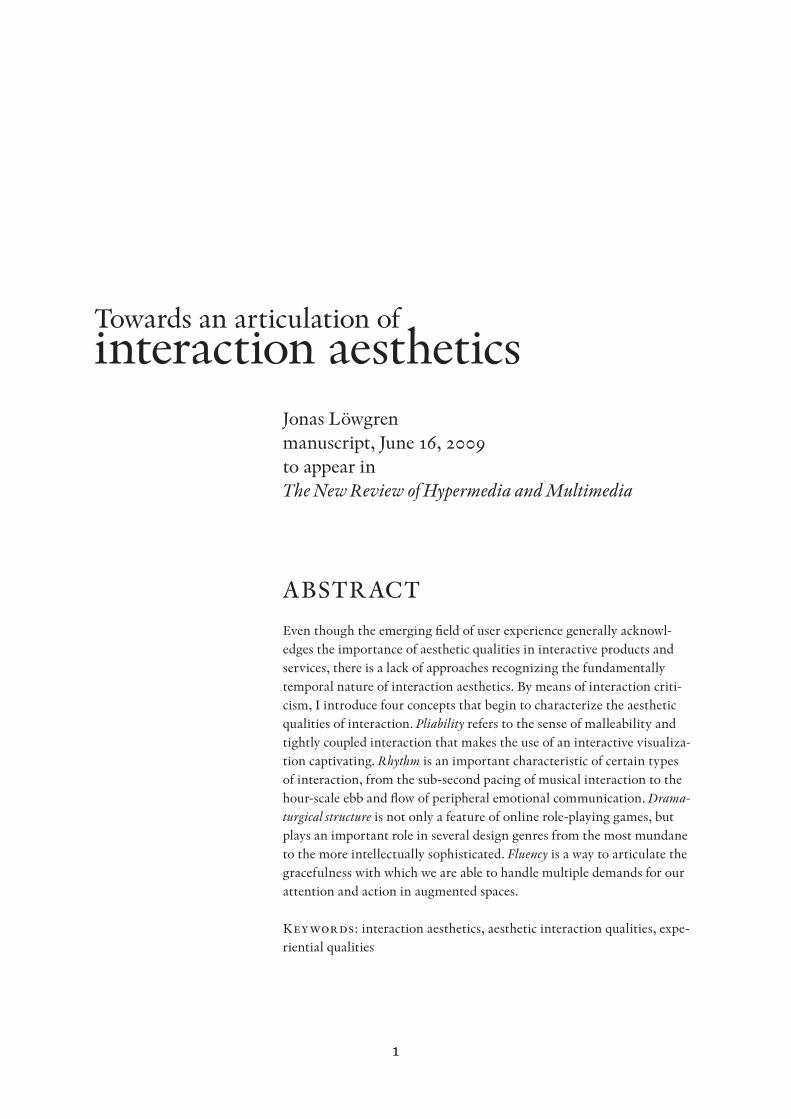
1 Towards an articulation of interaction aesthetics Jonas Löwgren manuscript, June 16, 2009 to appear in The New Review of Hypermedia and Multimedia ABSTRACT Even though the emerging field of user experience generally acknowl- edges the importance of aesthetic qualities in interactive products and services, there is a lack of approaches recognizing the fundamentally temporal nature of interaction aesthetics. By means of interaction criti- cism, I introduce four concepts that begin to characterize the aesthetic qualities of interaction. Pliability refers to the sense of malleability and tightly coupled interaction that makes the use of an interactive visualiza- tion captivating. Rhythm is an important characteristic of certain types of interaction, from the sub-second pacing of musical interaction to the hour-scale ebb and flow of peripheral emotional communication. Drama- turgical structure is not only a feature of online role-playing games, but plays an important role in several design genres from the most mundane to the more intellectually sophisticated. Fluency is a way to articulate the gracefulness with which we are able to handle multiple demands for our attention and action in augmented spaces. Keywords : interaction aesthetics, aesthetic interaction qualities, expe- riential qualities
-
Upload
sefat-chowdhury -
Category
Design
-
view
91 -
download
0
Transcript of Interacetion Aesthetics
1
Towards an articulation of interaction aesthetics
Jonas Löwgren manuscript, June 16, 2009 to appear in The New Review of Hypermedia and Multimedia
ABSTRACT
Even though the emerging field of user experience generally acknowl-edges the importance of aesthetic qualities in interactive products and services, there is a lack of approaches recognizing the fundamentally temporal nature of interaction aesthetics. By means of interaction criti-cism, I introduce four concepts that begin to characterize the aesthetic qualities of interaction. Pliability refers to the sense of malleability and tightly coupled interaction that makes the use of an interactive visualiza-tion captivating. Rhythm is an important characteristic of certain types of interaction, from the sub-second pacing of musical interaction to the hour-scale ebb and flow of peripheral emotional communication. Drama-turgical structure is not only a feature of online role-playing games, but plays an important role in several design genres from the most mundane to the more intellectually sophisticated. Fluency is a way to articulate the gracefulness with which we are able to handle multiple demands for our attention and action in augmented spaces.
Keywords: interaction aesthetics, aesthetic interaction qualities, expe-riential qualities
2
INTRODUCTION
In the emerging field of user experience, it is generally acknowledged that aesthetic qualities of interactive products and services play important roles for the users’ impressions and actions. However, aesthetic qualities are most often equated with the static appearance of a device or a screen layout; there is a striking lack of conceptualizations for addressing the beauty (or lack thereof) with which the interaction between user and product unfolds over time.
Interaction design researchers started advocating a shift of focus from the static to the dynamic already in the 1990s; a particularly eloquent example is the »sloganesque point« formulated by Djajadiningrat et al. (2000, p. 132) as follows:
Don’t think beauty in appearance, think beauty in interaction.Usability is generally treated separately from aesthetics. Aesthetics in product design appears to be restricted to making products beauti-ful in appearance. As the ease of use strategies do not appear to pay off, this has left us in the curious situation that we have products that look good at first sight, but frustrate us as soon as we start interacting with them. We think that the emphasis should shift from a beautiful appearance to beautiful interaction, of which beautiful appearance is a part.
The work reported here is a belated attempt to respond to the challenge posed by Djajadiningrat et al.: To emphasize beautiful interaction and, more specifically, to provide concepts for articulating and debating the beauty of interaction.
The paper starts with a discussion of how I use the concepts of beauty and aesthetics in this work, and then illustrates the difference between aesthetics of appearance and aesthetics of interaction by means of an ex-ample from the domain of interactive visualization. The main part of the work consists of introducing four aesthetic interaction qualities, or concepts that are intended to be used for unpacking the notion of beauty of inter-action: pliability, rhythm, dramaturgical structure and fluency. The final section is a discussion in which I examine the methodology of the work, its position in a scholarly community, and its potential value.
BeAUTy AND AeSTheTICS
Even though there is a preference within the academic user-experience community to limit the scope of aesthetics to immediate sensory grati-fication, it is generally conceded that »we experience sensuous delight, meaningful interpretation and emotional involvement as a unity« (Hekkert, 2006). This is also consistent with a pragmatist point of view (Melles, 2008), and specifically with the pragmatist notion of aesthetic experience (Dewey, 1934; McCarthy & Wright, 2004; Petersen et al.,
3
2004), which conflates the three levels of senses, meaning and emotion in the actual use situation. The task at hand here is to provide actionable knowledge for designers and researchers who wish to understand the aes-thetic qualities of the interactions they design; to this end, it would seem to make the most sense to adopt an inclusive notion of aesthetics where elements of meaning and emotion are included.
Specifically, the view taken here is that a statement expressing an ap-praisal or a taste judgment of a sensory impression is an aesthetic state-ment. To say that something looks good, feels stimulating or smells awful is an aesthetic statement; factual reports on sensory impressions – looks blue, feels uneven, smells acidic – are not aesthetic statements.
Moreover, aesthetic appraisals can be negative as well as positive. It is unfortunately not uncommon to hear an interaction experience described as »boring and monotonous«, and that is in fact an aesthetic appraisal of negative valence. Saying that something is beautiful is obviously an aesthetic judgment, but so is saying that something lacks beauty.
What is aesthetically appropriate depends on what the user expects from the interaction experience, which is in turn colored by her initial appraisal of the product, its purpose, its use potentials – in short, its genre. For instance, a dating site on the Web with its genre expectations of flirtation and friendly banter would most likely be designed to engender a playful and slightly whimsical interaction experience. A survival/horror game, on the other hand, is primarily designed around the aesthetic qual-ity of vulnerability (Niedenthal, 2008). And, as will be elaborated below, interactive visualizations depend significantly on the aesthetic interaction quality of pliability.
To conclude this brief discussion of key concepts and their meanings, it must be noted that the valence of an aesthetic experience is not neces-sarily correlated to its appeal (and the economic success of the product). To return to the genre of survival/horror games, it is clear that the player’s aesthetic experience of vulnerability is distinctly negative and un-pleasant in a very direct, psychophysiological sense. Yet many people find such experiences attractive and captivating enough to spend substantial amounts of time and money on them.
PINPOINT APPeARANCe AND PINPOINT INTeRACTION
Figure 1 is a screenshot from the Pinpoint visualization which addresses the task of finding colleagues within a large organization: the right person to ask a specific question, and people that you would like to get to know in order to expand your professional network. The basic idea of the visualization is that you are presented in the middle, surrounded by the 60 people in the organization most similar to you in terms of professional interests and competencies. The data is mined from documents, hr data-bases and other intraorganizational information sources. You can browse

4
the people in view, filter the view using topical tags, explore communica-tion patterns among people, and so on.
The appearance of the visualization may be assessed from the snap-shot, of course, and as such it may come across as moderately interesting. The color palette could be characterized as calm and competent; there is an attractive contrast between the organic shapes of the people silhou-ettes and the background info-wall on one hand and the modernistic typography on the other.
However, the aesthetic emphasis of our design work was not on the way the visualization looks but rather on the way it feels to use. First, we aimed for the user to experience the interaction as highly pliable – the sense of a tightly coupled interaction, akin to shaping a malleable materi-al with your hands – which is known to facilitate data exploration and ser-endipitous discovery (Löwgren, 2007a). Careful work on the mouseover behaviors, browsing techniques and rapid-feedback tag filters was devoted to reaching these goals, and when users tested the visualization, we found that curiosity-driven exploration was encouraged and the users found the interaction somewhat captivating in a tactile sense.
Our second aim in terms of aesthetic interaction experience was to engender a sense of grasping the full scope between overview and details, where we intended for users to perceive the size and potential of their own organization but at the same time not be intimidated by it. When users tested the first prototype, it was clear that we failed to convey the underlying model of a few promising people selected from a much larger number; Figure 1 is taken from a proposed design revision where ghost silhouettes are added around the 60 selected people to suggest the larger
Figure 1: Pinpoint, a visualiza-tion of people in a large organiza-tion. Designed by the author with Gunnar Forsén and Thomas Lundin.
5
population of colleagues. When the view is filtered or a new person is centered, the silhouettes moving between the selected view and the ghost crowd are animated to further establish the few-from-many model.
None of the interaction features mentioned here are discernible from the static snapshot in Figure 1. Yet I would argue that they are the main vehicles of aesthetic qualities in Pinpoint.
(The interested reader is referred to webzone.k3.mah.se/k3jolo/Pin-point for a demo that makes it possible to assess the points made in this section.)
AeSTheTIC INTeRACTION qUAlITIeS
We now move on to the main part of this work, in which I introduce four concepts that seem to add some clarity to our task of unpacking the beauty of interaction. I call them aesthetic interaction qualities, in analogy with the more general approach of experiential qualities – properties or traits that characterize a user’s experience of interacting with a product or service (Löwgren, 2006). The four aesthetic interaction qualities present-ed here include pliability, rhythm, dramaturgical structure and fluency; the order of presentation ranges from the most fine-grained details of how the actual interaction feels to the more general qualities of multiple interactions embedded in the flow of everyday life.
Pliability – Information appears malleableWhen an interaction feels tightly coupled and highly responsive, almost to the point of shaping a malleable material with your hands, then the interaction experience is one of high pliability (Löwgren, 2007a).I touched upon pliability already in the Pinpoint example (Figure 1), where we spent significant design and prototyping time fine-tuning the detailed behaviors of the interface to make the interaction seem highly re-sponsive and inviting to the touch. When the user moves the cursor over a silhouette, a mini-menu appears instantly for the most relevant elabora-tions (detailed info about the person under the cursor, communication patterns) whereas the organizational info displayed on the background wall requires a one-second hover to be displayed in order not to distract attention from the tip of the cursor. When a tag is used to filter the view, results are displayed instantly and incrementally. And so on.
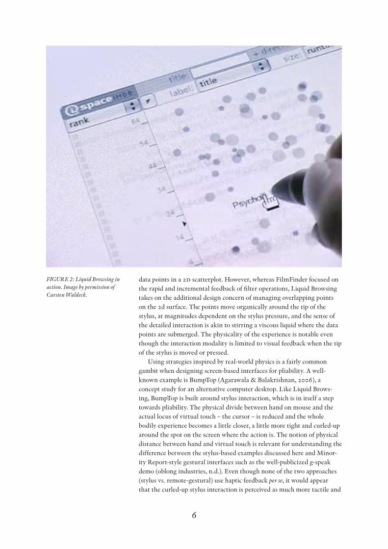
Yet there are examples that go much further in designing for pliabil-ity. Figure 2 shows Liquid Browsing (Waldeck and Balfanz, 2004), which must be regarded as a highly pliable approach to interactive information visualization. The data in the example shown here is a movie database, probably chosen as an homage to the seminal Maryland work on dynamic queries where the design ideal of pliability was first formulated, albeit under the label of »tight coupling« (Ahlberg & Shneiderman, 1994). Like the Maryland FilmFinder, the Liquid Browsing demo presents the
6
data points in a 2d scatterplot. However, whereas FilmFinder focused on the rapid and incremental feedback of filter operations, Liquid Browsing takes on the additional design concern of managing overlapping points on the 2d surface. The points move organically around the tip of the stylus, at magnitudes dependent on the stylus pressure, and the sense of the detailed interaction is akin to stirring a viscous liquid where the data points are submerged. The physicality of the experience is notable even though the interaction modality is limited to visual feedback when the tip of the stylus is moved or pressed.
Using strategies inspired by real-world physics is a fairly common gambit when designing screen-based interfaces for pliability. A well-known example is BumpTop (Agarawala & Balakrishnan, 2006), a concept study for an alternative computer desktop. Like Liquid Brows-ing, BumpTop is built around stylus interaction, which is in itself a step towards pliability. The physical divide between hand on mouse and the actual locus of virtual touch – the cursor – is reduced and the whole bodily experience becomes a little closer, a little more tight and curled-up around the spot on the screen where the action is. The notion of physical distance between hand and virtual touch is relevant for understanding the difference between the stylus-based examples discussed here and Minor-ity Report-style gestural interfaces such as the well-publicized g-speak demo (oblong industries, n.d.). Even though none of the two approaches (stylus vs. remote-gestural) use haptic feedback per se, it would appear that the curled-up stylus interaction is perceived as much more tactile and
Figure 2: Liquid Browsing in action. Image by permission of Carsten Waldeck.
7
malleable than the stand-up-and-wave-from-a-distance style of infowalls with gestural input.
To go back to BumpTop, the key element in the design with respect to pliability is the almost exaggerated quasi-physicality of the objects that are manipulated with the stylus. They can be pushed, dragged, flicked around and they collide, bounce and pile up just like so many slow-mo-tion domino bricks. There is no question that this level of quasi-physi-cality helps engender a sense of tactile manipulation, perhaps as close to tangible interaction as it makes sense to go while still working in the realm of screen-based interfaces. We should note, however, that more subdued elements of quasi-physicality are used to great pliability effect also in more mundane applications. A great example is the augmented scroll bar of Picasa, which uses quasi-physical animations for ease-in and ease-out during scroll-speed control, thus making the whole interaction situation of overviewing large collections of digital images more solid and malleable than comparable solutions using standard scrolling idioms (Löwgren, 2007a).
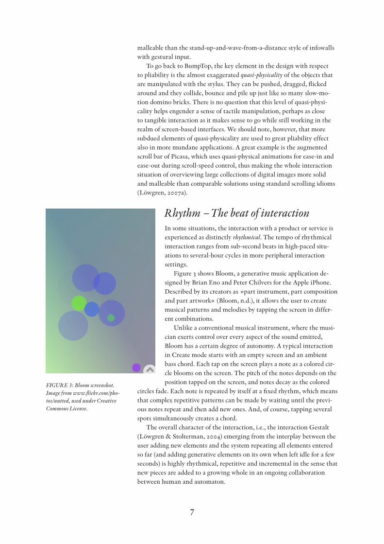
Rhythm – The beat of interactionIn some situations, the interaction with a product or service is experienced as distinctly rhythmical. The tempo of rhythmical interaction ranges from sub-second beats in high-paced situ-ations to several-hour cycles in more peripheral interaction settings.
Figure 3 shows Bloom, a generative music application de-signed by Brian Eno and Peter Chilvers for the Apple iPhone. Described by its creators as »part instrument, part composition and part artwork« (Bloom, n.d.), it allows the user to create musical patterns and melodies by tapping the screen in differ-ent combinations.
Unlike a conventional musical instrument, where the musi-cian exerts control over every aspect of the sound emitted, Bloom has a certain degree of autonomy. A typical interaction in Create mode starts with an empty screen and an ambient bass chord. Each tap on the screen plays a note as a colored cir-cle blooms on the screen. The pitch of the notes depends on the position tapped on the screen, and notes decay as the colored
circles fade. Each note is repeated by itself at a fixed rhythm, which means that complex repetitive patterns can be made by waiting until the previ-ous notes repeat and then add new ones. And, of course, tapping several spots simultaneously creates a chord.
The overall character of the interaction, i.e., the interaction Gestalt (Löwgren & Stolterman, 2004) emerging from the interplay between the user adding new elements and the system repeating all elements entered so far (and adding generative elements on its own when left idle for a few seconds) is highly rhythmical, repetitive and incremental in the sense that new pieces are added to a growing whole in an ongoing collaboration between human and automaton.
Figure 3: Bloom screenshot. Image from www.flickr.com/pho-tos/nutted, used under Creative Commons License.
8
Most comments on the Bloom application have centered on the ap-pealing and hypnotic qualities of the interaction (even though some gen-erative music artists and experts tend to add remarks on how unsophis-ticated Bloom is compared to more advanced algorithmic experiments). Music critic Ben Marshall (2008), for instance, contextualizes the work as the logical conclusion of Satie’s notion of an endless composition, and describes it as »hypnotic and ludicrously addictive.«
It goes more or less without saying that the interaction with a semi-autonomous music-making environment is going to be essentially char-acterized by rhythm. However, my point here is that rhythm is a factor in the experience of interaction also in non-musical contexts.
For instance, it has been known in human-computer interaction since the 1980s that consistent response times are preferable to variable ones, even if the average response time is shorter in the variable condition. It seems rather obvious that the reason for this preference is the human propensity towards rhythmical patterns and temporal predictability. Another example is found in certain repetitive tasks such as bulk-editing a collection of images. It is not uncommon for people to choose to do the manual operations over and over, even though the editing tools support the recording and execution of macros. There are surely plausible expla-nations to be found for this behavior in the tendency to abstain from short-term effort if the long-term gain is unfamiliar, and in the classic hci adage »Recognition is easier than recall.« However, I would like to add the rhythm factor to the analysis: There may be a certain hypnotic pleasure to be found in the rhythmic repetition of a motor sequence in a micro-automatic fashion without breakdowns, as indicated in the self-im-provement recommendations of repetitive activity such as riding a bicycle to stimulate “alpha waves.” Recognizing the possible value of rhythmi-cal interaction in non-musical use situations could lead to user-interface design strategies for inducing rhythmical interaction where guidelines would include placing interaction devices for potentially repetitive tasks in spatially and temporally predictable order to facilitate rhythmic perfor-mance.
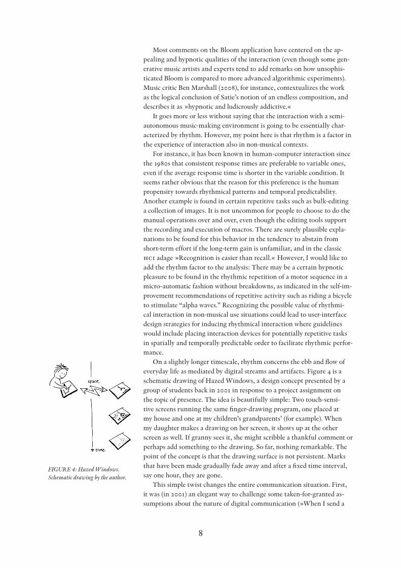
On a slightly longer timescale, rhythm concerns the ebb and flow of everyday life as mediated by digital streams and artifacts. Figure 4 is a schematic drawing of Hazed Windows, a design concept presented by a group of students back in 2001 in response to a project assignment on the topic of presence. The idea is beautifully simple: Two touch-sensi-tive screens running the same finger-drawing program, one placed at my house and one at my children’s grandparents’ (for example). When my daughter makes a drawing on her screen, it shows up at the other screen as well. If granny sees it, she might scribble a thankful comment or perhaps add something to the drawing. So far, nothing remarkable. The point of the concept is that the drawing surface is not persistent. Marks that have been made gradually fade away and after a fixed time interval, say one hour, they are gone.
This simple twist changes the entire communication situation. First, it was (in 2001) an elegant way to challenge some taken-for-granted as-sumptions about the nature of digital communication (»When I send a
Figure 4: Hazed Windows. Schematic drawing by the author.
9
message, it sits in the recipient’s inbox until she decides to do something about it«). Secondly, and more importantly, the fading away of the marks makes the communication more lightweight and ephemeral, more in line with the general rhythm of grandchild–grandmother communication which is more or less continuously ongoing and where conversational closure in the adult sense is of less significance. As anybody who has small children will know, many drawings are prepared for granny in a year and only very few are actually mailed or handed over.
The Hazed Windows concept illustrates how design can be sensitive to long-duration interaction rhythm and thus widens our perspective from the instrumental focus on effective communication that is often taken for granted in traditional hci towards including also more aesthetic consid-erations of the communication situation. There is a useful analogy here to the topic of rhythm in architecture, where buildings themselves can be seen as non-temporal 3d objects, but where the act of experiencing archi-tecture is certainly a temporal one:
If we believe that the object of architecture is to provide the frame-work for people’s lives, then the rooms in our houses, and the relation between them, must be determined by the way we will live in them and move through them.
This quote is taken from Eiler Rasmussen’s classic work on experiencing architecture (1959/1992), and specifically from his chapter on rhythm in architecture. It seems to me that Hazed Windows illustrates a similar treatment of interaction design in the larger everyday context of rhythms inherent in how we deal with the augmented spaces (Manovich, 2006) of the 21st century: how we live with the digital media and move by them.
Dramaturgical structure – From exposition to resolutionThe attribution of dramaturgical structure to interaction experience is due to Laurel (1993); however, her prescient discussion has not been used very widely to analyze the beauty of interaction. I would argue that it holds a certain value for understanding not only role-playing computer games but also other interaction design genres.
Consider the most mundane of interaction experiences: Withdraw-ing cash from an atm. When you start by inserting your card, there is already a certain level of (psychological) arousal. The card represents the means necessary to sustain yourself and your family for the rest of the month, and you are sticking it into an anonymous hole in the wall. Not to mention the effort that would be required to get a new card if the machine would swallow the card due to some technical glitch. And what about skimming devices? Are you really sure this machine is clean?
The welcome screen appears, you type in your pin code and select an amount to withdraw. The machine takes its time to process your request and communicate with its central computers, and dramatic tension builds to a climax as seconds pass. Is there enough money in the account? It is

10
close to the end of the month, after all. How embarrassing to be declined in front of a long line of people waiting to use the machine! You wonder if your wife made a purchase from the same account yesterday; perhaps you even have time to consider how many times you have typed your credit card number into e-commerce web pages of questionable validity.
Then the machine returns your card without complaints. Tension drops somewhat but the dramatic resolution is not completed until you get the bank notes and the receipt. Exhale. The End.
The conventional way to analyze dramaturgical structure is to plot dramatic tension in a story or play over time, yielding what is known as a Freytag graph. It should be straightforward to construct a Freytag graph of atm cash withdrawal from the account above. Once that is done, it also becomes apparent that atm cash withdrawal could be designed ac-cording to other dramaturgical structures. If the machine would instantly contact the central computer when you inserted the card, for instance, then it could present the account balance immediately after your entering the pin code. The resulting Freytag graph would be more flat (Figure 5) and less similar to the classic Aristotelian shape of exposition, compli-cation, climax and resolution (Laurel, 1993). Whether this would be a good or bad design move, whether the interaction would be more or less »beautiful«, is largely a question awaiting exploration. The point here is merely that acknowledging the dramaturgical structure opens the pos-sibility of modifying it.
Another area where dramaturgical structure contributes significantly to the experience is critical design, and specifically what Dunne (1999) terms parafunctionality. That is, design artifacts that clearly reveal their function – but on reflection you find that the function revealed is anoma-lous, paradoxical, inappropriate or in some other way critical of our tacit assumptions or our genre expectations. More generally, the dramaturgical structure of experiencing parafunctional objects can be seen to consist of three steps.1) Simple recognition of the product and its intended function.2) A period of frustration at the obvious inappropriateness of the
intended function.
Figure 5: The dramaturgical structures of ATM interaction using two different interaction designs.
Figure 6: SoMo3 – The Musical Mobile. From Social Mobiles by IDEO with Crispin Jones, 2002. Photo by Maura Shea, used with permission.
11
3) A sudden insight (the »a-ha« moment) when you realize what the artist-designer wants to make you see.
The example in Figure 6, taken from a well-known interaction design concept project called Social Mobiles (Pullin, 2007), illustrates this dramaturgical structure rather well. First, you recognize the designer’s intention that in order to call somebody on the Trumpet Phone, you would play notes in order to dial the number. Secondly, you are embar-rassed by the thought of playing trumpet in public and of how that would annoy other people. You may even be a little angry with the designer for being so stupid. Thirdly, you recognize that you are already annoying other people simply by talking on your regular cell phone, probably too loud at that. Dialing by playing the trumpet would at least force you to seek more appropriate places to make your calls.
Fluency – The graceful dance among media streamsAs we move between interaction surfaces, into and out of media streams, in the course of our daily lives, we may sometimes experience a sense of dealing gracefully with multiple demands for our attention and our action. On those occasions, there is a high degree of fluency in our interac-tion experience (Löwgren, 2007b).
There seem to be two major areas of interaction design where fluency is significant. One is peripheral interaction and calm technology, and the other concerns the relation between digital artifacts and everyday social norms and practices.
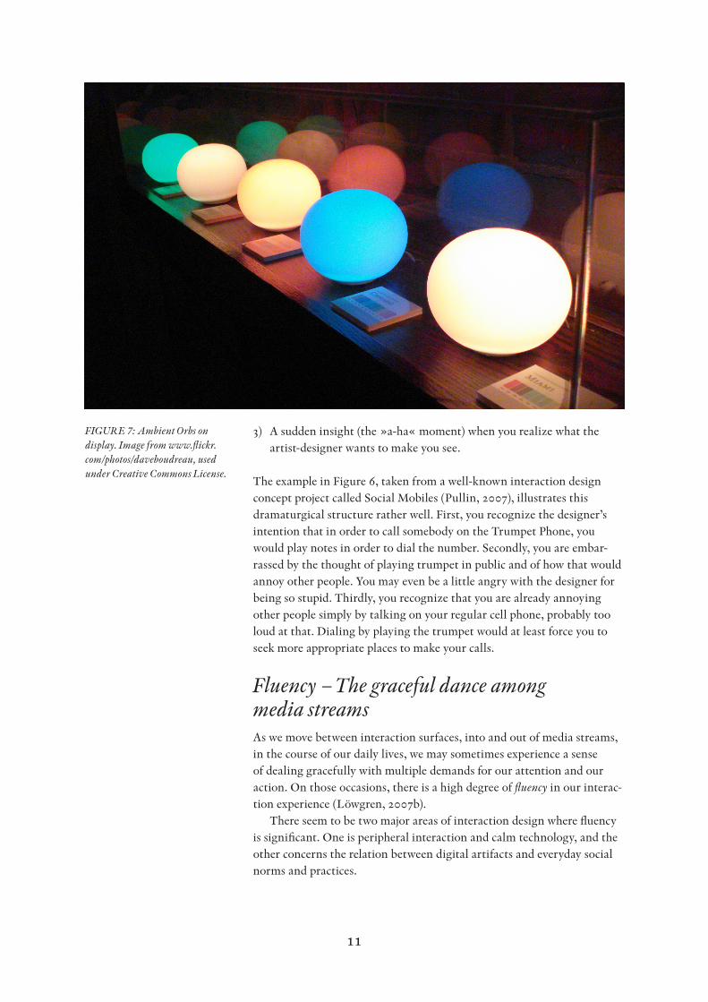
Figure 7: Ambient Orbs on display. Image from www.flickr.com/photos/daveboudreau, used under Creative Commons License.
12
First, let us consider the experience of fluency in relation to indi-vidual information perception and processing. It has become a cliché to point out that we are constantly overloaded with information. Designers have addressed this situation in several ways, one of which entails fusing large amounts of information into abstracted representations that can be perceived peripherally and thus reduce the demands on our conscious attention and processing. A well-known example is the Ambient Orb (n.d.), shown in Figure 7, which amounts to a desk lamp monitoring a data stream coming via the Internet. The lamp changes color depending on the trend of the data values over time, yielding a compact representa-tion of a potentially complex dataset that can be perceived in the corner of your eye as you attend to other things. When there is a change in the data calling for your attention and action, you will most likely notice the visual change and thus you will be able to decide on possible further action if the lamp, for instance, changes from green to red signifying a sudden peak in network traffic on an Internet port used mainly by hack-ers attempting to intrude (assuming that you work as a systems operator for a large company).
Visualizations based on data fusion are becoming increasingly com-mon and it is straightforward to see how they may contribute to fluency in everyday or working life, due to the way in which they reduce the demands for our conscious attention and information processing, yet provide enough perceivable information to be trusted with the task of making us notice when there is a development that really demands our attention.
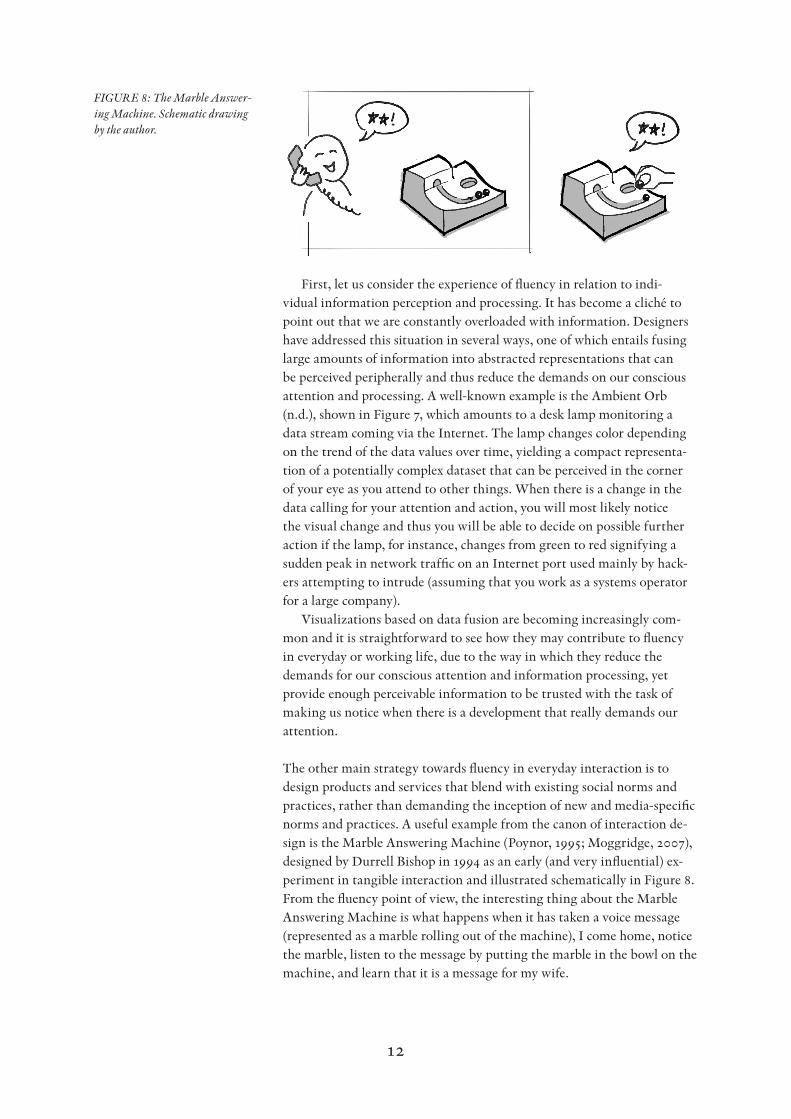
The other main strategy towards fluency in everyday interaction is to design products and services that blend with existing social norms and practices, rather than demanding the inception of new and media-specific norms and practices. A useful example from the canon of interaction de-sign is the Marble Answering Machine (Poynor, 1995; Moggridge, 2007), designed by Durrell Bishop in 1994 as an early (and very influential) ex-periment in tangible interaction and illustrated schematically in Figure 8.From the fluency point of view, the interesting thing about the Marble Answering Machine is what happens when it has taken a voice message (represented as a marble rolling out of the machine), I come home, notice the marble, listen to the message by putting the marble in the bowl on the machine, and learn that it is a message for my wife.
Figure 8: The Marble Answer-ing Machine. Schematic drawing by the author.
13
Now, since the message is temporarily embodied in a material object, I can fit it into the everyday coordination practices my wife and I have developed, like any other family, in an organic response to dealing with two full-time jobs, two children, and all of the duties that come with fam-ily life. Specifically, a designated spot on the kitchen table has emerged where I put my wife’s mail, notes from the children’s school teachers that she needs to see, and all other things related to domestic coordination and information handoff. Instead of having to write a separate note about my wife’s phone message or trying to remember telling her about it when she gets home (which would most likely fail), I take the marble from the an-swering machine and put it on top of the little pile of envelopes and pieces of paper. A tiny improvement, to be sure, but still a useful example of how interaction design can contribute to everyday fluency.
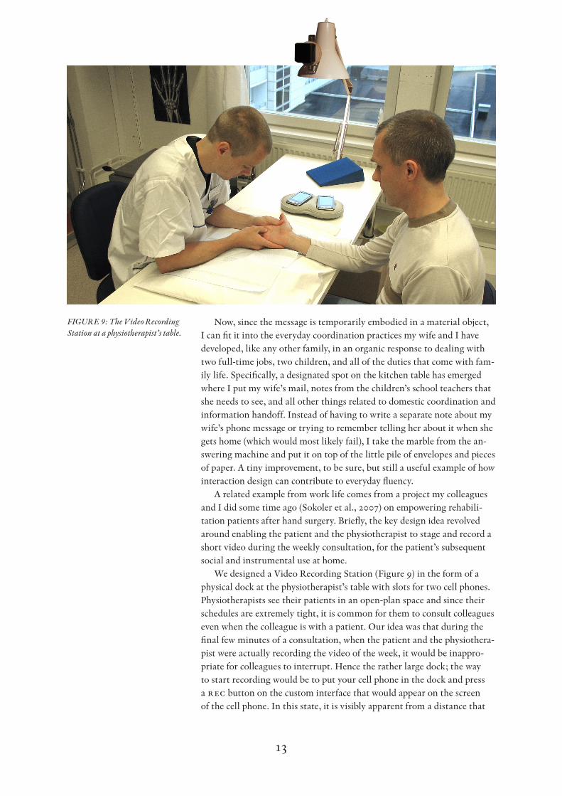
A related example from work life comes from a project my colleagues and I did some time ago (Sokoler et al., 2007) on empowering rehabili-tation patients after hand surgery. Briefly, the key design idea revolved around enabling the patient and the physiotherapist to stage and record a short video during the weekly consultation, for the patient’s subsequent social and instrumental use at home.
We designed a Video Recording Station (Figure 9) in the form of a physical dock at the physiotherapist’s table with slots for two cell phones. Physiotherapists see their patients in an open-plan space and since their schedules are extremely tight, it is common for them to consult colleagues even when the colleague is with a patient. Our idea was that during the final few minutes of a consultation, when the patient and the physiothera-pist were actually recording the video of the week, it would be inappro-priate for colleagues to interrupt. Hence the rather large dock; the way to start recording would be to put your cell phone in the dock and press a rec button on the custom interface that would appear on the screen of the cell phone. In this state, it is visibly apparent from a distance that
Figure 9: The Video Recording Station at a physiotherapist’s table.

14
there is a phone in the dock and this sends a signal to the colleagues to postpone their interruptions: a recording is in progress and it will be over in a couple of minutes. Hence the design would contribute to the workaday fluency of the physiotherapists in their open-plan environment. (When the recording is finished, a link to it is stored on the cell phone for later retrieval and viewing on the phone or on a larger display such as the tv in the patient’s home.)
When the design was evaluated, however, we learnt that our idea was flawed. The dock turned out to have such an inviting shape that many pa-tients put their phones in it immediately as they sat down to the consulta-tion, particularly if they happened to have the phone in their hand upon arrival. The subtle signal to colleagues – that a recording was in progress – was thus voided. We concluded in the project that there was probably a need for more inelegant solutions, such as a recording light on the desk-lamp camera. Still, the example illustrates a way to think about interac-tion fluency in relation to social norms and practices.
DISCUSSION
In this paper, I have proposed four concepts that may be used to discuss the beauty of interaction in more detail: pliability, rhythm, dramaturgi-cal structure, and fluency. They are intended as a contribution towards understanding what beauty in interaction might be, as well as an invita-tion to further discussion.
The method employed in the paper has been an analytical one in which I have combined carefully chosen examples of interaction experi-ences with textual reasoning about them, in order to provide material for peer designer-researchers to appropriate and incorporate into their own interaction-design knowledge structures and discourses. More specifi-cally, I view the method employed as an example of what Bardzell and Bardzell (2008a, 2008b, 2009) call interaction criticism, i.e., the practice of criticism in interaction design akin to the way that criticism is practiced in more mature creative disciplines such as architecture, literature, music, and so on.
Bardzell (2008a) points out that »interaction« in interaction criticism refers not primarily to empirical evidence from everyday interaction, but rather corresponds to expert readings or deep readings in literary criti-cism:
the critic […] approaches an interaction with the goal of doing so in the richest, most fulfilling, and/or most worthy way…
In other words, interaction criticism talks about interactions that are in some sense idealized, that illustrate how an expert would have the most comprehensively aesthetic experience possible in the use situation under consideration – the most »resonant passages«, to use a term from literary criticism. The reason for this approach is mainly to tease out insights and
15
perspectives that may be of more lasting value to – and yield more fruitful discussions within – the community of designers and critics.
Bardzell (2008a) further characterizes the reception and use of criti-cism as an appropriation process in which those who read criticism may choose to incorporate the critic’s models into their own interpretive practices. A responsibility of the critic is to identify resonant passages, as mentioned above. As Bardzell points out, the worth of one critic’s reso-nant passages versus another critic’s is connected to »erudition, insight, experience, conceptual command and domain expertise.«
From a methodological point of view, the attempts to initiate a prac-tice of criticism within interaction design harmonizes well with larger developments within design research towards more discursive views of knowledge building through the synthesis of creative and reflective work. This is what Krippendorff (2006) calls the »languaging of design«, for instance, and what Melles (2008) identifies as the inherent potential of pragmatist approaches to mixed methodologies consisting in means to »continue a discussion.«
It might be appropriate to close with a few words on the possible value of this work and the approach it represents. My motivation for the work reported here consists of four reasons.
First, it is an attempt to answer up to the challenge posed by Dja-jadiningrat et al. (2000) as well as other interaction design researchers. The community is increasingly recognizing that an interaction aesthetic needs to be dealing with the temporal aspects, the behaviors, the way the interaction feels over time (as opposed to considering only the sensory gratification of its static appearance). The notion of aesthetic interaction qualities, the four specific examples of such qualities, and the method of interaction criticism are my attempts to contribute towards a more rel-evant and comprehensive way of dealing with interaction aesthetics.
Secondly, it is my hope that articulations such as the ones presented here may inspire practicing interaction designers, support them in up-stream design activities by providing conceptual directions in terms of intended user experiences, and facilitate their abilities to judge the merits of design concepts and proposals.
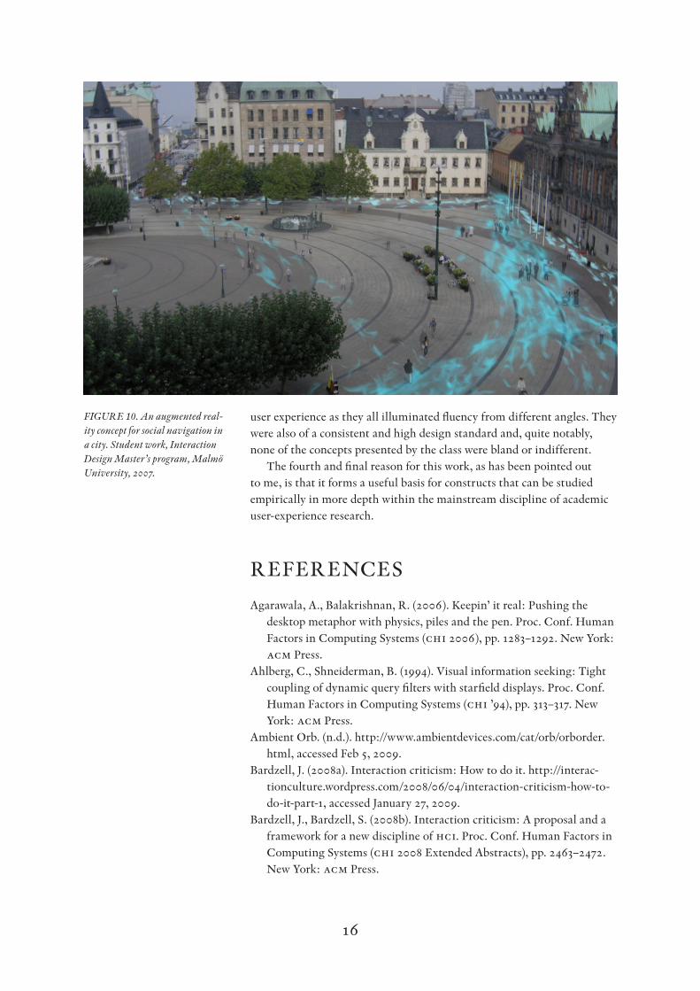
Thirdly, my own experience as an interaction design teacher seems to show that the articulation of experiential qualities (including aesthetic interaction qualities) is a useful vehicle for teaching and learning. Specifi-cally, I have had very good results when basing the brief for an explorative design assignment on an experiential quality (as opposed to the more conventional ways of using a design genre, a technology or a use situation as the basis for the brief). Figure 10, for example, illustrates one of the results from a studio class on fluency. The students received a show-and-tell-style introduction and were then asked to design concepts for shared spaces inspired by fluency. The student group represented in Figure 10 focused on fluent social navigation in the city and settled for a concept visualizing paths recently taken by people socially significant to the user. Other groups presented, e.g., concepts on ambient office lighting and gesture-based cell phone interaction. The results were quite disparate by conventional standards, yet formed a coherent body of work in terms of
16
user experience as they all illuminated fluency from different angles. They were also of a consistent and high design standard and, quite notably, none of the concepts presented by the class were bland or indifferent.
The fourth and final reason for this work, as has been pointed out to me, is that it forms a useful basis for constructs that can be studied empirically in more depth within the mainstream discipline of academic user-experience research.
RefeReNCeS
Agarawala, A., Balakrishnan, R. (2006). Keepin’ it real: Pushing the desktop metaphor with physics, piles and the pen. Proc. Conf. Human Factors in Computing Systems (chi 2006), pp. 1283–1292. New York: acm Press.
Ahlberg, C., Shneiderman, B. (1994). Visual information seeking: Tight coupling of dynamic query filters with starfield displays. Proc. Conf. Human Factors in Computing Systems (chi ’94), pp. 313–317. New York: acm Press.
Ambient Orb. (n.d.). http://www.ambientdevices.com/cat/orb/orborder.html, accessed Feb 5, 2009.
Bardzell, J. (2008a). Interaction criticism: How to do it. http://interac-tionculture.wordpress.com/2008/06/04/interaction-criticism-how-to-do-it-part-1, accessed January 27, 2009.
Bardzell, J., Bardzell, S. (2008b). Interaction criticism: A proposal and a framework for a new discipline of hci. Proc. Conf. Human Factors in Computing Systems (chi 2008 Extended Abstracts), pp. 2463–2472. New York: acm Press.
Figure 10. An augmented real-ity concept for social navigation in a city. Student work, Interaction Design Master’s program, Malmö University, 2007.
17
Bardzell, J. (2009). Interaction criticism and aesthetics. Proc. Conf. Hu-man Factors in Computing Systems (chi 2009), pp. 2357–2366. New York: acm Press.
Bloom. (n.d.). http://www.generativemusic.com, accessed Feb 5, 2009.Dewey, J. (1934). Art as experience. New York: Perigee.Djajadiningrat, J. P., Overbeeke, C. J., & Wensveen, S. A. G. (2000).
Augmenting fun and beauty: A pamphlet. Proc. Conf. Designing Aug-mented Reality Environments (dare 2000), pp. 131–134. New York: acm.
Dunne, A. (1999). Hertzian tales: Electronic products, aesthetic experience and critical design. London: Royal College of Art.
Eiler Rasmussen, S. (1959). Experiencing architecture. Cambridge, Mass.: mit Press. Twenty-third printing, 1992.
Hekkert, P. (2006). Design aesthetics: Principles of pleasure in product design. Psychology Science 48:157–172.
Krippendorff, K. (2006). The semantic turn: A new foundation for design. Boca Raton, fl: crc Press.
Laurel, B. (1993). Computers as theatre. Wokingham, uk: Addison-Wesley.Löwgren, J. (2006). Articulating the use qualities of digital designs. In
Fishwick, P. (ed.) Aesthetic computing, pp. 383–403. Cambridge, Mass.: mit Press.
Löwgren, J. (2007a). Pliability as an experiential quality: Exploring the aesthetics of interaction design. Artifact 1(2):85–95.
Löwgren, J. (2007b). Fluency as an experiential quality in augmented spaces. Int. J. Design 1(3):1–10.
Löwgren, J., Stolterman, E. (2004). Thoughtful interaction design. Cam-bridge, Mass.: mit Press.
Manovich, L. (2006). The poetics of augmented space. Visual Communica-tions 5(2):219–240.
Marshall, B. (2008). Brian Eno’s Bloom: New album or ambient joke? http://www.guardian.co.uk/music/musicblog/2008/oct/14/brian-eno-bloom-ipod-iphone, accessed Feb 5, 2009.
McCarthy, J., Wright, P. (2004). Technology as experience. Cambridge, Mass.: mit Press.
Melles, G. (2008). An enlarged pragmatist inquiry paradigm for method-ological pluralism in academic design research. Artifact 2(1):3–11.
Moggridge, B. (2007). Designing interactions. Cambridge, Mass: mit Press.
Niedenthal, S. (2008). Complicated shadows: The aesthetic significance of simulated illumination in digital games. Dissertation 2008:10, Ble-kinge Institute of Technology.
oblong industries, inc. (n.d.). http://oblong.com, accessed Feb 5, 2009.Petersen, M., Iversen, O., Krogh, P., Ludvigsen, M. (2004). Aesthetic
interaction: A pragmatist aesthetics of interactive systems. Proc. Conf. Designing Interactive Systems (dis ’04), pp. 269–276. New York: acm Press.
Poynor, R. (1995). The hand that rocks the cradle. I.D. – The International Design Magazine, May/June, pp. 60–65.
18
Pullin, G. (2007). Social mobiles and speaking chairs: Applying critical design to disruption, discourse and disability. Proc. Conf European Academy of Design (ead 07), Izmir, Turkey.
Sokoler, T., Löwgren, J., Eriksen, M., Linde, P., Olofsson, S. (2007). Ex-plicit interaction for surgical rehabilitation. Proc. Conf. Tangible and Embedded Interaction (tei ’07), pp. 117–124. New York: acm Press.
Waldeck, C., Balfanz, D. (2004). Mobile liquid 2d scatter space (ml2dss). Proc. Information Visualisation 2004, pp. 494–498. Wash-ington, dc: ieee.