Inspiring Images from Wales and Beyond by Nigel … · Inspiring Images from Wales and Beyond by...
35
PHOTOGRAPHY COURSE NOTES CPW / GEN 5 Photographing Interiors for Accommodation Providers and Tourism Businesses Inspiring Images from Wales and Beyond by Nigel Forster www.creativephotographywales.com
Transcript of Inspiring Images from Wales and Beyond by Nigel … · Inspiring Images from Wales and Beyond by...

PHOTOGRAPHY COURSE NOTES
CPW / GEN 5
Photographing Interiors for
Accommodation Providers and
Tourism Businesses
Inspiring Images from Wales
and Beyond by Nigel Forster
www.creativephotographywales.com

CPW. GEN 5 GENERAL COURSE NOTES – PHOTOGRAPHING INTERIORS 2
INTRODUCTION
These course notes are aimed at anyone looking to develop their understanding of interior
photography. You may be a photographer wishing to develop it as a specific interest or you may
be a tourism business (an accommodation or activity provider for example) looking to promote
your property in the best possible light! In this respect there may be information included here
which is below or beyond what you need but whatever your priority there’s plenty of information
here to enhance your knowledge of interior photography.
Topics covered in this paper Key Requirements and Considerations
Preparing your property for photography
Composition in interior photography
Getting it wrong – common errors and how to overcome them
The unique challenges of interior photography
How the professionals overcome these challenges
Photographing Details
Not just bricks & mortar - Promoting your ‘Brand’
Essential equipment and software
Photographing interiors is a wide ranging subject with many issues to consider and a number of
photographic challenges to overcome. This paper looks in general at the various aspects you will
need to consider and how to approach your photography. It does not go in depth into photographic
understanding and technique (these are covered in more detail in other papers) but gives the reader
a broad based understanding of the approach which needs to be taken to interior photography to
produce effective results. You will quickly see the limitations of the ‘Point and Shoot’ approach!
COURSE NOTES CPW/GEN 5
Photographing Interiors for
Accommodation Providers and
Tourism Businesses
AN HDR PRODUCED IMAGE – ONE OF THE
IMPORTANT TECHNIQUES IN INDOOR
PHOTOGRAPHY!

CPW. GEN 5 GENERAL COURSE NOTES – PHOTOGRAPHING INTERIORS 3
KEY REQUIREMENTS AND CONSIDERATIONS
Some basics – what equipment will you need? Images which are good enough for reproduction or web use are difficult to achieve with an
automatic compact camera for reasons which should become clear in this paper. More than nearly
every other photographic subject, control over exposure and other settings and use of RAW (digital
negative format) is vital in most situations. For this reason the following are basic requirements
A DSLR or Bridge Camera with an option for use of manual controls
A zoom or interchangeable lens facility with wide angle option
A tripod
The use of a computer with digital editing software
If you don’t have this equipment and are part of a tourism group that needs professional quality
images think about pooling resources – or of course employing a professional photographer!
How should I promote my property? Good interior photography is vital in promoting your home or premises to customers, whether they
are visiting or looking for accommodation. If just visiting, there may be public and private areas; you
only wish to promote the public areas; if they are staying with you, very often the whole property
inside and out is on show. Your style of photography needs to reflect your offer to customers.
Think of your target clientele. Do you want to be young & lively, quiet & slow paced, traditional or
modern, restrained or bold? The style of photography you use should reflect your market and how
you want to project your property.
Obviously your bedrooms should look quiet, warm and welcoming; your bathrooms clean and stylish
and your exterior in the best possible light. However the approach to your public areas may vary
depend on whether you’re a B&B or a pub. The pictures below show alternative approaches.
TWO VERY DIFFERENT PICTURES ABOVE: BOTH PHOTOGRAPHICALLY ACCEPTABLE BUT CONVEYING
A VERY DIFFERENT IMPRESSION OF YOUR PUBLIC SPACE….QUIET & RELAXED OR BUSY & THRIVING!!
IF YOU INCLUDE PEOPLE THEY NEED TO BE RIGHT FOR YOUR MARKET – THE IMAGE TO THE RIGHT
CLEARLY CONVEYS THE WRONG IMPRESSSION FOR A LIVELY BAR!!

CPW. GEN 5 GENERAL COURSE NOTES – PHOTOGRAPHING INTERIORS 4
TWO VIEWS OF THE SAME ROOM AT PICTON CASTLE IN PEMBROKESHIRE – ONE A TRADITIONAL
VIEW AND ONE A MORE ‘DYNAMIC’ APPROACH USING A LOW VIEWPOINT. BUT STILL VERY
DIFFERENT FROM ADVERTISING A PUB OR BAR!
What level of photographic knowledge will I need?
The answer to this depends on:
The layout and lighting of your property: properties with small poorly lit rooms (typically old
buildings) require a greater level of knowledge than brightly lit open plan rooms (typically more
recent buildings)
What you want to use the images for: web is perhaps more forgiving than reproduction
The scope and range of images you’re looking for: getting creative with focussing or detail
generally needs a higher level of understanding that straightforward general room shots.
At a basic level, an understanding of the following is required:
Setting the room out and preparing the property for photography
Familiarisation with your camera controls and settings
An understanding of basic composition guidelines
An understanding of basic errors and pitfalls in technique and composition.
At a more advanced level you will need some or all of:
An understanding of manual settings and controls on your camera
Knowledge of exposure and focussing control
Familiarisation with digital camera and processing techniques such as photomerges and HDR
photography
An understanding of the RAW format and digital post processing.

CPW. GEN 5 GENERAL COURSE NOTES – PHOTOGRAPHING INTERIORS 5
PREPARING YOUR INTERIOR FOR PHOTOGRAPHY
The best photography in the world will not rescue a poorly prepared property. This is not intended
to be a paper on interior design but some basic preparation and an understanding of what will
‘work’ photographically is essential.
The key factors are:
Organisation & furnishing of your room
The use of lighting
Soft Furnishings, ornamentation and flowers
Your ‘Branding’ (we deal with this later)
Good decoration and state of repair.
Organisation & Furnishing of your room
Rooms should be as clutter free and as tidy as possible. Photographs tend to work best with the
minimum of ornamentation and should be ‘depersonalised’. No-one wants pictures of your
family and pets on the wall or the kid’s toys in the corner!
Try not to fill space with excess furniture – only put in what is needed and will be there when
your guest enters the room.
Try to be consistent in style & period of furniture. Generally contemporary & simple is in vogue –
old fashioned & ornate is not. However, if your building is from a certain period and you wish to
be true to this it can work if done carefully.
Make sure that the important features are shown: a bedroom shot will need to show the bed; a
breakfast room will need to show the breakfast table! The bed must be perfectly made and
breakfast should be on the table.
Don’t be tempted to cover the walls with pictures – rooms can photograph perfectly effectively
without them. If you do have pictures / mirrors, few and large is always better then ‘many &
small’.
SIMPLE OR CLUTTERED: THE ROOM TO THE LEFT IS NEAT AND SIMPLE WITH MINIMAL AND
CONTEMPORARY FURNITURE: THE ONE TO THE RIGHT LOOKS CLUTTERED AND CRAMPED WITH
POOR AND INCONSISTENT QUALITY OF FURNISHINGS AND LIGHTING

CPW. GEN 5 GENERAL COURSE NOTES – PHOTOGRAPHING INTERIORS 6
TRADITIONAL: THIS HOTEL OWNER HAS GONE FOR A ‘PERIOD’ APPROACH. HIGH QUALITY ANTIQUE
FURNITURE HAS BEEN USED WHICH WORKS WELL IN THE EXAMPLE ON THE LEFT. HOWEVER THERE
IS AN INCONSISTENCY OF APPROACH ON THE RIGHT EXAMPLE – AND THE 4 POSTER IS NOT TO
EVERYONE’S TASTE!
CONTEMPORARY: THE BATHROOM TO THE LEFT IS STYLISH, CONTEMPORARY AND APPEALING. THE
BEDROOM TO THE RIGHT SHOWS AN INTIMATE BED SPACE AND PLENTY OF ROOM FOR OTHER
RELAXATION; THE CHAIR DESIGN HOWEVER DOES NOT MATCH THE REST OF THE ROOM

CPW. GEN 5 GENERAL COURSE NOTES – PHOTOGRAPHING INTERIORS 7
The Use of Lighting As we will see later in this paper, one of the main problems with interior photography is low and
uneven lighting. While much of this is within the control of the photographer, unless you are looking
for a particular ‘mood’ or effect, it’s usually best to supplement natural light with interior lighting.
You will notice that most of the examples I have used here have some element of artificial light. This
will have the effect of balancing the light levels of light and dark areas. In a modern building with
large windows this will be less of an issue than with more traditional buildings. Many bathrooms and
bar areas or old pubs or hotels will of course be very dark without artificial light.
Some general principles regarding lighting:
Using artificial lighting is not without its problems in photography: ‘Hot Spots’ around the light
source can burn out and artificial light creates an Orange or other colour shift in the image which
will need to be corrected in Photoshop. Covering bare bulbs with stylish shades can help.
In general you will need both low level and high level lighting: low level lighting adds far more
intimacy and warmth than ceiling mounted lights although these are often needed to boost
overall illumination levels.
Halogen bulbs give a more natural light colour than tungsten & others. Avoid fluorescent at all
costs - it photographs green and is very hard to correct!!!
There will generally be a difference between the quality and variety of light sources in a public
area of a hotel or bar, and that available in private rooms. Your bedrooms are the single most
important space – table or wall lamps by the bed(s) are a virtual must.
OVERHEAD LIGHTING
MAKES A SIGNIFICANT
DIFFERENCE TO THE
OVERALL LIGHT LEVELS.
HOWEVER THE PAPER
GLOBE IS NOT THE BEST
CHOICE
POOR LIGHTING: MORE
INADEQUATELY LIT
INTERIORS: THE SECOND
HAS SOME ADDITIONAL
LIGHT BUT IT’S
INSUFFICIENT
LIGHT ON OR OFF?
SWITCHING THE LIGHT ON
HAS WARMED UP THE
ROOM COLOUR. HOWEVER
IT HAS ALSO ADDED A
DISTRACTING BRIGHT SPOT
IN THE IMAGE

CPW. GEN 5 GENERAL COURSE NOTES – PHOTOGRAPHING INTERIORS 8
For additional mood, try putting some good quality candles in the picture – perhaps on a
mantelpiece if there is one.
If you’re about the refurbish your property, think about spotlights rather than a single bright
overhead light – they generally photograph better and create a much more even light. Globe
lanterns in particular create a rather unpleasant bright blob in the image AND BARE SINGLE
BULBS DO NOT WORK!
Wall lights or table lamps? Table lamps can be moved (often very useful in photography!).
BALANCED LIGHTING: WITH BOTH THESE EXAMPLES, ARTIFICIAL AND NATURAL LIGHT HAVE
COMBINED TO PRODUCE A NATURAL EVENLY LIT EFFECT. THE WALL COLOUR HAS AFFTECED THE
OVERALL COLOUR BALANCE LOOK AT THE SUBTLE SPOT LIGHTING
WALL LIGHTS OR TABLE LIGHTS BUT NOT BOTH!! THE SECOND IMAGE LOOKS CONFUSED WITH THE
SECOND SET OF LIGHTS A DISTRACTION. IN BOTH THE NATURAL LIGHT PROVIDES A PERFECT
BALANCE
CPW. GEN 5 GENERAL COURSE NOTES – PHOTOGRAPHING INTERIORS 9
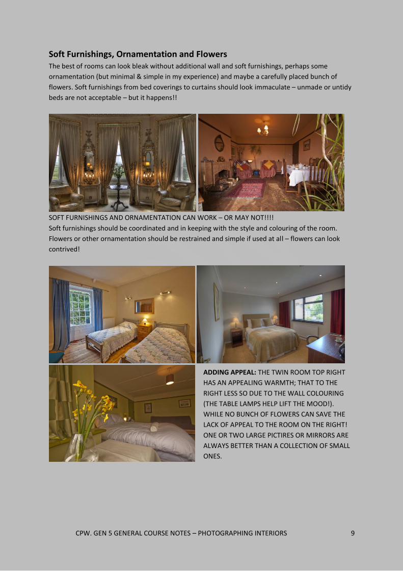
Soft Furnishings, Ornamentation and Flowers The best of rooms can look bleak without additional wall and soft furnishings, perhaps some
ornamentation (but minimal & simple in my experience) and maybe a carefully placed bunch of
flowers. Soft furnishings from bed coverings to curtains should look immaculate – unmade or untidy
beds are not acceptable – but it happens!!
SOFT FURNISHINGS AND ORNAMENTATION CAN WORK – OR MAY NOT!!!!
Soft furnishings should be coordinated and in keeping with the style and colouring of the room.
Flowers or other ornamentation should be restrained and simple if used at all – flowers can look
contrived!
ADDING APPEAL: THE TWIN ROOM TOP RIGHT
HAS AN APPEALING WARMTH; THAT TO THE
RIGHT LESS SO DUE TO THE WALL COLOURING
(THE TABLE LAMPS HELP LIFT THE MOOD!).
WHILE NO BUNCH OF FLOWERS CAN SAVE THE
LACK OF APPEAL TO THE ROOM ON THE RIGHT!
ONE OR TWO LARGE PICTIRES OR MIRRORS ARE
ALWAYS BETTER THAN A COLLECTION OF SMALL
ONES.

CPW. GEN 5 GENERAL COURSE NOTES – PHOTOGRAPHING INTERIORS 10
Good Decoration, State of Repair and Clean rooms!! It may be stating the obvious but before photography takes place the property has to be as perfect
as possible. Poor decoration, broken features / objects and dirty floors / walls will not promote your
property well!
ALL THESE IMAGES DEMONSTRATE POOR PREPARATION: A DIRTY FLOOR. BROKEN TILES AND DIRTY
WALLS ALL REQUIRED MANIPULATION IN PHOTOSHOP – THIS SHOULD NOT BE NECESSARY AND THE
CUSTOMER WILL NOT BE HAPPY SEENG THE REALITY!!
Simple, very light neutral coloured matt surfaces are best. You don’t want dark surfaces that reflect
little light and make the room look gloomy; satin or soft sheen paint can give off unwanted
reflections, reflected light off deep colours will create a colour cast over everything and wallpaper
will make a room look fussy with poor colour rendition. If you have access to imaging software such
as photoshop you can improve things with colour casts but it will be difficult without.
YOUR CHOICE OF DECORATION: LIGHT, NEUTRAL COLOURS TEND TO PHOTOGRAPH WELL, WHILE
DEEPER COLOURS (PARTICULARLY YELLOWS) LESS SO AS THEY TEND TO INCREASE THE CAMERA’S
YELLOW DISTORTAION OF ARTICIAL LIGHT

CPW. GEN 5 GENERAL COURSE NOTES – PHOTOGRAPHING INTERIORS 11
What to look out for when photographing your rooms
There are some basic things to watch out for when organising and photographing your rooms. There
are also pitfalls it’s easy to miss but equally easy to avoid. Remember that the camera misses
nothing – things not particularly obvious to the eye will be very noticeable on the picture you take!
Things to look for in particular are:
Unwanted items and clutter: Is there too much furniture, furniture out of place or unwanted
items such as litter bins prominent in the picture? Always make sure the room is tidy!!
Do you want doors open in the picture? If the door is open is the view beyond appealing or
would you sooner shut it out! Generally closed is best unless you have a specific reason for
keeping doors open such as a feeling of space or an enticing view beyond.
The TV: if there is a TV in the room, do you switch it on or off. If it’s on the screen should not be
distracting and should have appropriate subject matter.
Soft Furnishings: Make sure these are neat and colour co-ordinated. Try the curtains open or
closed if (as you usually are) photographing in daylight.
Windows: Do you want windows in your picture? They create light contrast but make the room
look much brighter if photographed with the right technique.
UNWANTED ITEMS AND CLUTTER: THE LEFT HAND IMAGE HAS A MIX OF FURNITURE AND A
RUBBISH BIN IN THE CENTRE AND THE OPEN DOOR IS OBTRUSIVE IN THE SECOND IMAGE. YOU
MIGHT ALSO FIND THE TV SCREEN INTRUSIVE
DOOR OPEN OR CLOSED: AN OPEN DOOR MAY LEAD THE EYE TO ANOTHER ROOM BUT DO YOU
REALLY WANT A PICTURE OF THE TOILET IN YOUR BEDROOM IMAGE?

CPW. GEN 5 GENERAL COURSE NOTES – PHOTOGRAPHING INTERIORS 12
TV ON OR OFF? A PERSONAL CHOICE BUT DN’T LET IT DOMINATE THE PICTURE!
THE TV PICTURE: IF THE TV IS ON THE IMAGE NEEDS TO BE RESTFUL AND VISUALLY IN KEEPING
WITH THE IMPRESSION YOU WISH TO CONVEY – DO NOT HAVE PEOPLE ON THE SCREEN
RUFFLED BEDCLOTHES OR SOFT FURNISHINGS: THEY SHOULD BE AS NEAT AS POSSIBLE
CURTAINS OPEN OR CLOSED? YOUR CHOICE BUT IT’LL CHANGE THE ATMOSPHERE OF THE ROOM

CPW. GEN 5 GENERAL COURSE NOTES – PHOTOGRAPHING INTERIORS 13
COMPOSITION IN PHOTOGRAPHING INTERIORS
There are a number of general ‘rules’ of composition that apply in photography. Those most
useful in photographing interiors are:
The use of lead in lines.
Use of foreground, middle and distance.
The ‘rule’ of thirds
Shooting form different viewpoints / heights
Image orientation
Remember that these are not mutually exclusive; they are used in many combinations and after a
while their use is less a conscious decision and more instinct and ‘what looks right’! Also composition
is not only about how you frame the picture, but also about how you use aperture to control depth
of field, how you focus to lead the viewer’s attention and who you expose to use light and shade and
shape the image.
Lead in lines / use of diagonals
Pictures made up of a series of horizontal planes / features can be restful to the eye but equally
often dull. Add diagonal features and the effect is much more dynamic. Think how you can use
natural and man-made lines to draw the eye into the picture. Think about what you can use: flooring
patterns, table and furniture edges, handrails for example.
Try to avoid lines running vertically or across the picture – these rarely work unless a very
deliberate part of the composition & can have the effect of slicing the picture in two. More often
than not lead in lines will run from the bottom corners into the picture.
If there is a main subject think how you can use these lines to draw the eye towards the subject
(as in the staircase balustrade example below).
Symmetry often works well with lead in lines – the example second to right below is a good
example where the tiled floor pattern has been used to create this effect.
USING LEAD IN LINES: ALL THESE PICTURES USE LINES OF FURNISHING FEATURES OR BUILDING
LINES TO DRAW THE VIEWERS EYE INTO THE SCENE

CPW. GEN 5 GENERAL COURSE NOTES – PHOTOGRAPHING INTERIORS 14
Use of foreground, middle to distance
Like lead in lines, layers from foreground to distance can move the eye through the picture. This
avoids empty space and the lack of a ‘base’ to the image.
There is no set amount of ‘layers’; maybe there’s a simple but strong foreground feature leading
the eye to a landscape beyond, or a series of features taking you through the image.
If your main subject is in the background, do not let the foreground dominate; try to let the
foreground draw the eye towards the subject.
A simple rule of thumb is ‘foreground interest, midground subject matter, background clear’.
Think about what separates or ‘distinguishes’ the layers; is it the subject, shape or form, colour
or tone? How do these features make the image work? Usually, simple is best.
Think about how you can use the foreground item / feature to tell a story or ‘brand’ your
property as in the ‘Talybont Saga’ and Horatio Nelson’ images below.
If you want to sell images, people in the foreground overlooking a great (or familiar) view are
popular with buyers promoting tourism.
EXAMPLES OF USE OF FOREGROUND INTEREST: NOTE THE USE OF ‘PROPS’ TO PLACE THE IMAGE
IN CONTEXT

CPW. GEN 5 GENERAL COURSE NOTES – PHOTOGRAPHING INTERIORS 15
Framing
Frames are features that enclose and draw the eye towards the main subject. You can use a range of
architectural features to achieve this effect. Arches, doorways and windows are obvious features
you may wish to use for framing in photographing interiors.
Frames don’t have to be at the top of the picture. A feature at the side or base can work.
A frame within a frame can be effective as it concentrates attention on the subject and hints at
the wider context of the subjects setting.
EXAMPLES OF FRAMING IN INTERIOR PHOTOGRAPHY. NOTE THE USE OF AN UNUSUAL VIEWPOINT
9THE SPIRAL STAIRS) TO FRAME A GROUP OF PEOPLE

CPW. GEN 5 GENERAL COURSE NOTES – PHOTOGRAPHING INTERIORS 16
Shooting From Different Viewpoints / Heights
Many of the most interesting images are from high, low or original viewpoints. Think about varying
your position: getting close to the ground, getting high up or simply being original with your choice
of position to take photographs from. Experiment to see the different effects that you can achieve.
Don’t just choose one viewpoint in each room. Take a variety of pictures from different
viewpoints. One or two will always work out better than the others.
Shoot from a low viewpoint with a wide angle lens to get an alternative view.
Shoot from a high viewpoint to the scene below where you’ll get a different perspective.
Some rooms have awkward shapes and proportions. Use viewpoints that accentuate space
rather than seem to reduce it.
ALTERNATIVE VIEWPOINTS AT PICTON CASTLE: HIGH AND LOW VIEWPOINTS
4 VIEWPOINTS OF THE SAME ROOM. THE TOP TWO HAVE THE COUCH ON THE MIDDLE OF THE
FRAME AND THEY DOMINATE THE IMAGE. THE LOWER TWO ARE MUCH MORE SUCCESSFUL AS THEY
USE FEATURES TO FRAME THE ROOM AND OPEN UP SPACE

CPW. GEN 5 GENERAL COURSE NOTES – PHOTOGRAPHING INTERIORS 17
SHOOTING FROM DIFFERENT VIEWPOINTS / HEIGHTS: BEING ORIGINAL WITH YOUR VIEWPOINT
CAN MAKE A GREAT DIFFERENCE TO THE IMPACT OF YOUR PICTURE
LOW VIEWPOINTS WORK WELL: TRY LOOKING ACROSS A BED RATHER THAN TOWARDS IT BUT
MAKE SURE THE BED COVERINGS ARE IMMACULATELY UNRUFFLED!
You’ll notice that most of these pictures have been taken using a wide angle lens: while you’ll
generally use a wide angle lens or wide setting on your zoom with interiors, where you’re looking for
high and low viewpoints, this is the lens what will often give the most interesting results. Note the
strong use of diagonals in many of these images.

CPW. GEN 5 GENERAL COURSE NOTES – PHOTOGRAPHING INTERIORS 18
Image Orientation – Landscape (Horizontal) and Portrait (Vertical) Format.
You may have noticed that many of the examples I have shown here have been taken with the
camera held vertically – known as ‘Portrait Format’. Very often the shape of interiors and the image
you want is better captured in this format.
Most camera formats produce rectangular pictures, allowing the photographer to hold the
camera to produce horizontal or vertical results; think about what format will best suit your
composition and the effect you want to achieve.
Horizontal (Landscape Format) images tend to emphasise the relationship between subject
elements on the left and right of the frame, while vertical (portrait format) pictures tend to more
strongly relate foreground and background elements.
If you are looking to use images for publicity purposes, don’t forget the benefits of ‘empty space’
that a title or other written material can go into. This can mean taking both landscape and
portrait format. Also, since most printed publications are vertical in format, pictures are more
likely to be used full-size if they are vertically framed.
SOME EXAMPLES OF EFFECTIVE USE OF PORTRAIT FORMAT – TIGHT SPACES SUCH AS BATHROOMS
CAN OFTEN BE BEST SHOT VERTICALLY OTHERWISE THEY CAN LOOK A LITTLE ‘CHOPPED OFF’ TOP
AND BOTTOM. NOTICE THAT ON THE CENTRE IMAGE THE FOCUS IS JUST ON ‘FOOD AND BUILIDNG ‘
AND NOTHING ELSE DISTRACTS THE EYE
HORIZONTAL
FORMAT TAKES IN A
WIDER VIEW –
VERTICAL FORMAT
FORMS A STRONGER
RELATIONSHIP
BETWEEN
FOREGROUND AND
BACKGROUND

CPW. GEN 5 GENERAL COURSE NOTES – PHOTOGRAPHING INTERIORS 19
THE UNIQUE CHALLENGES OF INTERIORS
You’ve learnt more about your camera, prepared your property for photography, learnt how to
compose your pictures, learnt a little about branding…………….but your images still aren’t looking
right! Interior photography has some very unique challenges. Possibly more than any other
photographic subject, interiors are dependent on reality having the right equipment and having
some knowledge of more advanced techniques – a point and shoot camera set on auto will rarely
produce effective results
These challenges are mainly to do with the Quality of Light, in terms of LOW and UNEVEN light
levels and of Small and Awkwardly Shaped Rooms as explained below.
Low light levels:
Interiors are dark compared to the outside. Using a digital camera set on auto will automatically
make the flash go off; you won’t get a natural look with even light. Use it on manual and your
shutter speed will be slow which will cause what is known as camera shake. Added to this, one of the
features of photography is that you will usually want all your image in focus from subjects near to
the camera, to those far away.
The camera exposure is a balance of APERTURE (the size of the hole which lets light in) and SHUTTER
SPEED) the length of time the shutter is open. If you use a large aperture (a large hole in the lens) to
let light in more quickly, the less of the image will be in focus. Conversely, using a SMALL APERTURE
(a small hole in the lens) means using a longer shutter speed but more of the image will be in focus.
Therefore a TRIPOD is ESSENTIAL for interior photography.
THIS IMAGE IS BLURRED DUE TO CAMERA
SHAKE AS A LONGER SHUTTER SPEED
WAS USED THAN COULD BE HAND HELD.
THE USE OF A TRIPOD WOULD HAVE KEPT
THE CAMERA STILL

CPW. GEN 5 GENERAL COURSE NOTES – PHOTOGRAPHING INTERIORS 20
UNDERSTANDING DEPTH OF FIELD: SEE IN THE FIRST IMAGE EVERYTHING IS ON FOCUS BUT IN THE
SECOND THE APPLES ARE IN FOCUS BUT THE BACKGROUND IS BLURRED – THIS IS KNOWN AS THE
USE OF ‘DEPTH OF FIELD’. THE FIRST PICTURE NEEDED A SMALL APERTURE AND LONG SHUTTER
SPEED AND THE SECOND A LAGRE APERTURE AND SHORT SHUTTER SPEED. A TRIPOD IS ESSENTIAL
Uneven light levels.
This is an even bigger problem than low light levels as it can’t just be overcome with the use of a
tripod. Typically many interiors have dark unlit areas in shadow. The most obvious problem is taking
photographs with the camera pointing outside through a door or window – the outside is much
brighter.
IMPOSSIBLE LIGHT CONTRAST: 2 SETS OF
PICTURES – ONE EXPOSED FOR THE OUTSIDE
AND ONE FOR THE INSIDE. THE NAKED EYE
CAN EASILY SEE THE BRIGHT AND DARK
AREAS AT THE SAME TIME BUT THE CAMERA
CAN’T - IT CAN’T HANDLE THE CONTRAST –
SO THE PHOTOGRAPHER IS DISAPPOINTED
WITH THE RESULTS BUT DOESN’T KNOW
WHY!

CPW. GEN 5 GENERAL COURSE NOTES – PHOTOGRAPHING INTERIORS 21
The small size of rooms:
Interiors aren’t like the landscape – rooms and spaces are often small and difficult to photograph.
Very often you’ll need to use the widest angle of view possible; either through the use of a wide
angle lens or the use of the widest possible setting on your camera zoom. The key objective is to give
the impression that the room is larger than it actually is – although there is a cottage in Robin Hoods
Bay in North Yorkshire that market’s itself on its tiny size!
NONE OF THE ABOVE IMAGES SHOW THE ROOMS SUFFICIENTLY IN CONTEXT. ALL WERE TAKEN
WITH A WIDE ANGLE LENS WHICH SHOWS THE SCALE OF THE PROBLEM WITH A STANDARD LENS!
BALANCING LIGHT: WITH
THESE EXAMPLES SEE THE
DIFFERENCE PUTTING THE
MIDDLE LIGHT ON – POOR
INTERIOR LIGHTING
CREATES GLOOMY AREAS
THE IMAGE TO THE LEFT SHOWS BOTH
INSUFFICIENT AND GLOOMY LIGHTING,
INSUFFICIENT ‘WARMTH IN TERMS OF
COLOUR AND USE OF SOFT FURNISHINGS
AND A LACK OF CONTEXT. IT GIVES A POOR
IMPRESSION OF THE ROOM

CPW. GEN 5 GENERAL COURSE NOTES – PHOTOGRAPHING INTERIORS 22
BATHOORMS ARE OFTEN DIFFICULT TO PHOTOGRAPH: THE SECOND IMAGE IS A PHOTOMERGE
AND THE IMAGE ON THE RIGHT FOCUSSES ON DETAIL – OFTEN A SOLUTION TO A DIFFICULT SPACE
The awkward shape of rooms
Many rooms are not evenly proportioned: they may be long and thin, a right angle or have odd
proportions (typical with en-suite bathrooms which have been built into corners of rooms)
AWKWARD ROOMS: THIS WAS AN AWKWARD SHAPED ROOM WITH THE BED DOMINATING. THE
MOST SUCCESSFUL EXAMPLE WAS THE ONE WITH THE BOOK ON THE FOREGROUND – THE CONTEXT
IS THAT LORD NELSON STAYED THERE ONCE!! THE IMAGE BOTTOM LEFT USES THE BED TO FRAME
THE ROOM INSTEAD OF THE CAMERA FACIING THE BED – IT WORKS BETTER.
Digital Photography has ways of dealing with these problems. More of that later in the
next section…..

CPW. GEN 5 GENERAL COURSE NOTES – PHOTOGRAPHING INTERIORS 23
HOW THE PROFESSIONALS DEAL WITH THE DIFFICULTIES OF
PHOTOGRAPHING INTERIORS
Contrast and Lighting Extremes
There are a number of ways of dealing with this:
Balancing lighting. We have already seen how balancing interior lighting with outside light can
produce far more even lighting. A mix of low level light and ceiling light can reduce dark areas and
shadows. Ceiling lights can cause problems with large bright spots on the image though; you may
wish to crop this out or turn the ceiling light off.
WAYS OF DEALING WITH A BRIGHT CEILING LIGHT: EITHER SWITCH IT OFF OR CROP THE IMAGE
Using RAW – not JPEG: RAW is effectively a ‘Digital Negative’ file format. It is an unprocessed and
uncompressed file in which no image detail has been lost in the camera. The problem with a JPEG is
that it is a compromise – the camera has decided the ‘best’ solution and deleted over half the
available information – this information is vital in image processing, particularly in controlling
extremes of contrast. For the reasons already described, the use of RAW in photographing interiors
is probably more important than in other photographic subjects and is actually essential in
producing high quality images for reproduction and web use.
For example if a JPEG has overexposed areas, the detail will be bleached out; if RAW is used, much of
this is recoverable due to the amount of embedded information. This is difficult to illustrate with a
small low resolution image but Nigel illustrates this in all his courses.
Please note that to use and process RAW you will need access to digital imaging software such as
photoshop or your camera’s own software. For anyone not familiar with using RAW Nigel is happy
to provide more information.

CPW. GEN 5 GENERAL COURSE NOTES – PHOTOGRAPHING INTERIORS 24
Using Fill-in Flash: Using flash can be effective in balancing light levels. Note I have used ‘Fill-In
Flash – it is not the main light source: it is simply used to supplement natural light to fill in dark areas
and shadows. It is also ‘Bounced’ rather than direct – this avoids flat results.
FILL IN FLASH HAS SUCCESSFULLY FILLED IN THE SHADOWS AND LIT UP THE BACKGROUND IN THIS
SHOT TAKEN AT A WEDDING
FLASH OR NO FLASH? THE FIRST IMAGE JUST USED AVAILABLE LIGHT, THE SECOND WITH ADDED
FLASH. WHILE EVENING OUT THE LIGHTING IT HAS DIMINISHED THE CHARACTER OF THE ROOM
GETTING FLASH WRONG:
NOTICE THE DIFFERENCE
BETWEEN FILL IN FLASH
AND ALLOWING THE MAIN
FLASH TO DONIMATE. IN
THIS EXAMPLE THE
‘OVERDONE’ FLASH
ILLUMINATES THE
FOREGROUND AND CASTS
STRONG SHADOWS BEHIND
THE ARCH FEATURE,
DESTROYING THE IMAGE

CPW. GEN 5 GENERAL COURSE NOTES – PHOTOGRAPHING INTERIORS 25
HDR (High Dynamic Range) Photography: This process was specifically created to deal with
interior photography, its extremes of contrast and the limited ability of digital technology to cope
with it. It involves taking a series of identical pictures at different exposures, from those exposed for
the darkest parts of the image to those exposed for the brightest. A series of 5 images is typical (One
f:stop or twice the brightness) apart. An example is shown below:
AN EXAMPLE OF AN HDR PRODUCED IMAGE. THE BLENDED VERSION IS SHOWN ON THE BOTTOM
RIGHT – YOU WILL SEE THAT THE IMAGE HAS CORRECTLY EXPOSED THE BRIGHTEST AREAS AND THE
DARKEST AREAS. THE EFFECT CAN HOWEVER LOOK A LITTLE UNNATURAL AND NEEDS TO BE
PROCESSED WITH CARE
What you will need to produce HDR images:
A tripod – you will be using slow shutter speeds and each image needs to be identically
composed apart from the different exposures.
HDR Processing Software – the most popular is PhotoMatix Pro (cost about £70)
http://www.hdrsoft.com. Don’t use the photoshop version – it doesn’t work!!
An understanding of how to set your camera controls to take a series of images at different
exposures.

CPW. GEN 5 GENERAL COURSE NOTES – PHOTOGRAPHING INTERIORS 26
Taking in a wide angle of view
As mentioned before one of the major problems with interior photography is restricted space and
angle of view – bathrooms can be a particular problem where it’s often simply impossible to get the
perfect viewpoint to show the room off.
.
CREATING A PANORAMIC PHOTOMERGE: THE ABOVE VIEW OF A KITCHEN IS A COMPOSITE OF 4
SEPARATE IMAGES STITCHED IN PHOTOSHOP. NIGEL CAN TEACH YOU HOW TO DO THIS!!
USING AN
ULTRA-WIDE
ANGLE LENS.
THESE IMAGES
COULD NOT BE
TAKEN WITH A
STANDARD LENS
– THESE WERE
TAKEN AT
10MM

CPW. GEN 5 GENERAL COURSE NOTES – PHOTOGRAPHING INTERIORS 27
Correcting colour casts and warming up your images
A simple increase in the colour temperature of the image can add warmth and appeal to your
interior. This can easily be done with imaging software. An example is shown below – the most
accurate example is actually the coolest one but it’s not necessarily the most appealing so you may
prefer to adjust the colour temperature.
3 EXAMPLES OF HOW COLOUR TEMPERATURE CAN BE ADJUSTED. THIS IS A BASIC FUNCTION IN ALL
IMAGING SOFTWARE. THE ORIGINAL IMAGE 9UNADJUSTED) IS SHOWN WITH THE RED BORDER
CORRECTING COLOUR CASTS: IN THIS EXAMPLE THE FIRST IMAGE HAD AN UNPLEASANT GREEN
TINGE DUE TO THE COLOUR OF THE WALLS AND THE MIXED LIGHTING. THE COLOUR WAS
CORRECTED IN PHOTOSHOP

CPW. GEN 5 GENERAL COURSE NOTES – PHOTOGRAPHING INTERIORS 28
Using black & white
Converting images to Black & White is simple and effective in photoshop. It can add atmosphere and
character to images. However do not use the in-camera option – it will not give you control over the
results and will only give you a processed JPEG.
A SIMPLE B&W CONVERSION
USING THE B&W OPTION IN HDR SOFTWARE
PHOTOGRAPHING AN EXTERIOR IN COLOUR AND BLACK & WHITE

CPW. GEN 5 GENERAL COURSE NOTES – PHOTOGRAPHING INTERIORS 29
BRANDING YOUR PROPERTY AND PHOTOGRAPHING DETAILS
Your promotional material will not only want to show your rooms and overall views of your
property. You can add significant interest and help to ‘Brand’ your property by looking at details,
features and what makes your hotel, B&B or activity centre unique. The ‘Branding’ choices are
numerous and can for example be based on:
Your location – what is special about your locality and how can you link it to your photography
Your architectural style – is there something unique about your property you wish to highlight.
Your offering – do you specialise in your local food and drink.
Your heritage – is there a historical link to your property and / or location you wish to highlight
Your facilities – do you have a spa, wonderful view, garden or something really special?
Architectural Features Your property will have many interesting features which can say far more about its character than an
overall view. These may be picture windows, stained glass, cornices, floor patterns, lighting features,
feature fireplaces, fixtures and fittings.
EXAMPLES OF ARCHITECTURAL FEATURES AND FITTINGS: YOU MAY WANT TO USE. THE STAINED
GLASS IS FROM A TOILET DOOR! IF YOU HAVE A TRADITIONAL FIREPLAE MAKE SURE IT’S LIT.

CPW. GEN 5 GENERAL COURSE NOTES – PHOTOGRAPHING INTERIORS 30
Ornamentation and displays As we have seen above, the way your property is furnished is vital in how it is promoted. As well as
the general furnishings, you may have ornamentation or displays you wish to use to give an insight
into the building. Shelf displays, flowers, candles, local information material, prominent paintings
and more can be used to great effect.
USE ‘THE FINISHING TOUCHES’ TO HELP TO BRAND YOUR PROPERTY: THINK ABOUT HOW THE
ORNAMENTATION AND DISPLAY FEATURES FITS WITH THE STYLE YOU WISH TO PROMOTE (FOR
EXAMPLE IS IT TRADITIONAL OR CONTEMPORARY?). BE CREATIVE WITH YOUR VIEWPOINTS AND
CHOICE OF LENSES / FOCAL LENGTHS.

CPW. GEN 5 GENERAL COURSE NOTES – PHOTOGRAPHING INTERIORS 31
Food, Drink and Complementary items The quality of your food and drink offering and the additional things you offer to your customers can
be used to add to your ‘branding’. This includes tea & coffee making facilities, bathroom extras /
toiletries, chocolates and biscuits and anything else you may offer. Note the frequent use of an out
of focus background to draw the eye to the main subject. To do this requires an understanding of
aperture control.
USE FOOD, DRINK AND COMPLEMENTARY ITEMS IN YOUR PHOTOGRAPHY: NOTE THE USE OF
‘PRODUCT PLACEMENT’ IN MANY OF THESE IMAGES – IF YOU USE A LOCAL SUPPLIER TRY TO GET A
SPONSORSHIP OR WEBLINK ARRANGEMENT WITH THEM.

CPW. GEN 5 GENERAL COURSE NOTES – PHOTOGRAPHING INTERIORS 32
Heritage and History Does your property have any important historical references or connections? Try placing a reference
to this in the foreground. If you house paintings or other artworks include them in your
photography.
Your exterior and immediate surroundings
Your location is your biggest selling point. This includes the immediate surroundings of your building
and the wider landscape and environment.
MAKE SURE YOU CHOOSE THE BEST VIEW: THE FRONT AND BACK OF THE SAME PROPERTY. THE
FRONT IS A BLAND SUBURBAN EXTERIOR WHILE THE BACK GARDEN OFFERS VIEWS OF THE BRECON
BEACONS (ALTHOUGH SUMMER WOULD HAVE MADE THE PATIO LOOK A LITTLE LESS COLD!!)
USE WHAT YOU HAVE: THE 2 IMAGES ABOVE USE A TREE IN FLOWER AND A SINGLE POPPY TO
CONSIDERABLY ENHANCE THE FRONT OF THE PROPERTY.

CPW. GEN 5 GENERAL COURSE NOTES – PHOTOGRAPHING INTERIORS 33
The Wider Environment Think of a collection of images that tell a story of your local environment. My own village, Talybont
on Usk, has a varied geographical and cultural local landscape that can described through
photographic images.
THE PHOTOGRAPHIC STORY: MOUNTAINS, RESERVIORS, SHEEP, DAFFODILS, CANALS AND
WATERWAYS, LOCAL HERITAGE – ALL OF THESE TELL A STORY OF YOUR LOCAL ENVIRONMENT
CPW. GEN 5 GENERAL COURSE NOTES – PHOTOGRAPHING INTERIORS 34
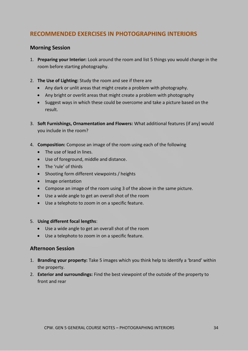
RECOMMENDED EXERCISES IN PHOTOGRAPHING INTERIORS
Morning Session
1. Preparing your Interior: Look around the room and list 5 things you would change in the
room before starting photography.
2. The Use of Lighting: Study the room and see if there are
Any dark or unlit areas that might create a problem with photography.
Any bright or overlit areas that might create a problem with photography
Suggest ways in which these could be overcome and take a picture based on the
result.
3. Soft Furnishings, Ornamentation and Flowers: What additional features (if any) would
you include in the room?
4. Composition: Compose an image of the room using each of the following
The use of lead in lines.
Use of foreground, middle and distance.
The ‘rule’ of thirds
Shooting form different viewpoints / heights
Image orientation
Compose an image of the room using 3 of the above in the same picture.
Use a wide angle to get an overall shot of the room
Use a telephoto to zoom in on a specific feature.
5. Using different focal lengths:
Use a wide angle to get an overall shot of the room
Use a telephoto to zoom in on a specific feature.
Afternoon Session
1. Branding your property: Take 5 images which you think help to identify a ‘brand’ within
the property.
2. Exterior and surroundings: Find the best viewpoint of the outside of the property to
front and rear

CPW. GEN 5 GENERAL COURSE NOTES – PHOTOGRAPHING INTERIORS 35
CONTACT NIGEL FORSTER
NIGEL IS AN ASSOCIATE MEMBER
OF THE BIPP
Telephone: (0044) 1874 676402 / (0044) 7815 089835
Email: [email protected]
Website: www.creativephotographywales.com