
INFORMATION BIAS IN THE GRAPHICS ACCOMPANYING NEWS ... · iii Summary Bias in the mainstream news...
118
i INFORMATION BIAS IN THE GRAPHICS ACCOMPANYING NEWS ARTICLES Cian Flynn A dissertation submitted in partial fulfilment of the degree of MAI Computer Engineering Supervisor: Professor Séamus Lawless Submitted to the University of Dublin, Trinity College, May 2018
Transcript of INFORMATION BIAS IN THE GRAPHICS ACCOMPANYING NEWS ... · iii Summary Bias in the mainstream news...

i
INFORMATION BIAS IN THE GRAPHICS
ACCOMPANYING NEWS ARTICLES
Cian Flynn
A dissertation submitted in partial fulfilment of the degree of
MAI Computer Engineering
Supervisor: Professor Séamus Lawless
Submitted to the University of Dublin, Trinity College, May 2018

ii
Declaration
I, Cian Flynn, declare that the following dissertation, except where otherwise stated,
is entirely my own work; that it has not previously been submitted as an exercise for
a degree, either in Trinity College Dublin, or in any other University; and that the
library may lend or copy it or any part thereof on request.
Signature:
Date: 10th May, 2018

iii
Summary Bias in the mainstream news media has been studied for many years. In recent years,
traditional mediums have given way to online and digital mediums, and with them new
features are being presented to readers which could influence bias. This research aimed to
determine if the level of bias perceived to be in a news article online could be impacted by an
information graphic accompanying that article. The experiment involved participants
reporting how biased they considered an article to be for three news stories, from three
websites. Each story from each website was studied at three levels of distortion: with no
graphic, with the original graphic, and with a tailored graphic.
The research found that an information graphic accompanying a news article will affect the
level of bias perceived for the article as a whole, but that this effect was not found to be
statistically significant, and no trend was found regarding what causes the bias level to
increase or decrease. With a sample size of 124 participants, no statistically significant effect
was detected. Closer examination of the data collected reveals findings which suggest further
work would be worthwhile in this area.
The data collected also indicates strong tendencies among participants to avoid cognitive
dissonance, and the presence of confirmation bias on the part of the participants. When
participants were presented with a website they recognised, and which they previously had
considered to be biased, they gave a significantly higher rating for bias in that article than for
those who did not recognise the website. Additionally, those who recognised the website but
did not previously consider it to be particularly biased, reported far lower levels of bias for
that article than those who had not recognised it.
This research adds to an existing body of work in the area. Possible refinements to the study
are proposed.

iv
Acknowledgements I would like to acknowledge the work of Professor Séamus Lawless, without whose initial
guidance I would not have undertaken this research, and who has provided constant support
and guidance throughout the project.
I would also like to acknowledge the extraordinary amount of advice and support given to me
by Mr. Brendan Spillane. The motivation and guidance he provided throughout the research
ensured that I could complete this research with the highest degree of academic rigour and
integrity, which he promotes constantly.
Finally, I must acknowledge the support and help received from my family and friends over
the course of this research project.
I thank them all for everything.
Cian Flynn
May 2018

v
Table of Contents
Declaration .............................................................................................................................................. ii
Summary ................................................................................................................................................ iii
Acknowledgements ................................................................................................................................ iv
Table of Contents .................................................................................................................................... v
Table of Figures ...................................................................................................................................... ix
Table of Tables ....................................................................................................................................... xi
1. Introduction .................................................................................................................................... 1
1.1 Research Question ........................................................................................................................ 3
1.2 Hypothesis ..................................................................................................................................... 3
1.3 Overview of this Dissertation ........................................................................................................ 4
2. Existing Work .................................................................................................................................. 5
2.1 Bias ................................................................................................................................................ 5
2.1.1 Definitions of Bias .................................................................................................................. 6
2.1.2 Bias in Mainstream News Media ........................................................................................... 7
2.1.3 Bias in the Presentation of News Online ............................................................................... 8
2.1.4 Information Graphics in News Media .................................................................................... 8
2.1.5 Bias in the Presentation of Information Graphics.................................................................. 9
2.2 Example of Driving a Narrative with Visualisation ...................................................................... 10
2.3 Conclusion ................................................................................................................................... 11
3. Methodology ................................................................................................................................. 12
3.1 Websites...................................................................................................................................... 12
3.2 Articles ........................................................................................................................................ 12
3.3 Distortions ................................................................................................................................... 13
3.3.1 Creating D2 Graphics ........................................................................................................... 13
3.3.2 Website Branding ................................................................................................................. 14
3.4 The Experiment ........................................................................................................................... 15
3.4.1 Phase 1: Participant Profile Questions ................................................................................. 15
3.4.2 Phase 2: Bias Rating Experiment .......................................................................................... 16
3.4.3 Experiment Paths ................................................................................................................. 16
3.4.4 Phase 3: Reflective Questions .............................................................................................. 18
3.5 Bias Rating Scale.......................................................................................................................... 19
3.6 Participants ................................................................................................................................. 19
3.7 Conclusion ................................................................................................................................... 20

vi
4. Experiment Apparatus .................................................................................................................. 22
4.1 Prolific Academic ......................................................................................................................... 22
4.2 Begin Survey ................................................................................................................................ 23
4.3 Participant Information ............................................................................................................... 23
4.4 Instruction Tasks ......................................................................................................................... 23
4.5 Survey Questions ........................................................................................................................ 23
4.6 Spike Question ............................................................................................................................ 24
4.7 Bias Ratings ................................................................................................................................. 24
4.8 Reflective Survey Questions ....................................................................................................... 24
4.9 Debrief ........................................................................................................................................ 25
4.10 Submission and Payment .......................................................................................................... 25
4.11 Conclusion ................................................................................................................................. 25
5. Data Analysis ................................................................................................................................. 26
5.1 ANOVA Assumptions ................................................................................................................... 26
5.2 Kruskel-Wallis H Test Assumptions ............................................................................................. 27
5.3 Kruskel-Wallis H Test Hypotheses ............................................................................................... 28
5.3.1 The Null Hypothesis ............................................................................................................. 28
5.3.2 Alternative Hypothesis ......................................................................................................... 29
5.4 Kruskal-Wallis H Test Results ...................................................................................................... 30
5.5 Conclusion ................................................................................................................................... 30
6. Results ........................................................................................................................................... 31
6.1 Experiment Participants .............................................................................................................. 31
6.2 How to Read the Kruskel-Wallis H Test Results .......................................................................... 32
6.2.1 Sample breakdown of results for a Kruskel-Wallis H Test interpretation ........................... 33
6.3 Bias Levels by Distortion ............................................................................................................. 36
6.3.1 W0A0 (D0/D1/D2) – The Daily Mail, CPI Inflation ............................................................... 36
6.3.2 W0A1 (D0/D1/D2) – The Daily Mail, Bitcoin Prices ............................................................. 36
6.3.3 W0A2 (D0/D1/D2) – The Daily Mail, Life Expectancy .......................................................... 37
6.3.4 W1A0 (D0/D1/D2) – The BBC, CPI Inflation ......................................................................... 37
6.3.5 W1A1 (D0/D1/D2) – The BBC, Bitcoin Prices ....................................................................... 38
6.3.6 W1A2 (D0/D1/D2) – The BBC, Life Expectancy .................................................................... 38
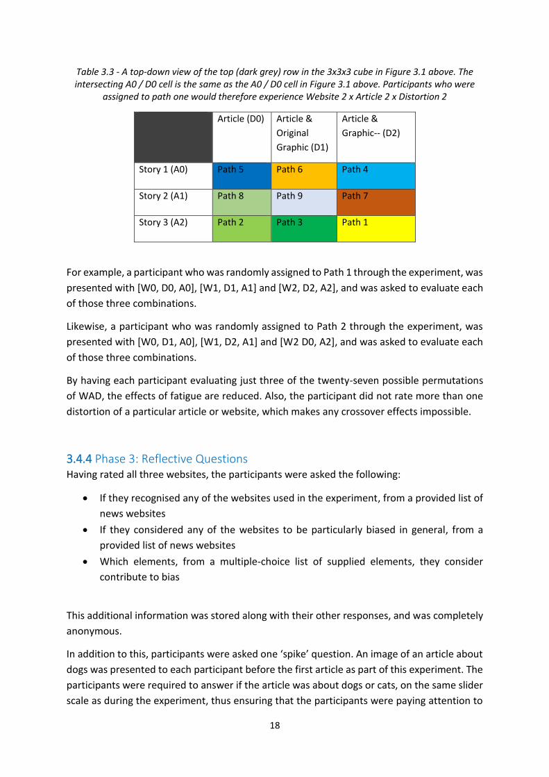
6.3.7 W2A0 (D0/D1/D2) – The Guardian, CPI Inflation ................................................................. 39
6.3.8 W2A1 (D0/D1/D2) – The Guardian, Bitcoin Prices ............................................................... 39
6.3.9 W2A2 (D0/D1/D2) – The Guardian, Life Expectancy ........................................................... 40
6.3.10 Overview of Results ........................................................................................................... 40
6.4 Bias Levels by News Story ........................................................................................................... 41

vii
6.4.1 W0D0 (A0/A1/A2) – The Daily Mail, no graphic .................................................................. 41
6.4.2 W0D1 (A0/A1/A2) – The Daily Mail, original graphic .......................................................... 41
6.4.3 W0D2 (A0/A1/A2) – The Daily Mail, experiment graphic .................................................... 42
6.4.4 W1D0 (A0/A1/A2) – The BBC, no graphic ............................................................................ 42
6.4.5 W1D1 (A0/A1/A2) – The BBC, original graphic .................................................................... 43
6.4.6 W1D2 (A0/A1/A2) – The BBC, experiment graphic ............................................................. 43
6.4.7 W2D0 (A0/A1/A2) – The Guardian, no graphic ................................................................... 44
6.4.8 W2D1 (A0/A1/A2) – The Guardian, original graphic ............................................................ 44
6.4.9 W2D2 (A0/A1/A2) – The Guardian, experiment graphic ..................................................... 45
6.4.10 Overview of Results ........................................................................................................... 45
6.5 Bias Levels by Website ................................................................................................................ 46
6.5.1 A0D0 (W0/W1/W2) – CPI Inflation, no graphics .................................................................. 46
6.5.2 A0D1 (W0/W1/W2) – CPI Inflation, original graphics .......................................................... 46
6.5.3 A0D2 (W0/W1/W2) – CPI Inflation, experiment graphics ................................................... 47
6.5.4 A1D0 (W0/W1/W2) – Bitcoin Prices, no graphics ................................................................ 47
6.5.5 A1D1 (W0/W1/W2) – Bitcoin Prices, original graphics ........................................................ 48
6.5.6 A1D2 (W0/W1/W2) – Bitcoin Prices, experiment graphics ................................................. 48
6.5.7 A2D0 (W0/W1/W2) – Life Expectancy, no graphics ............................................................ 49
6.5.8 A2D1 (W0/W1/W2) – Life Expectancy, original graphics .................................................... 49
6.5.9 A2D2 (W0/W1/W2) – Life Expectancy, experiment graphics .............................................. 50
6.5.10 Overview of Results ........................................................................................................... 50
6.6 Summary of Results .................................................................................................................... 51
6.7 Conclusions ................................................................................................................................. 52
6.7.1 Bias Rating Results ............................................................................................................... 52
6.7.2 Level of Significance ............................................................................................................. 52
7. Discussion of Results ..................................................................................................................... 54
7.1 Bias Rating Results ...................................................................................................................... 54
7.1.1 The Daily Mail....................................................................................................................... 54
7.1.2 The BBC ................................................................................................................................ 54
7.1.3 The Guardian ........................................................................................................................ 55
7.1.4 Website and Article Dimensions .......................................................................................... 55
7.1.5 Impact of Distortions ........................................................................................................... 55
7.1.6 Impact of Graphics ............................................................................................................... 56
7.2 Hypothesis Results ...................................................................................................................... 56
7.3 Bias Attributed to Publication ..................................................................................................... 56
7.3.1 Participant Recognition of Websites .................................................................................... 57

viii
7.3.2 Participants’ Opinions of the Websites’ Bias ....................................................................... 59
7.3.3 Effect on Bias Ratings ........................................................................................................... 60
7.3.4 Results of Bias Testing .......................................................................................................... 61
7.3.5 Analysis of Results for bias attributed to publications ........................................................ 62
7.4 Other External Factors ................................................................................................................ 63
7.5 Factors Contributing to Bias ........................................................................................................ 63
7.5.1 Responses ............................................................................................................................ 64
7.5.2 Analysis of Responses .......................................................................................................... 65
7.6 Summary of Results .................................................................................................................... 65
8. Conclusions ................................................................................................................................... 67
8.1 Future Work and Refinements .................................................................................................... 68
8.2 Final Thoughts ............................................................................................................................. 69
References ............................................................................................................................................ xii
Appendix A1: Bias Ratings Data ............................................................................................................ xv
Appendix A2: Survey Responses ........................................................................................................... xxi
Appendix A3: Participant Information ................................................................................................ xxix
Appendix A4: News Articles and Distortions Used in the Experiment ................................................ xxx
Appendix A5: Debrief Page ............................................................................................................... xxxix
Appendix A6: Background Results ......................................................................................................... xl
A6.1 Political Leaning vs Reported Bias, Daily Mail ........................................................................... xl
A6.2 Political Leaning vs Reported Bias, BBC ..................................................................................... xl
A6.3 Political Leaning vs Reported Bias, Daily Mail .......................................................................... xli
A6.4 Occupation vs Reported Bias .................................................................................................... xli
Appendix A7: Instruction Tasks ............................................................................................................ xlii
Appendix A8: D1 and D2 Graphics ....................................................................................................... xliv
Appendix A9: Chi-squared Tables ........................................................................................................ xlix

ix
Table of Figures Figure 2.1 – Visualisation of population growth vs. population. Image source: Our World in Data .... 10
Figure 3.1 - Original graphic (D1), left. Especially created graphic (D2), right. ..................................... 14
Figure 3.2 – Example of BBC website banner with explicit branding removed ................................... 14
Figure 3.3 - An illustration of the 3x3x3 experiment cube, showing the three levels of websites,
articles, and distortions. Each shaded layer of the cube corresponds to a table below (Tables 3.1 –
3.3), which detail how each path traverses the cube. .......................................................................... 17
Figure 3.4 - The Visual Analogue Scale on which participants rated the perceived level of bias for
each article ............................................................................................................................................ 19
Figure 5.1 - Boxplot showing data collected for all twenty-seven combinations of WAD presented to
participants. Significant outliers are seen represented by circles (more than one box-length), and
asterisks (more than three box-lengths). Note that the numbers associated with the outliers are the
unique identification numbers for those points in the dataset, and not the values of those points. . 27
Figure 5.2 - Example illustration showing three different groups whose distribution is different, with
distributions of the same shape (left), and different shape (right). Image source: Laerd Statistics .... 29
Figure 6.1 - The age distribution of participants .................................................................................. 32
Figure 6.2 - Number of participants by gender ..................................................................................... 32
Figure 6.3 – Results of the Kruskal-Wallis Test for W0A0 ..................................................................... 36
Figure 6.4 - Results of the Kruskal-Wallis H Test for W0A1 .................................................................. 36
Figure 6.5 - Results of the Kruskal-Wallis H Test for W0A1 .................................................................. 37
Figure 6.6 - Results of the Kruskal-Wallis H Test for W1A0 .................................................................. 37
Figure 6.7 - Results of the Kruskal-Wallis H Test for W1A1 .................................................................. 38
Figure 6.8 - Results of the Kruskal-Wallis H Test for W1A2 .................................................................. 38
Figure 6.9 - Results of the Kruskal-Wallis H Test for W2A0 .................................................................. 39
Figure 6.10 - Results of the Kruskal-Wallis H Test for W2A1 ................................................................ 39
Figure 6.11 - Results of the Kruskal-Wallis H Test for W2A2 ................................................................ 40
Figure 6.12 - Results of the Kruskal-Wallis H Test for W0D0 ................................................................ 41
Figure 6.13 - Results of the Kruskal-Wallis H Test for W0D1 ................................................................ 41
Figure 6.14 - Results of the Kruskal-Wallis H Test for W0D2 ................................................................ 42

x
Figure 6.15 - Results of the Kruskal-Wallis H Test for W1D0 ................................................................ 42
Figure 6.16 - Results of the Kruskal-Wallis H Test for W1D1 ................................................................ 43
Figure 6.17 - Results of the Kruskal-Wallis H Test for W1D2 ................................................................ 43
Figure 6.18 - Results of the Kruskal-Wallis H Test for W2D0 ................................................................ 44
Figure 6.19 - Results of the Kruskal-Wallis H Test for W2D1 ................................................................ 44
Figure 6.20 - Results of the Kruskal-Wallis H Test for W2D2 ................................................................ 45
Figure 6.21 - Results of the Kruskal-Wallis H Test for A0D0 ................................................................. 46
Figure 6.22 - Results of the Kruskal-Wallis H Test for A0D1 ................................................................. 46
Figure 6.23 - Results of the Kruskal-Wallis H Test for A0D2 ................................................................. 47
Figure 6.24 - Results of the Kruskal-Wallis H Test for A1D0 ................................................................. 47
Figure 6.25 - Results of the Kruskal-Wallis H Test for A1D1 ................................................................. 48
Figure 6.26 - Results of the Kruskal-Wallis H Test for A1D2 ................................................................. 48
Figure 6.27 - Results of the Kruskal-Wallis H Test for A2D0 ................................................................. 49
Figure 6.28 - Results of the Kruskal-Wallis H Test for A2D1 ................................................................. 49
Figure 6.29 - Results of the Kruskal-Wallis H Test for A2D2 ................................................................. 50
Figure 6.30 – The p-values for each of the tests carried out on the bias ratings. ................................ 52
Figure 7.1 – Number of participants claiming to recognise each website during the experiment,
chosen from a multiple-choice list. ....................................................................................................... 58
Figure 7.2 – Number of participants correctly identifying a number of websites. ............................... 59
Figure 7.3 – The number of participants who consider each news website to be particularly biased.
.............................................................................................................................................................. 60
Figure 7.4 - Results of the Kruskal-Wallis H Test for the Daily Mail (W0) ............................................. 61
Figure 7.5 - Results of the Kruskal-Wallis H Test for the BBC (W1) ...................................................... 61
Figure 7.6 - Results of the Kruskal-Wallis H Test for The Guardian (W2) ............................................. 62
Figure 7.7 – Media regularly used by participants to consume news. ................................................. 63
Figure 7.8 – Responses to the question, “When judging bias in news articles online, which of the
following do you consider to be significant elements of bias?” ........................................................... 64

xi
Table of Tables Table 3.1 - A top-down view of the top (white) row in the 3x3x3 cube in Figure 3.1 above. The
intersecting A0 / D0 cell is the same as the A0 / D0 cell in Figure 3.1 above. Participants who were
assigned to path one would therefore experience Website 0 x Article 0 x Distortion 0. ..................... 17
Table 3.2 - A top-down view of the middle (light grey) row in the 3x3x3 cube in Figure 3.1 above. The
intersecting A0 / D0 cell is the same as the A0 / D0 cell in Figure 3.1 above. Participants who were
assigned to path one would therefore experience Website 1 x Article 1 x Distortion 1 ...................... 17
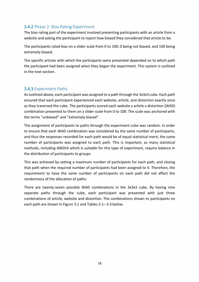
Table 3.3 - A top-down view of the top (dark grey) row in the 3x3x3 cube in Figure 3.1 above. The
intersecting A0 / D0 cell is the same as the A0 / D0 cell in Figure 3.1 above. Participants who were
assigned to path one would therefore experience Website 2 x Article 2 x Distortion 2 ...................... 18
Table 3.4 - Table showing calculations of statistical power for this experiment, from G*Power. ...... 20
Table 6.1 - Sample dataset with three groups of bias ratings. ............................................................. 34
Table 6.2- Sample dataset with three groups of bias ratings with ranks ............................................. 34
Table 6.3 – A summary of the key statistics generated by the results for this experiment, and the
decision to retain or reject the null hypothesis .................................................................................... 51
Table 7.1 – News-websites reportedly recognised by participants. The actual websites used are
highlighted in grey and with an asterisk. .............................................................................................. 57
Table 7.2 – The number of participants who consider each news website to be particularly biased.
The websites used in this experiment are highlighted in grey and with an asterisk. ........................... 59

1
1. Introduction With the ever-increasing availability and consumption of news media online, it is increasingly
important that we understand the factors which affect our interpretation of news online. Bias
in the online news media industry has, many times in recent years, been used as an
explanation for a rise in support for political extremes [1]. Recently it has been credited with
influencing the outcome of US Presidential and local elections [2], and for driving public
support for a referendum decision which will result in the United Kingdom leaving the
European Union [3]. It is evident that there is widespread belief that bias in news media, and
specifically online news media, can be used to drive major social, economic, and political
changes [4]. Bias has, and will continue to be an issue with news media, and has received
significant attention from researchers for at least the last half century [5], [6].
Due to increases in the ability of modern printing techniques and the desire to attract
attention to a news article dealing with a complex subject or series of events, newspapers
regularly commission accompanying artwork for news articles in the form of information
graphics. This method of displaying information is suitable for conveying large volumes of
data quickly and accurately [7]. For example, the share price of a company can be presented
as a graph over time, or the number of new cars being purchased could be presented as a bar
chart per quarter. Traditionally, print news media was constituted almost entirely of text; the
cost of printing images, be they photos or graphics, was prohibitive for printing on a frequent
basis. With the falling cost of printing through technological advances, and the increased
electronic consumption of news [8], images, including information graphics, have become
more prevalent in news journalism. With the increasing presence of such images, comes
increasing power to frame a narrative. Although the impact of bias in news, and especially
print news, has been regularly investigated in areas such as headlines, photographs, coverage,
rhetoric, and agenda setting among others, there is no research on whether it can be
introduced in graphics and the extent of such influence. If bias can be introduced in graphics,
then it is important that this effect is explored and its extent understood.
Information graphics are used in order to rapidly convey large amounts of information in
easily interpretable ways. However, by changing the format of the information from raw data
or other information into an information graphic, the designer of the graphic must make some
design decisions; the graphic is inherently an abstraction of the original data, and is not a
presentation of the original data itself [7]. Insofar as the information is being manipulated for
presentation, this begs the question of whether bias can be introduced into these graphics or
not, adding to or removing emphasis from a certain narrative construed from the original raw
data.
Manipulating how facts, or which facts are presented to an uninformed viewer is central to
the introduction of bias into news media. Bias in news media has been studied for decades,
beginning with traditional news media formats, while online news has become an area of

2
research focus more recently. To date, some work, discussed in Chapter 2 of this dissertation,
has explored how bias can be introduced through the text of news articles, and also through
the design of the websites which contain them [9]. No significant work exists concerning
whether bias can be introduced through the use of information graphics.
There are numerous definitions for the word “bias”. The Oxford English Dictionary [10]
defines bias as:
“[mass noun] Inclination or prejudice for or against one person or
group, especially in a way considered to be unfair.”1
This definition is very broad and is untested in academic research. For this research, a more
specific definition is required, pertaining to the field of study. Looking at existing literature
shows a wide variety of definitions used.
Waldman and Devitt [11] stated, as part of their research into media bias:
“Bias can be defined as any systematic slant favoring one candidate
or ideology over another.”
Gentzkow and Shapiro [12], discussing content bias stated:
“All the accounts are based on the same set of underlying facts. Yet by
selective omission, choice of words, and varying credibility ascribed to
the primary source, each conveys a radically different impression of
what actually happened. The choice to slant information in this way is
what we will mean in this paper by media bias.”
Andon and Free [13] suggest that media bias can be broken down into three categories:
gatekeeping bias, where publishers decide what will be published and what won’t be,
coverage bias, where one side of a story gets more coverage than another, and statement
bias, where bias is introduced through the text used in the coverage.
Bennet [14] also focusses on the significance of gatekeeping bias, but for this study only those
things which are reported can be studied, and so this type of bias will not form a major part
of this study.
Eberl, Boomgarden and Wagner [15] also suggest that there are a multitude of type of media
bias, and that their effects may differ.
Across all of these definitions of bias however, it is clear that bias is not a result of untruth,
but rather the selective framing of truth in favour of a particular point of view.
In the second and third definitions, which are more specifically tailored to the discussion of
bias in the media, the authors conclude that the bias must be introduced by choice or
systematically. While the systematic slant mentioned by Waldman and Devitt does not
1 https://en.oxforddictionaries.com/definition/bias

3
necessarily mean that the slant is knowingly introduced, it is important to remember that the
area of bias in information graphics, which is the focus of this research, has not previously
been extensively studied and is not well understood. It is plausible, if not likely, that bias which
has been introduced to articles through the use of these information graphics may have been
introduced inadvertently or unknowingly. Therefore, for this study bias is defined as:
“Deliberate or accidental slant by the journalist, editor or publication
to distort reality”.
In studying this particular aspect of perceived bias in online news media, covering a little-
researched area, this research should make a significant contribution to our understanding of
that perceived bias in online news media.
1.1 Research Question The purpose of this research project is to answer the question:
“To what extent do the information graphics accompanying a news article impact upon the
perceived bias of the article?”
To this end, the following research objectives were formed:
- A ground-truth bias rating for each of the news articles
- Whether the information graphics accompanying those news articles can impact upon
the perceived bias of the article
- If such graphics have an impact, the extent to which the design of the information
graphics can impact upon the perceived bias of the article
A significant body of work already exists exploring bias in news media, and bias in graphics,
but little work has been published about the perceived bias in the graphics accompanying
news articles in online news media.
1.2 Hypothesis This research aimed to determine whether bias can be introduced to an article through the
use of information graphics. The research aimed to find evidence that bias could be
introduced, and consequently the hypotheses are as follows.
The null hypothesis is:
(H0) This research finds no evidence of bias being introduced to a news article through the
use of an information graphic.

4
This is determined by finding the level of bias both with and without the information graphics
and finding no statistically significant difference in the two levels.
The alternative hypothesis is:
(HA) This research finds evidence of bias being introduced to a news article through the use
of an information graphic.
This is determined by finding the level of bias both with and without the information graphics
and finding a statistically significant difference in the two levels of bias.
1.3 Overview of this Dissertation The remainder of this dissertation is structured as follows. The following chapter gives an
overview of existing understanding related to bias in news media, both online and more
generally, and bias in the creation and reproduction of information graphics.
Chapter 3 provides an explanation of the methodology employed in this research project,
both in terms of the collection and the analysis of the data recorded.
Following this, Chapter 4 gives an overview of the experiment framework from a technical
and practical perspective, while Chapter 5 discusses the statistical methods used to make
determinations on the data collected during the experiment.
Chapter 6 details the results of the statistical tests carried out on the data and Chapter 7
provides a discussion on the results of the experiment. This includes discussion about the
results presented in Chapter 6, and provides a reflection on the participant profile data also
collected during the experiment.
Finally, Chapter 8 provides a conclusion to the dissertation, discussing both what has been
learned and how this can contribute to future work in the area.
The full set of the data collected during experimentation, and the materials used in the
collection of that data, can be found in the appendices at the end of this dissertation.

5
2. Existing Work Bias in news media has been the subject of academic research for many decades, focussing
both on specific aspects of the news media, for example the driving of a partisan agenda
through bias [16]–[18], and on news media more generally [4], [17], [19].
This chapter will give an overview of existing work in the area of media bias, discussing the
findings of that work, and why the research question is an important addition to the body of
work. The findings of other researchers, discussed in this chapter, should also contextualise
the design and implementation decisions, and results, of this experiment.
2.1 Bias Bias in news media has been studied extensively since the 1970s, with research focussing
mostly on the traditional mediums of print newspapers [11], [20] and television [6]. More
recently research has begun to investigate the effects of bias in online news publications [8],
[21]. The extent to which bias has been studied is no surprise given its apparent impact on
news consumers [3], [22].
While most acknowledge the existence of bias, it can be difficult to describe. There is no doubt
that while bias is only one dimension of credibility [23], there are many dimensions to bias,
and by which bias could be measured [17].
Selection bias is the introduction of bias by choosing to cover some material and not to cover
other material [24], [25]. For example, a newspaper editor could decide not to report at all
on a story which an editor finds not to be of interest to their readers. Similarly, an editor could
choose to omit certain aspects of a story for similar reasons. This could convey a significantly
different narrative to an audience than if all aspects of the story were reported, while never
actually diverging in any way from the truth, or having any inaccurate reporting. The bias in
this case is introduced by what is omitted rather than by any manipulation of what is included.
Bias can also be introduced by the way in which content is presented or covered. This is called
presentation bias. Research has found a link between the perceived bias of commentary
depending on to whom that commentary is credited [16], [26], and also in how reported facts
are contextualised [27]. The practice of selecting certain facts and presenting them as being
more important or salient to a particular point in order to promote a particular point of view
is known as framing [28], [29].
Partisan bias is the favouring of one party or person in news coverage of political stories.
Often this presents itself in the form of selection bias, where a news agency is more likely to
publish quotes by, or that are favourable to, a person or party which their readers support
[30]. The causes for partisan bias are very often driven by a desire to please the audience to
which the news agency is selling its output [24].

6
Agenda setting bias extends from this, where media outlets favour reporting viewpoints
which agree with their underlying economic and political stance [31], [32].
Given that what constitutes bias is a matter of debate, there is also no generally accepted
gold standard for the measurement of bias. Measurements of bias can only be obtained by
people reporting bias which they experience. This is often in the form of a user survey, and it
is clear that bias can be introduced both in the creation of content and also in the
consumption of that content [33], [34]. That is to say that in the interaction between an article
and consumer, the bias can be introduced by either the article or the consumer. As such, bias
in a particular article could be attributed either to the article itself or its creator, or it could
be attributed to the reader of that article, and must be regarded as, at best, an informed
opinion rather than an empirical fact.
The level of bias perceived for a particular article is also an inherently subjective
determination; each reader will have their own opinion. Measurements of bias can only be
considered accurate when considered in the context that bias will have a relative definition
for different people, and that the measurement can never be made in any absolute sense
[15]. That is to say that the level of bias is intrinsically subjective, but this subjectivity can be
accepted.
2.1.1 Definitions of Bias There are numerous definitions of the word bias, including many which have been used
specifically for the purposes of research into media bias.
As already discussed in Chapter 1, numerous researchers have used their own definitions for
bias [11], [12], [17], each tailored to their specific areas of research. Related work in other
areas which relate closely to bias, for example accuracy [35], have also presented their own
definitions.
Across all of these definitions, it is clear that bias in media is the favouring of one particular
side of a story, but not usually the intentional dissemination of false information. This is taken
in the context of reputable news agencies, who uphold high standards of journalistic integrity.
There are, of course, certain other media outlets who do in fact spread falsehoods, but these
will not be considered in the scope of this research. This means that while an article may be
perceived to be biased, and may favour one side of a story over the other, or drive a particular
narrative, the facts reported in the article may still be exclusively true.
Some researchers contend that bias should only be considered so if it has been introduced
intentionally, or by choice [12]. Others, meanwhile, have suggested that bias should be
considered only if it is introduced systematically [11]; this could be interpreted to include
unintentional bias which has been introduced as a result of an unrelated decision, for example
an editorial decision on a newspaper’s design.

7
Determining whether or not bias is present in the information graphics accompanying news
articles presents a relatively new research area, it is not implausible that any bias which has
been introduced to articles through the use of information graphics may have been
introduced unintentionally. Therefore, for the purpose of this research, bias is defined as:
“Deliberate or accidental slant by the journalist, editor or publication to distort reality”.
This definition was presented to all participants in the experiment before they undertook the
experiment.
2.1.2 Bias in Mainstream News Media While the majority of news articles published in the mainstream media are written to
established journalistic standards, often an intrinsic bias can exist in some published news
articles [18]. This can be perceived as being biased either in the way it is created, or by those
who consume it. The bias can exist for many reasons, including commercial, economic,
political and personal reasons.
Bias in the creation of news content can be introduced either in terms of how stories are
covered, or in terms of what stories are selected to be covered by a particular media outlet
[17], [24]. Even within a particular topic, the creator of the content can frame certain aspects
of a story as being particularly important or salient, thus influencing a consumer’s
understanding of the facts, while never actually compromising the accuracy of the reporting
of those facts [12], [27]–[29].
The perceived bias in the consumption of news media can be influenced significantly by a
consumer’s personal opinions about the topic or story being covered [33]. Furthermore, it has
been found that consumers tend to favour news outlets whose editorial stance is aligned with
their social, economic, and political views, and to avoid those with which they disagree,
reducing cognitive dissonance [34].
Indeed, it has been found that news agencies play into this fact for commercial reasons. For
news for which customers are unlikely to obtain an alternative, independent, third-party
viewpoint, a news agency can actually bolster its reputation for accuracy by reporting news
in a manner which its customers find agrees with their world-view [12]. News agencies may
do this regardless of whether or not this is the fairest way to report the news. If consumers
are likely to gain an alternative, independent account of the information from an impartial
third-party, the same news agencies are less likely to distort the information they present
[36]. As such, increased competition in the media marketplace tends to lead to lower levels
of bias [12]. Furthermore, for stories on which there is a general consensus of public opinion,
reporting tends to be relatively objective, whereas for stories which are contentious or for
which there is divided public opinion, news agencies tend to segment the market, and
promote more extreme editorial stances in their reporting [36].

8
The widespread availability of online news content has allowed for increased partisanship in
the news industry [9], leading to the so-called “echo chamber” effect, whereby consumers
can choose to expose themselves only to news stories which please them [4], [37].
Consumers will often do this subconsciously, as they often can be unaware of their own
personal bias on a topic, while being very aware of someone else’s with whom they disagree
[38].
This in turn leads to consumer distrust in the media, as stories which displease consumers can
be easily dismissed as biased or misleading, regardless of whether or not they actually are
[39]. As a result, the vast majority of Americans, including 87% of Republicans [40], believe
that the majority of mainstream news media is biased, one way or another [4], [41]. Although
there is some evidence of measurable bias in the online publications of mainstream news
media [19], there is strong research evidence to suggest that this is not as widespread as some
may think [33], [42], [43].
It is important to note that research has also found that a journalist having a strong personal
viewpoint on a particular subject will not necessarily cause their work to be biased or to
convey bias [17], [44]. While it can be accepted that a person’s own views will temper any
decisions they make, including professional editorial decisions, professional journalistic
standards will often help to mitigate any error arising from this judgement.
2.1.3 Bias in the Presentation of News Online Bias in the news media has been extensively studied since the 1970s, and this work has
typically focussed on highlighting differences between liberal and conservative news agencies
or on biased coverage of a particular topic.
Compared to traditional mediums, relatively little research has been carried out into how bias
may be present in the online presentation of news. Some existing research has looked at
textual content and website design [9], [45]. It has previously been shown that bias exists with
respect to vocabulary used in online news articles [21]. It has also been shown that the design
of the website can have a significant impact on how biased its content is perceived to be, with
certain features of website design affecting the perceived bias of the content more than
others [46].
2.1.4 Information Graphics in News Media Information graphics are used to convey large amounts of information in a format which can
be interpreted quickly, and provide insights which the presentation of raw data alone could
not achieve [7], [47], [48]. This should allow for increased understanding of a potentially large
and complex set of information to be achieved by the reader, and relatively quickly. This

9
means that vast amounts of information can be efficiently conveyed through this method of
communication.
Images are also attention-grabbing, and so they can be used to attract a reader to read the
article that they accompany [49].
Consequently, their use in media publications is frequent, indeed increasingly so [8], [50]. It
follows that as their use increases, so too does their influence on communicating information
from journalists to readers. This makes understanding the effects of this bias increasingly
important.
2.1.5 Bias in the Presentation of Information Graphics It has been noted by Munzner that: “no picture can communicate the truth, the whole truth,
and nothing but the truth” [7]. It is clear that any representation of data in an information-
graphic is inherently subject to design decisions by its creator, and the resulting graphic is
necessarily an abstraction of the data being represented and not just the data itself. Many of
the factors which affect other forms of bias also affect bias in information graphics; bias can
be introduced by consideration of what information is being communicated (selection bias),
and also how it is being communicated (salience bias) [51].
It has been noted that even as information graphics in news media become more prevalent,
little is understood about the balance between author-created elements of those graphics,
and the data itself [52].
The processes for the creation of graphics also varies. The New York Times, for example, has
a reasonably large, and multiple award-winning graphics department tasked with making
these information graphics. Other publications such as The Economist and The Washington
Post also spend significantly on graphic design. In many other publications less emphasis is
put on graphic design, and so it is likely that information graphics which are presented are
created on a more ad hoc basis. Given the standards of journalistic integrity which those who
write the text of articles are held to, it should stand that the designers of graphics are held to
the same standards, but as relatively little is known about the effects of the design process
on readers’ interpretation, this may not be the case.
Relatively little research has been carried out about how users extract information from
information graphics. It has been shown that the design of the information graphics can affect
how accurately and quickly readers can understand the information being conveyed [51], and
also that the addition or removal of certain design elements can affect whether the
information is perceived to be biased [53].
As information graphics accompany news articles with increasing frequency, it is increasingly
important to understand how the use of these graphics can impact on the level of perceived
bias in the article as a whole.

10
2.2 Example of Driving a Narrative with Visualisation Figure 2.1 shows an example of an information graphic which presents the same information
in two very different ways. The graphic visualises the population of the world, and also the
growth rate of the population over the same period.
Figure 2.1 – Visualisation of population growth vs. population. Image source: Our World in Data2
Presenting both of these pieces of information related to the same thing on the same graphic
is an eminently sensible design decision. However, if only one or the other of these pieces of
information was presented, it would paint a very different picture.
A graphic with just the blue area visualising population growth could accompany an article
about world population, and would signify a rapidly growing population. With this based in
fact, and visually impressed on the reader, the article could make a claim about how this could
be a huge problem for world resources, and seem very grounded in fact.
On the other hand, a graphic with just the line signifying the rate of population growth could
accompany an article about world population, and would signify a rapidly slowing population
growth. With this based in fact, and visually impressed on the reader, the article could make
2 https://ourworldindata.org/world-population-growth

11
a claim about how the slowing population growth poses an existential threat to humankind,
and this would seem very grounded in fact.
Considering either of those articles with the alternative graphic would expose a weakness in
the case presented by either article, and shows the power of graphics to give credibility to the
narrative in the text which they accompany.
In fact, for either case, the intentional selection of only certain elements of the graphic in
order to bolster the claims made by the article shows a bias, which could massively influence
the interpretation of the article by the reader.
However, it must also be considered that in Figure 2.1, the population is given as an absolute
figure, whereas the population growth is given as a percentage of the population. This means
that population is presented on a constant scale across the graphic, whereas population
growth is presented on a varying scale. This shows how the scale can also be used to visually
trick a reader into interpreting trends in data differently from how they actually are. The two
elements of the graphic in Figure 2.1, are not directly comparable even though they are
presented with each other.
2.3 Conclusion Bias, and more specifically bias in the mainstream media has been studied extensively for
decades. However, despite this, there has been almost no research carried out on bias
introduced to media publications through the use of information graphics, and what effect
this has on a reader’s perception of the articles which the graphics accompany.
As graphics become ever more prevalent, particularly with the rise in online news readership,
where their publication is no more expensive than text-based content, understanding how
they affect our judgement of the articles they accompany, and whether they could be
manipulated to favour one side of a story, or drive a particular narrative within that story, is
more important than ever before. In a time when media bias is very much in the public
spotlight, having been credited with driving major social, political, economic changes right
around the world, understanding how bias can be introduced to news media online is crucial
to understanding how this bias affects readers of these news publications.
This study will investigate whether bias is communicated by the graphical elements of news
content which accompany articles in news websites, and attempt to determine what effect
these information graphics may have on increasing or decreasing the level of perceived bias
in the news article.

12
3. Methodology Answering the questions posed by this research requires the collection and analysis of data
related to how people perceive bias in online news media, specifically when they are viewing
news articles accompanied by information graphics.
To do this, the experiment involved three stages:
1. Presenting participants with a survey to gather sample profile information
2. Then presenting participants with a series of images of webpages and asking them to
rate how biased they considered the article on each of the webpages to be
3. The participants were then required to answer some follow up questions
The experiment was set up as a 3x3x3 design, Websites x Article x Distortions (WAD), using a
Latin Cube in reduced form. This is a very simple form of Latin Hypercube Sampling, which is
a statistical method for generating near random samples from a multidimensional set of
parameters [54]. Participants were randomly assigned to one of nine paths through the 3x3x3
cube.
Participants were recruited to take part in the experiment through Prolific Academic [55]. The
number of participants was determined using G*Power [56], in order to create a sufficient
statistical power for the results to be meaningful.
Approval for this experiment was sought from, and granted by, the SCSS Research Ethics
Committee, at the School of Computer Science and Statistic, Trinity College, Dublin.
3.1 Websites The three websites selected were:
W0. The Daily Mail [57]
W1. The BBC [58]
W2. The Guardian [59].
They were chosen to provide a cross-section of British news media. The Daily Mail is
traditionally aligned with conservative and right-wing viewpoints, whereas The Guardian is
traditionally aligned with liberal and left-wing viewpoints. As a public service broadcaster, the
BBC is traditionally seen as an impartial reporter [60]. The study therefore uses the UK’s
mainstream media perceived as among the most right-wing, left-wing, and from the centre.
3.2 Articles Articles were chosen from the Daily Mail, The Guardian, and the BBC, covering stories
reported by all three news agencies on the same day, and which contained graphical

13
representations of data relating to the story. As such, any bias perceived to be present in the
articles was not related to story selection to fit the experiment.
The three articles selected were on the following stories:
A0. Consumer Price Index inflation, published on December 12th, 2017
A1. The price of bitcoin, published on February 2nd, 2018
A2. The rise in life-expectancy, published on September 27th, 2017
These three articles were chosen as they satisfied the criteria for inclusion. Importantly, they
were not of excessive length which could have resulted in fatigue effects tempering the
responses from participants. All three websites also reported very similarly in terms of data
and sources, making them suitable for comparison.
3.3 Distortions There are three levels of distortion for each website and story:
D0. The article presented without any accompanying information graphics. This is to
determine a ground truth bias rating for the text of the article. The articles were
presented with all other features of their website design included, but with
branding removed.
D1. The article presented in its original form, including its original information graphic,
but with branding removed. This is to determine the bias rating for the article as it
was originally published.
D2. The article presented with the original graphic replaced by a new graphic, specially
designed for the purposes of this experiment.
3.3.1 Creating D2 Graphics The D2 level of distortion required graphics to be created specifically for the purposes of this
experiment. For example, Figure 3.1 shows two graphics, the original graphic (D1) from the
BBC article about inflation (W1A0), and the newly introduced graphic (D2). The D2 graphic
has been designed to suggest an exaggerated gap in the inflation of wages and the consumer
price index, discussed in the article, while making this distortion of the figure not immediately
obvious. The figures were sourced from the same source as the BBC graphic.
For each D2 graphic created, the figures have been sourced from the same sources as the
original figures used, or else sources cited in the article. Some D2 graphics were entirely
original creations, while others were modified version of D1 graphics, with significant design
changes, in ways which are known to alter perception of information graphics.
All the distortions presented to participants are shown in Appendix A4. All the original D1
graphics, and the newly created D2 graphics are presented side-by-side in Appendix A8.

14
3.3.2 Website Branding In the case of all three distortions, all branding, or anything which could identify the name of
the website being used, was removed from the distorted versions of the websites. It is known
that preconceptions about a newspaper’s brand can influence a reader’s trust in the content
of that paper [45], and thus may impact their perception of bias. The branding was removed,
as shown in Figure 3.2, in order to reduce the possibility of participants in the survey having
preconceptions about the websites in question. This likelihood of this occurring was further
reduced by limiting participation to US citizens living in the USA, and only using UK news
websites. This was intended to increase the trust we can place in their responses being a
considered and fair reflection of the content being shown. It is impossible to completely
remove the possibility of participants recognising the websites, but by removing the branding,
this concern is minimised as much as is possible, while without fundamentally altering the
presentation of the website. It is important to avoid altering the presentation significantly, as
this would unnecessarily introduce another variable to the experiment, which could not be
independently measured; namely perceived bias possibly owing to the websites’ design [46].
Figure 3.1 - Original graphic (D1), left. Especially created graphic (D2), right.
Figure 3.2 – Example of BBC website banner with explicit branding removed

15
3.4 The Experiment As outlined in the opening section of this chapter, the experiment was split into three
stages:
1. Participant Profile Questions
2. Bias Rating Experiment
3. Reflective Questions
The experiment was designed in this way so as to gather as much information as possible
from each participant, not just about how biased they determined the articles with which
they were presented to be, but also information which may give insight to how they reached
that determination.
The three phases of the experiment are outlined in more detail below.
3.4.1 Phase 1: Participant Profile Questions Rather than just collecting bias ratings from the participants, it was important to gain some
context surrounding the responses provided by participants to the survey.
Prior to being presented with the websites for evaluation, participants were asked to provide
the following information:
• Date of birth
• Gender
• Amount of time spent on the internet each day
• Highest level of education completed
• Expected income for 2018
• Occupation
• Political leaning
• Media accessed most often
• How many times do they check the news online each day
The data gathered from the responses to these questions is useful in contextualising the
answers from the participants. If trends exist among socio-economic factors and the level of
bias reported for a story, it would indicate an underlying effect which would require further
attention and explanation. This can greatly add to the specificity of the findings.
16
3.4.2 Phase 2: Bias Rating Experiment The bias rating part of the experiment involved presenting participants with an article from a
website and asking the participant to report how biased they considered that article to be.
The participants rated bias on a slider scale from 0 to 100; 0 being not biased, and 100 being
extremely biased.
The specific articles with which the participants were presented depended on to which path
the participant had been assigned when they began the experiment. This system is outlined
in the next section.
3.4.3 Experiment Paths As outlined above, each participant was assigned to a path through the 3x3x3 cube. Each path
ensured that each participant experienced each website, article, and distortion exactly once
as they traversed the cube. The participants scored each website x article x distortion (WAD)
combination presented to them on a slider scale from 0 to 100. The scale was anchored with
the terms “unbiased” and “extremely biased”.
The assignment of participants to paths through the experiment cube was random. In order
to ensure that each WAD combination was considered by the same number of participants,
and thus the responses recorded for each path would be of equal statistical merit, the same
number of participants was assigned to each path. This is important, as many statistical
methods, including ANOVA which is suitable for this type of experiment, require balance in
the distribution of participants to groups.
This was achieved by setting a maximum number of participants for each path, and closing
that path when the required number of participants had been assigned to it. Therefore, the
requirement to have the same number of participants on each path did not affect the
randomness of the allocation of paths.
There are twenty-seven possible WAD combinations in the 3x3x3 cube. By having nine
separate paths through the cube, each participant was presented with just three
combinations of article, website and distortion. The combinations shown to participants on
each path are shown in Figure 3.1 and Tables 3.1– 3.3 below.

17
Table 3.1 - A top-down view of the top (white) row in the 3x3x3 cube in Figure 3.1 above. The intersecting A0 / D0 cell is the same as the A0 / D0 cell in Figure 3.1 above. Participants who were
assigned to path one would therefore experience Website 0 x Article 0 x Distortion 0.
Article (D0) Article &
Original
Graphic (D1)
Article &
Graphic-- (D2)
Story 1 (A0) Path 1 Path 2 Path 3
Story 2 (A1) Path 4 Path 5 Path 6
Story 3 (A2) Path 7 Path 8 Path 9
Table 3.2 - A top-down view of the middle (light grey) row in the 3x3x3 cube in Figure 3.1 above. The intersecting A0 / D0 cell is the same as the A0 / D0 cell in Figure 3.1 above. Participants who were
assigned to path one would therefore experience Website 1 x Article 1 x Distortion 1
Article (D0) Article &
Original
Graphic (D1)
Article &
Graphic-- (D2)
Story 1 (A0) Path 9 Path 7 Path 8
Story 2 (A1) Path 3 Path 1 Path 2
Story 3 (A2) Path 6 Path 4 Path 5
Figure 3.3 - An illustration of the 3x3x3 experiment cube, showing the three levels of websites, articles, and distortions. Each shaded layer of the cube corresponds to a table below (Tables 3.1 – 3.3),
which detail how each path traverses the cube.
18
Table 3.3 - A top-down view of the top (dark grey) row in the 3x3x3 cube in Figure 3.1 above. The intersecting A0 / D0 cell is the same as the A0 / D0 cell in Figure 3.1 above. Participants who were
assigned to path one would therefore experience Website 2 x Article 2 x Distortion 2
Article (D0) Article &
Original
Graphic (D1)
Article &
Graphic-- (D2)
Story 1 (A0) Path 5 Path 6 Path 4
Story 2 (A1) Path 8 Path 9 Path 7
Story 3 (A2) Path 2 Path 3 Path 1
For example, a participant who was randomly assigned to Path 1 through the experiment, was
presented with [W0, D0, A0], [W1, D1, A1] and [W2, D2, A2], and was asked to evaluate each
of those three combinations.
Likewise, a participant who was randomly assigned to Path 2 through the experiment, was
presented with [W0, D1, A0], [W1, D2, A1] and [W2 D0, A2], and was asked to evaluate each
of those three combinations.
By having each participant evaluating just three of the twenty-seven possible permutations
of WAD, the effects of fatigue are reduced. Also, the participant did not rate more than one
distortion of a particular article or website, which makes any crossover effects impossible.
3.4.4 Phase 3: Reflective Questions Having rated all three websites, the participants were asked the following:
• If they recognised any of the websites used in the experiment, from a provided list of
news websites
• If they considered any of the websites to be particularly biased in general, from a
provided list of news websites
• Which elements, from a multiple-choice list of supplied elements, they consider
contribute to bias
This additional information was stored along with their other responses, and was completely
anonymous.
In addition to this, participants were asked one ‘spike’ question. An image of an article about
dogs was presented to each participant before the first article as part of this experiment. The
participants were required to answer if the article was about dogs or cats, on the same slider
scale as during the experiment, thus ensuring that the participants were paying attention to

19
the content being presented to them, and not just responding to the survey at random. This
increases confidence that the responses to the survey were genuine and considered, and
therefore that the conclusions drawn can be considered to reflect reality.
3.5 Bias Rating Scale Bias was rated by participants on a visual analogue scale, which ranged from 0 to 100. This is
shown in Figure 3.4. This type of scale was chosen as it allows participants to report precisely
the level of bias they determine to be present in the article which they are rating.
An alternative type of scale, which has been used extensively in research in the past, is the
Likert scale. On a Likert scale, the participants report their answer as an approximation which
falls within a grouping of scores. This makes sense when evaluation of results is being carried
out manually, as it makes for more simplified analysis. However, with automatic methods for
data collection and analysis, the greater granularity of the responses made possible on a
continuous scale was possible to utilise. It is for this reason that a continuous scale was
utilised.
3.6 Participants The participants for the experiment were sourced through the crowd sourcing marketplace
Prolific Academic3[49].
Participation was limited to the United States of America. This was to help prevent the
participants’ personal opinion of articles presented to them affecting their perception of the
articles’ bias, as each of the news articles used for the experiment was sourced in media
publications from the United Kingdom. With the branding removed from the UK websites, the
likelihood of the American participants recognising the website, or having an opinion as to its
bias, should be reduced [45]. If the participants did have their own strong opinion on the
websites in question, it is likely that this could skew their interpretation of whether or not the
article was biased [38].
The requisite number of participants was determined, using G*Power[56], in order to create
a sufficient statistical power for the results to be meaningful. ANOVA analysis, discussed in
3 www.prolific.ac
Figure 3.4 - The Visual Analogue Scale on which participants rated the perceived level of bias for each article

20
Chapter 5, is generally suitable for this type of experiment, and so calculations were based on
creating a statistical power for ANOVA. A statistical power of .45 or better is sufficient to draw
meaningful conclusions from the research. In order to attain this statistical power, 121
participants would be required. However, in order to have an equal number of participants
per path through the Latin Cube, 126 participants were required; 14 participants per path.
Having an α error probability of <0.05 means that we have a 95% chance of not making a Type
1 error.
Also, with a sample size of 126, there is a >0.95 Statistical Power, or a >95% probability, that
we will detect an effect size of 0.45 when there is an effect to be detected, and not making a
Type 2 error.
With 126 participants, the calculations are as shown in Table 3.4. The effect size, f, shows the
effect size which is being sought. The power shows the probability of not making a Type 2
error for this effect size.
Table 3.4 - Table showing calculations of statistical power for this experiment, from G*Power.
Input Output
F Test
ANOVA: Fixed effects, special, main effects and interactions
Post hoc: Compute achieved power - given a sample size,
and effect size
• Effect size f = 0.45
• β / α ratio = 1
• Total Sample Size = 126
• Numerator df = 8 (levels minus 1)
• Number of groups = 9
• Noncentrality Parameter = 25.515
• Critical F = 2.0674719
• Denominator df = 117
• α err prob = 0.0444294
• β err prob = 0.0444294
• Power = 0.9555706
3.7 Conclusion The measurement of bias requires participants in the experiment to report their
determination on the perceived level of bias in the article with which they are presented. As
will be discussed in Chapter 5, in order to perform ANOVA analysis on the responses from the
participants it is desirable to record a single continuous dependant variable, and one
categorical independent variable. It was intended when designing the experiment that it
should be suitable for this type of statistical analysis. Therefore, any other variables should
be eliminated, and each participant should be asked to provide just a single piece of data; in
this case, the level of bias in an article.

21
Participants are only asked to rate three different images of websites, thus reducing the
possible effects of fatigue. Participants are also asked a spike question to ensure that they are
paying attention before the experiment begins.
Use of Latin Hypercube Sampling provides a method of ensuring that participants are shown
random images from the available selection, and also provides independence of observations
between groups, another requirement for statistical analysis of the data collected.
The use of articles from UK websites, and American participants, along with removed
branding, reduces the possible effects of bias arising from cognitive dissonance, by reducing
the chances of the participants having a strong opinion on the material that they are rating.
The presentation of the websites being kept as close as possible to their original format
reduces the possible effects of bias being affected by the website design. It is important to
mitigate these potential sources of error as much as is possible.
As statistical power of 0.45 is deemed sufficient to draw meaningful conclusions from this first
research into the area; working with a higher statistical power would be economically
prohibitive due to the number of participants required, while this should work to determine
if there are useful results to be found from this experiment. According to Cohen [61], a power
of 0.5 should detect an effect of medium magnitude. By using 0.45, the size which can be
detected is even smaller. The calculations were based on the premise that ANOVA would be
a suitable type of statistical analysis for the data collected in this experiment.

22
4. Experiment Apparatus The survey for this experiment was deployed online, using a custom-built apparatus, on an
Apache virtual machine (VM) in the School of Computer Science and Statistics at Trinity
College, Dublin.
The apparatus is based on that built and used by Brendan Spillane for his web design
experiments at the ADAPT Centre4, but used here with significant modification. The existing
apparatus was designed to accommodate two-dimensional experiments up to a maximum
size of a 9x9 two-dimensional Latin square. While significantly smaller than that size, this
experiment required a framework capable of handling a three-dimensional cube. The
apparatus’ code, therefore, required heavy modification in order to be suitable for this
experiment. This coding was completed and tested locally before being deployed to the VM
for public use.
The apparatus is written primarily in the Python 2.7 programming language using the Django
Framework. The HTML elements of the apparatus are styled using Twitter Bootstrap, and
interactive elements of the design are controlled with JavaScript.
Responses by participants were stored on a MySQL database, running on the same VM as the
front-end website. This was linked to the front-end using python-mysql.
The articles were modified for each required level of distortion with branding removed, using
photo editing software. Each of these samples presented to the participants is shown in
Appendix A4.
Each participant partaking in the survey progressed through the steps detailed in Sections 4.1
to 4.10.
4.1 Prolific Academic The participants were sourced through the crowdsourcing marketplace Prolific Academic5.
Participation was limited to US citizens, living in the USA, and who were at least 18 years old.
Eligible participants saw this experiment advertised on Prolific Academic, chose to partake,
and were brought to the start page of the experiment.
The experiment was advertised on Prolific Academic for four days, from April 27th to April
30th, 2018. Prolific Academic requires that participants are compensated at least £5 for an
hour of participation in surveys. This experiment took approximately 10 minutes, and so each
participant received compensation of £0.85 for their time.
4 https://www.adaptcentre.ie/ 5 www.prolific.ac

23
4.2 Begin Survey Participants who chose to partake were first brought to an introduction page where they were
provided with detailed information about the experiment. They were then given the option
to partake in the experiment or return to Prolific Academic. This page, and all subsequent
pages were part of the website running on the VM at Trinity College, Dublin. At this point,
participants clicked to begin their participation in the experiment.
4.3 Participant Information As per Trinity Research Ethics, participants were presented with information about the
experiment, and were then asked to provide their consent that their responses could be
recorded and used in the analysis of this experiment. This was a prerequisite for participation
in the experiment.
The full content of the participant information and consent pages are show in Appendix A3.
4.4 Instruction Tasks Having provided their consent in the previous section, participants clicked the button to begin
their participation in the experiment, and in so doing, were randomly assigned to one of the
nine paths through the experiment, as described in Chapter 3, Figure 3.1.
They were then presented with instruction tasks; they were presented with pages which
looked identical to the experiment proper, but were simply used to allow the participants to
familiarise themselves with the experiment apparatus and the interface. Popup windows
provided information to the user on how to partake in the experiment, and the users were
requested to rate the bias of two sample images, as they would do later on in the experiment
proper. These instruction pages are shown in Appendix A7.
4.5 Survey Questions Before rating any articles as part of the experiment, participants were required to fill in a short
survey. The results of this survey provided background information on the participants,
allowing for contextualisation and greater understanding of their bias ratings.
The users were asked to provide the information detailed in Section 3.4.1.
This information provides information about the participants’ socio-economic and political
background. Though not directly contributing to the findings of the experiment, this
information could be used to explain or contextualise the responses recorded.

24
4.6 Spike Question Having completed the background survey, users were presented with a spike question to
ensure diligence to the task and make sure they were not simply clicking though the
experiment. This article is not part of the experiment data that was assessed and is simply
designed to measure participants’ attention to the task. To this end, participants were shown
an article about dogs. The slider bar at the bottom of the page then asked them to indicate
whether the article was about dogs or cats. Asking this simple and, more importantly,
objective question for which there is a right and a wrong answer goes some way to ensuring
that the participants were in fact paying attention to the experiment, and were giving
considered responses. Any participant who answered the question incorrectly could be
considered to have provided generally erroneous results, and their responses could be
removed from consideration.
4.7 Bias Ratings Participants then partook in the main part of the experiment, namely rating the bias they
perceived to be present in each WAD combination. Each participant rated three WAD
combinations, on a slider scale from 0 to 100, 0 being unbiased and 100 being extremely
biased, as shown in Figure 3.4. The specific articles which were presented to the participants
depended on which path they had been assigned through the experiment (see Figure 3.1).
After rating all three articles, the participants were then presented with all three again, with
the opportunity to re-evaluate their ratings by comparing all three simultaneously.
Once satisfied with the rating which they had given for each, the participants were then once
again presented with all three articles side-by-side, without seeing their previous rating, and
asked to select the article they considered to be the most biased.
Asking for repeated affirmation of their decisions regarding the bias levels they perceived to
be present in the articles increases confidence that the responses provided by the participants
had been fully considered, and can provide meaningful information from which to draw
conclusions.
4.8 Reflective Survey Questions Having rated, and re-rated, the articles for their perceived level of bias, the participants were
again asked a number of survey questions, reflecting on the experiment. Each participant was
asked:
• If they recognised any of the websites used in the experiment, from a provided list of
news websites
• If they considered any of the websites to be particularly biased in general, from a
provided list of news websites

25
• Which elements, from a multiple-choice list of supplied elements, they consider
contribute to bias
This information is used to provide context to the answers provided. For example, if a user
said that they had recognised some of the websites used, we can no longer assume that their
responses are entirely free of their own bias, from opinions they already had about the
publication. Like the pre-experiment survey, described in Section 4.4, the answers to these
questions do not directly contribute to the outcome of the experiment, but can be used to
contextualise the responses recorded.
4.9 Debrief Having completed the entire experiment, participants were presented with a debrief page,
thanking them for their participation and providing them with contact information for the
researchers, whom they could contact with any questions arising from the experiment. The
full content of this page is presented in Appendix A6.
4.10 Submission and Payment Having read the debrief page, participants were prompted to submit their responses to be
included in the research. Upon clicking the button to do this, their answers were recorded on
a MySQL database, which was hosted on the same Apache VM as the rest of the experiment
apparatus.
The participants were then redirected to the Prolific Academic website, where they received
payment as compensation for their time in completing the experiment.
4.11 Conclusion The apparatus used in this experiment had previously been employed in two-dimensional
experiments at the ADAPT Centre, but required heavy adaptation for use in this three-
dimensional experiment.
The number of participants required to participate in the experiment was calculated using
G*Power, as discussed in Chapter 3. The design of this experiment ensured that participants
were always fully aware of what information they were expected to provide, and how to
provide it. The design also ensured that responses were well considered, and provided
context to a user’s response decisions.

26
5. Data Analysis Determining whether or not any bias exists in the data collected requires statistical analysis
of the data. Originally, it was envisaged that analysis for this experiment would be achieved
using one-way ANOVA, or Analysis of Variance tests, and the experiment was designed
accordingly. On examination, it transpired that the data collected did not satisfy the
assumptions for ANOVA as there were a number of significant outliers in the bias ratings, and
so the Kruskel-Wallis H Test was performed instead. All tests were run using SPSS 25.
5.1 ANOVA Assumptions There are six assumptions which an experiment and its resulting dataset must satisfy for
ANOVA to be considered an appropriate test for that data:
1. There must be just one dependent variable, which must be continuous. In this case,
that variable is the reported bias, which was reported on a continuous slider scale
from 0 to 100 by the participants.
2. There must be one independent variable, which is categorical. In this case, that
independent variable is one of either the Website, the Article, or the Distortion,
depending on which dimension of the experiment is being examined at a particular
time. Only one is examined at a time, which means that this assumption is satisfied.
3. There must be independence of observations. This is achieved by the Latin Hypercube
Sampling experiment design, discussed in Chapter 3. This design ensures that the way
that participants traverse the Latin Cube design guarantees independence of
observations, by maintaining each randomly assigned group on separate paths
through the cube.
4. There should be no significant outliers in the groups.
5. The dependent variable should be approximately normally distributed.
6. The variances of each variable should be approximately equal.
Assumptions 1, 2 and 3 are satisfied by the experiment design.
Assumptions 4, 5 and 6 depend entirely on the responses provided to the experiment by the
participants. While it can often be expected that the responses will satisfy these assumptions,
the data set must be tested to confirm that this is the case before an ANOVA analysis can be
considered appropriate for the dataset.
Having collected all of the data for this experiment, the data failed Assumption 4; there were
a small number of significant outliers, see Figure 5.1.

27
Figure 5.1 - Boxplot showing data collected for all twenty-seven combinations of WAD presented to participants. Significant outliers are seen represented by circles (more than one box-length), and
asterisks (more than three box-lengths). Note that the numbers associated with the outliers are the unique identification numbers for those points in the dataset, and not the values of those points.
As there was no reason to reject these outlying data-points as being erroneous, it was
necessary to include these in the statistical analysis. Consequently, ANOVA was unsuitable for
analysis in this experiment, and an alternative, the Kruskel-Wallis H Test was used instead.
5.2 Kruskel-Wallis H Test Assumptions Having rejected ANOVA as a suitable statistical test for use on this dataset, the Kruskel-Wallis
H Test was chosen as a suitable alternative. This test, like ANOVA, is suitable for determining
the relative differences between groups on a scale, which for this experiment is the bias
rating. Importantly, the Kruskel-Wallis H Test is suitable for analysis on datasets with outliers,
which is a necessity for the data collected in this experiment, as significant outliers exist.
For the Kruskel-Wallis H Test, the data must satisfy four assumptions, which are similar to the
ANOVA assumptions, in order for this test to be suitable:
1. There must be just one dependent variable, which can be either continuous ordinal.
In this case, that variable is the reported bias, which was reported on a continuous
slider scale from 0 to 100 by the participants.
2. There must be one independent variable, which is categorical. In this case, that
independent variable is one of either the Website, the Article, or the Distortion,
depending on which dimension of the experiment is being examined at a particular
time. Only one is examined at a time, which means that this assumption is satisfied.

28
3. There must be independence of observations. This is satisfied by the experiment
design as discussed in section 5.1.
4. A determination must be made of whether the distribution of scores of the dependent
variable has the same or different shape for each of the independent variables, as
shown in Figure 5.2. The test is suitable whether or not the shape is the same, but the
alternative hypothesis is different depending on this determination. This
determination is made for the data each time the test is run, which for this experiment
is twenty-seven times over the three dimensions of the experiment cube.
As the data collected from the participants in this experiment satisfies these assumptions, the
Kruskel-Wallis H Test is a suitable statistical method.
5.3 Kruskel-Wallis H Test Hypotheses The research question which this experiment aims to answer is, “To what extent do the
information graphics accompanying a news article impact upon the perceived bias of the
article?”. This requires determining if the perceived level of bias changes when a graphic is
introduced, and if so what the nature of that change is. This is achieved by comparing the bias
ratings at the three levels of distortion and for the three websites and news stories as
discussed in Chapter 3.
The Kruskel-Wallis H Test can be used to determine if any differences observed in the
collected data are statistically significant. The hypotheses which the Kruskel-Wallis H Test
tests for are very similar to the hypotheses for ANOVA, and so it provides a suitable alternative
test for this experiment. As this is a parametric test, unlike ANOVA, this test is suitable for
datasets with significant outliers, which is a necessity for analysis of the data collected in this
experiment.
The responses are grouped by their WAD combinations from the Latin Cube outlined in
Chapter 3. The Kruskel-Wallis H Test is performed on each level of WAD, for each dimension
of the cube. This means that twenty-seven tests are carried out on the experiment cube in
total. The outcome of each test is either the rejection or retention of the null hypothesis, and
in the case of rejection, the acceptance of the alternative hypothesis.
5.3.1 The Null Hypothesis The null hypothesis (H0), which is assumed, in a Kruskel-Wallis H Test is:
H0: The distribution of scores for the groups are equal.
For this experiment, the scores are the bias ratings by participants, and the groups are the
combinations of WAD.
As it is highly improbable that a set of data will contain identical data in different independent
groups, a determination must be made for what is a statistically significant difference in order

29
to reject the null hypothesis. For Kruskel-Wallis H Tests, this is determined by p-values. As is
standard practice, a p-value of 0.05 was used to test for significance in this experiment.
5.3.2 Alternative Hypothesis Alternatively, if the relative levels of bias between groups is found to be statistically
significant, the null hypothesis must be rejected. This implies that the alternative hypothesis
(H1) may be accepted. Consequently, we determine that the averages of the populations are,
in fact, different, and we can say with 95% certainty that the levels of bias are different in at
least one of the three groups.
Figure 5.2 - Example illustration showing three different groups whose distribution is different, with distributions of the same shape (left), and different shape (right). Image source: Laerd Statistics6
Depending on whether the shapes of the distributions are equal, as per the example in Figure
5.2, determined in Assumption 4, the alternative hypothesis can be described in different
ways. There is no generally accepted numerically rigorous approach to determining whether
the shapes of the distributions are equal or not, and so this determination is made visually.
For this experiment, that determination was made using box-plots of the data for each group.
This is a standard approach.
If Assumption 4 is violated, and the shapes of the distributions are not similar then the
alternative hypothesis states:
H1: The mean ranks for the groups are not equal.
This means that there is evidence that the level of bias reported at least one of the groups is
statistically significantly different from the others. This means that bias has been found to
exist. The precise extent to which the groups differ is found by comparing the mean ranks of
the groups.
6 https://statistics.laerd.com/

30
Rejecting the null hypothesis, and consequently accepting the alternative hypothesis in all
cases means that a statistically significant change in the levels of perceived bias has been
detected in this experiment.
5.4 Kruskal-Wallis H Test Results As mentioned in the previous section, whether or not to accept the null hypothesis is based
on p-values. P-values become more accurate the larger the population size, but are
considered appropriate for use once the population sample size is greater than five. The
increase in accuracy is asymptotic, meaning that as the sample size increases, the rate of
increase in the accuracy of the results reduces.
For this experiment, a p-value of <0.05 is considered to be statistically significant, as is
standard practice. That is to say, a test result with a p-value of <0.05 will be sufficient to reject
the null-hypothesis.
The p-value is calculated from the H-Statistic, which is the result of the experiment, and the
number of degrees of freedom, which is the number of groups minus one. The H-Statistic
approximately follows an x2 distribution for the relevant number of degrees of freedom. For
all tests of bias in this experiment, the number of degrees of freedom is two, as there are
three groups in each of the three dimensions of the experiment cube.
5.5 Conclusion In order to answer the research question proposed for this research, first a determination
must be made as to whether or not the levels of bias are changed significantly by the
introduction of graphics to news articles. The experiment was set up so that it would pass the
first three assumptions necessary to undertake an ANOVA. However, the resulting data
provided by the participants meant that there were too many outliers in the data and as a
result it failed Assumption 4, rendering the dataset unsuitable for ANOVA analysis.
The Kruskel-Wallis H Test provides a suitable alternative to ANOVA. The test is suitable for
determining a difference between the results reported by each group, but can do so
regardless of whether or not there are outliers in the groups, or the distributions of responses
are balanced. It was therefore used for analysis in this experiment.
The nature of any change found between the perceived levels of bias for each group, is
determined by comparing either the mean rank or the median of the groups, depending on
whether or not the distributions for each group had the same shape.
Accepting or rejecting the Kruskal-Wallis H Test’s null hypothesis for these tests determined
whether the level of bias perceived in articles was found to be affected by the use of
information graphics accompanying those articles, answering the research question.

31
6. Results This chapter details the results, following statistical analysis, of the bias ratings provided by
participants in the experiment. The full data collected and used in this analysis is presented
in Appendix A1.
The results shown below for each Kruskal-Wallis H Test carried out, comprise:
• A box plot, showing the reported levels of bias for each independent group being
tested. The horizontal black line through the boxes shows the mean rank for each
group.
• A table showing the mean value, and standard deviation for each independent group
being tested. The mean value is on a scale from 0 to 100, as this is the range of
responses allowed by the experiment apparatus.
• The decision on whether to accept or reject the null hypothesis, and the following key
statistics drawn from the results
o The H Test Statistic, presented as Chi-squared, and represented by X2(N-1),
where N is the number of groups being tested.
o The p-value of the results, used to accept or reject the null hypothesis. A p-
value of <0.05 is considered sufficient to reject the null hypothesis.
A full summary of these results is provided in Section 6.6. These results, including the
visualisations, were generated using SPSS 25, as noted in Chapter 5.
6.1 Experiment Participants The experiment was run, and all data collected over four days from April 27th to April 30th,
2018. 124 complete responses were gathered and considered for statistical analysis. A
breakdown of the participants’ demographics is shown in Figure 6.1 and 6.2. The vast majority
of participants were aged between 18 and 40 years old. 70 of the participants, or 56%,
identified themselves as being male. 52 of the participants, or 42%, identified as female.

32
Figure 6.1 - The age distribution of participants
Figure 6.2 - Number of participants by gender
A full breakdown of all responses to the experiment are shown in Appendix A1 and Appendix
A2.
6.2 How to Read the Kruskel-Wallis H Test Results This section is designed to show how the results presented in this chapter should be
interpreted.
The determination on if the groups had a distribution of equal shape was made on the shape
of the box plots for those groups. This decision is not dependent on how high or low the
distribution is grouped on the vertical axis, but only on its height and the location of the mean
rank within it, represented by the horizontal black line.
Regardless of whether or not the distributions were of equal shape, the Kruskel-Wallis H Test
tests for the relative locations of the distribution on the vertical axis. The resulting score, the
70
52
1 1
M A L E F E M A L E O T H E R P R E F E R N O T T O S A Y

33
H-statistic, is in fact a Chi-squared score for the test. As such, it is presented as X2(N-1), for N
groups, as this is a more familiar statistic to many.
One of the results for this experiment is explained in detail in Section 6.2.1. All other results
may be interpreted similarly.
6.2.1 Sample breakdown of results for a Kruskel-Wallis H Test interpretation
Figure 6.12 - Results of the Kruskal-Wallis H Test for W0D0
The distributions of bias for each distortion were not similar for all groups. The values of bias
reported for each article differed significantly from one another, X2(2) = 7.393, p = 0.025. The
null hypothesis is rejected.
6.2.1.1 Boxplots
The boxplot in the top left of figure 6.12 shows the distributions for the three groups being
tested. In this case they are the groups of users who experienced W0A0D0, W0A1D0, and
W0A2D0. It can be seen that the shapes of the three distributions of bias rating results are
different from each other. The leftmost box has the largest distribution, and the rightmost
box has the smallest distribution. This can also be confirmed with reference to the standard
deviation, shown in the table on the right. It can also be seen that the median, the horizontal
black line through each box plot, cuts the three boxes into different proportions. This is
another indication that the distributions are not equal.
6.2.1.2 H-Statistic
To make a determination on whether or not to reject the null hypothesis for each test, the H
statistic is calculated by running the Kruskal-Wallis H Test in SPSS 25. This is calculated by
assigning a “rank” to each data point (bias rating), from 1 to n, beginning with the lowest bias
rating, and working upward from there. A mean value is then found for the ranks which have
been assigned to each group. This is called the mean rank for that group.
For example, the mean rank for the sample data set shown in Table 6.1 would be calculated
as follows. Note, the data in Table 6.1 has been generated purely for explanation purposes,
and is not real data from the experiment.

34
Table 6.1 - Sample dataset with three groups of bias ratings.
W0A0D0 Bias Ratings W0A0D1 Bias Ratings W0A0D2 Bias Ratings
15 45 18
32 63 22
43 42 46
17 19 82
14 32 53
28 61 37
53 25 46
26 36 57
1. The bias ratings are put in an ordered list and ranked from smallest to highest.
Table 6.2- Sample dataset with three groups of bias ratings with ranks
W0A0D0 W0A0D1 W0A0D2
Bias Rating Rank Bias Rating Rank Bias Rating Rank
15 2 45 15 18 4
32 9 63 23 22 6
43 13 42 12 46 16
17 3 19 5 82 24
14 1 56 20 54 19
28 8 61 22 37 11
53 18 48 17 44 14
26 7 36 10 57 21
2. The mean rank of each group is calculated. This is the arithmetic mean of the ranks
assigned to that group.
Mean Rank for Group 1: (2 + 9 + 13 + 3 + 1 + 8 + 18 + 7)/8 = 61/8 = 7.625
Mean Rank for Group 2: (15 + 23 + 12 + 5 + 20 + 22 + 17 + 10)/8 = 124/8 = 15.5
Mean Rank for Group 3: (4 + 6 + 16 + 24 + 19 + 11 + 14 + 21)/8 = 115/8 = 14.375
3. The Kruskal-Wallis H Test then makes a comparison based on these mean ranks,
rather than a comparison of the bias rating values themselves. This is the most
suitable comparison of the distributions, as it takes into account the different
distributions for each group.
The H-statistic is calculated using equation 1.

35
𝐻 = [12
𝑛(𝑛+1) ∑
𝑇𝑗2
𝑛𝑗
𝑐𝑗=1 ] − 3(𝑛 + 1) (1)
where, n = sum of sample sizes for all samples, c = number of samples, Tj = sum of ranks of
the jth sample, and nj = size of the jth sample.
For the sample data in Table 6.1, this would be calculated, using Equation 1 as follows.
𝐻 = [12
𝑛(𝑛 + 1) ∑
𝑇𝑗2
𝑛𝑗
𝑐
𝑗=1
] − 3(𝑛 + 1)
𝐻 = [12
24(24 + 1) (
612
8 +
1242
8+
1152
8)] − 3(24 + 1)
𝐻 = [12
600 ×
16161
4] − 75
𝐻 = 5.805
The H-statistic, which is the result of the Kruskal-Wallis H Test, is often reported in the more
familiar form of a chi-squared score. For this sample breakdown, the H-statistic is H = X2(2) =
5.805, indicating that the experiment has two degrees of freedom. Higher H-statistics indicate
a greater variance between the bias levels reported for each group. Similarly, lower H-
statistics indicate a smaller variance between the bias levels reported for each group.
6.2.1.3 Hypothesis Testing and p-values
Using this H-statistic, and knowing the number of degrees of freedom, the p-value can be
found, either by calculation or using tables for the Chi-squared distribution.
Using the Chi-square tables, as shown in Appendix A9, it can be seen that for a H-statistic/Chi-
squared score of 5.805, with two degrees of freedom, the p-value is in the range 0.10 > p >
0.05. As is standard practice, a p-value of <0.05 has been used in this experiment to determine
significance. Having a p-value below 0.05 indicates that the null hypothesis can be rejected.
For this example, p > 0.05, and therefore the null hypothesis is retained. This indicates that
the difference between the bias reported for the groups is not statistically significant.

36
6.3 Bias Levels by Distortion This section focusses on the outcome of the Kruskal-Wallis H Test for each combination of
website and article. This directly compares the effects of distorting the graphic presented to
users, without consideration of the website or article chosen.
For brevity, only the significant results are explored in detail.
6.3.1 W0A0 (D0/D1/D2) – The Daily Mail, CPI Inflation
The distributions of bias for each distortion were not similar for all groups. The values of bias
reported for each distortion differed from one another, but the differences were not
statistically significant, H = X2(2) = 1.451, p = 0.484. The null hypothesis is retained.
6.3.2 W0A1 (D0/D1/D2) – The Daily Mail, Bitcoin Prices
Figure 6.3 – Results of the Kruskal-Wallis Test for W0A0
Figure 6.4 - Results of the Kruskal-Wallis H Test for W0A1

37
The distributions of bias for each distortion were not similar for all groups. The values of bias
reported for each distortion differed from one another, but the differences were not
statistically significant, H = X2(2) = 4.382, p = 0.112. The null hypothesis is retained.
6.3.3 W0A2 (D0/D1/D2) – The Daily Mail, Life Expectancy
Figure 6.5 - Results of the Kruskal-Wallis H Test for W0A1
The distributions of bias for each distortion were not similar for all groups. The values of bias
reported for each distortion differed from one another, but the differences were not
statistically significant, H = X2(2) = 0.164, p = 0.921. The null hypothesis is retained.
6.3.4 W1A0 (D0/D1/D2) – The BBC, CPI Inflation
The distributions of bias for each distortion were not similar for all groups. The values of bias
reported for each distortion differed from one another, but the differences were not
statistically significant, H = X2(2) = 1.180, p = 0.554. The null hypothesis is retained.
Figure 6.6 - Results of the Kruskal-Wallis H Test for W1A0

38
6.3.5 W1A1 (D0/D1/D2) – The BBC, Bitcoin Prices
The distributions of bias for each distortion were not similar for all groups. The values of bias
reported for each distortion differed from one another, but the differences were not
statistically significant, H = X2(2) = 2.593, p = 0.274. The null hypothesis is retained.
6.3.6 W1A2 (D0/D1/D2) – The BBC, Life Expectancy
Figure 6.8 - Results of the Kruskal-Wallis H Test for W1A2
The distributions of bias for each distortion were not similar for all groups. The values of bias
reported for each distortion differed from one another, but the differences were not
statistically significant, H = X2(2) = 1.983, p = 0.371. The null hypothesis is retained.
Figure 6.7 - Results of the Kruskal-Wallis H Test for W1A1
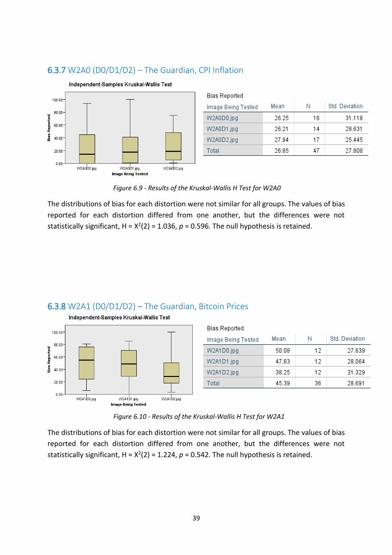
39
6.3.7 W2A0 (D0/D1/D2) – The Guardian, CPI Inflation
The distributions of bias for each distortion were not similar for all groups. The values of bias
reported for each distortion differed from one another, but the differences were not
statistically significant, H = X2(2) = 1.036, p = 0.596. The null hypothesis is retained.
6.3.8 W2A1 (D0/D1/D2) – The Guardian, Bitcoin Prices
The distributions of bias for each distortion were not similar for all groups. The values of bias
reported for each distortion differed from one another, but the differences were not
statistically significant, H = X2(2) = 1.224, p = 0.542. The null hypothesis is retained.
Figure 6.9 - Results of the Kruskal-Wallis H Test for W2A0
Figure 6.10 - Results of the Kruskal-Wallis H Test for W2A1

40
6.3.9 W2A2 (D0/D1/D2) – The Guardian, Life Expectancy
The distributions of bias for each distortion were not similar for all groups. The values of bias
reported for each distortion differed from one another, but the differences were not
statistically significant, H = X2(2) = 5.638, p = 0.060. The null hypothesis is retained.
6.3.10 Overview of Results There was no statistically significant difference found between the levels of bias reported for
articles presented with or without graphics. In all nine cases, the null hypothesis, that the bias
for each distortion was not statistically different from the other distortions, was retained.
These results are discussed more fully in Section 7.1.
Figure 6.11 - Results of the Kruskal-Wallis H Test for W2A2

41
6.4 Bias Levels by News Story This section details the outcome of the Kruskal-Wallis H Test for each combination of website
and distortion. This directly compares the bias reported for each story, on the same website
and for the same level of distortion.
6.4.1 W0D0 (A0/A1/A2) – The Daily Mail, no graphic
The distributions of bias for each distortion were not similar for all groups. The values of bias
reported for each article differed significantly from one another, H = X2(2) = 7.393, p = 0.025.
The null hypothesis is rejected.
This indicates that a statistically significant difference has been detected between the levels
of bias reported for the each of the Daily Mail articles. It can be seen that the article about
life expectancy (A2) was considered the least biased. This result is particularly important when
compared to the other results for other distortions of the Daily Mail.
6.4.2 W0D1 (A0/A1/A2) – The Daily Mail, original graphic
The distributions of bias for each distortion were not similar for all groups. The values of bias
reported for each distortion differed from one another, but the differences were not
statistically significant, H = X2(2) = 4.913, p = 0.086. The null hypothesis is retained.
Figure 6.12 - Results of the Kruskal-Wallis H Test for W0D0
Figure 6.13 - Results of the Kruskal-Wallis H Test for W0D1

42
6.4.3 W0D2 (A0/A1/A2) – The Daily Mail, experiment graphic
The distributions of bias for each distortion were not similar for all groups. The values of bias
reported for each distortion differed from one another, but the differences were not
statistically significant, H = X2(2) = 2.832, p = 0.243. The null hypothesis is retained.
6.4.4 W1D0 (A0/A1/A2) – The BBC, no graphic
The distributions of bias for each distortion were not similar for all groups. The values of bias
reported for each distortion differed from one another, but the differences were not
statistically significant, H = X2(2) = 1.175, p = 0.556. The null hypothesis is retained.
Figure 6.14 - Results of the Kruskal-Wallis H Test for W0D2
Figure 6.15 - Results of the Kruskal-Wallis H Test for W1D0

43
6.4.5 W1D1 (A0/A1/A2) – The BBC, original graphic
The distributions of bias for each distortion were not similar for all groups. The values of bias
reported for each distortion differed from one another, but the differences were not
statistically significant, H = X2(2) = 3.726, p = 0.155. The null hypothesis is retained.
6.4.6 W1D2 (A0/A1/A2) – The BBC, experiment graphic
The distributions of bias for each distortion were not similar for all groups. The values of bias
reported for each distortion differed from one another, but the differences were not
statistically significant, H = X2(2) = 0.79, p = 0.688. The null hypothesis is retained.
Figure 6.16 - Results of the Kruskal-Wallis H Test for W1D1
Figure 6.17 - Results of the Kruskal-Wallis H Test for W1D2
44
6.4.7 W2D0 (A0/A1/A2) – The Guardian, no graphic
The distributions of bias for each distortion were not similar for all groups. The values of bias
reported for each distortion differed from one another, but the differences were not
statistically significant, H = X2(2) = 5.343, p = 0.069. The null hypothesis is retained.
6.4.8 W2D1 (A0/A1/A2) – The Guardian, original graphic
The distributions of bias for each distortion were not similar for all groups. The values of bias
reported for each distortion differed from one another, but the differences were not
statistically significant, H = X2(2) = 4.788, p = 0.091. The null hypothesis is retained.
Figure 6.18 - Results of the Kruskal-Wallis H Test for W2D0
Figure 6.19 - Results of the Kruskal-Wallis H Test for W2D1

45
6.4.9 W2D2 (A0/A1/A2) – The Guardian, experiment graphic
The distributions of bias for each distortion were not similar for all groups. However, the
values of bias reported for each article differed significantly from one another, H = X2(2) =
12.378, p = 0.002. The null hypothesis is rejected.
This indicates that a statistically significant difference was detected in the reported levels of
bias for each article in The Guardian at the D2 level of distortion. The level of bias reported
for the article about life expectancy (A2), was significantly lower than for the other two
articles. This result is particularly important when compared to the results in Sections 6.4.7
and 6.4.8, where the differences were not statistically significant for the other levels of
distortion of The Guardian website.
6.4.10 Overview of Results There was a statistically significant difference detected between the bias reported for the
Daily Mail at the D0 level of distortion, and for The Guardian at the D2 level of distortion.
There was no significantly significant difference detected between the bias ratings of articles
for any other website or level of distortion. Although this test was specifically a comparison
of different articles for each website, at each level of distortion, a further inference can be
made. Given that the only difference between the presentations within the group of sections
6.4.1 – 6.4.3, within the group of sections 6.4.4 – 6.4.6 and also within the group of sections
6.4.7 – 6.4.9, is the level of distortion, and the H-statistic for each of these tests is different
(sometimes notably different), this tells us that the level of distortion (D0 / D1 / D2) is having
an effect on the level of bias perceived. This indicates that the graphics accompanying the
news articles have an effect on the level of bias perceived for the article as a whole.
Figure 6.20 - Results of the Kruskal-Wallis H Test for W2D2

46
6.5 Bias Levels by Website This section details the outcome of the Kruskal-Wallis H Test for each combination of article
and distortion. This directly compares the bias reported for each website’s reporting of the
same story, and at the same level of distortion.
6.5.1 A0D0 (W0/W1/W2) – CPI Inflation, no graphics
The distributions of bias for each distortion were not similar for all groups. The values of bias
reported for each distortion differed from one another, but the differences were not
statistically significant, H = X2(2) = 1.781, p = 0.411. The null hypothesis is retained.
6.5.2 A0D1 (W0/W1/W2) – CPI Inflation, original graphics
The distributions of bias for each distortion were not similar for all groups. The values of bias
reported for each distortion differed from one another, but the differences were not
statistically significant, H = X2(2) = 4.722, p = 0.094. The null hypothesis is retained.
Figure 6.21 - Results of the Kruskal-Wallis H Test for A0D0
Figure 6.22 - Results of the Kruskal-Wallis H Test for A0D1

47
6.5.3 A0D2 (W0/W1/W2) – CPI Inflation, experiment graphics
The distributions of bias for each distortion were not similar for all groups. The values of bias
reported for each distortion differed from one another, but the differences were not
statistically significant, H = X2(2) = 4.730, p = 0.094. The null hypothesis is retained.
6.5.4 A1D0 (W0/W1/W2) – Bitcoin Prices, no graphics
The distributions of bias for each distortion were not similar for all groups. The values of bias
reported for each distortion differed from one another, but the differences were not
statistically significant, H = X2(2) = 4.763, p = 0.092. The null hypothesis is retained.
Figure 6.23 - Results of the Kruskal-Wallis H Test for A0D2
Figure 6.24 - Results of the Kruskal-Wallis H Test for A1D0

48
6.5.5 A1D1 (W0/W1/W2) – Bitcoin Prices, original graphics
The distributions of bias for each distortion were not similar for all groups. The values of bias
reported for each distortion differed from one another, but the differences were not
statistically significant, H = X2(2) = 3.635, p = 0.162. The null hypothesis is retained.
6.5.6 A1D2 (W0/W1/W2) – Bitcoin Prices, experiment graphics
The distributions of bias for each distortion were not similar for all groups. The values of bias
reported for each distortion differed from one another, but the differences were not
statistically significant, H = X2(2) = 1.365, p = 0.505. The null hypothesis is retained.
Figure 6.25 - Results of the Kruskal-Wallis H Test for A1D1
Figure 6.26 - Results of the Kruskal-Wallis H Test for A1D2

49
6.5.7 A2D0 (W0/W1/W2) – Life Expectancy, no graphics
The distributions of bias for each distortion were not similar for all groups. The values of bias
reported for each distortion differed from one another, but the differences were not
statistically significant, H = X2(2) = 3.730, p = 0.155. The null hypothesis is retained.
6.5.8 A2D1 (W0/W1/W2) – Life Expectancy, original graphics
The distributions of bias for each distortion were not similar for all groups. However, the
values of bias reported for each article differed significantly from one another, H = X2(2) =
7.847, p = 0.020. The null hypothesis is rejected.
This means that a statistically significant difference was detected between the levels of bias
reported for the different website’s reporting on life expectancy, with the articles presented
in their original format with the original graphic. The BBC had a significantly higher level of
perceived bias than the Guardian in their article. This result is particularly important when
taken in comparison to the results detailed in Sections 6.5.7 and 6.5.9. For those other results,
no difference of statistical significance was detected, suggesting that the level of distortion
had an effect on the level of bias perceived for the article.
Figure 6.27 - Results of the Kruskal-Wallis H Test for A2D0
Figure 6.28 - Results of the Kruskal-Wallis H Test for A2D1

50
6.5.9 A2D2 (W0/W1/W2) – Life Expectancy, experiment graphics
The distributions of bias for each distortion were not similar for all groups. The values of bias
reported for each distortion differed from one another, but the differences were not
statistically significant, H = X2(2) = 5.191, p = 0.075. The null hypothesis is retained.
6.5.10 Overview of Results There was a statistically significant difference detected between the three websites’ reporting
the A2 article, at the D1 level of distortion. No other combinations of article and distortion
produced any significantly different results between websites.
Although this test was specifically a comparison of different websites for each article, at each
level of distortion, a further inference can be made. Given that the only difference between
the presentations within the group of sections 6.5.1 – 6.5.3, within the group of sections 6.5.4
– 6.5.6 and also within the group of sections 6.5.7 – 6.5.9, is the level of distortion, and the H-
statistic for each of these tests is different (sometimes notably different), this tells us that the
level of distortion (D0 / D1 / D2) is having an effect on the level of bias perceived. This
indicates that the graphics accompanying the news articles have an effect on the level of bias
perceived for the article as a whole.
Figure 6.29 - Results of the Kruskal-Wallis H Test for A2D2

51
6.6 Summary of Results Table 6.3 – A summary of the key statistics generated by the results for this experiment, and the
decision to retain or reject the null hypothesis
Independent
Variable
Being Tested
Sample H Test Result p-value Null Hypothesis
(REJECT if p-value
< 0.05)
D0, D1, D2 W0A0 1.451 0.484 Retain
W0A1 4.832 0.112 Retain
W0A2 0.164 0.921 Retain
W1A0 1.180 0.554 Retain
W1A1 2.593 0.274 Retain
W1A2 1.983 0.371 Retain
W2A0 1.036 0.596 Retain
W2A1 1.224 0.542 Retain
W2A2 5.638 0.060 Retain
A0, A1, A2 W0D0 7.393 0.025 REJECT
W0D1 4.913 0.086 Retain
W0D2 2.832 0.243 Retain
W1D0 1.175 0.556 Retain
W1D1 3.726 0.155 Retain
W1D2 0.79 0.688 Retain
W2D0 5.343 0.069 Retain
W2D1 4.788 0.091 Retain
W2D2 12.378 0.002 REJECT
W0, W1, W2 A0D0 1.781 0.411 Retain
A0D1 4.722 0.094 Retain
A0D2 4.370 0.094 Retain
A1D0 4.763 0.092 Retain
A1D1 3.635 0.162 Retain
A1D2 1.365 0.505 Retain
A2D0 3.370 0.155 Retain
A2D1 7.847 0.020 REJECT
A2D2 5.191 0.075 Retain

52
6.7 Conclusions
6.7.1 Bias Rating Results Although differences were found in the levels of bias reported between different groups, for
only three of the twenty-seven permutations of this experiment was that difference
considered statistically significant. There is no obvious trend in the rejection of the null
hypothesis for these samples.
Crucially, for answering the research question, none of the differences found in relation to
the different levels of graphical distortion (D0, D1, D2) was found to be statistically significant.
Therefore, no statistically significant evidence has been found to support the proposition that
the level of perceived bias can be affected by the graphics accompanying a news article.
6.7.2 Level of Significance While the differences were determined not to be statistically significant, there were small
differences between each group tested. There were some which were close to achieving
statistical significance; eleven of the twenty-seven tests had p-values of <0.1, as seen in Figure
6.30.
Figure 6.30 – The p-values for each of the tests carried out on the bias ratings. The horizontal red line signifies p=0.1
The limit of p=0.05, which was used in this experiment as the determining factor for
significance, is the standard used for such tests. However, this value is somewhat arbitrary,
and while rejection of the null hypothesis would have given a clear result, the retention of the
null hypothesis in most of these cases does not tell the whole story. Differences do exist
0.4
84
0.1
12
0.9
21
0.5
54
0.2
74
0.3
71
0.5
96
0.5
42
0.0
6
0.0
25 0.0
86
0.2
43
0.5
56
0.1
55
0.6
88
0.0
69
0.0
91
0.0
02
0.4
11
0.0
94
0.0
94
0.0
92 0
.16
2
0.5
05
0.1
55
0.0
2 0.0
75

53
between the different groups, and these are discussed in Chapter 7. Also, a wealth of other
data was also collected during the experiment on the participants’ backgrounds, which is also
discussed in Chapter 7.

54
7. Discussion of Results This chapter will focus on analysis of the results detailed in Chapter 6, and will also contain
discussion about the other data obtained in the survey section of the experiment.
The full set of responses recorded from the participants is given in Appendix A1 and Appendix
A2.
7.1 Bias Rating Results The results obtained from this experiment, as detailed in Chapter 6, show that graphics
accompanying news articles can have some impact on the level of bias perceived in the
articles. However, the tests in this experiment found many of these effects to be very small,
and very little evidence of these effects being statistically significant.
The tests which directly examine the difference between bias levels for different distortions
of the same website and articles found no statistically significant difference across any of the
distortion levels. There were differences observed in seven of the nine such tests, but these
were too small to be deemed statistically significant.
7.1.1 The Daily Mail For each article taken from the Daily Mail (W0), the addition of a graphic had a different effect,
one increasing the perceived bias (A0), one reducing the perceived bias (A1), and one making
no discernible difference (A2), as can be seen in Figures 6.1 – 6.3. In both cases where the
addition of a graphic caused a large change in the level of bias, the second distortion (D2)
actually served to moderate this effect; the second distortion was never considered the most
or least biased, but was actually roughly half way between. Although the different distortions
did not much affect the mean-rank for the third article (A2), there were very different
distributions for the results of each, with the responses becoming more distributed with each
distortion.
It is clear, therefore that while the graphic had some effect on the perceived bias of the
articles, what that effect was depended on the articles and graphics.
7.1.2 The BBC Similar results were seen across the samples taken from the BBC (W1), as seen in Figures 6.4
– 6.6. Here, again, the addition of a graphic changed the bias level where compared to when
the article was presented without a graphic. Once again, the second level of distortion was
never perceived as being the most biased. Also, similar to the results for the Daily Mail was

55
the result that for the third article (A2), the most significant change in bias levels was that the
responses became more widely distributed as the distortion level increased.
Again, it is clear that the graphic accompanying the articles had an effect on the perceived
level of bias for that article. It is notable that, like for the Daily Mail, the graphic for the D2
level of distortion served to divide opinion among participants rather than to change the
overall average of their responses.
7.1.3 The Guardian Finally, for the Guardian (W2), bias levels appear to have been affected to a much smaller
extent by the distortions, as seen in Figure 6.7 – 6.9. Overall, the responses to these samples
had a much smaller distribution, indicating larger consensus among participants on the
presence of bias in the samples.
It is particularly notable that the difference between the D0 level of distortion, with no
graphic, and the D1 level of distortion, with original graphic, was negligible across all three
articles. This indicates that just the addition of the graphic alone did not serve to alter the
level of bias perceived to be present in the article it accompanied.
7.1.4 Website and Article Dimensions Tests across the other dimensions of the experiment cube further underline that the graphics
accompanying news articles do have some effect on the perceived bias of the article, as the
relative differences between articles and websites changes, sometimes significantly, between
tests on different levels of distortion.
For example, as seen in Figure 6.10, there is a statistically significant difference between the
levels of bias reported for each article. As seen in Figure 6.11 and Figure 6.12, for the other
levels of distortion, the difference between the groups is not statistically significant. This is
possible only by the relative change in bias owing to the changes in the distortion, as the
articles and websites remain the same.
Similar conclusions can be drawn for both other cases where the null hypothesis was rejected
(W2D2 and (A2D1).
7.1.5 Impact of Distortions The differences observed between the distortions with no graphic present (D0), and the
distortions with graphics added (D1 and D2), were not statistically significant, but still warrant
explanation.
The difference is unlikely to be simply a matter of the website design changing, as it can be
seen in Figures 6.3, 6.7, 6.8, and 6.9, that there is no considerable change in the bias rating

56
with the addition of a graphic (D1), compared to when there was none (D0). In three of these
cases (Figure 6.3, 6.8, and 6.9), however, there is a discernible change in the level of perceived
bias between the D1 and D2 levels of distortion. This could be an indication that the level of
perceived bias has been affected by the graphic itself, and as such that information bias within
the graphic itself has affected the overall perceived level of bias for the article.
7.1.6 Impact of Graphics The differences evident in the box-plots of results for the Kruskel-Wallis H Test, shown in
Figure 6.3 – 6.29, show that the perceived level of bias does change depending on the graphic
present. The failure to reject the null-hypothesis in most cases in this experiment may be put
down to the sample size being too small to detect this effect size; as the sample size increases,
so too does the proximity of a p-value to its true value. It is fully possible that the differences
observed in this experiment were too small to detect statistically with the sample sizes used.
This does not make the evidence of differences irrelevant; they just can’t be deemed
statistically significant at a 95% confidence level for this particular sample size.
7.2 Hypothesis Results The null hypothesis for this experiment stated:
(H0) This research finds no evidence of bias being introduced to a news article through the
use of an information graphic.
The alternative hypothesis stated:
(HA) This research finds evidence of bias being introduced to a news article through the use
of an information graphic.
This experiment found no statistically significant evidence to support the proposition that
information bias in the graphics accompanying news articles online can affect the level of
perceived bias for the article as a whole. Therefore, the null hypothesis is retained.
7.3 Bias Attributed to Publication It was clear at the design stage of the experiment, that recognition, and opinions, among
participants of the websites used in the experiment, could affect the participants’ judgement
of a website. It was for this reason that participants were asked to report any websites they
recognised, and any websites they considered particularly biased. This section analyses those
responses.
Every effort was made in the design of this experiment to minimise the effects of participants
having pre-conceived notions of how biased they expect a particular news website to be, and

57
rating the bias accordingly. This is a known effect, as discussed in Chapter 2, and was to be
avoided, insofar as possible, in order to obtain accurate ratings for the specific samples used
in this experiment. Therefore, every precaution was taken to avoid it.
For this experiment all of the news websites were from the UK, and all of the participants
were US citizens living in the USA. Additionally, all names and branding were removed from
the images of websites shown to the participants. They could not determine the website
without prior knowledge of it. That said, owing to the universal nature of publications on the
internet, it is impossible to categorically find a demographic who will not know a certain news
agency.
7.3.1 Participant Recognition of Websites Recognising this fact, and in an attempt to quantify any effect arising from it, at the end of
the experiment, participants were asked to select any publications they had recognised during
the experiment, from a multiple-choice list. The numbers recognising publications is shown
in Table 7.1.
There were three websites used in the experiment, but nine on the multiple-choice list for
participants. This was to ensure that participants truly did recognise the websites used and
could differentiate them from websites not used. By only having the three used in the
experiment on the list, participants could have convinced themselves that they had
recognised each, in a sort of confirmation bias of itself. By having to differentiate between
websites, a participant is required to have genuinely recognised the website, or thought they
had.
Table 7.1 – News-websites reportedly recognised by participants. The actual websites used are highlighted in grey and with an asterisk.
Website Number of Participants Percentage of Participants
None 54 43.55%
The Guardian* 43 34.68%
The Telegraph 25 20.16%
The Independent 22 17.74%
The Daily Mail* 48 38.71%
The Spectator 7 5.56%
New Statesman 6 4.84%
Al Jazeera 23 18.55%
BBC* 47 37.90%
Reuters 25 20.16%
It is evident, from the data collected, that a small number of these responses could be
disregarded. Specifically, five respondents claimed to have recognised all nine websites

58
during the course of the experiment, which would have been impossible as each participant
was only presented with six (two instruction tasks, one spike question, and three in the
experiment proper). In these cases, it is likely that they just selected all of the boxes on the
multiple-choice survey question without regard to the question being asked or the responses
being selected.
There are many cases evident in Table 7.1 where participants incorrectly identified websites
which were not a part of the experiment. This could be attributed to mistakenly misattributing
certain design features from a website not in the experiment, to one on the list. It could also
simply be a case of mistaking a websites name for another.
Even taking this into account, it is noticeable that the most recognised websites by far were
in fact the ones used in the experiment, as seen in Figure 7.1. These are The Guardian (W2),
The Daily Mail (W0) and the BBC (W1), with well over one-third of participants recognising
each of those websites.
Figure 7.1 – Number of participants claiming to recognise each website during the experiment, chosen from a multiple-choice list.
While the greatest number of responses, almost 44%, claimed to recognise none of the
websites, the majority claimed to have recognised one or more. This shows that the efforts
made to reduce this effect were not entirely successful.
Furthermore, it can be seen in Figure 7.2 that over one-fifth, of the 124 respondents, correctly
identified all three websites.
54
43
25
22
48
7 6
23
47
25
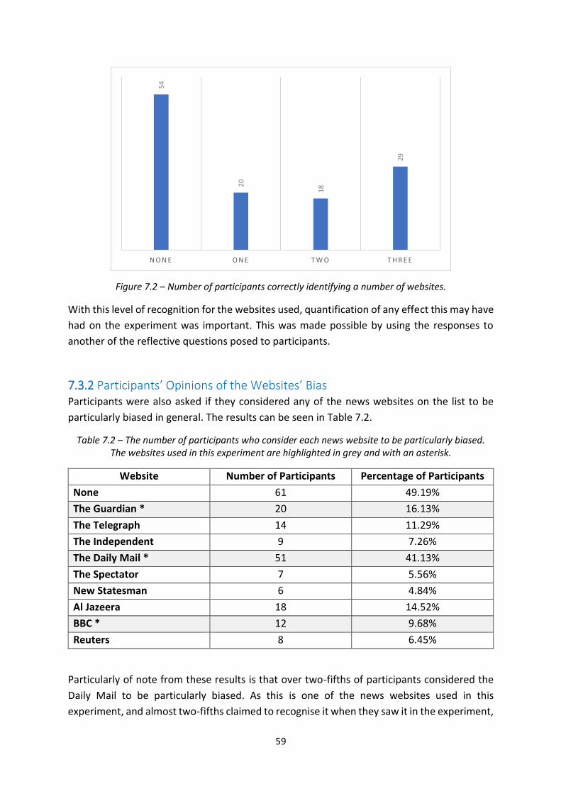
59
Figure 7.2 – Number of participants correctly identifying a number of websites.
With this level of recognition for the websites used, quantification of any effect this may have
had on the experiment was important. This was made possible by using the responses to
another of the reflective questions posed to participants.
7.3.2 Participants’ Opinions of the Websites’ Bias Participants were also asked if they considered any of the news websites on the list to be
particularly biased in general. The results can be seen in Table 7.2.
Table 7.2 – The number of participants who consider each news website to be particularly biased. The websites used in this experiment are highlighted in grey and with an asterisk.
Website Number of Participants Percentage of Participants
None 61 49.19%
The Guardian * 20 16.13%
The Telegraph 14 11.29%
The Independent 9 7.26%
The Daily Mail * 51 41.13%
The Spectator 7 5.56%
New Statesman 6 4.84%
Al Jazeera 18 14.52%
BBC * 12 9.68%
Reuters 8 6.45%
Particularly of note from these results is that over two-fifths of participants considered the
Daily Mail to be particularly biased. As this is one of the news websites used in this
experiment, and almost two-fifths claimed to recognise it when they saw it in the experiment,
54
20
18
29
N O N E O N E T W O T H R E E

60
it raises the possibility that participants’ opinions of the websites, external to this experiment,
may have influenced the results. Participants could only respond in this way if they had some
prior knowledge or opinions on the website.
Figure 7.3 – The number of participants who consider each news website to be particularly biased.
7.3.3 Effect on Bias Ratings In order to investigate if this may have been the case, further analysis was required. For this,
participants were split into three separate groups for each website:
1. Those who did not recognise the website being tested.
2. Those who recognised the website being tested, but do not consider that website to
be particularly biased.
3. Those who recognised the website being tested, and who consider that website to be
particularly biased.
The bias rating that each participant gave for each website, regardless of distortion or story,
was considered. To determine if there was an effect from websites being recognised, the
relative levels of bias reported was compared across the three groups for each website, and
a determination was made as to the significance of this.
As with the bias results for the main part of the experiment, the data involved does not satisfy
the assumptions required for ANOVA, as significant outliers exist in the bias ratings. The data
does satisfy the assumptions for the Kruskel-Wallis H Test, and so this test was used once
again.
The null hypothesis for these tests assumed that the distributions for each group would be
equal, indicating that recognition and prior expectation of the website had no impact on the
bias reported by the participant.
61
20
14
9
51
7 6
18
12
8

61
Rejection of the null hypothesis would indicate that recognition of the websites, and an
expectation of that website’s bias, had influenced the level of bias reported by the
participants.
7.3.4 Results of Bias Testing The groups were analysed for each website, and the results are as follows.
7.3.4.1 Daily Mail (W0)
The distributions of bias for each group were not similar for all groups. The values of bias
reported by each group differed significantly from one another, X2(2) = 10.373, p = 0.006. The
null hypothesis is rejected, indicating that existing opinions of the website’s bias significantly
affected the results of this experiment.
7.3.4.1 BBC (W1)
The distributions of bias for each group were not similar for all groups. The values of bias
reported by each group differed, but not significantly, X2(2) = 3.290, p = 0.193. The null
hypothesis is retained, indicating that existing opinions of the website’s bias did not
significantly affect the results of this experiment.
Figure 7.4 - Results of the Kruskal-Wallis H Test for the Daily Mail (W0)
Figure 7.5 - Results of the Kruskal-Wallis H Test for the BBC (W1)

62
7.3.4.2 The Guardian (W2)
The distributions of bias for each distortion were not similar for all groups. The values of bias
reported by each group differed significantly from one another, X2(2) = 6.202, p = 0.045. The
null hypothesis is rejected, indicating that existing opinions of the website’s bias significantly
affected the results of this experiment.
7.3.5 Analysis of Results for bias attributed to publications It can be seen from these results that participants’ existing opinions pertaining to the
perceived bias of each website has had a statistically significant impact on the results. While
there is no significant impact of this evident for responses to the BBC’s articles, it is worth
noting that the number of participants who considered that website to be biased was
relatively low anyway, thus increasing the p-value and making rejection of the null hypothesis
less likely, regardless of the responses.
Similarly, the difference between groups is most significant for the Daily Mail, which was
considered biased by the largest number of participants of any website. While this increases
the significance in itself, the simple fact that knowledge of the website has had an effect on
results, and that approximately two-fifths of respondents recognised it and considered it
biased, shows that this did in some way affect the results obtained for bias ratings.
This additional bias, introduced by the participant, is a confounding variable. The effect was
known and acknowledged by the experiment design; it was for this reason that participants
were asked the reflective questions. This does pose a challenge to carrying out experiments
of this type, and perhaps other experiment designs could be considered to reduce the effect
further. For example, participants could be asked to identify websites they would recognise
before they start rating them, and then only be presented with those websites which they
would not recognise.
Figure 7.6 - Results of the Kruskal-Wallis H Test for The Guardian (W2)

63
The results also provide further evidence that consumers tend to favour news media which
they find agreeable. By far the lowest levels of bias were reported for websites which were
recognised by participants, but which those participants did not consider to be biased.
7.4 Other External Factors Consideration was also given to other information supplied by the participants, and how that
might have affected their responses. No correlation was found between the level of bias
reported and the age, level of education, occupation, or expected yearly salary reported by
the participants. These social and economic factors therefore likely played no role in altering
the levels of bias reported by the participants. Visualisation of these results are shown in
Appendix A6.
There is no apparent correlation between political leaning and the level of bias reported by
the participants. With almost three-quarters of participants reporting that they hold a centre
or left-of-centre political view, any effect which is caused by political leaning will be somewhat
reduced by the homogeneity of the participant’s viewpoints anyway.
There is also no apparent correlation between the amount of time participants spend online
each day or the amount of time the participants spend reading the news online each day and
the level of bias reported by participants in the experiment. This indicates that familiarity with
accessing news online played no significant part in altering participants’ perception of bias.
The vast majority of participants reported, in a multiple-choice survey question, regularly
consuming news online, either using websites or social media the results of which are shown
in Figure 7.7.
Figure 7.7 – Media regularly used by participants to consume news.
7.5 Factors Contributing to Bias The final question asked of participants in this experiment was, “When judging bias in news
articles online, which of the following do you consider to be significant elements of bias?”
38 4
4
25
11
5
61
3 3

64
This question was designed to elicit what they believe constitutes bias in news media. There
is very little information in existing literature which ascertains exactly how people understand
bias. This likely contributes to confusion in the domain.
It should be noted that the participants had already been presented with the definition of
bias for this experiment before answering this question, that is:
“Deliberate or accidental slant by the journalist, editor or publication to distort reality”.
7.5.1 Responses Figure 7.8 shows the responses received to this multiple-choice question.
Figure 7.8 – Responses to the question, “When judging bias in news articles online, which of the following do you consider to be significant elements of bias?”
The letters A-I in the bar chart in Figure 7.8 correspond to the following options:
• A = “Lack of balance”
• B = “Unfairness”
• C = “Subjectivity”
• D = “Distortion affecting one side of a story”
• E = “Not giving one side of a story as much coverage as the other”
• F = “Expression of personal opinions by a journalist”
• G = “Providing sources for one side of a story and not the other”
• H = “Providing data to support one side of a story and not the other”
• I = “Order in which sides of a story are reported”
60
47
71
83
74
78
62
76
21
6
A B C D E F G H I O T H E R

65
All of the possible responses to this survey question were intentionally unqualified, requiring
a level of interpretation on the part of the participant. The responses provide insight to what
the participants in this experiment were judging their perception of bias.
7.5.2 Analysis of Responses Of particular note are the number of participants who chose options G and H. Over 22% more
participants chose option H, when compared to option G. This suggests that they consider it
more important to provide data for both sides of a story than to provide sources. This perhaps
highlights a distrust in the media generally, where readers would apparently rather make
sense of the raw information themselves, than to have it interpreted by a journalist or other
person who is cited as being the source.
Also interesting is that option B, “Unfairness”, was selected by far fewer participants than
most of the other responses. Just over one-third of the 124 of participants chose this option
compared to over one-half selecting many of the other options. “Unfairness” is an English-
language synonym for “bias”, making the lack of participants choosing it somewhat peculiar.
Many of the options which were most-selected were more specifically tailored to news media,
and being less vague may have seemed more relevant to the question.
Most specifically, it is interesting to note how significantly participants’ opinions of what
constituted bias differed from participant to participant, despite each participant taking the
same survey during which they were each presented with the same definition of bias. This
highlights a challenge in accurately carrying out this sort of experiment, where participant
subjectivity, and participant interpretation of the questions, can play a large role in forming
the participants’ answers. Even by presenting participants with a common definition for bias,
their subjectivity can play a part in how they apply that definition.
7.6 Summary of Results The null hypothesis for this experiment was retained, as there was no statistically significant
evidence to support the proposition that information bias in the graphics accompanying news
articles affected the level of bias perceived for the article as a whole. Despite this, there was
a small effect evident in the results, which was too small to confirm statistically in this
experiment.
More importantly, it was found that, despite efforts made to minimise the chances of this
happening, participants’ pre-determined opinions of the news websites presented in the
experiment significantly affected how they responded to the survey. Those who expected a
website to be particularly biased reported a significantly higher bias rating for that website
than other participants for the same website. This undermines the confidence we can have
that the results to the bias ratings are a fair and considered response to what was presented

66
to participants, and that the research into the different levels of graphical distortion has been
compromised by bias on the part of a significant number of the participants.
No other external factors seem to have influenced the results to any considerable degree, and
participants were almost all quite familiar with the online news medium.
The final finding shows a lack of consensus among participants of what constituted bias. This
is in spite of the participants all working from the same definition of bias, and suggests that
participants reported bias ratings for the articles based on different criteria.

67
8. Conclusions This research builds on a significant body of existing research into media bias, asking
specifically the question:
“To what extent do the information graphics accompanying a news article impact upon the
perceived bias of the article?”
The research indicates that the information graphics accompanying a news article can have a
material impact on the perceived bias of that article. The effect size observed in this particular
experiment was deemed statistically insignificant however. There was also no clear trend in
the results of this experiment, in terms of whether the bias level increased or decreased for
different levels of distortion. Despite this, visualisations of the data show that graphics do
impact on the perceived bias, suggesting that the research topic may be worthy of further
investigation.
A more significant finding arising from the user survey carried out, was that despite efforts to
minimise the chances of participants recognising the news websites used in the experiment,
and bringing their own opinions of those websites to bear on the results of the experiment,
there is significant evidence to suggest that this was the case. This is a result of crowdsourcing
participants, where the researchers have no control over what information participants do or
do not have, external to that which is presented to them in the experiment. This is
unavoidable, but must be noted.
Importantly, where participants recognised a website which they considered to be
particularly biased, they affirmed their own opinion by rating the bias level for that website
significantly higher than others who had no such opinion. Similarly, where participants
recognised a website but did not expect it to be biased, the participants reported significantly
lower levels of bias than those who had no such opinion. This is strong evidence of
confirmation bias, where the participant actively looks for reasons to give a high bias rating
to a website they consider to be biased. There are two important considerations resulting
from this:
1. The results agree with existing research in the area, further adding to the evidence of
the effects of confirmation bias.
2. Despite intentional efforts to minimise the effects, the confounding variable of
participants having an opinion of the bias associated with certain websites, played a
part in results. This presents a learning opportunity; a different experiment design
should be considered for future similar work.
It was also interesting to find the lack of consensus among participants on what constitutes
bias in news media. This lack of consensus came despite all participants having been
presented with the same definition of bias for the experiment. Their responses serve to
illustrate the multitude of factors which may affect a participant’s determination on the

68
presence of bias, and the difficulties which this presents to researchers in the area. This is an
area which will require significant future work in order for a comprehensive understanding to
be attained.
Although the null hypothesis was retained for this experiment, some evidence was found of
an effect graphics had on the level of bias perceived for the article they accompany. Future
work would be required to detect the precise significance of that effect.
8.1 Future Work and Refinements The results of this experiment provide some interesting insights into the perceptions of bias
in news media. Arising from this research are learning opportunities, and also areas which
could benefit from further study. The lessons learned from this research should be taken into
account in the formulation of the design of future experiments in order to avoid some of the
confounding effects found in this research.
Every effort was made in the preparation of news website samples, to be rated by participants
in the experiment, to ensure that the design of the website which was presented to
participants was not significantly altered from its original design. While branding was
removed, the rest of the website design and layout was left unaltered, in an attempt to avoid
the known effects of website design on the perception of bias. Efforts were also made to
minimise the possibilities of participants recognising the websites by having the source
material and participants coming from different countries. In spite of this, a significant
proportion of participants recognised the websites used, and with their own preconception
of whether or not that website should be bias, skewed the results significantly in favour of
their own opinions. This is not helpful to the research, as it does not compare like with like.
For future studies in this area, it should be considered, therefore, to present the articles alone
without the rest of their website, or else in a common template which is not website specific.
Another alternative, which would likely remove the effect altogether without removing
design effects, would be to ask participants which websites they would recognise in advance
of rating the images, and presenting them only with websites which they would not recognise.
Whatever method is employed, it is clear that there is a need to remove the introduction of
bias by the participants in this way.
Another possible refinement to the experiment relates to the samples used. The effect of the
graphics on the articles tended to differ depending on the particular article and graphic.
Presenting multiple graphics with the same article, or multiple articles on the same topic with
and without the same graphic may provide further insight into what effect the graphics have.
Varying the graphic, article and website may have been useful for providing an answer if the
effect had been very large in this experiment, but as it was not, a more nuanced approach
may be required which focusses on one specific aspect of this research.

69
In terms of effect size, it was seen in this research that the effect size was relatively small. In
order to make a statistically significant finding for this using p-values, it would be necessary
to use a much larger sample size. As the size increases the increasing accuracy of the p-value
slows, meaning that it would possibly have to be much larger sample size than was used in
this experiment.
Finally, further research could also be carried out into how users perceive bias based on what
they consider to constitute bias. The findings of this research, as shown in Figure 7.8, suggest
that there is far from consensus on the matter. Asking for bias ratings based on specific
aspects of bias, rather than just from a general high-level definition, and examining the
relative effect of these aspects could add significant understanding to how we determine that
bias exists in a piece of news media.
8.2 Final Thoughts Although the null hypothesis for this experiment was not rejected, the research has
highlighted some important factors which can affect this sort of experiment which will be
useful for future work. Effects including the introduction of bias through participants’ existing
experience of certain newspapers, despite significant efforts made to minimise this effect in
the experiment design, serve to highlight the importance of ongoing consideration of
experiment design for similar experiments. This was only detectable by collection of the
appropriate data from participants, and regardless of the experiment design, these results
have shown the importance of collecting this sort of background information to contextualise
participants’ responses.
While there was no statistically significant evidence found to support the supposition that
information bias in the graphics accompanying news articles can affect the level of bias
perceived for that article, finding exactly the extent to which the external factors influenced
the results is an important finding in itself. Determining also that the effect of graphics on the
bias in articles they accompany is likely quite small should provide important information for
the design of future experiments researching this topic.
From these results it is evident that there is a strong likelihood that the graphics
accompanying news articles affect the perception of bias in that article as a whole, but that
this effect is relatively small, and requires further research to adequately confirm. This further
research should explore the effects of different graphics, and the coverage of different topics,
including those which may be emotive. Future work is also required to establish the effects
of using different types of graphics.

xii
References [1] M. Higgins, ‘Mediated populism, culture and media form’, Palgrave Communications, vol. 3,
no. 1, p. 3, Oct. 2017. [2] E. C. Nisbet, P. Beck, and R. Gunther, ‘Trump may owe his 2016 victory to “fake news,” new
study suggests’, The Conversation. [Online]. Available: http://theconversation.com/trump-may-owe-his-2016-victory-to-fake-news-new-study-suggests-91538. [Accessed: 10-Apr-2018].
[3] ‘Ethics in the News - Media Lies and Brexit - Ethical Journalism and the EU’, Ethical Journalism Network. .
[4] T.-T. Lee, ‘Why They Don’t Trust the Media: An Examination of Factors Predicting Trust’, American Behavioral Scientist, vol. 54, no. 1, pp. 8–21, Sep. 2010.
[5] D. S. Tull, ‘Intentional Bias in Public Opinion Polls for Decisional Purposes’, Public Opinion Quarterly, vol. 39, no. 4, p. 552, 1975.
[6] F. D. Russo, ‘A Study of Bias in Tv Coverage of the Vietnam War: 1969 and 1970’, Public Opinion Quarterly, vol. 35, no. 4, pp. 539–543, 1971.
[7] T. Munzner, Visualization analysis and design, 1st ed. Boca Raton: CRC Press, 2014. [8] M. Tremayne, A. S. Weiss, and R. C. Alves, ‘From product to service: the diffusion of dynamic
content in online newspapers.’, Journalism & Mass Communication Quarterly, vol. 84, no. 4, pp. 825–839, 2007.
[9] J. Bar-Ilan, K. Keenoy, M. Levene, and E. Yaari, ‘Presentation bias is significant in determining user preference for search results—A user study’, J. Am. Soc. Inf. Sci., vol. 60, no. 1, pp. 135–149, Jan. 2009.
[10] J. A. Simpson and E. S. C. Weiner, Eds., The Oxford English dictionary. Vol.2: B.B.C.- Chalypsography, 2nd ed. Oxford: Clarendon P, 1989.
[11] P. Waldman and J. Devitt, ‘Newspaper photographs and the 1996 presidential election: The question of bias’, Journalism & Mass Communication Quarterly, vol. 75, no. 2, pp. 302–311, 1998.
[12] M. Gentzkow and J. M. Shapiro, ‘Media Bias and Reputation’, journal of political economy, p. 37.
[13] Paul Andon and Clinton Free, ‘Media coverage of accounting: the NRL salary cap crisis’, Acc Auditing Accountability J, vol. 27, no. 1, pp. 15–47, Jan. 2014.
[14] W. L. Bennett, News: the politics of illusion, 7th ed. Harlow: Longman, 2007. [15] J.-M. Eberl, H. G. Boomgaarden, and M. Wagner, ‘One Bias Fits All? Three Types of Media Bias
and Their Effects on Party Preferences’, Communication Research, vol. 44, no. 8, p. 1125, Dec. 2017.
[16] M. Kim, ‘The Role of Partisan Sources and Audiences’ Involvement in Bias Perceptions of Controversial News’, MEDIA PSYCHOLOGY, vol. 19, no. 2, pp. 203–223, Apr. 2016.
[17] T. Groeling, ‘Media Bias by the Numbers: Challenges and Opportunities in the Empirical Study of Partisan News’, Annual Review of Political Science, vol. 16, no. 1, pp. 129–151, May 2013.
[18] T. E. Patterson and W. Donsbagh, ‘News decisions: Journalists as partisan actors’, Political Communication, vol. 13, no. 4, pp. 455–468, Oct. 1996.
[19] E. Elejalde, L. Ferres, and E. Herder, ‘On the nature of real and perceived bias in the mainstream media’, PLoS ONE, vol. 13, no. 3, pp. 1–28, Mar. 2018.
[20] A. W. Barrett and L. W. Barrington, ‘Bias in newspaper photograph selection’, Political Research Quarterly, vol. 58, no. 4, pp. 609–618, 2005.
[21] R. Krestel, A. Wall, and W. Nejdl, ‘Treehugger or petrolhead?: identifying bias by comparing online news articles with political speeches’, in Proceedings of the 21st international conference companion on World Wide Web, New York, NY, USA, 2012, pp. 547–548.
[22] M. Higgins, ‘Mediated populism, culture and media form’, Palgrave Communications, vol. 3, no. 1, p. 3, Oct. 2017.

xiii
[23] E. C. . Nisbet nisbet. 5@osu. ed., M. Saldaña magdalenasaldan@gmail. co., T. J. . Johnson tom. johnson@austin. utexas. ed., G. Golan gjgolan@usf. ed., and A. Day daydoc@gmail. co., ‘Credibility Gaps and Public Opinion in a Competitive Media Environment: The Case of Arab Satellite TV News in Lebanon’, International Journal of Communication (19328036), vol. 11, pp. 3072–3095, Jan. 2017.
[24] T. GROELING, ‘Who’s the Fairest of them All? An Empirical Test for Partisan Bias on ABC, CBS, NBC, and Fox News’, 2008.
[25] A. Westerwick, B. K. Johnson, and S. Knobloch-Westerwick, ‘Confirmation biases in selective exposure to political online information: Source bias vs. content bias’, Communication Monographs, vol. 84, no. 3, pp. 343–364, Jul. 2017.
[26] G. W. Yun, S.-Y. Park, S. Lee, and M. A. Flynn, ‘Hostile Media or Hostile Source? Bias Perception of Shared News’, SOCIAL SCIENCE COMPUTER REVIEW, vol. 36, no. 1, pp. 21–35, Feb. 2018.
[27] Q. Ma and M. Yoshikawa, ‘Topic and Viewpoint Extraction for Diversity and Bias Analysis of News Contents’, in Advances in Data and Web Management, Q. Li, L. Feng, J. Pei, S. X. Wang, X. Zhou, and Q.-M. Zhu, Eds. Springer Berlin Heidelberg, 2009, pp. 150–161.
[28] S. Park, M. Ko, J. Kim, H. Choi, and J. Song, ‘NewsCube2. 0: An Exploratory Design of a Social News Website for Media Bias Mitigation’, in Workshop on Social Recommender Systems, 2011.
[29] R. M. Entman, ‘Framing: Toward Clarification of a Fractured Paradigm’, Journal of Communication, vol. 43, no. 4, pp. 51–58, Dec. 1993.
[30] M. Haselmayer, M. Wagner, and T. M. Meyer, ‘Partisan Bias in Message Selection: Media Gatekeeping of Party Press Releases’, Political Communication, vol. 34, no. 3, pp. 367–384, Jul. 2017.
[31] V. Larcinese, R. Puglisi, and J. M. Snyder, Partisan bias in economic news: evidence on the agenda- setting behavior of U.S. newspapers. London: Suntory and Toyota International Centres for Economics and Related Disciplines, 2008.
[32] J. Cohen cohen@bc. ed., Y. Ding, C. Lesage, and H. Stolowy, ‘Media Bias and the Persistence of the Expectation Gap: An Analysis of Press Articles on Corporate Fraud’, Journal of Business Ethics, vol. 144, no. 3, pp. 637–659, Sep. 2017.
[33] A. C. Gunther, ‘Biased Press or Biased Public? Attitudes Toward Media Coverage of Social Groups’, The Public Opinion Quarterly, vol. 56, no. 2, pp. 147–167, Jul. 1992.
[34] S. Lyengar and K. S. Hahn, ‘Red Media, Blue Media: Evidence of Ideological Selectivity in Media Use’, Journal of Communication, vol. 59, no. 1, pp. 19–39, 2009.
[35] D. C. Funder and S. G. West, ‘Concensus, Self-Other Agreement, and Accuracy in Personality Judgment: An Introduction’, Journal of Personality, vol. 61, no. 4, pp. 457–476, Dec. 1993.
[36] Sendhil Mullainathan and Andrei Shleifer, ‘The Market for News’, The American Economic Review, vol. 95, no. 4, pp. 1031–1053, 2005.
[37] E. Pariser, The Filter Bubble: What The Internet Is Hiding From You. Penguin UK, 2011. [38] J. Ehrlinger, T. Gilovich, and L. Ross, ‘Peering Into the Bias Blind Spot: People’s Assessments of
Bias in Themselves and Others’, Pers Soc Psychol Bull, vol. 31, no. 5, pp. 680–692, May 2005. [39] N. Geidner, I. Pjesivac, I. Imre, I. Coman, and D. Yuran, ‘The Role of Interactive Graphics in
Reducing Misperceptions in the Electorate’, Visual Communication Quarterly, vol. 22, no. 3, pp. 133–145, Jul. 2015.
[40] 1615 L. St NW, S. 800 Washington, and D. 20036 U.-419-4300 | M.-419-4349 | F.-419-4372 | M. Inquiries, ‘Views of media bias’, Pew Research Center’s Journalism Project, 09-May-2017. .
[41] C. D. Urban, Examining Our Credibility: Perspectives of the Public and the Press ; [report for the ASNE Journalism Credibility Project]. American Soc. of Newspaper Ed., 1999.
[42] D. Niven, Tilt?: The Search for Media Bias. Greenwood Publishing Group, 2002. [43] V. Larcinese, R. Puglisi, and J. M. Snyder Jr, ‘Partisan bias in economic news: Evidence on the
agenda-setting behavior of US newspapers’, Journal of Public Economics, vol. 95, no. 9, pp. 1178–1189, 2011.

xiv
[44] T. Groseclose and J. Milyo, ‘A Measure of Media Bias’, The Quarterly Journal of Economics, vol. 120, no. 4, pp. 1191–1237, Nov. 2005.
[45] P. B. Lowry, D. W. Wilson, and W. L. Haig, ‘A Picture is Worth a Thousand Words: Source Credibility Theory Applied to Logo and Website Design for Heightened Credibility and Consumer Trust’, International Journal of Human-Computer Interaction, vol. 30, no. 1, pp. 63–93, Jan. 2014.
[46] B. Spillane, S. Lawless, and V. Wade, ‘Perception of bias: the impact of user characteristics, website design and technical features’, 2017, pp. 227–236.
[47] S. Zwinger, J. Langer, and M. Zeiller, ‘Acceptance and Usability of Interactive Infographics in Online Newspapers’, in 2017 21st International Conference Information Visualisation (IV), 2017, pp. 176–181.
[48] C. Chen and C. Chen, Information visualization: beyond the horizon, 2nd ed. London: Springer, 2004.
[49] B. I. U. Dur, ‘Analysis of Data Visualizations in Daily Newspapers in Terms of Graphic Design’, Procedia - Social and Behavioral Sciences, vol. 51, pp. 278–283, Jan. 2012.
[50] S. Pasternack and S. H. Utt, ‘Reader Use & Understanding of Newspaper Infographics’, Newspaper Research Journal, vol. 11, no. 2, pp. 28–41, Mar. 1990.
[51] S. Bateman, R. L. Mandryk, C. Gutwin, A. Genest, D. McDine, and C. Brooks, ‘Useful junk?’, Conference on Human Factors in Computing Systems Proceedings, p. 2573, Apr. 2010.
[52] E. Segel and J. Heer, ‘Narrative Visualization: Telling Stories with Data’, IEEE Transactions on Visualization and Computer Graphics, vol. 16, no. 6, pp. 1139–1148, Nov. 2010.
[53] J. Vila and Y. Gomez, ‘Extracting business information from graphs: An eye tracking experiment’, Journal of Business Research, vol. 69, pp. 1741–1746, May 2016.
[54] N. M. Urban and T. E. Fricker, ‘A comparison of Latin hypercube and grid ensemble designs for the multivariate emulation of an Earth system model’, Computers & Geosciences, vol. 36, no. 6, pp. 746–755, Jun. 2010.
[55] ‘https://prolific.ac/’. [Online]. Available: https://prolific.ac/. [Accessed: 22-Mar-2018]. [56] ‘http://www.gpower.hhu.de/’. [Online]. Available: http://www.gpower.hhu.de/. [Accessed: 22-
Mar-2018]. [57] ‘dailymail.co.uk’, Mail Online. [Online]. Available:
http://www.dailymail.co.uk/home/index.html. [Accessed: 22-Mar-2018]. [58] ‘bbc.co.uk/news’, BBC News. [Online]. Available: http://www.bbc.co.uk/news. [Accessed: 22-
Mar-2018]. [59] ‘theguardian.com’, the Guardian. [Online]. Available:
http://www.theguardian.com/international. [Accessed: 22-Mar-2018]. [60] ‘YouGov | How left or right-wing are the UK’s newspapers?’, YouGov: What the world thinks.
[Online]. Available: //yougov.co.uk/news/2017/03/07/how-left-or-right-wing-are-uks-newspapers/. [Accessed: 30-Jan-2018].
[61] J. Cohen, Statistical power analysis for the behavioral sciences, 2nd ed. Hillsdale, N.J: L. Erlbaum Associates, 1988.

xv
Appendix A1: Bias Ratings Data The data in the tables in this Appendix shows the responses by participants in this survey
when reporting the level of perceived bias in the images with which they were presented.
The data is presented in a number of columns, as follows:
ID The unique identification number of the participant.
Path The path through the experiment cube to which the
participant was assigned.
Initial
Evaluation
of Samples
Sample One The first sample presented to the participant.
Bias One The bias rating given by the participant when presented
with Sample One. This rating is on a continuous slider
scale from 0 to 100.
The slider defaulted to 0. Where a participant did not
move the slider from the 0 mark, the response was
recorded as NULL. This can therefore be taken to mean 0.
Sample Two The second sample presented to the participant.
Bias Two The bias rating given by the participant when presented
with Sample Two. This rating is on a continuous slider
scale from 0 to 100.
The slider defaulted to 0. Where a participant did not
move the slider from the 0 mark, the response was
recorded as NULL. This can therefore be taken to mean 0.
Sample Three The third sample presented to the participant
Bias Three The bias rating given by the participant when presented
with Sample Three. This rating is on a continuous slider
scale from 0 to 100.
The slider defaulted to 0. Where a participant did not
move the slider from the 0 mark, the response was
recorded as NULL. A response of NULL can therefore be
taken to mean 0.
Bias One
The bias rating given by the participant when presented
with Samples One, Two, and Three side-by-side. The

xvi
Comparative
Re-
Evaluations
Bias Two
slider value defaulted to the response the participant had
given when originally presented with each sample. If the
participant did not change their rating for the bias of an
article, the response was recorded as NULL. A response of
NULL can therefore be taken to indicate that the value of
bias is the same as in the original bias column.
Bias Three
Most Biased The sample, from the three presented simultaneously to
the participant, which they consider to be most biased.
The participants could not view their previous bias ratings
for those samples at this time. If a participant did not
select a sample as the most biased, this is recorded as
blank cell. Note that the result of this test may indicate
that the participant recorded a different result to that
when the samples were presented individually at the start
of the survey.

xvii
InitiaLEvaluation of Samples Comparative Re-evaluation
Most Biased
ID Path Sample One
Bias One
Sample Two
Bias Two
Sample Three
Bias Three
Bias One
Bias Two
Bias Three
1 8 W1A0D2 37 W0A2D1 55 W2A1D0 46 NULL NULL NULL W1A0D2
2 4 W2A0D2 1 W1A2D1 51 W0A1D0 69 NULL NULL NULL W0A1D0
3 5 W2A0D0 52 W1A2D2 NULL W0A1D1 10 NULL NULL NULL W1A2D2
4 9 W1A0D0 NULL W2A1D1 10 W0A2D2 NULL NULL NULL NULL W2A1D1
5 6 W1A2D0 58 W2A0D1 20 W0A1D2 75 NULL NULL NULL W0A1D2
6 8 W1A0D2 NULL W0A2D1 11 W2A1D0 80 22 NULL NULL W2A1D0
7 2 W2A2D0 5 W1A1D2 59 W0A0D1 96 NULL NULL NULL W0A0D1
8 4 W2A0D2 48 W1A2D1 55 W0A1D0 64 NULL NULL NULL W0A1D0
9 1 W2A2D2 14 W1A1D1 40 W0A0D0 4 NULL NULL 9 W1A1D1
10 5 W1A2D2 65 W0A1D1 26 W2A0D0 NULL NULL NULL NULL W1A2D2
11 2 W1A1D2 77 W0A0D1 78 W2A2D0 82 NULL NULL NULL 12 2 W1A1D2 24 W0A0D1 40 W2A2D0 8 NULL NULL NULL W0A0D1
13 4 W1A2D1 90 W0A1D0 100 W2A0D2 61 100 NULL 56 W1A2D1
14 2 W1A1D2 5 W2A2D0 NULL W0A0D1 5 NULL NULL NULL W2A2D0
15 3 W1A1D0 12 W0A0D2 66 W2A2D1 21 NULL NULL NULL W0A0D2
16 8 W1A0D2 78 W2A1D0 77 W0A2D1 80 NULL NULL NULL W1A0D2
17 2 W1A1D2 10 W2A2D0 25 W0A0D1 5 NULL NULL NULL W0A0D1
18 1 W0A0D0 NULL W1A1D1 0 W2A2D2 0 NULL NULL NULL W2A2D2
19 2 W1A1D2 10 W2A2D0 NULL W0A0D1 30 15 NULL NULL W0A0D1
20 2 W0A0D1 NULL W2A2D0 NULL W1A1D2 25 NULL NULL NULL W1A1D2
21 1 W2A2D2 0 W1A1D1 10 W0A0D0 0 NULL NULL NULL W1A1D1
22 4 W0A1D0 92 W1A2D1 30 W2A0D2 23 NULL NULL 19 W0A1D0
23 7 W2A1D2 25 W0A2D0 1 W1A0D1 74 NULL NULL NULL W1A0D1
24 1 W2A2D2 0 W1A1D1 65 W0A0D0 75 NULL NULL NULL W0A0D0
25 2 W0A0D1 70 W2A2D0 15 W1A1D2 40 NULL NULL 50 W0A0D1
26 1 W0A0D0 9 W2A2D2 26 W1A1D1 1 NULL NULL NULL W0A0D0
27 1 W0A0D0 52 W2A2D2 5 W1A1D1 92 75 1 NULL W1A1D1
28 5 W0A1D1 100 W2A0D0 52 W1A2D2 40 NULL NULL NULL W0A1D1
29 9 W0A2D2 9 W1A0D0 12 W2A1D1 25 NULL NULL 40 W2A1D1
30 1 W0A0D0 21 W2A2D2 12 W1A1D1 5 NULL NULL NULL W0A0D0
31 5 W1A2D2 NULL W0A1D1 NULL W2A0D0 NULL NULL NULL NULL W1A2D2
32 9 W2A1D1 58 W0A2D2 8 W1A0D0 2 NULL NULL NULL W2A1D1
33 2 W0A0D1 77 W2A2D0 39 W1A1D2 46 NULL NULL NULL W0A0D1
34 2 W2A2D0 19 W1A1D2 30 W0A0D1 34 NULL NULL NULL W0A0D1
35 4 W2A0D2 20 W1A2D1 60 W0A1D0 39 NULL NULL NULL W1A2D1
36 5 W1A2D2 69 W0A1D1 46 W2A0D0 16 NULL NULL NULL W1A2D2
37 1 W1A1D1 42 W0A0D0 35 W2A2D2 4 NULL NULL NULL W0A0D0
38 8 W2A1D0 19 W0A2D1 19 W1A0D2 51 NULL NULL NULL 39 8 W2A1D0 30 W1A0D2 74 W0A2D1 48 NULL NULL NULL W0A2D1
40 6 W1A2D0 12 W0A1D2 10 W2A0D1 8 NULL NULL NULL W1A2D0

xviii
InitiaLEvaluation of Samples Comparative Re-evaluation
Most Biased
ID Path Sample One
Bias One
Sample Two
Bias Two
Sample Three
Bias Three
Bias One
Bias Two
Bias Three
41 2 W0A0D1 50 W1A1D2 100 W2A2D0 11 NULL NULL NULL W1A1D2
42 7 W1A0D1 34 W0A2D0 23 W2A1D2 58 NULL NULL 38 W2A1D2
43 7 W1A0D1 5 W0A2D0 36 W2A1D2 20 NULL NULL NULL W0A2D0
44 1 W2A2D0 58 W1A1D2 24 W0A0D1 70 NULL NULL NULL W0A0D1
45 6 W2A0D1 41 W1A2D0 9 W0A1D2 72 NULL NULL NULL W0A1D2
46 6 W0A1D2 7 W2A0D1 1 W1A2D0 40 NULL NULL NULL W1A2D0
47 4 W0A1D0 34 W1A2D1 58 W2A0D2 68 NULL NULL NULL W2A0D2
48 2 W0A0D1 84 W2A2D0 16 W1A1D2 74 88 NULL 70 W0A0D1
49 3 W0A0D2 47 W1A1D0 NULL W2A2D1 NULL NULL NULL NULL W0A0D2
50 1 W2A2D2 0 W0A0D0 30 W1A1D1 25 NULL NULL NULL W0A0D0
51 6 W2A0D1 NULL W0A1D2 25 W1A2D0 35 NULL 35 25 W0A1D2
52 4 W0A1D0 70 W2A0D2 5 W1A2D1 60 NULL NULL NULL W0A1D0
53 2 W0A0D1 83 W2A2D0 100 W1A1D2 50 100 95 80 W2A2D0
54 2 W0A1D1 NULL W1A2D2 NULL W2A0D0 NULL NULL NULL NULL W1A2D2
55 7 W0A2D0 26 W1A0D1 50 W2A1D2 51 NULL NULL NULL W1A0D1
56 6 W2A0D1 0 W1A2D0 0 W0A1D2 NULL NULL NULL NULL W1A2D0
57 5 W0A1D1 20 W1A2D2 20 W2A0D0 85 NULL NULL NULL W2A0D0
58 6 W0A1D2 25 W2A0D1 15 W1A2D0 30 NULL NULL NULL W1A2D0
59 9 W1A0D0 76 W0A2D2 9 W2A1D1 17 NULL NULL NULL W1A0D0
60 4 W2A0D2 13 W1A2D1 11 W0A1D0 14 NULL NULL NULL W1A2D1
61 3 W1A1D0 20 W2A2D1 20 W0A0D2 35 NULL NULL NULL W0A0D2
62 7 W0A2D0 15 W2A1D2 95 W1A0D1 27 NULL NULL NULL W2A1D2
63 3 W0A0D2 26 W1A1D0 78 W2A2D1 16 NULL 79 NULL W1A1D0
64 1 W1A1D1 41 W0A0D0 74 W2A2D2 18 NULL NULL NULL W2A2D2
65 1 W2A2D2 18 W0A0D0 49 W1A1D1 80 NULL NULL NULL W1A1D1
66 5 W2A0D0 0 W0A1D1 31 W1A2D2 0 NULL NULL NULL W0A1D1
67 1 W2A2D2 0 W0A0D0 82 W1A1D1 0 NULL NULL NULL W0A0D0
68 8 W0A2D1 1 W1A0D2 6 W2A1D0 67 NULL NULL NULL W2A1D0
69 5 W2A0D0 13 W0A1D1 NULL W1A2D2 15 NULL NULL NULL W1A2D2
70 8 W2A1D0 51 W0A2D1 0 W1A0D2 60 NULL NULL NULL W2A1D0
71 6 W2A0D1 46 W1A2D0 30 W0A1D2 1 NULL NULL NULL W2A0D1
72 8 W1A0D2 6 W0A2D1 NULL W2A1D0 11 NULL NULL NULL W2A1D0
73 9 W1A0D0 NULL W2A1D1 50 W0A2D2 NULL NULL NULL NULL W2A1D1
74 3 W2A2D1 30 W0A0D2 10 W1A1D0 1 NULL NULL NULL W0A0D2
75 9 W0A2D2 18 W1A0D0 NULL W2A1D1 42 NULL NULL NULL W2A1D1
76 7 W0A2D0 26 W1A0D1 50 W2A1D2 32 NULL NULL NULL W1A0D1
77 3 W1A1D0 3 W2A2D1 3 W0A0D2 19 NULL NULL NULL W0A0D2
78 3 W2A2D1 91 W0A0D2 86 W1A1D0 77 NULL NULL NULL W0A0D2
79 5 W1A2D2 84 W0A1D1 9 W2A0D0 94 NULL NULL NULL W1A2D2
80 4 W2A0D2 62 W1A2D1 24 W0A1D0 21 NULL NULL NULL W0A1D0

xix
InitiaLEvaluation of Samples Comparative Re-evaluation
Most Biased
ID Path Sample One
Bias One
Sample Two
Bias Two
Sample Three
Bias Three
Bias One
Bias Two
Bias Three
81 4 W1A2D1 50 W0A1D0 46 W2A0D2 33 31 26 25 W1A2D1
82 5 W2A0D0 4 W1A2D2 4 W0A1D1 10 NULL NULL NULL 83 9 W1A0D0 88 W0A2D2 0 W2A1D1 NULL NULL NULL NULL W1A0D0
84 4 W2A0D2 4 W1A2D1 5 W0A1D0 7 NULL NULL NULL 85 3 W2A2D1 84 W1A1D0 82 W0A0D2 75 NULL NULL NULL W1A1D0
86 7 W0A2D0 21 W1A0D1 59 W2A1D2 50 NULL NULL NULL W1A0D1
87 7 W0A2D0 15 W1A0D1 10 W2A1D2 15 NULL NULL NULL W0A2D0
88 1 W0A0D0 77 W1A1D1 85 W2A2D2 10 47 89 5 W1A1D1
89 9 W1A0D0 76 W2A1D1 83 W0A2D2 91 NULL NULL NULL W2A1D1
90 3 W0A0D2 55 W2A2D1 10 W1A1D0 28 NULL NULL NULL W0A0D2
91 6 W0A1D2 100 W1A2D0 100 W2A0D1 100 NULL NULL NULL W0A1D2
92 3 W2A2D1 5 W0A0D2 57 W1A1D0 10 NULL NULL NULL W0A0D2
93 3 W1A1D0 36 W2A2D1 14 W0A0D2 25 NULL 24 35 W1A1D0
94 9 W2A1D1 79 W1A0D0 86 W0A2D2 77 NULL NULL NULL W1A0D0
95 6 W2A0D1 35 W0A1D2 65 W1A2D0 49 NULL NULL NULL W0A1D2
96 9 W1A0D0 79 W2A1D1 62 W0A2D2 91 NULL NULL NULL W0A2D2
97 6 W0A1D2 34 W1A2D0 45 W2A0D1 40 NULL NULL NULL W1A2D0
98 6 W2A0D1 19 W1A2D0 70 W0A1D2 38 54 85 26 W1A2D0
99 4 W1A2D1 35 W2A0D2 18 W0A1D0 60 NULL NULL NULL W0A1D0
100 4 W1A2D1 35 W2A0D2 45 W0A1D0 60 NULL NULL NULL W0A1D0
101 4 W2A0D2 12 W0A1D0 44 W1A2D1 60 NULL NULL NULL W1A2D1
102 3 W2A2D1 3 W0A0D2 26 W1A1D0 6 NULL 36 NULL W0A0D2
103 4 W1A2D1 100 W2A0D2 75 W0A1D0 51 NULL NULL NULL W1A2D1
104 4 W1A2D1 100 W2A0D2 2 W0A1D0 24 NULL NULL NULL W1A2D1
105 5 W2A0D0 55 W1A2D2 65 W0A1D1 84 30 50 NULL W0A1D1
106 7 W0A2D0 15 W2A1D2 20 W1A0D1 15 NULL NULL NULL W0A2D0
107 4 W2A0D2 2 W1A2D1 20 W0A1D0 5 NULL NULL NULL W1A2D1
108 9 W2A1D1 48 W1A0D0 38 W0A2D2 54 NULL NULL NULL W0A2D2
109 8 W1A0D2 4 W2A1D0 6 W0A2D1 87 NULL NULL NULL W0A2D1
110 7 W0A2D0 5 W2A1D2 100 W1A0D1 13 NULL NULL NULL W2A1D2
111 5 W0A1D1 NULL W1A2D2 20 W2A0D0 NULL NULL NULL NULL W1A2D2
112 7 W2A1D2 10 W1A0D1 NULL W0A2D0 15 NULL NULL NULL W0A2D0
113 6 W2A0D1 7 W0A1D2 5 W1A2D0 30 NULL NULL NULL W1A2D0
114 5 W2A0D0 38 W1A2D2 64 W0A1D1 12 NULL 74 NULL W1A2D2
115 5 W2A0D0 36 W0A1D1 73 W1A2D2 84 NULL 75 NULL W1A2D2
116 8 W2A1D0 81 W1A0D2 30 W0A2D1 7 NULL NULL NULL W2A1D0
117 3 W1A1D0 15 W0A0D2 29 W2A2D1 NULL 21 41 17 W0A0D2
118 7 W1A0D1 NULL W2A1D2 3 W0A2D0 NULL NULL NULL NULL W2A1D2
119 5 W1A2D2 78 W2A0D0 0 W0A1D1 NULL NULL NULL NULL W1A2D2
120 8 W1A0D2 24 W0A2D1 0 W2A1D0 75 NULL NULL NULL W2A1D0

xx
InitiaLEvaluation of Samples Comparative Re-evaluation
Most Biased
ID Path Sample One
Bias One
Sample Two
Bias Two
Sample Three
Bias Three
Bias One
Bias Two
Bias Three
121 3 W1A1D0 13 W2A2D1 23 W0A0D2 70 7 49 NULL W0A0D2
122 8 W1A0D2 42 W2A1D0 58 W0A2D1 24 NULL NULL NULL W2A1D0
123 9 W2A1D1 85 W1A0D0 66 W0A2D2 77 NULL NULL NULL W2A1D1
124 6 W2A0D1 NULL W1A2D0 3 W0A1D2 NULL NULL NULL NULL W1A2D0

xxi
Appendix A2: Survey Responses The qualitative data collected for this survey, consisted primarily of responses to multiple
choice questions. Some questions were posed before the survey; others were posed after the
survey.
In addition to multiple choice questions, each participant also provided his or her date of birth
(DOB).
A unique identifier (ID) was assigned to each participant.
Each question is assigned a letter (A to K). The following is the list of question and the
permitted answers. Questions A to H were answered prior to the survey. Questions I to K
were answered following the survey.
Question Answer codes
A “What gender are
you?”
0 = “Male”
1 = “Female”
2 = “Other”
3 = “I prefer not to say”
B “How long do you
spend on the
Internet each day?”
0 = “Less than one hour a day”
1 = “1 – 2 hours a day”
2 = “2 – 4 hours a day”
3 = “4 – 6 hours a day”
4 = “6 – 8 hour a day”
5 = “8+ hours a day”
C “What is the
highest level of
education you have
completed?”
1 = “Elementary school only”
2 = “Some high school, but did not finish”
3 = “Completed high school”
4 = “Some college, but did not finish”
5 = “Two-year college degree / A.A / A.S.”
6 = “Four-year college degree / B.A. / B.S.”
7 = “Some graduate study”
8 = “Completed Masters or professional degree”
9 = “Advanced Graduate study or Ph.D.”
10 = “Other”

xxii
Question Answer codes
D “What is your
expected income
range for 2018?”
1 = “Under $10,000”
2 = “$10,000 - $19,999”
3 = “$20,000 - $29,999”
4 = “$30,000 - $39,999”
5 = “$40,000 - $49,999”
6 = “$50,000 - $59,999”
7 = “$60,000 - $69,999”
8 = “$70,000 - $79,999”
9 = “$80,000 - $89,999”
10 = “$90,000 - $99,999”
11 = “$100,000 - $109,999”
12 = “$110,000 - $119,999”
13 = “$120,000 - $129,999”
14 = “$130,000 - $139,999”
15 = “$140,000 - $149,999”
16 = “$150,000 - $159,999”
17 = “$160,000 - $169,999”
18 = “$170,000 - $179,999”
19 = “$180,000 - $189,999”
20 = “$190,000 - $199,999”
21 = “$200,000 - $209,999”
22 = “$210,000 - $219,999”
23 = “$220,000 - $229,999”
24 = “$230,000 - $239,999”
25 = “$240,000 - $249,999”
26 = “Over $250,000”

xxiii
Question Answer codes
E “Which best
describes your
current
occupation?”
1 = “Stay at home Parent”
2 = “Student”
3 = “Unemployed”
4 = “Professional”
5 = “Semi-professional”
6 = “Skilled professional”
7 = “Skilled manual”
8 = “Semi-skilled manual”
9 = “Unskilled manual”
10 = “Other”
F “What most closely
describes your
political
viewpoint?”
0 = “Strong Liberal”
1 = “Not so strong Liberal”
2 = “Independent leaning Liberal”
3 = “Independent”
4 = “Independent leaning Conservative”
5 = “Not so strong Conservative”
6 = “Strong Conservative”
7 = “Other”
8 = "Don't know"
G “Which mediums
do you access
News from most
often? Select all
that apply.”
1 = “Radio”
2 = “TV”
3 = “Newspaper”
4 = “Internet”
5 = “Social Media”
6 = “None”
7 = “Other”

xxiv
Question Answer codes
H “If the Internet is
one of your
primary sources of
News, how many
times do you check
it each day?”
0 = “Less than once per day”
1 = “1 - 2 times per day”
2 = “2 - 4 times per day”
3 = “4 - 6 times per day”
4 = “6 - 8 times per day”
5 = “8 - 10 times per day”
6 = “10 + times a day”
I “Did you recognize
any of the below
News websites
used in this
experiment? Select
each that you
recognized.”
0 = “None”
1 = “The Guardian”
2 = “The Telegraph”
3 = “The Independent”
4 = “The Daily Mail”
5 = “The Spectator”
6 = “New Statesman”
7 = “Al Jazeera”
8 = “BBC”
9 = “Reuters”
J “Do you consider
any of these News
websites used in
this experiment to
be especially
biased? Select each
that you consider
biased.”
0 = “None”
1 = “The Guardian”
2 = “The Telegraph”
3 = “The Independent”
4 = “The Daily Mail”
5 = “The Spectator”
6 = “New Statesman”
7 = “Al Jazeera”
8 = “BBC”
9 = “Reuters”

xxv
Question Answer codes
K “When judging bias
in news articles
online, which of the
following do you
consider to be
significant
elements of bias?
Please select all
that apply.”
0 = “Lack of balance”
1 = “Unfairness”
2 = “Subjectivity”
3 = “Distortion affecting one side of a story”
4 = “Not giving one side of a story as much coverage as the other”
5 = “Expression of personal opinions by a journalist”
6 = “Providing sources for one side of a story and not the other”
7 = “Providing data to support one side of a story and not the
other”
8 = “Order in which sides of a story are reported”
9 = “Other”
The data in the following table shows the responses by participants to survey questions
before and after rating the bias of the articles with which they were presented, as detailed in
Chapter 3.

xxvi
Responses to pre-bias rating survey questions Responses to reflective questions
ID D.O.B. A B C D E F G H I J K
1 25/05/1991 1 4 6 1 5 2 1,2,3,4,5 3 0 0 1,2,3,7,8
2 17/09/1953 0 2 6 7 3 1 3,4 6 1,2,3,4,7,8,9 4,7 0,3,5,6
3 08/03/1986 0 3 6 7 6 2 1,2,4,5 2 0 0 0,1,3,5,7
4 09/06/1999 1 3 3 1 2 2 2,4,5 1 0 0 2,4,5
5 01/04/1987 1 4 9 10 4 0 4,5 1 1,2,8 0 0,3,5,6,7 6 06/08/1992 1 1 6 6 6 1 4 2 1 1 4,7
7 04/09/1994 0 5 6 6 6 2 4,5 6 1,8 4 0,3,4
8 13/06/1988 1 1 5 3 1 0 2,4 1 0 0 3
9 01/04/1989 0 5 3 2 8 1 4,5 1 1,4 4 2,3,5
10 30/10/1991 0 1 5 4 2 5 4,5 4 8 4 0,2,4,5,7
11 15/10/1980 1 4 8 16 4 0 3,4,5 2 1,2,3,4,7,8 1,2,3,4,6,7 1,2,4
12 31/12/1988 1 3 4 2 2 3 2,4,5 5 4 0 0,1,2,3,4,5,6,7
13 17/11/1995 0 5 4 6 3 2 4,5 1 4 4 3,4,5,7
14 03/04/1989 1 4 6 6 5 1 1,4,5 3 2,4 0 1,3,4,7
15 15/02/1988 1 3 6 4 4 0 3,4,5 1 2 3,4,6,7,9 0,3,4,5,6,7
16 15/10/1980 0 4 8 16 4 0 3,4,5 2 1,2,3,4,5,6,7,8 1,2,3,4,5,7 1,2,3,4
17 01/02/1986 0 4 4 3 5 4 4,5 2 1,4 0 4
18 27/10/1964 1 3 6 4 4 2 2,3 2 1,2,3,4,7,8,9 0 0,1,3,5,6,7
19 24/12/1980 1 3 4 4 5 2 4,5 2 0 1,5,7 2,5,6,9
20 26/02/1998 0 3 3 1 2 3 1,4,5 4 0 4,7 0,1,2,3,4,5
21 19/01/1976 1 5 6 10 6 0 4,5 6 4 4 0,1,2,3,4,5,6,7,8,9
22 06/04/2000 0 2 2 1 2 2 4,5,7 1 1,3,8,9 3,9 1,2,3,6,7
23 18/11/1991 0 5 4 1 2 0 2,4 2 0 4 0,2,5
24 04/04/1981 0 3 8 8 4 5 1,4 6 0 0 0,3,4,6,7
25 18/01/1998 0 5 4 1 2 3 4 0 0 1 0,4
26 01/01/1999 0 3 5 1 2 3 3,4 1 4 4 0,1,2,4,6,7
27 25/04/1977 1 2 3 3 9 3 4 1 0 0 2,5,8
28 13/10/1984 0 5 6 8 4 5 1,2,3,4,5 3 0 0 0,5,6,7,8
29 24/11/1986 0 3 6 9 4 3 4 2 0 0 0,1,6,7
30 01/08/1973 0 4 3 10 5 0 4 6 8 0 0,3,4,6,7
31 05/05/1972 3 2 6 1 5 8 2,4 3 4 0 5,7
32 16/10/1998 0 5 4 2 1 8 4,5 6 0 0 3,5
33 11/11/1978 0 5 6 8 4 6 2,4,5 6 1 1,2,4,7,8,9 0,1,2,3,4,5,6,7,8
34 12/07/1970 0 5 6 11 6 4 2,5 1 0 0 7
35 10/06/1954 1 2 5 4 10 1 2,4,5 3 0 0 3
36 01/04/1977 1 2 4 2 9 0 1,4,5 1 0 4 0,1,3,7
37 24/08/1972 0 1 6 5 6 3 4 1 1,3,4,7,8,9 4,9 0,1,2,3,4,5,6,7
38 18/05/1952 0 2 8 5 10 6 1,4 1 1,2,4 5,6,7 3,4,6
39 18/02/1981 0 3 7 6 6 1 4 1 0 0 2,3,6,7
40 05/07/1986 0 3 6 7 4 0 4,5 2 0 4,7 0,1,2,3,4,5,6,7,8
41 22/03/1985 0 5 6 8 5 4 2,4,5 4 0 4,7 0,1,2,3,5,6,7
42 12/09/1975 0 3 8 18 4 5 2,3,4,5 2 1,2,3,4,8 1,3,4 4,5,7
43 11/11/1999 0 5 3 1 2 2 1,4 0 1,4,8 4 7

xxvii
Responses to pre-bias rating survey questions Responses to reflective questions
ID D.O.B. A B C D E F G H I J K
44 03/03/1996 0 5 4 2 2 3 4 3 0 0 0,2,4,6
45 14/04/1983 0 4 4 5 8 3 2 1 8 0 0,2
46 28/09/1989 0 5 4 2 2 2 4 4 1,2,3,4,7,8,9 1 2,3,5,7
47 03/03/1996 0 5 4 2 2 3 4 3 0 0 0,1,2,4,6
48 03/04/1985 1 4 4 1 3 2 1 0 0 0 1,2,3,4,5,6,7,8
49 06/06/1984 1 5 7 4 6 0 2,4,5 1 1,7,8,9 2,4,5 2,3,4,5,6,7
50 22/10/1978 1 5 4 1 2 3 6 0 8 0 0,1,2,3,4,5,7
51 16/01/1970 0 3 6 18 4 0 1,4 4 0 0 0,2,3,4,7
52 23/04/1971 0 5 5 1 3 3 4 3 0 1,2,3,4,5,6,7,8,9 1,2,3,5
53 19/03/1982 0 2 9 15 4 3 2,3,4,5 2 1,4,7,8 3,4,7,8 9
54 10/08/1983 1 5 6 9 6 0 4 6 0 0 1,2,3,5
55 27/05/1987 1 2 8 2 2 0 4,5 2 1,4,8 4 2,3,5,6,7
56 06/07/1977 1 2 3 1 1 6 6 4 0 0 9
57 14/05/1993 1 4 4 5 4 0 1,4,5 1 0 0 2,3,5,9
58 06/05/1956 1 1 5 2 10 1 2,3,4 0 0 1,2,4,9 0,3,4,5,6,7,8
59 02/05/1996 1 1 4 5 1 3 2,3,4,5 2 0 0 3,4,5
60 29/03/1983 0 5 6 3 4 5 1,2,3,4 3 0 7,9 2,3,5,7
61 07/10/1976 0 3 3 1 10 4 2,3,4,5 2 1,2,4 0 3,4
62 14/05/1993 1 4 4 5 4 0 1,4,5 1 0 4 2,3,5,9
63 26/02/1991 0 1 6 3 5 5 2,4 2 4 9 4,5
64 07/07/1988 1 3 5 3 5 0 2,4,5 6 8 0 5,7
65 25/12/1996 0 3 3 10 7 3 2,4 3 0 0 4
66 07/11/1988 0 2 6 2 4 3 4,5 1 0 4 0,2,5,6,7
67 09/05/1982 1 3 4 8 5 6 1,2,3,4 0 1,8,9 0 0,2,3,4,5,6,7
68 03/09/1982 0 5 3 2 8 2 4,5 6 1,2,4,7,8,9 4,7 0,3,4,8
69 16/02/1988 1 2 3 3 3 2 2,4,5 2 1,4,7,8 0 4,5,6,7
70 23/08/1981 1 3 4 2 6 0 4 1 1,2,3,4,7,8,9 1,4,7 0,1,2,3,4,5,6,7
71 25/07/1994 1 3 4 3 2 1 4,5 2 0 0 2,5
72 14/09/1984 1 5 5 5 1 4 1,4 0 0 0 0,1,2,4,5,6,7
73 12/12/1992 0 4 3 1 3 2 2,4,5 1 0 0 0,1,3,4,5,6,7
74 17/07/1981 0 2 8 8 4 2 4,5 2 4,8,9 1,4,7 2,3,4,5,6
75 27/04/1999 1 2 3 1 2 2 2,4 0 1,4,7,8,9 4 2,4,6,7
76 03/09/1985 1 5 6 6 6 0 4 1 1,2,3,4,7,8,9 0 0,2,3,4,5,6,7
77 04/03/1955 0 1 8 10 4 5 1,2,3,4 2 1,2,3,4,7,8,9 7,8 0,1,2,3,4,5,6,7,8
78 25/10/1977 0 4 8 26 4 6 1,5 4 2,4,6,8 2,4 5,7,8
79 12/04/1979 0 2 6 10 4 2 1,4 2 0 0 0,1,2,3,4,5,6,7
80 01/09/1963 0 3 5 2 2 3 1,4 2 0 0 4
81 08/07/1954 1 3 4 13 1 3 4 1 4,8 0 0,1,3,4,6,7,8
82 08/11/1963 0 5 6 6 4 0 4 1 1,9 0 1,3,5
83 11/11/1973 1 1 8 12 1 1 1,4 2 0 0 2,3,5
84 02/11/1956 0 2 8 8 4 5 2,3,4 2 2,3,4 0,4 3
85 25/10/1977 0 4 8 26 4 6 1,2,3,4,5 4 3,4,5,8 2,3,4,6,8 5,6,8

xxviii
Responses to pre-bias rating survey questions Responses to reflective questions
ID D.O.B. A B C D E F G H I J K
86 04/05/1988 0 2 5 5 4 3 4 3 8 8 4
87 11/12/1996 1 5 4 2 2 0 4,5 1 0 0 0,2,5,7
88 22/08/1977 0 3 7 5 6 2 1,4 2 1,2,3,4,6,7,8,9 1,2,4,8 0,2,3,5,6,7
89 25/10/1977 0 4 8 26 4 6 1,2,3,4,5 4 2,8 2,3,4,6,8 3,5,6,7
90 19/11/1981 1 5 4 2 1 0 4,5 3 1,4 1,4 0,1,2,3,4,5,6,7,8
91 16/07/1982 1 5 8 7 4 3 6 0 0 0 2
92 14/12/1989 0 5 6 8 4 0 2,4,5 6 4 4 0,2,4,5
93 27/08/1988 1 5 6 8 4 4 1,2,4,5 1 1 0 0,3,4,5,7
94 25/10/1977 0 4 8 26 4 6 1,2,3,5 4 2,3,4,8 2,4,8 3,6
95 11/03/1996 1 2 6 5 5 0 1,3,4 3 0 0 0,1,2,4,6,7
96 02/01/1964 1 5 8 8 6 3 4 6 8 4 3,4,5,6,7
97 01/10/1990 0 3 8 2 2 3 4 1 0 0 0,1,2,3,4,5,6,7,8
98 27/04/1966 0 2 5 3 10 6 1,2,4 2 8,9 1,2 0,1,2,3,5,6,8
99 14/08/1989 1 3 5 1 1 4 2,4 1 0 0 0,2,3,4,5,6,7,8
100 29/12/1987 0 4 8 1 3 2 4 3 0 2,4 3,6,7
101 01/10/1992 1 4 4 3 8 2 2,4,5 1 1 1,4 3,4,5
102 07/02/1995 0 4 6 2 2 0 2,4,5 3 1,3,4,8 0 0,1,2,3,5,7
103 20/12/1989 2 2 7 3 5 1 1,4 0 1,4,7,8,9 4 0,2,3,4,5,6,7
104 07/04/1960 1 4 8 3 6 5 4 1 1,3,4,7,8,9 4 0,2,3,4,5,6,7
105 01/10/1981 0 2 5 4 4 2 1,4,5 1 9 4 2,3,4,6,7
106 04/12/1963 0 2 4 8 6 0 1,4 3 0 1 0,1,2,3,4,5,6,7
107 18/02/1990 1 4 4 1 3 1 4,5 0 0 0 1,2,3,6,7
108 03/03/1968 0 3 5 8 6 1 4,5 4 1,4,7,8,9 1,4 1,2,4,6,7
109 07/01/1996 0 3 4 2 10 3 2,4,5 0 0 0 5,6,7
110 01/04/1988 0 5 4 2 4 6 1,4,5 1 1,2,3,4,7,8,9 1,2,3,4,8 0,1,2,3,4,5,6,7,8
111 22/05/1990 0 2 6 7 4 2 4,7 3 1,2,3,4,7,8,9 4 0,1,2,3,4,5
112 16/04/1986 0 2 4 4 7 1 4,5 1 0 0 2,4,5,7
113 01/06/1968 0 2 6 7 6 5 2,4,5 1 1,4,5,7,8,9 1,7 1,3,7
114 11/11/1990 1 1 6 6 4 1 1,4 1 0 0 2,4
115 15/03/1952 0 3 8 3 10 3 4,5 4 4 4 1,2,3,4,5,6,7
116 11/03/1989 0 3 4 1 1 2 1,4,5 6 8 0 0,1,2,3,4,5
117 01/03/1997 1 4 3 2 10 2 3,4,7 3 1,2,3,4,7,8,9 4,7 0,1,2,3,4,5,6,7,8
118 12/07/1988 1 2 5 1 1 3 1,3,4,5 1 1,2,3,4,8 0 3,4,5,7
119 19/07/1960 0 2 6 11 4 6 1,2,4 1 0 0 0,1,2,3,4,5,6,7,8
120 23/06/1976 0 3 4 6 4 0 4 1 1,4,8,9 0 2,3
121 25/07/1983 0 2 8 12 4 1 1,2,3,4,5 3 0 4 0,1,2,3,4,5,6,7
122 07/02/1990 1 5 5 2 5 0 4 1 0 4,5,8 0,3,4
123 08/08/1979 0 5 3 4 4 2 4 5 0 0 0,1,2,3,4,5,6,7,8
124 01/07/1966 0 5 6 10 4 5 1,2,3,4 1 1,2,3,4,7,8,9 0 0,1,3,4,6,7

xxix
Appendix A3: Participant Information

xxx
Appendix A4: News Articles and
Distortions Used in the Experiment
The following images show the websites presented to participants in the experiment for their
evaluation of perceived level of bias.
The label associated with each website corresponds to the website (W), story (A), and level
of distortion (D), as discussed in Chapter 3.

xxxi
W0A0D0 W0A0D1 W0A0D2

xxxii
W0A1D0 W0A1D1 W0A1D2

xxxiii
W0A2D0 W0A2D1 W0A2D2

xxxiv
W1A0D0 W1A0D1 W1A0D2

xxxv
W1A1D0 W1A1D1 W1A1D2

xxxvi
W1A2D0 W1A2D1 W1A2D2

xxxvii
W2A0D0 W2A0D1 W2A0D2
W2A1D0 W2A1D1 W2A1D2

xxxviii
W2A2D0 W2A2D1 W2A2D2

xxxix
Appendix A5: Debrief Page

xl
Appendix A6: Background Results This appendix contains visualisations of links between social and economic data provided by
participants, and the bias ratings they provided.
The group codes correspond to those detailed in Appendix A2. The results are to be
interpreted as per Section 6.1.
A6.1 Political Leaning vs Reported Bias, Daily Mail
X2(7) = 8.533, p-value = 0.288
A6.2 Political Leaning vs Reported Bias, BBC
X2(7) = 8.108, p-value = 0.323

xli
A6.3 Political Leaning vs Reported Bias, Daily Mail
X2(7) = 6.175, p-value = 0.519
A6.4 Occupation vs Reported Bias
X2(9) = 10.240, p-value = 0.331

xlii
Appendix A7: Instruction Tasks Instruction Task 1 Instruction Task 2

xliii
Instruction Task 1 Popup Instructions Instruction Task 2 Popup Instructions

xliv
Appendix A8: D1 and D2 Graphics W0A0D1 Graphic W0A0D2 Graphic
This graphic massively exaggerates the difference between CPI inflation and wage inflation, while also being relatively difficult to extract any precise information from.
W0A1D1 Graphic W0A1D2 Graphic
This graphic adds a bold red downward trendline to the price of bitcoin graph, and arrow showing the difference from the start of the graph. This trendline is ignores any nuance in the graphic, by being bolder and more attention grabbing than the line itself, and bolsters the narrative of an overall sharp decline in price.

xlv
W0A2D1 Graphic W0A2D2 Graphic
This graphic presents the information differently to the D1 graphic, giving the measure in change of life expectancy rather than just life expectancy. The graphic also appears to be incomplete.
W1A0D1 Graphic W1A0D2 Graphic
This graphic massively exaggerates the difference between CPI inflation and wage inflation, while also being relatively difficult to extract any precise information from.

xlvi
W1A1D1 Graphic W1A1D2 Graphic
This graphic adds a bold red downward trendline over the actual price of bitcoin, and arrow showing the difference from the start of the graph. This trendline is ignores any nuance in the graphic, by being bolder and more attention grabbing than the line itself, and bolsters the narrative of an overall sharp decline in price.
W1A2D1 Graphic W1A2D2 Graphic
This graphic focusses on a different detail picked out in the article than the original graphic, although it is from the same cited data source. The article’s narrative suggests a link between decline rate of life expectancy increase with decline healthcare spend in an apparent politic point. This graphic aims to bolster that narrative.
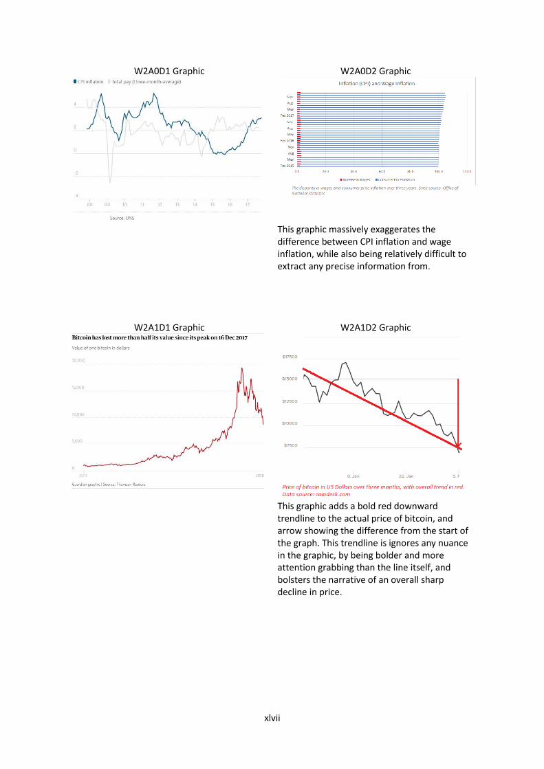
xlvii
W2A0D1 Graphic W2A0D2 Graphic
This graphic massively exaggerates the difference between CPI inflation and wage inflation, while also being relatively difficult to extract any precise information from.
W2A1D1 Graphic W2A1D2 Graphic
This graphic adds a bold red downward trendline to the actual price of bitcoin, and arrow showing the difference from the start of the graph. This trendline is ignores any nuance in the graphic, by being bolder and more attention grabbing than the line itself, and bolsters the narrative of an overall sharp decline in price.

xlviii
W2A2A1 Graphic W2A2D2 Graphic
This graphic presents the information differently to the D1 graphic, giving the measure in change of life expectancy rather than just life expectancy. The graphic also appears to be incomplete.

xlix
Appendix A9: Chi-squared Tables
Source: https://www.medcalc.org/manual/chi-square-table.php


![[PPT]Types of Media Bias - Anoka-Hennepin School District ... · Web viewWhat is Media Bias cont... Bias applied to media-Bias in news programs, political advertising, or any other](https://static.fdocuments.net/doc/165x107/5b29ef797f8b9ad8298b57c3/ppttypes-of-media-bias-anoka-hennepin-school-district-web-viewwhat-is.jpg)


