
Inferential Statistics and...
324
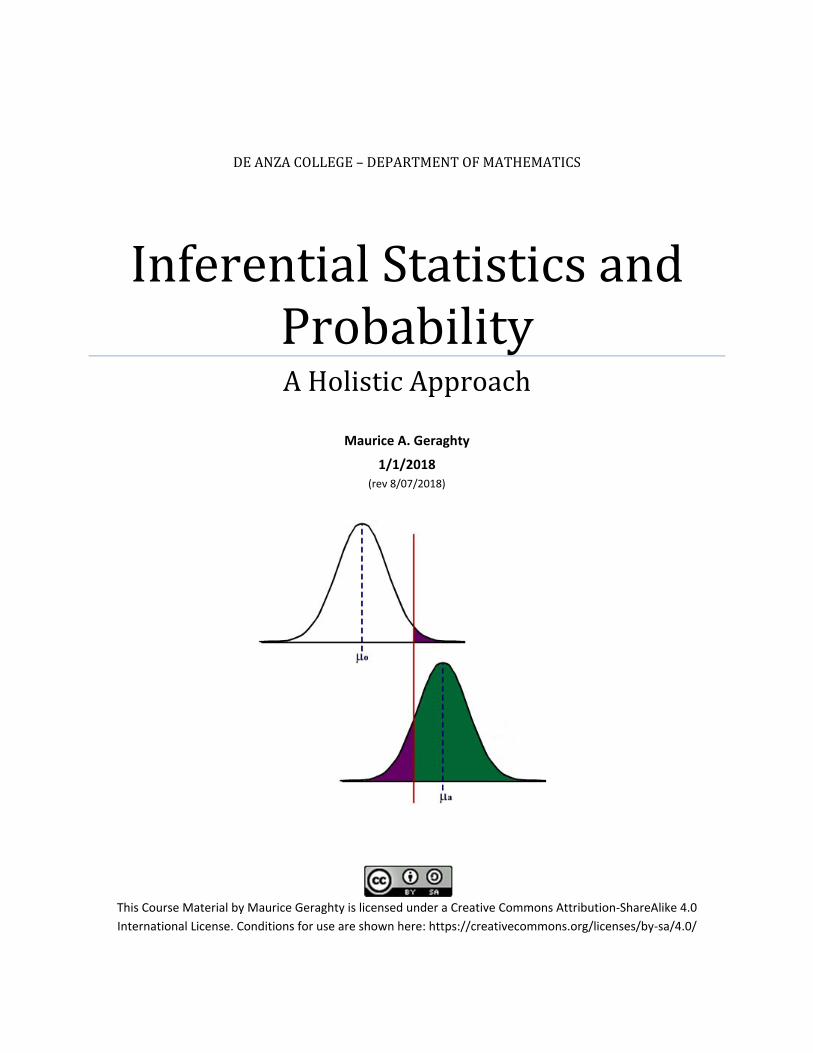
(rev 8/07/2018) This Course Material by Maurice Geraghty is licensed under a Creative Commons Attribution‐ShareAlike 4.0 International License. Conditions for use are shown here: https://creativecommons.org/licenses/by‐sa/4.0/ DE ANZA COLLEGE – DEPARTMENT OF MATHEMATICS Inferential Statistics and Probability A Holistic Approach Maurice A. Geraghty 1/1/2018
Transcript of Inferential Statistics and...
(rev 8/07/2018)
This Course Material by Maurice Geraghty is licensed under a Creative Commons Attribution‐ShareAlike 4.0
International License. Conditions for use are shown here: https://creativecommons.org/licenses/by‐sa/4.0/
DEANZACOLLEGE–DEPARTMENTOFMATHEMATICS
InferentialStatisticsandProbabilityAHolisticApproach
Maurice A. Geraghty
1/1/2018
P a g e | 1
Inference Statistics and Probability – A Holistic Approach
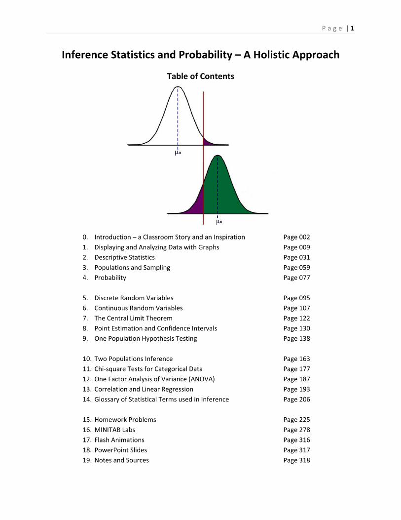
Table of Contents
0. Introduction – a Classroom Story and an Inspiration Page 002
1. Displaying and Analyzing Data with Graphs Page 009
2. Descriptive Statistics Page 031
3. Populations and Sampling Page 059
4. Probability Page 077
5. Discrete Random Variables Page 095
6. Continuous Random Variables Page 107
7. The Central Limit Theorem Page 122
8. Point Estimation and Confidence Intervals Page 130
9. One Population Hypothesis Testing Page 138
10. Two Populations Inference Page 163
11. Chi‐square Tests for Categorical Data Page 177
12. One Factor Analysis of Variance (ANOVA) Page 187
13. Correlation and Linear Regression Page 193
14. Glossary of Statistical Terms used in Inference Page 206
15. Homework Problems Page 225
16. MINITAB Labs Page 278
17. Flash Animations Page 316
18. PowerPoint Slides Page 317
19. Notes and Sources Page 318
P a g e | 2
0. Introduction ‐ A Classroom Story and an Inspiration
Several years ago, I was teaching an introductory Statistics course at De Anza College where I had
several achieving students who were dedicated to learning the material and who frequently asked me
questions during class and office hours. Like many students, they were able to understand the material
on descriptive statistics and interpreting graphs. Unlike many introductory Statistics students, they had
excellent math and computer skills and went on to master probability, random variables and the Central
Limit Theorem.
However, when the course turned to inference and hypothesis testing, I watched these students’
performance deteriorate. One student asked me after class to again explain the difference between the
Null and Alternative Hypotheses. I tried several methods, but it was clear these students never really
understood the logic or the reasoning behind the procedure. These students could easily perform the
calculations, but they had difficulty choosing the correct model, setting up the test, and stating the
conclusion.
These students, (to their credit) continued to work hard; they wanted to understand the material, not
simply pass the class. Since these students had excellent math skills, I went deeper into the explanation
of Type II error and the statistical power function. Although they could compute power and sample size
for different criteria, they still didn’t conceptually understand hypothesis testing.
On my long drive home, I was listening to National Public Radio’s Talk of the Nation1 and heard
discussion on the difference between the reductionist and holistic approaches to the sciences. The
commentator described this as the Western tradition vs. the Eastern tradition. The reductionist or
Western method of analyzing a problem, mechanism or phenomenon is to look at the component
pieces of the system being studied. For example, a nutritionist breaks a potato down into vitamins,
minerals, carbohydrates, fats, calories, fiber and proteins. Reductionist analysis is prevalent in all the
sciences, including Inferential Statistics and Hypothesis Testing.
Holistic or Eastern tradition analysis is less concerned with the component parts of a problem,
mechanism or phenomenon but rather with how this system operates as a whole, including its
surrounding environment. For example, a holistic nutritionist would look at the potato in its
environment: when it was eaten, with what other foods it was eaten, how it was grown, or how it was
prepared. In holism, the potato is much more
than the sum of its parts.
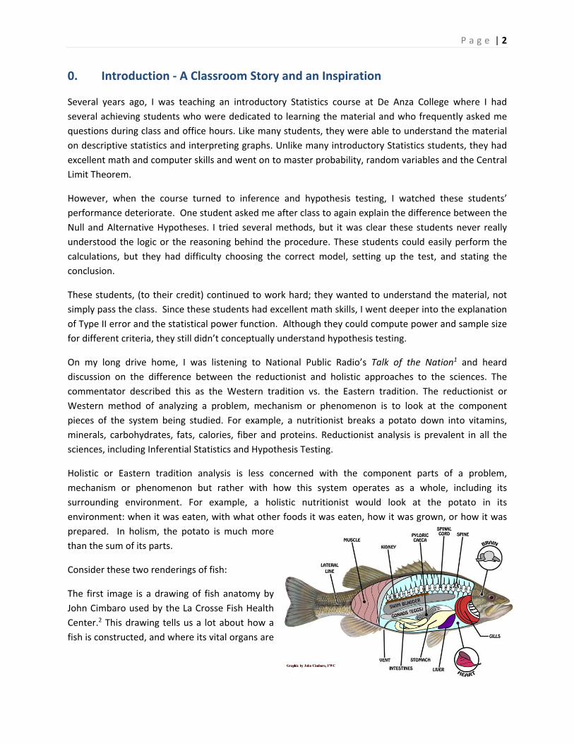
Consider these two renderings of fish:
The first image is a drawing of fish anatomy by
John Cimbaro used by the La Crosse Fish Health
Center.2 This drawing tells us a lot about how a
fish is constructed, and where its vital organs are

P a g e | 3
located. There is much detail given to the scales, fins, mouth and eyes.
The second image is a watercolor by
the Chinese artist Chen Zheng‐
Long3. In this artwork, we learn very
little about fish anatomy since we
can only see minimalistic eyes,
scales and fins. However, the artist
shows how fish are social creatures,
how their fins move to swim and
the type of plants they like. Unlike
the first drawing, the drawing
teaches us much more about the
interaction of the fish in its surrounding environment and much less about how a fish is built.
This illustrative example shows the difference between reductionist and holistic analyses. Each
rendering teaches something important about the fish: the reductionist drawing of the fish anatomy
helps explain how a fish is built and the holistic watercolor helps explain how a fish relates to its
environment. Both the reductionist and holistic methods add to knowledge and understanding, and
both philosophies are important. Unfortunately, much of Western science has been dominated by the
reductionist philosophy, including the backbone of the scientific method, Inferential Statistics.
Although science has traditionally been reluctant, often hostile, to embrace or include holistic
philosophy in the scientific method, there have been many who now support a multicultural or multi‐
philosophical approach. In his book Holism and Reductionism in Biology and Ecology4, Looijen claims
that “holism and reductionism should be seen as mutually dependent, and hence co‐operating
research programs than as conflicting views of nature or of relations between sciences.” Holism
develops the “macro‐laws” that reductionism needs to “delve deeper” into understanding or explaining
a concept or phenomena. I believe this claim applies to the study of Statistics as well.
I realize that the problem of my high‐achieving students being unable to comprehend hypothesis testing
could be cultural – these were international students who may have been schooled under a more
holistic philosophy. The Introductory Statistics curriculum and most texts give an incomplete
explanation of the logic of Hypothesis Testing, eliminating or barely explaining such topics as Power, the
consequence of Type II error or Bayesian alternatives. The problem is how to supplement an
Introductory Statistics course with a holistic philosophy without depriving the students of the required
reductionist course curriculum – all in one quarter or semester!
I believe it is possible to teach the concept of Inferential Statistics holistically. This course material is a
result of that inspiration, and it was designed to supplement, not replace, a traditional course textbook
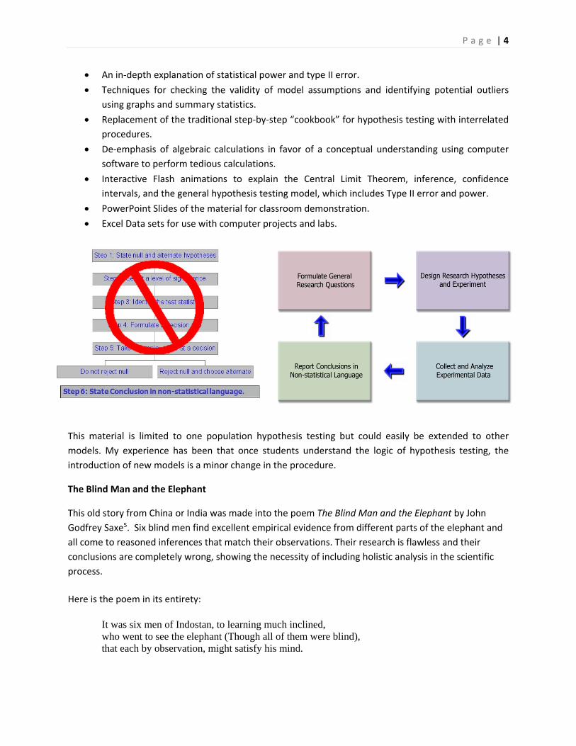
or workbook. This supplemental material includes:
Examples of deriving research hypotheses from general questions and explanatory conclusions
consistent with the general question and test results.
P a g e | 4
An in‐depth explanation of statistical power and type II error.
Techniques for checking the validity of model assumptions and identifying potential outliers
using graphs and summary statistics.
Replacement of the traditional step‐by‐step “cookbook” for hypothesis testing with interrelated
procedures.
De‐emphasis of algebraic calculations in favor of a conceptual understanding using computer
software to perform tedious calculations.
Interactive Flash animations to explain the Central Limit Theorem, inference, confidence
intervals, and the general hypothesis testing model, which includes Type II error and power.
PowerPoint Slides of the material for classroom demonstration.
Excel Data sets for use with computer projects and labs.
This material is limited to one population hypothesis testing but could easily be extended to other
models. My experience has been that once students understand the logic of hypothesis testing, the
introduction of new models is a minor change in the procedure.
The Blind Man and the Elephant
This old story from China or India was made into the poem The Blind Man and the Elephant by John
Godfrey Saxe5. Six blind men find excellent empirical evidence from different parts of the elephant and
all come to reasoned inferences that match their observations. Their research is flawless and their
conclusions are completely wrong, showing the necessity of including holistic analysis in the scientific
process.
Here is the poem in its entirety:
It was six men of Indostan, to learning much inclined, who went to see the elephant (Though all of them were blind), that each by observation, might satisfy his mind.
P a g e | 5
The first approached the elephant, and, happening to fall, against his broad and sturdy side, at once began to bawl: "God bless me! but the elephant, is nothing but a wall!"
The second feeling of the tusk, cried: "Ho! what have we here, so very round and smooth and sharp? To me tis mighty clear, this wonder of an elephant, is very like a spear!"
The third approached the animal, and, happening to take, the squirming trunk within his hands, "I see," quoth he, the elephant is very like a snake!"
The fourth reached out his eager hand, and felt about the knee: "What most this wondrous beast is like, is mighty plain," quoth he; "Tis clear enough the elephant is very like a tree."
The fifth, who chanced to touch the ear, Said; "E'en the blindest man can tell what this resembles most; Deny the fact who can, This marvel of an elephant, is very like a fan!"
The sixth no sooner had begun, about the beast to grope, than, seizing on the swinging tail, that fell within his scope, "I see," quothe he, "the elephant is very like a rope!"
And so these men of Indostan, disputed loud and long, each in his own opinion, exceeding stiff and strong, Though each was partly in the right, and all were in the wrong!
So, oft in theologic wars, the disputants, I ween, tread on in utter ignorance, of what each other mean, and prate about the elephant, not one of them has seen!
-John Godfrey Saxe
What can go wrong in research ‐ two stories
The first story is about a drug that was thought to be effective in research, but was pulled from the
market when it was found to be ineffective in practice.
FDA Orders Trimethobenzamide Suppositories Off the market6
FDA today ordered makers of unapproved suppositories containing trimethobenzamide hydrochloride to stop manufacturing and distributing those products.
Companies that market the suppositories, according to FDA, are Bio Pharm, Dispensing Solutions, G&W Laboratories, Paddock Laboratories, and Perrigo New York. Bio Pharm also distributes the products, along with Major Pharmaceuticals, PDRX Pharmaceuticals, Physicians Total Care, Qualitest Pharmaceuticals, RedPharm, and Shire U.S. Manufacturing.

P a g e | 6
FDA had determined in January 1979 that trimethobenzamide suppositories lacked "substantial evidence of effectiveness" and proposed withdrawing approval of any NDA for the products.
"There's a variety of reasons" why it has taken FDA nearly 30 years to finally get the suppositories off the market, Levy said.
At least 21 infant deaths have been associated with unapproved carbinoxamine-containing products, Levy noted.
Many products with unapproved labeling may be included in widely used pharmaceutical reference materials, such as the Physicians' Desk Reference, and are sometimes advertised in medical journals, he said.
Regulators urged consumers using suppositories containing trimethobenzamide to contact their health care providers about the products.
The second story is about promising research that was abandoned because the test data showed no significant improvement for patients taking the drug.
Drug Found Ineffective Against Lung Disease7
Treatment with interferon gamma-1b (Ifn-g1b) does not improve survival in people with a fatal lung disease called idiopathic pulmonary fibrosis, according to a study that was halted early after no benefit to participants was found.
Previous research had suggested that Ifn-g1b might benefit people with idiopathic pulmonary fibrosis, particularly those with mild to moderate disease.
The new study included 826 people, ages 40 to 79, who lived in Europe and North America. They were given injections of either 200 micrograms of Ifn-g1b (551 people) or a placebo (275) three times a week.
After a median of 64 weeks, 15 percent of those in the Ifn-g1b group and 13 percent in the placebo group had died. Symptoms such as flu-like illness, fatigue, fever and chills were more common among those in the Ifn-g1b group than in the placebo group. The two groups had similar rates of serious side effects, the researchers found.
"We cannot recommend treatment with interferon gamma-1b since the drug did not improve survival for patients with idiopathic pulmonary fibrosis, which refutes previous findings from subgroup analyses of survival in studies of patients with mild-to-moderate physiological impairment of pulmonary function," Dr. Talmadge E. King Jr., of the University of California, San Francisco, and colleagues wrote in the study published online and in an upcoming print issue of The Lancet.
The negative findings of this study "should be regarded as definite, [but] they should not discourage patients to participate in one of the several clinical trials currently underway to find effective treatments for this devastating disease," Dr. Demosthenes Bouros, of the Democritus University of Thrace in Greece, wrote in an accompanying editorial.

P a g e | 7
Bouros added that people deemed suitable "should be enrolled early in the transplantation list, which is today the only mode of treatment that prolongs survival."
Although these are both stories of failures in using drugs to treat diseases, they represent two different
aspects of hypothesis testing. In the first story, the suppositories were thought to be effective in
treatment from the initial trials, but were later shown to be ineffective in the general population. This is
an example of what statisticians call Type I Error: supporting a hypothesis (the suppositories are
effective) that later turns out to be false.
In the second story, researchers chose to abandon research when the interferon was found to be
ineffective in treating lung disease during clinical trials. Now this may have been the correct decision,
but what if this treatment was truly effective and the researchers just had an unusual group of test
subjects? This would be an example of what statisticians call Type II Error: failing to support a
hypothesis (the interferon is effective) that later turns out to be true. Unlike the first story, the second
story will never result in answer to this question since the treatment will not be released to the general
public.
In a traditional Introductory Statistics course, very little time is spent analyzing the potential error shown
in the second story. However, both types of error are important and will be explored in this course
material.
Preliminary Results – bringing the holistic approach to the entire statistics curriculum.
After writing what are now chapters 8, 9 and 10, I decided to use this holistic approach in several of my
courses. I found students were more engaged in the course, were able to understand the logic of
hypothesis testing, and would state the appropriate conclusion. I wanted to bring this approach to the
entire statistics course and this book is the result.
Why Creative Commons Attribution License?
16 years ago, I was co‐author for a Business Statistics textbook that was published by a boutique
publisher. The textbook was expensive for students and I received little compensation for the work put
into this text. Then Chancellor Martha Kanter of the Foothill‐De Anza Community College District
initiated a movement to bring free Online Education Resources, including textbooks, to our students.
Following the lead of two of my colleagues, Barbara Illowsky and Susan Dean, I decided that any
material I create will be provided to students free of charge. Whenever possible, I try to use online
resources to help students who are suffering financial hardship from the cost of college.
In order to protect this material from being marketed without my permission, I publish all material using
a Creative Commons Attribution‐ShareAlike 4.0 International License.8 What this means is:
Anyone can download and use this material without permission.
Anyone can remix, modify or add to this material for non‐commercial use, as long as proper
attribution is given to this source.
None of this material can ever be copyrighted, I retain all rights for the material.

P a g e | 8
So please feel free to download and modify the material and share it with the world. If all of us could
spend our energy sharing and being creative instead of being fearful and protectionist, imagine how rich
the library of open resource material would be.
Acknowledgments
No textbook can be written in a vacuum, and there are so many colleagues, students, administrators,
friends and family members who have supported this endeavor.
I would first like to thank my colleagues and administrators at De Anza College, especially: Barbara
Illowsky, Susan Dean and Frank Soler, Statistics authors who helped me with process of writing my text
and creating an online education resource; Diane Mathios, who allowed me to use her material on
sampling bias; Doli Bambania, who shared with me ideas of adding rich context to material; Roberta
Bloom, who I collaborated with in using other online resources; Lenore Desilets, Lisa Mesh, Hung
Nguyen, and many others who have used some of my preliminary material and made suggestions;
Martha Kanter, who initiated the OER incentive at FHDA as part of her life’s mission to make college
more affordable to students; and Jerry Rosenberg, for supporting my Professional Development Leave
request to write this book.
I would also like to thank the many students who have inspired me to complete this material. I want to
especially thank students and tutors who agreed to review some of the preliminary chapters and who
have found errors in the text: Kairev Sheth, Alice Lee, Nikki Diep, Thanh Pham, Ana Chaverri, Kamyar
Kazemi, Milanko Plavsic, Alyssa Melesurgo, Andrea Yepez, Natalia Ramos, Meidan Jing, Derek
Esteban, Yuhan Tan, Hilary Lou, Qiong Wu, Dan Trinh, Deshan Yapabandara, Christopher Ton, Lily
Tran, Emily Sabour and Tony Ton.
Finally, I want to thank my daughter Amy Geraghty, who patiently edited this text for grammar and my
wife Rita Geraghty, who inspires me to stay present by being mindful and to meet challenges with
loving kindness.
Thank you all.
P a g e | 9
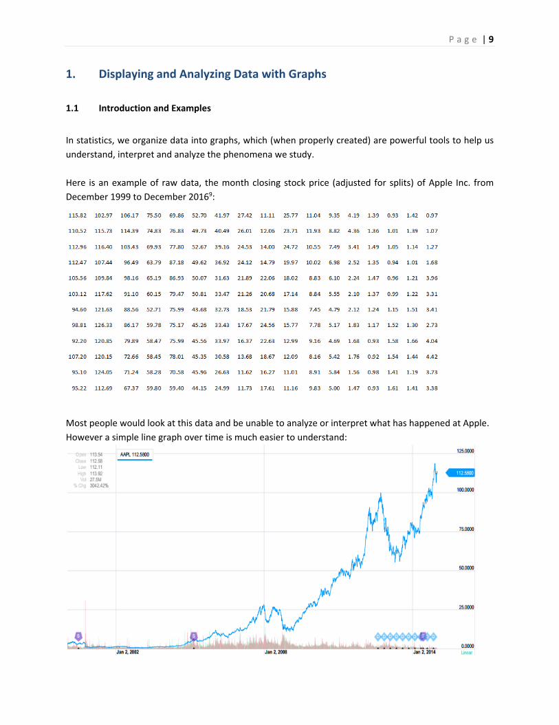
1. Displaying and Analyzing Data with Graphs
1.1 Introduction and Examples
In statistics, we organize data into graphs, which (when properly created) are powerful tools to help us
understand, interpret and analyze the phenomena we study.
Here is an example of raw data, the month closing stock price (adjusted for splits) of Apple Inc. from
December 1999 to December 20169:
Most people would look at this data and be unable to analyze or interpret what has happened at Apple.
However a simple line graph over time is much easier to understand:

P a g e | 10
The line graph tells the story of Apple, from the dot.com crash in 2000, to the introduction of the first
IPod in 2005, the first smart phone in 2007, the economic collapse of 2008, and competition from other
operating systems, such as Android:
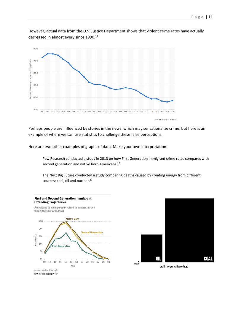
Graphs can help separate perception from reality. The polling organization Gallup has annually asked
the question “Is there more crime in the U.S. then there was a year ago, or less?” In virtually every poll
done, a large majority has said that crime has gone up.10
P a g e | 11
However, actual data from the U.S. Justice Department shows that violent crime rates have actually
decreased in almost every since 1990.11
Perhaps people are influenced by stories in the news, which may sensationalize crime, but here is an
example of where we can use statistics to challenge these false perceptions.
Here are two other examples of graphs of data. Make your own interpretation:
Pew Research conducted a study in 2013 on how First Generation immigrant crime rates compares with
second generation and native born Americans.12
The Next Big Future conducted a study comparing deaths caused by creating energy from different
sources: coal, oil and nuclear.13
P a g e | 12
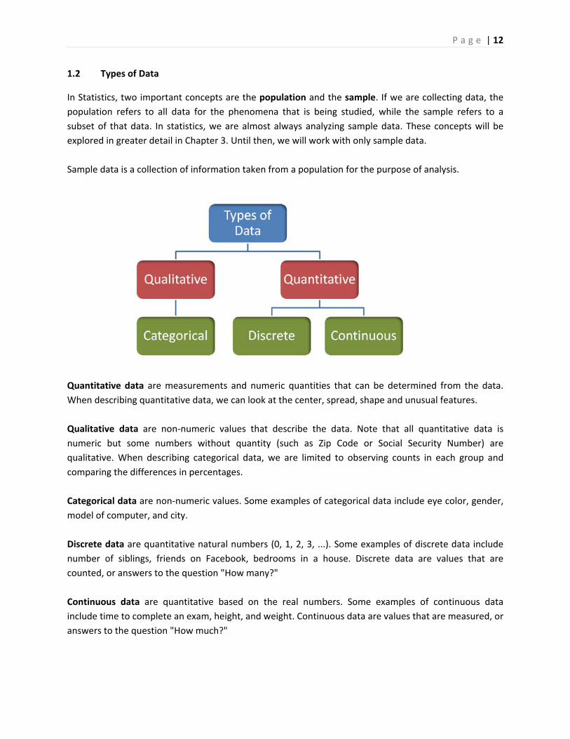
1.2 Types of Data
In Statistics, two important concepts are the population and the sample. If we are collecting data, the
population refers to all data for the phenomena that is being studied, while the sample refers to a
subset of that data. In statistics, we are almost always analyzing sample data. These concepts will be
explored in greater detail in Chapter 3. Until then, we will work with only sample data.
Sample data is a collection of information taken from a population for the purpose of analysis.
Quantitative data are measurements and numeric quantities that can be determined from the data.
When describing quantitative data, we can look at the center, spread, shape and unusual features.
Qualitative data are non‐numeric values that describe the data. Note that all quantitative data is
numeric but some numbers without quantity (such as Zip Code or Social Security Number) are
qualitative. When describing categorical data, we are limited to observing counts in each group and
comparing the differences in percentages.
Categorical data are non‐numeric values. Some examples of categorical data include eye color, gender,
model of computer, and city.
Discrete data are quantitative natural numbers (0, 1, 2, 3, ...). Some examples of discrete data include
number of siblings, friends on Facebook, bedrooms in a house. Discrete data are values that are
counted, or answers to the question "How many?"
Continuous data are quantitative based on the real numbers. Some examples of continuous data
include time to complete an exam, height, and weight. Continuous data are values that are measured, or
answers to the question "How much?"
P a g e | 13
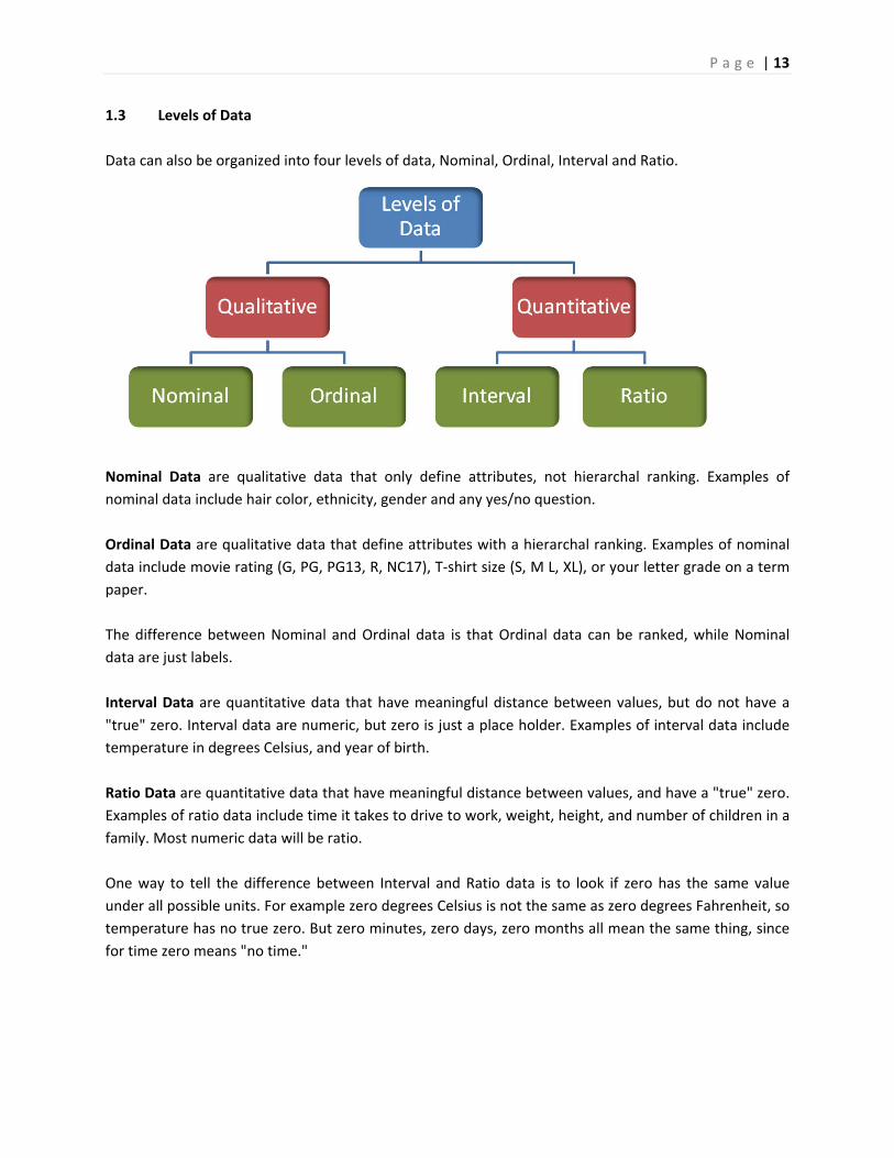
1.3 Levels of Data
Data can also be organized into four levels of data, Nominal, Ordinal, Interval and Ratio.
Nominal Data are qualitative data that only define attributes, not hierarchal ranking. Examples of
nominal data include hair color, ethnicity, gender and any yes/no question.
Ordinal Data are qualitative data that define attributes with a hierarchal ranking. Examples of nominal
data include movie rating (G, PG, PG13, R, NC17), T‐shirt size (S, M L, XL), or your letter grade on a term
paper.
The difference between Nominal and Ordinal data is that Ordinal data can be ranked, while Nominal
data are just labels.
Interval Data are quantitative data that have meaningful distance between values, but do not have a
"true" zero. Interval data are numeric, but zero is just a place holder. Examples of interval data include
temperature in degrees Celsius, and year of birth.
Ratio Data are quantitative data that have meaningful distance between values, and have a "true" zero.
Examples of ratio data include time it takes to drive to work, weight, height, and number of children in a
family. Most numeric data will be ratio.
One way to tell the difference between Interval and Ratio data is to look if zero has the same value
under all possible units. For example zero degrees Celsius is not the same as zero degrees Fahrenheit, so
temperature has no true zero. But zero minutes, zero days, zero months all mean the same thing, since
for time zero means "no time."
P a g e | 14
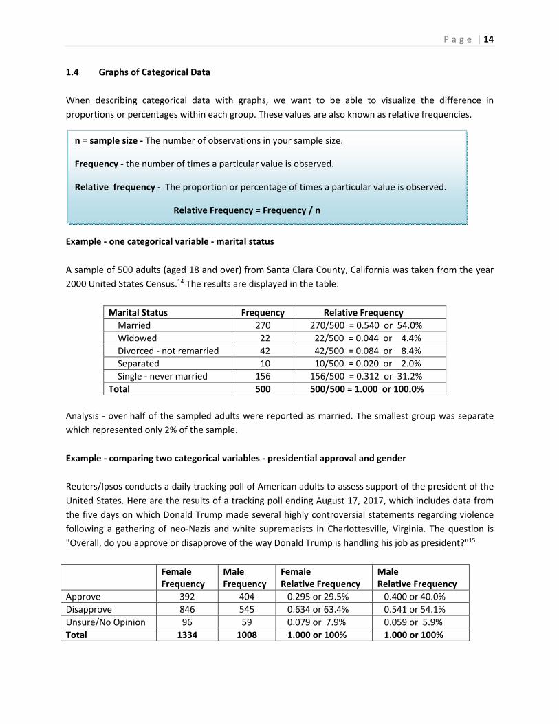
1.4 Graphs of Categorical Data
When describing categorical data with graphs, we want to be able to visualize the difference in
proportions or percentages within each group. These values are also known as relative frequencies.
Example ‐ one categorical variable ‐ marital status
A sample of 500 adults (aged 18 and over) from Santa Clara County, California was taken from the year
2000 United States Census.14 The results are displayed in the table:
Marital Status Frequency Relative Frequency
Married 270 270/500 = 0.540 or 54.0%
Widowed 22 22/500 = 0.044 or 4.4%
Divorced ‐ not remarried 42 42/500 = 0.084 or 8.4%
Separated 10 10/500 = 0.020 or 2.0%
Single ‐ never married 156 156/500 = 0.312 or 31.2%
Total 500 500/500 = 1.000 or 100.0%
Analysis ‐ over half of the sampled adults were reported as married. The smallest group was separate
which represented only 2% of the sample.
Example ‐ comparing two categorical variables ‐ presidential approval and gender
Reuters/Ipsos conducts a daily tracking poll of American adults to assess support of the president of the
United States. Here are the results of a tracking poll ending August 17, 2017, which includes data from
the five days on which Donald Trump made several highly controversial statements regarding violence
following a gathering of neo‐Nazis and white supremacists in Charlottesville, Virginia. The question is
"Overall, do you approve or disapprove of the way Donald Trump is handling his job as president?"15
Female Frequency
Male Frequency
Female Relative Frequency
Male Relative Frequency
Approve 392 404 0.295 or 29.5% 0.400 or 40.0%
Disapprove 846 545 0.634 or 63.4% 0.541 or 54.1%
Unsure/No Opinion 96 59 0.079 or 7.9% 0.059 or 5.9%
Total 1334 1008 1.000 or 100% 1.000 or 100%
n = sample size ‐ The number of observations in your sample size.
Frequency ‐ the number of times a particular value is observed.
Relative frequency ‐ The proportion or percentage of times a particular value is observed.
Relative Frequency = Frequency / n
P a g e | 15
SingleSeparatedDivorcedWidowedMarried
60
50
40
30
20
10
0
Marital Status
Perc
enta
ge
31.2
2
8.4
4.4
54
Marital Status of 500 Adults in Santa Clara County
Percent within all data.
SingleSeparatedDivorcedWidowedMarried
300
250
200
150
100
50
0
Marital Status
Freq
uenc
y156
10
42
22
270
Marital Status of 500 Adults in Santa Clara County
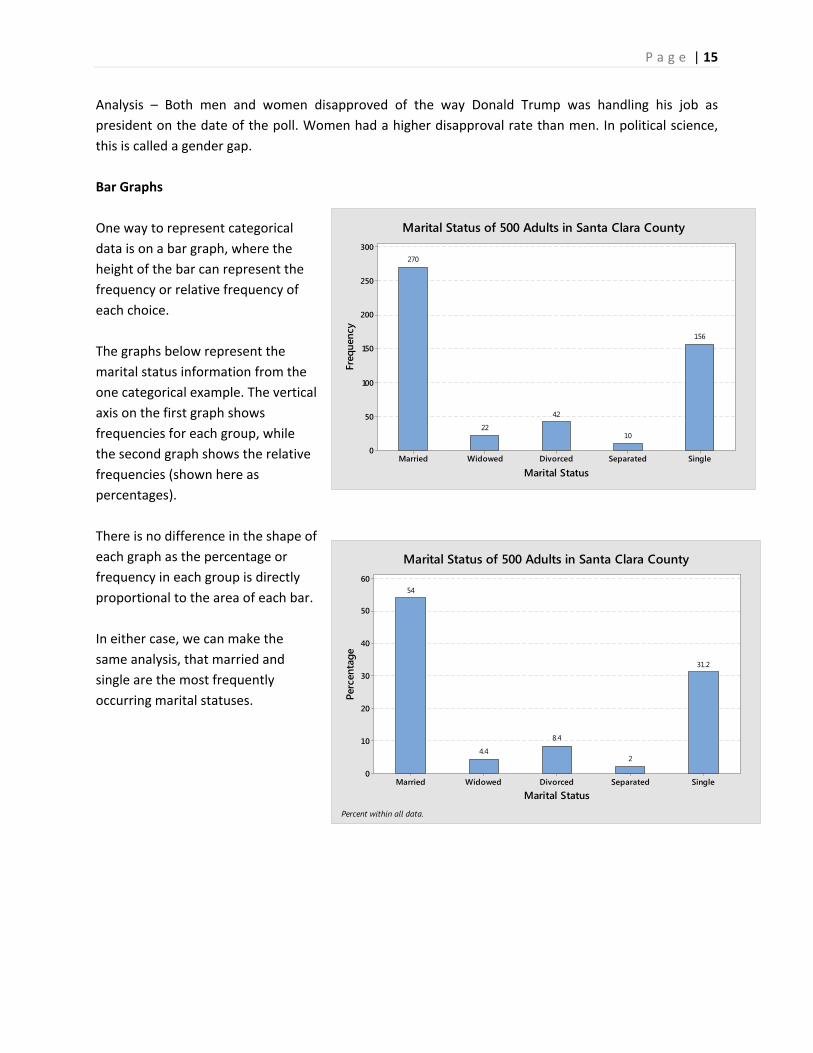
Analysis – Both men and women disapproved of the way Donald Trump was handling his job as
president on the date of the poll. Women had a higher disapproval rate than men. In political science,
this is called a gender gap.
Bar Graphs
One way to represent categorical
data is on a bar graph, where the
height of the bar can represent the
frequency or relative frequency of
each choice.
The graphs below represent the
marital status information from the
one categorical example. The vertical
axis on the first graph shows
frequencies for each group, while
the second graph shows the relative
frequencies (shown here as
percentages).
There is no difference in the shape of
each graph as the percentage or
frequency in each group is directly
proportional to the area of each bar.
In either case, we can make the
same analysis, that married and
single are the most frequently
occurring marital statuses.
P a g e | 16
Gender
Approval
Male
Female
Unsure
/No O
pinion
Disappro
ve
Approve
Unsure
/No O
pinion
Disappro
ve
Approve
900
800
700
600
500
400
300
200
100
0
Coun
t
59
545
404
96
846
392
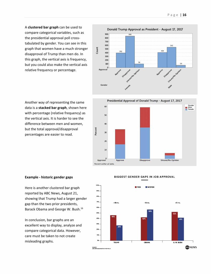
Donald Trump Approval as President - August 17, 2017A clustered bar graph can be used to
compare categorical variables, such as
the presidential approval poll cross‐
tabulated by gender. You can see in this
graph that women have a much stronger
disapproval of Trump than men do. In
this graph, the vertical axis is frequency,
but you could also make the vertical axis
relative frequency or percentage.
Another way of representing the same
data is a stacked bar graph, shown here
with percentage (relative frequency) as
the vertical axis. It is harder to see the
difference between men and women,
but the total approval/disapproval
percentages are easier to read.
Example ‐ historic gender gaps
Here is another clustered bar graph
reported by ABC News, August 21,
showing that Trump had a larger gender
gap than the two prior presidents,
Barack Obama and George W. Bush.16
In conclusion, bar graphs are an
excellent way to display, analyze and
compare categorical data. However,
care must be taken to not create
misleading graphs.

P a g e | 17
Example ‐ misreported Affordable Care Act enrollment
Here is an example of a bar graph reported on the Fox News Channel that distorted the truth about
people signing up for the Affordable Care Act (ACA) in 2014, as reported by mediamatters.org17
On March 27 health insurance enrollment through the ACA's exchanges surpassed 6 million, exceeding the revised estimate of enrollees for the program's first year before the March 31 open enrollment deadline. Enrollment appears on track to hit the Congressional Budget Office's initial estimate of 7 million sign‐ups, and taking Medicaid enrollees into account, the ACA will have reportedly extended health care coverage to at least 9.5 million previously uninsured individuals.
Fox celebrated the final day of open enrollment by attempting to somehow twist the recent enrollment surge into bad news for the law.
America's Newsroom aired an extremely skewed bar chart which made it appear that the 6 million enrollees comprised roughly one‐third of the 7 million enrollee goal:
At first look, the graph seemingly shows that the ACA enrollment was well below the projected goal. The graph is misleading for three reasons:
1. The vertical axis doesn’t start at zero enrollees, greatly overstating the difference between the two numbers.
2. The graph of the “6,000,000” enrolled failed to include new enrollees in Medicaid, which was part of the “March 31 Goal.”
3. The reported enrollment was 4 days before the deadline. Like students doing their homework, many people waited until the last day to enroll.
The actual enrollment numbers far exceeded the goal, the exact opposite of this poorly constructed bar graph.
P a g e | 18
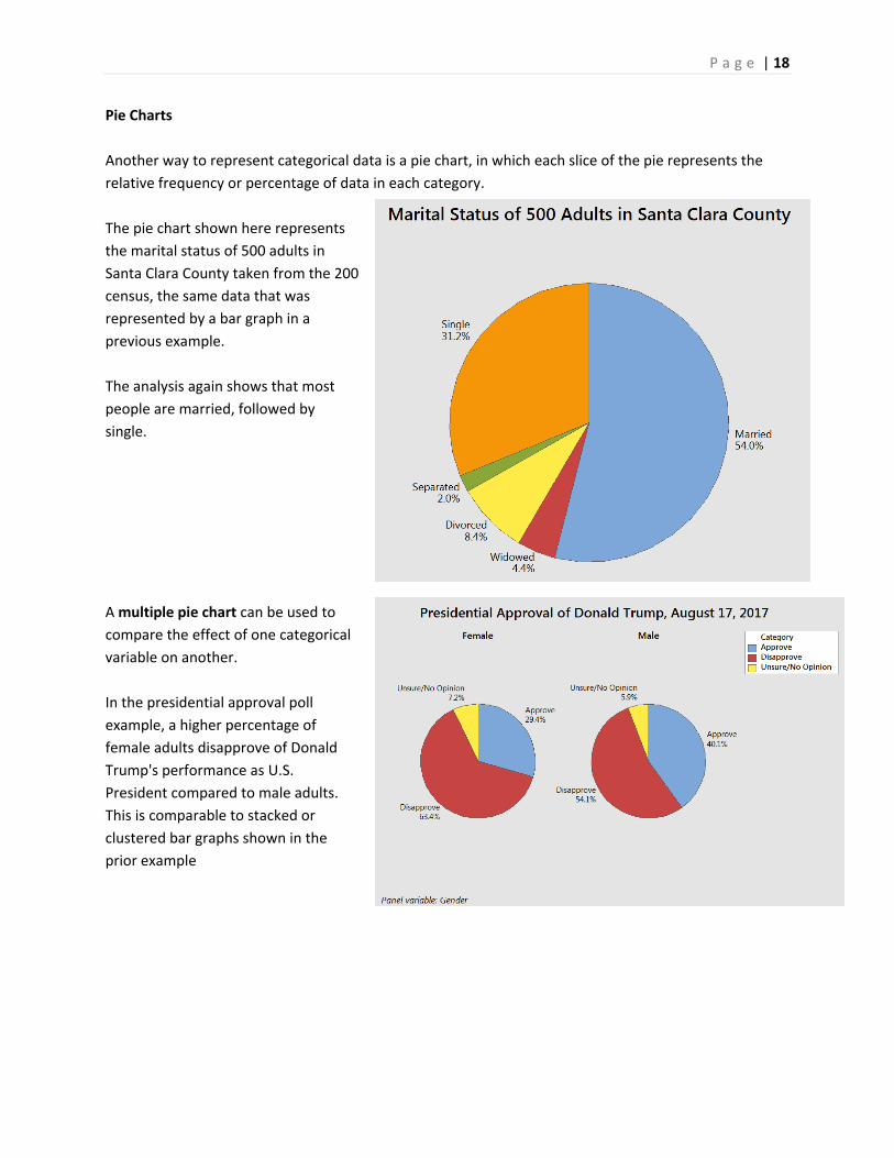
Pie Charts
Another way to represent categorical data is a pie chart, in which each slice of the pie represents the
relative frequency or percentage of data in each category.
The pie chart shown here represents
the marital status of 500 adults in
Santa Clara County taken from the 200
census, the same data that was
represented by a bar graph in a
previous example.
The analysis again shows that most
people are married, followed by
single.
A multiple pie chart can be used to
compare the effect of one categorical
variable on another.
In the presidential approval poll
example, a higher percentage of
female adults disapprove of Donald
Trump's performance as U.S.
President compared to male adults.
This is comparable to stacked or
clustered bar graphs shown in the
prior example
P a g e | 19
1.5 Graphs of Numeric Data
Numeric data is treated differently from categorical data as there exists quantifiable differences in the
data values. In analyzing quantitative data, we can describe quantifiable features such as the center, the
spread, the shape or skewness18, and any unusual features (such as outliers).
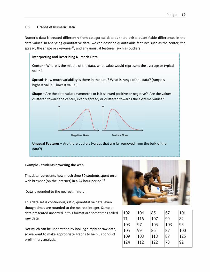
Example ‐ students browsing the web.
This data represents how much time 30 students spent on a
web browser (on the Internet) in a 24 hour period.19
Data is rounded to the nearest minute.
This data set is continuous, ratio, quantitative data, even
though times are rounded to the nearest integer. Sample
data presented unsorted in this format are sometimes called
raw data.
Not much can be understood by looking simply at raw data,
so we want to make appropriate graphs to help us conduct
preliminary analysis.
Interpreting and Describing Numeric Data
Center – Where is the middle of the data, what value would represent the average or typical
value?
Spread‐ How much variability is there in the data? What is range of the data? (range is
highest value – lowest value.)
Shape – Are the data values symmetric or is it skewed positive or negative? Are the values
clustered toward the center, evenly spread, or clustered towards the extreme values?
Unusual Features – Are there outliers (values that are far removed from the bulk of the
data?)
P a g e | 20
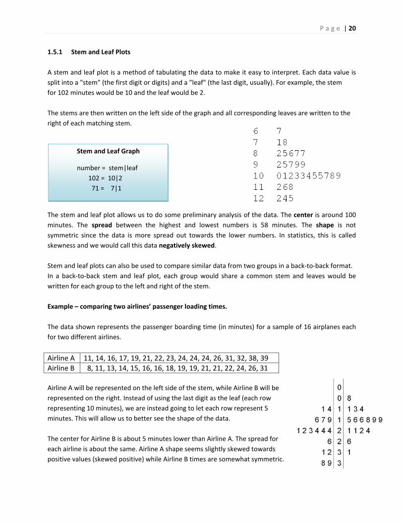
1.5.1 Stem and Leaf Plots
A stem and leaf plot is a method of tabulating the data to make it easy to interpret. Each data value is
split into a "stem" (the first digit or digits) and a "leaf" (the last digit, usually). For example, the stem
for 102 minutes would be 10 and the leaf would be 2.
The stems are then written on the left side of the graph and all corresponding leaves are written to the
right of each matching stem.
The stem and leaf plot allows us to do some preliminary analysis of the data. The center is around 100
minutes. The spread between the highest and lowest numbers is 58 minutes. The shape is not
symmetric since the data is more spread out towards the lower numbers. In statistics, this is called
skewness and we would call this data negatively skewed.
Stem and leaf plots can also be used to compare similar data from two groups in a back‐to‐back format.
In a back‐to‐back stem and leaf plot, each group would share a common stem and leaves would be
written for each group to the left and right of the stem.
Example – comparing two airlines’ passenger loading times.
The data shown represents the passenger boarding time (in minutes) for a sample of 16 airplanes each
for two different airlines.
Airline A 11, 14, 16, 17, 19, 21, 22, 23, 24, 24, 24, 26, 31, 32, 38, 39
Airline B 8, 11, 13, 14, 15, 16, 16, 18, 19, 19, 21, 21, 22, 24, 26, 31
Airline A will be represented on the left side of the stem, while Airline B will be
represented on the right. Instead of using the last digit as the leaf (each row
representing 10 minutes), we are instead going to let each row represent 5
minutes. This will allow us to better see the shape of the data.
The center for Airline B is about 5 minutes lower than Airline A. The spread for
each airline is about the same. Airline A shape seems slightly skewed towards
positive values (skewed positive) while Airline B times are somewhat symmetric.
Stem and Leaf Graph
number = stem|leaf
102 = 10|2
71 = 7|1

P a g e | 21
1.5.2 Dot Plots
A dot plot represents each value of a data set as a dot on a simple numeric scale. Multiple values are
stacked to create a shape for the data. If the data set is large, each dot can represent multiple values of
the data.
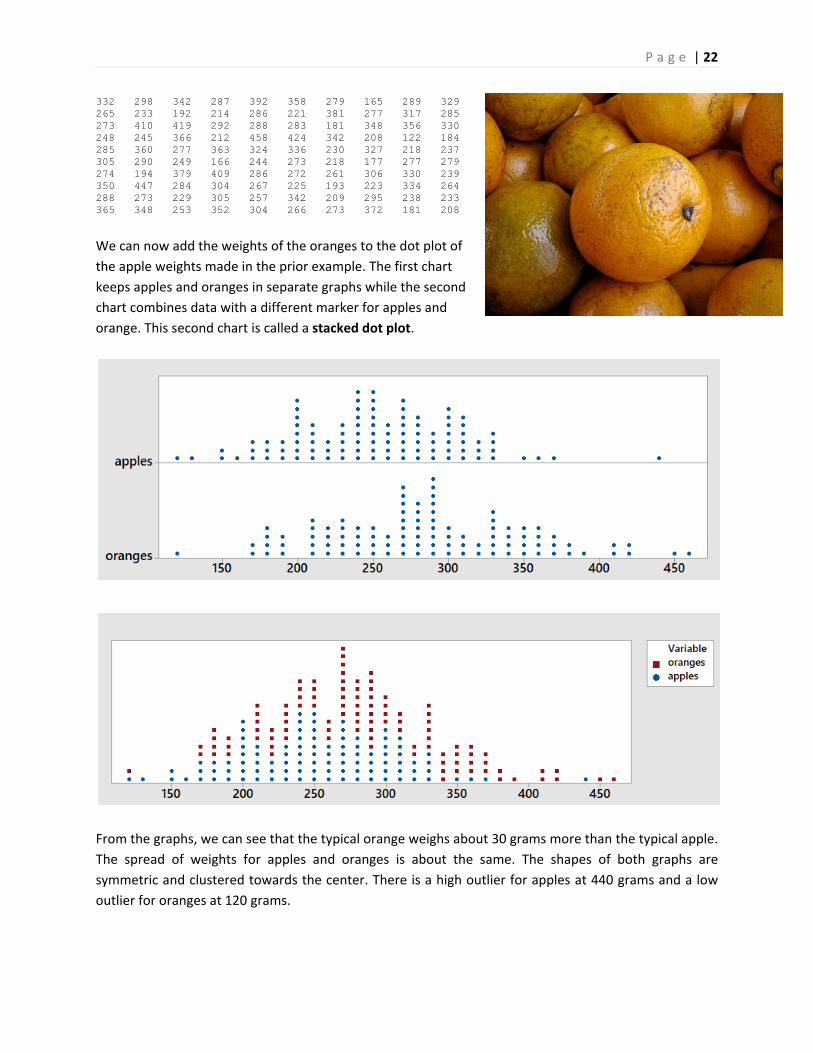
Example ‐ weights of apples
A Chilean agricultural researcher collected a sample of 100
Royal Gala apples.20 The weight of each apple (reported in
grams) is shown in the table below:
228 272 196 435 195 242 265 330 298 248 320 189 278 261 203 282 246 203 274 231 282 311 275 297 194 183 308 245 185 260 235 149 312 274 218 307 324 256 203 206 310 182 245 167 297 276 248 262 327 292 287 118 265 235 246 310 200 289 299 230 237 205 164 231 133 222 326 353 252 237 214 274 253 197 244 209 236 290 296 272 315 173 224 202 246 363 299 325 151 242 170 261 270 284 365 213 184 240 302 233
Here is the data organized into a dot plot, in which each dot represents one apple. The scaling of the
horizontal axis rounds each apple’s weight to the nearest 10 grams.
The center of the data is about 250, meaning that a typical apple would weight about 250 grams. The
range of weights is between 110 and 440 grams, although the 440 gram apple is an outlier, an unusually
large apple. The next highest weight is only 370 grams. Not counting the outlier, the data is symmetric
and clustered towards the center.
Dot plots can also be used to compare multiple populations.
Example ‐ comparing weights of apples and oranges
The Chilean agricultural researcher collected a sample of 100 navel oranges21 and recorded the weight
of each orange in grams.
P a g e | 22
332 298 342 287 392 358 279 165 289 329 265 233 192 214 286 221 381 277 317 285 273 410 419 292 288 283 181 348 356 330 248 245 366 212 458 424 342 208 122 184 285 360 277 363 324 336 230 327 218 237 305 290 249 166 244 273 218 177 277 279 274 194 379 409 286 272 261 306 330 239 350 447 284 304 267 225 193 223 334 264 288 273 229 305 257 342 209 295 238 233 365 348 253 352 304 266 273 372 181 208
We can now add the weights of the oranges to the dot plot of
the apple weights made in the prior example. The first chart
keeps apples and oranges in separate graphs while the second
chart combines data with a different marker for apples and
orange. This second chart is called a stacked dot plot.
From the graphs, we can see that the typical orange weighs about 30 grams more than the typical apple.
The spread of weights for apples and oranges is about the same. The shapes of both graphs are
symmetric and clustered towards the center. There is a high outlier for apples at 440 grams and a low
outlier for oranges at 120 grams.
P a g e | 23
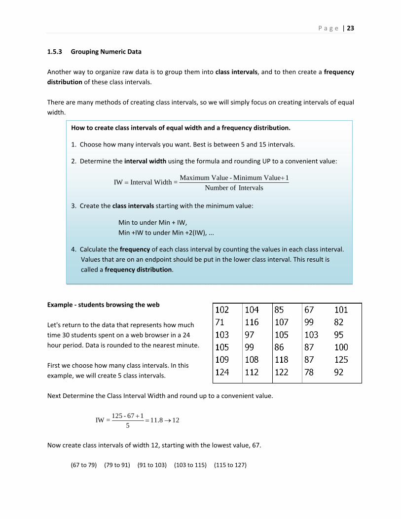
1.5.3 Grouping Numeric Data
Another way to organize raw data is to group them into class intervals, and to then create a frequency
distribution of these class intervals.
There are many methods of creating class intervals, so we will simply focus on creating intervals of equal
width.
Example ‐ students browsing the web
Let's return to the data that represents how much
time 30 students spent on a web browser in a 24
hour period. Data is rounded to the nearest minute.
First we choose how many class intervals. In this
example, we will create 5 class intervals.
Next Determine the Class Interval Width and round up to a convenient value.
125 - 67 1IW = 11.8 12
5
Now create class intervals of width 12, starting with the lowest value, 67.
(67 to 79) (79 to 91) (91 to 103) (103 to 115) (115 to 127)
How to create class intervals of equal width and a frequency distribution.
1. Choose how many intervals you want. Best is between 5 and 15 intervals.
2. Determine the interval width using the formula and rounding UP to a convenient value:
Maximum Value - Minimum Value 1IW Interval Width =
Number of Intervals
3. Create the class intervals starting with the minimum value:
Min to under Min + IW,
Min +IW to under Min +2(IW), ...
4. Calculate the frequency of each class interval by counting the values in each class interval.
Values that are on an endpoint should be put in the lower class interval. This result is
called a frequency distribution.
P a g e | 24
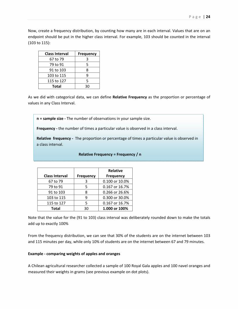
Now, create a frequency distribution, by counting how many are in each interval. Values that are on an
endpoint should be put in the higher class interval. For example, 103 should be counted in the interval
(103 to 115):
As we did with categorical data, we can define Relative Frequency as the proportion or percentage of
values in any Class Interval.
Note that the value for the (91 to 103) class interval was deliberately rounded down to make the totals
add up to exactly 100%
From the frequency distribution, we can see that 30% of the students are on the internet between 103
and 115 minutes per day, while only 10% of students are on the internet between 67 and 79 minutes.
Example ‐ comparing weights of apples and oranges
A Chilean agricultural researcher collected a sample of 100 Royal Gala apples and 100 navel oranges and
measured their weights in grams (see previous example on dot plots).
Class Interval Frequency
67 to 79 3
79 to 91 5
91 to 103 8
103 to 115 9
115 to 127 5
Total 30
Class Interval
Frequency
Relative Frequency
67 to 79 3 0.100 or 10.0%
79 to 91 5 0.167 or 16.7%
91 to 103 8 0.266 or 26.6%
103 to 115 9 0.300 or 30.0%
115 to 127 5 0.167 or 16.7%
Total 30 1.000 or 100%
n = sample size ‐ The number of observations in your sample size.
Frequency ‐ the number of times a particular value is observed in a class interval.
Relative frequency ‐ The proportion or percentage of times a particular value is observed in
a class interval.
Relative Frequency = Frequency / n
P a g e | 25
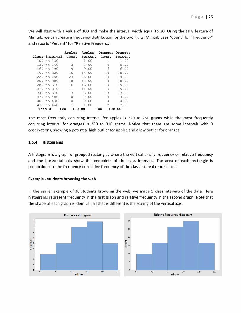
We will start with a value of 100 and make the interval width equal to 30. Using the tally feature of
Minitab, we can create a frequency distribution for the two fruits. Minitab uses “Count” for “Frequency”
and reports “Percent” for “Relative Frequency”
Apples Apples Oranges Oranges Class interval Count Percent Count Percent 100 to 130 1 1.00 1 1.00 130 to 160 3 3.00 0 0.00 160 to 190 9 9.00 6 6.00 190 to 220 15 15.00 10 10.00 220 to 250 23 23.00 14 14.00 250 to 280 18 18.00 18 18.00 280 to 310 16 16.00 19 19.00 310 to 340 11 11.00 9 9.00 340 to 370 3 3.00 13 13.00 370 to 400 0 0.00 4 4.00 400 to 430 0 0.00 4 4.00 430 to 460 1 1.00 2 2.00
Totals 100 100.00 100 100.00
The most frequently occurring interval for apples is 220 to 250 grams while the most frequently
occurring interval for oranges is 280 to 310 grams. Notice that there are some intervals with 0
observations, showing a potential high outlier for apples and a low outlier for oranges.
1.5.4 Histograms
A histogram is a graph of grouped rectangles where the vertical axis is frequency or relative frequency
and the horizontal axis show the endpoints of the class intervals. The area of each rectangle is
proportional to the frequency or relative frequency of the class interval represented.
Example ‐ students browsing the web
In the earlier example of 30 students browsing the web, we made 5 class intervals of the data. Here
histograms represent frequency in the first graph and relative frequency in the second graph. Note that
the shape of each graph is identical; all that is different is the scaling of the vertical axis.
P a g e | 26
Like the stem and leaf diagram, the histogram allows us to interpret and analyze the data. The center is
around 100 minutes. The spread between the highest and lowest numbers is about 60 minutes. The
shape is slightly skewed negative. The data clusters towards the center and there doesn’t seem to be
any unusual features like outliers.
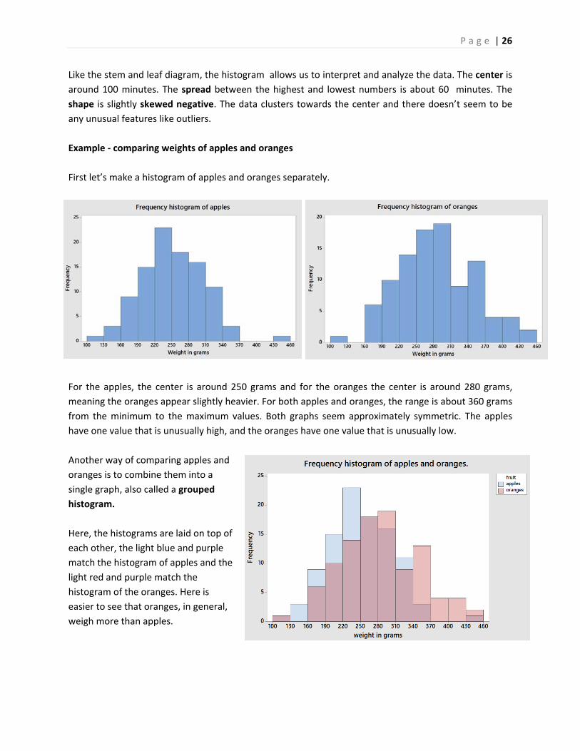
Example ‐ comparing weights of apples and oranges
First let’s make a histogram of apples and oranges separately.
For the apples, the center is around 250 grams and for the oranges the center is around 280 grams,
meaning the oranges appear slightly heavier. For both apples and oranges, the range is about 360 grams
from the minimum to the maximum values. Both graphs seem approximately symmetric. The apples
have one value that is unusually high, and the oranges have one value that is unusually low.
Another way of comparing apples and
oranges is to combine them into a
single graph, also called a grouped
histogram.
Here, the histograms are laid on top of
each other, the light blue and purple
match the histogram of apples and the
light red and purple match the
histogram of the oranges. Here is
easier to see that oranges, in general,
weigh more than apples.
P a g e | 27
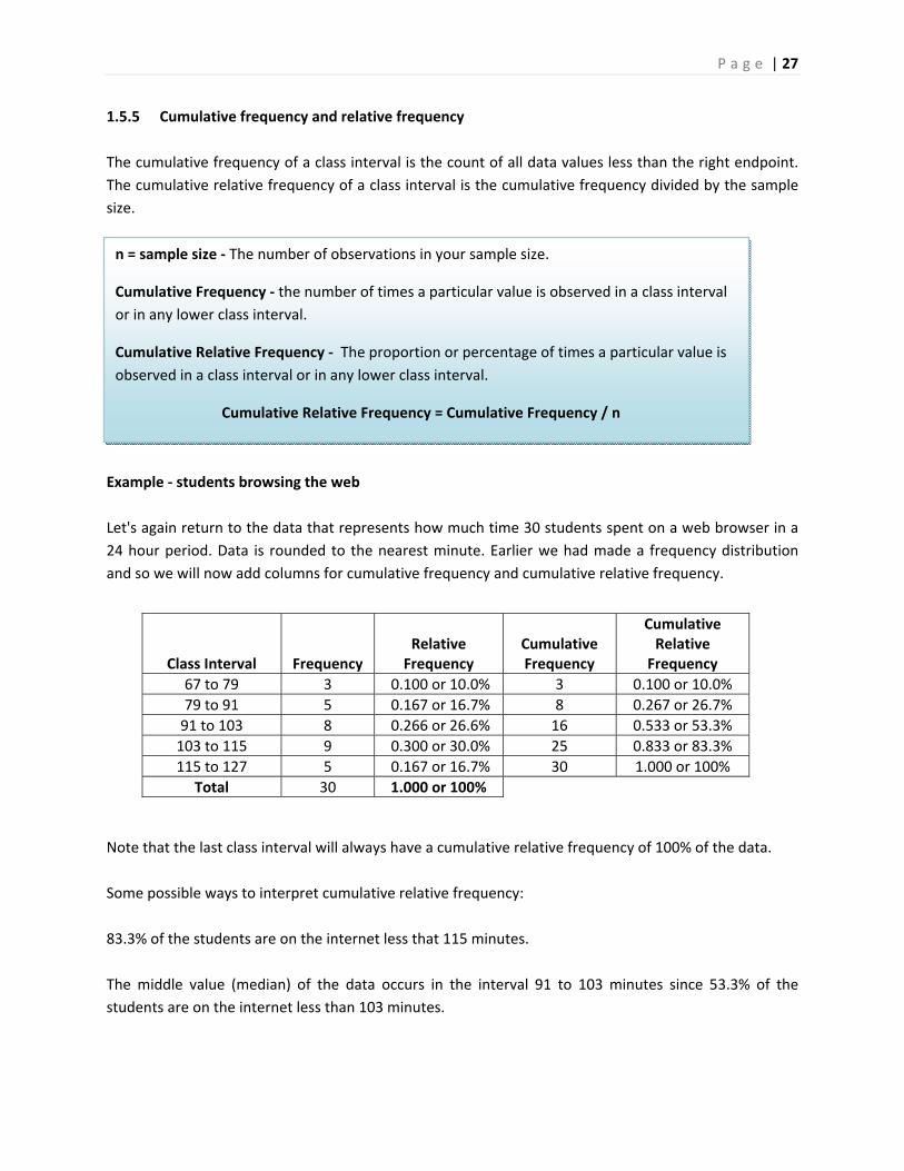
1.5.5 Cumulative frequency and relative frequency
The cumulative frequency of a class interval is the count of all data values less than the right endpoint.
The cumulative relative frequency of a class interval is the cumulative frequency divided by the sample
size.
Example ‐ students browsing the web
Let's again return to the data that represents how much time 30 students spent on a web browser in a
24 hour period. Data is rounded to the nearest minute. Earlier we had made a frequency distribution
and so we will now add columns for cumulative frequency and cumulative relative frequency.
Note that the last class interval will always have a cumulative relative frequency of 100% of the data.
Some possible ways to interpret cumulative relative frequency:
83.3% of the students are on the internet less that 115 minutes.
The middle value (median) of the data occurs in the interval 91 to 103 minutes since 53.3% of the
students are on the internet less than 103 minutes.
Class Interval
Frequency
Relative Frequency
Cumulative Frequency
Cumulative Relative Frequency
67 to 79 3 0.100 or 10.0% 3 0.100 or 10.0%
79 to 91 5 0.167 or 16.7% 8 0.267 or 26.7%
91 to 103 8 0.266 or 26.6% 16 0.533 or 53.3%
103 to 115 9 0.300 or 30.0% 25 0.833 or 83.3%
115 to 127 5 0.167 or 16.7% 30 1.000 or 100%
Total 30 1.000 or 100%
n = sample size ‐ The number of observations in your sample size.
Cumulative Frequency ‐ the number of times a particular value is observed in a class interval
or in any lower class interval.
Cumulative Relative Frequency ‐ The proportion or percentage of times a particular value is
observed in a class interval or in any lower class interval.
Cumulative Relative Frequency = Cumulative Frequency / n
P a g e | 28
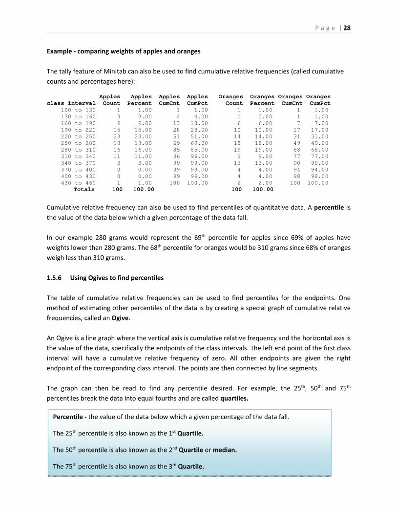
Example ‐ comparing weights of apples and oranges
The tally feature of Minitab can also be used to find cumulative relative frequencies (called cumulative
counts and percentages here):
Apples Apples Apples Apples Oranges Oranges Oranges Oranges class interval Count Percent CumCnt CumPct Count Percent CumCnt CumPct 100 to 130 1 1.00 1 1.00 1 1.00 1 1.00 130 to 160 3 3.00 4 4.00 0 0.00 1 1.00 160 to 190 9 9.00 13 13.00 6 6.00 7 7.00 190 to 220 15 15.00 28 28.00 10 10.00 17 17.00 220 to 250 23 23.00 51 51.00 14 14.00 31 31.00 250 to 280 18 18.00 69 69.00 18 18.00 49 49.00 280 to 310 16 16.00 85 85.00 19 19.00 68 68.00 310 to 340 11 11.00 96 96.00 9 9.00 77 77.00 340 to 370 3 3.00 99 99.00 13 13.00 90 90.00 370 to 400 0 0.00 99 99.00 4 4.00 94 94.00 400 to 430 0 0.00 99 99.00 4 4.00 98 98.00 430 to 460 1 1.00 100 100.00 2 2.00 100 100.00 Totals 100 100.00 100 100.00
Cumulative relative frequency can also be used to find percentiles of quantitative data. A percentile is
the value of the data below which a given percentage of the data fall.
In our example 280 grams would represent the 69th percentile for apples since 69% of apples have
weights lower than 280 grams. The 68th percentile for oranges would be 310 grams since 68% of oranges
weigh less than 310 grams.
1.5.6 Using Ogives to find percentiles
The table of cumulative relative frequencies can be used to find percentiles for the endpoints. One
method of estimating other percentiles of the data is by creating a special graph of cumulative relative
frequencies, called an Ogive.
An Ogive is a line graph where the vertical axis is cumulative relative frequency and the horizontal axis is
the value of the data, specifically the endpoints of the class intervals. The left end point of the first class
interval will have a cumulative relative frequency of zero. All other endpoints are given the right
endpoint of the corresponding class interval. The points are then connected by line segments.
The graph can then be read to find any percentile desired. For example, the 25th, 50th and 75th
percentiles break the data into equal fourths and are called quartiles.
Percentile ‐ the value of the data below which a given percentage of the data fall.
The 25th percentile is also known as the 1st Quartile.
The 50th percentile is also known as the 2nd Quartile or median.
The 75th percentile is also known as the 3rd Quartile.
P a g e | 29
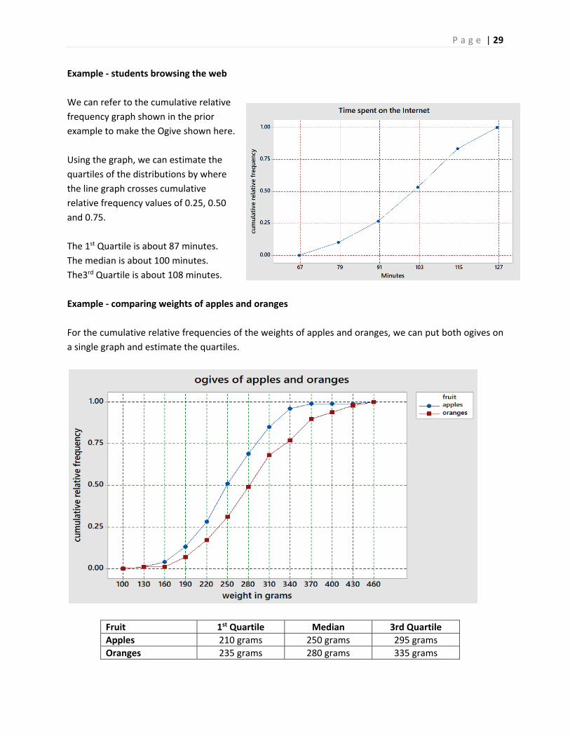
Example ‐ students browsing the web
We can refer to the cumulative relative
frequency graph shown in the prior
example to make the Ogive shown here.
Using the graph, we can estimate the
quartiles of the distributions by where
the line graph crosses cumulative
relative frequency values of 0.25, 0.50
and 0.75.
The 1st Quartile is about 87 minutes.
The median is about 100 minutes.
The3rd Quartile is about 108 minutes.
Example ‐ comparing weights of apples and oranges
For the cumulative relative frequencies of the weights of apples and oranges, we can put both ogives on
a single graph and estimate the quartiles.
Fruit 1st Quartile Median 3rd Quartile
Apples 210 grams 250 grams 295 grams
Oranges 235 grams 280 grams 335 grams
P a g e | 30
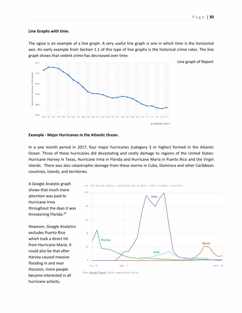
Line Graphs with time.
The ogive is an example of a line graph. A very useful line graph is one in which time is the horizontal
axis. An early example from Section 1.1 of this type of line graphs is the historical crime rates. The line
graph shows that violent crime has decreased over time.
Line graph of Report
Example ‐ Major Hurricanes in the Atlantic Ocean.
In a one month period in 2017, four major hurricanes (category 3 or higher) formed in the Atlantic
Ocean. Three of these hurricanes did devastating and costly damage to regions of the United States:
Hurricane Harvey in Texas, Hurricane Irma in Florida and Hurricane Maria in Puerto Rico and the Virgin
Islands. There was also catastrophic damage from these storms in Cuba, Dominica and other Caribbean
countries, islands, and territories.
A Google Analytic graph
shows that much more
attention was paid to
Hurricane Irma
throughout the days it was
threatening Florida.22
However, Google Analytics
excludes Puerto Rico
which took a direct hit
from Hurricane Maria. It
could also be that after
Harvey caused massive
flooding in and near
Houston, more people
became interested in all
hurricane activity.
P a g e | 31
2. Descriptive Statistics
In the prior section, methods of organizing data into tables and graphs were shown as a way of analyzing
the data. By observing graphs, we can describe the central tendency (center), the variability (spread),
shape (skewness) and unusual features (outliers) of the data. In this section, we will explore statistics
that can be calculated from the data and that can help describe and analyze the data.
2.1 Measures of Central Tendency
Let’s start this section with an example and a multiple choice question:
Example – pizza delivery
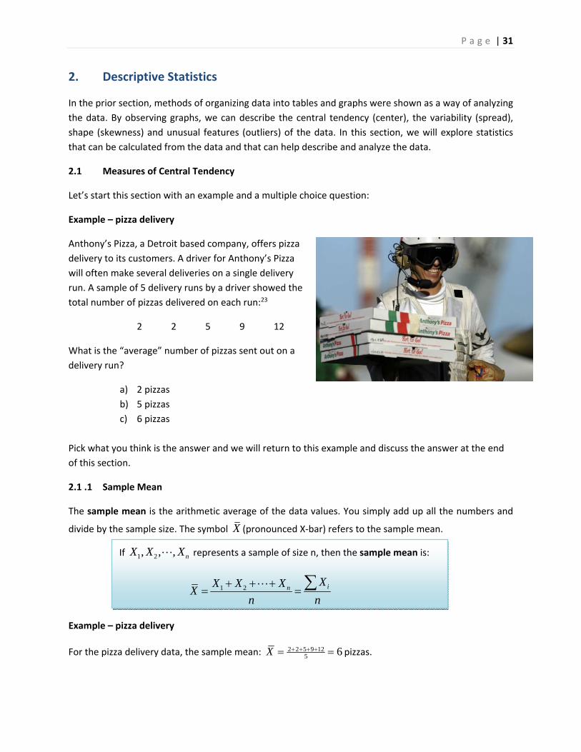
Anthony’s Pizza, a Detroit based company, offers pizza
delivery to its customers. A driver for Anthony’s Pizza
will often make several deliveries on a single delivery
run. A sample of 5 delivery runs by a driver showed the
total number of pizzas delivered on each run:23
2 2 5 9 12
What is the “average” number of pizzas sent out on a
delivery run?
a) 2 pizzas
b) 5 pizzas
c) 6 pizzas
Pick what you think is the answer and we will return to this example and discuss the answer at the end
of this section.
2.1 .1 Sample Mean
The sample mean is the arithmetic average of the data values. You simply add up all the numbers and
divide by the sample size. The symbol X (pronounced X‐bar) refers to the sample mean.
Example – pizza delivery
For the pizza delivery data, the sample mean: 2 2 5 9 125 6X pizzas.
If 1 2, , , nX X X represents a sample of size n, then the sample mean is:
1 2 inXX X X
Xn n
P a g e | 32
2.1 .2 Sample Median
The sample median is the value that represents the exact middle of data, when the values are sorted
from lowest to highest.
Example – pizza delivery
For the pizza delivery data {2, 2, 5, 9, 12} , the sample median is 5 pizzas (the middle value).
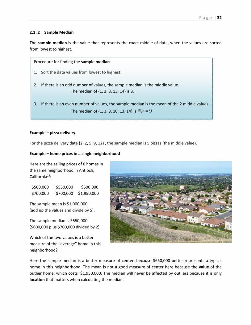
Example – home prices in a single neighborhood
Here are the selling prices of 6 homes in
the same neighborhood in Antioch,
California24:
$500,000 $550,000 $600,000
$700,000 $700,000 $1,950,000
The sample mean is $1,000,000
(add up the values and divide by 5).
The sample median is $650,000
($600,000 plus $700,000 divided by 2).
Which of the two values is a better
measure of the “average” home in this
neighborhood?
Here the sample median is a better measure of center, because $650,000 better represents a typical
home in this neighborhood. The mean is not a good measure of center here because the value of the
outlier home, which costs $1,950,000. The median will never be affected by outliers because it is only
location that matters when calculating the median.
Procedure for finding the sample median
1. Sort the data values from lowest to highest.
2. If there is an odd number of values, the sample median is the middle value.
The median of {1, 3, 8, 13, 14} is 8.
3. If there is an even number of values, the sample median is the mean of the 2 middle values
The median of {1, 3, 8, 10, 13, 14} is 8 102 9
P a g e | 33
Unlike the mean, the median (which is based on ranking instead of values), can be calculated for ordinal
categorical data, but not for nominal data.
Example – Grades in a math class.
In a community college algebra class, an instructor gave out the following grades to 40 students.
Determine the median grade for the course.
A C C B B B‐ A A+ B‐ A‐ C+ B‐ C A B‐ D F B+ B C+
C A‐ A‐ B A‐ B B+ B+ C+ F B‐ F A+ B+ F C B A‐ D B
The first step is to sort the grades from lowest to highest:
F F F F D D C C C C C C+ C+ C+ B‐ B‐ B‐ B‐ B‐ B
B B B B B B B+ B+ B+ B+ A‐ A‐ A‐ A‐ A‐ A A A A+ A+
The middle values are both B’s, so the median grade is B.
2.1.3 Sample mode
The sample mode is the most frequently occurring value in the data. If there are multiple values that
occur most frequently, then there are multiple modes in the data.
Example – pizza delivery
For the pizza delivery data {2, 2, 5, 9, 12} , the sample mode
is 2 pizzas because 2 occurs most frequently in the data.
Let's now return to the original question at the beginning of
this section.
What is the “average” number of pizzas sent out on a
delivery run?
a) 2 pizzas
b) 5 pizzas
c) 6 pizzas
Since 2 is the mode, 5 is the median and 6 is the mean, practically speaking all 3 answers are examples
of "averages". Lightbulb Books humorously calls these statistics "The Average Bears."25
Many (including some Statistics texts) will automatically assume that average is the same as mean. In
general life, people will use the terms mean and average interchangeably. But in Statistics, when we use
the word "average", we mean a value that represents the center of the data. There are many statistics
that represent the center of the data, including the mean, median and mode.
P a g e | 34
The mode can also be used for both nominal and ordinal categorical data.
Example – ordinal data ‐ Grades in a math class.
Let's return to this prior example and redisplay the grades sorted from low to high.
F F F F D D C C C C C C+ C+ C+ B‐ B‐ B‐ B‐ B‐ B
B B B B B B B+ B+ B+ B+ A‐ A‐ A‐ A‐ A‐ A A A A+ A+
In this example, we can see B occurs six times, more than any other grade. So "B" is the mode.
Example ‐ nominal data ‐ marital status
Let's return to the sample of 500 adults (aged 18 and over) from Santa Clara County taken from the year
2000 United States Census.
Marital Status Frequency
Married 270
Widowed 22
Divorced ‐ not remarried 42
Separated 10
Single ‐ never married 156
Total 500
The mode for this data is value with the highest frequency, "Married."
2.1.4 Using the mean and median to determine skewness
Skewness is a measure of how asymmetric the data vales are. Data can be positively skewed (stretched
to the right), negatively skewed (stretched to the left) or symmetric (no skewness). Let’s now explore
what effect skewness has on measures of center with several examples.
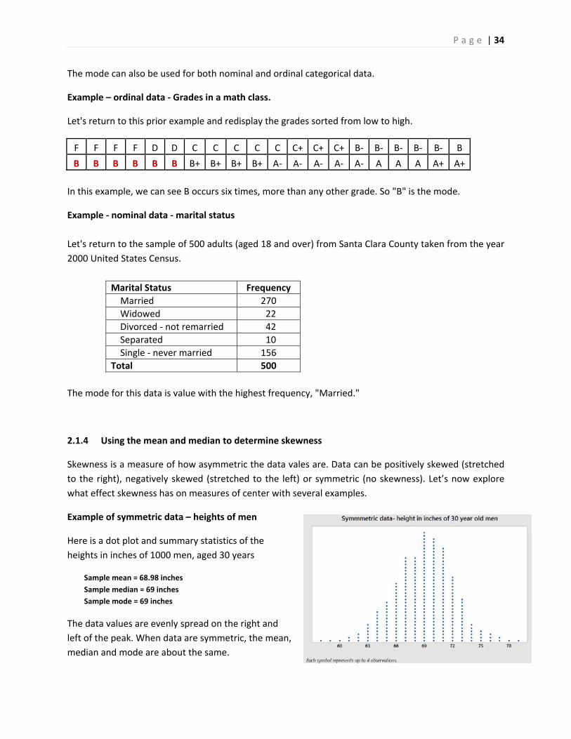
Example of symmetric data – heights of men
Here is a dot plot and summary statistics of the
heights in inches of 1000 men, aged 30 years
Sample mean = 68.98 inches
Sample median = 69 inches
Sample mode = 69 inches
The data values are evenly spread on the right and
left of the peak. When data are symmetric, the mean,
median and mode are about the same.
P a g e | 35
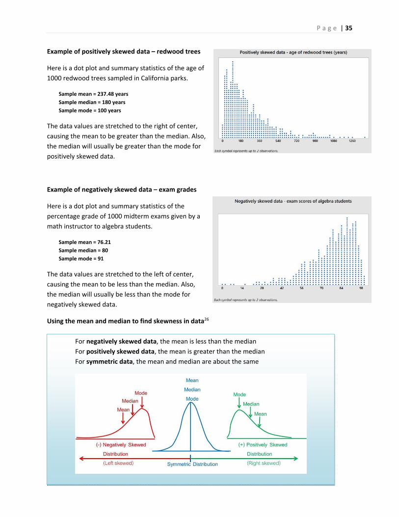
Example of positively skewed data – redwood trees
Here is a dot plot and summary statistics of the age of
1000 redwood trees sampled in California parks.
Sample mean = 237.48 years
Sample median = 180 years
Sample mode = 100 years
The data values are stretched to the right of center,
causing the mean to be greater than the median. Also,
the median will usually be greater than the mode for
positively skewed data.
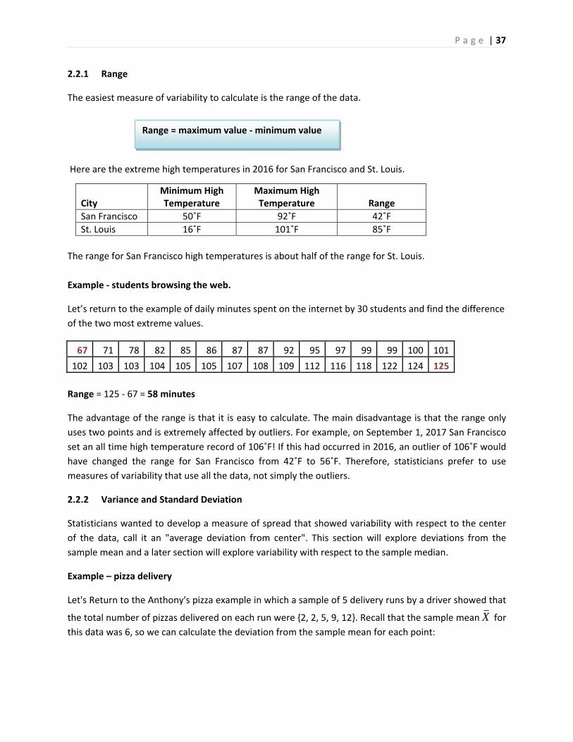
Example of negatively skewed data – exam grades
Here is a dot plot and summary statistics of the
percentage grade of 1000 midterm exams given by a
math instructor to algebra students.
Sample mean = 76.21
Sample median = 80
Sample mode = 91
The data values are stretched to the left of center,
causing the mean to be less than the median. Also,
the median will usually be less than the mode for
negatively skewed data.
Using the mean and median to find skewness in data26
For negatively skewed data, the mean is less than the median
For positively skewed data, the mean is greater than the median
For symmetric data, the mean and median are about the same

P a g e | 36
Example ‐ students browsing the web.
From a prior example, this stem and leaf graph represents how much
time 30 students spent on a web browser (on the Internet) in a 24 hour
period. Data is rounded to the nearest minute.
The sample median is 101.5 minutes, since the 15th observation is 101
and the 16th observation is 102.
Since the data is skewed negative, we would expect the sample mean
to be less than the sample median.
Adding up the values and dividing by 30, we calculate that the sample mean is 96.6 minutes, consistent
with data values that are negatively skewed.
Note that the mode is not helpful in this example since the sample size is small.
2.2 Measures of Variability
When analyzing data, it is also important to describe the spread or variability of the data.
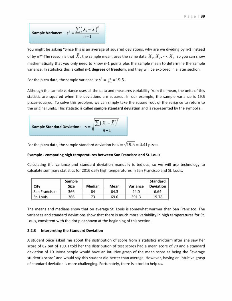
Example ‐ comparing high temperatures between San Francisco and St. Louis
Here are the daily high temperatures for every day in 2016 for the cities of San Francisco and St.
Louis.272829
Even though both cities seem to have approximately the same center, it’s obvious that the spread of
daily high temperatures in San Francisco is much lower than it is in St. Louis. San Francisco temperatures
are mostly mild all year long, while St. Louis has some very hot and very cold days. This section will
explore statistics that are used to measure variability in data.
P a g e | 37
2.2.1 Range
The easiest measure of variability to calculate is the range of the data.
Here are the extreme high temperatures in 2016 for San Francisco and St. Louis.
The range for San Francisco high temperatures is about half of the range for St. Louis.
Example ‐ students browsing the web.
Let’s return to the example of daily minutes spent on the internet by 30 students and find the difference
of the two most extreme values.
67 71 78 82 85 86 87 87 92 95 97 99 99 100 101
102 103 103 104 105 105 107 108 109 112 116 118 122 124 125
Range = 125 ‐ 67 = 58 minutes
The advantage of the range is that it is easy to calculate. The main disadvantage is that the range only
uses two points and is extremely affected by outliers. For example, on September 1, 2017 San Francisco
set an all time high temperature record of 106˚F! If this had occurred in 2016, an outlier of 106˚F would
have changed the range for San Francisco from 42˚F to 56˚F. Therefore, statisticians prefer to use
measures of variability that use all the data, not simply the outliers.
2.2.2 Variance and Standard Deviation
Statisticians wanted to develop a measure of spread that showed variability with respect to the center
of the data, call it an "average deviation from center". This section will explore deviations from the
sample mean and a later section will explore variability with respect to the sample median.
Example – pizza delivery
Let's Return to the Anthony's pizza example in which a sample of 5 delivery runs by a driver showed that
the total number of pizzas delivered on each run were {2, 2, 5, 9, 12}. Recall that the sample mean X for
this data was 6, so we can calculate the deviation from the sample mean for each point:
City
Minimum High Temperature
Maximum High Temperature
Range
San Francisco 50˚F 92˚F 42˚F
St. Louis 16˚F 101˚F 85˚F
Range = maximum value ‐ minimum value
P a g e | 38
Record number i
Pizzas delivered
iX
Deviation from mean
iX X
1 2 2 6 4
2 2 2 6 4
3 5 5 6 1
4 9 9 6 3
5 12 12 6 6
Totals 0
The sum of deviations from the mean will always equal zero, so we need a way to calculate an "average"
deviation from the mean. Statisticians realized the sign of the deviation doesn't really matter so they
explored statistics such as the absolute value of the deviation from the mean:
Record number
i
Pizzas delivered
iX
Deviation from mean
iX X
Absolute value of Deviation from mean
iX X
1 2 2 6 4 4
2 2 2 6 4 4
3 5 5 6 1 1
4 9 9 6 3 3
5 12 12 6 6 6
Totals 0 18
Dividing by the sample size, we can find the "average absolute deviation from the mean" to be
18/5 = 3.6 pizzas. For reasons that will be explained in a later section, this measure was not found to be
ideal.
Another method of eliminating negative signs from data is to square the numbers, since any negative
numbers raised to an even power will become positive.
Record number
i
Pizzas delivered
iX
Deviation from mean
iX X
Squared Deviation from the mean
2
iX X
1 2 2 6 4 16
2 2 2 6 4 16
3 5 5 6 1 1
4 9 9 6 3 9
5 12 12 6 6 36
Totals 0 78
The quantity 278iX X is called the sum of squared deviations from the mean. To calculate an
"average" square deviation, it is best for the sum of squared deviations to be divided by n‐1 instead of
by n (n is the sample size). This statistic is called the sample variance and referred to by the symbol s2.
P a g e | 39
You might be asking “Since this is an average of squared deviations, why are we dividing by n‐1 instead
of by n?” The reason is that X , the sample mean, uses the same data 1 2, , , nX X X so you can show
mathematically that you only need to know n‐1 points plus the sample mean to determine the sample
variance. In statistics this is called n‐1 degrees of freedom, and they will be explored in a later section.
For the pizza data, the sample variance is: 2 785 1 19.5s .
Although the sample variance uses all the data and measures variability from the mean, the units of this
statistic are squared when the deviations are squared. In our example, the sample variance is 19.5
pizzas‐squared. To solve this problem, we can simply take the square root of the variance to return to
the original units. This statistic is called sample standard deviation and is represented by the symbol s.
For the pizza data, the sample standard deviation is: 19.5 4.41s pizzas.
Example ‐ comparing high temperatures between San Francisco and St. Louis
Calculating the variance and standard deviation manually is tedious, so we will use technology to
calculate summary statistics for 2016 daily high temperatures in San Francisco and St. Louis.
The means and medians show that on average St. Louis is somewhat warmer than San Francisco. The
variances and standard deviations show that there is much more variability in high temperatures for St.
Louis, consistent with the dot plot shown at the beginning of this section.
2.2.3 Interpreting the Standard Deviation
A student once asked me about the distribution of score from a statistics midterm after she saw her
score of 82 out of 100. I told her the distribution of test scores had a mean score of 70 and a standard
deviation of 10. Most people would have an intuitive grasp of the mean score as being the “average
student’s score” and would say this student did better than average. However, having an intuitive grasp
of standard deviation is more challenging. Fortunately, there is a tool to help us.
City
Sample Size
Median
Mean
Variance
Standard Deviation
San Francisco 366 64 64.3 44.0 6.64
St. Louis 366 73 69.6 391.3 19.78
Sample Variance: 2
2
1iX X
sn
Sample Standard Deviation: 2
1iX X
sn
P a g e | 40
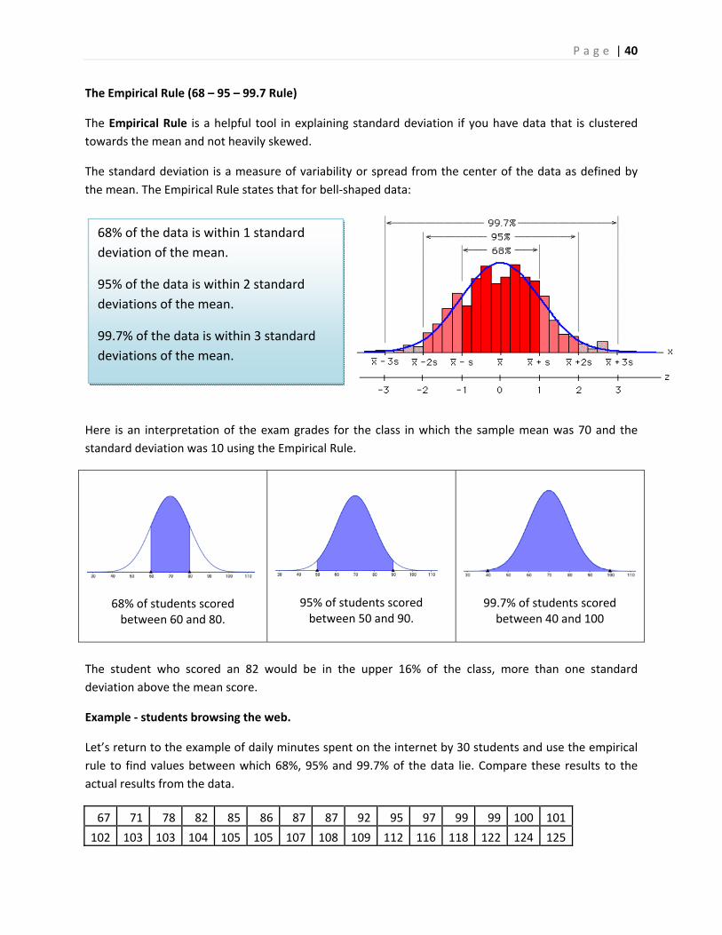
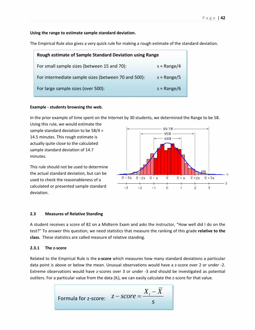
The Empirical Rule (68 – 95 – 99.7 Rule)
The Empirical Rule is a helpful tool in explaining standard deviation if you have data that is clustered
towards the mean and not heavily skewed.
The standard deviation is a measure of variability or spread from the center of the data as defined by
the mean. The Empirical Rule states that for bell‐shaped data:
Here is an interpretation of the exam grades for the class in which the sample mean was 70 and the
standard deviation was 10 using the Empirical Rule.
68% of students scored between 60 and 80.
95% of students scored between 50 and 90.
99.7% of students scored between 40 and 100
The student who scored an 82 would be in the upper 16% of the class, more than one standard
deviation above the mean score.
Example ‐ students browsing the web.
Let’s return to the example of daily minutes spent on the internet by 30 students and use the empirical
rule to find values between which 68%, 95% and 99.7% of the data lie. Compare these results to the
actual results from the data.
67 71 78 82 85 86 87 87 92 95 97 99 99 100 101
102 103 103 104 105 105 107 108 109 112 116 118 122 124 125
68% of the data is within 1 standard
deviation of the mean.
95% of the data is within 2 standard
deviations of the mean.
99.7% of the data is within 3 standard
deviations of the mean.
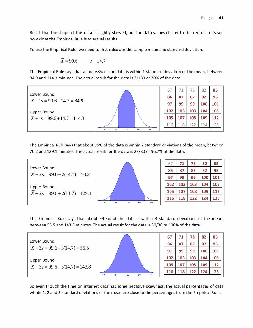
P a g e | 41
Recall that the shape of this data is slightly skewed, but the data values cluster to the center. Let’s see
how close the Empirical Rule is to actual results.
To use the Empirical Rule, we need to first calculate the sample mean and standard deviation.
99.6X 14.7s
The Empirical Rule says that about 68% of the data is within 1 standard deviation of the mean, between
84.9 and 114.3 minutes. The actual result for the data is 21/30 or 70% of the data.
Lower Bound:
1 99.6 14.7 84.9X s Upper Bound
1 99.6 14.7 114.3X s
67 71 78 82 85
86 87 87 92 95
97 99 99 100 101
102 103 103 104 105
105 107 108 109 112
116 118 122 124 125
The Empirical Rule says that about 95% of the data is within 2 standard deviations of the mean, between
70.2 and 129.1 minutes. The actual result for the data is 29/30 or 96.7% of the data.
Lower Bound:
2 99.6 2(14.7) 70.2X s Upper Bound
2 99.6 2(14.7) 129.1X s
67 71 78 82 85
86 87 87 92 95
97 99 99 100 101
102 103 103 104 105
105 107 108 109 112
116 118 122 124 125
The Empirical Rule says that about 99.7% of the data is within 3 standard deviations of the mean,
between 55.5 and 143.8 minutes. The actual result for the data is 30/30 or 100% of the data.
Lower Bound:
3 99.6 3(14.7) 55.5X s Upper Bound
3 99.6 3(14.7) 143.8X s
67 71 78 82 85
86 87 87 92 95
97 99 99 100 101
102 103 103 104 105
105 107 108 109 112
116 118 122 124 125
So even though the time on internet data has some negative skewness, the actual percentages of data
within 1, 2 and 3 standard deviations of the mean are close to the percentages from the Empirical Rule.
P a g e | 42
Using the range to estimate sample standard deviation.
The Empirical Rule also gives a very quick rule for making a rough estimate of the standard deviation.
Example ‐ students browsing the web.
In the prior example of time spent on the Internet by 30 students, we determined the Range to be 58.
Using this rule, we would estimate the
sample standard deviation to be 58/4 =
14.5 minutes. This rough estimate is
actually quite close to the calculated
sample standard deviation of 14.7
minutes.
This rule should not be used to determine
the actual standard deviation, but can be
used to check the reasonableness of a
calculated or presented sample standard
deviation.
2.3 Measures of Relative Standing
A student receives a score of 82 on a Midterm Exam and asks the instructor, “How well did I do on the
test?” To answer this question, we need statistics that measure the ranking of this grade relative to the
class. These statistics are called measure of relative standing.
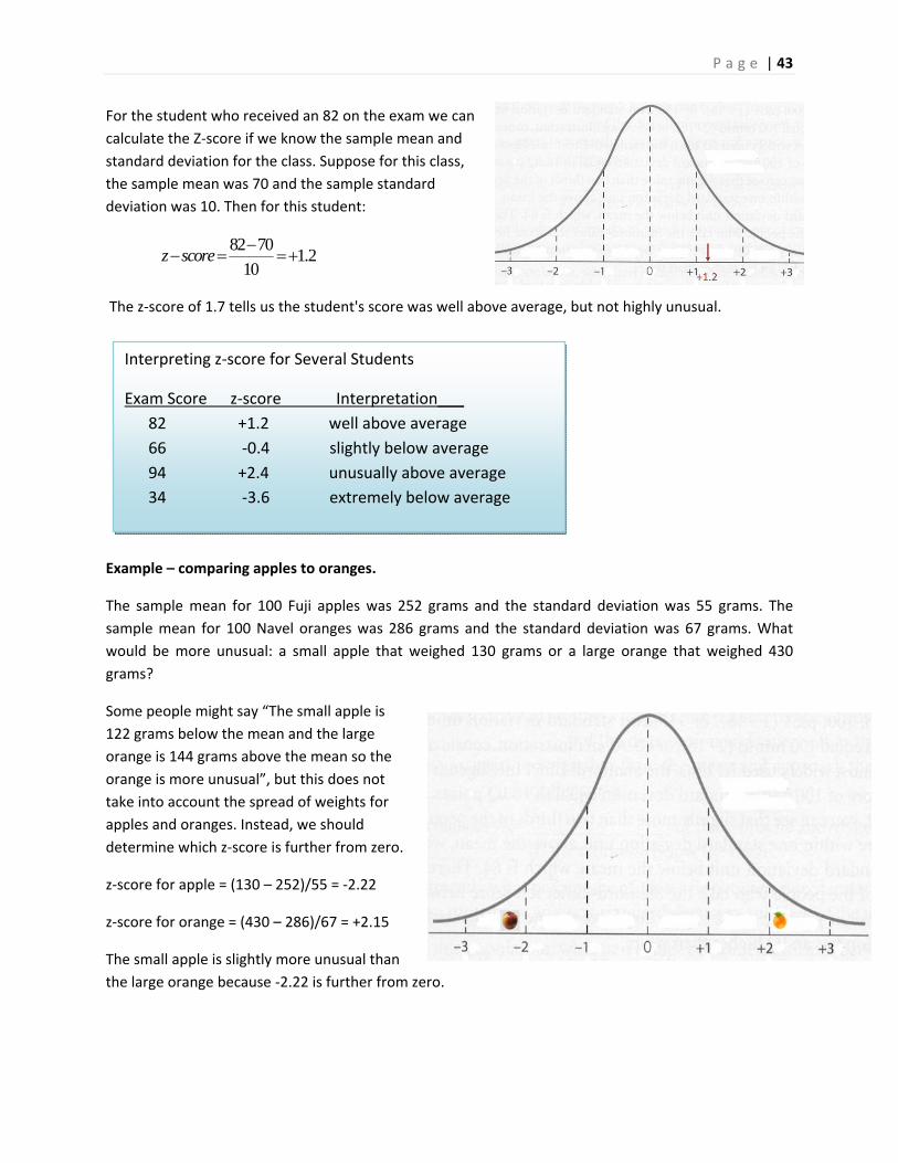
2.3.1 The z‐score
Related to the Empirical Rule is the z‐score which measures how many standard deviations a particular
data point is above or below the mean. Unusual observations would have a z‐score over 2 or under ‐2.
Extreme observations would have z‐scores over 3 or under ‐3 and should be investigated as potential
outliers. For a particular value from the data (Xi), we can easily calculate the z‐score for that value.
Rough estimate of Sample Standard Deviation using Range
For small sample sizes (between 15 and 70): s ≈ Range/4
For intermediate sample sizes (between 70 and 500): s ≈ Range/5
For large sample sizes (over 500): s ≈ Range/6
Formula for z‐score: iX X
z scores
P a g e | 43
For the student who received an 82 on the exam we can
calculate the Z‐score if we know the sample mean and
standard deviation for the class. Suppose for this class,
the sample mean was 70 and the sample standard
deviation was 10. Then for this student:
82 701.2
10z score
The z‐score of 1.7 tells us the student's score was well above average, but not highly unusual.
Example – comparing apples to oranges.
The sample mean for 100 Fuji apples was 252 grams and the standard deviation was 55 grams. The
sample mean for 100 Navel oranges was 286 grams and the standard deviation was 67 grams. What
would be more unusual: a small apple that weighed 130 grams or a large orange that weighed 430
grams?
Some people might say “The small apple is
122 grams below the mean and the large
orange is 144 grams above the mean so the
orange is more unusual”, but this does not
take into account the spread of weights for
apples and oranges. Instead, we should
determine which z‐score is further from zero.
z‐score for apple = (130 – 252)/55 = ‐2.22
z‐score for orange = (430 – 286)/67 = +2.15
The small apple is slightly more unusual than
the large orange because ‐2.22 is further from zero.
Interpreting z‐score for Several Students
Exam Score z‐score Interpretation___
82 +1.2 well above average
66 ‐0.4 slightly below average
94 +2.4 unusually above average
34 ‐3.6 extremely below average
P a g e | 44
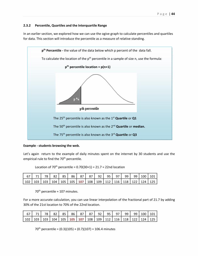
2.3.2 Percentile, Quartiles and the Interquartile Range
In an earlier section, we explored how we can use the ogive graph to calculate percentiles and quartiles
for data. This section will introduce the percentile as a measure of relative standing.
Example ‐ students browsing the web.
Let’s again return to the example of daily minutes spent on the internet by 30 students and use the
empirical rule to find the 70th percentile.
Location of 70th percentile = 0.70(30+1) = 21.7 ≈ 22nd location
67 71 78 82 85 86 87 87 92 95 97 99 99 100 101
102 103 103 104 105 105 107 108 109 112 116 118 122 124 125
70th percentile ≈ 107 minutes.
For a more accurate calculation, you can use linear interpolation of the fractional part of 21.7 by adding
30% of the 21st location to 70% of the 22nd location.
67 71 78 82 85 86 87 87 92 95 97 99 99 100 101
102 103 103 104 105 105 107 108 109 112 116 118 122 124 125
70th percentile = (0.3)(105) + (0.7)(107) = 106.4 minutes
pth Percentile ‐ the value of the data below which p percent of the data fall.
To calculate the location of the pth percentile in a sample of size n, use the formula:
pth percentile location = p(n+1)
The 25th percentile is also known as the 1st Quartile or Q1
The 50th percentile is also known as the 2nd Quartile or median.
The 75th percentile is also known as the 3rd Quartile or Q3
P a g e | 45
There is an alternative method to find the quartiles of data.
1. Find the median (2nd quartile). The median divides the data in half.
2. Q1 (1st quartile) will be the median of the first half of the data
3. Q3 (3rd quartile) will be the median of the second half of the data.
Example ‐ students browsing the web.
Find the three quartiles for this data.
Median = (101 +102)/2 = 101.5
67 71 78 82 85 86 87 87 92 95 97 99 99 100 101
102 103 103 104 105 105 107 108 109 112 116 118 122 124 125
Q1 = 1st quartile = 87
67 71 78 82 85 86 87 87 92 95 97 99 99 100 101
Q3 = 3rd quartile = 108
102 103 103 104 105 105 107 108 109 112 116 118 122 124 125
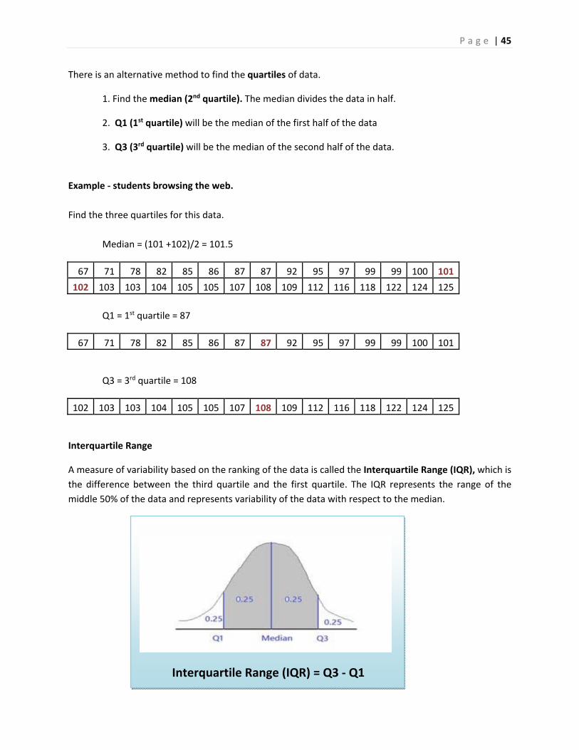
Interquartile Range
A measure of variability based on the ranking of the data is called the Interquartile Range (IQR), which is
the difference between the third quartile and the first quartile. The IQR represents the range of the
middle 50% of the data and represents variability of the data with respect to the median.
Interquartile Range (IQR) = Q3 ‐ Q1
P a g e | 46
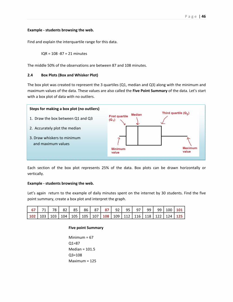
Steps for making a box plot (no outliers)
1. Draw the box between Q1 and Q3
2. Accurately plot the median
3. Draw whiskers to minimum
and maximum values
Example ‐ students browsing the web.
Find and explain the interquartile range for this data.
IQR = 108 ‐87 = 21 minutes
The middle 50% of the observations are between 87 and 108 minutes.
2.4 Box Plots (Box and Whisker Plot)
The box plot was created to represent the 3 quartiles (Q1, median and Q3) along with the minimum and
maximum values of the data. These values are also called the Five Point Summary of the data. Let's start
with a box plot of data with no outliers.
Each section of the box plot represents 25% of the data. Box plots can be drawn horizontally or
vertically.
Example ‐ students browsing the web.
Let’s again return to the example of daily minutes spent on the internet by 30 students. Find the five
point summary, create a box plot and interpret the graph.
67 71 78 82 85 86 87 87 92 95 97 99 99 100 101
102 103 103 104 105 105 107 108 109 112 116 118 122 124 125
Five point Summary
Minimum = 67
Q1=87
Median = 101.5
Q3=108
Maximum = 125
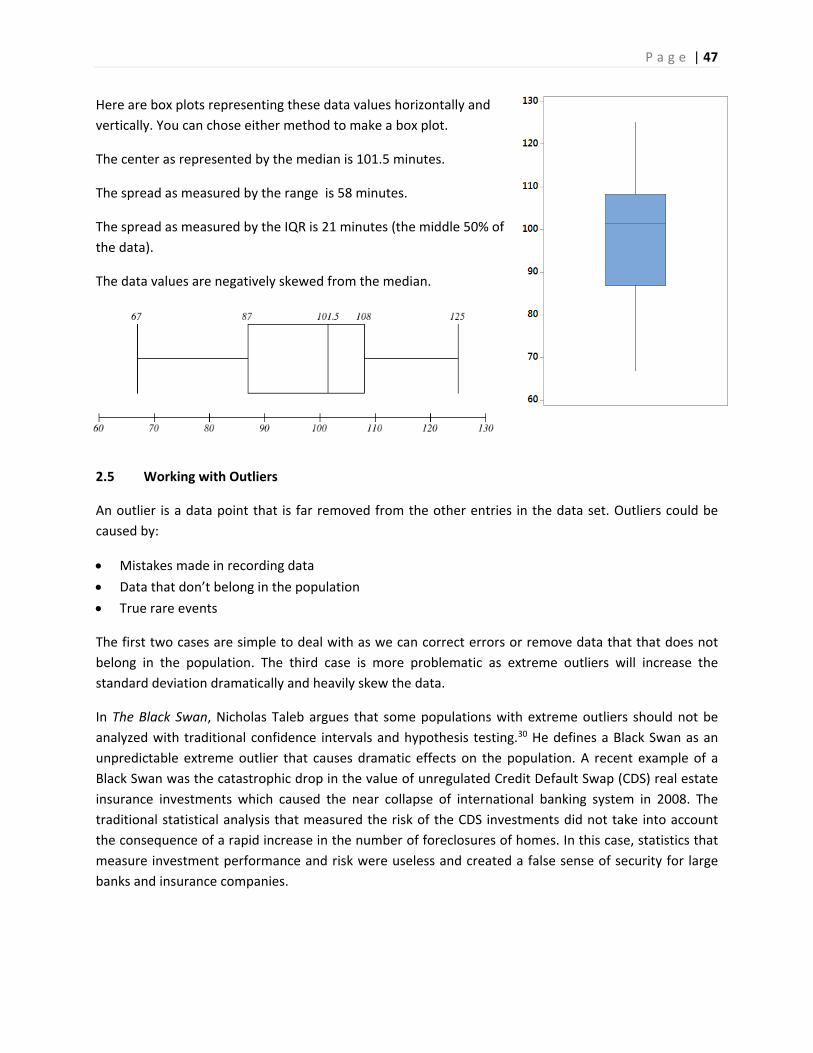
P a g e | 47
Here are box plots representing these data values horizontally and
vertically. You can chose either method to make a box plot.
The center as represented by the median is 101.5 minutes.
The spread as measured by the range is 58 minutes.
The spread as measured by the IQR is 21 minutes (the middle 50% of
the data).
The data values are negatively skewed from the median.
2.5 Working with Outliers
An outlier is a data point that is far removed from the other entries in the data set. Outliers could be
caused by:
Mistakes made in recording data
Data that don’t belong in the population
True rare events
The first two cases are simple to deal with as we can correct errors or remove data that that does not
belong in the population. The third case is more problematic as extreme outliers will increase the
standard deviation dramatically and heavily skew the data.
In The Black Swan, Nicholas Taleb argues that some populations with extreme outliers should not be
analyzed with traditional confidence intervals and hypothesis testing.30 He defines a Black Swan as an
unpredictable extreme outlier that causes dramatic effects on the population. A recent example of a
Black Swan was the catastrophic drop in the value of unregulated Credit Default Swap (CDS) real estate
insurance investments which caused the near collapse of international banking system in 2008. The
traditional statistical analysis that measured the risk of the CDS investments did not take into account
the consequence of a rapid increase in the number of foreclosures of homes. In this case, statistics that
measure investment performance and risk were useless and created a false sense of security for large
banks and insurance companies.
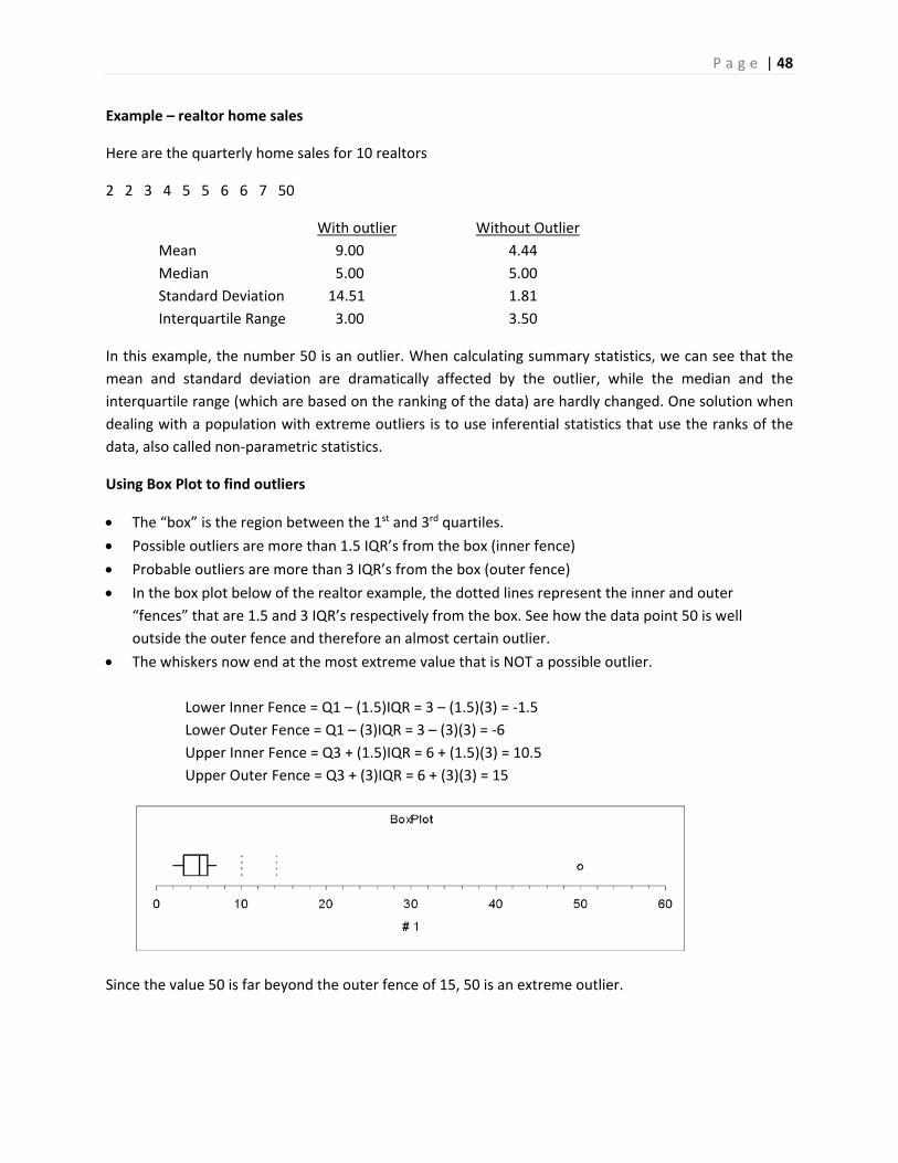
P a g e | 48
Example – realtor home sales
Here are the quarterly home sales for 10 realtors
2 2 3 4 5 5 6 6 7 50
With outlier Without Outlier
Mean 9.00 4.44
Median 5.00 5.00
Standard Deviation 14.51 1.81
Interquartile Range 3.00 3.50
In this example, the number 50 is an outlier. When calculating summary statistics, we can see that the
mean and standard deviation are dramatically affected by the outlier, while the median and the
interquartile range (which are based on the ranking of the data) are hardly changed. One solution when
dealing with a population with extreme outliers is to use inferential statistics that use the ranks of the
data, also called non‐parametric statistics.
Using Box Plot to find outliers
The “box” is the region between the 1st and 3rd quartiles.
Possible outliers are more than 1.5 IQR’s from the box (inner fence)
Probable outliers are more than 3 IQR’s from the box (outer fence)
In the box plot below of the realtor example, the dotted lines represent the inner and outer
“fences” that are 1.5 and 3 IQR’s respectively from the box. See how the data point 50 is well
outside the outer fence and therefore an almost certain outlier.
The whiskers now end at the most extreme value that is NOT a possible outlier.
Lower Inner Fence = Q1 – (1.5)IQR = 3 – (1.5)(3) = ‐1.5
Lower Outer Fence = Q1 – (3)IQR = 3 – (3)(3) = ‐6
Upper Inner Fence = Q3 + (1.5)IQR = 6 + (1.5)(3) = 10.5
Upper Outer Fence = Q3 + (3)IQR = 6 + (3)(3) = 15
Since the value 50 is far beyond the outer fence of 15, 50 is an extreme outlier.
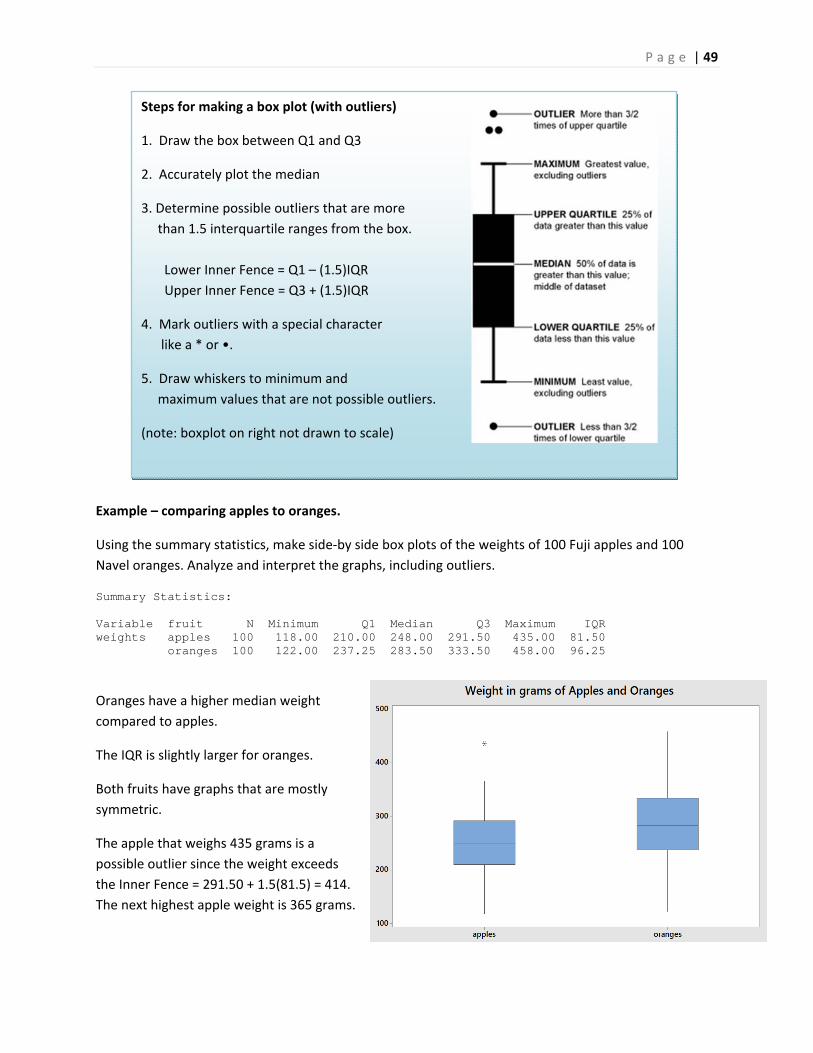
P a g e | 49
Steps for making a box plot (with outliers)
1. Draw the box between Q1 and Q3
2. Accurately plot the median
3. Determine possible outliers that are more
than 1.5 interquartile ranges from the box.
Lower Inner Fence = Q1 – (1.5)IQR
Upper Inner Fence = Q3 + (1.5)IQR
4. Mark outliers with a special character
like a * or •.
5. Draw whiskers to minimum and
maximum values that are not possible outliers.
(note: boxplot on right not drawn to scale)
Example – comparing apples to oranges.
Using the summary statistics, make side‐by side box plots of the weights of 100 Fuji apples and 100
Navel oranges. Analyze and interpret the graphs, including outliers.
Summary Statistics: Variable fruit N Minimum Q1 Median Q3 Maximum IQR weights apples 100 118.00 210.00 248.00 291.50 435.00 81.50 oranges 100 122.00 237.25 283.50 333.50 458.00 96.25
Oranges have a higher median weight
compared to apples.
The IQR is slightly larger for oranges.
Both fruits have graphs that are mostly
symmetric.
The apple that weighs 435 grams is a
possible outlier since the weight exceeds
the Inner Fence = 291.50 + 1.5(81.5) = 414.
The next highest apple weight is 365 grams.
P a g e | 50
Procedure for using z‐score to find outliers
1. Calculate the sample mean and standard deviation without the suspected outlier.
2. Calculate the Z‐score of the suspected outlier: iX Xz score
s
3. If the Z‐score is more than 3 or less than ‐3, that data point is a probable outlier.
Using the z‐score to find outliers
The z‐score can also be used to find outliers, but care must be taken since the mean and standard
deviation are affected by outliers. One strategy is to remove the outlier before calculating these
statistics.
Example – realtor home sales
Determine if 50 is an outlier.
Determine the sample mean and standard deviation excluding the value 50.
4.44X 1.81s
Determine the z‐score for 50.
Since 25.2 is much greater than 3, the value 50 is an extreme outlier.
Outliers, what to do?
There is no clear answer what to do about legitimate outliers. Do we remove them or leave them in?
For some populations, outliers don’t dramatically change the overall statistical analysis. Example: the
tallest person in the world will not dramatically change the mean height of 10000 people.
However, for some populations, a single outlier will have a dramatic effect on statistical analysis (called
“Black Swan” by Nicholas Taleb31), and inferential statistics may be invalid in analyzing these
populations. Example: the richest person in the world will dramatically change the mean wealth of
10000 people.
50 4.425.2
1.81z score
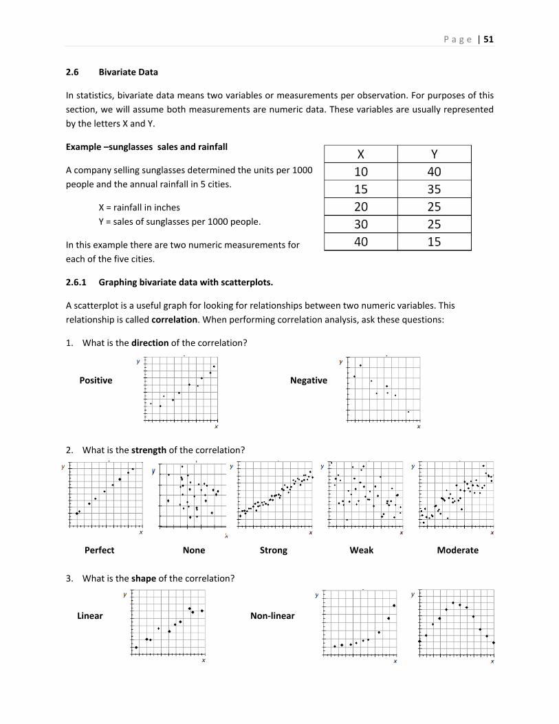
P a g e | 51
2.6 Bivariate Data
In statistics, bivariate data means two variables or measurements per observation. For purposes of this
section, we will assume both measurements are numeric data. These variables are usually represented
by the letters X and Y.
Example –sunglasses sales and rainfall
A company selling sunglasses determined the units per 1000
people and the annual rainfall in 5 cities.
X = rainfall in inches
Y = sales of sunglasses per 1000 people.
In this example there are two numeric measurements for
each of the five cities.
2.6.1 Graphing bivariate data with scatterplots.
A scatterplot is a useful graph for looking for relationships between two numeric variables. This
relationship is called correlation. When performing correlation analysis, ask these questions:
1. What is the direction of the correlation?
Positive Negative
2. What is the strength of the correlation?
Perfect None Strong Weak Moderate
3. What is the shape of the correlation?
Linear Non‐linear
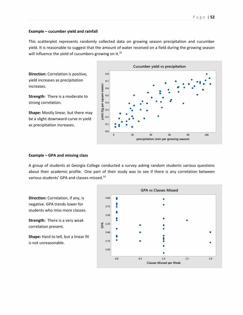
P a g e | 52
100806040200
0.8
0.7
0.6
0.5
0.4
0.3
0.2
0.1
0.0
precipitation (mm per growing season)
yiel
d (k
g pe
r squ
are
met
er)
Cucumber yield vs precipitation
2.01.51.00.50.0
4.00
3.75
3.50
3.25
3.00
2.75
2.50
Classes Missed per Week
GPA
GPA vs Classes Missed
Example – cucumber yield and rainfall
This scatterplot represents randomly collected data on growing season precipitation and cucumber
yield. It is reasonable to suggest that the amount of water received on a field during the growing season
will influence the yield of cucumbers growing on it.32
Direction: Correlation is positive,
yield increases as precipitation
increases.
Strength: There is a moderate to
strong correlation.
Shape: Mostly linear, but there may
be a slight downward curve in yield
as precipitation increases.
Example – GPA and missing class
A group of students at Georgia College conducted a survey asking random students various questions
about their academic profile. One part of their study was to see if there is any correlation between
various students’ GPA and classes missed.33
Direction: Correlation, if any, is
negative. GPA trends lower for
students who miss more classes.
Strength: There is a very weak
correlation present.
Shape: Hard to tell, but a linear fit
is not unreasonable.
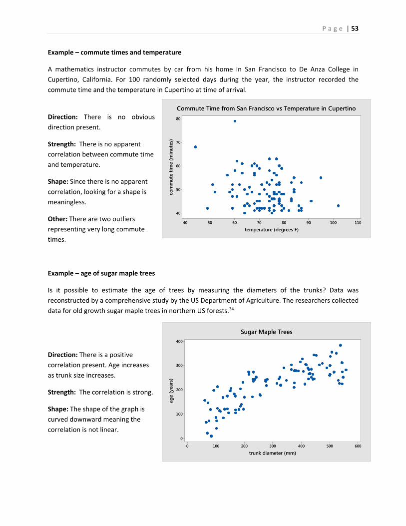
P a g e | 53
6005004003002001000
400
300
200
100
0
trunk diameter (mm)
age
(yea
rs)
Sugar Maple Trees
110100908070605040
80
70
60
50
40
temperature (degrees F)
com
mut
e tim
e (m
inut
es)
Commute Time from San Francisco vs Temperature in Cupertino
Example – commute times and temperature
A mathematics instructor commutes by car from his home in San Francisco to De Anza College in
Cupertino, California. For 100 randomly selected days during the year, the instructor recorded the
commute time and the temperature in Cupertino at time of arrival.
Direction: There is no obvious
direction present.
Strength: There is no apparent
correlation between commute time
and temperature.
Shape: Since there is no apparent
correlation, looking for a shape is
meaningless.
Other: There are two outliers
representing very long commute
times.
Example – age of sugar maple trees
Is it possible to estimate the age of trees by measuring the diameters of the trunks? Data was
reconstructed by a comprehensive study by the US Department of Agriculture. The researchers collected
data for old growth sugar maple trees in northern US forests.34
Direction: There is a positive
correlation present. Age increases
as trunk size increases.
Strength: The correlation is strong.
Shape: The shape of the graph is
curved downward meaning the
correlation is not linear.
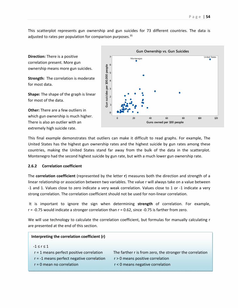
P a g e | 54
120100806040200
7
6
5
4
3
2
1
0
Guns owned per 100 people
Gun
sui
cide
s pe
r 100
,000
peo
ple
United StatesMontenegro
Gun Ownership vs. Gun Suicides
Interpreting the correlation coefficient (r)
‐1 ≤ r ≤ 1
r = 1 means perfect positive correlation The farther r is from zero, the stronger the correlation
r = ‐1 means perfect negative correlation r > 0 means positive correlation
r = 0 mean no correlation r < 0 means negative correlation
This scatterplot represents gun ownership and gun suicides for 73 different countries. The data is
adjusted to rates per population for comparison purposes.35
Direction: There is a positive
correlation present. More gun
ownership means more gun suicides.
Strength: The correlation is moderate
for most data.
Shape: The shape of the graph is linear
for most of the data.
Other: There are a few outliers in
which gun ownership is much higher.
There is also an outlier with an
extremely high suicide rate.
This final example demonstrates that outliers can make it difficult to read graphs. For example, The
United States has the highest gun ownership rates and the highest suicide by gun rates among these
countries, making the United States stand far away from the bulk of the data in the scatterplot.
Montenegro had the second highest suicide by gun rate, but with a much lower gun ownership rate.
2.6.2 Correlation coefficient
The correlation coefficient (represented by the letter r) measures both the direction and strength of a
linear relationship or association between two variables. The value r will always take on a value between
‐1 and 1. Values close to zero indicate a very weak correlation. Values close to 1 or ‐1 indicate a very
strong correlation. The correlation coefficient should not be used for non‐linear correlation.
It is important to ignore the sign when determining strength of correlation. For example,
r = ‐0.75 would indicate a stronger correlation than r = 0.62, since ‐0.75 is farther from zero.
We will use technology to calculate the correlation coefficient, but formulas for manually calculating r
are presented at the end of this section.
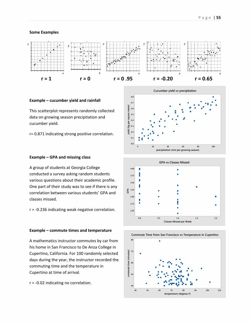
P a g e | 55
100806040200
0.8
0.7
0.6
0.5
0.4
0.3
0.2
0.1
0.0
precipitation (mm per growing season)
yiel
d (k
g pe
r squ
are
met
er)
Cucumber yield vs precipitation
2.01.51.00.50.0
4.00
3.75
3.50
3.25
3.00
2.75
2.50
Classes Missed per Week
GPA
GPA vs Classes Missed
110100908070605040
80
70
60
50
40
temperature (degrees F)
com
mut
e tim
e (m
inut
es)
Commute Time from San Francisco vs Temperature in Cupertino
Some Examples
r = 1 r = 0 r = 0 .95 r = ‐0.20 r = 0.65
Example – cucumber yield and rainfall
This scatterplot represents randomly collected
data on growing season precipitation and
cucumber yield.
r= 0.871 indicating strong positive correlation.
Example – GPA and missing class
A group of students at Georgia College
conducted a survey asking random students
various questions about their academic profile.
One part of their study was to see if there is any
correlation between various students’ GPA and
classes missed.
r = ‐0.236 indicating weak negative correlation.
Example – commute times and temperature
A mathematics instructor commutes by car from
his home in San Francisco to De Anza College in
Cupertino, California. For 100 randomly selected
days during the year, the instructor recorded the
commuting time and the temperature in
Cupertino at time of arrival.
r = ‐0.02 indicating no correlation.
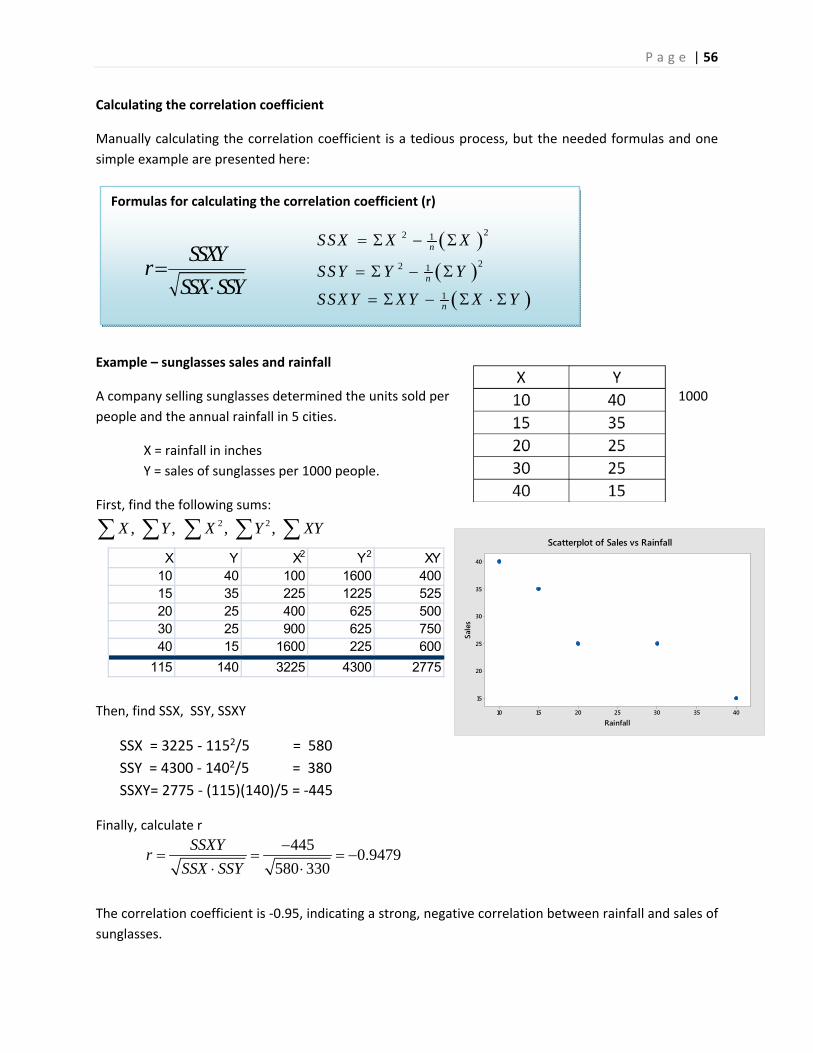
P a g e | 56
Formulas for calculating the correlation coefficient (r)
40353025201510
40
35
30
25
20
15
Rainfall
Sale
s
Scatterplot of Sales vs Rainfall
Calculating the correlation coefficient
Manually calculating the correlation coefficient is a tedious process, but the needed formulas and one
simple example are presented here:
Example – sunglasses sales and rainfall
A company selling sunglasses determined the units sold per 1000
people and the annual rainfall in 5 cities.
X = rainfall in inches
Y = sales of sunglasses per 1000 people.
First, find the following sums: 2 2, , , ,X Y X Y XY
Then, find SSX, SSY, SSXY
SSX = 3225 ‐ 1152/5 = 580
SSY = 4300 ‐ 1402/5 = 380
SSXY= 2775 ‐ (115)(140)/5 = ‐445
Finally, calculate r
The correlation coefficient is ‐0.95, indicating a strong, negative correlation between rainfall and sales of
sunglasses.
SSXYr
SSX SSY
22 1
22 1
1
n
n
n
SSX X X
SSY Y Y
SSX Y X Y X Y
X Y X2 Y2 XY10 40 100 1600 40015 35 225 1225 52520 25 400 625 50030 25 900 625 75040 15 1600 225 600
115 140 3225 4300 2775
4450.9479
580 330
SSXYr
SSX SSY
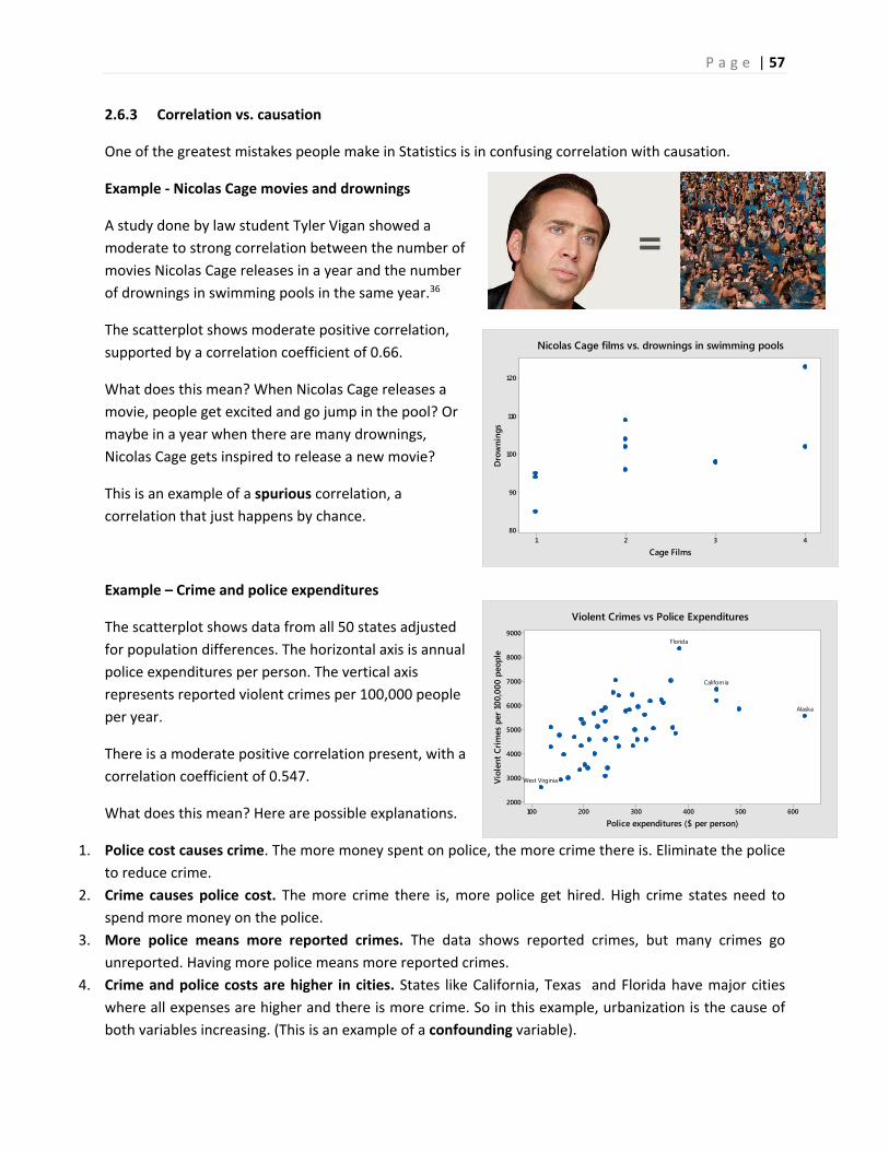
P a g e | 57
4321
120
110
100
90
80
Cage Films
Dro
wni
ngs
Nicolas Cage films vs. drownings in swimming pools
600500400300200100
9000
8000
7000
6000
5000
4000
3000
2000
Police expenditures ($ per person)
Viol
ent C
rimes
per
100
,000
peo
ple
West Virginia
Alaska
California
Florida
Violent Crimes vs Police Expenditures
2.6.3 Correlation vs. causation
One of the greatest mistakes people make in Statistics is in confusing correlation with causation.
Example ‐ Nicolas Cage movies and drownings
A study done by law student Tyler Vigan showed a
moderate to strong correlation between the number of
movies Nicolas Cage releases in a year and the number
of drownings in swimming pools in the same year.36
The scatterplot shows moderate positive correlation,
supported by a correlation coefficient of 0.66.
What does this mean? When Nicolas Cage releases a
movie, people get excited and go jump in the pool? Or
maybe in a year when there are many drownings,
Nicolas Cage gets inspired to release a new movie?
This is an example of a spurious correlation, a
correlation that just happens by chance.
Example – Crime and police expenditures
The scatterplot shows data from all 50 states adjusted
for population differences. The horizontal axis is annual
police expenditures per person. The vertical axis
represents reported violent crimes per 100,000 people
per year.
There is a moderate positive correlation present, with a
correlation coefficient of 0.547.
What does this mean? Here are possible explanations.
1. Police cost causes crime. The more money spent on police, the more crime there is. Eliminate the police
to reduce crime.
2. Crime causes police cost. The more crime there is, more police get hired. High crime states need to
spend more money on the police.
3. More police means more reported crimes. The data shows reported crimes, but many crimes go
unreported. Having more police means more reported crimes.
4. Crime and police costs are higher in cities. States like California, Texas and Florida have major cities
where all expenses are higher and there is more crime. So in this example, urbanization is the cause of
both variables increasing. (This is an example of a confounding variable).
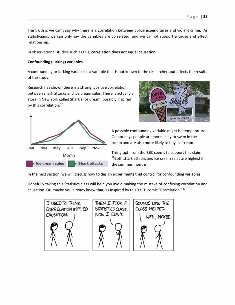
P a g e | 58
The truth is we can’t say why there is a correlation between police expenditures and violent crime. As
statisticians, we can only say the variables are correlated, and we cannot support a cause and effect
relationship.
In observational studies such as this, correlation does not equal causation.
Confounding (lurking) variables
A confounding or lurking variable is a variable that is not known to the researcher, but affects the results
of the study.
Research has shown there is a strong, positive correlation
between shark attacks and ice cream sales. There is actually a
store in New York called Shark’s Ice Cream, possibly inspired
by this correlation.37
A possible confounding variable might be temperature.
On hot days people are more likely to swim in the
ocean and are also more likely to buy ice cream.
This graph from the BBC seems to support this claim. 38Both shark attacks and ice cream sales are highest in
the summer months.
In the next section, we will discuss how to design experiments that control for confounding variables.
Hopefully taking this Statistics class will help you avoid making the mistake of confusing correlation and
causation. Or, maybe you already knew that, as inspired by this XKCD comic “Correlation.”39
P a g e | 59
Steps of a Statistical Process
Step 1 (Problem): Ask a question that can be answered with sample data. Step 2 (Plan): Determine what information is needed. Step 3 (Data): Collect sample data that is representative of the population. Step 4 (Analysis): Summarize, interpret and analyze the sample data. Step 5 (Conclusion): State the results and conclusion of the study.
3. Populations, Sampling and Experimental Design
The prior sections dealt with analyzing data. We now want to explore how data is obtained and
introduce the concept of finding a representative sample, a critical component of statistical inference.
3.1 Populations and Samples
A population is the entire group of individuals or objects of interest to us. In practice, it is difficult or impossible to study every individual or object in the population. A sample is a subset of the population that we can study by collecting or gathering data.
Quantities that describe populations are called parameters. We will explore some of these values in the
future chapters on random variables.
Quantities that describe samples are called statistics and were investigated in the previous chapter.
Example – Math anxiety and community college students
A large community college has about 25,000 students. In a study of 85 students from college, it was
determined that about 60 of the students have moderate or high math anxiety.
In this study, the population is all the students at this college. The sample is the 85 students whose math
anxiety was measured.
A census is a sample of every individual or object in the population. It is rarely possible to effectively
conduct a complete census due to unavailability of data or prohibitive costs. For example, the cost of
the 2010 United States census was $13 billion to simply count people and collect basic data.40 Keep in
mind that even the US census is not perfect since there are both over‐counting of some groups and
under‐counting of other groups.
The major goal in Statistics is to be able to make estimates or support claims about populations based
on the sample measurements, a process called statistical inference. To be able to make a valid
inference, care must be taken in collecting sample data.
3.2 The Statistical Process
Statistical Inference can be thought of as a process that can be used for testing claims and making
estimates.
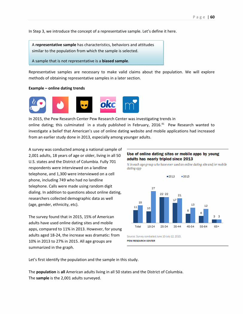
P a g e | 60
A representative sample has characteristics, behaviors and attitudes
similar to the population from which the sample is selected.
A sample that is not representative is a biased sample.
In Step 3, we introduce the concept of a representative sample. Let’s define it here.
Representative samples are necessary to make valid claims about the population. We will explore
methods of obtaining representative samples in a later section.
Example – online dating trends
In 2015, the Pew Research Center Pew Research Center was investigating trends in
online dating; this culminated in a study published in February, 2016.41 Pew Research wanted to
investigate a belief that American’s use of online dating website and mobile applications had increased
from an earlier study done in 2013, especially among younger adults.
A survey was conducted among a national sample of
2,001 adults, 18 years of age or older, living in all 50
U.S. states and the District of Columbia. Fully 701
respondents were interviewed on a landline
telephone, and 1,300 were interviewed on a cell
phone, including 749 who had no landline
telephone. Calls were made using random digit
dialing. In addition to questions about online dating,
researchers collected demographic data as well
(age, gender, ethnicity, etc).
The survey found that in 2015, 15% of American
adults have used online dating sites and mobile
apps, compared to 11% in 2013. However, for young
adults aged 18‐24, the increase was dramatic: from
10% in 2013 to 27% in 2015. All age groups are
summarized in the graph.
Let’s first identify the population and the sample in this study.
The population is all American adults living in all 50 states and the District of Columbia.
The sample is the 2,001 adults surveyed.
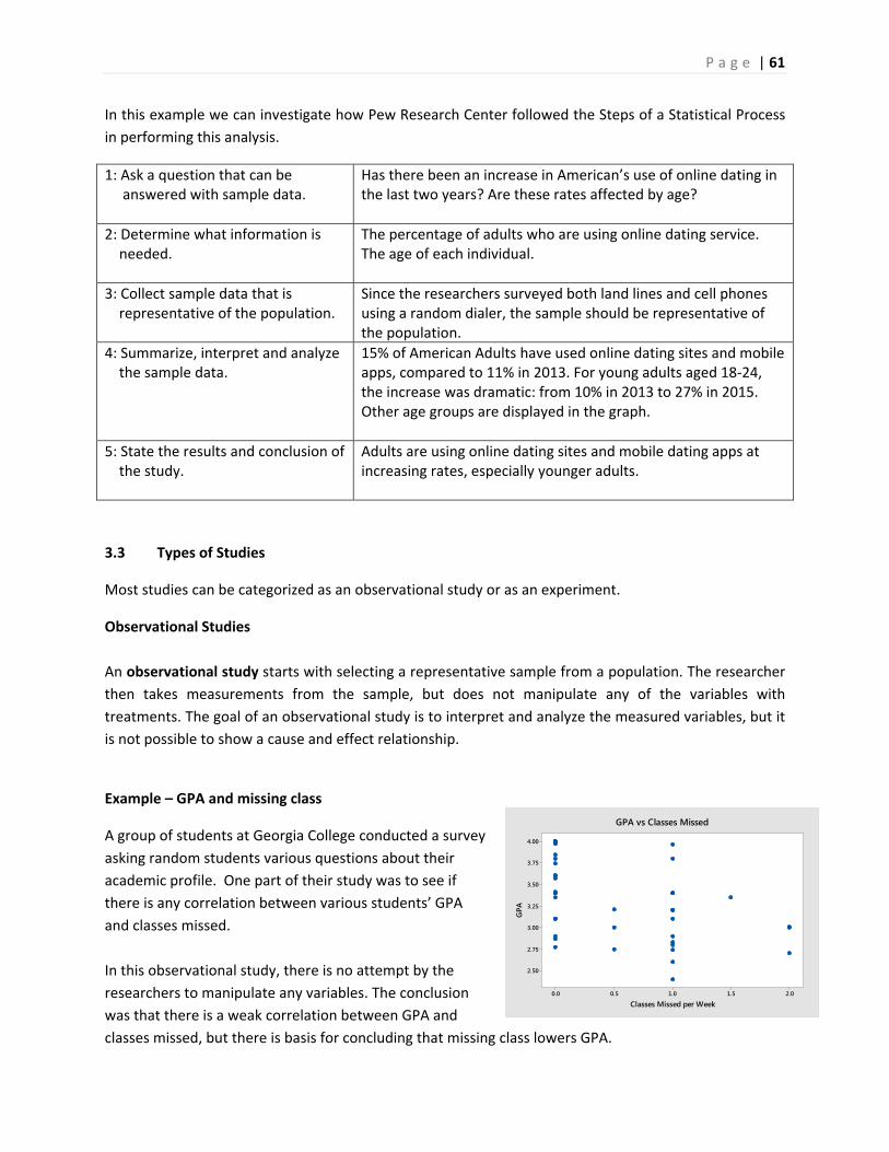
P a g e | 61
2.01.51.00.50.0
4.00
3.75
3.50
3.25
3.00
2.75
2.50
Classes Missed per Week
GPA
GPA vs Classes Missed
In this example we can investigate how Pew Research Center followed the Steps of a Statistical Process
in performing this analysis.
1: Ask a question that can be answered with sample data.
Has there been an increase in American’s use of online dating in the last two years? Are these rates affected by age?
2: Determine what information is needed.
The percentage of adults who are using online dating service. The age of each individual.
3: Collect sample data that is representative of the population.
Since the researchers surveyed both land lines and cell phones using a random dialer, the sample should be representative of the population.
4: Summarize, interpret and analyze the sample data.
15% of American Adults have used online dating sites and mobile apps, compared to 11% in 2013. For young adults aged 18‐24, the increase was dramatic: from 10% in 2013 to 27% in 2015. Other age groups are displayed in the graph.
5: State the results and conclusion of the study.
Adults are using online dating sites and mobile dating apps at increasing rates, especially younger adults.
3.3 Types of Studies
Most studies can be categorized as an observational study or as an experiment.
Observational Studies
An observational study starts with selecting a representative sample from a population. The researcher
then takes measurements from the sample, but does not manipulate any of the variables with
treatments. The goal of an observational study is to interpret and analyze the measured variables, but it
is not possible to show a cause and effect relationship.
Example – GPA and missing class
A group of students at Georgia College conducted a survey
asking random students various questions about their
academic profile. One part of their study was to see if
there is any correlation between various students’ GPA
and classes missed.
In this observational study, there is no attempt by the
researchers to manipulate any variables. The conclusion
was that there is a weak correlation between GPA and
classes missed, but there is basis for concluding that missing class lowers GPA.
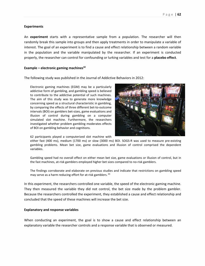
P a g e | 62
Experiments
An experiment starts with a representative sample from a population. The researcher will then
randomly break this sample into groups and then apply treatments in order to manipulate a variable of
interest. The goal of an experiment is to find a cause and effect relationship between a random variable
in the population and the variable manipulated by the researcher. If an experiment is conducted
properly, the researcher can control for confounding or lurking variables and test for a placebo effect.
Example – electronic gaming machines42
The following study was published in the Journal of Addictive Behaviors in 2012:
Electronic gaming machines (EGM) may be a particularly addictive form of gambling, and gambling speed is believed to contribute to the addictive potential of such machines. The aim of this study was to generate more knowledge concerning speed as a structural characteristic in gambling, by comparing the effects of three different bet‐to‐outcome intervals (BOI) on gamblers bet‐sizes, game evaluations and illusion of control during gambling on a computer simulated slot machine. Furthermore, the researchers investigated whether problem gambling moderates effects of BOI on gambling behavior and cognitions.
62 participants played a computerized slot machine with either fast (400 ms), medium (1700 ms) or slow (3000 ms) BOI. SOGS‐R was used to measure pre‐existing gambling problems. Mean bet size, game evaluations and illusion of control comprised the dependent variables.
Gambling speed had no overall effect on either mean bet size, game evaluations or illusion of control, but in the fast machines, at‐risk gamblers employed higher bet sizes compared to no‐risk gamblers.
The findings corroborate and elaborate on previous studies and indicate that restrictions on gambling speed may serve as a harm reducing effort for at‐risk gamblers. 43
In this experiment, the researchers controlled one variable, the speed of the electronic gaming machine.
They then measured the variable they did not control, the bet size made by the problem gambler.
Because the researchers controlled the experiment, they established a cause and effect relationship and
concluded that the speed of these machines will increase the bet size.
Explanatory and response variables
When conducting an experiment, the goal is to show a cause and effect relationship between an
explanatory variable the researcher controls and a response variable that is observed or measured.
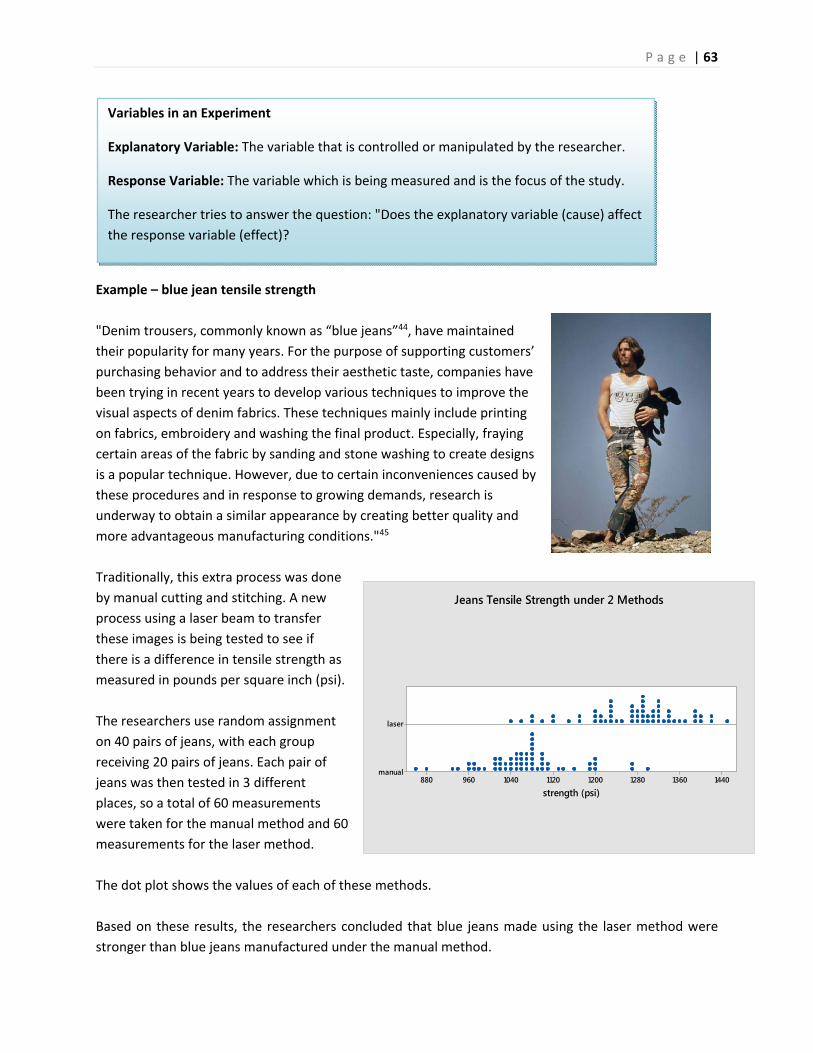
P a g e | 63
144013601280120011201040960880
laser
manual
strength (psi)
Jeans Tensile Strength under 2 Methods
Variables in an Experiment
Explanatory Variable: The variable that is controlled or manipulated by the researcher.
Response Variable: The variable which is being measured and is the focus of the study.
The researcher tries to answer the question: "Does the explanatory variable (cause) affect
the response variable (effect)?
Example – blue jean tensile strength
"Denim trousers, commonly known as “blue jeans”44, have maintained
their popularity for many years. For the purpose of supporting customers’
purchasing behavior and to address their aesthetic taste, companies have
been trying in recent years to develop various techniques to improve the
visual aspects of denim fabrics. These techniques mainly include printing
on fabrics, embroidery and washing the final product. Especially, fraying
certain areas of the fabric by sanding and stone washing to create designs
is a popular technique. However, due to certain inconveniences caused by
these procedures and in response to growing demands, research is
underway to obtain a similar appearance by creating better quality and
more advantageous manufacturing conditions."45
Traditionally, this extra process was done
by manual cutting and stitching. A new
process using a laser beam to transfer
these images is being tested to see if
there is a difference in tensile strength as
measured in pounds per square inch (psi).
The researchers use random assignment
on 40 pairs of jeans, with each group
receiving 20 pairs of jeans. Each pair of
jeans was then tested in 3 different
places, so a total of 60 measurements
were taken for the manual method and 60
measurements for the laser method.
The dot plot shows the values of each of these methods.
Based on these results, the researchers concluded that blue jeans made using the laser method were
stronger than blue jeans manufactured under the manual method.
P a g e | 64
The explanatory variable is the production method (manual or laser), which is the variable that is
controlled by the researcher, randomly assigning jeans into the two groups.
The response variable, which is the variable the researcher wanted to compare for each method of
production, is the tensile strength of each measurement taken from the jeans.
Let's now organize this study into the steps of the statistical process
1: Ask a question that can be answered with sample data.
Is there a difference in tensile strength of denim blue jeans between the manual method and the laser method of modification?
2: Determine what information is needed.
The method of production (manual or laser) The tensile strength of each sample
3: Collect sample data that is representative of the population.
The researchers used random assignment to control for confounding variables, such as defects in the fabric. 60 measurements were taken for each method.
4: Summarize, interpret and analyze the sample data.
Reviewing the dot plots of tensile strength under reach method, both graphs have the spread and shape, but the center for the laser method is substantial higher than the graph for the manual method.
5: State the results and conclusion of the study.
The laser method produces blue jeans with higher tensile strength compared to the manual method.
Placebos and Blinding
Sometimes in an experiment, a participant will respond in a positive way to a treatment with no active
ingredients. This called the placebo effect, and a treatment with no active ingredients is called a
placebo.
Example ‐ Headache Pill
A researcher for a pharmaceutical company is conducting research on an experimental drug to reduce
the pain from migraine headaches. Participants with migraine headaches are randomly split into 3
groups. The first group gets the experimental drug (Treatment Group). The second group gets a
placebo, a fake drug (Placebo Group). The third group gets nothing (Control Group).
The researcher found that pain was reduced for both the treatment group and the placebo group,
establishing a placebo effect. The researcher must then compare the amount of pain reduction in the
treatment group to the placebo group in order to determine if the treatment was effective.
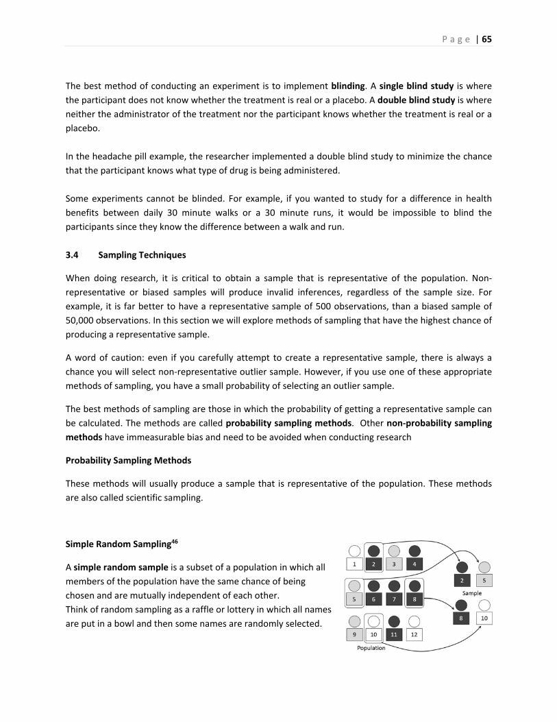
P a g e | 65
The best method of conducting an experiment is to implement blinding. A single blind study is where
the participant does not know whether the treatment is real or a placebo. A double blind study is where
neither the administrator of the treatment nor the participant knows whether the treatment is real or a
placebo.
In the headache pill example, the researcher implemented a double blind study to minimize the chance
that the participant knows what type of drug is being administered.
Some experiments cannot be blinded. For example, if you wanted to study for a difference in health
benefits between daily 30 minute walks or a 30 minute runs, it would be impossible to blind the
participants since they know the difference between a walk and run.
3.4 Sampling Techniques
When doing research, it is critical to obtain a sample that is representative of the population. Non‐
representative or biased samples will produce invalid inferences, regardless of the sample size. For
example, it is far better to have a representative sample of 500 observations, than a biased sample of
50,000 observations. In this section we will explore methods of sampling that have the highest chance of
producing a representative sample.
A word of caution: even if you carefully attempt to create a representative sample, there is always a
chance you will select non‐representative outlier sample. However, if you use one of these appropriate
methods of sampling, you have a small probability of selecting an outlier sample.
The best methods of sampling are those in which the probability of getting a representative sample can
be calculated. The methods are called probability sampling methods. Other non‐probability sampling
methods have immeasurable bias and need to be avoided when conducting research
Probability Sampling Methods
These methods will usually produce a sample that is representative of the population. These methods
are also called scientific sampling.
Simple Random Sampling46
A simple random sample is a subset of a population in which all
members of the population have the same chance of being
chosen and are mutually independent of each other.
Think of random sampling as a raffle or lottery in which all names
are put in a bowl and then some names are randomly selected.
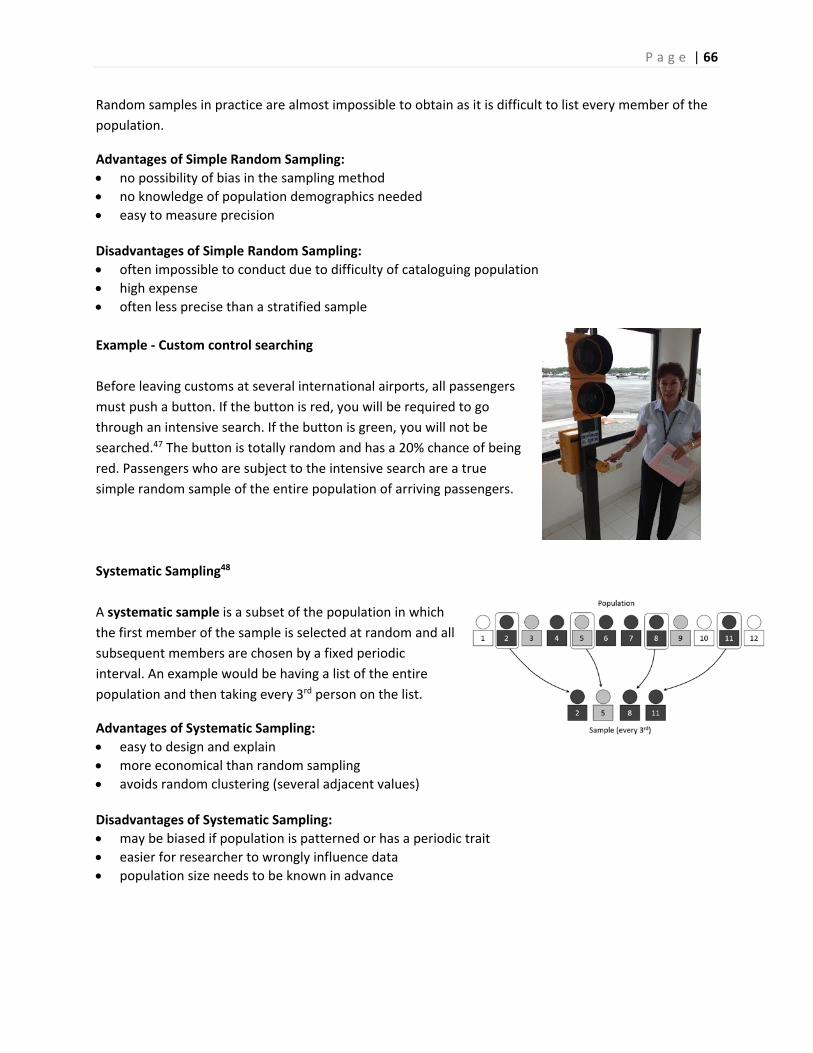
P a g e | 66
Random samples in practice are almost impossible to obtain as it is difficult to list every member of the
population.
Advantages of Simple Random Sampling:
no possibility of bias in the sampling method
no knowledge of population demographics needed
easy to measure precision Disadvantages of Simple Random Sampling:
often impossible to conduct due to difficulty of cataloguing population
high expense
often less precise than a stratified sample
Example ‐ Custom control searching
Before leaving customs at several international airports, all passengers
must push a button. If the button is red, you will be required to go
through an intensive search. If the button is green, you will not be
searched.47 The button is totally random and has a 20% chance of being
red. Passengers who are subject to the intensive search are a true
simple random sample of the entire population of arriving passengers.
Systematic Sampling48
A systematic sample is a subset of the population in which
the first member of the sample is selected at random and all
subsequent members are chosen by a fixed periodic
interval. An example would be having a list of the entire
population and then taking every 3rd person on the list.
Advantages of Systematic Sampling:
easy to design and explain
more economical than random sampling
avoids random clustering (several adjacent values) Disadvantages of Systematic Sampling:
may be biased if population is patterned or has a periodic trait
easier for researcher to wrongly influence data
population size needs to be known in advance
P a g e | 67
Example ‐ random drug testing of employees
A shipping company has approximately 20,000 employees. The company
decided to administer a random drug test to 5% of the employees, a
sample size of 1000. The company has a list of all employees sorted by
social security number. A random number is selected between 1 and 20.
Starting with that person, every subsequent 20th person is also
sampled. For example, if the selected number is 16, then the company
would select persons 16, 36, 56, 76, ... , 19996 for drug testing.
Stratified Sampling49
A stratified sample is designed by breaking the population into
subgroups called strata, and then sampling so the proportion of each
subgroup in the sample matches the proportion of each subgroup in
the population. For example, if a population is known to be 60%
female and 40% male, then a sample of 1000 people would have 600
women and 400 men.
Advantages of Stratified Sampling:
minimizes selection bias as all strata are fairly represented
each subgroup receives proper representation
high precision (low standard deviation) compared to other methods Disadvantages of Stratified Sampling:
high knowledge of population demographics needed
not all populations are easily stratified
time consuming and expensive
Example ‐ social media conversations about race
In 2016, Pew Research Center conducted a study to examine how
people use social media such as Twitter or Facebook.50 The study
focused on the content and hash tags used on people's comments
about events involving racially motivated attacks by the police and
differences in opinions about groups such as Black Lives Matter.
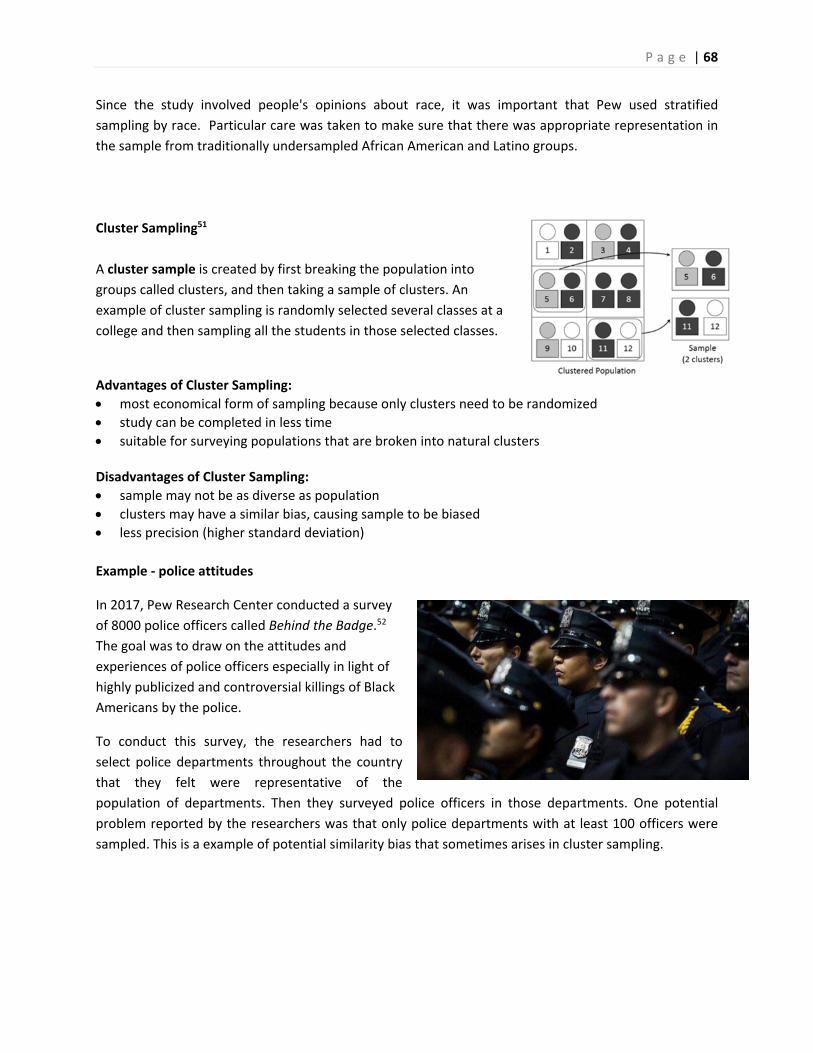
P a g e | 68
Since the study involved people's opinions about race, it was important that Pew used stratified
sampling by race. Particular care was taken to make sure that there was appropriate representation in
the sample from traditionally undersampled African American and Latino groups.
Cluster Sampling51
A cluster sample is created by first breaking the population into
groups called clusters, and then taking a sample of clusters. An
example of cluster sampling is randomly selected several classes at a
college and then sampling all the students in those selected classes.
Advantages of Cluster Sampling:
most economical form of sampling because only clusters need to be randomized
study can be completed in less time
suitable for surveying populations that are broken into natural clusters Disadvantages of Cluster Sampling:
sample may not be as diverse as population
clusters may have a similar bias, causing sample to be biased
less precision (higher standard deviation)
Example ‐ police attitudes
In 2017, Pew Research Center conducted a survey
of 8000 police officers called Behind the Badge.52
The goal was to draw on the attitudes and
experiences of police officers especially in light of
highly publicized and controversial killings of Black
Americans by the police.
To conduct this survey, the researchers had to
select police departments throughout the country
that they felt were representative of the
population of departments. Then they surveyed police officers in those departments. One potential
problem reported by the researchers was that only police departments with at least 100 officers were
sampled. This is a example of potential similarity bias that sometimes arises in cluster sampling.

P a g e | 69
Example – student homelessness53
The Bill Wilson Center of Santa Clara County
provides social services for children, teens and
adults. In 2017, the center conducted a study
documenting homeless youth populations,
surveying both high school students and
community college students.54
For community college students, the researchers
chose two community colleges from the eight in
Santa Clara County and surveyed students from Winter 2017 to Spring 2017. One finding was that a
staggering 44% of community college students surveyed at these two colleges reported that they were
homeless. (Homeless in this study means living on the street, living in cars, or couch surfing).
This study is an example of cluster sampling. Out of the eight Santa Clara County community colleges,
the researchers chose 2. Although not reported in the study, it would be important that the
demographics of the two chosen colleges match the average of all community college students in the
county.
Non‐probability Sampling Methods
There are non‐scientific methods of sampling being conducted today that have immeasurable biases and
should not be used in scientific research. The only advantage of these methods is that they are
inexpensive and can generate very large samples. However, these samples will often fail to create a
representative sample and therefore have no value in research. Worse yet, these biased samples may be
presented as more accurate or better than scientific studies because of the large sample size. However,
a biased sample of any size has little or no value ‐‐ a big pile of garbage is still garbage.
Convenience Sampling
A convenience sample is simply a sample of people who are easy to reach.
Example ‐ marijuana usage
A 21 year old student wants to conduct a survey on marijuana usage.
He asks his friends on Facebook to fill out a survey. The results of his
survey show that 65% of respondents frequently use marijuana.
The student's Facebook friends were easy to sample but are not
representative of the population. For example, if the student frequently
uses marijuana, it is more likely that his Facebook friends would also use marijuana.

P a g e | 70
Self‐selected Sampling
A self‐selected sample is one in which the participants volunteer to be sampled. This would include
Internet polls and studies that advertise for volunteers.
Do not confuse self‐selected sampling with scientific studies that ask for volunteers from an initial
representative sample. Researchers take care to avoid bias making sure the demographics of the
volunteers match the demographics of the representative sample.
Example ‐ Boaty McBoatface
The Natural Environment Research Council (NERC), an agency
of the British government, decided to let the Internet suggest a
name for a $287 million polar research ship. A public relations
professional and former BBC employee started a social media
frenzy by suggesting people vote for the name "Boaty
McBoatface."55
The final result of this self‐selected poll showed that Boaty
McBoatface was the overwhelming winner. You can see that
the top 20 entries included many other humorous choices,
along with some more traditional names.56
The NERC eventually chose a more serious name, the RSS Sir
David Attenborough, but as a consolation to the voters, the
agency named a remotely operated underwater research vessel
Boaty McBoatface . 57
The results of the poll do not reflect what the public wanted.
What happened instead was many people, through social
media, were inspired to vote for Boaty McBoatface as a joke.
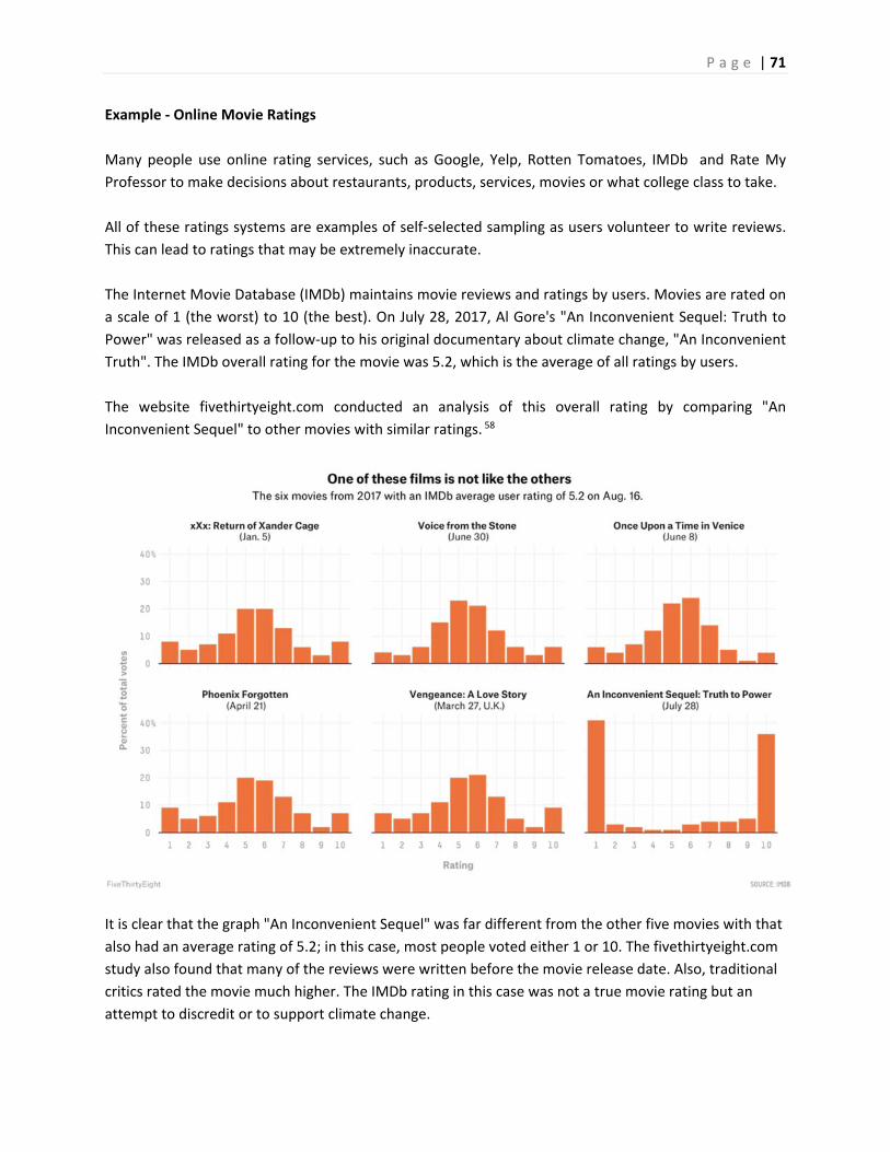
P a g e | 71
Example ‐ Online Movie Ratings
Many people use online rating services, such as Google, Yelp, Rotten Tomatoes, IMDb and Rate My
Professor to make decisions about restaurants, products, services, movies or what college class to take.
All of these ratings systems are examples of self‐selected sampling as users volunteer to write reviews.
This can lead to ratings that may be extremely inaccurate.
The Internet Movie Database (IMDb) maintains movie reviews and ratings by users. Movies are rated on
a scale of 1 (the worst) to 10 (the best). On July 28, 2017, Al Gore's "An Inconvenient Sequel: Truth to
Power" was released as a follow‐up to his original documentary about climate change, "An Inconvenient
Truth". The IMDb overall rating for the movie was 5.2, which is the average of all ratings by users.
The website fivethirtyeight.com conducted an analysis of this overall rating by comparing "An
Inconvenient Sequel" to other movies with similar ratings. 58
It is clear that the graph "An Inconvenient Sequel" was far different from the other five movies with that
also had an average rating of 5.2; in this case, most people voted either 1 or 10. The fivethirtyeight.com
study also found that many of the reviews were written before the movie release date. Also, traditional
critics rated the movie much higher. The IMDb rating in this case was not a true movie rating but an
attempt to discredit or to support climate change.

P a g e | 72
The conclusion by fivethirtyeight.com was a warning about these popular online rating systems:
"Say what you will, but in addition to being controversial, “An Inconvenient Sequel” was ambitious: Few films involve Arctic expeditions, inside access to the Paris Climate Conference, interviews with the sitting secretary of state and a globe‐trotting look at catastrophic weather conditions. If ambitious‐yet‐controversial films are boiled down to a single number that makes them look identical to mediocre films, what incentive does Hollywood have to continue investing in movies that challenge the audience?
"The democratization of film reviews has been one of the most substantial structural changes in the movie business in some time, but there are dangerous side effects. The people who make movies are terrified. IMDb scores represent a few thousand mostly male reviewers who might have seen the film but maybe didn’t, and they’re influencing the scoring system of one of the most popular entertainment sites on the planet."
We will all continue to use online rating services, but we must keep in mind the reviews could be fake,
manipulated or extremely biased.
3.5 Bias in statistical studies
In the last selection we discussed how non‐probability sampling methods will often not create a representative sample that is needed to draw any meaningful conclusions. These methods usually create two types of bias.
3.5.1 Selection Bias
Selection bias occurs when the sampling method does not create a representative sample for the study. Selection bias frequently occurs when using convenience sampling.
Example ‐ library fee
A community college proposes increasing the student fee by $5.00 in order to create more open hours for the library. A survey was conducted by several student researchers to see if there was support for this fee. The researchers stood in the central part of the campus near the library and selected students for their sample as they were walking by. The students were only sampled during the morning hours.
This is a convenience sample and probably not representative for this study. The students sampled only day students, excluding night students who are less likely to use the library. Some excluded students only take classes online and don't use the library. Finally, the survey was conducted near the library, so it is more likely that the sample contained library users, who would probably be more likely to support added services. This is a clear example of selection bias.
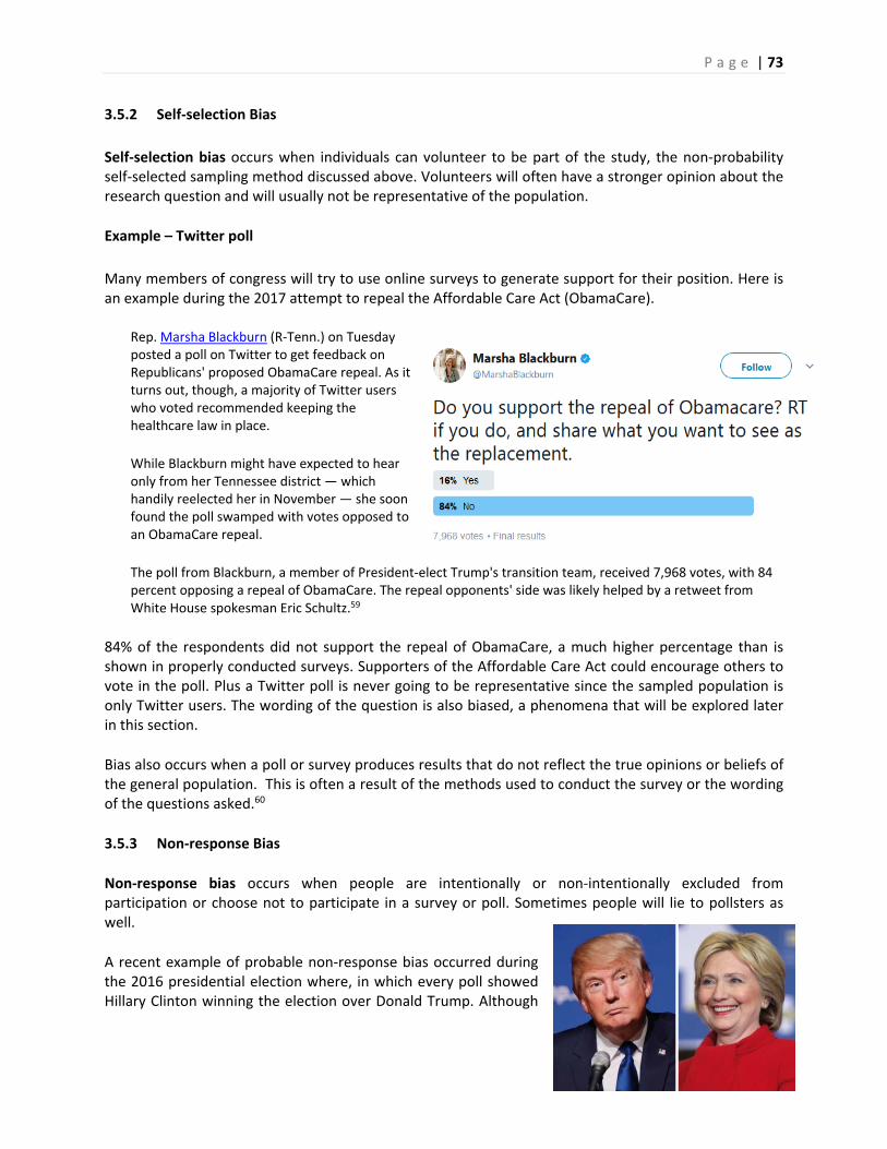
P a g e | 73
3.5.2 Self‐selection Bias
Self‐selection bias occurs when individuals can volunteer to be part of the study, the non‐probability self‐selected sampling method discussed above. Volunteers will often have a stronger opinion about the research question and will usually not be representative of the population.
Example – Twitter poll
Many members of congress will try to use online surveys to generate support for their position. Here is an example during the 2017 attempt to repeal the Affordable Care Act (ObamaCare).
Rep. Marsha Blackburn (R‐Tenn.) on Tuesday posted a poll on Twitter to get feedback on Republicans' proposed ObamaCare repeal. As it turns out, though, a majority of Twitter users who voted recommended keeping the healthcare law in place.
While Blackburn might have expected to hear only from her Tennessee district — which handily reelected her in November — she soon found the poll swamped with votes opposed to an ObamaCare repeal.
The poll from Blackburn, a member of President‐elect Trump's transition team, received 7,968 votes, with 84 percent opposing a repeal of ObamaCare. The repeal opponents' side was likely helped by a retweet from White House spokesman Eric Schultz.59
84% of the respondents did not support the repeal of ObamaCare, a much higher percentage than is shown in properly conducted surveys. Supporters of the Affordable Care Act could encourage others to vote in the poll. Plus a Twitter poll is never going to be representative since the sampled population is only Twitter users. The wording of the question is also biased, a phenomena that will be explored later in this section.
Bias also occurs when a poll or survey produces results that do not reflect the true opinions or beliefs of the general population. This is often a result of the methods used to conduct the survey or the wording of the questions asked.60
3.5.3 Non‐response Bias
Non‐response bias occurs when people are intentionally or non‐intentionally excluded from participation or choose not to participate in a survey or poll. Sometimes people will lie to pollsters as well.
A recent example of probable non‐response bias occurred during the 2016 presidential election where, in which every poll showed Hillary Clinton winning the election over Donald Trump. Although
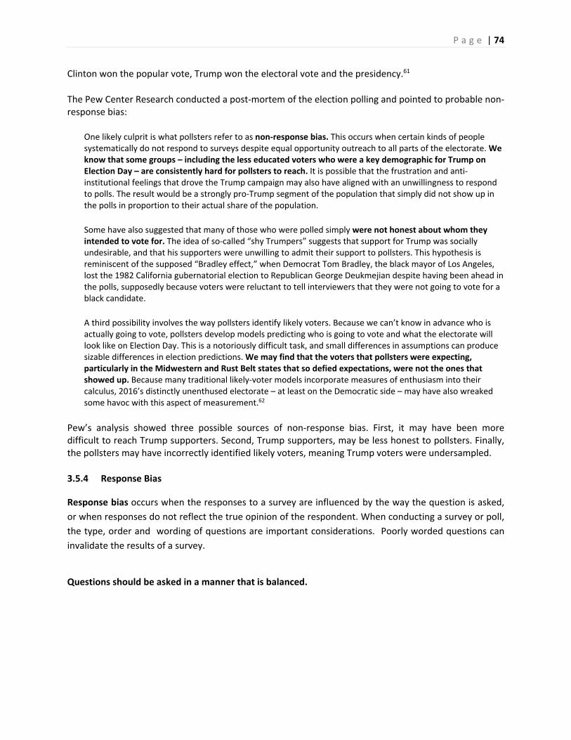
P a g e | 74
Clinton won the popular vote, Trump won the electoral vote and the presidency.61
The Pew Center Research conducted a post‐mortem of the election polling and pointed to probable non‐response bias:
One likely culprit is what pollsters refer to as non‐response bias. This occurs when certain kinds of people systematically do not respond to surveys despite equal opportunity outreach to all parts of the electorate. We know that some groups – including the less educated voters who were a key demographic for Trump on Election Day – are consistently hard for pollsters to reach. It is possible that the frustration and anti‐institutional feelings that drove the Trump campaign may also have aligned with an unwillingness to respond to polls. The result would be a strongly pro‐Trump segment of the population that simply did not show up in the polls in proportion to their actual share of the population.
Some have also suggested that many of those who were polled simply were not honest about whom they intended to vote for. The idea of so‐called “shy Trumpers” suggests that support for Trump was socially undesirable, and that his supporters were unwilling to admit their support to pollsters. This hypothesis is reminiscent of the supposed “Bradley effect,” when Democrat Tom Bradley, the black mayor of Los Angeles, lost the 1982 California gubernatorial election to Republican George Deukmejian despite having been ahead in the polls, supposedly because voters were reluctant to tell interviewers that they were not going to vote for a black candidate.
A third possibility involves the way pollsters identify likely voters. Because we can’t know in advance who is actually going to vote, pollsters develop models predicting who is going to vote and what the electorate will look like on Election Day. This is a notoriously difficult task, and small differences in assumptions can produce sizable differences in election predictions. We may find that the voters that pollsters were expecting, particularly in the Midwestern and Rust Belt states that so defied expectations, were not the ones that showed up. Because many traditional likely‐voter models incorporate measures of enthusiasm into their calculus, 2016’s distinctly unenthused electorate – at least on the Democratic side – may have also wreaked some havoc with this aspect of measurement.62
Pew’s analysis showed three possible sources of non‐response bias. First, it may have been more difficult to reach Trump supporters. Second, Trump supporters, may be less honest to pollsters. Finally, the pollsters may have incorrectly identified likely voters, meaning Trump voters were undersampled.
3.5.4 Response Bias
Response bias occurs when the responses to a survey are influenced by the way the question is asked,
or when responses do not reflect the true opinion of the respondent. When conducting a survey or poll,
the type, order and wording of questions are important considerations. Poorly worded questions can
invalidate the results of a survey.
Questions should be asked in a manner that is balanced.

P a g e | 75
Example – high speed rail Consider the questions: “Do you feel that the increasing cost of the high speed rail project is too expensive for California?” “Do you feel that high speed rail will be important to the future economy of California?” “Do you approve or disapprove of building a high speed rail system in California?” The first question encourages people to oppose high speed rail because of the expense. The second question encourages people to support high speed rail to support the economy. The third question simply asks people’s opinion without the leading bias.
Example – Twitter poll
Let’s return to the Twitter poll example in which Marsha Blackburn, an opponent of the Affordable Care
Act, asked followers to vote on the question: “Do you support the repeal of Obamacare? [Retweet] if
you do, and share what you want to see as the replacement.”
There are many sources of bias in this question. First, supporting a repeal sounds like supporting, the
more positive stance. Secondly, many polls have shown that using the words “Obamacare” instead of
“Affordable Care Act” will encourage support for repeal. Finally, the last part of the question is
encouraging people to take action if they support repeal.
Questions should not be vague. For example, the question “What’s wrong with the economy?” is vague. It is unclear what the question is trying to determine. Here are some questions from recent polls and surveys regarding same sex marriage. Discuss the issues
of bias and fairness in these questions:
Should states continue to discriminate against couples who want to marry and who are of the same gender?
Do you support marriage equality?
Should states be forced to legalize homosexual marriage over the wishes of a majority of the people?
Do you think marriages between same‐sex couples should or should not be recognized by the law as valid, with the same rights as traditional marriages?

P a g e | 76
Giving people explanatory information can change their opinions
Care must be taken in providing explanatory information about an issue; however, providing no
information may also lead to misleading results. For example, you might want to ask people if they
support the CHIP program. Most people have no idea what the CHIP program is, so some explanation is
needed. You then add the language: “The Children's Health Insurance Program (CHIP) is a program
administered by the federal government whose aim is to help states provide health insurance to families
with children who were just above the financial threshold for Medicaid.”
Example – Aid to Puerto Rico after Hurricane Maria
On September 20, 2017, Hurricane Maria caused
catastrophic damage to the U.S. territory of Puerto
Rico. This came shortly after two other major
hurricanes hit the United States, causing major
damage in Texas and Florida.
However, the initial public support for Puerto Rico
seemed less than that for Florida or Texas. A poll of
2200 American adults conducted by Morning Consult
showed that only 54% of Americans knew that
Puerto Rico was part of the United States.63
The survey then split the sample into two groups to answer the question “Should Puerto Rico receive
additional government aid to help rebuild the territory?” The first group was given no information about
Puerto Rican citizenship and 64% supported giving aid. The second group was first told that Puerto
Ricans were American citizens, and support for aid increased to 68%.
In conclusion, the wording of polls or providing additional information can lead to biased results and
care should be taken so the wording of the questions is both clear and balanced.
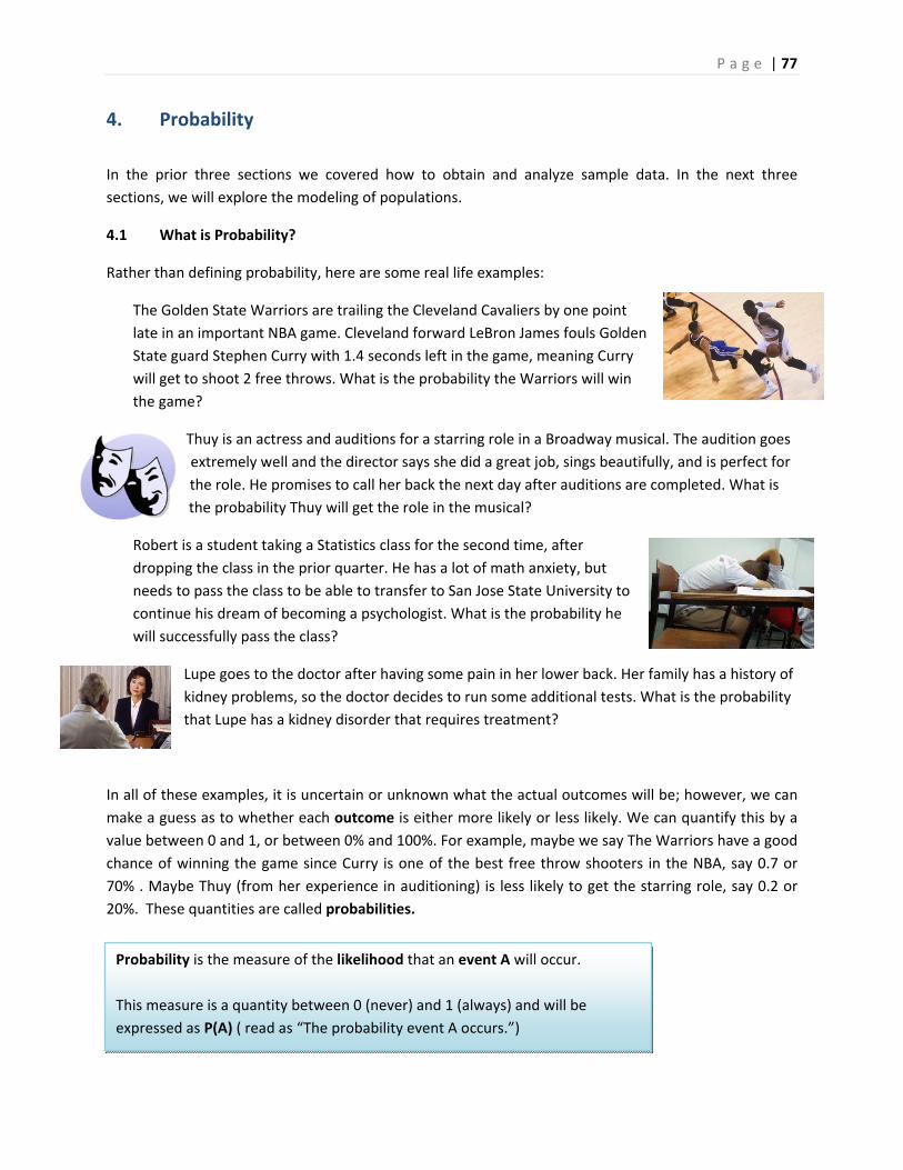
P a g e | 77
4. Probability
In the prior three sections we covered how to obtain and analyze sample data. In the next three
sections, we will explore the modeling of populations.
4.1 What is Probability?
Rather than defining probability, here are some real life examples:
The Golden State Warriors are trailing the Cleveland Cavaliers by one point
late in an important NBA game. Cleveland forward LeBron James fouls Golden
State guard Stephen Curry with 1.4 seconds left in the game, meaning Curry
will get to shoot 2 free throws. What is the probability the Warriors will win
the game?
Thuy is an actress and auditions for a starring role in a Broadway musical. The audition goes
extremely well and the director says she did a great job, sings beautifully, and is perfect for
the role. He promises to call her back the next day after auditions are completed. What is
the probability Thuy will get the role in the musical?
Robert is a student taking a Statistics class for the second time, after
dropping the class in the prior quarter. He has a lot of math anxiety, but
needs to pass the class to be able to transfer to San Jose State University to
continue his dream of becoming a psychologist. What is the probability he
will successfully pass the class?
Lupe goes to the doctor after having some pain in her lower back. Her family has a history of
kidney problems, so the doctor decides to run some additional tests. What is the probability
that Lupe has a kidney disorder that requires treatment?
In all of these examples, it is uncertain or unknown what the actual outcomes will be; however, we can
make a guess as to whether each outcome is either more likely or less likely. We can quantify this by a
value between 0 and 1, or between 0% and 100%. For example, maybe we say The Warriors have a good
chance of winning the game since Curry is one of the best free throw shooters in the NBA, say 0.7 or
70% . Maybe Thuy (from her experience in auditioning) is less likely to get the starring role, say 0.2 or
20%. These quantities are called probabilities.
Probability is the measure of the likelihood that an event A will occur.
This measure is a quantity between 0 (never) and 1 (always) and will be
expressed as P(A) ( read as “The probability event A occurs.”)
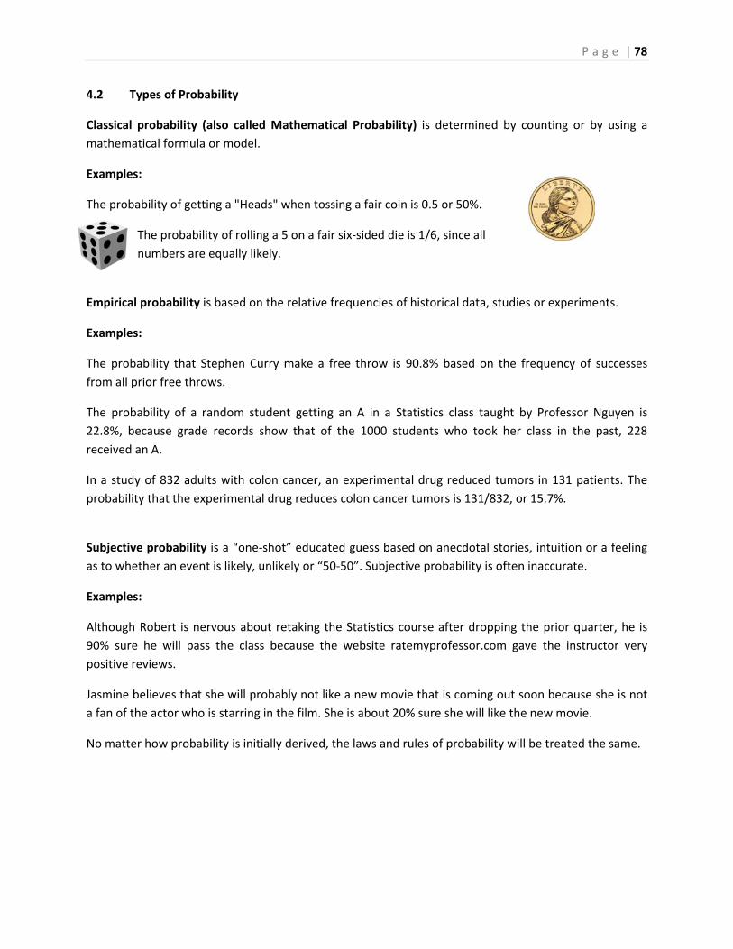
P a g e | 78
4.2 Types of Probability
Classical probability (also called Mathematical Probability) is determined by counting or by using a
mathematical formula or model.
Examples:
The probability of getting a "Heads" when tossing a fair coin is 0.5 or 50%.
The probability of rolling a 5 on a fair six‐sided die is 1/6, since all
numbers are equally likely.
Empirical probability is based on the relative frequencies of historical data, studies or experiments.
Examples:
The probability that Stephen Curry make a free throw is 90.8% based on the frequency of successes
from all prior free throws.
The probability of a random student getting an A in a Statistics class taught by Professor Nguyen is
22.8%, because grade records show that of the 1000 students who took her class in the past, 228
received an A.
In a study of 832 adults with colon cancer, an experimental drug reduced tumors in 131 patients. The
probability that the experimental drug reduces colon cancer tumors is 131/832, or 15.7%.
Subjective probability is a “one‐shot” educated guess based on anecdotal stories, intuition or a feeling
as to whether an event is likely, unlikely or “50‐50”. Subjective probability is often inaccurate.
Examples:
Although Robert is nervous about retaking the Statistics course after dropping the prior quarter, he is
90% sure he will pass the class because the website ratemyprofessor.com gave the instructor very
positive reviews.
Jasmine believes that she will probably not like a new movie that is coming out soon because she is not
a fan of the actor who is starring in the film. She is about 20% sure she will like the new movie.
No matter how probability is initially derived, the laws and rules of probability will be treated the same.
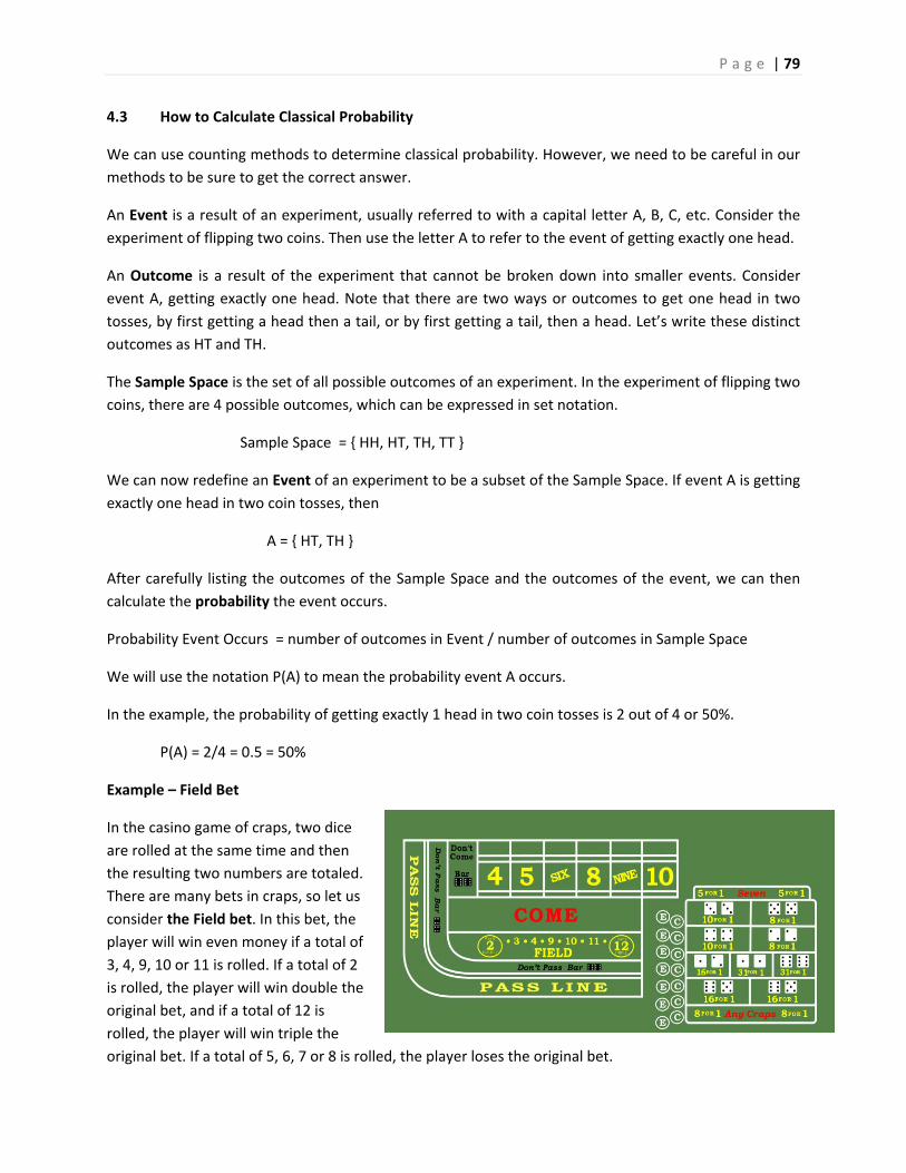
P a g e | 79
4.3 How to Calculate Classical Probability
We can use counting methods to determine classical probability. However, we need to be careful in our
methods to be sure to get the correct answer.
An Event is a result of an experiment, usually referred to with a capital letter A, B, C, etc. Consider the
experiment of flipping two coins. Then use the letter A to refer to the event of getting exactly one head.
An Outcome is a result of the experiment that cannot be broken down into smaller events. Consider
event A, getting exactly one head. Note that there are two ways or outcomes to get one head in two
tosses, by first getting a head then a tail, or by first getting a tail, then a head. Let’s write these distinct
outcomes as HT and TH.
The Sample Space is the set of all possible outcomes of an experiment. In the experiment of flipping two
coins, there are 4 possible outcomes, which can be expressed in set notation.
Sample Space = { HH, HT, TH, TT }
We can now redefine an Event of an experiment to be a subset of the Sample Space. If event A is getting
exactly one head in two coin tosses, then
A = { HT, TH }
After carefully listing the outcomes of the Sample Space and the outcomes of the event, we can then
calculate the probability the event occurs.
Probability Event Occurs = number of outcomes in Event / number of outcomes in Sample Space
We will use the notation P(A) to mean the probability event A occurs.
In the example, the probability of getting exactly 1 head in two coin tosses is 2 out of 4 or 50%.
P(A) = 2/4 = 0.5 = 50%
Example – Field Bet
In the casino game of craps, two dice
are rolled at the same time and then
the resulting two numbers are totaled.
There are many bets in craps, so let us
consider the Field bet. In this bet, the
player will win even money if a total of
3, 4, 9, 10 or 11 is rolled. If a total of 2
is rolled, the player will win double the
original bet, and if a total of 12 is
rolled, the player will win triple the
original bet. If a total of 5, 6, 7 or 8 is rolled, the player loses the original bet.
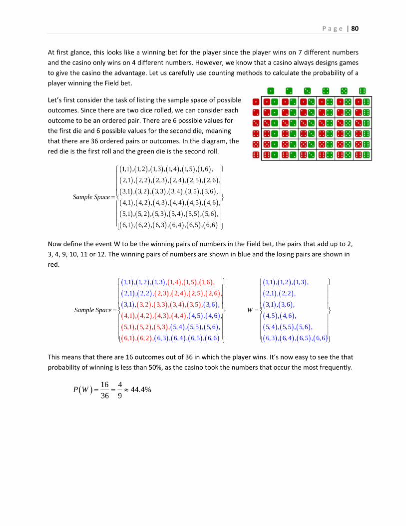
P a g e | 80
At first glance, this looks like a winning bet for the player since the player wins on 7 different numbers
and the casino only wins on 4 different numbers. However, we know that a casino always designs games
to give the casino the advantage. Let us carefully use counting methods to calculate the probability of a
player winning the Field bet.
Let’s first consider the task of listing the sample space of possible
outcomes. Since there are two dice rolled, we can consider each
outcome to be an ordered pair. There are 6 possible values for
the first die and 6 possible values for the second die, meaning
that there are 36 ordered pairs or outcomes. In the diagram, the
red die is the first roll and the green die is the second roll.
1,1 , 1, 2 , 1,3 , 1,4 , 1,5 , 1,6 ,
2,1 , 2,2 , 2,3 , 2,4 , 2,5 , 2,6 ,
3,1 , 3,2 , 3,3 , 3,4 , 3,5 , 3,6 ,
4,1 , 4,2 , 4,3 , 4,4 , 4,5 , 4,6 ,
5,1 , 5, 2 , 5,3 , 5, 4 , 5,5 , 5,6 ,
6,1 , 6,2 , 6,3 , 6, 4 , 6,5 , 6,6
Sample Space
Now define the event W to be the winning pairs of numbers in the Field bet, the pairs that add up to 2,
3, 4, 9, 10, 11 or 12. The winning pairs of numbers are shown in blue and the losing pairs are shown in
red.
1, 4 , 1,5 , 1,6 ,
2,3 , 2,4 , 2,5 , 2,6 ,
3, 2 , 3,3 , 3,4 , 3,5 ,
4,1 , 4,2 , 4,3 , 4,4 ,
5,1 , 5,
1,1 , 1, 2 , 1,3 ,
2,1 , 2,2 ,
3,1 , 3,6 ,
4,5 , 4,6 ,
5, 4 , 5,5 , 5,6 ,
6,3 , 6, 4 , 6,5 ,
2 , 5,3 ,
6,1 , 6,2 ,, 6 6
Sample Space
1,1 , 1,2 , 1,3 ,
2,1 , 2,2 ,
3,1 , 3,6 ,
4,5 , 4,6 ,
5, 4 , 5,5 , 5,6 ,
6,3 , 6,4 , 6,5 , 6,6
W
This means that there are 16 outcomes out of 36 in which the player wins. It’s now easy to see the that
probability of winning is less than 50%, as the casino took the numbers that occur the most frequently.
16 444.4%
36 9P W
P a g e | 81
As a final note on this example, you might recall that the casino pays double if the player rolls (1,1) or
triple if the player rolls (6,6). Even taking this extra bonus into account, if a player makes 36 $100 bets,
the casino will expect to win $2000 (20 numbers x $100), and the player will expect to win $1900 (16
numbers x $100, plus $100 extra for the 2 and $200 extra for the 12), meaning the player loses $100 for
every $3600 bet, a house (casino) advantage of 2.78%.
Field Bet – Summary of 36 possible rolls Amount won on $100 bets
1,1 (pays double) +$200
6,6 (pays triple) +$300
1,2 , 1,3 , 2,1 , 2,2 , 3,1 , 3,6 , 4,5 ,
4,6 , 5,4 , 5,5 , 5,6 , 6,3 , 6,4 , 6,5
+$1400
1,4 , 1,5 , 1,6 , 2,3 , 2,4 , 2,5 , 2,6 , 3,2 , 3,3 , 3,4 ,
3,5 , 4,1 , 4,2 , 4,3 , 4,4 , 5,1 , 5,2 , 5,3 , 6,1 , 6,2
‐$2000
Overall expected result of 36 rolls ($3600 bet) ‐$100
Just remember, in the long run, the casino always wins.
4.4 Rule of Complement
It is sometimes difficult to calculate the probability that an event will occur, but it is much easier to
calculate the probability that an event will not occur.
For example you may want to determine the probability that a student at California State University –
East Bay majors in something other than Business. Instead of adding up all the non‐Business major
probabilities, it would be much easier to find the chance that a student at CSUEB majors in Business, say
21%. Then you would determine that the probability that a student does not major in Business (all other
students) is the remaining 79%.
Example – die rolling
In a game, you must keep rolling a six‐sided die until you get a six. What is the probability that you
would need 2 or more rolls to get a six?
The event A is “2 or more rolls to get a six” which would be a very difficult probability to calculate ‐‐ it’s
actually an infinite sum!
A (read as “A‐complement”) is the event that event A does not
occur. In that case, the Rule of Complement is:
1 1 1P A P A P A P A P A P A
P a g e | 82
The event A’ is “do not take 2 or more rolls to get a six” which is the same as saying “get a six on the first
roll.” That’s a much easier probability to calculate, P(A’) = 1/6.
So P(A) = 1 – P(A’) = 1 – 1/6 = 5/6.
Therefore, the probability of needing two or more rolls to get a six is 5/6 or about 83.3%
4.5 Joint Probability and Additive Rule
Two or more events can be combined into joint events by using “or”
statements or “and” statements.
The Union of two events A and B is that either event A or B occurs, or
both; (the blue, red and purple parts of the Venn diagram shown to the
right).
The Intersection of two events A and B is that both events A and B occur; (the purple overlap of the
Venn diagram shown to the right).
Marginal Probability means the probability of a single event occurring.
Joint Probability means the probability of the union or intersection of multiple events occurring.
Example – student courses
In a group of 100 students, a total of 40 students take Math, a total of
20 students take History, and 10 students take both Math and
History. (Note that these 10 students were already counted twice as
being Math students and History students). Find the marginal and
joint probabilities.
Marginal Probabilities:
P(Math) = 40/100 = 0.4
P(History) = 20/100 = 0.2
Joint Probabilities:
P(Math and History) = 10/100 = 0.1 (this is the intersection of the two events)
P(Math or History) = 50/100 = 0.5 (this is the union of the two events)
We can make a rule for relating joint and marginal probabilities but noticing that we are double counting
the outcomes in the intersection of two events when combining marginal probabilities from event each
event. This is called the Additive Rule.
The Additive Rule for Probability
P Aor B P A P B P Aand B
P a g e | 83
Example – student courses
Calculate the probability that a student is taking Math or History using the additive rule. Compare to the
direct calculation in the prior example.
P(Math or History) = P(Math) + P(History) – P(Math or History)
P(Math or History) = 0.4 + 0.2 – 0.1 = 0.5
Mutually Exclusive means that two events A, B cannot both occur. In
this case, the intersection of two events has no possible outcomes.
Example – Spanish class
500 students at a community college are taking Spanish 1A in the Fall Quarter this year. 32 students are
in Section 11 and 30 students are in Section 12. Find the probability that a Spanish 1A student is in
Sections 11 or Section 12.
Since students cannot be in two sections of the same class, the events Section 11 and Section 12 are
mutually exclusive. P(Sec 11 or 12) = P(Sec 11) + P(Sec 12) = 32/500 + 30 /500 = 62/500 = 0.124.
4.6 Conditional Probability
Conditional Probability means the probability of an event A occurring given that another event B has
already occurred. This probability is written as P(A|B) which is read as P(A given B).
Example – 2016 presidential election
In the 2016 United States presidential election, Donald Trump received 46% of the total vote, Hillary
Clinton received 48%, and other candidates received 6%. (Note: although Clinton received about 3
million more votes than Trump, the Electoral College determined the actual winner to be Trump).
CNN conducted exit polls to determine how people voted based on demographic statistics, such as
gender.64 These exit polls showed that 53% of the voters were female and 47% of the voters were male.
These two values are examples of marginal probabilities.
The polls also showed that Donald Trump received 41% of the female vote and 52% of the male vote.
These two values are examples of conditional probability, in which the condition is knowing the gender
of the voter.
Events T = Voter chooses Trump F = Voter is Female M = Voter is Male
Marginal Probabilities P(T) = 0.46 P(F) = 0.53 P(M) = 0.47
Conditional Probabilities P(T|F) = 0.41 P(T|M) = 0.52
The Additive Rule for Mutually Exclusive Events
P Aor B P A P B
P a g e | 84
In calculating the probability of A given B, we only need to consider the elements of Event B instead of
the entire sample space.
Example – student courses
Let us revisit the example of students taking Math and History. Suppose we wanted to calculate the
probability that a student who is taking math is also taking history. In this case we only need to consider
the 40 students taking math as the sample space and the 10 students taking both math and history as
the conditional event occurring.
P(History) = 20/100 = 0.20 P(History|Math) = 10/40 = 0.25
In this example, we used classical counting probability rules, but conditional probability can be
calculated directly using known marginal and conditional probabilities.
P(History) = 10/100 = 0.10
P(Math and History) = 10/100 = 0.10
P(History|Math) = 0.10/0.40 = 0.25
Example:
Example – cell phone carrier
Of all cell phone users in the US, 15% have a smart phone with AT&T. 25% of all cell phone users use
AT&T. Given a selected cell phone user has AT&T, find the probability the user also has a smart phone.
Let A = AT&T subscriber. Let B = Smart Phone User
0.150.25 0.15 | 0.60
0.25P A P AandB P A B
This means 60% of all AT&T subscribers have smart phones.
Rules for Conditional Probability
| |
( ) ( )
P Aand B P Aand BP A B P B A
P B P A
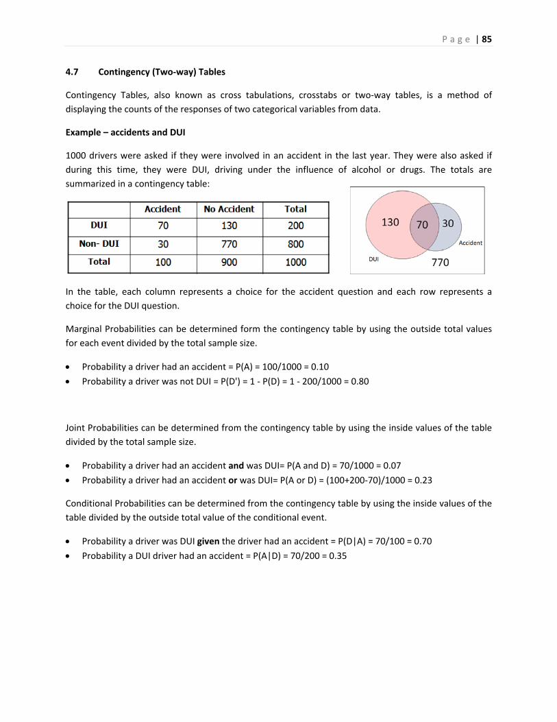
P a g e | 85
4.7 Contingency (Two‐way) Tables
Contingency Tables, also known as cross tabulations, crosstabs or two‐way tables, is a method of
displaying the counts of the responses of two categorical variables from data.
Example – accidents and DUI
1000 drivers were asked if they were involved in an accident in the last year. They were also asked if
during this time, they were DUI, driving under the influence of alcohol or drugs. The totals are
summarized in a contingency table:
In the table, each column represents a choice for the accident question and each row represents a
choice for the DUI question.
Marginal Probabilities can be determined form the contingency table by using the outside total values
for each event divided by the total sample size.
Probability a driver had an accident = P(A) = 100/1000 = 0.10
Probability a driver was not DUI = P(D') = 1 ‐ P(D) = 1 ‐ 200/1000 = 0.80
Joint Probabilities can be determined from the contingency table by using the inside values of the table
divided by the total sample size.
Probability a driver had an accident and was DUI= P(A and D) = 70/1000 = 0.07
Probability a driver had an accident or was DUI= P(A or D) = (100+200‐70)/1000 = 0.23
Conditional Probabilities can be determined from the contingency table by using the inside values of the
table divided by the outside total value of the conditional event.
Probability a driver was DUI given the driver had an accident = P(D|A) = 70/100 = 0.70
Probability a DUI driver had an accident = P(A|D) = 70/200 = 0.35
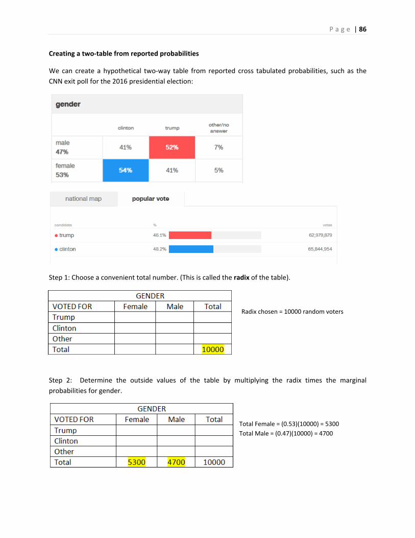
P a g e | 86
Creating a two‐table from reported probabilities
We can create a hypothetical two‐way table from reported cross tabulated probabilities, such as the
CNN exit poll for the 2016 presidential election:
Step 1: Choose a convenient total number. (This is called the radix of the table).
Radix chosen = 10000 random voters
Step 2: Determine the outside values of the table by multiplying the radix times the marginal
probabilities for gender.
Total Female = (0.53)(10000) = 5300
Total Male = (0.47)(10000) = 4700
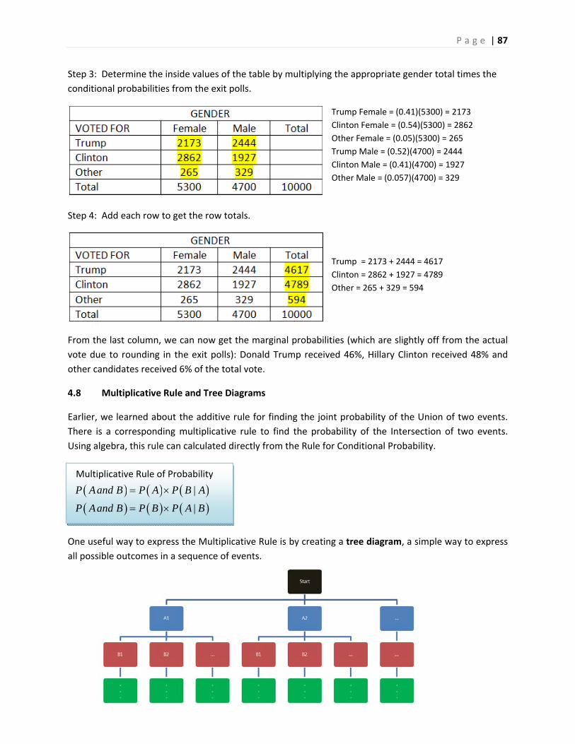
P a g e | 87
Step 3: Determine the inside values of the table by multiplying the appropriate gender total times the
conditional probabilities from the exit polls.
Trump Female = (0.41)(5300) = 2173
Clinton Female = (0.54)(5300) = 2862
Other Female = (0.05)(5300) = 265
Trump Male = (0.52)(4700) = 2444
Clinton Male = (0.41)(4700) = 1927
Other Male = (0.057)(4700) = 329
Step 4: Add each row to get the row totals.
Trump = 2173 + 2444 = 4617
Clinton = 2862 + 1927 = 4789
Other = 265 + 329 = 594
From the last column, we can now get the marginal probabilities (which are slightly off from the actual
vote due to rounding in the exit polls): Donald Trump received 46%, Hillary Clinton received 48% and
other candidates received 6% of the total vote.
4.8 Multiplicative Rule and Tree Diagrams
Earlier, we learned about the additive rule for finding the joint probability of the Union of two events.
There is a corresponding multiplicative rule to find the probability of the Intersection of two events.
Using algebra, this rule can calculated directly from the Rule for Conditional Probability.
One useful way to express the Multiplicative Rule is by creating a tree diagram, a simple way to express
all possible outcomes in a sequence of events.
Multiplicative Rule of Probability
|
|
P Aand B P A P B A
P Aand B P B P A B
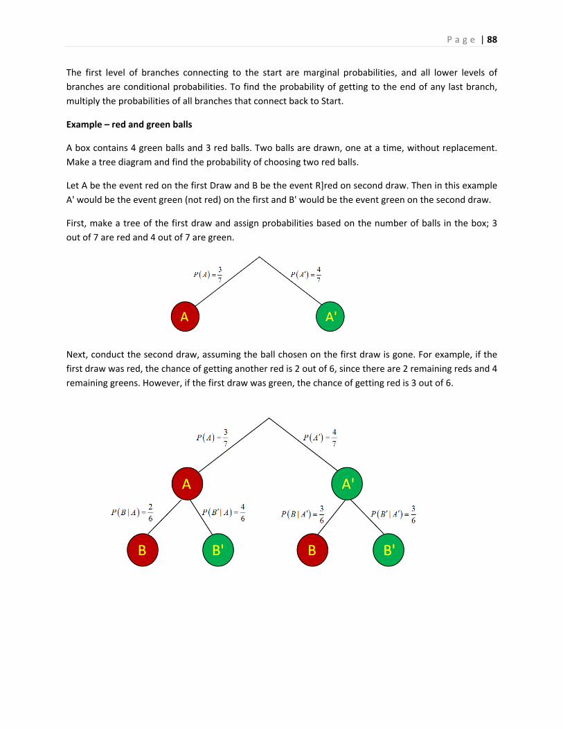
P a g e | 88
The first level of branches connecting to the start are marginal probabilities, and all lower levels of
branches are conditional probabilities. To find the probability of getting to the end of any last branch,
multiply the probabilities of all branches that connect back to Start.
Example – red and green balls
A box contains 4 green balls and 3 red balls. Two balls are drawn, one at a time, without replacement.
Make a tree diagram and find the probability of choosing two red balls.
Let A be the event red on the first Draw and B be the event R]red on second draw. Then in this example
A' would be the event green (not red) on the first and B' would be the event green on the second draw.
First, make a tree of the first draw and assign probabilities based on the number of balls in the box; 3
out of 7 are red and 4 out of 7 are green.
Next, conduct the second draw, assuming the ball chosen on the first draw is gone. For example, if the
first draw was red, the chance of getting another red is 2 out of 6, since there are 2 remaining reds and 4
remaining greens. However, if the first draw was green, the chance of getting red is 3 out of 6.
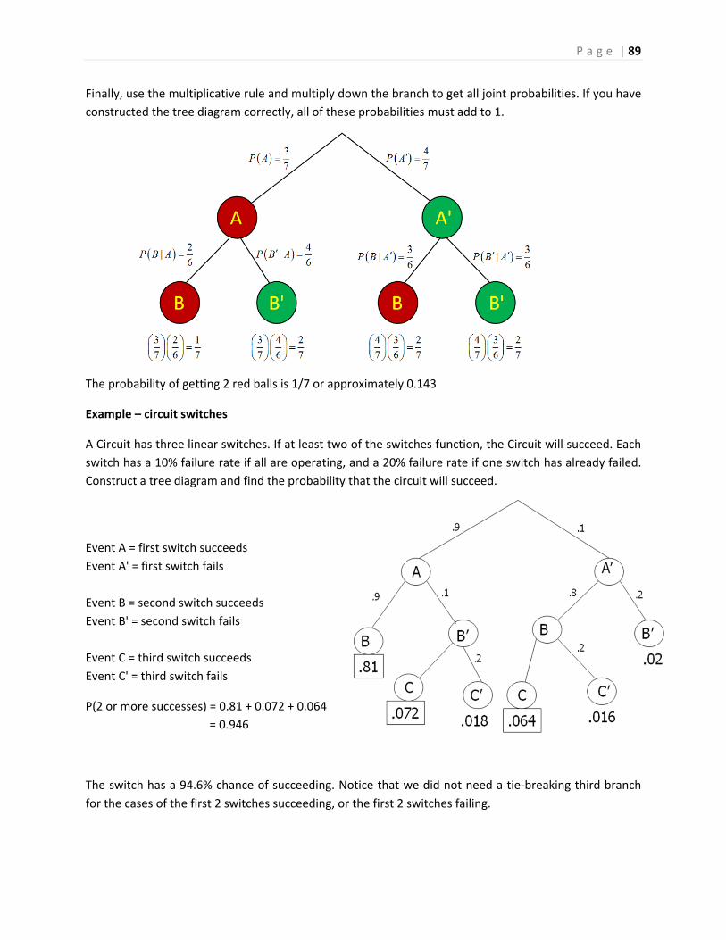
P a g e | 89
Finally, use the multiplicative rule and multiply down the branch to get all joint probabilities. If you have
constructed the tree diagram correctly, all of these probabilities must add to 1.
The probability of getting 2 red balls is 1/7 or approximately 0.143
Example – circuit switches
A Circuit has three linear switches. If at least two of the switches function, the Circuit will succeed. Each
switch has a 10% failure rate if all are operating, and a 20% failure rate if one switch has already failed.
Construct a tree diagram and find the probability that the circuit will succeed.
Event A = first switch succeeds
Event A' = first switch fails
Event B = second switch succeeds
Event B' = second switch fails
Event C = third switch succeeds
Event C' = third switch fails
P(2 or more successes) = 0.81 + 0.072 + 0.064
= 0.946
The switch has a 94.6% chance of succeeding. Notice that we did not need a tie‐breaking third branch
for the cases of the first 2 switches succeeding, or the first 2 switches failing.
P a g e | 90
4.9 Independence
Two events are considered independent if the probability of one event occurring is not changed by
knowing if the other event occurred or not. Events that are not independent are called dependent.
Here are examples of independent (unrelated) events:
A fair coin flip comes up heads; the coin is flipped again and comes up heads.
A student is unable to attend a math class at De Anza College; it rains today in New York City.
A house in San Francisco starts on fire; on the same day, a house in Dallas starts on fire.
A patient is diagnosed with cancer; on the same day, another patient is diagnosed with pneumonia.
In these independent events, the probability of the second event occurring is not affected by whether
the first event occurs.
Examples of dependent (related) events
A student gets an A on the first exam; the same student gets an A on the second exam.
A person has never smoked; the same person gets lung cancer.
An earthquake destroys a home in San Francisco; on the same day, an earthquake destroys a home
in Oakland.
A student majors in Computer Science; the same student wants to work for Google.
In these dependent events, the probability of the second event occurring is affected by whether the first
event occurs:
A student who gets an A on an exam is more likely to get an A on another exam.
A non‐smoker is less likely to get lung cancer than is a smoker.
A single strong earthquake will affect homes all over the Bay Area.
A Computer Science major is more likely to work for a tech company, such as Google.
The mathematical definition of independent events means that the marginal probability of the first
event occurring is the same as the conditional probability of the first occurring given the second event
occurred. We can then adjust the Multiplicative Rule to get three formulas, any of which can be used to
test for independence:
The last formula is particularly useful and can be easily generalized to find the joint probability of many
independent events from looking at the simple marginal probabilities, making random sampling in
statistical research so critical.
If events A and B are independent, then the following statements are all true
|
|
P A P A B
P B P B A
P A and B P A P B
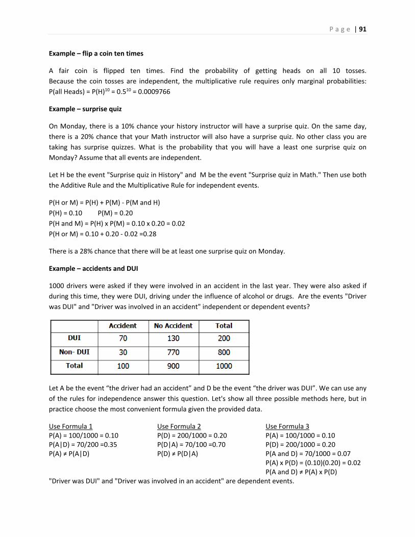
P a g e | 91
Example – flip a coin ten times
A fair coin is flipped ten times. Find the probability of getting heads on all 10 tosses.
Because the coin tosses are independent, the multiplicative rule requires only marginal probabilities:
P(all Heads) = P(H)10 = 0.510 = 0.0009766
Example – surprise quiz
On Monday, there is a 10% chance your history instructor will have a surprise quiz. On the same day,
there is a 20% chance that your Math instructor will also have a surprise quiz. No other class you are
taking has surprise quizzes. What is the probability that you will have a least one surprise quiz on
Monday? Assume that all events are independent.
Let H be the event "Surprise quiz in History" and M be the event "Surprise quiz in Math." Then use both
the Additive Rule and the Multiplicative Rule for independent events.
P(H or M) = P(H) + P(M) ‐ P(M and H)
P(H) = 0.10 P(M) = 0.20
P(H and M) = P(H) x P(M) = 0.10 x 0.20 = 0.02
P(H or M) = 0.10 + 0.20 ‐ 0.02 =0.28
There is a 28% chance that there will be at least one surprise quiz on Monday.
Example – accidents and DUI
1000 drivers were asked if they were involved in an accident in the last year. They were also asked if
during this time, they were DUI, driving under the influence of alcohol or drugs. Are the events "Driver
was DUI" and "Driver was involved in an accident" independent or dependent events?
Let A be the event “the driver had an accident” and D be the event “the driver was DUI”. We can use any
of the rules for independence answer this question. Let's show all three possible methods here, but in
practice choose the most convenient formula given the provided data.
Use Formula 1 P(A) = 100/1000 = 0.10 P(A|D) = 70/200 =0.35 P(A) ≠ P(A|D)
Use Formula 2 P(D) = 200/1000 = 0.20 P(D|A) = 70/100 =0.70 P(D) ≠ P(D|A)
Use Formula 3 P(A) = 100/1000 = 0.10 P(D) = 200/1000 = 0.20 P(A and D) = 70/1000 = 0.07 P(A) x P(D) = (0.10)(0.20) = 0.02 P(A and D) ≠ P(A) x P(D)
"Driver was DUI" and "Driver was involved in an accident" are dependent events.
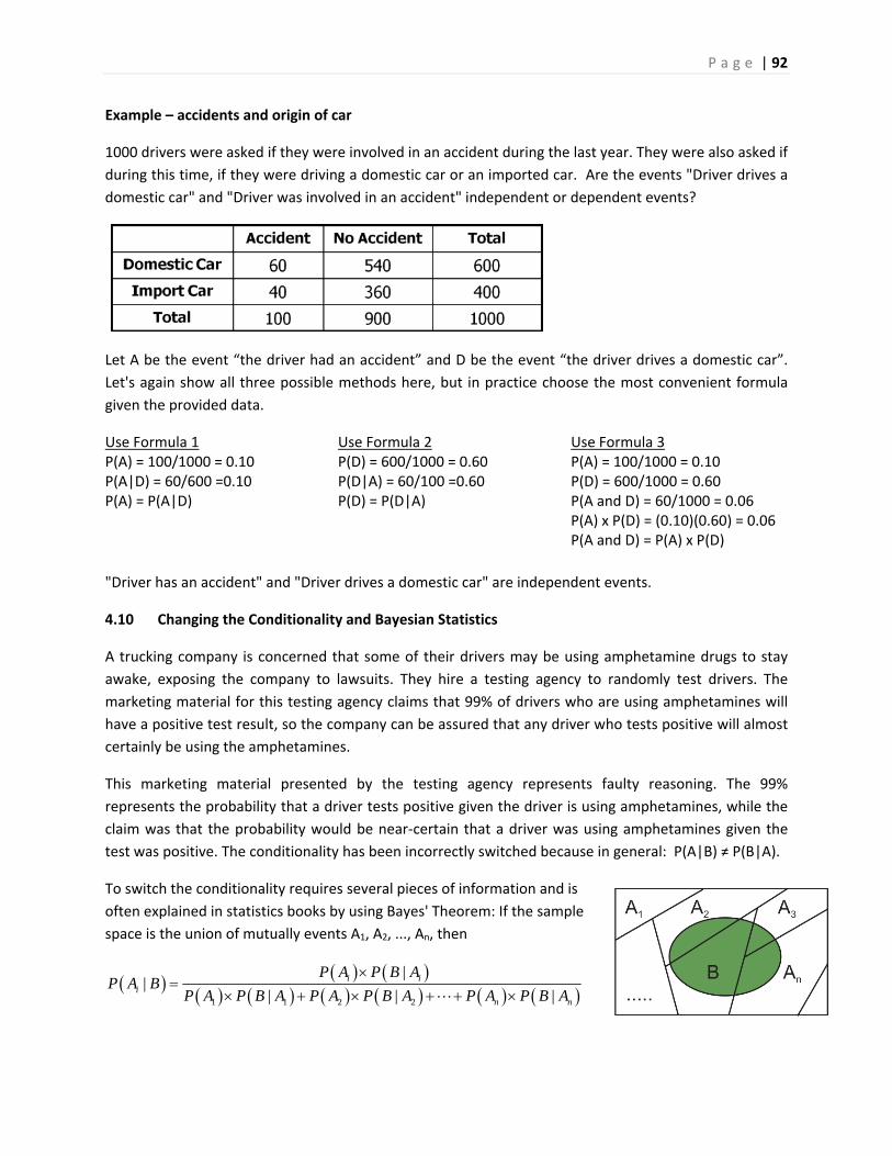
P a g e | 92
Example – accidents and origin of car
1000 drivers were asked if they were involved in an accident during the last year. They were also asked if
during this time, if they were driving a domestic car or an imported car. Are the events "Driver drives a
domestic car" and "Driver was involved in an accident" independent or dependent events?
Let A be the event “the driver had an accident” and D be the event “the driver drives a domestic car”.
Let's again show all three possible methods here, but in practice choose the most convenient formula
given the provided data.
Use Formula 1 P(A) = 100/1000 = 0.10 P(A|D) = 60/600 =0.10 P(A) = P(A|D)
Use Formula 2 P(D) = 600/1000 = 0.60 P(D|A) = 60/100 =0.60 P(D) = P(D|A)
Use Formula 3 P(A) = 100/1000 = 0.10 P(D) = 600/1000 = 0.60 P(A and D) = 60/1000 = 0.06 P(A) x P(D) = (0.10)(0.60) = 0.06 P(A and D) = P(A) x P(D)
"Driver has an accident" and "Driver drives a domestic car" are independent events.
4.10 Changing the Conditionality and Bayesian Statistics
A trucking company is concerned that some of their drivers may be using amphetamine drugs to stay
awake, exposing the company to lawsuits. They hire a testing agency to randomly test drivers. The
marketing material for this testing agency claims that 99% of drivers who are using amphetamines will
have a positive test result, so the company can be assured that any driver who tests positive will almost
certainly be using the amphetamines.
This marketing material presented by the testing agency represents faulty reasoning. The 99%
represents the probability that a driver tests positive given the driver is using amphetamines, while the
claim was that the probability would be near‐certain that a driver was using amphetamines given the
test was positive. The conditionality has been incorrectly switched because in general: P(A|B) ≠ P(B|A).
To switch the conditionality requires several pieces of information and is
often explained in statistics books by using Bayes' Theorem: If the sample
space is the union of mutually events A1, A2, ..., An, then
1 1 2 2
||
| | |i i
in n
P A P B AP A B
P A P B A P A P B A P A P B A
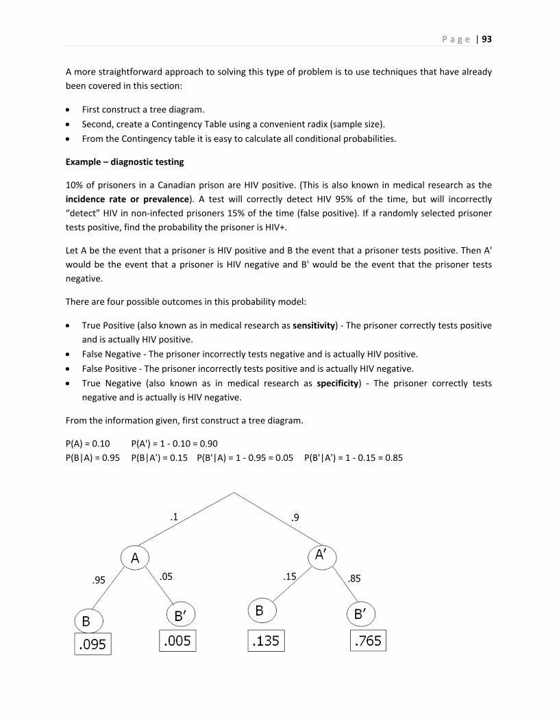
P a g e | 93
A more straightforward approach to solving this type of problem is to use techniques that have already
been covered in this section:
First construct a tree diagram.
Second, create a Contingency Table using a convenient radix (sample size).
From the Contingency table it is easy to calculate all conditional probabilities.
Example – diagnostic testing
10% of prisoners in a Canadian prison are HIV positive. (This is also known in medical research as the
incidence rate or prevalence). A test will correctly detect HIV 95% of the time, but will incorrectly
“detect” HIV in non‐infected prisoners 15% of the time (false positive). If a randomly selected prisoner
tests positive, find the probability the prisoner is HIV+.
Let A be the event that a prisoner is HIV positive and B the event that a prisoner tests positive. Then A'
would be the event that a prisoner is HIV negative and B' would be the event that the prisoner tests
negative.
There are four possible outcomes in this probability model:
True Positive (also known as in medical research as sensitivity) ‐ The prisoner correctly tests positive
and is actually HIV positive.
False Negative ‐ The prisoner incorrectly tests negative and is actually HIV positive.
False Positive ‐ The prisoner incorrectly tests positive and is actually HIV negative.
True Negative (also known as in medical research as specificity) ‐ The prisoner correctly tests
negative and is actually is HIV negative.
From the information given, first construct a tree diagram.
P(A) = 0.10 P(A') = 1 ‐ 0.10 = 0.90
P(B|A) = 0.95 P(B|A') = 0.15 P(B'|A) = 1 ‐ 0.95 = 0.05 P(B'|A') = 1 ‐ 0.15 = 0.85
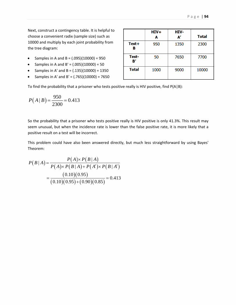
P a g e | 94
Next, construct a contingency table. It is helpful to
choose a convenient radix (sample size) such as
10000 and multiply by each joint probability from
the tree diagram:
Samples in A and B = (.095)(10000) = 950
Samples in A and B' = (.005)(10000) = 50
Samples in A' and B = (.135)(10000) = 1350
Samples in A' and B' = (.765)(10000) = 7650
To find the probability that a prisoner who tests positive really is HIV positive, find P(A|B):
950| 0.413
2300P A B
So the probability that a prisoner who tests positive really is HIV positive is only 41.3%. This result may
seem unusual, but when the incidence rate is lower than the false positive rate, it is more likely that a
positive result on a test will be incorrect.
This problem could have also been answered directly, but much less straightforward by using Bayes'
Theorem:
||
| |
0.10 0.950.413
0.10 0.95 0.90 0.85
P A P B AP B A
P A P B A P A P B A
P a g e | 95
5. Discrete Random Variables
The next two chapters will explore random variables. This chapter covers random variables for data that
is discrete, while the next chapter explores random variables for continuous data.
5.1 What is a Random Variable?
A random variable is a variable in which the value depends upon an experiment, observation or
measurement. This differs from Math classes where one can assign values to the random variables.
Here, the value is assigned by a random process and is not known in advance. For the purposes of this
class, the variable will be numeric.
This chapter covers random variables for data that is discrete, while the next chapter explores random
variables for continuous data.
Like in Mathematics, we will use letters as symbols to represent random variables. Upper case letters
refer to the random variable as a function of some random activity. Lower case letters refer to values of
the random variable, which are numbers.
Example – roll a die
A fair six‐sided die is rolled. Let the random variable X represent the numeric value of the die roll. A five
is rolled.
Upper Case X = the function = the number seen when a fair six‐sided die is rolled.
Lower Case x = the value of the roll = 5
5.2 What is a Discrete Random Variable?
A discrete random variable is a random variable that has only discrete values. Discrete values are
related to counting numbers.
Examples of discrete random variables
The number when a die is rolled.
Possible values = {1, 2, 3, 4, 5, 6}
The number of heads when flipping two coins.
Possible values = {0, 1, 2}
Number of Siblings you have.
Possible Values = {0, 1, 2, …}
Here we don’t know the maximum, but the possible values are still whole numbers.
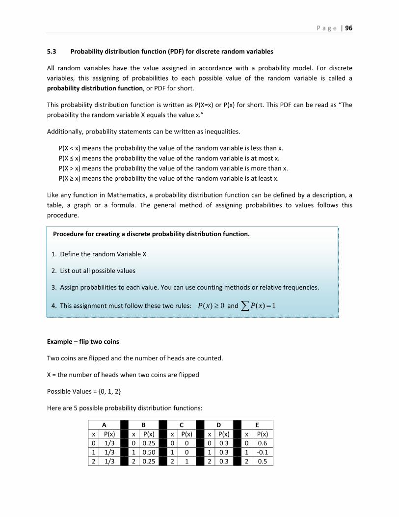
P a g e | 96
5.3 Probability distribution function (PDF) for discrete random variables
All random variables have the value assigned in accordance with a probability model. For discrete
variables, this assigning of probabilities to each possible value of the random variable is called a
probability distribution function, or PDF for short.
This probability distribution function is written as P(X=x) or P(x) for short. This PDF can be read as “The
probability the random variable X equals the value x.”
Additionally, probability statements can be written as inequalities.
P(X < x) means the probability the value of the random variable is less than x.
P(X ≤ x) means the probability the value of the random variable is at most x.
P(X > x) means the probability the value of the random variable is more than x.
P(X ≥ x) means the probability the value of the random variable is at least x.
Like any function in Mathematics, a probability distribution function can be defined by a description, a
table, a graph or a formula. The general method of assigning probabilities to values follows this
procedure.
Example – flip two coins
Two coins are flipped and the number of heads are counted.
X = the number of heads when two coins are flipped
Possible Values = {0, 1, 2}
Here are 5 possible probability distribution functions:
A B C D E
x P(x) x P(x) x P(x) x P(x) x P(x)
0 1/3 0 0.25 0 0 0 0.3 0 0.6
1 1/3 1 0.50 1 0 1 0.3 1 ‐0.1
2 1/3 2 0.25 2 1 2 0.3 2 0.5
Procedure for creating a discrete probability distribution function.
1. Define the random Variable X
2. List out all possible values
3. Assign probabilities to each value. You can use counting methods or relative frequencies.
4. This assignment must follow these two rules: ( ) 0P x and ( ) 1P x
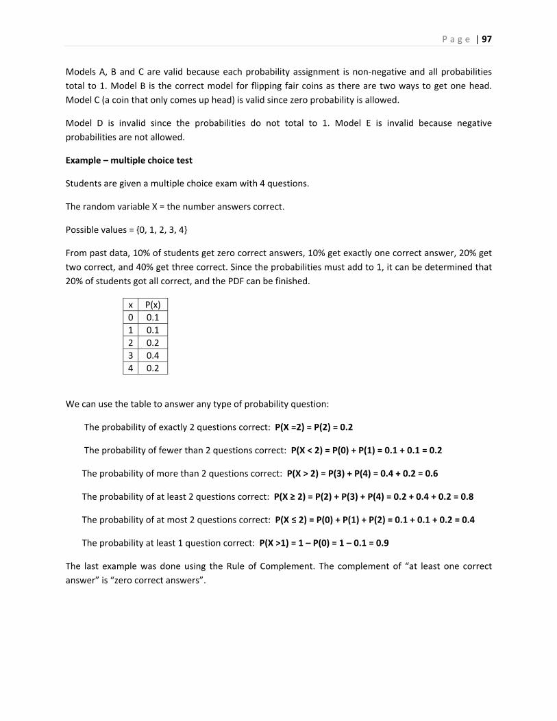
P a g e | 97
Models A, B and C are valid because each probability assignment is non‐negative and all probabilities
total to 1. Model B is the correct model for flipping fair coins as there are two ways to get one head.
Model C (a coin that only comes up head) is valid since zero probability is allowed.
Model D is invalid since the probabilities do not total to 1. Model E is invalid because negative
probabilities are not allowed.
Example – multiple choice test
Students are given a multiple choice exam with 4 questions.
The random variable X = the number answers correct.
Possible values = {0, 1, 2, 3, 4}
From past data, 10% of students get zero correct answers, 10% get exactly one correct answer, 20% get
two correct, and 40% get three correct. Since the probabilities must add to 1, it can be determined that
20% of students got all correct, and the PDF can be finished.
x P(x)
0 0.1
1 0.1
2 0.2
3 0.4
4 0.2
We can use the table to answer any type of probability question:
The probability of exactly 2 questions correct: P(X =2) = P(2) = 0.2
The probability of fewer than 2 questions correct: P(X < 2) = P(0) + P(1) = 0.1 + 0.1 = 0.2
The probability of more than 2 questions correct: P(X > 2) = P(3) + P(4) = 0.4 + 0.2 = 0.6
The probability of at least 2 questions correct: P(X ≥ 2) = P(2) + P(3) + P(4) = 0.2 + 0.4 + 0.2 = 0.8
The probability of at most 2 questions correct: P(X ≤ 2) = P(0) + P(1) + P(2) = 0.1 + 0.1 + 0.2 = 0.4
The probability at least 1 question correct: P(X >1) = 1 – P(0) = 1 – 0.1 = 0.9
The last example was done using the Rule of Complement. The complement of “at least one correct
answer” is “zero correct answers”.
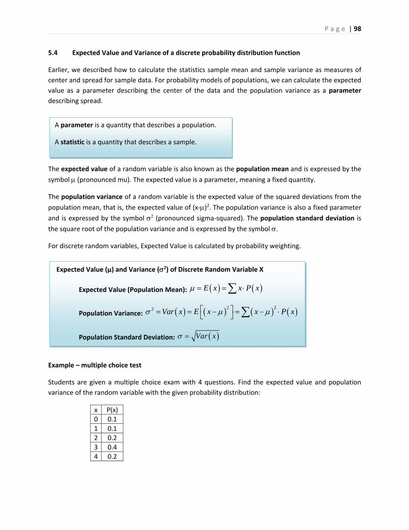
P a g e | 98
5.4 Expected Value and Variance of a discrete probability distribution function
Earlier, we described how to calculate the statistics sample mean and sample variance as measures of
center and spread for sample data. For probability models of populations, we can calculate the expected
value as a parameter describing the center of the data and the population variance as a parameter
describing spread.
The expected value of a random variable is also known as the population mean and is expressed by the
symbol (pronounced mu). The expected value is a parameter, meaning a fixed quantity.
The population variance of a random variable is the expected value of the squared deviations from the
population mean, that is, the expected value of (x‐)2. The population variance is also a fixed parameter
and is expressed by the symbol (pronounced sigma‐squared). The population standard deviation is
the square root of the population variance and is expressed by the symbol .
For discrete random variables, Expected Value is calculated by probability weighting.
Example – multiple choice test
Students are given a multiple choice exam with 4 questions. Find the expected value and population
variance of the random variable with the given probability distribution:
x P(x)
0 0.1
1 0.1
2 0.2
3 0.4
4 0.2
Expected Value (µ) and Variance (2) of Discrete Random Variable X
Expected Value (Population Mean): E x x P x
Population Variance: 222 Var x E x x P x
Population Standard Deviation: Var x
A parameter is a quantity that describes a population.
A statistic is a quantity that describes a sample.

P a g e | 99
To find the expected value of X, weigh each value of X by the probability, then add them up.
x P(x) ( )x P x
0 0.1 0.0
1 0.1 0.1
2 0.2 0.4
3 0.4 1.2
4 0.2 0.8
Total 1.0 = 2.5
The expected number of correct answers is 2.5.
Note that the Expected Value of a random variable does not have to be a possible answer. For example,
in 2015 the expected number of children an American woman will birth is 1.84, a quantity also known as
the fertility rate.
To find the population variance, determine the quantity (x‐)2 for each value of the random variable,
weight by probability, and the add them up.
x P(x) ( )x P x x‐ (x‐)2 2( )x P x
0 0.1 0.0 ‐2.5 6.25 0.625
1 0.1 0.1 ‐1.5 2.25 0.225
2 0.2 0.4 ‐0.5 0.25 0.050
3 0.4 1.2 0.5 0.25 0.100
4 0.2 0.8 1.5 2.25 0.450
Total 1.0 = 2.5 = 1.45
The population variance is 1.45 and the population standard deviation is 1.45 =1.20 correct answers.
Example – Major Atlantic Hurricanes
Hurricanes are tropical cyclones that have wind speeds of at least 74
MPH. Hurricanes are classified by wind speed from Category 1 to
Category 5 by the Saffir‐Simpson Scale. Major Hurricanes are storms that
have sustained winds of at least 111 MPH (Category 3 or higher).
Historically, there have been anywhere from zero to eight major
hurricanes in the Atlantic Ocean during a year. Based on this data, we
can create a discrete probability distribution function X for number of
major Atlantic hurricanes in a year65:
x 0 1 2 3 4 5 6 7 8
P(x) 0.187 0.290 0.271 0.090 0.054 0.054 0.036 0.012 0.006
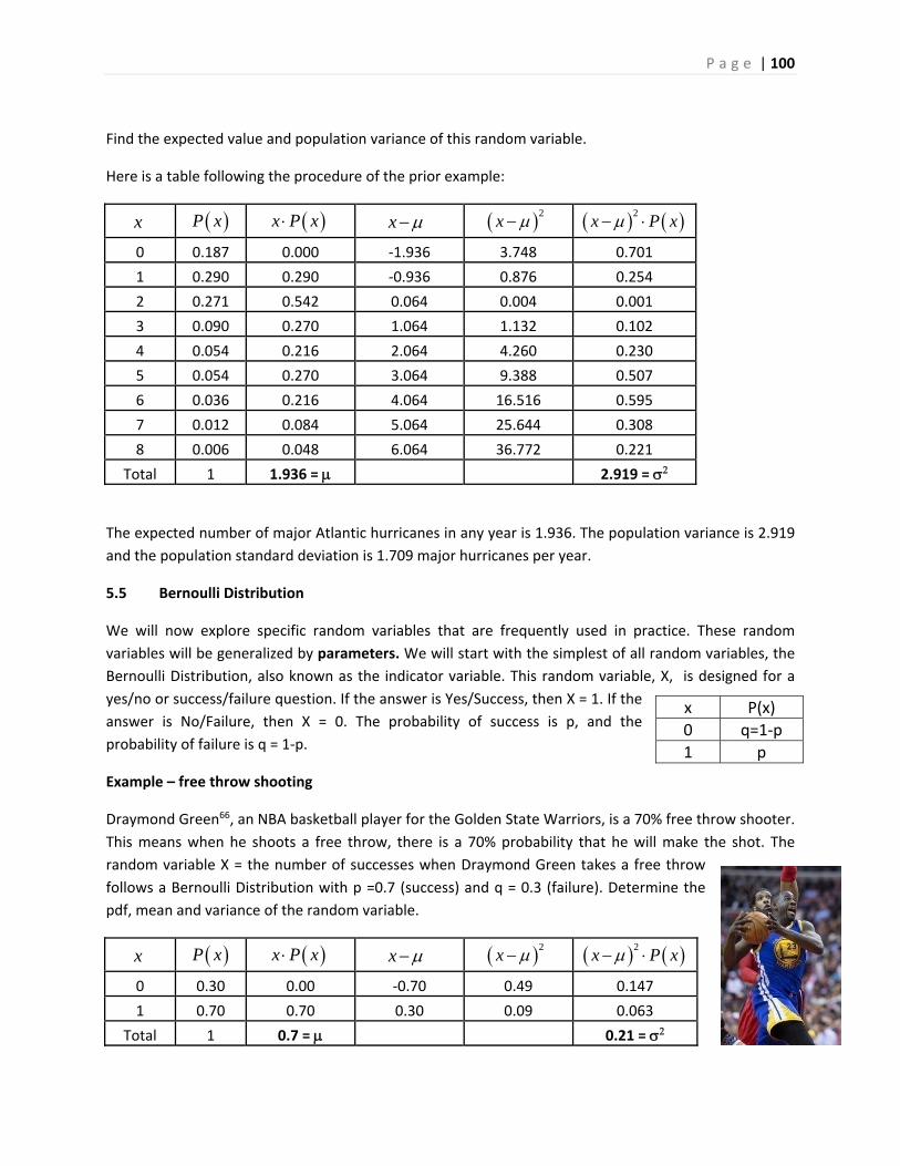
P a g e | 100
Find the expected value and population variance of this random variable.
Here is a table following the procedure of the prior example:
x P x x P x x 2x 2
x P x
0 0.187 0.000 ‐1.936 3.748 0.701
1 0.290 0.290 ‐0.936 0.876 0.254
2 0.271 0.542 0.064 0.004 0.001
3 0.090 0.270 1.064 1.132 0.102
4 0.054 0.216 2.064 4.260 0.230
5 0.054 0.270 3.064 9.388 0.507
6 0.036 0.216 4.064 16.516 0.595
7 0.012 0.084 5.064 25.644 0.308
8 0.006 0.048 6.064 36.772 0.221
Total 1 1.936 = 2.919 =
The expected number of major Atlantic hurricanes in any year is 1.936. The population variance is 2.919
and the population standard deviation is 1.709 major hurricanes per year.
5.5 Bernoulli Distribution
We will now explore specific random variables that are frequently used in practice. These random
variables will be generalized by parameters. We will start with the simplest of all random variables, the
Bernoulli Distribution, also known as the indicator variable. This random variable, X, is designed for a
yes/no or success/failure question. If the answer is Yes/Success, then X = 1. If the
answer is No/Failure, then X = 0. The probability of success is p, and the
probability of failure is q = 1‐p.
Example – free throw shooting
Draymond Green66, an NBA basketball player for the Golden State Warriors, is a 70% free throw shooter.
This means when he shoots a free throw, there is a 70% probability that he will make the shot. The
random variable X = the number of successes when Draymond Green takes a free throw
follows a Bernoulli Distribution with p =0.7 (success) and q = 0.3 (failure). Determine the
pdf, mean and variance of the random variable.
x P x x P x x 2x 2
x P x
0 0.30 0.00 ‐0.70 0.49 0.147
1 0.70 0.70 0.30 0.09 0.063
Total 1 0.7 = 0.21 =
x P(x)
0 q=1‐p
1 p
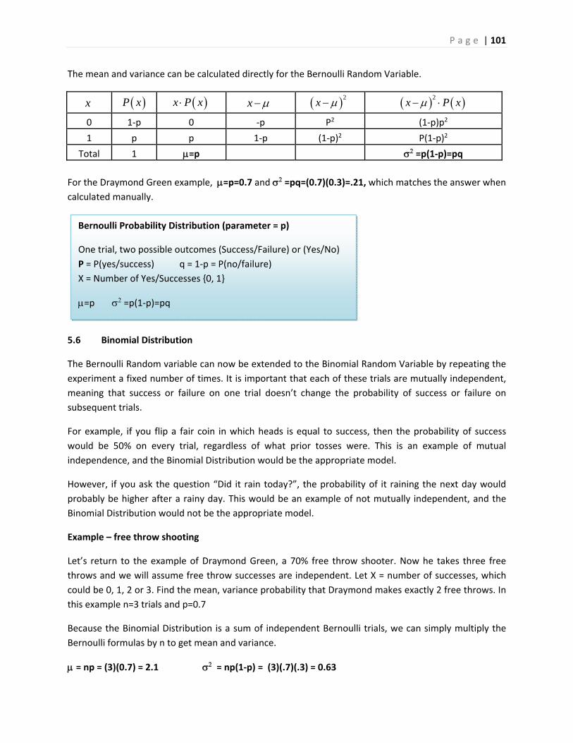
P a g e | 101
The mean and variance can be calculated directly for the Bernoulli Random Variable.
x P x x P x x 2x 2
x P x
0 1‐p 0 ‐p P2 (1‐p)p2
1 p p 1‐p (1‐p)2 P(1‐p)2
Total 1 =p =p(1‐p)=pq
For the Draymond Green example, =p=0.7 and =pq=(0.7)(0.3)=.21, which matches the answer when
calculated manually.
5.6 Binomial Distribution
The Bernoulli Random variable can now be extended to the Binomial Random Variable by repeating the
experiment a fixed number of times. It is important that each of these trials are mutually independent,
meaning that success or failure on one trial doesn’t change the probability of success or failure on
subsequent trials.
For example, if you flip a fair coin in which heads is equal to success, then the probability of success
would be 50% on every trial, regardless of what prior tosses were. This is an example of mutual
independence, and the Binomial Distribution would be the appropriate model.
However, if you ask the question “Did it rain today?”, the probability of it raining the next day would
probably be higher after a rainy day. This would be an example of not mutually independent, and the
Binomial Distribution would not be the appropriate model.
Example – free throw shooting
Let’s return to the example of Draymond Green, a 70% free throw shooter. Now he takes three free
throws and we will assume free throw successes are independent. Let X = number of successes, which
could be 0, 1, 2 or 3. Find the mean, variance probability that Draymond makes exactly 2 free throws. In
this example n=3 trials and p=0.7
Because the Binomial Distribution is a sum of independent Bernoulli trials, we can simply multiply the
Bernoulli formulas by n to get mean and variance.
= np = (3)(0.7) = 2.1 = np(1‐p) = (3)(.7)(.3) = 0.63
Bernoulli Probability Distribution (parameter = p)
One trial, two possible outcomes (Success/Failure) or (Yes/No)
P = P(yes/success) q = 1‐p = P(no/failure)
X = Number of Yes/Successes {0, 1}
=p =p(1‐p)=pq
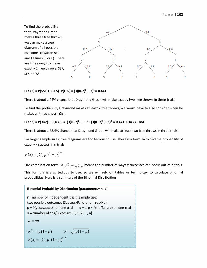
P a g e | 102
To find the probability
that Draymond Green
makes three free throws,
we can make a tree
diagram of all possible
outcomes of Successes
and Failures (S or F). There
are three ways to make
exactly 2 free throws: SSF,
SFS or FSS.
P(X=2) = P(SSF)+P(SFS)+P(FSS) = (3)(0.7)2(0.3)1 = 0.441
There is about a 44% chance that Draymond Green will make exactly two free throws in three trials.
To find the probability Draymond makes at least 2 free throws, we would have to also consider when he
makes all three shots (SSS).
P(X≥2) = P(X=2) + P(X =3) = (3)(0.7)2(0.3)1 + (3)(0.7)3(0.3)0 = 0.441 +.343 = .784
There is about a 78.4% chance that Draymond Green will make at least two free throws in three trials.
For larger sample sizes, tree diagrams are too tedious to use. There is a formula to find the probability of
exactly x success in n trials:
( ) 1n xx
n xP x C p p
The combination formula !
! !n
n x x n xC means the number of ways x successes can occur out of n trials.
This formula is also tedious to use, so we will rely on tables or technology to calculate binomial
probabilities. Here is a summary of the Binomial Distribution
Binomial Probability Distribution (parameters= n, p)
n= number of independent trials (sample size)
two possible outcomes (Success/Failure) or (Yes/No)
p = P(yes/success) on one trial q = 1‐p = P(no/failure) on one trial
X = Number of Yes/Successes {0, 1, 2, ..., n}
np
2 1 1np p np p
( ) 1n xx
n xP x C p p
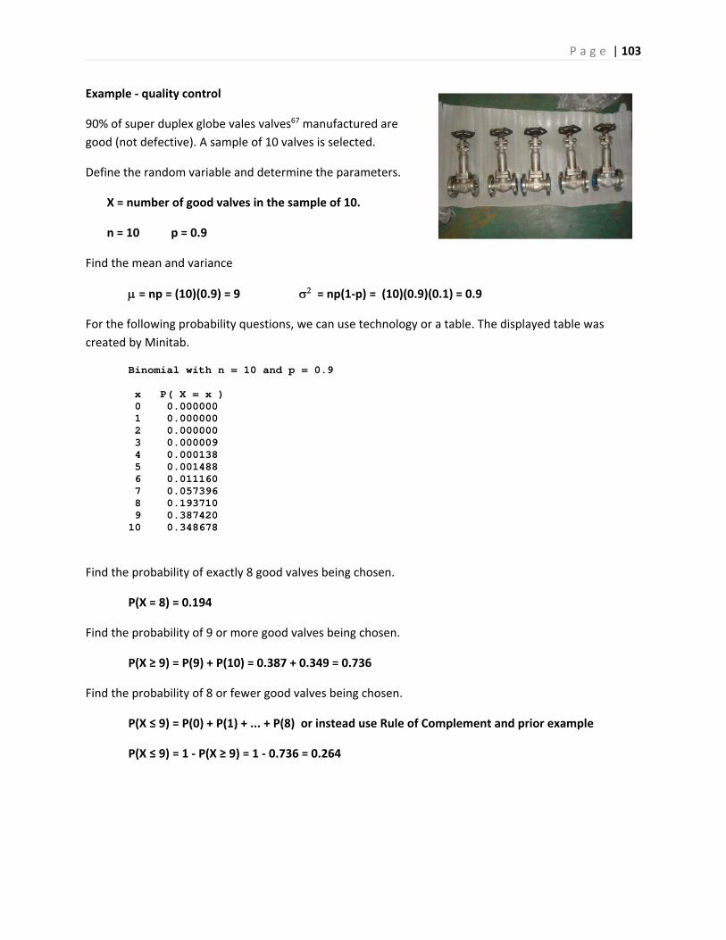
P a g e | 103
Example ‐ quality control
90% of super duplex globe vales valves67 manufactured are
good (not defective). A sample of 10 valves is selected.
Define the random variable and determine the parameters.
X = number of good valves in the sample of 10.
n = 10 p = 0.9
Find the mean and variance
= np = (10)(0.9) = 9 = np(1‐p) = (10)(0.9)(0.1) = 0.9
For the following probability questions, we can use technology or a table. The displayed table was
created by Minitab.
Binomial with n = 10 and p = 0.9 x P( X = x ) 0 0.000000 1 0.000000 2 0.000000 3 0.000009 4 0.000138 5 0.001488 6 0.011160 7 0.057396 8 0.193710 9 0.387420 10 0.348678
Find the probability of exactly 8 good valves being chosen.
P(X = 8) = 0.194
Find the probability of 9 or more good valves being chosen.
P(X ≥ 9) = P(9) + P(10) = 0.387 + 0.349 = 0.736
Find the probability of 8 or fewer good valves being chosen.
P(X ≤ 9) = P(0) + P(1) + ... + P(8) or instead use Rule of Complement and prior example
P(X ≤ 9) = 1 ‐ P(X ≥ 9) = 1 ‐ 0.736 = 0.264
P a g e | 104
5.7 Geometric Distribution
Consider these two random variables, which both start with repeated Bernoulli trials:
1. Flip a fair coin 10 times. Let X = the number of heads.
2. Flip a fair coin repeatedly until you get a head. Let X = the number of total flips.
The first random variable is a binomial random variable where n =10 and p=0.5. The possible values of X
are {0,1,2,3,4,5,6,7,8,9,10}
The second random variable is unusual in that there are an infinite number of possibilities for X. The
possible number of flips until you get a head are {1, 2, 3, ...}. This is called the geometric distribution
and its features are shown in the box.
Example – free throw shooting
Let’s again return to the example of Draymond Green, a 70% free throw shooter. Now let X = the
number of free throws Draymond takes until he makes a shot. X follows a geometric distribution.
The expected number of shots: 1
1.43p
shots. The variance: 22
1 0.70.612
0.7
The probability that Draymond Green takes exactly 3 shots to make a free throw:
2( 3) 0.7 0.3 0.063P X
The probability that Draymond Green takes 3 or more shots to make a free throw:
Since ( 3) (3) (4) ...P X P P is an infinite sum, is better to use Rule of Complement.
0 1( 3) 1 (1) (2) (0.7)(0.3) (0.7)(0.3) 1 0.91 0.09P X P P
Geometric Probability Distribution (parameter= p)
two possible outcomes (Success/Failure) or (Yes/No)
p = P(yes/success) on one trial q = 1‐p = P(no/failure) on one trial
X = Number of independent trials until the first success. (1, 2, 3, ...)
1
p 2
2 2
1 1p p
p p
1( ) 1
xP x p p
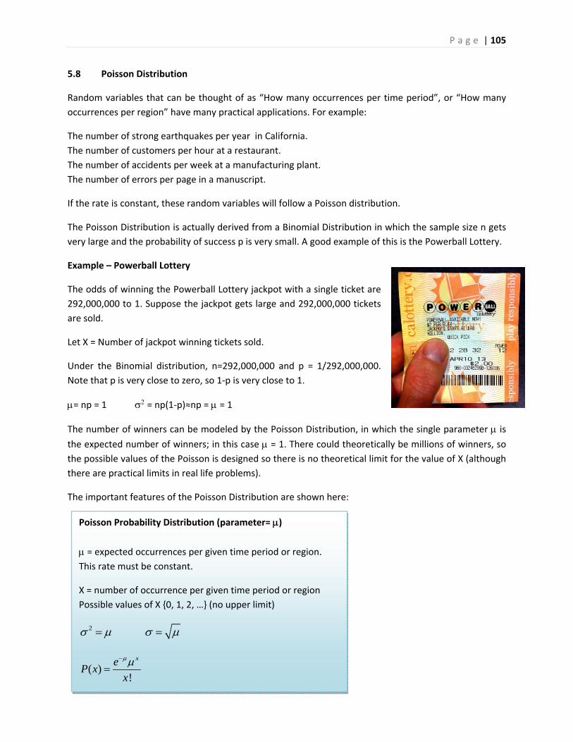
P a g e | 105
5.8 Poisson Distribution
Random variables that can be thought of as “How many occurrences per time period”, or “How many
occurrences per region” have many practical applications. For example:
The number of strong earthquakes per year in California.
The number of customers per hour at a restaurant.
The number of accidents per week at a manufacturing plant.
The number of errors per page in a manuscript.
If the rate is constant, these random variables will follow a Poisson distribution.
The Poisson Distribution is actually derived from a Binomial Distribution in which the sample size n gets
very large and the probability of success p is very small. A good example of this is the Powerball Lottery.
Example – Powerball Lottery
The odds of winning the Powerball Lottery jackpot with a single ticket are
292,000,000 to 1. Suppose the jackpot gets large and 292,000,000 tickets
are sold.
Let X = Number of jackpot winning tickets sold.
Under the Binomial distribution, n=292,000,000 and p = 1/292,000,000.
Note that p is very close to zero, so 1‐p is very close to 1.
= np = 1 = np(1‐p)≈np = = 1
The number of winners can be modeled by the Poisson Distribution, in which the single parameter is the expected number of winners; in this case = 1. There could theoretically be millions of winners, so
the possible values of the Poisson is designed so there is no theoretical limit for the value of X (although
there are practical limits in real life problems).
The important features of the Poisson Distribution are shown here:
Poisson Probability Distribution (parameter= )
= expected occurrences per given time period or region.
This rate must be constant.
X = number of occurrence per given time period or region
Possible values of X {0, 1, 2, …} (no upper limit)
2
( )!
xeP x
x
P a g e | 106
Find the probability of no jackpot winners.
1 02(0) 0.368
0!
eP
Find the probability of at least one jackpot winner. The answer calculated directly is an infinite sum, so
instead use the Rule of Complement
( 1) (1) (2)P X P P
1 02( 1) 1 (0) 1 0.632
0!
eP X P
There is a 63.2% chance that at least one winning ticket is sold.
Example – earthquakes
Earthquakes of Richter magnitude 3 or greater occur on a
certain fault at a rate of two times per every year. Assume
this rate is constant.
Find the probability of at least one earthquake of RM 3 or
greater in the next year.
= 2 per year
2 02( 1) 1 (0) 1 0.865
0!
eP X P
Find the probability of exactly 6 earthquakes of RM 3 or greater in the next 2 years.
When determining the parameter m for the Poisson Distribution, make sure that the expected value is
over the time period or region given in the problem. Since these earthquakes occur at a rate of 2 per
year, we would expect 4 earthquakes in 2 years.
= (2 per year)( 2 years) = 4
6 04( 6) 0.104
6!
eP X
Counting methods that are modeled by random variables that follow a Poisson Distribution are also
called a Poisson Process.
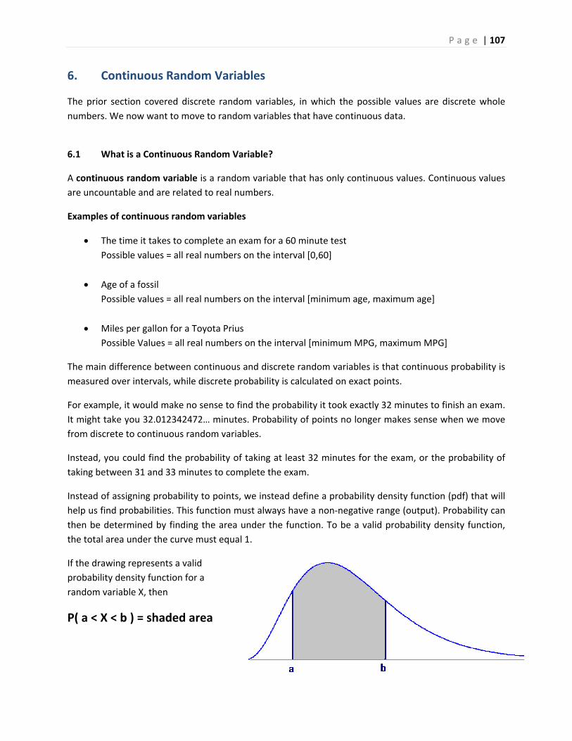
P a g e | 107
6. Continuous Random Variables
The prior section covered discrete random variables, in which the possible values are discrete whole
numbers. We now want to move to random variables that have continuous data.
6.1 What is a Continuous Random Variable?
A continuous random variable is a random variable that has only continuous values. Continuous values
are uncountable and are related to real numbers.
Examples of continuous random variables
The time it takes to complete an exam for a 60 minute test
Possible values = all real numbers on the interval [0,60]
Age of a fossil
Possible values = all real numbers on the interval [minimum age, maximum age]
Miles per gallon for a Toyota Prius
Possible Values = all real numbers on the interval [minimum MPG, maximum MPG]
The main difference between continuous and discrete random variables is that continuous probability is
measured over intervals, while discrete probability is calculated on exact points.
For example, it would make no sense to find the probability it took exactly 32 minutes to finish an exam.
It might take you 32.012342472… minutes. Probability of points no longer makes sense when we move
from discrete to continuous random variables.
Instead, you could find the probability of taking at least 32 minutes for the exam, or the probability of
taking between 31 and 33 minutes to complete the exam.
Instead of assigning probability to points, we instead define a probability density function (pdf) that will
help us find probabilities. This function must always have a non‐negative range (output). Probability can
then be determined by finding the area under the function. To be a valid probability density function,
the total area under the curve must equal 1.
If the drawing represents a valid
probability density function for a
random variable X, then
P( a < X < b ) = shaded area
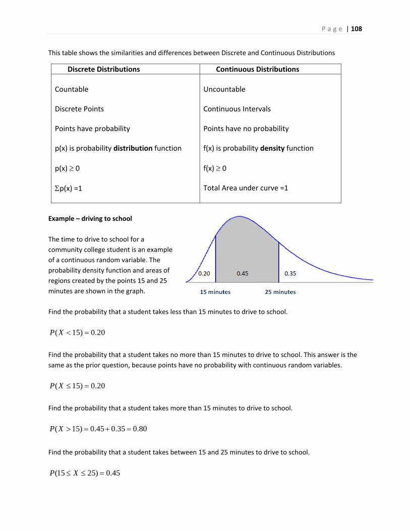
P a g e | 108
This table shows the similarities and differences between Discrete and Continuous Distributions
Example – driving to school
The time to drive to school for a
community college student is an example
of a continuous random variable. The
probability density function and areas of
regions created by the points 15 and 25
minutes are shown in the graph.
Find the probability that a student takes less than 15 minutes to drive to school.
( 15) 0.20P X
Find the probability that a student takes no more than 15 minutes to drive to school. This answer is the
same as the prior question, because points have no probability with continuous random variables.
( 15) 0.20P X
Find the probability that a student takes more than 15 minutes to drive to school.
( 15) 0.45 0.35 0.80P X
Find the probability that a student takes between 15 and 25 minutes to drive to school.
(15 25) 0.45P X
Discrete Distributions Continuous Distributions
Countable Discrete Points Points have probability p(x) is probability distribution function
p(x) 0
p(x) =1
Uncountable Continuous Intervals Points have no probability f(x) is probability density function
f(x) 0 Total Area under curve =1
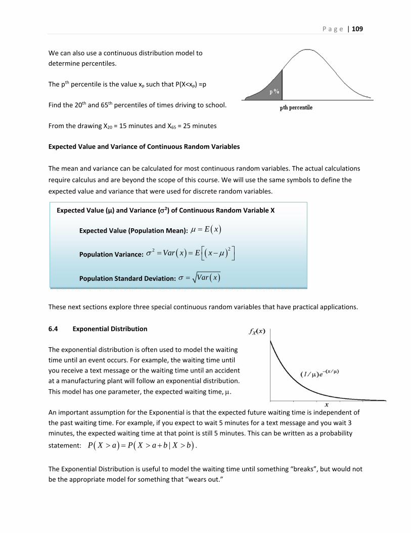
P a g e | 109
We can also use a continuous distribution model to
determine percentiles.
The pth percentile is the value xp such that P(X<xp) =p
Find the 20th and 65th percentiles of times driving to school.
From the drawing X20 = 15 minutes and X65 = 25 minutes
Expected Value and Variance of Continuous Random Variables
The mean and variance can be calculated for most continuous random variables. The actual calculations
require calculus and are beyond the scope of this course. We will use the same symbols to define the
expected value and variance that were used for discrete random variables.
These next sections explore three special continuous random variables that have practical applications.
6.4 Exponential Distribution
The exponential distribution is often used to model the waiting
time until an event occurs. For example, the waiting time until
you receive a text message or the waiting time until an accident
at a manufacturing plant will follow an exponential distribution.
This model has one parameter, the expected waiting time, .
An important assumption for the Exponential is that the expected future waiting time is independent of
the past waiting time. For example, if you expect to wait 5 minutes for a text message and you wait 3
minutes, the expected waiting time at that point is still 5 minutes. This can be written as a probability
statement: |P X a P X a b X b .
The Exponential Distribution is useful to model the waiting time until something “breaks”, but would not
be the appropriate model for something that “wears out.”
Expected Value (µ) and Variance (2) of Continuous Random Variable X
Expected Value (Population Mean): E x
Population Variance: 22 Var x E x
Population Standard Deviation: Var x
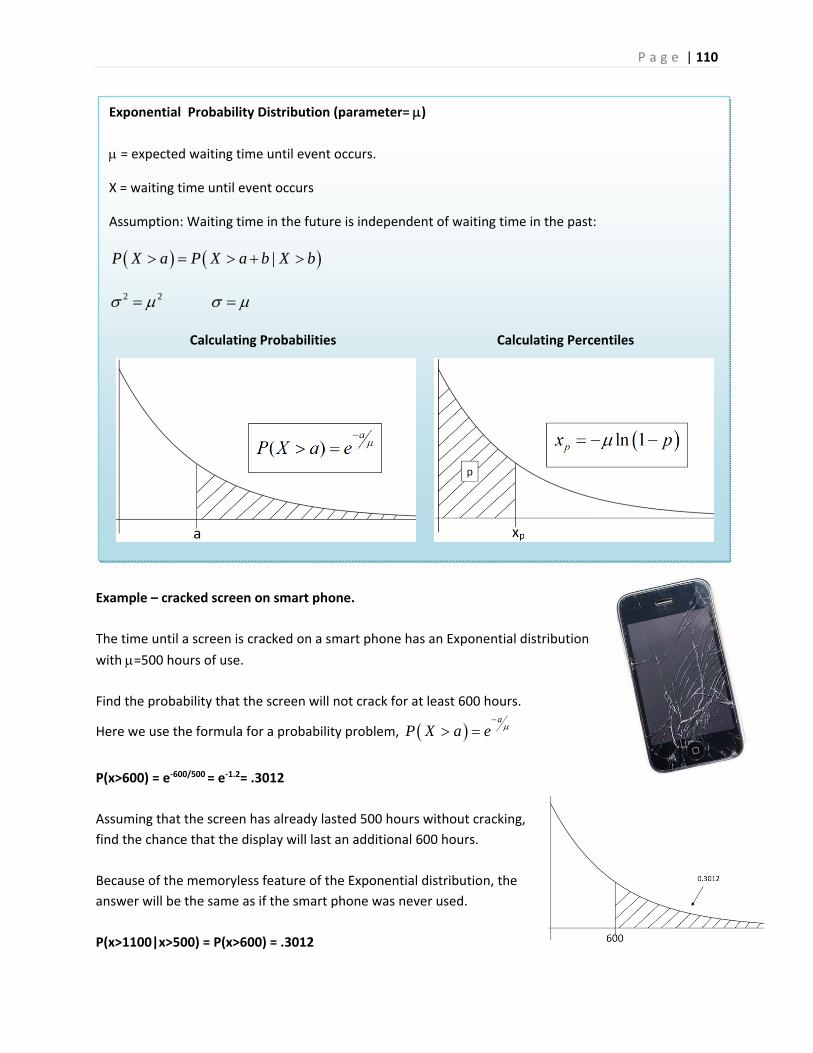
P a g e | 110
Example – cracked screen on smart phone.
The time until a screen is cracked on a smart phone has an Exponential distribution
with =500 hours of use.
Find the probability that the screen will not crack for at least 600 hours.
Here we use the formula for a probability problem, a
P X a e
P(x>600) = e‐600/500 = e‐1.2= .3012
Assuming that the screen has already lasted 500 hours without cracking,
find the chance that the display will last an additional 600 hours.
Because of the memoryless feature of the Exponential distribution, the
answer will be the same as if the smart phone was never used.
P(x>1100|x>500) = P(x>600) = .3012
Exponential Probability Distribution (parameter= )
= expected waiting time until event occurs.
X = waiting time until event occurs
Assumption: Waiting time in the future is independent of waiting time in the past:
|P X a P X a b X b
2 2
Calculating Probabilities Calculating Percentiles
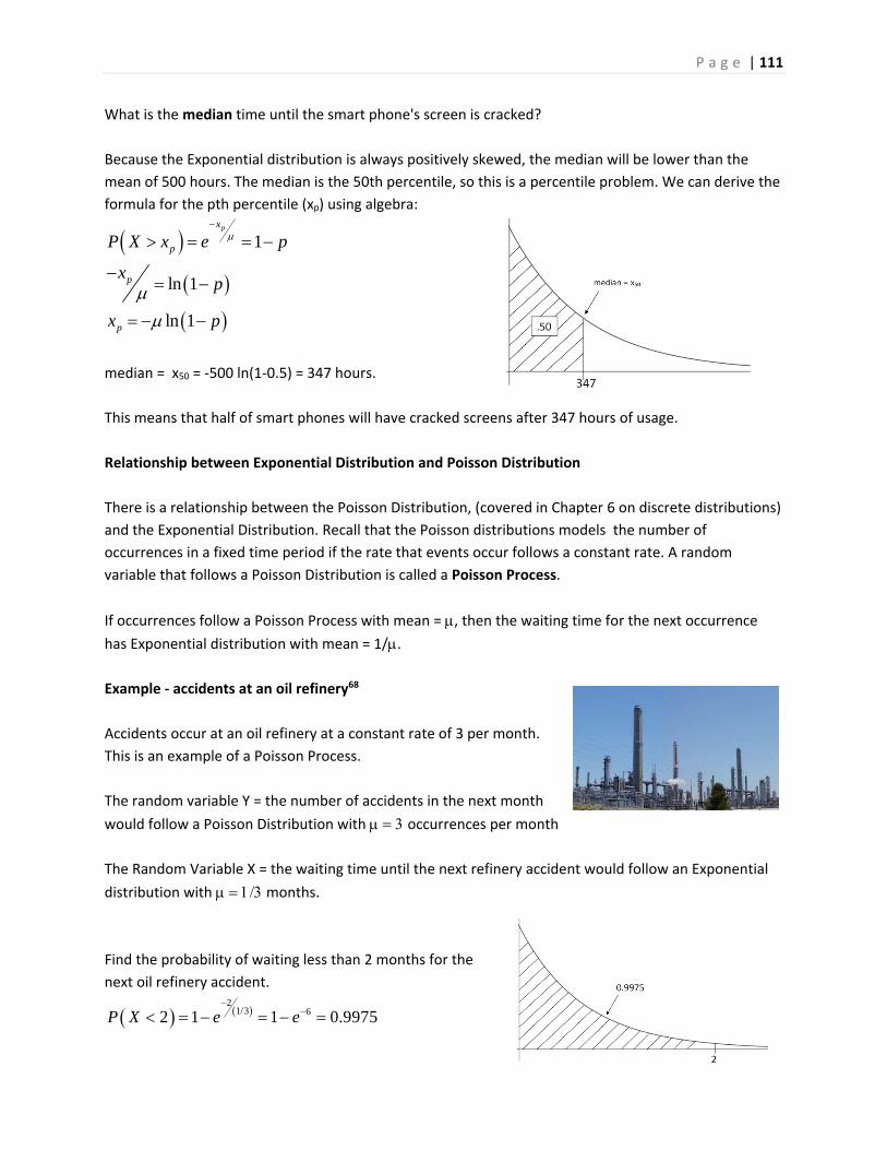
P a g e | 111
What is the median time until the smart phone's screen is cracked?
Because the Exponential distribution is always positively skewed, the median will be lower than the
mean of 500 hours. The median is the 50th percentile, so this is a percentile problem. We can derive the
formula for the pth percentile (xp) using algebra:
1
ln 1
ln 1
px
p
p
p
P X x e p
xp
x p
median = x50 = ‐500 ln(1‐0.5) = 347 hours.
This means that half of smart phones will have cracked screens after 347 hours of usage.
Relationship between Exponential Distribution and Poisson Distribution
There is a relationship between the Poisson Distribution, (covered in Chapter 6 on discrete distributions)
and the Exponential Distribution. Recall that the Poisson distributions models the number of
occurrences in a fixed time period if the rate that events occur follows a constant rate. A random
variable that follows a Poisson Distribution is called a Poisson Process.
If occurrences follow a Poisson Process with mean = , then the waiting time for the next occurrence
has Exponential distribution with mean = 1/.
Example ‐ accidents at an oil refinery68
Accidents occur at an oil refinery at a constant rate of 3 per month.
This is an example of a Poisson Process.
The random variable Y = the number of accidents in the next month
would follow a Poisson Distribution with occurrences per month
The Random Variable X = the waiting time until the next refinery accident would follow an Exponential
distribution with months.
Find the probability of waiting less than 2 months for the
next oil refinery accident.
2
1/3 62 1 1 0.9975P X e e
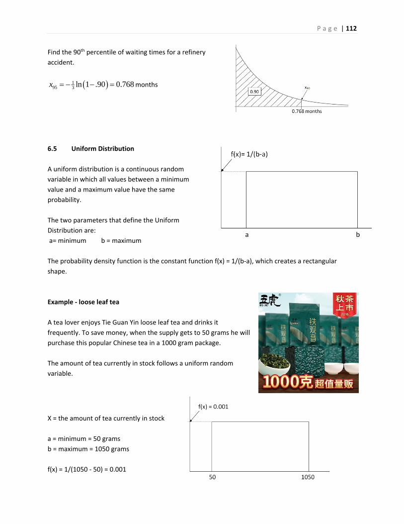
P a g e | 112
Find the 90th percentile of waiting times for a refinery
accident.
195 3 ln 1 .90 0.768x months
6.5 Uniform Distribution
A uniform distribution is a continuous random
variable in which all values between a minimum
value and a maximum value have the same
probability.
The two parameters that define the Uniform
Distribution are:
a= minimum b = maximum
The probability density function is the constant function f(x) = 1/(b‐a), which creates a rectangular
shape.
Example ‐ loose leaf tea
A tea lover enjoys Tie Guan Yin loose leaf tea and drinks it
frequently. To save money, when the supply gets to 50 grams he will
purchase this popular Chinese tea in a 1000 gram package.
The amount of tea currently in stock follows a uniform random
variable.
X = the amount of tea currently in stock
a = minimum = 50 grams
b = maximum = 1050 grams
f(x) = 1/(1050 ‐ 50) = 0.001
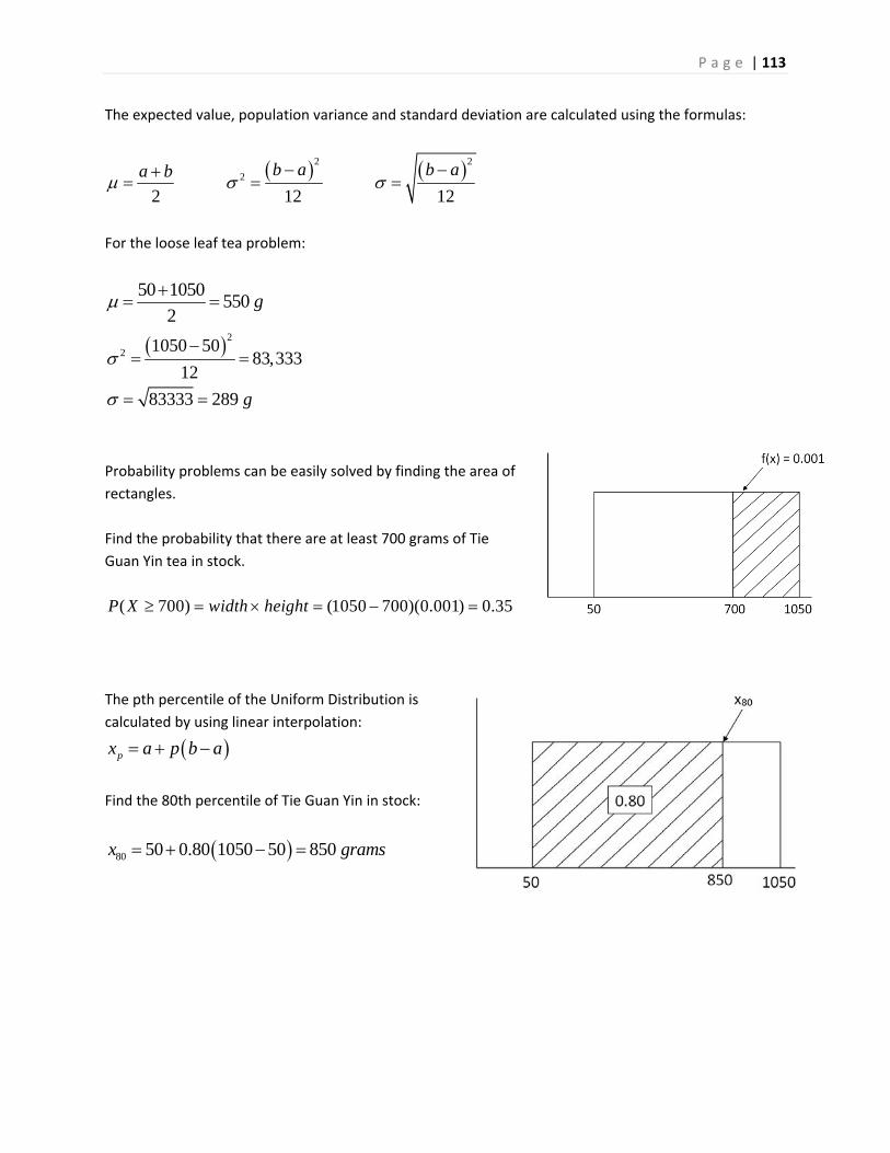
P a g e | 113
The expected value, population variance and standard deviation are calculated using the formulas:
2 2
2
2 12 12
b a b aa b
For the loose leaf tea problem:
50 1050550
2g
2
2 1050 5083,333
12
83333 289 g
Probability problems can be easily solved by finding the area of
rectangles.
Find the probability that there are at least 700 grams of Tie
Guan Yin tea in stock.
( 700) (1050 700)(0.001) 0.35P X width height
The pth percentile of the Uniform Distribution is
calculated by using linear interpolation:
px a p b a
Find the 80th percentile of Tie Guan Yin in stock:
80 50 0.80 1050 50 850x grams
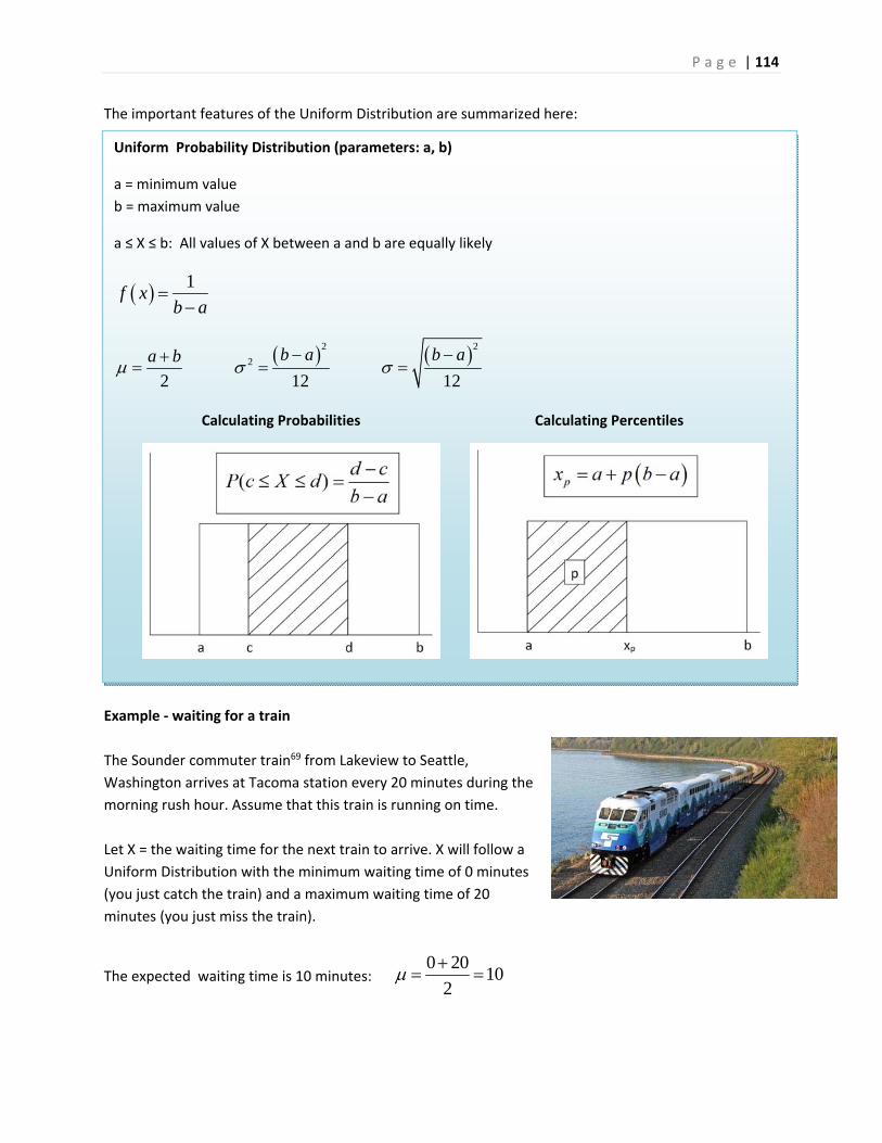
P a g e | 114
The important features of the Uniform Distribution are summarized here:
Example ‐ waiting for a train
The Sounder commuter train69 from Lakeview to Seattle,
Washington arrives at Tacoma station every 20 minutes during the
morning rush hour. Assume that this train is running on time.
Let X = the waiting time for the next train to arrive. X will follow a
Uniform Distribution with the minimum waiting time of 0 minutes
(you just catch the train) and a maximum waiting time of 20
minutes (you just miss the train).
The expected waiting time is 10 minutes: 0 20
102
Uniform Probability Distribution (parameters: a, b)
a = minimum value
b = maximum value
a ≤ X ≤ b: All values of X between a and b are equally likely
1f x
b a
2 2
2
2 12 12
b a b aa b
Calculating Probabilities Calculating Percentiles
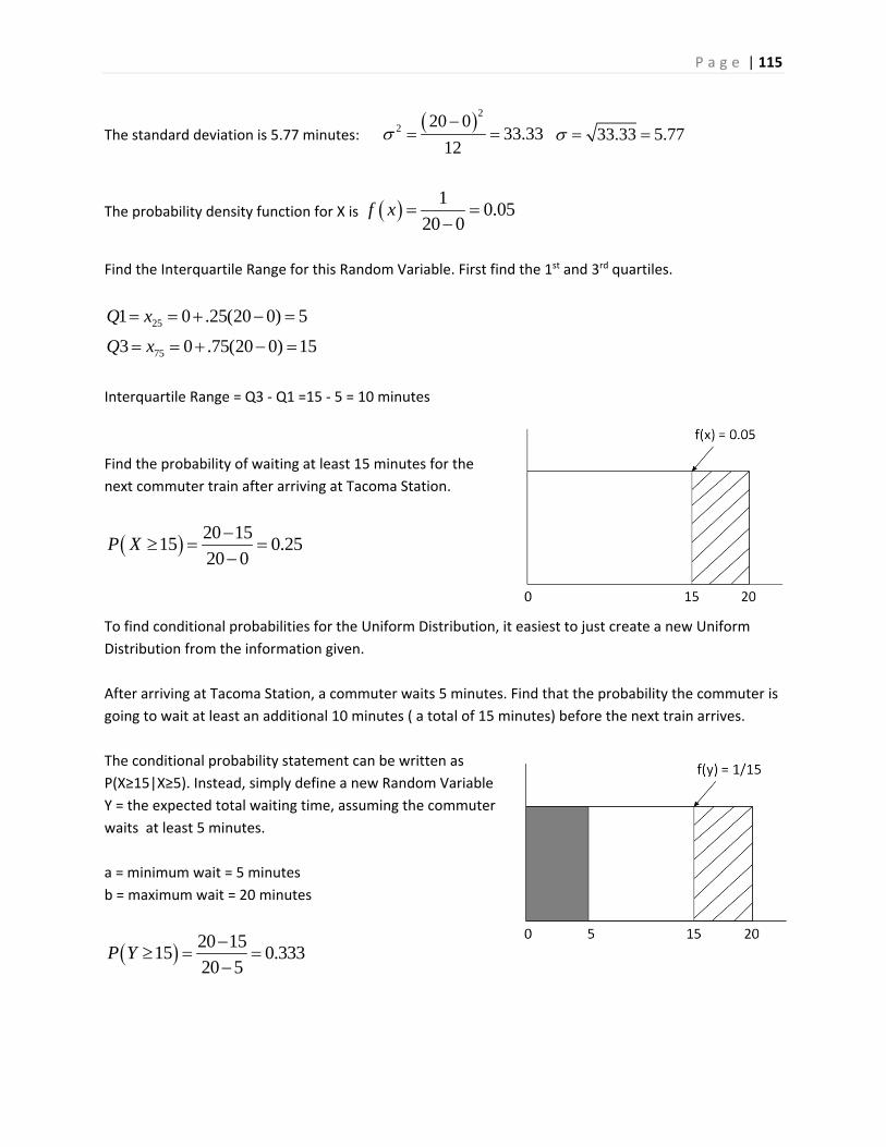
P a g e | 115
The standard deviation is 5.77 minutes: 2
2 20 033.33
12
33.33 5.77
The probability density function for X is 10.05
20 0f x
Find the Interquartile Range for this Random Variable. First find the 1st and 3rd quartiles.
251 0 .25(20 0) 5Q x
753 0 .75(20 0) 15Q x
Interquartile Range = Q3 ‐ Q1 =15 ‐ 5 = 10 minutes
Find the probability of waiting at least 15 minutes for the
next commuter train after arriving at Tacoma Station.
20 1515 0.25
20 0P X
To find conditional probabilities for the Uniform Distribution, it easiest to just create a new Uniform
Distribution from the information given.
After arriving at Tacoma Station, a commuter waits 5 minutes. Find that the probability the commuter is
going to wait at least an additional 10 minutes ( a total of 15 minutes) before the next train arrives.
The conditional probability statement can be written as
P(X≥15|X≥5). Instead, simply define a new Random Variable
Y = the expected total waiting time, assuming the commuter
waits at least 5 minutes.
a = minimum wait = 5 minutes
b = maximum wait = 20 minutes
20 1515 0.333
20 5P Y

P a g e | 116
6.6 Normal Distribution
The most important probability distribution in Statistics is the Normal Distribution, the iconic bell‐
shaped curve. The Normal Distribution is symmetric and defined by two parameters: the expected value
(mean) which describes the center of the distribution and the standard deviation , which describes the spread.
The extremely complicated probability distribution function for the Normal Distribution is:
2
1
21,
2
x
f x e X
Examples of the Normal Distribution are shown here.
There are many examples of data that are both symmetric and clustered towards the mean. For
example, we created dot plots of the weights of apples and oranges in Chapter 1. You can see both
graphs are clustered towards the center and are symmetric. A Normal Distribution would be an
appropriate model for weight of apples and oranges.
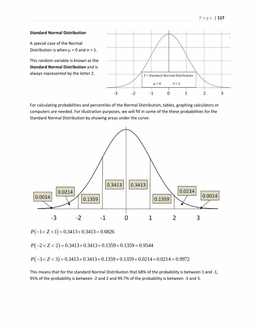
P a g e | 117
Standard Normal Distribution
A special case of the Normal
Distribution is when = 0 and = 1.
This random variable is known as the
Standard Normal Distribution and is
always represented by the letter Z.
For calculating probabilities and percentiles of the Normal Distribution, tables, graphing calculators or
computers are needed. For illustration purposes, we will fill in some of the these probabilities for the
Standard Normal Distribution by showing areas under the curve:
1 1 0.3413 0.3413 0.6826P Z
2 2 0.3413 0.3413 0.1359 0.1359 0.9544P Z
3 3 0.3413 0.3413 0.1359 0.1359 0.0214 0.0214 0.9972P Z
This means that for the standard Normal Distribution that 68% of the probability is between 1 and ‐1,
95% of the probability is between ‐2 and 2 and 99.7% of the probability is between ‐3 and 3.
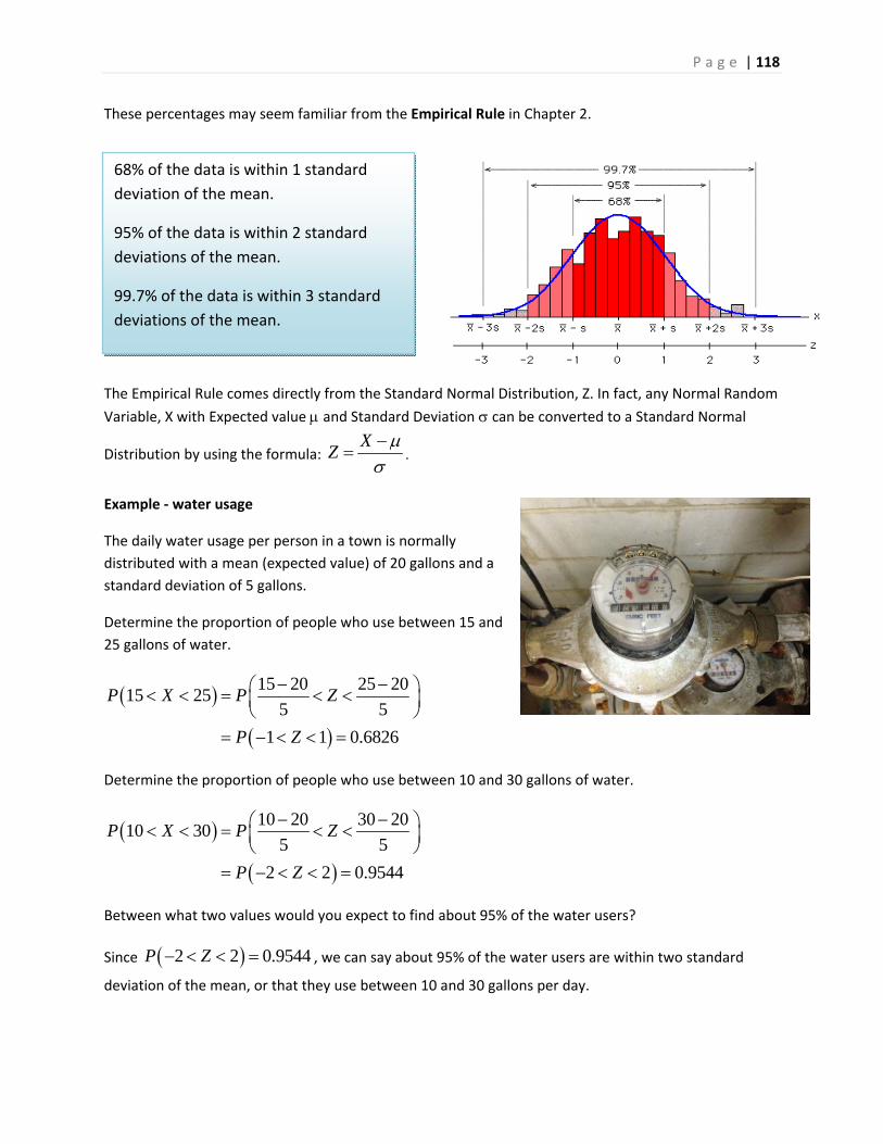
P a g e | 118
These percentages may seem familiar from the Empirical Rule in Chapter 2.
The Empirical Rule comes directly from the Standard Normal Distribution, Z. In fact, any Normal Random
Variable, X with Expected value and Standard Deviation can be converted to a Standard Normal
Distribution by using the formula: X
Z
Example ‐ water usage
The daily water usage per person in a town is normally
distributed with a mean (expected value) of 20 gallons and a
standard deviation of 5 gallons.
Determine the proportion of people who use between 15 and
25 gallons of water.
15 20 25 2015 25
5 5
1 1 0.6826
P X P Z
P Z
Determine the proportion of people who use between 10 and 30 gallons of water.
10 20 30 2010 30
5 5
2 2 0.9544
P X P Z
P Z
Between what two values would you expect to find about 95% of the water users?
Since 2 2 0.9544P Z , we can say about 95% of the water users are within two standard
deviation of the mean, or that they use between 10 and 30 gallons per day.
68% of the data is within 1 standard
deviation of the mean.
95% of the data is within 2 standard
deviations of the mean.
99.7% of the data is within 3 standard
deviations of the mean.
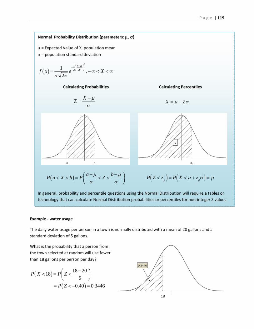
P a g e | 119
Example ‐ water usage
The daily water usage per person in a town is normally distributed with a mean of 20 gallons and a
standard deviation of 5 gallons.
What is the probability that a person from
the town selected at random will use fewer
than 18 gallons per person per day?
18 2018
5
0.40 0.3446
P X P Z
P Z
Normal Probability Distribution (parameters: )
= Expected Value of X, population mean
= population standard deviation
2
1
21,
2
x
f x e X
Calculating Probabilities Calculating Percentiles
XZ
X Z
a bP a X b P Z
p pP Z z P X z p
In general, probability and percentile questions using the Normal Distribution will require a tables or
technology that can calculate Normal Distribution probabilities or percentiles for non‐integer Z values
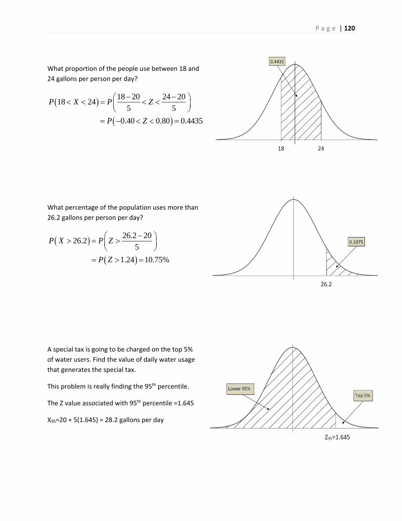
P a g e | 120
What proportion of the people use between 18 and
24 gallons per person per day?
18 20 24 2018 24
5 5
0.40 0.80 0.4435
P X P Z
P Z
What percentage of the population uses more than
26.2 gallons per person per day?
26.2 2026.2
5
1.24 10.75%
P X P Z
P Z
A special tax is going to be charged on the top 5%
of water users. Find the value of daily water usage
that generates the special tax.
This problem is really finding the 95th percentile.
The Z value associated with 95th percentile =1.645
X95=20 + 5(1.645) = 28.2 gallons per day
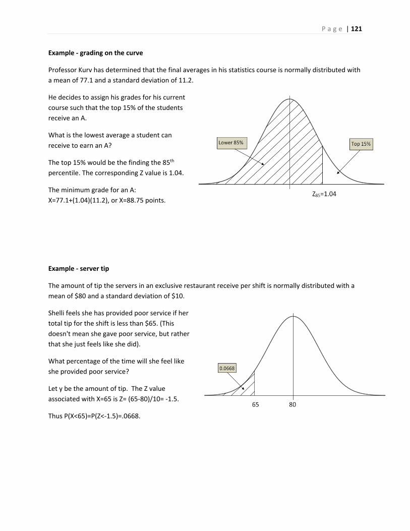
P a g e | 121
Example ‐ grading on the curve
Professor Kurv has determined that the final averages in his statistics course is normally distributed with
a mean of 77.1 and a standard deviation of 11.2.
He decides to assign his grades for his current
course such that the top 15% of the students
receive an A.
What is the lowest average a student can
receive to earn an A?
The top 15% would be the finding the 85th
percentile. The corresponding Z value is 1.04.
The minimum grade for an A:
X=77.1+(1.04)(11.2), or X=88.75 points.
Example ‐ server tip
The amount of tip the servers in an exclusive restaurant receive per shift is normally distributed with a
mean of $80 and a standard deviation of $10.
Shelli feels she has provided poor service if her
total tip for the shift is less than $65. (This
doesn't mean she gave poor service, but rather
that she just feels like she did).
What percentage of the time will she feel like
she provided poor service?
Let y be the amount of tip. The Z value
associated with X=65 is Z= (65‐80)/10= ‐1.5.
Thus P(X<65)=P(Z<‐1.5)=.0668.
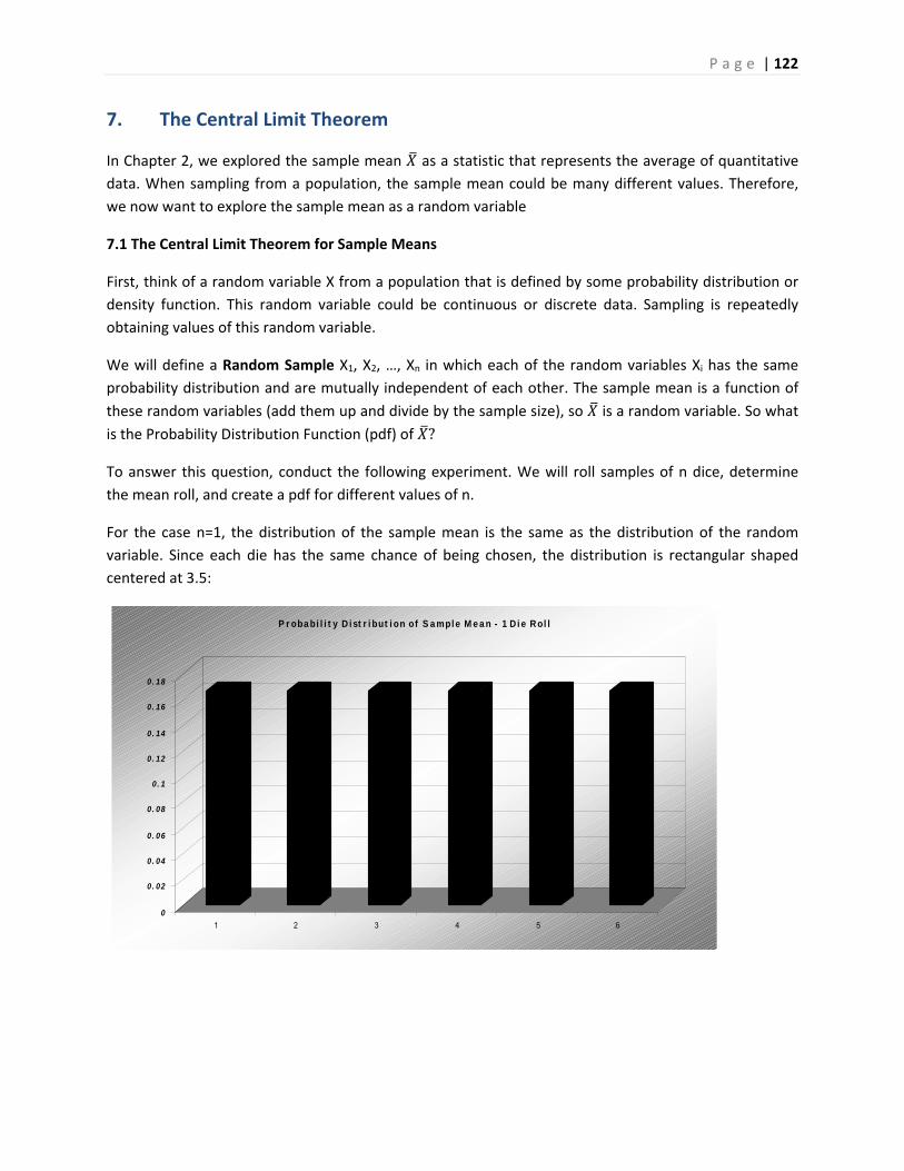
P a g e | 122
0
0. 02
0. 04
0. 06
0. 08
0. 1
0. 12
0. 14
0. 16
0. 18
1 2 3 4 5 6
P r oba bi l i t y D i st r i but i on of S a mpl e M e a n - 1 D i e R ol l
7. The Central Limit Theorem
In Chapter 2, we explored the sample mean as a statistic that represents the average of quantitative
data. When sampling from a population, the sample mean could be many different values. Therefore,
we now want to explore the sample mean as a random variable
7.1 The Central Limit Theorem for Sample Means
First, think of a random variable X from a population that is defined by some probability distribution or
density function. This random variable could be continuous or discrete data. Sampling is repeatedly
obtaining values of this random variable.
We will define a Random Sample X1, X2, …, Xn in which each of the random variables Xi has the same
probability distribution and are mutually independent of each other. The sample mean is a function of
these random variables (add them up and divide by the sample size), so is a random variable. So what
is the Probability Distribution Function (pdf) of ?
To answer this question, conduct the following experiment. We will roll samples of n dice, determine
the mean roll, and create a pdf for different values of n.
For the case n=1, the distribution of the sample mean is the same as the distribution of the random
variable. Since each die has the same chance of being chosen, the distribution is rectangular shaped
centered at 3.5:
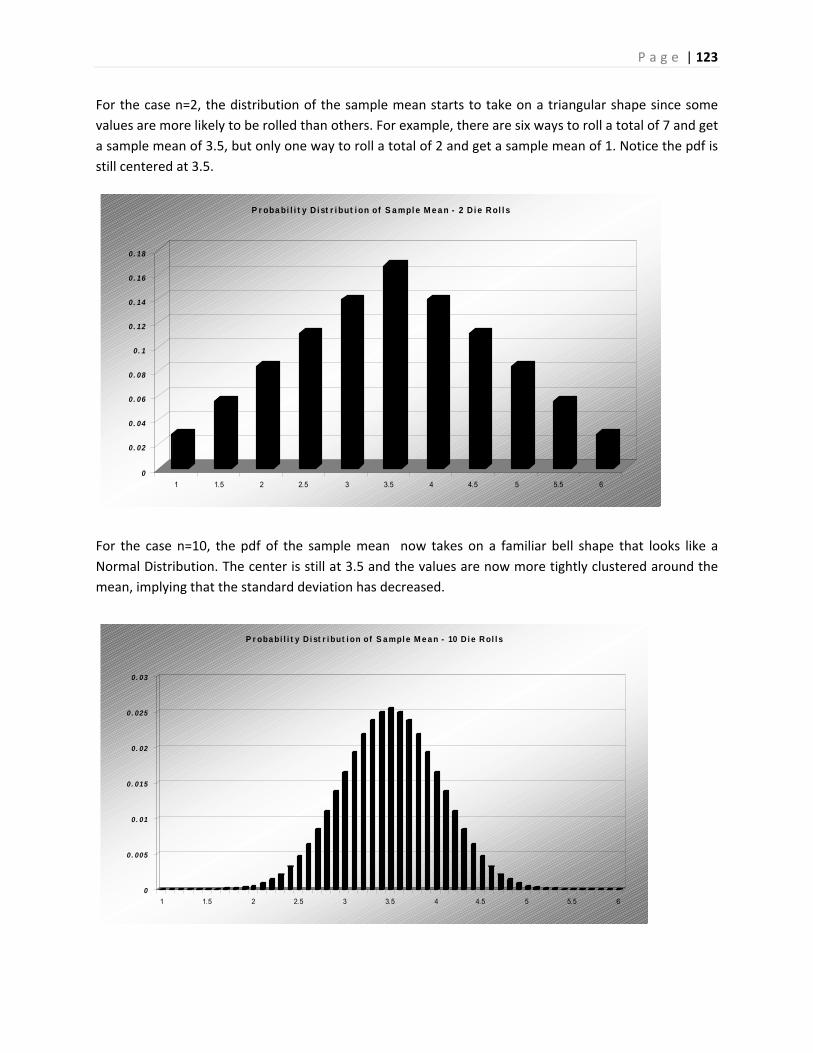
P a g e | 123
0
0. 02
0. 04
0. 06
0. 08
0. 1
0. 12
0. 14
0. 16
0. 18
1 1.5 2 2.5 3 3.5 4 4.5 5 5.5 6
P r oba bi l i t y D i st r i but i on of S a mpl e M e a n - 2 D i e Rol l s
0
0. 005
0. 01
0. 015
0. 02
0. 025
0. 03
1 1.5 2 2.5 3 3.5 4 4.5 5 5.5 6
P r oba bi l i t y D i st r i but i on of S a mpl e M e a n - 10 D i e Rol l s
For the case n=2, the distribution of the sample mean starts to take on a triangular shape since some
values are more likely to be rolled than others. For example, there are six ways to roll a total of 7 and get
a sample mean of 3.5, but only one way to roll a total of 2 and get a sample mean of 1. Notice the pdf is
still centered at 3.5.
For the case n=10, the pdf of the sample mean now takes on a familiar bell shape that looks like a
Normal Distribution. The center is still at 3.5 and the values are now more tightly clustered around the
mean, implying that the standard deviation has decreased.
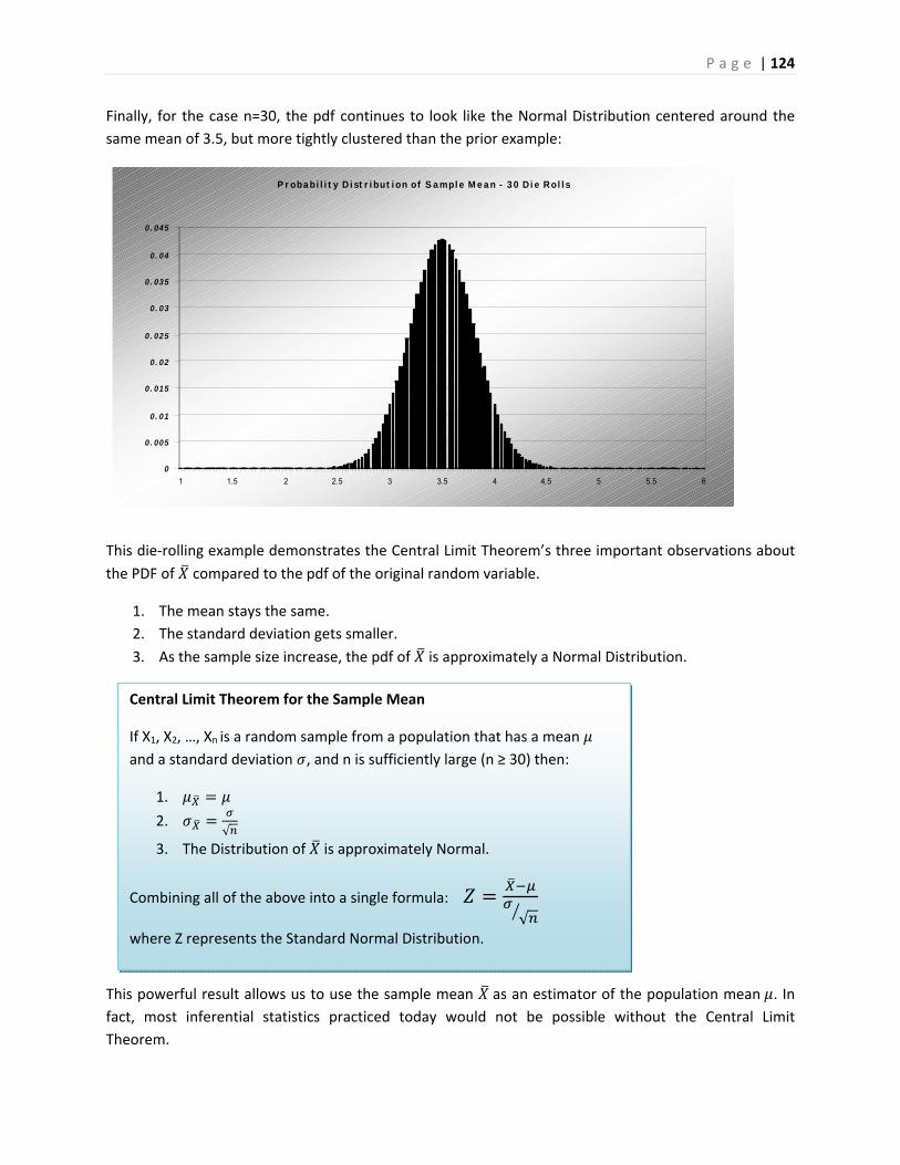
P a g e | 124
0
0. 005
0. 01
0. 015
0. 02
0. 025
0. 03
0. 035
0. 04
0. 045
1 1.5 2 2.5 3 3.5 4 4.5 5 5.5 6
P r oba bi l i t y D i st r i but i on of S a mpl e M e a n - 3 0 D i e Rol l s
Finally, for the case n=30, the pdf continues to look like the Normal Distribution centered around the
same mean of 3.5, but more tightly clustered than the prior example:
This die‐rolling example demonstrates the Central Limit Theorem’s three important observations about
the PDF of compared to the pdf of the original random variable.
1. The mean stays the same.
2. The standard deviation gets smaller.
3. As the sample size increase, the pdf of is approximately a Normal Distribution.
This powerful result allows us to use the sample mean as an estimator of the population mean . In
fact, most inferential statistics practiced today would not be possible without the Central Limit
Theorem.
Central Limit Theorem for the Sample Mean
If X1, X2, …, Xn is a random sample from a population that has a mean
and a standard deviation , and n is sufficiently large (n ≥ 30) then:
1.
2. √
3. The Distribution of is approximately Normal.
Combining all of the above into a single formula:
√
where Z represents the Standard Normal Distribution.

P a g e | 125
Example ‐ mean height of men
The mean height of American men (ages 20‐29) is = 69.2 inches. If a random sample of 60 men in this age group is selected, what is the
probability the mean height for the sample is greater than 70 inches?
Assume σ = 2.9”.
Due to the Central Limit Theorem, we know the distribution of the
Sample will have approximately a Normal Distribution:
Compare this to the much larger probability that one male chosen will be over 70 inches tall:
This example demonstrates how the sample mean will cluster towards the population mean as the
sample size increases.
Example ‐ text messages
The waiting time until receiving a text
message follows an exponential
distribution with an expected waiting time
of 1.5 minutes. Find the probability that
the mean waiting time for the 50 text
messages exceeds 1.6 minutes.
For the exponential distribution, the mean
equals the standard deviation. Since the
sample size is over 30, the distribution of
will be normal, even though the
distribution of X is heavily skewed.
= 1.6 = 1.6 n = 50
609.2
)2.6970()70( ZPXP 0162.0)14.2( ZP
9.2
)2.6970()70( ZPXP 3897.0)28.0( ZP
3192.0)47.0(
505.1
)5.16.1()6.1(
ZP
ZPXP
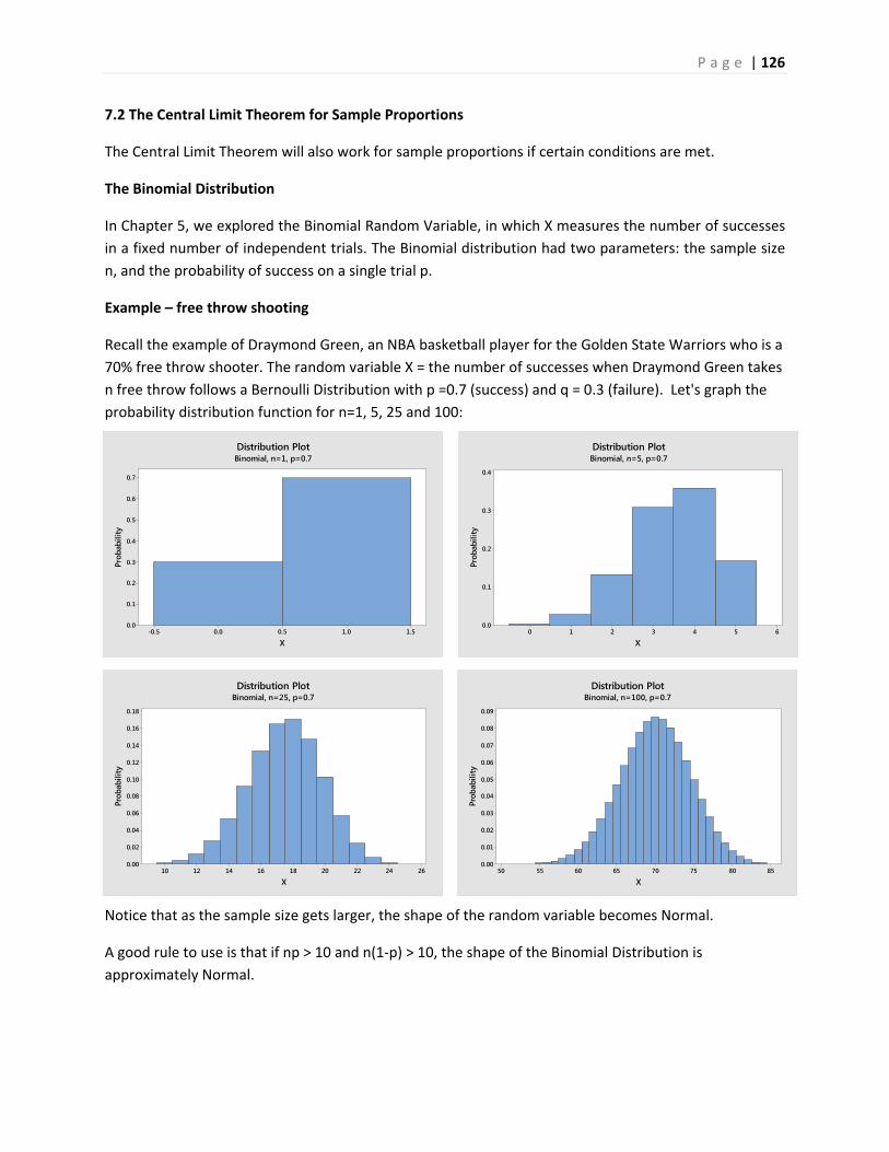
P a g e | 126
1.51.00.50.0-0.5
0.7
0.6
0.5
0.4
0.3
0.2
0.1
0.0
X
Prob
abili
ty
Distribution PlotBinomial, n=1, p=0.7
6543210
0.4
0.3
0.2
0.1
0.0
X
Prob
abili
ty
Distribution PlotBinomial, n=5, p=0.7
262422201816141210
0.18
0.16
0.14
0.12
0.10
0.08
0.06
0.04
0.02
0.00
X
Prob
abili
ty
Distribution PlotBinomial, n=25, p=0.7
8580757065605550
0.09
0.08
0.07
0.06
0.05
0.04
0.03
0.02
0.01
0.00
X
Prob
abili
ty
Distribution PlotBinomial, n=100, p=0.7
7.2 The Central Limit Theorem for Sample Proportions
The Central Limit Theorem will also work for sample proportions if certain conditions are met.
The Binomial Distribution
In Chapter 5, we explored the Binomial Random Variable, in which X measures the number of successes
in a fixed number of independent trials. The Binomial distribution had two parameters: the sample size
n, and the probability of success on a single trial p.
Example – free throw shooting
Recall the example of Draymond Green, an NBA basketball player for the Golden State Warriors who is a
70% free throw shooter. The random variable X = the number of successes when Draymond Green takes
n free throw follows a Bernoulli Distribution with p =0.7 (success) and q = 0.3 (failure). Let's graph the
probability distribution function for n=1, 5, 25 and 100:
Notice that as the sample size gets larger, the shape of the random variable becomes Normal.
A good rule to use is that if np > 10 and n(1‐p) > 10, the shape of the Binomial Distribution is
approximately Normal.
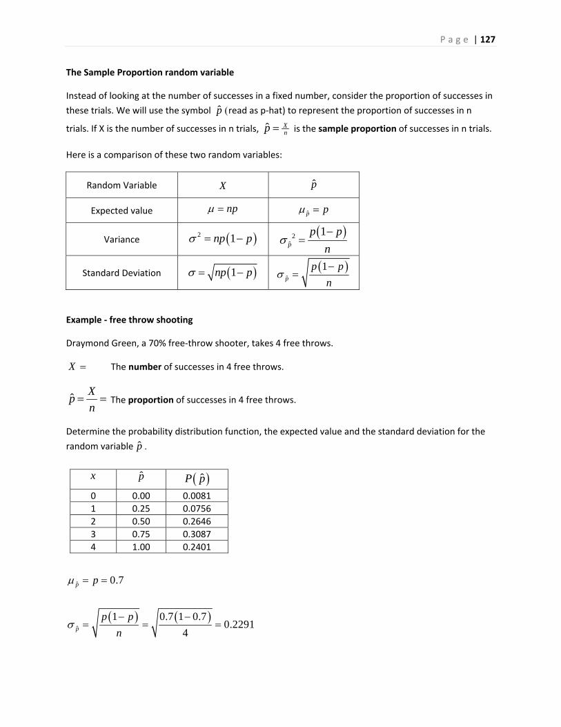
P a g e | 127
The Sample Proportion random variable
Instead of looking at the number of successes in a fixed number, consider the proportion of successes in
these trials. We will use the symbol p read as p‐hat) to represent the proportion of successes in n
trials. If X is the number of successes in n trials, ˆ Xnp is the sample proportion of successes in n trials.
Here is a comparison of these two random variables:
Random Variable X p
Expected value np p p
Variance 2 1np p 2
ˆ
1p
p p
n
Standard Deviation 1np p
ˆ
1p
p p
n
Example ‐ free throw shooting
Draymond Green, a 70% free‐throw shooter, takes 4 free throws.
X The number of successes in 4 free throws.
ˆX
pn
The proportion of successes in 4 free throws.
Determine the probability distribution function, the expected value and the standard deviation for the
random variable p
ˆ 0.7p p
ˆ
1 0.7 1 0.70.2291
4p
p p
n
x p ˆP p
0 0.00 0.0081
1 0.25 0.0756
2 0.50 0.2646
3 0.75 0.3087
4 1.00 0.2401
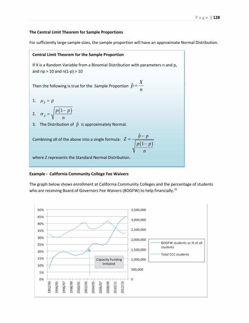
P a g e | 128
The Central Limit Theorem for Sample Proportions
For sufficiently large sample sizes, the sample proportion will have an approximate Normal Distribution.
Example ‐ California Community College Fee Waivers
The graph below shows enrollment at California Community Colleges and the percentage of students
who are receiving Board of Governors Fee Waivers (BOGFW) to help financially.70
Central Limit Theorem for the Sample Proportion
If X is a Random Variable from a Binomial Distribution with parameters n and p,
and np > 10 and n(1‐p) > 10
Then the following is true for the Sample Proportion ˆX
pn
1. p p
2.
ˆ
1p
p p
n
3. The Distribution of p is approximately Normal.
Combining all of the above into a single formula: ˆ
1
p pZ
p p
n
where Z represents the Standard Normal Distribution.
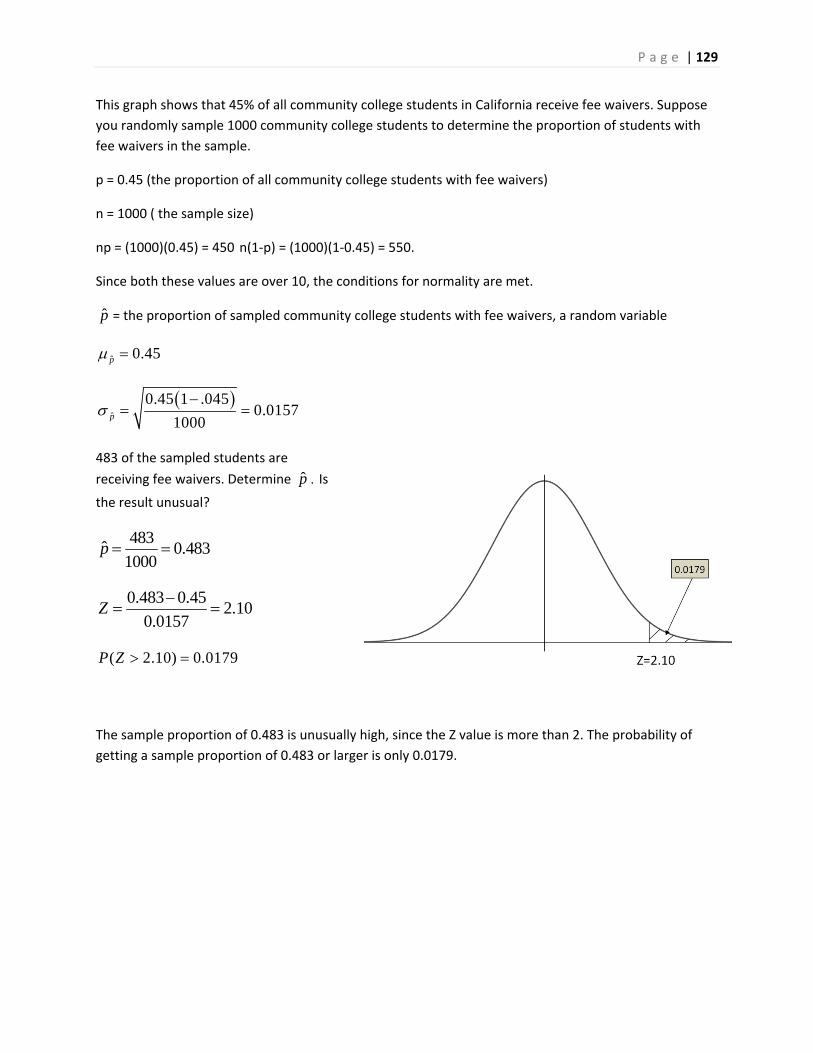
P a g e | 129
This graph shows that 45% of all community college students in California receive fee waivers. Suppose
you randomly sample 1000 community college students to determine the proportion of students with
fee waivers in the sample.
p = 0.45 (the proportion of all community college students with fee waivers)
n = 1000 ( the sample size)
np = (1000)(0.45) = 450 n(1‐p) = (1000)(1‐0.45) = 550.
Since both these values are over 10, the conditions for normality are met.
p = the proportion of sampled community college students with fee waivers, a random variable
ˆ 0.45p
ˆ
0.45 1 .0450.0157
1000p
483 of the sampled students are
receiving fee waivers. Determine p Is
the result unusual?
483ˆ 0.483
1000p
0.483 0.452.10
0.0157Z
( 2.10) 0.0179P Z
The sample proportion of 0.483 is unusually high, since the Z value is more than 2. The probability of
getting a sample proportion of 0.483 or larger is only 0.0179.
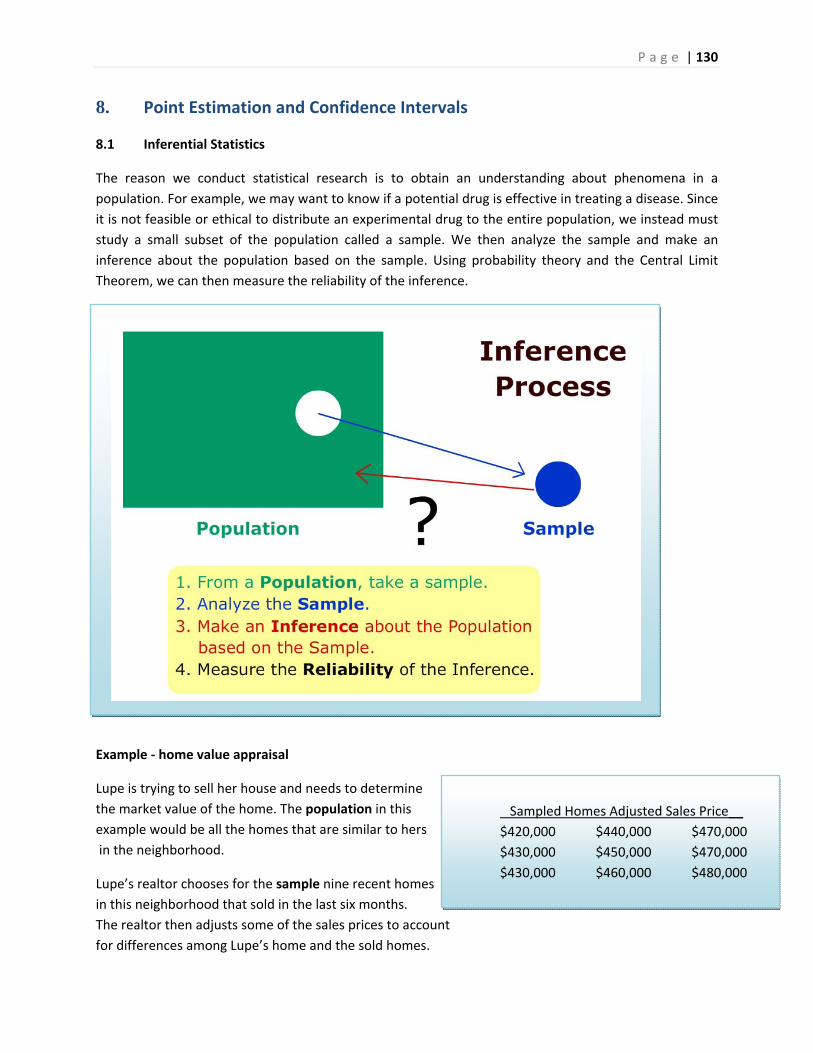
P a g e | 130
8. Point Estimation and Confidence Intervals
8.1 Inferential Statistics
The reason we conduct statistical research is to obtain an understanding about phenomena in a
population. For example, we may want to know if a potential drug is effective in treating a disease. Since
it is not feasible or ethical to distribute an experimental drug to the entire population, we instead must
study a small subset of the population called a sample. We then analyze the sample and make an
inference about the population based on the sample. Using probability theory and the Central Limit
Theorem, we can then measure the reliability of the inference.
Example ‐ home value appraisal
Lupe is trying to sell her house and needs to determine
the market value of the home. The population in this
example would be all the homes that are similar to hers
in the neighborhood.
Lupe’s realtor chooses for the sample nine recent homes
in this neighborhood that sold in the last six months.
The realtor then adjusts some of the sales prices to account
for differences among Lupe’s home and the sold homes.
Sampled Homes Adjusted Sales Price__
$420,000 $440,000 $470,000
$430,000 $450,000 $470,000
$430,000 $460,000 $480,000
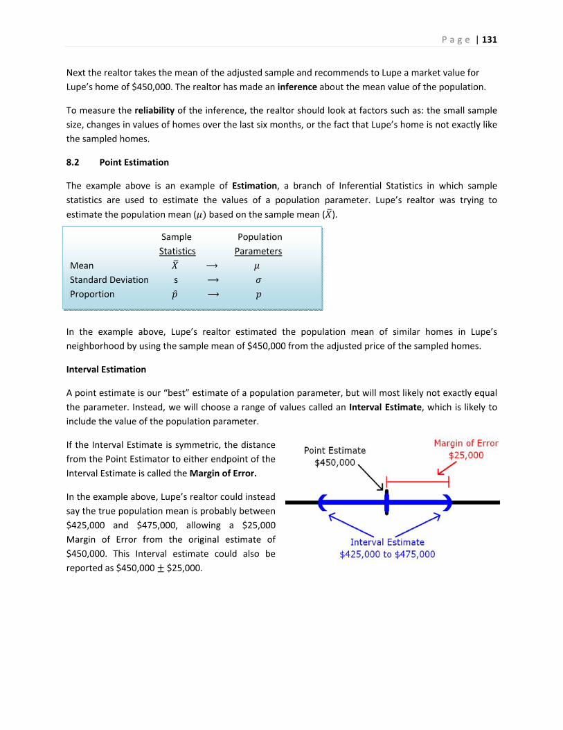
P a g e | 131
Sample Population
Statistics Parameters
Mean ⟶
Standard Deviation s ⟶
Proportion ⟶
Next the realtor takes the mean of the adjusted sample and recommends to Lupe a market value for
Lupe’s home of $450,000. The realtor has made an inference about the mean value of the population.
To measure the reliability of the inference, the realtor should look at factors such as: the small sample
size, changes in values of homes over the last six months, or the fact that Lupe’s home is not exactly like
the sampled homes.
8.2 Point Estimation
The example above is an example of Estimation, a branch of Inferential Statistics in which sample
statistics are used to estimate the values of a population parameter. Lupe’s realtor was trying to
estimate the population mean ( based on the sample mean ( ).
In the example above, Lupe’s realtor estimated the population mean of similar homes in Lupe’s
neighborhood by using the sample mean of $450,000 from the adjusted price of the sampled homes.
Interval Estimation
A point estimate is our “best” estimate of a population parameter, but will most likely not exactly equal
the parameter. Instead, we will choose a range of values called an Interval Estimate, which is likely to
include the value of the population parameter.
If the Interval Estimate is symmetric, the distance
from the Point Estimator to either endpoint of the
Interval Estimate is called the Margin of Error.
In the example above, Lupe’s realtor could instead
say the true population mean is probably between
$425,000 and $475,000, allowing a $25,000
Margin of Error from the original estimate of
$450,000. This Interval estimate could also be
reported as $450,000 $25,000.
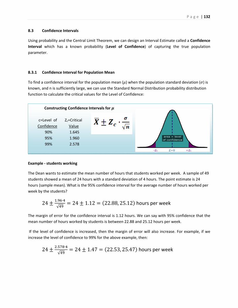
P a g e | 132
Constructing Confidence Intervals for
c=Level of Zc=Critical
Confidence Value
90% 1.645
95% 1.960
99% 2.578
8.3 Confidence Intervals
Using probability and the Central Limit Theorem, we can design an Interval Estimate called a Confidence
Interval which has a known probability (Level of Confidence) of capturing the true population
parameter.
8.3.1 Confidence Interval for Population Mean
To find a confidence interval for the population mean ( ) when the population standard deviation ( ) is
known, and n is sufficiently large, we can use the Standard Normal Distribution probability distribution
function to calculate the critical values for the Level of Confidence:
Example ‐ students working
The Dean wants to estimate the mean number of hours that students worked per week. A sample of 49
students showed a mean of 24 hours with a standard deviation of 4 hours. The point estimate is 24
hours (sample mean). What is the 95% confidence interval for the average number of hours worked per
week by the students?
24. ∙
√24 1.12 22.88, 25.12 hours per week
The margin of error for the confidence interval is 1.12 hours. We can say with 95% confidence that the
mean number of hours worked by students is between 22.88 and 25.12 hours per week.
If the level of confidence is increased, then the margin of error will also increase. For example, if we
increase the level of confidence to 99% for the above example, then:
24. ∙
√24 1.47 22.53, 25.47 hours per week
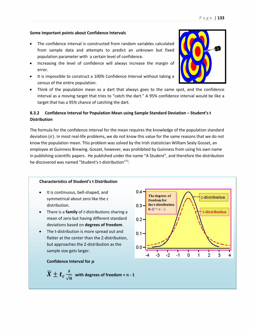
P a g e | 133
Characteristics of Student’s t Distribution
It is continuous, bell‐shaped, and
symmetrical about zero like the z
distribution.
There is a family of t‐distributions sharing a
mean of zero but having different standard
deviations based on degrees of freedom.
The t‐distribution is more spread out and
flatter at the center than the Z‐distribution,
but approaches the Z‐distribution as the
sample size gets larger.
Confidence Interval for
√ with degrees of freedom = n ‐ 1
Some important points about Confidence Intervals
The confidence interval is constructed from random variables calculated
from sample data and attempts to predict an unknown but fixed
population parameter with a certain level of confidence.
Increasing the level of confidence will always increase the margin of
error.
It is impossible to construct a 100% Confidence Interval without taking a
census of the entire population.
Think of the population mean as a dart that always goes to the same spot, and the confidence
interval as a moving target that tries to “catch the dart.” A 95% confidence interval would be like a
target that has a 95% chance of catching the dart.
8.3.2 Confidence Interval for Population Mean using Sample Standard Deviation – Student’s t
Distribution
The formula for the confidence interval for the mean requires the knowledge of the population standard
deviation ( . In most real‐life problems, we do not know this value for the same reasons that we do not
know the population mean. This problem was solved by the Irish statistician William Sealy Gosset, an
employee at Guinness Brewing. Gosset, however, was prohibited by Guinness from using his own name
in publishing scientific papers. He published under the name “A Student”, and therefore the distribution
he discovered was named "Student's t‐distribution"71.
P a g e | 134
Normal Distribution for if Central Limit Theorem conditions are met.
Confidence interval for :
Example ‐ rating heath care plans
Last year Sally belonged to an Health Maintenance Organization (HMO) heath care plan that had a population average rating of 62 (on a scale from 0‐100, with ‘100’ being best); this was based on records accumulated about the HMO over a long period of time. This year Sally switched to a new HMO. To assess the population mean rating of the new HMO, 20 members of this HMO are polled and they give the HMO an average rating of 65 with a standard deviation of 10. Find and interpret a 95% confidence interval for population average rating of the new HMO. The t distribution will have 20‐1 =19 degrees of freedom. Using a table or technology, the critical value for the 95% confidence interval will be tc=2.093
65. ∙
√65 4.68 60.32, 69.68 HMO rating
With 95% confidence we can say that the rating of Sally’s new HMO is between 60.32 and 69.68. Since the quantity 62 is in the confidence interval, we cannot say with 95% certainty that the new HMO is either better or worse than the previous HMO.
8.3.3 Confidence Interval for Population Proportion
Recall from the section on random variables the binomial distribution where represented the
proportion of successes in the population. The binomial model was analogous to coin‐flipping, or yes/no
question polling. In practice, we want to use sample statistics to estimate the population proportion .
The sample proportion ( ) is the proportion of successes in the sample of size n and is the point
estimator for . Under the Central Limit Theorem, if 10and 1 10, the distribution of the sample proportion will have an approximately Normal Distribution.
Using this information we can construct a confidence interval for , the population proportion:
P a g e | 135
Example ‐ talking and driving
200 California drivers were randomly sampled and it was
discovered that 25 of these drivers were illegally talking
on their cell phones without the use of a hands‐free
device. Find the point estimator for the proportion of
drivers who are using their cell phones illegally and
construct a 99% confidence interval.
The point estimator for is .125 or 12.5%.
A 99% confidence interval for is: 0.125
2.576. .
.125 .060
The margin of error for this poll is 6% and we can say with 99% confidence that the true percentage of
drivers who are using their cell phones illegally is between 6.5% and 18.5%
8.3.4 Point Estimator for Population Standard Deviation
We often want to study the variability, volatility or consistency of a population. For example, two
investments both have expected earnings of 6% per year, but one investment is much riskier, with
higher ups and downs. To estimate variation or volatility of a data set, we will use the sample standard
deviation as a point estimator of the population standard deviation .
Example
Investments A and B are both known to have a rate of return of 6% per year. Over the last 24 months,
Investment A has a sample standard deviation of 3% per month, while Investment B has a sample
standard deviation of 5% per month. We would say that Investment B is more volatile and riskier than
Investment A due to the higher estimate of the standard deviation.
To create a confidence interval for an estimate of standard deviation, we need to introduce a new
distribution, called the Chi‐square distribution.
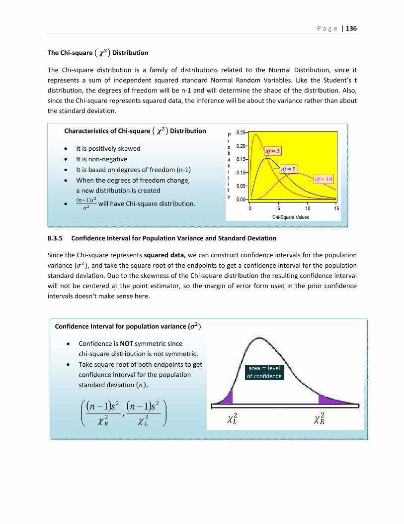
P a g e | 136
Characteristics of Chi‐square Distribution
It is positively skewed
It is non‐negative
It is based on degrees of freedom (n‐1)
When the degrees of freedom change,
a new distribution is created
will have Chi‐square distribution.
Confidence Interval for population variance (
Confidence is NOT symmetric since
chi‐square distribution is not symmetric.
Take square root of both endpoints to get
confidence interval for the population
standard deviation .
The Chi‐square Distribution
The Chi‐square distribution is a family of distributions related to the Normal Distribution, since it
represents a sum of independent squared standard Normal Random Variables. Like the Student’s t
distribution, the degrees of freedom will be n‐1 and will determine the shape of the distribution. Also,
since the Chi‐square represents squared data, the inference will be about the variance rather than about
the standard deviation.
8.3.5 Confidence Interval for Population Variance and Standard Deviation
Since the Chi‐square represents squared data, we can construct confidence intervals for the population
variance ( , and take the square root of the endpoints to get a confidence interval for the population
standard deviation. Due to the skewness of the Chi‐square distribution the resulting confidence interval
will not be centered at the point estimator, so the margin of error form used in the prior confidence
intervals doesn’t make sense here.
2
2
2
2 1,
1
LR
snsn

P a g e | 137
Example ‐ performance risk in finance
In performance measurement of investments, standard deviation is
a measure of volatility or risk. Twenty monthly returns from a
mutual fund show an average monthly return of 1 percent and a
sample standard deviation of 5 percent. Find a 95% confidence
interval for the monthly standard deviation of the mutual fund.
The Chi‐square distribution will have 20‐1 =19 degrees of freedom.
Using technology, we find that the two critical values are
8.90655 and 32.8523.
Formula for confidence interval for is:
One can say with 95% confidence that the standard deviation for this mutual fund is between 3.8 and
7.3 percent per month.
3.7,8.390655.8
519,
8523.32
519 22
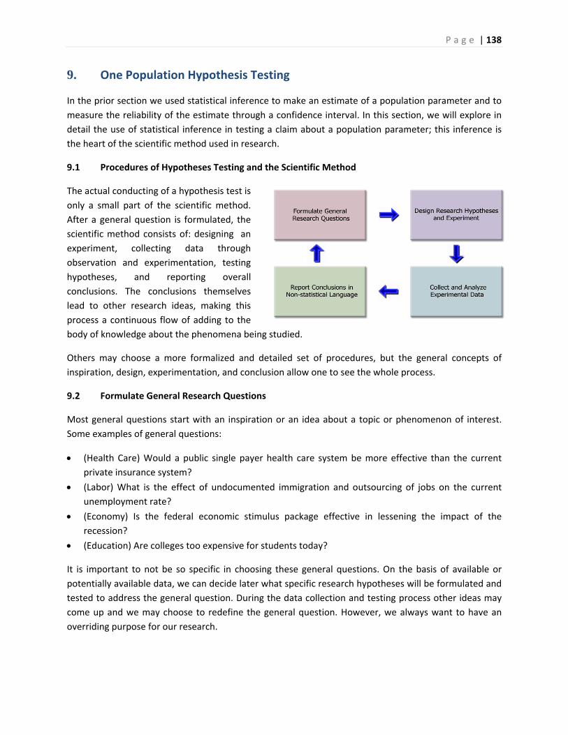
P a g e | 138
9. One Population Hypothesis Testing
In the prior section we used statistical inference to make an estimate of a population parameter and to
measure the reliability of the estimate through a confidence interval. In this section, we will explore in
detail the use of statistical inference in testing a claim about a population parameter; this inference is
the heart of the scientific method used in research.
9.1 Procedures of Hypotheses Testing and the Scientific Method
The actual conducting of a hypothesis test is
only a small part of the scientific method.
After a general question is formulated, the
scientific method consists of: designing an
experiment, collecting data through
observation and experimentation, testing
hypotheses, and reporting overall
conclusions. The conclusions themselves
lead to other research ideas, making this
process a continuous flow of adding to the
body of knowledge about the phenomena being studied.
Others may choose a more formalized and detailed set of procedures, but the general concepts of
inspiration, design, experimentation, and conclusion allow one to see the whole process.
9.2 Formulate General Research Questions
Most general questions start with an inspiration or an idea about a topic or phenomenon of interest.
Some examples of general questions:
(Health Care) Would a public single payer health care system be more effective than the current
private insurance system?
(Labor) What is the effect of undocumented immigration and outsourcing of jobs on the current
unemployment rate?
(Economy) Is the federal economic stimulus package effective in lessening the impact of the
recession?
(Education) Are colleges too expensive for students today?
It is important to not be so specific in choosing these general questions. On the basis of available or
potentially available data, we can decide later what specific research hypotheses will be formulated and
tested to address the general question. During the data collection and testing process other ideas may
come up and we may choose to redefine the general question. However, we always want to have an
overriding purpose for our research.
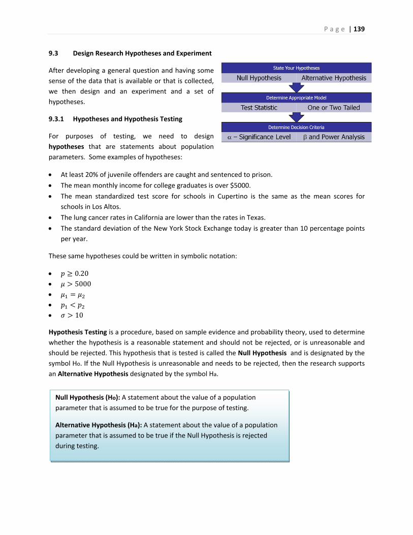
P a g e | 139
Null Hypothesis (Ho): A statement about the value of a population
parameter that is assumed to be true for the purpose of testing.
Alternative Hypothesis (Ha): A statement about the value of a population
parameter that is assumed to be true if the Null Hypothesis is rejected
during testing.
9.3 Design Research Hypotheses and Experiment
After developing a general question and having some
sense of the data that is available or that is collected,
we then design and an experiment and a set of
hypotheses.
9.3.1 Hypotheses and Hypothesis Testing
For purposes of testing, we need to design
hypotheses that are statements about population
parameters. Some examples of hypotheses:
At least 20% of juvenile offenders are caught and sentenced to prison.
The mean monthly income for college graduates is over $5000.
The mean standardized test score for schools in Cupertino is the same as the mean scores for
schools in Los Altos.
The lung cancer rates in California are lower than the rates in Texas.
The standard deviation of the New York Stock Exchange today is greater than 10 percentage points
per year.
These same hypotheses could be written in symbolic notation:
0.20 5000
10
Hypothesis Testing is a procedure, based on sample evidence and probability theory, used to determine
whether the hypothesis is a reasonable statement and should not be rejected, or is unreasonable and
should be rejected. This hypothesis that is tested is called the Null Hypothesis and is designated by the
symbol Ho. If the Null Hypothesis is unreasonable and needs to be rejected, then the research supports
an Alternative Hypothesis designated by the symbol Ha.
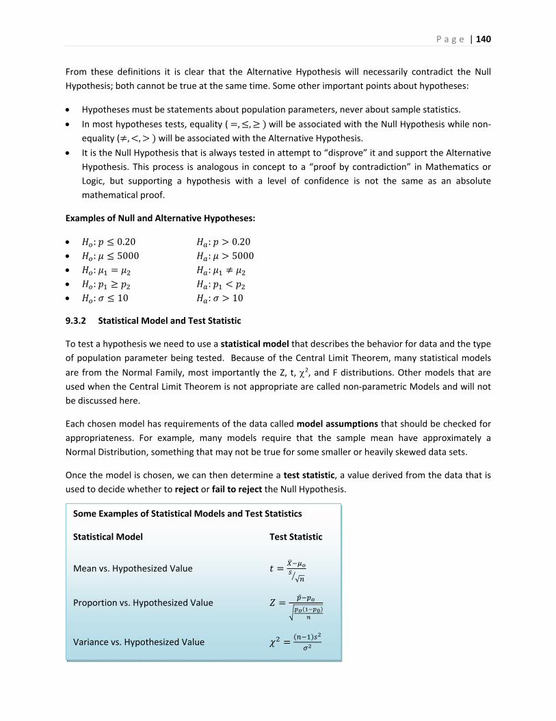
P a g e | 140
Some Examples of Statistical Models and Test Statistics
Statistical Model Test Statistic
Mean vs. Hypothesized Value √
Proportion vs. Hypothesized Value
Variance vs. Hypothesized Value
From these definitions it is clear that the Alternative Hypothesis will necessarily contradict the Null
Hypothesis; both cannot be true at the same time. Some other important points about hypotheses:
Hypotheses must be statements about population parameters, never about sample statistics.
In most hypotheses tests, equality ( , , will be associated with the Null Hypothesis while non‐equality ( , , will be associated with the Alternative Hypothesis.
It is the Null Hypothesis that is always tested in attempt to “disprove” it and support the Alternative
Hypothesis. This process is analogous in concept to a “proof by contradiction” in Mathematics or
Logic, but supporting a hypothesis with a level of confidence is not the same as an absolute
mathematical proof.
Examples of Null and Alternative Hypotheses:
: 0.20 : 0.20 : 5000 : 5000 : :
: :
: 10 : 10
9.3.2 Statistical Model and Test Statistic
To test a hypothesis we need to use a statistical model that describes the behavior for data and the type
of population parameter being tested. Because of the Central Limit Theorem, many statistical models
are from the Normal Family, most importantly the Z, t, 2, and F distributions. Other models that are
used when the Central Limit Theorem is not appropriate are called non‐parametric Models and will not
be discussed here.
Each chosen model has requirements of the data called model assumptions that should be checked for
appropriateness. For example, many models require that the sample mean have approximately a
Normal Distribution, something that may not be true for some smaller or heavily skewed data sets.
Once the model is chosen, we can then determine a test statistic, a value derived from the data that is
used to decide whether to reject or fail to reject the Null Hypothesis.
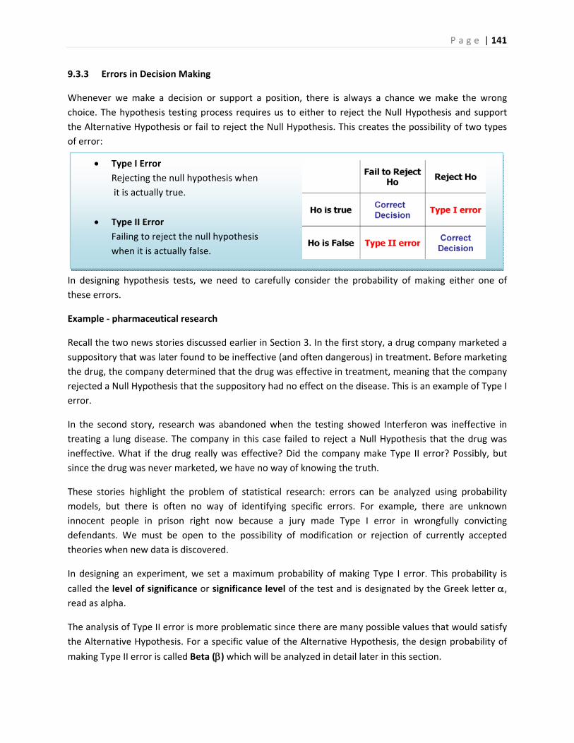
P a g e | 141
Type I Error
Rejecting the null hypothesis when
it is actually true.
Type II Error
Failing to reject the null hypothesis
when it is actually false.
9.3.3 Errors in Decision Making
Whenever we make a decision or support a position, there is always a chance we make the wrong
choice. The hypothesis testing process requires us to either to reject the Null Hypothesis and support
the Alternative Hypothesis or fail to reject the Null Hypothesis. This creates the possibility of two types
of error:
In designing hypothesis tests, we need to carefully consider the probability of making either one of
these errors.
Example ‐ pharmaceutical research
Recall the two news stories discussed earlier in Section 3. In the first story, a drug company marketed a
suppository that was later found to be ineffective (and often dangerous) in treatment. Before marketing
the drug, the company determined that the drug was effective in treatment, meaning that the company
rejected a Null Hypothesis that the suppository had no effect on the disease. This is an example of Type I
error.
In the second story, research was abandoned when the testing showed Interferon was ineffective in
treating a lung disease. The company in this case failed to reject a Null Hypothesis that the drug was
ineffective. What if the drug really was effective? Did the company make Type II error? Possibly, but
since the drug was never marketed, we have no way of knowing the truth.
These stories highlight the problem of statistical research: errors can be analyzed using probability
models, but there is often no way of identifying specific errors. For example, there are unknown
innocent people in prison right now because a jury made Type I error in wrongfully convicting
defendants. We must be open to the possibility of modification or rejection of currently accepted
theories when new data is discovered.
In designing an experiment, we set a maximum probability of making Type I error. This probability is
called the level of significance or significance level of the test and is designated by the Greek letter , read as alpha.
The analysis of Type II error is more problematic since there are many possible values that would satisfy
the Alternative Hypothesis. For a specific value of the Alternative Hypothesis, the design probability of
making Type II error is called Beta () which will be analyzed in detail later in this section.
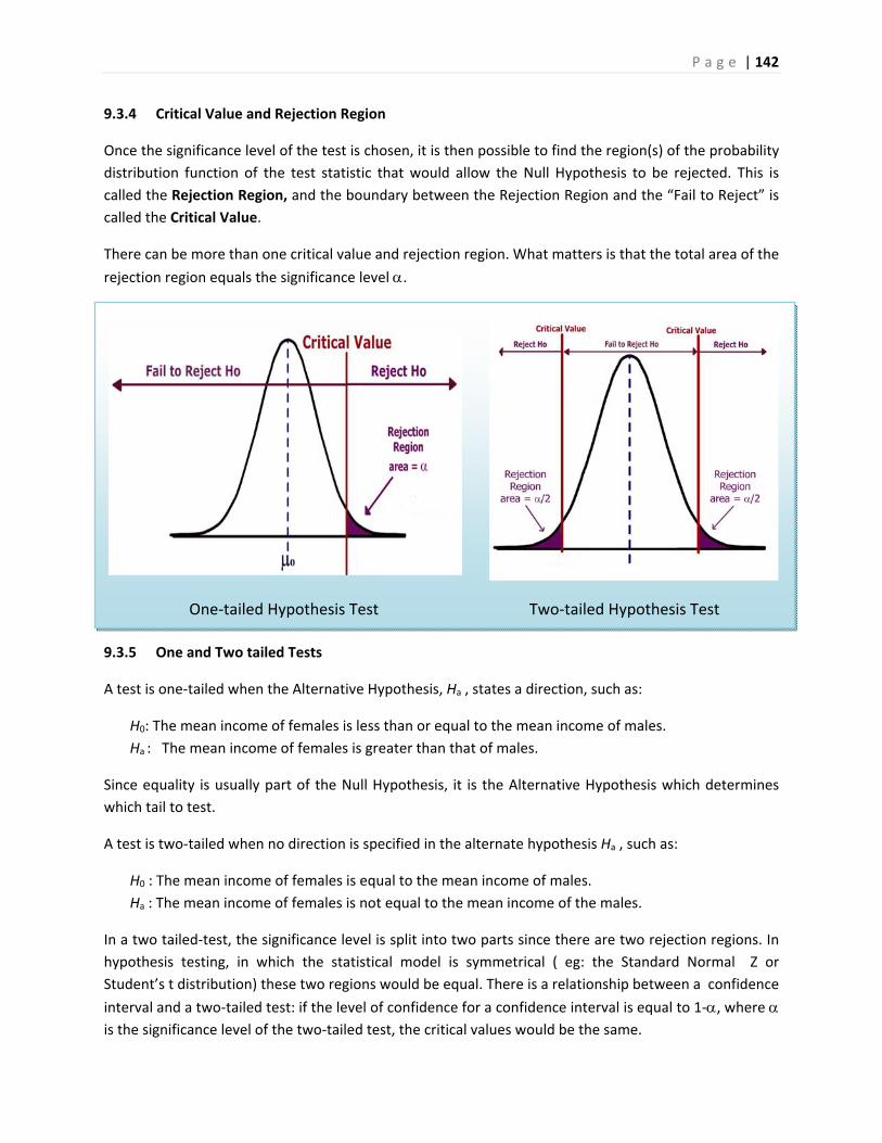
P a g e | 142
One‐tailed Hypothesis Test Two‐tailed Hypothesis Test
9.3.4 Critical Value and Rejection Region
Once the significance level of the test is chosen, it is then possible to find the region(s) of the probability
distribution function of the test statistic that would allow the Null Hypothesis to be rejected. This is
called the Rejection Region, and the boundary between the Rejection Region and the “Fail to Reject” is
called the Critical Value.
There can be more than one critical value and rejection region. What matters is that the total area of the
rejection region equals the significance level .
9.3.5 One and Two tailed Tests
A test is one‐tailed when the Alternative Hypothesis, Ha , states a direction, such as:
H0: The mean income of females is less than or equal to the mean income of males.
Ha : The mean income of females is greater than that of males.
Since equality is usually part of the Null Hypothesis, it is the Alternative Hypothesis which determines
which tail to test.
A test is two‐tailed when no direction is specified in the alternate hypothesis Ha , such as:
H0 : The mean income of females is equal to the mean income of males.
Ha : The mean income of females is not equal to the mean income of the males.
In a two tailed‐test, the significance level is split into two parts since there are two rejection regions. In
hypothesis testing, in which the statistical model is symmetrical ( eg: the Standard Normal Z or
Student’s t distribution) these two regions would be equal. There is a relationship between a confidence
interval and a two‐tailed test: if the level of confidence for a confidence interval is equal to 1‐, where is the significance level of the two‐tailed test, the critical values would be the same.
P a g e | 143
Ha: >0 means test the upper tail and is also called a right‐tailed test.
Ha: <0 means test the lower tail and is also called a left‐tailed test.
Ha: ≠0 means test both tails.
Here are some examples for testing the mean against a hypothesized value 0:
Deciding when to conduct a one or two‐tailed test is often controversial and many authorities even go
so far as to say that only two‐tailed tests should be conducted. Ultimately, the decision depends on the
wording of the problem. If we want to show that a new diet reduces weight, we would conduct a lower
tailed test, since we don’t care if the diet causes weight gain. If instead, we wanted to determine if mean
crime rate in California was different from the mean crime rate in the United States, we would run a
two‐tailed test, since different implies greater than or less than.
9.4 Collect and Analyze Experimental Data
After designing the experiment, we would
then collect and verify the data. For the
purposes of statistical analysis, we will
assume that all sampling is either random or
uses an alternative technique that
adequately simulates a random sample.
9.4.1 Data Verification
After collecting the data but before running
the test, we need to verify the data. First, get a picture of the data by making a graph (histogram, dot
plot, box plot, etc). Check for skewness, shape and any potential outliers in the data.
9.4.2 Working with Outliers
An outlier is a data point that is far removed from the other entries in the data set. Outliers could be
caused by:
Mistakes made in recording data
Data that don’t belong in population
True rare events
The first two cases are simple to deal with since we can correct errors or remove data that does not
belong in the population. The third case is more problematic as extreme outliers will increase the
standard deviation dramatically and heavily skew the data.
In The Black Swan, Nicholas Taleb argues that some populations with extreme outliers should not be
analyzed with traditional confidence intervals and hypothesis testing.72 He defines a Black Swan to be an
unpredictable extreme outlier that causes dramatic effects on the population. A recent example of a
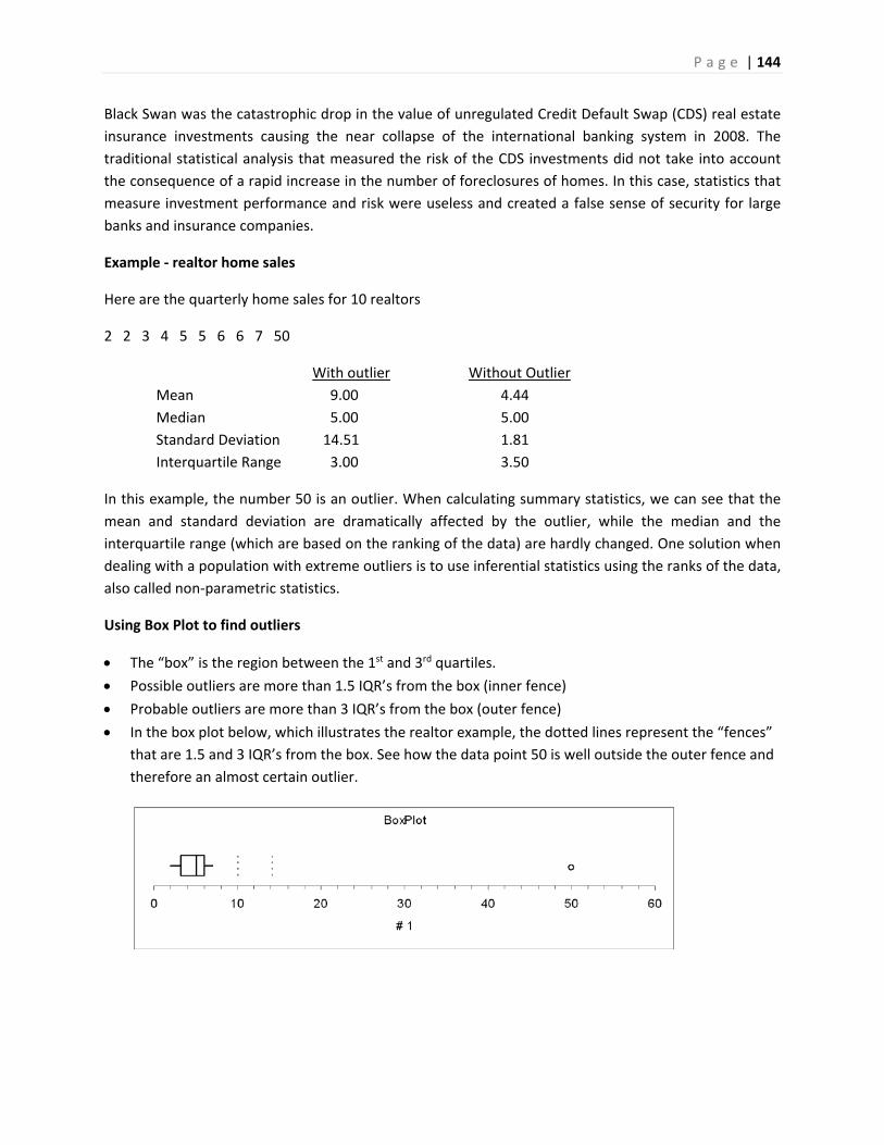
P a g e | 144
Black Swan was the catastrophic drop in the value of unregulated Credit Default Swap (CDS) real estate
insurance investments causing the near collapse of the international banking system in 2008. The
traditional statistical analysis that measured the risk of the CDS investments did not take into account
the consequence of a rapid increase in the number of foreclosures of homes. In this case, statistics that
measure investment performance and risk were useless and created a false sense of security for large
banks and insurance companies.
Example ‐ realtor home sales
Here are the quarterly home sales for 10 realtors
2 2 3 4 5 5 6 6 7 50
With outlier Without Outlier
Mean 9.00 4.44
Median 5.00 5.00
Standard Deviation 14.51 1.81
Interquartile Range 3.00 3.50
In this example, the number 50 is an outlier. When calculating summary statistics, we can see that the
mean and standard deviation are dramatically affected by the outlier, while the median and the
interquartile range (which are based on the ranking of the data) are hardly changed. One solution when
dealing with a population with extreme outliers is to use inferential statistics using the ranks of the data,
also called non‐parametric statistics.
Using Box Plot to find outliers
The “box” is the region between the 1st and 3rd quartiles.
Possible outliers are more than 1.5 IQR’s from the box (inner fence)
Probable outliers are more than 3 IQR’s from the box (outer fence)
In the box plot below, which illustrates the realtor example, the dotted lines represent the “fences”
that are 1.5 and 3 IQR’s from the box. See how the data point 50 is well outside the outer fence and
therefore an almost certain outlier.
P a g e | 145
p‐value: the probability, assuming that the null hypothesis is true, of getting a value of the test
statistic at least as extreme as the computed value for the test.
If the p‐value is smaller than the significance level , H0 is rejected.
If the p‐value is larger than the significance level , H0 is not rejected.
9.4.3 The Logic of Hypothesis Testing
After the data is verified, we want to conduct the hypothesis test and come up with a decision: whether
or not to reject the Null Hypothesis. The decision process is similar to a “proof by contradiction” used in
mathematics:
We assume Ho is true before observing data and design Ha to be the complement of Ho.
Observe the data (evidence). How unusual are these data under Ho?
If the data are too unusual, we have “proven” Ho is false: reject Ho and support Ha (strong
statement).
If the data are not too unusual, we fail to reject Ho. This “proves” nothing and we say data are
inconclusive. (weak statement) .
We can never “prove” Ho , only “disprove” it.
“Prove” in statistics means support with (1‐)100% certainty. (example: if =.05, then we are at least 95% confident in our decision to reject Ho.
9.4.4 Decision Rule – Two methods, Same Decision
Earlier we introduced the idea of a test statistic which is a value calculated from the data under the
appropriate Statistical Model from the data that can be compared to the critical value of the Hypothesis
test. If the test statistic falls in the rejection region of the statistical model, we reject the Null
Hypothesis.
Recall that the critical value was determined by design on the basis of the chosen level of significance . The more preferred method of making decisions is to calculate the probability of getting a result as
extreme as the value of the test statistic. This probability is called the p‐value, and can be compared
directly to the significance level.
Comparing p‐value to
Both the p‐value and are probabilities of getting results as extreme as the data assuming Ho is true.
The p‐value is determined by the data and is related to the actual probability of making Type I error
(rejecting a true Null Hypothesis). The smaller the p‐value, the smaller the chance of making Type I
error and therefore, the more likely we are to reject the Null Hypothesis.
The significance level is determined by the design and is the maximum probability we are willing to
accept of rejecting a true H0.
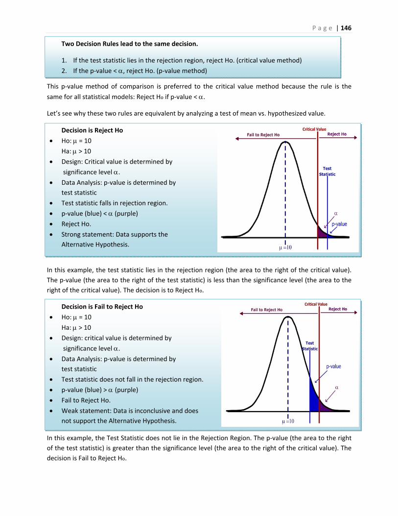
P a g e | 146
Decision is Fail to Reject Ho
Ho: = 10 Ha: > 10
Design: critical value is determined by
significance level . Data Analysis: p‐value is determined by
test statistic
Test statistic does not fall in the rejection region.
p‐value (blue) > (purple) Fail to Reject Ho.
Weak statement: Data is inconclusive and does
not support the Alternative Hypothesis.
Two Decision Rules lead to the same decision.
1. If the test statistic lies in the rejection region, reject Ho. (critical value method)
2. If the p‐value < , reject Ho. (p‐value method)
Decision is Reject Ho
Ho: = 10 Ha: > 10
Design: Critical value is determined by
significance level . Data Analysis: p‐value is determined by
test statistic
Test statistic falls in rejection region.
p‐value (blue) < (purple) Reject Ho.
Strong statement: Data supports the
Alternative Hypothesis.
This p‐value method of comparison is preferred to the critical value method because the rule is the
same for all statistical models: Reject Ho if p‐value < .
Let’s see why these two rules are equivalent by analyzing a test of mean vs. hypothesized value.
In this example, the test statistic lies in the rejection region (the area to the right of the critical value).
The p‐value (the area to the right of the test statistic) is less than the significance level (the area to the
right of the critical value). The decision is to Reject Ho.
In this example, the Test Statistic does not lie in the Rejection Region. The p‐value (the area to the right
of the test statistic) is greater than the significance level (the area to the right of the critical value). The
decision is Fail to Reject Ho.
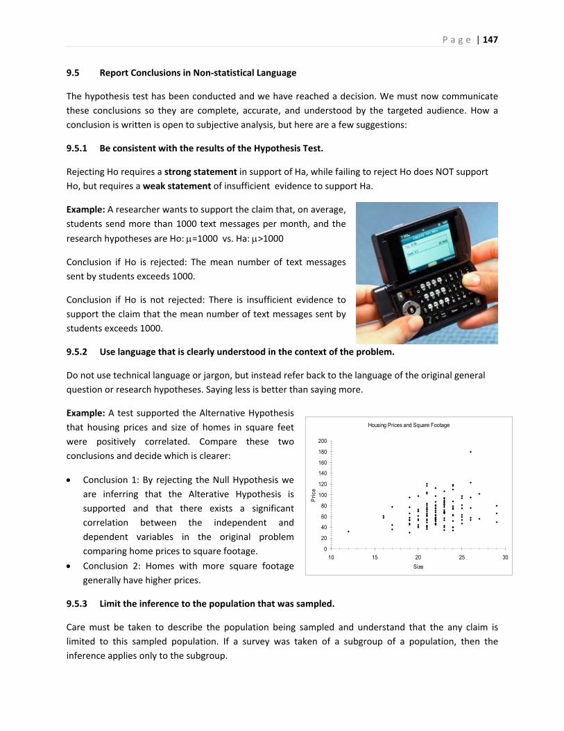
P a g e | 147
Housing Prices and Square Footage
0
20
40
60
80
100
120
140
160
180
200
10 15 20 25 30
Size
Pri
ce
9.5 Report Conclusions in Non‐statistical Language
The hypothesis test has been conducted and we have reached a decision. We must now communicate
these conclusions so they are complete, accurate, and understood by the targeted audience. How a
conclusion is written is open to subjective analysis, but here are a few suggestions:
9.5.1 Be consistent with the results of the Hypothesis Test.
Rejecting Ho requires a strong statement in support of Ha, while failing to reject Ho does NOT support
Ho, but requires a weak statement of insufficient evidence to support Ha.
Example: A researcher wants to support the claim that, on average,
students send more than 1000 text messages per month, and the
research hypotheses are Ho: =1000 vs. Ha: >1000
Conclusion if Ho is rejected: The mean number of text messages
sent by students exceeds 1000.
Conclusion if Ho is not rejected: There is insufficient evidence to
support the claim that the mean number of text messages sent by
students exceeds 1000.
9.5.2 Use language that is clearly understood in the context of the problem.
Do not use technical language or jargon, but instead refer back to the language of the original general
question or research hypotheses. Saying less is better than saying more.
Example: A test supported the Alternative Hypothesis
that housing prices and size of homes in square feet
were positively correlated. Compare these two
conclusions and decide which is clearer:
Conclusion 1: By rejecting the Null Hypothesis we
are inferring that the Alterative Hypothesis is
supported and that there exists a significant
correlation between the independent and
dependent variables in the original problem
comparing home prices to square footage.
Conclusion 2: Homes with more square footage
generally have higher prices.
9.5.3 Limit the inference to the population that was sampled.
Care must be taken to describe the population being sampled and understand that the any claim is
limited to this sampled population. If a survey was taken of a subgroup of a population, then the
inference applies only to the subgroup.
P a g e | 148
For example, studies by pharmaceutical companies will only test adult patients, making it difficult to
determine effective dosage and side effects for children. “In the absence of data, doctors use their
medical judgment to decide on a particular drug and dose for children. ‘Some doctors stay away from
drugs, which could deny needed treatment,’ Blumer says. ‘Generally, we take our best guess based on
what's been done before.’ The antibiotic chloramphenicol was widely used in adults to treat infections
resistant to penicillin. But many newborn babies died after receiving the drug because their immature
livers couldn't break down the antibiotic.”73 We can see in this example that applying inference of the
drug testing results on adults to the un‐sampled children led to tragic results.
9.5.4 Report sampling methods that could question the integrity of the random sample assumption.
In practice it is nearly impossible to choose a random sample, and scientific sampling techniques that
attempt to simulate a random sample need to be checked for bias caused by under‐sampling.
Telephone polling was found to under‐sample young people during the 2008 presidential campaign
because of the increase in cell phone only households. Since young people were more likely to favor
Obama, this caused bias in the polling numbers. Additionally, caller ID has dramatically reduced the
percentage of successful connections to people being surveyed. The pollster Jay Leve of SurveyUSA said
telephone polling was “doomed” and said his company was already developing new methods for
polling.74
Sampling that didn’t occur over the weekend may exclude many full time workers while self‐selected
and unverified polls (such as ratemyprofessors.com) could contain immeasurable bias.
9.5.5 Conclusions should address the potential or necessity of further research, sending the process
back to the first procedure.
Answers often lead to new questions. If changes are recommended in a researcher’s conclusion, then
further research is usually needed to analyze the impact and effectiveness of the implemented changes.
There may have been limitations in the original research project (such as funding resources, sampling
techniques, unavailability of data) that warrant more comprehensive studies.
For example, a math department modifies its curriculum based on the improved student success rates
of an experimental course. The department would want to do further study of student outcomes to
assess the effectiveness of the new program.
9.6 Test of Mean vs. Hypothesized Value – A Complete Example
Example – soy sauce production
A food company has a policy that the stated contents of a product
match the actual results. A General Question might be “Does the
stated net weight of a food product match the actual weight?” The
quality control statistician decides to test the 16 ounce bottle of Soy
Sauce and must now design the experiment.
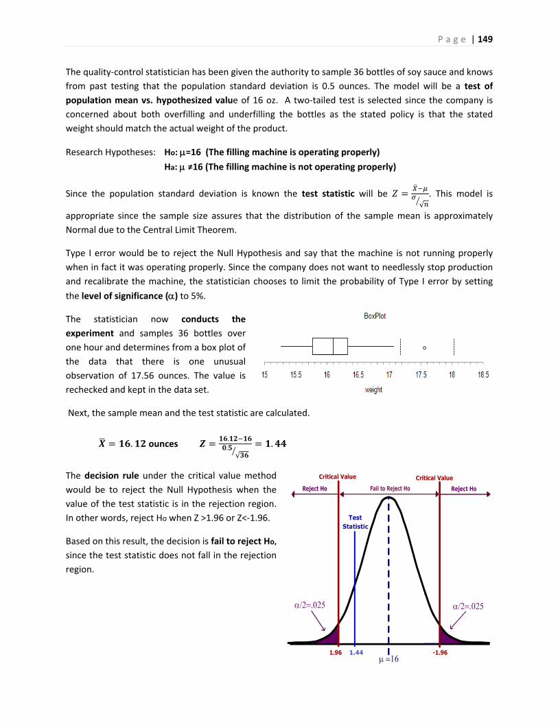
P a g e | 149
The quality‐control statistician has been given the authority to sample 36 bottles of soy sauce and knows
from past testing that the population standard deviation is 0.5 ounces. The model will be a test of
population mean vs. hypothesized value of 16 oz. A two‐tailed test is selected since the company is
concerned about both overfilling and underfilling the bottles as the stated policy is that the stated
weight should match the actual weight of the product.
Research Hypotheses: Ho: =16 (The filling machine is operating properly)
Ha: ≠16 (The filling machine is not operating properly)
Since the population standard deviation is known the test statistic will be √. This model is
appropriate since the sample size assures that the distribution of the sample mean is approximately
Normal due to the Central Limit Theorem.
Type I error would be to reject the Null Hypothesis and say that the machine is not running properly
when in fact it was operating properly. Since the company does not want to needlessly stop production
and recalibrate the machine, the statistician chooses to limit the probability of Type I error by setting
the level of significance () to 5%.
The statistician now conducts the
experiment and samples 36 bottles over
one hour and determines from a box plot of
the data that there is one unusual
observation of 17.56 ounces. The value is
rechecked and kept in the data set.
Next, the sample mean and the test statistic are calculated.
. ounces ..√
.
The decision rule under the critical value method
would be to reject the Null Hypothesis when the
value of the test statistic is in the rejection region.
In other words, reject Ho when Z >1.96 or Z<‐1.96.
Based on this result, the decision is fail to reject Ho,
since the test statistic does not fall in the rejection
region.
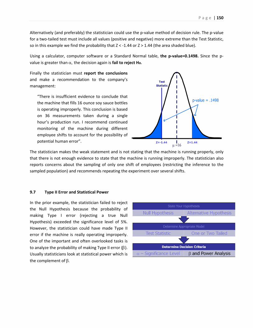
P a g e | 150
Alternatively (and preferably) the statistician could use the p‐value method of decision rule. The p‐value
for a two‐tailed test must include all values (positive and negative) more extreme than the Test Statistic,
so in this example we find the probability that Z < ‐1.44 or Z > 1.44 (the area shaded blue).
Using a calculator, computer software or a Standard Normal table, the p‐value=0.1498. Since the p‐
value is greater than the decision again is fail to reject Ho.
Finally the statistician must report the conclusions
and make a recommendation to the company’s
management:
“There is insufficient evidence to conclude that
the machine that fills 16 ounce soy sauce bottles
is operating improperly. This conclusion is based
on 36 measurements taken during a single
hour’s production run. I recommend continued
monitoring of the machine during different
employee shifts to account for the possibility of
potential human error”.
The statistician makes the weak statement and is not stating that the machine is running properly, only
that there is not enough evidence to state that the machine is running improperly. The statistician also
reports concerns about the sampling of only one shift of employees (restricting the inference to the
sampled population) and recommends repeating the experiment over several shifts.
9.7 Type II Error and Statistical Power
In the prior example, the statistician failed to reject
the Null Hypothesis because the probability of
making Type I error (rejecting a true Null
Hypothesis) exceeded the significance level of 5%.
However, the statistician could have made Type II
error if the machine is really operating improperly.
One of the important and often overlooked tasks is
to analyze the probability of making Type II error (). Usually statisticians look at statistical power which is
the complement of
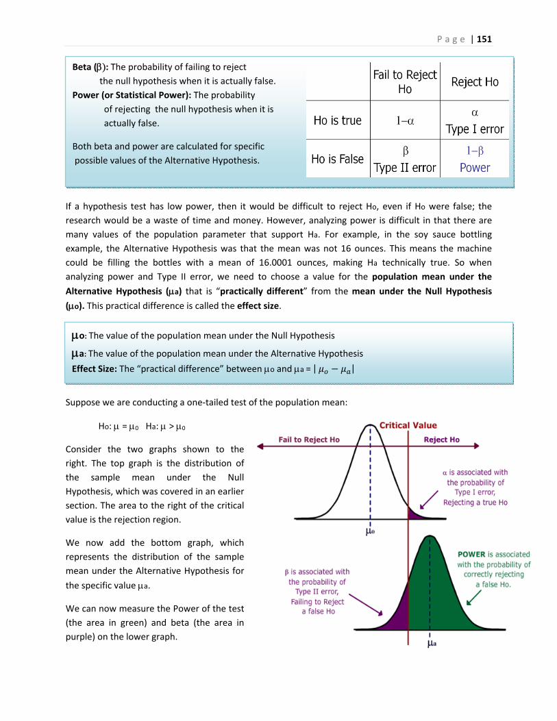
P a g e | 151
Beta (: The probability of failing to reject the null hypothesis when it is actually false.
Power (or Statistical Power): The probability
of rejecting the null hypothesis when it is
actually false.
Both beta and power are calculated for specific
possible values of the Alternative Hypothesis.
o: The value of the population mean under the Null Hypothesis
a: The value of the population mean under the Alternative Hypothesis
Effect Size: The “practical difference” between o and a =| |
If a hypothesis test has low power, then it would be difficult to reject Ho, even if Ho were false; the
research would be a waste of time and money. However, analyzing power is difficult in that there are
many values of the population parameter that support Ha. For example, in the soy sauce bottling
example, the Alternative Hypothesis was that the mean was not 16 ounces. This means the machine
could be filling the bottles with a mean of 16.0001 ounces, making Ha technically true. So when
analyzing power and Type II error, we need to choose a value for the population mean under the
Alternative Hypothesis (a) that is “practically different” from the mean under the Null Hypothesis
(o). This practical difference is called the effect size.
Suppose we are conducting a one‐tailed test of the population mean:
Ho: = 0 Ha: > 0
Consider the two graphs shown to the
right. The top graph is the distribution of
the sample mean under the Null
Hypothesis, which was covered in an earlier
section. The area to the right of the critical
value is the rejection region.
We now add the bottom graph, which
represents the distribution of the sample
mean under the Alternative Hypothesis for
the specific value a.
We can now measure the Power of the test
(the area in green) and beta (the area in
purple) on the lower graph.
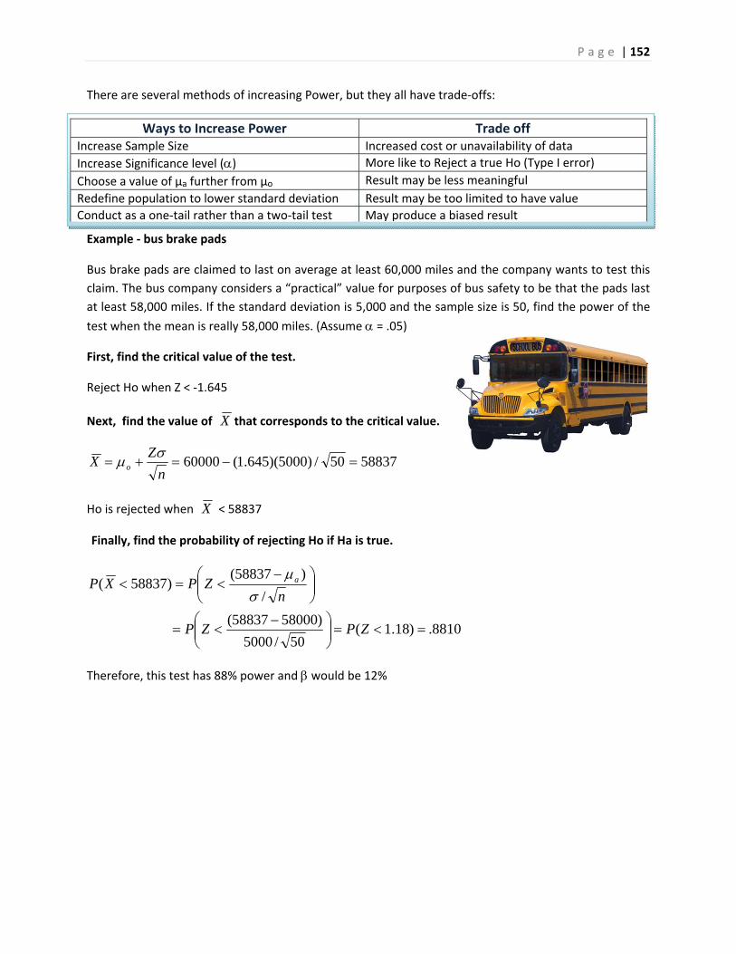
P a g e | 152
Ways to Increase Power Trade off Increase Sample Size Increased cost or unavailability of data
Increase Significance level () More like to Reject a true Ho (Type I error)
Choose a value of µa further from µo Result may be less meaningful
Redefine population to lower standard deviation Result may be too limited to have value
Conduct as a one‐tail rather than a two‐tail test May produce a biased result
There are several methods of increasing Power, but they all have trade‐offs:
Example ‐ bus brake pads
Bus brake pads are claimed to last on average at least 60,000 miles and the company wants to test this
claim. The bus company considers a “practical” value for purposes of bus safety to be that the pads last
at least 58,000 miles. If the standard deviation is 5,000 and the sample size is 50, find the power of the
test when the mean is really 58,000 miles. (Assume = .05)
First, find the critical value of the test.
Reject Ho when Z < ‐1.645
Next, find the value of that corresponds to the critical value.
Ho is rejected when < 58837
Finally, find the probability of rejecting Ho if Ha is true.
Therefore, this test has 88% power and would be 12%
X
5883750/)5000)(645.1(60000 n
ZX o
X
8810.)18.1(50/5000
)5800058837(
/
)58837()58837(
ZPZP
nZPXP a

P a g e | 153
Power Calculation Values
Input Values
60,000 miles58,000 miles
0.05 50 5000 miles
Calculated Values
Effect Size = 2000 miles
Critical Value 58,837miles0.1190orabout12%
Power 0.8810 or about 88%
9.8 New Models for One Population Inference, Similar Procedures
The procedures outlined for the test of population mean vs. hypothesized value with known population
standard deviation will apply to other models as well. All that really changes is the test statistic.
Examples of some other one population models:
Test of population mean vs. hypothesized value, population standard deviation unknown.
Test of population proportion vs. hypothesized value.
Test of population standard deviation (or variance) vs. hypothesized value.
9.8.1 Test of population mean with unknown population standard deviation
The test statistic for the one sample case changes to a Student’s t distribution with degrees of freedom
equal to n‐1: √⁄
The shape of the t distribution is similar to the Z, except for the fact that the tails are fatter, so the logic
of the decision rule is the same as for the Z test statistic.

P a g e | 154
Example ‐ archaeology
Humerus bones from the same species have
approximately the same length‐to‐width ratios. When
fossils of humerus bones are discovered,
archaeologists can determine the species by
examining this ratio. It is known that Species A has a
mean ratio of 9.6. A similar Species B has a mean ratio
of 9.1 and is often confused with Species A. 21
humerus bones were unearthed in an area that was
originally thought to be inhabited Species A. (Assume
all unearthed bones are from the same species.)
1. Design a test in which the alternative hypothesis would be the humerus bones were not from Species A.
Research Hypotheses
Ho: = 9.6 (The humerus bones are from Species A)
Ha: ≠ 9.6 (The humerus bones are not from Species A)
Significance level: =.05
Test Statistic (Model): t‐test of mean vs. hypothesized value, unknown standard deviation
Model Assumptions: we may need to check the data for extreme skewness as the distribution of the
sample mean is assumed to be approximately the Normal Distribution.
2. Determine the power of this test if the bones actually came from Species B (assume a standard
deviation of 0.7)
Information needed for Power Calculation
o = 9.6 (Species A) a = 9.1 (Species B) Effect Size =| mo ‐ ma | = 0.5
s = 0.7 (given)
= .05 n = 21 (sample size)
Two tailed test
Results using Online Power Calculator75
Power =.8755
= 1 ‐ Power = .1245 If humerus bones are from Species B, test
has an 87.55% chance of correctly rejecting Ho and a maximum Type II error of 12.55%
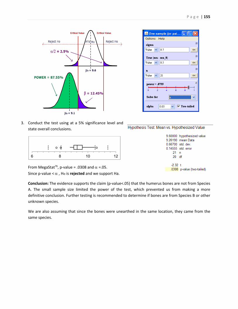
P a g e | 155
3. Conduct the test using at a 5% significance level and
state overall conclusions.
From MegaStat76, p‐value = .0308 and =.05. Since p‐value < , Ho is rejected and we support Ha.
Conclusion: The evidence supports the claim (p‐value<.05) that the humerus bones are not from Species
A. The small sample size limited the power of the test, which prevented us from making a more
definitive conclusion. Further testing is recommended to determine if bones are from Species B or other
unknown species.
We are also assuming that since the bones were unearthed in the same location, they came from the
same species.
6 8 10 12
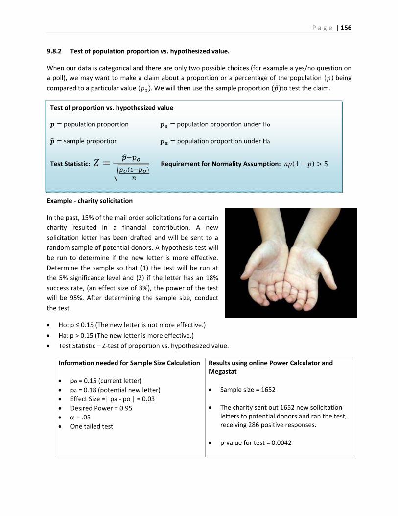
P a g e | 156
Test of proportion vs. hypothesized value
population proportion population proportion under Ho
sample proportion population proportion under Ha
Test Statistic: Requirement for Normality Assumption: 1 5
9.8.2 Test of population proportion vs. hypothesized value.
When our data is categorical and there are only two possible choices (for example a yes/no question on
a poll), we may want to make a claim about a proportion or a percentage of the population being compared to a particular value .We will then use the sample proportion to test the claim.
Example ‐ charity solicitation
In the past, 15% of the mail order solicitations for a certain
charity resulted in a financial contribution. A new
solicitation letter has been drafted and will be sent to a
random sample of potential donors. A hypothesis test will
be run to determine if the new letter is more effective.
Determine the sample so that (1) the test will be run at
the 5% significance level and (2) if the letter has an 18%
success rate, (an effect size of 3%), the power of the test
will be 95%. After determining the sample size, conduct
the test.
Ho: p ≤ 0.15 (The new letter is not more effective.)
Ha: p > 0.15 (The new letter is more effective.)
Test Statistic – Z‐test of proportion vs. hypothesized value.
Information needed for Sample Size Calculation
po = 0.15 (current letter)
pa = 0.18 (potential new letter)
Effect Size =| pa ‐ po | = 0.03
Desired Power = 0.95
= .05 One tailed test
Results using online Power Calculator and Megastat
Sample size = 1652
The charity sent out 1652 new solicitation letters to potential donors and ran the test, receiving 286 positive responses.
p‐value for test = 0.0042
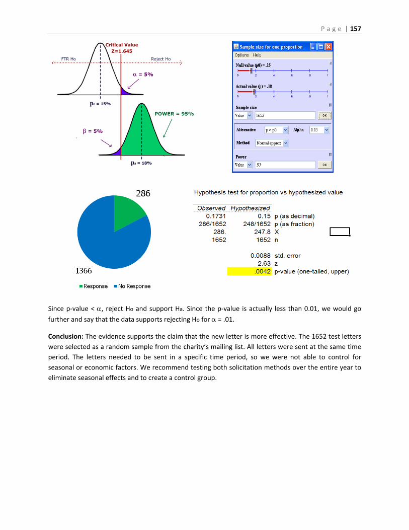
P a g e | 157
Since p‐value < , reject Ho and support Ha. Since the p‐value is actually less than 0.01, we would go further and say that the data supports rejecting Ho for = .01.
Conclusion: The evidence supports the claim that the new letter is more effective. The 1652 test letters
were selected as a random sample from the charity’s mailing list. All letters were sent at the same time
period. The letters needed to be sent in a specific time period, so we were not able to control for
seasonal or economic factors. We recommend testing both solicitation methods over the entire year to
eliminate seasonal effects and to create a control group.
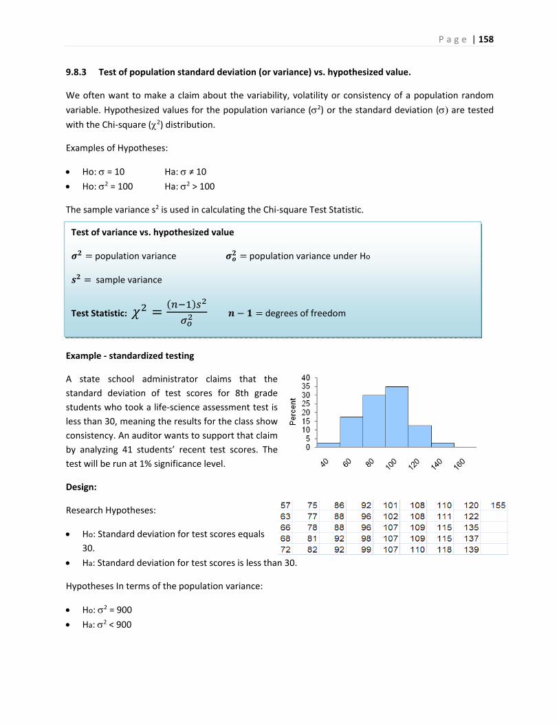
P a g e | 158
Test of variance vs. hypothesized value
population variance population variance under Ho
sample variance
Test Statistic: degrees of freedom
9.8.3 Test of population standard deviation (or variance) vs. hypothesized value.
We often want to make a claim about the variability, volatility or consistency of a population random
variable. Hypothesized values for the population variance (2) or the standard deviation ( are tested with the Chi‐square (2) distribution.
Examples of Hypotheses:
Ho: = 10 Ha: ≠ 10 Ho: 2 = 100 Ha: 2 > 100
The sample variance s2 is used in calculating the Chi‐square Test Statistic.
Example ‐ standardized testing
A state school administrator claims that the
standard deviation of test scores for 8th grade
students who took a life‐science assessment test is
less than 30, meaning the results for the class show
consistency. An auditor wants to support that claim
by analyzing 41 students’ recent test scores. The
test will be run at 1% significance level.
Design:
Research Hypotheses:
Ho: Standard deviation for test scores equals
30.
Ha: Standard deviation for test scores is less than 30.
Hypotheses In terms of the population variance:
Ho: 2 = 900
Ha: 2 < 900
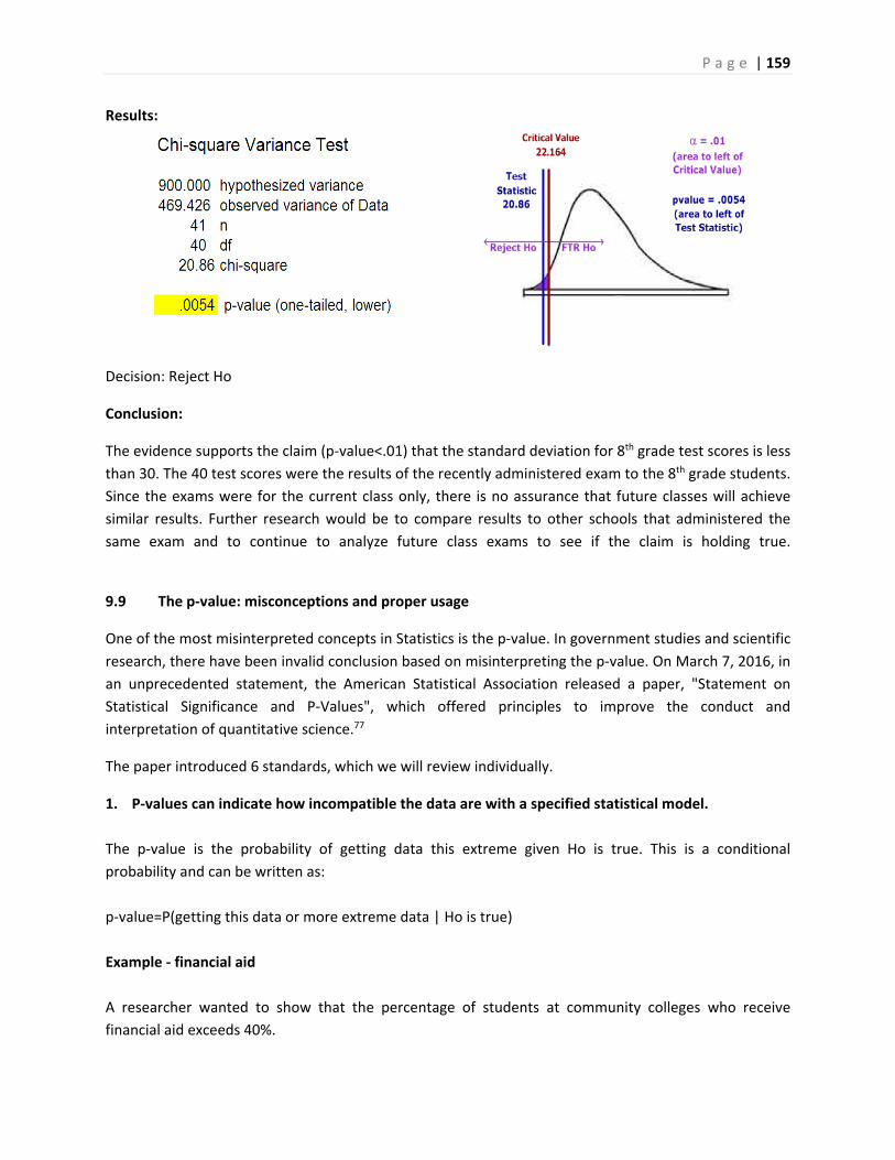
P a g e | 159
Results:
Decision: Reject Ho
Conclusion:
The evidence supports the claim (p‐value<.01) that the standard deviation for 8th grade test scores is less
than 30. The 40 test scores were the results of the recently administered exam to the 8th grade students.
Since the exams were for the current class only, there is no assurance that future classes will achieve
similar results. Further research would be to compare results to other schools that administered the
same exam and to continue to analyze future class exams to see if the claim is holding true.
9.9 The p‐value: misconceptions and proper usage
One of the most misinterpreted concepts in Statistics is the p‐value. In government studies and scientific
research, there have been invalid conclusion based on misinterpreting the p‐value. On March 7, 2016, in
an unprecedented statement, the American Statistical Association released a paper, "Statement on
Statistical Significance and P‐Values", which offered principles to improve the conduct and
interpretation of quantitative science.77
The paper introduced 6 standards, which we will review individually.
1. P‐values can indicate how incompatible the data are with a specified statistical model.
The p‐value is the probability of getting data this extreme given Ho is true. This is a conditional
probability and can be written as:
p‐value=P(getting this data or more extreme data | Ho is true)
Example ‐ financial aid
A researcher wanted to show that the percentage of students at community colleges who receive
financial aid exceeds 40%.
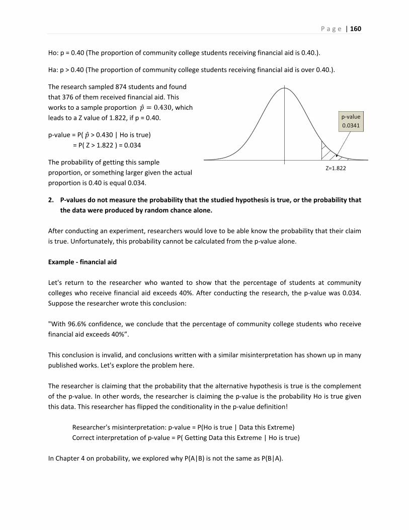
P a g e | 160
Ho: p = 0.40 (The proportion of community college students receiving financial aid is 0.40.).
Ha: p > 0.40 (The proportion of community college students receiving financial aid is over 0.40.).
The research sampled 874 students and found
that 376 of them received financial aid. This
works to a sample proportion 0.430, which leads to a Z value of 1.822, if p = 0.40.
p‐value = P( > 0.430 | Ho is true) = P( Z > 1.822 ) = 0.034
The probability of getting this sample
proportion, or something larger given the actual
proportion is 0.40 is equal 0.034.
2. P‐values do not measure the probability that the studied hypothesis is true, or the probability that
the data were produced by random chance alone.
After conducting an experiment, researchers would love to be able know the probability that their claim
is true. Unfortunately, this probability cannot be calculated from the p‐value alone.
Example ‐ financial aid
Let's return to the researcher who wanted to show that the percentage of students at community
colleges who receive financial aid exceeds 40%. After conducting the research, the p‐value was 0.034.
Suppose the researcher wrote this conclusion:
"With 96.6% confidence, we conclude that the percentage of community college students who receive
financial aid exceeds 40%”.
This conclusion is invalid, and conclusions written with a similar misinterpretation has shown up in many
published works. Let's explore the problem here.
The researcher is claiming that the probability that the alternative hypothesis is true is the complement
of the p‐value. In other words, the researcher is claiming the p‐value is the probability Ho is true given
this data. This researcher has flipped the conditionality in the p‐value definition!
Researcher's misinterpretation: p‐value = P(Ho is true | Data this Extreme)
Correct interpretation of p‐value = P( Getting Data this Extreme | Ho is true)
In Chapter 4 on probability, we explored why P(A|B) is not the same as P(B|A).
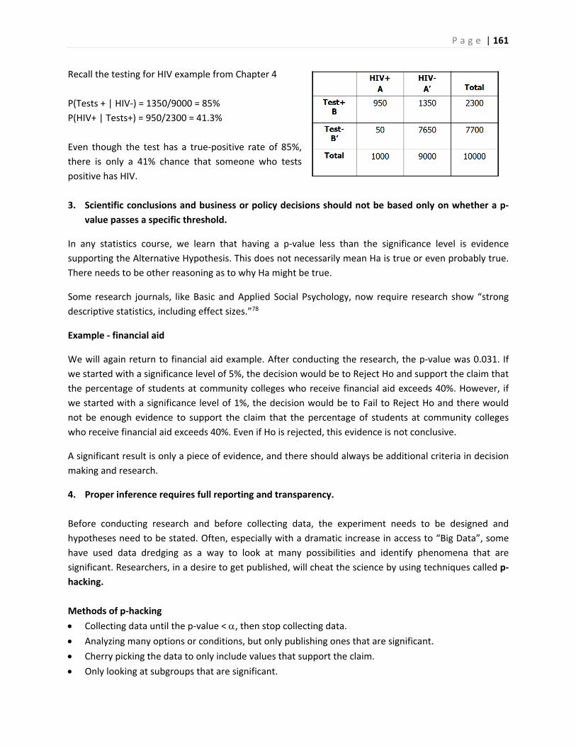
P a g e | 161
Recall the testing for HIV example from Chapter 4
P(Tests + | HIV‐) = 1350/9000 = 85%
P(HIV+ | Tests+) = 950/2300 = 41.3%
Even though the test has a true‐positive rate of 85%,
there is only a 41% chance that someone who tests
positive has HIV.
3. Scientific conclusions and business or policy decisions should not be based only on whether a p‐
value passes a specific threshold.
In any statistics course, we learn that having a p‐value less than the significance level is evidence
supporting the Alternative Hypothesis. This does not necessarily mean Ha is true or even probably true.
There needs to be other reasoning as to why Ha might be true.
Some research journals, like Basic and Applied Social Psychology, now require research show “strong
descriptive statistics, including effect sizes.”78
Example ‐ financial aid
We will again return to financial aid example. After conducting the research, the p‐value was 0.031. If
we started with a significance level of 5%, the decision would be to Reject Ho and support the claim that
the percentage of students at community colleges who receive financial aid exceeds 40%. However, if
we started with a significance level of 1%, the decision would be to Fail to Reject Ho and there would
not be enough evidence to support the claim that the percentage of students at community colleges
who receive financial aid exceeds 40%. Even if Ho is rejected, this evidence is not conclusive.
A significant result is only a piece of evidence, and there should always be additional criteria in decision
making and research.
4. Proper inference requires full reporting and transparency.
Before conducting research and before collecting data, the experiment needs to be designed and
hypotheses need to be stated. Often, especially with a dramatic increase in access to “Big Data”, some
have used data dredging as a way to look at many possibilities and identify phenomena that are
significant. Researchers, in a desire to get published, will cheat the science by using techniques called p‐
hacking.
Methods of p‐hacking
Collecting data until the p‐value < , then stop collecting data. Analyzing many options or conditions, but only publishing ones that are significant.
Cherry picking the data to only include values that support the claim.
Only looking at subgroups that are significant.

P a g e | 162
Use of these p‐hacking methods are troubling and
is one of the main reasons scientific journals are
now skeptical of p‐value based hypothesis testing.
The XKCD comic “Significant”79, pictured on the
right, shows an example of p‐hacking, including
how the media misinterprets research.
5. A p‐value, or statistical significance, does not measure the size of an effect or the importance of a result.
A result may be statistically significant, but have no practical value. Suppose someone claims that the mean flying time between New York and San Francisco is 6 hours 20 minutes. After conducting a large sample size study, you find significant evidence (p‐value < .01) that the mean flying time is really longer, with a sample mean of 6 hours and 23 minutes. Even though your evidence is strong, there is no practical difference between the times. The p‐value does not address effect sizes. 6. By itself, a p‐value does not provide a good
measure of evidence regarding a model or hypothesis.
The p‐value is a useful tool, but by itself is not enough to support research.80
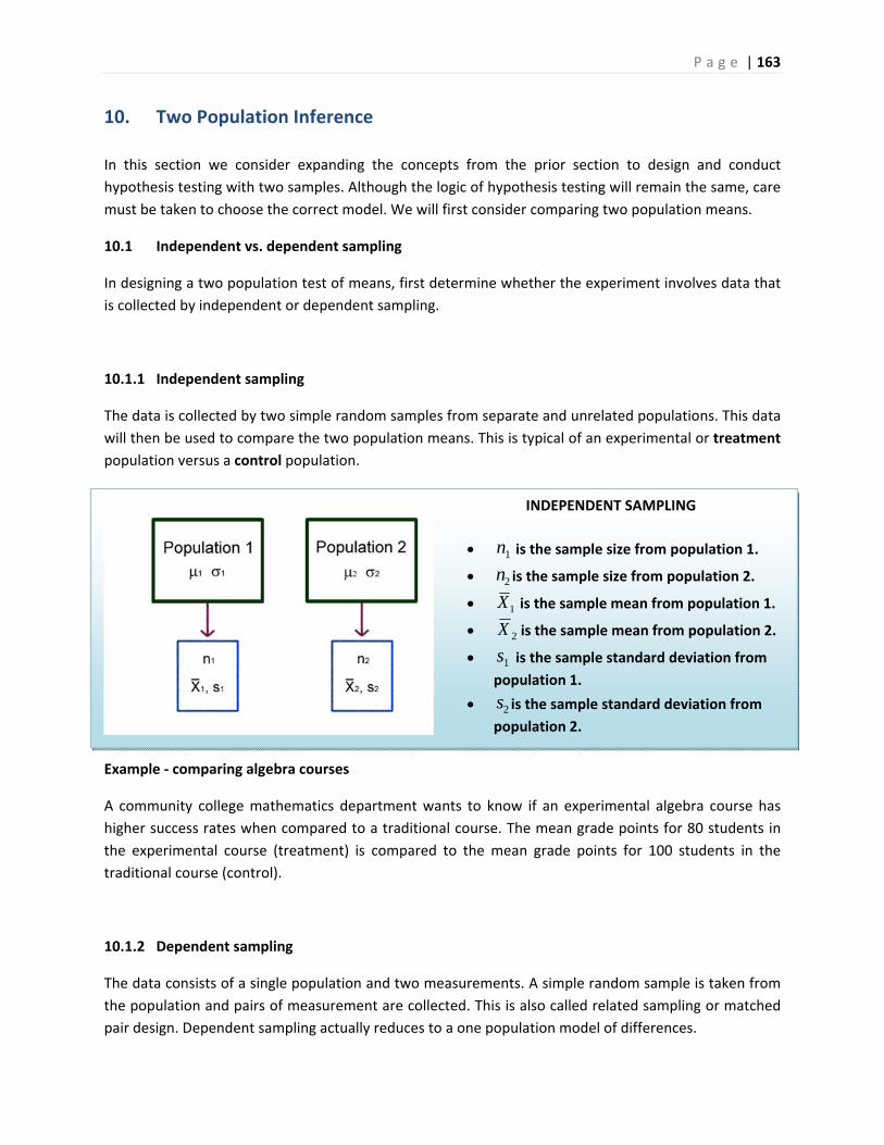
P a g e | 163
INDEPENDENT SAMPLING
1n is the sample size from population 1.
2n is the sample size from population 2.
1X is the sample mean from population 1.
2X is the sample mean from population 2.
1s is the sample standard deviation from
population 1.
2s is the sample standard deviation from
population 2.
10. Two Population Inference
In this section we consider expanding the concepts from the prior section to design and conduct
hypothesis testing with two samples. Although the logic of hypothesis testing will remain the same, care
must be taken to choose the correct model. We will first consider comparing two population means.
10.1 Independent vs. dependent sampling
In designing a two population test of means, first determine whether the experiment involves data that
is collected by independent or dependent sampling.
10.1.1 Independent sampling
The data is collected by two simple random samples from separate and unrelated populations. This data
will then be used to compare the two population means. This is typical of an experimental or treatment
population versus a control population.
Example ‐ comparing algebra courses
A community college mathematics department wants to know if an experimental algebra course has
higher success rates when compared to a traditional course. The mean grade points for 80 students in
the experimental course (treatment) is compared to the mean grade points for 100 students in the
traditional course (control).
10.1.2 Dependent sampling
The data consists of a single population and two measurements. A simple random sample is taken from
the population and pairs of measurement are collected. This is also called related sampling or matched
pair design. Dependent sampling actually reduces to a one population model of differences.
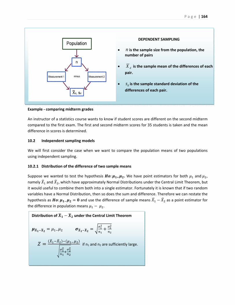
P a g e | 164
Distribution of under the Central Limit Theorem
if n1 and n2 are sufficiently large.
Example ‐ comparing midterm grades
An instructor of a statistics course wants to know if student scores are different on the second midterm
compared to the first exam. The first and second midterm scores for 35 students is taken and the mean
difference in scores is determined.
10.2 Independent sampling models
We will first consider the case when we want to compare the population means of two populations
using independent sampling.
10.2.1 Distribution of the difference of two sample means
Suppose we wanted to test the hypothesis : . We have point estimators for both and ,
namely and , which have approximately Normal Distributions under the Central Limit Theorem, but
it would useful to combine them both into a single estimator. Fortunately it is known that if two random
variables have a Normal Distribution, then so does the sum and difference. Therefore we can restate the
hypothesis as : and use the difference of sample means as a point estimator for
the difference in population means .
DEPENDENT SAMPLING
n is the sample size from the population, the number of pairs
dX is the sample mean of the differences of each
pair.
ds is the sample standard deviation of the
differences of each pair.

P a g e | 165
10.2.2 Comparing two means, independent sampling: Model when population variances known
When the population variances are known, the test statistic for the Hypothesis : can be tested
with Normal distribution Z test statistic shown above. Also, if both sample size n1 and n2 exceed 30, this
model can also be used.
Example ‐ homes and pools
Are larger homes more likely to have pools? The square
footage (size) data for single family homes in California was
separated into two populations: Homes with pools and
homes without pools. We have data from 130 homes with
pools and 95 homes without pools.
Design
Research Hypotheses: Ho: ≤ (Homes with pools do not have more mean square footage)
Ha: > (Homes with pools do have more mean square footage)
Since both sample sizes are over 30, the model will be a Large sample Z test comparing two population
means with independent sampling. This model is appropriate since the sample sizes assures the
distribution of the sample mean is approximately Normal from the Central Limit Theorem. We opt for a
one‐tailed test since we want to support the claim that homes with pools are larger. The test statistic
will be .
Type I error would be to reject the Null Hypothesis and claim home with pools are larger, when they are
not larger. It was decided to limit this error by setting the level of significance () to 1%.
The decision rule under the critical value method would be to reject the Null Hypothesis when the value
of the test statistic is in the rejection region. In other words, reject Ho when Z > 2.326. The decision
under the p‐value method is to reject Ho if the p‐value is <
Data/Results
Since the test statistic (Z = 4.19) is greater than the critical value (2.326), Ho is rejected. Also the p‐value
(0.000013) is less than (0.01), the decision is to Reject Ho.
P a g e | 166
Pooled variance t‐test to compare the means for two independent populations
Model Assumptions
Independent Sampling
approximately Normal
Test Statistic
Degrees of freedom = 2
Conclusion
The researcher makes the strong statement that homes with pools have a significantly higher mean
square footage than home without pools.
10.2.3 Model when population variances are unknown, but are assumed to be equal
In the case that the population standard deviations are unknown, it seems logical to simply replace the
population standard deviations for each population with the sample standard deviations and use a t‐
distribution as we did for the one population case. However, this is not so simple when the sample size
for either group is under 30.
We will consider two models. This first model (which we prefer to use since it has more power) assumes
the population variances are equal and is called the pooled variance t‐test. In this model we combine or
“pool” the two sample standard deviations into a single estimate called the pooled standard deviation,
sp . If the central limit theorem is working, we then can substitute sp for s1 and s2 get a t‐distribution with
n1 +n2 ‐2 degrees of freedom:
Example ‐ fuel economy
A recent EPA study compared the highway fuel economy of
domestic and imported passenger cars. A sample of 15 domestic
cars revealed a mean of 33.7 MPG (mile per gallon) with a standard
deviation of 2.4 mpg. A sample of 12 imported cars revealed a
mean of 35.7 mpg with a standard deviation of 3.9. At the .05
significance level can the EPA conclude that the MPG is higher for
the imported cars?
Design
It is best to associate the subscript 2 with the control group; in this case we will let domestic cars be
population 2.
Research Hypotheses: Ho: ≤ (Imported compact cars do not have a higher mean MPG)
Ha: > (Imported compact cars have a higher mean MPG)
We will assume the population variances are equal , so the model will be a Pooled variance t‐
test. This model is appropriate if the distribution of the differences of sample means is approximately
Normal from the Central Limit Theorem. A one‐tailed test is selected based on Ha.
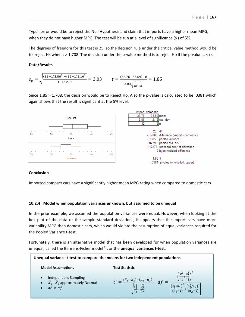
P a g e | 167
Unequal variance t‐test to compare the means for two independent populations
Model Assumptions
Independent Sampling
approximately Normal
Test Statistic
12
122
2
12
122
2
12
11 1
22
22 1
Type I error would be to reject the Null Hypothesis and claim that imports have a higher mean MPG,
when they do not have higher MPG. The test will be run at a level of significance () of 5%.
The degrees of freedom for this test is 25, so the decision rule under the critical value method would be
to reject Ho when t > 1.708. The decision under the p‐value method is to reject Ho if the p‐value is <
Data/Results
. .3.03 . .
.1.85
Since 1.85 > 1.708, the decision would be to Reject Ho. Also the p‐value is calculated to be .0381 which
again shows that the result is significant at the 5% level.
Conclusion
Imported compact cars have a significantly higher mean MPG rating when compared to domestic cars.
10.2.4 Model when population variances unknown, but assumed to be unequal
In the prior example, we assumed the population variances were equal. However, when looking at the
box plot of the data or the sample standard deviations, it appears that the import cars have more
variability MPG than domestic cars, which would violate the assumption of equal variances required for
the Pooled Variance t‐test.
Fortunately, there is an alternative model that has been developed for when population variances are
unequal, called the Behrens‐Fisher model 81, or the unequal variances t‐test.
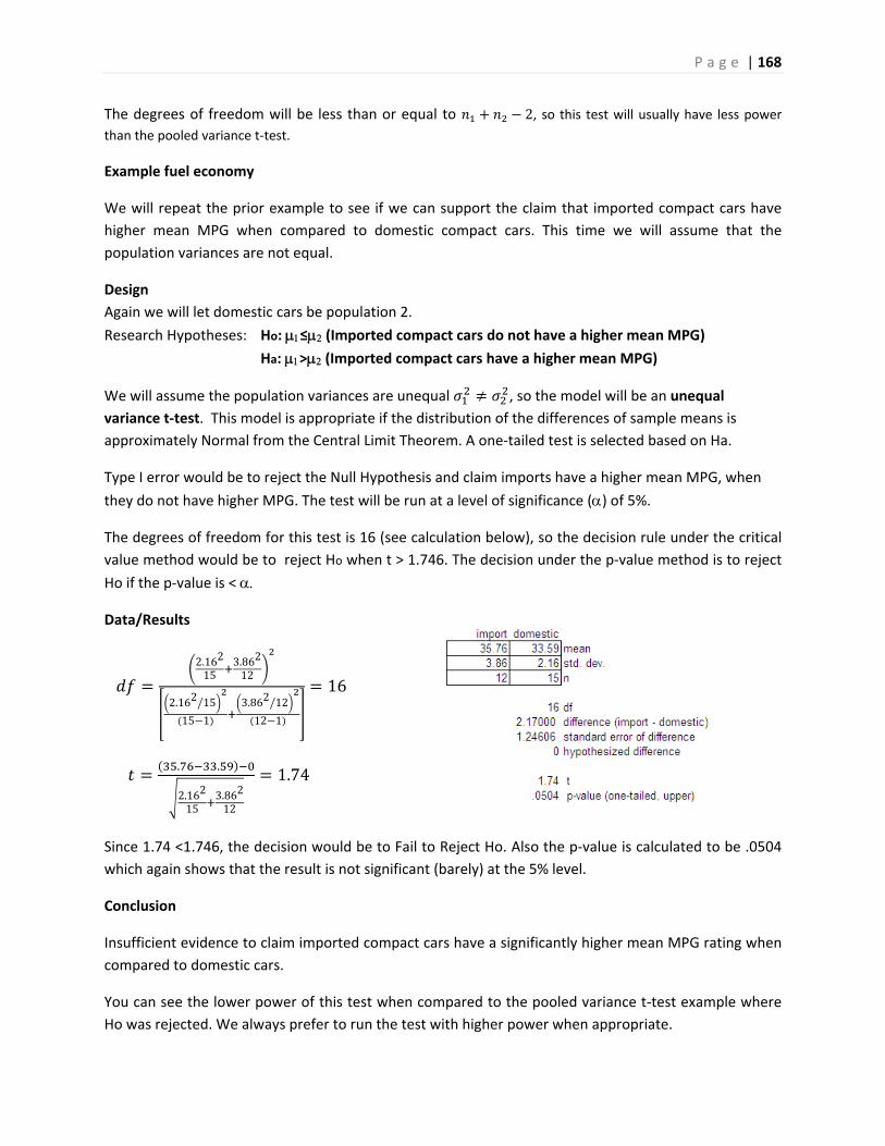
P a g e | 168
The degrees of freedom will be less than or equal to 2, so this test will usually have less power than the pooled variance t‐test.
Example fuel economy
We will repeat the prior example to see if we can support the claim that imported compact cars have
higher mean MPG when compared to domestic compact cars. This time we will assume that the
population variances are not equal.
Design
Again we will let domestic cars be population 2.
Research Hypotheses: Ho: ≤ (Imported compact cars do not have a higher mean MPG)
Ha: > (Imported compact cars have a higher mean MPG)
We will assume the population variances are unequal , so the model will be an unequal
variance t‐test. This model is appropriate if the distribution of the differences of sample means is
approximately Normal from the Central Limit Theorem. A one‐tailed test is selected based on Ha.
Type I error would be to reject the Null Hypothesis and claim imports have a higher mean MPG, when
they do not have higher MPG. The test will be run at a level of significance () of 5%.
The degrees of freedom for this test is 16 (see calculation below), so the decision rule under the critical
value method would be to reject Ho when t > 1.746. The decision under the p‐value method is to reject
Ho if the p‐value is <
Data/Results
2.162
153.862
12
2.162 15
15 1
3.862 12
12 1
16
. .
2.162
153.862
12
1.74
Since 1.74 <1.746, the decision would be to Fail to Reject Ho. Also the p‐value is calculated to be .0504
which again shows that the result is not significant (barely) at the 5% level.
Conclusion
Insufficient evidence to claim imported compact cars have a significantly higher mean MPG rating when
compared to domestic cars.
You can see the lower power of this test when compared to the pooled variance t‐test example where
Ho was rejected. We always prefer to run the test with higher power when appropriate.
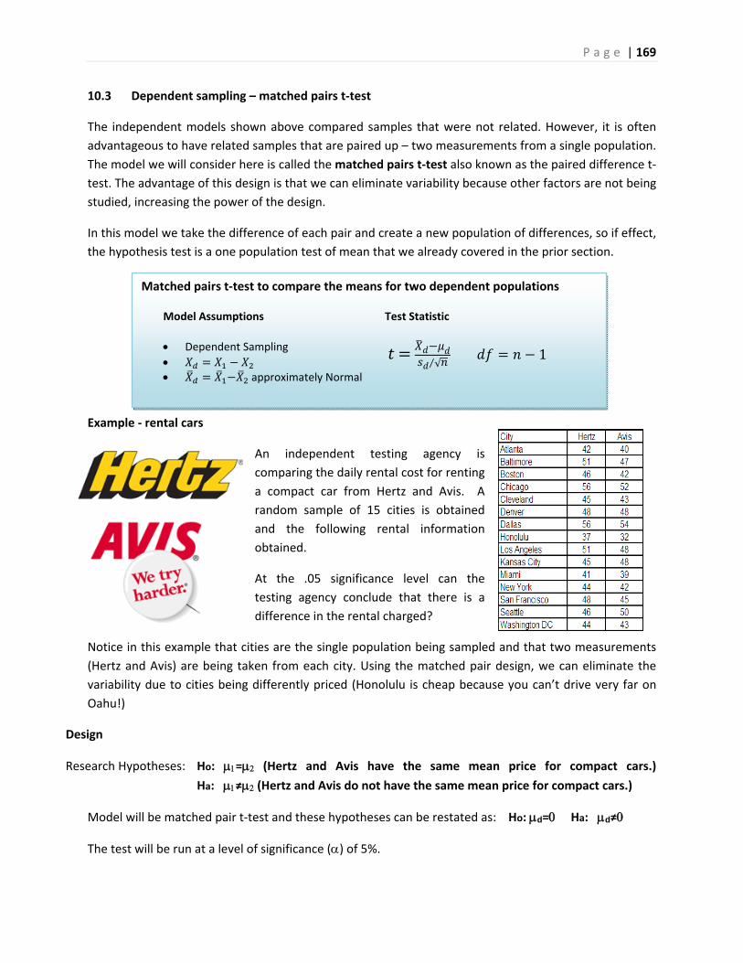
P a g e | 169
Matched pairs t‐test to compare the means for two dependent populations
Model Assumptions
Dependent Sampling
approximately Normal
Test Statistic
√⁄
1
10.3 Dependent sampling – matched pairs t‐test
The independent models shown above compared samples that were not related. However, it is often
advantageous to have related samples that are paired up – two measurements from a single population.
The model we will consider here is called the matched pairs t‐test also known as the paired difference t‐
test. The advantage of this design is that we can eliminate variability because other factors are not being
studied, increasing the power of the design.
In this model we take the difference of each pair and create a new population of differences, so if effect,
the hypothesis test is a one population test of mean that we already covered in the prior section.
Example ‐ rental cars
An independent testing agency is
comparing the daily rental cost for renting
a compact car from Hertz and Avis. A
random sample of 15 cities is obtained
and the following rental information
obtained.
At the .05 significance level can the
testing agency conclude that there is a
difference in the rental charged?
Notice in this example that cities are the single population being sampled and that two measurements
(Hertz and Avis) are being taken from each city. Using the matched pair design, we can eliminate the
variability due to cities being differently priced (Honolulu is cheap because you can’t drive very far on
Oahu!)
Design
Research Hypotheses: Ho: = (Hertz and Avis have the same mean price for compact cars.)
Ha: ≠ (Hertz and Avis do not have the same mean price for compact cars.)
Model will be matched pair t‐test and these hypotheses can be restated as: Ho: d= Ha: d≠
The test will be run at a level of significance () of 5%.
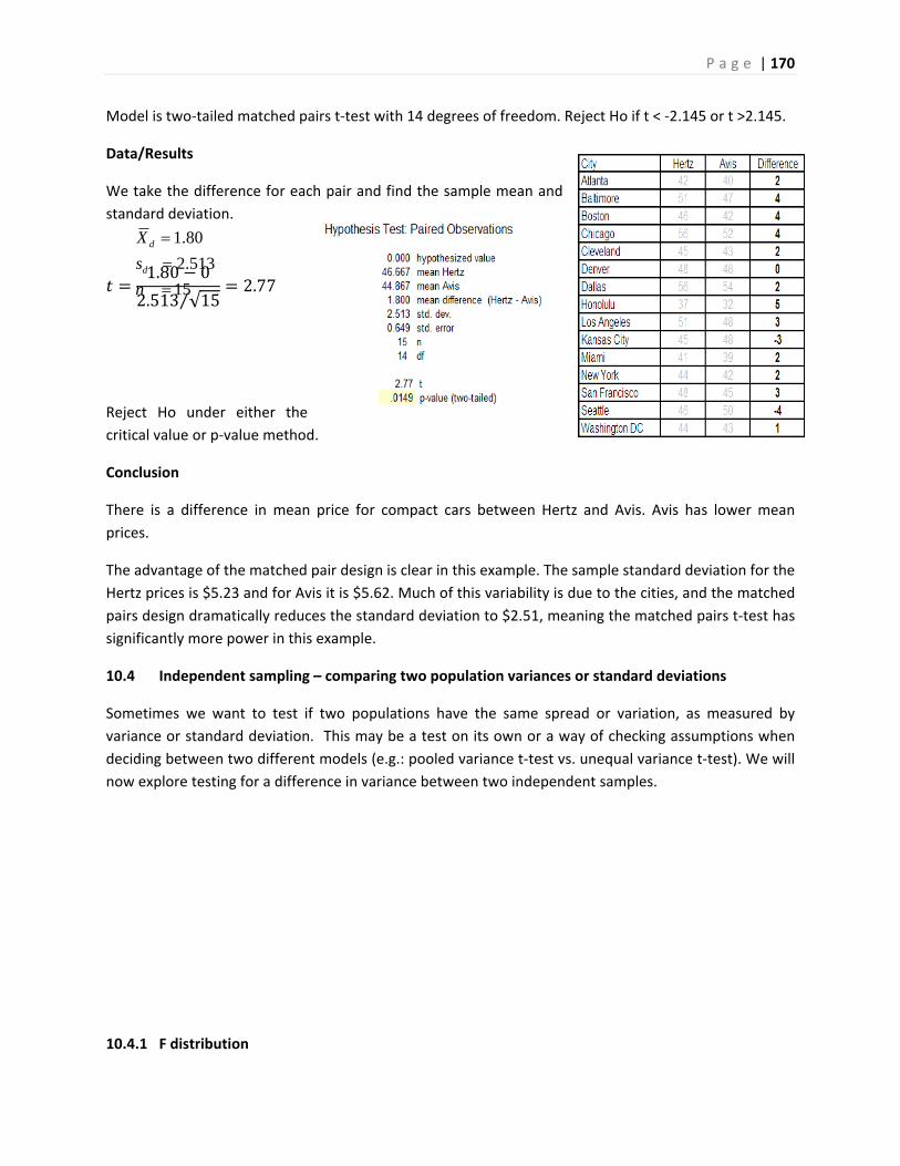
P a g e | 170
Model is two‐tailed matched pairs t‐test with 14 degrees of freedom. Reject Ho if t < ‐2.145 or t >2.145.
Data/Results
We take the difference for each pair and find the sample mean and
standard deviation.
1.80 0
2.513 √15⁄2.77
Reject Ho under either the
critical value or p‐value method.
Conclusion
There is a difference in mean price for compact cars between Hertz and Avis. Avis has lower mean
prices.
The advantage of the matched pair design is clear in this example. The sample standard deviation for the
Hertz prices is $5.23 and for Avis it is $5.62. Much of this variability is due to the cities, and the matched
pairs design dramatically reduces the standard deviation to $2.51, meaning the matched pairs t‐test has
significantly more power in this example.
10.4 Independent sampling – comparing two population variances or standard deviations
Sometimes we want to test if two populations have the same spread or variation, as measured by
variance or standard deviation. This may be a test on its own or a way of checking assumptions when
deciding between two different models (e.g.: pooled variance t‐test vs. unequal variance t‐test). We will
now explore testing for a difference in variance between two independent samples.
10.4.1 F distribution
15
513.2
80.1
n
s
X
d
d
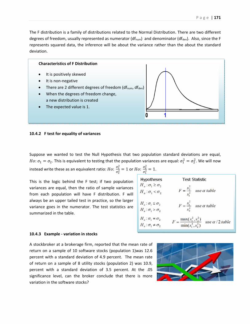
P a g e | 171
Characteristics of F Distribution
It is positively skewed
It is non‐negative
There are 2 different degrees of freedom (dfnum, dfden)
When the degrees of freedom change,
a new distribution is created
The expected value is 1.
The F distribution is a family of distributions related to the Normal Distribution. There are two different
degrees of freedom, usually represented as numerator (dfnum) and denominator (dfden). Also, since the F
represents squared data, the inference will be about the variance rather than the about the standard
deviation.
10.4.2 F test for equality of variances
Suppose we wanted to test the Null Hypothesis that two population standard deviations are equal,
: . This is equivalent to testing that the population variances are equal: . We will now
instead write these as an equivalent ratio: : 1 or : 1.
This is the logic behind the F test; if two population
variances are equal, then the ratio of sample variances
from each population will have F distribution. F will
always be an upper tailed test in practice, so the larger
variance goes in the numerator. The test statistics are
summarized in the table.
10.4.3 Example ‐ variation in stocks
A stockbroker at a brokerage firm, reported that the mean rate of
return on a sample of 10 software stocks (population 1)was 12.6
percent with a standard deviation of 4.9 percent. The mean rate
of return on a sample of 8 utility stocks (population 2) was 10.9,
percent with a standard deviation of 3.5 percent. At the .05
significance level, can the broker conclude that there is more
variation in the software stocks?
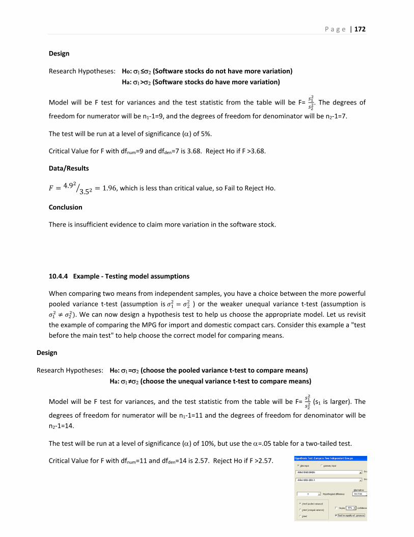
P a g e | 172
Design
Research Hypotheses: Ho: ≤ (Software stocks do not have more variation)
Ha: > (Software stocks do have more variation)
Model will be F test for variances and the test statistic from the table will be F= . The degrees of
freedom for numerator will be n1‐1=9, and the degrees of freedom for denominator will be n2‐1=7.
The test will be run at a level of significance () of 5%.
Critical Value for F with dfnum=9 and dfden=7 is 3.68. Reject Ho if F >3.68.
Data/Results
4.93.5 1.96, which is less than critical value, so Fail to Reject Ho.
Conclusion
There is insufficient evidence to claim more variation in the software stock.
10.4.4 Example ‐ Testing model assumptions
When comparing two means from independent samples, you have a choice between the more powerful
pooled variance t‐test (assumption is 12
22 ) or the weaker unequal variance t‐test (assumption is
. We can now design a hypothesis test to help us choose the appropriate model. Let us revisit
the example of comparing the MPG for import and domestic compact cars. Consider this example a "test
before the main test" to help choose the correct model for comparing means.
Design
Research Hypotheses: Ho: = (choose the pooled variance t‐test to compare means)
Ha: ≠ (choose the unequal variance t‐test to compare means)
Model will be F test for variances, and the test statistic from the table will be F= (s1 is larger). The
degrees of freedom for numerator will be n1‐1=11 and the degrees of freedom for denominator will be
n2‐1=14.
The test will be run at a level of significance () of 10%, but use the =.05 table for a two‐tailed test.
Critical Value for F with dfnum=11 and dfden=14 is 2.57. Reject Ho if F >2.57.
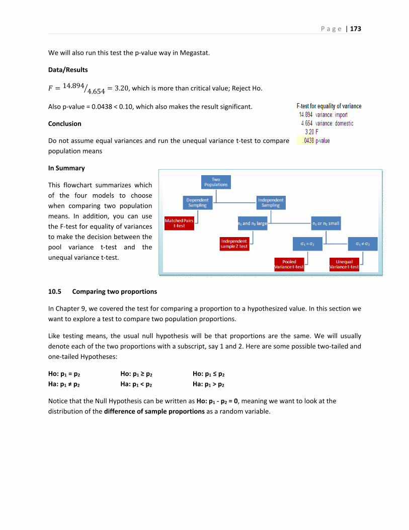
P a g e | 173
We will also run this test the p‐value way in Megastat.
Data/Results
14.8944.654 3.20, which is more than critical value; Reject Ho.
Also p‐value = 0.0438 < 0.10, which also makes the result significant.
Conclusion
Do not assume equal variances and run the unequal variance t‐test to compare
population means
In Summary
This flowchart summarizes which
of the four models to choose
when comparing two population
means. In addition, you can use
the F‐test for equality of variances
to make the decision between the
pool variance t‐test and the
unequal variance t‐test.
10.5 Comparing two proportions
In Chapter 9, we covered the test for comparing a proportion to a hypothesized value. In this section we
want to explore a test to compare two population proportions.
Like testing means, the usual null hypothesis will be that proportions are the same. We will usually
denote each of the two proportions with a subscript, say 1 and 2. Here are some possible two‐tailed and
one‐tailed Hypotheses:
Ho: p1 = p2 Ho: p1 ≥ p2 Ho: p1 ≤ p2
Ha: p1 ≠ p2 Ha: p1 < p2 Ha: p1 > p2
Notice that the Null Hypothesis can be written as Ho: p1 ‐ p2 = 0, meaning we want to look at the
distribution of the difference of sample proportions as a random variable.
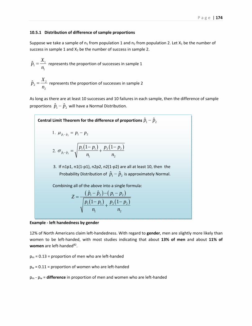
P a g e | 174
10.5.1 Distribution of difference of sample proportions
Suppose we take a sample of n1 from population 1 and n2 from population 2. Let X1 be the number of
success in sample 1 and X2 be the number of success in sample 2.
11
1
ˆX
pn
represents the proportion of successes in sample 1
22
2
ˆX
pn
represents the proportion of successes in sample 2
As long as there are at least 10 successes and 10 failures in each sample, then the difference of sample
proportions 1 2ˆ ˆp p will have a Normal Distribution.
Example ‐ left handedness by gender
12% of North Americans claim left‐handedness. With regard to gender, men are slightly more likely than
women to be left‐handed, with most studies indicating that about 13% of men and about 11% of
women are left‐handed82.
pm = 0.13 = proportion of men who are left‐handed
pw = 0.11 = proportion of women who are left‐handed
pm ‐ pw = difference in proportion of men and women who are left‐handed
Central Limit Theorem for the difference of proportions 1 2ˆ ˆp p
1 2ˆ ˆ 1 2p p p p
1 2
1 1 2 2ˆ ˆ
1 2
1 1p p
p p p p
n n
3. If n1p1, n1(1‐p1), n2p2, n2(1‐p2) are all at least 10, then the
Probability Distribution of 1 2ˆ ˆp p is approximately Normal.
Combining all of the above into a single formula:
1 2 1 2
1 1 2 2
1 2
ˆ ˆ
1 1
p p p pZ
p p p p
n n
P a g e | 175
Suppose we take a sample of 100 men and 150 women. Let's investigate the random variable ˆ ˆm wp p
100(0.13) = 13 100(1‐0.13) = 87
150(0.11) = 16.5 150(1‐0.11) = 133.5
Since all values are greater than 10, ˆ ˆm wp p has approximately a normal distribution.
ˆ ˆ 0.13 0.11 0.02m wp p
ˆ ˆ
0.13 1 0.13 0.11 1 0.110.0422
100 150m wp p
10.5.2 Hypothesis test for difference of proportions
In conducting a Hypothesis test where the Null hypothesis assumes equal proportions, it is best practice
to pool or combine the sample proportions into a single estimated proportion p , and use an estimated
standard error, ˆ ˆm wp ps
1 2
1 2
X Xp
n n
1 2ˆ ˆ
1 2
1 1p p
p p p ps
n n
The test statistic will have a Normal Distribution as long as there are at least 10 successes and 10 failures
in both samples.
1 2 1 2
1 2
ˆ ˆ
1 1
p p p pZ
p p p p
n n
Example ‐ background checks at gun shows
Under current United States law, private sales
between owners are exempt from background check
requirements. This is sometimes called the "Gun
Show Loophole" as it may allow criminals, terrorists
and the mentally ill to purchase assault weapons,
such as those used in mass shootings.83
In an August 2016 Study, Pew Research analyzed American's opinions about gun laws and rights.84 Pew
took a representative sample of 990 men and 1020 women and asked them several questions. In
particular, they asked the sampled Americans if background checks required at gun stores should be
P a g e | 176
made universal and extended to all sales of guns between private owners or at gun shows. 772 out 990
men said yes, while 857 out of 1020 women said yes.
Is there a difference in the proportion of men and women who support universal background checks for
purchasing guns? Design and conduct the test with a significance level of 1%.
Design:
Ho: pm=pw (There is no difference in the proportion of support for background checks by gender)
Ha: pm≠pw (There is a difference in the proportion of support for background checks by gender)
Model: Two proportion Z test. This is a two‐tailed test with = 0.01.
Model Assumptions: for men there are 772 yes and 218 no. For women there are 857 yes and 163 no.
Since all these numbers exceed 10, the model is appropriate.
Decision Rules: Critical Value Method ‐ Reject Ho if Z > 2.58 or Z < ‐2.58.
P‐value method ‐ Reject Ho if p‐value <0.01
Data/Results
772ˆ 0.780
990mp 857
ˆ 0.8401020wp
772 8570.810
990 1020p
0.780 0.840 03.45
0.810 1 0.810 0.810 1 0.810
990 1020
Z
p‐value = 0.0005 <
Reject Ho under both methods
Conclusion
There is a difference in the proportion of support for background checks by gender. Women are more
likely to support background checks.
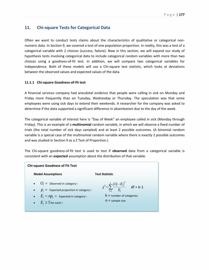
P a g e | 177
Chi‐square Goodness of Fit Test
Model Assumptions
iO Observed in category i
ip Expected proportion in category i
i iE np Expected in category i
5iE for each i
Test Statistic
22
1
ki i
i i
O E
E
df = k‐1
k = number of categories
n = sample size
11. Chi‐square Tests for Categorical Data
Often we want to conduct tests claims about the characteristics of qualitative or categorical non‐
numeric data. In Section 9, we covered a test of one population proportion. In reality, this was a test of a
categorical variable with 2 choices (success, failure). Now in this section, we will expand our study of
hypothesis tests involving categorical data to include categorical random variables with more than two
choices using a goodness‐of‐fit test. In addition, we will compare two categorical variables for
independence. Both of these models will use a Chi‐square test statistic, which looks at deviations
between the observed values and expected values of the data.
11.1.1 Chi‐square Goodness‐of‐fit test
A financial services company had anecdotal evidence that people were calling in sick on Monday and
Friday more frequently than on Tuesday, Wednesday or Thursday. The speculation was that some
employees were using sick days to extend their weekends. A researcher for the company was asked to
determine if the data supported a significant difference in absenteeism due to the day of the week.
The categorical variable of interest here is “Day of Week” an employee called in sick (Monday through
Friday). This is an example of a multinomial random variable, in which we will observe a fixed number of
trials (the total number of sick days sampled) and at least 2 possible outcomes. (A binomial random
variable is a special case of the multinomial random variable where there is exactly 2 possible outcomes
and was studied in Section 9 as a Z Test of Proportion.)
The Chi‐square goodness‐of‐fit test is used to test if observed data from a categorical variable is
consistent with an expected assumption about the distribution of that variable.
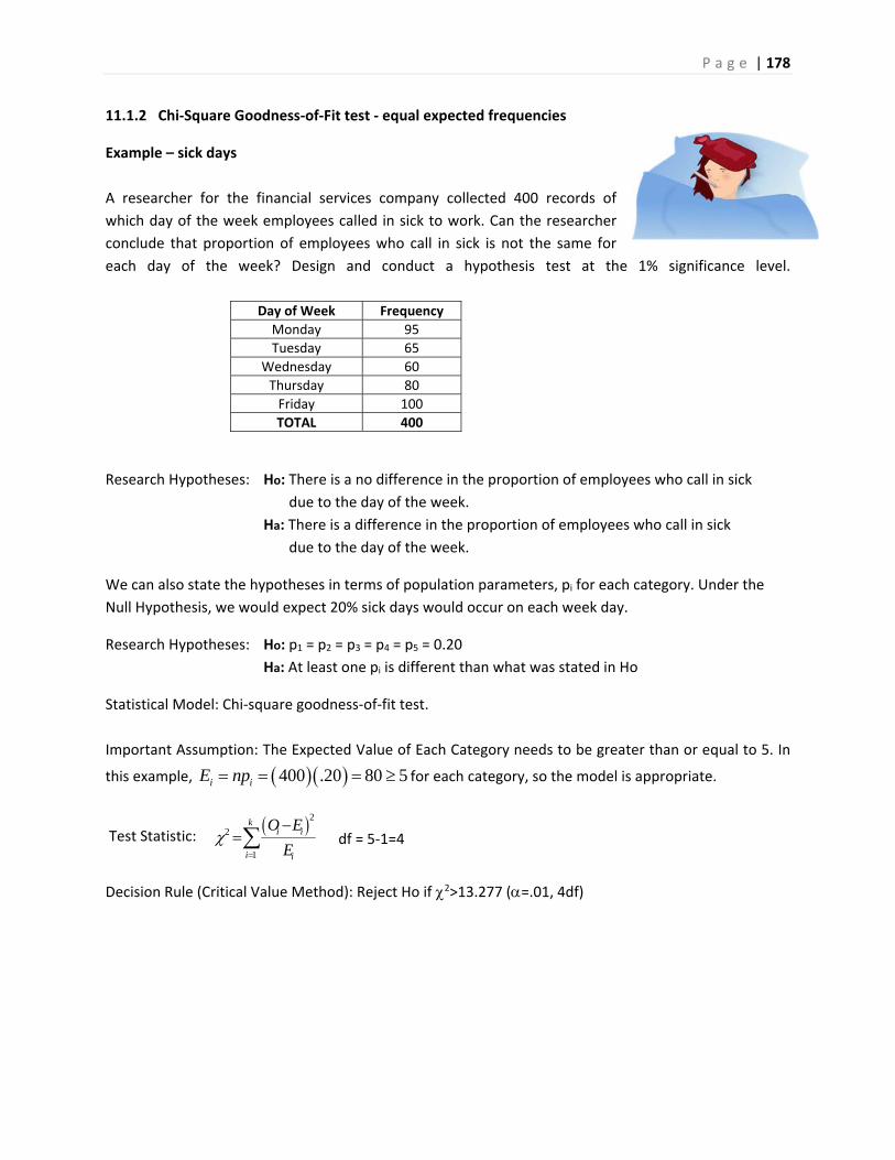
P a g e | 178
11.1.2 Chi‐Square Goodness‐of‐Fit test ‐ equal expected frequencies
Example – sick days
A researcher for the financial services company collected 400 records of
which day of the week employees called in sick to work. Can the researcher
conclude that proportion of employees who call in sick is not the same for
each day of the week? Design and conduct a hypothesis test at the 1% significance level.
Day of Week Frequency
Monday 95
Tuesday 65
Wednesday 60
Thursday 80
Friday 100
TOTAL 400
Research Hypotheses: Ho: There is a no difference in the proportion of employees who call in sick
due to the day of the week.
Ha: There is a difference in the proportion of employees who call in sick
due to the day of the week.
We can also state the hypotheses in terms of population parameters, pi for each category. Under the
Null Hypothesis, we would expect 20% sick days would occur on each week day.
Research Hypotheses: Ho: p1 = p2 = p3 = p4 = p5 = 0.20
Ha: At least one pi is different than what was stated in Ho
Statistical Model: Chi‐square goodness‐of‐fit test.
Important Assumption: The Expected Value of Each Category needs to be greater than or equal to 5. In
this example, 400 .20 80 5i iE np for each category, so the model is appropriate.
Test Statistic: 22
1
ki i
i i
O E
E
df = 5‐1=4
Decision Rule (Critical Value Method): Reject Ho if 2>13.277 (=.01, 4df)
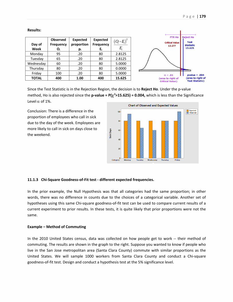
P a g e | 179
Results:
Day of Week
Observed Frequency
Oi
Expected proportion
pi
Expected Frequency
Ei
2i i
i
O E
E
Monday 95 .20 80 2.8125
Tuesday 65 .20 80 2.8125
Wednesday 60 .20 80 5.0000
Thursday 80 .20 80 0.0000
Friday 100 .20 80 5.0000
TOTAL 400 1.00 400 15.625
Since the Test Statistic is in the Rejection Region, the decision is to Reject Ho. Under the p‐value
method, Ho is also rejected since the p‐value = P(2>15.625) = 0.004, which is less than the Significance
Level of 1%.
Conclusion: There is a difference in the
proportion of employees who call in sick
due to the day of the week. Employees are
more likely to call in sick on days close to
the weekend.
11.1.3 Chi‐Square Goodness‐of‐Fit test ‐ different expected frequencies.
In the prior example, the Null Hypothesis was that all categories had the same proportion; in other
words, there was no difference in counts due to the choices of a categorical variable. Another set of
hypotheses using this same Chi‐square goodness‐of‐fit test can be used to compare current results of a
current experiment to prior results. In these tests, it is quite likely that prior proportions were not the
same.
Example – Method of Commuting
In the 2010 United States census, data was collected on how people get to work ‐‐ their method of
commuting. The results are shown in the graph to the right. Suppose you wanted to know if people who
live in the San Jose metropolitan area (Santa Clara County) commute with similar proportions as the
United States. We will sample 1000 workers from Santa Clara County and conduct a Chi‐square
goodness‐of‐fit test. Design and conduct a hypothesis test at the 5% significance level.
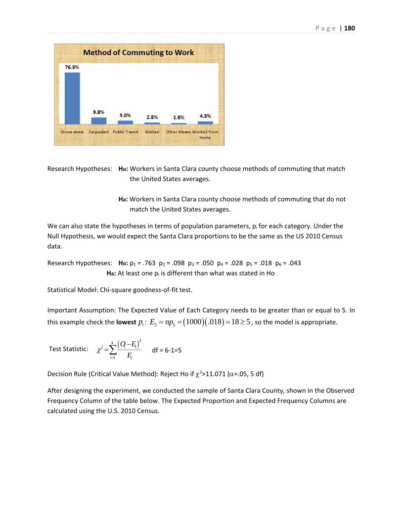
P a g e | 180
Research Hypotheses: Ho: Workers in Santa Clara county choose methods of commuting that match
the United States averages.
Ha: Workers in Santa Clara county choose methods of commuting that do not
match the United States averages.
We can also state the hypotheses in terms of population parameters, pi for each category. Under the
Null Hypothesis, we would expect the Santa Clara proportions to be the same as the US 2010 Census
data.
Research Hypotheses: Ho: p1 = .763 p2 = .098 p3 = .050 p4 = .028 p5 = .018 p6 = .043
Ha: At least one pi is different than what was stated in Ho
Statistical Model: Chi‐square goodness‐of‐fit test.
Important Assumption: The Expected Value of Each Category needs to be greater than or equal to 5. In
this example check the lowest ip : 5 5 1000 .018 18 5E np , so the model is appropriate.
Test Statistic: 22
1
ki i
i i
O E
E
df = 6‐1=5
Decision Rule (Critical Value Method): Reject Ho if 2>11.071 (=.05, 5 df)
After designing the experiment, we conducted the sample of Santa Clara County, shown in the Observed
Frequency Column of the table below. The Expected Proportion and Expected Frequency Columns are
calculated using the U.S. 2010 Census.
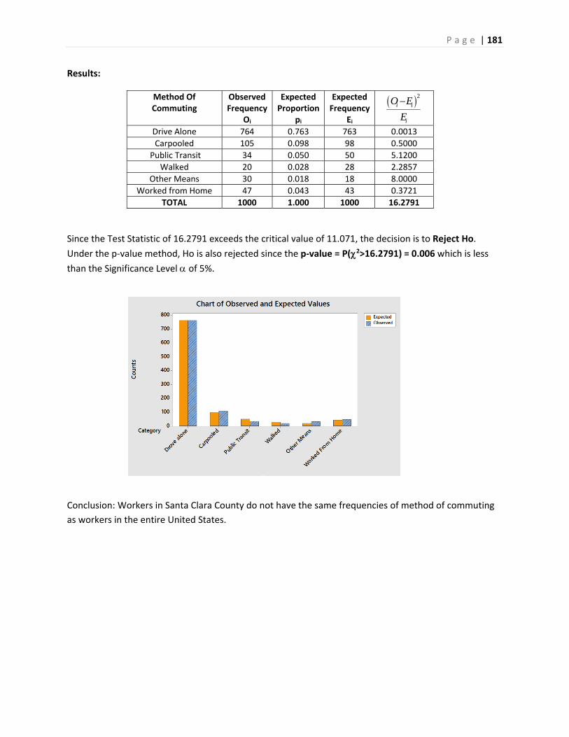
P a g e | 181
Results:
Method Of Commuting
Observed Frequency
Oi
Expected Proportion
pi
Expected Frequency
Ei
2i i
i
O E
E
Drive Alone 764 0.763 763 0.0013
Carpooled 105 0.098 98 0.5000
Public Transit 34 0.050 50 5.1200
Walked 20 0.028 28 2.2857
Other Means 30 0.018 18 8.0000
Worked from Home 47 0.043 43 0.3721
TOTAL 1000 1.000 1000 16.2791
Since the Test Statistic of 16.2791 exceeds the critical value of 11.071, the decision is to Reject Ho.
Under the p‐value method, Ho is also rejected since the p‐value = P(2>16.2791) = 0.006 which is less
than the Significance Level of 5%.
Conclusion: Workers in Santa Clara County do not have the same frequencies of method of commuting
as workers in the entire United States.
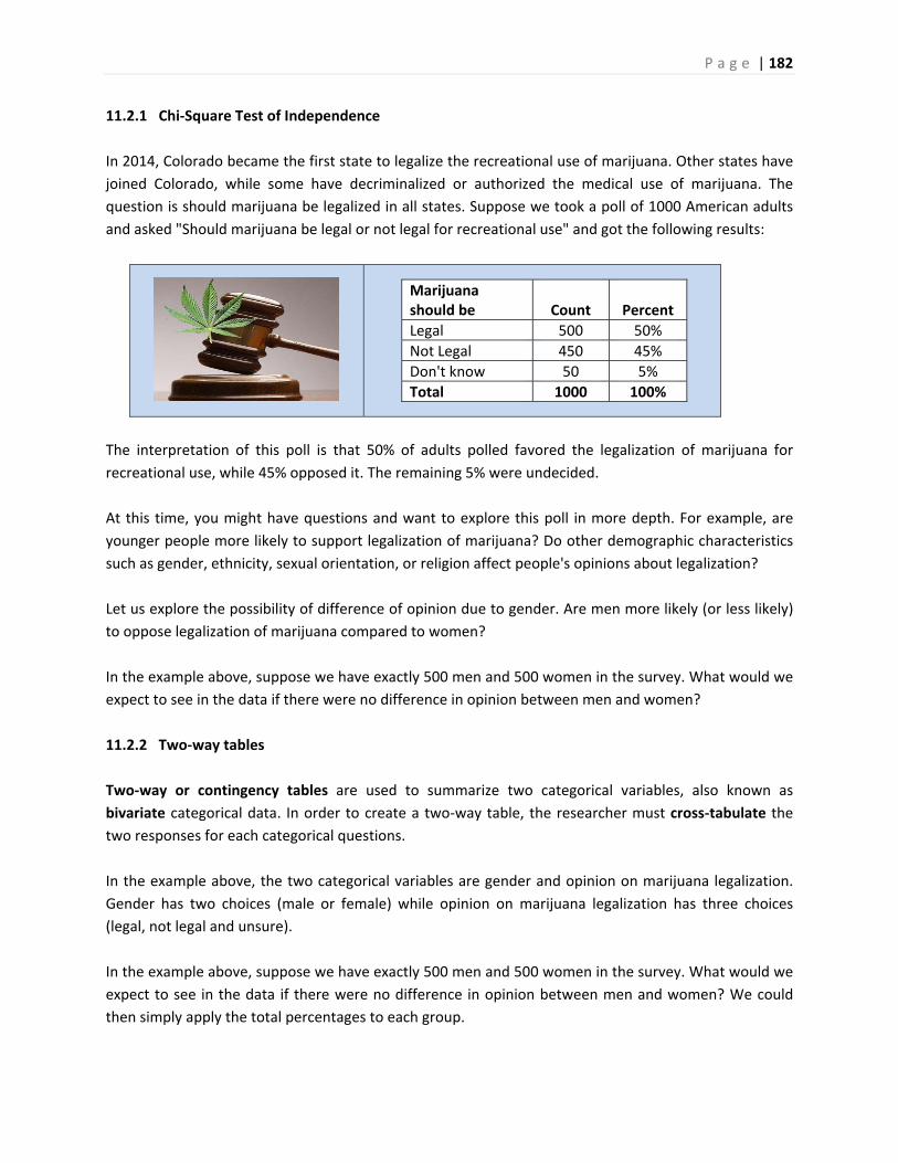
P a g e | 182
11.2.1 Chi‐Square Test of Independence
In 2014, Colorado became the first state to legalize the recreational use of marijuana. Other states have
joined Colorado, while some have decriminalized or authorized the medical use of marijuana. The
question is should marijuana be legalized in all states. Suppose we took a poll of 1000 American adults
and asked "Should marijuana be legal or not legal for recreational use" and got the following results:
Marijuana should be
Count
Percent
Legal 500 50%
Not Legal 450 45%
Don't know 50 5%
Total 1000 100%
The interpretation of this poll is that 50% of adults polled favored the legalization of marijuana for
recreational use, while 45% opposed it. The remaining 5% were undecided.
At this time, you might have questions and want to explore this poll in more depth. For example, are
younger people more likely to support legalization of marijuana? Do other demographic characteristics
such as gender, ethnicity, sexual orientation, or religion affect people's opinions about legalization?
Let us explore the possibility of difference of opinion due to gender. Are men more likely (or less likely)
to oppose legalization of marijuana compared to women?
In the example above, suppose we have exactly 500 men and 500 women in the survey. What would we
expect to see in the data if there were no difference in opinion between men and women?
11.2.2 Two‐way tables
Two‐way or contingency tables are used to summarize two categorical variables, also known as
bivariate categorical data. In order to create a two‐way table, the researcher must cross‐tabulate the
two responses for each categorical questions.
In the example above, the two categorical variables are gender and opinion on marijuana legalization.
Gender has two choices (male or female) while opinion on marijuana legalization has three choices
(legal, not legal and unsure).
In the example above, suppose we have exactly 500 men and 500 women in the survey. What would we
expect to see in the data if there were no difference in opinion between men and women? We could
then simply apply the total percentages to each group.
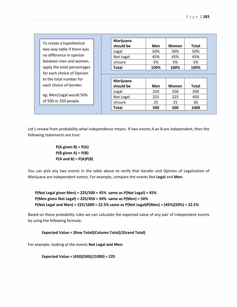
P a g e | 183
Marijuana should be
Men
Women
Total
Legal 50% 50% 50%
Not Legal 45% 45% 45%
Unsure 5% 5% 5%
Total 100% 100% 100%
Marijuana should be
Men
Women
Total
Legal 250 250 500
Not Legal 225 225 450
Unsure 25 25 50
Total 500 500 1000
Let’s review from probability what independence means. If two events A an B are independent, then the
following statements are true:
P(A given B) = P(A)
P(B given A) = P(B)
P(A and B) = P(A)P(B)
You can pick any two events in the table above to verify that Gender and Opinion of Legalization of
Marijuana are independent events. For example, compare the events Not Legal and Men.
P(Not Legal given Men) = 225/500 = 45% same as P(Not Legal) = 45%
P(Men given Not Legal) = 225/450 = 50% same as P(Men) = 50%
P(Not Legal and Men) = 225/1000 = 22.5% same as P(Not Legal)P(Men) = (45%)(50%) = 22.5%
Based on these probability rules we can calculate the expected value of any pair of independent events
by using the following formula:
Expected Value = (Row Total)(Column Total)/(Grand Total)
For example, looking at the events Not Legal and Men:
Expected Value = (450)(500)/(1000) = 225
To create a hypothetical
two‐way table if there was
no difference in opinion
between men and women,
apply the total percentages
for each choice of Opinion
to the total number for
each choice of Gender.
eg: Men/Legal would 50%
of 500 or 250 people.
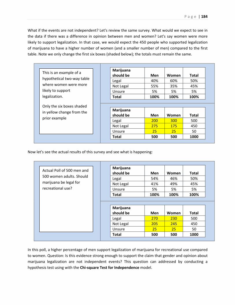
P a g e | 184
What if the events are not independent? Let's review the same survey. What would we expect to see in
the data if there was a difference in opinion between men and women? Let's say women were more
likely to support legalization. In that case, we would expect the 450 people who supported legalization
of marijuana to have a higher number of women (and a smaller number of men) compared to the first
table. Note we only change the first six boxes (shaded below); the totals must remain the same.
Marijuana should be
Men
Women
Total
Legal 40% 60% 50%
Not Legal 55% 35% 45%
Unsure 5% 5% 5%
Total 100% 100% 100%
Marijuana should be
Men
Women
Total
Legal 200 300 500
Not Legal 275 175 450
Unsure 25 25 50
Total 500 500 1000
Now let's see the actual results of this survey and see what is happening:
Marijuana should be
Men
Women
Total
Legal 54% 46% 50%
Not Legal 41% 49% 45%
Unsure 5% 5% 5%
Total 100% 100% 100%
Marijuana should be
Men
Women
Total
Legal 270 230 500
Not Legal 205 245 450
Unsure 25 25 50
Total 500 500 1000
In this poll, a higher percentage of men support legalization of marijuana for recreational use compared
to women. Question: Is this evidence strong enough to support the claim that gender and opinion about
marijuana legalization are not independent events? This question can addressed by conducting a
hypothesis test using with the Chi‐square Test for Independence model.
This is an example of a
hypothetical two‐way table
where women were more
likely to support
legalization.
Only the six boxes shaded
in yellow change from the
prior example
Actual Poll of 500 men and
500 women adults. Should
marijuana be legal for
recreational use?
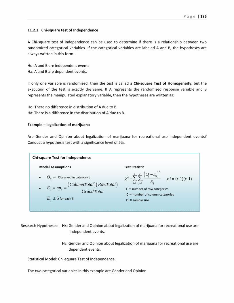
P a g e | 185
Chi‐square Test for Independence
Model Assumptions
ijO Observed in category ij
ij ij
ColumnTotal RowTotalE np
GrandTotal
5ijE for each ij
Test Statistic
22
1 1
r cij ij
i j ij
O E
E
df = (r‐1)(c‐1)
r = number of row categories
c = number of column categories
n = sample size
11.2.3 Chi‐square test of Independence
A Chi‐square test of independence can be used to determine if there is a relationship between two
randomized categorical variables. If the categorical variables are labeled A and B, the hypotheses are
always written in this form:
Ho: A and B are independent events
Ha: A and B are dependent events.
If only one variable is randomized, then the test is called a Chi‐square Test of Homogeneity, but the
execution of the test is exactly the same. If A represents the randomized response variable and B
represents the manipulated explanatory variable, then the hypotheses are written as:
Ho: There no difference in distribution of A due to B.
Ha: There is a difference in the distribution of A due to B.
Example – legalization of marijuana
Are Gender and Opinion about legalization of marijuana for recreational use independent events?
Conduct a hypothesis test with a significance level of 5%.
Research Hypotheses: Ho: Gender and Opinion about legalization of marijuana for recreational use are
independent events.
Ha: Gender and Opinion about legalization of marijuana for recreational use are
dependent events.
Statistical Model: Chi‐square Test of Independence.
The two categorical variables in this example are Gender and Opinion.
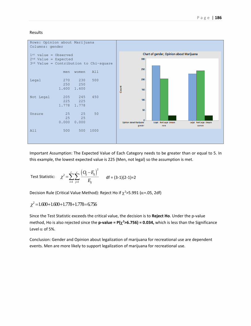
P a g e | 186
Results
Rows: Opinion about Marijuana Columns: gender 1st value = Observed 2nd Value = Expected 3rd Value = Contribution to Chi-square men women All Legal 270 230 500 250 250 1.600 1.600 Not Legal 205 245 450 225 225 1.778 1.778 Unsure 25 25 50 25 25 0.000 0.000 All 500 500 1000
Important Assumption: The Expected Value of Each Category needs to be greater than or equal to 5. In
this example, the lowest expected value is 225 (Men, not legal) so the assumption is met.
Test Statistic: 22
1 1
r cij ij
i j ij
O E
E
df = (3‐1)(2‐1)=2
Decision Rule (Critical Value Method): Reject Ho if 2>5.991 (=.05, 2df)
2 1.600 1.600 1.778 1.778 6.756
Since the Test Statistic exceeds the critical value, the decision is to Reject Ho. Under the p‐value
method, Ho is also rejected since the p‐value = P(2>6.756) = 0.034, which is less than the Significance
Level of 5%.
Conclusion: Gender and Opinion about legalization of marijuana for recreational use are dependent
events. Men are more likely to support legalization of marijuana for recreational use.
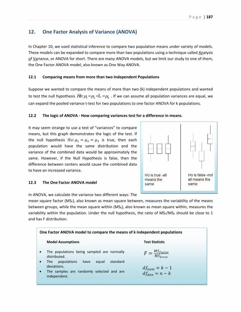
P a g e | 187
One Factor ANOVA model to compare the means of k independent populations
Model Assumptions
The populations being sampled are normally distributed.
The populations have equal standard deviations.
The samples are randomly selected and are independent.
Test Statistic
1
12. One Factor Analysis of Variance (ANOVA)
In Chapter 10, we used statistical inference to compare two population means under variety of models.
These models can be expanded to compare more than two populations using a technique called Analysis
of Variance, or ANOVA for short. There are many ANOVA models, but we limit our study to one of them,
the One Factor ANOVA model, also known as One Way ANOVA.
12.1 Comparing means from more than two Independent Populations
Suppose we wanted to compare the means of more than two (k) independent populations and wanted
to test the null hypothesis 1 2: kHo L . If we can assume all population variances are equal, we
can expand the pooled variance t‐test for two populations to one factor ANOVA for k populations.
12.2 The logic of ANOVA ‐ How comparing variances test for a difference in means.
It may seem strange to use a test of “variances” to compare
means, but this graph demonstrates the logic of the test. If
the null hypothesis : is true, then each
population would have the same distribution and the
variance of the combined data would be approximately the
same. However, if the Null Hypothesis is false, then the
difference between centers would cause the combined data
to have an increased variance.
12.3 The One Factor ANOVA model
In ANOVA, we calculate the variance two different ways: The
mean square factor (MSF), also known as mean square between, measures the variability of the means
between groups, while the mean square within (MSE), also known as mean square within, measures the
variability within the population. Under the null hypothesis, the ratio of MSF/MSE should be close to 1
and has F distribution.
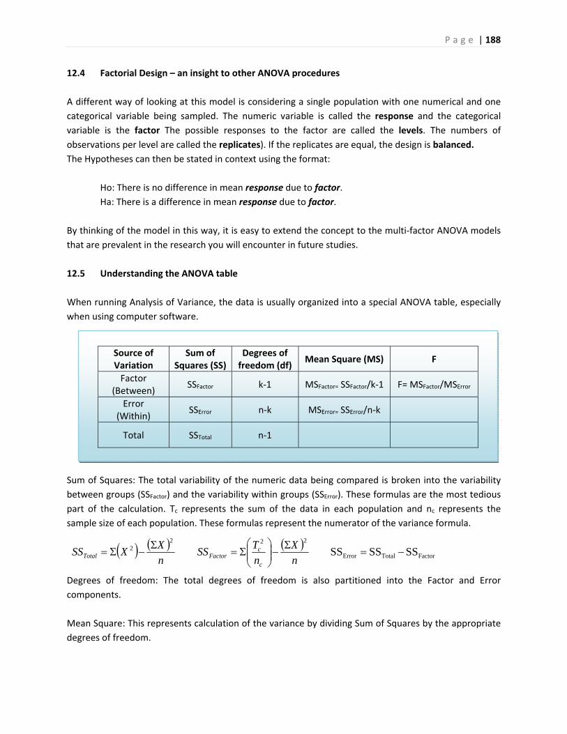
P a g e | 188
Source of Variation
Sum of Squares (SS)
Degrees of freedom (df)
Mean Square (MS) F
Factor (Between)
SSFactor k‐1 MSFactor= SSFactor/k‐1 F= MSFactor/MSError
Error (Within)
SSError n‐k MSError= SSError/n‐k
Total SSTotal n‐1
12.4 Factorial Design – an insight to other ANOVA procedures
A different way of looking at this model is considering a single population with one numerical and one
categorical variable being sampled. The numeric variable is called the response and the categorical
variable is the factor The possible responses to the factor are called the levels. The numbers of
observations per level are called the replicates). If the replicates are equal, the design is balanced.
The Hypotheses can then be stated in context using the format:
Ho: There is no difference in mean response due to factor.
Ha: There is a difference in mean response due to factor.
By thinking of the model in this way, it is easy to extend the concept to the multi‐factor ANOVA models
that are prevalent in the research you will encounter in future studies.
12.5 Understanding the ANOVA table
When running Analysis of Variance, the data is usually organized into a special ANOVA table, especially
when using computer software.
Sum of Squares: The total variability of the numeric data being compared is broken into the variability
between groups (SSFactor) and the variability within groups (SSError). These formulas are the most tedious
part of the calculation. Tc represents the sum of the data in each population and nc represents the
sample size of each population. These formulas represent the numerator of the variance formula.
Degrees of freedom: The total degrees of freedom is also partitioned into the Factor and Error
components.
Mean Square: This represents calculation of the variance by dividing Sum of Squares by the appropriate
degrees of freedom.
FactorTotalError
2222 SSSSSS
n
X
n
TSS
n
XXSS
c
cFactorTotal
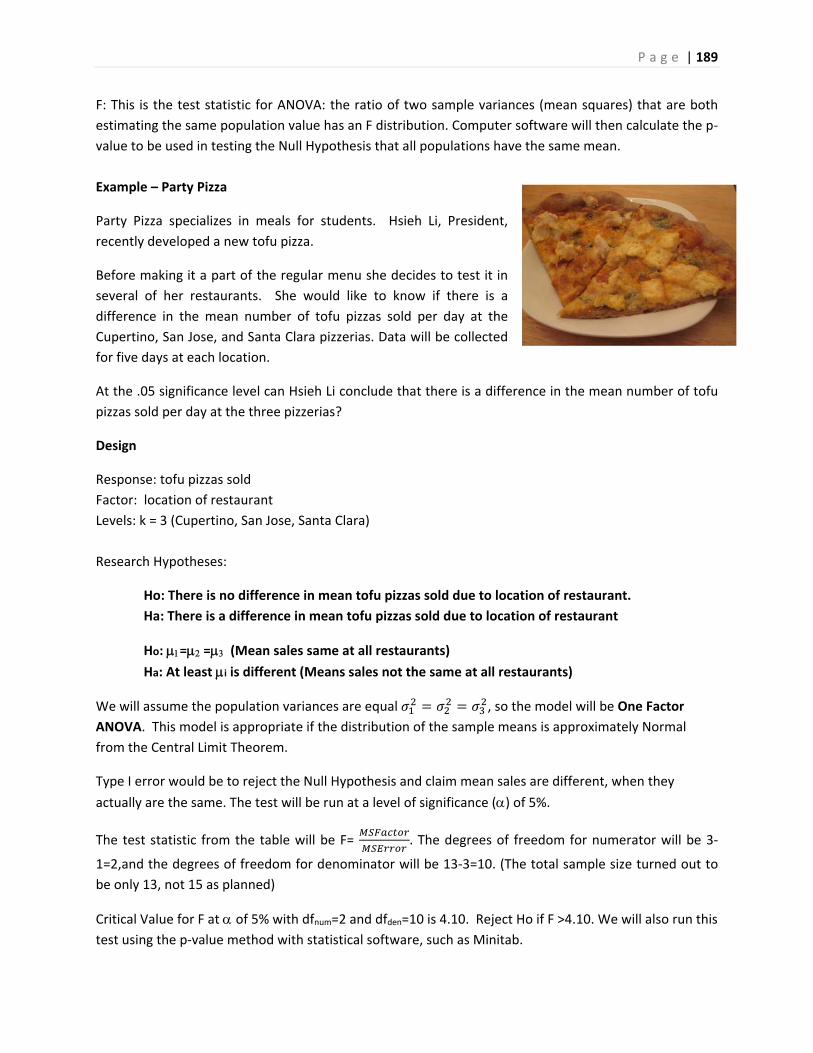
P a g e | 189
F: This is the test statistic for ANOVA: the ratio of two sample variances (mean squares) that are both
estimating the same population value has an F distribution. Computer software will then calculate the p‐
value to be used in testing the Null Hypothesis that all populations have the same mean.
Example – Party Pizza
Party Pizza specializes in meals for students. Hsieh Li, President,
recently developed a new tofu pizza.
Before making it a part of the regular menu she decides to test it in
several of her restaurants. She would like to know if there is a
difference in the mean number of tofu pizzas sold per day at the
Cupertino, San Jose, and Santa Clara pizzerias. Data will be collected
for five days at each location.
At the .05 significance level can Hsieh Li conclude that there is a difference in the mean number of tofu
pizzas sold per day at the three pizzerias?
Design
Response: tofu pizzas sold
Factor: location of restaurant
Levels: k = 3 (Cupertino, San Jose, Santa Clara)
Research Hypotheses:
Ho: There is no difference in mean tofu pizzas sold due to location of restaurant.
Ha: There is a difference in mean tofu pizzas sold due to location of restaurant
Ho: = = (Mean sales same at all restaurants)
Ha: At least i is different (Means sales not the same at all restaurants)
We will assume the population variances are equal , so the model will be One Factor
ANOVA. This model is appropriate if the distribution of the sample means is approximately Normal
from the Central Limit Theorem.
Type I error would be to reject the Null Hypothesis and claim mean sales are different, when they
actually are the same. The test will be run at a level of significance () of 5%.
The test statistic from the table will be F= . The degrees of freedom for numerator will be 3‐
1=2,and the degrees of freedom for denominator will be 13‐3=10. (The total sample size turned out to
be only 13, not 15 as planned)
Critical Value for F at of 5% with dfnum=2 and dfden=10 is 4.10. Reject Ho if F >4.10. We will also run this
test using the p‐value method with statistical software, such as Minitab.
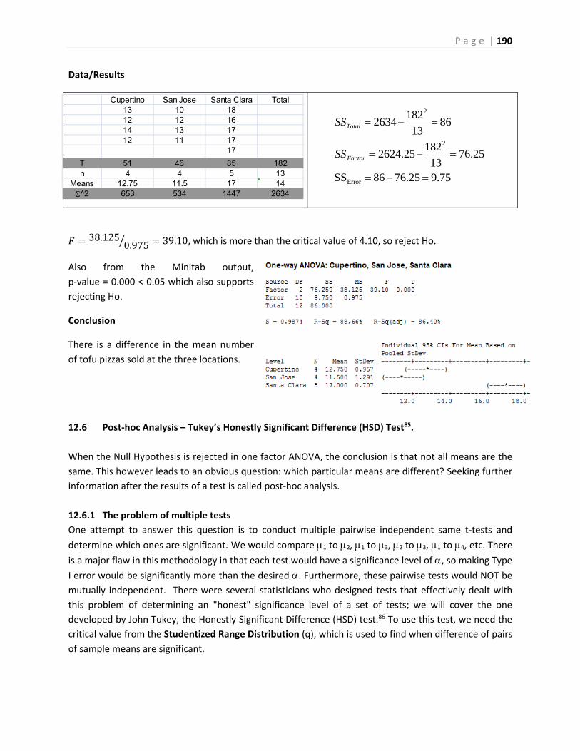
P a g e | 190
Data/Results
38.1250.975 39.10, which is more than the critical value of 4.10, so reject Ho.
Also from the Minitab output,
p‐value = 0.000 < 0.05 which also supports
rejecting Ho.
Conclusion
There is a difference in the mean number
of tofu pizzas sold at the three locations.
12.6 Post‐hoc Analysis – Tukey’s Honestly Significant Difference (HSD) Test85.
When the Null Hypothesis is rejected in one factor ANOVA, the conclusion is that not all means are the
same. This however leads to an obvious question: which particular means are different? Seeking further
information after the results of a test is called post‐hoc analysis.
12.6.1 The problem of multiple tests
One attempt to answer this question is to conduct multiple pairwise independent same t‐tests and
determine which ones are significant. We would compare 1 to 2, 1 to 3, 2 to 3, 1 to 4, etc. There
is a major flaw in this methodology in that each test would have a significance level of , so making Type
I error would be significantly more than the desired . Furthermore, these pairwise tests would NOT be
mutually independent. There were several statisticians who designed tests that effectively dealt with
this problem of determining an "honest" significance level of a set of tests; we will cover the one
developed by John Tukey, the Honestly Significant Difference (HSD) test.86 To use this test, we need the
critical value from the Studentized Range Distribution (q), which is used to find when difference of pairs
of sample means are significant.
75.925.6768SS
25.7613
18225.2624
8613
1822634
Error
2
2
Factor
Total
SS
SS
Cupertino San Jose Santa Clara Total13 10 1812 12 1614 13 1712 11 17
17
T 51 46 85 182n 4 4 5 13
Means 12.75 11.5 17 14^2 653 534 1447 2634
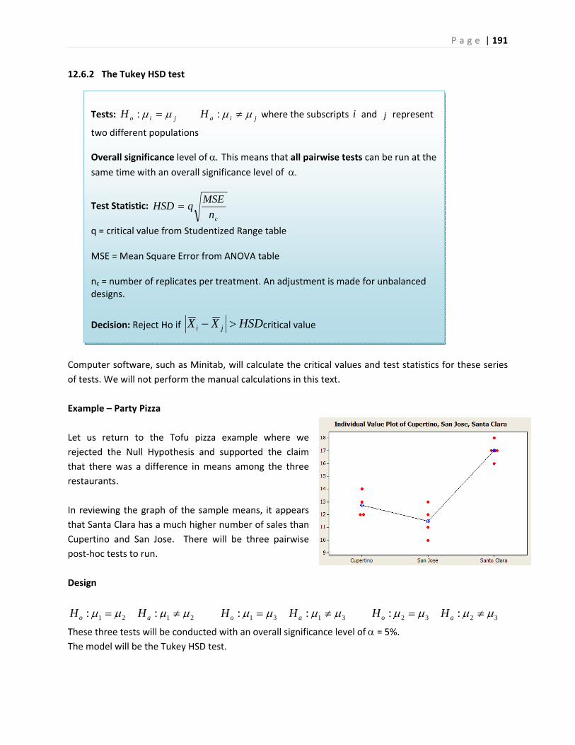
P a g e | 191
Tests: jiajio HH :: where the subscripts i and j represent
two different populations
Overall significance level of This means that all pairwise tests can be run at the
same time with an overall significance level of
Test Statistic: cn
MSEqHSD
q = critical value from Studentized Range table MSE = Mean Square Error from ANOVA table nc = number of replicates per treatment. An adjustment is made for unbalanced designs.
Decision: Reject Ho if HSDXX ji critical value
12.6.2 The Tukey HSD test
Computer software, such as Minitab, will calculate the critical values and test statistics for these series
of tests. We will not perform the manual calculations in this text.
Example – Party Pizza
Let us return to the Tofu pizza example where we
rejected the Null Hypothesis and supported the claim
that there was a difference in means among the three
restaurants.
In reviewing the graph of the sample means, it appears
that Santa Clara has a much higher number of sales than
Cupertino and San Jose. There will be three pairwise
post‐hoc tests to run.
Design
2121 :: ao HH 3131 :: ao HH 3232 :: ao HH
These three tests will be conducted with an overall significance level of = 5%. The model will be the Tukey HSD test.
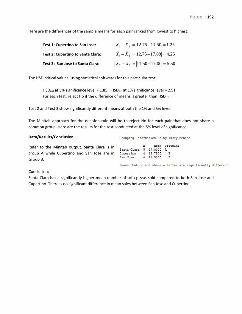
P a g e | 192
Here are the differences of the sample means for each pair ranked from lowest to highest:
Test 1: Cupertino to San Jose: 1 2 12.75 11.50 1.25X X
Test 2: Cupertino to Santa Clara: 1 3 12.75 17.00 4.25X X
Test 3: San Jose to Santa Clara: 2 3 11.50 17.00 5.50X X
The HSD critical values (using statistical software) for this particular test:
HSDcrit at 5% significance level = 1.85 HSDcrit at 1% significance level = 2.51
For each test, reject Ho if the difference of means is greater than HSDcrit
Test 2 and Test 3 show significantly different means at both the 1% and 5% level.
The Minitab approach for the decision rule will be to reject Ho for each pair that does not share a
common group. Here are the results for the test conducted at the 5% level of significance:
Data/Results/Conclusion
Refer to the Minitab output. Santa Clara is in
group A while Cupertino and San Jose are in
Group B.
Conclusion:
Santa Clara has a significantly higher mean number of tofu pizzas sold compared to both San Jose and
Cupertino. There is no significant difference in mean sales between San Jose and Cupertino.
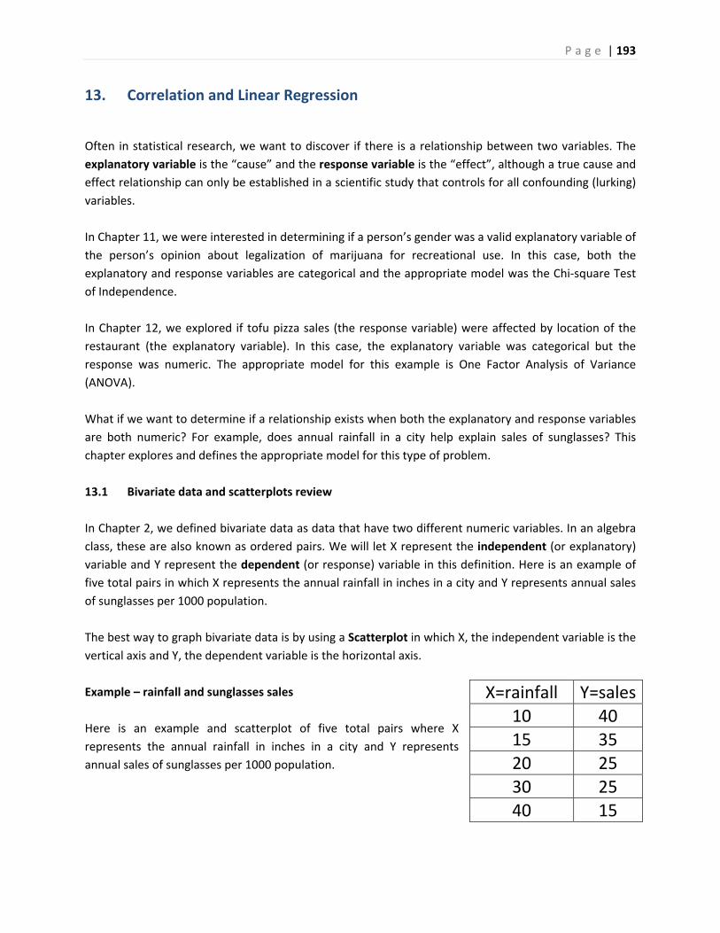
P a g e | 193
13. Correlation and Linear Regression
Often in statistical research, we want to discover if there is a relationship between two variables. The
explanatory variable is the “cause” and the response variable is the “effect”, although a true cause and
effect relationship can only be established in a scientific study that controls for all confounding (lurking)
variables.
In Chapter 11, we were interested in determining if a person’s gender was a valid explanatory variable of
the person’s opinion about legalization of marijuana for recreational use. In this case, both the
explanatory and response variables are categorical and the appropriate model was the Chi‐square Test
of Independence.
In Chapter 12, we explored if tofu pizza sales (the response variable) were affected by location of the
restaurant (the explanatory variable). In this case, the explanatory variable was categorical but the
response was numeric. The appropriate model for this example is One Factor Analysis of Variance
(ANOVA).
What if we want to determine if a relationship exists when both the explanatory and response variables
are both numeric? For example, does annual rainfall in a city help explain sales of sunglasses? This
chapter explores and defines the appropriate model for this type of problem.
13.1 Bivariate data and scatterplots review
In Chapter 2, we defined bivariate data as data that have two different numeric variables. In an algebra
class, these are also known as ordered pairs. We will let X represent the independent (or explanatory)
variable and Y represent the dependent (or response) variable in this definition. Here is an example of
five total pairs in which X represents the annual rainfall in inches in a city and Y represents annual sales
of sunglasses per 1000 population.
The best way to graph bivariate data is by using a Scatterplot in which X, the independent variable is the
vertical axis and Y, the dependent variable is the horizontal axis.
Example – rainfall and sunglasses sales
Here is an example and scatterplot of five total pairs where X
represents the annual rainfall in inches in a city and Y represents
annual sales of sunglasses per 1000 population.
X=rainfall Y=sales
10 40
15 35
20 25
30 25
40 15
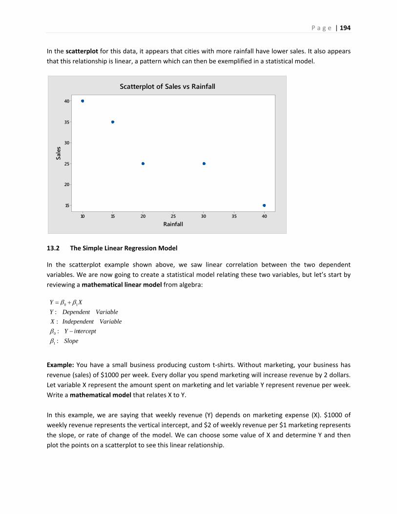
P a g e | 194
40353025201510
40
35
30
25
20
15
Rainfall
Sale
s
Scatterplot of Sales vs Rainfall
In the scatterplot for this data, it appears that cities with more rainfall have lower sales. It also appears
that this relationship is linear, a pattern which can then be exemplified in a statistical model.
13.2 The Simple Linear Regression Model
In the scatterplot example shown above, we saw linear correlation between the two dependent
variables. We are now going to create a statistical model relating these two variables, but let’s start by
reviewing a mathematical linear model from algebra:
Example: You have a small business producing custom t‐shirts. Without marketing, your business has
revenue (sales) of $1000 per week. Every dollar you spend marketing will increase revenue by 2 dollars.
Let variable X represent the amount spent on marketing and let variable Y represent revenue per week.
Write a mathematical model that relates X to Y.
In this example, we are saying that weekly revenue (Y) depends on marketing expense (X). $1000 of
weekly revenue represents the vertical intercept, and $2 of weekly revenue per $1 marketing represents
the slope, or rate of change of the model. We can choose some value of X and determine Y and then
plot the points on a scatterplot to see this linear relationship.
0 1
0
1
:
:
:
:
Y X
Y Dependent Variable
X Independent Variable
Y intercept
Slope
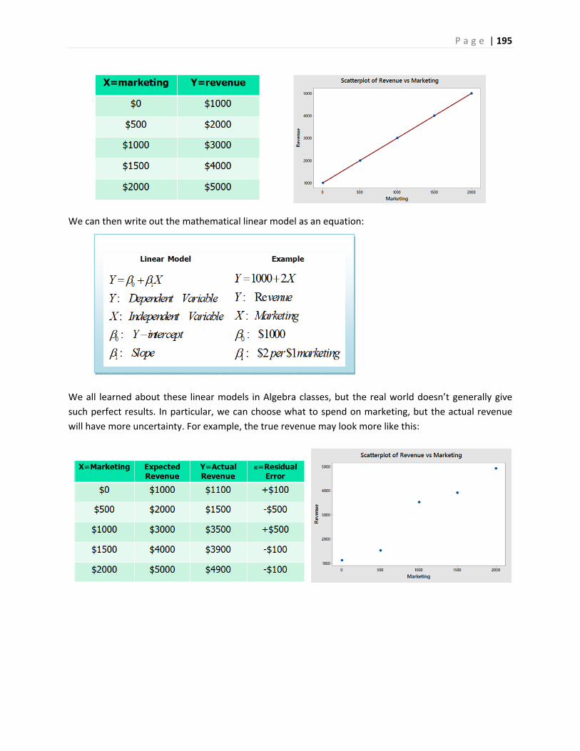
P a g e | 195
We can then write out the mathematical linear model as an equation:
We all learned about these linear models in Algebra classes, but the real world doesn’t generally give
such perfect results. In particular, we can choose what to spend on marketing, but the actual revenue
will have more uncertainty. For example, the true revenue may look more like this:
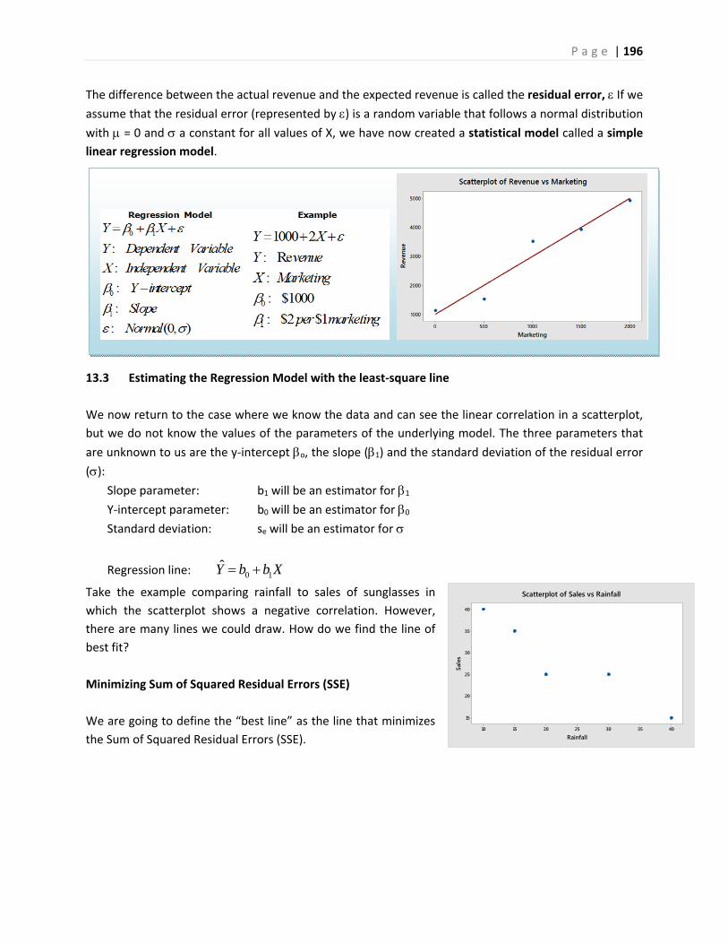
P a g e | 196
40353025201510
40
35
30
25
20
15
Rainfall
Sale
s
Scatterplot of Sales vs Rainfall
The difference between the actual revenue and the expected revenue is called the residual error, If we assume that the residual error (represented by ) is a random variable that follows a normal distribution
with = 0 and a constant for all values of X, we have now created a statistical model called a simple
linear regression model.
13.3 Estimating the Regression Model with the least‐square line
We now return to the case where we know the data and can see the linear correlation in a scatterplot,
but we do not know the values of the parameters of the underlying model. The three parameters that
are unknown to us are the y‐intercept o, the slope (1) and the standard deviation of the residual error
(): Slope parameter: b1 will be an estimator for 1
Y‐intercept parameter: b0 will be an estimator for 0
Standard deviation: se will be an estimator for
Regression line: 0 1Y b b X
Take the example comparing rainfall to sales of sunglasses in
which the scatterplot shows a negative correlation. However,
there are many lines we could draw. How do we find the line of
best fit?
Minimizing Sum of Squared Residual Errors (SSE)
We are going to define the “best line” as the line that minimizes
the Sum of Squared Residual Errors (SSE).
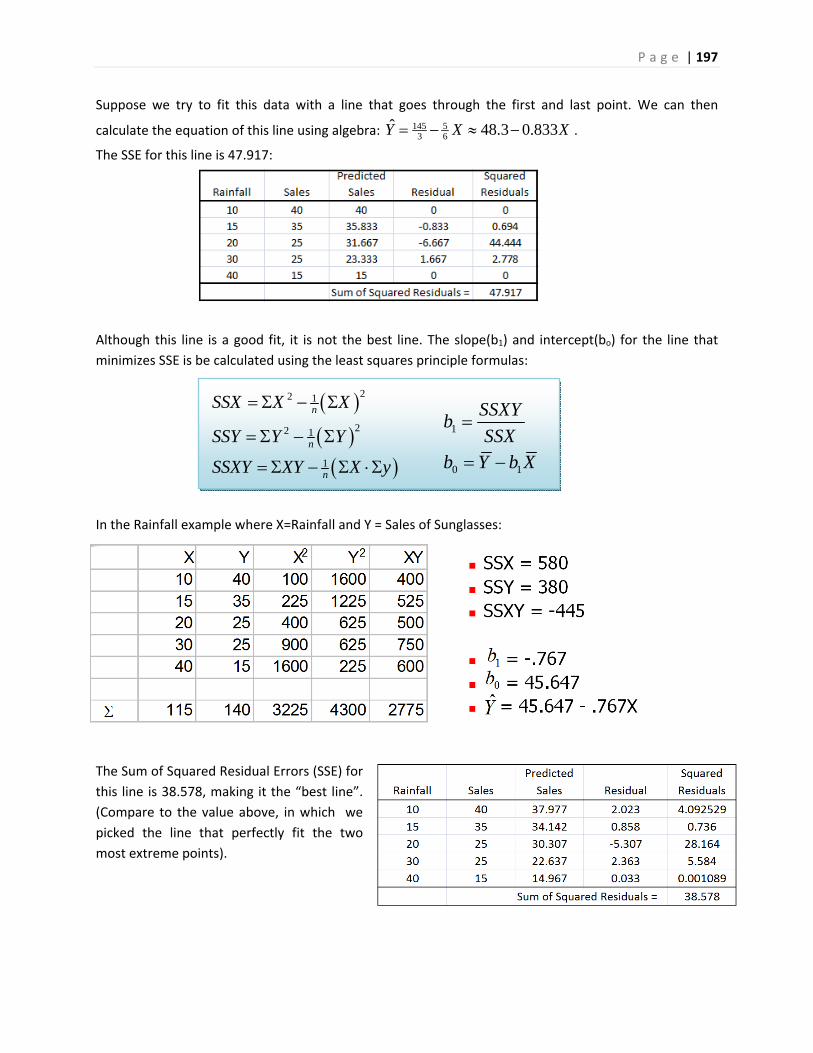
P a g e | 197
22 1
22 1
1
n
n
n
SSX X X
SSY Y Y
SSXY XY X y
1
0 1
SSXYb
SSXb Y b X
Suppose we try to fit this data with a line that goes through the first and last point. We can then
calculate the equation of this line using algebra: 145 53 6
ˆ 48.3 0.833Y X X .
The SSE for this line is 47.917:
Although this line is a good fit, it is not the best line. The slope(b1) and intercept(bo) for the line that
minimizes SSE is be calculated using the least squares principle formulas:
In the Rainfall example where X=Rainfall and Y = Sales of Sunglasses:
The Sum of Squared Residual Errors (SSE) for
this line is 38.578, making it the “best line”.
(Compare to the value above, in which we
picked the line that perfectly fit the two
most extreme points).
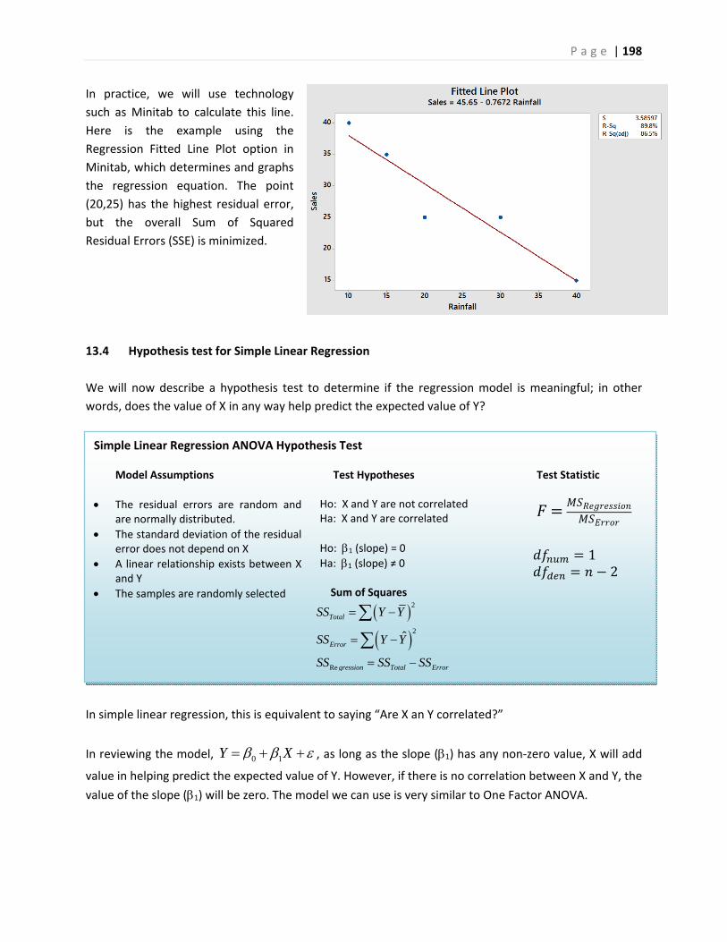
P a g e | 198
Simple Linear Regression ANOVA Hypothesis Test
Model Assumptions
The residual errors are random and are normally distributed.
The standard deviation of the residual error does not depend on X
A linear relationship exists between X and Y
The samples are randomly selected
Test Hypotheses Ho: X and Y are not correlated Ha: X and Y are correlated
Ho: 1 (slope) = 0
Ha: 1 (slope) ≠ 0 Sum of Squares
2
2
Re
ˆ
Total
Error
gression Total Error
SS Y Y
SS Y Y
SS SS SS
Test Statistic
1 2
In practice, we will use technology
such as Minitab to calculate this line.
Here is the example using the
Regression Fitted Line Plot option in
Minitab, which determines and graphs
the regression equation. The point
(20,25) has the highest residual error,
but the overall Sum of Squared
Residual Errors (SSE) is minimized.
13.4 Hypothesis test for Simple Linear Regression
We will now describe a hypothesis test to determine if the regression model is meaningful; in other
words, does the value of X in any way help predict the expected value of Y?
In simple linear regression, this is equivalent to saying “Are X an Y correlated?”
In reviewing the model, 0 1Y X , as long as the slope (1) has any non‐zero value, X will add
value in helping predict the expected value of Y. However, if there is no correlation between X and Y, the
value of the slope (1) will be zero. The model we can use is very similar to One Factor ANOVA.
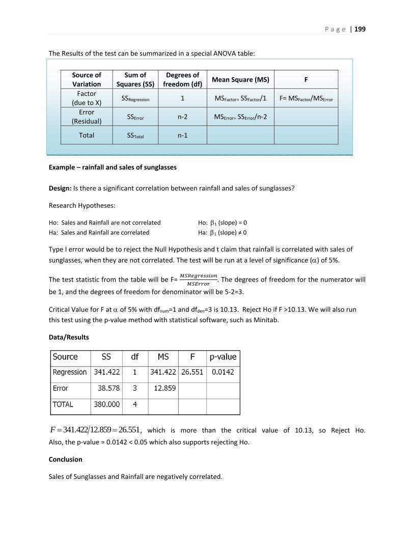
P a g e | 199
Source of Variation
Sum of Squares (SS)
Degrees of freedom (df)
Mean Square (MS) F
Factor (due to X)
SSRegression 1 MSFactor= SSFactor/1 F= MSFactor/MSError
Error (Residual)
SSError n‐2 MSError= SSError/n‐2
Total SSTotal n‐1
The Results of the test can be summarized in a special ANOVA table:
Example – rainfall and sales of sunglasses
Design: Is there a significant correlation between rainfall and sales of sunglasses?
Research Hypotheses:
Ho: Sales and Rainfall are not correlated Ho: 1 (slope) = 0
Ha: Sales and Rainfall are correlated Ha: 1 (slope) ≠ 0
Type I error would be to reject the Null Hypothesis and t claim that rainfall is correlated with sales of
sunglasses, when they are not correlated. The test will be run at a level of significance () of 5%.
The test statistic from the table will be F= . The degrees of freedom for the numerator will
be 1, and the degrees of freedom for denominator will be 5‐2=3.
Critical Value for F at of 5% with dfnum=1 and dfden=3 is 10.13. Reject Ho if F >10.13. We will also run
this test using the p‐value method with statistical software, such as Minitab.
Data/Results
341.422 12.859 26.551F , which is more than the critical value of 10.13, so Reject Ho.
Also, the p‐value = 0.0142 < 0.05 which also supports rejecting Ho.
Conclusion
Sales of Sunglasses and Rainfall are negatively correlated.
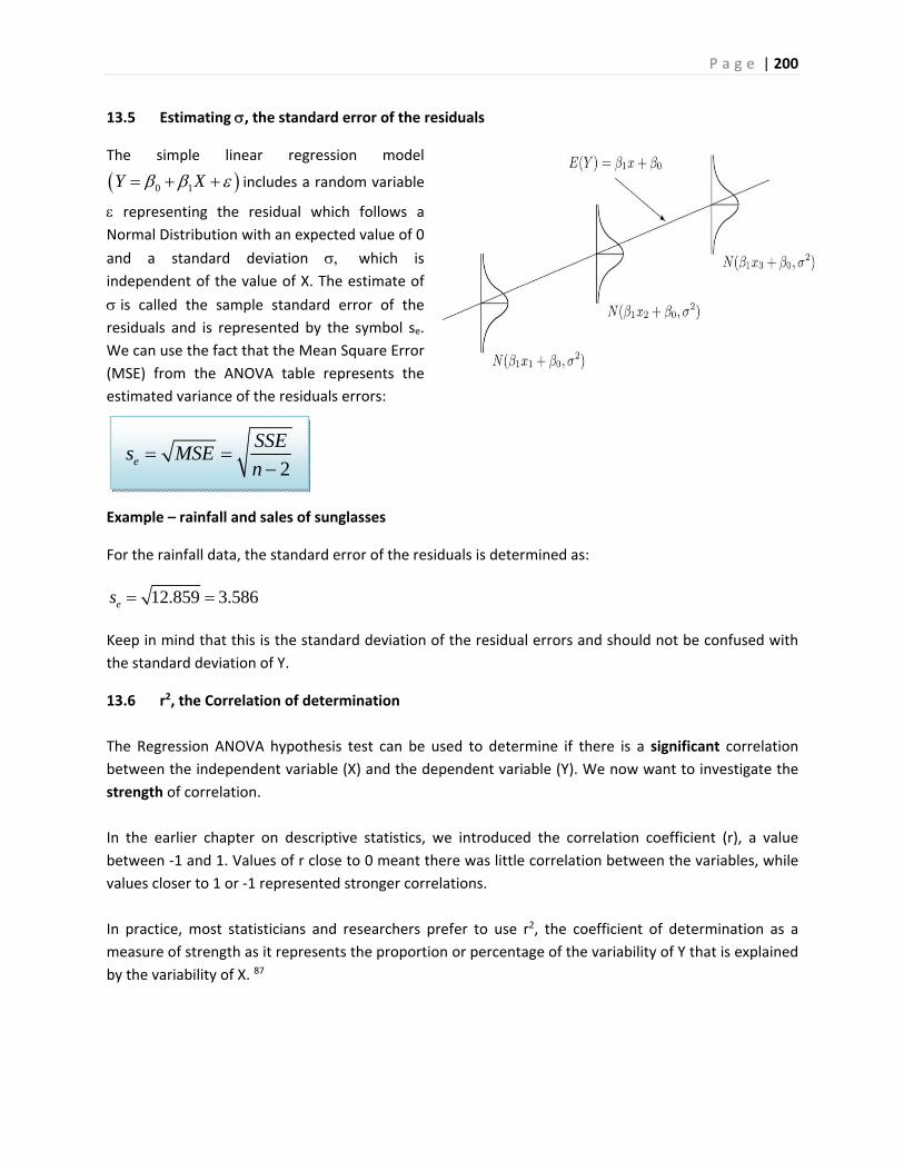
P a g e | 200
2e
SSEs MSE
n
13.5 Estimating , the standard error of the residuals
The simple linear regression model
0 1Y X includes a random variable
representing the residual which follows a Normal Distribution with an expected value of 0
and a standard deviation which is
independent of the value of X. The estimate of
is called the sample standard error of the
residuals and is represented by the symbol se.
We can use the fact that the Mean Square Error
(MSE) from the ANOVA table represents the
estimated variance of the residuals errors:
Example – rainfall and sales of sunglasses
For the rainfall data, the standard error of the residuals is determined as:
12.859 3.586es
Keep in mind that this is the standard deviation of the residual errors and should not be confused with
the standard deviation of Y.
13.6 r2, the Correlation of determination
The Regression ANOVA hypothesis test can be used to determine if there is a significant correlation
between the independent variable (X) and the dependent variable (Y). We now want to investigate the
strength of correlation.
In the earlier chapter on descriptive statistics, we introduced the correlation coefficient (r), a value
between ‐1 and 1. Values of r close to 0 meant there was little correlation between the variables, while
values closer to 1 or ‐1 represented stronger correlations.
In practice, most statisticians and researchers prefer to use r2, the coefficient of determination as a
measure of strength as it represents the proportion or percentage of the variability of Y that is explained
by the variability of X. 87
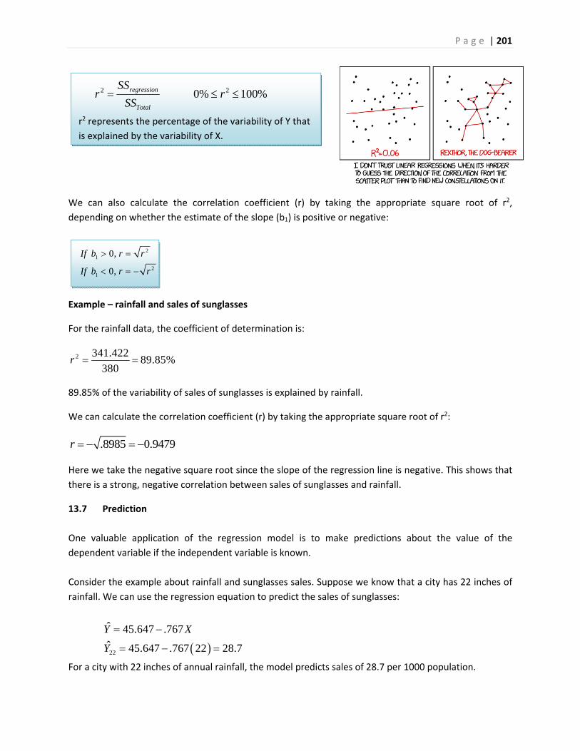
P a g e | 201
21
21
0,
0,
If b r r
If b r r
%100%0 22 rSS
SSr
Total
regression
r2 represents the percentage of the variability of Y that
is explained by the variability of X.
We can also calculate the correlation coefficient (r) by taking the appropriate square root of r2,
depending on whether the estimate of the slope (b1) is positive or negative:
Example – rainfall and sales of sunglasses
For the rainfall data, the coefficient of determination is:
2 341.42289.85%
380r
89.85% of the variability of sales of sunglasses is explained by rainfall.
We can calculate the correlation coefficient (r) by taking the appropriate square root of r2:
.8985 0.9479r
Here we take the negative square root since the slope of the regression line is negative. This shows that
there is a strong, negative correlation between sales of sunglasses and rainfall.
13.7 Prediction
One valuable application of the regression model is to make predictions about the value of the
dependent variable if the independent variable is known.
Consider the example about rainfall and sunglasses sales. Suppose we know that a city has 22 inches of
rainfall. We can use the regression equation to predict the sales of sunglasses:
22
ˆ 45.647 .767
ˆ 45.647 .767 22 28.7
Y X
Y
For a city with 22 inches of annual rainfall, the model predicts sales of 28.7 per 1000 population.
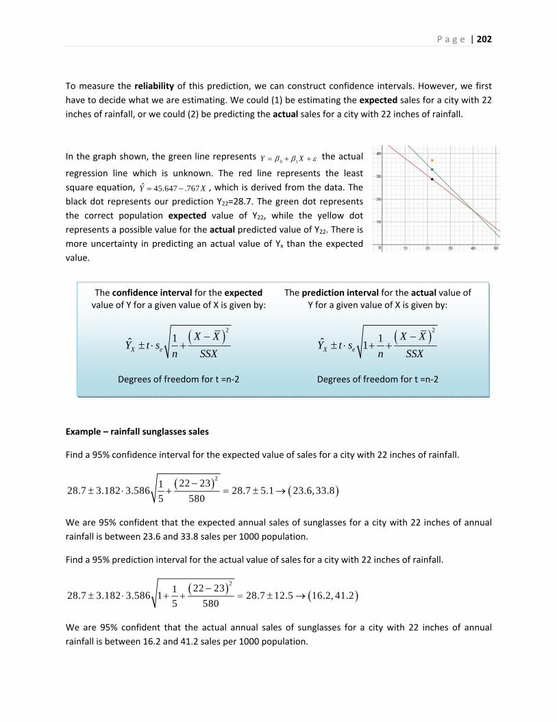
P a g e | 202
The confidence interval for the expected value of Y for a given value of X is given by:
2
1X e
X XY t s
n SSX
Degrees of freedom for t =n‐2
The prediction interval for the actual value of Y for a given value of X is given by:
2
1ˆ 1X e
X XY t s
n SSX
Degrees of freedom for t =n‐2
To measure the reliability of this prediction, we can construct confidence intervals. However, we first
have to decide what we are estimating. We could (1) be estimating the expected sales for a city with 22
inches of rainfall, or we could (2) be predicting the actual sales for a city with 22 inches of rainfall.
In the graph shown, the green line represents 0 1Y X
the actual
regression line which is unknown. The red line represents the least
square equation, ˆ 45.647 .767Y X , which is derived from the data. The
black dot represents our prediction Y22=28.7. The green dot represents
the correct population expected value of Y22, while the yellow dot
represents a possible value for the actual predicted value of Y22. There is
more uncertainty in predicting an actual value of Yx than the expected
value.
Example – rainfall sunglasses sales
Find a 95% confidence interval for the expected value of sales for a city with 22 inches of rainfall.
2
22 23128.7 3.182 3.586 28.7 5.1 23.6,33.8
5 580
We are 95% confident that the expected annual sales of sunglasses for a city with 22 inches of annual
rainfall is between 23.6 and 33.8 sales per 1000 population.
Find a 95% prediction interval for the actual value of sales for a city with 22 inches of rainfall.
2
22 23128.7 3.182 3.586 1 28.7 12.5 16.2, 41.2
5 580
We are 95% confident that the actual annual sales of sunglasses for a city with 22 inches of annual
rainfall is between 16.2 and 41.2 sales per 1000 population.
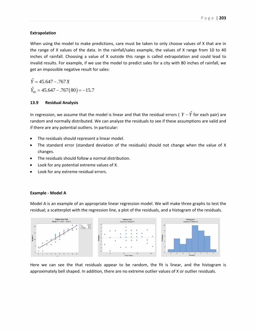
P a g e | 203
Extrapolation
When using the model to make predictions, care must be taken to only choose values of X that are in
the range of X values of the data. In the rainfall/sales example, the values of X range from 10 to 40
inches of rainfall. Choosing a value of X outside this range is called extrapolation and could lead to
invalid results. For example, if we use the model to predict sales for a city with 80 inches of rainfall, we
get an impossible negative result for sales:
80
ˆ 45.647 .767
ˆ 45.647 .767 80 15.7
Y X
Y
13.9 Residual Analysis
In regression, we assume that the model is linear and that the residual errors ( ˆY Y for each pair) are
random and normally distributed. We can analyze the residuals to see if these assumptions are valid and
if there are any potential outliers. In particular:
The residuals should represent a linear model.
The standard error (standard deviation of the residuals) should not change when the value of X
changes.
The residuals should follow a normal distribution.
Look for any potential extreme values of X.
Look for any extreme residual errors.
Example ‐ Model A
Model A is an example of an appropriate linear regression model. We will make three graphs to test the
residual; a scatterplot with the regression line, a plot of the residuals, and a histogram of the residuals.
Here we can see the that residuals appear to be random, the fit is linear, and the histogram is
approximately bell shaped. In addition, there are no extreme outlier values of X or outlier residuals.
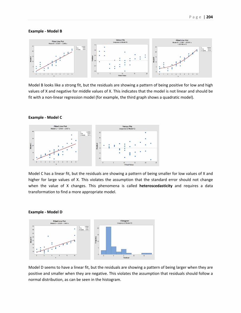
P a g e | 204
Example ‐ Model B
Model B looks like a strong fit, but the residuals are showing a pattern of being positive for low and high
values of X and negative for middle values of X. This indicates that the model is not linear and should be
fit with a non‐linear regression model (for example, the third graph shows a quadratic model).
Example ‐ Model C
Model C has a linear fit, but the residuals are showing a pattern of being smaller for low values of X and
higher for large values of X. This violates the assumption that the standard error should not change
when the value of X changes. This phenomena is called heteroscedasticity and requires a data
transformation to find a more appropriate model.
Example ‐ Model D
Model D seems to have a linear fit, but the residuals are showing a pattern of being larger when they are
positive and smaller when they are negative. This violates the assumption that residuals should follow a
normal distribution, as can be seen in the histogram.
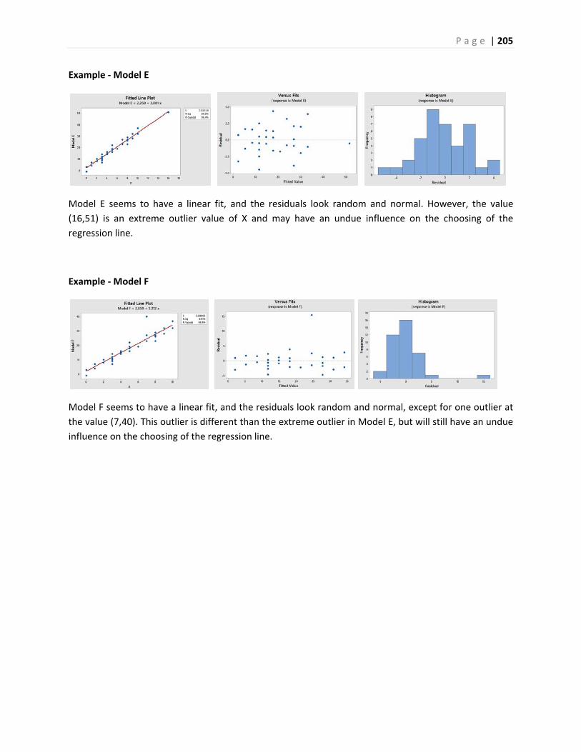
P a g e | 205
Example ‐ Model E
Model E seems to have a linear fit, and the residuals look random and normal. However, the value
(16,51) is an extreme outlier value of X and may have an undue influence on the choosing of the
regression line.
Example ‐ Model F
Model F seems to have a linear fit, and the residuals look random and normal, except for one outlier at
the value (7,40). This outlier is different than the extreme outlier in Model E, but will still have an undue
influence on the choosing of the regression line.
P a g e | 206
14. Glossary of Statistical Terms used in Inference
Additive Rule
In probability, for events A and B, P(A or B) = P(A) +P(B) ‐ P(A and B).
Alpha () – see Level of Significance
Alternative Hypothesis (Ha)
A statement about the value of a population parameter that is assumed to be true if the Null Hypothesis
is rejected during testing.
Analysis of Variance (ANOVA)
A group of statistical tests used to determine if the mean of a numeric variable (the Response) is
affected by one or more categorical variables (Factors).
Bar Graphs
A graph of categorical data in which the height of the bar represents the frequency of each choice. Bar
graphs can be clustered or stacked for multiple categorical variables.
Bernoulli Distribution
A probability distribution function (parameter p) for a discrete random variable that is the numbers of
successes in a single trial when there are only two possible outcomes (success or failure).
Beta ( The probability, set by design, of failing to reject the Null Hypothesis when it is actually false. Beta is
calculated for specific possible values of the Alternative Hypothesis.
Biased Sample
A sample that has characteristics, behaviors and attitudes from the population from which the sample is
selected ‐‐ in other words a non‐representative sample.
P a g e | 207
Binomial Distribution
A probability distribution function (parameters n, p) for a discrete random variable that is the numbers
of successes in a fixed number of independent trials when there are only two possible outcomes
(success or failure).
Bivariate Data
Pairs of numeric data; there are two variables or measurements per observation.
Box Plot
A graph that represent the 3 quartiles (Q1, median and Q3), along with the minimum and maximum
values of the data.
Blinding
In an experiment, blinding is keeping the participant and/or the administrator unaware as to what
treatment is being given. A single blind study is when the participant does not know whether the
treatment is real or a placebo. A double blind study is when neither the administrator of the treatment
nor the participant knows whether the treatment is real or a placebo.
Categorical data
Non‐numeric values. Some examples of categorical data include eye color, gender, model of computer,
and city.
Central Limit Theorem
A powerful theorem that allows us to understand the distribution of the sample mean, . If X1, X2, …, Xn
is a random sample from a probability distribution with mean = and standard deviation = and the
sample size is “sufficiently large”, then will have a Normal Distribution with the same mean and a
standard deviation of /√ (also known as the Standard Error). Because of this theorem, most statistical
inference is conducted using a sampling distribution from the Normal Family.
Class Intervals
For grouped numeric data, one category, usually of equal width, in which values are counted.
P a g e | 208
Chi‐square Distribution (2)
A family of continuous random variables (based on degrees of freedom) with a probability density
function that is from the Normal Family of probability distributions. The Chi‐square distribution is non‐
negative and skewed to the right and has many uses in statistical inference such as inference about a
population variance, goodness‐of‐fit tests and test of independence for categorical data.
Chi‐square Goodness‐of‐fit Test
A test that is used to test if observed data from a categorical variable is consistent with an expected
assumption about the distribution of that variable.
Chi‐square Test of Independence
A test to determine if there is a relationship between two randomized categorical variables.
Chi‐square Test of Homogeneity
A test that is run the same way as a Chi‐square Test of Independence, but in which only one of the
categorical variables is randomized.
Classical probability (also called Mathematical Probability)
Determined by counting or by using a mathematical formula or model.
Cluster Sample
A sample that is created by first breaking the population into groups called clusters, and then by taking a
sample of clusters.
Complement of an Event
The complement of an event means that the event does not occur. If the event is labeled A, then the
complement of A is labeled A' and read as "not A".
Conditional Probability
The probability of an event A occurring given that another event B has already occurred. This probability
is written as P(A|B) which is read as P(A given B).
Confidence Interval
An interval estimate that estimates a population parameter from a random sample using a
predetermined probability called the level of confidence.
P a g e | 209
Confidence Level – see Level of Confidence
Confounding Variable
A lurking variable that is not known to the researcher, but that affects the results of the study.
Contingency Tables
A method of displaying the counts of the responses of two categorical variables from data, also known
as cross tabulations, or two‐way tables.
Control Group
In an experiment, the group that receives no treatment giving the researcher a baseline to be able to
compare the treatment and placebo groups.
Continuous data
Quantitative based on the real numbers. Some examples of continuous data include time to complete
an exam, height, weight. Continuous data are values that are measured, or answers the question "How
much"?
Continuous Random Variable
A random variable that has only continuous values. Continuous values are uncountable and are related
to real numbers.
Correlation Coefficient
A measure of correlation(represented by the letter r) that measures both the direction and strength of a
linear relationship or association between two variables. The value r will always take on a value between
‐1 and 1. Values close to zero imply a very weak correlation. Values close to 1 or ‐1 imply a very strong
correlation. The correlation coefficient should not be used for non‐linear correlation.
Critical value(s)
The dividing point(s) between the region where the Null Hypothesis is rejected and the region where it is
not rejected. The critical value determines the decision rule.
Cross Tabulations ‐ see Contingency Tables
P a g e | 210
Cumulative Frequency
In grouped data, the number of times a particular value is observed in a class interval or in any lower
class interval.
Cumulative Relative Frequency
In grouped data, the proportion or percentage of times a particular value is observed in a class interval
or in any lower class interval.
Data Dredging ‐ see p‐hacking
Decision Rule
The procedure that determines what values of the result of an experiment will cause the Null Hypothesis
to be rejected. There are two methods that are equivalent decision rules:
1. If the test statistic lies in the Rejection Region, Reject Ho (Critical Value method).
2. If the p‐value < , Reject Ho (p‐value method).
Dependent Events
Two events are dependent if the probability of one event occurring is changed by knowing if the other
event occurred or not. Events that are not dependent are called independent.
Dependent Sampling
A method of sampling in which 2 or more variables are related to each other (paired or matched).
Examples would be the “Before and After” type models using the Matched Pairs t‐test.
Discrete data
Quantitative natural numbers (0, 1, 2, 3, ...). Some examples of discrete data include number of siblings,
friends on Facebook, or bedrooms in a house. Discrete data are values that are counted, or where you
might ask the question "How many"?
Discrete Random Variable
A random variable that has only discrete values. Discrete values are related to counting numbers.
Dot Plot
A graph of numeric data in which each value is represented as a dot on a simple numeric scale. Multiple
values are stacked to create a shape for the data. If the data set is large, each dot can represent multiple
values of the data.
P a g e | 211
Effect Size
The “practical difference” between a population parameter under the Null Hypothesis and a selected
value of the population parameter under the Alternative Hypothesis.
Empirical probability
Probability that is based on the relative frequencies of historical data, studies or experiments.
Empirical Rule
(Also known as the 68‐95‐99.7 Rule). A rule used to interpret standard deviation for data that is
approximately bell‐shaped. The rule says about 68% of the data is within one standard deviation of the
mean, 95% of the data is within two standard deviations of the mean, and about 99.7% of the data is
within three standard deviations of the mean.
Estimation
An inference process that attempts to predict the values of population parameters based on sample
statistics.
Event
A result of an experiment, usually referred to with a capital letter A, B, C, etc.
Expected Value
A value that describes the central tendency of a random variable, also known as the population mean
and that is expressed by the symbol (pronounced mu). The expected value is a parameter, meaning a
fixed quantity.
Experiment
A study in which the researcher will randomly break a representative sample into groups and then apply
treatments in order to manipulate a variable of interest. The goal of an experiment is to find a cause and
effect relationship between a random variable in the population and the variable manipulated by the
researcher.
Exponential Distribution
A probability distribution function (parameter ) for a continuous random variable that models the
waiting time until the first occurrence of an event defined by a Poisson Process.
P a g e | 212
Explanatory Variable
The variable that the researcher controls or manipulates.
F Distribution
A family of continuous random variables (based on 2 different degrees of freedom for numerator and
denominator) with a probability density function that is from the Normal Family of probability
distributions. The F distribution is non‐negative and skewed to the right and has many uses in statistical
inference such as inference about comparing population variances, ANOVA, and regression.
Factor
In ANOVA, the categorical variable(s) that break the numeric response variable into multiple populations
or treatments.
Frequency
In grouped data, the number of times a particular value is observed.
Frequency distribution
An organization of numeric data into class intervals.
Geometric Distribution
A probability distribution function (parameter p) for a discrete random variable that is the number of
independent trials until the first success in which there are only two possible outcomes (success or
failure).
Hypothesis
A statement about the value of a population parameter developed for the purpose of testing.
Hypothesis Testing
A procedure, based on sample evidence and probability theory, used to determine whether the
hypothesis is a reasonable statement and should not be rejected, or is unreasonable and should be
rejected.
Independent Events
Two events are independent if the probability of one event occurring is not changed by knowing if the
other event occurred or not. Events that are not independent are called dependent.
P a g e | 213
Independent Sampling
A method of sampling in which 2 or more variables are not related to each other. Examples would be
the “Treatment and Control” type models using the independent samples t‐test.
Inference – see Statistical Inference
Interquartile Range (IQR)
A measure of variability that is calculated by taking the difference of the 1st quartile and 3rd quartiles.
Interval Estimate
A range of values based on sample data that is used to estimate a population parameter.
Interval Level of Data
Quantitative data that have meaningful distance between values, but that do not have a "true" zero.
Interval data are numeric, but zero is just a place holder. Examples of interval data include temperature
in degrees Celsius and year of birth.
Joint Probability
The probability of the union or intersection of multiple events occurring. If A and B are multiple events,
then P(A or B) and P(A and B) are examples of joint probability.
Level
In ANOVA, a possible value that a categorical variable factor could be. For example, if the factor was
shirt color, levels would be blue, red, yellow, etc.
Level of Confidence
The probability, usually expressed as a percentage, that a Confidence Interval will contain the true
population parameter that is being estimated.
Level of Significance ( The maximum probability, set by design, of rejecting the Null Hypothesis when it is actually true
(maximum probability of making Type I error).
Levels of Data
The four levels of data are Nominal, Ordinal, Interval and Ratio.
P a g e | 214
Lurking Variable – see Confounding Variable
Margin of Error
The distance in a symmetric Confidence Interval between the Point Estimator and an endpoint of the
interval. For example a confidence interval for may be expressed as Margin of Error.
Marginal Probability
The probability a single event A occurs, written as P(A).
Mean – see Population Mean or Sample Mean
Median – see Population Median or Sample Median
Mode – see Population Mode or Sample Mode
Model Assumptions
Criteria that must be satisfied to appropriately use a chosen statistical model. For example, a Student’s t
statistic used for testing a population mean vs. a hypothesized value requires random sampling and that
the sample mean has an approximately Normal Distribution.
Multiplicative Rule
In probability, for events A and B, P(A and B) = P(A)P(B|A) = P(B)P(A|B).
Mutually Exclusive Events
Events that cannot both occur; the intersection of two events has no possible outcomes.
Nominal Level of Data
Qualitative data that only define attributes, with no hierarchal ranking. Examples of nominal data
include hair color, ethnicity, gender and any yes/no question.
Non‐probability Sampling Methods
Non‐scientific methods of sampling that have immeasurable biases and should not be used in scientific
research. These methods include Convenience Sampling and Self‐selected sampling.
P a g e | 215
Non‐response Bias A type of sampling bias that occurs when people are intentionally or non‐intentionally excluded from participation or choose not to participate in a survey or poll. Sometimes people will lie to pollsters as well.
Normal Distribution
Often called the “bell‐shaped” curve, the Normal Distribution is a continuous random variable which has
Probability Density Function /2 / √2 . The special case where 0and 1, is called the Standard Normal Distribution and is designated by Z.
Normal Family of Probability Distributions
The Standard Normal Distribution (Z) plus other Probability Distributions that are functions of
independent random variables with Standard Normal Distribution. Examples include the t, the F and the
Chi‐square distributions.
Null Hypothesis (Ho)
A statement about the value of a population parameter that is assumed to be true for the purpose of
testing.
Observational Study
A study in which the researcher takes measurements from a representative sample, but does not
manipulate any of the variables with treatments. The goal of an observational study is to interpret and
analyze the measured variables, but it is not possible to show a cause and effect relationship.
Ogive
A line graph in which the vertical axis is cumulative relative frequency and the horizontal axis is the value
of the data, specifically the endpoints of the class intervals. The left end point of the first class interval
will have a cumulative relative frequency of zero. All other endpoints are given the right endpoint of the
corresponding class interval. The points are then connected by line segments. The ogive can be used to
estimate percentiles.
Outcome
A result of the experiment which cannot be broken down into smaller events.
P a g e | 216
Ordinal Level of Data
Qualitative data that define attributes with a hierarchal ranking. Examples of nominal data include
movie ratings (G, PG, PG13, R, NC17), t‐shirt size (S, M L, XL), or your letter grade on a term paper.
Outlier
A data point that is far removed from the other entries in the data set.
p‐value
The probability, assuming that the Null Hypothesis is true, of getting a value of the test statistic at least
as extreme as the computed value for the test.
p‐hacking
An improper research method that uses repeated experiments or multiple measures analysis until the
researcher obtains a significant p‐value. Also known as Data Dredging.
Parameter
A fixed numerical value that describes a characteristic of a population.
Percentile
The value of the data below which a given percentage of the data fall.
Pie Chart
A circular graph of categorical data where each slice of the pie represents the relative frequency or
percentage of data in each category.
Placebo
A treatment with no active ingredients.
Placebo Effect
In an experiment, when a participant responds in a positive way to a placebo, a treatment with no active
ingredients.
Placebo Group
In an experiment, the group that receives the treatment with no active ingredients
P a g e | 217
Point Estimate
A single sample statistic that is used to estimate a population parameter. For example, is a point estimator for .
Poisson Distribution
A probability distribution function (parameter ) for a discrete random variable that is the number of
occurrences in a fixed time period or region, over which the rate occurrences is a constant.
Poisson Process
Counting methods that are modeled by random variables that follow a Poisson Distribution.
Population
The set of all possible members, objects or measurements of the phenomena being studied.
Population Mean – see Expected Value
Population Median
A value that describes the central tendency of a random variable that represents the 50th percentile. The
population median is a parameter, meaning a fixed quantity.
Population Mode
The maximum value or values of a probability density function.
Population Variance
The expected value of the squared deviation from the mean, a value that describes the variability of a
random variable expressed by the symbol (pronounced sigma‐squared). The population variance is a
parameter, meaning a fixed quantity.
Population Standard Deviation
The square root of the population variance, a value that describes the variability of a random variable
expressed by the symbol (pronounced sigma).
P a g e | 218
Power (or Statistical Power)
The probability, set by design, of rejecting the Null Hypothesis when it is actually false. Power is
calculated for specific possible values of the Alternative Hypothesis and is the complement of Beta ().
Probability
The measure of the likelihood that an event A will occur. This measure is a quantity between 0 (never)
and 1 (always) and will be expressed as P(A) ( read as “The probability event A occurs.”)
Probability Density Function (pdf)
A non‐negative function that defines probability for a Continuous Random Variable. Probability is
calculated by measuring the area under a probability density function.
Probability Distribution Function (PDF)
A function that assigns a probability to all possible values of a discrete random variable. In the case of a
continuous random variable (like the Normal Distribution), the PDF refers to the area to the left of a
designated value under a Probability Density Function.
Probability Sampling Methods
Sampling methods that will usually produce a sample that is representative of the population. These
methods are also called scientific sampling. Examples include Simple Random Sampling, Systematic
Sampling, Stratified Sampling and Cluster Sampling.
Qualitative Data are non‐numeric values that describe the data. Note that all quantitative data is
numeric, but some numbers without quantity (such as Zip Code or Social Security Number) are
qualitative. When describing categorical data, we are limited to observing counts in each group and
comparing the differences in percentages.
Quantitative Data
Measurements and numeric quantities that can be determined from the data. When describing
quantitative data, we can look at the center, spread, shape and unusual features.
Quartile
The 25th, 50th and 75th percentiles, which are usually called, respectively, the 1st quartile, the median,
and the 3rd quartile.
P a g e | 219
Radix
A convenient total used in creating a hypothetical two‐way table.
Random Sample ‐ see Simple Random Sample
Range
For numeric data, the maximum value minus the minimum value.
Random Variable
A variable in which the value depends upon an experiment, observation or measurement.
Ratio Level of Data
Quantitative data that have meaningful distance between values, and have a "true" zero. Examples of
ratio data include time to drive to work, weight, height, or number of children in a family. Most numeric
data will be ratio.
Raw Data
Sample data presented unsorted.
Regression Analysis
A method of modeling correlated bivariate data.
Relative frequency
In grouped data, the proportion or percentage of times a particular value is observed.
Replicate
In ANOVA, the sample size for a specific level of factor. If the replicates are the same for each level, the
design is balanced.
Rejection Region
Statistical Model region(s) which contain the values of the Test Statistic in which the Null Hypothesis will
be rejected. The total area of the Rejection Region =
P a g e | 220
Representative Sample
A sample that has characteristics, behaviors and attitudes similar to the population from which the
sample is selected.
Response Variable
The numeric variable that is being tested under different treatments or populations.
Response bias
A type of sampling bias that occurs when the responses to a survey are influenced by the way the
question is asked, or when responses do not reflect the true opinion of the respondent. When
conducting a survey or poll, the type, order, and wording of questions are important considerations.
Poorly worded questions can invalidate the results of a survey.
Rule of Complement
If the events A and A' are complements, then P(A) +P(A') =1.
Sample
A subset of the population that is studied to collect or gather data.
Sample Size
The number of observations in your sample size, usually represented by n.
Sample Mean
a) The arithmetic average of a numeric data set.
b) A random variable that has an approximately Normal Distribution if the sample size is sufficiently
large.
c) An unbiased estimator for the population mean.
Sample Median
The value that represents the exact middle of data, when the values are sorted from lowest to highest.
Sample Mode
The most frequently occurring value in the data. If there are multiple values that occur most frequently,
then there are multiple modes in the data.
P a g e | 221
Significance Level – see Level of Significance
Sample Space
In probability, the set of all possible outcomes of an experiment.
Sample Standard Deviation
The square root of the sample variance, which measures the spread of data and distance from the
mean. The units of the standard deviation are the same units as the data.
Sample Variance
A measure of the mean squared deviation of the data values from the mean. The units of the variance
are the square of the units of the data.
Scatterplot
A graph of bivariate data used to visualize correlation between the two numeric variables.
Selection Bias A type of sampling bias that occurs when the sampling method does not create a representative sample for the study. Selection bias frequently occurs when using convenience sampling.
Self‐selection Bias A type of sampling bias that occurs when individuals can volunteer to be part of the study. Volunteers will often have a stronger opinion about the research question and will usually not be representative of the population.
Simple Random Sample
A subset of a population in which each member of the population has the same chance of being chosen
and is mutually independent from all other members.
Skewness
A measure of how asymmetric the data vales are.
Standard Deviation – see Sample Standard Deviation or Population Standard Deviation
P a g e | 222
Standard Normal Distribution – A special case of the Normal Distribution where = 0 and = 1. The symbol Z is usually reserved for the Standard Normal Distribution.
Statistic
A value that is calculated from only the sample data, and that is used to describe the data. Examples of
statistics are the sample mean, the sample standard deviation, the range, the sample median and the
interquartile range. Since statistics depend on the sample, they are also random variables.
Statistical Inference
The process of estimating or testing hypotheses of population parameters using statistics from a random
sample.
Statistical Model
A mathematical model that describes the behavior of the data being tested.
Stem and Leaf Plot
A method of tabulating data by splitting it into the "stem" (the first digit or digits) and the "leaf" (the last
digit, usually). For example, the stem for 102 minutes would be 10 and the leaf would be 2.
Stratified Sample
A sample that is designed by breaking the population into subgroups called strata, which are then
sampled so that the proportion of each subgroup in the sample matches the proportion of each
subgroup in the population.
Student’s t Distribution (or t Distribution)
A family of continuous random variables (based on degrees of freedom) with a probability density
function that is from the Normal Family of Probability Distributions. The t distribution is used for
statistical inference of the population mean when the population standard deviation is unknown.
Subjective probability
Probability that is a “one‐shot” educated guess based on anecdotal stories, intuition or a feeling as to
whether an event is likely, unlikely or “50‐50”. Subjective probability is often inaccurate.
Systematic Sample

P a g e | 223
A subset of the population in which the first member of the sample is selected at random and all
subsequent members are chosen by a fixed periodic interval.
t Distribution – see Student’s t Distribution
Test Statistic
A value, determined from sample information, used to determine whether or not to reject the Null
Hypothesis.
Treatment Group(s)
In an experiment, the group(s) that receive the treatment that the researcher controls.
Tukey HSD Test
In ANOVA, a post‐hoc collection of tests that report honest significant differences in pair of means.
Tree Diagram
A simple way to display all possible outcomes in a sequence of events. Each branch will represent a
possible outcome. Using the Multiplicative Rule, the probability of each possible outcome can be
calculated.
Two‐way Tables – see Contingency Tables
Type I Error
Rejecting the Null Hypothesis when it is actually true.
Type II Error
Failing to reject the Null Hypothesis when it is actually false.
Uniform Distribution
A probability distribution function (parameters a, b) for a continuous random variable in which all values
between a minimum value and a maximum value have the same probability.
Variance – see Sample Variance or Population Variance

P a g e | 224
Z‐score
A measure of relative standing that shows the distance in standard deviations that a particular data
point is above or below the mean.
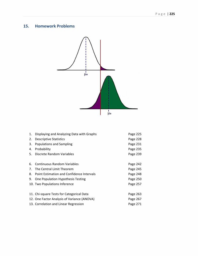
P a g e | 225
15. Homework Problems
1. Displaying and Analyzing Data with Graphs Page 225
2. Descriptive Statistics Page 228
3. Populations and Sampling Page 231
4. Probability Page 235
5. Discrete Random Variables Page 239
6. Continuous Random Variables Page 242
7. The Central Limit Theorem Page 245
8. Point Estimation and Confidence Intervals Page 248
9. One Population Hypothesis Testing Page 250
10. Two Populations Inference Page 257
11. Chi‐square Tests for Categorical Data Page 263
12. One Factor Analysis of Variance (ANOVA) Page 267
13. Correlation and Linear Regression Page 271
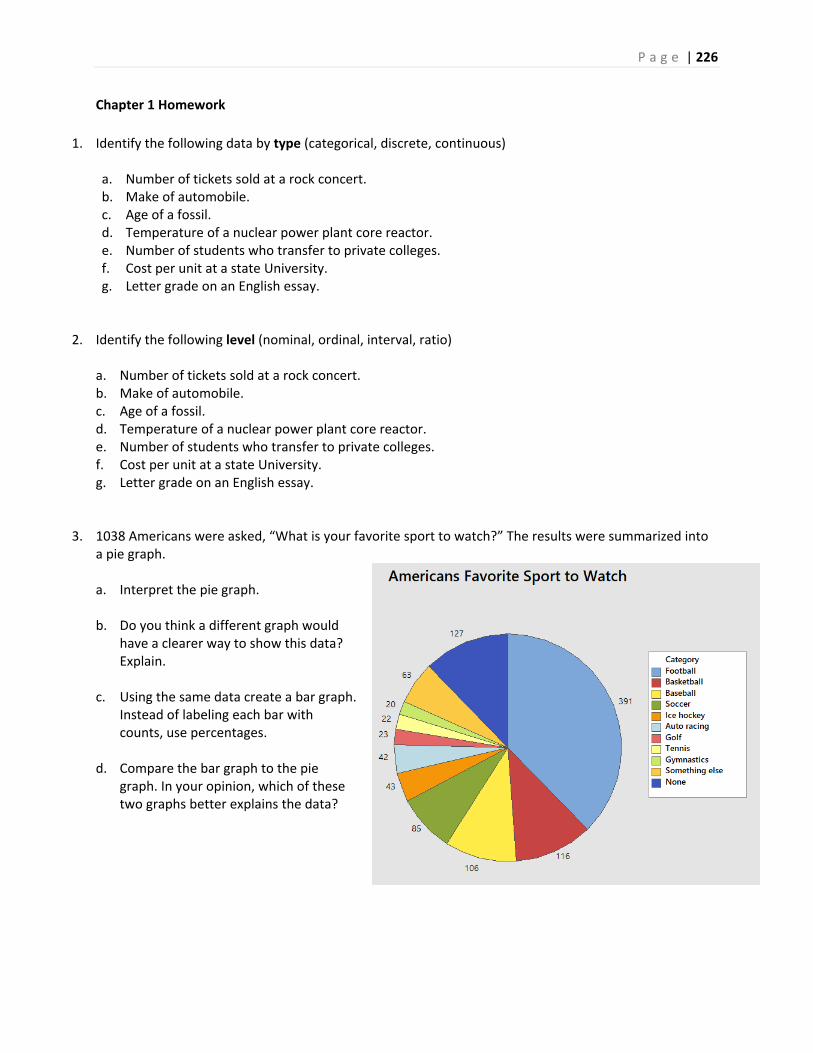
P a g e | 226
Chapter 1 Homework
1. Identify the following data by type (categorical, discrete, continuous)
a. Number of tickets sold at a rock concert. b. Make of automobile. c. Age of a fossil. d. Temperature of a nuclear power plant core reactor. e. Number of students who transfer to private colleges. f. Cost per unit at a state University. g. Letter grade on an English essay.
2. Identify the following level (nominal, ordinal, interval, ratio) a. Number of tickets sold at a rock concert. b. Make of automobile. c. Age of a fossil. d. Temperature of a nuclear power plant core reactor. e. Number of students who transfer to private colleges. f. Cost per unit at a state University. g. Letter grade on an English essay.
3. 1038 Americans were asked, “What is your favorite sport to watch?” The results were summarized into a pie graph. a. Interpret the pie graph.
b. Do you think a different graph would
have a clearer way to show this data? Explain.
c. Using the same data create a bar graph. Instead of labeling each bar with counts, use percentages.
d. Compare the bar graph to the pie graph. In your opinion, which of these two graphs better explains the data?

P a g e | 227
4. The following average daily commute time (minutes) for residents of two cities are shown in the table.
a. Construct a back‐to back stem and leaf diagram.
b. Describe the center, shape and spread of each city. c. What is similar about each city, and what is different?
5. The February 10, 2017 Nielsen ratings of 20 TV programs shown on commercial television, all starting between 8 PM and 10 PM, are given below: 2.1 2.3 2.5 2.8 2.8 3.6 4.4 4.5 5.7 7.6 7.6 8.1 8.7 10.0 10.2 10.7 11.8 13.0 13.6 17.3 a. Graph a stem and leaf plot with the tens and ones units making up the stem and the tenths unit
being the leaf.
b. Group the data into intervals of width 2, starting with the 1st interval at 2, and obtain the frequency of each of the intervals.
c. Graphically depict the grouped frequency distribution in part b by a histogram.
d. Obtain the relative frequency, cumulative frequency and cumulative relative frequency for the intervals in part b.
e. Construct an ogive of the data. Estimate the median and quartiles.
6. The following data represent the median monthly rent from 2005 to 2015 for a studio apartment in the US, California and Santa Clara County. Create line graphs of US, California and Santa Clara County rents on the same graph. Make three interpretations from the graphs.
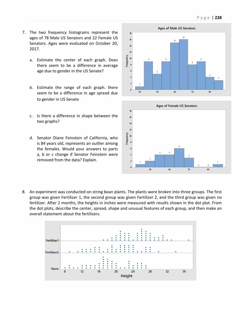
P a g e | 228
8070605040
18
16
14
12
10
8
6
4
2
0
Freq
uenc
y
34
9
8
16
15
9
5
9
1
Ages of Male US Senators
80706050
18
16
14
12
10
8
6
4
2
0
Freq
uenc
y
1
00
3
6
44
21
Ages of Female US Senators
7. The two frequency histograms represent the ages of 78 Male US Senators and 22 Female US Senators. Ages were evaluated on October 20, 2017. a. Estimate the center of each graph. Does
there seem to be a difference in average age due to gender in the US Senate?
b. Estimate the range of each graph. there seem to be a difference in age spread due
to gender in US Senate c. Is there a difference in shape between the
two graphs? d. Senator Diane Feinstein of California, who
is 84 years old, represents an outlier among the females. Would your answers to parts a, b or c change if Senator Feinstein were removed from the data? Explain.
8. An experiment was conducted on string bean plants. The plants were broken into three groups. The first group was given Fertilizer 1, the second group was given Fertilizer 2, and the third group was given no fertilizer. After 2 months, the heights in inches were measured with results shown in the dot plot. From the dot plots, describe the center, spread, shape and unusual features of each group, and then make an overall statement about the fertilizers.
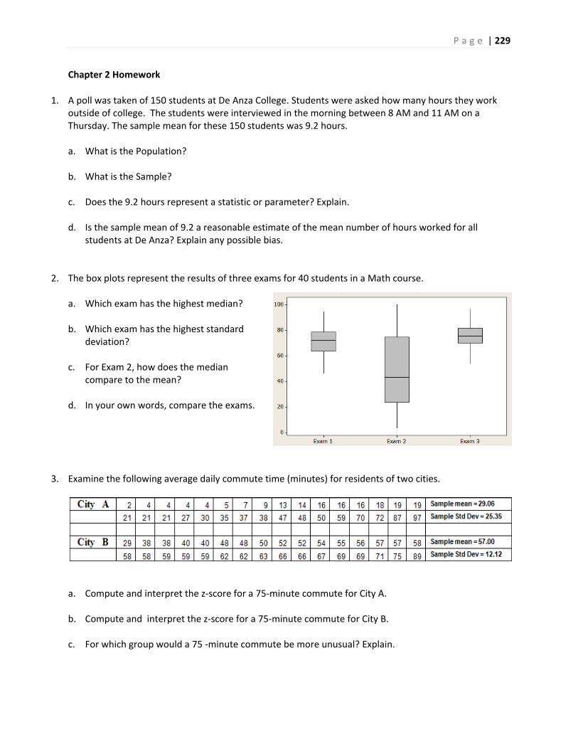
P a g e | 229
Chapter 2 Homework
1. A poll was taken of 150 students at De Anza College. Students were asked how many hours they work
outside of college. The students were interviewed in the morning between 8 AM and 11 AM on a Thursday. The sample mean for these 150 students was 9.2 hours. a. What is the Population?
b. What is the Sample?
c. Does the 9.2 hours represent a statistic or parameter? Explain.
d. Is the sample mean of 9.2 a reasonable estimate of the mean number of hours worked for all
students at De Anza? Explain any possible bias.
2. The box plots represent the results of three exams for 40 students in a Math course. a. Which exam has the highest median?
b. Which exam has the highest standard
deviation?
c. For Exam 2, how does the median compare to the mean?
d. In your own words, compare the exams.
3. Examine the following average daily commute time (minutes) for residents of two cities.
a. Compute and interpret the z‐score for a 75‐minute commute for City A. b. Compute and interpret the z‐score for a 75‐minute commute for City B.
c. For which group would a 75 ‐minute commute be more unusual? Explain.
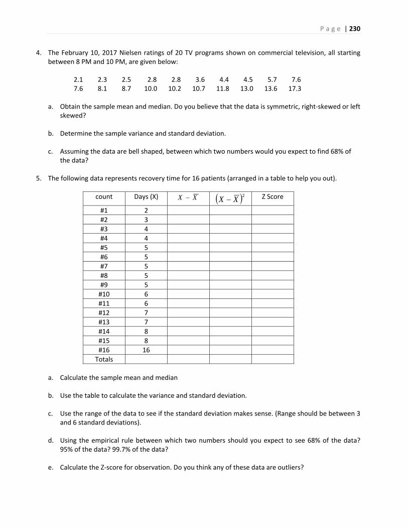
P a g e | 230
4. The February 10, 2017 Nielsen ratings of 20 TV programs shown on commercial television, all starting between 8 PM and 10 PM, are given below: 2.1 2.3 2.5 2.8 2.8 3.6 4.4 4.5 5.7 7.6 7.6 8.1 8.7 10.0 10.2 10.7 11.8 13.0 13.6 17.3
a. Obtain the sample mean and median. Do you believe that the data is symmetric, right‐skewed or left
skewed?
b. Determine the sample variance and standard deviation.
c. Assuming the data are bell shaped, between which two numbers would you expect to find 68% of the data?
5. The following data represents recovery time for 16 patients (arranged in a table to help you out).
count Days (X) XX 2XX Z Score
#1 2
#2 3
#3 4
#4 4
#5 5
#6 5
#7 5
#8 5
#9 5
#10 6
#11 6
#12 7
#13 7
#14 8
#15 8
#16 16
Totals
a. Calculate the sample mean and median
b. Use the table to calculate the variance and standard deviation. c. Use the range of the data to see if the standard deviation makes sense. (Range should be between 3
and 6 standard deviations). d. Using the empirical rule between which two numbers should you expect to see 68% of the data?
95% of the data? 99.7% of the data? e. Calculate the Z‐score for observation. Do you think any of these data are outliers?
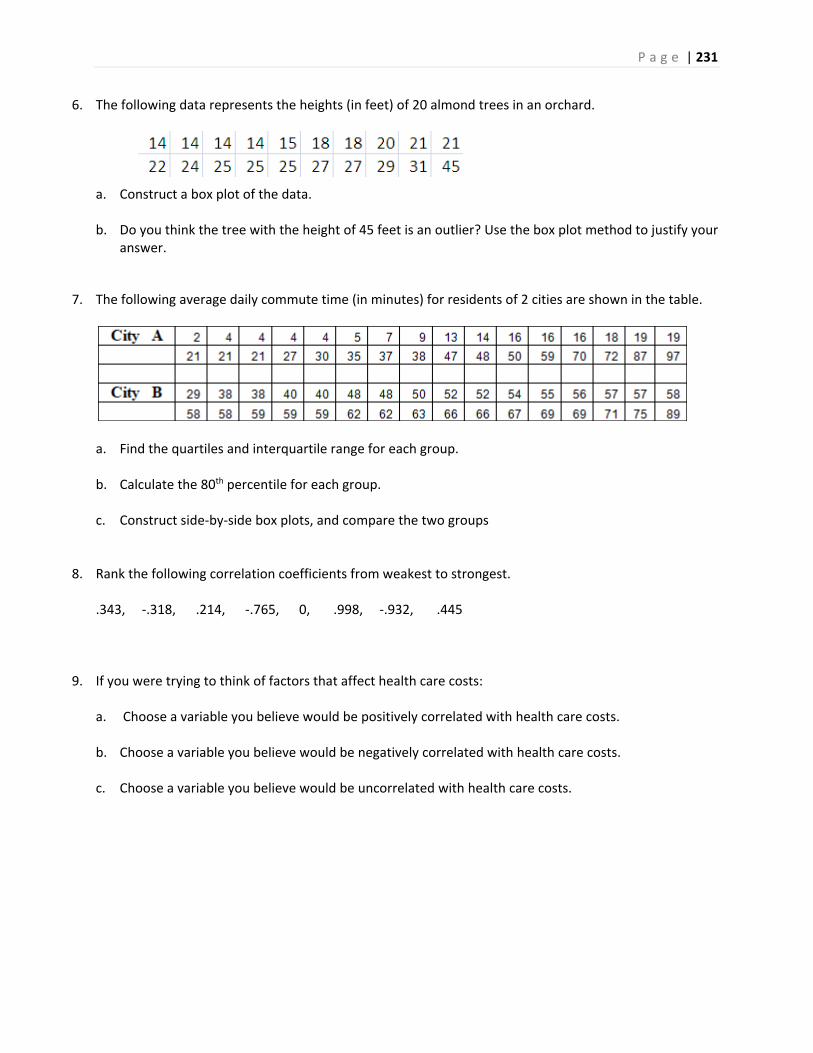
P a g e | 231
6. The following data represents the heights (in feet) of 20 almond trees in an orchard. a. Construct a box plot of the data. b. Do you think the tree with the height of 45 feet is an outlier? Use the box plot method to justify your
answer.
7. The following average daily commute time (in minutes) for residents of 2 cities are shown in the table.
a. Find the quartiles and interquartile range for each group. b. Calculate the 80th percentile for each group. c. Construct side‐by‐side box plots, and compare the two groups
8. Rank the following correlation coefficients from weakest to strongest. .343, ‐.318, .214, ‐.765, 0, .998, ‐.932, .445
9. If you were trying to think of factors that affect health care costs:
a. Choose a variable you believe would be positively correlated with health care costs.
b. Choose a variable you believe would be negatively correlated with health care costs.
c. Choose a variable you believe would be uncorrelated with health care costs.
P a g e | 232
Chapter 3 Homework
1. A researcher wanted to know if students who use the library at a college have higher GPAs than
students who do not use the library. The researcher decided used a random number generator to choose 20 random classes at the college. Students in each of these classes were given surveys that could be filled out anonymously. Students that completed the surveys were given a $5 gift card for the bookstore. 82% of students in the sampled classes returned the surveys. Here are the two questions of interest: How often do you use the library?
a. Never b. Less than once a week c. More than once a week, but not every day d. Every day
What is your current GPA? __________
a. What method of sampling was used by the researcher?
b. Discuss the wording of the questions for possible bias.
c. Is this an observational study or an experiment? Explain.
d. The researcher concluded that students who use the library more frequently have higher GPAs. Is
this a valid conclusion for this type of study? Explain.
2. A community college is considering using multiple measures to place students into math courses. The
existing measure is that each student takes a standardized placement exam. On the basis of the score, the student will be placed in one of three math courses: Elementary Level, Intermediate Level and Transfer Level. A second measure is to use high school GPA to modify the needed placement exam score for each of the three courses. 200 incoming students who have high school GPAs were randomly split into two groups. The first group of 100 students was given the existing placement exam only. The second group of 100 students was placed by the new second measure, utilizing both placement exams and high school GPAs. After three quarters, it was found that 17 of the first group completed the transfer level course, while 31 of the second group completed the transfer level course. Based on this result, the researcher decided that the new multiple measures method of placing students improved the percentage of students who pass the transfer level math course in three quarters. a. Is this an observational study or an experiment? Explain.
b. What is the explanatory variable and what is the response variable?
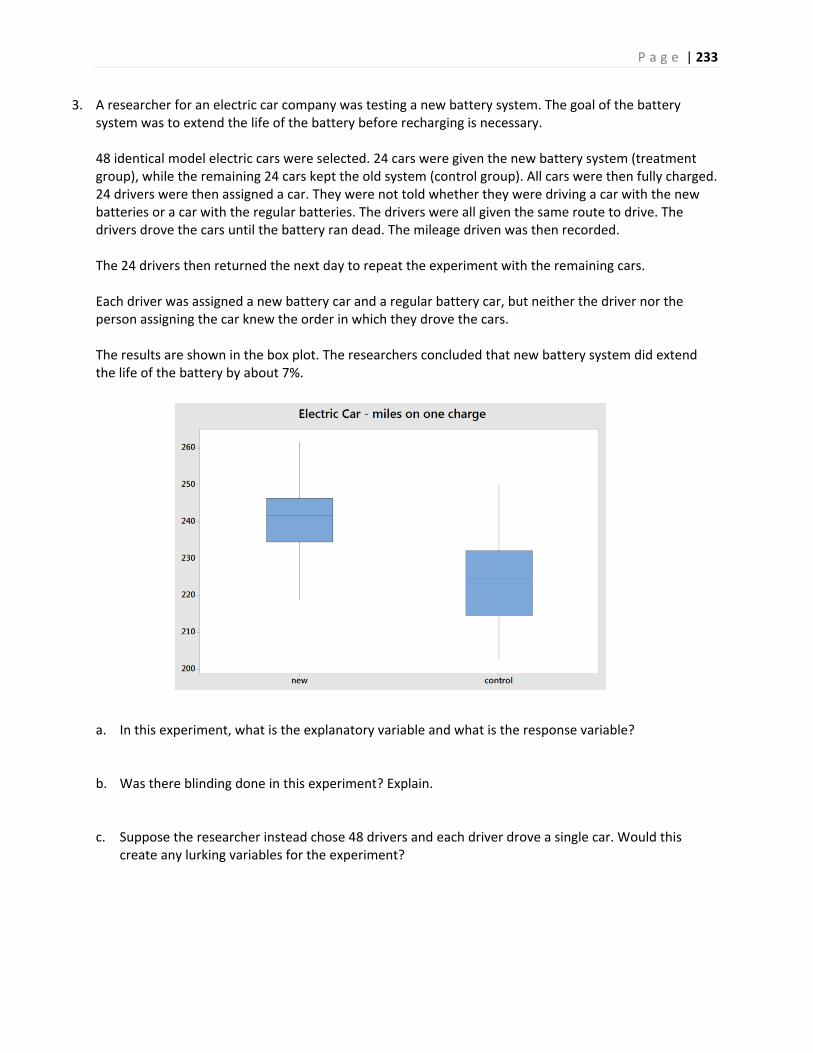
P a g e | 233
3. A researcher for an electric car company was testing a new battery system. The goal of the battery system was to extend the life of the battery before recharging is necessary. 48 identical model electric cars were selected. 24 cars were given the new battery system (treatment group), while the remaining 24 cars kept the old system (control group). All cars were then fully charged. 24 drivers were then assigned a car. They were not told whether they were driving a car with the new batteries or a car with the regular batteries. The drivers were all given the same route to drive. The drivers drove the cars until the battery ran dead. The mileage driven was then recorded. The 24 drivers then returned the next day to repeat the experiment with the remaining cars. Each driver was assigned a new battery car and a regular battery car, but neither the driver nor the person assigning the car knew the order in which they drove the cars. The results are shown in the box plot. The researchers concluded that new battery system did extend the life of the battery by about 7%. a. In this experiment, what is the explanatory variable and what is the response variable?
b. Was there blinding done in this experiment? Explain.
c. Suppose the researcher instead chose 48 drivers and each driver drove a single car. Would this create any lurking variables for the experiment?
P a g e | 234
4. Identify the Steps of a Statistical Process for the library use/GPA example in problem 1. The steps are listed below: a. Ask a question that can be answered with sample data.
b. Determine the information needed c. Collect sample data that is representative of the population.
d. Summarize, interpret and analyze the sample data.
e. State the results and conclusion of the study.
5. Identify the Steps of a Statistical Process for the multiple measures example in problem 2. The steps are listed below: a. Ask a question that can be answered with sample data.
b. Determine the information needed
c. Collect sample data that is representative of the population. d. Summarize, interpret and analyze the sample data.
e. State the results and conclusion of the study.
6. Identify the Steps of a Statistical Process for the electric car example in problem 3. The steps are listed below: a. Ask a question that can be answered with sample data. b. Determine the information needed c. Collect sample data that is representative of the population. d. Summarize, interpret and analyze the sample data. e. State the results and conclusion of the study.

P a g e | 235
7. A researcher wants to determine the average student loan debt for California students. The researcher understands that the cost of college could be dramatically different for students who attend community college, the California State System (CSU), The University of California system (UC), or private colleges. To account for this, the researcher decides to employ stratified sampling. a. Why did the researcher choose stratified sampling?
b. Identify the 4 strata (groups) for this method. c. Based on recent estimates, 2.1 million students attend community college, 478,000 attend the CSU
system, 238,000 attend the UC system and 184,000 attend private colleges. If the researcher wants to sample a total of 2000 students, determine the sample size for each group.
8. The 2015 US Supreme Court Decision Obergefell v. Hodges established a constitutional right for same‐sex couples to marry. Before this decision, many polls were conducted. Read the wording of the following actual polling questions and decide if the questions are unbiased or biased. Explain your reasoning and why you think some questions are biased. a. Do you think it should be legal or illegal for gay and lesbian couples to get married? b. Do you favor or oppose allowing gay and lesbian couples to enter into same‐sex marriages? c. Should state governments give legal recognition to marriages between couples of the same sex? d. Do you think gays and lesbians have a constitutional right to get married and have their marriage
recognized by law as valid? e. Do you think marriages between same‐sex couples should or should not be recognized by the law as
valid, with the same rights as traditional marriages? f. Do you want homosexual marriage in your community even if it means schools will be required to
teach sodomy to your children? g. Would you support or oppose a law in your state that would allow same‐sex couples to get married? h. Do you support marriage equality? i. Should states continue to discriminate against couples of the same gender who want to marry? j. Should states be forced to legalize homosexual marriage over the wishes of a majority of the
people?

P a g e | 236
Chapter 4 Homework
1. In the game of Craps, two dice are rolled and the sum totaled. One set of 4 bets are called hard ways, in which the player has to roll the number in doubles before a 7 or a non‐hard way version of the number is rolled. For example, suppose you want to bet on hard way 6. To win, you must roll a pair of threes before you roll a seven or any other combination that adds to 6. All others rolls are ignored. a. For the hard way 6, list the sample space of rolls that have an effect on the game. Then find the
probability of winning.
b. For the hard way 4, list the sample space of rolls that have an effect on the game. Then find the probability of winning.
c. For the hard way 4, the casino will pay 7 to 1 if you win. For the hard way 6, the casino will pay 9 to 1 if you win. Compare the payoff to the actual odds. Does the casino have an advantage in this game?
2. 40% of students at a community college are on financial aid. 30% of students at the same college live with at least one parent. 15% of students are on financial aid and live with at least one parent. a. Find the probability that a community college student does not live with at least one parent. Is this
marginal, joint or conditional probability?
b. Find the probability that a community college student is on financial aid or lives with at least one parent. Is this marginal, joint or conditional probability?
c. Find the probability that a community college student who lives with at least one parent is also on financial aid. Is this marginal, joint or conditional probability?
P a g e | 237
3. A poll of American registered voters was taken by Politico/Morning Consult in November, 2017 after the Las Vegas mass shooting, in which 58 concertgoers were murdered by a single gunman. The poll asked the question, "Do you support or oppose stricter gun laws in the United States? The results of the poll, cross‐tabulated by gender, are shown in the contingency table.
a. What percentage of all registered voters support (strong or somewhat) stricter gun laws?
b. What percentage of males support (strong or somewhat) stricter gun laws?
c. What percentage of females support (strong or somewhat) stricter gun laws? d. Are gender and support of stricter gun laws independent events? Explain
4. A student has a 90% chance of getting to class on time on Monday and a 70% chance of getting to class on time on Tuesday. Assuming that these are independent events, determine the following probabilities: a. The student is on time both Monday and Tuesday.
b. The student is on time at least once (Monday or Tuesday). c. The student is late both days.
5. A class has 10 students, 6 females and 4 males. 3 students will be sampled without replacement for a group presentation. a. Construct a tree diagram of all possibilities (there will be 8 total branches at the end)
Find the following probabilities: b. All male students in the group presentation.
c. Exactly 2 female students in the group presentation. d. At least 2 female students in the group presentation.
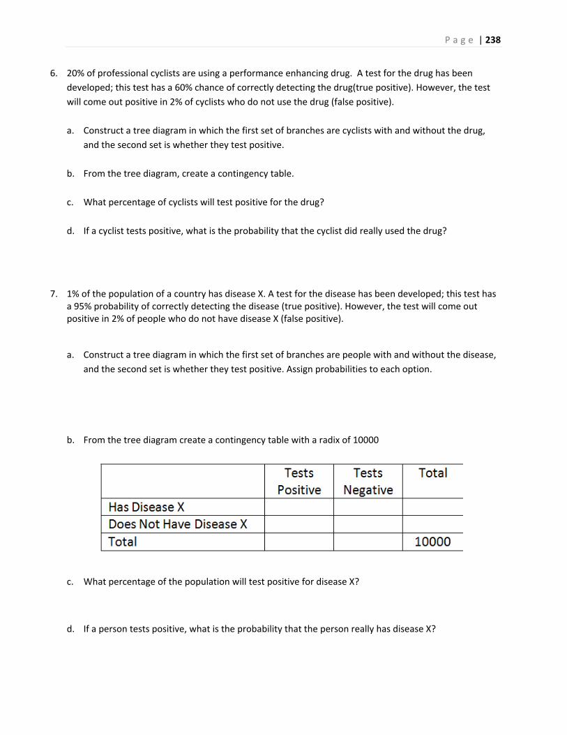
P a g e | 238
6. 20% of professional cyclists are using a performance enhancing drug. A test for the drug has been
developed; this test has a 60% chance of correctly detecting the drug(true positive). However, the test
will come out positive in 2% of cyclists who do not use the drug (false positive).
a. Construct a tree diagram in which the first set of branches are cyclists with and without the drug,
and the second set is whether they test positive.
b. From the tree diagram, create a contingency table.
c. What percentage of cyclists will test positive for the drug?
d. If a cyclist tests positive, what is the probability that the cyclist did really used the drug?
7. 1% of the population of a country has disease X. A test for the disease has been developed; this test has a 95% probability of correctly detecting the disease (true positive). However, the test will come out positive in 2% of people who do not have disease X (false positive).
a. Construct a tree diagram in which the first set of branches are people with and without the disease,
and the second set is whether they test positive. Assign probabilities to each option.
b. From the tree diagram create a contingency table with a radix of 10000
c. What percentage of the population will test positive for disease X?
d. If a person tests positive, what is the probability that the person really has disease X?
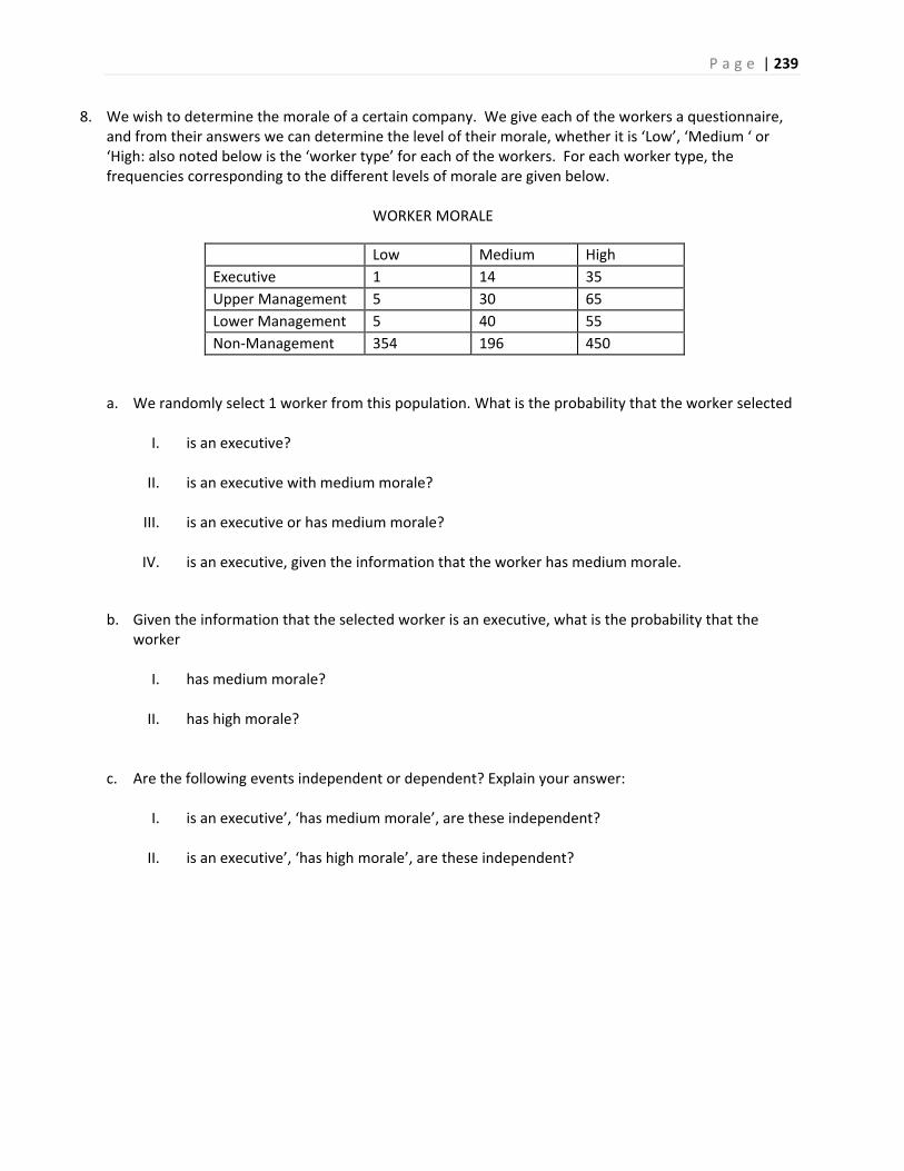
P a g e | 239
8. We wish to determine the morale of a certain company. We give each of the workers a questionnaire, and from their answers we can determine the level of their morale, whether it is ‘Low’, ‘Medium ‘ or ‘High: also noted below is the ‘worker type’ for each of the workers. For each worker type, the frequencies corresponding to the different levels of morale are given below.
WORKER MORALE
Low Medium High
Executive 1 14 35
Upper Management 5 30 65
Lower Management 5 40 55
Non‐Management 354 196 450
a. We randomly select 1 worker from this population. What is the probability that the worker selected
I. is an executive?
II. is an executive with medium morale?
III. is an executive or has medium morale?
IV. is an executive, given the information that the worker has medium morale.
b. Given the information that the selected worker is an executive, what is the probability that the worker
I. has medium morale?
II. has high morale?
c. Are the following events independent or dependent? Explain your answer:
I. is an executive’, ‘has medium morale’, are these independent?
II. is an executive’, ‘has high morale’, are these independent?
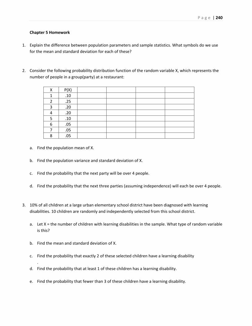
P a g e | 240
Chapter 5 Homework
1. Explain the difference between population parameters and sample statistics. What symbols do we use
for the mean and standard deviation for each of these?
2. Consider the following probability distribution function of the random variable X, which represents the
number of people in a group(party) at a restaurant:
X P(X)
1 .10
2 .25
3 .20
4 .20
5 .10
6 .05
7 .05
8 .05
a. Find the population mean of X.
b. Find the population variance and standard deviation of X.
c. Find the probability that the next party will be over 4 people.
d. Find the probability that the next three parties (assuming independence) will each be over 4 people.
3. 10% of all children at a large urban elementary school district have been diagnosed with learning
disabilities. 10 children are randomly and independently selected from this school district.
a. Let X = the number of children with learning disabilities in the sample. What type of random variable
is this?
b. Find the mean and standard deviation of X.
c. Find the probability that exactly 2 of these selected children have a learning disability
.
d. Find the probability that at least 1 of these children has a learning disability.
e. Find the probability that fewer than 3 of these children have a learning disability.
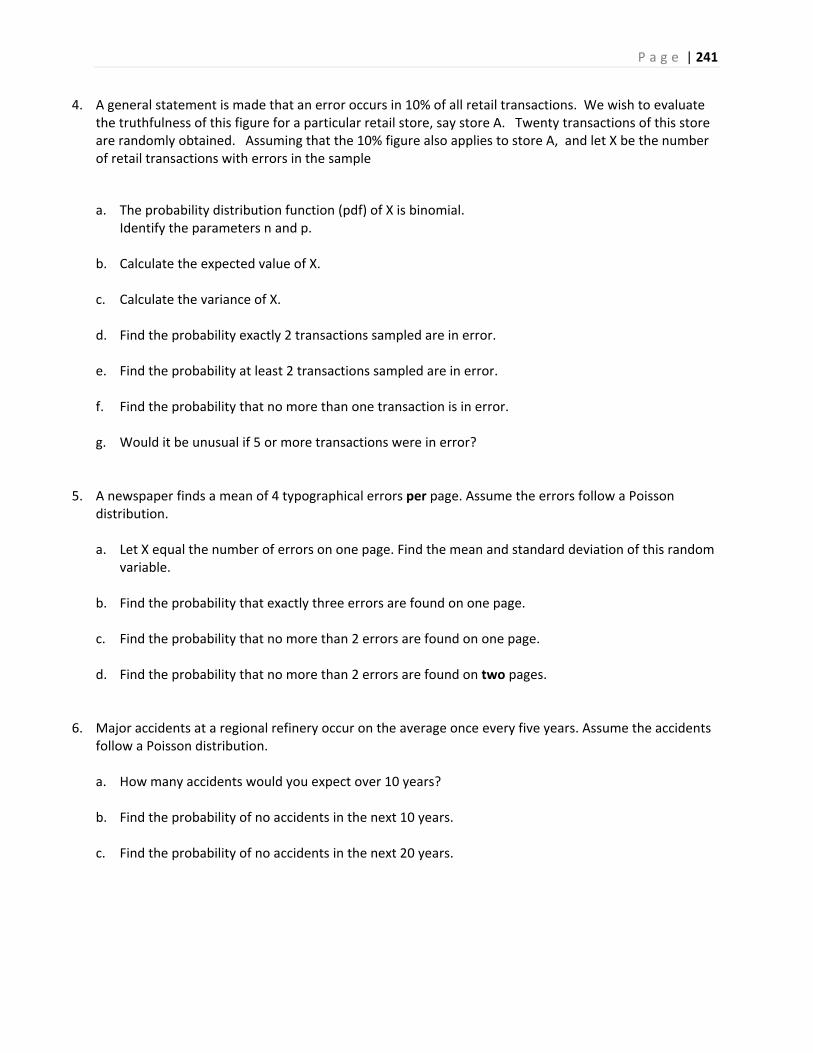
P a g e | 241
4. A general statement is made that an error occurs in 10% of all retail transactions. We wish to evaluate the truthfulness of this figure for a particular retail store, say store A. Twenty transactions of this store are randomly obtained. Assuming that the 10% figure also applies to store A, and let X be the number of retail transactions with errors in the sample
a. The probability distribution function (pdf) of X is binomial. Identify the parameters n and p.
b. Calculate the expected value of X.
c. Calculate the variance of X.
d. Find the probability exactly 2 transactions sampled are in error.
e. Find the probability at least 2 transactions sampled are in error.
f. Find the probability that no more than one transaction is in error.
g. Would it be unusual if 5 or more transactions were in error?
5. A newspaper finds a mean of 4 typographical errors per page. Assume the errors follow a Poisson distribution. a. Let X equal the number of errors on one page. Find the mean and standard deviation of this random
variable.
b. Find the probability that exactly three errors are found on one page.
c. Find the probability that no more than 2 errors are found on one page.
d. Find the probability that no more than 2 errors are found on two pages.
6. Major accidents at a regional refinery occur on the average once every five years. Assume the accidents follow a Poisson distribution. a. How many accidents would you expect over 10 years?
b. Find the probability of no accidents in the next 10 years.
c. Find the probability of no accidents in the next 20 years.
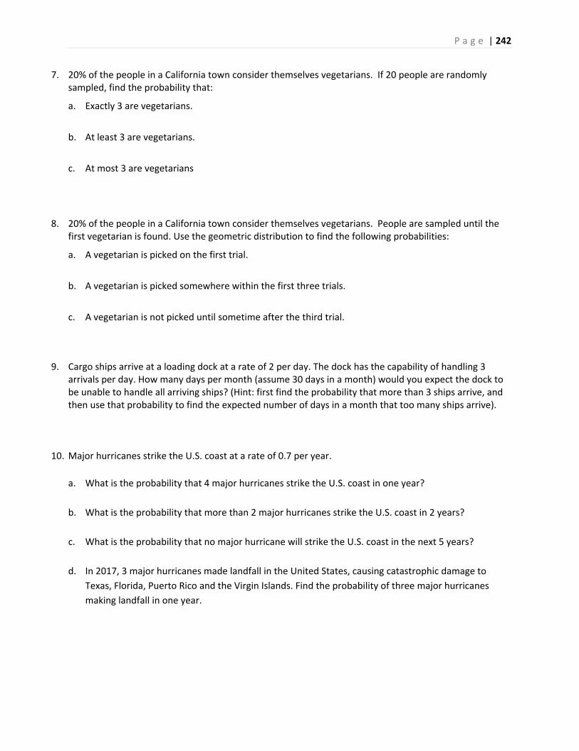
P a g e | 242
7. 20% of the people in a California town consider themselves vegetarians. If 20 people are randomly sampled, find the probability that:
a. Exactly 3 are vegetarians.
b. At least 3 are vegetarians.
c. At most 3 are vegetarians
8. 20% of the people in a California town consider themselves vegetarians. People are sampled until the first vegetarian is found. Use the geometric distribution to find the following probabilities:
a. A vegetarian is picked on the first trial.
b. A vegetarian is picked somewhere within the first three trials.
c. A vegetarian is not picked until sometime after the third trial.
9. Cargo ships arrive at a loading dock at a rate of 2 per day. The dock has the capability of handling 3 arrivals per day. How many days per month (assume 30 days in a month) would you expect the dock to be unable to handle all arriving ships? (Hint: first find the probability that more than 3 ships arrive, and then use that probability to find the expected number of days in a month that too many ships arrive).
10. Major hurricanes strike the U.S. coast at a rate of 0.7 per year.
a. What is the probability that 4 major hurricanes strike the U.S. coast in one year?
b. What is the probability that more than 2 major hurricanes strike the U.S. coast in 2 years?
c. What is the probability that no major hurricane will strike the U.S. coast in the next 5 years?
d. In 2017, 3 major hurricanes made landfall in the United States, causing catastrophic damage to
Texas, Florida, Puerto Rico and the Virgin Islands. Find the probability of three major hurricanes
making landfall in one year.
P a g e | 243
Chapter 6 Homework
1. The completion time (in minutes) for a student to complete a short quiz follows the probability density function shown here, with some areas calculated.
a. Find the probability that a student completes the exam in 4 minutes or less.
b. Find the probability that a student needs between 8 and 10 minutes to finish the quiz.
c. If the instructor allows 10 minutes for the quiz and the class has 40 students, how many students will run out of time before the quiz is finished?
d. Find the 64th percentile of the distribution.
2. A ferry boat leaves the dock once per hour. Your waiting time for the next ferry boat will follow a uniform distribution from 0 to 60 minutes. a. Find the mean and variance of this random variable.
b. Find the probability of waiting more than 20 minutes for the next ferry.
c. Find the probability of waiting exactly 20 minutes for the next ferry.
d. Find the probability of waiting between 15 and 35 minutes for the next ferry.
e. Find the conditional probability of waiting at least 10 more minutes after you have already waited
15 minutes.
f. Find the probability of waiting more than 45 minutes for the ferry on 3 consecutive independent days.
P a g e | 244
3. The cycle times for a truck hauling concrete to a highway construction site are uniformly distributed over the interval 50 to 70 minutes. a. Find the mean and variance for cycle times.
b. Find the 5th and 95th percentile of cycle times.
c. Find the interquartile range.
d. Find the probability that the cycle time for a randomly selected truck exceeds 62 minutes.
e. If you are given that the cycle time exceeds 55 minutes, find the probability that the cycle time is
between 60 and 65 minutes.
4. The amount of gas in a car’s tank (X) follows a Uniform Distribution, in which the minimum is zero and
the maximum is 12 gallons.
a. Find the mean and median amount of gas in the tank.
b. Find the variance and standard deviation of gas in the tank.
c. Find the probability that there is more than 3 gallons in the tank.
d. Find the probability that there is between 4 and 6 gallons in the tank.
e. Find the probability that there is exactly 3 gallons in the tank.
f. Find the 80th percentile of gas in the tank.
5. A normally distributed population of package weights has a mean of 63.5 g and a standard deviation of 12.2 g. a. What percentage of this population weighs 66 g or more?
b. What percentage of this population weighs 41 g or less?
c. What percentage of this population weighs between 41 g and 66 g?
d. Find the 60th percentile for distribution of weights.
e. Find the three quartiles and the interquartile range.
P a g e | 245
6. Assume the expected waiting time until the next RM (Richter Magnitude) 7.0 or greater earthquake
somewhere in California follows an exponential distribution with 10 years.
a. Find the probability of waiting 10 or more years for the next RM 7.0 or greater earthquake.
b. Determine the median waiting time until the next RM 7.0 or greater earthquake.
7. High Fructose Corn Syrup (HFCS) is a sweetener in food products that is linked to obesity and Type 2 Diabetes. The mean annual consumption in the United States in 2008 of HFCS was 60 lbs with a standard deviation of 20 lbs. Assume the population follows a Normal Distribution. a. Find the probability that a randomly selected American consumes more than 50 lbs of HFCS per
year.
b. Find the probability that a randomly selected American consumes between 30 and 90 lbs of HFCS per year.
c. Find the 80th percentile of annual consumption of HFCS.
d. Between what two numbers would you expect to contain 95% of Americans HFCS annual consumption?
e. Find the quartiles and Interquartile range for this population.
f. A teenager who loves soda consumes 105 lbs of HFCS per year. Is this result unusual? Use probability to justify your answer.
8. A nuclear power plant experiences serious accidents once every 8 years. Let X = the waiting time until the next serious accident.
a. What is the mean and standard deviation of the random variable X?
b. Determine the probability of waiting more than 10 years before the next serious accident.
c. Suppose a plant went 5 years without a serious accident. Find the probability of waiting more than
10 years before the next serious accident.
d. Determine the probability of waiting less than 5 years before the next serious accident.
e. What is median waiting time until the next serious accident?
f. Find the Interquartile range for this distribution.
P a g e | 246
Chapter 7 Homework
1. State in your own words the 3 important parts of the Central Limit Theorem.
2. For women aged 18‐24, systolic blood pressures (in mmHg) are normally distributed with and
a. Find the probability that a woman aged 18‐24 has systolic blood pressure exceeding 120.
b. If 4 women are randomly selected, find the probability that their mean blood pressure exceeds 120.
c. If 40 women are randomly selected, find the probability that their mean blood pressure exceeds 120.
d. If the pdf for systolic blood pressure did NOT follow a normal distribution, would your answer to part c change? Explain.
3. A normally distributed population of package weights has a mean of 63.5 g and a standard deviation of 12.2 g.
a. If you sample 1 package, find the probability that the sample mean is over 66 g.
b. If you sample 16 packages, find the probability that the sample mean is over 66 g. Compare this answer to part a.
c. If you sample 49 packages, find the probability that the sample mean is over 66 g. Compare this answer to parts a and b.
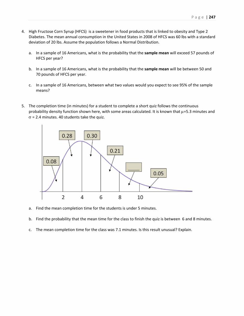
P a g e | 247
4. High Fructose Corn Syrup (HFCS) is a sweetener in food products that is linked to obesity and Type 2 Diabetes. The mean annual consumption in the United States in 2008 of HFCS was 60 lbs with a standard deviation of 20 lbs. Assume the population follows a Normal Distribution. a. In a sample of 16 Americans, what is the probability that the sample mean will exceed 57 pounds of
HFCS per year?
b. In a sample of 16 Americans, what is the probability that the sample mean will be between 50 and 70 pounds of HFCS per year.
c. In a sample of 16 Americans, between what two values would you expect to see 95% of the sample means?
5. The completion time (in minutes) for a student to complete a short quiz follows the continuous
probability density function shown here, with some areas calculated. It is known that =5.3 minutes and
= 2.4 minutes. 40 students take the quiz.
a. Find the mean completion time for the students is under 5 minutes.
b. Find the probability that the mean time for the class to finish the quiz is between 6 and 8 minutes.
c. The mean completion time for the class was 7.1 minutes. Is this result unusual? Explain.
P a g e | 248
6. A pollster sampled 100 adults in California and asked a series of questions. The Central Limit Theorem for Proportions requires that np > 10 and n(1‐p) > 10. Determine if these conditions are met for the following statements. a. 61% of Californians live in Southern California.
b. 92% of Californians support Deferred Action for Childhood Arrivals (DACA).
c. 24% of Californians have visited Yosemite National Park.
d. 8% of Californians have a felony conviction.
7. The cycle times for a truck hauling concrete to a highway construction site are uniformly distributed
over the interval 50 to 70 minutes. For the Uniform Distribution 2
a b and
2
12
b a
, in
which a is the minimum value and b is the maximum value. a. Find the mean and standard deviation for cycle times.
b. There have been 46 times that concrete has been hauled to the construction site. Find the
probability that the mean cycle time for these 46 samples exceeds 58 minutes.
9. Nuclear power plants experience serious accidents once every 8 years. Let X = the waiting time until the
next serious accident. X follows an Exponential Distribution in which = the expected waiting time and
.
a. What is the mean and standard deviation of the random variable X?
b. For 35 accidents at nuclear power plants, the mean waiting time was 6.1 years. Is this value
unusually low? To answer, find the probability that the mean waiting time is 6.1 years or less.
P a g e | 249
Chapter 8 Homework
1. The average number of years of post secondary education for employees within a certain industry is 1.5. A company claims that this average is higher for its employees. A random sample of 16 of its employees has an mean of 2.1 years of post secondary education with a standard deviation of 0.6 years.
a. Find a 95% confidence interval for the mean number of years of post secondary education for the company’s employees. How does this compare with the industry value?
b. Find a 95% confidence interval for the standard deviation of number years of post secondary education for the company’s employees.
2. When polling companies report a margin of error, they are referring to a 95% confidence interval. Go to the website www.pollingreport.com and verify the stated margins of error for 2 polls.
3. In a random sample of five microwave ovens, the mean repair cost was $75.00, and the sample standard
deviation was $12.50. Construct and interpret a 95% confidence interval for the mean.
standard deviation
4. In a random sample of seven computers, the mean repair cost was $100.00 and the was $42.50.
Construct and interpret a 99% confidence interval for the mean.,
5. You did some research on repair costs of microwave ovens and found that the population standard
deviation is = $15. Repeat Exercise 3, using a normal distribution with the appropriate calculations for
a standard deviation that is known. Compare the results.
6. A soccer ball manufacturer wants to estimate the mean circumference of soccer balls within 0.15 inch.
Assume that the population of circumferences is normally distributed.
a. Determine the minimum sample size required to construct a 99% confidence interval for the population mean. Assume the population standard deviation is 0.20 inch.
b. Repeat part (a) using a standard deviation of 0.10 inch. Which standard deviation requires a larger sample size? Explain.
c. Repeat part (a) using a confidence level of 95%. Which level of confidence requires a larger sample size? Explain.
P a g e | 250
7. If all other quantities remain the same, how does the indicated change affect the minimum sample size
requirement (Increase, Decrease or No Change)?
a. Increase in the level of confidence
b. Increase in the error tolerance
c. Increase in the standard deviation
8. In a survey of 3,224 U.S. adults, 1515 said flying is the most stressful form of travel. Construct a 95%
confidence interval for the proportion of all adults who say that flying is the most stressful form of
travel.
9. A study of 2,008 traffic fatalities found that 800 of the fatalities were alcohol related. Find a 99%
confidence interval for the population proportion, and explain what it means.
10. In a survey of 1,003 U.S. adults, 662 would be happy spending the rest of their career with their current
employer. Construct a 90% confidence interval for the proportion that would be happy staying with
their current employer. Does this result surprise you?
11. You wish to estimate, with 95% confidence and within 3.5% of the true population, the proportion of
computers that need repairs or have problems by the time the product is three years old.
a. No preliminary estimate is available. Find the minimum sample size needed.
b. Find the minimum sample size needed, using a prior study that found that 19% of computers needed repairs or had problems by the time the product was three years old.
c. Compare the results from parts (a) and (b).
12. A lawn mower manufacturer is trying to determine the standard deviation of the life of one of its lawn mower models. To do this, it randomly selects 12 lawn mowers that were sold several years ago and finds that the sample standard deviation is 3.25 years. Use a 99% level of confidence to find a confidence interval for standard deviation.
13. The monthly incomes of 20 randomly selected individuals who have recently graduated with a bachelor's degree in social science have a sample standard deviation of $107. Use a 95% level of confidence to find a confidence interval for standard deviation.
P a g e | 251
Chapter 9 Homework
(Exercises 1‐6) Determine whether the statement is true of false. If it is false, rewrite it as a true
statement.
1. In a hypothesis test, you assume that the alternative hypothesis is true.
2. A statistical hypothesis is a statement about a sample.
3. If you decide to reject the null hypothesis, you can support the alternative hypothesis.
4. The level of significance is the maximum probability that you allow for rejecting a null hypothesis when
it is actually true.
5. A large p‐value in a test will favor a rejection of the null hypothesis.
6. If you want to support a claim, write it as your null hypothesis.
(Exercises 7‐12) Think about the context of the claim. Determine whether you want to support or reject
the claim.
a. State the null and alternative hypotheses in words.
b. Write the null and alternative hypotheses in appropriate symbols
c. Describe in words Type I error (the consequence of rejecting a true null hypothesis).
d. Describe in words Type II error (the consequence of failing to reject a false null hypothesis).
7. You represent a chemical company that is being sued for paint damage to automobiles. You want to support the claim that the mean repair cost per automobile is not $650. How would you write the null and alternative hypotheses?
8. You are on a research team that is investigating the mean temperature of adult humans. The commonly accepted claim is that the mean temperature is about 98.6°F. You want to show that this claim is false. How would you write the null and alternative hypotheses?
9. A light bulb manufacturer claims that the mean life of a certain type of light bulb is at least 750 hours. You are skeptical of this claim and want to refute it.
10. As stated by a company's shipping department, the number of shipping errors per million shipments has a standard deviation that is less than 3. Can you support this claim?
11. A research organization reports that 33% of the residents in Ann Arbor, Michigan are college students. You want to reject this claim.
12. The results of a recent study show that the proportion of people in the western United States who use seat belts when riding in a car or truck is under 84%. You want to support this claim.

P a g e | 252
13. In your work for a national health organization, you are asked to monitor the amount of sodium in a certain brand of cereal. You find that a random sample of 82 cereal servings has a mean sodium content
of 232 milligrams. The population standard deviation is known to be 10 milligrams. At = 0.01, can you conclude that the mean sodium content per serving of cereal is over 230 milligrams?
(a) (DESIGN) State your Hypothesis
(d) (DESIGN) Determine decision rule
(p‐value method)
(e) (DATA) Conduct the test and circle your
decision
Reject Ho Fail to Reject Ho
(f) (CONCLUSION) State your overall conclusion
in language that is clear, relates to the original
problem and is consistent with your decision.
(b) (DESIGN) State Significance Level of the test and
explain what it means,
(c) (DESIGN) Determine the statistical model (test
statistic)

P a g e | 253
14. A tourist agency in Florida claims that the mean daily cost of meals and lodging for a family of four traveling in Florida is $284. You work for a consumer advocate and want to test this claim. In a random sample of 50 families of four traveling in Florida, the mean daily cost of meals and lodging is $292 and
the standard deviation is $25. At = 0.05, do you have enough evidence to reject the agency's claim?
(a) (DESIGN) State your Hypothesis
(d) (DESIGN) Determine decision rule
(critical value method)
(e) (DATA) Conduct the test and circle your
decision
Reject Ho Fail to Reject Ho
(f) (CONCLUSION) State your overall conclusion
in language that is clear, relates to the original
problem and is consistent with your decision.
(b) (DESIGN) State Significance Level of the test
and explain what it means.
(c) (DESIGN) Determine the statistical model (test
statistic)
P a g e | 254
15. An environmentalist estimates that the mean waste recycled by adults in the United States is more than 1 pound per person per day. You want to test this claim. You find that the mean waste recycled per person per day for a random sample of 12 adults in the United States is 1.2 pounds and the standard
deviation is 0.3 pound. At = 0.05, can you support the claim?
(a) (DESIGN) State your Hypothesis
(d) (DESIGN) Determine decision rule
(critical value method)
(e) (DATA) Conduct the test and circle your
decision
Reject Ho Fail to Reject Ho
(f) (CONCLUSION) State your overall conclusion
in language that is clear, relates to the original
problem and is consistent with your decision.
(b) (DESIGN) State Significance Level of the test
and explain what it means.
(c) (DESIGN) Determine the statistical model
(test statistic)

P a g e | 255
16. A government association claims that 44% of adults in the United States do volunteer work. You work for a volunteer organization and are asked to test this claim. You find that in a random sample of 1165
adults, 556 do volunteer work. At = 0.05, do you have enough evidence to reject the association's claim?
(a) (DESIGN) State your Hypothesis
(d) (DESIGN) Determine decision rule
(p‐value method)
(e) (DATA) Conduct the test and circle your
decision
Reject Ho Fail to Reject Ho
(f) (CONCLUSION) State your overall conclusion
in language that is clear, relates to the original
problem and is consistent with your decision.
(b) (DESIGN) State Significance Level of the test
and explain what it means,
(c) (DESIGN) Determine the statistical model
(test statistic)
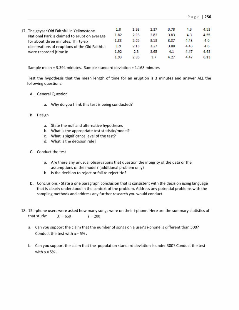
P a g e | 256
17. The geyser Old Faithful in Yellowstone National Park is claimed to erupt on average for about three minutes. Thirty‐six observations of eruptions of the Old Faithful were recorded (time in
Sample mean = 3.394 minutes. Sample standard deviation = 1.168 minutes
Test the hypothesis that the mean length of time for an eruption is 3 minutes and answer ALL the following questions:
A. General Question
a. Why do you think this test is being conducted?
B. Design
a. State the null and alternative hypotheses b. What is the appropriate test statistic/model? c. What is significance level of the test? d. What is the decision rule?
C. Conduct the test
a. Are there any unusual observations that question the integrity of the data or the
assumptions of the model? (additional problem only) b. Is the decision to reject or fail to reject Ho?
D. Conclusions ‐ State a one paragraph conclusion that is consistent with the decision using language
that is clearly understood in the context of the problem. Address any potential problems with the sampling methods and address any further research you would conduct.
18. 15 i‐phone users were asked how many songs were on their i‐phone. Here are the summary statistics of that study: 200650 sX a. Can you support the claim that the number of songs on a user’s i‐phone is different than 500?
Conduct the test with = 5% .
b. Can you support the claim that the population standard deviation is under 300? Conduct the test
with = 5% .
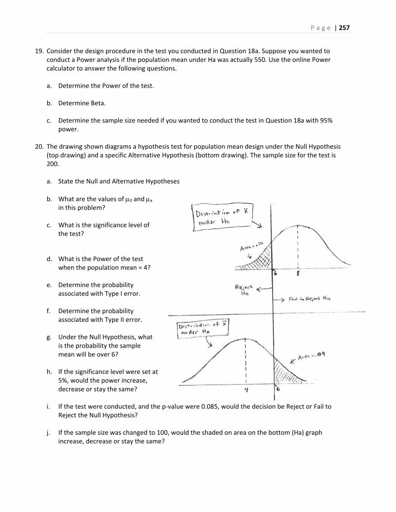
P a g e | 257
19. Consider the design procedure in the test you conducted in Question 18a. Suppose you wanted to conduct a Power analysis if the population mean under Ha was actually 550. Use the online Power calculator to answer the following questions. a. Determine the Power of the test.
b. Determine Beta.
c. Determine the sample size needed if you wanted to conduct the test in Question 18a with 95%
power.
20. The drawing shown diagrams a hypothesis test for population mean design under the Null Hypothesis (top drawing) and a specific Alternative Hypothesis (bottom drawing). The sample size for the test is 200. a. State the Null and Alternative Hypotheses
b. What are the values of 0 and a in this problem?
c. What is the significance level of the test?
d. What is the Power of the test when the population mean = 4?
e. Determine the probability associated with Type I error.
f. Determine the probability associated with Type II error.
g. Under the Null Hypothesis, what is the probability the sample mean will be over 6?
h. If the significance level were set at 5%, would the power increase, decrease or stay the same?
i. If the test were conducted, and the p‐value were 0.085, would the decision be Reject or Fail to Reject the Null Hypothesis?
j. If the sample size was changed to 100, would the shaded on area on the bottom (Ha) graph increase, decrease or stay the same?
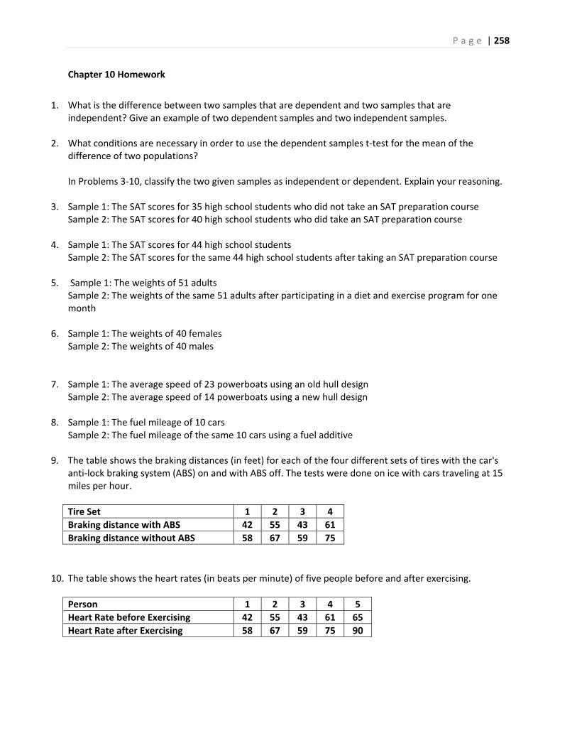
P a g e | 258
Chapter 10 Homework
1. What is the difference between two samples that are dependent and two samples that are
independent? Give an example of two dependent samples and two independent samples.
2. What conditions are necessary in order to use the dependent samples t‐test for the mean of the difference of two populations? In Problems 3‐10, classify the two given samples as independent or dependent. Explain your reasoning.
3. Sample 1: The SAT scores for 35 high school students who did not take an SAT preparation course Sample 2: The SAT scores for 40 high school students who did take an SAT preparation course
4. Sample 1: The SAT scores for 44 high school students Sample 2: The SAT scores for the same 44 high school students after taking an SAT preparation course
5. Sample 1: The weights of 51 adults Sample 2: The weights of the same 51 adults after participating in a diet and exercise program for one month
6. Sample 1: The weights of 40 females Sample 2: The weights of 40 males
7. Sample 1: The average speed of 23 powerboats using an old hull design Sample 2: The average speed of 14 powerboats using a new hull design
8. Sample 1: The fuel mileage of 10 cars Sample 2: The fuel mileage of the same 10 cars using a fuel additive
9. The table shows the braking distances (in feet) for each of the four different sets of tires with the car's anti‐lock braking system (ABS) on and with ABS off. The tests were done on ice with cars traveling at 15 miles per hour.
Tire Set 1 2 3 4
Braking distance with ABS 42 55 43 61
Braking distance without ABS 58 67 59 75
10. The table shows the heart rates (in beats per minute) of five people before and after exercising.
Person 1 2 3 4 5
Heart Rate before Exercising 42 55 43 61 65
Heart Rate after Exercising 58 67 59 75 90
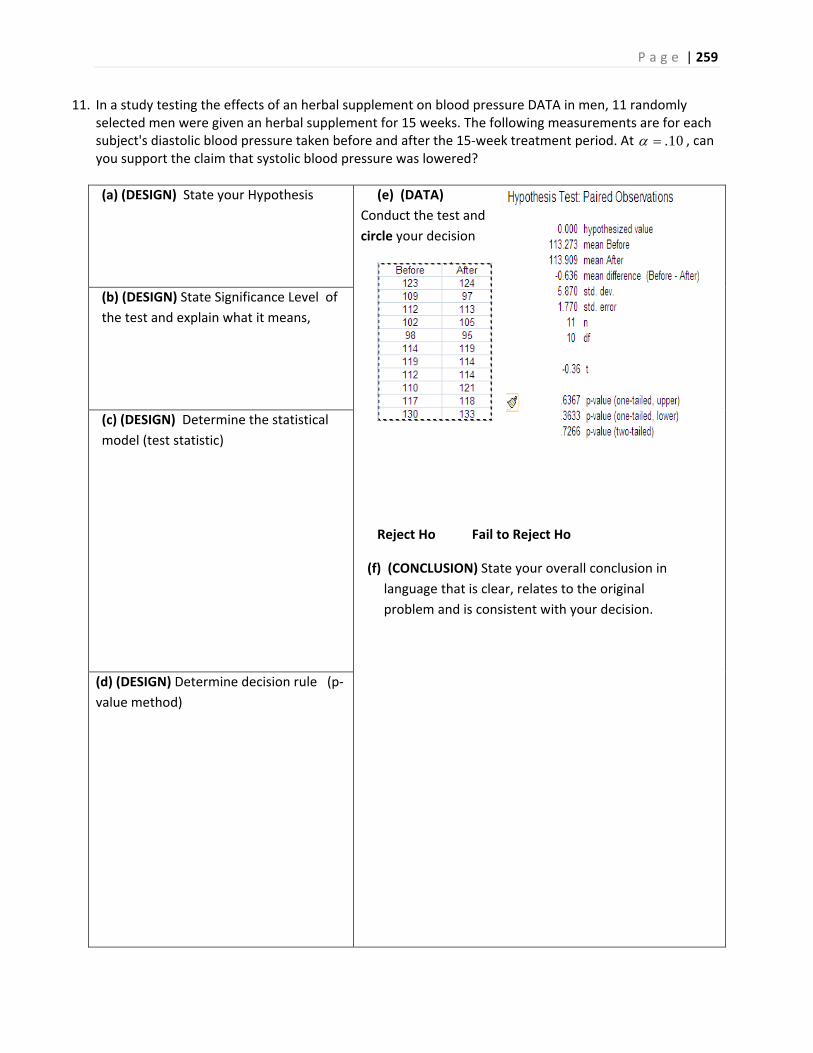
P a g e | 259
11. In a study testing the effects of an herbal supplement on blood pressure DATA in men, 11 randomly selected men were given an herbal supplement for 15 weeks. The following measurements are for each subject's diastolic blood pressure taken before and after the 15‐week treatment period. At .10 , can you support the claim that systolic blood pressure was lowered?
(a) (DESIGN) State your Hypothesis
(e) (DATA)
Conduct the test and
circle your decision
Reject Ho Fail to Reject Ho
(f) (CONCLUSION) State your overall conclusion in
language that is clear, relates to the original
problem and is consistent with your decision.
(b) (DESIGN) State Significance Level of
the test and explain what it means,
(c) (DESIGN) Determine the statistical
model (test statistic)
(d) (DESIGN) Determine decision rule (p‐
value method)

P a g e | 260
12. A random sample of 25 waiting times (in minutes) before patients saw a medical professional in a hospital's minor emergency department had a standard deviation of 0.7 minute. After a new admissions procedure was implemented, a random sample of 21 waiting times had a standard deviation of 0.5 minute. At .10 , can you support the hospital's claim that the standard deviation of the waiting times has decreased?
(a) (DESIGN) State your Hypothesis
(d) (DESIGN) Determine decision rule
(critical value method)
(e) (DATA) Conduct the test and circle your
decision
Reject Ho Fail to Reject Ho
(f) (CONCLUSION) State your overall conclusion
in
language that is clear, relates to the original
problem and is consistent with your decision.
(b) (DESIGN) State Significance Level of the test
and explain what it means.
(c) (DESIGN) Determine the statistical model (test
statistic)
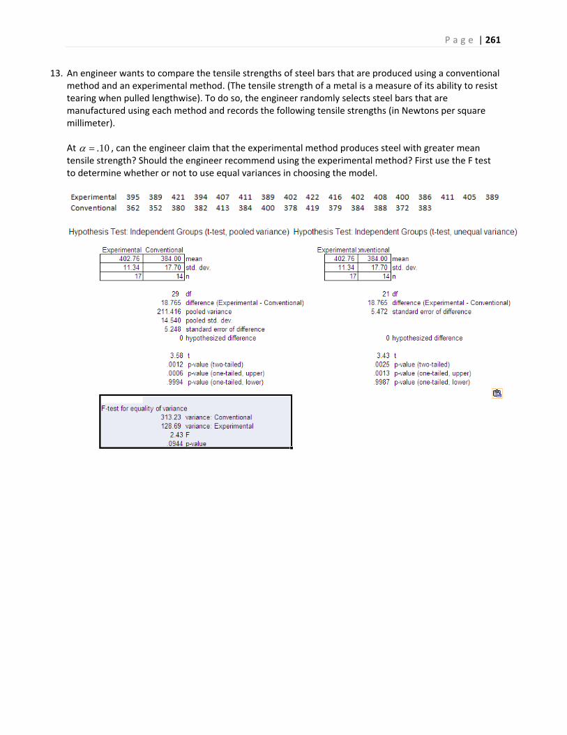
P a g e | 261
13. An engineer wants to compare the tensile strengths of steel bars that are produced using a conventional method and an experimental method. (The tensile strength of a metal is a measure of its ability to resist tearing when pulled lengthwise). To do so, the engineer randomly selects steel bars that are manufactured using each method and records the following tensile strengths (in Newtons per square millimeter). At .10 , can the engineer claim that the experimental method produces steel with greater mean tensile strength? Should the engineer recommend using the experimental method? First use the F test to determine whether or not to use equal variances in choosing the model.
P a g e | 262
Problem 13 – continued
(a) (DESIGN) State your Hypothesis
(d) (DESIGN) Determine decision rule
(p‐value method)
(e) (DATA) Conduct the test and circle your
decision
Reject Ho Fail to Reject Ho
(f) (CONCLUSION) State your overall conclusion
in
language that is clear, relates to the original
problem and is consistent with your decision.
(b) (DESIGN) State Significance Level of the test
and explain what it means,
(c) (DESIGN) Determine the statistical model (test
statistic)
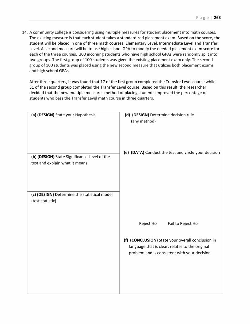
P a g e | 263
14. A community college is considering using multiple measures for student placement into math courses. The existing measure is that each student takes a standardized placement exam. Based on the score, the student will be placed in one of three math courses: Elementary Level, Intermediate Level and Transfer Level. A second measure will be to use high school GPA to modify the needed placement exam score for each of the three courses. 200 incoming students who have high school GPAs were randomly split into two groups. The first group of 100 students was given the existing placement exam only. The second group of 100 students was placed using the new second measure that utilizes both placement exams and high school GPAs. After three quarters, it was found that 17 of the first group completed the Transfer Level course while 31 of the second group completed the Transfer Level course. Based on this result, the researcher decided that the new multiple measures method of placing students improved the percentage of students who pass the Transfer Level math course in three quarters.
(a) (DESIGN) State your Hypothesis
(d) (DESIGN) Determine decision rule
(any method)
(e) (DATA) Conduct the test and circle your decision
Reject Ho Fail to Reject Ho
(f) (CONCLUSION) State your overall conclusion in
language that is clear, relates to the original
problem and is consistent with your decision.
(b) (DESIGN) State Significance Level of the
test and explain what it means.
(c) (DESIGN) Determine the statistical model
(test statistic)
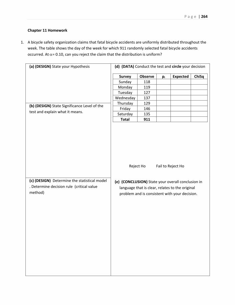
P a g e | 264
Chapter 11 Homework
1. A bicycle safety organization claims that fatal bicycle accidents are uniformly distributed throughout the
week. The table shows the day of the week for which 911 randomly selected fatal bicycle accidents
occurred. At = 0.10, can you reject the claim that the distribution is uniform?
(a) (DESIGN) State your Hypothesis
(d) (DATA) Conduct the test and circle your decision
Survey Observe pi Expected ChiSq
Sunday 118
Monday 119
Tuesday 127
Wednesday 137
Thursday 129
Friday 146
Saturday 135
Total 911
Reject Ho Fail to Reject Ho
(e) (CONCLUSION) State your overall conclusion in
language that is clear, relates to the original
problem and is consistent with your decision.
(b) (DESIGN) State Significance Level of the
test and explain what it means.
(c) (DESIGN) Determine the statistical model
. Determine decision rule (critical value
method)
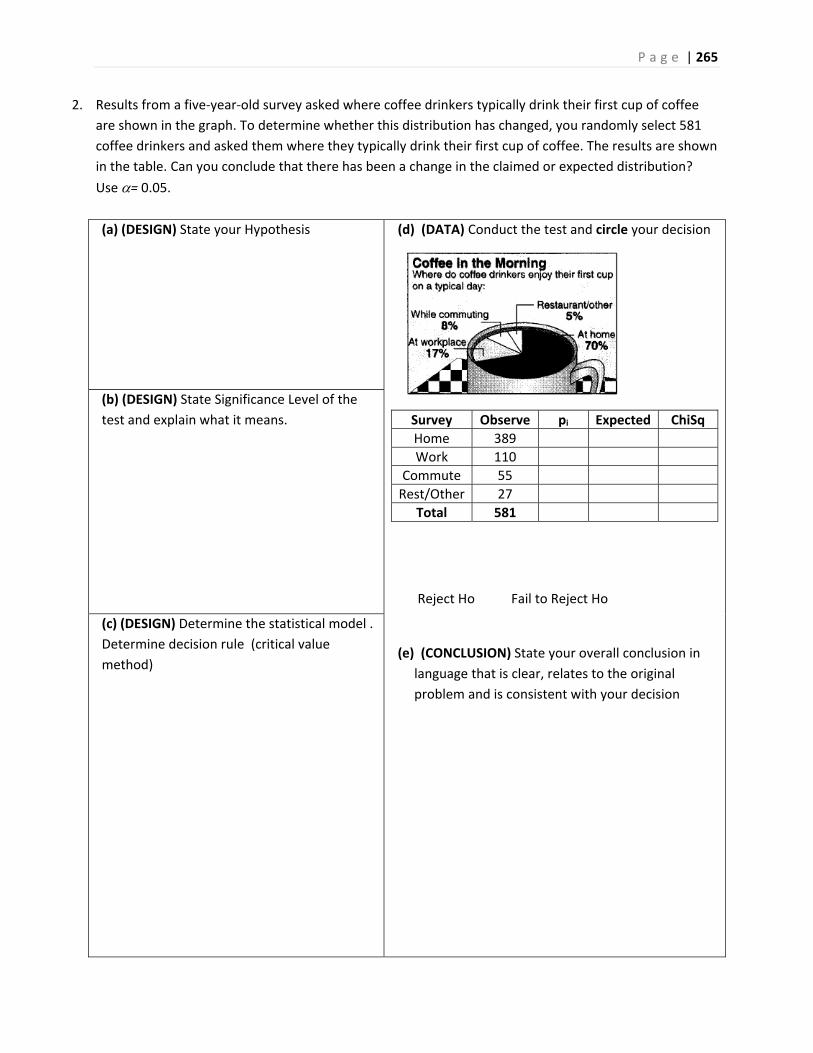
P a g e | 265
2. Results from a five‐year‐old survey asked where coffee drinkers typically drink their first cup of coffee
are shown in the graph. To determine whether this distribution has changed, you randomly select 581
coffee drinkers and asked them where they typically drink their first cup of coffee. The results are shown
in the table. Can you conclude that there has been a change in the claimed or expected distribution?
Use = 0.05.
(a) (DESIGN) State your Hypothesis
(d) (DATA) Conduct the test and circle your decision
Survey Observe pi Expected ChiSq
Home 389
Work 110
Commute 55
Rest/Other 27
Total 581
Reject Ho Fail to Reject Ho
(e) (CONCLUSION) State your overall conclusion in
language that is clear, relates to the original
problem and is consistent with your decision
(b) (DESIGN) State Significance Level of the
test and explain what it means.
(c) (DESIGN) Determine the statistical model .
Determine decision rule (critical value
method)
P a g e | 266
3. In a SurveyUSA poll, 500 Americans adults were asked if marijuana should be legalized. The results of
the poll were cross tabulated as shown in the contingency tables below. Conduct a hypothesis test for
independence to determine if opinion about legalization of marijuana is dependent on age.
4. In a SurveyUSA poll, 500 Americans adults were asked if marijuana should be legalized. The results of
the poll were cross tabulated as shown in the contingency tables below. Conduct a hypothesis test for
independence to determine if opinion about legalization of marijuana is dependent on gender.
5. 1000 American adults were recently polled on their opinion about effect of recent stimulus bill and the economy. The results are shown in the following contingency table, broken down by gender:
Stimulus will
hurt economy
Stimulus will
help the
economy
Stimulus will
have no effect
TOTAL
Male 150 150 200 500
Female 100 200 200 500
TOTAL 250 350 400 1000
Are gender and opinion on the stimulus dependent variables? Test using =1%.
Male Female
Should be Legal 123 90
Should Not be Legal 127 160
18‐34 35‐54 55+
Should be Legal 95 83 48
Should Not be Legal 65 126 83
P a g e | 267
For the studies in questions 6 to 8, answer the following questions. (You will not have to actually
conduct tests).
a. State the Null and Alternative Hypotheses in words
b. State the Null and Alternative Hypotheses in population parameters
c. Choose the appropriate model from among these three:
i. One population test of proportion
ii. Chi‐square goodness of fit
iii. Chi‐square test of independence
6. Starting in 2018, the California State University System (CSU) changed their prerequisite requirements
for a Statistics course needed for community college students to transfer. The original provision was
that students needed to take Intermediate Algebra before Statistics. The new requirement is that
students can take Intermediate Algebra or an alternative path to Statistics course as a prerequisite for
Statistics.
There is some concern that students who choose the alternative path may be less successful after
transferring to CSU. A study is proposed to determine the graduation rates in 3 years for transfer
students who passed Intermediate Algebra and those who passed the alternative course. Data will be
collected and cross‐tabulated into two questions: "What path did the student choose?" and "Did the
student graduate within 3 years of transfer?"
7. The Achilles tendon connects the calf muscle to the heel bone. Of the patients who rupture (tear) the
Achilles tendon and have it surgically repaired, 11% will re‐rupture the Achilles tendon within three
years of treatment. A proposed non‐surgical method of treatment would treat the rupture with a series
of casts, ultrasound and passive motion. The researcher wanted to show that the percentage of patients
who choose the non‐surgical method of treatment had a reduced percentage of re‐ruptures.
8. A sport's shoe company has designed a women's running shoe and is considering producing the shoe in
4 different colors: pink, blue, teal and gray. The company wants to know if there is a preference among
women for a specific color of the shoe. 154 women who are runners will participate in the study.
P a g e | 268
Chapter 12 Homework
1. A clinical psychologist completed a study on hyperactivity in children using one‐way ANOVA. The model
was balanced with 5 replicates per treatment. The factor was 3 types of school district (urban, rural and
suburban). Unfortunately, hackers broke into the psychologist’s computer and wiped out all the data. All
that remained was a fragment of the ANOVA table:
Source of Variation
Sum of Squares
Degrees of Freedom
Mean Square
F statistic Critical Value of F for α= .05
Decision
Factor 7000
Error
Total 9000
Fill in the table and conduct the hypothesis test that compares mean level of hyperactivity in the 3 types
of districts. Explain your results.
2. A sociologist was interested in the commute time for workers in the Bay Area. She categorized
commuters by 4 regions (North Bay, South Bay, East Bay and Peninsula) and designed a balanced model
with 8 replicates per region. Data is round trip commute time in minutes . The results and ANOVA
output are shown on the next page:
a. Test the Null Hypothesis that all regions have the same mean commute time at a significance level of 5%. State your decision in non‐statistical language.
b. Conduct all pairwise comparisons at an overall significance level of 5%.
c. One of the underlying assumptions of One Factor ANOVA is that all groups variances are equal. Review the data and decide whether you think this assumption may be being violated.
d. Explain the results of this experiment as if you were addressing a transportation committee. What
would you recommend?
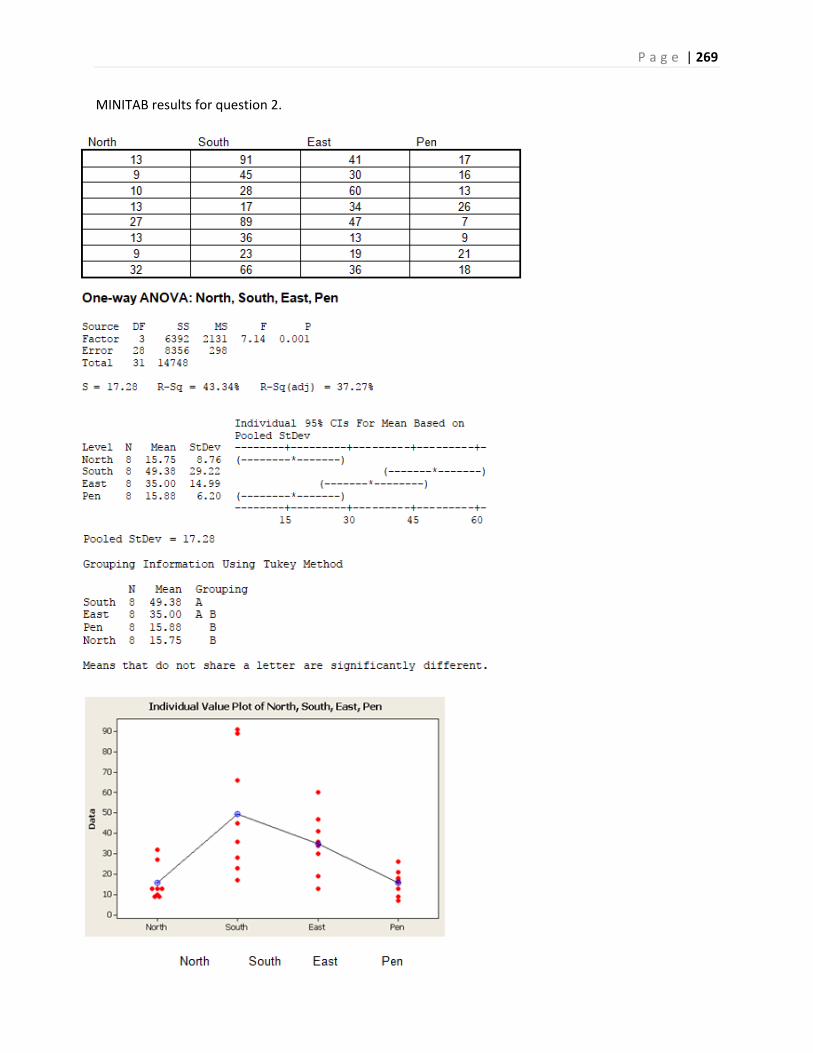
P a g e | 269
MINITAB results for question 2.
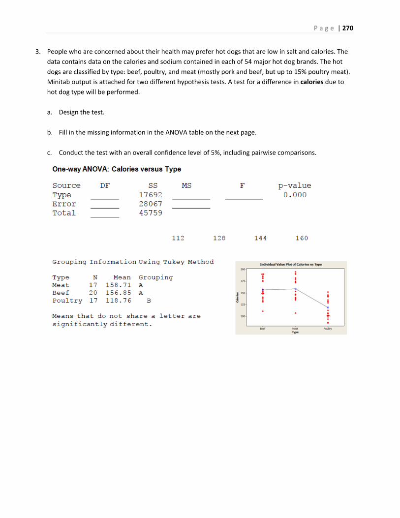
P a g e | 270
3. People who are concerned about their health may prefer hot dogs that are low in salt and calories. The
data contains data on the calories and sodium contained in each of 54 major hot dog brands. The hot
dogs are classified by type: beef, poultry, and meat (mostly pork and beef, but up to 15% poultry meat).
Minitab output is attached for two different hypothesis tests. A test for a difference in calories due to
hot dog type will be performed.
a. Design the test.
b. Fill in the missing information in the ANOVA table on the next page.
c. Conduct the test with an overall confidence level of 5%, including pairwise comparisons.
P a g e | 271
(Questions 4‐8) Does mindfulness reduce anxiety for students who are taking Mathematics courses?
Several designs for studies are show. For each design, answer the following:
a. State the Null and Alternative Hypotheses in words
b. State the Null and Alternative Hypotheses in population parameters
c. Choose the appropriate model from among these five:
i. One population test of proportion
ii. Matched pairs t‐test
iii. Independent Samples (Pooled Variance or Unequal Variance) t‐test
iv. Chi‐square test of independence
v. One factor ANOVA
4. The anxiety level of 117 Math students will be measured. After one month of mindfulness within the
course, the anxiety level of these students will be measured again.
5. Do most students (more than 50%) want to see mindfulness taught in a math course? 324 math
students will be asked if they would like to see a 20 minute weekly mindfulness unit in the class.
6. 400 students will participate in a study where they will be classified into 3 categories: low math anxiety,
moderate math anxiety and high math anxiety. They will then be asked if they would like to add a 20
minute per week mindfulness unit in the math class to determine if the level of anxiety and opinion
about mindfulness in the class are dependent events.
7. An instructor with two sections of the same course will offer 20 minutes of mindfulness per week in one
class. The other class will be taught without the 20 minutes of mindfulness. After the course is
completed, the students in both sections will have their anxiety level measured. A test will be run to see
if the mean anxiety score is lower for the class with mindfulness.
8. An instructor with three sections of the same course will offer 20 minutes of mindfulness per week in
the first class. The second class will have 10 minutes of mindfulness per week. The third class will be
taught without mindfulness. After the course is completed, the students in all three sections will have
their anxiety levels measured. A test will be run to see if there is a difference mean anxiety score due to
the section the students were in.

P a g e | 272
Chapter 13 Homework
1. A real estate agent uses a simple regression model to estimate the value of a home based on square size
in which Y is the value of the home in dollars and X is the size in total square feet. The regression
equation is ˆ 253000 438Y X .
a. Interpret the slope using the units of the problem.
b. Estimate the value of a home with 1347 square feet.
c. Will the correlation coefficient be positive or negative in this problem. Explain.
2. A car dealer uses a simple regression model to estimate the value of a used 2013 Toyota Prius basing the
value on the car’s mileage. Y is the value of the car in dollars and X is the total miles on the odometer.
The regression equation is ˆ 28000 0.048Y X .
a. Interpret the slope by using the units of the problem.
b. Estimate the value of a car with an odometer reading of 143,282 miles.
c. Why would this model not work for a Prius that was driven 600,000 miles?
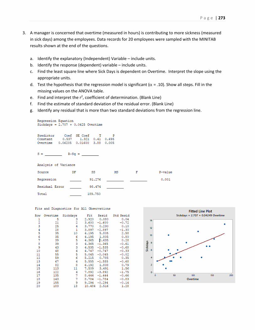
P a g e | 273
3. A manager is concerned that overtime (measured in hours) is contributing to more sickness (measured
in sick days) among the employees. Data records for 20 employees were sampled with the MINITAB
results shown at the end of the questions.
a. Identify the explanatory (Independent) Variable – include units.
b. Identify the response (dependent) variable – include units.
c. Find the least square line where Sick Days is dependent on Overtime. Interpret the slope using the
appropriate units.
d. Test the hypothesis that the regression model is significant (= .10). Show all steps. Fill in the missing values on the ANOVA table.
e. Find and interpret the r2, coefficient of determination. (Blank Line)
f. Find the estimate of standard deviation of the residual error. (Blank Line)
g. Identify any residual that is more than two standard deviations from the regression line.
P a g e | 274
4. 16 student volunteers drank a randomly assigned number of cans of beer. Thirty minutes later a police
officer measured their blood alcohol content (BAC) in grams of alcohol per deciliter of blood. Data and
computer output attached on next page.
a. Find the least square line where BAC is dependent on Beers consumed. Interpret the slope.
b. Find and interpret the r‐squared statistic.
c. Test the hypothesis that the beers consumed and BAC are correlated ( = .05)
d. Find a 95% Confidence Interval for the mean BAC for a student who consumes 5 beers.
e. Would this model be appropriate for a student who consumed 20 beers? Explain.
f. Joe claims that he can still legally drive after consuming 5 beers: the legal BAC limit is 0.08. Find a
95% Prediction interval for Joe’s BAC. Do you think Joe can legally drive?
g. Residual Analysis
i. We would expect the residuals to be random: about half would be positive and half would be
negative. Check the actual residuals and compare the actual percentages to the expected
percentages.
ii. The assumption for regression is that the residuals have a Normal Distribution. This means
about 68% of the residuals would have a Z‐score between ‐1 and 1, 95% of the residuals would
have a Z‐score between ‐2 and 2 and all the residuals would have a Z‐score between ‐3 and 3.
The Column labeled “Standardized Residual” is the Z‐score for each residual. Check to see what
percentage of the data has Z‐scores in each of these three intervals, and compare the actual
percentages to the expected percentages (68%, 95%, 100%).
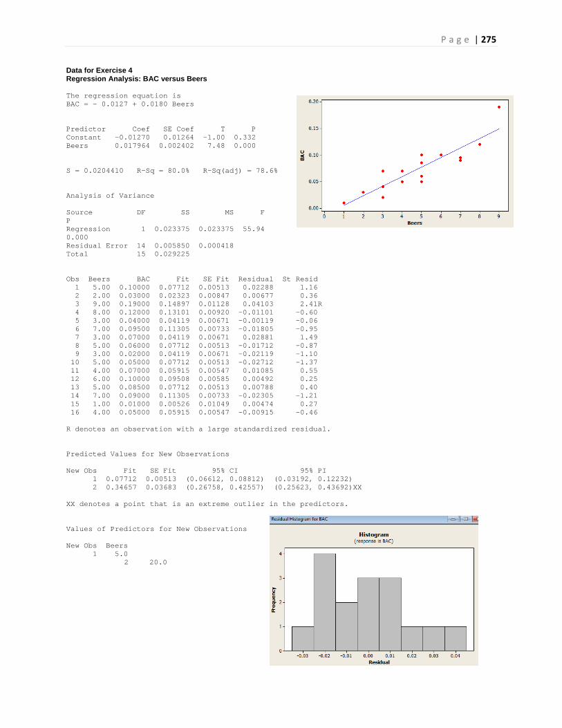
P a g e | 275
Data for Exercise 4 Regression Analysis: BAC versus Beers The regression equation is BAC = - 0.0127 + 0.0180 Beers Predictor Coef SE Coef T P Constant -0.01270 0.01264 -1.00 0.332 Beers 0.017964 0.002402 7.48 0.000 S = 0.0204410 R-Sq = 80.0% R-Sq(adj) = 78.6% Analysis of Variance Source DF SS MS F P Regression 1 0.023375 0.023375 55.94 0.000 Residual Error 14 0.005850 0.000418 Total 15 0.029225 Obs Beers BAC Fit SE Fit Residual St Resid 1 5.00 0.10000 0.07712 0.00513 0.02288 1.16 2 2.00 0.03000 0.02323 0.00847 0.00677 0.36 3 9.00 0.19000 0.14897 0.01128 0.04103 2.41R 4 8.00 0.12000 0.13101 0.00920 -0.01101 -0.60 5 3.00 0.04000 0.04119 0.00671 -0.00119 -0.06 6 7.00 0.09500 0.11305 0.00733 -0.01805 -0.95 7 3.00 0.07000 0.04119 0.00671 0.02881 1.49 8 5.00 0.06000 0.07712 0.00513 -0.01712 -0.87 9 3.00 0.02000 0.04119 0.00671 -0.02119 -1.10 10 5.00 0.05000 0.07712 0.00513 -0.02712 -1.37 11 4.00 0.07000 0.05915 0.00547 0.01085 0.55 12 6.00 0.10000 0.09508 0.00585 0.00492 0.25 13 5.00 0.08500 0.07712 0.00513 0.00788 0.40 14 7.00 0.09000 0.11305 0.00733 -0.02305 -1.21 15 1.00 0.01000 0.00526 0.01049 0.00474 0.27 16 4.00 0.05000 0.05915 0.00547 -0.00915 -0.46 R denotes an observation with a large standardized residual. Predicted Values for New Observations New Obs Fit SE Fit 95% CI 95% PI 1 0.07712 0.00513 (0.06612, 0.08812) (0.03192, 0.12232) 2 0.34657 0.03683 (0.26758, 0.42557) (0.25623, 0.43692)XX XX denotes a point that is an extreme outlier in the predictors. Values of Predictors for New Observations New Obs Beers 1 5.0
2 20.0
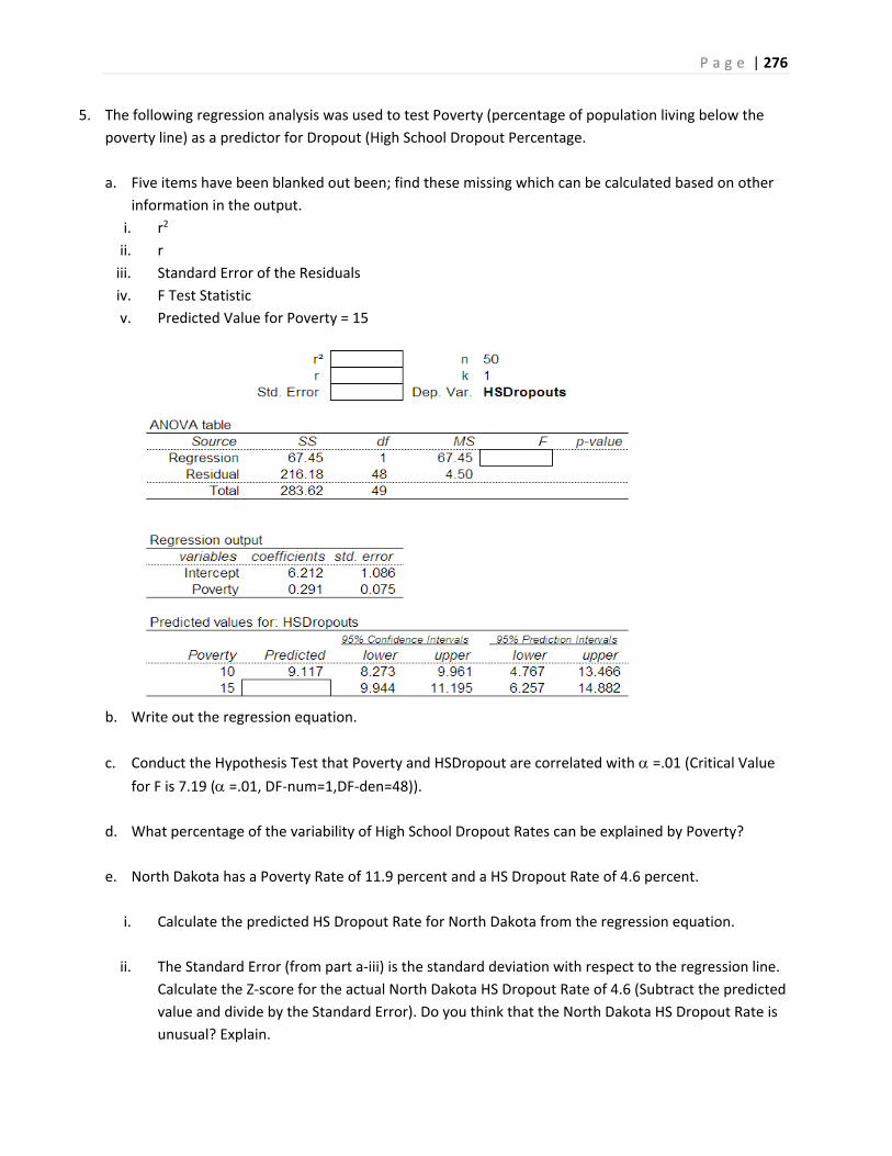
P a g e | 276
5. The following regression analysis was used to test Poverty (percentage of population living below the
poverty line) as a predictor for Dropout (High School Dropout Percentage.
a. Five items have been blanked out been; find these missing which can be calculated based on other
information in the output.
i. r2
ii. r
iii. Standard Error of the Residuals
iv. F Test Statistic
v. Predicted Value for Poverty = 15
b. Write out the regression equation.
c. Conduct the Hypothesis Test that Poverty and HSDropout are correlated with =.01 (Critical Value for F is 7.19 ( =.01, DF‐num=1,DF‐den=48)).
d. What percentage of the variability of High School Dropout Rates can be explained by Poverty?
e. North Dakota has a Poverty Rate of 11.9 percent and a HS Dropout Rate of 4.6 percent.
i. Calculate the predicted HS Dropout Rate for North Dakota from the regression equation.
ii. The Standard Error (from part a‐iii) is the standard deviation with respect to the regression line.
Calculate the Z‐score for the actual North Dakota HS Dropout Rate of 4.6 (Subtract the predicted
value and divide by the Standard Error). Do you think that the North Dakota HS Dropout Rate is
unusual? Explain.
P a g e | 277
For the studies in questions 6 to 8:
a. Indentify the explanatory variable.
b. Identify the response variable
c. Choose the appropriate model from among these three:
i. Chi‐square test of independence
ii. One factor ANOVA
iii. Simple Linear Regression
6. A golf course designer was studying types of grass to be used in a region that was susceptible to
droughts. The designer studied 5 types of grass: Bent Grass, Fescue, Rye Grass, Bermuda Grass and
Paspalum. Ten samples were taken of each grass and watered to keep the grass in prime condition
for a month. For each sample, the daily water usage was calculated in liters per square meter. The
designer wanted to know if there was a significant difference in mean water usage due to grass
type.
7. A school psychologist believes students who have more homework will sleep less. 200 students
participated in a study. For each of 14 consecutive days, students were asked to count how many
minutes they spent doing their homework and how many minutes they slept that night.
8. Does smoking change the way someone tastes salt? A researcher sampled 200 smokers and 200
non‐smokers. They were then given a bowl of soup and ask to classify the salt level into one of 3
categories: low salt, average salt and high salt. The researcher wanted to know if there was a
significant difference in the saltiness classification due to whether the participant was a smoker.
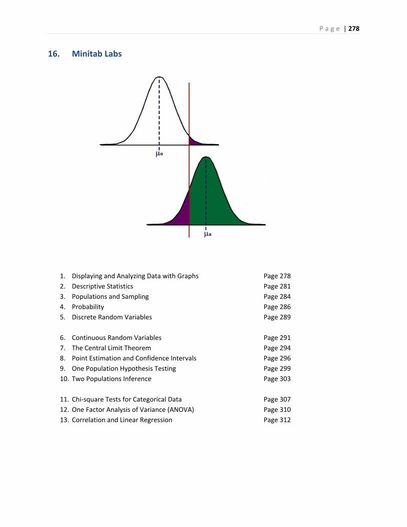
P a g e | 278
16. Minitab Labs
1. Displaying and Analyzing Data with Graphs Page 278
2. Descriptive Statistics Page 281
3. Populations and Sampling Page 284
4. Probability Page 286
5. Discrete Random Variables Page 289
6. Continuous Random Variables Page 291
7. The Central Limit Theorem Page 294
8. Point Estimation and Confidence Intervals Page 296
9. One Population Hypothesis Testing Page 299
10. Two Populations Inference Page 303
11. Chi‐square Tests for Categorical Data Page 307
12. One Factor Analysis of Variance (ANOVA) Page 310
13. Correlation and Linear Regression Page 312
P a g e | 279
Chapter 1 Lab – Creating Graphs from Data (Chapter 1 required)
Open MINITAB file lab01.mpj from the website. This data represents information 700 instructors from the popular website ratemyprofessors.com. All instructors are sampled from the Foothill‐De Anza Community College District. Here is a description of the data: College: Foothill or De Anza
Smiley: Positive Neutral Negative Photo: Instructor has a photo
Hot: Instructor has a chili pepper Gender: Male or Female Dept: Academic Department (example ‐ Mathematics) Division Academic Division (example ‐ PSME) Num Number of Ratings for that faculty member Overall Average Overall Quality Rating (1‐5 scale, lowest to highest) Easiness Average Easiness Rating (1‐5 scale, hardest to easiest)
We are going to use Minitab to make some dot plots for this data. Specifically we are going to look at Average Overall Quality Rating and try to make some comparisons of groups. First, let's ask some questions about this data.
1. Identify the quantitative variables.
2. Identify the categorical variables.
3. Is this an observational study or an experiment? Explain.
4. What is the population?
5. What is the sample?
6. Do you think this is a representative sample of all instructors at Foothill‐De Anza? Explain.
P a g e | 280
Chapter 1 Lab (continued) Now we are going to make some dot plots of the Average Overall Quality Rating. These can be found under the GRAPHS menu command in MINTAB
7. Make a dot plot of all instructors' Average Overall Quality Rating. (Simple Dot Plot). Paste the graph here and analyze the dot plot. (Describe the data's shape, center, spread and unusual features)
8. Make a dot plot of all instructors' Average Overall Quality Rating by gender. (With Groups Dot Plot). Paste the graph here. Do you see any difference in overall quality between males and females?
9. Make a dot plot of all instructors' Average Overall Quality Rating by college. (With Groups Dot Plot). Paste the graph here. Do you see any difference in overall quality between Foothill and De Anza instructors?
10. Make a dot plot of all instructors' Average Overall Quality Rating by hotness. (With Groups Dot Plot). Paste the graph here. Do you see any difference in overall quality between "Hot" and "Not Hot" instructors?
11. Write a paragraph summarizing your results. Do you see any problems or bias with this study?
P a g e | 281
Chapter 1 Lab (continued) To graph categorical data, you can use pie charts or bar charts, both of which can be found on the GRAPHS menu command in MINTAB
12. Make a pie chart of the categorical variable college and interpret the graph.
13. Make a simple bar chart of the categorical variable gender and interpret the graph.
14. Make a clustered bar chart of the variables college and gender. What does this graph mean?
15. Make a clustered bar chart of the variables hot and smiley. Compare the smiley rating by hotness rating.

P a g e | 282
Chapter 2 Lab – Descriptive Statistics (Chapter 1, 2 required)
Open MINITAB file lab02.mpj from the website. This data represents information 700 instructors from the popular website ratemyprofessors.com. All instructors are sampled from the Foothill‐De Anza Community College District. Here is a description of the data: College: Foothill or De Anza
Smiley: Positive Neutral Negative Photo: Instructor has a photo
Hot: Instructor has a chili pepper Gender: Male or Female Dept: Academic Department (example - Mathematics) Division Academic Division (example - PSME) Num Number of Ratings for that faculty member Overall Average Overall Quality Rating (1-5 scale, lowest to highest) Easiness Average Easiness Rating (1-5 scale, hardest to easiest) In Lab 1, we constructed some dot plots and made some interpretations of Average Overall Quality Rating. In Lab 2, we will look at other graphs and statistics that measure center, spread and relative standing.
1. Above is a dot plot you made of Average Overall Quality Rating in Lab 1. Make a histogram of the Average Overall Quality Rating. Paste the graph here. Are both graphs showing the same center, spread and shape? Explain your answer. Descriptive Statistics can be found in Minitab under STAT>BASIC STATISTICS.
2. Use this command to determine the sample mean and sample median for the Average Overall Quality Rating. Paste the results here and answer these questions: a. Which statistic is a better measure of center for this data? Explain your answer.
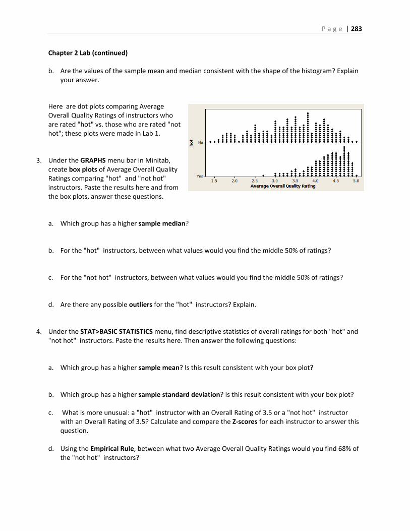
P a g e | 283
Chapter 2 Lab (continued)
b. Are the values of the sample mean and median consistent with the shape of the histogram? Explain your answer.
Here are dot plots comparing Average Overall Quality Ratings of instructors who are rated "hot" vs. those who are rated "not hot"; these plots were made in Lab 1.
3. Under the GRAPHS menu bar in Minitab, create box plots of Average Overall Quality Ratings comparing "hot" and "not hot" instructors. Paste the results here and from the box plots, answer these questions. a. Which group has a higher sample median? b. For the "hot" instructors, between what values would you find the middle 50% of ratings? c. For the "not hot" instructors, between what values would you find the middle 50% of ratings? d. Are there any possible outliers for the "hot" instructors? Explain.
4. Under the STAT>BASIC STATISTICS menu, find descriptive statistics of overall ratings for both "hot" and "not hot" instructors. Paste the results here. Then answer the following questions: a. Which group has a higher sample mean? Is this result consistent with your box plot? b. Which group has a higher sample standard deviation? Is this result consistent with your box plot?
c. What is more unusual: a "hot" instructor with an Overall Rating of 3.5 or a "not hot" instructor
with an Overall Rating of 3.5? Calculate and compare the Z‐scores for each instructor to answer this question.
d. Using the Empirical Rule, between what two Average Overall Quality Ratings would you find 68% of
the "not hot" instructors?

P a g e | 284
Chapter 2 Lab (continued)
5. Under the STAT>BASIC STATISTICS menu, find descriptive statistics of overall ratings split by college for both "Foothill" and "De Anza" instructors. Paste the results here. Then answer the following questions: a. Which group has a higher sample mean? Is this result consistent with your box plot? b. Which group has a higher sample standard deviation? Is this result consistent with your box plot? c. What is more unusual: a "Foothill" instructor with an Overall Rating of 2.3 or a "De Anza" instructor
with an Overall Rating of 2.3? Calculate and compare the Z‐scores for each instructor to answer this question.
d. Using the Empirical Rule, between what two Average Overall Quality Ratings would you find 68% of
the "De Anza" instructors?
6. To make a scatterplot: MINITAB>GRAPHS>SCATTERPLOT To find correlation coefficients: MINITAB> BASIC STATISTICS>CORRELATION a. Create a scatterplot in which the dependent variable is Overall and the independent variable is
Num. Paste the graph here. Describe the strength, direction and linearity of the correlation.
b. Determine the correlation coefficient of Overall and Num. Is the result consistent with part a? c. Create a scatterplot in which the dependent variable is Overall and the independent variable is
Easiness. Paste the graph here. Describe the strength, direction and linearity of the correlation. d. Determine the correlation coefficient of Overall and Easiness. Is the result consistent with part c?
Why are these two variables correlated? Give at least two possible explanations.

P a g e | 285
Chapter 3 Lab – Experimental Design
1. Design a survey. You are going to ask other students in the class four questions, 2 of which you will
create:
What is your gender (Male, Female, Other Answer)?
How many units are you currently taking?
Question 3 ________________________________________________________________________
Responses to Question 3 _____________________________________________________________
Question 4 ________________________________________________________________________
Responses to Question 4 _____________________________________________________________
2. Collect Data from Students in class ‐ ask as many students as possible the 4 questions. Put the
responses here.
1 2 3 4 5 6 7 8 9 10 11 12 13 14 15 16 17 18 19 20
Gender
Units
Question 3
Question 4
21 22 23 24 25 26 27 28 29 30 31 32 33 34 35 36 37 38 39 40
Gender
Units
Question 1
Question 2
3. Is this an observational study or an experiment? Explain?
4. What type of sampling method did you use?

P a g e | 286
Chapter 3 Lab – Experimental Design (continued)
5. Now, enter the data in the Minitab worksheet lab03.mpj.
There will be 4 columns: Gender, Units, Question3, Question4.
6. Create a graph that shows the percentage of each gender in your sample.
7. Create a graph that shows the distribution of Units.
8. Create a graph that shows the distribution of Question 3.
9. Create a graph that shows the distribution of Question 4.
10. Create a graph that shows the distribution of Question 3 by Gender.
11. Create a graph that shows the distribution of Question 4 by Units.
Write a paragraph describing the graphs, pointing out anything you found of interest.
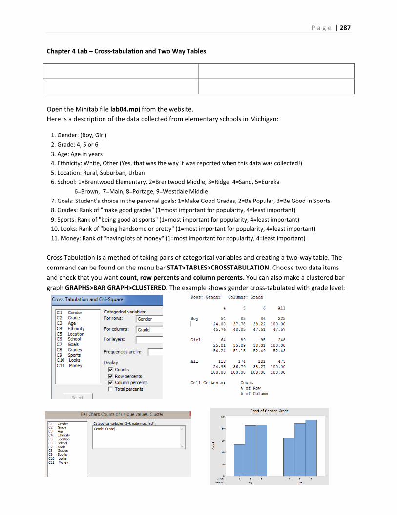
P a g e | 287
Chapter 4 Lab – Cross‐tabulation and Two Way Tables
Open the Minitab file lab04.mpj from the website.
Here is a description of the data collected from elementary schools in Michigan:
1. Gender: (Boy, Girl)
2. Grade: 4, 5 or 6
3. Age: Age in years
4. Ethnicity: White, Other (Yes, that was the way it was reported when this data was collected!)
5. Location: Rural, Suburban, Urban
6. School: 1=Brentwood Elementary, 2=Brentwood Middle, 3=Ridge, 4=Sand, 5=Eureka
6=Brown, 7=Main, 8=Portage, 9=Westdale Middle
7. Goals: Student's choice in the personal goals: 1=Make Good Grades, 2=Be Popular, 3=Be Good in Sports
8. Grades: Rank of "make good grades" (1=most important for popularity, 4=least important)
9. Sports: Rank of "being good at sports" (1=most important for popularity, 4=least important)
10. Looks: Rank of "being handsome or pretty" (1=most important for popularity, 4=least important)
11. Money: Rank of "having lots of money" (1=most important for popularity, 4=least important)
Cross Tabulation is a method of taking pairs of categorical variables and creating a two‐way table. The
command can be found on the menu bar STAT>TABLES>CROSSTABULATION. Choose two data items
and check that you want count, row percents and column percents. You can also make a clustered bar
graph GRAPHS>BAR GRAPH>CLUSTERED. The example shows gender cross‐tabulated with grade level:
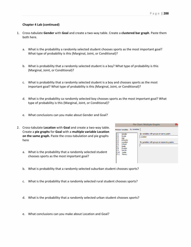
P a g e | 288
Chapter 4 Lab (continued)
1. Cross‐tabulate Gender with Goal and create a two‐way table. Create a clustered bar graph. Paste them both here.
a. What is the probability a randomly selected student chooses sports as the most important goal? What type of probability is this (Marginal, Joint, or Conditional)?
b. What is probability that a randomly selected student is a boy? What type of probability is this (Marginal, Joint, or Conditional)?
c. What is probability that a randomly selected student is a boy and chooses sports as the most important goal? What type of probability is this (Marginal, Joint, or Conditional)?
d. What is the probability ca randomly selected boy chooses sports as the most important goal? What type of probability is this (Marginal, Joint, or Conditional)?
e. What conclusions can you make about Gender and Goal?
2. Cross‐tabulate Location with Goal and create a two‐way table. Create a pie graphs for Goal with a multiple variable Location on the same graph. Paste the cross‐tabulation and pie graphs here
a. What is the probability that a randomly selected student chooses sports as the most important goal?
b. What is probability that a randomly selected suburban student chooses sports?
c. What is the probability that a randomly selected rural student chooses sports?
d. What is the probability that a randomly selected urban student chooses sports?
e. What conclusions can you make about Location and Goal?
P a g e | 289
Chapter 4 Lab (continued)
3. Cross‐tabulate any two variables of your choice and create a two‐way table. Create a clustered bar graph. Paste them both here.
a. Calculate and explain any marginal probability of your choice.
b. Calculate and explain any joint probability of your choice.
c. Calculate and explain any conditional probability of your choice.
d. What conclusions can you make about these two variables?
P a g e | 290
Chapter 5 Lab – Discrete Random Variables
Open the MINITAB file lab05.mpj from the website. Find Probabilities for a Binomial Random Variable (MINITAB>CALC>PROBABILITY DISTRIBUTIONS)
1. In a poll conducted in January 2015, 72% of American adults rated protecting freedom of speech ahead
of not offending others. Assume this is the true proportion. You sample 64 American adults. Let X be
the number in the sample who rated protecting freedom of speech ahead of not offending others.
a. Determine the probability that 44 American adults or fewer in the sample rated protecting freedom
of speech ahead of not offending others. (Cumulative Probability) Is this result unusual?
b. Determine the probability that 56 American adults or more in the sample rated protecting freedom
of speech ahead of not offending others. (Cumulative Probability plus Rule of Complement) Is this
result unusual?
c. Create a Probability Distribution Plot of this binomial distribution (Under Graph Menu in Minitab).
d. What is the mean, variance and standard deviation of X?
e. Use the Empirical (68, 95 99.7) Rule to determine between what two values would you expect to
find 95% of the values of the random variable X? Is the result consistent with the graph?

P a g e | 291
Chapter 5 Lab (continued) Find Probabilities for a Poisson Random Variable (MINITAB>CALC>PROBABILITY DISTRIBUTIONS)
2. Strong earthquakes (of RM 5 or greater) occur on a fault at a Poisson rate of 1.45 per year.
a. Determine the probability of exactly 2 strong earthquakes in the next year. (Probability)
b. Determine the probability of at least 1 strong earthquake in the next year. (Cumulative Probability plus Rule of Complement)
c. Determine the probability of at least 1 strong earthquake in the next 3 years. (Cumulative Probability plus Rule of Complement)
d. Create a Probability Distribution Plot of this binomial distribution (Under Graph Menu in Minitab).
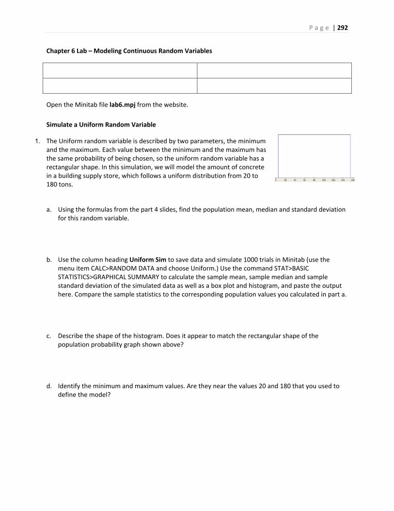
P a g e | 292
Chapter 6 Lab – Modeling Continuous Random Variables
Open the Minitab file lab6.mpj from the website.
Simulate a Uniform Random Variable
1. The Uniform random variable is described by two parameters, the minimum and the maximum. Each value between the minimum and the maximum has the same probability of being chosen, so the uniform random variable has a rectangular shape. In this simulation, we will model the amount of concrete in a building supply store, which follows a uniform distribution from 20 to 180 tons.
a. Using the formulas from the part 4 slides, find the population mean, median and standard deviation for this random variable.
b. Use the column heading Uniform Sim to save data and simulate 1000 trials in Minitab (use the menu item CALC>RANDOM DATA and choose Uniform.) Use the command STAT>BASIC STATISTICS>GRAPHICAL SUMMARY to calculate the sample mean, sample median and sample standard deviation of the simulated data as well as a box plot and histogram, and paste the output here. Compare the sample statistics to the corresponding population values you calculated in part a.
c. Describe the shape of the histogram. Does it appear to match the rectangular shape of the population probability graph shown above?
d. Identify the minimum and maximum values. Are they near the values 20 and 180 that you used to define the model?
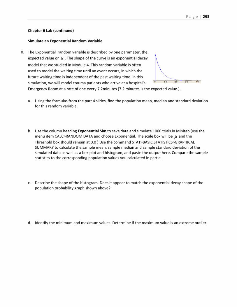
P a g e | 293
Chapter 6 Lab (continued) Simulate an Exponential Random Variable
0. The Exponential random variable is described by one parameter, the
expected value or . The shape of the curve is an exponential decay
model that we studied in Module 4. This random variable is often
used to model the waiting time until an event occurs, in which the
future waiting time is independent of the past waiting time. In this
simulation, we will model trauma patients who arrive at a hospital’s
Emergency Room at a rate of one every 7.2minutes (7.2 minutes is the expected value.).
a. Using the formulas from the part 4 slides, find the population mean, median and standard deviation for this random variable.
b. Use the column heading Exponential Sim to save data and simulate 1000 trials in Minitab (use the menu item CALC>RANDOM DATA and choose Exponential. The scale box will be and the
Threshold box should remain at 0.0 ) Use the command STAT>BASIC STATISTICS>GRAPHICAL SUMMARY to calculate the sample mean, sample median and sample standard deviation of the simulated data as well as a box plot and histogram, and paste the output here. Compare the sample statistics to the corresponding population values you calculated in part a.
c. Describe the shape of the histogram. Does it appear to match the exponential decay shape of the population probability graph shown above?
d. Identify the minimum and maximum values. Determine if the maximum value is an extreme outlier.
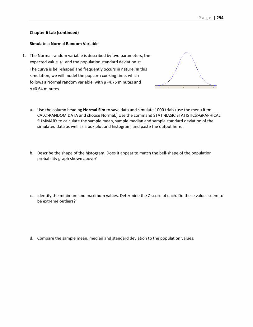
P a g e | 294
Chapter 6 Lab (continued)
Simulate a Normal Random Variable
1. The Normal random variable is described by two parameters, the
expected value and the population standard deviation .
The curve is bell‐shaped and frequently occurs in nature. In this
simulation, we will model the popcorn cooking time, which
follows a Normal random variable, with =4.75 minutes and
=0.64 minutes.
a. Use the column heading Normal Sim to save data and simulate 1000 trials (use the menu item CALC>RANDOM DATA and choose Normal.) Use the command STAT>BASIC STATISTICS>GRAPHICAL SUMMARY to calculate the sample mean, sample median and sample standard deviation of the simulated data as well as a box plot and histogram, and paste the output here.
b. Describe the shape of the histogram. Does it appear to match the bell‐shape of the population probability graph shown above?
c. Identify the minimum and maximum values. Determine the Z‐score of each. Do these values seem to be extreme outliers?
d. Compare the sample mean, median and standard deviation to the population values.

P a g e | 295
Chapter 7 Lab – Central Limit Theorem
Open the Minitab file lab07.mpj from the website.
The lifetime of optical scanning drives follows a skewed distribution with 100 and 100 . The
five columns labeled CLT n= represent 1000 simulated random samples of 1, 5, 10, 30, and 100 from this
population.
1. Make dot plots of all 5 sample sizes using the Multiple Y's Simple option and paste the result here.
a. As the sample size changes, describe the change in center.
b. As the sample size changes, describe the change in spread.
c. As the sample size changes, describe the change in shape.
P a g e | 296
Chapter 7 Lab (continued) 2. Using the command STAT>DISPLAY DESCRIPTIVE STATISTICS, determine the mean and standard
deviation for each of the five groups. Paste the results here.
a. The Central Limit Theorem states that the Expected Value of X is . As the sample size
increases, describe the change in mean. Is this consistent with the Central Limit Theorem?
b. The Central Limit Theorem states that the Standard Deviation of X is n
.
As the sample size increases, describe the change in standard deviation. Is this consistent with the Central Limit Theorem?
3. What you have observed are the three important parts of the Central Limit Theorem for the
distribution of the sample mean .X In your own words, describe these three important parts.

P a g e | 297
Chapter 8 Lab – Confidence Intervals
Open MINITAB file lab08.mpj from the website. This data represents information for 700 instructors from the popular website ratemyprofessors.com. All instructors are sampled from the Foothill‐De Anza Community College District. Here is a description of the data: College: Foothill or De Anza
Smiley: Positive Neutral Negative Photo: Instructor has a photo
Hot: Instructor has a chili pepper Gender: Male or Female Dept: Academic Department (example - Mathematics) Division Academic Division (example - PSME) Num Number of Ratings for that faculty member Overall Average Overall Quality Rating (1-5 scale, lowest to highest) Easiness Average Easiness Rating (1-5 scale, hardest to easiest)
The BASIC STATISTICS>GRAPHICAL SUMMARY feature of MINITAB allows you to create confidence
intervals for the population mean and standard deviation. You can set the confidence level to what you
want.
(Question 1 – 5) For questions 3 to 6 you will need to use the "By Variables" option in MINITAB
1. Find a 95% confidence interval for the mean easiness rating of instructors. Analyze and interpret the confidence interval.
2. Find a 99% confidence interval for the mean easiness rating of instructors. Analyze and interpret the confidence interval. Compare your results to question 1 and explain why the confidence interval has a higher margin of error.
3. Find a 95% confidence interval for the standard deviation of easiness rating of instructors. Analyze and interpret the confidence interval.

P a g e | 298
Chapter 8 Lab (continued) (Question 3‐6) For questions 3 to 6 you will need to use the "By Variables" option in MINITAB
4. Find 95% confidence intervals for the mean easiness rating of instructors at each college. Compare the confidence intervals. Do they seem to be different?
5. Find 95% confidence intervals for the mean easiness rating of instructors by gender. Compare the confidence intervals. Do they seem to be different?
6. Find 95% confidence intervals for the mean easiness rating of instructors by hotness rating. Compare the confidence intervals. Do they seem to be different?
7. Find 95% confidence intervals for the mean easiness rating of instructors by division. Compare the confidence intervals. Do they seem to be different?
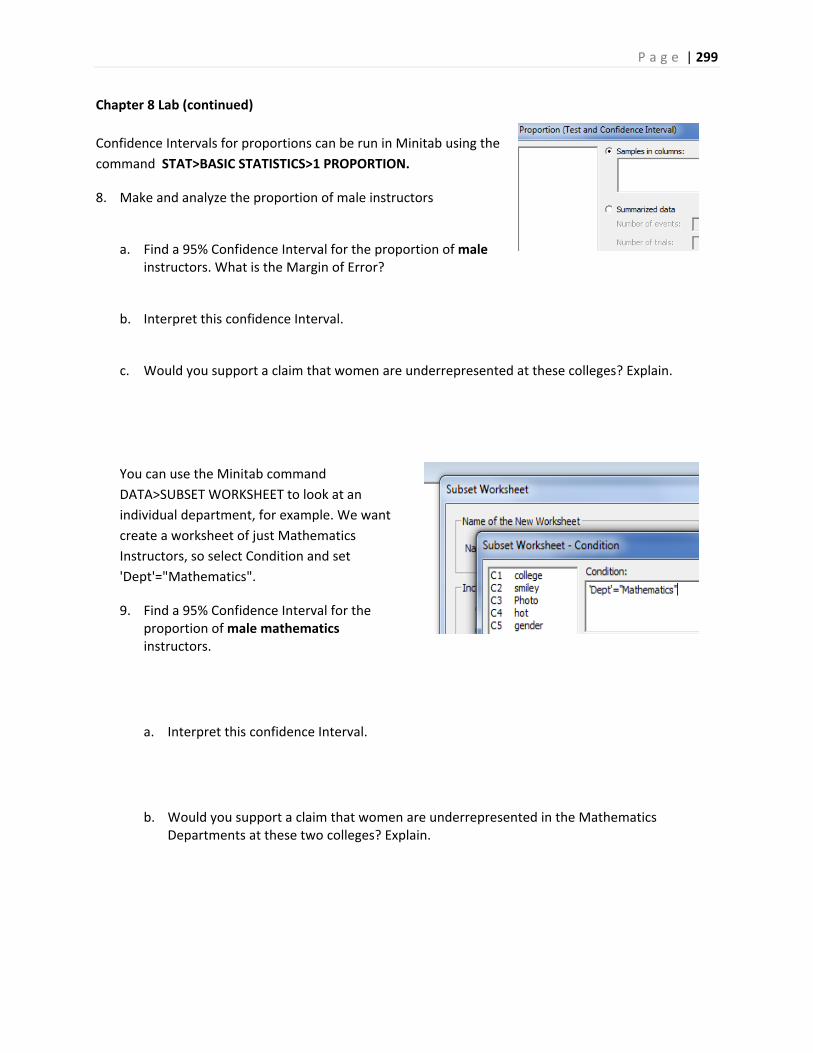
P a g e | 299
Chapter 8 Lab (continued)
Confidence Intervals for proportions can be run in Minitab using the
command STAT>BASIC STATISTICS>1 PROPORTION.
8. Make and analyze the proportion of male instructors
a. Find a 95% Confidence Interval for the proportion of male instructors. What is the Margin of Error?
b. Interpret this confidence Interval.
c. Would you support a claim that women are underrepresented at these colleges? Explain.
You can use the Minitab command
DATA>SUBSET WORKSHEET to look at an
individual department, for example. We want
create a worksheet of just Mathematics
Instructors, so select Condition and set
'Dept'="Mathematics".
9. Find a 95% Confidence Interval for the proportion of male mathematics instructors.
a. Interpret this confidence Interval.
b. Would you support a claim that women are underrepresented in the Mathematics Departments at these two colleges? Explain.
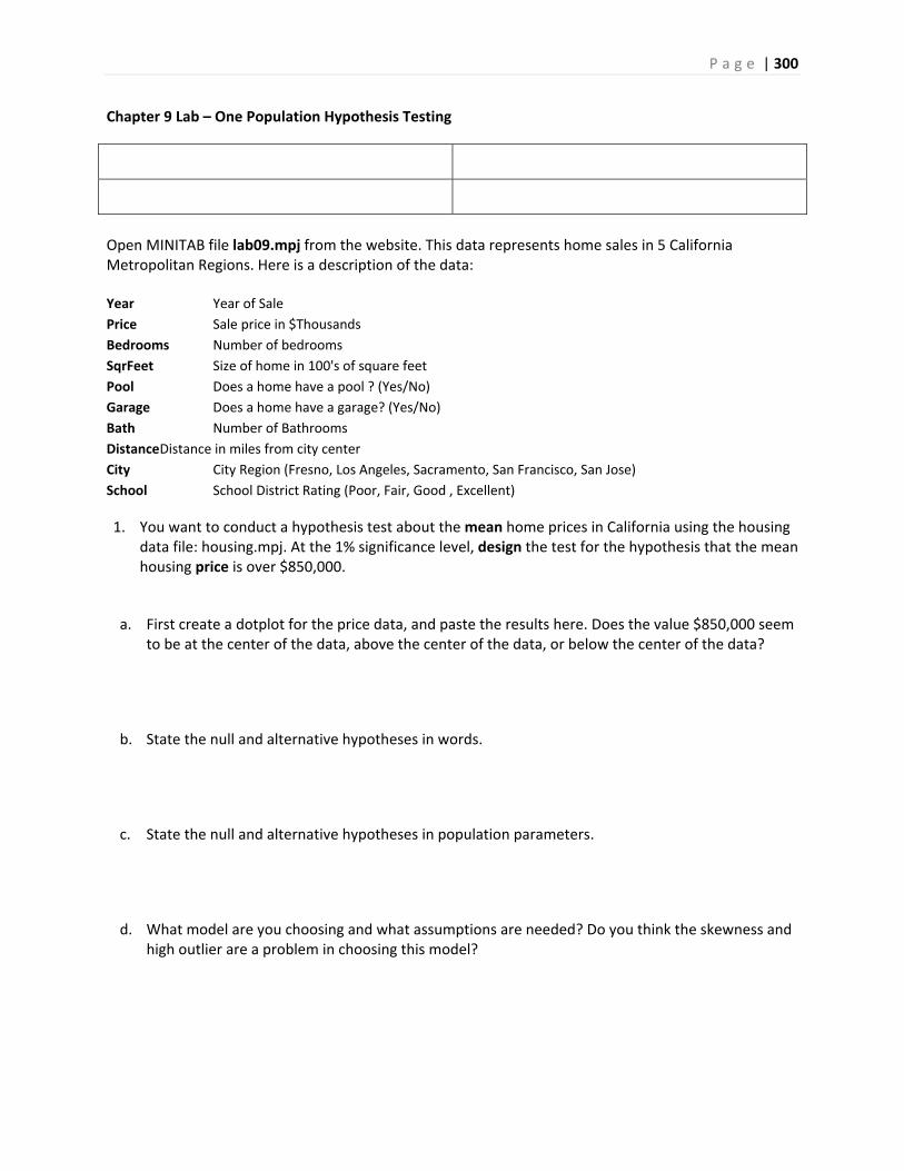
P a g e | 300
Chapter 9 Lab – One Population Hypothesis Testing
Open MINITAB file lab09.mpj from the website. This data represents home sales in 5 California Metropolitan Regions. Here is a description of the data: Year Year of Sale
Price Sale price in $Thousands
Bedrooms Number of bedrooms
SqrFeet Size of home in 100's of square feet
Pool Does a home have a pool ? (Yes/No)
Garage Does a home have a garage? (Yes/No)
Bath Number of Bathrooms
Distance Distance in miles from city center
City City Region (Fresno, Los Angeles, Sacramento, San Francisco, San Jose)
School School District Rating (Poor, Fair, Good , Excellent)
1. You want to conduct a hypothesis test about the mean home prices in California using the housing data file: housing.mpj. At the 1% significance level, design the test for the hypothesis that the mean housing price is over $850,000.
a. First create a dotplot for the price data, and paste the results here. Does the value $850,000 seem to be at the center of the data, above the center of the data, or below the center of the data?
b. State the null and alternative hypotheses in words.
c. State the null and alternative hypotheses in population parameters.
d. What model are you choosing and what assumptions are needed? Do you think the skewness and high outlier are a problem in choosing this model?

P a g e | 301
Chapter 9 Lab (continued)
e. Conduct the test at a significance level of 1%, using MINITAB command Stat>Basic Statistics>1 Population t‐test. Make sure you choose options to set Ha. Paste the results here. All price data is in $thousands, so you would enter $850,000 as 850.
f. Do you reject or fail to reject Ho?
g. State your conclusion in the context of the problem.
h. Using the online or Minitab power calculator, determine the power of the test if the population mean is really $900,000. Assume the standard deviation is $450,000. (Remember the data is entered in $ thousands).
i. Using the online or Minitab power calculator, determine the sample size needed to have 95% power for the test.
P a g e | 302
Chapter 9 Lab (continued)
2. You want to conduct a hypothesis test about the standard deviation of home prices in California using the housing data file: housing.mpj. At the 5% significance level, design a test to support the claim that the standard deviation housing price is not $400,000.
a. State the null and alternative hypotheses in words.
b. State the null and alternative hypotheses in population parameters.
c. What model are you choosing and what assumptions are needed?
d. Conduct the test at a significance level of 5%, using MINITAB command Stat>Basic Statistics>1 Variance. Make sure you choose options to set Ha. Paste the results here.
e. Do you reject or fail to reject Ho?
f. State your conclusion in the context of the problem.
P a g e | 303
Chapter 9 Lab (continued)
3. For the housing data above, we want to support the claim that the percentage of homes in California with garages is over 60%. We are going to conduct a Hypothesis Test using a significance level of 10%. a. State the null and alternative hypotheses in words.
b. State the null and alternative hypotheses in population parameters.
c. Create a bar chart of garages and under Chart Option, click the box to show y as a percentage. Does the bar graph support the claim that more than 60% of homes have garages?
d. What model are you choosing and what assumptions are needed?
e. Using the online power calculator, determine the power of the test if the population proportion under Ha is 0.65
f. Conduct the test at a significance level of 5%, using MINITAB command Stat>Basic Statistics>1 Proportion. Make sure you choose options to set Ha. Paste the results here.
g. Do you reject or fail to reject Ho?
h. State your conclusion in the context of the problem.

P a g e | 304
Chapter 10 Lab – Two Population Hypothesis Testing
Open MINITAB file lab10.mpj from the website. The National Basketball Association (NBA) announced that a new basketball would be used for the
2006–2007 season. Here is the announcement from the NBA about the new ball:
The NBA is introducing a new Official Game Ball for play beginning in the 2006–07 season. The new synthetic ball, manufactured by Spalding, features a new design and a new material that together offer better grip, feel, and consistency than the current leather ball. This marks the first change to the ball in over 35 years and only the second in 60 seasons.
Players in the NBA complained about the new ball, saying the ball reduced their performance. The NBA announced that the traditional leather ball would be used again beginning January 1, 2007. For the following 4 problems, analyze data from NBA games hat show the home team score and visiting
team score for games played with the original leather ball and with the new synthetic ball. You will then
conduct the following hypothesis tests. Make sure you show all steps:
1. Test for a difference in Standard deviation in home team score due to the type of ball. a. State Ho and Ha
b. State the model used and the assumptions needed
c. Conduct the test at a significance level of 5% ‐ paste results
d. State the decision (Reject or Fail to Reject Ho)
e. State the appropriate conclusion in the context of the original problem.
P a g e | 305
Chapter 10 Lab (continued)
2. Test for a difference in mean home team score due to the type of ball.
a. State Ho and Ha.
b. Is this model independent or dependent sampling? Explain.
c. State the model used and the assumptions needed. Use the F‐test from question 1 if you have independent sampling.
d. Conduct the test at a significance level of 5% ‐ paste results
e. State the decision (Reject or Fail to Reject Ho)
f. State the appropriate conclusion in the context of the original problem.
g. Make grouped box plots of the home score by type of ball. Is the graph consistent with your decision?

P a g e | 306
Chapter 10 Lab (continued)
3. Test for a difference in mean visiting team score due to the type of ball.
a. State Ho and Ha.
b. Is this model independent or dependent sampling? Explain.
c. State the model used and the assumptions needed. You will need to conduct the F‐test if you have independent sampling.
d. Conduct the test at a significance level of 5% ‐ paste results
e. State the decision (Reject or Fail to Reject Ho)
f. State the appropriate conclusion in the context of the original problem.
g. Make grouped box plots of the visiting score by type of ball. Is the graph consistent with your decision?

P a g e | 307
Chapter 10 Lab (continued) 4. Test for a mean difference in scores between home team and visiting team.
a. State Ho and Ha.
b. Is this model independent or dependent sampling? Explain.
c. State the model used and the assumptions needed. You will need to conduct the F‐test only if you have independent sampling.
d. Conduct the test at a significance level of 5% ‐ paste results
e. State the decision (Reject or Fail to Reject Ho)
f. State the appropriate conclusion in the context of the original problem.
P a g e | 308
Chapter 11 Lab – Chi‐square tests for categorical data
Open MINITAB file lab11.mpj from the website.
1. A sample of motor vehicle deaths for a recent year in Montana is broken down by day of the week. Test the claim that fatalities occur with equal frequency on the different days ( =5%).
Sun Mon Tue Wed Thu Fri Sat
35 21 22 18 23 29 45
a. State the null and alternative hypotheses in words.
b. State the null and alternative hypotheses in population parameters.
c. What model are you choosing and what assumptions are needed?
d. The data is in the first 2 columns of the Mintab worksheet. Conduct the test at a significance level of 5%, using MINITAB command: Stat>Table > Chi Square Goodness of Fit. Set the Observed Counts to the column you just entered and choose Equal Proportions. Paste the results here.
e. Do you reject or fail to reject Ho? Then state your conclusion in the context of the problem.
P a g e | 309
Chapter 11 Lab (continued) 2. Pew Research conducted a poll of 2000
American adults asking whether they
Favor or Oppose same‐sex marriage. The
data is summarized in the two‐way table
shown below. Conduct a hypothesis test
to determine if Americans’ opinions about
same‐sex marriage are age related?
a. Before conducting the test, determine the percentage in each group that supports same sex marriage. Describe the trend.
b. Now we will conduct the test. State the null and alternative hypotheses.
c. What model are you choosing and what assumptions are needed?
d. The table above has been entered in columns 4 to 7 of the Minitab file. Conduct the test at a significance level of 1%, using MINITAB command: Stat>Table > Crosstabulation/Chi Square. Choose Summarized Data. Highlight columns that contain the table. Paste the results here.
e. Do you reject or fail to reject Ho? Then state your conclusion in the context of the problem.
P a g e | 310
Chapter 11 Lab (continued)
For questions 3 and 4, the popular data starts in column 9. Use the MINITAB command Stat>Table > Crosstabulation. Choose Raw Data. To run the Chi Square test of independence, Click Chi‐square and check the options as shown. Run these tests at a significance level of 5%
3. Test for dependence between location and goal for elementary school students.
a. State the null and alternative hypotheses.
b. Run the test and paste the results here.
c. Do you reject or fail to reject Ho? Then state your conclusion in the context of the problem.
4. Test for dependence between gender and goal for elementary school students.
a. State the null and alternative hypotheses.
b. Run the test and paste the results here.
c. Do you reject or fail to reject Ho? Then state your conclusion in the context of the problem.
P a g e | 311
Chapter 12 Lab – Analysis of Variance
Open MINITAB file lab12.mpj from the website. 1. You want to address the question: “Is there a difference in overall quality due to Division?” There
are five divisions (some were combined): Certificate Programs/Other, Creative Arts/Physical Ed, Social Studies/Humanities/Business, Language/International/Multicultural, Physical and Health Science. Conduct the test at a significance level of 1%. a. What is response and what is the factor? How many levels?
b. State the hypotheses in words and parameters.
c. Run the appropriate one factor ANOVA test (use columns 1 and 2 from data). Make sure you select the Tukey Test under the Comparisons options. Paste the results here, including a graph comparing the means.
d. State a detailed conclusion using the both ANOVA results and the Tukey Test results.
P a g e | 312
Chapter 12 Lab (continued)
2. Columns 3 ‐5 of the Minitab file represent annual pay in $ thousands for randomly sampled workers in San Jose, California, Ann Arbor, Michigan and Dallas, Texas. Test for a difference in mean pay among the three cities. Choose a significance level of 5%.
a. What is the response variable and what is the factor variable.? How many levels?
b. State the hypotheses in words and parameters.
c. Run the appropriate one factor ANOVA test. Make sure you select the Tukey Test under the Comparisons options. Paste the results here, including a graph comparing the means.
d. State a detailed conclusion using the both the ANOVA results and the Tukey Test results.
P a g e | 313
Chapter 13 Lab – Simple Linear Regression
Open MINITAB file lab13.mpj from the website: this file contains geographic and weather data for several California cities.
1. First design a regression Model in which Latitude (degrees North) is the Independent variable and Precipitation (annual rainfall in inches) is the response. Run Minitab Stat>Regression>Fitted Line Plot a. Make a scatterplot and graph the least square line. Interpret the slope.
b. Conduct the appropriate hypothesis test for a significant correlation between precipitation and latitude using a significance level of 5%.
c. Find and interpret r2.
d. Run Minitab Stat>Regression>Regression>Fit Regression Model. Then find a 95% confidence interval for the expected precipitation for a city at latitude 40 degrees north using Stat>Regression>Regression>Predict. Interpret the interval.

P a g e | 314
2. Next design a regression Model in which Altitude (feet above sea level) is the Independent variable and Precipitation (annual rainfall in inches) is the response. Run Minitab Stat>Regression>Fitted Line Plot a. Make a scatterplot and graph the least square line. Interpret the slope.
b. Conduct the appropriate hypothesis test for a significant correlation between precipitation and altitude, using a significance level of 5%.
c. Find and interpret r2.
d. Run Minitab Stat>Regression>Regression>Fit Regression Model. Click Results and change Fits and Diagnostics to for all observations. Then find a 95% prediction interval for the precipitation for a city at altitude of 150 feet using Stat>Regression>Regression>Predict.
e. Interpret the interval. Analyze the residuals. Which city fits the model best? Which city fits the model worst?
P a g e | 315
3. Finally, design a regression Model in which Distance from Coast (in miles) is the Independent variable and Precipitation (annual rainfall in inches) is the response. Run Minitab Stat>Regression>Fitted Line Plot
a. Make a scatterplot and graph the least square line. Interpret the slope.
b. Conduct the appropriate hypothesis test for a significant correlation between precipitation and distance from coast using a significance level of 5%.
c. Find and interpret r2.
d. Looking at the scatterplot, it seems that a non‐linear regression model might be a better fit for precipitation and distance from coast. Rerun the fitted line plot but choose cubic instead of linear. Paste the graph here. Under this model, what percentage of the variability precipitation is explained by distance from coast?

P a g e | 316
17. Flash Animations
I have designed four interactive Flash animations that will provide students with deeper insight of the
major concepts of inference and hypothesis testing. These animations are on the website
http://nebula2.deanza.edu/~mo/ .
Central Limit Theorem (Chapter 7)
Using die rolling with progressively increasing sample sizes, this
animation shows the three main properties of the Central Limit
Theorem.
Inference Process (Chapter 8)
This animation walks a student through the logic of the statistical
inference and is presented just before confidence intervals and
hypothesis testing.
Confidence Intervals (Chapter 8)
This animation compares hypothesis testing to an unusual method of
playing darts and compares it to a practical example from the 2008
presidential election.
Statistical Power in Hypothesis Testing (Chapter 9)
This animation explains power, Type I and Type II error conceptually,
and demonstrates the effect of changing model assumptions.
P a g e | 317
18. PowerPoint Slides
I have developed PowerPoint Slides that follow the material presented in this text. This material is
presented on the text website as a slideshow. There are also note pages that can be downloaded.

P a g e | 318
19. Notes and Sources 1 Talk of the Nation, National Public Radio Archives, http://www.npr.org/ 2 John Cimbaro, Fish Anatomy, http://www.fws.gov/midwest/lacrossefishhealthcenter/PhotoAlbum.html 3 Chen Zheng‐Long, Chinese Koi Fish, http://www.orientaloutpost.com/proddetail.php?prod=czl‐kf135‐1
4 Richard Christian Looijen, Holism and Reductionism in Biology and Ecology: The Mutual Dependence of
Higher and Lower Level Research Programmes, Springer, 2000
5The Poems of John Godfrey Saxe (Highgate Edition), Boston: Houghton, Mifflin and Company, 1881
6 Donna Young, American Society of Health System Pharmacists, April 6, 2007, http://www.ashp.org/import/News/HealthSystemPharmacyNews/newsarticle.aspx?id=2517 7 The Lancet, news release, June 29, 2009, http://www.nlm.nih.gov/medlineplus/news/fullstory_86206.html 8 Creative Commons, https://creativecommons.org/licenses/by‐sa/4.0/ 9 Apple, Inc. (AAPL) (2017). Profile, business summary. Yahoo! Finance. Retrieved from https://finance.yahoo.com/quote/AAPL?p=AAPL 10 Gallup Organization (2017). Polling on Crime. Retrieved from http://www.gallup.com/poll/1603/crime.aspx
11 Pew Research Center (2013). Crime rises among second‐generation immigrants as they assimilate.
Retrieved from http://www.pewresearch.org/fact‐tank/2013/10/15/crime‐rises‐among‐second‐
generation‐immigrants‐as‐they‐assimilate/
12 Statista, the Statistics Portal (2017). Reported violent crime rate in the United States from 1990 to 2015. Retrieved from https://www.statista.com/statistics/191219/reported‐violent‐crime‐rate‐in‐the‐usa‐since‐1990/ 13 The Next Big Future (2008). Deaths per TWH by energy source. Retrieved from https://www.nextbigfuture.com/2011/03/deaths‐per‐twh‐by‐energy‐source.html 14 2000 United States Census, Sample of 500 adults from Santa Clara County, CA, 2000 15 Reuter/Ispos Polling, Approve/Disapprove of President Trump, August 17, 2017, http://polling.reuters.com/#poll/CP3_2/, August 18, 2017

P a g e | 319
16 ABC News Washington Post Poll, Biggest Gender Gaps in Job Approval. Retrieved from http://abcnews.go.com/Politics/28‐approve‐trumps‐response‐charlottesville‐poll/story?id=49334079, August 21, 2017. 17 mediamatters.org, Dishonest Fox Charts: Obamacare Enrollment Edition (2014). Retrieved from https://www.mediamatters.org/blog/2014/03/31/dishonest‐fox‐charts‐obamacare‐enrollment‐editi/198679, August 26, 2017. 18 By Rodolfo Hermans (Godot) at en.wikipedia. ‐ Own work; transferred from en.wikipedia by Rodolfo
Hermans (Godot)., CC BY‐SA 3.0, https://commons.wikimedia.org/w/index.php?curid=4567445
19 African American College Students in Computer Room, E‐Learning Africa News, http://ela‐newsportal.com/what‐matters‐is‐government‐policy‐on‐creating‐local‐open‐educational‐resources/african‐american‐college‐students‐in‐computer‐room‐3/, Feb 2013 20 By David Adam Kess (Own work) [CC BY‐SA 4.0 (http://creativecommons.org/licenses/by‐sa/4.0)], via Wikimedia Commons 21 By Benjamin D. Esham / Wikimedia Commons, CC BY‐SA 3.0 us, https://commons.wikimedia.org/w/index.php?curid=3433510
22 Axios, Irma captured America's attention more than other storms, Irma captured America's attention
more than other storms, Sept 25, 2017
23 By English: Airman Bo J. Flannigan, U.S. Navy [Public domain], via Wikimedia Commons 24 By LPS.1 ‐ Own work, CC0, https://commons.wikimedia.org/w/index.php?curid=32591423
25 Lightbulb Books, The Average Bears: Mr. Mean, Mr. Median & Mr. Mode,
http://www.lightbulbbooks.com/blog/wp‐content/uploads/Mean‐Median‐Mode.jpg
26 Skewness graph, A Square School,
http://www.asquareschool.com/wp‐content/uploads/2015/08/skewness.jpg
27 "Daily high temperatures for downtown San Francisco and St. Louis Airport" NOAA National Centers for Environmental Information, 2016. Web. 5 Sep 2017. https://www.ncdc.noaa.gov/data‐access 28 CC BY‐SA 1.0, https://commons.wikimedia.org/w/index.php?curid=10087 29 By Daniel Schwen ‐ Own work, CC BY‐SA 4.0, https://commons.wikimedia.org/w/index.php?curid=6814969 30 Taleb, Nicholas, The Black Swan: The Impact of the Highly Improbable, Penguin, 2007. 31 Taleb, Nicholas, The Black Swan: The Impact of the Highly Improbable, Penguin, 2007.

P a g e | 320
32 PhysicalGeography.net Fundamentals eBook, The Science of Physical Geography, 2015, http://www.physicalgeography.net/fundamentals/3h.html 33 Nable, Mosley, Witt, Davis, Is GPA affected by hours studying, classes missed, and age?, February 2012, StatCrunch, https://www.statcrunch.com/5.0/viewreport.php?reportid=23993 34 Leak, William B, Relationships of Tree Age to Diameter in Old‐Growth Northern Hardwoods and Spruce‐Fir, United States Department of Agriculture, 1985. 35 StatCrunch, Guns and Gun Deaths by Country, August 2016, https://www.statcrunch.com/app/index.php?dataid=1880699 36 National Geographic, Nick Cage Movies Vs. Drownings, and more strange (but spurious) correlations, Illustration Photographs by (L) Fotos International, Getty (R) Bernadett Szabo, Corbis, September 2015, http://phenomena.nationalgeographic.com/2015/09/11/nick‐cage‐movies‐vs‐drownings‐and‐more‐strange‐but‐spurious‐correlations/ 37 Sharks Ice Cream Store, Bloomfield New York, http://www.sharksicecream.com/ 38 BBC, Bitsize ‐ Discussing Results, Drawing Inferences and Conclusions, http://www.bbc.co.uk/education/guides/ztm4dmn/revision/3, 2017 39 Munroe, Randall, Correlation, XKCD, https://imgs.xkcd.com/comics/correlation.png, 2016
40 "Censuses: Costing the count". The Economist. Jun, 2011. 41 Pew Research Center, 15% of American Adults Have Used Online Dating Sites or Mobile Dating Apps, Feb 2016, http://www.pewinternet.org/2016/02/11/15‐percent‐of‐american‐adults‐have‐used‐online‐dating‐sites‐or‐mobile‐dating‐apps/ 42 By Corpse Reviver (Own work) [GFDL (http://www.gnu.org/copyleft/fdl.html) or CC‐BY‐SA‐3.0 (http://creativecommons.org/licenses/by‐sa/3.0/)], via Wikimedia Commons
43 Mentzoni, et. al., Tempo in electronic gaming machines affects behavior among at‐risk gamblers , Journal of Behavioral Addictions, Sep 22, 2012.
44 By Charles O'Rear (1941—), Environmental Protection Agency http://www.flickr.com/photos/usnationalarchives/3678468445/ Public Domain, https://commons.wikimedia.org/w/index.php?curid=9384331 45 Z. Ondogan, O. Pamuk, E.N. Ondogan, A. Ozguney (2005)."Improving the Appearance of All Textile Products from Clothing to HomeTextile Using Laser Technology," Optics and Laser Technology, Vol. 37, pp. 631‐637. 46 By Dan Kernler (Own work) [CC BY‐SA 4.0 (http://creativecommons.org/licenses/by‐sa/4.0)], via
Wikimedia Commons

P a g e | 321
47 TJ's Flying Adventure, Random airport traffic light, http://www.tjflyingadventures.com/2012/ 48 By Dan Kernler ‐ Own work, CC BY‐SA 4.0,
https://commons.wikimedia.org/w/index.php?curid=36506022
49 By Dan Kernler ‐ Own work, CC BY‐SA 4.0, https://commons.wikimedia.org/w/index.php?curid=36506021 50 Pew Research Center (2016). Social Meida Conversations about race, http://www.pewinternet.org/2016/08/15/social‐media‐conversations‐about‐race/ 51 By Dan Kernler ‐ Own work, CC BY‐SA 4.0,
https://commons.wikimedia.org/w/index.php?curid=36506019
52 Morin, Parker, Stepler, Mercer. Behind the Badge, Pew Research Center (2017). http://www.pewsocialtrends.org/2017/01/11/behind‐the‐badge/ 53 By Ed Yourdon from New York City, USA (Helping the homeless Uploaded by Gary Dee) [CC BY‐SA 2.0 (https://creativecommons.org/licenses/by‐sa/2.0)], via Wikimedia Commons 54 Bill Wilson Center of Santa Clara County, Count Me! Hidden in Plain Sight: Documenting Homeless Youth Populations in 2017, September 2017 55 Rogers, Katie. Boaty McBoatface: What You Get When You Let the Internet Decide, The New York Times, March 21, 2016.
56 9gag.com, Boaty McBoatface wins $370M ship naming competition, these are the other names in the
poll, https://9gag.com/gag/aq5Bg2j/boaty‐mcboatface‐wins‐370m‐ship‐naming‐competition‐these‐are‐
the‐other‐names‐in‐the‐poll
57 The Two‐way, Breaking News from NPR, http://www.npr.org/sections/thetwo‐way/2017/03/13/519976028/boaty‐mcboatface‐prepares‐for‐first‐antarctic‐mission, March 2017 58 FivethirtyEight.com, Al Gore’s New Movie Expose the Big Flaw in Online Movie Ratings, Sept 2017, https://fivethirtyeight.com/features/al‐gores‐new‐movie‐exposes‐the‐big‐flaw‐in‐online‐movie‐ratings/ 59 The Hill, GOP rep’s Obamacare Twitter poll backfires, January 4, 2017, http://thehill.com/blogs/in‐the‐know/in‐the‐know/312674‐gop‐reps‐twitter‐poll‐doesnt‐go‐as‐planned 60 Mathios, Diane. De Anza College, Notes on Selection and Response Biases 61 By Donald Trump August 19, 2015 (cropped).jpg: BU Rob13 Hillary Clinton by Gage Skidmore 2.jpg: Gage [GFDL (http://www.gnu.org/copyleft/fdl.html) or CC BY‐SA 4.0 (https://creativecommons.org/licenses/by‐sa/4.0)], via Wikimedia Commons 62 Pew Research Center (2016). Why 2016 Election Polls Missed the Mark, http://www.pewresearch.org/fact‐tank/2016/11/09/why‐2016‐election‐polls‐missed‐their‐mark/

P a g e | 322
63 Dropp & Nyhan, Nearly Half of Americans Don’t Know Puerto Ricans Are Fellow Citizens, The New York
Times, September 26, 2017. https://www.nytimes.com/2017/09/26/upshot/nearly‐half‐of‐americans‐
dont‐know‐people‐in‐puerto‐ricoans‐are‐fellow‐citizens.html?_r=0
64 CNN, Election 2016, National President Exit Polls, November 23, 2016, http://www.cnn.com/election/results/exit‐polls/national/president 65 Data and photo retrieved from the National Hurricane Center, NOAA, http://www.nhc.noaa.gov/ 66 By Keith Allison from Hanover, MD, USA ‐ Draymond Green, CC BY‐SA 2.0,
https://commons.wikimedia.org/w/index.php?curid=46776515
67 By Heather Smith (The Alloy Valve Stockist's photo gallery.) [CC BY‐SA 3.0 (https://creativecommons.org/licenses/by‐sa/3.0) or GFDL (http://www.gnu.org/copyleft/fdl.html)], via Wikimedia Commons 68 Shell Oil Refinery, Martinez CA. CC SA 1.0, https://commons.wikimedia.org/w/index.php?curid=110538 69 SountTransit, Sounder Commuter train. https://www.soundtransit.org/sounder. Schedule retrieved October 14, 2017 70 Fisher, Stacy B, The California Community Colleges Board of Governors Fee Waiver: A Comparison of State Aid Programs, California Community Colleges Chancellor’s Office, Jan 2016 71 Ronald Walpole & Raymond Meyers & Keying Ye, Probability and Statistics for Engineers and Scientists. Pearson Education, 2002, 7th edition. 72 Taleb, Nicholas, The Black Swan: The Impact of the Highly Improbable, Penguin, 2007. 73 Food and Drug Administration, FDA Consumer Magazine , Jan/Feb 2003 74 Mark Blumenthal, Is Polling as we Know it Doomed?, The National Journal Online, http://www.nationaljournal.com/njonline/mp_20090810_1804.php, August 10, 2009 75 Russ Lenth, Java Applets for Power and Sample Size, University of Iowa , http://www.stat.uiowa.edu/~rlenth/Power/ , 2009 76 J. B. Orris, MegaStat for Excel, Version 10.1, Butler University, 2007 77 The American Statistical Association, Statement on Statistical Significance and P‐Values ,March 7, 2016

P a g e | 323
78 Trafimow and Marks, Editorial, Basic and Applied Social Psychology, Volume 37, 2015, Issue 1. 79 Munroe, Randall, XKCD, Significant, https://xkcd.com/882/, 2013 80 Munroe, Randall, XKCD, P‐values, https://xkcd.com/1478/, 2015 81 Shlomo S. Sawilowsky, Fermat, Schubert, Einstein, and Behrens‐Fisher: The Probable Difference
Between Two Means When , Journal of Modern Applied Statistical Methods, Vol. 1, No 2, Fall 2002 82 Mastin, Luke, Right Left, Right Wrong? An Investigation of Handedness, http://www.rightleftrightwrong.com/statistics.html, 2012
83 Feuer, Alan. AR‐15 Rifles Are Beloved, Reviled and a Common Element in Mass Shootings New York Times,https://www.nytimes.com/2016/06/14/nyregion/ar‐15‐rifles‐are‐beloved‐reviled‐and‐a‐common‐element‐in‐mass‐shootings.html, June 2016
84 Pew Research Center, Opinions on Gun Policy and the 2016 Campaign , Aug 2016, http://www.people‐press.org/2016/08/26/opinions‐on‐gun‐policy‐and‐the‐2016‐campaign/ 85 Lowry, Richard. One Way ANOVA – Independent Samples. Vassar.edu, 2011 86 NIST/SEMATECH e‐Handbook of Statistical Methods, http://www.itl.nist.gov/div898/handbook/, Section 7.4.7.1.Tukey's Method, April, 2016 87 Munroe, Randall, XKCD, Linear Regression, http://xkcd.com/1725/, 2016 Additional reference used but not specifically cited: Dean Fearn, Elliot Nebenzahl, Maurice Geraghty, Student Guide for Elementary Business Statistics, Kendall/Hunt, 2003