
Incomedia WebSite X5static.incomedia.eu/websitex5.com/v11/websitex5_evolution11_en.pdfstarted...
256
© Copyright 2014 Incomedia. All rights reserved. Official Website: www.websitex5.com [email protected] - www.incomedia.eu
Transcript of Incomedia WebSite X5static.incomedia.eu/websitex5.com/v11/websitex5_evolution11_en.pdfstarted...

© Copyright 2014 Incomedia. All rights reserved.
Official Website:
www.websitex5.com
[email protected] - www.incomedia.eu

© Copyright 2014 Incomedia. All rights reserved.
Information in this manual is subject to change w ithout notice. No part of
this manual may be reproduced or transmitted in any form or by any
means, electronic or mechanical, for any purpose, w ithout the express
w ritten permission of Incomedia.
Please remember that existing movies, sounds or images that you may
w ant to use in your project may be protected under copyright law . The
unauthorized incorporation of such material into your new w ork could be a
violation of the rights of the author. Please be sure to obtain any
permission required from such authors.
Incomedia, WebSite X5, WebSite X5 Evolution are trademarks of Incomedia
s.r.l. Other brand or product names mentioned herein are trademarks or
registered trademarks of their respective ow ners.
Written and designed at Incomedia s.r.l.
Incomedia WebSite X5
2

3
Summary
Summary
1. ................................................................................................... 9Introduction
................................................................................................... 9Presenting WebSite X5
................................................................................................... 10WebSite X5: What it does
2. ................................................................................................... 13The work environment
................................................................................................... 15Welcome to WebSite X5
................................................................................................... 16The Preferences window
................................................................................................... 19The Add web fonts window
3. ................................................................................................... 22Step 0 - Project Selection
4. ................................................................................................... 25Step 1 - General Settings
................................................................................................... 25General Settings
................................................................................................... 26The Language Content Management window
................................................................................................... 28Default Template
................................................................................................... 29Default Template
................................................................................................... 30Custom Library
................................................................................................... 31Template Style
33Template Structure
37Text Sty le
40Main Menu Sty le
42Drop Down Menu Sty le
46Page Menu Sty le
48Tooltip Sty le
49ShowBox Sty le
50E-mail Sty le
................................................................................................... 52Template customization

4
Incomedia WebSite X5
5. ................................................................................................... 61Step 2 - Sitemap Creation
................................................................................................... 64The Level Properties window
................................................................................................... 65The Page Properties window
6. ................................................................................................... 70Step 3 - Page Creation
................................................................................................... 73The Objects Management window
................................................................................................... 75Text Object
................................................................................................... 79The RollOver window
................................................................................................... 81The Image Properties window
................................................................................................... 81Image Object
................................................................................................... 87Table Object
................................................................................................... 91Gallery Object
................................................................................................... 98Video/Audio Object
................................................................................................... 102E-mail Form Object
................................................................................................... 109The Insert Field window
................................................................................................... 114Social Network Object
................................................................................................... 118Guestbook Object
................................................................................................... 120Map Object
................................................................................................... 122Flash Animation Object
................................................................................................... 124Product Catalog Object
................................................................................................... 127HTML Code Object
................................................................................................... 129Common features
................................................................................................... 129Image Editor
................................................................................................... 134Cell Style
................................................................................................... 139The Link window
................................................................................................... 144The Effect Properties window
................................................................................................... 145The Upload linked file window
7. ................................................................................................... 148Step 4 - Advanced Settings

5
Summary
................................................................................................... 149Statistics, SEO and Code
................................................................................................... 151Welcome Page
................................................................................................... 154The Language Settings window
................................................................................................... 155Advertising Message
................................................................................................... 157Blog
................................................................................................... 162The Post Setting window
................................................................................................... 164The Side Block window
................................................................................................... 168RSS Feed
................................................................................................... 169The Post Setting window
................................................................................................... 170Data Management
................................................................................................... 172The Database Settings window
................................................................................................... 172Access Management
................................................................................................... 175The User Settings window
................................................................................................... 175Shopping Cart
................................................................................................... 183The Product Settings window
................................................................................................... 186The Shipping Type window
................................................................................................... 188The Payment Type window
8. ................................................................................................... 192Step 5 - Export
................................................................................................... 192WebSite Export to Internet
................................................................................................... 197Export completed
................................................................................................... 198Export to disk
................................................................................................... 198Export the Project
9. ................................................................................................... 201Best Practices
................................................................................................... 201General Settings
................................................................................................... 201How to organize backup copies of your project
................................................................................................... 203Web Fonts
203How to use Web Fonts
204How to download a font from Google Fonts™
6
Incomedia WebSite X5
206How to download a font from Fontsquirrel
................................................................................................... 208Step 1 - General Settings
................................................................................................... 208How to translate text that is entered automatically
................................................................................................... 210Working with Google
210How to use Google Webmaster Central™
211
How to monitor website performance with serv ices such as Google
Analy tics™
212How to create and link the website's SiteMap Map
................................................................................................... 215The graphic templates
215How to work with the templates
218Where to find new WebSite X5 templates
................................................................................................... 219Step 2 - Sitemap Creation
................................................................................................... 219How to create and work on the website Map
................................................................................................... 221Step 3 - Page Creation
................................................................................................... 221How to create a page using the page layout table
................................................................................................... 224How to work on the Cell Style
................................................................................................... 227Step 4 - Advanced Settings
................................................................................................... 227How to create a multi-language website
................................................................................................... 232How to manage logins and create a Members' Area
................................................................................................... 236How to handle comments from the online Control Panel
................................................................................................... 238The e-commerce shopping cart
238How to define the contents of the order confirmation e-mail
240How to import/export products in the shopping cart
10. ................................................................................................... 247Further information
................................................................................................... 247Web browsers and the WebSite X5 browser
................................................................................................... 249WebSite X5's built-in Search Engine
................................................................................................... 251Safe fonts and web fonts
................................................................................................... 254The Box Model in WebSite X5
................................................................................................... 255The online Control Panel

7
Summary

Chapter
Introduction1

9
Introduction
We have included this online guide so that everyone w ho w ants to get
started immediately w ith WebSite X5 to create their ow n w ebsites, blogs
and e-commerce stores can do so, w ith all the help they need at their
f ingertips.
Each step of the project development is accompanied by a clear description
of every part of the Program's interface that you w ork on, w ith a detailed
explanation of all the commands and options available in the various menus,
panels and w indow s.
With the explanations and information given in this guide, the logical and
easy-to-follow w ork sequence and the additional help of preview s of your
w ork that are updated in real time, you'll have no problem using WebSite X5
to create eye-catching, interesting and professional w ebsites.
This WebSite X5 guide refers to the Evolution v. 11 version but
may be used in conjunction w ith other versions of the Program,
bearing in mind the specif ic functional differences betw een the
various versions.
1.1 Presenting WebSite X5Create websites, online stores and blogs in 5 steps
WebSite X5 is the ideal softw are for creating the w ebsites you've alw ays
w anted. You don't need to know anything about programming! This
softw are gives you an intuitive and fully-visual interface to w ork w ith, and
you can check your w ork as you go w ith the preview s that are updated
each time you take a look.
WebSite X5 guides you through each step of creating your w ebsite and
publishing on the Internet. It's extremely easy to use, it's f lexible and it
offers you plenty of scope for your ow n personal customization.
WebSite X5 automatically generates page code in HTML5 + CSS 2.1 or 3 for
the choices you make and the settings you define in each page,
guaranteeing full compatibility w ith all brow sers and mobile devices, as w ell
as accurate search engine indexing.
WebSite X5 is so easy to use that you'll have no problem incorporating

10
Incomedia WebSite X5
sophisticated professional features in your w ebsite, such as:
nline stores w ith credit card
facilities
Blogs w ith podcasts and
videocasts and RSS Feeds
A built-in search engine
E-mail forms w ith anti-spam filters
Zoom and w ide-angle photos
Photo and video galleries
Access management
Advert banner management
Multi-language w ebsites
What's more, w ith WebSite X5 you'll save time and energy because it
already includes everything you need to create a complete w ebsite:
Template editor
Image editor
Menu generator
Built-in FTP engine
1.500 customizable templates
200,000 royalty-free photos
Buttons libraries
Widget collection
This mix of simplicity and sophistication (in terms of the number and quality
of features included) is the key to WebSite X5's success: it's simply the
right softw are for everyone w ho w ants a w ebsite!
1.2 WebSite X5: What it doesWebSite X5 acts like a w izard, w hich means it behaves like a visual guide
that takes you through each step of the w ay to creating a complete,
functional and attractive w ebsite that you'll be proud of!
There are just 5 steps betw een your idea of the perfect w ebsite and
having it published and visible on the Internet:
1. General Settings
Once you have decided on your project, and given some initial general
information, such as a title and description that are used by the search
engines for indexing your w ebsite, WebSite X5 then helps you define the
look of your w ebsite. You can choose from a library of over 1.500
default templates that is constantly being updated or, if you prefer, you
can create your ow n template from scratch. You can use the built-in
editor to customize both the heading and footer as you like. It's also
possible to define the styles of all the elements that make up the page

11
Introduction
layout: navigation menus, text, Show Box w indow s, etc.
2. Map Creation
Starting from the Home page, w ith WebSite X5 you begin by defining the
hierarchical structure of your w ebsite. You can include as many levels
and sub-levels as you need, w ith an unlimited number of pages. Your
navigation menu w ill be created automatically, on the basis of the
w ebsite Map. You can change your Map at any time, if you w ant to make
changes or update the w ebsite.
3. Pages Creation
You can create pages and w ork on their layout by simply dragging and
dropping objects onto them. The main objects are: text, tables, images,
animation, video and audio, galleries, forms for data submission and e-
mails, social netw orks, your guest book, the w ebsite Map, the product
list, HTML code. You can customize the imported objects and f inish them
off w ith links to both internal and external objects. With the built-in
graphic editor, you can rotate, correct or apply f ilters, masks and frames
to pages that you have imported, w ithout having to use any extra
softw are.
4. Advanced Settings
Once you have created the w ebsite structure and added the main
contents, you can complete it w ith advanced features such as a
Welcome page that includes a soundtrack and offers the choice of
language for the w ebsite, a Members' area w ith user and access
management, advertisements, RSS Feeds, a blog, e-commerce.
5. Export
WebSite X5 guides you through the process of publishing your w ebsite
on the Internet: you can start an FTP session, w here all the f iles that are
necessary for giving your w ebsite Internet visibility are transferred to a
server. WebSite X5 supports secure sessions and saves you time w ith
simultaneous connections and intelligent publishing of only the f iles that
have been changed.
As w ell as publishing your w ebsite on the Internet, you can also export
your project to another disk on your computer, or create a backup copy
of the entire project.

Chapter
The work environment2
13
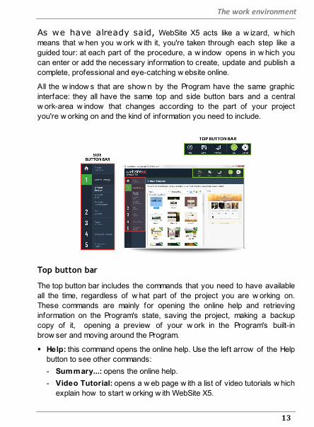
The work environment
As we have already said, WebSite X5 acts like a w izard, w hich
means that w hen you w ork w ith it, you're taken through each step like a
guided tour: at each part of the procedure, a w indow opens in w hich you
can enter or add the necessary information to create, update and publish a
complete, professional and eye-catching w ebsite online.
All the w indow s that are show n by the Program have the same graphic
interface: they all have the same top and side button bars and a central
w ork-area w indow that changes according to the part of your project
you're w orking on and the kind of information you need to include.
Top button bar
The top button bar includes the commands that you need to have available
all the time, regardless of w hat part of the project you are w orking on.
These commands are mainly for opening the online help and retrieving
information on the Program's state, saving the project, making a backup
copy of it, opening a preview of your w ork in the Program's built-in
brow ser and moving around the Program.
Help: this command opens the online help. Use the left arrow of the Help
button to see other commands:
- Summary...: opens the online help.
- Video Tutorial: opens a w eb page w ith a list of video tutorials w hich
explain how to start w orking w ith WebSite X5.

14
Incomedia WebSite X5
- WebSite X5 Gallery: opens the WEBSITE X5 ANSWERS section that
contains w ebsites created w ith WebSite X5 that have been submitted
directly by their authors.
- WebSite X5 Templates: opens the section of WEBSITE X5
ANSWERS that is dedicated to the templates. It contains new
templates that have been created by Incomedia and by other authors,
and they can be displayed and dow nloaded. Some of them are free!
- Technical Support: opens WEBSITE X5 ANSWERS, the w ebsite
that provides technical assistance for WebSite X5. On WEBSITE X5
ANSWERS you can look through the FAQs and the tutorials, or you
can send a request for assistance.
- www.websitex5.com: opens WebSite X5's w ebsite.
- About WebSite X5: displays general information on the WebSite X5
version installed on your computer.
Save [CTRL + S]: saves the current project. The project is automatically
saved in Projects folder specif ied in the Preferences w indow . You can
use the left arrow of the Save button to see these commands:
- Save at every Preview: automatically saves the project each time
you use the Preview command to display a preview of your w ebsite.
- Create a Backup Copy when saving the Project the first time:
automatically creates a backup copy of your project (Backup.iwprj
f ile) after the f irst time you save in the current w ork session.
- Create a Backup Copy every time you upload: automatically
creates a backup copy of your project (Uploaded_timestamp.iwprj
f ile) before you publish it on the Internet.
The backup copies that are created by the Create a Backup Copy
when saving the Project the first time and Create a Backup Copy
every time you upload functions are saved in the Backup
subfolder w hich you specify in the Preferences w indow and can
find in Projects folder.
If you w ant to create a backup copy of your project, instead of
using a Save as command, you can use the Duplicate in the

15
The work environment
Project Selection w indow .
- Preview: displays a local preview of your w ebsite so far, using the
program's built-in brow ser.
If you leave the Update the Pages while modifying the Project
option active in the Preferences w indow , each time you make a
change (and click on an OK or Next button to save it) the
Program recreates and updates everything that the change refers
to. This means that the w ebsite preview is kept constantly
updated, and w ill be displayed correctly immediately you choose to
see it.
You can also select the Save at every Preview option so that the
project w ill be saved every time you click on the Preview button.
Back: takes you back to the previous w indow , in case you w ant to
make further changes.
Next: takes you to the next w indow , to continue creating your w ebsite.
Side button bar
WebSite X5 takes you through the w ork of creating a w ebsite in just 5
steps. The buttons on the left side of the Program w indow , w hich are
alw ays available, indicate w hich step you are currently w orking on and
you can use them to move from one step to another (you don't have to
follow the order in w hich they appear).
2.1 Welcome to WebSite X5The Welcome page is the f irst w indow you see w hen you start WebSite
X5. It includes a number of links to online resources and material that may
be of help to you w hen you are w orking w ith the Program. These links are
available in a side button bar that looks like this:
Web Site WebSite X5: this opens the off icial site of WebSite X5.

16
Incomedia WebSite X5
WebSite X5 Answers: opens WEBSITE X5 ANSWERS, the
w ebsite that provides technical assistance for WebSite X5. On
WEBSITE X5 ANSWERS you can look through the FAQs and the
tutorials, or you can send a request for assistance.
Check for Updates: checks w hether there are any updates
available online for the version of WebSite X5 you are w orking
w ith. We strongly advise you to alw ays check for and install new
updates, to ensure you get the best out of your softw are.
Preferences: opens the Preferences w indow , w here you can
define some general settings on how you w ant the Program to
w ork and add the Web Fonts that you w ant to use in your project.
Besides this side button bar, the Welcome page also includes information
w hich is updated in real time w hen you are connected to the Internet. This
information refers to the latest versions available online of your Program
copy, new s, special contents (w hich may be articles, w hite papers,
tips&tricks), new video tutorials and the latest discounts and special
offers.
If an Internet connection is not available, the Welcome page show s
a standard page. This page w ill be show n even w hen the Check
for updates at program startup option in the Preferences w indow
is not selected.
When you have f inished looking through the contents of the Welcome page,
you can begin w ork on creating your w ebsite by clicking on the Start button
that is in the top right corner.
2.2 The Preferences windowThis window opens when you click on the Preferences button
in the Welcome page, and here you can give some general settings for how
the Program is to w ork and add the Web Fonts that you w ant to use in the
projects.
The available options are organized in the General and Web Font
sections.

17
The work environment
Reference: The commands in the General window
The options in the General section are:
Projects folder: this is the folder in w hich your project f ile
(Project.IWPRJ) is saved, w hether you are creating a new project or
importing an existing one (see Project Selection | Import...). Because
the folder is already indicated, w hen you click on the Save button w hen
you are w orking on your w ebsite, the project w ill be saved in this folder
w ithout you being asked to indicate w here it should be saved.
Check for updates at program startup: this option means that new
softw are updates w ill be looked for each time the Program is started.
The Program starts an Internet connection to the Incomedia server to
search for any updates.
We advise you to leave this option selected, so that you can be
sure you are alw ays w orking w ith the latest available version
of WebSite X5.
The options for File Creation are:
Keep Preview updated while working on the Project: makes sure
that the w ebsite preview is constantly updated w ith all the developments
in your project. This basically means that every time you add something
new or make a change to something, and click on an OK or Next button),
the Program automatically updates the w ebsite preview w hich you can
view locally on your PC using the built-in brow ser.
Update the Pages while modifying the Project: synchronizes the
pages you create in your w ebsite w hile you are w orking on your
project. So, each time you confirm an addition or change (by clicking on
an OK or a Next button), the Program recreates all the parts in other
pages in the project that are affected by the new part. This feature
keeps the w ebsite preview updated and if you click on the Preview to
check your progress, you'll see all the additions/changes immediately.
Max number of simultaneous processes: means you can define
the number of processes (or "Threads") that the Program starts, and that

18
Incomedia WebSite X5
w ill be carried out simultaneously by the computer.
What is Multithreading?
It's a technique w hereby one process is divided into several,
smaller processes w hich are carried out at the same time.
Obviously, you computer has to be able to handle this. The
Multithreading feature makes the most of the computer's
calculating pow er, making it w ork on several threads at the
same time. Thanks to this technique, programs such as %
PRODUCT%>, that have been developed to spread the w ork
load over a number of different threads, can noticeably improve
performance.
You need to correctly evaluate your computer's hardw are
capacity to be able to take full advantage of Multithreading. Try
starting w ith 5 simultaneous processes and gradually increase
this value until you don't notice any further signif icant
improvements in performance.
Finally, the Local Preview WebServer settings options handle the correct
display of w ebsite preview s:
Port: is the port that WebSite X5 tells its local w eb server to w atch so
that the w ebsite preview s are displayed correctly.
IP Address: is the IP address that WebSite X5 tells its local w eb server
to keep an eye on so that the preview s of your w ebsite come up as you
expect them to. The default value for the IP address option is 127.0.0.1
w hich alw ays identif ies the local (your) computer. Most people w on't
need to change this value.
We advise you not to change the values that you f ind already
set for the Port and IP Address options, unless you are
absolutely sure of w hat you're doing.
Reference: The commands in the Web Font window
You can use the commands in this section to create and display the list of
fonts that can be used in the projects to format all types of text: contents,

19
The work environment
button labels, f ield labels, etc.
The commands for w orking on the projects' w eb font list are:
Add: this opens the Add web fonts w indow w here you can add a new
w eb font to the list.
Remove: this removes the selected w eb font from the list.
The fonts in the list all have an icon next to them that makes it easy to
recognize w hat type of font they are:
Google Fonts: fonts added from the Preferences | Web Font
w indow of WebSite X5 and linked to Google's server.
Web Fonts: fonts added from the Preferences | Web Font
w indow of WebSite X5 and published on the w ebsite's Internet
server.
Safe Fonts: fonts that are present on practically all devices and so
do not require any publication.
2.2.1 The Add web fonts window
The Add web fonts w indow opens w hen you click on the Add button in
the Preferences | Web Font w indow , and it contains the options for adding
a new w eb font to the list of those that can be used in the project.
Reference: The options for adding Web Fonts
First of all, you have to decide how the w eb fonts are to be integrated in
the project:
Google Font: you can choose to use w eb font f iles directly from
Google's server and they are referenced in the CSS stylesheets of your
w ebsite pages.
Web Font: the w eb font f iles are on the local computer and published on
the Web server.
20
Incomedia WebSite X5
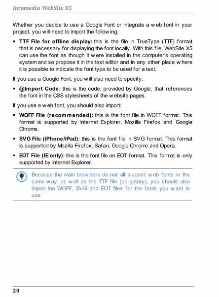
Whether you decide to use a Google Font or integrate a w eb font in your
project, you w ill need to import the follow ing:
TTF File for offline display: this is the f ile in TrueType (TTF) format
that is necessary for displaying the font locally. With this f ile, WebSite X5
can use the font as though it w ere installed in the computer's operating
system and so propose it in the text editor and in any other place w here
it is possible to indicate the font type to be used for a text.
If you use a Google Font, you w ill also need to specify:
@Import Code: this is the code, provided by Google, that references
the font in the CSS stylesheets of the w ebsite pages.
If you use a w eb font, you should also import:
WOFF File (recommended): this is the font f ile in WOFF format. This
format is supported by Internet Explorer, Mozilla Firefox and Google
Chrome.
SVG File (iPhone/iPad): this is the font f ile in SVG format. This format
is supported by Mozilla Firefox, Safari, Google Chrome and Opera.
EOT File (IE only): this is the font f ile on EOT format. This format is only
supported by Internet Explorer.
Because the main brow sers do not all support w eb fonts in the
same w ay, as w ell as the TTF file (obligatory), you should also
import the WOFF, SVG and EOT files for the fonts you w ant to
use.

Chapter
Step 0 - Project Selection3

22
Incomedia WebSite X5
After you have started WebSite X5 and seen the Welcome Page, you can
go to the Project Selection w indow , w here you have to indicate the project
you w ant to w ork on.
You can choose:
if you w ant to create a new project;
or if you w ant to w ork on one that you have already created.
Reference: Commands in the Project Selection window
Create a new Project: choose this option if you w ant to start w ork on
a new project. First of all, you have to give the new project a name: type
a name in the f ield below . You can save the project by clicking on the
Save button, w hich is alw ays present in the top button bar.
You don't need to specify a path w hen you save a project
because the program takes care of that by saving all your projects
in the Projects folder w hich is defined in the Preferences w indow .
Edit an existing Project: this option lets you open an existing project,
so that you can add new contents to it or make any necessary changes.
All the names of existing projects are show n in a list. There are a
number of choices available for selecting and opening the project you
w ant to w ork on, and they are:

23
Step 0 - Project Selection
Display Large icons - Display Titles - Display List -
Display Details
These options define how the project preview s are
displayed.
Display Groups according to last edit date
This option groups and displays the projects according to
their last edit date.
Use the follow ing commands to organize your projects:
Import...: this command imports a project that has been created and
exported (see Export the Project) w ith WebSite X5 from another
computer.
Rename: use this command to change the name of the selected
project. You can also click tw ice on a project name to change it.
Duplicate: makes a copy of the selected project.
Delete: deletes the selected project.

Chapter
Step 1 - General Settings4

25
Step 1 - General Settings
4.1 General SettingsThis is the f irst w indow of Step 1. The information you enter in the various
fields of this w indow set the basic parameters for the project you are
w orking on.
Important information such as the project title, the URL (w ebsite address)
and the language to be used and codes is entered in this w indow . You can
choose w hether to enter this information immediately or do it later.
The follow ing options are available:
WebSite Title: enter the title you w ant to give your w ebsite in this f ield.
The title w ill be show n in the brow ser's title bar w hen your w ebsite is
published on the Internet. It's obviously an important parameter because
it allow s visitors and search engines to correctly identify your w ebsite.
The default entry in this f ield is the name you have given to the project
(see Project Selection) and you can change it at any time: you may
decide on a better name, or you may w ant to change it to try and improve
optimization.
WebSite Author: enter the name of the person, business, club, etc
w ho is to appear as the author of the w ebsite. The author's name
appears in the <author> meta tag of all the w ebsite pages' HTML
code, and it is the electronic equivalent of signing the w ork that has been
done.
WebSite Address (URL): enter the URL address (for example http//
w w w .mysite.com) w here the w ebsite w ill be located w hen it is
published on the Internet. This information is essential for RSS feeds,
the e-commerce shopping cart and the SiteMap to w ork correctly (this
latter is created automatically by the Program and linked to the various
w ebsite pages).
WebSite Description: enter a short description of the w ebsite in this
f ield. Make sure the description is concise and to the point because it w ill
be added to the <description> meta tag in the HTML code and
analyzed by search engine spiders to include your w ebsite in search
results.

26
Incomedia WebSite X5
The WebSite Description that you enter in this f ield is
automatically associated w ith the w ebsite's Home page.
You can, how ever, improve w ebsite optimization by associating a
description and a list of keyw ords w ith each page (or, at least, to
the most important ones). To do this, go to Sitemap Creation,
select the page to w ork on and click on Properties....
Content Language: enter the language you w ant to use for your
w ebsite in this f ield. All the text that is entered automatically by the
Program w ill be show n in the language you choose here: links to built-in
anchors, labels for the E-mail Form Object, labels and text for the e-
commerce shopping cart, text in the w ebsite's Map.
If you w ant to change the text that the Program enters
automatically, or you w ant to add a new language, click on the
button and use the options in the Language Content
Management w indow .
WebSite Icon: enter the name of the icon (a .ICO, .PNG, .GIF or .JPG
file) to associate w ith the w ebsite's pages. This icon w ill be displayed to
the left of the URL in the Internet brow ser's address bar.
Icons associated w ith w ebsites are often referred to as favicons
(from favorite icons). You can use images in .ICO, .PNG, .GIF and
.JPG formats. Files in .ICO format are imported as they are,
w hereas if you use f iles of any size in .PNG, .GIF and .JPG format
WebSite X5 automatically creates a copy in .PNG format at 16x16
pixels and uses this copy as the favicon.
4.1.1 The Language Content Management window
This w indow opens w hen you click on the button of the Content
Language option in the General Settings w indow . You can w ork on the
text that the Program enters automatically, such as links to built-in anchors,
the buttons in the Gallery Object, the labels in the E-mail Form Object, labels
and text in the e-commerce cart, text in the w ebsite's Map.
27
Step 1 - General Settings
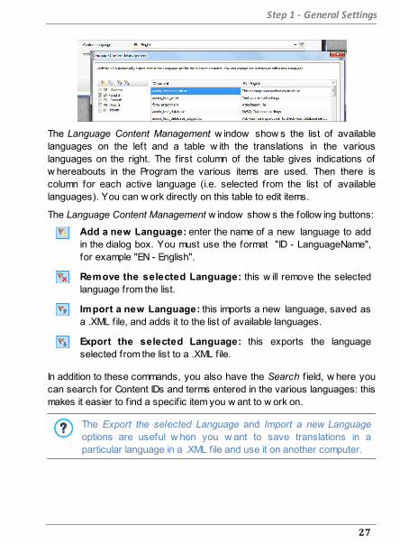
The Language Content Management w indow show s the list of available
languages on the left and a table w ith the translations in the various
languages on the right. The f irst column of the table gives indications of
w hereabouts in the Program the various items are used. Then there is
column for each active language (i.e. selected from the list of available
languages). You can w ork directly on this table to edit items.
The Language Content Management w indow show s the follow ing buttons:
Add a new Language: enter the name of a new language to add
in the dialog box. You must use the format "ID - LanguageName",
for example "EN - English".
Remove the selected Language: this w ill remove the selected
language from the list.
Import a new Language: this imports a new language, saved as
a .XML file, and adds it to the list of available languages.
Export the selected Language: this exports the language
selected from the list to a .XML file.
In addition to these commands, you also have the Search f ield, w here you
can search for Content IDs and terms entered in the various languages: this
makes it easier to f ind a specif ic item you w ant to w ork on.
The Export the selected Language and Import a new Language
options are useful w hen you w ant to save translations in a
particular language in a .XML file and use it on another computer.

28
Incomedia WebSite X5
4.2 Default TemplateOne of the keys to a successful w ebsite is an attractive appearance. First
impressions count, and new visitors' opinions on your w ebsite w ill be
largely influenced by its graphic layout, before they even start to look
through the contents. A w ell thought-out and professional-looking design
gives the impression of a good quality site that is w orth looking at.
In WebSite X5, the template that defines the graphic appearance of the
w ebsite is an integral part of the project. This means that, w hen you start a
new project, a default template is already associated w ith it. Obviously, you
are free to change the proposed layout of your w ebsite by replacing the
automatically assigned template w ith a Default Template, a template chosen
from the Custom Library or w ith a New Template created from scratch.
It is in this Template selection w indow that you can change the look of
your w ebsite, choosing from:
Default Template: this option takes you to a library of over
1.500 ready-to-use graphic templates. Just select the one that
is right for your w ebsite and apply it to the project.
Custom Library: this option show s you the library of the
templates that have already been created and saved. Again,
select the one you like best to apply it to your project.
New Template: choose this option to cancel all the current
settings of the project's template and start again from scratch
to create a new one.
Once you have made your choice, click on the Next button to open the
Template Style w indow : now you can start changing the default template
or custom template you have selected, or begin creating a brand new
template.
You can change your project's template at any time, simply by
selecting a different template from the default/custom library or
starting a new one from scratch. The changes you made to the
original template w ill not be saved. If you w ant to save the
changes to the original template, save it f irst in the Custom Library

29
Step 1 - General Settings
before applying a new template to your project.
All the default templates are optimized to be displayed at 1024 x
768 pixels. If you w ant to use a different resolution, use the
Template Structure.
4.2.1 Default Template
The easiest and quickest w ay to define a graphic template for a project is
to choose one that is close to w hat you w ant from the library of Default
Templates.
The library that WebSite X5 offers you initially contains 1.500 templates:
they are all complete and have been designed specif ically to help you
create sophisticated and professional w ebsites. What's more, they're free!
But that's not all - this library is constantly being updated w ith new
templates, to give you even more choice. Updates are provided by both
Incomedia and its aff iliated authors. In some cases, the updates must be
purchased, but often they are free.
Once inside WebSite X5 you can display a preview of all the available
default templates, but not all of them are actually installed w ith the program.
Ther latest additions to the library, and templates that can be dow nloaded
free of charge and those that have to be purchased can be easily
recognized by the ribbon show n next to them.
Most of the Default Template w indow is dedicated to displaying the
available templates. You can use the follow ing commands to f ilter the
templates on display, if this makes it easier for you to choose w hich one
you w ant to use:
List of Categories
This option show s a list of the various categories in
w hich the templates are organized, so you can choose
w hich ones to display. The f irst items in the list refer to
the Highlighted, For sale and Licenced templates. The
theme templates follow .

30
Incomedia WebSite X5
Menu
This option f ilters the templates according to the type of
menu they propose, so you can choose to display
templates w ith either horizontal or vertical menus, or
both.
Show Small Previews - Show Medium Previews
- Show Large Previews
These options define the w ay in w hich template
preview s are displayed.
Update
The template list is updated automatically w hen the
program starts: you can use this command to force the
update w hile using the Internet.
When you select a template from the list, a preview of it is show n in the
preview w indow . If the selected template is for sale, the description
includes its price and the Buy now button. You w ill need to have enough
credits and be connected to the Internet to complete the purchase.
If you select a template from the list that is free of charge, or that you have
already purchased but not installed, it w ill be dow nloaded automatically and
applied to the current project.
You need to be connected to the Internet to:
Display preview s of all the available templates. If Internet is not
active, only the templates installed w ith the program w ill be
visible in the preview w indow .
Install a new , free-of-charge, template.
Buy and install a new template.
4.2.2 Custom Library
With WebSite X5, you can obtain excellent high-quality layouts w hether you
customize a default template or create a new one from scratch. It's very
simple to save templates of these types in a library of custom templates, so
that they can be used again in other projects.

31
Step 1 - General Settings
The w ays of displaying the Custom Template Library, and the commands
available for w orking on it, are the same as those for default templates:
Menu
This option f ilters the templates according to the type of
menu they propose, so you can choose to display
templates w ith either horizontal or vertical menus, or
both.
Show Small Previews - Show Medium Previews
- Show Large Previews
These options define the w ay in w hich template
preview s are displayed.
The follow ing commands are available for w orking on the templates:
Add: this command saves the template you are using w ith the current
project, w ith all its settings, in the Custom Template Library.
Rename: use this command if you w ant to rename a template. You can
also rename a custom template by clicking tw ice on its name.
Remove: this command deletes the selected template.
Import...: this command imports a new template (a .IWTPL file) that has
been created w ith WebSite X5 and exported.
Export...: this command exports the selected template (a .IWTPL file) to
the specif ied folder. It can then be shared and used on other computers.
4.2.3 Template Style
When you have decided w hether to use a default template, a custom
template or create a new one, you can make all the changes you w ant to
the template's structure and define the graphic style of each element in the
layout of the w ebsite pages: the navigation menu, texts, Show Box
w indow s, Tips, etc.
The options are:

32
Incomedia WebSite X5
Template Structure
This option defines the template's structure and you can
indicate size, w here the navigation menu is to appear, the
margins and alignments.
Text Style
This option defines the styles for each of the text elements in
the w ebsite pages.
Main Menu Style
Here you can design the style of the main menu, w hich
appears either along the top or dow n the side of every page
and helps visitors f ind their w ay around the w ebsite.
Drop Down Menu Style
You can define the style of the drop-dow n menus (menus that
appear w hen the mouse is moved over an item in the main
menu).
Page Menu Style
You can define the style of the page menu. Page menus list
the various pages in at particular level.
Tooltip Style
You can define the style of the Tips that may be associated
w ith the Link.
ShowBox Style
Here you can define the style of the Show Box w indow ,
w hich is w here zoomed photos, videos or slideshow s are
displayed.
E-mail Style
This option lets you define a style for the e-mails that are
generated w hen you use the E-mail Form Object or create a
Shopping Cart.
For more information on creating the w ebsite Map and the

33
Step 1 - General Settings
difference betw een f irst and second level menus, drop-dow n
menus and page menus, see Sitemap Creation.
4.2.3.1 Template Structure
When you w ant to define the graphic appearance of a w ebsite, WebSite
X5 lets you choose a default template, a custom template or a completely
new one. Whatever method you choose, you can use the options in the
Template Structure w indow to make all the changes you w ant to a default
or custom template, or to create your new template from scratch.
To make your w ork easier, the Template Structure w indow offers a
Preview that show s a graphic representation of the page. You can choose
w hich section of the page to change from the list, or click on a part of the
preview to edit it and see the changes appear in the preview as you make
them.
Reference: Menu type options
Before you start creating a custom template, you have to specify the Menu
Type, w hich defines w here and how the navigation menu w ill be displayed
in all the w ebsite pages. The options are:
Horizontal – Menu above the header
Horizontal – Menu below the header
Horizontal - Menu inside the header
Vertical - Menu on the left
34
Incomedia WebSite X5
Vertical – Menu on the right
Reference: Page section options
When you have chosen the menu type you have to select the Page
section that you w ant to w ork on. Pages are divided into the follow ing
sections:
Page Background: this is the area surrounding the page. It's on
view w hen the brow ser's w indow has a higher resolution than
that set for the actual w ebsite.
Header Background: this is the part of the Page Background
w hich is behind the Header.
Header: the header is at the top of the page. It normally contains
mostly graphic elements, and is the ideal place for the w ebsite's
title and subtitle, a company logo, search f ields, service menus w ith
links to such elements as the w ebsite's map and the w ebsite
language choice.
Menu: this is w here the f ixed navigation menu appears. This menu
displays the f irst-level choices available, w hich appear in exactly
the same w ay on every page of the w ebsite. This section w ill be
either at the top, bottom, left or right of the page, depending on the
menu type you have previously chosen.
Page Contents: this section contains the actual page content and
any submenus, if you have them.
Footer: this section is at the bottom of the page and, like the
header, is mainly graphic. It visually closes the page. It is often
used for placing notes, disclaimers, copyright indications, VAT
numbers, e-mail addresses, etc.
Footer Background: this is the part of the Page Background that
is behind the Footer.
If you set the Header Background or Footer Background as

35
Step 1 - General Settings
Transparent, they w ill be treated as part of the Page Background
and w ill have exactly the appearance. If they aren't Transparent
then the Header and/or Footer w ill be show n as strips that cover
the w hole w idth of the brow ser's w indow .
Reference: Page section graphics properties
You can set the follow ing Graphic Properties for all the various page
sections:
Color: indicates the color to use for the background.
Image File: indicates the image f ile (.JPG, .GIF, .PNG.) for the picture to
use as the background. You can also have Flash animation (.SWF) in
the Header or Footer.
Repeat: this indicates w hether the background image is to be repeated.
Images can be repeated horizontally, vertically, or in both directions so
that it takes up all the available space. If you are w orking on the Page
Background the image can be resized so that it covers the entire
background. In this case, the original proportions may not be maintained.
Alignment: indicates how the image is to aligned in the particular page
section.
The follow ing option is also available for the Page Background:
Fixed Background: if you select this option, the page's background
image is f ixed, even w hen the page contents are scrolled.
Reference: Page section sizes
You can set the Size for some of the page sections.
The follow ing option is available for the Header and Horizontal - Menu
inside the header:
Width: gives the w idth in pixels of the selected page section. The value
of Width for vertical menus is by default 960 pixels for the Header
section and 120 pixels for the Menu section, and both values can be
changed. The value of Width for horizontal menus placed above or
below the heading that is set for the Header is also used for the Menu,

36
Incomedia WebSite X5
Page Contents and Footer.
The default value of the Width is calculated for a w ebsite that is
optimized for a display resolution of 1024x768 pixels.
The follow ing option is available for sections, apart from the Page
Background and Page Contents:
Height: gives the height in pixels of the selected page section.
The follow ing option is only for the Page Contents section:
Minimum Height: gives the minimum height in pixels that the page
contents section must have, regardless of the height of the contents that
are added.
Finally, if you have chosen the Horizontal - Menu inside the header option
for Menu Type, the follow ing options w ill be show n in the Menu section:
Offset X: this value indicates by how many pixels the menu must be
moved left/right w ith respect to the heading.
Offset Y: this value indicates by how many pixels the menu must be
moved up/dow n w ith respect to the heading.
With all these options available, there are practically no limits to
the size and position of the horizontal menu inside the heading,
making it possible to obtain extraordinary results.
Reference: Page section content properties
You can define Content Properties for some page sections.
The follow ing option is available for the Page Background, Menu and Page
Contents sections:
Margins: gives the value in pixels of the margins (the empty space
betw een the edge of the section and its contents).
This option is available for the Page Background and Menu sections:
Alignment: for the Page Background, it specif ies how the page is to be
aligned in the brow ser's w indow ; for the Menu it specif ies how the
37
Step 1 - General Settings
menu buttons are to be aligned w ith respect to the page.
The actual w idth of the w ebsite pages is given by the w idth of
the Page Contents section (that depends on the w idth of the
Header), minus the left and right margins.
You can add text, pictures, Flash animation, slideshow s, search
fields and links to the template's header. The options are show n in
the Template customization w indow , w hich you can open by
clicking on the Next button.
4.2.3.2 Text Style
The commands in this w indow can be used to define the style of the
various texts that appear in the w ebsite.
A style can be generally defined as a series of indications for formatting
text and graphics that are applied to an element to change its appearance.
Using Styles and Models, you can include several different formats in a
single operation.
First of all, you have to choose the Page Item you w ant to define a style
for. Select it from the drop-dow n menu or click on the preview .
The various page items you can apply a style to are:
Page Title: this is the title in the w ebsite pages. It is taken
from the name given to the page w hen the w ebsite Map is
created in the Sitemap Creation w indow , or, if otherw ise
specif ied, from the Extended Page Title in the Page
Properties w indow .
Page Path: this is the text that appears immediately below
the page title, and it show s the path to this page in the
w ebsite ("breadcrumb navigation"). The Program adds the
path automatically.
Page Text: this is the text of the single paragraphs that are
added using the Text Object. The style indicated here is

38
Incomedia WebSite X5
applied by default to text entered in the Text Object editor.
When the style is changed, all the texts to w hich it has
been applied are automatically updated. You can use the
editor's commands to make further changes and
customizations, w hich can alw ays be deleted w ith the
button Reset Format.
The default page text style is also applied to text that is
added automatically by the Program, such as pages in the
Members' Area, the Blog, the built-in search engine and the
w ebsite Map.
Active Link / Mouseover Link / Visited Link: these
options refer to hypertext links created w ith the Text
Object. A link can change its appearance according to its
state: active, on mouseover, already visited. Changing a
link's style according to its current state helps the visitor to
navigate the w ebsite, reminding him w hich parts he has
already seen.
Field / Button: these are the f ields and buttons that are
created w ith the E-mail Form Object or the e-commerce
shopping cart, as w ell as being elements of search f ields
(see Template customization | Insert Search Field), the
login/logout f ields of the Members' Area, etc. When you
create a new E-mail Form Object the f ields in it take on the
style defined here by default. You can subsequently
change the style in the new e-mail form using the options in
the E-mail Form Object | Style section.
Footer Menu: this menu repeats the items of the main
menu and displays them at the bottom of every page.
If you select Page Item, you can w ork on the options in the Style section to
change the style:
Visible: you can decide w hether the selected page item is to be visible
or not. This option is not available for the Page Text or the various states
of links, f ields and buttons w hich cannot be invisible. Making an item

39
Step 1 - General Settings
invisible does not mean removing it from the page. It simply means that
the item w ill not be visible w hen the page is published. You may w ant to
make the Page Title invisible, for example, because you prefer to add a
picture rather than text, but this does not mean the the <title> tag w ill
be deleted from the HTML code.
Background Color / Text Color: you can choose the color for the
background and the text of the selected page item. You cannot choose a
background color for the Page Text because this depends on the
chosen template (see Default Template or Template Structure) and/or
the Cell Style that the Text Object has.
Font Type: specif ies the font, style and size to use for the text.
Alignment: you can decide how to align the element in the page: it can
be Left, Center or Right. This option is not available for f ields, buttons or
links because hypertext link alignment is defined w hen the Text Object is
created, regardless of the style.
Text Style: this option is only available for the links in their various
states (visited, etc) and it can be Normal or Underlined.
Pointer: this option is available only for the Active Link, and it is
automatically assumed by the other tw o link states. You can specify the
style on mouseover. Click on to select a .CUR, .ICO or .ANI f ile to use.
Border Color: you can specify the color of the borders that the Page
Title, Page Path, Field, Button and Footer Menu can have.
Rounded Corners: you can indicate how rounded the corners of the
Field and Button are to be, and you can specify the value for each
corner separately.
Drop Shadow: you can apply a shadow inside the Field, specifying its
color, position, diffusion and size.
Horizontal Margin: you can specify the horizontal margin of the Page
Title, Page Path and Footer Menu.

40
Incomedia WebSite X5
4.2.3.3 Main Menu Style
In this w indow you can design the style of the buttons in the f irst level of
the main menu.
Menus are created and updated automatically by the program according to
the w ebsite's map designed in Step 2 - Sitemap Creation. The main menu
displays the f irst level items of the w ebsite map that are used for the site's
navigation menu. If you have chosen a menu structure w ith horizontal
menus, the main menu appears immediately above, below or inside the
header on every page. If you have chosen a menu structure w ith vertical
menus, the main menu is show n dow n the side of the pages, either on the
left or the right of the page contents.
The commands for customizing menu buttons are organized in the follow ing
sections: General, Menu Items and 3D Style.
Reference: Commands in the General section
You can use these commands for give some general settings for the main
menu.
The options in the Style section are:
Width: you can set the w idth in pixels of the buttons for the menu items.
Margin: you can specify the horizontal and vertical margins in pixels
(the space betw een the button border and the text in the button).
Distance between Buttons: you can specify the outer margin in pixels
(the space betw een each button).
Enable Auto-scrolling: select this option if you w ant the navigation
menu to scroll w ith the page contents, so that it is alw ays visible.
When you define the w idth of the buttons, take into account the
overall space available for this menu: this parameter can be
changed if you are not using a default template (see Template
Structure.
The options in the Text section are:
Font Type: specif ies the font, style and size to use for the text.

41
Step 1 - General Settings
Alignment: you can specify how you w ant the text to be aligned in the
button: to the Left, in the Center or to the Right.
Use Anti-alias text: select this option if you w ant smoother text edges.
Reference: Commands in the Menu Items section
You can use the commands in this section to define colors, background
images and text styles for the various states of the main menu buttons.
First of all, select the Menu Item you w ant to w ork on: you can define the
style of the Menu Item, of the Item on mouseover and of the
Item for Current Page. You can select a menu element from the drop-dow n
menu or you can w ork directly on the preview, w hich is kept constantly up-
to-date w ith any changes you make.
The options in the Style section are available for all menu items:
Background Color / Text Color / Border Color: you can define the
color for the background, text and button border.
Background Image: you can specify the image to use as a
background for the button. Click on the to brow se through the
available f iles (in .JPG, .GIF or .PNG format) to select an image. Or click
on the arrow next to the f ield to open the button library and select the
image you w ant to use from there.
Font Style: this option defines the style of the button's text for the Menu
Item item: it may be None, Inset, Raised, or Drop shadow. The Item on
mouseover and Item for Current Page items automatically assume the
setting of the Menu Item item: you can also add one of these styles:
Normal, Bold, Italics, Bold Italics.
Reference: Commands in the 3D Style section
You can use the commands in this section to define 3D-effect buttons.
The follow ing options are available in the Shape section:
Shape: choose a button shape from those available.
Corner Radius: specify how accentuated the beveled corners of the

42
Incomedia WebSite X5
buttons are to be (for shapes w ith rounded corners).
Merge Button Shape: merge the buttons together so that the selected
shape is applied to all of them.
The follow ing options are available in the 3D Format section:
Graphic: you can define the look of the button as Flat, Flat Pillow,
Bevel, etc.
Light Direction: you can define the direction of the light effect on the
button.
Gradient Factor: you can set the amount of shading for the button.
Image Opacity: you can specify the degree of transparency of the
images that are added to the buttons in the Menu Items section.
The 3D Border section has the follow ing options:
Border Style: you can define the button borders as Normal, Bevel or
Inset.
Outer Width / Inner Width: you can specify the outer and inner
thickness of the button's border.
Outer Border only: if you select this option, your preferences w ill be
applied to the border surrounding all the buttons and not to just one
single button.
4.2.3.4 Drop Down Menu Style
The commands in this w indow are used to define the style of drop-dow n
menus.
Menus are created and updated automatically by the program according to
the w ebsite's map designed in Step 2 - Sitemap Creation. Drop-dow n
menus are show n w hen the mouse passes over an item in the main menu.
The commands are organized in the follow ing sections: General, Menu
Items and 3D Style.

43
Step 1 - General Settings
Reference: Commands in the General section
You can use the commands in this section to give some general settings for
drop-dow n menus.
You f irst have to indicate the Menu Type that you w ant, w hich may be:
Arrange in one column: all the items on the drop-dow n menu
appear in a single column, one after the other.
Arrange in multiple columns: the items in the drop-dow n menu
appear in several adjacent columns. A new column is added
automatically w hen:
the number of items in the menu reaches or is greater than the
value of Max Items per Column;
the page list has a separator in it (see Sitemap Creation).
If you have chosen a vertical menu in the Default Template, Custom
Library or Template Structure w indow s, you can also select:
Vertical Accordion: all the items in the drop-dow n menu appear in
a single column: w hen you click on an item, all the items below move
dow n to leave space to display a new list of previously-hidden
items, that relate to the one you have selected.
When you have selected the Menu Type, you can w ork on the options in
the Style section:
Width: you can set the w idth in pixels of the buttons for the menu items.
Margin: you can specify the horizontal and vertical margins in pixels
(the space betw een the button border and the text in the button).
Max Items per Column: this option is only available for the Arrange in
multiple columns menu type. You can specify the maximum number of
items for each column in the drop-dow n menu.
The options in the Text section are:
Font Type: specif ies the font, style and size to use for the text.
Alignment: you can specify how you w ant the text to be aligned in the
44
Incomedia WebSite X5
button: to the Left, in the Center or to the Right.
Finally, the Options section has these choices:
Effect: you can specify the display effect for drop-dow n menus,
choosing None, Fade, Drop Top, Drop Left or Drop Top Left.
Automatically select the current Page: this option is only available
for the Vertical Accordion menu type. the drop-dow n menu is
automatically expanded and the page you are looking at is show n as
selected in the menu.
Reference: Commands in the Menu Items section
The commands in this section are for defining the colors, background
images and text style of the various states of the buttons in drop-dow n
menus.
First of all, you have to select the Menu Item to w ork on: you can specify
the style of the Menu Item, Item on mouseover and Separator.
You can select a menu element from the drop-dow n menu or you can w ork
directly on the preview, w hich is kept constantly up-to-date w ith any
changes you make.
The options in the Style section are available for all the menu items:
Background Color / Text Color / Border Color: you can define the
color for the background, text and button border. The Separator item only
has the Text Color option.
Font Style: you can define the text style for the Item on mouseover and
Separator items as Normal, Bold, Italics and Bold Italics.
Background Image: this is only available for the Menu Item and Item
on mouseover items, and you can specify the image to use as a
background for the button. Click on the to brow se through the
available f iles (in .JPG, .GIF or .PNG format) to select an image. Or click
on the arrow next to the f ield to open the button library and select the
image you w ant to use from there.
Bullet Icon: you can specify the image to use as bullets for lists of

45
Step 1 - General Settings
buttons and separators. Click on the and select a .JPG, .GIF or .PNG
file.
Reference: Commands in the 3D Style section
You can use the commands in this section to define 3D-effect buttons.
The follow ing options are available in the Shape section:
Shape: choose a button shape from those available.
Corner Radius: specify how accentuated the beveled corners of the
buttons are to be (for shapes w ith rounded corners).
Merge Button Shape: merge the buttons together so that the selected
shape is applied to all of them.
The follow ing options are available in the 3D Format section:
Graphic: you can define the look of the button as Flat, Flat Pillow,
Bevel, etc.
Light Direction: you can define the direction of the light effect on the
button.
Gradient Factor: you can set the amount of shading for the button.
Image Opacity: you can specify the degree of transparency of the
images that are added to the buttons in the Menu Items section.
The 3D Border section has the follow ing options:
Border Style: you can define the button borders as Normal, Bevel or
Inset.
Outer Width / Inner Width: you can specify the outer and inner
thickness of the button's border.
Outer Border only: if you select this option, your preferences w ill be
applied to the border surrounding all the buttons and not to just one
single button.
46
Incomedia WebSite X5
4.2.3.5 Page Menu Style
This w indow gives you the commands for defining some advanced settings
for the buttons in page menus.
Menus are created and updated automatically by the program according to
the w ebsite's map designed in Step 2 - Sitemap Creation. The page menus
are optional, and they show a list of the pages in the current level. In other
w ords, if you open a page in a level, and this contains other pages, the
page menu show s the list of all the pages in that level. Page menus are
alw ays vertical, and may be displayed on the left or right of the page
contents.
The commands for customizing buttons in the page menus are organized in
the General and Menu Items sections.
Reference: Commands in the General section
You can use the commands in this section to define some general settings
for the page menu.
If you w ant to display a page menu that includes all the pages in the current
level, you have to select the Show Page Menu option.
When you have done this, you can w ork on the options in the Style section:
Menu Position: choose w hether you w ant the page menu to be
displayed on the left or right of the page.
Width: you can set the w idth in pixels of the buttons for the menu items.
Margin: you can specify the horizontal and vertical margins in pixels
(the space betw een the button border and the text in the button).
Distance between Buttons: you can set the value of the outer margin,
in pixels (the space betw een one button and another).
The options in the Text section are:
Font Type: specif ies the font, style and size to use for the text.
Alignment: you can specify how you w ant the text to be aligned in the
button: to the Left, in the Center or to the Right.
Finally, in the Border section, you can create a border around the page

47
Step 1 - General Settings
menu (not the single buttons) and w ork on the follow ing options:
Thickness: the thickness of the borders (each one may be defined
separately).
Color: the color of the borders (again, each border can be colored
separately).
Rounded Corners: how rounded the corners are (each one can be
defined separately).
Drop Shadow: a shadow , specifying its color, position, diffusion and
size.
Reference: Commands in the Menu Items section
You can use the commands in this section to define the style of the items in
the page menus.
First of all, select the Menu Item to w ork on: you can define the style of
the Menu Item, Item on mouseover, Separator and
Separator Line. You can select a menu element from the drop-dow n menu
or you can w ork directly on the preview, w hich is kept constantly up-to-
date w ith any changes you make.
Background Color / Text Color / Line Color: you can choose a color
for the background and text of the Menu Item, Item on mouseover and
Separator, and the color of the line for the Separator Line.
Bullet Icon: this option is for the Menu Item, Item on mouseover and
Separator items, and it lets you import a .JPG, .GIF or .PNG file containing
the image to use as a bullet next to the items in the menu page.
Font Style: this option is for the Item on mouseover and Separator, and
you can set the text as Normal, Bold, Italics or Bold Italics.
Line Style: this option is only available for the Separator Line item, and it
is used to define the line style, w hich may be Solid, Dash, Dot, Inset or
Raised.

48
Incomedia WebSite X5
4.2.3.6 Tooltip Style
The commands in this w indow are used to define the style of the Tooltips
that are associated w ith links that are added to text and images w ith the
Link command. A Tooltip is a short text that appears in a balloon w hen
the mouse passes over a link: it should explain w hat w ill happen the the link
is clicked.
You can start defining Tooltips w ith the options in the Style section:
Tooltip Position: choose w hether you w ant the Tooltip to be displayed
on the Left, Right, Top or Bottom of the link.
Effect: you can specify an entry effect for the Tooltip, w hich can be
None, Fade or Alternate.
Background Color: you can choose the color for the Tooltip
background.
Show Tail: you can add an arrow to the balloon that points tow ards the
link that the Tooltip refers to.
The options for the Text are:
Text Color: you can choose a color for the text of the Tooltip.
Font Type: specif ies the font, style and size to use for the text.
Alignment: this indicates how the text is to aligned in the Tooltip: to the
Left, in the Center, or to the Right.
The options for the Border are:
Thickness: the thickness of the borders (each one may be defined
separately).
Color: the color of the borders (again, each border can be colored
separately).
Rounded Corners: how rounded the corners are (each one can be
defined separately).
Drop Shadow: a shadow , specifying its color, position, diffusion and
size.

49
Step 1 - General Settings
The style settings are valid for the entire project, and so all the
Tooltips w ill look the same. The contents of a Tooltip (text and
images) are defined in the Link | Description w indow .
4.2.3.7 ShowBox Style
You can use the commands in this w indow to define the style of the
Show Box that is used in the galleries (see Gallery Object), in the
Show Box Gallery link (see Link | Action) and in the Product Catalog Object.
In all cases, the Show Box opens on a link and displays an enlarged picture,
a video or a slideshow : w hen a visitor clicks on the link to the Show Box,
the brow ser w indow is dimmed to highlight the Show Box w indow , w hich
is displayed in the foreground w ith the selected entry effect.
The options in the Style section are:
Effect: you can specify the entry effect for the Show Box w indow ,
w hich can be None, Fade, Move from Top, Zoom, Zoom and Hide the
start Image. The Zoom and Zoom and Hide the start Image effects are
very similar: the difference is that the original picture either remains
visible or is hidden w hen it is enlarged. The Zoom and Hide the start
Image effect is, therefore, particularly suitable w hen pictures are
displayed in the Show Box, rather than text.
Outer Color / Inner Color: you can choose the color for the
background in the area outside/inside the Show Box. The color of the
outer background is semi-transparent (according to the Opacity)
settings), and is used to dim the brow ser w indow underneath.
Opacity: you can specify the transparency for the outer background.
Higher values lessen the visibility of the brow ser w indow underneath.
The options for the Text are:
Text Color: you can choose the color for the text in the Show Box
w indow .
Font Type: specif ies the font, style and size to use for the text.
Alignment: this indicates how the text is to aligned in the Show Box
w indow : to the Left, in the Center, or to the Right.

50
Incomedia WebSite X5
The follow ing options are available for the Border:
Thickness: the thickness of the borders (each one may be defined
separately).
Color: the color of the borders (again, each border can be colored
separately).
Rounded Corners: how rounded the corners are (each one can be
defined separately).
Drop Shadow: a shadow , specifying its color, position, diffusion and
size.
4.2.3.8 E-mail Style
The commands in this w indow are for defining the style of the e-mails
created in the E-mail Form Object or Shopping Cart.
First of all, you have to select the E-mail Item you w ant to define a style
for, selecting it from the drop-dow n menu or clicking on it in the preview .
The elements of an e-mail that you can define styles for are:
E-mail Layout: the e-mails created by the Program all have an
identical layout: a outer background w ith a central area for the
message. You can include a border around the central area to
visually separate the message from the background.
Image/Company Logo: you can add an image to the e-mail
header. This could be a company logo, a banner, etc.
Message Content: this is the central area of the e-mail, w here
the message is w ritten.
Footer Note: this is the text that ends the e-mail. It is normally a
standard text and has different styles to differentiate it from the
main message.
The options for each E-mail Item are show n in the Style section:
E-mail Background Color: you can choose the color for the
51
Step 1 - General Settings
Layout e-mail background.
Border Color / Thickness: you can define the color
and thickness of the border that separates the main
central area from the background.
Image/
Company
Logo
Image File: you can choose a picture to add to the e-
mail header. Click on to select the .JPG, .GIF or .PNG
file to import.
Alignment: you can choose how the picture is to be
aligned in the header: Left, Center or Right.
Position: you can indicate w hether you w ant the
picture placed Inside the frame or Outside the frame of
the main area.
Width: the w idth of the original picture is show n
automatically, and you can modify it. The maximum
w idth is 700 pixels, and depends on the e-mail layout.
This parameter ensures that e-mails are alw ays
displayed correctly for all recipients.
Message
Content
Background Color: you can select the background
color of the message text.
Text Color: you can choose the color for the message
text.
Font Type: specif ies the font, style and size to use for
the text.
Footer Note
Background Color: you can select the background
color for the text in the closing notes.
Text Color: you can specify the color of the text in the
closing notes.
Font Type: specif ies the font, style and size to use for
the text.
Alignment: you can specify how the notes in the
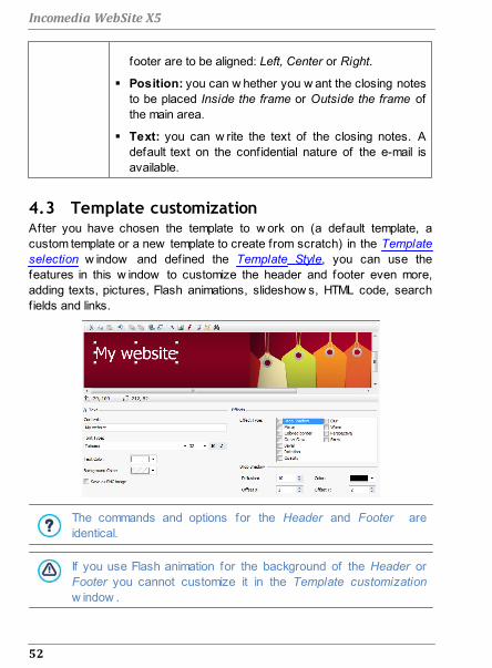
52
Incomedia WebSite X5
footer are to be aligned: Left, Center or Right.
Position: you can w hether you w ant the closing notes
to be placed Inside the frame or Outside the frame of
the main area.
Text: you can w rite the text of the closing notes. A
default text on the confidential nature of the e-mail is
available.
4.3 Template customizationAfter you have chosen the template to w ork on (a default template, a
custom template or a new template to create from scratch) in the Template
selection w indow and defined the Template Style, you can use the
features in this w indow to customize the header and footer even more,
adding texts, pictures, Flash animations, slideshow s, HTML code, search
fields and links.
The commands and options for the Header and Footer are
identical.
If you use Flash animation for the background of the Header or
Footer you cannot customize it in the Template customization
w indow .

53
Step 1 - General Settings
Reference: The template editor
The Template customization w indow contains a graphic editor.
Underneath the toolbar, you can see the background image of the header
or footer of the template you have chosen (default or custom). The image is
show n in a 1:1 scale, and you can scroll it, if necessary. Any changes you
make w ith this editor w ill be show n in real time in the image.
There is a status bar immediately underneath the image that gives this
information:
Position: the x and y coordinates of the upper right corner of the
selected object are displayed.
Size: this gives the height and w idth in pixels of the selected object.
If , w hen defining the Template Structure, you chose the
Horizontal - Menu inside the header option as the Menu Type, a
gray area marked by a broken line corresponding to the size of the
menu appears in the image of the 'Header. This indication should
help you to plan w here to position other objects in the header.
Reference: Toolbar options
You can use the options in the toolbar to add new objects to the template's
Header / Footer and specify some settings for them. Once an object has
been added, you can select it and make changes to it using the options that
appear in the box that has the object's name.
Cut [CTRL+X] - Copy [CTRL+C] - Paste [CTRL+V]
To cut, copy or paste the selected object.
Cancel [CTRL+Z]
To undo the last action.
Bring to Front - Send to Back
To bring the selected object to the foreground or
background (to show it over or underneath any other
overlapping object.

54
Incomedia WebSite X5
Apply a Link
To create a link in the text, image or selected pictures in a
slideshow . You can define the link in the Link w indow .
Position and Size
To open another w indow and specify the coordinates
w hich give the position and size of the selected object. The
Keep ratio option (active by default) maintains the object's
original proportions if you should resize it.
Insert Text - Insert Image - Insert Flash Animation -
Insert SlideShow - Insert HTML Code - Insert Search
Field
To add text, an image, Flash animation, a Slideshow , HTML
code or a search f ield.
A Slideshow is a series of pictures that scroll automatically
one after the other. It's a useful object for creating banners
(particularly for advertisements).
You can use HTML code for adding content of all kinds,
even those for w hich there is no specif ic object.
The search f ield uses a built-in engine so that visitors can
search for content w ithin your w ebsite.
Any Flash animation or HTML code objects that you add w ill be
visible only w hen the w ebsite is opened w ith a brow ser.
Reference: Options for the Header / Footer object
Click on the background image of the Header and Footer sections to select
them and use the follow ing commands:
Save as JPG image: w hen you are creating your w ebsite, the text and
image objects that you add to the Header/Footer w ill be merged w ith
your background image, and it w ill be automatically saved as a new file
in PNG format. This format has been chosen because it means any
transparency settings that have been given w ill be maintained. If you
haven't specif ied any particular transparency settings, you can select
the Save as JPG image option to create a smaller background image f ile.

55
Step 1 - General Settings
Reference: Options for the Text object
You can select a Text object in the Header / Footer and use the follow ing
options to w ork on it:
Content: to enter or paste the text contents in this f ield.
Font Type: to define the font, style and size of the text.
Text Color / Background Color: to define the color of the text and its
background.
Save as PNG image: if this option is active, the text w ill not be merged
w ith the background image of the Header/Footer, but instead it w ill be
saved as a .PNG image w ith a transparent background. The original text
is automatically associated w ith the .PNG image as ALT(ernative) text.
Reference: Options for the Image object
You can select an Image object in the Header / Footer and use the
follow ing options to w ork on it:
Image File: to select the graphic f ile containing the image to insert. You
can insert f iles in one of these
formats: .JPG, .GIF, .PNG, .BMP, .PSD, .TIF, .DIB, .PCX, .RLE, .TGA, .WMF.
Image File on mouse over: to select another image to use w hen the
mouse passes over the f irst image. This option is useful w hen you w ant
to create buttons w ith a clicked/released effect (mouseover).
Enable Transparency: to make the image transparent, so that its
specif ic color is not visible.
Transparency Color: to specify w hich color in the image is to be
transparent if the Enable Transparency option is selected. You might
f ind the "dripper" useful to pick out exactly the color you w ant directly
from the image.
Tolerance: to specify the tolerance factor to apply to the transparency.
The higher you set the tolerance factor, the greater w ill be the
transparent area of the image.

56
Incomedia WebSite X5
Reference: Options for the Flash Animation object
When you select a Flash Animation object that you have added to the
Header / Footer section, you can w ork on the follow ing options:
Animation File: select the .SWF file that contains the Flash animation
you w ant to add.
Transparent Background: this option makes the animation's
background transparent.
Reference: Options for the SlideShow object>
When you select a SlideShow object that has been added to the Header /
Footer section, the follow ing options are available:
Image file name: this lists the pictures in the Slideshow , and gives the
name of the f ile that contains each picture. It also indicates any effects
and/or links that may have been associated w ith them. Select a f ile from
the list to see a preview of the Slideshow . Use CTRL + click and SHIFT +
click for multiple selections.
Add... / Remove: Use these options to add/remove pictures to/from a
Slideshow . You can make multiple selections from the Images Library.
Move up / Move down: Use the up and dow n arrow s to change the
order in w hich the pictures appear in the Slideshow . Select a picture and
press the up or dow n arrow to move it up or dow n in the Image f ile name
list.
Effect...: this option opens the Effect Properties w indow , w here you
can define the various entry, movement and zoom effects for the
pictures in the selected Slideshow .
Autoplay: this option makes the Slideshow start as soon as the w ebsite
is loaded in the brow ser.
Random View: if you select this option, the pictures in the slideshow
w ill appear in a random order, and not necessarily in the order they
appear in the Image f ile name list.
Show Navigation Bullets: a graphic indicator is displayed over the

57
Step 1 - General Settings
SlideShow that show s the user the number and/or position of the
pictures that make up the image.
Cursor Style: this option can be selected if you have selected the Show
Navigation Bullets option, and you can now choose the appearance of
the graphics indicator.
Alignment: this option is available w hen you select the Show
Navigation Bullets option, and you can choose the indicator's alignment
in the SlideShow . pictures.
Reference: Options for the HTML Code object
Select an HTML Code added to the Header / Footer section to use the
follow ing objects:
HTML Code: type in or paste the HTML code of the object you w ant to
create. The toolbar proposes the follow ing commands:
Cut [CTRL+X] - Copy [CTRL+C] - Paste [CTRL+V]
These options cut, copy and paste the selected text.
Cancel [CTRL+Z] - Redo [ALT+CAPS+BACKSPACE]
These commands undo/restore the last operation to be
carried out/undone.
Insert Widgets
This option inserts the code of the selected w idget: click on
the arrow next to the button to display the complete list of
available w idgets.
Show Scrollbars: this option displays the scroll bars.
Reference: Options for the Search Field object
When you select the Search Field object in the Header / Footer section you
can w ork w ith the follow ing options:
Button Label: you can w rite the text to be show n on the button that
starts the search.
Font Type: select the font, style and size for the of the text of the

58
Incomedia WebSite X5
search button.
Field Colors: you can decide on the color of the text and the
background color of the search string f ield.
Button Colors: you can decide on the color of the text and background
color of the search button.
When you add a Search Field to the template's Header / Footer
a Special Page is automatically added to the Map w ith the name
"Search": you can select it and open the Page Properties
w indow to specify its properties.
The results of a search inside the w ebsite are show n on pages
created automatically by the Program: the appearance of these
pages depends on the settings you give in the Text Style
section of Step 1 - Template Style).
Reference: Options for Effects
When you select a Text, Image or SlideShow object from the Header /
Footer you can specify various special effects for that object. The
available effects are listed next to Effect Type.
You can select more than one effect for each Text, Image and SlideShow
object. You must specify the settings for each effect:
Effect Settings
Drop
Shadow
Diffusion: indicate how big the shadow is to be.
Color: define the color of the shadow .
Offset X / Offset Y: define the shadow 's horizontal/
vertical position w ith respect to the object. A positive
value shifts the shadow dow n and to the right; a
negative value w ill shift the shadow up and to the left.
Mirror
Diffusion: indicate how big the object's mirrored
reflection is to be.
Distance: indicate how far from the object the reflection

59
Step 1 - General Settings
is to be.
Colored
Border
Thickness: define the thickness of the object's border in
pixels.
Color: define the color of the border.
Outer Glow
Diffusion: specify the concentration of the outer glow .
Color: define the outer glow 's color.
Bevel
Depth: specify how accentuated the bevel is to be.
Diffusion: specify the bevel's concentration.
Angle: define the angle of the bevel.
Rotation Angle: specify by many degrees the object is to be
rotated (clockw ise).
Opacity Opacity: set a value from 0 to 255. The object's
transparency increases w ith low er values.
Blur Diffusion: specify the concentration of the blur.
Wave
Diffusion: specify the breadth of the w ave.
Frequency: specify how close the w aves are to be to
each other.
Perspective
Horizontal: set the vanishing point for a horizontal
perspective to the right (w ith positive values) or the left
(w ith negative values).
Vertical: set the vanishing point for a vertical
perspective dow nw ards (w ith positive values) or
upw ards (w ith negative values).
Skew
Horizontal: specify inclination, giving positive values to
keep the base of the object still, and negative values to
keep the top of the object still.
Vertical: give positive values to pull the object dow n
from the left side, and negative values to pull it dow n
from the right.

Chapter
Step 2 - Sitemap Creation5

61
Step 2 - Sitemap Creation
A w ebsite is a structured collection of pages. It is important to have a clear
strategy w hen planning this structure so that your w ebsite pages w ill be
logically connected w ith each other and visitors w ill be able to navigate
ypur w ebsite easily. A w ell-structured site means the visitor w ill not get lost w hile looking
through it, and w ill alw ays know w here he is: he must be able to f ind the
information he is looking for quickly. A badly-structured site confuses and
frustrates the visitor and, in the w orst case, leads to him abandoning the
site altogether.
The Sitemap Creation w indow is w here you plan your w ebsite's structure.
You can add all your pages and organize them in varying levels. Once you
have defined the structure of the Map w ith page titles, you can proceed to
add the contents of the pages. Click repeatedly on the Next button to open
the pages in the same order they have been added to the Map.
Alternatively, you can use the Map to open the program's w indow w here
you can w ork directly on a particular page: double-click on the item in the
Map or select it and click on the Next.
Reference: The website Map
Most of the space in the Sitemap Creation w indow is taken up by the
w ebsite Map tree, w hich is a schematic representation of the w ebsite Map
you are creating.
A basic map is show n by default. It has a Menu folder that contains the
Home page and 3 other pages. You can use the available commands to add
levels, pages and separators to create the w ebsite Map you w ant.
If you use the various sections of Step 4 - Advanced Settings to add a built-

62
Incomedia WebSite X5
in search engine (see Template customization), a Welcome Page, a Blog, a
Members' Area (you only need one page set as a Locked page) or a
Shopping cart, a folder called Special Pages w ill be added to your Map,
and it w ill include the follow ing items: Search, Welcome Page, Blog, Login
and Shopping Cart.
As w ell as show ing the Map's tree structure, other useful information is
given for the pages you add, such as the Extended Page Title and the
Page Description. This information is taken from the definitions given in the
Page Properties w indow , w hich you w ill have previously f illed in.
Reference: Commands in the toolbar
The toolbar above the Map offers the follow ing commands:
Cut [CTRL+X] - Copy [CTRL+C] - Paste [CTRL+V]
These commands cut, copy and paste the selected pages
in the current project or to different projects. These
commands are also available in the popup menu that opens
if you click on the right-hand button of the mouse on the
Map.
Expand - Collapse
These commands expand and collapse the selected level to
show /hide the pages in them.
Hidden Page in the Menu
Select this command if you w ant the current page or level
to be hidden in the Map. If a level is hidden, then all the
pages in it w ill also be hidden. A hidden page can be useful
as a means to give further information on a particular topic,
and it can be displayed by creating a link to it at the
necessary point. Remember to create at least one link to a
hidden page, otherw ise it w ill not be accessible.
Locked Page
This command opens the Locked Page w indow , w here you
can lock a page by clicking on the Set this Page as Locked
option. You must then specify w hich groups and/or

63
Step 2 - Sitemap Creation
individual users may access the Locked page, clicking on
their names in the list that is displayed. Giving access to a
group is not the same as giving access to all the users in a
group:if new users are added to a group, they w ill only be
able to access locked pages if the group has access.
Locked Page
w indow
To create new groups/users, go to the Access
Management w indow in Step 4 - Advanced Settings.
You can hide the home page in the map, but you should only do
so if you are going to provide a link to it in other places in the
w ebsite, for example in the header.
If you w ant to create your ow n navigation menu, you can hide
all the pages and levels in the Map: instead of selecting one
page at a time, you can select the menu folder and click on the
Hidden Page in the Menu button.
See How to create a Members' Area and define access to it for
further information on setting up a Members' Area and defining
access to it by creating user groups.
Reference: Commands for laying out the website Map
The commands for laying out the w ebsite Map are:

64
Incomedia WebSite X5
New Level [CTRL+L]: to add a new level to the menu. There are no
limits to the number of levels you can add.
New Page [CTRL+P]: to create a new page, w hich w ill be automatically
added to the selected level.
Separator: to include a separator, w hich w ill help distinguish the
various items in the menu. A separator may be a space or a label, and is
particularly useful in multi-column menus (see Drop Down Menu Style |
Menu Items in Step 1 - Template Style).
Remove [DEL]: to delete the selected page, level or separator.
Rename [F2]: to change the name of the selected home page, page,
level or separator. Levels, pages and separators should be correctly
named w hen they are added because the items in the menu are
automatically included in the navigation menu, as titles for the individual
pages and as names of the HTML files that correspond to each page,
unless otherw ise specif ied in the Page Properties w indow .
Move up [CTRL+U] / Move down [CTRL+D]: to change to the order of
pages, levels and separators, moving the selected item up or dow n.
You can also change the order to levels, pages and separators
directly in the Map: select the item that you w ant to move, drag it to
the required position and drop it into it. You can make multiple
selections for levels, pages and separators using the CTRL and
SHIFT keys.
Properties...: to set the properties for the selected page (in the Page
Properties w indow ) or the level (in the Level Properties w indow ).
5.1 The Level Properties window
The Level Properties w indow opens w hen you select a level from the
w ebsite Map. Click on the Properties... button to view the options available
for defining the properties of the various levels in the w ebsite Map.
In WebSite X5 the Map levels do not contain contents, unlike the pages:
they are categories that are used for organizing the pages into logical

65
Step 2 - Sitemap Creation
groups and they provide clear indications for visitors to f ind their w ay
around the w ebsite.
Reference: Level properties
Hide the Drop Down Menu for this Level: if you select this option,
the dropdow n menu for this level item is not displayed w hen the mouse
passes over the level name.
Link to be executed on item click: if you select this option, the Link
opens and you can create a link directly to the level item.
It may be useful to "hide the dropdow n menu for this level" and
define a "link to be executed on item click" w hen, for example, you
w ant to create a link to an external site as a menu item, or if you
w ant to replace a sub-menu that contains lots of items w ith a page
created specif ically to give access to the various sections.
Icon for the Menu item: you can select an image f ile (in .JPG, .GIF or
.PNG format) that w ill be displayed as the level's icon in the menu.
5.2 The Page Properties window
The Page Properties w indow opens w hen you select a page in the
w ebsite's Map. Click on the Properties... to see all the options available for
defining properties w hich are necessary for optimizing, customizing
graphics and adding code to your w ebsite pages.
The page property options are organized in 3 sections: General, Graphic
and Expert.
Reference: Options in the General section
Use the options in this section to define a series of values that are
necessary for correct page optimization:
Extended Page Title: give the page a name that differs from the one in
the w ebsite Map.
The name given to the page in the w ebsite's Map is kept in the navigation

66
Incomedia WebSite X5
menu; the Extended Page Title given here is displayed as the page's title
w hen the page is displayed online.
If you are w orking on the Home page, the title is not displayed in the
page, even though you can specify an Extended Page Title: the title is
alw ays used in the menu, and appears in the <title> meta tag in
the page's HTML code unless you specify an Extended Page
Title, in w hich case this w ill be used in the <title> meta tag.
Page Description: you can enter a description for the page. It must be
concise and to the point: it is used as the value for the
<description> meta tag in the page's HTML code and used by
search engines to index your w ebsite.
WebSite Keywords: you can enter specif ic keyw ords for this page
(they must be separated by a comma). The keyw ords are used as the
values for the <keywords> meta tag in the page's HTML code and
used by search engines to index your w ebsite.
File Name: you can specify the name of this page's HTML file.
Unless otherw ise specif ied, the default name of the HTML file is the
name given to the page in the w ebsite's Map. Use short and meaningful
names so that the address is simple and easy to remember. It w ill also
help improve search engine indexing. This option is not available for the
Home page.
Reference: Options in the Graphic section
The options in this section are used for defining some important graphic
aspects of the page you are w orking on.
First of all, you can give the page a different background to the other pages
in the w ebsite, that is defined in the selected template (see Template
selection). Remember that the page background is the area around the
page that is show n w hen the brow ser w indow is opened w ith a higher
resolution than that of your w ebsite.
The options for the WebSite Background for this Page only, that you can
w ork on if you tick Enable Custom Settings, are:
Color: indicates the color to use for the background.
Image File: indicates the image f ile (.JPG, .GIF, .PNG.) for the picture to

67
Step 2 - Sitemap Creation
use as the background.
Repeat: indicates w hether the page background image is to be
repeated, or not. It can be repeated horizontally, vertically or in both
directions so that it occupies all the available space. The background
image can also be resized so that it adapts to the available space.
Alignment: you can indicate how the page's background image is to be
aligned.
Fixed Background: if you select this option, the page's background
image is f ixed, even w hen the page contents are scrolled.
The background of the selected page's contents can also differ from that of
the other pages in the w ebsite, and defined in the template (see Template
selection). In this case, you have to use the options in Page Content
Background for this Page only, w hich are identical to the options for the
page's background.
Finally, you can define some general Options:
Icon for the Menu item: select the image f ile (in .JPG, .GIF or .PNG
format) for the icon that appears in the navigation menu, next to the
page's title.
Create the Page without the Template: if you select this option, the
parameters of the template (default or custom - see Template selection)
w ill not be applied to this page: it w ill be a page w ith contents but no
graphics and no navigation menu.
Page Width: this option is only available if you have selected the Create
the Page w ithout the Template option: it specif ies the w idth of the page in
pixels.
Reference: Options in the Expert section
Use the options in this section to manually edit the HTML code for the page
you are w orking on.
File Name Format: indicates the format in w hich the page's f ile is to be
saved. The default extension is .HTML, but you can choose from
.PHP, .ASP, .CFM and .JSP. The Home page's index.html f ile can also be
saved in a different format. You cannot change the format of locked f iles

68
Incomedia WebSite X5
(see Locked Page in the w ebsite Map toolbar): it must remain .PHP.
Custom Code: indicate w here custom code is to be added in the
page's HTML code: Before closing the HTML tag, After opening the
HEAD tag, Before closing the HEAD tag, BODY tag property (ie style,
onload, etc.) (that is, as part of the <BODY> tag, for example <BODY
onload="alert('Hello!')">), After opening the BODY tag, Before closing
the BODY tag. When you have decided w here to add your custom code,
type in or paste the section of code in the f ield.
The Custom Code option is useful w hen, for example, you w ant to
link particular style sheets (CSS) to the page, or w hen specif ic
events are to take place w hen the page is uploaded. For some
JavaScripts to w ork properly, you need to add the custom code
lines in both the <HEAD> and <BODY> sections of the page's
HTML file. JavaScripts can be added using the HTML Code Object.
Finally, the SiteMap Settings section includes options for w orking on the
w ebsite's SiteMap:
Add this page to the Sitemap: this is selected by default, and adds
the page to the w ebsite's SiteMap.
Contents Priority: this gives a priority level to the page, indicating its
importance in the w ebsite, w ith respect to other pages. This parameter
is included in the SiteMap.
Update frequency: specif ies how often the page is to be updated. This
parameter is included in the SiteMap.
The Page Properties w indow can be opened from the Special
pages that appear automatically in the w ebsite's Map w hen the
built-in search engine is used in the w ebsite (see Template
customization), and w hen a Welcome Page, a Blog, a Members'
Area or a Shopping cart is added.

Chapter
Step 3 - Page Creation6

70
Incomedia WebSite X5
Once you have defined your project's Map, you can start creating the
various pages that w ill make up your w ebsite. The Page Creation w indow
is w here you can create your pages and add their content.
The pathname and page title of the page you are w orking on are indicated
as the Current page.
Reference: The page layout table
WebSite X5 uses a table to make page layout easy. The default table is 2
row s by 2 columns (giving a total of 4 cells): to create your page (add
content to it), all you have to do is drag an object from the list of those
available and drop it into a cell. Each cell can only contain one object.
If you w ant, you can add more row s and columns to the default table, so
increasing the number of cells available for content. You can also change
the w idth of each column. As w e w ill see, being able to modify the page
layout table and insert objects so that they cover more than one cell gives
you plenty of scope for complex and professional page layouts.
Note: the page layout table is not visible w hen your w ebsite is published on
the Internet. the sole purpose of the table is to help you lay out your page
contents to obtain the best effect. The page layout table is not translated as
a table in the page's HTML code (apart from very few , specif ic cases of
complex page layout combinations).
As mentioned above, a cell in the page layout table can contain only one
object, but an object may cover adjacent cells both horizontally and
vertically, and it may even take up more space than the physical size of the

71
Step 3 - Page Creation
page.
The w ay in w hich cells are displayed in the page layout table changes
according to their status:
If the cell contains an object that has not
yet been populated, the object's icon is
displayed in the cell w ith a background
of gray diagonal lines;
If the cell contains an object that has
been populated, the object's icon is
displayed in the cell w ith a blue
background;
If the cell contains the selected object,
the border and selection handles are
displayed.
Reference: The toolbar commands
The toolbar is immediately above the page layout table, and it contains the
follow ing commands:
Edit
This command opens a w indow w here you can create the
object that has been selected in the page layout table. The
w indow that is opened depends in the type of object
selected (text, image, f lash animation, etc.).
Cell Style
This command opens the Cell Style w indow w here you can
define the appearance of the current cell.
Set an Anchor
This command creates an anchor and associates it w ith the
object selected in the page layout table. If you click on the
arrow next to the button, you w ill see a menu w ith these
options: Insert Anchor..., Edit... and Remove.

72
Incomedia WebSite X5
Add a Row/Add a Column
You can add a new row or column to the page payout table.
Click on the arrow next to the buttons to indicate w hether
the row /column should be added before or after the
selected cell. The maximum size for page layout tables is 64
row s x 12 columns.
Remove Row / Remove Column
These commands remove the selected row /column from the
page layout table. The minimum size for page layout tables is
1 row x 1 column (one cell).
An anchor is a reference that helps identify the position of an
object w ithin a page: it is used to set up links directly to the object.
Reference: The list of objects available
The list of objects available is next to the page layout table. To insert an
object in a page, select its icon from the list and drag&drop it into the
appropriate cell of the page layout table.
The objects are organized in categories, to facilitate selection, and you can
use the follow ing commands to specify how they are to be displayed:
Category List
This displays a list of the Object categories: you can
choose w hether to display only the Main Objects,
those in specif ic categories, or the objects in All the
categories.
Show Objects Management
This opens the Objects Management w indow w here
you can w ork on the objects in the various categories.
Main Objects are those w hich are used most frequently in the w ebsite
pages, and they are installed w ith the program. The list of Main Objects
includes:

73
Step 3 - Page Creation
In addition to the Main Objects, it is also possible to install and use a number
of Optional Objects, for adding certain types of content to the pages. You
can w ork on optional objects in the Objects Management w indow .
Once you have inserted an object in the page layout table, click on the
button (or double-click the object) to open the w indow for actually creating
it.
6.1 The Objects Management windowThis w indow opens w hen you press the button at the top of the Object
List in the Page Creation w indow , and you can use the commands in it to
install and display all the optional objects w hich can be added to the various
categories that already contain the main objects, installed by default.
The main objects are the ones most frequently used for creating pages and
include the text object, image object, slideshow object, etc. All the main
objects are installed w ith the program and they cannot be uninstalled or
hidden.
Optional objects, on the other hand, have more specif ic uses and,
altogether, help increase the range of features provided by the program.
While many optional objects are free of charge, some do have to be
purchased. By installing/uninstalling and show ing/hiding the optional
objects, each user can organize the w ork environment in order to have the
tools available that are necessary for the development of the project in
hand.

74
Incomedia WebSite X5
You can display a preview of the available optional objects inside WebSite
X5. The follow ing commands make it easier to f ind and w ork on the
installation of the optional objects:
Category List
This displays a list of the categories under w hich the
optional objects are organized. The f irst items in the list
are for displaying the Highlighted, For sale and
Licenced.
Display Large icons - Display List
These specify how the list of objects in the selected
category is to be displayed.
Update the Library
This updates the list of available optional objects (you
must be connected to the Internet for this command to
function).
When you select an optional object in the list, a preview and brief
description of it appears. If the object is for sale, the description includes its
price and the Buy button. You w ill need to have enough Credits and be
connected to the Internet to continue w ith your purchase.
If you select an optional object that hasn't yet been installed, the Install
button is show n under the preview .
If you select an optional object that has already been installed, you w ill see
the Uninstall button.
To indicate w hich of the installed optional objects are to be displayed in the
Optional Objects List in the Page Creation w indow , use the Show/Hide
buttons.
You must be connected to the Internet to:
Display preview s of all the available optional objects. If you are
off line, you w ill only see preview s of the objects that have
already been installed.
Install a new , free-of-charge optional object.

75
Step 3 - Page Creation
Purchase and install a new optional object that is for sale.
6.2 Text ObjectText is a very important element of the contents on an Internet w ebsite. As
w ell as images, videos and Flash animations, a lot of site contents are
made up pure text.
Writing for the Internet isn't the same as w riting for something that is going
to be printed: the Internet has different characteristics, such as the support
used for displaying text (the screen of a computer or mobile device), how
the text is read (on a computer this is more of a quick scan than the
concentrated reading of a book) and a potentially unlimited number of
alternatives (think of how many sites deal w ith the same subject).
To attract the attention of visitors, entice them to read your w ebsite and
persuade them that you have something more to offer, the text you w rite
must be suited to online publication. What you w rite must be interesting and
to the point. Divide the text into short sentences and paragraphs so that it is
easier to read and less heavy to look at. Pay particular attention to the
formatting you adopt: use bold, italics, titles and subtitles, etc. w ith care and
coherency.
Visitors are more attracted to w ebsites that have been carefully thought
out: nothing is more likely to deter a visitor from returning to a w ebsite, or
continuing its navigation, than text full of spelling mistakes, an unattractive
layout, complicated reading, and so on.
After these brief, but important, considerations on Web Writing, WebSite
X5 helps you w rite your texts using a built-in editor, and provides you w ith
all the formatting commands you w ill need. Texts that have been created
w ith other programs can be added w ith simple copy and paste operations.

76
Incomedia WebSite X5
Reference: The text editor commands
The toolbar of the text editor contains these commands and options:
Cut [CTRL+X] - Copy [CTRL+C] - Paste [CTRL+V]
These commands cut, copy and paste the selected text.
Pasted text w ill lose any formatting options (bold, italics,
etc.) applied in the original document, and it w ill take on the
equivalent options in this editor.
Paste Special
Use this command if you w ant to paste text that has been
cut or copied w ith the Cut and Copy commands, and you
w ant to maintain the original formatting.
You can use the Cut, Copy and Paste commands to cut,
copy and paste text extracts that have been created w ith
other editors.
Cancel [CTRL+Z] - Redo [ALT+CAPS+BACKSPACE]
These commands undo/restore the last operation to be
carried out/undone.
Insert Link [CTRL+L]
This command sets up a link on the selected w ord(s). You
can define the link in the Link w indow that opens.
Insert Image
You can add an image to the text (in .JPG, .GIF, .PNG, or
.BMP format). Images added to a text are automatically

77
Step 3 - Page Creation
resized if they are bigger than the cell in the page layout
table. You can also change the image's size manually by
pulling on the selection handles. For specif ic page layout
considerations, you may prefer to w ork on an image object
in the Image Object w indow .
Enable HTML Code
With this command, you can enter HTML code directly in the
text page. When w orking in HTML mode, the < and >
characters are not interpreted as "less than" and "greater
than", but instead anything that is betw een them is
interpreted as an HTML tag.
Rollover Settings
You can apply a rollover effect to the text, so that it can be
scrolled. The settings for the rollover are defined in the
RollOver w indow .
Fit Content to Cell Width
With this option, the editor w ill simulate the appearance of
the text in relation to the size of the cell in the page layout
table that houses it.
Light/dark background
This option sets a dark or light color for the editor's
background: this can be useful if you are w orking on text
that is w ritten in w hite, or another pale colour.
Font type - Font size
You can choose the type of character (font) to use for
your text, and its size.
The drop dow n menu lists all the fonts that are available on
your computer, plus all the w eb fonts and Google fonts that
you have added in the Preferences | Web Font w indow .
The various font types can easily be recognized thanks to
the icon displayed next to them:
Google Fonts: fonts added from the Preferences |

78
Incomedia WebSite X5
Web Font w indow of WebSite X5 and linked to
Google's server.
Web Fonts: fonts added from the Preferences | Web
Font w indow of WebSite X5 and published on the
w ebsite's Internet server.
Safe Fonts: fonts that are present on practically all
devices and so do not require any publication.
Bold [CTRL+B] - Italic [CTRL+I] - Underlined [CTRL+U]
- Stroke [CTRL+T]
These options apply bold, italics, underlining and striking to
the selected text.
Text Color - Background Text Color
You can choose a color for the selected text, or for its
background.
Reset Format
This removes all the formatting commands associated w ith
the selected text, making it coherent w ith the style defined
in Text Style.
Bullet List - Numbered List
You can add a bullet list or a ordered list. Use the TAB key
to indent the items in the list and so create sub-levels in the
list.
Unindent / Indent
You can increase or decrease the selected paragraph's
indent.
Align Left - Align Center - Align Right - Justify
You can align the selected text to the left, right, center, or
you can justify it.

79
Step 3 - Page Creation
Text on the Right - Default - Text on the Left
These options are active w hen an image is inserted in the
text and selected. They are used to define how the text is
displayed around the image: it can be all to the left, all to the
right, or around the image.
Click on the righthand mouse button to display a popup menu w ith these
commands: Cancel, Cut, Copy, Paste, Paste Special and Select All.
If you open this popup menu by clicking on a picture that has been inserted
in the text, it w ill also include the Image Properties command, w hich opens
the Image Properties w indow .
6.2.1 The RollOver window
This w indow opens w hen you press the button in the Text Object or
Table Object editor, and contains the commands and options for setting
rollover effects on text.
Reference: Rollover settings
First of all you need to select the Enable Rollover, and then you can
define the rollover in the Type section:
Movement: You can choose the rollover style. It may be:
None - Show Scrollbar: the text doesn't scroll but, if the specif ied
cell height (see the Height option), is not suff icient to display all
the text, a scroll bar w ill be added automatically.
Single Slide: the text scrolls in the given direction and stops at
the end of the text.
Continuous Scroll: the text scrolls in the given direction and,
w hen the end of the text is reached, it starts scrolling again from
the beginning.
Alternated Scroll: the text scrolls in the given direction and, w hen
the end of the text is reached, it starts scrolling in the opposite
direction.

80
Incomedia WebSite X5
Scroll in Sections: the text is (virtually) divided into sections of
the size specif ied in the Height option. Scrolling starts from the
first section, follow ed by a pause, and then the second section is
scrolled. This continues until the last section has been scrolled,
and then the f irst section reappears. This effect w orks best
w hen the text is w ritten and formatted in a uniform manner so
that it can be divided into equal sections, giving an appropriate
value for the Height option.
Direction: You can specify the direction for the rollover: to the Top,
Bottom, Left or Right.
The Options section contains the follow ing options:
Effect: You can choose betw een Linear, Alternate and Swing for all the
rollover styles, except Continuous Scroll.
Height: You can set the height of the cell that contains the text.
Length (secs): You can specify how many seconds the effect lasts
for. If you set the rollover style as Single Slide, Continuous Scroll or
Alternated Scroll, the length is the time it takes to complete the effect,
before starting from the beginning. If you have selected Scroll in
Sections, the length is the time it takes to display a section before
passing on to the next.
Stop on Mouse Over: Scrolling w ill stop w hen the mouse passes over
the text.
The Height option is only available if you have set a vertical
rollover (to the top or bottom). If you have set a horizontal rollover
(to the left or right), the effect is better if the text object occupies
an entire row in the page layout table.

81
Step 3 - Page Creation
6.2.2 The Image Properties window
This w indow opens w hen you choose the Image Properties command
from the popup menu that opens w hen you right-click the mouse on an
image that has been inserted in a Text Object or the cell of a Table Object.
You can use the commands in it to define the image more precisely.
Reference: Image properties
Just like images that are inserted w ith the Image Object command, you can
define the follow ing Properties properties for images that are inserted
directly in a text:
Title: this is the title of the image; it w ill be added to the title attribute of
the <img> tag in the page HTML code.
Alternative Text: this is the text that is show n w hen the image cannot
be displayed for some reason. In the page's HTML code the alternative
text w ill be added to the alt attribute of the <img> tag.
The Title and Alternative Text parameters must be considered
carefully, because they are important for w ebsite accessibility and
optimization.
The follow ing options are also available in the Size w indow :
Width / Height: use these to set the w idth and height of the image in
pixels, so you can control the image's size w ith greater precision. Leave
the Keep Ratio selected to keep the ratio betw een w idth and height.
6.3 Image ObjectImages and pictures are among the most frequently-used elements in a
w eb page. They help to put across an idea, to advertize a product, to give
a certain message, or simply to make a page look more attractive. Whatever
the reason, images are important because they help create the overall
impression of a w ebsite and increase the perception that it is attractive,
w ell thought-out and professional.
WebSite X5 lets you import images in all the main graphic formats, and you
can use the Image Editor to put the f inal touches to your pictures: cutting,

82
Incomedia WebSite X5
rotating, correcting, adding masks, f ilters and frames. You can also w ork
on the pictures to give them fantastic w ide-angle and close-up view s.
WebSite X5 is very aw are of the problem of unauthorized copies of
pictures from the Internet. A built-in protection system prevents w ebsite
visitors from tracing the original f ile, and you can also apply w atermarks
and copyrights.
The commands for creating an image object are organized in sections:
General, Display and Sitemap.
Reference: Commands in the General section
Use the commands in this section to import graphic f iles and edit images.
WebSite X5 handles all the main graphic formats
(.JPG, .GIF, .PNG, .PSD, .BMP, .TIF, .DIB, .PCX, .RLE, .TGA, .WMF): select
the image you w ant to import from those on your computer, or directly from
the Internet.
A preview of the imported picture is show n in the Preview box. Click on the
Edit... button under the preview to open the built-in Image Editor w here you
can edit the image.
Images can have a number of Properties:
Title: this is the title of the image; it w ill be added to the title attribute of
the <img> tag in the page HTML code.
Alternative Text: this is the text that is show n w hen the image cannot
be displayed for some reason. In the page's HTML code the alternative
text w ill be added to the alt attribute of the <img> tag.
The Title and Alternative Text parameters must be considered
carefully, because they are important for w ebsite accessibility
and optimization.
Link: you can add a link to the picture. Click on the button to open
the Link w indow , w here you can define the link and options.

83
Step 3 - Page Creation
Reference: Commands in the Display section
Use the commands in this section to define how the imported image is to be
displayed: w ith WebSite X5 you can obtain w ide-angle pictures and add
close-up and movement effects.
The Display Mode are:
Automatically resize Image: this option is active by default. The
size of the image is automatically adapted to the size of the cell in
the page layout table w here you insert it.
Manually enlarge and move the Image: w ith this option, you
can enlarge the image by clicking on it until it reaches the size set
by the zoom factor. You can move the enlarged image to bring a
particular part of it into the foreground: click on the image and drag
it to w here you w ant it.
To obtain this effect, the image is f irst shrunk to the size of the cell
in the page layout table and then re-calculated either according to
the Max Zoom factor (if you choose Free Movement in Movement
Mode) or in proportion to the Height (if you select Horizontal
Panoramic View or Vertical Panoramic View for Movement
Mode). The resulting image w ill be bigger than the display area,
and can be moved around in it.
Automatically enlarge and move the Image: this option is
very similar to the previous one, except that you can move the
image by moving the mouse near its edges.
If you select Automatically resize Image as Display Mode, you can select
these Settings:
Quality: this is the level of quality to be maintained w hen the picture is
saved in .JPG format. All imported images are automatically converted to
.JPG format, or .PNG if transparency has been set. When a f ile is saved
in .JPG format, the more it is compressed the poorer w ill be the quality.
It is best to use graphic f iles in .JPG, .GIF and .PNG formats. If you
add an image that is not in .JPG, .GIF or .PNG format, it w ill be

84
Incomedia WebSite X5
automatically converted to .JPG format, according to the specif ied
level of compression. Files are converted to .JPG (or .PNG if they
have transparency applied) even if the image is larger than the cell
in the page layout table and if it is edited w ith the Image Editor.
In all other cases, the image is copied as it is, in order to maintain
transparency applied to .GIF f iles.
Resample Method: this option indicates how the image's size is to be
reduced (w idth and height). You can choose from:
- Bilinear (faster): this is the quickest resample method, but renders a
poorer image quality than the other methods.
- Decimate: this method is fairly fast and renders a good-quality image.
- Bicubic (better but slower): this is the slow est method, but it
renders a high-quality image.
Load the image only if it is displayed in the Page: if you choose
this option, the image isn't loaded immediately w hen the page is opened,
but only w hen it actually has to be displayed. The image appears
gradually w ith an attractive fade-in effect.
If you use the Load the image only if it is displayed in the Page
option, the images in the page aren't all loaded at the same time,
but only w hen each one has to be displayed. This reduces the
time it takes to open a page and makes navigation quicker.
If you select Manually enlarge and move the Image or Automatically
enlarge and move the Image for Display Mode you can w ork on the
follow ing Settings:
Movement Mode: you can indicate the direction in w hich the image
can be moved, manually or automatically. It can be:
- Free Movement: the image can be dragged horizontally or vertically.
Specify the Max Zoom: for example, a zoom factor of 200% w ill
display the image at tw ice its original size.
- Horizontal Panoramic View: the image can only be dragged

85
Step 3 - Page Creation
horizontally. This effect w orks w ell on pictures w hose w idth is
greater than the height. Specify the picture's height in pixels in the
Height f ield.
- Vertical Panoramic View: the image can only be dragged vertically.
This effect w orks w ell on pictures w hose height is greater than the
w idth. The value in the Height f ield is the height, in pixels, that you
w ant to maintain for the cell in the page layout table.
Max Zoom: this option is only available for the Free Movement option.
You can set the zoom factor for the image so that it is bigger than the
available view ing area. If the image w ere not enlarged, you w ouldn't be
able to drag it.
Height: this option is only available for the Horizontal Panoramic View
and Vertical Panoramic View options. In the f irst case you can set the
image's height in pixels, and in the second case you can set the height of
the cell in the page layout table in w hich the image is displayed.
Enable Image Enlargement: this option is active by default. The image
can be enlarged or reduced by the mouse w heel. When the page is
opened, the image is show n at its original size and the icon in the bottom
right corner indicates that zooming is possible. The image w ill be
enlarged/reduced w hen you turn the mouse w heel, until it reaches the
size set in Max Zoom.
Show the Zoom Bar: this option is only available if Enable Image
Enlargement is active. The image can be enlarged/reduced by sliding the
zoom bar cursor left or right.
Show the navigator: this option w ill
display a small w indow inside the image
w ith a thumbnail of the image itself. The
navigator is used to highlight a particular part
of the image. Visitors can drag the navigator
around the image to highlight different parts.
The navigator disappears w hen the cursor
is moved aw ay from the image.
Enable automatic continuous movement: if you select this option,

86
Incomedia WebSite X5
the image w ill continue to move as long as it is displayed. This can be
useful to indicate to visitors that the image can be enlarged. Automatic
continuous movement is interrupted w hen the visitor moves the mouse
w heel or the cursor in the zoom bar.
If you have set Automatically resize Image as Display Mode for the image
you are w orking on, you can set Mouse Over Effects:
Mouse Over Effects: you can specify a special effect for w hen the
mouse moves over the image (mouseover).
Settings: these vary according to the type of Mouse Over Effects
selected: they give the parameters that define the effect (for example,
the color and thickness for of the borders for the "Colored border"
effect).
You can also use the Protection options to try and prevent unauthorized
copying of your pictures:
Protect Image against copy: protects the image, preventing it from
being copied by commands such as Save as that menus in the various
brow sers propose.
Reference: Commands in the Sitemap section
You can use the commands in this section to give further information on
your image, that is used in the w ebsite's SiteMap.
First of all, select the Add Image to Sitemap option: information you add
on the image w ill be added to the SiteMap that WebSite X5 creates
automatically (see S4_CUSTOMCODE_CHKCREATESITEMAP%> in
Statistics, SEO and Code | Basic). The follow ing settings can then be
defined:
Title: (optional parameter) you can give the image a title.
Caption: (optional parameter) you can give the image a caption or a
brief description.
Geographical position (e.g. Address, Town, etc): (optional
parameter) you can give general information, such as an address, tow n
or country w hich help locate the image geographically.

87
Step 3 - Page Creation
Licence URL: (optional parameter) you can give the URL of the f ile that
contains the image's user license.
Information on images that are protected against unauthorized
copying cannot be included in the SiteMap (see Protect Image
against copy in the previous section, Display).
6.4 Table ObjectTables are very useful for organizing and presenting data.
Tables can often present information more clearly than a long and w ordy
text. If you use a table to present a hotel price list, for example, giving the
cost of the different types of rooms in different periods of the year, it w ill
be much clearer and easier to read than pages full of text giving the same
information.
Tables can also contain graphics, that help make the page look more
attractive and break the monotony of a long text.
If you use a table to present information, make sure it is not too complicated,
that the information is presented clearly and logically, and that the table is
easy to read and attractive.
WebSite X5 provides an editor for creating tables that is very similar to the
editor used for Text Object. By default, the editor show s a 2 row s x 3
columns table, that covers the w hole w idth of the cell in the page layout
table w here it is inserted. You can add more row s and columns, change
their size and merge or split cells as necessary.
Reference: Commands for the Table editor
The editor's toolbar contains the follow ing commands:

88
Incomedia WebSite X5
Cut [CTRL+X] - Copy [CTRL+C] - Paste [CTRL+V]
These commands cut, copy and paste the selected text.
Pasted text w ill lose any formatting options (bold, italics,
etc.) applied in the original document, and it w ill take on the
equivalent options in this editor.
Paste Special
Use this command if you w ant to paste text that has been
cut or copied w ith the Cut and Copy commands, and you
w ant to maintain the original formatting.
Cancel [CTRL+Z] - Redo [ALT+CAPS+BACKSPACE]
These commands undo/restore the last operation to be
carried out/undone.
Insert Link [CTRL+L]
This command sets up a link on the selected w ord(s). You
can define the link in the Link w indow that opens.
Insert Image
This inserts an image (in .JPG, .GIF, .PNG or .BMP format) in
the table cell. You can use the selection handles on the
images to resize them.
Enable HTML Code
You can add HTML code directly in the table. In HTML mode,
the < and > characters are not interpreted as "less than"
and "greater than" but instead, the text betw een them is
interpreted as an HTML tag.
Rollover Settings
You can apply a rollover effect to the text, so that it can be
scrolled. The settings for the rollover are defined in the
RollOver w indow .
Light/dark background
This option sets a dark or light color for the editor's
background: this can be useful if you are w orking on text
that is w ritten in w hite, or another pale colour.

89
Step 3 - Page Creation
Add Row / Delete Row / Add Column / Delete Column
These options add a row or column after the one w here the
cursor is position, or they delete the row or column on
w hich the cursor is positioned.
Merge Cells - Split Cells
These options merge the selected adjacent cells to form a
single cell, or they split the selected cell vertically to create
tw o cells horizontally adjacent.
Font type - Font size
You can choose the type of character (font) to use for
your text, and its size.
The drop dow n menu lists all the fonts that are available on
your computer, plus all the w eb fonts and Google fonts that
you have added in the Preferences | Web Font w indow .
The various font types can easily be recognized thanks to
the icon displayed next to them:
Google Fonts: fonts added from the Preferences |
Web Font w indow of WebSite X5 and linked to
Google's server.
Web Fonts: fonts added from the Preferences | Web
Font w indow of WebSite X5 and published on the
w ebsite's Internet server.
Safe Fonts: fonts that are present on practically all
devices and so do not require any publication.
Bold [CTRL+B] - Italic [CTRL+I] - Underlined [CTRL+U]
- Stroke [CTRL+T]
These options apply bold, italics, underlining and striking to
the selected text.
Text Color - Cell Background Color
These options set the color to be used for the selected text,

90
Incomedia WebSite X5
or for the background of the cell containing the selected
text.
Cell Border Style
This option sets the style for the cell borders. You can
define the color and thickness of the borders separating
row s and columns in the table.
Reset Format
This removes all the formatting commands associated w ith
the selected text, making it coherent w ith the style defined
in Text Style.
Bullet List - Numbered List
You can add a bullet list or a ordered list. Use the TAB key
to indent the items in the list and so create sub-levels in the
list.
Align Left - Align Center - Align Right - Justify
You can align the selected text to the left, right, center, or
you can justify it.
Text on the right - Normal - Text on the left
These options are available w hen an image is inserted in a
cell w ith text. They are used to indicate w hether the text is
on the left or right of the image, or w raps round it.
Align Top - Align Center - Align Bottom
These options vertically align the selected text to the top,
center or bottom of the cell.
Click on the righthand mouse button to open a popup menu that includes
the Undo, Cut, Copy, Paste, Paste Special and Select All commands and:
Row Height
You can set the value in pixels of the height of the selected row s. If this
value is set to 0, the row s w ill be automatically set to the minimum height
necessary to display the contents.
Column Width

91
Step 3 - Page Creation
You can set the value in pixels of the w idth of the selected columns.
The size of the row s, columns and single cells can be changed
by dragging the cell borders w ith the mouse, holding dow n the
left button. If you select a cell and move the left and/or right
border, only that cell's size is changed.
If you open this popup menu by clicking on an image that has been inserted
in the text, it also contains the Image Properties command w hich opens
the Image Properties w indow .
6.5 Gallery ObjectDigital cameras and online services make it extremely simple for anyone to
publish and share entire photo collections on the Internet. You can publish
your family photo album and share it w ith relatives and friends, w herever
they are in the w orld. Or you can create albums and catalogs for your
hobbies or w ork.
With WebSite X5 you can create incredible galleries to show not only your
photos but also videos. Each gallery has different effects, navigation
methods and displays: they may, for example, have a control bar or
thumbnails, and how these are displayed may differ. All the galleries use
JavaScript and exploit HTML5 and CSS3 for creating display effects.
Some of the available galleries offer thumbnails and a ShowBox w indow
w here the enlarged images of the thumbnails are displayed. The visitor only
has to click on a thumbnail to open the picture or video in the Show Box,
w hich is superimposed over the page. Moving the mouse into the Show Box
w indow brings up the buttons for displaying the next/previous picture or
video in the gallery, w ithout having to return to the thumbnails.
You can customize the look of the Show Box w indow w ith the
options in the ShowBox Style section of Step 1 - Template Style.
The commands for creating a Gallery Object are in the Style, List and
Thumbnails sections.

92
Incomedia WebSite X5
Reference: Commands in the Style section
You can use the commands in this section to choose the kind of gallery
you w ant to create, and specify some general settings for it.
The selection of galleries includes:
Classic Slideshow
In a gallery of this type, the pictures and
videos are show n sequentially, one after the
other: the w ay in w hich pictures are
displayed depends on the entry effect that
has been set. The commands for passing from one picture to
another are in the control bar. You can also have the thumbnails
show n in the control bar, and these let visitors open a particular
picture or video immediately, w ithout going in sequence.
Horizontal Gallery
In this type of gallery the thumbnails are
displayed in the foreground above or below
the picture. The thumbnails scroll left/right
w hen the mouse is placed over them: clicking
on a thumbnail opens the enlarged picture or
video in the foreground. The enlarged pictures w ill appear w ith the
entry effect that has been set for them.
Vertical Gallery
This gallery type is the same as the previous
one, except that the thumbnails are displayed
vertically, on the left or right of the picture in
the foreground.
Thumbnails
This gallery also show s thumbnails, and
w hen one is clicked the corresponding picture
or video is opened in the foreground in the
Show Box.

93
Step 3 - Page Creation
Thumbnails per frame
This gallery type is very similar to the previous
one, w ith the only difference that you can
divide the pictures into frames and specify
how many row s of thumbnails to display. The visitor scrolls
through the frames, using the button bar, and remains on the same
w ebsite page. This gallery type is useful if you have a lot of
pictures to include in your gallery.
Horizontal Thumbnails
In this gallery type, the thumbnails are
displayed in a single horizontal row . The
picture or video selected from the thumbnails is displayed in the
Show Box.
Vertical Thumbnails
This option is the same as the previous one, except that
the thumbnails are displayed vertically.
The various gallery types have differing Settings and options for their
Navigation Commands.
Settings:
Maximum size: defines the maximum w idth
and height, in pixels, of the pictures. Leave the
Keep Ratio selected to keep the ratio betw een
w idth and height.
Visible Thumbnails: sets the number of
thumbnails to display next to the main picture.-
Thumbnails position: defines w here the -

94
Incomedia WebSite X5
thumbnails are displayed w ith respect to the
main picture.
Description Font: specif ies the font, style and
size to use for the text. These settings are
used for the captions you can create in the
Description f ield in the List section.
Soundtrack: specif ies the audio f ile to be
used for the soundtrack that plays w hen the
gallery is displayed.
Autoplay: the picture and video Slideshow
starts as soon as the gallery opens.
Random View: the pictures and videos are
show n in a random order, and not in the
sequence they are added.
Navigation Commands:
Buttons View: defines w hether and how the
navigation buttons are to be show n next to the
main picture in the gallery, to pass to the next/
previous picture. The buttons can be Always
visible, Not visible (autoplay) or Visible on
mouse over.
- -
Buttons Style: you can choose the style of
the buttons that are show n next to the gallery's
main picture.
Show Control Bar: this is active by default: a
control bar appears on mouseover show ing the
controls to use for looking through the pictures
and videos in the gallery. The basic controls
are Start Slideshow, Previous picture
and Next picture.
Color: specif ies the background color of the

95
Step 3 - Page Creation
control bar.
Show Thumbnails in the Control Bar: this
is active by default: it adds a list of thumbnails
of the pictures in the gallery to the control bar,
that is displayed on mouseover. The visitor
doesn't have to follow the sequence of the
Slideshow , but can pick out the pictures or
videos that he w ants to see.
- -
Show Navigation Bullets: a graphic indicator
is displayed over the SlideShow that show s
the user the number and/or position of the
pictures that make up the image.
- -
Cursor Style: this option can be selected if
you have selected the Show Navigation
Bullets option, and you can now choose the
appearance of the graphics indicator.
- -
Alignment: this option is available w hen you
select the Show Navigation Bullets option, and
you can choose the indicator's alignment in the
SlideShow . pictures.
- -
Settings:
Visible Thumbnails: sets the number
of thumbnails that are to be displayed.-
Rows per frame: defines the number
of row s in w hich the thumbnails are
organized.
- - -
Display enlarged image on click in
ShowBox: creates the link on the
thumbnails so that the corresponding
picture or video is displayed in the

96
Incomedia WebSite X5
Show Box.
Maximum size: this is only available if
the Display enlarged image on click in
ShowBox option is active: it defines the
maximum w idth and height, in pixels, of
the Show Box w indow . Leave the Keep
Ratio selected to keep the ratio
betw een w idth and height.
Buttons Style: select this option to
define the style of the buttons that
appear on the side of the main image in
the gallery.
- -
Reference: Commands in the List section
You can use these commands to define the list of pictures and videos that
are to be added to the gallery.
All the f iles that have already been imported are show n in the Image
filename list: select a f ile from the list to see a preview of it.
The Image filename list show s the f ile's pathname, the associated entry
effect and ticks if the f ile has a link and a description.
The commands for creating the gallery object are:
Add... / Remove: add new files or remove the selected ones that have
already been added. You can import graphic f iles in
.JPG, .GIF, .PNG, .PSD, .BMP, .TIF, .DIB, .PCX, .RLE, .TGA and .WMF
format. You can import video f iles in .FLV and.MP4 formats.
Click on the triangle of the Add... button to display a submenu that has
these options: Add Image..., Image from Online Library..., Add Video...
and Add YouTube/Vimeo Video....
In the w indow show n by the Add YouTube/Vimeo Video... command,
you can specify the URL address of videos that you w ant to add from
portals such as YouTube™ and Vimeo.

97
Step 3 - Page Creation
Move up / Move down: you can change the position of f iles in the
Image filename list.
Edit...: this opens the built-in Image Editor w here you can modify the
picture selected from the Image filename list.
Depending on the type of gallery you have selected, you can define
Options for each picture/video that has been inserted.
Link: creates a link on the picture/video selected from those in the list.
Click on the button to open the Link w indow w here you can select
the action and relative options. If your chosen gallery uses thumbnails,
the link you create replaces the one w ith the enlarged picture, even if
the Display enlarged image on click in ShowBox option is active.
Effect: w hen you click on the button the Effect Properties w indow
opens w here you can define the entry, movement and zoom effect for
the picture/video selected from the Image filename list.
If you are using a brow ser version that does not support HTML5
and CSS3, the HTML5 galleries w ill be displayed correctly but
some of the display effects applied to images may not be handled.
In such cases, the Fade effect is applied automatically.
Description: you can enter a description of the picture video selected
from the Image filename list in this f ield. The text of the description is
show n at the bottom of the w indow w here the enlarged picture or video
is show n.
Reference: The commands in the Thumbnails section
You can use the commands in this section to define the look of the
thumbnails in galleries that have them.
A thumbnail is a miniature version of a picture or video in a gallery, and it is
created automatically by the program. Thumbnails are show n in frames that
can make them look like slides, negatives, post-its, etc.
These commands are for defining the thumbnail's appearance:
Preset Image: you can choose the frame for the thumbnail from a

98
Incomedia WebSite X5
selection.
Custom Image: you can load the graphic f ile (in .JPG, .GIF, .PNG, .BMP,
.PSD, .TIF, .DIB, .PCX, .RLE, .TGA or .WPG format) that corresponds to
the frame you w ant to use.
To create a new frame, prepare the image and save it in a f ile.
You should create square frames and save them in .PNG form, if
you w ant to maintain an outer transparency.
The follow ing Options are also available for the thumbnails:
Thumbnails outer margin: you can define the margin betw een one
thumbnail and the next.
Outer Image Margin (%): you can specify the margin betw een the
thumbnail and the frame.
Enable Color Saturation: you can specify the color saturation of the
thumbnail frame. A coloring effect is applied to the frame's image so that
it tends tow ards the required color.
Color saturation has no effect on black or w hite frames.
Galleries can be started by links in the pages: see Link for more
information.
6.6 Video/Audio ObjectWith WebSite X5 you can entertain visitors to your w ebsite by adding
videos and music.
Videos are living a moment of glory: everyone can make a video, copy it to
a computer, edit it and then publish it on the Internet.
With WebSite X5 it is very easy to import all types of video, add them to
your w ebsite and share them. WebSite X5 accepts all the main formats and
has a built-in player for .FLV and .MP4 files. You can import f iles already on
your computer or f iles you f ind on the Internet, including those on portals

99
Step 3 - Page Creation
such as YouTube™ and Vimeo.
The commands for creating a Video/Audio Object are organized in the
General and Sitemap sections.
Reference: Commands in the General section
Using the commands in this section, you can import the f ile to use for
creating a Video/Audio Object and give the necessary indications on how it
is to be played.
The 'Video/Audio Object can be added in several w ays, depending on
w here the imported f ile comes from:
Local File on PC: if you select this option, just click on the button to
brow ser through the f iles that are on your computer and choose one to
import. The f ile must be in
.MP4, .WEBM, .OGG, .FLV, .AVI, .WMV, .MPG, .MOV, .MP3, .WMA, .WAV
, .MID, .AIF or .M4A format.
Internet file: if you select this option, enter the URL address w here the
video or audio f ile is located on the Internet.
YouTube/Vimeo Video URL: If you select this option, enter the URL
address w here the video/audio f ile you w ant to import can be found in
the page of a portal such as YouTube™ or Vimeo.
If you import a video from YouTube™, it w ill be resized according
to WebSite X5's settings. If you w ant to maintain the original size
you can import the f ile from YouTube™ using the HTML Code
Object instead of the Video/Audio Object.
You can display a preview of the imported video/audio object, by selecting
the Preview option.
Different players are used for playing the various video/audio f ile formats. If
the brow ser supports the HTML5 video tag and the f ile's codec, then it w ill
use WebSite X5 Media Player to display/play f iles in .MP4, .WEBM and .OGG
formats. All other formats are handled as show n in the table:

100
Incomedia WebSite X5
Player Video File Audio File
Adobe Flash Player® .MP4 and .FLV .MP3
Microsoft® Window s
Media Player®
.AVI, .WMV and
.MPG.WAV and .WMA
QuickTime® Player .MOV .M4A and .AIF
To ensure maximum compatibility, you should use .MP4.
Whichever player is used displaying/playing the imported f ile, you can
define the follow ing Properties:
Alternative Text: enter the text that is to be displayed if the video/audio
cannot be played for some reason.
Size: enter the w idth and height in pixels of the video or audio control
bar. The maximum w idth for the object is show n in brackets, according
to the settings for the page layout table. The maximum height for the
audio control bar (35 pixels) is show n in brackets. The minimum height is
15 pixels. Leave the Keep Ratio selected to keep the ratio betw een
w idth and height.
Autoplay: if set, the video/audio w ill start automatically.
Enable Full Screen view: the full screen button w ill appear in the video
control bar.
You can define how the Control Bar is displayed:
Show Control Bar: displays a button bar w ith all the video/audio
controls.
If WebSite X5 Media Player is used to display/play the f ile, you can also
choose the follow ing options for the Control Bar:
Automatically hide the Control Bar: the control bar appears on
mouseover in the w indow w here the video/audio is playing.
Color: sets the background color of the control bar.

101
Step 3 - Page Creation
WebSite X5 Media Player is not used for videos in Microsoft® or
QuickTime® format, and this could cause occasional problems
w ith the control bar.
Reference: Commands in the Sitemap section
Use the commands in this section to give further information w hich may be
useful for completing the w ebsite's SiteMap.
First of all, select the Add video to the Sitemap option: the information in
the video is added to the SiteMap that is created automatically by WebSite
X5 (see Automatically create a SiteMap in Statistics, SEO and Code |
Basic). Then you must set the follow ing parameters:
Title: (mandatory parameter) this specif ies the title to give to the video.
Google™ accepts 100 characters for the title's length
Caption: (mandatory parameter) this specif ies a brief description of the
the video. Google™ accepts 2048 characters for the description: longer
ones w ill be cut.
Category: (optional parameter) this specif ies a category for the video,
according to its content. Google™ stipulates that a video may belong to
only one category, and the category name must not exceed 256
characters.
WebSite Keywords: (optional parameter) this specif ies a list of tags, or
brief descriptions of the main aspects of the video. Google™ allow s a
maximum of 32 tags for each video.
Image preview of the Video: (mandatory parameter) this specif ies a
preview picture to associate w ith the video. Google™ advises you to
give these thumbnails a minimum size of 120x90 pixel and to save them
in .JPG, .PNG or .GIF format.
Publication Date: (optional parameter) this specif ies the video's
publication date.
Length (secs): (optional parameter) this specif ies the duration of the
video, in seconds. Google™ recommends that you give this information,
and specif ies that the duration must be betw een 0 and 28800 seconds
(8 hours).

102
Incomedia WebSite X5
Contents suitable for everybody: (optional parameter) this
parameter is used to specify w hether the video's contents are suitable
for children. Google™ w arns that, if a video is not indicated as suitable
for children, it w ill only be view able by users w ho have the Google
Safesearch™ filter sw itched off. The Google™ Safesearch feature
filters w ebsites w ith explicit sexual or pornographic content and
removes them from search results.
6.7 E-mail Form Object
When you are brow sing the Internet, you often come across pages w hich
display a form w here you are asked for personal details. These forms can
be a means of contact, to ask you to register to receive information, to
access Members' Areas, or simply for surveys or market research.
Whatever the purpose, w ith WebSite X5 you can create an e-mail form
very easily. You can specify the f ields you w ant in it, decide on the page
layout and graphic appearance and, most importantly, stipulate how
submitted data is to be collected and w ho receives it.
The commands for creating an E-mail Form object are organized in the List,
Send and Style.
Reference: Commands in the List section
Use the commands in this section to define the list of f ields that you w ant to
appear in your e-mail forms.
All the existing f ields are show n in the table, that gives this information for
each one: Field Name, Field Type, Width, if it is Mandatory and

103
Step 3 - Page Creation
Description. These parameters can be set w hen creating a f ield, in the
Insert Field w indow .
As w ell as summarizing the salient points of each f ield, the table can also
be used for w orking on them:
Double-click on a f ield to open the Insert Field w indow , w here you can
change any values previously entered;
Click a second time on a selected f ield to change its name (you can also
do this by opening the Insert Field w indow and changing the text
entered as a label;
Select a f ield and then use the button bar commands to make a copy,
remove it, move it up or dow n or change its settings.
You can also check the layout of the f ields in the form. A dotted line
indicates how many row s there are in the f ield. If a f ield is on the same row
as the previous f ield, the icon is displayed next to its w idth. If the w idth
of all the f ields in the same row exceeds the total w idth of the row , the
icon signals this error. If you don't change the w idths to correct the
mistake, the f ields that don't f it in the row w ill be displayed on the next row .
The commands for creating the list of f ields in the form are show n next to
the table:
Add...: this opens the Insert Field w indow , w here you can add a new
field to the form.
Duplicate: you can make a copy of the selected f ield.
Remove: you can remove the selected f ield from the form.
Move up / Move down: you can change the order of the f ields, moving
the selected one up or dow n in the list.
Edit...: this opens the Insert Field w indow , w here you can change the
settings for the selected f ield.
The Send and Reset buttons (for sending the compiled form and
for deleting all the information added to the form) are added
automatically by the program at the bottom of the form.

104
Incomedia WebSite X5
Reference: Commands in the Send section
Use the commands in this section to define how the data submitted in e-mail
forms is to be treated.
In the Data submission box you have to specify how the w ebsite
Administrator is to receive the data. You have the follow ing options:
Send data by e-mail: is the default option. Data submitted through
the forms is automatically sent via e-mail, using a PHP script.
Send data to a Database: the data submitted in the form is
automatically sent to the specif ied MySQL database, using a PHP
script.
Send data to a file: the data submitted through the form is saved
in the specif ied script format (.PHP, .ASP, etc.). This option is useful
if you w ant to use your ow n script, for example if .PHP is not
available on your server, or if you w ant to include particular
procedures or implement specif ic data management procedures.
You have to set a number of parameters for each send option:
Send data
by e-mail:
Sender e-mail address: this indicates the address
from w hich to send the e-mail in reply to data submitted
in the form.
By default, the send address is the same as the
receiver w hich, in this case, is that of the w ebsite
Administrator. If you specify that the send address is
that of the visitor w ho f illed in the form, it w ill be
possible, for example, to use the e-mail Reply command.
User e-mail address: this indicates the address that
w ill receive the data submitted through the forms. You
can type in more than one address: separate them w ith
a semi-colon (;).
Subject: this indicates the subject of the e-mail
containing the submitted data.
105
Step 3 - Page Creation
Message: this is the text to be used in the e-mail.
Include the collected data in CSV format: the
submitted data is also saved in a .CSV file, and added
to the e-mail. Data in a .CSV file is w ritten in text form,
like a long list of items, separated by a semi-colon (;):
these f iles can easily be imported into spreadsheet
programs (Microsoft Excel, for example).
Send data
to a
Database:
Database: select the database from the list of those
linked to the project. Use the commands in the Data
Management w indow to create the list of databases to
link to the project.
Table Name: enter the name of the table in the
database w here you w ant submitted data to be added.
If the table doesn't exist, it w ill be created automatically.
Send an e-mail to notify the data has been
received: a notif ication e-mail w ill be sent automatically
w hen new data arrive.
User e-mail address: You have to set a number of
parameters for each send option:
enter the recipient address of the e-mail notifying data
reception.
Send data
to a file:
Script file (e.g. PHP, ASP): you can import the script
f ile to use for collecting and sending submitted data.
You must create the script f ile manually.
If you do not select Send data to a file as a Data submission method in
Confirmation e-mail for the user, the follow ing options are displayed:
Send a confirmation e-mail to the user: select this option if you
w ant the visitor to receive automatic confirmation by e-mail w hen he
submits data.
Sender e-mail address: enter a valid and active e-mail address to use
as the confirmation e-mail sender.
By default, the confirmation e-mail sender's address, w hich in this case

106
Incomedia WebSite X5
is that of the w ebsite Administrator, is the address given as User e-mail
address in the Data submission section. Enter a different Sender e-
mail address if you w ant the confirmation e-mail to be sent from a
different address, instead of the one that receives submitted forms. This
option is useful if you prefer to communicate w ith visitors using a generic
address (such as [email protected] or [email protected])
rather than a personal address ([email protected]).
User e-mail address: you can specify w hich f ield in the e-mail form
the confirmation e-mail address is to be taken from.
Subject: specify the subject of the confirmation e-mail.
Message: specify the message of the confirmation e-mail.
Include the collected data: add submitted data at the end of the
confirmation e-mail.
Finally, you can select the follow ing Options:
Enable 'Captcha' anti-spam filter: you can add the Captcha anti-
spam filter to the end of the e-mail form. A series of distorted letters is
show n in a random order: the visitor must copy them correctly in the f ield
in order to send his message.
Confirmation page after sending data: this option displays the
w ebsite Map w here you can indicate the page that is to be displayed
w hen the e-mail form has been f illed in and the submitted data have been
sent via e-mail. It is a good idea to have a specif ic page for this purpose,
rather than using the Home page, so that you can include a thank-you
message in it. This page must be Hidden Page in the Menu: the
command for this is in Step 2 - Sitemap Creation.
You can customize the style of the e-mails that are sent
automatically, using the options in the %
S1_STYLES_LBLWIZTITLE_EMAIL%> w indow of Step 1 -
Template Style.
Reference: Commands in the Style section
Use the commands in this section to set the style of the e-mail form you are
creating.

107
Step 3 - Page Creation
First of all, select the Form Item you w ant to w ork on: choose it from the
drop-dow n menu or click on the item in the preview.
You can customize these items:
Labels: this is a descriptive text of the f ield and it either indicates
w hat information is required, or it asks a question.
Fields: this is w here the visitor enters the necessary information.
Send' and 'Reset' buttons: these buttons are added
automatically at the bottom of the e-mail form. They send the e-mail
or clear all the f ields, respectively.
Field Description and Validation: these are messages that may
be displayed w hile the form is being f illed in. They give extra
information, indicate incorrect data or remind the visitor that a
mandatory f ield has not been f illed in.
The options available for these items are in the Style section:
Labels: Font Type: specif ies the font, style and size to use
for the text.
Color: specif ies the color to use for the text.
Repeat: you can indicate w here the f ield labels are
to be. There are 3 choices: Display Labels above
the Fields, Display Labels inside the Fields and
Display Labels on the left of the Fields. If you
choose to have labels on the left of the f ields, you
can specify the Width (%) as a percentage of the
row in w hich it appears, and the Alignment of the
labels.
Fields: Color: indicate the color to use for the text (for
normal and "selected" states), for the background
(normal and "selected" states) and for the border
(normal and "error" states).
Rounded Corners: you can define how rounded

108
Incomedia WebSite X5
each corner is to be.
Drop Shadow: applies a shadow inside the f ields
to give an impression of depth.
Send' and
'Reset'
buttons:
Font Type: specif ies the font, style and size to use
for the text.
Color: specif ies the color to use for the text,
background and button borders.
Rounded Corners: you can define how rounded
each corner is to be.
Background Image: indicates the image f ile (.JPG,
.GIF, .PNG.) for the picture to use as the
background.
Alignment: specif ies how the buttons are to be
aligned. Choose Left, Center or Right.
Show the 'Reset' Button: this is active by
default. A "Reset" button is automatically added at
the bottom of the form (to clear the contents of
f ields that have been f illed in), next to the "Send"
button.
Field
Description
and Validation:
Field Description icon file: you can import a
graphic f ile (in .JPG, .GIF and .PNG format) to use
as an icon next to the f ield, indicating that further
information is available.
Show the Description when the Field is
selected: select this option if you w ant a message
w ith more information to be displayed automatically
w hen the visitor clicks inside the f ield.
If an error occurs during data validation: you
can choose how the default message is to be
displayed w hen a f ield is f illed in incorrectly, or
w hen a mandatory f ield has not been f illed in. You
can choose from Display the Browser's dialog

109
Step 3 - Page Creation
window, Display internal popup window or Show Tip
next to invalid Field.
When you preview your w ebsite, a message reminds you that e-
mails w ith submitted data w ill not be sent. The Send E-mail Form
feature only w orks fully w hen the w ebsite has been published on
the Server.
The Send E-mail Form feature w ill function correctly if the Server
on w hich the w ebsite is published supports the .PHP programming
language and if the MAIL command is active. You can obtain this
information on your Server diagnostics through the Website Test
section of the Control Panel.
If problems occur w hen sending e-mails, it is possible that the
Server you are using does not have a standard configuration. Try
changing the script settings and those for sending e-mails, using
the options in Advanced Settings | Data Management. For further
information, contact your w ebspace provider.
6.7.1 The Insert Field window
The Insert Field w indow opens w hen you press the Add... and Edit...
buttons in the E-mail Form Object w indow . Here, you can create and
define the f ields in the e-mail form.
This w indow has the follow ing sections: Field Type and Options.
Reference: Commands in the Field Type section
You can use the options in this section to create the list of f ields that w ill
make up your e-mail form.
The available options are:
Text field: a single line of text show n as an empty box that the
visitor can f ill in as he w ishes.

110
Incomedia WebSite X5
E-mail Address: a single line of text w here the visitor must give
an e-mail address. An automatic f ilter checks the address format:
valid e-mail addresses contain the "@" character and a "." (dot).
Text Area: this text f ield covers more than one line, and the visitor
can leave comments or ask questions.
Date: a text f ield w here the visitor enters the date. It can either be
typed in or selected from the calendar.
Drop Down List: the visitor must choose a reply from the drop-
dow n list.
List: the visitor must select a reply from those in the list.
Multiple Choice: the visitor can select one or more replies from
those in the list.
Single Choice: the visitor can choose one reply from those in the
list.
Password: a text f ield in w hich the characters type in are hidden,
and dots or asterisks are show n to cover the letters (depending
on the operating system on the computer). This policy is adopted to
ensure a visitor's privacy w hen entering a passw ord to access a
service.
Attachment File: a text f ield in w hich the visitor can specify a f ile
to send as an attachment, using the button to brow se through
the available f iles.
Contact your w ebspace provider to check that attached f iles are
handled correctly.
Check Question: a text f ield in w hich the visitor enters the reply
to a question. These questions are intended to differentiate
betw een real people and spam programs that use contact forms to
send undesired e-mail.
Agreement Conditions: a text f ield that gives the conditions that

111
Step 3 - Page Creation
the visitor must agree to to submit the form. This f ield is used, for
example, to show the conditions for matters of privacy on
submitted data management.
Separator: this is a separator, and not a f ield, and it is used to
separate the f ields in sections and make long forms more user-
friendly.
Description: this f ield is useful for displaying text in a form. It can
be used, for example, to add brief introductions to the various
sections of a form, or to give explanations to visitors.
Various options may be presented, depending on the type of f ield selected.
The options available for all f ields are:
Label: you can give a description of the f ield. This text w ill be displayed
above, next to, or inside the f ield it refers to, to specify the requested
information or to show the question the visitor is being asked. The Label
for the Description field isn't displayed in the form, but only appears in
the summary table show n in the E-mail Form Object | List w indow .
Width (%): you can define the f ield's w idth (from 5% to 100% of the
available space).
Display on the same row as the previous Field: select this option if
you w ant your f ield to be on the same row as the previous f ield. Tw o
fields can only be on the same row if their total w idth does not exceed
the row 's w idth.
Set as Mandatory Field: this option makes the f ield mandatory for the
visitor. It is not available for the Multiple Choice f ields, and it is active by
default for the Check Question f ields.
The follow ing options are f ield-specif ic:
Text field: Max number of characters: specify the
maximum number of characters that can be entered
in this f ield. For example, you can specify a
maximum of 15 characters for a f ield w here the
visitor enters his VAT number.

112
Incomedia WebSite X5
Input Text Filter: the visitor's data in the f ield w ill
be checked. The possible f ilters are:
- None (characters and numbers): both
characters and numbers are accepted.
- Numbers only: only numbers are accepted.
- Phone/Fax number (numbers and '-' and ' '
chars): numbers, the "-" character and spaces
are accepted.
- Date (numbers and '/' and '. ' chars):
numbers and the "/" character are accepted.
Address:
Request e-mail address confirmation: adds
another f ield in w hich the visitor must repeat his e-
mail address. The exact correspondence betw een
the tw o f ields is checked automatically: if the f ields
do not match, a w arning message is displayed.
Text Area: Max number of characters: specify the
maximum number of characters that can be entered
in this f ield.
Number of rows: specify the height of the f ield,
giving the number of row s to be displayed (max.
30).
Date:
Date Format: you can choose the format for
entering the date, selecting from the normal national
and international formats.
Display 'Calendar' icon: this option displays the
"Calendar" icon next to the Date f ield. When this
icon is clicked on, the visitor can select the date
from a calendar, w ithout having to type it in.
List: Number of rows: specify the height of the f ield,
giving the number of row s to be displayed (max.
30).

113
Step 3 - Page Creation
Multiple
Choice/Single
Choice:
Number of columns: this options defines the
number of columns on w hich the possible choices
are show n.
Password: Request password confirmation: adds another
field in w hich the visitor must repeat his passw ord.
The exact correspondence betw een the tw o f ields
is checked automatically. If the f ields do not match,
a w arning message is displayed.
Check
Question:
Correct answer: this f ield contains the correct
answ er that w ill be matched against the visitor's
answ er.
Agreement
Conditions:
Agreement Text: you can enter the text of the
conditions that the visitor must accept before
submitting data.
Description: Number of rows: specify the height of the f ield,
giving the number of row s to be displayed (max.
30).
Font Type: specif ies the font, style and size to use
for the text.
Color: specif ies the color to use for the text.
Alignment: specif ies how the text is to be aligned.
It can be Left, Center or Right.
Outer Margin / Inner Margin: you can define the
size of the f ield's internal and external margins in
pixels.
Finally, you can create a list of possible replies for the Drop Down List, List,
Multiple Choice and Single Choice f ields, w ith the follow ing commands:
Add / Remove: select a reply to add a new version or remove the
current one.
Move up / Move down: you can change the order of the replies in the

114
Incomedia WebSite X5
list, moving the selected item one position up or dow n.
Edit: you can edit the selected reply. If a reply is already selected, click
again to edit it.
Reference: Commands in the Options section
You can use the options in this section to set some advanced properties
for f ields in the e-mail forms.
The options are:
Field Description: you can add a message that explains how to f ill in
the f ield. If you have set an icon for this f ield, the visitor can display the
message by passing the mouse over the icon.
<name> attribute: you can specify the value to be given to the
<name> attribute of the f ield w hen the HTML code is generated for the
e-mail form. This option is useful w hen, for example, the Send data to a
file is set as the Data submission method (see E-mail Form Object |
Send).
Database Field Name: you can give a name to the f ield so that the
submitted data is correctly recognized and added in the right place in the
database. This option is useful, for example, w hen the Data submission
method is set to Send data to a Database (see E-mail Form Object |
Send).
6.8 Social Network Object
Each one of us is probably part of at least one social netw ork: by sharing
messages, photos, videos or any other kind of content, w e build up our
online profile, create relationships and continuously expand our circle of
contacts.
Many people currently interact online w ith the social netw orks, so it is
important to make sure that w ebsites communicate correctly w ith the
various social profiles that are open. WebSite X5 does this through the
Social Netw ork Object that takes advantage of the plug-ins provided by the

115
Step 3 - Page Creation
most common social netw orks: Facebook, Google+, Tw itter, Pinterest.
Obviously, the results depend on the plug-ins that are chosen but, generally
speaking, they all have the objective of transforming w ebsite visitors into
new contacts on the social netw orks, so encouraging contents to be
shared.
Reference: The social networks that are available
First of all, you need to select an item to add from the Social Network list.
The items available are:
AddThis - 'Share' Buttons: this option adds a button bar and/or a
menu that the visitor can use to select a social netw ork on w hich he
w ants to share his contents w ith his contacts.
For further information on how the AddThis plug-in w orks, see
http://w w w .addthis.com/social-plugins
Facebook - Comments Box: this option adds a Facebook section,
w here visitors can leave their comments.
Facebook - 'Like' Box: this option inserts a box w here visitors can
read the latest posts on a Facebook w all and click on the "Like" button to
follow it.
Facebook - 'Like' Button: this option inserts the "Like" button, so
visitors can click on it and share the contents they like w ith their friends
on Facebook.

116
Incomedia WebSite X5
For further information on how Facebook plug-ins w ork, see
https://developers.facebook.com/docs/plugins/
Google Plus - 'Plus 1' Button: this option adds the "Follow " button:
visitors w ho click here can recommend contents they like and w ant to
share on Google+ through Google Search
Google Plus - Badge: this option adds a badge, and visitors can read a
person's profile on Google+ and follow that person.
Google Plus - Icon: this option adds a button so that visitors can read a
person's profile on Google+ and follow that person.
For further information on the Google+ plug-ins w ork, see
https://developers.google.com/+/plugins/
Twitter - 'Tweet' Button: this option adds the "Tw eet" button: if
visitors click here they can share the w ebsite w ith their follow ers on
Tw itter.
Twitter - Account Box: this option adds a box w here visitors can read
the latest tw eets on a Tw itter account and join in the discussion.
Twitter - 'Follow ' Button: this option adds the "follow " button: visitors
can click here to follow a Tw itter account.
For further information on how the Tw itter plug-ins w ork, see
https://dev.tw itter.com/docs/tw itter-for-w ebsites
Pinterest - 'Follow ' Button: this option adds the "Follow " button: w hen
visitors click on it they can follow a Pinterest account.
Pinterest - 'Pin It' Button: this option adds the "Pin It" button: w hen
visitors click here they share contents they like on Pinterest.
For further information on Pinterest plug-ins, see http://
pinterest.com/about/goodies/
Reference: Available settings
Obviously, for each item selected from the Social Network list, there are

117
Step 3 - Page Creation
specif ic Settings available, w ith w hich you can define how each w orks.
Apart from the options related specif ically to the style, you need to pay
particular attention to the follow ing parameters:
AddThis -
'Share'
Buttons
Username: this is the username that you receive
w hen you open an account on AddThis. Website
Administrators w ith an account on AddThis should
specify their role to be able to consult statistics on
how visitors use the service on the w ebsite.
Facebook -
Comments
Box
WebSite URL: this parameter specif ies the URL of
the w ebsite that visitors make comments on.
Usually, the "Comments" box is added to the
w ebsite page that visitors comment on: in this case,
the URL must correspond to the page containing the
"Comments" box.
Facebook -
'Like' Box
Profile URL: this parameter specif ies the URL of
the Facebook page to link to, in order to show the
contents and ask visitors to follow it, clicking on the
"Like" button.
Facebook -
'Like' Button
WebSite URL: this parameter specif ies the URL of
the w ebsite that visitors judge, clicking on the "Like"
button.
Google Plus -
'Plus 1' Button
WebSite URL: this parameter specif ies the URL of
the w ebsite that visitors can recommend to their
contacts.
Google Plus -
Badge / Google
Plus - Icon
Profile URL: this parameter gives the URL of the
Google+ profile to be linked to so that visitors can
follow it.
Twitter -
'Tweet' Button
WebSite URL: this parameter gives the URL of the
w ebsite that visitors can post on their Tw itter
profile.
Twitter -
Account Box /
Username: this is the username for a Tw itter
profile.

118
Incomedia WebSite X5
Twitter -
'Follow ' Button
Pinterest -
'Follow ' Button
Username: this is the username for a Pinterest
profile.
Pinterest - 'Pin
It' Button
WebSite URL: this parameter gives the URL of the
w ebsite that is the source of the pictures that
visitors can pin on their Pinterest pinboards.
Image URL: this parameter gives the URL of the
picture that visitors can pin on their Pinterest
pinboards.
6.9 Guestbook Object
The Guestbook lets w ebsite visitors leave their signature or a comment
and/or give a vote. It's made up of a short form that visitors f ill in, and a list
of comments that have been made by other visitors.
WebSite X5 lets you customize the Guestbook, and manage the publication
of comments using a specif ic online control panel.
Reference: Guestbook settings
To create a Guestbook, you need to define the Content Type that visitors
can leave, choosing betw een:
Comment and Vote: visitors can w rite a comment and vote the
w ebsite.
Comment: visitors can w rite a comment, but they can't vote.
Vote: visitors can vote, but they can't w rite a comment.
You can choose options for the Comments Settings, depending on the
Content Type you have selected:

119
Step 3 - Page Creation
View Mode: you can decide w hether comments made by visitors are to
be published immediately online, or w hether they are to be approved
first, using the commands in the online control panel.
View Order: you can define the chronological order to the published
comments, from the most recent to the earliest, or vice versa.
Comments per Page: you can define the maximum number of
comments to be displayed per page.
Show 'Abuse' button: select this option if you w ant an "Abuse" button
added, so that visitors can report objectionable conduct.
Enable 'Captcha' anti-spam filter: you can add the Captcha anti-
spam filter to the end of the comment form. A series of distorted letters is
show n in random order and visitors must copy them correctly in a f ield in
order to submit their comment.
Vote Style: select this option to define the style of the element that
visitors can vote (for example, 5 stars). This is the only option available if
you select Vote as Content Type.
You can define the follow ing Properties for displaying comments:
Height: you can define the height in pixels of the Guestbook Object.
Each time a visitor leaves a comment and this is published online, the
comment is added to the list of those already made: you can set the
height of the object so that, after a certain number of comments, the list
can be scrolled to view the rest.
Reference: Submitting Guestbook data
You can indicate how data submitted in the comments form is to be saved
and handled by the w ebsite administrator in the Data Save Settings section:
Subfolder on the Server where to save data: specify the folder on
the server (w ith PHP w rite access) in w hich the submitted data is to be
saved. The main server folder name is specif ied by the Server folder
with write access option in the Data Management w indow . If you do not
specify a sub-folder, the data w ill be saved in this one.
Send an e-mail to notify the comment has been received: a
notif ication e-mail w ill be sent automatically w hen new data arrive.

120
Incomedia WebSite X5
User e-mail address: You have to set a number of parameters for
each send option:
enter the recipient address of the e-mail notifying data reception.
Providers usually give w rite access to all folders on the server: if
this is the case, you don't need to give the pathname of the public
folder. In all other cases, contact your w ebspace provider for the
complete public folder pathname.
You can check in the WebSite Test section of the online control
panel w hether the folder w ith w rite access, and any sub-folders
inside i, actually exist and, if so, if you have w rite access to them
(so that you can save the data).
For this Object to w ork correctly, the page it is inserted in must be
saved as a .PHP file.
Use the File Name Format option in the Page Properties | Expert
w indow to specify page formats.
6.10 Map Object
Most commercial w ebsites now include a Contact Us page, w ith an
interactive map that show s the company's geographical location. These
maps are useful because they provide potential customers w ith the
company's address and indications on how to reach it.
WebSite X5 lets you add a map to your w ebsite, using the Google Maps™
service, via the Map Object.
Reference: Settings for creating an interactive map
First of all, you have to w ork on the Settings to specify the type of Style to
use for the map:
Map: this setting w ill show the map w ith road names and the
given address.

121
Step 3 - Page Creation
Street View: this setting w ill show the street-view photographs
of the given address (if they are available).
Street View and Map: this setting w ill show both the map and
the Google Street View ™ photos, if they are available for the
given address.
Different Settings w ill be show n, depending on the selected Style.
Settings:
Address: this is the address to be highlighted
on the map.
Angle: changes the display angle of Google
Street View ™.-
Style: lets you decide how the map is to be
displayed, choosing betw een Map, Satellite
and Terrain.
-
Zoom Factor: defines the zoom factor for
displaying the map. -
Show tip: enables a mouseover effect on the
signpost on the map, so that the complete
address is displayed in a tip.
- -
Show the navigator: enables a navigator to
make it easier to move around in Google Street
View ™.
- -
The follow ing options can be selected, for all types of map, in the General
section:
Language: this setting defines the language to be used for the map.

122
Incomedia WebSite X5
Size: this setting defines the size of the map. Leave the Keep Ratio
selected to keep the ratio betw een w idth and height.
If Google Street View ™ isn't displayed in the project preview or in
your online w ebsite, it may be that the Address given, or the area
it is in, isn't yet covered by this service.
6.11 Flash Animation ObjectWebSite X5 lets you add various types of animation and special effects to
your pages, so that you can make them more attractive and interesting.
You can import all kinds of Flash animation (in .SWF format), from simple
banners w ith text and images to more complex and interactive video clips.
They can either be imported from your ow n computer or taken from the
Internet. You can use the available advanced features for attaching any
files that are necessary for the animation to w ork correctly.
The commands for creating a Flash Animation Object are organized in the
Basic and Expert sections.
Reference: Commands in the Basic section
Use the commands in this section to import the f iles you need to create the
Flash Animation Object.
The Flash animation f ile can be imported from your computer or the Internet.
If it is on your computer, select the Local File on PC option, click on the
button to look for the f ile (in .SWF format). In the second case, select
the Internet file option and enter the address w here the f ile(s) you w ant
are located on the Internet.
Select the Preview option to have a look at a preview of the imported
animation in the preview w indow .
You w ill need to install the Adobe® Flash® player to be able to
see the preview . It is available at http://get.adobe.com/it/
f lashplayer/otherversions/ (choose the "Other brow sers" option).

123
Step 3 - Page Creation
You can define the follow ing Properties for the animation that you have
inserted:
Alternative Text: this is the text that w ill be show n if, for some reason,
the animation cannot be displayed.
Size: this setting gives the w idth and height in pixels of the Flash
animation. The maximum w idth possible is indicated in brackets, and
depends on how the page layout table has been set up. Leave the Keep
Ratio selected to keep the ratio betw een w idth and height.
Player version: this indicates w hich version of the Flash player is
required to play the inserted animation. If the visitor does not have the
correct version, a message is displayed automatically, asking him to
update it.
Transparent Background: if this option is selected, the inserted
animation's background is transparent.
Reference: Commands in the Expert section
You can use the commands in this section to import any f iles w hich are
necessary for the correct functioning of the Flash animation.
All the f iles that are linked to the imported Flash animation are listed in a
table that gives the f ilename and the Relative Server path.
Use the follow ing commands to create the list of f iles linked to the Flash
animation:
Add...: this command opens the Upload linked file w indow , w here you
can add a new file linked to the Flash animation.
Edit...: this command opens the Upload linked file w indow , w here you
can change the settings for the selected f ile in the table.
Remove: this command deletes the selected f ile from the list.
Finally, you can use this option:
Pathname for uploading the Flash file: to specify the pathname of
the folder in w hich the .SWF file linked to the Flash animation is to be
published.

124
Incomedia WebSite X5
6.12 Product Catalog ObjectOne of the most interesting features in WebSite X5 is the E-commerce
facility: you can create online stores to show your products in a virtual
shop w indow that is open to the w orld, and sell them directly online.
As w ell as adding products and managing online shopping carts, you can
also create online catalogs w ith WebSite X5's Product List object.
Customers can brow se through the contents, read a description of each
article on the product cards and buy the article they are interested in.
The commands for creating a Product List object are available in the List
and Settings sections.
Reference: Commands in the List section
Use the commands in this section to specify w hich products are to appear
in the Product List object.
The column in the left side of the w indow show s the Category and Product
List inserted w hen the Shopping Cart w as created in Step 4 - Advanced
Settings.
There is a check box next to each category and product: click on the check
boxes to add categories/products to the Product List you are creating. All
the selected products are show n in the column on the right side of the
w indow .
Selecting a category or selecting all the products in a category is
not the same thing: only in the f irst case, if new products are
subsequently added to the category you added to the Product List,
they too w ill be added automatically to the same Product List.
You can decide how you w ant the products in the righthand column to be
ordered: click on the Sort order button and choose Custom, First Name,
Category, Price, Ascending or Descending.
If you choose Custom you can use the Move up / Move down buttons to
order the products as you w ant them to appear.

125
Step 3 - Page Creation
Reference: Commands in the Settings section
The commands in this section allow you to define the style of the product
cards that describe the products in the list.
First of all, you have to indicate the Display Mode for the product cards:
Text Only
The product card show s the product name, description, a drop-
dow n list of variations (if there are any), price, quantity and the
"Buy now " button.
Text and Image
The product card has a picture of the product on the left and all the
information on the product on the right.
Text and Image
The product card has a picture of the product on the right and all
the information on the product on the left.
Image Only
All the information on the product is given underneath the picture.
The detailed description is not included.
Alternate Image and Text
The product cards alternate w ith the picture on the left/text on the
right and picture on the right/text on the left.
Whichever display mode you choose, any link to the title and/or
image that may be included in the product card that has been
defined w ith the Link (ie Product Page) option in the Product
Settings | General w indow is activated automatically.
You can use the options in Frames Settings to define:
Frame per row: how many product cards there are in a single row .
Frame height: the height in pixels of the product cards. The pictures of
the products w ill be resized automatically according to the given height.
If the product descriptions are too long to be displayed completely, a
scroll bar is added.

126
Incomedia WebSite X5
Image width (%): how much space is occupied by the picture and how
much by the text, if you have chosen a layout w ith picture and text side
by side. For example, if the picture takes up 30% of the space, the
remaining 70% is taken up by the text.
Inner Margin: how w ide the margin is to be (the margin is the space
betw een the product card's border and the contents).
You can use the Graphic options to define:
Text Color/Background Color: the colors to use for the text and the
background of the product cards.
Font Type: specif ies the font, style and size to use for the text.
You can use these Options to define:
Thickness: the thickness of the borders (each one may be defined
separately).
Color: the color of the borders (again, each border can be colored
separately).
Rounded Corners: how rounded the corners are (each one can be
defined separately).
Drop Shadow: a shadow , specifying its color, position, diffusion and
size.
You can use the functions in Commands to define:
Enable Link over the image: this setting links the pictures in the
product cards to their enlarged versions, w hich w ill be displayed in the
Show Box.
You can customize the style of the Show box: using the options in
the ShowBox Style section of Step 1 - Template Style, you can
define colors, shadow s, opacity, entry effects, etc.
Add the Product w ithout showing the Cart: w hen a customer
clicks on the Buy button, the product is added to the order, w ithout being
automatically redirected to the shopping cart.
You can use these Options to define the follow ing settings:

127
Step 3 - Page Creation
Show Price: this displays the product's price, w ith or w ithout VAT, in
the product card.
Show Buy Button: this displays the button in the product card w hich
you have to click on to proceed w ith the purchase. If the Buy button is
not displayed, the Quantity f ield w ill not be present.
Show Quantity Field: this displays a quantity f ield in the product card
so that the customer can indicate how many items of a product he
w ants to add to the shopping cart.
For the Product List object to w ork correctly, you must already
have added products to the shopping cart, using the commands in
the Shopping Cart section of Step 4 - Advanced Settings.
6.13 HTML Code ObjectWebSite X5 provides a specif ic object for each type of content matter that
you w ant to add to a page: text, pictures, animation, e-mail forms, etc. And
w ith the HTML Code Object object, the possibilities are practically unlimited.
With this object, you can add HTML code directly to pages and thus include
features that w ould otherw ise have been impossible to use.
The commands for creating a HTML Code Object are organized in the HTML
Code and Expert sections.
Reference: Commands in the HTML Code section
In this section you have an editor for including the HTML code that you
w ant to add to a page.
The editor in the HTML Code box includes the follow ing commands:
Cut [CTRL+X] - Copy [CTRL+C] - Paste [CTRL+V]
These options cut, copy and paste the selected text.
Cancel [CTRL+Z] - Redo [ALT+CAPS+BACKSPACE]
These commands undo/restore the last operation to be
carried out/undone.

128
Incomedia WebSite X5
Insert Widgets
This option inserts the code of the selected w idget: click on
the arrow next to the button to display the complete list of
available w idgets.
To help w rite/read the code, the HTML editor offers:
automatic numbering of the lines of code;
Syntax highlighting. Thanks to this feature, certain elements of the
code are highlighted w ith different colors, w ithout changing the meaning
of the text in any w ay;
As you can imagine, the addition of these features not only makes it easier
to read the code, but it also helps to make the structure of the code clearer
and more leggible, and therefore easier to pinpoint mistakes.
Notes on compatibility w ith the previous versions:
Available objects - In the previous version 10, the HTML Code
Object included a series of w idgets. In the new version 11, the
w idgets have been revised and included as Optional Objects, to
be used directly in Step 3 - Page Creation.
The follow ing options are available under Properties:
Width: this gives the w idth of the HTML Code Object; it is set
automatically according to the space available in the page layout table.
Height: this option sets the height of the HTML Code Object.
Show Scrollbars: this option is active by default: a scroll bar is added
automatically if the HTML Code Object is bigger than the value specif ied
in the Height option.
Reference: Commands in the Expert section
Use the commands in this section to create a stylesheet (.CSS) and/or
create the list of f iles to attach to the HTML Code Object you are w orking
on.
Use the editor in the CSS Code box to enter the stylesheet code (the editor
is identical to that used for HTML code). The purpose of CSSs is to define

129
Step 3 - Page Creation
the graphic appearance of the HTML pages they are linked to.
The Files linked to HTML code table gives the names of all the linked f iles
and their Relative Server path.
You can use the follow ing commands to create the list of f iles linked to the
HTML code:
Add...: you can add a new file to the list, in the Upload linked file
w indow .
Edit...: this opens the Upload linked file w indow , w here you can
change the settings for the f ile selected from the linked f ile table.
Remove: you can delete the selected f ile from the linked f ile table.
6.14 Common features
6.14.1 Image Editor
As w ell as optimizing imported pictures, WebSite X5 also provides a
versatile built-in graphic editor for adding professional f inishing touches to
the pictures.
The Image Editor can be opened by pressing the Edit... button, w hich is
usually found in the w indow s w here graphic f iles can be imported, such
as Image Object, Gallery Object and Shopping Cart.
The Image Editor is organized in the follow ing sections: Crop and rotation,
Filters, Watermark, Mask, Frame, Effects and Library.
The Image Editor also has the follow ing buttons:
Ok: this button closes the Image Editor and takes you back to the main
w indow , saving any changes you may have made.
Cancel: this button closes the Image Editor and takes you back to the
main w indow , w ithout saving changes.
Save As...: this button saves a copy of the original picture in .PNG
format.

130
Incomedia WebSite X5
Reference: Commands in the Crop and rotation section
You can use the commands in this section to define the part of the picture
you w ant to display and delete the rest.
You can mark the area you w ant to keep (the crop box) on the picture's
preview and use the anchors to change the size. You can also move the
crop box to bring a detail into the foreground: click on it, hold dow n the left
button of the mouse and drag it to a new position.
You don't have to confirm the crop: the area outside the crop box (darker
than the original) w ill not be displayed. If you change your mind and w ant to
undo the crop box, just click on the area outside it to remove the box and
cancel your selection.
The follow ing options are show n in the w indow , next to the picture:
Crop: this option show s the values (in pixels) of the X-coordinate and
Y-coordinate that correspond to the upper left apex of the selected area.
It also gives the Width and Height of the area. You can change the size
of the selected area by changing the values show n here (as an
alternative to pulling on the anchors of the crop box).
You can also define the crop box and maintain the correct w idth/height
ratio w ith the Ratio option.

131
Step 3 - Page Creation
Mirror: you can f lip the picture horizontally or vertically.
Rotation: you can rotate the picture clockw ise by 0°, 90°, 180° or 270°.
Reference: Commands in the Filters section
You can use the options in this section to correct the color and add graphic
filters to the imported picture.
If you w ant to apply a f ilter, select it from the list, activate it and define the
settings. Changes made to the f ilters are applied immediately and displayed
in the picture's preview .
Filters: this option lists the f ilters that are available. The list includes
Brightness/Contrast, RGB, HSL, Sharpen, Blur, Black and White, Sepia,
Mosaic, Portrait, Diffusion, Oil Paint, Canvas, Noise, Marble. Click on
one of the f ilters to apply it to the picture: its check box w ill be ticked..
Settings: you can change the settings of the selected f ilter.
Reference: Commands in the Watermark section
You can use the commands in this section to apply a w atermark to the
imported picture, to protect it against unauthorized copying. The w atermark
alters the picture, sometimes giving copyright information, and so
discourages people from making copies of it or using it in any other w ay.
Watermark: this option lists the various w atermarks that you can apply
to the picture. You can also apply a custom w atermark: select the
second preview from the list (Custom...) and import the graphic f ile that
you have prepared.
Settings: you can rotate the w atermark by 90°, 180° or 270° or f lip it
horizontally/vertically.
A w atermark must be a graphic .GIF, .PNG, .PSD or .WMF
file, w ith a transparency setting. The w atermark is applied
over the original picture so that only the parts that
correspond to the transparent areas of the w atermark can
be seen.
The .GIF format can only handle one transparency level,

132
Incomedia WebSite X5
w hereas the .PNG and .PSD formats handle up to 256, so
you should save your w atermark in one of these tw o
formats.
+ =
Reference: Commands in the Mask section
You can use the commands in this section to apply a mask to the imported
pictures, in order to alter their appearance.
Mask: this command lists the various masks that you can apply to your
picture. You can also apply a custom mask: select the second preview
from the Custom... list and import the graphic f ile you have prepared.
Settings: you can rotate the mask you have applied by 90°, 180° or
270° or f lip it horizontally/vertically.
A mask is basically a 256-color image in various shades of
gray: a mask is applied over the original picture so that the
parts covered by the black areas are invisible and the parts
covered by the w hite areas remain on view .
+ =
Reference: Commands in the Frame section
You can use the commands in this section to apply a frame to the imported
picture.
Frame: this command lists the frames you can apply to your picture.
You can also apply your ow n frame: select the second preview from the
list (Custom...) and import the graphic f ile you have prepared that
contains the custom frame.

133
Step 3 - Page Creation
Settings: you can rotate the frame by 90°, 180° or 270° or f lip it
horizontally/vertically.
A frame must be a graphic f ile in .GIF, .PNG, .PSD or .WMF
format, w ith a transparency setting: the frame is applied
over the original picture so that only the parts that
correspond to the transparent areas of the frame are
visible.
The .GIF format can only handle one level of transparency,
w hereas the .PNG and .PSD formats can handle up to 256,
so you should save your frames in one of these tw o
formats.
+ =
Reference: Commands in the Effects section
You can use the commands in this section to apply special graphic effects
to the imported picture.
Effects: this command lists the effects you can apply to the picture.
They are Drop Shadow, Mirror, Outer Glow, Colored border, Gradient,
Bevel, Ridge, Frame, Rotation, Perspective, Skew and Opacity. Click on
the effect you w ant to apply (its check box w ill be ticked).
Settings: you can change the settings of the selected effect.
Reference: Commands in the Library section
You can use the commands in this section to apply a stylesheet to the
current picture, or you can save the settings for this picture in a new
stylesheet that can then be applied to other pictures.
Apply: this command applies the selected stylesheet to the current
picture.
Add: this command saves the settings defined so far in the Image Editor

134
Incomedia WebSite X5
sections for the current picture and create a new stylesheet w ith them.
The new stylesheet is added to the list of Custom style sheets.
Remove: this command deletes the selected stylesheet from the
Custom. stylesheets. You cannot delete the Presets stylesheets.
6.14.2 Cell Style
WebSite X5 makes it easy for you to create pages in your w ebsite by
dividing the space into cells in the page layout table. The number of cells
depends on how many row s and columns there are in the table. To create
a page (add contents to it), all you have to do is drag and drop objects into
the cells (one for each cell).
A cell is a precise area of the page: it has its ow n contents and may have
its ow n style. You can define the margins, borders and background of a
cell so that the contents of the page are all given the right amount of
emphasis.
To define the style of a cell, select it and click on the button to open the
Cell Style w indow . The options in this w indow are divided into the Style,
Text and Library sections.
Reference: Commands in the Style section
You can use the commands in this section to define the style of the current
cell in the page layout table.
First of all, you have to choose the type of Background you w ant to for the
cell, and you can choose from:
Colored background: the background is f illed w ith a solid color.
Gradient background: the background is f illed w ith shaded color
and you can specify the f irst and f inal colors, and the direction of
the shading.
Image background: an image is used as the cell's background.
Fit to Cell background: the background image is cut and f itted

135
Step 3 - Page Creation
exactly to the size of the cell (see How to work on the cell style)
You can now specify the Settings for each background style.
Color: specif ies the color to be used as
the background f iller color.-
Start Color / End Color: specify the
first and f inal colors of the shading.- - -
Diffusion: indicates w hether the f irst or
f inal color is the most important, defining
the space (in pixels) in w hich the
transition from the f irst and f inal color is
to occur. For example, a vertical
shading that passes from gray to w hite,
w ill graduate fade from gray to w hite in
the f irst 250 pixels, after w hich the
background w ill be completely w hite.
- - -
Direction: you can choose in w hich
direction the background color is to be
shaded, from the Top, Bottom, Left or
Right.
- - -
Image File: indicates the image f ile
(.JPG, .GIF, .PNG.) for the picture to use
as the background.
- -
Repeat: indicates w hether the page
background image is to be repeated, or
not. It can be repeated horizontally,
vertically or in both directions so that it
occupies all the available space. The
background image can also be resized
so that it adapts to the available space.
- - -
Alignment: you can specify how the - - -

136
Incomedia WebSite X5
background image is to be aligned inside
the cell area.
Color Saturation: you can change the
color hue of the background image: a
"coloring" effect is applied to the image
so that it tends tow ards the color you
w ant.
- - -
Block width / Block height: you can
set the size of the portions of the image
to be cut, so that you can indicate
w hich parts of the image are to remain
fixed, and w hich are to be repeated
(see How to work on the cell style).
- - -
Opacity: you can set the amount of
transparency of the background image's
color/shading. Values closer to 0
increase transparency, letting the
page's background show through.
You can use the options in the Border section to define:
Thickness: the thickness of the borders (each one may be defined
separately).
Color: the color of the borders (again, each border can be colored
separately).
Rounded Corners: how rounded the corners are (each one can be
defined separately).
Drop Shadow: a shadow , specifying its color, position, diffusion and
size.
Finally, you can use the options Alignment and Margin to define the
follow ing:
Alignment: this option aligns the object w ith the Top/Center/Bottom and
Left/Center/Right of the current cell.

137
Step 3 - Page Creation
Outer Margin / Inner Margin: these options set the value in pixels of
the outer and inner margins of the current cell (see The Box Model in
WebSite X5).
Reference: Commands in the Text section
Use the commands in this section to add and define the style of the text that
complete the style of the current cell in the page layout table.
First of all, you have to select the element - text or image - that you w ant to
add and w ork on. You can choose from:
Title: this is the text that w ill be displayed as the title of the current
cell.
Header Image: this is a picture that w ill be included in the current
cell's header, next to the Title.
Description Text: this is the text that w ill be show n as a caption
under the current cell.
Once they have been added, you can select the various elements either by
clicking directly on the preview or by selecting them from the dropdow n
menu.
There are a number of options in the Settings section, depending on the
type of element that you have selected:
These options are available for Title and Description Text:
Content: enter the text for the title or cell description.
Color / Text Color: you can specify the foreground and backgrounds
for the text you are w orking on.
Font Type: specif ies the font, style and size to use for the text.
Alignment: you can specify how the text is to be aligned in the cell: to
the Left, in the Center or to the Right.
Outer Margin / Inner Margin: you can specify the value in pixels for
the text margins, so that it is positioned at precisely the distance you
w ant it from the cell's borders.

138
Incomedia WebSite X5
The follow ing options are available for the Header Image:
Image File: indicates the image f ile (.JPG, .GIF, .PNG.) for the picture to
use as the background.
Alignment: you can specify how the image is to be aligned in the cell:
to the Left, in the Center or to the Right.
Margin: you can specify the value in pixels for the image's margins, so
that it is positioned at precisely the distance you w ant it from the cell's
border and, consequently, w ith respect to the Title.
Reference: Commands in the Library section
In this section, you can choose existing settings, saved as a Style, to apply
to the current cell, or you can save the settings of the current cell as a new
Style, to be used for other cells.
The Library lists all the Presets and Custom Styles that have been created
so far. These commands are available:
Apply: you can apply the selected Style settings to the current cell.
Add: you can save the graphic settings defined in the Style and Text
sections for the current sell in a new Style and add it to the list of
Custom Styles.
Remove: you can delete the selected Style from the Custom Style list.
You cannot delete Presets Styles.
Import...: you can import a new style created w ith WebSite X5 and
export it using the appropriate command.
Export...: you can export the selected style to the specif ied folder. This
style can then be shared and imported to other computers.
When a new Style is being created, all the settings for the current
cell are maintained, but not the contents, w hich could obviously
vary from one cell to another. For example, the Text Color or Font
Type is saved in the new Style, but not the Content that has been
specif ied for elements such as the Title or the Description Text
of a cell.

139
Step 3 - Page Creation
6.14.3 The Link window
As well as the fixed navigation menus, createdautomatically from the website Map, WebSite X5 lets you apply
links to text, pictures and other elements. These links may open internal/
external pages, open f iles, display images, add a product to the shopping
cart, and so on.
When you apply a link, you define its action, and you can also define and
customize a Tooltip to associate w ith it: a Tooltip briefly explains w hat w ill
happen w hen a visitor clicks on the link.
The options for setting up a link are available in the Action and Description
sections.
Reference: Commands in the Action section
You can use the commands in this section to indicate the action to be
associated w ith the link:
WebSite Page
You can create a link to another page in the w ebsite. Click on the
button to brow se the w ebsite Map and select the WebSite
Page to link to. If you need to, you can also specify the Internal
Page Anchor to link to, selecting one from the list of anchors in the
page. You can also specify w hether the linked page is to be
opened in the same w indow , in a new brow ser w indow or in a
popup w indow . In the latter case, a new brow ser w indow is
opened and you can set its Width and Height.
Anchors must have been previously associated w ith
objects before they w ill appear in the Internal Page Anchor
list.
You can associate anchors w ith objects by clicking on the
button, in Step 3 - Page Creation.

140
Incomedia WebSite X5
File or URL
You can create a link to an external resource, f ile or HTML page,
that is on your computer or on the Internet. To specify w hich f ile
you w ant to link to, select the Local File on PC option and click on
the button to brow se through the resources and locate your
file, or select the Internet file option and type in the URL address
that gives its position on the Internet.
Again, you can specify w hether the linked resource is to open in
the same w indow , in a new brow ser w indow or in a popup
w indow and, in this case, give the Width and Height for it.
File or URL with ShowBox
You can create a link to display a f ile, present on your computer or
on the Internet, in a Show Box. Unlike the popup w indow , the f ile in
the Show Box is show n in the foreground of the original page,
w hich is automatically shaded (either lighter or darker).
To specify the f ile to link, select the Local File on PC option and
click on the to brow se through the resources on your
computer, or select the Internet file option and type in the URL
address to locate the f ile's position on the Internet. Use the
available options to define the Width and Height of the Show Box
w indow , and a Caption that w ill be displayed underneath it.
Links w ith a Show Box w indow are useful to display things such
as pictures .PDF documents.
ShowBox Gallery
You can create a link to display a gallery of pictures inside a
Show Box w indow . To create the list of pictures, you can use the
Add..., Remove, Move up and Move down. You can also define the
size of the Show Box w indow w ith the Width and Height) options.
You can customize the style of the Show box: using the
options in the ShowBox Style section of Step 1 - Template
Style, you can define colors, shadow s, opacity, entry
effects, etc.

141
Step 3 - Page Creation
E-mail Address
You can create a link to open the default e-mail program and send
an e-mail. To set a link of this kind, type in the e-mail address and
the subject and content of the message (optional).
If you select Enable e-mail address protection, the specif ied e-
mail address w ill be encrypted in the page's HTML code, so that it
cannot be recognized by spyw are searching the Internet for
addresses to use in spam campaigns.
Internet call
You can create a link to open an Internet phone call program (e.g.
Skype) and chat to the person indicated in the relevant f ield. You
can also specify the Action Type, choosing from Call, Add
contact, Chat, Show profile, Skype VoiceMail and Send file.
Sound
You can create a link to generate sound. To choose the audio f ile
to link to, select Local File on PC and click on the to brow se
through the resources on your computer, or select Internet file and
type in the URL address that locates it on the Internet. You can link
files in .MP3 format.
When a visitor clicks on the link a Tooltip opens and show s the
Play/Pause button to start/stop the audio. When the mouse cursor
is moved out of the Tooltip, the popup w indow is closed and the
sound stops.
The Tooltip on an audio link is created automatically by the
Program: the style depends on the settings given in the
Tooltip Style w indow of Step 1 - Template Style.
Print Page
You can create a link to print the page on display.
Message Box
This creates a link to a w arning message. To create a link of this
kind, type in the Message Text in the f ield. If you select Show as a
popup window, the w arning message is displayed in a Window s-

142
Incomedia WebSite X5
type dialog box.
RSS Feed
You can display the w ebsite's RSS feed: the link is only active if
an RSS feed has been created in Step 4 - Advanced Settings.
When you test your w ebsite, a message appears to remind
you that RSS feeds w ill only be displayed w hen the
w ebsite has been published on the Internet.
Blog
You can create a link to open the Blog associated w ith your
w ebsite. You must have already created the Blog in Step 4 -
Advanced Settings.
Use the options to specify w hether the linked Blog is to be show n
in the same w indow , or if a new brow ser w indow is to be
opened.
Sitemap
You can create a link to the w ebsite Map, to be displayed in a new
page. The items in the Map, w hich is created automatically, are
active links to the single pages, so the Map is useful for moving
around the w ebsite. Use the Expand All and Collapse All controls
to display/hide elements in the Map.
View the Shopping Cart
You can use this option to create a link to the shopping cart page,
w ith a list of all the products ordered so far.
Add to Cart
You can create a link to the e-commerce shopping cart, so the
visitor can place an order or add products to the shopping cart.
In the f irst case, select Show the Product List of the selected
Category and then the category from the Product Category table.
In the second case, select Add the selected Product directly to the
Cart and then choose a product from the list. You can also specify

143
Step 3 - Page Creation
the Option and Quantity of the product you w ant to add to the
shopping cart.
The View the Shopping Cart and Add to Cart links only
w ork correctly if you have already created the shopping
cart in the Shopping Cart section of Step 4 - Advanced
Settings.
Reference: Commands in the Description section
You can use the options in this section to add a description to the link. This
description is used as the text for an explanatory note, called a "Tooltip" (or
just "tip"). The tip is show n next to the mouse cursor w hen this moves over
the link, and should explain w hat w ill happen if the visitor clicks on the link:
"you'll go to a new page", "you'll go to a new w ebsite", " a f ile w ill be
dow nloaded", etc.
The commands for w riting a Tooltip are:
Text: type in the description of the link.
Image File: add a picture to be displayed in the Tooltip, or instead of the
description.
Tooltip w idth: specify the w idth, in pixels, of the Tooltip.
Image width (%): specify the w idth on the picture as a percentage of
the Tooltip's w idth.
Image Position: specify how the picture is to be aligned w ith the text in
the Tooltip.
Text, Image File and Tooltip width vary for each link, so they
have to be defined each time. Other graphic styles of the Tooltip
are true for the w hole project, and are defined in the Tooltip Style
w indow of Step 1 - Template Style.

144
Incomedia WebSite X5
6.14.4 The Effect Properties window
In this w indow , you can define entry effects for pictures in a SlideShow
object, available in the editor for Template customization, pictures selected
in the Gallery Object and pictures in a Product list SlideShow (see Product
Catalog Object).
The commands are organized in the follow ing sections: Effect Type, Zoom
and Position and Page.
Reference: Commands in the Effect Type section
Use the commands in this section to choose the entry effect to apply to the
picture you are w orking on:
Effect List: a list of all the available effects is displayed. If you select "1
- Random" the selected effect to applied to the pictures in the SlideShow
in a random order. When you make a selection, the effect on the
SlideShow is show n in the preview .
Display time: you can define how many seconds each picture is
displayed for.
Reference: Commands in the Zoom and Position section
You can specify the amount of zoom and the movement of picture you are
w orking on.
Start position: enter the zoom percentage and the X and Y coordinates
from w here the picture starts moving.
Final position: enter the zoom percentage and the X and Y coordinates
of the position w here the picture stops moving.
In both cases, instead of specifying the X and Y coordinates, you can drag
the preview picture to the required position, so defining the start and f inal
positions.
You can apply an entry effect and a zoom-and-position effect to
the same picture. the entry effect is applied f irst, and the picture is
displayed according to the coordinates and size specif ied for the
start position. Then the picture is moved and re-sized, until it

145
Step 3 - Page Creation
reaches the coordinates and size specif ied for the f inal position.
Reference: Commands in the Page section
This section is only available for pictures in a SlideShow object that has
been added to the page's header/footer (see Template customization).
The w ebsite's Map is opened: tick pages you w ant the picture you are
w orking on to be displayed in. With this option, you can display different
parts of the same SlideShow in the header/footer in different parts of your
w ebsite.
Specifying in w hich pages a particular picture of a SlideShow is to
be show n can be useful w hen, for example, you w ant to add
adverts. In the SlideShow , you can set all the banners to use in
the w ebsite: w ith this feature, you can ensure that only relevant
messages are displayed in specif ic pages or sections.
6.14.5 The Upload linked file window
This w indow opens w hen you click on the Add... button in the list of f iles
linked to a Flash animation (see Flash Animation Object | Expert), to HTML
code (see HTML Code Object | Expert) or to Statistics, SEO and Code |
Expert).
The available commands are:
Linked file to upload to Server: you can select a f ile to import,
because it is linked to the object you are w orking on.
Path on Server: enter the pathname of the folder w here the imported
file (linked to the object) is to be uploaded.
Link the file (.js and .css files only): if the imported f ile is a
JavaScript (in .JS format) or a style sheet (in .CSS format), it must be
linked to the code page to w ork properly. When you select this option,
the necessary code is automatically added to the <HEAD> section of the
page's HTML code.

146
Incomedia WebSite X5

Chapter
Step 4 - Advanced Settings7

148
Incomedia WebSite X5
When you have created the w ebsite Map in Step 2 and the various pages
and their contents in Step 3, you can move on to Step 4, w here you w ill be
able to choose from a number of advanced features to complete and
perfect your w ebsite. You can add many important features such as an e-
commerce shopping cart, a Blog, and a Members' Area.
The advanced features are:
Statistics, SEO and Code
You can add code to the pages to include, for example, a
w ebsite hit statistics service. You can also indicate how the
SiteMap is to be created
Welcome Page
You can include a Welcome page, to introduce visitors to your
w ebsite. The Welcome page may have a soundtrack and
choices of other languages.
Advertising Message
You can set up and customize an advert to display only on the
Home page or on all the w ebsite pages, in a specif ic position.
Blog
You can create and manage a Blog, w hich is like an online
diary in w hich you publish your new s and visitors can
comment on it.
RSS Feed
You can create and manage an RSS feed, w hich is a useful
instrument for maintaining an up-to-date new s channel.
Data Management
Here you can indicate how data submission is to be handled in
the various areas of the w ebsite w here visitors can submit
data: e-mails, the Blog, the Guestbook, the online shopping
cart.
149
Step 4 - Advanced Settings
Access Management
You can create profiles for the visitors w ho w ill have access
to Locked pages in the w ebsite, and you can organize them in
groups. Locked pages, defined in Step 2 - Sitemap Creation,
make up Members' Areas w hich need a login name to open
them. According to each user profile, the credentials you
specify determine w hich Locked pages in the Members' Area
that user has access to.
Shopping Cart
You can create and manage an e-commerce shopping cart,
defining product lists, shipping and payment methods, the
layout of your order forms, etc.
7.1 Statistics, SEO and CodeIn this w indow , you can w ork on page optimization, using tools such as the
SiteMap and adding the necessary code for including a w ebsite hit
statistics service.
The various options are presented in the Basic and Expert sections.
Reference: Options in the Basic section
Use the commands in this section to add the tracking code necessary for
activating Google's services and the SiteMap:
Tracking ID for Google Universal Analytics: This f ield is for entering
the w eb tracking code, w hich you need to start Google's Universal
Analytics™.
Universal Analytics™ is the new w orking standard for Google
Analytics™. With Universal Analytics™ you can use all the
reports and tools of Google Analytics™ and also access new
features. If you already use Google Analytics™ you can
upgrade to Universal Analytics™ from the classic version of
Analytics: for more information, see Analytics Help Center.

150
Incomedia WebSite X5
For more information on Google Analytics™ and to open an
account, click on the button to access the off icial site: http://
w w w .google.it/analytics/.
Verification metatag for Google Webmaster Central: enter the
control meta tag to use the Google Webmaster Central™ tools.
For more information on Google WebMaster Central™ and to
open an account, click on the button to go to the off icial site:
http://w w w .google.com/w ebmasters/.
Automatically create a SiteMap: this is active by default, and the
SiteMap w ill be automatically created and linked.
For the SiteMap to be created correctly, you must enter a valid
URL in the WebSite Address (URL) f ield in the Step 1 - General
Settings w indow .
Enable HTML Code Protection: this enables protection for published
w ebsite pages, disabling right button mouse clicks. The visitor w ill not be
able to view the pages' source code online using the commands in the
context menu that opens w hen the righthand mouse button is clicked on
the pages.
Reference: Options in the Expert section
Use the commands in this section to add custom code in specif ic parts of
the page:
Custom Code: indicate w here custom code is to be added in the
page's HTML code: Before closing the HTML tag, After opening the
HEAD tag, Before closing the HEAD tag, BODY tag property (ie style,
onload, etc.) (that is, as part of the <BODY> tag, for example <BODY
onload="alert('Hello!')">), After opening the BODY tag, Before closing
the BODY tag. When you have decided w here to add your custom code,
type in or paste the section of code in the f ield.
Files linked to HTML code: you can create the list of f iles you need to
link so that the custom code that has been added to the page w orks

151
Step 4 - Advanced Settings
correctly. All the linked f iles are displayed in a summary table, w hich
gives the f ilename and the Relative Server path.
You can use the follow ing commands to create a list of f iles linked to the
Custom Code:
Add...: you can add a new file to the list, in the Upload linked file
w indow .
Edit...: this opens the Upload linked file w indow , w here you can
change the settings for the f ile selected from the linked f ile table.
Remove: you can delete the selected f ile from the linked f ile table.
7.2 Welcome PageIn this w indow you can create a Welcome page for your w ebsite, and offer
a number of languages that visitors can choose from to consult the w ebsite
in.
As the name suggests, the Welcome page is a sort of front cover to the
w ebsite: it may have a picture, Flash animation or a video in it and it is
usually displayed for a set amount of time before the Home page is show n.
Sometimes the visitor has to click in order to pass on to the Home page
(w ith a message such as "skip intro). If the w ebsite is available in more
than one language, the choice of languages is sometimes offered on this
page.
Reference: Commands for setting up a Welcome page
Not every w ebsite has a Welcome page. If you do w ant to include one in
your w ebsite, select the Show the Welcome Page option. Remember
that if you do have a Welcome page, it is alw ays the f irst page to be
displayed.
You can specify the contents and background, and add a soundtrack if you
w ant.
The options for the Page Contents are:
Type: you can specify w hat sort of content to add to your Welcome
page. Contents can be an Image, Flash Animation, Video and HTML

152
Incomedia WebSite X5
Code.
File: if you choose an Image, Flash Animation or Video as the content
Type, you need to import the graphic f ile for the image (in .JPG, .GIF or
.PNG format), the Flash animation f ile (in .SWF format) or the video f ile (in
.FLV, .MP4, .WEBM or .OGG format) to use.
HTML Code: if you choose HTML Code as the content Type, you enter
the code here. The toolbar contains these tools:
Cut [CTRL+X] - Copy [CTRL+C] - Paste [CTRL+V]
These options cut, copy and paste the selected text.
Cancel [CTRL+Z] - Redo [ALT+CAPS+BACKSPACE]
These commands undo/restore the last operation to be
carried out/undone.
Insert Widgets
This option inserts the code of the selected w idget: click on
the arrow next to the button to display the complete list of
available w idgets.
Size: you can specify the w idth and height of the Image, Flash
animation, Video or HTML code in pixels. Leave the Keep Ratio selected
to keep the ratio betw een w idth and height.
The follow ing options are available for the Page Background:
Background Color: you can specify the color of the Welcome page's
background.
Image File: indicates the image f ile (.JPG, .GIF, .PNG.) for the picture to
use as the background.
Repeat: indicates w hether the page background image is to be
repeated, or not. It can be repeated horizontally, vertically or in both
directions so that it occupies all the available space. The background
image can also be resized so that it adapts to the available space.
Alignment: you can specify how the image is to be aligned in the
brow ser w indow .
These Options are also available:

153
Step 4 - Advanced Settings
Entrance Sound: you can indicate the audio f ile (in .MP3 format) to be
used as background music w hen the Welcome page is displayed.
Jump to Home Page after [sec]: you can specify the number of
seconds the Welcome page is to be displayed for, after w hich the Home
page appears automatically.
Reference: Commands for the choice of language
If your w ebsite is available in more than one language and you w ant
visitors to be able to choose the language from the Welcome page, select
the Show links to other Languages option.
Compile the list of languages you intend offering in the Language List.
There are f ive languages in the list by default: you can use the follow ing
commands to change the list:
Add... / Remove: you can add a language to the list in the Language
Settings w indow , or delete a language from the list.
Move up / Move down: you can change the order of the languages in
the list, moving the selected language up or dow n to a new position.
Current: you can set one of the languages in the Language List as the
"default" language. This is the language that is used for the w ebsite
w hen it is opened. The Welcome page only appears on the w ebsite in
the default language (for more information, see How to create a multi-
language website).
Edit...: this opens the Language Settings w here you can change the
settings for the language selected from the Language List.
Although w e have talked mainly about language choices in the
Welcome page, there are other features that you can include here.
You could, for example, offer choices of "HTML version / Flash
version" or "Contents suitable for everybody / Adults only".
If you include a Welcome page in your w ebsite, the special
"Welcome Page" page is added automatically to the w ebsite Map.

154
Incomedia WebSite X5
Select it and open the Page Properties w indow to define the main
characteristics.
7.2.1 The Language Settings window
This w indow opens w hen you click on the Add... or Edit... buttons on the
Welcome Page w indow , and you can specify various parameters for the
languages available for your w ebsite.
The options are:
Language name to show: you can enter the name of the language
you w ant to make available. Click on the arrow next to the f ield to open a
popup menu show ing a list of possible languages, and select the one
you w ant to add. You can also type the name of the language directly in
the f ield.
Image file for this language (eg. flag): you can specify the name of
the graphic f ile to use to create the button for the language. Click on
to select the .JPG, .GIF or .PNG file to use to create a button w ith the
image of the f lag that represents the language, for example.
If you don't associate any image w ith the button, a text link w ill be
created automatically, using the Language name to show as the text.
Link for this Language (eg show the WebSite in this language):
you can create a link on the image that you import using the Image file for
this language (eg. flag) option. Click on the button to open the Link
w indow w here you can select the action and relative options.
If, for example, the w ebsite in the language indicated by the f lag has
already been published, you can select the File or URL option and enter
the URL (w ebsite address) to link up to it (e.g. http//w w w .mysite.com/en/
index.html). If you are w orking on the default language, you cannot use
this option because it is automatically linked to the Home page of the
current w ebsite.

155
Step 4 - Advanced Settings
7.3 Advertising MessageThis w indow show s the commands for including an advertisement either
just on the Home page, or on all of the pages in your w ebsite.
The advert can be an image or a Flash animation, displayed in a specif ic
position on the page, and w hich has a link to a "Landing page". A landing
page is a normal w ebsite page, but you have to study its contents carefully
as it is supposed to convey a specif ic message to visitors, encouraging
them to f ill in a form, make a purchase, etc.
Reference: Commands for including advertisements
If you w ant to add an advert, you must f irst select the Show the
Advertising Message option.
You can choose the Message Type from the follow ing items:
Show ads on the top right corner: this advert is often called a
"Pagepeel": w ith the mouse in the top right corner of the w indow ,
the corner is "peeled" dow n to show the advert underneath.
Show ads in a box: this advert is show n in a box in a specif ic
position on the page, in the foreground over the page contents.
Show ads in a horizontal bar: the advert is displayed as a
banner along the top of the brow ser w indow , above the contents
of the page, or at the bottom of the w indow superimposed over
the page contents.
The Settings section proposes the follow ing option for each Message
Type:
Image File: you can specify the graphic f ile (in .JPG, .GIF or .PNG
format) or the Flash animation f ile (in .SWF format) containing the advert
you w ant to add.
For the Show ads on the top right corner item, you can also choose the
follow ing options:
Style: you can choose the classic pagepeel, or another effect. All the
effects w ork in the same w ay: the advert underneath is show n on

156
Incomedia WebSite X5
mouseover.
Width/Height: you can specify the w idth and height in pixels of the
space dedicated to the advert.
The follow ing options are also available for the Show ads in a box item:
Position: you can specify w here the advert is to be displayed in the
brow ser w indow . The choices are Center, Top left, Top right, Bottom
left and Bottom right.
Effect: you can define an effect to apply w hen the advert appears. it
can be Fade, Wipe Down, Wipe Up, Wipe Right or Wipe Left.
Show this message only once: if you select this option, the
advertisement is only displayed once, w hen the page is opened for the
first time (the next time the w ebsite is visited, the advertisement w ill be
show n again).
Other options for Show ads in a horizontal bar are:
Position: you can specify w hether the advert's banner is to be
displayed at the top of the page, before the contents, or at the bottom of
the page, superimposed on the contents.
Background Color: you can choose the color for the banner's
background.
Show this message only once: if you select this option, the
advertisement is only displayed once, w hen the page is opened for the
first time (the next time the w ebsite is visited, the advertisement w ill be
show n again).
These Options are for all advert types:
Link: you can specify the link (usually to the Landing Page) that is to be
activated w hen a visitor clicks on the advertisement. Click on the
button to open the Link w indow w here you can select the action and
relative options.
Entrance Sound: you can import an audio f ile (in .MP3 format) that you
w ant to be played w hen the advert is on view .

157
Step 4 - Advanced Settings
What is a Landing page?
The Landing Page is the page a visitor "lands on" after clicking on
a link or an advertising banner. It must be created so that the
visitor immediately f inds the information he w ants, w ithout having
to navigate elsew here in the w ebsite.
This concept can best be explained w ith an example: you decide
to publish a banner to advertise the sale of a particular article.
Only the essential information is given in the banner, but it is
enough to arouse the visitor's interest. Taking him to the w ebsite's
Home page w ould be counter-productive because it is too general
and he w ould w aste time navigating through the w ebsite to f ind
more information on the particular article he has become interested
in. You risk losing a potential customer! So, the best thing is to
create a new page w ith a simple layout that gives all the
necessary information on the advertised article, including how to
buy it.
You usually have to create a specif ic Landing page but, if it is w ell
done, it is w orth the trouble because it guides the visitor to the
objective of the banner (that of making a purchase, in this case).
These options are available in the Display Mode section:
Show on Home Page Only / Show on all Pages: you can choose
w hether the advert is to be displayed on all the pages in the w ebsite or
only on the Home page.
7.4 BlogHere you w ill f ind all the tools and options necessary for setting up a Blog
and organizing comments that visitors may make on w hat you publish.
A Blog is like an online diary. The author w rites about w hat he w ants in
Posts (articles), w hich he publishes more or less regularly.
Once it has been published, a WebSite X5 Blog is a separate entity of the
main w ebsite, and it is automatically added to the w ebsite Map in the
Special pages folder (see Sitemap Creation). If you w ant to add the "Blog"
item to the navigation menu, you w ill have to create an Alias for the Special
158
Incomedia WebSite X5
page, by selecting it and dragging it to the Menu folder.
Because it is a part of the w ebsite, the Blog has the same graphics and the
w ebsite's template is applied automatically to it.
Your Blog is published at the http//w w w .mysite.com/blog URL
w here http//w w w .mysite.com is that of the w ebsite w ith w hich
the Blog is associated (your w ebsite).
The Blog's main page lists all the posts that you have published, in
chronological order. For each Post, the list gives the title, author, category,
date and time of publishing and, if only a summary is displayed, an extract
of the Posts is displayed w ith a link to "Read all". The "Read all" link opens
the specif ic Post in a new page, and the entire article is displayed. Any
comments that have been made are also show n, and new comments can
be added.
Apart from the contents of the Posts, all the pages in a Blog have the same
structure: there is a column on the right side of the page that show s tools
such as Recent Posts, Monthly/category archive and Clouds. You can
customize this column and decide w hich tools to make available to visitors,
and in w hich order they appear in the column.
The possibility to receive comments on your Posts from visitors is a great
w ay to develop an on-going discussion betw een readers and w riters. To
avoid abusive, irrelevant or otherw ise inappropriate comments from being
published, WebSite X5 provides you w ith an online Control Panel through
w hich undesirable comments can be intercepted.
To create a Blog, all you have to do is define a few general parameters and
create the list of new s items that you w ant to publish.
Once you have started publishing your Blog, you w ill need to keep visitors
interested by publishing new Posts w ith a certain regularity. To save time
w hen uploading your project to the Internet, you can choose to publish only
the updates to your Blog by selecting the Export only Blog and RSS Feed
option in the WebSite Export to Internet w indow .
The commands for setting up a Blog and w riting Posts are organized in the
Posts, Layout and Comments sections.

159
Step 4 - Advanced Settings
Reference: Commands in the Posts section
You can use the commands in this section to define some general
parameters and start creating the list of Posts to publish in your Blog.
You have these options in the General Settings section:
Title: enter the title that you w ant to give to your Blog in this f ield. The
title is displayed in the brow ser's title bar and is, obviously, an important
element as it helps visitors and search engines to correctly identify the
Blog.
If you don't give your Blog a title, the title of the w ebsite is used by
default (you specify this in the General Settings w indow .
Description: w rite a brief description of the Blog in this f ield. Be brief
but clear and to the point: this description is used in the HTML code as
the contents of the <description> meta tag, and it w ill be used by
search engine spiders to identify your Blog.
If you don't enter a description for your Blog, the description of the
w ebsite, given in the General Settings w indow , w ill be used.
Create RSS Feed including the Blog contents: this option is active
by default, and means that an RSS Feed w ill be created automatically
w ith all the Blog's Posts. The path for the Blog's RSS feeds is http//
w w w .mysite.com/blog/x5feed.xml w here http//w w w .mysite.com is the
URL of the w ebsite w ith w hich the Blog is associated (your w ebsite).
The Post List section show s a table summarizing the Title, Author,
Category and Date of publishing for each Post, and the commands for
creating new Posts and organizing existing ones:
Add...: this opens the Post Setting w indow , w here you can add a new
Post.
Remove: this deletes the selected Post from the Post List.
Edit...: this opens the Post Setting w indow w here you can edit the Post
selected from the Post List.
Reference: Commands in the Layout section
The commands in this section define the appearance of your Blog.

160
Incomedia WebSite X5
The follow ing options are available in the General section:
Posts View Mode: you can choose how your Posts are displayed in
the f irst page of your Blog. You can have the f irst Post displayed in full,
follow ed by a summary of all the others, or you can have a summary of
all the Posts. Summaries have the "Read all" link associated w ith them.
Show the 'AddThis' Button to share your WebSite w ith Social
Networks.: if you select this option, the "AddThis" button is added
automatically to every Post in your blog. When a visitor clicks on this
button a submenu is displayed w ith a list of the most common social
netw orks. If the visitor is already a member of one of these netw orks, he
can select it and share the link to the Post w ith his contacts.
Button Type: you can select the graphics for the "AddThis" button from
those available in the menu.
AddThis Account: if you have an AddThis account, you can specify it.
If you have this account, you can view the statistics on how visitors are
using the AddThis service.
For more information on the AddThis service, and how to open an
account, click on the button to access the off icial
w w w .addthis.com w ebsite.
The Side Blocks section gives a summary of the Title, Type and Width of
the blocks in the side toolbar, and the commands for creating the block list:
Add...: this opens the Side Block w here you can add a new block.
Duplicate: you can copy the selected block.
Remove: you can delete a block from the list of Side Blocks.
Move up / Move down: you can move the selected block up or dow n
in the Side Blocks list.
Edit...: this opens the Side Block w indow , w here you can edit the block
selected from the Side Blocks list.
Reference: Commands in the Comments section
You can use the commands in this section to organize comments made by

161
Step 4 - Advanced Settings
visitors as feedback to your Posts in the Blog.
First of all, you have to select the Let readers add Comments to your
Blog option so that visitors can make comments on your Posts.
Then you have to specify the Content Type, choosing from:
Comment and Vote: visitors can w rite a comment and vote the
w ebsite.
Comment: visitors can w rite a comment, but they can't vote.
Vote: visitors can vote, but they can't w rite a comment.
The options in the Comments Settings section are:
View Mode: you can decide w hether comments made by visitors are to
be published immediately online, or w hether they are to be approved
first, using the commands in the online control panel.
View Order: you can define the chronological order to the published
comments, from the most recent to the earliest, or vice versa.
Comments per Page: you can define the maximum number of
comments to be displayed per page.
Show 'Abuse' button: select this option if you w ant an "Abuse" button
added, so that visitors can report objectionable conduct.
Enable 'Captcha' anti-spam filter: you can add the Captcha anti-
spam filter to the end of the comment form. A series of distorted letters is
show n in random order and visitors must copy them correctly in a f ield in
order to submit their comment.
Vote Style: select this option to define the style of the element that
visitors can vote (for example, 5 stars). This is the only option available if
you select Vote as Content Type.
You can indicate how data submitted in the comments form is to be saved
and handled by the w ebsite administrator in the Data Save Settings section:
Subfolder on the Server where to save data: specify the folder on
the server (w ith PHP w rite access) in w hich the submitted data is to be

162
Incomedia WebSite X5
saved. The main server folder name is specif ied by the Server folder
with write access option in the Data Management w indow . If you do not
specify a sub-folder, the data w ill be saved in this one.
Send an e-mail to notify the comment has been received: a
notif ication e-mail w ill be sent automatically w hen new data arrive.
User e-mail address: You have to set a number of parameters for
each send option:
enter the recipient address of the e-mail notifying data reception.
Providers usually give w rite access to all folders on the server: if
this is the case, you don't need to give the pathname of the public
folder. In all other cases, contact your w ebspace provider for the
complete public folder pathname.
You can check in the WebSite Test section of the online control
panel w hether the folder w ith w rite access, and any sub-folders
inside i, actually exist and, if so, if you have w rite access to them
(so that you can save the data).
When you create a Blog, a Special page is automatically created in
the Map and it is labeled "Blog": select it and open the Page
Properties w indow to define its main characteristics.
7.4.1 The Post Setting window
The Post Setting w indow , opened by the Add... or Edit... commands in the
Blog | Posts w indow , are for creating or editing a Post in the Blog.
This w indow has tw o sections: Basic and Expert.
Reference: Commands in the Basic section
The commands in this section are:
Title: you can give the Post a title.
Publication Date: you can set the date by using the specif ic calender
and set the time to specify w hen you have published the article.

163
Step 4 - Advanced Settings
Regardless to these settings, every article w ill be visualized in the local
preview and published w hile you export your project online. The articles
w ill be visible only w hen they w ill reach the time and date you have set
up.
Use the Publication Date option to prepare and publish posts
beforehand, scheduling them so that they are displayed according
to the date and time given fro each one.
Author: you can name the Post's author, typing the name in the f ield or
selecting it from the list.
Category: you can choose a category for the Post. As for the Author
f ield, you can type the name of a new category or select one from the
list.
Tag: you can enter a list of tags, w hich are brief descriptions of the
main contents of a Post. You can associate several tags w ith a Post,
w riting one after the other and separating them by commas (e.g. "tag1,
tag2, tag3, ...").
Content: you can w rite your Post in an editor w hich is the same as the
one for the Text Object.
Caption: you can w rite a brief description of the Post.
Reference: Commands in the Expert section
The commands in this section are:
Linked Video/Audio: you can specify an audio f ile (in
.MP3, .WMA, .WAV, .MID, .AIF or .M4A format) or a video f ile (in
.MP4, .FLV, .AVI, .WMV, .MPG or .MOV format) to associate w ith the
Post. When you select this option, a link to the audio/video f ile is created
automatically at the end of the Post.
Videos can be played directly from a Post if you manually insert
the HTML code w hen you w rite the text of the Post w ith the
editor.
For example, you can copy the code of a YouTube™ video and
paste it into the Post text as it is.

164
Incomedia WebSite X5
Post Sources: you can create a list of sources used to w rite your Post
using the follow ing commands:
Add... / Remove: you can add a new source or delete the selected
one.
Move up / Move down: you can select a source and move it to a
different position in the list.
Edit: you can edit the selected source. You can also click tw ice on a
source to edit it. To enter a source correctly, w rite the name of the
w ebsite follow ed by its URL betw een the < > characters (for example
"WebSite X5 <http://w w w .w ebsitex5.com>"): the text w ill be
displayed as the source and the URL w ill be used to create a link to it.
Do not allow users to add comments to the Post: if you select this
option, visitors w ill not be able to make comments on the current Post.
7.4.2 The Side Block window
The Side Block w indow opens from the Add and Edit commands in the
Blog | Layout w indow , and you can start defining the blocks, that contain
useful tools for visitors, in the column on the right of every page in the
Blog.
This w indow has the General and Style sections.
Reference: Commands in the General section
Use the commands in this section to create the list of blocks that complete
your Blog page.
There are different kinds of blocks to choose from:
Recent Posts: This block displays all the recent Posts that have
been published in the Blog. A visitor clicks on a title to go to the
Post.
Categories: This block contains a list of the categories in w hich
you have organized your Posts. A visitor clicks on a category to

165
Step 4 - Advanced Settings
display the list of Posts in it.
Monthly Posts: This block contains the list of Posts that have
been published each month.
Clouds: This block contains the list of categories or tags
associated w ith the published Posts. The names of the categories
and tags are w ritten in different font sizes, depending on how
many Posts are associated w ith them: the bigger the font, the more
Posts there are. A visitor clicks on a category or tag to see the list
of Posts associated w ith it.
Blogroll: This block displays the list of w ebsites or Blogs that you
think may be of interest to your visitors.
Facebook: This block uses Facebook's "Like" plug-in. Visitors can:
see how many people and/or their friends like the proposed
Facebook page;
read the Posts published recently on the proposed Facebook
page;
say they like the proposed Facebook page w ithout actually
having to visit it.
Google AdSense Adverts: This block is for displaying adverts
that are part of the Google AdSense™ circuit.
HTML Code: This block is free for you to customize as you like.
You can add any feature that the Program does not add
automatically.
The available options depend on the type of block. The follow ing options
are available for all types:
Title: you can specify the title of the block.
Width: you can specify the w idth in pixels of the block.
The follow ing options are specif ic for the block type:
Recent Max Items Number: you can specify the maximum

166
Incomedia WebSite X5
Posts /
Categories
/
Monthly
Posts:
number of items that can be displayed in the block.
Clouds: Show Categories in a Cloud / Show Tags in a
Cloud: you can specify w hether the Clouds block
show s the categories or the tags for the Posts that
have already been published.
Blogroll: Blogroll List: you can compile the list of friendly
w ebsites w ith these commands:
- Add / Remove: to add a new friendly w ebsite, or
delete the selected one.
- Move up / Move down: you can change the order
of the list, moving the selected item up or dow n to a
different position.
- Edit: you can edit the selected item. You can also
click tw ice on an item to edit it.
To enter a friendly w ebsite correctly, w rite the name of
the w ebsite follow ed by its URL betw een the < >
characters (for example "WebSite X5 <http://
w w w .w ebsitex5.com>"): the text w ill be displayed as the
friendly w ebsite source and the URL w ill be used to
create a link to it.
Facebook:
Facebook URL: you can specify the URL of the
Facebook page you w ant to propose.
Color: you can give the block a light or dark
background.
Height: you can set the block's height in pixels.
Show Connections: select this option if you w ant
friends' profile photos to be displayed (these are links
to their Facebook page).

167
Step 4 - Advanced Settings
Show Stream: select this option to display the latest
Posts published on the w all of the proposed Facebook
page in the block.
Show FaceBook Header: select this option to display
a Facebook header in the block.
AdSense
Adverts:
Google AdSense HTML Code: copy the HTML code
from Google AdSense™ to display adverts in this block.
HTML
Code:
HTML Code: w rite or copy HTML code to create your
ow n contents in this block.
Reference: Commands in the Style section
You can use the commands in this section to define the appearance of the
blocks in your Blog page..
The options for the Text are:
Font Type: specif ies the font, style and size to use for the text.
Text Color: specif ies the color to use for the text.
Margin: sets the w idth of the margin in pixels (the space betw een the
block's border and the text).
The options for the Background are:
Color: indicates the color to use for the background.
Image File: indicates the image f ile (.JPG, .GIF, .PNG.) for the picture to
use as the background.
Repeat: indicates w hether the page background image is to be
repeated, or not. It can be repeated horizontally, vertically or in both
directions so that it occupies all the available space. The background
image can also be resized so that it adapts to the available space.
Alignment: specif ies how the background image is to be aligned in the
block.
The options for the Border are:

168
Incomedia WebSite X5
Thickness: the thickness of the borders (each one may be defined
separately).
Color: the color of the borders (again, each border can be colored
separately).
Rounded Corners: how rounded the corners are (each one can be
defined separately).
Drop Shadow: a shadow , specifying its color, position, diffusion and
size.
7.5 RSS FeedThis w indow show s the tools and options for creating an RSS Feed, one of
the most popular formats for broadcasting w ebsite contents.
An RSS Feed is a very versatile tool for sharing new s, pictures and videos:
it can be used for frequent new s broadcasts, to publicize events or
updates to the w ebsite, or to signal new posts and comments on a blog.
If visitors subscribe to the RSS Feed associated w ith the w ebsite, they w ill
be kept up-to-date w ith all the new s and w ill receive new s directly on their
new s aggregator program.
Reference: Commands for creating an RSS feed
To create an RSS feed, you need to specify a few general parameters and
create the list of new s articles you w ant to broadcast.
The Post List show s a table that summarizes the existing articles, giving
their Title and the Date they w ere published. The commands for w orking
on the Post list are:
Add...: this opens the Post Setting w indow w here you can add a new
Post.
Remove: you can delete a Post from the Post List.
Edit...: this opens the Post Setting w indow w here you can edit the Post
selected from the Post List.
As w ell as creating the Post list, you also have to define the follow ing

169
Step 4 - Advanced Settings
General Settings:
Title: (mandatory parameter) to give the title of the RSS feed associated
w ith the w ebsite.
Image: you can specify an image (using a f ile in .JPG, .GIF or .PNG
format) to associate w ith the RSS feed: this image (typically a company
or w ebsite logo) w ill be displayed by the new s reader program.
Description: (mandatory parameter) to give a description of the RSS
feed associated w ith the w ebsite.
When you test your w ebsite, a message appears to remind you
that RSS feeds w ill only be displayed w hen the w ebsite has been
published on the Internet.
7.5.1 The Post Setting window
The Post Setting w indow is opened by the Add... and Edit... commands in
the RSS Feed w indow , and you can create or edit an RSS feed Post.
Title: you can give the Post a title.
Publication Date: you can set the date by using the specif ic calender
and set the time to specify w hen you have published the article.
Regardless to these settings, every article w ill be visualized in the local
preview and published w hile you export your project online. The articles
w ill be visible only w hen they w ill reach the time and date you have set
up.
Content: you can w rite your Post in an editor w hich is the same as the
one for the Text Object.
Linked Page: you can specify the page to associate w ith the Post in
the w ebsite map.

170
Incomedia WebSite X5
7.6 Data ManagementIn this w indow , you can define how submitted data is to be treated. You
may receive such data from E-mail forms, your Blog, the Guestbook.
You can use the commands in the Database section to create a list of the
databases linked to your w ebsite project, to make data management easier.
All the databases that you include are show n in a table that gives their
Description, Database Name, Host Name and Username.
Reference: Commands for creating the list of databases
The commands for creating the list of databases that are linked to the
current project are:
Add...: this opens the Database Settings w indow , w here you can add a
new database.
Remove: you can delete the selected database from the list.
Edit...: this opens the Database Settings w indow , w here you can edit
the data in the selected database. You can also click tw ice on a
database name to edit it.
You must create the list of databases linked to the project before
you can use a database to store data that is submitted via an E-
mail Form Object.
Reference: Options for sending e-mails and saving data on the
server
You can use the options in the E-mail Form section to indicate how e-mails
are to be sent:
E-mail form script type: you can specify the script to be used for e-
mails sent by WebSite X5, for example in the E-mail form object or in the
e-commerce shopping cart. The complete script is used by default: if this
script does not w ork w ith the server's configuration, replace it and set
the server options to low quality or low -level script.

171
Step 4 - Advanced Settings
E-mail form data submission type: this option defines how data for
the E-mail form object is to be sent. The POST method is used by default,
but as some servers may not be able to support it, it is possible to use
the GET method.
The HTTP protocol (Hypertext Transfer Protocol) is the most
common method adopted for transmitting information on the
Internet. This protocol w orks on a request/reply basis: the client
sends a request and the server sends a reply. The client is
usually a brow ser and the server is that of the w ebsite.
The HTTP request/reply messages have their ow n syntax.
Request messages must specify the send method: the most
common ones are POST and GET.
The GET method is used to use the contents of the indicated
resource as the subject of the request (for example, the
requested w eb page).
The POST method is used to send information to to the server
(for example, data in a form).
It is more correct to use the POST method for e-mails but, if this
is not supported by the server, then WebSite X5 allow s you to
use the GET method instead.
You can also specify the Writing Access Folder:
Server folder w ith write access: enter the path on the server for the
folder w ith w rite access (w here the PHP script can w rite to).
Providers usually give w rite access to all folders on the server: if
this is the case, you don't need to give the pathname of the public
folder. In all other cases, contact your w ebspace provider for the
complete public folder pathname.
You can check in the WebSite Test section of the online control
panel w hether the folder w ith w rite access, and any sub-folders
inside i, actually exist and, if so, if you have w rite access to them
(so that you can save the data).

172
Incomedia WebSite X5
7.6.1 The Database Settings window
This w indow opens from the Add... command in the Data Management
w indow , and you can define settings for a new database to link to the
current project.
The Database Settings that you need to specify are:
Description: give the database a name so that you can identify it more
easily.
Host Name: enter the URL address of the SQL server w here the
database is stored online. The database is usually stored on the same
server w hich hosts the w ebsite it is linked to, and so "localhost" is often
used. Check w ith your provider that the database and w ebsite are on
the same server.
Database Name: enter the name of the database you w ant to w ork on
(you can obtain this from your provider).
Username: enter the username (that your provider gives you) needed
to access the online database.
Password: enter the passw ord (that your provider gives you) needed
to access the online database.
7.7 Access ManagementThis w indow contains the commands for creating and managing the profile
of users w ho have access to your w ebsite's Members' Area. Pages in the
Members' Area are defined as Locked Pages w hen you are w orking on
Sitemap Creation.
Reference: Commands for creating user profiles
In the Groups and Users section, you w ill see a table w ith a list of groups/
users for w hom a profile has already been created, and the login name and
notes for each user.
The commands for creating the list of groups and users w ith access to
locked pages are show n next to the table:

173
Step 4 - Advanced Settings
New Group: you can create a new group: if you organize similar users
in groups they are easier to manage. Groups don't have any particular
settings: they are simply "containers" and are added directly to the table.
Double-click on a group if you w ant to change its name.
You may sometimes f ind it easier to organize users if you further divide
them into sub-groups. There is no limit to the number of groups and sub-
groups you create.
Tw o groups are present in the list by default: Administrators and Users.
The Administrators group include the w ebsite Administrators and they have
access to all the Locked pages in your w ebsite.
All the users in the Administrators group can use their login and
passw ord to access the online Control Panel (w hich is at the
URL http//w w w .mysite.com/admin w here http//
w w w .mysite.com is the w ebsite's URL) Here they can organize
comments on Posts in the Blog, the messages left in the
Guestbook and view diagnostic information.
New User: this command opens the User Settings w indow w here you
can add a new user to the selected group and give him a login and
passw ord.
Create Alias: you can create an Alias for the selected user. This option
is useful w hen a user has to be added to more than one group, to have
access to different locked pages. This option is not available for users in
the Administrators group because they have access to all locked pages.
The Alias remains associated w ith the user so any changes made to one
are automatically applied to the other. You can also create an Alias by
selecting a user in a group and dragging the name to another group.
Before releasing the mouse button to drop the name into the second
group, press the CTRL key.
Remove: you can remove the selected group or user. You cannot
remove the Administrators group,or the Admin user in it.
Edit...: this command opens the User Settings w indow w here you can
change the settings for the selected user.
When you have created the users w ith their logins and passw ords, and
organized them in groups, you can go back to Step 2 - Sitemap Creation to

174
Incomedia WebSite X5
define the pages to be locked and indicate w hich groups/users can access
each one.
Reference: Options for access management
The follow ing options are available in the Login and Password Page
Settings section:
Welcome message: you can w rite a message that w ill be displayed
w hen a user tries to access a locked page w ithout logging in f irst. The
user w ill be re-directed to a page that the Program creates automatically
and that contains the follow ing:
- the w elcome message that you define here;
- the login and passw ord f ields;
- the Register button, if you include a Registration Page (see below ).
Registration Page: this option takes you to the w ebsite Map and you
can specify w hich page is to be displayed w hen the user clicks on the
Register link to enter his login and passw ord for accessing locked
pages.
When you define even just one page as Locked (thus setting up a
Members' Area) a special page called "Login Page" is created
automatically in the Map and you can select it and use the options
in the Page Properties w indow to define its main characteristics.
When you test your w ebsite off line, a w arning message w ill tell
you that the locked pages w ill be displayed w ithout requesting
access. The Members' Area w ill be fully operational only w hen the
w ebsite is published on the server.
In order for the Members' Area to w ork correctly, the host server
must support the PHP language and sessions. You can obtain this
information on server diagnostics in the Website Test section of
the online Control Panel.

175
Step 4 - Advanced Settings
7.7.1 The User Settings window
The User Settings w indow opens w hen you select the New User or Edit...
commands in the Access Management w indow , and you can set the login
and passw ord for a new user.
The commands for creating a new user are:
First and Last Name: enter the name of user w ho is to have access to
certain Locked Pages in the w ebsite.
Username / Password: enter a login name and passw ord for the new
user w hich he w ill use to access the Locked Pages to w hich he has
access. A passw ord of 8 characters is generated automatically: it can
be changed.
Entrance Page: this option takes you to the w ebsite Map and you can
specify the page to be displayed after the user has given his login and
passw ord.
Note: this is an optional f ield: you can add notes on the user.
Registration Date: a calendar is displayed so you can indicate the date
the new user w as registered.
The information in the Note , Registration Date options are not
added to the w ebsite's code: their sole purpose is to facilitate the
w ebsite Administrator's task of user management.
7.8 Shopping Cart
This w indow contains the tools and options for creating and organizing an
e-commerce shopping cart, w here you can sell products on your w ebsite
online.
The f irst thing to do w hen creating an e-commerce shopping cart is to
define the product catalog, organizing the products into appropriate
categories and sub-categories. You w ill need to enter some basic
information for each product, such as its name, description and price. You
can, how ever, add further details, for example photographs, variations of

176
Incomedia WebSite X5
color, size and model, etc. When you have created your product catalog,
you can specify shipping and payment methods and compose the order
form, including e-mails that are sent by the shopping cart object to the
w ebsite Administrator and the customers w ho place an order.
The options for defining the various elements in the e-commerce shopping
cart, and how they w ork, are organized in the follow ing sections: Product
List, Order Management, Customer Details, Sending order and Options.
Reference: Commands in the Product List section
You can use the commands in this section to add products to the shopping
cart, organizing them in categories.
All the products that have been added are listed in a table, in their
categories. The table gives their Description and Price for each one.
The toolbar at the top of the table has the follow ing commands:
Cut [CTRL+X] - Copy [CTRL+C] - Paste [CTRL+V]
These commands cut, copy and paste the selected
products. The same commands are also available
from the popup menu w hich you can display by
clicking the righthand mouse button on the product
list.
Expand / Collapse
You can expand and collapse the selected category
to view /hide the products in it.
Import Products
You can import the list of products to add to the
shopping cart directly from an external f ile (in .TXT or
.CSV format from Microsoft Excel).
Export Products
You can export the product catalog to a .TXT or .CSV
file.
For more information on the Import Products/Export Products
features, and on how to create and organize f iles in the product

177
Step 4 - Advanced Settings
catalog, see How to import/export products in the shopping cart.
The follow ing commands are also available for creating the list of products
in the online shopping cart:
New Category: you can add a new category for the products.
Categories don't have any particular settings: they are simply
"containers" and are added directly to the table w hen they are created.
You can double-click on a category in the table to rename it.
You can also create sub-categories. there are no limits to the number of
categories and sub-categories you can add.
New Product: this command opens the Product Settings w indow
w here you can add a new product to the selected category.
Remove: you can delete the selected category and all the products in it,
or you can select single products to delete.
Edit...: this command opens the Product Settings w indow w here you
can change the settings for the selected product.
You can move a product to a different category from the product
list: select it and drag & drop it to another category. Use the CTRL
and SHIFT keys to make multiple selections.
When you have added the categories and products to the e-commerce
shopping cart, you can use the Product Catalog Object to create the online
catalog.
Reference: Commands in the Order Management section
You can use the commands in this section to define the shipping and
payment methods for your online shopping cart.
The Shipping type List displays the shipping methods that have been
added, and gives the Name, Description and Cost for each one.
The commands for creating the shipping type list are:
Add...: this opens the Shipping Type w indow and you can define a new
shipping method.
Duplicate: you can make a copy of the selected shipping method, to use

178
Incomedia WebSite X5
as the basis for defining a new one.
Remove: you can delete the selected shipping method.
Move up / Move down: you can change the order of the shipping
methods in the list, moving the selected method up or dow n to a new
position.
Edit...: this command opens the Shipping Type and you can edit the
selected shipping method. You can also do this by double-clicking on a
type in the list.
The Payment type List is very similar to the shipping type list. It lists the
payment methods that have been added and gives the Name, Description
and Cost for each one.
The commands for creating the payment type list are identical to those for
the shipping type list, but you also have tw o buttons, Add... and Edit...
w hich open the Payment Type w indow .
Reference: Commands in the Customer Details section
You can use the commands in this section to compose an order form for
your shopping cart.
The Order Form section displays a Field List w ith all the f ields that you can
use in the order form: some fields are Presets and some are Custom, and
the list indicates w hether a f ield is Visible and/or Mandatory.
The commands in the button bar above the Field List are:
Add a custom Field
You can add a new Custom f ield to the order form.
Remove Field
You can delete the selected f ield. You cannot delete Presets
f ields.
Rename Field
You can change the name of the selected f ield. You cannot
change the names of Presets f ields.

179
Step 4 - Advanced Settings
Move up / Move down
You can change the position of the f ields in the list, moving the
selected f ield up or dow n. You can change the order of the
Presets and Custom f ields, but you cannot move the Custom
f ields to the list of Presets ones, or vice versa.
Visible Field
You can set the selected f ield as Visible/Invisible in the order
form.
Mandatory Field
You can set the selected f ield as Mandatory/Optional in the
order form. The customer has to f ill in all the mandatory f ields, in
order to proceed w ith his order.
The list already contains all the f ields that are usually used in an order form.
The "E-mail address" f ield is the only one that cannot be set as optional or
hidden, because the customer's e-mail address is vital to the correct
w orking of the shopping cart.
At the bottom of the Field List table there is this option:
Allow shipping data to differ from invoice data: if you select this
option, a special section is added automatically to the order form w ith the
fields for the customer's address details for shipping, if these differ from
the details for sending the invoice.
As w ell as the f ields for collecting invoicing and shipping data, according to
current legal requirements, order forms must also specify the sales terms
and conditions that regulate how the shopping cart functions, so that
customers may read and explicitly accept them.
In the Sales Terms and Conditions section there is an editor w hich you
can use to w rite the Sales Terms and Conditions Text. A standard text
is included in the editor, and you can use the button to create links to
open, for example, the .PDF files containing your Sensitive Data
Management Policy and Refund Policies. If you prefer, you can w rite your
ow n text.
To meet current legal requirements, it is suff icient that the Sales Terms and
180
Incomedia WebSite X5
Conditions appear immediately before the "Buy now " button, w hich
confirms the order. You can also include the follow ing option:
Request confirmation of Sales Terms and Conditions: a f ield
requesting the customer to explicitly accept the Sales Terms and
Conditions is added at the end of the order form, and the customer can
click on the check box to show his acceptance.
Reference: Commands in the Sending order section
You can use the commands in this section to define how data submitted in
the shopping cart order form is treated, and to w rite the text of the order
confirmation e-mails that are sent automatically to customers.
You can specify how data submitted in order forms is to be saved and sent
to the w ebsite Administrator in the Sending order:
E-mail Address for receiving Orders: specif ies the e-mail address
to w hich data submitted in the order forms is to be sent to. More than
one e-mail address can be given: separate the e-mail addresses by a
semi-colon (;).
Attach Order Data in CSV format: submitted data is saved in a .CSV
file, added to the bottom of the e-mail. Data in .CSV files is in text format,
as a list of items separated by a semi-colon (;): these f iles can be
imported to spreadsheet programs (e.g.Microsoft Excel).
Finally, in the User's Order confirmation e-mail section, you have the f ields
for specifying the Header Text and Footer Text for the order confirmation
e-mail that is sent automatically to the customer. This e-mail contains the
introductory text, the closing text and a description of the shipping and
payment methods chosen by the customer.
Reference: Commands in the Options section
You can use the commands in this section to define some settings for
graphics, currency and VAT in the e-commerce shopping cart.
The follow ing options are available for the Currency Settings:
Currency: you can specify the currencies that w ill be accepted in the
shopping cart. A drop-dow n menu show s a list of currencies: click on

181
Step 4 - Advanced Settings
the button to open the Currency List w indow and edit the list.
Digit grouping: you can specify how prices are to be w ritten: you can
use the dot as the thousands separator and a comma as the decimal
separator (1.000,00) or vice versa (1,000.00).
Show Currency on the right: if you select this option, the currency
symbol is placed to the right of the price.
Show Decimal Places: if you select this option, the prices are given
w ith tw o digits after the decimal separator.
The follow ing options are available for the VAT settings:
Type: specify w hether the prices show n in the shopping cart include VAT,
do not include VAT, or w hether VAT is not applicable.
Default value (%): specify the VAT value to be added by default to all the
products in the shopping cart, w ith the exception of those products for
w hich a different VAT value has been set w ith the VAT (%) option in the
Product Settings | General w indow .
The follow ing commands are available in the Options section:
Allow orders only for minimum amounts: if you select this option,
orders for less than a specif ied minimum amount w ill not be accepted.
Minimum total amount: this option is available if Allow orders only for
minimum amounts is selected. You can define the minimum total value
that the order must reach to be accepted.You can use the Options
to set the style of the tables show ing the available products and/or
added to the shopping cart:
Header Background / Header Text / Cells Background / Cells
Text / Table Border: you can specify the color of the various elements
in the product table.
Rounded Corners: you can specify the bevel for the corners of the
product table, either for all four or singularly.
Alternate row color: you can apply tw o background colors to
alternate betw een even and odd row s. One of the colors is that
specif ied in the Cells Background option and the other is applied

182
Incomedia WebSite X5
automatically as a shade darker. Using alternating colors may make
tables easier to read, especially long tables.
You can use the commands in the Images section to add the images for the
shopping cart pages:
Add to Cart/ Remove from Cart: you can specify w hich images you
w ant to use for the "Add to cart" and "Remove from cart" buttons.
Preview not Available: you can specify the image to be used w hen a
particular product does not have a photograph associated w ith it (in
Product Settings | Image), and the "Text and Image" or "Text and
Image" option has been selected as the Display Mode for product cards
in Product Catalog Object | Settings.
When the shopping cart is complete, you have to add the information and
necessary links in the w ebsite so that customers can display the
information on the products and make their purchases. You can do this in
tw o w ays:
1. Include the "Buy now " button in the product presentation pages as you
create them, using the Add to Cart link (see Link).
2. Create the product presentation pages w ith the Product Catalog Object to
use cards that already include the "Buy now " button.
When you create an e-mail shopping cart, the "e-commerce
shopping cart" special page is automatically added to the Map: you
can select it and define its main characteristics in the Page
Properties w indow .
When you test the w ebsite off line, a message w arns you that the
order w ill not be sent and you w ill be redirected automatically to
the order confirmation page. The e-commerce shopping cart w ill
be fully functional w hen the w ebsite has been published on the
server.
The server on w hich the w ebsite is published must support the
PHP language and the Mail command must be enable, for your e-
commerce shopping cart to w ork correctly. You can retrieve this
183
Step 4 - Advanced Settings
information on server diagnostics from the WebSite Test section
of the online Control Panel.
If you encounter problems in sending e-mails, it is probable that the
server you are using does not have a standard configuration. Try
changing the settings for the script and the e-mail send method,
using the options in Advanced Settings | Data Management. For
further information, contact your w eb space provider.
7.8.1 The Product Settings window
The Product Settings w indow opens w hen you select the New Product or
Edit... commands in the Shopping Cart | Product List section, and you can
define and add a new product.
The w indow is organized in the follow ing sections: General, Image,
Options, Discount.
Reference: Commands in the General section
You can use the commands in this section to give basic information on a
new product to add to the Shopping Cart.
The options for defining a new product are:
Name/Code: you can give a name or a code to the product.
Description: you can w rite a description of the product.
Price: you can specify the price of the product.
VAT (%): if you select this option, you can specify the VAT rate to apply
to the product. This option is available if you have set the Type as "VAT
included" or "VAT excluded" as the VAT settings in Shopping Cart |
Options.
Depending on how you w ant to organize your shopping cart,
you can add products w ith prices that already include VAT or
you can quote prices w ithout VAT, w hich is useful for those
articles w hich have a particular VAT rate applied to them, and

184
Incomedia WebSite X5
add the tax separately for each article.
Weight: enter the w eight of the current product, so that the correct
shipping charges can be calculated (see The Shipping Type window).
Depending on the type of product you w ant to add to the
shopping cart, you can use the Weight option to express the
w eight in kilograms or grams, liters, cubic meters or any other
unit of measure. Shipping costs need to be calculated correctly
so it is important to choose the most appropriate unit of measure
and apply it to all the products in the shopping cart.
Link (ie Product Page): this option opens the Link w indow w here
you can specify a link for the current product. The link could be, for
example, to the w ebsite page that presents the product in detail.
Reference: Commands in the Image section
You can use the commands in this section to add photos to a product in
the Shopping Cart.
You can import a number of photos to create a Slideshow of the product:
w hen visitors click on the single photos an enlarged version w ill be show n
in the Show Box.
Only the f irst photo associated w ith a product is show n in the shopping
cart. The others can be seen in the product card, if you create one using
the Product Catalog Object.
The options for creating the list of photos to associate w ith a product are:
Add... / Remove: you can add photos or remove the selected ones
from the list that makes up the Slideshow . You can select several f iles at
a time in the w indow that opens.
Move up / Move down: you can change the order of the photos added
to the Slideshow , moving the selected photo up or dow n to a new
position in the list.
Edit...: this option opens the l'Image Editor w here you can edit the
selected photo.

185
Step 4 - Advanced Settings
The follow ing options are available in the ShowBox Properties section:
Maximum size: you can specify the maximum w idth/height of the
Show box w here enlarged versions of the photos are displayed. Leave
the Keep Ratio selected to keep the ratio betw een w idth and height.
Effect: click on the button to open the Effect Properties w indow
w here you can define the transition effects for the photos in the
Show box.
You can customize the style of the Show box: using the options in
the ShowBox Style section of Step 1 - Template Style, you can
define colors, shadow s, opacity, entry effects, etc.
Reference: Commands in the Options section
You can use the commands in this section to create the list of options that
are available for the new product you are adding to the Shopping Cart.
The main options of a product are, for example, the size, color and
alternative models of the same product.
Customers can view a complete list of the available options in the e-
commerce shopping cart and/or in the product cards created using the
Product Catalog Object, and select the one he w ants to order.
The commands for creating the Main Option List are:
Add...: you can add the new main option for the current product. It w ill
be displayed in the Main Option List and you can define it, using the
options in the Main Option Settings section.
Remove: you can delete the selected main option from the Main Option
List.
Move up / Move down: you can change the order of the main options
in the list, moving the selected option up or dow n to a different position.
You can define the main options in the Main Option Settings:
Name/Code: give a name or code to the main option you are creating
for the current product.

186
Incomedia WebSite X5
Price difference: specify the variation in price for the main option, w ith
respect to the Price of the product indicated in the General section.
Weight difference: specify the variation in w eight of the main option,
w ith respect to the Weight of the product indicated the General section.
Reference: Commands in the Discount section
You can use the commands in this section to set a discount for the new
product in the Shopping Cart.
If you tick the Enable Quantity Discount option, you can create a list of the
discounts to apply according to the number of products ordered. These
bulk discounts are show n in a list, and the commands for creating them are:
Add...: this command opens the Quantity Discount w indow , and you
can add a bulk discount for the current product. You can define the
product Quantity that must be the same as or more than the order for
the Discount (%) to be applied.
Remove: you can delete the selected bulk discount from the list.
Edit...: this command opens the Quantity Discount w indow , w here you
can change the selected bulk discount. You can also double-click on the
discount to edit it.
7.8.2 The Shipping Type window
The Shipping Type w indow , w hich opens w hen you select the Add... or
Edit... command in the Shipping type List section of Shopping Cart | Order
Management, lets you define the shipping methods for the products in the
shopping cart.
The Shipping Type w indow is organized in the follow ing sections: General,
Cost and E-mail message.
Reference: Commands in the General section
You can use these commands to define a shipping method:

187
Step 4 - Advanced Settings
Name: give the method a concise and clear name, so that you can easily
identify it.
Description: you can give a complete explanation for the method.
Image: select the image to associate w ith the current method in the
shopping cart pages.
Reference: Commands in the Cost section
You can use the commands in this section to indicate any surcharges for
the current shipping method. These costs can be applied in one of the
follow ing w ays:
Fixed Cost: you can specify a f ixed shipping cost for the current
method. The cost remains f ixed, regardless of the total w eight or value
of the order.
Cost related to the Order's amount: you can define a range of
shipment costs, that depend on the total value of the order. The Add...
and Edit... buttons open the Shipping Cost w indow , w here you can
define the Order's amount to be reached or greater than, to apply the
specif ied shipping Price.
Cost related to Total Weight: you can define a range of shipment
costs for the current shipment method, depending on the total w eight of
the products in the order. The Add... and Edit... buttons open the
Shipping Cost w indow , w here you can define the Total Weight to be
reached or greater than to apply the specif ied shipping Cost.
For a correct calculation of shipping costs, make sure you
specify the w eight of each article in the shopping cart in the
Product Settings | General w indow .
You can also use this option:
VAT (%): if selected, you can specify the VAT to apply to the shipping
method. This option is available if you have set the Type as "VAT
included" or "VAT excluded" as the VAT settings in Shopping Cart |
Options.

188
Incomedia WebSite X5
Reference: Commands in the E-mail message section
You can use the f ield in this section to add an explanatory text on the
shipping method. Pay attention to how you w rite this text, because it w ill be
added to the order confirmation e-mail that is sent to the customer.
7.8.3 The Payment Type window
The Payment Type is opened by the Add... or Edit... commands in the
Payment type List in Shopping Cart | Order Management, and you can add
the payment methods for the shopping cart.
The Payment Type w indow has the follow ing sections: General, Cost,
Type and E-mail message.
Reference: Commands in the General section
You can use these commands to add a new payment method:
Name: give the method a concise and clear name, so that you can easily
identify it.
Description: you can give a complete explanation for the method.
Image: select the image to associate w ith the current method in the
shopping cart pages.
Reference: Commands in the Cost section
You can use the commands in this section to specify the total extra costs
that w ill apply if the customer chooses the current payment method. This
amount can be defined in one of the follow ing w ays:
Cost: you can specify the handling costs (if any) that are applied to the
selected payment method.
Cost as percentage: you can specify the percentage to be applied to
the total order cost to calculate the extra costs.
VAT (%): you can specify the VAT rate that is applied to the cost of the
payment method. This option is available if you have set the Type as

189
Step 4 - Advanced Settings
"VAT included" or "VAT excluded" as the VAT settings in Shopping Cart
| Options.
Reference: Commands in the Type section
You can use the commands in this section to choose the payment method,
w hich may be:
Pay later: the customer can send an order and pay later (for example,
by bank transfer).
Pay now: the customer can send the order and pay immediately (for
example, by PayPal™, or other similar circuits, or by credit card).
If you select the Pay now option, you have to define the requested Payment
Type; each type requires certain parameters:
PayPal/Credit
Card
PayPal Account: the PayPal™ account details
must be entered.
Payment Confirmation Page: you can select the
page from the w ebsite map that is to be displayed
to confirm payment.
Payment Error Page: you can select the page
from the w ebsite map that is to be displayed if an
error occurs during payment.
Custom Code HTML Code for 'Pay Now' Button: if you use an
alternative method to PayPal™, you must enter the
HTML code provided by the payment service
provider in this f ield.
The HTML code from the payment service provider is used to
create the "Pay now " button, and it must include the ordered
article's code and its price. You have to enter the follow ing tags
manually in the code, otherw ise the shopping cart w ill not w ork
correctly:
[ORDER_NO] - the order number is entered here;

190
Incomedia WebSite X5
[PRICE] - the price is entered here.
Reference: Commands in the E-mail message section
You can w rite a message in the f ield in this section that describes and
explains the selected payment method. This message w ill be included in the
order confirmation e-mail that is sent to the customer.

Chapter
Step 5 - Export8

192
Incomedia WebSite X5
When you have f inished a w ork session, or you have f inished creating
your w ebsite, you are ready to move on to Step 5, w here WebSite X5
gives you the choice of how to export your project. Thanks to the built-in
FTP engine, you can publish your project f iles directly on the server: secure
connections are used, and you can save time by w orking in simultaneous
connection and publishing only f iles that have been changed. Alternatively,
you can export your w ebsite to your ow n computer, so that you have a
copy of the f iles that w ill be published on the server. Finally, all the project
f iles can be saved in a single folder, to be transferred to a different
computer if you w ant to w ork somew here else.
So, the various export options are:
Upload the WebSite to Internet
Export the WebSite to disk
Export the Project
8.1 WebSite Export to InternetYou can publish your w ebsite on the Internet in this w indow .
WebSite X5 provides a built-in FTP engine so you can publish your
w ebsites directly online. All the f iles necessary for correctly displaying a
w ebsite on the Internet are saved on the computer you used to create the
w ebsite. You have to copy your project f iles to a server (a computer that is
permanently connected to the Internet) so that other people w ill be able to
see your w ebsite online.

193
Step 5 - Export
Reference: Commands for establishing a connection to the
server
The first thing to do w hen exporting your w ebsite is to specify the Session
Profile (this data is provided by your Internet provider):
Server Type: specify the connection to use for publishing the w ebsite
files on the server. Choose the one that your server uses from the
follow ing:
- FTP - File Transfer Protocol: this is the default options. FTP is one
of the oldest data transmission protocols and is still w idely used. The
data exchanged betw een client and server is not encrypted,
according to the original FTP specif ications.
- SFTP - SSH File Transfer Protocol: this is an Internet protocol that
guarantees secure data transfer, using remote encrypted sessions
and remote f ile manipulation.
- FTPS - FTP over explicit TLS/SSL: to ensure security, this protocol
adds an encrypted SSL/TLS layer to the FTP protocol, plus a series of
commands and reply codes.
FTP Address: enter your FTP address in this f ield. An example of an
FTP address is "ftp.w ebsitex5.com", w here "w ebsitex5.com" is the
domain name..
Username / Password: enter your username and passw ord in these
fields.
Save password: if you select this option, your passw ord w ill be saved
and you w ill not have to enter it again in the future.
There are also some Optional parameters, not strictly necessary for
establishing a connection w ith the server, but you can enter them if you
w ant to:
Destination folder: enter the pathname of the destination folder on the
server, provided by the Internet provider. If you do not enter the
pathname here, you w ill be able to do so in the next w indow that
WebSite X5 show s.

194
Incomedia WebSite X5
Port: enter the name of the gatew ay on the server to w hich you w ant to
establish a connection (your Internet provider w ill give you this
information). It isn't usually necessary to change the default value.
Simultaneous connections: enter the number of connections to the
server that the built-in FTP engine needs to open simultaneously in order
to publish the w ebsite f iles. The number of connections is equivalent to
the maximum number of f iles that can be exported simultaneously.
The server you use must support Simultaneous connections.
Although support is guaranteed, only a certain number of
simultaneous connections can be handled eff iciently. Try starting
w ith 3 connections and progressively increase the number until
you f ind the best number that the server can handle on its
bandw idth. Generally speaking, it is not advisable to specify more
than 10 simultaneous connections.
Use Passive FTP: this is active by default, and it means that passive
FTP is used for exporting projects. It guarantees greater connection
compatibility w ith the server.
Enable gzip compression: this is active by default, and means that
the project f iles are compressed during the export procedure, so
reducing export times.
Not all servers support gzip compression. If this option is selected,
and your server does not support it, the f iles w ill not be
compressed but the project w ill still be published. Gzip
compression w orks very w ell for large f iles (that contain a lot of
graphics, for example), but it is not recommended for small f iles.
When you have set all the necessary parameters for establishing a
connection w ith the server, you can specify the Upload Mode (w hat and
how you actually w ant to publish):
Upload all WebSite files to the Internet: the entire w ebsite project is
uploaded and published. This option is recommended the f irst time you
upload your w ebsite, or w hen you have made a lot of changes to project
f iles.
195
Step 5 - Export
Export only the files modified after last export on date : only the
files that have been changed since the last export are uploaded. This
option is recommended for w ebsites that are constantly undergoing
updates as it takes less time to upload the f iles than it w ould to upload
the entire project.
The publication date is saved in the project f ile, so it is important to
alw ays save changes after publishing f iles.
Even if you choose to export only modif ied f iles, the HTML pages
and resource f iles (in the RES folder) are also uploaded, because
it is likely that they w ill have been automatically modif ied in some
w ay.
Export only Blog and RSS Feed: if you select this option, only the .PHP
and XML files of the Blog and the .XML files of the RSS feed are
published (see Step 4 - Advanced Settings). You can only select this
option if the Blog and/or RSS feed have already been published once. It
is useful for updating your Blog w ith new posts and adding new new s
to the RSS feed, w hen no other changes have been made to the
w ebsite.
Reference: Commands for going online
When you have set all the parameters, click on the Next button to establish
a connection to the server. When this has been established, a list of folders
already on the server is displayed. Use the available commands to move to
the folder in w hich you w ant to publish your project f iles.
The folder w here you w ant to publish your w ebsite must have an
index.html f ile. If you are not sure w hich folder to use, ask your
Internet provider: not all the folders on the server can be used for
publishing w ebsites.

196
Incomedia WebSite X5
The commands for w orking on folders and f iles on the server are:
Go back to the previous folder
This takes you back to the folder on the previous level.
Update
The contents of the folder are reloaded.
New folder
You can create a new folder.
Delete
You can delete the selected f ile or folder.
Rename
You can change the name of the selected f ile or folder.
Upload file to Server / Download the selected file from
the Server
You can publish one or more f iles on the server that are not
part of the project, or you can dow nload f iles published on the
server to your computer.
Display List / Display Details
You can choose the level of detail of the f ile list.
Finally, there is section w ith tw o further options:
Log: you can choose to display the message log and any errors that
may have occurred during the connection w ith the server.
Queued files: you can choose to display the upload status of the f iles
being published on the server (the maximum number of f iles depends on

197
Step 5 - Export
the number of simultaneous connections). A status bar show s the
progress of each f ile transfer. When a f ile has been transferred, it is
removed from the queue.
When exporting a project, WebSite X5 copies all the f iles in the
registration folder to the server. If this folder contains f iles w ith the
same name as those being published, the latter w ill be overw ritten.
WebSite X5 never deletes any f iles that are on the server: this has
to be done manually.
8.1.1 Export completed
When your w ebsite has been successfully published online (see WebSite
Export to Internet), this w indow suggests a number of w ays to let people
know about it, using channels such as WebSite X5's Gallery, Google™,
Facebook and Tw itter.
The options are:
Your WebSite is online!
You can start the default Internet brow ser to open your w ebsite
and check that everything w orks correctly.
WebSite X5 Gallery
You can access the WEBSITE X5 ANSWERS Gallery to submit
your new w ebsite. The Gallery is a collection of w ebsites
created w ith WebSite X5 and submitted by their authors.
Update the SiteMap on Google
You can inform Google™ of the new ly-published SiteMap, so that
its search engine spider indexes it.
Broadcast publication on Facebook
You can post a message on your w all in Facebook to let people
know you have published a w ebsite.
Broadcast publication on Twitter
You can w rite a tw eet on your Tw itter timeline to tell your

198
Incomedia WebSite X5
follow ers that you have published a w ebsite.
8.2 Export to diskIn this w indow you can export a copy of your published w ebsite to your
computer.
This option is useful for keeping a local copy of the f iles that are published
on the server, so that you can copy them to another support (CD/DVD/USB)
or to make changes to the HTML pages before confirming publication in the
Internet.
To export the project f iles, you must specify:
Destination folder: enter the name of the folder in w hich to copy the
w ebsite. If the folder does not exist, it w ill be created automatically.
The Export to disk option is not intended to be used for making a
backup copy of your project, because it exports the f iles used for
online publication to your computer, and not the project f ile that can
be edited.
If you w ant to have a backup copy of the project, so that you can
restore previous versions, you have to use the Backup commands
in the Save menu.
If you w ant a backup copy to be used in case you lose the original
project, use the Export the Project feature: this w ill make you a
copy of the original project f iles.
8.3 Export the ProjectIn this w indow you can export all the f iles linked to your project in a single,
compressed f ile so that the project can be transferred to another computer
or you can make a backup copy of it.
You have to specify:
Destination folder: enter the name of the folder to export the project
to. If this folder does not exist, it w ill be created automatically.

199
Step 5 - Export
When the project has been exported, a single compressed f ile is created in
the destination folder. It has the same name as the project, w ith a .IWZIP
extension. For example, if the project f ile is called "myproject", the new
compressed f ile w ill be called "myproject.iw zip". Both the project f ile (a
.IWPRJ file) and all the f iles linked to it (the f iles containing graphics, videos,
audio, Flash animation, etc.) are saved inside the compressed f ile.
Before you export the project, you can use the follow ing options:
Include a copy of the WebSite preview files: you can include the
files for displaying preview s w hen consulting the w ebsite locally (on
your computer) in the compressed .IWZIP f ile. The size of the .IWZIP f ile
w ill increase but it w on't be necessary to recreate the preview files if
you transfer the project to another computer.
The compressed .IWZIP f ile can be transferred to another computer and
opened by the Program using the Import... command in the Project
Selection w indow .

Chapter
Best Practices9

201
Best Practices
9.1 General Settings
9.1.1 How to organize backup copies of your project
A fundamental aspect of organizing a project is creating a backup copy of
it.
Creating a backup copy of a project means creating a safety copy, to keep
on your computer or on another storage device, as a safeguard against
loss of the original.
If you have a backup copy of your project, you can safeguard yourself
against:
Disaster recovery - recovering a project after fatal errors caused by
events such as problems w ith your computer or the involuntary deletion
of data.
Version recovery - creating copies that correspond to different
versions of your project, so that you can, for example, cancel changes
made in a w ork session and restore a backup copy of the version as it
w as before you made the changes.
For backup copies to be really useful, you need to be methodical and
systematic in creating them.
Version recovery - How to create an automatic backup copy
To automatically create a backup copy of your project, you need to:
open the project,
select the Create a Backup Copy when saving the Project the first time
option in the Save menu,
alternatively, or at the same time, select the Create a Backup Copy every
time you upload option in the Save menu.
If you select the Create a Backup Copy when saving the Project the first
time option, a backup copy of the project is made w hen you save the
project for the f irst time, w hereas if you select the Create a Backup Copy
every time you upload option a backup copy is made before the w ebsite is
published online.

202
Incomedia WebSite X5
All the backup copies you make are saved in the Backup subfolder in the
Projects folder that you specify in the Preferences w indow .
Version recovery - How to restore a backup copy of a project
If you need to restore a backup copy of a project, you have to:
open the Backup subfolder, in the Projects folder (that you specify in
the Preferences w indow ) and select the f ile corresponding to the
backup copy you w ant to restore: this w ill be either Backup.iwprj,
created w ith the Create a Backup Copy when saving the Project the first
time option, or Uploaded_timestamp.iwprj, created w ith the Create a
Backup Copy every time you upload option;
cut the f ile you select in the Backup subfolder and paste it into the
Projects folder;
delete the "project.iwprj" f ile that contains your project and rename the
file of the backup copy as "project.iwprj";
Disaster recovery - How to make a backup copy of your project
If you w ant to make a backup copy of your project to keep on a separate
storage device, you have to:
select Export the Project in Step 5 - Export to export all the f iles linked
to your project in a single compressed f ile (.IWZIP);
copy the .IWZIP f ile to the storage device you w ant to save the backup
copy on.
Disaster recovery - How to restore a backup copy of your
project
If you w ant to restore a backup copy of your project that is stored on a
separate storage device, you have to:
click on the Import... button in the Project Selection w indow to select the
.IWZIP compressed f ile containing the project you w ant to restore;
select the restored project to open it and continue w orking on it.

203
Best Practices
9.1.2 Web Fonts
9.1.2.1 How to use Web Fonts
As w ell as the standard fonts, WebSite X5 makes it easy for you to add
and use w eb fonts available on:
portals such as Google Fonts™ (free): they offer ready-to-use w eb
fonts that just need linking to through the w ebsite pages' CSS
stylesheets.
portals such as Fontsquirrel: you can dow nload new fonts to your
computer, so that they can be published on the w ebsite's Internet
server.
Web fonts allow you to format texts w ith different styles that aren't
available in safe fonts, and you can be sure that everything on your pages
w ill be displayed correctly, w ithout a particular font being replaced by
another.
How To: Add a font from Google Fonts
When you have chosen the font you w ant to use from Google Fonts™ and
you have dow nloaded the relative TTF file and the code you need to link to
your pages (see How to dow nload a font from Google Fonts™), to be able
to use it in WebSite X5 you must:
Open the Preferences | Web Font w indow and click on the Add button.
In the Add web fonts w indow that opens, select Google Font, import the
TTF File for offline display and copy the @Import Code from Google into
the appropriate f ield.
Click on OK to confirm: you'll go back to the Preferences | Web Font
w indow w here you w ill see the new font in the list of available fonts.
When you have f inished this simple procedure, the new font w ill be
automatically proposed by WebSite X5 in all the places w here it is possible
to apply a font to a text: the Google fonts can be recognized in the selection
menu because they have the icon next to them.

204
Incomedia WebSite X5
How To: Add a web font
Once you have dow nloaded a new font, w ith the necessary f iles to use it
on your computer or on the Internet (see How to dow nload a font from
Fontsquirrel), you'll f ind it's very easy to use it in WebSite X5:
Open the Preferences | Web Font w indow and click on the Add button.
In the Add web fonts that opens, select Web Font and import the TTF
File for offline display.
Although it is not obligatory, the font w ill be supported better on the
various brow sers if you also import the WOFF, SVG and EOT files (if
they're available) for the new font you w ant to use.
Click on OK to confirm: you'll go back to the Preferences | Web Font
w indow w here you w ill see the new font displayed in the list of
available fonts.
After you have added a new w eb font, it w ill appear automatically in all the
menus that allow you to select a font for a text. Web fonts can be easily
recognized in the menus because they have the icon next to them.
9.1.2.2 How to download a font from Google Fonts™
Google Fonts™ is a service offered by Google that allow s you to use non-
standard fonts in your w ebsite pages w ithout having to implement the
CSS3 directives and, above all, w ithout having to load the font f iles into
your w eb space (the f iles remain on Google's server).
Google Fonts™ is basically an enormous folder full of open source fonts:
they are free to be used by everyone, for private and commercial ends,
they can be printed, used to create w ebsites and used on a single
computer.
To use the fonts from Google Fonts™ in a WebSite X5 project, you need to:
Go to the Google Fonts™ directory and use the f ilters to f ind the fonts
you w ant to use: although the interface is available only in English it is
very intuitive.
Click on the Add to Collection button of the font you w ant to use. The

205
Best Practices
Collection is a sort of container from w hich you can choose the most
interesting fonts. It is displayed at the bottom of the page.
When you have chosen your fonts, expand the Collection and click on
the Use button.
In the follow ing page, you select the styles for each font (for example,
Normal, Bold, etc.) and the character set (for example, Cyrillic, Greek,
etc.) that you w ant to use. On the basis of your choices, Google
estimates the impact that the fonts w ill have on the time it w ill take to load
the page (because they have to be dow nloaded from Google's server).
Each font has a different impact so be careful not to exaggerate and
import only the fonts you really need.
Click on the Download button: a dialog box w ill tell you that it is not strictly
necessary to dow nload in order to use a font. Remember, how ever, that
you do need to dow nload in order to obtain the TTF file that WebSite X5
needs to be able to display the font on your computer. Click on .zip file to
dow nload the zipped folder of all the TTF files and the user licence f ile
for each font. When the dow nload is complete, close the dialog box by
clicking on Close.

206
Incomedia WebSite X5
Google proposes three w ays of adding the font, and you must select the
one you w ant to use:
Adding to CSS standard
Adding via @import command
Adding via Javascript
In all 3 cases, you only need to copy Google's code so that you can
paste it into the appropriate f ield in WebSite X5.
When you have f inished, you w ill have all the f iles and information that
WebSite X5 needs to add a Google font (see How to use w eb fonts).
9.1.2.3 How to download a font from Fontsquirrel
There are lots of portals from where you can downloadfonts to use in your projects: one of the best-known forthe variety and quality of its free fonts is Fontsquirrel.
If you w ant to use fonts from Fontsquirrel in a WebSite X5 project, you
need to:
Go the Fontsquirrel directory and use its f ilters to f ind the fonts you w ant

207
Best Practices
to use. Make sure that the font you select is available in both the desktop
and w eb versions. You can check this through the icons that are
show n next to the font's name, and w hich indicate permitted uses:
Commercial Desktop Use - Create commercial graphics and
documents.
@font-face Embedding - Embed the font in your w eb site w ith
CSS.
Ebooks and PDFs - Embed fonts in eBooks and portable
documents.
Applications - Embed the fonts in applications and softw are.
Click on the font you w ant to use to proceed to the next page, and here
you must open the Webfont Kit section.
Choose the Subset that you w ant to use from the menu, and then select

208
Incomedia WebSite X5
all the formats available for the font (TTF, EOT, WOFF, SVG), then click
on the Download @font-face kit button to start the dow nload.
When the dow nload is completed, you w ill have a zipped folder on your
computer that contains all the f iles needed by WebSite X5 to use a w eb
font (see How to use w eb fonts).
9.2 Step 1 - General Settings
9.2.1 How to translate text that is entered automatically
Some elements in the pages created w ith WebSite X5 are added
automatically by the Program; they may be, for example, links and anchors
to other parts of the w ebsite, buttons in the Gallery Object, labels for the E-
mail Form Object, labels and text for the e-commerce shopping cart, or text
that appears in the Map.
Obviously, the text that appears in these elements must be in the correct
language for the w ebsite, and to ensure this happens you must specify the
first language of the w ebsite in the Content Language option w hich is in
the General Settings w indow . WebSite X5 offers a number of default
languages, including English, Italian and German, w ith the necessary
translations. The default translations can be changed, and you can add or
import new languages, or remove unnecessary ones. To do this, click on
the button next to the Content Language in the Language Content
Management w indow .
How to change existing automatic text
Examples of text that is added automatically by the Program are the labels
on the "Send" and "Reset" buttons at the bottom of e-mail forms.
Imagine you have selected "English" as the Content Language, and you
w ant to change the "Reset" label to "Ignore":
In the Language Content Management w indow , click on "EN - English" to
display the text elements in English that are already present in the
translation table.
In the f irst column of the table, look for the "label_reset" item, w hich is

209
Best Practices
the label for the button you w ant to change. Move along the row to the
corresponding cell in the English language column. Double-click on the
cell to make the cursor appear: delete the w ord "Reset" and type
"Ignore" in its place.
Close the w indow : your changes w ill be saved automatically.
How to add a new language
If you w ant to create a w ebsite in a language that is not included in the list
of available languages (for example, Portuguese), to avoid having the
automatic text added in English (w hich is the default language), you must
add a new language to the list. You w ill also need to provide the
translations of all the texts, so make sure you have these available w hen
you w ant to add a new language. Once you have the necessary
translations, adding a new language is easy:
In the Language Content Management, click on the Add a new Language
button and type "PT - Português" in the dialog box that is show n. This
new entry w ill appear at the bottom of the list of available languages.
Click on "PT - Português" to display the column for this language in the
translation table.
Type in the translations for each item and then close the w indow w hen
you have f inished: this automatically saves your w ork.
Set "PT - Português" as Content Language in the General Settings
w indow .
How to export/import a language
If you need to develop a w ebsite on tw o different computers in a language
that is not catered for by the Program, you can export the new language
created on one of the computers and export it to the other.
On the f irst computer, click on the Add a new Language to open the
Language Content Management w indow and start translating into the
new language.
Select the new language from the list of available languages and click on
the Export the selected Language: a .XML file w ith the new

210
Incomedia WebSite X5
language w ill be saved in the specif ied folder.
Move the .XML file to another computer.
Open the Program and go to the Language Content Management
w indow . Click on the Import a new Language to select the .XML file
to import.
If the imported language is already in the list, it w ill not be
duplicated, but any new items w ill be added and modif ied items w ill
be updated.
9.2.2 Working with Google
9.2.2.1 How to use Google Webmaster Central™
Google Webmaster Central™ is a free service provided by Google™ to help
w eb Administrators design a w ebsite that conforms to its site analysis
methods. These tools help diagnose w ebsite problems and, if correctly
used, they can help improve a w ebsite's ranking in search results.
To use Google Webmaster Central™, you w ill f irst need a Google Account
and be able to prove that you are the ow ner of the w ebsite to be analyzed.
One w ay of proving you are the ow ner of the w ebsite is to copy a meta
tag supplied by Google™ in the f irst <head> section of your Home page,
before the <body> section.
This is w hat you have to do:
Open an account w ith Google™.
Go to the Google Webmaster Central™ home page and log in.
Click on Add a site in the Home page and type the complete URL of the
site you w ant analyzed. Click on Continue.
In the Verification Page, select the verif ication method you w ant to use.
If you w ant, go to the Alternative methods section and select the HTML
Tag option.
Copy the meta tag supplied by Google™ and paste it into the Verification

211
Best Practices
metatag for Google Webmaster Central in the Statistics, SEO and Code
| Basic w indow of WebSite X5: the Program w ill add the meta tag in the
correct position to the HTML code of your Home page.
A verif ication meta tag from Google™ looks like this:
<meta name="verify-v1" content="VOPYsjbR4uw/
YqV+MWLB0lVmJt0niwdkv9PQTsTREHQ=" />
Once you have published your w ebsite, go back to the Site Verification
page in Google Webmaster Central™ and click on Verify to complete the
procedure.
9.2.2.2 How to monitor website performance with
services such as Google Analytics™
Many w ebsite statistics tools are available on the Internet, and one of the
most popular is Google Analytics™. This free tool provides numerous
reports for monitoring and analyzing visits to your w ebsite. Google
Analytics™ can be used for simple analysis such as counting the number
of visits, through to more complex w ork such as judging the eff iciency of
your advertizing campaigns running on the Google Adsense™ program.
To make use of Google Analytics™, you need to tell the search engine
w hich w ebsite is to be analyzed, and w hich pages are to be tracked. For
this, you w ill need to add a special tracking code to the w ebsite pages.
This is w hat you have to do:
Open an account w ith Google™.
Go to the Google Analytics™ home page and log in.
In the page that opens, specify that you w ant to track a w eb site: this
feature uses Universal Analytics.
Enter the data you are asked for in the Setting up your account, Setting
up your property and Data Sharing Settings sections, then click on the
Get Tracking ID button.

212
Incomedia WebSite X5
The tracking code provided by Google™ looks like this:
<script type="text/javascript">
var gaJsHost = (("https:" ==
document.location.protocol) ? "https://ssl." :
"http://www.");
document.write(unescape("%3Cscript src='" +
gaJsHost + "google-analytics.com/ga.js'
type='text/javascript'%3E%3C/script%3E"));
</script>
<script type="text/javascript">
try {
var pageTracker = _gat._getTracker("UA-110367-
1");
pageTracker._trackPageview();
} catch(err) {}</script>
Copy the tracking code from Google™, open the Statistics, SEO and
Code | Basic w indow of WebSite X5 and paste the code into the f ield of
the Tracking ID for Google Universal Analytics option.
Universal Analytics™ is the new w orking standard for Google
Analytics™. With Universal Analytics™ you can use all the reports
and tools of Google Analytics™ and also access new features. If
you already use Google Analytics™ you can upgrade to Universal
Analytics™ from the classic version of Analytics: for more
information, see Analytics Help Center.
9.2.2.3 How to create and link the website's SiteMap Map
WebSite X5 generates your w ebsite's XML SiteMap.
A SiteMap is an XML file that contains a list of all the pages in a w ebsite. It
w as introduced by Google™ (and is now used by Yahoo! and MSN) to
scan w ebsites more quickly and effectively. In other w ords, if you create
and submit your SiteMap to a w ebmaster, it can ensure that its search
engines, and in this case Google™, is informed of the existence of your

213
Best Practices
w ebsite and all its pages, including those w hich w ould not be "seen" by
normal scanning procedures.
You can use the SiteMap to direct search engines to including specif ic site
content, such as videos, images, new s, etc. The SiteMap can also contain
additional information on how often pages are updated, w hen they w ere
last edited, the importance of each page w ithin the w ebsite (this parameter
does not affect a page's positioning w ithin the search results).
How to activate the SiteMap
To create and link the SiteMap to a w ebsite, leave the Automatically create
a SiteMap option active as the default setting in the Statistics, SEO and
Code | Basic w indow .
Now you can add additional information for each page, as follow s:
In Step 2 - Sitemap Creation select the page you w ant to w ork on.
Click on the Properties... button to open the Page Properties w indow
and open the Expert section.
Leave the Add this page to the Sitemap option as it is (active) and select
the Contents Priority and Update frequency options.
Repeat these operations for the other pages in the w ebsite.
To improve optimization, you should set a Page priority level that is
proportional to the importance of the page, and not give the same
value to every page. You can decide, for example, to give high
priority (9) to important pages such as the home page or product
description pages, and a low er value (7) to pages that give further
information. You could give an even low er value (5) to contact
pages.
How to include images in the SiteMap
The SiteMap can be used to give additional information to Google™ on the
images that are in the w ebsite, so helping the w ebmaster's search engine
find images that w ould otherw ise be by-passed (for example, images that
are included in JavaScript modules) and to recognize the images that are

214
Incomedia WebSite X5
more important than others. For example, by not including images in the
SiteMap that are part of the graphic template, or that are purely ornamental,
you indicate to Google™ that they are less important than others.
Google™ specif ies that you can add a maximum of 1000 images per page
in the SiteMap, and that it cannot guarantee that all the images w ill be
indexed, or that all the additional information w ill be taken into account.
Once you have created your SiteMap, it is easy to add information on the
images:
Double-click on the Image Object that corresponds to the image you
w ant to w ork on, to open the Image Object w indow .
Open the Sitemap section and select the Add Image to Sitemap option.
The Title, Caption, Geographical position (e.g. Address, Town, etc) and
Licence URL are optional.
Repeat these operations for all the important images in your w ebsite.
For more information, see Image Object | Sitemap.
How to include videos in the SiteMap
The SiteMap can also be used to inform Google™ about the videos you
have in your w ebsite. Again, Google™ does not offer any guarantees, but
if you do include videos on the SiteMap, you increase the possibility that
they w ill be traced and included in Google Video™ searches.
You can use the SiteMap to give additional information, such as the title,
description and length of the video, that may simplify the search. This, and
other information, is included in the Search Engine Results Page (SERP).
How ever, Google™ may use the text on your video's page for the SERPs,
rather than the text you supply in the SiteMap's video content, if this
differs.
Completing the SiteMap w ith video content is easy:
Double-click on the Video/Audio Object option for the video you w ant to
add, to open the Video/Audio Object w indow .
Open the Sitemap section and select the Add video to the Sitemap

215
Best Practices
option.
Add the mandatory information that must be included in the SiteMap:
Title, Caption and Image preview of the Video.
You can, optionally, include the follow ing information: Category, WebSite
Keywords, Publication Date, Length (secs) and Contents suitable for
everybody.
Repeat these operations for each video that you w ant to include in the
SiteMap.
For further information, see Video/Audio Object | Sitemap.
How to remove a page from the SiteMap
When a SiteMap is created, all the pages in the w ebsite are included in it by
default. If you don't w ant search engines to consider a particular page, just
remove it from the SiteMap:
Select the page you w ant to remove from the SiteMap in the w indow in
Step 2 - Sitemap Creation.
Click on the Properties... button to open the Page Properties w indow ,
and then open the Expert section.
Untick the Add this page to the Sitemap option.
Confirm and save.
9.2.3 The graphic templates
9.2.3.1 How to work with the templates
With WebSite X5, you w ill f ind it easy to w ork on the graphic templates (the
backbone of your w ebsite), because they are all extremely f lexible and
easy to use. Thanks to the default templates, w ith numerous possibilities of
customization and, above all, the possibility of creating templates of your
ow n, you can be sure of obtaining the look you w ant for your w ebsite.

216
Incomedia WebSite X5
You can also import and export templates (extracting them from the
projects they w ere originally created for), and this makes resource sharing
incredibly simple.
How to use a default template
WebSite X5 provides a gallery of over 1.500 default templates, w hich can
be added to by dow nloading more templates (free of charge or purchased).
Choosing the one that is right for you is simple:
Open the Template selection w indow and click on Default Template.
In the Default Template w indow , use the categories and Menu type f ilter
to narrow the search and display only those templates that may be
useful for your project.
Look through the preview of the templates to choose the one you like
best.
Select the template you w ant to use and, only if necessary, buy it and/or
install it.
Click on the OK button to apply it to your project and open the Template
Style w indow to customize the structure and styles.
How to create a new template based on a default template
A default template is often a good start for creating your ow n custom
template, if you like the basic layout but w ant to add some ideas of your
ow n. This is w hat you have to do:
Open the Template selection w indow and click on Default Template.
In the Default Template w indow use the f ilters to identify and select the
default template you w ant to start from.
Click on the OK button to apply it to your project and open the Template
Style w indow to customize the structure and styles.
Make all the changes you w ant and then go back to the Template
selection w indow and click on Custom Library.
In the Custom Library w indow , click on the Add button to save the

217
Best Practices
current template as a Personal Template in the library w ith the same
name.
Now you w ill be able to use the template you have created for this project
for other projects.
How to set up a new template
When you have created a layout, using an external graphic editor, you can
apply it to your WebSite X5 project w ith the New Template feature:
Open the Template selection and click on the New Template option.
Confirm the settings in the dialog box and then, in the Template Style
w indow , click on Template Structure.
Use the options in the Template Structure w indow to set up the
structure you w ant, import the various graphic elements for the layout
and define the margins and alignments.
Go back to Template Style and from here you can continue to the other
w indow s for customizing the various styles.
How to set up a custom template based on a new template
When you have created a new template for a project, it is a good idea to
save it in the Personal Templates library, so that you w ill be able to use it
for other projects. To do this, you must:
Open the Template selection w indow and click on New Template, then
use the options in the Template Structure w indow to set up the
structure you w ant, import the various graphic elements for the layout
and define the margins and alignments.
Make all the changes you w ant and then go back to the Template
selection w indow and click on Custom Library.
In the Custom Library w indow , click on the Add button to save the
current template as a Personal Template in the library w ith the same
name.

218
Incomedia WebSite X5
How to import/export a template
You can export a project's template so that you can use it on another
computer, or so it can be used by other people.
To export a template that you have created, you must f irst save it in the
Personal Templates Library (see the instructions above), and then:
Open the Template selection and click on the Custom Library option.
In the Custom Library w indow , select the template that you w ant to
export and click on the Export... button: a .IWTLP file is created in the
specif ied export folder.
Copy this .IWTPL file to the computer on w hich you w ant to import the
template.
To import a template that has been exported w ith WebSite X5:
Open the Template selection w indow and click on the Custom Library
option.
In the Custom Library w indow , click on Import... button: select the
.IWTPL file of the f ile to be imported.
The imported template w ill be added to the list of custom templates.
.IWTPL files only contain the images and settings for the relative
template: w hen exported, they do not contain information on the
project.
To export a project, you have to use the commands in Step 5 -
Export.
9.2.3.2 Where to find new WebSite X5 templates
The starting point for looking for new templates to use in WebSite X5 is
WebSite X5 Templates, the section of the off icial w ebsite of WebSite X5
that can be reached at http://answ ers.w ebsitex5.com/templates.
New graphic templates are constantly being added to WebSite X5
Templates, w ritten either by Incomedia or by aff iliated authors, available

219
Best Practices
free of charge or on purchase and all of them ready to use for your new
projects.
To keep you up-to-date on all the templates that are currently available, the
list of default templates proposed by WebSite X5 is automatically updated
as new templates are published in WebSite X5 Templates. Look through the
preview s to see the new templates, those that still have to be installed and
those that have to be purchased: the icon next to each template indicates
the type. All your w ork takes place w ithin the program and you can be sure
of having all the templates alw ays available.
If you w ould like to take an active part in WebSite X5 Templates, you can
propose templates that you have created. If you love w eb-designing, you
could become one of our aff iliated authors, publish your templates and
make money from your w ork. Find out more on http://
answ ers.w ebsitex5.com/templates.
9.3 Step 2 - Sitemap Creation
9.3.1 How to create and work on the website Map
In WebSite X5 the w ebsite Map has a typical tree structure: it stems from
the Home page and branches out into the various levels, w here all the
pages are. Every w ebsite map has a Home page and a varying number of
pages linked through the menu. As you add pages, you organize them into
the various levels of the menu.
Remember that the levels in WebSite X5 are categories and not real pages
w ith content. Levels contain pages.
Separators don't have content either. They are used to visually organize
the navigation menu.Your aim, w hen designing the w ebsite Map, is to
create a logical structure for the w ebsite contents, so that visitors can f ind
the information they are looking for easily.
How to create the website Map
Creating and designing the w ebsite Map in WebSite X5 is easy:

220
Incomedia WebSite X5
In the w indow of Step 2 - Sitemap Creation use the New Level, New
Page and Separator buttons to add new levels, pages and separators to
your Map.
Name the items in the Map carefully: these names appear in the
navigation menu and as f ile names. If you w ant to change a name, click
tw ice on it or use the Rename button.
You can edit the Map at any time, moving pages, levels and separators
to different places: select the item you to move and drag it to a new
position, or you can use the Move up / Move down buttons.
How to work on the website Map (commands and shortcuts)
There are several shortcuts available for making w ork on the w ebsite Map
quicker:
Click a second time on a selected level, page (including the Home page)
or a separator to rename it (instead of using the Rename button). You
can also rename the aliases for Special pages in the Menu folder, but
you cannot rename the Special pages themselves.
After selecting a page, click on the Extended title or Description to
change the text (otherw ise you w ill have to re-open the Page Properties
w indow to edit the text).
You can double-click on a level to expand and view all the pages at that
level, and double-click again to collapse it (this is quicker than using the
Expand and Collapse buttons). You can also expand and collapse a
level by clicking on the arrow in front of its name.
Double-click on a page to open the Page Creation w indow , w here you
can create the page.
Double-click on a Special page to open the Step 4 - Advanced Settings
w indow , w here you can create/edit it.
Select a level and drag it to a new position, taking all its pages w ith it
(instead of using the Move up / Move down buttons).
Select one or more pages and drag them to a new position (instead of
using the Move up / Move down buttons). Use the CTRL + click or SHIFT
+ click combinations for multiple selections. Multiple selections can

221
Best Practices
include Hidden or Locked pages.
Select the Menu folder and hide the navigation menu, clicking on the
Hidden Page in the Menu button.
Select a Special page and drag it to the Menu folder (to the pages and
levels that w ill make up the navigation menu) to create a level that acts
as an alias for the Special page. This level w ill have the same name as
the Special page and a link to it. By doing this, you can provide a link in
the navigation menu that w ill go directly to the results page of the built-in
search engine, the Welcome page, the Blog, the Members' Area or the e-
commerce shopping cart.
Select one or more pages and copy and them paste to another place in
the project, or to a different project that you can open in another w idow
of the program. You can use the commands in the tool bar, in the popup
menu (rightclicking the mouse) or w ith the CTRK+C and CTRL+V key
combinations. Remember that you cannot copy and paste Special pages.
9.4 Step 3 - Page Creation
9.4.1 How to create a page using the page layout table
WebSite X5 uses a unique page layout method w here you see exactly
w hat the page w ill look like as you w ork on it.
The page is show n as a table w here you can specify the number of row s
and columns to make the cells w hich w ill contains the various contents.
You can easily drag and drop the content Objects into the cells.
Reference: How to set up the page layout table
The default table is 2 row s x 2 columns, and you can add more row s and
columns so that you have enough cells for all your contents, and then you
proceed to add the necessary content Objects to the cells.
Use the buttons in the tool bar to add row s and columns. The
table can have a maximum of 64 row s and 12 columns.
All the row s and columns in the page layout table automatically have the

222
Incomedia WebSite X5
same w idth and height. You can change the w idth of the columns manually,
entering an absolute value (in pixels) or a relative value (as a percentage),
using the cursors at the bottom of the table:
Click on and drag a cursor to move the column line. It is moved by a tenth
of the available space. For greater
precision, hold dow n the CTRL key to
move the line one pixel at a time.
Right-click on a cursor and choose Set Column Width from the menu, and
then type in the w idth of the column in
pixels.
Right-click on a cursor and select Reset Column Width to restore all the
columns to the same w idth.
Reference: How to add contents to the page layout table
Once you have defined the size of the page layout table, you can enter the
page contents by adding Objects to the cells. To add an Object, select the
icon that represents it and drag and drop it into the appropriate cell.
A cell can contain only one Object, but an Object can occupy several
adjacent cells. If you drop an Object icon onto the border of a cell, the
Object w ill occupy the cells sharing that border. You can also pull on the
Object's handles to pull it into adjacent cells.
You can move Objects around the page layout table, even w hen they
occupy more than one cell, providing there is enough space for them in the
position you w ant to move them to. You can use the arrow keys for moving
Objects:
arrow keys: they move the selected Object from one cell to another in
the table.
CTRL + arrow keys: this combination moves the selected Object to a
different place in the table, maintaining its size.
SHIFT + arrow keys: this combination moves the selected Object to a

223
Best Practices
different place in the table but it changes its size, making it bigger
(compatibly w ith other Objects) or making it smaller to occupy few er
cells.
You can right-click on an Object's icon in a cell, or in an empty cell, to open
a menu w ith the Cut, Copy, Paste, Delete, Cell Properties, Add Row, Add
Column, Delete Row and Delete Column commands.
Use these commands, for example, to make a copy of an Object and paste
it into a different cell or page, or delete it. You can also remove an Object
by dragging it outside the page layout table, or by pressing the DEL key.
Remember that an Object w ill be removed if you add a new Object to the
cell it is in, and the second Object w ill take its place. How ever, if you drag
an Object from one cell to an occupied cell, the tw o Objects w ill simply
change places.
The Copy Style and Paste Style commands in the submenu of the Cell Style
command are used to apply the settings defined in the Cell Style w indow
for one cell to another cell.
When you added an Object to a cell, you can open the w indow in w hich to
define its actual content double-clicking on the cell in the table w here you
have inserted it or selecting the Object and clicking on the Object
Content button.
You don't have to populate all the cells in the table: remember,
though, that an empty cell w ill correspond to an empty space in the
page.
To make the best use of the page layout possibilities, remember
that the softw are follow s these rules:
The page w idth is determined by the template.
The w idth of the columns in the table is equal to the page w idth
divided by the number of columns. By default, all the columns
have the same w idth, but you can change the w idth of each
one manually.
All the cells in a row have the same height: by default, the
height is that of the biggest Object among those in the cells in a
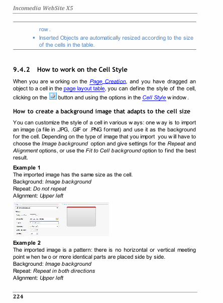
224
Incomedia WebSite X5
row .
Inserted Objects are automatically resized according to the size
of the cells in the table.
9.4.2 How to work on the Cell Style
When you are w orking on the Page Creation, and you have dragged an
object to a cell in the page layout table, you can define the style of the cell,
clicking on the button and using the options in the Cell Style w indow .
How to create a background image that adapts to the cell size
You can customize the style of a cell in various w ays: one w ay is to import
an image (a f ile in .JPG, .GIF or .PNG format) and use it as the background
for the cell. Depending on the type of image that you import you w ill have to
choose the Image background option and give settings for the Repeat and
Alignment options, or use the Fit to Cell background option to f ind the best
result.
Example 1
The imported image has the same size as the cell.
Background: Image background
Repeat: Do not repeat
Alignment: Upper left
Example 2
The imported image is a pattern: there is no horizontal or vertical meeting
point w hen tw o or more identical parts are placed side by side.
Background: Image background
Repeat: Repeat in both directions
Alignment: Upper left

225
Best Practices
Example 3
The imported image is a frame that has to adapt to cells of varying sizes.
Background: Fit to Cell background
Block w idth / Block height: set the best size for the blocks.
To better understand how the Fit to Cell background option w orks, w hat
blocks are and how to give correct sizes, consider the folllow ing pictures:
Picture 1 Picture 2 Picture 3
The original picture (Picture 1) is an elaborate frame that can easily be cut
into blocks and be adapted to any size: the ornamental parts in the corners
are a f ixed size and the shading can be repeated as a pattern w ithout
abrupt changes in color.
In Picture 2, you can see the blocks w hose sizes have to be specif ied (in
the Block width and Block height options). The w idth and height is the
same for all the blocks and is given as a percentage of the original picture:
it can vary from 5% to 45%. The cut in the example is 35% for both w idth
and height: this value ensures that each block includes the corner element.

226
Incomedia WebSite X5
Picture 3 show s how it is possible, from blocks A, B, C and D of the
original, to obtain 5 other blocks, a, b, c, d and e: these are the blocks that
the Program cuts to obtain all the parts of the picture that are necessary to
complete the background of the cell. Blocks A, B, C and D are maintained
unaltered and placed at the corners of the cell, and the other f ive blocks, a,
b, c, d and e, are repeated to f ill the rest of the space.
The Fit to cell Background is, therefore, very useful for adapting the same
picture to f it cells of different sizes.
How to use the cell style library
You can save time w ith the Library: if you need to apply the same style to
several cells, you can define it for one cell, save the style and then apply it
to all the others.
To create a new style:
In the page layout table, select the cell you w ant to w ork on and click on
the button to open the Cell Style w indow .
Use the available options in the Style and Text sections to obtain the look
you w ant.
open the Library section and click on the Add button: a new style is
created according to your settings. A preview of the style you have
created is added to the list of Custom styles.
To apply a style to a cell:
In the page layout table select the cell you w ant to w ork on and click on
the button to open the Cell Style w indow .

227
Best Practices
Go to the Library section and select the preview of the style you w ant to
apply, choosing it from the list of Presets styles or from those in the
Custom list.
Click on the Apply button.
9.5 Step 4 - Advanced Settings
9.5.1 How to create a multi-language website
Internet breaks dow n all national and international boundaries and if you
think your w ebsite may be visited by people from other countries, you
should consider offering your w ebsite in a choice of languages.
Managing a multi-language w ebsite does make a project more complex but,
thanks to the features that are available in WebSite X5, and if you can reply
on a good quality translating service, the result w ill make the extra w ork
w ell w orth the w hile.
First of all, you should remember that WebSite X5 generates all the HTML
files for the w ebsite pages in UTF-8 code (Unicode Transformation Format,
8 bit), to allow full support for all languages, including those w hich use non-
Latin alphabets, such as Greek, Cyrillic, Coptic, Armenian, Hebrew , Arabic,
Chinese, Japanese and Korean. Not only can you have w ebsites in
different languages, but you can also have text in different languages in the
same w ebsite, and all characters w ill be displayed correctly: you can have
an extract in Russian w ith its translation next to it in English.
When you are creating your w ebsite, WebSite X5 asks you to associate a
language w ith your project (in the Content Language option of the General
Settings w indow ): this is essential for a correct handling of text that is
added automatically by the Program. A number of languages are included
by default, and you can add others in the Language Content Management
w indow , clicking on the button to create/import new languages or
change some w ords for those that are already included (see How to
translate text that is entered automatically).
With WebSite X5 you can create a multi-language w ebsite and give the
visitor the choice of w hich language he w ants to use. All you have to do is
create a project for each language that you intend to offer, and connect
228
Incomedia WebSite X5
them together as though they w ere different sections of the same w ebsite.
You can use the Welcome Page or add a link in the template's header to
offer a choice of languages.
How to create a multi-language website using the Welcome
page
Imagine you w ant to create a w ebsite in English, Italian and Portuguese.
You can use the Welcome Page to add the buttons w ith w hich visitors
choose the language they prefer.
First of all, create your w ebsite in English, defining the structure and
contents, and in General Settings set "EN = English" as the Content
Language.
In Step 4 - Advanced Settings click on the Welcome Page button and, in
the w indow that opens, select the Show the Welcome Page option,
specifying the picture/animation to use as the Page Background and
giving all the necessary settings to obtain the style you w ant.
Click on the Show links to other Languages option to create the language
choice buttons.
Use the available commands to make up the Language List. Select
"Deutsch", "Español" and "Français" as unavailable languages and click
on the Remove button. Then click on the Add... button to open the
Language Settings w indow and add Portuguese: type ""Português" as
the Language name to show and import a f ile for the picture to associate
w ith it (this is often the nation's f lag).
Select "English" and "Italiano" and click on the Edit... button to open the
Language Settings w indow and add the pictures for the f lags for these
languages.
As the current project is in English (the only language associated w ith
the Welcome page), select "English" from the Language List and click on
the Current button.
Use the Move up / Move down buttons to put the languages in the order
you prefer.
When you have added the pictures for the f lags, you have to set up links

229
Best Practices
on them. A w ebsite w ill be created for each language, and published
online, so you can create a link w ith a URL:
In the 'Language List w indow , select "Italiano" and click on the Edit...
button to open the Language Settings w indow .
Click on the button for the Link for this Language (eg show the
WebSite in this language) option and then select File or URL in the Link
w indow and enter the URL for your w ebsite in Italian: for example http//
w w w .mysite.com/it/index.html, if you are going to publish the Italian site
in the "it" subfolder of the main folder on the Server.
Repeat the same operations for your w ebsite in Portuguese, linking it to
the relative URL: for example, http//w w w .mysite.com/pt/index.html, if you
are going to publish your Portuguese w ebsite in the "pt" subfolder of the
main folder on the Server.
Now your w ebsite is ready for the choice of languages, but you still need
the contents in Italian and Portuguese.
Make a copy of your English w ebsite to speed up the creation of the site
in Italian: in the f irst Project Selection w indow , select the w ebsite
project in English and click on the Duplicate button. Then click on the
Rename button to change the name to that of the new project in Italian.
Open the copy of the project and, in General Settings, set "IT - Italian" as
the Content Language: translate all the text and any other elements that
depend on the language.
In Step 4 - Advanced Settings, go to the Welcome Page w indow and
deselect the Show the Welcome Page option.
When you have completed the project in Italian, do the same for your
w ebsite in Portuguese.
To publish the w ebsites on the Server, you have to follow this procedure:
Publishing the w ebsite in English: the w ebsite in English is the one
associated w ith the Welcome page, and is defined as the "default"
w ebsite. When you publish the w ebsite, an index.html f ile w ill be
created, that corresponds to the Welcome page, and it w ill be saved in
the publishing folder. You w ill need to create "it" and "pt" subfolders on

230
Incomedia WebSite X5
the Server so that the URLs for these sites w ork.
When you have f inished this part, the English w ebsite w ill be online, and
the links in the Welcome page to the other languages w ill be active, even
though they do not actually go anyw here at the moment.
Publishing the w ebsite in Italian: the link in the Welcome page of the
English w ebsite w ill only w ork if you publish the Italian w ebsite in the "it"
subfolder you have created on the Server.
Publishing the w ebsite in Portuguese: the link in the Welcome page of the
English site w ill only w ork if you publish the Portuguese w ebsite in the
"pt" subfolder on the Server.
When you have published all three w ebsites in the correct subfolder, the
buttons in the Welcome page w ill w ork correctly and visitors w ill be able to
choose w hich language they w ant to visit the site in.
You can use the Link for this Language (eg show the WebSite in
this language) option in the Language Settings w indow to
associate any type of action to the pictures representing the
various languages (usually an image of that nation's f lag). This
means that, instead of having to link an entire site, as w e saw in
the example, you can link just one page or a message to say that
the site in a particular language is not yet available, but it w ill be
soon, or a PDF document w ith all the information that you w ant to
give on a language, or anything else.
How to create a multi-language website using buttons in the
template's header
If you w ant to create a w ebsite that is available in English, Italian and
Portuguese, instead of using the Welcome Page w indow , an alternative, or
complementary, w ay to do this is to put the language choice buttons in the
w ebsite template's header. This method has the advantage that visitors can
change the language they are using at any time, and from any page in the
w ebsite.
First of all, you have to create the w ebsite in English, defining the
structure and contents, and in the General Settings w indow set "EN -

231
Best Practices
English as the Content Language.
Open the Template customization w indow to w ork on the header and
create the buttons so visitors can choose the language they w ant to
use.
Using the Insert Image button, import the graphic f ile for the Union
Jack: if you w ant a button w ith mouseover effect, use the Image File on
mouse over option to import a second image, slightly different from the
first.
Repeat this procedure to create the buttons for the Italian and
Portuguese f lags.
Select the button for the Union Jack and click on the Apply a Link
command: in the Link w indow that opens, select File or URL and then
select the Internet file option, typing the address at w hich the Home
page of the Italian w ebsite can be found w hen it is online (for example
http//w w w .mysite.com/it/index.html).
Repeat the same procedure for the Portuguese button, linking it to the
relative URL (for example http//w w w .mysite.com/pt/index.html).
As you are w orking on the project for the English w ebsite, you don't have
to add any link to the button w ith the Union Jack.
Make a copy of your English w ebsite to speed up the creation of the site
in Italian: in the f irst Project Selection w indow , select the w ebsite
project in English and click on the Duplicate button. Then click on the
Rename button to change the name to that of the new project in Italian.
Open the copy of the project and, in the General Settings w indow , set
"IT - Italian" as the Content Language: translate all the text and any other
elements that depend on the language.
Go to the Template customization w indow and complete the button/f lag
links: associate the link on the English f lag w ith the relative URL (for
example http://http//w w w .mysite.com/index.html) and remove the link on
the button w ith the Italian f lag.
When you have f inished w orking on the Italian site, you have to repeat
the same procedure for the w ebsite in Portuguese. remember to set the

232
Incomedia WebSite X5
links on the buttons to the English and Italian languages, and remove any
links to the Portuguese language.
All three w ebsites must be published on the Server for the language-choice
buttons to w ork correctly.
Create tw o subfolders on the Server, in the main publishing folder, and
call them "it" and "pt".
Publish the project in English (the main - default - language) in the main
folder on the Server, and the projects for the Italian and Portuguese
w ebsites in the "it" and "pt" subfolders, respectively.
9.5.2 How to manage logins and create a Members' Area
You often come across w ebsites w here you don't have free access to all
the sections: to be able to view the contents in certain parts of the w ebsite
you need to register and obtain a login and passw ord to enter these
restricted areas.
A classic example is a company site, w here access to the Members' Area
is reserved for salespeople and partners to view documents and price
lists, or portals that require login access to contents that can be
dow nloaded.
WebSite X5 offers the possibility to create a Members' Area in your
w ebsite w ith a number of Locked pages, and access to them is granted to
administrator and user groups.
To explain the theory, let's consider w orking on the w ebsite of a voluntary
association that organizes various projects through a Central Coordination
Team and a number of specif ic Committees. The institutional part of the
w ebsite is open to the public, but the site also contains pages that are
specif ic for each project, and can only be consulted by members of the
committee that follow each one, and by the members of the Central
Coordination team. There are 9 volunteers organized as follow s:
Central Project A Project B Project C

233
Best Practices
Coordinatio
n teamCommittee Committee Committee
Member 1 Member 1 Member 1 Member 1
Member 2 Member 4 Member 6 Member 8
Member 3 Member 5 Member 7 Member 9
As you can see, Member 1 is part of the Central Coordination team and is
also a member of each project committee.
You have to f irst create the w ebsite Map and add contents to the various
pages before you can define a Members' Area and manage the profiles of
the users w ho w ill have access to Locked pages.
How to define users and groups with access to Locked Pages
On the basis of the organization chart above, w e need to create nine
users w ith access credentials, and organize them into groups.
In Step 4 - Advanced Settings, click on Access Management.
In the Groups and Users table, the Administrator group, w ith an Admin
user, and the User group, w ith a User1 user, already exist by default.
Select the User group and use the New Group command to create the
groups that w ill be named "Central Coordination team", "Project A
committee", "Project B committee" and "Project C committee".
Select the "Central Coordination team" group and click on the New User
button to open the New User w indow , w here you can create the
"Member 1" user. Type "Member 1" for the First and Last Name option,
give it a Username and a Password and select the most appropriate
Entrance Page.
Repeat this procedure to create usernames for all the members, and
position them in the correct groups.
The "Member 1" user belongs to all the groups: in this case, select him
and click 3 times on the Create Alias command to create 3 aliases for
this user. Select each alias and drag&drop it in each group.

234
Incomedia WebSite X5
How to create the Registration Page
The Registration Page is the page the visitor is re-directed to w hen he tries
to access a Locked page w ithout logging in f irst. This page is created
automatically by the Program. It includes a w elcome message, the
username and passw ord f ields (w hich the visitor f ills in, if he has been
registered ), the Register button, if necessary (w hich takes the visitor to
another page w here he can request a username and passw ord.
You can w rite the Welcome message that is displayed in the Registration
Page using the Welcome Message option in the Access
Managementw indow . This text should w elcome the visitor and explain that
he is trying to access reserved contents. He should be invited to enter his
username and passw ord, if he has already registered, or to register to
obtain them.
There are tw o w ays you can give visitors the opportunity to register:
1. Include an e-mail address in the Welcome message to w hich the visitor
can send a request for a username and passw ord. The address entered
is automatically recognized by WebSite X5 w hich starts up the default e-
mail program.
2. Create a page that includes the registration form (see E-mail Form
Object) that the visitor must f ill in and send in order to receive a
username and passw ord. In this case, w hen you have prepared the
page, you must go back to the Access Management w indow and click
on the button for the Registration Page option, in order to select it.
Then, the Program automatically creates the Register button and adds it
to the Registration page, next to the Login button.

235
Best Practices
How to set up Locked Pages
When you have defined the list of users, w ith their relative credentials, you
can specify w hich pages in the w ebsite are to be locked, and w ho has
access to them.
In Step 2 - Sitemap Creation select the f irst of the pages to be locked
and click on the button to open the Locked Page w indow .
Select the Set this Page as Locked option and then tick each user or
group w ho can access it. Locked pages are indicated on the w ebsite
Map by the icon. Locked pages may or may not be displayed in
menus, according to w hether you select the Hidden Page in the Menu
option or not.
Repeat this procedure for all the pages you w ant to lock, deciding w hich
users/groups to give access to for each of them.
How to define access parameters for the Administrator
WebSite X5 lets you manage not only user profiles, but also those of the
Administrators. By default, an Administrator group already exists, and it
contains one Admin user.
To change the name and access credentials of the Admin administrator,
select the name in the Groups and Users list and click on the Edit...
button to open the User Settings w indow .
To create new administrator profiles, select the Administrator Group and
click on the New User button to open the User Settings w indow , and add
the necessary information.

236
Incomedia WebSite X5
Unlike ordinary Users, the Administrators have access to all the Locked
pages in the w ebsite. With the same credentials, they can access the
online Control Panel to organize the display of comments to posts in the
Blog, messages in the Guestbook and to display information on the
diagnostics or w ebsite optimization for the search engines.
When the w ebsite is published on the Internet, each time a visitor tries to
display a Locked page he w ill be asked to enter his username and
passw ord. If these parameters are entered correctly, the Locked page w ill
be displayed. By default, visitors have f ive minutes to enter their username
and passw ord. After f ive minutes, if no username or passw ord is entered,
the request for this information is repeated. The f ive-minute time interval is
reset each time a link to a Locked page is made.
When you test your w ebsite off line, a w arning message w ill tell
you that the locked pages w ill be displayed w ithout requesting
access. The Members' Area w ill be fully operational only w hen the
w ebsite is published on the server.
9.5.3 How to handle comments from the online Control
Panel
A Blog is a sort of online diary w here you can post articles of any kind, and
give visitors the possibility to leave comments. If your reader community is
active and stimulated by the various posts, then interesting discussions
may develop.
How to configure post management in WebSite X5
If you w ant visitors to be able to leave comments on your posts, you have
to configure your Blog, using the options in the Blog | Comments w indow :
Select the Let readers add Comments to your Blog option.
Specify the path of the Subfolder on the Server where to save data,
w hich is the folder that PHP code can w rite to.
Decide w hether to activate the anti-spam "Captcha" f ilter w hen
comments are made.

237
Best Practices
Specify the User e-mail address, w hich is the e-mail address that w ill
receive notif ication that visitors have left comments.
Specify w hether comments can be published immediately online, or
w hether they have to be approved f irst.
When you have done this, you can add posts and publish your Blog. A form
is added automatically to the bottom of posts, w here visitors can w rite and
send their comments. This form asks for a name, an e-mail address, a
w ebsite and a message. all the f ields are mandatory, except for the
w ebsite f ield.
How to handle comments from the online Control Panel
When you have configured how comments to the Blog are to be handled,
w hen a visitor leaves a comment, a notif ication e-mail w ill be sent to the
specif ied address (to the w ebsite Administrator, usually). If you have
selected the Show Comments after Admin approval option, comments have
to be approved before they are published online and WebSite X5 has a
command for this in the online Control Panel.
The Control Panel can be found at the http//w w w .mysite.com/
admin URL, w here http//w w w .mysite.com is the w ebsite to w hich
the Blog is linked, and it is available to all the users in the
Administrator group, w ho have been added in the Access
Management section of Step 4 - Advanced Settings.
There are tw o dropdow n menus in the Blog section of the Control Panel,
and they show a list of the categories and the posts linked to them. You
can choose the post you w ant to view the comment on. A list of the
comments gives the name of the author, his e-mail address, the text of the
comment and the date and time it w as made. If the author has a w ebsite
linked to his name, this link is automatically activated.
To handle comments, you have to:
Go to the online Control Panel and log in, then open the Blog section.
Identify the post you w ant to view comments on, using the dropdow n
menus that show the list of categories, and the posts in them.

238
Incomedia WebSite X5
Scroll the list of comments and use these commands to handle them:
- Delete: to remove a comment: it w ill not be published on the Blog and it
w ill be deleted from the list of comments in the Control Panel.
- Approve/Disapprove: to approve a comment and so have it published
on your Blog, or disapprove a comment and so remove it from the list
of posts on the Blog. A disapproved comment is not deleted from the
lists in the Control Panel.
It is absolutely necessary to be able to manage w hat comments are
displayed on your Blog, to guard against spam and to moderate
discussions, removing offensive or otherw ise inappropriate content.
9.5.4 The e-commerce shopping cart
9.5.4.1 How to define the contents of the order
confirmation e-mail
When a customer completes an order, it is important that he receives
confirmation of his order, so he can check that he has given all the correct
information and consult the details on how to make the payment.
WebSite X5 automatically w rites the order confirmation e-mail, taking
necessary details from the order itself.
An order confirmation e-mail is made up as follow s:
Introductory text
Description: This is the text at the beginning of the e-mail. It should
thank the customer for his order and summarize the
contents that follow .
Example: Dear Customer,
Thank you for choosing our products.
Below you will find a summary of your order, including
your purchases, invoice data, shipping data and your

239
Best Practices
preferred method of payment.
Specified in: In Shopping Cart | Sending order, in the Header Text
f ield.
Customer details
Description: This part of the e-mail repeats the invoice data that the
customer entered in the order form.
Specified in: The order form can be defined in Shopping Cart |
Customer Details.
Order summary
Description: This is a table that summarizes all the products that
have been ordered: it gives the product quantity,
partial total and total order value.
Specified in: The table is created automatically, according to the
order.
Payment method
Description: This section must give the customer precise
instructions on making the payment, according to the
method he selected.
Example: For "Bank Transfer":
Payment must be in favor of:
XXX YYY ZZZ
Following payment, please forward us the order
number and accounting copy of the Bank Transfer
operation.
Specified in: In the E-mail message section of the Payment Type
w indow .

240
Incomedia WebSite X5
Shipment method
Description: It should summarize the selected shipment method and
give, if possible, indications on w hen and how the
goods w ill be delivered, and any other information that
may be useful.
Example: For "Express Delivery Service":
Shipment via Express Delivery Service. The goods
will be delivered within 1-2- working days.
Specified in: In the E-mail message section of the Shipping Type
w indow .
Closing text
Description: This is a standard paragraph containing the
appropriate formal phrases for closing the e-mail.
Example: If you have any queries relating to this order, please
do not hesitate to contact us.
Yours faithfully, Company Name
Specified in: In Shopping Cart | Sending order, in the Footer Text
f ield.
Like all the other e-mails that are composed and sent automatically by the
Program, the order confirmation e-mail has the graphic style defined in E-
mail Style.
A copy of the order confirmation e-mail is also sent in text format.
9.5.4.2 How to import/export products in the shopping
cart
After creating an e-commerce shopping cart, it may be useful to export the
product catalog to use in another project, or w ith other softw are, such as
your accounting program. It is also just as important to be able to import a

241
Best Practices
product catalog so that you don't have to recreate it from the beginning.
In WebSite X5 you can import/export product catalogs using the tool bar in
the Shopping Cart | Product List w indow . When you export a product
catalog, a f ile in .TXT or .CSV format is produced, that can easily be opened
and edited w ith any text editor (for example Window s Notepad) or
Microsoft Excel.
Follow the indications below if you manually edit the exported product
catalog f ile, or you create a new one to import:
The f irst row must contain the f ield headings w ith these labels:
ID;Category;Name/Code;Description;Price;Enable VAT;VAT
Value;Weight;Options;Enable Discounts;Discounts
If you delete a f ield from the header, you w ill delete that data for all
products. Mandatory f ields (Category, Name/Code, Description and
Price) cannot be deleted.
Each row after the heading corresponds to one product.
All the parameters must be separated by the ";" character.
The follow ing must be given for each product: Category name, Product
name, Product description, Product price. All the other f ields are optional
and may be omitted (not w riting anything betw een the ";" characters for
the f ield in question).
The product ID is generated by the Program: if you enter a new product,
leave the ID f ield empty.
Any spaces in the f ile w ill be removed w hen it is imported.
The parameters in a .TXT or .CSV file are:
Parameter: ID
Mandatory No Description The product's unique identif ication.
Value It is generated and associated w ith a product
automatically by the Program.
If you update the .TXT or .CSV file of a previous export,
do not edit the existing IDs, and leave this f ield empty for

242
Incomedia WebSite X5
new products. When a catalog is imported, the Program
checks against duplicate IDs and generates the
necessary new ones.
Parameter: Category
Mandatory Yes Description The category of the product.
Value Use the ">" character to indicate the path of categories
and subcategories.
For example, a T-shirt in the subcategory "Casual" of the
category "Men's clothing" is indicated in the ,TXT or .CSV
file :
... ; Men's clothing > Casual ; ...
You can add all the necessary subcategories in this
w ay.
Parameter: Name/Code
Mandatory Yes Description The name or code of the product.
Value When the catalog is exported to a .TXT or .CSV file, this
parameter is taken from the Name/Code f ield in the
Product Settings | General w indow .
Parameter: Description
Mandatory Yes Description The description of the product.
Value When the catalog is exported to a .TXT or .CSV file, this
parameter is taken from the Description f ield in the
Product Settings | General w indow .
Parameter: Price
Mandatory Yes Description The price of the product.
Value When the catalog is exported to a .TXT or .CSV file, this
parameter is taken from the Price f ield in the Product
Settings | General w indow .

243
Best Practices
Parameter: Enable VAT
Mandatory No Description Indicator of a specif ic VAT value
for this product.
Value When the catalog is exported to a .TXT or .CSV file, this
parameter is taken from the VAT (%) option in the
Product Settings | General w indow . This option is only
available if Type "VAT included" is selected for the VAT
settings in Shopping Cart | Availability. It is used to
associate a specif ic VAT value to a product, that is
different from the VAT value for the other products in the
catalog. In these cases prices are given w ithout VAT.
This parameter can have a value of 0, if the VAT (%)
option is not selected, or 1 if it is.
Parameter: VAT Value
Mandatory No Description The VAT applied to the price of a
product w ith a specif ic VAT
Value When the catalog is exported to a .TXT or .CSV file, this
parameter is taken from the VAT (%) option in the
Product Settings | General w indow w hich is only
available if , in Shopping Cart | Availability the Type "VAT
included" option is selected for the VAT settings.
If the VAT (%) option in the Product Settings | General
w indow is selected but no value is given, the Default
value (%) indicated in Product Settings | Availability is
used.
Parameter: Weight
Mandatory No Description The product's w eight.
Value When the catalog is exported to a .TXT or .CSV file, this
parameter is taken from the Weight f ield in the Product
Settings | General w indow .

244
Incomedia WebSite X5
Parameter: Options
Mandatory No Description A list of possible product
variations.
Value When the catalog is exported to a .TXT or .CSV file, this
parameter is taken from the Main Option List f ield in the
Product Settings | Options w indow .
If you are creating a .TXT or .CSV file to import, the
product variants in the list can be separated by the "|"
character, as follow s:
... ; Variant1 |Variant2 | Variant3 ; ....
All the necessary variants can be added in this w ay.
Parameter: Enable Discounts
Mandatory No Description Indicator for bulk discount.
Value When the catalog is exported to a .TXT or .CSV file, this
parameter is taken from the Enable Quantity Discount
option in the Product Settings | Discount w indow .
This parameter can have a value of 1 or 0, according to
w hether the Enable Quantity Discount option has been
selected or not.
Parameter: Discounts
Mandatory No Description The list of possible bulk discounts.
Value When the catalog is exported to a .TXT or .CSV file, this
parameter is taken from the Enable Quantity Discount
option in the Product Settings | Discount w indow .
If you are creating a .TXT or .CSV file to import, the list of
bulk discounts must be w ritten as follow s:
... ; quantity : discount | quantity : discount ; ...
So, if a bulk discount of 10% is applied to orders for
more than 20 articles, and a discount of 15% is applied to
orders for more than 50 articles, you w ould w rite:
... ; 20 : 10 | 50 : 15 ; ...

245
Best Practices
Use the "|" character to add all the necessary bulk
discounts.
When you import a .TXT or .CSV file from a previous export
operation or that you have w ritten yourself, it w ill probably be
updated by the Program, to adding missing IDs, for example. If you
w ant an updated copy of the .TXT or .CSV file, you w ill have to
re-export the product catalog. .

Chapter
Further information10

247
Further information
10.1 Web browsers and the WebSite X5 browserA Brow ser is a program that lets users display and interact w ith the
information (text, images, etc.) in a w eb page. The most w idely-used
brow sers are Microsoft Explorer®, Firefox®, Safari® and Google
Chrome™.
Brow sers use a rendering engine to display w eb contents. A rendering
engine is a program that dow nloads contents (an HTML page, for example)
and formats the information on it (associated CSSs, for example) and
show s them on the screen. Brow sers use many different rendering
engines, and these differ for the rendering quality, w ith respect to the
standards, and speed. So, pages may appear differently according to
w hich brow ser displays them. How ever, as a w eb page is not printed, a
certain margin of difference is acceptable, if the user's experience is not
damaged by this.
The best w ay to obtain w eb pages that are compatible w ith the main
brow sers, in their various versions, is to create a clean code that adheres
to standards.
WebSite X5 automatically generates HTML5 code w ith associated CSS 2.1
or 3, and guarantees full compatibility w ith all the main brow sers and mobile
devices, such as mobile phones, tablets and smartphones.
WebSite X5's built-in browser
When you are w orking on a project, you need to be able to check the f inal
result and how the w ebsite w ill be displayed once it has been published.
To do this, WebSite X5 provides a Preview button, that is alw ays available
(see The work environment), w hich gives you a preview of the w ebsite on
your computer. It is constantly updated (see Keep Preview updated while
working on the Project in the Preferences w indow ).
To display the preview , WebSite X5 uses its built-in brow ser, based on
Chromium (http://w w w .chromium.org/), the open source brow ser that
gives its name to Google Chrome™. This brow ser has the follow ing
commands:
Back

248
Incomedia WebSite X5
Return to the last page visited.
Forward
Go forw ard to a previously-visited page.
Home
Go to the w ebsite's Home page.
Address bar
This show s the path of the page on display and/or lets you
enter the path of the page you w ant to display.
Go
This loads the page indicated in the path. You can also load
the page by pressing the CR key.
Edit page
This goes back to the Program, opening the page displayed
as a preview by the brow ser in the Page Creation w indow ,
so it can be edited. If the page is part of the Blog, the
Members' Area or the Shopping Cart, this button takes you
back to the relative section in Step 4 - Advanced Settings.
When the brow ser w indow is open to show the preview of the page you
are w orking on, the page that is displayed changes automatically according
to the page displayed in the main brow ser w indow .
Using a built-in brow ser to display a preview of the w ebsite under
construction has the follow ing advantages:
the preview does not replace the w ebsite page displayed in the
brow ser w indow ;
the preview of the w ebsite under construction is updated in the built-in
brow ser's w indow and new w indow s in the default borw ser are not
opened.

249
Further information
10.2 WebSite X5's built-in Search Engine
WebSite X5 offers you the possibility of adding a search f ield to the
Header / Footer of the template (see Template customization | Insert
Search Field), so that your visitors can use the built-in Search Engine to
look for things in your w ebsite. The Engine w ill search pages, images,
videos, products in the e-commerce shopping cart and the Blog: the results
of the search are ordered by relevance and displayed in pages created
automatically by the Program.
What does the Search Engine work on?
To get the most out of WebSite X5's built-in Search Engine you need to
know that:
Pages
The items that the Search Engine considers in a page are the title,
description and keyw ords (see the Page Properties | General w indow ),
as w ell as the text contents.
Images / Videos
The Search Engine only considers images and videos that have been
added to the SiteMap (see Image Object | Sitemap or Video/Audio
Object | Sitemap) and it analyzes all the information that has been
given: Title, Caption and Geographical position (e.g. Address, Town,
etc) for the images; Title, Caption, Category, WebSite Keywords and
Publication Date for videos.
Products in the e-commerce shopping cart
The Search Engine extends its search to include all the products that
have been added to the e-commerce shopping cart, analyzing the Name/
Code and associated Description (see Product Settings | General).
Blog
All the pages in your Blog are included in a search. The Search Engine
analyzes the Title, Author, Category, Tag, Caption and Content of each
Post.
Members' Area
The pages w ith login and passw ord access (inside a Members' Area)

250
Incomedia WebSite X5
are not considered by the Search Engine, unless the user has already
logged in.
Hidden pages
Pages that are Hidden in the navigation menu are treated as normal
pages for the purpose of the search.
To exclude a page from the search
If you w ant to exclude a page from a search, select it from the Map,
open the Page Properties w indow and, in the Expert section, deselect
the Add this page to the Sitemap option.
Uppercase/Lowercase
The Search Engine is not case-sensitive: it does not differentiate
betw een upper and low ercase letters.
The various parameters that the Search Engine considers have different
relevance: for example, the occurrences of elements in page titles are
considered very relevant. Thus, the occurrences of some parameters are
automatically multiplied by a correction factor before being associated w ith
other occurrences. Depending on the number of occurrences, a element's
relevance is calculated and it is positioned accordingly in the Search
Results page.
The Search Results pages
The Search Results pages are created automatically by the Program and
show :
the search f ield, w hich you see in the template's header or footer;
a side menu, w here you can choose w hether to display the results for
pages, the Blog, the e-commerce shopping cart, the images or the
videos. Next to each item in this menu the number of results for it is given
in brackets. If there are no results for a particular category, the item is
not included in the menu;
the list of results of the search, ordered according to their calculated
relevance.
Remember that, in pages show ing the results of searches on images and
videos, you can click directly on an image or video in the list to open it in the

251
Further information
page w here it has been inserted.
The built-in Search Engine is particularly useful for w ebsites that have a
rich product catalog: the Search Results pages not only give a complete
description of the products, but also include the "Buy now " button so that
visitors can immediately order online.
The Search Results pages are created automatically by the Program: the
style of these pages is defined in Step 1 - Template Style, in the Text Style
section and, the side menu can be defined in the Page Menu Style section.
10.3 Safe fonts and web fonts
The choice of a font is very important because it inf luences the display
quality of a w ebsite page. Over 90% of the information on the Internet is
text and so it is clear that the choice of font is very important. It is important
to choose a font that is not only attractive but also easy to read, and that
w ill be displayed correctly on our visitors' devices, regardless of the
brow ser they use for navigating.
Font readability
A font's readability essentially depends on factors such as the family it
belongs to, the x-height and the overall character size.
Family - The most readable fonts on the Internet belong to the sans-serif
family (e.g. Arial or Helvetica) w hilst the serif family (e.g. Times New
Roman, Georgia or Palatino) is more suited to printed documents. Cursiv
(such as Arabic) and fantasy (such as Symbolix) fonts are not w idely
supported by the main brow sers. Monospace fonts (such as Courier)
tend to induce eye-fatigue if used for long documents, and they are
normally only used for snippets of code on the Internet.
x-height - By x-height, w e mean the height of the low ercase "x"
character. A font such as Times New Roman has, for example, an
average readability on a computer screen because it has a moderate x-
height. Verdana, on the other hand, w as designed specif ically to be read
on computer screens and has a very high x-height, especially w hen

252
Incomedia WebSite X5
compared to other character types w ith the same pixel size.
Safe fonts
Before the CSS3 directive w as introduced, another factor that heavily
influenced the choice of fonts for w eb pages w as the support offered by
the various brow sers for displaying the fonts. It w as practically obligatory
to use safe fonts, that is those fonts that are used universally and present
on nearly every computer.
When a server sends a w eb page to a client computer, it asks the client
w hich font it w ill use to display the text, The client checks that it has the
proposed font installed and proceeds as instructed: otherw ise it uses a
default font as a substitute.
This basically meant that everyone alw ays used the same fonts (Arial,
Verdana, Georgia and few others), to avoid the risk of spoiling the display
of the w eb pages. This obviously limited the creativity of w eb authors.
Unsafe fonts or web fonts
CSS3 opened the door to the use of unsafe fonts: the @font-face command
makes it possible to send a f ile relative to a particular font (in TTF, EOT,
WOFF or SVG format, depending on the brow ser in use) to the client
computer that contains the character set to use for a particular page.
This means that the client computer no longer has to check that the
suggested font is installed, or not, but it can use the character set linked to
the CSS stylesheet of the w eb page.
So, thanks to CSS3, it is now possible to use any font on a w eb page,
because the end user can dow nload the necessary character set.
There are 2 main techniques for using w eb fonts:
use fonts installed on our computer, publishing the font f iles (in the
various formats) on the w ebsite's server;
use an external service, such as Google Fonts™ (free) or Adobe
Typekit (to buy), that offers w eb fonts that are ready to use, and only
need a link in the w eb page's CSS stylesheets.

253
Further information
One disadvantage of these solutions is the the w eb fonts have to be
dow nloaded by the user, and this could influence the time taken to load a
page. The advantage of them is that they offer much greater freedom for
text formatting and page layout. Furthermore, Google fonts remain stored
on Google's servers and do not have to be present on the w ebsite's
server.
Suggestions
Thanks to the w eb fonts w e can now be as creative on the w eb as w e
are on desktop computers, but it's important to remember not to exaggerate.
Here are some suggestions for using w eb fonts w isely:
Use small fonts and not too many of them: the pages w ill be clearer to
read and look tidier.
Don't use fonts haphazardly: stick to the same character type and style
combinations on all the pages so that the w ebsite is coherent and
consistent.
Only add the w eb fonts (w ith their styles) that you actually use to the
pages: the end user has to dow nload the w eb font f iles and they
influence the time it takes to load the page, so too many may slow dow n
display.
Alw ays check the conditions of use in the font licence: many fonts can
be used freely on the Internet, but some are subject to particular
conditions, such as a limit to printed material only.
Using web fonts in WebSite X5
There are many places in WebSite X5 w here you can choose fonts to use:
in the text editor, the template's header/footer editor and in all the w indow s
w here you can add text (contents, menu items, a button label, etc.).
Every time you have to enter text, the menu listing the available fonts w ill
automatically display all the fonts that are installed on the computer. You
can increase the choice by adding w eb fonts to this list, w ithout having to
install them but simply by adding them from the Internet (see How to use
w eb fonts).

254
Incomedia WebSite X5
The fonts in the menu are listed in alphabetical order, and the w eb fonts
have an icon next to them, so they are easy to recognize:
Google Fonts: fonts added from the Preferences | Web Font
w indow of WebSite X5 and linked to Google's server.
Web Fonts: fonts added from the Preferences | Web Font
w indow of WebSite X5 and published on the w ebsite's Internet
server.
Safe Fonts: fonts that are present on practically all devices and so
do not require any publication.
10.4 The Box Model in WebSite X5
In WebSite X5 pages are created w ith the help of a page layout table and
you can perfect the page design and layout by adjusting the margins in the
Outer Margin and Inner Margin options in Cell Style | Style.
In order to fully understand w hat is meant by Margin, and so correctly lay
out the contents, it must be clear w hich Box Model is being used.
When you w rite a w eb page's code, all the HTML elements are considered
as boxes and the parameters that define the visual aspect of each box is
called a Box Model. Each box consists of a basic number of components -
margins, borders, padding and the actual content - and each one can be
modif ied w ith CSS properties.
The diagram below illustrates the various components of the Box Model:

255
Further information
In WebSite X5 the default page layout table has a number of cells to w hich
the page contents can be added. Each cell has the Box Model show n.
The elements are:
Contents: the contents are added to a cell by dragging one of the
available objects into it.
Padding: this is the space betw een the contents and the border.
Border: the border surrounds the padding and contents. You can define
the border's appearance in the Cell Style w indow .
Margin: this is the space betw een the border and the lines of the page
layout table.
Given these definitions, the space betw een tw o adjacent objects
(horizontally or vertically) is equal to the margins defined for the cells that
the objects have been placed in.
10.5 The online Control PanelWebSite X5 automatically sets up an online Control Panel for each w ebsite
created w ith the Program. It is used by Site Administrators to handle
comments on posts in the Blog or messages added to the Guestbook, and
to obtain diagnostic information on the w ebsite.
Users in the Administrators group, created in the Access Management
section of Step 4 - Advanced Settings can access it.

256
Incomedia WebSite X5
To access the Control Panel:
Connect to the http//www.mysite.com/admin URL, w here http//
w w w .mysite.com is the w ebsite's URL.
Enter your login name and passw ord.
When you have logged in, you w ill see these sections in the Control Panel:
Blog: for handling comments made by visitors on the posts of the Blog
linked to the w ebsite (see How to handle comments in the Blog and
Guestbook from the online Control Panel)
Guestbook: for handling messages left by visitors in the Guestbook
you can add using the Guestbook Object.
WebSite Test: to display diagnostic information on the w ebsite and the
Server it has been published on. The information is about:
- PHP Version - the Server must support the PHP language for the e-
mails of the E-mail Form Object and Shopping Cart to w ork properly,
as w ell as login and passw ord access to Locked pages. If PHP is
supported, the supported version is indicated.
- Session support - As w ell as supporting PHP, the Server must also
support sessions so that only authorized users w ith a login and
passw ord can access Locked pages.
- Write-access folder - To be able to store and handle comments on
Posts in the Blog and Guestbook Object, there must a folder on the
Server w ith w rite-access. The presence of this folder is checked,
and then it is checked for w rite-permission.
- MySQL support and database settings - When you compose a E-mail
Form Object you can specify that submitted data is sent to a
database (see E-mail Form Object | Send): you w ill need to give
some parameters to connect to the database you w ant to use on the
Server. The Server is checked for MySQL support, and then the
parameters you have specif ied are checked that they effectively give
access to the database.