IMF Country Report No. 14/222 UNITED STATES · IMF Country Report No. 14/222 UNITED STATES SELECTED...
113
© 2014 International Monetary Fund IMF Country Report No. 14/222 UNITED STATES SELECTED ISSUES This Selected Issues paper for the United States was prepared by a staff team of the International Monetary Fund. It is based on the information available at the time it was completed on July 7, 2014. The policy of publication of staff reports and other documents by the IMF allows for the deletion of market-sensitive information. Copies of this report are available to the public from International Monetary Fund Publication Services 700 19 th Street, N.W. Washington, D.C. 20431 Telephone: (202) 623-7430 Telefax: (202) 623-7201 E-mail: [email protected] Internet: http://www.imf.org Price: $18.00 a copy International Monetary Fund Washington, D.C. July 2014
Transcript of IMF Country Report No. 14/222 UNITED STATES · IMF Country Report No. 14/222 UNITED STATES SELECTED...

© 2014 International Monetary Fund
IMF Country Report No. 14/222
UNITED STATES SELECTED ISSUES This Selected Issues paper for the United States was prepared by a staff team of the International Monetary Fund. It is based on the information available at the time it was completed on July 7, 2014. The policy of publication of staff reports and other documents by the IMF allows for the deletion of market-sensitive information.
Copies of this report are available to the public from
International Monetary Fund Publication Services
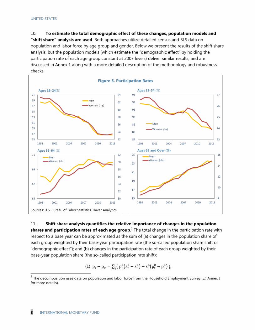
700 19th Street, N.W. Washington, D.C. 20431 Telephone: (202) 623-7430 Telefax: (202) 623-7201
E-mail: [email protected] Internet: http://www.imf.org
Price: $18.00 a copy
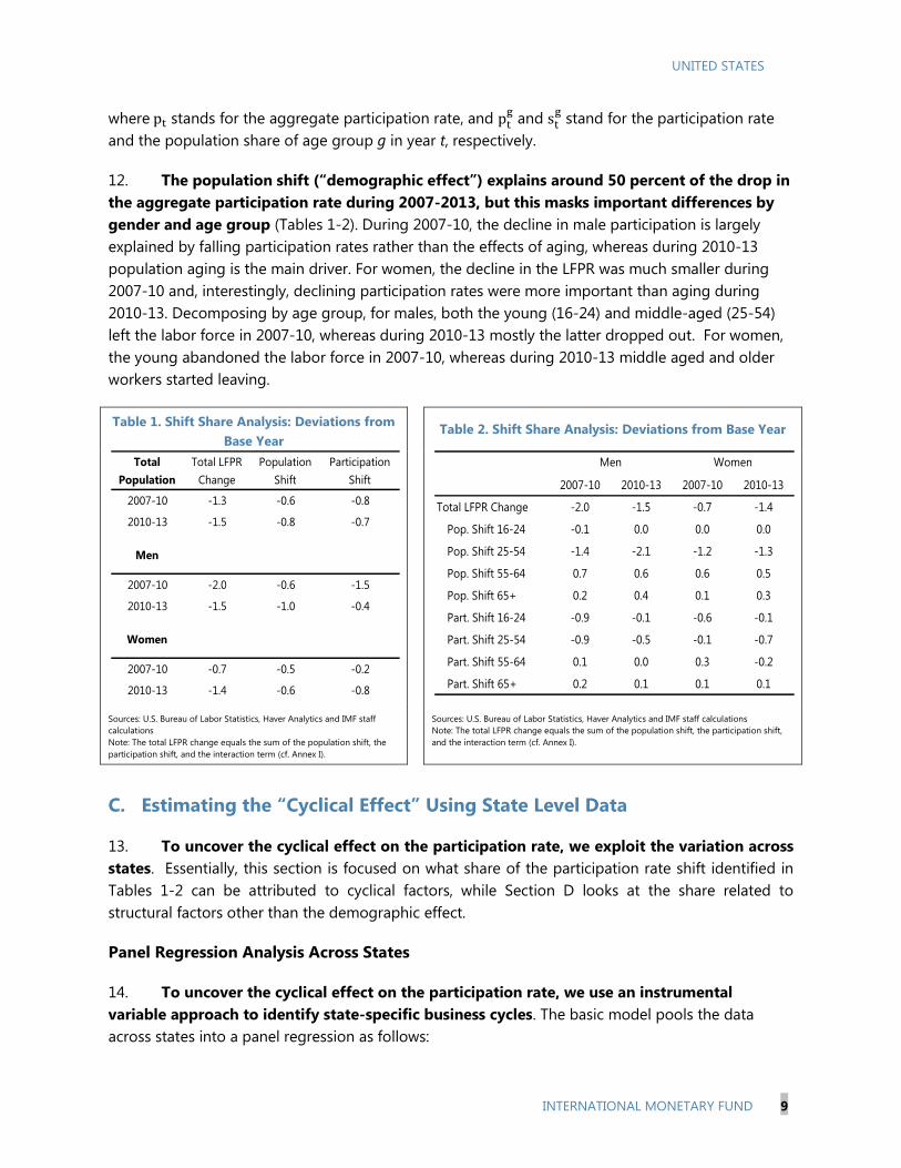
International Monetary Fund Washington, D.C.
July 2014

UNITED STATES
SELECTED ISSUES
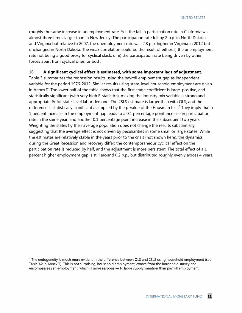
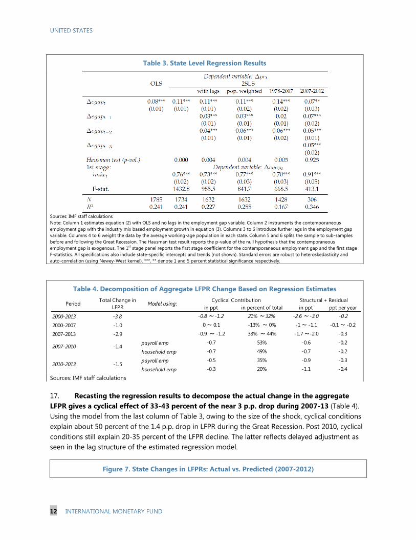
Approved By Western Hemisphere
Department
Prepared By Ravi Balakrishnan, Roberto Cardarelli, Madelyn
Estrada, Deniz O. Igan, Lusine Lusinyan, Tim Mahedy, Juan
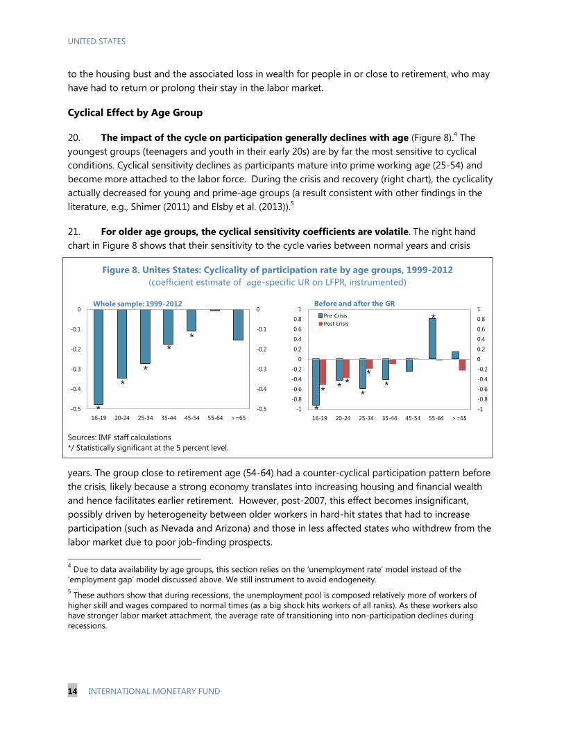
Solé, Jarkko Turunen, and Jeremy Zook (WHD); Mai Chi Dao
(RES); Simon Gray and Darryl King (MCM); and Niklas
Westelius (SPR).
RECENT US LABOR FORCE PARTICIPATION DYNAMICS: REVERSIBLE OR NOT? _____ 5
A. Introduction ___________________________________________________________________________ 5
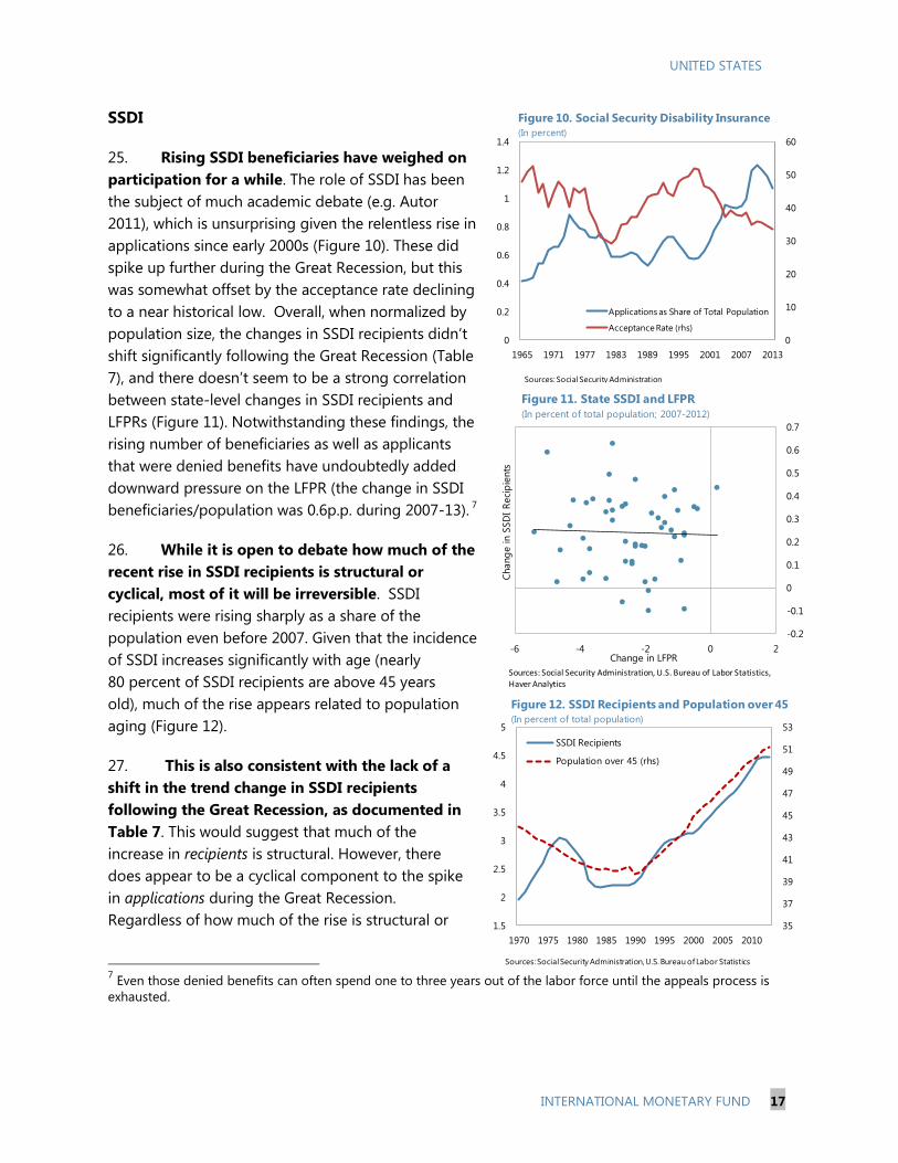
B. Population Aging and the “Demographic Effect” _______________________________________ 7
C. Estimating the “Cyclical Effect” Using State Level Data _________________________________ 9
D. Youths, SSDI, and Older Workers _____________________________________________________ 15
E. LFPR Forecasts and Slack Measures ___________________________________________________ 18
F. Conclusions and Policy Implications ___________________________________________________ 22
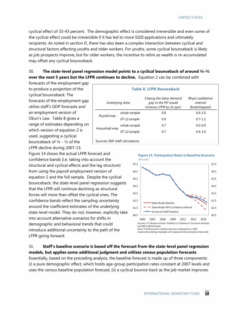
TABLES
1. Shift Share Analysis: Deviations from Base Year (a) _____________________________________ 9
2. Shift Share Analysis: Deviations from Base Year (b) _____________________________________ 9
3. State Level Regression Results ________________________________________________________ 12
4. Decomposition of Aggregate LFPR Change Based on Regression Estimates __________ 12
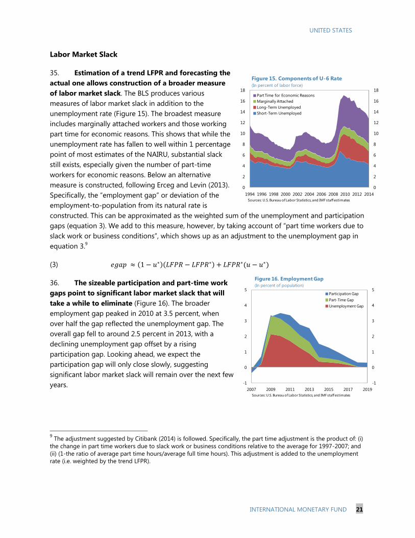
5. School Enrollment Statistics ___________________________________________________________ 15
6. Compositional Changes in Participation by School Enrollment ________________________ 16
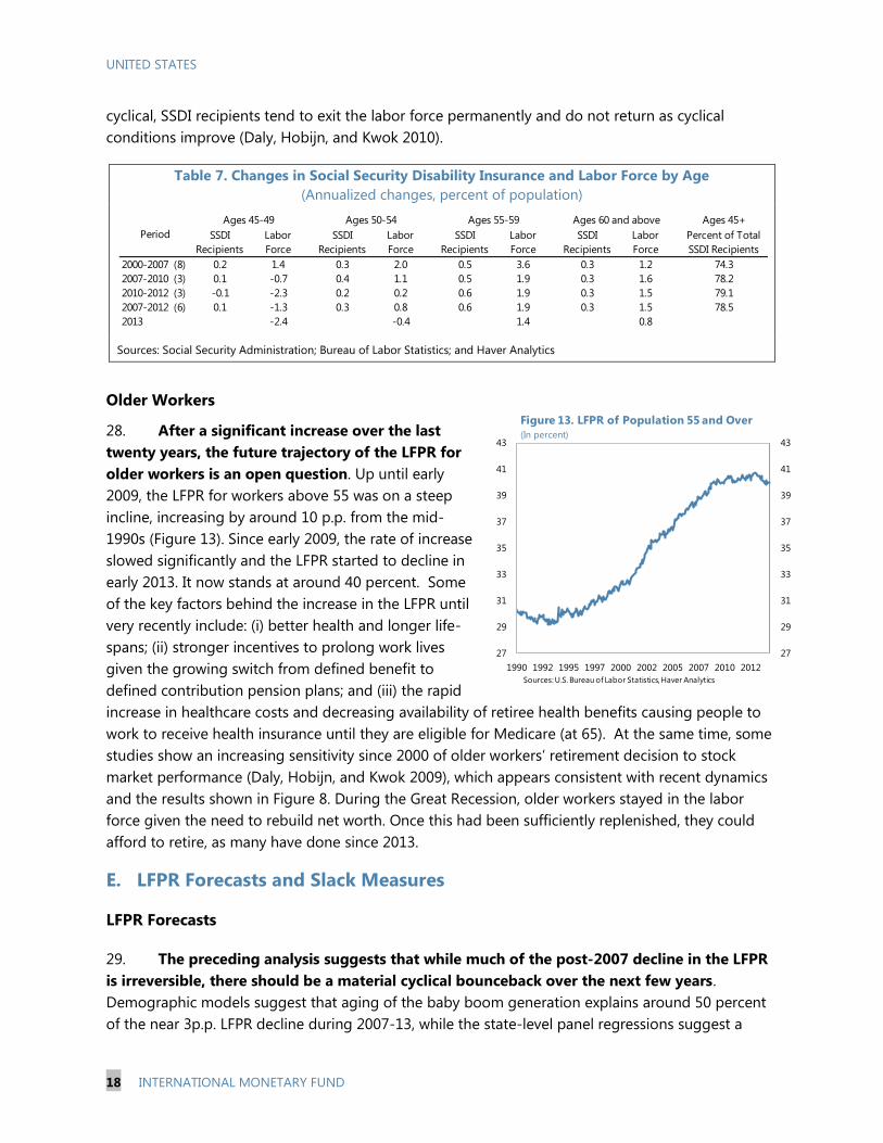
7. Changes in Social Security Disability Insurance and Labor Force by Age ______________ 18
8. LFPR Bounceback _____________________________________________________________________ 19
APPENDICES
1. Demographic Data and Analysis ______________________________________________________ 24
2. State-Level Regression Model _________________________________________________________ 27
APPENDIX TABLES
A.1. Estimates of Structural Component in the Reduction of the Participation Rate ______ 25
CONTENTS
July 7, 2014
UNITED STATES
2 INTERNATIONAL MONETARY FUND
A.2 Regression results using household employment. ___________________________________ 29
REFERENCES
References _______________________________________________________________________________ 23
U.S. TOTAL FACTOR PRODUCTIVITY SLOWDOWN: EVIDENCE FROM THE U.S.
STATES __________________________________________________________________________________30
A. Productivity Slowdown: The Debate __________________________________________________ 30
B. Empirical Analysis _____________________________________________________________________ 32
C. Conclusions ___________________________________________________________________________ 38
FIGURES
1. Deceleration in Average TFP Growth, 2005–2010 vs. 1996–2004 ______________________ 33
2. IT Specialization Across U.S. States ____________________________________________________ 34
APPENDICES
1. Data Sources and Description _________________________________________________________ 43
2. Empirical Results and Robustness Analysis ____________________________________________ 47
APPENDIX FIGURES
A1. Average TFP Growth Across U.S. States ______________________________________________ 45
A2. TFP and GDP Growth: The Case of Oregon __________________________________________ 46
A3. Average Technical Efficiency, 1996–2010 ____________________________________________ 46
APPENDIX TABLES
A1. Dummy Variable Tests of Post-2005 TFP Slowdown _________________________________ 47
A2. Tests of Post-2005 TFP Slowdown for IT-Intensive States ____________________________ 47
A3. Stochastic Frontier Analysis __________________________________________________________ 48
A4. Stochastic Frontier Analysis with Conditional Inefficiency Effects ____________________ 49
A5. Determinants of Total Factor Productivity ___________________________________________ 50
BOX
Stochastic Frontier Analysis ______________________________________________________________ 36
REFERENCES
References _______________________________________________________________________________ 40
MONETARY POLICY COMMUNICATION AND FORWARD GUIDANCE _______________51
A. Introduction __________________________________________________________________________ 51
B. Did Forward Guidance Represent a Change in the Fed’s Reaction Function? __________ 53
C. Did Forward Guidance Reduce Policy Uncertainty? ___________________________________ 56
UNITED STATES
INTERNATIONAL MONETARY FUND 3
D. Conclusions ___________________________________________________________________________ 60
BOX
The Fed’s Communication since 2008 ___________________________________________________ 52
TABLES
1. FOMC’s Economic Outlook and Policy Projections for 2014 ___________________________ 54
2. Regressions Results ___________________________________________________________________ 59
APPENDIX
Data Description _________________________________________________________________________ 64
REFERENCES
References _______________________________________________________________________________ 62
THE OPERATIONAL FRAMEWORK FOR MONETARY POLICY _________________________65
A. Introduction __________________________________________________________________________ 65
B. Some History __________________________________________________________________________ 65
C. Normalizing the Policy Stance ________________________________________________________ 68
D. Considerations for the Future Shape of the Operating Framework ___________________ 75
E. Summary ______________________________________________________________________________ 81
BOX
The Mechanics of Draining Reserves: the ONRRP and the Fed Funds Rate ______________ 71
TABLES
1. Summary of Instruments’ Costs and Impacts __________________________________________ 74
2. Operational Features of Interest Rate Targeting Regimes _____________________________ 76
APPENDICES
1. Floor versus Mid-Corridor Systems ____________________________________________________ 83
2. A Short History of and the Case Against Reserve ______________________________________ 85
REFERENCES
References _______________________________________________________________________________ 88
FISCAL RISKS AND BORROWING COSTS IN STATE AND LOCAL GOVERNMENTS __89
A. Introduction __________________________________________________________________________ 89
B. Outlook and Risks: A Bird’s Eye View __________________________________________________ 91
C. Empirical Analyses ____________________________________________________________________ 95
UNITED STATES
4 INTERNATIONAL MONETARY FUND
D. Policy Implications __________________________________________________________________ 101
BOXES
1. Legal Options Available to Financially Distressed Local Governments _______________ 103
2. 2013 Municipal Bond Market Distress _______________________________________________ 104
TABLES
1. Determinants of State Credit Ratings________________________________________________ 107
2. Determinants of Municipal Bond Spreads ___________________________________________ 108
3. Instrumental Variable Estimates _____________________________________________________ 109
4. Recent Municipal Bankruptcies ______________________________________________________ 110
5. Recent Pension Reforms ____________________________________________________________ 111
APPENDIX
Details on the Econometric Analyses and Recent Developments ______________________ 106
REFERENCES
References _____________________________________________________________________________ 112
UNITED STATES
INTERNATIONAL MONETARY FUND 5
RECENT US LABOR FORCE PARTICIPATION DYNAMICS:
REVERSIBLE OR NOT?1
A. Introduction
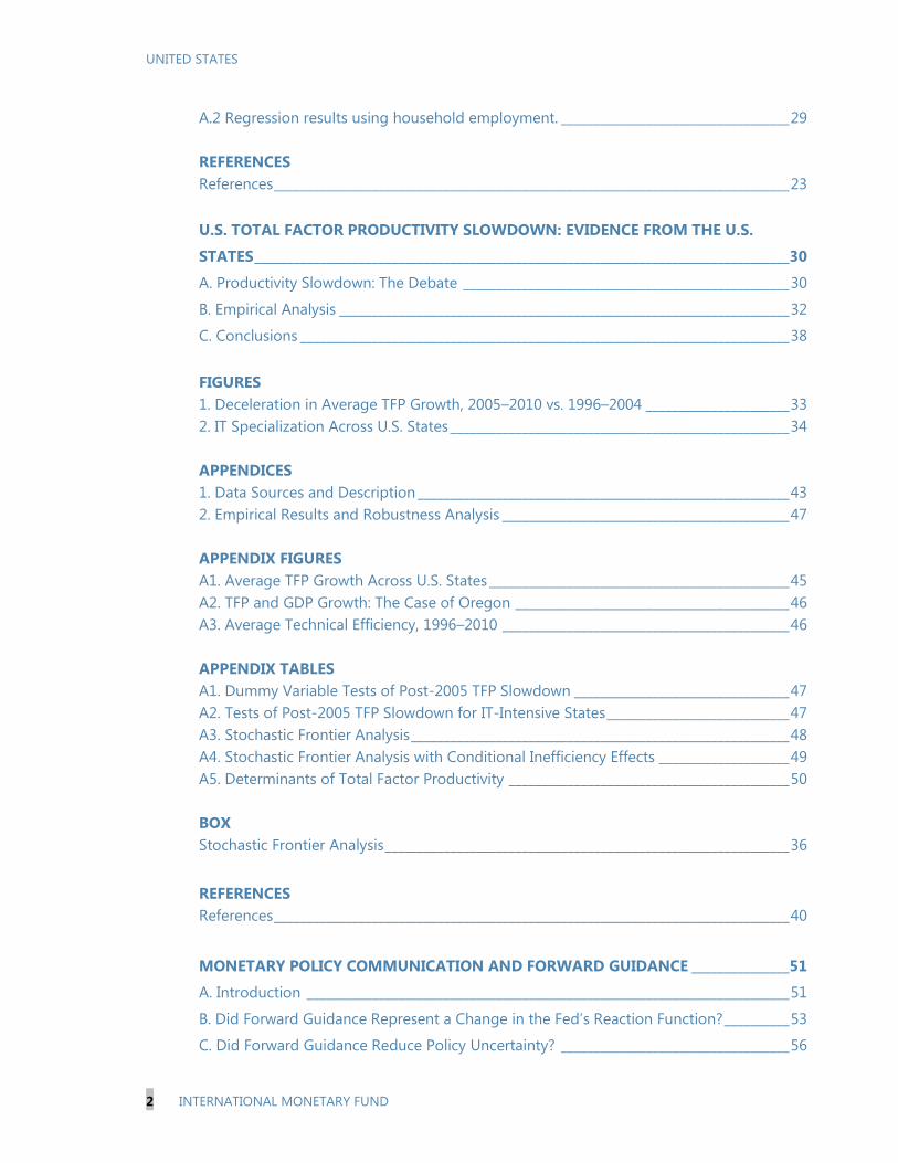
1. The U.S. labor force participation rate (LFPR) fell dramatically following the Great
Recession and has yet to start recovering (Figure 1). Indeed, the current LFPR of 62.8 percent is
the lowest rate since 1978. Taking a longer view of
LFPR dynamics yields some important background to
the recent decline (Figure 2). In particular, the LFPR
increased sharply from just below 60 percent in the
early 60s to above 66 percent by 1990, largely
reflecting the baby boom generation (especially
women) entering the labor force. Over the 1990s, the
trend line flattened sharply, with the LFPR reaching a
global peak of 67.3 percent in 2000Q3, as
participation rates for new cohorts of women stopped
increasing. Since the 2001 Recession, the LFPR has
been largely on a secular decline.
2. A key question is how much of the post-
2007 decline is reversible. LFPR dynamics can be
driven by structural factors (e.g. population aging,
increased college enrollment as education becomes
more accessible, or later retirement due to better
health) and cyclical ones related to job prospects. And
forecasting is complicated by the fact that some
structural factors could be reversible, (e.g. if the trend
of increasing college enrollment reversed because the
cost of college education for the marginal student
became too high relative to the return), while part of
the LFPR decline associated with cyclical factors could
become irreversible (e.g. if the Great Recession led to
more older workers to apply, and get accepted, for
1 Prepared by Ravi Balakrishnan, Mai Dao, Juan Solé, Jeremy Zook (WHD). The authors are grateful to Robert Arnold,
Roberto Cardarelli, Nigel Chalk, Bruce Fallick, Andy Levin, Robert Shackleton and Mitra Toosi for helpful discussions
and comments.
62
63
64
65
66
67
62
63
64
65
66
67
2004 2005 2006 2007 2008 2009 2010 2011 2012 2013 2014
Participation Rate
Nov. 2007 BLS Forecast
Figure 1. Labor Force Participation Rate
(In percent)
Sources: U.S. Bureau of Labor Statistics, Haver Analytics
58
59
60
61
62
63
64
65
66
67
68
58
59
60
61
62
63
64
65
66
67
68
1950 1960 1970 1980 1990 2000 2010
Figure 2. Labor Force Participation Rate
(In percent)
Sources: U.S. Bureau of Labor Statistics, Haver Analytics

UNITED STATES
6 INTERNATIONAL MONETARY FUND
social security disability insurance).
3. Explaining the post-2007 decline is at the center of the policy debate. This is because
understanding the extent to which the decline is reversible and hence the LFPR’s future path is
crucial to estimating the amount of slack in the labor market. With the Federal Reserve having a
mandate for maximum employment as well as price stability, the degree of labor market slack is a
key factor when determining the future course of monetary policy, in particular how gradually
interest rates should rise if there is a large amount of slack. The future dynamics of the LFPR are also
a key driver of potential output, explaining why labor supply policies are receiving a lot of attention.
4. Against this background, this chapter addresses the following questions:
How much of the decrease since the Great Recession is driven by demographics, cyclical,
and other structural forces? How much is reversible?
What is the baseline forecast for the LFPR over the next few years? What are the risks around
this baseline? What is the current and projected level of labor market slack?
What are the macroeconomic and supply-side policy implications?
5. The key chapter finding is that while around ¼-⅓ of the post-2007 decline is
reversible, the LFPR will continue to decline given population aging. With participation rates
for older workers lower than for prime age workers, demographic models suggest that aging of the
baby boom generation explains around 50 percent of the near 3p.p. LFPR decline during 2007-13.
State-level panel regression analysis is used to tie down the cyclical effect, which is estimated to
account for about 30-40 percent of the decline. The rest is made up of non-demographic structural
factors such as increasing college enrollment and fewer students working. With some of the decline
triggered by cyclical factors and non-demographic structural factors judged to be irreversible, only
around a ¼-⅓ of the post-2007 decline is forecast to be reversed over the next few years as job
prospects improve. And as population aging continues to weigh, this reversal only causes the LFPR
to flatline in the near term projection, with the secular decline reasserting itself once the cyclical
bounceback starts to wane.
6. Significant remaining slack in the labor market points to an important role for
macroeconomic and labor supply policies. The chapter’s measure of the “employment gap”,
suggests that labor market slack is still high and will only decline gradually in the baseline scenario.
This suggests a still important role for stimulative macro-economic policies to help reach full
employment. In addition, given the continued downward pressure on the LFPR, labor supply
measures will be an essential component of the strategy to boost potential growth. Finally,
stimulative macroeconomic and labor supply policies should also help reduce the scope for further
hysteresis effects to develop (e.g., loss of skills, discouragement).
7. The rest of the chapter is organized as follows. Section B estimates the structural decline
in the LFPR that can be explained by population aging (“the demographic effect”) using national

UNITED STATES
INTERNATIONAL MONETARY FUND 7
level analysis by different age groups. Section C uncovers the cyclical component of the recent
decline in the LFPR by using state-level panel regression analysis. Section D discusses some key
demographic and economic groups affecting recent LFPR dynamics, namely youths, social security
disability insurance (SSDI) recipients, and older workers. Section E presents forecasts of the LFPR
over the forecast horizon and proposes a broad measure of labor market slack. Section F concludes
and discusses policy implications.
B. Population Aging and the “Demographic Effect”
8. Aging is starting to weigh on participation rates for both males and females, although
there are some differences across genders. Participation rates for males were already on a
downward trend starting the mid 1990s (Figure 3),
although their rate of decline accelerated markedly in
the aftermath of the Great Recession. In particular, the
participation rate of males declined by 0.1 percentage
points (p.p.) per year between 1995 and 2007,
compared to 0.6 p.p. per year between 2008 and
2013. Female participation rates, however, only
started declining in the late 1990s, after which they
have followed a similar pattern to those for males. The
recent pattern of downward pressure on participation
rates for both men and women is consistent with
population aging (Figure 4).
Figure 4. Population Shares
Sources: U.S. Bureau of Labor Statistics, Haver Analytics
9. Older workers have increased their participation rates, whereas youths and prime-age
workers have reduced them. 16-24 year-olds have been steadily reducing their participation rates
since 2000. Similarly, although to a lesser extent, prime-aged workers have also reduced their
participation rates (Figure 5). Older workers, however, have increased their attachment to the labor
force: most notably those aged 65 and above, for whom participation rates have increased by
almost 50 percent for males and nearly doubled for females since the late 1990s.
10
20
30
40
50
60
10
20
30
40
50
60
1998 2001 2004 2007 2010 2013
Male Population Shares (%, by age group)
16-24
25-54
55+
10
20
30
40
50
60
10
20
30
40
50
60
1998 2001 2004 2007 2010 2013
Female Population Shares (%, by age group)
16-24
25-54
55+
57
58
59
60
69
71
73
75
1995 1998 2001 2004 2007 2010 2013
Figure 3. Labor Force Participation Rates
(in percent)
Men
Women (rhs)
Sources: U.S. Bureau of Labor Statistics, Haver Analytics
UNITED STATES
8 INTERNATIONAL MONETARY FUND
10. To estimate the total demographic effect of these changes, population models and
“shift share” analysis are used. Both approaches utilize detailed census and BLS data on
population and labor force by age group and gender. Below we present the results of the shift share
analysis, but the population models (which estimate the “demographic effect” by holding the
participation rate of each age group constant at 2007 levels) deliver similar results, and are
discussed in Annex 1 along with a more detailed description of the methodology and robustness
checks.
11. Shift share analysis quantifies the relative importance of changes in the population
shares and participation rates of each age group.2 The total change in the participation rate with
respect to a base year can be approximated as the sum of (a) changes in the population share of
each group weighted by their base-year participation rate (the so-called population share shift or
“demographic effect”); and (b) changes in the participation rate of each group weighted by their
base-year population share (the so-called participation rate shift):
(1)
,
2 The decomposition uses data on population and labor force from the Household Employment Survey (cf. Annex I
for more details).
Figure 5. Participation Rates
Sources: U.S. Bureau of Labor Statistics, Haver Analytics
52
54
56
58
60
62
64
55
57
59
61
63
65
67
69
71
1998 2001 2004 2007 2010 2013
Ages 16-24(%)
Men
Women (rhs)
73
74
75
76
77
87
88
89
90
91
92
93
1998 2001 2004 2007 2010 2013
Ages 25-54 (%)
Men
Women (rhs)
50
52
54
56
58
60
62
65
67
69
71
1998 2001 2004 2007 2010 2013
Ages 55-64 (%)
Men
Women (rhs)
8
10
12
14
16
15
17
19
21
23
25
1998 2001 2004 2007 2010 2013
Ages 65 and Over (%)
Men
Women (rhs)
UNITED STATES
INTERNATIONAL MONETARY FUND 9
where stands for the aggregate participation rate, and and
stand for the participation rate
and the population share of age group g in year t, respectively.
12. The population shift (“demographic effect”) explains around 50 percent of the drop in
the aggregate participation rate during 2007-2013, but this masks important differences by
gender and age group (Tables 1-2). During 2007-10, the decline in male participation is largely
explained by falling participation rates rather than the effects of aging, whereas during 2010-13
population aging is the main driver. For women, the decline in the LFPR was much smaller during
2007-10 and, interestingly, declining participation rates were more important than aging during
2010-13. Decomposing by age group, for males, both the young (16-24) and middle-aged (25-54)
left the labor force in 2007-10, whereas during 2010-13 mostly the latter dropped out. For women,
the young abandoned the labor force in 2007-10, whereas during 2010-13 middle aged and older
workers started leaving.
Table 1. Shift Share Analysis: Deviations from
Base Year
Table 2. Shift Share Analysis: Deviations from Base Year
Sources: U.S. Bureau of Labor Statistics, Haver Analytics and IMF staff
calculations
Note: The total LFPR change equals the sum of the population shift, the
participation shift, and the interaction term (cf. Annex I).
Sources: U.S. Bureau of Labor Statistics, Haver Analytics and IMF staff calculations
Note: The total LFPR change equals the sum of the population shift, the participation shift,
and the interaction term (cf. Annex I).
C. Estimating the “Cyclical Effect” Using State Level Data
13. To uncover the cyclical effect on the participation rate, we exploit the variation across
states. Essentially, this section is focused on what share of the participation rate shift identified in
Tables 1-2 can be attributed to cyclical factors, while Section D looks at the share related to
structural factors other than the demographic effect.
Panel Regression Analysis Across States
14. To uncover the cyclical effect on the participation rate, we use an instrumental
variable approach to identify state-specific business cycles. The basic model pools the data
across states into a panel regression as follows:
Total
Population
Total LFPR
Change
Population
Shift
Participation
Shift
2007-10 -1.3 -0.6 -0.8
2010-13 -1.5 -0.8 -0.7
Men
2007-10 -2.0 -0.6 -1.5
2010-13 -1.5 -1.0 -0.4
Women
2007-10 -0.7 -0.5 -0.2
2010-13 -1.4 -0.6 -0.8
2007-10 2010-13 2007-10 2010-13
Total LFPR Change -2.0 -1.5 -0.7 -1.4
Pop. Shift 16-24 -0.1 0.0 0.0 0.0
Pop. Shift 25-54 -1.4 -2.1 -1.2 -1.3
Pop. Shift 55-64 0.7 0.6 0.6 0.5
Pop. Shift 65+ 0.2 0.4 0.1 0.3
Part. Shift 16-24 -0.9 -0.1 -0.6 -0.1
Part. Shift 25-54 -0.9 -0.5 -0.1 -0.7
Part. Shift 55-64 0.1 0.0 0.3 -0.2
Part. Shift 65+ 0.2 0.1 0.1 0.1
Men Women

UNITED STATES
10 INTERNATIONAL MONETARY FUND
(2)
The constant and time trend are allowed to be state specific, reflecting state-specific linear and
quadratic trends in levels of the LFPR, and hence capture differences in demographic and other
structural trends across states. We measure state labor demand or the cyclical position using
measures of the employment gap at the state level. To take account of short-term shocks to labor
supply (e.g. reactions to policy such as unemployment insurance benefit extensions or temporary tax
changes) and other sources of endogeneity, equation (2) is estimated by both OLS and 2SLS, where
the employment gap is instrumented by a measure of predicted employment growth based on each
state’s industry mix (see Annex II for details).
Figure 6. State Changes in LFPRs and Unemployment Rates (2007-2012)
Sources: U.S. Bureau of Labor Statistics, Haver Analytics
Note: States are ordered by the magnitude of change in the Labor Force Participation Rate.
15. The importance of taking account of endogeneity is evidenced by the lack of a clear
relationship between state unemployment and participation rates since the Great Recession
(Figure 6). The unemployment rate is often thought of as a good measure of cyclical slack. Hence,
the relationship between the change in the unemployment rate and the change in the participation
rate should illustrate how job prospects influence the decision to participate in the labor force.
Strikingly, the participation rate change is only weakly correlated with the unemployment rate
change (correlation coefficient of -0.16). For example, New Jersey and California experienced
-6
-4
-2
0
2
4
6
8
-6
-4
-2
0
2
4
6
8Change in LFPR
Change in UR
-6
-4
-2
0
2
4
6
8
-6
-4
-2
0
2
4
6
8
Change in LFPR
Change in UR
-6
-4
-2
0
2
4
6
8
-6
-4
-2
0
2
4
6
8Change in LFPR
Change in UR
-6
-4
-2
0
2
4
6
8
-6
-4
-2
0
2
4
6
8
Change in LFPR
Change in UR
l
k
stktsktssst cycletrendPR0
,21 **
UNITED STATES
INTERNATIONAL MONETARY FUND 11
roughly the same increase in unemployment rate. Yet, the fall in participation rate in California was
almost three times larger than in New Jersey. The participation rate fell by 2 p.p. in North Dakota
and Virginia but relative to 2007, the unemployment rate was 2.8 p.p. higher in Virginia in 2012 but
unchanged in North Dakota. The weak correlation could be the result of either: i) the unemployment
rate not being a good proxy for cyclical slack, or ii) the participation rate being driven by other
forces apart from cyclical ones, or both.
16. A significant cyclical effect is estimated, with some important lags of adjustment.
Table 3 summarizes the regression results using the payroll employment gap as independent
variable for the period 1976-2012. Similar results using state-level household employment are given
in Annex II. The lower half of the table shows that the first stage coefficient is large, positive, and
statistically significant (with very high F-statistics), making the industry mix variable a strong and
appropriate IV for state-level labor demand. The 2SLS estimate is larger than with OLS, and the
difference is statistically significant as implied by the p-value of the Hausman test.3 They imply that a
1 percent increase in the employment gap leads to a 0.1 percentage point increase in participation
rate in the same year, and another 0.1 percentage point increase in the subsequent two years.
Weighting the states by their average population does not change the results substantially,
suggesting that the average effect is not driven by peculiarities in some small or large states. While
the estimates are relatively stable in the years prior to the crisis (not shown here), the dynamics
during the Great Recession and recovery differ: the contemporaneous cyclical effect on the
participation rate is reduced by half, and the adjustment is more persistent. The total effect of a 1
percent higher employment gap is still around 0.2 p.p., but distributed roughly evenly across 4 years.
3 The endogeneity is much more evident in the difference between OLS and 2SLS using household employment (see
Table A2 in Annex II). This is not surprising, household employment, comes from the household survey and
encompasses self-employment, which is more responsive to labor supply variation than payroll employment.
UNITED STATES
12 INTERNATIONAL MONETARY FUND
17. Recasting the regression results to decompose the actual change in the aggregate
LFPR gives a cyclical effect of 33-43 percent of the near 3 p.p. drop during 2007-13 (Table 4).
Using the model from the last column of Table 3, owing to the size of the shock, cyclical conditions
explain about 50 percent of the 1.4 p.p. drop in LFPR during the Great Recession. Post 2010, cyclical
conditions still explain 20-35 percent of the LFPR decline. The latter reflects delayed adjustment as
seen in the lag structure of the estimated regression model.
Figure 7. State Changes in LFPRs: Actual vs. Predicted (2007-2012)
Table 3. State Level Regression Results
Sources: IMF staff calculations
Note: Column 1 estimates equation (2) with OLS and no lags in the employment gap variable. Column 2 instruments the contemporaneous
employment gap with the industry mix based employment growth in equation (3). Columns 3 to 6 introduce further lags in the employment gap
variable. Columns 4 to 6 weight the data by the average working-age population in each state. Column 5 and 6 splits the sample to sub-samples
before and following the Great Recession. The Hausman test result reports the p-value of the null hypothesis that the contemporaneous
employment gap is exogenous. The 1st stage panel reports the first stage coefficient for the contemporaneous employment gap and the first stage
F-statistics. All specifications also include state-specific intercepts and trends (not shown). Standard errors are robust to heteroskedasticity and
auto-correlation (using Newey-West kernel). ***, ** denote 1 and 5 percent statistical significance respectively.
Table 4. Decomposition of Aggregate LFPR Change Based on Regression Estimates
Sources: IMF staff calculations
in ppt in percent of total in ppt ppt per year
2000-2013 -3.8 -0.8 ~ -1.2 21% ~ 32% -2.6 ~ -3.0 -0.2
2000-2007 -1.0 0 ~ 0.1 -13% ~ 0% -1 ~ -1.1 -0.1 ~ -0.2
2007-2013 -2.9 -0.9 ~ -1.2 33% ~ 44% -1.7 ~-2.0 -0.3
payroll emp -0.7 53% -0.6 -0.2
household emp -0.7 49% -0.7 -0.2
payroll emp -0.5 35% -0.9 -0.3
household emp -0.3 20% -1.1 -0.4
PeriodTotal Change in
LFPRModel using:
Cyclical Contribution Structural + Residual
2007-2010 -1.4
-1.52010-2013

UNITED STATES
INTERNATIONAL MONETARY FUND 13
Sources: U.S. Bureau of Labor Statistics, Haver Analytics and IMF staff calculations
Note: States are ordered by the magnitude of change in the Labor Force Participation Rate. Predictions are based on the state-
level model using the payroll employment gap (instrumented).
18. The cyclical effect can explain a significant amount of the drop in the LFPR for certain
individual states, although there is substantial heterogeneity. Using the regression results for
the average response of the participation rate to cyclical forces (Table 4, column 6), we can predict
the cyclical change in state-level participation based on each state’s change in its employment gap
since the onset of the Great Recession (Figure 7). Overall, the predicted cyclical change in LFPR is
correlated with the change in unemployment across states, although not perfectly (correlation
coefficient -0.6). Thus the low correlation between changes in the unemployment rate and the LFPR
shown in Figure 6 suggests that the unemployment rate by itself is not a good measure of labor
market slack, particularly during and after the Great Recession (as it is endogenous to changes in
LFPR itself). The model predicts much of the drop in LFPR in states that were hardest hit by the crisis,
notably Nevada, Arizona, Florida, and California. It also correctly predicts either no change or even a
rise in LFPR in states that were least affected by the crisis: DC, New York, and especially North
Dakota.
19. In most cases, the model predicts a smaller fall in LFPR than actually occurred,
consistent with demographic and other structural forces additionally impacting the LFPR. In a
few cases, most notably Nevada and Arizona, the model actually over-predicts the decline in LFPR. A
detailed look at the data shows that in these two states, the decline in LFPR was dampened by an
increase in participation among the older age groups (55 years and above). This could be a response
-6
-5
-4
-3
-2
-1
0
1
-6
-5
-4
-3
-2
-1
0
1
Actual Change in LFPR
Predicted Cyclical Change in LFPR
-6
-5
-4
-3
-2
-1
0
1
-6
-5
-4
-3
-2
-1
0
1
Actual Change in LFPR
Predicted Cyclical Change in LFPR
-6
-5
-4
-3
-2
-1
0
1
-6
-5
-4
-3
-2
-1
0
1
Actual Change in LFPR
Predicted Cyclical Change in LFPR
-6
-5
-4
-3
-2
-1
0
1
-6
-5
-4
-3
-2
-1
0
1
Actual Change in LFPR
Predicted Cyclical Change in LFPR
UNITED STATES
14 INTERNATIONAL MONETARY FUND
to the housing bust and the associated loss in wealth for people in or close to retirement, who may
have had to return or prolong their stay in the labor market.
Cyclical Effect by Age Group
20. The impact of the cycle on participation generally declines with age (Figure 8).4 The
youngest groups (teenagers and youth in their early 20s) are by far the most sensitive to cyclical
conditions. Cyclical sensitivity declines as participants mature into prime working age (25-54) and
become more attached to the labor force. During the crisis and recovery (right chart), the cyclicality
actually decreased for young and prime-age groups (a result consistent with other findings in the
literature, e.g., Shimer (2011) and Elsby et al. (2013)).5
21. For older age groups, the cyclical sensitivity coefficients are volatile. The right hand
chart in Figure 8 shows that their sensitivity to the cycle varies between normal years and crisis
years. The group close to retirement age (54-64) had a counter-cyclical participation pattern before
the crisis, likely because a strong economy translates into increasing housing and financial wealth
and hence facilitates earlier retirement. However, post-2007, this effect becomes insignificant,
possibly driven by heterogeneity between older workers in hard-hit states that had to increase
participation (such as Nevada and Arizona) and those in less affected states who withdrew from the
labor market due to poor job-finding prospects.
4 Due to data availability by age groups, this section relies on the ‘unemployment rate’ model instead of the
‘employment gap’ model discussed above. We still instrument to avoid endogeneity.
5 These authors show that during recessions, the unemployment pool is composed relatively more of workers of
higher skill and wages compared to normal times (as a big shock hits workers of all ranks). As these workers also
have stronger labor market attachment, the average rate of transitioning into non-participation declines during
recessions.
Figure 8. Unites States: Cyclicality of participation rate by age groups, 1999-2012
(coefficient estimate of age-specific UR on LFPR, instrumented)
Sources: IMF staff calculations
*/ Statistically significant at the 5 percent level.
-0.5
-0.4
-0.3
-0.2
-0.1
0
-0.5
-0.4
-0.3
-0.2
-0.1
0
16-19 20-24 25-34 35-44 45-54 55-64 >=65
Whole sample: 1999-2012
*
*
*
**
-1
-0.8
-0.6
-0.4
-0.2
0
0.2
0.4
0.6
0.8
1
-1
-0.8
-0.6
-0.4
-0.2
0
0.2
0.4
0.6
0.8
1
16-19 20-24 25-34 35-44 45-54 55-64 >=65
Before and after the GR
Pre-Crisis
Post Crisis
*
**
*
*
**
*

UNITED STATES
INTERNATIONAL MONETARY FUND 15
D. Youths, SSDI, and Older Workers
22. Participation rate trends for youths and older workers and the impact of rising SSDI
recipients are key components of the aggregate LFPR picture. However, disentangling how
much of their respective changes since 2007 is cyclical, structural, or reversible is a complex issue.
This section explores potential explanatory factors behind the behavior of these groups.
Youths
23. The majority of the reduction in youth participation rates is explained by the decline in
those working while studying. Total school enrollment has risen quite significantly since 2000,
driven by increasing enrollment of 18-24 year olds in college rather than 16-18 year olds in high
school (Table 5). Even more striking has been the drop of those in school (high school or college)
who are working; a decline that started before the Great Recession. Indeed by 2007, the share of
those working while in school had declined from a peak of 46 percent in 2000 to less than 40
percent. A similar shift share analysis to that conducted in section B suggests that this latter trend
rather than rising college enrollment has been driving most of the decline in the overall youth
participation rate since 2000, including during and after the Great Recession (Table 6). Some of this
likely reflects a lower employment share for teenagers (and a higher employment share of older
workers and immigrants) within all industries and occupations (Dennett and Modestino, 2013),
possibly due to higher skill and less flexible work-time requirements, or more stringent regulation.
Table 5. School Enrollment Statistics
(Ages 16-24)
Sources: U.S. Bureau of Labor Statistics, Haver Analytics
1/ CNIP: Civilian Non-Institutional Population
School
EnrollementEnrolled in HS
Enrolled in
CollegeEmployed Full-
Time
Employed Part-
Time
Employed Full-
Time
Employed Part-
TimeAverage 2000-2007 55.5 26.3 29.2 2.4 25.3 17.5 35.6
Average 2007-2010 57.6 25.5 32.1 1.4 17.3 14.4 33.3
Average 2010-2013 57.9 25.1 32.8 1.0 14.5 13.0 32.1
Average 2007-2013 57.8 25.3 32.4 1.2 15.9 13.7 32.7
(percent of CNIP ages 16-24)
Enrolled in High School Enrolled in College

UNITED STATES
16 INTERNATIONAL MONETARY FUND
Table 6. Compositional Changes in Participation by School Enrollment
(Ages 16-24, annualized changes)
Sources: U.S. Bureau of Labor Statistics, Haver Analytics
Note: First column shows the total annualized change in LFPR; subsequent columns show the contribution of different factors
based on the shift-share analysis.
24. There appears to be a mix of cyclical and structural factors behind the decline for
youths, with much of the cyclical part likely to be
reversible. It is expected that most students will
join the labor force upon graduation. And while
there clearly was a downward trend in the share of
student workers before 2007, this share plummeted
by nearly 5 p.p. in 2008-09, and has not recovered
since. This suggests a sizable impact of the Great
Recession and one that should be partly reversible
as job prospects improve. In addition, after a secular
increase since 2000, the share of students enrolled
in college started to fall in 2012 (Figure 9). With the
share in 2013 still 2 p.p. above that in 2007, this
suggests an upside risk to youth participation rates
if more students start working part time as the job
market picks up and if college enrollment rates revert to pre-Great Recession levels (in part to help
pay off student loans).6
6 Indeed, reverting to pre-Great Recession average levels of school enrollment and employment rates for students
would increase the youth participation rate by around 7pp from the current level of 54¾ percent.
PeriodPart. Rate
Change
Enrolled Part.
Rate Shift
Enrolled
Population Shift
Unenrolled
Partipcation Rate
Shift
Unenrolled
Population Shift
2000-2007 (8) -0.7 -0.5 0.1 -0.1 -0.2
2007-2010 (3) -1.2 -0.8 0.2 -0.2 -0.5
2010-2013 (3) -0.3 -0.3 -0.2 -0.2 0.4
2007-2013 (6) -0.8 -0.5 0.0 -0.2 -0.1
25
26
27
28
29
30
31
32
33
34
25
26
27
28
29
30
31
32
33
34
1993 1995 1997 1999 2001 2003 2005 2007 2009 2011 2013
Figure 9. College Enrollment
(In percent of population 16-24)
Sources: U.S. Bureau of Labor Statistics
UNITED STATES
INTERNATIONAL MONETARY FUND 17
SSDI
25. Rising SSDI beneficiaries have weighed on
participation for a while. The role of SSDI has been
the subject of much academic debate (e.g. Autor
2011), which is unsurprising given the relentless rise in
applications since early 2000s (Figure 10). These did
spike up further during the Great Recession, but this
was somewhat offset by the acceptance rate declining
to a near historical low. Overall, when normalized by
population size, the changes in SSDI recipients didn’t
shift significantly following the Great Recession (Table
7), and there doesn’t seem to be a strong correlation
between state-level changes in SSDI recipients and
LFPRs (Figure 11). Notwithstanding these findings, the
rising number of beneficiaries as well as applicants
that were denied benefits have undoubtedly added
downward pressure on the LFPR (the change in SSDI
beneficiaries/population was 0.6p.p. during 2007-13). 7
26. While it is open to debate how much of the
recent rise in SSDI recipients is structural or
cyclical, most of it will be irreversible. SSDI
recipients were rising sharply as a share of the
population even before 2007. Given that the incidence
of SSDI increases significantly with age (nearly
80 percent of SSDI recipients are above 45 years
old), much of the rise appears related to population
aging (Figure 12).
27. This is also consistent with the lack of a
shift in the trend change in SSDI recipients
following the Great Recession, as documented in
Table 7. This would suggest that much of the
increase in recipients is structural. However, there
does appear to be a cyclical component to the spike
in applications during the Great Recession.
Regardless of how much of the rise is structural or
7 Even those denied benefits can often spend one to three years out of the labor force until the appeals process is
exhausted.
35
37
39
41
43
45
47
49
51
53
1.5
2
2.5
3
3.5
4
4.5
5
1970 1975 1980 1985 1990 1995 2000 2005 2010
SSDI Recipients
Population over 45 (rhs)
Figure 12. SSDI Recipients and Population over 45
(In percent of total population)
Sources: Social Security Administration, U.S. Bureau of Labor Statistics
0
10
20
30
40
50
60
0
0.2
0.4
0.6
0.8
1
1.2
1.4
1965 1971 1977 1983 1989 1995 2001 2007 2013
Applications as Share of Total Population
Acceptance Rate (rhs)
Figure 10. Social Security Disability Insurance
(In percent)
Sources: Social Security Administration
-0.2
-0.1
0
0.1
0.2
0.3
0.4
0.5
0.6
0.7
-6 -4 -2 0 2
Chang
e in S
SD
I R
eci
pie
nts
Change in LFPR
Figure 11. State SSDI and LFPR
(In percent of total population; 2007-2012)
Sources: Social Security Administration, U.S. Bureau of Labor Statistics, Haver Analytics
UNITED STATES
18 INTERNATIONAL MONETARY FUND
cyclical, SSDI recipients tend to exit the labor force permanently and do not return as cyclical
conditions improve (Daly, Hobijn, and Kwok 2010).
Table 7. Changes in Social Security Disability Insurance and Labor Force by Age
(Annualized changes, percent of population)
Sources: Social Security Administration; Bureau of Labor Statistics; and Haver Analytics
Older Workers
28. After a significant increase over the last
twenty years, the future trajectory of the LFPR for
older workers is an open question. Up until early
2009, the LFPR for workers above 55 was on a steep
incline, increasing by around 10 p.p. from the mid-
1990s (Figure 13). Since early 2009, the rate of increase
slowed significantly and the LFPR started to decline in
early 2013. It now stands at around 40 percent. Some
of the key factors behind the increase in the LFPR until
very recently include: (i) better health and longer life-
spans; (ii) stronger incentives to prolong work lives
given the growing switch from defined benefit to
defined contribution pension plans; and (iii) the rapid
increase in healthcare costs and decreasing availability of retiree health benefits causing people to
work to receive health insurance until they are eligible for Medicare (at 65). At the same time, some
studies show an increasing sensitivity since 2000 of older workers’ retirement decision to stock
market performance (Daly, Hobijn, and Kwok 2009), which appears consistent with recent dynamics
and the results shown in Figure 8. During the Great Recession, older workers stayed in the labor
force given the need to rebuild net worth. Once this had been sufficiently replenished, they could
afford to retire, as many have done since 2013.
E. LFPR Forecasts and Slack Measures
LFPR Forecasts
29. The preceding analysis suggests that while much of the post-2007 decline in the LFPR
is irreversible, there should be a material cyclical bounceback over the next few years.
Demographic models suggest that aging of the baby boom generation explains around 50 percent
of the near 3p.p. LFPR decline during 2007-13, while the state-level panel regressions suggest a
Ages 45+
SSDI
Recipients
Labor
Force
SSDI
Recipients
Labor
Force
SSDI
Recipients
Labor
Force
SSDI
Recipients
Labor
Force
Percent of Total
SSDI Recipients
2000-2007 (8) 0.2 1.4 0.3 2.0 0.5 3.6 0.3 1.2 74.3
2007-2010 (3) 0.1 -0.7 0.4 1.1 0.5 1.9 0.3 1.6 78.2
2010-2012 (3) -0.1 -2.3 0.2 0.2 0.6 1.9 0.3 1.5 79.1
2007-2012 (6) 0.1 -1.3 0.3 0.8 0.6 1.9 0.3 1.5 78.5
2013 -2.4 -0.4 1.4 0.8
Ages 50-54 Ages 55-59 Ages 60 and aboveAges 45-49
Period
27
29
31
33
35
37
39
41
43
27
29
31
33
35
37
39
41
43
1990 1992 1995 1997 2000 2002 2005 2007 2010 2012
Figure 13. LFPR of Population 55 and Over
(In percent)
Sources: U.S. Bureau of Labor Statistics, Haver Analytics
UNITED STATES
INTERNATIONAL MONETARY FUND 19
cyclical effect of 33-43 percent. The demographic effect is considered irreversible and even some of
the cyclical effect could be irreversible if it has led to more SSDI applications and ultimately
recipients. As noted in section D, there has also been a complex interaction between cyclical and
structural factors affecting youths and older workers. For youths, some cyclical bounceback is likely
as job prospects improve, but for older workers, the incentive to retire as wealth is re-accumulated
may offset any cyclical bounceback.
30. The state-level panel regression model points to a cyclical bounceback of around ¼-⅓
over the next 5 years but the LFPR continues to decline. Equation 2 can be combined with
forecasts of the employment gap
to produce a projection of the
cyclical bounceback. The
forecasts of the employment gap
utilize staff’s GDP forecasts and
an employment version of
Okun’s Law. Table 8 gives a
range of estimates depending on
which version of equation 2 is
used, suggesting a cyclical
bounceback of ¼ - ⅓ of the
LFPR decline during 2007-13.
Figure 14 shows the actual LFPR forecast and
confidence bands (i.e. taking into account the
structural and cyclical effects and the lag structure)
from using the payroll employment version of
equation 2 and the full sample. Despite the cyclical
bounceback, the state-level panel regression suggests
that the LFPR will continue declining as structural
forces will more than offset the cyclical ones. The
confidence bands reflect the sampling uncertainty
around the coefficient estimates of the underlying
state-level model. They do not, however, explicitly take
into account alternative scenarios for shifts in
demographic and behavioral trends that could
introduce additional uncertainty to the path of the
LFPR going forward.
31. Staff’s baseline scenario is based off the forecast from the state-level panel regression
models, but applies some additional judgment and utilizes census population forecasts.
Essentially, based on the preceding analysis, the baseline forecast is made up of three components:
(i) a pure demographic effect, which holds age-group participation rates constant at 2007 levels and
uses the census baseline population forecast; (ii) a cyclical bounce-back as the job market improves
Table 8. LFPR Bounceback
Sources: IMF staff calculations
Closing the labor demand
gap in the MT would
increase LFPR by (in ppt):
99 pct confidence
interval
(bootstrapped)
whole sample 0.8 0.6-1.0
07-12 sample 0.9 0.7-1.2
whole sample 0.7 0.5-0.9
07-12 sample 0.7 0.4-1.0
Payroll emp
Household emp
Underlying data:
60.5
61.5
62.5
63.5
64.5
65.5
66.5
67.5
60.5
61.5
62.5
63.5
64.5
65.5
66.5
67.5
2000 2003 2006 2009 2012 2015 2018
State Model Baseline
State Model 99% Confidence Interval
Actual and Staff baseline
Figure 14. Particpation Rates in Baseline Scenario
(Percent)
Sources: U.S. Bureau of Labor Statistics, U.S. Bureau of Economic Analysis,
and IMF staff estimates.
Note: The 99 percent confidence band is obtained from 1000
clustered bootstrap resamples with replacement (clustered at state level).

UNITED STATES
20 INTERNATIONAL MONETARY FUND
benchmarked off the state-level analysis; and (iii) judgment regarding non-demographic structural
forces (i.e., college enrollment, share of students working, and retirement patterns).8
32. Staff’s baseline scenario has a more front loaded cyclical bounceback than the state
model projection, and the LFPR at 2019 is around 0.3 p.p. higher. In the baseline, the LFPR of
older and younger workers embed some additional judgment that the statistical model is not
designed to capture. Specifically, the LFPR of younger workers is expected to bounce-back by
around 2p.p. as school enrollment declines a little more (closer to 2007 levels) and more students
start working as job opportunities improve and given the need to pay off student loans. Older
workers, however, are forecast to have no bounce-back given their participation rates continued
going up during 2007-13 and as the recovery of wealth allows many who postponed retirement to
finally do so. The projections are younger and older workers are also consistent with the cyclical
sensitivities presented in Figure 8. However, the overall cyclical bounceback in the baseline is the
same as in the state model (middle of the range given in Table 9) but more is taking place during
2014-16. In sum, the aggregate participation rate is roughly flat for the period 2014-16, as the
cyclical and non-demographic structural forces offset the demographic effect, before resuming a
downward trend from 2017 as the weight of the aging population begins to dominate. The higher
LFPR in 2019 in the baseline relative to the state model projection is mainly driven by using actual
Census population forecasts in the baseline.
33. Staff’s baseline forecast is also slightly above CBO’s forecast over the medium term.
CBO has a similar projection to staff for the end of 2014 (63 percent). But they have downward
pressure from population aging outweighing the cyclical bounceback by more than staff over the
medium term, resulting in the LFPR declining to 62.5 by end-2017 (relative to staff’s forecast of 62.8
percent). Deutsche Bank (2013) uses a VAR model to estimate that, as economic conditions
improve, the participation rate should approach 63 percent by end-2014.
34. There are some important risks around staff’s baseline that are beyond the confidence
bands generated from the state-level model. As noted earlier, the confidence bands do not take
into account alternative scenarios for shifts in demographic and behavioral trends that could
introduce additional uncertainty to the path of the LFPR going forward. Specifically, as noted in
previous studies, forecasting LFPRs for youths and older workers has proven to be incredibly
challenging given various structural changes (Aaronson et al, 2006). For example, it’s not easy to
predict what will happen to college enrollment. Will it continue the very recent decline as job
prospects improve and the cost of college goes up, or will a rising skill premium encourage further
enrollments? For older workers, which forces will dominate: increasing wealth or rising longevity and
better health? And how do we forecast longevity and health?
8 The census also produces three alternative population forecasts based on different migration assumptions. As we
show in Annex (II), this makes little difference to the path of the aggregate LFPR, but can make a substantial
difference to the path of labor force growth.
UNITED STATES
INTERNATIONAL MONETARY FUND 21
0
2
4
6
8
10
12
14
16
18
0
2
4
6
8
10
12
14
16
18
1994 1996 1998 2000 2002 2004 2006 2008 2010 2012 2014
Figure 15. Components of U-6 Rate
(In percent of labor force)
Part Time for Economic Reasons
Marginally Attached
Long-Term Unemployed
Short-Term Unemployed
Sources: U.S. Bureau of Labor Statistics, and IMF staff estimates
-1
0
1
2
3
4
5
-1
0
1
2
3
4
5
2007 2009 2011 2013 2015 2017 2019
Figure 16. Employment Gap
(In percent of population)
Participation Gap
Part-Time Gap
Unemployment Gap
Sources: U.S. Bureau of Labor Statistics, and IMF staff estimates
Labor Market Slack
35. Estimation of a trend LFPR and forecasting the
actual one allows construction of a broader measure
of labor market slack. The BLS produces various
measures of labor market slack in addition to the
unemployment rate (Figure 15). The broadest measure
includes marginally attached workers and those working
part time for economic reasons. This shows that while the
unemployment rate has fallen to well within 1 percentage
point of most estimates of the NAIRU, substantial slack
still exists, especially given the number of part-time
workers for economic reasons. Below an alternative
measure is constructed, following Erceg and Levin (2013).
Specifically, the “employment gap” or deviation of the
employment-to-population from its natural rate is
constructed. This can be approximated as the weighted sum of the unemployment and participation
gaps (equation 3). We add to this measure, however, by taking account of “part time workers due to
slack work or business conditions”, which shows up as an adjustment to the unemployment gap in
equation 3.9
(3)
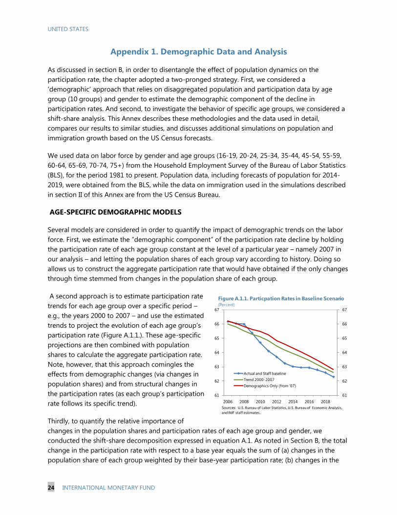
36. The sizeable participation and part-time work
gaps point to significant labor market slack that will
take a while to eliminate (Figure 16). The broader
employment gap peaked in 2010 at 3.5 percent, when
over half the gap reflected the unemployment gap. The
overall gap fell to around 2.5 percent in 2013, with a
declining unemployment gap offset by a rising
participation gap. Looking ahead, we expect the
participation gap will only close slowly, suggesting
significant labor market slack will remain over the next few
years.
9 The adjustment suggested by Citibank (2014) is followed. Specifically, the part time adjustment is the product of: (i)
the change in part time workers due to slack work or business conditions relative to the average for 1997-2007; and
(ii) (1-the ratio of average part time hours/average full time hours). This adjustment is added to the unemployment
rate (i.e. weighted by the trend LFPR).

UNITED STATES
22 INTERNATIONAL MONETARY FUND
F. Conclusions and Policy Implications
37. The key chapter finding is that while around ¼-⅓ of the post-2007 decline is
reversible, the LFPR will continue to fall given population aging. With participation rates for
older workers lower than for prime age workers, demographic models suggest that aging of the
baby boom generation explains around 50 percent of the near 3p.p. LFPR decline during 2007-13.
State-level panel regression analysis is used to tie down the cyclical effect, which is estimated to
account for 33-43 percent of the decline. The rest is made up of non-demographic structural factors
such as increasing college enrollment and fewer students working. With some of the decline
triggered by cyclical factors and non-demographic structural factors judged to be irreversible, only
around a ¼-⅓ of the post-2007 decline is forecast to be reversed over the next few years. However,
with population aging continuing to weigh, this reversal only causes the LFPR to flatline in the near
term, and the secular decline reasserts itself once the cyclical bounceback starts to wane.
38. There are some important risks around staff’s baseline forecast. In particular, over the
last 20 years, forecasting LFPRs for youths and older workers has proven to be incredibly challenging
given various structural changes. For example, it’s not easy to predict what will happen to college
enrollment. Will it continue the very recent decline as job prospects improve and the cost of college
goes up, or will a rising skill premium encourage further enrollments? For older workers, which
forces will dominate: increasing wealth or rising longevity and better health? And how do we
forecast longevity and health?
39. Macroeconomic policy should remain accommodative for a while given sizeable labor
market slack. This slack goes beyond that signaled by the unemployment rate, and takes account of
the LFPR being below trend and many employees working part time “involuntarily”. Moreover, the
numbers of long-term unemployment are still higher than at any time pre-2007 since WWII,
suggesting that further hysteresis effects (e.g., loss of skills, discouragement) could still develop.
40. Policies to enhance labor supply and help offset the headwinds to potential growth
from aging will also be important. The main drag to potential growth in staff’s forecast is
expected to come from aging and the retirement of the baby-boom generation. Indeed, staff
projects the potential labor force to expand at below ½ percent per year over the medium term, half
the average growth rate seen in 2000–13 and well below the long-run average of 1½ percent. Policy
priorities include: (i) enhancing training and job search assistance programs (such as sectoral
training), particularly those that engage industry and higher education institutions; (ii) better family
benefits (including childcare assistance) to reverse the downward trend in female labor force
participation rates; (iv) modifying the disability program to allow for part-time work by those
receiving benefits; reducing the penalties for working during the application process; and re-
examining eligibility rules to present misuse (especially for disability related to mental illness);
(v) providing greater visa opportunities for high-skilled immigrants; and (v) expanding the EITC to
childless workers and by lowering the age threshold from 25.

UNITED STATES
INTERNATIONAL MONETARY FUND 23
References
Aaronson, Stephanie, Bruce Fallick, Andrew Figura, Jonathan Pingle, and William Wascher “The
Recent Decline in the Labor Force Participation Rate and Its Implications for Potential Labor
Supply”, Brookings Papers on Economic Activity, Vol. 2006, No. 1 pp. 69-134.
Bartik, Timothy J., 1991, Who Benefits From State and Local Economic Development Policies? W.E.
Upjohn Institute for Employment Research, Kalamazoo, MI.
Citi, 2014, “How Much Slack is there in the U.S. Labor Market? Implications of the Shadow
Unemployment Rate,” Citi Research, February 18.
Congressional Budget Office (CBO), 2013, “The Economic Impact of S. 744, the Border Security,
Economic Opportunity, and Immigration Modernization Act.”
Congressional Budget Office (CBO), 2014, “The Budget and Economic Outlook: 2014 to 2024,”
February.
Dennett, Julia, Alicia S. Modestino, 2013, “Uncertain Futures? Youth Attachment to the Labor Market
in the United States and New England,” New England Public Policy Center Research Report
13-3, Federal Reserve Bank of Boston, December 2013.
Deutsche Bank, 2013, “US Labor Force Participation Likely to Continue to Decline,” Deutsche Bank
Markets Research, May 1.
Elsby, Michael W.L., Bart Hobijn and Aysegul Sahin, “On the Importance of the Participation Margin
for Market Fluctuations”, Federal Reserve Bank of San Francisco Working Paper 2013-05.
Fujita, Shigeru, 2014, “On the Causes of Declines in the Labor Force Participation Rate,” Federal
Reserve Bank of Philadelphia, Special Report, February 6.
Kwok, Joyce, Mary Daly, and Bart Hobijn, 2010, “Labor Force Participation and the Future Path of
Unemployment,” Federal Reserve Bank of San Francisco, Economic Letter, September 13.
Mishel, Lawrence, Josh Bivins, Elise Gould, and Heidi Shierholz, 2012, The State of Working America
12th
Edition, An Economic Policy Institute book, Ithica, N.Y., Cornell University Press.
Shimer, Robert, 2011, “Job Search, Labor Force Participation, and Wage Rigidities,” Working Paper,
October.
UNITED STATES
24 INTERNATIONAL MONETARY FUND
Appendix 1. Demographic Data and Analysis
As discussed in section B, in order to disentangle the effect of population dynamics on the
participation rate, the chapter adopted a two-pronged strategy. First, we considered a
‘demographic’ approach that relies on disaggregated population and participation data by age
group (10 groups) and gender to estimate the demographic component of the decline in
participation rates. And second, to investigate the behavior of specific age groups, we considered a
shift-share analysis. This Annex describes these methodologies and the data used in detail,
compares our results to similar studies, and discusses additional simulations on population and
immigration growth based on the US Census forecasts.
We used data on labor force by gender and age groups (16-19, 20-24, 25-34, 35-44, 45-54, 55-59,
60-64, 65-69, 70-74, 75+) from the Household Employment Survey of the Bureau of Labor Statistics
(BLS), for the period 1981 to present. Population data, including forecasts of population for 2014-
2019, were obtained from the BLS, while the data on immigration used in the simulations described
in section II of this Annex are from the US Census Bureau.
AGE-SPECIFIC DEMOGRAPHIC MODELS
Several models are considered in order to quantify the impact of demographic trends on the labor
force. First, we estimate the “demographic component” of the participation rate decline by holding
the participation rate of each age group constant at the level of a particular year – namely 2007 in
our analysis – and letting the population shares of each group vary according to history. Doing so
allows us to construct the aggregate participation rate that would have obtained if the only changes
through time stemmed from changes in the population share of each group.
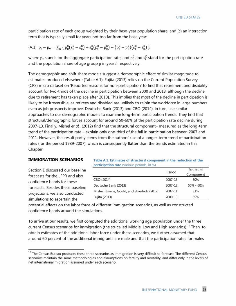
A second approach is to estimate participation rate
trends for each age group over a specific period –
e.g., the years 2000 to 2007 – and use the estimated
trends to project the evolution of each age group’s
participation rate (Figure A.1.1.). These age-specific
projections are then combined with population
shares to calculate the aggregate participation rate.
Note, however, that this approach comingles the
effects from demographic changes (via changes in
population shares) and from structural changes in
the participation rates (as each group’s participation
rate follows its specific trend).
Thirdly, to quantify the relative importance of
changes in the population shares and participation rates of each age group and gender, we
conducted the shift-share decomposition expressed in equation A.1. As noted in Section B, the total
change in the participation rate with respect to a base year equals the sum of (a) changes in the
population share of each group weighted by their base-year participation rate; (b) changes in the
61
62
63
64
65
66
67
61
62
63
64
65
66
67
2006 2008 2010 2012 2014 2016 2018
Actual and Staff baseline
Trend 2000-2007
Demographics Only (from '07)
Figure A.1.1. Particpation Rates in Baseline Scenario(Percent)
Sources: U.S. Bureau of Labor Statistics, U.S. Bureau of Economic Analysis, and IMF staff estimates.
UNITED STATES
INTERNATIONAL MONETARY FUND 25
participation rate of each group weighted by their base-year population share; and (c) an interaction
term that is typically small for years not too far from the base year:
(A.1)
,
where stands for the aggregate participation rate, and and
stand for the participation rate
and the population share of age group g in year t, respectively.
The demographic and shift share models suggest a demographic effect of similar magnitude to
estimates produced elsewhere (Table A.1). Fujita (2013) relies on the Current Population Survey
(CPS) micro dataset on ‘Reported reasons for non-participation’ to find that retirement and disability
account for two-thirds of the decline in participation between 2000 and 2013, although the decline
due to retirement has taken place after 2010]. This implies that most of the decline in participation is
likely to be irreversible, as retirees and disabled are unlikely to rejoin the workforce in large numbers
even as job prospects improve. Deutsche Bank (2013) and CBO (2014), in turn, use similar
approaches to our demographic models to examine long-term participation trends. They find that
structural/demographic forces account for around 50-60% of the participation rate decline during
2007-13. Finally, Mishel et al., (2012) find that the structural component– measured as the long-term
trend of the participation rate – explain only one-third of the fall in participation between 2007 and
2011. However, this result partly stems from the authors’ use of a longer-term trend of participation
rates (for the period 1989-2007), which is consequently flatter than the trends estimated in this
Chapter.
IMMIGRATION SCENARIOS
Section E discussed our baseline
forecasts for the LFPR and also
confidence bands for these
forecasts. Besides these baseline
projections, we also conducted
simulations to ascertain the
potential effects on the labor force of different immigration scenarios, as well as constructed
confidence bands around the simulations.
To arrive at our results, we first computed the additional working age population under the three
current Census scenarios for immigration (the so-called Middle, Low and High scenarios).10
Then, to
obtain estimates of the additional labor force under these scenarios, we further assumed that
around 60 percent of the additional immigrants are male and that the participation rates for males
10
The Census Bureau produces these three scenarios as immigration is very difficult to forecast. The different Census
scenarios maintain the same methodologies and assumptions on fertility and mortality, and differ only in the levels of
net international migration assumed under each scenario.
PeriodStructural
Component
CBO (2014) 2007-13 50%
Deutsche Bank (2013) 2007-13 50% - 60%
Mishel, Bivens, Gould, and Shierholz (2012) 2007-11 33%
Fujita (2013) 2000-13 65%
Table A.1. Estimates of structural component in the reduction of the
participation rate (various periods, in %)

UNITED STATES
26 INTERNATIONAL MONETARY FUND
and females are 90 percent and 50 percent, respectively (cf. CBO, 2011). Finally, in order to assess
the accuracy of these forecasts, we used past vintages of the Census’ immigration and population
forecasts to compute average error forecasts, and
applied these estimates to obtain confidence bands
around the baseline projection (Figure A.1.2.).
Our analysis reveals that alternative immigration
scenarios could have a considerable effect on the
size of the labor force and hence on potential
growth, but not so much on the aggregate
participation rate (Figure A.1.3.). Under our baseline
projections for LFPR, by the end of the decade, the
labor force could have grown 4 percent compared
to its level in 2013. The error bands suggest,
however, that immigration could further add or
detract around 1.1 to 1.4 pp to these estimates, and
thus have a non-negligible impact on the size of the labor force and potential growth. However, the
impact on the participation rate would not be sizeable, as in the scenario both the labor force and
working age population would be growing at a
similar pace.
It’s also worth noting that existing proposals for
immigration reform could have a large impact on the
size of the labor force (cf. CBO, 2013). The CBO
estimates that the implementation of the Senate Bill
S.74411
would lead to a further increase (relative to
CBO’s baseline) in the labor force of around 6 million
people (about 3½ percent) by end-2023, as well as
raise GDP by 3.3 percent. The increase in GDP would
come via the effects of a larger labor force as well as
higher demand from an expanded population.
11
Bill S.744, Border Security, Economic Opportunity, and Immigration Modernization Act
62
62.2
62.4
62.6
62.8
63
63.2
63.4
62.0
62.2
62.4
62.6
62.8
63.0
63.2
63.4
2013 2014 2015 2016 2017 2018 2019
Baseline
High migration upper bound
Low migration lower bound
Figure A.1.3. Participation Rate Scenarios
(In percent of total population)
Sources: U.S. Census Bureau and U.S. Bureau of Labor Statistics
99
100
101
102
103
104
105
106
99
100
101
102
103
104
105
106
2013 2014 2015 2016 2017 2018 2019
Baseline
High migration upper bound
Low migration lower bound
Figure A.1.2. Population Scenarios: labor force
(index 2013 = 100)
Sources: U.S. Census Bureau

UNITED STATES
INTERNATIONAL MONETARY FUND 27
Appendix 2. State-Level Regression Model
EMPIRICAL APPROACH:
The underlying model in levels: To estimate the cyclical effect of labor demand on the
participation rate, we start with a linear model determining the level of participation rate as:
(1)
As at the national level, the participation rate in state s and year t may follow a linear and quadratic
trend that accounts for aggregate aging dynamics and other structural forces not related to the
business cycle. We allow the trends to be state-specific, accounting for evolution of structural forces
that can follow different paths across states. Once de-trended, the participation rate evolves around
a state-specific mean, which should capture unobservable state characteristics such as climate,
geographic location, industrial specialization, etc, which in turn may affect the demographic
composition and hence the mean participation rate across states.
The main variable of interest is the measure of the state-specific business cycle (cycle) which should
capture the annual variation in labor demand across states. The coefficient βk therefore gives the
effect of cyclical forces on the participation rate, allowing the adjustment to occur gradually over
time via the lag structure.
Model in first differences: Taking first differences of the level equation (1), we arrive at the
following equation for the change in the participation rate:
(2)
There are several advantages to estimating the model in first differences as opposed to levels: first,
the level variable is likely non-stationary, which conventional unit root tests in fact suggest, possibly
rendering the level estimation spurious. Second, the level of participation rate is highly persistent so
that the level residuals are strongly auto-correlated, while this is no more the case in first
differences. While the state-specific intercept captures state-specific annual change in LFPR during
the sample period, the state-specific trend in the changes allows for some curvature in the
dynamics, as the evolution of LFPR at the aggregate level as well as in all states has been highly
non-linear (both features result directly from the levels equation (1)).
We measure state labor demand or the cycle using two different measures of the employment gap
at state level. The employment gap is calculated as the difference between payroll or household
employment and its state-specific trend using a HP filter. As we want to measure changes to labor
demand, we prefer these employment gap measures to the unemployment rate, which inevitably
st
l
k
ktsktstssst cycletrendtrendPR
0
,
2
21 ***
l
k
stktsktssst cycletrendPR0
,21 **

UNITED STATES
28 INTERNATIONAL MONETARY FUND
responds to endogenous changes in labor supply and the LFPR itself. To avoid that the HP filter fits
a trend that is too close to actual data toward the end of the series, we adjust the end points as
follows: For each state, we calculate the average annual employment growth between 2002 and
2005 (the last two years before the crisis where aggregate employment was at trend and
unemployment close to NAIRU), and for all years starting with 2006, we impose trend growth rate to
equal this average growth rate.
Instrumental Variable: The trend captures low frequency movements in employment potential, but
cannot account for short-term shocks to labor supply, e.g. reactions to policy such as
unemployment insurance benefit extension or temporary tax changes which also often vary at the
state level. To control for these and other sources of endogeneity, we estimate equation (2) both
with OLS and 2SLS, where the employment gap is instrumented by a measure of predicted
employment growth based on a state’s industry mix (imix):
(3)
This industry mix variable, often called the Bartik shock (Bartik, 1991), captures changes to a state’s
labor demand through an average of industry-specific employment growth at the national level
( , weighted by the state’s share of employment in each industry (averaged over the
previous five years). In other words, this is a measure of employment growth that would result if
each industry’s employment growth coincided with the national rate, and the sectoral distribution of
employment by state did not fluctuate significantly from year to year. It is thus plausible to assume
that this predicted employment growth is exogenous to state-specific shifts in labor supply.
REGRESSION RESULTS:
Table A.2 below summarizes various regression results of estimating equation (2), using the
household employment variable (as opposed to payroll employment, for which the same table is in
the main text) to construct the employment gap as a measure of the state business cycle. The trend-
cycle decomposition and end-point adjustment follows the same procedure as for the payroll
employment (discussed above).

UNITED STATES
INTERNATIONAL MONETARY FUND 29
Table A.2 Regression results using household employment.
Note: Column 1 estimates equation (2) with OLS and no lags in the employment gap variable. Column 2 instruments the
contemporaneous employment gap with the industry mix based employment growth in equation (3). Columns 3 to 6
introduce further lags in the employment gap variable. Columns 4 to 6 weight the data by the average working-age
population in each state. Column 5 and 6 splits the sample to sub-samples before and following the Great Recession.
The Hausman test result reports the p-value of the null hypothesis that the contemporaneous employment gap is
exogenous. The 1st stage panel reports the first stage coefficient for the contemporaneous employment gap and the first
stage F-statistics. All specifications also include state-specific intercepts and trends (not shown). Standard errors are
robust to heteroskedasticity and auto-correlation (using Newey-West kernel). ***, ** denote 1 and 5 percent statistical
significance respectively.
Compared with the estimates using the payroll employment gap as the independent variable in
Table 3 in the text, a few points stand out. First, the industry mix variable continues to be a very
strong instrument for the employment gap if the household measure is used (positive, statistically
significant first stage coefficients and large F-statistics). Second, the bias of OLS is positive and
substantially larger than when using payroll employment. This is plausible, as household
employment encompasses a wider definition of employment, including self-employment, and hence
is more prone to an endogenous response to labor supply. As an increase in labor supply raises
both the LFPR as well as self-employment, the OLS coefficient is biased upward. Moreover, the
household employment variable is derived from the same survey as the LFPR, introducing possible
mechanical correlation that could render OLS regression spurious. The instrumentation is therefore
even more important when using the household employment variable to measure labor market
slack, as is reflected in the Hausman test results.
Finally, when instrumenting using the industry mix variable, the estimates using household
employment deliver very similar results. Accounting for sufficient lags, the total effect of a 1 percent
increase in the employment gap leads to a total of 0.2 p.p. increase in LFPR within 2 years, the same
as obtained using payroll employment (columns 3 to 5). Also, similar to the baseline result, the
cyclical response has been more sluggish and persistent following the Great Recession, thought still
adding up to the same total effect as estimated with the whole sample.

UNITED STATES
30 INTERNATIONAL MONETARY FUND
-5
-4
-3
-2
-1
0
1
2
3
4
5
6
1987
1989
1991
1993
1995
1997
1999
2001
2003
2005
2007
2009
2011
2013
United States: TFP and Real Output Growth
(Percentage change; business sector)
TFP growth (with a range of estimates)
Real output growth
Sources: BLS; OECD; Fernald (2014); and IMF staff estimates.
U.S. TOTAL FACTOR PRODUCTIVITY SLOWDOWN:
EVIDENCE FROM THE U.S. STATES12
A. Productivity Slowdown: The Debate
41. U.S. total factor productivity growth has slowed since mid-2000s. After growing at
about 1¾ percent per year during 1996–
2004, average total factor productivity (TFP)
growth rate has halved since 2005 (Chart).
This suggests that the reasons of the
slowdown go beyond the effects of the
Great Recession. Understanding what is
driving the slowdown is key to assessing the
future potential growth of the U.S. economy
(CEA, 2014).
42. Some argue that the slowdown in
TFP growth reflects the reduced ability of
the U.S. economy to benefit from
technological advances. Gordon (2012 and 2013) suggests that technological innovation has
become marginally less important for growth. Fernald (2014) argues that the recent subdued pace
of productivity growth is merely the return to more normal rates following nearly a decade of
extraordinary gains from the information technology (IT) revolution. A few others are more
optimistic on the room for technology to keep boosting TFP growth in the future, as they see still
room for positive knockout effects from past technological advances, especially in services (e.g.,
Baily, Manyika, and Gupta, 2013; Byrne, Oliner, and Sichel, 2013), or are confident on the continuing
transformational nature of recent IT innovations (Bernanke, 2013).
43. But TFP growth depends on many factors besides advances in technology. In general,
TFP captures the efficiency with which labor and capital are combined to generate output. This
depends not only on businesses’ ability to innovate, but also on the extent to which they operate in
an institutional, regulatory, and legal environment that fosters competition, removes unnecessary
administrative burden, provides modern and efficient infrastructure, and allows easy access to
finance (for a literature survey, see for example, Syverson, 2011, and Isaksson, 2007).13
A few authors
12
Prepared by R. Cardarelli and L. Lusinyan (both WHD). The authors are grateful to Steven Yamarik for helpfully
providing the state-level capital stock and investment estimates, and to Andrew Levin, Juan Sole, Jason Sorens, and
Andrew Tiffin for helpful discussions and comments. 13
In practice, TFP is usually obtained as a residual in estimates of a production function, once the contributions from
measured inputs have been estimated. Thus, growth in output not directly attributable to changes in labor and
capital would be captured in TFP, including unobserved factor utilization and measurement errors.

UNITED STATES
INTERNATIONAL MONETARY FUND 31
suggest that the slowdown in U.S. TFP
growth reflects a more secular loss of
market “dynamism” given the importance
of business churning, “creative
destruction”, business startups, and young
firms (Chart) to generate productivity
gains though more efficient resource
allocation and greater innovation (e.g.,
Haltiwanger, 2011). Furthermore,
Haltiwanger, Hathaway, and Miranda
(2014) show that the decline in firm
formation and entrepreneurship has been
especially pronounced in the high-tech sector after 2002. The decline in dynamism is also evident in
the U.S. labor market, with slower geographic mobility and labor turnover only partly reflecting
population aging and a higher share of older firms (Hyatt and Spletzer, 2013; and Tarullo, 2014).14
44. The objective of this chapter is to shed light on the slowdown of U.S. TFP growth using
evidence from TFP estimated across U.S. states over the last two decades. In particular, we
focus on three main questions:
Has the TFP growth slowdown been similar across U.S. states? Fernald (2014) and earlier studies
(Bauer and Lee, 2006; Daveri and Mascotto 2006) look at labor productivity, which captures
cross-state variation of both TFP and capital deepening. Most likely reflecting data limitations,
little is known about state-level TFP developments in recent years.15
To what extent can aggregate U.S. TFP growth benefit from low-productivity states converging to
high-productivity ones? Higher aggregate TFP growth can be achieved by shifting the production
frontier outward (through technological innovations) for all states, but also by closing the gap
between the “frontier” and “laggard” states (by tackling inefficiencies that prevent all states to
be on the production frontier). Identifying relative contributions of these factors to TFP growth
would provide further insights to productivity prospects and policy options.
Can we exploit the variation of TFP growth and its main determinants across the U.S. states to
speculate on what factors and policies are most important for TFP growth? To the extent that the
14
Hyatt and Spletzer (2013) argue that while the decline in employment dynamics is concentrated in recession
periods, from which it has never fully recovered, it remains an open empirical question whether the decline indicates
increasing labor market adjustment costs or better job matching. 15
Blanco, Prieger, and Gu (2013) and Caliendo and others (2014) are notable exceptions but they do not cover the
period after 2007, and while the former focuses primarily on the impact of research and development, the latter
examines aggregate implications of disaggregated (by region and sector) productivity changes and the role of
regional trade. Sharma, Sylwester, and Margono (2007) look at sources of state-level TFP growth over the period of
1977–2000.
33
24
52
37
1982 1987 1991 1995 1999 2003 2007 2011
United States: The Declining Share of Young Firms
("Young firm"=aged 5 years or younger)
Sources: U.S. Census Bureau Longitudinal Business Database 1977-2011;
and IMF staff calculations.
Number of young firms(Percent of total number of firms)
Employment in young firms(Percent of total employment)
UNITED STATES
32 INTERNATIONAL MONETARY FUND
cross-sectional (across U.S. states) variation in TFP experiences allows us to robustly identify a
few key factors associated with TFP growth, these could be the focus of policy actions.
45. Our results suggest that TFP growth in the United States can benefit especially from
policies that promote investment in human capital and research and development. We find
that the slowdown in TFP growth from mid-2000s has been widespread across the U.S. states and
does not seem to be stronger in those states which rank higher in terms of production or usage of
IT. Our analysis suggests that the TFP slowdown across the U.S. states owes more to a declining
efficiency in combining factors of production than to a diminishing pace of technological progress.
We find that higher educational attainment, greater spending on research and developments (R&D),
and a larger financial sector are associated with lower “inefficiencies” across U.S. states. Our analysis
of TFP determinants across U.S. states over the last two decades suggests that human capital is a
significant factor associated with TFP growth.
B. Empirical Analysis
46. Our empirical analysis is carried out in three stages. First, we estimate state-level TFP
growth using a standard Cobb-Douglas production function with time-varying and state-specific
labor shares. Second, we use a stochastic frontier analysis to assess the relative contributions to TFP
growth from common technological trends and state-specific technical efficiency. Third, we analyze
the determinants of TFP growth across U.S. states using panel data models that relate TFP growth to
human capital, innovation, infrastructure, taxation, and regulatory framework.
47. There are a number of important caveats to analyzing TFP trends at U.S. state level.16
In particular, there is no data on capital stock or services for U.S. states. We use data from Garofalo
and Yamarik (2002) and Yamarik (2013), who start from the net national capital stock at the industry
level (from the Bureau of Economic Analysis; for each one-digit industry including services and
agriculture) and allocate it to individual states’ industries based on their share of national industry
income.17
This approach assumes that the capital-to-output ratio within each industry is the same
across U.S. states, which could lead to an underestimation of TFP in states where capital productivity
is high, and therefore may imply understating the actual variation in TFP across states. Also, our
labor input variable is employment in the private sector, rather than hours worked: this means that
changes in labor utilization (that is, in hours per worker) would be included in our TFP estimates. The
accurate measurement of TFP is an exercise traditionally fraught with measurement errors and goes
beyond the objectives of this chapter.18
Rather, our main objective is to exploit the variation in our
16
For details on data sources and description, see Appendix 1. 17
For example, Sharma, Sylwester, and Margono (2007), LaSage and Pace (2009), and Blanco, Prieger, and Gu, (2013)
use capital stock data constructed by Garofalo and Yamarik (2002) and Yamarik (2013), while Turner, Tamura, and
Mulholland (2013) construct alternative series of state-level physical capital covering 1947–2001, which show very
high correlation with the Garofalo-Yamarik series (for further discussion, see also Panda, 2010). 18
See, for example, Hauk and Wacziarg (2009) for a discussion of measurement error in growth regressions.

UNITED STATES
INTERNATIONAL MONETARY FUND 33
TFP estimates across U.S. states to assess whether they are significantly associated with a few
underlying factors that have traditionally been related to TFP growth.19
Is Productivity Growth Different Across U.S. States?
48. The slowdown in TFP growth after mid-2000s has been widespread across U.S. states,
but there have also been some significant differences (Figure 1, Appendix Figure A1). While
for the U.S. as a whole the TFP growth slowed about 1¾ percentage points on average in 2005–
2010 relative to 1996–2004, the state-level estimates range from a decline of over 3 percentage
points in New Mexico and South Dakota to a relatively modest (below 1 percent) decline in ten
states, with Oregon standing as a clear outlier in terms of a sustained high pace of TFP growth over
the whole period (Appendix Figure A2).
Figure 1. Deceleration in Average TFP Growth, 2005–2010 vs. 1996–2004
(Percentage change)
Source: IMF staff estimates.
19
Two different robustness checks support our TFP estimates: first, the GDP-weighted average of state TFP growth
follows very closely national aggregate TFP growth estimates from a range of sources (including BLS). Second, our
state TFP growth estimates are strongly correlated with those from Caliendo and others (2014) who construct state-
level TFP by aggregating industry-level TFP estimates using the industry (revenues) shares within each state as
weights.

UNITED STATES
34 INTERNATIONAL MONETARY FUND
Figure 2. IT Specialization Across U.S. States
IT Producing States
(Index; U.S.-wide output share of IT-producing industries in total private industries=1)
IT-Intensive Using States
(Index; U.S.-wide output share of IT-using industries in total private industries=1)
Source: IMF staff estimates.

UNITED STATES
INTERNATIONAL MONETARY FUND 35
49. There is little evidence that the TFP growth slowdown was significantly higher in those
states which are most intensively producing or using information technology. We measure the
extent to which a state is specialized in IT production and the degree to which it uses IT given its
industry composition and industry-level IT-intensity estimates (see Appendix 1). Figure 2 shows the
two measures of IT-specialization prior to the productivity slowdown, and suggests that IT
production was more geographically concentrated across U.S. states than IT usage (as in Daveri and
Mascotto, 2006). A series of statistical tests (similar to Stiroh, 2002, and Daveri and Mascotto, 2006)
using various measures of IT-specialization show no significant additional TFP deceleration for IT-
producing or IT-intensive states relative to other states (see Appendix 2, Tables A1 and A2). In
particular, the two states—New Mexico and Oregon—with the highest degree of specialization in IT-
production and a similar degree of IT-intensity had very different productivity and growth outcomes.
Technological Progress vs. Efficiency
50. An alternative way to analyze TFP growth is to decompose it more explicitly into
contributions from technological progress and improvement in efficiency. Following the
common approach in the stochastic frontier analysis (SFA), we assume that inefficiencies potentially
drive a wedge between actual production and the production frontier, given the existing state of
technology (Box 1). In this framework, technological progress (proxied by a time trend) shifts the
production frontier upward for all states, while an improvement in technical efficiency (captured by
state-/time-specific variables) moves states towards the production frontier.20
20
Using SFA with a translog production function, Sharma, Sylwester, and Margono (2007) decompose TFP growth for
the lower 48 U.S. states over the period 1977–2000 and show that TFP growth mainly stemmed from technological
progress, while differences in efficiency change explained cross-state differences in TFP. Oil and coal producing states
underwent the greatest declines in efficiency, while those with larger financial sectors experienced greatest increases.
Also, human capital, urbanization, and shares of non-agriculture and financial sectors were positively associated with
efficiency. Jerzmanowski (2007) also finds that the TFP growth in the U.S. between 1960 and 1995 was entirely due to
the growth of technology while the average efficiency change was zero.

UNITED STATES
36 INTERNATIONAL MONETARY FUND
Box 1. Stochastic Frontier Analysis
For a given state s, assume
where is output of the state, is production function of inputs and technological change t, is the
level of efficiency, with indicating that the state is achieving the optimal output with the technology
embodied in the production function , and is a random shock. For a log-linear production function with two
inputs (labor and capital), a time trend to proxy a common technology, and denoting inefficiency,
such that
the point estimates of technical efficiency (TE) can be derived via where is the model
error term comprised of the two independent, unobservable error terms. The coefficient on the time trend
represents the change in the frontier output caused by technological change. Furthermore, Kumbakhar and Lovell
(2000) show that a change in TFP, defined as output growth unexplained by input growth, can be expressed as
where
is technological change,
is change in technical efficiency, and output
elasticities with respect to labor (capital), with specifying returns to scale ( is the case of constant
returns to scale).
Specifications for vary, and in our analysis, we use two versions of time-varying inefficiency (having looked at
other specifications as well, including time-invariant inefficiency and “true” fixed-effects models, see, Belotti and
others, 2012).
Time-varying inefficiency with convergence (or decay specification): , where is the
last period in the sth panel, and is the decay parameter, such that when , the degree of inefficiency
decreases over time (i.e., converges ‘down’ towards the base level of inefficiency in the last period ), and
when , the degree of inefficiency increases over time.
Time-varying conditional inefficiency: , where is a vector of explanatory variables
associated with technical inefficiency of production in state s. Parameters of the stochastic frontier and the
model for the technical inefficiency effects are simultaneously estimated with a maximum likelihood method
(Battese and Coelli, 1995).

UNITED STATES
INTERNATIONAL MONETARY FUND 37
51. Our results show that technological
change has been relatively stable, while
technical efficiency has slowed. Rolling-
window estimates of the SFA model over the
period 1995–2010 suggest that the production
frontier has been shifting up at a relatively
constant rate of about 1 percent per year (the
solid black line in Chart), close to the estimates
found in the literature (e.g., Jerzmanowski, 2007)
(Appendix 2, Table A3). The estimated technical
efficiency declined over time, with the average
state moving slightly away from the frontier (the
dashed blue line in the Chart).21
52. There is, however, large variation in
efficiency rates across states. On average, over
the whole period, Delaware was found to be
quite close to the production frontier, while
Oklahoma, West Virginia, and Montana were
those furthest away from it (Chart and Appendix
Figure A3). Staff estimates that if all states with
lower-than-average efficiency converged to the
average efficiency, average aggregate output per
worker would have been about 3 percent higher
than its actual level in 2010.
53. Investment in human capital and R&D appear to reduce estimated inefficiencies. Using
an SFA model which allows for conditional inefficiency effects (Battese and Coelli, 1995), we test
whether we can attribute the variation in inefficiency across states to differences in a number of
productivity-friendly underlying factors (Appendix 2, Table A4).22
We find statistically significant and
robust results showing that states with greater human capital (as proxied by years of schooling,
especially elementary and tertiary educational attainment) tend to be have smaller inefficiencies.23
A greater share of total R&D spending in GDP also tends to lower inefficiencies, in addition to
(potentially) contributing positively to technological progress. Possibly reflecting the role of financial
21
Technical efficiency estimates are on a lower side of the estimates found in the literature for the U.S. states: for
example, mean efficiency in Sharma, Sylwester, and Marganon (2007) is estimated at 76 percent. 22
Note that this exercise is looking at the factors that may explain the shortfall of actual output from production
frontier which may or may not be the same factors that are associated with TFP growth discussed in the following
section, since TFP growth includes changes in both technical efficiency and production frontier. 23
In particular, a one year increase in average years of schooling is associated with about 10 percent decrease in
technical inefficiency.
56
57
58
59
60
0.0
0.5
1.0
1.5
1995-0
4
1996-0
5
1997-0
6
1998-0
7
1999-0
8
2000-0
9
2001-1
0
2002-1
0
2003-1
0
Technological change 1/
Technical efficiency (RHS) 2/
Source: IMF staff estimates.
1/ Growth rate; 2/ average actual output in percent of production frontier.
U.S. States: Sources of TFP Growth
AK
CA
DE
DC
MT
NY
OKORSD
TXWV
WY
AK
CA
DEDC
MT
NY
NC
OK
OR
SD
TX
WV
WY
40
60
80
100
120
140
160
0 50 100 150 200
Actual in 1996
Actual in 2010
Capital per worker
Outp
ut
per
wo
rker
Production Frontier, 1996 vs. 2010
(Thousands of real 2005 dollars)
Source: IMF staff estimates.

UNITED STATES
38 INTERNATIONAL MONETARY FUND
intermediation in resource allocation, states with a larger financial sector tend to be more efficient.
In the following section, we test the impact of these factors on TFP growth within a panel data
framework.
Determinants of State-Level TFP Growth
54. There is a vast empirical literature on the many factors that can affect TFP growth.
(e.g., Isaksson, 2007). Our focus here is on whether the variation of TFP growth across U.S. states
over the last two decades can be associated with cross-state variation in education, R&D and
innovation, infrastructure, tax policies, and other institutional and regulatory characteristics. To
investigate these relationships, we use a number of econometric specifications, including fixed-
effects regressions with three-year averages and a mean group model, which allows for parameter
heterogeneity and cross-sectional dependence.24
55. Our results confirm the previous findings that investment in human capital and
R&D/innovation are important factors associated with TFP growth (Appendix 2, Table A5). In
particular:
Education. The average years of schooling in the U.S. increased from 13.1 in 1996 to 13.8 in
2010 (albeit slowing in 2004–06), but substantial variation remains across states: the average
years of schooling vary from below 12.5 years in Mississippi and West Virginia to over 14.5 years
in the District of Columbia and Massachusetts. We find a strong positive relation between the
indicator of human capital and TFP growth.
R&D and innovation. Total R&D expenditure in the U.S. was about 2½ percent of GDP per year
in 1996–2010, about three-quarters of which performed by business sector. Business R&D has
however been declining (as share of GDP) in 2000-05 and at 2 percent of GDP in 2012 is close to
its 2000 peak. New Mexico has the highest total (7.5 percent of GDP) and government
(4.4 percent of GDP) R&D spending, while the highest business R&D is in Michigan (4.2 percent
of GDP). We find some support for a positive impact of both business R&D expenditure and,
more importantly, of government R&D spending and TFP growth. Including interaction terms for
both types of R&D expenditure, however, makes their combined effects statistically insignificant.
C. Conclusions
56. Our analysis of TFP trends across U.S. states suggests that there is scope for policies to
tackle inefficiencies and help boost productivity. In particular, our findings show that the
slowdown in TFP has not been confined to IT-producing or IT-intensive user states, and if anything,
24
As part of robustness tests, we have also estimated fixed-effects model with five-year averages, dynamic panel
data models using system-GMM estimator, and various modifications to the specifications reported in Appendix 2,
Table A5, including to control for the impact of possible outliers.

UNITED STATES
INTERNATIONAL MONETARY FUND 39
the estimated pace of technological progress has remained broadly unchanged since mid-1990s.
Instead, there are signs of increasing inefficiencies and slower catching-up, which may be associated
with divergence in educational attainment and R&D spending. While mindful of the differences
between empirical associations and causal relations, these findings suggest that policies that
promote investment in human capital and innovation may boost aggregate TFP growth.
UNITED STATES
40 INTERNATIONAL MONETARY FUND
References
Baily, M.N., Manyika, J., and S. Gupta, 2013, U.S. Productivity Growth: An Optimistic Perspective,
International Productivity Monitor 25, pp. 3–12.
Battese., G.E., and T.J. Coelli, 1995, A Model for Technical Inefficiency Effects in a Stochastic Frontier
Production Function for Panel Data, Empirical Economics 20, pp. 325–332.
Bauer, P.W., and Y. Lee, 2006, Estimating GSP and Labor Productivity by State, Federal Reserve Bank
of Cleveland, Policy Discussion Paper n. 16.
Belotti, F., Silvio Daidone, S., Ilardi., G., and V. Atella, 2012, Stochastic Frontier Analysis Using Stata,
The Stata Journal vv (ii), pp. 1–39.
Bernanke, B., 2013, Economic Prospects for the Long Run, Remarks at Bard, Massachusetts,
http://www.federalreserve.gov/newsevents/speech/bernanke20130518a.pdf
Blanco, L., Prieger, J., and J. Gu, 2013, The Impact of Research and Development on Economic
Growth and Productivity in the US States, Pepperdine University School of Public Policy Working
Paper 11-1-2013.
Byrne, D.M., Oliner, S.D., and D.E. Sichel, 2013, Is the Information Technology Revolution Over?
International Productivity Monitor 25, pp. 20–36.
Caliendo, L., Parro, F., Rossi-Hansberg, E., and P.-D. Sarte, 2014, The Impact of Regional and Sectoral
Productivity Changes on the U.S. Economy, https://www.princeton.edu/~erossi/RSSUS.pdf
Council of Economic Advisors (CEA), 2014, The Annual Report of the Council of Economic Advisers,
http://www.whitehouse.gov/sites/default/files/docs/full_2014_economic_report_of_the_president
Daveri, F., and A. Mascotto, 2006, The IT Revolution Across the U.S. States, Review of Income and
Wealth 52(4), pp. 569–602.
Economic Freedom of North America (EFNA), 2013, Database, Fraser Institute,
http://www.freetheworld.com/efna.html
Garofalo, G.A., and S. Yamarik, 2002, Regional Convergence: Evidence from a New State-by-State
Capital Stock Series, The Review of Economics and Statistics 84(2), pp. 316–323.
Gomme, P., and P. Rupert, 2004, Measuring Labor’s Share of Income. Federal Reserve Bank of
Cleveland Policy Discussion Papers, No. 7.
Gordon, R., 2012, Is U.S. Economic Growth Over? Faltering Innovations Confronts the Six Headwinds,
NBER Working Paper 18315.
Gordon, R., 2013, U.S. Productivity Growth: The Slowdown Has Returned After a Temporary Revival,
International Productivity Monitor 25, pp. 13–19.
Fernald, J., 2014, Productivity and Potential Output Before, During, and After the Great Recession,
NBER 29th Annual Conference on Macroeconomics,
http://conference.nber.org/confer/2014/Macro14/macro14prg.html

UNITED STATES
INTERNATIONAL MONETARY FUND 41
Haltiwanger, J., 2011, Job Creation and Firm Dynamics in the U.S., in “Innovation Policy and the
Economy,” J. Lerner and S. Stern (eds), Volume 12, University of Chicago Press, pp. 17–38.
Haltiwanger, J., Hathaway, I., and J. Miranda, 2014, Declining Business Dynamism in the U.S. High-
Technology Sector, http://papers.ssrn.com/sol3/papers.cfm?abstract_id=2397310
Hauk, W.R., and R., Wacziarg, 2009, A Monte Carlo Study of Growth Regressions, Journal of Economic
Growth 14, pp. 103–147.
Hyatt, H.R., and J. R. Spletzer, 2013, The Recent Decline in Employment Dynamics, Center for
Economic Studies Working Paper Series 13-03, U.S. Census Bureau, March,
http://www2.census.gov/ces/wp/2013/CES-WP-13-03.pdf
Isaksson, A., 2007, Determinants of Total Factor Productivity: A Literature Review, Research and
Statistics Branch Staff Working Paper 02/2007, United Nations Industrial Development
Organization.
Jerzmanowski, M., 2007, Total Factor Productivity Differences: Appropriate Technology vs. Efficiency,
European Economic Review 51, pp. 2080–2110.
Jorgenson, D.W., Ho, M., and J. Samuels, 2010, Information Technology and U.S. Productivity Growth:
Evidence from a Prototype Industry Production Account, prepared for M. Mas and R. Stehrer
(eds) “Industrial Productivity in Europe: Growth and Crisis.”
Kumbakhar, S.C., and C.A.K. Lovell, 2000, Stochastic Frontier Analysis, Cambridge University Press,
Cambridge, U.K.
LaSage, J., and R.K. Pace, 2009, Introduction to Spacial Econometrics, Statistics: Textbooks and
Monographs, CRC Press, Taylor & Francis Group.
Lee, G., and J. Perry, 2002, Are Computers Boosting Productivity? A Test of the Paradox in State
Governments, Journal of Public Administration Research and Theory 12(1), pp. 77–102.
Panda, B., 2010, Productivity Growth of the US States, A Dissertation, Graduate Faculty of the
Louisiana State University and Agricultural and Mechanical College,
http://etd.lsu.edu/docs/available/etd-11112010-204900/unrestricted/Panda_Dissertation.pdf
Sharma, S.C., Sylwester, K., and H. Margono, 2007, Decomposition of Total Factor Productivity
Growth in U.S. States, The Quarterly Review of Economics and Finance 47, pp. 215–241.
Sorens, J., Muedini, F., and W. Ruger, 2008, State and Local Public Policies in 2006: A New Database,
State Politics and Policy Quarterly 8(3), pp. 309–326.
Stiroh, K.J., 2002, Information Technology and the U.S. Productivity Revival: what Do the Industry
Data Say? The American Economic Review 92(5), pp. 1559–1576.
Syverson, Ch., 2011, What Determines Productivity, Journal of Economic Literature 49(2), pp. 326–
365.

UNITED STATES
42 INTERNATIONAL MONETARY FUND
Tarullo, D., 2014, Longer-Term Challenges for the American Economy, Remarks at “Stabilizing
Financial Systems for Growth and Full Employment” 3rd Annual Hyman P. Minsky Conference on
the State of the U.S. and World Economies,
http://www.federalreserve.gov/newsevents/speech/tarullo20140409a.pdf
Turner, Ch., Tamura, R., Mulholland, S. E., and S. Baier, 2006, Education and Income of the States of
the United States: 1840–2000, Journal of Economic Growth 12, pp. 101–158.
Turner, Ch., Tamura, R., and S. E. Mulholland, 2013, How Important are Human Capital, Physical
Capital and Total Factor Productivity for Determining State Economic Growth in the United
States, 1840–2000? Journal of Economic Growth 18, pp. 319–371.
Yamarik, S., 2013, State-Level Capital and Investment: Updates and Implications, Contemporary
Economic Policy 31(1), pp. 62–72.

UNITED STATES
INTERNATIONAL MONETARY FUND 43
Appendix 1. Data Sources and Description
Output: Gross domestic product by state in chained (2005) dollars private industries is from the BEA.
Data on NAICS–based private (and total) industries for 1997–2012 are extended backwards by
splicing with SIC-based series for 1987–1997. Private industries account on average for more than
85 percent of total gross state product.
Labor input: Employment in the private sector is constructed as the sum of farm employment and
private nonfarm employment from the BEA. Data on NAICS–based private (and total) industries for
1990–2012 are extended backwards by splicing with SIC-based series for 1987–1989.
Capital input: Net private capital stock data by state, in chained 2005 dollars, are from Yamarik
(2013) up to 2007, with the extension for 2008–2010 provided by the author. Yamarik (2013) tests
the soundness of the state-level capital and investment (derived from capital stock through the
perpetual inventory method) data by estimating a Cobb-Douglas production function and a Solow
growth model and finds that estimates of the output elasticity for capital are plausible and close to
the national income share. Net private capital stock for the United States is from BEA (rebased from
2009 to 2005 as a base year).
Labor and capital shares: Following Gomme and Rupert (2004) and Blanco, Prieger, and Gu (2013),
labor share of GDP is the ratio of private sector compensation of employees to the difference
between private sector output and ‘ambiguous labor income’. The latter is the sum of taxes-less-
subsidies and proprietor income. To smooth the series, a three-year moving average of the labor
share is used. Capital share is one minus labor share.
IT-producing states: Specialization in IT-production is assessed as the share of IT-producing
"Computer and electronic product manufacturing” industry (NAICS code 334) in total private
industries in a given state s relative to the same share for the U.S. as a whole. In particular, a
synthetic index following Daveri and Mascotto (2006) is constructed as
, where
is the output in sector i in state s, is total private industries’ output in state s, is the U.S. total
output in sector i, and is total U.S. output in private industries. A state is characterized as “IT-
producing state” if the value of the index is bigger than or equal to one. Following Stiroh (2002), in
order to obtain an exogenous indicator of specialization prior to the productivity slowdown, the
index is calculated as the average of 2002–04.
ICT-producing states: Specialization in ICT-production is assessed as the share of NAICS-composite
“Information, Communication, and Technology” sector in total private industries in a given state s
relative to the same share for the U.S. as a whole. ICT aggregate includes primary ICT sectors
(directly involved in manufacture of ICT equipment, software, services, repair, etc.) and secondary
sectors that indirectly or partially involved in ICT industry activities or significantly dependent on ICT
industries. For the construction of the synthetic index, see above.
UNITED STATES
44 INTERNATIONAL MONETARY FUND
IT-intensive user states: IT-intensity is assessed as the share of the sectors identified in Jorgenson,
Ho, and Samuels (2010, Table 1) in total private industries in a given state s relative to the same
share for the U.S. as a whole. IT-using industries are those with more than the median share of IT-
intensity index, defined in turn as the share of IT-capital input (and IT services purchased) in total
capital input of a given industry. For the construction of the synthetic index, see above, except the
reference year here is 2005 reflecting data availability in Jorgenson, Ho, and Samuels (2010).
Educational attainment: Average years of schooling. The main data source, Turner et al. (2006) has
been extended after 2000 with the data from the OECD Regional Database using elementary
(6 years), secondary (12 years) and tertiary (20.52 years) attainment series to calculate the average
years of schooling. The data for the total U.S. are from the Census “Table A-1. Years of School
Completed by People 25 Years and Over, by Age and Sex: Selected Years 1940 to 2012.”
Innovation indicators (R&D expenditure): The OECD Regional Database for state-level data on
R&D expenditure by sector, R&D personnel by sector, employment in high-tech sectors, patent
applications (by sector) and ownership. The data are annual covering the period of 1990–2010/2011.
The original data source is the U.S. National Science Foundation (NSF)/Division of Science Resources
Statistics (SRS).
Infrastructure: State and local government expenditure on infrastructure (as a share of GDP),
including spending on highway and air transportation, housing, water, and sanitation, from Sorens,
Muedini, and Ruger (2008).
Tax burden: Tax burden is state and local revenues from all taxes (but not current charges), as a
percentage of personal income, from Sorens, Muedini, and Ruger (2008).
Tax structure: Own-source revenue is defined as total government revenue from own source, as a
percentage of GDP, from EFNA (2013).
Government size score: The score covering three indicators (all in percent of GDP)—general
consumption expenditures by government, transfers and subsidies, and social security payments—is
from EFNA (2013).
Poverty rate: Percentage of state population in poverty from Sorens, Muedini, and Ruger (2008).
Financial sector share: Financial sector specialization is assessed as the share of “Finance and
Insurance” industry (NAICS code 52) in total private industries in a given state s relative to the same
share for the U.S. as a whole. For the construction of the synthetic index, see above.
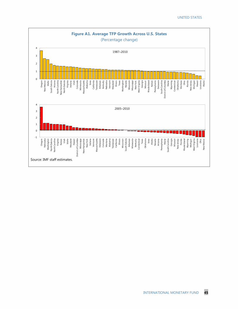
UNITED STATES
INTERNATIONAL MONETARY FUND 45
Figure A1. Average TFP Growth Across U.S. States
(Percentage change)
Source: IMF staff estimates.
0
1
2
3
4
Ore
go
n
New
Mexi
co
Idaho
So
uth
Dako
ta
Ari
zon
a
No
rth C
aro
lina
New
Ham
psh
ire
No
rth
Dako
ta
Vir
gin
ia
Ind
iana
Uta
h
Co
lora
do
Min
neso
ta
Mass
ach
use
tts
Ala
bam
a
Iow
a
Califo
rnia
Ten
ness
ee
Ark
ansa
s
Ken
tuck
y
Neb
rask
a
Verm
ont
Mary
land
Illino
is
Texa
s
Wash
ing
ton
Neva
da
Wis
consi
n
Mis
siss
ippi
New
Yo
rk
West
Vir
gin
ia
Geo
rgia
Mis
souri
Rh
od
e Is
lan
d
Kansa
s
Pen
nsy
lvan
ia
Dela
ware
So
uth
Caro
lina
Dis
tric
t o
f Co
lum
bia
Main
e
Wyo
min
g
Co
nnect
icut
Okla
ho
ma
Mo
nta
na
Ohio
Flo
rid
a
New
Jers
ey
Mic
hig
an
Haw
aii
Lou
isia
na
Ala
ska
1987–2010
-1
0
1
2
3
4
Ore
go
n
Neb
rask
a
Wash
ing
ton
No
rth D
ako
ta
No
rth
Caro
lin
a
Vir
gin
ia
Kansa
s
Uta
h
Idaho
Mary
land
Haw
aii
Dis
tric
t o
f Co
lum
bia
Mis
siss
ipp
i
New
Ham
psh
ire
New
Yo
rk
Ind
iana
Verm
ont
Mass
ach
use
tts
Dela
ware
Co
lora
do
Mo
nta
na
Ala
bam
a
Tenness
ee
Califo
rnia
Illi
no
is
Wis
con
sin
So
uth
Dako
ta
Ark
ansa
s
Min
neso
ta
Kentu
cky
Co
nnect
icut
Texa
s
Okla
ho
ma
Iow
a
Ala
ska
Neva
da
Ari
zona
Pennsy
lvania
Main
e
So
uth
Caro
lina
Geo
rgia
Mis
souri
New
Jers
ey
Flo
rid
a
Rho
de Is
land
Wyo
min
g
Mic
hig
an
West
Vir
gin
ia
Louis
iana
Ohio
New
Mexi
co
2005–2010
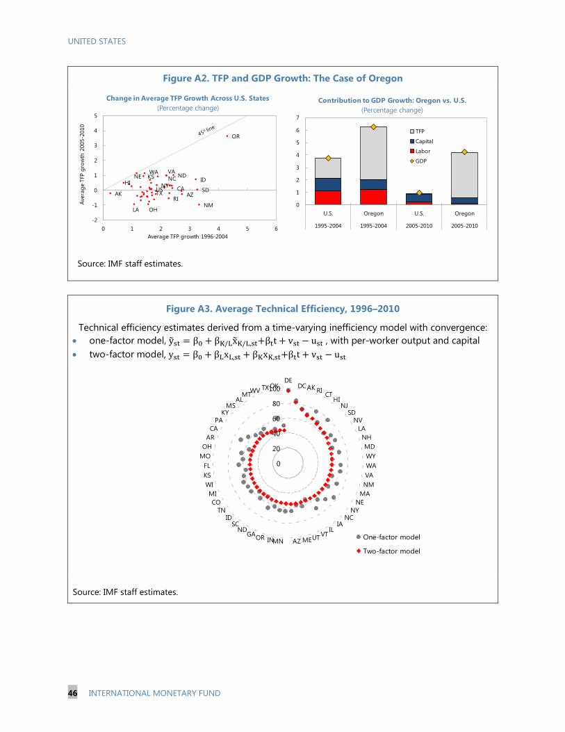
UNITED STATES
46 INTERNATIONAL MONETARY FUND
Figure A2. TFP and GDP Growth: The Case of Oregon
Source: IMF staff estimates.
Figure A3. Average Technical Efficiency, 1996–2010
Technical efficiency estimates derived from a time-varying inefficiency model with convergence:
one-factor model, , with per-worker output and capital
two-factor model,
Source: IMF staff estimates.
0
20
40
60
80
100
DEDCAK RI
CTHI
NJSD
NV
LA
NH
MD
WY
WA
VA
NM
MA
NE
NYNC
IAIL
VTUTMEAZMNINOR
GAND
SCID
TN
CO
MI
WI
KS
FL
MO
OH
AR
CA
PAKY
MSAL
MTWV TX OK
One-factor model
Two-factor model
Technical Efficiency, 1996-2010
0
1
2
3
4
5
6
7
U.S. Oregon U.S. Oregon
1995-2004 1995-2004 2005-2010 2005-2010
Contribution to GDP Growth: Oregon vs. U.S.
(Percentage change)
TFP
Capital
Labor
GDP
USAK AZ
CAHI
IDKS
LA
NE
NM
NY
NCND
OH
OR
RI
SDTX
VAWA
-2
-1
0
1
2
3
4
5
0 1 2 3 4 5 6
Average TFP growth 1996-2004
Ave
rag
e T
FP g
row
th 2
005-2
010
Change in Average TFP Growth Across U.S. States
(Percentage change)
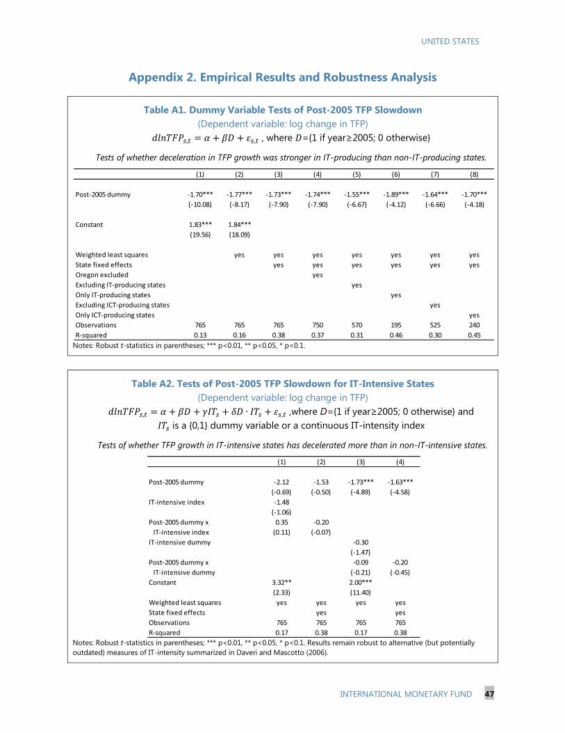
UNITED STATES
INTERNATIONAL MONETARY FUND 47
Appendix 2. Empirical Results and Robustness Analysis
Table A1. Dummy Variable Tests of Post-2005 TFP Slowdown
(Dependent variable: log change in TFP)
, where ={1 if year≥2005; 0 otherwise}
Tests of whether deceleration in TFP growth was stronger in IT-producing than non-IT-producing states.
Notes: Robust t-statistics in parentheses; *** p<0.01, ** p<0.05, * p<0.1.
Table A2. Tests of Post-2005 TFP Slowdown for IT-Intensive States
(Dependent variable: log change in TFP)
,where D={1 if year≥2005; 0 otherwise} and
is a {0,1} dummy variable or a continuous IT-intensity index
Tests of whether TFP growth in IT-intensive states has decelerated more than in non-IT-intensive states.
Notes: Robust t-statistics in parentheses; *** p<0.01, ** p<0.05, * p<0.1. Results remain robust to alternative (but potentially
outdated) measures of IT-intensity summarized in Daveri and Mascotto (2006).
(1) (2) (3) (4) (5) (6) (7) (8)
Post-2005 dummy -1.70*** -1.77*** -1.73*** -1.74*** -1.55*** -1.89*** -1.64*** -1.70***
(-10.08) (-8.17) (-7.90) (-7.90) (-6.67) (-4.12) (-6.66) (-4.18)
Constant 1.83*** 1.84***
(19.56) (18.09)
Weighted least squares yes yes yes yes yes yes yes
State fixed effects yes yes yes yes yes yes
Oregon excluded yes
Excluding IT-producing states yes
Only IT-producing states yes
Excluding ICT-producing states yes
Only ICT-producing states yes
Observations 765 765 765 750 570 195 525 240
R-squared 0.13 0.16 0.38 0.37 0.31 0.46 0.30 0.45
(1) (2) (3) (4)
Post-2005 dummy -2.12 -1.53 -1.73*** -1.63***
(-0.69) (-0.50) (-4.89) (-4.58)
IT-intensive index -1.48
(-1.06)
Post-2005 dummy x 0.35 -0.20
IT-intensive index (0.11) (-0.07)
IT-intensive dummy -0.30
(-1.47)
Post-2005 dummy x -0.09 -0.20
IT-intensive dummy (-0.21) (-0.45)
Constant 3.32** 2.00***
(2.33) (11.40)
Weighted least squares yes yes yes yes
State fixed effects yes yes
Observations 765 765 765 765
R-squared 0.17 0.38 0.17 0.38

UNITED STATES
48 INTERNATIONAL MONETARY FUND
Table A3. Stochastic Frontier Analysis
(Dependent variable: log real GDP)
Time-varying inefficiency model with convergence
Notes: z-statistics in parentheses; *** p<0.01, ** p<0.05, * p<0.1. Eta=decay parameter (see Box 1). Regressions include time fixed
effects. See Appendix 1 for the definitions and sources of variables.
1995-04 1996-05 1997-06 1998-07 1999-08 2000-09 2001-10 2002-10 2003-10
(1) (2) (3) (4) (5) (6) (7) (8) (9) (10) (11)
Log labor 0.57*** 0.60*** 0.61*** 0.60*** 0.60*** 0.61*** 0.61*** 0.63*** 0.62*** 0.62*** 0.60***
(14.42) (14.72) (14.98) (14.71) (13.97) (13.59) (12.52) (12.07) (11.17) (21.82) (16.11)
Log capital 0.48*** 0.45*** 0.45*** 0.47*** 0.47*** 0.47*** 0.47*** 0.45*** 0.45*** 0.45*** 0.49***
(13.60) (12.08) (11.69) (11.90) (11.33) (11.64) (10.95) (9.93) (9.29) (18.15) (14.72)
Time trend 0.01 0.01*** 0.01*** 0.01*** 0.01*** 0.01*** 0.01*** 0.01*** 0.01*** 0.00 0.01***
(1.55) (3.57) (6.51) (6.02) (4.27) (2.75) (3.74) (3.37) (2.70) (0.92) (6.97)
Constant 6.06*** 6.36*** 6.36*** 6.20*** 6.24*** 6.21*** 6.27*** 6.49*** 6.52*** 6.40*** 5.95***
(12.56) (12.92) (12.95) (12.21) (12.18) (11.95) (11.61) (11.49) (10.94) (15.00) (13.24)
Eta 0.02*** 0.01*** 0.00 -0.01* -0.01** -0.01*** -0.01*** -0.01*** -0.01*** 0.01*** -0.00
(5.38) (2.69) (0.37) (-1.65) (-2.16) (-3.74) (-3.33) (-3.86) (-3.39) (7.13) (-1.41)
Observations 510 510 510 510 510 510 510 459 408 1,071 765
Number of states 51 51 51 51 51 51 51 51 51 51 51
1990-10 1996-10

UNITED STATES
INTERNATIONAL MONETARY FUND 49
Table A4. Stochastic Frontier Analysis with Conditional Inefficiency Effects
(Dependent variable: log real GDP)
, with
where is a vector of explanatory variables associated with technical inefficiency
of production in state s
Notes: z-statistics in parentheses; *** p<0.01, ** p<0.05, * p<0.1. GR dummy is the Great Recession dummy variable (=1, if
year>2007; 0 otherwise). See Appendix 1 for the definitions and sources of variables.
(1) (2) (3) (4) (5) (6) (7)
Frontier
Log labor 0.44*** 0.43*** 0.50*** 0.43*** 0.43*** 0.43*** 0.40***
(23.01) (22.74) (19.85) (23.04) (21.13) (22.07) (22.59)
Log capital 0.60*** 0.61*** 0.51*** 0.61*** 0.60*** 0.62*** 0.63***
(32.21) (33.00) (20.57) (33.26) (30.03) (32.09) (36.59)
Time trend 0.01*** 0.01*** 0.01*** 0.01*** 0.01*** 0.01*** 0.005***
(6.83) (8.74) (3.40) (8.98) (8.20) (11.11) (4.06)
Constant 4.55*** 4.42*** 5.48*** 4.41*** 4.49*** 3.99*** 4.27***
(15.08) (12.50) (18.48) (17.53) (10.85) (18.09) (19.83)
Mean inefficiency
Schooling -0.12*** -0.11*** -0.11*** -0.09*** -0.05***
(-15.57) (-15.35) (-14.43) (-10.59) (-3.71)
Log schooling -0.71***
(-7.69)
GR dummy 0.07*** 0.05*** 0.08*** 0.07*** 0.06*** 0.05***
(5.37) (3.02) (5.50) (5.45) (3.99) (4.09)
Tertiary educ.att. -0.01***
(-12.60)
Elementary educ.att. -0.01***
(-4.47)
Gov R&D spending -0.02***
(-4.43)
Total R&D spending -0.02*** -0.01***
(-5.51) (-6.18)
Poverty rate 0.01***
(7.32)
Financial sector share -1.37***
(-20.72)
Constant 1.97*** 1.92*** 0.83*** 1.84*** 1.57*** 0.58*** 2.47***
(8.72) (6.57) (13.31) (11.50) (4.45) (3.05) (9.72)
Observations 1,071 1,071 561 1,071 856 900 714
Number of states 51 51 51 51 51 50 51

UNITED STATES
50 INTERNATIONAL MONETARY FUND
Table A5. Determinants of Total Factor Productivity
Notes: t-statistics in parentheses; *** p<0.01, ** p<0.05, * p<0.1. See Appendix 1 for the definitions and sources of variables.
(1) (2) (3) (4) (5) (6) (7) (8)
Schooling 0.42**
(2.02)
Log schooling 5.50** 9.64*** 5.00*** 5.15*** 4.71*** 3.91***
(1.98) (2.69) (4.23) (4.02) (4.23) (2.94)
Tertiary educational attainment 0.16*
(1.70)
Business R&D expenditure 0.36** 0.08 7.45*
(2.48) (0.48) (1.83)
Total R&D expenditure 0.40*
(1.69)
Government R&D expenditure -0.52*** -0.48*** 0.26 0.61*** 0.53** 0.50**
(-2.86) (-2.64) (1.15) (2.61) (2.55) (2.50)
Business x Gov. R&D expenditure 0.36** 0.38**
(2.01) (2.16)
Log schooling x Business R&D exp. -2.83*
(-1.81)
Time trend -0.02*** -0.02*** -0.02*** -0.01**
(-3.96) (-3.62) (-3.77) (-2.26)
Own-source taxes (% GDP) 2.04*** 1.97*** 0.77
(3.41) (3.35) (1.29)
Tax burden (% GDP) -6.38*** -6.31*** -4.46**
(-3.11) (-3.11) (-2.23)
Capital expenditure (% GDP) -0.01
(-0.28)
Government size score 0.04*
(1.65)
Constant -4.49 -3.76 -12.75* -23.50** -5.68* -5.86* -4.65* -3.38
(-1.65) (-1.39) (-1.78) (-2.53) (-1.92) (-1.83) (-1.69) (-0.99)
Combined effect (for interaction terms)
Log schooling 5.68**
(2.05)
Government R&D expenditure -0.02 0.06
(0.08) (0.28)
Business R&D expenditure 0.25 0.21
(1.57) (1.34)
Time fixed effects yes yes yes yes
State-specific time trend yes yes yes yes
Three-year averages yes yes yes yes
Annual yes yes yes yes
Observations 346 204 346 346 1,071 950 950 950
R-squared 0.40 0.48 0.42 0.42
Number of states 51 51 51 51 51 50 50 50
Fixed-Effects Estimator Mean Group Estimator
Dependent variable: TFP growth Dependent variable: log TFP
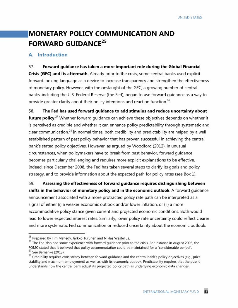
UNITED STATES
INTERNATIONAL MONETARY FUND 51
MONETARY POLICY COMMUNICATION AND
FORWARD GUIDANCE25
A. Introduction
57. Forward guidance has taken a more important role during the Global Financial
Crisis (GFC) and its aftermath. Already prior to the crisis, some central banks used explicit
forward looking language as a device to increase transparency and strengthen the effectiveness
of monetary policy. However, with the onslaught of the GFC, a growing number of central
banks, including the U.S. Federal Reserve (the Fed), began to use forward guidance as a way to
provide greater clarity about their policy intentions and reaction function.26
58. The Fed has used forward guidance to add stimulus and reduce uncertainty about
future policy.27 Whether forward guidance can achieve these objectives depends on whether it
is perceived as credible and whether it can enhance policy predictability through systematic and
clear communication.28 In normal times, both credibility and predictability are helped by a well
established pattern of past policy behavior that has proven successful in achieving the central
bank’s stated policy objectives. However, as argued by Woodford (2012), in unusual
circumstances, when policymakers have to break from past behavior, forward guidance
becomes particularly challenging and requires more explicit explanations to be effective.
Indeed, since December 2008, the Fed has taken several steps to clarify its goals and policy
strategy, and to provide information about the expected path for policy rates (see Box 1).
59. Assessing the effectiveness of forward guidance requires distinguishing between
shifts in the behavior of monetary policy and in the economic outlook. A forward guidance
announcement associated with a more protracted policy rate path can be interpreted as a
signal of either (i) a weaker economic outlook and/or lower inflation, or (ii) a more
accommodative policy stance given current and projected economic conditions. Both would
lead to lower expected interest rates. Similarly, lower policy rate uncertainty could reflect clearer
and more systematic Fed communication or reduced uncertainty about the economic outlook.
25
Prepared By Tim Mahedy, Jarkko Turunen and Niklas Westelius. 26
The Fed also had some experience with forward guidance prior to the crisis. For instance in August 2003, the
FOMC stated that it believed that policy accommodation could be maintained for a “considerable period”. 27
See Bernanke (2013). 28
Credibility requires consistency between forward guidance and the central bank’s policy objectives (e.g., price
stability and maximum employment) as well as with its economic outlook. Predictability requires that the public
understands how the central bank adjust its projected policy path as underlying economic data changes.

UNITED STATES
52 INTERNATIONAL MONETARY FUND
Box 1. The Fed’s Communication since 2008
Communication channels. In March 2011, the FOMC introduced regular post-meeting press
conferences by the chairman. The press conferences coincide with the committee’s publication of
the Summary of Economic Projections (SEP) and are intended to “further enhance the clarity and
timeliness of the Federal Reserve's monetary policy communication.”
Policy objectives and strategy. In January 2012, the FOMC published a statement on its longer-
run goals and monetary policy strategy, formally committing to a 2 percent inflation target and
assessment of maximum employment based on a range of indicators. The statement also clarified
that the FOMC follows a balanced approach in making tradeoffs between the two objectives when
necessary.
Forward guidance. In January 2012, the FOMC included federal funds rate projections by FOMC
participants in the SEP (the so-called “dot” graph). Since December 2008, the FOMC has gone
through four different forward guidance regimes:
Qualitative FG I: In December 2008, together with establishing a target range for the federal
funds rate of 0 to 1/4 percent, the FOMC introduced qualitative policy rate guidance by
indicating that economic conditions are likely to “warrant exceptionally low levels of the federal
funds rate for some time.” In March 2009 the language was changed to “for an extended
period.”
Date based FG: In August 2011, the FOMC shifted to date-based guidance by declaring that
economic conditions are likely to “warrant exceptionally low levels of the federal funds rate at
least through mid-2013”. In January 2012, the date was changed to late 2014, and in
September 2012, it was changed to mid-2015.
State based FG: In December 2012, the FOMC transitioned to state-based guidance by stating
that the committee deemed it appropriate for the federal funds rate to be at its zero lower
bound at “least as” long as unemployment remains above 6.5 percent, projected inflation is no
more than 2.5 percent and longer term inflation expectations are well anchored. This
announcement also coincided with an extension of the long-term asset purchase program. In
December 2013 the language was changed from “at least” to “well past.”
Qualitative FG II: Finally, in March 2014, the FOMC went back to qualitative guidance by
removing the reference to specific unemployment and inflation thresholds. Instead the
committee stated that it would be “appropriate to maintain the current target range for the
federal funds rate for a considerable time after the asset purchase program ends, especially if
projected inflation continues to run below the Committee’s 2 percent longer-run goal.” and that
it “anticipates that, even after employment and inflation are near mandate-consistent levels,
economic conditions may, for some time, warrant keeping the target federal funds rate below
levels the Committee views as normal in the longer run.”
60. This selected issues paper addresses two main questions. First, did forward
guidance represent a shift in the reaction function of the Fed or simply signal a weaker
economic outlook? Second, did forward guidance move policy rate expectations as
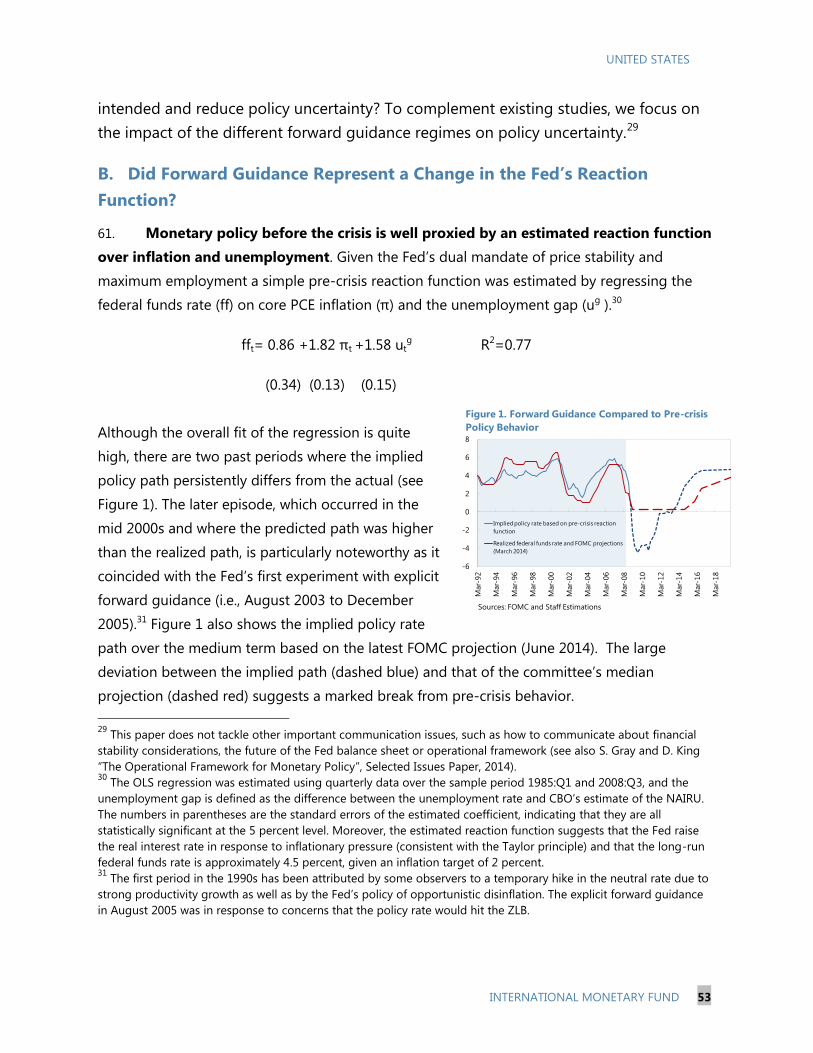
UNITED STATES
INTERNATIONAL MONETARY FUND 53
intended and reduce policy uncertainty? To complement existing studies, we focus on
the impact of the different forward guidance regimes on policy uncertainty.29
B. Did Forward Guidance Represent a Change in the Fed’s Reaction
Function?
61. Monetary policy before the crisis is well proxied by an estimated reaction function
over inflation and unemployment. Given the Fed’s dual mandate of price stability and
maximum employment a simple pre-crisis reaction function was estimated by regressing the
federal funds rate (ff) on core PCE inflation (π) and the unemployment gap (ug ).30
fft= 0.86 +1.82 πt +1.58 utg R2=0.77
(0.34) (0.13) (0.15)
Although the overall fit of the regression is quite
high, there are two past periods where the implied
policy path persistently differs from the actual (see
Figure 1). The later episode, which occurred in the
mid 2000s and where the predicted path was higher
than the realized path, is particularly noteworthy as it
coincided with the Fed’s first experiment with explicit
forward guidance (i.e., August 2003 to December
2005).31 Figure 1 also shows the implied policy rate
path over the medium term based on the latest FOMC projection (June 2014). The large
deviation between the implied path (dashed blue) and that of the committee’s median
projection (dashed red) suggests a marked break from pre-crisis behavior.
29
This paper does not tackle other important communication issues, such as how to communicate about financial
stability considerations, the future of the Fed balance sheet or operational framework (see also S. Gray and D. King
“The Operational Framework for Monetary Policy”, Selected Issues Paper, 2014). 30
The OLS regression was estimated using quarterly data over the sample period 1985:Q1 and 2008:Q3, and the
unemployment gap is defined as the difference between the unemployment rate and CBO’s estimate of the NAIRU.
The numbers in parentheses are the standard errors of the estimated coefficient, indicating that they are all
statistically significant at the 5 percent level. Moreover, the estimated reaction function suggests that the Fed raise
the real interest rate in response to inflationary pressure (consistent with the Taylor principle) and that the long-run
federal funds rate is approximately 4.5 percent, given an inflation target of 2 percent. 31
The first period in the 1990s has been attributed by some observers to a temporary hike in the neutral rate due to
strong productivity growth as well as by the Fed’s policy of opportunistic disinflation. The explicit forward guidance
in August 2005 was in response to concerns that the policy rate would hit the ZLB.
-6
-4
-2
0
2
4
6
8
Mar-
92
Mar-
94
Mar-
96
Mar-
98
Mar-
00
Mar-
02
Mar-
04
Mar-
06
Mar-
08
Mar-
10
Mar-
12
Mar-
14
Mar-
16
Mar-
18
Implied policy rate based on pre-crisis reaction
function
Realized federal funds rate and FOMC projections
(March 2014)
Figure 1. Forward Guidance Compared to Pre-crisis
Policy Behavior
Sources: FOMC and Staff Estimations

UNITED STATES
54 INTERNATIONAL MONETARY FUND
62. Starting from 2012, the FOMC members’ projected policy path deviates
significantly from pre-crisis behavior, suggesting a shift in the Fed’s reaction function. In
early 2012, the implied path of the federal funds rate based on pre-crisis behavior and the
median of FOMC member’s projected policy rate path were fairly well in line with each other. 32
However, while the implied policy path shifted up during 2012, due to a slight improvement in
the FOMC’s economic outlook, the median projected path was lowered and the lift-off date
pushed further out (see Figure 2 and Table 1). Indeed, some FOMC members explicitly stated
that the shift to date-based guidance did not constitute a more pessimistic view on the US
economic outlook.33
63. Alternatively, the shift in the FOMC member’s projected path could potentially be
explained by unusual headwinds from the crisis. The shift to a more protracted policy rate
path could also reflect a focus on broader measures of slack or a lower neutral real rate.34
Greater labor market slack than indicated by headline unemployment (or concerns that
inflation was likely to run below target). The crisis has been associated with a greater
decline in labor force participation than can be explained by demographic factors, as
well as a rising number of part-time employed.35
A lower neutral real policy rate. Shifts in savings preferences, lower expected future
growth, as well as global conditions could have contributed to a decline in the neutral
32
The implied path is derived using the midpoint of unemployment and inflation from the SEP. 33
See Dudley (2012) and Bullard (2013). 34
See also Levin (2014). 35
See Balakrishnan et al. (2014).
-5
-3
-1
1
3
5
2007
2008
2009
2010
2011
2012
2013
2014
2015
2016
2017
2018
Realized FF-rate
Implied path Jan.
Implied path Sept.
FOMC Jan.
FOMC Sept.
Figure 2. A Shift to an Expansionary Stance Despite an
Improving Economic Outlook, 2012(September, 2012)
Projections Jan-12 Jun-12 Sep-12
Unemployment rate 7.2 7.4 7.0
PCE core inflation 1.8 1.8 1.9
Federal funds rate 0.75 0.50 0.25
Table 1. FOMC's Economic Outlook and Policy
Projections for 2014
Date of Projection
Source: Selected Economic Projections, FOMC. The numbers
correspond to the mid point of the central tendancy for each
variable.
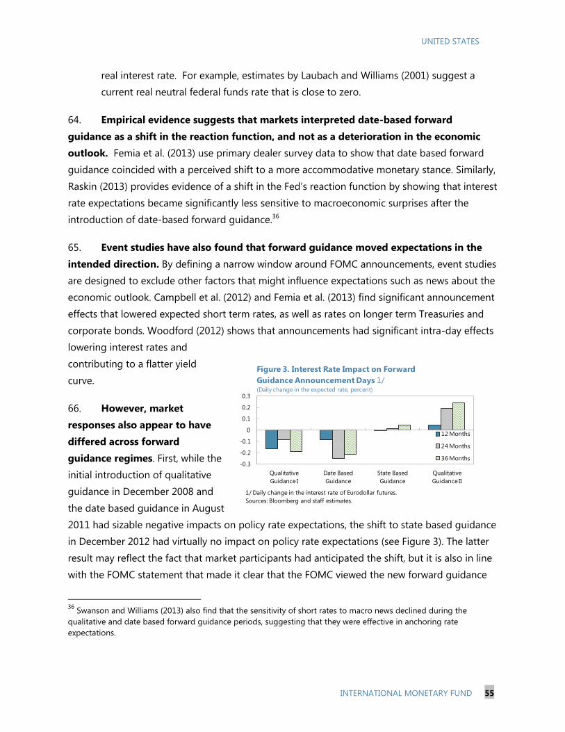
UNITED STATES
INTERNATIONAL MONETARY FUND 55
real interest rate. For example, estimates by Laubach and Williams (2001) suggest a
current real neutral federal funds rate that is close to zero.
64. Empirical evidence suggests that markets interpreted date-based forward
guidance as a shift in the reaction function, and not as a deterioration in the economic
outlook. Femia et al. (2013) use primary dealer survey data to show that date based forward
guidance coincided with a perceived shift to a more accommodative monetary stance. Similarly,
Raskin (2013) provides evidence of a shift in the Fed’s reaction function by showing that interest
rate expectations became significantly less sensitive to macroeconomic surprises after the
introduction of date-based forward guidance.36
65. Event studies have also found that forward guidance moved expectations in the
intended direction. By defining a narrow window around FOMC announcements, event studies
are designed to exclude other factors that might influence expectations such as news about the
economic outlook. Campbell et al. (2012) and Femia et al. (2013) find significant announcement
effects that lowered expected short term rates, as well as rates on longer term Treasuries and
corporate bonds. Woodford (2012) shows that announcements had significant intra-day effects
lowering interest rates and
contributing to a flatter yield
curve.
66. However, market
responses also appear to have
differed across forward
guidance regimes. First, while the
initial introduction of qualitative
guidance in December 2008 and
the date based guidance in August
2011 had sizable negative impacts on policy rate expectations, the shift to state based guidance
in December 2012 had virtually no impact on policy rate expectations (see Figure 3). The latter
result may reflect the fact that market participants had anticipated the shift, but it is also in line
with the FOMC statement that made it clear that the FOMC viewed the new forward guidance
36
Swanson and Williams (2013) also find that the sensitivity of short rates to macro news declined during the
qualitative and date based forward guidance periods, suggesting that they were effective in anchoring rate
expectations.
-0.3
-0.2
-0.1
0
0.1
0.2
0.3
Qualitative
Guidance I
Date Based
Guidance
State Based
Guidance
Qualitative
Guidance II
Figure 3. Interest Rate Impact on Forward
Guidance Announcement Days 1/(Daily change in the expected rate, percent)
12 Months
24 Months
36 Months
1/ Daily change in the interest rate of Eurodollar futures.
Sources: Bloomberg and staff estimates.

UNITED STATES
56 INTERNATIONAL MONETARY FUND
0.0
0.5
1.0
1.5
2.0
2.5
3.0
3.5
Dec-08 Dec-09 Dec-10 Dec-11 Dec-12 Dec-13
Figure 5. Time to Liftoff
(Years)
Years to Liftoff
Average during guidance period
Source: Bloomberg and staff estimates.
as consistent with its earlier date-based guidance. Second, the shift back to qualitative guidance
in March 2014 coincided with an increase in policy rate expectations at announcement.
However, this shift may also reflect an upward revision in FOMC member’s projections for policy
interest rates that were released at the same time.37
C. Did Forward Guidance Reduce Policy Uncertainty?
67. Forward guidance has been associated with a decline in policy uncertainty. While
most of the recent literature has focused market expectations about interest rates, less
attention has been paid to the impact of forward guidance on policy rate uncertainty. Bauer
(2012) finds that early
announcements of forward guidance
reduced uncertainty about future
interest rates. Filardo and Hoffman
(2014) show descriptive evidence
that forward guidance has coincided
with lower interest rate uncertainty
at shorter horizons. Indeed, implied
volatility of swaptions (a measure of
interest rate uncertainty) has
declined during the forward guidance period, with some increase in volatility at longer horizons
from mid-2013 onwards (see Figure 4). The period of date based forward guidance in particular
coincides with a sizeable decline in uncertainty. At the same time, the introduction of date
based forward guidance resulted in a significant increase in market expectations about the time
to lift-off from the ZLB (see Figure 5). While time to lift-off is also impacted by changes in the
economic outlook, the upward shift at the announcement of date based guidance suggests that
a significant part of the dampening impact of forward guidance on rate uncertainty worked
through this channel. The period with state based forward guidance coincides with some
increase in volatility at longer horizons and, as the recovery proceeded, a decline in the
expected distance to lift-off. Finally, the return to qualitative forward guidance has been
associated with an increase in policy uncertainty.
37
More generally, interpretation of specific events is complicated by announcements that occurred at the same time.
For example, the introduction of date based forward guidance coincided with an extension of the LSAP program.

UNITED STATES
INTERNATIONAL MONETARY FUND 57
0.0
0.2
0.4
0.6
0.8
1.0
1.2
1.4
1.6
1.8
Dec-08 Dec-09 Dec-10 Dec-11 Dec-12 Dec-13
Figure 6. CPI and Unemployment Rate 1/
(Percent)
CPI
Unemployment
1/ Measurement of dispersion, or the difference in forecasts between the 75th
and 25th percentiles.
Source: Philidelphia Federal Reserve.
Qualitative guidance Date based
guidance
State based
guidance
Return to
qualitatitve
guidance
Figure 4. Implied Volatilities of Swaptions
68. Uncertainty about the economic outlook has also fallen. Lower policy uncertainty
could reflect less uncertainty about the near-term economic outlook. Forecaster disagreement
about both inflation and the unemployment rate (as measured by the dispersion in private
sector forecasts four quarters ahead) have also declined over time (see Figure 6). This is true in
particular for the period after date based forward guidance was announced.
69. Regression evidence. To futher
analyze the impact of forward guidance
on uncertainty, we regress measures of
uncertainty on future interest rates on
indicator variables for the forward
guidance periods, controlling for
economic uncertainty and other factors
(including broader market uncertainty
and risk aversion as proxied by the VIX
index) (see the Appendix for a more detailed description of the data). Specifically, we estimate
OLS regressions:
15
35
55
75
95
115
135
155
175
195
12/16/2008 12/16/2009 12/16/2010 12/16/2011 12/16/2012 12/16/2013
6 Month
Average over forward
guidance period
Date based
guidance
State based
guidance
Qualitative
guidance
Return to
qualitative
guidance
15
35
55
75
95
115
135
155
175
195
12/16/2008 12/16/2009 12/16/2010 12/16/2011 12/16/2012 12/16/2013
1 Year
Average over forward
guidance period
Date based
guidanceState based
guidance
Qualitative
guidance
Return to
qualitative
guidance
15
35
55
75
95
115
135
155
175
195
12/16/2008 12/16/2009 12/16/2010 12/16/2011 12/16/2012 12/16/2013
2 Year
Average over forward
guidance period
Date based
guidance
State based
guidance
Qualitative
guidance
Sources: Bloomberg and staff estimates.
Return to
qualitative
guidance15
35
55
75
95
115
135
155
175
195
12/16/2008 12/16/2009 12/16/2010 12/16/2011 12/16/2012 12/16/2013
5 Year
Average over forward
guidance period
Date based
guidance
State based
guidance
Qualitative
guidance
Return to
qualitative
guidance

UNITED STATES
58 INTERNATIONAL MONETARY FUND
Where VOL is a measure of uncertainty about future interest rates (implied volatility of
swaptions at different time horizons); ECON a measure of economic uncertainty (forecaster
disagreement on unemployment and inflation) and FG are step dummy variables for the three
forward guidance regimes (with the first qualitative forward guidance period as the omitted
category). We also include control variables X (VIX, time to lift off from the ZLB and the OIS-
Libor spread). The regressions were estimated using daily data over the sample period from
12/16/2008 through 06/16/2014.
70. Regressions evidence confirms that forward guidance was associated with lower
policy uncertainty, with some differences across regimes. Several interesting results emerge:
Economic uncertainty increases uncertainty about future policy interest rates. As expected,
msot coefficients for forecaster disagreement about the unemployment rate and inflation
are positive and statistically significant (see Table 2). Broader market uncertainty (as
measured by the VIX) is also associated with higher uncertainty about future policy interest
rates.
Date-based forward guidance is associated with lower policy rate uncertainty on average. This
effect is primarily driven by date-based forward guidance successfully pushing the lift-off
date further out, and therefore providing greater clarity about the period when policy rates
were expected to remain close to zero (see Figure 7).
State-based forward guidance may have reduced policy uncertainty above and beyond time
to-lift-off. In particular, there is some evidence that once time to lift-off is controlled for,
state-based forward guidance was associated with lower policy uncertainty. This may reflect
the fact that at shorter horizons, state based forward guidance provided a more systematic
approach to evaluating progress towards liftoff from ZLB. Indeed, this seems to be
consistent with Bernanke’s (2013) argument that an important limitation to date based
guidance was that it did not explain how future policy would be affected by changes in the
economic outlook.
While based on a short sample, there is some evidence that the return to qualitative forward
guidance was associated with lower uncertainty. Despite the increase in uncertainty at
announcement, the regression evidence suggests that qualitatitive forward guidance has
been associated with lower uncertainty. This may reflect additional forward guidance about
the path of policy rates post lift-off.
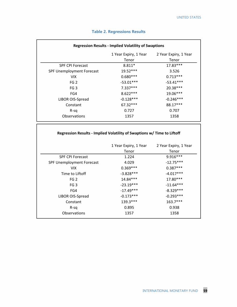
UNITED STATES
INTERNATIONAL MONETARY FUND 59
Table 2. Regressions Results
Regression Results - Implied Volatility of Swaptions
1 Year Expiry, 1 Year
Tenor
2 Year Expiry, 1 Year
Tenor
SPF CPI Forecast 8.811* 17.83***
SPF Unemployment Forecast 19.52*** 3.526
VIX 0.680*** 0.713***
FG 2 -53.01*** -53.41***
FG 3 7.337*** 20.38***
FG4 8.622*** 19.06***
LIBOR OIS-Spread -0.128*** -0.246***
Constant 67.32*** 88.17***
R-sq 0.727 0.707
Observations 1357 1358
Regression Results - Implied Volatility of Swaptions w/ Time to Liftoff
1 Year Expiry, 1 Year
Tenor
2 Year Expiry, 1 Year
Tenor
SPF CPI Forecast 1.224 9.916***
SPF Unemployment Forecast 4.029 -12.75***
VIX 0.369*** 0.387***
Time to Liftoff -3.828*** -4.017***
FG 2 14.84*** 17.80***
FG 3 -23.19*** -11.64***
FG4 -17.49*** -8.329***
LIBOR OIS-Spread -0.173*** -0.293***
Constant 139.3*** 163.7***
R-sq 0.895 0.938
Observations 1357 1358

UNITED STATES
60 INTERNATIONAL MONETARY FUND
71. These regression results are subject to a number of caveats. The descriptive
regressions do not identify causal effects and estimated impacts could reflect omitted factors.
Furthermore, the analysis of volatility is complicated by the ZLB which tends to shrink volatility.
However, the qualitative results for the forward guidance periods are robust across a number of
alternative specifications, such as using alternative measures of uncertainty (e.g. realized
volatility of eurodollar futures or the MOVE index of implied volatility in Treasuries), other
variables to capture economic uncertainty (e.g. the Citi surprise index), and controlling for other
factors (e.g. the impact of euro area sovereign stress using the spread between euro area core
versus perphery bonds). To minimize complication from the ZLB the analysis refrains from
comparisons with non-ZLB periods.
D. Conclusions
72. Uncertainties remain whether the deviation from pre-crisis policy is due to a
change in the Fed’s reaction function or lingering headwinds from the crisis. Empirical
evidence suggests that market participants have interpreted the protracted policy path as a
shift in the Fed’s reaction function and not as response to a deteriorating outlook. While the
Fed has mentioned a number of reasons for the protracted path, there have been calls for more
-80
-70
-60
-50
-40
-30
-20
-10
0
10
20
Date based State based Return to Qualitative
Guidance
Figure 7. Cumulative Effects of Foward Guidance on Interest
Rate Volatility, Swaption 1y 1y
Time to liftoff effect
Effect excluding time to liftoff
1/ Interest rate volatility is measured as the change in volatility of Swaptions
with a 1 year expiry and 1 year tenor.
Sources: Bloomberg and staff estimates.
UNITED STATES
INTERNATIONAL MONETARY FUND 61
clarity from both within the FOMC and from market participants. 38 Further communication
about the FOMCs consensus view on the rationale for the protracted policy path could facilitate
a smoother and more predictable normalization process.
73. Forward guidance has generally been effective in moving policy expectations in
the intended direction and in reducing policy uncertainty. This is consistent with the Fed’s
stated objectives of forward guidance policy. However, recent events have also resulted in
challenges, in particular as the economic recovery has been moving the Fed closer towards a
turning point in monetary policy.
74. Across regimes, there is some evidence that more recent forward guidance was
been more effective in guiding expectations and reducing uncertainty than initial
qualitative forward guidance. This experience suggests a potential trade off between
systematic communication and policy flexibility. More recently, there is some evidence that the
recent shift back to qualitative forward guidance was associated with lower uncertainty, perhaps
reflecting additional guidance about the path of policy rates post lift-off. Looking forward ,
while qualitative forward guidance will provide the FOMC with more policy flexibility, it also
suggests a greater premium on clear and systematic communcation to avoid an increase in
policy uncertainty as lift-off approaches.
38
See Bernanke (2012) for a list of reasons for the protracted path and Plosser (2014) and the NY Federal Reserve
Survey of Primary Dealers for calls for more clarity.
UNITED STATES
62 INTERNATIONAL MONETARY FUND
References
Balakrishnan, R., Dao, M., Sole J. and Zook, J (2014): “Recent U.S. Labor Force Participation
Dynamics: Reversible or Not?”, Selected Issues Paper.
Bauer, M. (2012): “Monetary Policy and Interest Rate Uncertainty”, Federal Reserve Bank of San
Francisco Economic Letter.
Bernanke, B. (2013): “Communication and Monetary Policy,” speech at the National Economists
Club Annual Dinner.
Bullard, J. (2013) “U.S. Monetary Policy: Easier than You Think It Is”, remarks before Center for
Global Economy and Business at New York University’s Stern School of Business
Campbell, J., Evans, C., Fisher, J. and Justiniano, A. (2012): “Macroeconomic Effects of FOMC
Forward Guidance”, Brookings Papers on Economic Activity 35(2).
Dudley, W., (2012). “Regional and National Economic Conditions”, remarks before the Morris
County Chamber of Commerce, Florham Park, NJ, September 18.
Dudley, W., (2012). “Conducting Monetary Policy: Rules, Learning and Risk Management,”
Remarks at the C. Peter McColough Series on International Economics, Council on
Foreign Relations, New York City.
Femia, K., Friedman, S. and Sack, B. (2013): “The Effects of Policy Guidance on Perceptions of the
Fed’s Reaction Function”, Federal Reserve Bank of New York Staff Reports.
Filardo, A. and Hoffman, B. (2014): ”Forward Guidance at the Zero Lower Bound”, BIS Quarterly
Review.
UNITED STATES
INTERNATIONAL MONETARY FUND 63
Laubach, T. and Williams, J. (2001): “Measuring the Natural Real Rate of Interest”, The Review of
Economics and Statistics 85(4).
Levin, A. (2014): “The Design and Communication of Systematic Monetary Policy Strategies”.
Raskin, M. (2013): “The Effects of the Federal Reserve’s Date Based Forward Guidance”, Finance
and Economics Discussion Series, Federal Reserve Board.
Swanson, E. and Williams, J. (2013): “Measuring the Effect of the Zero Lower Bound on Medium
and Longer Term Interest Rates”, Federal Reserve Bank of San Francisco working paper.
Yellen (2014): Transcript press conference, March.
Woodford, M. (2012): “Methods of Policy Accommodation at the Interest-Rate Lower Bound”,
Jackson Hole (September 16).

UNITED STATES
64 INTERNATIONAL MONETARY FUND
Appendix 1. Data Description
Implied volatility of swaptions. A swaption is an option that gives one party the right, but
not the obligation, to swap a fixed rate for a floating rate (based on the 3 month Libor). The
expiry of the option denotes the amount of time the party has to exercise the option, while the
option tenor is the duration of the contract once it’s exercised. The expiry can be thought of as
an approximation of the interest rate horizon. For instance, an option with a 1 year expiry,
1 year tenor, represents market sentiment about the short-term rate over a year, one year from
now.39
The dispersion of forecasts. The dispersion of the Philadelphia Federal Reserves’ Survey of
Professional Forecasters (SPF) forecasts is the difference between the 75th and 25th percentiles
of private market participants four quarters ahead forecast of the CPI and the unemployment
rate.
Time to lift-off. We construct a 36-month ahead curve from generic monthly Federal Funds
futures contracts for each day and count the number of months until the interest rate exceeds
50 basis points.
VIX. Measure of the implied volatility of the S&P 500 index options over the next 30 days.
OIS-Libor Spread. Spread between the overnight indexed swap and the 3-month LIBOR rates,
a commonly used measure of credit and liquidity risk.
39
For robustness, we also run regressions using realized volatility of eurodollar futures, as well as the MOVE index of
implied volatility in Treasuries as the dependent variable and other control variables. Realized volatility of Eurodollar
futures contracts: Eurodollar futures contracts are derivatives based on the interest rate paid on dollar denominated
short-term deposits outside of the United States. The realized volatility is computed as the 10-day standard deviation
of the day-over-day rate change based on the end of day option price. Merrill Lynch Option Volatility Expectations
Index (MOVE Index): the index is a weighted index of implied volatilities on 1-month Treasury options at different
maturities. The weights are: 20% on 2yr, 20% on 5yr, 40% on 10yr, and 20% on 30yr. Realized volatility and the MOVE
index show similar trends. We also contolled for euro area sovereign stress using the spread between euro area core
versus periphery long term (10 year) bonds.
UNITED STATES
INTERNATIONAL MONETARY FUND 65
THE OPERATIONAL FRAMEWORK FOR MONETARY POLICY
E. Introduction
75. Unconventional policies have been used for a longer period and in greater volume
than originally envisaged, with focus now moving toward the Fed’s preparedness to manage
financial conditions during normalization. The Fed commenced Large Scale Asset Purchases
(LSAPs) in 2009, and has increased its balance sheet from $800 billion to $4.3 trillion. Tapering
commenced in early-2014 with the expectation that the LSAP program would gradually be wound
down and finish towards the end of 2014, if economic conditions evolve as expected.
76. The FOMC has indicated that it wants to reduce the size of its balance sheet over time
and return to targeting short-term interest rates. It first outlined its Exit Strategy Principles in
June 2011, and suggested that it wanted to return the quantity of bank reserves to ‘the smallest
levels that would be consistent with the efficient implementation of monetary policy.’40
It reviewed its
Exit Strategy Principles and normalization plans in May 2013 and April 2014, noting that the Federal
funds rate may not be the best indicator of the general level of short-term rates, and that new tools
may be needed to improve control over short-term rates.41
77. This paper assesses operational issues during normalization and for the longer term.
The pre-crisis framework is described, preparedness for exit is assessed, and suggestions offered on
the shape of the post-normalization framework.
F. Some History
The Pre-crisis Framework
78. Pre-crisis, the Fed targeted the federal funds rate, an overnight unsecured interest
rate.42
Typically policy announcements had an immediate impact on money market rates, and there
was little long-term relationship between excess reserves, which were very small ($1 billion to $2
billion), and trends in interest rates (Figure 1). There was however a tight connection between the
level of excess reserves and interest rates within the reserve maintenance period. Excess reserves
were low, reflecting a low level of demand given a high opportunity cost (excess reserves were not
remunerated) in the context of a well functioning money market and efficient payments
infrastructure.
40
Minutes of the FOMC meeting held June 2011. 41
Minutes of the FOMC meetings held April 30–May 1, 2013 and April 29–30, 2014. 42
Simon Potter: Executive Vice President Federal Reserve Bank of New York, December 2, 2013. Recent
Developments in Monetary Policy Implementation: (Potter speech).

UNITED STATES
66 INTERNATIONAL MONETARY FUND
79. The Fed conducted monetary policy in the context of a small structural liquidity deficit
using a standard set of instruments.43
The bulk of the deficit came through the Fed’s policy of
increasing its holdings of U.S. Treasury securities as the stock of Federal Reserve notes rose over
time, as well as the imposition of the reserve requirement on depository institutions. In addition, the
discount window (rarely used) was available to depository institutions, and fine-tuning open market
operations (OMO) to adjust the supply of reserve balances with fluctuations in demand, were
conducted on a daily basis with a small set of primary dealers.44
Figure 1. Excess Reserves of Depository
Institutions and Selected Interest Rates
(Monthly average)
Figure 2. Composition of Reserve Requirements
(Monthly average)
Sources: Federal Reserve Bank of St. Louis and IMF calculations.
43
The main features of the monetary policy frameworks of the Bank of Japan, the Federal Reserve and the
Eurosystem: Conference paper May 2000. 44
Primary dealers, usually numbered between 20 and 25, and were required to be a banking organization or a
registered securities dealer in good standing with the regulator. Their duties included making markets to the Fed
Trading desk, supporting the U.S. Treasuries market, and providing market intelligence.

UNITED STATES
INTERNATIONAL MONETARY FUND 67
Figure 3. Reserves of Depository Institutions
and Selected Interest Rates
0
500
1,000
1,500
2,000
2,500
3,000
3,500
4,000
0.0
0.1
0.2
0.3
0.4
0.5
0.6
0.7
0.8
0.9
1.0
2008 2009 2010 2010 2011 2012 2013 2013
Excess Reserves of Depository Institutions (RHS)
Reserves Balances used to meet Reserve
RequirementsIOER
Federal Funds Effective Rate
Overnight Repo Rate
Perc
ent
USD
Billio
ns
Figure 3. Reserves of Depository Institutions and
Selected Interest Rates
Post-Lehman Balance Sheet Expansion
80. In response to the financial crisis, and in an effort to stabilize financial markets and
promote economic recovery, the Fed introduced major changes to its operational framework:
To maintain control over short-term money market rates while adding liquidity to counter
growing financial stability risks, the Fed started remunerating reserves balances in October
2008, which was earlier than an initially planned date of 2011.45
In December 2008 the fed funds target was changed from a point target (1.0 percent) to a
range target (0–0.25 percent).
Initially various Fed lending programs and then ongoing LSAP programs significantly
increased the volume of excess reserves (Figure 3). The interest rate paid on excess reserves
(IOER) has been 0.25 percent for some time, while the expansion in excess reserves put
downward pressure on both the fed funds rate and repo rates resulting in both trading
below this level.46
The fed funds rate has generally remained in a range of 0.05 to
0.15 percent in recent years.
81. In parallel to those moves, fed funds transactions contracted sharply and with a
change in the nature of activity. Initially,
markets fragmented as uncertainty about the
health of the banking system led to a flight
to quality and less trading between financial
institutions. Subsequently, the introduction
of the IOER and the increase in excess
reserves reduced institutions’ need to
actively manage liquidity. As a result, fed
funds daily activity fell from an estimated
$250 billion in 2006 to $60 billion at the end
of the 2012. The nature of the lending to the
market also changed, with Federal Home
Loan Banks (FHLB), that do not have access
to the IOER, now estimated to provide 75
percent of fed funds lending, up from a pre-
crisis estimate of 40 percent.47
The other
45
The Financial Services Regulatory Relief Act 2006 authorized the Fed to pay interest on reserves beginning October
2011. This authority was superseded by the Emergency Economic Stabilization Act 2008 bringing forward the
authority to October 2008. 46
The IOER does not act as a firm floor to the Fed Funds rate because only depository institutions have access to the
IOER. Government Sponsored Enterprises do not have access to IOER and are large sellers of Fed funds. 47
Liberty Street Economics December 2, 2013: Who’s Lending in the Fed Funds Market?
UNITED STATES
68 INTERNATIONAL MONETARY FUND
large entities that do not have access to IOER—Fannie Mae and Freddie Mac—appear not to have
been active in the fed funds market since 2011. U.S. branches of foreign banks now represent a
bigger share of borrowing in the market. This is attributable in large part to differences in capital
requirements and the FDIC’s expansion of its deposit insurance assessment base (2011) 48
that
increased the effective cost of fed funds for domestic banks and undermined the latter’s ability to
arbitrage the IOER. Deposits held by U.S. branches of foreign banks are generally not insured.49
Despite all of these changes, the Fed considers that fed funds rate is still connected to other money
market rates and remains a good indicator of banks’ marginal funding costs.
G. Normalizing the Policy Stance
The Challenges Ahead
82. The Fed has made a number of changes in preparation for rate increases, the timing of
which they have stressed will be data dependent—the markets are pricing in the first rate rise
in mid-2015. The changes (below), including the testing of new instruments, are to ensure the Fed
is operationally prepared to tighten conditions when the time comes:
The number of reverse repo counterparties has been increased to 139 (18 banks,
6 Government Sponsored Enterprises, 94 money funds, and the 21 primary dealers).50
Testing of term reserves draining instruments: Deposits51
and reverse repos.
Testing of Overnight Fixed Rate Reverse Repos (ONRRP). This instrument, first introduced
in September 2013, could be considered either as similar to a standing facility—if accessible
without restriction, or an OMO—if offered with an allotment cap. The instrument has been
tested at fixed rates from 1 to 5 basis points and up to a recently increased cap of $10 billion
per counterparty. Testing is partly aimed at identifying how the instrument impacts money
market rates and intermediation flows, and its effectiveness in establishing a floor for
overnight market rates.52
The evidence to date suggests that the instrument has been
effective in setting a floor under rates (Figure 4).
48
In December 2013 U.S. branches of foreign banks held $1 trillion of the reserves at the Fed representing 43 percent
of total reserves but accounted for only 13 percent of banking assets in the U.S.A. 49
Liberty Street Economics December 9, 2013: Who’s Borrowing in the Fed Funds Market? 50
These counterparties account for 25 percent of all overnight Treasury tri-party repo volume—(Potter speech). 51
All banks are able to participate in term deposit auctions and not just those in the reverse repo counterparty list. 52
FOMC Minutes: September 17–18, 2013.

UNITED STATES
INTERNATIONAL MONETARY FUND 69
83. In preparation for normalization, decisions and clear communication regarding two
key parameters are vital: the operating target and its positioning.
The fed funds rate should remain as the operational target during most (if not all) of
the normalization period. The prior is
to change the operating parameters
only where there is a clear benefit in
doing so. At this point, there seems no
clear benefit in moving away from the
fed funds target, while there could be
risks in doing so, given the
uncertainties about the behavior of
interest rates in different market
segments going forward. The use of
the fed funds rate in financial contracts
would also suggest that any change
should be communicated well in
advance, to allow market participants
sufficient time to adjust their
contractual arrangements.
The Fed should target a single rate in the context of a floor system; with the target
rate set equal to the IOER. While a fed funds target range (0–0.25 percent) makes sense at
interest rates close to zero, continuing with a policy range once the tightening phase has
begun could undermine the clarity of the policy signal. If a policy range were to be retained,
there is a question of whether the Fed would be indifferent to the fed funds rate trading
anywhere within the announced range, or whether the mid-point of the range was in fact
the implicit target. And if it were the latter, then why not return to a single-point target; and
in the context of a floor system, the fed funds target would equate with the rate set on the
IOER.53
53
The Fed should move away from the current approach of paying interest at the top of announced interest rate
range. In all other cases, central banks pay interest on reserves to signal and set a floor under market rates.
Figure 4. Selected Interest Rates and the Fed’s
ONRRP
Source: Bloomberg and IMF estimates.
0
50
100
150
200
250
300
350
0.00
0.05
0.10
0.15
0.20
0.25
0.30
0.35
Jan.13 Apr.13 Jul.13 Oct.13 Jan.14 Apr.14
ONRRP volume (RHS)
DTCC GCF Repo Index
Fed Funds Effective Rate US
ONRRP Rate
IOER
Billi
onsPer
cen
t
Jun.14
UNITED STATES
70 INTERNATIONAL MONETARY FUND
The ONRRP, with an allotment cap to mitigate financial stability risks, would be the
primary monetary policy tool to engineer an increase in the fed funds rate to, or
slightly above, the IOER (Box 1). With uncertainty about the ONRRP rate that is consistent
with a fed funds rate trading at the IOER, the Fed could gradually increase the ONRRP rate
until it achieved the fed funds objective. Periodically, given seasonal influences in the net-
issuance of securities, the ONRRP rate may need to be changed to control the fed funds rate
as desired, but any such change in the rate would not signify a change in policy – to be clear,
the ONRRP is a monetary policy tool and not a target.
Using the new tools in an environment of abundant liquidity could result in more
variation in the fed funds rate from the target than in the past, which should not be of
concern given clear communication. Moving back to a single rate policy target could be
challenging but would not need to be achieved immediately upon announcement. A modest
first step in the tightening cycle would be from the current target of 0–0.25 percent to 0.25
percent. That the fed funds rate does not immediately adjust to the target should not be a
concern given an initial small change in the policy target, when combined with a credible
commitment to achieve the target over the short-term (maybe one to three weeks). The Fed
should also communicate clearly about the likely challenges of controlling the fed funds rate,
suggesting that somewhat more volatility is possible, especially early on in the tightening
cycle given the uncertainty about the demand for its new tools.
84. Preparations for the effective control of money market conditions during
normalization appear to be on track, but there are uncertainties ahead:
The ONRRP may not always be sufficiently effective to move the fed funds rate to the
IOER. It is not certain that the counterparty list has been sufficiently expanded to control
rates in a rising rate environment. Testing so far suggests that ONRRP rate has placed a floor
under repo rates but volumes have been low with rates still compressed close to zero. It is
not clear whether significantly larger volumes would be required once tightening begins, in
order to have the desired impact on the fed funds rate; and if larger volumes were required,
potentially more counterparties may also be needed. Further, limited access (12.45pm–
1.15pm) may undermine the efficacy of the ONRRP once policy rates are increased, as up to
half of tri-party repo (the bulk of the repo market) activity is reportedly conducted after 3pm
(although as noted earlier the ONRRP has thus far set an effective floor).
UNITED STATES
INTERNATIONAL MONETARY FUND 71
Box 1. The Mechanics of Draining Reserves: the ONRRP and the Fed Funds Rate
The fed funds rate is determined by the interaction between the supply and demand for fed funds (Fed
Funds Figure below) and the Fed’s policy interest rates.1 For any given demand curve, Fed operations
that drain liquidity—whether overnight or for a term—move the supply curve left, resulting in an
increase in the fed funds rate.2 Currently the fed funds rate trades below the IOER because of: 1)
abundant liquidity (S1), and 2) constraints on some banks’ ability to arbitrage between the providers of
fed funds that are not able to receive the IOER and the IOER. These constraints are largely regulatory in
nature—capital, leverage, liquidity, and the FDIC levy—but may also reflect an unwillingness of the
GSEs to make placements with certain banks.
If the Fed wanted to increase the fed funds rate to a level at or slightly above the IOER, then it would
have to reduce the supply of fed funds by magnitude “A.” This objective could be achieved in principle
by offering the fixed volume ‘A’ of term sterilization instruments, but in doing so the Fed would have to
accept the market clearing rate on the instruments. This approach is problematic from two
perspectives: 1) significant uncertainty about the demand curve for fed funds makes it difficult to
assess “A,” and 2) term instruments would incur a term premium.
The ONRRP is a fixed rate instrument offered by the Fed. The Fed’s demand for funds (i.e., the scale of
ONRRP operations) is perfectly inelastic while the market’s supply curve of funds is upward sloping
(ONRRP Figure below). There are two impacts here: 1) The ONRRP rate sets a floor under repo rates;
participants would not deal at a rate lower than what the Fed was offering. The solidity of this floor is
however contingent on the breadth of the counterpart list – which has been addressed through the
increase in the number and type of counterparties. 2) Funds placed in the ONRRP are funds that are
withdrawn from banks, therefore the supply of fed funds falls (the fed funds supply curve moves left),
putting upward pressure on the fed funds rate.
The Fed is acquiring information about the market’s supply curve for the ONRRP by varying the rate
but the information to date is limited given the highest rate offered is 5 basis points, and the volumes
have been capped. Consequently, there is considerable uncertainty about market behavior when
ONRRP rates approach the IOER. However, when the time comes for an interest rate rise, the Fed can
move slowly, increasing the ONRRP rate in small steps until the desired fed funds rate is achieved. This
process would further reveal the supply curve for ONRRP and the demand curve for Fed funds,
recognizing that these curves move over time. Market commentators have variously suggested that the
ONRRP rate could be set at 0 to 15 basis points below the IOER. A driver of this spread is the FDIC levy
which is around 12 basis points; a spread lower than this level provides the money market mutual
funds with an advantage (since they don’t pay the levy) allowing them attract more funds from banks
thereby putting upward pressure on the Fed funds rate. And a higher spread could well result in the
fed funds rate remaining below the IOER. But only when the time comes, will it be clear where ONRRP
rate will need to be, to exert the desired pressure on the fed funds rate.
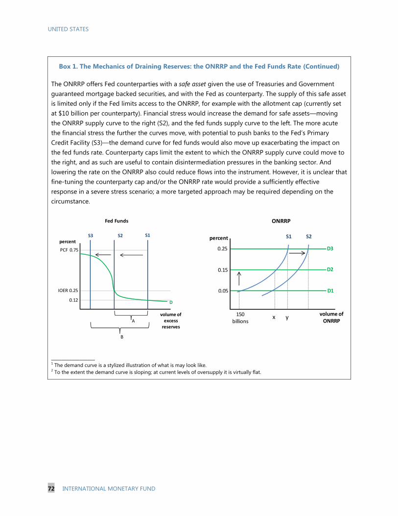
UNITED STATES
72 INTERNATIONAL MONETARY FUND
Box 1. The Mechanics of Draining Reserves: the ONRRP and the Fed Funds Rate (Continued)
The ONRRP offers Fed counterparties with a safe asset given the use of Treasuries and Government
guaranteed mortgage backed securities, and with the Fed as counterparty. The supply of this safe asset
is limited only if the Fed limits access to the ONRRP, for example with the allotment cap (currently set
at $10 billion per counterparty). Financial stress would increase the demand for safe assets—moving
the ONRRP supply curve to the right (S2), and the fed funds supply curve to the left. The more acute
the financial stress the further the curves move, with potential to push banks to the Fed’s Primary
Credit Facility (S3)—the demand curve for fed funds would also move up exacerbating the impact on
the fed funds rate. Counterparty caps limit the extent to which the ONRRP supply curve could move to
the right, and as such are useful to contain disintermediation pressures in the banking sector. And
lowering the rate on the ONRRP also could reduce flows into the instrument. However, it is unclear that
fine-tuning the counterparty cap and/or the ONRRP rate would provide a sufficiently effective
response in a severe stress scenario; a more targeted approach may be required depending on the
circumstance.
_________________ 1 The demand curve is a stylized illustration of what is may look like.
2 To the extent the demand curve is sloping; at current levels of oversupply it is virtually flat.
Fed Funds
S3 S2 S1
0.25
0.12
percent
volume of excess
reserves
D
IOER
0.75PCF
A
B
ONRRP
0.15
0.05
x
S1
150 billions
volume of ONRRP
0.25
S2percent
y
D1
D2
D3
UNITED STATES
INTERNATIONAL MONETARY FUND 73
Financial stability risks arising from disintermediation of the banking sector.54
These
risks could arise if deposits are attracted out of banks and into money market mutual
funds—increasing the size of the less-tightly regulated shadow banking system.55
Further, in
times of financial stress there could be runs into money funds— exacerbated by some funds
having publicized their access to an unlimited volume of safe assets (i.e. the ONRRP). Risks
of disintermediation increase if the instrument is offered without an allotment cap.
Operational challenges of conducting large volumes of overnight transactions. Each
day, transfers of securities and cash will be required. While only small volumes of
transactions are currently conducted, much larger volumes may be required to move the fed
funds rate closer to the IOER (maybe in excess of $1 trillion), which could potentially double
the current tri-party repo volumes. Such a surge in volumes would increase the operational
and financial risks related to settlement.56
Steps to Improve Implementation and to Mitigate Risks
85. Measures could be considered to increase the solidity of the interest rate floor:
Further expanding the number of counterparties, if rates traded below the ONRRP rate. There
could be important segments of liquidity unable to access the instrument (e.g., a large
number of investment intermediaries which fall below the threshold to become
counterparties); this could be addressed by further expanding the counterparty list. The
resulting increased risks of disintermediation (i.e., funds flowing out of banks into money
market funds) would need to be mitigated by:
Maintaining and managing the allotment cap on the ONRRP. The allotment cap impacts
only on the non-banks, as banks will not use the ONRRP because of access to IOER
(which pays a higher interest rate). The caps should be maintained to mitigate financial
stability risks (see Box 1) and be set at a level that allows the Fed to meet its operating
objectives. A uniform cap across counterparties is the easiest to administer, while
recognizing proportionally larger counterparties may be disadvantaged with this
approach.
Managing the ONRRP rate, relative to the IOER. A significant move of funds out of banks
would push the fed funds rate up which could be countered by a lowering of the ONRRP
54
William Dudley, President FRBNY Speech May 20, 2014: The Economic Outlook and Implications for Monetary
Policy. 55
Regulatory arbitrage is likely given that banks are subject to capital, liquidity and FDIC costs and other
counterparties are not. 56
Because haircuts are not applied to reverse repo transactions, the Fed is exposed to market risk if a counterpart
defaults and if the value of the security has increased – albeit a small risk in the context of overnight transactions.
Further large volumes of overnight deals increase the intra-day exposures in the tri-party system, something that has
been the focus of the Tri-party Repo Infrastructure Reform Task Force to reduce.

UNITED STATES
74 INTERNATIONAL MONETARY FUND
rate. The ONRRP will probably be set below the IOER to compensate for the FDIC levy and
other regulatory costs that fall on banks but not on money market funds.
Extending the timing of the operation. When the ONRRP is not available there would be no
effective lower bound on rates. Therefore, it may be necessary to extend the ONRRP
operation to much later in the day when a significant volume of overnight deals are done.
Table 1. Summary of Instruments’ Costs and Impacts
Counterparty
Relevance Format Costs
Reserves
Draining
Impact
Post-
Normalization
Reserve requirement Banks Administrative IOER 1 Permanent
(until changed)
Not
recommended
IOER (policy rate) Banks Standing
facility 2
IOER None Yes
Term deposits Banks Auction
(fixed price or
fixed quantity)
IOER plus
term premium
Temporary Not required
ONRRP Non-banks Standing
facility (maybe
capped)
IOER minus
margin
Temporary Not
recommended
Term RRP All Auction
(fixed price or
fixed quantity)
ONRRP plus
term premium
Temporary Yes
(small volume)
Asset sales All Auction /
Bi-lateral
transactions
At market
prices
Permanent Not required 3
1 This assumes the current policy of remunerating required reserves at the same rate as excess reserves, although the Fed
could choose to apply different rates to each category of reserves. 2 A standing facility is an arrangement offered by the central bank that can be utilized at the discretion of depository
institutions and generally without restriction. Payment of interest on excess reserves (IOER) has these characteristics. 3 The FOMC has suggested there could be residual MBS sales after normalization.

UNITED STATES
INTERNATIONAL MONETARY FUND 75
86. Term sterilization instruments would reduce the heavy reliance on overnight
operations but would carry additional cost.57, 58
A mix of term deposits and term reverse repos
could be used to tighten liquidity conditions, thereby reducing segmentation and operational risks.
Term deposits, would incur a term premium above the IOER, while term reverse repos would incur a
term premium above the ONRRP (but could still be below the IOER). The liquidity premium on term
reverse repos is to some extent, a function of the liquidity constraints on money market mutual
funds, something that could be mitigated by attaching a 7-day put option to the instrument;
something the Fed has also tested.
H. Considerations for the Future Shape of the Operating Framework
87. The current juncture provides an opportunity for a broader review of the operating
framework. The post-exit framework will be different to that of today, and probably that of the pre-
crisis period. Abundant liquidity currently limits operational choices, yet it should still be possible to
implement changes along the path to normalization; i.e. that being the point where the Fed’s
balance sheet reverts to a steady state.
88. Differences in interest rate targeting frameworks come down to a few key areas: (1)
Specification of the operating target; (2) positioning of the operating target; (3) instrument design;
(4) counterparty selection; and (5) collateral policy. Each of these issues except collateral policy is
discussed in subsequent sections and Table 2 provides a country comparison.59
Specification of the Operating Target
An implicit or explicit operating target?
89. Central banks can influence financial conditions by targeting interest rates, either
implicitly or explicitly.60
With an implicit target there is no market rate announced as a target. The policy target
is tied to a central bank instrument in the expectation that short-term money market rates
will remain close to the level at which there is commitment to add or withdraw liquidity.61
Idiosyncratic movements in individual market rates therefore matter less. However, market
57
Some central banks use foreign exchange swaps as a liquidity management instrument but this is not feasible for
the Fed as it has few foreign reserves to swap into dollars and borrowing the reserves could be costly. 58
Higher reserve requirements could complement the toolkit during normalization. However statutory limitations on
the types of reservable accounts and the maximum level restrict the potential impact. 59
With Fed’s balance sheet returning a small deficit and with abundant supply of US government securities, there no
requirement to expand the collateral pool used for normal monetary operations. Further, the collateral policy for the
Discount Window (LOLR) is well defined and sufficiently broad to meet current needs. 60
Conventional monetary policy works through actual and expected real short-term risk free rates while
unconventional policy aimed to impact expectations of short-term rates (through forward guidance) and the term
premium through the asset rebalancing channel (LSAPs). 61
This excludes transactions at central bank standing facilities which are priced at penalty rates.
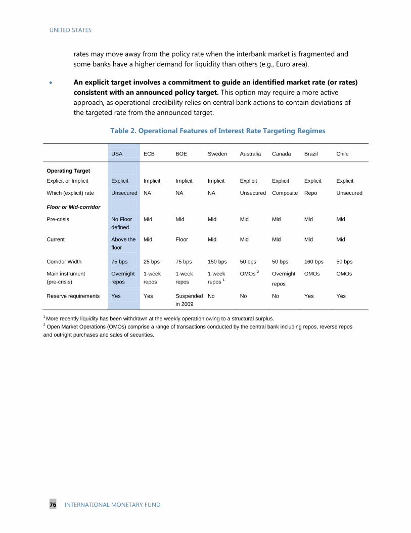
UNITED STATES
76 INTERNATIONAL MONETARY FUND
rates may move away from the policy rate when the interbank market is fragmented and
some banks have a higher demand for liquidity than others (e.g., Euro area).
An explicit target involves a commitment to guide an identified market rate (or rates)
consistent with an announced policy target. This option may require a more active
approach, as operational credibility relies on central bank actions to contain deviations of
the targeted rate from the announced target.
Table 2. Operational Features of Interest Rate Targeting Regimes
USA ECB BOE Sweden Australia Canada Brazil Chile
Operating Target
Explicit or Implicit Explicit Implicit Implicit Implicit Explicit Explicit Explicit Explicit
Which (explicit) rate Unsecured NA NA NA Unsecured Composite Repo Unsecured
Floor or Mid-corridor
Pre-crisis No Floor
defined
Mid Mid Mid Mid Mid Mid Mid
Current Above the
floor
Mid Floor Mid Mid Mid Mid Mid
Corridor Width 75 bps 25 bps 75 bps 150 bps 50 bps 50 bps 160 bps 50 bps
Main instrument
(pre-crisis)
Overnight
repos
1-week
repos
1-week
repos
1-week
repos 1
OMOs 2 Overnight
repos
OMOs OMOs
Reserve requirements Yes Yes Suspended
in 2009
No No No Yes Yes
1 More recently liquidity has been withdrawn at the weekly operation owing to a structural surplus.
2 Open Market Operations (OMOs) comprise a range of transactions conducted by the central bank including repos, reverse repos
and outright purchases and sales of securities.
UNITED STATES
INTERNATIONAL MONETARY FUND 77
90. The Fed should continue to announce an explicit operating targeting. Central banks
have successfully employed both implicit and explicit approaches to the operating target (Table 2).
As neither approach has been proven demonstrably superior, the Fed should retain an explicit target
recognizing there is no clear advantage in changing.
Options for an explicit operating target
91. Post-normalization, the choice of operating target will be guided by an assessment of
the relevance of interest rates in different segments of the money market. And, with more
regulatory changes to be phased in over the years ahead, there is uncertainty about how the
different segments will function. Three main options for targeting short-term interest rates are
available—the fed funds rate (an unsecured overnight rate), a repo rate (a secured overnight rate)
and a composite (reflecting money market conditions with indicators of which rates are most
important).
Maintaining the fed funds rate
92. The fed funds market has shrunk and it is uncertain by how much it will recover. Risk
aversion during the crisis reduced activity in the unsecured markets globally, in absolute terms and
relative to activity in secured markets. In the U.S. a number of regulatory changes—capital, leverage,
liquidity, and the FDIC levy—require banks to have more stable funding, relative to short-term
financing. And there is evidence of diminished transmission of the fed funds rate to longer rates, but
this should be treated with caution given the prolonged period of compressed rates.62
Undermining
the case for retaining the fed funds target is the likelihood that activity in the unsecured market is
likely to remain subdued. It could be retained if activity did recover, and providing there was a
sufficiently close relationship with movements in other money market rates.
The General Collateral Repo Rate (GCRR)
93. The treasury GCRR is an alternative to the fed funds rate.63
The value of tri-party repo
transactions is around $1.7 trillion with about one third relating to the treasury general collateral
category, although the breakdown between overnight and term transactions is not available.64
However, using the FICC-GCF repo data65
as a proxy, around one third of the transactions may be
overnight—equating to $190 billion (compared to fed funds estimated at $60 billion). With money
62
Klee and Stebunovs December 2012: Target Practice: Monetary policy implementation in a post-crisis
environment—page 22. 63
The GCRR is based on a daily survey conducted by the FRBNY which is not publicly available. The DTCC General
Collateral Finance (GCF) repo rate for treasury securities is suggested as a good proxy for the GCRR: Klee and
Stebunovs 2012. 64
FRBNY Tri-party repo data April 9, 2014. Data is obtained on the 7th business day each month, selected as being
typical business day. 65
Fixed Income Clearing Corporation (FICC)—General Collateral Finance (GCF) repos are transactions between
dealers.
UNITED STATES
78 INTERNATIONAL MONETARY FUND
market mutual funds active in tri-party repos and other segments—short-term US treasury and
corporate securities and the bi-lateral repo market—arbitrage ensures that changes in the GCRR are
widely transmitted. Also relevant is the transmission from the GCRR to the repo yield curve, which
appeared to remain more stable when compared to the unsecured lending curve.66
94. The Fed could exert control over the GCRR—albeit with added complexity given the
role of collateral. Pre-crisis, the GCRR responded predictably to movements in the fed funds rate,
but this relationship weakened at the onset of the crisis as risk premiums and liquidity increased.67
Repo rates are affected not just by changes in liquidity, but also by seasonal influences affecting the
net-issuance of treasury securities.68
While abundant liquidity has weakened the short-term liquidity
effects, when excess reserves run down, the liquidity effects should strengthen, with arbitrage
activity recovering. With a balance sheet back at steady state, the Fed should then be able to
manage the GCRR in a similar way to the fed funds rate pre-crisis, albeit with added complexity
given the role of collateral and the uncertainty about the extent to which arbitrage activity recovers.
A composite approach could be considered
95. Individual rates—including the GCRR—have been hit by idiosyncratic shocks
complicating policy implementation.69
Going forward, the GCRR is certainly a viable option for a
single rate operating target, yet it was impacted during the financial crisis (2008) when risk aversion
resulted in a sharp fall in the rate, and again during the debt ceiling negotiations (2013) when, as the
default risk on short-term treasuries spiked, so too did the rate. Rigid implementation responses in
these circumstances, when a single rate is targeted, could exacerbate volatility in other markets
undermining policy signals and effectiveness.
96. To get around this problem the Fed could target the general level of short-term rates,
while providing clear guidance on which rate was the most important indicator. When a
single-targeted rate moves but other short-term rates do not (or move by much less), from a policy
perspective, there is no need for an immediate response to bring the rate back to the target; yet
failure to act could pose communication challenges and risk credibility. To get around this problem,
a combination of money market rates could be considered. The GCRR could be of primary
importance—and communicated as such—but the fed funds rate and EURO dollar rates could also
be used with lesser emphasis, as well as term rates (repo and bank certificate of deposits).
66
Klee and Stebunovs December 2012: Target Practice: Monetary policy implementation in a post-crisis
environment—page 22. 67
Bech, Klee and Stebunovs 2011: Arbitrage, liquidity and exit: The repo and federal funds markets before, during
and emerging from the crisis—Tables 4, 5 and 6. 68
Klee and Stebunovs 2012: Target Practice: Monetary policy implementation in a post-crisis environment – page 20.
69 Incorporating Financial Stability Considerations into a Monetary Policy Framework Jeremy Stein, March 21, 2014:
Highlights the frequency of events that impact term and credit risk premiums.
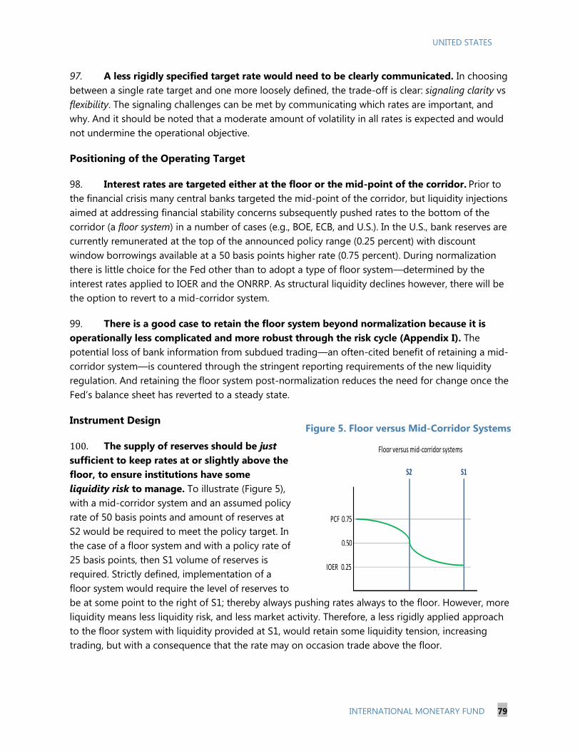
UNITED STATES
INTERNATIONAL MONETARY FUND 79
97. A less rigidly specified target rate would need to be clearly communicated. In choosing
between a single rate target and one more loosely defined, the trade-off is clear: signaling clarity vs
flexibility. The signaling challenges can be met by communicating which rates are important, and
why. And it should be noted that a moderate amount of volatility in all rates is expected and would
not undermine the operational objective.
Positioning of the Operating Target
98. Interest rates are targeted either at the floor or the mid-point of the corridor. Prior to
the financial crisis many central banks targeted the mid-point of the corridor, but liquidity injections
aimed at addressing financial stability concerns subsequently pushed rates to the bottom of the
corridor (a floor system) in a number of cases (e.g., BOE, ECB, and U.S.). In the U.S., bank reserves are
currently remunerated at the top of the announced policy range (0.25 percent) with discount
window borrowings available at a 50 basis points higher rate (0.75 percent). During normalization
there is little choice for the Fed other than to adopt a type of floor system—determined by the
interest rates applied to IOER and the ONRRP. As structural liquidity declines however, there will be
the option to revert to a mid-corridor system.
99. There is a good case to retain the floor system beyond normalization because it is
operationally less complicated and more robust through the risk cycle (Appendix I). The
potential loss of bank information from subdued trading—an often-cited benefit of retaining a mid-
corridor system—is countered through the stringent reporting requirements of the new liquidity
regulation. And retaining the floor system post-normalization reduces the need for change once the
Fed’s balance sheet has reverted to a steady state.
Instrument Design
100. The supply of reserves should be just
sufficient to keep rates at or slightly above the
floor, to ensure institutions have some
liquidity risk to manage. To illustrate (Figure 5),
with a mid-corridor system and an assumed policy
rate of 50 basis points and amount of reserves at
S2 would be required to meet the policy target. In
the case of a floor system and with a policy rate of
25 basis points, then S1 volume of reserves is
required. Strictly defined, implementation of a
floor system would require the level of reserves to
be at some point to the right of S1; thereby always pushing rates always to the floor. However, more
liquidity means less liquidity risk, and less market activity. Therefore, a less rigidly applied approach
to the floor system with liquidity provided at S1, would retain some liquidity tension, increasing
trading, but with a consequence that the rate may on occasion trade above the floor.
Figure 5. Floor versus Mid-Corridor Systems
Floor versus mid-corridor systems
IOER 0.25
0.50
PCF 0.75
S2 S1
UNITED STATES
80 INTERNATIONAL MONETARY FUND
101. Standing facilities at the floor and the ceiling of the corridor are needed:
The IOER will again become effective as the large structural surplus shrinks, allowing
for a withdrawal of the ONRRP in its current form. Active arbitrage will reduce market
segmentation, thereby establishing the IOER as an effective floor under rates. While high
liquidity and segmentation necessitated the introduction of ONRRP—to fix the floor—a
return to tighter conditions means this instrument is no longer needed, and given the
disintermediation risks it should be removed as soon as possible.
The Primary Credit Facility (PCF) establishes a ceiling rate, but this may involve stigma.
The PCF is for highly rated banks and intended to provide a safety valve for liquidity
pressures. 70
It still may not be fully effective because of stigma as the Fed must, with a two
year lag, disclose its lending activity.
102. Instruments to manage short term liquidity fluctuations are still needed. Fine-tuning
operations will need to offset seasonal influences given the GCRR may respond to changes in both
reserves, and the net-issuance of collateral. The Fed would need to use its portfolio of treasury
securities through repo operations best offered as a variable rate/fixed volume format. This
approach differs to its operations pre-crisis in that while the operations were variable rate, it did not
announce an amount, thereby providing greater flexibility to determine an outcome consistent with
its interest rate objective. If the Fed wishes to continue with this approach, information should—as
before—be provided post-auction on the results of operation, to help market participants better
assess liquidity conditions in support of more stable market conditions. Noted is that the Fed’s
auction facilities during the crisis involved detailed pre- and post-auction information on volumes
and rates.71
70
A Secondary Credit Facility is available to lesser rated institutions with restrictions on the use of fund—it is
therefore more akin to a lender of last resort arrangement. It is currently priced 50 basis points above the PCF. 71
Armantier and Sporn: Federal Reserve Bank of New York Staff Report 635 September 2013: Auctions implemented
by the Federal Reserve Bank of New York during the Great Recession
UNITED STATES
INTERNATIONAL MONETARY FUND 81
103. The reserve requirement no longer meets any monetary policy or liquidity
management objective and can be withdrawn (Appendix II). Eliminating the reserve requirement
would free up reserves, thereby increasing excess reserves and reducing the need to inject
additional liquidity.72
There would also be administrative savings.
Counterparty selection
104. Counterparty selection can be differentiated on the basis of instrument type:
Standing facilities: The IOER and the discount window facilities are limited to depository
institutions, and this should not change.
Open market operations: Regulatory developments (LCR and the supplementary leverage
ratio) are likely to have undermined the Fed’s ability to implement policy through the traditionally
narrow set of primary dealers. However, beyond normalization, and in the context of an increased
focus on the GCRR, the Fed may need to transact in larger volumes. With these considerations the
expanded counterpart list is appropriate and should be retained, with an additional benefit of
enhanced competition in the Fed’s OMOs. A caveat being, only banks should have access to
standing facility-type instruments (i.e. fixed rate instruments with or without limits) to mitigate
disintermediation and subsequent financial stability risks.
I. Summary
105. The recommendations for the normalization period are summarized:
Continue with the fed funds rate as the operating target of monetary policy.
Announce that a floor system will be used during most, if not all, of the normalization
period, and therefore the rate set on the IOER will equate with the fed funds target.
Use the ONRRP, with counterparty allotment caps, as the primary monetary policy tool to
manage the fed funds rate at or slightly above the IOER.
Assess the need for further expanding the counterpart list if the ONRRP is not sufficiently
effective.
Manage the dis-intermediation and shadow banking risks of the ONRRP by announcing that
it is unlikely that the instrument will be used post-normalization and that allotment caps
may be changed to contain flows.
72
The amount of reserve balances used to meet reserve requirements in March 2014 was $78 billion.

UNITED STATES
82 INTERNATIONAL MONETARY FUND
Re-instate the single rate policy target; with the first modest move from the current 0–0.25
percent to 0.25 percent. Communicate the prospect that given abundant liquidity, there
could be somewhat higher variation around the policy target than in the past.
Explore the use of term sterilization instruments—deposits and reverse repos—to lessen
operational risks. Small term premiums could be justified to reduce the burden of a daily
rollover of large transaction volumes.
106. Post-normalization considerations:
Consider alternate operating targets after it is clear how markets have adapted to the
regulatory changes. Consider de-emphasizing the importance of a single rate in favor of
focus on the general level of money market rates, while highlighting what the Fed considers
to be the most important indicators (e.g., GCRR, Fed funds rate).
Continue with the floor system.
Withdraw the ONRRP: because the IOER will provide an effective floor once liquidity
conditions tighten.
Use short-term repos and reverse repos to manage the operating target close to floor.
Abolish the reserve requirement, as it provides no benefit and is administratively
cumbersome.

UNITED STATES
INTERNATIONAL MONETARY FUND 83
Appendix 1. Floor versus Mid-Corridor Systems
This appendix outlines the considerations when deciding between implementing a floor system,
where the policy target rate is set at the floor of the corridor, and a mid-corridor system where the
policy target rate is set away from the floor (but not necessarily at the mid-point).
Floor System
Advantages
There may be less variability between market and target rates. The combination of abundant
liquidity and an effective floor anchors rates at the floor, thereby aligning market rates more
precisely with the targeted rate.1
Higher reserve balances (than required in a mid-corridor system) may facilitate an increased
supply of high quality liquid assets (HQLA).2 Higher reserves levels could help alleviate a
shortage of HQLA—although not a current concern in the U.S.—and support the function of the
payments system.
The price/quantity nexus is removed, thereby providing more flexibility in times of stress. The
IOER was introduced in 2008 at time when the Fed sought to put a floor under rates, while
simultaneously increasing liquidity to counter mounting financial stresses. In these situations rates
trade at the floor, facilitating a break in the price/quantity nexus—quantity can be increased—to a
point—without impact on price (subject to the solidity of the interest rate floor and market
segmentation issues which will impact at some point). A floor arrangement is therefore likely to be
more robust across different phases of the risk cycle.
Less operational resource and fewer monetary instruments are required. Larger reserve
balances would mean less need for accurate forecasting of the influences on reserves, and most
likely, less fine-tuning operations to offset those influences.
There would be a positive impact on central bank profitability given the somewhat larger
balance sheet. The higher level of reserves, incurring interest costs at the policy rate, would be
matched against term assets earning the term premium.
1 An important operational decision is the extent to which liquidity is oversupplied, as greater oversupply reduces the
prospect of rates moving away from the floor. 2 The impact on HQLA will depend upon how the reserves are supplied to the system. If they are supplied through
the purchases of HQLA, then there will be no net change in the volume of HQLA. However, HQLA will increase when
non-HQLA transactions are undertaken (e.g., repos with non-HQLA or foreign exchange swaps).

UNITED STATES
84 INTERNATIONAL MONETARY FUND
Disadvantage
Abundant liquidity reduces both liquidity risks and the incentive to trade in interbank markets, with
a potential loss of information. The question arises whether less activity reduces the incentives and
scope for peer-monitoring, leading to a loss of information about individual banks solvency, with
negative financial stability consequences. While some literature supports this view,3 others highlight
that because interbank trading is very short-term, there is little focus on the long-term solvency of
the borrowing bank.4 Active interbank markets did not prevent the recent financial crisis (much of
which was bank-sourced), so the benefit of active interbank markets should not be overstated.
Mid-corridor System
Two-way liquidity risk encourages trading and perhaps better transmission along the yield
curve. With a greater incentive to manage liquidity, transmission along the short part of the yield
curve would be stronger, given that rates are not forced to the floor.
Liquidity management is more challenging but could be mitigated by the use of a reserve
requirement (or some form of contractual reserves) with averaging. With no liquidity buffer,
frequent fine-tuning operations would be required to manage supply against forecasted demand in
order to meet the targeted rate. Reserve requirements with full averaging would reduce interest rate
volatility that would arise when supply and demand were not aligned on a particular day. A
contractual reserves approach requires banks to reveal their demand for precautionary reserves, and
combines incentives for them to manage their position in a manner consistent with their stated
reserves position.5
3 Rochet and Tirole 1996: Interbank Lending and Systemic Risk.
4 Bernhardsen and Kloster, Norges Bank, 2010: Liquidity Management System: Floor or Corridor?
5 The BOE pre-crisis, allowed banks to nominate their reserves levels at the start of each maintenance period.

UNITED STATES
INTERNATIONAL MONETARY FUND 85
Appendix 2. A Short History of and the Case Against Reserve Requirements
History
The use of reserve requirements in the USA can be traced back to voluntary redemption
arrangements in the 1820s. Bank notes were used as a medium of exchange, but limited
information on the solvency of the issuer meant the geographical coverage for an individual bank’s
notes was narrow. Banks in New York and New England agreed to redeem each others’ notes at par,
providing the issuing bank maintained sufficient specie (gold or its equivalent) at the redeeming
bank. This first use of required reserves was, in essence, for prudential reasons.
On a nationwide basis reserve requirements were first established under the National Bank
Act (1863). The charter established a network that banks could join, requiring them to hold a 25
percent reserve against bank notes and deposits. This network facilitated greater countrywide
acceptance of notes of the participating banks. From that point until the establishment of the Fed,
reserve requirements continued to be viewed as a prudential measure to support the liquidity of
bank notes and deposits (under the prevailing gold standard, by linking them to physical gold
reserves), yet financial panics still occurred.1 By 1931, after the establishment of the Fed, and with it
a lender of last resort function, reserve requirements were used to influence the expansion of bank
credit and were no longer viewed as a prudential tool. Membership of the Fed was optional for
state-chartered banks and some began leaving the system to take advantage of lower reserve
requirements imposed by state authorities. By the late 1970s, less than 65 percent of total
transaction deposits were held at Fed member banks. Congress introduced the Monetary Control
Act (1980) mandating the Fed to set reserve requirements universally across all depository
institutions.
From the early 1980s, the Fed aimed to influence monetary and credit conditions by adjusting
the cost of reserves to depository institutions. Actual reserve balances were stabilized around the
minimum level needed to meet requirements and clearing purposes (as reserves were not
remunerated, banks kept balances as low as possible). Individual banks could however, contract to
hold more reserves if they deemed their clearing needs were higher than the requirement, and this
excess earned credits that could be offset against Fed priced services. The reserve requirement was
averaged over the two-week maintenance period for larger banks and one week for smaller banks.
1 The U.S.A. experienced a number of financial panics during 1869, 1873, 1893, and 1901.
UNITED STATES
86 INTERNATIONAL MONETARY FUND
The Fed was first able to remunerate reserve balances in October 2008.2 The rate paid on
required reserves was originally set at the average of the Fed funds target over the maintenance
period less 10 basis points, while excess reserves were remunerated at the lowest Fed Funds target
rate during the period, less 75 basis points. These margins were removed from early 2009: both
categories of reserves are now remunerated at 25bp, the top end of the fed funds target rate.
The Case for Abolishing Reserve Requirements in the U.S.A.
The current arrangements are complex and administratively burdensome.3 Depository
institutions report either on a weekly or quarterly basis, depending on the size of their net
transactions accounts and other accounts.4 Reserves are maintained over a two-week period, which
in the case of institutions reporting weekly, is based on two reporting periods and lagged to the
computational period by 17 days. The computation period for institutions that report quarterly is the
7-day period beginning on the third Tuesday of the report month, with compliance lagged by four,
or in some cases five weeks. The reservable base covers net transactions accounts split in three
tranches—up to $13.3 million is reservable at 0 percent (referred to as the low reserve tranche),
$13.3.million to $89 million is reservable at 3 percent, and more than $89 million is reservable at 10
percent.5 The low reserve tranche is adjusted each year by 80 percent of the annual increase or
decrease in net transaction accounts at all depository institutions. The impact of reserve
requirements was reduced in 1990 when the ratio on non-personal time deposits and Eurocurrency
liabilities was set to zero.
Institutions can satisfy their reserve requirements through holdings of vault cash and reserve
balances.6 Vault cash covers in excess of 40 percent of the requirement for the system as a whole,
and more than 100 percent of the requirement for some banks. A penalty-free band is calculated as
the greater of $50,000 or 10 percent of the reserve requirement. When an institution has more than
the sum of its reserve requirement plus the penalty free band, it is deemed to be in excess.7 If it has
less than the reserve requirement minus the penalty-free band, then it is in deficit and will be
subject to penalty set at the rate on the Primary Credit Facility plus one percentage point.
2 The Financial Services Regulatory Relief Act (2006) originally authorized the Fed to pay interest on reserves
beginning October 2011. This authority was superseded, as a result of the financial crisis, by the Emergency Economic
Stabilization Act (2008), bringing forward the authority to October 2008. 3 Board of Governors of the Federal Reserve System: Reserve Maintenance Manual—November 2013.
4 There are two further categories of reporting—annual and non-reporters. Institutions in these categories have net
transactions accounts of less than the amount specified as the low reserve tranche. 5 Net transactions accounts are total transaction accounts, less amounts due from other depository institutions, and
less cash items in the process of collection. Total transactions accounts include demand deposits automatic transfer
service accounts, NOW accounts, telephone and pre-authorized transfer accounts, and others. 6 There are also pass-through arrangements that allow institutions to meet their requirements through a
correspondent bank. 7 The distinction between required reserves and excess reserves is less relevant now that both categories of reserves
are remunerated at the same rate.

UNITED STATES
INTERNATIONAL MONETARY FUND 87
Reserve requirements in the U.S.A. no longer play a prudential or monetary role and may not
be needed for liquidity management. Many central banks now operate an effective operational
framework without reserve requirements.8 Other central banks that use them aim to stabilize the
demand for reserves, thereby improving liquidity management outcomes. The key features of these
arrangements are requirements that result in reserve levels close to that which is voluntarily
demanded for a given remuneration rate (typically at the policy rate or up to 25bp below it), a
relatively long maintenance period (around a month), and full averaging.
Monetary policy could be implemented effectively in the USA using a floor system and
without reserve requirements.9 Liquidity management in a floor system involves keeping interest
rates at, or close to the floor. Consequently there is a one-way risk of not meeting the operational
target—assuming that there is an effective interest rate floor, the market rate can only be too high.
With rates pushed to floor of the corridor, there is less of a requirement to fine-tune operations, and
as a result, less need to accurately forecast and stabilize the demand for reserves. However, there is
still a need for periodic operations, perhaps in both directions (injecting and withdrawing liquidity)
as the objective should be to over-supply liquidity only by a small margin, to ensure that money
market activity is not undermined by a high volume of excess liquidity (as it is currently). A flexible
form of required reserves (contractual reserves) where banks reveal their demand for reserves could
however be useful in a mid-corridor system to reduce uncertainty.10
8 From the IMF - ISIMP 2013 survey, 10 central banks implement monetary policy without using reserve
requirements, these include Australia, Canada, Denmark, Mexico, New Zealand, Norway and Sweden. 9 Current examples of counties using the floor system are Norway, and New Zealand.
10 In 2006 the Bank of England (BOE) operated a mid-corridor system and introduced a contractual reserves, system
which forced banks to reveal their demand by nominating the amount of reserves they intended to hold during a
given maintenance period. The maximum amount a bank could nominate was limited to the lower of; two percent of
their sterling liabilities, or £3 billion. Banks were remunerated at the policy rate when they held average balances
through the maintenance periods of within +/- 1 percent of their nominated amount. No remuneration was paid if
the balances were above this range, and a penalty was charged for balances below this range. This system was
suspended during the financial crisis, as the BOE embarked on a policy of quantitative easing which pushed rates to
the floor of the corridor.
UNITED STATES
88 INTERNATIONAL MONETARY FUND
References
Armantier and Sporn, Federal Reserve Bank of New York Staff Report 635 September 2013: Auctions
implemented by the Federal Reserve Bank of New York during the Great Recession.
Basle Committee on Banking Supervision, Basle III: The Liquidity Coverage Ratio and liquidity
monitoring tools – January 2013.
Bech and Keister: BIS Working papers No 432. October 2013: Liquidity regulation and the
implementation of monetary policy.
Bech, Klee and Stebunovs 2011: Arbitrage, liquidity and exit: The repo and federal funds markets
before, during and emerging from the crisis.
Bernhardsen and Kloster, Norges Bank, 2010: Liquidity Management System: Floor or Corridor.
Board of Governors of the Federal Reserve System: Reserve Maintenance Manual November 2013.
Dudley, William, President FRBNY Speech May 20, 2014: The Economic Outlook and Implications for
Monetary Policy.
ECB Monthly Bulletin April 2013: Liquidity regulation and monetary policy implementation
Feinman Joshua: Reserve Requirements: History, Current Practice, and Potential Reform: Federal
Reserve Bulletin June 1993.
Gagnon, Joseph E. and Sack B, 2014, “Monetary Policy with Abundant Liquidity: A New Operating
Framework for the Federal Reserve,” (January).
Gray, Simon: IMF Working Paper WP/11/36: Central Bank Balance and Reserve Requirements.
Klee and Stebunovs December 2012: Target Practice: Monetary policy implementation in a post-
crisis environment.
Liberty Street Economics December 2, 2013: Who’s Lending in the Fed Funds Market?
Liberty Street Economics December 9, 2013: Who’s Borrowing in the Fed Funds Market?
Potter, Simon, Executive Vice President Federal Reserve Bank of New York, December 2, 2013.
Recent Developments in Monetary Policy Implementation.
Rochet and Tirole 1996: Interbank Lending and Systemic Risk.
The main features of the monetary policy frameworks of the Bank of Japan, the Federal Reserve and
the Eurosystem: Conference paper May 2000.
UNITED STATES
INTERNATIONAL MONETARY FUND 89
FISCAL RISKS AND BORROWING COSTS IN STATE AND
LOCAL GOVERNMENTS88
State and local governments (SLGs) face important fiscal challenges, most notably because of
the unfunded liabilities they have under public employee pension plans and related to other
post-employment benefits. This chapter examines the state of SLG finances with a focus on
how challenges posed by such liabilities and political polarization that may hinder
implementation of policies to address them are priced in by municipal bond markets. Analysis
suggests that state borrowing costs will increase if unfunded liabilities are left unchecked and
that certain budget institutions may help contain the negative impact of unfunded liabilities
and political polarization on borrowing costs. This highlights the need for public pension and
budget process reform.
A. Introduction
107. In the wake of the Great Recession, fiscal imbalances in the U.S. have surfaced at all
levels of government. The federal budget deficit as a percentage of GDP widened rapidly from 1¼
percent in 2007 to 11½ percent in 2009 and remained above 3 percent in 2013, while debt held by
the public rose from 35 percent of GDP in 2007 to 74 percent in 2013. The aggregate SLG deficit as
a percentage of GDP, measured on an annual basis, reached 2½ percent in 2009—the widest since
1980s—with gross debt increasing considerably from 25 percent of GDP in 2007 to 29 percent in
2013.89
108. These imbalances raise concerns about the sustainability of public finances and, for
SLGs, put upward pressure on financing costs. Indeed, municipal bond spreads over Treasuries
rose sharply during the crisis and remain well above historical averages (Chart).90
Moreover, several
states suffered from credit downgrades in 2009–11, including those with large stocks of debt such as
California, Illinois, and New Jersey. Admittedly, the reserve currency status of the dollar and safe
haven flows into the Treasury market have, so far, helped keep federal borrowing costs at historical
lows despite the sharp rise in federal debt held by the public. However, the lack of a consolidation
plan to stabilize medium-term debt dynamics and doubts about the effectiveness and predictability
of policymaking amidst political polarization led to a sovereign credit rating downgrade in August
88
This chapter was prepared by Madelyn Estrada, Deniz Igan, and Dinah Knight. It has greatly benefited from
discussions with Rabah Arezki, Ravi Balakrishnan, Kathleen Byrne, Roberto Cardarelli, Nigel Chalk, Matt Fabian, Tracy
Gordon, David Jones, Lusine Lusinyan, Marcelo Pinheiro, and Tigran Poghosyan. 89
All years refer to calendar years. Federal government deficit figures include IMF staff’s adjustment for financial
sector support costs. It should be noted that all states save Vermont have a balanced budget rule in place on a fiscal
year basis (over two fiscal years in some states), but how binding the rule is varies across states. Technically, SLGs
may not issue debt to close budget gaps (although they sometimes find ways around this constraint or legislate one-
time fixes), hence the smaller increase in the SLG debt level compared to the federal debt held by the public. 90
In fact, municipal bonds tend to have lower yields than Treasuries because of their tax advantage, offsetting their
illiquidity. Since the crisis, the “muni/Treasury ratio” has consistently exceeded 100 percent.
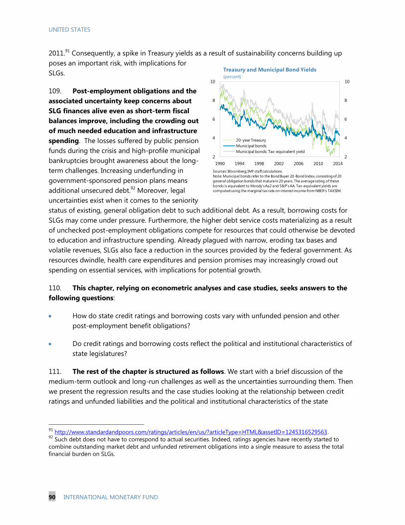
UNITED STATES
90 INTERNATIONAL MONETARY FUND
2011.91
Consequently, a spike in Treasury yields as a result of sustainability concerns building up
poses an important risk, with implications for
SLGs.
109. Post-employment obligations and the
associated uncertainty keep concerns about
SLG finances alive even as short-term fiscal
balances improve, including the crowding out
of much needed education and infrastructure
spending. The losses suffered by public pension
funds during the crisis and high-profile municipal
bankruptcies brought awareness about the long-
term challenges. Increasing underfunding in
government-sponsored pension plans means
additional unsecured debt.92
Moreover, legal
uncertainties exist when it comes to the seniority
status of existing, general obligation debt to such additional debt. As a result, borrowing costs for
SLGs may come under pressure. Furthermore, the higher debt service costs materializing as a result
of unchecked post-employment obligations compete for resources that could otherwise be devoted
to education and infrastructure spending. Already plagued with narrow, eroding tax bases and
volatile revenues, SLGs also face a reduction in the sources provided by the federal government. As
resources dwindle, health care expenditures and pension promises may increasingly crowd out
spending on essential services, with implications for potential growth.
110. This chapter, relying on econometric analyses and case studies, seeks answers to the
following questions:
How do state credit ratings and borrowing costs vary with unfunded pension and other
post-employment benefit obligations?
Do credit ratings and borrowing costs reflect the political and institutional characteristics of
state legislatures?
111. The rest of the chapter is structured as follows. We start with a brief discussion of the
medium-term outlook and long-run challenges as well as the uncertainties surrounding them. Then
we present the regression results and the case studies looking at the relationship between credit
ratings and unfunded liabilities and the political and institutional characteristics of the state
91
http://www.standardandpoors.com/ratings/articles/en/us/?articleType=HTML&assetID=1245316529563. 92
Such debt does not have to correspond to actual securities. Indeed, ratings agencies have recently started to
combine outstanding market debt and unfunded retirement obligations into a single measure to assess the total
financial burden on SLGs.
2
4
6
8
10
2
4
6
8
10
1990 1994 1998 2002 2006 2010 2014
20-year Treasury
Municipal bonds
Municipal bonds: Tax-equivalent yield
Treasury and Municipal Bond Yields
(percent)
Sources: Bloomberg; IMF staff calculations.
Note: Municipal bonds refer to the Bond Buyer 20-Bond Index, consisting of 20
general obligation bonds that mature in 20 years. The average rating of these
bonds is equivalent to Moody's Aa2 and S&P's AA. Tax-equivalent yields are
computed using the marginal tax rate on interest income from NBER's TAXSIM.
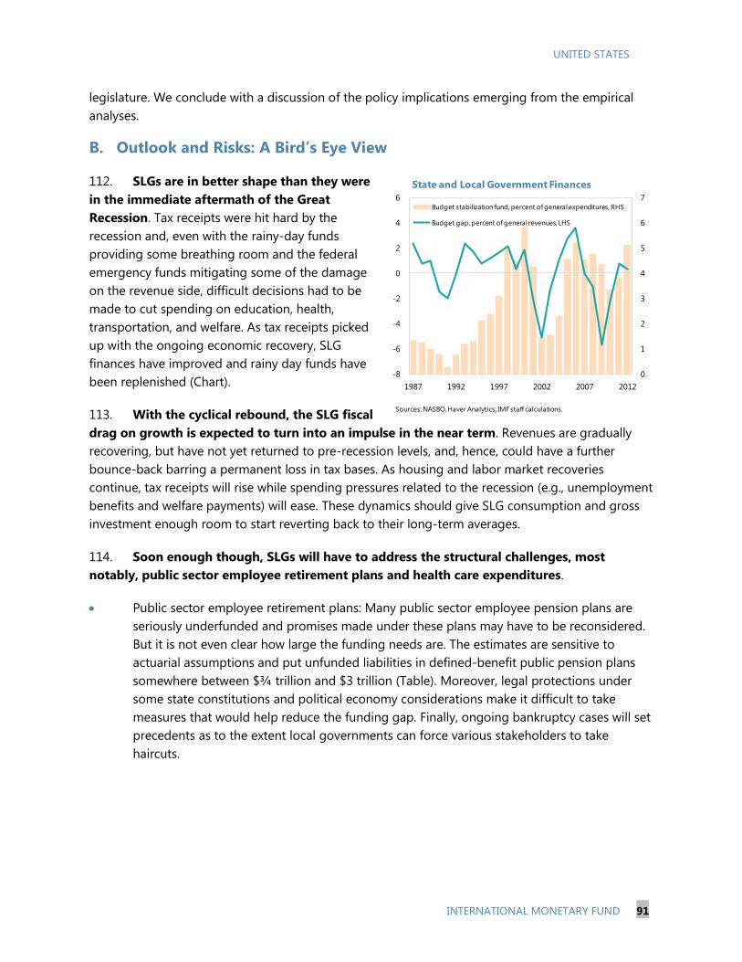
UNITED STATES
INTERNATIONAL MONETARY FUND 91
legislature. We conclude with a discussion of the policy implications emerging from the empirical
analyses.
B. Outlook and Risks: A Bird’s Eye View
112. SLGs are in better shape than they were
in the immediate aftermath of the Great
Recession. Tax receipts were hit hard by the
recession and, even with the rainy-day funds
providing some breathing room and the federal
emergency funds mitigating some of the damage
on the revenue side, difficult decisions had to be
made to cut spending on education, health,
transportation, and welfare. As tax receipts picked
up with the ongoing economic recovery, SLG
finances have improved and rainy day funds have
been replenished (Chart).
113. With the cyclical rebound, the SLG fiscal
drag on growth is expected to turn into an impulse in the near term. Revenues are gradually
recovering, but have not yet returned to pre-recession levels, and, hence, could have a further
bounce-back barring a permanent loss in tax bases. As housing and labor market recoveries
continue, tax receipts will rise while spending pressures related to the recession (e.g., unemployment
benefits and welfare payments) will ease. These dynamics should give SLG consumption and gross
investment enough room to start reverting back to their long-term averages.
114. Soon enough though, SLGs will have to address the structural challenges, most
notably, public sector employee retirement plans and health care expenditures.
Public sector employee retirement plans: Many public sector employee pension plans are
seriously underfunded and promises made under these plans may have to be reconsidered.
But it is not even clear how large the funding needs are. The estimates are sensitive to
actuarial assumptions and put unfunded liabilities in defined-benefit public pension plans
somewhere between $¾ trillion and $3 trillion (Table). Moreover, legal protections under
some state constitutions and political economy considerations make it difficult to take
measures that would help reduce the funding gap. Finally, ongoing bankruptcy cases will set
precedents as to the extent local governments can force various stakeholders to take
haircuts.
0
1
2
3
4
5
6
7
-8
-6
-4
-2
0
2
4
6
1987 1992 1997 2002 2007 2012
Budget stabilization fund, percent of general expenditures, RHS
Budget gap, percent of general revenues, LHS
State and Local Government Finances
Sources: NASBO, Haver Analytics; IMF staff calculations.

UNITED STATES
92 INTERNATIONAL MONETARY FUND
Health care benefits for public sector retirees93: Although total unfunded liabilities for non-
pension post-employment benefits are smaller in size at an estimated $600 billion and easier
to address than pensions at least from a legal perspective, many states have not been
adequately prepared to meet the commitments they have made under these programs. The
average funding ratio across states is estimated to be less than 10 percent while only about
40 percent of required contributions are actually made. Moreover only three states (Alaska,
Arizona, and Ohio) have other post-employment benefits funded at 50 percent or more
because generally these benefits are funded on a pay-as-you-go basis.94
Health care cost growth and the Affordable Care Act: Medicaid is a large spending category
in state budgets (estimated to account for 20 percent in FY2012, ranking second after K-12
education) and enrollment in the program is expected to increase significantly in 2014 and
thereafter as a consequence of the Affordable Care Act, but by how much remains to be
seen. The Government Accountability Office (GAO) projects that SLG health care spending
will increase by about 2 percentage points of GDP over the next two decades (about $350
billion in current dollars). Additional uncertainty comes from the difficulty in predicting how
fast health care costs will rise in the future, including whether efforts to bend the cost curve
will be successful or not.95
93
There may be other post-employment benefits but health care plans constitute the major portion. We use the
terms health care benefits and other post-employment benefits interchangeably in the rest of the chapter. 94
For comparison, 40 out of 50 states report pension funding of at least 60 percent. 95
Chapter 3 of the IMF Country Report No. 13/237 looks at the factors driving health care spending growth and
discusses the policy options to contain future health care spending.
Study
Investment Return
(percent)
Funding Ratio
(percent)
Unfunded
Liability
(billions of $)
Novy-Marx and Rauh
(2009)
116 major pension plans
sponsored by the 50 U.S.
states as reported in their
Comprehensive Annual Financial
Reports
Treasury yield 38 3,230
Munnel et al (2010)
126 pension plans accounting for
about 80 percent of the entire SLG
retirement system
between 48
and 79
between 700
and 2,900
Pew Charitable Trusts
(as of April 8, 2014)
233 pension plans and 166 retiree
health care and other benefit plans
as reported in the states'
Comprehensive Annual Financial
Reports
72 915
Public Fund Survey
Scorecard (as of May
16, 2014)
126 pension plans with the
combined market value of system
assets amounting to $2.63 trillion
(85 percent of the entire SLG
retirement system)
7.9 73 971
states' own assumptions;
most use 8 percent
How Large are Unfunded Pension Liabilities?
Coverage
Alternative assumptions
varying from 4 to 8
percent
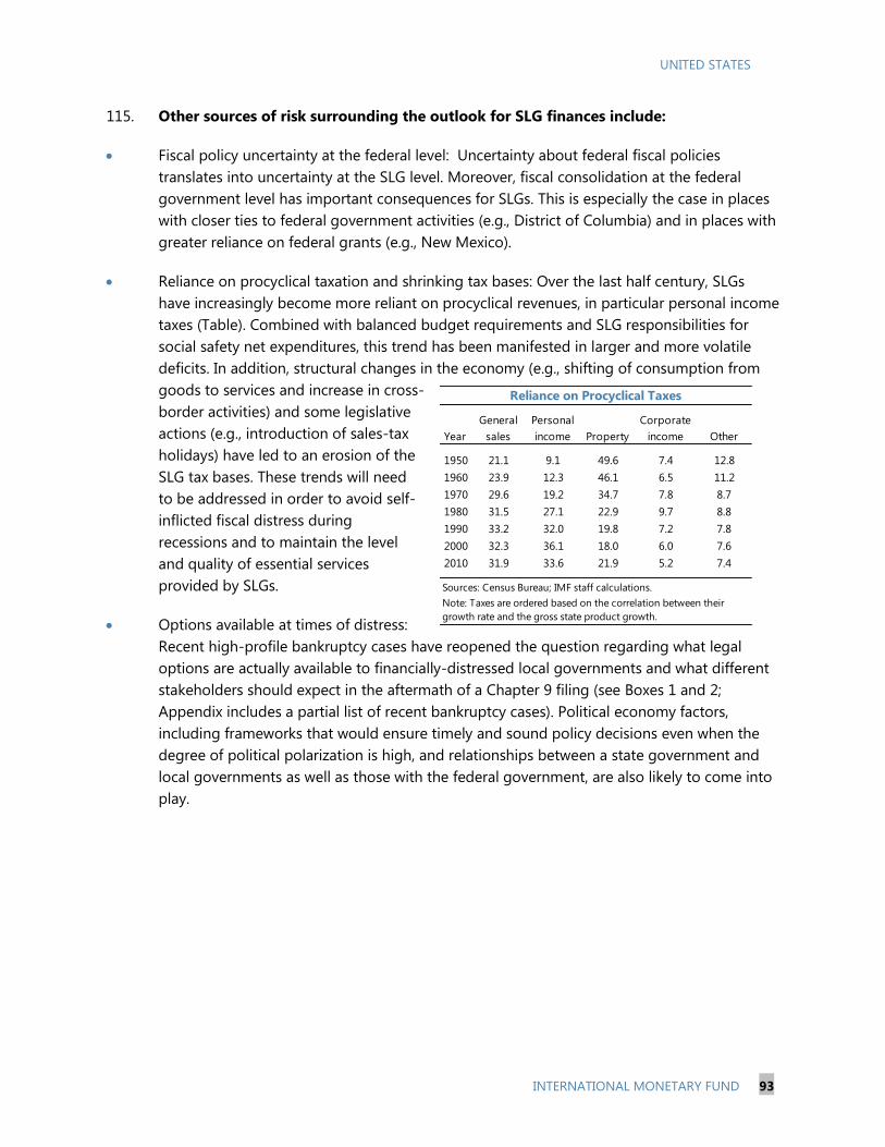
UNITED STATES
INTERNATIONAL MONETARY FUND 93
115. Other sources of risk surrounding the outlook for SLG finances include:
Fiscal policy uncertainty at the federal level: Uncertainty about federal fiscal policies
translates into uncertainty at the SLG level. Moreover, fiscal consolidation at the federal
government level has important consequences for SLGs. This is especially the case in places
with closer ties to federal government activities (e.g., District of Columbia) and in places with
greater reliance on federal grants (e.g., New Mexico).
Reliance on procyclical taxation and shrinking tax bases: Over the last half century, SLGs
have increasingly become more reliant on procyclical revenues, in particular personal income
taxes (Table). Combined with balanced budget requirements and SLG responsibilities for
social safety net expenditures, this trend has been manifested in larger and more volatile
deficits. In addition, structural changes in the economy (e.g., shifting of consumption from
goods to services and increase in cross-
border activities) and some legislative
actions (e.g., introduction of sales-tax
holidays) have led to an erosion of the
SLG tax bases. These trends will need
to be addressed in order to avoid self-
inflicted fiscal distress during
recessions and to maintain the level
and quality of essential services
provided by SLGs.
Options available at times of distress:
Recent high-profile bankruptcy cases have reopened the question regarding what legal
options are actually available to financially-distressed local governments and what different
stakeholders should expect in the aftermath of a Chapter 9 filing (see Boxes 1 and 2;
Appendix includes a partial list of recent bankruptcy cases). Political economy factors,
including frameworks that would ensure timely and sound policy decisions even when the
degree of political polarization is high, and relationships between a state government and
local governments as well as those with the federal government, are also likely to come into
play.
Year
General
sales
Personal
income Property
Corporate
income Other
1950 21.1 9.1 49.6 7.4 12.8
1960 23.9 12.3 46.1 6.5 11.2
1970 29.6 19.2 34.7 7.8 8.7
1980 31.5 27.1 22.9 9.7 8.8
1990 33.2 32.0 19.8 7.2 7.8
2000 32.3 36.1 18.0 6.0 7.6
2010 31.9 33.6 21.9 5.2 7.4
Reliance on Procyclical Taxes
Sources: Census Bureau; IMF staff calculations.
Note: Taxes are ordered based on the correlation between their
growth rate and the gross state product growth.
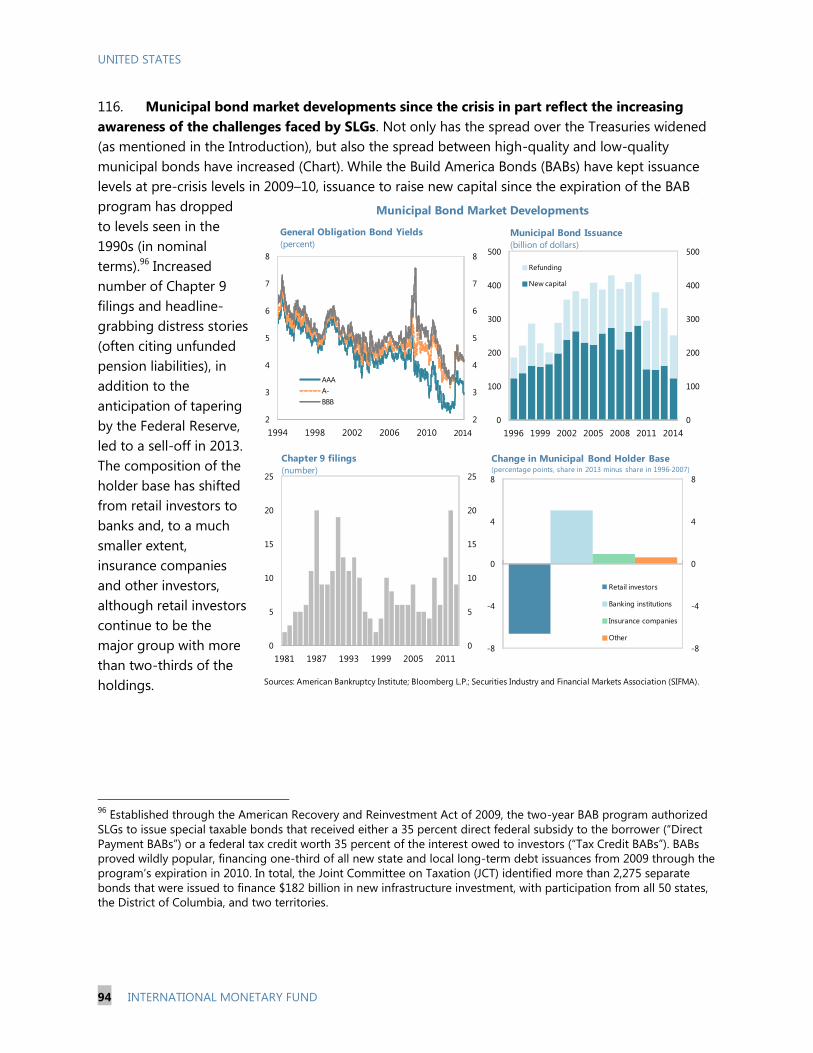
UNITED STATES
94 INTERNATIONAL MONETARY FUND
116. Municipal bond market developments since the crisis in part reflect the increasing
awareness of the challenges faced by SLGs. Not only has the spread over the Treasuries widened
(as mentioned in the Introduction), but also the spread between high-quality and low-quality
municipal bonds have increased (Chart). While the Build America Bonds (BABs) have kept issuance
levels at pre-crisis levels in 2009–10, issuance to raise new capital since the expiration of the BAB
program has dropped
to levels seen in the
1990s (in nominal
terms).96
Increased
number of Chapter 9
filings and headline-
grabbing distress stories
(often citing unfunded
pension liabilities), in
addition to the
anticipation of tapering
by the Federal Reserve,
led to a sell-off in 2013.
The composition of the
holder base has shifted
from retail investors to
banks and, to a much
smaller extent,
insurance companies
and other investors,
although retail investors
continue to be the
major group with more
than two-thirds of the
holdings.
96
Established through the American Recovery and Reinvestment Act of 2009, the two-year BAB program authorized
SLGs to issue special taxable bonds that received either a 35 percent direct federal subsidy to the borrower (“Direct
Payment BABs”) or a federal tax credit worth 35 percent of the interest owed to investors (“Tax Credit BABs”). BABs
proved wildly popular, financing one-third of all new state and local long-term debt issuances from 2009 through the
program’s expiration in 2010. In total, the Joint Committee on Taxation (JCT) identified more than 2,275 separate
bonds that were issued to finance $182 billion in new infrastructure investment, with participation from all 50 states,
the District of Columbia, and two territories.
Sources: American Bankruptcy Institute; Bloomberg L.P.; Securities Industry and Financial Markets Association (SIFMA).
Municipal Bond Market Developments
2
3
4
5
6
7
8
2
3
4
5
6
7
8
1994 1998 2002 2006 2010
AAA
A-
BBB
2014
General Obligation Bond Yields
(percent)
0
100
200
300
400
500
0
100
200
300
400
500
1996 1999 2002 2005 2008 2011 2014
Municipal Bond Issuance
(billion of dollars)
Refunding
New capital
0
5
10
15
20
25
0
5
10
15
20
25
1981 1987 1993 1999 2005 2011
Chapter 9 filings
(number)
-8
-4
0
4
8
-8
-4
0
4
8
Retail investors
Banking institutions
Insurance companies
Other
Change in Municipal Bond Holder Base (percentage points, share in 2013 minus share in 1996-2007)

UNITED STATES
INTERNATIONAL MONETARY FUND 95
C. Empirical Analyses
Are They All in the Same Boat?
117. Aggregate statistics for SLGs mask a great degree of cross-sectional variation. States, as
well as local governments, have different economic, fiscal, and political risk characteristics and, these
differences are reflected in the states’ credit ratings and borrowing costs (Maps). For instance, North
Dakota has enjoyed large budget surpluses even during the Great Recession in part thanks to strong
economic activity driven by the shale gas boom. The state’s credit rating was upgraded from AA in
2008 to AAA in 2013. Meanwhile, Arizona was hit hard by the housing boom-bust and struggled
with budget deficits. Unsurprisingly, its credit rating was downgraded in 2010 from AA to AA-. The
contrast between California and Pennsylvania on the one hand and North Carolina and Virginia on
the other with respect to their debt levels also seems to be carried over to their credit ratings and
bond spreads. The former two states are among the most heavily indebted and the lowest rated,
and pay some of the highest borrowing costs. The latter two, in part thanks to their low debt levels,
enjoy the low yields that come with their stellar AAA credit ratings. Similarly, liabilities related to
public employee pensions and other post-employment benefits vary considerably across states. For
example, with regard to pensions, Wisconsin has negligible unfunded liabilities with a pension plan
that is 99.9 percent funded, while Illinois has very high unfunded liabilities (about 12 percent of
gross state product) and the worst funding ratio in the nation at about 55 percent in 2010. High
unfunded liabilities for pensions do not necessarily translate into high unfunded liabilities for other
post-employment benefit plans. For example, Oklahoma has one of the highest unfunded pension
liabilities as a percentage of gross state product at 10 percent but it has very small unfunded
liabilities under its health care plan for public sector retirees. In terms of political polarization in state
legislature, California ranks as one of the most polarized and Louisiana as one of the least.
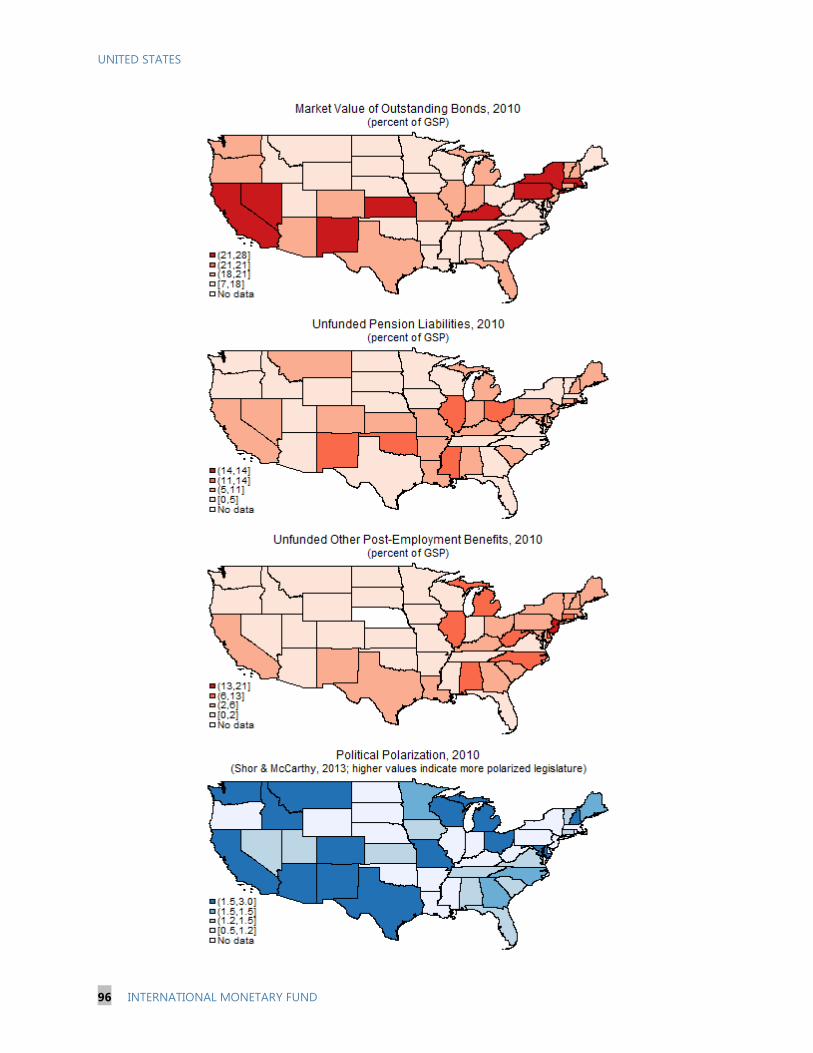
UNITED STATES
96 INTERNATIONAL MONETARY FUND
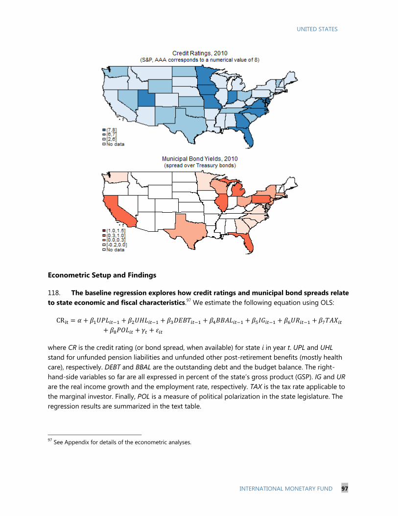
UNITED STATES
INTERNATIONAL MONETARY FUND 97
Econometric Setup and Findings
118. The baseline regression explores how credit ratings and municipal bond spreads relate
to state economic and fiscal characteristics.97
We estimate the following equation using OLS:
where CR is the credit rating (or bond spread, when available) for state i in year t. UPL and UHL
stand for unfunded pension liabilities and unfunded other post-retirement benefits (mostly health
care), respectively. DEBT and BBAL are the outstanding debt and the budget balance. The right-
hand-side variables so far are all expressed in percent of the state’s gross product (GSP). IG and UR
are the real income growth and the employment rate, respectively. TAX is the tax rate applicable to
the marginal investor. Finally, POL is a measure of political polarization in the state legislature. The
regression results are summarized in the text table.
97
See Appendix for details of the econometric analyses.

UNITED STATES
98 INTERNATIONAL MONETARY FUND
119. We focus the discussion of the results mostly on the
regressions where the dependent variable is the credit rating.
The findings for bond spreads are qualitatively similar to those for
credit ratings but the sample size is much smaller and the
relationships are often either not statistically significant or less
robust to alternative specifications. As one would anticipate,
spreads tend to be higher for lower-rated states (Chart). Hence,
we use “borrowing costs” interchangeably with credit ratings
when discussing the results.
120. Not surprisingly, state credit ratings are negatively
correlated with debt levels. Econometric analysis exploiting the
variation across states reveals that states with
higher levels of debt (in percent of gross state
product) have lower credit ratings. As
expected, budget surpluses and lower
marginal taxes are also associated with better
ratings. Links with income growth and
unemployment rate are not statistically
significant.
121. Increased awareness about
unfunded pension liabilities appears to be
reflected in the ratings. States with larger unfunded pension liabilities have lower credit ratings
and face higher borrowing costs. Interestingly, unfunded liabilities under health care and other
benefits, which are not only smaller and but also received much less attention than pensions, are
negatively related to credit ratings but this relationship loses significance when unfunded pension
liabilities are also included in the regression. Also noteworthy is the fact that unfunded liabilities in
the regressions are as reported by the states themselves, that is, likely assuming more generous
rates of return. Under more prudent return assumptions, these liabilities would be larger—and
upward revisions to unfunded liability estimates are indeed expected to take place once the recent
change to the Governmental Accounting Standards Board (GASB) rules is fully implemented.98
98
Unlike private pension systems, which are governed by federal law and regulations, state and local pension plans
are not required to follow specific methods in calculating funding adequacy. Most plans adhere to the guidelines
issued by the GASB but the board has no enforcement authority. Moreover, until June 2012, GASB rules allowed
plans to use discount rates based on the expected rates of return, typically around 8 percent, to calculate pension
liabilities and determine the degree of underfunding. The high discount rate underestimates the present value of
promised benefits, which should instead be discounted by the riskless rate of return because these payments are
certain to be made. With the rule change, the high discount rate can be used only for the funded portion of pension
liabilities (i.e., the part backed by underlying pension assets) and the rest has to be discounted using a riskless
discount rate, leading to a funding ratio that would be some 20 percentage points below the one estimated under
the old rule.
1.2
-0.2
y = -0.198x + 1.0453
R² = 0.7567
A-AA+AA-AAAA+AAA
Average Spread by Credit Rating
(percent)
Variable Rating Spread
UPL - +
UHL n.s. n.s.
DEBT - +
BBAL + -
IG n.s. n.s.
UR n.s. +
TAX - n.s.
POL - n.s.
Summary of Regression Results
Sign of the coefficient obtained in the
regressions for each variable is shown.
"n.s." stands for "not significant".
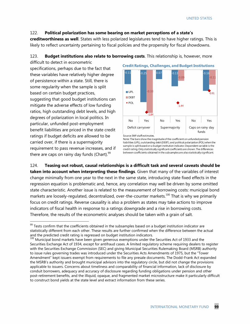
UNITED STATES
INTERNATIONAL MONETARY FUND 99
122. Political polarization has some bearing on market perceptions of a state’s
creditworthiness as well. States with less polarized legislatures tend to have higher ratings. This is
likely to reflect uncertainty pertaining to fiscal policies and the propensity for fiscal showdowns.
123. Budget institutions also relate to borrowing costs. This relationship is, however, more
difficult to detect in econometric
specifications, perhaps due to the fact that
these variables have relatively higher degree
of persistence within a state. Still, there is
some regularity when the sample is split
based on certain budget practices,
suggesting that good budget institutions can
mitigate the adverse effects of low funding
ratios, high outstanding debt levels, and high
degrees of polarization in local politics. In
particular, unfunded post-employment
benefit liabilities are priced in the state credit
ratings if budget deficits are allowed to be
carried over, if there is a supermajority
requirement to pass revenue increases, and if
there are caps on rainy day funds (Chart).99
124. Teasing out robust, causal relationships is a difficult task and several caveats should be
taken into account when interpreting these findings. Given that many of the variables of interest
change minimally from one year to the next in the same state, introducing state fixed effects in the
regression equation is problematic and, hence, any correlation may well be driven by some omitted
state characteristic. Another issue is related to the measurement of borrowing costs: municipal bond
markets are loosely-regulated, decentralized, over-the-counter markets.100
That is why we primarily
focus on credit ratings. Reverse causality is also a problem as states may take actions to improve
indicators of fiscal health in response to a ratings downgrade and a rise in borrowing costs.
Therefore, the results of the econometric analyses should be taken with a grain of salt.
99
Tests confirm that the coefficients obtained in the subsamples based on a budget institution indicator are
statistically different from each other. These results are further confirmed when the difference between the actual
and the predicted credit rating is regressed on budget institution indicators. 100
Municipal bond markets have been given generous exemptions under the Securities Act of 1933 and the
Securities Exchange Act of 1934, except for antifraud cases. A limited regulatory scheme requiring dealers to register
with the Securities Exchange Commission (SEC) and giving Municipal Securities Rulemaking Board (MSRB) authority
to issue rules governing trades was introduced under the Securities Acts Amendments of 1975, but the “Tower
Amendment” kept issuers exempt from requirements to file any presale documents. The Dodd-Frank Act expanded
the MSRB’s authority and brought municipal advisors into the regulatory circle, but did not change the provisions
applicable to issuers. Concerns about timeliness and comparability of financial information, lack of disclosure by
conduit borrowers, adequacy and accuracy of disclosure regarding funding obligations under pension and other
post-retirement benefits, and the illiquid, opaque, and fragmented market microstructure make it particularly difficult
to construct bond yields at the state level and extract information from these series.
-0.11 -0.25 -0.07 -0.13 -0.16
-0.33
-0.09 -0.11
-1.84
-1.44
-0.91
No Yes No Yes No Yes
Deficit carryover Supermajority Caps on rainy day
funds
UPL
DEBT
POL
Credit Ratings, Challenges, and Budget Institutions
Source: IMF staff estimates.
Note: The bars show the magnitude of the coefficient on unfunded pension
liabilities (UPL), outstanding debt (DEBT), and political polarization (POL) when the
sample is split based on a budget institution indicator. Dependent variable is the
credit rating. Only statistically significant coefficients are shown. The differences
between coefficients obtained in the subsamples are also statistically significant.
UNITED STATES
100 INTERNATIONAL MONETARY FUND
Case Studies
125. The importance of sound fiscal policies and budget institutions can be further
illustrated with case studies. Regression analyses shed light into the role played by budget
outcomes, unfunded pension liabilities, and political polarization in municipal bond markets and
hinted at the interactions with institutional characteristics. Nonetheless, given the lack of variation in
some of the variables used, we use case studies to complement this evidence (especially that on the
role of budget institutions). We look at the experience of four states where the credit rating is much
higher or lower than that implied by the “fundamentals”.101
Good news is that blemished credit can
be fixed and market pressures can be alleviated when necessary actions are taken (also see Box 2 on
Detroit and Puerto Rico).
Alaska
126. Alaska demonstrates how flexible yet conservative budget institutions can help offset
the impact of moderately high liability levels. Alaska has an inherent vulnerability due to its
economy’s dependence on the natural resource industry. To mitigate the volatility induced by
energy-related revenues, the state has set aside very large reserves for general fund operating needs
(principally in the Constitutional Budget Reserve Fund and the Statutory Budget Reserve Fund).
There are no caps on these funds and repayment provisions are flexible in that there is no fixed time
limit to replenish the reserves. Moreover, Alaska projects revenues for a ten-year window—at least
twice longer than any other state. Although the funding ratios of major statewide pension systems
are weak at about 55 percent compared to the national average of 70 percent, Alaska has kept up
with its contributions and taken steps to address the issue, including closing of defined benefit plans
to new employees in 2005. These actions seem to have helped maintain the state’s AA+ rating in
2010 despite a budget deficit of almost 3 percent of GSP and get an upgrade to AAA in 2012.
California
127. California exemplifies how markets reward active deficit reduction and improvement
in budget institutions. Faced with immediate liquidity pressures as the deficit soared in the
aftermath of the dot-com boom, California enacted Proposition 57 and 58 in 2004, authorizing
issuance of long-term bonds to pay off accumulated deficits. However, they also prohibited any
future deficit bonds and required enactment of a balanced budget and the establishment of a
budget stabilization account. As a result, the state got a three-notch boost in its bond rating from
BBB to A. The state’s effort to balance its general fund budget through tax hikes enacted in 2012
also led to a ratings upgrade while its revenue-anticipation notes issued in August 2013 had the
lowest yields since the 1970s. But California’s current rating of A is still about two notches below
101
Specifically, we use the estimated coefficients to predict the credit rating for each state based on their economic,
fiscal, and political characteristics. The four states chosen have the largest differences between the actual and
predicted credit ratings consistently (that is, not only in a single year but consecutively over a three-year period).
UNITED STATES
INTERNATIONAL MONETARY FUND 101
what one would expect based on its fundamentals, especially considering its relatively small
unfunded pension liabilities. Instead, it seems that remaining weaknesses in budget institutions—
including the ability to spend unanticipated funds without legislative approval, the scope to carry
over deficits, and the supermajority requirement for revenue increases—have weighed on
California’s credit rating.
Illinois
128. Illinois shows how inaction to correct imbalances and adopt good budget institutions
can calcify into a bad reputation and translate to higher borrowing costs. Illinois currently has
the lowest credit rating across U.S. states at A-, although the econometric model would predict
three notches higher. The state was not always at the bottom: actually, Illinois and Alaska had the
same rating as late as 2007. However, several decades of skipping or skimping on payments for the
required contributions to pension plans resulted in the state having the worst funding ratio (at
about 40 percent) in the nation. While all other states that faced similar challenges have taken some
sort of action, Illinois became known for its political gridlocks and repeated failures to deliver on
pension reform. Moreover, a budget stabilization fund was introduced in 2000—Illinois was one of
only five states that did not have one at the time—but design flaws led to the fund being used for
the alleviation of ongoing cash flow problems rather than for fiscal emergencies. These factors have
produced what has become known as the “Illinois effect,” whereby similarly structured and rated
municipal bonds carry higher interest rates if the issuer is located in Illinois.
New Jersey
129. New Jersey confirms that failing to address structural imbalances and implement
sound fiscal management practices can hurt creditworthiness. With a volatile income tax base
heavily dependent on a small number of high-income residents, the state had difficulty meeting the
challenges posed by the Great Recession, and was forced to make deep cuts in school funding and
aid to local governments. The latter, in turn, were forced to raise property taxes. The state has
underpaid its pension contributions for years, even before the recession started and made only 14
percent of the required pension contributions in 2012 after failing to make any payments in 2010
and 2011. Overly optimistic revenue forecasts spanning only one year coupled with one-off moves
to plug annual deficits rather than implementation of permanent solutions are all factors that have
raised concerns about budget processes. In addition, liquidity has become a concern as rainy day
funds, drained in 2009, have not been replenished. The state’s credit rating has been downgraded
three times from AA+ in 2002 to A+ in 2014.
D. Policy Implications
130. There are important challenges facing SLGs on the horizon. Problems such as rising
health care costs and underfunding of promises made under public employee benefit plans mean
that tough choices will have to be made if SLGs are to avoid large cutbacks to other essential
functions, such as in education and infrastructure investment. Moreover, federal government
consolidation efforts will reduce financial resources potentially available to SLGs. The significant

UNITED STATES
102 INTERNATIONAL MONETARY FUND
fiscal adjustment in the past few years has improved fiscal balances, but this should not give a false
sense of safety. SLGs will have to tackle the ticking time bombs of public sector employee retirement
and health care plans soon. Many states have enacted reforms in this area recently but these tend to
remain on the margin and be limited to new hires only (see Appendix for a partial list of recent
pension reform actions).
131. Empirical analyses point to unfunded pension liabilities being associated with lower
credit ratings, especially when budget institutions are weak. If left unchecked, these liabilities
will continue to grow as the population ages and may increase borrowing costs. Moreover, such
implicit liabilities are likely to weigh on credit risks with potential to raise financing costs and weaken
SLG finances more broadly.
132. In order to keep future borrowing costs in check, SLGs should:
assess the extent of their unfunded liabilities under more realistic actuarial assumptions,
move away from defined-benefit plans, pursue reforms as necessary to ensure fiscal health,
enhance risk sharing, and establish separately-governed trust funds if they choose to
maintain pay-as-you-go financing102
;
improve their budget frameworks, including adoption of multi-year plans laying out
conservative revenue forecasts, better enforcement of balanced budget rules and rules
governing the use of unanticipated funds, and introduction of more flexible revenue-
increase and rainy-day fund rules.
102
The new GASB rules take steps in this direction by requiring more realistic appraisal of the unfunded portion of
pension obligations as well as higher required contributions and more transparency in the reporting of obligations.
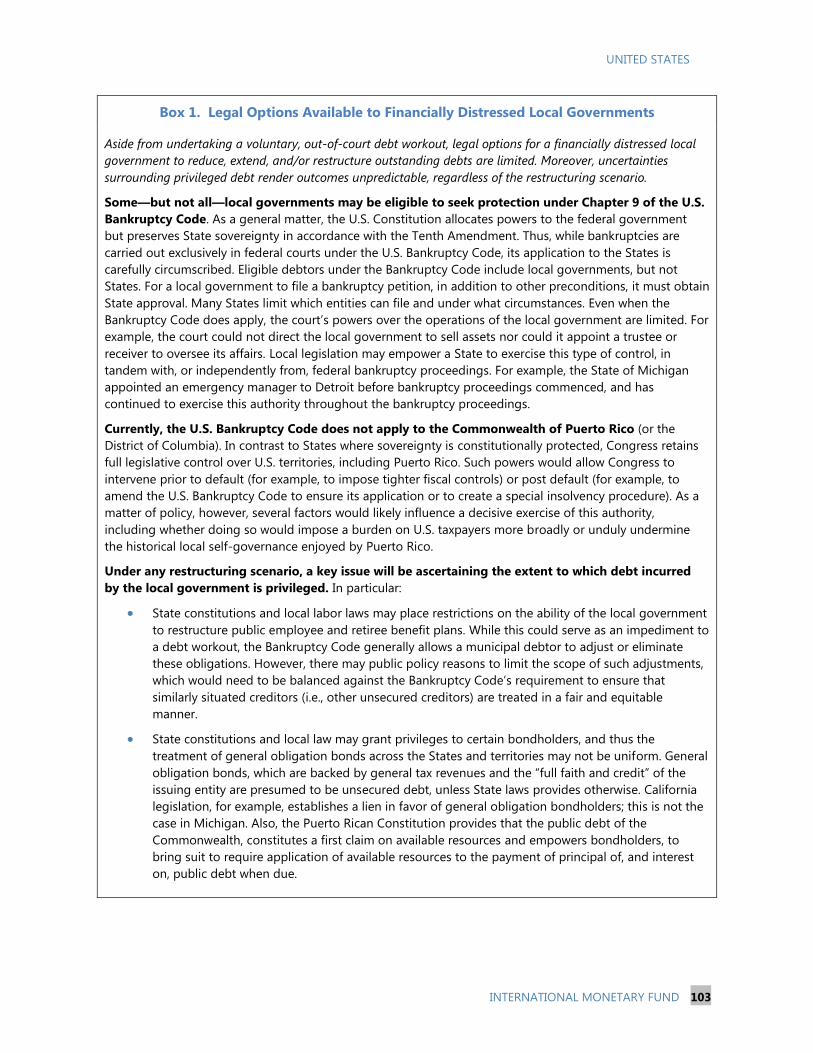
UNITED STATES
INTERNATIONAL MONETARY FUND 103
Box 1. Legal Options Available to Financially Distressed Local Governments
Aside from undertaking a voluntary, out-of-court debt workout, legal options for a financially distressed local
government to reduce, extend, and/or restructure outstanding debts are limited. Moreover, uncertainties
surrounding privileged debt render outcomes unpredictable, regardless of the restructuring scenario.
Some—but not all—local governments may be eligible to seek protection under Chapter 9 of the U.S.
Bankruptcy Code. As a general matter, the U.S. Constitution allocates powers to the federal government
but preserves State sovereignty in accordance with the Tenth Amendment. Thus, while bankruptcies are
carried out exclusively in federal courts under the U.S. Bankruptcy Code, its application to the States is
carefully circumscribed. Eligible debtors under the Bankruptcy Code include local governments, but not
States. For a local government to file a bankruptcy petition, in addition to other preconditions, it must obtain
State approval. Many States limit which entities can file and under what circumstances. Even when the
Bankruptcy Code does apply, the court’s powers over the operations of the local government are limited. For
example, the court could not direct the local government to sell assets nor could it appoint a trustee or
receiver to oversee its affairs. Local legislation may empower a State to exercise this type of control, in
tandem with, or independently from, federal bankruptcy proceedings. For example, the State of Michigan
appointed an emergency manager to Detroit before bankruptcy proceedings commenced, and has
continued to exercise this authority throughout the bankruptcy proceedings.
Currently, the U.S. Bankruptcy Code does not apply to the Commonwealth of Puerto Rico (or the
District of Columbia). In contrast to States where sovereignty is constitutionally protected, Congress retains
full legislative control over U.S. territories, including Puerto Rico. Such powers would allow Congress to
intervene prior to default (for example, to impose tighter fiscal controls) or post default (for example, to
amend the U.S. Bankruptcy Code to ensure its application or to create a special insolvency procedure). As a
matter of policy, however, several factors would likely influence a decisive exercise of this authority,
including whether doing so would impose a burden on U.S. taxpayers more broadly or unduly undermine
the historical local self-governance enjoyed by Puerto Rico.
Under any restructuring scenario, a key issue will be ascertaining the extent to which debt incurred
by the local government is privileged. In particular:
State constitutions and local labor laws may place restrictions on the ability of the local government
to restructure public employee and retiree benefit plans. While this could serve as an impediment to
a debt workout, the Bankruptcy Code generally allows a municipal debtor to adjust or eliminate
these obligations. However, there may public policy reasons to limit the scope of such adjustments,
which would need to be balanced against the Bankruptcy Code’s requirement to ensure that
similarly situated creditors (i.e., other unsecured creditors) are treated in a fair and equitable
manner.
State constitutions and local law may grant privileges to certain bondholders, and thus the
treatment of general obligation bonds across the States and territories may not be uniform. General
obligation bonds, which are backed by general tax revenues and the “full faith and credit” of the
issuing entity are presumed to be unsecured debt, unless State laws provides otherwise. California
legislation, for example, establishes a lien in favor of general obligation bondholders; this is not the
case in Michigan. Also, the Puerto Rican Constitution provides that the public debt of the
Commonwealth, constitutes a first claim on available resources and empowers bondholders, to
bring suit to require application of available resources to the payment of principal of, and interest
on, public debt when due.

UNITED STATES
104 INTERNATIONAL MONETARY FUND
Box 2. 2013 Municipal Bond Market Distress
Recent high-profile cases of financial distress have brought U.S. municipal bond markets and the state of SLG
finances to the spotlight. In the largest U.S. municipal bankruptcy ever, the city of Detroit filed for bankruptcy
on July 18, 2013, while yields on Puerto Rican bonds have soared in the fall of 2013 on concerns of the island’s
debt sustainability. Considerable uncertainty remains, also reflecting uncharted legal questions raised by these
episodes.
Detroit’s bankruptcy filing occurred after decades of decline due to a depressed local economy (severely
affected by the scaling down of local auto industry employment), declining tax revenues (driven by falling
house prices and population loss, especially in higher-income segments), and deteriorating quality of city
services. The bankruptcy was highly anticipated and already priced in. Yields on 10-year benchmark
municipal bonds rose by 15 basis points between July 18 and July 25 before receding. They stood at 2.3
percent on June 17 [lower than the July 18, 2013 level of 2.66 percent]. The legal process will take a long
time. Currently, the goal is to finish the process by early fall 2014. Along the way, important precedents may
be set at least in two main areas.1
There is a legal gray area on how public pensions will be treated. Michigan is one of nine states that
explicitly protect public employee pensions in the state constitution but, under the federal
bankruptcy law, a judge may be able to subvert the state constitution to reduce the Detroit’s
obligation to its pensioners. A legal battle is expected, perhaps ultimately reaching the Supreme
Court.
The haircut the bondholders would take under Detroit’s restructuring proposals is generally higher
than what the market currently assumes for loss-given-default in municipal bankruptcies. Re-pricing
risk across the municipal market cannot be ruled out if Detroit is successful in negotiating higher
haircuts.
Highly dependent on federal aid and tax incentives, Puerto Rico has been in recession since 2006,
when the phase-out of an important tax credit was completed. The recession exposed long-standing
structural problems. These include high public debt ($70 billion, around 100 percent of GDP); heavy
government involvement financed by subsidized debt (Puerto Rican bonds are “triple-tax-free,” meaning
that they are exempt from federal, state, and local taxes, and the government sector accounts for 27 percent
of total nonfarm employment); and lack of competitiveness, in part because of high labor costs relative to
Caribbean neighbors (the U.S. federal minimum wage applies in Puerto Rico) and a low labor force
participation rate (emigration to the mainland is common and residents often qualify for direct transfers
from the U.S. federal government).
Doubts about Puerto Rico’s debt sustainability surfaced in the summer of 2012 and intensified in the
fall of 2013. The island’s increasing reliance on bank credit and other short-term measures to fund budget
gaps came into the spotlight against the backdrop of a struggling economy. The government unveiled
plans—including pension reform, tax hikes, spending cuts, a balanced budget proposal, and incentives to
attract businesses to the island—to address the problems but flows out of Puerto Rican debt continued. In
February 2014, all three major credit rating agencies downgraded Puerto Rico to junk status. Paradoxically,
Puerto Rican debt rallied after the downgrade, thanks to the removal of uncertainty regarding credit rating
agency action and the island was able to raise $3.5 billion in bond sales in March. Yields on 10-year Puerto
Rican bonds stood at 8.8 percent on June 17, up from 6.2 percent at the end of August 2013 but down from
above 10 percent observed in early late January/early February. Moreover, Puerto Rico was able to tap the
markets and raise $3.5 billion in general obligation bonds in March 2014.
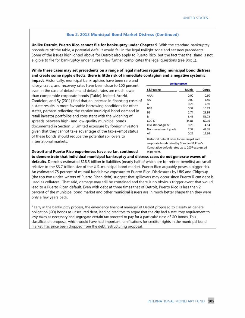
UNITED STATES
INTERNATIONAL MONETARY FUND 105
Box 2. 2013 Municipal Bond Market Distress (Continued)
Unlike Detroit, Puerto Rico cannot file for bankruptcy under Chapter 9. With the standard bankruptcy
procedure off the table, a potential default would fall in the legal twilight zone and set new precedents.
Some of the issues highlighted above for Detroit also apply to Puerto Rico, but the fact that the island is not
eligible to file for bankruptcy under current law further complicates the legal questions (see Box 1).
While these cases may set precedents on a range of legal matters regarding municipal bond distress
and create some ripple effects, there is little risk of immediate contagion and a negative systemic
impact. Historically, municipal bankruptcies have been rare and
idiosyncratic, and recovery rates have been close to 100 percent
even in the case of default—and default rates are much lower
than comparable corporate bonds (Table). Indeed, Arezki,
Candelon, and Sy (2011) find that an increase in financing costs of
a state results in more favorable borrowing conditions for other
states, perhaps reflecting the captive municipal bond demand in
retail investor portfolios and consistent with the widening of
spreads between high- and low-quality municipal bonds
documented in Section B. Limited exposure by foreign investors
given that they cannot take advantage of the tax-exempt status
of these bonds should reduce the potential spillovers to
international markets.
Detroit and Puerto Rico experiences have, so far, continued
to demonstrate that individual municipal bankruptcy and distress cases do not generate waves of
defaults. Detroit’s estimated $18.5 billion in liabilities (nearly half of which are for retiree benefits) are small
relative to the $3.7 trillion size of the U.S. municipal bond market. Puerto Rico arguably poses a bigger risk.
An estimated 75 percent of mutual funds have exposure to Puerto Rico. Disclosures by UBS and Citigroup
(the top two under-writers of Puerto Rican debt) suggest that spillovers may occur since Puerto Rican debt is
used as collateral. That said, damage may still be contained and there is no obvious trigger event that would
lead to a Puerto Rican default. Even with debt at three times that of Detroit, Puerto Rico is less than 2
percent of the municipal bond market and other municipal issuers are in much better shape than they were
only a few years back.
1 Early in the bankruptcy process, the emergency financial manager of Detroit proposed to classify all general
obligation (GO) bonds as unsecured debt, leading creditors to argue that the city had a statutory requirement to
levy taxes as necessary and segregate certain tax proceed to pay for a particular class of GO bonds. This
classification proposal, which would have had important ramifications for creditor rights in the municipal bond
market, has since been dropped from the debt restructuring proposal.
S&P rating Munis Corps
AAA 0.00 0.60
AA 0.00 1.50
A 0.23 2.91
BBB 0.32 10.29
BB 1.74 29.93
B 8.48 53.72
CCC-C 44.81 69.19
Investment grade 0.20 4.14
Non-investment grade 7.37 42.35
All 0.29 12.98
Default Rates
Historical default rates for municipal and
corporate bonds rated by Standard & Poor’s.
Cumulative default rates up to 2007 expressed
in percent.

UNITED STATES
106 INTERNATIONAL MONETARY FUND
Appendix 1. Details on the Econometric Analyses and Recent Developments
The econometric specification we use to examine the relationship between municipal bond market’s
perception of a state’s creditworthiness and state characteristics builds the list of variables to include
based on the analyses in Bayoumi, Goldstein, and Woglom (1995), Poterba and Reuben (1999),
Novy-Marx and Rauh (2009b), and Grizzle (2010).
Data come from a variety of sources including Bloomberg, Bureau of Labor Statistics, Census Bureau,
National Association of State Budget Officers, Pew Center, and NBER TAXSIM. Sample period covers
2008 through 2014.
We present the results under two main specifications: first with the credit rating as the dependent
variable and then with the bond spread as the dependent variable. The latter is available only for 19
states (and Puerto Rico but Puerto Rico is not included in the regressions because of missing
information on some of the control variables). The baseline regression results are in Tables 1 and 2.
These results are robust to several changes to the specification including addition of other
macroeconomic and fiscal controls (such as log level of state per capita income, revenue-to-GSP
ratio, and average growth rate of revenues in the last three years) and different lags of the control
variables.
An obvious concern is the endogeneity of outstanding debt levels. If a state is perceived to be in
better fiscal health (e.g., because of its economic potential or because it has better budget
institutions) and faces lower borrowing costs, it may opt for higher levels of debt because it can
afford to do so. To address this concern and check the robustness of the coefficients on unfunded
pension and other post-employment benefit liabilities and political polarization, we use an
instrumental variables approach. Noting that most general obligation debt is long term and issued
to finance infrastructure spending, the instrument we use is the population density of the state:
more densely populated states tend to have higher demand for infrastructure and, hence, higher
debt levels but population density is not related to credit ratings or bond yields. The instrumental
variable regression results are in Table 3. First-stage results (available upon request) confirm the
suitability of population density as an instrument for outstanding debt level. The main coefficients of
interest on unfunded pension liabilities and political polarization remain largely unaltered in the IV
regressions while the coefficient on outstanding debt is no longer significant. The latter may be an
indication that the municipal bond market does take into account the fact that most debt is issued
to finance capital projects with potential to benefit long-term growth.
Finally, Tables 4 and 5 provide a partial list of recent municipal bankruptcy filings and pension
reform actions.
UN
ITED
STA
TES
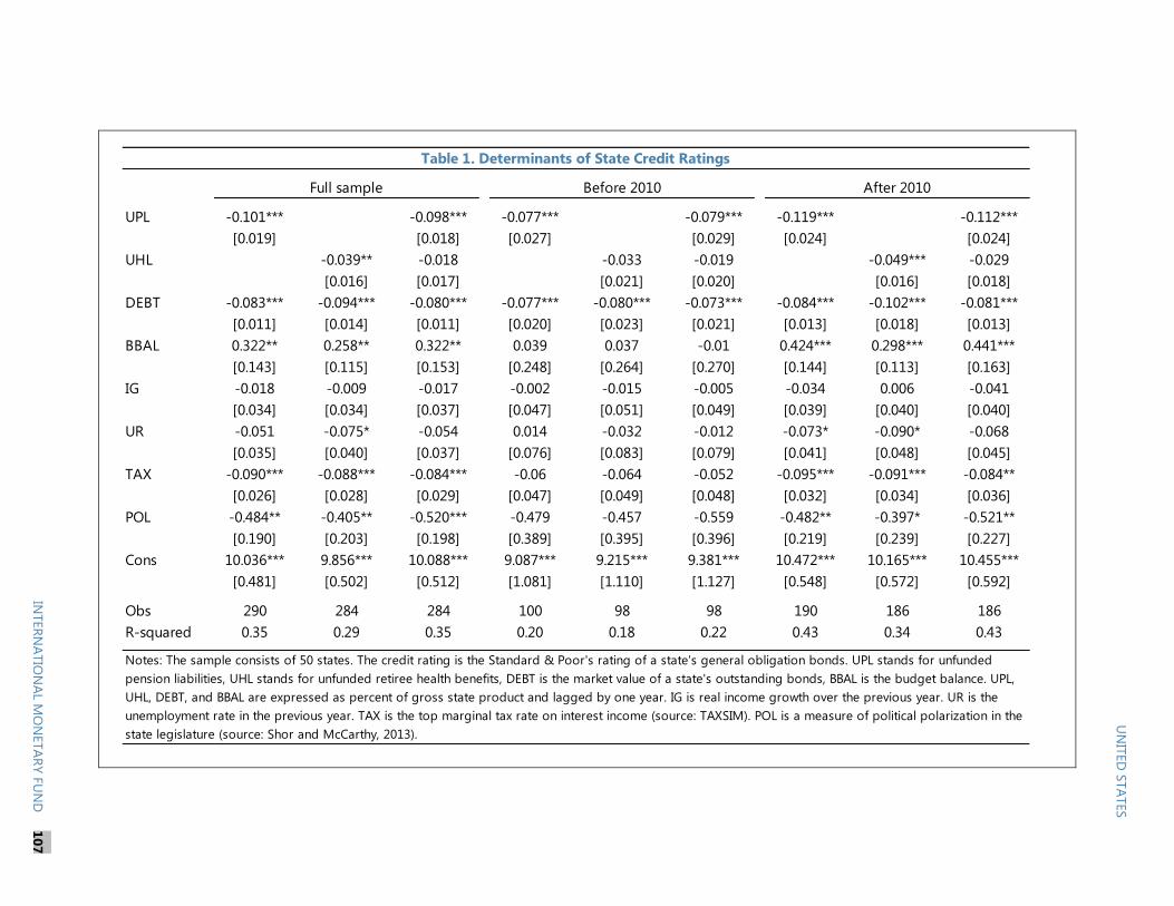
UPL -0.101*** -0.098*** -0.077*** -0.079*** -0.119*** -0.112***
[0.019] [0.018] [0.027] [0.029] [0.024] [0.024]
UHL -0.039** -0.018 -0.033 -0.019 -0.049*** -0.029
[0.016] [0.017] [0.021] [0.020] [0.016] [0.018]
DEBT -0.083*** -0.094*** -0.080*** -0.077*** -0.080*** -0.073*** -0.084*** -0.102*** -0.081***
[0.011] [0.014] [0.011] [0.020] [0.023] [0.021] [0.013] [0.018] [0.013]
BBAL 0.322** 0.258** 0.322** 0.039 0.037 -0.01 0.424*** 0.298*** 0.441***
[0.143] [0.115] [0.153] [0.248] [0.264] [0.270] [0.144] [0.113] [0.163]
IG -0.018 -0.009 -0.017 -0.002 -0.015 -0.005 -0.034 0.006 -0.041
[0.034] [0.034] [0.037] [0.047] [0.051] [0.049] [0.039] [0.040] [0.040]
UR -0.051 -0.075* -0.054 0.014 -0.032 -0.012 -0.073* -0.090* -0.068
[0.035] [0.040] [0.037] [0.076] [0.083] [0.079] [0.041] [0.048] [0.045]
TAX -0.090*** -0.088*** -0.084*** -0.06 -0.064 -0.052 -0.095*** -0.091*** -0.084**
[0.026] [0.028] [0.029] [0.047] [0.049] [0.048] [0.032] [0.034] [0.036]
POL -0.484** -0.405** -0.520*** -0.479 -0.457 -0.559 -0.482** -0.397* -0.521**
[0.190] [0.203] [0.198] [0.389] [0.395] [0.396] [0.219] [0.239] [0.227]
Cons 10.036*** 9.856*** 10.088*** 9.087*** 9.215*** 9.381*** 10.472*** 10.165*** 10.455***
[0.481] [0.502] [0.512] [1.081] [1.110] [1.127] [0.548] [0.572] [0.592]
Obs 290 284 284 100 98 98 190 186 186
R-squared 0.35 0.29 0.35 0.20 0.18 0.22 0.43 0.34 0.43
Table 1. Determinants of State Credit Ratings
Full sample Before 2010 After 2010
Notes: The sample consists of 50 states. The credit rating is the Standard & Poor's rating of a state's general obligation bonds. UPL stands for unfunded
pension liabilities, UHL stands for unfunded retiree health benefits, DEBT is the market value of a state's outstanding bonds, BBAL is the budget balance. UPL,
UHL, DEBT, and BBAL are expressed as percent of gross state product and lagged by one year. IG is real income growth over the previous year. UR is the
unemployment rate in the previous year. TAX is the top marginal tax rate on interest income (source: TAXSIM). POL is a measure of political polarization in the
state legislature (source: Shor and McCarthy, 2013).
UN
ITED
STA
TES
INTER
NA
TIO
NA
L MO
NETA
RY F
UN
D 1
07
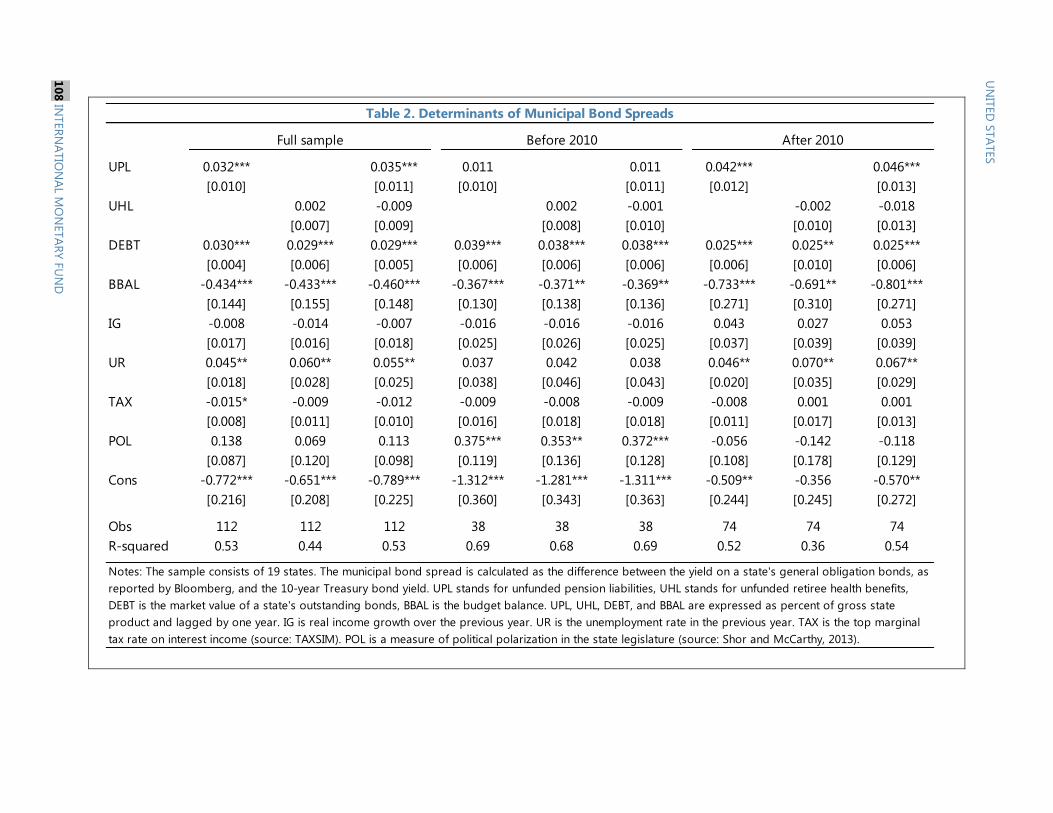
UPL 0.032*** 0.035*** 0.011 0.011 0.042*** 0.046***
[0.010] [0.011] [0.010] [0.011] [0.012] [0.013]
UHL 0.002 -0.009 0.002 -0.001 -0.002 -0.018
[0.007] [0.009] [0.008] [0.010] [0.010] [0.013]
DEBT 0.030*** 0.029*** 0.029*** 0.039*** 0.038*** 0.038*** 0.025*** 0.025** 0.025***
[0.004] [0.006] [0.005] [0.006] [0.006] [0.006] [0.006] [0.010] [0.006]
BBAL -0.434*** -0.433*** -0.460*** -0.367*** -0.371** -0.369** -0.733*** -0.691** -0.801***
[0.144] [0.155] [0.148] [0.130] [0.138] [0.136] [0.271] [0.310] [0.271]
IG -0.008 -0.014 -0.007 -0.016 -0.016 -0.016 0.043 0.027 0.053
[0.017] [0.016] [0.018] [0.025] [0.026] [0.025] [0.037] [0.039] [0.039]
UR 0.045** 0.060** 0.055** 0.037 0.042 0.038 0.046** 0.070** 0.067**
[0.018] [0.028] [0.025] [0.038] [0.046] [0.043] [0.020] [0.035] [0.029]
TAX -0.015* -0.009 -0.012 -0.009 -0.008 -0.009 -0.008 0.001 0.001
[0.008] [0.011] [0.010] [0.016] [0.018] [0.018] [0.011] [0.017] [0.013]
POL 0.138 0.069 0.113 0.375*** 0.353** 0.372*** -0.056 -0.142 -0.118
[0.087] [0.120] [0.098] [0.119] [0.136] [0.128] [0.108] [0.178] [0.129]
Cons -0.772*** -0.651*** -0.789*** -1.312*** -1.281*** -1.311*** -0.509** -0.356 -0.570**
[0.216] [0.208] [0.225] [0.360] [0.343] [0.363] [0.244] [0.245] [0.272]
Obs 112 112 112 38 38 38 74 74 74
R-squared 0.53 0.44 0.53 0.69 0.68 0.69 0.52 0.36 0.54
Table 2. Determinants of Municipal Bond Spreads
Full sample Before 2010 After 2010
Notes: The sample consists of 19 states. The municipal bond spread is calculated as the difference between the yield on a state's general obligation bonds, as
reported by Bloomberg, and the 10-year Treasury bond yield. UPL stands for unfunded pension liabilities, UHL stands for unfunded retiree health benefits,
DEBT is the market value of a state's outstanding bonds, BBAL is the budget balance. UPL, UHL, DEBT, and BBAL are expressed as percent of gross state
product and lagged by one year. IG is real income growth over the previous year. UR is the unemployment rate in the previous year. TAX is the top marginal
tax rate on interest income (source: TAXSIM). POL is a measure of political polarization in the state legislature (source: Shor and McCarthy, 2013).
UN
ITED
STA
TES
10
8 IN
TER
NA
TIO
NA
L MO
NETA
RY
FU
ND
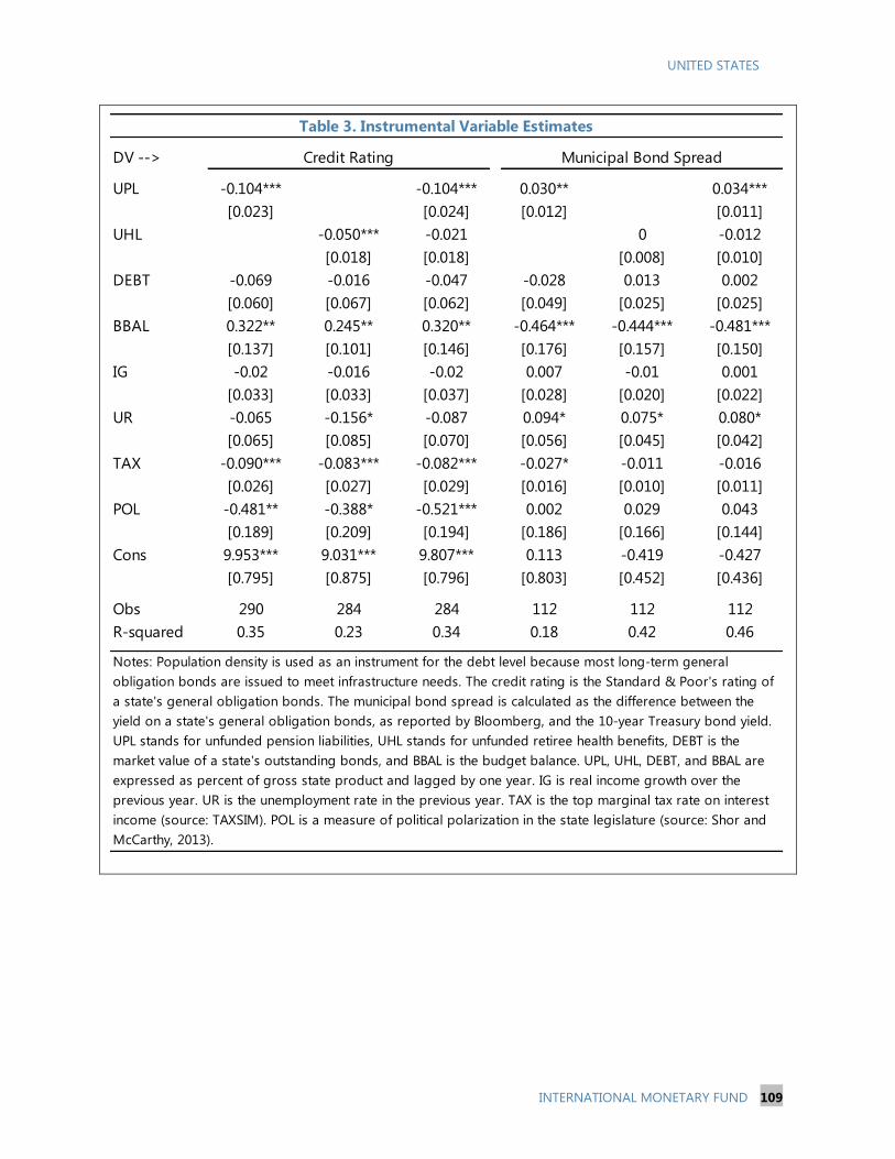
UNITED STATES
INTERNATIONAL MONETARY FUND 109
DV -->
UPL -0.104*** -0.104*** 0.030** 0.034***
[0.023] [0.024] [0.012] [0.011]
UHL -0.050*** -0.021 0 -0.012
[0.018] [0.018] [0.008] [0.010]
DEBT -0.069 -0.016 -0.047 -0.028 0.013 0.002
[0.060] [0.067] [0.062] [0.049] [0.025] [0.025]
BBAL 0.322** 0.245** 0.320** -0.464*** -0.444*** -0.481***
[0.137] [0.101] [0.146] [0.176] [0.157] [0.150]
IG -0.02 -0.016 -0.02 0.007 -0.01 0.001
[0.033] [0.033] [0.037] [0.028] [0.020] [0.022]
UR -0.065 -0.156* -0.087 0.094* 0.075* 0.080*
[0.065] [0.085] [0.070] [0.056] [0.045] [0.042]
TAX -0.090*** -0.083*** -0.082*** -0.027* -0.011 -0.016
[0.026] [0.027] [0.029] [0.016] [0.010] [0.011]
POL -0.481** -0.388* -0.521*** 0.002 0.029 0.043
[0.189] [0.209] [0.194] [0.186] [0.166] [0.144]
Cons 9.953*** 9.031*** 9.807*** 0.113 -0.419 -0.427
[0.795] [0.875] [0.796] [0.803] [0.452] [0.436]
Obs 290 284 284 112 112 112
R-squared 0.35 0.23 0.34 0.18 0.42 0.46
Notes: Population density is used as an instrument for the debt level because most long-term general
obligation bonds are issued to meet infrastructure needs. The credit rating is the Standard & Poor's rating of
a state's general obligation bonds. The municipal bond spread is calculated as the difference between the
yield on a state's general obligation bonds, as reported by Bloomberg, and the 10-year Treasury bond yield.
UPL stands for unfunded pension liabilities, UHL stands for unfunded retiree health benefits, DEBT is the
market value of a state's outstanding bonds, and BBAL is the budget balance. UPL, UHL, DEBT, and BBAL are
expressed as percent of gross state product and lagged by one year. IG is real income growth over the
previous year. UR is the unemployment rate in the previous year. TAX is the top marginal tax rate on interest
income (source: TAXSIM). POL is a measure of political polarization in the state legislature (source: Shor and
McCarthy, 2013).
Table 3. Instrumental Variable Estimates
Credit Rating Municipal Bond Spread

2008 Gould, Arkansas
2008 Vallejo, California
2009Westfall Township,
Pennsylvania
2009Washington Park,
Illinois
2009 Prichard, Alabama
2011Central Falls, Rhode
Island
2011Harrisburg,
Pennsylvania
2011Jefferson County,
Alabama
2012 Stockton, California
2012San Bernardino,
California
2013 Detroit, Michigan Pension obligations and operational budget; Largest municpal filing in U.S. history. Debt estimated 18-20
billion.
Date City, State Reason/Amount
Table 4. Recent Municipal Bankruptcies
Municipality filed a chapter 9 case as a strategy to forestall several lawsuits.Case was dismissed after debtor
regained financial stability.
Pension obligations and operational budget; Financial distress stemmed mainly from the city’s inability to
pay pension benefits to government employees.
Debt or payments related to public services or owed to private litigants. Filed a chapter 9 case in the face
significant debts resulting from a $20.8 million decision in favor of a resident who had sued the municipality
after the township had sought to prevent the resident from building a housing development.
Pension obligations and operational budget; Unable to meet financial obligations; $319m in outstanding
debt, plus $450m in health insurance and pension liabilities for city retirees.
Debt or payments related to public services or owed to private litigants . Washington Park, Illinois filed a
chapter 9 case due in part to mounting payments owed to trash collectors. Washington Park’s debts also stem
from litigation brought by private citizens, including litigation brought by a private strip club
that resulted in the city being unable to continue to realize significant annual revenue from strip club licenses
and becoming liable for the strip club’s attorneys fees. The municipality has also faced litigation related to
certain government employees’ corrupt practices.
Pension obligations and operational budget; The municipality was under significant financial pressure
regarding its operational budget and its pension reserves for retired government employees. It was able to
revise its budget, so that it would no longer operate at a deficit, but it could not come up with the funds to pay
its pension obligations. In the face of litigation from retirees, the municipality filed a chapter 9 case.
Pension obligations and operational budget ; Owed more than $80 million in unfunfed pension and retiree
health benefit liability.
Debt or payments related to construction of facilities for public services; chapter 9 filing, due largely to
$282 million of debt associated with the construction of a trash incinerator.
Debt or payments related to construction of facilities for public services. $3 billion in sewer debt.The
“sewer debt” was further exacerbated by an interest rate swap transaction that failed.
Pension obligations and operational budget;Pension obligations; over $17 million.
UN
ITED
STA
TES
11
0 IN
TER
NA
TIO
NA
L MO
NETA
RY
FU
ND

Year State Actions taken
2003 Oregon Restructured to a hybrid plan with a DB and DC component;Capped COLA at 1.5% on all benefits above $20,000.
2005 Alaska Created a defined contribution plan for new employees.
2008 Kentucky 2008: Extends the period of calculation for FAS; Reduces COLAs (House Bill 1); 2013: Created a hybrid plan for new employees
2009 Mississippi Increased employee contribution rates; Changed eligibility requirements for new employees.
2009 Colorado Changed COLA terms; Increased employee contributions; Modified formula used to calculate benefits 2011;
2009 New Hampshire Increased contribution rates.
2009 New Mexico Temporarily increased employee contributions; Created new tiers for state and educational employees;
2010 South Dakota Removed COLAs for first year of retirement; Tied future COLA payments to system funded status.
2010 Delaware Increased retirement age for new hires; Increased employee contributions.
2010 Pennsylvania Created a shared risk DB plan for new employees, where employee contribution rates rise and fall based on investment returns; Changed the formula used to calculate benefits.
2010 West Virginia Teachers' plan converted back to DB after 17 years of DC.
2010 Virginia Employees required to contribute to pension (employer previously picked up); Change made to the calculation of average final salary; COLA match reduced.
2010 Vermont Increased contributions for all TRS members ;Increased contributions for SRS members from 2011-2016.
2010 Missouri Employee contributions raised; Retirement age raised.
2010 Minnesota SRS: Reduced COLA;PERA: Increased contribution rates;TRS: Increased contribution rates incrementally.
2010 Wyoming Requires employee contributions for the first time since 1991 ; Created a new tier for new employees with reduced benefits.
2010 Nevada Allows for an increase in employee contributions; Reduced COLA for new employees; Modified the formula used to calculate benefits for new employees
2010 Utah Closed the DB plan to new hires; created a Tier II retirement system for new employees, who choose between a DC plan and a hybrid plan (S.B. 63)
2010 Michigan Created a hybrid plan for new school employees; Increased contribution rates for the two defined benefit tiers which were closed by the 2010.
2011 Arizona Increased contribution rates; Modified the formula used to calculate benefits.
2011 New Jersey Increased employee contributions; Modified formula used to calculate benefits.
2011 Kansas Created a cash balance plan for state employees and teachers hired after.
2011 Rhode Island Increased the normal retirement age; Temporarily suspended COLA.
2011 Wisconsin Requires employees to pay half of the actuarially required contribution (employers have previously picked up employee contributions).
2011 Massachusetts Future Employees: Increased retirement age and modified the formula used to calculate benefits; Current and Future Employees: Changed method used to calculate.
2011 Georgia Created a hybrid plan for new employees.
2011 Maryland Increases employee contributions.
2011 Florida Increased employee contributions.
2011 Montana Increased contribution rates for new employees; decreased cost-of-living adjustment for current retirees.
2011 Maine Froze Cola for three years; Raised retirement age for all members with less than five years of service.
2011 North Dakota Increased state employee contributions; Increased teacher contributions.
2012 South Carolina Changed benefit calculations for new employees.
2012 California Increased employee contributions; increased retirement age.
2012 Virginia Created a hybrid plan; Reduced the pension multiplier; Modified the formula used to calculate pension benefits.
2012 New York Created a new tier (Tier VI) for newly hired employees which features a higher normal retirement age, a lower pension multiplier, and higher employee contributions.
2013 New MexicoPERA: Reduced COLA for retirees receiving $20,000 or less; changed COLA eligibility for new hires. Increased employee contributions for all workers; ERB: Reduced COLA for current retirees and increased
contributions for current members.
2013 Louisiana Created a cash balance plan for state employees and teachers hired after July 1, 2013 .
2013 Puerto Rico Increased the retirement age; increased employee contributions; reduced benefits; created a hybrid plan.
2013 Oklahoma Increased the retirement age and vesting period for new firefighters. Increased firefighter contribution rates.
2013 Nebraska Created a new tier for newly hired school employees with a longer period used to calculate FAS and a reduced COLA.
2013 Tennessee Closed the DB plan to new state and higher education employees and teachers hired after July 1, 2014. Created a new combination (DB/DC) hybrid plan for these employee groups.
Table 5. Recent Pension Reforms
UN
ITED
STA
TES
INTER
NA
TIO
NA
L MO
NETA
RY F
UN
D 1
11

UNITED STATES
112 INTERNATIONAL MONETARY FUND
References
Arezki, Rabah, Bertrand Candelon, and Amadou N.R. Sy, 2011, “Are There Spillover Effects from
Munis?” IMF Working Paper No. 11/290.
Bayoumi, Tamim, Morris Goldstein, and Geoffrey Woglom, 1995, “Do Credit Markets Discipline
Sovereign Borrowers: Evidence from U.S. States,” Journal of Money, Credit, and Banking, 27:
1046–1059.
Brown, Jeffrey R., and David W. Wilcox, 2009, “Discounting State and Local Pension Liabilities,”
American Economic Review, 99(2): 538–542.
Government Accountability Office (GAO), 2013, “State and Local Governments’ Fiscal Outlook,” April
Update, Report No. GAO–13–546SP.
Grizzle, Cleopatra, 2010, “The Impact of Budget Stabilization Funds on State General Obligation
Bond Ratings,” Public Budgeting and Finance.
Knox, John, and Marc Levinson, “Municipal Bankruptcy: Avoiding and Using Chapter 9 in Times of
Financial Stress,” Orrick, Herrington & Sutcliff LLP.
Munnell, Alicia H., Richard W. Kopcke, Jean-Pierre Aubry, and Laura Quinby, 2010, “Valuing Liabilities
in State and Local Plans,” Center for Retirement Research at Boston College, Issue Brief 11.
Novy-Marx, Robert, and Joshua D. Rauh, 2009a, “The Liabilities and Risks of State-Sponsored
Pension Plans,” Journal of Economic Perspectives, 23(4): 191–210.
Novy-Marx, Robert, and Joshua D. Rauh, 2009b, “Fiscal Imbalances and Borrowing Costs: Evidence
from State Investment Losses,” mimeo.
Poterba, James M., and Kim Reuben, 1999, “State Fiscal Institutions and the U.S. Municipal Bond
Market,” in Fiscal Institutions and Fiscal Performance, NBER Chapters No. 8028.
Shor, Boris, and Nolan McCarty, 2013, "Individual State Legislator Shor-McCarty Ideology Data,"
http://hdl.handle.net/1902.1/21509
Spiotto, James E., “Primer on Municipal Debt Adjustment—Chapter 9: The Last Resort for Financially
Distressed Municipalities,” Chapman and Cutler LLP.
United States Courts, “Bankruptcy Basics—Chapter 9, Municipal Bankruptcy,” available at:
http://www.uscourts.gov/FederalCourts/Bankruptcy/BankruptcyBasics/Chapter9.aspx