
Image analysis of Renais sance copperplate prints · Image analysis of Renais sance copperplate...
20
Image analysis of Renaissance copperplate prints S. Blair Hedges* Department of Biology, Pennsylvania State University, 208 Mueller Laboratory, University Park, PA USA 16802-5131 ABSTRACT From the fifteenth to the nineteenth centuries, prints were a common form of visual communication, analogous to photographs. Copperplate prints have many finely engraved black lines which were used to create the illusion of continuous tone. Line densities generally are 100–2000 lines per square centimeter and a print can contain more than a million total engraved lines 20–300 micrometers in width. Because hundreds to thousands of prints were made from a single copperplate over decades, variation among prints can have historical value. The largest variation is plate-related, which is the thinning of lines over successive editions as a result of plate polishing to remove time-accumulated corrosion. Thinning can be quantified with image analysis and used to date undated prints and books containing prints. Print-related variation, such as over-inking of the print, is a smaller but significant source. Image-related variation can introduce bias if images were differentially illuminated or not in focus, but improved imaging technology can limit this variation. The Print Index, the percentage of an area composed of lines, is proposed as a primary measure of variation. Statistical methods also are proposed for comparing and identifying prints in the context of a print database. Keywords: Art, authentication, database, dating, focus, image analysis, map, print clock, printing press, time 1. INTRODUCTION 1.1 Copperplate prints Intaglio printing, the process of producing prints from metal plates, first appeared in Germany in the early 15 th Century (1, 2). A variety of metals have been used over the years, but copper was by far the most common. The printing process involves engraving grooves—representing the artwork—in the copper using a steel tool (burin or needle) or etching the grooves with acid, or a combination of the two methods. The grooves are filled with ink and the print is made by pressing a sheet of paper against the plate, usually in a rolling press. More than 18,000 prints could be made from a single plate (3), although typical print runs in the Renaissance were considerably smaller, usually 500–1000 prints (4-6). Prints in general, and especially copperplate prints, were in many ways the precursors of photographs. They often depicted scenes of daily life, were mass produced, and were commonly used to illustrate books. A typical print is composed of hundreds of thousands of very narrow engraved lines or dots, 20–300 micrometers (μm) in width, although typical engraved lines are 100–200 μm (Fig. 1). (Etched lines are slightly larger). Copperplate prints are similar to half- tone prints (invented in the 1880s) in the sense that they are black and white and convey the illusion of continuous tone by using very small dots or lines. Because of limitations on the resolution of information by the human retina, about 180 or more differences per inch are needed to create this optical illusion, which corresponds to lines or dots less than roughly 140 μm in width. Although woodblock artists found ways to achieve some tonal differences, the lines in woodblock prints are rarely that small because of the fibrous nature of wood and its fragility. Metal provided a more durable and homogeneous medium whereby artists could pass the threshold of visual acuity and enter this realm of optical illusion by engraving very narrow lines. Although it is not well documented, copperplate engravers must have used lenses for such detailed work, just as engravers of jewelry use lenses today (lenses were widely available during the Renaissance). In fact, the intaglio process is thought to have been invented by goldsmiths (1, 2). *[email protected]; evo.bio.psu.edu/hedgeslab Computer Image Analysis in the Study of Art, edited by David G. Stork, Jim Coddington, Proc. of SPIE-IS&T Electronic Imaging, SPIE Vol. 6810, 681009, © 2008 SPIE-IS&T · 0277-786X/08/$18 SPIE-IS&T/ Vol. 6810 681009-1
Transcript of Image analysis of Renais sance copperplate prints · Image analysis of Renais sance copperplate...
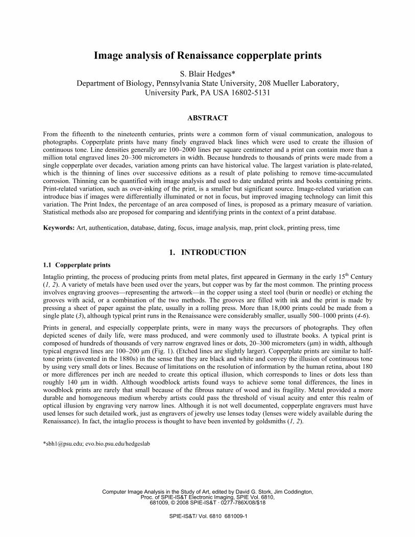
Image analysis of Renaissance copperplate prints
S. Blair Hedges*
Department of Biology, Pennsylvania State University, 208 Mueller Laboratory, University Park, PA USA 16802-5131
ABSTRACT
From the fifteenth to the nineteenth centuries, prints were a common form of visual communication, analogous to photographs. Copperplate prints have many finely engraved black lines which were used to create the illusion of continuous tone. Line densities generally are 100–2000 lines per square centimeter and a print can contain more than a million total engraved lines 20–300 micrometers in width. Because hundreds to thousands of prints were made from a single copperplate over decades, variation among prints can have historical value. The largest variation is plate-related, which is the thinning of lines over successive editions as a result of plate polishing to remove time-accumulated corrosion. Thinning can be quantified with image analysis and used to date undated prints and books containing prints. Print-related variation, such as over-inking of the print, is a smaller but significant source. Image-related variation can introduce bias if images were differentially illuminated or not in focus, but improved imaging technology can limit this variation. The Print Index, the percentage of an area composed of lines, is proposed as a primary measure of variation. Statistical methods also are proposed for comparing and identifying prints in the context of a print database. Keywords: Art, authentication, database, dating, focus, image analysis, map, print clock, printing press, time
1. INTRODUCTION 1.1 Copperplate prints
Intaglio printing, the process of producing prints from metal plates, first appeared in Germany in the early 15th Century (1, 2). A variety of metals have been used over the years, but copper was by far the most common. The printing process involves engraving grooves—representing the artwork—in the copper using a steel tool (burin or needle) or etching the grooves with acid, or a combination of the two methods. The grooves are filled with ink and the print is made by pressing a sheet of paper against the plate, usually in a rolling press. More than 18,000 prints could be made from a single plate (3), although typical print runs in the Renaissance were considerably smaller, usually 500–1000 prints (4-6).
Prints in general, and especially copperplate prints, were in many ways the precursors of photographs. They often depicted scenes of daily life, were mass produced, and were commonly used to illustrate books. A typical print is composed of hundreds of thousands of very narrow engraved lines or dots, 20–300 micrometers (µm) in width, although typical engraved lines are 100–200 µm (Fig. 1). (Etched lines are slightly larger). Copperplate prints are similar to half-tone prints (invented in the 1880s) in the sense that they are black and white and convey the illusion of continuous tone by using very small dots or lines. Because of limitations on the resolution of information by the human retina, about 180 or more differences per inch are needed to create this optical illusion, which corresponds to lines or dots less than roughly 140 µm in width. Although woodblock artists found ways to achieve some tonal differences, the lines in woodblock prints are rarely that small because of the fibrous nature of wood and its fragility. Metal provided a more durable and homogeneous medium whereby artists could pass the threshold of visual acuity and enter this realm of optical illusion by engraving very narrow lines. Although it is not well documented, copperplate engravers must have used lenses for such detailed work, just as engravers of jewelry use lenses today (lenses were widely available during the Renaissance). In fact, the intaglio process is thought to have been invented by goldsmiths (1, 2).
*[email protected]; evo.bio.psu.edu/hedgeslab
Computer Image Analysis in the Study of Art, edited by David G. Stork, Jim Coddington,Proc. of SPIE-IS&T Electronic Imaging, SPIE Vol. 6810,
681009, © 2008 SPIE-IS&T · 0277-786X/08/$18
SPIE-IS&T/ Vol. 6810 681009-1
I.
Fig. 1. The Americae Retectio print by Stradanus (1st edition, 1590–95). (A) Entire print. (B) close-up of woman. (C) Close-
up of woman’s face showing details of lines used for creating the illusion of continuous tone. This included stippling, widely spaced tapered lines (e.g., nose), closely spaced tapered lines (below eyes) and crosshatching (e.g., her cheek). Dark horizontal bar = 1 millimeter. The narrowest lines and stipples are approximately 20 µm. The number of lines in the entire print is estimated to be approximately 480,000.
1.2 Undated books and art prints
Copperplate prints have historical value but unfortunately a large number of prints—and books containing prints—are undated, which limits that value. The online bibliographic resource WorldCat lists slightly over three million different books printed by hand operated presses between 1450 and 1830 that still exist in libraries, although the actual number that was printed is certainly much larger (7, 8). It is unclear how many of the existing books are undated or poorly dated, but cursory examination of bibliographic records suggests that it could be between 10% and 30%, and thus as many as a million (or more) books. For prints, many of which were issued separately (unbound), it is likely that even a greater proportion is undated. There are famous examples of undated books and prints that have attracted attention by historians, such as the first map to name America, by Waldseemüller (9) and two of Shakespeare’s quartos (10), but there are many others of importance.
A diversity of methods has been used to determine the dates of undated documents, including analysis of carbon-14 content, type defects, paper composition, and watermarks, among others. Of those, watermarks are used most often for dating (10, 11). They were figures—essentially trademarks of the papermaker—drawn with wire in the mold and embedded in the paper when it was formed. Because molds lasted only a few years and each produced a unique watermark, the matching of a watermark in an undated book with the same watermark in dated books should provide a date for the paper (not necessarily the print) within a few years. Although sometimes it works nicely, often it doesn’t because only a fraction of the millions of different watermarks that exist have been cataloged, thus greatly limiting the possibility of a match (12).
1.3 The print clock method
Recently, the “print clock” was proposed as a method for dating early books and art prints (12). It differs from watermark analysis in that it dates the print itself, rather than the paper. The print clock is based on the hypothesis that woodblocks and metal plates deteriorated in a clock-like manner during their lifespan, which was often decades. In the woodblock clock, the deterioration was the random cracking of the wood relief with time, resulting in line breaks in the prints. In the copperplate clock, grooves in the metal became thinner as the copper surface was polished before each edition was printed, resulting in thinner printed lines and an overall paling of the print. Dating is accomplished by measuring this change across different dated editions of the same print to establish a rate, and the applying the rate to an
SPIE-IS&T/ Vol. 6810 681009-2
undated print. Early books (i.e., prior to 1830) can be dated because most contained woodblock or copperplate prints, if only ornamentation on the title page, headpieces, tailpieces, or enlarged letters (12). The print clock is probabilistic—based on random events—and thus is similar to radiometric clocks used by geologists to date rocks and molecular clocks used by biologists to date species divergences (13). Although a constant rate of change was observed in the initial study (12), rates may also vary over time and methods (e.g., Bayesian analysis) that can account for rate variation might be used for dating.
1.4 The copperplate clock
Evidence for the copperplate clock (12) came from image analysis of prints in two Italian Renaissance atlases: L'isole piu famose del mondo by Porcacchi (14) and Geographiae universae by Magini (15). The Porcacchi atlas was printed in five editions over 48 years (1572, 1576, 1590, 1604–05, and 1620), mostly without retouching of the plates. The plates in two later editions (1686, 1713) were reworked so they were not considered. The Magini atlas was printed in three editions over 25 years (1596, 1598, and 1621), not including the pirated edition of 1597. These two atlases were selected because the multiple editions were unevenly spaced in time permitting the testing of print-related change versus time-related change.
In that study, digital photos were taken of prints from the two atlases and subjected to image analyses. The images were thresholded and gray levels were determined and compared. A strong positive relationship (r=0.99) was obtained between gray level and time. Although this paling of prints across editions had been noted frequently by art historians and analytical bibliographers, it always has been attributed to the cumulative (print-dependent) pressure of the rolling press, thinning the lines by gradually flattening the copperplate with every print (2, 4-6, 16-19). For example, Campbell (17) states: Repeated subjection of the relatively soft copper plate to the great pressure of the rolling press imperceptibly wore it down and reduced the depth of the original cut, so that it was able to retain and transfer to the sheet of paper progressively less ink. Consequently, in the past, the phrase “plate wear” was commonly used to describe the source of the observed changes in prints.
But statistical tests of the gray level data from those Renaissance prints showed that this relationship was significantly time dependent, not print dependent. In other words, prints from two successive editions are significantly different, whereas the conventional print-dependent hypothesis would predict that the last print made in one edition would resemble the first print made in the next edition (thus predicting a continuum of variation among prints from different editions, which was not observed). Also, there is no evidence that copperplates were flattened over time. This would have caused the plates to expand in dimensions. Measurements of overall plate dimensions, based on prints from different editions, showed no significant changes (12). Compression of copperplates also would have made lines in later editions wider (making the prints darker), not thinner, so the print dependent hypothesis is inconsistent with what is already acknowledged: prints in later editions are paler.
Engraved grooves in the metal plates are triangular in shape and therefore the thinning of lines indicates that the surface of the copperplate was eroded away. Removal of the surface would reduce the height of the groove, exposing a progressively narrower part of the groove closer to the point of the triangle (12). But the mechanism for why this would happen, and why it would be time-dependent was not obvious. Clues were buried in early printing manuals explaining that engraved plates were always polished prior to a print run (after the first) to remove corrosion (which can finely pit the surface) and nicks that accumulated during months or years of storage (20, 21). Otherwise any surface defects would be printed, lowering the value of the print. For example, when a modern print is made from an antique copperplate that has not been polished, the corrosion appears as a faint granular mottling on the print. But of course, polishing off the surface of an engraved copperplate—with its artwork—also meant the lines would be thinner, thus altering the artwork. With this knowledge, printer would have polished only enough of the surface to remove the corrosion, otherwise the value of the print would have been diminished (12).
Using high-resolution scans of two Porcacchi maps printed 28 years apart (1576 and 1604), the width of engraved lines was measured and those in the later print were found to be on average 60 µm thinner (12). Based on the triangular shape of the grooves, it was determined that approximately 40 µm (1.4 µm/year) from the surface of the copperplate used to print those two maps had been removed at some point or points in time (presumably by the printers of the 1590 and 1604 editions, just prior to printing those editions). This is consistent with typical atmospheric rates of corrosion of copper in unpolluted areas (1–2 µm/year) (22). Thus, the resulting model of copperplate change across editions involves time-dependent corrosion during storage, with removal of the accumulated corrosion products prior to printing, resulting in thinner lines in successive editions (Fig. 2).
SPIE-IS&T/ Vol. 6810 681009-3
Copperplate linesB
Time:
Time - Time
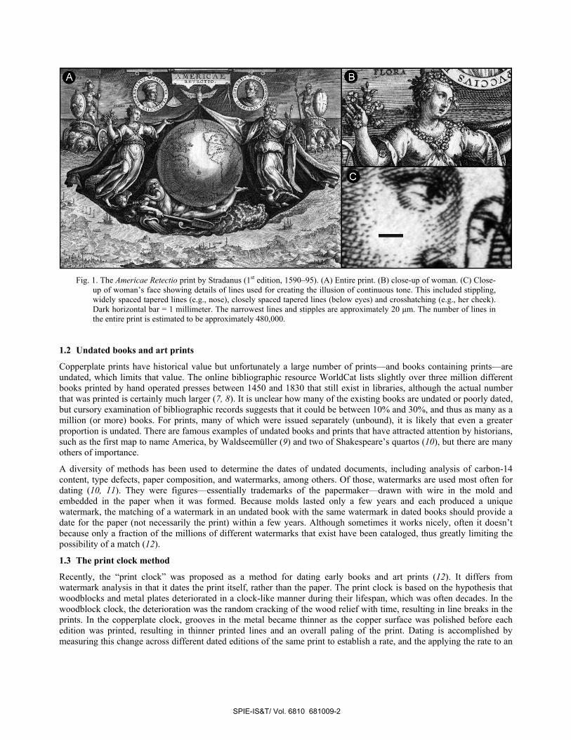
Fig. 2. The copperplate print clock model (12). (A) Generalized diagram showing change in width of an engraved
triangular-shaped groove in a copperplate through time (four editions), and the printed lines produced by that groove. The cross-section of the ink-filled groove is black. Before each printing, the plate surface was polished (eroded) to remove nicks and corrosion, narrowing the width of the groove. (B) Three dimensional view of a one-millimeter-square section of a copperplate with curved groove, at two periods in time (e.g., two editions). The corresponding curved black lines produced on the print are shown above the plates, illustrating the narrower groove and line in the later edition.
1.5 Some open questions
The work described above concerned copperplate prints in two late-Renaissance Italian atlases. Many more prints need to be examined to determine both geographic and temporal variability. For example, is the same relationship and rate of change found in prints from northern Europe or from other time periods such as the early Renaissance (e.g., 15th century) or post-Renaissance (e.g., 18th century)? Modern copperplates are usually protected from corrosion with a coating of grease or varnish (23) but it is not clear when this practice began. It is not mentioned in the early printing manuals (20, 21) and was apparently not used by the Venetian printers of the Porcacchi book, or else they would not have had to polish off so much of the plate before each print run. Also, the indoor atmosphere of modern structures is considerably drier than the outdoor atmosphere during the winter, which would have reduced the rate of corrosion (24). However, humidity levels of the rooms where copperplates were stored in earlier times are not known. In the original study (12), the primary measurement used was gray level. Line width was measured only in two prints using high resolution images. To get a complete view of the actual change taking place in the prints, line width is examined here across multiple editions, in parallel with gray level analyses.
Then there are practical questions concerning print clock analyses, because most early prints available for study are in curated collections that limit how the prints are imaged. How do these limitations bias the resulting images and image analyses? For example, flatbed scans are rarely permitted for imaging rare documents, and the low levels of light available for digital photography often create problems for focusing and differential illumination. The quality of in-house (institutional) photography varies greatly and often the options (e.g., resolution) are limited. Under these circumstances, what kind of recommendations can be made for imaging of copperplate prints to be used in analyses?
Finally, what are the basic physical properties of copperplate prints in terms of size and number of lines and the percentage of lines within a printed area? What are the sources of variation in these basic properties of prints, and how might this variation be used to compare prints in historical analyses? Is it possible to compare and uniquely identify
SPIE-IS&T/ Vol. 6810 681009-4
prints with one or a few statistical measures? What are the challenges facing the development of a global print database? These are some of the questions that will be touched upon here.
2. METHODS 2.1 Line density and total line estimates
The line density (lines/cm2) and total number of lines in four copperplate prints was estimated by averaging line counts from ten more or less randomly selected one cm2 cells and extrapolating to the entire print. Lines were counted by eye using 1200 dpi flatbed-scanned images of prints. A line was defined as any engraved or etched black mark, either an isolated dot or line, or a segment connecting other lines. Therefore, in cases of crosshatching, individual connecting segments formed by the intersection of extended lines were counted as separate lines. If all lines were discrete and unconnected, they could be counted automatically using particle counting algorithms. However, lines are commonly interconnected, which creates problems for line discrimination technology.
The four copperplate prints used for estimating line density and total number of lines were: Americae Retectio by Stradanus (1590–95), 275 x 194 mm; Lapis Polaris Magnes by Stradanus (1590–95), 266 x 190 mm; Spagnuola by Porcacchi (1572), 141 x 104 mm; and L’isola Cuba by Forlani (1564), 228 x 161 mm. The first two are Flemish art prints and the last two are Italian maps. They were selected to represent a visual range from densely engraved (Lapis Polaris Magnes) to relatively pale (Cuba). All are first edition prints and therefore the lines correspond to the original engraved copperplate, before any subsequent polishing or retouching. For comparison, line density was measured in the same manner in a woodblock print from the author’s collection, Münster’s Meerwunder und seltzame Their... (1560), measuring 343 x 258 mm. It is a relatively large print with a moderate amount of engraving, depicting numerous sea monsters. It is neither excessively dark nor pale and thus could be considered representative.
2.2 Physical dimensions of copperplates and grooves
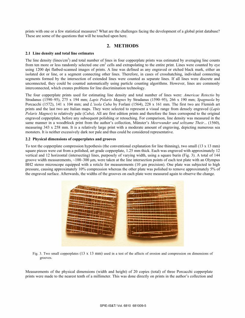
To test the copperplate compression hypothesis (the conventional explanation for line thinning), two small (13 x 13 mm) square pieces were cut from a polished, art grade copperplate, 1.25 mm thick. Each was engraved with approximately 12 vertical and 12 horizontal (intersecting) lines, purposely of varying width, using a square burin (Fig. 3). A total of 144 groove width measurements, ~100–300 µm, were taken at the line intersection points of each test plate with an Olympus BH2 stereo microscope equipped with a reticle for measurements (10 µm precision). One plate was subjected to high pressure, causing approximately 10% compression whereas the other plate was polished to remove approximately 5% of the engraved surface. Afterwards, the widths of the grooves on each plate were measured again to observe the change.
Fig. 3. Two small copperplates (13 x 13 mm) used in a test of the affects of erosion and compression on dimensions of grooves.
Measurements of the physical dimensions (width and height) of 20 copies (total) of three Porcacchi copperplate prints were made to the nearest tenth of a millimeter. This was done directly on prints in the author’s collection and
SPIE-IS&T/ Vol. 6810 681009-5
on institutional images that included a scale. This was done to determine if there was an increase in dimensions of the plate (reflected in the prints) over time because of compression by the printing press. Measurements on several prints were taken earlier (12) but those here include a larger number of prints.
2.3 Rates of line thinning
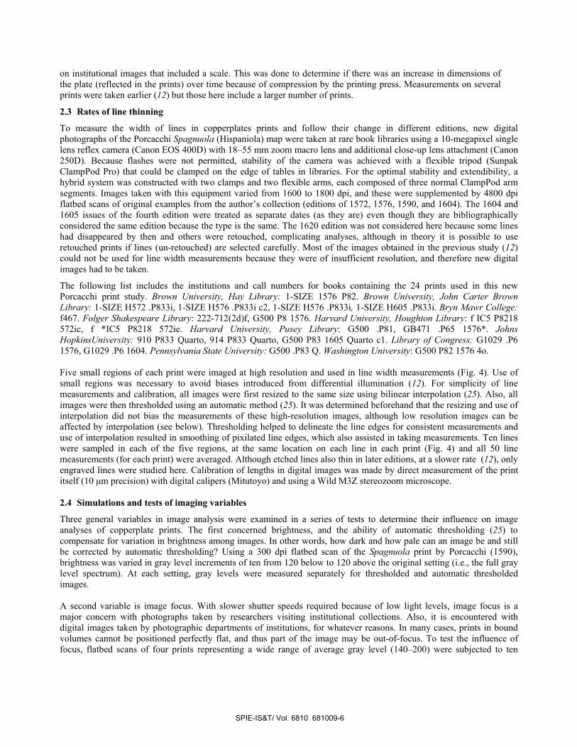
To measure the width of lines in copperplates prints and follow their change in different editions, new digital photographs of the Porcacchi Spagnuola (Hispaniola) map were taken at rare book libraries using a 10-megapixel single lens reflex camera (Canon EOS 400D) with 18–55 mm zoom macro lens and additional close-up lens attachment (Canon 250D). Because flashes were not permitted, stability of the camera was achieved with a flexible tripod (Sunpak ClampPod Pro) that could be clamped on the edge of tables in libraries. For the optimal stability and extendibility, a hybrid system was constructed with two clamps and two flexible arms, each composed of three normal ClampPod arm segments. Images taken with this equipment varied from 1600 to 1800 dpi, and these were supplemented by 4800 dpi flatbed scans of original examples from the author’s collection (editions of 1572, 1576, 1590, and 1604). The 1604 and 1605 issues of the fourth edition were treated as separate dates (as they are) even though they are bibliographically considered the same edition because the type is the same. The 1620 edition was not considered here because some lines had disappeared by then and others were retouched, complicating analyses, although in theory it is possible to use retouched prints if lines (un-retouched) are selected carefully. Most of the images obtained in the previous study (12) could not be used for line width measurements because they were of insufficient resolution, and therefore new digital images had to be taken.
The following list includes the institutions and call numbers for books containing the 24 prints used in this new Porcacchi print study. Brown University, Hay Library: 1-SIZE 1576 P82. Brown University, John Carter Brown Library: 1-SIZE H572 .P833i, 1-SIZE H576 .P833i c2, 1-SIZE H576 .P833i, 1-SIZE H605 .P833i. Bryn Mawr College: f467. Folger Shakespeare Library: 222-712(2d)f, G500 P8 1576. Harvard University, Houghton Library: f IC5 P8218 572ic, f *IC5 P8218 572ie. Harvard University, Pusey Library: G500 .P81, GB471 .P65 1576*. Johns HopkinsUniversity: 910 P833 Quarto, 914 P833 Quarto, G500 P83 1605 Quarto c1. Library of Congress: G1029 .P6 1576, G1029 .P6 1604. Pennsylvania State University: G500 .P83 Q. Washington University: G500 P82 1576 4o. Five small regions of each print were imaged at high resolution and used in line width measurements (Fig. 4). Use of small regions was necessary to avoid biases introduced from differential illumination (12). For simplicity of line measurements and calibration, all images were first resized to the same size using bilinear interpolation (25). Also, all images were then thresholded using an automatic method (25). It was determined beforehand that the resizing and use of interpolation did not bias the measurements of these high-resolution images, although low resolution images can be affected by interpolation (see below). Thresholding helped to delineate the line edges for consistent measurements and use of interpolation resulted in smoothing of pixilated line edges, which also assisted in taking measurements. Ten lines were sampled in each of the five regions, at the same location on each line in each print (Fig. 4) and all 50 line measurements (for each print) were averaged. Although etched lines also thin in later editions, at a slower rate (12), only engraved lines were studied here. Calibration of lengths in digital images was made by direct measurement of the print itself (10 µm precision) with digital calipers (Mitutoyo) and using a Wild M3Z stereozoom microscope. 2.4 Simulations and tests of imaging variables
Three general variables in image analysis were examined in a series of tests to determine their influence on image analyses of copperplate prints. The first concerned brightness, and the ability of automatic thresholding (25) to compensate for variation in brightness among images. In other words, how dark and how pale can an image be and still be corrected by automatic thresholding? Using a 300 dpi flatbed scan of the Spagnuola print by Porcacchi (1590), brightness was varied in gray level increments of ten from 120 below to 120 above the original setting (i.e., the full gray level spectrum). At each setting, gray levels were measured separately for thresholded and automatic thresholded images. A second variable is image focus. With slower shutter speeds required because of low light levels, image focus is a major concern with photographs taken by researchers visiting institutional collections. Also, it is encountered with digital images taken by photographic departments of institutions, for whatever reasons. In many cases, prints in bound volumes cannot be positioned perfectly flat, and thus part of the image may be out-of-focus. To test the influence of focus, flatbed scans of four prints representing a wide range of average gray level (140–200) were subjected to ten
SPIE-IS&T/ Vol. 6810 681009-6
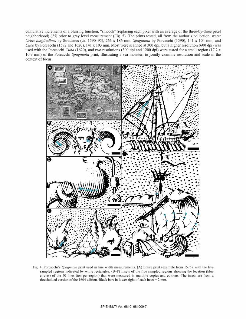
cumulative increments of a blurring function, “smooth” (replacing each pixel with an average of the three-by-three pixel neighborhood) (25) prior to gray level measurement (Fig. 5). The prints tested, all from the author’s collection, were: Orbis longitudines by Stradanus (ca. 1590–95), 266 x 186 mm; Spagnuola by Porcacchi (1590), 141 x 104 mm; and Cuba by Porcacchi (1572 and 1620), 141 x 103 mm. Most were scanned at 300 dpi, but a higher resolution (600 dpi) was used with the Porcacchi Cuba (1620), and two resolutions (300 dpi and 1200 dpi) were tested for a small region (17.2 x 10.9 mm) of the Porcacchi Spagnuola print, illustrating a sea monster, to jointly examine resolution and scale in the context of focus.
Fig. 4. Porcacchi’s Spagnuola print used in line width measurements. (A) Entire print (example from 1576), with the five sampled regions indicated by white rectangles. (B–F) Insets of the five sampled regions showing the location (blue circles) of the 50 lines (ten per region) that were measured in multiple copies and editions. The insets are from a thresholded version of the 1604 edition. Black bars in lower right of each inset = 2 mm.
SPIE-IS&T/ Vol. 6810 681009-7
-,.
Fig. 5. Simulating variation in the focus of an image. A section (63 mm wide) of Stradanus’ Orbis longitudines (ca. 1590–
95) showing a galleon on the open sea. (A) Original flatbed-scanned image in focus. (B–D) The same image with application of one, two, and three increments of smoothing.
The third variable examined was image resolution. The same small region (17.2 x 10.9 mm) of the Spagnuola print by Porcacchi (1590) was scanned with a flatbed scanner and a series of different resolutions (100–1200 dpi) to determine the influence of resolution, resizing, and different file formats (TIFF versus JPEG) on gray level. Resizing (resampling) was tested because image analyses are facilitated if images are resized to the same size prior to analysis. Besides constraining the aspect ratio in resizing images, the additional affect of using bilinear interpolation (25) was tested. All of the above analyses involved the measurement of gray level under different conditions and were conducted with ImageJ (25).
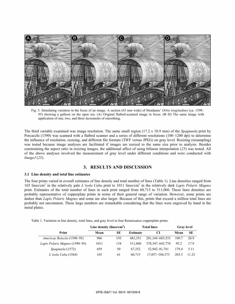
3. RESULTS AND DISCUSSION 3.1 Line density and total line estimates
The four prints varied in overall estimates of line density and total number of lines (Table 1). Line densities ranged from 165 lines/cm2 in the relatively pale L’isola Cuba print to 1011 lines/cm2 in the relatively dark Lapis Polaris Magnes print. Estimates of the total number of lines in each print ranged from 60,715 to 511,060. These lines densities are probably representative of copperplate prints in terms of their general range of variation. However, some prints are darker than Lapis Polaris Magnes and some are also larger. Because of this, prints that exceed a million total lines are probably not uncommon. These large numbers are remarkable considering that the lines were engraved by hand in the metal plates.
Table 1. Variation in line density, total lines, and gray level in four Renaissance copperplate prints.
Line density (lines/cm2) Total lines Gray level
Print Mean SE Estimate CI Mean SE Americae Retectio (1590–95) 906 193 483,351 281,169–685,533 109.7 20.9
Lapis Polaris Magnes (1590–95) 1011 134 511,060 378,347–643,774 95.2 17.9 Spagnuola (1572) 459 50 67,352 52,942–81,761 179.4 5.11
L’isola Cuba (1564) 165 61 60,715 17,057–104,373 203.5 11.23
SPIE-IS&T/ Vol. 6810 681009-8
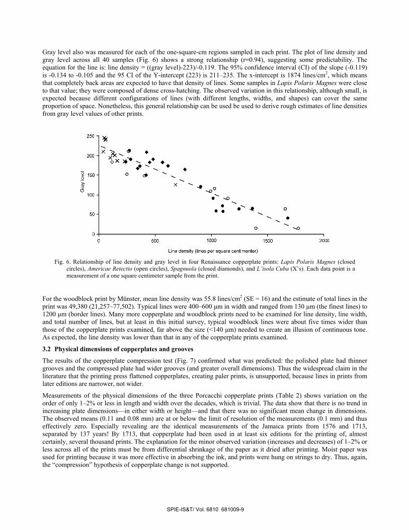
Gray level also was measured for each of the one-square-cm regions sampled in each print. The plot of line density and gray level across all 40 samples (Fig. 6) shows a strong relationship (r=0.94), suggesting some predictability. The equation for the line is: line density = ((gray level)-223)/-0.119. The 95% confidence interval (CI) of the slope (-0.119) is -0.134 to -0.105 and the 95 CI of the Y-intercept (223) is 211–235. The x-intercept is 1874 lines/cm2, which means that completely back areas are expected to have that density of lines. Some samples in Lapis Polaris Magnes were close to that value; they were composed of dense cross-hatching. The observed variation in this relationship, although small, is expected because different configurations of lines (with different lengths, widths, and shapes) can cover the same proportion of space. Nonetheless, this general relationship can be used be used to derive rough estimates of line densities from gray level values of other prints.
Fig. 6. Relationship of line density and gray level in four Renaissance copperplate prints: Lapis Polaris Magnes (closed
circles), Americae Retectio (open circles), Spagnuola (closed diamonds), and L’isola Cuba (X’s). Each data point is a measurement of a one square centimeter sample from the print.
For the woodblock print by Münster, mean line density was 55.8 lines/cm2 (SE = 16) and the estimate of total lines in the print was 49,380 (21,257–77,502). Typical lines were 400–600 µm in width and ranged from 130 µm (the finest lines) to 1200 µm (border lines). Many more copperplate and woodblock prints need to be examined for line density, line width, and total number of lines, but at least in this initial survey, typical woodblock lines were about five times wider than those of the copperplate prints examined, far above the size (<140 µm) needed to create an illusion of continuous tone. As expected, the line density was lower than that in any of the copperplate prints examined.
3.2 Physical dimensions of copperplates and grooves
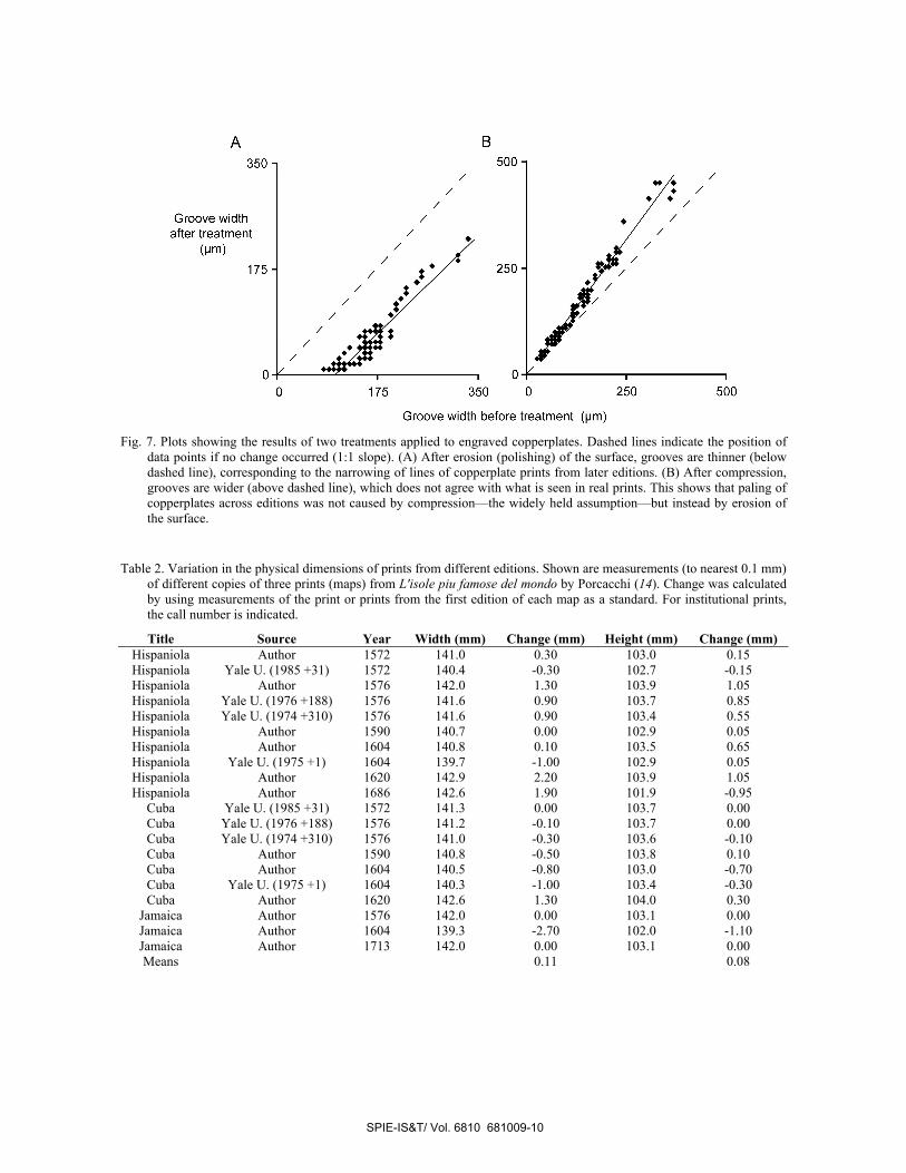
The results of the copperplate compression test (Fig. 7) confirmed what was predicted: the polished plate had thinner grooves and the compressed plate had wider grooves (and greater overall dimensions). Thus the widespread claim in the literature that the printing press flattened copperplates, creating paler prints, is unsupported, because lines in prints from later editions are narrower, not wider.
Measurements of the physical dimensions of the three Porcacchi copperplate prints (Table 2) shows variation on the order of only 1–2% or less in length and width over the decades, which is trivial. The data show that there is no trend in increasing plate dimensions—in either width or height—and that there was no significant mean change in dimensions. The observed means (0.11 and 0.08 mm) are at or below the limit of resolution of the measurements (0.1 mm) and thus effectively zero. Especially revealing are the identical measurements of the Jamaica prints from 1576 and 1713, separated by 137 years! By 1713, that copperplate had been used in at least six editions for the printing of, almost certainly, several thousand prints. The explanation for the minor observed variation (increases and decreases) of 1–2% or less across all of the prints must be from differential shrinkage of the paper as it dried after printing. Moist paper was used for printing because it was more effective in absorbing the ink, and prints were hung on strings to dry. Thus, again, the “compression” hypothesis of copperplate change is not supported.
SPIE-IS&T/ Vol. 6810 681009-9
44/. 7/ I, /roovewiatn / I • Iafter treatment / I / / /
(pm) /I
175I
7 . /7,/ 250
1/
I F
Fig. 7. Plots showing the results of two treatments applied to engraved copperplates. Dashed lines indicate the position of
data points if no change occurred (1:1 slope). (A) After erosion (polishing) of the surface, grooves are thinner (below dashed line), corresponding to the narrowing of lines of copperplate prints from later editions. (B) After compression, grooves are wider (above dashed line), which does not agree with what is seen in real prints. This shows that paling of copperplates across editions was not caused by compression—the widely held assumption—but instead by erosion of the surface.
Table 2. Variation in the physical dimensions of prints from different editions. Shown are measurements (to nearest 0.1 mm) of different copies of three prints (maps) from L'isole piu famose del mondo by Porcacchi (14). Change was calculated by using measurements of the print or prints from the first edition of each map as a standard. For institutional prints, the call number is indicated.
Title Source Year Width (mm) Change (mm) Height (mm) Change (mm) Hispaniola Author 1572 141.0 0.30 103.0 0.15 Hispaniola Yale U. (1985 +31) 1572 140.4 -0.30 102.7 -0.15 Hispaniola Author 1576 142.0 1.30 103.9 1.05 Hispaniola Yale U. (1976 +188) 1576 141.6 0.90 103.7 0.85 Hispaniola Yale U. (1974 +310) 1576 141.6 0.90 103.4 0.55 Hispaniola Author 1590 140.7 0.00 102.9 0.05 Hispaniola Author 1604 140.8 0.10 103.5 0.65 Hispaniola Yale U. (1975 +1) 1604 139.7 -1.00 102.9 0.05 Hispaniola Author 1620 142.9 2.20 103.9 1.05 Hispaniola Author 1686 142.6 1.90 101.9 -0.95
Cuba Yale U. (1985 +31) 1572 141.3 0.00 103.7 0.00 Cuba Yale U. (1976 +188) 1576 141.2 -0.10 103.7 0.00 Cuba Yale U. (1974 +310) 1576 141.0 -0.30 103.6 -0.10 Cuba Author 1590 140.8 -0.50 103.8 0.10 Cuba Author 1604 140.5 -0.80 103.0 -0.70 Cuba Yale U. (1975 +1) 1604 140.3 -1.00 103.4 -0.30 Cuba Author 1620 142.6 1.30 104.0 0.30
Jamaica Author 1576 142.0 0.00 103.1 0.00 Jamaica Author 1604 139.3 -2.70 102.0 -1.10 Jamaica Author 1713 142.0 0.00 103.1 0.00 Means 0.11 0.08
SPIE-IS&T/ Vol. 6810 681009-10
3.3 Rates of line thinning
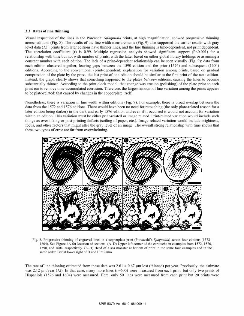
Visual inspection of the lines in the Porcacchi Spagnuola prints, at high magnification, showed progressive thinning across editions (Fig. 8). The results of the line width measurements (Fig. 9) also supported the earlier results with gray level data (12): prints from later editions have thinner lines, and the line thinning is time-dependent, not print dependent. The correlation coefficient (r) is 0.99. Multiple regression analysis showed significant support (P<0.001) for a relationship with time but not with number of prints, with the latter based on either global library holdings or assuming a constant number with each edition. The lack of a print-dependent relationship can be seen visually (Fig. 9): data from each edition clustered together, leaving gaps between the 1590 edition and the prior (1576) and subsequent (1604) editions. According to the conventional (print-dependent) explanation for variation among prints, based on gradual compression of the plate by the press, the last print of one edition should be similar to the first print of the next edition. Instead, the graph clearly shows that something happened to the plates between editions, causing the lines to become substantially thinner. According to the print clock model, that change was erosion (polishing) of the plate prior to each print run to remove time-accumulated corrosion. Therefore, the largest amount of line variation among the prints appears to be plate-related: that caused by changes in the copperplate itself. Nonetheless, there is variation in line width within editions (Fig. 9). For example, there is broad overlap between the data from the 1572 and 1576 editions. There would have been no need for retouching (the only plate-related reason for a later edition being darker) in the dark and early 1576 edition and even if it occurred it would not account for variation within an edition. This variation must be either print-related or image related. Print-related variation would include such things as over-inking or post-printing defects (soiling of paper, etc.). Image-related variation would include brightness, focus, and other factors that might alter the gray level of an image. The overall strong relationship with time shows that these two types of error are far from overwhelming.
Fig. 8. Progressive thinning of engraved lines in a copperplate print (Porcacchi’s Spagnuola) across four editions (1572–1604). See Figure 4A for location of sections. (A–D) Upper left corner of the cartouche in examples from 1572, 1576, 1590, and 1604, respectively. (E–H) Head of a sea monster at bottom of print in the same four examples and in the same order. Bar at lower right of D and H = 2 mm.
The rate of line thinning estimated from these data was 2.61 ± 0.67 µm lost (thinned) per year. Previously, the estimate was 2.12 µm/year (12). In that case, many more lines (n=600) were measured from each print, but only two prints of Hispaniola (1576 and 1604) were measured. Here, only 50 lines were measured from each print but 20 prints were
SPIE-IS&T/ Vol. 6810 681009-11
1801
E 140:L
ie w
idth
/ /
*4
measured across four editions. Because of this greater sampling of prints, the rate estimate here is considered more accurate. Considering the triangular shape of the grooves in the copperplate, an even mixture of burin shapes, the depth of an typical groove should be about 68% of its width (12). In this case, the rate of surface erosion of the Porcacchi copperplate is estimated here to have been 1.77 µm/year. Over 32 years (1572–1604) that totals 57 µm. The average engraved lines in the print had decreased to only half of their original (1572) width by 1605. By then, the finest lines in the original print had disappeared and essentially all of the existing engraved lines, which are characteristically tapered at one end, were shorter. Therefore, besides being paler overall, technical and artistic aspects of the print, such as distribution of shading, had changed substantially by 1605.
Fig. 9. Relationship of line width and date of publication in 24 copies of Porcacchi’s Spagnuola print. The number of prints from each edition/issue measured was: 1572 (four), 1576 (eight), 1590 (six), 1604 (four), and 1605 (two).
3.4 Affect of image brightness
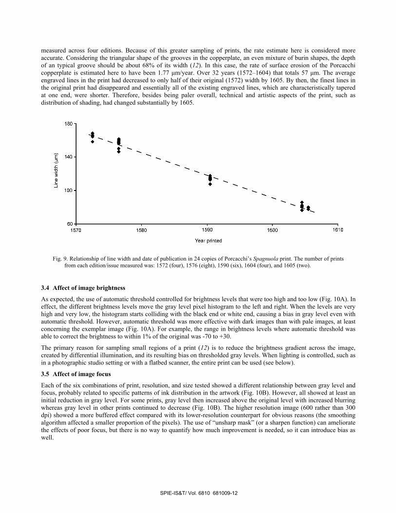
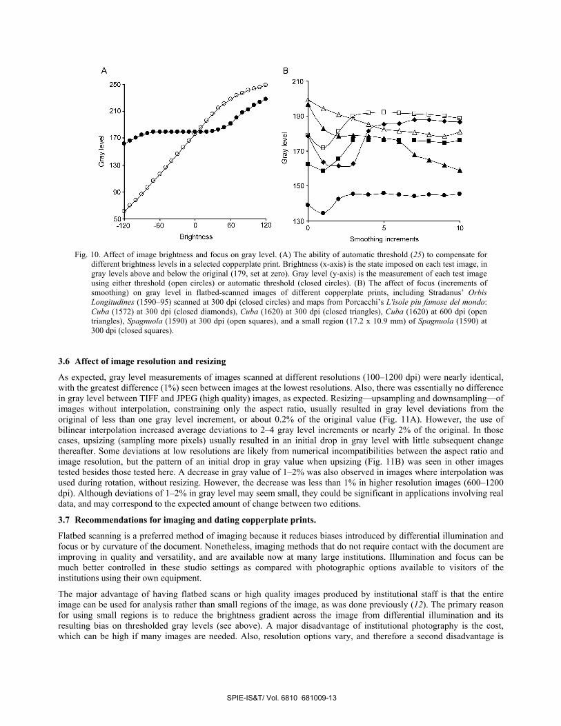
As expected, the use of automatic threshold controlled for brightness levels that were too high and too low (Fig. 10A). In effect, the different brightness levels move the gray level pixel histogram to the left and right. When the levels are very high and very low, the histogram starts colliding with the black end or white end, causing a bias in gray level even with automatic threshold. However, automatic threshold was more effective with dark images than with pale images, at least concerning the exemplar image (Fig. 10A). For example, the range in brightness levels where automatic threshold was able to correct the brightness to within 1% of the original was -70 to +30.
The primary reason for sampling small regions of a print (12) is to reduce the brightness gradient across the image, created by differential illumination, and its resulting bias on thresholded gray levels. When lighting is controlled, such as in a photographic studio setting or with a flatbed scanner, the entire print can be used (see below).
3.5 Affect of image focus
Each of the six combinations of print, resolution, and size tested showed a different relationship between gray level and focus, probably related to specific patterns of ink distribution in the artwork (Fig. 10B). However, all showed at least an initial reduction in gray level. For some prints, gray level then increased above the original level with increased blurring whereas gray level in other prints continued to decrease (Fig. 10B). The higher resolution image (600 rather than 300 dpi) showed a more buffered effect compared with its lower-resolution counterpart for obvious reasons (the smoothing algorithm affected a smaller proportion of the pixels). The use of “unsharp mask” (or a sharpen function) can ameliorate the effects of poor focus, but there is no way to quantify how much improvement is needed, so it can introduce bias as well.
SPIE-IS&T/ Vol. 6810 681009-12
130'-6J 0 60 10 0 s 10
Brightness Smoothing increments
Fig. 10. Affect of image brightness and focus on gray level. (A) The ability of automatic threshold (25) to compensate for
different brightness levels in a selected copperplate print. Brightness (x-axis) is the state imposed on each test image, in gray levels above and below the original (179, set at zero). Gray level (y-axis) is the measurement of each test image using either threshold (open circles) or automatic threshold (closed circles). (B) The affect of focus (increments of smoothing) on gray level in flatbed-scanned images of different copperplate prints, including Stradanus’ Orbis Longitudines (1590–95) scanned at 300 dpi (closed circles) and maps from Porcacchi’s L'isole piu famose del mondo: Cuba (1572) at 300 dpi (closed diamonds), Cuba (1620) at 300 dpi (closed triangles), Cuba (1620) at 600 dpi (open triangles), Spagnuola (1590) at 300 dpi (open squares), and a small region (17.2 x 10.9 mm) of Spagnuola (1590) at 300 dpi (closed squares).
3.6 Affect of image resolution and resizing
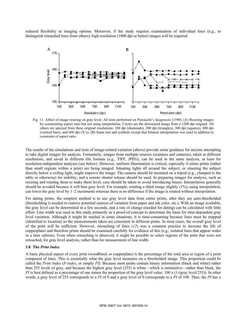
As expected, gray level measurements of images scanned at different resolutions (100–1200 dpi) were nearly identical, with the greatest difference (1%) seen between images at the lowest resolutions. Also, there was essentially no difference in gray level between TIFF and JPEG (high quality) images, as expected. Resizing—upsampling and downsampling—of images without interpolation, constraining only the aspect ratio, usually resulted in gray level deviations from the original of less than one gray level increment, or about 0.2% of the original value (Fig. 11A). However, the use of bilinear interpolation increased average deviations to 2–4 gray level increments or nearly 2% of the original. In those cases, upsizing (sampling more pixels) usually resulted in an initial drop in gray level with little subsequent change thereafter. Some deviations at low resolutions are likely from numerical incompatibilities between the aspect ratio and image resolution, but the pattern of an initial drop in gray value when upsizing (Fig. 11B) was seen in other images tested besides those tested here. A decrease in gray value of 1–2% was also observed in images where interpolation was used during rotation, without resizing. However, the decrease was less than 1% in higher resolution images (600–1200 dpi). Although deviations of 1–2% in gray level may seem small, they could be significant in applications involving real data, and may correspond to the expected amount of change between two editions.
3.7 Recommendations for imaging and dating copperplate prints.
Flatbed scanning is a preferred method of imaging because it reduces biases introduced by differential illumination and focus or by curvature of the document. Nonetheless, imaging methods that do not require contact with the document are improving in quality and versatility, and are available now at many large institutions. Illumination and focus can be much better controlled in these studio settings as compared with photographic options available to visitors of the institutions using their own equipment.
The major advantage of having flatbed scans or high quality images produced by institutional staff is that the entire image can be used for analysis rather than small regions of the image, as was done previously (12). The primary reason for using small regions is to reduce the brightness gradient across the image from differential illumination and its resulting bias on thresholded gray levels (see above). A major disadvantage of institutional photography is the cost, which can be high if many images are needed. Also, resolution options vary, and therefore a second disadvantage is
SPIE-IS&T/ Vol. 6810 681009-13
B
1701
155 I I I I I I I I I I I I I I I I I I I I I I I
reduced flexibility in imaging options. Moreover, if the study requires examination of individual lines (e.g., to distinguish retouched lines from others), high resolution (1800 dpi or better) images will be required.
Fig. 11. Affect of image resizing on gray level. All tests performed on Porcacchi’s Spagnuola (1590). (A) Resizing images
by constraining aspect ratio but not using interpolation. Circles are the downsized image from a 1200 dpi original. All others are upsized from these original resolutions: 100 dpi (diamonds), 200 dpi (triangles), 300 dpi (squares), 400 dpi (vertical bars), and 600 dpi (X’s). (B) Same test and symbols except that bilinear interpolation was used in addition to constraint of aspect ratio.
The results of the simulations and tests of image-related variation (above) provide some guidance for anyone attempting to take digital images for analysis. Fortunately, images from multiple sources (scanners and cameras), taken at different resolutions, and saved in different file formats (e.g., TIFF, JPEG), can be used in the same analysis, at least for resolution-independent analyses (see below). However, uniform illumination is critical, especially if entire prints (rather than small regions within a print) are being imaged. Situating lights all around the subject, or situating the subject directly below a ceiling light, might improve the image. The camera should be mounted on a tripod (e.g., clamped to the table or otherwise) for stability, and a remote shutter release should be used. In preparing images for analysis, such as resizing and rotating them to make them level, care should be taken to avoid introducing biases. Interpolation generally should be avoided because it will bias gray level. For example, rotating a tilted image slightly (1%), using interpolation, can lower the gray level by 1–2 increments whereas there is no difference if the image is rotated without interpolation.
For dating prints, the simplest method is to use gray level data from entire prints, after they are auto-thresholded (thresholding is needed to remove potential sources of variation from paper and ink color, etc.). With an image available, the gray level can be determined in a few seconds, and a rate of change (needed for dating) can be calculated with little effort. Line width was used in this study primarily as a proof-of-concept to determine the basis for time-dependent gray level variation. Although it might be needed in some situations, it is time-consuming because lines must be mapped (identified to location) so the measurements taken are consistent in different prints. In most cases, the overall gray level of the print will be sufficient. However, retouching of lines (12) was a common practice to increase the life of copperplates and therefore prints should be examined carefully for evidence of this (e.g., isolated lines that appear wider in a later edition). Even when retouching is observed, it might be possible to select regions of the print that were not retouched, for gray level analysis, rather than for measurement of line width.
3.8 The Print Index
A basic physical aspect of every print (woodblock or copperplate) is the percentage of the total area or region of a print composed of lines. This is essentially what the gray level measures on a thresholded image. This proportion could be called the Print Index (P-index, or simply PI). Because most prints contain binary information (black and white) rather than 255 levels of gray, and because the highest gray level (255) is white—which is unintuitive—rather than black, the PI is best defined as a percentage of one minus the proportion of the gray level value: 100 x (1-(gray level/255)). In other words, a gray level of 255 corresponds to a PI of 0 and a gray level of 0 corresponds to a PI of 100. Thus, the PI has a
SPIE-IS&T/ Vol. 6810 681009-14
direct meaning: the percentage of an area composed of lines. For example, a print with a PI of 35.3 means that 35.3% of the print is made of lines and the remainder (64.7%) is the unprinted (white) area of the paper. Because it is a proportion (percentage), prints of different sizes can be compared. It is appropriate to report the PI to one decimal place of precision. The relationship between PI and line density (section 3.1) is of course the same as between gray level and line density, except that the equation now becomes: line density = ((PI)-12.4)/0.0460. The 95% CI of the slope (0.0460) is 0.041–0.052 and the 95 CI of the Y-intercept (12.4) is 8.03–17.2.
Of potential value for art history, the PI conveys the density of the line work without having to view the print. For example, a PI of 60.8 would indicate a highly dense engraving with many dark areas (60.8% of the surface) whereas a PI of 17.6 would indicate a relatively pale print with widely spaced lines or white areas. Having the PI accessible from many prints would permit comparative analysis (e.g., dating) without the researcher needing to visit a library and examine or photograph the print. Irrespective of dating, different editions of prints will have, on average, different PI values (the later, paler, editions will have lower values), and therefore the PI will be useful in determining the edition of a print, especially when other information is unavailable. Retouching of an image, of course, can slow or reverse a trend of progressive paling (12), but the resulting PI of a retouched edition is likely to be unique itself and thus useful for identification purposes. A relatively accurate PI can be obtained with moderate or even low resolution (e.g., 100–200 dpi) flatbed scanned images, although a resolution of at least 300 dpi is recommended. Using even higher resolutions may improve accuracy slightly but the resulting large image files could pose difficulties in analysis. Either Tiff or high-quality JPEG files can be used to determine the PI, but see the recommendations (above) for optimal imaging.
3.9 Variation in prints: comparison, discrimination, identification, and authentication
An advantage of a scale-independent measure such as the PI is that prints of all types, artists, and sizes can be compared. This raises the possibility of potential benefits for art history, the comparative study of prints, art curation, and specific identification of prints. For example, it is possible that some artists or styles of artwork could be defined by one or a few statistical measures that are easily quantified from images.
Table 3 lists the PI and other related statistics from selected copperplate prints (one woodblock print by Bordone is included for comparison). All prints are from the author’s collection and were scanned on a flatbed scanner except as noted (in those 11 noted cases, the institutions acquired and provided images). In each case, the 300-dpi image was trimmed to the outside border of the print (i.e., including the lined border but no more), auto-thresholded using ImageJ (25), and the gray level value was measured and converted to a PI. Most prints have well-defined (lined) borders and therefore determining the area to be sampled is relatively straightforward. Some prints have titles and other text placed outside—especially below—the borders of the primary artwork. Although the platemark could be used as guidance in these cases, it is sometimes difficult to discern. For this reason, the proposed method here is to sample the entire bordered region of the print, generally corresponding to the artwork. In prints with no borders, the smallest rectangular area encompassing all parts of the print could be used. Optimally, the PI should be accompanied by the dimensions (in millimeters) of the sampled area, which would help clarify what was sampled.
At a general level, the list shows that the Flemish and French art prints by Bosse, Sadeler, and Stradanus are all densely engraved (PI=42–62) whereas the Italian map prints (Bertelli, Forlani, and Porcacchi) are paler (PI=18–30), with earlier editions of prints—in general—having higher PI values than later editions. In the case of the Porcacchi Spagnuola prints, the four copies of the first edition (1572) varied by only 1.9% (28.2–30.1) and the four copies of second edition (1576) varied by 2.6% (27.8–30.4).
The 5% difference between the two copies of Forlani’s L’isola Cuba (1564) seemed unusually high for two images that were flatbed-scanned (i.e., controlling for image-related variation) so this was investigated further. At high magnification (Fig. 12), most of the lines in copy 2 show microscopic bulges and are not as sharply defined as those in copy 1. Also, many closely spaced lines in copy 2 are interconnected. The presence of drawing lines and guide lines (very fine scratches typically made with a needle by the artist or engraver to assist engraving; e.g., faint lines above hills in 12B and D) confirms that both prints are from the first edition, prior to any subsequent polishing. The likely explanation for the difference is that copy 2 was over-inked at the time of printing, which resulted in a darker print and higher PI. Further evidence of over-inking is that the blank area—normally white—between the print and the plate mark is gray in copy 2. Dried ink in the grooves from a previous print also could have contributed to unequal inking, but the evidence here indicates simple over-inking from insufficient wiping of the plate by the printer. Thus the PI can direct attention to aspects of prints that would otherwise go unnoticed.
SPIE-IS&T/ Vol. 6810 681009-15
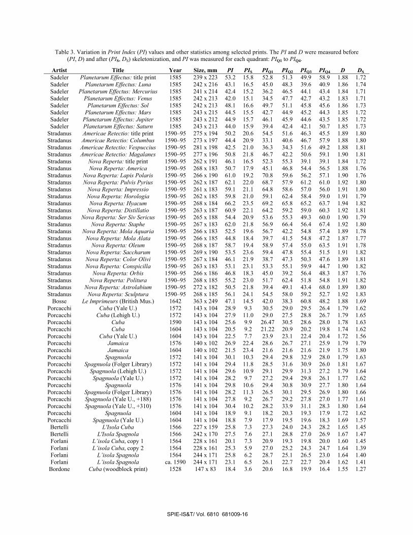
Table 3. Variation in Print Index (PI) values and other statistics among selected prints. The PI and D were measured before (PI, D) and after (PIS, DS) skeletonization, and PI was measured for each quadrant: PIQ1 to PIQ4.
Artist Title Year Size, mm PI PIS PIQ1 PIQ2 PIQ3 PIQ4 D DS Sadeler Planetarum Effectus: title print 1585 239 x 223 53.2 15.8 52.8 51.3 49.9 58.9 1.88 1.72 Sadeler Planetarum Effectus: Luna 1585 242 x 216 43.1 16.5 45.0 48.3 39.6 40.9 1.86 1.74 Sadeler Planetarum Effectus: Mercurius 1585 241 x 214 42.4 15.2 36.2 46.5 44.1 43.4 1.84 1.71 Sadeler Planetarum Effectus: Venus 1585 242 x 213 42.0 15.1 34.5 47.7 42.7 43.2 1.83 1.71 Sadeler Planetarum Effectus: Sol 1585 242 x 213 48.1 16.6 49.7 51.1 45.8 45.6 1.86 1.73 Sadeler Planetarum Effectus: Mars 1585 243 x 215 44.5 15.5 42.7 44.9 45.2 44.3 1.85 1.72 Sadeler Planetarum Effectus: Jupiter 1585 243 x 212 44.9 15.7 46.1 45.9 44.6 43.5 1.85 1.72 Sadeler Planetarum Effectus: Saturn 1585 243 x 213 44.0 15.9 39.4 42.4 42.1 50.7 1.85 1.73
Stradanus Americae Retectio: title print 1590–95 275 x 194 50.2 20.6 54.5 51.6 46.3 45.5 1.89 1.80 Stradanus Americae Retectio: Columbus 1590–95 273 x 197 44.4 20.9 33.1 40.6 46.7 57.9 1.88 1.80 Stradanus Americae Retectio: Vespuccius 1590–95 281 x 198 42.5 21.0 36.3 34.3 51.6 49.2 1.88 1.81 Stradanus Americae Retectio: Magalanes 1590–95 277 x 196 50.8 21.8 46.7 42.2 50.6 59.1 1.90 1.81 Stradanus Nova Reperta: title print 1590–95 262 x 191 46.1 16.5 52.3 55.3 39.1 39.1 1.84 1.72 Stradanus Nova Reperta: America 1590–95 268 x 183 50.7 17.9 45.1 46.8 54.4 56.5 1.88 1.76 Stradanus Nova Reperta: Lapis Polaris 1590–95 266 x 190 61.0 19.2 70.8 59.6 56.2 57.1 1.90 1.76 Stradanus Nova Reperta: Pulvis Pyrius 1590–95 262 x 187 62.1 22.0 68.7 57.9 61.2 61.0 1.92 1.80 Stradanus Nova Reperta: Impressio 1590–95 261 x 183 59.1 21.1 64.8 58.6 57.0 56.0 1.91 1.80 Stradanus Nova Reperta: Horologia 1590–95 262 x 185 59.8 21.0 59.1 62.4 58.4 59.0 1.91 1.79 Stradanus Nova Reperta: Hyacum 1590–95 268 x 184 66.2 23.5 69.2 65.8 65.2 63.7 1.94 1.82 Stradanus Nova Reperta: Distillatio 1590–95 263 x 187 60.9 22.1 64.2 59.2 59.0 60.3 1.92 1.81 Stradanus Nova Reperta: Ser Siv Sericus 1590–95 265 x 188 54.4 20.9 53.6 55.3 49.3 60.0 1.90 1.79 Stradanus Nova Reperta: Staphe 1590–95 267 x 183 62.0 21.8 56.9 66.4 56.4 67.4 1.92 1.80 Stradanus Nova Reperta: Mola Aquaria 1590–95 266 x 183 52.5 19.6 56.7 42.2 54.8 57.4 1.89 1.78 Stradanus Nova Reperta: Mola Alata 1590–95 266 x 185 44.8 18.4 39.7 41.5 54.8 47.2 1.87 1.77 Stradanus Nova Reperta: Oleum 1590–95 268 x 187 58.7 19.4 58.9 57.4 55.0 63.5 1.91 1.78 Stradanus Nova Reperta: Saccharum 1590–95 269 x 190 53.5 23.6 59.4 47.8 55.4 51.5 1.91 1.82 Stradanus Nova Reperta: Color Olivi 1590–95 267 x 184 46.1 21.9 38.7 47.3 50.3 47.6 1.89 1.81 Stradanus Nova Reperta: Conspicilla 1590–95 263 x 183 53.1 23.1 53.3 55.1 59.9 44.7 1.90 1.82 Stradanus Nova Reperta: Orbis 1590–95 266 x 186 46.8 18.3 45.0 39.2 56.4 48.3 1.87 1.76 Stradanus Nova Reperta: Politura 1590–95 268 x 185 55.2 23.0 51.7 62.4 51.8 54.8 1.91 1.82 Stradanus Nova Reperta: Astrolabium 1590–95 272 x 182 50.5 21.8 39.4 49.1 43.4 68.0 1.89 1.80 Stradanus Nova Reperta: Sculptura 1590–95 268 x 185 56.1 24.1 54.5 58.0 59.2 52.7 1.92 1.83
Bosse Le Imprimeurs (British Mus.) 1642 363 x 249 47.1 14.5 42.0 38.3 60.8 48.2 1.88 1.69 Porcacchi Cuba (Yale U.) 1572 143 x 104 28.9 9.3 30.5 29.0 29.5 26.4 1.79 1.62 Porcacchi Cuba (Lehigh U.) 1572 143 x 104 27.9 11.0 29.0 27.5 28.8 26.7 1.79 1.65 Porcacchi Cuba 1590 143 x 104 25.6 9.9 26.47 30.5 28.6 28.0 1.78 1.63 Porcacchi Cuba 1604 143 x 104 20.5 9.2 21.22 20.9 20.2 19.8 1.74 1.62 Porcacchi Cuba (Yale U.) 1604 143 x 104 22.5 7.7 23.9 23.1 22.4 20.4 1.72 1.56 Porcacchi Jamaica 1576 140 x 102 26.9 22.4 28.6 26.7 27.1 25.9 1.79 1.79 Porcacchi Jamaica 1604 140 x 102 21.5 23.4 21.6 21.6 21.6 21.9 1.75 1.80 Porcacchi Spagnuola 1572 141 x 104 30.1 10.3 29.4 29.8 32.9 28.0 1.79 1.63 Porcacchi Spagnuola (Folger Library) 1572 141 x 104 29.4 11.8 28.5 31.6 30.9 26.0 1.81 1.67 Porcacchi Spagnuola (Lehigh U.) 1572 141 x 104 29.6 10.9 29.1 29.9 31.3 27.2 1.79 1.64 Porcacchi Spagnuola (Yale U.) 1572 141 x 104 28.2 9.7 27.2 29.4 29.8 26.1 1.77 1.62 Porcacchi Spagnuola 1576 141 x 104 29.8 10.6 29.4 30.8 30.9 27.7 1.80 1.64 Porcacchi Spagnuola (Folger Library) 1576 141 x 104 28.2 11.3 26.5 30.1 29.5 26.9 1.80 1.66 Porcacchi Spagnuola (Yale U., +188) 1576 141 x 104 27.8 9.2 26.7 29.2 27.8 27.0 1.77 1.61 Porcacchi Spagnuola (Yale U., +310) 1576 141 x 104 30.4 10.2 28.2 33.9 31.1 28.3 1.80 1.64 Porcacchi Spagnuola 1604 141 x 104 18.9 9.1 18.2 20.3 19.3 17.9 1.72 1.62 Porcacchi Spagnuola (Yale U.) 1604 141 x 104 18.8 7.9 17.9 19.5 19.6 18.3 1.69 1.57 Bertelli L'Isola Cuba 1566 227 x 159 25.8 7.3 27.3 24.0 24.3 28.2 1.65 1.45 Bertelli L'Isola Spagnola 1566 242 x 170 27.5 7.6 27.1 28.8 27.0 26.9 1.67 1.47 Forlani L’isola Cuba, copy 1 1564 228 x 161 20.1 7.3 20.9 19.3 19.8 20.0 1.60 1.45 Forlani L’isola Cuba, copy 2 1564 228 x 161 25.3 5.9 27.0 25.2 24.3 24.7 1.64 1.39 Forlani L’isola Spagnola 1564 244 x 171 25.8 6.2 28.7 25.1 26.5 23.0 1.64 1.40 Forlani L’isola Spagnola ca. 1590 244 x 171 23.1 6.5 26.1 22.7 22.7 20.4 1.62 1.41
Bordone Cuba (woodblock print) 1528 147 x 83 18.4 3.6 20.6 16.8 19.9 16.4 1.55 1.27
SPIE-IS&T/ Vol. 6810 681009-16
0
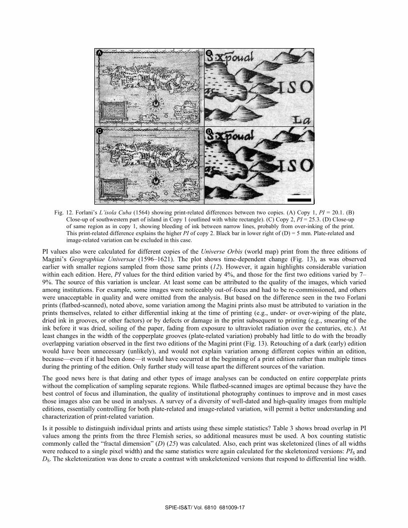
Fig. 12. Forlani’s L’isola Cuba (1564) showing print-related differences between two copies. (A) Copy 1, PI = 20.1. (B)
Close-up of southwestern part of island in Copy 1 (outlined with white rectangle). (C) Copy 2, PI = 25.3. (D) Close-up of same region as in copy 1, showing bleeding of ink between narrow lines, probably from over-inking of the print. This print-related difference explains the higher PI of copy 2. Black bar in lower right of (D) = 5 mm. Plate-related and image-related variation can be excluded in this case.
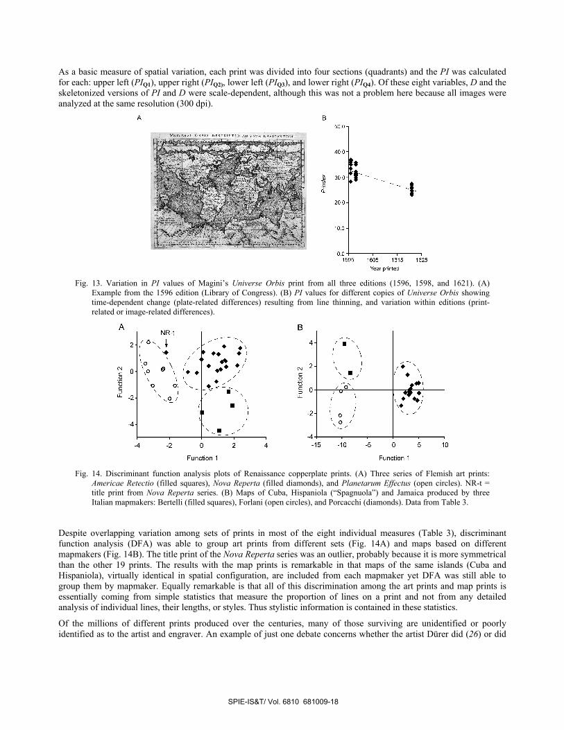
PI values also were calculated for different copies of the Universe Orbis (world map) print from the three editions of Magini’s Geographiae Universae (1596–1621). The plot shows time-dependent change (Fig. 13), as was observed earlier with smaller regions sampled from those same prints (12). However, it again highlights considerable variation within each edition. Here, PI values for the third edition varied by 4%, and those for the first two editions varied by 7–9%. The source of this variation is unclear. At least some can be attributed to the quality of the images, which varied among institutions. For example, some images were noticeably out-of-focus and had to be re-commissioned, and others were unacceptable in quality and were omitted from the analysis. But based on the difference seen in the two Forlani prints (flatbed-scanned), noted above, some variation among the Magini prints also must be attributed to variation in the prints themselves, related to either differential inking at the time of printing (e.g., under- or over-wiping of the plate, dried ink in grooves, or other factors) or by defects or damage in the print subsequent to printing (e.g., smearing of the ink before it was dried, soiling of the paper, fading from exposure to ultraviolet radiation over the centuries, etc.). At least changes in the width of the copperplate grooves (plate-related variation) probably had little to do with the broadly overlapping variation observed in the first two editions of the Magini print (Fig. 13). Retouching of a dark (early) edition would have been unnecessary (unlikely), and would not explain variation among different copies within an edition, because—even if it had been done—it would have occurred at the beginning of a print edition rather than multiple times during the printing of the edition. Only further study will tease apart the different sources of the variation.
The good news here is that dating and other types of image analyses can be conducted on entire copperplate prints without the complication of sampling separate regions. While flatbed-scanned images are optimal because they have the best control of focus and illumination, the quality of institutional photography continues to improve and in most cases those images also can be used in analyses. A survey of a diversity of well-dated and high-quality images from multiple editions, essentially controlling for both plate-related and image-related variation, will permit a better understanding and characterization of print-related variation.
Is it possible to distinguish individual prints and artists using these simple statistics? Table 3 shows broad overlap in PI values among the prints from the three Flemish series, so additional measures must be used. A box counting statistic commonly called the “fractal dimension” (D) (25) was calculated. Also, each print was skeletonized (lines of all widths were reduced to a single pixel width) and the same statistics were again calculated for the skeletonized versions: PIS and DS. The skeletonization was done to create a contrast with unskeletonized versions that respond to differential line width.
SPIE-IS&T/ Vol. 6810 681009-17
B50.0
VNVR ORBIS DRS S!S( S[/B[
4OO—200]
_______ _______ I U
U1
-4 -2 0 2 4 -15 -10 -5 0 5 10
Function 1 Function 1
As a basic measure of spatial variation, each print was divided into four sections (quadrants) and the PI was calculated for each: upper left (PIQ1), upper right (PIQ2), lower left (PIQ3), and lower right (PIQ4). Of these eight variables, D and the skeletonized versions of PI and D were scale-dependent, although this was not a problem here because all images were analyzed at the same resolution (300 dpi).
Fig. 13. Variation in PI values of Magini’s Universe Orbis print from all three editions (1596, 1598, and 1621). (A)
Example from the 1596 edition (Library of Congress). (B) PI values for different copies of Universe Orbis showing time-dependent change (plate-related differences) resulting from line thinning, and variation within editions (print-related or image-related differences).
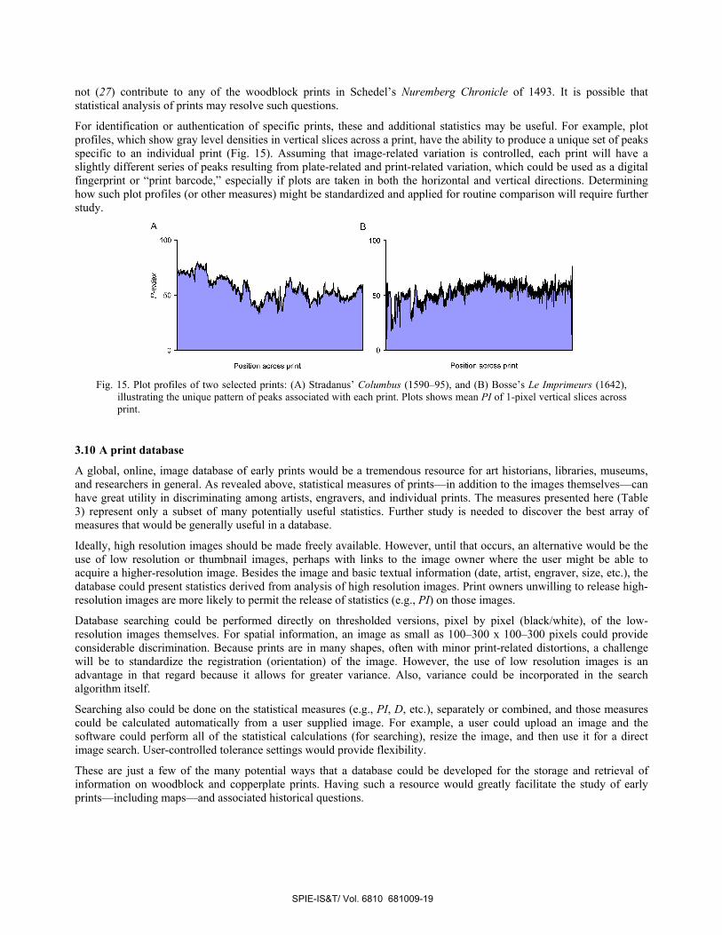
Fig. 14. Discriminant function analysis plots of Renaissance copperplate prints. (A) Three series of Flemish art prints:
Americae Retectio (filled squares), Nova Reperta (filled diamonds), and Planetarum Effectus (open circles). NR-t = title print from Nova Reperta series. (B) Maps of Cuba, Hispaniola (“Spagnuola”) and Jamaica produced by three Italian mapmakers: Bertelli (filled squares), Forlani (open circles), and Porcacchi (diamonds). Data from Table 3.
Despite overlapping variation among sets of prints in most of the eight individual measures (Table 3), discriminant function analysis (DFA) was able to group art prints from different sets (Fig. 14A) and maps based on different mapmakers (Fig. 14B). The title print of the Nova Reperta series was an outlier, probably because it is more symmetrical than the other 19 prints. The results with the map prints is remarkable in that maps of the same islands (Cuba and Hispaniola), virtually identical in spatial configuration, are included from each mapmaker yet DFA was still able to group them by mapmaker. Equally remarkable is that all of this discrimination among the art prints and map prints is essentially coming from simple statistics that measure the proportion of lines on a print and not from any detailed analysis of individual lines, their lengths, or styles. Thus stylistic information is contained in these statistics.
Of the millions of different prints produced over the centuries, many of those surviving are unidentified or poorly identified as to the artist and engraver. An example of just one debate concerns whether the artist Dürer did (26) or did
SPIE-IS&T/ Vol. 6810 681009-18
B
100] 100]
- — — IQ 50 50
Position across print Position across print
not (27) contribute to any of the woodblock prints in Schedel’s Nuremberg Chronicle of 1493. It is possible that statistical analysis of prints may resolve such questions.
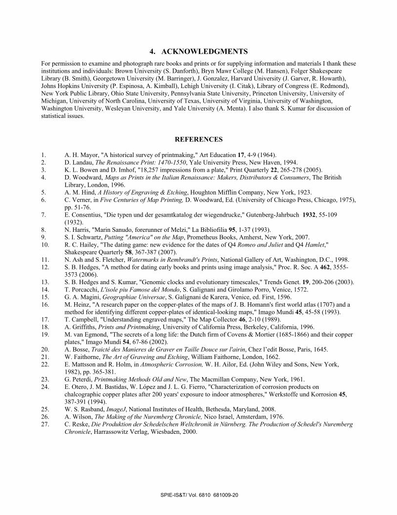
For identification or authentication of specific prints, these and additional statistics may be useful. For example, plot profiles, which show gray level densities in vertical slices across a print, have the ability to produce a unique set of peaks specific to an individual print (Fig. 15). Assuming that image-related variation is controlled, each print will have a slightly different series of peaks resulting from plate-related and print-related variation, which could be used as a digital fingerprint or “print barcode,” especially if plots are taken in both the horizontal and vertical directions. Determining how such plot profiles (or other measures) might be standardized and applied for routine comparison will require further study.
Fig. 15. Plot profiles of two selected prints: (A) Stradanus’ Columbus (1590–95), and (B) Bosse’s Le Imprimeurs (1642),
illustrating the unique pattern of peaks associated with each print. Plots shows mean PI of 1-pixel vertical slices across print.
3.10 A print database
A global, online, image database of early prints would be a tremendous resource for art historians, libraries, museums, and researchers in general. As revealed above, statistical measures of prints—in addition to the images themselves—can have great utility in discriminating among artists, engravers, and individual prints. The measures presented here (Table 3) represent only a subset of many potentially useful statistics. Further study is needed to discover the best array of measures that would be generally useful in a database.
Ideally, high resolution images should be made freely available. However, until that occurs, an alternative would be the use of low resolution or thumbnail images, perhaps with links to the image owner where the user might be able to acquire a higher-resolution image. Besides the image and basic textual information (date, artist, engraver, size, etc.), the database could present statistics derived from analysis of high resolution images. Print owners unwilling to release high-resolution images are more likely to permit the release of statistics (e.g., PI) on those images.
Database searching could be performed directly on thresholded versions, pixel by pixel (black/white), of the low-resolution images themselves. For spatial information, an image as small as 100–300 x 100–300 pixels could provide considerable discrimination. Because prints are in many shapes, often with minor print-related distortions, a challenge will be to standardize the registration (orientation) of the image. However, the use of low resolution images is an advantage in that regard because it allows for greater variance. Also, variance could be incorporated in the search algorithm itself.
Searching also could be done on the statistical measures (e.g., PI, D, etc.), separately or combined, and those measures could be calculated automatically from a user supplied image. For example, a user could upload an image and the software could perform all of the statistical calculations (for searching), resize the image, and then use it for a direct image search. User-controlled tolerance settings would provide flexibility.
These are just a few of the many potential ways that a database could be developed for the storage and retrieval of information on woodblock and copperplate prints. Having such a resource would greatly facilitate the study of early prints—including maps—and associated historical questions.
SPIE-IS&T/ Vol. 6810 681009-19
4. ACKNOWLEDGMENTS For permission to examine and photograph rare books and prints or for supplying information and materials I thank these institutions and individuals: Brown University (S. Danforth), Bryn Mawr College (M. Hansen), Folger Shakespeare Library (B. Smith), Georgetown University (M. Barringer), J. Gonzalez, Harvard University (J. Garver, R. Howarth), Johns Hopkins University (P. Espinosa, A. Kimball), Lehigh University (I. Citak), Library of Congress (E. Redmond), New York Public Library, Ohio State University, Pennsylvania State University, Princeton University, University of Michigan, University of North Carolina, University of Texas, University of Virginia, University of Washington, Washington University, Wesleyan University, and Yale University (A. Menta). I also thank S. Kumar for discussion of statistical issues.
REFERENCES
1. A. H. Mayor, "A historical survey of printmaking," Art Education 17, 4-9 (1964). 2. D. Landau, The Renaissance Print: 1470-1550, Yale University Press, New Haven, 1994. 3. K. L. Bowen and D. Imhof, "18,257 impressions from a plate," Print Quarterly 22, 265-278 (2005). 4. D. Woodward, Maps as Prints in the Italian Renaissance: Makers, Distributors & Consumers, The British
Library, London, 1996. 5. A. M. Hind, A History of Engraving & Etching, Houghton Mifflin Company, New York, 1923. 6. C. Verner, in Five Centuries of Map Printing, D. Woodward, Ed. (University of Chicago Press, Chicago, 1975),
pp. 51-76. 7. E. Consentius, "Die typen und der gesamtkatalog der wiegendrucke," Gutenberg-Jahrbuch 1932, 55-109
(1932). 8. N. Harris, "Marin Sanudo, forerunner of Melzi," La Bibliofilia 95, 1-37 (1993). 9. S. I. Schwartz, Putting "America" on the Map, Prometheus Books, Amherst, New York, 2007. 10. R. C. Hailey, "The dating game: new evidence for the dates of Q4 Romeo and Juliet and Q4 Hamlet,"
Shakespeare Quarterly 58, 367-387 (2007). 11. N. Ash and S. Fletcher, Watermarks in Rembrandt's Prints, National Gallery of Art, Washington, D.C., 1998. 12. S. B. Hedges, "A method for dating early books and prints using image analysis," Proc. R. Soc. A 462, 3555-
3573 (2006). 13. S. B. Hedges and S. Kumar, "Genomic clocks and evolutionary timescales," Trends Genet. 19, 200-206 (2003). 14. T. Porcacchi, L'isole piu Famose del Mondo, S. Galignani and Girolamo Porro, Venice, 1572. 15. G. A. Magini, Geographiae Universae, S. Galignani de Karera, Venice, ed. First, 1596. 16. M. Heinz, "A research paper on the copper-plates of the maps of J. B. Homann's first world atlas (1707) and a
method for identifying different copper-plates of identical-looking maps," Imago Mundi 45, 45-58 (1993). 17. T. Campbell, "Understanding engraved maps," The Map Collector 46, 2-10 (1989). 18. A. Griffiths, Prints and Printmaking, University of California Press, Berkeley, California, 1996. 19. M. van Egmond, "The secrets of a long life: the Dutch firm of Covens & Mortier (1685-1866) and their copper
plates," Imago Mundi 54, 67-86 (2002). 20. A. Bosse, Traicté des Manieres de Graver en Taille Douce sur l'airin, Chez l’edit Bosse, Paris, 1645. 21. W. Faithorne, The Art of Graveing and Etching, William Faithorne, London, 1662. 22. E. Mattsson and R. Holm, in Atmospheric Corrosion, W. H. Ailor, Ed. (John Wiley and Sons, New York,
1982), pp. 365-381. 23. G. Peterdi, Printmaking Methods Old and New, The Macmillan Company, New York, 1961. 24. E. Otero, J. M. Bastidas, W. López and J. L. G. Fierro, "Characterization of corrosion products on
chalcographic copper plates after 200 years' exposure to indoor atmospheres," Werkstoffe und Korrosion 45, 387-391 (1994).
25. W. S. Rasband, ImageJ, National Institutes of Health, Bethesda, Maryland, 2008. 26. A. Wilson, The Making of the Nuremberg Chronicle, Nico Israel, Amsterdam, 1976. 27. C. Reske, Die Produktion der Schedelschen Weltchronik in Nürnberg. The Production of Schedel's Nuremberg
Chronicle, Harrassowitz Verlag, Wiesbaden, 2000.
SPIE-IS&T/ Vol. 6810 681009-20


