Icelandair Brand Identity Standards - honnunarmidstod.is · Icelandair Brand Identity Standards...
16
Icelandair Brand Identity Standards Icelandair Brand Identity Standards
Transcript of Icelandair Brand Identity Standards - honnunarmidstod.is · Icelandair Brand Identity Standards...
Icelandair Brand Identity Standards �
Icelandair Brand Identity Standards
Icelandair Brand Identity Standards� Icelandair Brand Identity Standards �
It is about our marketing position, personality, our visual identity and our tone of voice. It will help you understand how we want to communicate to keep our brand identity consistent.
Master guidelines
This document describes our brand identity standards.
Icelandair Brand Identity Standards� Icelandair Brand Identity Standards �
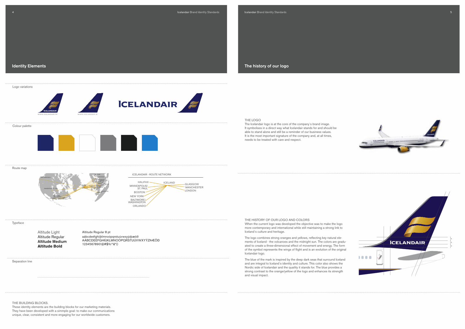
Identity Elements
Logo variations
Colour palette
Typeface
Route map
Altitude LightAltitude RegularAltitude MediumAltitude Bold
SAN FRANCISCO
MINNEAPOLIS – ST. PAUL
ORLANDO
BALTIMORE –WASHINGTON
BOSTON
ICELAND
REYKJAVIK
GLASGOW MANCHESTER
STOCKHOLM
HELSINKI
COPENHAGENOSLO
BERLIN
AMSTERDAMZURICH
MADRID
LONDONPARIS
NEW YORK
MILAN
MUNICHFRANKFURT
BARCELONA
3 cm
ICELANDAIR - ROUTE NETWORK
MINNEAPOLIS/ST. PAUL
BOSTON
ORLANDO
HALIFAXGLASGOWMANCHESTERLONDON
NEW YORKBALTIMORE/
WASHINGTON
ICELAND
THE BUILDING BLOCKS. These identity elements are the building blocks for our marketing materials. They have been developed with a simmple goal: to make our communications unique, clear, consistent and more engaging for our worldwide customers.
Altitude Regular 8 ptaábcdeéfghiíjklmnoópqrstuúvwxyýzþæöðAÁBCDEÉFGHIÍJKLMNOÓPQRSTUÚVWXYÝZÞÆÖÐ1234567890!@#$%^&*()
Altitude Bold 8 ptaábcdeéfghiíjklmnoópqrstuúvwxyýzþæöðAÁBCDEÉFGHIÍJKLMNOÓPQRSTUÚVWXYÝZÞÆÖÐ1234567890!@#$%^&*()
Icelandair 12 pt Altitude Regular
Icelandair 26 pt Altitude Bold
AaAltitude Light 8 ptaábcdeéfghiíjklmnoópqrstuúvwxyýzþæöðAÁBCDEÉFGHIÍJKLMNOÓPQRSTUÚVWXYÝZÞÆÖÐ1234567890!@#$%^&*()
Altitude Medium 8 ptaábcdeéfghiíjklmnoópqrstuúvwxyýzþæöðAÁBCDEÉFGHIÍJKLMNOÓPQRSTUÚVWXYÝZÞÆÖÐ1234567890!@#$%^&*()
The history of our logo
X
X
1.625 X
X
X
THE LOGO The Icelandair logo is at the core of the company´s brand image. It symbolises in a direct way what Icelandair stands for and should be able to stand alone and still be a reminder of our business values. It is the most important signature of the company and, at all times, needs to be treated with care and respect.
THE HISTORy Of OUR LOGO AND COLORS When the current logo was developed the objective was to make the logo more contemporary and international while still maintaining a strong link to Iceland´s culture and heritage.
The logo combines strong oranges and yellows, reflecting key natural ele-ments of Iceland - the volcanoes and the midnight sun. The colors are gradu-ated to create a three-dimensional effect of movement and energy. The form of the symbol represents the wings of flight and is an evolution of the original Icelandair logo.
The blue of the mark is inspired by the deep dark seas that surround Iceland and are integral to Iceland´s identity and culture. This color also shows the Nordic side of Icelandair and the quaility it stands for. The blue provides a strong contrast to the orange/yellow of the logo and enhances its strength and visual impact.
Separation line
Icelandair Brand Identity Standards� Icelandair Brand Identity Standards �
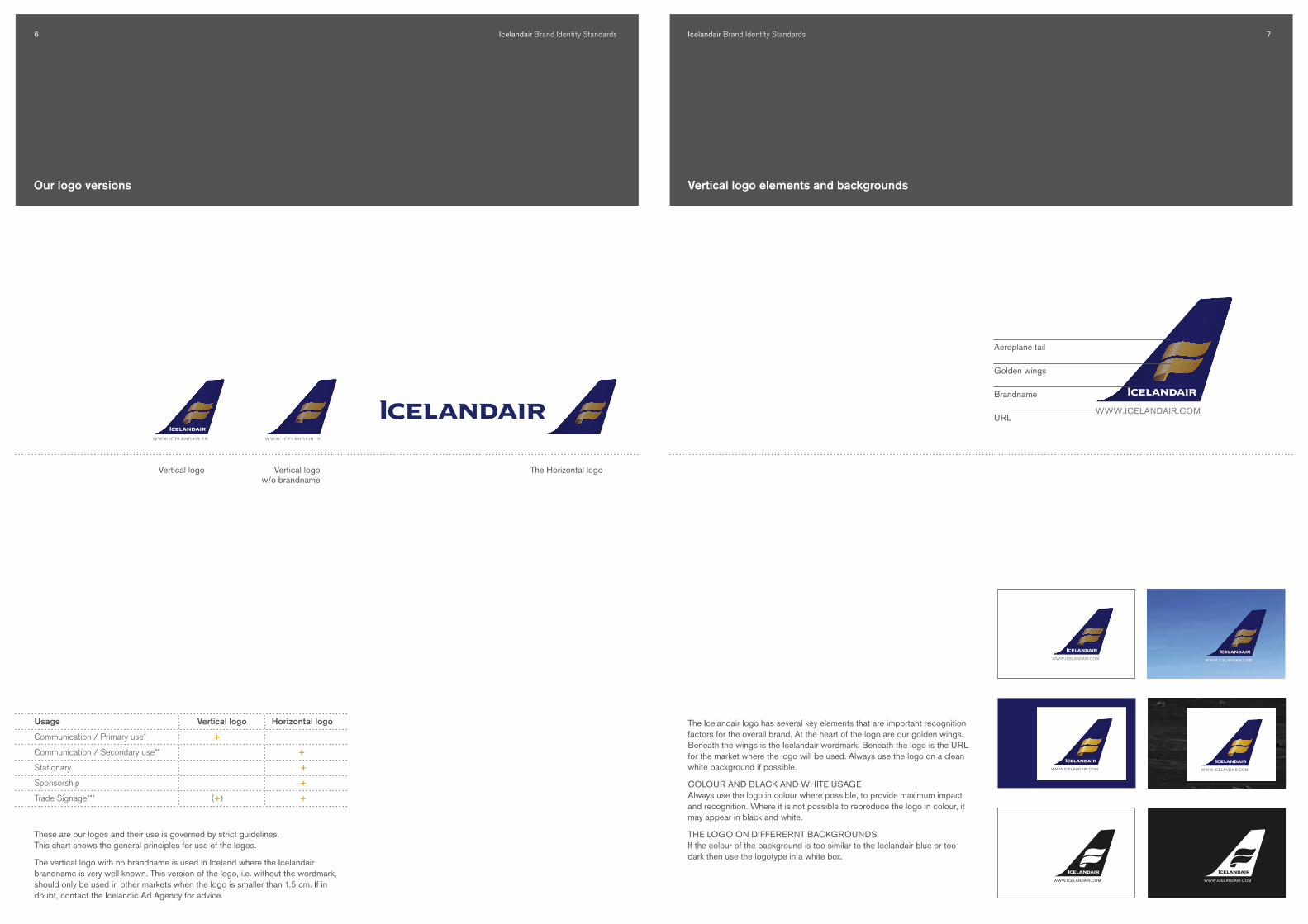
Vertical logo elements and backgrounds
WWW.ICELANDAIR.NET
The Icelandair logo has several key elements that are important recognition factors for the overall brand. At the heart of the logo are our golden wings. Beneath the wings is the Icelandair wordmark. Beneath the logo is the URL for the market where the logo will be used. Always use the logo on a clean white background if possible.
COLOUR AND BLACK AND WHITE USAGE Always use the logo in colour where possible, to provide maximum impact and recognition. Where it is not possible to reproduce the logo in colour, it may appear in black and white.
THE LOGO ON DIffERERNT BACKGROUNDS If the colour of the background is too similar to the Icelandair blue or too dark then use the logotype in a white box.
Aeroplane tail
Golden wings
Brandname
URL
WWW.ICELANDAIR.NET WWW.ICELANDAIR.NET
Our logo versions
These are our logos and their use is governed by strict guidelines. This chart shows the general principles for use of the logos.
The vertical logo with no brandname is used in Iceland where the Icelandair brandname is very well known. This version of the logo, i.e. without the wordmark, should only be used in other markets when the logo is smaller than �.� cm. If in doubt, contact the Icelandic Ad Agency for advice.
The Horizontal logoVertical logo w/o brandname
Vertical logo
Usage Vertical logo Horizontal logo
Communication / Primary use* +
Communication / Secondary use** +
Stationary +
Sponsorship +
Trade Signage*** (+) +

Icelandair Brand Identity Standards8 Icelandair Brand Identity Standards 9
Space around the logo and the smallest size
WHAT IS CLEAR SPACE AND WHEN SHOULD IT BE USED?We need to surround the Icelandair logo with clear space to ensure it stands out in the mind of our customers, and to maximise its impact. This area should be free of any words, logos, symbols, etc. that might intrude on the brand presence.
The method for calculating clear space is shown above.This is the absolute minimum clear space area - please allow more space wherever possible.
MINIMUM SIZEThe smallest usable size for the vertical logo with the URL is �.� cm high. If the logo is � cm or larger then the Icelandair wordmark can be used, but if it is smaller than � cm then it should be used without the wordmark.
MAXIMUM SIZEThere is no maximum size for the vertical logo.
WWW.ICELANDAIR.NET
�X
Clear space
�,� CM
�,0 CM
�,� CM
�,0 CM
�,� CM
�,0 CM
0,� CM
0 CMWWW.ICELANDAIR.NET
WWW.ICELANDAIR.NET
POSITIONING THE LOGO ON THE MARKETING MATERIALThe best position for the logo is the bottom right hand corner.
In some cases, the logo is better positioned in the top right or top left corner for easier visibility. Examples include brochures stacked in racks, advertising walls where there are too many people to see the advertisement clearly and locations where the logo will appear too close to ground level to be clearly seen.
WWW.ICELANDAIR.NET
WWW.ICELANDAIR.NETWWW.ICELANDAIR.NET
WWW.ICELANDAIR.NET
WWW.ICELANDAIR.NET
WWW.ICELANDAIR.NET
X
X
Positioning of the vertical logo
Minimum size

Icelandair Brand Identity Standards�0 Icelandair Brand Identity Standards ��
WWW.ICELANDAIR.IS
Horizontal logo elements and backgrounds
Aeroplane tail
Golden feathersBrandnameURL
The horizontal logo with a grey background should only be used if the background is similar to the logo or if it is too dark for it to be seen.
COLOUR AND BLACK AND WHITE USAGE Use the logo in colour where possible, to provide maximum impact and recognition. Where it is not possible to reproduce the logo in colour, it may appear in black and white.
THE LOGO ON DIffERERNT BACKGROUNDS If the colour of the background is too similar to the Icelandair blue or too dark then use the logotype in a white box.
The same rules apply here as for the vertical logo.
The horizontal logo
1,5x
1,5x
1x
Use the horizontal logo when the shape of the marketing material calls for a version of the logo that is more legible. Examples are smaller classified ads, retail fascias, some office signage, sport signage, or even down to small examples like branding on pens.
CLEAR SPACE AROUND THE HORIZONTAL LOGO Using the logo with the logotype acquires some breathing space around the logo. The logo should be positioned in this manner: use the height of the smaller letters of the logotype as a basic unit of �. The space to the right and at the bottom should then be the basic unit multiplied by �.�.
MINIMUM SIZE The minimum size of the horizontal logo is ��mm.
MAXIMUM SIZE There is no maximum size for the horizontal logo, it depends on the marketing material.
The horizontal logo should be used sparingly, and only when the vertical logo does not apply itself well.
1.5
Cm
1.0
Cm
0.5
Cm
0 C
m
Clear spaceMinimum size

�� Icelandair Brand Identity Standards ��
X
2X
POSITIONING THE LOGO ON THE MARKETING MATERIALThe agreed position for the logo is the bottom right hand corner.
In some cases, the logo is better positioned in the top right or left corner for easier visibility. Examples include brochures stacked in racks, advertising walls where there are too many people to see the advertisement clearly and locations where the logo will appear too close to ground level to be clearly seen.
Positioning of the vertical logo
Icelandair Brand Identity Standards
URL under the Logo
The URL should be placed beneath the logo at all times, unless there is not adequate space for the correct logo size.
Each market should use its own particular version of the URL.
Use a .net ending when the local URL is not appropriate or when the logo is used in more than one market.
WWW.ICE LAN DAI R.ESWWW.ICE LAN DAI R. ITWWW.ICE LAN DAI R. IS
WWW.ICELANDAIR.NET

Icelandair Brand Identity Standards�� Icelandair Brand Identity Standards ��
It is very important that all the elements presented in this manual are used in their original format and not altered in any way. Here are few examples of common mistakes that should be avoided.
Do not change the proportions between the logo and the logotype.
Do not change the proportions of the logotype. Use only proportional scaling of the whole set.
Do not condense the URL. Do not scale the URL alone. Do not use disproportional scaling.
Logo usage - what not to do
WWW.ICELANDAIR.NET WWW.ICELANDAIR.NET
Do not put the logo on dark colours.
Sometimes the URL or call to action information needs to be placed on the photo. Then the prefered placement is in the top right or top left corner of the material.
URL outside the logo
Icelandair Brand Identity Standards�� Icelandair Brand Identity Standards ��
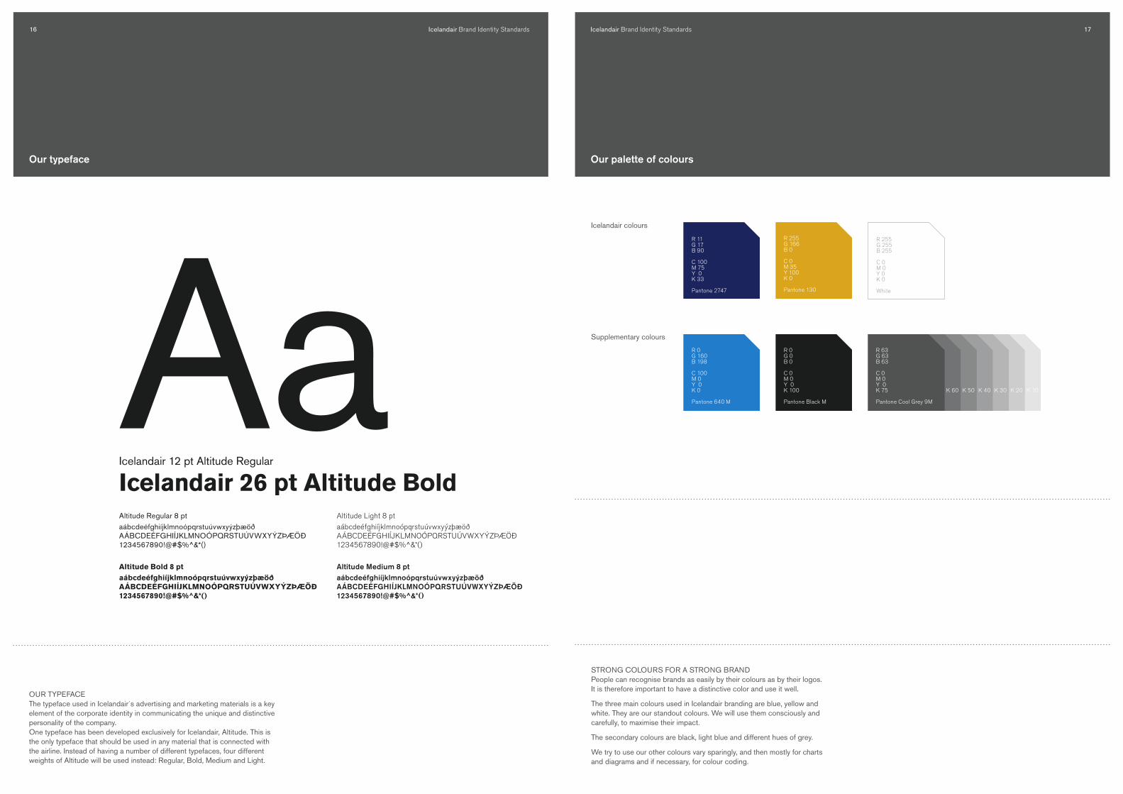
OUR TyPEfACEThe typeface used in Icelandair´s advertising and marketing materials is a key element of the corporate identity in communicating the unique and distinctive personality of the company.One typeface has been developed exclusively for Icelandair, Altitude. This is the only typeface that should be used in any material that is connected with the airline. Instead of having a number of different typefaces, four different weights of Altitude will be used instead: Regular, Bold, Medium and Light.
Altitude Regular 8 ptaábcdeéfghiíjklmnoópqrstuúvwxyýzþæöðAÁBCDEÉFGHIÍJKLMNOÓPQRSTUÚVWXYÝZÞÆÖÐ1234567890!@#$%^&*()
Altitude Bold 8 ptaábcdeéfghiíjklmnoópqrstuúvwxyýzþæöðAÁBCDEÉFGHIÍJKLMNOÓPQRSTUÚVWXYÝZÞÆÖÐ1234567890!@#$%^&*()
Icelandair 12 pt Altitude Regular
Icelandair 26 pt Altitude Bold
AaAltitude Light 8 ptaábcdeéfghiíjklmnoópqrstuúvwxyýzþæöðAÁBCDEÉFGHIÍJKLMNOÓPQRSTUÚVWXYÝZÞÆÖÐ1234567890!@#$%^&*()
Altitude Medium 8 ptaábcdeéfghiíjklmnoópqrstuúvwxyýzþæöðAÁBCDEÉFGHIÍJKLMNOÓPQRSTUÚVWXYÝZÞÆÖÐ1234567890!@#$%^&*()
Our typeface
STRONG COLOURS fOR A STRONG BRAND People can recognise brands as easily by their colours as by their logos. It is therefore important to have a distinctive color and use it well.
The three main colours used in Icelandair branding are blue, yellow and white. They are our standout colours. We will use them consciously and carefully, to maximise their impact.
The secondary colours are black, light blue and different hues of grey.
We try to use our other colours vary sparingly, and then mostly for charts and diagrams and if necessary, for colour coding.
Our palette of colours
Icelandair colours
Supplementary colours
R 0G 0B 0
C 0M 0Y 0K 100
Pantone Black M
R 11G 17B 90
C 100M 75Y 0K 33
Pantone 2747
R 0G 160B 198
C 100M 0Y 0K 0
Pantone 640 M
R 63G 63B 63
C 0M 0Y 0K 75
Pantone Cool Grey 9M
K 60 K 50 K 40 K 30 K 20 K 10
R 255G 166B 0
C 0M 35Y 100K 0
Pantone 130
R 255G 255B 255
C 0M 0Y 0K 0
White

Icelandair Brand Identity Standards�8 Icelandair Brand Identity Standards �9
MINNEAPOLIS – ST. PAUL
ORLANDO BOSTON
HALIFAX
GLASGOW
MANCHESTER
STOCKHOLM
HELSINKI
COPENHAGEN
OSLO
BERLINFRANKFURT
MUNICHMILAN
AMSTERDAM
BARCELONA
LONDON
PARIS
NEW YORK
BALTIMORE –WASHINGTON
REYKJAVIK
ICELAND BERGEN GOTHENBOURG
3 cm
ICELANDAIR - ROUTE NETWORK
WHy THE ROUTE MAP?At the core of the Icelandair business strategy is the route network. An im-portant building block of the brand identity is to include the route network in most material that comes from the company. It should be an integral element in communications from the company, just as our logo or a headline.
This version of the route map should only be used when the complete network is shown, with all of Icelandair’s destinations.
When the route map is used in sizes that are smaller than � cm then no text should be used for the destination cities.
The Route Map Alternative Route Map
ROUTE MAP fOR EACH MARKETWhen a local market includes a route map in its marketing material, a localised route map. The local version of the route map only shows destina-tions in that particular market.
MINNEAPOLIS/ST. PAUL
BOSTON
GLASGOWMANCHESTERLONDON
NEW YORK
BALTIMORE /WASHINGTON
ICELAND
ICELANDAIR - ROUTE MAP
ICELANDAIR - ROUTE NETWORK
Placed on a imageOn white background
ICELANDAIR - ROUTE NETWORK
MINNEAPOLIS/ST. PAUL
BOSTON
ORLANDO
HALIFAXGLASGOWMANCHESTERLONDON
NEW YORKBALTIMORE/
WASHINGTON
ICELAND
MINNEAPOLIS/ST. PAUL
BOSTON
GLASGOWMANCHESTERLONDON
NEW YORK
BALTIMORE /WASHINGTON
ICELAND
MINNEAPOLIS/ST. PAUL
BOSTON
ORLANDO
HALIFAXGLASGOWMANCHESTERLONDON
NEW YORKBALTIMORE/
WASHINGTON
ICELAND
ICELANDAIR - ROUTE NETWORK
MINNEAPOLIS/ST. PAUL
BOSTON
ORLANDO
HALIFAX
GLASGOW
HELSINKISTOCKHOLMOSLOCOPENHAGENBERLINFRANKFURTMUNICHAMSTERDAM
MANCHESTERLONDON
NEW YORKBALTIMORE/
WASHINGTON
ICELAND
MINNEAPOLIS/ST. PAUL
BOSTON
GLASGOWMANCHESTERLONDON
NEW YORK
BALTIMORE /WASHINGTON
ICELAND
ICELANDAIR - ROUTE MAP
ICELANDAIR - ROUTE NETWORK
Placed on a imageOn white background
ICELANDAIR - ROUTE NETWORK
MINNEAPOLIS/ST. PAUL
BOSTON
ORLANDO
HALIFAXGLASGOWMANCHESTERLONDON
NEW YORKBALTIMORE/
WASHINGTON
ICELAND
MINNEAPOLIS/ST. PAUL
BOSTON
GLASGOWMANCHESTERLONDON
NEW YORK
BALTIMORE /WASHINGTON
ICELAND
MINNEAPOLIS/ST. PAUL
BOSTON
ORLANDO
HALIFAXGLASGOWMANCHESTERLONDON
NEW YORKBALTIMORE/
WASHINGTON
ICELAND
ICELANDAIR - ROUTE NETWORK
MINNEAPOLIS/ST. PAUL
BOSTON
ORLANDO
HALIFAX
GLASGOW
HELSINKISTOCKHOLMOSLOCOPENHAGENBERLINFRANKFURTMUNICHAMSTERDAM
MANCHESTERLONDON
NEW YORKBALTIMORE/
WASHINGTON
ICELAND

Icelandair Brand Identity Standards�0 Icelandair Brand Identity Standards ��
The look of the marketing material is inspired by Iceland‘s Nordic roots. The look reflects the spirit of Iceland by being pure, clean and simple.
Two template styles for print advertising have been developed. In version A,the picture bleeds over the whole ad space. This version should only beused when there is not too much copy and the text can be easily read andunderstood. Examples of usage for version A are larger print ads (wholepage or page dominant), posters and outdoor. Version B includes the whitebox at the bottom to increase the legibility of the copy and the call toaction in the ad. It is recommended to use version B when there is too muchcopy to fit easily in version A.
Bleeding ads and the white border
Icelandair Holidays offers great deals to Iceland.• Reykjavik city breaks• Winter adventures• Excursions• Fly drives and much more + For up-to-date information on packages and latest offers, visit us online at www.icelandair.co.uk or call us on 0870 787 4044.
THIS IS OUR BLUEPRINT FOR RAPTUREICELAND ONLY 3 HOURS AWAY
THIS IS OUR BLUEPRINT FOR RAPTUREICELAND ONLY 3 HOURS AWAY
WWW.ICELANDAIR.NET
+ For our latest offers visit us online at www.icelandair.net
ICELANDAIR - ROUTE NETWORK
MINNEAPOLIS/ST. PAUL
BOSTON
ORLANDO
HALIFAXGLASGOWMANCHESTERLONDON
NEW YORKBALTIMORE/
WASHINGTON
ICELAND
WWW.ICELANDAIR.NET
MINNEAPOLIS – ST. PAUL
ORLANDO BOSTON
HALIFAX
GLASGOW
MANCHESTER
STOCKHOLM
HELSINKI
COPENHAGEN
OSLO
BERLINFRANKFURT
MUNICHMILAN
AMSTERDAM
BARCELONA
LONDON
PARIS
NEW YORK
BALTIMORE –WASHINGTON
REYKJAVIK
ICELAND BERGEN GOTHENBOURG
A B
Both versions are surrounded by a black frame. The objective of the frame isto help define the advertising space, and when the white box is used, it unifies the whole advertisement. It also helps the ads stand out better when placed in a cluttered advertising environment.
Another building block is added when the white box is used and that is thedotted line. The objective of the dotted line is to let the reader of thead know that the picture and white text box are connected.
When using smaller advertisements, e.g. classified ads, it is important to keep in mind how the desired message in the ad is best communicated. The deciding factor is the amount of copy. If the copy is just a headline and call to action, then the ad can be bleeding. If there is more copy, then it is recommended to use a white box for the main text. The space for the fine print is clearly defined at the bottom of each ad.
Smaller ads
3 DAGER I REYKJAVIKFLY OG HOTELL FRA KR. 2.990,-*
* Fly t/r inkl. flyskatter og 2 netter på **** hotell (dobbeltrom) inkl. frokostbuffet. Spesielle betingelser gjelder. Garanti er stilt i reisegarantifondet.
Kun fly fra kr. 1.765,- t/r. inkl. flyskatter.
+ Bestill reisen på www.icelandair.no eller på 22 03 40 50 lokal 2, mot gebyr.
WWW.ICELANDAIR.SE
3 DAGER I REYKJAVIKFLY OG HOTELL FRA KR. 2.990,-* KUN FLY FRA KR. 1.765,- T/R. INKL. FLYSKATTER
+ Bestill reisen på www.icelandair.no eller på 22 03 40 50 lokal 2, mot gebyr.
WWW.ICELANDAIR.NO
3 DAGER I REYKJAVIKFLY OG HOTELL FRA KR. 2.990,-*
* Fly t/r inkl. flyskatter og 2 netter på **** hotell (dobbeltrom) inkl. frokostbuffet. Spesielle betingelser gjelder. Garanti er stilt i reisegarantifondet.
KUN FLY FRA KR. 1.765,- T/R. INKL. FLYSKATTER
+ Bestill reisen på www.icelandair.no eller på 22 03 40 50 lokal 2, mot gebyr.
WWW.ICELANDAIR.NO
Icelandair Brand Identity Standards�� Icelandair Brand Identity Standards ��
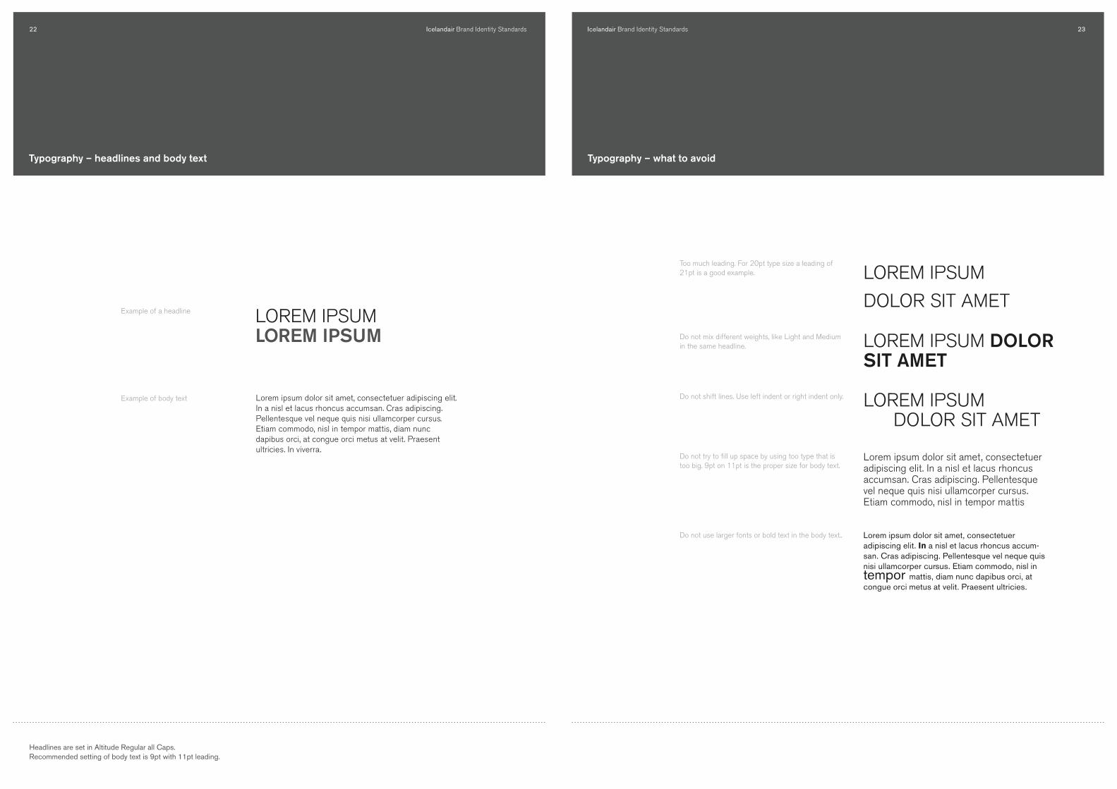
Headlines are set in Altitude Regular all Caps.Recommended setting of body text is 9pt with ��pt leading.
Typography – headlines and body text
LOREM IPSUMLOREM IPSUM
Lorem ipsum dolor sit amet, consectetuer adipiscing elit. In a nisl et lacus rhoncus accumsan. Cras adipiscing. Pellentesque vel neque quis nisi ullamcorper cursus. Etiam commodo, nisl in tempor mattis, diam nunc dapibus orci, at congue orci metus at velit. Praesent ultricies. In viverra.
Example of body text
Example of a headline
Typography – what to avoid
Too much leading. For 20pt type size a leading of 21pt is a good example.
Do not mix different weights, like Light and medium in the same headline.
Do not shift lines. Use left indent or right indent only.
Do not try to fill up space by using too type that is too big. 9pt on 11pt is the proper size for body text.
Do not use larger fonts or bold text in the body text..
LOREM IPSUM
DOLOR SIT AMET
LOREM IPSUM DOLOR SIT AMET
LOREM IPSUM DOLOR SIT AMET
Lorem ipsum dolor sit amet, consectetuer adipiscing elit. In a nisl et lacus rhoncus accumsan. Cras adipiscing. Pellentesque vel neque quis nisi ullamcorper cursus. Etiam commodo, nisl in tempor mattis
Lorem ipsum dolor sit amet, consectetuer adipiscing elit. In a nisl et lacus rhoncus accum-san. Cras adipiscing. Pellentesque vel neque quis nisi ullamcorper cursus. Etiam commodo, nisl in tempor mattis, diam nunc dapibus orci, at congue orci metus at velit. Praesent ultricies.
Icelandair Brand Identity Standards�� Icelandair Brand Identity Standards ��
MINNEAPOLIS – ST. PAUL
ORLANDO
BOSTON
HALIFAX
GLASGOWMANCHESTER
STOCKHOLM
HELSINKI
COPENHAGENOSLOBERLINFRANKFURT
MUNICH
MILANAMSTERDAM
BARCELONA
LONDON
PARIS
NEW YORK
BALTIMORE –WASHINGTON
REYKJAVIK
BERGENGOTHENBOURG
MINNEAPOLIS – ST. PAUL
ORLANDO
BOSTON
HALIFAX
GLASGOWMANCHESTER
STOCKHOLM
HELSINKI
COPENHAGENOSLOBERLINFRANKFURT
MUNICH
MILANAMSTERDAM
BARCELONA
LONDON
PARIS
NEW YORK
BALTIMORE –WASHINGTON
ICELAND
BERGENGOTHENBOURG
REYKJAVIK
ICELAND
MINNEAPOLIS – ST. PAUL
ORLANDO
BOSTON
HALIFAX
GLASGOWMANCHESTER
STOCKHOLM
HELSINKI
COPENHAGENOSLOBERLINFRANKFURT
MUNICH
MILANAMSTERDAM
BARCELONA
LONDON
PARIS
NEW YORK
BALTIMORE –WASHINGTON
REYKJAVIK
BERGENGOTHENBOURG
ICELAND
MINNEAPOLIS – ST. PAUL
ORLANDO
BOSTON
HALIFAX
GLASGOWMANCHESTER
STOCKHOLM
HELSINKI
COPENHAGENOSLOBERLINFRANKFURT
MUNICH
MILANAMSTERDAM
BARCELONA
LONDON
PARIS
NEW YORK
BALTIMORE –WASHINGTON
REYKJAVIK
BERGENGOTHENBOURG
ICELAND
WHy THE ROUTE MAP?At the core of the Icelandair business strategy is the route network. At thecore of our new look and feel is also the route network. One of the newelements in our advertising materials is the route map. It should be an in-tegral element in all communications from the company, just as our logo or a headline.
Route map – what not to do
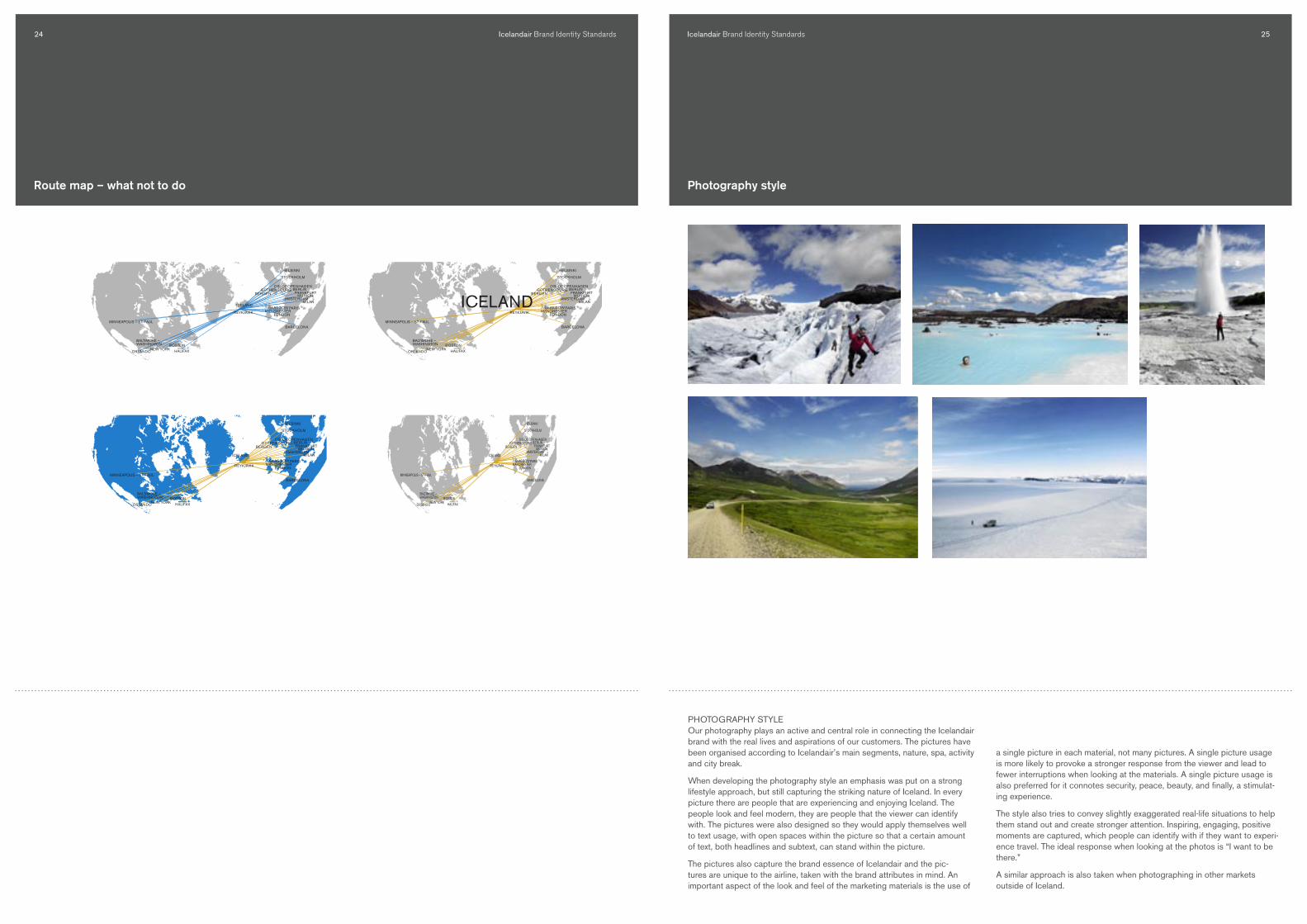
PHOTOGRAPHy STyLE Our photography plays an active and central role in connecting the Icelandair brand with the real lives and aspirations of our customers. The pictures have been organised according to Icelandair’s main segments, nature, spa, activity and city break.
When developing the photography style an emphasis was put on a strong lifestyle approach, but still capturing the striking nature of Iceland. In every picture there are people that are experiencing and enjoying Iceland. The people look and feel modern, they are people that the viewer can identify with. The pictures were also designed so they would apply themselves well to text usage, with open spaces within the picture so that a certain amount of text, both headlines and subtext, can stand within the picture.
The pictures also capture the brand essence of Icelandair and the pic-tures are unique to the airline, taken with the brand attributes in mind. An important aspect of the look and feel of the marketing materials is the use of
Photography style
a single picture in each material, not many pictures. A single picture usage is more likely to provoke a stronger response from the viewer and lead to fewer interruptions when looking at the materials. A single picture usage is also preferred for it connotes security, peace, beauty, and finally, a stimulat-ing experience.
The style also tries to convey slightly exaggerated real-life situations to help them stand out and create stronger attention. Inspiring, engaging, positive moments are captured, which people can identify with if they want to experi-ence travel. The ideal response when looking at the photos is “I want to be there.”
A similar approach is also taken when photographing in other markets outside of Iceland.
Icelandair Brand Identity Standards�� Icelandair Brand Identity Standards ��
The written tone of voice is integral to Icelandair´s personality. It tells people at once who we are, what we stand for and how we feel about them.
Shining through all the writing for Icelandair should be qualities that set the brand apart in a cluttered market. Our tone is:
+ cLEAR clarity is the heart of our brand and written tone
+ wARM we are a small company and we come from a cold country. Our tone needs to be warm and inviting
+ fRESH this factor gets people excited and captures the essence of our position
+ UnIqUE our tone should be surprising. We want people to notice us, to listen to us and feel the Icelandic experience.
Stationary and business cards
While the front of the stationary includes the logo and address information, the backside has the routemap for informative and decorative purpose.
The design of the business cards allows for all the needed information to be presented in a very clear manner with easily adaptable markets and divisons.
SAN FRANCISCO
MINNEAPOLIS – ST. PAUL
ORLANDO
BALTIMORE –WASHINGTON
BOSTON
ICELAND
REYKJAVIK
GLASGOW MANCHESTER
STOCKHOLM
HELSINKI
COPENHAGENOSLO
BERLIN
AMSTERDAMZURICH
MADRID
LONDONPARIS
NEW YORK
MILAN
MUNICHFRANKFURT
BARCELONA
SAN FRANCISCO
MINNEAPOLIS – ST. PAUL
ORLANDO
BALTIMORE –WASHINGTON
BOSTON
ICELAND
REYKJAVIK
GLASGOW MANCHESTER
STOCKHOLM
HELSINKI
COPENHAGENOSLO
BERLIN
AMSTERDAMZURICH
MADRID
LONDONPARIS
NEW YORK
MILAN
MUNICHFRANKFURT
BARCELONA
JÓN STÓRI JÓNSSONDirector Marketing
ICELANDAIR HEADOFFICE
Reykjavík Airport 101 Reykjavík, Iceland
Tel +354 50 50 300 +354 50 50 391Fax +354 50 50 766
[email protected] www.icelandair.net
ICELANDAIR HEADOFFICE
REYKJAVÍK AIRPORT, 101 REYKJAVÍK, ICELANDFAX +354 50 50 766, TEL +354 50 50 300
ICELANDAIR HEADOFFICE
REYKJAVÍK AIRPORT, 101 REYKJAVÍK, ICELANDFAX +354 50 50 766, TEL +354 50 50 300
ICELANDAIR HEADOFFICE
REYKJAVÍK AIRPORT, 101 REYKJAVÍK, ICELANDFAX +354 50 50 766, TEL +354 50 50 300
COPy GUIDELINES fOR ADVERTISING It is important to maintain a consistent brand character in our tone of voice, and to achieve that certain rules must be followed.
In the headlines, a humorous or quirky reference is always made to Iceland or Icelanders, in relation to the picture content. This is to help fulfill the brand position. The tone of the text should always be spoken in the �st person, plural or singular. We are telling people something about the people or the country in a personal and humorous way. The sub-headline should be a challenge to the reader to put himself into the picture, some-thing similar to “Are you up for it?” After this sentence comes the selling message, or flights or special packages to Iceland.
WWW.ICELANDAIR.COM
ON SUNDAYS, WE LIKE A STROLL IN THE PARKARE YOU UP FOR IT?
ICELAND - ONLY 5 HOURS AWAY
Icelandair Brand Identity Standards�8 Icelandair Brand Identity Standards �9
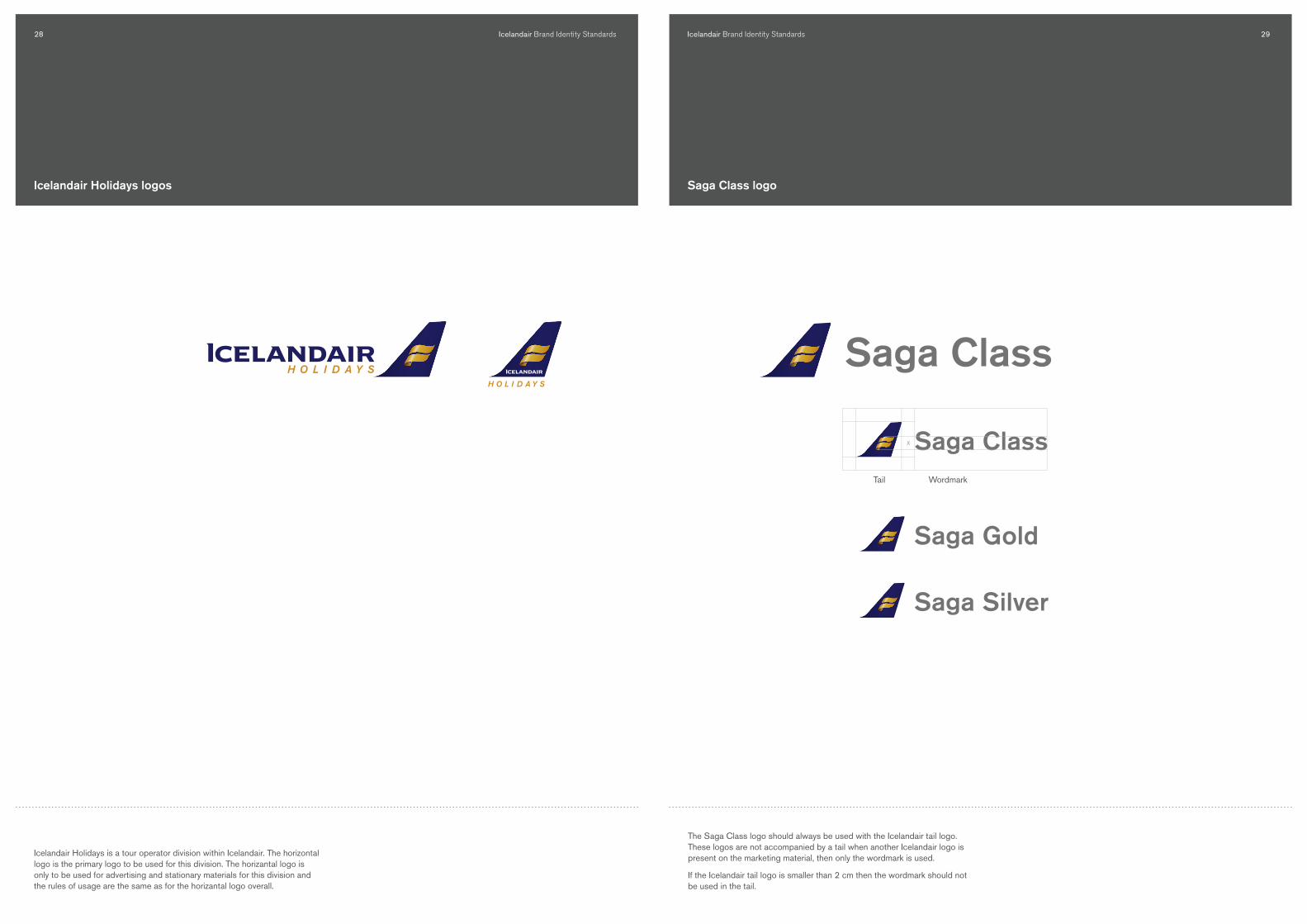
Icelandair Holidays logos
Icelandair Holidays is a tour operator division within Icelandair. The horizontal logo is the primary logo to be used for this division. The horizantal logo is only to be used for advertising and stationary materials for this division and the rules of usage are the same as for the horizantal logo overall.
H O L I D A Y S
Saga ClassX
Saga Gold
Saga Silver
The Saga Class logo should always be used with the Icelandair tail logo. These logos are not accompanied by a tail when another Icelandair logo is present on the marketing material, then only the wordmark is used.
If the Icelandair tail logo is smaller than � cm then the wordmark should not be used in the tail.
Tail Wordmark
Saga class logo
Icelandair Brand Identity Standards�0 Icelandair Brand Identity Standards ��
X Vildarklúbbur
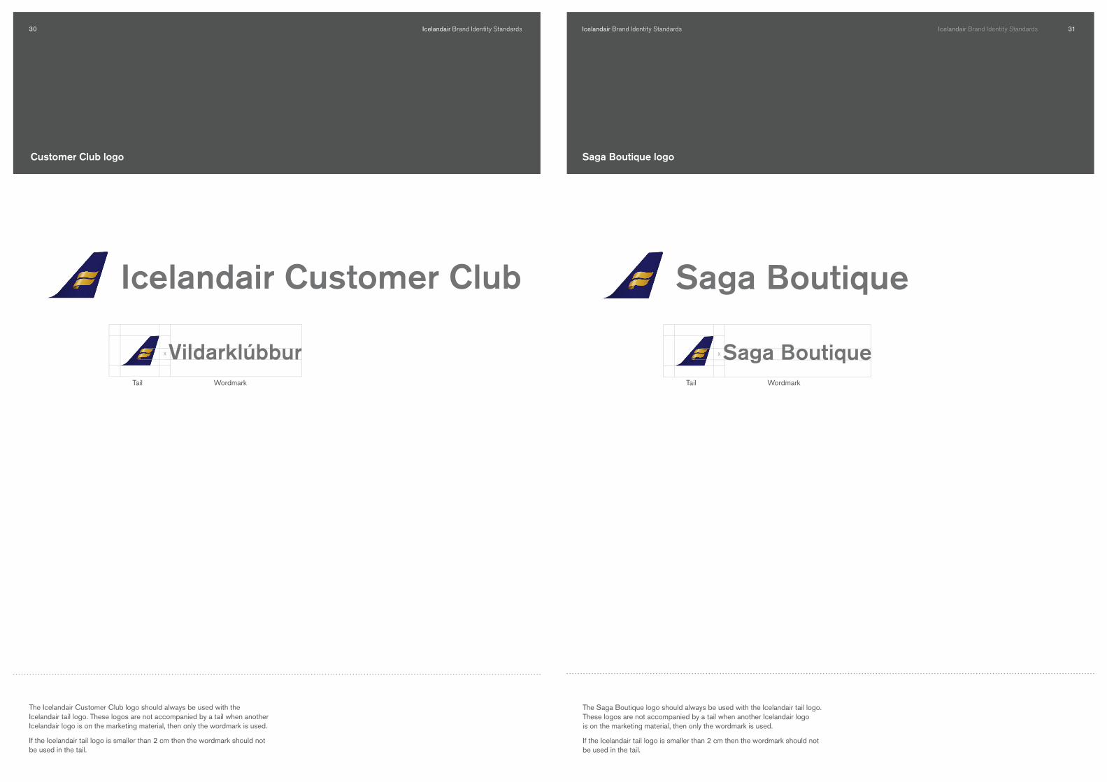
The Icelandair Customer Club logo should always be used with the Icelandair tail logo. These logos are not accompanied by a tail when another Icelandair logo is on the marketing material, then only the wordmark is used.
If the Icelandair tail logo is smaller than � cm then the wordmark should not be used in the tail.
Tail Wordmark
customer club logo
X
The Saga Boutique logo should always be used with the Icelandair tail logo. These logos are not accompanied by a tail when another Icelandair logo is on the marketing material, then only the wordmark is used.
If the Icelandair tail logo is smaller than � cm then the wordmark should not be used in the tail.
Icelandair Brand Identity Standards
Saga Boutique logo
Tail Wordmark