IB Biology HL 1 Boot Camp - Prince Edward Island Biology/files/IBHLBootCampPacket2009.pdfIB Biology...
21
IB Biology HL 1 Boot Camp Reference Guide Allen High School Allen, TX You will use this guide during your two years in IB HL Biology, so don’t throw it away! Keep this in your binder and bring it with you to each class. Some materials excerpted from: The Open Door Web Site: http://www.saburchill.com David Mindorff: http://web.mac.com/mindorffd/Site/Home.html Heinemann Baccalaureate: Biology Higher Level by Damon, McGonegal, Tosto and Ward (Sample available at: http://ib-source.com/title_info.php?id=3690 )
Transcript of IB Biology HL 1 Boot Camp - Prince Edward Island Biology/files/IBHLBootCampPacket2009.pdfIB Biology...

IB Biology HL 1 Boot Camp
Reference Guide Allen High School Allen, TX
You will use this guide during your two years in IB HL Biology, so don’t throw it away! Keep this in your binder and bring it with you to each class.
Some materials excerpted from: The Open Door Web Site: http://www.saburchill.com David Mindorff: http://web.mac.com/mindorffd/Site/Home.html Heinemann Baccalaureate: Biology Higher Level by Damon, McGonegal, Tosto and Ward (Sample available at: http://ib-source.com/title_info.php?id=3690)

SCIENTIFIC INVESTIGATIONSEach time you carry out an investigation check the following points.
Planning• Have I written a short concise introduction?• Have I stated my aim or objective (research question)? Be precise.• If it is valid, have I written my hypothesis (a justified prediction)?
Method• Which variable will I change (the independent variable)?• Which variable will I measure/observe (dependent variable)?- How will I measure it and how
often?• Which other variables do I need to control (which ones will affect the experiment)?• How many trials do I need to be sure of my results?• What equipment and materials will I need?• What safety factors should I bear in mind?
Results/Data• How accurate must I be?• How should I present them? (annotated drawings, tables, prose)• Where are the errors in my measurements/observations and how big are they likely to be?• Did I see anything else happen during the investigation that needs to be described?
Processing and Analysis of Results• Do I leave them as they are?• Do I calculate a change, a proportion/percentage, an average or other statistical value?• Do I present them as a table or graphically?• If graphically, what sort of graph is best? What are the conventions?• Do I need to analyse the graph to obtain a result?
Discussion of results• What do the results show? (Are there any trends?)• What can I interpret from the results? (Explain them in a systematic way.)• Are the results consistent with what I expected?• Can I explain any unexpected results?• Compare with literature values where appropriate• What are the sources of error: in my method, in the manipulation, in the analysis?• What improvements could be made?• Do I need to suggest a new hypothesis to account for the results?• How could I take the investigation further?
Style• Keep it impersonal (eg “The tubes were left for 10 minutes to incubate” instead of “I left the
tubes for 10 minutes to incubate”)• Use labelled or annotated diagrams, if necessary, to show the experimental set up.• Use subheadings to organise your report (Aim, Hypothesis, Method, Results etc)
The Open Door Web Site© Paul Billiet 2003

1
DRAWING IN BIOLOGY
Drawing is still a very important skill in biology. Drawings help to record data fromspecimens. Drawings can highlight the important features of a specimen. Photographs can bevery useful for recording data but they are not very selective - they show more detail of aspecimen than you might want.
Photographs of small specimens and photomicrographs cannot show the whole specimen infocus at once. A drawing is the result of a long period of observation at different depths offocus and at different magnifications. One drawing can show features that would take severalphotographs.
Some guidelines for drawing from specimens in biology
• Move the specimen around, do not just concentrate on one part. Observe the generalappearance first.
• Identify the most significant features (only include detail which is necessary in your
drawing). • Determine which part or parts you are going to draw. • Use a sharp HB (medium grade) pencil.
• Use white, unlined paper for drawing. • Make a large, clear drawing, it should occupy at least half a page • Keep looking back at your specimen whilst you are drawing. When drawing from a
microscope it is useful to look down the eye piece with one eye and at the drawing paperwith the other - it takes practice but it is possible.
• Whilst you are observing increase the magnification to observe more details and reduce the
magnification to get a more general view. Use the focusing controls on the microscope toobserve at different depths of the specimen.
• A drawing is incomplete without a full title and a scale or magnification. Annotations
are particularly important, they permit you to put your observations where they will havethe most impact.
The Open Door Web Site© Paul Billiet 2003

2
Example 1 Epithelial cells from the an onion bulb (Allium cepa) stain with neutralred at pH 7.6 maintained at 20°C. Viewed at x100 to x400
Example 2 Drawing a plan view: Identify the tissues, select your area, draw withoutincluding details of the cells. Rat kidney cortex viewed at x400
The Open Door Web Site© Paul Billiet 2003
Cell sap vacuole stained brickred.
Cell walland cellsurfacemembrane
Nucleus – appears to be insidethe vacuole, in fact it issurrounded by it.
The shadingshould be simpleand clear
Cell wall, cell surface membrane andtonoplast
Tonoplast on its own
Colourless cytoplasm. Cell inclusions could beobserved moving in the cytoplasm at high power(x400) – probably due to cytoplasmic streaming.This cell is still alive
Annotations provide useful information
Do not cross your arrows
Write a title which isinformative
It is more correct to put it this way becauseyour drawing will not be the sameenlargement as the image produced by themicroscope
Glomeruli
Bowman’s capsuleConvoluted tubules
1
ERROR ANALYSIS IN BIOLOGY
Error analysis in biology is no different from that in other sciences. Biology however is not an“exact” science in that much of the data collected by biologists is qualitative. Furthermore,biological systems are very complex and difficult to control. Biological investigations, nevertheless,do often require measurements and biologists do need to be aware of the sources of error in theirdata.
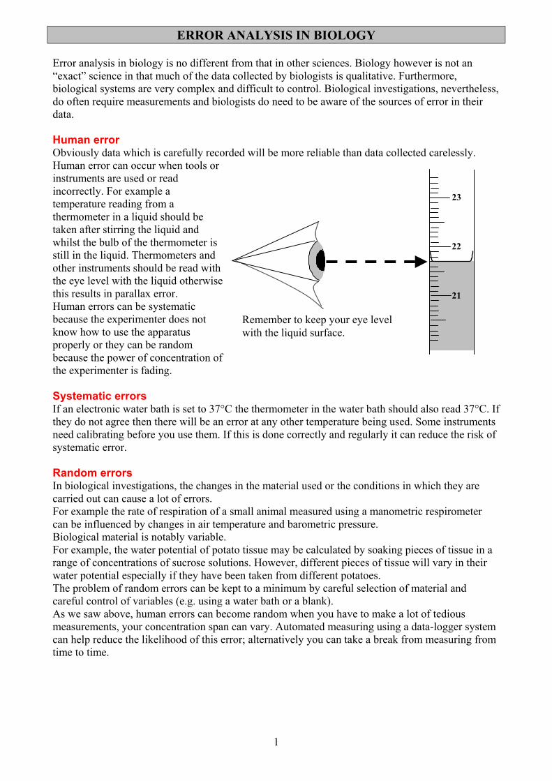
Human errorObviously data which is carefully recorded will be more reliable than data collected carelessly.Human error can occur when tools orinstruments are used or readincorrectly. For example atemperature reading from athermometer in a liquid should betaken after stirring the liquid andwhilst the bulb of the thermometer isstill in the liquid. Thermometers andother instruments should be read withthe eye level with the liquid otherwisethis results in parallax error.Human errors can be systematicbecause the experimenter does notknow how to use the apparatusproperly or they can be randombecause the power of concentration ofthe experimenter is fading.
Systematic errorsIf an electronic water bath is set to 37°C the thermometer in the water bath should also read 37°C. Ifthey do not agree then there will be an error at any other temperature being used. Some instrumentsneed calibrating before you use them. If this is done correctly and regularly it can reduce the risk ofsystematic error.
Random errorsIn biological investigations, the changes in the material used or the conditions in which they arecarried out can cause a lot of errors.For example the rate of respiration of a small animal measured using a manometric respirometercan be influenced by changes in air temperature and barometric pressure.Biological material is notably variable.For example, the water potential of potato tissue may be calculated by soaking pieces of tissue in arange of concentrations of sucrose solutions. However, different pieces of tissue will vary in theirwater potential especially if they have been taken from different potatoes.The problem of random errors can be kept to a minimum by careful selection of material andcareful control of variables (e.g. using a water bath or a blank).As we saw above, human errors can become random when you have to make a lot of tediousmeasurements, your concentration span can vary. Automated measuring using a data-logger systemcan help reduce the likelihood of this error; alternatively you can take a break from measuring fromtime to time.
23
22
21
Remember to keep your eye levelwith the liquid surface.

2
Replicates and samplesBecause of their complexity and variability biological systems require replicate observations andmultiple samples of material. As rule the lower limit is 5 measurements or a sample size of 5. Verysmall samples run from 5 to 20, small samples from 20 to 30 and big samples above 30.
Selecting dataReplicates permit you to see if data is consistent. If a reading is very different from the others it maybe left out from the processing and analysis. However, you must always be ready to justify why youdo this.
Degrees of precisionIf you use a ruler, graduated in millimetres, to measure an object (e.g. the length of a leaf) you willprobably find the edges of the object lie close to a millimetre division but probably not right on it.Recording the leaf is “4.5cm-and-a-bit” long is not very useful. The accepted rule is that the degreeof precision is ± the smallest division on the instrument, in this case one millimetre. So the leaf inthis example is 4.5cm ± 0.1cm.The degree of precision will influence the instrument that you choose to make a measurement. Forexample of you used the same ruler to measure an object 0.5cm long the degree of precision (±0.1cm) is 20% of the measurement, This a is very large error margin and, so, it is not very precise.Therefore, we must choose an appropriate instrument for measuring a particular length, volume,pH, light intensity etc.
The act of measuringWhen a measurement is taken this can affect the environment of the experiment. For example whena cold thermometer is put in a test tube of warm water, the water will be cooled by the presence ofthe thermometer. When the behaviour of animals is being recorded the presence of the experimentermay influence them.
Why bother?You might think that with all these sources of error and imprecision experimental results areworthless. This is not true, it is understood that experimental results are only estimates. What isexpected of a scientist is that they:(i) make the best effort to avoid errors in their design of investigations and the use of
instruments.(ii) are aware of the source of errors and to appreciate their magnitude.
The Open Door Web Site© Paul Billiet 2003
Transmitted lightWhite lightLight of a particular wavelength
MeterLight sensor
Coloured filterSpecimen absorbs some light
Lamp
The colorimeter
Colorimeters will “drift” so they need to be periodically re-calibrated using ablank (a specimen that the instrument can be reliably set e.g. the solvent only).

DRAWING TABLES Tables are a convenient way of recording data. Nevertheless they do follow certain conventions.
The results of an investigation on the effect of light on the cyclosis of chloroplasts
Light intensity / lx
Distance moved / µm ± 0.1µm
Time taken / s ± 0.1s
Speed / µm s-1 ± 0.1µms-1
1200 12.5 6.1 2.1 1500 12.5 3.7 3.4 1900 25.0 7.3 3.4 2000 25.0 7.3 3.4 2500 25.0 7.0 3.6
Title of each variable at the top
of each column
Dependent variables in succeeding columns
The data can even be
processed in the table
Pure dimensionless numbers with decimal points in line. All to the
same number of significant figures
Units of measurement after a diagonal line, the “solidus”. Note the degrees of precision of
the instrument.
Independent variables in the first column arranged
in ascending order
Degrees of precision • Apply a simple rule. The degree of precision is equal to the smallest graduation on the
instrument. • You may need to estimate the degree of precision sometimes especially with stop watches.
Digital stop watches are said to be accurate to 0.01s but your reaction time is only 0.1s. • For electronic probes you may have to go to the manufacturers specifications (on their web site
or in the instructions manual. • Some instruments have not degrees of precision because their reading is relative. Tables can be arranged horizontally too, to save space
The result of pig red blood cells exposed to different salt concentrations
Salt concentration / % ± 0.1%
0 0.1 0.3 0.5 0.7 0.9 2.0 10.0
Colorimeter reading / % transmission 2 25 25 25 50 55 62 42

MORE COMPLEX TABLES
The rate of uptake of water by a leafy shoot under different conditions
WITHOUT HAIR DYER WITH HAIR DRYER TRIAL DISTANCE
/ cm TIME TAKEN
/ min SPEED
/ cm min-1
DISTANCE / cm
TIME TAKEN/ min
SPEED / cm min
-1
Units at the top of the column. Use SI units.
Use the « solidus » to separate the title from the units
Give your table a title which concisely states what the experiment is about.
1 10 5.18 1.93 10 2.68 3.732 6 2.71 2.21 5 1.80 2.78 3 10 5.24 1.91 6 1.92 3.134 15 7.60 1.97 10 2.75 3.645 5 2.65 1.88 10 2.55 3.92 AVERAGE
SPEED 1.98 AVERAGE
SPEED 3.44
Draw straight lines. Use a ruler !
Time is recorded in one unit ie minutes or seconds not both. Note : 2 min 30s = 2.5 min not 2.30 min
Titles of variables at the top of each column.
Independent variable first…………………
……dependent variable next
No units here
All decimal points should be in line.
Data presented in decimals to as many significant places as your instruements will permit.
Paul Billiet
October 2002

1
Introduction
1 Statistical analysis
In this chapter, you will learn how scientists analyse the evidence they collect when they perform experiments. You will be designing your own experiments, so this information will be very useful to you. You will be learning about:
• means; • standard deviation;• error bars; • significant difference;• t-test; • causation and correlation.
Have your calculator by you to practise calculations for standard deviation and t-test so that you can use these methods of analysing data when you do your own experiments.
Statistics1.1
Assessment statements1.1.1 State that error bars are a graphical representation of the variability of data. 1.1.2 Calculate the mean and standard deviation of a set of values.1.1.3 State that the term standard deviation is used to summarize the spread of
values around the mean, and that 68% of values fall within one standard deviation of the mean.
1.1.4 Explain how the standard deviation is useful for comparing the means and spread of data between two or more samples.
1.1.5 Deduce the significance of the difference between two sets of data using calculated values for t and the appropriate tables.
1.1.6 Explain that the existence of a correlation does not establish that there is a causal relationship between two variables.
This is an Africanized honey bee (AHB). AHBs have spread to the USA from Brazil. They are now in competition with the local bee population, which are European honey bees (EHBs). EHBs were brought to America by European colonists in the 1600s. AHBs are now out-competing EHBs in areas the former invade.
This mixed oak forest is a mature stage in the development of plant communities surrounding bodies of water. Studying the growth rate of the trees such as maple, beech, oak and hickory gives us evidence of the health of these plant communities.
This is the common bean plant used by many students in their classrooms. Bean plants grow in about 30 days under banks of artificial lights. Seeds are easy to obtain. Germinated seeds can be placed in paper cups with sterilized soil. Many factors can be tested to determine whether or not they affect the growth of the bean plants.

2
Statistical analysis 1
Reasons for using statisticsBiology examines the world in which we live. Plants and animals, bacteria and viruses all interact with one another and the environment. In order to examine the relationships of living things to their environments and each other, biologists use the scientific method when designing experiments. The first step in the scientific method is to make observations. In science, observations result in the collection of measurable data. For example: What is the height of bean plants growing in sunlight compared to the height of bean plants growing in the shade? Do their heights differ? Do different species of bean plants have varying responses to sunlight and shade? After we have observed, we then decide which of these questions to answer. Assume we want to answer the question, ‘Will the bean plant, Phaseolus vulgaris, grow taller in sunlight or the shade?’ We must design an experiment which can try to answer this question.
How many bean plants should we use in order to answer our question? Obviously, we cannot measure every bean plant that exists. We cannot even realistically set up thousands and thousands of bean plants and take the time to measure their height. Time, money, and people available to do the science are all factors which determine how many bean plants will be in the experiment. We must use samples of bean plants which represent the population of all bean plants. If we are growing the bean plants, we must plant enough seeds to get a representative sample.
Statistics is a branch of mathematics which allows us to sample small portions from habitats, communities, or biological populations, and draw conclusions about the larger population. Statistics mathematically measures the differences and relationships between sets of data. Using statistics, we can take a small population of bean plants grown in sunlight and compare it to a small population of bean plants grown in the shade. We can then mathematically determine the differences between the heights of these bean plants. Depending on the sample size that we choose, we can draw conclusions with a certain level of confidence. Based on a statistical test, we may be able to be 95% certain that bean plants grown in sunlight will be taller than bean plants grown in the shade. We may even be able to say that we are 99% certain, but nothing is 100% certain in science.
Mean, range, standard deviation and error barsStatistics analyses data using the following terms:• mean; • range;• standard deviation; • error bars.
Mean
The mean is an average of data points. For example, suppose the height of bean plants grown in sunlight is measured in centimetres at 10 days after planting. The heights are 10, 11, 12, 9, 8 and 7 centimetres. The sum of the heights is 57 centimetres. Divide 57 by 6 to find the mean (average). The mean is 9.5 centimetres. The mean is the central tendency of the data.
Range
The range is the measure of the spread of data. It is the difference between the largest and the smallest observed values. In our example, the range is 12 – 7 = 5. The range for this data set is 5 centimetres. If one data point were unusually large or unusually small, this very large or small data point would have a great effect on the range. Such very large or very small data points are called outliers. In our sample there is no outlier.
Statistics can be used to describe conditions which exist in countries around the world. The data can heighten our awareness of global issues. To learn about United Nations poverty facts and consumption statistics visit www.heinemann.co.uk/hotlinks, insert the express code 4273P and click on Weblinks 1a and 1b.
The World Health Organization (WHO) website has statistical information on infectious diseases. Over the next year, the system aims to provide a single point of access to data, reports and documents on:• major diseases of poverty
including malaria, HIV/AIDS, tuberculosis;
• diseases on their way towards eradication and elimination such as guinea worm, leprosy, lymphatic filariasis;
• epidemic-prone and emerging infections such as meningitis, cholera, yellow fever and anti-infective drug resistance.
For more information and access ti the WHO website, visit www.heinemann.co.uk/hotlinks, insert the express code 4273P and click on Weblink 1.2.

3
Standard deviation
The standard deviation (SD) is a measure of how the individual observations of a data set are dispersed or spread out around the mean. Standard deviation is determined by a mathematical formula which is programmed into your calculator. You can calculate the standard deviation of a data set by using the SD function of a graphic display or scientific calculator.
Error bars
Error bars are a graphical representation of the variability of data. Error bars can be used to show either the range of data or the standard deviation on a graph. Notice the error bars representing standard deviation on the histogram in Figure 1.1 and the line graph in Figure 1.2. The value of the standard deviation above the mean is shown extending above the top of each bar of the histogram and the same standard deviation below the mean is shown extending below the top of each bar of the histogram. Since each bar represents the mean of the data, the standard deviation for each type of tree will be different, but the value extending above and below one bar will be the same. The same is true for the line graph. Since each point on the graph represents the mean data for each day, the bars extending above and below the data point are the standard deviations above and below the mean.
4
beech0
8
12
16
maple
grow
th in
met
res
hickory oak
Figure 1.1 Rate of tree growth on the Oak–Hickory Dune 2004–05. Values are represented as mean 1SD from 25 trees per species.
100
0
200
300
50
150
250
0 1 2 3 4 5 6days
7 8 9 10 11
P. aurelia
P. caudatum
num
ber o
fin
divi
dual
s in
a li
tre
Figure 1.2 Mean population density (1SD) of two species of Paramecium grown in solution.

4
Statistical analysis 1
Standard deviationWe use standard deviation to summarize the spread of values around the mean and to compare the means and spread of data between two or more samples.
Summarizing the spread of values around the mean
In a normal distribution, about 68% of all values lie within 1 standard deviation of the mean. This rises to about 95% for 2 standard deviations from the mean.
To help understand this difficult concept, let’s look back to the bean plants growing in sunlight and shade. First, the bean plants in the sunlight: suppose our sample is 100 bean plants. Of that 100 plants, you might guess that a few will be very short (maybe the soil they are in is slightly sandier). A few may be much taller than the rest (possibly the soil they are in holds more water). However, all we can measure is the height of all the bean plants growing in the sunlight. If we then plot a graph of the heights, the graph is likely to be similar to a bell curve (see Figure 1.3). In this graph, the number of bean plants is plotted on the y axis and the heights ranging from short to medium to tall are plotted on the x axis.
Many data sets do not have a distribution which is this perfect. Sometimes, the bell-shape is very flat. This indicates that the data is spread out widely from the mean. In some cases, the bell-shape is very tall and narrow. This shows the data is very close to the mean and not spread out.
The standard deviation tells us how tightly the data points are clustered around the mean. When the data points are clustered together, the standard deviation is small; when they are spread apart, the standard deviation is large. Calculating the standard deviation of a data set is easily done on your calculator.
Look at Figure 1.4. This graph of normal distribution may help you understand what standard deviation really means. The dotted area represents one standard deviation in either direction from the mean. About 68% of the data in this graph is located in the dotted area. Thus, we say that for normally distributed data, 68% of all values lie within 1 standard deviation from the mean. Two standard deviations from the mean (the dotted and the cross-hatched areas) contain about 95% of the data. If this bell curve were flatter, the standard deviation would have to be larger to account for the 68% or 95% of the data set. Now you can see why standard deviation tells you how widespread your data points are from the mean of the data set.
How is this useful? For one thing, it tells you how many extremes are in the data. If there are many extremes, the standard deviation will be large; with few extremes the standard deviation will be small.
y
x0
Figure 1.3 This graph shows a bell curve.

5
Comparing the means and spread of data between two or more samples
Remember that in statistics we make inferences about a whole population based on just a sample of the population. Let’s continue using our example of bean plants growing in the sunlight and shade to determine how standard deviation is useful for comparing the means and the spread of data between these two samples. Here are the raw data sets for bean plants grown in sunlight and in shade.
Height of bean plants in the sunlight in centimetres 0.1 cm
Height of bean plants in the shade in centimetres 0.1 cm
124 131
120 60
153 160
98 212
123 117
142 65
156 155
128 160
139 145
117 95
Total 1300 Total 1300
First, we determine the mean for each sample. Since each sample contains 10 plants, we can divide the total by 10 in each case. The resulting mean is 130.0 centimetres for each condition.
Of course, that is not the end of the analysis. Can you see there are large differences between the two sets of data? The height of the bean plants in the shade is much more variable than that of the bean plants in the sunlight. The means of each data set are the same, but the variation is not the same. This suggests that other factors may be influencing growth in addition to sunlight and shade.
How can we mathematically quantify the variation that we have observed? Fortunately, your calculator has a function that will do this for you. All you have to do is input the raw data. For practice, find the standard deviation of each raw data set above before you read on.
The standard deviation of the bean plants growing in sunlight is 17.68 centimetres while the standard deviation of the bean plants growing in the shade is 47.02 centimetres. Looking at the means alone, it appears that there is no difference between the two sets of bean plants. However, the high standard deviation of the
Figure 1.4 This graph shows a normal distribution.
y
x0
mean
Key
� 1 standarddeviation fromthe mean
� 2 standarddeviations fromthe mean
68%
95%
For directions on how to calculate standard deviation with a TI-86 calculator, visit: www.heinemann.co.uk/hotlinks, insert the express code 4242P and click on Weblink 1.4a.
If you have a TI-83 calculator, visit: www.heinemann.co.uk/hotlinks, insert the express code 4242P and click on Weblink 1.4b.

6
Statistical analysis 1
bean plants grown in the shade indicates a very wide spread of data around the mean. The wide variation in this data set makes us question the experimental design. Is it possible that the plants in the shade are also growing in several different types of soil? What is causing this wide variation in data? This is why it is important to calculate the standard deviation in addition to the mean of a data set. If we looked at only the means, we would not recognize the variability of data seen in the shade-grown bean plants.
Significant difference between two data sets using the t-testIn order to determine whether or not the difference between two sets of data is a significant (real) difference, the t-test is commonly used. The t-test compares two sets of data, for example heights of bean plants grown in the sunlight and heights of bean plants grown in the shade. Look at the bottom of the table of t values (opposite), and you will see the probability (p) that chance alone could make a difference. If p = 0.50, we see the difference is due to chance 50% of the time. This is not a significant difference in statistics. However, if you reach p = 0.05, the probability that the difference is due to chance is only 5%. That means that there is a 95% chance that the difference is due (in our bean example) to one set of the bean plants being in the sunlight. A 95% chance is a significant difference in statistics. Statisticians are never completely certain but they like to be at least 95% certain of their findings before drawing conclusions.
When comparing two groups of data, we use the mean, standard deviation and sample size to calculate the value of t. When given a calculated value of t, you can use a table of t values. First, look in the left-hand column headed ‘Degrees of freedom’, then across to the given t value. The degrees of freedom are the sum of sample sizes of each of the two groups minus 2.
If the degree of freedom is 9, and if the given value of t is 2.60, the table indicates that the t value is just greater than 2.26. Looking down at the bottom of the table, you will see that the probability that chance alone could produce the result is only 5% (0.05). This means that there is a 95% chance that the difference is significant.
Worked example 1.1
Compare two groups of barnacles living on a rocky shore. Measure the width of their shells to see if a significant size difference is found depending on how close they live to the water. One group lives between 0 and 10 metres from the water level. The second group lives between 10 and 20 metres above the water level.
Measurement was taken of the width of the shells in millimetres. 15 shells were measured from each group. The mean of the group closer to the water indicates that living closer to the water causes the barnacles to have a larger shell. If the value of t is 2.25, is that a significant difference?
Solution
The degree of freedom is 28 (15 + 15 – 2 = 28). 2.25 is just above 2.05.
Referring to the bottom of this column in the table, p = 0.05 so the probability that chance alone could produce that result is only 5%.
The confidence level is 95%. We are 95% confident that the difference between the barnacles is significant. Barnacles living nearer the water have a significantly larger shell than those living 10 metres or more away from the water.
To use an online calculator to do the t-test go to: www.heinemann.co.uk/hotlinks, insert the express code 4242P and click on Weblink 1.5a or 1.5b.

7
Table of t values
Degrees of freedom t values
1 1.00 3.08 6.31 12.71 63.66 636.62
2 0.82 1.89 2.92 4.30 9.93 31.60
3 0.77 1.64 2.35 3.18 5.84 12.92
4 0.74 1.53 2.13 2.78 4.60 8.61
5 0.73 1.48 2.02 2.57 4.03 6.87
6 0.72 1.44 1.94 2.45 3.71 5.96
7 0.71 1.42 1.90 2.37 3.50 5.41
8 0.71 1.40 1.86 2.31 3.367 5.04
9 0.70 1.38 1.83 2.26 3.25 4.78
10 0.70 1.37 1.81 2.23 3.17 4.590
11 0.70 1.36 1.80 2.20 3.11 4.44
12 0.70 1.36 1.78 2.18 3.06 4.32
13 0.69 1.35 1.77 2.16 3.01 4.22
14 0.69 1.35 1.76 2.15 2.98 4.14
15 0.69 1.34 1.75 2.13 2.95 4.07
16 0.69 1.34 1.75 2.12 2.92 4.02
17 0.69 1.33 1.74 2.11 2.90 3.97
18 0.69 1.33 1.73 2.10 2.88 3.92
19 0.69 1.33 1.73 2.09 2.86 3.88
20 0.69 1.33 1.73 2.09 2.85 3.85
21 0.69 1.32 1.72 2.08 2.83 3.82
22 0.69 1.32 1.72 2.07 2.82 3.79
24 0.69 1.32 1.71 2.06 2.80 3.75
26 0.68 1.32 1.71 2.06 2.78 3.71
28 0.68 1.31 1.70 2.05 2.76 3.67
30 0.68 1.31 1.70 2.04 2.75 3.65
35 0.68 1.31 1.69 2.03 2.72 3.59
40 0.68 1.30 1.68 2.02 2.70 3.55
45 0.68 1.30 1.68 2.01 2.70 3.52
50 0.68 1.30 1.68 2.01 2.68 3.50
60 0.68 1.30 1.67 2.00 2.66 3.46
70 0.68 1.29 1.67 1.99 2.65 3.44
80 0.68 1.29 1.66 1.99 2.64 3.42
90 0.68 1.29 1.66 1.99 2.63 3.40
100 0.68 1.29 1.66 1.99 2.63 3.39
Probability (p) that chance alone could
produce the difference
0.50 (50%)
0.20 (20%)
0.10 (10%)
0.05 (5%)
0.01 (1%)
0.001 (0.1%)

8
Statistical analysis 1
Existence of a correlation does not establish a causal relationship between two variables We make observations all the time about the living world around us. We might notice, for example, that our bean plants wilt when the soil is dry. This is a simple observation. We might do an experiment to see if watering the bean plants prevents wilting. Observing that wilting occurs when the soil is dry is a simple correlation, but the experiment gives us evidence that the lack of water is the cause of the wilting. Experiments provide a test which shows cause. Observations without an experiment can only show a correlation.
Africanized honey bees
The story of Africanized honey bees (AHBs) invading the USA includes an interesting correlation. In 1990, a honey bee swarm was found outside a small town in southern Texas. They were identified as AHBs. These bees were brought from Africa to Brazil in the 1950s, in the hope of breeding a bee adapted to the South American tropical climate. But by 1990, they had spread to the southern US. Scientists predicted that AHBs would invade all the southern states of the US, but this hasn’t happened. Look at Figure 1.5: the bees have remained in the southwest states (area shaded in yellow) and have not travelled to the south-eastern states. The edge of the areas shaded in yellow coincides with the point at which there is an annual rainfall of 137.5 cm (55 inches) spread evenly throughout the year. This level of year-round wetness seems to be a barrier to the movement of the bees and they do not move into such areas.
Cormorants
When using a mathematical correlation test, the value of r signifies the correlation. The value of r can vary from +1 (completely positive correlation) to 0 (no correlation) to –1 (completely negative correlation). For an example, we can measure in millimetres the size of breeding cormorant birds to see if there is a correlation between the sizes of males and females which breed together.
Figure 1.5 AHBs have not moved beyond the areas shaded yellow in the last 10 years. So, states in the south east (Louisiana, Florida, Alabama and Mississippi) seem unlikely to be bothered by AHBs if the 137.5 cm (55 inches) of rain correlation holds true. This is an example of a mathematical correlation and is not evidence of a cause. In order to find out if this is a cause, scientists must design experiments to explain mechanisms which may be the cause of the observed correlation.

9
Pair numbers Size of female cormorants Size of male cormorants
1 17.1 16.5
2 18.5 17.4
3 19.7 17.3
4 16.2 16.8
5 21.3 19.5
6 19.6 18.3
r = 0.88
The r value of 0.88 shows a positive correlation between the sizes of the two sexes: large females mate with large males. However, correlation is not cause. To find the cause of this observed correlation requires experimental evidence. There may be a high correlation but only carefully designed experiments can separate causation from correlation.
Just because event X is regularly followed by event Y, it does not necessarily follow that X causes Y. Biologists are often faced with the difficult challenge of determining whether or not events that appear related are causally associated. For example, there may be an association between large numbers of telephone poles in a particular geographic area and the number of people in that area who have cancer, but that does not mean that the telephone poles cause cancer. Carefully designed experiments are needed to separate causation from correlation.
The tobacco companies used to say that there was a statistical correlation between smoking and lung cancer, but they insisted that there was no causal connection. In other words, they said X did not follow Y in this case. In fact, they said that people who thought that smoking caused cancer were committing a fallacy of post ergo proper hoc (one thing follows another). However, we now have lots of other evidence that smoking does cause lung cancer.
So, try assessing the following statements as to whether you think they represent a correlation or if there is a causal connection between the two things in each case.
1 Cars with low mileage per gallon/litre of fuel cause global warming.2 Drinking red wine protects against heart disease.3 Tanning beds can cause skin cancer.4 UV rays increase the risk of cataracts.5 Vitamin C cures the common cold.
Use of tobacco by adolescents is a major public health problem in all six WHO regions. Worldwide, more countries need to develop, implement, and evaluate tobacco-control programmes to address the use of all types of tobacco products, especially among girls.
It can be difficult to imagine what it was like when people did not have some of the knowledge that we take for granted today. In the mid-19th century, people had a different paradigm of what caused disease; they thought there were many causes of disease but they did not know about germs (microorganisms). The modern concept that germs can cause disease, was introduced by Louis Pasteur. Further evidence of the germ theory was demonstrated by Robert Koch.
To find information on Pasteur and Koch, and discover answers to the questions below, visit heinemann.co.uk/hotlinks, insert the express code 4242P and click on Weblink 1.7.
1 What was the paradigm of disease for people in the mid-19th century? What did they think caused disease? Were they looking at causation or correlation?
2 How did Louis Pasteur’s work change this paradigm?3 Explain how Robert Koch’s work gave evidence which was required to show that a
bacterium plays a causal role in a certain disease.
1 Define an error bar.2 Define standard deviation.3 Explain the use of standard deviation when comparing the means of two sets of data.4 If you are given a calculated value for t, what can be deduced from a t-table?5 Give a specific example of a correlation.6 Explain the relationship between cause and correlation.
Exercises
You can find many interesting statistics if you visit www.heinemann.co.uk/hotlinks, insert the express code 4242P and click on Weblink 1.6.

10
Statistical analysis 1
As this chapter covers new syllabus material, there are no past examination papers available. Hence, there is no markscheme for these questions.
1 What is standard deviation used for?A To determine that 68% of the values are accurate.B To deduce the significant difference between two sets of data.C To show the existence of cause.D To summarize the spread of values around the means.
2 What is an error bar?A A graphical representation of the variability of data.B A graphical representation of the correlation of data.C A calculated mean.D A histogram.
3 What is the t-test used for?A Comparing the spread of data between two samples.B Deducing the significant difference between two sets of data.C Explaining the existence of cause and correlation.D Calculating the mean and the standard deviation of a set of values.
4 What is the relationship between cause and correlation?A A correlation does not establish a causal relationship.B A correlation requires a scientific experiment, while cause does not. C A correlation requires collection of data, cause does not. D A causal relationship does not establish correlation.
5 An experiment using 0.5 grams of fresh garlic and crushed garlic root, leaf and bulb from garlic cloves sprouted for 2 days was performed. This garlic was used in a bioassay on lettuce seedlings to see if growth of the lettuce seedlings was inhibited compared to a control. Data recorded was seedling length in millimetres.
Fresh garlicCrushed
sprouted rootCrushed
sprouted leafCrushed
sprouted bulbControl
(no treatment)
4 4 3 3 20
5 5 4 4 19
6 5 5 5 17
4 5 5 4 20
3 4 5 5 21
4 3 6 4 22
3 3 4 5 19
5 5 5 4 17
4 4 4 4 16
3 3 3 5 20
(a) Find the mean and standard deviation of each of these data sets. (b) Discuss the variability of the garlic data.(c) Compare the means of each group of data.(d) (i) If the calculated t for fresh garlic compared to the control is t = 13.9, is the
difference between the two groups a significant difference? (ii) What is the probability that the difference between the groups is due to
chance?
Practice questions

11
(e) (i) If the calculated t for the sprouted bulb compared to the fresh garlic is t = 0.33, is the difference significant?
(ii) What is the probability that the difference between the two groups is due to chance?
6 An experiment using fertilizer on bean plants was performed. Germinated seeds were planted in sterile soil to which different amounts of a commercial fertilizer were added. Height of the plants was measured in centimetres 25 days after planting. Data recorded was bean plant height in centimetres (0.5 cm).
Group A No fertilizer
Group B 0.001% fertilizer
Group C 0.01% fertilizer
Group D 0.1% fertilizer
10 8 7 12
7 8 10 13
8 7 8 15
7 10 10 10
8 10 8 10
10 7 9 15
9 8 9 10
8 8 8 10
7 9 6 14
9 9 7 10
(a) Find the mean and standard deviation of each set of data.(b) Discuss the variability of the bean plant data.(c) Compare the means of each group of data.(d) (i) If the calculated t for Group B compared to the the control is t = 0.60, is the
difference between the two groups a significant difference? (ii) What is the probability that the difference between the two groups is due to
chance?(e) (i) If the calculated t for Group D compared to the the control is t = 2.90, is the
difference between the two groups significant? (ii) What is the probability that the difference is due to chance?

Example from Allott Biology for the IB Diploma: To test whether there was any difference in the size of lichens growing on the top and side of a stone wall, some data were collected. The diameters of a random sample of ten lichens on the top of the wall and ten growing on the side were measured and a t-test was used to find out if there was a significant difference.
Surface Diameter of lichen (mm) Top 22 10 24 45 9 26 5 34 10 13 Side 22 12 23 13 7 13 5 24 3 10
1. Enter the data into two columns in excel. 2. Highlight the empty cell below the second
column. 3. Click on the fx button and choose ttest. (you might
need to scroll through the list of functions) 4. Array 1 refers to the location of the first column
of data. Highlight the data from A1 to A10 and the box will fill in.
5. Click in the array 2 box. Highlight the data from B1 to B10.
6. The number of tails is two if you are testing whether there is a significant difference in means whereas a one-tailed test is whether you are testing the hypothesis that the one mean is greater than the other. Both could apply in this case. We choose the two-tailed test.
7. For type we are assuming equal variance in the two samples, so choose type’2’.
8. A ‘p’ value of .176 indicates that the difference in means is not statistically significant.

Using the TI-84 for the ttest*
In the graphic calculator, data is stored in lists. If data is in the lists from previous experiments the lists will need to be cleared. If no data is present, you can skip step a)
a. Press the STAT button. Either press 4 or use the blue cursor keys to move down to ClrList and press enter You will now need to specify which list you want to clear. Use the blue ‘2nd’ button in the top left corner to choose your list. Press 2nd and then press 1. Press ENTER. You will now have cleared list 1 and you are free to enter the data.
Example from Allott Biology for the IB Diploma: To test whether there was any difference in the size of lichens growing on the top and side of a stone wall, some data were collected. The diameters of a random sample of ten lichens on the top of the wall and ten growing on the side were measured and a t-test was used to find out if there was a significant difference.
Surface Diameter of lichen (mm) Top 22 10 24 45 9 26 5 34 10 13 Side 22 12 23 13 7 13 5 24 3 10
* note the steps are the same for the Ti-83 calculator as well
a. Clear your L1 as specified in the instructions above. b. Clear your L2 using the same procedure. c. Press the STAT button and choose Edit d. Enter the Top data into L1 and the Side data into L2. To do this, type in a
value and press enter after each value. e. Push the STAT button f. Move the cursor to the TESTS menu. g. Press 4; the default should be Data (it will be flashing), Pooled should be
highlighted as Yes h. Move the cursor down to the last row off the screen until you see the
flashing Calculate. i. Press ENTER. Despite the means being 19.8 and 13.2 respectively, a t
value of 1.41 with a (p) value of 17.7% shows that the difference in means is not statistically significant. (the presumption is that the variances are equal)