Human-Computer Interaction IS4300 · Human-Computer Interaction IS4300 1 ... inventory –...
22
1 Human-Computer Interaction IS4300 1 Designing for the Web Stone Ch 17 + J. Lazar et al, HCI Handbook
Transcript of Human-Computer Interaction IS4300 · Human-Computer Interaction IS4300 1 ... inventory –...

1
Human-Computer InteractionIS4300
1
Designing for the Web
Stone Ch 17 +J. Lazar et al, HCI Handbook

2
Today
Stone Chapter J. Lazar et al, HCI Handbook Testing tools & surveys Nielsen’s ‘Top 10 Mistakes’ Credibility in Web sites
Designing for the Web
Relative to Designing for GUIs… What’s different? What’s the same?
3
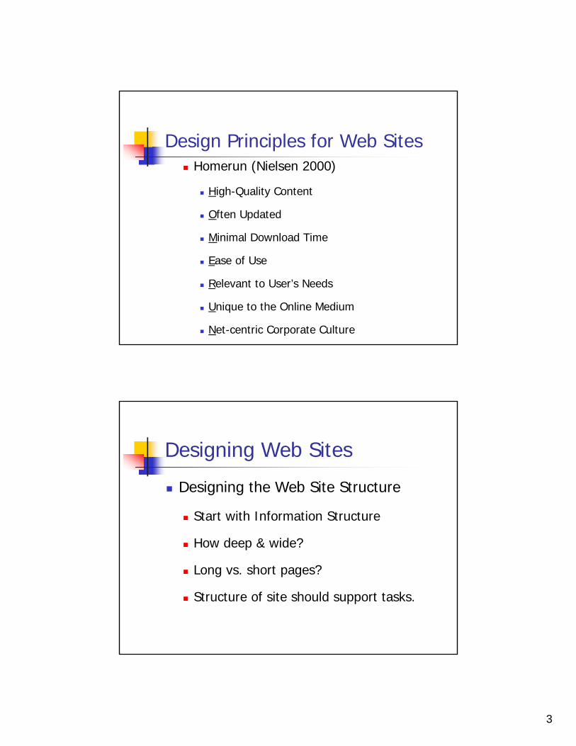
Design Principles for Web Sites Homerun (Nielsen 2000)
High-Quality Content
Often Updated
Minimal Download Time
Ease of Use
Relevant to User’s Needs
Unique to the Online Medium
Net-centric Corporate Culture
Designing Web Sites
Designing the Web Site Structure
Start with Information Structure
How deep & wide?
Long vs. short pages?
Structure of site should support tasks.

4
Sample information structure
Web structure Broad & shallow minimizes page loads

5
Designing Web Sites
Helping the Users Know Where They Are
Orient users who hypertext into the middle of your site.
What site am I on?
Logo, consistent look & feel
What page am I on?
Breadcrumbs
Breadcrumbs

6
Designing Web Sites Helping the Users Navigate around the Site
Structural navigation – other pages within the same site
Associative links – same page links
“See Also” links – to other web sites
Navigation Aids
Site map
Breadcrumbs
Maps (geographical or other visual index)
Designing Home Pages and Interior Pages
Designing the Home Page
Tells the users where they are
Tells the users what the site does
Logo, tagline, intro, key content, search, etc
Designing Interior Pages
More content, less introductory info
User still needs to know where they are
Logo, link to homepage
7
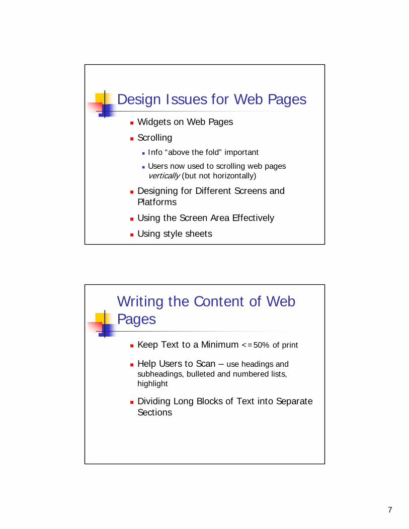
Design Issues for Web Pages Widgets on Web Pages
Scrolling Info “above the fold” important
Users now used to scrolling web pages vertically (but not horizontally)
Designing for Different Screens and Platforms
Using the Screen Area Effectively
Using style sheets
Writing the Content of Web Pages
Keep Text to a Minimum <=50% of print
Help Users to Scan – use headings and subheadings, bulleted and numbered lists, highlight
Dividing Long Blocks of Text into Separate Sections

8
UIDE Chapter 17
Lovely Roomsexample
Conceptual Design
Content diagram
UIDE Chapter 17
Find a Lovely Room
Information structure

9
UIDE Chapter 17
Lovely Rooms web site
UIDE Chapter 17

10
Jonathan LazarHandbook of HCI
Unique Challenges in Designing for Web?
Unreliability of internet (delays, outages) Browser incompatibility & versions Standards (w3) rarely followed exactly Absence of user training
Navigation design Important to provide navigation
Let users know where they are and where they can go Users may not enter from home page
Infeasible to link from every page to every other, so must organize site into sections “sectional navigation” – section links in sidebar (eg)
“audience-splitting” Parts of site optimized to different user groups
site maps Reduces user disorientation

11
Navigation breadcrumbs
Hierarchical info about current location in site
Text navigation (in addition to images) important For users with images turned off For blind users For users to navigate before all images download
Navigation widgets should be at top or left of page First places users look at
Methods should be constant throughout entire site
Tips – things to think about
Download times 10 sec max (Nielsen)
Accessibility Internationalization
Animation – can be distracting Mouseovers
Nielsen: most have no value to users

12
Development Methodology for Web
First, determine overall mission and users
User involvement Requirements gathering Usability testing Best: participatory design
But, typically very short development times
Usability testing
Easier to do remotely, since web site can be accessed over net Tools
Intuition HQ, Usabilla, Loop11, etc.
Heuristic evaluation: Levi & Conrad, 1996 –Interactions 3(4), A heuristic eval Used Nielsen’s heuristics & severity scale

13
“Automatic” Usability Testing Tools
NIST WEBSAT Very old Example rule,
Forms must have Submit and Reset/Clear buttons
Readability checks (Word, wordscount.info, etc) Color contrast (checkmycolours.com) Navigation (optimalworkshop.com, writemaps.com,
plainframe.com, navflow.com) Load speed (pingdom.com) UX (feedbackarmy.com, 10 reviews for $20)
Standard Survey Instruments
QUIS - $750! Questionnaire for
User Interaction Satisfaction
WAMMI – web analysis and measurement inventory –wammi.com

14
WAMMI
WEBMAC – Website Motivational Analysis Checklist
4 aspects assessed
Engaging/Stimulating offers eye-catching visuals, attractive screen layout, humor, varied activities, novelty,
and diverse and well-written content;
Meaningful offers a statement of the purpose and importance of the site, accurate and updated
information, meaningful examples and analogies, and quick and easy links to other relevant sites;
Organized offers a site overview, summaries of key points, a help interface, and definitions of
terms;
Enjoyable for both the extrinsically and intrinsically motivated user positive feedback on progress, user-controlled external rewards (such as animation),
and quick response speed.

15
WEBMAC Example “Stimulating” Questions
1. The home page of this Web site is eye-catching and visually interesting.5. There are incentives at this site that motivate me to explore it 9. The screen layout of this Web site is attractive.
Exercise
Design the eyeglass frame sales web site
Methodology? Sketch solution

16
Nielsen: Top 10 Mistakes in Web Design
#1. Bad Search#2. PDFs#3. Not indicating
visited links. #4. Non-Scannable
Text#5. Fixed Font Size
Nielsen: Top 10 Mistakes in Web Design
#6. Page Titles With Low Search Engine Visibility#7. Avoid Anything that looks like an Advertisement #8. Violating Design Conventions
Jakob's Law of the Web User Experience:"users spend most of their time on other websites."
#9. Opening New Browser Windows#10. Not answering users’ questions

17
Trust in websites
Fogg, CHI 2001, What Makes Web Sites Credible?
1400 people evaluated 51 websites credibility can be defined as believability
When is this important?
Trust

18
Positive influence
Positive influence

19
Positive influence
Positive influence

20
Negative influence
Negative influence

21
T8 - User Testing & Prototype Revision – Due next class
In this final group assignment, you will complete enough of the implementation to support user testing, conduct a user test of your interface, and write up the final results of the project.
User Testing You will conduct user testing of your system. Prepare a briefing and three tasks. These may be the same ones that you used in paper prototyping, but you may want to improve them based on feedback from the paper prototyping. You may, if you wish, also prepare a short demo of your interface that you can use to show your users the purpose of the system. The demo should be scripted, so that you do and say the same things for each user. It should use a concrete example task, but the example task should be sufficiently different from the test tasks to avoid bias. The demo option is offered because some interfaces are learned primarily by watching someone else use the interface. Think carefully about whether your interface is in this category before you decide to use a demo, because the demo will cost you information. Once you've demonstrated how to use a feature, you forfeit the chance to observe how the user would have used it otherwise. Pilot test your briefing, demo, and tasks, before the user test session. Use another group member or another member of the class for your pilot testing.
T8 - User Testing & Prototype Revision – Due next class
Conduct a formative evaluation with each user: Provide your briefing and (optionally) demo. Then provide the tasks one at a time, observe, and take notes.
One member of your group should be the facilitator of the test, and the rest should be observers.
Redesign Collect the usability problems found by your user tests into a list. Assign each problem a severity rating (as in T7 above), and brainstorm possible solutions for the problems. Then, fix your implementation to solve as many problems as you can in the time available, giving priority to severe problems.
What to Post A link to your updated prototype and a brief usability test report.

22
To do
Read Stone Ch 18, Leung, Chaudry Finish T8 (next class) Finish final report & 10 min presentation
(due in 1 week) Problem. (1 min) What user problem are you trying to solve? Who are the
users? What are their tasks? Demonstration. (2 min) Demonstrate your design and implementation via a
live demo of your system, working through one sample task. Discuss major design decisions. Run on YOUR computer to minimize compatibility issues. You should test with the projector before class starts.
Evaluation. (4 min) Discuss the major findings from all three of your user evaluations (paper prototyping, heuristic evaluation, and user testing).