How to set up successful graphs in Science!. Y Axis (This is for your dependent variable)
16
How to set up successful graphs in Science!
-
Upload
theodora-houston -
Category
Documents
-
view
220 -
download
3
Transcript of How to set up successful graphs in Science!. Y Axis (This is for your dependent variable)
How to set up successful graphs in Science!


Y Axis
(This is for your dependent variable)

X Axis
(This is for your independent variable)

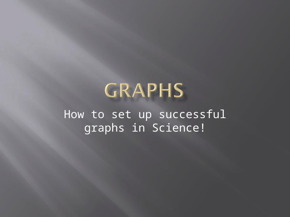
TT - Title
Teachers’s Favorite Singer

T - T - Title
A - Axis
Teachers’s Favorite Singer
Y Axis = Dependent Variable
X Axis = Independent
Variable
T - T - Title
A – Axis
S – Scale
Teachers’s Favorite Singer
Decide on an appropriate scale for each axis.
Choose a scale that lets you make the graph as
large as possible for your paper and data

Scale is determined by your highest & lowest number.
In this case your scale would be from 2 – 22.
Favorite Singer
Number of Teachers
Toby Keith 22
Madonna 15
Elvis 11
Sting 5
Sinatra 2

The interval is decided by your scale.
In this case your scale would be from 2 – 22 and you want the scale to fit the graph.
The best interval would be to go by 5’s.
Favorite Singer
Number of Teachers
Toby Keith 22
Madonna 15
Elvis 11
Sting 5
Sinatra 2

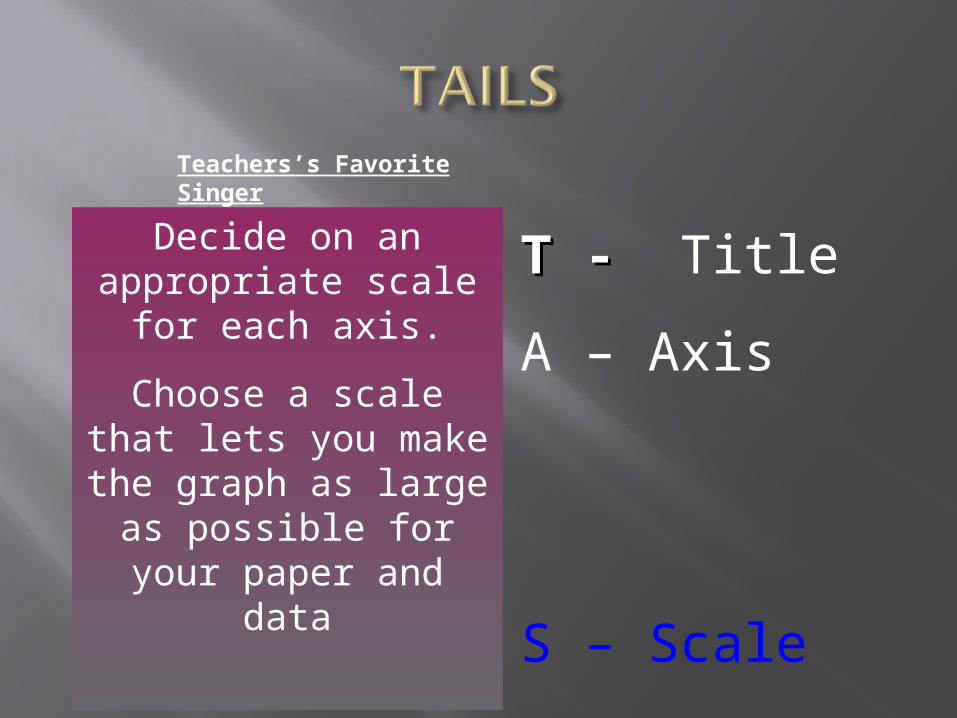
T – TitleT – Title
A – Axis
I – Interval
S – Scale
Teachers’s Favorite Singer
The amount of space between one number and the next or one type of data and the next on the graph.
The interval is just as important as the scale
Choose an interval that lets you make the graph as large as possible for your paper and data

T – TitleT – Title
A – Axis
I – Interval
S – Scale
Teachers’s Favorite Singer
0
5
10
15
20
25
T – TitleT – Title
A – Axis
I – Interval
L – Labels
S – Scale
Teachers’s Favorite Singer
0
5
10
15
20
25
Toby K
eith
Madonna
Elvis
Sting
Sinatra
LABEL your bars or data points
Singers
Give the bars a general label. What do those words mean?
Num
ber
of T
each
ers
Label your Y Axis. What do those numbers mean?

Bar graphsBar graphs Used to show data that are not continuous. Allows us to compare data like amounts or
frequency or categories Allow us to make generalizations about the
data Help us see differences in data
Line GraphsLine Graphs For continuous data useful for showing trends over time

A scatter plot is a graph of a collection of ordered pairs (x,y).
The graph looks like a bunch of dots, but some of the graphs are a general shape or move in a general direction.
HINT HINT WINK WINK: the type of graph you will be using
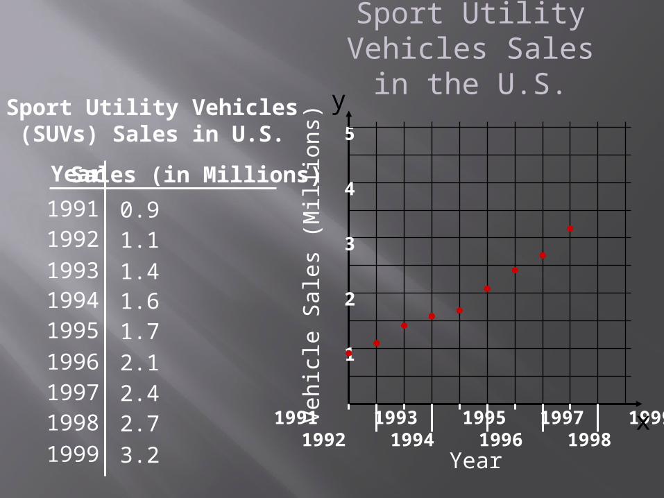
Year
Sport Utility Vehicles(SUVs) Sales in U.S.
Sales (in Millions)
19911992
199319941995
1996
19971998
1999
0.91.1
1.41.61.7
2.1
2.42.7
3.2
1991 1993 1995 1997 1999 1992 1994 1996 1998 2000
x
y
Year
Veh
icle
Sal
es (
Mil
lion
s)
5
4
3
2
1
Sport Utility Vehicles Sales in the U.S.
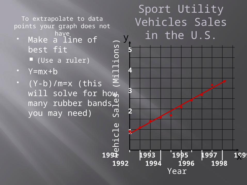
1991 1993 1995 1997 1999 1992 1994 1996 1998 2000
x
y
Year
Veh
icle
Sal
es (
Mil
lion
s)
5
4
3
2
1
Make a line of best fit (Use a ruler)
Y=mx+b (Y-b)/m=x (this will
solve for how many rubber bands you may need)
Sport Utility Vehicles Sales in the U.S.
To extrapolate to data points your graph does not have