
How to doc - Additional UI Elements · How to doc - Additional UI Elements 9 r. Go to the Design...
18
How to Configure Additional UI Elements Supported in the Self Service Composition Environment Applicable Release: MII 15.0 Version 1.0 Date: 27 th May 2014 SAP MII – Additional UI element support in Self Service Composition Environment How-To-Guide
Transcript of How to doc - Additional UI Elements · How to doc - Additional UI Elements 9 r. Go to the Design...

How to Configure Additional UI
Elements Supported in the Self Service
Composition Environment
Applicable Release: MII 15.0
Version 1.0
Date: 27th
May 2014
SAP MII – Additional UI element
support in Self Service
Composition Environment
How-To-Guide

How to doc - Additional UI Elements
i
© Copyright 2015 SAP AG. All rights reserved.
No part of this publication may be reproduced or transmitted in
any form or for any purpose without the express permission of
SAP AG. The information contained herein may be changed
without prior notice.
Some software products marketed by SAP AG and its
distributors contain proprietary software components of other
software vendors.
Microsoft, Windows, Outlook, and PowerPoint are registered
trademarks of Microsoft Corporation.
IBM, DB2, DB2 Universal Database, OS/2, Parallel Sysplex,
MVS/ESA, AIX, S/390, AS/400, OS/390, OS/400, iSeries,
pSeries, xSeries, zSeries, z/OS, AFP, Intelligent Miner,
WebSphere, Netfinity, Tivoli, Informix, i5/OS, POWER,
POWER5, OpenPower and PowerPC are trademarks or
registered trademarks of IBM Corporation.
Adobe, the Adobe logo, Acrobat, PostScript, and Reader are
either trademarks or registered trademarks of Adobe Systems
Incorporated in the United States and/or other countries.
Oracle is a registered trademark of Oracle Corporation.
UNIX, X/Open, OSF/1, and Motif are registered trademarks of
the Open Group.
Citrix, ICA, Program Neighborhood, MetaFrame, WinFrame,
VideoFrame, and MultiWin are trademarks or registered
trademarks of Citrix Systems, Inc.
HTML, XML, XHTML and W3C are trademarks or registered
trademarks of W3C®, World Wide Web Consortium,
Massachusetts Institute of Technology.
Java is a registered trademark of Sun Microsystems, Inc.
JavaScript is a registered trademark of Sun Microsystems, Inc.,
used under license for technology invented and implemented by
Netscape.
MaxDB is a trademark of MySQL AB, Sweden.
SAP, R/3, mySAP, mySAP.com, xApps, xApp, SAP
NetWeaver, and other SAP products and services mentioned
herein as well as their respective logos are trademarks or
registered trademarks of SAP AG in Germany and in several
other countries all over the world. All other product and service
names mentioned are the trademarks of their respective
companies. Data contained in this document serves
informational purposes only. National product specifications
may vary.
These materials are subject to change without notice. These
materials are provided by SAP AG and its affiliated companies
("SAP Group") for informational purposes only, without
representation or warranty of any kind, and SAP Group shall not
be liable for errors or omissions with respect to the materials.
The only warranties for SAP Group products and services are
those that are set forth in the express warranty statements
accompanying such products and services, if any. Nothing herein
should be construed as constituting an additional warranty.
These materials are provided “as is” without a warranty of any
kind, either express or implied, including but not limited to, the
implied warranties of merchantability, fitness for a particular
purpose, or non-infringement.
SAP shall not be liable for damages of any kind including
without limitation direct, special, indirect, or consequential
damages that may result from the use of these materials.
SAP does not warrant the accuracy or completeness of the
information, text, graphics, links or other items contained within
these materials. SAP has no control over the information that
you may access through the use of hot links contained in these
materials and does not endorse your use of third party web pages
nor provide any warranty whatsoever relating to third party web
pages.
SAP ME “How-to” Guides are intended to simplify the product
implementation. While specific product features and procedures
typically are explained in a practical business context, it is not
implied that those features and procedures are the only approach
in solving a specific business problem using SAP ME. Should
you wish to receive additional information, clarification or
support, please refer to SAP Consulting.

How to doc - Additional UI Elements
ii
Document History
Document Version Description Author
1.0 Initial version Arnab Sengupta
How to doc - Additional UI Elements
iii
Table of Contents
1 Introduction ........................................................................................................................................... 1
2 Additional UI elements in the Dashboard ............................................................................................. 1
2.1 Adding and configuring a TextArea UI element ........................................................................... 1
2.2 Adding and configuring Radio Button UI elements ..................................................................... 4
2.3 Adding and configuring Checkbox UI elements ........................................................................... 6
3 Selecting Image from Client’s local machine ....................................................................................... 9

How to doc - Additional UI Elements
1
1 Introduction The Self Service Composition Environment now supports additional UI elements like Radio Button,
CheckBox and Text Area.
Also, images can be selected from the client’s local machine and dragged into a Dashboard. There is a
new UI element called Image which enables this. Once the image is loaded in the Dashboard, it is then
cached and stored for a particular user.
2 Additional UI Elements in the Dashboard
2.1 Adding and Configuring a TextArea UI element To add a TextField UI element in the Self Service Composition Environment:
a. Logon to the Self Service Composition Environment.
b. Create a 1X1 Standard Layout.
c. Go to the tab UI ELEMENTS in the top right hand panel.
d. Select the UI element TextArea under UI Controls and drag it to the cell.
e. Click on the TextArea UI element.
f. Go to the Properties tab on the right hand pane for this UI elements.
g. Enter specific values for the UI element attributes
Name
Placeholder
Text Size
Tooltip
Enabled

How to doc - Additional UI Elements
2
Visible
OnLiveChange event
OnChange event
h. Go to the tab “Source Code”.
i. Click on “Edit”.
j. Enter necessary code block for the run time eventing methods configured for the UI element.
k. Choose Apply.
l. Go to Preview.
m. Click on the UI element and enter any text.

How to doc - Additional UI Elements
3
n. Note that on entering some text the “OnEnter” method is triggered, and a pop-up is displayed.
o. Choose OK to close the pop-up.
p. Go to the “Design” tab.
q. Select the UI element.
r. To delete the UI element, click on the Delete icon on the top left corner.

How to doc - Additional UI Elements
4
2.2 Adding and Configuring Radio Button UI elements To add Radio Button UI elements:
a. Select the UI element Radio Button under UI Controls and drag two such elements to the cell.
b. Click on the RadioButton UI element.
c. Go to the Properties tab on the right hand pane for these UI elements.
d. Enter specific values for the UI element attributes:
Name
Text
Text Size
Group Name
Tooltip
Enabled
Visible
OnSelect event
e. Go to the tab Source Code.
f. Click on Edit.
g. Enter necessary code block for the run time eventing methods configured for the UI element.
h. Choose Apply.

How to doc - Additional UI Elements
5
i. Go to the Design tab and configure the second Radio Button element similarly.
j. Go to Preview
k. Click on any of the Radio Buttons.
How to doc - Additional UI Elements
6
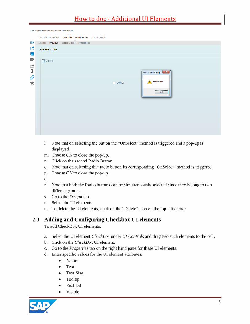
l. Note that on selecting the button the “OnSelect” method is triggered and a pop-up is
displayed.
m. Choose OK to close the pop-up.
n. Click on the second Radio Button.
o. Note that on selecting that radio button its corresponding “OnSelect” method is triggered.
p. Choose OK to close the pop-up.
q.
r. Note that both the Radio buttons can be simultaneously selected since they belong to two
different groups.
s. Go to the Design tab .
t. Select the UI elements.
u. To delete the UI elements, click on the “Delete” icon on the top left corner.
2.3 Adding and Configuring Checkbox UI elements To add CheckBox UI elements:
a. Select the UI element CheckBox under UI Controls and drag two such elements to the cell.
b. Click on the CheckBox UI element.
c. Go to the Properties tab on the right hand pane for these UI elements.
d. Enter specific values for the UI element attributes:
Name
Text
Text Size
Tooltip
Enabled
Visible
How to doc - Additional UI Elements
7
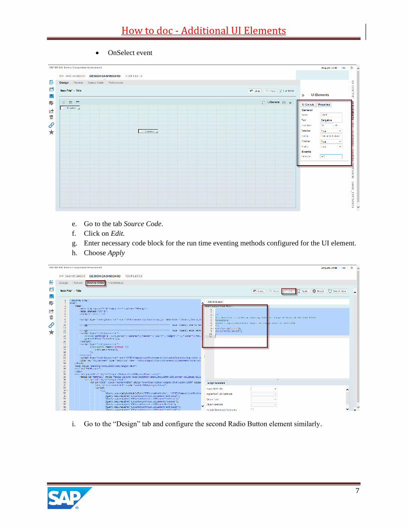
OnSelect event
e. Go to the tab Source Code.
f. Click on Edit.
g. Enter necessary code block for the run time eventing methods configured for the UI element.
h. Choose Apply
i. Go to the “Design” tab and configure the second Radio Button element similarly.
How to doc - Additional UI Elements
8
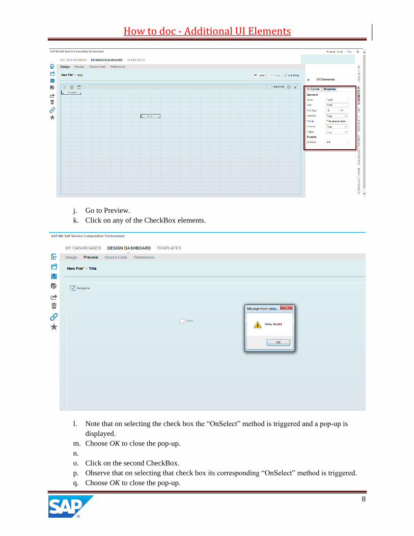
j. Go to Preview.
k. Click on any of the CheckBox elements.
l. Note that on selecting the check box the “OnSelect” method is triggered and a pop-up is
displayed.
m. Choose OK to close the pop-up.
n.
o. Click on the second CheckBox.
p. Observe that on selecting that check box its corresponding “OnSelect” method is triggered.
q. Choose OK to close the pop-up.
How to doc - Additional UI Elements
9
r. Go to the Design tab.
s. Select the UI elements.
3 To delete the UI elements, click on the “Delete” icon on the top
left corner Selecting Image from Client’s Local Machine In the Self Service Composition Environment, a user can select any image file that is stored locally in his
machine and use the same in a dashboard. That same image file is then cached and stored in the user’s
local folder in the dashboard.
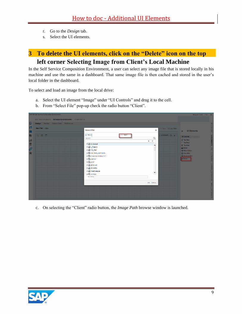
To select and load an image from the local drive:
a. Select the UI element “Image” under “UI Controls” and drag it to the cell.
b. From “Select File” pop-up check the radio button “Client”.
c. On selecting the “Client” radio button, the Image Path browse window is launched.

How to doc - Additional UI Elements
10
d. Click on the “Browse” button to locate and select the image file stored locally.
e. Click on “Open” to load the file path in the “Image Path” field.
How to doc - Additional UI Elements
11
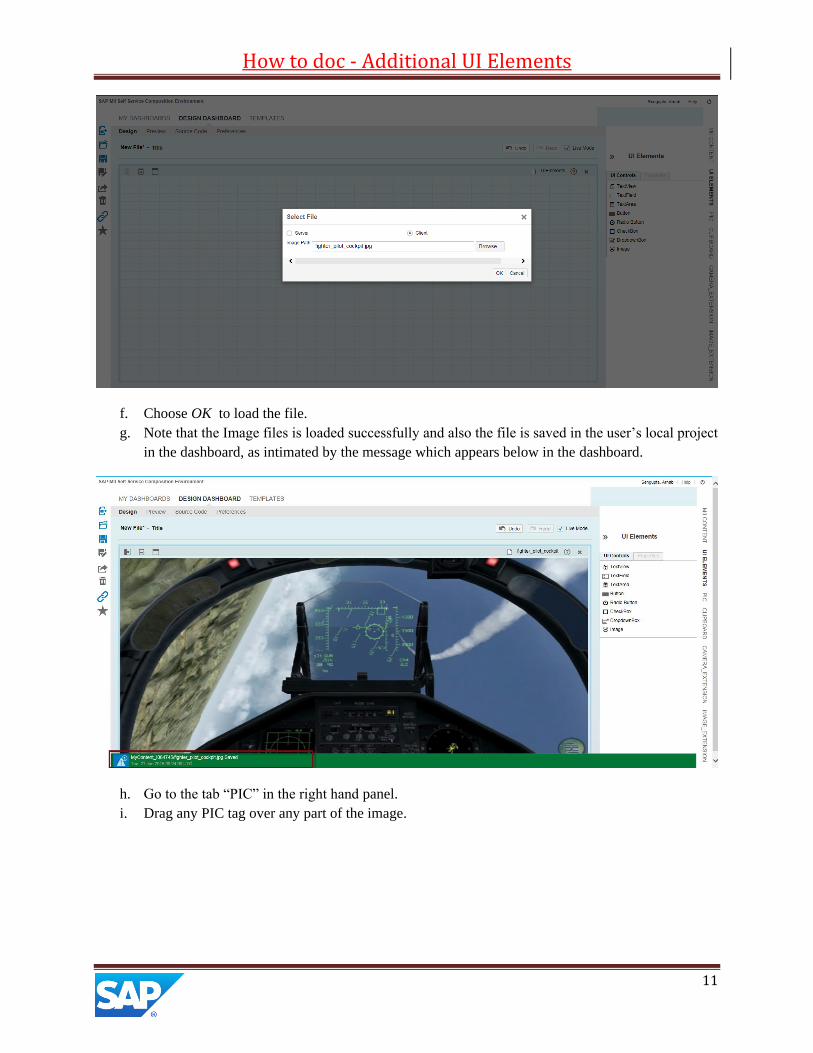
f. Choose OK to load the file.
g. Note that the Image files is loaded successfully and also the file is saved in the user’s local project
in the dashboard, as intimated by the message which appears below in the dashboard.
h. Go to the tab “PIC” in the right hand panel.
i. Drag any PIC tag over any part of the image.

How to doc - Additional UI Elements
12
j. Click on the PIC tag.
k. Select the option “Configure Tag Display”.
l. Configure the Tag to add a rule in a row with the required set of condition.

How to doc - Additional UI Elements
13
m. Click on the “Select Icon for Display” icon under the “Icons” column.
n. In the ensuing “Select File” pop-up check the radio button “Server”.
o. Expand the node “My Content”.
p. Select any small image file that was loaded earlier and cached in this folder.
q. Choose OK
r. The file path for the icon is loaded in the “Icon” column.
s. Go to the “Display” tab.
t. Check the checkbox “Show Tag Names”.
u. Choose Apply.
v. Go to the “Preview” tab.
w. Observe that the Tag values is now displayed with the selected icon file.

How to doc - Additional UI Elements
14