How (not) to give a talk june 2016
66
How How (Not) (Not) To To Give an Give an Effective Effective Talk Talk Kim Nicholas, [email protected] @KA_Nicholas LUCSUS, Lund University, Sweden With input from Weston Dripps, visiting professor from Furman University NOT
-
Upload
kim-nicholas -
Category
Education
-
view
75 -
download
0
Transcript of How (not) to give a talk june 2016

How How (Not) (Not) ToTo Give an Give an EffectiveEffectiveTalkTalk
Kim Nicholas, [email protected] @KA_Nicholas LUCSUS, Lund University, Sweden
With input from Weston Dripps, visiting professor from Furman University
NOT

Key PointsKey PointsA. Content
- Meet the requirements- Focus on what’s important
B. Presentation Skills- Addressing your audience
C. Slide Design- Clear, consistent slides

20 minutes, no more!
A. ContentMeet the requirementsThe LUMES Thesis Presentation

Ideal: 1 slide = 2 minutesMinimum: 1 slide = 1 minute
1. Title Slide [1 slide]2. Introduction / Research Question [1 - 2 slides]3. Materials, Methods, Field Site [2 slides]4. Results [3 - 5 slides]5. Discussion [2 - 4 slides]6. Conclusions [1 - 2 slides]
Focus on What’s ImportantContent

Title slide (1 slide): Title, your name, institution, and contact info. Possibly interesting photograph
Some Specific Suggestions for Slide Content

Analysis of Urban Air Pollution:Implication for Global Health
and Mortality in the Developed World
Dr. Jane DoeDepartment of XYZ, University of ABC

URBAN AIR POLLUTION: THE SILENT KILLERJane Doe / Department of XYZ / University of ABC

Title slide (1 slide): • Title, your name, institution, and contact info.• Possibly interesting photograph
Some Specific Suggestions for Slide Content
Introduction (1 – 2 slides): • Get your audience excited about the "issue”• Put your issue in some context / past work• Provide statement of hypothesis / question

Materials / Methods / Field Site (2 – 3 slides): • visuals of your equipment / set up / field site• experimental approach / methods employed• data collected, why selected, how analyzed
Results and Discussion (5 – 9 slides): • show data collected (graphically)• highlight key trends and findings• explain findings
Conclusions (1 – 2 slides): • Reiterate / summarize key points• Contribution of your work• Future directions / next steps

Put on a Good Show Hit the Highlights
“Pay no attention to the man behind the curtain!”
“I am the Great and Powerful OZ!”

LUMES Defense Format• Student presentation: 20 minutes• Discussant: 30 minutes• Final 10 minutes: Examiner/Audience

LUMES Defense Reminders• Bring printed or electronic copy of your
thesis for reference• Be prepared to justify and explain the
appropriateness of your research question and methods, and the relevance of your findings
• Keep answers short and concise• Ask for clarification: “Is your question …?”

B. Presentation SkillsB. Presentation SkillsAddressing your audienceAddressing your audience
• Eye contact• Project voice• Open body language• Face audience,
not slides• Find the “nodders”
Image: Publicwords.typepad.com

ExcusesExcuses
• “I’m just a student…”• “I did this last night (or 5 minutes ago…)”• “I haven’t done this before…”

ExcusesExcuses
• “I’m just a student…”• “I did this last night (or 5 minutes ago…)”• “I haven’t done this before…”

TimingTiming• ESSENTIAL to get this right• Put key points up front,
support throughout, summarize at end
• Rehearse fully at least 3 times
• Have minute goals for slides• No excuse to go over time
Image: sundialtime.com

Know Thy AudienceKnow Thy Audience
• Catch interest at the beginning• Make relevant and accessible to them• Don’t assume overly specialized knowledge

From Todd Reubold, UMinn
C. Slide DesignClear, Consistent Slides

• Backwards Design
• design around main take-away points
• Focus on your work!
• Minimize background.
Powerpoint DesignPowerpoint Design
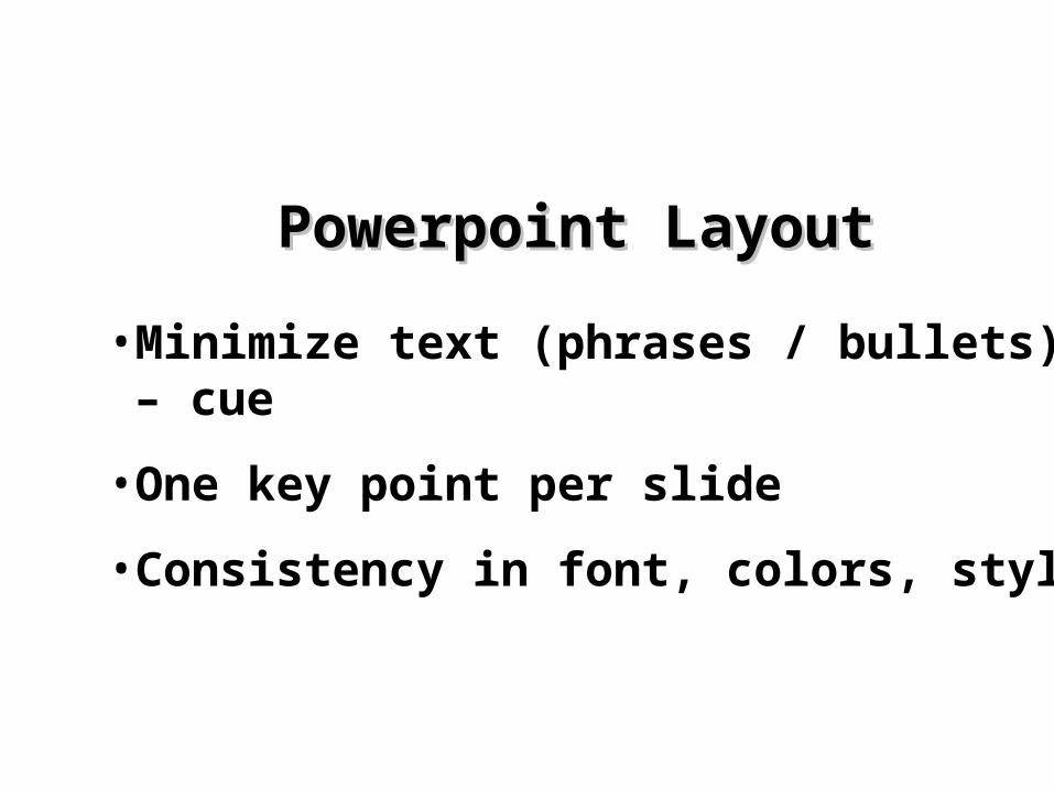
• Minimize text (phrases / bullets) – cue
• One key point per slide
• Consistency in font, colors, style
Powerpoint LayoutPowerpoint Layout

From Todd Reubold, UMinn

From Todd Reubold, UMinn

From Todd Reubold, UMinn


From Todd Reubold, UMinn

From Todd Reubold, UMinn

“The audience will either read your slidesor listen to you. They won’t do both.”
Nancy Duarte, Duarte Design
The slides are meant to support the narration of the speaker,
not make the speaker superfluous.


So Avoid the So Avoid the ““All WordAll Word”” Slide SlideAvoid the use of a large block paragraph to introduce your information. Attendees do not like to have what is on the screen, read to them verbatim. So, please use short, bulleted statements and avoid typing out your whole presentation on to the slides. It is difficult for some to listen and read a large amount of text at the same time.

From Todd Reubold, UMinn
Don’t !

From Todd Reubold, UMinn
Don’t !

From Todd Reubold, UMinn

Keep it simple!
From Todd Reubold, UMinn

Limit the number of fonts in your presentation!
FontsFonts
• DonDon’’t Sacrifice Readability for t Sacrifice Readability for StyleStyle
• DonDon’’t Sacrifice Readability t Sacrifice Readability for Stylefor Style
• DonDon’’t Sacrifice Readability for t Sacrifice Readability for StyleStyle

ArialTahomaVerdana
FontsFonts
Choose 1 – 2 Sans Serif fontsfor your presentation

• Good title size (Arial 40 point)• Good subtitle size (Arial 32 point)• Content text should be no smaller than Arial 24 point
Font SizeFont SizeRemember, your slides must be readable,
even at the back of the room.

• Here is what Arial 20 point looks like …
• Here is what Arial 16 point looks like …
• Here is what Arial 12 point looks like …
Font SizeFont Size
You won’t be able to read these …

Use a TemplateUse a Template• Use a set font and color scheme.• Different styles are disconcerting to
the audience.• You want the audience to focus on
what you present, not the way you present.

Ideally Use the Same BackgroundBackground on Each Slide

• Don’t use multiple backgrounds in your presentation
• Changing the style is distracting

CCoolloorrss• Reds and oranges are high-
energy but can be difficult to stay focused on.
• Greens, blues, and browns are mellower, but not as attention grabbing.
• Reds and Greens can be difficult to see for those who are color blind.

CCoolloorrss• Large Hall Events
–Avoid WhiteWhite Backgrounds–The white screen can be
blinding in a dark room–Dark SlidesDark Slides with LightLight Colored Colored
TextText Work Best
Don’t

The The CCoolloorr Wheel Wheel• Colors separated by
another color are contrasting colors (complementary)
• Adjacent colors harmonize with one another (Green and Yellow)
• Colors directly opposite one another are said to CLASH
• Clashing colors provide readability – OrangeOrange on BlueBlue
Do !

This is a good mix of colors. Readable!
Background Background CCoolloorrssRemember: Readability! Readability! Readability!
This is a bad mix of colors. Low contrast.Unreadable!
This is a good mix of colors. Readable!
This is a bad mix of colors. Avoid brightcolors on white.Unreadable!

Use Color ConsistentlyUse Color Consistently• Decide on a color for each unit (country, group, treatment…).• Explain it in the first slide.• Keep the same throughout. • Have a key that shows it visually for every slide.

Graphs and ChartsGraphs and Charts
Make sure the audience can read them!

8
Don’t !
Unreadable, busy graphsUnreadable, busy graphs

This graph contains too much information in an unreadable format.
10
Don’t !

(This may require you to re-create text in PowerPoint)

Check out Check out “Search by “Search by image”!image”!
Low res
Higher res

Don’t !

Don’t !

Do !

Do !

From Todd Reubold, UMinn

From Todd Reubold, UMinn

From Todd Reubold, UMinn

From Todd Reubold, UMinn
From Todd Reubold, UMinn

From Todd Reubold, UMinn

From Todd Reubold, UMinn

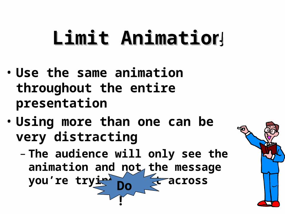
Limit AnimationLimit Animation
• Use the same animation throughout the entire presentation
• Using more than one can be very distracting– The audience will only see the
animation and not the message you’re trying to get across
!!
Bam!Don’t
Limit AnimationLimit Animation• Use the same animation throughout
the entire presentation• Using more than one can be very
distracting– The audience will only see the
animation and not the message you’re trying to get across
!!
Do !

Key PointsKey PointsA. Content
- Meet the requirements- Focus on what’s important
B. Presentation Skills- Addressing your audience
C. Slide Design- Clear, consistent slides

YOUYOU• Do not use the media to hide you• The audience came to SEE you• The media should ENHANCE the
presentation, not BE the presentation• If you’re only going to read from the slides,
then just send them the slides!• Remember, only you can prevent “Death by PowerPoint”

This is My Final SlideThis is My Final Slide• End with a Final Slide• Make the last words you say “Thank
You” so the audience knows when to clap!
Image: ferdyonfilms.com