How do you use observed data to predict unobserved data? Hours watching TV Test score.
17
How do you use observed data to predict unobserved data? Hours watching TV Test score
-
Upload
aubrie-sharp -
Category
Documents
-
view
270 -
download
0
Transcript of How do you use observed data to predict unobserved data? Hours watching TV Test score.

How do you use observed data to predict unobserved data?
Hours watching TV
Test
sco
re

In this lesson you will learn how to interpret scatter plots by identifying the line of best
fit.

Let’s ReviewLet’s Review
1 2 3 4 5 6 7 8 9 10
100
90
80
70
60
50
40
30
20
10
When x is 7, y is 65.

Let’s ReviewA Common Mistake
Homework completed
100
90
80
70
60
50
40
30
20
10
1 2 3 4 5 6 7 8 9 10
Test
sco
re

Let’s ReviewCore Lesson
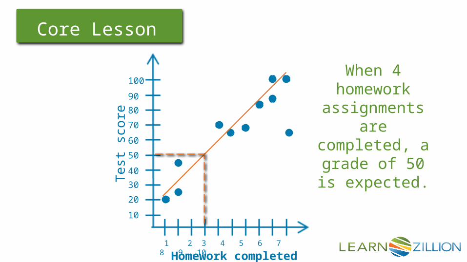
Homework completed
100
90
80
70
60
50
40
30
20
10
1 2 3 4 5 6 7 8 9 10
Test
sco
re
Line of Best FitOr
Linear Model
Let’s ReviewCore Lesson
Homework completed
100
90
80
70
60
50
40
30
20
10
1 2 3 4 5 6 7 8 9 10
Test
sco
re
When 4 homework
assignments are completed, a grade of 50 is
expected.

Let’s ReviewCore Lesson
Hours watching TV
Test
sco
re
100
90
80
70
60
50
40
30
20
10
1 2 3 4 5
When 2.5 hours of TV are
watched, a grade of 72 is
expected.
Let’s ReviewCore Lesson
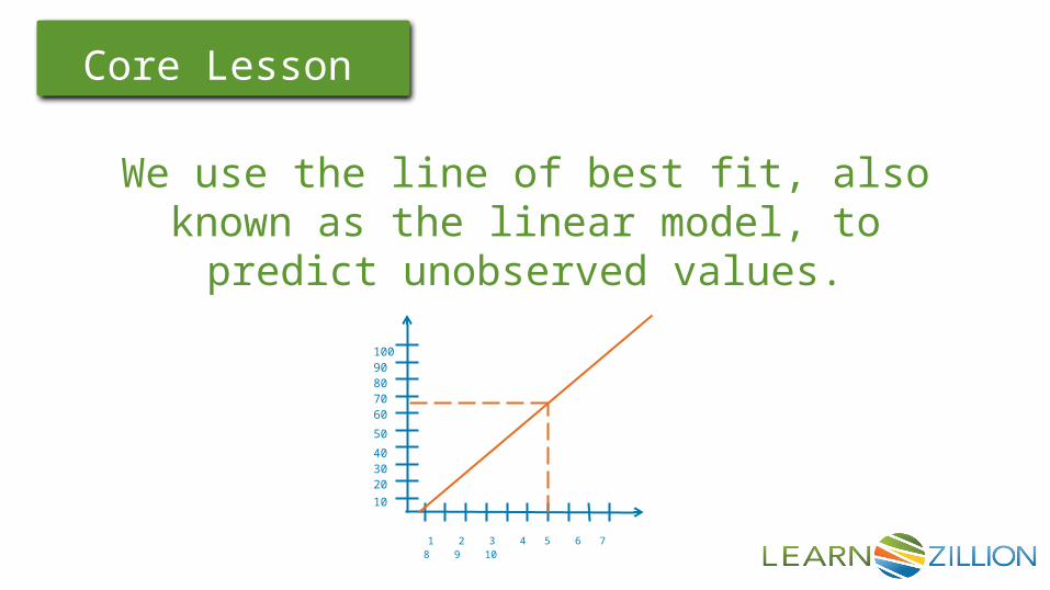
We use the line of best fit, also known as the linear model, to predict
unobserved values.
1 2 3 4 5 6 7 8 9 10
10090807060
50
403020
10

In this lesson you learned how to interpret scatter plots by
identifying the line of best fit.

Let’s ReviewGuided Practice
Study Time (min)
Resp
on
se S
peed
(se
c)
100
90
80
70
60
50
40
30
20
10
1 2 3 4 5
Find the line of best fit.
Predict the response time if a person studies
for of a minute.

Let’s ReviewExtension Activities
Find a data table in your local newspaper that compares two pieces of data. Construct a scatter plot using the data found. Informally draw the line of best fit. Use this line to predict 3 values that were not observed.

Let’s ReviewExtension Activities
Survey 10 people and construct your own scatter plot with the results. Informally draw the line of best fit. Use this line to predict 3 values that were not observed.

Let’s ReviewQuick Quiz
Which graph shows the line of best fit?
# mp3 downloads
$$
on m
usi
c ca
rd
# mp3 downloads
$$
on m
usi
c ca
rd
# mp3 downloads
$$
on m
usi
c ca
rd

Let’s ReviewQuick Quiz
Use the line of best fit to predict amount of food left on a students plate after a 30 minute lunch.
Minutes at Lunch
Food
Rem
ain
ing
(ou
nce
s)
25
20
15
10
5
4 8 12 16 20
Let’s ReviewQuick Quiz
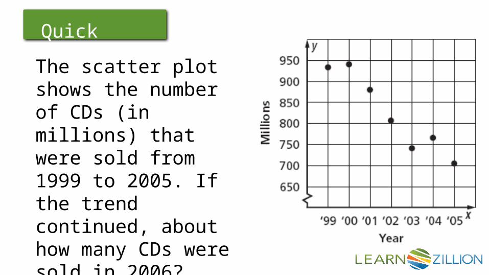
The scatter plot shows the number of CDs (in millions) that were sold from 1999 to 2005. If the trend continued, about how many CDs were sold in 2006?

Let’s ReviewQuick Quiz
Make a scatter plot of the data in the table. Draw a line of best fit. What is the equation of the line of best fit?

Let’s ReviewQuick Quiz
The table below shows the predicted annual cost for a middle income family to raise a child from birth until adulthood. Draw a scatter plot and describe what relationship exists within the data.Draw a line of best fit and predict cost at age 18.