Growth and Transformation Plan (2010/11 -2014/15) and ... · Growth and Transformation Plan...
83
Growth and Transformation Plan (2010/11 -2014/15) and Monetary policy in the five-years : The Case of Ethiopia
Transcript of Growth and Transformation Plan (2010/11 -2014/15) and ... · Growth and Transformation Plan...

Growth and Transformation Plan (2010/11 -2014/15)
and Monetary policy in the five-years : The Case of Ethiopia

I. Main development agenda of the Ethiopian government is: poverty reduction.
through: • Broad-based; and • Accelerated and Sustained economic growth
– the country is believed to join the middle income group in the next 10 to 15 years
II. Towards this main agenda, the Five-Year (2010/11 – 2014/15) Growth and Transformation Plan has been prepared.
III. GTP comprises of detailed socio-economic transformation plans and targets. My presentation focuses on the economic side of it.
IV. GTP is a closed and internally consistent plan: the plan has tried to ensure consistency between growth and macroeconomic stability objectives.
A/ Sector-wide growth and investment Plan
B/ Five-years financial Programming

A/ Sector-wide growth and investment Plan Four main objectives: 1. Achieve at least an average real GDP growth of 11.2% and attain MDGs
In the Five-years GTP (2010/11 – 20014/15)
higher-case base-case Real GDP growth 14.9% 11.2%
– agriculture 14.9% 8.6% – industry 21.3% 20.0% – services 12.8% 10.6%
This would be achieved through high and sustained investment and increase domestic savings – Gross capital formation - to - GDP ratio to reach 28.2% (in 2014/15)
from 22.3% (in 2009/10)
» Investment in infrastructure and social development (expansion and ensuring quality)
• Easy access to power (e.g. electricity coverage from 41% to 75%) • Transport (e.g. average time taken to all-weather roads from 3.7hrs to
1.4hrs; • Communication ( e.g. fixed line telephone density from 1.36% to
3.4%)

» Investment in industries
e.g. • Sugar exports earnings to reach USD 661.7 million in 2014/15 from
zero in 2009/10 • Textile and garment export earnings to reach USD 1000 million in
2014/5 from USD 21.8 million in 2009/10
– Domestic saving-to-GDP ratio is targeted to reach 15.0% (2014/15 from 5.5% in 2009/10)
» Broadening the tax base and increase tax collection capacity; » Introducing new financial saving instruments and markets such as » Government saving bonds introduced; » Other contractual saving instruments such as private pension
funds to start soon. 2. Expand and ensure the qualities of education and health services and achieve
MDGs in the social sector 3. Establishing suitable conditions for sustainable nation building through the
creation of a stable democratic and developmental state; 4. Ensuring the sustainability of growth though stable macroeconomic framework

B/ Financial Programming
The objectives of Financial programming is to ensure internal consistency between growth and macroeconomic stability objectives
The GTP takes maintaining a stable macroeconomic environment as a necessary condition to attain high and sustained real GDP growth.
So, the four pillars of the FP are:
– GDP growth and investment targets – Monetary Policy (Inflation) targets – BOP targets – Fiscal target

1/ Monetary Policy: Objectives:
a. containing inflation in single digit while allowing macroeconomic space for growth (inflation rate of 6-9.5%)
– Helps for accelerated growth and investment – Supports for achieving poverty reduction efforts
b. Allowing for monetization of the economy (to accelerate the rate of domestic savings)
– Reaching out those sections of the society that has not been monetized. This would be supported by financial sector policies (no. 3 below)
– Accelerating specialization and division of labor Monetary transmission mechanism Policy instruments operational target intermediate target Goals
Policies and targets: Targets: operational target (nominal anchor) – Reserve money Policies:
– Statutory reserve requirement – treasury bills (primary market) – Moral suasion

2/ Fiscal policy – Sustainable fiscal balance
• Budget deficit–to-GDP ratio of not more than 3 percent – Increasing tax revenue/ GDP ratio to 15% (2014/15) from 11.3% in
2009/10 – Central Treasury towards not resort to central bank borrowing
3/ Financial sector policies – Establishing accessible, efficient and competitive financial system
• Access to finance to reach 67% in 2014/15 from 20% in 2009/10 – E.g. introducing modern national payment system
4/ Sustainable trade balance of the balance of payments – trade deficit-to-GDP ratio to decline to -15 percent by 2014/15 – Current account deficit also to drop to -2 % of GDP by the end of the plan period – Policies include : competitive exchange rate; doing aggressive work on improving the
quality of exports; infrastructure expansion and selected incentives to export sector; and market based import substitution strategy.

Main Challenges of Monetary Policy
• Loose link between operational target (RM) and intermediate target (MS) – Volatility of the money multiplier
• Inadequate foreign exchange sterilization instruments - huge inflow of foreign exchange bloating RM
• High correlation between international food and fuel inflation and domestic inflation – Imported inflation through:
• Exports - agriculture accounts more than 80 percent of total exports • Imports – fuel accounts more than 15 percent of total imports

Macroeconomic Developments and prospects through the GTP
2010/11 2011/12
2003/04-2009/10
Target Actual/ Estimate
Projection
Real GDP growth 11.0 11.2 11.0 * 11.2
Trade deficit/GDP -21.0 -23.6 -17.7 -20.0
Export growth 19.4 37.1 37.1 35.0
Investment/GDP 23.6 28.7 na
Inflation (moving average)
14.9 7.5 18.1 8.5
o/w food 17.6 7.0 15.7 8.0

Analysis of inflation 2010/11
Headline
– including all items in the basket 18.1% – excluding items sensitive to international trade 5.8%
Food – including all items in the basket 15.7% – excluding items sensitive to international trade 4.2%
Non-food – including all items in the basket 21.8% – excluding items sensitive to international trade 8.2%
Note: • excluded from food includes pulses; oils and fats; vegetables and fruits;
spices; and coffee

Main Challenges for 2011/12 • World food & fuel inflation • Slow recovery from financial crises

Thank you

Dick Durevall (University of Gothenburg) Josef Loening (World Bank) Yohannes Ayalew Birru (University of Sussex)
1
Food Prices and Inflation in Ethiopia

Outline
2
1. What is the problem? 2. Model(s) 3. Methods 4. Main findings 5. Summary and implications

CPI for food, 1999:1-2011:7
3
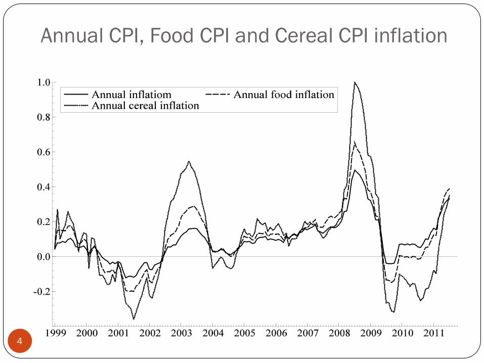
Annual CPI, Food CPI and Cereal CPI inflation
4
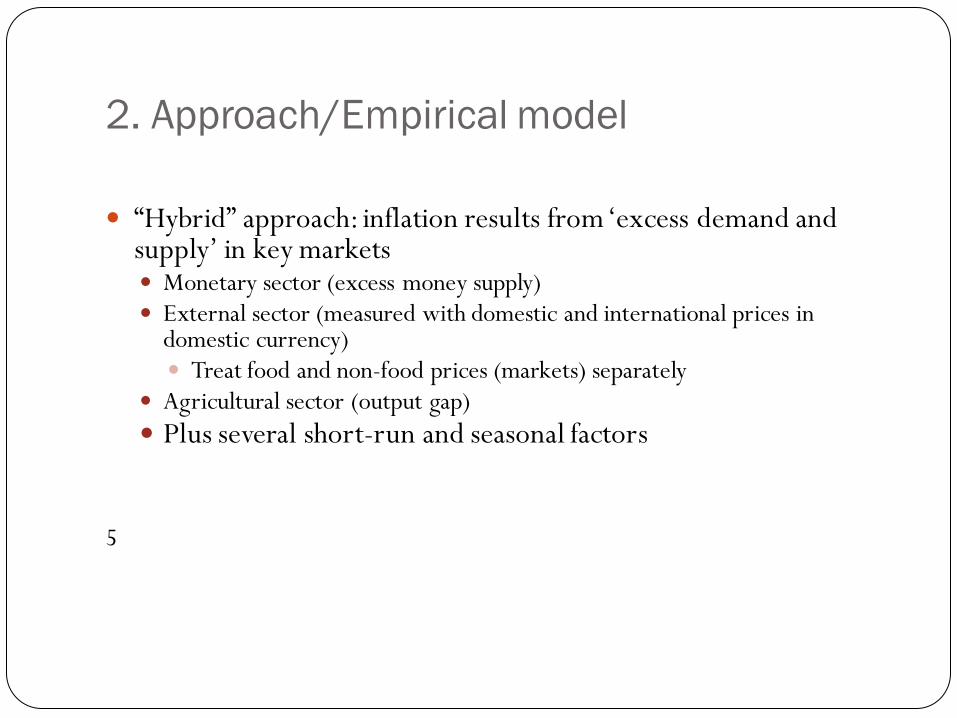
2. Approach/Empirical model
5
“Hybrid” approach: inflation results from ‘excess demand and
supply’ in key markets Monetary sector (excess money supply) External sector (measured with domestic and international prices in
domestic currency) Treat food and non-food prices (markets) separately
Agricultural sector (output gap) Plus several short-run and seasonal factors
5

Empirical model
6
0 1 2m p y Rγ γ γ− = + +
1pnf e wp τ= + −
2pf e wfp τ= + −
3. .ag agri prod τ= −R = Various determinants of money demand pnf = Non-food CPI pf = Food-price CPI wp= World producer price index wfp = World food price index ag = Agricultural output gap Agri. prod. = domestic grain production = (stochastic) trend
iτ
Money market Non-food external sector Food external sector Domestic agricultural sector

Modellling approach
7
( )
1 1 1 1 1 1
1 2 3 4 5 61 0 0 0 0 0
7 1 1 1 2 1 2 1 1 3 2 71( ) ( ) ,
k k k k k k
t i t i i t i i t i i t i i t i i t ii i i i i i
t t t t tt
p p m R e wfp wp
ag m p y R e wp pnf e wfp pf D v
π π π π π π
π α γ γ α τ α τ π
− − − − − −
− − − − − −− = = = = =
− − − −
∆ = ∆ + ∆ + ∆ + ∆ + ∆ + ∆
+ − − − + + − − + + − − + +
∑ ∑ ∑ ∑ ∑ ∑
1. Estimate long run relationships with cointegration analysis and/or filtering 2. Formulate error correction models for CPI, food prices, cereal prices and
non-food prices 3. Use Autometrics and general-to-specific modelling to obtain parsimonous error correction models and test hypotheses Autometrics is an algorithm that does automatic model selection while keeping the significance level constant (Doornik 2008)
A stylized error correction model

Long run relationships: Monetary sector
8

Money market cointegrating vector (monetary overhang)
9
12( ) 0.86 1.85m p y eus− − + ∆
12 12( ) 0.85 1.34 0.52m p y eus p− − + ∆ + ∆With inflation added

External food sector: Cereal price index and world price index of grain in Birr (in logs)
10

External sectors: relative food and non-food prices
11
Food: e+pwf-pc is stationary Non-food: e+pw-pnf is made stationary with Hodrick-Prescott filter

Agricultural output gap (obtained with interpolated annual harvests and Hodrick-Prescott filter) and food inflation
12

13

Main finding: dominant role of world food prices and agricultural supply
14
Domestic food prices adjust to changes in world food prices (plus exchange rate) But large deviations from long-run equilibrium prices because of
agricultural supply shocks and expectations Food price inflation (2004-2007) was mainly triggered by global
food price developments
Little evidence for “structural” change story Inter-seasonal speculation due to news probably explains 2008
cereal price increases (‘similar’ episodes in 1980/81, 1983/84, 1990/91, etc. (see Osborne, 2004)
Domestic non-food prices adjust to changes in world producer prices (plus exchange rate)
Money supply not the main driver of inflation

Interpretation of findings:
15
Monetary policy was ‘accommodating’ Large excess reserve ratios in banking system severs link to monetary
policy instruments. NBE had little control of money supply (recurred to credit ceilings in 2009)
Exchange rate policy matters for inflation The world food price transmission mechanism is not fully
understood Weak private and financial sectors Restrictions on regional commodity trade and access to foreign
currency, But there is ‘informal’ cross-border trade
Donors and government imports do some of the arbitrage Wholesale market dominated by few companies, Is there a role for price information without much trade?

Main findings: Food price transmission
16
The world food price transmission mechanisms is not fully understood Weak private and financial sectors Restrictions on regional commodity trade and access to foreign
currency, But there is some cross-border trade
Donors and government imports do some of the arbitrage Is there a role for price information without much trade?

Thank you for the attention
17

Crop Production in Ethiopia:
Assessing the Evidence for a Green Revolution
Douglas Gollin
Department of Economics, Williams College
IGC Growth Week, September 19, 2011
D. Gollin (Williams College ) Ethiopia Yield Study Growth Week 2011 1 / 26

Outline
1 Background
2 Methodology and Approach
3 Production and Sources of Growth
4 Prices
5 Comparisons with India's Green Revolution
6 Further Questions
D. Gollin (Williams College ) Ethiopia Yield Study Growth Week 2011 2 / 26

1. Background and Motivation
Data show enormous increases in Ethiopia's grain production over thepast decade or more.
Production of Ethiopia's most important cereal grains � wheat, maize,sorghum, millet, barley, and te� � more than doubled between 1998and 2009.
Using 3-year averages, 72% increase between 1998-2000 and 2007-09.
Important to understand recent trends in yield and to make sense,where possible, of the Ethiopian experience.
Part of a broader study looking at crop yield levels and growth inEthiopia, Kenya, Tanzania, and Uganda.
D. Gollin (Williams College ) Ethiopia Yield Study Growth Week 2011 3 / 26

A Green Revolution?
From 1999 to 2009, grain yields for the six main cereal cropscombined grew at an annual average growth rate of 3.89%.
Area harvested also grew, at a rate of 2.31% annually.
Together, this resulted in an annual average increase in grainproduction of 6.29%, sustained over a decade.
Compare this with India's Green Revolution experience: in the peak10-year period, grain production grew at an annual average rate of4.15% (1965 to 1975).
D. Gollin (Williams College ) Ethiopia Yield Study Growth Week 2011 4 / 26

2. Methodology and Approach
No new primary data.
Review data on output, yield.
Look at evidence on inputs.
Consider data on trade, prices, etc.
Interpret results.
Identify speci�c targets for further data collection.
D. Gollin (Williams College ) Ethiopia Yield Study Growth Week 2011 5 / 26

Comparisons
Compare Ethiopia with Kenya, Uganda, and Tanzania � both in levelsand growth rates.
Compare Ethiopia's experience in cereals with evidence from othercrops and commodities.
Compare recent period with longer time trends.
Compare Ethiopia's experience with �original� Green Revolution inIndia and other countries.
D. Gollin (Williams College ) Ethiopia Yield Study Growth Week 2011 6 / 26

3. Production, Area, and Yield
Production is rising rapidly in Ethiopia; how do these changes compareto other countries?
First, consider cereals...
Table: Average annual growth rates of cereal yields (wheat, maize, sorghum, andmillet)
Ethiopia Kenya Tanzania Uganda All but Ethiopia
2002-2009 3.60% -2.49% -3.37%† -0.82% -2.16%†
1993-2009 2.35% -0.34% -1.38%†† 0.572% -0.64%††
1961-2009 1.58% 0.56% 1.55%††† 1.13% 0.95%†††
1961-2002 1.74% 0.70% 2.29% 1.33% 1.51%Source: FAOSTAT.
† Data for 2002-2008. †† Data for 1993-2008. ††† Data for 1961-2008.
D. Gollin (Williams College ) Ethiopia Yield Study Growth Week 2011 7 / 26

Grain production in Ethiopia
Ethiopia's production of cereal grains is rising rapidly.
The data suggest that Ethiopia's total cereal production has risenfrom 25% of the region's total in the early 1990s to over 40% inrecent years.
This di�erential success is striking.
Is this coming at the expense of other crops?
I Not at the expense of root crops, beans, co�ee and sugar, all of whichare continuing to grow in Ethiopia.
D. Gollin (Williams College ) Ethiopia Yield Study Growth Week 2011 8 / 26

Sources of Growth
Production of almost all crops appears to be growing rapidly. Withfew exceptions, growth is faster than in neighboring countries.
Is this a Green Revolution?
What are the sources of growth?
I AreaI LaborI FertilizerI IrrigationI Other inputs
D. Gollin (Williams College ) Ethiopia Yield Study Growth Week 2011 9 / 26

Growth in Cropped Area
Area harvested is growing rapidly for most major crops.
The total area harvested to these crops has increased at 4.2% annuallyfor the past 15 years.
Ethiopia's growth in area harvested, 1993-2008
Crop Area Growth Crop Area Growth
Beans 7.69% Sorghum 5.24%
Co�ee 2.42% Sugarcane 3.01%
Maize 2.57% Sweet Potato 9.21%
Millet 3.66% Wheat 5.84%
Potato 2.28%
D. Gollin (Williams College ) Ethiopia Yield Study Growth Week 2011 10 / 26

Total Input Use
Table: Levels of input use, 2007/2008.
Ethiopia Kenya Tanzania Uganda
Labor per cropped ha 1.97 2.17 1.33 1.45
Fertilizer (nutrient kg/ha) 6.93 23.73 4.93 0.97
Tractors and combines per ha 0.21 2.60 2.11 0.61
Irrigation (% of cropped area) 1.45 1.70 3.11 < 1.00Source: FAOSTAT.
D. Gollin (Williams College ) Ethiopia Yield Study Growth Week 2011 11 / 26
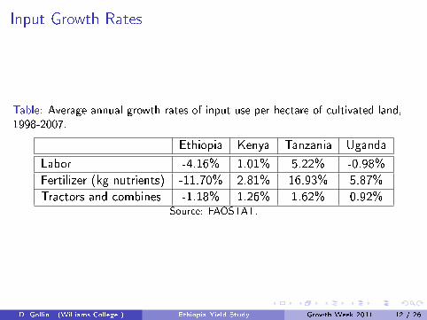
Input Growth Rates
Table: Average annual growth rates of input use per hectare of cultivated land,1998-2007.
Ethiopia Kenya Tanzania Uganda
Labor -4.16% 1.01% 5.22% -0.98%
Fertilizer (kg nutrients) -11.70% 2.81% 16.93% 5.87%
Tractors and combines -1.18% 1.26% 1.62% 0.92%Source: FAOSTAT.
D. Gollin (Williams College ) Ethiopia Yield Study Growth Week 2011 12 / 26
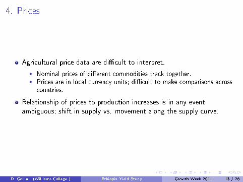
4. Prices
Agricultural price data are di�cult to interpret.
I Nominal prices of di�erent commodities track together.I Prices are in local currency units; di�cult to make comparisons across
countries.
Relationship of prices to production increases is in any eventambiguous; shift in supply vs. movement along the supply curve.
D. Gollin (Williams College ) Ethiopia Yield Study Growth Week 2011 13 / 26

Relative Price Comparisons
Analyze relative prices in Ethiopia and Kenya.
Consider local prices of food crops (partly determined on domesticmarkets) relative to local price of co�ee (largely determined on worldmarket).
See how these relative prices move over time within the two countries� and how the relationship between the relative prices changes withproduction levels in the two countries.
In general, when Ethiopia's production rises relative to Kenya's, wewould expect relative prices of these commodities to fall relative toKenyan prices.
D. Gollin (Williams College ) Ethiopia Yield Study Growth Week 2011 14 / 26

Maize Production and Price
0.00 0.20 0.40 0.60 0.80 1.00 1.20 1.40 1.60 1.80 2.00
0.00
20.00
40.00
60.00
80.00
100.00
120.00
140.00
2000 2002 2004 2006 2008 2010
Rela
tieve
Pric
e
Prod
uctio
n In
dex
Maize
Ethiopia/Kenya Production Index (2000 = 100) Ethiopia/Kenya Relative Price
D. Gollin (Williams College ) Ethiopia Yield Study Growth Week 2011 15 / 26

Wheat Production and Price
0.00 0.20 0.40 0.60 0.80 1.00 1.20 1.40 1.60 1.80 2.00
0.00
20.00
40.00
60.00
80.00
100.00
120.00
140.00
160.00
2000 2002 2004 2006 2008 2010
Rela
tive
Pric
e
Prod
uctio
n In
dex
Wheat
Ethiopia/Kenya Production Index (2000 = 100) Ethiopia/Kenya Relative Price
D. Gollin (Williams College ) Ethiopia Yield Study Growth Week 2011 16 / 26
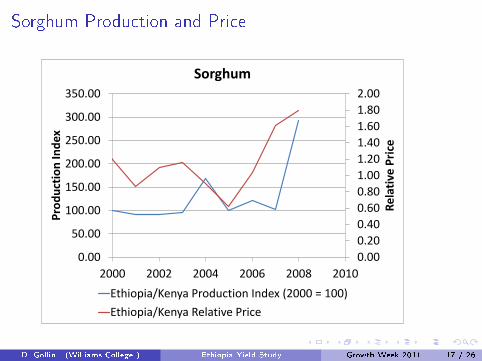
Sorghum Production and Price
0.00 0.20 0.40 0.60 0.80 1.00 1.20 1.40 1.60 1.80 2.00
0.00
50.00
100.00
150.00
200.00
250.00
300.00
350.00
2000 2002 2004 2006 2008 2010
Rela
tive
Pric
e
Prod
uctio
n In
dex
Sorghum
Ethiopia/Kenya Production Index (2000 = 100) Ethiopia/Kenya Relative Price
D. Gollin (Williams College ) Ethiopia Yield Study Growth Week 2011 17 / 26

Millet Production and Price
0.00 0.20 0.40 0.60 0.80 1.00 1.20 1.40 1.60 1.80 2.00
0.00 20.00 40.00 60.00 80.00
100.00 120.00 140.00 160.00 180.00 200.00
2000 2002 2004 2006 2008 2010
Rela
tive
Pric
e
Prod
uctio
n In
dex
Millet
Ethiopia/Kenya Production Index (2000 = 100) Ethiopia/Kenya Relative Price
D. Gollin (Williams College ) Ethiopia Yield Study Growth Week 2011 18 / 26

Prices � A Summary
It does not appear that prices are falling to the extent that we mightexpect if production is growing at the current rate, and if domesticmarkets are (as we think) poorly integrated with world markets.
Not conclusive evidence, but these data challenge our thinking withrespect to reported production increases:
I They are collected independently from production data.I Should incorporate all the forces on the supply side.I Prices are intrinsically important; directly related to the welfare of
urban consumers.
D. Gollin (Williams College ) Ethiopia Yield Study Growth Week 2011 19 / 26

5. Comparisons with India's Green Revolution
Useful to compare Ethiopia's experience with that of India in 1965-75.
How close are the parallels?
In what ways do the data from Ethiopia mirror those from GreenRevolution India, and in what ways do the data di�er?
D. Gollin (Williams College ) Ethiopia Yield Study Growth Week 2011 20 / 26

Breadth and Depth of the Green Revolution
Ethiopia's experience involves a much broader increase in cropproductivity:
I India's Green Revolution was initially con�ned to two crops: wheat andrice. Some (smaller) productivity gains arrived later in maize, sorghum,and millet.
Ethiopia has seen far larger increases in area harvested.
I India saw limited growth in the total area planted to cereals, with only0.86% average annual growth in cereals from 1965-75.
I Rapid increases in wheat area (4.56% annual growth) and maize(1.79% from a small base).
I Sorghum and millet actually declined in area, at annual growth rates of-1.51% and -0.27% respectively; crowded out by productivity gains inthe other grains.
I Cereals collectively displaced other crops; negative growth in areaplanted to other crops.
D. Gollin (Williams College ) Ethiopia Yield Study Growth Week 2011 21 / 26

Input Intensi�cation
India's Green Revolution was heavily dependent on inputintensi�cation.
Nitrogen fertilizer use:
I 3.5 kg/ha in 1965I 16.4 kg/ha in 1975
Tractors:
I 48,000 in 1965I 168,000 in 1975
Agricultural labor use
I 480 million in 1964/65I 599 million in 1974/75
D. Gollin (Williams College ) Ethiopia Yield Study Growth Week 2011 22 / 26
Input Intensi�cation, cont.
Irrigation
I 26.5 million ha in 1965 (16.3% of cultivated area)I 33.7 million ha in 1975 (20.1% of cultivated area)
Improved seeds
I Essentially zero in 1965I By 1975, semi-dwarf varieties on 75% of wheat area and 27% of rice
area.
D. Gollin (Williams College ) Ethiopia Yield Study Growth Week 2011 23 / 26

India's Neighbors
India's Green Revolution was part of a well-documented regionaltechological revolution.
Rice production in India's neighbors � Bangladesh, Nepal, Pakistan,and Sri Lanka � rose at an average annual rate of 2.1% from 1965-75,and wheat production in those countries grew at a rate of 6.9%.
The Southeast Asian region as a whole saw a 3.1% average annualincrease in rice production during this period as well.
In short, India's Green Revolution was widely shared and came from awell-understood mechanism.
Ethiopia's experience is not typical of any of its neighbors.
D. Gollin (Williams College ) Ethiopia Yield Study Growth Week 2011 24 / 26

6. Further Questions
Are the data in fact reliable?
Sampling issues are complicated, because patterns of population andproduction change over time.
With urban growth, area sampling frameworks can easily overweightintensive production that is close to cities.
Many other possibilities for sampling error and misreporting.
D. Gollin (Williams College ) Ethiopia Yield Study Growth Week 2011 25 / 26
Does it matter?
Very important not to make policy decisions based onmisunderstanding of agricultural output levels and trends.
Can lead to complacency about agricultural sector.
Can lead to dangerous policy decisions; e.g., if grain is thought to beabundant, then governments might encourage using it for animal feed� to the detriment of the poor.
Crucially important to reconcile the agricultural statistics withinformation coming from other sources
D. Gollin (Williams College ) Ethiopia Yield Study Growth Week 2011 26 / 26

Adoption of Seed and Fertiliser in Ethiopia 1999-2009

Adoption of fertiliser and improved seeds key to increased land productivity
However, the adoption and diffusion of such technologies has been slow
Many potential reasons

Improved seed use is 5% of cropped area (cereals) AND ONLY SLOW CHANGE SINCE
For maize in particular, higher at 20% (fourfold increase since 97/98)
Fertiliser is 39% of cropped area (cereals) – a rise from 32% in 97/98
In this paper – trying to understand role of learning and extension in adoption over time
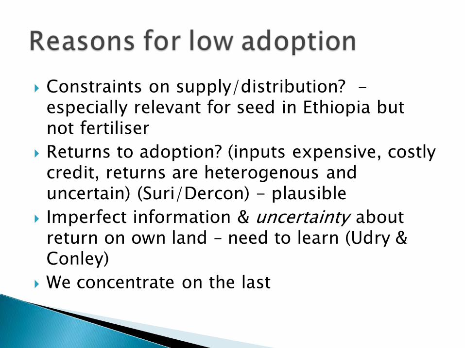
Constraints on supply/distribution? - especially relevant for seed in Ethiopia but not fertiliser
Returns to adoption? (inputs expensive, costly credit, returns are heterogenous and uncertain) (Suri/Dercon) - plausible
Imperfect information & uncertainty about return on own land – need to learn (Udry & Conley)
We concentrate on the last

Ethiopian Rural Household Survey, as it is a longitudinal data set 1994-2009
15 villages, so not nationally representative for levels of adoption or yield
But villages in 4 main regions and representing diversity of most of rural Ethiopia, so helpful in study of processes of change and its determinants
A longitudinal study can allow causal analysis of these changes

Cereal yield grew by 21% (wheat by 62%, maize by 19% and barley by 11%) since 99
Modern input use higher in this sample than in national average
14% of cereal crop area cultivated with improved seeds
*Caution: Improved seed is bought/exchanged – so unclear if all seed use is “improved”


Seed: better educated, no real differences in wealth
Fertiliser: better educated, wealthier, more and better land
Both: More extension visits in 99 Key difference: adopters are more likely to
have neighbours who are adopters too

Spatial neighbours based on a distance of 1 km from the household.
Instrument for the average neighbour's decision to adopt : the non-overlapping sets of neighbours - or neighbours of neighbours
Affect the decisions of spatial neighbours directly - but not the household's own decision
Robust to variations and distance – and the use of self-reported neighbours

An increase of one standard deviation in the average neighbours' adoption raises the probability of own adoption by about 11% points in 1999 and 12% points in 2009
Average adoption rates range from 0.18-0.23, so this is large - more than double current levels.


An increase of 1 sd in visits – ie about 1.3 visits in 1999 raises the probability of adoption by 3.7% points – (Interpretation: SMALL BUT IMPORTANT!)
This falls to 1.3% in 2004 and to 2.9% points by 2009 (here, 1 sd increase is 10 visits)
The increased probability of adoption is about 1/10th the effect in 1999 (VERY SMALL IMPACT)
(Effects confirmed by controlling for unobserved household characteristics/unobserved targeting of farmers)
Consistent with a reasonable (but not high) return to extension early on, but close to zero return later on

The cross-section controls for village-level effects – like distance to nearest extension office
But suppose that extension was targeted at the “better” farmers – that there are unobserved characteristics at the household level - then cross-section will overstate the effect
So also do this in changes in adoption – removes household specific characteristics that do not change
Also check: is effect the same in each year? And does learning occur via current neighbours’
adoption and extension or via past adoption by them?


A one standard deviation increase in the average fertiliser adoption of neighbours raises own probabilities of adoption of fertiliser by 19%.
The effects are similar in both 1999 and 2009 A substantial effect given that adoption is
already about 62% in the survey areas.
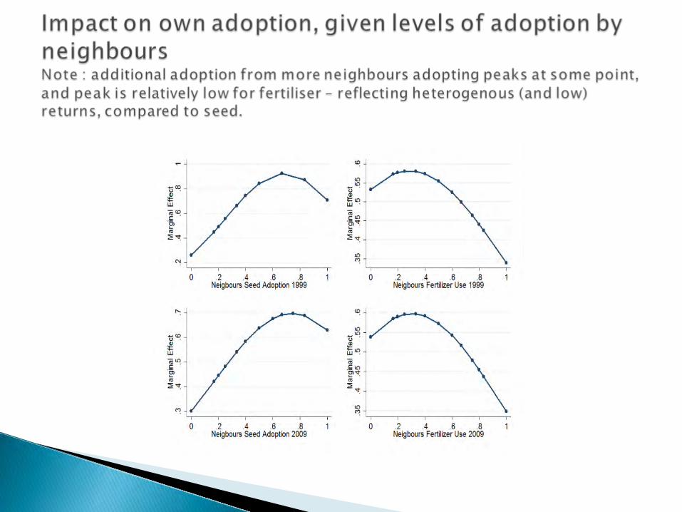

Seed: The speed of diffusion through learning from others increases until local diffusion levels of 70 percent have been reached
Fertiliser: these benefits from learning appear to tail off at about 30 percent diffusion levels.
In both cases: an increase by 10% points in diffusion in the neighbourhood increases the probability of adopting by about 5% points at current levels of diffusion

In comparison to effect of neighbours, the impact of extension is :
Large and significant in 1999 Collapses by 2009 (similar to effect of extension
on seed adoption) Potentially explained by the targeting of farmers
more likely to adopt fertiliser in 1999 True “value-added” of extension might be rather
low However, potential impact on other practices
useful for yield growth not examined here


We examine improved seed that is bought/exchanged
Potentially, supply constraints might mean sharing of seed more important
Also, farmers report facing changing land fertility – 58% in 1999 said fertility was decreasing – making future returns uncertain with new technology
So yes, likely to be learning but.. Learning from others is a powerful tool, but is
not amenable to rapid change through policy (such as via extension), as it reflects steady but careful learning from the experiences of others.

Clear evidence that adoption occurs in neigbhourhoods with learning from each other a plausible explanation
Stable return to learning from others – remarkably stable
Extension not terribly effective for adoption – except at start in 1999
Striking; maybe not surprising given the evidence from green revolution (once started, spread fast and not via extension)

Help offered by extension agents in 2009 %NA 41Source of introduction to new inputs 23Introduction to new methods of cultivation 20Source of introduction to new crops 5Assist in obtaining fertilizer 7Assist in obtaining improved seeds 3Assist in obtaining credit 0.3Others 0.3How to prepare and use compost 0.2How to prevent soil erosion 0.9How to crossbread livestock 0.2How to make water harvest 0.2


New wheat and rice varieties adopted rapidly where clear evidence of technical & economic superiority
Neither farm size nor tenure mattered in adoption In Indian Punjab proportion of area planted rose from
3 in 66/67 to 66% by 69/70 Adoption in Philippines between 60-95% in 4 years Largest increments came in relatively arid areas with
access to irrigation But where the seed needed to be adapted for specific
environments, the rate of diffusion was much slower Extension services generally low impact – with
influence only in initial take up