GRASSHOPPER PRIMER - Ningapi.ning.com/.../20110811_Grasshopper_Primer_WIP_lowres.pdf · 2.1 The...
68
Transcript of GRASSHOPPER PRIMER - Ningapi.ning.com/.../20110811_Grasshopper_Primer_WIP_lowres.pdf · 2.1 The...


GR
AS
SH
OP
PE
RP
RIM
ER
TH
IRD
ED
ITIO
N F
OR
GR
AS
SH
OP
PE
R V
ER
SIO
N 0
.8.0
50B
Y A
ND
RE
W P
AY
NE

This work is licensed under a Creative Commons Attribution-NonCommercial-Share Alike 3.0 license. You are free to to copy, distribute, transmit, or adapt the work so long as you attribute the work in the manner specified by the author or licensor (but not in any way that suggests that they endorse you or your use of the work). You may not use this work for commercial purposes. A copy of this licence is available at: http://creativecommons.org/licenses/by/3.0/ or write to [email protected]

PREFACE

TABLE OF CONTENTS
PrefaceTable of Contents
1 Getting Started2 The Interface2.1 The Main Dialog The Main Menu Bar File Browser Control Component Palettes The Windows Title Bar The Canvas Tool Bar The Canvas Parameters Components Tool Tips Using Context Menus Color Schemes The Find Feature Grouping Widgets The Status Bar Markov Widget2.2 Viewport Feedback3 Data Inheritance3.1 Types of Data3.2 Persistent Data3.3 Volatile Data3.4 Connection Management Adding Multiple Wires Removing Wires3.5 Wire Types3.6 Data Matching Shortest List Longest List Cross-Reference4 Mathematics, Expressions, & Conditionals4.1 The Mathematics Tab4.2 Operators Numbers Points Vectors4.3 Conditional Operators Equality, Larger Than, Smaller Than, Expressions4.4 Spiral Patterns4.5 Trigonometric Curves Cosine, Sine, Tangent5 Lists & Data Management5.1 What is a List?5.2 List Creation Manual Method Range Series Random
1
222466999
101112121314151515
1717181920212224252525
28283031333336364043
444545464748

TABLE OF CONTENTS
4950505151
5.3 List Visualization Point List Text Tag Text Tag 3d Color (Gradient)

2.1 The Main Dialog
Once you have loaded the plug-in, type the word “Grasshopper” in the Rhino command prompt to display the Grasshopper Editor. This interface contains a number of different elements, most of which will be very familiar to Rhino users.
Fig. 2.1.1 - The Grasshopper Editor
A. The Main Menu Bar
The menu is similar to typical Windows menus, except for the file browser control on the right (see next section). You can quickly switch between different loaded files by selecting them through this drop-down box. Be careful when using shortcuts since they are handled by the active window which could either be Rhino, the Grasshopper can-vas or any other window inside Rhino. It is quite easy to use a short cut command, only to realize that you had the wrong active window selected and accidentally invoked the wrong command. The Undo command (Ctrl+Z) is now available in Grasshopper but it’s always a good idea to think about every action before doing.
B. File Browser Control
Grasshopper is a plug-in that works “on-top” of Rhino and as such has its own file types. The default file type is known as a Grasshopper XML file (extension .ghx) and could be used 99.9% of the time. The XML (Extensible Markup Language) file type uses tags to define objects and object attributes (much like an .HTML document) but uses custom tags to define objects and the data within each object. XML files have become a standard way of storing and transferring data between programs because they are formatted as text documents. As such, you could open up any Grasshopper XML file in a text editor like NotePad or Text Wrangler to see the coding that is going
2 THE GRASSHOPPER PRIMER FOR PLUG-IN VERSION 8.0050
2 THE INTERFACE

on behind the scenes. However, it will more than likely be quite confusing to you which is why we will rely on the Grasshopper interface to make any changes to the XML code.
Grasshopper can also save definitions using Binary data (extension .gh). These definitions are significantly smaller in size than its XML counterpart mainly because it converts all of the Grasshopper code into a computer language composed of zeros and ones. Unless you have some severe size limitations, I would recommend using the default .ghx file format for most applications.
As discussed in the previous section, the File Browser Control menu (letter B in the preceding image) can be used to switch between different loaded files. Accessing your open files through the File Browser drop-down box enables you to quickly copy and paste items from open definitions. Just click on the active file name in the browser control window and a cascading list of all open files will be displayed (along with a small thumbnail picture of each open definition) for easy access. You can also hit Alt+Tab to quickly switch between any open Grasshopper documents.
You can drag and drop a Grasshopper file into the upper left hand corner of the canvas to load a particular defini-tion (see image below). Grasshopper has several different methods by which it can open a file, and you will need to specify which option you would like to use when using this method.
Fig. 2.1.2 - Drag and Drop Files onto the Canvas
3 THE GRASSHOPPER PRIMER FOR PLUG-IN VERSION 8.0050

Open File: As the name suggest, this file option will simply open any definition that you drag and drop onto the canvas.
Insert File: You can use this option to insert an existing file into the current document as loose components.
Group File: This method will insert a file into an existing document, but will group all of the objects together.
Cluster File: Similar to the group function, this method will insert a file into an existing document, but will create a cluster object for the entire group of objects.
Examine File: Allows you to open a file in a locked state, meaning you can look around a particular file but you can’t make any changes to the definition.
Grasshopper also has an Autosave feature which will be triggered periodically based on specific user actions. A list of Autosave preferences can be found under the File menu on the Main Menu Bar. When the active instance of Rhino is closed, a pop-up dialogue box will appear asking whether or not you want to save any Grasshopper files that were open when Rhino was shut down.
C. Component Palettes
This area organizes components into categories and sub-categories. Each component belongs to a unique category and sub-category. Categories are displayed as tabs, and sub-categories are displayed as drop-down panels.
As we just explained, all components belong to a certain category. These categories have been labeled to help you find the specific component that you are looking for (such as “Params” for all primitive data types or “Curves” for all curve related tools... so on and so forth).
Since there can be many more components in each sub-category than will fit into the palette, a limited number of icons are displayed on each panel. The height of the component palette and the width of the Grasshopper window can be adjusted to display more or fewer components per sub-category.
Fig. 2.1.3 - Resize the Component Palette
Resize Component Palette
4 THE GRASSHOPPER PRIMER FOR PLUG-IN VERSION 8.0050
2 THE INTERFACE
To see a menu of all of the components in a given sub-category, simply click on the black bar at the bottom of each panel. This will open the sub-category menu which provides access to all components in that sub-category.
Fig. 2.1.4 - Click the Black Bar to open the Sub-Category Panel menu
To add a component to the canvas, you can either click on the objects in the drop-down menu or you can drag the component directly from the menu onto the canvas.
Fig. 2.1.5 - Drag + Drop a component from the palette to add a component to the canvas.
Although a lot of thought has gone into the placement of each component on the component panel so that it would be the most intuitive for new users, people sometimes find it difficult to locate a specific component that might be
Category Tab
Sub-Category Panel
Drop-down Menu
5 THE GRASSHOPPER PRIMER FOR PLUG-IN VERSION 8.0050

buried deep inside one of the category panels. Fortunately, you can also find components by name, by double-clicking on any empty space on the canvas. This will invoke a pop-up search box. Simply type in the name of the component you are looking for and you will see a list of parameters or components that match your request.
Fig 2.1.6 – Double-click anywhere on the canvas to invoke a key word search for a particular component found in the Component Panels.
D. The Window Title Bar
The Editor Window title bar behaves different from most other dialogs in Microsoft Windows. If the window is not minimized or maximized, double clicking the title bar will fold or unfold the dialog into a minimized bar on your screen. This is a great way to switch between the plug-in and Rhino because it minimizes the Editor without moving it to the bottom of the screen or behind other windows. Note that if you close the Editor, the Grasshopper geometry preview in the Rhino viewport will disappear, but the file won’t actually be closed. The next time you run the “Grass-hopper” command in the Rhino dialogue box, the window will come back in the same state with the same files loaded. This is because once Grasshopper is invoked from the command prompt it essentially stays active until that instance of Rhino is closed.
E. The Canvas Toolbar
The canvas toolbar provides quick access to a number of frequently used features. All the tools are available through the menu as well, and you can hide the toolbar if you like. It can be re-enabled from the View tab on the Main Menu Bar.
The canvas toolbar exposes the following tools:
1. The Sketch Tool: The sketch tool works similarly to the pencil tool set found in Adobe Photoshop with a few added features. Default controls of the sketch tools allow changes in line weight, line type, and color. However, you may notice that it can be quite difficult to draw straight lines or pre-defined shapes by using the sketch tool alone. By right-clicking on the selected sketch object you can choose to simplify your line to create a smoother effect. However, if this still isn’t enough, you can bring any 2d shape that you have pre-defined in Rhino. Simply, right-click on your sketch object and select “Load from Rhino”. When prompted, select any pre-defined shape in your Rhino
6 THE GRASSHOPPER PRIMER FOR PLUG-IN VERSION 8.0050
2 THE INTERFACE

scene (This can be any 2d shape like a rectangle, circle, star...etc). Once you have selected your referenced shape, hit Enter, and your previously drawn sketch line will be reconfigured to your Rhino reference shape.
Note: Your sketch object may have moved from its original location once you have chosen to load a shape in from Rhino. Not to worry. Grasshopper always re-centers your sketch object back in the upper left hand corner of your canvas after it has loaded the shape into the canvas. Check this location first if you’ve followed all of the previous steps but can’t seem to find where your sketch object has been moved to.
2. Zoom Defaults: As the name suggests, these are default zoom settings that allow you to zoom in or out of your canvas at pre-defined intervals.
3. Focus View: First select the geometry (components) on your canvas, then use this tool to focus the current view-port on that geometry. Rhino users who are familiar with the Zoom Selected command will find this tool helpful.
4. Zoom Extents: This tool allows you to zoom to the extents of your definition. Click on the arrow next to the Zoom Extents icon to select one of the sub-menu items to zoom to a particular region within your definition.
5. The Navigation Map: The Navigation Map pops open a smaller diagrammatic window of the canvas which allows you to quickly move around the canvas without having to scroll and pan around the canvas without having to use the click-wheel or middle mouse button. Photoshop users will find this feature very similar to the Navigator Window.
6. Named Views: This feature exposes a menu allowing you to store or recall any view area in your definition.
7. Cluster Objects: Cluster objects are new to version 8.0001 and as such they will probably change over time. Clusters are a series of Grasshopper components which get compiled (or clusterized) into a single component with inputs and outputs. To create a cluster object, simply select one or more components and select this tool.
8. Enable Preview for Selection: Perhaps one of the best new features is the Preview Selection On/Off toggle (Icons 8 & 9). By selecting the man without the blindfold (the one who can see), any currently selected components will have their previews set to the ‘On’ or visible state.
9. Disable Preview for Selection: Conversely, by choosing the man with the blindfold (or the one who cannot see) you can turn multiple component previews off with one click.
10. Enable Selection: The Enable Selection icon provides the user the ability to turn multiple disabled components ‘on’ (meaning the components will be included in the solution calculation) with a single click.
11. Disable Selection: As the name suggests, the Disable Selection icon will disable the solution of any currently selected components. Disabled components simply stop sending data, so only if they were a pivotal part of a defi-nition will anything downstream be put on hold.
12. Rebuild Solution: This button forces a complete rebuild of the Grasshopper solution. You can also hit the hot-key F5 to force invoke this command as well.
13. Enable/Disable Solver Switch: This toggle allows the user to completely switch on or off Grasshopper updates. This global switch replaces the Rhino events and Grasshopper events toggles, which were document bound.
14. Preview Settings: Grasshopper geometry is previewed by default, meaning its geometry is visible inside the Rhino viewport. You can disable the preview on a per object basis by right-click each component and de-selecting the preview feature, but you can also override the preview for all objects by using the Preview Settings on the can-vas tool bar. Switching off the Shaded preview can increase the speed of scenes that have many trimmed surfaces.
7 THE GRASSHOPPER PRIMER FOR PLUG-IN VERSION 8.0050

15. Document Preview Settings: Grasshopper has a default color scheme for selected (semi-transparent green) and unselected (semi-transparent red) geometry. It is possible to override this color scheme with the Document Preview Settings dialog.
Fig. 2.1.7 - Change the color of selected and unselected geometry using the Document Preview Settings
16. The Bake Button: This button turns all selected components into actual Rhino objects and places the new ge-ometry on the current Layer. However, you now have the ability to specify specific attributes about an object before baking them into your scene.
8 THE GRASSHOPPER PRIMER FOR PLUG-IN VERSION 8.0050
2 THE INTERFACE

The Bake Attributes menu can only be invoked by right-clicking on each individual component and selecting the Bake button within its sub-menu. This dialogue box will allow you to control each object’s name, layer, color, deco-rations (if applicable), display type, mode setting, group settings, and any user defined attributes.
F. The Canvas
This is the actual editor where you define and edit the history network. The Canvas hosts both the objects that make up the definition and some UI widgets (see section G & I).
Objects on the canvas are usually color coded to provide feedback about their state:
Fig. 2.1.8 - Color schemes for parameters and components provide visual feedback.
A Grasshopper definition can consist of many different kinds of objects, but in order to get started you only need to familiarize yourself with two of them:
• Parameters (a.k.a. Storage Devices) • Components (a.k.a. Operative Devices)
Parameters
Parameters contain data, meaning that they store stuff. The first two objects in the image above are parameter ob-jects. Parameters are container objects which are usually shown as a small rectangular box with a single input and single output. We also know that these are parameters because of the shape of their icon. All parameter objects have a hexagonal border around their icon (which will come in handy once we talk about the Find Feature).
1. A parameter which contains warnings is displayed as an orange box. Any object which fails to collect data is considered suspect in a Grasshopper definition since it appears to be wasting everyone’s time and money. There-fore, all parameters (when freshly added) are orange, to indicate they do not contain any data and have thus no functional effect on the outcome of the solution. You also probably noticed that orange icons have a small balloon in the upper right hand corner of the object. If you hover your mouse over this balloon, it will reveal information about why the component is giving you a warning. Once a parameter inherits or defines data, it will become grey (see item 2 above).
2. A parameter which contains neither warnings nor errors is shown in light gray. This color object indicates that everything is working properly with this parameter (which in this case is to contain a list of circles).
Components
Components contain actions, meaning that they do stuff. A component usually requires data in order to perform its actions, and it usually comes up with a result. That is why most components have a set of nested parameters, referred to as Input and Output parameters respectively. Input parameters are positioned along the left side, output parameters along the right side. Let’s take a closer look at the various parts of a component.
9 THE GRASSHOPPER PRIMER FOR PLUG-IN VERSION 8.0050

Fig. 2.1.9 - The three parts of a Component: Input, Central Menu, and Output.
A. The three input parameters of the Circle CNR component. By default, parameter names are always extremely short. You can rename each parameter as you please.
B. A context menu which can be invoked by right-clicking on the middle area of any component. This context menu allows you to set useful attributes such as: the nickname of a component, the data matching algorithm, the preview state... among others.
C. The three output parameters of the Circle CNR component.
Tool Tips
When you hover your mouse over the individual parts of a Component object, you’ll see different tooltips that indi-cate the particular type of the sub-object currently under the mouse. Tooltips are quite informative since they tell you both the type and the data of individual parameters.
Fig. 2.1.10 - Tooltips can help you determine what kind of data is expected for each input/output.
All objects on the Canvas have their own context menus that expose most of the features for that particular com-ponent. Components are a bit trickier, since they also expose (in a cascading style) all the menus of the sub-objects they contain. You can access this context menu by right-clicking on the center area of each component. Let’s take a look at how this might look.
10 THE GRASSHOPPER PRIMER FOR PLUG-IN VERSION 8.0050
2 THE INTERFACE

Fig. 2.1.11 - The context menu for a component can be invoked by right-clicking on the middle of the component.
Using Context Popup Menus
Here you see the main context menu, with the cascading menu for the “C” input parameter. The menu usually starts with an editable text field that lists the name of the object in question. You can change the name to something more descriptive, but by default all names are extremely short to minimize screen-real-estate usage. The second item in the menu (Preview flag) indicates whether or not the geometry produced/defined by this object will be visible in the Rhino viewports. Switching off preview for components that do not contain vital information will speed up both the Rhino viewport frame-rate and the time taken for a solution (in case meshing is involved). The context menu for the “C” input parameter contains the orange warning icon, which in turn contains a list (just 1 warning in this case) of all the warnings that were generated by this parameter.
Now that we know a little bit more how components work, let’s go back to Fig. 2.1.9 and take a look at objects 3-8. All of these components are the same Circle CNR Component which can be found under the Primitives subcategory under the Curves Tab. In this case, the Circle component’s ‘job’ is to make a circle given the appropriate information (Center Point, Normal, and Radius). The color scheme tells us important information about the state of that opera-tion. Let’s take a closer look.
11 THE GRASSHOPPER PRIMER FOR PLUG-IN VERSION 8.0050

Color Schemes
3. A component is always a more involved object, since it contains input and output parameters. This particular component has at least 1 warning associated with it because it is displayed as an orange box (just as object 1). If you hover your mouse over the balloon in the upper right hand corner of the component, you will see that this particular component does not have enough information to actually create a circle. Remember, warnings aren’t necessarily bad, it usually just means that they are taking up space on your canvas as they aren’t actually contribut-ing to the solution.
4. A component which contains neither warnings nor errors is shown in light gray.
5. A component whose preview has been disabled is shown in a slightly darker gray. There are two ways to disable a component’s preview. First, simply right-click on the component and toggle the preview button. To disable the preview for multiple components at the same time, first select the desired components and then toggle the disable preview icon (blindfolded man) on the Canvas Toolbar.
6. A component that has been disabled is shown in a dull gray. To disable a component you may right-click on the component and toggle the disable button, or you may select the disable selection icon on the canvas toolbar after having selected the desired components. Disabled components stop sending data to downstream components.
7. A component which has been selected will be shown in a light green color. If the selected component has gener-ated some geometry within the Rhino scene, this will also turn green to give you some visual feedback.
8. A component which contains at least 1 error is displayed in red. The error can come either from the component itself or from one of its input/output parameters. We will learn more about component structures in the following chapters.
The Find Feature
In Section C, we discussed how difficult it can become trying to locate one of the hundreds of components that are available in the Component Panels. The quick solution is to double-click anywhere on the canvas to launch a search query for the component you are looking for. However, what if we need to find a particular component al-ready placed on our canvas? No need to worry. By right-clicking anywhere on the canvas, you can invoke the Find feature. Start by typing in the name of the component that you are looking for.
Fig 2.1.12 – The Find feature can be quite helpful to locate a particular component on the canvas. Right-click any-where on the canvas to launch the Find dialogue box.
12 THE GRASSHOPPER PRIMER FOR PLUG-IN VERSION 8.0050
2 THE INTERFACE

The Find feature employs the use of some very sophisticated algorithms which search not only for any instances of a component’s name within a definition (a component’s name is the title of the component found under the Compo-nent Panel which we as users cannot change), but also any unique signatures which we may have designated for a particular component (also known as nicknames). The Find feature can also search for any component type on the canvas or search through text panel content. Once the Find feature has found a match, it will automatically grey out the rest of the definition and draw a dashed line around the highlighted component. If multiple matches are found, a list of components matching your search query will be displayed in the Find dialogue box and hovering over a item in the list will turn that particular component on the canvas green. A small arrow will also be displayed next to each item in the list which points to its corresponding component on the canvas. Try moving the Find dialogue box around on the canvas and watch the arrows rotate in to keep track of their components. Clicking on the Find result will try to place the component (on the canvas) next to the Find dialog box.
Grouping
One of the most useful new additions to the Grasshopper interface has been the ability to visually link several components together in group. In addition to being an extremely useful tool for organizing your definitions, this new feature allows you the ability to quickly select and move multiple components around the canvas. You can create a group by typing Ctrl+G with the desired components selected. An alternate method can be found by using the “Group Selection” button under the Edit Menu on the Main Menu Bar. Custom parameters for group color, transpar-ency, name, and outline type can be defined by right-clicking on any group object. You can also nest groups inside of other groups, enabling you to create layers of organizational data in your definitions. The following images show a few different grouping methods.
Fig 2.1.13 – The image above shows a group of components delineated by the Box Outline profile.
Fig 2.1.14 – You can also define a group using a meta-ball algorithm by using the Blob Outline profile.
13 THE GRASSHOPPER PRIMER FOR PLUG-IN VERSION 8.0050

Fig 2.1.15 – Here we see a group outlined using the Rectangle Outline profile.
Fig 2.1.16 – Two groups are nested inside one another in the image above. The color (light blue) has been changed on the outer group to help visually identify one group from the other.
G. Widgets
There are a few widgets that are available in Grasshopper that can help you perform useful actions. The first is the Compass which is shown in the bottom right corner of the canvas. The Compass widget provides a graphical navi-gation device to show where your current canvas viewport is in relation to the extents of the entire definition. This UI widget can be enabled or disabled through the View menu on the Main Menu Bar.
Another useful UI widget which can help you keep your canvas clean is the Align Tool. You can access the Align Tools by selecting multiple components at the same time and clicking on one of the options found in the dashed outline that surrounds your selected components. You can align {left, vertical center, right} or {top, horizontal center, bottom} or distribute components equally through this interface. When first starting out, you may find that these tools sometimes get in the way (I can tell you that I often make the mistake of collapsing several components on top of each other). While these tools can be very useful, you can disable this feature (if needed) by deselecting the Align Tools UI widget from the View Menu on the Main Menu Bar.
The Profiler widget has been added to the list of UI features (off by default). The profiler lists worst-case runtimes for parameters and components, allowing you to track down bottlenecks in networks and to compare different com-ponents in terms of performance.
14 THE GRASSHOPPER PRIMER FOR PLUG-IN VERSION 8.0050
2 THE INTERFACE

Fig 2.1.17 – The Profiler widget gives you visual feedback as to which components in your definition could be caus-ing longer computational times.
In the example above, we see that the Square Point Grid component takes a maximum of 178 milliseconds to gen-erate its point grid and takes 80% of the total time needed to solve the entire definition. The Profiler widget can be used as a means to optimize your definition. Since this example is fairly simple, there isn’t much room for optimiza-tion. However, this feedback can be very useful in longer definitions. As these Profiler labels can take up precious screen real estate, you may decide to turn these analysis tools on or off as needed. You can enable/disable this widget under the View Menu on the Main Menu Bar.
H. The Status Bar
The status bar provides feedback on the selection set and the major events that have occurred in the plug-in. Key information about whether or not you have any errors or warnings in your definition will be displayed here. You can also see the current plugin version number in the bottom right hand corner.
I. Markov Widget
This widget uses Markov chains to ‘predict’ which component you want to use next based on your behavior in the past. A Markov chain is a process that consists of a finite number of states (or levels) and some known probabili-ties. It can take some time for this widget to become accustomed to a particular user, so don’t expect miracles right away, but over time you should begin to notice that this widget will begin to suggest components that you may want to use next.
The Markov Widget can suggest up to three possible components depending on your recent activity. You can find a description of Markov probabilities by typing in “GrasshopperMarkovChainDescription” in the Rhino command prompt. You can right-click on the Markov widget to dock it into one of the four corners of the canvas or to hide it completely.
2.2 Viewport Feedback
All geometry that is generated using the various Grasshopper components will show up (by default) in the Rhino viewport. This preview is just an Open GL approximation of the actual geometry, and as such you will not be able to select the geometry in the Rhino viewport (you must first bake it into the scene). You can turn the geometry preview on/off by right-clicking on a component and selecting the Preview toggle. The geometry in the viewport is color coded to provide visual feedback. The image on the following page outlines the default color scheme.
15 THE GRASSHOPPER PRIMER FOR PLUG-IN VERSION 8.0050

Fig 2.2.1 – The default viewport color schemes.
A. Blue feedback means you are currently making a selection in the Rhino Viewport.
B. Green geometry in the viewport belongs to a component which is currently selected.
C. Red geometry in the viewport belongs to a component which is currently unselected.
D. Point geometry is drawn as a cross rather than a rectangle to distinguish it from other Rhino point objects.
Note: The color scheme above is the default color scheme, although this can be modified using the Document Pre-view Settings tool on the canvas toolbar. See page 8 for more information.
16 THE GRASSHOPPER PRIMER FOR PLUG-IN VERSION 8.0050
2 THE INTERFACE
3.1 Types of Data
Parameters are only used to store information, but most parameters can store two different kinds; Volatile and Per-sistent data. Volatile data is inherited from one or more source parameters and is destroyed (i.e. recollected) when-ever a new solution starts. Persistent data is data which has been specifically set by the user. Whenever a parameter is hooked up to a source object the persistent data is ignored, but not destroyed.
Note: The exception here are output parameters which can neither store permanent records nor define a set of sources. Output parameters are fully under the control of the component that owns them.
3.2 Persistent Data
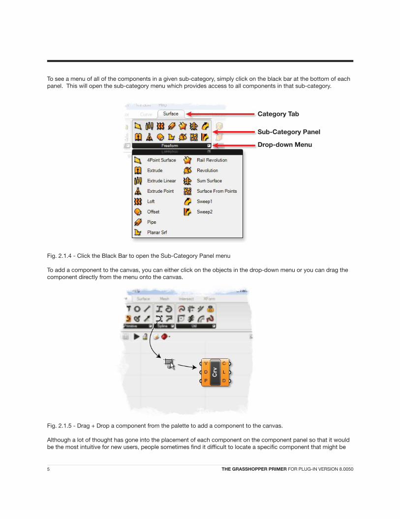
Persistent data is accessed through the menu, and depending on the kind of parameter has a different manager. Vector parameters for example allow you to set both single and multiple vectors through the menu.
But, let’s back up a few steps and see how a default Vector parameter behaves. Once you drag+drop it from the Params Panel onto the canvas, you will see the following:
The parameter is orange, indicating it generated a warning. It’s nothing serious, the warning is simply there to inform you that the parameter is empty (it contains no persistent records and it failed to collect volatile data) and thus has no effect on the outcome of the solution. The context menu of the Parameter offers 2 ways of setting persistent data: single and multiple. Right click on the paramter to set Multiple Vectors.
Fig. 3.2.1 - Right click on any parameter to set its persistent data.
Vector Parameter
17 THE GRASSHOPPER PRIMER FOR PLUG-IN VERSION 8.0050
3 DATA INHERITANCE

Once you click on either of these menu items, the Grasshopper window will disappear and you will be asked to pick a vector in one of the Rhino viewports.
Fig. 3.2.2 - Set multiple persistent data records inside the Rhino viewport.
Once you have defined all the vectors you want, you can press Enter and they will become part of the Parameters persistent data record. This means the Parameter is now no longer empty and it turns from orange to grey. (notice that the information balloon in the upper right corner also disappears as there are no more warnings). At this point you can use this parameter to ‘seed’ as many objects as you like with identical vectors.
Fig. 3.2.3 - Once the parameter contains some persistent data, the component will turn from orange to grey.
3.3 Volatile Data
As previously stated, Grasshopper data is stored in parameters (either in Volatile or Persistent form) and is used in various components. When data is not stored in the permanent record set of a parameter, it must be inherited from elsewhere. Every parameter (except output parameters) defines where it gets its data from and most parameters are not very particular. You can plug a double parameter (which just means that it is a decimal number) into an integer source and it will take care of the conversion. The plug-in defines many conversion schemes but if there is no trans-lation procedure defined, the parameter on the receiving end will generate a conversion error. For example, if you supply a Surface when a Point is needed, the Point parameter will generate an error message (accessible through the menu of the parameter in question) and turn red. If the parameter belongs to a component, this state of red-ness will propagate up the hierarchy and the component will also become red even though it may not contain errors itself.
Volatile data, as the name suggests, is not permanent and will be destroyed each time the solution is expired. How-ever, this will often trigger an event to rebuild the solution and update the scene. Generally speaking, most of the data generated ‘on the fly’ is considered volatile. Now, let’s look how to connect this data to various components.
18 THE GRASSHOPPER PRIMER FOR PLUG-IN VERSION 8.0050
3 DATA INHERITANCE

3.4 Connection Management
Since Parameters are in charge of their own data sources, you can get access to these settings through the param-eter in question. Let’s assume we have a small definition containing three components and two point parameters.
At this stage, all the objects are unconnected and we need to start hooking them up. It doesn’t matter in what order we do this, but let’s go from left to right. If you start dragging near the little circle of a parameter (what us hip people call a “grip”) a connecting wire will be attached to the mouse.
Once the mouse (with the Left Button still firmly pressed) hovers over a potential target Parameter, the wire will at-tach and become solid. This is not a permanent connection until you release the mouse button.
It doesn’t matter if we make the connections in a ‘left to right’ or ‘right to left’ manner. This time, let’s make a con-nection from the Y parameter of the Point XYZ component back to the R output of the Range component.
19 THE GRASSHOPPER PRIMER FOR PLUG-IN VERSION 8.0050

We can do the same for the “A” and “B” parameters of the Line component: Click+Drag+Release...
Note that we can make connections both ways. But be careful, by default a new connection will erase existing con-nections. Since we assumed that you will most often only use single connections, you have to do something special in order to define multiple sources. If you hold the SHIFT button while dragging connection wires, the cursor will turn green to indicate the addition behavior.
20 THE GRASSHOPPER PRIMER FOR PLUG-IN VERSION 8.0050
3 DATA INHERITANCE

If the cursor is green when you release the mouse button over a source parameter, that parameter will be added to the source list. If you specify a source parameter which is already defined as a source, nothing will happen. You can-not inherit from the same source more than once.
By the same token, if you hold down CONTROL, the cursor will become red, and the targeted source will be re-moved from the source list. If the target isn’t referenced, nothing will happen.
You can also take one or more connection wires that are connected to one input and transfer them to another by holding down SHIFT + CONTROL while dragging the wires from one input to another. In the example below, we can transfer both wires connected to the A-input of the Line component to the P-input of a new Circle component.
Note: that this method will remove the original connection (not copy the connections).
21 THE GRASSHOPPER PRIMER FOR PLUG-IN VERSION 8.0050

The image above shows the resultant wire connection from preceeding image. You can also disconnect (but not connect) sources through the parameter menu (see image below).
3.5 Wire Types
Grasshopper can also give you clues as to what type of information is flowing from one component to another through its different wire types. The default setting for these so called “fancy wires” is off, so you have to enable them before you can view the different types of line types for the connection wires. To do this, simply click on the View Tab on the Main Menu Bar and select the button labeled “Draw Fancy Wires”.
Fancy wires can tell you a lot of information about what type of information is flowing from one component to an-other. Figure 3.4.1 outlines the various wire types.
22 THE GRASSHOPPER PRIMER FOR PLUG-IN VERSION 8.0050
3 DATA INHERITANCE

Fig. 3.5.1 - The various ‘fancy’ wire types.
A. List – If the information flowing out of a component contains a list of information, the wire type will be shown as a grey double line. In this example, the line parameter contains two lines which are being fed into the Divide Curve component.
Note: Any parameter that contains more than one item is considered a ‘list’, which should make intuitive sense.
B. Single Item – The data flowing out of any parameter that contains a single item (including sliders) will be shown with a solid grey line.
C. Tree – Information transferred between components which contain a data structure will be shown in a grey double-line-dash wire type. In this example, we have two paths, each with 6 items on each path. See Chapter 8 for more information on Data Structures.
D. Empty Item – An orange wire type indicates that no information has been transferred. Since our parameter component is orange as well, we know that this component has generated some warning message. In this case, it simply means that the parameter contains no data, and thus no information is being sent across the wire.
You can also Extract Parameters from any input node of a component. Simply, right-click on any input parameter of a component and select Extract Parameter to pull out a new component with that particular input.
If you have spent any great deal of time working on a single Grasshopper document, you may have realized that the canvas can get cluttered with a nest of wires quite quickly. Fortunately, we have the ability to manage the wire displays for each input of a component.
There are three wire displays: 1) Default Display 2) Faint Display and 3) Hidden Display. Figure 3.4.2 on the next page shows each of the three wire displays. To change the wire display, simply right-click on any input parameter on a component and select one of the views available under the Wire Display pop out menu.
A. Hidden Display – When hidden display is selected, the wire will be completely ‘invisible’. Even though the con-nection isn’t shown, the data is still transferred ‘wirelessly’ from the source to the input parameter. If you select the component on either side of the connection (source or target) a green wire will show up to give you an idea of which components are connected to each other. Once you deselect the component, the wire will once again disappear.
23 THE GRASSHOPPER PRIMER FOR PLUG-IN VERSION 8.0050

Fig. 3.5.2 - Right-click on any input change the wire display settings.
B. Faint Display – The faint wire display will draw the wire connection as a very thin, semi-transparent line. Faint and Hidden wire displays can be very helpful if you have many source wires coming into a single input.
C. Default Display – The default wire display will draw all connections as seen in Figure 3.4.1 (if fancy wires is turned on).
3.6 Data Matching
Data matching is a problem without a clean solution. It occurs when a component has access to differently sized inputs. Imagine a component which creates line segments between points. It will have two input parameters which both supply point coordinates (Stream A and Stream B). It is irrelevant where these parameters collect their data from, a component cannot “see” beyond its in and output parameters.
Fig. 3.6.1 - Two input streams of point data.
As you can see there are different ways in which we can draw lines between these sets of points. The Grasshopper plug-in currently supports three matching algorithms, but many more are possible. The simplest way is to connect the inputs one-on-one until one of the streams runs dry. This is called the “Shortest List” algorithm.
24 THE GRASSHOPPER PRIMER FOR PLUG-IN VERSION 8.0050
3 DATA INHERITANCE

Fig. 3.6.2 - The Shortest List algorithm will use the stream which has the least amount of data (Stream A).
The “Longest List” algorithm keeps connecting inputs until all streams run dry. This is the default behavior for com-ponents.
Fig. 3.6.3 - The Longest List algorithm will use the stream which has the greatest amount of data (Stream B).
Finally, the “Cross Reference” method makes all possible connections.
Fig. 3.6.4 - The Cross Reference algorithm will make connections from every data entry in both streams.
This is potentially dangerous since the amount of output can be humongous. The problem becomes more intricate as more input parameters are involved and when the volatile data inheritance starts to multiply data, but the logic remains the same.
Let’s take a look at a simple example. Imagine we have a point component which inherits its x, y and z values from remote parameters which contain the following data:
X coordinate: {0.0, 1.0, 2.0, 3.0, 4.0, 5.0, 6.0, 7.0, 8.0, and 9.0} (list of 10 numbers)Y coordinate: {0.0, 1.0, 2.0, 3.0, and 4.0} (list of 5 numbers)Z coordinate: {0.0, and 1.0} (list of 2 numbers)
If we combine this data in the Shortest List algorithm, we get only two points since the “Z coordinate” contains only two values. Since this is the shortest list it defines the extent of the solution.
25 THE GRASSHOPPER PRIMER FOR PLUG-IN VERSION 8.0050

Fig. 3.6.5 – The shortest list algorithm creates only two points in this example.
However, if we choose to use the Longest List algorithm, we will create ten points, recycling the highest possible values of the Y and Z streams.
Fig. 3.6.6 – The longest list algorithm yields 10 points.
If we set the data matching algorithm to Cross Reference, we will connect all values in X with all values in Y and Z, thus resulting in 10×5×2 = 100 points.
26 THE GRASSHOPPER PRIMER FOR PLUG-IN VERSION 8.0050
3 DATA INHERITANCE

Fig. 3.6.7 – The cross reference algorithm creates a three dimensional grid of 100 points (10 points in the X-axis, 5 points in the Y-axis, and 2 points in the Z-axis).
Note: Every component can be set to obey one of these rules. The data matching algorithm setting is available in the menu by right clicking on the component icon.
Fig. 3.6.8 – Right-click on any component to change the data matching algorithm.
27 THE GRASSHOPPER PRIMER FOR PLUG-IN VERSION 8.0050
4.1 The Mathematics Tab
Now that we know a little bit about how the Grasshopper interface works, let’s take a look at some of the different component categories, starting with the Mathematics tab at the top of the Component Panel. Mathematical opera-tions and functions can be found under the following sub-categories:
A. Boolean - One of the most primitive data types, the boolean represents a binary condition... typically (True or False). The boolean subcategory contains boolean operators enabling conjunction, negation, or disjunction com-mands on a set of boolean values.
B. Domain - Domains are used to define a range of values (formerly known as intervals) between a set of numbers (typically between a lower limit {A} and an upper limit {B}). There are many components under the Domain tab that allow you to create or decompose different domain types which we will cover in more detail later in this chapter.
C. Operators - Operators are used to perform mathematical operations such as Addition, Subtraction, Multiplica-tion, etc… There are also a handful of conditional operators found in this sub-category which allow you to determine whether a set of numbers are larger than, less than, or similar to another set of number (returning a boolean value).
D. Polynomials - Polynomials are one of the most important concepts in algebra and throughout mathematics and science. They are used to form polynomial equations, which encode a wide range of problems. You can use the handful of polynomial components found in this subcategory to compute factorials, logarithms, or to raise a number to the nth power.
E. Script - The script subcategory contains several useful components, including single and multi-variable expres-sions (see examples later in this chapter) as well as the VB.NET and C# scripting components (see second half of this manual).
F. Trigonometry – As the name implies, these components allow you to solve trigonometric functions such as Sine, Cosine, and Tangent, etc.
G. Utility – The utility subcategory is a ‘grab bag’ of useful components that can be used in various mathemati-cal equations. Check here if you’re trying find the maximum or minimum values between two lists of numbers; or average a group of numbers. There are also a number of helpful components that deal with complex (or imaginary) numbers.
4.2 Operators
As we previously discussed, Operators are a set of components that use algebraic functions with two numeric input values, which result in one output value. To further understand Operators, we will create a simple mathematical defi-nition to explore the different Operator component types.
Note: To see the finished version of this next tutorial, open the file 4.2_GH Primer_Mathematic Operators.ghx found in the Source Files folder that accompanies this document.
Note: Before we begin this next tutorial, I should explain how this manual has been set up to help you find the components. In the tutorial below, you’ll see a list of instructions which will walk you through each example. After each step number, you may see a list of words followed by forward slashes: eg. Params/Special/Number Slider. This is the address to the component that you are looking for. So if you were looking to add a numeric slider to the canvas; you will find that component under the Params Tab. You would then you click on the black bar found at the bottom of the subcategory labeled ‘Special’. That should bring up a drop down list of every component within that subcategory which is where you will find the numeric slider. Drag+drop the numeric slider on to the canvas and then proceed to the next step. See Fig. 4.2.1 for more information.
28 THE GRASSHOPPER PRIMER FOR PLUG-IN VERSION 8.0050
4 MATHEMATICS, CONDITIONALS, & EXPRESSIONS

Fig. 4.2.1 - The steps needed to locate components on the Component Panel for all of the tutorials in this manual (Category/Subcategory/Component).
Now, let’s begin by creating this definition from scratch:
1. Params/Special/Number Slider – Drag and drop a numeric slider component to the canvas2. Double click on the slider to set the following parameters: • Lower limit: 0.0 • Upper limit: 100.0 • Value: 50.0
Note: the value of the slider is arbitrary and can be modified to any value within the upper and lower limits.
3. Right-click on the numeric slider and set the name (at the top) to “Input A”4. Select the Input A slider and type Ctrl+C (copy) and Ctrl+V (paste) to create a duplicate slider5. Right-click on this duplicated slider and set its name to Input B6. Params/Primitive/Integer – Drag+drop two Integer components onto the canvas7. Connect the Input A slider to the first Integer component8. Connect the Input B slider to the second Integer component
Note: A slider’s default value type is floating point, which is just a fancy way of saying that the slider returns a deci-mal value. By connecting the slider to the Integer component, we can convert the floating point value to an integer which is any whole number without the decimal remainder. You probably noticed that we could have simplified this step by just setting the slider type to integers at the beginning. But, you’ll find that there are always several ways to skin a cat in Grasshopper (for lack of a better term). From now on, we will simply set our slider type to integers (if we need whole numbers) to save on screen real estate, but there may be specific times where we will feed some
29 THE GRASSHOPPER PRIMER FOR PLUG-IN VERSION 8.0050

numeric data into a primitive parameter like this. Now, when we connect a Text Panel (Params/Special/Panel) to the output value of each Integer component, we can see the conversion happening in real-time. Move the slider to the left and right and note that the floating point values are being converted to whole numbers on the fly.
9. Math/Operators/Addition – Drag and drop an Addition component to the canvas10. Connect the first Integer component to the A-input of the Addition component11. Connect the second Integer component to the B-input of the Addition component12. Params/Special/Panel – Drag and drop a Text Panel to the canvas13. Connect the R-output of the Addition component to the Text Panel input14. Drag and drop the other remaining Mathematical Operators onto the Canvas: • Subtraction • Multiplication • Division15. Connect the first Integer component to each of the Operator’s-A input value16. Connect the second Integer component to each of the Operator’s-B input value17. Drag and drop a three more Text Panels onto the canvas and connect one panel to each operator’s output value
Congratulations! You’ve just made your first calculator via Grasshopper. You should now see the result of each op-erator’s action in the Text Panel area as you change each of the numeric sliders. Hopefully, if all has gone well your definition should look like the image below.
Fig. 4.2.2 - Operators can be useful tools for performing simple mathematic operations on Numbers.
Most of the time, you will use the Math Operators to perform arithmetical actions on a set of numbers. However, these operators can also be used on various data types, including Points and Vectors. Let’s look at a quick ex-ample of point addition and subtraction.
1. Vector/Point/Point XYZ - Drag and drop a Point XYZ component onto the canvas2. Params/Special/Number Slider – Drag and drop a numeric slider component to the canvas3. Double click on the slider to set the following parameters: • Lower limit: 0.0 • Upper limit: 10.0 • Value: any value4. Select this slider and type Ctrl+C (copy) and Ctrl+V (paste) to create two duplicate sliders5. Right-click on the first slider and set its name (at the top) to “X”6. Right-click on the second slider and set its name to “Y”7. Right-click on the third slider and set its name to “Z”
30 THE GRASSHOPPER PRIMER FOR PLUG-IN VERSION 8.0050
4 MATHEMATICS, CONDITIONALS, & EXPRESSIONS

8. Connect the X slider to the X-input of the Point XYZ component9. Connect the Y slider to the Y-input of the Point XYZ component10. Connect the Z slider to the Z-input of the Point XYZ component11. Select the Point XYZ component and all three sliders and type Ctrl+C (copy) and Ctrl+V (paste) to create a duplicate set of components12. Math/Operators/Addition – Drag and drop an Addition component to the canvas13. Connect the output of the first Point XYZ component to the A-input of the Addition component14. Connect the output of the second Point XYZ component to the B-input of the Addition component15. Params/Special/Panel – Drag and drop a Text Panel to the canvas16. Connect the R-output of the Addition component to the Text Panel input17. Repeat steps 12-16 only this time use the Subtraction operator
The mathematic operators add (or subtract) each of the points component values (X, Y, and Z) together and uses that to return a new point coordinate. The new point is a displacement of the first point in relation to the second, and as such can be seen as one method to ‘move’ points around a space. Of course, we could also use the Move component (Xform/Euclidean/Move) to perform the same action, but the method we just created could be seen as an alternative. Your Grasshopper definition should look like the image below.
Note: Point coordinates can only be Added or Subtracted - meaning Multiplication and Division will fail to return a valid point.
Fig. 4.2.3 - We can also use mathematic operators on Points to create a displacement.
In 3 D coordinate system, vectors are represented by three real numbers and would look like: V = <a1, a2, a3>. You probably noticed that vectors look almost identical to points. A point, as we just saw, is a location in space. A point does not have any size. Its only property is a location which is defined by three numbers: (x-coordinate, y-coordi-nate, z-coordinate).
Vectors differ from points in that their parameters are defined by a distance as opposed to a location. A vector may be defined as (delta-x, delta-y, delta-z) where the delta values are the component distances from two points in space. Vectors can exist anywhere in space because they are abstract and are not tied to a location until they have been anchored to some point. Once anchored to a point, Vectors can be visualized (typically done with arrows) by using the Vector Display component (Vector/Vector/Display). We’ll look at Vectors in much more detail in later chap-ters, but for now, let’s take a look at some simple vector algebra (Addition, Subtraction, and Multiplication).
1. Vector/Vector/Vector XYZ - Drag and drop a Vector XYZ component onto the canvas2. Params/Special/Number Slider – Drag and drop a numeric slider component to the canvas3. Double click on the slider to set the following parameters: • Lower limit: 0.0 • Upper limit: 10.0 • Value: any value
31 THE GRASSHOPPER PRIMER FOR PLUG-IN VERSION 8.0050

4. Select this slider and type Ctrl+C (copy) and Ctrl+V (paste) to create two duplicate sliders5. Right-click on the first slider and set its name (at the top) to “X”6. Right-click on the second slider and set its name to “Y”7. Right-click on the third slider and set its name to “Z” 8. Connect the X slider to the X-input of the Vector XYZ component9. Connect the Y slider to the Y-input of the Vector XYZ component10. Connect the Z slider to the Z-input of the Vector XYZ component11. Select the Vector XYZ component and all three sliders and type Ctrl+C (copy) and Ctrl+V (paste) to create a duplicate set of components
Note: We’ve now created two vectors, but Grasshopper does not draw vectors in the viewport (by defualt). In order to see them, we must use a Vector Display component.
12. Vector/Vector/Vector Display - Drag and drop a Vector Display component onto the canvas13. Holding the SHIFT button down, drag the V-output of both Vector XYZ components into the V-input of the Vec tor Display component14. Right-click on the A-input of the Vector Display component and select “Set One Point”15. When prompted in the Rhino Viewport, type in the coordinate values “0.0, 0.0, 0.0”
Note: You should now see two red arrows pointing away from the origin point. These are your two vectors. Try changing the X, Y, & Z coordinates of the two vectors to see how they effect the Vector Display.
16. Math/Operators/Addition – Drag and drop an Addition component to the canvas17. Connect the output of the first Point XYZ component to the A-input of the Addition component18. Connect the output of the second Point XYZ component to the B-input of the Addition component19. Params/Special/Panel – Drag and drop a Text Panel to the canvas20. Connect the R-output of the Addition component to the Text Panel input21. Repeat steps 16-20 only this time use the Subtraction operator
Note: We’ve just created two new vectors (one that has been added and another that has been subtracted) from the A-input vector. As previously stated, Grasshopper does not draw vectors in the viewport by default, so let’s try to visualize one of these new vectors using another Vector Display component.
22. Select the Vector Display component and type Ctrl+C (copy) and Ctrl+V (paste) to create a duplicate 23. Connect the R-output of the Addition component to the V-input of this duplicate Vector Display component (making sure to replace the existing connection wires)
Note: You should now see a new vector that bi-sects the other two vectors. If you place the original component vectors (the ones we added together) head-to-tail, you should see that the resultant component is the same as the one we just created using the Addition component. The Subtracted vector works in a similar manner, except its value is the resultant vector of the two component vectors placed at a single anchor point (as in our definition).
We’ve now covered how to Add and Subtract two vectors, but Multiplication works slightly different. The multipli-cation of two vectors is called the Dot Product, or sometimes the Scalar Product because its result is a simple number. Again, we’ll cover vectors (and Dot Products) in more detail later in this manual... but for two given vectors: v = <vx, vy, vz> w = <wx, wy, wz>
Then the Dot Product can be found by multiplying the corresponding components and adding the results:
v.w = (vx*wx) + (vy*wy) + (vz*wz)
32 THE GRASSHOPPER PRIMER FOR PLUG-IN VERSION 8.0050
4 MATHEMATICS, CONDITIONALS, & EXPRESSIONS

The Dot Product is a measure of similarity between vectors and is also related to the angle between the two vectors. By rule, if the Dot Product returns a zero, then the two vectors are said to be perpendicular to one another. Let’s first take a look at how to calculate the Dot Product.
24. Math/Operators/Multiplication – Drag and drop an Multiplication component to the canvas25. Connect the output of the first Point XYZ component to the A-input of the Multiplication component26. Connect the output of the second Point XYZ component to the B-input of the Multiplication component27. Params/Special/Panel – Drag and drop a Text Panel to the canvas28. Connect the R-output of the Multiplication component to the Text Panel input
The number returned by the Multiplication component is the Dot Product of the two vectors. You can check this by dragging a Dot Product component (Vector/Vector/Dot Product) onto the canvas and supplying it the two base vec-tors. The results should be the same. Try creating two vectors that are perpendicular to each other (hint: zero out two of the component numbers (X, Y, and Z) for each vector) and see whether or not the Dot Product returns a value of zero. Hopefully your definition will look like the image below.
Fig. 4.2.4 - We can Add, Subtract, and Multiply two base vectors.
4.3 Conditional Operators
Almost every programming language has a method for evaluating conditional statements. In most cases the pro-grammer creates a piece of code to ask a simple question of “what if?”. What if the area of a floor outline exceeds the programmtic requirements? Or, what if the curvature of my roof exceeds a realistic amount? These are im-portant questions that represent a higher level of abstract thought. Computer programshave the ability to analyze “what if?” questions and take actions depending on the answer to that question. Let’s take a look at a very simple conditional statement that a program might interpret:
If the object is a curve, delete it.
The piece of code first looks at an object and determines a single boolean value for whether or not it is a curve. There is no middle ground. The boolean value is True if the object is a curve, or False if the object is not a curve. The second part of the statement performs an action dependent on the outcome of the conditional statement; in this case, if the object is a curve then delete it. This conditional statement is called an If statement.
33 THE GRASSHOPPER PRIMER FOR PLUG-IN VERSION 8.0050

There are 4 conditional operators (found under the Math/Operators subcategory) that evaluate a condition and return a boolean value. For example, we can compare two numbers and test whether or not they are Equal, Smaller Than, Larger Than, or Similar to one another. The result of such a comparison is binary - it either does or does not pass the condition. In this next example, we’ll use the result of a conditional operation to change the geometric output.
Note: To see the finished version of this next tutorial, open the file 4.3_GH Primer_Conditional Operators.ghx found in the Source Files folder that accompanies this document.
Let’s begin this definition from scratch by creating a new document (File/New Document)
1. Params/Special/Number Slider – Drag and drop a numeric slider component to the canvas2. Double click on the slider to set the following parameters: • Lower limit: 0.0 • Upper limit: 10.0 • Value: any value3. Right-click on the numeric slider and set the name (at the top) to “Radius”4. Params/Special/Panel – Drag and drop a Text Panel to the canvas5. Double click on the Panel and when the dialog box opens, clear the text inside and type in the number “5”.6. Click OK to accept7. Right-click on the Text Panel and rename it (at the top) to “Test Value”8. Math/Operators/Equality – Drag and drop an Equality component to the canvas9. Connect the Radius slider to the A-input of the Equality component10. Connect the output of the Test Value Text Panel to the B-input of the Equality component11. Params/Special/Panel – Drag and drop a Text Panel to the canvas12. Connect the equals (“=”) output of the Equality component to this new Text Panel13. Right-click on this Text Panel and rename it (at the top) to “Result”
Note: You have now just performed a conditional test. The result should tell you whether or not the Radius slider is equal to the Test Value (which more than likely will be False since there is only one exact number that would return True). Try changing the slider value until it matches the Test Value and watch the result switch from False to True. The other output of this component is the not equal to (“=”) condition... which is essentially the opposite result from the equality output.
14. Math/Operators/Larger Than – Drag and drop a Larger Than component to the canvas15. Connect the Radius slider to the A-input of the Larger Than component16. Connect the output of the Test Value Text Panel to the B-input of the Larger Than component17. Perform the same steps (14-16) only this time use the Smaller Than component (Math/Operators/Smaller Than)
Note: Just as before, the result of these two new conditional operators tells you whether the A-input is Larger Than (or equal to) or Smaller Than (or equal to) the B-input.
There is one other method for testing a conditional statment - through an expression. Expressions are one of the most flexible and useful components within Grasshopper. Not only can they help you compare conditional state-ments and perform algebraic computations; they can also help you format string data which we’ll see later sections of this manual.
18. Math/Script/F2 - Drag and drop a two-variable expression to the canvas.19. Connect the Radius slider into the x-input of the two-variable expression20. Params/Primitive/Number - Drag and drop a Number parameter onto the canvas21. Connect the output of the Test Value Text Panel to the input of the Number parameter22. Connect the output of the Number parameter to the y-input of the two-variable expression
/
34 THE GRASSHOPPER PRIMER FOR PLUG-IN VERSION 8.0050
4 MATHEMATICS, CONDITIONALS, & EXPRESSIONS

Note: We can’t connect the Test Value panel directly to the y-input of the expression because the component will consider this data as a string - which is a data type composed of ASCII characters (you can think of them as text). The expression will not know how to compare a string and a number, so we need to first convert the string into a number using the Number parameter.
23. Right-click on the F-input of the two-variable expression and open up the Expression Editor
Note: The Expression Editor is a very powerful tool and provides a lot of information about how to write proper expressions. In the bottom left, you see the variables that we are working with (x as double and y as double). The Double data type is the same as the Floating Point value - meaning it is number with a decimal and 6-7 levels of precision. In the Expression area of the editor, we can type in an algorithm that will evaluate our two variables.
24. In the Expression area, type in the equation: x > (y+2)
Note: If you have typed it in correctly, you should see a message in the Errors area that says, “No syntax errors detected in expression”. Click OK to accept.
Fig. 4.3.1 - The expression editor can be used to evaluate variables using conditional operators.
Note: The two-variable expression will return a boolean value similarly to the other conditional operator components (True or False). The benefit of using expressions is that you can evaluate complex conditional statements in a single component.
25. Sets/Lists/Dispatch - Drag and drop a Dispatch component onto the canvas26. Connect the Radius slider to the L-input of the Dispatch component27. Connect one of the output values from the Larger Than component to the P-input of the Dispatch component
Note: The Dispatch component works by taking a list of information and splits the information into two groups based on a boolean pattern. If the pattern shows a True value, the list information will be passed to the A-output. If the pattern is False, it passes the list information to the B-output. In our example, if the Radius slider is larger than the test value, then the boolean pattern will be True and the slider value will be passed to the A-output. Likewise, if the pattern is False, then the slider value will be passed to the B-output.
28. Curve/Primitive/Circle - Drag and drop a Circle component onto the canvas
35 THE GRASSHOPPER PRIMER FOR PLUG-IN VERSION 8.0050

29. Connect the A-output of the Dispatch component to the R-input of the Circle component30. Curve/Primitive/Polygon - Drag and drop a Polygon component onto the canvas31. Connect the B-output of the Dispatch component to the R-input of the Polygon component
You’ve now performed a conditional logic test and used the output to change the geometric output. If the slider value goes above the test value, a circle will be drawn in the viewport which uses the slider value as its radius. However, if it falls below the test value, a polygon will be drawn in the viewport. Try using the result from one of the other conditional operators on the canvas to change the behavior.
Hopefully if you’ve followed the steps, you definition should look like the image below (Fig. 4.3.2).
Fig. 4.3.2 - The above definition uses conditional operators and a Dispatch component to control the geometric output.
4.4 Spiral Patterns
As stated in the last example, the Expression component (also known as a function) is very flexible tool; that is to say that it can be used for a variety of different applications. We have already discussed how we can use an expres-sion component to evaluate a conditional statement and return a boolean. However, we can also use an expression to solve mathematical algorithms and return numeric data as the output.
In the following example, we will look at mathematical spirals found in nature and how we can use a few Functions components to create similar patterns in Grasshopper. This image on the following page shows the natural spiral pattern of an aloe plant.
Note: To see the finished version of this next tutorial, open the file 4.4_GH Primer_Spiral Patterns.ghx found in the Source Files folder that accompanies this document.
36 THE GRASSHOPPER PRIMER FOR PLUG-IN VERSION 8.0050
4 MATHEMATICS, CONDITIONALS, & EXPRESSIONS

Fig. 4.4.1 - Photo courtesy of Kai Schreiber. http://www.flickr.com/photos/genista
Let’s start this definition from scratch:
1. Type Ctrl+N (in Grasshopper) to start a new definition2. Sets/Sequence/Range - Drag and drop a Range component onto the canvas3. Params/Special/Slider - Drag and drop two numeric sliders onto the canvas4. Double-click on the first slider and set the following: • Name: Crv Length • Rounding: Floating Point (set by default) • Lower Limit: 0.1 • Upper Limit: 10.0 • Value: 8.05. Now, double-click on the second slider and set the following: • Name: Num Pts on Crv • Rounding: Integers • Lower Limit: 1.0 • Upper Limit: 100.0 • Value: 100.0
Note: We have set this slider type to integers because it will be driving the number of points on our spiral. Logic tells us that we can’t create half of a point, so we know we will want to set the rounding type integers to ensure that we won’t get any errors when we create our spiral.
6. Connect the Crv Length slider to the D-input of the Range component7. Connect the Num Pts on Crv slider to the N-input of the Range component
Note: We have just created a range of 101 numbers that are evenly spaced that range from 0.0 to 8.0 that we can feed into the Trigonometry function. See the next chapter for more information about lists.
8. Math/Script/F1 - Drag and drop a single variable Expression component onto the canvas9. Right-click the F-input of the Expression component and open the Expression Editor10. In the Expression Editor dialogue box, type the following equation: x*sin(5*x)
37 THE GRASSHOPPER PRIMER FOR PLUG-IN VERSION 8.0050

Note: If you have entered the algorithm into the editor correctly, you should see a statement that says, “No syntax errors detected in expression” under the errors rollout. Click “OK” to accept the algorithm.
Fig 4.4.2 - You can type an algorithm into the Expression Editor to solve mathematic algorithms.
11. Now, select the Expression component and hit Ctrl+C (copy) and Ctrl+V (paste) to create a duplicate12. Right-click the F-input of the duplicated Expression component and open up the Expression Editor again13. In the Expression Editor dialogue box, type the following equation: x*cos(5*x)
Note: The only difference in this equation is that we have replaced the sine function with a cosine function. Click “OK” to accept this algorithm.
14. Connect the R-output of the Range component to the x-input to both Expression components15. Vector/Point/Point XYZ - Drag and drop a Point XYZ component onto the canvas16. Connect the first R-output of the first Expression component to the X-input of the Point XYZ component17. Connect the R-output of the second Expression component to the Y-input of the Point XYZ component
Note: You should now see a set of points that radiates out from the origin point forming a parametric spiral. Since we have only connected the list of values coming out of the two Expression components to the X & Y nodes of the Point XYZ component, the spiral will only form a 2-dimensional pattern. You can create a 3-dimensional spiral (or helix) by simply connecting the R-output of the first Range component to the Z-input of the Point XYZ component.
18. Mesh/Triangulation/Voronoi – Drag and drop a Voronoi component onto the canvas19. Connect the Pt-output of the Point XYZ component to the P-input of the Vornoi component20. Right-click on the Point XYZ component and turn its preview off
Note: There is a lot of information online about Voronoi Patterns, but in essence, we have just created a number of cells that always maintain an equal distance from adjacent points. Since our spiral of points was generated in the X & Y plane, we have created a 2-dimensional Voronoi pattern. Try connecting a slider to R-input of the Voronoi com-ponent to fillet the edges of each of your Voronoi cells. You can also change the values of your Crv Length and Num Pts on Curve sliders to create drastically different patterns. The algorithm for the Vorronoi pattern makes 3-dimen-sional patterns difficult, so it’s best to start out with 2-dimensional patterns.
38 THE GRASSHOPPER PRIMER FOR PLUG-IN VERSION 8.0050
4 MATHEMATICS, CONDITIONALS, & EXPRESSIONS

Fig 4.4.3 - The finished definition above will create a parametric voronoi spiral pattern.
Pattern #1: Crv Length = 7.93 | Num Pts on Crv = 66 Pattern #2: Crv Length = 7.88 | Num Pts on Crv = 30
Pattern #3: Crv Length = 8.27 | Num Pts on Crv = 66 Pattern #4: Crv Length = 6.45 | Num Pts on Crv = 100
39 THE GRASSHOPPER PRIMER FOR PLUG-IN VERSION 8.0050

4.5 Trigonometric Curves
We have already shown that we can use an two-variable Expression (or function) component to evaluate conditional statements. We can also use them to compute algebraic equations. However, there other ways to calculate simple expressions using a few of the built in Trigonometry functions. We can use these functions to define periodic phe-nomena like sinusoidal wave forms such as ocean waves, sound waves, and light waves.
In the following example, we will create a sinusoidal wave form where the number of points on the curve, the curve width, frequency, amplitude, and phase shift can be controlled by a set of numeric sliders.
Fig. 4.5.1 - The parameters which can be controlled in a sinusoidal waveform.
Note: To see the finished version of this next tutorial, open the file 4.5_GH Primer_Trigonometry Curves.ghx found in the Source Files folder that accompanies this document.
Let’s start this definition from the beginning:
1. Params/Special/Slider - Drag and drop three numeric sliders onto the canvas2. Right-click on the first slider and set the name (at the top) to “Num Pts on Crv”3. Double-click the Num Pts on Crv slider and set the following parameters: • Rounding: Integers • Lower Limit: 1 • Upper Limit: 50 • Value: 404. Right-click on the second slider and set the name (at the top) to “Curve Width”5. Now, double-click the Curve Width slider and set the following parameters: • Rounding: Floating Point • Lower Limit: 0 • Upper Limit: 30 • Value: 106. Right-click on the third slider and set the name (at the top) to “Frequency”7. Double-click on the Frequency slider and set the following parameters: • Rounding: Even • Lower Limit: 0 • Upper Limit: 10 • Value: 4 8. Sets/Sequence/Range - Drag and drop two Range components onto the canvas
40 THE GRASSHOPPER PRIMER FOR PLUG-IN VERSION 8.0050
4 MATHEMATICS, CONDITIONALS, & EXPRESSIONS

9. Connect the Curve Width slider to the D-input of the first Range component10. Math/Util/Pi – Drag and drop a Pi component onto the canvas11. Connect the Frequency slider to the input of the Pi component12. Connect the output of the Pi component to the D-input of the second Range component13. Connect the Num Pts on Curve slider to both N-input of both of the Range components
Note: The Range component can be a very handy way to quickly create a list of numbers. We’ll cover lists in more detail in the next chapter.
Note: You may be wondering why we connected the Frequency slider to the Pi component. This method ensures that our trigonometric curve will always complete a complete cycle (essentially some multiple of Pi). This is a critical step, because we will need the start point of our sinusoidal curve to coincide with the end point so that when we will have a seamless match when we shift the curve to the right or to the left (phase shift).
Fig. 4.5.2 - Your definition should look like the image above. We have now created two lists of data - the first list is a range of evenly divided numbers from 0 to 10, and the second is a list of evenly divided numbers ranging from 0 to 4*Pi.
14. Math/Trig/Cosine - Drag and drop a Cosine component onto the canvas15. Connect the output of the second Range component to the x-input of the Cosine component16. Params/Special/Slider – Drag and drop a numeric slider onto the canvas17. Right-click on this slider and set the name (at the top) to “Amplitude”18. Double-click on the Amplitude slider and set the following parameters: • Rounding: Floating Point • Lower Limit: 0 • Upper Limit: 4 • Value: 1.519. Math/Operators/Multiply – Drag and drop a Multiply component onto the canvas20. Connect the y-output of the Cosine component to the A-input of the Multiply component21. Connect the Amplitude slider to the B-input of the Multiply component22. Sets/Lists/Shift List - Drag and drop a Shift List component onto the canvas23. Connect the R-output of the Multiply component to the L-input of the Shift List component24. Params/Special/Slider – Drag and drop a numeric slider onto the canvas25. Right-click on this slider and set the name (at the top) to “Phase Shift”
41 THE GRASSHOPPER PRIMER FOR PLUG-IN VERSION 8.0050

26. Double-click on the Phase Shift slider and set the following parameters: • Rounding: Integers • Lower Limit: -20 • Upper Limit: 20 • Value: 127. Connect the Phase Shift slider to the S-input of Shift List component28. Params/Special/Boolean Toggle - Drag and drop a Boolean Toggle onto the canvas29. Double-click on the Boolean Toggle to set the output to True30. Connect the Boolean Toggle to the W-input of the Shift List component
Note: The Shift List component will move the list up or down a set number of indices based on a positive or nega-tive shift value. It is important to set the wrap index input (W-input) to True so that the items that are shifted off the ends of the list are re-appended (keeping the length of the list constant). We will cover the Shift List component in more detail in the next chapter.
31. Vector/Point/Point XYZ - Drag and drop a Point XYZ component onto the canvas32. Connect the R-output of the first Range component to the X-input of the Point XYZ component
Note: You should see a set of points that are evenly spaced along the X-axis.
33. Connect the L-output of the Shift List component to the Z-input of the Point XYZ component
Note: You should see a series of points in the shape of a cosine wave in the Rhino viewport. The X-coordinate of our sine wave is evenly spaced. The Z-coordinates, however, are defined by a list of values that have been multi-plied by cosine, so they undulate in a wave pattern. You can now change any of the numeric sliders to change the shape of the wave pattern.
34. Curve/Spline/Interpolate – Drag and drop an Interpolated Curve component onto the canvas35. Connect the Pt-output of the Point XYZ component to the V-input of the Interpolated Curve component
Note: You’ve now created an interpolated curve - or a three degree curve that passes through each vertex. We can also create a horizontal baseline and a series of vertical lines which registers the amplitude of each point.
36. Vector/Point/Point XYZ - Drag and drop another Point XYZ component onto the canvas37. Connect the output of the first Range component to the X-input of this new Point XYZ component38. Curve/Primitive/Line - Drag and drop a Line component onto the canvas39. Connect the output of one of the Point XYZ components to the A-input of the Line component40. Connect the output of the other Point XYZ component to the B-input of the Line component
Note: In the last part of the definition, we have created a second set of evenly spaced points along the X-axis which correspond to the same X-coordinates of the cosine curve. The Line component creates a line segment between the first list of points - the ones that create the cosine curve - and the second list of points which define the X-axis. The new lines give you a visual reference of the vertical displacement in the wave form pattern.
42 THE GRASSHOPPER PRIMER FOR PLUG-IN VERSION 8.0050
4 MATHEMATICS, CONDITIONALS, & EXPRESSIONS

9. Connect the Curve Width slider to the D-input of the first Range component10. Math/Util/Pi – Drag and drop a Pi component onto the canvas11. Connect the Frequency slider to the input of the Pi component12. Connect the output of the Pi component to the D-input of the second Range component13. Connect the Num Pts on Curve slider to both N-input of both of the Range components
Note: The Range component can be a very handy way to quickly create a list of numbers. We’ll cover lists in more detail in the next chapter.
Note: You may be wondering why we connected the Frequency slider to the Pi component. This method ensures that our trigonometric curve will always complete a complete cycle (essentially some multiple of Pi). This is a critical step, because we will need the start point of our sinusoidal curve to coincide with the end point so that when we will have a seamless match when we shift the curve to the right or to the left (phase shift).
Fig. 4.5.3 - The definition above will create a parametric cosine curve. If all has gone well, your document should look like the image above
43 THE GRASSHOPPER PRIMER FOR PLUG-IN VERSION 8.0050

5.1 What is a List?
It’s helpful to think of Grasshopper in terms of flow, since the graphical interface is designed to have data flow into and out of specific types of components. In order to fully understand how the plug-in works, we first have to under-standing how to manipulate the DATA (such as points, curves, surfaces, strings, booleans, and numbers, etc.) that flows into and out of the various components that are currently available. We’ll first take a look at List Management (Chapter 5) and then Data Trees (Chapter 6).
Before we learn how to manipulate a list, we should first define how data gets stored in Grasshopper. You have probably already noticed that the real power of Grasshopper lies in its abilities to manipulate large quantities of data. Typically, this data gets stored in an array. At the risk of stating the obvious:
An array is just a list of variables.
That’s it. Nothing too complicated about that. We have already worked with lists (see Section 4.5) we just didn’t know much about them. When storing data in a list, it’s helpful to know the position of each item in that list so that we can begin to access or manipulate certain items. The position of an item in the list is called its index number. The only thing that might seem odd at first is that the first index number of a list is always 0; not 1. So, when we talk about the first item of a list, we actually mean the item that corresponds to index number 0.
Fig. 5.1.1 - The above example shows how we (as humans) would count the number of fingers on one hand; in comparison to the zero-based counting system which Grasshopper uses which always starts a list at index number zero.
For example, if we were to count the number of fingers we have on our right hand, chance are that you would have counted from 1 to 5 (unless you have had the unfortunate experience of losing one or more of your fingers… in which case… this is a very poor example). However, if this list had been stored in an array, then our list would have counted from 0 to 4. Note, that we still have 5 items in the list; it’s just that the array is using a zero-based count-ing system. Don’t feel bad if this seems confusing. Zero-based counting systems routinely confuse even the most experienced computer programmers.
Often times the easiest way to take a look at the type of data stored in a list is to connect a Text Panel (Params/Spe-cial/Panel) to the output of a particular component. By default, the Text Panel automatically shows all index num-bers to the left side of the panel (see Fig.5.1.1) and displays the data items on the right side of the panel. The index numbers will become a crucial element when we begin to manipulate our lists. You can turn the index numbers on and off by right-clicking on the Text Panel and clicking on the “Draw Indices” item in the sub-menu. For now, let’s leave the entry numbers turned on for all of our text panels.
Index Number Data Item
44 THE GRASSHOPPER PRIMER FOR PLUG-IN VERSION 8.0050
5 LISTS & DATA MANAGEMENT

5.2 Lists Creation (Manual, Range, Series, Random)
There are many different ways to generate lists in Grasshopper. Below, we’ll look at a few different methods for gen-erating lists and then look at how the list data can then be used to visualize some point data in a meaningful way.
Note: To see the finished version of this tutorial, open the file 5.2_GH Primer_List Visualization.ghx found in the Source Files folder that accompanies this document.
Manual List Creation
Perhaps the easiest way to create a list (and one of the most over-looked methods) is to manually type in a list of values into a parameter. Using this method puts added responsibility on the user because this method relies on direct user input (ie. persistent data) for the list creation. In order to change the list values, the user has to manually type in each individual value... which can be difficult if the list has many entries. Let’s look at one way to manually create a list.
1. Params/Primitive/Number - Drag and drop a Number parameter onto the canvas2. Right-click on the Number parameter and select ‘Manage Number Collection’
On the left hand side of the Number Collection Manager, you will white text area (just below the green plus icon). Click in this area and type a number (any number will do). Hit enter after each number to add more entries (you can also click on the green plus icon). When you are done with your list, click OK.
3. Params/Special/Panel - Drag and drop a Text Panel onto the canvas4. Connect the output of the Number parameter to the input of the Text Panel (we can use text panels to visualize the list data).
Fig. 5.2.1 - You can manually type in a list of values using a paramter component (Params/Primitive).
Range
The Range component, found under Sets/Sequence/Range, creates a list of evenly spaced numbers between a low and a high value called the domain of the numeric range. A domain (also sometimes referred to as an interval) is every possible number between two numeric extremes. Let’s first take a look at a generic example.
45 THE GRASSHOPPER PRIMER FOR PLUG-IN VERSION 8.0050

Fig. 5.2.2 - A Range component divides a numeric domain into even segments and returns a list of values.
In the example above, the numeric domain has been defined as every possible number between 0 and 1. The Range component takes that domain and divides it up by the number of steps (in this case 10). So, we have 10 even spaced segments, but the Range component returns a list of values (not a list of segments). Because it keeps the first and the last values in the list, the output of a Range component is always one more than the number of steps. In the example above, we created 10 steps... so the Range component returns 11 values. Now, let’s look at a specific Grasshopper example.
1. Sets/Sequence/Range - Drag and drop a Range component onto the canvas2. Params/Special/Slider - Drag and drop a numeric slider onto the canvas3. Right-click on the this slider and set the name (at the top) to “Domain High”4. Double-click the Domain High slider and set the following parameters: • Rounding: Floating Point • Upper Limit: 100 • Value: 205. Connect the Domain High slider to the D-input of the Range component6. Params/Special/Slider - Drag and drop another numeric slider onto the canvas7. Right-click on the this slider and set the name (at the top) to “Steps”8. Double-click the Steps slider and set the following parameters: • Rounding: Integer • Upper Limit: 100 • Value: 109. Connect the Steps slider to the D-input of the Range component10. Params/Special/Panel - Drag and drop a Text Panel onto the canvas11. Connect the output of the Range component to the input of the Text Panel
Fig. 5.2.3 - In this example, we have created 11 evenly spaced values between 0 and 20.
46 THE GRASSHOPPER PRIMER FOR PLUG-IN VERSION 8.0050
5 LISTS & DATA MANAGEMENT

You may have noticed something a little quirky about the setup we just made. We know that a domain is a always defined by two values (a high and low value). Yet, in our definition we simply connected a single slider value to the domain input. In order to avoid errors, Grasshopper makes an assumption that you are trying to define a domain between zero and some other number (our slider value). So, what could we do if we wanted to create a range between two numbers that didn’t start at zero? Fortunately, there is a very simple way to create a numeric domain using a built-in component.
12. Math/Domain/Domain - Drag and drop a Domain component onto the canvas
Note: There are many different domain components so make sure to use the component that creates a numeric in-terval between two numeric extremes. We will cover some of the other domain components in upcoming chapters.
13. Params/Special/Slider - Drag and drop a numeric slider onto the canvas14. Right-click on the this slider and set the name (at the top) to “Domain Low”15. Double-click the Domain Low slider and set the following parameters: • Rounding: Floating Point • Upper Limit: 100 • Value: 1016. Connect the Domain Low output to the A-input of the Domain component17. Disconnect the Domain High slider from the Range component and connect it to the B-input of the Domain component.18. Connect the output of the Domain component to the D-input of the Range component
Fig. 5.2.4 - Using a Domain component, we can define the upper and lower bounds of the Range component.
Series
The Series component is similar to the Range component, in that, it also creates a list of numbers. However a Series component is different because it creates a set of discreet numbers based on a start value, step size, and the number of values in the series. Let’s take a look at a simple Grasshopper definition.
1. Sets/Sequence/Series - Drag and drop a Series component onto the canvas2. Params/Special/Slider - Drag and drop a numeric slider onto the canvas3. Right-click on the this slider and set the name (at the top) to “Start Value”4. Double-click the Start Value slider and set the following parameters: • Rounding: Floating Point • Upper Limit: 100 • Value: 0
47 THE GRASSHOPPER PRIMER FOR PLUG-IN VERSION 8.0050

5. Connect the Start Value slider to the S-input of the Series component6. Params/Special/Slider - Drag and drop another numeric slider onto the canvas7. Right-click on the this slider and set the name (at the top) to “Step Value”8. Double-click the Step Value slider and set the following parameters: • Rounding: Integer • Upper Limit: 100 • Value: 109. Connect the Step Value slider to the N-input of the Series component10. Params/Special/Slider - Drag and drop another numeric slider onto the canvas11. Right-click on the this slider and set the name (at the top) to “Count”12. Double-click the Count slider and set the following parameters: • Rounding: Integer • Upper Limit: 10 • Value: 1013. Connect the Count slider to the C-input of the Series component14. Params/Special/Panel - Drag and drop a Text Panel onto the canvas15. Connect the output of the Series component to the input of the Text Panel
Fig. 5.2.5 - The Series component creates a list based on a start value, step value, and the number of values in the list.
Random
The Random Component (Sets/Sequence/Random) can be used to generate a list of pseudo random numbers. They are referred to as “pseudo” random because the number sequence is unique but stable for each seed value. Thus, you can generate an entirely new set of random numbers by changing the seed value (S-input). The domain, as in the previous example, is a defined interval between two numeric extremes. Let’s take a look at another simple setup.
1. Sets/Sequence/Random - Drag and drop a Random component onto the canvas2. Params/Special/Slider - Drag and drop a numeric slider onto the canvas3. Right-click on the this slider and set the name (at the top) to “Domain High”4. Double-click the Domain High slider and set the following parameters: • Rounding: Floating Point • Upper Limit: 100 • Value: 205. Connect the Domain High slider to the R-input of the Random component6. Params/Special/Slider - Drag and drop a numeric slider onto the canvas7. Right-click on the this slider and set the name (at the top) to “Num Val”
48 THE GRASSHOPPER PRIMER FOR PLUG-IN VERSION 8.0050
5 LISTS & DATA MANAGEMENT

8. Double-click the Num Val slider and set the following parameters: • Rounding: Integer • Upper Limit: 20 • Value: 109. Connect the Num Val slider to the N-input of the Random component10. Params/Special/Slider - Drag and drop a numeric slider onto the canvas11. Right-click on the this slider and set the name (at the top) to “Seed”12. Double-click the Seed slider and set the following parameters: • Rounding: Integer • Upper Limit: 10 • Value: 113. Connect the Seed slider to the S-input of the Random component14. Params/Special/Boolean Toggle - Drag and drop a Boolean Toggle onto the canvas15. Connect the Boolean Toggle to the I-input of the Random component16. Params/Special/Panel - Drag and drop a Text Panel onto the canvas17. Connect the output of the Random component to the input of the Text Panel
Fig. 5.2.6 - The Random component creates a pseudo-random list of values.
5.3 List Visualization
There are many different ways to visualize a list of data. The most common way is to create some geometry with the list of data, but there are a few other built-in component that can help us understand the data (ie. pointlist, text tag, text tag 3d, and color). Next, we’ll use one of the lists we just made to test a few of these visualization methods. Let’s start with the Point List component. Before we can start, we need to create a list of points.
1. Vector/Point/Point XYZ - Drag and drop a Point XYZ component onto the canvas2. Connect the output of the Range component (from the previous example) to the Y-input of the Point XYZ component3. Vector/Point/Point List - Drag and drop a Point List component onto the canvas4. Connect the Pt-output of the Point XYZ component to the P-input of the Point List component
The Point List component is an extremely useful tool for visualizing the order of a set of points in a list. Essentially, the Point List component places the index item number (see Fig. 5.1.1.) next to the point geometry in the viewport. You can also specify whether or not you want to draw the number tags, the connection lines, or the size of the text tags.
49 THE GRASSHOPPER PRIMER FOR PLUG-IN VERSION 8.0050

Fig. 5.3.1 - You can visualize the order of a set of points using the Point List component.
The next component we’ll look at is the Text Tag. A text tag component allows you to draw little strings (a string is a set of ASCII characters) in the viewport as feedback items. Text and location are specified as input parameters. When text tags are baked into the scene, they turn into Text Dots. The other interesting thing about Text Tags is that they are viewport independent - meaning the tags always face the camera (including perspective views) and they always remain the same size on the screen regardless of your zoom settings. Let’s take a look at a simple setup.
5. Vector/Point/Text Tag - Drag and drop a Text Tag component onto the canvas6. Connect the Pt-output of the Point XYZ component to the L-input of the Text Tag component7. Connect the Pt-output of the Point XYZ component to the T-input of the Text Tag component
Note: In this setup, we have decided to display the coordinates of each point on top of each point location. We could have assigned any text to display, but this is the most basic. We’ll cover other methods for creating custom string values later in this manual.
Fig. 5.3.2 - You can visualize any string information in the viewport using the Text Tag component.
The Text Tag 3d component works very similarly to the Text Tag component. They differ, in that, when Text Tag 3d objects are baked into the scene, they become Text objects in Rhino. The scale of the Text Tag 3d font can also be controlled via an input (which is inaccessible in the Text Tag component). Let’s add a Text Tag 3d to the canvas.
8. Vector/Point/Text Tag3d - Drag and drop a Text Tag3d component onto the canvas9. Connect the Pt-output of the Point XYZ component to the L-input of the Text Tag3d component10. Connect the Pt-output of the Point XYZ component to the T-input of the Text Tag3d component
50 THE GRASSHOPPER PRIMER FOR PLUG-IN VERSION 8.0050
5 LISTS & DATA MANAGEMENT

Fig. 5.3.3 - You can use a Text Tag 3d component to visualize information much like a Text object in Rhino.
One of the other things we can do to visualize the list data is to assign color to the geometry. Grasshopper has lim-ited ‘rendering’ capabilities, but we can control simple Open GL settings like color, specular color, transparency, etc. Let’s look at one way to assign a gradient color value to a list of points.
11. Math/Domain/Bounds - Drag and drop a Bounds component onto the canvas12. Connect the Pt-output of the Point XYZ component to the N-input of the Bounds component13. Math/Domain/Domain Components - Drag and drop a Domain Components component onto the canvas14. Connect the I-output of the Bounds component to the I-input of the Domain Components component15. Params/Special/Gradient - Drag and drop a Gradient component onto the canvas16. Connect the S-output of the Domain Components component to the L0 input of the Gradient component17. Connect the E-output of the Domain Components component to the L1 input of the Gradient component18. Connect the Pt-output to the t-input of the Gradient component
Note: The L0 value represents the low end (left side) of the gradient, whereas the L1 value represents the upper end (right side). The Bounds and Domain Components components basically returned the range of values in our points and then returned the minium and maximum values. The t-values are the elements in the list that will get mapped somewhere within the L0 and L1 range. The output of the gradient is a list of RGB color values which correspond to each point in our list. Right-click on the Gradient to set one of the gradient presets, or define your own using the color node points.
19. Params/Special/Custom Preview - Drag and drop a Custom Preview component20. Connect the Pt-output of the Point XYZ component to the G-input of the Custom Preview component21. Connect the output of the Gradient component to the S-input of the Custom Preview component
Fig. 5.3.4 - The Custom Preview component can be used to assign color values to any specific geometry.
51 THE GRASSHOPPER PRIMER FOR PLUG-IN VERSION 8.0050

Point List Text Tag Text Tag 3d Custom Color Preview
Fig. 5.3.5 - Each of the methods above can be very helpful techniques to visualize list data in the viewport.
5.4 List Management
You have probably already notices that one of the most powerful features of Grasshopper is you ability to quickly build and manipulate various lists of data. We can store many different types of data in a list (numbers, points, vec-tors, curves, surfaces, breps, etc.) and there are a number of useful tools found under the Sets/List subcategory.
Note: To see the finished version of this tutorial, open the file 5.4_GH Primer_List Management.ghx found in the Source Files folder that accompanies this document.
In the following tutorials, we’ll walk through all of the list management tools on a simple list of numbers (created us-ing the Series component). Even though we’ll be using numbers in these examples, these methods work the same on any list, regardless of data type. Let’s take a look at our initial list.
To start, we have used a Series component (Sets/Sequence/Series) with a starting value of 0.0, a step value of 1.0, and a count of 10. Thus, the Post-it panel connected to the Series-S output shows the following list of numbers: 0.0, 1.0, 2.0, 3.0, 4.0, 5.0, 6.0, 7.0, 8.0, and 9.0. Since the start value of our Series component is zero, the data items will also match our index numbers.
52 THE GRASSHOPPER PRIMER FOR PLUG-IN VERSION 8.0050
5 LISTS & DATA MANAGEMENT

Fig. 5.4.1 - We will use this list of integer for the following list manipulation methods.
1) List Item - Our List (from the Series component) is fed into a List Item component (Sets/List/List Item) in order to retrieve a specific data item from within a data set. When accessing individual items in a list, we have to specify the i-input; which corresponds to the index number we would like to retrieve. We can feed a single integer or a list of integers into the i-input depending on how many items we would like to retrieve. The L-input defines the base list which we will be analyzing. If the Wrap value (W-input) equals true, then the index is always remapped (tiled) to be within the valid range of indices. In this example, we have set the i-input to 5.0 so the List Item component returns the data item associated with the 5th entry number in our list (which also happens to be 5.0).
2) List Length - The List Length component (Sets/Sequence/List Length) essentially measures the length of the List. Because our lists always start at zero, the highest possible index in a list equals the length of the list minus one. In this example, we have connected our base List (from the Series component) to the List Length-L input, showing that there are 10 values in the list.
3) Reverse List - We can invert the order of our list by using a Reverse List component (Sets/Sequence/Reverse). If we input an ascending list of numbers from 0.0 to 9.0 into the Reverse List component; the output returns a de-scending list from 9.0 to 0.0.
53 THE GRASSHOPPER PRIMER FOR PLUG-IN VERSION 8.0050

4) Shift List - The Shift List component (Sets/Sequence/Shift List) will either move the list up or down a number of increments depending on the value of the shift offset. We have connected the Series-S output into the Shift-L input, while also connecting a numeric slider to the Shift-S input. Let’s set the numeric slider type to integers (by double-clicking on the slider and setting the appropriate rounding type) so that the shift offset will occur in whole numbers. If we set the slider to -1, all values of the list will move down by one entry number. Likewise, if we change the slider value to +1, all values of the list will move up by one entry number. If Wrap equals True, then items that fall off the ends are re-appended. In this example, we have a shift offset value set to +1, so that our list moves up by one entry number. Now, we have a decision to make on how we would like to treat the first value. If we set the Wrap value to False, the first entry will be shifted up and out of the list, essentially removing this value from the data set. However, if we set the wrap value to True, the first entry will be moved to the bottom of the list.
5) Cull Nth - The Cull Nth component (Sets/Sequence/Cull Nth) removes every N data entry from the list, where N is defined as the culling frequency. In this example, we have connected a numeric slider to the N-input. We have set our slider to 2.0, such that the component removes every other entry from the list. The Cull Nth-L output reveals a new culled list where every odd entry has been removed from the list resulting in the following: 0.0, 2.0, 4.0, 6.0, and 8.0. If we change the numeric slider to 3.0, the Cull Nth component will remove every third number from the list so that the output would be: 0.0, 1.0, 3.0, 4.0, 6.0, 7.0, and 9.0.
6) Cull Index -The Cull Index component (Sets/SequenceCull Index) will remove specified index numbers from a List. We can feed a single integer or a list of integers into the I-input depending on which data items we would like to remove from the list. In this example, we have specified index numbers (2.0, 4.0, 7.0, and 8.0) to be removed from the list; so our resultant list reads 0.0, 1.0, 3.0, 5.0, 6.0, and 9.0.
54 THE GRASSHOPPER PRIMER FOR PLUG-IN VERSION 8.0050
5 LISTS & DATA MANAGEMENT

7) Cull Pattern -The Cull Pattern component (Sets/Sequence/Cull Pattern) is similar to the Cull Nth component, in that it removes items from a list based on a defined value. However, in this case, it uses a set of boolean values that form a pattern, instead of numeric values. If the boolean value is set to True, the data entry will remain in the list; whereas a false value will remove the data entry from the set. In this example, we have set the boolean pattern to: True, True, False, False. Since there are only 4 boolean values and our list has 10 entries, the pattern will be repeated until it reaches the end of the list. With this pattern, the output list will look like: 0.0, 1.0, 4.0, 5.0, 8.0, and 9.0. The Cull Pattern component kept the first two entries (0.0 and 1.0) and then removed the next two values (2.0 and 3.0). It continues this pattern until it reaches the end of the list.
8) Random Reduce -The Random Reduce component (Sets/Sequence/Random Reduce) randomly removes R-number of samples from a list. The random generator is consider “pseudo” random because the number sequence is unique but stable for each seed value. Thus, you can generate an entirely new set of random numbers by chang-ing the seed value (S-input). In the example below, we have randomly removed 3 values from the initial list.
9) Jitter - The Jitter Component (Sets/Sequence/Jitter) randomly shuffles a list of values. The input list is reordered based on random noise. Jittering is a good way to get a random set with a good distribution. The jitter strength (J-input) sets radius of the random noise. Thus, if the jitter strength equals 0.5, then each item is allowed to reposition itself randomly to within half the span of the entire set. If that parameter is set to 1.0, then each value can relocate to any new position within the list. In the example below, the original ordered list is completely reshuffled by using the Jitter component. No new values have been created. Instead, the existing values are just moved around.
55 THE GRASSHOPPER PRIMER FOR PLUG-IN VERSION 8.0050

10) Sort - The Sort Component (Sets/Lists/Sort) enables you to order a list of numeric keys. In order for something to be sorted, it must first be comparable. Most types of data are not comparable, Numbers and Strings being pretty much the sole exceptions.
If you want to sort other types of data, such as curves, you’ll need to create a list of keys first. Let’s say we want to sort a list of curves by length. The first thing we need to do is create a new list of numbers which represents the length of each curve. We can now sort the numbers, while synchronously sorting the curves:
Presorted List Curves = {L, XS, M, XXL, S, XL} Lengths = {25, 1, 10, 65, 3, 40}
Sorted List(K-input): Lengths = {1, 3, 10, 25, 40, 65}(A-input): Curves = {XS, S, M, L, XL, XXL}
11) List Insert - The List Insert Component (Sets/Lists/List Insert) enables you to insert a collection of items into a list. In order for this to work properly, you need to know the items you want to insert and the index position for each new item. In the example above, we will insert the numbers 10.0, 11.0, and 12.0 into index position five.
12) Sublist - The Sub List component (Sets/Lists/Sub List) extracts a subset of list. This component allows you to copy a continuous range of elements as a new list. In order to extract a sub list, we must first create a domain to define the lower index position and upper index position of our subset. To do this, add an Domain component (Math/Domain/Domain) onto the canvas (You can also create a domain by using a Text Panel and making sure to type the word “To” in between two numeric values). In the example above, we have defined the Subset start value as 4.0 and the Subset end value as 8.0 so that our resultant Sub-List reads: 4.0, 5.0, 6.0, 7.0 and 8.0.
56 THE GRASSHOPPER PRIMER FOR PLUG-IN VERSION 8.0050
5 LISTS & DATA MANAGEMENT

13) Split List - The Split List component (Sets/Lists/Split List) does just what you think it might do... it splits a list into two smaller lists. The splitting index number is the integer where the list will be split into two sub-lists. The splitting index number indicates the first item in the second list. In this case, we have defined the splitting index as 5.0; thus our output reads:
List A = 0.0, 1.0, 2.0, 3.0, and 4.0 List B = 5.0, 6.0, 7.0, 8.0, and 9.0.
14) Weave - The Weave component (Sets/Lists/Weave) merges two or more lists together based on a specified weave pattern (P-input). When the pattern and the streams do not match perfectly, this component can either insert nulls into the output streams or it can ignore streams which have already been depleted. In this example, we have fed the A-output from the Split component above to the 0-input of the Weave component. Similarly, we have con-nected the B-output from the same Split component to the 1-input of the Weave component. With a weave pattern of {0,1} our output list reads: 0.0, 5.0, 1.0, 6.0, 2.0, 7.0, 3.0, 8.0, 4.0, and 9.0.
15) Pick n’ Choose - The Pick n’ Choose component (Sets/Lists/Pick n’ Choose) allows you to select items from a set of input lists. The pattern is specified as a list of index values (integers) that define the order in which input data is collected. For example, imagine three input streams:
(0) = {A;B;C;D;E;F} (1) = {K;L;M;N;O;P} (2) = {U;V;W;X;Y;Z}
When we pick from these three streams using this pattern {0, 1, 0, 1, 2, 2} we’ll get the following output stream:
{A;L;C;N;Y;Z}
57 THE GRASSHOPPER PRIMER FOR PLUG-IN VERSION 8.0050

5.5 Weaving a Truss
In the last section, we explained how we can use a number of different components to control how lists are man-aged in Grasshopper, but we can also use the Weave Component to control the order of a list. The Weave compo-nent can be found under the Lists subcategory of the Sets Tab (Sets/Lists/Weave).
In this example, we’ll use two Cull Pattern components (Sets/Sequence/Cull Pattern) to isolate a series of points on the upper and lower chords of a truss and then weave those lists of points together to form a single list to generate the interior diagonal braces of the truss.
Note: To see the finished version of this tutorial, open the file 5.5_GH Primer_Weave Truss.ghx found in the Source Files folder that accompanies this document.
Fig 5.5.1 – The image above shows the parameters (height, length, and the number of nodes) which we will use to create the final truss.
1. In the Top viewport of Rhino, create two point object (type ‘point’ in the command prompt)2. Type Ctrl+N (in Grasshopper) to start a new definition3. Params/Geometry/Point - Drag and drop two Point parameter onto the canvas4. Right-click on the first point parameter and select ‘Set One Point’5. When prompted, choose one of the point objects from the Rhino scene6. Right-click on the second point parameter and select ‘Set One Point’7. When prompted choose the second point object from the Rhino scene8. Curve/Primitive/Line – Drag and drop a Line component onto the canvas9. Connect the first point parameter to the A-input of the Line component10. Connect the second poitn parameter to the B-input of the Line component
Note: We’ve now defined the bottom chord of our truss. Next, we need to offset this line in the Z-axis.
11. XForm/Euclidean/Move – Drag and drop a Move component onto the canvas12. Vector/Vector/Unit-Z – Drag and drop a Unit-Z vector component onto the canvas13. Params/Special/Number Slider – Drag and drop a numeric slider onto the canvas14. Right-click on this slider and set the name (at the top) of this slider to “Truss Height”15. Now, double-click on the Truss Height slider and set the following: • Rounding Type: Floating Point • Upper Limit: 10.0 • Current Value: 2.5
58 THE GRASSHOPPER PRIMER FOR PLUG-IN VERSION 8.0050
5 LISTS & DATA MANAGEMENT

16. Connect the Truss Height slider to the input side of the Unit-Z component17. Connect the Unit-Z output to the T-input of the Move component18. Connect the L-output of the Line component to the G-input of the Move component
Note: At this point, we have just created a parametrically controlled upper and lower chord line. Try adjusting the Truss Height slider to control this parameter. Let’s keep going.
19. Curve/Division/Divide Curve – Drag and drop two Divide Curve components onto the canvas20. Connect the L-output of the Line component to the C-input of the first Divide Curve component21. Connect the G-output of the Move component to the C-input of the second Divide curve component22. Params/Special/Number Slider – Drag and drop a numeric slider onto the canvas23. Right-click on this slider and set the name (at the top) of this slider to “Truss Nodes”24. Double-click on the Truss Nodes slider and set the following: • Rounding Type: Even Numbers • Lower Limit: 0.0 • Upper Limit: 20.0 • Current Value: 20.0
Note: Because we’ll be removing ever other point, it is important that we make sure to set the rounding type of this slider to even numbers to ensure the proper number of division points on our truss.
25. Connect the Truss Nodes slider to the N-input of both Divide Curve components26. Sets/Sequence/Cull Pattern – Drag and drop two Cull Pattern components onto the canvas27. Connect the P-output of the first Divide Curve component (the points associated with the lower chord line) with the L-input of the first Cull Pattern component28. Now, right-click on the P-input of this Cull Pattern component and select “Manage Boolean Collection”
Note: Once the Boolean collection manager pops up, you’ll see a default cull pattern already set up (notice the False, False, True, True pattern on the upper left side of the manager). Select all of these values and hit Delete as we will be defining a different pattern.
29. Set the new cull pattern in the boolean collection manager as True, False
Note: Remember that a True boolean value in a Cull Pattern component will keep the corresponding index item in the input list in tact; while a False boolean value will remove that index item from the list. With a True, False pattern, we have told the Cull Pattern component to keep the first point in the list, but then to remove the second point… and so on and so forth until it reaches the end of the list.
30. Click OK to accept the boolean pattern
59 THE GRASSHOPPER PRIMER FOR PLUG-IN VERSION 8.0050

31. Now, connect the P-output of the second Divide Curve component (the points associated with the upper chord of the truss) to the L-input of the second Cull Pattern component32. Right-click on the second Cull Pattern component and open up the Boolean Collection Manager again33. Only this time, set the cull pattern to False, True
Note: We’ve now removed every other point on the lower chord of our truss and then removed the opposite set of points on the upper chord. These will be the control points of a polyline that will form the interior diagonals of the truss. However, these points are still contained in two distinct lists (the outputs from each Cull Pattern components). In order to create a single polyline, we’ll need to weave these two lists together into one list.
34. Logic/Lists/Weave – Drag and drop a Weave component onto the canvas35. Connect the output from the first Cull Pattern component (again, these are the point associated with the lower chord) to the zero input of the Weave component36. Connect the output from the second Cull Pattern component (to belabor the obvious, these are the points asoci- ated with the upper chord) to the one input of the Weave component
Note: The Weave component merges the two lists together according to a weaving pattern (the P-input). The default weave pattern is set to zero and then one, although you can change the weaving order by right-click and changing the pattern similarly to the boolean collection manager. You can also add more inputs by right-clicking on the Weave component and opening up the Input Manager (although we won’t need to do that in this tutorial because we only have two lists we’re working with). Because our weaving pattern is set to zero and then one, the resultant weaved list will start with the first item in the first list (zero input). The next item in the list will come from the first index item associate with the second input (one input). It will repeat this pattern until it has completely merged both lists together. We now have a weaved list containing points on the upper and lower chords of our truss. Now, all we need to do is create a Polyline through each of these points.
37. Curve/Spline/Polyline – Drag and drop a Polyline component onto the canvas38. Connect the W-output from the Weave component to the V-input of the Polyline component
Note: Now, you’ll probably notice that the truss is nearly complete… but not quite, because the upper chord extends beyond the first and last nodal point on our truss. We need to create a new upper chord line that is only drawn between the first and last point in our upper sets of points. Right-click on the Move component and turn it’s Preview Off.
39. Curve/Spline/Polyline – Drag and drop another Polyline component onto the canvas40. Connect the L-output from the second Cull Pattern component (again, these are the upper set of points) to the V-input of this new Polyline component
Note: As always, depending on which units you are working with, you may have to modify a few of the parameters (this tutorial was created using inches). Hopefully, if all has gone well, your definition will look like the image below.
Fig 5.5.2 – The final truss definition shows how the Weave component helps organize the nodal points for the interior diagonals so we can use a single polyline component to generate all of the interior chords.
60 THE GRASSHOPPER PRIMER FOR PLUG-IN VERSION 8.0050
5 LISTS & DATA MANAGEMENT

5.6 Formatting String Data
Formatting information is perhaps one of the most underutilized and also one of the most powerful methods for organizing your information, but it does require a little explanation. In order to work through the various methods of formatting, we first need to have some data which we want configure. Let’s start with the most basic… a single number.
Note: To see the finished version of this tutorial, open the file 5.6_GH Primer_Formatting Strings.ghx found in the Source Files folder that accompanies this document.
Let’s say, for lack of a better example, that we have a six digit number… something like 123,456. If we were to put this number into a Number parameter (Params/Primitive/Number) and connected it to a Text Pane, we would see that Grasshopper displays floating point numbers above five digits in scientific notation.
Fig 5.6.1 – Floating point numbers above five digits (like 123,456) are displayed in scientific notation.
For those of us that don’t use scientific notation on a regular basis, it may be important to be able to re-format this data into a more reasonable notation. Go ahead and drag a single variable function (Logic/Script/F1) onto your canvas and open up the Expression Editor (right-click on the F-input node). In the expression dialogue box, type in the following: Format(“{0}”,x)
That probably doesn’t make much sense to you, yet, so let’s break that statement down step by step. The first thing that we come across is the word “Format”. This is just a signature that tells Grasshopper that you are going to be formatting an incoming variable into some other type of arrangement. There are a whole bunch of other signatures that we can use in the expression dialogue box. To see the entire list of possible functions, click on the box on the right side of the expression editor that says “Display Function List”. The next thing we encounter in the statement is a left (or open) parenthesis. This just tells Grasshopper that everything inside of these parentheses is what we intend to format. Moving right along, we next encounter a quotation mark. This marks the beginning of the format string; or the instructions that tell Grasshopper how we want to format our data. Next up, we see a left (or leading) curly brace followed by a zero and finally a right (or trailing) curly brace. The value inside these curly braces is the format parameter. The format parameter consists of zero or more runs of text intermixed with zero or more indexed placeholders, called format items that correspond to an object in the parameter list of this method. The formatting process replaces each format item with the string representation of the corresponding object. A zero indicates that it will it will be replaced by the first variable in the parameter list. If we had two variables then our parameter list would contain x and y. This means that we would also need to specify two format parameters (0 and 1 inside the curly braces) to be replaced with the incoming x and y variables. The next thing we come across in the statement is a closing quotation mark which indicates the end of our formatting instructions. Following the quotation mark, we see a comma which indicates the break between the format string and the format parameter list. The next item after the comma indicates the first item in our parameter list. In this example, we only have one variable (x) which contains the number 123,456. We could have renamed the x-variable to any other name we would have liked (just right-click on the x-input node) but for now… x is the variable name. So, x will be the first variable in our parameter list. Finally, we close the Format function with the right (or close) parenthesis.
Whew… that is a lot to take in. But, let’s take a look at what’s happened to our original number 1.234560E+005. We re-formatted the number to return 123456.
61 THE GRASSHOPPER PRIMER FOR PLUG-IN VERSION 8.0050

But, what if we had wanted the formatted number to have exactly two decimal places of precision? Remember that the value inside the curly brace is the format parameter which defines the formatting instructions. So, let’s type in the following statement into the expression editor: Format(“{0:0.00}”,x)
Notice, that the only difference in this statement is that we have added an argument which defines how we want to format the data. In this case, we have added a colon after the index placeholder and then specified the format in-structions. So, when you see the string {0:0.00}; the first zero is the index place holder and the value after the colon indicates how we’d like to convert the number. Since this has been defined as 0.00 our formatted number will have two decimal places. If we had wanted exactly five decimals; we could have used the following format parameter: {0:0.00000}.
There are also a lot of other standard formatting methods by which to convert your variable data into another use-able format such as: numbers, currency, percentages, strings, hexadecimal values, etc. Below are a few examples of these conversions.
The numeric “N” specifier format converts a number to a string of the form “-d,ddd,ddd.ddd…”, where “-” indicates a negative number symbol if required, “d” indicates a digit (0-9), “,” indicates a group separator, and “.” indicates a decimal point symbol. A precision specifier can be used to indicate the number of decimal places you would like to include in your formatted text string. For example, the parameter {0:N4} would return a number with exactly 4 decimal places.
The “C” (or currency) format specifier converts a number to a string that represents a currency amount. The preci-sion specifier (the number that can be used after the “C” specifier) indicates the desired number of decimal places in the result string. If the precision specifier is omitted, the default precision is defined by the settings in the Regional and Language Options in Control Panel. These Regional and Language Options will also affect which currency sym-bol is used. If no language setting is specified (cultural invariant) then a default ¤ symbol will be used.
The “P” (or percentage) format specifier multiplies a number by 100 and converts it to a string that represents a percentage. The precision specifier (optional) indicates the desired number of decimal places
62 THE GRASSHOPPER PRIMER FOR PLUG-IN VERSION 8.0050
5 LISTS & DATA MANAGEMENT

This example uses the variable as part of a formatted text string. This method, in particular, can be very helpful in creating custom labels for objects in your scene or for creating customized data analysis.
63 THE GRASSHOPPER PRIMER FOR PLUG-IN VERSION 8.0050


![INTRODUCTION TO GRASSHOPPER - Amazon S3s3.amazonaws.com/mcneel/grasshopper/Grasshopper_Intro_Outline.pdf · Introduction to Grasshopper-[GH-01] INTRODUCTION TO GRASSHOPPER Block 5-Day](https://static.fdocuments.net/doc/165x107/5ada38217f8b9a137f8d3089/introduction-to-grasshopper-amazon-s3s3-to-grasshopper-gh-01-introduction-to.jpg)


![INTERMEDIATE GRASSHOPPER 102...Intermediate - Grasshopper-[GH-102] INTERMEDIATE GRASSHOPPER 102 Block 3-Day 2 [1:30 Hours] • Introduction to some Math components • The Absolute](https://static.fdocuments.net/doc/165x107/5f30bde1f206111bec7588f3/intermediate-grasshopper-102-intermediate-grasshopper-gh-102-intermediate.jpg)