Graphing and Interpreting Scatter Plots Objective - To graph and interpret scatter plots.
17
Graphing and Interpreting Scatter Plots Objective - To graph and interpret scatter plots.
-
Upload
kristopher-day -
Category
Documents
-
view
265 -
download
1
Transcript of Graphing and Interpreting Scatter Plots Objective - To graph and interpret scatter plots.
Graphing and Interpreting Scatter Plots
Objective - To graph and interpret scatter plots.
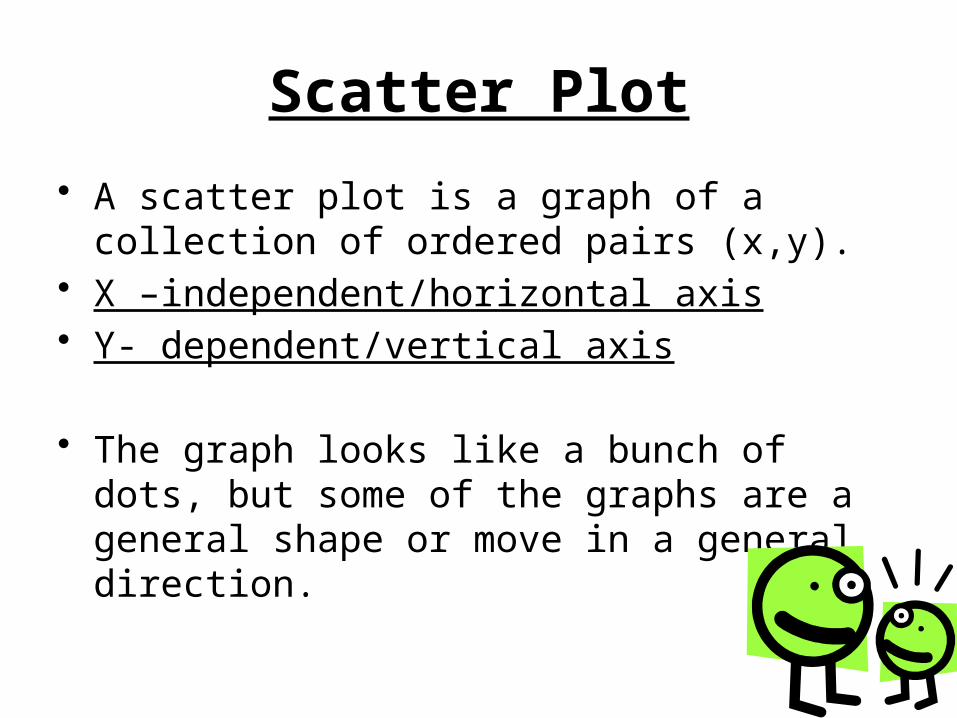
Scatter Plot
• A scatter plot is a graph of a collection of ordered pairs (x,y).
• X –independent/horizontal axis• Y- dependent/vertical axis
• The graph looks like a bunch of dots, but some of the graphs are a general shape or move in a general direction.
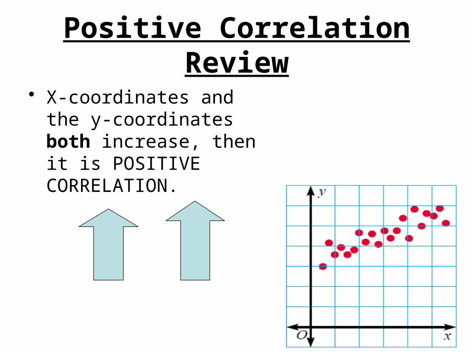
Positive CorrelationReview
• X-coordinates and the y-coordinates both increase, then it is POSITIVE CORRELATION.
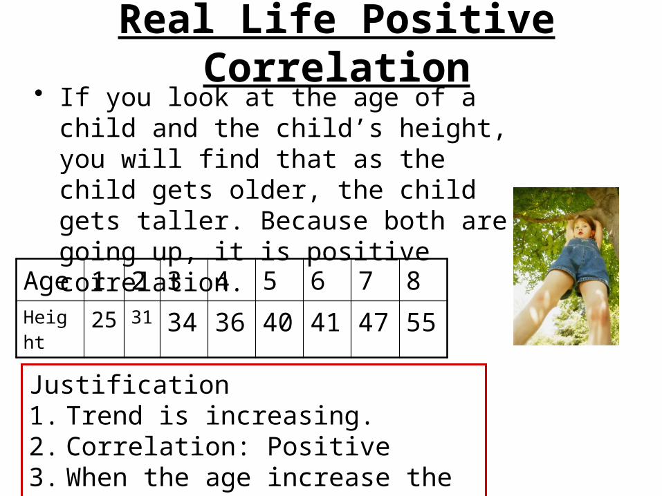
Real Life Positive Correlation• If you look at the age of a child and the
child’s height, you will find that as the child gets older, the child gets taller. Because both are going up, it is positive correlation.
Age 1 2 3 4 5 6 7 8Height 25 31 34 36 40 41 47 55
Justification1. Trend is increasing.2. Correlation: Positive3. When the age increase the height
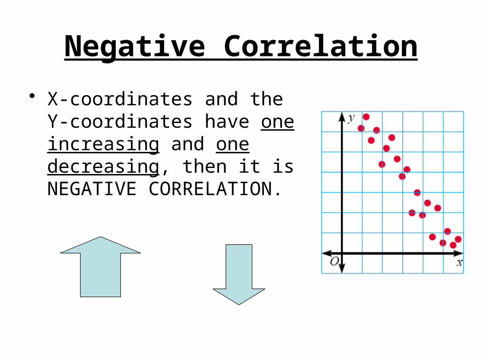
Negative Correlation
• X-coordinates and the Y-coordinates have one increasing and one decreasing, then it is NEGATIVE CORRELATION.
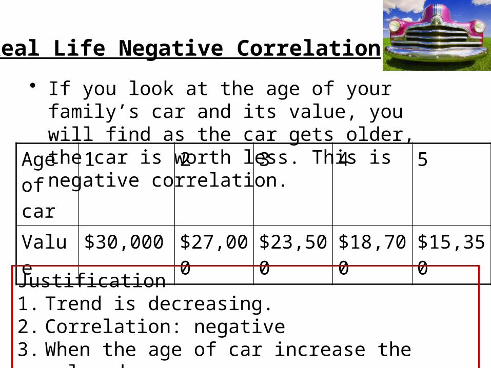
Real Life Negative Correlation
• If you look at the age of your family’s car and its value, you will find as the car gets older, the car is worth less. This is negative correlation.
Age of car
1 2 3 4 5
Value $30,000 $27,000 $23,500 $18,700 $15,350
Justification1. Trend is decreasing.2. Correlation: negative3. When the age of car increase the value decreases
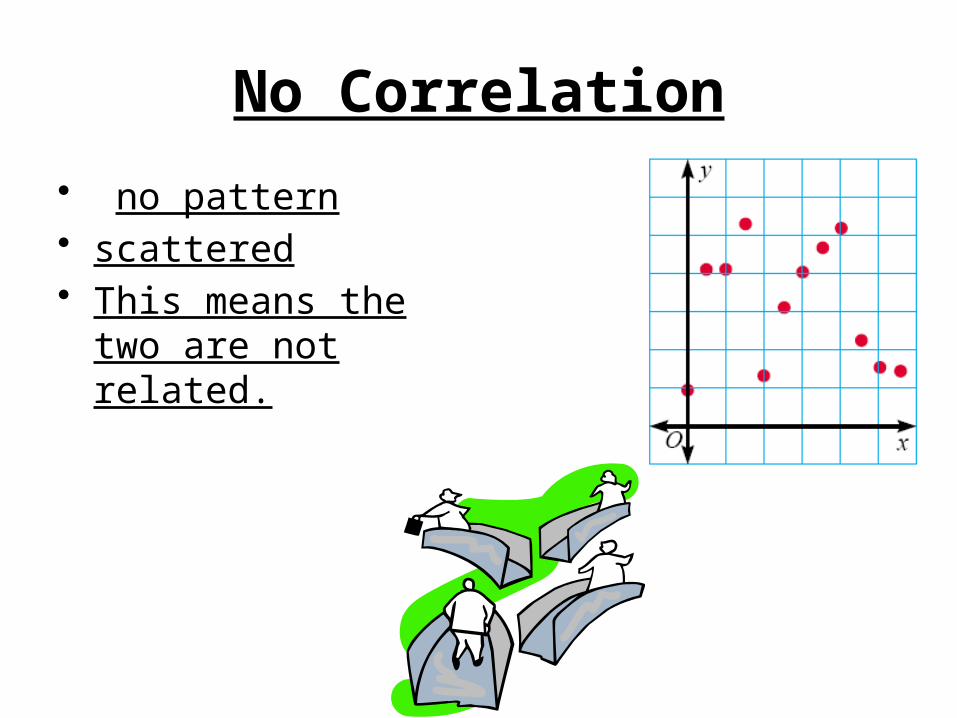
No Correlation
• no pattern• scattered• This means the two
are not related.
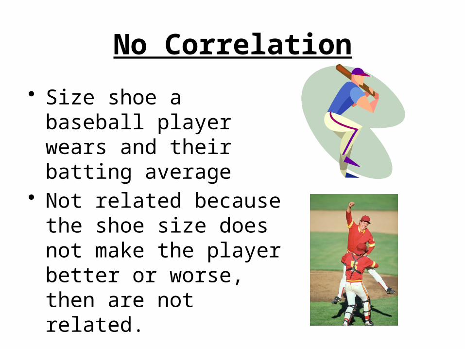
No Correlation
• Size shoe a baseball player wears and their batting average
• Not related because the shoe size does not make the player better or worse, then are not related.
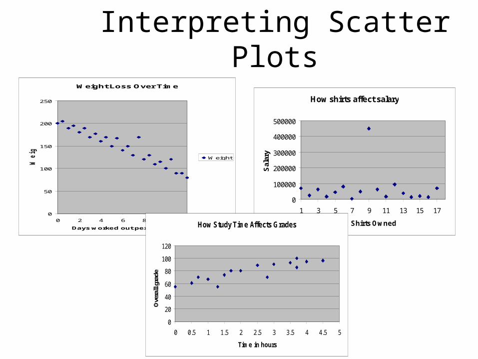
Interpreting Scatter PlotsWeight Loss Over Time
0
50
100
150
200
250
0 2 4 6 8 10 12
Days worked out per month
Weig
ht
Weight
How shirts affect salary
0
100000
200000
300000
400000
500000
1 3 5 7 9 11 13 15 17
Shirts Owned
Sal
ary
How Study Time Affects Grades
0
20
40
60
80
100
120
0 0.5 1 1.5 2 2.5 3 3.5 4 4.5 5
Time in hours
Ove
rall
grad
e
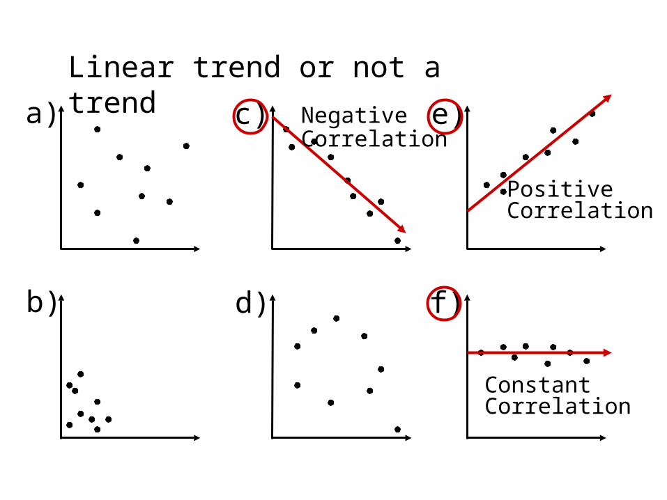
Linear trend or not a trend
a) c) e)
b) d) f)
NegativeCorrelation
PositiveCorrelation
ConstantCorrelation
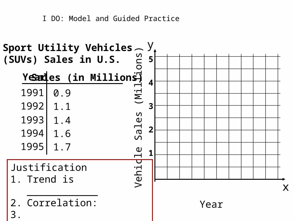
Year
Sport Utility Vehicles(SUVs) Sales in U.S.
Sales (in Millions)
19911992
199319941995
0.91.1
1.41.61.7
x
y
Year
Veh
icle
Sal
es (
Mil
lion
s)
5
4
3
2
1
Justification1. Trend is ____________2. Correlation: 3.
I DO: Model and Guided Practice
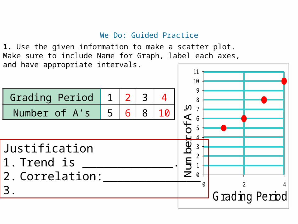
We Do: Guided Practice
1. Use the given information to make a scatter plot. Make sure to include Name for Graph, label each axes, and have appropriate intervals.
Insert Lesson Title Here
Grading Period 1 2 3 4
Number of A’s 5 6 8 10
0
1
2
3
4
5
6
7
8
9
10
11
0 2 4N
umbe
r of
A's
Grading Period
Justification1. Trend is _____________.2. Correlation:______________3.
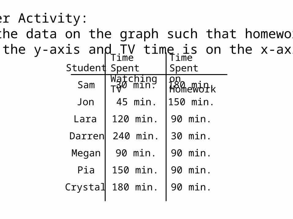
Partner Activity:Plot the data on the graph such that homework timeis on the y-axis and TV time is on the x-axis.
StudentTime SpentWatching TV
Time Spenton Homework
Sam
Jon
Lara
Darren
Megan
Pia
Crystal
30 min.
45 min.
120 min.
240 min.
90 min.
150 min.
180 min.
180 min.
150 min.
90 min.
30 min.
90 min.
90 min.
90 min.
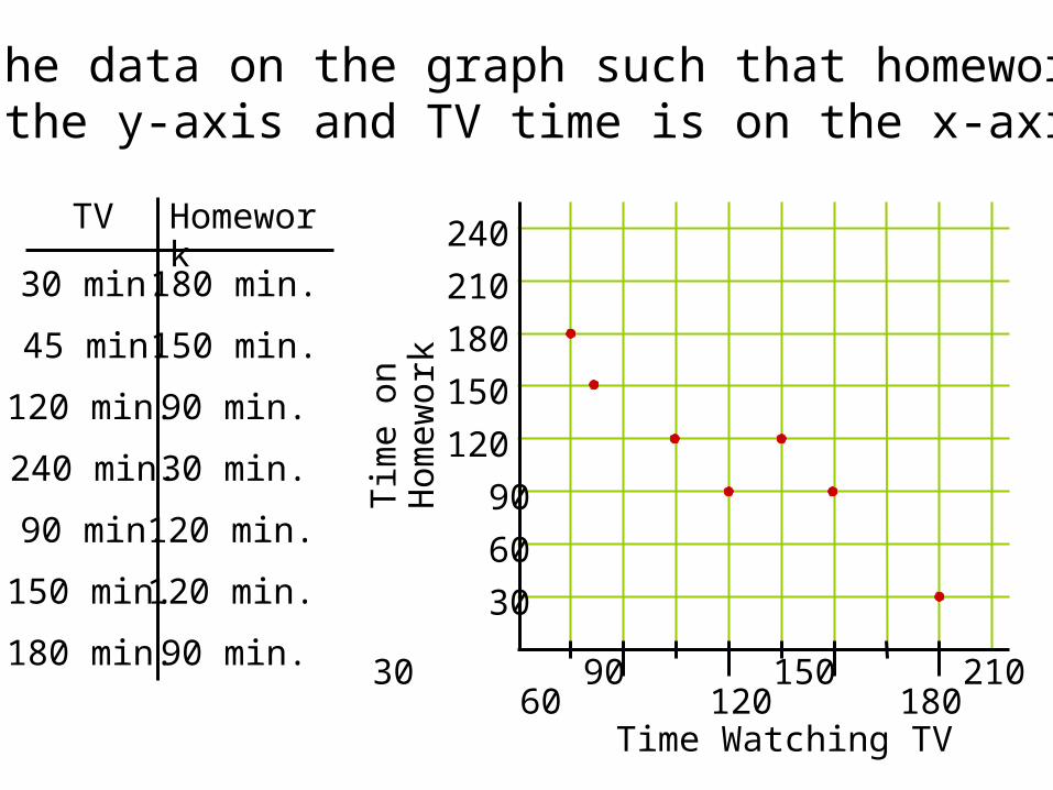
Plot the data on the graph such that homework timeis on the y-axis and TV time is on the x-axis.
TV Homework
30 min.
45 min.
120 min.
240 min.
90 min.
150 min.
180 min.
180 min.
150 min.
90 min.
30 min.
120 min.
120 min.
90 min.
Time Watching TV
Tim
e on
Hom
ewor
k
30 90 150 210 60 120 180 240
240
210
180
150
120
90
60
30
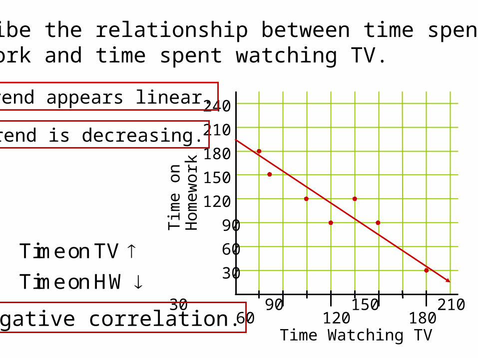
Describe the relationship between time spent onhomework and time spent watching TV.
Time Watching TV
Tim
e on
Hom
ewor
k
30 90 150 210 60 120 180 240
240
210
180
150
120
90
60
30
Trend is decreasing.
Trend appears linear.
Negative correlation.
Time on TV Time on HW

You Do
Independent Work
Closure
• Fist of 5• Wrap Up