Graphics Book
16
The Graphics Book Color Color Correction & Variation Resolution Enlargements & Posters Raster & Vector Formatting and Layers Digital Cameras Design Time Paper & Color Table of Contents
-
Upload
brenna-thompson -
Category
Documents
-
view
229 -
download
5
description
A quick learning book to help clients understand more about print and design.
Transcript of Graphics Book

The Graphics Book
ColorColor Correction & Variation
ResolutionEnlargements & Posters
Raster & VectorFormatting and Layers
Digital CamerasDesign Time
Paper & Color
Table of Contents

Co
lor

Preparing Graphics: Which Color Mode, RGB or CMYK?
Do I want to print RGB or CMYK?
For optimal quality, you always want to print a CMYK file. RGB files are typically reserved for the web or from your camera. Below is a brief explanation between the two modes of CMYK and RGB.
RGB (Red, Green, and Blue)
Red, Green, and Blue are “additive colors”. If we combine red, green and blue light you will get white light. This is the principal behind the T.v. set in your living room as well as your computer monitor.Additive color, or RGB mode, is optimized for display on computer monitors and peripherals, RGB most notably scanning devices.
CMYK (Cyan, Magenta, Yellow, and Black)
Cyan, Magenta and Yellow are “subtractive colors”. If we print cyan, magenta and yellow inks on white paper, they absorb the light shining on the page. Since our eyes receive no reflected light from the paper, we perceive black... in a perfect world!
The printing world operates in subtractive color, or CMYK mode.
In practice, printing subtractive inks may contain impurities that prevent them from absorbing light perfectly. They do a pretty good job with light colors, but when we add them all together, CMYK they produce a murky brown rather than black. In order to get decent dark colors. black ink is added in increasing proportions, as the color gets darker and darker. This is the “K” component in CMYK printing. “K” is used to indicate black instead of a “B” to avoid possibleconfusion over Blue ink.
Quick ReferenceRGB- WebCMYK- Print
ColorCorrection

The Benefits of Color Correction:
Scanned images can be less true to the origional file that was provided especially with flesh tones.
Corrected flesh tones look more natural and present a better image as a whole.
Color Correcting images can make a bigger impact in the final product then you might think.

As shot without Photoshop color correction. This image looks very dull and flat, without much depth or texture.
The same image color corrected to allow for a deeper blue sky, a greener grass with more texture, and a rich, fuller tree.
Color Correcting Images:The Surprising Impact You Will See

differences in color dispay
RGB
CMYK
The variations can range from loss of vibrance to simply a darker image than the original, this is why a printed proof is essential to color matching situations.

This is one of the most common questions asked about files. The answer is not always a simple one, but generally it is simple to distinguish between two main choices:
1) Will this be printed?
or
2) Will this be on the web?
Knowing the answer to that will start you along the right path.
If printing: most common is 300 dpi.
Typically, a standard size print will be a resolution of 300 dpi. This relates to 300 dots-perinch. Therefore, there will be 300 dots of color per every inch of the page. Of course, as you enlarge this resolution, your quality becomes better. However, the larger the resolution the bigger the file size. Sometimes it can certainly be “overkill” to enlarge the resolution too much. In most cases, for sizes up to 18”x24”, 300 dpi is perfectly fine.
If placing on web: most common is 72 ppi.
One of the main challenges for a web designer is to keep the file size to a minimum without sacrificing too much in terms of quality. Ever go to a website that takes a long time to load? Chances are that the reason is because the images contained on the site are not properly optimized for the web. Each image must load into your browser before they display, so the idea is to keep them small. So why can you get away with lower resolution on the web? The answer is because unlike 300 dpi for print, the standard resolution is 72 ppi for the web. The difference between dpi and ppi is that printing uses dots and computer screens uses pixels.
Preparing Graphics: The Resolution Solution
Quick ReferencePrint- 300 dpi at leastWeb- 72 ppi
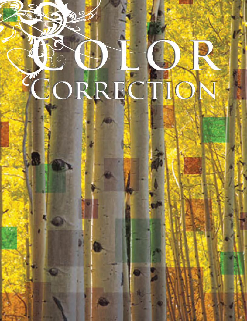
Other issues may arise if smaller raster images are enlarged with the improper resolution. For example, if a picture is taken from the web at 72 resolution and then enlarged three times its original size the pixels will become visible. This is highly discouraged for print purposes as a quality print is rarely achieved using this method.
Enlarging Photos
Preparing Graphics: The Resolution Solution

In many cases, clients do not have the original vector artwork. The best way to acquire this is by contacting the original designer of your work, and ask them for your original vector file. After all, this artwork is the identity of your business, and you should own it!
If it is not possible to acquire the original artwork, it might be a very good idea to have us do a logo “rebuild”, Not only would your current project look incredible, but also any print projects going forward will have the proper artwork to accompany the printed materials.
Below is an example of a logo in a low resolution raster graphic and a infinitely scalable vector graphic. Which would you rather display your company’s identity as?
* Due to the fact we would be manually recreating artwork from a low resolution sample, not all logos will be exact copies. We aim to make the replica as true and authentic to the original as possible.
Preparing Graphics: What if I only have raster graphics for my logo or project?
VECTOR LOGO
After being redrawn, you can see how precise and sharp the logo looks. Not only will this project look professional, but imagine how every project going forward will be now that you have a proper logo to represent your company!
RASTER LOGO
A case of the “best art we could get” issue.The bigger this prints, the worse it gets.
Quick ReferenceRaster- Use as small images only if low resolutionVector- Always a clean image large or small

Preparing Your Graphics For Print:The Differences Between
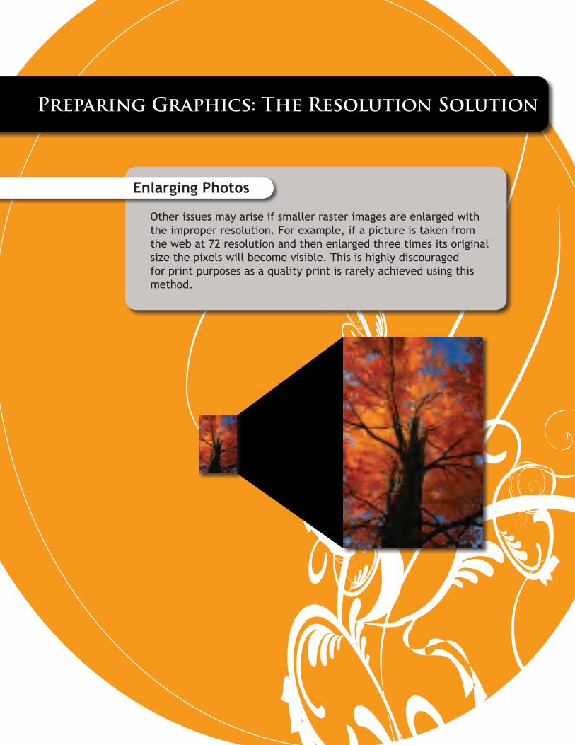
Vector: Vector artwork is made up of lines and shapes, as opposed to pixels.Vector is the best way to handle text, logos, and graphics. Unlike raster graphics, vector can be scaled as large or small without losing any quality in the image.
Use vector for:TextDigital IllustrationsLogosGraphics
Most common print programs for vector artwork:Adobe Illustrator, Corel Draw
Most common vector based file types:.AI, .EPS, .PS, .CDRA visual difference betweenvector and raster artwork
Raster: Raster artwork is the counterpart to vector, because it is made up of pixels. Think of raster artwork as a bunch of tiny squares, or pixels, that make up an image when grouped together. The most common raster image is the photograph. In order to enlarge a raster image, the resolution for the file must be set to a high level. Eventually, a raster image willdistort and “pixelate” as the pixels enlarge with the upscaling.
Use raster for:Images (photographs)
Most common print programs for raster artwork:Adobe Photoshop
Common raster-based file type extensions:.PSD, .TIFF, .JPG*, .GIF*, .PNG*, .BMP
Typically, with the exception of some high resolution JPG files (such as from your camera) GIF and .PNG files are strictly for the web and should never be printed.
A Raster circle.Notice how the edges of the circle are rough? These are the pixels of the raster image. As you enlarge this circle, it will become more and more pixelated and distorted.
A Vector circle.Notice how crisp the edges are. This circle can be enlarged infinitely without any loss of quality.
Preparing Graphics: The difference between Vector and Raster?
You may have heard of “vector” graphics and “raster” graphics, but what exactly does it mean?Quick ReferenceVector- Smooth
Raster- Ragged

DevelopeD by AmericAns of the miDDle mAjority
The Health Care Stakeholders Plan
Your voice matters. Your ideas count. share your thoughts and suggestions on how we continue to refine this plan.
Visit: www.healthcarestakeholdersplan.com.
email: [email protected].
Forward this website and plan to friends and family
and together let’s restore common-sense solutions to washington.
It’s not a Democrat Plan. It’s not a Republican Plan. It’s an American Plan.
“Our lives begin to end the day we become silent about
things that matter.”
– Martin Luther King, Jr.
Formatting Errors
Even when a client submits print ready files some errors may occur.
Notice the box around the artwork that was not present on screen. This is an error sometimes due to the format the file was saved in, for example a pdf saved with Acrobat version 4 might have issues with version 8.
Other explanations could be that the file was saved as a pdf with layers. This can be resolved by flattening the image to retain the original look.
We can fix this to ensure your files print correctly.
Screen
Quick ReferenceErrors often occur with boxes around them.

Depending on the complexity of the project, design time can vary from a few moments to a scheduled month long process or more. It’s our goal to provide you with the best possible design for you and your business so any information you can provide the designer will aid in the developement of the project in the direction you describe.
Remember, if you can think it we can design it, so no matter how crazy your idea let us know what it is. We will do everything in our power to make your concepts reality.
Design Time: You and The Designer
Quick ReferenceComplexity=Lots of Time=More Money

Paper: Its uses and how assorted kinds can enhance your project
Types of Paper
Coated
Uncoated
Textured
Label Stock
Please ask for available papers to ensure we can properly execute your project.
Project Uses of Paper
For wedding invitations different textured papers like linens can add that extra special feel to your special day. For public service pieces consider us-ing recycled material papers to keep with the
Quick ReferenceChoose the correct paper for your project’s final use.

Bleeds occur when the design of something continues to the edge of the object for print, for example business cards or letterhead. To accommodate production needs, the design must have at least an eight inch of that design extended beyond the actual edge of the page so when the printed object is cut to size there is a clean edge and no white shows on the edge of the finished piece. This ensures the quality of the final piece will be up to standard.
The middle example demonstrates that the design is set up with a bleed but the file is not print ready because that extra eight of an inch of the design is not present. The printing and cutting of this piece would result in slight white lines on the edge of each card due to slight shifting during the cutting process.
No bleed is when a design terminates before the edge of the page. Continuation of the design is not needed because there is already white around the design and can remain so.
As seen to the bottom right, a business card with no bleeds. This design is fine as is for print.
Preparing Graphics: Bleeds & No Bleeds
NO BLEED
BLEED
Quick ReferenceBleed- The design extends to the edge of the pageNo Bleed- The design has a border around it where it stops
Graciela Garcia CandiaPresident
(602) 216-9507 Office(602) 625-9969 Cell(602) 216-9508 Fax
2501 W. Dunlap Ave Suite 200Phoenix, AZ 85021
INCORRECT BLEED