
Graphical User Interfaces with Perl/Tk An introduction.
37
Graphical User Interfaces with Perl/Tk An introduction
-
Upload
brittney-pitts -
Category
Documents
-
view
243 -
download
0
Transcript of Graphical User Interfaces with Perl/Tk An introduction.

Graphical User Interfaces with Perl/Tk
An introduction

Event Driven Programming
• In functional programming, what happens when is determined (almost) entirely by the programmer. The user generally has a very limited number of options at any one time.
• In event-driven programming, the user decides what to do when. The programmer needs to decide what happens when the user creates a certain event.

Structure of an Event-Driven Program
1. Set up all windows and forms for initial use2. Create handler routines for all possible events3. Start the main loop
• At this point, the windowing environment receives all events (mouse clicks, button pushes, etc).
• Environment asks the program in focus if it wishes to handle this event.
• If so, run the program's event handler• In the main loop, your program just waits for the
environment to notify it that another event was received, then handles that event, then waits for another.

What is Tk? What is Perl/Tk?• Tk is the Toolkit originally developed for the
language Tcl (which created Tcl/Tk)– pronounced "Tickle-Tee-Kay"
• Tk is a Graphical User Interface toolkit, containing methods and objects with convenient interfaces to the lower layers of the Windowing System.
• The Tk toolkit has been ported to a couple other languages, including Perl.
• For Perl, it has been ported as a Perl Module, Tk.pm

Sample GUI Program:
• #!/usr/bin/env perluse strict;use warnings;use Tk;my $mw = MainWindow->new;MainLoop;
• This program does nothing but display a window with the control box and minimize, maximize, close buttons.

The MainWindow• The MainWindow is the first widget your program
creates. It is a special variant of the TopLevel widget, in that it is displayed automatically when your program enters the main loop.
• There are several customization options and methods:• my $mw = new MainWindow( -background=>'red', -cursor=>'hourglass');
• $mw->title('Hello World');• $mw->geometry('300x400+40+50');
– 300 pixels high, 400 pixels wide, starting 40 pixels from top, 50 from left
• Much more in chapter 11 of Emu– perldoc Tk::MainWindow

Widgets
• A Widget is an element of your Perl/Tk application. • There are several different kinds of widgets:
– TopLevel, Frame, Entry, Checkbox, Radio, Button, Text, Canvas, etc
• Each widget must have a parent widget create it.• Some widgets can contain other widgets (Toplevels,
Frames, Canvases)• A widget is created by calling a method of the parent
widget, along with customization options.

An Example• #!/usr/bin/env perluse strict;use warnings;use Tk;my $mw = MainWindow->new;$mw->title('Hello World');
• my $btn1 = $mw->Button( -text=>'print', -command => sub {print "hello world\n"}, -width=>10, -height=>3);
• my $btn2 = $mw->Button( -text=>'exit',
-command=>sub {exit}, -width=>20,
-height=>3);• $btn1->pack();$btn2->pack();
• MainLoop;

Geometry Management• In that last example, the buttons were created
by the Button() method of $mw.• However, they were only displayed on the
screen because of their pack() methods.• Pack is one of four Geometry Managers
available to Perl/Tk.– pack, grid, place, form
• we will not be covering form - read the Emu
• All widgets must be displayed by calling one of the four geometry managers.
• Usually a good idea to use only one geometry manager per window or frame.

Pack Geometry Manager• By far the most common, and easiest to use.• Widgets can be packed against one of the four sides of the
window– top, right, bottom, left
• Pack first creates an "allocation rectangle" for the widget. The allocation rectangle is packed tight as close to the appropriate side as possible– allocation rectangle cannot overlap– only one widget per allocation rectangle
• If top or bottom, width is entire available width of the parent window, height is as much as is needed by the widget to pack– vice-versa for left or right– Available height/width can be modified by existing allocation rectangles
• Once allocation rectangle is determined, widget is placed in that allocation rectangle, based on options given to pack()

pack() arguments• -side => 'left' | 'right' | 'top' | 'bottom'
– Which side of parent should allocation rectangle be attached to? • -fill => 'none' | 'x' | 'y' | 'both'
– In which direction(s) should the widget fill its allocation rectangle • -expand => 1 | 0
– Allocation rectangle fills remaining space available in window• -anchor => 'n' | 'ne' | 'e' | 'se' | 's' | 'sw' | 'w' | 'nw' | 'center'
– Where in allocation rectangle should widget be anchored • -after => $otherwidget
– Put this widget after current widget in packing order.– Default ordering is determined by order of pack() statements.
• -ipadx => $num, -ipady => $num– Number of pixels to add to the left/right & top/bottom of the widget
• before allocation rectangle calculated
• -padx => $num, -pady => $num– Number of pixels to add to the left/right & top/bottom of the allocation
rectangle

Unpacking
• To remove a widget from the geometry manager (ie, make it disappear from the screen):
• $widget -> packForget();
• Note that this does not destroy the widget, merely hides it.
• If you repack it later, it will come at the end of the packing order

Grid Geometry Manager
• Rather than attaching to sides of a window, Grid divides the window into rows and columns.
• Each widget is set to be placed in a specified set of 'cells'.
0, 0
0, 1
1, 0 2, 0
1, 1 2, 1
0, 2 1, 2 2, 2
etc.

Grid placement• First style of using grid:
– First widget in a row is the widget that calls grid()– All other widgets in that row are passed as arguments
to grid()– Each successive call to grid() creates a new row
$w1->grid($w2, $w3);$w4->grid();$w5->grid($w6, $w7, $w8);
$w6$w5
$w4
$w1 $w2 $w3
$w7 $w8

Special Grid Characters• - : previous widget should span this column as well• x : leave a blank space in this cell• ^ : Widget in this column in previous row spans this
row.
$w1 -> grid($w2, "-", $w3, "x", $w4);
$w5 -> grid("x", "x", "x", "x", "^");
$w1 $w2
$w5
$w3
$w4

Alternate Grid style• Specify directly which rows and columns a
widget should occupy• $widget->grid( -column => 4, -row => 5,
-columnspan => 2, -rowspan => 3);
• This widget extends from (4, 5) through (5, 7)
• Corresponding to packForget(), gridForget() hides a gridded widget.

Place Geometry Manager• Allows overlapping of widgets.• You decide precisely where on screen a widget will be
placed• $widget->place(-anchor=>'n', -x=>40,-y=>20, -height=>10, -width=>30);
• The 'north' (top center) of this widget will be placed 40 pixels from the left of the window, 20 from the top. It is 10 pixels high and 30 wide.
• $widget->place(-anchor=>'se', -relx=>.7,-rely=>.4, -relheight=>1,-relwidth=>.5);
• The 'south-east' (right bottom corner) of this widget will be placed 70% of the distance across the widget, 40% down. It is exactly as tall as the window, and half as wide.

Widgets
• We will now cover a list of different widget types.
• Each widget type can be created with a list of –name=>'value' options.
• Most widgets have a standard set of configuration options, as well as their own.
• Some widgets also have methods which can be invoked for further configuration– such as $mw->title('hello world');

Buttons• my $bttn = $mw -> Button ( … );• -command => \&fctn
– Subroutine to execute when button is pushed• See caveats on slide 33 to pass arguments
• -text => 'hello'– Text displayed on the button, static, never changing
• -textvariable => \$mytext– Text on button will change as $mytext changes– These are mutually exclusive!
• -anchor => [compass direction]– Which part of the button text is anchored to
• * -background => 'red'• * -font => 'courier'• * -state => 'normal' | 'disabled'• * -bitmap => '@dir1/subdir/file.bmp'

Checkbuttons
• $cb = $mw -> Checkbutton( … );• Most options are identical to button• Also adds:• -variable => \$var,-onvalue => 'yes',-offvalue => 'no'
• When the button is checked, $var will be set equal to the value of –onvalue– -onvalue defaults to 1, -offvalue to 0
• if ($var eq 'yes') { #check is on }• $var = 'no'; #uncheck the box

Radiobuttons• my $rb = $mw -> Radiobutton (…);• Same options as Button, plus:-value => 'foo',-variable => \$type
• Each radio button in a group has the same –variable, and different –value.
• Contents of $rb will be the value of which ever radio button is selected.
• my $r1=$mw->Radiobutton(-text=>'foo', -value=>'foo', -variable=>\$type);my $r2=$mw->Radiobutton(-text=>'bar', -value=>'bar, -variable=>\$type);
• if ($type eq 'foo') { #$r1 is selected} elsif ($type eq 'bar') {#$r2 is selected}

Labels
• my $lb = $mw -> Label( … );
• Basically a button that doesn't do anything.
• Same basic standard options, but no -command => …
• Usually used with -text or -textvariable just to give information on a form.
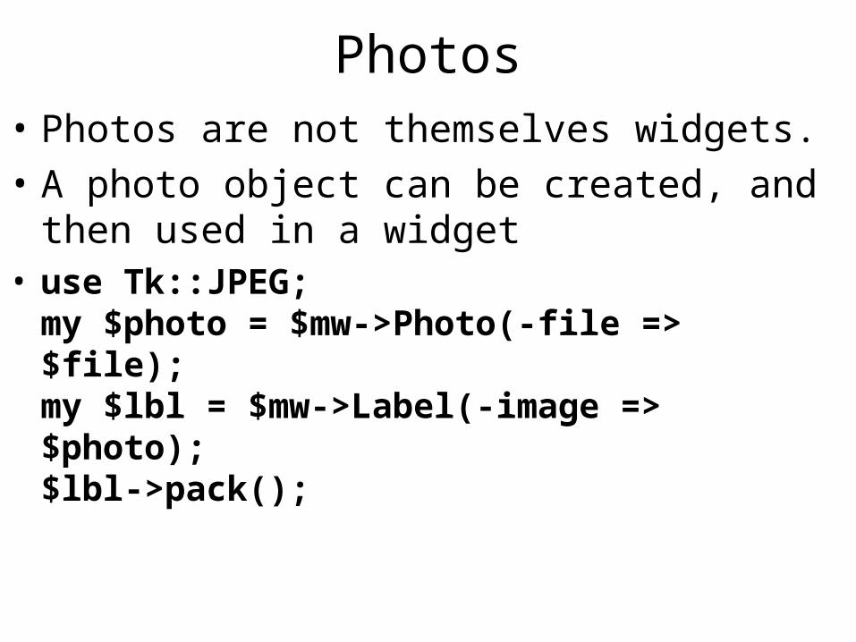
Photos• Photos are not themselves widgets.
• A photo object can be created, and then used in a widget
• use Tk::JPEG;my $photo = $mw->Photo(-file => $file);my $lbl = $mw->Label(-image => $photo);$lbl->pack();

Entry• my $en = $mw -> Entry ( … );• A text-entry field.• -textvariable => \$txt
– $txt can be assigned to, or read from. $txt will always hold the current contents of the text entry field.
• -show => "*"– Show asterisks instead of the actual contents– Useful for password fields

Canvas• Widget that holds shapes and other widgets• my $cv = $mw->Canvas (…);• With canvas created, can create several shapes:$cv->CreateArc(x1, y1, x2, y2);$cv->CreateLine(x1, y1, x2, y2);$cv->CreateOval(x1, y1, x2, y2);$cv->CreatePolygon(x1, y1, …, xn, yn);$cv->CreateRectangle(x1, y1, x2, y2)$cv->CreateText(x, y, -text => "…");$cv_bttn = $cv->Button ( … );
• origin (x=0, y=0) at the top left corner.• x increases in the right direction,• y increases in the down direction

Menus• A menu consists of a Menu widget, attached to a main window,
and consisting of five types of other widgets:• $mw -> configure (-menu => my $mb = $mw->Menu);• my $file = $mb -> cascade(-label => "~File");my $edit = $mb -> cascade(-label => "~Edit");
• my $new = $file -> cascade (-label => "New", -accelerator => "Ctrl-n");
• $file ->separator();• $file ->command(-label=>"Open", -command=>\&open);
• $file ->checkbutton( … ); – (same options as Checkbutton widget)
• $file ->radiobutton ( … ); – (same options as Radiobutton widget)

Listbox
my $lb = $mw -> Listbox (...);
-selectmode => "single" | "browse" | "multiple" | "extended"– single - choose one item only– browse - choose one item, dragging mouse changes
selection (default)– multiple - select 1 or more– extended - select 1 or more using Shift-click or Ctrl-
click

Elements in a Listbox
$lb -> insert (index, $item1, $item2, …);– index is either an integer, "active", or "end"
$lb -> delete (firstindex [, lastindex] );– delete item at first index, or all items from firstindex to
lastindex
$lb -> get (firstindex [, lastindex] );– get item in firstindex, or all items from firstindex to lastindex
my @list = $lb -> curselection();– get list of indexes of currently selected items

Other Widgets• text - large text area
• scroll - add scroll bars to a widget
• scale - scroll bar with a changing number value
• frame - container of other widgets– useful for using different geometry managers in
same application
• Notebook - widget containing 'tabs' or pages.
• Dialog - simple (or not so simple) dialog boxes• perldoc Tk::<widget> for info on any of
these

Two Useful Pre-defined Dialog Boxes• my $file = $mw->getOpenFile();
– Creates the standard open file dialogue box. Returns the path of the file user selects.
– If the user cancels the open, returns undef
• my $newfile = $mw->getSaveFile();– Creates the standard "Save as…" dialogue box
• Both take two options– -filetypes=>[ ['text files', [ '.txt' ] ], [ 'perl files', ['.pl', '.pm'] ] ]
• An arrayref of arrayrefs, first member is a description of file type, second is a arrayref of possible extentions
– -title => 'Choose a file to open!'• A title for the dialogue box. A default title is used if omitted.
• These just return filenames. They don't actually open/save files for you.

Configuration of Widgets
• After a widget is created, you can change its options using its configure method
• $bttn->configure(-state=>"normal");• my @cfg = $bttn->configure();
– returns an array of anonymous arrayrefs, containing all values of all options
• Better option:• my $opt = $bttn->cget(-option)
– Returns the value of $bttn's -option.

Event Handlers• Each widget has a method called bind(). This
is used to create a handler for an event that occurs at that widget.
• For example:• $w1->bind('<Button-1>'=> \&myfunc);• When the first mouse button is pressed while
the cursor is over this widget, the subroutine myfunc() gets called.

Arguments to event handlers• To pass arguments to an event handler, the value of the event
descriptor must be an array ref.
• First element is a reference to the function you want to call.
• Remaining elements are arguments to the subroutine
• BEWARE1: Perl passes an event object to the subroutine before your arguments!! shift() it off to get to your args.
• BEWARE2: Values passed to function will be values at the time of declaration
• my ($a1, $a2) = (5, 10);• '<Button-1>' => [\&mysub, $a1, $a2]• Regardless of values of $a1 and $a2 when button is clicked,
mysub() will get 5 and 10.• '<Button-1>' => [\&mysub, \$x, \$y]• Now, references to $x and $y will be passed. In mysub(), you can
dereference these args to get the current values of $x and $y.
• This also applies to -command option of Button widgets

Event descriptors
• In previous slides, '<Button-1>' is an event descriptor. It contains an event type (Button) and an event detail (1).
• The general form of an event descriptor is:• <modifier-modifier-type-detail>• (most of) The modifiers are:
• Alt, Control, Double, Lock, Meta, Shift, Triple

Event Types• Full list on Emu page 363
– perldoc Tk::bind• Most common/useful:• Button – pressing a mouse button• ButtonRelease – releasing a mouse button• Destroy – the widget is destroyed• Enter – the cursor moves onto the widget• Leave – the cursor leaves the widget• Motion – the cursor is in motion on a widget• Key – A keyboard key is pressed• KeyRelease – A keyboard key is released• FocusIn – The widget has gained keyboard focus• FocusOut – The widget has lost keyboard focus

Event Details
• For Button events, the detail is an integer from 1 to 5 (for really complicated mice…)– If the detail is omitted, the handler is enacted for
that event for ANY button
• For Key events, the detail is the alpha-numeric key that's pressed.– also have 'enter', 'space', 'back', etc– If the detail is omitted, the handler is enacted for
that event for ANY key.

References• The Emu: Mastering Perl/Tk
– Outstanding reference. Linked from the course webpage
– $40.45 from Amazon– If you're serious about Perl/Tk, you need this.
• perldoc Tk• http://phaseit.net/claird/comp.lang.perl.tk/ptkFAQ.html
• http://www.perltk.org/