
Graphical Presentation of Data in Reports Dr Peter Kappen Acting Principal Scientist – XAS.
NOTES Dr. Neeraj Saxena
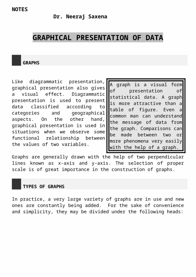
GRAPHICAL PRESENTATION OF DATA
GRAPHS
Like diagrammatic presentation, graphical presentation also gives a visual effect. Diagrammatic presentation is used to present data classified according to categories and geographical aspects. On the other hand, graphical presentation is used in situations when we observe some functional relationship between the values of two variables.
Graphs are generally drawn with the help of two perpendicular lines known as x-axis and y-axis. The selection of proper scale is of great importance in the construction of graphs.
TYPES OF GRAPHS
In practice, a very large variety of graphs are in use and new ones are constantly being added. For the sake of convenience and simplicity, they may be divided under the following heads:
A graph is a visual form of presentation of statistical data. A graph is more attractive than a table of figure. Even a common man can understand the message of data from the graph. Comparisons can be made between two or more phenomena very easily with the help of a graph.
NOTES Dr. Neeraj Saxena
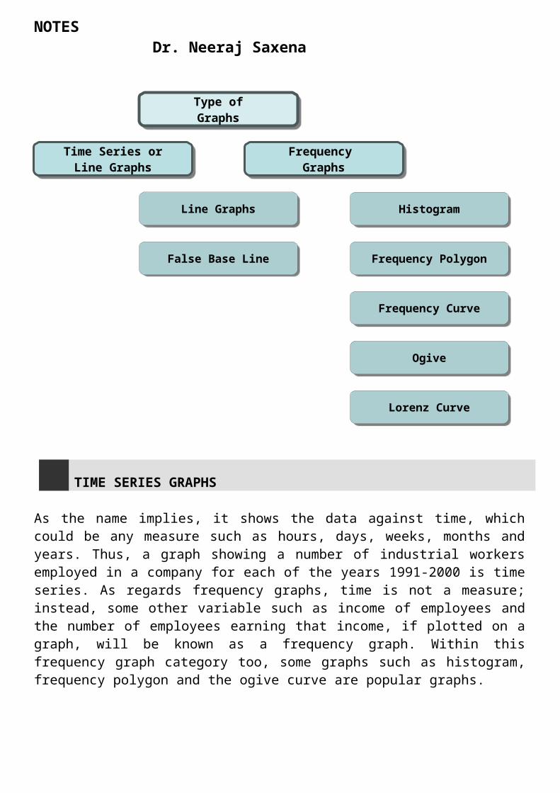
TIME SERIES GRAPHS
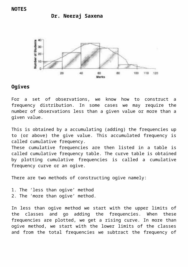
As the name implies, it shows the data against time, which could be any measure such as hours, days, weeks, months and years. Thus, a graph showing a number of industrial workers employed in a company for each of the years 1991-2000 is time series. As regards frequency graphs, time is not a measure; instead, some other variable such as income of employees and the number of employees earning that income, if plotted on a graph, will be known as a frequency graph. Within this frequency graph category too, some graphs such as histogram, frequency polygon and the ogive curve are popular graphs.
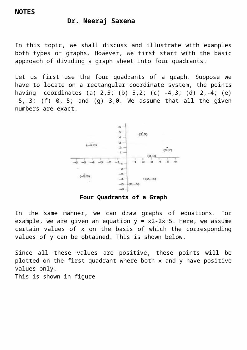
In this topic, we shall discuss and illustrate with examples both types of graphs. However, we first start with the basic approach of dividing a graph sheet into four quadrants.
Let us first use the four quadrants of a graph. Suppose we have to locate on a rectangular coordinate system, the points having coordinates (a) 2,5; (b) 5,2; (c) –4,3; (d) 2,-4; (e) –5,-3; (f) 0,-5; and (g) 3,0. We assume that all the given numbers are exact.
Type ofGraphs
Time Series orLine Graphs
Frequency Graphs
Line Graphs
False Base Line
Histogram
Frequency Polygon
Frequency Curve
Ogive
Lorenz Curve
NOTES Dr. Neeraj Saxena
Four Quadrants of a Graph
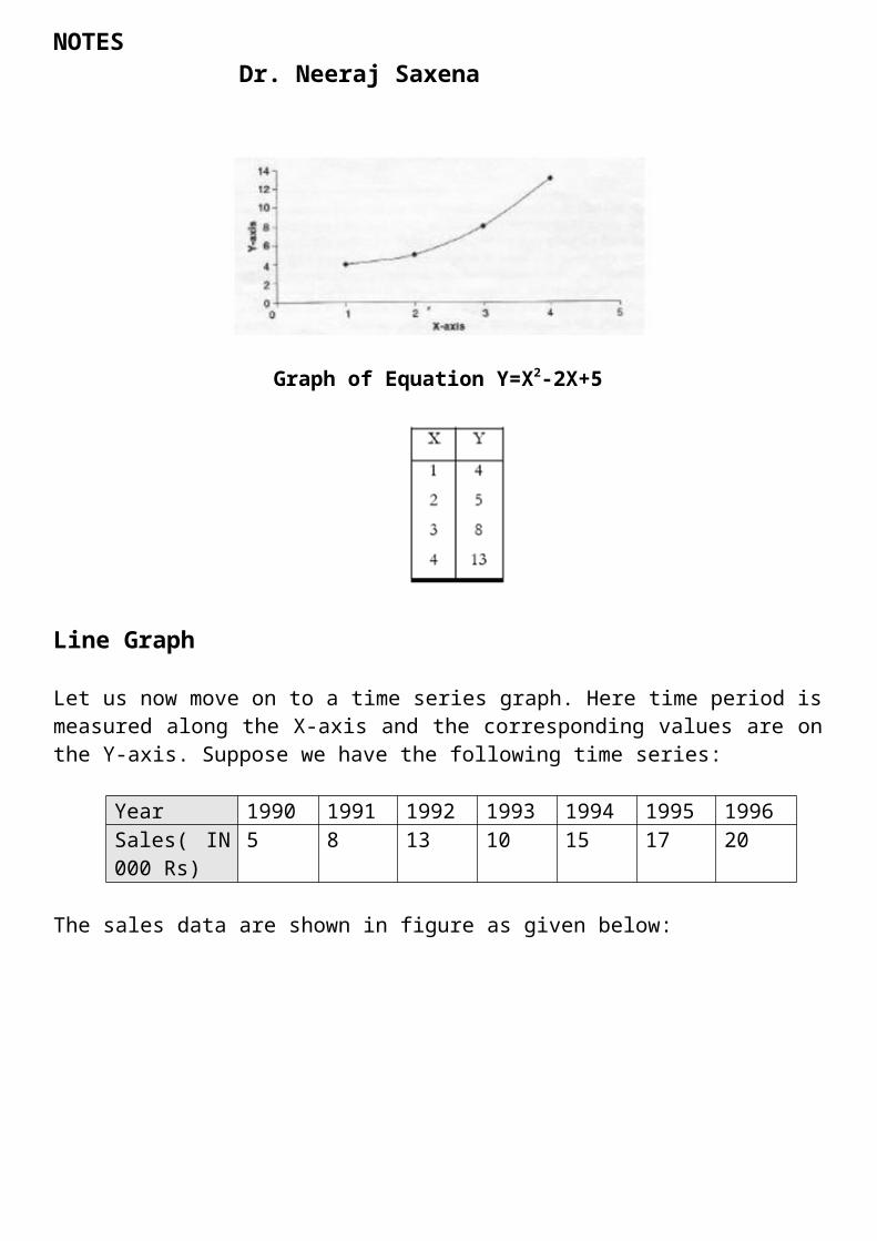
In the same manner, we can draw graphs of equations. For example, we are given an equation y = x2-2x+5. Here, we assume certain values of x on the basis of which the corresponding values of y can be obtained. This is shown below.
Since all these values are positive, these points will be plotted on the first quadrant where both x and y have positive values only.This is shown in figure
Graph of Equation Y=X2-2X+5
Line Graph
NOTES Dr. Neeraj Saxena
Let us now move on to a time series graph. Here time period is measured along the X-axis and the corresponding values are on the Y-axis. Suppose we have the following time series:
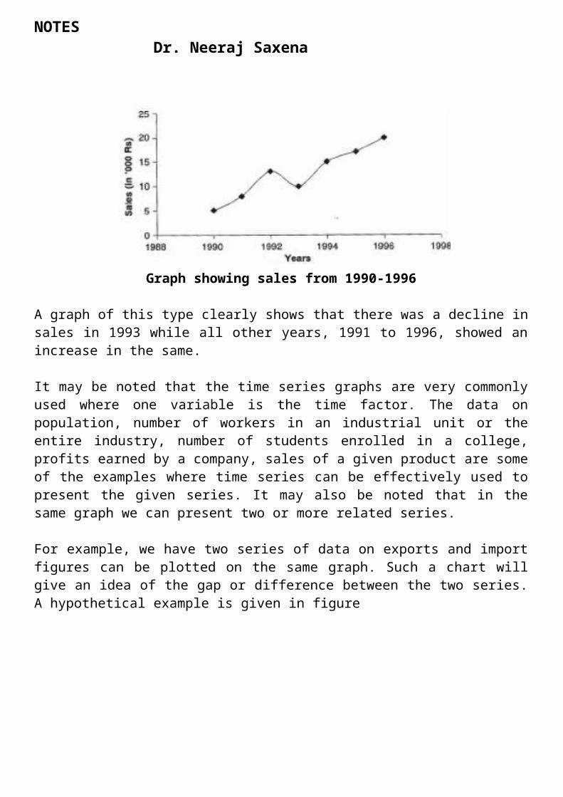
Year 1990 1991 1992 1993 1994 1995 1996Sales( IN 000 Rs)
5 8 13 10 15 17 20
The sales data are shown in figure as given below:
Graph showing sales from 1990-1996
A graph of this type clearly shows that there was a decline in sales in 1993 while all other years, 1991 to 1996, showed an increase in the same.
It may be noted that the time series graphs are very commonly used where one variable is the time factor. The data on population, number of workers in an industrial unit or the entire industry, number of students enrolled in a college, profits earned by a company, sales of a given product are some of the examples where time series can be effectively used to present the given series. It may also be noted that in the same graph we can present two or more related series.
For example, we have two series of data on exports and import figures can be plotted on the same graph. Such a chart will give an idea of the gap or difference between the two series. A hypothetical example is given in figure
NOTES Dr. Neeraj Saxena
Graph Showing Exports and Imports 1990 –1995
Both the figures are the examples of line graph wherein the values of a given variable gave been plotted against time (years). A point to note is that the time could be a year, a month, a week, a day or even an hour. Such graphs are extremely simple though one has to be very careful in selecting a suitable scale depending on the range of data to be plotted against time. A multiple line graph showing two or more series on the same graph needs more care to accommodate varying values if the different series.
False Base Line
An important rule in the construction of graphs is that the scale of the Y- axis should begin from zero even when the lowest figure in the Y- series happens to be far above zero. However, sometimes we have to graph such data that it may be extremely difficult to adhere to this basic rule. This happens when the space available for the graph cannot accommodate the entire scale beginning from zero. An example will make this point clear.
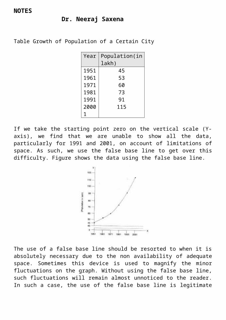
Suppose the data given in Table relating to the growth of population of a city during the decennial periods are to be shown by means of a graph.
Table Growth of Population of a Certain City
Year Population(in lakh)
1951196119711981199120001
4553607391115
If we take the starting point zero on the vertical scale (Y-axis), we find that we are unable to show all the data, particularly for 1991 and 2001, on account of limitations of space. As

NOTES Dr. Neeraj Saxena
such, we use the false base line to get over this difficulty. Figure shows the data using the false base line.
The use of a false base line should be resorted to when it is absolutely necessary due to the non availability of adequate space. Sometimes this device is used to magnify the minor fluctuations on the graph. Without using the false base line, such fluctuations will remain almost unnoticed to the reader. In such a case, the use of the false base line is legitimate and justified. However, sometimes one may one this device with the intention to magnify the fluctuations in the given data, say, pertaining to production, sales, profits, and so forth. Obviously, the use of false base line in such cases is unfair. As such, the reader should be very vigilant while interpreting graphs based on false base line.
5.5 FREQUENCY GRAPHS
We now come to another category of graphs known as frequency graphs. The following types of frequency graphs are normally used:
1. Histogram 2. Frequency Polygon 3. Frequency Curve 4. Ogive 5. Lorenz Curve
A brief discussion of these along with a suitable illustration in each case now follows.
Histogram
NOTES Dr. Neeraj Saxena
A histogram is a bar chart or graph showing the frequency of occurrence of each value of the variable being analysed. In histogram, data are plotted as a series of rectangles. Class intervals are shown on the ‘X-axis’ and the frequencies on the ‘Y-axis’.
The height of each rectangle represents the frequency of the class interval. Each rectangle is formed with the other so as to give a continuous picture. Such a graph is also called staircase or block diagram.
However, we cannot construct a histogram for distribution with open-end classes. It is also quite misleading if the distribution has unequal intervals and suitable adjustments in frequencies are not made.
The total area covered by the histograms for whole frequency distributaries is equal to the total number of items in the frequency distribution.
The following points should be kept in mind in drawing a histogram.
1. Histogram can only be drawn for continuous data. If the data is discontinuous i.e. upper limit of one class is not equal to the lower limit of next higher class, then the class-intervals should be first made continuous.
2. Area of the rectangle is always equal to frequency of the corresponding class interval. In case all the class-intervals are of same width, the height of the rectangle can be taken proportional to the frequency of the class interval.
3. In this case of open-end classes, the end class’s limits are chosen arbitrarily so that width of the class intervals becomes equal to that of the preceding class.
SOLVED EXAMPLE
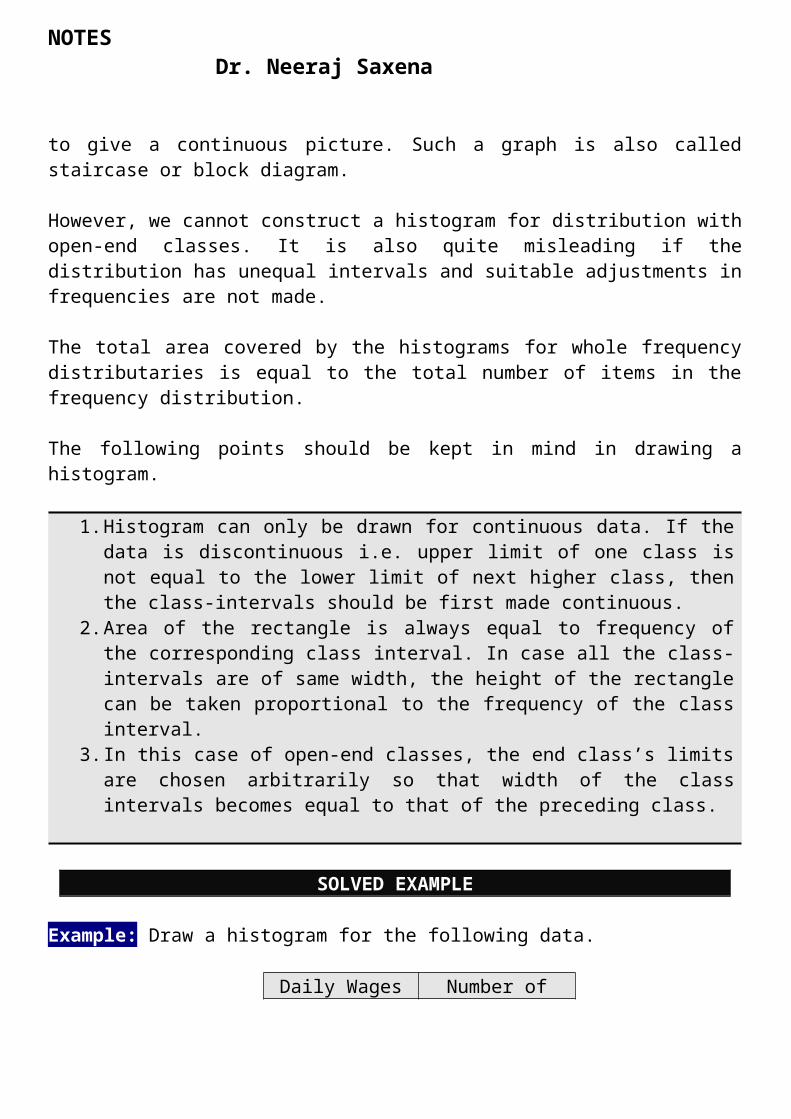
Example: Draw a histogram for the following data.
Daily Wages Number of workers
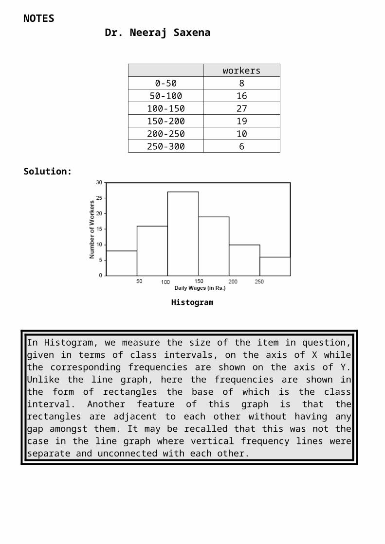
0-50 850-100 16100-150 27150-200 19200-250 10250-300 6
Solution:

NOTES Dr. Neeraj Saxena
Histogram
In Histogram, we measure the size of the item in question, given in terms of class intervals, on the axis of X while the corresponding frequencies are shown on the axis of Y. Unlike the line graph, here the frequencies are shown in the form of rectangles the base of which is the class interval. Another feature of this graph is that the rectangles are adjacent to each other without having any gap amongst them. It may be recalled that this was not the case in the line graph where vertical frequency lines were separate and unconnected with each other.
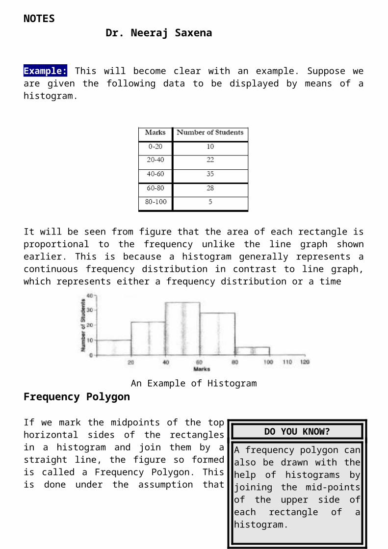
Example: This will become clear with an example. Suppose we are given the following data to be displayed by means of a histogram.
It will be seen from figure that the area of each rectangle is proportional to the frequency unlike the line graph shown earlier. This is because a histogram generally represents a continuous frequency distribution in contrast to line graph, which represents either a frequency distribution or a time
NOTES Dr. Neeraj Saxena
An Example of HistogramFrequency Polygon
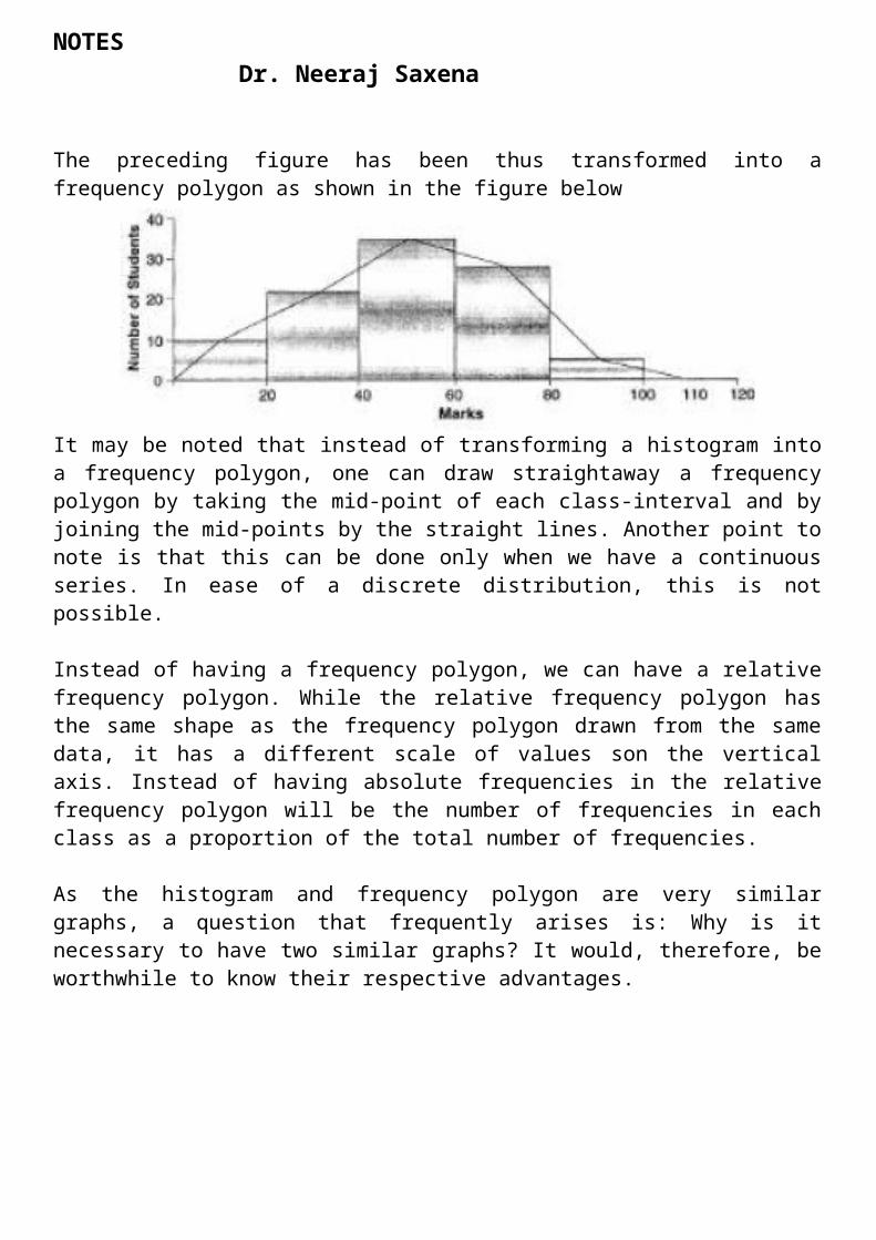
If we mark the midpoints of the top horizontal sides of the rectangles in a histogram and join them by a straight line, the figure so formed is called a Frequency Polygon. This is done under the assumption that the frequencies in a class interval are evenly distributed throughout the class. The area of the polygon is equal to the area of the histogram, because the area left outside is just equal to the area included in it.
SOLVED EXAMPLE
Example: Draw a frequency polygon for the following data.
DO YOU KNOW?
A frequency polygon can also be drawn with the help of histograms by joining the mid-points of the upper side of each rectangle of a histogram.
NOTES Dr. Neeraj Saxena
A Frequency Polygon like any polygon consists of many angles. A histogram can be easily transformed into a frequency polygon by joining the mid-points of the rectangles by straight lines.
The preceding figure has been thus transformed into a frequency polygon as shown in the figure below
It may be noted that instead of transforming a histogram into a frequency polygon, one can draw straightaway a frequency polygon by taking the mid-point of each class-interval and by joining the mid-points by the straight lines. Another point to note is that this can be done only when we have a continuous series. In ease of a discrete distribution, this is not possible.
Instead of having a frequency polygon, we can have a relative frequency polygon. While the relative frequency polygon has the same shape as the frequency polygon drawn from the same data, it has a different scale of values son the vertical axis. Instead of having absolute frequencies in the relative frequency polygon will be the number of frequencies in each class as a proportion of the total number of frequencies.
NOTES Dr. Neeraj Saxena
As the histogram and frequency polygon are very similar graphs, a question that frequently arises is: Why is it necessary to have two similar graphs? It would, therefore, be worthwhile to know their respective advantages.
The Advantages of Histogram over Polygon
1. Each rectangle shows distinctly separate class in the distribution. 2. The area of each rectangle in relation to all other rectangles shows the proportion of the total number of observations pertaining to that class.
Frequency Polygons, too, have certain advantages.
1. The frequency polygon is simpler as compared to its histogram. 2. The frequency polygon shows more vividly an outline of the data pattern. 3. As the number of classes and the number of observations increase, so also the frequency polygon becomes increasingly smooth.
Frequency Curve
A frequency curve gives a more realistic representation of the phenomenon than a histogram or a frequency polygon. The method of drawing a frequency curve is similar to frequency polygon. The only difference is that instead of joining the successive points by straight lines, a free hand smooth curve is drawn in such a way that it passes through more of the points.
The basic advantage of free hand smooth curve is that it helps in classifying the given frequency distribution by comparing the curve with the frequency curve of some common frequency distributions.
Some fundamental frequency distributions have the following form of frequency curves.
DO YOU KNOW?
If the middle point of the upper boundaries of the rectangles of a histogram is corrected by a smooth freehand curve, then that diagram is called frequency curve. The curve should begin and end at the base line.

NOTES Dr. Neeraj Saxena
(a) Symmetrical distribution: A common characteristic of such distributions is that frequency maximum frequency.
(b) Moderately skewed or slightly asymmetrical distributions: in such distributions the rate of decrease of frequencies on the side of the maximum value is more than the corresponding rate of another side. These are most popular in practice. A asymmetrical curve can be positively skewed if rate of decrease of the frequencies on right side of the maximum is more than that on the left otherwise the curve is said to be negatively skewed.
SOLVED EXAMPLE
Example: Draw a frequency curve for the following data.
Solution:
NOTES Dr. Neeraj Saxena
A Frequency Polygon is angular as the mid-points of class- intervals ate joined by straight lines. When a frequency polygon is smoothened and rounded at the top, then it known as a Frequency Curve. On account of smoothening angularities of frequency polygon, the frequency curve becomes more suitable for the purpose of interpolation.
Figure, given below, shows the frequency curve. As is evident, this is based on the smoothening of the frequency polygon.
Ogives
For a set of observations, we know how to construct a frequency distribution. In some cases we may require the number of observations less than a given value or more than a given value.
This is obtained by a accumulating (adding) the frequencies up to (or above) the give value. This accumulated frequency is called cumulative frequency.These cumulative frequencies are then listed in a table is called cumulative frequency table. The curve table is obtained by plotting cumulative frequencies is called a cumulative frequency curve or an ogive.
There are two methods of constructing ogive namely:
1. The ‘less than ogive’ method2. The ‘more than ogive’ method.
In less than ogive method we start with the upper limits of the classes and go adding the frequencies. When these frequencies are plotted, we get a rising curve. In more than ogive method, we start with the lower limits of the classes and from the total frequencies we subtract the frequency of each class. When these frequencies are plotted we get a declining curve.
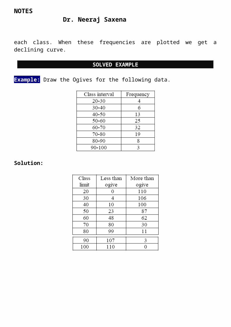
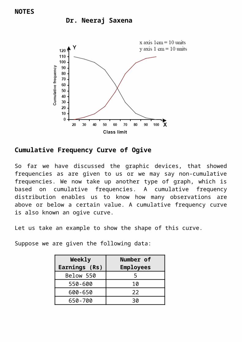
SOLVED EXAMPLE
Example: Draw the Ogives for the following data.
NOTES Dr. Neeraj Saxena
Solution:
NOTES Dr. Neeraj Saxena
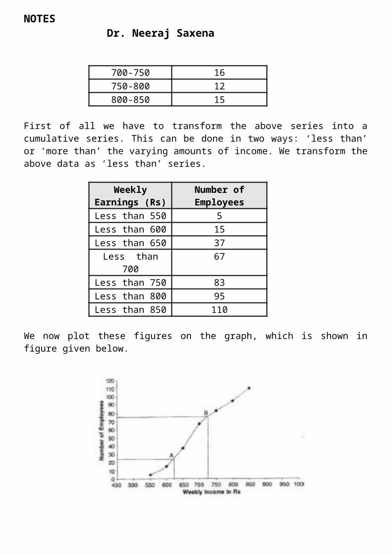
Cumulative Frequency Curve of Ogive
So far we have discussed the graphic devices, that showed frequencies as are given to us or we may say non-cumulative frequencies. We now take up another type of graph, which is based on cumulative frequencies. A cumulative frequency distribution enables us to know how many observations are above or below a certain value. A cumulative frequency curve is also known an ogive curve.
Let us take an example to show the shape of this curve.
Suppose we are given the following data:
Weekly Earnings (Rs)
Number ofEmployees
Below 550 5550-600 10600-650 22650-700 30700-750 16750-800 12800-850 15
First of all we have to transform the above series into a cumulative series. This can be done in two ways: ‘less than’ or ‘more than’ the varying amounts of income. We transform the above data as ‘less than’ series.
Weekly Earnings (Rs)
Number of Employees
Less than 550 5Less than 600 15Less than 650 37Less than 700 67Less than 750 83Less than 800 95Less than 850 110
We now plot these figures on the graph, which is shown in figure given below.

NOTES Dr. Neeraj Saxena
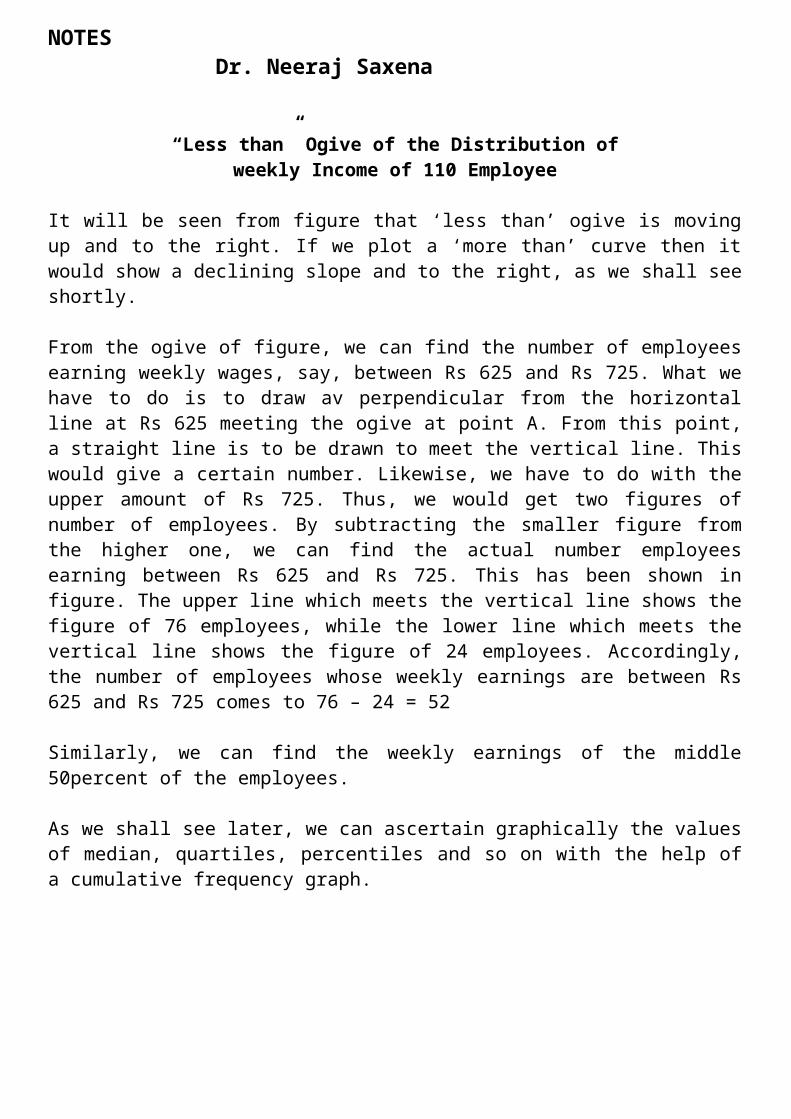
“Less than” Ogive of the Distribution of weekly Income of 110 Employee
It will be seen from figure that ‘less than’ ogive is moving up and to the right. If we plot a ‘more than’ curve then it would show a declining slope and to the right, as we shall see shortly.
From the ogive of figure, we can find the number of employees earning weekly wages, say, between Rs 625 and Rs 725. What we have to do is to draw av perpendicular from the horizontal line at Rs 625 meeting the ogive at point A. From this point, a straight line is to be drawn to meet the vertical line. This would give a certain number. Likewise, we have to do with the upper amount of Rs 725. Thus, we would get two figures of number of employees. By subtracting the smaller figure from the higher one, we can find the actual number employees earning between Rs 625 and Rs 725. This has been shown in figure. The upper line which meets the vertical line shows the figure of 76 employees, while the lower line which meets the vertical line shows the figure of 24 employees. Accordingly, the number of employees whose weekly earnings are between Rs 625 and Rs 725 comes to 76 – 24 = 52
Similarly, we can find the weekly earnings of the middle 50percent of the employees.
As we shall see later, we can ascertain graphically the values of median, quartiles, percentiles and so on with the help of a cumulative frequency graph.
NOTES Dr. Neeraj Saxena
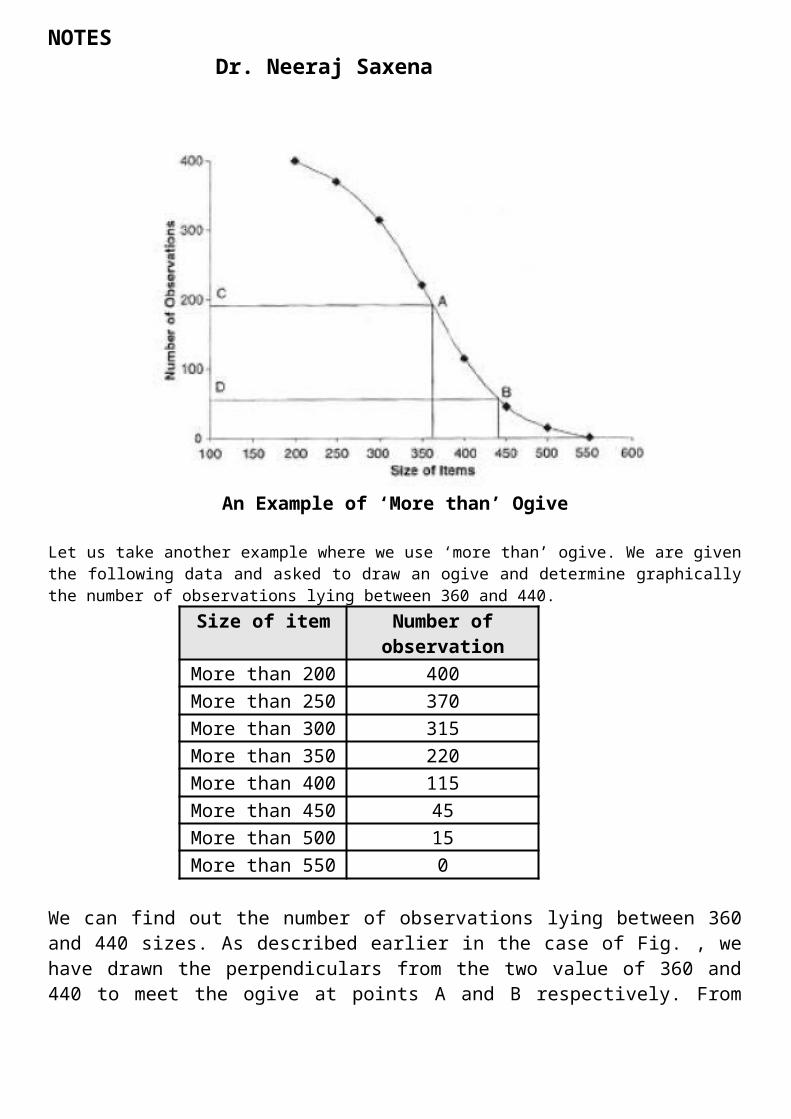
An Example of ‘More than’ Ogive
Let us take another example where we use ‘more than’ ogive. We are given the following data and asked to draw an ogive and determine graphically the number of observations lying between 360 and 440.
Size of item Number of observation
More than 200 400More than 250 370More than 300 315More than 350 220More than 400 115More than 450 45More than 500 15More than 550 0
We can find out the number of observations lying between 360 and 440 sizes. As described earlier in the case of Fig. , we have drawn the perpendiculars from the two value of 360 and 440 to meet the ogive at points A and B respectively. From these points, straight lines have been drawn to meet the vertical line at points C and D respectively. Now, C gives the value of 195 observations and D gives the value of 57 observations.
Thus, the difference between C and D, that is, C – D gives us the number of observations lying between these values, which his 138 approximately. It is worthwhile here to recall the steps needed in drawing an ogive after the data have been collected. The data are first arrayed and then a frequency distribution is obtained. Both these
NOTES Dr. Neeraj Saxena
steps were discussed in the preceding chapters. From the frequency distribution, we obtain a cumulative frequency distribution on the basis of either ‘less than’ or ‘more than’ patterns. The cumulative data are then plotted on the graph, which gives us an ogive. Finally, the ogive curve thus obtained can be used to find graphically the values of any given size or for any given value, the corresponding size. But, we cannot get the exact original data from any of the graphical devices.
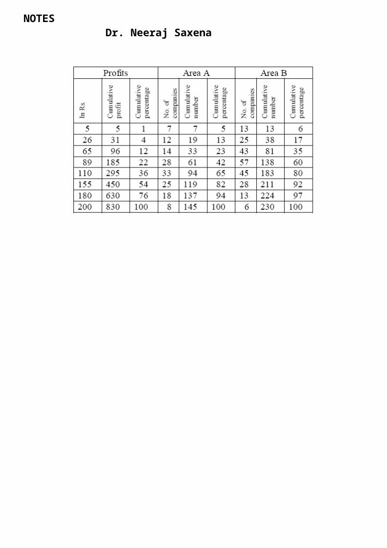
Lorenz Curve
Lorenz curve is a graphical method of studying dispersion. It was introduced by Max.O.Lorenz, a great Economist and a statistician, to study the distribution of wealth and income. It is also used to study the variability in the distribution of profits, wages, revenue, etc.
Lorenz Curve is specially used to study the degree of inequality in the distribution of income and wealth between countries or between different periods. It is a percentage of cumulative values of one variable in combined with the percentage of cumulative values in other variable and then Lorenz curve is drawn.
The curve starts from the origin (0,0) and ends at (100,100). If the wealth, revenue, land etc are equally distributed among the people of the country, then the Lorenz curve will be the diagonal of the square. But this is highly impossible.
The deviation of the Lorenz curve from the diagonal shows how the wealth, revenue, land etc are not equally distributed among people.
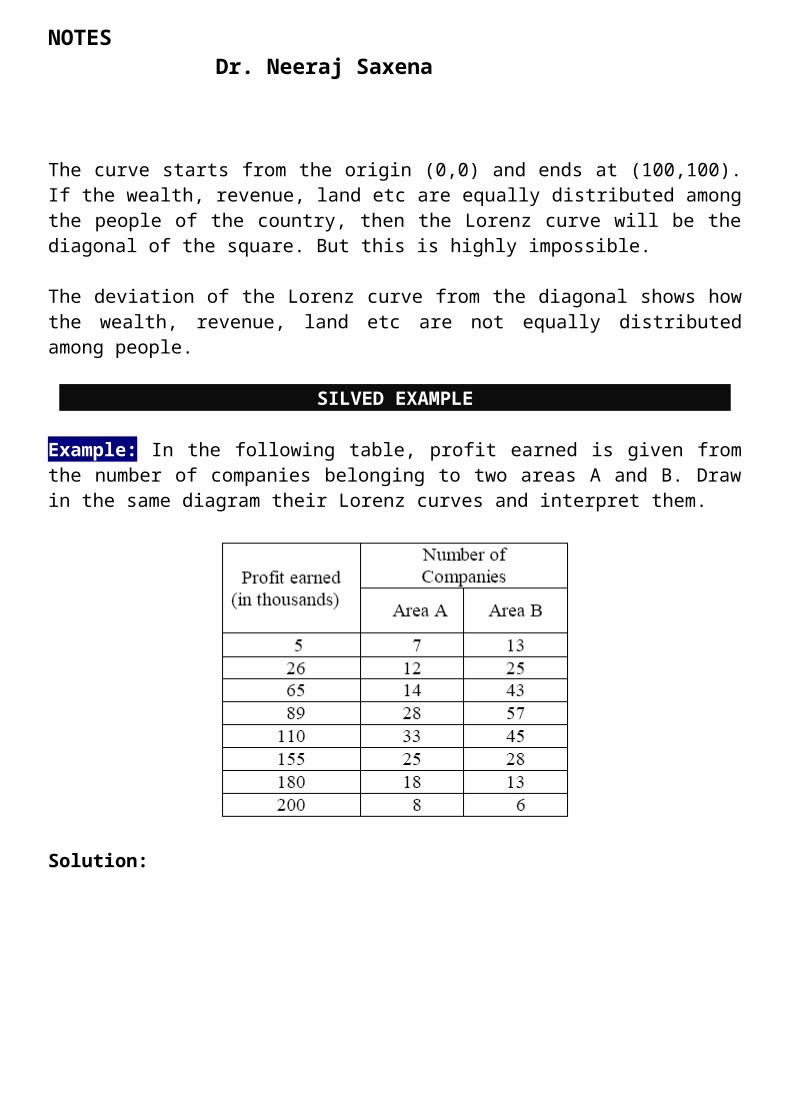
SILVED EXAMPLE
Example: In the following table, profit earned is given from the number of companies belonging to two areas A and B. Draw in the same diagram their Lorenz curves and interpret them.
NOTES Dr. Neeraj Saxena
Solution:
NOTES Dr. Neeraj Saxena
BAR PRESENTATION OF DATA
DIAGRAMS
A diagram is a visual form for presentation of statistical data, highlighting their basic facts and relationship. If we draw diagrams on the basis of the data collected they will easily be understood and appreciated by all. It is readily intelligible and save a considerable amount of time and energy.
One of the most convincing and appealing ways in which data may be presented is through diagrams. Evidence of this can be found in the financial pages of newspapers, journals, advertisements, etc. Pictorial presentation helps in quick understanding of the data. As the number and magnitude of figures increases, they become more confusing and their analysis tends to be more strenuous. A picture is said to be worth 10,000 words, i.e., through pictorial
NOTES Dr. Neeraj Saxena
presentation data can be presented in an interesting form. Not only this, diagrams have greater memorizing effect as the impressions created by them last much longer than those created by the figures.
CHARACTERISTICS OF DIAGRAMS
(i) Diagrams are meant only to give a pictorial representation of the quantitative data with a view to make them readily intelligible. Diagrams are not meant for anything beyond it. They prove or disprove a particular fact. They are not suitable for further analysis of data which can be done only from figures. If diagrams are properly drawn they can not doubt give proper emphasis on the different characteristics of the quantitative data. They are capable of focussing attention on the main findings of the enquiry in question. Beyond this, however, they do nothing.
(ii) Data should be homogeneous: Another point to be noted in this connection is that the person drawing the diagrams should make himself sure of figures cannot be suitably represented by means of diagrams. Statistical data which are intended to be diagrammatically represented should be homogeneous and comparable.
(iii) Diagrams are not substitutes for figures. Another very important characteristic of diagrams is that though they represent figures yet the size of a bar or a suare or a circle or a picture representing a set of figures, changes with changes in the scale with which they have been drawn. If the same data are represented on two different scales their size would differ and sometimes they may create very misleading impression on the minds of the people.
RULES FOR CONSTRUCTING DIAGRAMS
The construction of diagrams is an art, which can be acquired through practice. However, observance of some general guidelines can help in making them more attractive and effective. The diagrammatic presentation of statistical facts will be advantageous provided the following rules are observed in drawing diagrams.
1. A diagram should be neatly drawn and attractive.2. The measurements of geometrical figures used in diagram should be accurate and proportional.3. The size of the diagrams should match the size of the paper.4. Every diagram must have a suitable but short heading.5. The scale should be mentioned in the diagram.6. Diagrams should be neatly as well as accurately drawn with the help of drawing instruments.
NOTES Dr. Neeraj Saxena
7. Index must be given for identification so that the reader can easily make out the meaning of the diagram.8. Footnote must be given at the bottom of the diagram.9. Economy in cost and energy should be exercised in drawing diagram.
TYPES OF DIAGRAMS
In practice, a very large variety of diagrams are in use and new ones are constantly being added. For the sake of convenience and simplicity, they may be divided under the following heads:
Type of Diagrams
One-Dimensional Diagrams
Type of Diagrams
One Dimensional Diagram
Two-DimensionalDiagrams
Three-Dimensional Diagrams
Pictograms & Cartograms
Line Diagram
Simple Bar Diagram
Multiple Bar Diagram
Sub-Divided Bar Diagram
Percentage Bar Diagram
Rectangles
Squares
Pie-Diagrams
NOTES Dr. Neeraj Saxena
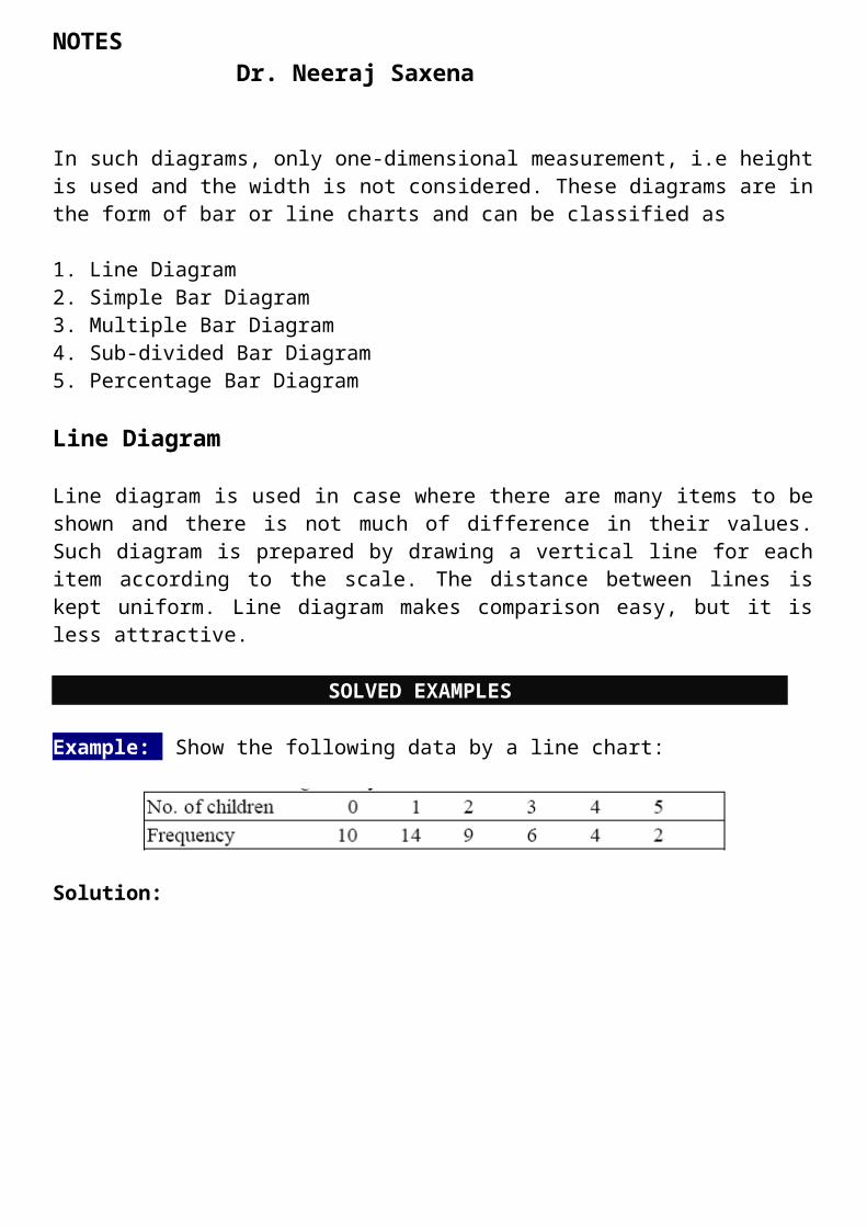
In such diagrams, only one-dimensional measurement, i.e height is used and the width is not considered. These diagrams are in the form of bar or line charts and can be classified as
1. Line Diagram2. Simple Bar Diagram3. Multiple Bar Diagram4. Sub-divided Bar Diagram5. Percentage Bar Diagram
Line Diagram
Line diagram is used in case where there are many items to be shown and there is not much of difference in their values. Such diagram is prepared by drawing a vertical line for each item according to the scale. The distance between lines is kept uniform. Line diagram makes comparison easy, but it is less attractive.
SOLVED EXAMPLES
Example: Show the following data by a line chart:
Solution:
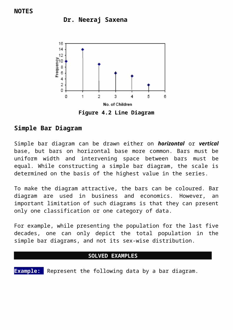
Figure 4.2 Line Diagram
Simple Bar Diagram
Simple bar diagram can be drawn either on horizontal or vertical base, but bars on horizontal base more common. Bars must be uniform width and intervening space between
NOTES Dr. Neeraj Saxena
bars must be equal. While constructing a simple bar diagram, the scale is determined on the basis of the highest value in the series.
To make the diagram attractive, the bars can be coloured. Bar diagram are used in business and economics. However, an important limitation of such diagrams is that they can present only one classification or one category of data.
For example, while presenting the population for the last five decades, one can only depict the total population in the simple bar diagrams, and not its sex-wise distribution.
SOLVED EXAMPLES
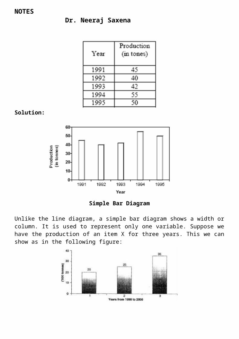
Example: Represent the following data by a bar diagram.
Solution:
Simple Bar Diagram
Unlike the line diagram, a simple bar diagram shows a width or column. It is used to represent only one variable. Suppose we have the production of an item X for three years. This we can show as in the following figure:
NOTES Dr. Neeraj Saxena
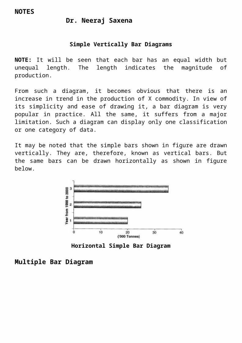
Simple Vertically Bar Diagrams
NOTE: It will be seen that each bar has an equal width but unequal length. The length indicates the magnitude of production.
From such a diagram, it becomes obvious that there is an increase in trend in the production of X commodity. In view of its simplicity and ease of drawing it, a bar diagram is very popular in practice. All the same, it suffers from a major limitation. Such a diagram can display only one classification or one category of data.
It may be noted that the simple bars shown in figure are drawn vertically. They are, therefore, known as vertical bars. But the same bars can be drawn horizontally as shown in figure below.
Horizontal Simple Bar Diagram
Multiple Bar Diagram
NOTES Dr. Neeraj Saxena
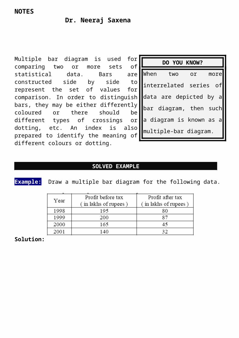
Multiple bar diagram is used for comparing two or more sets of statistical data. Bars are constructed side by side to represent the set of values for comparison. In order to distinguish bars, they may be either differently coloured or there should be different types of crossings or dotting, etc. An index is also prepared to identify the meaning of different colours or dotting.
SOLVED EXAMPLE
Example:: Draw a multiple bar diagram for the following data.
Solution:
Multiple Bar Diagram
It should be noted that multiple bar diagrams are particularly suitable where some comparison is involved. For example, we may represent admission data pertaining to, say, an MBA programme for boys and girls or performance of boys and girls in a particular examination. Similarly, the number of skilled, semi-skilled and unskilled workers in a factory for a couple of years can be represented well by means of a multiple-bar diagram.
DO YOU KNOW?
When two or more interrelated
series of data are depicted by a bar
diagram, then such a diagram is
known as a multiple-bar diagram.
NOTES Dr. Neeraj Saxena
SOLVED EXAMPLE
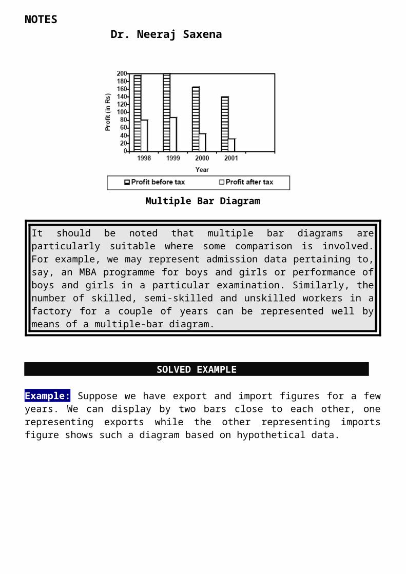
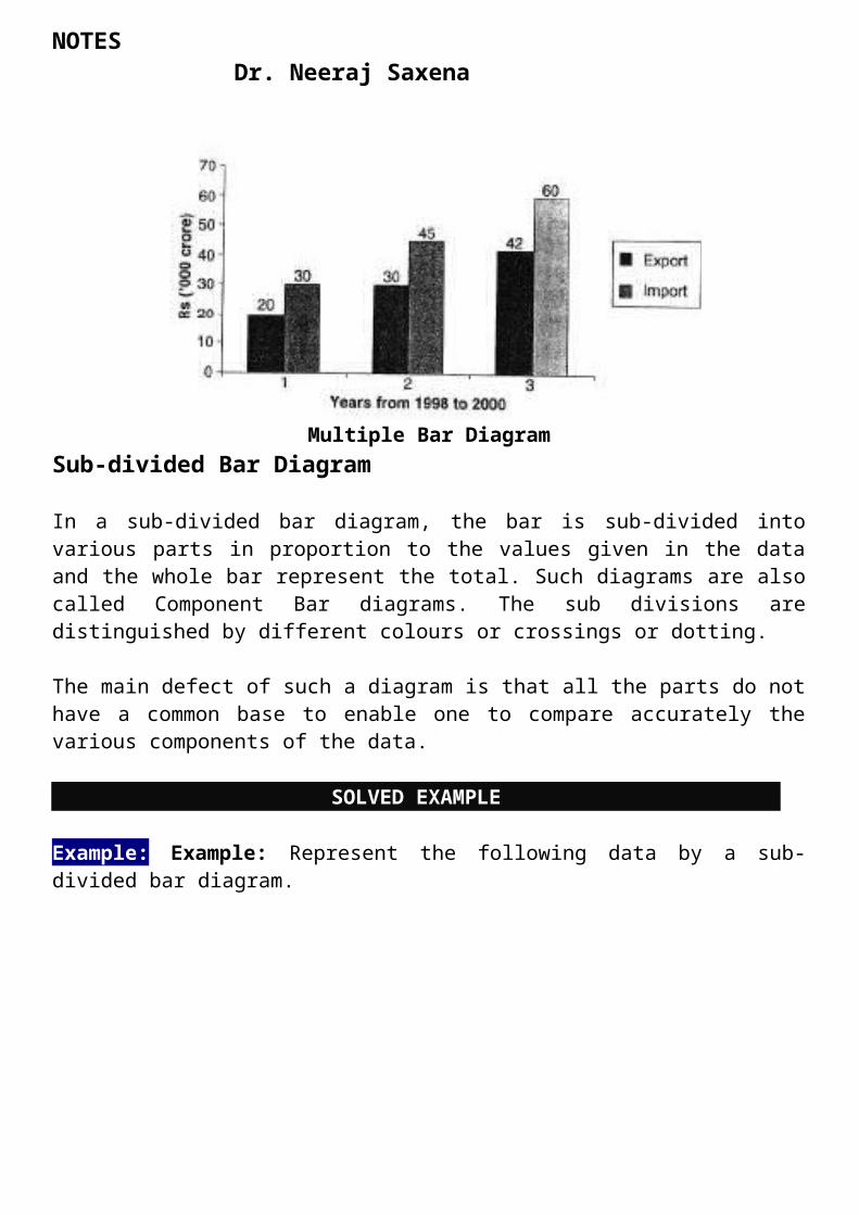
Example: Suppose we have export and import figures for a few years. We can display by two bars close to each other, one representing exports while the other representing imports figure shows such a diagram based on hypothetical data.
Multiple Bar DiagramSub-divided Bar Diagram
In a sub-divided bar diagram, the bar is sub-divided into various parts in proportion to the values given in the data and the whole bar represent the total. Such diagrams are also called Component Bar diagrams. The sub divisions are distinguished by different colours or crossings or dotting.
The main defect of such a diagram is that all the parts do not have a common base to enable one to compare accurately the various components of the data.
SOLVED EXAMPLE
Example: Example: Represent the following data by a sub-divided bar diagram.
NOTES Dr. Neeraj Saxena
Solution:
Sub Divided Bar Diagram
Example For example, a bar diagram may show the composition of revenue expenditure of the Government of India. The components of this bar could be defence expenditure, interest payments, major subsidies, grants to State and Union Territories and others. Such bar diagrams are shown in Fig. for two years.

NOTES Dr. Neeraj Saxena
Composition of Revenue Expenditure (Percent)
It will be seen from these bars that the order of components in each bar is the same. This is necessary for proper comparison of two or more bars. It is also to be noted that figure shows the components in percentages. These could have been shown in absolute figures as well, but in such a case the length of each bar would have been different in accordance with the total revenue expenditure of the Government in the two years. Since the bars are in terms of percentages, the length of each bar is the same indicating the total as 100 percent.
In order to distinguish the different components, different colours or shades should be used. This should be accompanied by a legend or key for identifying these components.
Another point worth noting is that such a diagram should not be used when there are too many components or subdivisions. This is because of two reasons.
First, it may be difficult to provide so many subdivisions particularly when their magnitudes are small.
Second, it may be difficult to understand and interpret such a diagram.
Component bars can be very suitable mode of presenting data on the enrolment of students by the type of courses such as MBA, MCA, PGDM, M.Com, and B.Com and so on. Likewise, data on the employment of the workers in the public sector, private sector and the total can be suitably displayed by component bars.
Percentage Bar Diagram
This is another form of component bar diagram. Here the components are not the actual values but percentages of the whole. The main difference between the sub-divided bar diagram and percentage bar diagram is that in the former the bars are of different heights since their totals may be different whereas in the latter the bars are of equal height since each bar represents 100 percent. In the case of data having sub-division, percentage bar diagram will be more appealing than sub-divided bar diagram.
NOTES Dr. Neeraj Saxena
SOLVED EXAMPLE
Example: Represent the following data by a percentage bar diagram.
Solution: Convert the given values into percentages as follows:
NOTES Dr. Neeraj Saxena
Figure 4.10: Sub-Divided Percentage Bar Diagram
Example Suppose we are given the following data pertaining to the monthly expenditure of two families under some heads.
Since these data are in absolute terms, we have to convert them into percentages. This has been done in the following table.
Calculation of Percentage Expenditure under Different Heads
NOTES Dr. Neeraj Saxena
Figure : Percentage Subdivided Bars
We may now show the percentage expenditure of the two families by percentage bars. It may be noted that we have calculated cumulative percentages, which have been plotted. Although the above diagram gives some idea of relative expenditure on various items of the two families, a rectangular diagram would be a much better means of displaying the expenditure, which will be taken up later.
The fundamental characteristic of one dimensional diagram is that the magnitude of various characteristics is proportional to either length or width of the bars.
Two-Dimensional Diagrams
In one-dimensional diagrams, only length 9 is taken into account. But in two-dimensional diagrams the area represents the data and so the length and breadth have both to be taken
NOTES Dr. Neeraj Saxena
into account. Such diagrams are also called area diagrams or surface diagrams. The important types of area diagrams are:
1. Rectangles 2. Squares 3. Pie-diagrams
Rectangles
Rectangles are used to represent the relative magnitude of two or more values. The area of the rectangles are kept in proportion to the values. Rectangles are placed side by side for comparison. When two sets of figures are to be represented by rectangles, either of the two methods may be adopted.
We may represent the figures as they are given or may convert them to percentages and then subdivide the length into various components. Thus the percentage sub-divided rectangular diagram is more popular than sub-divided rectangular since it enables comparison to be made on a percentage basis.
SOLVED EXAMPLE
Example Represent the following data by sub-divided percentage rectangular diagram.
Solution: First of all the figures of family A and family B in each item of expenditure will be converted into percentage. The calculations are shown in the following table.
Items Family A Family BFood (2000/5000)*100=40 (2500/8000)*100=31
Clothing (1000/5000)*100=20 (2000/8000)*100=25House Rent (800/5000)*100=16 (1000/8000)*100=13
Fuel (400/5000)*100=8 (500/8000)*100=6Miscellaneous (800/5000)*100=16 (2000/8000)*100=25
NOTES Dr. Neeraj Saxena
The percentage sub-divided bar diagram will be as follows-
Subdivided Percentage Rectangular Diagram
Squares
The rectangular method of diagrammatic presentation is difficult to use where the values of items vary widely. The method of drawing a square diagram is very simple.
In a square diagram the length and width are of the same dimension. Sometimes a square diagram is preferable to rectangle. This is because when a comparison is involved between any two phenomena but their magnitudes are widely different from each other, it is difficult to draw rectangles on the same page. One rectangle would have very wide width while the other a very small width. This apart, a meaningful comparison between the two diagrams would be quite difficult. To overcome this difficulty, square diagrams are preferred.
One has to take the square root of the values of various item that are to be shown in the diagrams and then select a suitable scale to draw the squares.
SOLVED EXAMPLE
Example: Yield of rice in Kgs. per acre of five countries are
NOTES Dr. Neeraj Saxena
Solution: To drawn the square diagram we calculate as follows:
Example: we are given the following data:
Year Production of Food(million tonnes)
1950-51 50.81960-61 82.01970-71 108.41980-81 129.61990-91 176.4
As mentioned earlier, first we have to calculate the square roots of these figures. The square roots are as follows:
Year Production of Food(million tonnes)
Square Roots(million tonnes)
1950-51 50.8 7.121960-61 82.0 9.061970-71 108.4 10.411980-81 129.6 11.381990-91 176.4 13.28
NOTES Dr. Neeraj Saxena
Square Diagrams
Pie Diagram or Circular Diagram
Another way of preparing a two-dimensional diagram is in the form of circles. In such diagrams, both the total and the component parts or sectors can be shown. The area of a circle is proportional to the square of its radius.
While making comparisons, pie diagrams should be used on a percentage basis and not on an absolute basis. In constructing a pie diagram the first step is to prepare the data so that various components values can be transposed into corresponding degrees on the circle.
The second step is to draw a circle of appropriate size with a compass. The size of the radius depends upon the available space and other factors of presentation. The third step is to measure points on the circle and representing the size of each sector with the help of a


