Google Charts Sai Goud Durgappagari - Computer Sciencexiao/visualization/Vis-PA1-Sai...
17
Google Charts Sai Goud Durgappagari Introduction Interactive charts for browsers and mobile devices. Google chart tools are powerful, simple to use, and free. Why Google Charts? • Rich Gallery o Variety of charts available. o Simple scatter plots to Hierarchical treemaps. • Customizable o provides extensive set of options to match look and feel • HTML5/SVG o Cross-browser compatibility • Free o Completely free with three years backward compatibility guaranteed • Controls and Dashboard o Easily connect charts and controls into interactive dashboard • Dynamic Data o Connect data in real time using data connection tools and protocols Common Terms Animation: An option for including motion when a chart is first drawn or redrawn after modification. Axis: A reference line in a chart indicating the measurement of coordinates. In Google Charts, the two main axes are categorized as either: • horizontal vs. vertical • domain vs. target Google Charts does not call them "x" and "y" axes because this would be ambiguous: Google Charts allows the user to break the traditional association between the "axis showing domain values" and the "horizontal axis," and it would not be clear which one "x axis" describes. For example, you can flip the orientation of a chart to show the domain variables on the vertical axis.
Transcript of Google Charts Sai Goud Durgappagari - Computer Sciencexiao/visualization/Vis-PA1-Sai...
Google Charts
Sai Goud Durgappagari
Introduction
Interactive charts for browsers and mobile devices. Google chart tools are powerful, simple to use, and free.
Why Google Charts?
• Rich Gallery o Variety of charts available. o Simple scatter plots to Hierarchical treemaps.
• Customizable o provides extensive set of options to match look and feel
• HTML5/SVG o Cross-browser compatibility
• Free o Completely free with three years backward compatibility guaranteed
• Controls and Dashboard o Easily connect charts and controls into interactive dashboard
• Dynamic Data o Connect data in real time using data connection tools and protocols
Common Terms
Animation: An option for including motion when a chart is first drawn or redrawn after modification.
Axis: A reference line in a chart indicating the measurement of coordinates. In Google Charts, the two main axes are categorized as either:
• horizontal vs. vertical • domain vs. target
Google Charts does not call them "x" and "y" axes because this would be ambiguous: Google Charts allows the user to break the traditional association between the "axis showing domain values" and the "horizontal axis," and it would not be clear which one "x axis" describes. For example, you can flip the orientation of a chart to show the domain variables on the vertical axis.
Callback: A piece of executable code that is passed as an argument to a second piece of code, which is expected to "call back," or execute, the first piece of code at a later time. In Google Charts, callbacks are commonly used with library loaders and event handlers. Example: "Set a callback to run when the Google Charts library is loaded." Chart Type: A combination of data representation, appearance, and options that is implemented as a JavaScript object. Examples of chart types include Pie Charts and Bubble Charts. ChartEditor: The user interface for editing Google Charts on the fly, which you can include in any web page. ChartWrapper: A JavaScript class that wraps your chart and can handle all loading, drawing, and queries against Datasources for your chart. ChartWrappers are required when using Dashboards and ChartEditor. Read more at ChartWrapper. Column Role: A property of a column in a DataTable that describes its purpose. For example, the tooltip column role is assigned to columns that store tooltip text. Read more at What roles are available? and getColumnRole. Column Type: The data type assigned to a column in a DataTable. Column types can be one of the following:
• string • number • boolean • date • datetime • timeofday
Continuous: Having a smooth progression of consecutive values. Used to describe an axis where a variable can take on any value between two given values, as opposed to a discrete axis. Example: "The major axis of a chart can be either discrete or continuous." Control: A user interface widget on a dashboard, such as sliders or autocompleters, which allows the viewer to alter the data or charts that are part of a dashboard. Example: "This dashboard contains a control that lets you select an option from a drop-down menu." Read more at Controls and Dashboards.
Core Charts: The most popular chart types in Google Charts. You can load all core charts simultaneously by using the corechart package. The core chart types are:
• Area Charts • Bar Charts • Bubble Charts • Candlestick Charts • Column Charts • Combo Charts • Histogram Charts • Line Charts • Pie Charts • Scatter Charts • Stepped Area Charts
Dashboard: A visual display that combines chart and control instances, typically with at least one chart and one control. If a dashboard contains multiple charts, they must all have the same data source. DataTable: A JavaScript class that represents a two-dimensional, mutable table of values. DataView: A JavaScript class that is derived from a DataTable. A DataView can serve as a data source for Google Charts, but unlike a DataTable, it is read-only. A DataView auto-updates when the underlying DataTable is changed, with some exceptions. Discrete: Referring to a set of values that are not based a continuous value system. In the context of Google Charts, "discrete" can describe data types or axes. Read more about discrete axes at Discrete vs Continuous." Example: "A list of countries should be stored as a column with a discrete data type." Domain: The set of all possible inputs which a function or relation can take. If multiple data series are shown in a chart, it is possible for one domain value to have multiple target values. Example: "For the domain value '3', this data series has value '5'." Event: Pre-defined actions that a Google Chart can register, such as a user clicking a button. The page for each chart type contains an Events section listing the events

supported by that chart type, such as ready, selectand onmouseover. Example: "When the user clicks 'I want apples,' this throws a userWantsApples event." Formatter: Determines how the data in a DataTable column is displayed without affecting the underlying values. Google Charts provides a pre-defined list of formatters and formatter options. For example, you can use the prefixoption of the NumberFormat formatter to display the value "1000" as "$1000." Google Sheets: Google Sheets allows users to create, update, modify, and share spreadsheets online. Google Sheets are a common data source for Google Charts. Interval: An optional column role which contains additional target values for given domain values in a data series. For example, you can store data about confidence intervals in an interval column in order to display it as part of a bar chart. Intervals are most commonly displayed in line, scatter, and bar charts. Google Charts offers several styles for displaying intervals. Legend: An area within a chart which lists the label and visual appearance of all data series in a chart, and/or the visual sub-components of a single data series in a chart. For example, in a pie chart which contains only one data series, the legend will contain the label and color corresponding to each "slice" of the pie. Library Loader: The JavaScript method google.charts.load, which loads the Google Charts API library. Loading the library is necessary whenever you build a web page that uses Google Charts. Query: A request for information issued against a database. Google Charts supports Data Queries, which are SQL-like queries used to query sources such as Google Sheets. Queries must be written using the Google Visualization API Query Language.
Series: A data column in a DataTable or DataView, where each value corresponds one-to-one with a domain value from the domain column. A series may have one or more associated columns which have different column roles, e.g. annotation or style roles. Example: "The following chart demonstrates a chart with two series, one in dark blue, one in light blue."

Stacking: A chart option for displaying multiple data series where each series is graphed relative to the preceding series by adding up all previous series values for a given domain value. This creates the visual effect of the series being "stacked" on top of each other. Stacking is available for the following chart types by setting the isStacked option to true:
• Area Charts • Bar Charts • Column Charts • Stepped Area Charts
Style: A column role which uses specific properties to determine the appearance of a series. Properties include color, opacity, stroke-width, and stroke-color.
Tooltip: The small boxes that pop up when your cursor hovers over certain chart components. Tooltip content can be either automatically generated from the underlying series data or stored in a column with the tooltip column role.
Popular charts:
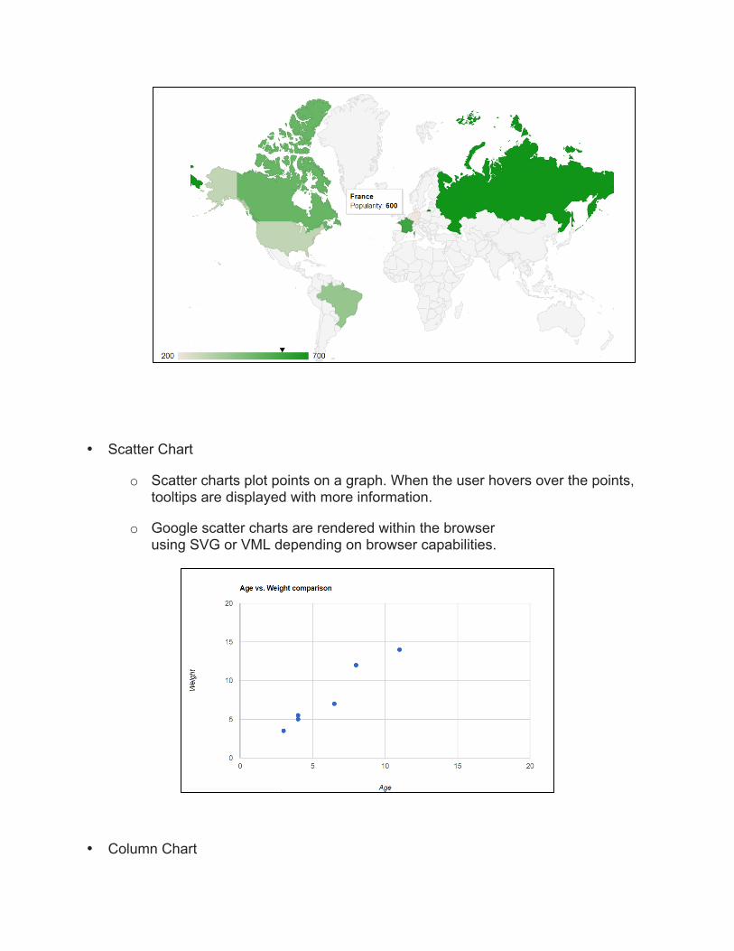
• GeoChart
A geochart is a map of a country, a continent, or a region with areas identified in one of three ways:
o The region mode colors whole regions, such as countries, provinces, or states.
o The markers mode uses circles to designate regions that are scaled according to a value that you specify.
o The text mode labels the regions with identifiers (e.g., "Russia" or "Asia").
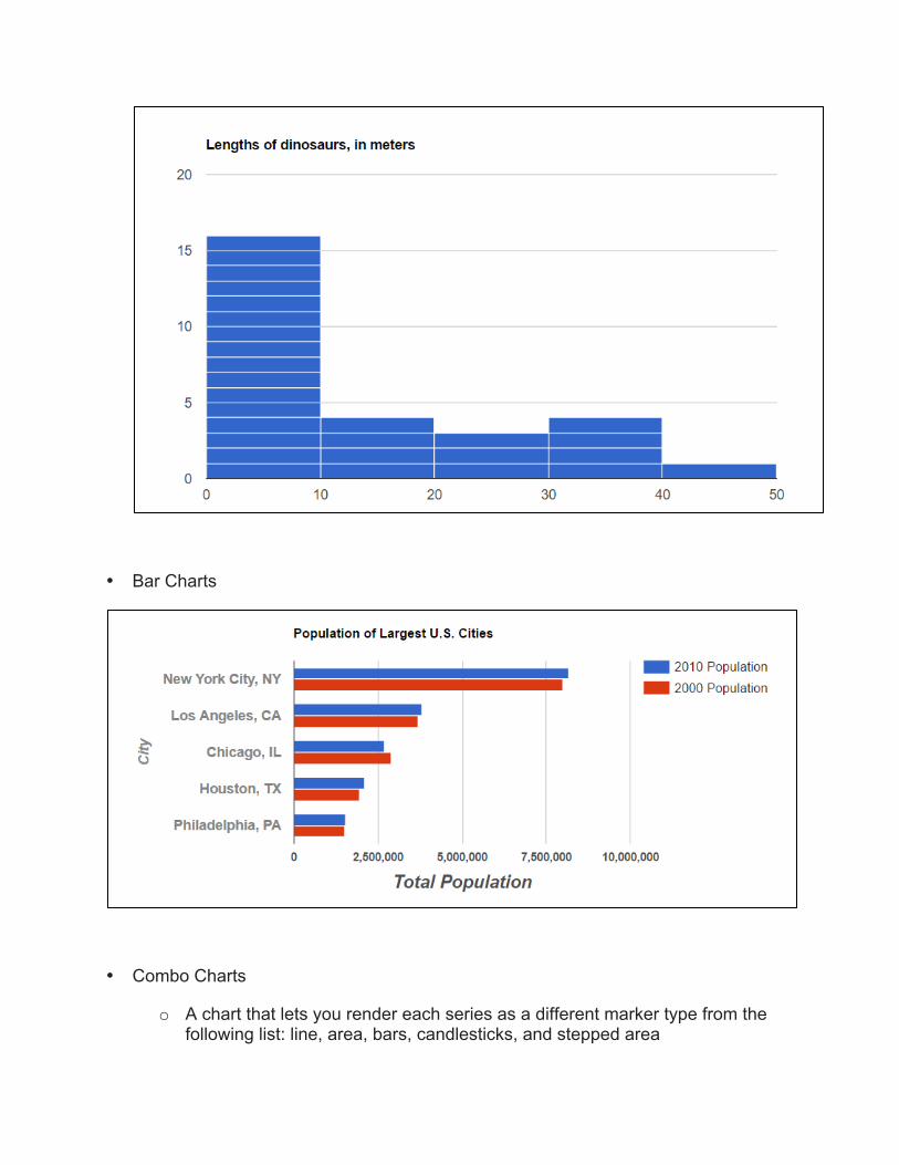
• Scatter Chart
o Scatter charts plot points on a graph. When the user hovers over the points, tooltips are displayed with more information.
o Google scatter charts are rendered within the browser using SVG or VML depending on browser capabilities.
• Column Chart

o A column chart is a vertical bar chart rendered in the browser using SVG or VML, whichever is appropriate for the user's browser. Like all Google charts, column charts display tooltips when the user hovers over the data.
• Histogram
o A histogram is a chart that groups numeric data into bins, displaying the bins as segmented columns. They're used to depict the distribution of a dataset: how often values fall into ranges.
• Bar Charts
• Combo Charts
o A chart that lets you render each series as a different marker type from the following list: line, area, bars, candlesticks, and stepped area

• Area Chart
• Stepped Area Chart
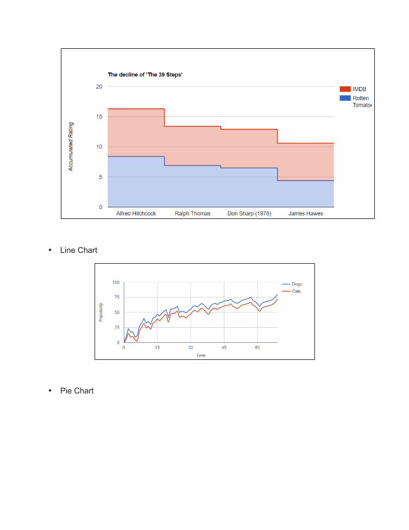
• Line Chart
• Pie Chart
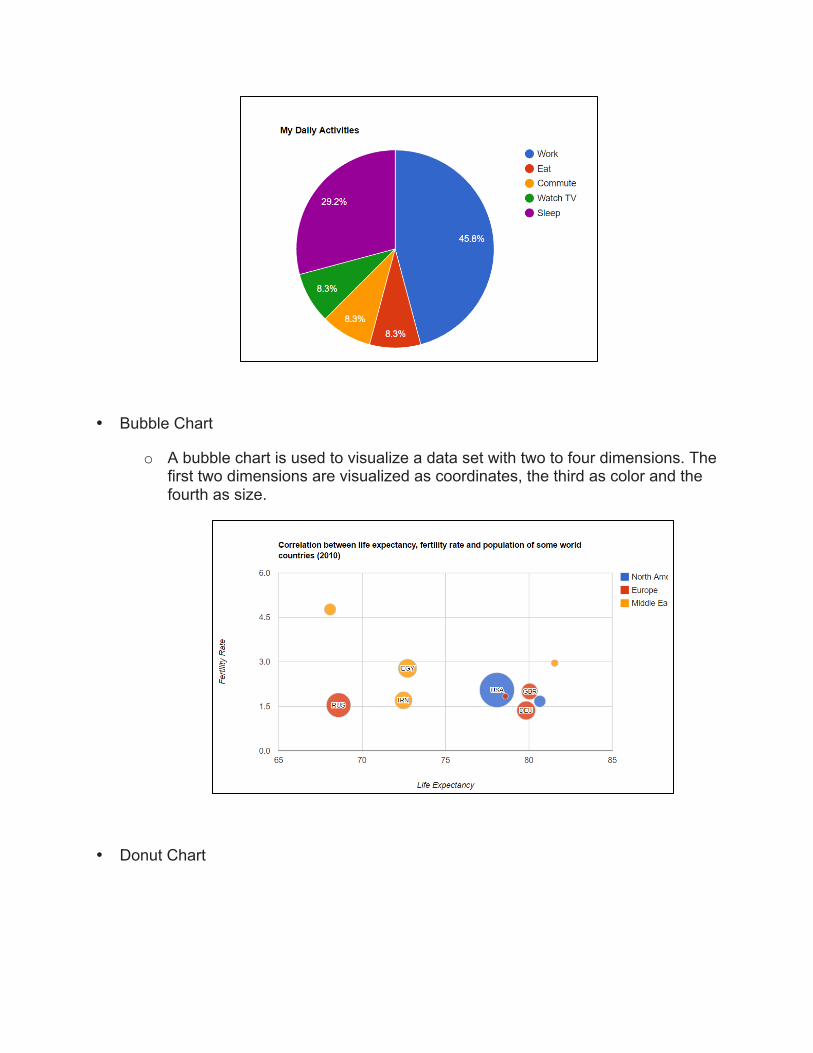
• Bubble Chart
o A bubble chart is used to visualize a data set with two to four dimensions. The first two dimensions are visualized as coordinates, the third as color and the fourth as size.
• Donut Chart

• Treemaps
o A visual representation of a data tree, where each node can have zero or more children, and one parent (except for the root, which has no parents). Each node is displayed as a rectangle, sized and colored according to values that you assign. Sizes and colors are valued relative to all other nodes in the graph. You can specify how many levels to display simultaneously, and optionally to display deeper levels in a hinted fashion. If a node is a leaf node, you can specify a size and color; if it is not a leaf, it will be displayed as a bounding box for leaf nodes. The default behavior is to move down the tree when a user left-clicks a node, and to move back up the tree when a user right-clicks the graph.

• Timelines
o A timeline is a chart that depicts how a set of resources are used over time. If you're managing a software project and want to illustrate who is doing what and when, or if you're organizing a conference and need to schedule meeting rooms, a timeline is often a reasonable visualization choice. One popular type of timeline is the Gantt chart.
• Guage

• Candlestick charts
o A candlestick chart is used to show an opening and closing value overlaid on top of a total variance. Candlestick charts are often used to show stock value behavior. In this chart, items where the opening value is less than the closing value (a gain) are drawn as filled boxes, and items where the opening value is more than the closing value (a loss) are drawn as hollow boxes.
Using Google Charts
• Load Charts Library <script type="text/javascript"
src="https://www.gstatic.com/charts/loader.js"></script> <script type="text/javascript">
google.charts.load('current', {packages: ['corechart']}); google.charts.setOnLoadCallback(drawChart); ...
</script>

• Prepare data
All charts require data. Google Chart Tools charts require data to be wrapped in a JavaScript class called google.visualization.DataTable. This class is defined in the Google Visualization library that you loaded previously.
A DataTable is a two-dimensional table with rows and columns, where each column has a datatype, an optional ID, and an optional label.
var data = new google.visualization.DataTable(); data.addColumn('string', 'Topping'); data.addColumn('number', 'Slices'); data.addRows([ ['Mushrooms', 3], ['Onions', 1], ['Olives', 1], ['Zucchini', 1], ['Pepperoni', 2] ]);
• Customize Chart
Every chart has many customizable options, including title, colors, line thickness, background fill, and so on.
var options = {
'legend':'left',
'title':'My Big Pie Chart',
'is3D':true,
'width':400,
'height':300
}
• Draw the Chart
Web page must have an HTML element (typically a <div>) to hold your chart. We must pass your chart a reference to this element, so assign it an ID that you can use to retrieve a reference using document.getElementById(). Anything inside this element will be replaced by the chart when it is drawn.

<html>
<head>
<!--Load the AJAX API-->
<script type="text/javascript"
src="https://www.google.com/jsapi"></script>
<script type="text/javascript">
// Load the Visualization API and the piechart package.
google.load('visualization', '1.0',
{'packages':['corechart']});
// Set a callback to run when the Google Visualization API is
loaded.
google.setOnLoadCallback(drawChart);
// Callback that creates and populates a data table,
// instantiates the pie chart, passes in the data and
// draws it.
function drawChart() {
// Create the data table.
var data = new google.visualization.DataTable();
data.addColumn('string', 'Topping');
data.addColumn('number', 'Slices');
data.addRows([
['Mushrooms', 3],
['Onions', 1],
['Olives', 1],
['Zucchini', 1],
['Pepperoni', 2]
]);
// Set chart options
var options = {'title':'How Much Pizza I Ate Last Night',
'width':400,
'height':300};
// Instantiate and draw our chart, passing in some options. var chart = new google.visualization.PieChart(document.getElementById('chart_div')); chart.draw(data, options); }
</script>

</head>
<body>
//Div that will hold the pie chart <div id="chart_div" style="width:400; height:300"></div> </body>
</html>
References:
• https://developers.google.com/chart/ • https://support.google.com/docs/