Gonni Work
31
branding studio
-
Upload
francisco-santolo -
Category
Documents
-
view
15 -
download
4
Transcript of Gonni Work
brandingstudio
workourwork
Brand context
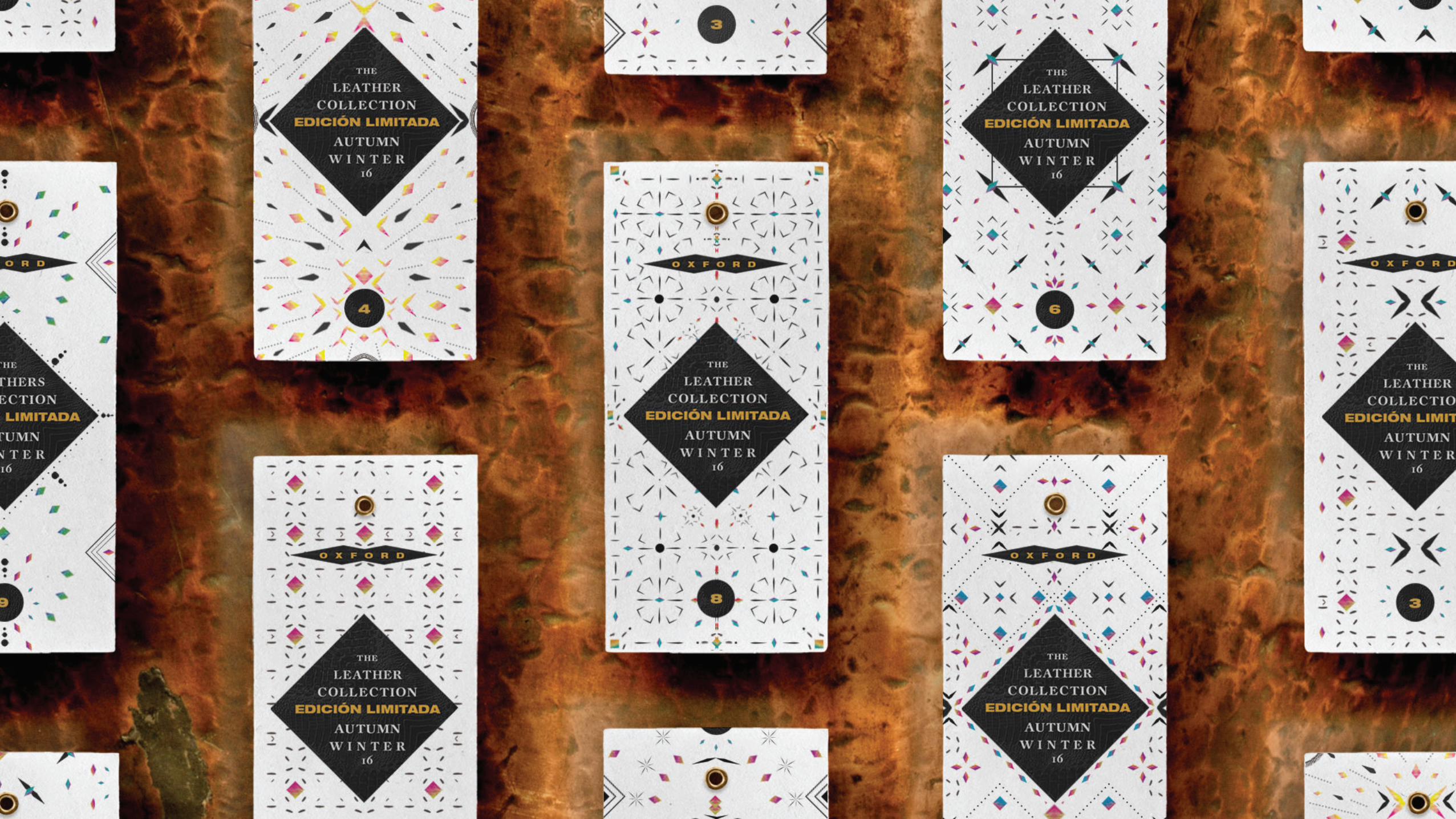
Early in 2016, Pía Cortés entrusted us with the launching of its autumn winter campaign and its corresponding entrance into the argentine market.
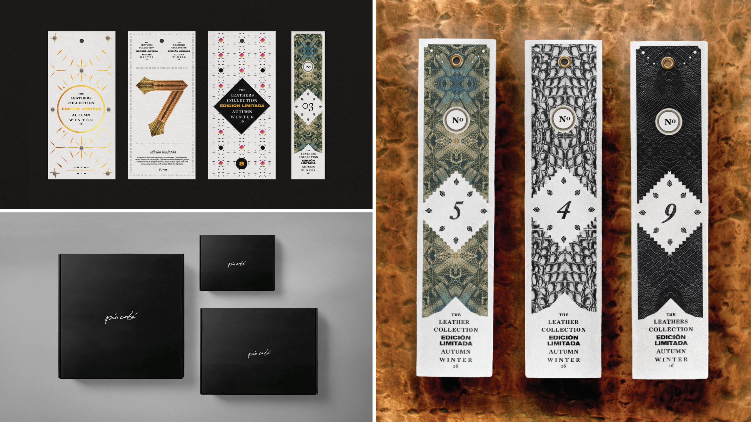
The Brand had to be positioned as a premium brand within a segment already abundant in leather clothing offer. Pía Cortés’s distinguishing factor lay in its prime quality leather treatment as well as its excellence in confection and level of detail of their products.
Our goal
As the brand had a strongly de�ned personality, the objective of the study was to develop a graphic system which could harmonize with the brand’s attitude. It was us who were in charge of developing both the communication related to the product as well as the website , packaging, photography, and production logistics.
What we did
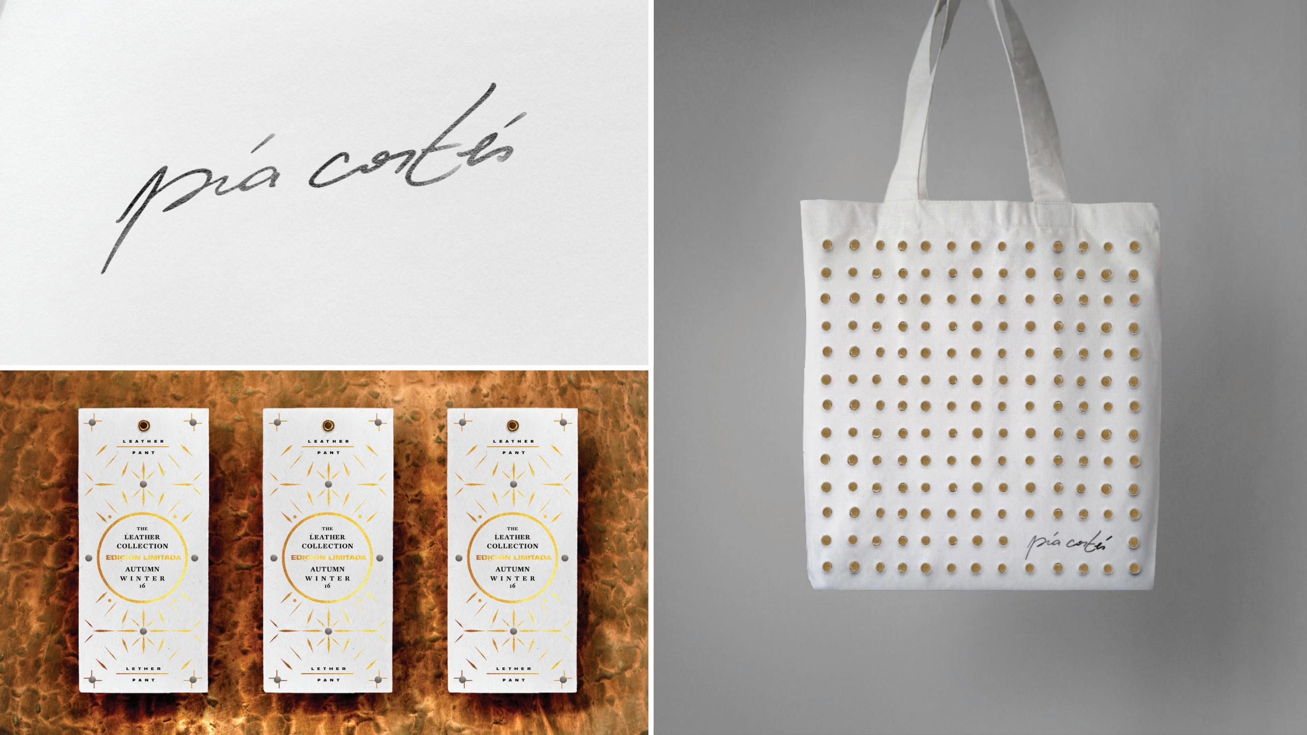
Logo, creative redaction, photographic campaigns, product photos, hangtag design, packaging, bags, and online store.
pía cortés is a female clothing Brandwith a strong attitude which offers their clients high-quality, limited-editionleather clothes.
For the launching, we were the ones in charge of designing a communication system that accompanied the quality of their products while positioning the brand within a premium segment of the market.
luxuryleather
pía cortés

Brand context
The event arises in 2012 as the project of an independent production company which was in search of gathering several artists, exhibitors, performes and bands who were related to the world of the circus.
The event would take place in Centro Cultural Konex, an old abandoned Factory which became an important centre of the artistic and musical life of the city of Buenos Aires
Our goal
Alongside a particular selection of musicians, artists, and exhibitors, our job was to create a visual universe for a brand whose unique and unusual personality was to be remembered. The entire event’s graphic was based on 1900’s circus poster’s codes mixed with vibrating colours and striking typographical compositions.
What we did
Naming, logo, creative redaction, graphic design for Street campaign, tickets design, website, �yers, editorial design, creativewriting, typography design and poster design.
Freak is the result of a production that blends performace, circus arts, and music in a single three-day event.
The �nal result was a distinct and unique identity, born among old circus posters, twisted typographies and psychedelic colours.
rockingcircusattitude
freak


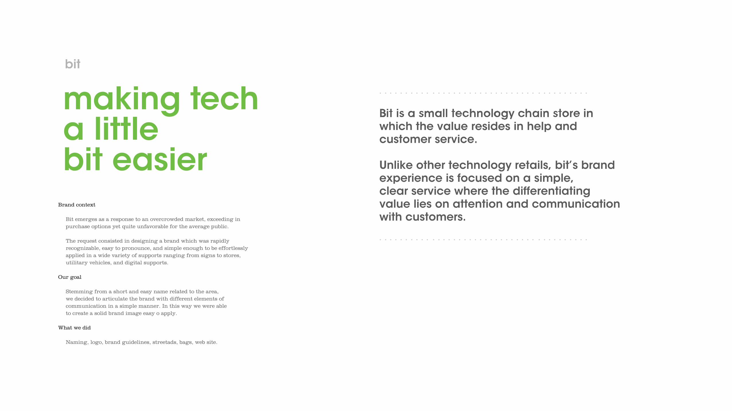
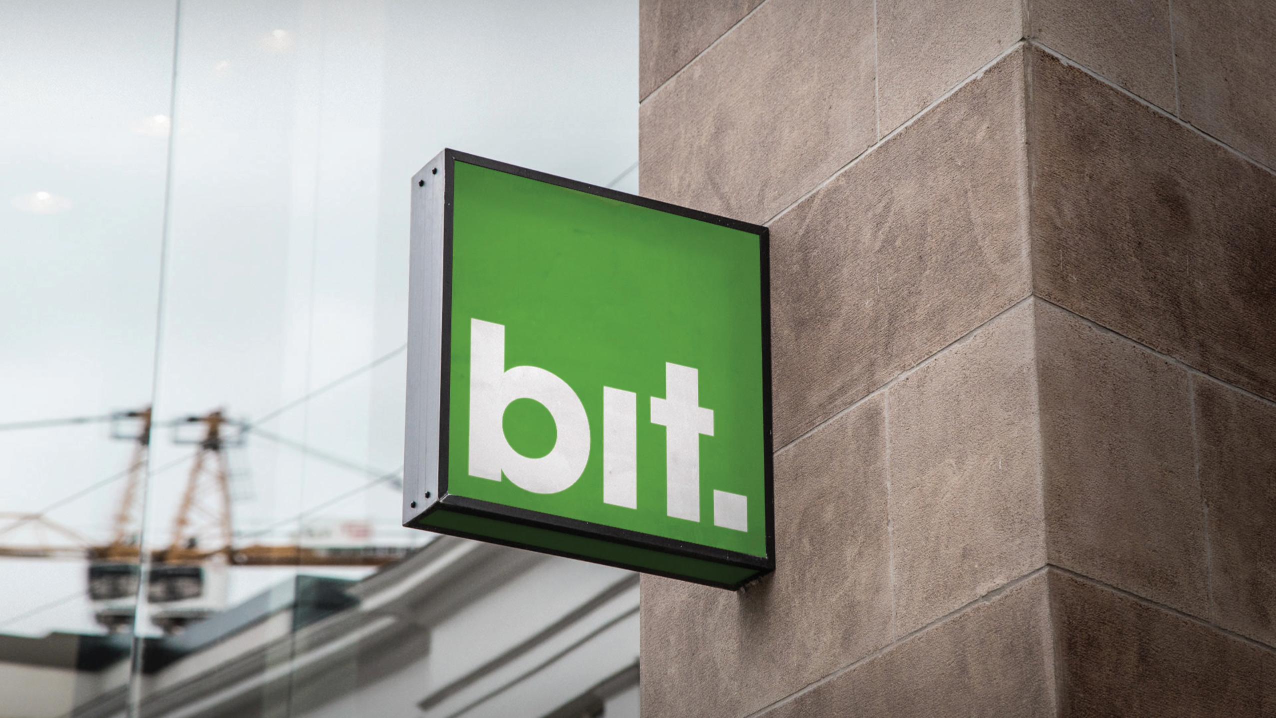
making techa littlebit easier
Brand context
Bit emerges as a response to an overcrowded market, exceeding in purchase options yet quite unfavorable for the average public.
The request consisted in designing a brand which was rapidly recognizable, easy to pronounce, and simple enough to be effortlessly applied in a wide variety of supports ranging from signs to stores, utilitary vehicles, and digital supports.
Our goal
Stemming from a short and easy name related to the area,we decided to articulate the brand with different elements of communication in a simple manner. In this way we were ableto create a solid brand image easy o apply.
What we did
Naming, logo, brand guidelines, streetads, bags, web site.
Bit is a small technology chain store in which the value resides in help and customer service.
Unlike other technology retails, bit’s brand experience is focused on a simple,clear service where the differentiating value lies on attention and communication with customers.
bit


Brand context
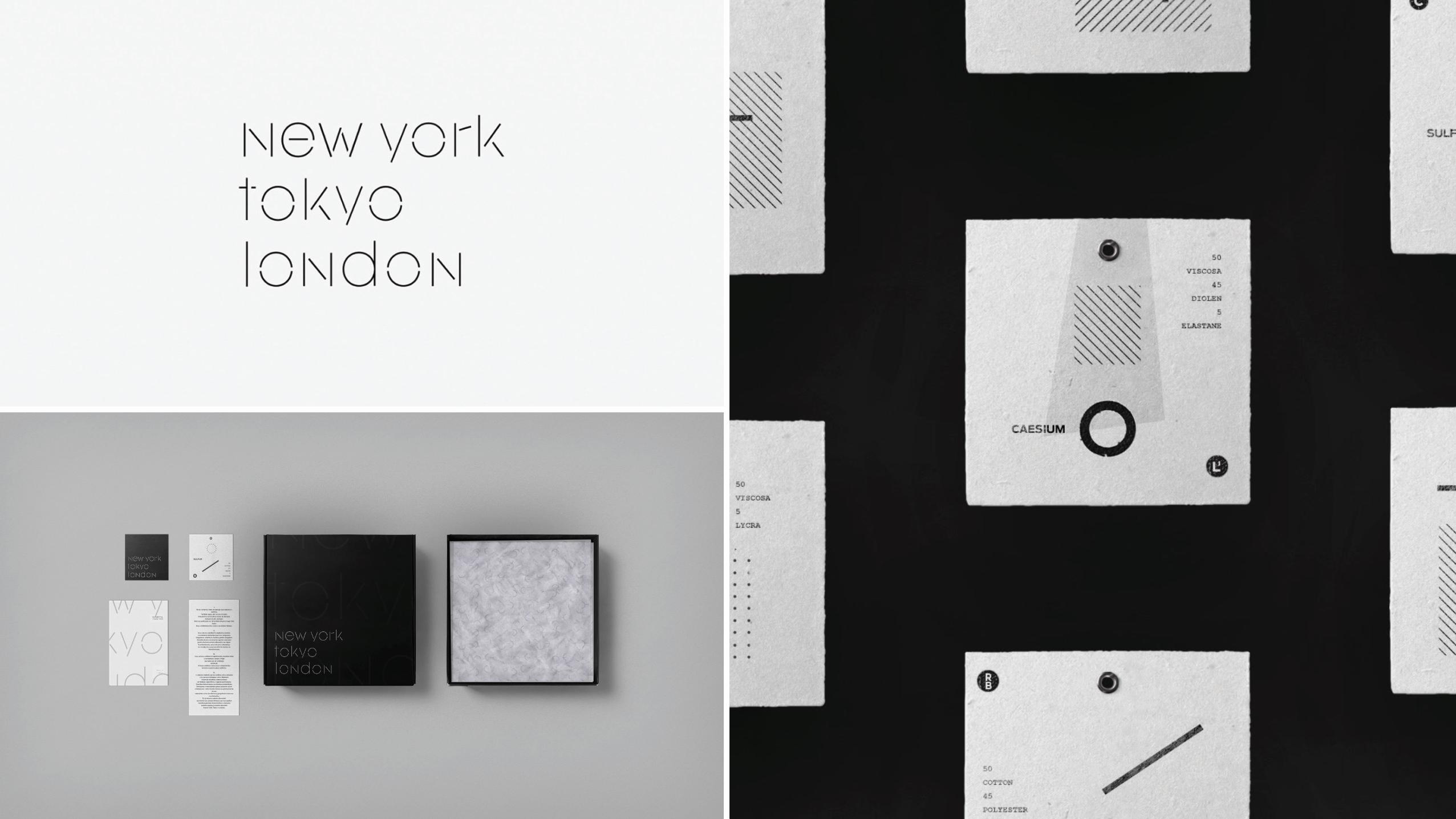
In early 2015 Moishele Kravi, an Israeli textile entrepreneur with more than 15 years of experience in the world of clothing, decided to create a new brand completely removed from his niche market where he could explore new forms and materials.
Our goal
The new brand should represent the least possible expression and concentrate on what had given rise to the brand: materials. Our work consisted in creating a graphic systemparticular enough to exploit on each piece the characteristics of the materials, their composition and their forms in such a way that it was perceived as an extension of the experience offered by the products.
What we did
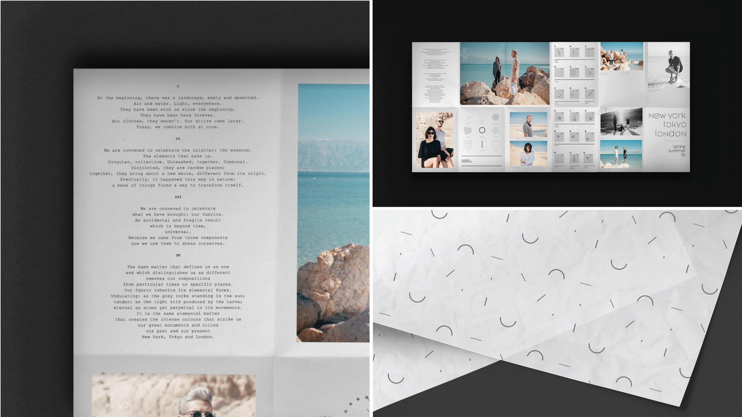
Integral brand design, Logo, Packaging, Art direction, Creative writing, Photography, Expanding publishers and web design.
Formed in early 2015 in Israel New York, Tokyo, London is an ultra-minimalist clothing company that bases its essence on the quality of its materials and its clothing.
Gonni was chosen as a studio to create the brand image fromscratch and the integral development of New York Tokio London's image, which included everything from hangtags to campaign photography.
essentialclothing
new york tokyo london


Brand context
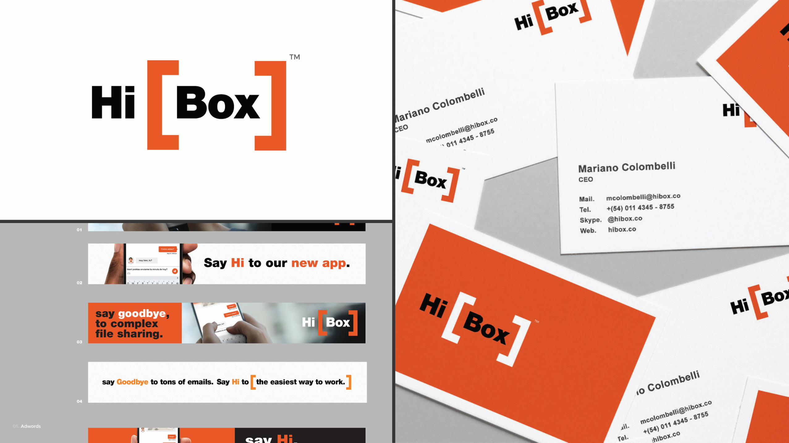
Originally born as a social network for businesses, Hibox had a strategy change in 2016, when it became a chat application for communication between work teams.
Upon landing in the European market in mid-2016, the company found out that the approach to its brand strategy was more associated with following the leader of the segment that identi� es with the real characteristics of the company itself.
Our goal
Our task was to �nd a concept, a small story that helped present the brand in a way that could explain what the brandis and at the same time differenciates i f t rom the leader of the segment. Within the main tasks we carried out, we redesigned the logo, website and public road campaigns.
What we did
Integral brand redesign, isologotype redesign, voice tone design,creative writing, web design, brand guides.
HiBox is a web tool and team communication app, with bases in Chile, Argentina, Brazil and Spain.
As a result of it’s recent entry into the European market we were hired to redesign its logo and brand image.
say Hi! to agame changerapp
hibox


Brand context
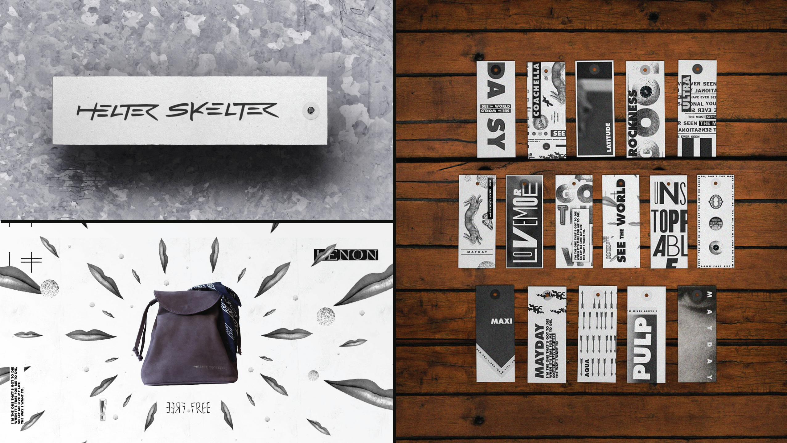
Early in 2012, in the midst of cycling development in the city of Buenos Aires, Helter Skelter raises as a brand, characterized by limited-edition, fully handmade, 100% argentine leather backpacks, treated with colours which evidence the brand’s spirit and intensity.ca.
Our goal
Since the brand’s name was inspired in one of the most eclectic Beatles’ songs, the graphics seek to accompany the brand’s attitude resorting to clashes between a wide range of black and white shapes that aesthetically represent the company’s values and personality.
What we did
Brand comprehensive design, logo, creative writing, packaging, tag system, graphic advertising, storefront, patterns, wallpapers, and web site design.
Helter Skelter is an Enterprise dedicated to the manufacturing of high-quality, leather bags with an urban, rocker spirit.
For the brand launching we were in charge of the design of packaging, tag system, website, and graphics to be used both on the product and showrooms.
backpacksfor freedom
helter skleter


Brand context
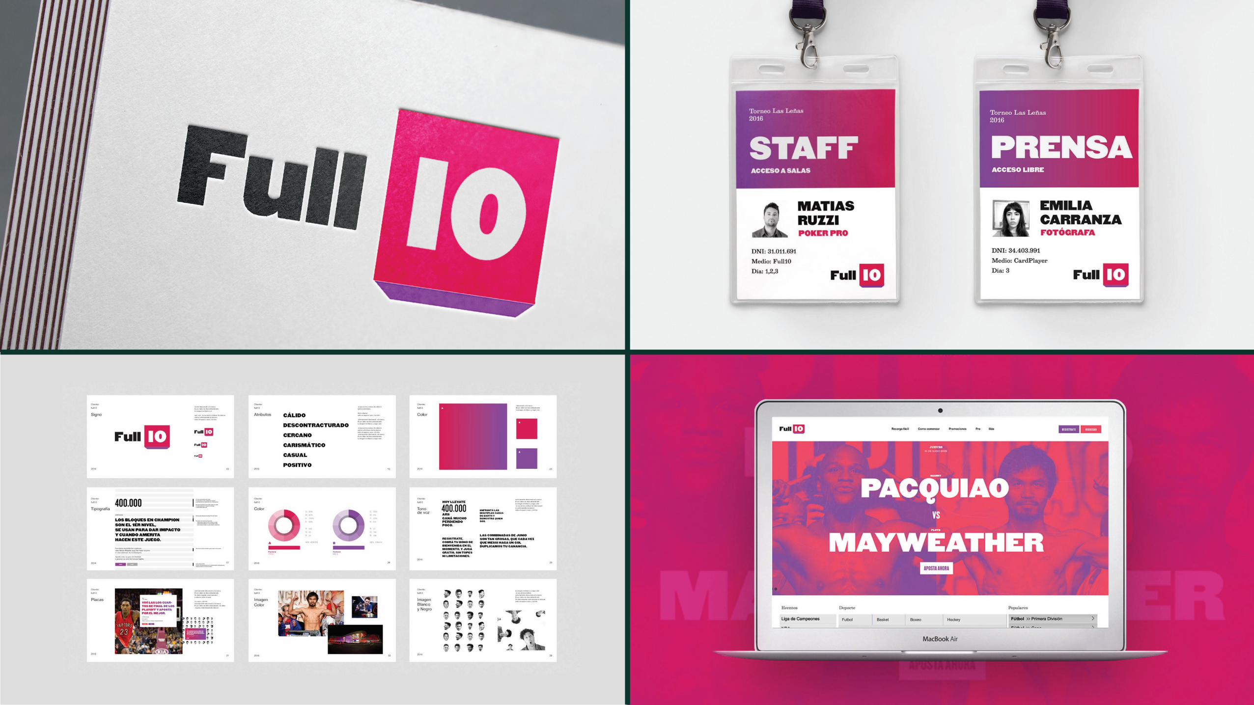
After a key change in its business model that includes the joining of casino games and sports betting along with a change of target and the expansion to all Latin America, the company hired us to translate that transformation into its image and help it appeal in a more effective way to their new audience.
Our goal
The goal was to make a radical change in the way the company spoke to its audience, both graphically and verbally. Full 10 stops beingan overnight company, to become an entertainment company with recreational purposes. It is no longer a betting company, but a source of entertainment.
What we did
Isologotype redesign, voice tone, brand manual, website, creative writing, roadside graphics.
Founded in 2010 in Argentina, Full 10 Poker is one of the largest online betting companies in the country.
A recent change in their internal organization and business model led them to rethink their communicationto effectively reach a new segmentof the market.
betting toa new target
full10 poker


gonnistudio.comweb.
junin 1343 6c,buenos aires, argentinadirección.
gonnistudioredes.
+54 (11) 2482 -1905teléfono.
gonnistudioskype.