Global Climate Change: Evidence on Causes and...
104
Global Climate Change: Evidence on Causes and Effects A Report Prepared for Morgan Family Charitable Foundation By Kesten C Green 11 February, 2008 www.decision.co.nz • T: +64 4 976 3245 • F: +64 4 976 3250 • [email protected]
Transcript of Global Climate Change: Evidence on Causes and...
Global Climate Change: Evidence on Causes and Effects
A Report Prepared for
Morgan Family Charitable Foundation
By
Kesten C Green
11 February, 2008 www.decision.co.nz • T: +64 4 976 3245 • F: +64 4 976 3250 • [email protected]

Global Climate Change: Evidence on Causes and Effects. K C Green, February 2008 2
CONTENTS Executive Summary 4 Introduction 5 1. Recent and Previous Changes in Global Temperature 6 1.1 Measuring temperature 6 1.2 Temperature since 1900 15 1.3 Temperature during the Common Era, and earlier 21 1.4 Temperature during the Phanerozoic Eon 24 1.5 Temperature levels and rates of change compared 25 2. Recent and Previous Extreme Weather Events 30 2.1 Heat waves and cold spells 32 2.2 Storms 32 2.3 Floods 38 2.4 Droughts 40 3. Global Temperature and Extreme Weather Events 46 3.1 Temperature extremes: Heat waves and cold snaps 46 3.2 Violent weather 47 4. Global Temperature and Precipitation 49 5. Global Temperature and Dramatic Changes in the Environment 51 5.1 Glaciers and Ice Sheets, and Sea Ice 51 5.2 Wild Fires 56 6. Global Temperature and Sea Levels 58 6.1 Theory 58 6.2 Evidence on global sea level changes 61 6.3 Ice sheet and sea levels 64 6.4 Evidence on sea level changes in places where people are especially vulnerable65 7. Effects of Previous Climate Changes on People 68 7.1 Effects of climate during the Dark Ages and the Little Ice Age 69 7.2 Effects of climate during the Roman and Medieval Warm Periods 71 7.3 Effects of hot and cold snaps and other extreme weather during the 20th and 21st
Centuries 72 7.4 Effects of temperature on prevalence of malaria and armed conflict 75 8. Causes of Global Temperature Changes 76 8.1 Greenhouse gases 82 8.2 The Sun 93 8.3 Summary of evidence on causes of global temperature changes 96 8.4 Consensus on manmade global warming and other matters of public and scientific
interest—another diversion 96 References 98

Global Climate Change: Evidence on Causes and Effects. K C Green, February 2008 3
NOTE: Permissions have not been obtained to reproduce the third party images, graphs, and tables in this report. The report should not be circulated without obtaining the relevant permissions.
Global Climate Change: Evidence on Causes and Effects. K C Green, February 2008 4
Executive Summary Theories about climate change and consequent predictions about what will happen to the Earth’s climate over coming decades have become as much an issue of politics and philosophy as they are an issue of science. Despite assertions to the contrary, there is no consensus among scientists about the causes of climate change. Scientists disagree over what causes the Earth’s climate to change because the mechanisms are unknown or poorly understood, and data are sparse and unreliable.
The situation, which could reasonably be characterised as ignorance, provides fertile ground for speculation and thereby for diverse theories to emerge. One theory about climate change, that mankind is causing the Earth to warm dangerously via the emission of carbon dioxide and the “greenhouse effect”, has achieved prominence due to widespread support from politicians and from pressure groups that oppose modern day human activity.
For a theory to be considered scientific, is should provide the simplest reasonable explanation the data with a minimum of assumptions. This report presents evidence that the theory of manmade global warming does not meet this test.
First, 20th and 21st Century temperatures and changes in temperature are not unusual in human history. For example the Medieval Warm Period was warmer than now and there appear to have been much warmer times in prehistory. The theory that climate continues to change as a result of “natural variation” is thus a perfectly reasonable theory.
Second, the relationship between atmospheric concentrations carbon dioxide and temperatures is tenuous. There are theoretical reasons to believe that concentrations are already more than high enough to capture most of any heat that could possibly be captured by carbon dioxide in the atmosphere. The empirical evidence shows that over long periods of time temperature increases have tended to occur before increases in carbon dioxide. This occurs because increased temperatures cause the release of carbon dioxide from oceans and land. In more recent times, human carbon dioxide emissions increased strongly after WWII while temperatures were declining; to the extent that by 1975 there were fears of a new ice age. Emissions and concentrations are still increasing strongly yet, after peaking in 1998, temperatures have been flat for the last ten years. If manmade global warming is occurring, it is very minor and therefore hard to detect.
Finally, the relationship between human carbon dioxide emissions and concentrations is also tenuous. Emissions and absorptions of carbon dioxide by the oceans and plant and animal life, including micro-organisms vary greatly and dwarf human contributions.
It is important to recognise that carbon dioxide in the atmosphere is essential to life on Earth and that higher concentrations lead to increased plant growth. While particulate emissions and toxic trace elements from combustion can be harmful to human health, carbon dioxide itself is beneficial.
There is no reason to fear warmer temperatures, should they happen to occur. Warmer periods of history have tended to be more prosperous than colder ones. Warmer weather expands growing seasons and ranges and therefore agricultural productivity. People are less vulnerable to dying from the effects of heat than they are to dying from the effect of cold. The prevalence of vector-borne diseases such as malaria is affected more by pest control policies than by climate. There is no evidence that warmer temperatures cause more violent weather such as cyclones and tornadoes, nor storm, floods, or droughts. Finally, while it might seem obvious that warmer temperatures would cause glaciers and ice sheets to melt and lead to sea level rises, the situation is not so simple. Warmer temperatures can and have led to increase precipitation in cold regions thereby increasing total ice mass and decreasing sea levels. Should there be a net melting of the Earth’s ice, there is little reason to believe that this would occur with dangerous speed.

Global Climate Change: Evidence on Causes and Effects. K C Green, February 2008 5
Introduction This report presents a summary of evidence on climate change: changes that have occurred in the past, recent changes, the effects of changes on people, and the causes of climate change.
The topic of climate change is currently dominated by the output of the Intergovernmental Panel on Climate Change. The IPCC’s first report was used as background material for the 1992 Earth Summit in Rio de Janeiro which in turn promulgated the Framework Convention on Climate Change (FCCC). The FCCC in Article 1 defined climate change as:
a change of climate which is attributed directly or indirectly to human activity that alters the composition of the global atmosphere and which is in addition to natural climate variability observed over comparable time periods
The governments that signed the FCCC, including New Zealand’s, are legally bound to accept the Article 1 definition of climate change and the IPCC, as a consequence, has the function of providing evidence of human impact on the Earth’s climate via greenhouse gases. Former OECD Head of Economics and Statistics David Henderson has raised serious concerns about the ability of the IPCC to provide independent advice. Vincent Gray, a member since its inception of the IPCC Expert Reviewers Panel, has described the corruption of science by the IPCC and has gone further than Henderson in calling for the IPCC to be disbanded “in disgrace”.
The IPCC has, in fulfilment of its brief, concluded that dramatic and dangerous global warming caused by emissions of CO2 from human activity will occur over the 21st Century. The conclusion has been widely disseminated in the media and is widely but by no means universally accepted. Prominent scientists who previously had expressed strong concerns about the dangers of manmade global warming, including for example Claude Allègre and David Bellamy, are now convinced that there is no good reason to fear human influences on the Earth’s climate. Allègre concluded that the causes of climate change are unknown and Bellamy concluded that the causes are largely natural and beyond human control.
The purpose of this report is to present a summary of evidence on past climate changes and on the causes and effects of such changes. To that end, I do not use the FCCC definition of climate change. Instead, I use the common and literal definition of the term “climate change” so as to include all substantive changes and present evidence and hypotheses on what causes changes.
The evidence presented in this report may be surprising to readers because much of it conflicts with media coverage which by-and-large implicitly accepts that dangerous manmade global warming is a genuine phenomenon. It is not the purpose of this report to describe or explain differences between media coverage and the evidence. Nevertheless, given the differences, it is important to note that in addition to the serious concerns about the IPCC processes described above, there is evidence of scientists and others “exaggerating” the case for manmade global warming and its supposed consequences1. Most importantly, there is also evidence of bias among scientific journal editors and in media coverage of climate matters2. Czech Republic President Vaclav Klaus, a former economics professor and author of a book on the politics and economics of “global warming”, considers that exponents of manmade global warming do not trust people to make good decisions and are motivated by desires to make important decisions for them and thereby to restrict individual freedoms. Klaus spoke at the UN Climate Change Summit on 24 September 2007. Despite Klaus’s stronger credentials to speak on the topic, California Governor Arnold Schwarzenegger’s calls for “action, action, action” received greater coverage than Klaus’s counsel to “trust in the rationality of man and in the outcome of spontaneous evolution of human society, not in the virtues of political activism”.
1 For example, global warming activist and NASA scientist James Hansen has admitted exaggeration, and Al Gore’s movie An Inconvenient Truth was judged in a British court unfit for classrooms unless pupils are warned about the serious misrepresentations it contains. 2 Benny Peiser in his speech at the European Parliament describes the nature and origins of these biases. A more comprehensive treatment is provided in climatologist Patrick Michaels’s 2005 book subtitled The Predictable Distortion of Global Warming by Scientists, Politicians, and the Media.

Global Climate Change: Evidence on Causes and Effects. K C Green, February 2008 6
1. Recent and Previous Changes in Global Temperature Heat from the Sun drives the Earth’s climate and changes can be detected via changes in temperature. This section addresses the question: how do recent changes and rates of change in global temperature compare to previous changes? In order to answer the question I describe how temperature has been measured in recent times and estimated for earlier times, and problems with both measurement and estimation. I then present evidence on temperature since 1900, during the Common Era, and over the Phanerozoic Eon3. Finally, in this section, I compare recent temperature levels and rates of change with those of the past. 1.1 Measuring temperature Direct measurement Local surface and near-surface air temperatures have for more than a century been measured directly at individual sites using mercury-in-glass thermometers and, more recently, thermistors4. Lower troposphere5 temperatures have been measured by thermistors carried by weather balloons since at least the 1950s. Weather balloon temperature data are transmitted to a nearby earth station using a device known as a radiosonde. Since 1978, temperatures in the lower troposphere have been sensed by orbiting microwave radiometers6. Each form of measurement has its own characteristics. Near surface thermometers are typically housed in a Stevenson screen such as the one shown in the image below. There are a number of sources of error in temperature readings taken from Stevenson screens and these have been found to lead to an upward bias in the record of temperatures in more recent years.
Stevenson screen from Wikipedia 3 The current geological eon spanning, so far, the last 545 million years. The Phanerozoic is the eon during which abundant animal life has existed on Earth. 4 Thermistor thermometers measure temperature by measuring the electrical resistance of a ceramic material whose resistance increases as temperature decreases. 5 The atmosphere up to about 16 km in the tropics and 8 km at the poles. 6 Material in this section (1.1) draws heavily on Balling (2005) and Christy (2005) [in Michaels ed. 2005]. John Christy was a lead author of the IPCC 2001 Report and contributing author of the 2007 report. Information on him is available at http://www.nsstc.uah.edu/atmos/christy.html.

Global Climate Change: Evidence on Causes and Effects. K C Green, February 2008 7
These biases arise from urban heat island effects, desertification, and instrumentation problems. Heat island effects occur as weather stations become influenced by urban development. For example, vegetation is removed and replaced by surfaces that are impervious to water, which runs off into drains, with the result that more radiation warms the air and surfaces and less is expended on evaporating water. The activities of people and their machines also generate heat7. The figure is an attempt to quantify the effect.
From Robinson et al. (2007) Desertification is similar to the urban heat island effect except that it occurs in rural areas where local vegetation has been reduced by human activity with the consequence that soil moisture declines and less radiation is expended on evaporating water from the soil. Instrumentation problems are diverse and make for amusing reading. Stevenson screens have been recorded sited on or near asphalt, adjacent to buildings, near garden incinerators, and in proximity to air conditioning units to name a few of the inappropriate locations. Less obvious biases arise because early settlements were often located in valley bottoms where cold air tends to accumulate whereas in more recent times screens were located at airfields, whose locations were specifically chosen to avoid pooling cold air which could lead to fog and closure of the airport. The white paint on the screens deteriorates and leaves the units more prone to absorb radiation. In developed countries, mercury thermometers have been increasingly over the last three decades replaced by thermistors, and readings are electronic, rapid, and nearly continuous. The newer instruments can detect the temperature of a turbulent warm eddy blowing through the screen that would not have been detected by the slower technology of a mercury thermometer. Further, on a cold morning the manual recording of thermometer readings typically at 0700 Local Standard Time can lead to the temperature being recorded as the
7 Christy presented written testimony that increases in measured temperature in Central Valley, CA. were more consistent with land use change than with greenhouse theory on 7 March 2007: http://www.atmos.uah.edu/atmos/christy/ChristyJR_07EC_subEAQ_written.pdf

Global Climate Change: Evidence on Causes and Effects. K C Green, February 2008 8
low for the current and previous day resulting in double counting of low temperatures. This problem does not arise with thermistors because they take frequent readings. Anthony Watts established http://surfacestations.org/ in order to document problems with surface temperature readings. The following graphics and text, copied from the site provide an illustration. Here is a well maintained and well sited USHCN station:
Graph is from NASA GISS - see it full size
Click pictures for complete site surveys of these stations
Here is a not-so-well maintained or well sited USHCN station:
Graph is from NASA GISS - see it full size
This site in Marysville, CA has been around for about the same amount of time, but has been encroached upon by growth in a most serious way by micro-site effects.
Global Climate Change: Evidence on Causes and Effects. K C Green, February 2008 9
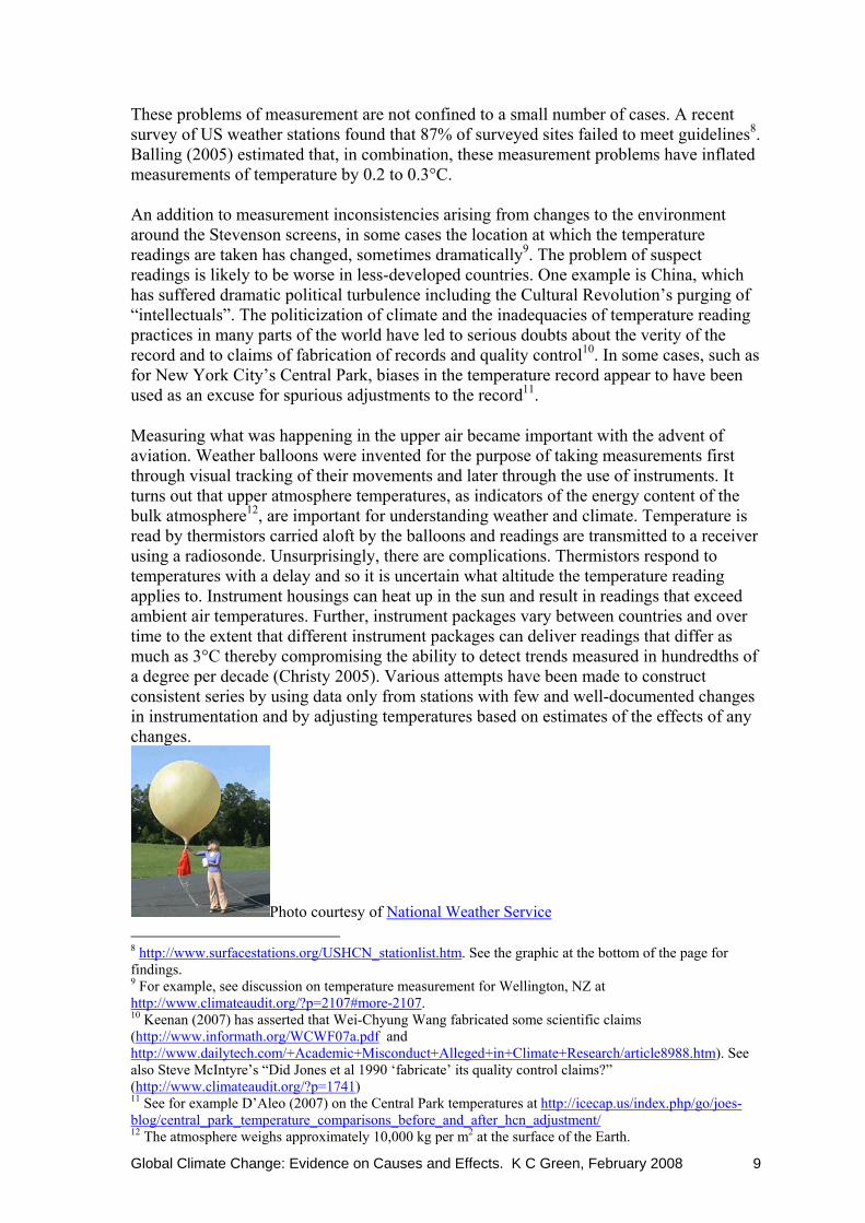
These problems of measurement are not confined to a small number of cases. A recent survey of US weather stations found that 87% of surveyed sites failed to meet guidelines8. Balling (2005) estimated that, in combination, these measurement problems have inflated measurements of temperature by 0.2 to 0.3°C. An addition to measurement inconsistencies arising from changes to the environment around the Stevenson screens, in some cases the location at which the temperature readings are taken has changed, sometimes dramatically9. The problem of suspect readings is likely to be worse in less-developed countries. One example is China, which has suffered dramatic political turbulence including the Cultural Revolution’s purging of “intellectuals”. The politicization of climate and the inadequacies of temperature reading practices in many parts of the world have led to serious doubts about the verity of the record and to claims of fabrication of records and quality control10. In some cases, such as for New York City’s Central Park, biases in the temperature record appear to have been used as an excuse for spurious adjustments to the record11.
Measuring what was happening in the upper air became important with the advent of aviation. Weather balloons were invented for the purpose of taking measurements first through visual tracking of their movements and later through the use of instruments. It turns out that upper atmosphere temperatures, as indicators of the energy content of the bulk atmosphere12, are important for understanding weather and climate. Temperature is read by thermistors carried aloft by the balloons and readings are transmitted to a receiver using a radiosonde. Unsurprisingly, there are complications. Thermistors respond to temperatures with a delay and so it is uncertain what altitude the temperature reading applies to. Instrument housings can heat up in the sun and result in readings that exceed ambient air temperatures. Further, instrument packages vary between countries and over time to the extent that different instrument packages can deliver readings that differ as much as 3°C thereby compromising the ability to detect trends measured in hundredths of a degree per decade (Christy 2005). Various attempts have been made to construct consistent series by using data only from stations with few and well-documented changes in instrumentation and by adjusting temperatures based on estimates of the effects of any changes.
Photo courtesy of National Weather Service 8 http://www.surfacestations.org/USHCN_stationlist.htm. See the graphic at the bottom of the page for findings. 9 For example, see discussion on temperature measurement for Wellington, NZ at http://www.climateaudit.org/?p=2107#more-2107. 10 Keenan (2007) has asserted that Wei-Chyung Wang fabricated some scientific claims (http://www.informath.org/WCWF07a.pdf and http://www.dailytech.com/+Academic+Misconduct+Alleged+in+Climate+Research/article8988.htm). See also Steve McIntyre’s “Did Jones et al 1990 ‘fabricate’ its quality control claims?” (http://www.climateaudit.org/?p=1741) 11 See for example D’Aleo (2007) on the Central Park temperatures at http://icecap.us/index.php/go/joes-blog/central_park_temperature_comparisons_before_and_after_hcn_adjustment/ 12 The atmosphere weighs approximately 10,000 kg per m2 at the surface of the Earth.

Global Climate Change: Evidence on Causes and Effects. K C Green, February 2008 10
Since 1978, the heat content or temperature of the bulk atmosphere has been measured by instruments carried by polar-orbiting National Oceanic and Atmospheric Administration (NOAA) weather satellites. The instruments are known as microwave sounding unit (MSU) radiometers. The radiometers measure the intensity of microwave emissions in the 50 to 60 GHz absorption band from excited oxygen molecules in the atmosphere. The intensity of the emissions is proportional to the atmosphere’s temperature. It is necessary to adjust the raw data to eliminate errors due to diurnal drift (east-west movement, which results in changes in the time of day that temperatures are sampled), orbital decay (decline in satellite altitude), inter-satellite calibration (as one satellite is replaced by another), and instrument body effect (from differences in the temperature of the instruments).
NOAA-17 TIROS-N satellite, launched in June 2002 (NOAA image from Smithsonian National Air and Space Museum site)
Adjusted MSU temperatures have been produced by scientists at the University of Alabama at Huntsville (UAH), Remote Sensing Systems (RSS), and the University of Washington (UW). A look at UAH’s README file gives a flavour of the ongoing adjustment process. The three groups use the same raw data from NOAA, but their adjusted series differ. The UW series are not widely used. UAH have provided full disclosure of their methods and their series are more consistent with the radiosonde evidence (Christy et al. 2007). The UAH series are the ones I have used in this report.
Indirect measurement
It is possible to estimate temperatures prior to the time when instruments were available and readings recorded by using proxies that provide a record of relative temperature. One proxy that is intuitively easy to understand is tree-ring data. Trees tend to grow faster in warmer temperatures and so bigger gaps between rings are taken to mean higher temperatures during that year. Tree ring data also illustrates the precariousness of the proxy approach. For example, the summer of 2003 was the hottest in Europe for some time and after that year researchers (Pichler and Oberhuber 2007) took samples to investigate the effect on tree rings. They found that the rings for 2003 were closer together than in previous years, rather than further apart. Temperature reconstructions typically assume linear response to temperature change, whereas trees can respond in an inverse-parabolic manner, possibly

Global Climate Change: Evidence on Causes and Effects. K C Green, February 2008 11
because of higher evaporation rates (Loehle 2007). If the calibration period for calculating the proxy series does not include the full range of temperatures experienced by the trees the validity of the series is doubtful. There are other reasons than temperature for differences in tree growth. One of these is rainfall. Another is CO2 concentrations in the atmosphere. Graybill and Idso (1993) wrote a paper containing bristlecone pine tree ring data titled “Detecting the aerial fertilization effect of atmospheric CO2 enrichment in tree ring chronologies”. The authors described how the trees’ growth had accelerated in recent years in response to the increasing levels of CO2. Finally, the assumption used in proxy construction that tree ring response to temperature is constant over the life of the tree does not always hold (Loehle 2007). Other proxy measures are derived from tree lines, pollen, ice cores, boreholes, seabed and lake sediments, and stalagmites. There are others. There are uncertainties about the reliability of proxy measure as one would expect in regard to complex processes that are not fully understood and which may have changed over time (see, for example, Douglas Keenan’s informath.org). Individual proxy measures, like the thermometer in Kelburn, record local rather than global conditions. Not surprisingly, then, while proxies show broad agreement they differ in the details. NOAA provides a repository of paleoclimatology proxy data series. Finally, during the period of recorded history, it is possible to cross check proxy measures against historical accounts such as of grape growing in Britain during the Roman and Medieval warm periods, and the Thames freezing during the Little Ice Age. There is also evidence of grain being grown in southern Greenland and further north than is now possible in Britain and continental Europe during the Medieval Warm Period. Global measurement
The polar-orbiting satellites and the instruments they carry enable the best available measurement of global temperature that is currently available. Such data are not however available prior to 1978. The less-than-30-year data set is a very small sample of the Earth’s mean temperature and there are questions about how representative that sample is. For example, two very intense El Niño events (1982-83 and 1997-98) and two large volcanic eruptions (El Chichon in 1982 and Mt Pinatubo in 1991) occurred during the period. With a small sample of doubtful representativeness, it is not possible to draw valid conclusions about causal relationships and trends.
In order to investigate the magnitudes, causes, and effects of climate changes, longer series of global average temperatures are necessary. The concept of a global average temperature is simple, but in practice it is not so easily estimated from non-satellite data. Broadly, this is a problem of missing data. Prior to the very recent advent of satellite monitoring, data are missing over time and space. First, true local mean temperatures are not known from thermometer data. The figure that is used to represent a day’s local temperatures in the calculation of mean temperature series is the temperature half way between the daily maximum and minimum temperatures. It is not clear whether trends in such a figure, based as it is on just two points in time, can in anyway be regarded as a providing a reliable estimate of trends in daily mean temperature. Second, weather stations are not evenly distributed across the Earth and large areas, including the ocean outside of frequently travelled sea lanes, cannot be represented in a global average by regular and reliable measurements. Weather stations tend naturally to be associated with

Global Climate Change: Evidence on Causes and Effects. K C Green, February 2008 12
human settlement and the increasing wealth of inhabitants. Even in well-settled areas, however, local political turbulence such as occurred in China during the Cultural Revolution can result in patchy and unreliable temperature measurement (See Keenan 2007 on this subject).
These are important caveats. If temperatures cannot be measured across the whole globe 24 hours a day, then representative samples of temperatures over long periods are needed in order to be confident that one has identified a genuine global trend in temperatures. Every month, Christy and Spencer at the University of Alabama at Huntsville issue the latest statistics from the NOAA polar-orbiting satellite, including the following temperature anomaly map. The map shows why global measurement or representative sampling is important: regional variation. The month of September 2007 was both warmer than, colder than, and much the same as the local average for September for the period 1979-1998, depending on where you look. Before reading on, you might like to guess from looking at the map whether the mean global temperature in September was up or down compared to the 20-year average.
My pick from the map was that September would on average have been colder. I was wrong: Christy and Spencer’s preliminary estimate was, at the time of writing, +0.24°C. Researchers have made efforts to estimate the average temperature of the Earth, or large parts of it, for the vast period of the Earth’s history before comprehensive human record-keeping. This has been done by aggregating proxy data. The best-known of these efforts is Mann, Bradley, and Hughes’s (1999) “hockey stick” graph. It has featured prominently in the IPCC’s publications (Mann was an IPCC lead author), popular reportage, and Al Gore’s movie An Inconvenient Truth.

Global Climate Change: Evidence on Causes and Effects. K C Green, February 2008 13
The “hockey stick” graph—an important diversion The “hockey stick” graph was based on the authors’ reconstruction of 1000 years of Northern Hemisphere temperatures. It showed temperatures almost flat from AD1000 until the early 1900s and then heading rapidly upwards during the 20th Century to exceed all temperatures during the preceding centuries of the millennium. It is probably fair to say that the “hockey stick” graph is many peoples’ primary image of “global warming”. It is also an illustration of how vulnerable to assumptions, data selection, and analysis methods such reconstructions can be. Some people were surprised that the series showed the Medieval Warm Period, when Vikings were farming in Greenland, as being colder than recent times. On July 6 2006, a 155 page report that discredited the “hockey stick” graph was issued by a panel of 12 senior scientists who had been appointed by the US National Academy of Sciences at the request of the House of Representatives science committee to evaluate criticisms of Mann’s work by MacIntyre and McKitrick13. McIntyre thought the hockey stick shape of the Mann data graph was too good to be true and tried to reconstruct it based on the description of the procedures given in the Mann et al. papers. He found that there was insufficient information in the papers and he asked Mann for his algorithms and data. Mann obfuscated but McIntyre, with the help of McKitrick, persisted and eventually was able to determine what Mann had done in order to achieve the hockey stick shape. The fascinating and disturbing story of McIntyre and McKitrick’s detective work, persistent requests, and findings are told in McKitrick (2005). In particular, Mann et al. misused the statistical technique of principal components in such a way that a hockey stick shape was likely to emerge from any large enough set of data. Their method would, by its nature, over-weight any series that displayed a strong upward trend over the 20th Century. As it happened, the author’s large data set contained just such series: Graybill and Idso’s (1993) Sheep Mountain bristlecone pine tree ring data. Graybill and Idso’s paper was titled “Detecting the aerial fertilization effect of atmospheric CO2 enrichment in tree ring chronologies”. Graybill and Idso described how the trees’ growth had accelerated in recent years in response to the increasing levels of CO2 in the atmosphere (the Figure below illustrates this effect) and warned that for this reason the data was unsuitable for use as a temperature proxy. The result of including this data was the “hockey stick” graph. In a recent twist, Ababneh (2006) presented a Sheep Mountain temperature chronology based on 100 cores, which was many more than were used in the Graybill and Idso series, that did not exhibit the dramatic 20th Century hockey-stick hook.
13 See McIntyre and McKitrick (2006) for an account.

Global Climate Change: Evidence on Causes and Effects. K C Green, February 2008 14
Robinson et al. (2007) Interestingly, when Mann eventually released the mass of data associated with his multi-proxy exercise, McIntyre and McKitrick found evidence, in the contents of a file labelled “CENSORED”, that Mann et al. were aware of the effect of the bristlecone pine data: without it, 20th Century temperatures appear unremarkable compared to earlier centuries. More recently, Loehle (2007) argued that tree ring data in general is too unreliable and constructed series by averaging 18 non-tree ring 2000-year series. The result is shown in the next figure. There is no sign of a hockey-stick shape, and a warmer-than-present-day Medieval Warm Period and a cold Little Ice Age are clearly evident.
Loehle (2007)

Global Climate Change: Evidence on Causes and Effects. K C Green, February 2008 15
1.2 Temperature since 1900 The best available temperature data for the last 100 or so years are the near-surface thermometer readings from around the world. The best known compilation of this data into estimates of global average temperatures is the work of Phil Jones of the Climatic Research Unit at the University of East Anglia in collaboration with the UK Met Office’s Hadley Centre. Broadly, the Jones methodology involves calculating the average monthly temperature anomaly (versus the 1961-90 average for the month in question) for each 5° by 5° grid box from individual readings from within each box. The anomalies are averaged across each hemisphere and then the two hemisphere figures are averaged to produce a global average. A graph of the resulting series to August 2007 (HadCRUT3 Global) is shown below.
Monthly global average near-surface temperature differences from 1961-90 means. Link Recall that there is considerable uncertainty over the estimates of global temperature from local thermometer readings due to the various biases described earlier. The next two graphs show quite different trends in big city temperatures compared to those at remote stations in Australia, perhaps as a consequence of heat island effects and land use changes. The big cities are mostly included in the Jones averages (HadCRUT3) and the remote stations mostly are not. The third graph shows that for one big area of the Earth at least, the 48 contiguous US States, 1920s temperatures were higher than more recent high temperatures.

Global Climate Change: Evidence on Causes and Effects. K C Green, February 2008 16
Tasman Institute (1991)
From Robinson at al. (2007)

Global Climate Change: Evidence on Causes and Effects. K C Green, February 2008 17
Trends in satellite temperature data
Recall that the satellite temperature data are more truly global than can be obtained from aggregations of thermometer data and are less prone to bias. Satellite temperature data are also available for the lower troposphere. Lower troposphere temperature is more representative of the bulk atmosphere temperature, which is more relevant to climate than near ground temperatures. Further, tropical lower troposphere temperature is predicted by global warming theory to be most subject to warming.
The following graphs show lower troposphere temperatures, measured using satellite-based microwave sounding units, since the beginning of comprehensive satellite measurements in 1978 and ending with the month of September 200714. The data suggest that while the years since 1997 have mostly been warmer in most places than the years 1979 to 1996, there has been no warming trend since the strong El Niño year of 1998. The average global anomaly since 1998 was 0.24°C warmer than the average anomaly for the roughly 20 years prior to 1998.
14 Notes about the graphs and links to John Christie’s University of Alabama at Huntsville data are available from http://mclean.ch/climate/Tropos_temps.htm. The graphs in this report were provided with a uniform scale by John McLean at my request. The vertical (blue) gridlines are at the month of December. As a consequence of my choice of scale the second month’s data in the graph of the US 48 states is truncated at -3°C when the actual figure was -3.28°C

Global Climate Change: Evidence on Causes and Effects. K C Green, February 2008 18
Temperature anomalies over land were on average greater in magnitude than those over the sea.

Global Climate Change: Evidence on Causes and Effects. K C Green, February 2008 19
Tropical latitude temperatures have displayed no obvious trend over the period for which satellite data has been available and there is little evidence of a trend in the southern exotropics (which includes New Zealand). Temperatures in the northern exotropics, where most population and industry is concentrated, have been consistently higher over the last decade. Even in the northern exotropics, however, 1998 was the warmest year and there has been no apparent trend in temperatures since then.

Global Climate Change: Evidence on Causes and Effects. K C Green, February 2008 20
The graphs on this page show satellite temperature data for smaller geographical areas than the previous graphs and at least partly for this reason the temporal variations in temperature anomalies are greater. Arctic Circle anomalies were, despite considerable month-to-month variation, obviously warmer during the most recent decade of satellite temperature readings. Temperatures were also warmer on average over the 48 contiguous states of the US from 1998, but this would have been less obvious to inhabitants because temperature anomalies were colder than average for nearly a quarter of months. Antarctic temperatures were on average slightly colder during the latter period.

Global Climate Change: Evidence on Causes and Effects. K C Green, February 2008 21
1.3 Temperature during the Common Era, and earlier The Common Era is a period of written records and much extant evidence of human activity. On the other hand, there was no scientific recording of temperatures for much of the period and we need to rely on historical accounts and proxy data from individual locations to reconstruct global temperatures. Historical records and archaeological research suggest that the Roman Empire enjoyed a relatively warm climate during which grapes were grown for wine in Britain. The subsequent Dark Ages were cooler until temperatures picked up again during what is known as the Medieval Warm Period, which lasted from roughly 800 to 1300 CE. This is the time during which the Vikings settled in Greenland where they grazed stock and grew grain and Maori settled New Zealand and were able to grow kumara as far south as Otago. The period from roughly 1300 to 1900 CE experienced on average cooler temperatures, and has become known as the Little Ice Age. During that period, alpine glaciers advanced engulfing villages, the Vikings abandoned their settlement on the west of Greenland, wine was no longer produced in Britain, and Kumara growing retreated to the far north of New Zealand. Recent times have seen a return to somewhat warmer temperatures. The following figure shows a sea surface temperature reconstruction for the Sargasso Sea, an area of the Atlantic Ocean to the North East of the West Indies. The Roman and Medieval Warm Periods show up with average temperatures above or equal to the 3,000-year mean, while Dark Age and Little Ice age temperatures were on average below the mean. The temperature for 2006 was close to the 3,000 year mean.
From Robinson et al. (2007)

Global Climate Change: Evidence on Causes and Effects. K C Green, February 2008 22
Other temperature reconstructions, from proxy data collected in other parts of the world, show a similar picture. The two figures below show, respectively, a reconstruction from Chinese peat core data and from Siberian tree-ring data.
Chinese temperature history from Hong et al. (2000)
5-year average early summer temperature in °C for east Taymir and Putoran (Siberia)
reconstructed from tree ring data. From Naurzbaev and Vaganov (2000). Soon et al. (2003) found that the great majority of proxy temperature series indicate that, while there were geographical and temporal variations, the Medieval Warm Period and Little Ice Age were global phenomena and that the former period was warmer on average than the current climate. One interesting temperature proxy is the range of southern elephant seals. They are currently based principally on the islands of South Georgia, Heard, and Macquarie, all of which are close to the 55°-South parallel. The elephant seals do not cope well with sea ice, and so they are rarely seen visiting the Antarctic. Surprisingly then, Hall et al. (2006) found plentiful remains from extensive elephant seals colonies along the Scott Coast of Antarctica in the McMurdo Sound area in the vicinity of latitude 75°-South. Consistent
Global Climate Change: Evidence on Causes and Effects. K C Green, February 2008 23
with the existence of a Medieval Warm Period that was warmer than our current climate and experienced over wide areas of the Earth, they found that the period from 350 BCE to 850 CE saw the expansion of the seal colonies and the disappearance of Adélie penguins during a period that
…represents the greatest sea-ice decline (and probably the warmest ocean and air temperatures) in the Ross Sea in the last 6,000 yr. This was followed by an increase in sea ice and the development of land-fast ice ~1,000 yr ago on the [Victoria Land Coast], which we propose led to the abandonment of seal colonies. The ice regime remains too severe for either elephant seals or penguins to occupy the southern [Victoria Land Coast] today.
p. 10215
Further:
… The disappearance of elephant seals from the VLC is broadly contemporaneous with the onset of Little Ice Age climatic conditions in the Northern Hemisphere
p. 10215 In an indication of how tentative knowledge of past climates can be, the authors wrote:
Integration of southern elephant seal and Adélie penguin data affords a distinctly different record of Holocene sea-ice change than that previously derived from penguin data alone. For example, the disappearance of penguins from the southern [Victoria Land Coast] (~2,500 14C yr B.P.), originally thought to reflect severe ice, is now interpreted as indicating a period of sea-ice reduction so great that Adélie penguins no longer were a viable population.
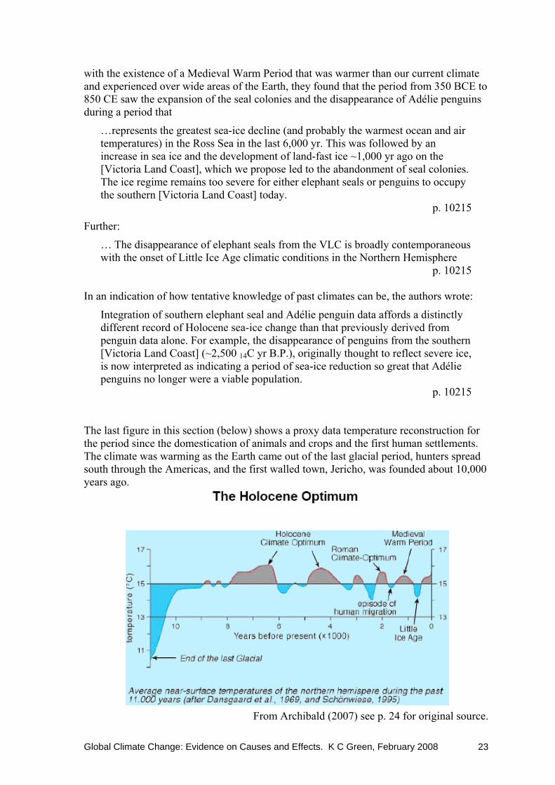
p. 10215 The last figure in this section (below) shows a proxy data temperature reconstruction for the period since the domestication of animals and crops and the first human settlements. The climate was warming as the Earth came out of the last glacial period, hunters spread south through the Americas, and the first walled town, Jericho, was founded about 10,000 years ago.
From Archibald (2007) see p. 24 for original source.

Global Climate Change: Evidence on Causes and Effects. K C Green, February 2008 24
1.4 Temperature during the Phanerozoic Eon The Common Era and even the 11,000 or so years since people first established permanent settlements offer only a small sample of the Earth’s climate over the period of abundant life, the Phanerozoic Eon, a period of 570,000,000 years. The next figure shows a temperature reconstruction from the Vostok (central eastern Antarctica) ice cores for the most recent tenth of that period. The previous graph covered the period that appears as a jiggle of data between -2 and +2°C on the far right.
From Quirk (2007)
In turn, the Vostok data corresponds to 0.1mm to the right of the following temperature proxy graph showing most of the Phanerozoic Eon. Note that the difference between each y-axis tick mark corresponds to roughly 1.5°C to 2.0°C difference in average temperature.
Temperature proxy data derived from changes in oxygen isotope ratios in fossils. A change of 1-part-per-thousand equates roughly to a temperature difference on 1.5-2.0°C. Graph by Rohde
derived from Veizer et al’s (1999) oxygen isotope data and Veizer’s 2004 update.

Global Climate Change: Evidence on Causes and Effects. K C Green, February 2008 25
1.5 Temperature levels and rates of change compared The preceding material has shown that global temperatures have varied over short, medium, and long periods of the history of life on Earth. Perhaps the two most striking conclusions from inspecting the graphs are, first, that variations in temperature anomalies for a single site over short periods are large relative to changes over longer periods or for larger areas. For example, estimates of the difference in average temperature between the depth of the Little Ice Age and current temperatures are in the order of 1 to 2°C, whereas average temperatures in Siberia have varied as much as 5°C from one five year period to the next and US 48-State satellite data anomalies that differ by 2°C from one month to the next are not unusual. The size of short term and local variations relative to long term global variations makes detecting genuine trends difficult. For example, Singer and Avery (2007) point out that Iceland’s major author on climate change, Porvaldur Thoroddsen concluded in the early-1900s that Iceland’s climate had not changed over the thousand years of settlement. He ascribed his compatriots’ complaints to their unwillingness to come to terms with the highly variable climate of their home. There is nothing remarkable about recent rates of change. The figure shows temperatures increased in central England to a greater extent (more than 2°C) and more rapidly in the early-1700s than has been the case in recent decades. The second figure (repeated from above without caption) shows several spikes in sea surface temperature proxy data over a longer period (3,000 years) that were more dramatic than recent changes.
A 300 year thermometer record: Central England temperature
From Archibald (2007) see p. 24 for original source.
From Robinson et al. (2007)

Global Climate Change: Evidence on Causes and Effects. K C Green, February 2008 26
Second, a look at the scale of the graphs makes it clear that the absolute range of global mean anomalies and proxies is small. Roughly 1.5°C encompasses almost all of the variation in the HadCRUT3 monthly data for a period of more than 150 years. Sargasso Sea surface temperature 100-year averages varied roughly 3°C over 3,000 years. To put these figures into context, Nelson’s annual average temperature is 17.4°C which is 1.6°C higher than nearby Wellington’s annual average of 15.8°C. Further afield but at roughly the same latitude in the Northern Hemisphere (41°N rather than 41°S) a selection of annual average 24 hour temperatures show even greater variation: Madrid 14.2°C, Istanbul 13.2°C, Tashkent 13.5°C, Beijing 11.8°C, Aomori 9.9°C, Salt Lake City 9.6°C, New York City 11.5°C. A final example: the maximum and minimum temperatures for today, the 20th of October in Kelburn were 14°C and 7°C, and at Wellington Airport they were 16°C and 10°C. The two stations are about 5 km apart. It is not necessary to move far or wait long to observe temperature differences as large as those that are associated with climate changes.
From Robinson et al. (2007) The Vostok data, as plotted above, show more variation than the other series. To put the variation onto context, the second to rightmost peak in the figure coincides with the last interglaciation of 125,000 or so years BP. Marra (2003) estimated from the distribution of beetle fossils that temperatures in the South Wairarapa at the time of were 1.6–2.5°C warmer in the summer and 2.3–3.2°C warmer in the winter than they are now; similar to conditions currently prevailing in Northland. Evidence for warm moist conditions is consistent with other proxy climate measures, including the Vostok data. The following figure shows the Vostok data in the context of local annual maximum and minimum temperatures, a Global average temperature, and an equatorial average temperature.

Global Climate Change: Evidence on Causes and Effects. K C Green, February 2008 27
Global temperature Range
-100
-75
-50
-25
0
25
50
050,000100,000150,000200,000250,000300,000350,000400,000450,000
Age BP
Temperature C
Vostok TemperatureAnnual Summer MaximumAnnual Winter MinimumEquatorial TemperatureGlobal "Average"
From Quirk (2007)
Are late-20th Century temperatures unusual in their magnitude or rate of change? The data suggest not. The table below summarises the evidence, across many studies, for and against the existence of a Medieval Warm Period, a Little Ice Age, and exceptional 20th Century warming. The hypothesis of exceptional 20th Century warming is rejected by the data.
From Robinson et al. (2007)

Global Climate Change: Evidence on Causes and Effects. K C Green, February 2008 28
The next two figures show the number of US State temperature records that occurred in each decade from the 1890s (1880s) to 1990s. There is a bias in the data: where there is a tie, the record is assigned to the more recent year. Despite the bias, 298 record maximums occurred between 1900 and 1949 compared to 145 between 1950 and 1999. For minimum temperatures, the situation is reversed: most occurred in the latter half of the century.
Both from McGurk (2007)

Global Climate Change: Evidence on Causes and Effects. K C Green, February 2008 29
Patterson (2007), who has developed a temperature proxy series based on mud at the bottom of British Columbia fjords, observed:
Many times in the past, temperatures were far higher than today, and occasionally, temperatures were colder. As recently as 6,000 years ago, it was about 3C warmer than now. Ten thousand years ago, while the world was coming out of the thou-sand-year-long “Younger Dryas” cold episode, temperatures rose as much as 6C in a decade -- 100 times faster than the past century’s 0.6C warming that has so upset environmentalists.
Soon et al. (2003, p 270) concluded their review of evidence on temperatures over the last millennium as follows:
…thermometer warming of the 20th century across the world seems neither unusual nor unprecedented within the more extended view of the last 1000 years. Overall, the 20th century does not contain the warmest or most extreme anomaly of the past millennium in most of the proxy records.
Finally, Robert Giegengack, chair of the Department of Earth and Environmental Science at the University of Pennsylvania said in an interview published in Philadelphia Magazine (Marchese 2007): “For most of Earth history… the globe has been warmer than it has been for the last 200 years. It has only rarely been cooler.”

Global Climate Change: Evidence on Causes and Effects. K C Green, February 2008 30
2. Recent and Previous Extreme Weather Events How do recent extreme weather events compare to extreme weather events in the past? As technology improves and weather readings are taken in increasing numbers of locations, weather extreme records are likely to be biased towards more recent times. The bias is exacerbated in some cases by the custom of taking the most recent record if there is a draw. Despite the biases, some records have persisted for more than a century, as the tables below show. The tables list records for “weather elements” including temperature, rainfall, and wind for the US (first table) and the World (second table). Could anyone fail to be impressed by records such as 29 metres of snow in a season, or the enormous difference—in human terms—between the World’s highest recorded temperature of 58°C and the lowest of minus 89°C? And what would it have been like to experience the 27°C two-minute temperature increase recorded in Spearfish South Dakota?
From Cerveny et al. (2007)

Global Climate Change: Evidence on Causes and Effects. K C Green, February 2008 31
From Cerveny et al. (2007)

Global Climate Change: Evidence on Causes and Effects. K C Green, February 2008 32
2.1 Heat waves and cold spells There are long temperature data series, as I have described above, but there is no comprehensive and reliable data on short-duration often localized temperature extremes (heat waves and cold spells) prior to the commissioning of the weather monitoring satellites in 1978. Concern that the planet might be warming dangerously has led to an intense interest in heat waves in recent years. The European summer heat wave of 2003 was reported as an exceptional event and deaths were attributed to it, particularly in France. Chase et al. (2006) used satellite data to investigate how the 2003 heat wave compared to other extreme temperature events since the advent of satellite monitoring. The authors measured extended-duration hot and cold anomalies in terms of numbers of standard deviations. They found that although the 2003 heat wave exceeded three standard deviations, parts of the Earth were affected by anomalies of +/- 3 SD, or greater, in roughly one-third of years, and by anomalies of +/- 2 SD or greater in every year since the advent of satellite data in 1978. The 2003 heat wave was not an exceptional heat wave. 2.2 Storms Reports of record storms seem common in the popular media. At face value, the prevalence of such reports suggests that the Earth is subject to worsening storms in recent years. Even if this view were unambiguously true, the lack of good measurement even a few decades ago, and poor coverage of less-developed and less-populated regions, mean that the sample of extreme events and hence rare weather events is a small one. As a consequence, it is difficult to be very confident about the frequency distribution of storm sizes. For example, how could or should the account of the death of hundreds of Edward III’s soldiers and horses be incorporated into the hailstorm record? In practice, reports of record storms are often spurious, with the term being used loosely or in relation to a short time period or small geographical area. Reports may not distinguish between economic damage, which is affected by the location and value of economic development, and the physical characteristics of the storm. Finally, there are now more reporters in more places, all motivated to tell a dramatic story, than there were in the past.

Global Climate Change: Evidence on Causes and Effects. K C Green, February 2008 33
The record of hurricanes and tornadoes affecting the US and surrounding region during the 20th and 21st Centuries provides relatively reliable data on severe storms over a longer period that is generally available. The next figure shows the number of Atlantic hurricanes that made landfall in the years from 1900. The number has been as low as one and as high as 19, but there is no sign of any trend in the data.
From Robinson et al. (2007)
Perhaps the most severe storms matter most. The next figure shows the number of violent Atlantic hurricanes and maximum wind speeds from 1944. There were no violent hurricanes during five of the years and as many as seven during two years (1950 and 2005). Maximum wind speeds varied between roughly 140 and 300 kilometres per hour. There is no sign of any trend in either number of violent hurricanes or maximum wind speed.
From Robinson et al. (2007) Some people have postulated that warmer temperatures would result in hurricanes and tropical storms sweeping further pole-ward. Vermette (2007) examined county weather records for the state of New York since 1850 and found no trend in the number of
Global Climate Change: Evidence on Causes and Effects. K C Green, February 2008 34
hurricanes and tropical storms reaching the State over the period, as the following figure shows.
(Vermette 2007)
The US is particularly prone to large and destructive tornadoes. The next figure shows number of tornados in the US during the seasons from 1950 to 2006 varied from a handful to more than 100. The three years with the greatest number of tornados occurred in the 1950s, 1960s, and 1970s. The statistical trend has been downwards.
From Robinson et al. (2007) Hurricane is the term used in the US and Caribbean for a tropical cyclone. In parts of Asia, the same weather phenomenon is called a typhoon. In the Northern Hemisphere cyclones revolve in a counter-clockwise direction. Ren et al. (2006) looked at the data for tropical cyclones in China from 1957 to 2004 and concluded that there had been a decline in their number and in precipitation associated

Global Climate Change: Evidence on Causes and Effects. K C Green, February 2008 35
with them over that period. The figures below show the authors’ data. As with other storms, there is much variation from year-to-year.
Ren et al. (2006)
Ren et al. (2006) The next figure shows “A bias-corrected time series of tropical storms, subtropical storms, and hurricanes to take into account undercounts before the advent of geostationary satellite imagery in 1966 and new technology available since about 2002. The adjusted 1900–2006 long-term mean is 11.5 per year” (Landsea 2007). The number of named storms has varied widely since 1900, but there is no evidence of a trend in the number. The 1970s and 1980s were relatively quite, however, so the number of storms in the decade from 1996 to 2005 seems high by comparison.

Global Climate Change: Evidence on Causes and Effects. K C Green, February 2008 36
Landsea (2007)
Southern Florida is the US region most subject to hurricanes. The next figure shows that during the decade from 1997 to 2006 more than twice as many hurricanes made landfall in Florida than was the case in each of the previous three decades. In the memories of most people, then, the most recent ten year period was much worse for Florida than anything that had gone before. The figure, however, shows different. The most recent decade with nine hurricanes is more typical of the full 110 year period (mode and median of eight hurricanes) than the three previous decades with a mode and median of three hurricanes per decade.
Ferguson (2007) There is also the question of how much damage is caused by the storms. More people and more valuable property in the path of storms results means that greater losses are likely even if there is no trend in the intensity and frequency of storms. Pielke et al. (2008) developed two methods to normalize the dollar value of damage from Atlantic tropical cyclones (hurricanes) for the period 1900 to 2005. The normalization schemes assessed

Global Climate Change: Evidence on Causes and Effects. K C Green, February 2008 37
the value of damage that would have arisen from each hurricane had it made landfall in 2005 (the year of Hurricane Katrina). The resulting values are shown in the next figure. While the decade 1996 to 2005 resulted in very high losses in 2005 terms, the storms of 1926 to 1935 would have caused more damage had they occurred in 2005.
Pielke et al. (2008)

Global Climate Change: Evidence on Causes and Effects. K C Green, February 2008 38
2.3 Floods The floodsafety.com site15 includes information on the worst floods recorded in US states. In Texas for example, the site lists 17 storms with more than 25 inches of rain. Texas is the US state with the most flood related deaths. The State has recorded some of the worst floods in the World. John Patton’s narrative, with data, of storms and floods starts with a description of “probably the biggest flood in Texas history”. The flood occurred in 1861. It is hard to see a pattern over time, as the following text and dates on the figures from the site describes:
Largest Storms Many Texas storms represent some of the largest storms in the world. Figure 3 shows the largest precipitation depths in the world, for durations ranging from 1 minute to 24 months. Also shown are some of the largest known precipitation depths in Texas. As indicated, many of the largest storms with durations from about 1 hour to 48 hours have occurred in Texas. Examples of these storms include a 1921 storm in Thrall that produced 32 inches of rainfall in 12 hours and a 1935 storm in D’Hanis that produced 22 inches of rain in 2 hours and 45 minutes.
15 The site is sponsored by various Federal, State, and Local government organizations.

Global Climate Change: Evidence on Causes and Effects. K C Green, February 2008 39
Flooding Flooding from large storms has affected Texas throughout its history, causing many deaths and much economic loss and hardship. Floods occur regularly in Texas, and destructive floods occur somewhere in the State every year. Many of these floods are destructive because they often occur in areas where extreme flooding had not occurred for many years. These floods often are perceived as unexpected or even unprecedented because their peak water-surface elevations (stages) can greatly exceed those of past floods. For example, a recent report by the U.S. Geological Survey identified, for sites throughout the State, maximum known peak stream discharges that greatly exceed peak discharges for 100-year floods. The maximum known discharges typically range from about 1.5 to about 3 times greater than 100-year discharges in the western and eastern parts of the State, but documented discharges for some sites along the Balcones escarpment have been as much as 4 or 5 times greater than 100-year peak discharges. Such peaks usually are devastating because structures and development typically exist outside the 100-year floodplain but often are within floodplains for maximum floods.
From floodsafety.com; link The photograph from 1906, below, shows that images of flooded towns are not so new.
From floodsafety.com; link

Global Climate Change: Evidence on Causes and Effects. K C Green, February 2008 40
Floods can be created or exacerbated by impervious surfaces such as roads, car parks, and building roofs together with channelling and dredging of streams and rivers that have the effect of more rapidly moving the larger volumes of runoff water to low-lying areas. Thus economic development can lead to increased flooding without any change in precipitation patterns. As with other extreme weather events, development and population growth means that there is more damage and there are more people to observe and suffer from floods that do occur. To the extent that more people are affected and even more are made aware of floods via instant, extensive, and vivid media coverage, it would not be surprising if people thought the climate was changing for the worse. 2.4 Droughts Legates (2005) described three different approaches to measuring drought. A meteorological drought occurs when below normal rainfall has occurred and does not end until total precipitation for a set period equals or exceeds the normal level for the whole period. The selection of the period that defines normal rainfall and the period over which rainfall is assessed against the norm clearly has a big effect on the measure. For example, a flood will not end a meteorological drought if the total rainfall for the period still falls short of the normal total for such a period. On that basis, Australia’s Murray-Darling basin only recently emerged from a 100 year drought. An agricultural drought is defined in terms of soil moisture deficit. This definition relates well to plant growth. Because soil moisture in most areas recovers over winter, agricultural droughts typically do not last longer than a single growing season. Finally, a hydrological drought is, in effect, the opposite of a flood. A hydrological drought occurs when, lake, river, reservoir, or well levels fall below predefined levels. This definition also corresponds well with the interests of people, who depend on these resources for domestic, recreational, industrial, and agricultural activities. It is important to realise that human activities can increase the frequency and severity of droughts and floods without any change occurring in the climate. For example, increasing population leads to greater water use thereby drawing down reservoirs at increasing rates and on more occasions causing a drought. Where asphalt, concrete, and lawns replace wood- and grass-lands, runoff is accelerated and flooding can be more common. Woodhouse and Overpeck (1998) conducted a review of the paleoclimatic evidence on the occurrence of severe drought in the Great Plains of the US over the past 2000 years. The Great Plains is particularly prone to drought and the economic and social consequences can be severe. The authors concluded that:
Historical documents, tree rings, archaeological remains, lake sediment, and geomorphic data make it clear that the droughts of the twentieth century, including those of the 1930s and 1950s, were eclipsed several times by droughts earlier in the last 2000 years, and as recently as the late sixteenth century. In general, some droughts prior to 1600 appear to be characterized by longer duration (i.e., multidecadal) and greater spatial extent than those of the twentieth century.
p. 2693

Global Climate Change: Evidence on Causes and Effects. K C Green, February 2008 41
The figure below shows a graph of Palmer Drought Severity Index (PDSI) data series for three US Great Plains locations over the 20th Century. The three maps are PDSI contour maps of the contiguous US States representing the three most severe drought years of the 20th Century. The most recent major drought in 1988 was not as severe as the dustbowl years of the 1930s.
Woodhouse & Overpeck (1998)
Paleoclimatic evidence on Great Plains and western-US drought over a period of up to 1000 years is shown in the next figure. The data were obtained using four different methods—tree rings, lake levels, lake sediments, and archaeological studies—and from between one and three studies using each method. The data provide evidence of widespread droughts lasting a century or more in some cases, and suggest that the last 500 years have been relatively free of major droughts.

Global Climate Change: Evidence on Causes and Effects. K C Green, February 2008 42
Woodhouse & Overpeck (1998)
A fifth proxy drought measure examined by Woodhouse and Overpeck (1998) is the record of salinity levels in a North Dakota lake, again over a nearly 2000 year period. The data, displayed in the next figure, show relatively dry conditions through to 1200 CE and persistent, though variable, relatively wet conditions subsequently.
Woodhouse & Overpeck (1998)
The mid-latitude East Coast of the US is not so commonly associated with droughts. Nevertheless, the paleoclimate data collected from Chesapeake Bay by Cronin et al. (2000) show evidence of 14 wet-dry cycles over the past 500 years. In particular, they found evidence of 16th and early-17th Century mega-droughts that were more severe than any experienced in the 20th Century. Data from other sources are consistent with this record.
Global Climate Change: Evidence on Causes and Effects. K C Green, February 2008 43
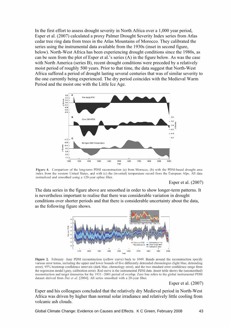
In the first effort to assess drought severity in North Africa over a 1,000 year period, Esper et al. (2007) calculated a proxy Palmer Drought Severity Index series from Atlas cedar tree ring data from trees in the Atlas Mountains of Morocco. They calibrated the series using the instrumental data available from the 1930s (inset in second figure, below). North-West Africa has been experiencing drought conditions since the 1980s, as can be seen from the plot of Esper et al.’s series (A) in the figure below. As was the case with North America (series B), recent drought conditions were preceded by a relatively moist period of roughly 500 years. Prior to that time, the data suggest that North-West Africa suffered a period of drought lasting several centuries that was of similar severity to the one currently being experienced. The dry period coincides with the Medieval Warm Period and the moist one with the Little Ice Age.
Esper et al. (2007)
The data series in the figure above are smoothed in order to show longer-term patterns. It is nevertheless important to realise that there was considerable variation in drought conditions over shorter periods and that there is considerable uncertainty about the data, as the following figure shows.
Esper et al. (2007)
Esper and his colleagues concluded that the relatively dry Medieval period in North-West Africa was driven by higher than normal solar irradiance and relatively little cooling from volcanic ash clouds.

Global Climate Change: Evidence on Causes and Effects. K C Green, February 2008 44
Closer to home, Australia’s current drought has been referred to as “the worst in 1,000 years”16. Is that really true? The three figures below showing rainfall data for the important Murray-Darling Basin suggest not. First, the rainfall anomaly (the difference from the long-term average) for 2006 was equalled or exceeded in four other years over a period of little more than a century. The lowest rainfall years (approximately 200 mm below normal) were roughly evenly dispersed across the 107 years of data, and the lowest rainfall year was the earliest, in 1902.
Annual rainfall in the Murray-Darling Basin, Australia (1)
Australian Bureau of Meteorology; Years: 1900-2006 Second, the data show that the Murray-Darling Basin has not been suffering from an especially prolonged period of drought. Rather the second-half of the 20th Century and early-21st Century enjoyed higher rainfall than the first half.
Annual rainfall in the Murray-Darling Basin, Australia (2)
Australian Bureau of Meteorology; Years: 1900-2006 16 See Cosmos article of 15 December 2006 by Benjamin Lester.
Global Climate Change: Evidence on Causes and Effects. K C Green, February 2008 45
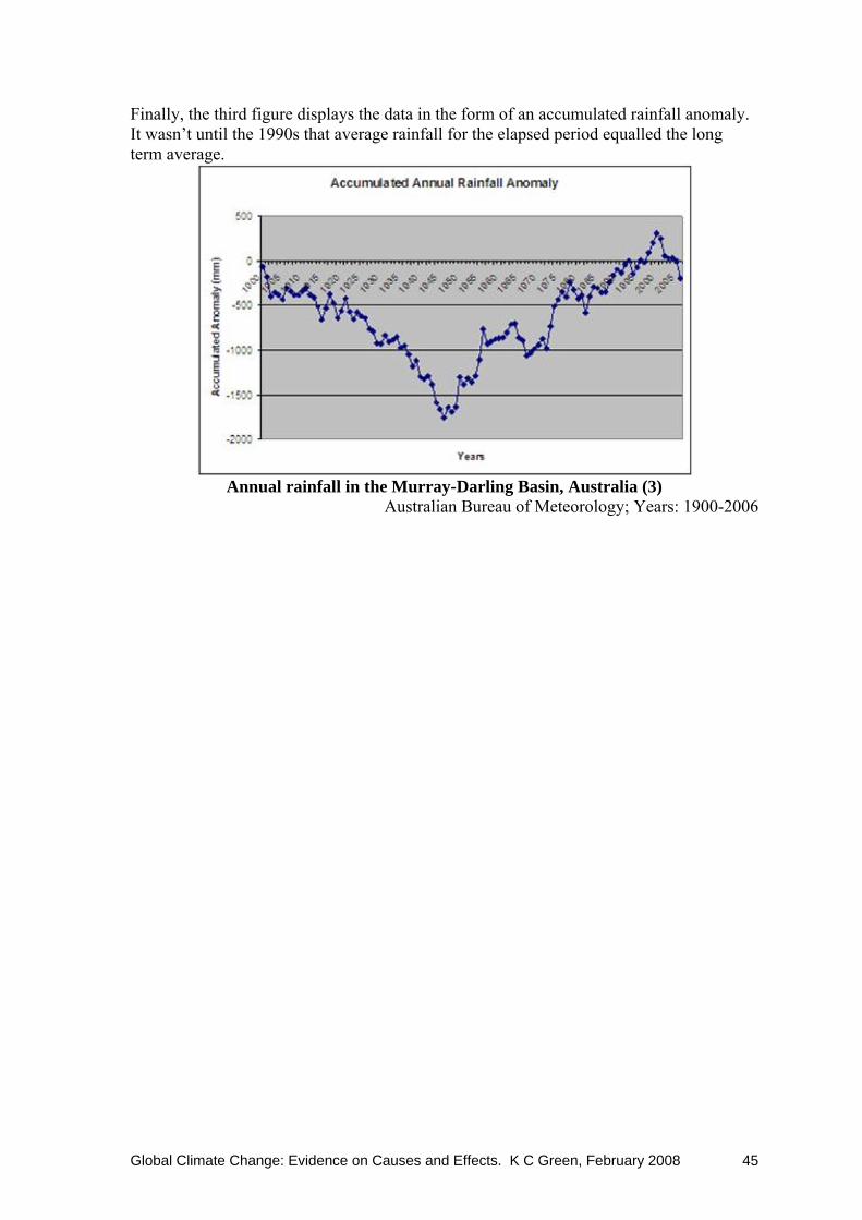
Finally, the third figure displays the data in the form of an accumulated rainfall anomaly. It wasn’t until the 1990s that average rainfall for the elapsed period equalled the long term average.
Annual rainfall in the Murray-Darling Basin, Australia (3)
Australian Bureau of Meteorology; Years: 1900-2006

Global Climate Change: Evidence on Causes and Effects. K C Green, February 2008 46
3. Global Temperature and Extreme Weather Events What is the relationship between global temperature and extreme weather events? 3.1 Temperature extremes: Heat waves and cold snaps On the face of it, this relationship is too obvious to be worth mentioning. It seems reasonable to expect more and more-severe heat waves and fewer and less-severe cold snaps when global temperatures are higher. Indeed, this is consistent with the findings of Chase et al. (2006) who used satellite temperature data in their study of extreme regional temperature anomalies. They found the area of the Earth affected by heat waves was positively correlated with Global mean temperature and cold spells were negatively correlated. A study of summer season temperature extremes in Quebec, Canada, revealed a different pattern. The authors found that over the 60 year period from 1941 to 2000, during which time Global temperatures trended broadly upwards, spells during which maximum temperatures remained above their 80th percentile benchmark declined in frequency (Khaliq et al. 2007). The comprehensive and reliable global data for assessing the unusualness or otherwise of regional heat waves and cold snaps, such as were used in the Chase et al. (2006) study, only became available with the advent of satellite measurements in 1978. The authors concluded that natural variability such as is associated with El Niño events and volcanic eruptions provided a better explanation than was provided by the hypothesis that such phenomena have tended to increase over time with Global temperatures. For example, extreme anomalies associated with the 1997-1998 El Niño were far larger in both degrees Celsius and geographical extent than the famously hot European summer of 2003. Precipitation, or more particularly soil moisture levels, has a major impact on the occurrence or otherwise of heat waves. The reason for this is that it takes roughly nine times the energy to evaporate water as it takes to raise the temperature. That is why fountains are popular in hot countries and why the deserts of the sub-tropics get so much hotter than equatorial jungles. For example, at Manaus in Brazil (3° South), the average hot season maximum is 31°C and the record high is only 35°C. When soil moisture levels are high, temperatures are depressed as summer heat is expended on the process of evaporating moisture. When soil moisture levels are low, the build up of summer heat is not constrained in the same way. Fischer et al. (2007) found that the European heat waves in 1976, 2003, and 2005 followed periods of at least four months of precipitation deficit. The authors estimated that soil moisture levels accounted for 50% to 80% of the number of hot summer days and affect particularly daily temperature maxima. In other word, low rainfall tends to cause temperature increases, rather than the other way around. Phenomena such as the extended cold being experienced in the, so far, seven-month winter affecting South America are not consistent with a hypothesis that cold snaps are less common and less severe when Global temperatures are warmer. Buenos Aires on November 15th recorded the lowest November temperature in 90 years: 2.5°C at the Downtown weather station. The record low temperatures are widespread, affecting also Uruguay and Brazil, and the Brazilian base in Antarctica. In Switzerland snowfalls have come early allowing the earliest start to the season since 1952. More recently, a Swiss

Global Climate Change: Evidence on Causes and Effects. K C Green, February 2008 47
meteorologist was reported as saying “Last week’s snowfalls were certainly quite extreme. We have no record, especially at mid altitudes, of such an event in the past” (Simonian, 2007). Early or severe snowfalls have also been reported in Idaho, New Hampshire, New Jersey, Oregon, Philadelphia, Serbia, Hungary, England, and China. Meanwhile, Environment Canada predicted “the coldest winter in nearly 15 years”. The limited data do not provide good evidence for the existence of a positive relationship between Global-mean-temperatures and the prevalence, extent, or severity of heat waves and their converse, cold snaps. 3.2 Violent weather The theoretical relationship between global temperature and extreme weather events is complex. Weather on Earth is driven by temperature differences, the greatest of these being the difference between the Equatorial and Polar Regions. If temperatures were to warm more in the region of the Poles than around the Equator, in theory at least it is reasonable to expect that the weakening of the climate engine would result in less storminess (Singer and Avery 2007). At a more local level, warmer surface temperatures tend to increase convection, whereby hot moist air rises and cools with the water vapour condensing as clouds. Again, bigger temperature differences can lead to greater air movement, and consequent storminess, and precipitation (more on the later in section 5). This simple theoretical analysis does not, however, take account of the cooling effect of clouds on surface and lower atmosphere temperatures. Neither does it take account of many other known-but-difficult-to-quantify feedbacks, nor the possibility of so-far-unknown feedback mechanisms. Attempts to model the effect of temperature on storminess based on current understanding have been inconsistent as to whether storms increase or decrease when temperature increases (Cerveny 2005). What, then, is the evidence from the empirical data? The historical accounts shows that the 13th Century cooling at the beginning of the Little Ice Age was accompanied by ferocious storms and great loss of life in Europe. Similarly, in China during the Medieval Warm Period, floods and droughts were two or more times less common than they were during the Little Ice Age. On the other hand, the Western US was much dryer during the very warm Holocene Climate Optimum of 6,000 or so years ago and desert conditions prevailed in the plains (Singer and Avery 2007). In a study looking at 5,000 years of Atlantic hurricanes, Donnelly and Woodruff (2007) found “the Caribbean experienced a relatively active interval of intense hurricanes for more than a millennium when local [sea surface temperatures] were on average cooler than modern” (p. 468). More recently, South America’s seven-month winter has been accompanied by severe thunderstorms and tornadoes leading to state-of-emergency declarations for more than 100 towns in Brazil’s Rio Grande do Sul state. A perusal of the data presented in the previous section suggests that warmer temperatures in recent times have not been associated with a greater prevalence or severity of extreme weather events. Cerveny (2005) summarised evidence that (a) rainfall from thunderstorms had increased over most of the US and the heaviest rainfall events have increased in severity; (b) the number of thunderstorms had decreased; (c) US hail incidence had declined since the mid-20th Century; and (d) there was much variability, but no obvious

Global Climate Change: Evidence on Causes and Effects. K C Green, February 2008 48
trend in US East Coast Nor’easters and mid-continental blizzards. Cerveny (2005) also presented evidence that while there is considerable variation from year to year and even from decade to decade, there was no discernable trend in the occurrence of severe tornados or in the frequency of tropical cyclones. In their review of evidence of trends in extreme weather events over the 20th and early-21st Centuries, Singer and Avery (2007) found (a) the number of heavy rainstorms has increased to levels prevailing in the late 19th Century; (b) no trend in storminess on the US East Coast or coastal north eastern Europe; (c) no evidence that Indian monsoons have increased in severity or variability with warmer temperatures and the 1990s saw decreased variability; (d) the incidence of extreme weather including heat waves, tornados, thunder storms, hail, floods, and blizzards declined in Canada over the last 40 years of the 20th Century; and (e) droughts became more intense and widespread in southern Africa from the late-1960s. The following table summarises the evidence described here and in the previous section on whether severe weather events have tended to increase in prevalence or severity in the period since 1900. While it is not clear that the data presented are comprehensive, the coverage of the studies together provides strong evidence that late-20th Century warming has not been associated with a general increase in extreme weather events.
Trend from 1900* Weather type Qualifier Area Number Severity
Tropical cyclones hurricanes Americas Flat Flat hurricanes Florida Flat wind speed Atlantic Flat violent Atlantic Flat typhoon China Down Down Storms adjusted, named Americas, Atlantic Flat storminess Coastal NE Europe Flat nor’easters East Coast US Flat Thunderstorms rainfall US Up - US Down - Canada Down Hail incidence US Down - Canada Down storms, heavy US Up Blizzards - Mid-continental US Flat - Canada Down Tornados - Canada Down severe US Down/Flat Floods - Texas Unclear Unclear - Canada Down Monsoons - India Flat Droughts - Western US Flat Flat - Murray-Darling Basin Down Down - Southern Africa Up Up Heat waves severe Global Flat - Canada Down
* Or for the period over which data are available, if shorter

Global Climate Change: Evidence on Causes and Effects. K C Green, February 2008 49
4. Global Temperature and Precipitation What is the relationship between global temperature and precipitation? An increase in air temperature makes it possible for the air to carry more water vapour; increased precipitation in the form of rain, snow, or hail is therefore theoretically possible. If water were evaporated and precipitated in the same place, perhaps this would not matter much, especially as the increases in global average temperatures that could possibly occur could only lead to a modest increase in the saturation level for water vapour for most parts of the earth for most of the year, as next figure shows.
Legates (2004) In practice, the relationship between temperature and precipitation is more complicated. Some of the most humid places, for example North Africa, are also deserts. Without a mechanism to condense the water vapour in the air, precipitation does not occur. The next figure suggests that there might have been a very small increase in precipitation on land over the 20th Century (0.1% or less than 1mm per decade), with most of any increase occurring in the Southern Hemisphere. A look at the noise of regional and temporal variations in even the smoothed curves in the figure, however, is enough to dispel any idea that there is a clear or strong trend in the data.
Legates (2004)

Global Climate Change: Evidence on Causes and Effects. K C Green, February 2008 50
Moreover, as with temperature measured at ground stations, there is evidence of biases in the measurement of precipitation (Legates, 2005). A traditional can-type precipitation gauge located in the kind of exposed site that is typical of the sites that are chosen to locate weather recording stations tends to under-estimate precipitation. Legates and co-authors estimated that in much of the US, summer biases can approach 8% and winter biases often exceed 25%. Biases arise from obstruction to airflow by the gauge itself, evaporation, water adhering to the sides of the container, and problems with automatic recording (Legates 2005). In the case of bias arising from obstruction to airflow, wind hitting the side of the container is forced upwards and across the mouth of the gauge at an increased speed, there is a slight updraft across the gauge mouth, and a pressure difference between the air at rest inside the gauge and the air moving across the gauge mouth. The consequences are that gauge catch is lower when winds are higher and when precipitation is in the form of snow the catch is depressed even further. Assuming there are otherwise no changes, this finding implies that, for example, it would not be sensible to take a report that this November was windier and drier than last November at face value. In many cases, there are other changes. While the heat island effect tends to boost actual local temperatures, in the case of precipitation the effect of local development such as buildings, walls and fences, and the growth of shrubs, hedges and trees is on measurement. As a gauge becomes increasingly sheltered, more precipitation is captured, partly due to the local fall in wind speed and partly because, as local temperatures increase due to heat island effects, more precipitation that would in previous times have fallen as snow will melt before it reaches the mouth of the gauge and be more readily captured. As a consequence, increasing trends in precipitation during modern times should be viewed with caution. Legates (2005) calculated that if over a century the temperature at a weather station increased by 1°C and wind speed at the weather gauge decreased by 1 knot (0.5 ms-1), as might reasonably happen at a station subject to heat island effect, recorded precipitation would increase by 6.4% without any change in actual mean precipitation.

Global Climate Change: Evidence on Causes and Effects. K C Green, February 2008 51
5. Global Temperature and Dramatic Changes in the Environment In general, did previous changes in global temperature, similar to recent changes, lead to sharp and dramatic changes in the environment; alternatively what type of temperature change has been associated with such changes? In this section I examine the relationship between temperature and two environmental threats that are commonly believed to be associated with warmer global temperatures: melting ice, and wildfires. Sea level changes were dealt with below in section 6. 5.1 Glaciers and Ice Sheets, and Sea Ice There is a complex relationship between temperature and changes in the volume of ice on the Earth, and the implications of any changes for sea level. Glaciers and ice sheets such as Greenland’s and the East Antarctic ice sheet are formed from an accumulation of snow that becomes increasingly compact until it turns into ice. When the accumulation of ice becomes sufficiently think, gravity causes it to flow. In the case of glaciers the flow is downhill and in the case of ice sheets the ice flows outwards from the thickest region. In the case of Greenland, the ice sheet is nearly as thick at its thickest point (approximately 11,000 feet) as Mt Cook is high. The ice is even thicker in parts of Antarctica. While a small alpine glacier might flow at a rate of 40 metres a year, Greenland’s Upernavik Glacier flows roughly that distance every day. Individual glaciers and ice sheets can increase by their flow rate to the extent that they move several times faster than previously. Where the ice reaches a place where the temperature is warmer, at lower altitudes or latitudes, it tends to melt. In places where glaciers or ice sheets reach the sea the ice floats and eventually parts of it break off to form icebergs. When floating ice melts, it does not increase the sea level because the water from the melted ice has the same volume as was displaced by the floating ice. Ice Sheets In the case of the vast ice sheets on Greenland and Antarctica, it can take thousands of years for the ice to flow from where it was formed to where it melts. Warmer temperatures can lead to ice being lost from the edges of an ice sheet, not from the surface (Ollier 2007a). What happens after ice is lost in this way depends on the rate at which the ice flows. But the rate at which the ice flows does not depend on current temperature, but on the weight of the ice that accumulated over thousands of years. Ollier (2007b) described the process:
The accumulation of kilometres of undisturbed ice in cores in Greenland and Antarctica… show hundreds of thousands of years of accumulation with no melting or flow. Except around the edges, ice sheets flow at the base, and depend on geothermal heat, not the climate at the surface.
…vast thicknesses of ice are preserved, and they retain complete records of deposition, in spite of the fact that temperatures at times during that period have been warmer than now. They do not fit the model of surface melting, even infrequently. After three quarters of a million years of documented continuous accumulation, how can we believe that right now the world’s ice sheets are collapsing!

Global Climate Change: Evidence on Causes and Effects. K C Green, February 2008 52
Greenland and Antarctic ice sheets sit in enormous basins the bases of which are below sea level in places. They are not about to “slide” off the land mass and into the ocean. Moreover, it is possible that warmer temperatures will lead to increased snowfall and a net increase in the mass of ice in ice sheets. The mechanism for this is that increased temperatures increase evaporation and hence precipitation, including snowfall. Greenland temperatures are cooler now than they were in the 1930s and 1940s after peaking in 1941 (see June 2006 Journal of Geophysical Research), but they are warmer than more recent decades and Antarctic and Greenland ice sheets have been growing from an accumulation of snow (Ollier 2007). The figure below shows the distribution of the change in the height of Greenland’s ice sheet between 1992 and 2003 that was on overage a net increase of 5.4 cm per year.
In the study by Hall et al. (2006) on elephant seals in Antarctica mentioned earlier, the authors noted that the “seal optimum” they observed coincided not only with warmer temperatures and much reduced sea ice but also with a period of increased accumulation of ice on the continental ice-sheet.
Our data on seal distribution cannot inform us about the fate of the Ross Ice Shelf during these periods. However, the lack of coastal landforms, such as beaches south of the present calving front (unpublished observation), and the dates of marine organisms on the adjacent McMurdo Ice Shelf both suggest that the Ross Ice Shelf has been continuously present over the last 7,000 yr.
… The presence of southern elephant seal colonies (which today exclusively occupy areas where the mean January temperature exceeds 0°C, usually by considerable margins), the disappearance of ice-obligate penguins, and the inferred significant reduction in sea ice, both in intensity and seasonal duration,
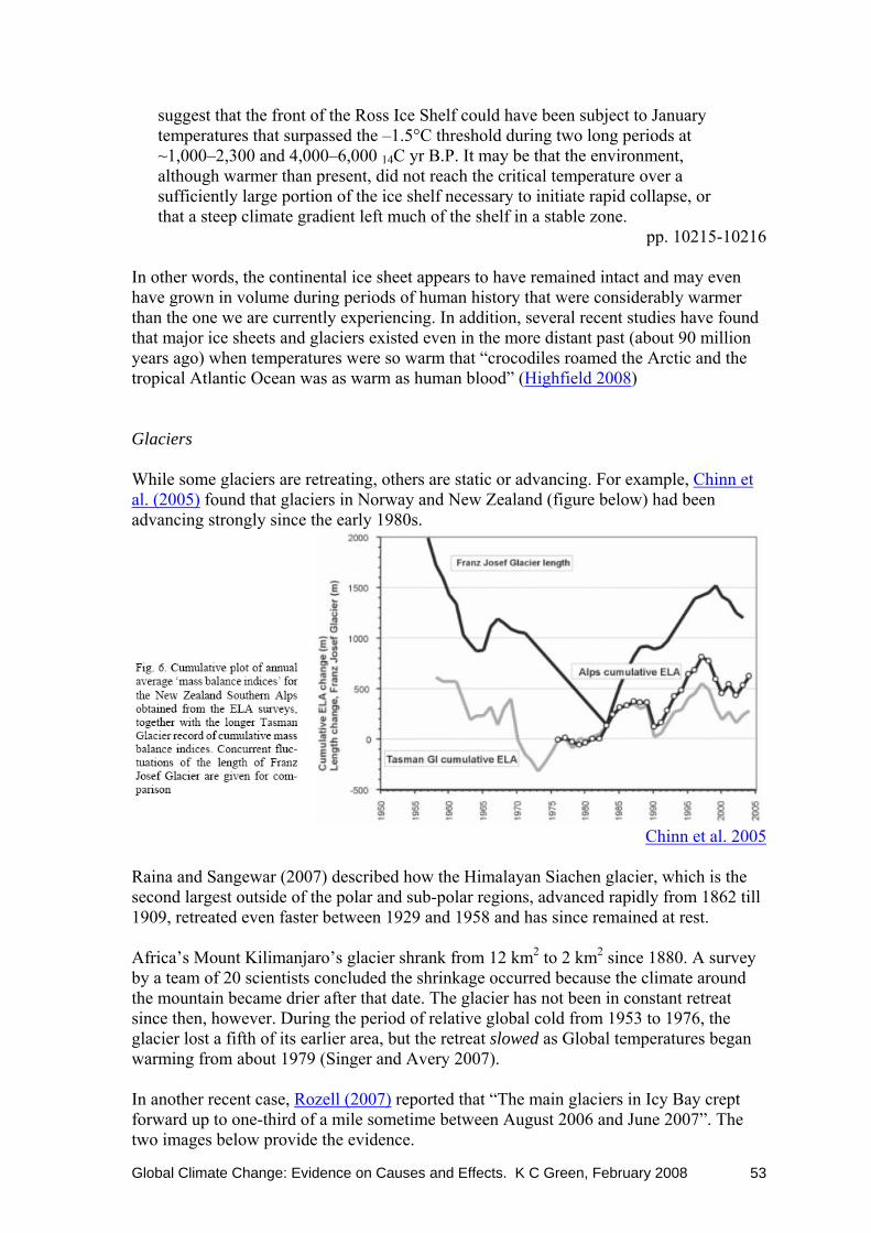
Global Climate Change: Evidence on Causes and Effects. K C Green, February 2008 53
suggest that the front of the Ross Ice Shelf could have been subject to January temperatures that surpassed the –1.5°C threshold during two long periods at ~1,000–2,300 and 4,000–6,000 14C yr B.P. It may be that the environment, although warmer than present, did not reach the critical temperature over a sufficiently large portion of the ice shelf necessary to initiate rapid collapse, or that a steep climate gradient left much of the shelf in a stable zone.
pp. 10215-10216 In other words, the continental ice sheet appears to have remained intact and may even have grown in volume during periods of human history that were considerably warmer than the one we are currently experiencing. In addition, several recent studies have found that major ice sheets and glaciers existed even in the more distant past (about 90 million years ago) when temperatures were so warm that “crocodiles roamed the Arctic and the tropical Atlantic Ocean was as warm as human blood” (Highfield 2008) Glaciers While some glaciers are retreating, others are static or advancing. For example, Chinn et al. (2005) found that glaciers in Norway and New Zealand (figure below) had been advancing strongly since the early 1980s.
Chinn et al. 2005
Raina and Sangewar (2007) described how the Himalayan Siachen glacier, which is the second largest outside of the polar and sub-polar regions, advanced rapidly from 1862 till 1909, retreated even faster between 1929 and 1958 and has since remained at rest. Africa’s Mount Kilimanjaro’s glacier shrank from 12 km2 to 2 km2 since 1880. A survey by a team of 20 scientists concluded the shrinkage occurred because the climate around the mountain became drier after that date. The glacier has not been in constant retreat since then, however. During the period of relative global cold from 1953 to 1976, the glacier lost a fifth of its earlier area, but the retreat slowed as Global temperatures began warming from about 1979 (Singer and Avery 2007). In another recent case, Rozell (2007) reported that “The main glaciers in Icy Bay crept forward up to one-third of a mile sometime between August 2006 and June 2007”. The two images below provide the evidence.
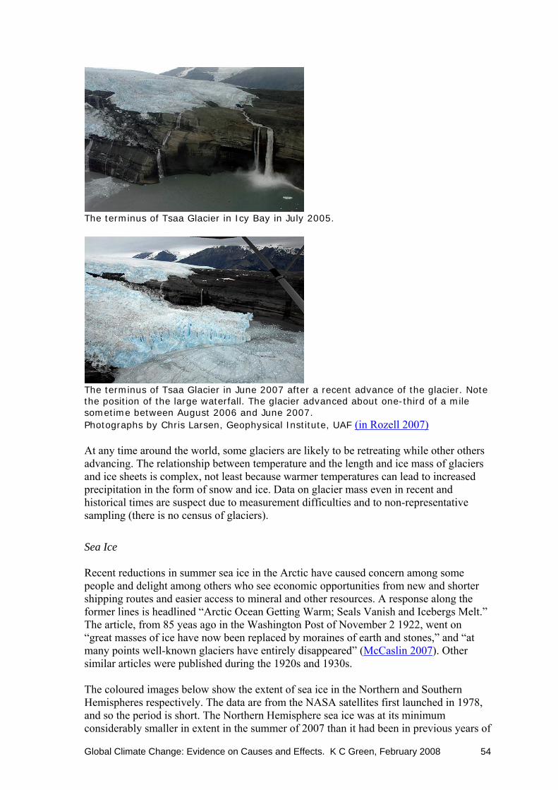
Global Climate Change: Evidence on Causes and Effects. K C Green, February 2008 54
The terminus of Tsaa Glacier in Icy Bay in July 2005.
The terminus of Tsaa Glacier in June 2007 after a recent advance of the glacier. Note the position of the large waterfall. The glacier advanced about one-third of a mile sometime between August 2006 and June 2007. Photographs by Chris Larsen, Geophysical Institute, UAF (in Rozell 2007) At any time around the world, some glaciers are likely to be retreating while other others advancing. The relationship between temperature and the length and ice mass of glaciers and ice sheets is complex, not least because warmer temperatures can lead to increased precipitation in the form of snow and ice. Data on glacier mass even in recent and historical times are suspect due to measurement difficulties and to non-representative sampling (there is no census of glaciers).
Sea Ice Recent reductions in summer sea ice in the Arctic have caused concern among some people and delight among others who see economic opportunities from new and shorter shipping routes and easier access to mineral and other resources. A response along the former lines is headlined “Arctic Ocean Getting Warm; Seals Vanish and Icebergs Melt.” The article, from 85 yeas ago in the Washington Post of November 2 1922, went on “great masses of ice have now been replaced by moraines of earth and stones,” and “at many points well-known glaciers have entirely disappeared” (McCaslin 2007). Other similar articles were published during the 1920s and 1930s. The coloured images below show the extent of sea ice in the Northern and Southern Hemispheres respectively. The data are from the NASA satellites first launched in 1978, and so the period is short. The Northern Hemisphere sea ice was at its minimum considerably smaller in extent in the summer of 2007 than it had been in previous years of

Global Climate Change: Evidence on Causes and Effects. K C Green, February 2008 55
satellite observation. In contrast, the Southern Hemisphere sea ice was considerably larger in extent during the 2007 winter. Antarctic sea ice has grown at least since satellite monitoring started. The intra-year variations in the area of sea ice are enormous in both Hemispheres and dwarf inter-year differences as the two saw-toothed graphs covering the period 1978 to 2008 illustrate.
The images below (a) show the extent of Arctic sea ice 29 years ago and at the time of writing (early winter) both on the same day of the year. Only the more recent images show snow. I was unable to obtain an equivalent Southern Hemisphere image for 1978.
(a)
Northern Hemisphere sea ice concentration on November 6, 1978 and 2007.
The images (b) show the extent of sea ice last winter and 28 years before.
(b)
Northern Hemisphere sea ice concentration on February 15, 1979 and 2007.
Purple is 100% concentration. The Cryosphere Today

Global Climate Change: Evidence on Causes and Effects. K C Green, February 2008 56
As mentioned above, the extent of Antarctic sea ice has been growing since satellite monitoring began. It has been doing so over a period when local air temperatures exhibited a modest warming trend as the next figure illustrates.
Antarctic sea ice extent is increasing despite the warming
temperatures
Zhang (2007) J. Climate vol. 20, 2515-2529
sea ice extent
air temperature
As with glaciers and ice sheets, the effect of temperature is not straightforward and is not well understood. Ocean currents also appear to play a role. Claims that warmer temperatures are causing a loss of summer sea ice in the Arctic are inconsistent with the evidence that Antarctic sea ice is increasing in extent. 5.2 Wild Fires Recent fires in southern California, particularly around Dan Diego, have been big news stories. While it now appears that some of the fires at least were deliberately lit, it seems logical that wildfires would be more frequent and extensive during periods when the climate is warm. The prospect of more and larger wildfires if temperatures increase in places such as the increasingly populous US western states is not a pleasant one. In practice, the actual relationship between temperatures and fires is not so clear, as the two figures below show. Firstly, drought conditions in the western US states have not been associated with higher temperatures. Drought conditions and their obverse are measured using the Palmer Drought Severity Index. Negative values indicate drought, zero is normal moisture levels for the location and positive values indicate heavier than usual rainfall. The index is calculated using local norms. The first figure shows that there was no relationship between temperature and the presence or degree of drought in the years between 1895 and 2006.

Global Climate Change: Evidence on Causes and Effects. K C Green, February 2008 57
Secondly, wildfires have tended to be associated with drought conditions, have been almost absent when conditions were normal, and completely absent during wetter periods in the northern Rocky Mountains over a period of nearly 400 years, as the next figure shows.
Ferguson Wildfires (2007)
Dry conditions in the western US are not unusual however, as the next figure shows, so it seems reasonable to expect that more, longer, and more-severe droughts will occur at times in the future due to natural variation in climate.
Ferguson Wildfires (2007)
Global Climate Change: Evidence on Causes and Effects. K C Green, February 2008 58
6. Global Temperature and Sea Levels What is the relationship between changes in Global temperature and uniform Global sea level changes or eustasy? In particular, what is the evidence on the relationship between Global temperature changes and dramatic eustasy, whereby global sea levels change by more than say 20 cm (8 inches) in a century? Alabama State Climatologist John Christy’s testimony before the US House Committee on Resources on 13 May 2003 provided some perspective on what the impact of a sea level increase in that order would be:
One of my duties in the office of the State Climatologist is to inform developers and industries of the potential climate risks and rewards in Alabama. I am very frank in pointing out the dangers of beachfront property along the Gulf Coast. A sea level rise of 6 inches over 100 years, or even 50 years, is miniscule compared with the storm surge of a powerful hurricane like Frederick or Camille. Coastal areas threatened today will be threatened in the future. The sea level rise, which will continue, will be very slow an thus give decades of opportunity for adaptation, if one is able to survive the storms.
Storm surges in the sea level such as those alluded to by Christy arise when air pressure drops and onshore wind velocity increases. A severe tropical low can result in a 50 millibar drop in atmospheric pressure and a consequent sea level rise of 50 cm without any effect from the wind. When the rise is accompanied by reinforcing winds and a spring tide, the overall increase in sea level can be dramatic. In practice, while dramatic eustasy is by definition a Global phenomenon, it is a concern because of local effects on shorelines. For example, a dramatically falling sea level would over time make some harbours and shipping routes unusable, and destroy shellfish beds and fish spawning grounds. On the other hand, a rising sea level could over time cause some low-lying coastal settlements and productive land to be flooded, especially during storms and high tides. 6.1 Theory Shorelines change due to changes in the sea level. They change due to changes in the level of the land. They also change due to local processes that arise mostly from the interactions of weather and the physical characteristics of the shoreline and environs (coastal dynamics). For example, Giegengack and Foster (2006) concluded that natural change and the actions of people in the Mississippi Delta area will continue to increase the area’s exposure to hurricane risk to a much greater extent than could arise from any man-made warming of the climate. Some of the factors they identify are: (1) sea level continuing to rise at current rates due to glacier melt and expanding sea water (~1.8 mm/yr); (2) the Delta continuing to subside due to depressing of the Earth’s crust under the weight of sediment, compaction as oil and gas are pumped out and as a consequence of de-watering to keep homes and businesses dry (5-10 mm/yr); and (3) channelling of flood-pain sediment out to the deep water of the Gulf of Mexico so that land is not being built up, and buffering wetlands and the seaward margin of the Delta are eroded due to lack of replenishment. The figure below lists influences on shorelines under the three broad headings.

Global Climate Change: Evidence on Causes and Effects. K C Green, February 2008 59
Mörner (2007-pamplet)
Some terms in the figure need explanation. The geoid is a hypothetical surface of the Earth that coincides with mean sea level applied to the entire planet. In other words, the surface of the geoid is everywhere perpendicular to the Earth’s gravity. Isostasy is a theoretical equilibrium of the Earth’s crust whereby lifting in one area is counterbalanced by depression in another. The phenomenon is proposed to occur because the relatively light crust is believed to in effect float on the Earth’s mantle. Steric effects are those that relate to the arrangements of atoms in molecules; for example warmer water is less dense (more voluminous) that colder water. Shown in the next figure are illustrations of the main influences on global sea levels and estimates of the effect sizes. Glacial eustasy is topical. The difference in sea levels between ice ages and warm periods such as we are currently experiencing is large. For example, since the time of the Last Glacial Maximum, which occurred over the period from about 30,000 to 19,000 years ago, roughly 50 million km3 of ice that had been locked-up in land-based ice sheets has melted. The melt-water increased sea levels in regions distant from the major ice sheets by about 130 m. In the places where the ice sheets disappeared, relative sea levels dropped by hundreds of metres as the surface of the Earth slowly rebounded (Woodroffe and Horton 2005). (An ice sheet depresses the crust below it as much as one-third of the ice sheet’s own thickness.)

Global Climate Change: Evidence on Causes and Effects. K C Green, February 2008 60
Mörner (2007-pamplet)
The estimated tracks of the relative sea levels from the end of the Last Glacial Maximum until 3,000 years BP is shown in the next figure for three locations distant from the major ice sheets: New Guinea, Tahiti, and Barbados. The rate of sea level rise during the middle, steep, section of the graph amounts to about 1 m per century.

Global Climate Change: Evidence on Causes and Effects. K C Green, February 2008 61
(Woodroffe and Horton 2005)
Other big influences on global sea levels are not so familiar. Tectono eustasy occurs when the plates making up the surface of the Earth lift or subside under or adjacent to the oceans thereby changing the volume of the basin in which the oceans reside and hence the sea level. Although the effect can be large, it tends to happen slowly over millennia and is therefore not a concern. Changes in the Earth’s gravitational field cause changes in the geoid and hence geoidal eustasy via changes in the distribution of water in the oceans. Geodal eustasy, while associated with large redistributions of water, has also been a slow process in the past. Water in the oceans is moved around by currents such as the Gulf Stream and weather systems such as El Niño, and these cause dynamic changes in sea surface topography of as much as 5 m in the former case and 0.3 m in the latter. The arrival or departure of an El Niño system can, in other words, cause a much greater rate of sea level change than would typically have been experienced as a consequence of ice-melt after the Last Glacial Maximum alone. Finally, the rotation of the Earth currently causes water at the Equator to bulge more than 21 m relative to water at the North Pole. When there is more water in the oceans, the bulge is greater (rotational eustasy) and the spin rate of the Earth slows by 15 ms for every 1 m increase in sea level—analogously to the spinning ice-skater who slows when she spreads her arms. 6.2 Evidence on global sea level changes With both land and sea moving, meaningful estimation and measurement of global sea level changes is a difficult task. Burroughs (2001) provided a summary of estimates of

Global Climate Change: Evidence on Causes and Effects. K C Green, February 2008 62
major components of sea level change over the last 100 years and estimates of the total net sea level change in the table below. Estimates of the contribution of thermal expansion (a steric effect) are based on computer models, rather than observation. Estimates of three of the five components examined (Greenland and Antarctic ice sheets, and surface water and ground water storage) range from large negative to large positive contributions, with middle estimates of zero or close to it. Further, observational evidence on sea level change over the last 100 years ranges from 10 cm to 25 cm. Clearly, there is a great deal of uncertainty about what has happened to the global sea level, even in the recent past.
(Burroughs 2001)
Jevrejeva et al. (2006) used elaborate mathematical procedures to analyze tide gauge data in order to derive a global sea level time series. The next figure shows the series they derived to represent sea level changes in each of ten regions. Even with this massaged data it is clear that there has been a great deal of variation in the rate of change in sea levels at a regional level and that the absolute regional changes can be in opposite directions. The authors pointed out the most rapid increases occurred between 1920 and 1950.
Jevrejeva et al. (2006)

Global Climate Change: Evidence on Causes and Effects. K C Green, February 2008 63
The global sea level composite series compiled by Jevrejeva et al. (2006) is shown in the top half of the next figure and the rate of change in the bottom half. The peak rate of increase that occurred around 1950 is clearly shown.
Jevrejeva et al. (2006) Human burning of hydrocarbon fuels is not a credible explanation of increasing sea levels because the upward trend in sea level began a century before. Robinson et al.’s (2007) estimate of the average rate of sea level change, shown in the figure below, is a rise of 18 cm per century or 1.8 mm per year.
From Robinson et al. (2007)

Global Climate Change: Evidence on Causes and Effects. K C Green, February 2008 64
The low observed estimate of net sea level rise of 10 cm per century, or 1 mm per year, in Burroughs’s (2001) table (above) is the same as the figure derived by Nils-Axel Mörner and others using diverse measurements and approaches17. The approaches that were used included the obvious (tide-gauge measurements since 1531), the not so obvious (change in the Earth’s rate of rotation compared to a century ago), and modern technology (satellite altimetry data). The data suggest that the rate of sea level rise has averaged close to 1 mm per year for nearly 500 years at least. An interesting alternative or supplementary explanation for average sea level rises over recent decades was proposed by Endersbee (2007). He pointed out that human use of groundwater has been much higher than it was prior to the 20th Century and that such water is in effect an addition to the Earth’s climate system:
This groundwater is not recharged from surface rainfall. It is a fossil resource, and can only be replenished in geological time. … The total world use of fossil groundwater is estimated to be about 750 to 800 cubic km per annum. That extraction is a net addition to the hydrosphere, which eventually becomes a net addition to the oceans. … The area of the oceans is 360 million sq. km. Thus the use of fossil groundwater in the past 100 years would have raised the level of the oceans by about 2 mm/annum, which is the same magnitude of sea level rise now claimed to be due to global warming (p. 17).
Sea levels appear to have been increasing at around 1 mm to 2 mm per year over hundreds of years. There is no evidence that the rate has increased in recent years. Moreover, while many factors that influence sea level change have been identified, the sizes and directions of the effects are not clear.
6.3 Ice sheet and sea levels Mörner was President of the INQUA Commission on Sea Level Changes and Coastal Evolution (1999-2003). During a visit to New Zealand in 2007, concerns were expressed to him about the possibility of dramatic sea level rises due to melting of the large ice sheets. He responded by pointing out that during the last ice age Northern Hemisphere ice sheets extended as far south as London, Moscow and New York. When the ice sheets were melting at their maximum rate, the sea level rose by up to 1.5 m per century. If the Earth again warmed at the same rapid rate, the only large ice sheet that is left to melt is Greenland; in Antarctica the temperatures would remain too cold for the ice sheets to melt to any great degree. Given that Greenland is less than 10% of the area of the extensive ice sheets of the ice age, a similar rate of melting would today increase the sea level by less than 15 cm per century [1.5 mm per annum]. Robinson et al. (2007) came to a similar conclusion to Mörner using the analogy of the Medieval Warm Period:
If the natural trend in sea level increase continues for another two centuries as did the temperature rise in the Sargasso Sea as the Earth entered the Medieval Warm Period, sea level would be expected to rise about 1 foot between the years 2000 and 2200 [1.5 mm per annum].
17 http://www.pog.nu/01research/sea_level_research.htm

Global Climate Change: Evidence on Causes and Effects. K C Green, February 2008 65
Reeh (1999) reported the range of experts’ estimates on the effect of a 1°C increase in global temperatures on sea levels that would arise from changes in the masses of the Greenland and Antarctic ice sheets as between +0.30 and +0.70 mm per year from the former and -0.20 and -0.70 mm per year from the latter. On the basis of these figures, the worst-case sea level rise arising from changes in the big ice sheets due to a 1°C warming would be the equivalent of 5 cm per century. At the other extreme, the experts’ estimates imply sea level decline at a rate equivalent to 4 cm per century. Evidence that sea levels fell 25 to 40 metres during the much warmer than any IPCC warming predictions Turonian period, centred around 90 million years ago, cast further doubt on the theory that a warmer climate would inevitably lead to dangerous sea level rises (Highfield 2008). Interestingly, using satellite radar altimetry data, Zwally et al. (2005) estimated that the combined mass change in the Greenland and Antarctic ice sheets contributed just 0.05 mm per year to sea-level change over a period roughly corresponding to the last decade of the 20th Century.
6.4 Evidence on sea level changes in places where people are especially vulnerable Much has been made of the vulnerability of low-lying island nations in particular to rising sea-levels. The Maldives, Venice, Tuvalu, and other Pacific Island nations have been proposed as being particularly vulnerable. Despite this, there is no evidence that such places are more vulnerable now than they have been in the past. Sea level around the Maldives has been both higher and lower than it is at present. There is no obvious trend over the last 4000 years (figure below). During his recent talk in Wellington in which Mörner presented this result, a member of the audience announced that he was a Maldives native and reported that the old people there said that there was nothing unusual about recent sea level changes. Mörner replied that the old people had told him this too, but that the government did not want to hear this message and had stopped him from presenting his findings to the Maldives people.
Mörner (2004)

Global Climate Change: Evidence on Causes and Effects. K C Green, February 2008 66
The next figure is an updated version of the previous one, reproduced so that the time scales are to the same scale and in horizontal alignment for convenient comparison.
Mörner (2007-pamplet)
Venice has been threatened by relative sea level rises—in the main at least it is the city that is sinking—for much of its history. The figure shows that this threat is not accelerating and, since 1970 has even moderated or abated.
Relative sea level at Venice, Italy
Mörner (2005) The sea level at Tuvalu has shown no trend since 1978 at least (next figure). Tuvalu has, however, been suffering from seawater encroachment; the problem arises because the Japanese pineapple industry extracts large volumes of fresh groundwater.
Mörner (2005)

Global Climate Change: Evidence on Causes and Effects. K C Green, February 2008 67
Similarly, the figure below shows a lack of trend in the sea levels experienced by Islands in the Pacific Ocean in the 1990s and early 2000s.
Mitchell (2007)
It is perhaps worth noting that coral grows faster than any sea level rise that has occurred in the past or could plausibly arise in the future.
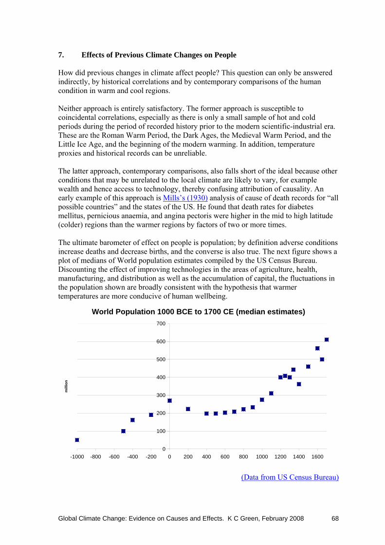
Global Climate Change: Evidence on Causes and Effects. K C Green, February 2008 68
7. Effects of Previous Climate Changes on People How did previous changes in climate affect people? This question can only be answered indirectly, by historical correlations and by contemporary comparisons of the human condition in warm and cool regions. Neither approach is entirely satisfactory. The former approach is susceptible to coincidental correlations, especially as there is only a small sample of hot and cold periods during the period of recorded history prior to the modern scientific-industrial era. These are the Roman Warm Period, the Dark Ages, the Medieval Warm Period, and the Little Ice Age, and the beginning of the modern warming. In addition, temperature proxies and historical records can be unreliable. The latter approach, contemporary comparisons, also falls short of the ideal because other conditions that may be unrelated to the local climate are likely to vary, for example wealth and hence access to technology, thereby confusing attribution of causality. An early example of this approach is Mills’s (1930) analysis of cause of death records for “all possible countries” and the states of the US. He found that death rates for diabetes mellitus, pernicious anaemia, and angina pectoris were higher in the mid to high latitude (colder) regions than the warmer regions by factors of two or more times. The ultimate barometer of effect on people is population; by definition adverse conditions increase deaths and decrease births, and the converse is also true. The next figure shows a plot of medians of World population estimates compiled by the US Census Bureau. Discounting the effect of improving technologies in the areas of agriculture, health, manufacturing, and distribution as well as the accumulation of capital, the fluctuations in the population shown are broadly consistent with the hypothesis that warmer temperatures are more conducive of human wellbeing.
World Population 1000 BCE to 1700 CE (median estimates)
0
100
200
300
400
500
600
700
-1000 -800 -600 -400 -200 0 200 400 600 800 1000 1200 1400 1600
mill
ion
(Data from US Census Bureau)
Global Climate Change: Evidence on Causes and Effects. K C Green, February 2008 69
In this section I examine in turn the apparent effects of climate on people during two long cold periods (Dark Ages and Little Ice Age), two long warm periods (Roman and Medieval), and finally, modern times. 7.1 Effects of climate during the Dark Ages and the Little Ice Age Before even the Dark Age cool period (c600 CE to c800 CE) and the Roman Warm Period (c200 BCE to c600 CE), there was a cold period from about 750 BCE to 200 BCE. The Egyptians recorded a cooling trend in the early part of the period during which they built canals and dams in order to cope with a decline in the bountiful flooding of the Nile Valley. Sediments records from Lake Victoria in Central Africa show a declining lake level over the period. Further north, glaciers advanced and contemporary accounts describe the Tiber freezing and snow remaining for long periods. Archaeologists have found evidence from ancient port facilities that sea levels were lower than today (Singer and Avery 2007). Accounts from the Dark Ages reported summer snow in Southern Europe and coastal China, widespread violent storms, and sunlight that seemed more like the light of the moon. Fruit failed to ripen and famines in the late-530s were followed by the plague during the 540s. Trade was much reduced. Again in the early 800s there was marked cooling with the Black Sea freezing and ice forming on the Nile in 829 CE. Invasions of Europe may have been precipitated by droughts in Asia between 300 and 800 CE. The Plague of Justinian, which started in Constantinople in 541 CE and ravaged Europe in successive waves, has also been associated with the famines which arose from the cool conditions. Perhaps 50-60% of Europe’s population died from the plague in the period to 700 CE (Singer and Avery 2007; Wikipedia). Fagan (2000) suggested that although it would not be immediately apparent to a modern person transported to some time in the Little Ice Age (1300 to 1850) that the climate was different from the modern one, the period suffered from a kind of “climatic seesaw”. For example, winter temperatures in England and the Netherlands were 40-50% more variable during the coldest centuries than they are now. Summers were warm and dry some years and very cold and wet in others, and there were more storms in the North Sea and English Channel (Singer and Avery 2007). On balance, however, temperatures were colder, conditions were wetter, glaciers advanced, there were oak forests in Mauritania (most of which lies in tropical latitudes), and growing seasons were shorter. Weather began to deteriorate in Europe from the 1200s with wet years increasing. In 1315, grain failed to ripen across Europe and extraordinary rains affected many parts with topsoil washed away leaving rocks exposed. Cold years became colder and more frequent from the late 1500s. In the winter of 1683-84, there was sea ice along the English and French coasts and it extended 30 to 40 km off the Dutch shore (Fagan 2000). Centuries-old orange groves in China were abandoned after severe winters in the mid-1600s. Farming lands in the higher country in southern Scotland were abandoned. During the Little Ice Age, Nile floods were below normal 35% of the time. Similarly, the floods fell short 28% of the time during the Dark Ages. In contrast, floods were below normal only 8% of the time during the Medieval Warm Period. Millions of people died from hunger between 1690 and 1700, and there were famines again in 1725 and 1816. The effects of the 1816 famine at least were World-wide, and plagues of typhus and bubonic plague reappeared.

Global Climate Change: Evidence on Causes and Effects. K C Green, February 2008 70
Trade by sea suffered as a consequence of bigger and less predictable storms and more extensive sea ice. North Sea harbours became choked with ice. The cod fishery failed. Some people adapted to the colder conditions. For example, northern fisheries failed as herring moved south to the benefit of English and Dutch fishers, while Norwegians abandoned agriculture in favour of exporting timber from their forests (Fagan 2000). Trade by land suffered too, with roads turned to mud and mountain passes closed by snow and ice. Hunger and deaths were widespread, for example the population of Iceland halved between 1095 and 1780. Greenland’s Eastern Settlement had been home to more than 200 farms until about 1500. Evidence on the deteriorating conditions is provided by the height of adult men buried in the Herjolfsnes graveyard: average heights for the early years of the settlement were 5 ft 10 inches, whereas in the 15th Century they were 5 ft 5 inches (Singer and Avery 2007). The Black Death from 1348 and warfare in Europe over much of the century reduced the population dramatically and hence pressure on the carrying capacity of the land. The following graph shows the purchasing power of builders’ wages increased during the early years of the Little Ice Age following the huge population declines. As the population rebuilt and the climate became colder, wages fell to the extent that by 1600 they were much lower, in relative purchasing power, than they had been 200 years before (Burroughs 2001). The changes in purchasing power were gob-smackingly large, falling by 1600 to quarter of the peak level achieved before 1480.
(Burroughs 2001) Wet growing seasons increased problems with mouldy grain. The ergot fungus that attacks damp grain contains a toxin that causes hallucinations, hysteria, and, in extreme cases, limbs to fall off from gangrene, and death. Cold damp conditions combined with malnutrition and the prevailing crowded and unsanitary environment in which people lived to increase the prevalence of diseases such as pneumonia, tuberculosis, diphtheria, whooping cough, and typhus (Singer and Avery 2007).
Global Climate Change: Evidence on Causes and Effects. K C Green, February 2008 71
7.2 Effects of climate during the Roman and Medieval Warm Periods Contemporary and near-contemporary accounts and proxy evidence covering the period of Roman ascendancy and dominance (200 BCE to 600 CE) point to a warming recovery early in the period with the cultivation of grapes and olives moving northward up the peninsula of Italy. Grapes were first cultivated at the city of Rome about 150 BCE (Singer and Avery 2007). Grapes were grown for wine in Roman Britain (Frere 1999) and Roman (Mediterranean) type cereal cultivation depending on long growing seasons, extended far to the north in Europe (Fagan 2004). North Africa enjoyed sufficient rainfall to grow abundant grain for the Carthaginians and then the Roman Empire. The population of Central Asia grew strongly as the climate warmed (Singer and Avery 2007). After the cold and harsh times of the Dark Ages, warmer weather returned at around 900 CE and lasted until circa 1300 CE. This period has become known as the “Little Climate Optimum” or Medieval Warm Period. This was the age of the Vikings, who found wild grapes growing on the Island of Newfoundland in North America and who established farming settlements on the coast on the south and south-west of Greenland, where there were green summer pastures and thick willow scrub at the time. Farms spread up the valleys and hillsides of central Norway to altitudes up to 200 m higher than previously. Grapes were again grown for wine making in the south of England from about 1100 (vineyards were recorded in the Domesday Book) and were grown at altitudes of up to 780 m in Germany. The presence of vineyards 500 km to the north of, and more than 200 m higher than, the current limits, suggests that mean temperatures were 1.0 to 1.4 °C higher than they are now (Singer and Avery 2007). As in Roman times, North Africa received more rain during the Medieval Warm Period than it does now. Chinese citrus groves were planted further to the north. Japanese historical documents show a warm period from the 10th to 14th Centuries, sandwiched between two cold periods. The magnificent temples of Angkor Wat were built during this time. Anasazi Indians flourished in the US Southwest until unstable weather patterns and more frequent draughts occurred from 1250 CE (Fagan 1999). Other American Indian tribes in the east prospered until circa 1200 when the climate became cooler and drier. Warming also benefited industry and trade. Previously, self-sufficient estates were the predominant economic model in Europe; with the warmer weather came the first trade fairs. Copper mines reopened in the Alps that had been sealed by ice during the Dark Ages. Sea and coastal trade prospered due to a decline in storms and strong winds. Roads were more often dry and hard permitting more cart traffic, and mountain passes were more often passable (Singer and Avery 2007). Russell (1972) estimated the total population of Europe in the Dark Age year of 650 CE as 18 million. One hundred years into the Medieval Warm Period (1000 CE), his figure is 38.5 million people and shortly after the end of the Period (1340 CE), 73.5 million. The last figure represents a fourfold increase in population since the Dark Ages. World population is estimated to have doubled to 443 million over the same period (US Census Bureau). The Medieval Warm Period was time during which many monumental buildings, both public and private, were constructed. The warmer and more reliable weather and longer growing seasons meant that food production was able to support much larger populations and many more people engaged in non-agricultural pursuits.

Global Climate Change: Evidence on Causes and Effects. K C Green, February 2008 72
7.3 Effects of hot and cold snaps and other extreme weather during the 20th and 21st Centuries Khandekar18 (2006) looked at the effect of temperature on the people of his country of birth, India. Much of India is hot for much of the year, especially where most people live, yet the population has increased to 1050 million and the people have become more prosperous. What is more, India has been getting hotter. For example Pune, due to its location in the hills, rarely recorded maximum temperatures over 35°C in the early-1950s—a moderate climate by Indian standards. The population is now, at 5 million, ten times what it was in the early-1950s and, due to urbanisation, temperatures of 37°C or more are common now. The pattern is similar in cities across India and, over India as-a-whole, temperatures were estimated to have increased by 1°C by 1994 from mid-century. In that period, food production has burgeoned thanks to Norman Borlaug’s Green Revolution (supported by Rockefeller and Ford foundations), improved irrigation, and elevated levels of CO2. Rice production has grown four-fold, winter wheat five-fold, and fruit and vegetable production has also increased substantially. India is now the World’s largest single producer of milk. Khandekar summed up his article: “Indians do not mind hot weather, in fact they thrive on it!” Deaths and illnesses associated with heat waves include heat stroke, heart attacks, and asthma attacks. Deaths occur during cold spells due to falls on slippery surfaces, heart attacks induced by the heavy work of shovelling snow or from breathing cold air. Respiratory and infectious diseases proliferate. In the US between 1979 and 1997, extreme cold killed roughly twice as many people as did heat waves. Heat waves in Germany tend to reduce death rates whereas cold spells increase deaths. Moreover, the longer the cold spell the greater the rate of excess deaths. Stroke rates in Siberia and Korea have been found to be markedly higher in colder weather. On cold days in London, respiratory disease consultations are more than 10% higher when temperatures are 1°C lower, and in Brazil a 1°C cooling increases the adult death rate by twice as much as a 1°C warming. Among the elderly in Finland, Germany, the Netherlands, Greater London, Italy, and Athens, deaths related to cold were nearly ten times higher than heat-related deaths (Singer and Avery 2007). The following figure illustrates the relationship between temperature and death rates for six diverse locations in France.
18 Expert Reviewer IPCC 4th Assessment 2007, and 50 years involvement in the science of weather and climate.

Global Climate Change: Evidence on Causes and Effects. K C Green, February 2008 73
Daily mean mortality in 3°C temperature bands in Paris, the Hérault, Finistère, the Hautes-Alpes, Côte-d’Or and the Alpes-Maritimes for the whole population (1991–1995) and per 100,000 Inhabitants (Laaidi et al., 2006).
Annual death rates from the effects of weather were nearly 90% lower during the period from 1990 to 2006 than they were between 1900 and 1989. The catastrophe death rate dropped to a similar extent. Even the absolute numbers were lower during the latter period with deaths from weather-related events averaging less than 20,000 between 2000 and 2006 and nearly 500,000 during the 1920s (CSCCC 2007). In general, death rates as a

Global Climate Change: Evidence on Causes and Effects. K C Green, February 2008 74
consequence of extreme weather events tend to decline dramatically as GDP per capita increases, as the following figure shows.19
CSCCC (2007) New York City provides an example of increasing wealth, manifested via the prevalence of air conditioning and better health care, and presumably greater awareness of the problem, leading to dramatically lower heat-related death rates in the face of increasing summer temperatures. The following figures show the data.
(Davis et al., 2003). Keatinge et al. (2000) concluded their study of death rates among elderly people in climatically diverse regions of Europe with this observation: “Populations in Europe have adjusted successfully to mean summer temperatures ranging from 13.5°C to 24.1°C”.
19 It is hard to escape the impression that natural disasters are nevertheless more common now with instant mass media coverage of events in even the most out-of-the-way places. The impression is wrong. Lyons (2007) investigated Oxfam’s claims that natural disasters have been increasing due to the effects of warmer global temperatures and found that, while reporting of disasters was up strongly, the claim was not supported by evidence as far as actual events were concerned.
Global Climate Change: Evidence on Causes and Effects. K C Green, February 2008 75
7.4 Effects of temperature on prevalence of malaria and armed conflict Temperature influences the prevalence of malaria, but it is only a minor variable. For example, while it is commonly though of as a tropical disease due to its current distribution, malaria was an important disease in England during the coldest part of the Little Ice Age, and was endemic in the US and other temperate countries as well as in Siberia within the Arctic Circle until the middle of the 20th Century. More important are public health measures, including spraying of DDT, and the use of screens (Singer and Avery 2007; Davis 2005). Ironically, given the award of the Nobel Peace Prize to Al Gore and the authors of the IPCC reports, new research looking at the relationship between the level of exploitation of natural resources and armed conflicts in 150 countries found that places where the natural environment was more heavily used for human ends were less prone to armed conflict. The converse was also true (Binningsbø et al. 2007).

Global Climate Change: Evidence on Causes and Effects. K C Green, February 2008 76
8. Causes of Global Temperature Changes What is known about the causes, including any human causes, of global temperature changes? In particular, what is the relationship between CO2 emissions and CO2 concentrations, and between CO2 concentrations and global temperature? The figure below is a stylised representation of the Earth’s climate system. Inspecting even this simple diagram it is clear that the climate system is complex. The energy that drives the system comes largely from the Sun. The amount of energy that reaches the Earth from the Sun varies depending on the energy emitted by the Sun, the Earth’s distance from the Sun, and the Earth’s atmosphere. All three vary.
From Le Treut et al. (2007)
The next figure represents the flows of energy that comprise the mean annual energy balance of the Earth. The unit of the flows in the figure is Watts-per-square-metre or Wm-
2. The “greenhouse effect” is an important component of the Earth’s energy balance. The effect is the absorption and reemission of infrared radiation from the Earth’s surface by some gases in the atmosphere. These gases are, in order of importance: water vapour, carbon dioxide (CO2), methane (CH4), N2O and O3. If these “greenhouse gases” were not present, energy in the form of radiation from the Earth’s surface would escape directly into space and the mean Global temperature would be 34.5°C colder than it is now. Instead of escaping, most of that energy is reemitted back towards the Earth’s surface as infrared radiation. Bellamy and Barrett (2007) presented estimates that the contribution of CO2 to the current extra warmth that the Earth enjoys is in the vicinity of 7 to 10°C.

Global Climate Change: Evidence on Causes and Effects. K C Green, February 2008 77
From Le Treut et al. (2007)
The diagram is the basis of the models used by the IPCC to forecast climate. In the following passage, IPCC reviewer Vincent Gray (2008) argues that the diagram is a gross and misleading simplification that can provide no useful basis for predicting climate:
The theory is a gross over-simplification of what happens in the climate. It assumes that you can study the earth entirely from average quantities. This means you get all the right answers if you assume that the earth is flat, has a constant energy from the sun, has a constant temperature, and that everything else is constant. The system is “balanced”, and the only thing that alters the balance is the increase in greenhouse gases produced by humans. The diagram tries to pretend that the earth's surface pictured is curved, but none of the quantities shown make any allowance for this, so it should be flat.
None of the assumptions are correct. There is no part of the earth's surface where the energy received equals the energy emitted, and these two quantities change all the time. In daytime the sun supplies more energy than is emitted. At night the earth emits but none is received. The imbalance fluctuates on all time scales with the time of day, seasons, latitude, cloud cover and local weather. The earth has a high thermal capacity, so there can be long periods when there is an overall imbalance, one way or another. Long tern changes are possible. A change to the next ice age could be slow or fast.
The “averages” used are either unknown or unpredictable. The incident radiation from the sun can now be measured, and its variability measured, but its past behaviour is uncertain and future changes are unknown.
The average temperature of the earth is unknown. The “Wikipedia” recently held a public opinion poll for this quantity. This is presumably how Kiehl and Trenberth and the IPCC obtained [the diagram shown above].
Even if the averages [were] correct you cannot carry out calculations unless you know the distribution curve of the quantity involved, which is usually

Global Climate Change: Evidence on Causes and Effects. K C Green, February 2008 78
unknown. If this curve is skewed a simple average is wrong. If you use non-linear mathematics you must apply it to the whole set, not just the average.
Everybody knows that heat is transferred by four ways, conduction, convection, radiation and latent heat. Conduction in the atmosphere and oceans is probably small, but convection is large, and is ignored by the models. Latent heat is mentioned in the diagram, but it is subject to great and unknown variability.
The “greenhouse effect” is assumed to be constant, only changing as “emissions” rise. The variability of carbon dioxide concentration in the atmosphere is concealed and the many earlier measurements which showed this, recently recovered by [Beck (2007)], have been suppressed, so that they can use an oversimplified formula to calculate “radiative forcing”.
The flat earth theory [illustrated in the diagram] is therefore complete nonsense. If there were anything in it the meteorologists would be using it.
The IPCC admit that the theory, and the models based on it, cannot predict the future, for they refer to the results only as “projections”. They are careful never to have a “projection” sufficiently close that somebody can check whether it is right, and the “likelihood” and “probability” levels that they place on their “projections” are based purely on the “opinions” of the “experts” who created the models, not on any evidence at all that they are capable of predicting the future climate.
Energy flows can vary with changes in incoming solar radiation, surface reflectivity, and clouds, water vapour, other atmospheric particles and gases. The next figure provides some examples of influences on energy flows (“forcings” and “feedbacks”). A climate “forcing” is a mechanism by which the global energy balance is changed thereby inducing the climate to change. Feedbacks are forcings that arise in response to other changes. For example, warmer temperatures can melt snow thereby increasing the absorption of solar radiation and further boosting temperatures (positive feedback), and increase evaporation leading to increased cloudiness and reflection of solar radiation thereby depressing temperatures. The figure distinguishes between human and non-human (“natural”) originated forcings, and between radiative and non-radiative forcings.
National Research Council (2005)

Global Climate Change: Evidence on Causes and Effects. K C Green, February 2008 79
The IPCC estimates of the effects of some radiative forcings in the year 2005 relative to 1750 are shown in the following figure in Wm-2. Included are the IPCC authors’ subjective assessments of the level of scientific understanding (rightmost column) and indications of measurement uncertainty (whiskers). Of the six components of any size, three were estimated to have had a warming influence and three a cooling influence. Lindzen (2007) described research suggesting that the whiskers are too narrow; in particular, the aerosol effect may make a net positive contribution to warming (Ramanathan et al. 2007) rather than the cooling effect assumed by the authors of the figure. In the IPCC’s previous (2001) report, understanding of most of the components was rated as “very low”; that seems a fair assessment.
From IPCC (2007) {Summary for Policy Makers, IPCC: WG1-AR4}
The US National Research Council (2005) identified, in the figure on the next page, a more comprehensive list of the radiative forcings that are associated with clouds. In the second figure on the page are other factors that influence radiative forcings that were identified by Cotton and Pielke (2007). Both figures indicate the expected sign of the forcing where a “negative” forcing will tend to cause cooling. Of the ten items in the two figures, three are expected to be negative and for five the direction of the influence is unknown.
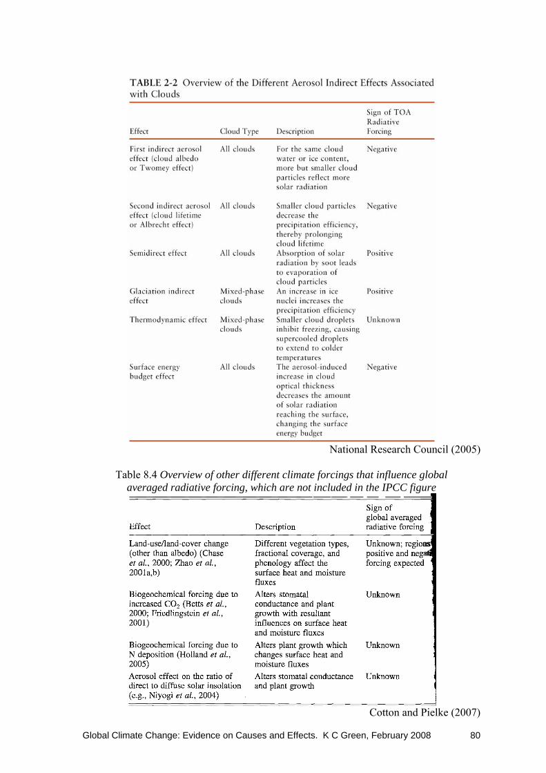
Global Climate Change: Evidence on Causes and Effects. K C Green, February 2008 80
National Research Council (2005)
Table 8.4 Overview of other different climate forcings that influence global
averaged radiative forcing, which are not included in the IPCC figure
Cotton and Pielke (2007)
Global Climate Change: Evidence on Causes and Effects. K C Green, February 2008 81
High clouds: positive feedback or temperature moderating “iris” The theory behind global warming and hence the models that underpin the IPCC reports assume positive temperature feedback from high (cirrus) clouds such that a 1.2°C warming postulated to arise from a doubling of atmospheric CO2 concentrations relative to pre-industrial levels would be amplified into warming of 2.5°C or more. The proposed mechanism is that increases in atmospheric CO2 increase the greenhouse effect thereby warming the Earth which results in increased water vapour in the atmosphere and more precipitation and more cirrus clouds will result. Cirrus clouds, which are composed of tiny ice crystals, reflect infrared radiation (heat) back towards the Earth causing additional warming. Theoretical arguments either way are tenable—for example, warmer temperatures might lead to an increase in low-level cloudiness and thereby to a cooling the Earth. Lindzen et al. (2001) proposed a negative feedback mechanism whereby increasing atmospheric temperatures cause decreases in the prevalence of cirrus clouds thereby allowing more heat to escape the Earth. There are many known and possible feedback mechanisms of uncertain magnitude and even direction and it is not obvious what the net effect might be. What, then, is the empirical evidence? Kärner (2007) analyzed daily near-surface air temperature series from 24 European and Asian stations. The series were for periods ranging between 45 and 250 years. He found negative correlations between consecutive time increments for all series. In other words, warmer-than-average spells tended to be followed by colder-than-average spells, and vice versa. Spencer et al. (2007) examined the strong month-to-month fluctuations in air temperatures that occur in the tropics and found that rainfall increased with temperature as is expected in the theory of global warming. What was not expected was the rapid decrease in the amount of infrared radiation being trapped in the Earth’s atmosphere as the air temperature increased. The researchers traced this phenomenon—a strong negative feedback—to a decrease in cirrus clouds, much as Lindzen et al. (2001) had proposed. Note that a strong negative feedback implies that the 1.2°C warming postulated to arise solely from a doubling of atmospheric CO2 concentrations relative to pre-industrial levels would not be achieved in practice. Spencer observed in an interview on the 9th of August that:
There are significant gaps in the scientific understanding of precipitation systems and their interactions with the climate… At least 80 percent of the Earth’s natural greenhouse effect is due to water vapor and clouds, and those are largely under the control of precipitation systems… Until we understand how precipitation systems change with warming, I don’t believe we can know how much of our current warming is manmade. Without that knowledge, we can’t predict future climate change with any degree of certainty.

Global Climate Change: Evidence on Causes and Effects. K C Green, February 2008 82
8.1 Greenhouse gases
Global CO2 concentrations in the atmosphere are currently estimated to be about 380 ppmv. To put this in context, CO2 composes 0.00038 of the Earth’s atmosphere. The pie graph from Wikipedia, see left, shows a breakdown of dry air gases. CO2 is such a small component of the atmosphere that it does not show up on the larger (whole atmosphere) pie. CO2 is an odourless gas that is harmless to people but beneficial to plants. It should not be confused with particulate emissions (smoke, soot, ash, dust) and toxic substances (such as chemicals containing chlorine, fluorine, nitrogen, sulphur, and metals) that can be bi-products of combustion and can cause health problems if they are allowed to escape into the atmosphere in high concentrations near where people live. CO2 is, in effect, a plant fertilizer: the photosynthesis reaction uses sunlight to turn water and CO2 into glucose and oxygen. (6CO2 + 6H2O → C6H12O6 + 6O2). There is much research that shows the beneficial effects on plant growth of elevated CO2 levels (Robinson et al, 2007). As the three following figures from Robinson et al. (2007) show—depending on the size of the increase in CO2, the plant or tree type, and the conditions—increases in plant growth of nearly 250% are possible with CO2 levels of double the pre-industrial levels. The biggest gains in growth from CO2 are evident when plants are stressed for example by drought. As a consequence, higher CO2 levels encourage plants to grow in areas that would otherwise be too dry. Elevated CO2 levels have increased the growth of forests, crops, and grasslands and are helping to feed the people of the world.
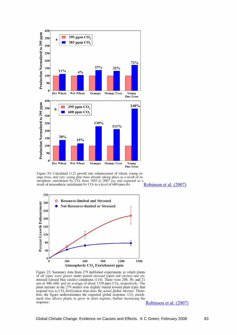
Global Climate Change: Evidence on Causes and Effects. K C Green, February 2008 83
Robinson et al. (2007)
Robinson et al. (2007)

Global Climate Change: Evidence on Causes and Effects. K C Green, February 2008 84
Atmospheric CO2 represents roughly 1.6% of the total carbon in the Earth’s carbon cycle. More than twice as much (4.3%) is bound up in terrestrial plants and soils. The bulk of the carbon in the carbon cycle (83%) is dissolved in the oceans.
BBC News The BBC figure above overemphasises the human contribution to the carbon cycle with its overlarge and prominent factory, buildings, road and fossil fuel emissions arrows, and underemphasises the contribution of soils and organic matter by the positioning of their representation on the figure, and de-emphasises the ocean reservoir by showing only half of the red disc required for proportionality with other reservoirs. Inevitably, the figure is also a simplification of what is known about the enormously complex carbon cycle, and cannot show what is not known. For example, Sample (2007) described in more detail what is known about the processes and explained that a large research programme will be required in order to gain sufficient understanding to make useful estimates of the current state and predictions of what effect any changes will have. Economists are familiar with the problem of estimating and forecasting the difference between large numbers, especially when the data and processes are uncertain. In relation to this problem, Robinson et al. (2007) wrote:
So great are the magnitudes of these reservoirs, the rates of exchange between them, and the uncertainties of these estimated numbers that the sources of the recent rise in atmospheric CO2 have not been determined with certainty. Atmospheric concentrations of CO2 are reported to have varied widely over geological time, with peaks, according to some estimates, some 20-fold higher than at present and lows at approximately 200 ppm.
Other sources of uncertainty are to do with the causes and speed of exchange of CO2 between the reservoirs, in particular, what is the residence time of CO2 in the atmosphere?

Global Climate Change: Evidence on Causes and Effects. K C Green, February 2008 85
Estimates vary, but a figure of less than 10 years for the CO2 “half-time” is typical. The evidence is summarised in Robinson et al. (2007):
Carbon dioxide has a very short residence time in the atmosphere. Beginning with the 7 to 10-year half-time of CO2 in the atmosphere estimated by Revelle and Seuss, there were 36 estimates of the atmospheric CO2 half-time based upon experimental measurements published between 1957 and 1992. These range between 2 and 25 years, with a mean of 7.5, a median of 7.6, and an upper range average of about 10. Of the 36 values, 33 are 10 years or less. Many of these estimates are from the decrease in atmospheric carbon 14 after cessation of atmospheric nuclear weapons testing, which provides a reliable half-time. There is no experimental evidence to support computer model estimates of a CO2 atmospheric “lifetime” of 300 years or more. Human production of 8 Gt C per year of CO2 is negligible as compared with the 40,000 Gt C residing in the oceans and biosphere. At ultimate equilibrium, human-produced CO2 will have an insignificant effect on the amounts in the various reservoirs. The rates of approach to equilibrium are, however, slow enough that human use creates a transient atmospheric increase.
As I outlined in my introduction, the IPCC are committed to the view that human-caused CO2 emissions are and will be responsible for substantial increases in global temperature and the world’s media has given much attention to this view. As far as I am aware, no scientist disputes that there is a greenhouse effect which keeps the Earth warmer than it would otherwise be and that part of this effect is due to the presence of CO2 in the atmosphere. The main contribution to the greenhouse effect is, however, H2O in the form of water vapour. The contribution of water vapour to the greenhouse effect is also is not controversial. What is controversial is the effect of changes in the level of CO2. The IPCC has predicted that a doubling of CO2 from pre-industrial levels of 285ppmv to 570ppmv will cause global temperature to rise by between 2.0°C and 4.5°C. The renowned Cambridge astronomer and physicist Fred Hoyle (1981, p 122), on the other hand, summarised the physics as follows:
“The efficiency of the carbon dioxide trap is insensitive to the amount of carbon dioxide in the atmosphere: increasing the amount five-fold would scarcely change the trap (despite) the stories that are currently being circulated by environmentalists.”
The contribution of CO2 to the greenhouse effect appears to be logarithmic and the vast bulk of any potential contribution already in place (Bellamy and Barrett 2007). Ball20 and Harris (2007) used the analogy of painting a window black in the following description of the relationship between CO2 and global mean temperature:
Even if CO2 concentration doubles or triples, the effect on temperature would be minimal. The relationship between temperature and CO2 is like painting a window black to block sunlight. The first coat blocks most of the light. Second and third coats reduce very little more. Current CO2 levels are like the first coat of black paint. Computer climate models get around this by assuming that a highly questionable hypothesis is correct, namely that small increases in temperature due
20 “Dr. Tim Ball, Chairman of the Natural Resources Stewardship Project, is a renowned environmental consultant and former professor of climatology at the University of Winnipeg…”

Global Climate Change: Evidence on Causes and Effects. K C Green, February 2008 86
to large CO2 rises cause more evaporation and the subsequently higher concentration of water vapor (the major greenhouse gas) in the atmosphere will cause further temperature rise. More likely, the resultant increased cloud cover will drive temperatures down.
Schwartz (2007) used empirical data to estimate the sensitivity of global temperatures to a doubling of CO2 from pre-industrial levels and concluded that it is 1.1 ± 0.5°C. In other words a doubling of CO2 relative to 19th Century levels would, all else being equal, lead to global average temperatures that were 1.1°C higher. Since CO2 levels are currently some 30% higher than pre-industrial level, we have already experienced much of that increase. Schwartz wrote: “The low equilibrium climate sensitivity… is well below current best estimates of this quantity, summarized in the Fourth Assessment Report of the IPCC.” Using “basic theory, modelling results, and observations”, Lindzen (2007) concluded that no more than one-third of warming at the Earth’s surface since 1979 can be attributed to human contributions to atmospheric greenhouse gases. Even if the climate’s sensitivity to anthropogenic greenhouse gases were equal to Lindzen’s upper bound, it would not be a cause for practical concern. Much has been made of the apparent relationship between estimated CO2 levels and estimated temperatures over a half-a-million years or so using evidence from ice cores, most famously in a graph used by Al Gore, and this relationship has been used to support the argument that CO2 causes the Earth to warm. Early ice core data were at roughly 1,000 year intervals. In 2003, finer resolution data, with resolution of several hundred years, became available. The finer data showed that CO2 increases tended to lag temperature increases by many years (Soon 2007). Lags are also evident for CH4. CO2 increases tend also to lag decreases in ice volume. There are also questions about the assumptions behind the construction of long-term atmospheric CO2 concentration series from ice-core samples, and the effect of contamination from the extraction and handling of the cores on the proxy measures (Jaworowski 2007). Soon examined the evidence on (a) the relationship between CO2 and CH4 concentrations in the atmosphere and temperature and ice-sheet volume, (b) atmospheric CO2 as an amplifier of climate change, and (c) the relative effects of changes in atmospheric CO2 concentrations and changes in insolation (sunlight reaching Earth) due to orbital irregularities. He found that the evidence failed to support a major role for CO2 and CH4 in climate changes. Changes in insolation over sensitive areas were sufficient to explain climate changes over the last 650,000 years. It may be that CO2 and CH4 are released from the oceans, where the gases previously had been absorbed, as the oceans are slowly warmed by higher temperatures (see the next two figures) and from melting ice, where they had been trapped in air bubbles. The gases are less soluble the warmer the seawater becomes. Endersbee (2007) pondered the implications of the relationship for carbon trading schemes:
The fact that natural variations in the levels of carbon dioxide and methane in the atmosphere result from changes of ocean surface temperatures raises interesting questions for those people who have been persuaded to invest in carbon trading.
Global Climate Change: Evidence on Causes and Effects. K C Green, February 2008 87
Do they get their money back if atmospheric carbon dioxide levels should fall because of lower ocean temperatures? (p.16)
Endersbee (2007)
Endersbee (2007)
The following graphs over different time-scales fail to support claims that variations in CO2 drive global temperatures and are consistent with the scientific understanding of Hoyle, Bellamy, and others. Also worth noting is that CO2 levels were estimated to be more than 10 times higher than they are now for much of geological time. Bellamy and

Global Climate Change: Evidence on Causes and Effects. K C Green, February 2008 88
Barrett (2007) calculated that we would need to burn all the Earth’s known oil and gas reserves plus mountains of coals in order to reach the 570 ppmv doubling of preindustrial levels of CO2 in the atmosphere that concerns the IPCC authors. That wouldn’t even get the concentration of CO2 to the first tick mark in the graph of climate over geological time, and it is not dramatically higher than the levels measured in the 1800s in the “chemical methods” graph below. Not shown on the graphs is the fact that as CO2 levels were increasing steeply after WWII, global temperatures were falling through to the late-1970s. This situation famously led climate scientists at the time to warn that a new ice-age was imminent (Gwynne 1975).
Archibald (2007)
The grey-shaded figure shows probably the longest direct measurement series of CO2 concentrations in the atmosphere from Beck’s (2007) data. The data show 5-year averaged CO2 concentrations peaking at around 440 ppm shortly after 1820 and again shortly after 1940, well above current levels of around 370 ppm. Beck’s data are more consistent with the hypothesis that CO2 concentrations follow, rather than lead, global temperature changes (See the Robinson et al. (2007) temperature graph in section 1.2 for comparison).
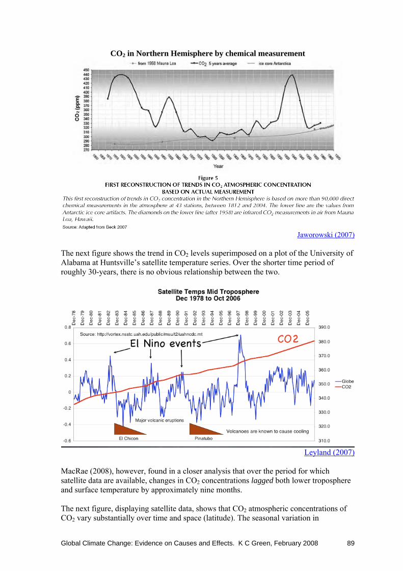
Global Climate Change: Evidence on Causes and Effects. K C Green, February 2008 89
CO2 in Northern Hemisphere by chemical measurement
Jaworowski (2007)
The next figure shows the trend in CO2 levels superimposed on a plot of the University of Alabama at Huntsville’s satellite temperature series. Over the shorter time period of roughly 30-years, there is no obvious relationship between the two.
Leyland (2007)
MacRae (2008), however, found in a closer analysis that over the period for which satellite data are available, changes in CO2 concentrations lagged both lower troposphere and surface temperature by approximately nine months. The next figure, displaying satellite data, shows that CO2 atmospheric concentrations of CO2 vary substantially over time and space (latitude). The seasonal variation in

Global Climate Change: Evidence on Causes and Effects. K C Green, February 2008 90
concentrations suggests that CO2 is absorbed to a greater extent by, inter alia, growing living things and the formation of humus during the warmer part of the year.
There is emerging evidence of enormous contributions to atmospheric CO2 from natural sources such as Indonesia’s peat-lands and Britain’s bogs, and the ability of plankton to take up enormous quantities of dissolved CO2 (as much as 39% more than they currently do) and deposit it on the ocean floor (ABC 2007). The former (Indonesian peat-lands) have been estimated to emit two billion tonnes each year: more than annual human-originated emissions of Germany or Japan. Findings such as these make it even more difficult to assess how much humans actually contribute—after the effects of plant respiration, ocean uptake and release, bog emissions, plankton deposits, and perhaps others—to the level of CO2 in the atmosphere. The historical and geological period data shown in the graphs above confirm that changes in CO2 levels that result from non-human processes dwarf potential human contributions The figures on the next page provides evidence, respectively, that atmospheric CO2 levels follow rather than lead increases in temperature, and that atmospheric methane concentrations have more-or-less levelled off over recent years.

Global Climate Change: Evidence on Causes and Effects. K C Green, February 2008 91
From Robinson et al. (2007)
From Robinson et al. (2007) Finally, the theory that increasing atmospheric concentrations of greenhouse gases are causing global warming dictates that the hot spots in the Earth’s atmosphere will appear in the tropical latitudes at an altitude of around 10,000 m. The posited hot spot pattern is sometimes referred to as the “signature” of manmade global warming and this signature appears in the outputs of the climate models behind the IPCC temperature forecasts. Measurements taken using weather balloons and, more recently, satellite show no such pattern. In the figure below, the trend (in surface minus lower troposphere temperatures) dictated by the theory and expressed as the output of computer models is represented by
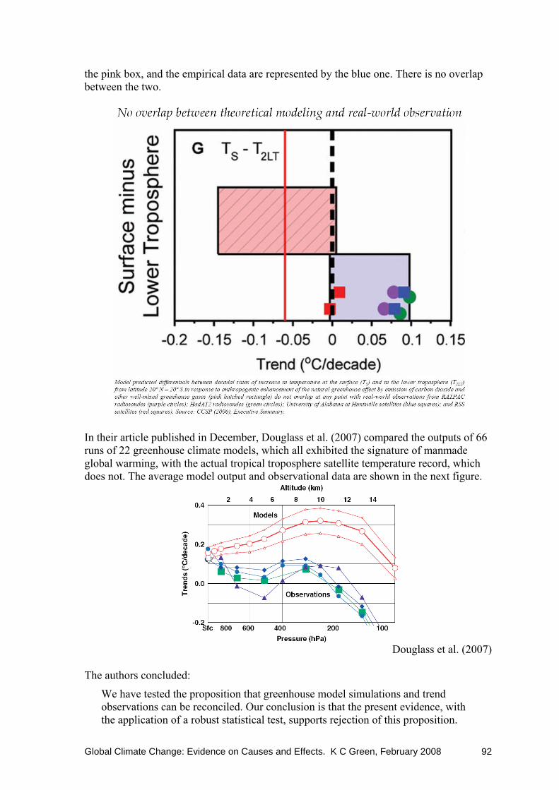
Global Climate Change: Evidence on Causes and Effects. K C Green, February 2008 92
the pink box, and the empirical data are represented by the blue one. There is no overlap between the two.
In their article published in December, Douglass et al. (2007) compared the outputs of 66 runs of 22 greenhouse climate models, which all exhibited the signature of manmade global warming, with the actual tropical troposphere satellite temperature record, which does not. The average model output and observational data are shown in the next figure.
Douglass et al. (2007)
The authors concluded:
We have tested the proposition that greenhouse model simulations and trend observations can be reconciled. Our conclusion is that the present evidence, with the application of a robust statistical test, supports rejection of this proposition.

Global Climate Change: Evidence on Causes and Effects. K C Green, February 2008 93
Douglass et al.’s finding that the GCM models are not predictive is not surprising. Decades of scientific research on forecasting has established that in situations that are complex and uncertain, as is the case with climate, forecasting models should be simple and conservative. GCM models are neither of these things and are in effect the unaided judgments of modellers transformed into complex maths (Green and Armstrong 2007). Given that the current state of knowledge about climate is modest at best, models that assume the next 100 years will be like the past will be hard to beat. In a speech on 22 January at Dartmouth College, Stanford professor of biological sciences Stephen Schneider conceded that a mechanism for manmade global warming has so far not been clearly identified (Davis 2008). Indeed, the atmospheric concentration of CO2 tends to follow changes in temperature; the concentration has been higher than now during cooler times in history and has been much higher in the geologic past. Human emissions are dwarfed by emissions and absorptions from natural processes. The “greenhouse effect” is a real phenomenon, but there are theoretical and empirical reasons to believe that current concentrations of CO2 are well above the level where most of the portion of the infrared spectrum that could be trapped by CO2 is already being trapped. Dangerous anthropogenic global warming is a theory that does not fit well with the evidence, as 1970s fears of a new ice age after three decades of declining temperatures and increasing CO2 concentrations suggests. There is a much simpler theory that is more consistent with the evidence: observed climate changes are a result of natural variations. One source of natural variation is changes in the quantum of energy reaching the earth from the Sun, and this variable correlates quite well with global temperature (see below). It is not good science to reject a simple theory that fits the evidence in favour of a complex one which does not. 8.2 The Sun The Sun is the main and obvious source of the Earth’s warmth. Variations in amount and intensity of radiation that reach the Earth from the Sun change global temperature. And local temperatures too for that matter as people who winter over in Antarctica must notice. The astronomer William Herschel noted in 1801 a correlation between sunspot activity and grain prices: the more active the sun, the lower were the grain prices. Herschel’s findings on this matter were not accepted at the time but recent research has supported his conclusion (Ball 2003).

Global Climate Change: Evidence on Causes and Effects. K C Green, February 2008 94
Heat from the Sun varies with the Earth-Sun distance and orientation (see next figure), and with the level of activity of the Sun. These statements are not controversial. In addition, the Earth is subject to radiation from the galaxy and the Cosmos beyond, and the position of our solar system within the Milky Way galaxy influence our climate. The Solar System is currently travelling through virtually empty space between spiral arms of the Galaxy, and this is associated with a climate that is benign compared to that which prevailed as the solar system travelled through clouds of dust and gas during the long ice ages of the Earth’s past (Endersbee 2007). Important components of earth sun geometry. Important orbital parameters: (a) eccentricity of orbit, (b) axial tilt, and (c) precession of the equinoxes. (Griffiths and Driscoll 1982)
Advocates of an important role for CO2 changes in changes in global temperature, such as the IPCC, maintain that changes in heat from the Sun do not explain enough of temperature changes on Earth. Researchers including Svensmark (2007), however, have demonstrated the plausibility of a positive feedback mechanism whereby increases in solar radiation diminish cosmic rays reaching the Earth’s atmosphere. Cosmic rays provide material for seeding clouds—water condenses around the tiny particles—and so fewer clouds are formed. With fewer clouds, the Earth’s albedo (reflectiveness) is diminished and more of the increased radiation from the Sun reaches the Earth. The following graphs illustrate the relationships.

Global Climate Change: Evidence on Causes and Effects. K C Green, February 2008 95
Svensmark and Friis-Christensen (2007b)
Svensmark and Friis-Christensen (2007b)

Global Climate Change: Evidence on Causes and Effects. K C Green, February 2008 96
8.3 Summary of evidence on causes of global temperature changes The current state of knowledge on the causes of long term global temperature changes was summarised recently by Soon (2007). Soon reviewed the evidence, citing 140 articles from the peer-reviewed literature, and came to the following conclusions:
There is no quantitative evidence that varying levels of minor greenhouse gases like CO2 and CH4 have accounted for even as much as half of the reconstructed glacial-interglacial temperature changes or, more importantly, for the large variations in global ice volume on both land and sea over the past 650 thousand years. …changes in solar insolation at climatically sensitive latitudes and zones exceed the global radiative forcings of CO2 and CH4 by several-fold, and … regional responses to solar insolation forcing will decide the primary climatic feedbacks and changes…
Persistent orbitally-moderated insolation forcing is, therefore, likely to be the principal driver of water vapor cycling, and the cloud-and-ice insulator and albedo feedbacks… A host of other forcings and feedbacks, including dust and aerosol forcings, oceanic circulation, and vegetation cover feedbacks have not been soundly quantified…
[I conclude that] long-term climate change is driven by solar insolation changes, from both orbital variations and intrinsic solar magnetic and luminosity variations.
8.4 Consensus on manmade global warming and other matters of public and scientific interest—another diversion Claims have been made that there is a consensus of scientific opinion that the people of the Earth are in great danger from manmade global warming on the basis in part at least of the IPCC Working Group One report on the science of climate change. In practice, Ball (2007) reported, while 308 reviewers made some comment on the report’s “Second Order Revision”, only 32 commented on more than three chapters, and only five made comment on all of the 11 chapters. Many comments were rejected by the editors. In terms of relevance to this report, and probably in general, the most critical statement in the WG1 report was “Greenhouse gas forcing has very likely caused most of the observed global warming over the last 50 years”. Ball reported that 62 scientists reviewed the chapter (9) in which the statement appeared and nearly 60% of their comments were rejected. Further, only seven of the expert reviewers did not have any “serious vested interest”, two of those were in complete disagreement with the statement, and one made only a single comment on the report. Ball suggested that the four “independent” reviewers who made substantive comment and appeared to agree with the conclusions had vested interests in the conclusions. While none of this would be very unusual for a peer-reviewed journal article, it seems clear that the review process for the crucial chapter of the IPCC report on the scientific evidence on climate change cannot legitimately be described as a consensus of opinion that “greenhouse gas forcing” is the major influence global climate change. Even if there were a consensus, a consensus is not a substitute for evidence. There are plenty of examples of nominal or effective scientific consensuses that have been wrong and that have led to policies detrimental to mankind. Four such consensuses concerned

Global Climate Change: Evidence on Causes and Effects. K C Green, February 2008 97
DDT, chlorofluorocarbons and the ozone layer, the effect of exposure to low levels of radiation, the effect of large doses of vitamin C, and the treatment of head injuries with anti-inflammatory drugs.

Global Climate Change: Evidence on Causes and Effects. K C Green, February 2008 98
References Ababneh L. N. (2006). Analysis of radial growth patterns of strip-bark and whole-bark
bristlecone pine trees in the white mountains of California: Implication in paleoclimatology and archaeology of the great basin. PhD dissertation, Department of Geosciences, The University of Arizona. Retrieved from http://www.geo.arizona.edu/Antevs/Theses/AbabnehDissertation.pdf.
Archibald, D. (2007). The past and future climate. A presentation to the Lavoisier Group’s 2007 Workshop ‘Rehabilitating Carbon Dioxide’ held in Melbourne on 29-30 June.
ABC (2007). Oceans could absorb far more CO2: study. Australian Broadcasting Corporation. Retrieved from http://www.abc.net.au/news/stories/2007/11/12/2087741.htm
Ball, P. (2003). Sun set food prices in the Middle Ages. Nature, 22 December.
Ball, T. & Harris, T. (2007). Canada’s carbon dioxide ‘comedy of errors’ a total capitulation to climate change dogma. Canadian Free Press. June 6. Available at: http://www.canadafreepress.com/2007/global-warming060607.htm
Balling, R. C., Jr. (2005). Observational surface temperature records versus model predictions, in Michaels, P. J. (ed.) Shattered consensus: the true state of global warming, 50-71.
BBC News (2007). The Carbon Cycle. Retrieved from http://news.bbc.co.uk/2/shared/spl/hi/sci_nat/04/climate_change/html/carbon.stm
Beck, E.-G. ( (2007). 180 Years of CO2 gas analysis by chemical methods. Energy and Environment, 18 (2), 259-282.
Bellamy, D. and Barrett, J. (2007). Climate stability: an inconvenient proof. Proceedings of the Institution of Civil Engineers – Civil Engineering, 160, 66-72. doi: 10.1680/cien.2007.160.2.66
Binningsbø, H. M., de Soysa, I., Gleditsch, N. P. (2007). Green giant, or straw man: environmental pressure and civil conflict, 1961-99. Population and Environment, 28(6), 337-353.
Burroughs, W. J. (2001). Climate change: a multidisciplinary approach. Cambridge University Press: Cambridge: U.K.
CCSP (2006). Climate Change Science Program Synthesis and Assessment Product 1.1, Temperature Trends in the Lower Atmosphere: Steps for Understanding and Reconciling Differences.
Cerveny, R. S., Lawrimore, J., Edwards, R., and Landsea, C. (2007). Extreme weather records. Bulletin of the American Meteorological Society, 88 (6), 853-860. doi:10.1175/bams-88-6-853
Cerveny, R. S. (2005). Severe weather, natural disasters, and global change. In Michaels, P. J. (ed.), Shattered consensus: The true state of global warming. Rowman & Littlefield: Lanham, MD.
Chase, T. N., Wolter, K. Pielke Sr., R. A. and Rasool, I. (2006). Was the 2003 European summer heat wave unusual in a global context? Geophysical Research Letters, 33, L23709, doi:10.1029/2006GL027470.

Global Climate Change: Evidence on Causes and Effects. K C Green, February 2008 99
Christy, J. (2005). Temperature changes in the bulk atmosphere: beyond the IPCC, in Michaels, P. J. (ed.) Shattered consensus: the true state of global warming, 72-105.
Christy, J.R., Norris, W.B., Spencer, R.W. and Hnilo, J.J. (2007). Troposheric temperature change since 1979 from tropical radiosonde and satellite measurements. Journal of Geophysical Research, 112, D06102, doi:10.1029/2005JD006881.
Cotton, W. R., and Pielke, R.A. Sr. (2007). Human impacts on weather and climate (2nd ed.). Cambridge University Press: Cambridge, U.K.
Cronin et al. (2000). Climate variability in the eastern United States over the past millennium from Chesapeake Bay sediments. Geology, (28), 3-6.
CSCCC (2007). Civil Society Report on Climate Change. International Policy Press: London.
D’Aleo (2007) on the Central Park temperatures at http://icecap.us/index.php/go/joes-blog/central_park_temperature_comparisons_before_and_after_hcn_adjustment/
Davis, M. (2008). Stanford professor discusses effects of global warming. TheDartmouth.com News, January 23. Retrieved from http://thedartmouth.com/2008/01/23/news/globalwarming/print/
Davis R. E. (2005). Climate change and human health, in Shattered consensus: The True State of Global Warming, in Michaels, P. J. (ed.). Rowman & Littlefield: Oxford, U.K.
Davis, R.E., et al., (2003). Changing heat-related mortality in the United States. Environmental Health Perspectives, 111, 1712-1718.
Donnelly, J. P. and Woodruff, J. D. (2007). Intense hurricane activity over the past 5,000 years controlled by El Niño and the West African monsoon. Nature, 447, 465-468. doi:10.1038/nature05834
Douglass, D.H., Christy, J.R., Pearson, B.D., and Singer, S.F. (2007). A comparison of tropical temperature trends with model predictions. International Journal of Climatology, December 5, doi: 10.1002/joc.
Endersbee, L. (2007). Climate change is nothing new! New Concepts in Global Tectonics Newsletter, 42, March, 3-17. Retrieved from http://icecap.us/images/uploads/EndersbeeReprint.pdf
Esper, J., Frank, D., Büntgen, U., Verstege, A., Luterbacher, J., Xoplaki, E. (2007). Long-term drought severity variations in Morocco. Long-term drought severity variations in Morocco, 34, L17702. doi:10.1029/2007GL030844.
Fagan, B. (2004). The long summer: how climate changed civilization. Basic Books: New York.
Fagan, B. (2000). The little ice age: how climate made history 1300 – 1850. Basic Books: New York.
Fagan, B. (1999). Floods, famines, and emperors: El Niño and the fate of civilizations. Basic Books: New York.
Ferguson, R. (2007). Hurricane threat to Florida: climate change or demographics? Science and Public Policy Institute: Haymarket, VA. Retrieved from http://scienceandpublicpolicy.org/images/stories/papers/originals/hurricanethreat/hurricanethreat.pdf

Global Climate Change: Evidence on Causes and Effects. K C Green, February 2008 100
Fischer, E. M., Seneviratne, S. I., Lüthi, D. and Schär, C. (2007). Contribution of land-atmosphere coupling to recent European summer heat waves. Geophysical Research Letters, 34, L06707, doi:10.1029/2006GL029068.
Frere, S. (1999). Britannia: A history of Roman Britain. Folio Society: London.
Gray, V. (2008). The flat earth society. NC Climate and Enviro Truth, 162, 11 January. Retrieved from http://nzclimatescience.net/images/PDFs/evt162.pdf
Graybill, D. A., and Idso, S. B. (1993). Detecting the aerial fertilization effect of atmospheric CO2 enrichment in tree-ring chronologies. Global Biochemical Cycles, 7, 81-95.
Green, K. C., and Armstrong, J. S. (2007). Global warming: Forecasts by scientists versus scientific forecasts. Energy and Environment, 18, 997-1021.
Griffiths, J.F., and Driscoll, D.M. (1982) Survey of climatology. Charles E. Merrill Publishing Co.: Columbus, Ohio.
Gwynne, P. (1975). The cooling world. Newsweek, 28 April, 64.
Hall, B.L., Hoelzel, A.R., Baroni, C., Denton, G.H., Le Boeuf, B.J., Overturf, B. and Töpf, A.L. (2006). Holocene elephant seal distribution implies warmer-than-present climate in the Ross Sea. Proceedings of the National Academy of Sciences, 103, 10213-10217.
Highfield, R. (2008). Global warming impact may be overstated. Telegraph, 10 January. Retrieved from http://www.telegraph.co.uk/earth/main.jhtml?view=DETAILS&grid=A1YourView&xml=/earth/2008/01/10/sciglacier110.xml
Hong, Y. T. et al. (2000). Response of climate to solar forcing recorded in a 6000-year δ18O time-series of Chinese peat cellulose. The Holocene, 10, 1-7.
Hoyle, F. (1981). Ice. Hutchinson: London.
Hughes, W. S. (1991). The Australian Record on Global Warming. Tasman Institute.
IPCC (2001) Climate Change 2001: The Scientific Basis. Contribution of Working Group I to the Third Assessment Report of the Intergovernmental Panel on Climate Change [Houghton, J.T.,Y. Ding, D.J. Griggs, M. Noguer, P.J. van der Linden, X. Dai, K. Maskell, and C.A. Johnson (eds.)]. Cambridge University Press, Cambridge, United Kingdom and New York, NY, USA.
IPCC (2007) Summary for Policymakers. In: Climate Change 2007: The Physical Science Basis. Contribution of Working Group I to the Fourth Assessment Report of the Intergovernmental Panel on Climate Change [Solomon, S., D. Qin, M. Manning, Z. Chen, M. Marquis, K.B. Averyt, M.Tignor and H.L. Miller (eds.)]. Cambridge University Press, Cambridge, United Kingdom and New York, NY, USA.
Jaworowski, Z. (2007). CO2: The greatest scientific scandal of our time. 21st Century Science and Technology, Spring/Summer, 14-28.
Jevrejeva, S., Grinsted, A. Moore, J. C. and Holgate, S. (2006). Nonlinear trends and multiyear cycles in sea level records. Journal of Geophysical Research, 111, C09012, doi:10.1029/2005JC003229.
Johannessen, O. M., Khvorostovsky, K. S., Miles, M. W. and Bobylev, L. P. (2005). Recent ice-sheet growth in the interior of Greenland. Science, 310, 11 November, 1013-1016, doi:10.1126/science.1115356.

Global Climate Change: Evidence on Causes and Effects. K C Green, February 2008 101
Kärner, O. (2007). Temporal variability in local air temperature series shows negative feedback. Energy & Environment, 18, 1059-1072.
Keatinge, W. R., Donaldson, G. C., Cordioli, E., Martinelli, M., Kunst, A. E., Mackenbach, J. P., Nayha, S., and Vuori, I. (2000). Heat related mortality in warm and cold regions of Europe: observational study. BMJ, 321, 670-673.
Keenan D. J. (2007). Wei-Chyung Wang fabricated some scientific claims. The Limehouse Cut, London. Retrieved from http://www.informath.org/WCWF07a.pdf
Khaliq, M.N., Gachon, P., St-Hilaire, A., Ouarda, T.B.M.J. and Bobeé, B. (2007). Southern Quebec (Canada) summer-season heat spells over the 1941–2000 period: an assessment of observed changes. Theoretical and Applied Climatology, 88, 83–101.
Khandekar, M. L. (2006). India’s economic progress in a changing climate: benefits of global warming. Energy and Environment, 17, 777-784.
Kiehl, J. T. and Trenberth, K. E. (1997). Earth’s Annual Global Mean Energy Budget. Bulletin of the American Meteorological Association 78: 197-208.
Laaidi, M., Laaidi, K. and Besancenot, J.-P. (2006). Temperature-related mortality in France, a comparison between regions with different climates from the perspective of global warming. International Journal of Biometeorology, 51, 145-153.
Landsea, C. W. (2007). Counting Atlantic tropical cyclones back to 1900. EOS, Transactions, American Geophysical Union, 88(18), 197-208.
Le Treut, H., R. Somerville, U. Cubasch, Y. Ding, C. Mauritzen, A. Mokssit, T. Peterson and M. Prather, 2007: Historical Overview of Climate Change. In: Climate Change 2007: The Physical Science Basis. Contribution of Working Group I to the Fourth Assessment Report of the Intergovernmental Panel on Climate Change [Solomon, S., D. Qin, M. Manning, Z. Chen, M. Marquis, K.B. Averyt, M. Tignor and H.L. Miller (eds.)]. Cambridge University Press, Cambridge, United Kingdom and New York, NY, USA.
Legates, D. R. (2005). Precipitation and the “enhanced” hydrologic cycle. In Michaels, P. J. (ed.), Shattered consensus: The true state of global warming. Rowman & Littlefield: Lanham, MD.
Legates, D. R. (2004). Precipitation and the “enhanced” hydrological cycle. Marshall Policy Outlook. April.
Leyland, B. (2007). Manmade global warming: science or snake oil? Overheads for talk. Retrieved from http://homepage.mac.com/bryanleyland/.Public/Climate%20Stuff/StAndrewsPresentation.pdf
Lindzen, R. S. (2007). Taking greenhouse warming seriously. Energy & Environment, 18, 937-950.
Lindzen, R. S., Chou, M.-D., and Hou, A. Y. (2001). Does the Earth have an adaptive infrared iris? Bulletin of the American Meteorological Society, 82, 417-432.
Loehle, C. (2007). A 2000-year global temperature reconstruction based on non-treering proxies. Energy & Environment, 18, 1049-1058.
Lyons, R. (2007). Lack of development: that’s the real disaster. Spiked. 28 November. Retrived from http://www.spiked-online.com/index.php?/site/article/4121/

Global Climate Change: Evidence on Causes and Effects. K C Green, February 2008 102
MacRae, A. M. R. (2008). Carbon dioxide is not the primary cause of global warming: the future cannot cause the past. Icecap. Retrieved from http://icecap.us/images/uploads/CO2vsTMacRae.pdf; data available at http://icecap.us/images/uploads/CO2vsTMacRae.xls
Mann, M. E., Bradley, R. S., and Hughes, M. K. (1999). Northern hemisphere temperatures during the past millennium: inferences, uncertainties and limitations. Geophysical Research Letters, 26, 759-762.
Marchese, J. (2007). Al Gore is a greenhouse gasbag. Philadelphia Magazine. Retrieved from http://www.phillymag.com/home/articles/science_al_gore_is_a_greenhouse_gasbag/page1
McKitrick, R. (2005). What is the ‘hockey stick’ debate about? APEC Study Group. Retrieved from http://www.uoguelph.ca/~rmckitri/research/APEC-hockey.pdf
Marra, M. J. (2003). Last interglacial beetle fauna from New Zealand. Quaternary Research, 59, 122–131.
McGurk, P. (2007). Expanding on the work of Bruce Hall “Hall of Fame” blog. Icecap. Retrieved from http://icecap.us/images/uploads/Expanding_on_the_work_of_Gary_Hall.pdf
Mills, C. A. (1930). The Influence of Climate on Human Organism as Evidenced by the Death Rate from Certain Diseases, and by Conception Rate. The Ohio Journal of Science, 30 (4), 256-260.
Mitchell, W. (2007). Monthly data report September 2007. South Pacific Sea Level and Climate Monitoring Project, No. 147.
Naurzbaev, M. M. and Vaganov E. A. (2000). Variation of early summer and annual temperature in east Taymir and Putoran (Siberia) over the last two millennia inferred from tree rings. Journal of Geophysical Research, 105, 7317-7326.
Ollier, C. (2007a). Glaciers and ice-sheets: modern problems and tectonic associations. New Concepts in Global Tectonics, 42, 38-40.
Ollier, C. (2007b). The Greenland-Antarctica melting problem does not exist. The Lavoisier Group. Retrieved from http://www.lavoisier.com.au/papers/articles/ollierglaciersnov2007.pdf
Patterson, R. T. (2007). Read the sunspots. Financial Post. June 20. Retrieved from http://www.canada.com/nationalpost/financialpost/comm...tory.html?id=597d0677-2a05-47b4-b34f-b84068db11f4&p=4
Pichler, P., and Oberhuber, W. (2007). Radial growth response of coniferous forest trees in an inner Alpine environment to heat-wave in 2003. Forest Ecology and Management, 242, 688-699.
Pielke, R. A. Jr., Gratz, J., Landsea, C. W., Collins, D., Saunders, M. A. and Musulin, R. (2008). Normalized Hurricane Damages in the United States: 1900-2005. Natural Hazards Review, 9, 29-42.
Quirk, T. (2007). Everyone is entitled to their own opinion but not their own facts. The Lavoisier Group. Retrieved from http://www.lavoisier.com.au/papers/Conf2007/Quirk2007.pdf
Ren, F. et al. (2006). Changes in tropical cyclone precipitation over China. Geophysical Research Letters, 33, L20702, doi:10.1029/2006GL027951.

Global Climate Change: Evidence on Causes and Effects. K C Green, February 2008 103
Raina, V.K. and Sangewar, C. (2007). Siachen glacier of Karakoram Mountains, Ladakh – its secular retreat. Journal of the Geological Society of India, 70, 11-16.
Ramanathan, V. Ramana, M. V., Roberts, G., Dohyeong, K., Corrigan, C. Chung, C., and Winker, D. (2007). Warming trends in Asia amplified by brown cloud solar absorption. Nature, 448, 575-578. doi:10.1038/nature06019
Robinson, A. B., Robinson, N. E., and Soon, W. (2007). Environmental effects of increased atmospheric carbon dioxide, Journal of American Physicians and Surgeons, 12, 79-90.
Rozell, N. (2007). Icy Bay glaciers get up and go. SitNews, June 27.
Russell, J. C. (1972). Population in Europe, in Cipolla (ed.), The Fontana Economic History of Europe, Vol. I: The Middle Ages. Collins/Fontana: Glasgow, 25-71.
Sample, S. (2007). The ocean and the carbon cycle. NASA Oceanography. Retrieved from http://science.hq.nasa.gov/oceans/system/carbon.html
Schwartz, S. E. (2007). Heat capacity, time constant, and sensitivity of Earth’s climate system. Journal of Geophysical Research, D24S05. doi:10.1029/2007JD008746.
Simonian, H. (2007). Heavy snowfalls lift Alpine spirits. Financial Times, published online on 23 November.
Singer, S.F. and Avery, D.T. (2007). Unstoppable global warming: every 1,500 years. Rowman & Littlefield: Lanham, MD.
Soon, W. (2007). Implications of the secondary role of carbon dioxide and methane forcing in climate change: Past, present, and future. Physical Geography, 28(2), 97-125.
Soon, W., Baliunas, S., Idso, C., Idso, S., Legates, D. R. (2003). Reconstructing climate and environmental changes of the past 1000 years: a reappraisal. Energy & Environment, 14, 233-296.
Spencer, R.W., Braswell, W.D., Christy, J.R., Hnilo, J. (2007). Cloud and radiation budget changes associated with tropical intraseasonal oscillations. Geophysical Research Letters, 34, L15707, doi:10.1029/2007/GL029698.
Svensmark, H. (2007). Cosmoclimatology: a new theory emerges. Astronomy and Geophysics, 48, 1.18-1.24.
Svensmark, H., and Friis-Christensen, E. (2007). Reply to Lockwood and Frölich – The persistent role of the Sun in climate forcing. Danish National Space Center, Scientific Report 3/2007.
U.S. Census Bureau (2007). Historical estimates of world population. Available from http://www.census.gov/ipc/www/worldhis.html
National Research Council (2005). Radiative forcing of climate change: expanding the concept and addressing uncertainties. The National Academies Press: Washington, D.C.
Veizer, J., Ala, D., Azmy, K., Bruckschen, P., Buhl, D., Bruhn, F., Carden, G.A.F., Diener, A., Ebneth, S., Godderis, Y., Jasper, T., Korte, C., Pawellek, F., Podlaha, O. and Strauss, H. (1999). 87Sr/86Sr, δ13C and δ18O evolution of Phanerozoic seawater. Chemical Geology, 161, 59-88.
Vermette, S. (2007). Storms of tropical origin: a climatology for New York State, USA (1851–2005). Natural Hazards, 42, 91–103.

Global Climate Change: Evidence on Causes and Effects. K C Green, February 2008 104
Woodhouse, C. A. and Overpeck, J. T. (1998). 2000 years of drought variability in the central United States. Bulletin of the American Meteorological Society, 79, 2693-2714.
Zwally, H.J., Giovinetto, M.B., Li, J., Cornejo, H.G., Beckley, M.A., Brenner, A.C., Saba, J.L., Yi, D. (2005). Mass changes of the Greenland and Antarctic ice sheets and shelves and contributions to sea level rise: 1992-2002. Journal of Glaciology, 51 (175), 509-527.