Gaining Attention and Encouraging a Response: My Criteria ...
50
East Tennessee State University Digital Commons @ East Tennessee State University Electronic eses and Dissertations Student Works 12-2007 Gaining Aention and Encouraging a Response: My Criteria for Successful Graphic Design. Kerry Sco Jenkins East Tennessee State University Follow this and additional works at: hps://dc.etsu.edu/etd Part of the Graphic Design Commons is esis - Open Access is brought to you for free and open access by the Student Works at Digital Commons @ East Tennessee State University. It has been accepted for inclusion in Electronic eses and Dissertations by an authorized administrator of Digital Commons @ East Tennessee State University. For more information, please contact [email protected]. Recommended Citation Jenkins, Kerry Sco, "Gaining Aention and Encouraging a Response: My Criteria for Successful Graphic Design." (2007). Electronic eses and Dissertations. Paper 2068. hps://dc.etsu.edu/etd/2068
Transcript of Gaining Attention and Encouraging a Response: My Criteria ...

East Tennessee State UniversityDigital Commons @ East
Tennessee State University
Electronic Theses and Dissertations Student Works
12-2007
Gaining Attention and Encouraging a Response:My Criteria for Successful Graphic Design.Kerry Scott JenkinsEast Tennessee State University
Follow this and additional works at: https://dc.etsu.edu/etd
Part of the Graphic Design Commons
This Thesis - Open Access is brought to you for free and open access by the Student Works at Digital Commons @ East Tennessee State University. Ithas been accepted for inclusion in Electronic Theses and Dissertations by an authorized administrator of Digital Commons @ East Tennessee StateUniversity. For more information, please contact [email protected].
Recommended CitationJenkins, Kerry Scott, "Gaining Attention and Encouraging a Response: My Criteria for Successful Graphic Design." (2007). ElectronicTheses and Dissertations. Paper 2068. https://dc.etsu.edu/etd/2068

A thesis presented to the faculty of the Department of Art & Design East Tennessee State University
In partial fulfillment of the requirements for the degree Master of Fine Arts in Graphic Design
by Kerry Scott Jenkins December 2006
M. Wayne Dyer, Chair David B. Dixon
Catherine A. Murray
Keywords: Graphic Design, Typography, Publication Design, Illustration
Gaining Attention and Encouraging a Response:My Criteria for Successful Graphic Design
2
by Kerry Scott Jenkins
Abstract
Gaining Attention and Encouraging a Response:My Criteria for Successful Graphic Design
As a graphic designer, my goal is to clearly express my clients’ message to their intended audience. Based on the diversity of my clients and their products and services, finding a consistent style in my projects might be difficult, although there are usually some typical traits. With examples of my work and dialogue from leaders in the graphic design industry, I intend to point out a common thread that runs through all successful design projects, regardless of the projects’ designer, era, or individual design elements (e.g., typography, copywriting, color, layout, imagery). Success comes from graphic design’s ability to gain attention and encourage a response.

�
Copyright 2006 by Kerry Scott Jenkins All Rights Reserved

�
Abstract ............................................................................................2List of Figures .................................................................................5Chapter 1. Background .............................................................6 2. U&lc. .........................................................................10 �. History of Design .................................................1� �. TypeCon ..................................................................19 Matthew Carter ............................................. 20 James Craig ..................................................... 21 Kit Hinrichs ......................................................22 5. Designer Questions ............................................2� What are the key elements necessary in both creating and evaluating graphic design? .............................................2� Kit Hinrichs ...............................................25 James Craig ..............................................26 Matthew Carter ......................................26 Have the key elements of design changed over history, or has it just been changes within technology? ..........27
Contents
Matthew Carter ..................................... 29 Kit Hinrichs .............................................. �0 James Craig ............................................. �0 Is successful graphic design based on objective decisions, or is design purely subjective? ......................................... �1 Kit Hinrichs .............................................. �� Matthew Carter ..................................... �� James Craig ............................................. �� Does the creation and evaluation of graphic design require professional experience, higher education, or both? ............................................................�6 Matthew Carter ..................................... �8 James Craig ............................................. �8 Kit Hinrichs .............................................. �8 6. The End Result ......................................................�9
Designer Notes ............................................................................ �1Works Cited ...................................................................................�5Vita .................................................................................................. �6

5
15. Blue Ridge font .................................................................2�
16. BRP book cover .................................................................2�
17. Graphic design seal .........................................................25
18. Morris .................................................................................. 28
19. Rand .................................................................................... 28
20. Jenkins ................................................................................ 28
21. Identity designs ............................................................... 29
22. Identity designs 2 ........................................................... �0
2�. Phil Bachman ad ...............................................................�2
2�. Herald & Tribune redesign ..............................................��
25. Chicken ................................................................................�5
26. FedEx and diploma .........................................................�7
27. “Duck and cover” ............................................................ �0
1. “Duck and cover” ...............................................................6
2. Cultural Arts Department Award..................................8
�. Holton trumpet ..................................................................9
�. U&lc. page ...........................................................................10
5. U&lc. nameplate ............................................................... 11
6. Crown edge and dime ...................................................12
7. William Addison Dwiggins............................................1�
8. CSCA invitation .................................................................15
9. Block House poster .........................................................16
10. Steven Heller quote .........................................................18
11. Matthew Carter ............................................................... 20
12. James Craig ........................................................................ 21
1�. Kit Hinrichs .........................................................................22
1�. Parkway construction photo ........................................2�
List of FiguresFigure Page Figure Page

6
Because of a couple ofscience fair incidents,I decided to pursue a
career in graphic design.
Chapter 1: Background
Fig. 1 “Duck and cover” (corbis.com)

The image and headline on the preceding page have achieved the graphic designer’s goal:
to get your attention.
Obviously, the design was successful,as you are continuing to read:
another of the designer’s intentions.
So, what elements of the design made this happen? Did the success come from the typography? The copy writing? The photograph? The humorous connection between the wording and image?
Did the fact the photo was black and white command your attention? These details may be subjective and may vary depending on who answers the questions. They may even be aspects
that never would have crossed your mind. However—for the designer—they did. And his objective was reached; you clicked to the next page and continued reading.
7
8
The Cultural Arts Department Award. I received this distinction twice at my high school as a junior and senior. The faculty apparently saw some
promise in me. I was a band member—I was in the chorus—I took creative writing classes—I was constantly drawing and painting as a hobby—I even
offered to design and illustrate a yearbook cover. I had an easel in my bedroom and was constantly working on acrylic paintings (never having
developed the patience required for oils).
The warm tones of the Renaissance Masters’ ochers, sepias, and umbers were a favorite palette. So much so, I tried at one point to reproduce Rembrandt’s
“The Man with the Golden Helmet.” The chiaroscuro treatment of beginning with a dark, dense background and building up the lighting, many times
ambiguously, fascinated (and fascinates) me. Also, strong men and beautiful women was a recurring theme. But, Rembrandt probably wasn’t who instilled this in me—remember I was a teenage boy. Books and calendars by Boris Vallejo and Frank Frazetta were my real
influences—lots of fantasy art. I was also drawn to the science fiction art of Chris Foss. His alien landscapes, spaceships, and space stations
were science fiction at a level you might almost start to believe. George Lucas, of course, would also be on my list of influences.
At the time, though, it wasn’t so much that I felt my high school faculty saw promise in me artistically. I figured it was more likely they thought, “This boy isn’t an athlete, science doesn’t seem to fascinate him, and algebra? Well, he’ll just never get it. So, what should we give him at Awards Day?”
The western North Carolina county where I grew up was so focused on athletics, it wasn’t until my junior year (1979-80) that they introduced an art class in the high school. Even then,
Fig. 2 Cultural ArtsDepartment Award

9
the budget didn’t seem to allow for much beyond finger paints. So as not to forfeit any chance for my one award, I took the class.
You have to understand, it was close to graduation time and I also had thoughts coursing through my head about where I should go to college, and what to study. Granted, my dream of being the next Maynard Ferguson had always kept my spirits high. But really—who could ever be
“the next Maynard Ferguson?” (I did notice there was room for improvement on some of his album cover designs.)
It was around this time my art teacher gave me a brochure from a local technical college. The piece promoted a two-year degree in something they labeled: “Commercial Graphics.” The program offered classes like graphic design, black and white and color photography, illustration, technical drawing, and typography (whatever that was … something to do with maps, I thought). Seeing no requirements for memorizing the periodic table of the elements or any indications of algebra, I kept the brochure.
I enrolled in 1981, right after high school.
This is the Holton low pitch “Revelation” trumpet I started playing in 1973. Sort of a family heirloom, actually, it was made November 5, 1921.
Fig. 3 Holton trumpet
10
Chapter 2: U&lc.
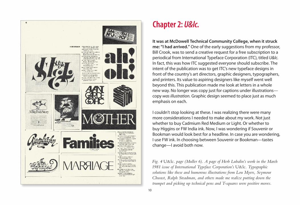
Fig. 4 U&lc. page (Muller 6). A page of Herb Lubalin’s work in the March 1981 issue of International Typeface Corporation’s U&lc. Typographic solutions like these and humorous illustrations from Lou Myers, Seymour Chwast, Ralph Steadman, and others made me realize putting down the trumpet and picking up technical pens and T-squares were positive moves.
It was at McDowell Technical Community College, when it struck me: “I had arrived.” One of the early suggestions from my professor, Bill Crook, was to send a creative request for a free subscription to a periodical from International Typeface Corporation (ITC), titled U&lc. In fact, this was how ITC suggested everyone should subscribe. The intent of the publication was to get ITC’s new typeface designs in front of the country’s art directors, graphic designers, typographers, and printers. Its value to aspiring designers like myself went well beyond this. This publication made me look at letters in a whole new way. No longer was copy just for captions under illustrations—copy was illustration. Graphic design seemed to place just as much emphasis on each.
I couldn’t stop looking at these. I was realizing there were many more considerations I needed to make about my work. Not just whether to buy Cadmium Red Medium or Light. Or whether to buy Higgins or FW India ink. Now, I was wondering if Souvenir or Bookman would look best for a headline. In case you are wondering, I use FW ink. In choosing between Souvenir or Bookman—tastes change—I avoid both now.
11
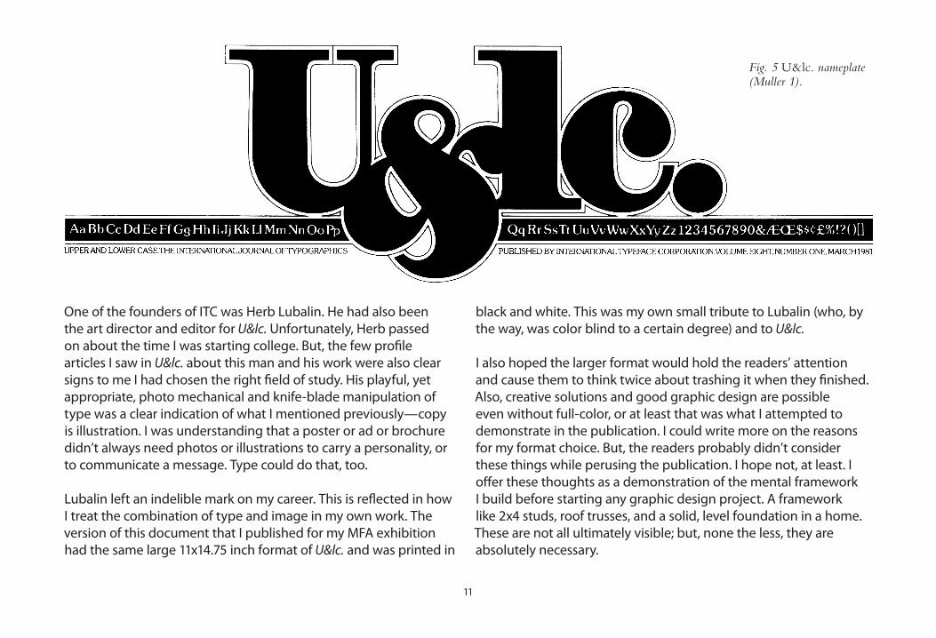
One of the founders of ITC was Herb Lubalin. He had also been the art director and editor for U&lc. Unfortunately, Herb passed on about the time I was starting college. But, the few profile articles I saw in U&lc. about this man and his work were also clear signs to me I had chosen the right field of study. His playful, yet appropriate, photo mechanical and knife-blade manipulation of type was a clear indication of what I mentioned previously—copy is illustration. I was understanding that a poster or ad or brochure didn’t always need photos or illustrations to carry a personality, or to communicate a message. Type could do that, too.
Lubalin left an indelible mark on my career. This is reflected in how I treat the combination of type and image in my own work. The version of this document that I published for my MFA exhibition had the same large 11x1�.75 inch format of U&lc. and was printed in
black and white. This was my own small tribute to Lubalin (who, by the way, was color blind to a certain degree) and to U&lc.
I also hoped the larger format would hold the readers’ attention and cause them to think twice about trashing it when they finished. Also, creative solutions and good graphic design are possible even without full-color, or at least that was what I attempted to demonstrate in the publication. I could write more on the reasons for my format choice. But, the readers probably didn’t consider these things while perusing the publication. I hope not, at least. I offer these thoughts as a demonstration of the mental framework I build before starting any graphic design project. A framework like 2x� studs, roof trusses, and a solid, level foundation in a home. These are not all ultimately visible; but, none the less, they are absolutely necessary.
Fig. 5 U&lc. nameplate(Muller 1).

12
Today, wiTh my associaTe degree in commercial graphics, my
bachelor’s degree in graphic design, and over Two decades
devoTed To The graphic design indusTry, i am beginning To
quesTion whaT i know abouT my field and am looking for
more answers, way beyond wondering whaT “Typography”
means. why is iT ThaT some graphic design seems successful
and some doesn’T? how can someone really judge or place
a value on design? why do some clienTs seem To “geT iT” and
succeed wiTh creaTive soluTions, and oThers flounder?
in This documenT, i will relay some answers To These and
oTher quesTions abouT graphic design—noT jusT based
on my own ThoughTs and experiences, buT wiTh personal
inTerviews wiTh indusTry leaders. ThroughouT These pages,
i will also inserT some work examples ThaT may emphasize
TraiTs in my collecTive projecTs, such as “appropriaTeness”
or “simpliciTy.” i inTend To demonsTraTe no maTTer who
The designer, The clienT, or The inTended audience, how The
projecT is Technically creaTed, or even whaT era The work
originaTes, all graphic design (including mine)—wiThouT
excepTion—has The same purpose: To gain aTTenTion and
encourage a response.
Fig. 6 Crown edge and dime

1�
DwigginsChapter 3: History of Design
The hisTory of Graphic DesiGn (since 1981, anyway) any historical observations of graphic design coincide heavily with the history of printing and the evolving technological changes thereof. This is because—in the whole scheme of things—other methods of visual communication dissemination have been much more recent occurrences. “But, wait a minute,” you might say, “What about television? or even earlier, movies? haven’t movies been around since the late 19th century?” True—but, printing began in 175 a.D. china, when copies of stone inscriptions were made by placing paper over these inscriptions and rubbing them with ink (Goines 24).
In fact, The Oxford American Dictionary definition of graphic design reflects printing as “the” means for graphic design distribution. This narrow focus points
Fig. 7 William Addison Dwiggins

1�
“If you’re working on mechanical art and you cut yourself, keep your hand away from the art.”
Bill Crook’s Lessons in Mechanical Art Preparation: No. 001
out a past era when the definition was written: “the art or skill of combining text or pictures in advertisements, magazines, or books.”
The term “graphic design” was coined by a book designer: William Addison Dwiggins, in 1922. He used this phrase as a way to describe his own skills as an individual who brought structural order and visual form to printed communications (Meggs ix). So, even his original thoughts on the name are reflected in the dictionary definition.
Dwiggins was not just a book designer. He was also an illustrator, type designer, calligrapher, … and puppeteer. His name and this chapter’s introduction are set in his most successful typeface design, Caledonia (Shaw �7).
Since there are multiple books available on graphic design’s luminous history, let’s skip through (in printing terms) the rubbings, woodblocks, stone lithography, wooden moveable type, and hot metal type. Rather, let’s begin where I began in graphic design—toward the end of photo typesetting and paste-ups.
15
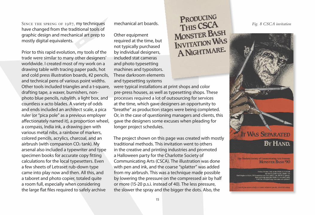
Since the spring of 1987, my techniques have changed from the traditional tools of graphic design and mechanical art prep to mostly digital equivalents.
Prior to this rapid evolution, my tools of the trade were similar to many other designers’ worldwide. I created most of my work on a drawing table with tracing paper pads, hot and cold press illustration boards, #2 pencils, and technical pens of various point widths. Other tools included triangles and a t-square, drafting tape, a waxer, burnishers, non-photo blue pencils, rubylith, a light box, and countless x-acto blades. A variety of odds and ends included an architect scale, a pica ruler (or “pica pole” as a previous employer affectionately named it), a proportion wheel, a compass, India ink, a drawing pen with various metal nibs, a rainbow of markers, colored pencils, acrylics, charcoal, and an airbrush (with companion CO2 tank). My arsenal also included a typewriter and type specimen books for accurate copy fitting calculations for the local typesetters. Even a few sheets of Letraset rub-down type came into play now and then. All this, and a taboret and photo copier, totaled quite a room full, especially when considering the large flat files required to safely archive
mechanical art boards.
Other equipment required at the time, but not typically purchased by individual designers, included stat cameras and photo typesetting machines and typositors. These darkroom elements and typesetting systems were typical installations at print shops and color pre-press houses, as well as typesetting shops. These processes required a lot of outsourcing for services at the time, which gave designers an opportunity to
“breathe” as production stages were being completed. Or, in the case of questioning managers and clients, this gave the designers some excuses when pleading for longer project schedules.
The project shown on this page was created with mostly traditional methods. This invitation went to others in the creative and printing industries and promoted a Halloween party for the Charlotte Society of Communicating Arts (CSCA). The illustration was done with pen and ink, and the coarse “splatter” was added from my airbrush. This was a technique made possible by lowering the pressure on the compressed air by half or more (15-20 p.s.i. instead of �0). The less pressure, the slower the spray and the bigger the dots. Also, the
Fig. 8 CSCA invitation

16
ribbed texture in his sweater was created by airbrushing ink through a tube sock.
The four spot-color separations were done by hand, using an x-acto knife and translucent rubylith overlays, which the printer’s stat camera would “read” as black. Actually, the typesetting was from my own Aldus PageMaker file. The Lino positive type was run through a hot wax machine and then burnished down on the appropriate board or overlays.
Here’s another example of traditional paste up. I designed this 18 x 2� inch poster for a student competition in 1985.
The background was a royal blue, the cap and number �9 (also denoting the �9th running of the race) was a bright red. Black was used for the shadows, boot, riding crop, and mane. Photo typesetting from a Varityper system was pasted up on an overlay to indicate it would reverse out of the blue background.
In 1985, Western Carolina University had both winning entries for this state-wide poster competition: mine was selected for the “attention-getting” poster, and a graduate student’s design for the “informational” poster.
Fig. 9 Block House poster

17
In the late 1980s, Adobe’s new PostScript printer language and Aldus’ PageMaker software combined technologies with Apple’s Macintosh personal computers to revolutionize some of these typical pre-press processes. In 1987, I started out on a Macintosh SE computer with PageMaker version 1 and began to experiment with Adobe’s new Illustrator program. It was showing promise of going way beyond Apple’s own MacDraw program’s capabilities. This Mac purchase took some convincing at the time, since my employer had a worldwide installed base of IBM, Compaq, and the now defunct Wang systems. However, the bottom line was my best ally. The company was easily spending $�00-500 on each quarterly issue of its newsletter just for outside typesetting. Now, I was just one in-house designer for one office of one corporation. If we had justified it so easily, it wasn’t a stretch to see the fast-approaching demise of type shops on a national and even worldwide basis.
The company made more investments into Apple’s world shortly thereafter. It was soon obvious that the money spent on a proprietary presentation slide system could be eliminated with a color Mac II, another software program, and an Agfa Matrix film recorder. Today, of course, even presentation slides have lost their appeal and profit-making capabilities. At the time, though, it wasn’t unheard of for slide houses to charge $200 per slide for corporate meetings using mainframe systems from Genigraphics. Now, with a relatively small
initial investment, we were making our own slides with Aldus Persuasion software. Afterwards, on-going costs were just for film and E6 processing. Anyone see a corre-lation between the type shops and the slide houses?
Since I was an early adopter of the Macintosh and the related graphic arts software, I taught myself to use the programs and I kept up with the version upgrades and their changed or added features. My day-to-day use of the technology led to teaching opportunities as others began to join in on the desktop changes. I taught a beginning Macintosh class and an Aldus PageMaker class at Central Piedmont Community College in Charlotte, NC. I also did some one-on-one training in PageMaker for a couple of corporate clients.
My fascination and my intent on keeping up with the software and hardware changes led me to a management role at a pre-press service bureau. Our main service was film imagesetting from Macintosh files, and a few PC files as the software started moving to the Windows operating system. However, I continued with design and advertising projects by developing promotions for the service bureau. Most service bureaus have now gone the way of the type shops and slide houses as more printers justified bringing similar equipment in house.
I still try to keep on the forefront of the software and hardware; but I don’t feel like I have to “know

18
everything” like I did at the service bureau. I concentrate on just the programs that I need personally for my own graphic design studio. This still includes many programs from within Adobe’s Creative Suite. Apple’s iLife software and FontLab Studio, from FontLab, round out my design software needs.
A big investment I made early on in my own business was a Linotype font library license. I had worked with their PostScript typefaces since 1987, especially during my four years at the service bureau. I consider them one of only a handful of quality type foundries today (although the field is growing), and found that their collection was less expen-sive than Adobe’s. Actually, at the time of my purchase, about 60% of the entire Adobe Library had been licensed to them by Linotype. Remember I mentioned W.A. Dwiggins? His very first typeface design, Metroblack, was for Linotype. He created it in less than a year in 1929 (Shaw ��, �7).
So, my current collection of graphic arts materials and tools includes the software,
the Linotype fonts, a laser printer, a color inkjet printer, an Apple Macintosh computer, a flatbed scanner, and the obvious assortment of office equipment (fax machine, file cabinets, etc.).
I still enjoy the tactile scratch of a metal nib on illustration board, and the constant dipping as the India ink is drawn from the pen. But for the most part, my client base doesn’t have time for anything that takes the effort typical of more traditional processes. There is, however, one element of my process that started pre-1987 and remains even today throughout all my projects—the creativity.
This comes in advance of any inkjet prints or even a click of the mouse. Changing technology has never snuffed out that light, nor ever will. As author and educator Steven Heller pointed out to me in a recent e-mail,
“Software is zeros and ones. Creativity is a human activity. Computers will never be creative without human creativity behind them.”
— STEVEN HELLER —
Softwareis zerosand ones.
Creativityis a human activity.
Computerswill NEVERbe creative
without humancreativitybehind them.
Fig. 10 Steven Heller quote (Heller).

The TypeCon conference united type designers and some graphic designers in their combined quest for more knowledge and fellowship within their chosen industry
[ More details can be found at http://www.TypeCon.com ]. I took this meeting one step further by interviewing a few of the presenters and asking some of the questions in this publication. These three men were most gracious with their time and were interested
in adding their own thoughts to my project.
Here’s a quick alphabetical introduction of the three, gleaned from the TypeCon conference program, unless otherwise cited…
Chapter 4: TypeCon
19
The 8th Annual Convention Presented in Boston by The Society of Typographic Aficionados

20
Principal, Carter & Cone Type Inc. www.carterandcone.com
Son of Harry Carter, Royal Designer for Industry, Matthew Carter is a contemporary British type designer and ultimate craftsman. He trained as a punchcutter at Enschedé by Paul Rädisch, was responsible for Crosfield’s typographic program in the early 1960s, and was Mergenthaler Linotype’s house designer from 1965–1981. Carter cofounded Bitstream with Mike Parker in 1981. In 1991 he left Bitstream to form Carter & Cone with Cherie Cone. He has in recent years designed Verdana and Georgia for Microsoft; these fonts are tuned to be extremely legible even at very small sizes on the screen. In 1997 he was awarded the TDC Medal, the award from the Type Directors Club presented to those “who have made significant contributions to the life, art, and craft of typography” (“Matthew Carter : MyFonts”).
Matthew CarterPh
oto c
ourte
sy of
Eben
Sork
in
Fig. 11 Matthew Carter

21
Designing with Type www.DesigningWithType.com
James Craig, a well-known author of books on graphic design, was born in Montreal, Canada. He studied fine arts in Montreal and Paris before coming to the United States. Craig received his BFA from the Cooper Union and his MFA from Yale University. He was design director for Watson-Guptill Publications for more than 25 years and has been teaching typography at the Cooper Union since 1979. In addition to writing books on typography, James now works full time developing the popular website www.DesigningWithType.com. Recently, James—along with his coauthor, Irene Scala—has just completed the fifth edition of Designing with Type and launched a companion website, www.DesigningWithType.com/5. James is a member of the Type Directors Club (TDC), the New York Art Directors Club, the Typophiles, and ATypl.
James CraigPh
oto c
ourte
sy of
Eben
Sork
in
Fig. 12 James Craig

22
Partner, Pentagram Design www.Pentagram.com
Kit Hinrichs studied at the Art Center College of Design in Pasadena, California and worked in several New York design offices before forming independent businesses. In 1976 Hinrichs & Associates moved to San Francisco and formed a national partnership called Jonson Pedersen Hinrichs and Shakery. In 1986 the San Francisco office merged with Pentagram. At Pentagram, Kit leads a graphic design team with expertise in corporate communications and promotions. The team’s design expertise includes package, editorial, and exhibition design. Kit has been an instructor at the School of Visual Arts in New York and at the Academy of Art in San Francisco. In 200� he was awarded the profession’s highest honor, the AIGA Medal, in recognition of his distinguished achievements and contributions to the field (“Pentagram Partners Kit Hinrichs San Francisco”).
Kit HinrichsPh
oto c
ourte
sy of
Eben
Sork
in
Fig. 13 Kit Hinrichs

2�
Question 1What are the key
elements necessaryin both creatingand evaluatinggraphic design?
In my own opinion, no matter what the medium used to create and the method of distribution, graphic design still has a basic collection of elements. I see graphic design as a structure or form that combines these elements—message, imagery, and type—toward a desired æsthetic. Pretty vague, don’t you think? Well, that’s deliberate. Design that grabs the attention of and is æsthetically pleasing to one audience, may fail miserably when presented to another. Another audience may need a different set and combination of elements to provoke a similar double take. Or, maybe the
message is completely inappropriate for this audience. At this point, the design—in any form—may never “work” with this other audience. Yes, there are necessary elements. As a designer, my task is to build a knowledge of both the message and the target audience to determine which elements are appropriate, along with the correct way to combine and present them. Graphic design encompasses skills beyond creative and/or artistic talent. I try to be a good business partner as well as a designer; a partner who will not only present creative ideas, but who will listen closely to the client’s needs and desires. The evaluation of graphic design, many times, comes from industry peers. Hence, all the magazine reviews of work and design competitions—worldwide. This is very valuable in the designer/client business relationship. Well, at least for the designer. For the designer gets accolades, press releases, and attention. This is usually followed by more clients and more projects, more money, and more awards. These new clients may then say, “I saw what you did for XYZ—can you do that for me?” Now the proven track record of award-winning work may become duplicated and less effective as it is no longer unique. If the designer
just repeats his or her “style,” blindly at the request of the client, the work now becomes cliché or tedious. The desire for their work may diminish. I need to interject an appropriate story here. In the late 1980s, I attended a presentation by Kit Hinrichs in Charlotte, NC. After his presentation, an audience member asked him if there was a particular style that said “Pentagram” when his office’s work was observed. He replied, “I sure hope not.” I smiled in agreement with Kit at this statement. This is my feeling in client work as well. I don’t work toward an end of having my work recognized. I work toward communicating to the client’s audience. If the design itself is standing out and being considered, chances are the message is not. What if the designer/client business relationship was more of a partnership? The increase in business and associated bottom line should be equally considered for both businesses. I clearly promote this as a required element for graphic design. It comes from knowing the client, knowing what he or she is trying to achieve, understanding the habits of the intended audience, and then working together to implement a unique design solution that delivers a win/win situation. Now the value
Chapter 5: Designer Questions

is two-sided—not just all for the designer. If my design is effective, the client has made this evaluation based on his/her prospects’ reaction. Then, more projects come, more money comes, and more repeat clients because of their satisfaction and trust. This continually builds from the knowledge gained with my first project
for the client. Also, because of the word-of-mouth advertising from these happy clients, new clients call. The short answer is the key elements for creating and evaluating graphic design are determined by the target audience. Did the design gain their attention and encourage them to respond as planned? If so, the
design included the necessary elements and should be evaluated as successful. The specific graphic design elements of contrast, layout, color, choice of typeface, imagery, and copy were all implemented to be appropriate for this audience, at this time. On the next pages are comments from my distinguished panel on this same question.
but including this image of Blue Ridge Parkway construction within a parkway coffee table book, I felt, was appropriate. In fact, I convinced the photographer who published the book (J. Scott Graham) to include a whole section in the center of the book that incorporated these images, provided by the Blue Ridge Parkway Headquarters. Probably seemed like an odd request to him since he had nothing to do with these photographs. But, the 20 pages of old images and captions showed a glimpse of the road’s history and provided a mid-book
break in the text and colorful scenic images. I also added sections of Parkway plan drawings from the early 1930s to tie in with this historical aspect. These served as dividers for new chapters. I took the trait of appropri-ateness even further in this award-winning publication design project. A navy blue and light warm grey were used for headings and backgrounds to tie in with the parkway’s color scheme on the roadside signage. Speaking of the signs, I was thrilled to find an early drawing for an all-caps alphabet used on
the parkway’s wooden signs. The drawing also included numerals. What a perfect face to use for headlines in the book, I thought. Through some investigation,
I found that the parkway’s sign shop had digital outlines of these
characters for a proprietary system they used to carve the signs. I worked with these outlines in Adobe Illustrator and set each headline for the book, letter-by-letter. Cumbersome? Yes—but, appropriate. In fact, I became so intrigued by these capital letters and numerals, I plunged into my first typeface design project. I have designed an entire face with lowercase designs, punctuation, and accents. This is still a work in progress, but the alphabets and numbers above are set in my new typeface, appropriately named “Blue Ridge.”
Smoking a pipe while planting dynamite—this is not my idea of “appropriate”…
Fig. 14 Parkway construction photo (Graham 73).
Fig. 15 Blue Ridge font
Fig. 16 BRP book cover

25
Kit HinrichsThe creation is one thing, but the value of what has been created is often times determined by the people who created the design. They use their own criteria, which they’ve also used for their own evaluation of someone else’s creation. It’s not quite as clearly defined as it could be. I don’t know if design is or should be something that has 27 rules of which everyone agrees and “that’s what makes design.” I think design really is about communications. What communicates for someone is actually something that evolves over a period of time. Successful graphic design isn’t a fixed thing—it’s a continually-evolving thing. I think the evaluation is more about,
“Does it work? Does it actually have influence on the audience it wants to reach?” I like the work of designer David Carson. I think it’s quite beautiful and very ingenious. At the same time, it’s so open to interpretation. Other design can more clearly define something in a shorter period
of time, and is not going to depend on emo-tional values, which I think his work does. It’s not that his work is not effective to a certain audience. To an audience he’s talking to, he says “hello,” and my work doesn’t. But, his work wouldn’t say “hello” to most of my clients. I’m probably more involved in trying to communicate to more people. So, I may use tools, images, and ideas that have a little broader appeal and are more understandable by a broader number of people. I see the success of design based on the intended audience’s acceptance; and I think that’s fair for graphic design. For fine art, it only has to be evaluated by the person who creates it, or maybe by a critic. Fine art’s evaluation, however, has evolved just like graphic design’s. Art that would be accepted today as creative work of the 21st century would not be understood by an audience 100 years ago.
Fig. 17 Graphic design seal
26
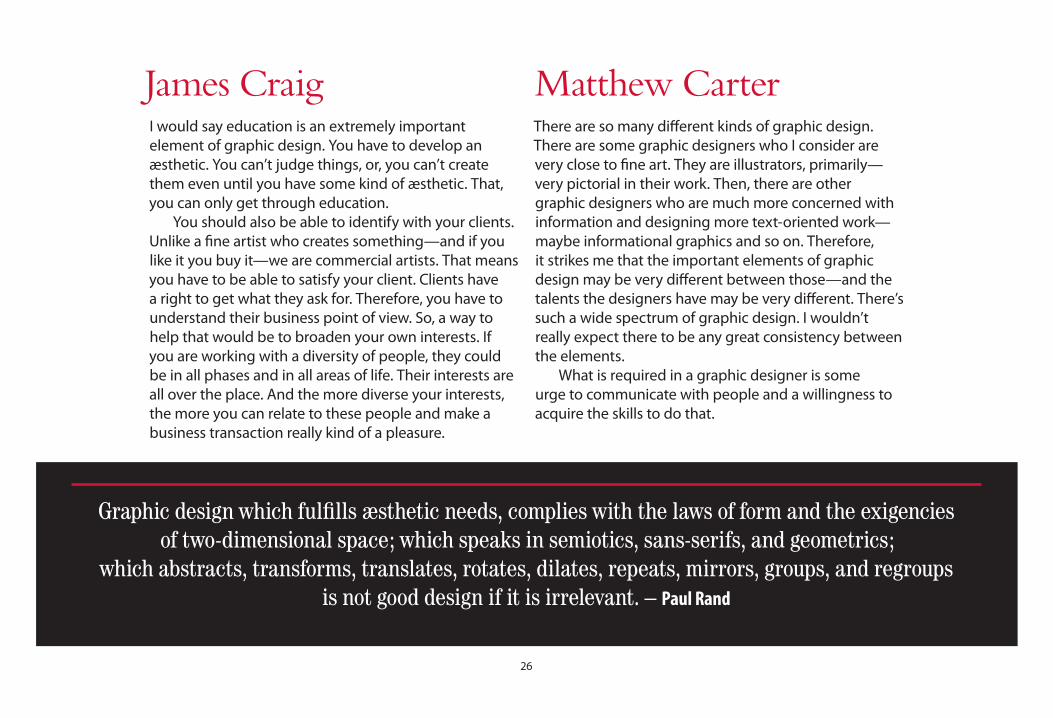
James CraigI would say education is an extremely important element of graphic design. You have to develop an æsthetic. You can’t judge things, or, you can’t create them even until you have some kind of æsthetic. That, you can only get through education. You should also be able to identify with your clients. Unlike a fine artist who creates something—and if you like it you buy it—we are commercial artists. That means you have to be able to satisfy your client. Clients have a right to get what they ask for. Therefore, you have to understand their business point of view. So, a way to help that would be to broaden your own interests. If you are working with a diversity of people, they could be in all phases and in all areas of life. Their interests are all over the place. And the more diverse your interests, the more you can relate to these people and make a business transaction really kind of a pleasure.
Matthew CarterThere are so many different kinds of graphic design. There are some graphic designers who I consider are very close to fine art. They are illustrators, primarily—very pictorial in their work. Then, there are other graphic designers who are much more concerned with information and designing more text-oriented work—maybe informational graphics and so on. Therefore, it strikes me that the important elements of graphic design may be very different between those—and the talents the designers have may be very different. There’s such a wide spectrum of graphic design. I wouldn’t really expect there to be any great consistency between the elements. What is required in a graphic designer is some urge to communicate with people and a willingness to acquire the skills to do that.
Graphic design which fulfills æsthetic needs, complies with the laws of form and the exigencies of two-dimensional space; which speaks in semiotics, sans-serifs, and geometrics;
which abstracts, transforms, translates, rotates, dilates, repeats, mirrors, groups, and regroups is not good design if it is irrelevant. – Paul Rand

27
Question 2Have the key
elements of designchanged over
history, or has it just been changes within technology?
Now that I have some interesting answers about the key elements of graphic design, I’ll ask my next question, which builds from these answers. Have these key graphic design elements changed over the course of history? Or, has it just been changes in the technology used to produce the same elements? Were William Morris, Aubrey Beardsley, and W.A. Dwiggins working with the same elements as Paul Rand, Herb Lubalin, and Saul Bass? How about Joe Duffy, Michael Bierut … or me?
When I consider the purposely vague answer I gave to the first question, the answers to my two-part second question would be no and yes. No: the key elements have not changed. Yes: the technology used has changed. If the audience is reached and they respond as intended, it doesn’t matter what specific audience we are speaking of, or from where or whence they came. When William Morris wrote and designed “The Story of the Glittering Plain,” (see next page) his intention was to print twenty copies in 189�. However, as word spread about what he and illustrator Walter Crane were up to, he was convinced to increase the press run to two hundred paper copies and six on vellum. Not only would his design reach his intended audience, in a way it did so even prior to distribution. The technology he implemented at the time was his own type designs and ornamentation, Crane’s illustrations, and an old hand press (Meggs 172). Paul Rand’s book jacket designs for Alfred A. Knopf Inc. in the 19�0s and 50s were on the cutting edge of gaining an audience’s attention. His provocative forms always had a unique concept behind them, and Rand would not let production issues
get in his way of grabbing the audience. The cover shown on the next page, for “Leave Cancelled,” was Rand’s solution for showing the premise of the story: a tragic tale of two lovers separated by war. His answer was an image of Eros, the god of love on a plain red background. The jackets had die-cut “bullet holes” (Heller 96, 102). Rand’s technology at the time was his twin lens reflex camera (he did most of his own shooting), pens for sketching, and his phone for calling the typographers. Since we are looking at publication design samples, also on the next page is an example of an editorial spread I designed. The magazine article was about the history of a small theme park once open in the mountains of western North Carolina. It depicted “The Wizard of Oz,” and in its heyday of the 1970s, was called “The Land of Oz.” I could have used the typical photos of kids enjoying the park, walking on the yellow brick paths holding their helium-filled cowardly lion balloons (I actually had one of those as a child). This is an example, however, of a design project without the luxury of quality client-supplied imagery. Since the park is no longer operated in the same manner, new photography wasn’t an option. From the scant handful of old
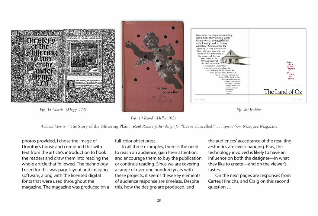
28
photos provided, I chose the image of Dorothy’s house and combined this with text from the article’s introduction to hook the readers and draw them into reading the whole article that followed. The technology I used for this was page layout and imaging software, along with the licensed digital fonts that were used throughout the magazine. The magazine was produced on a
full-color offset press. In all three examples, there is the need to reach an audience, gain their attention, and encourage them to buy the publication or continue reading. Since we are covering a range of over one hundred years with these projects, it seems these key elements of audience response are timeless. Despite this, how the designs are produced, and
the audiences’ acceptance of the resulting æsthetics are ever-changing. Plus, the technology involved is likely to have an influence on both the designer—in what they like to create—and on the viewer’s tastes. On the next pages are responses from Carter, Hinrichs, and Craig on this second question …
William Morris’ “The Story of the Glittering Plain,” Raul Rand’s jacket design for “Leave Cancelled,” and spread from Marquee Magazine.
Fig. 18 Morris (Meggs 174)
Fig. 19 Rand (Heller 102)
Fig. 20 Jenkins

29
Matthew CarterTechnology is changing—has changed, is changing. So that is plainly the case. As to whether the standards change, to some extent they do. But, I think if I look at old examples of graphic design and new examples of graphic design, I as an individual am probably using the same standards to judge them. I do have some sort of sense that there is a continuum of design standard that manifests itself in different ways. But the standard itself is fairly consistent over time. As far as methods and technology, I think it’s interesting because I run across students sometimes who are actually wizards with Quark or something like that—I mean just amazing. Then you say to them,
“Okay, so what is a word space? Define a word space for me.” They say, “Well you hit the space bar.” No, that’s not it. That’s not a word space, that’s what you do to get one. They don’t know it’s a character in the font. There are a lot of what I say are design fundamentals that you don’t necessarily understand by being very slick with a keyboard. I suppose ideally you would have a perfect balance of the whole thing. You would have a sort of lofty understanding of design that was independent of exactly how it was executed. On the other hand, you would be very conversant with the current tools because that’s what you’re going to have to deal with when you get out there and earn a living.
simpl
icity the right visual solution
doesn’t have to be complex.
in fact, it may seem so obvious one may think,
“i could’ve done that.” great design may result from
a visual simplification for an identity.[ consider the nike swoosh … Fig. 21 Identity designs

�0
… or the target target. ] my role as graphic designer is to make
a similar immediate connection with the desired audience.
as mies van der rohe might suggest,that may really mean “less is more.”
Kit HinrichsThat’s back and forth. Design influences the society; the society influences design. Art imitates life; life imitates art. It’s just one of those things. Certainly technology changes the tools that are used and the way in which you may receive the message. But I think the basics of the message are still there. Things that have value beyond just being effective communications are also a guideline for the work I create. A lot of other designers think this way, too. Good design, from my point-of-view, is also design that contributes to the beauty of the society we are in. We have the responsibility as designers to not just do what the market requires of us, but to say,
“Does this also contribute æsthetically to the world that we’re in?” We should always keep both aspects in mind. We should communicate well and effectively do what we do; but, we should also contribute to society with æsthetically positive solutions.
Okay, I’ll give you the short answer to that—because it comes up all the time. I think we all work with a very strong core of—you might say—æsthetics. Styles, though, come and go. The best example I’m going to give is that most women have a basic black dress, which they can wear anywhere. Most men have a blazer, grey slacks, and a white shirt they can wear anywhere. This is base. Then you have your fashions. These things are wonderful; I look forward to them. Also, graphic design and typography is a growing art that changes. Therefore, every five or ten years, there’s a new energy that comes into it, and I thank God for that. Otherwise, we’d still be reading books with French layouts from the 17th century. We have to think of who the market is, and that there is a proper typography for reading, another one for advertisements, one for young, one for old people. All these are part of the mix. So, the fashions will change; but the designs still need to reach the market.
James Craig
Fig. 22 Identity designs 2

�1
Question 3Is successful
graphic design based on
objective decisions,or is design
purely subjective?
So far in this investigation, we’ve seen there are key elements in graphic design. The elements should be determined based on the designer’s desired response from the audience. If these elements of design involve communicating with someone specific, these elements have not changed
over the course of history. But, the technologies used to create the designs are constantly changing, as are the expectations of the designers and audiences about which designs are appealing. Now I would ask whether the elements used in successful design are based on objective decisions, or whether it’s all subjective? When I consider this question about my own work, it makes me wonder about Kit Hinrich’s earlier suggestion of “27 rules of design.” This implies an objective approach to creating design—there are some rules. Some examples: for web design, site viewers should expect to find a way to contact the person or organization. They should also find an obvious method for getting back to the site’s home page. For typography, there are some other objective ideas. Transitional style serif faces have a rational, business-like personality. Humanist sans serif faces have a warm and friendly quality. For layout decisions, maybe there are other rules. A logo that is symmetrical
and centered suggests the business card design would have a consistent symmetrical and centered appearance. In the corporate design realm, a company may even create a graphics standards manual with objective rules about position of logos, scale, Pantone colors, typography, etc. This is an example of an extreme need for design objectivity—for consistent branding and corporate communications. Graphic design does require some sort of framework or quality point of reference. Rules were made to be broken, however. Imagine if all design was based on objective rules or ideas about the way things should be. The results would be pretty homogenized. In fact, it’s usually when design breaks away from the rules that it gains the audience’s attention. Whether the designer likes it, the client likes it, or the audience likes it (ideally, all three) is now more subjective than objective. The next page shows a full-page newspaper ad that breaks out of the typical auto dealer context …

�2
I consider this an example of taking the typical design out of context from the viewer’s expectations. Many area auto dealers run display ads in their local papers. Most of these ads have a formula for content and layout: rows and columns of vehicles, showing associated monthly payments. Hopefully, someone will notice one price and one model that will entice them to visit the lot. Unfortunately, many dealers use images available from their respective manufacturer, so the advertising ends up with a similar look to other ads from other dealerships selling the same vehicles. My project involved a similar line of thought from my client. He wanted to show all the new Toyotas to spark interest in his dealership. My solution required that I ask a few questions of my client. As it turns out, these were just production questions to see if I could carry out my idea. My
first question: “Do you have at least one of each of the new model lineup?” He answered yes, with only one or two exceptions. He thought it was safe to say, though, that no one would notice. My next question:
“When is your dealership the slowest, as far as customer traffic and busy sales people?” He said Saturday mornings were the slowest—which proved to be the case. When I went the next Saturday with camera and tripod, three or four different sales people were able to drive each vehicle into the same spot on the lot, one right after the other. This allowed me to keep a similar perpendicular angle and distance between each car and the camera. It also maintained the angle of sunlight. Because of the large inventory, I was able to choose colors on a few of the models to mix it up. I also faced the cars in both directions for variety. After these photos, I went across town to a toy store and
Fig. 23 Phil Bachman ad

before & after
bought an orange vinyl case for toy cars. I photographed it outdoors with the same angle of light. The rest of the ad involved manipulation in Photoshop to combine the cars and the case, followed by a clean page design that included short copy writing and typography. The dealership logo and contact information at the bottom visually “anchored” the ad. All that remained was the general manager’s happy approval and agreement to ad placement. Although I was showing all the models like all the other ads, my solution was way out of context with the other designs and, therefore, gained some attention. This resulted in some positive customer feedback directed to my client—as well as a 7th district win from the AAF’s American Advertising Awards, or ADDYs® [more info at: www.aaf.org]. My answer to the objective and/or subjective decisions involved in graphic design is that there are many of both. The more subjectivity involved, the more skills designers have to call upon to make the appropriate creative decisions for reaching their client’s objective. Let’s look at the panel’s answers to this third question.
a newspaper redesign for the oldest weekly in tennessee switched nameplates, typefaces, layouts, and colors. the focus of editorial
is on the historical community and its people—and the new design had the same friendly attitude. colors were switched out based on
historical home exterior paints. body copy was switched from new century schoolbook to jim parkinson’s azuza—
similar legibility, but with more characters per inch.
Fig. 24 Herald & Tribune redesign

��
It’s probably some of both. The reason I think some things are good is because I’m in a society that says those are good. I don’t think the education of design—or art to a certain extent—is or should ever be limited only to formal learning. In the world of law, where there are very specific things that you do or don’t do, things are written down. Those laws evolve through a period of time as society changes its value of things. And the same thing is true in æsthetics. As far as the public is concerned, æsthetics will always evolve with what the tastes and needs are at the time. Part of graphic design, by nature, is that design should—and does—continually change. There is always an avant garde: some people who are looking ahead and changing things. But that doesn’t exist without an establishment. That cycle always continues.
I think it’s a combination of objective and subjective. But, it would be very difficult for me to analyze which was which. As you ask the question, I tend to say I’m probably more subjective. Then, as I think about it a bit more, I’m sure I have learned ways of evaluating things that aren’t just from within myself. This objective approach comes from conversations with designers, reading enough books, and so on. I’m not a big believer in focus groups. I tend to have more faith in the judgment of the designer who I respect than the so called, “testing techniques.” I tend to be skeptical of marketing that
says everything has to be “focus-group approved.” You’re better off trusting a really good designer than listening to a hundred people. From that point of view, I think I come down on the side of subjective. It’s always a matter of determining how receptive the audience will be.
Okay, I think it’s both. Because I think we all have to bring some subjectivity to what we like and don’t like. Some people hate a certain typeface, and you show them something with that, then it probably gets in their way of seeing the rest of the design. Sometimes you get comments from older people, like, “I don’t understand kids with their music today. I don’t understand their design. I don’t understand anything like this.” Well, I do understand it. I may not like it; but, I do understand it. If I were their age, it’s exactly what I would want. There will always be different groups with different likes. You have your own prejudices, and you can’t help but bring those to the table. But, I don’t think you should knock other people and their choice of art. If somebody’s enjoying it, somebody obviously did something right. I think you have to keep an open mind. Some is subjective, but you have to try to be objective. I use a restaurant analogy a lot with my students. You (the client) go in to a restaurant and order a steak. This is subjective—you like steak. The chef (the designer) decides, “I think this guy would like chicken.” So he brings and puts a chicken in front of you. You say,
“Wait a second, I ordered steak.” He says, “Yeah, I think you should
Kit Hinrichs
Matthew Carter
James Craig

try this, I think you’ll like this.” You have the right to say, “I’m going—I’m out of here. I ordered steak. I want steak. I don’t want you to try to educate me.” First of all, there are a couple of things that can happen in this
situation if that chef wants you to have chicken. He can either talk to you first, or what he could do is bring out the steak and the chicken, as if you had both planned it together. Let’s turn this around now. If you, the designer, (the chef)
think your client (the patron) is on the wrong track, you can do an alternate design, then come in and try to convince him why your idea is better than his idea. That’s totally legitimate. If you can’t do that, it’s just because there are times you have
clients who are not on the same wavelength with you, subjectively. Plus, you may be unable to convince them otherwise, objectively. At this point, I would recommend they try out a new restaurant.
W ithin this exploration of successful design, I have decided success
comesfromachievingthedesiredaudienceresponse.Ifthisisthepurpose
of graphic design, then the purpose hasn’t really changed throughout
history. Production methods and means of spreading the message
dochange.As timesandpeoplechange,sodo thewaysofgetting the
desired response. Therefore, design changes continuously. There is an
objective framework involved in graphic design, but the choices about
whatisgooddesign—orwhatwill“work”—usuallycomesubjectivelyfrom
thedesigner,theirclient,andtheaudience.Nowontomyfinalquestion:
�5Fig. 25 Chicken (veer.com)

�6
Question 4Does the creation
and evaluation of graphic design
require professional experience, higher education, or both?
Sometimes, there is a tendency to assume anyone can be a graphic designer. However, this incorrect perception may actually be reinforced by good design. This relates to something I brought up earlier in the publication: Communicating a message is the goal of design, rather than emphasizing the design itself. If someone stops and notices, it’s usually the message they notice—not the design. Whether a halftone or duotone was used, photograph or illustration, serif or sans serif type, coated or
uncoated paper—none of this should have to be considered by the viewer. In my own work, many times this clear communication calls for a simple visual approach. Designers all have their own ways of communicating their messages. For me, I try to be cognizant of the viewer’s time and intelligence. Unlike a telemarketer who might be trying to sell me health insurance when I am already covered, I try to quickly communicate my message, and only to my intended audience. I listen to my client’s needs and create projects to address these desires, rather than trying to sell them on something they don’t need. If I suggest something else they didn’t ask for, it’s because their needs pointed me in a different direction—rather than my desires. I try to quickly gain my audience’s attention and invite them into the design. Many times, this comes in the form of a design some would term “simplistic.” Someone once said that a good designer isn’t one who knows where else to add something. A good designer is one who knows he/she can’t take anything else away. This is very much my design philosophy. Here’s a different example of this. When Landor Associates designed the new logo for FedEx (then Federal Express) in the early
1990s, they could have used a different approach. They could have worked with an illustrator and had he/she engrave an intricate image of trucks, vans, planes, and ships circling the world with packages drifting down all around as if they had been dropped from Santa’s sleigh. This image could have been emblazoned across all the FedEx vehicles and uniforms, packages, and drop boxes. Some might then say, “Now that takes talent! That’s art! I wish I could have done that.” Or instead, these same people might look at the actual logo cynically and say,
“Even I could have done that … my 5-year old could have done that.” It makes me wonder, though, would these people know the identity research and design process took two years? Would they realize employees, customers, and industry leaders in twelve markets around the world were involved in the research? Would they notice the chosen mark was a combination and adaptation of two different typefaces? Would they understand the x-height of the lower case letterforms was raised to make FedEx more readable? Could they comprehend that Landor came up with �00 preliminary concept sketches? Would it be obvious that—since the name
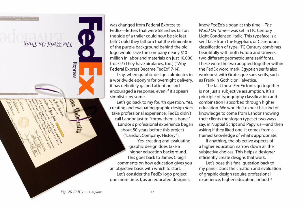
�7
was changed from Federal Express to FedEx—letters that were 58 inches tall on the side of a trailer could now be six feet tall? Could they fathom that the elimination of the purple background behind the old logo would save the company nearly $10 million in labor and materials on just 10,000 trucks? (They have airplanes, too.) (“Why Federal Express Became FedEx” 7-1�). I say, when graphic design culminates in a worldwide eponym for overnight delivery, it has definitely gained attention and encouraged a response, even if it appears simplistic by some. Let’s go back to my fourth question. Yes, creating and evaluating graphic design does take professional experience. FedEx didn’t
call Landor just to “throw them a bone.” Landor’s professional experience began
about 50 years before this project (“Landor: Company: History”).
Yes, creating and evaluating graphic design does take a higher education background.
This goes back to James Craig’s comments on how education gives you
an objective basis with which to start. Let’s consider the FedEx logo project one more time. I, as an educated designer,
know FedEx’s slogan at this time—The World On Time—was set in ITC Century Light Condensed Italic. This typeface is a serif face from the Egyptian, or Clarendon, classification of type. ITC Century combines beautifully with both Futura and Univers, two different geometric sans serif fonts. These were the two adapted together within the FedEx word mark. Egyptian serifs also work best with Grotesque sans serifs, such as Franklin Gothic or Helvetica. The fact these FedEx fonts go together is not just a subjective assumption. It’s a principle of typography classification and combination I absorbed through higher education. We wouldn’t expect his kind of knowledge to come from Landor showing their clients the slogan typeset two ways—say, in Nuptial Script and Papyrus—and then asking if they liked one. It comes from a trained knowledge of what’s appropriate. If anything, the objective aspects of a higher education narrow down all the subjective choices. This helps a designer efficiently create designs that work. Let’s pose this final question back to my panel: Does the creation and evaluation of graphic design require professional experience, higher education, or both?
Fig. 26 FedEx and diploma

�8
Matthew CarterIt’s a really good question. It’s a question I’ve asked of myself because I learned on the job. I didn’t serve a formal apprenticeship in any fashion. Rather, I learned in a type foundry with dirty hands. I think there is a big difference between work experience and education. I think if you do as I did, you learn one thing quite deeply. At the end of this experience I knew a lot about a little. If I had gone to art school instead, I wouldn’t have known anything as deeply. I would have known more things broadly. I’m not complaining about that, I’m very happy. Still, I sometimes wonder how my life might have been different if I’d had a better understanding of the other aspects of graphic design—photography, illustration, book design, poster design. I wonder if I’d had a more liberal, and broader design education, what might have happened. I might have ended up exactly in the same place! On the other hand, I might have had wider interests in different kinds of design.
I feel you need both and for a very important reason. If you look at your experience when you first start working with clients, very often you don’t have the required vocabulary. Let’s say you’re an architect. When you start in your profession, you don’t just go see a new client and say, “Here are 25 drawings of buildings. I thought maybe you’d like one.” No—you sit down with the client, and she says, “Okay now, we have a family of 6. We want a house that’s on one level. We want a 2-car garage.” Before you know it, the house designs itself.
When you go to meet a new graphic design client, it should be the same situation. You don’t just go and he gives you a job and you rush out. No—you ask, “Do you have some previous jobs you have done? Is there any preference in typefaces? Who do you need to reach with this? Is there anything else I should know before I even start?” So, before you walk out, you may already have the design in mind. Therefore, professional experience is extremely important. You don’t get that in your first year out of school. That’s why I insist that my students do a lot of the talking in class, so they start to develop this vocabulary.
All formal education does is provide the ability to get a job. From that point, your education really begins or continues. It doesn’t stop because you’ve finished your schooling and now you’re just practicing something. So, formal education provides the basis upon which everything else is built. It is always valuable to have that very strong basis of education. But, without the practice of what we do, design would never change. When something is fixed without an opportunity to change, this implies a specific academic model by which everything must be done. This may work for some professions, but not for design. Some professions pass their knowledge along to the next generation without testing its viability and effectiveness in the world. With design, you have to continually “put something out there” and this is refined by society as it interacts with society. That’s an essential part of what makes our profession what it is—what design is about.
Kit Hinrichs
James Craig

�9
risultato finaleThis completes my questions and publication.It also reinvigorates my quest for successful graphic design solutions to client projects.
If I garner a Master’s degree in graphic design, this will provide yet another opportunity:
to share my knowledge with eager students …
Chapter 6: The End Result

�0
Fig. 27 “Duck and cover” (corbis.com)

�1
Designer NotesMy design decisions about some of the preceding pages (a.k.a.: My Support Paper)
For publications such as this—or newsletters, magazines, and annual reports—I usually start with a 12-column layout. This gives me a lot of variety even though there is still a grid structure. Any number that can evenly divide into 12 is now a possibility for the number of columns per page (e.g., 6, 4, and 3). There are more choices if the columns aren’t even. This typeface is from the Myriad Pro family, as is the large warm grey title above and throughout the publication in the body copy. The red serif font used later on the panel’s names is Bembo. I have used the two families together for my own design studio’s identity for years. The friendly, readable sans serif works well with the oldstyle serif’s classic sensibility. A few captions are set in Bembo italic. For variety, I have mixed in others, such as Franklin Gothic and New Baskerville on the black “question squares.” Other types have been added and noted for specific reasons.
Page 6 is the photo and headline from my printed publication. (A small view of the cover is also shown on page 1.) This is a rights-managed (RM) image. RM images are generally more expensive than royalty-free (RF), but usually the photographer or the collection quality is worth the expense. Plus, there’s less worry of seeing the same image used elsewhere. Granted, custom photography is always the best option. But since this was an historical subject, a reshoot of the concept would have been difficult, expensive, and time prohibitive to stage. I had also licensed this same image a few years back for my design studio. The promotion was a hit, so I was going by past experiences on this choice. The chapter heading was added for this electronic thesis. I also decided to incorporate color throughout this document. The printed version was black and white for various reasons, including budget.
The medal on page 8 is made up of two scans, as the actual medal had a large ribbon to serve almost like an Olympic medal. The small ribbon was scanned and added instead, from an All-State Band pin I earned. I like to show objects actual size for the impact, and also here for the nice text wrap. The shadow on the award was added in Adobe InDesign to make it believeable as possible. This, and the trumpet on the next page, have a similar “nostalgic” aspect—not unlike the photo on page 6.

�2
Page 9 shows the trumpet, which although I originaly shot this in color, some of the reflections seemed distracting. So, I switched this to greyscale and then made it a blue and black dutone. Even though this horn has a matte “nickel” finish on some areas, I like how the duotone made it seem more bright and reflective. The shadow here was also added in InDesign, but at a greater distance, lightness, and softness than the previous shadow on the medal for a more realistic effect.
Since this text at the start of Chapter 2 explains my early influences from International Typeface Corporation’s U&lc. publication, I received permission from Allan Haley to reproduce a page from a 1981 edition, as well as the publication’s nameplate on page 11. Since U&lc. was printed on newsprint stock, I added a yellowish background to this black and white scan to represent the aged appearance of the paper.
Like the trumpet and award on pages 8 and 9, I like to show objects actual size. So, I photographed a dime and placed it correctly sized on page 12. The copy speaks of placing a value on design, so I thought this would be a fun contrast with the luxurious page edge. The edge is a textured sheet of paper with lots of fibers, inverted so the light paper went dark. The various crowns were scanned from a copyright-free book of trademarks and symbols. Then I added the deckled vertical edge. Deckled edges imply expensive paper, as it can only be printed in one direction, leaving this uncut edge on one side. The humor comes from this “extravagant” border juxtaposed with a dime. Then, within the Bembo text, the solid black words make a short sentence on their own (another trick I learned from Lubalin based on an ad for Land-Rover).
The illustration of Dwiggins on page 13 had various reasons for being. First, it looks like a “preliminary” sketch to me, which bodes well for discussing early stages of graphic design. The pencil also lends itself to black and white printing—useful for my printed version. Finally, I wanted to incorporate his puppeteer talent. The hand was drawn from a reference shot of me holding chopsticks. The humorous quality of the illustration works with Dwiggins—he had quite a sense of humor. I also added one of his typeface designs on his name and the introductory paragraph to this first page of Chapter 3.

��
The project examples on pages 15 and 16 were somewhat intimidating. I wanted to show work I did with “pre-Mac” processes. However, most of my career, except for the first two years out of college, has incorporated the Mac and digital equivalents of these traditional steps. Finding early work that would stand up to my later work (after much professional experience) was a challenge. The grey objects in the background of pages 14 through 17, again, are actual size. These were scanned on my flatbed scanner as if they were transparencies, so I ended up with nice silhouettes without shadows. Then, the scans were converted to vector drawings in Adobe Illustrator. I used a light grey to also represent the idea of these traditional tools “fading away.”
Page 18 shows a quote from Steven Heller. What’s unusual about this is he e-mailed this comment based on a letter I sent out about a year earlier. The letter described how I was working on my thesis; but at the time, my abstract was quite different. Still, these notes found their way into my writing after all. The “bitmap” image of him was something I found when looking for his contact information online. I recreated this web graphic in Adobe Illustrator, as I felt it had a nice tie with his quote. In making this electronic version color, I decided to make the grey background in this graphic red. This seems to give the graphic a resemblance to a label for a certain brand of soup. No design reason for this in particular—just a funny coincidence.
For page 24, I decided on a way to interject examples of some of the defining design traits in my projects. Here, I am adding an illusion of an extra sheet of paper placed on top of the publication spread. This visually implies they are topics separate from the main text, especially with the light warm grey “paper.” The change in number of columns reinforces this, too—the 3-column spread is now overlapped with what would be a 6-column page. The deckled edge I put around the photo on page 12 was scanned from an old print I had, probably from the 1950s. This type of print edge was a standard from many photo labs at the time. I felt the nostalgic aspect of this—from days gone by—suited the photo which was shot in 1938. Including this image, when there were so many to choose from in the book, falls back to my tendency to rely on humor as a means of gaining attention.
Page 25 incorporates a graphic I designed based on Kit Hinrichs answer, listed to the left side. I scanned a sheet of Fox River Gainsborough paper, then a certificate border which I placed on a top layer. The round seal I created in Adobe Illustrator and brought in as an EPS file. This and the grey paper bands have InDesign-added shadows. The seal uses Caslon 540 Italic and Frutiger Bold. Again, these faces combine well as they represent the Oldstyle serif and Humanist sans serif classes, respectively.
��
The three images on page 28 were chosen to show a wide range of time—graphic design examples from 1894 to 2000. Yet, all three deal in print and publication design, which is my own studio’s focus. The three designs also serve to break up the lengthy body copy started on the previous page—again, to invite the reader in.
Another rights-managed stock photo is used on page 35. This also uses a humorous connection between the photo and headline to hopefully compel readers to continue with James Craig’s answer at the top—just to learn what the image means. The typeface for the headline is Linotype Didot, a serif face from the modern classification. I chose this as it appears elegant and crisp. This may be appropriate for a fine restaurant’s menu, too. I begin the copy on the bottom in a larger point size and with an initial cap. These features, along with a grey tint, help to visually separate this from Craig’s text and the photo. The change in column widths helps, too.
Page 37 incorporates a subtle humor in the image due to the fact it combines the concept of higher education (with the diploma) and the FedEx brand story I’m relaying in the text. This was another photo I shot with my Nikon D100 camera. I used two light sources to make the interesting shadows around the torn strip. This gives the otherwise flat image some depth.

�5
Works CitedCarter, Matthew. “Personal interview.” 12 August 2006.
Craig, James. “Personal interview.” 12 August 2006.
Goines, David Lance. “A Brief History of Pre-Electronic Printing.” Communication Arts Jan./Feb. 200�: 2�-�1.
Graham, J. Scott. Blue Ridge Parkway - America’s Favorite Journey. China: J. Scott Graham, 200�.
Heller, Steven. “Re: your letter” E-mail to the author. 1� November 2005.
Heller, Steven. Paul Rand. London: Phaidon Press Limited, 1999.
Hinrichs, Kit. “Personal interview.” 11 August 2006.
“Landor: Company: History.” 08 October 2006. <http://www.landor.com/?do=cCompany.history&g=1100>.
“Matthew Carter - Font Designer of Snell Roundhand, Shelley Script, New Baskerville ...” 2� September 2006. <http://www.linotype.com/��6/matthewcarter.html?PHPSESSID=7ecf
8fb0fd�cb�e95ed9c�c�17c22��0>.
Meggs, Philip B. and Alston W. Purvis. Megg’s History of Graphic Design. �th ed. Hoboken: John Wiley & Sons, Inc., 2006.
“Matthew Carter : MyFonts.” 2� September 2006. <http://www.myfonts.com/person/carter/matthew/>.
Muller, Marion. “Pro.File: Herb Lubalin.” U&lc. March 1981: �-7.
“Pentagram Partners Kit Hinrichs San Francisco.” 2� September 2006. <http://pentagram.com/en/partners-hinrichs.htm>.
Shaw, Paul. “W.A. Dwiggins: Jack of all Trades, master of more than one.” Linotype Matrix Spring 2006: �6-�7.
Snyder, Gertrude and Alan Peckolick. Herb Lubalin – Art Director, Graphic Designer and Typographer.. New York: American Showcase, Inc., 1985.
“Why Federal Express Became FedEx.” @issue: V1, N1 (1995): 6-1�.

�6
VitaKerry Scott Jenkins, 138 Tangency Drive, Gray, Tennessee 37615Business: 423/477-5733, Home/Cell: 423/477-5827, Fax: 423/477-4338, E-Mail: [email protected]
Education
2006 Master of Fine Arts, Graphic Design East Tennessee State University, Johnson City, TN Thesis:GainingAttentionandEncouragingaResponse: MyCriteriaforSuccessfulGraphicDesign Advisor: M. Wayne Dyer
1985 Bachelor of Fine Arts, Graphic Design Western Carolina University, Cullowhee, NC
1983 Assoc. of Applied Science, Commercial Graphics McDowell Technical Community College, Marion, NC
Teaching Interests
– Typography, 2D design – Software (in order of expertise/interest): Adobe InDesign, Adobe Photoshop, Adobe Illustrator, Macromedia Dreamweaver, FontLab Studio, Macromedia Flash, Apple iMovie, Apple Final Cut Pro, Apple iDVD – Graphic design history
Related Teaching Experience
2006 CommercialArt:GraphicDesign – ARTA 3402 East Tennessee State University, Johnson City, TN An intermediate level studio course in graphic design
2006 HistoryofGraphicDesign – ARTA 3403 East Tennessee State University, Johnson City, TN Developed course based onMegg’sHistoryofGraphicDesign, FourthEdition by Philip Meggs and Alston Purvis
2005&2006 ElectronicPublishing – COMM 310 Lees-McRae College, Banner Elk, NC Guest lecturer: stationery and newsletter design/layout
2005&2006 GraphicDesignWorkshop – ARTA 4002 East Tennessee State University, Johnson City, TN Course provides project management, portfolio development, and community service opportunities as student work is created for area non-profit clients
1991-1992 IntroductiontoMacintosh andPageMaker4.0 Central Piedmont Community College, Charlotte, NC Part-time instructor within Corporate and Continuing Education Department

�7
Professional Experience
2005-2006 East Tennessee State University, Johnson City, TN Graduate Assistantship: tuition reimbursement awarded based on maintaining a 3.0 GPA with a 9 credit hour/semester course load. Requires teaching 3 credit hours each semester
1995- Great Scott Design, Johnson City, TN Sole proprietor of graphic design firm established to provide the Tri-Cities region with graphic design, illustration, typography, and photography for all categories of visual communications. Projects include publication design, brochures, newsletters, identity, print advertising, package designs, annual reports, typeface design and web design
1993-1995 Computer Graphics Group, Inc., Charlotte, NC (Now:CorporateCreative) Art Director for graphic design company specializing in presentations, multimedia and printed collateral for corporate client base (including health care, real estate, banking and industrial). Art direction/ design/illustration/print coordination of all projects for Charlotte office clients. Projects include brochures, newsletters, logos/identity, slides, and direct mail
1989-1993 I.C.C.A. (Intercontinental Communication Corporation of America), Charlotte, NC Manager of the Graphic Services Division. Manage a staff of six which produces PostScript imagesetting and other pre- press work including scanning, camera work, file translations, typesetting, mechanical art, overhead transparencies, and 35mm presentation slides
1985-1989 Arthur Andersen & Co., Charlotte, NC (Now:GrantThorntonLLP) Graphics Department Head for Carolinas Practice. Conceptualization, design, illustration, photography, mechanical art, and print coordination for marketing aspects of the firm. Projects include print advertising, newsletters, direct mail, special events/trade shows, and computer graphics (for proposals and presentations). Member of the firm’s North American Desktop Publishing User’s Council, organized to develop firm-wide design standards
1983-1985 The Print Shop, Western Carolina University, Cullowhee, NC Design, illustration, film work, and offset press operation for various on and off campus projects. College work-study position to gain experience in field and to finance education

�8
Awards & Honors
1995-2006 2 print mediaBestofShow awards, 2Judges’Choice awards, 65 ADDY® awards collectively across eleven annual Tri-City Metro Advertising Federation American Advertising Awards®
2005 LogoLounge.com judged international entries forLogoLounge VolumeII, published by Rockport Publishers. Two marks were chosen by design leaders including Joe Duffy (Minneapolis), Tom Nynas (Dallas), Tony Spaeth (NYC), and Rüdiger Goetz (Germany)
2004 BlueRidgeParkway–America’sFavoriteJourney, hard-cover book designed for photographer J. Scott Graham, awarded 2004GrandAward from APEX® awards for publication excellence
2003 7th District AAF Silver ADDY® award for Phil Bachman Toyota “Collectibles” ad
2000 Premier issue ofEastTennesseeMarquee awarded2000Awardof Excellence from APEX® awards for publication excellence
1999 Rocky Mount Museum brochure chosen as 1st place Regional Winner and 5th place internationally byAssociationof ProfessionalBrochureDistributors from a possible field of 7500
brochures representing the collective client base of the association’s membership
‘85,‘87,‘88 Arthur Andersen & Co.’sBlueMaxAward. Best special event category (U.S. and Canada)
1985 – WCU graduate; Magna Cum Laude – Tryon Blockhouse Races; regional poster design winner
1983-1985 – Western Carolina University’s Dean’s List – Phi Kappa Phi National Honor Society
1983 – McDowell Technical Comm. College Honors Graduate – Second place; state-wide brochure design contest among college students
Professional Affiliations
1995- Member and Board Member: Tri-City Metro Advertising Federation (AAF Chapter)
1987-1993 Member: Charlotte Society of Communicating Arts (CSCA)

�9
Professional Service to Community
Jenkins donated design and production services for King Pharmaceuticals’ internal 2002 holiday fund raiser named
“Bucks for Bowls: A Soup Affair for Christmas Share.” Invitation, ticket and recipe book designs aided King in generating more than $38,000 to help assist 59 families purchase basic supplies, clothing and food.
His pro bono designs and illustrations for King Pharma-ceuticals’ 2003 holiday fund raiser, entitled “Christmas Chair for Christmas Share,” helped to draw contributors who built, refurbished or redecorated a number of antique and new chairs. The effort helped to raise approximately $30,000 and assist 57 area families.
To help under served families and indigent patients in the region, Jenkins donated design for an informational brochure
for Healing Hands Health Center. Founded by community leaders and local churches, the Center was established to provide free medical, dental, eye, chiropractic, foot care and counseling services to the working uninsured. In the past eight years, health care volunteers at the clinic have facilitated over 10,000 patient visits. Jenkins’ brochure is an integral tool to help those in medical need know this service is within reach.
Jenkins donated service mark design for Appalachia Service Project, a Christian ministry that fosters human development by addressing the housing needs of Central Appalachia.
Jenkins also donated mark design services for Boone’s Creek United Methodist Church, where Jenkins’ family has membership.