
Fuse Creator™ – User Guide - support.rm.com · Xandros™/Windows® XP Processor 800Mhz+ G4...
47
Fuse Creator™ – User Guide Standard Edition 1.4 P/N: 1N3-694 Copyright © 2010 RM Education plc All rights reserved. Microsoft®, Internet Explorer®, Windows®, Windows Server® and Windows Vista™ operating system are either registered trademarks or trademarks of Microsoft Corporation in the United States and other countries. Apple, Macintosh, Mac OS and Safari are trademarks of Apple Inc., registered in the U.S. and other countries Adobe, the Adobe logo, Flash and Adobe Reader are either registered trademarks or trademarks of Adobe Systems Incorporated in the United States and/or other countries. Mozilla®, Firefox® and the Firefox logo are registered trademarks of the Mozilla Foundation; Xandros™ is a trademark of Xandros Corporation. RM®, Community Connect™ 3 and Community Connect™ 4 are either registered trademarks or trademarks of RM plc. Fuse Creator is a trademark of RM Education plc. The SCORM logo is a registered trademark of the Advanced Distributed Learning Initiative.
Transcript of Fuse Creator™ – User Guide - support.rm.com · Xandros™/Windows® XP Processor 800Mhz+ G4...
Fuse Creator™ – User Guide Standard Edition 1.4 P/N: 1N3-694 Copyright © 2010 RM Education plc All rights reserved. Microsoft®, Internet Explorer®, Windows®, Windows Server® and Windows Vista™ operating system are either registered trademarks or trademarks of Microsoft Corporation in the United States and other countries. Apple, Macintosh, Mac OS and Safari are trademarks of Apple Inc., registered in the U.S. and other countries Adobe, the Adobe logo, Flash and Adobe Reader are either registered trademarks or trademarks of Adobe Systems Incorporated in the United States and/or other countries. Mozilla®, Firefox® and the Firefox logo are registered trademarks of the Mozilla Foundation; Xandros™ is a trademark of Xandros Corporation. RM®, Community Connect™ 3 and Community Connect™ 4 are either registered trademarks or trademarks of RM plc. Fuse Creator is a trademark of RM Education plc. The SCORM logo is a registered trademark of the Advanced Distributed Learning Initiative.

Copyright © 2010 RM Education plc Page 2 of 47
TABLE OF CONTENTS
1. Introduction ................................................................................................................................................. 4 1.1. About Fuse Creator ™ ........................................................................................................................ 4 1.2. How to use this guide ......................................................................................................................... 4 1.3. Getting support ................................................................................................................................... 4
2. Installing Fuse Creator ™ ........................................................................................................................... 5 2.1. Technical requirements ...................................................................................................................... 5 2.2. Installing Fuse Creator ™ on your computer ................................................................................. 6
3. Guided tour ................................................................................................................................................. 7 3.1. Start Page ............................................................................................................................................. 7 3.2. Activity Set-Up page........................................................................................................................... 7 3.3. Creating Pages .................................................................................................................................... 7 3.4. Sequencing activities ......................................................................................................................... 8 3.5. Previewing your work .......................................................................................................................... 8 3.6. Running your activity .......................................................................................................................... 8 3.7. Saving your work ................................................................................................................................. 8 3.8. Publishing .............................................................................................................................................. 8 3.9. File Menu ............................................................................................................................................... 9 3.10. Edit Menu .............................................................................................................................................. 9 3.11. Help Menu ............................................................................................................................................ 9
4. Using Creator to create and edit activities ........................................................................................... 10 4.1. Start Page ........................................................................................................................................... 10 4.2. Activity Set-Up .................................................................................................................................... 11 4.2.1. Basic Set-Up ..................................................................................................................................... 11 4.2.2. Advanced Set-Up ........................................................................................................................... 11 4.3. Edit Page ............................................................................................................................................. 12 4.3.1. Drag and Drop ................................................................................................................................ 12 4.3.2. Sorting ................................................................................................................................................ 13 4.3.3. Ordering ............................................................................................................................................ 13 4.3.4. Fill the Gap ....................................................................................................................................... 13 4.3.5. Question ............................................................................................................................................ 13 4.3.6. Linking Lines ...................................................................................................................................... 13 4.3.7. Flashcards ......................................................................................................................................... 13 4.3.8. Information ....................................................................................................................................... 13 4.3.9. Menu page ...................................................................................................................................... 13 4.4. Editing tools ........................................................................................................................................ 14 4.4.1. Editable page titles ......................................................................................................................... 14 4.4.2. Objects panel .................................................................................................................................. 14 4.4.3. Page Options panel ....................................................................................................................... 14 4.4.4. New button ..................................................................................................................................... 14 4.4.5. Labels button ................................................................................................................................... 15 4.4.6. Preview button ................................................................................................................................ 15 4.4.7. Add help ........................................................................................................................................... 15 4.4.8. Show grid .......................................................................................................................................... 15 4.4.9. Recycle bin ...................................................................................................................................... 15 4.4.10. Coordinates ................................................................................................................................. 15 4.5. Generic page objects ...................................................................................................................... 15 4.5.1. Image object ................................................................................................................................... 15 4.5.2. Background Image object ........................................................................................................... 17

Copyright © 2010 RM Education plc Page 3 of 47
4.5.3. Text Box object ................................................................................................................................ 17 4.5.4. User Input box .................................................................................................................................. 18 4.5.5. Pop-up object ................................................................................................................................. 19 4.6. General page properties control ................................................................................................... 20 4.6.1. Page properties ............................................................................................................................... 20 4.6.2. Common object properties .......................................................................................................... 21 4.6.3. Audio options ................................................................................................................................... 21 4.7. Drag and Drop page objects ......................................................................................................... 22 4.7.1. Drag / Drop pair object ................................................................................................................. 22 4.7.2. Dummy drag object (red herring) ............................................................................................... 23 4.8. Sorting page objects ........................................................................................................................ 24 4.8.1. Sorting group object ...................................................................................................................... 24 4.9. Ordering page objects .................................................................................................................... 27 4.9.1. Horizontal ordering group object ................................................................................................ 27 4.9.2. Vertical ordering group object .................................................................................................... 28 4.9.3. Two-part horizontal ordering group object ............................................................................... 29 4.10. Fill the Gap page objects ................................................................................................................ 30 4.10.1. Gap Fill text object ..................................................................................................................... 30 4.11. Question page objects .................................................................................................................... 32 4.11.1. Answer object ............................................................................................................................. 32 4.12. Linking Lines page objects .............................................................................................................. 33 4.12.1. Linking Lines pair object ............................................................................................................ 33 4.13. Flashcards page objects ................................................................................................................. 34 4.13.1. Flashcard object ......................................................................................................................... 34 4.14. Information page objects ............................................................................................................... 35 4.15. Menu page objects .......................................................................................................................... 35 4.15.1. Link object .................................................................................................................................... 35
5. Using Creator to sequence activities ..................................................................................................... 37 5.1. About sequencing ............................................................................................................................ 37 5.2. How to sequence your activity ...................................................................................................... 38
6. Playback .................................................................................................................................................... 41 6.1. Splash Screen ..................................................................................................................................... 41 6.2. Activity toolbar .................................................................................................................................. 41 6.3. Comments .......................................................................................................................................... 42 6.4. Report .................................................................................................................................................. 43 6.5. Printing and saving............................................................................................................................ 43
7. Saving your activity .................................................................................................................................. 44 7.1. Saving a Fuse Creator ™ file ........................................................................................................... 44 7.2. Saving As... .......................................................................................................................................... 44
8. Publishing activities .................................................................................................................................. 45 8.1. Publish Standalone ........................................................................................................................... 45 8.2. Export SCORM .................................................................................................................................... 45 8.3. Import SCORM ................................................................................................................................... 46
9. Accessibility .............................................................................................................................................. 47 9.1. Shortcuts on Windows® operating systems ................................................................................. 47 9.2. Shortcuts on Macintosh operating systems .................................................................................. 47

Copyright © 2010 RM Education plc Page 4 of 47
1. Introduction
1.1. About Fuse Creator ™ Fuse Creator ™ is an intuitive activity-creation tool that is quick and easy to use, requires little technical knowledge, and can help you produce professional-looking activities and resources in minutes. With Fuse Creator ™ you can: Create – set up and create a whole range of new interactive activities from scratch Edit – open and edit existing activities to tailor them to your needs Sequence – add branching to an activity so it can be differentiated for all ability levels Publish – publish activities in a number of different formats at the click of the mouse You may wish to use Fuse Creator ™ to create quick activities for your lessons on an ad-hoc basis, or you could use it to make more in-depth assessments or exercises that will personalise the learning experience of all your students. Fuse Creator ™ can even be used by students to show that they have grasped a particular learning objective enough to teach it to their peers or other learners.
1.2. How to use this guide This guide comprises the following sections: Installing Fuse Creator ™ – describes how to install the software onto your computer. Guided tour – provides a brief overview of all the features of Fuse Creator ™. Using Creator to create and edit activities – provides guidance on using Fuse Creator ™ to create and edit activities including details about page types. Using Creator to sequence activities – provides guidance on using Fuse Creator ™ to sequence existing pages in an activity, including scoring and feedback. Playing your Fuse activities – provides an overview of the playback features available in Fuse Creator ™. Saving your activities – provides guidance on saving the activities you have created using Fuse Creator ™ Using Creator to publish activities – provides an overview of the publishing options available in Fuse Creator ™.
1.3. Getting support If you experience problems using Fuse Creator ™:
- Visit www.rm.com/support, or - Contact RM Support on 08709 202202 during office hours (Monday – Friday 8 am – 6 pm).
Copyright © 2010 RM Education plc Page 5 of 47
2. Installing Fuse Creator ™
This section details the hardware and software you will need before you start to use Fuse Creator ™.
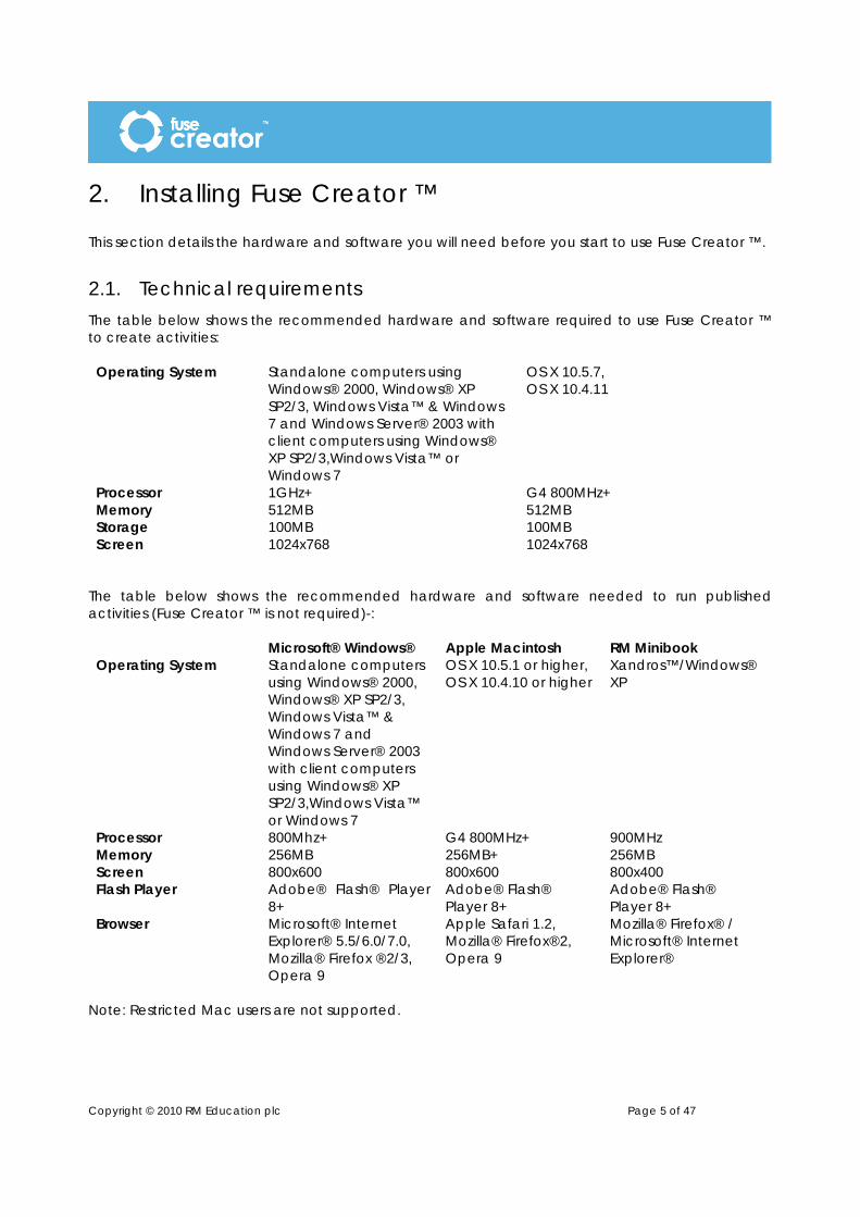
2.1. Technical requirements The table below shows the recommended hardware and software required to use Fuse Creator ™ to create activities: Operating System Standalone computers using
Windows® 2000, Windows® XP SP2/3, Windows Vista™ & Windows 7 and Windows Server® 2003 with client computers using Windows® XP SP2/3,Windows Vista™ or Windows 7
OS X 10.5.7, OS X 10.4.11
Processor 1GHz+ G4 800MHz+ Memory 512MB 512MB Storage 100MB 100MB Screen 1024x768 1024x768
The table below shows the recommended hardware and software needed to run published activities (Fuse Creator ™ is not required)-: Microsoft® Windows® Apple Macintosh RM Minibook Operating System Standalone computers
using Windows® 2000, Windows® XP SP2/3, Windows Vista™ & Windows 7 and Windows Server® 2003 with client computers using Windows® XP SP2/3,Windows Vista™ or Windows 7
OS X 10.5.1 or higher, OS X 10.4.10 or higher
Xandros™/Windows® XP
Processor 800Mhz+ G4 800MHz+ 900MHz Memory 256MB 256MB+ 256MB Screen 800x600 800x600 800x400 Flash Player Adobe® Flash® Player
8+ Adobe® Flash® Player 8+
Adobe® Flash® Player 8+
Browser Microsoft® Internet Explorer® 5.5/6.0/7.0, Mozilla® Firefox ®2/3, Opera 9
Apple Safari 1.2, Mozilla® Firefox®2, Opera 9
Mozilla® Firefox® / Microsoft® Internet Explorer®
Note: Restricted Mac users are not supported.

Copyright © 2010 RM Education plc Page 6 of 47
2.2. Installing Fuse Creator ™ on your computer The following steps guide you through the process of installing Fuse Creator ™. To install to your Windows®-based or Macintosh-based computer follow the on-screen instructions. To install to Windows®- based networks including Community Connect ™ 3 or -4 networks follow the instructions in the Installation Guide. 1. Insert the Fuse Creator ™ disc into your computer drive. 2.
a) For Windows® users; the installation wizard should start automatically. If installation does not start automatically, locate and select the setup program on the disc and double-click to run. Click Standalone Computer.
b) For Macintosh users; locate and select the setup application on the disc and double-click to run.
3. Follow the installation wizard by choosing the Next button when prompted. 4. You will be prompted to accept the terms of the licence agreement. Choose ‘I accept …’ and
click Next. Note: Your establishment name must consist of at least four characters and will be used when
you publish activities. You must enter the product key at this time otherwise Fuse Creator ™ will be installed as a
demonstration version which does not support saving and exporting activities. 5. Enter your establishment name and the product key which can be found on the Fuse Creator ™
pack and click Next. 6. Choose the location on your computer where you want Fuse Creator ™ to be installed and click
Next. 7. Click Next to have the media files and sample activities install to the default location. This is
C:\Program files for PC and Mac:\Applications for Mac. Note: You can click Back, (Windows®) or Previous (Macintosh) to review and/or change the settings on each screen. 8. When you have finalised all options, click Install to continue. 9. Macintosh users will see a “Choose Alias Folder” screen providing the following options: In the
Dock, On the Desktop, In your home folder, Other and Don’t create aliases. Select an option and click Next.
10. Fuse Creator ™ will install the necessary files to your computer. When the installation is complete click Finish.
To run Fuse Creator™ click on the Fuse Creator icon on the desktop or other chosen location.

Copyright © 2010 RM Education plc Page 7 of 47
3. Guided tour
3.1. Start Page When you first open Fuse Creator ™, the Start Page displays. This gives you three options: Create a new activity, Edit an existing activity or Run an activity.
3.2. Activity Set-Up page When you choose the Create option, the Activity Set-Up page displays. This allows you to define the activity and some of its parameters. Enter as much information as you can. This will help with tagging the activity later on.
3.3. Creating Pages When you are starting a new activity from scratch, you will see a page showing a panel Select the first page type.
There are now nine page types available:
• Drag and Drop • Ordering • Fill the Gap • Question • Linking Lines
• Flashcards • Information • Menu Page • Sorting

You can create as many pages as you like by clicking the New button. Your pages will be added to the page tray at the bottom of the page. A collection of pages is referred to as an activity.
3.4. Sequencing activities Once you have created the pages of your activity, you can sequence them and add branching to them so that different users get a different experience depending on their score. You can add comments to a page outcome, dependent on the score achieved, and you can also add a final report page to the activity to show users how they did in the activity.
3.5. Previewing your work You can preview both your pages and your sequenced activities. The Preview Page button in the page editor will allow you to test the current page.
The Run Activity button in Sequencer will allow you to test the fully sequenced activity. You will see the page or activity exactly as the intended user will see it.
3.6. Running your activity The Playback screen will allow you to run the activity as a user will see it. It will display all the functionality that you have defined for the activity including a splash screen with copyright message, prompt for user name and report pages.
3.7. Saving your work You can save your activity as an editable Fuse Creator ™ file to come back to later. You can also Save As, in order to create different versions with slightly different content or structure by changing the file name.
3.8. Publishing You can publish Fuse Creator ™ activities in the following ways: Publish Standalone – this feature allows you to publish the current activity as an .html or .swf file to be played back on a computer or via a website. Export SCORM – this feature allows you to publish the current activity as a SCORM pack for use in a VLE.

Copyright © 2010 RM Education plc Page 9 of 47
3.9. File Menu The File Menu on the main navigation bar at the top of the Fuse Creator ™ window provides the following options: Create New… – allows you to create a new activity. Open Activity…– allows you to open an existing activity. Sample Activities… – allows direct access to the sample files provided. Save – allows you to save the current activity. Save As… – allows you to save the current activity under a different file name. Import SCORM… – allows import of SCORM files produced in Fuse Creator. Export SCORM… – allows you to publish the current activity in either SCORM 1.2 or SCORM 2004 formats. Publish Standalone… – allows you to publish the current activity as a standalone activity, which can be copied to other computers. Activity Set-Up… – allows you to add some basic and advanced details to describe the activity. Exit – allows you to exit the application.
3.10. Edit Menu The Edit Menu on the main navigation bar at the top of the Fuse Creator ™ window provides the following options:
Undo – allows you to undo the last action Redo – allows you to redo the last action you undid Cut Object – allows you to cut the selected object or text to the clipboard Copy Object – allows you to copy the selected item or text to the clipboard Paste Object – allows you to paste the selected item or text from the clipboard to the page Paste Object in Place – allows you to paste an item in the same place that you copied it from. This means that you can copy an object from one page and paste it in the same place on a different page.
3.11. Help Menu The Help Menu on the main navigation bar at the top of the Fuse Creator ™ window provides the following options. Help – opens the help file which covers the features of Fuse Creator ™ and includes a quick tutorial. User Guide – opens a copy of this guide which you can print out. Creator Website – allows you to open the Fuse Creator ™ website. About Creator… – allows you to view detailed product information such as copyright, version and product type. There are also links to product and company Web sites and a link to the Licence Agreement for Fuse Creator ™.

Copyright © 2010 RM Education plc Page 10 of 47
4. Using Creator to create and edit activities
4.1. Start Page The Start Page when active displays every time you run Fuse Creator ™.
This page provides a quick route to the main features of Fuse Creator ™: To create a new activity, click Create. The Activity Set-Up pop-up displays. If you want to edit an existing activity, click Edit then browse to the location of the activity on your computer and click Open. If you want to run an existing activity, click Run then browse to the location of your sequenced activity on your computer and click Open.

Copyright © 2010 RM Education plc Page 11 of 47
4.2. Activity Set-Up This pop-up allows you to define the activity you want to create. The information you provide here will help when it comes to tagging and publishing the activity later on.
4.2.1. Basic Set-Up
There are two fields that must be filled in -Title and Description. Type the information into the associated text boxes.
4.2.2. Advanced Set-Up
This set-up page contains six optional fields: Keywords: type some keywords here to aid discovery of the activity within a Virtual Learning Environment (VLE). Keywords should be separated by a semi-colon. Copyright text: type some copyright text to display when the activity is opened and on the activity splash screen if required. Show copyright in activity: a tick box indicating whether you want the copyright text to show on the activity splash screen. Request user name: a tick box indicating whether you want the user to enter their name at the start of the activity. Their name will be included in their report if this option is selected. By default this option is ticked. Cost: a tick box indicating whether this activity is a commercially-produced activity and has a cost associated with it. Protect from edit: a tick box indicating
whether you want to prevent this activity from being edited once it has been published. Enable score output: a tick box indicating whether you want to allow this activity to provide a score to pass back to a VLE, LMS or other website.
Copyright © 2010 RM Education plc Page 12 of 47
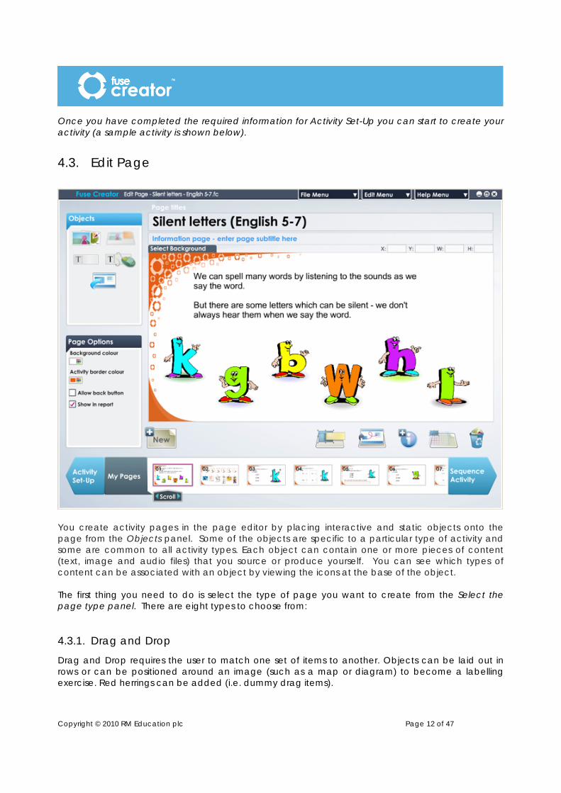
Once you have completed the required information for Activity Set-Up you can start to create your activity (a sample activity is shown below).
4.3. Edit Page
You create activity pages in the page editor by placing interactive and static objects onto the page from the Objects panel. Some of the objects are specific to a particular type of activity and some are common to all activity types. Each object can contain one or more pieces of content (text, image and audio files) that you source or produce yourself. You can see which types of content can be associated with an object by viewing the icons at the base of the object. The first thing you need to do is select the type of page you want to create from the Select the page type panel. There are eight types to choose from:
4.3.1. Drag and Drop
Drag and Drop requires the user to match one set of items to another. Objects can be laid out in rows or can be positioned around an image (such as a map or diagram) to become a labelling exercise. Red herrings can be added (i.e. dummy drag items).
Copyright © 2010 RM Education plc Page 13 of 47
4.3.2. Sorting
Sorting requires the user to sort items into groups or categories. Items and category zones can be laid out in rows or can be positioned transparently over an image (such as a map or diagram) to become a labelling exercise.
4.3.3. Ordering
Ordering requires the user to place a number of items in the correct order by clicking and dragging them into place. This page type can be used for mathematical or scientific equations, or for ordering processes or historical events.
4.3.4. Fill the Gap
Fill the Gap requires the user to complete a word, sentence or paragraph by filling in one or more missing words or letters. They can do this either by using a pre-determined word bank, or by typing the answer into a text box. A different word bank can be set up for each gap or you can use the same word bank for all gaps.
4.3.5. Question
The Question page requires the user to complete a multiple choice question. Questions can have multiple correct answers if necessary, and can be accompanied by an image, audio or video. The user must identify the correct number of answers before clicking the Next button.
4.3.6. Linking Lines
Linking Lines presents users with two sets of items. Users link each item in one set with an item in the other set using a connecting line. As with the Drag and Drop page; items can be laid out in simple rows or can be positioned around an image (such as a map or diagram) to become a labelling exercise. Items can have images, audio or text assigned to them.
4.3.7. Flashcards
The Flashcards page is intended as a warm-up page to be used on a whiteboard. It presents a series of images which the group can discuss. Each image can be assigned some clue text (i.e. first letter of a word, or a written clue to prompt discussion). Clicking the Show answer button will then reveal the correct word/answer. Images can also be accompanied by audio files as required.
4.3.8. Information
The Information page is designed to allow you to present a non-interactive page comprising media files or some basic information to introduce the activity. The information page can include any combination of the main page objects - audio files, images or text boxes.
4.3.9. Menu page
The Menu page is designed to allow the user to progress through the activity by choosing their route through the pages. You can use it to create an interactive story where the user chooses what happens next by clicking one of the options; or you could use it to allow users to concentrate on a particular topic within a bigger activity (i.e. choosing triangles within an activity about polygons).

Copyright © 2010 RM Education plc Page 14 of 47
Once you have chosen the page type you want to create, click on its name to start editing and access the main editing tools.
4.4. Editing tools
4.4.1. Editable page titles
The activity title you provided during activity set-up automatically displays on each page, but you can change this for each page if you want by selecting the title and typing over it. There is also an optional page subtitle, which can be changed for each page. If no subtitle is added, a subtitle will not be shown in the finished activity.
4.4.2. Objects panel
The Objects panel contains the objects available for you to use in the page type you have chosen. Images, text boxes, input boxes, background images and pop-ups can be added to all page types. In addition to these, each page type has its own specific interactive objects (see sections 4.7 to 4.13).
4.4.3. Page Options panel
The Page Options panel allows you to change the properties and add features to the objects and media files, you add to your page, e.g. changing the font of text in a text box, resizing an image, etc. The properties available in the Page Options panel will change according to the object or media file you currently have selected on the page.
4.4.4. New button
Click the New button when you want to add a new page to your activity. You will see the Select the page type panel and you can select a new page type, choose to insert a page from another activity or duplicate the page you have just finished creating.
The Insert page from other activity option will allow you to browse for an existing Fuse Creator ™ file and copy a page from it into your open activity.
The Duplicate current page option will duplicate the page including all the objects and media files you added to the page.

Copyright © 2010 RM Education plc Page 15 of 47
4.4.5. Labels button
The Labels button allows you to view the authoring labels associated with the objects you have dragged onto the page. This will allow you to see the order of items or matching pairs more easily while editing your activity. Labels will not be shown in the finished activity.
4.4.6. Preview button
You can preview a page from your activity at any time by clicking the Preview button. You will see the page as a user will see it.
4.4.7. Add help
The Add help button allows you to add instructions / help text to your page to help the user complete the activity. The text you add here will display in the activity player when the user runs the activity.
The user accesses the help by clicking the corresponding Help button at the bottom of the page.
4.4.8. Show grid
Click the Show grid button to display a grid on the working page and help you align the objects. All objects you add to the working page will snap to grid to make positioning easier. The grid will not display in the finished activity.
4.4.9. Recycle bin
When you want to delete an object from the page, select the object and click the Recycle bin icon. You can also use the Delete key to delete objects.
4.4.10. Coordinates
You can view X and Y coordinates in order to position your objects in a specific location on the page. You can also view W and H coordinates in order to size your objects to a specific width and height. Coordinates appear above the page content on the right-hand side.
4.5. Generic page objects
4.5.1. Image object
This object allows you to add an image or a Flash Movie File (.swf) to the page, either as supporting information or to form part of your activity.
Note: Any .swf file that you add must be self contained and not access any external files. To add an image to your page:

Copyright © 2010 RM Education plc Page 16 of 47
1. In the Objects panel, click on the image icon, hold the mouse button down and drag the Image object, release the mouse button to drop the object onto the page.
2. The Select File dialog box displays. 3. By default the Select File dialog box will open in the Fuse Creator Media location. You can
choose a different location using the navigation panel on the left or the Look in drop-down box.
4. You can choose to open either an image of a .swf file by selecting the appropriate file type in the Files of type: drop-down box. When you have selected your file click Open.
Note: Some images will be larger than the destination image object, if prompted; you can still choose to continue adding the image smaller than actual size or choose a different image. You can resize the image later, (see below).
You can reposition the image by clicking and dragging it to a different position.
You can resize the image box using selection points on the corners and sides of the object. The image will be forced into the proportions of the image box in the first instance but you can change this to suit your requirements by using the image options in the Image Options panel, which displays when you click the image icon below the object.
Change Image – choose this option if you want to change the image file assigned to the object. The Change image option will display the Load Image pop-up box click Browse to choose another image file or click Cancel. Remove Image – choose this option if you want to remove the image file assigned to the object. Actual Size – choose this option to resize the object to the original size of the image. Keep Aspect – tick this option to keep the original proportions of the image
whenever you resize the object. Image flip – choose one of the options in the Image flip section to flip the image either vertically or horizontally. Image rotate – choose one of the options in the Image rotate section to rotate the image either clockwise or anti-clockwise. You can also add images to other generic objects of different types. To add an image to an object, click the image icon at the base of the object.
Selection points
Image icon
Copyright © 2010 RM Education plc Page 17 of 47
4.5.2. Background Image object
This object allows you to add a background image to the page, either as supporting information or to form part of your activity.
To add a background image to your page: 1. In the Objects panel, click on the background image icon. 2. The Select File dialog box displays. 3. By default the Select File dialog box will open in the Fuse Creator Media location. You can
choose a different location using the navigation panel on the left or the Look in drop-down box. When you have selected your file click Open.
Note: Some images will be larger than the destination image object, if prompted; you can still choose to continue or choose a different image. Large images may make the page run slowly.
The image will be forced into the proportions of the background in the first instance, but you can resize the image using the selection points on the corners and sides of the image. The background has a width of 796 pixels and a height of 389 pixels. Select Background – once you’ve added a background image, the Select Background tab will
become active (located at the top of the page). This is how you select the background to make changes to it. If the background is deleted the tab becomes inactive.
Deselect Background – once a background image has been added and selected, you can lock
the image to the page by clicking this tab.
4.5.3. Text Box object
This object allows you to add some text to the page, either as supporting information or instructions for your activity.
To add a text object to your page:
1. In the Objects panel, click on the text box icon, hold the mouse button down and drag the text object, release the mouse button to drop the object onto the page.
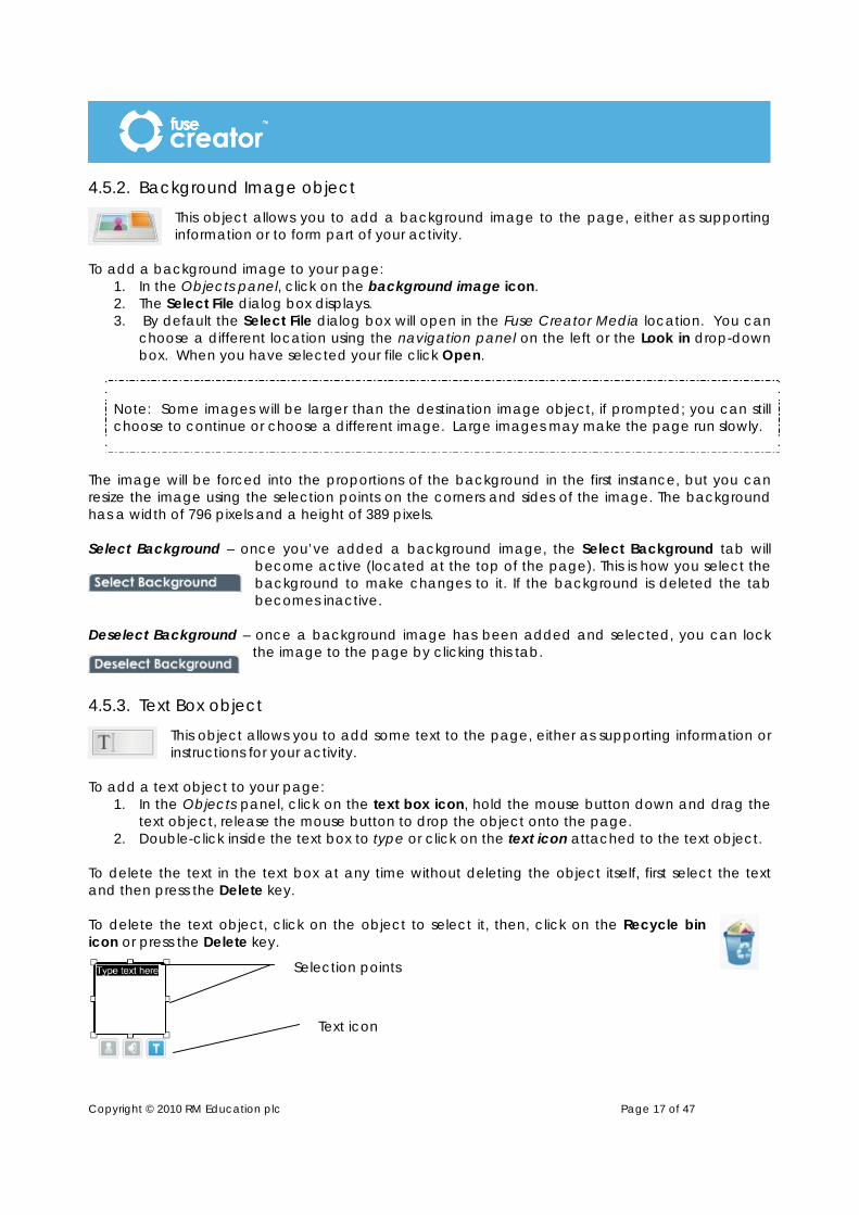
2. Double-click inside the text box to type or click on the text icon attached to the text object. To delete the text in the text box at any time without deleting the object itself, first select the text and then press the Delete key. To delete the text object, click on the object to select it, then, click on the Recycle bin icon or press the Delete key.
Text icon
Selection points

Copyright © 2010 RM Education plc Page 18 of 47
You can edit the text in the text box by selecting the whole text object or just the specific text you wish to edit and then following the instructions below to change the Text Options of size and colour, alignment, format and/or font. N.B. If no text is selected (by highlighting) then the changes will be applied to the whole text object. You can reposition the text object by clicking and dragging the object to a different position. You can resize the text object using selection points on the corners and sides of the object. You can change the properties of your text box using the tools in the Text Options panel, which are shown when you click the text icon below the object.
Size and colour – you can resize the text by clicking on the graduated buttons for small to large text. To change the colour of the text click on the Colour Picker icon. Alignment – you can change the alignment of the text by using the horizontal and vertical alignment options. Format – you can change the format of the text to either bold, italic and/or underline. Font – you can choose from four pre-defined fonts for your text.
You can also add text to other generic objects of different types. To add text to an object, click the text icon at the base of the object.
4.5.4. User Input box
This object provides the user with a text entry box, either to answer an open-ended question, or to provide workings or reasons for their answer. There can be one input box per page.
To add an input box to your page:
1. In the Objects panel, click on the user input box icon, hold the mouse button down and drag the text object, release the mouse button to drop the object onto the page.
2. Double-click inside the box to type some initial text as instruction text or as a part-finished sentence or paragraph. Alternatively, you can delete the text and make it a blank input box with instructions elsewhere on the page.
To delete the text in the input box, without deleting the object itself, first select the text and then press the Delete key. To delete the input box object, click on the object to select it, then, click on the Recycle bin icon or press the Delete key.

Copyright © 2010 RM Education plc Page 19 of 47
You can reposition the input box by clicking and dragging the object to a different position.
You can resize your input box using the selection points on the corners and sides of the object. You can change the properties of the text in your user input box using the options in the Text Options panel. These are the same options as for the text box described in 4.5.3
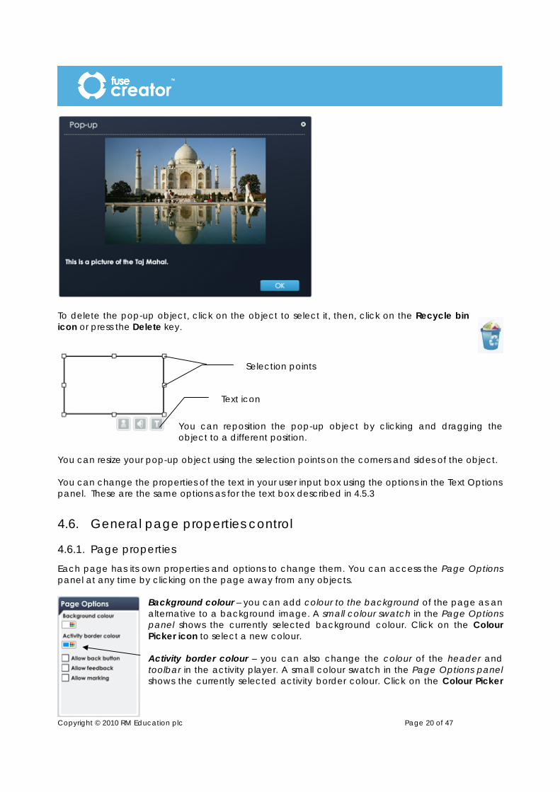
4.5.5. Pop-up object
This object provides the user with a pop-up dialog box, either to provide extra on-screen help, provide clues or just to act as an information box. Pop-ups can include a combination or text, image and audio and are created by using the choice of 4 pre-set templates provided. To add a pop-up box to your page:
1. In the Objects panel, click on the pop-up box icon, hold the mouse button down and drag the object, release the mouse button to drop the object onto the page.
2. The Select a layout dialog box will appear. Select the layout you require from the four templates available.
3. Your chosen template will appear. Add any images, text or audio to the template. 4. If you are using an image-based template, you can use the slider to adjust the proportions of
the text area and image area. 5. Once you are happy with the contents of your pop-up object, click OK.
Selection points
Text icon
Copyright © 2010 RM Education plc Page 20 of 47
To delete the pop-up object, click on the object to select it, then, click on the Recycle bin icon or press the Delete key.
You can reposition the pop-up object by clicking and dragging the object to a different position.
You can resize your pop-up object using the selection points on the corners and sides of the object. You can change the properties of the text in your user input box using the options in the Text Options panel. These are the same options as for the text box described in 4.5.3
4.6. General page properties control
4.6.1. Page properties
Each page has its own properties and options to change them. You can access the Page Options panel at any time by clicking on the page away from any objects.
Background colour – you can add colour to the background of the page as an alternative to a background image. A small colour swatch in the Page Options panel shows the currently selected background colour. Click on the Colour Picker icon to select a new colour. Activity border colour – you can also change the colour of the header and toolbar in the activity player. A small colour swatch in the Page Options panel shows the currently selected activity border colour. Click on the Colour Picker
Selection points
Text icon
Copyright © 2010 RM Education plc Page 21 of 47
icon to select a new colour. Click the Preview button to view your changes to the toolbar. Allow back button – you can also define whether your page should show a Back button on the toolbar. This is a useful feature for an information page or flashcard page, so that users can navigate backwards and forwards through the information provided. Allow feedback – you can define whether your page should allow users to see feedback on their progress on the page so far. This is not a recommended feature if your activity is a formal test.
Allow marking – you can define whether your page should allow users to see the marks for each of their answers on the page so far. This is not a recommended feature if your activity is a formal test.
4.6.2. Common object properties
Most of the objects in Fuse Creator ™ have similar properties that you can change from the Frame Options panel when you have the object selected. Border – you can change the border thickness by clicking on the border icons representing no border and varying degrees of thickness. A tick indicates which option is selected. You can change the border colour. The small colour swatch in the Frame Options panel shows the currently selected colour. Click on the Colour Picker icon to choose a new colour. Background – you can choose to have a background to your object by clicking the on or off icons. A tick shows the current selection. If you choose to have no background then the background of the whole activity is visible through the object. If you choose to have a background then you can choose a colour for the object background. The small colour swatch in the Frame Options panel shows the currently selected colour. Click on the Colour Picker icon to choose a new colour. Opacity settings – you can use the slider provided to select the opacity level of your object. This means that if you are using a background colour or image, you can make you objects opaque or semi-opaque so that you can see through them to the background.
4.6.3. Audio options
Most objects can have audio assigned to them, (MP3 sound files). To add audio to an object:
1. Click on the audio icon at the base of the object. 2. A Select File dialog box displays. 3. By default the Select File dialog box will open in the Fuse Creator Media
location. You can choose a different location using the navigation panel on the left or the Look in drop-down box.
4. When you have selected your file click Open.

Copyright © 2010 RM Education plc Page 22 of 47
Note: Some audio files will be large, if prompted; you can still choose to continue or choose a different audio file. Large audio files may make the page run slowly; you should if possible edit the file to reduce its size.
The audio has a number of properties which can be changed in the Audio Options panel when you have the audio icon selected. Change – choose this option if you want to change the audio file associated with the object. The Change Audio option displays the Load Audio pop-up box, click Browse to choose another audio file or click Cancel. Remove – choose this option if you want to remove the audio file associated with the object. Size and colour – you can resize the audio icon to be shown on the selected object by clicking on the graduated buttons for small to large icon. The small colour swatch in the Options panel shows the currently selected colour. Click on
the Colour Picker icon to choose a new colour. Alignment – you can change the alignment of the audio icon by using the horizontal and vertical alignment buttons. Preview audio – choose this option to hear the audio file you have attached to the object. Click on the Preview audio icon to listen to the audio file. Click the Preview audio icon again at any time to stop playing the audio file.
4.7. Drag and Drop page objects The objects and options below are specific to the Drag and Drop page type.
4.7.1. Drag / Drop pair object
This object is a pair of linked items that the user matches correctly to complete the page. You can choose to have two lines of items or arrange the items around a
larger image to produce a labelling exercise (see the examples below). To add a drag/drop pair object to your page:
1. In the Objects panel, click on the drag/drop pair icon, hold the mouse button down and drag the object, release the mouse button to drop the object onto the page.
2. When the paired object has been added to the page, if you click on one of the paired objects, an animated border line will show you where the corresponding item is located.
Remember also that you can use the Labels button to show which object is the drag item and which is the drop zone.
You can assign text, image, audio or a combination of all three to either the drag item or the drop zone object using the associated icons below the object, (shown when the object is selected).

Copyright © 2010 RM Education plc Page 23 of 47
You can reposition the drag or drop objects by clicking and dragging the object to a different position. You can resize the drag and drop objects using the selection points on the corners and sides of the object. You can reposition and resize the two items independently. To delete the drag/drop pair object, click either the drag item or the drop zone to select the pair, then click on the Recycle bin icon or press the Delete key.
You can change the properties of your drag or drop objects using the tools in the Frame Options panel, which are shown when you select either of the drag and drop pair. The drag and drop objects support the common object properties Border, Background and Opacity (described in 4.6.2). With drag item selected: Resize All – choose this option to resize all the drag and drop objects on the page so that they are the same size as the one you have selected. This can be used to ensure that users aren’t given clues to matching pairs by their size. It can also help you to layout your page quickly. Resize Pair – choose this option to resize the matching drop zone object so that it is the same size as the drag object you have selected. With the drop zone selected:
Labelling line – choose this option to add a labelling line to your drop zone object this is useful when you are making a labelling exercise: Click the tick box on the left of the line.
If you want to add an arrow to the end of your labelling line, click the tick box to the right on the line. There is a small colour swatch to the right of the line showing the currently selected colour. To change the colour of the arrow click on the Colour Picker icon next to the labelling line option.
4.7.2. Dummy drag object (red herring)
Drag item
Drop zone
Selection points

Copyright © 2010 RM Education plc Page 24 of 47
This object allows you to add some incorrect answers or ‘red herrings’ to your drag and drop page. It is essentially a drag item with no drop zone.
To add a dummy drag object to your page:
1. In the Objects panel, click on the Dummy drag icon, hold the mouse button down and drag the object, release the mouse button to drop the object onto the page.
2. You can assign text, image, audio or a combination of all three to the dummy drag object. You can reposition the dummy drag object by clicking and dragging the object to a different position. You can resize the object by using the selection points on the corners and sides of the object.
To delete the dummy drag object, click the object then click on the Recycle bin icon or press the Delete key. You can change the properties of your dummy drag objects using the tools in the Frame Options panel, which are shown when you select the object. The dummy drag objects support the common object properties Border, Background and Opacity (described in 4.6.2). Resize All – choose this option to resize all the drag and drop objects on the page so that they are the same size as the one you have selected. This can be
used to ensure that users aren’t given clues to matching pairs by their size.
4.8. Sorting page objects The objects and options below are specific to the Sorting page type.
4.8.1. Sorting group object
This object is a single category item with multiple drag items that the user sorts correctly to complete the page. You can choose to arrange the items as simple categories and items or you could lay the drop zones over a larger image to produce a labelling exercise. The user can place drag items within the category in
any order.

Copyright © 2010 RM Education plc Page 25 of 47
To add a sorting group object to your page: 1. In the Objects panel, click on the sorting group icon, hold the mouse button down and drag
the object, release the mouse button to drop the object onto the page. 2. The Change number of drags pop-up displays. Click the right and left arrows to increase or
decrease the number of drag items in the sorting group. Note: You must have at least two- and no more than ten drag items per page.
3. When the sorting group has been added to the page, you can move and reposition each item within the group independently.
4. If you click on one of the drag items, an animated border line will show you where the corresponding category is located.
Remember also that you can use the Labels button to show which objects are the drag items and which is the category.
You can assign text, image, audio or a combination of all three to either the drag items or the category using the associated icons below the object, (shown when the object is selected).

Copyright © 2010 RM Education plc Page 26 of 47
You can reposition the drag items or category by clicking and dragging the object to a different position. You can resize the drag items and categories using the selection points on the corners and sides of the object.
You can reposition and resize the items independently. To delete a sorting group, click either a drag item or the category to select the group, then click on the Recycle bin icon or press the Delete key. You can change the properties of your sorting group objects using the tools in the Frame Options panel, which are shown when you select an item.
The sorting group objects support the common object properties Border, Background and Opacity (described in 4.6.2). With drag item selected: Resize All – choose this option to resize all the drag and drop objects on the page so that they are the same size as the one you have selected. This can be used to ensure that users aren’t given clues to matching pairs by their size. It can also help you to layout your page quickly. With the drop zone selected:
Change drag – choose this option to change the number of drag items in your sorting group object. It will display the Change number of drags pop-up box again.
Drag item
Category
Selection points

Copyright © 2010 RM Education plc Page 27 of 47
4.9. Ordering page objects The objects and options below are specific to the Ordering page type. You can choose to add either a horizontal or vertical ordering object to your page.
4.9.1. Horizontal ordering group object
This object is a group of items in a horizontal line. The user will need to places the items in the correct order by rearranging them horizontally. This group works best for image-based exercises.
To add a horizontal ordering object to your page:
1. In the Objects panel, click on the horizontal ordering group icon, hold the mouse button down and drag the object, release the mouse button to drop the object onto the page.
2. The Item Count pop-up displays. Click the right and left arrows to increase or decrease the number of items in the group.
Note: You must have at least two - and no more than ten items per page. 3. You can assign text, image, audio or a combination of all three to each of the items within
the group using the icons below the object, (shown as each item in the group is selected). 4. When editing the page, put the items together in the correct order. The order will be
randomised when the user runs the activity.
You can view this by clicking the Preview button. You can change the amount of items in the group at any time by clicking Change in the Frame Options panel (this will display the Item Count pop-up box again). You can reposition the object by clicking and dragging the group object to a different position. You can resize the object using the selection points on the corners and sides of the object. All items will be resized together as a group.
Selection points

Copyright © 2010 RM Education plc Page 28 of 47
To delete the ordering group, click on any item in the group to select the group, then click on the Recycle bin icon or press the Delete key. The ordering objects support the common object properties Border, Background and Opacity (described in 4.6.2).
4.9.2. Vertical ordering group object
This object is a group of items in a vertical line. The user places the items in the correct order by rearranging them vertically. This group works best for text-based exercises.
To add a vertical ordering group object to your page: 1. In the Objects panel, click on the vertical ordering group icon, hold the mouse button down
and drag the object, release the mouse button to drop the object onto the page. 2. The Item Count pop-up displays. Click the right and left arrows to increase or decrease the
number of items in the group.
Note: You must have at least two - and no more than ten items per page. 3. You can assign text, image, audio or a combination of all three to each of the items within
the group using the icons below the object, (shown as each item in the group is selected). 4. When editing the page, put the items together in the correct order. The order will be
randomised when the user runs the activity.
You can reposition the object by clicking and dragging the group object to a different position. You can resize the object using the selection points on the corners and sides of the object. All items will be resized together as a group. You can view this by clicking the Preview button.

Copyright © 2010 RM Education plc Page 29 of 47
To delete the ordering group, click on any item in the group to select the group, then click on the Recycle bin icon or press the Delete key. You can change the properties of your ordering objects using the tools in the Frame Options panel, which are shown when you select the object. The ordering objects support the common object properties Border, Background, Opacity and Coordinates (described in 4.6.2). Change – choose this option to change the number of items in your ordering object. It will display the Item Count pop-up box again.
4.9.3. Two-part horizontal ordering group object
This object is a group of items in a horizontal line, which have two parts. The idea is to be able to easily add text to an ordering object via the bottom part. The user will need to place the items in the correct order by rearranging them horizontally. To add a two-part horizontal ordering object to your page:
1. In the Objects panel, click on the two-part horizontal ordering group icon, hold the mouse button down and drag the object, release to drop the object onto the page.
2. The Item Count pop-up displays. Click the right and left arrows to increase or decrease the number of items in the group.
Note: You must have at least two - and no more than ten items per page. 3. You can assign text, image, audio or a combination of all three to each of the items within
the group using the icons below the object, (shown as each item in the group is selected). 4. When editing the page, put the items together in the correct order. The order will be
randomised when the user runs the activity.
You can view this by clicking the Preview button
Selection points

Copyright © 2010 RM Education plc Page 30 of 47
You can change the amount of items in the group at any time by clicking Change in the Frame Options panel (this will display the Item Count pop-up box again). You can reposition the object by clicking and dragging the group object to a different position. You can resize the object using the selection points on the corners and sides of the object. All items will be resized together as a group. To delete the ordering group, click on any item in the group to select the group, then click on the Recycle bin icon or press the Delete key.
The ordering objects support the common object properties Border, Background and Opacity (described in 4.6.2).
4.10. Fill the Gap page objects The objects and options below are specific to the Fill the Gap page type.
4.10.1. Gap Fill text object
This object is a text box for you to enter words, sentences or paragraphs and create missing words or letters for users to complete.
To add a Fill the Gap text object to your page: 1. In the Objects panel, click on the Gap fill text object icon, hold the mouse button down and
drag the object, release the mouse button to drop the object onto the page.
2. Double-click inside the text box to type or click on the text icon to select then, type the word, sentence or paragraph that you want to use in the activity.
3. Once you have entered your text, whilst the text icon
is still selected you can change the text properties using the formatting options in the Text Options panel. You can change the text size and colour as well as choose from the four preset fonts.
4. When you are happy with the text, click the Make gaps button below the object. You will see a warning message stating that you won’t be able to edit the text if you continue. Click Yes. (If you
need to edit the text again the Edit text button will be available, but you will lose any gaps you have made if you do this.)
Text icon

Copyright © 2010 RM Education plc Page 31 of 47
5. To make a missing word or letter, select a word or character with the mouse. The Select text button will change to a Make gap button. Click the Make gap button below the object.
6. The Gap Options pop-up displays. You have options to let your user type the answer for each
gap, or choose words or letters from a word bank to fill the gap.
7. Within the pop-up box you have several options: Share answer items with other gaps on this page – Selecting this allows the user to select all answers from a single word bank for the activity. This means that you do not need to set up a different word bank for each gap. Use answer items for this gap only – Selecting this allows the user to select the answers for each gap from a separate word bank. The options are presented to the user in a pop-up box. Note: If you choose one of the word bank options, each word or character becomes a clickable button for the user. Use keyboard input – Selecting this allows users to type in their answer. Allow accented characters – For use with keyboard input, the tick box is ticked by default. When enabled a panel displays for the user to select the required accented characters whilst completing the activity. If you do not want this feature click on the tick box to deselect it.

Copyright © 2010 RM Education plc Page 32 of 47
Remove Gap – allows you to remove the current gap from the gap fill object. OK – when you have finished completing the selections for the gap, click OK to save your edits. Cancel – if you want to cancel the action or discard your editing click Cancel The Gap Options pop-up closes when you click OK or Cancel. 8. Select the next word or character where you want to create a gap and repeat from Step 4,
until all gaps have been created. 9. To preview the activity click the Preview button. The Fill the Gap objects support the common object properties Border, Background and Opacity (described in 4.6.2).
4.11. Question page objects The objects and options below are specific to the Question page type.
4.11.1.Answer object
This object is a multiple choice answer selection box. When used alongside a text box containing some question text, it aims to create a multiple choice page to test users’ knowledge.
To add an Answer object to your page: 1. In the Objects panel, click on the Answer object icon, hold the mouse
button down and drag the object, release the mouse button to drop the object onto the page.
2. You can assign text, image, audio or a combination of all three to the answer object using the icons below the object.
3. Add further answer objects in the same way until you have enough choices.
4. To tell the computer which answer(s) are correct, you need to identify the correct answer(s) and select Mark as correct in the Frame Options panel.
5. Actual questions to be used in the activity and any associated images should be added as common text box objects or image boxes.
Note: There must be at least one correct answer per page; you may have more than one correct answer.
You can reposition the object by clicking and dragging the object to a different position.

Copyright © 2010 RM Education plc Page 33 of 47
You can resize the question object using the selection points on the corners and sides of the object. To delete the question object, click on the object to it, then click on the Recycle bin icon or press the Delete key. You can change the properties of your question objects using the tools in the Frame Options panel (above), which are shown when you select the object. Question objects support the common object properties Border, Background and Opacity (described in 4.6.2).
4.12. Linking Lines page objects The objects and options below are specific to the Linking Lines page type.
4.12.1.Linking Lines pair object
This object is a pair of items that the user has to link via a connecting line to complete the page. You can choose to have two rows or columns of items or arrange the items around a larger image to produce a labelling exercise.
To add a Linking lines object to your page: 1. In the Objects panel, click on the Linking lines pair object icon, hold the mouse button down
and drag the object, release the mouse button to drop the object onto the page. 2. Once the paired object has been added to the page, if you click on one of
the paired objects, an animated border line will show you where the corresponding line start or line end item is located. Remember also that you can use the Labels button to show which object is the line start and which is the line end.
3. You can assign text, image, audio or a combination of all three to the linking lines objects using the icons below the object.
You can reposition the object by clicking and dragging the object to a different position. You can resize the object using the selection points on the corners and sides of the object. You can reposition and resize the two items independently.
To delete the linking lines pair, click on either the line start object or the line end object to select the pair, then click on the Recycle bin icon or press the Delete key.
You can change the properties of your linking lines objects using the tools in the Frame Options panel, which are shown when you select the object. Anchor Point – Click one of the icons to select a specific anchor point for both the line start and the line end pair. You can choose to show a central anchor point, or have left, right, top or bottom. When you click on an option a tick displays to show which option is selected.
Copyright © 2010 RM Education plc Page 34 of 47
Linking lines objects support the common object properties Border, Background and Opacity (described in 4.6.2).
4.13. Flashcards page objects
The objects and options below are specific to the Flashcards page type.
4.13.1.Flashcard object
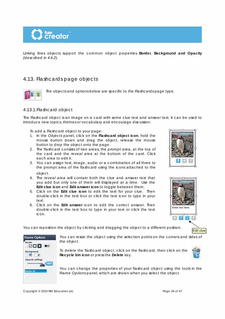
The Flashcard object is an image on a card with some clue text and answer text. It can be used to introduce new topics, themes or vocabulary and encourage discussion.
To add a Flashcard object to your page: 1. In the Objects panel, click on the Flashcard object icon, hold the
mouse button down and drag the object, release the mouse button to drop the object onto the page.
2. The flashcard consists of two areas, the prompt area, at the top of the card and the reveal area at the bottom of the card. Click each area to edit it.
3. You can assign text, image, audio or a combination of all three to the prompt area of the flashcard using the icons attached to the object.
4. The reveal area will contain both the clue and answer text that you add but only one of them will displayed at a time. Use the Edit clue icon and Edit answer icon to toggle between them.
5. Click on the Edit clue icon to edit the text for your clue. Then double-click in the text box or click the text icon to type in your text.
6. Click on the Edit answer icon to edit the correct answer. Then double-click in the text box to type in your text or click the text icon.
You can reposition the object by clicking and dragging the object to a different position.
You can resize the object using the selection points on the corners and sides of the object. To delete the flashcard object, click on the flashcard, then click on the Recycle bin icon or press the Delete key. You can change the properties of your flashcard object using the tools in the Frame Options panel, which are shown when you select the object.

Copyright © 2010 RM Education plc Page 35 of 47
Flashcards objects support the common object properties Border, Background and Opacity (described in 4.6.2).
Clue text is shown on the flashcard automatically or, if card is face down, it displays when the user clicks on the flashcard. If no clue text is added the text area will be empty. Answer text displays when user clicks on the Show Answer icon at the base of the card.
Allow back button – This option is shown in the Page Options panel when you have the page selected. It allows you to define whether your page should show a Back button on the toolbar. It allows users to navigate backwards and forwards to review the flashcards.
Show cards face down. This option is shown in the Page Options panel when you have the page selected. Selecting this option means the card will start off being face down in the activity. When the user clicks on the card it will flip over showing the image. By default the Flashcards are shown facing up.
Show in report – This option is shown in the Page Options panel when you have the flashcards page selected. It allows you to define whether your page should show in the activity report. Activity reports are added to the activity sequence
in the Sequencer (see page 38). Because flashcards pages do not possess scoring information, you may wish to omit them from the report.
4.14. Information page objects The information page only has generic objects available, e.g. textbox, image box, pop-up, etc.
Show in report – This option is shown in the Page Options panel when you have the information page selected. It allows you to define whether your page should show in the activity report. Activity reports are added to the activity sequence in the Sequencer (see page 38). Because information pages do not possess scoring information, you may wish to emit them from the report.
4.15. Menu page objects The objects and options below are specific to the Menu page type.
4.15.1.Link object
This object acts as a link to a new page in the activity. It can be used to make an interactive story where the user chooses what happens next, or it can be used to guide the activity down a particular route. These linked pages are assigned once you
get to the Sequencer.
Copyright © 2010 RM Education plc Page 36 of 47
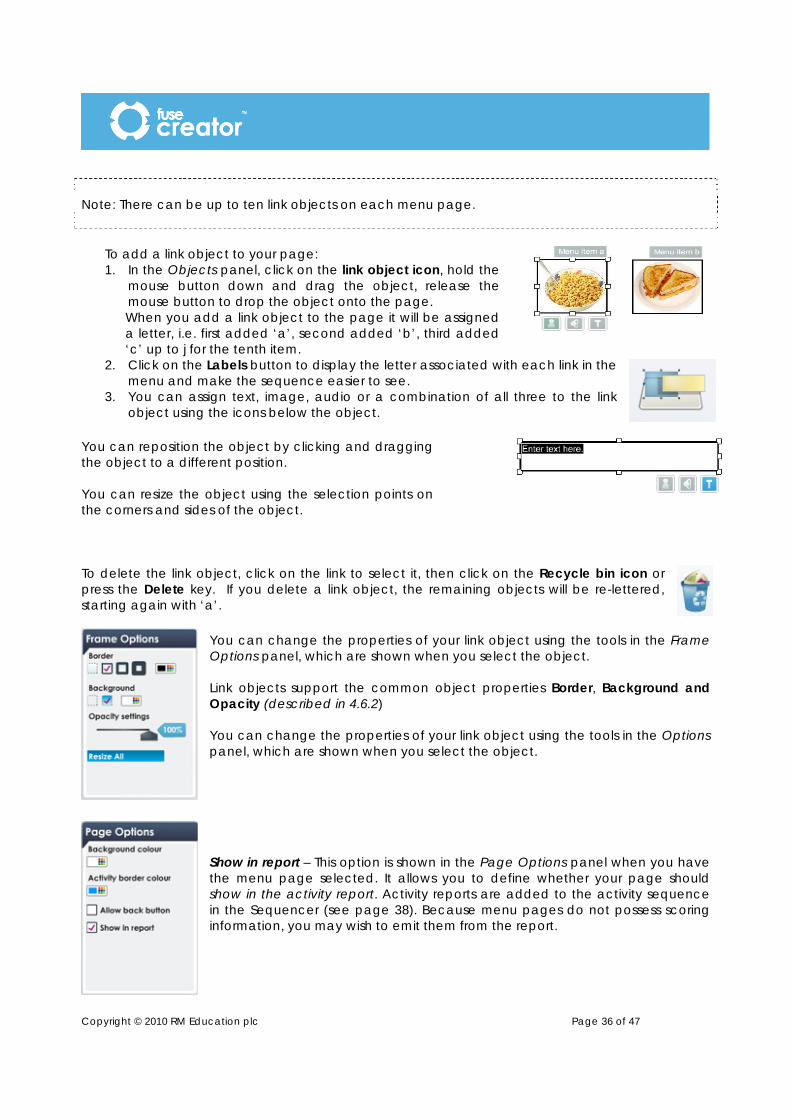
Note: There can be up to ten link objects on each menu page.
To add a link object to your page: 1. In the Objects panel, click on the link object icon, hold the
mouse button down and drag the object, release the mouse button to drop the object onto the page. When you add a link object to the page it will be assigned a letter, i.e. first added ‘a’, second added ‘b’, third added ‘c’ up to j for the tenth item.
2. Click on the Labels button to display the letter associated with each link in the menu and make the sequence easier to see.
3. You can assign text, image, audio or a combination of all three to the link object using the icons below the object.
You can reposition the object by clicking and dragging the object to a different position. You can resize the object using the selection points on the corners and sides of the object. To delete the link object, click on the link to select it, then click on the Recycle bin icon or press the Delete key. If you delete a link object, the remaining objects will be re-lettered, starting again with ‘a’.
You can change the properties of your link object using the tools in the Frame Options panel, which are shown when you select the object. Link objects support the common object properties Border, Background and Opacity (described in 4.6.2) You can change the properties of your link object using the tools in the Options panel, which are shown when you select the object. Show in report – This option is shown in the Page Options panel when you have the menu page selected. It allows you to define whether your page should show in the activity report. Activity reports are added to the activity sequence in the Sequencer (see page 38). Because menu pages do not possess scoring information, you may wish to emit them from the report.

Copyright © 2010 RM Education plc Page 37 of 47
5. Using Creator to sequence activities
Once you have created your pages, use the Sequencer to structure them into an activity.
5.1. About sequencing
There are two ways you can sequence an activity: a simple linear sequence and a branched sequence.
A simple linear sequence can be achieved by clicking the Create linear sequence button. The pages of your activity will display in a linear sequence in the same order as they are shown in the page tray. Every user will go through the activity pages in the
same order. You are still able to amend the sequence once you have created a linear sequence. In a branched sequence, you are able to add more dimensions to your activity. You can make branches based on the score a user gets and make the experience more personal. For example, a Drag and Drop activity has a potential score of eight. For users who get four or less, you may want them to take another look at the topic in question so you could branch them to a Flashcard activity to help them revise the topic. For those users who got five and above in the Drag and Drop, you

Copyright © 2010 RM Education plc Page 38 of 47
may want to congratulate them and progress them to a more difficult page. You have created two branches from a single activity. You can create score-based branching from any page that has a score. For those pages with a potential score of three and above, you can create up to three branches. A slider allows you to set the parameters of the branches. There is another way to use the branching mechanism in Sequencer and that is to use menu pages. Menu pages have link objects that can link to separate pages in the sequence by branching. In this instance, the slider won’t show a score, but the different letters representing the route. a, b, c… up to j. See the Menu page section to see how these letters are assigned. (4.13.1)
5.2. How to sequence your activity The following steps guide you through the process of sequencing your activity. Click Sequence Activity to open the Sequencer
1. Decide which page is going to be the first page in the activity. 2. Drag the first page from the page tray into the box marked Drag the first
page of your activity here. 3. Now decide which page will be your second page and drag that onto
the Sequencer somewhere below the first page. 4. Join the two pages together; click on the anchor at the bottom of the
first page and holding the mouse down drag the connecting line to the anchor at the top of the second page and release the mouse button. This is your branch line.
5. Drag a third page onto the sequence (either below the first page or the second).
6. Drag another branch line to join to the third page. 7. You can add comments to a connecting line. From the Comments and Reports panel, click
on the Feedback Comments icon, hold the mouse button down and drag the object to the connecting line, release the mouse button. The Select a layout dialog box will appear. Select the layout you require from the four templates available. Your chosen template will appear. Add any images, text or audio to the template. If you are using an image-based template, you can use the slider to adjust the proportions of the text area and image area. Once you are happy with the contents of your pop-up object, click OK.

Copyright © 2010 RM Education plc Page 39 of 47
Within the pop-up you have several options: Allow user to see correct answers. Selecting this allows the user to see what the correct answers are. Correct answers will not be shown by default. Allow user to remove errors. Selecting this allows the user to return to the activity and correct their answers. Correct answers will stay in place and incorrect answers will reset. Show score. Selecting this allows the user to see their current score. The score will not be shown by default. Allow reset. Selecting this allows the user to have another attempt to complete the activity and improve their
score. This option is not selected by default. You can also type some feedback text into the pop-up.
• Click OK when you have finished to close the pop-up box. 8. When you have a completed branch, you can add a report to the end of it.
From the Comments and Reports panel, click on a Report icon, hold the mouse button down and drag the object, release the mouse button to drop the report object below the branch.
9. Connect the last page of the branch to the report with a branch line. The way your activity flows is entirely up to you. All pages which have a score can have multiple branches. Those which don’t, i.e. Flashcards and Information pages, can only link to one branch. The menu page can have multiple branches based on choices, not scores. The following tools are available in Sequencer: In the Comments and Reports Panel Add feedback comments to a branch: Allows you to add comments to a branch line in the Sequencer. Click the object, hold down the mouse and drag the object onto a branch line. You can add comments via a pop-up box, and also select whether to allow the user to try the page again and/or show the score they achieved. (See point 8 above) Add a report to the end of a branch: Allows you to add a final report to a branch. Click the object, hold down the mouse and drag the object onto the Sequencer and connect it to a branch using a branch line. The report displays at the end of the activity and gives the user scores for each page they completed. Add a book-type report to the end of a branch: Allows you to add a book-type report to a branch. This is useful if your activity is based on a branching story, rather than scored activity pages. Click the object, hold down the mouse and drag the object onto the Sequencer and connect it to a branch using a branch line. The report displays at the end of the activity and gives the user scores for each page they completed.

Copyright © 2010 RM Education plc Page 40 of 47
At the base of the Sequencer Create linear sequence: Allows you to make a linear sequence of pages, in the same order as they are shown in the page tray. Pages will be added to the Sequencer in a vertical line. The sequence can still be edited, added to including comments and report added, as with any other sequence. Magnifying bar: Simple slider bar allowing you to magnify the sequence. Dragging to the left reduces the size and dragging to the right will enlarge it. Show all pages: Allows you to display all pages in the sequence on the screen at the same time. Display 100%: Allows you to revert display back to default size. If no page is selected the canvas scales from the centre.
Recycle bin: Click this to delete selected objects. Lower Panel Back to Edit: Allows you to go back to the page editor to make changes to specific page content. Run Activity: Once the activity has been sequenced, click to run through the activity as the user will see it. Within the Sequencer Slider: When you add multiple branches from a page a slider displays. The slider will automatically include the correct number of points for the page. You can make a maximum of ten branches from a single page. The number of sliders on a bar depends on the amount of branches, i.e. two branches = one slider, three branches = two sliders. If a branched page is deleted the slider will update accordingly. If only a single branch is left then the slider will be removed. Branch lines and anchors: Each page added to the Sequencer has a top and bottom anchor, allowing it to be linked from and to another page/s. To branch pages, drag the branch lines from a bottom anchor to a top anchor. Lines can be selected individually. To delete a line, click to select it then click on the Recycle bin icon. Looping branch lines: You can drag branch lines upwards in the sequence to create a looping sequence, for example if you want a user to repeat a page to get more practice. You do this in the same way as other branching lines, but the line will go up vertically and into the top anchor of the page you want the user to repeat. Note: You cannot create a looping branch line which connects back into the very first page. You can also scroll around the Sequencer area by clicking into it and then keeping the mouse button down, moving from left to right until the pages of the activity you want to work on are in view.
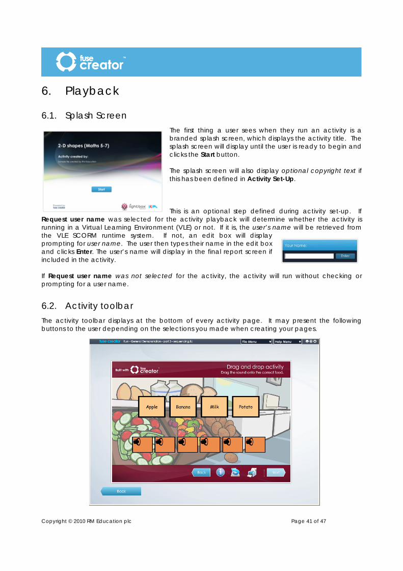
Copyright © 2010 RM Education plc Page 41 of 47
6. Playback
6.1. Splash Screen The first thing a user sees when they run an activity is a branded splash screen, which displays the activity title. The splash screen will display until the user is ready to begin and clicks the Start button. The splash screen will also display optional copyright text if this has been defined in Activity Set-Up. This is an optional step defined during activity set-up. If
Request user name was selected for the activity playback will determine whether the activity is running in a Virtual Learning Environment (VLE) or not. If it is, the user’s name will be retrieved from the VLE SCORM runtime system. If not, an edit box will display prompting for user name. The user then types their name in the edit box and clicks Enter. The user’s name will display in the final report screen if included in the activity. If Request user name was not selected for the activity, the activity will run without checking or prompting for a user name.
6.2. Activity toolbar The activity toolbar displays at the bottom of every activity page. It may present the following buttons to the user depending on the selections you made when creating your pages.
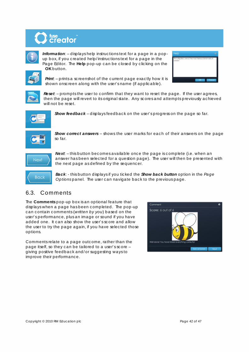
Copyright © 2010 RM Education plc Page 42 of 47
Information: – displays help instructions text for a page in a pop-up box, if you created help/instructions text for a page in the Page Editor. The Help pop-up can be closed by clicking on the
OK button. Print: – prints a screenshot of the current page exactly how it is shown onscreen along with the user’s name (if applicable).
Reset: – prompts the user to confirm that they want to reset the page. If the user agrees, then the page will revert to its original state. Any scores and attempts previously achieved will not be reset.
Show feedback – displays feedback on the user’s progress on the page so far. Show correct answers – shows the user marks for each of their answers on the page so far. Next: – this button becomes available once the page is complete (i.e. when an answer has been selected for a question page). The user will then be presented with the next page as defined by the sequencer. Back: - this button displays if you ticked the Show back button option in the Page Options panel. The user can navigate back to the previous page.
6.3. Comments The Comments pop-up box is an optional feature that displays when a page has been completed. The pop-up can contain comments (written by you) based on the user’s performance, plus an image or sound if you have added one. It can also show the user’s score and allow the user to try the page again, if you have selected those options. Comments relate to a page outcome, rather than the page itself, so they can be tailored to a user’s score – giving positive feedback and/or suggesting ways to improve their performance.

Copyright © 2010 RM Education plc Page 43 of 47
6.4. Report A report displays at the end of an activity if it has been added to the sequence. The traditional report will contain the user’s name, the activity title and a list of the pages that the user completed and the scores they achieved on each page.
For each page the user completed, the following information will be provided:
• Page title • Page subtitle • Thumbnail image of the page • Score on first attempt • Number of attempts made • Score on last attempt • Text added by the user (if the page
contained an Input text box) The book-type report will contain the user’s name and a screenshot of each page the user selected to visit. This type of report is useful for when the activity in question is an interactive story. It shows the choices the user has made and provides them with a printed version of their chosen story. The reports can be printed by the user, but cannot be saved.
6.5. Printing and saving As well as being able to print out their final report, a user can also print any page of an activity by clicking the print icon on the activity toolbar. This will print a screenshot of the page, including the user’s name if they provided it.
Please note, in both cases the user is only able to print to their own installed printers. The user cannot generate a PDF, JPG or other file to save their results unless they have an appropriate pseudo-printer installed.

Copyright © 2010 RM Education plc Page 44 of 47
7. Saving your activity
7.1. Saving a Fuse Creator ™ file Your Fuse Creator ™ activity file can be saved at any time by following these steps.
1. From the File Menu click Save. 2. If this is the first time you have saved the file, the Save FC file dialog box
displays. Select a location for saving the activity and provide a file name for the activity. Click Save.
3. The activity will be saved as an .fc file. (e.g. geog_activity.fc) 4. You may save the activity at regular intervals by clicking
Save from the File Menu. You will not be prompted to repeat step 2 each time.
5. Your .fc file can be opened in a number of ways: a. by double-clicking on the file in the folder b. by opening Fuse Creator ™, from the Start Page,
click Edit and selecting the activity from its location. c. from the File Menu, choosing Open Activity, then selecting the .fc file.
7.2. Saving As... You may find that you want to save an activity under a different file name so that you can make small differentiations in the content or structure. To do this, follow these steps.
1. From within an existing activity, from the File Menu, choose Save As.
2. The Save FC file pop-up box displays. Select a location for saving the new version of the activity and provide a file name for the activity. Click Save.
3. The activity will be saved as an .fc file. (e.g. geog_activity_term1.fc)
4. You may save this new version of the activity at regular intervals by choosing Save from the File Menu. You do not need to repeat step 2 each time.
5. Your .fc file can be opened in a number of ways: a. by double clicking it b. opening Fuse Creator ™, choosing Edit from the Start Page and selecting the activity
from its location. c. from the File Menu, choosing Open Activity, then selecting the .fc file.
Please note that .fc files can only be opened for editing by Fuse Creator ™. In order to allow users to play activities over the Web or in a VLE you must publish the activity or create a SCORM pack. (See section 8).
Note: When downloading an FC file from a VLE, please ensure that you save the file on your computer before attempting to open. Some operating systems will think it’s a .zip file and try to extract it.

Copyright © 2010 RM Education plc Page 45 of 47
8. Publishing activities
8.1. Publish Standalone This feature allows you to create a standalone activity for use on a Web page, or embedded within another application such as Fuse Publisher ™, Microsoft ® PowerPoint® or Easiteach®. The following steps guide you through the process of publishing a standalone activity.
1. From the File Menu choose Publish Standalone… 2. The Browse for Folder dialog box displays. Select a location for publishing the activity to and
click OK. 3. The activity will be published in a folder which takes the name as
your .fc file at the location you selected. 4. Change the folder name to be something relevant to the activity.
• The activity will run in a browser window if you double-click the index.html file.
• The activity will run in an Adobe ® Flash ® Player window if you double-click the index.swf file.
Note: both index files need the subfolders in order to work, so if you move the activity, make sure the subfolders are also moved to the new location. Note: Activities published as standalone on a CC3 terminal will not run on that terminal, but can be uploaded to Kaleidos.
8.2. Export SCORM This feature allows you to publish the current activity as a SCORM pack for use in a Virtual Learning Environment (VLE). The following steps guide you through the process of creating a SCORM pack.
1. From the File Menu choose Export SCORM 2. The Select SCORM Format pop-up displays. 3. You will need to choose a SCORM version (either SCORM 1.2 or SCORM 2004). Click on the
appropriate button. Note: Most VLEs support the 1.2 standard.

Copyright © 2010 RM Education plc Page 46 of 47
4. An Export SCORM Package dialog box displays. Select a
location for the SCORM Pack, type a suitable file name, then click Export.
5. The Export SCORM Package pop-up displays confirming that the SCORM pack has been exported successfully. Click OK.
8.3. Import SCORM This feature allows you to import the content of a SCORM pack that has previously been created in Fuse Creator ™. To import a SCORM zip file:
1. From the File Menu, choose Import Activity. 2. An Import SCORM dialog displays where you can navigate to the zip file. 3. Click Import. 4. The Import Activity pop-up displays. Select the activity by
first clicking on Manifest Structure, and then navigate to the activity file. Click Add
• If there is a copyright notice set for the activity, the Copyright pop-up displays. Click Accept to import the activity. The activity will not be imported if you choose to Decline.
• If the SCORM zip file contains only one activity, then it will be imported automatically.
Note: If you have an activity already open when you choose to import, you will be prompted to save the activity before the import completes.
Copyright © 2010 RM Education plc Page 47 of 47
9. Accessibility
9.1. Shortcuts on Windows® operating systems CTRL + Z will undo actions on the current page or sequence CTRL + Y will redo actions on the current page or sequence CTRL + N equivalent to selecting Create New from the File Menu CTRL + O equivalent to selecting Open Activity from the File Menu CTRL + S equivalent to selecting Save from the File Menu CTRL + X equivalent to selecting Cut Object from the Edit Menu CTRL + C equivalent to selecting Copy Object from the Edit Menu CTRL + V equivalent to selecting Paste Object from the Edit Menu Page Up equivalent to selecting the Next button Page Down equivalent to selecting the Back button F1 equivalent to selecting Help from the Help Menu
9.2. Shortcuts on Macintosh operating systems
Command + Z will undo actions on the current page or sequence Command + N equivalent to selecting Create New from the File Menu Command + O equivalent to selecting Open Activity from the File Menu Command + S equivalent to selecting Save from the File Menu Command + C equivalent to selecting Copy Object from the Edit Menu Command + V equivalent to selecting Paste Object from the Edit Menu F1 equivalent to selecting Help from the Help Menu


![VIPA HMI - СВ АЛЬТЕРА · Resolution [Pixel] 320x240 640x480 800x600 800x600 1024x768 Touch screen resistive Processor XScale-CPU 800MHz XScale-CPU 1066MHz XScale-CPU 1066MHz](https://static.fdocuments.net/doc/165x107/60231425f355c24acc6e7f24/vipa-hmi-resolution-pixel-320x240-640x480-800x600-800x600.jpg)


![VIPA HMI Brochure 2016 VIPA HMI... · 2017. 4. 19. · Resolution [Pixel] 320x240 640x480 800x600 800x600 1024x768 Touch screen resistive ... and new upcoming technologies such as](https://static.fdocuments.net/doc/165x107/602313d128587e2dba1b0028/vipa-hmi-brochure-2016-vipa-hmi-2017-4-19-resolution-pixel-320x240-640x480.jpg)


![VIPA HMI...Resolution [Pixel] 320x240 640x480 800x600 800x600 1024x768 Touch screen resistive Processor XScale-CPU 800MHz XScale-CPU 1066MHz XScale-CPU 1066MHz XScale-CPU 1066MHz XScale-CPU](https://static.fdocuments.net/doc/165x107/60231425f355c24acc6e7f25/vipa-hmi-resolution-pixel-320x240-640x480-800x600-800x600-1024x768-touch-screen.jpg)