Forecasting with R - kourentzes.com · Forecasting with R Nikolaos Kourentzesa,c, Fotios...
66
Forecasting with R A practical workshop International Symposium on Forecasting 2016 19th June 2016 Nikolaos Kourentzes [email protected] http://nikolaos.kourentzes.com Fotios Petropoulos [email protected] http://fpetropoulos.eu
Transcript of Forecasting with R - kourentzes.com · Forecasting with R Nikolaos Kourentzesa,c, Fotios...

Forecasting with R A practical workshop
International Symposium on Forecasting 2016 19th June 2016
Nikolaos Kourentzes
[email protected] http://nikolaos.kourentzes.com
Fotios Petropoulos
[email protected] http://fpetropoulos.eu

Forecasting with R
Nikolaos Kourentzesa,c, Fotios Petropoulosb,c
aLancaster Centre for Forecasting, LUMS, Lancaster University, UKbCardiff Business School, Cardiff University, UK
cForecasting Society, www.forsoc.net
This document is supplementary material for the “Forecasting with R” workshop deliveredat the International Symposium on Forecasting 2016 (ISF2016).
Contents
1 Overview of RStudio 3
2 Introduction to R 52.1 R as calculator . . . . . . . . . . . . . . . . . . . . . . . . . . . . . . . . . . 52.2 R as programming language . . . . . . . . . . . . . . . . . . . . . . . . . . . 52.3 Data structures . . . . . . . . . . . . . . . . . . . . . . . . . . . . . . . . . . 62.4 Reading data . . . . . . . . . . . . . . . . . . . . . . . . . . . . . . . . . . . 72.5 Useful functions . . . . . . . . . . . . . . . . . . . . . . . . . . . . . . . . . . 8
3 Time series exploration 93.1 Packages and functions . . . . . . . . . . . . . . . . . . . . . . . . . . . . . . 93.2 Time series components . . . . . . . . . . . . . . . . . . . . . . . . . . . . . 93.3 Time series decomposition . . . . . . . . . . . . . . . . . . . . . . . . . . . . 133.4 Autocorrelation and partial autocorrelation functions . . . . . . . . . . . . . 16
4 Forecasting for fast demand 184.1 Packages and functions . . . . . . . . . . . . . . . . . . . . . . . . . . . . . . 184.2 Preparation: load packages and time series . . . . . . . . . . . . . . . . . . . 184.3 Naıve and Seasonal Naıve . . . . . . . . . . . . . . . . . . . . . . . . . . . . 194.4 Exponential smoothing . . . . . . . . . . . . . . . . . . . . . . . . . . . . . . 204.5 ARIMA . . . . . . . . . . . . . . . . . . . . . . . . . . . . . . . . . . . . . . 214.6 Trigonometric Exponential Smoothing (TBATS) . . . . . . . . . . . . . . . . 234.7 Multiple Aggregation Prediction Algorithm (MAPA) . . . . . . . . . . . . . 23
Email addresses: [email protected]; [email protected] (NikolaosKourentzes), [email protected]; [email protected] (Fotios Petropoulos)
June 16, 2016

4.8 Theta method . . . . . . . . . . . . . . . . . . . . . . . . . . . . . . . . . . . 264.9 Forecasting using decomposition . . . . . . . . . . . . . . . . . . . . . . . . . 274.10 Forecast evaluation . . . . . . . . . . . . . . . . . . . . . . . . . . . . . . . . 28
5 Forecasting for intermittent demand 305.1 Packages and functions . . . . . . . . . . . . . . . . . . . . . . . . . . . . . . 305.2 Croston’s method and variants . . . . . . . . . . . . . . . . . . . . . . . . . . 305.3 Forecasting intermittent time series with temporal aggregation . . . . . . . . 335.4 Intermittent series classification . . . . . . . . . . . . . . . . . . . . . . . . . 335.5 Forecasting multiple time series . . . . . . . . . . . . . . . . . . . . . . . . . 345.6 Forecast evaluation . . . . . . . . . . . . . . . . . . . . . . . . . . . . . . . . 36
6 Forecasting with causal methods 376.1 Functions . . . . . . . . . . . . . . . . . . . . . . . . . . . . . . . . . . . . . 376.2 Simple regression . . . . . . . . . . . . . . . . . . . . . . . . . . . . . . . . . 376.3 Linear regression on trend . . . . . . . . . . . . . . . . . . . . . . . . . . . . 406.4 Residual diagnostics . . . . . . . . . . . . . . . . . . . . . . . . . . . . . . . 416.5 Multiple regression . . . . . . . . . . . . . . . . . . . . . . . . . . . . . . . . 436.6 Selecting independent variables . . . . . . . . . . . . . . . . . . . . . . . . . 49
7 Advanced methods in forecasting 517.1 Hierarchical forecasting . . . . . . . . . . . . . . . . . . . . . . . . . . . . . . 517.2 ABC-XYZ analysis . . . . . . . . . . . . . . . . . . . . . . . . . . . . . . . . 557.3 A modern take on regression: LASSO . . . . . . . . . . . . . . . . . . . . . . 58
Appendix A Installing R, RStudio and packages 64
Appendix B About the instructors 65
2

1. Overview of RStudio
RStudio is a freeware integrated development environment (IDE) for the R statisticallanguage. It provides a simple and intuitive user interface for scripting, loading and savingresults and producing graphs. Figure 1.1 provides a screen-shot of the RStudio. This consistsof the following four panels:
Figure 1.1: A screen-shot of RStudio, an integrated development environment for R statistical software.
1. The top-left panel is a text editor where the R scripts can be compiled. Tip: you canrun the current line of the script or the current selection by pressing Ctrl+Enter.
2. The bottom-left panel is the console where all messages and outputs are printed.3. The top-right panel consists of the tabs environment (where all variables and objects
are saved and presented) and history (past commands previously ran).4. The bottom-right panel consists of the tabs files (which provides access to the file
system), plots (where the produced graphs are displayed), packages (where packagescan be installed/uninstalled, updated and loaded), and help (which provides documen-tation for the packages and functions).
An important folder when working with R and RStudio is the working directory, which isa physical computer folder from which data files can be read and/or saved. To set the workingdirectory within RStudio, from the main menu go to Session/Set Working Directory/ChooseDirectory, or simply type:
3

setwd("C:/MyFolder/")
where “MyFolder” should be replaced with the actual file-path.
4

2. Introduction to R
R is a powerful statistical tool that can be used for any kind of statistical analysis (andnot only forecasting). This section will provide an overview to R statistical language andsome simple functions, programming tools, including the if-statement and for-loop, and datastructures.
2.1. R as calculator
First, let’s try to use R as a calculator:
(10+8)/4 #simple calculations using R4*5ˆ2 #multiplication and power7 / 2 #division7 %/% 2 #integer division7 %% 2 #remainder of integer division1/00/0sqrt(4) #function of square rootx <- sqrt(4 * max(-3, 9, 0.8)) #saving a result into a variableflag <- TRUE #boolean variable
The output in the console is:
[1] 4.5[1] 100[1] 3.5[1] 3[1] 1[1] Inf[1] NaN[1] 2
while the value of x in the environment (top-right panel) is 6 and the value of flag isTRUE.
2.2. R as programming language
R, as a programming language, allows for several programming statements. The twomost useful ones are the if-statement and the for-loop. The former allows for conditionalrunning of some commands, while the latter is suitable for repeated calculations (such asthe calculation of the expression
∑20i=1 i
3).
b <- 5c <- 3
if (b < 4){d <- b+c #this will run only if the condition (b<4) is true
}
if (b <= 4){
5

d <- b+c #this will run if the condition (b<=4) is true} else {d <- b-c #this will run if the condition is false
}
for (i in 1:10){print("Hello!") #prints the message "Hello!" ten times
}
s <- 0 #initialise sum with zerofor (i in 1:20){s <- s + iˆ3 #calculate the expression
}
In the first if-statement the condition is FALSE, so the variable d does not take any values.In the second if-statement the condition is FALSE again, so the else-command is run andthe value of d is 2. The value of variable s after the end of the second for-loop is 44100.
Boolean operators are useful in constructing conditions: <, >, == (=), ! = ( 6=), <=(≤) and >= (≥). Also, two or more conditions can be combined together with & (and) or| (or).
2.3. Data structures
R can handle a large number of data structures. The simplest one are single-dimensionalarrays, or vectors. Data values in vectors can be specified manually or read from externalfiles. Tip: make sure you have set as the working directory the folder that contains the data.
y = c(4,6,2,5,3,7,10) #a vector containing 7 items (elements)z = scan("z_vector.txt") #another vector of size 7 that is read from an
external filey[2] #returns the 2nd element of yy[4:6] #returns elements 4, 5 and 6 of yz[7] #returns the 3rd element of zy+z #adds each element of y with the respective element of zy*z #multiplies each element of y with the respective element of zy+3 #adds 3 to each element of yy/2 #divides each element of y by 2
The first two commands save (in the environment) two vectors each of size 7. The outputfor the rest of the lines is presented below:
[1] 6[1] 5 3 7[1] 5[1] 10 8 8 9 6 8 15[1] 24 12 12 20 9 7 50[1] 7 9 5 8 6 10 13[1] 2.0 3.0 1.0 2.5 1.5 3.5 5.0
6

More complicated data structures include the matrices, arrays (of any dimension) anddata frames.
# Read data from an external file and arrange as a matrix of order 3x5#"byrow" argumentm <- matrix(scan("m_matrix.txt"), nrow=3, ncol=5, byrow=TRUE)m #diplays the matrix
# Define a 3-d array populated with random numbers (sample() function)b <- array(sample(30), c(3,5,2))b #displays the 3-d array
# Create two vectors, one with strings and one with integersname <- c("John", "Jennifer", "Andrew", "Peter", "Christine")age <- c(30, 45, 23, 56, 32)# Combine the two vectors in a data framedata.frame(name, age)
R’s output is:
[,1] [,2] [,3] [,4] [,5][1,] 4 5 6 3 1[2,] 6 10 11 5 2[3,] 9 7 -4 0 1
#array b is different for each run, given that it is randomly populated
name age1 John 302 Jennifer 453 Andrew 234 Peter 565 Christine 32
2.4. Reading data
We will now load some data and transform them into time series format. Then, we willplot these data.
# Load quarterly data and convert to time seriests1 <- ts(scan("ts1.txt"), start=c(2011,1), frequency=4)# Plot the data, adding a main title and a suitable label for the y-axisplot(ts1, main="Stationary quarterly data", ylab="Demand")
# Load monthly data and convert to time seriests2 <- ts(scan("ts2.txt"), start=c(2011,1), frequency=12)plot(ts2, main="Trend and seasonal monthly data", ylab="Demand")
ts3 <- ts(scan("ts3.txt"), start=c(2011,1), frequency=12)plot(ts3, main="Intermittent monthly data", ylab="Demand")
7

The produced plots are presented in figure 2.1.
Stationary quarterly data
Time
Dem
and
2011 2012 2013 2014 2015
3000
4000
5000
Trend and seasonal monthly data
Time
Dem
and
2011 2012 2013 2014 2015 2016
2500
3500
4500
Intermittent monthly data
Time
Dem
and
2011 2012 2013 2014 2015 2016
050
100
150
200
Figure 2.1: Visualisation of the three time series.
2.5. Useful functions
Some useful and generic functions in R include the sequence (seq), repeat (rep),minimum (min), maximum (max), summation (sum), arithmetic mean (mean), median(median), mean absolute deviation (mad), variance (var), and standard deviation (sd).
seq(1, 3, 0.25) #sequence functionrep(4, 10) #repeat function
min(y) #minimum valuemax(y) #maximum value
# Measures of central tendencymean(y) #arithmetic meanmedian(y) #mediantable(y) #for finding the mode
# Measures of dispersionmad(y) #mean absolute deviationvar(y) #variancesd(y) #standard deviation
The output in the console is:
[1] 1.00 1.25 1.50 1.75 2.00 2.25 2.50 2.75 3.00[1] 4 4 4 4 4 4 4 4 4 4[1] 2[1] 10[1] 5.285714[1] 5y2 3 4 5 6 7 101 1 1 1 1 1 1[1] 2.9652[1] 7.238095[1] 2.690371
8

3. Time series exploration
In this section we will look how to perform basic time series exploration using R.
3.1. Packages and functions
We will be using the forecast and TStools packages. We can load these by typing:
#load the necessary librarieslibrary(forecast)library(TStools)
Table 3.1 lists the functions1 that we will be using:
Table 3.1: Functions used for time series exploration
Function Package Descriptioncmav Tstools Calculate Centred Moving Averagecoxstuart TStools Cox-Stuart testseasplot TStools Visualise and test seasonalityseasonplot forecast Visualise seasonalitydecomp TStools Classical decompositionresidout TStools Control chart for residualsstl forecast STL decompositionacf stats Autocorrelation functionpacf stats Partial autocorrelation functiondiff stats Time series differencing
3.2. Time series components
In the first part of our exploration we will look for the presence of trend and seasonalityin a time series. We will do this both visually and by using statistical tests. First let us loadsome data and plot the time series:
ts2 <- ts(scan("ts2.txt"), start=c(2011,1), frequency=12)# Let us store the time series to be explored in variable ‘y’ so that we can# repeat the analysis easily with new data if needed.y <- ts2
# First we plot the series to get a general impressionplot(y)
1If you have problems using packages hosted in Github, like TStools, keep in mind that you can downloadindividual functions and load them using: source("function name"). For example, to load cmav onecan write source("cmav.R").
9

To calculate the Centred Moving Average (CMA) of a time series we will use the functioncmav. This can accept time series (ts) objects or vectors. In the first case the CMA lengthis automatically set to be equal to the sampling frequency. In the second case, or if we wantto override this setting, we can use the option ma=X, where X is the desired length.
# Let us look for trend in the data, by calculating the Centred Moving# Averagecma <- cmav(y, outplot=1)print(cma)
The console output is:
> cma <- cmav(y, outplot=1)> print(cma)
Jan Feb Mar Apr May Jun Jul Aug Sep OctNov Dec
2011 2659.533 2673.576 2687.619 2701.662 2715.705 2729.748 2743.792 2757.8332781.042 2801.042 2813.125 2834.042
2012 2857.417 2877.625 2900.708 2926.958 2951.000 2970.708 2985.583 2998.3333008.833 3025.167 3051.875 3076.500
...
The CMA is plotted as a red line, as in figure 3.1, where we can clearly see that there isan upwards trend in the time series. The function cmav by default backcasts and forecasts
Time
y
2011 2012 2013 2014 2015 2016
2500
3500
4500
Figure 3.1: Plot of CMA.
the missing starting and ending values using exponential smoothing (ets from the forecastpackage). If we want to stop this we can use the following:
# CMA without back- and forecasting of missing valuescmav(y, outplot=1, fill=FALSE)
This will give use a result as in figure 3.2. We can test whether the estimated trend issignificant. There are many tests to do this, but we prefer the non-parametric (but relatively
10

Time
y
2011 2012 2013 2014 2015 2016
2500
3500
4500
Figure 3.2: Plot of CMA without backcasting and forecasting the missing values.
weak) Cox-Stuart test.
# Cox-Stuart on the estimated CMA to test for significant trendcoxstuart(cma)
The console output of the test is:
> coxstuart(cma)$H[1] 1
$p.value[1] 9.313226e-10
$Htxt[1] "H1: There is trend (upwards or downwards)"
Next we will explore for seasonality. When trend is present it is good practice to firstremove it. The function that we will be using to visualise and test for seasonality does thisautomatically, but the user can also force a specific behaviour if needed.
# We can test for seasonality visually by producing a seasonal plotseasplot(y)# This functions removes the trend automatically but we can control this.# It also provides other interesting visualisations of the seasonal componentseasplot(y,outplot=2)seasplot(y,outplot=3)seasplot(y,outplot=4)
The various visualisations are given in figure 3.3. The seasonal boxplot is useful to see howwe could test for the presence of seasonality. If the location of each monthly distribution issignificantly different form the rest that would indicate presence of seasonality. This function
11

0.8
0.9
1.0
1.1
1.2
Period
Seasonal diagramme (Detrended)
Seasonal (p−val: 0)
OldestNewest
1 2 3 4 5 6 7 8 9 10 12 1 2 3 4 5 6 7 8 9 10 12
0.8
0.9
1.0
1.1
1.2
Period
Seasonal boxplot (Detrended)
Seasonal (p−val: 0)
0.8
0.9
1.0
1.1
1.2
Period
Seasonal subseries (Detrended)
Seasonal (p−val: 0)
1 2 3 4 5 6 7 8 9 11
0.8
0.9
1.0
1.1
1.2
Period
Median25%−75%10%−90%MinMax
Seasonal distribution (Detrended)
Seasonal (p−val: 0)
1 2 3 4 5 6 7 8 9 10 12
Figure 3.3: Variations of the seasonplot output plot.
12

tests for that using the non-parametric Friedman test, the p-value of which is reported inthe plots (see figure 3.3) and in the console output, which provides the estimated seasonalindices, trend (if any) and the respective p-values for testing for presence of these.
$season1 2 3 4 5 6 7 8 9 10
11 12s1 0.9298624 0.8655074 1.037721 1.0075279 1.006000 1.068597 1.129823 1.144377
0.9309461 0.9760655 0.9068207 0.9784613s2 0.9183120 0.8687720 1.089389 0.9672157 0.987123 1.089976 1.118709 1.134297
0.9631640 1.0098617 0.9197624 0.9718836...s5 0.9258012 0.8643152 1.055418 0.9790282 1.003710 1.053244 1.131002 1.196615
0.9408029 0.9711409 0.9065252 0.9743549s6 NA NA NA NA NA NA NA NA NA NA
NA NA
$season.exist[1] TRUE
$season.pval[1] 1.749586e-07
$trendJan Feb Mar Apr May Jun Jul Aug Sep Oct
Nov Dec2011 2659.533 2673.576 2687.619 2701.662 2715.705 2729.748 2743.792 2757.833
2781.042 2801.042 2813.125 2834.0422012 2857.417 2877.625 2900.708 2926.958 2951.000 2970.708 2985.583 2998.333
3008.833 3025.167 3051.875 3076.500...
$trend.exist[1] TRUE
$trend.pval[1] 9.313226e-10
An alternative visualisation is offered by the forecast package, the output of which can beseen in figure 3.4
# The equivalent function in the forecast package is:seasonplot(y)
The main differences between the functions are in the additional options that seasplotoffers on removing the trend, estimation of seasonal indices and visualisations.
3.3. Time series decomposition
We can perform classical decomposition by using the function decomp. This allowsus to control the trend and the estimation of the seasonal component. For example we
13

2500
3500
4500
Seasonal plot: y
Month
Jan Mar May Jul Sep Nov
Figure 3.4: seasonplot output. Observe that the time series trend is not removed.
can use seasonal smoothing instead of the arithmetic mean (or median) to estimate theseasonal indices and ask it to predict future seasonal values as well. This can be quiteuseful for decomposing the time series to forecasting with methods such as Theta and thensuperimposing the seasonal component.
# We can perform classical decomposition using the decomp functiondecomp(y,outplot=1)# or using the pure.seasonal for estimating the seasonal indicesy.dc <- decomp(y,outplot=1,type="pure.seasonal",h=12)
If we use the option outplot=1 then we will get a visualisation as in figure 3.5, wherethe forecasted seasonal indices are also plotted. The function outputs the numerical valuesof the trend, seasonal and irregular components. If seasonal smoothing is used then theparameters of the fitted model are also provided.
We can visualise the residuals for any extraordinary behaviour:
# Control chart of residualsresidout(y.dc$irregular)
which provides the plot in figure 3.6.The console output highlights any extraordinary (by default over 2 standard deviations
away from zero) values:
$location[1] 15 56
$outliers[1] 2.170237 2.637928
$residualsJan Feb Mar Apr May Jun Jul Aug
Sep Oct Nov Dec
14

Da
ta2
00
03
00
04
00
0
Data Reconstructed
Tre
nd
20
00
30
00
40
00
Se
aso
n0
.80
.91
.01
.11
.2
Irre
gu
lar
RMSE: 52.18
−1
00
00
50
0
Figure 3.5: Classical decomposition using seasonal smoothing to estimate the seasonal indices and providingforecasts for the next 12 periods.
0 10 20 30 40 50 60
−3
−2
−1
01
23
Figure 3.6: Control chart of residuals. Different shades define different ranges of standard deviation.
2011 0.86412086 0.47036905 -0.62841740 1.01930127 -0.22539447 -0.393994240.30564341 -0.85094357 -0.80378649 -0.46907466 -0.16421443 0.17351057
2012 0.30113730 0.68481526 2.17023690 -1.13825701 -1.30368743 0.77830399-0.29807646 -1.49956077 0.97278234 1.43655102 0.57251943 -0.19625191
...
This threshold can be controlled using the option t=X, where X is the number of standarddeviations desired.
The forecast package offers an alternative that is based on loess estimation of the trend:
15

# STL time series decompositiony.stl <- stl(y,s.window=7)plot(y.stl)
The output of which is plotted in figure 3.7. Note that one has now to set the parametersfor the loess fit, which has no defaults.
2500
3500
4500
data
−400
0400
seasonal
2800
3400
4000
trend
−100
0100
2011 2012 2013 2014 2015 2016
rem
ain
der
time
Figure 3.7: The output of STL decomposition.
Finally, The seasonal package offers an interface for X-13-ARIMA-SEATS for a moreadvanced time series decomposition.
3.4. Autocorrelation and partial autocorrelation functions
The build-in functions acf and pacf are useful to calculate the autocorrelation and par-tial autocorrelation functions respectively. Figure 3.8 presents the output of these functions.We can control how many lags to visualise using the option lag.max.
# Calculate and plot ACF and PACFacf(y,lag.max=36)pacf(y,lag.max=36)
We can introduce differencing as appropriate using the built-in function diff. For example:
# 1st differenceplot(diff(y,1))acf(diff(y,1),lag.max=36)# Seasonal difference
16

0.0 0.5 1.0 1.5 2.0 2.5 3.0
−0.2
0.2
0.6
1.0
Lag
AC
F
Series y
0.0 0.5 1.0 1.5 2.0 2.5 3.0
−0.4
0.0
0.4
Lag
Part
ial A
CF
Series y
Figure 3.8: ACF and PACF plots.
plot(diff(y,12))acf(diff(y,12),lag.max=36)# 1st & seasonal differencesplot(diff(diff(y,12),1))acf(diff(diff(y,12),1),lag.max=36)
17

4. Forecasting for fast demand
In this section we look how to produce univariate forecasts for conventional time series,such as fast demand data.
4.1. Packages and functions
We will be using the following three packages forecast, MAPA and TStools packages.Table 4.1 lists the functions that we will be using:
Table 4.1: Functions used for univariate forecasting
Function Package Descriptionets forecast State-space exponential smoothing modelsauto.arima forecast SARIMA with automatic specificationtbats forecast TBATS modelforecast forecast Predict for forecast package methodstsaggr MAPA Non-overlapping temporal aggregationmapaest MAPA Estimate MAPAmapafor MAPA Forecast with MAPAmapa MAPA Wrapper containing both mapaest and mapafortheta TStools Theta method with automatic seasonal decompositionstlf forecast STL decomposition and forecastdecomp TStools Classical decompositionnemenyi TStools Friedman and Nemenyi post-hoc testts.plot stats Function to plot several time series
4.2. Preparation: load packages and time series
Before producing the forecasts let us load the relevant packages and some time series.
# Load the necessary librarieslibrary(forecast)library(MAPA)library(TStools)
# Load two example time series, as beforets1 <- ts(scan("ts1.txt"), start=c(2011,1), frequency=4)ts2 <- ts(scan("ts2.txt"), start=c(2011,1), frequency=12)# In order to evaluate our forecasts let us load some test data as well.ts1.test <- ts(scan("ts1out.txt"), start=c(2016,1), frequency=4)ts2.test <- ts(scan("ts2out.txt"), start=c(2016,1), frequency=12)
We first focus on the second time series (ts2) that has more interesting features. We storethe in-sample and test data into two new variables which will be used for the generation ofall forecasts. The idea is that we can simply replace the time series in these two variablesand reuse the same code. For this example, we set the forecast horizon equal to the size ofthe test set.
18

# Let us first model ts2y <- ts2y.test <- ts2.test
# Set horizonh <- length(y.test)
4.3. Naıve and Seasonal Naıve
We do not use any special functions to produce Naıve forecasts (nonetheless the forecastpackage offers the functions naive and snaive for that purpose if you prefer). Here wewill construct the forecasts manually. The result can be seen in figure 4.1.
# Naive# Replicate the last value h timesf.naive <- rep(tail(y,1),h)# If we transform this to a ts object it makes plotting the series and the# forecast together very easy.# Otherwise we need to be careful with the x coordinates of the plotf.naive <- ts(f.naive,start=start(y.test),frequency=frequency(y.test))# Now we can plot all elementsts.plot(y,y.test,f.naive,col=c("blue","blue","red"))
Time
2011 2012 2013 2014 2015 2016 2017
2500
3500
4500
Figure 4.1: Time series and Naıve forecast.
Obviously since the time series is seasonal the result is poor. Let us instead try to produceseasonal naıve forecasts, the result of which can be seen in figure 4.2. Although this forecastcaptures the seasonal shape it ignores the apparent trend.
# Seasonal Naivef.snaive <- rep(tail(y,frequency(y)),ceiling(frequency(y)/h))f.snaive <- ts(f.snaive,start=start(y.test),frequency=frequency(y.test))ts.plot(y,y.test,f.snaive,col=c("blue","blue","red"))
19

Time
2011 2012 2013 2014 2015 2016 2017
2500
3500
4500
Figure 4.2: Time series and Seasonal Naıve forecast.
4.4. Exponential smoothing
Exponential smoothing is one of the most widely used extrapolative forecasting methods.The forecast package offers the ets functions that implement exponential smoothing with astate space formulation. The function is able to produce all 30 standard models, with differ-ent types of trend (none, additive, multiplicative and damped), seasonality (none, additive,multiplicative) and error term (additive and multiplicative). The models are named withthe following convention ETS(Error,Trend,Season). For example ETS(A,N,N) has additiveerrors with no trend and seasonality, i.e. is the well known single exponential smoothing.For details about the state space implementation of exponential smoothing the reader isreferred to Hyndman et al. (2008).
The ets function fits all possible models for the given time series, by finding opti-mal smoothing parameters and initial values, and selects the best using some informationcriterion. By default this is the Akaike’s Information Criterion corrected for sample size(AICc), but other options are also available. The user can also input predefined smoothingparameters.
For our example we let the automatic procedure run:
# Exponential smoothing# First we need to fit the appropriate model, which is selected automatically
via AICcfit.ets <- ets(y)print(fit.ets)
# And then we use this to forecastf.ets <- forecast(fit.ets,h=h)# Notice that since now we have a model we can produce analytical prediction
intervalsprint(f.ets)# Plot the resulting forecast and prediction intervalsplot(f.ets)# Let us add the true test values to the plot
20

lines(y.test,col="red")
# Note that we easily can force a specific modelets(y,model="AAA") # Additive errors, Additive trend, Additive seasonality
The console output provides the fitted model and the forecast with the prediction intervalsand the test set actuals, which were added to the default plot, are given in figure 4.3
> print(fit.ets)ETS(M,A,M)
Call:ets(y = y)
Smoothing parameters:alpha = 0.0488beta = 0.013gamma = 1e-04
Initial states:l = 2626.29b = 18.8062s=0.9755 0.9107 0.985 0.948 1.1623 1.1222
1.0755 1.0112 0.989 1.0524 0.8569 0.9113
sigma: 0.0185
AIC AICc BIC767.3014 779.9525 800.8109
The output provides information about the selected model, parameters, initial states, aswell as various fit statistics. We can see in detail what elements are contained in fit.etsby using the function names as follows:
> names(fit.ets)[1] "loglik" "aic" "bic" "aicc" "mse" "amse" "fit"[8] "residuals" "fitted" "states" "par" "m" "method" "components"[15] "call" "initstate" "sigma2" "x"
> fit.ets$method[1] "ETS(M,A,M)"
Furthermore, we can produce a plot of the estimated model, which provides a decompositionof the series to the fitted components. The result of the command plot(fit.ets) isshown is figure 4.4.
4.5. ARIMA
Next we use ARIMA to produce forecasts using the function auto.arima. This functionhas the advantage that it can automatically specify an appropriate ARIMA model. This is
21

Forecasts from ETS(M,A,M)
2011 2012 2013 2014 2015 2016 2017
2500
3500
4500
Figure 4.3: Time series and ETS forecast.
2500
4000
observ
ed
2600
3400
level
18
24
30
slo
pe
0.8
51.0
5
2011 2012 2013 2014 2015 2016
season
Time
Decomposition by ETS(M,A,M) method
Figure 4.4: Decomposition of the time series to the fitted ETS components.
done by first using statistical tests to identify the appropriate order of differencing (includingseasonal). Then once this is fixed a heuristic is used to identify the appropriate autoregressiveand moving average processes orders, by tracking an appropriate information criterion. Bydefault the AICc is used. The detailed specification methodology is described by Hyndmanand Khandakar (2008). Note that to test for seasonal differencing the current version ofauto.arima uses the OCSB test instead of the Canova-Hansen test as originally proposed.Obviously the user can pre-specify the desirable ARIMA model.
To get the ARIMA forecasts we type:
# ARIMA# We can build ARIMA using the auto.arima function from the forecast packagefit.arima <- auto.arima(y)print(fit.arima)# We produce the forecast in a similar wayf.arima <- forecast(fit.arima,h=h)
22

plot(f.arima)lines(y.test,col="red")
The console output reports the fitted model:
> fit.arimaSeries: yARIMA(1,1,1)(0,1,0)[12]
Coefficients:ar1 ma1
0.3698 -0.8957s.e. 0.1780 0.1001
sigmaˆ2 estimated as 8754: log likelihood=-279.46AIC=564.92 AICc=565.48 BIC=570.47
4.6. Trigonometric Exponential Smoothing (TBATS)
Particularly for seasonal time series the forecast package offers the TBATS model, whichwas proposed by De Livera et al. (2011). TBATS uses a trigonometric parsimonious rep-resentation of seasonality, instead of conventional seasonal indices, and also incorporatesARMA errors. The function tbats also automatically performs Box-Cox transformationof the time series, as required.
Because of the parsimonious trigonometric representation of seasonality, TBATS has twomajor advantages: (i) it can easily incorporate multiple seasonal cycles; and (ii) the periodof each seasonality does not have to be integer.
An example of using TBATS is shown below. Note that the seasonality periodicity doesnot need to be specified explicitly. The results of the forecast and the corresponding timeseries decomposition are shown in figure 4.5
# TBATSfit.tbats <- tbats(y)f.tbats <- forecast(fit.tbats,h=h)plot(f.tbats)lines(y.test,col="red")
# Similar to ETS, TBATS also offers a decomposition of the seriesplot(fit.tbats)
4.7. Multiple Aggregation Prediction Algorithm (MAPA)
Recently there has been a revival of research in temporal aggregation. The MAPA pack-age offers an implementation of the MAPA (Kourentzes et al., 2014), as well as supportingfunctions for non-overlapping temporal aggregation.
We can produce temporally aggregated versions of a time series using the tsaggr func-tion. For example suppose we want to produce the temporally aggregated versions at a
23

Forecasts from TBATS(0, {0,0}, 1, {<12,5>})
2011 2012 2013 2014 2015 2016 2017
2500
3500
4500
7.8
8.2
observ
ed
7.9
8.1
level
0.0
060
slo
pe
−0.1
50.0
5
2011 2012 2013 2014 2015 2016
season
Time
Decomposition by TBATS model
Figure 4.5: Forecast and decomposition using TBATS.
quarterly and annual level: tsaggr(y, c(3,12)). The function produces three sets ofoutputs: (i) $out that contains the aggregated time series; (ii) $all that contains an arraycontaining all aggregated series in the original frequency; and (iii) $idx that contains a listof indices used to produce $out from $all.
> tsaggr(y, c(3,12), outplot=1)$out$out$AL3
Qtr1 Qtr2 Qtr3 Qtr41 7576 8371 8845 80582 8284 8982 9639 88523 8676 9879 10569 95724 9343 10648 11198 101415 10406 11422 12594 11260
$out$AL12Time Series:Start = 1End = 5Frequency = 1[1] 32850 35757 38696 41330 45682
$allAL3 AL12
[1,] 7576 32850[2,] 7576 32850...[60,] 11260 45682
$idx$idx$AL3[1] 1 4 7 10 13 16 19 22 25 28 31 34 37 40 43 46 49 52 55 58
24

$idx$AL12[1] 1 13 25 37 49
Using the option outplot=1 provides a visual output of the aggregated series, as seen infigure 4.6.
10 20 30 40 50 60
020000
40000
Period
OriginalAL3AL12
Figure 4.6: Visualisation of the resulting aggregated time series. The $all output is plotted.
The idea behind MAPA is to fit an appropriate exponential smoothing model at severaltemporally aggregated version of a time series and combine the resulting fits by components.The motivation for this is that temporal aggregation acts as a filter, strengthening or at-tenuating different components of the time series. Effectively it is easier to identify and fitthe high-frequency components, such as seasonality, on more disaggregate views of the data,and conversly low-frequency components, like trend, are easily modelled at a more aggregateview.
# MAPA# The forecasts can be produced in two steps, first mapaest is used to# estimate the models at each aggregation level and mapafor is used to# produce the forecasts and combine them by time series component.fit.mapa <- mapaest(y)f.mapa <- mapafor(y, fit.mapa, fh = h)
Figure 4.7 presents the various ETS models fitted at each aggregation level, as well as theresulting fit and forecast. It can be observed that at lower temporal aggregation levels theseasonal component of the time series dominates, while at higher levels it is filtered out.
Function mapa acts as a wrapper that does both the estimation and forecasting in a singlestep. Also it can be used (similarly to mapafor) to produce rolling in-sample forecasts andempirical prediction intervals, as shown below; the result can been seen in figure 4.8.
# The estimation and forecasting can be done with a single functionmapa(y, fh=h, ifh=h, conf.lvl=c(0.8,0.95))
25

ETS components
Aggregation Level
Com
ponents
Err
or
Tre
nd
Season
1 2 3 4 5 6 7 8 9 10 12
M M M M M M M M M M M M
A A A A A A N N N N N N
M M M M N N N N N N N N
0 10 20 30 40 50 60 70
2000
3000
4000
Forecast
Figure 4.7: Fitted models at each aggregation level and final forecast using MAPA.
0 10 20 30 40 50 60 70
2000
3000
4000
5000
Forecast
Figure 4.8: Rolling in-sample predictions and out-of-sample forecasts with empirical prediction intervals forMAPA.
4.8. Theta method
The Theta method (Assimakopoulos and Nikolopoulos, 2000) was shown to be veryaccurate in the M3 competition and various works since. The key aspect of the method isthe decomposition of the data into two theta lines that are used to predict the seasonallyadjusted time series.
The TStools package offers an implementation of Theta with various refinements: (i) theseries is tested for presence of trend and modelled accordingly; (ii) the seasonal componentis modelled using exponential smoothing; (iii) the user can control the type of decompositionused and the cost function used to estimate the method parameters.
# Thetaf.theta <- theta(y,outplot=1,h=h)$frclines(y.test,col="red")# We can also plot the various Theta lines
26

theta(y,outplot=2)
The visual output for the code above is presented in figure 4.9.
Time
2011 2012 2013 2014 2015 2016 2017
2500
3500
4500
Time
2011 2012 2013 2014 2015 2016
2500
3500
4500
Figure 4.9: Forecast and method fit using Theta.
Fiorucci et al. (2016) showed ways to optimise the Theta method and its connection withstate space models. The authors released the forecTheta package for R that implements therefined Theta method.
4.9. Forecasting using decomposition
Another approach that one could employ is to decompose the time series (similarlyto Theta), but use any model to predict the series. This is particularly useful for high-frequency data, as many implementations do not handle long seasonalities. For exampleets is restricted to seasonal periods up to 24.
The forecast package offers the stlf function which implements decomposition andforecasting of the non-seasonal part of the time series using either ETS or ARIMA.
# STLFf.stlf <- stlf(y,method="arima",h=h)plot(f.stlf)lines(y.test,col="red")
Alternatively for a more general approach we can use the decomp function from theTStools package. Now the user can control the type of decomposition and estimation of theseasonal component, as well as use any model to predict the non-seasonal part.
y.comp <- decomp(y,h=h,type="pure.seasonal")y.dc <- y/y.comp$season# Plot the series without the seasonal componentplot(y.dc)# Forecast it with exponential smoothing and add seasonalityf.decomp <- forecast(ets(y.dc,model="ZZN"),h=h)$mean * y.comp$f.seasonts.plot(y,y.test,f.decomp,col=c("blue","blue","red"))
27

4.10. Forecast evaluation
Various authors have provide functions for calculating forecast errors (for examples seeexisting functions in TStools). We take the stance that it is often very simple to manuallycalculate summary accuracy statistics and sometimes it requires more effort to bring the datain the required format for each function. The following example code calculates the bias(Mean Error) and accuracy (Mean Absolute Error and Mean Absolute Percentage Error)for all forecasts produced above.
# Note that we use only the $mean from the predictions that containprediction intervals
f.all <- cbind(f.naive, f.snaive, f.ets$mean, f.arima$mean, f.theta,f.mapa$outfor, f.stlf$mean, f.decomp)
# Find the number of forecastsk <- dim(f.all)[2]# Replicate test set k times# We can do this quickly by using the function tcrossprod# We give it a vector of k ones and the test set that are matrix multiplied
together# This is equivalent to rep(1,k) %*% t(y.test)y.all <- t(tcrossprod(rep(1,k),y.test))# Calculate errorsE <- y.all - f.all# Summarise errors# ME is mean by columnsME <- apply(E,2,mean)# MAEMAE <- apply(abs(E),2,mean)# MAPEMAPE <- apply(abs(E)/y.all,2,mean)*100# Let us collate the results in a nice tableres <- rbind(ME,MAE,MAPE)rownames(res) <- c("ME","MAE","MAPE%")colnames(res) <-
c("Naive","S.Naive","ETS","ARIMA","Theta","MAPA","STLF","Decomp")print(round(res,2))
The resulting console output indicates that for this time series the best performing forecastis produced by ARIMA:
Naive S.Naive ETS ARIMA Theta MAPA STLF DecompME 328.83 399.00 103.63 66.27 157.64 173.83 149.00 118.49MAE 447.00 399.00 117.71 103.90 173.76 189.07 165.74 132.32MAPE% 10.21 9.43 2.73 2.43 4.05 4.28 3.78 3.08
It is trivial to repeat the analysis for the first time series by simply updating the values ofy and y.test.
The evaluation performed here is fixed origin and therefore quite unreliable as it is basedon a single set of forecasts from each method. We can easily extend this to a rolling originevaluation by using a for-loop to produce forecasts from different in-sample sets, effectively
28

by only updating y and y.test.Finally we can test the forecast errors for significant differences using the nemenyi
function. For this example we test the absolute errors across different forecast horizons.This comparison is rather weak and it is recommended to compare multiple forecast errorsacross forecast origins.
# Nemenyi testnemenyi(abs(E)) # Default visualisationnemenyi(abs(E),plottype="vmcb") # Alternative visualisation
The resulting outputs are provided in figure 4.10. In the first visualisation for anyforecasts joined by a vertical line there is no evidence of significant difference. In the figure,we can see three groupings of the methods, depending from where we start looking for thedifferences. For the second visualisation, for every forecast we can imagine two verticallines from the edges of the plotted intervals (in the figure this is done for the best rankingforecast). For any forecast that its mean rank (plotted with •) is outside these bounds thereis evidence of significant differences.
Friedman: 0.000 (Different)
Nemenyi CD: 3.031
f.snaive − 7.38
f.naive − 7.04
.mapa$outfor − 4.75
f.theta − 4.67
f.stlf$mean − 4.50
f.decomp − 3.08
f.ets$mean − 2.50
.arima$mean − 2.08
Friedman: 0.000 (Different)
Nemenyi CD: 3.031
f.arima$mean
f.ets$mean
f.decomp
f.stlf$mean
f.theta
f.mapa$outfor
f.naive
f.snaive
−2 0 2 4 6 8 10 12
Figure 4.10: Alternative visualisations of the post-hoc Nemenyi test.
29

5. Forecasting for intermittent demand
In this section we will deal with forecasting slow moving demand series. This problemis quite distinct from conventional univariate forecasting and as such requires specialisedfunctions.
5.1. Packages and functions
We will be using the tsintermittent package. We can load this, as well as some exampletime series, by typing:
# Load the necessary librarylibrary(tsintermittent)
# Load the third time seriesy <- ts(scan("ts3.txt"), start=c(2011,1), frequency=12)y.test <- ts(scan("ts3out.txt"), start=c(2016,1), frequency=12)# Set the forecats horizon to be equal to the test seth <- length(y.test)
The tsintermittent package offers various forecasting methods for intermittent demand.Most methods are automatically optimised using the cost functions proposed by Kourentzes(2014). All functions allow the user to instead use predefined parameters and initialisationvalues if desired. Table 5.1 lists the functions that we will be using in this section:
Table 5.1: Functions used for intermittent series forecasting
Function Package Descriptioncrost tsintermittent Croston’s method and variantscrost.decomp tsintermittent Croston’s method decompositioncrost.ma tsintermittent Croston’s method using moving averagestsb tsintermittent Teunter-Syntetos-Babai methodsexsm tsintermittent Single exponential smoothingimapa tsintermittent MAPA for intermittent demandidclass tsintermittent Classification of intermittent time seriessimID tsintermittent Intermittent series generator
5.2. Croston’s method and variants
Croston’s method is the most widely used forecasting method for intermittent demandtime series. This can be easily produced using:
# Croston’s methodf.crost <- crost(y,h=h,outplot=1)# The output contains various results which are documented in the function
help.print(f.crost)# $frc.out is the out-of-sample forecast so we will retain only thisf.crost <- f.crost$frc.out
30

The console output for print(f.crost) provides the in-sample fit ($frc.in), the out-of-sample forecast ($frc.out), the parameter values ($weights and ($initial) andthe non-zero demand and inter-demand interval components for the in- and out-of-sampleperiods ($components). The output of the code above is:
> print(f.crost)$model[1] "croston"
$frc.in[1] NA 42.03016 41.83333 41.83333 42.46275 42.46275 42.18760 42.18760
41.78218 41.78218 41.39217 41.39217 41.39217 40.44976 41.78823...[46] 41.81276 41.68598 41.68598 41.65861 41.65861 41.65861 40.93039 40.67289
41.87612 42.60286 42.60286 42.60286 41.23357 41.71786 43.90001
$frc.out[1] 43.90001 43.90001 43.90001 43.90001 43.90001 43.90001 43.90001 43.90001
43.90001 43.90001 43.90001 43.90001
$weights[1] 0.03292563 0.03351995
$initial[1] 132.393905 3.149974
$components$components$c.in
Demand Interval[1,] NA NA[2,] 132.39391 3.149974[3,] 128.75912 3.077907[4,] 128.75912 3.077907...[60,] 98.86703 2.252096
$components$c.outDemand Interval
[1,] 98.86703 2.252096[2,] 98.86703 2.252096[3,] 98.86703 2.252096[4,] 98.86703 2.252096...[12,] 98.86703 2.252096
$components$coeff[1] 1
Figure 5.1 visualises the output.Croston’s method has been shown to be biased and various corrections have been pro-
31

10 20 30 40 50 60 70
050
100
150
200
Period
Figure 5.1: Croston’s method fit and forecast.
posed, such as the Syntetos-Boylan-Approximation (SBA) (Syntetos and Boylan, 2005) andthe Shale-Boylan-Johnston correction. These can be easily produced using the crost func-tion.
# SBAf.sba <- crost(y,h=h,type="sba")$frc.out
We may be interested in the Croston decomposition of a time series (for a more in-depthdiscussion of the Croston decomposition see Petropoulos et al., 2016). We can get thisdirectly by using the function crost.decomp:
# Croston Decompositioncrost.decomp(y)
This provides the non-zero demand and the inter-demand intervals for the given series.
$demand[1] 132 22 141 59 47 48 40 156 41 67 23 63 55 21 65 99 197 130 92 57 82 7 81
64 159 81 71 21 126 92 31 74 190
$interval[1] 1 1 2 2 2 2 3 1 1 3 1 2 1 2 2 1 1 3 4 1 2 1 2 1 4 2 3 1 1 1 3 1 1
Using this decomposition we can easily replace the exponential smoothing method used toforecast these two quantities with other ones. The function crost.ma replaces exponentialsmoothing with moving average.
# Moving Average Crostonf.cma <- crost.ma(y,h=h)$frc.out
A more recent alternative method is the TSB, which differs from Croston’s method byupdating modelling the probability of demand, instead of the inter-demand intervals and
32

updating this in every period, instead of only when demand occurs as Croston’s methodprescribes. This allows it to better deal with obsolescence.
# TSBf.tsb <- tsb(y,h=h)$frc.out
The tsintermittent package also contains a simple implementation of single exponentialsmoothing. Although it introduces decision bias for intermittent time series, it has beenshown to still be a useful method.
# Single Exponential Smoothingf.ses <- sexsm(y,h=h)$frc.out
5.3. Forecasting intermittent time series with temporal aggregation
An alternative way to deal with the problem of intermittence is to temporally aggregatethe time series so that the degree of intermittence is minimised. The ADIDA methodproposed by Nikolopoulos et al. (2011) is taking advantage of this idea. First it aggregatesthe series, then a forecast is produced at the aggregate level, which is in turn disaggregatedto the original sampling frequency. However, a question posed by ADIDA to the modelleris what is the appropriate aggregation level. Nikolopoulos et al. (2011) recommend a simpleheuristic that is the desired forecast horizon (lead time) plus one.
We can avoid choosing a single temporal aggregation level by implementing MAPA forintermittent time series. Although forecast combinations have been shown to perform poorlyfor intermittent demand, combinations over temporal aggregation levels have been found toimprove accuracy (Petropoulos and Kourentzes, 2015). We can produce such forecasts usingthe function imapa.
# IMAPAf.imapa <- imapa(y,h=h)$frc.out
If we restrict the function to use a single temporal aggregation level then we can get ADIDAbased forecasts.
# ADIDAf.adida <- as.vector(imapa(y,h=h,minimumAL=h+1,maximumAL=h+1)$frc.out)
5.4. Intermittent series classification
Both ADIDA and IMAPA as implemented in the tsintermittent package by default choosethe appropriate method to use from Croston’s, SBA and SES automatically, based on thePKa classification (Petropoulos and Kourentzes, 2015), which is an extension of the classi-fication proposed by Syntetos et al. (2005), as refined by Kostenko and Hyndman (2006).All these classifications can be produced by the function idclass.
# The function can either handle a single series as a vector or multiple asan array.
33

# To use the single series we will first transform it into a vector.idclass(as.vector(y),outplot="summary")
The resulting console output provides the classification outcome:
> idclass(as.vector(y),outplot="summary")$idx.crostoninteger(0)
$idx.sba[1] 1
$idx.sesinteger(0)
$cv2[1] 0.3859854
$p[1] 1.787879
$summarySeries
Croston 0SBA 1SES 0
To demonstrate how to classify multiple time series let us simulate some using the func-tion simID. The options type and outplot allows to control the type of classification itsvisualisation. Figure 5.2 provides some examples.
5.5. Forecasting multiple time series
Forecasts for a complete dataset can be easily produced using the individual forecastswithin a loop, or alternatively use the function data.frc. For example for 5 simulatedseries we can use:
# Forecasting Multiple Series# For this example we produce 5 simulated seriesf.data <- data.frc(simID(5,30),method="crost",type="sba",h=5)# f.data stores all information for each series. We can simply get the
forecasts for# all series by typingf.data$frc.out
The resulting forecasts are reported in the console:
> f.data$frc.outts.1 ts.2 ts.3 ts.4 ts.5
1 23.48276 14.35443 22.90572 3.868408 56.708942 23.48276 14.35443 22.90572 3.868408 56.70894
34

PKa classification
p
CV
2
1 4/3
01/2
SBA: 53
Croston: 47SE
S: 0
1.0 1.1 1.2 1.3 1.4 1.5
0.0
0.4
0.8
1.2
PKa classification
p
CV
2
SBC classification
p
CV
2
1 1.32
00.4
9
Erratic
Smooth
Lumpy
Intermittent
SBA: 0
Croston: 100
1.0 1.1 1.2 1.3 1.4 1.5
0.0
0.4
0.8
1.2
SBC classification
p
CV
2
Figure 5.2: Examples of classification using idclass.
35

3 23.48276 14.35443 22.90572 3.868408 56.708944 23.48276 14.35443 22.90572 3.868408 56.708945 23.48276 14.35443 22.90572 3.868408 56.70894
Although in this example we pre-specified to use SBA for forecasting, we could haveset type="auto", which would choose for each time series the most appropriate methodaccording to the PKa classification.
5.6. Forecast evaluation
Measuring forecasting performance for intermittent demand time series is an open re-search topic. The reader is referred to Kourentzes (2014) and Kolassa (2016). In thisexample though, we will content with ME and RMSE.
f.all <- cbind(f.crost,f.sba,f.cma,f.tsb,f.imapa,f.adida)k <- dim(f.all)[2]y.all <- t(tcrossprod(rep(1,k),y.test))E <- y.all - f.allME <- apply(E,2,mean)RMSE <- sqrt(apply(Eˆ2,2,mean))res <- rbind(ME,RMSE)print(res)
This provides the following summary statistics, indicating that for the example time series(ts3) Croston’s method is marginally better.
> print(res)f.crost f.sba f.cma f.tsb f.imapa f.adida
ME 10.18332 10.26556 10.18816 10.81691 12.15261 11.41289RMSE 93.02209 93.03113 93.02262 93.09358 93.25822 93.16471
36

6. Forecasting with causal methods
6.1. Functions
Table 6.1 lists the functions that we will be using in this section:
Table 6.1: Functions used for causal methodsFunction Package Descriptioncor stats Calculate the correlation coefficientlm stats Fit linear modelssummary stats Produce result summaries of model fitspredict stats Provide predictions from model fitsacf stats Compute and plot the ACF functionhist graphics Compute and plot a histogramdnorm stats Density function for the normal distribution
6.2. Simple regression
Sometimes it is useful to investigate relationships between two variables and subsequentlyto build regression models so that one variable can be used to predict another. For example,the sales of beer in a local pub could be heavily affected by external variables, such asthe weather and/or sport events. In this section we will see how we can build such simpleregression models using R.
In the first example, we assume that the sales of a company (contained in the file“salesreg.txt”2) are affected by the expenses occurred for advertising purposes. The ad-vertising information is captured in the file “advertising.txt”. First, we read the files usingthe function scan() and then we combine the two vector in a data frame. Subsequently, weproduce a scatter-plot where the x-axis represents the advertising costs (independent vari-able) and the y-axis the sales (dependent variable). Scatter-plots allow us for investigatingpotential linear or non-linear correlations between two variables. The output is depicted infigure 6.1.
# Scan the sales and advertising datasales <- scan("salesreg.txt")advertising <- scan("advertising.txt")# Combine the two set of data in a data framedata <- data.frame(sales, advertising)# Plot the data as a scatterplotplot(advertising, sales, xlab="Advertising", ylab="Sales")
A statistical way to measure this relationship is the correlation coefficient, which in Rcan be computed with the function cor().
2Remember to appropriately set the working directory.
37

10 12 14 16
12
01
40
16
01
80
20
0
Advertising
Sa
les
Figure 6.1: Scatter-plot of advertising costs against sales.
# Calculate the correlationcor(advertising, sales)
The result in the console indicates a strong positive correlation between the two outputs.The positive strong correlation suggests that increase in advertising costs would result inincrease in sales.
[1] 0.9302205
We now build a simple regression model of sales on advertising. The lm() functioncan be used for fitting linear models, where within the brackets we need to specify therelationship and the source for the data (data frame). The results summary of the fittedmodel can be displayed using the function summary(). The fitted values of the model canbe displayed by typing fit$fitted.values. Finally, the function lines() is used todraw an additional line (the best fit line) on the existing graph.
# Fit a simple regression modelfit <- lm(sales ˜ advertising, data)# Show the summary of the fitted modelsummary(fit)# Draw the best fit linelines(x=advertising, y=fit$fitted.values, col="red")
The output of the model summary is provided below. We can see that increase of oneunit in advertising costs results in increase of almost 9 units in sales. The overall fit ofthe regression model is provided by the R2 or coefficient of determination. In this case, wecan see that 86.5% of the total variance has been captured by this simple regression model.Figure 6.2 presents the actual data (black) against the fitted values (red).
Call:lm(formula = sales ˜ advertising, data = data)
38

Residuals:Min 1Q Median 3Q Max
-15.3946 -7.8281 0.4656 8.4667 12.5486
Coefficients:Estimate Std. Error t value Pr(>|t|)
(Intercept) 36.735 18.196 2.019 0.090037 .advertising 8.777 1.414 6.209 0.000806 ***---Signif. codes: 0 *** 0.001 ** 0.01 * 0.05 . 0.1 1
Residual standard error: 11.2 on 6 degrees of freedomMultiple R-squared: 0.8653, Adjusted R-squared: 0.8429F-statistic: 38.55 on 1 and 6 DF, p-value: 0.000805
10 12 14 16
12
01
40
16
01
80
20
0
Advertising
Sa
les
Figure 6.2: Best fit line (red) of the simple regression model against the actual observations (black).
Based on the fitted regression model, we are now in position to produce forecasts. Let usassume that the company wishes to investigate three scenarios regarding future advertisingexpenses, namely 13.8, 15.5 and 16.3. We first create a new data frame that contains thenew values for the independent variable. Then we use the function predict(), where thefit of the model and the future values for the advertising costs are passed. By setting theargument se.fit equal to TRUE we additionally get information related to the standarderror.
# Create a new data frame to hold advertising plansnew_data = data.frame(advertising=c(13.8, 15.5, 16.3))# Calculate the predictions based on the fitted model, including the standard
errorpredict(fit, new_data, se.fit=TRUE)
The console output is:
$fit1 2 3
157.8619 172.7833 179.8051
39

$se.fit1 2 3
4.327773 5.737147 6.602084
$df[1] 6
$residual.scale[1] 11.19604
6.3. Linear regression on trend
Sometimes, independent variables (internal or external) are not available. However,regression modelling can still be performed on some very useful predictors, such as the trendindicator. In this example, we will model the quarterly sales of Apple iPhone on the trend.First, we load the respective data contained in the file “iphone.txt”. Then, the data aretransformed in a time series format and plotted. Finally, we define the trend indicatot (t)which is nothing more than the indication of the time stamp (1, 2, 3, ...). This indicator isuseful when a linear trend exists.
# Scan the quarterly sales of the iPhone and transform into a time seriesiphone <- ts(scan("iphone.txt"), start=c(2007,2), frequency=4)# Plot the dataplot(iphone, ylab="Sales", main="iPhone quarterly sales")# Create a trend indicatort = 1:length(iphone)
iPhone quarterly sales
Time
Sa
les
2007 2008 2009 2010 2011 2012 2013 2014
02
00
00
40
00
0
Figure 6.3: Quarterly sales of the Apple iPhone (in thousands).
As previously, the linear regression model can be estimated from the function lm.
# Fit a simple regression model
40

fit <- lm(iphone ˜ t)# Show the summary of the fitted modelsummary(fit)# Add to the existing graph the fitting valueslines(ts(fit$fitted, start=c(2007,2), frequency=4), col="red", lwd=2)
The output in the console is presented below. Overall, this appears to be a good model.However, residual analysis and diagnostics will help us in identifying specific problems.
Call:lm(formula = iphone ˜ t)
Residuals:Min 1Q Median 3Q Max
-7530 -3666 -2488 3991 14300
Coefficients:Estimate Std. Error t value Pr(>|t|)
(Intercept) -7385 2354 -3.137 0.00434 **t 1777 147 12.093 6.08e-12 ***---Signif. codes: 0 *** 0.001 ** 0.01 * 0.05 . 0.1 1
Residual standard error: 5947 on 25 degrees of freedomMultiple R-squared: 0.854, Adjusted R-squared: 0.8482F-statistic: 146.2 on 1 and 25 DF, p-value: 6.084e-12
6.4. Residual diagnostics
First, we plot the residuals of the fit (fit$residuals) against time. We would expectnot to find any specific patterns and the residuals to be stationary in nature. However, wecan see in figure 6.4 that the residuals consistently have negative values for the periods 7up to 18, while the variance seems to increase after the 19th period. These suggest that anon-linear patters between sales and trend possibly exists.
# Plot the residuals on timeplot(fit$residuals, ylab="Residuals", xlab="Year")abline(h=0, col="grey")
Then, we compute and plot the auto-correlation function plot using the R functionacf(). The output (figure 6.5) suggests that there is a significant positive value for lagequal to 4. Given that our data are quarterly, this could be an indication of a seasonalpatterns. One solution would be to add indicator for the seasonality (seasonal dummies).However, a “market intelligence” view on the sales graph (figure 6.3) suggests that the peaksin the sales are associated with the releases of new versions of the Apple iPhone (which alsopossibly have lead effects, as customers would anticipate that a new version will be released).As such, a better way to model this series would be to include a dummy variable for newreleases.
41

0 5 10 15 20 25
−5
00
00
50
00
15
00
0
Year
Re
sid
ua
ls
Figure 6.4: Plot of the residuals on time.
# Check for autocorrelation in the residualsacf(fit$residuals)
0 2 4 6 8 10 12 14
−0
.40
.00
.40
.8
Lag
AC
F
Figure 6.5: ACF plot of the residuals.
Finally, we produce a histogram of the residuals to check if these are normally distributed.The R function hist() computes and plots a histogram, where the argument prob controlsif a relative or absolute frequency histogram will be computed. We also draw a line of theexpected normal distribution density function given the standard deviation of the residuals.A comparison of the actual histogram and the theoretically expected values suggests thatthe residuals are not normally distributed but are positively skewed.
# Histogram of residualshist(fit$residuals, xlab="Residuals", prob=TRUE)# Compare with normal distributionlines(-10000:15000, dnorm(-10000:15000, 0, sd(fit$residuals)), col="red")
42

Residuals
De
nsity
−10000 −5000 0 5000 10000 15000
0e
+0
02
e−
05
4e
−0
56
e−
05
8e
−0
5
Figure 6.6: Density histogram of the residuals against theoretically expected values.
6.5. Multiple regression
Multiple regression is useful when we would like to model the impact of two or moreindependent variables (also called regressors) on the dependent variable (sales or demandor ...). As we saw in the previous section, the residual analysis of the model referringto the sales of the Apple iPhone indicated that, apart from the trend indicator, we shouldadditional consider other variables, such as new product launches. Other variables that couldbe generally considered in a multiple regression model include seasonal dummy variables aswell as other dummy variables so that the impact of special events and actions (promotions,strikes, holidays, etc) is captured.
In this example we will model and forecast the weekly sales of a company using as regres-sors information regarding promotional activity. Assuming that three types of promotionstake place, we will introduce three independent dummy variables. Each of thee variableswill have value 1 if a promotion took place at the respective period, o otherwise.
First, let us read and plot the data, which are contained in the data file “sales.txt”. Wewill also define a new variable (n) where the length of the in-sample data is saved.
# Scan data (sales)sales <- scan("sales.txt")# Plot the sales as a lineplot(sales, type="l", xlab="Weeks", ylab="Sales")# Save the length of the sales into a variablen <- length(sales)
Now, we need to read the promotional information which are contained in three externaldata files, “promo1.txt”, “promo2.txt” and “promo3.txt”. We scan and arrange the datainto a data frame. Note that each of these series holds more data points than the availablein-sample (sales) data; this is because the company has information regarding forthcoming(planned) promotional activity for the next 13 weeks. We define as the forecast horizon (h)
43

the length of this additional information.
# Scan the promotional data and save into a data framepromos <- data.frame(promo1=scan("promo1.txt"), promo2=scan("promo2.txt"),
promo3=scan("promo3.txt"))# Diplay the data frame in the consolepromos# Save the length of the information regarding forthcoming promotional
activity (or forecasting horizon)h <- nrow(promos)-n
The console output is:
promo1 promo2 promo31 0 0 02 0 0 03 0 0 04 0 0 15 0 0 16 0 0 07 0 0 08 0 1 19 0 0 110 0 0 1...
The promotional activity information can be graphically displayed on the sales graph, sothat we can qualitatively assess the uplift in sales given specific types of promotion. We canadd additional points on the existing plot using the points() function. The which()function is also useful so that we are able to distinguish the periods with promotionalactivity. As different promotional types are expected to have different impact on the sales,we present this information using different markers (pch argument) and different colours(col argument). Lastly, the cex argument controls the size of the markers.
Figure 6.7 presents the weekly sales information and the periods with promotional ac-tivity.
# Plot the promotional activity information on the existing plotpoints(which(promos[,1]==1), sales[which(promos[,1]==1)], pch=1, col="blue",
cex=1.5, lwd=2)points(which(promos[,2]==1), sales[which(promos[,2]==1)], pch=2, col="red",
cex=1.5)points(which(promos[,3]==1), sales[which(promos[,3]==1)], pch=3,
col="orange", cex=1)
We will now build our first multiple regression model. We will use the function forlinear models (lm()), where the first argument gives the relationship of the variables (salesdepended on promotions) and the second argument provides the data frame that containsthe information for the independent variables. Note that only the first n observations ofpromos can be used (as this is also the length of the available sales information). The
44

0 20 40 60 80
10
00
15
00
20
00
25
00
30
00
35
00
Weeks
Sa
les
Figure 6.7: Visualisation of the weekly sales and the periods with promotional activity.
function summary() returns the usual output of the regression model. Finally, we add thefitted values on the existing graph (figure 6.8).
# Fit an additive regression modelfit1 <- lm(sales ˜ promo1 + promo2 + promo3, promos[1:n,])# Return the summary of the modelsummary(fit1)# Add a new line (the fit of the model) on the existing graphlines(fit1$fit, col="blue")
The console output for the summary of the fit is:
Call:lm(formula = sales ˜ promo1 + promo2 + promo3, data = promos[1:n, ])
Residuals:Min 1Q Median 3Q Max
-483.44 -120.07 -7.94 120.73 613.04
Coefficients:Estimate Std. Error t value Pr(>|t|)
(Intercept) 943.13 22.18 42.516 <2e-16 ***promo1 758.52 60.92 12.450 <2e-16 ***promo2 1166.43 58.05 20.095 <2e-16 ***promo3 58.30 36.31 1.605 0.112---Signif. codes: 0 *** 0.001 ** 0.01 * 0.05 . 0.1 1
Residual standard error: 168.5 on 92 degrees of freedomMultiple R-squared: 0.8882, Adjusted R-squared: 0.8845
45

F-statistic: 243.6 on 3 and 92 DF, p-value: < 2.2e-16
0 20 40 60 80
10
00
15
00
20
00
25
00
30
00
35
00
Weeks
Sa
les
Figure 6.8: Graph of the linear regression fit on the actual data.
Figure 6.8 makes apparent that there is a significant negative lagging effect from thepromotional activity: the sales significantly decrease in the periods after a promotion hasoccurred. However, this is not captured in our model (blue line). In order to be able tomodel this lagging effect, we need to consider lags of the independent variables.
Let us create some lags; there are many ways to go about doing this, we will show one ofthe simplest here. The variables we want to lag are contained in promos. Assuming that nopromotional activity occurred in period 0, we first create a vector of three zeros (0, 0, 0), i.e.zero indicator for the first observation that we do not have for the lags. Then, we paste thisfirst observation on top of promos (using the rbind() function), effectively shifting all byone period in the past. Lastly, we change the names of the three new variables and updatethe promos so that this now includes non-lagged and lagged promotional information.
# Create lagged variables of the promotionspromos_lag <- rbind(c(0,0,0), promos)names(promos_lag) <- c("promo1_lag", "promo2_lag", "promo3_lag")# Combine the two data framespromos <- cbind(promos, promos_lag[1:(n+h),])# Diplay the expanded data frame in the consolepromos
The console output is:
promo1 promo2 promo3 promo1_lag promo2_lag promo3_lag1 0 0 0 0 0 02 0 0 0 0 0 0
46

3 0 0 0 0 0 04 0 0 1 0 0 05 0 0 1 0 0 16 0 0 0 0 0 17 0 0 0 0 0 08 0 1 1 0 0 09 0 0 1 0 1 110 0 0 1 0 0 1...
We build another additive multiple regression model that includes six independent vari-ables (non-lagged and lagged promotional activity).
# Fit an additive regression model, adding the lagged effects of thepromotions
fit2 <- lm(sales ˜ promo1 + promo2 + promo3 + promo1_lag + promo2_lag +promo3_lag, promos[1:n,])
# Return the summary of the modelsummary(fit2)# Add a new line (the fit of the model) on the existing graphlines(fit2$fit, col="green")
The summary of the new model is:
Call:lm(formula = sales ˜ promo1 + promo2 + promo3 + promo1_lag +
promo2_lag + promo3_lag, data = promos[1:n, ])
Residuals:Min 1Q Median 3Q Max
-263.72 -60.76 -7.54 54.53 540.79
Coefficients:Estimate Std. Error t value Pr(>|t|)
(Intercept) 1012.32 16.59 61.037 < 2e-16 ***promo1 793.74 42.39 18.723 < 2e-16 ***promo2 1134.28 40.67 27.892 < 2e-16 ***promo3 176.56 28.79 6.134 2.32e-08 ***promo1_lag -71.48 42.72 -1.673 0.097799 .promo2_lag -148.01 40.00 -3.700 0.000373 ***promo3_lag -255.06 29.04 -8.783 1.06e-13 ***---Signif. codes: 0 *** 0.001 ** 0.01 * 0.05 . 0.1 1
Residual standard error: 114.6 on 89 degrees of freedomMultiple R-squared: 0.95, Adjusted R-squared: 0.9466F-statistic: 281.9 on 6 and 89 DF, p-value: < 2.2e-16
The second model has a higher adjusted R2 value. However, the lagged variable for thefirst type of promotion appears to be insignificant at level 0.05, so we could also remove it
47

from the model. Additionally, and similarly to creating one-period lags, one could considercreating and adding in the model lags (or leads) of the promotional data for more periods.
Let us assume that the fit2 is the model that we choose as the best one. Now, we willuse this model and the information regarding forthcoming promotional activity and we willproduce forecasts for the next 13 weeks. For this purpose, we use the function predict(),where the rows n+1 up to n+h of the data frame promos are used as future data.
# Calculate the out-of-sample forecasts, based on the available informationon forthcoming promotions
fcs <- predict(fit2, promos[(n+1):(n+h),])fcs
We can plot the sales and the forecasts together. We will need to specify the limits for thehorizontal axis (time) so that there is enough space for the 13-steps-ahead forecasts to bedrawn. Figure 6.9 presents the output.
# Plot the sales as a lineplot(sales, type="l", xlab="Weeks", ylab="Sales", xlim=c(1,109))# Plot the forecasts as a new linelines(x=(n+1):(n+h), fcs, col="blue")
0 20 40 60 80 100
10
00
15
00
20
00
25
00
30
00
35
00
Weeks
Sa
les
Figure 6.9: Line graph of the sales data and the 13-weeks-ahead forecasts from the additive regression model.
We will now build a multiplicative regression model. To do so, we need to transformour variables in logs (apart from the dummies). As with other programming languages, thelog() function returns the natural logarithm on a positive number. Once we fit the newmodel (based on the logged sales), we need transform the fitted values using the exp()function, which computes the exponent.
48

# Calculate the natural logarithm of the saleslogsales <- log(sales)# Fit a regression modelfitlog <- lm(logsales ˜ promo1 + promo2 + promo3 + promo1_lag + promo2_lag +
promo3_lag, promos[1:n,])# Return the summary of the modelsummary(fitlog)# Plot the sales as a lineplot(sales, type="l", lwd=2)# Add a line for the fitted values (which are transformed using the
exponential function)lines(exp(fitlog$fit), col="orange")
Figure 6.10 presents the graph of the sales and the fitted values from the multiplicativeregression model.
0 20 40 60 80
10
00
15
00
20
00
25
00
30
00
35
00
Index
sa
les
Figure 6.10: Line graph of the sales data and the fitted values from the multiplicative regression model.
6.6. Selecting independent variables
In multiple regression, it is important to be able to select the best subset of independentvariables. One way to do this is to build all possible multiple regression models, evaluatethem and select the best one. However, this approach is not practical when the number ofpredictors increases. For example, 10 regressors result in 210 = 1024 possible models.
In such cases, the backwards stepwise regression is regarded as a useful approach. Thesearch for the optimal model starts from the assumption that the most complex model (theone that contains all available independent variables) is the best one. Then, one variable isremoved at a time and the performance of the new model is recalculated. If a better model
49

is found, then this will replace the best one. The procedure is repeated until no better modelcan be found.
An R implementation of the backwards stepwise regression that utilises the Akakie’sInformation Criterion (AIC) to measure the accuracy of each fit is presented below. Notethat this example uses the same data from subsection 6.5.
# Backwards stepwise regressionstep(lm(sales ˜ promo1 + promo2 + promo3 + promo1_lag + promo2_lag +
promo3_lag, promos[1:n,]))
The console output is presented below. We can see that the model containing all sixvariables has an AIC equal to 917.06, while when removing one variable at a time theresult is a worse model (higher values of AIC). Thus, in this case the best model is the onecontaining all six variables.
Start: AIC=917.06sales ˜ promo1 + promo2 + promo3 + promo1_lag + promo2_lag + promo3_lag
Df Sum of Sq RSS AIC<none> 1168490 917.06- promo1_lag 1 36756 1205246 918.03- promo2_lag 1 179758 1348247 928.80- promo3 1 493934 1662424 948.91- promo3_lag 1 1012860 2181349 974.99- promo1 1 4602607 5771096 1068.39- promo2 1 10214283 11382772 1133.59
Call:lm(formula = sales ˜ promo1 + promo2 + promo3 + promo1_lag +
promo2_lag + promo3_lag, data = promos[1:n, ])
Coefficients:(Intercept) promo1 promo2 promo3 promo1_lag promo2_lag promo3_lag
1012.32 793.74 1134.28 176.56 -71.48 -148.01 -255.06
50

7. Advanced methods in forecasting
In this section we will be showing how to do in R some specialised forecasting tasks.Each subsection is independent and uses a specific R package.
7.1. Hierarchical forecasting
Usually, a company’s data can be naturally organised in multilevel hierarchical structures.However, forecasting is challenging as forecasts derived from different levels do not typicallysum up. For example, the sum of the bottom-level forecasts is not equal to the forecastsof the top (company) level. In this section we will present how hierarchical reconciliationapproaches can be applied in R. Such approaches include the bottom-up, top-down, middle-out and optimal combination. For more details on the hierarchical reconciliation approaches,you can see Hyndman et al. (2011) and Athanasopoulos et al. (2009).
For this section we will be using the hts and fpp packages. We can load the packages bytyping:
# Load the requires packageslibrary(hts)library(fpp)
The first package contains all the relevant functions for hierarchical forecasting andreconciliation, while the second package will provide some cross-sectional data suitable forhierarchical forecasting. In more detail, the data refer to the Australian tourism demanddata and are adopted from the textbook Hyndman and Athanasopoulos (2013), example 9.7.The hierarchy of the data is depicted on figure 7.1. The bottom level data are contained inthe variable vn of the fpp package.
Table 7.1 lists the functions that we will be using for hierarchical forecasting:
Table 7.1: Functions used for hierarchical forecasting
Function Package Descriptionhts hts Create hierarchical time seriesforecast.gts hts Methods for forecasting hierarchical or grouped time seriesallts hts Extract all time series from a gts object
First, let us have a look at the available data:
# Bottom level datavn# Return the first time seriesvn[,1]
The data can be organised in a hierarchy using the function hts, where the nodesargument consists of a list that corresponds with how nodes are connected across the hier-archical levels. Once the hierarchy is saved in the new variable y, we can call for the namesof the nodes and the connections (y$labels and y$nodes respectively).
51

Australia
New South Wales
Sydney Other
Victoria
Melbourne Other
Queensland
Brisbane Other
Other
Capitals Other
Figure 7.1: Hierarchical structure of Australian tourism demand data.
# Convert the data into an hierarchyy <- hts(vn, nodes=list(4, c(2,2,2,2)))# Return the hierarchyy# Return the labels of the nodes at each levely$labels# Return how the nodes are organisedy$nodes
The output in the console is:
Hierarchical Time Series3 LevelsNumber of nodes at each level: 1 4 8Total number of series: 13Number of observations per series: 56Top level series:
Qtr1 Qtr2 Qtr3 Qtr41998 84502 65314 72749 708911999 86891 66872 72179 683232000 85650 64467 70408 72859...
$‘Level 0‘[1] "Total"$‘Level 1‘[1] "A" "B" "C" "D"$‘Level 2‘[1] "Sydney" "NSW" "Melbourne" "VIC" "BrisbaneGC"[6] "QLD" "Capitals" "Other"
$‘Level 1‘[1] 4$‘Level 2‘[1] 2 2 2 2
Once the data are organised within a hierarchy, we can directly produce forecasts using
52

the forecast.gts function. Arguments of this function include the required forecasthorizon (h), the reconciliation method (method) and the forecasting method (fmethod).Setting the horizon equal with 4 quarters ahead, the reconciliation method being the bottom-up approach and the exponential smoothing (ets) as the forecasting method, we have:
# Bottom-up approachallf <- forecast.gts(y, h=4, method="bu", fmethod="ets")# Summary of the outputallf# All-levels forecastsallts(allf)# Bottom-level forecastsallf$bts# Plot all forecastsplot(allf)
In this example, only the bottom-level forecasts are taken into account, while forecasts ofhigher levels are simply produced as the sum of the respective bottom-level forecasts. Theoutput in the console is:
Hierarchical Time Series3 LevelsNumber of nodes at each level: 1 4 8Total number of series: 13Number of observations in each historical series: 56Number of forecasts per series: 4Top level series of forecasts:
Qtr1 Qtr2 Qtr3 Qtr42012 79650.72 61059.14 67400.77 64847.41
Total A B C D Sydney NSW ...2012 Q1 79650.72 25558.82 17898.63 17841.70 18351.57 5883.261 19675.562012 Q2 61059.14 18384.19 11927.79 15498.77 15248.40 4938.497 13445.69...
Figure 7.2 presents the output (data and reconciled forecasts across all levels) in a graph-ical format.
Other reconciliation approaches can be applied by suitably changing the value of theargument method. Note that there are three different top-down approaches, depending onhow disaggregation is applied (i.e. how the proportions are calculated). Also note that theoptimal combination approach requires (compared to the rest of the approaches) the highestcomputational time, as forecasts are independently produced at every node of the hierarchy.
# Top-down approach (Average historical proportions)# for proportion of historical averages, use "tdgsf"# for forecast proportions, use "tdfp"allf <- forecast.gts(y, h=4, method="tdgsa", fmethod="ets")plot(allf)
53

Level 0
2000 2005 2010
60
00
07
00
00
80
00
0
Total
Level 1
2000 2005 2010
10
00
01
50
00
20
00
02
50
00
30
00
0
A
B
C
D
Level 2
2000 2005 2010
50
00
10
00
01
50
00
20
00
0
Sydney
NSW
Melbourne
VIC
BrisbaneGCQLD
CapitalsOther
Figure 7.2: Hierarchical time series of the Australian domestic tourism and 4-step-ahead reconciled forecastsusing the bottom-up approach and ETS.
54

# Middle-out approachallf <- forecast.gts(y, h=4, method="mo", fmethod="ets", level=1)plot(allf)
# Optimal reconciliation approachallf <- forecast.gts(y, h=4, method="comb", fmethod="ets")plot(allf)
Other forecasting methods that could be alternatively applied using the forecast.gtsfunction include the ARIMA models and the random walk (where the fmethod argumentshould be set to “arima” or “rw” respectively).
7.2. ABC-XYZ analysis
Another interesting analysis for the forecasting process is the ABC-XYZ analysis. Thisanalysis attempts to classify time series according to their importance and forecastability,so as to help prioritising the effort put in forecasting, or help exploring forecast accuracy inmore detail. Both ABC (importance) and XYZ (forecastability) analyses are based on thePareto analysis.
The TStools package offers three functions to help us perform these analyses, as seen intable 7.2
Table 7.2: Functions used for causal methodsFunction Package Descriptionabc TStools Perform ABC analysisxyz TStools Perform XYZ analysisabcxyz TStools Combined results of ABC-XYZ
For this example we will load the necessary packages and some quarterly time series fromthe M3 competition to analyse:
# load the necessary packageslibrary(Mcomp)library(TStools)
# Get 100 quarterly time seriesM3.subset <- subset(M3, "QUARTERLY")x <- matrix(NA,46,100)for (i in 1:100){x.temp <- c(M3.subset[[i]]$x,M3.subset[[i]]$xx)x[1:length(x.temp),i] <-x.temp
}
To perform ABC analysis use the abc function. Unless the importance of a series iscalculated externally, it is estimated as the mean volume of sales of a product. The functionallows us to control how many classes we want and what percentages are assigned to each onethrough the argument prc. The default option is prc=c(0.2,0.3,0.5), which meansthat three classes will be calculated with percentages 20, 30 and 50% respectively.
55

# ABC analysisimp <- abc(x,outplot=1)print(imp)
The option outplot provides the output in figure 7.3, while the console output of the analysisis:
> print(imp)$value[1] 4775.589 2792.300 3442.898 3728.123 2546.471 8055.568 7813.196 4677.895
4336.207 5144.083 4802.705 5835.723 4687.159 2633.124 2622.227 4618.6604526.615 3175.285 4781.364 3699.098 3827.364 5056.830 4284.986 4163.8224798.509 2596.903
...[92] 5690.931 6680.239 3118.496 4015.984 4654.409 6969.290 6211.645 4764.468
3349.105
$class[,1] [,2] [,3] [,4] [,5] [,6] [,7] [,8] [,9] [,10] [,11] [,12] [,13]
[1,] "A" "A" "C" "C" "C" "C" "C" "B" "C" "C" "B" "C" "C"...
[,91] [,92] [,93] [,94] [,95] [,96] [,97] [,98] [,99] [,100][1,] "A" "C" "A" "A" "C" "B" "A" "B" "C" "C"
$rank[1] 6 7 62 75 97 61 93 40 84 67 36 55 98 58 65 83 12 63 92 33 69 77 32 59
46 29 27 71 89 74 10 47 22 53 49 43 48 11 25 19 1 99 13 8 52 96 16 3717 80 9 82 23 66 41 70 24 35 72 68
...[91] 2 87 14 15 78 26 5 42 54 88
$importance[,1]
A 28.68601B 33.06462C 38.24938
Figure 7.3 shows how concentrated is the value in the A, B or C classes. The bigger thedifference between the straight diagonal line and the concentration curve, the more value isincluded in the A and B classes. For example, here we have set class A to contain 20% ofthe products, but it accounts for 28.7% of the value.
Similarly XYZ analysis can be done using the xyz function. Forecastability can beestimated in three different ways using this function. The default is to calculate a scaledin-sample RMSE of the best of two methods: Naive and Seasonal Naive. The scaling is doneby dividing the RMSE by the mean of each time series. The second approach is to calculatethe coefficient of variation for each time series. The last approach is to fit an ETS model(using the forecast package) and calculate again the scaled in-sample RMSE. The advantageof the first approach is that it can tackle with seasonal time series and it is relatively fast.
56

20 40 60 80 100
020
40
60
80
100
A
28.7%B
33.1%
C
38.2%
Figure 7.3: ABC analysis.
The second approach is very simple, but it does not handle well trended or seasonal timeseries. The last approach selects the appropriate ETS model for each time series, thus beingable to handle most types of time series. On the downside, it requires substantially moretime.
# XYZ analysisfrc <- xyz(x,m=4,outplot=TRUE)
The visual output of the XYZ analysis is given in figure 7.4. As with the abc function,external measures of forecastability can be used and any number of classes with differentpercentages.
Finally we can use abcxyz to get the combined classification:
# ABC-XYZabcxyz(imp,frc)
This provides a summarised console output and a combined visualisation, as in figure 7.5.
> abcxyz(imp,frc)Z Y X
A 4 7 9B 6 7 17C 10 16 24
57
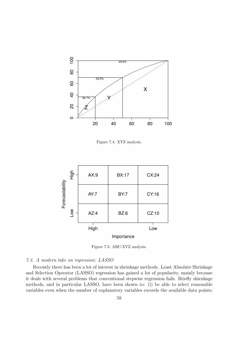
20 40 60 80 100
020
40
60
80
100
Z
36.7% Y
33.5%
X
29.8%
Figure 7.4: XYZ analysis.
Importance
Fore
casta
bili
ty
AZ:4
AY:7
AX:9
BZ:6
BY:7
BX:17
CZ:10
CY:16
CX:24
High Low
Low
Hig
h
Figure 7.5: ABC-XYZ analysis.
7.3. A modern take on regression: LASSO
Recently there has been a lot of interest in shrinkage methods. Least Absolute Shrinkageand Selection Operator (LASSO) regression has gained a lot of popularity, mainly becauseit deals with several problems that conventional stepwise regression fails. Briefly shirnkagemethods, and in particular LASSO, have been shown to: (i) be able to select reasonablevariables even when the number of explanatory variables exceeds the available data points;
58

(ii) be very robust against multicollinearity; (iii) be robust against sample uncertainty. Thereader is referred to Friedman et al. (2001) for an excellent introduction to the topic.
The package glmnet has several helpful functions to use LASSO, amongst other shrinkageregression methods. To demonstrate its use we will revisit an example from section 6.2. Theexample dataset has only 8 data points and we used a single predictor. Building models withso few observations is risky, but it becomes impossible if the number of potential explanatoryvariables exceeds the number of observations. This is one of the areas that LASSO candemonstrate its strength. For an example on how conventional selection methods fails oncethe regression is saturated with input variables, you can check how to fit an elephant!
We will use the functions listed in table 7.3 from the glmnet package for this example.
Table 7.3: Functions used for LASSO regression
Function Package Descriptionglmnet glmnet Fit LASSO regressioncv.glmnet glmnet Fit LASSO regression and find CV optimal λcoef glmnet Extract regression coefficient from LASSO fit
First let us load the necessary package and some data:
library(glmnet)
# Let us get some data from the causal modelling examplessales <- scan("salesreg.txt")advertising <- scan("advertising.txt")
# This example has 8 data points, which is already too little# Suppose instead of one regressor we had 22. Conventional regression# will fail in this case.
# Let us load some additional potential explanatory variablesX <- read.csv("indicators.csv")
# Combine all data sets in a data framedata <- data.frame(sales, advertising,X)
Let us check the correlation between the target sales variable and all other.
> round(cor(data)[1,],2)sales advertising Ind_898 Ind_19341.00 0.93 -0.34 -0.30
Ind_3184 Ind_4399 Ind_4513 Ind_6092-0.22 -0.32 0.28 -0.05
Ind_901 Ind_5880 Ind_19353 Ind_19417-0.33 0.32 -0.38 -0.28
Ind_25718 Ind_25719 Ind_25884 Ind_25705-0.24 -0.42 -0.14 -0.15
Ind_25707 Ind_25714 Ind_25716 Ind_25538-0.34 -0.36 -0.40 -0.28
59

Ind_25540 Ind_25547 Ind_25549-0.52 -0.52 -0.13
Advertising remains the most correlated variable, but there are other potentially usefulones as well. As noted, stepwise regression cannot solve this problem due to the numberof variables. Let us attempt to solve this will LASSO regression. LASSO operates byminimising the following cost function: MSE + λ
∑(|b|), where b are the coefficients of
the explanatory variables and λ controls the amount of shrinkage.
# Fit LASSO regressionfit <- glmnet(x=as.matrix(data[,2:23]),y=data[,1])# This gives us the optimal set of coefficients for each lambda. We can plot
thisplot(fit,xvar="lambda")
−1 0 1 2 3
−5
05
10
Log Lambda
Coeffic
ients
7 6 4 1 1
Figure 7.6: Coefficients for different λ.
Figure 7.6 presents the resulting output and shows that as λ increases more variables areremoved from the regression. Selecting the best λ is not trivial. One approach to resolvethis is to use cross-validation. We can do this by using the cv.glmnet function.
# Cross-validated LASSO fitfit.cv <- cv.glmnet(x=as.matrix(data[,2:23]),y=data[,1],grouped=FALSE)# Let us get the coefficients from this fitbeta.lasso <- coef(fit.cv)
The resulting coefficients are reported in the console output:
> print(beta.lasso)
60

23 x 1 sparse Matrix of class "dgCMatrix"1
(Intercept) 84.466328advertising 4.977805Ind_898 .Ind_1934 .Ind_3184 .Ind_4399 .Ind_4513 .Ind_6092 .Ind_901 .Ind_5880 .Ind_19353 .Ind_19417 .Ind_25718 .Ind_25719 .Ind_25884 .Ind_25705 .Ind_25707 .Ind_25714 .Ind_25716 .Ind_25538 .Ind_25540 .Ind_25547 .Ind_25549 .
We observe that LASSO was able to identify that only advertising is relevant and removeall other predictors automatically, even when the number of variables was larger than thenumber of observations. Let us compare this solution with the OLS solution:
# OLS fitfit.ols <- lm(sales ˜ advertising, data)beta.ols <- coef(fit.ols)
# Compare the two sets of coefficientsbeta.lasso <- as.numeric(beta.lasso)[1:2]beta.diff <- beta.ols - beta.lassoprint(beta.diff)
We can see in the console output that the differences are non-zero.
> print(beta.diff)(Intercept) advertising-47.730902 3.799475
This is because the ‘best’ λ is not zero, in which case LASSO would be identical to OLS.
> fit.cv$lambda.1se[1] 10.63842
Finally let us compare the quality of the fit:
61

yhat.fit.cv <- predict(fit.cv,as.matrix(data[2:23]))yhat.fit.ols <- predict(fit.ols,data[2:23])MSE <- c(mean((data[,1] - yhat.fit.cv)ˆ2), mean((data[,1] - yhat.fit.ols)ˆ2))names(MSE) <- c("LASSO","OLS")print(MSE)
The resulting MSEs are:
> print(MSE)LASSO OLS
207.18950 94.01345
Observe that the MSE of LASSO is greater than OLS. This is to be expected, as LASSOattempts to find the optimal balance between bias and variance to avoid overfitting, ascontrolled by λ. This example also demonstrates how risky is to rely on in-sample fitstatistics. Figure 7.7 visualises how the two model fits differ, where it can be seen that theLASSO fit is more resistant to follow the variability observed in the sample, as shrinkagewould prescribe.
# Plot the target variable and the two model fitsplot(sales,type="o")lines(yhat.fit.cv,col="red")lines(yhat.fit.ols,col="blue")legend("topright",c("Sales","LASSO","OLS"),col=c("black","red","blue"),lty=1)
1 2 3 4 5 6 7 8
120
140
160
180
200
Index
sale
s
SalesLASSOOLS
Figure 7.7: LASSO and OLS fit.
62

References
Assimakopoulos, V., Nikolopoulos, K., 2000. The Theta model: a decomposition approach to forecasting.International Journal of Forecasting 16 (4), 521–530.
Athanasopoulos, G., Ahmed, R. A., Hyndman, R. J., 2009. Hierarchical forecasts for australian domestictourism. International Journal of Forecasting 25, 146–166.
De Livera, A. M., Hyndman, R. J., Snyder, R. D., 2011. Forecasting time series with complex seasonalpatterns using exponential smoothing. Journal of the American Statistical Association 106 (496), 1513–1527.
Fiorucci, J. A., Pellegrini, T. R., Louzada, F., Petropoulos, F., Koehler, A. B., 2016. Models for optimisingthe theta method and their relationship to state space models. International Journal of Forecasting 32 (4),1151–1161.
Friedman, J., Hastie, T., Tibshirani, R., 2001. The elements of statistical learning. Vol. 1. Springer series instatistics Springer, Berlin.
Hyndman, R., Athanasopoulos, G., 2013. Forecasting: principles and practice. OTexts. Accessed on14/06/2016.
Hyndman, R., Khandakar, Y., 2008. Automatic time series forecasting: The forecast package for r. Journalof Statistical Software 27 (1), 1–22.
Hyndman, R., Koehler, A. B., Ord, J. K., Snyder, R. D., 2008. Forecasting with exponential smoothing: thestate space approach. Springer Science & Business Media.
Hyndman, R. J., Ahmed, R. A., Athanasopoulos, G., Shang, H. L., 2011. Optimal combination forecasts forhierarchical time series. Computational Statistics & Data Analysis 55 (9), 2579–2589.
Kolassa, S., 2016. Evaluating predictive count data distributions in retail sales forecasting. InternationalJournal of Forecasting 32 (3), 788–803.
Kostenko, A., Hyndman, R., 2006. A note on the categorization of demand patterns.Kourentzes, N., 2014. On intermittent demand model optimisation and selection. International Journal of
Production Economics 156, 180–190.Kourentzes, N., Petropoulos, F., Trapero, J. R., 2014. Improving forecasting by estimating time series
structural components across multiple frequencies. International Journal of Forecasting 30 (2), 291–302.Nikolopoulos, K., Syntetos, A. A., Boylan, J. E., Petropoulos, F., Assimakopoulos, V., 2011. An aggregate-
disaggregate intermittent demand approach (ADIDA) to forecasting: An empirical proposition and ana-lysis. Journal of the Operational Research Society, 544–554.
Petropoulos, F., Kourentzes, N., 2015. Forecast combinations for intermittent demand. Journal of the Op-erational Research Society 66 (6), 914–924.
Petropoulos, F., Kourentzes, N., Nikolopoulos, K., 2016. Another look at estimators for intermittent demand.International Journal of Production Economics.
Syntetos, A., Boylan, J., Croston, J., 2005. On the categorization of demand patterns. Journal of theOperational Research Society 56 (5), 495–503.
Syntetos, A. A., Boylan, J. E., 2005. The accuracy of intermittent demand estimates. International Journalof forecasting 21 (2), 303–314.
63

Appendix A. Installing R, RStudio and packages
In order to be able to run the scripts presented in this document, you should haveinstalled the latest versions of the following software:
1. R Statistical Software, available here.2. RStudio Desktop, available here.3. Once the above have been installed, you should install (through RStudio) the follow-
ing R packages: forecast, Mcomp, tsintermittent, hts, fpp, MAPA, lars,glmnet. A short guide on how to install packages through RStudio can be foundhere.
4. Download and install RTools, available here.5. Install the TStools package available on github. You can install this by typing and
running the following two commands in the console of RStudio:
if (!require("devtools")){install.packages("devtools")}devtools::install_github("trnnick/TStools")
The package depends on Rcpp and RcppArmadillo, which will be installed auto-matically. However Mac OS users may need to install gfortran libraries in order touse Rcpp. Follow this link for the instructions.
All software are available for free. Please proceed with default settings during the instal-lation of the two software.
64

Appendix B. About the instructors
Nikolaos KourentzesLancaster Centre for Forecasting, Department of Management Science,Lancaster University Management School, Lancaster University, [email protected]; [email protected]
Personal website: nikolaos.kourentzes.comNikos is an Associate Professor at Lancaster University and a researcherat the Lancaster Centre for Forecasting, UK. His research addresses fore-casting issues of temporal aggregation and hierarchies, model selection and
combination, intermittent demand, promotional modelling and supply chain collaboration.Together with Fotios, he has co-founded of the Forecasting Society (www.forsoc.net). Healso has longer hair than what is shown in his profile photo!
Fotios PetropoulosLogistics and Operations Management Section, Cardiff Business School,Cardiff University, [email protected]; [email protected]
Profile: fpetropoulos.euFotios is an Assistant Professor at Cardiff Business School of Cardiff Uni-versity, the Forecasting Support Systems Editor of Foresight and electedDirector of the International Institute of Forecasters. His research exper-
tise lies in behavioural aspects of forecasting and improving the forecasting process, appliedin the context of business and supply chain. Together with Nikos, he has co-founded of theForecasting Society (www.forsoc.net). Little known fact about Fotios: his forecast fu is asgood as his kung fu!
65