Fluke Magazine Preview
48
description
Preview of the upcoming FLUKE magazine. www.wearecellardoor.com
Transcript of Fluke Magazine Preview


TO THE VERY FIRST ISSUE OF FLUKE. IF YOU SHOULD HAVE STARTED FLIP-PING THROUGH THIS MAGAZINE ON THE BACK THIS WILL BE THE LAST PAGE, IF NOT, YOU ARE AT THE PLACE TO BE.
very warm welcome or an hopefully even more satisfiable good bye – if this should be the last page you are reading – to the very first issue of FLUKE. This zeitschrift (german for ma-gazine or periodical) – as we like to call it – has made its goal to present and discuss the ongoing “trend“ in visual creation which deals with failure and coincidences during the work
process. I‘m pretty sure al of you have had at least one experience during a project, or during experiments where some kind of mistake occured which was actually really interesting or even beautiful and for that matter it became part of the actual design.
Those are things that interest us and things we want to discuss and exchange with you our dear readers. This zeitschrift would have not been possible to produce without the help of great participants who shared their work and stories with the FLUKE community. You made this all happening. Thank you for that.
If you go further than design we will notice that coincidences, expe-riments and lillte failures are crucial the nearly any creative process. Especially in analog photography – the art of the unexpected – some will find a lot of unintentional processes which helped this discipline to grow. For anyone interested in those beautiful captures on film take a quick look on page XX, but please come back after that, because we have a lot more to explore. To begin with the topic of flukes, we have researched inventions and other explorations which were made possible with the little help of luck (P.6).
I hope all of you will be fascinated with this document of time and spread the word to help the FLUKE community to grow and to resurect with hopefully a lot of further issues.
This being said, have fun.
Yours truly Cellar Door

P. 5 THAT WAS A TOTAL FLUKE
P. 7 THE AESTHETICS OF COINCIDENCE
P.14 ESSAY ON COINCIDENCES P. 11 BEHIND THE
UNIVERSE OF UN DEMI
P. 21 PERFECTION IS REPEATABLE
P. 27 TOOLS OF COINCIDENCE
P. 25 THE PHOTO- GRAPHY PAGES
P. 17 POST POST MODERNISM
P. 29 EXPERIMENTS IN NATURE
P. 31 ONCE UPON A FACTORY
P. 39 THE JOY OF THE UNEXPECTED
P. 37 INSTANT QUESTIONAIRE
P. 9 BASED SOLELY ON LUCK?

The french painter LOUIS DAGUERR was done painting battle scenes or landscapes. The era of the early 19th century wanted faster repro-duction of events and other occasions. On the basis of the already existing Camera Obscura, Daguerr was trying to fixate those images. Af-ter several years experimenting with different materials, he was forced to pause his work because of bad weather. Daguerr was storing his silver coated frames in a cabinet full of chemicals. After he had returned the pictures were suddenly “developed“. He found out that some drips of mercury had leaked onto the frames, which helped to achieve the effect he was looking for. He is known as the pioneer of photography.
CHARLES GOODYEAR had been waiting years for a happy accident when it finally occurred. Goodyear spent a decade finding ways to make rubber easier to work with while being resistant to heat and cold. Nothing was having the effect he wanted. One day he spilled a mixture of rubber, sulfur and lead onto a hot stove. The heat charred the mixture, but didn‘t ruin it. When Goodyear picked up the accident, he noticed that the mixture had hardened but was still quite usable. At last! The breakthrough he had been waiting for! His vulcanized rubber is used in everything from tires, to shoes, to hockey pucks.
5 F
LU
KE
TH
AT
WAS
A
TOTA
L FL
UKE!
INVENTIONS HAVE OFTEN DEVELOPED OUT OF PURE LUCK? OR AT LEAST COINCINDECES DID A MAJOR PART IN DEVELOPING NEW INVENTIONS. THE FOLLOWING ACHIEVEMENTS HOWEVER WERE MADE POSSIBLE BY A TOTAL FLUKE. OR NOT?
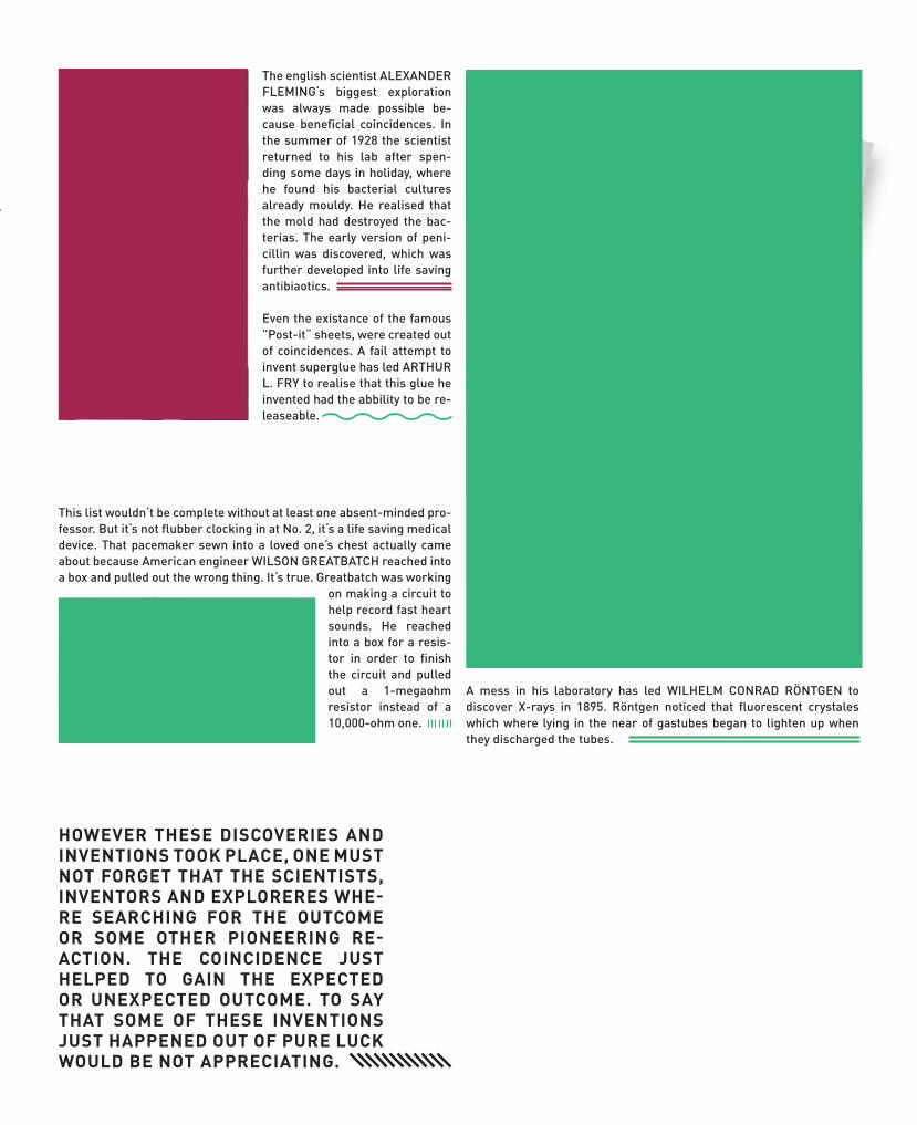
The english scientist ALEXANDER FLEMING‘s biggest exploration was always made possible be-cause beneficial coincidences. In the summer of 1928 the scientist returned to his lab after spen-ding some days in holiday, where he found his bacterial cultures already mouldy. He realised that the mold had destroyed the bac-terias. The early version of peni-cillin was discovered, which was further developed into life saving antibiaotics.
Even the existance of the famous ”Post-it“ sheets, were created out of coincidences. A fail attempt to invent superglue has led ARTHUR L. FRY to realise that this glue he invented had the abbility to be re-leaseable.
A mess in his laboratory has led WILHELM CONRAD RÖNTGEN to discover X-rays in 1895. Röntgen noticed that fluorescent crystales which where lying in the near of gastubes began to lighten up when they discharged the tubes.
HOWEVER THESE DISCOVERIES AND INVENTIONS TOOK PLACE, ONE MUST NOT FORGET THAT THE SCIENTISTS, INVENTORS AND EXPLORERES WHE-RE SEARCHING FOR THE OUTCOME OR SOME OTHER PIONEERING RE-ACTION. THE COINCIDENCE JUST HELPED TO GAIN THE EXPECTED OR UNEXPECTED OUTCOME. TO SAY THAT SOME OF THESE INVENTIONS JUST HAPPENED OUT OF PURE LUCK WOULD BE NOT APPRECIATING.
This list wouldn‘t be complete without at least one absent-minded pro-fessor. But it‘s not flubber clocking in at No. 2, it‘s a life saving medical device. That pacemaker sewn into a loved one‘s chest actually came about because American engineer WILSON GREATBATCH reached into a box and pulled out the wrong thing. It‘s true. Greatbatch was working
on making a circuit to help record fast heart sounds. He reached into a box for a resis-tor in order to finish the circuit and pulled out a 1-megaohm resistor instead of a 10,000-ohm one.

A DIPLOMA PROJECT BYTOBIAS BECKER & ALEX LIS
Text & photos: Tobias Becker
DURING THEIR FINAL YEAR IN COLLEGE TOBIAS BECKER AND ALEX LIS WERE EXPERIMIMENTING WITH DIFFEREMT PRINTERS IN VARIOUS COPY SHOPS TO CREATE UNIQUE ARTWORKS OF COINCIDENCES. HOW THEY EXPERIENCED THEIR FIRST FLUKED WORK AND WHAT INSPIRED THEM TO DO SUCH THING WILL BE EXPLAINED ON THIS PAGES.
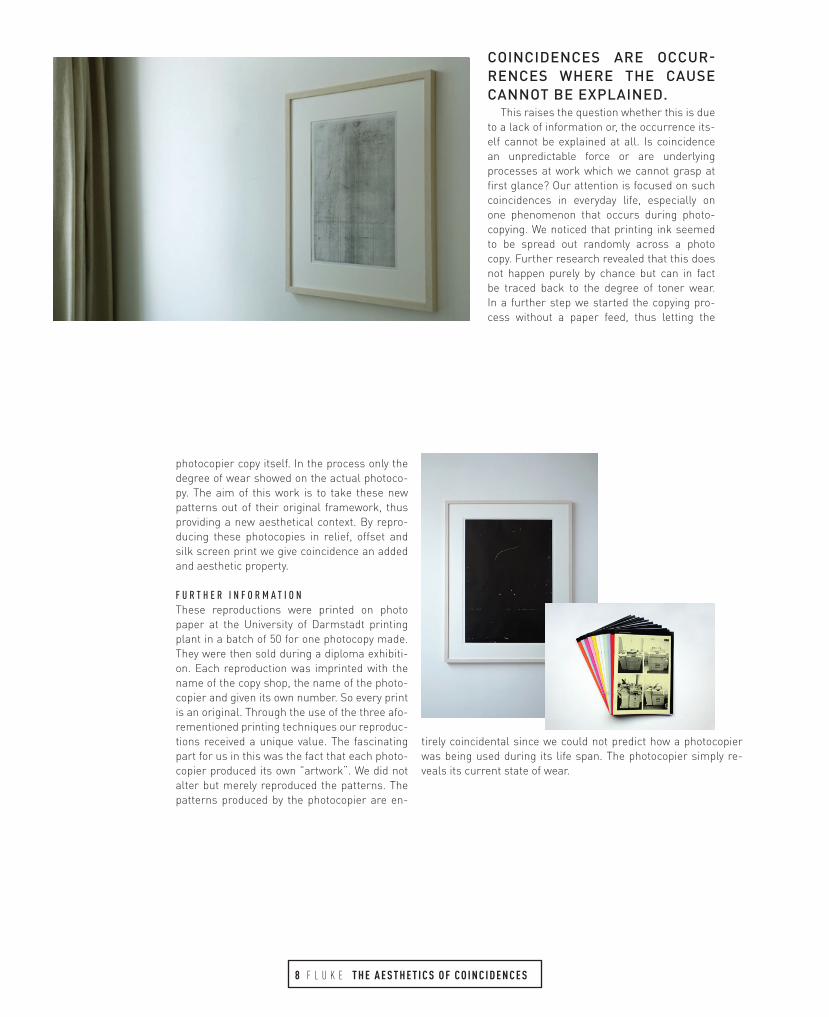
COINCIDENCES ARE OCCUR-RENCES WHERE THE CAUSE CANNOT BE EXPLAINED.
This raises the question whether this is due to a lack of information or, the occurrence its-elf cannot be explained at all. Is coincidence an unpredictable force or are underlying processes at work which we cannot grasp at first glance? Our attention is focused on such coincidences in everyday life, especially on one phenomenon that occurs during photo-copying. We noticed that printing ink seemed to be spread out randomly across a photo copy. Further research revealed that this does not happen purely by chance but can in fact be traced back to the degree of toner wear. In a further step we started the copying pro-cess without a paper feed, thus letting the
photocopier copy itself. In the process only the degree of wear showed on the actual photoco-py. The aim of this work is to take these new patterns out of their original framework, thus providing a new aesthetical context. By repro-ducing these photocopies in relief, offset and silk screen print we give coincidence an added and aesthetic property.
F U R T H E R I N F O R M A T I O NThese reproductions were printed on photo paper at the University of Darmstadt printing plant in a batch of 50 for one photocopy made. They were then sold during a diploma exhibiti-on. Each reproduction was imprinted with the name of the copy shop, the name of the photo-copier and given its own number. So every print is an original. Through the use of the three afo-rementioned printing techniques our reproduc-tions received a unique value. The fascinating part for us in this was the fact that each photo-copier produced its own ”artwork“. We did not alter but merely reproduced the patterns. The patterns produced by the photocopier are en-
tirely coincidental since we could not predict how a photocopier was being used during its life span. The photocopier simply re-veals its current state of wear.
8 F L U K E T H E A E S T H E T I C S O F C O I N C I D E N C E S

DURING DESIGN PROCESSES A LOT OF STUFF CAN HAP-PEN. YOU COULD SPILL COFFEE OVER YOUR NEW ILLUST-RATION OR HIT THE WRONG LETTER WHILST LAYOUTING IN INDESIGN. MAYBE THE RESULT WILL LOOK STUNNING AND IMPULSIVE OR MAYBE NOT. EITHER WAY TRYING AND FAI-LING IS ONE OF THE MOST CRUCIAL ELEMENTS OF DESIGN.

Design, photography or nearly every other form of art or visual expression evolves from a fairly long timeline ofmistakes anD trial processes. How would we know today how our tools work or what even can be considered as a “tool“? It is an obvisiouly known fact, that everyone can proclaim each new object or whatsoever as a new tool, but without trying or without the his-tory behind former working objects, one would experience it much more difficult to gain know-lege about “new“ tools.
With that in mind, the at least second most valuable tool in visual expression must be the time to fail. Without the crucial trial and error period, one will be stuck with his methods and ideas for probably quiet a long time. So what is the inner will for humans to try new things, go on adventures and not just take the already exisiting for granted?
If we take a closer look to the large illust-ration displayed on these two pages, we will see a design piece made out of a fluke: During
creating another promotion for an electronic music event I was experimenting with Adobe Illustrators Blend tool. After completing my client‘s work I was curious what else could be done with this newly found tool. Further I ex-perimented with different shapes and coinci-dently hit the 3-D effect. After qiet a long time rendering – on my old Mac – this weird, spacey looking illustration ws the result of fluke and already known experience with my digital tools.
1 0 F L U K E B A S E D S O L E LY O N L U C K ?

1/2 IS A PROJECT OF ARTISTIC EXCHANGE
BETWEEN FOUR FRENCH GRAPHIC
DESIGNERS/ILLUSTRATORS, WHO LIVE
IN FOUR EUROPEAN CAPITALS.
1/2 IS AN ONLINE SPACE TO SHARE
AND DISCUSS EACH OTHERS WORK.
1/2 IS A BIANNUAL ORIGINAL
SELF-PUBLISHED HAND-MADE ZINE.
1/2 IS AROUND THE CORNER.
11
FL
UK
E
BEH
IND
THE
UNIV
ERES
E OF
UN
DE
MI

12 F
LU
KE
BEH
IND
THE
UNIVERESE
OF UN
DEM
I
w w w . u n d e m i . f r
0 1 . W E LC H E S E Q U I P M E N T B E N U T Z T D U ?Ut mi, qui occatem nonsecumetur am ut voloresto to occum quam, comnis mossin nobitatum re optas vendi aut rerum im et officias eliquib usciis mo moditatur maiosam nonet aboribus et ut volenduciis iumquid mint officabo. Et ut reris eos experci as sitasin ctinullori debisciae sape-rum iliquis conempo rrovid ma et autatur arum quo quam ressi coreper chitiis vollitiumque acepudae sum quaspit a doluptaquia comnim fugit qui remquiani uteseni
0 2 . W O R A N L I E G T D E R R E I Z , D E R I M V E R G L E I C H Z U M D I G I TA L E N A B -L I C H T E N , D O C H T E U R E N A N A LO G E N P H OTO G R A F I E ?Mos reicipid quia cusaperro eturepero il etur?Feribus vera dest, que sandigname et eos simaxim rerchicit por minci-endit molenissim incit, culpa dolenis sunt.Lorum, qui dolorporum vit, con ex eles et voluptust, sit, ilibus eos aut ali-quatia necumquas aut reriberum exceped magnati istiorem expernatis atus dolupta sitectem rendit ea dolore ipsa con repel ea pa quis est alic temporumquas idusciistis exerfer natur, endi repremo odis cum sequis necus ius.Oditiae doluptiasimo tet vollatur? Volutem volorerum que nis ilignatate prae labo. Et prorae prorrup tiatumquis digentem es as es si ut adit volo-ribus expe non repelenis nonse estotas rem illuptas re pel ideles molen-du sandist ex et que mo quiscillab in conse maio quasim que nat event.
0 3 . W E LC H E S E Q U I P M E N T B E N U T Z T D U ?Ut mi, qui occatem nonsecumetur am ut voloresto to occum quam, comnis mossin nobitatum re optas vendi aut rerum im et officias eliquib usciis mo moditatur maiosam nonet aboribus et ut volenduciis iumquid mint officabo. Et ut reris eos experci as sitasin ctinullori debisciae sape-rum iliquis conempo rrovid ma et autatur arum quo quam ressi coreper chitiis vollitiumque acepudae sum quaspit a doluptaquia comnim fugit qui remquiani utesenim volorep tatur, aruptat endenim quias molores moloris magnimus.
0 4 . W O R A N L I E G T D E R R E I Z , D E R I M V E R G L E I C H Z U M D I G I TA L E N A B -L I C H T E N , D O C H T E U R E N A N A LO G E N P H OTO G R A F I E ?Mos reicipid quia cusaperro eturepero il etur?Feribus vera dest, que sandigname et eos simaxim rerchicit por minci-endit molenissim incit, culpa dolenis sunt.Lorum, qui dolorporum vit, con ex eles et voluptust, sit, ilibus eos aut ali-quatia necumquas aut reriberum exceped magnati istiorem expernatis atus dolupta sitectem rendit ea dolore ipsa con repel ea pa quis est alic temporumquas idusciistis exerfer natur, endi repremo odis cum sequis necus ius.Oditiae doluptiasimo tet vollatur? Volutem volorerum que nis ilignatate prae labo. Et prorae prorrup tiatumquis digentem es as es si ut adit volo-
ribus expe non repelenis nonse estotas rem illuptas re pel ideles molen-du sandist ex et que mo quiscillab in conse maio quasim que nat event.Lorum, qui dolorporum vit, con ex eles et voluptust, sit, ilibus eos aut ali-quatia necumquas aut reriberum exceped magnati istiorem expernatis atus dolupta sitectem rendit ea dolore ipsa con repel ea pa quis est alic temporumquas idusciistis exerfer natur, endi repremo odis cum sequis necus ius.Oditiae doluptiasimo tet vollatur? Volutem volorerum que nis ilignatate prae labo. Et prorae prorrup tiatumquis digentem es as es si ut adit volo-ribus expe non repelenis nonse estotas rem illuptas re pel ideles molen-du sandist ex et que mo quiscillab in conse maio quasim que nat event. 0 5 . W E LC H E S E Q U I P M E N T B E N U T Z T D U ?Ut mi, qui occatem nonsecumetur am ut voloresto to occum quam, comnis mossin nobitatum re optas vendi aut rerum im et officias eliquib usciis mo moditatur maiosam nonet aboribus et ut volenduciis iumquid mint officabo. Et ut reris eos experci as sitasin ctinullori debisciae sape-rum iliquis conempo rrovid ma et autatur arum quo quam ressi coreper chitiis vollitiumque acepudae sum quaspit a doluptaquia comnim fugit qui remquiani uteseni Oditiae doluptiasimo tet vollatur? Volutem volore-rum que nis ilignatate prae labo. Et prorae prorrup tiatumquis digentem es as es si ut adit voloribus expe non repelenis nonse estotas rem illup-tas re pel ideles molendu sandist ex et que mo quiscillab in conse maio quasim que nat event.
0 6 . W O R A N L I E G T D E R R E I Z , D E R I M V E R G L E I C H Z U M D I G I TA L E N A B -L I C H T E N , D O C H T E U R E N A N A LO G E N P H OTO G R A F I E ?Mos reicipid quia cusaperro eturepero il etur?Feribus vera dest, que sandigname et eos simaxim rerchicit por minci-endit molenissim incit, culpa dolenis sunt.Lorum, qui dolorporum vit, con ex eles et voluptust, sit, ilibus eos aut ali-quatia necumquas aut reriberum exceped magnati istiorem expernatis atus dolupta sitectem rendit ea dolore ipsa con repel ea pa quis est alic temporumquas idusciistis exerfer natur, endi repremo odis cum sequis necus ius.
0 7 . W E LC H E S E Q U I P M E N T B E N U T Z T D U ?Ut mi, qui occatem nonsecumetur am ut voloresto to occum quam, comnis mossin nobitatum re optas vendi aut rerum im et officias eliquib usciis mo moditatur maiosam nonet aboribus et ut volenduciis iumquid mint officabo. Et ut reris eos experci as sitasin ctinullori debisciae sape-rum iliquis conempo rrovid ma et autatur arum quo quam ressi coreper chitiis vollitiumque acepudae sum quaspit a doluptaquia comnim fugit qui remquiani utesenim volorep tatur, aruptat endenim quias molores moloris magnimus. Oditiae doluptiasimo tet vollatur? Volutem volore-rum que nis ilignatate prae labo. Et prorae prorrup tiatumquis digen-tem es as es si ut adit voloribus expe non repelenis nonse estotas rem.

13
FL
UK
E
BEH
IND
THE
UNIV
ERES
E OF
UN
DE
MI

w w w . u n d e m i . f r

an amazing story of coinciDences appears in the Westminster Gazette. During the Boer War four men met by chance for the first time on the eve of some big action, and the meeting was so agreeable that one of the men who had a bad two-shilling piece in his pocket divided it, and gave each of the others a quarter as a memento of the evening. Immediately afterwards they separated, and never saw or heard of each other again till a few evenings ago, when a dinner was given in honour of somebody or other in Birmingham. The four men were friends of the guest of the evening, and all of them turned up at the dinner, where they recognised each other easily, we are told, because each of them was wearing his quarter-florin on his watch-chain.
Life is, of course, a series of coincidences, but we never cease to be surprised as each new one happens, and nothing can destroy their recurring freshness. We may make mathematical calculations show-ing that there is a chance in a million that such and such a thing will happen, but, when it happens once in a million times, it seems to us as marvellous as a comet. We cannot get accustomed to the pattern of Nature, which repeats itself as daringly as the pattern in a wall-paper. Our fathers recognised this pattern, and saw in it the weird craftsman-ship of destiny. We who believe in iron law, which surely implies a rigid pattern, are by a curious want of logic sceptics, and we treat each new emergence of the pattern as a strange exception to scientific rule. We cannot believe that Nature arranged howlings of dogs and disasters in the stars to accompany the death of a Caesar or a Napoleon. Everything that we can call dramatic in Nature we put down to chance and coinci-dence. Superstitious people confront us with instance upon instance of the succession of omen and event, but we label these exception No. 1, exception No. 2, and so forth, and go cheerfully on our way.
Believers in omens tell us that, some time before Laud‘s trial and execution, he found his portrait fallen on to the floor, and predicted di-saster; and they ask us to admit that this was more than a coincidence, especially as there are a hundred similar stories. They relate how the stumble of a horse proved as fatal an omen for Mungo Park as did the fall of a picture for Laud. One day before he departed on his last expe-dition to Africa his horse stumbled, and Sir Walter Scott, who was with him, said: „I am afraid this is a bad omen.“ „Omens follow those who look to them,“ replied the explorer, and set forth on the expedition from which he never returned. Luckily we have examples which suggest that Park and not Scott was right. Everyone knows the story of William the Conqueror‘s fall as he landed on the shores of England, and how, in or-der to calm the superstitious alarm of his followers, he called on them to observe how he had taken possession of the country with both hands. In the very fact of doing so, of course, he merely substituted one inter-pretation of an omen for another. But if omens are capable in this way of opposite interpretations, we are on the direct road to scepticism about their significance, and so to a view that most events that appear to have been heralded by omens are simple coincidences.
cOne remarkable coincidence of this kind came to my ears the other day. A man I know was suddenly dismissed from his post with three
months‘ salary in his pocket. I happened to be talking about supersti-tions with him the same afternoon, when he said: „It‘s all very well, but only last week, when I was in the country, some one was telling for-tunes by tea-leaves in the house where I was stopping; and he turned to me and said: ‚Old man, there‘s a big surprise in store for you, and I see some money in the bottom of the cup.‘ I shan‘t let them know this has happened,“ he added, „as it might encourage them to be supersti-tious.“ Certainly, when such a coincidence happens in our own lives, it is difficult to believe that it is not a deliberate act on the part of Nature. Nature, we can see, does concern herself with the minutest cell or atom of our being; why not with these premonitory shadows of our deeds and sufferings? Many coincidences, on the other hand, admit of a less fatali-stic explanation. Everybody has noticed how one no sooner meets a new name in a book that one comes on the same name in real life also for the first time. I had not read Mr Forrest Reid‘s novel, The Bracknels, a week, when, on walking down a London avenue, the same name--“The Bracknels“--stared at me from a gate. It is not easy, however, to conceive that destiny deliberately leads one into a suburban avenue to enjoy the humour of one‘s surprise at so trivial a coincidence. It is a more natural conclusion that these names one begins to notice so livelily would still have remained unobserved, were it not that they had acquired a new sig-nificance for one‘s eyes owing to something one had read or heard. After all, one can ride down the Strand on the top of a ‚bus for a month without consciously seeing a single name over a shop-window. But let any of the-se names become real to us as the result of some accident, and it leaps to one‘s eyes like a scene in a play. It is merely that one now selects this particular name for observation, and ignores the others. It is all due to the artistic craving for patterns. I am inclined at times to explain the evi-dence in favour of the Baconian theory of Shakespeare as pattern-mon-gering. Those cyphers, those coincidences of phrase and suggestion at such-and-such a line from the beginning or end of so many of the plays, those recurrences of hoggish pictures, are enough to shake the balan-ce of anyone who cannot himself go forward with a study of the whole evidence. But, as we proceed with an examination of the coincidences, we find that many of them are coincidences only for the credulous. It seems a strange coincidence that Shakespeare and Bacon should so often make use of the same metaphors and words. But it seems strange only till we discover that plenty of other pre-Shakespearean and Eliz-abethan writers made use of them as well. Much of the Baconian theory, indeed, is built, not upon coincidence, but upon pseudo-coincidence. The fact that Shakespeare died on the same day of the month--or almost on the same day--as that on which he was born is really a more interesting coincidence than any that occurs within the field of Baconianism.
Much the same may be said of the coincidences discovered by tho-se who have, at one time or another, counted up the numerical values of the letters in the names of Napoleon and Gladstone and other lea-ders of men, and found that they were equal to 666, the fatal number of the Antichrist. In nearly every case the name has been distorted in its transliteration into Greek in such a way as to make the coincidence no coincidence at all. On the other hand, there are some genuinely interes-
ROBERT LYND: ESSAY ON COINCIDENCE

ting coincidences in figures, which have been recorded by various wri-ters on credulity and superstition. French history since the middle of the eighteenth century can almost be written as a series of figure-mongers‘ coincidences. It began with Louis XVI, who came to the throne in 1774. By adding the sum of the ciphers in this figure to the figure itself--1774 + 1 + 7 + 7 + 4--the arithmetical diviners point out that you get 1793, the year of the King‘s death. Similarly, the beginning of the French Revolution fo-retold the end of the Revolutionary period with Napoleon‘s fall, for if you add up 1789 + 1 + 7 + 8 + 9 you get 1814, the year of Elba. Louis Philippe‘s accession-date, 1830, gives scarcely less remarkable results. If you add to it the figures in 1773, the date of his birth--1830 + 1 + 7 + 7 + 3--you get 1848, the date of his fall and flight. It is the same if you add to his acces-sion-date the figures in 1809, the date of his marriage. Here again 1830 + 1 + 8 + 0 + 9 results in 1848. And, if you turn to his Queen, you find that the figures in her birth-date, 1782, lead up to the same fatal message: 1830 + 1 + 7 + 8 + 2 once more mount to the ominous figure. The arithmetici-ans, whose ingenuities are recorded in Mr Sharper Knowlson‘s Origins of Popular Superstitions, have unearthed similar significances in the dates of Napoleon III. They add the figure 1852--the date of his inauguration as Emperor--to the ciphers of 1808, his birth-date--1852 + 1 + 8 + 0 + 8--and arrive at the fatal date, 1869, when the Empire came to an end. The Empress Eugenie was born in 1826 and married in 1853. Add the ciphers in these dates to 1852--1852 + 1 + 8 + 5 + 3 or + 1 + 8 + 2 + 6--and 1869 appears once more. But there is no need to go on with these quaint sums. I have quoted enough to suggest the intricate and subtle patterns which the ingenious can discover everywhere in Nature.
Nature, assuredly, has provided us with coincidences so lavishly that we may well go about in amazement. Even the fiction of Mr William Le Queux is not quite so abundant in strange coincidences as the life of the most ordinary man you could see reading a halfpenny newspaper. It is only in literature, indeed, that coincidences seem unnatural. Sophocles has been blamed for making a tragedy out of a man who unwittingly slew his father and afterwards unwittingly married his mother. It is incredible as fiction; but I imagine real life could give us as startling a coincidence even as that. Each of us is, to use Sir Thomas Browne‘s phrase, Africa and its prodigies. We tread a miraculous earth which is all mirrors and echoes, hints and symbols and correspondences. Each deed we do may, for all we know, be echoed and mirrored in Nature in a thousand places, even before we do it, and I can imagine it possible that the shape of a man‘s fate may be scattered over the palm of his hand. I am a sceptic on the subject, and I see what a door is opened to charlatanry if we ad-mit the presence of too many meanings in the world about us. But I am not ready to deride the notion that there may be some undiscovered law underlying many of the coincidences which puzzle us. True, if someo-ne contended that a mysterious sort of gravitation was working steadily through the years to bring those four soldiers together again at the Bir-mingham dinner, I should be anxious to hear his proofs. But I am willing to listen patiently to almost any theory on the subject. No theory could be more sensational than the facts.
16
NAME: Robert Staughton LyndBORN: September 26th, 1892 in New Albany, IndianaDIED: November 1st, 1970 in New Yok CityOCCUPATION: Professor of Sociology at Columbia University, NYC

ANY DISCUSSION OF POSTMODERNISM must be preceded by at least a provisional definition of modernism. First there is modernism with a capital „M,“ which designates a style and ideology and that is not restricted to a specific historical moment or geographical location. Mo-dernist designers from the Bauhaus in Germany, the De Style in Holland, and Constructivism in Russia, share essentially the same Modernist ideology as designers like Paul Rand, Massimo Vignelli, and Eric Spie-kermann. Its primary tenet is that the articulation of form should always be derived from the programmatic dictates of the object being designed. In short, form follows function.
Modernism was for the most part formed in art schools, where the pedagogical strategies were developed that continue to this day in de-sign schools. It is a formalist, rationalist, visual language that can be ap-plied to a wide range of circumstances. All kinds of claims can and have been made in an effort to keep Modernism eternally relevant and new. The contradiction of being constant, yet always new, has great appeal for graphic designers, whose work is so ephemeral.
Then there is the modern, with a small „m.“ It is often confused with Modernism with a big M, but being a modern designer simply means being dedicated to working in a way that is contemporary and innovative, regardless of what your particular stylistic or ideo-logical bias may be. Modern designers who were not necessarily Modernist would include designers like Milton Glaser, Charles and Ray Eames, and Ta-danori Yokoo.
With all the confusion in these early days of for-mulating theoretical paradigms, it is understan-dable why some designers have given up trying to connect their practice to contemporary theory. By the time postmodernism came along, many desig-ners were quite happy to dismiss it as a trendy fad or irrelevant rambling, and be done with it. That is exactly why I think it is important to examine some of the connections between the postmodern condi-tion and graphic design.Although there has ALWAYS BEEN SOME Confu-sION ABOUT WHAT POSTMODERNISM IS, the most obvious feature is that it is a reaction (not rejection), to the established forms of high Mo-dernism. The second most prominent feature of postmodernism is the erasing of the boundaries between high culture and pop culture. But probably the most contested feature is that of „theoretical discourse,“ where the-ory was no longer confined to philosophy, but incorporated history, social theory, political science, and many other areas of study, including design theory. Postmodernism is not a description of a style; it is the term for the era of late capitalism starting after the 1940‘s and realized in the 1960‘s with neo-colonialism, the green revolution, computerization and electronic information.
Postmodernism didn‘t have much impact on graphic design until the middle of the 1980s. Initially, many designers thought it was just undis-
ciplined self-indulgence. A hodgepodge of styles, with no unifying ideals or formal vocabularies, dreamed up by students in the new graduate programs. But in fact it was a new way of thinking about design, one that instigated a new way of designing. Designers began to realize that as mediators of culture, they could no longer hide behind the „problems“ they were „solving.“ One could describe this shift as a younger genera-tion of designers simply indulging their egos and refusing to be trans-parent (like a crystal goblet). Or you could say they were acknowledging their unique position in the culture, one that could have any number of political or ideological agendas.The vernacular, high and low culture, POP CULTURE, NOSTALGIA, PARODY , IRONY, PASTICHE, DECONSTRuct ION , and the anti-aesthetic represent some of the ideas that have come out of the 80s and informed design practice and theory of the 90s. After the 80s designers may still choose to be anonymous, but they will never again be considered invisible. We are part of the message in the media. In the postmodern era we are not just mediators of information, but individuals who think creatively and visually about our culture.
Although Jan Tschichold has been celebrated as an early proponent of modernist asymmetric typography, designers have increasingly come
to respect his earlier calligraphic and latter classi-cal work. Tschichold‘s body of work is an important precedent for today‘s postmodern typography in that it represents diversity in ideology and style. It was one that ranged from craft-based calligraphy and machine-age modernism to neoclassicism.
Another important precursor to postmodernism was W. A. Dwiggins, a designer who translated traditional values and aesthetics into a modern sensibility. He was a tireless experimenter with form, who took inspiration for his work from eas-tern cultures, history, and new technology. Unlike Tschichold, Dwiggins never embraced the Moder-nist movement nor was he deified by it. However, he was absolutely committed to being a modern designer.
ALTHOUGH Dwiggins‘s and Tschichold‘s work seems to have little in common, there is a simila-rity in how their work was initially misrepresented. Tschichold was celebrated as a Modernist typo-grapher, which downplayed his more substantial body of design and writing based on traditional and
classical ideas. On the other hand, Dwiggins has always been represen-ted as a traditional designer in spite of the innovative and experimental nature of most of his work.
IT HAS ONLY been in recent years that discussions of Tschichold and Dwiggins have expanded to include the full scope and plurality of their work. That is because the postmodern context has encouraged diversity and complexity, and given us a critical distance to assess Modernism and its ramifications. In the postmodern era, the line dividing modern and classical, good and bad, new and old, has, like so many lines in gra-
POST
TEXT byEMigre

phic design today, become very blurry, distressed and fractured.IN THE LATE 80S, an anti-aesthetic impulse emerged in opposition to the canon
of Modernist „good design.“ It was a reaction to the narrow, formalist concerns of late Modernism. It staked a larger claim to the culture and expanded the expressive possibilities in design. The new aesthetic was impure, chaotic, irregular and crude. A point that was so successfully made, in terms of style, that pretty much everything was allowed in the professionalized field of graphic design, and from then on typo-graphy would include the chaotic and circuitous as options in its lexicon of styles. In fact, most of the formal mannerisms of the late 80s have continued to predominate throughout the 90s. But now it‘s no longer an ideologically relevant, or even new style - now it‘s just the most popular commercial style.
IN 1989 I designed a typeface to use in my design work for experimental arts organizations like Los Angeles Contemporary Exhibitions and CalArts. I called the typeface Bondage Bold. Rudy VanderLans saw it in some of my work and wanted to sell it through Emigre. After adding a regular weight, normalizing the spacing, cleaning up the drawings (with Zuzana Licko‘s guidance), and changing the name to Keedy Sans, it was finally released on an unsuspecting public in 1991.
I designed Keedy Sans as a „user,“ simply based on a vague idea of a typeface that I had not yet seen but wanted to use in my graphic design. Most typefaces are logically systematic; if you see a few letters you can pretty much guess what the rest of the font will look like. I wanted a typeface that would willfully contradict those expectations. It was a typically postmodern strategy for a work to call attention to the flaws and artifi-ce of its own construction. But I never thought of it as being illegible, or even difficult to read. I have never been very interested in pushing the limits of legibility for its own sake. Absolute clarity, or extreme distortion, is too simplistic a goal, and it is ground that has already been well covered. I wanted to explore the complex possibilities that lie somewhere in between and attempt to do something original or at least unique.
AT THE TIME I had been using the American highway Gothic typeface in my de-sign work that I cut and pasted from a highway signage manual. Another vernacular influence was the „f“ from the Fiat logo. But I was not only quoting low vernacular sources; it was important that I mixed in high design sources as well. So I was thin-king about Akzidenz-Grotesk Black, which was somewhat exotic in America, because I liked Wolfgang Weingart‘s typography. Overall I wanted a typeface that was similar to Cooper Black, extremely bold with a strong idiosyncratic personality. I think it is a very postmodern typeface in that it included „high“ and „low“ vernacular quotation, and it is self-consciously crude and anti-aesthetic in reaction to the slickness of Mo-dernism. The initial reaction to Keedy Sans was that it was too idiosyncratic, it was „ugly,“ hard to read, and too weird to be very useful. It‘s hard to imagine that kind of reaction to a type design today. I guess nobody really cares any more.
In 1993, Keedy Sans was still able to cause a bit of controversy among graphic designers, and it was starting to be a popular typeface for music and youth-oriented audiences. Its popularity slowly but consistently grew; by 1995 it was starting to look pretty legible and tame compared to other new typefaces on the market. Eventually even the big boys in the corporate world were no longer put off by my typographic antics, and Keedy Sans made its way into the mainstream world of corporate com-mercialism by 1997.
EIGHT YEARS LATER, it is no longer considered an illegible, weird, deconstruc-ted, or confrontational design. Now it‘s just another decorative type style, one among many. Its willful contradictions are only what is expected in design today. I still think it is an interesting typeface; that‘s why it‘s a shame
1 8 F L U K E POST POST M O D E R N I S M
P O S T E R : A L E X W I T J A S
M A G A Z I N E : J O E L E V E Y

RESISTing mainstream pop banality is an outdated attitude that only a few designers of my generation worry about anymore. Now most gra-phic designers need results fast; formal and conceptual innovations only slow down commercial accessibility. It is hard for a generation raised in a supposedly „alternative“ youth culture, which put every kid from Toledo to Tokyo in the same baggy pants and t-shirt, to believe that relevant forms of expression can even exist outside of pop culture. Today‘s young designers don‘t worry about selling out, or having to work for „the man,“ a conceit almost no one can afford anymore. Now everyone wants to be „the man.“ What is left of an avant-garde in graphic design isn‘t about resistance, cultural critique, or experimenting with meaning. Now the avant-garde only consists of technological mastery: who is using the coolest bit of code or getting the most out of their HTML this week.Resistance is not futile; resistance is a very successful advertising
strategy. The advertising world co-opted our desire for resistance and has been refining it in pop culture since the 60s. After the 60s, adverti-sing was never the same. It was the end of the men in the gray flannel suits. To this day ad agencies are full of middle-aged „creative direc-tors“ who talk and dress like twenty year-olds. They exploit an endless supply of new, cutting edge design talent to sell the same old stuff. By comparison, graphic designers were less successful at using resistance as a vehicle for changing attitudes in their profession in the 80s. That is because most designers did not want anything to challenge their con-tinuity with a design canon they had so recently constructed. The only thing that the design establishment in the 80s was interested in resisting was new ideas.That is why ultimately the strategies of resistance to Mo-dernist dogma and the critique of the status quo, from the late 80s, only led to what is currently referred to as the ugly, grunge, layered, chaotic, postmodern design of the 90s. Only now there is little opposition and no resistance to what is an empty stylistic cliché. What I had hoped would be an ideological victory over the tyranny of style mongering, devolved into a one-style-fits-all commercial signifier for everything that is youth, alternative, sports, and entertainment-oriented. The „official style of the hip and cool“ will probably be with us for some time, as it is easy to do and little has been done to establish any standard of quality.
There have never been as many books published on contemporary TYPOGRAPHY as in the past few years. Ironically, in spite of all these new type books, there has never been less of a consensus as to what is of interest or value in typography. Although these books are fun to look at, you would be hard pressed to find any significant discussion, criticism, debate, or even explanation in most of them. They include anything and everything except critical, informative, and qualitative ana-lysis. This new cornucopia of type books is not the result of a sudden re-naissance in typography, but the result of the publishing industry‘s ability to recognize and develop a commercial market. They have no interest in „separating the wheat from the chaff,“ so all this new work has just become „more grist for the publishing mill.“

ONE OF THE REASONS Jan Tschichold went back to traditional center axis typography was because when it was done by less skilled desi-gners, he thought it resulted in less offensive work than when the more demanding asym-metrical modernist typography was poorly done. Unlike traditional or Modernist typo-graphy, typography of the postmodern era has not up to this point been clearly articula-ted, much less canonized, making that type of qualitative judgment difficult at best. This situation has led some designers to simply dismissing it all as garbage.Even though the current publishing craze may be helpful as self-promotion for a few designers and a design aid for the creatively challenged, it may have done more damage than good to the promotion of typography as a sophisti-cated or discriminating craft. Fortunately, on a much smaller scale, some critical and historical ideas are still being disse-minated, in spite of the smaller financial rewards. Some design history, criticism and theory has managed to get publis-hed in recent years, but compared to the picture books, graphic designers aren‘t buying it.
THE PRACTICE OF GRAPHIC DESIGN has from the beginning been intertwined with pop commercialism, but that does not mean that our values and ideals, or the lack of them, have to be dictated by the commercial mar-ketplace. Just because thinking about design isn‘t a popular activity doesn‘t mean it isn‘t an important one.
GRAPHIC DESIGNERS LOVE new things, and new things love graphic designers - like fire loves wood. Graphic designers loved the new in-ternational corporate culture. But it was the advertising industry that ultimately won the partnership with multi-national corporations. Then graphic designers loved the new desktop publishing. But it took away a lot of our low end projects, gave us the additional responsibility of typesetting and pre-press, shor-tened our deadlines, and ultimate-ly reduced our fees. Now graphic
designers love the new Internet. But maybe this time we should stop and ask: „Does the Internet love graphic design?“
PERHAPS THE INTERNET will simply co-opt graphic design, incor-porating it into its operating system. Maybe graphic design will cease to exist as a discreet practice and just become another set of options on the menu. Or is graphic design just a lubricant that keeps everything on the info highway moving - are we just greasing the wheels of capitalism with style and taste? If graphic desi-gners play a major role in building the bridge to the twenty-first century, will they be recognized for their efforts? Do you remember typesetters?
GRAPHIC design‘s ephemeral nature has practically disqualified it from serious consideration as an im-portant cultural practice. For most non-designers, historical graphic design is valued as nostalgic ephemera, while contemporary design is viewed as some-times amusing, but mostly annoying, ad-vertising. Graphic design is not generally accepted as having the cultural signifi-cance of other less ephemeral forms of design like architecture, industrial design, and even fashion. This is due largely to its short life-span and its disposable ubiquity. Will the even more ephemeral and ubiqui-tous media of film titles, television gra-phics, and the Internet create greater awa-reness and respect for graphic design, or will such familiarity only breed contempt?
NEW MEDIA is a practical embodiment of the theoretical paradigm established by poststructuralism. It was an idea about lan-guage, communication and meaning before it was ever a technology. But now it seems that the technology has eclipsed its raison d‘etre and it exists outside of any theoretical critique. The often quoted cliché is that the new media requires new rules and the old as-sumptions do not apply, even though somehow the old consumers do. Curiously, the new me-dia has not yet developed a new theoretical pa-radigm, or even a new lexicon, to comprehend
this ideological shift. Ironically, the new buzz-word is a familiar old standby from grammar school art classes - it‘s all a matter of „intuition.“
ALTHOUGH intuition is a satisfactory explana-tion for a five-year-old‘s crayon abstractions, it‘s a bit weak for describing the computer-graphic-multi-national-imperialism that is reshaping our global culture. Intuition is a generic term for a perceptive insight that is ar-rived at without using a ratio-nal process. It is a way of say-ing „educated guess“ without defining the education of the „guesser.“ That one‘s source of inspiration could be unknowab-le, or at least indescribable, after the death of the author, and at the end of history, is understandable in these postmodern times. But the unwillingness of graphic designers to recognize their indebtedness to history, education, and their peers is not. At this juncture in its history, graphic design practice needs a more rigorous and responsible discourse. Maybe we should leave „instincts“ and „intuition“ to our furry friends; then we could reinstate history, education and current practice as our center for critical reflection, discourse, and inspi-ration.
THEORETICAL AND CONCEPTUAL discourse in graphic design has always been a bit naive compared to older more established cultural practices. For examp-le, all designers have been, and continue to be taught, the history of type design in terms of the five families of type: Oldstyle, Transitional, Modern, Egyptian, and Con-temporary. This nineteenth century termi-nology devised by type founders is completely out of sync with period classifications used in the humanities. As such, it disconnects type design from our general cultural history. Given
this type of foundation, it should come as no surprise that con-temporary design discourse is also out of sync with that of architecture, literature, and art.
GRAPHIC DESIGNERS are caught up in a media stream that is very wide and fast, but not very deep. The only way to navigate in it is to go faster or slower than the stream. To go faster you must be at the fore-front of technology and fashion, both of which are changing at an un-precedented rate. To go slower you need an understanding of con-text through history and theory. Graphic designers are predis-posed to going faster or slower according to their experience and inclination, but mostly they are get-ting swept along in the currents of pop mediocrity.
HOW we com-municate says a lot about who we are. Looking at much of today‘s graphic design one would have to conclude that graphic designers are twelve-year-olds with an atten-tion deficit d i s o r d e r. Designers today are represen-ting our present .
20 F L U K E POST POST M O D E R N I S M
R A Y G U N : D A V I D C A R S O N
O B J E C T : U N K N O W N
IT W
AS
UN
DE
R T
HE
CR
EAT
IVE
LE
AD
ING
OF
AM
ER
ICA
N A
RTI
ST
JOE
L E
VEY
(FO
LLO
-W
ED
BY
TALE
NTE
D D
ES
IGN
ER
ALE
X W
ITJA
S) T
HAT
UR
BA
N O
UTF
ITTE
RS
HA
S B
EC
OM
E A
N I
MP
OR
TAN
T IN
FLU
EN
CE
FO
R M
E I
N T
ER
MS
OF
BR
AN
DIN
G. E
VEY’
S T
YPO
GR
AP
HI-
CA
L A
PP
RO
AC
H,
EXP
ER
IME
NTA
L LA
YOU
TS A
ND
CO
NC
ER
NIN
G A
BO
UT
THE
FO
RM
LI
NK
HIM
WIT
H T
HE
PO
STM
OD
ER
N A
ES
THE
TIC
, FR
OM
WO
LFG
AN
G W
EIN
GA
RT
TO E
D
FE
LLA
AN
D N
EVI
LLE
BR
OD
I. W
ITJA
S,
IN H
ER
TU
RN
, D
ES
IGN
S W
ITH
SU
CH
VIB
RA
NT
CO
LOU
RS
AN
D P
ATTE
RN
S,
JUS
T LI
KE
AP
RIL
GR
EIM
AN
, TE
RR
Y JO
NE
S (
FOR
I-D
MA
-G
AZI
NE
) A
ND
MIC
HE
LE D
E L
UC
CH
I (FO
R G
IRM
I) D
ID D
UR
ING
TH
E P
LAYF
UL
80′S
.

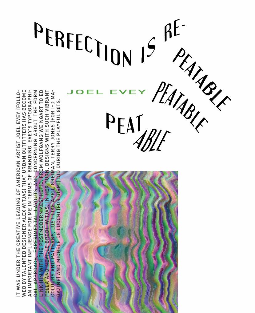
NAME: Joel EveyOCCUPATION: Art Director & Graphic DesignerWEB: www.joelevey.com
2 2 F L U K E P E R F E C T I O N I S R E P E ATA B L E


It was under the creative leading of American artist Joel Evey (followed by talented designer Alex Witjas) that Urban Outfitters has become an important influence for me in terms of bran-ding. Evey’s typographical approach, experi-mental layouts and concerning about the form link him with the postmodern aesthetic, from Wolfgang Weingart to Ed Fella and Neville Bro-di. Witjas, in her turn, designs with such vibrant colours and patterns, just like April Greiman, Terry Jones (for i-D Magazine) and Michele de Lucchi (for Girmi) did during the playful 80′s.

THEPHOTOGRAPHYPAGES
THEPHOTOGRAPHY
PAGES
PH
OTO
M
AXIM
ILIA
N H
UB
ER

EVERY ARTIST ESSENTIALLY NEEDS TOOLS. WHE-THER THEY ARE BRUSHES, PENCILS, SPRAYCANS OR ONE‘S ONE HANDS. TO CAPTURE THE ARTISI-TIC OUTCOME WE NORMALLY NEED SOME KIND OF MATERIAL, SUCH AS PAPER, CLAY, CANVAS OR A CONCRETE WALL. IN THIS CASE THE TOOLS ARE PHOTOGRAPHIC CAMERAS AND THE MATERIAL WE USE IS FILM. LET‘S BE INSPIRED BY THE SO-METIMES MORE, SOMETIMES LESS COINCIDEN-TAL WORK ON THE FOLLOWING PAGES.
TEXT
& P
HO
TOS
MAX
IMIL
IAN
HU
BER

28 F
LUK
ETO
OLS
OF
CO
INC
IDEN
CE
1
2
3
4
5 6
7
8
9
1. Canon A1 35mm
2. Zenza Bronica ETRS 120mm
3. Dacora 1956 35mm
4. Revue Flash
5. Polaroid XP 500
6. Various kinds of 120 and 35 mm film
7. Kodak Instamatic 35mm (not working anymore)
8. Lightmeter
9. Leica Mini

Ich beschäftige mich seit rund einem Jahr in-tensiv mit (analoger) Fotografie. Dabei haben mich vor allem Doppelbelichtungen schon im-mer sehr beeindruckt und meine Leidenschaft geweckt. Das Maß an Möglichkeiten erscheint unerschöpflich. In diesem Beitrag möchte ich mich auf geplante, das heißt durchdachte, nicht-zufällige Doppelbelichtungen beziehen und dabei sowohl auf den Mehraufwand an sich, als auch auf meine persönliche Motivati-on eingehen. Eher im Hintergrund stehen die technischen Aspekte einer Doppelbelichtung, die – wie ich finde – schon sehr gut an dieser Stelle erläutert wurden.
Beginnend durch die treibende Idee eines gewissen Endresultats begibt man sich also auf die Suche nach geeigneten Motiven für eine Doppelbelichtung. Dabei kann es passieren, dass man für diese zwei Aufnahmen ziemliche Strecken zurücklegt und zudem eine größere Zeitspanne zwischen den Aufnahmen in Kauf nehmen muss. Zum Beispiel entstand bei fol-gendem Foto die Belichtung des Waldes an einem Morgen und das Portrait der hölzernen Statue erst Tage später und an einem kilome-terweit entfernten, anderen Ort. So kann es vorkommen, dass eine gemachte Belichtung
nicht vorwärts gespult werden kann und somit weitere Aufnahmen „blockiert“. Und was dieser Zwangsverzicht für einen ambitionierten Foto-grafen bedeutet, können sicherlich viele von euch nachvollziehen. Erst wenn sich das geeig-nete zweite Motiv zur Vollendung der Doppel-belichtung gefunden hat, kann der Film weiter transportiert werden. Denkbare Einflüsse auf zwei unterschiedliche Aufnahmen können Ta-geszeiten, Licht- und/oder Wetterverhältnisse (Nebel, Sonne, Wolken etc.) sein. Schlussfol-gernd kann also die Gestaltung einer Doppel-belichtung mit einer zusätzlichen taktischen Planung verbunden sein.
In Bezug auf das Konzept einer Doppel-belichtung kann man sich grundsätzlich aus unterschiedlichen Themengebieten der Fo-tografie bedienen. Beispielhafte Gebiete zur Kombination zweier Aufnahmen sind Formen/Strukturen, Makros, Portraits bzw. der Mensch an sich sowie Natur- und Landschaftaufnah-men. Weiterhin können natürlich auch extreme Farb- und Größenkontraste in einer Doppelbe-lichtung herausgestellt werden. So zeigt das folgende Beispiel ein Portrait in Kombination mit einer verhältnismäßig kleineren Ganzkör-per-Panning-Aufnahme. Ich versuche in mei-
nen Doppelbelichtungen oftmals eine Spanne zwischen Mensch und Natur zu schaffen. Die Verknüpfung der Einzigartigkeit eines Portraits mit der Abstraktheit der Natur lassen in mei-nen Augen völlig neue Interpretationen offen. Und diese Interpretationen sind im besten Fall höchst individuell, so dass der Betrachter eige-ne Assoziationen entwickelt und zum Denken angeregt wird. Mein Ziel ist es also, mit Hilfe dieser geplanten Doppelbelichtungen mei-nen Ideen und Gedanken einen Ausdruck zu verleihen, um sie somit mit anderen teilen zu können. Und gerade eine doppelte Belichtung bietet dabei einen größeren Gestaltungs- und Gedankenspielraum im Gegensatz zu einer einfachen Belichtung.
Letztendlich lernt man mit jeder Dop-pelbelichtung bzw. mit jeder anknüpfenden Film-Entwicklung dazu. Dennoch ist meines Erachtens stets ein Anteil Glück dabei. Ins-besondere die Messung und Berechnung der korrekten Belichtung erweist sich oftmals als sehr schwierig. Dabei ist es ein schmaler Grat zwischen einer genialen und einer gefloppten Doppelbelichtung, was diese „Kunst“ letzten Endes so faszinierend und zugleich so kompli-ziert macht.
DER FOLGENDE ARTIKEL ÜBER DOPPELBELICHTUNGEN ENTSTAMMT DER FEDER VON FLORIAN IMGRUND. FLORIAN IST WOHNHAFT IN DUISBURG UND ANGEHENDER WISSENSCHAFTLICHER MITARBEITER DER UNI DUISBURG-ESSEN.
TEXT
& P
HOTO
S FL
ORIAN
IMGR
UND

30 F
LU
KE
EXPERIM
ENTS
IN
NATURE

Mannequins pose in the dusty factory, lines of Polaroid images spread before them, their careers as test subjects for batches of film seemingly over. This factory in Enschede, Holland, was for 20 years Polaroid‘s main European base, a complex of six buildings dedicated to making the iconic instant film. Today it is home to a team of just 15. Their mission: to bring instant film back to life.
In 2004, Polaroid decided to stop producing the negatives needed to create its instant film. It believed that it had stockpiled enough material to produce ten million films a year for ten years. It was wrong. Demand was far higher than expected, and by mid-2008 the negatives were al-most gone. Sixty-two years after its creator, Edwin Land, had unveiled his first instant negative, Polaroid film was seemingly finished.
Supply problems had troubled the company from the start. Polaro-id made only 60 units of Land‘s first instant camera, the Land Camera. Fifty-seven of that first batch went on sale before Christmas 1948 at Jor-dan Marsh, a Boston department store. The company estimated that the stock would last until it could manufacture a second run. All 57 cameras sold out on the first day.
Before Land, photography involved exposing light-sensitive material, developing, fixing and printing it. As a first-year student at Harvard, Land thought it might be possible to create polarising film by lining up crystals of iodoquinine sulphate and embedding them in transparent plastic to prevent them from moving apart. From there, he created Polaroid ins-tant film. It held the developing solution in a hermetically sealed com-partment bundled with the photosensitive paper. Pressure rollers in the
camera spread the chemicals across the paper when it was exposed, activating the reaction that developed the print. Polaroid instant film was an immediate success. At its peak, in 1991, sales of cameras and films were close to $3 billion. But by 2004, the digital-photography revolution had led the company to refocus. The factory continued to produce, ship and sell films -24million of them in 2008 alone - but the scarcity of raw materials and the shift from film had numbered its days.
On June 14, 2008, Polaroid held a closing party at the Enschede facto-ry. It was there that the man tasked with killing off Polaroid instant film met a man obsessed with saving it. By the end of the evening, they had a shared mission: to create a new instant film that would work in existing Polaroid cameras as well as a new model.
André Bosman was the man Polaroid charged with shutting down the Enschede complex. It was not a role he cherished. In 28 years with the firm, he had risen from engineer to factory manager. With his neat, scraped back hair, Bosman, now 56, is enthusiastic but extremely pre-cise, choosing all his words with care.
Years earlier, he had drawn up a survival plan for a smaller-scale operation. The factory was equipped to crank out 100 million film packs a year, but Bosman had a strategy for profitably producing ten million. „They were not interested,“ he shrugs. „That‘s the problem with big com-panies - back then, Polaroid was still 5,000 people. If you draw up an organisation of 200 people making ten million films, whose interest is it in? The customer‘s, but not the top management‘s.
IN OCTOBER 2008 THE IMPOSSIBLE PROJECT SAVED THE LAST POLAROID PRODUCTION PLANT FOR INTEGRAL INSTANT FILM IN ENSCHEDE (NL) AND STARTED TO INVENT AND PRODUCE TOTALLY NEW INSTANT FILM MATERIALS FOR TRADITIONAL POLAROID CAMERAS.
1 1 F L U K E O N C E U P O N A FA C TO RY

IN OCTOBER 2001, THE ORIGINAL POLAROID CORPORATION HAD FILED FOR BANKRUPTCY IN THE US. MOST OF THE FIRM‘S ASSETS - INCLUDING THE POLAROID NAME AND ITS PRO-FIT-MAKING FOREIGN SUBSIDIARI-ES - WERE SOLD TO AN INVESTMENT FIRM, ONE EQUITY PARTNERS. THE COMPANY‘S NAME WAS CHANGED TO THE POLAROID HOLDING COMPANY. ON APRIL 27, 2005, PETTERS GROUP WORLDWIDE ACQUIRED THE POLA-ROID HOLDING COMPANY. THE PET-TERS GROUP HAD A LONG HISTORY OF BUYING UP FAILED COMPANIES TO EXPLOIT PROMINENT BRAND NAMES, AND POLAROID WAS AN OBVIOUS TARGET.
Bosman‘s role, with the factory‘s closure just months away, now came down to breaking apart the machinery, selling what could be sold, and handing over the keys to the buildings‘ owners. He also had to help the factory‘s workers come to terms with the end of jobs many had held for more than 30 years. Now, on that Saturday in June 2008, Bosman had been given another mission by Polaroid‘s US management. An entrepre-neur and instant-film obsessive, Florian Kaps, had been badgering them about „saving“ instant film. Bosman had to tell this lunatic to stop. „It was a stupid thing to ask me,“ he says. „I was one of the people saying: you don‘t need to stop!“
Kaps‘s fascination with Polaroid began relatively late. In 2004, he was working for the Lomographic Society, which promotes the cult analogue
Lomo camera. „Everybody was scared because of the digital revolution,“ he recalls in his lan-guid Austrian accent. „But I said, ‚Hey, maybe this isn‘t the biggest threat but the biggest chance.‘ I started searching for the most ana-logue form out there.“ He settled on two possi-bilities - Super 8 and Polaroid instant film.
Kaps, 40, is wearing a T-shirt with a stylised sketch of the Polaroid SX-70 camera and the slogan „Golden Years“. His long hair is tied into a messy ponytail, his stubble rough and scratchy. He is restless as he talks, repeatedly picking up Wired‘s voice recorder to inspect it and swinging back on his chair. His graduate thesis was on the structure of spiders‘ eyes - but he describes himself as „a salesman“.
The complexity of Super 8 deterred him. „You need the camera, you need the film, you need to develop that and you need the projector.“ Po-laroid was a simpler prospect: “It is the perfect medium. It is the most analogue film - it de-velops in the palm of your hand. It also has a lot of the advantages of digital - it’s an instant
3 1 3 2 3 3

picture. But it‘s more than just a picture. A lot of emotions are attached to it.“
HE FOUND IT FASCINATING THAT PEOPLE SHOOK THE FILM.“WHY DO THEY DO THAT? EVEN IF IT‘S THE FIRST TIME THEY‘VE USED A POLAROID, THEY IM-MEDIATELY START SHAKING IT.” KAPS MADE INQUIRIES AND DISCOVERED THAT POLARO-ID HAD ALL BUT GIVEN UP ON THE PRODUCT THAT MADE ITS NAME. FILM WAS DIFFICULT TO FIND AND THE BRAND HAD LITTLE PRESENCE ONLINE. “I SAID - THIS SOUNDS LIKE SOMETHING THAT SHOULD BE DONE.” Kaps bought an original Polaroid SX-70 came-ra on eBay. “I got this camera and took it out”, he says, his eyes widening with wonder. „It had brown leather and chrome. I unfolded it and pushed the button. Film came out and began to develop. Even my wife, who is always sus-picious of my new fantasies and dreams, said ‚Wow! This is the most beautiful camera I have ever seen.‘“
Armed with proposals for building a new on-line community for Polaroid lovers and plans to sell instant film online, Kaps made an appoint-ment with Polaroid‘s management in Germany. The representatives he met were not enthusias-tic. Tom Petters had decreed that the company must focus on selling Polaroid televisions and digital-photo frames. There was no budget for analogue. Kaps was told that he could become a Polaroid retailer if he placed a minimum or-der of €200,000. „I said, ‚That‘s not what I was expecting.‘ I talked to my friends and family and raised the money.“ Together with Andi Höeller, a web designer he had met at the Lomographic Society, Kaps built Polanoid, a fan community, and Polapremium, an online film retailer.
„We bought the last remaining film for the Polaroid SX-70 camera and became a more and more respected outlet for expired films,“ says Kaps. „We found out that it‘s really the young
customers who are discovering and redisco-vering Polaroid film. Our customers all use digital cameras, but they want to have an ana-logue camera next to that. As with vinyl, they started rediscovering the old things. Everybody has CDs and an MP3 player, but that doesn‘t mean that they don‘t want to spend some mo-ney on a nice record player.“
The first Kaps knew of Polaroid‘s plan to cease production came with the firm‘s official statement in December 2007 which declared: „Due to market conditions, Polaroid has dis-continued almost all of its instant camera pro-duction.“ He immediately contacted the com-pany hoping to reverse the decision. The only response he received was an invitation to the closing party.
Bosman by now had all but given up hope: „After years of fighting, you have to accept the reality and move on. But I had no idea of what I would move on to.“ Meeting Kaps changed that. „We immediately inspired each other. We‘re very different people - he‘s this marketing, sa-les person and I‘m from a management, tech-nical background. You can drive a train through the differences between us. But we both wan-ted the same thing - to save Polaroid instant film.“
Kaps was baffled by Polaroid‘s decision to shut down a factory that both Bosman and he considered profitable. He knew that the buil-dings had been sold to a property consortium, so saw no way of stopping the closure. But Bos-man knew differently - he had heard from the developers that the economic downturn had delayed its plan for at least ten years. „I said: ‚We can stay here for ten years and keep ma-
3 2 3 3 3 4
F O U N D E R SDr. Florian Kaps2001 Florian first dived into the magic of analog photography as a leading manager of the Lomographic Society, developing their worldwide online communi-ty and shop platform. What started based on nothing more than pure unreasonab-le analog love soon turned out to be a high potential and essentially important project: The Impossible Project, that finally led to the re-invention of a complete new instant film system, making an analog dream come true.

king film?‘“ says Kaps. „But then I thought, ‚It‘s too late - the machines are already destroyed‘,“ Bosman recalls shaking his head. „‘I‘m respon-sible for destroying the machines, and the destruction team arrives on Monday.‘“ Besides, the materials required to make new negatives were no longer available. Without them, there could be no more instant film.
Bosman had an idea. „I and my team have closely looked at this and maybe, just maybe, with some time and a small team, there‘s a chance we could invent a new form of film.“
„That was it!“Kaps exclaims, bringing his fists down on the table in the Enschede factory canteen as he recalls that moment at the party. „We stopped drinking beer. I told him that I was selling the films and that there was demand. We agreed there and then: he had to stop the machi-nes being destroyed and I had to contact the management and get them
to talk to us.“ Kaps knew Polaroid would be reticent, so he fought dirty. „I said, ‚Please talk to us - or we‘ll have to tell the press that there is a chance to keep Polaroid instant film alive, but you prefer to destroy it.‘“
The next day, a Sunday, was Father‘s Day and Bosman‘s family gathe-red for a celebration. He wasn‘t home. He had sat all night in his office at the factory with Kaps, sketching out the plan to revive instant film. „I wrote a lot of emails,“ says Kaps. „The Polaroid management called me on Monday and said, ‚OK, we‘ll discuss it, but don‘t do anything rash. The situation at the factory is out of control.‘“ Paul Latka, a balding 51-year-old who began his 30-year Polaroid career in Enschede as a production engineer, recalls that dramatic day. Bosman told the workers that the dismantling was to stop. The factory would not be sold. „It was a little bit strange for people,“ says Latka, now in charge of IT infrastructure for the
1 4 F L U K E O N C E U P O N A FA C TO RY

revival project. „I had cried when I realised my job of 30 years was over. We knew for two years the factory was going to close. It was almost like when you know someone is dying. We were in shock. Polaroid had died in Enschede.“
Bosman was the focus for a lot of anger and resentment that day. „It was an emotional explosion,“ he says frankly. „They‘d known for years we were going to stop. Of course there were people who were angry with me. They felt I was fooling around with their emotions. Some people were angry, some enthusiastic, saying, ‚Can I be on the team?‘“ Meanwhile, the Po-laroid management were enraged. „I stopped the demolition first thing in the morning and then went to the directors,“ says Bosman. „By the time I got there, word had already reached them. There was no time to play by the book.“
Bosman had the technical knowledge to assemble the team to revive instant film, and Kaps and a third member of the project‘s part-nership, Marwan Saba, knew how to assemble the money and investors they would need. „We only had a short period to collect the money,“ says Kaps. „We needed funds to buy the ma-chines and rent the building for a minimum of one year. We also needed money to heat the building - below a certain temperature the ma-chines will simply not work.“ In three months, Kaps collected €1.2 million from a range of pri-vate investors. He already had a good network
of investors thanks to Polanoid, his Polaroid site, and Polanoir, a gallery for Polaroid pictu-res which he had set up in Vienna (it now has outposts in Barcelona and Berlin). „The only thing missing was a better price for film or the chance of producing an exclusive product. This was our chance,“ he says, smiling. „Andre said we had a 50/50 chance of success, but that‘s a pretty good chance. We had the product, we had the demand, now we needed the machines and the people to make it.“ Bosman and Kaps needed to secure the machines from Ensche-de. Bosman had done his sums and concluded that, even if it were possible to find a company that could replicate the machines, each would cost at least £10 million to build. So the ten machines remaining in the factory were worth, to him, at least £100 million. The blueprints to recreate the machines are still stored at En-schede, filling a huge cabinet with hundreds of drawers of microfilm.
Polaroid‘s management considered the fac-tory plant to be essentially scrap. In their view, without the negatives required to produce in-stant film, the machines were useless. „We would go into meetings,“ says Kaps, chuckling, „and they would tell us: ‚We cannot sell you tho-se machines. We have looked at it closely. All the experts have looked at it and it‘s impossib-le. You cannot reproduce Polaroid film.‘“ Kaps jumped on this argument: „I said: ‚OK, that‘s
fine. If it‘s impossible, those machines must be incredibly cheap. Because if it‘s impossible, they‘re useless.‘“
He told Polaroid‘s management that he would sign legal papers to that effect, and that it was not his plan to reproduce their instant film. The business he and Bosman planned had a different goal - to produce a brand-new ins-tant film. And that very threat of impossibility suggested a company name: The Impossible Project. „I told Polaroid, ‚Listen, I‘ll even call the company Impossible to make sure everybo-dy knows you told me that this task is impossi-ble,‘“ says Kaps.
Kaps knew the name was a great hook for journalists and investors itching for a challen-ge. „From the beginning we let the investors know that it was Impossible, but that it could become ‚I‘m Possible‘ too,“ he continues. Re-searching Land‘s life online, Kaps discovered a quote from a 1987 Forbes profile. In „The Vindi-cation Of Edwin Land“, the inventor had opined: „Don‘t do anything that someone else can do. Don‘t undertake a project unless it is manifestly important and nearly impossible.“ The Impos-sible Project had its mission statement.
F O U N D E R SAndré BosmanAndré joined Polaroid in November 1980 as a product and process engineer, rose to manager engineering and became member of the management team. In June 2008 André met Florian at the closing event of the Polaroid factory and after 2 beers and 2 hours of intense discussions he decided to take action against the death of Instant Photography. Within just one year André and his Impossible team developed a complete new Instant film system, writing a new chapter in the history of photography.

ITS GOAL WAS SIMPLE: WITHIN A YEAR, CREATE A NEW FORM OF INSTANT FILM THAT WILL WORK IN OLD POLAROIDS.
The time constraint was purely practical: existing film is fast running out. Bosman says: „We want the fading of the old inventory to be coun-terbalanced by us getting new film on to the market.“ The Impossible Project‘s first film, a black-and-white integral film (meaning there‘s no need to peel the film apart) uses a transparent sheet, a titanium- di-oxide white pigment based developer and a negative with a black back coat. One frame leaves the camera with no separation required. Polaroid never produced this form of black-and-white film. Its own product was a peel-apart film. Though the Impossible film uses different developer chemicals to Polaroid‘s, the principle is similar. In an open-plan area the team calls „The Lab“, Martin Steinmeijer is working on the chemical formulation for the new film. Steinmeijer has a shock of messy Harry Potter-esque black hair and glasses that list to one side. He worked on
chemical engineering at Polaroid for 23 years.„The problem we had is that some materials that Polaroid used are
simply not made any more,“ he mutters nervously. Steinmeijer‘s main task is to develop the various layers of material required to develop a photograph on the new film - a positive material to act as an image-receiving layer, a timing layer to control the length of development, and a neutralisation layer to end that process. „If you don‘t stop it at the right time,“ says Steinmeijer, „it will just keep on developing.“
After much experimentation, the Impossible Project has succeeded in producing a black-and-white integral film. Steinmeijer reveals a series of test pictures, each showing his eager face staring inquisitively into the lens.
After coming up with a name for its product, the Impossible Project set itself six further challenges; designing the package for the chemi-cals and film; developing a photosystem; manufacturing a battery; crea-ting a new plastic cartridge and spring; designing foils; and developing the film coating. Inevitably, there were unforeseen problems: the cost of
3 5 3 6
materials and chemicals alone was £1 million up front. „That was not part of our equation on the first day,“ says Bosman, rolling his eyes. Typically, Kaps describes the list in a more esoteric way: „The original list we dis-cussed with investors had seven points. We like seven, it‘s an evil number.“
Negotiations to secure the plant and machinery were time consuming. Beginning after the meeting between Bosman and Kaps on June 14, 2008, they stretched to October 2008. In the meantime, Polaroid went through a period of extreme upheaval when Tom Petters was arrested by the FBI, accused of involvement in a $100 million investment fraud. The case is ongoing.
ON OCTOBER 8, 2008, THE IMPOSSIBLE PROJECT WAS FOUNDED AS A LEGAL ENTITY. BY JANUARY 2009, A TEAM OF TEN HAD BEGUN WORK. NOW 15 ARE INVOLVED.

WHA
T KI
ND
OF P
OLAR
OID
CAM
ERA(
S) D
O YO
U US
E?
WHY
DO
YOU
LIKE
IN
STAN
T PH
OTOG
RAPH
Y?
WHA
T IS
YOU
R EA
RLIE
ST M
EMOR
Y OF
IN
STAN
T FI
LM?
WHA
T’S
YOUR
FAV
ORIT
E IM
POSS
IBLE
FIL
M T
YPE?
All o
f the
m! N
o, re
ally
…I h
ave
this
thin
g w
here
I ha
ve to
try
ever
ythi
ng. I
pro
babl
y ha
ve a
t lea
st o
ne o
f eve
ry s
tyle
and
form
at o
f Pol
aroi
d ca
mer
a, fr
om S
pect
ra a
nd
peel
-apa
rt c
amer
as to
500
and
eve
n I-
Zone
!I r
eally
enj
oy m
y SL
R c
amer
as (s
ever
al S
X-70
s an
d an
SLR
680)
mos
t, bu
t I’v
e al
so
built
a fe
w h
ome-
mad
e ca
mer
as in
clud
ing
inst
ant p
inho
le c
amer
as a
nd a
cus
tom
ru
bber
-coa
ted
“Hol
ga-r
oid.
” I a
lso
just
got
a C
row
n G
raph
ic, w
hich
is ju
st fa
scin
a-tin
g w
hen
used
with
inst
ant fi
lm.
I was
initi
ally
dra
wn
to in
stan
t pho
togr
aphy
for
the
nost
algi
a.H
owev
er, I
qui
ckly
bec
ame
hook
ed o
n th
e “i
nsta
nt g
ratifi
catio
n” a
nd th
e un
pre-
dict
able
nat
ure
of in
stan
t pho
tos.
I lo
ve h
ow th
is p
roce
ss u
ses
chem
ical
s –
they
can
de
cay
and
expi
re o
r be
man
ipul
ated
to c
reat
e so
met
hing
that
has
ele
men
ts o
f bot
h in
tent
iona
l and
une
xpec
ted
at th
e sa
me
time.
The
imag
es a
re s
o un
ique
, tha
t it
wou
ld b
e Im
poss
ible
to d
o th
is w
ith d
igita
l. se
e w
hat I
just
did
ther
e? Im
poss
ible
?
I rem
embe
r m
ostly
the
boxy
pla
stic
Pol
aroi
d ca
mer
as o
f the
80s
and
90s
. I th
ink
mor
e th
an th
e ca
mer
as, I
rem
embe
r th
e lit
tle w
hite
-bor
dere
d 60
0 an
d Ti
me
Zero
ph
otos
that
use
d to
be
take
n an
d sh
ared
at e
vent
s lik
e bi
rthd
ay p
artie
s, a
nd th
at
mag
ic o
f wat
chin
g th
e ph
oto
appe
ar s
o qu
ickl
y.
Her
e co
mes
my
“nee
d to
try
the
m a
ll” t
hing
aga
in. I
like
the
m a
ll fo
r di
ffere
nt r
ea-
sons
. The
col
or fi
lms
have
real
ly e
volv
ed a
nd I
am e
xcite
d to
try
each
rele
ase,
but
the
PX68
0 B
eta
was
a fa
vori
te o
f min
e fo
r the
sat
urat
ed c
olor
s an
d ra
w, “
unfil
tere
d” lo
ok.
As fa
r as
the
Silv
er S
hade
film
s go
, I fo
und
PX10
0 Fi
rst
Flus
h w
as r
eally
sup
erb
for
the
exac
t re
ason
s th
at s
ome
may
hav
e fo
und
it ch
alle
ngin
g to
wor
k w
ith. T
here
w
as a
maz
ing
pote
ntia
l in
the
abili
ty to
pur
pose
ly e
xplo
it th
e te
mpe
ratu
re s
ensi
tivity
to
cre
ate
wild
ly v
aryi
ng to
nes
and
othe
r effe
cts.
I am
hoa
rdin
g a
few
pac
ks s
till,
than
k go
odne
ss!
But
I a
lso
can’
t ar
gue
with
pro
gres
s, a
nd t
he P
X 60
0 U
V+ r
eally
is ju
st
gorg
eous
with
tone
s th
at a
re le
ss s
epia
and
mor
e si
lver
y. Is
that
a w
ord
? Si
lver
y?
WIT
H D
AN M
EAD
E

WHA
T AR
E YO
UR F
AVOR
ITE
SUBJ
ECTS
TO
PHOT
OGRA
PH?
TELL
US
ABOU
T A
PROJ
ECT
YOU’
RE W
ORKI
NG
ON.
I lik
e to
try
and
find
the
hid
den
beau
ty in
eve
ryda
y ob
ject
s or
sce
nes
that
we
pass
by
with
out e
ver
stop
ping
to n
otic
e. E
ven
thin
gs th
at a
re n
ot tr
aditi
onal
ly c
onsi
dere
d be
autif
ul c
an b
ecom
e in
tere
stin
g if
you
look
at t
hem
the
righ
t way
. So
I ten
d to
take
a
lot o
f pho
tos
of d
ecay
in b
oth
urba
n an
d ru
ral s
ettin
gs. B
ut I
wou
ld re
ally
like
to s
pend
so
me
time
impr
ovin
g m
y sk
ills
with
por
trai
ts a
nd p
eopl
e.
I hav
e be
en w
orki
ng o
n a
seri
es o
f ab
stra
ct in
stan
t te
xtur
es. T
he p
roce
ss in
volv
es
inje
ctin
g ch
emic
als,
app
lyin
g ex
trem
e te
mpe
ratu
res,
and
usi
ng o
ther
typ
es o
f m
a-ni
pula
tion
to a
lter
the
chem
istr
y an
d de
velo
pmen
t to
mak
e un
ique
, one
-of-
a-ki
nd
abst
ract
com
posi
tions
of c
olor
and
text
ure.
The
resu
lts fr
om e
ach
expe
rim
ent t
end
to
be “
Impo
ssib
le”
to d
uplic
ate
so e
ach
one
is s
peci
al. S
ee h
ow I
did
that
aga
in?
Ther
e ar
e so
man
y tal
ente
d pe
ople
on
site
s lik
e Fl
ickr
and
Pol
anoi
d w
ho in
spire
me
to
keep
tryi
ng n
ew th
ings
and
see
thin
gs in
new
way
s. A
nyon
e w
hose
wor
k I h
ave
seen
ha
s in
fluen
ced
me
in s
ome
way
, so
ther
e ar
e re
ally
too
man
y pe
ople
to li
st.
Wel
l, I j
ust r
ecen
tly b
ecam
e a
Dad
, so
I sus
pect
I’ll
be g
ettin
g pl
enty
of c
hanc
es to
get
so
me
prac
tice
with
por
trai
ts!
If I c
ould
just
get
her
to
sit
still
long
eno
ugh,
I’d
real
ly lo
ve t
o ha
ve lo
ts o
f tho
se
nost
algi
c in
stan
t pho
tos
of m
y da
ught
er.
WHO
ARE
YOU
R FA
VORI
TE P
HOTO
GRAP
HERS
, IN
STAN
T OR
OTH
ERW
ISE!
IF Y
OU C
OULD
TAK
E A
PHOT
O OF
AN
YON
E OR
AN
YTHI
NG
WHA
T W
OULD
IT
BE?
Dan
Mea
de is
a N
ew Y
ork
base
d G
raph
ic-
and
Web
-Des
igne
r w
ith a
pas
sion
for
inst
ant p
hoto
grap
hy.

39
THE JOY OF THE UNEXPECTED
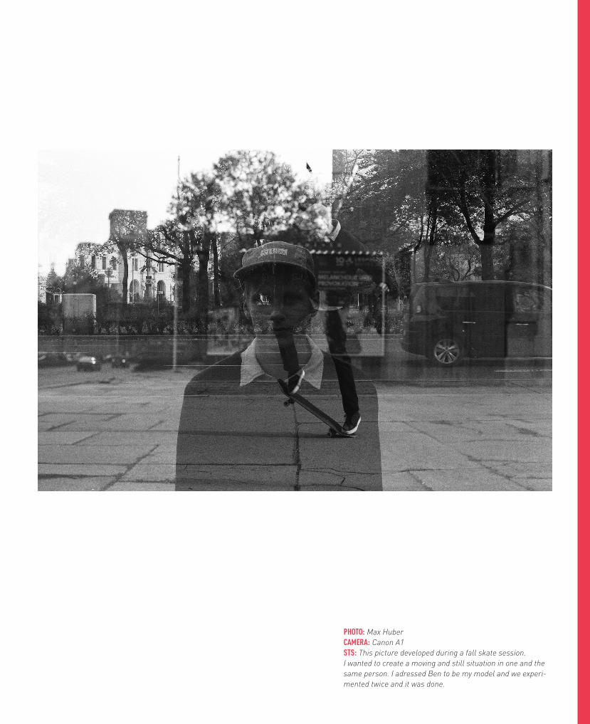
PHOTO: Max HuberCAMERA: Canon A1STS: This picture developed during a fall skate session. I wanted to create a moving and still situation in one and the same person. I adressed Ben to be my model and we experi-mented twice and it was done.

PHOTO: Mona ManaviCAMERA: Canon A1STS: This picture developed during a fall skate session. I wanted to create a moving and still situation in one and the same person. I adressed Ben to be my model and we experi-mented twice and it was done.

42

43
PHOTO: Julian SimonlehnerCAMERA: Canon AE-1, Hasselblad 500 cmSTS: This picture developed during a fall skate session. I wanted to create a moving and still situation in one and the same person. I adressed Ben to be my model and we experi-mented twice and it was done. WEB: pluspopre.tumblr.com


EDITORMaximilian Huber
IMPR INT
ART DIRECTIONMaximilian Huber
TEXTMaximilian Huber
PHOTOGRAPHYMaximilian Huber
PHOTOGRAPHYMona Manavi
PRINTINGIntercopy Wien
SPECIAL THANKS TOMy loved ones
PHOTOGRAPHYJulian Simonlehner

IF YOU PREFER READING A MAGAZINE STARTING FROM THE BACK COVER, THIS WILL BE YOUR FIRST PAGE. IF NOT WE HOPE YOU ENJOYED YOURSELF.

I S S U E N o . 1 F L U K E A Z E I T S C H R I F T F O R C O I N C I D E N C E S I N G E S TA LT