FloVis: Flow Visualization System - Dalhousie University · FloVis: Flow Visualization System Teryl...
10
FloVis: Flow Visualization System Teryl Taylor Dalhousie University Halifax, NS, Canada [email protected] Diana Paterson Dalhousie University Halifax, NS, Canada [email protected] Joel Glanfield Dalhousie University Halifax, NS, Canada joel@joelglanfield.com Carrie Gates CA Labs New York [email protected] Stephen Brooks Dalhousie University Halifax, NS, Canada [email protected] John McHugh Dalhousie University Halifax, NS, Canada [email protected] Abstract NetFlow data is routinely captured at the border of a many enterprise networks. Although not as rich as full packet capture data, Netflow provides a compact record of the interactions between host pairs on either side of the monitored border. Analysis of this data presents a chal- lange to the security analyst due to its sheer volume. We report preliminary results on the development of a suite of visualization tools that are intended to complement the com- mand line tools, such as those from the SiLK Tools, that are currently used by analysts to perform forensic analysis of NetFlow data. The current version of the tool set draws on three visual paradigms: Activity diagrams that display var- ious aspects of multiple individual host behaviors as color coded time series, connection bundles that show the inter- actions among hosts and groups of hosts and the netbytes viewer that allows detailed examination of the port and vol- ume behaviors of an individual host over a period of time. The system supports drill down for additional detail and pivoting that allows the analyst to examine the relationships among the displays. SiLK data is preprocessed into a rela- tional database to drive the display modes, and the tools can interact with the SiLK system to extract additional data as necessary. 1. Introduction A security administrator or anaylst has a difficult job. He or she must examine vast amounts of network data, host and IDS logs and information from other sources in order to understand what is occurring on the network. Buried in this mass of data are the signs of intrusive behaviour. The tasks associated with this analysis can be time consuming and cumbersome as it is difficult to find patterns in the data and trends over time. Recent research has focused on using visualization tech- niques to aid security administrators in gaining a mental image of how data is flowing along the network. Visual- ization is powerful because it allows us to view a significant amount of data at once and utilize our cognitive and pre- cognitive abilities to find patterns much more quickly than sifting through raw packet contents. The real challenge for using visualization is creating im- ages that are more than just pretty pictures. They must pro- vide insight into the underlying data to be useful. It is possi- ble to show too much information in a picture which could serve to confuse rather than help. Some years ago, we developed a number of static vi- sualization approaches[13] that provided insight into both network wide and host behaviors. The work reported here extends these preliminary ideas to an interactive tool that is integrated with the SiLK netflow tools to allow the analysist a rich and flexible visualization capability that complements the textual features of the usual SiLK analysis. FloVis is a suite of interactive visualizations designed to show various aspects of network data flow. Each image complements the others and shows the data in a different way such that if one image does not show a specific pattern another might. This paper describes the FloVis application features and some of the key visualizations offered in the suite. In Sec- tion 2 we discuss our overall philosophy and our approach the the visual representation of flow data. This is followed by the introduction of our three key visual paradigms in Section 3. The representations capture time series behav- ior for a group of hosts as color coded blocks representing categorical aspects of hourly behavior, as bundles of flows from related sources to related destinations, and as detailed,
Transcript of FloVis: Flow Visualization System - Dalhousie University · FloVis: Flow Visualization System Teryl...
FloVis: Flow Visualization System
Teryl TaylorDalhousie UniversityHalifax, NS, Canada
Diana PatersonDalhousie UniversityHalifax, NS, [email protected]
Joel GlanfieldDalhousie UniversityHalifax, NS, Canada
Carrie GatesCA LabsNew York
Stephen BrooksDalhousie UniversityHalifax, NS, [email protected]
John McHughDalhousie UniversityHalifax, NS, [email protected]
Abstract
NetFlow data is routinely captured at the border of amany enterprise networks. Although not as rich as fullpacket capture data, Netflow provides a compact record ofthe interactions between host pairs on either side of themonitored border. Analysis of this data presents a chal-lange to the security analyst due to its sheer volume. Wereport preliminary results on the development of a suite ofvisualization tools that are intended to complement the com-mand line tools, such as those from the SiLK Tools, that arecurrently used by analysts to perform forensic analysis ofNetFlow data. The current version of the tool set draws onthree visual paradigms: Activity diagrams that display var-ious aspects of multiple individual host behaviors as colorcoded time series, connection bundles that show the inter-actions among hosts and groups of hosts and the netbytesviewer that allows detailed examination of the port and vol-ume behaviors of an individual host over a period of time.The system supports drill down for additional detail andpivoting that allows the analyst to examine the relationshipsamong the displays. SiLK data is preprocessed into a rela-tional database to drive the display modes, and the toolscan interact with the SiLK system to extract additional dataas necessary.
1. Introduction
A security administrator or anaylst has a difficult job. Heor she must examine vast amounts of network data, hostand IDS logs and information from other sources in orderto understand what is occurring on the network. Buried inthis mass of data are the signs of intrusive behaviour. Thetasks associated with this analysis can be time consuming
and cumbersome as it is difficult to find patterns in the dataand trends over time.
Recent research has focused on using visualization tech-niques to aid security administrators in gaining a mentalimage of how data is flowing along the network. Visual-ization is powerful because it allows us to view a significantamount of data at once and utilize our cognitive and pre-cognitive abilities to find patterns much more quickly thansifting through raw packet contents.
The real challenge for using visualization is creating im-ages that are more than just pretty pictures. They must pro-vide insight into the underlying data to be useful. It is possi-ble to show too much information in a picture which couldserve to confuse rather than help.
Some years ago, we developed a number of static vi-sualization approaches[13] that provided insight into bothnetwork wide and host behaviors. The work reported hereextends these preliminary ideas to an interactive tool that isintegrated with the SiLK netflow tools to allow the analysista rich and flexible visualization capability that complementsthe textual features of the usual SiLK analysis.
FloVis is a suite of interactive visualizations designedto show various aspects of network data flow. Each imagecomplements the others and shows the data in a differentway such that if one image does not show a specific patternanother might.
This paper describes the FloVis application features andsome of the key visualizations offered in the suite. In Sec-tion 2 we discuss our overall philosophy and our approachthe the visual representation of flow data. This is followedby the introduction of our three key visual paradigms inSection 3. The representations capture time series behav-ior for a group of hosts as color coded blocks representingcategorical aspects of hourly behavior, as bundles of flowsfrom related sources to related destinations, and as detailed,
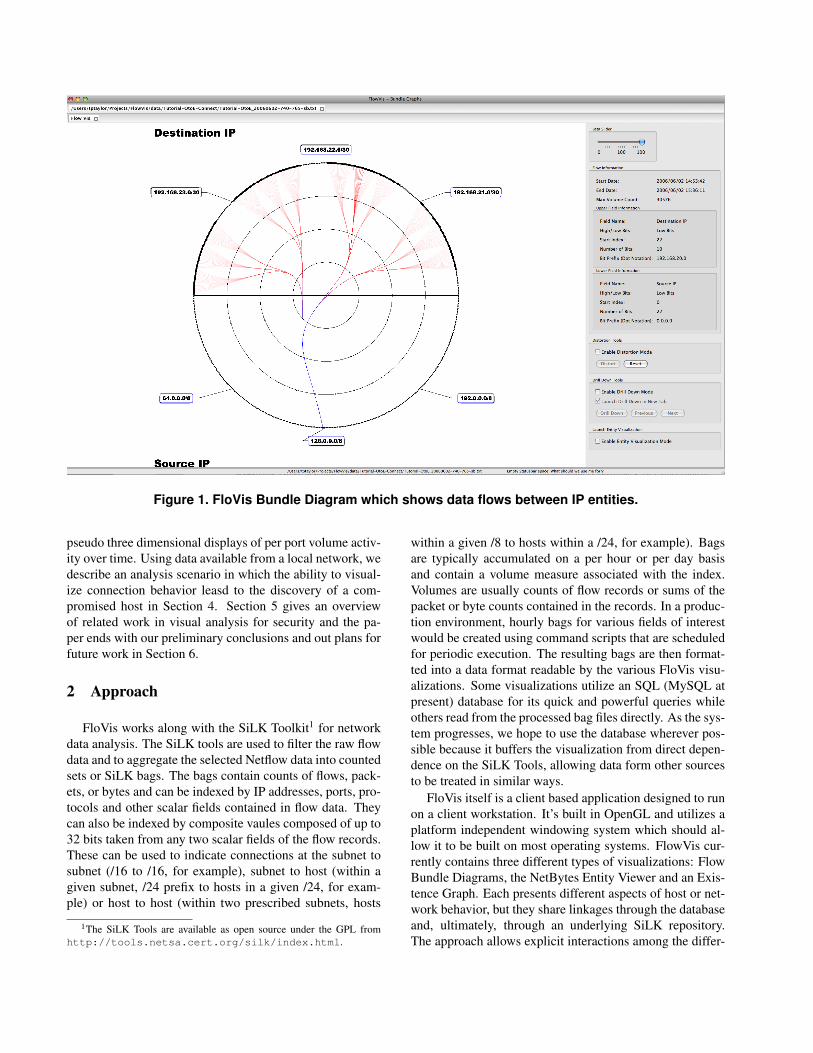
Figure 1. FloVis Bundle Diagram which shows data flows between IP entities.
pseudo three dimensional displays of per port volume activ-ity over time. Using data available from a local network, wedescribe an analysis scenario in which the ability to visual-ize connection behavior leasd to the discovery of a com-promised host in Section 4. Section 5 gives an overviewof related work in visual analysis for security and the pa-per ends with our preliminary conclusions and out plans forfuture work in Section 6.
2 Approach
FloVis works along with the SiLK Toolkit1 for networkdata analysis. The SiLK tools are used to filter the raw flowdata and to aggregate the selected Netflow data into countedsets or SiLK bags. The bags contain counts of flows, pack-ets, or bytes and can be indexed by IP addresses, ports, pro-tocols and other scalar fields contained in flow data. Theycan also be indexed by composite vaules composed of up to32 bits taken from any two scalar fields of the flow records.These can be used to indicate connections at the subnet tosubnet (/16 to /16, for example), subnet to host (within agiven subnet, /24 prefix to hosts in a given /24, for exam-ple) or host to host (within two prescribed subnets, hosts
1The SiLK Tools are available as open source under the GPL fromhttp://tools.netsa.cert.org/silk/index.html.
within a given /8 to hosts within a /24, for example). Bagsare typically accumulated on a per hour or per day basisand contain a volume measure associated with the index.Volumes are usually counts of flow records or sums of thepacket or byte counts contained in the records. In a produc-tion environment, hourly bags for various fields of interestwould be created using command scripts that are scheduledfor periodic execution. The resulting bags are then format-ted into a data format readable by the various FloVis visu-alizations. Some visualizations utilize an SQL (MySQL atpresent) database for its quick and powerful queries whileothers read from the processed bag files directly. As the sys-tem progresses, we hope to use the database wherever pos-sible because it buffers the visualization from direct depen-dence on the SiLK Tools, allowing data form other sourcesto be treated in similar ways.
FloVis itself is a client based application designed to runon a client workstation. It’s built in OpenGL and utilizes aplatform independent windowing system which should al-low it to be built on most operating systems. FlowVis cur-rently contains three different types of visualizations: FlowBundle Diagrams, the NetBytes Entity Viewer and an Exis-tence Graph. Each presents different aspects of host or net-work behavior, but they share linkages through the databaseand, ultimately, through an underlying SiLK repository.The approach allows explicit interactions among the differ-
ent views, allowing a interesting region of one visualizationto trigger visualizations of related behaviors. The underly-ing philosophy of the system is to aid the analyst in develop-ing insight into the behaviors that are seen on the networkand hosts being monitored. We assume that the analyst isalready familiar with most aspects of intrusive behavior andis familiar with the command line operation of the SiLKtools allowing us to translate drill down requests that gobeyond the precomputed summaries into scripts to extractadditional data from the SiLK (or a similar) repository andprocess it for either visualization or subsequent, manual orautomated, analysis outside the FloVis system. The scriptswill be parameterized and can be saved in a library for sub-sequent execution or modification as circumstances dictate.
3 Sample Visualizations
3.1 Bundle Diagrams
The Bundle Diagram as shown in Figure 1 focuses ondisplaying Netflow connections between entities (i.e. hostsor subnetworks) on a network. The knock against currentapplications that visualize network connections is that theycan have significant visual occlusion when showing largedatasets. The Bundle Diagram attempts to mitigate this bybundling connections [7] together and utilizing node aggre-gation to limit occlusion. Figure 1 shows a set of circularrings. The outer ring contains 512 points. Each point rep-resents the highest 8 bits of an entity’s address (could bean individual host or a subnet) on the network. The linedividing the circle represents a network border where net-flow data crosses from (for instance) an internal network toan external network (or vice versa). Connections are rep-resented by B-spline curves connecting points (entities) onthe circle. Colour is used to represent flow direction (dataflows from blue to red) while transparency is used to indi-cate flow volume. The more opaque a connection line is,the higher the percentage of the maximum volume traffic isrunning along it (for a specific time period).
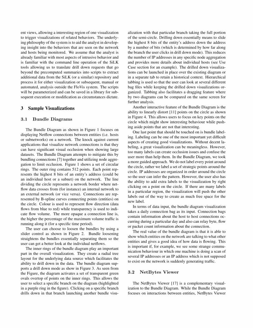
The user can choose to loosen the bundles by using aslider control as shown in Figure 2. Bundle looseningstraightens the bundles essentially separating them so theuser can get a better look at the individual netflows.
The inner rings of the bundle diagram play an importantpart in the overall visualization. They create a radial treelayout for the underlying data source which facilitates theability to drill down in the data. The bundle diagram sup-ports a drill down mode as show in Figure 3. As seen fromthe Figure, the diagram activates a set of transparent greenovals overtop of points on the inner rings. This allows theuser to select a specific branch on the diagram (highlightedin a purple ring in the figure). Clicking on a specific branchdrills down in that branch launching another bundle visu-
alization with that particular branch taking the full portionof the semi-circle. Drilling down essentially means to slidethe highest 8 bits of the entity’s address down the addressby a number of bits (which is determined by how far alongthe branch the user clicks in drill down mode). This reducesthe number of IP addresses in any specific node aggregationand provides more details about individual hosts (see UseCase section for an example). The drilled down visualiza-tions can be launched in place over the existing diagram orin a separate tab to retain a historical context. Hierarchicaltabbing is used so that the user can look at several differentbag files while keeping the drilled down visualizations or-ganized. Tabbing also facilitates a dragging feature whereby two diagrams can be compared on the same screen forfurther analysis.
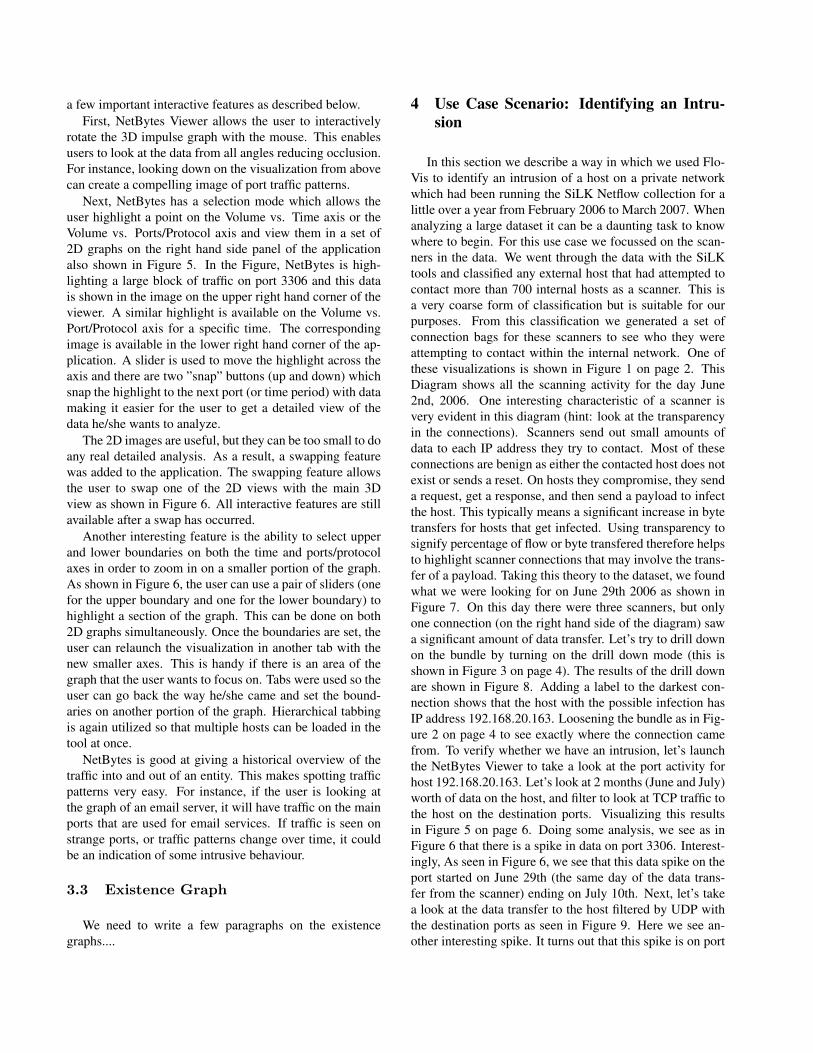
Another interactive feature of the Bundle Diagram is theability to linearly distort [11] points on the circle as shownin Figure 4. This allows users to focus on key points on thecircle which might show interesting behaviour while push-ing aside points that are not that interesting.
One last point that should be touched on is bundle label-ing. Labeling can be one of the most important yet difficultaspects of creating good visualizations. Without decent la-beling, a great visualization can be meaningless. However,too many labels can create occlusion issues and confuse theuser more than help them. In the Bundle Diagram, we tooka more guided approach. We do not label every point aroundthe circle, rather we label a set of strategic points around thecircle. IP addresses are organized in order around the circleso the user can infer the pattern. However, the user also hasthe ability to add extra labels to the visualization by rightclicking on a point on the circle. If there are many labelsin a particular region, the visualization will push the otherlabels out of the way to create as much free space for thenew label.
In terms of data input, the bundle diagram visualizationtakes a daily connection bag as its input. Connection bagscontain information about the host to host connections oc-curring during a particular day and also can relay byte, flowor packet count information about the connection.
The real value of the bundle diagram is that it is able toshow which entities on the network are talking to what otherentities and gives a good idea of how data is flowing. Thisis important if, for example, we see some strange commu-nication behaviour in which one machine is doing a scan ofseveral IP addresses or an IP address which is not supposedto exist on the network is suddenly generating traffic.
3.2 NetBytes Viewer
The NetBytes Viewer [17] is a complementary visual-ization to the Bundle Diagram. While the Bundle Diagramfocuses on interactions between entities, NetBytes Viewer
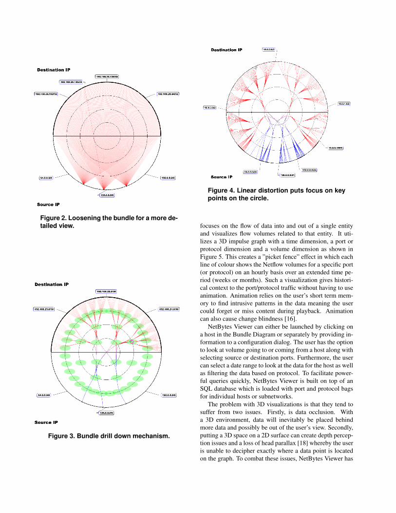
Figure 2. Loosening the bundle for a more de-tailed view.
Figure 3. Bundle drill down mechanism.
Figure 4. Linear distortion puts focus on keypoints on the circle.
focuses on the flow of data into and out of a single entityand visualizes flow volumes related to that entity. It uti-lizes a 3D impulse graph with a time dimension, a port orprotocol dimension and a volume dimension as shown inFigure 5. This creates a ”picket fence” effect in which eachline of colour shows the Netflow volumes for a specific port(or protocol) on an hourly basis over an extended time pe-riod (weeks or months). Such a visualization gives histori-cal context to the port/protocol traffic without having to useanimation. Animation relies on the user’s short term mem-ory to find intrusive patterns in the data meaning the usercould forget or miss content during playback. Animationcan also cause change blindness [16].
NetBytes Viewer can either be launched by clicking ona host in the Bundle Diagram or separately by providing in-formation to a configuration dialog. The user has the optionto look at volume going to or coming from a host along withselecting source or destination ports. Furthermore, the usercan select a date range to look at the data for the host as wellas filtering the data based on protocol. To facilitate power-ful queries quickly, NetBytes Viewer is built on top of anSQL database which is loaded with port and protocol bagsfor individual hosts or subnetworks.
The problem with 3D visualizations is that they tend tosuffer from two issues. Firstly, is data occlusion. Witha 3D environment, data will inevitably be placed behindmore data and possibly be out of the user’s view. Secondly,putting a 3D space on a 2D surface can create depth percep-tion issues and a loss of head parallax [18] whereby the useris unable to decipher exactly where a data point is locatedon the graph. To combat these issues, NetBytes Viewer has
a few important interactive features as described below.First, NetBytes Viewer allows the user to interactively
rotate the 3D impulse graph with the mouse. This enablesusers to look at the data from all angles reducing occlusion.For instance, looking down on the visualization from abovecan create a compelling image of port traffic patterns.
Next, NetBytes has a selection mode which allows theuser highlight a point on the Volume vs. Time axis or theVolume vs. Ports/Protocol axis and view them in a set of2D graphs on the right hand side panel of the applicationalso shown in Figure 5. In the Figure, NetBytes is high-lighting a large block of traffic on port 3306 and this datais shown in the image on the upper right hand corner of theviewer. A similar highlight is available on the Volume vs.Port/Protocol axis for a specific time. The correspondingimage is available in the lower right hand corner of the ap-plication. A slider is used to move the highlight across theaxis and there are two ”snap” buttons (up and down) whichsnap the highlight to the next port (or time period) with datamaking it easier for the user to get a detailed view of thedata he/she wants to analyze.
The 2D images are useful, but they can be too small to doany real detailed analysis. As a result, a swapping featurewas added to the application. The swapping feature allowsthe user to swap one of the 2D views with the main 3Dview as shown in Figure 6. All interactive features are stillavailable after a swap has occurred.
Another interesting feature is the ability to select upperand lower boundaries on both the time and ports/protocolaxes in order to zoom in on a smaller portion of the graph.As shown in Figure 6, the user can use a pair of sliders (onefor the upper boundary and one for the lower boundary) tohighlight a section of the graph. This can be done on both2D graphs simultaneously. Once the boundaries are set, theuser can relaunch the visualization in another tab with thenew smaller axes. This is handy if there is an area of thegraph that the user wants to focus on. Tabs were used so theuser can go back the way he/she came and set the bound-aries on another portion of the graph. Hierarchical tabbingis again utilized so that multiple hosts can be loaded in thetool at once.
NetBytes is good at giving a historical overview of thetraffic into and out of an entity. This makes spotting trafficpatterns very easy. For instance, if the user is looking atthe graph of an email server, it will have traffic on the mainports that are used for email services. If traffic is seen onstrange ports, or traffic patterns change over time, it couldbe an indication of some intrusive behaviour.
3.3 Existence Graph
We need to write a few paragraphs on the existencegraphs....
4 Use Case Scenario: Identifying an Intru-sion
In this section we describe a way in which we used Flo-Vis to identify an intrusion of a host on a private networkwhich had been running the SiLK Netflow collection for alittle over a year from February 2006 to March 2007. Whenanalyzing a large dataset it can be a daunting task to knowwhere to begin. For this use case we focussed on the scan-ners in the data. We went through the data with the SiLKtools and classified any external host that had attempted tocontact more than 700 internal hosts as a scanner. This isa very coarse form of classification but is suitable for ourpurposes. From this classification we generated a set ofconnection bags for these scanners to see who they wereattempting to contact within the internal network. One ofthese visualizations is shown in Figure 1 on page 2. ThisDiagram shows all the scanning activity for the day June2nd, 2006. One interesting characteristic of a scanner isvery evident in this diagram (hint: look at the transparencyin the connections). Scanners send out small amounts ofdata to each IP address they try to contact. Most of theseconnections are benign as either the contacted host does notexist or sends a reset. On hosts they compromise, they senda request, get a response, and then send a payload to infectthe host. This typically means a significant increase in bytetransfers for hosts that get infected. Using transparency tosignify percentage of flow or byte transfered therefore helpsto highlight scanner connections that may involve the trans-fer of a payload. Taking this theory to the dataset, we foundwhat we were looking for on June 29th 2006 as shown inFigure 7. On this day there were three scanners, but onlyone connection (on the right hand side of the diagram) sawa significant amount of data transfer. Let’s try to drill downon the bundle by turning on the drill down mode (this isshown in Figure 3 on page 4). The results of the drill downare shown in Figure 8. Adding a label to the darkest con-nection shows that the host with the possible infection hasIP address 192.168.20.163. Loosening the bundle as in Fig-ure 2 on page 4 to see exactly where the connection camefrom. To verify whether we have an intrusion, let’s launchthe NetBytes Viewer to take a look at the port activity forhost 192.168.20.163. Let’s look at 2 months (June and July)worth of data on the host, and filter to look at TCP traffic tothe host on the destination ports. Visualizing this resultsin Figure 5 on page 6. Doing some analysis, we see as inFigure 6 that there is a spike in data on port 3306. Interest-ingly, As seen in Figure 6, we see that this data spike on theport started on June 29th (the same day of the data trans-fer from the scanner) ending on July 10th. Next, let’s takea look at the data transfer to the host filtered by UDP withthe destination ports as seen in Figure 9. Here we see an-other interesting spike. It turns out that this spike is on port
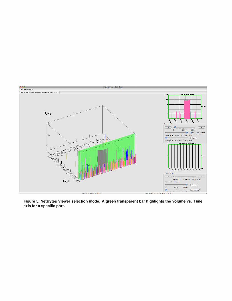
Figure 5. NetBytes Viewer selection mode. A green transparent bar highlights the Volume vs. Timeaxis for a specific port.
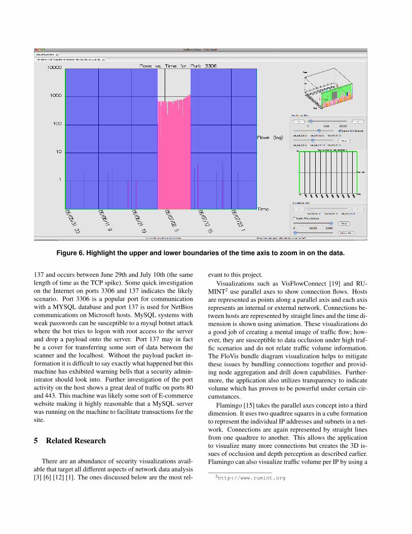
Figure 6. Highlight the upper and lower boundaries of the time axis to zoom in on the data.
137 and occurs between June 29th and July 10th (the samelength of time as the TCP spike). Some quick investigationon the Internet on ports 3306 and 137 indicates the likelyscenario. Port 3306 is a popular port for communicationwith a MYSQL database and port 137 is used for NetBioscommunications on Microsoft hosts. MySQL systems withweak passwords can be susceptible to a mysql botnet attackwhere the bot tries to logon with root access to the serverand drop a payload onto the server. Port 137 may in factbe a cover for transferring some sort of data between thescanner and the localhost. Without the payload packet in-formation it is difficult to say exactly what happened but thismachine has exhibited warning bells that a security admin-istrator should look into. Further investigation of the portactivity on the host shows a great deal of traffic on ports 80and 443. This machine was likely some sort of E-commercewebsite making it highly reasonable that a MySQL serverwas running on the machine to facilitate transactions for thesite.
5 Related Research
There are an abundance of security visualizations avail-able that target all different aspects of network data analysis[3] [6] [12] [1]. The ones discussed below are the most rel-
evant to this project.Visualizations such as VisFlowConnect [19] and RU-
MINT2 use parallel axes to show connection flows. Hostsare represented as points along a parallel axis and each axisrepresents an internal or external network. Connections be-tween hosts are represented by straight lines and the time di-mension is shown using animation. These visualizations doa good job of creating a mental image of traffic flow; how-ever, they are susceptible to data occlusion under high traf-fic scenarios and do not relate traffic volume information.The FloVis bundle diagram visualization helps to mitigatethese issues by bundling connections together and provid-ing node aggregation and drill down capabilities. Further-more, the application also utilizes transparency to indicatevolume which has proven to be powerful under certain cir-cumstances.
Flamingo [15] takes the parallel axes concept into a thirddimension. It uses two quadtree squares in a cube formationto represent the individual IP addresses and subnets in a net-work. Connections are again represented by straight linesfrom one quadtree to another. This allows the applicationto visualize many more connections but creates the 3D is-sues of occlusion and depth perception as described earlier.Flamingo can also visualize traffic volume per IP by using a
2http://www.rumint.org
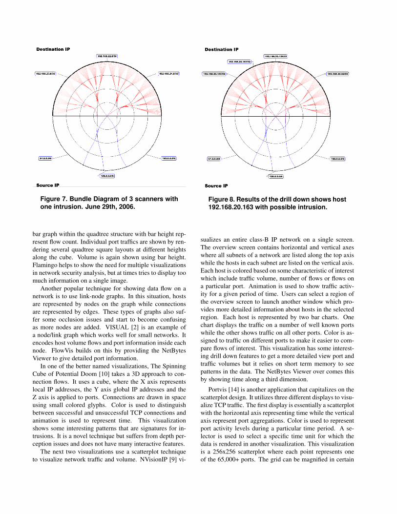
Figure 7. Bundle Diagram of 3 scanners withone intrusion. June 29th, 2006.
bar graph within the quadtree structure with bar height rep-resent flow count. Individual port traffics are shown by ren-dering several quadtree square layouts at different heightsalong the cube. Volume is again shown using bar height.Flamingo helps to show the need for multiple visualizationsin network security analysis, but at times tries to display toomuch information on a single image.
Another popular technique for showing data flow on anetwork is to use link-node graphs. In this situation, hostsare represented by nodes on the graph while connectionsare represented by edges. These types of graphs also suf-fer some occlusion issues and start to become confusingas more nodes are added. VISUAL [2] is an example ofa node/link graph which works well for small networks. Itencodes host volume flows and port information inside eachnode. FlowVis builds on this by providing the NetBytesViewer to give detailed port information.
In one of the better named visualizations, The SpinningCube of Potential Doom [10] takes a 3D approach to con-nection flows. It uses a cube, where the X axis representslocal IP addresses, the Y axis global IP addresses and theZ axis is applied to ports. Connections are drawn in spaceusing small colored glyphs. Color is used to distinguishbetween successful and unsuccessful TCP connections andanimation is used to represent time. This visualizationshows some interesting patterns that are signatures for in-trusions. It is a novel technique but suffers from depth per-ception issues and does not have many interactive features.
The next two visualizations use a scatterplot techniqueto visualize network traffic and volume. NVisionIP [9] vi-
Figure 8. Results of the drill down shows host192.168.20.163 with possible intrusion.
sualizes an entire class-B IP network on a single screen.The overview screen contains horizontal and vertical axeswhere all subnets of a network are listed along the top axiswhile the hosts in each subnet are listed on the vertical axis.Each host is colored based on some characteristic of interestwhich include traffic volume, number of flows or flows ona particular port. Animation is used to show traffic activ-ity for a given period of time. Users can select a region ofthe overview screen to launch another window which pro-vides more detailed information about hosts in the selectedregion. Each host is represented by two bar charts. Onechart displays the traffic on a number of well known portswhile the other shows traffic on all other ports. Color is as-signed to traffic on different ports to make it easier to com-pare flows of interest. This visualization has some interest-ing drill down features to get a more detailed view port andtraffic volumes but it relies on short term memory to seepatterns in the data. The NetBytes Viewer over comes thisby showing time along a third dimension.
Portvis [14] is another application that capitalizes on thescatterplot design. It utilizes three different displays to visu-alize TCP traffic. The first display is essentially a scatterplotwith the horizontal axis representing time while the verticalaxis represent port aggregations. Color is used to representport activity levels during a particular time period. A se-lector is used to select a specific time unit for which thedata is rendered in another visualization. This visualizationis a 256x256 scatterplot where each point represents oneof the 65,000+ ports. The grid can be magnified in certain
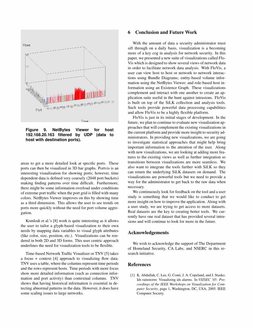
Figure 9. NetBytes Viewer for host192.168.20.163 filtered by UDP (data tohost with destination ports).
areas to get a more detailed look at specific ports. Theseports can then be visualized in 3D bar graphs. Portvis is aninteresting visualization for showing ports; however, timedependent data is defined very coarsely (2048 port buckets)making finding patterns over time difficult. Furthermore,there might be some information overload under conditionsof extreme port traffic when the port grid is filled with manycolors. NetBytes Viewer improves on this by showing timeas a third dimension. This allows the user to see trends onports more quickly without the need for port volume aggre-gation.
Komlodi et al.’s [8] work is quite interesting as it allowsthe user to tailor a glyph-based visualization to their ownneeds by mapping data variables to visual glyph attributes(like color, size, position, etc.). Visualizations can be ren-dered in both 2D and 3D forms. This user centric approachunderlines the need for visualization tools to be flexible.
Time-based Network Traffic Visualizer or TNV [5] takesa focus + context [4] approach to visualizing flow data.TNV uses a table, where the columns represent time periodsand the rows represent hosts. Time periods with more focusshow more detailed information (such as connection infor-mation and port activity) than contextual columns. TNVshows that having historical information is essential in de-tecting abnormal patterns in the data. However, it does havesome scaling issues to large networks.
6 Conclusion and Future Work
With the amount of data a security administrator mustsift through on a daily basis, visualization is a becomingmore of a key cog in analysis for network security. In thispaper, we presented a new suite of visualizations called Flo-Vis which is designed to show several views of network datain order to facilitate network data analysis. With FloVis, auser can view host to host or network to network interac-tions using Bundle Diagrams; entity-based volume infor-mation using the NetBytes Viewer; and role-based host in-formation using an Existence Graph. These visualizationscomplement and interact with one another to create an ap-plication suite useful in the hunt against intrusions. FloVisis built on top of the SiLK collection and analysis tools.Such tools provide powerful data processing capabilitiesand allow FloVis to be a highly flexible platform.
FloVis is just in its initial stages of development. In thefuture, we plan to continue to evaluate new visualization ap-proaches that will complement the existing visualizations inthe current platform and provide more insight to security ad-ministrators. In providing new visualizations, we are goingto investigate statistical approaches that might help bringimportant information to the attention of the user. Alongwith new visualizations, we are looking at adding more fea-tures to the existing views as well as further integration sotransitions between visualizations are more seamless. Wealso want to integrate the tools further with SiLK so theycan return the underlying SiLK datasets on demand. Thevisualizations are powerful tools but we need to provide away for the administrator to get back to the raw data whennecessary.
We continuously look for feedback on the tool and a userstudy is something that we would like to conduct to getmore insight on how to improve the application. Along witha user study, we are trying to get access to more datasets.Real datasets are the key to creating better tools. We cur-rently have one real dataset that has provided several intru-sions and will continue to look for more in the future.
Acknowledgements
We wish to acknowledge the support of The Departmentof Homeland Security, CA Labs, and NSERC in this re-search initiative.
References
[1] K. Abdullah, C. Lee, G. Conti, J. A. Copeland, and J. Stasko.Ids rainstorm: Visualizing ids alarms. In VIZSEC ’05: Pro-ceedings of the IEEE Workshops on Visualization for Com-puter Security, page 1, Washington, DC, USA, 2005. IEEEComputer Society.
[2] R. Ball, G. A. Fink, and C. North. Home-centric visual-ization of network traffic for security administration. InVizSEC/DMSEC ’04: Proceedings of the 2004 ACM work-shop on Visualization and data mining for computer secu-rity, pages 55–64, New York, NY, USA, 2004. ACM.
[3] G. A. Fink, P. Muessig, and C. North. Visual correlation ofhost processes and network traffic. In VIZSEC ’05: Proceed-ings of the IEEE Workshops on Visualization for ComputerSecurity, page 2, Washington, DC, USA, 2005. IEEE Com-puter Society.
[4] G. W. Furnas. Generalized fisheye views. SIGCHI Bull.,17(4):16–23, 1986.
[5] J. R. Goodall, W. G. Lutters, P. Rheingans, and A. Komlodi.Focusing on context in network traffic analysis. IEEE Com-put. Graph. Appl., 26(2):72–80, 2006.
[6] Y. Hideshima and H. Koike. Starmine: a visualization sys-tem for cyber attacks. In K. Misue, K. Sugiyama, andJ. Tanaka, editors, APVIS, volume 60 of CRPIT, pages 131–138. Australian Computer Society, 2006.
[7] D. Holten. Hierarchical edge bundles: Visualization of ad-jacency relations in hierarchical data. IEEE Transactionson Visualization and Computer Graphics, 12(5):741–748,2006.
[8] A. Komlodi, P. Rheingans, U. Ayachit, J. R. Goodall, andA. Joshi. A user-centered look at glyph-based security visu-alization. In VIZSEC ’05: Proceedings of the IEEE Work-shops on Visualization for Computer Security, page 3, Wash-ington, DC, USA, 2005. IEEE Computer Society.
[9] K. Lakkaraju, W. Yurcik, and A. J. Lee. Nvisionip: netflowvisualizations of system state for security situational aware-ness. In VizSEC/DMSEC ’04: Proceedings of the 2004 ACMworkshop on Visualization and data mining for computer se-curity, pages 65–72, New York, NY, USA, 2004. ACM.
[10] S. Lau. The spinning cube of potential doom. Commun.ACM, 47(6):25–26, 2004.
[11] Y. K. Leung and M. D. Apperley. A review and taxonomyof distortion-oriented presentation techniques. ACM Trans.Comput.-Hum. Interact., 1(2):126–160, 1994.
[12] F. Mansmann, D. A. Keim, S. C. North, B. Rexroad, andD. Sheleheda. Visual analysis of network traffic for resourceplanning, interactive monitoring, and interpretation of secu-rity threats. IEEE Transactions on Visualization and Com-puter Graphics, 13(6):1105–1112, 2007.
[13] J. McHugh, C. Gates, and D. Becknel. Situational awarenessand network traffic analysis. In Proceedings of the GdanskNATO Workshop on Cyberspace Security and Defence: Re-search Issues, volume 196 of NATO Science Series II. Math-ematics, Physics, and Chemistry, pages 209 – 228, Gdansk,Poland, September 2004. Springer.
[14] J. McPherson, K.-L. Ma, P. Krystosk, T. Bartoletti, andM. Christensen. Portvis: a tool for port-based detection ofsecurity events. In VizSEC/DMSEC ’04: Proceedings of the2004 ACM workshop on Visualization and data mining forcomputer security, pages 73–81, New York, NY, USA, 2004.ACM.
[15] J. Oberheide, M. Goff, and M. Karir. Flamingo: Visualizinginternet traffic. pages 150–161, 2006.
[16] R. A. Rensink, J. K. O’Regan, and J. J. Clark. To see or notto see: The need for attention to perceive changes in scenes.Psychological Science, 8:368–373, 1997.
[17] T. Taylor, S. Brooks, and J. McHugh. Netbytes viewer:An entity-based netflow visualization utility for identify-ing intrusive behavior. In VizSEC 2007: Proceedings ofthe 2007 workshop on visualization for computer security,pages 101–114, Berlin, Germany, 2008. Springer-Verlag.
[18] C. Ware. Information visualization: perception for de-sign. Morgan Kaufmann Publishers Inc., San Francisco, CA,USA, 2000.
[19] X. Yin, W. Yurcik, M. Treaster, Y. Li, and K. Lakkaraju. Vis-flowconnect: netflow visualizations of link relationships forsecurity situational awareness. In VizSEC/DMSEC ’04: Pro-ceedings of the 2004 ACM workshop on Visualization anddata mining for computer security, pages 26–34, New York,NY, USA, 2004. ACM.