
Flexbox Cheat Sheet - Bootstrap 4...Bootstrap 4 BootstrapCreative.com: 21 Breakpoints Extra small...
42
Bootstrap 4.4.1 CSS <link rel="stylesheet" href="https://stackpath.bootstrapcdn.com/ bootstrap/4.4.1/css/bootstrap.min.css" integrity="sha384-Vkoo8x4CGsO3+Hhxv8T/ Q5PaXtkKtu6ug5TOeNV6gBiFeWPGFN9MuhOf23Q9Ifjh" crossorigin="anonymous"> JS JS is only necessary if you plan on using one or all of the following components: Alerts, Buttons, Carousel, Collapse, Dropdowns, Modals, Navbar, Tooltips and Scrollspy <script src="https://code.jquery.com/jquery-3.4.1.slim.min.js" integrity="sha384-J6qa48 49blE2+poT4WnyKhv5vZF5SrPo0iEjwBvKU7imGFAV0wwj1yYfoRSJoZ+n" crossorigin="anonymous"></ script> <script src="https://cdn.jsdelivr.net/npm/[email protected]/dist/umd/popper.min.js" integrity="sha384-Q6E9RHvbIyZFJoft+2mJbHaEWldlvI9IOYy5n3zV9zzTtmI3UksdQRVvoxMfooAo" crossorigin="anonymous"></script> <script src="https://stackpath.bootstrapcdn.com/bootstrap/4.4.1/js/bootstrap.min.js" integrity="sha384-wfSDF2E50Y2D1uUdj0O3uMBJnjuUD4Ih7YwaYd1iqfktj0Uod8GCExl3Og8ifwB6" crossorigin="anonymous"></script> Alerts Badge Breadcrumb Buttons Button group Card Carousel Collapse Dropdowns Forms Input group Jumbotron List group Media object Modal Navs Navbar Pagination Popovers Progress Scrollspy Spinners Toasts Tooltips Borders Clearfix Close icon Colors Display Embed Flex Float Image replacement Overflow Position Screenreaders Shadows Sizing Spacing Stretched link Text Vertical align Visibility Components Utilities
Transcript of Flexbox Cheat Sheet - Bootstrap 4...Bootstrap 4 BootstrapCreative.com: 21 Breakpoints Extra small...
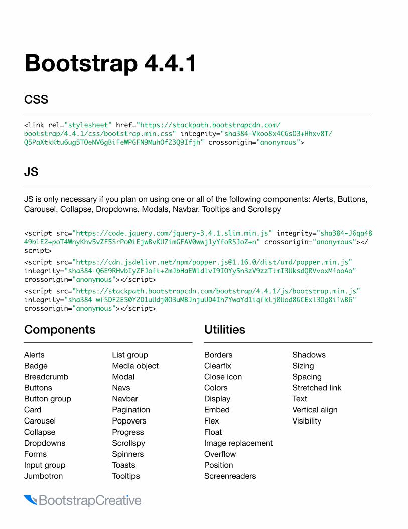
Bootstrap 4.4.1 CSS
<link rel="stylesheet" href="https://stackpath.bootstrapcdn.com/bootstrap/4.4.1/css/bootstrap.min.css" integrity="sha384-Vkoo8x4CGsO3+Hhxv8T/Q5PaXtkKtu6ug5TOeNV6gBiFeWPGFN9MuhOf23Q9Ifjh" crossorigin="anonymous">
JS
JS is only necessary if you plan on using one or all of the following components: Alerts, Buttons, Carousel, Collapse, Dropdowns, Modals, Navbar, Tooltips and Scrollspy
<script src="https://code.jquery.com/jquery-3.4.1.slim.min.js" integrity="sha384-J6qa4849blE2+poT4WnyKhv5vZF5SrPo0iEjwBvKU7imGFAV0wwj1yYfoRSJoZ+n" crossorigin="anonymous"></script><script src="https://cdn.jsdelivr.net/npm/[email protected]/dist/umd/popper.min.js" integrity="sha384-Q6E9RHvbIyZFJoft+2mJbHaEWldlvI9IOYy5n3zV9zzTtmI3UksdQRVvoxMfooAo" crossorigin="anonymous"></script><script src="https://stackpath.bootstrapcdn.com/bootstrap/4.4.1/js/bootstrap.min.js" integrity="sha384-wfSDF2E50Y2D1uUdj0O3uMBJnjuUD4Ih7YwaYd1iqfktj0Uod8GCExl3Og8ifwB6" crossorigin="anonymous"></script>
AlertsBadgeBreadcrumbButtonsButton groupCardCarouselCollapseDropdownsFormsInput groupJumbotron
List groupMedia objectModalNavsNavbarPaginationPopoversProgressScrollspySpinnersToastsTooltips
BordersClearfixClose iconColorsDisplayEmbedFlexFloatImage replacementOverflowPositionScreenreaders
ShadowsSizingSpacingStretched linkTextVertical alignVisibility
Components Utilities

Bootstrap 4
BootstrapCreative.com : 21
Breakpoints
Extra small devices (portrait phones, less than 576px) do not require a breakpoint because Bootstrap 4 is mobile first.
Breakpoints | Max container widthnot needed=Extra small < 576px | None (auto) sm=Small ≥ 576px | 540px md=Medium ≥ 768px | 720px lg=Large ≥ 992px | 960pxxl=Extra large ≥ 1200px | 1140px
Media Queries
Change the width value to set a media query for sm, md, lg, xl./* Small devices (landscape phones, 576px and up) */@media (min-width: 576px) { }
Lists
.list-unstyled Removes default list margin
.dl-horizontal Makes list items two columns.list-inline Makes list items inline .list-inline-item Added to each li
Example<ul class="social-icons list-inline"><li class="list-inline-item">item 1</li></ul>
Typography
.text-left Left aligned text
.text-*-left Left aligned by breakpoint
.text-center Center aligned text
.text-right Right aligned text
.text-justify Justified text
.text-nowrap No wrap text
.text-(lowercause, uppercase, capitalize) Changes the text capitalization style.text-decoration-none Removes decoration.text-truncate Truncate text with ellipsis.lead Good for first paragraph of article.text-monospace Changes to monospace font.font-weight-(bold, bolder, normal, light, lighter, italic) Changes the font weight.blockquote Slightly increases font-size and sets a bottom margin for blockquotes.(h1, h2, h3, h4, h5, h6) Used to make an element match the heading styles.display-(1, 2, 3, 4) Large display text. 1=96px, 2=88px, 3=72px, 4=56px
Colors
.text-primary
.text-secondary
.text-success
.text-danger
.text-warning
.text-info
.text-light
.text-dark
.text-body
.text-muted
.text-white
.text-black-50
.text-white-50
.bg-primary
.bg-secondary
.bg-success
.bg-danger
.bg-warning
.bg-info
.bg-light
.bg-dark
.bg-white
.bg-transparent

Bootstrap 4
Images
.img-fluid Make an image responsive
.rounded Adds rounded corners to image
.rounded-circle Crops image to be circle
.img-thumbnail Adds rounded corner and img border
Floats
.float-left Floats item left
.float-right Floats item right
.float-none Removes float
.float-*-* Add breakpoints if needed
Borders
Add border .border Add border to all sides.border-* (top, right, bottom, left) Add border on a certain edge
Remove Border .border-0 Remove border to all sides.border-*-0 (top, right, bottom, left) Remove border on a certain edge
Border Radius .rounded Adds border radius on all edges.rounded-* (top, right, bottom, left, circle) Adds a border radius.rounded-0 Removes border radius
Display
Value can equal one of the following: none, inline, inline-block, block, table, table-cell, table-row, flex, inline-flex .d-(value) for xs.d-(sm, md, lg, and xl)-(value) sets display value for breakpoint and up
Position
.position-(static, relative, absolute, fixed, sticky) Sets CSS position values but not responsive.fixed-(top, bottom) Position an element to the top of the viewport..sticky-top Position an element at the top of the viewport, but only after you scroll past it. Not fully supported in IE.
Shadows
.shadow The regular sized box drop shadow
.shadow-(none, sm, lg) Remove box drop shadow or change its size.
Sizing
Make an element as wide or as tall (relative to its parent).w-(5%, 50%, 75%, 100%, auto) Sets width.h-(5%, 50%, 75%, 100%, auto) Sets height.mw-(5%, 50%, 75%, 100%, auto) Sets max-width.mh-(5%, 50%, 75%, 100%, auto) Sets max-height
Bootstrap 4
BootstrapCreative.com : 23
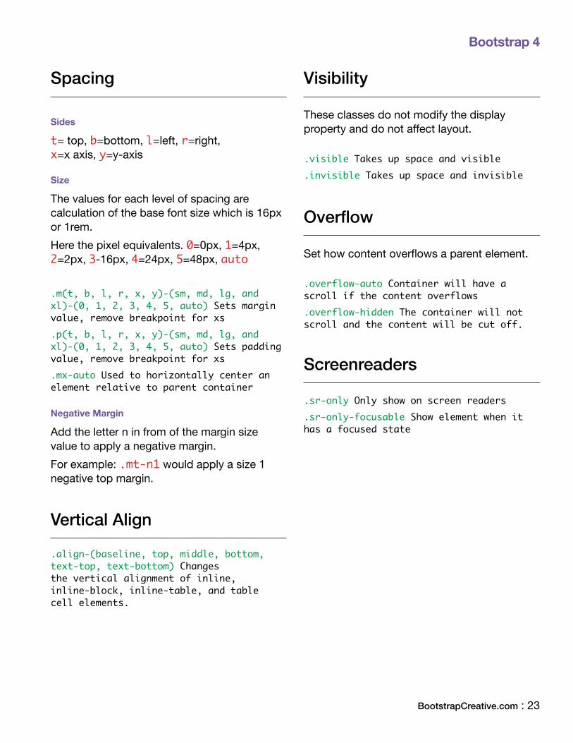
Spacing
Sides
t= top, b=bottom, l=left, r=right, x=x axis, y=y-axis
Size
The values for each level of spacing are calculation of the base font size which is 16px or 1rem. Here the pixel equivalents. 0=0px, 1=4px, 2=2px, 3-16px, 4=24px, 5=48px, auto
.m(t, b, l, r, x, y)-(sm, md, lg, and xl)-(0, 1, 2, 3, 4, 5, auto) Sets margin value, remove breakpoint for xs.p(t, b, l, r, x, y)-(sm, md, lg, and xl)-(0, 1, 2, 3, 4, 5, auto) Sets padding value, remove breakpoint for xs.mx-auto Used to horizontally center an element relative to parent container
Negative Margin
Add the letter n in from of the margin size value to apply a negative margin. For example: .mt-n1 would apply a size 1 negative top margin.
Vertical Align
.align-(baseline, top, middle, bottom, text-top, text-bottom) Changes the vertical alignment of inline, inline-block, inline-table, and table cell elements.
Visibility
These classes do not modify the display property and do not affect layout.
.visible Takes up space and visible
.invisible Takes up space and invisible
Overflow
Set how content overflows a parent element.
.overflow-auto Container will have a scroll if the content overflows.overflow-hidden The container will not scroll and the content will be cut off.
Screenreaders
.sr-only Only show on screen readers
.sr-only-focusable Show element when it has a focused state
Bootstrap 4
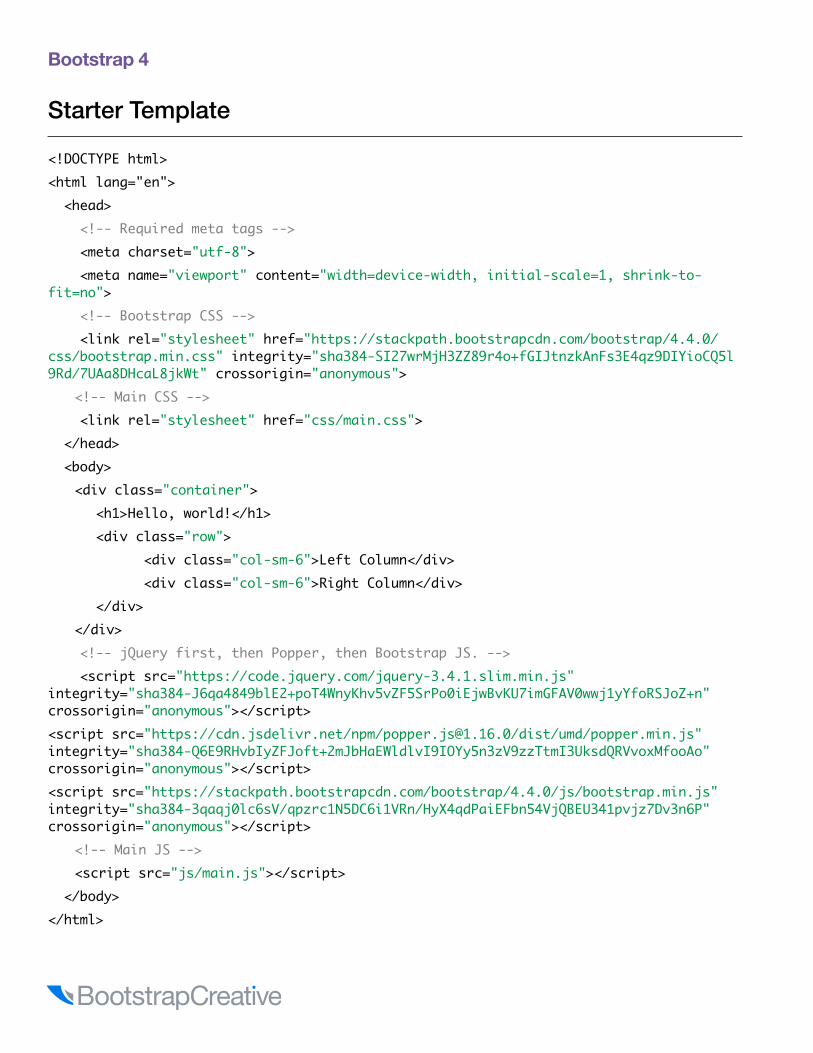
Starter Template
<!DOCTYPE html><html lang="en"> <head> <!-- Required meta tags --> <meta charset="utf-8"> <meta name="viewport" content="width=device-width, initial-scale=1, shrink-to-fit=no"> <!-- Bootstrap CSS --> <link rel="stylesheet" href="https://stackpath.bootstrapcdn.com/bootstrap/4.4.0/css/bootstrap.min.css" integrity="sha384-SI27wrMjH3ZZ89r4o+fGIJtnzkAnFs3E4qz9DIYioCQ5l9Rd/7UAa8DHcaL8jkWt" crossorigin="anonymous"> <!-- Main CSS --> <link rel="stylesheet" href="css/main.css"> </head> <body> <div class="container"> <h1>Hello, world!</h1> <div class="row"> <div class="col-sm-6">Left Column</div> <div class="col-sm-6">Right Column</div> </div> </div> <!-- jQuery first, then Popper, then Bootstrap JS. --> <script src="https://code.jquery.com/jquery-3.4.1.slim.min.js" integrity="sha384-J6qa4849blE2+poT4WnyKhv5vZF5SrPo0iEjwBvKU7imGFAV0wwj1yYfoRSJoZ+n" crossorigin="anonymous"></script><script src="https://cdn.jsdelivr.net/npm/[email protected]/dist/umd/popper.min.js" integrity="sha384-Q6E9RHvbIyZFJoft+2mJbHaEWldlvI9IOYy5n3zV9zzTtmI3UksdQRVvoxMfooAo" crossorigin="anonymous"></script><script src="https://stackpath.bootstrapcdn.com/bootstrap/4.4.0/js/bootstrap.min.js" integrity="sha384-3qaqj0lc6sV/qpzrc1N5DC6i1VRn/HyX4qdPaiEFbn54VjQBEU341pvjz7Dv3n6P" crossorigin="anonymous"></script> <!-- Main JS --> <script src="js/main.js"></script> </body></html>
Bootstrap 4
BootstrapCreative.com : 25
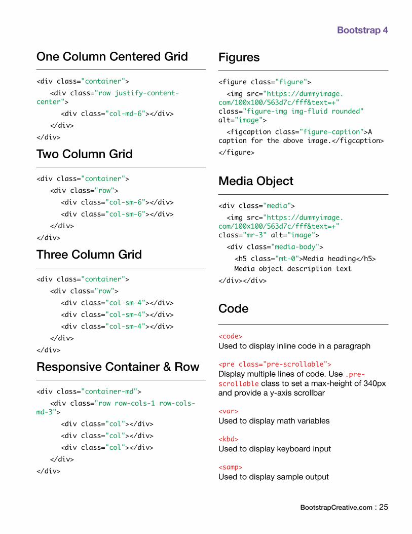
One Column Centered Grid
<div class="container"> <div class="row justify-content-center">
<div class="col-md-6"></div> </div></div>
Two Column Grid
<div class="container"><div class="row">
<div class="col-sm-6"></div> <div class="col-sm-6"></div> </div></div>
Three Column Grid
<div class="container"><div class="row">
<div class="col-sm-4"></div> <div class="col-sm-4"></div> <div class="col-sm-4"></div> </div></div>
Responsive Container & Row
<div class="container-md"> <div class="row row-cols-1 row-cols-md-3"> <div class="col"></div> <div class="col"></div> <div class="col"></div> </div></div>
Figures
<figure class="figure"> <img src="https://dummyimage.com/100x100/563d7c/fff&text=+" class="figure-img img-fluid rounded" alt="image"> <figcaption class="figure-caption">A caption for the above image.</figcaption></figure>
Media Object
<div class="media"> <img src="https://dummyimage.com/100x100/563d7c/fff&text=+" class="mr-3" alt="image"> <div class="media-body"> <h5 class="mt-0">Media heading</h5> Media object description text </div></div>
Code
<code> Used to display inline code in a paragraph
<pre class="pre-scrollable"> Display multiple lines of code. Use .pre-scrollable class to set a max-height of 340px and provide a y-axis scrollbar
<var> Used to display math variables
<kbd> Used to display keyboard input
<samp> Used to display sample output

Bootstrap 4
Navbar
<nav class="navbar navbar-toggleable-md navbar-dark bg-primary"> <button class="navbar-toggler navbar-toggler-right" type="button" data-toggle="collapse" data-target="#navbarNavDropdown" aria-controls="navbarNavDropdown" aria-expanded="false" aria-label="Toggle navigation"> <span class="navbar-toggler-icon"></span> </button> <a class="navbar-brand" href="#">Navbar</a> <div class="collapse navbar-collapse" id="navbarNavDropdown"> <ul class="navbar-nav"> <li class="nav-item active"> <a class="nav-link" href="#">Home <span class="sr-only">(current)</span></a> </li> <li class="nav-item"> <a class="nav-link" href="#">Features</a> </li> <li class="nav-item"> <a class="nav-link" href="#">Pricing</a> </li> <li class="nav-item dropdown"> <a class="nav-link dropdown-toggle" href="http://example.com" id="navbarDropdownMenuLink" data-toggle="dropdown" aria-haspopup="true" aria-expanded="false"> Dropdown link </a> <div class="dropdown-menu" aria-labelledby="navbarDropdownMenuLink"> <a class="dropdown-item" href="#">Action</a> <a class="dropdown-item" href="#">Another action</a> <a class="dropdown-item" href="#">Something else here</a> </div> </li> </ul> </div></nav>

Bootstrap 4
BootstrapCreative.com : 27
Modal
<!-- Button trigger modal --><button type="button" class="btn btn-primary" data-toggle="modal" data-target="#myModal"> Launch demo modal</button>
<!-- Modal --><div class="modal fade" id="myModal" tabindex="-1" role="dialog" aria-labelledby="exampleModalLabel" aria-hidden="true"> <div class="modal-dialog" role="document"> <div class="modal-content"> <div class="modal-header"> <h5 class="modal-title" id="exampleModalLabel">Modal title</h5> <button type="button" class="close" data-dismiss="modal" aria-label="Close"> <span aria-hidden="true">×</span> </button> </div> <div class="modal-body"> <h2>Modal body heading</h2> <p>Modal body text description</p> </div> <div class="modal-footer"> <button type="button" class="btn btn-secondary" data-dismiss="modal">Close</button> <button type="button" class="btn btn-primary">Save changes</button> </div> </div> </div></div>
Bootstrap 4
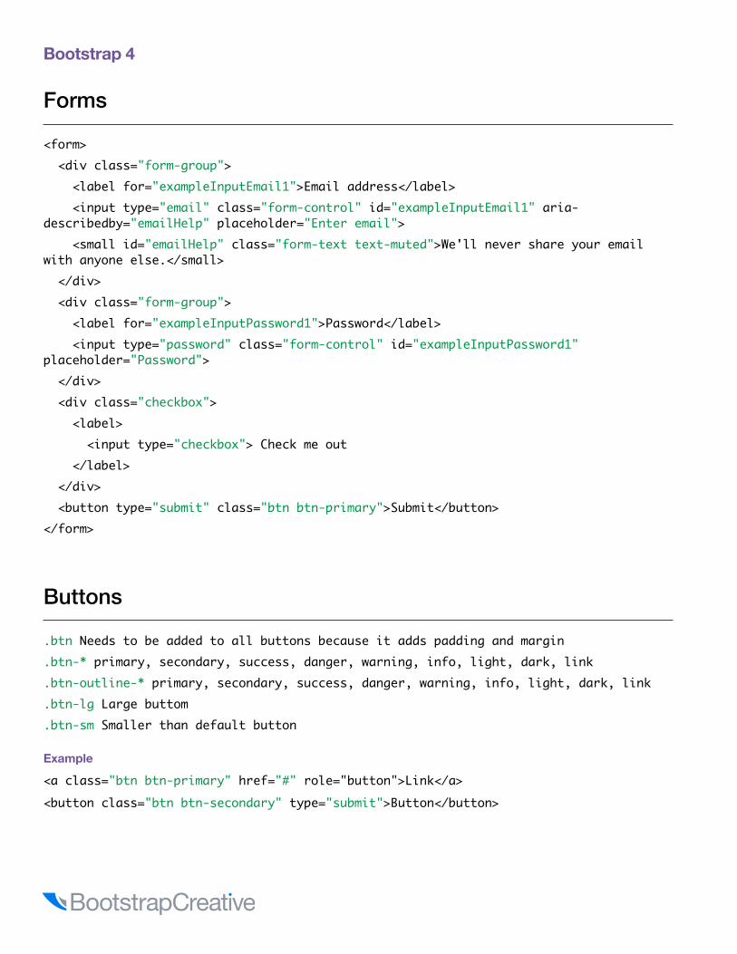
Forms
<form> <div class="form-group"> <label for="exampleInputEmail1">Email address</label> <input type="email" class="form-control" id="exampleInputEmail1" aria-describedby="emailHelp" placeholder="Enter email"> <small id="emailHelp" class="form-text text-muted">We'll never share your email with anyone else.</small> </div> <div class="form-group"> <label for="exampleInputPassword1">Password</label> <input type="password" class="form-control" id="exampleInputPassword1" placeholder="Password"> </div> <div class="checkbox"> <label> <input type="checkbox"> Check me out </label> </div> <button type="submit" class="btn btn-primary">Submit</button></form>
Buttons
.btn Needs to be added to all buttons because it adds padding and margin
.btn-* primary, secondary, success, danger, warning, info, light, dark, link
.btn-outline-* primary, secondary, success, danger, warning, info, light, dark, link
.btn-lg Large buttom
.btn-sm Smaller than default button
Example
<a class="btn btn-primary" href="#" role="button">Link</a><button class="btn btn-secondary" type="submit">Button</button>

Bootstrap 4
BootstrapCreative.com : 29
Carousel
<div id="carousel-name" class="carousel slide" data-ride="carousel"> <ol class="carousel-indicators"> <li data-target="#carousel-name" data-slide-to="0" class="active"></li> <li data-target="#carousel-name" data-slide-to="1"></li> <li data-target="#carousel-name" data-slide-to="2"></li> </ol> <div class="carousel-inner" role="listbox"> <div class="carousel-item active"> <img class="d-block img-fluid" src="https://dummyimage.com/900x340/563d7c/fff&text=+" alt="First slide"> <div class="carousel-caption d-none d-md-block"> <h3>Carousel Slider Title</h3> <p>Description text to further describe the content of the slide image</p> <a href="" class="btn btn-primary">Call to Action</a> </div> </div> <div class="carousel-item"> <img class="d-block img-fluid" src="https://dummyimage.com/900x340/563d7c/fff&text=+" alt="Third slide"> <div class="carousel-caption d-none d-md-block"> <a href="" class="btn btn-primary">Call to Action</a> </div> </div> </div> <a class="carousel-control-prev" href="#carousel-name" role="button" data-slide="prev"> <span class="carousel-control-prev-icon" aria-hidden="true"></span> <span class="sr-only">Previous</span> </a> <a class="carousel-control-next" href="#carousel-name" role="button" data-slide="next"> <span class="carousel-control-next-icon" aria-hidden="true"></span> <span class="sr-only">Next</span> </a></div>

Bootstrap 4
Jumbotron
<div class="jumbotron jumbotron-fluid"> <div class="container"> <h1 class="display-3">Fluid jumbotron</h1> <p class="lead">This is a modified jumbotron that occupies the entire horizontal space of its parent.</p> </div></div>
Card
<div class="card" style="width: 20rem;"> <img class="card-img-top w-100" src="https://dummyimage.com/600x400/563d7c/fff" alt="Card image cap" > <div class="card-body"> <h4 class="card-title">Card title</h4> <p class="card-text">Some quick example text to build on the card title and make up the bulk of the card's content.</p> <a href="#" class="btn btn-primary">Go somewhere</a> </div></div>
Breadcrumbs
<ol class="breadcrumb"> <li><a href="#">Home</a></li> <li><a href="#">Library</a></li> <li class="active">Data</li></ol>
Responsive embed
<div class="embed-responsive embed-responsive-16by9"> <iframe class="embed-responsive-item" src="..."></iframe></div>
Bootstrap 4
BootstrapCreative.com : 31
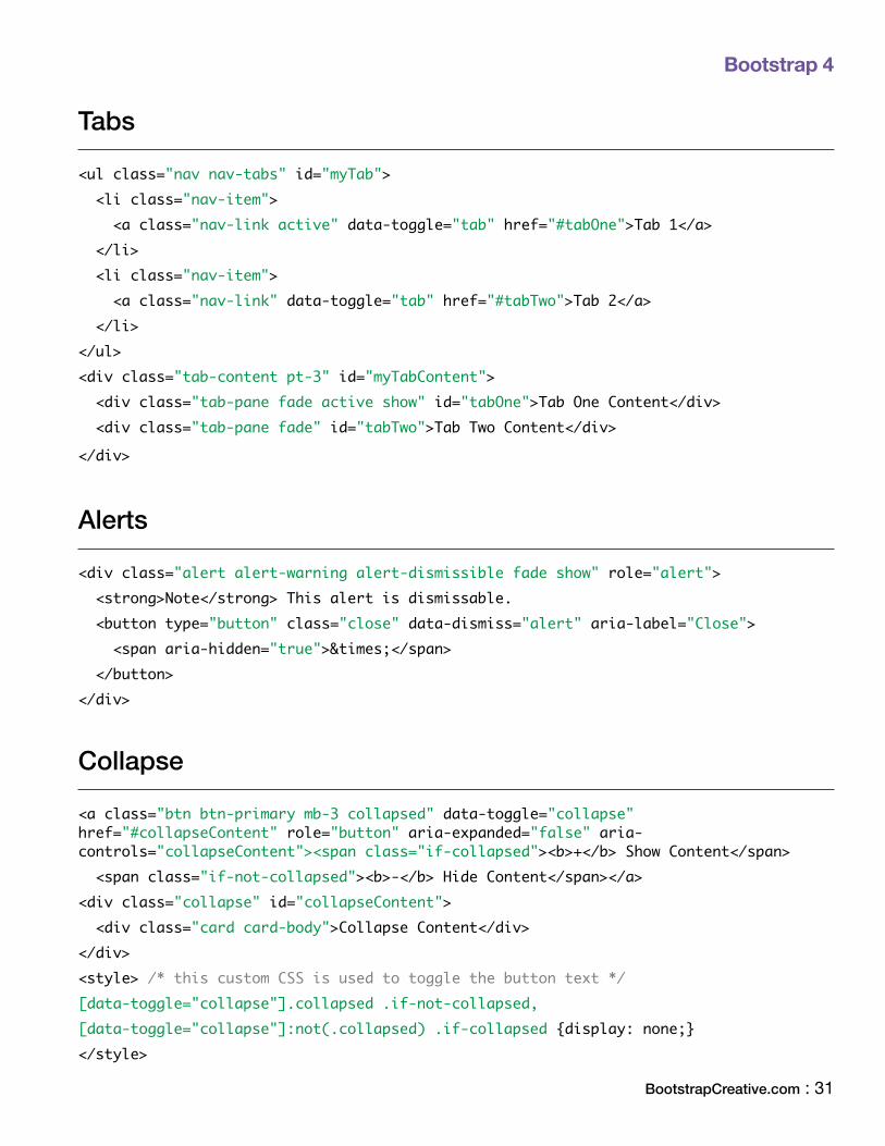
Tabs
<ul class="nav nav-tabs" id="myTab"> <li class="nav-item"> <a class="nav-link active" data-toggle="tab" href="#tabOne">Tab 1</a> </li> <li class="nav-item"> <a class="nav-link" data-toggle="tab" href="#tabTwo">Tab 2</a> </li></ul><div class="tab-content pt-3" id="myTabContent"> <div class="tab-pane fade active show" id="tabOne">Tab One Content</div> <div class="tab-pane fade" id="tabTwo">Tab Two Content</div>
</div>
Alerts
<div class="alert alert-warning alert-dismissible fade show" role="alert"> <strong>Note</strong> This alert is dismissable. <button type="button" class="close" data-dismiss="alert" aria-label="Close"> <span aria-hidden="true">×</span> </button></div>
Collapse
<a class="btn btn-primary mb-3 collapsed" data-toggle="collapse" href="#collapseContent" role="button" aria-expanded="false" aria-controls="collapseContent"><span class="if-collapsed"><b>+</b> Show Content</span> <span class="if-not-collapsed"><b>-</b> Hide Content</span></a><div class="collapse" id="collapseContent"> <div class="card card-body">Collapse Content</div></div><style> /* this custom CSS is used to toggle the button text */[data-toggle="collapse"].collapsed .if-not-collapsed,[data-toggle="collapse"]:not(.collapsed) .if-collapsed {display: none;}</style>
Bootstrap 4
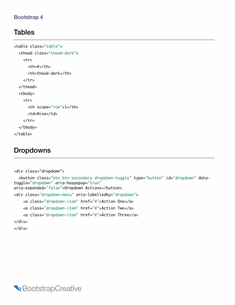
Tables
<table class="table"> <thead class="thead-dark"> <tr> <th>#</th> <th>thead-dark</th> </tr> </thead> <tbody> <tr> <th scope="row">1</th> <td>Nina</td> </tr> </tbody></table>
Dropdowns
<div class="dropdown"> <button class="btn btn-secondary dropdown-toggle" type="button" id="dropdown" data-toggle="dropdown" aria-haspopup="true" aria-expanded="false">Dropdown Actions</button><div class="dropdown-menu" aria-labelledby="dropdown"> <a class="dropdown-item" href="#">Action One</a> <a class="dropdown-item" href="#">Action Two</a> <a class="dropdown-item" href="#">Action Three</a></div></div>

Learn Bootstrap 4 and Responsive Design Basics.. Fast!
Learn MoreBootstrapQuickStart.com

Bootstrap 4
Component CSS Format and Media Queries
/* * Component section heading * * Component description and use */
/* base - shared styles */.component { width: 220px; }
/* Sub-component with component name as a prefix to isolate styles and break the cascade. */
.component-heading { display: block; width: 100px; font-size: 1rem;}
/* variant - alert color */.component-alert { color: #ff0000;}
/* variant - success color */.component-success { color: #00ff00;}
/* Add media queries below components instead of a separate stylesheet or section to make updating easier */
@media (min-width: 480px) { .component-heading { width:auto; }}

Bootstrap 4
BootstrapCreative.com : 35
.active
.accordion
.alert
.alert-(primary, secondary, success, danger, warning, info, light, dark).alert-dismissible.alert-heading.alert-link.align-(baseline, top, middle, bottom, text-top, text-bottom).align-content-(sm, md, lg, xl)-(around, between, center, end, start, stretch).align-items-(sm, md, lg, xl)-(baseline, center, end, start, stretch).align-self-(sm, md, lg, xl)-(auto, baseline, center, end, start, stretch).arrow.badge.badge-(primary, secondary, success, danger, warning, info, light, dark).badge-pill.bg-(primary, secondary, success, danger, warning, info, light, dark, transparent, white).blockquote.blockquote-footer.border-(light, dark primary, secondary, transparent, white, warning, success, info, danger, 0, top-0, right-0, bottom-0, left-0) .border-(bottom, left, right, top).breadcrumb.breadcrumb-item.bs-popover-(auto, bottom, left, right, top)
.bs-tooltip-(auto, bottom, left, right, top).btn.btn-block.btn-group.btn-group-(sm, lg).btn-group-toggle.btn-group-vertical.btn-(sm, lg).btn-link.btn-outline-(primary, secondary, success, danger, warning, info, light, dark).btn-(primary, secondary, success, danger, warning, info, light, dark).btn-toolbar.card.card-body.card-columns.card-deck.card-footer.card-group.card-header.card-header-pills.card-header-tabs.card-img.card-img-bottom.card-img-overlay.card-img-top.card-link.card-subtitle.card-text.card-title.carousel
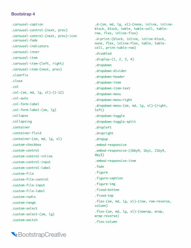
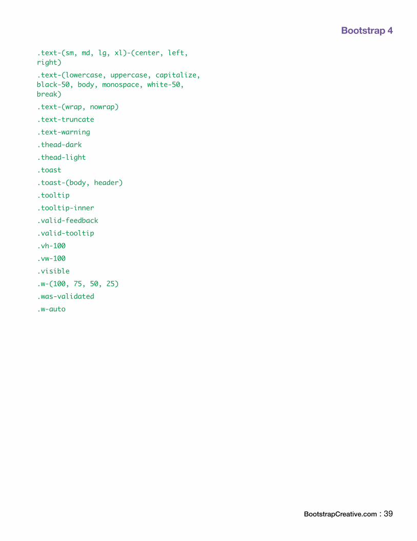
Alphabetical Index of CSS Classes
Bootstrap 4
.carousel-caption
.carousel-control-(next, prev)
.carousel-control-(next, prev)-icon
.carousel-fade
.carousel-indicators
.carousel-inner
.carousel-item
.carousel-item-(left, right)
.carousel-item-(next, prev)
.clearfix
.close
.col
.col-(sm, md, lg, xl)-(1-12)
.col-auto
.col-form-label
.col-form-label-(sm, lg)
.collapse
.collapsing
.container
.container-fluid
.container-(sm, md, lg, xl)
.custom-checkbox
.custom-control
.custom-control-inline
.custom-control-input
.custom-control-label
.custom-file
.custom-file-control
.custom-file-input
.custom-file-label
.custom-radio
.custom-range
.custom-select
.custom-select-(sm, lg)
.custom-switch
.d-(sm, md, lg, xl)-(none, inline, inline-block, block, table, table-cell, table-row, flex, inline-flex).d-print-(block, inline, inline-block, none, flex, inline-flex, table, table-cell, print-table-row).disabled.display-(1, 2, 3, 4).dropdown.dropdown-divider.dropdown-header.dropdown-item.dropdown-item-text.dropdown-menu.dropdown-menu-right.dropdown-menu-(sm, md, lg, xl)-(right, left).dropdown-toggle.dropdown-toggle-split.dropleft.dropright.dropup.embed-responsive.embed-responsive-(16by9, 1by1, 21by9, 4by3).embed-responsive-item.fade.figure.figure-caption.figure-img.fixed-bottom.fixed-top.flex-(sm, md, lg, xl)-(row, row-reverse, column).flex-(sm, md, lg, xl)-(nowrap, wrap, wrap-reverse).flex-column

Bootstrap 4
BootstrapCreative.com : 37
.flex-column-reverse
.flex-fill
.flex-grow-*
.flex-shrink-*
.float-(sm, md, lg, xl)-(none, left, right).focus.font-italic.font-weight-(bold, bolder, light, lighter, normal).form-check.form-check-inline.form-check-input.form-check-label.form-control.form-control-file.form-control-(sm, lg).form-control-plaintext.form-control-range.form-group.form-inline.form-row.form-text.h-(100, 75, 50, 25, auto).(h1-h6).hide.img-fluid.img-thumbnail.initialism.input-group.input-group-append.input-group-(sm, lg).input-group-prepend.input-group-text.invalid-feedback
.invalid-tooltip
.invisible
.is-invalid
.is-valid
.jumbotron
.jumbotron-fluid
.justify-content-(sm, md, lg, xl)-(start, end, center, between, around).lead.list-group.list-group-flush.list-group-horizontal-(sm, md, lg, xl).list-group-item.list-group-item-action.list-group-item-(primary, secondary, success, danger, warning, info, light, dark).list-(inline, inline-item, unstyled).m(t,b,r,l,x,y)-(sm, md, lg, xl)-(0, 1, 2, 3, 4, 5, n1, n2, n3, n4, n5).mark.media.media-body.mh-100.modal.modal-backdrop.modal-body.modal-content.modal-dialog.modal-dialog-(centered, scrollable).modal-footer.modal-header.modal-(sm, lg).modal-open.modal-scrollbar-measure.modal-title

Bootstrap 4
.nav
.nav-fill
.nav-item
.nav-justified
.nav-link
.nav-pills
.nav-tabs
.navbar
.navbar-brand
.navbar-collapse
.navbar-(dark, light)
.navbar-expand-(sm, md, lg, xl)
.navbar-nav
.navbar-text
.navbar-toggler
.navbar-toggler-icon
.no-gutters
.offset-(sm, md, lg, xl)-(1-12)
.order-(sm, md, lg, xl)-first
.order-(sm, md, lg, xl)-last
.order-(sm, md, lg, xl)-(0-12)
.p(t,b,r,l,x,y)-(sm, md, lg, xl)-(0, 1, 2, 3, 4, 5, n1, n2, n3, n4, n5).overflow-(auto, hidden).page-item.page-link.pagination.pagination-(sm, lg).popover.popover-body.popover-header.position-(absolute, fixed, relative, static, sticky).pre-scrollable.progress
.progress-bar
.progress-bar-animated
.progress-bar-striped
.rounded
.rounded-(top, right, bottom, left, circle, pill, 0, lg, sm).rounded-circle.row.row-cols-(sm, md, lg, xl)-(1, 2, 3, 4, 5, 6).shadow-(none, sm, lg).show.showing.small.spinner-(border, border-sm, grow, grow-sm).sr-only.sr-only-focusable.stretched-link.tab-content.tab-pane.table.table-active.table-bordered.table-borderless.table-hover.table-(primary, secondary, success, danger, warning, info, light, dark).table-responsive-(sm, md, lg, xl).table-sm.table-striped.text-(primary, secondary, success, danger, warning, info, light, dark, muted, white, decoration-none, reset).text-hide.text-justify
Bootstrap 4
BootstrapCreative.com : 39
.text-(sm, md, lg, xl)-(center, left, right).text-(lowercase, uppercase, capitalize, black-50, body, monospace, white-50, break).text-(wrap, nowrap).text-truncate.text-warning.thead-dark.thead-light.toast.toast-(body, header).tooltip.tooltip-inner.valid-feedback.valid-tooltip.vh-100.vw-100.visible.w-(100, 75, 50, 25).was-validated.w-auto

Bootstrap 4
Pixels REMS Pixels REMS1 px 0.0625 26 px 1.6252 px 0.125 27 px 1.68753 px 0.1875 28 px 1.754 px 0.25 29 px 1.81255 px 0.3125 30 px 1.8756 px 0.375 31 px 1.93757 px 0.4375 32 px 28 px 0.5 33 px 2.06259 px 0.5625 34 px 2.12510 px 0.625 35 px 2.187511 px 0.6875 36 px 2.2512 px 0.75 37 px 2.312513 px 0.8125 38 px 2.37514 px 0.875 39 px 2.437515 px 0.9375 40 px 2.5
Default Bootstrap 4 font size
16 px1 41 px 2.5625
17 px 1.0625 42 px 2.62518 px 1.125 43 px 2.687519 px 1.1875 44 px 2.7520 px 1.25 45 px 2.812521 px 1.3125 46 px 2.87522 px 1.375 47 px 2.937523 px 1.4375 48 px 324 px 1.5 49 px 3.062525 px 1.5625 50 px 3.125
Convert Pixels to REMS

Bootstrap 4
BootstrapCreative.com : 41
Multiples of 15 Multiples of 3015 405 30 81030 420 60 84045 435 90 87060 450 120 90075 465 150 93090 480 180 960105 495 210 990120 510 240 1020135 525 270 1050150 540 300 1080165 555 330 1110180 570 360 1140195 585 390 1170210 600 420 1200225 615 450 1230240 630 480 1260255 645 510 1290270 660 540 1320285 675 570 1350300 690 600 1380315 705 630 1410330 720 660 1440345 735 690 1470360 750 720 1500375 765 750 1530390 780 780 1560
Multiples of Common Units of Measure

Bootstrap 4
Bootstrap’s font sizes are calculated off of the body font size by using rem values. If you change the body font size all styles will be increased/decreased automatically. Rem stands for “root em” because it calculates the size based on the size of the root of the document or body tag.
Tag / Class Default Font size
body16px; line-height: 1.5;
font-family: “Helvetica Neue”, Helvetica, Arial, sans-serif;
p, li 1rem / 16px
h1 2.5rem / 40px
h1 small 80% / 32px
h2 2rem / 32px
h2 small 80% / 25.6px
h3 1.75rem / 28px
h3 small 80% / 22.4px
h4 1.5rem / 24px
h4 small 80% / 24px
h5 1.25rem / 20px
h5 small 80% / 16px
h6 1rem / 16px
h6 small 80% / 12.8px
.display-1 6rem / 90px
.display-2 5.5rem / 82.5px
.display-3 4.5rem / 67.5px
.display-4 3.5rem / 52.5px
Default Text Sizes
BootstrapCreative.com : 43
Flexbox Reference

Flexbox ReferenceBelow is flexbox example markup. You could apply flexbox CSS properties manually, but things can get cumbersome when you are trying to apply responsive functionality. The benefit of using Bootstrap 4 flexbox utility classes is that you can set flexbox properties and target specific breakpoints.
What is Flexbox?In Bootstrap 3 and for the majority of websites, the only way to build multi-column layouts was to set column widths and use floats. Then on mobile, you would just remove the float and width property so that it would change to be one column.
Now with flexbox, or flexible box, you will be able to build complex grid layouts with more control and flexibility to adapt the layout as the viewport changes.
If you are familiar with an UL and LI relationship, flexbox is very similar in how it has sub items or flexbox items inside a parent wrapping container. But since flexbox is a display property it can be applied to any parent and child HTML elements and does not have its own HTML element like <flexbox>.
<div class="flex-container">
<div class="flex-item-a">flex item with a class .flex-item-a</div>
<div>flex item</div>
<div>flex item</div>
</div>
The following pages compares vanilla CSS flexbox to Bootstrap 4 flexbox utility classes to help you decide which approach is best for your situation.
Flexbox Reference
BootstrapCreative.com : 45
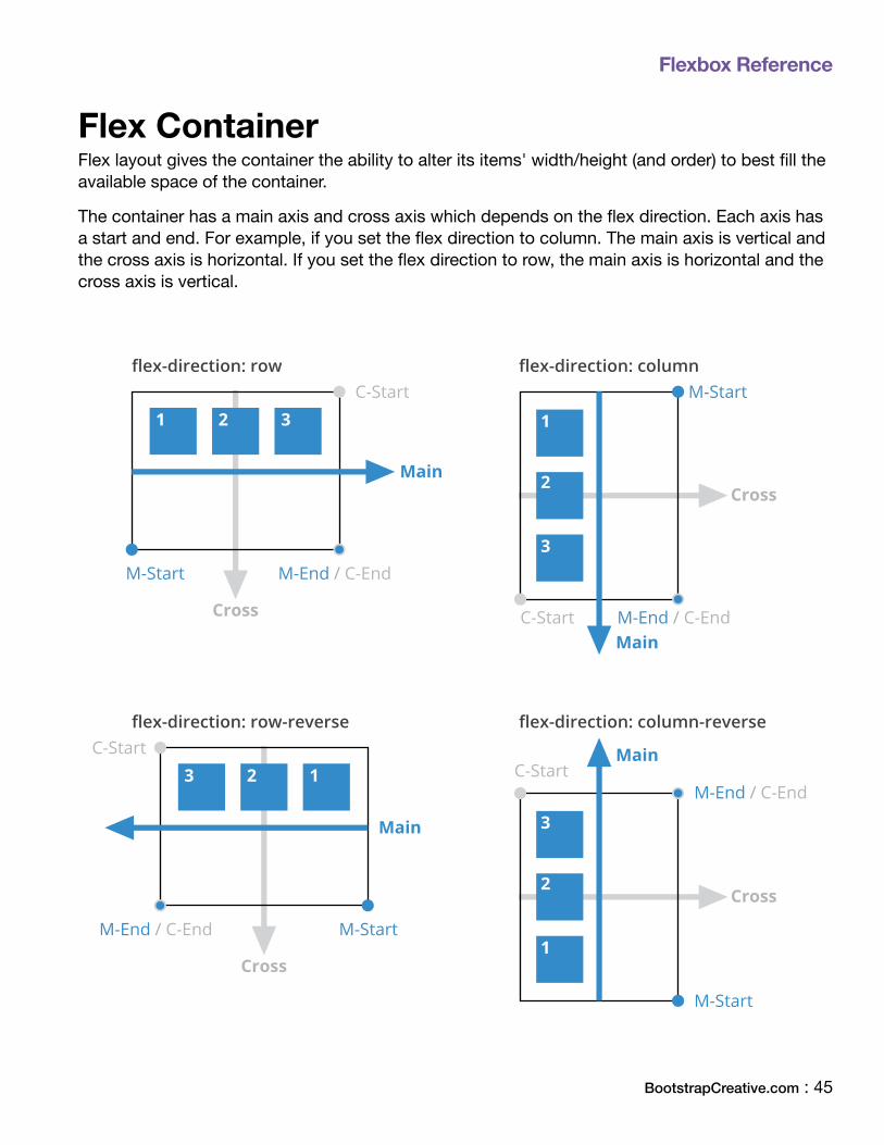
Flex ContainerFlex layout gives the container the ability to alter its items' width/height (and order) to best fill the available space of the container.
The container has a main axis and cross axis which depends on the flex direction. Each axis has a start and end. For example, if you set the flex direction to column. The main axis is vertical and the cross axis is horizontal. If you set the flex direction to row, the main axis is horizontal and the cross axis is vertical.
Main
Main
Cross
Cross
C-Start M-End / C-End
M-StartC-Start
M-End / C-EndM-Start
flex-direction: row flex-direction: column
1 2 3 1
2
3
Main
Main
Cross
Cross
C-StartM-End / C-End
M-Start
C-Start
M-End / C-End M-Start
flex-direction: row-reverse flex-direction: column-reverse
3 2 1
3
2
1

Flexbox Reference
FLEXBOX CONTAINER
Step 1: Do you want the container to behave like a block or inline element?
CSS Bootstrap 4
display: Docs: https://developer.mozilla.org/en-US/docs/Web/CSS/display#Values
flex
makes the container act display block
inline-flex
makes the container act display inline
Use one or a combination of classes below to specify what breakpoints you would like the properties to be applied.
Docs: http://getbootstrap.com/docs/4.0/utilities/flex/#enable-flex-behaviors
.d-flex
.d-inline-flex
.d-(sm, md, lg, xl)-(flex, inline-flex)
Flexbox Reference
BootstrapCreative.com : 47
FLEXBOX CONTAINER
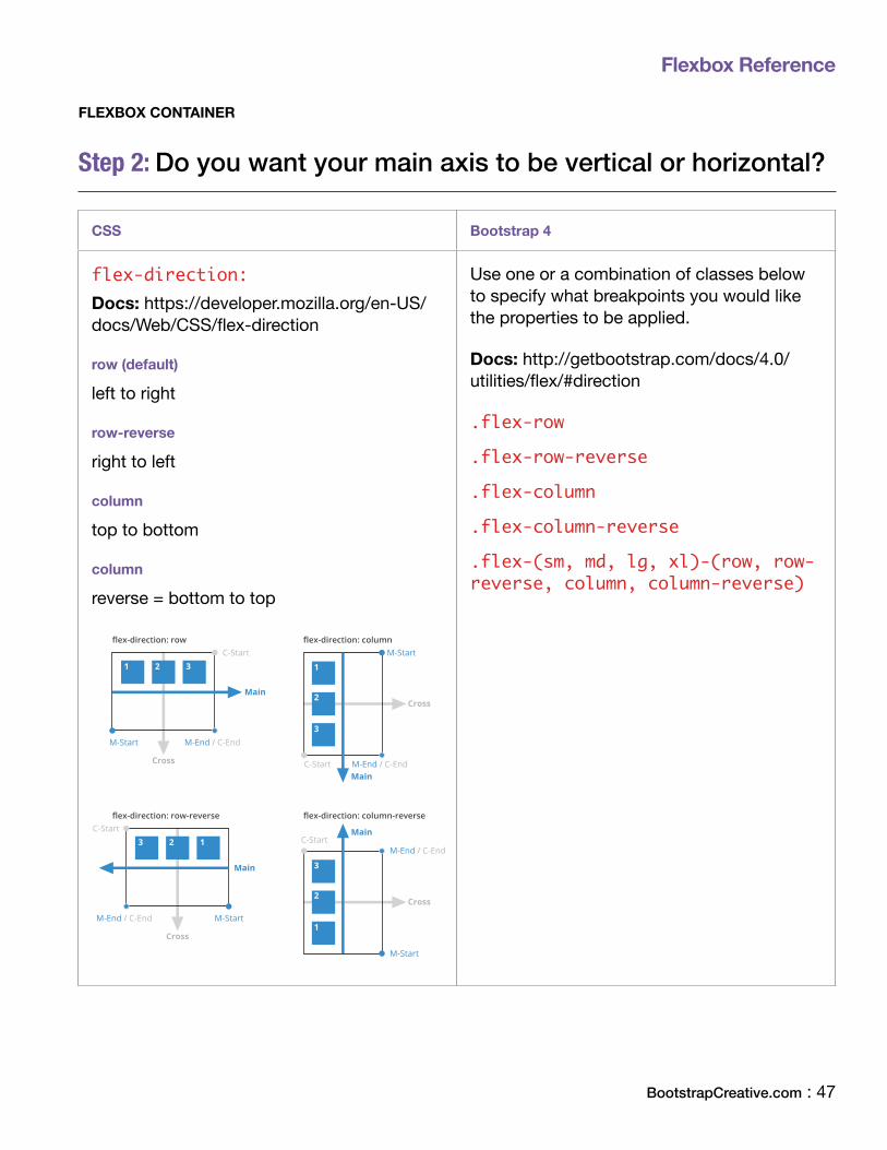
Step 2: Do you want your main axis to be vertical or horizontal?
CSS Bootstrap 4
flex-direction: Docs: https://developer.mozilla.org/en-US/docs/Web/CSS/flex-direction
row (default)
left to right
row-reverse
right to left
column
top to bottom
column
reverse = bottom to top
Main
Main
Cross
Cross
C-Start M-End / C-End
M-StartC-Start
M-End / C-EndM-Start
flex-direction: row flex-direction: column
1 2 3 1
2
3
Main
Main
Cross
Cross
C-StartM-End / C-End
M-Start
C-Start
M-End / C-End M-Start
flex-direction: row-reverse flex-direction: column-reverse
3 2 1
3
2
1
Use one or a combination of classes below to specify what breakpoints you would like the properties to be applied.
Docs: http://getbootstrap.com/docs/4.0/utilities/flex/#direction
.flex-row
.flex-row-reverse
.flex-column
.flex-column-reverse
.flex-(sm, md, lg, xl)-(row, row-reverse, column, column-reverse)

Flexbox Reference
FLEXBOX CONTAINER
Step 3: How do you want the extra space to be distributed along the main axis?
CSS Bootstrap 4
justify-content: Docs: https://developer.mozilla.org/en-US/docs/Web/CSS/justify-content
flex-start (default)
items anchored to the start
flex-end
items anchored to the start
center
items centered
space-between
items evenly distributed in the line. First item in on the start and last item is at the end
space-around
start and end items are not to the edge but have 1 unit of space on each side
space-evenly
similar to space-around, except all space is the same
Use one or a combination of classes below to specify what breakpoints you would like the properties to be applied.
Docs: http://getbootstrap.com/docs/4.0/utilities/flex/#justify-content
.justify-content-start
.justify-content-end
.justify-content-center
.justify-content-between
.justify-content-around
.justify-content-(sm, md, lg, xl)-(start, end, center, between, around)

Flexbox Reference
BootstrapCreative.com : 49
FLEXBOX CONTAINER
Step 4: How do you want the extra space of LINES of items to be distributed along the cross axis?
CSS Bootstrap 4
align-content: Docs: https://developer.mozilla.org/en-US/docs/Web/CSS/align-content
flex-start
items anchored to the start
flex-end
items anchored to the end
center
items centered
space-between
first line at the start of the container and the last one is at the end
space-around
lines are evenly distributed with equal space around each line
stretch (default)
lines stretch to take up the space that is left
Use one or a combination of classes below to specify what breakpoints you would like the properties to be applied.
Docs: http://getbootstrap.com/docs/4.0/utilities/flex/#align-content
.align-content-start
.align-content-end
.align-content-center
.align-content-around
.align-content-stretch
.align-content-(sm, md, lg, xl)-(start, end, center, around, stretch)
Flexbox Reference
FLEXBOX CONTAINER
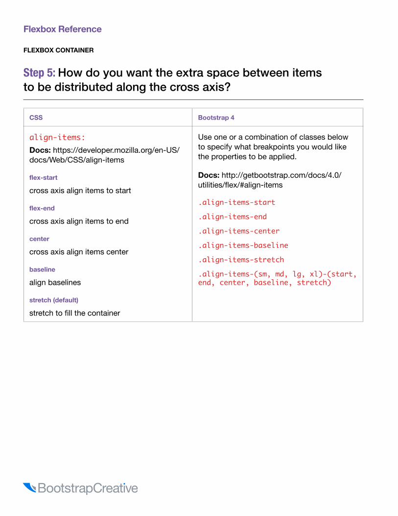
Step 5: How do you want the extra space between items to be distributed along the cross axis?
CSS Bootstrap 4
align-items: Docs: https://developer.mozilla.org/en-US/docs/Web/CSS/align-items
flex-start
cross axis align items to start
flex-end
cross axis align items to end
center
cross axis align items center
baseline
align baselines
stretch (default)
stretch to fill the container
Use one or a combination of classes below to specify what breakpoints you would like the properties to be applied.
Docs: http://getbootstrap.com/docs/4.0/utilities/flex/#align-items
.align-items-start
.align-items-end
.align-items-center
.align-items-baseline
.align-items-stretch
.align-items-(sm, md, lg, xl)-(start, end, center, baseline, stretch)

Flexbox Reference
BootstrapCreative.com : 51
FLEXBOX CONTAINER
Step 6: Want the items to wrap if they don't fit on one line?
CSS Bootstrap 4
flex-wrap: Docs: https://developer.mozilla.org/en-US/docs/Web/CSS/flex-wrap
nowrap (default)
all items will try to stay on one line
wrap
if items don't fit they will wrap and create a new line below
wrap-reverse
if items don't fit they will wrap and create a new line above
Use one or a combination of classes below to specify what breakpoints you would like the properties to be applied.
Docs: http://getbootstrap.com/docs/4.0/utilities/flex/#wrap
.flex-nowrap
.flex-wrap
.flex-wrap-reverse
.flex-(sm, md, lg, xl)-(nowrap, wrap, wrap-reverse)
Shorthand property
This is a shorthand property that sets the flex-direction and flex-wrap properties. I suggest avoid using this until you learn the core properties because it could make things more confusing.
CSS Bootstrap 4
flex-flow: Docs: https://developer.mozilla.org/en-US/docs/Web/CSS/flex-flow
< flex-direction > < flex-wrap >
example: flex-flow: column-reverse wrap-reverse; or just flex-flow: wrap-reverse;
Since Bootstrap uses classes there is no shorthand property available.

Flexbox Reference
Flex ItemDo you want to override the parent settings and give a specific item their own unique settings? You will first need to write a custom class and add it to the item you would like to modify.
• Flexbox items follow the orders given by their container.• By default, flex items all want to appear on the same line• Individual flexbox items can be targeted with a unique class and property to override the
orders given by their container. The example below uses the class .flex-item-a to make adjustments to only flex-item-a
Example:
HTML
<div class="flex-container"> <div class="flex-item-a">.flex-item-a</div> <div class="flex-item-b">.flex-item-b</div> <div class="flex-item-c">.flex-item-c</div> </div>
CSS
.flex-item-a { order: 3; font-weight: bold; }
Result
Flexbox Reference
BootstrapCreative.com : 53
FLEXBOX ITEM
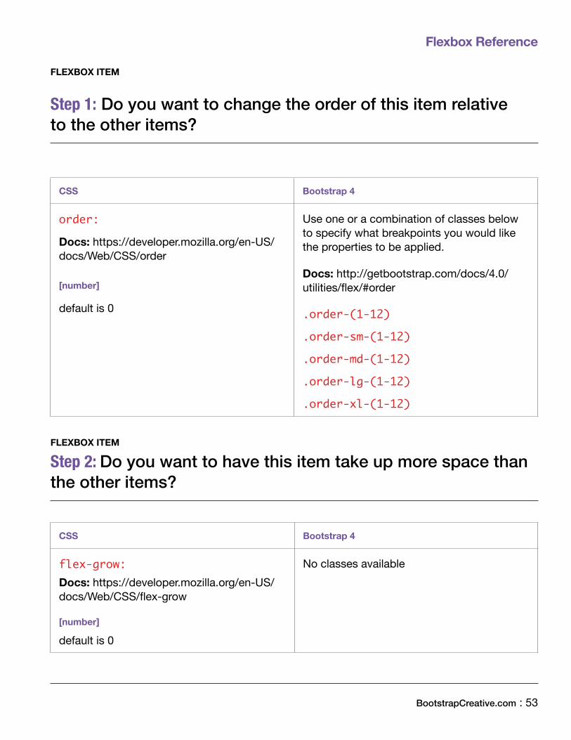
Step 1: Do you want to change the order of this item relative to the other items?
CSS Bootstrap 4
order:
Docs: https://developer.mozilla.org/en-US/docs/Web/CSS/order
[number]
default is 0
Use one or a combination of classes below to specify what breakpoints you would like the properties to be applied.
Docs: http://getbootstrap.com/docs/4.0/utilities/flex/#order
.order-(1-12)
.order-sm-(1-12)
.order-md-(1-12)
.order-lg-(1-12)
.order-xl-(1-12)
FLEXBOX ITEM
Step 2: Do you want to have this item take up more space than the other items?
CSS Bootstrap 4
flex-grow: Docs: https://developer.mozilla.org/en-US/docs/Web/CSS/flex-grow
[number]
default is 0
No classes available
Flexbox Reference
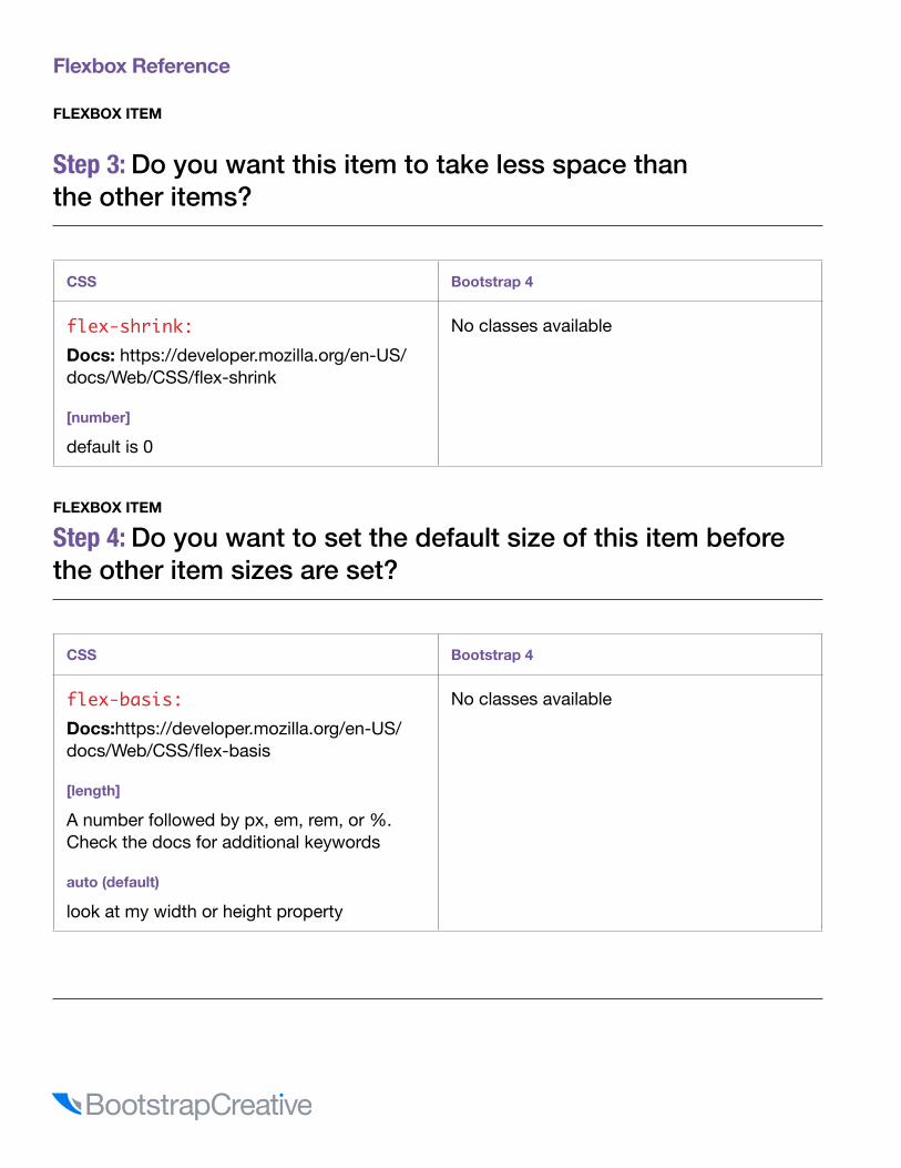
FLEXBOX ITEM
Step 3: Do you want this item to take less space than the other items?
CSS Bootstrap 4
flex-shrink: Docs: https://developer.mozilla.org/en-US/docs/Web/CSS/flex-shrink
[number]
default is 0
No classes available
FLEXBOX ITEM
Step 4: Do you want to set the default size of this item before the other item sizes are set?
CSS Bootstrap 4
flex-basis: Docs:https://developer.mozilla.org/en-US/docs/Web/CSS/flex-basis
[length]
A number followed by px, em, rem, or %. Check the docs for additional keywords
auto (default)
look at my width or height property
No classes available
Flexbox Reference
BootstrapCreative.com : 55
FLEXBOX ITEM
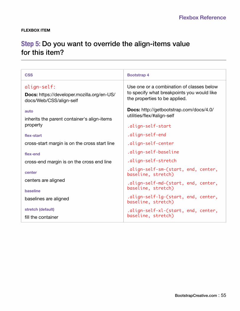
Step 5: Do you want to override the align-items value for this item?
CSS Bootstrap 4
align-self: Docs: https://developer.mozilla.org/en-US/docs/Web/CSS/align-self
auto
inherits the parent container's align-items property
flex-start
cross-start margin is on the cross start line
flex-end
cross-end margin is on the cross end line
center
centers are aligned
baseline
baselines are aligned
stretch (default)
fill the container
Use one or a combination of classes below to specify what breakpoints you would like the properties to be applied.
Docs: http://getbootstrap.com/docs/4.0/utilities/flex/#align-self
.align-self-start
.align-self-end
.align-self-center
.align-self-baseline
.align-self-stretch
.align-self-sm-(start, end, center, baseline, stretch)
.align-self-md-(start, end, center, baseline, stretch)
.align-self-lg-(start, end, center, baseline, stretch)
.align-self-xl-(start, end, center, baseline, stretch)

Flexbox Reference
Shorthand property
This is the shorthand for flex-grow, flex-shrink and flex-basis combined.
CSS Bootstrap 4
flex: Docs:https://developer.mozilla.org/en-US/docs/Web/CSS/flex
example:
Three values: flex-grow | flex-shrink | flex-basis flex: 2 2 10%;
Since Bootstrap uses classes there is no shorthand property available
Other great flexbox resourcesThere are a lot of great flexbox tutorials and resources available and below are some of the ones I found the most helpful in my learning and exploration.
Tutorials
• Take Command of CSS Flexbox : https://bootstrapcreative.com/flexbox-tutorial/• A Complete Guide to Flexbox via css-tricks.com : https://css-tricks.com/snippets/css/a-
guide-to-flexbox/• Flexbox bugs : https://github.com/philipwalton/flexbugs• CSS3 Flexible Box : https://www.w3schools.com/csS/css3_flexbox.aspx• Flexbox Froggy – A game to help you learn flexbox : http://flexboxfroggy.com/
Code examples
• Responsive flexbox image gallery : https://bootstrapcreative.com/pattern/responsive-image-gallery/
• Flexbox properties demo : https://codepen.io/justd/pen/yydezN• Flexbox playground : https://codepen.io/enxaneta/pen/adLPwv• Bootstrap 4 flexbox column wrapping example : https://codepen.io/JacobLett/pen/aJRQrN
BootstrapCreative.com : 57
Colors Reference

.rgba-color {color: rgba(2, 117, 216, 0.5);}
RGBA is a lot like light shining through a stained glass window. The more light that shines through the window, the brighter the color. The less light shining through the window, the color becomes darker. RGBA stands for red, green, blue, and alpha. Each color has a maximum value of 255. If all RGB values are the same you will have a gray value. The maximum value for Alpha is 1, which means 100%. A lower alpha value will allow background colors to show through.
Code example: https://codepen.io/JacobLett/pen/eRPeyj
How to use RGBA in your CSS
KeyA: Link hoverB: Input focus border colorC: PrimaryD: Primary alert backgroundE: SecondaryF: Secondary alert backgroundG: SuccessH: Success alert backgroundI: Danger
J: Danger alert backgroundK: WarningL: Warning alert backgroundM: InfoN: Info alert backgroundO: LightP: Light alert backgroundQ: DarkR: Dark alert background
Colors Reference

Colors Reference
BootstrapCreative.com : 59
HEX # 007bff
RGB 0.123.255
A HEX # 0069d9
RGB 0.105.217
B HEX # 80bdff
RGB 128.189.255
HEX # fff
RGB 1.76.140
HEX # f8f9fa
RGB 248.249.250
HEX # e9ecef
RGB 233.236.239
HEX # dee2e6
RGB 222.226.230
HEX # ced4da
RGB 206.212.218
HEX # adb5bd
RGB 173.181.189
HEX # 868e96
RGB 134.142.150
HEX # 495057
RGB 73.80.87
HEX # 343a40
RGB 52.58.64
HEX # 212529
RGB 33.37.41
HEX # 000
RGB 0.0.0
Grays
Primary
C HEX # 007bff
RGB 0.123.255
D HEX # cce5ff
RGB 204.229.255
E HEX # 868e96
RGB 134.142.150
F HEX # e7e8ea
RGB 231.232.234
G HEX # 28a745
RGB 40.167.69
H HEX # d4edda
RGB 212.237.218
I HEX # dc3545
RGB 220.53.69
J HEX # f8d7da
RGB 248.215.218
K HEX # ffc107
RGB 255.193.7
L HEX # fff3cd
RGB 255.243.205
M HEX # 17a2b8
RGB 23.162.184
N HEX # d1ecf1
RGB 209.236.241
O HEX # f8f9fa
RGB 248.249.250
P HEX # fefefe
RGB 254.254.254
Q HEX # 343a40
RGB 52.58.64
R HEX # d6d8d9
RGB 214.216.217
Contextual
Colors Reference
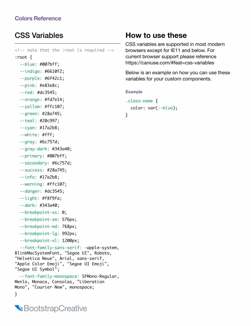
CSS Variables
<!-- note that the :root is required -->:root { --blue: #007bff; --indigo: #6610f2; --purple: #6f42c1; --pink: #e83e8c; --red: #dc3545; --orange: #fd7e14; --yellow: #ffc107; --green: #28a745; --teal: #20c997; --cyan: #17a2b8; --white: #fff; --gray: #6c757d; --gray-dark: #343a40; --primary: #007bff; --secondary: #6c757d; --success: #28a745; --info: #17a2b8; --warning: #ffc107; --danger: #dc3545; --light: #f8f9fa; --dark: #343a40; --breakpoint-xs: 0; --breakpoint-sm: 576px; --breakpoint-md: 768px; --breakpoint-lg: 992px; --breakpoint-xl: 1200px; --font-family-sans-serif: -apple-system, BlinkMacSystemFont, "Segoe UI", Roboto, "Helvetica Neue", Arial, sans-serif, "Apple Color Emoji", "Segoe UI Emoji", "Segoe UI Symbol"; --font-family-monospace: SFMono-Regular, Menlo, Monaco, Consolas, "Liberation Mono", "Courier New", monospace;}
How to use theseCSS variables are supported in most modern browsers except for IE11 and below. For current browser support please reference https://caniuse.com/#feat=css-variables
Below is an example on how you can use these variables for your custom components.
Example
.class-name { color: var(--blue);}

Thank you!I hope you have found this Bootstrap reference guide helpful and informative.
Let's make a responsive web together!
Sign up to receive free book updates and future training.
https://bootstrapcreative.com/signup
Find an error? Or have a suggestion on how this book could be improved?Please contact [email protected]